brand (re)birth - core
TRANSCRIPT

Brand (re)birth A case study of the company BDS and their
internal brand evolution
MADELEIN FAGERLIND
OANA GEORGESCU
Master of Communication Thesis
Report No. 2011:040
ISSN: 1651-4769
University of Gothenburg
Department of Applied Information Technology
Gothenburg, Sweden, June 2011

Brand (re) birth – A case study of the company BDS and their internal brand evolution © Madelein Fagerlind and Oana Georgescu | M.Sc. Communication | University of Gothenburg | 2011

Abstract
The purpose of this study is to determine how the brand image BDS has evolved internally
throughout the company’s history and how the values are reflected in the process. Most
research done within the field of brand evolution is conducted by case studies as it provides
unique insights within different aspects of brand evolution. The concept of a brand is closely
linked to value- in this study examined as company values and brand value are essential for
brand development. Following a practical model elaborated by Mary Goodyear we analyse
the brand evolution steps taken by BDS. The undertaken research represents a qualitative
case study. The data was collected from the company BDS and analysed according to two
traditions within the field of semiotics- Ferdinand de Saussure and Charles Sanders Peirce.
In conclusion, we found that BDS has evolved in a slow pace throughout the years due to a
complex history throughout the years. Only in 2009 they acquired a clear brand image which
made BDS a stronger brand.
Keywords: Brand evolution • Brand image • Brand value• Communication • Company values
• Semiotics • Case study • Goodyear model
Acknowledgements
We would first of all like to express our gratitude and gratefulness to BDS who allowed us to
make a study on their company. We are grateful for the material provided to us that
constitutes the core of this research. This would not have been possible without your help. A
special thank you to Bengt Oscarius who took his time to explain his insights and profound
knowledge regarding BDS and its history.
Last but not least, thank you to everyone who has stood by us and supported our research
throughout these months.
Gothenburg, May 20th
Madelein Fagerlind Oana Georgescu

Table of Contents
1. Introduction ........................................................................................................................... 1
1.1 Purpose and research question ........................................................................................ 1
1.2 Company overview ........................................................................................................... 2
2. Theoretical background ......................................................................................................... 5
2.1 From marketing to branding ............................................................................................. 5
2.2 Brand evolution ................................................................................................................ 6
3. Method ................................................................................................................................... 9
3.1 Semiotics ........................................................................................................................... 9
3.2 Case study research ........................................................................................................ 12
3.3 Data collection ................................................................................................................ 12
3.4 Validity ............................................................................................................................ 13
3.5 Reliability ........................................................................................................................ 14
3.6 Ethical considerations ..................................................................................................... 14
4. Analysis ................................................................................................................................ 15
4.1 Profile handbook 2003 and the brochure from Automobile industry 2005 .................. 15
4.2 Profile handbook 2006 and the brochure from Automobile industry 2008 .................. 17
4.3 Profile handbook 2009 and the brochure from Automobile industry 2011 .................. 19
4.4 Advertising campaign ..................................................................................................... 22
4.5 Jingle ............................................................................................................................... 23
4.6 Calendar .......................................................................................................................... 24
5. Discussion............................................................................................................................. 28
5.1 Findings ........................................................................................................................... 28
5.2 BDS and the Goodyear model ........................................................................................ 29
6. Conclusion ............................................................................................................................ 31
7. Suggestions for further research ......................................................................................... 32
References ............................................................................................................................... 33

Appendix 1 .......................................................................................................... 35
Appendix 2 .......................................................................................................... 36
Appendix 3 .......................................................................................................... 37
Appendix 4 .......................................................................................................... 38

1
1. Introduction
It is all about the money would say an advocate of the materialistic American perspective on things. We buy things because we want them not necessarily because we need them. When we do need them we choose something that suits our needs and is representative for our personalities. Products have gone way beyond their strict utility. Most of them are not simple goods anymore, but a name, a logo, a philosophy, a story, a prolongation of our personalities. Products have become brands and we buy brands because they mean something to us. Kapferer (2001) argues that consumers incorporate the brands that they buy into their identities. Be it true or not, companies struggle to build brands, make them popular and keep them alive. Rebranding or changing the image of a brand is part of the evolution of a brand and a necessity. “All brands need to be revitalized on a regular basis in order for them to be kept fresh, vital, and relevant to the contemporary market” (Merilees, 2005, p.201). But how is that kind of change being communicated? A new brand image is communicated both externally - to the consumer and internally - within the company. It is the latter side of this process that we will look at in this paper using the company BildelsSpecialisten (BDS), a Swedish brand for car components and accessories as our case study. In order to have a deeper understanding of the topic discussed in this study we further formulate a research question and provide some background information, both theoretical and empirical.
1.1 Purpose and research questions
As already mentioned, we are interested in finding out how the image of the brand evolved internally, how the BDS brand looks like from inside the company. Most literature concerning rebranding identifies a gap in this research field (Merrilees, 2005). Moreover “an important weakness of the branding literature is that it is focused almost exclusively on consumer markets” (Michell et al,2001:1).The purpose of this study is to analyze the evolution of BDS’ image as a brand from its formation until present from an internal perspective. In order to reach this aim we will analyze a set of internal material presented in the Data collection section, using semiotics as method. Therefore the main research question we address in this study is:
How has the BDS brand image evolved internally from the company’s formation until present?
Invariably when talking about a brand one must consider the values behind it. Values are an important factor in the company’s evolution and affect the development of a brand (Urde, 2003; Michell et al, 2001). For this reason we think that the evolution of the BDS values provides important information for answering our research question. The outcome we intend to acquire by answering the main research question concerns insights into the process of brand evolution. As explained further on in this paper most information regarding the life of a brand comes from case studies. Each brand is different and several variables such as product, industry, market and location affect the existence and evolution of it. By analysing the evolution of BDS from its formation until present from an internal perspective we aim to bring value to the research within brand evolution. We are of the opinion that BDS represents a unique case due to the following reasons:
2
- it has along complicated history including several mergers and acquisitions which accordingly involved name and image changes;
- BDS is a brand that reaches the end consumer through resellers. Still the company maintains and communicates the BDS identity through these filters;
- The car industry, namely the niche that BDS activates in, has specific characteristics which distinguish it from other industries, such as food or fashion, where brand image is different. For instance, fashion retailers communicate their brand by putting it on each piece of clothing they sell whereas if a customer buys a car part provided by BDS the BDS logo is not visible.
In order to have a clearer and broader picture about the BDS’ history and activity a company overview is provided.
1.2 Company overview
The BDS history, as presented by the Concept Responsible of BDS, starts with a company called APE. APE was founded in 1935 and has had different owners and names, the last owner coming from Finland. In the beginning of the 1990’s APE had a client group called Reservdelsspecialisten. Their shops were resellers for APE’s spare car parts. In 1995 APE bought a company called Sahlbergs which was a wholesaler for the shops. Sahlbergs had around 40 shops called CD-handlarna. Reservdelsspecialisterna were from the beginning about 70 shops. In 1996 the two companies Reservdelsspecialisterna and CD-handlarna were merged, having in total over 100 shops called BildelsSpecialisten (The Car Parts Specialist) selling both spare car parts and car accessories. BildelsSpecialisten did not demand much from the garages that used their brand just that their profiling should be displayed in the shops. Since BildelsSpecialisten did not own the shops that used their profiling they could not tell them what or what not to do. However, through each monthly company newspaper they paid tribute to the shops that used their profiling in order for other shops to follow their example.
In 1997 BildelsSpecialisten started with yearly meetings including representatives from the shop in order to increase the information flow. At these meetings the resellers were given information about upcoming campaigns which meant receiving the information earlier than in the past. BildelsSpecialisten tightens up their profiling in 1999 and changes the conditions for the shops that did not use their profiling as requested. The shops that used their profiling were given financial advantages such as free shipping and being prioritized over other shops.
In the beginning the BildelsSpecialisten logo presented a man in a car. The man had the letters ‘CD’ on his shirt, relating back to CD-handlarna. The CD from the man’s shirt was later removed. In 2004 BildelsSpecialisten broke out from CD and changed their logo. They modernized it and made the colour and profile handbook fresher. As BildelsSpecialisten proceeded with their new profiling the customer loyalty increased and the shops started to buy everything that BildelsSpecialisten could provide for them in order to enlarge their range of products. As the customer loyalty grew BildelsSpecialisten provided the shops with better conditions.

3
Between 2004 and 2009 BildelsSpecialisten had 55 resellers. BildelsSpecialisten’s goal was to have as many resellers as possible in Sweden and find others who were willing to sell their products.
BildelsSpecialisten invested 2 000 000 Swedish crowns (sek)/year on marketing with only one person managing the account- Bengt Oscarius. The money was mostly distributed to monthly company handouts and there were no marketing ads or TV/radio campaigns. Customers could only find BildelsSpecialisten through their website.
Becoming BDS In spring 2008 BildelsSpecialisten initiated a rebranding process in collaboration with a PR company called Dragster. The reason for hiring a PR company was that BildelsSpecialisten could focus on their shops and clients whereas Dragster could manage the marketing plan. Together with Dragster BildelsSpecialisten changed their name to BDS as they thought it was better focused and easier for the clients to remember. As the company was heading towards a new fresh start the name had to suggest that too. In order for BDS to improve their image in the eyes of their clients they started a focus group which consisted of seven resellers. These seven resellers represent the best of the shops. BDS shifted their focus to their shops and how they could help them with profiling instead of the shops handling it on their own. When the first shop opened with the new profiling the turnover increased with 30 %.
In fall 2008 Dragster presented a proposal for BDS which was met with mixed feelings. Dragster chose to continue to work on the new profiling and in fall 2009 Dragster and BDS presented the new and finalized result that was very well received. Before BildelsSpecialisten changed their name to BDS they had 91 shops and after the profiling 80 shops remained with them. The reason that not all shops and garages remained with BDS is that they increased the demands in order for them to use the BDS brand and profiling. They implemented a fee which was the main reason for garages to drop out. This included having a clear and proper customer service, their working clothes should be marked with the BDS logo and have the correct diagnostic equipment for the cars. BDS’ goal for 2011/2012 is to have 100 shops and 100 garages. How do BDS work? BDS first and foremost works with entrepreneurs as they believe that they have higher urge to succeed compared to if the shops would be owned by BDS. BDS offers a concept that has national coverage but the shops are still independent. The shops stand for 80% of the revenue. Through word-of-mouth, focus groups, salesmen, colleagues and competitors BDS knows that their new profiling is well accepted. The shops invite the garages they would like to work with and the salesmen from BDS visit shops they think would fit into the BDS profiling.
Three core values Before they formed the focus group BDS felt as if they did not have a clear identity or focus. They changed their colours from blue and red to only red so that it would fit better with the new core values: love, knowledge, service. Moreover, no one else within the business used red as their only representative colour. The three core values are discussed in more detail and referred to in the Data analysis and Discussion parts.

4
Target group In the latest BDS profile manual the target group is clearly defined. It consists of a family (Niklas and Anna, 38) with two children and a dog. They live in the proximity of a big city and the car plays a central role in their lives. They are interested in sports and keen on family, friends and colleagues. They need two cars and they want to have a stable and safe daily life.

5
2. Theoretical Background
In this section we will introduce some key-concepts relevant for the field we are studying, research done in the area and further theoretical background that provides extensive information for this study. As well as that we present some models concerning brand evolution, specifically the one that we will use as a main reference in our paper.
2.1 From marketing to branding
When discussing about brands and brand evolution one must first understand the larger context in which these concepts are being operated, namely the field of marketing and advertising. Phillip Kotler, “the father” of modern marketing, defines the concept as it follows:
Marketing – a social and managerial process by which individuals and groups obtain what they need and want through creating and exchanging products and value with others. (Kotler et. al, 2008:7).
On a narrower business level marketing can be defined as “the process by which companies create value for customers and build strong relationships in order to capture value from customers in return.” (Kotler et. al, 2008:7). When talking about marketing invariably one has to refer to the 4P’s: product, price, place and promotion (Kotler, 2008) and the related activities. Kotler (2008) mentions product development, research, communication, distribution, pricing and service as main marketing activities. Relevant for this paper is the communication part, namely how a brand is being communicated. This paper does not concern communicating a certain product, but a whole range of products under a common name – BDS. Moreover, as already mentioned, we are only interested in the communication of this name within the company. The purpose of this paper as well as the main research question we address gravitate around the concept of brand.
Brand – a name, sign or symbol that identifies the origin of a particular group of products or services and differentiates them from those of competitors (Kapferer, 2000:10).
We are interested in the evolution of a brand, specifically the changes that a brand image goes through from its formation on. The brand we look at in this study, BDS, has passed through different stages of evolution, with the latest in 2009 when a radical change of brand image took place. As Merrilees (2005) states, there is a gap in the literature concerning rebranding. Moreover, he explains that most knowledge related to brand evolution is provided by case studies. Due to the nature of the field of branding - relatively new, rapidly evolving, highly dependable on market conditions – each case becomes unique and provides new insights to the reality of the business world. As the notion of brand is tightly related to the one of value it is important to provide a broader picture of the latter concept for a deeper understanding. Urde (2003) presents a good overview of values and introduces a conceptual framework for the process of building a corporate brand based on core values. He distinguishes between three types of values:

6
- values that are related to the organisation; - values that summarise the brand; - values as they are experienced by the customers.
In this study we will refer to the first and second category as BDS represents both the company and the brand. The BDS products and services reach the customers through different independent stores and garages which is why the values related to the organisation and the ones summarising the brand overlap considerably in this study. Values that sum up the brand basically refer to “short three to five word phrases that capture the irrefutable essence or spirit of the brand positioning” (Keller, 1999 in Urde, 2003:3). Urde (2003) mentions and sums up the connection between the two types of values by stating that “in short, the development of core values is synonymous with the development of the brand” (Urde, 2003:4). Dobni and Zinkhan (1990) provide an extensive overview of what brand image means and how the concept has evolved throughout the years, since the early 1950’s. The authors classify the large number of definitions related to brand image into five groups:
1. blanket definitions; 2. emphasis on symbolism; 3. emphasis on meaning and messages; 4. emphasis on personification; 5. emphasis on cognitive or psychological elements. Most relevant for this study are the definitions in the third category as they relate to the semiotic perspective used in the data analysis of this study. Out of this group of definitions we shall mention two:
“An image is an interpretation, a set of inferences and reactions to a symbol because it is not the object itself, but refers to it and for it”. (Levy and Glick, 1973, in Dobni & Zinkhan, 1990:112).
“…the set of meanings and associations that serve to differentiate a product or service from its competition”. (Reynolds and Gutman,1984, in Dobni & Zinkhan, 1990:112).
What can be concluded from Dobni’s and Zinkhan’s study (1990) is that brand image is a complex concept in which value, meanings and consumer perception play an important role. As our focus is not the consumer, we will pay greater attention to the meanings and the value of the brand.
2.2 Brand Evolution
The research on branding has generated both pragmatic and conceptual models regarding brand evolution. A well-known model that has a practical approach towards the evolution of a brand is the one developed by Mary Goodyear in 1996. The model, analysed and explained by McEnally and de Chernatony (1999) proposes six stages in the life of a brand:

7
1. Unbranded goods: in this stage the goods are seen as pure commodities and their main function is utilitarian. No branding is involved and there is a very high demand for these goods, usually surpassing the offer. This kind of situation is rarely seen in developed countries and appears to be more common in developing economies.
2. Brand as reference: at this point producers differentiate their goods from others within the same category, mainly by changing the physical attributes of the product. “Consumers’ memory networks expand beyond recognition of the basic product category to include other product information in order to evaluate goods on the basis of consistency and quality” (McEnally&deChernatony, 1999:1). There is a change in consumers’ perception but they still value the goods based on their utilitarian function.
3. Brand as personality: represents the point when differentiating between brands is difficult to make as many producers have similar claims. That is why personalities are attributed to the brand. McEnally and de Chernatony (1999:2) give as an example the Ivory soap1. The personality of the caring mother is created and associated with the Ivory soap and by doing so “the marketer injects emotion into the consumer’s learning and valuing process.” As a result, all mothers who want to be perceived as caring will use the Ivory soap. This stage is tightly connected to the symbolic nature of the brands. Symbols are being used in order to communicate information about the brand and the consumer is engaged in decoding these symbols. The product is no longer just an object, but it has personality which makes it more attractive for the consumer. “Thus, the personalities of the consumer and the brand begin to merge and the value of the brand has become self-expression” (McEnally&deChernatony, 1999:2). This stage is important from a cultural perspective as well as some brands express cultural principles and establish cultural categories.
4. Brand as icon: at this level the brand is “owned by the consumers” and becomes part of their identities. The example given by McEnally and de Chernatony (1999) for this stage is the Marlboro cowboy who represents a set of values and is known around the world. Consumers who want to be perceived as him (strong, rugged, or loners) might smoke Marlboro cigarettes.
5. Brand as company: this stage belongs to the postmodern marketing approach. The brand becomes the company therefore its image must be the same both for the media and for the stakeholders. Consumers become more actively involved in the brand creation process. The main examples for this stage are the use of ATM machines and the patronage of the IKEA stores.
6. Brand as policy: this stage is characterized by an inclusion of ethical, social and political issues in the company’s activity. Consumers buy the product because the company which made it supports the same causes as they do. Through this kind of commitment consumers are said to own the brand. The main examples for this stage are The Body Shop and Benetton.
1 Ivory represents one of the oldest Procter&Gamble brands . Originally Ivory was a soap brand but today it covers a larger range of care products (http://www.ivory.com/index.html).

8
A more conceptual model regarding brand evolution was elaborated by Jean-Noël Kapferer in 2001. According to his model the brand evolves from the tangible to the intangible as it follows:
- Ingredient; - Product attribute; - Consumer benefit; - Personality; - Value.
Throughout the evolution process the relationship between the brand and its product is reversed. In the incipient stage of the brand it is the tangible that counts for the consumer, namely the ingredients of the product. As we move on to product attributes and consumer benefits the importance of the brand is growing while the product itself becomes less important. When personality and value are added to the product, the brand prevails and converges to an intangible mission. In other words this is the stage when the brand becomes part of the consumer’s identity. The consumer acquires the brand not because of the product’s qualities but because it reflects whom he/she is as a person. Kapferer’s model for brand evolution has several common points with the Goodyear model. However, the first one is more conceptual and explanatory whereas the latter has concrete application in the real business world. Moreover, Kapferer’s model is strictly applicable to products in relation to their brands, whereas the Goodyear model takes in the company as well. McEnally and de Chernatony (1999) demonstrate the utility of the Goodyear model by bringing up concrete examples and focusing on the managerial and consumer perspective when discussing each stage from a time evolution point of view. They emphasise an aspect mentioned by Goodyear before, namely that not all brands will reach the last stage of evolution. This fact is especially due to consumers’ implications and the development and nature of the industry.
As already stated the focus of this paper lies in analyzing the evolution of a brand as it already happened, not at the moment when changes are being decided. Even though it represents a pragmatic model, we found the Goodyear model to be appropriate for our case study due to the following reasons:
it refers to brands in relation to both the product and the company;
it does not involve the consumer directly;
it includes a time line when describing each stage of evolution;
it can both reflect the past of a brand and provide a path for future development.
With the help of this model we will try to identify in which stage of evolution BDS find themselves and therefore answer our research question. In order to do that we analyzed with the help of semiotics a set of internal material presented further in this paper.
Other research in the field of brand evolution has generated other models and frameworks but it is based on the work of Goodyear and Kapferer. One example is Merrilees’ (2005) framework for analyzing rebranding decisions. The framework is supposed to constitute a useful tool for coordinating communication and sales activities in order to manage the image of a brand over time. As Merrilees points out, his framework has practical implications for those companies that intend to initiate a rebranding process and adds to the often mentioned Goodyear model.

9
3. Method
In this part we provide an overview of the method we are using for analysing our material - semiotics. As well as that complementary information about case study research is being provided, together with specific aspects regarding our own study.
Research can be divided into two distinct approaches: qualitative and quantitative approach. Quantitative researchers believe in measurements and analysing statistical data to determine the relationship between different variables (Eldabi, 2002). On the other hand, qualitative researchers use a smaller sample of data in order to get an in-depth analysis (Amaratung et al, 2002). Our case study is a qualitative one. As Eldabi (2002) suggests, by using a qualitative approach the researcher believes that what is being studied cannot be understood without understanding the context around it. In order for us to understand the context around BDS we have spoken to Bengt Oscarius, Concept Responsible (Konceptansvarig) for BDS, who provided us with the internal material that we analyse and with information regarding the company’s history. Qualitative data can be collected within a short period of time, as the case was with this research, and the analysis of the data is interpretative and of subjective content (Hair et al, 2006).
3.1 Semiotics
Semiotics refers to both theory and method and has generally been defined as:
1. the study of signs and symbols as elements of communicative behaviour; the
analysis of systems of communication, as language, gestures, or clothing
2. a general theory of signs and symbolism, usually divided into the branches of
pragmatics, semantics, and syntactic2
As method, semiotics is different from traditional qualitative research, taking an outside-in approach, unlike interviews for example that have an inside-out perspective on analyzing information (Lawes, 2002). “What you have in semiotics is a methodology that is tailor-made for understanding packaging, advertising, all kinds of marketing literature and even 3D spaces such as retail environments” (Lawes, 2002:253). Branding and our study specifically fall into the field of research that semiotics is most suitable for. Moreover, as our material is internal and heterogeneous we found this method to be the best possible option. As well as that, as Lawes (2002:261) mentions, “If you want to interrogate communications directly rather than consumer’s response to them, semiotics is the only sensible choice”.
Semiotics seeks to find the meaning behind signs and this can be achieved with a set of tools that help dismantle and make sense of the material to be analyzed (Lawes, 2002):
Visual signs – “images that mean something (e.g. a heart to symbolise love, a smiley face icon for happiness)” (Lawes, 2002:263);
Linguistic signs – words and phrases;
Aural signs – signs that can be heard;
2 http://dictionary.reference.com/browse/semiotics

10
The implied communication situation – refers to who the sender and the receiver are;
Textual structure – the form of a text;
Information structure – the content of a text;
Visual emphasis – how the visual elements of a picture are arranged in relation to each other and their relative size;
Genre – “a class or category of human communication that has a distinctive style or set of conventions” (Lawes, 2002:263);
Binary opposition and contrast pairs – describing and understanding things through reference to how they are different from something else;
Communication codes – “sets of unspoken rules and conventions that structure sign systems and link signs to meanings” (Lawes, 2002:263). Codes change over time.
In relation to Lawes’ tool-kit of semiotic analysis our BDS material could be classified as figure 3.1. However, a better understanding of this categorisation and how the signs were analysed come in the Analysis section.
Visual signs Automässan brochures, Profile handbooks, BDS logo
Linguistic signs Jingle, Slogan, Profile handbooks
Aural signs Not applicable
The implied communication situation Sender:BDS, Receiver:BDS (internal perspective)
Textual structure Not applicable
Information structure Jingle
Visual emphasis Automässan brochures, Profile handbooks
Genre Not applicable
Binary opposition and contrast pairs Cornerstones vs. new values
Communication codes e.g. red=love
Figure 3.1 – Semiotic tools
Our analysis is constructed not only around the practical part of semiotics, but also around its theoretical aspects that help building a broader image of how the BDS brand has evolved. There are two different traditions in semiotics: the Saussure tradition stemming from the linguist Ferdinand de Saussure and the Peirce tradition developed by the American philosopher Charles Sanders Peirce.
1. Saussure focuses on the linguistic part of signs and views the sign as begin composed by a signifier and a signified. The signifier can be viewed as the material form of the sign that is something one can touch, see, hear, smell or taste. The signified is a concept in the mind- a mental picture of what is the signifier (Chandler, 2002).
2. Peirce proposes a triadic model of signs (Chandler, 2002:32): a representamen - the form which the sign takes-, an interpretant – the sense made of the sign - and an object to which the sign refers. Peirce (1985) classifies the signs into three main categories:

11
- icon: a sign of something that exists in reality and who’s image is viewed through its similarity to the object. An icon resembles the Saussure’s signified. For example a picture of a car is an iconic sign of a car. - index: something that is grounded on experience. For example dark clouds in the sky represent an index that, by experience, shows us it is most likely going to rain. The image is indicating something that does not have to be explicitly communicated. - symbol: belongs to the same category as the verbal language and certain signs which demand certain codes in order for the meaning of the symbol to be understood (Peirce, 1985). For example in certain cultures the image of a red heart is a symbol of love, whereas in others it might mean something else.
Any text or image has different levels of meaning represented by the distinction between denotation and connotation. All signs have an inner core and this is something we all agree upon, no matter what culture or background one comes from, called denotation (Baldwin et al, 1999).
The denotation level is the direct meaning of the sign- the basic meaning of the sign which is relatively objective (Baldwin et al, 1999).
For example, for this study when we analyze the brochures made for the industry fair, among many other things, we will look at what we first see on the pictures, which can be cars for example, red clothing of people standing and people singing without putting any meaning or interpretations in the pictures.
The next level called connotation is an interpretation in relation to cultural meanings and norms in a society. It is the indirect analysis of the sign and therefore it is our own interpretation. A connotation can also be a private association (Sparrman et al, 2003).
In our analysis of the BDS internal material we looked both at pictures and text. The Saussurean model is more suitable for text/language and with its help we identified the meaning behind the words, or the relation between connotation and denotation. When it comes to the pictures we analyse, we have also referred to Pierce’s classification of signs which helps us identify what the signs symbolize/indicate.
“Denotative signifieds are ‘first-order’ signifying systems. They correspond to the literal meaning of the advertising sign, to what is ‘objectively referred to in the advertising image. Connotative signifiers are introduced by the receiver of the advertising message. They correspond to ‘second-order’ signifying systems – systems which build on already existing ones” (Pinson, 1998:4).
When referring to the denotation-connotation levels we chose the values stated in the profile manuals as reference. The handbooks provide a clear complete picture of what the company is and stands for. Our interest lies in seeing if the values expressed in the profile manuals are shown in different forms in the BDS calendar, the brochures from the automobile industry fair, the text from the jingle and the advertising plan made by the advertising agency Dragster. For example, this will let us understand why the people in the
12
brochure pictures are wearing red clothes and what the colour symbolises. This will provide us with a deeper, contextual analysis of the company´s brand evolution.
3.2 Case Study Research
Case study research focuses on describing, understanding, predicting, and/or controlling the individual (e.g organisation, person or industry) (Woodside, 2010). Another way to explain case study research is referring to its applicability - an intensive study on a single unit in order to understand the similar units in a larger example (Gerring, 2006:37). By looking at BDS we hope to provide valuable insights for both the brand evolution field and other companies activating in the car industry. As Gummesson (2003) explains, using a case study, anything from one case to a hundred can be just as useful when conducting a research. One case can help us understand a specific company and teach us a general lesson regarding, in this case, brand evolution. The sample is purposeful and one can extract maximum of information from the case which, from a focus and time perspective, might not have been possible using several different case studies (Gummesson, 2003).
Case studies provide the researcher with an insight from the real world where it could be mainly inductive or deductive. In an inductive case study the case provides the researcher with the data for conceptualization and theory building whereas a deductive case study is set up against the theory in order to test reality and validity (Gummesson, 2003). By using the company BDS as our case study we are interested in describing and understanding how their brand image has evolved from the company formation until today. In order to do that we have looked at several models regarding brand evolution and we chose the most appropriate one. As Saunders et al (2007:57) explains, for deduction “the researcher uses the literature to help identify theoretical framework and ideas that will be tested using data”. In this study we will try to identify the stage BDS find themselves in according to the Goodyear brand evolution model.
3.3 Data Collection
The data used in this study was provided to us by the company BDS. At the beginning of the study we travelled to Stockholm and visited BDS. The Concept Responsible provided us with the data consisting of different types of internal material, both past and present in order for us to obtain a complete and contextual understanding of the company´s evolution. We could not receive material produced before 2003 as the company is not in the possession of it anymore. Part of the internal material we could have used in our research is represented by the company’s internal monthly newsletter. However, we chose not to use it as it refers mostly to news related to the car industry and does not provide any new information about the internal brand image.
The internal material that we considered in this study is presented further down. As the focus of this paper is the BDS brand image from the company’s perspective, we will take into consideration the following:
- Three profile manuals/handbooks from 2003, 2006 and 2009; - A BDS calendar (1935-2005) illustrating a big part of their history; - Brochures made by and for the company after the national event Automässan (2005,
2008,2011) – automobile industry fair; - A recent jingle;

13
- The plan for the advertising campaign made in 2009 by the Dragster advertising agency.
The three profile manuals were developed at different stages of the company. They show how the company has moved forward regarding several different aspects such as: the company´s colour, clothing of the employees, logo types, font type, core values, design of the shops and garages, their target group and marketing strategies.
The calendar came out in 2005 as an anniversary product for celebrating 70 years since the company was first founded. Each month presents a before/after comparison regarding different aspects such as: distribution, warehouse, employees, uniforms, technological improvement. This parallel is constructed through both text and pictures and points out at the company’s successful evolution. The calendar is an internal material relevant for this study as it shows how the company see themselves.
Automässan is a national event and the biggest of its kind in Scandinavia which takes place every three years in Sweden. It is a chance for companies to show their profile for other companies within the same field. We believe it is important for this study to analyse these brochures as they represent a compacted reflection of how the company portray themselves. These brochures are handed out only within BDS and consist mostly of pictures from the fair with a few headlines.
The jingle is a new concept for BDS which was introduced along with the big rebranding in 2009. As BDS has never used this concept before we find it important to see if it reflects the company’s values as presented in the profile manual. The text for the jingle was composed by a song writer who was given directions by BDS.
In 2009 BDS had an advertising campaign called “The bucket” (tvätthink). It was their first campaign after the latest image change and it was made by an external advertising agency called Dragster. We found it interesting to analyse from the new company image perspective. We wanted to see how and if the new values were reflected and if there were other indicators of the new BDS image.
3.4 Validity
Validity can be considered internally or externally. The internal validity questions whether the theoretical framework is compatible to the qualitative data and if they are relevant to each other (Amaratung et al, 2002). Our research provided us with interesting results that proved the compatibility between the Goodyear model and the evolution of the BDS brand. The different implications of this match are discussed more into detail in the Discussion and Conclusion sections.
External validity refers to whether the research findings can be applicable to other settings and be generalised (Amaratung et al, 2002). As already mentioned our paper refers to a case study and usually the results provided by case study research cannot be generalised. However, each case provides valuable information in a larger context and can be compared to other similar cases.

14
3.5 Reliability
Qualitative researchers have to consider their background and skills when undertaking a study from a subjective point of view (Give, 2008). However, it is still important that the results are unbiased and minimal. A researcher can never free herself from her background (Vanderstoep & Johnson,2008). When we drew the conclusion for our study and answered the research questions we based ourselves only on our results. Our personal input comes when discussing the pros and cons of the Goodyear model.
3.6 Ethical considerations
The data were provided by BDS on the basis of a written agreement. The agreement states that the data will be used only for research purposes and only for this study.
15
4. Analysis
In this section we will analyse each type of internal material using semiotics, based on the toolkit provided by Lawes (2002) and presented in figure 3.1. We take a closer look at the meaning behind words and pictures and how they reflect the image of the BDS brand. First we analyse the three different profile handbooks in relation to the corresponding concluding brochures from the Automässan automobile fair. We have selected the most important and significant parts from the profile handbooks which are relevant to this research in order to see if the BDS values and brand image shine through in the biggest and most important industry fair in Scandinavia. Afterwards an advertising campaign, the BDS jingle and their 70th anniversary calendar follow, also in relation to the values and brand image.
4.1 Profile handbook 2003 and the brochure from Automässan 2005
The first page of the profile handbook has a white background and the text ‘This is how we are going to appear, BildelsSpecialistens Small White’ (Så här ska vi synas, BildelsSpecialistens Lilla Vita). Along the bottom of the page is a red and white line with the text ‘BildelsSpecialistens’ in blue and red and a man in a blue suit driving a red car, with CD printed on his shirt. The man in the blue suit is a symbol for BildelsSpecialisten and for CD and a symbol their customers recognise as they have learnt it is a part of BildelsSpecialisten. The car the man is sitting in is an icon for a car and ties the name BildelsSpecialisten together with the symbol as a whole.
The following page consists of a text stating how they should profile themselves in different contexts. The consistency will make them appear as a national chain in comparison to small and local. This is not a program that needs to be followed, rather guidelines when change occur in the company.
Following, this text is BildelsSpecialistens cornerstones´:
- Own entrepreneurs with a strong local position - Union-, service and quality oriented - Active work of the consumer and garage - Bildelsspecilistens profile in and out - Have APE and Sahlbergs as main suppliers
These cornerstones symbolise the most important aspects of the company and the employees of the company understand the text better than someone that is not a part of BildelsSpecialisten.
Brochure from the Automobile fair 2005 The background colour of the front page is yellow and the biggest text is in the middle, on top of the page stating ‘Fair results’ ‘The best of the most in 70 years’ (See appendix 1). Underneath is a text thanking everyone who was there and helped them or visited them in the monitor. Four pictures follow with different motives on. The first picture is of a woman with black hair, a yellow dress and a striped blue and red apron holding cupcakes with small flags with the text Bilservice, BildelsSpecialisten and APE Fordonskomponenter on. The blue and red stripes on the apron indicate that she is a part of the company as she is wearing their colours. The cupcakes she is holding with the company’s flags on gives a warm and
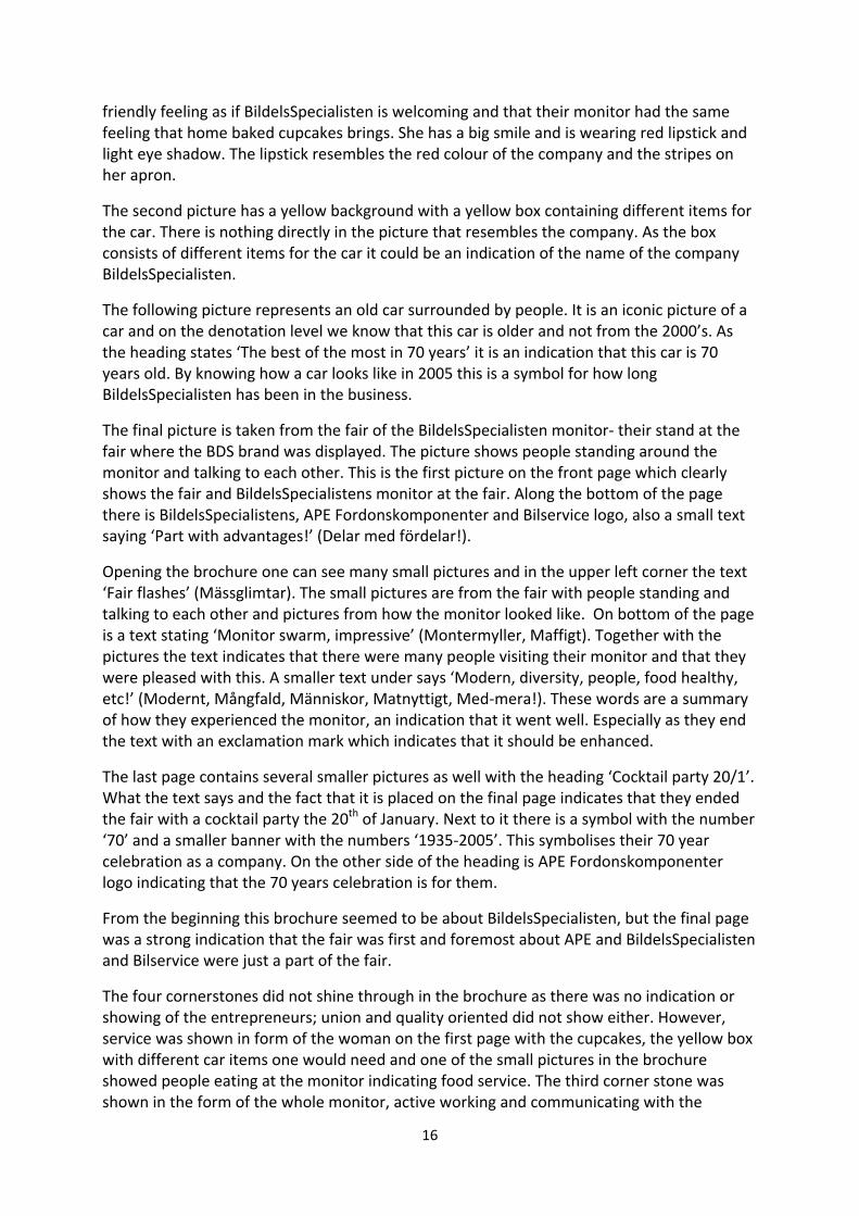
16
friendly feeling as if BildelsSpecialisten is welcoming and that their monitor had the same feeling that home baked cupcakes brings. She has a big smile and is wearing red lipstick and light eye shadow. The lipstick resembles the red colour of the company and the stripes on her apron.
The second picture has a yellow background with a yellow box containing different items for the car. There is nothing directly in the picture that resembles the company. As the box consists of different items for the car it could be an indication of the name of the company BildelsSpecialisten.
The following picture represents an old car surrounded by people. It is an iconic picture of a car and on the denotation level we know that this car is older and not from the 2000’s. As the heading states ‘The best of the most in 70 years’ it is an indication that this car is 70 years old. By knowing how a car looks like in 2005 this is a symbol for how long BildelsSpecialisten has been in the business.
The final picture is taken from the fair of the BildelsSpecialisten monitor- their stand at the fair where the BDS brand was displayed. The picture shows people standing around the monitor and talking to each other. This is the first picture on the front page which clearly shows the fair and BildelsSpecialistens monitor at the fair. Along the bottom of the page there is BildelsSpecialistens, APE Fordonskomponenter and Bilservice logo, also a small text saying ‘Part with advantages!’ (Delar med fördelar!).
Opening the brochure one can see many small pictures and in the upper left corner the text ‘Fair flashes’ (Mässglimtar). The small pictures are from the fair with people standing and talking to each other and pictures from how the monitor looked like. On bottom of the page is a text stating ‘Monitor swarm, impressive’ (Montermyller, Maffigt). Together with the pictures the text indicates that there were many people visiting their monitor and that they were pleased with this. A smaller text under says ‘Modern, diversity, people, food healthy, etc!’ (Modernt, Mångfald, Människor, Matnyttigt, Med-mera!). These words are a summary of how they experienced the monitor, an indication that it went well. Especially as they end the text with an exclamation mark which indicates that it should be enhanced.
The last page contains several smaller pictures as well with the heading ‘Cocktail party 20/1’. What the text says and the fact that it is placed on the final page indicates that they ended the fair with a cocktail party the 20th of January. Next to it there is a symbol with the number ‘70’ and a smaller banner with the numbers ‘1935-2005’. This symbolises their 70 year celebration as a company. On the other side of the heading is APE Fordonskomponenter logo indicating that the 70 years celebration is for them.
From the beginning this brochure seemed to be about BildelsSpecialisten, but the final page was a strong indication that the fair was first and foremost about APE and BildelsSpecialisten and Bilservice were just a part of the fair.
The four cornerstones did not shine through in the brochure as there was no indication or showing of the entrepreneurs; union and quality oriented did not show either. However, service was shown in form of the woman on the first page with the cupcakes, the yellow box with different car items one would need and one of the small pictures in the brochure showed people eating at the monitor indicating food service. The third corner stone was shown in the form of the whole monitor, active working and communicating with the

17
costumer. BildelsSpecialistens profiling was shown at the monitor and it was clear from the pictures that APE was their main supplier; however Sahlbergs cannot be seen in the brochure. In relation to the Goodyear model the company is in the second stage- brand as reference. Their main focus in the profile handbook is the concept and importance of recognition and the importance of the cornerstones. These cornerstones push mainly on service and quality but are not concise and focused and therefore represent only borders to the third stage- brand as personality.
4.2 Profile handbook 2006 and the brochure from Automobile industry fair 2008
The second profile handbook from BildelsSpecialisten has a distinct blue colour throughout the handbook. On the first page the logo is shown in the bottom right corner ‘Bildels’ (car parts) in blue and ‘specialisten’ (specialist) in red, with the word ‘bildels’ on top of the word ‘specialisten’. Two curves in blue and red are a part of the logo. On the middle left side of the handbook says Profile handbook (profilhandbok) followed by February 2006. Next page is all in blue with white typing and the two curve lines from the logo on the top left corner. The first heading states ‘Together for better business’ (Tillsammans för bättre affärer) followed by a text about how to create an image and a common identity, the importance of exposure and how this exposure leads clients to relate the brand with a positive feeling. They describe how in this handbook one will find the guidelines of how they profile themselves on different locations and in a different context. There is a part in the beginning of the handbook called ‘Important cornerstones’ (Viktiga hörnstenar) where they have seven bullet points lined up:
- Entrepreneur with a strong local position - BDS- profile business - Active work of the garage and consumer - Active distribution for the shops - Developing the shop concept Car-Service - Loyalty to APE Fordon at least 80 % - District elected reference group for the company.
Logo and colour As mentioned before, the logo is in the colours blue and red. The logo is built up as a sign and a word mark. BildelsSpecialisten is the word mark and the two CC’s, wings, by the side are the symbols. In the discussion with the BDS Concept responsible we found out that the two CC’s, wings, where inspired by another brand logo he had seen and had a similar look. He had changed them around and thought of two curved lines in connection to the most people’s connotation of the word ‘speed’. The colour blue is BildelsSpecialistens most important identity asset. The handbook states clearly that the more colour, blue, there is the stronger will the company identity be. The colour blue in this context becomes the company´s symbolic colour. Other colours can be used in order to complement the blue colours and these are red, dark grey and light grey.

18
Brochure from the Automobile fair The automobile fair is the biggest in the industry in Scandinavia and an important chance for companies to profile themselves and show a clear identity and image to stand out among the other companies who are trying to do the same thing. As BildelsSpecialisten went through a change in 2006 and this fair was in 2008 they had time to settle in to their new profiling before the automobile fair.
The first page is in yellow stating the words ‘The fair was a success’ (see appendix 2). Along the left side of the page, from top to bottom, there is the colour red looking like a curtain with a yellow band around it. This symbolises an event and looks like silk curtains being opened up for an inside look at the event, this being the catalogue itself. On the top left corner there is a small text where it says ‘auto fair 2008’, framed in a box with a white background. The word ‘auto’ and ‘2008’ are in light green and the word ‘fair’ in light grey. These colours were a part of the profile handbook as complement colours for the blue identity colour. The line around 2008 resembles the CC’s or wings from the company logo. On the bottom of the page there is a white text saying ‘18.305 visitors got the chance in out monitor!´. This text signifies the pictures with people from the fair that visually shows how many people were there. The background of the front page is a different picture from the fair with the APE logo at the top.
Opening the brochure there are many small pictures from the fair, some of them with only people and some are pictures from the monitor. There is one bigger picture in the middle on the page with a bird perspective of the monitor. In all four corners there is the same logo as on the front page stating ‘auto fair 2008’. The back of the brochure is again filled with small pictures from the fair showing people and pictures from the monitor. The background is a blue text on a white background; the small pictures are covering the text and therefore making it impossible to read out what it states. In the middle bottom of the page is APE Fordonskomponenter logo. On the left side of it there is a text which pays gratitude to everyone who visited them and helped them in the monitor. On the right side there is a text which says that see you next time in January 2011 at the next fair.
Resembling the first brochure, this too has APE in focus for the Auto fair and very little of BildelsSpecialisten is put forward. Again there is no hint of the strong positions of the entrepreneurs. BildelsSpecialistens profile business is not put forward. Active work of the garages, consumer and distribution of the shops are not shown in this handbook. Neither are the three remaining cornerstones. There is still no clear focus of what BildelsSpecialisten stand for; instead the cornerstones represent many different areas with long phrasing. This puts the company in 2006 still in the second stage of the Goodyear model- brand as reference. As the company’s cornerstones are not focused and neither is the brochure from the Auto fair in 2008 there is no clear personality or identity traits for customers easily relate to. There has been a slight change in the physical attribute this year compared to the former year as the icon of the man in a suit in the car is no longer there and the blue colour is more distinct now than before.

19
4.3 Profile handbook 2009 and the brochure from the Automobile industry fair 2011
This is the first profile handbook to be made after the big re-image in 2009 with help from the Dragster advertising agency. On the connotation level the first page shows a red background colour with a white logo in the middle of the page and a white text underneath which says ‘We take care of the car’. The whole manual is built up in the same manner as the front page, red background colour and with white text. On the following page there is a text which shortly explains why they are doing this and three words follow: Recognition, Comfort, Purchase (Igenkänning, Trygghet, Köp). Short explanations to the words are that they create recognition for their brand. Recognition leads to comfort for their customers. Comfort leads to purchase. These words signify the meaning behind the handbook and why it is necessary to have one.
The next page has a text which describes the profile handbook and points out that it is the result of well thought through research consisting of workshops, interviews with sales men and customers along with an analysis of the industry.
The BDS values are clearly outlined in the handbook and they are: Love-Knowledge-Service (Kärlek-Kunskap-Service). Love- stands for their love of cars and that BDS is a part of the car and the owner in good and bad situations. They want their customers and their cars to receive the best possible service. Along with the red colour and softer approach they stand out from their square competitors. Knowledge- they have long experience in the industry and know the most about cars, both in the shops and the garages. Service- they can help you with all different kinds of service; one only needs to leave the car with them. If the customer rather would like to handle the car by themselves the shop has everything needed and will help you to get the right things. They
have good service in both their shops and garages.
The logo and slogan As stated in the handbook, the new logo resembles a typical car sign or car station. The red colour is a given for BDS and symbolises the love BDS have for cars. The font is modern and brings ones thoughts to the car sport along with their old symbol for recognition.
The BDS slogan is ‘We take care of your car’ (Vi tar hand om bilen). This is their communicative message, it is soft and loving and straight to the point of their business. They mean that they are not sloppy, they care and always do their best.
Figure 4.1 - BDS logo and slogan

20
The picture that goes along with the slogan in the handbook (figure 4.2) one can see a part of a car in the background and in the foreground there is a hand held out by someone who is wearing a red jacket. Taking a closer look we see that the hand resembles a male hand. Above this hand is another hand holding a pair of keys with the finger tips. The person wearing a black jacket and the nails of the hand looks shiny indicating a female customer. The concluding remarks of the profile handbook state that this manual is a help and something for BDS to relate to. If they understand it and follow the guidelines in it then their brand identity will be strengthened. This is more than just a handbook, it is the gaming rules and principles for them to take BDS into the future and achieve their goals.
The BDS name
The BDS name is a shorter version of BildelsSpecialisten and easier for customers to remember as it is composed by only three letters. Searching for BildelsSpecialisten online it can be along word to search for online and therefore BDS is better in order to ease the search process.
Brochure from the Automobile fair The background is the same red colour as in the profile handbook. In the upper left corner is the BDS logo on a yellow star in the background (see appendix 3). A star behind BDS logo enhances the logo and indicates that the company is a star. In the upper right corner there is a blue box with a white frame and a white text saying ‘Xtra Fair special No. 1, 2011’ (Xtra Mässpecial Nr. 1, 2011). Underneath there is a yellow star which says ‘Unique pictures’ with a picture of couple of bottles of wine on the left and four smiling people underneath and four bottles showing in the fore ground. The wine bottles indicate celebration. Under this picture there is the profile of a guy with a bottle in his hand and holding up a finger in the air. Viewing his position and body language one can come to the conclusion that he is dancing. Next to him there is a picture with a yellow frame and the text ‘Popular bar hanging’ (Populärt barhäng). The picture going along with the text shows the back side of four people from the shoulder to the knees standing at the bar. On the bottom left corner there is a round picture of a man with the text in white with pink background ‘The atmosphere was on top’ (Stämningen var på topp). Above this picture is a bigger text, white on blue background, saying ‘This year’s funniest party at the automobile fair’ (Årets roligaste fest på Automässan). Above this text there is a picture of a man and a woman with the text, black on yellow, ‘The evening’s happiest couple’ (Kvällens gladaste par). The man and the woman are smiling and the text signifies that they are a couple, but they could also be colleagues. The text ‘Xtra’ along with the yellow star with the BDS logo and the yellow star with the text ‘Unique pictures’ indicates a tabloid magazine as these are typical symbols that we are used of seeing in that context. The pictures of wine bottles, smiling people with bottles in front of them, the text ‘Popular bar hanging’ and the man pointing up his index
Figure 4.2
21
finger are all signifiers of the words ‘funniest party’ and ‘the atmosphere was on top’. These pictures are also symbols of a good party, wine, people and dancing.
Turning to the second page there is a picture in the upper left corner of a man in a red shirt standing and holding a microphone. Next to the picture there is a text which says Mats Wilhelmsson: ‘Success on the fair!’ Underneath that text there is a paragraph describing how well the fair went. Out of 200 companies exhibiting and 800 brands BDS managed to stand out with their red monitor which was to the part most full of people. They thank everyone who came by and visited them. Under the text there are two pictures, one with a woman with a tag that says BDS on it, facing a man and a woman. In the other picture we can see two men sitting down with a table in front of them and two glasses on the table. In the background there are other men standing. Under this picture there is the text ‘Business & Pleasure’. This text plays off the pictures with ‘Business’ that signifies the men in suits and women communicating with each other and probably doing business. The word ‘Pleasure’ signifies the glasses on the table and follows the theme from the front page which was more pleasure than business oriented.
This brochure differentiates itself in many ways compared to the two former ones. It has a clearer focus which shines through. First, the layout of the brochure is more comprehendible than the previous as the pictures are not as compact on the page and position themselves in better focus. BDS has chosen to add pages to the brochure in order to put focus on specifically chosen pictures and each page has a message. The headings and the little text in the brochure go well together with the pictures. The main core value which is communicated in the brochure is Love. The pictures project a love among the co-workers and the love the co-workers have for the company. As the pictures show a party involving dancing and alcohol, this is viewed as if they have a good time working at BDS and especially at the Auto fair. Knowledge is somewhat projected through the amount of people who came to the BDS monitor as this shows that they believe in the company. This is also shown through the pictures where people are sitting and talking to each other and exchanging knowledge. Service in this context is shown by the beverage and the knowledge BDS provides to the people who come to the monitor.
From the handbook 2009 and the Auto fair in 2011 it is clear that BDS has entered the third stage in the Goodyear model- brand as personality. The structure of the brochure is clearer and so is the focus of the material inside as well as the whole handbook. They have in short explained what they are doing and wanting to achieve by focusing on the single words- Recognition, Comfort and Purchase. Their values are concise and clear- Love, Knowledge and Service and the red colour stands out in a distinct way, making a statement for itself and for the BDS customer.

22
4.4 Advertising campaign
In 2009 BDS went through an important change of their brand image. In 2010, when BDS had a new image, an advertising campaign which we will closely look at was launched. In spring 2010 Dragster advertising agency launched a campaign called “The bucket” (tvätthink). The campaign was planned to start on the 2nd of April 2010 and run until the end of the month. There were two reasons behind this choice:
- The period covers two important events in Sweden: Easter and the 1st of May weekend;
- It was shown that April-May is the peak time when people take care of their cars.
The target group defined in the campaign plan consisted mainly of men with ages between 20 and 40 with a high interest for their personal cars (gathering 498 individuals). The extended target group also included men between 45 and 65 years old (around 418 individuals).
The main mass-media where the campaign was to be promoted were two evening newspapers Aftonbladet and Expressen. Apart from these, similar ads for the free newspaper Metro (figure 4.3) and several relevant websites were to be used.
The offer consists of a bucket with cleaning products for the car at the price of 1 Swedish crown (sek) for shopping car accessories or spare parts worth 300 sek.
Figure 1.3 - ad for Metro
On a closer look at the ads, several cues indicate a strong brand image. First of all the background is red – the BDS colour. Even though the bucket itself and the circle containing the 1 sek price are red, the preferred background colour is not a contrasting one, but the one symbolising the BDS brand. As well as that, the first things standing out in the ads are the red rounded shapes of the BDS logo and the 1 sek price.
In each ad the BDS logo stands together with their slogan: “we take care of the car” (vi tar hand om bilen). No car or car parts are shown in the images, but the BDS colour, logo and slogan stand out. On the internet banner, the logo and slogan stand separately on a red background, distinguishing the brand even more. On a denotation level this choice could signal brand personality. In relation to the Goodyear brand evolution model, adding personality to a brand represents the third stage. The notion of “care” from “we take care of

23
the car” is taken beyond providing accessories and spare parts, in this case by offering cleaning products.
Regarding the message on every ad – “a fresh offer!” (ett fräscht erbjudande!) the connotation level is not rich in brand-related information. The denotation level of the words indicates literally a fresh offer whereas the meaning behind them refer to the extra products offered and their use. “A fresh offer” means both an offer that is fresh, as new, and an offer that would make the customer’s car fresh. There is not much information regarding the brand in this message, but it does connect to the BDS slogan: “we take care of the car”.
4.5 Jingle
According to the Dictionary of Marketing Terms (2000) a jingle represents:
“catchy repetitious sounds or words used in rhyming fashion and usually set to music to form a simple musical verse, which is featured in a commercial and used in conjunction with other advertising for a product”.
The BDS song/jingle was written by a song writer according to BDS’ instructions and the final version came out in February 2011. It is meant to be used on different types of advertising such as radio and TV commercials, but also in the BDS stores and at different events such as fairs.
As our analysis concerns the denotation-connotation dichotomy we will take into consideration the lyrics, regardless of the musical aspect of the song. An approximate translation of the jingle from Swedish is presented in Appendix 4.
As the lyrics show, there is a clear connection between the text and the brand. The denotative meaning of the words prevails and the message is expressed explicitly. The BDS name, the values and the slogan are clearly stated and reiterated. The lyrics are simple, concise and they contain much repetition, thus matching the definition of a jingle. The brand values are shown in a clear way:
- Love: BDS – love, knowledge and service, BDS – we take care of the car; - Knowledge: BDS – love, knowledge and service, we have all parts of course/
yes, here there is everything you want to have/when you drive home your car will feel good;
- Service: BDS – love, knowledge and service, BDS – everything is just fast and simple in the store and in the garage when you come to us, we do more than the majority and we keep our word, it becomes more personal and we provide warranty.
Besides the company’s core values, other BDS positive attributes are expressed: - Warranty: we provide warranty; - Easy access: BDS – everything is just fast and simple in the store and in the garage
when you come to us, We are quite easy to reach; - Trustworthiness: we do more than the majority and we keep our word; - Complete range of products and services: because here there is everything that you
need, BDS – car’s all parts, yes, here there is everything you want to have.

24
The message is addressed directly to the customer and the text is built in a way that fosters the brand/company-customer relationship. This strategy represents an indicator of added brand personality, the third stage of development according to Goodyear. BDS no longer provides only products and services, but love-based care for the customer’s car: We have love for your car, we have knowledge about your car, we have service for your car. Right from the first line it is shown that BDS puts great value on the car itself and understands the emotional relationship between the owner (the customer) and the car: Your car is the best that exists/It represents the heart in your full schedule. Moreover, the we-you relation is established and reinforced throughout the whole text, where we represents BDS and you refers to the customer. 4.6 Calendar The calendar we analyse was released in 2005, on the 70th anniversary of the company. The calendar represents an inside material meant for the employees and it illustrates the key points in the history of what started as APE and today is BDS. Every page of the calendar contains a short text and before/after pictures presenting briefly different aspects of the company’s evolution such as: marketing, employees, products, payment methods and so on. Moreover, each page has a 70 logo (as in figure 4.4) in accordance to the written information, besides the APE Fordons Komponenter logo.
Figure 4.4 – anniversary logos
Each piece of text starts with the title: ‘How did it go afterwards?’ (Hur gick det sedan?) except for the last month – ‘How will it be in the future’ (Hur blir det i framtiden?) and ends with a short sentence following the pattern ‘so it is/may be/can become/can go/went” (så är/kan bli/kan gå/har det gått). The calendar’s title is ‘On the way for 70 years’ (På väg i 70 år). The connotation level indicates that the company has been on the way/road for seventy years through its products and services provided to the cars that use the roads. The title suggests also the company’s life, its persistence and constant activity over seven decades. The same meaning appears in the slogan present on every page of the calendar: ‘Parts that win on the long run’ (Delar som vinner i längden). The idea of durability emerges again from the literal meaning of long lasting car parts. Further on we will look closely at each month and discuss each aspect presented.
January The first month presents marketing activities, namely the latest car industry fair at that time (Automässan 2005) that BDS participated at. Then APE Fordonskomponenter turned into BildesSpecialisten and BIL-Service. To be noticed in the January text there is an old slogan that the company had: ‘One is not seen – one does not exist’ (Syns man inte – finns man inte). This motto underlines the importance of brand visibility and of the fair itself.

25
February In February the warehouse and distribution are presented. The then/now difference shows a fruitful evolution that places the company in a great light. Moreover, this positive self image is expressed explicitly, through denotative words: ‘We began to become really good’ (Vi började bli riktigt duktiga).
March From the March page we find out about the BDS working uniforms. The number of branded pieces grew from one (a cap) to a whole range of pants, T-shirts, shirts and overalls. As same as in February, the words stand on their denotative level and express a clear message: ‘Now we invest heavily in our profile’ (Nu satsar vi stort på vår profil).
April April talks about people – the most important of company’s resources. Both the employees and the customers must be pleased and knowledge and joy are highly regarded at BildelsSpecialisten. Here we must notice a direct connection to the BDS values formulated subsequently: love, knowledge, service.
Figure 4.6 - APE employees
Figure 4.5- employees showing the new uniforms in 2005

26
May In May we find out about the company’s growth and re-organization under one roof. The event was marked by a new motto: ‘One stop shopping’. The fact that the company provides an easier access and a simpler and more comfortable shopping experience could be connected to ‘service’ in the set of values formulated clearly later. The same text mentions an important moment in the company’s life – the merger of APE Fordonskomponenter with Atoy OY represented in Finland and Estonia under the one Finnish-owned group in 2004.
June The text for June focuses on product development, namely the sparking plug. The late 40’s represented a fruitful period for the car industry in the WWII context. In 1949 the company elaborated the Champion sparking plug handbook containing several advice and recommendations for both European and American cars. Today’s sparking plug is almost identical to the old one on the outside, but thanks to advanced technology can last for a distance 200 times longer than the previous one (10.000 vs. 50 Swedish miles).
July As well as the previous month July focuses on technological development, this time regarding the administrative area. The evolution from handwritten invoices to the ones issued with the help of manual typing machines and later on to electronic invoices and payments via credit cards is briefly described.
August August presents the faster distribution nowadays. From carrying bicycles and primitive trucks distribution is now made through cars wearing the BDS logo. Orders are placed online and the next day the products are delivered all over the country. This month underlines increased efficiency and development which represents an indicator of the ‘service’ value.
September September talks about the range of products that BildelsSpecialisten offers. Starting with pistons in 1935, 70 years later the company provides a large variety of car parts and accessories made by world top manufacturers. The company refers to this fact as ‘Original brand parts’ (Original märkesdelar). The meaning behind this slogan is quality, as signalled in the text later on.
October October’s text talks about the improvement regarding customer service. Improved technology, easier access and internal communication makes customer service more efficient through the two employees Marika and Birgitta. The text reveals and connects several internal company values, different from the ones communicated to the customer:
- Technological development: ‘new technology has constantly taken place’ (Ny teknik har ständigt tillkommit);
- People/employees: ’Luckily the man is still here’ (Kvar finns som tur är människan); - Good service to the customers: ‘within APE Fordonskomponenter we always try to
give a good impression’ (Inom APE Fordonskomponenter försöker vi alltid ge ett got intryck).

27
November From the November text we find out that APE values their yearly catalogues. In the 1930’s the company’s vice-president used to carry all the time a catalogue with him that he would offer as a present at a dinner party for instance. In 2005 the company has digital catalogues on CD-Cardic.
December The last text has a different title than all the other ones: ‘How will it be in the future?’ (Hur blir det i framtiden?. The text talks about how in the 1930’s car mechanics and their knowledge were extremely important when finding out what was wrong with the car whereas in 2005 effective advanced diagnosis devices can be connected to the car. The mechanic has become the person who sets a diagnosis for the car. The value emerging from the text is ‘knowledge’ but this time it appears accompanied by technology/technological development. Overall, the calendar presents the information straight forward, there is not much deeper meaning behind the words. As it represents an anniversary product made by the company for the company, the calendar reflects a very positive self image that BildelsSpecialisten had about themselves in 2005. The calendar shows the company’s growth not only in practical terms (marketing, employees, warehouse, uniforms etc.), but also in terms of pride and self awareness.
Figure 4.10 - new techonolgy

28
5. Discussion
In this section we take a closer look at the results revealed through our semiotic analysis and see how they can answer our research question. As well as that, we identify the stage of brand development BDS find themselves in according to the Goodyear model. Moreover we discuss the pros and cons of this model in relation to our case study.
5.1 Findings
The two first Auto Fair brochures from 2005 and 2008 were focused on APE rather than BildelsSpecialisten as the handbooks we analysed proved to be. This could be an indication of how the company was still positioning themselves within the business, namely under the name of APE rather than BildelsSpecialisten as they did in the Auto fair 2011. It is interesting that neither APE nor BildelsSpecialisten saw the Auto fair as an opportunity to put forward BildelsSpecialisten rather than APE, especially in 2008 when they had a stronger and clearer identity than in 2005 since they had updated their handbook. On the other hand, the company might have thought that APE had a stronger current position within the market compared to BildelsSpecialisten and therefore it was better to promote APE on the Auto fair. As stated in the analysis of the brochures from 2005 and 2008 the cornerstones from the corresponding handbooks were not shown in the brochure. However, they could still have been shown in leaflets at the Auto fair and what the employees from Bildelsspecialisten spoke about with the customers who visited them at the fair. This does not show in any way in the brochures and we would need all the material from the Auto fair 2005 and 2006 in order to analyse and see if this presumption is accurate.
The big re-image in 2009 shines clearly at the Auto fair in 2011. Comparing the three brochures one could notice a great difference. The only hints that they refer to the same company are the play on words (Bildelsspecialisten becomes BDS) and the two CCs (the wings) on the logo; the rest has changed. The BDS image is more focused and it is being communicated in a more direct way. The cornerstones have become core values which are implemented in many aspects of the company. Love is mostly shown in the colour red which the whole monitor at the Auto fair was and the main colour for the brochure, it also makes BDS stand out from their competitors. Knowledge and Service are two words that are harder to communicate but their slogan brings them well together ‘We take care of the car’.
The advertising campaign, jingle and calendar reflect the company values in a very clear way helping us answer our research question. Evolving from the cornerstones of APE, BDS’ love, knowledge and service are now clearly communicated. The advertising campaign is an example of the brand’s reflection after the big change in 2009. The company values come to light in various ways: the dominating colour in the ads is red, suggesting the value love; the BDS logo is present and visible on each and every advertising material as well as the slogan (we take care of the car) that is tightly connected to the two other values – knowledge and service.
The jingle represents a current material meant to be used in different types of advertising but also in the BDS stores and at various events such as automobile fairs. It constitutes another clear example of how the BDS values can be expressed. The lyrics are simple and

29
repetitive, most words stand on their denotation level and the connection to the three values (love, knowledge, service) is very easy to detect and understand.
The calendar summarises a big part of the company’s history. It represents maybe the most important source of information for answering the research question. One part of the answer consists of all aspects presented in the calendar and their evolution: marketing activities, warehouse and distribution, working uniforms, human resources, the company’s growth and reorganization, product development, customer service, technological development. In 2005 when the calendar was released the company still functioned under the APE name. The three current values did not exist then but other company principles shine through: valuing the employees, the importance of technical improvement and the idea of durability.
5.2 BDS and the Goodyear model
When it comes to identifying in which stage of the Goodyear model the BDS brand finds itself, our analysis led us to the third one – brand as personality. At this point personality is added to the brand and helps differentiating it from other similar brands belonging to other producers. As well as that, at this stage the symbolic nature of the brands is important. In the BDS case the data analysis revealed the following information that indicates added personality to the brand: the rebranding process itself (2009), emphasis on and clear communication of the BDS values, a clear picture of the target group. The change of image from 2009 represented a process of redefinition and strengthening of the brand. The new logo, new colours, clear definition and communication of the BDS values contributed to adding personality to the brand and making it stronger. Stating the three values and making them visible in various types of materials (brochures, profile manuals, calendar, advertising campaign, jingle) mean distinguishing the brand from others by adding personality to it, not by changing the physical attributes of the products as in the second stage of development. The target group, as stated in the latest BDS profile manual and mentioned in the company overview section, consists of a family (Niklas and Anna, 38) with two children who live in a small town or in the proximity of a big city. The car plays an important role in their lives. Defining the target group in such a clear way means connecting the brand with a person – in this case a family – therefore adding personality to the brand. Before, as being shown by the first profile manuals and brochures from the Auto fair, BildelsSpecialisten was still in the second stage of the Goodyear model called brand as reference and not holding a strong identity for their customers. We believe that the brand, as it looks and positions itself at the moment, has only a short history behind in order for it to be seen as an icon. From APE to BildelsSpecialisten, only since 2009 BDS acquired its own personality and was communicated as such to the consumers. With their new focus it will be easier and more at hand for the customer to see BDS as an iconic brand and relate to BDS’ values. From 2009 until today the brand has taken a big step forward. This re-image is still being implemented in many ways and BDS needs the recognition from their clients, they need to grow more before entering the fourth stage in the Goodyear model- brand as icon. As the shops that use the BDS profiling do this by their own choice and the rules regarding using the profiling have become sharper the brand is on its way into the fourth step of development.

30
In the end of our research we found the Goodyear model highly valuable. Not only did it prove to be applicable to our study, but also its functionality could successfully be verified. Even though the model is pragmatic and it usually applies to evolutions of brands in relation to the consumer, it proved to be functional even from an internal perspective as in our case. Moreover, as BDS distinguishes itself from other brands by the fact that it is less visible and it reaches the end consumer through resellers, it still evolved as in the Goodyear model.
When it comes to the downsides of the model we could mention the lack of a time dimension and no indication regarding the transition from a stage to another. The last stage of the Goodyear model is Brand as policy and the main examples given are The Body Shop and United Colours of Benetton. The Body Shop started with their first store in 19763, the Benetton group was established in 19654 and they both reached the last stage of brand evolution. The BDS history can be traced back in the 1930’s and the brand is only in the third stage of evolution. The Goodyear model does not give any indication regarding how long it takes for a brand to reach a certain stage, how long it has to stay on a certain level or how it can move on and upgrade. Concerning the BDS brand, one way for it to become an icon would be to invest more in the relationship with the consumer. Stricter conditions for the stores and garages using their profiling, more aggressive advertising campaigns and increased presence in the mass-media represent some ways of pushing the BDS brand to the fourth stage of development.
3 http://www.thebodyshop.com/_en/_ww/services/aboutus_history.aspx 4 http://www.benettongroup.com/en/whoweare/history.htm

31
6. Conclusion
Research question: How has the BDS brand image evolved internally from the company´s formation until present?
Our analysis led us to the conclusion that due to a long history marked by mergers and acquisitions it was only in 2009 that BDS was clearly defined as a brand. Until then either APE or BildelsSpcialisten were visible and the company did evolve in several aspects such as: marketing activities, warehouse and distribution, working uniforms, human resources, the company’s growth and reorganization, product development, customer service, technological improvement. However, only in 2009 BDS presented itself as a brand and a company with a clear image, clear values, a well-defined target group and a clear communication of all these. Thus at this point BDS reached the third stage of brand development – brand as personality. With the help of semiotics we could identify those signs that indicated added personality to the BDS brand: new logo, new colour, new slogan, a clear image of the target group, the new company values and their meaning and communication.
The answer to our research question is therefore that BDS evolved first slowly in several different aspects and following a complicated company history. Only in 2009 BDS acquired a clear image and personality that make it today a stronger brand. The three current BDS values – love, knowledge, service – evolved from the APE cornerstones and are presently communicated to the consumer in a very clear way. They come to light in every single material analyzed both in a direct way (the denotation level) and an indirect way (the connotation level).
One main change in the process of BildelsSpecialisten becoming BDS was to take the step of hiring an independent advertising company. Through this decision the target group and BDS’ aim became clearer. Dragster offered an external perspective and provided BDS with the tools to make their brand image sharper and more visible.
With this in mind, a suggestion for a company in the process of developing their brand is to collaborate with an advertising agency. Such an external actor can then view the brand from an objective point of view and see what the company is lacking and what is needed in order for the brand to grow. However, every company is unique and needs its own personal business plan which is dependent on the product and the market it is operating in. Another general suggestion for companies willing to improve their brand image would be a clearly and strictly defined strategy. A good planning includes both an internal and an external approach following a definite time frame. One specific aspect that needs to be emphasised as a result of our study is a clear and concise definition and communication of the company values. However, as mentioned in the literature concerning the Goodyear model, not every company is able to reach the last stage - brand as policy.

32
7. Suggestions for further research
Further research could seek to understand and evaluate the consumer’s perception regarding the new image that BDS is communicating through different channels. This would be done by analysing the material that BDS communicates externally through the mass-media and reaches the larger public. Therefore we suggest that consumer-oriented research would be complementary to this study in order to see similarities and differences. Perhaps some consumers experience BDS as part of their identities already which would place BDS in the fourth stage of the Goodyear model - Brand as icon.
Another direction for further research would be studying the BDS employees and trying to see how they identify themselves with the new BDS values. It would be interesting to see how the change affected them and what is the difference when working with a focused and clear brand as BDS, compared to the time before 2009.
Another important point to be taken in consideration is how the shops and garages carrying the BDS profile perceive the change. Is it equivalent to what BDS communicated in the profile manual and if not how? The fact that the owners of these shops choose to profile themselves with BDS could be an indication of the fifth stage of the Goodyear model - Brand as company.

33
References
Amaratung, D., Baldry, D., Sarshar, M. and Newton, R. (2002) “Quantitative and Qualitative Research in the Built Environment: Application of ‘Mixed’ Research Approach”. Work Study. Vol. 51, No. 1, pp. 17‐31. Chandler, D. (2002) Semiotics, The Basics. London: Routledge. Dobni, D., Zinkhan, G.M. (1990). In Search of Brand Image: A Foundation Analysis. Advances in Consumer Research, 17, 110-119.
Eldabi, T., Irani, Z., Paul, J.P. and Love, P.E.D (2002) Quantitative and qualitative decision-making methods in simulation modelling. Management Decision. Vol. 40, No. 1, pp. 64-73. Gerring, J (2006) Case study research: Principles and practice. Cambridge University Press.
Gummesson, E (2003) All research is interpretive. Journal of business and industrial marketing. Vol. 18, No. 6/7, pp. 482-492.
Hair, J.J., Bush, R.P., and Ortianu, D. J. (2006) Marketing Research: Within a Changing Information Environment. New York: McGraw- Hill/Irwin.
Kapferer, J.-N. (2001). Reinventing the brand. London: Kogan Page.
Kotler, Ph., Armstrong, G., Wong, V., Saunders, J. (2008). Principles of marketing. 5th European ed. UK: Pearson Education Limited. Lawes, R. (2002). Demystifying semiotics: some key questions answered. International Journal of Market Research, vol. 44:3, pp. 251-264 Merrilees, B. (2005). Radical Brand Evolution: A Case-Based framework. Journal of Advertising Research, 45:2, 201-210. Michell, P., King, J., Reast, J. (2001). Brand values related to industrial products. Industrial Marketing Management. Vol. 30, pp. 415-425. Peirce, C.S. (1897-1910/1985). Logic as semiotic: the theory of signs. in Innis, R.E. (Ed.), Semiotics. An Introductory Anthology, Indiana University Press, Bloomington, IN. Saunders, M., Lewis, P. and Thornhill, A. (2007) Research Methods for Business Students. 4th ed. Harlow: Pearson Education. Sparrman, A., Torell, U & Åhrén Snickare, E. (red.) (2003). Visuella spår: bilder i kultur- och samhällsanalys. Lund: Studentlitteratur. Urde, M. (2003). Core value-based corporate brand building. European Journal of Marketing, 37 (7/8), 1017 – 1040.

34
Vanderstoep, S.W. and Johnson, D.D. (2008) Research methods for everyday life: Blending qualitative and quantitative approaches. Jossy-Bass Vannini, P. (2007) Qualitative inquiry: Social semiotics and fieldwork: Method and analysis. Sage publications. Vol. 13, No. 1, pp. 113- 140.
Woodside, A (2010) Case study research: Theory, methods and practice. Emerald Group Publishing
World wide web documents:
McEnally, M., de Chernatony, L. (1999). The Evolving Nature of Branding:
Consumer and Managerial Considerations. [Internet] Academy of Marketing Science Review. Available from: <http://www.amsreview.org/articles/mcenally02-1999.pdf> [Accessed 10 March, 2011]
Pinson, C. (1998). Marketing Semiotics. Available from: < http://flora.insead.edu/fichiersti_wp/inseadwp1998/98-39.pdf> [Accessed 13 June, 2011] <http://www.ivory.com/index.html> [Accessed 23 May, 2011]
<http://www.benettongroup.com/en/whoweare/history.htm> [Accessed 23 May, 2011]
<http://www.benetton.com/portal/web/guest/home> [Accessed 23 May, 2011]
< http://dictionary.reference.com/browse/semiotics> [Accessed 13 June, 2011]
35
Appendix 1

36
Appendix 2

37
Appendix 3

38
Appendix 4
Your car is the best that exists It represents the heart in your full schedule
and you know that if something would happen then you will take it to BDS
because here there is everything that you need it becomes more personal and we provide warranty.
BDS – everything is just fast and simple in the store and in the garage when you come to us BDS – love, knowledge and service, we do more than the majority and we keep our word
BDS – car’s all parts BDS – we take care of the car
We are quite easy to reach and you decide yourself what we can do exactly for you
no difference between sudan or cab, we have all parts of course
yes, here there is everything you want to have when you drive home your car will feel good
BDS – everything is just fast and simple in the store and in the garage when you come to us
BDS – love, knowledge and service we do more than the majority and we keep our word
BDS – car’s all parts BDS – we take care of the car
We have love for your car, we have knowledge about your car, we have service for your car We have love for your car, we have knowledge about your car, we have service for your car
BDS – everything is just fast and simple in the store and in the garage when you come to us
BDS – love, knowledge and service we do more than the majority and we keep our word
BDS – car’s all parts BDS – we take care of the car