brand guidelines | bc.com
TRANSCRIPT

BRAND GUIDELINES
Updated September 20201
2
WHAT IS A BRAND?
A brand is more than a logo or a tagline. Our brand is the way our company is perceived by those who experience our
organization through interacting with our people, products and services. Despite its intangible nature, a brand a valuable
asset that drives business value with customers, suppliers, investors and the general public.
HOW TO USE THIS GUIDE:
These guidelines outline how we communicate the Boise Cascade brand. As a company doing business across various
divisions and business units, brand guidelines help ensure we represent Boise Cascade consistently no matter the context.
This guide is designed to be the primary resource for information, advice and requirements when creating internal and
external digital or printed materials.
If you have questions, please reach out to your Division Marketing team or email HR Corporate Communications.
Together, we build the Boise Cascade brand in a manner that respects and enhances our legacy.
BRAND GUIDELINES OVERVIEW

3
Color is a powerful tool that provides a quick means of brand identification.
The profile color codes to ensure integrity in print (PMS, CMYK) and digital (RGB, HEX).
These primary colors are the anchors of our brand and can be used in graphic elements or as font (text) colors.
PRIMARY COLOR PALETTE
BC Green
Pantone 362
CMYK 70 / 0 / 100 / 9
HEX 49a942
RGB 73 / 169 / 66
BC Black
Pantone 433
CMYK 79 / 69 / 58 / 67
HEX 1e242b
RGB 30 / 36 / 43
Microsoft Tip:
If you’re working in Word or
PowerPoint, you can adjust
the colors in the Drawing
Tools menu: click on Format,
Shape Fill, More Fill Colors,
and then enter the RGB
code.
BC Forest
Pantone 357
CMYK 85 / 40 / 91 / 38
HEX 1e5732
RGB 31 / 87 / 51
NOTE: Pantone spot colors
are only for a print vendor who
requires them. Don’t convert
PMS colors to CMYK. Use the built color profiles shown.

SECONDARY COLOR PALETTE
BC Yellow-Green
Pantone 382
CMYK 29 / 2 / 100 / 0
HEX c1d32f
RGB 193 / 211 / 47
BC Red
Pantone 1655
CMYK 0 / 84 / 100 / 0
HEX f05123
RGB 240 / 81 / 35
BC Light Grey
Pantone 5435
CMYK 35 / 18 / 14 / 0
Web Hex a6bbca
RGB 166 / 187 / 202
These secondary colors can be used in graphic elements and/or sparingly for emphasis. They should NOT regularly
be used as a font (text) color.
Note: computer monitors, LED screens, and printers may vary in color reproduction; e.g., the light grey may appear
light blue in some instances. Until equipment is standardized, this will be a minor inconsistency.
BC Dark Grey
Pantone 4196
CMYK 68 / 49 / 43 / 38
Hex #3f4c5a
RGB 63 / 76 / 90
Accessibility Tip:
Keep in mind that some people have
visual impairments. Color contrast is vital
for readability, so be aware of the font
colors that you use on background
colors or on top of images.
EXAMPLE: Hard to see
This is better
4

5
Our fonts are Arial and Montserrat. Arial is the typeface used in
our logo and has been a part of our heritage for some time.
Montserrat is a more contemporary style and is a free, open-source
font. Montserrat is best used when the design is “locked down” in an
image or PDF document. If you’re sharing Word (.doc) or
PowerPoint (.pptx), it’s best to stick with Arial to ensure consistency
with other users’ installed fonts.
Style and size of font use is flexible, depending on the hierarchy
of your content and/or space constraints.
RECOMMENDATIONS:
• For headings, consider Arial Black or Montserrat ExtraBold
• For subheads, consider Arial Bold or Montserrat SemiBold
• For body copy, use a 10 pt. 11 pt. or 12 pt. in sentence case
• For disclaimers, use 8 pt. font in Arial Narrow or Arial Italic
• ALL type should left-justified with ragged right – do not center
• Avoid underlining words unless it’s a hyperlink
• Avoid cursive or handwriting fonts, which can be hard to read
• Don’t combine too many multiple emphasis techniques (e.g.,
capitalization + bold + color) can be overwhelming to the eye and
appear less professional.
TYPOGRAPHY
Montserrat Mediumabcdefghijklmnopqrstuvwxyz1234567879
Montserrat SemiBoldabcdefghijklmnopqrstuvwxyz123456789
Montserrat ExtraBold abcdefghijklmnopqrstuvwxyz123456789
Arial
abcdefghijklmnopqrstuvwxyz
123456789
Arial Bold
abcdefghijklmnopqrstuvwxyz
123456789
Arial Black
abcdefghijklmnopqrstuvwxyz
123456789
Arial Narrow
abcdefghijklmnopqrstuvwxyz
123456789

6
As part of our brand refresh in 2018, we added graphic elements
that are subtle representations of our heritage: logo tree-in-a-circle,
lumber, building materials, architecture, etc. The angles connote
strength and structure.
Designers have freedom to be creative with the use of the angles.
Here are a few examples.
GRAPHIC DESIGN

7
Brand personality is the unique spectrum of thoughts, emotions, and behavioral patterns that are intrinsic to us. These terms
describe the characteristics and traits that make us distinct today, and how our brand personality can be conveyed when
writing copy.
BRAND PERSONALITY AND TONE
Involved Straight Forward Brave Thoughtful Genuine
Our approach will
spark a connection
that is real and
robust. We are active
in our relationships
and invested in the
results.
We are:
• Interested
• Committed
• Purposeful
We are not:
• Bored
• Disconnected
• Indifferent
We are candid in
communications and
sincere in our work.
Our integrity will
show.
We are:
• Sincere
• Candid
• Practical
We are not:
• Complicated
• Vague
• Patronizing
With our 60+ year
heritage, we are
committed to our
purpose with
resilience and
courage.
We are:
• Strong
• Confident
• Steadfast
We are not:
• Tired
• Incapable
• Indecisive
Our perspective is
informed by insight,
intellect and
empathy.
We are:
• Mindful
• Aware
• Intentional
We are not:
• Preoccupied
• Anxious
• Hasty
We are fueled by the
right amount of
determination, pride
and humbleness. Our
principles run deep.
We are:
• Authentic
• Dedicated
• Credible
We are not:
• Arrogant
• Contrived
• Obstinate
8
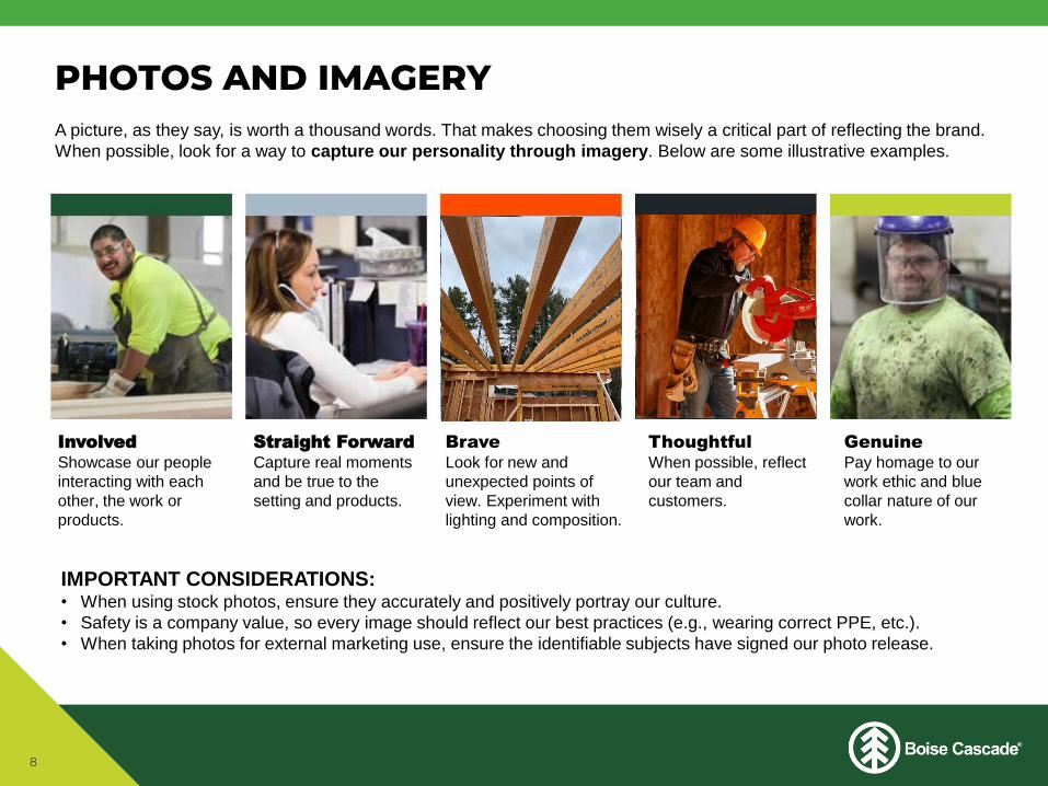
A picture, as they say, is worth a thousand words. That makes choosing them wisely a critical part of reflecting the brand.
When possible, look for a way to capture our personality through imagery. Below are some illustrative examples.
PHOTOS AND IMAGERY
IMPORTANT CONSIDERATIONS:• When using stock photos, ensure they accurately and positively portray our culture.
• Safety is a company value, so every image should reflect our best practices (e.g., wearing correct PPE, etc.).
• When taking photos for external marketing use, ensure the identifiable subjects have signed our photo release.
InvolvedShowcase our people
interacting with each
other, the work or
products.
Straight ForwardCapture real moments
and be true to the
setting and products.
BraveLook for new and
unexpected points of
view. Experiment with
lighting and composition.
ThoughtfulWhen possible, reflect
our team and
customers.
GenuinePay homage to our
work ethic and blue
collar nature of our
work.

9
For a more contemporary feel, a few changes have been made in our 2018 brand refresh. Most notably, the trademark
symbol ® has been moved out of the tree symbol to the end of our logo, the space between letters (kerning) has been
tightened and the division unit/business unit names have been capitalized and reduced slightly to create a brand hierarchy.
If you see the ® within in the tree or italicized division/business unit names, these are outdated versions and should be
updated as it makes sense to reprint or revise the materials.
Our logo has two approved styles: horizontal and vertical. It can be reversed or reproduced in one- or two-color.
A tone-on-tone logo is acceptable for embroidered apparel or hats; thread should be a shade or two darker for best
visibility. The logo without the registration mark ® should be used for any promotional items.
OUR LOGO
To request logo files, contact:
[email protected] (Corporate)
[email protected] (Wood Products)[email protected] (BMD)

10
Our logo is an iconic piece of our heritage; it is important that we use it respectfully and correctly. Use the logo files provided
by Boise Cascade, available in multiple formats. NOTE: use PNG logos for digital purposes; use other formats like EPS,
JPG, etc. logos for print. For best results, do not mix PNG and JPG logos in the same document.
LOGO USAGE
DO NOT ALTER THE LOGO BY:1. Changing or realigning the elements
2. Rotating, stretching or skewing
3. Recoloring or adding special effects
4. Using the tree-in-a-circle symbol as a
stand-alone graphic element/pattern
5. Using the logo in a sentence
As much as possible, ensure adequate space
surrounding the logo (equal to ½ the height of
the tree symbol).
is a proud sponsor
Distributed by
EXAMPLES OF INCORRECT LOGO USE:

Copyright notice
The use of a copyright notice is the optional responsibility of the copyright owner and does not require advance registration
from the Copyright Office. Its purpose is to educate others that permission is needed to use the work.
Typically the copyright is the year of first publication; new versions of the work should contain the publication date of the new
version. The copyright notice looks like this: © 2020 Boise Cascade.
Our company name
Our trade name is Boise Cascade Company, which can be shortened to “Boise Cascade” as the preferred reference.
PLEASE DO NOT:• Shorten our name to “Boise”
• Use acronyms such as BC or BCC externally
• Refer to the company as Boise Cascade Corporation, Boise, Inc., or Boise Cascade, LLC.
• Use explanatory phrases (“formerly known as…”)
• Refer to “Timber & Wood” as a division – it’s Wood Products
• Abbreviate Building Materials Distribution to “BMD” if acronym is not widely familiar to the intended audience
(e.g., in a news release or recruitment ad)
11
COPYRIGHTS AND OUR NAME

12
The integrity of the Boise Cascade logo and its product trademarks should be protected in order to promote
positive and consistent recognition. Our name is well-respected in the market and its registered trademark through the
U.S. Patent and Trademark office must be protected.
To take full advantage of the registration and to provide maximum protection, it is necessary for the registration ® symbol to
appear with the logo on certain items.
External requests to use our logo must comply with our Trademark License Agreement, which can be found online at
http://www.bc.com/trademarks/.
USE THE ® SYMBOL ON:
• Products, e.g., stencil/stamp and paper wrap
• BC.com, official social media channels, or our intranet site
• All marketing materials, tradeshow materials and displays
• All vendor materials
THE ® SYMBOL IS NOT NECESSARY ON:
• Company letterhead or business cards
• Location signage
• Promotional items, e.g., company apparel, trade show giveaways, service awards, etc., as the registration mark
does not reproduce well on embroidery and small imprinted items.
LOGO TRADEMARK

Product trademarks
Trademark symbols provide notice to customers, competitors and suppliers of Boise Cascade’s ownership of a product
name. Each time a Boise Cascade trademark is used consistently with its correct symbol, it strengthens our use of the mark
and better protects it against possible infringement.
We have two types of marks:
• A registered trademark is followed by ® symbol. Example: ALLJOIST®
• A common law trademark is followed by the ™ symbol. Example: Finish-Rite™
External use of trademarks
On occasion the company receives requests from non-employees to use one or more of our registered trademarks, e.g.,
students doing research for class projects, vendors applying our logo on their product, etc. While the company has no
objection to complying with these requests, we do require that any individual requesting use of the mark sign a Trademark
License Agreement wherein they agree, among other things, not to disparage or infringe on company-owned marks. The
requester must provide a sample of use for legal department review, along with the signed Agreement prior to use. Please
forward the document to [email protected].
A complete list of trademarks and guidelines, the Trademark License Agreement, and other resources are available online at
http://www.bc.com/trademarks/ .
For questions, reviews or advice regarding trademarks, copyrights or use of our trade name, contact Kristin Bjorkman at
[email protected] or 208-384-4926.
13
TRADEMARKS