brand book - robert gray writing &...
TRANSCRIPT

B r a n d B o o k

This publication includes language to be used in expressing the St. Andrew’s Schools brand platform when communicating about the school. It includes an overarching statement of brand positioning
with themes, or taglines. It also includes positioning language for the St. Andrew’s Priory School for Girls, St. Andrew’s Preparatory School for Boys, and Queen Emma PreSchool.
The new brand of the St. Andrew’s Schools reinvigorates our time-honored commitment to highly individualized, single gender learning. Long recognized for our success with girls, we now offer a similar program for boys—just when the research says we need it most. The St. Andrew’s brand now includes our coed preschool program, as well. The language in this document describes in more detail how these divisions fit together and carry on the mission of the school. It can find application in a wide range of communication about St. Andrew’s.
For each division of the St. Andrew’s School, the book also includes a set of brand attributes. These can be used to further distinguish individual programs in a wider range of contexts, such as emphasizing St. Andrew’s downtown Honolulu location when developing stories about service learning, or how the Priory helps girls connect globally and develop 21st century communications expertise.
The text and graphics in this book represent many hours of collaborative work of the part of many people, both within the school and beyond. It is with great pride that we share with you our new identity as we put our bold brand promise into action.
Brand Positioning ........................................................................2-6
School Logos ....................................................................................... 7
Acceptable Logo & Color Variations ..................................... 8-11
Minimum Size ..................................................................................12
Protected Area ..................................................................................13
Improper Usage ...............................................................................14
Color .....................................................................................................15
Typography ....................................................................................... 16
Stationery Guidelines .............................................................. 17-27
Samples of Usage ...........................................................................28
Advertising Guidelines ................................................................29

The St. Andrew’s SchoolsInstitutional Identity and Positioning
Identity
The great Hawaiian leader Queen Emma was a visionary thinker. A progressive and passionate advocate for justice, she worked tirelessly to address Hawai‘i’s most pressing social needs, including healthcare for the Hawaiian people and equal education for girls. St. Andrews Priory, the oldest all-girls school in O‘ahu, is a lasting testament to her towering vision and efforts.
At the St. Andrew’s Schools, we look to her leadership for inspiration as we improve and extend academic opportunities to the widest possible range of O‘ahu’s youth. And, since 1867, the Priory has earned a reputation as one of Hawai‘i’s premier college preparatory programs for girls, graduating confident and articulate young women who go on to achieve greatness—in Hawai‘i and around the world. Queen Emma PreSchool prepares preschool boys and girls to love learning.
Now, with the establishment of St. Andrew’s Preparatory School for Boys, the St. Andrew’s Schools opens a new chapter on academic excellence for Hawai‘i and the nation. With this bold new initiative, we bring our years of leadership in individualized learning to bear on one of the most urgent challenges facing America today: the education of boys.
The only school of its kind in the state of Hawai‘i, St. Andrews Prep offers boys in grades K-5 the same commitment to individualized learning that distinguishes the Priory among independent schools in Hawai‘i. Combining the latest research in how boys learn with our own proven expertise in student- centered education, the Prep represents an entirely unique educational opportunity designed from its inception to help each boy discover his own special gifts and flourish as an active and engaged lifelong learner.
T H E S T. A N d r E W ’ S S C H O O L S B r A N d B O O K | P G . 2

Brand PositioningAt the St. Andrew’s Schools, we draw inspiration from Queen Emma, whose progressive vision greatly expanded educational equality in Hawai‘i. Founded in 1867, St. Andrew’s Priory is one of Hawai‘i’s premier college preparatory programs for girls. At Queen Emma PreSchool, preschool boys and girls prepare for success in school and life. Now, with the establishment of St. Andrew’s Preparatory School for Boys, we are bringing our many years of leadership in individualized learning to bear on one of the most urgent challenges facing America today: the education of boys.
TaglineStrive for the highest
Brand attributesHawaiian legacyQueen Emma founded St. Andrew’s Priory for girls in 1867 because she saw a need for equal access to quality education. Today, the Priory is joined by St. Andrew’s Prep for boys and Queen Emma PreSchool. Based on a Queen’s vision and our Episcopalian origins, we offer a values-focused education that begins in preschool and prepares boys and girls for success in high school and beyond.
Leading edge pedagogyEntirely unique in the state of Hawai‘i, the St. Andrew’s Schools are distinguished by an institutional commitment to providing a differentiated learning experience, where learning is individualized for each student. Leaders in this highly effective learning model, the St. Andrew’s Schools applies the latest best practices as revealed in research for students in preschool and through grade 5 for boys and 12 for girls. Understanding that we live in a connected world, we integrate information technology into the education and the community.
Location advantageSt. Andrew’s students are not just in Honolulu, they are of Honolulu. Our central location in the heart of Honolulu presents unrivaled opportunities to enrich the lives of our students through service learning, internships, partnership programs in the city, cultural and natural resources, and much more.
Successful outcomesCommitted to successful preparation for the next step in every division, the St. Andrew’s Schools introduce the joy of learning to preschool students, prepare boys for success in high school, and graduate articulate, confident young women. The success of the Priory speaks for itself. Virtually 100% of graduates go on to attend college and university at some of the most prestigious institutions in the world. They go on to become leaders in Hawai‘i and around the world.
T H E S T. A N d r E W ’ S S C H O O L S B r A N d B O O K | P G . 3

Brand PositioningHawai‘i’s great Queen Emma envisioned equal access to education for girls. Nearly one hundred and fifty years later, the school she founded in 1867 is among Hawai‘i’s premier college preparatory programs for girls. Now, the Priory is the focal point for a bold new kind of learning experience. Challenged in the classroom, engaged with the community, and connected with the global challenges of the 21st century, Priory students graduate prepared to have a real and lasting impact on a rapidly changing world.
TaglineWomen for Hawai’i, Women for the world
Brand attributesHawaiian legacyQueen Emma founded St. Andrew’s Priory for Girls in 1867 because she saw a need for equal access to quality education. Today, the oldest girls school in O‘ahu is joined by St. Andrew’s Prep for Boys and Queen Emma PreSchool. Based on a Queen’s vision and our Episcopalian origins, we offer a values-focused educa-tion that begins in preschool and prepares girls for success in high school and beyond.
Leading edge pedagogyEntirely unique in the state of Hawai‘i, the St. Andrew’s Priory is distinguished as a program for girls that provides a differentiated learning experience, where learning is individualized for each student. The Priory practices differentiated learning in a single-gender learning environment that applies the latest best practices on how girls learn. Understanding that we live in a connected world, we integrate information technology into the education and the community.
Location advantageSt. Andrew’s Priory students are not just in Honolulu, they are of Honolulu. Our central Honolulu location presents unrivaled opportunities to enrich the lives of our students through service learning, internships, partnership programs with the YWCA and others, and to take advantage of cultural and natural resources, and much more. Our Priory in the City program places students in real working situations. In every way we can, we make Honolulu and O‘ahu our expanded campus.
Successful outcomesOur program prepares confident, articulate young women prepared to take on the challenges of undergraduate work and beyond. Our college attendance rate is 100%, with acceptances into the most prestigious colleges and universities in the U.S. and internationally. Our alumnae includes state and national leaders, as well as successful businesswomen, entrepreneurs, and more.
T H E S T. A N d r E W ’ S S C H O O L S B r A N d B O O K | P G . 4

Brand PositioningHawai‘i’s Queen Emma was a tireless advocate for social justice. Today, the evidence is clear: Traditional learning models are failing our boys, especially in the critical primary years, and dropouts in Hawai‘i and across the nation are rising at an alarming rate. St. Andrew’s has proven success and leadership in delivering challenging academics with highly individualized learning. For families of boys in grades K-5, St. Andrew’s Prep offers a compelling alternative—a chance to start smart, stay strong, and go far.
TaglineFor boys today, for Hawai‘i’s tomorrow
Brand attributesHawaiian legacyQueen Emma founded St. Andrew’s Priory for girls in 1867 because she saw a need for equal access to quality education. Today, the Priory is joined by St. Andrew’s Prep for boys and Queen Emma PreSchool. Based on a Queen’s vision and our Episcopalian origins, we offer a values-focused education for boys. We are the only boy’s school for grades K-5 in Hawai‘i.
Why a school for boys? Why now?St. Andrew’s Prep addresses a significant need in Hawai‘i and the United States. research shows that boys drop out of school at much higher rates than girls. research also shows how boys learn best. Providing a single-gender education that is individualized and based on latest best practices on how boys learn, St. Andrew’s Prep offers a compelling educational alternative to families whose boys are preparing for success in high school and beyond.
Location advantageThe Prep’s location in downtown Honolulu provides unlimited opportunities for field trips, school visits, and projects that help students engage in real world learning opportunities. St. Andrew’s students explore the cultural, natural, and service opportunities around them.
T H E S T. A N d r E W ’ S S C H O O L S B r A N d B O O K | P G . 5

Brand PositioningAt Queen Emma PreSchool, we nurture a love of learning through the joy of play. Every child is born with an innate curiosity, and each encounters the world with a unique sense of wonder. Encouraging their development as unique individuals, we help them channel their wonder and curiosity toward a love of learning and a life of joyful discovery.
Taglineready to learn, ready for life
Brand attributesHawaiian legacyThe school’s namesake, Queen Emma Kaleleonālani, founded St. Andrew’s Priory in 1867 to extend educational equality to girls. We are extending it farther. Today, Queen Emma PreSchool is also part of the St. Andrew’s Schools system, which includes St. Andrew’s Prep for boys as well. Based on a Queen’s vision and our Episcopalian origins, we offer values driving learning beginning in the earliest years.
Warm and welcomingAt Queen Emma PreSchool, we practice developmental learning. We work at each child’s pace as he or she develops and learns along an upward developmental path. We offer art, physical education, music, field trips, and school visits that enrich the whole child. Queen Emma PreSchool graduates are prepared for success within the St. Andrew’s Schools and in other selective programs.
Location advantageConveniently located in Honolulu, the PreSchool takes full advantage of the cultural, natural, and learning opportunities in the city. Queen Emma students take field trips to natural parks and museums nearby. Storytellers, fire fighters, and others visit campus. The school’s location allows more parents to be involved in the life of the school.
T H E S T. A N d r E W ’ S S C H O O L S B r A N d B O O K | P G . 6

The St. Andrew’s Schools primary signature is composed of the customized wordmark “The St. Andrew’s Schools” and a customized seal.
The wordmark “The St. Andrew’s Schools” is set in a customized arrangement of letters. No substitute may be used for this wordmark.
The Priory, the Prep, and Queen Emma’s logos use “The St. Andrew’s Schools” seal. The School’s type is set in a customized arrangement of letters. No substitute may be used for this wordmark.
do not attempt to recreate the logos. The logos may not be altered in any way and should always be used in the proportion and configuration shown in this manual.
The development and use of any other logo for the St. Andrew’s Schools, the Priory, the Prep, and Queen Emma is prohibited. There should be no more logos developed to represent the Schools.
School Logos
T H E S T. A N d r E W ’ S S C H O O L S B r A N d B O O K | P G . 7

Acceptable Logo & Color VariationsThe St. Andrew’s Schools
Strive for the Highest
Strive for the Highest
T H E T H E S T. A N d r E W ’ S S C H O O L S B r A N d B O O K | P G . 8

Acceptable Logo & Color VariationsThe Priory
TWO COLOrS
ONE COLOr
rEVErSE - ONE COLOr
T H E S T. A N d r E W ’ S S C H O O L S B r A N d B O O K | P G . 9

Acceptable Logo & Color VariationsThe Prep
TWO COLOrS
ONE COLOr
rEVErSE - ONE COLOr
T H E S T. A N d r E W ’ S S C H O O L S B r A N d B O O K | P G . 1 0

Acceptable Logo & Color VariationsQueen Emma
TWO COLOrS
ONE COLOr
rEVErSE - ONE COLOr
T H E S T. A N d r E W ’ S S C H O O L S B r A N d B O O K | P G . 1 1

Minimum SizeThe logo has been created for maximum readability and clarity. The minimum acceptable size of each component is shown below. Please do not attempt to recreate or adjust the size or configuration of any logo component.
2.75”
.5”
.5”
.5”
T H E S T. A N d r E W ’ S S C H O O L S B r A N d B O O K | P G . 1 2

Protected AreaThe protected area ensures that the logo is always readable. The purpose is to prevent other graphic images or words from getting too close to our signature. No other type or images should appear in the space indicated.
=
protected areaheight of “T”
T
T H E S T. A N d r E W ’ S S C H O O L S B r A N d B O O K | P G . 1 3

Improper Usage for the LogosThe logo was designed especially for the St. Andrew’s Schools. Please do not attempt to recreate any components of the design or alter the position or configuration of the elements in relation to one another.
1 . NO SIzE VAr IATIONS.Never alter the size relationship of the logo from its original format.
2 . NO COLOr VAr IATIONS It is unacceptable to change the color of the logotype or logo.
3 . NO r EAr rANGI NG OF ELEMENTSdo not try to rearrange the configuration of the logo.
4 . NO OTH Er TYPEFAC ESThe typeface of the school should not be altered.
.THE S ANDREW’S SCHOOLST
These same guidelines apply to the logos of the Priory, the Prep and Queen Emma.
T H E S T. A N d r E W ’ S S C H O O L S B r A N d B O O K | P G . 1 4

Color plays a critical role in ensuring the overall impact of the St. Andrew’s Schools identity.
If necessary, the logo may be reversed.
If printing the logo via four-color process or using it on the web, use the color selections detailed below to match the School colors.
PMS
red (PMS 201)
Blue (PMS 287)
Gold (PMS 137)
ColorrEd
GOLd
PMS 201
PMS 137
BLUE
PMS 287
4-color ProceSS
rEd BLUE GOLd
Cyan 24% Cyan 100% Cyan 0%
Magenta 100% Magenta 87% Magenta 35%
Yellow 78% Yellow 20% Yellow 100%
Black 18% Black 11% Black 0%
IVOrY WArM GrAY CHArCOAL
Cyan 0% Cyan 37% Cyan 71%
Magenta 1% Magenta 35% Magenta 57%
Yellow 7% Yellow 38% Yellow 61%
Black 0% Black 1% Black 44%
CHArCOAL
PMS 446
WArM GrAY
PMS Warm Gray 6
IVOrY
4-color process: C:0, M:1, Y:7, K:0
rEd BLUE GOLd a32136 002f87 ffa400
IVOrY WArM GrAY CHArCOAL fffaec a69c95 3d4543
HExAdECIMAL (FOr WEB)
If the colors are to appear on the Web, use the hexadecimal values detailed below to match as closely as possible the Wesleyan orange, gray and black.
Ivory
Warm Gray (PMS Warm Gray 6)
Charcoal (PMS 446)
T H E S T. A N d r E W ’ S S C H O O L S B r A N d B O O K | P G . 1 5

The Mix
The Mix LightABCDEFGHIJKLMNOPQRSTUVWXYZabcdefghijklmnopqrstuvwxyz 1234567890
The Mix Light ItalicABCDEFGHIJKLMNOPQRSTUVWXYZabcdefghijklmnopqrstuvwxyz 1234567890
The Mix Semi LightABCdEFGHIJKLMNOPQrSTUVWxYzabcdefghijklmnopqrstuvwxyz 1234567890
The Mix Semi LightABCDEFGHIJKLMNOPQRSTUVWXYZabcdefghijklmnopqrstuvwxyz 1234567890
The Mix PlainABCDEFGHIJKLMNOPQRSTUVWXYZabcdefghijklmnopqrstuvwxyz 1234567890
The Mix Plain ItalicABCDEFGHIJKLMNOPQRSTUVWXYZabcdefghijklmnopqrstuvwxyz 1234567890
The Mix Semi Bold PlainaBCdEFGHIJkLMnoPQrSTUVWXYZabcdefghijklmnopqrstuvwxyz 1234567890
The Mix Semi Bold ItalicABCDEFGHIJKLMNOPQRSTUVWXYZabcdefghijklmnopqrstuvwxyz 1234567890
The Mix Bold PlainABCDEFGHIJKLMNOPQRSTUVWXYZabcdefghijklmnopqrstuvwxyz 1234567890
The Mix Bold Plain ItalicABCDEFGHIJKLMNOPQRSTUVWXYZabcdefghijklmnopqrstuvwxyz 1234567890
The Mix Black PlainABCDEFGHIJKLMNOPQRSTUVWXYZabcdefghijklmnopqrstuvwxyz 1234567890
The Mix Black Plain ItalicABCDEFGHIJKLMNOPQRSTUVWXYZabcdefghijklmnopqrstuvwxyz 1234567890
Typography The use of consistent typography is an effective means of reinforcing a cohesive look in all of the St. Andrew’s Schools materials. Cochin and The Mix are the official typefaces of the St. Andrew’s Schools communications. Typographical substitutions are discouraged.
Cochin Family
Cochin RomanABCDEFGHIJKLMNOPQRSTUVWXYZabcdefghijklmnopqrstuvwxyz 1234567890
Cochin ItalicABCDEFGHIJKLMNOPQRSTUVWXYZabcdefghijklmnopqrstuvwxyz 1234567890
Cochin BoldABCDEFGHIJKLMNOPQRSTUVWXYZabcdefghijklmnopqrstuvwxyz 1234567890
Cochin Bold ItalicABCDEFGHIJKLMNOPQRSTUVWXYZabcdefghijklmnopqrstuvwxyz 1234567890
T H E S T. A N d r E W ’ S S C H O O L S B r A N d B O O K | P G . 1 6

GENErAL STATIONErY GUIdELINES
1. The recommended stationery typing format is shown on the following page. We strongly encourage everyone to follow this style for consistency.
2. The recommended typeface for body copy on stationery and letterhead is Goudy Oldstyle or Times New roman. The point size range (height of the letters) for the typeface is 10-12 pt.
3. The recommended paper stock is as follows:
LETTErHEAd ANd ENVELOPES: Strathmore recycled Bright White, 24 lb. writing, wove
BUSINESS CArdS: Strathmore recycled Bright White, 80 lb. cover, wove
do not attempt to create your own stationery from the examples shown in this guide. The examples on the following pages should be used as guidelines for creating all business cards, envelopes, letterhead and labels. The files can be obtained from ?.
Stationery is the most common and most visible use of the graphic identity. Stationery includes letterhead, envelopes, mailing labels and business cards. To ensure consistency across all forms of stationery, the following pages show examples of approved letterhead, envelopes, business cards and mailing labels.
Stationery Guidelines
T H E S T. A N d r E W ’ S S C H O O L S B r A N d B O O K | P G . 1 7

224 Queen Emma Square • Honolulu, Hawai‘i 96813 • 808.536.6102
w w w. s ta n d r e w s s c h o o l s .o r g
Date
NameTitleCompanyStreet AddressCity, State Zip
Dear Colleagues,
There are many styles of typing formats. This example illustrates the preferred typing style for all communications on the School’s stationery.
The recommended typeface for body copy on stationery and letterhead is Goudy Oldstyle or Times New Roman. The point size range for the typeface is 10-12 pt.
The left margin should line up 1” from the left edge of the page, and the right margin should not extend past 1” from the right edge of the page.
When a letter is longer than one page, use plain white matching stock for the second page.
Remember, correspondence portrays the image of the School. How your letters look often say as much about the School as the words on the page.
Sincerely,
NameTitle

LOGO SIzE
Seal of logo width is .625" (not shown actual size)
LOGO POSITION
Logo is positioned .3" from the top and centered from left to right (not shown actual size)
STrEET AddrESS
The Mix Semi-Light Plain Point size: 8 pt. (not shown actual size)
AddrESS POSITION
Address is positioned 10.4" down from the top of the page and centered (not shown actual size)
WEB AddrESS
The Mix Semi-Light Caps Point size: 7.5 pt. Kerning: 150 (not shown actual size)
T H E S T. A N d r E W ’ S S C H O O L S B r A N d B O O K | P G . 1 9
The St. Andrew’s Schools letterhead
224 Queen Emma Square • Honolulu, Hawai‘i 96813 • 808.536.6102
w w w. s ta n d r e w s s c h o o l s .o r g
Date
NameTitleCompanyStreet AddressCity, State Zip
Dear Colleagues,
There are many styles of typing formats. This example illustrates the preferred typing style for all communications on the School’s stationery.
The recommended typeface for body copy on stationery and letterhead is Goudy Oldstyle or Times New Roman. The point size range for the typeface is 10-12 pt.
The left margin should line up 1” from the left edge of the page, and the right margin should not extend past 1” from the right edge of the page.
When a letter is longer than one page, use plain white matching stock for the second page.
Remember, correspondence portrays the image of the School. How your letters look often say as much about the School as the words on the page.
Sincerely,
NameTitle

The St. Andrew’s Schools #10 Envelope and Mailing Label
logo PoSition
Logo is positioned .25" from the top and left edge of the envelope
# 10 enveloPe
9.5" x 4.125" (shown actual size)
Mailing label
6" x 4" (shown actual size)
The logo and address are positioned the same as the #10 envelope.
John A. Doe123 Main StreetAnywhere, USA 12345
T H E S T. A N d r E W ’ S S C H O O L S B r A N d B O O K | P G . 2 0
logo Size
Seal of logo width is .625" (shown actual size)
STrEET AddrESS
Type is centered The Mix Semi-Light Plain Point size: 8 pt.
224 Queen Emma Square Honolulu, Hawai‘i 96813
224 Queen Emma Square Honolulu, Hawai‘i 96813

The St. Andrew’s Schools Business Card
naMe:
The Mix Semi-Light caps 7.5 pt.
title:
The Mix Semi-Light italic 8 pt.
Street addreSS:
The Mix Semi-Light Plain Point size: 8 pt.
224 Queen Emma Square • Honolulu, Hawai‘i 96813 (P) 555.252.8000 (M) 555.252.8001
JANE SMITH , Title
WWW.STAN dr EWSSC HOOLS.OrG
back of buSineSS card
3.5" x 2" Solid pms 201, (shown actual size)
web addreSS:
The Mix Semi-Light caps reverse type Point size: 10 pt.
front of buSineSS card
3.5“ x 2“ (shown actual size)
logo PoSition
Logo is positioned .15" down from the top and centered
logo Size
Seal of logo width is .5" (shown actual size)
T H E S T. A N d r E W ’ S S C H O O L S B r A N d B O O K | P G . 2 1

224 Queen Emma Square • Honolulu, Hawai‘i 96813 • 808.536.6102
w w w. s ta n d r e w s s c h o o l s .o r g
Date
NameTitleCompanyStreet AddressCity, State Zip
Dear Colleagues,
There are many styles of typing formats. This example illustrates the preferred typing style for all communications on the School’s stationery.
The recommended typeface for body copy on stationery and letterhead is Goudy Oldstyle or Times New Roman. The point size range for the typeface is 10-12 pt.
The left margin should line up 1” from the left edge of the page, and the right margin should not extend past 1” from the right edge of the page.
When a letter is longer than one page, use plain white matching stock for the second page.
Remember, correspondence portrays the image of the School. How your letters look often say as much about the School as the words on the page.
Sincerely,
NameTitle
224 Queen Emma Square • Honolulu, Hawai‘i 96813 • 808.536.6102
w w w. s ta n d r e w s s c h o o l s .o r g

224 Queen Emma Square • Honolulu, Hawai‘i 96813 • 808.536.6102
w w w. s ta n d r e w s s c h o o l s .o r g
Date
NameTitleCompanyStreet AddressCity, State Zip
Dear Colleagues,
There are many styles of typing formats. This example illustrates the preferred typing style for all communications on the School’s stationery.
The recommended typeface for body copy on stationery and letterhead is Goudy Oldstyle or Times New Roman. The point size range for the typeface is 10-12 pt.
The left margin should line up 1” from the left edge of the page, and the right margin should not extend past 1” from the right edge of the page.
When a letter is longer than one page, use plain white matching stock for the second page.
Remember, correspondence portrays the image of the School. How your letters look often say as much about the School as the words on the page.
Sincerely,
NameTitle

224 Queen Emma Square • Honolulu, Hawai‘i 96813 • 808.536.6102
w w w. s ta n d r e w s s c h o o l s . o r g
Date
NameTitleCompanyStreet AddressCity, State Zip
Dear Colleagues,
There are many styles of typing formats. This example illustrates the preferred typing style for all communications on the School’s stationery.
The recommended typeface for body copy on stationery and letterhead is Goudy Oldstyle or Times New Roman. The point size range for the typeface is 10-12 pt.
The left margin should line up 1” from the left edge of the page, and the right margin should not extend past 1” from the right edge of the page.
When a letter is longer than one page, use plain white matching stock for the second page.
Remember, correspondence portrays the image of the School. How your letters look often say as much about the School as the words on the page.
Sincerely,
NameTitle
Strive for the Highest
LOGO SIzE
Seal of logo width is .5" (not shown actual size)
LOGO POSITION
Logo is positioned .5" from the top and left side of the page (not shown actual size)
STrEET AddrESS
The Mix Semi-Light Plain Point size: 8 pt. (not shown actual size)
AddrESS POSITION
Address is positioned 1.07" from the left side of the page (not shown actual size)
WEB AddrESS
The Mix Semi-Light Caps Point size: 7.5 pt. Kerning: 150 (not shown actual size)
ST. ANdrEW’S SCHOOL LOGOTYPE
Use Customized St. Andrew’s Schools type 1” in length (not shown actual size)
T H E S T. A N d r E W ’ S S C H O O L S B r A N d B O O K | P G . 2 5
The Priory, The Prep, & Queen Emma’s letterhead

The Priory, The Prep & Queen Emma’s #10 Envelope and Mailing Label
logo PoSition
Logo is positioned .25" from the top and left edge of the envelope
nuMber 10 enveloPe
9.5" x 4.125" (shown actual size)
Mailing label
6" x 4" (shown actual size)
The logo and address are positioned the same as the #10 envelope.
addreSS
Font: Goudy Oldstyle orTimes New roman
John A. Doe123 Main StreetAnywhere, USA 12345
T H E S T. A N d r E W ’ S S C H O O L S B r A N d B O O K | P G . 2 6
224 Queen Emma Square Honolulu, Hawai‘i 96813
224 Queen Emma Square Honolulu, Hawai‘i 96813
logo Size
Seal of logo width is .5" (shown actual size)
STrEET AddrESS
The Mix Semi-Light Plain Point size: 8 pt.
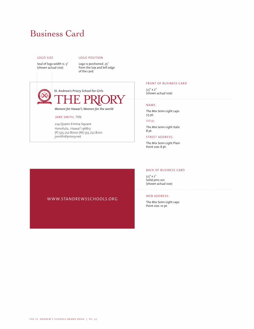
Business Card
naMe:
The Mix Semi-Light caps 7.5 pt.
title:
The Mix Semi-Light italic 8 pt.
Street addreSS:
The Mix Semi-Light Plain Point size: 8 pt.
224 Queen Emma Square Honolulu, Hawai‘i 96813 (P) 555.252.8000 (M) 555.252.8001 [email protected]
JANE SMITH , Title
WWW.STAN dr EWSSC HOOLS.OrG
back of buSineSS card
3.5" x 2" Solid pms 201 (shown actual size)
web addreSS:
The Mix Semi-Light caps Point size: 10 pt.
front of buSineSS card
3.5“ x 2“ (shown actual size)
logo PoSition
Logo is positioned .25" from the top and left edge of the card
logo Size
Seal of logo width is .5" (shown actual size)
T H E S T. A N d r E W ’ S S C H O O L S B r A N d B O O K | P G . 2 7

Samples of Use
T H E S T. A N d r E W ’ S S C H O O L S B r A N d B O O K | P G . 2 8
Admissions
WE ARE
Admissions
WE ARE
Admissions
WE ARE
Admissions
WE ARE
Admissions
WE AREAdmissions
WE ARE
Admissions
WE ARE

Advertising
T H E S T. A N d r E W ’ S S C H O O L S B r A N d B O O K | P G . 2 9
224 Queen Emma Square
Honolulu, Hawai‘i 96813
808.536.6102
www.priory.net
Open HouseWedneday, nov. 20th, 6-8 pm
toP of ad
The St. Andrew’s Schools logotype along with it’s tag appears in this space. Nothing is allowed above it.
This section gets 10% of the ad space. No logo should appear in this space.
Middle of the ad
The ad agency works with the remaining middle space (65%) to build their messages.
the bottoM of the ad
This section gets 25%+ of the ad space. The logo and tagline of the school running the ad should appear in this space along with the contact information.
All type and logos are reversed.