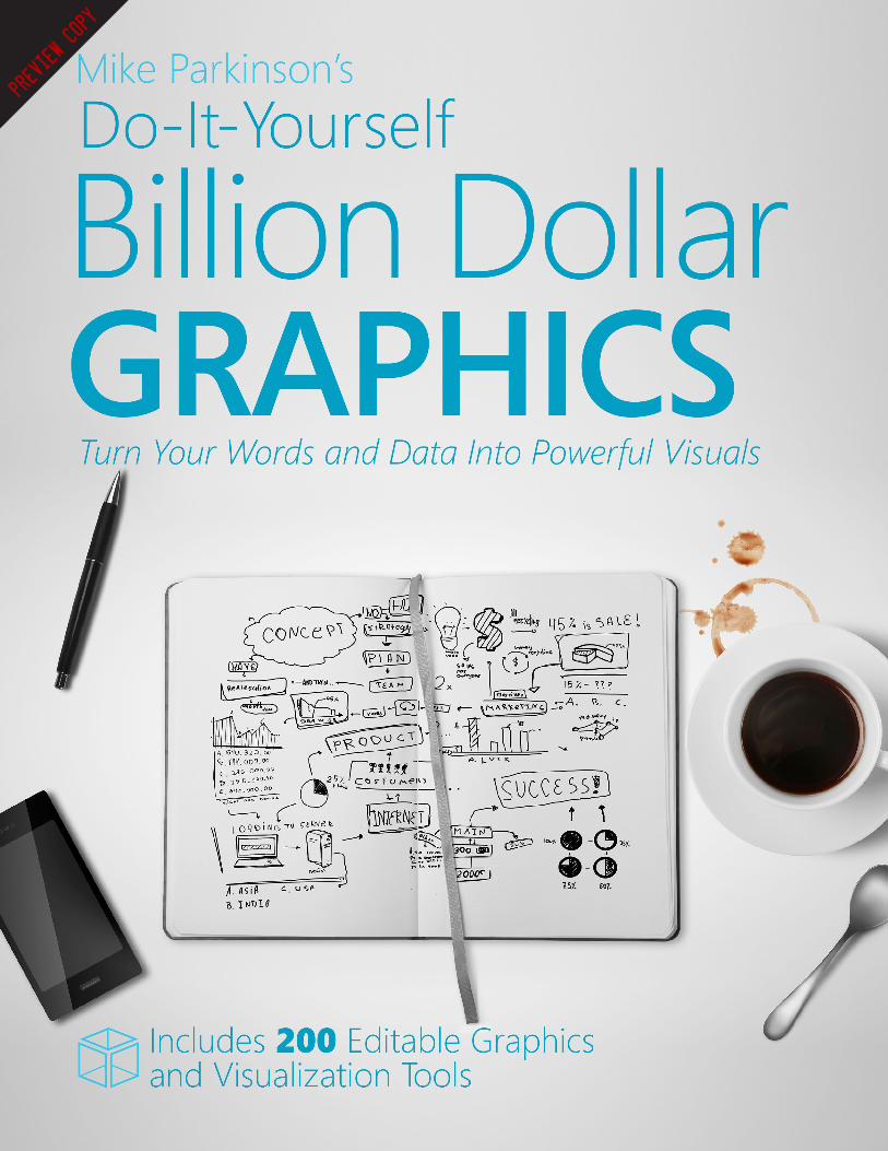
billion dollar graphics
TRANSCRIPT
Preview Copy
Mike Parkinson’s
Do-It-Yourself Billion Dollar GraphicsTurn Your Words and Data Into Powerful Visuals

Do-It-Yourself Billion Dollar Graphics: 3 Fast and Easy Steps to Turn Your Text and Ideas Into Persuasive Graphics. Copyright 2006-2016 by PepperLip, Inc. All rights reserved. No part of this book may be reproduced in any form or by any electronic or mechanical means without permission in writing from the publisher, except by a reviewer, who may quote brief passages in a review. Published by PepperLip Press, 7308 Ivycrest Place, Annandale, VA 22003. Second edition. Second printing.
Other fine tools and seminars are available. Visit BillionDollarGraphics.com to learn more.
All artwork, except where noted, was created by Mike Parkinson and 24 Hour Company. All graphics are devoid of proprietary content and, where applicable, permissions were granted to share the visuals with the general public. The following graphics were used with permission:
• page 65 - James Whistler’s Arrangement in Gray and Black: Portrait of the Artist’s Mother. Musee d’Orsay; Georges-Pierre Seurat’s A Sunday Afternoon on the Island of La Grand Jatte. The Art Institution of Chicago; Edgar Degas’ Dancers Practicing at the Bar. Metropolitan Museum of Art.
• pages 65 and 98 - shuttle graphic developed by NASA (nasa.gov)• pages 74 and 97 - Bonneville Generator graphic developed by U.S. Amy Corps of Engineers (images.usace.army.mil)• page 82 - revised New York City subway map developed by Kick Design (kickdesign.com)• page 98 - shuttle wing graphic developed by NASA (nasa.gov)• page 98 - compressor graphic developed by Bob Ulrich of Ulrich Digital ([email protected])• page 101 - flashlight graphic developed by Bob Ulrich of Ulrich Digital ([email protected]); engine diagram developed by Todd Harrison• page 107 - aqualis (upper right) developed by Bob Ulrich of Ulrich Digital ([email protected])• page 114 - security X-ray compliments of U.S. Transportation Security Administration (tsa.gov)
• page 114 - Border Patrol Communication Center compliments of U.S. Army (army.mil)
Edited by Jennifer Parkinson, Nanna Ingvarsson, and Colleen Jolly.Cover design by Mike Parkinson and interior design by Jennifer Parkinson and Mike Parkinson.Printed by Signature Book Printing, www.sbpbooks.comISBN: 978-1-4507-4011-1

About the Author
Mike Parkinson has spearheaded multi-billion dollar projects and created thousands of graphics resulting in billions of dollars in increased revenue for his clients. He is a multi-published author and is often requested to speak at national conferences, large and small companies, and graphic industry events.
Mike started his formal design training at the Baltimore School for the Arts. After four years of fine arts education, he attended the University of Maryland Baltimore County’s Digital Arts
Program. Upon graduation, he was hired as a graphic designer at a medical training company, where he was promoted to art director. Using his knowledge and understanding of visual communication, Mike has supported trial attorneys and created ad campaigns, tutorials, corporate briefings, Web portals, medical training software, and more. He was invited to become part owner of 24 Hour Company in 1999. Mike leveraged his design experience to help his partners transform the company into the industry leader. For over 20 years, Mike has helped Lockheed Martin, Dell, HP, Motorola, Raytheon, Northrop Grumman, BAE Systems, the National Security Agency and many other large and small companies and organizations succeed using visual communication.
Mike actively shares his graphic secrets with other professionals to help them realize their goals and dreams through better visual communication. In 2006, he founded Billion Dollar Graphics (www.BillionDollarGraphics.com) to offer articles, books, tools, and resources that provide tips, tricks, strategies, and best practices to non-designers and designers alike. In 2012, he launched and sold Get My Graphic to a leading learning company. Mike’s goal is to empower everyone to use clear, compelling graphics to achieve their success.
DedicationThis book is dedicated to my wife, Jennifer.
AcknowledgementsThank you to—in no particular order—Kathy Parkinson, Michael D. Parkinson, Barbara Parkinson, Betty Bock, Jeff Hall, Dennis Fitzgerald, Sandi Fitzgerald, Paul Kay, Von, Kay, Colleen Jolly, Robert Frey, Sheila McCarthy, Bob Ulrich, Connie Williams, Deanna Boudreau, Jay Schiavo, Denise Rhea-McKenzie, Debbie Rivera, Luis Figuera, Chris Prochaska, Marc Bolea, Nanna Ingvarsson, Kafi Johnson, Kevin Bush, Stacy Ross, Alvin Lowe, Kristi Arthur, Pat Bartlett, Lakin Jones, Debi Ratcliffe, Sheree Smith, Bridget Skelly, Jeanine Staab, Dana Thompson, Erycka Snyder, Derrick Pedranti, Chris Mahon, Kevin Beaumont, Steve Cummings, Megan Skuller, Joe Tedesco, Steve Kantor, Mo Fathelbab, Randy Morgan, Miles Fawcet, Griff Thomas, Beth Wingate, Ann Oliveri, Jack Banks, Mark Murphy, Stacia Kelly, M.J. Efflandt, Tony Arellano, Adam Ugolnik, and Pam Overton, David Winton, Andy Bounds, Rob Ransone, Chuck Keller, Bill Andre, Charlie Divine, Joe Jablonski, Barbara Esmedina, Chris Simmons, Jeanne Schulze, Kym Harrington, Elizabeth Goonan, Bobbie O’Brien, Ann Moss, Julia Maurer, Larry Tracy, Wendy Frieman, Carl Dickson, Diane Dickson, BJ Lownie, Azra Lownie, Jon Williams, and Olessia Smotrova-Taylor for your help and support.
Thanks to C2 Media (www.c2media.com), ENEXDI (www.enexdi.com), CapturePlanning.com, ProposalCafe.com, SalesEdge (www.salesedgellc.com), StrategicProposals (www.strategicproposals.com), PresentationXpert.com, Presenters and Programs Forum, Training Media Review (www.tmreview.com), Manage Smarter (www.managesmarter.com), Google (www.google.com), and the Association of Proposal Management Professionals (www.apmp.org).
A very special thank you to:
www.24hrco.com
To everyone who has helped and continues to help me with advice, ideas, and support, I extend a heartfelt thank you.
Table of Contents
Introduction: The Power of Graphics ...............................................................1
Chapter 1: The Lifecycle of a Successful Graphic ............................................9
Chapter 2: Step 1—Know the P.A.Q.S. ...........................................................13
The Primary Objective ...................................................................................14
The Audience .................................................................................................20
The Questions ................................................................................................22
The Subject Matter.........................................................................................24
P.A.Q.S. Questionnaire ..................................................................................27
Chapter 3: Step 2—Sketch ..............................................................................29
Four Methods.................................................................................................30
Design Techniques .........................................................................................49
Affecting Emotions ........................................................................................54
Conceptualization Conclusion .......................................................................68
Chapter 4: Step 3—Render .............................................................................69
Using a Graphic Designer...............................................................................76
Chapter 5: Problem Solving—Three Traps and Seven Rules .........................79
Three Traps ....................................................................................................79
Seven Rules ....................................................................................................81
Chapter 6: Graphic Types ................................................................................85
Area Chart......................................................................................................86
Bar Chart .......................................................................................................87
Before and After Graphic ...............................................................................88
Bridge Graphic ...............................................................................................89
Bubble Chart .................................................................................................90
Building Blocks ..............................................................................................91
Calendar ........................................................................................................92
Candlestick Chart ..........................................................................................93
Circle Charts ..................................................................................................94
Collage ...........................................................................................................95
Conveyor Belt Graphic ...................................................................................96
Cross Section Diagram ...................................................................................97
Cutaway Diagram ..........................................................................................98
Dashboard Graphic ........................................................................................99
Dome Graphic .............................................................................................100
Exploded Diagram .......................................................................................101
Floor Plan ....................................................................................................102
Funnel Graphic ............................................................................................103
Gantt Chart .................................................................................................104
Gauge Graphic .............................................................................................105
Gear Graphic ...............................................................................................106
Illustration ...................................................................................................107
Line Chart ....................................................................................................108
Looping Graphic ..........................................................................................109
Map Graphic ................................................................................................110
Network Diagram ........................................................................................111
Organizational Chart ...................................................................................112
Peg Graphic ..................................................................................................113
Photograph ..................................................................................................114
Pie Chart (or Segmented Chart) ...................................................................115
Pipe Graphic ................................................................................................116
Point Chart ..................................................................................................117
Process Diagram (or Flow Chart) .................................................................118
Puzzle Graphic .............................................................................................119
Pyramid Graphic ..........................................................................................120
Risk Matrix ..................................................................................................121
Road Graphic (or Path Graphic) ...................................................................122
Scale Graphic ...............................................................................................123
Spiral Graphic ..............................................................................................124
Stacked Diagram ..........................................................................................125
Stair Graphic ................................................................................................126
Step-by-step Graphic ....................................................................................127
Table (or Matrix) ..........................................................................................128
Timeline .......................................................................................................129
Vee Diagram.................................................................................................130
Venn Diagram ..............................................................................................131
Waterfall Diagram ........................................................................................132
Chapter 7: Conclusion ..................................................................................133
Testing What You’ve Learned .........................................................................135
Answers ..........................................................................................................139
Glossary ........................................................................................................141
Index ..............................................................................................................146
DO-IT-YOURSELF BILLION DOLLAR GRAPHICS 1
Introduction: The Power of Graphics
What we see has a profound effect on what we do, how we feel, and who we are. Through experience and experimentation, we continually increase our understanding of the visual world and how we are influenced by it. Psychologist Albert Mehrabian demonstrated that 93% of communication is nonverbal.* Studies find that the human brain deciphers image elements simultaneously, while language is decoded in a linear, sequential manner taking more time to process. Our minds react differently to visual stimuli.
Relatively speaking, in terms of communication, textual ubiquity is brand new. Thanks to millions of years of evolution, we are genetically wired to respond differently to visuals than text. For example, humans have an innate fondness for images of wide, open landscapes, which evoke an instant sense of well-being and contentment. Psychologists hypothesize that this almost universal response stems from the years our ancestors spent on the savannas in Africa.1
People think using pictures. John Berger, media theorist, writes in his book Ways of Seeing (Penguin Books, 1972), “Seeing comes before words … The child looks and recognizes before it can speak.” Dr. Lynell Burmark, Ph.D. Associate at the Thornburg Center for Professional Development and writer of several books and papers on visual literacy, said, “… unless our words, concepts, ideas are hooked
*Dr. Mehrabian notes that the actual percentage varies situationally but nonverbal communication carries great weight.1. Stevenson Johnson, “Beauty and the Beastly PC, The Graphics on Your Screen Can Affect the Way You Feel—and Think,” Discover Volume 25: Number 5 (May 2004): 20-21.
Q U I C K N O T E
According to a study by the
United States Armed Forces,
83% of what we learn is
through our eyes.
2 Introduction: The Power of Graphics
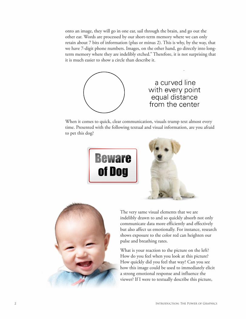
onto an image, they will go in one ear, sail through the brain, and go out the other ear. Words are processed by our short-term memory where we can only retain about 7 bits of information (plus or minus 2). This is why, by the way, that we have 7-digit phone numbers. Images, on the other hand, go directly into long-term memory where they are indelibly etched.” Therefore, it is not surprising that it is much easier to show a circle than describe it.
When it comes to quick, clear communication, visuals trump text almost every time. Presented with the following textual and visual information, are you afraid to pet this dog?
The very same visual elements that we are indelibly drawn to and so quickly absorb not only communicate data more efficiently and effectively but also affect us emotionally. For instance, research shows exposure to the color red can heighten our pulse and breathing rates.
What is your reaction to the picture on the left? How do you feel when you look at this picture? How quickly did you feel that way? Can you see how this image could be used to immediately elicit a strong emotional response and influence the viewer? If I were to textually describe this picture,
DO-IT-YOURSELF BILLION DOLLAR GRAPHICS 3
your emotional reaction would not be as strong, and it would take more time for you to digest the information. J. Francis Davis, an adult educator and media education specialist, captured it well when he said, “… in our culture pictures have become tools used to elicit specific and planned emotional reactions in the people who see them.” Visuals are not only excellent communicators but also quickly affect us psychologically and physiologically.
Don Norman, author of Emotional Design, said in a Discover magazine article, “Beauty and the Beastly PC: The Graphics on Your Computer Screen Can Affect the Way You Feel—and Think,”
“I started out as an engineer, and I thought that what was really important was that something
worked. Appearance—how could that matter? And yet for some reason, I would still buy attrac-
tive things, even if they didn’t work as well as the less attractive ones. This puzzled me. In the
last two years, I’ve finally come to understand that it’s a result of the extremely tight coupling
between emotion and cognition. Emotion is about judging the world, and cognition is about
understanding. They can’t be separated.”
How many times have you heard, “I didn’t believe it until I saw it.” Studies show that the old saying “seeing is believing” is mostly true. Of course, we know that what we see can be manipulated, but the point is that visuals are persuasive. The Stanford Persuasive Technology Lab asked 2,440 participants how they evaluated the credibility of websites they were shown. Almost half (46.1%) said the website’s design (color, graphics, layout, etc.) was the number one criterion for discerning the credibility of the presented material. The following are some of the captured participant comments:
“This site is more credible. I find it to be much more professional looking.” — M, 38, Washington
“More pleasing graphics, higher-quality look and feel …” — F, 52, Tennessee
“Just looks more credible.” — M, 24, New Jersey
“I know this is superficial, but the first thing that struck me is the color difference. The … site is
a soothing green (sort of like money) while the [other] site is a jarring purple.” — M, 56, Virginia
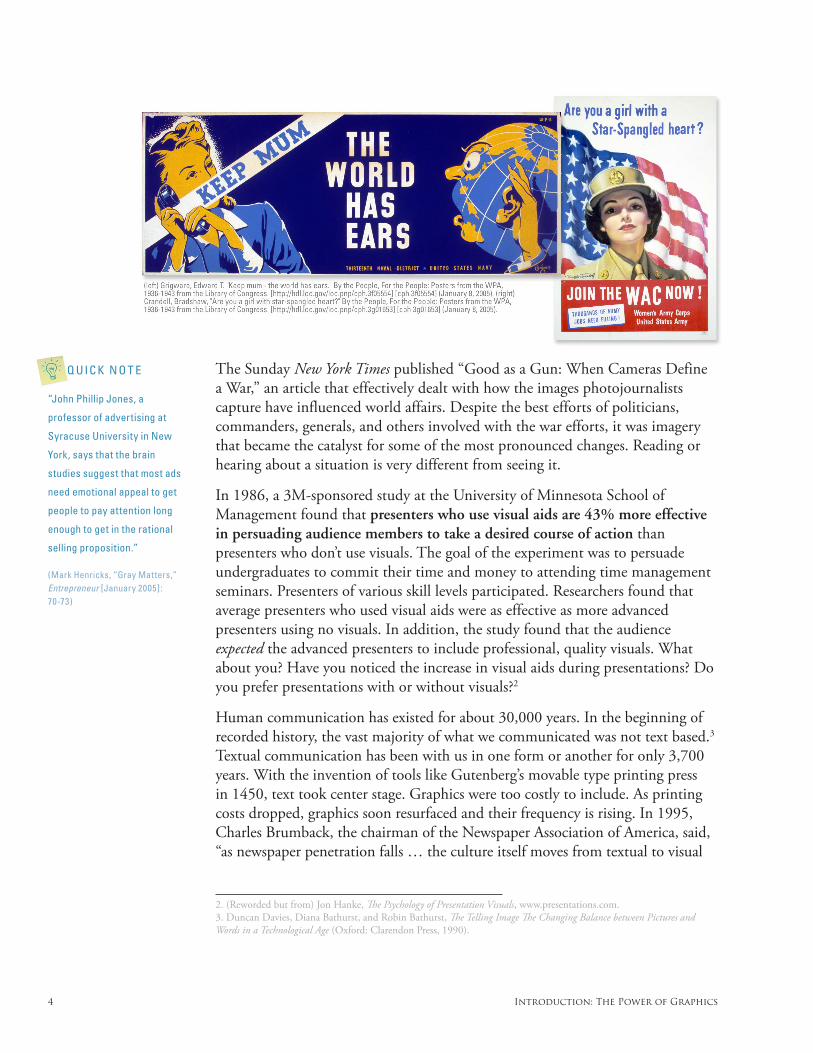
The ability of visual stimuli to communicate and influence is undeniable and inescapable. Through evolution, human beings are compelled to view and disseminate visuals. Recognizing the importance of visual communication is key to your success. Allen Ginsberg, poet and author, stated, “Whoever controls the media—the images—controls the culture.” As early as the late nineteenth century, advertisers, based on their collective experience, were convinced that illustrations sold goods. World War II propaganda posters were very effective at manipulating popular opinion.
Q U I C K N O T E
“Patrick Renvoise,
cofounder of SalesBrain, LLC
and co-author of Neuro-
marketing: Is There a “Buy
Button” in the Brain? Selling
to the Old Brain for Instant
Success, says we should
rethink marketing to reflect
current brain understand-
ing. To start with, marketing
should be more visual and
less verbal. Areas of the brain
are much older than those
of language, Renvoise says.
That has implications for any-
one attempting to influence
decision makers. ‘A lot of
entrepreneurs talk about their
benefit or solution and don’t
use a strong visual metaphor,’
Renvoise says. ‘And it’s very
hard to convince people using
words when their organ of
decision is primarily vision.’”
(Mark Henricks, “Gray Matters,” Entrepreneur [January 2005] : 70-73)
4 Introduction: The Power of Graphics
The Sunday New York Times published “Good as a Gun: When Cameras Define a War,” an article that effectively dealt with how the images photojournalists capture have influenced world affairs. Despite the best efforts of politicians, commanders, generals, and others involved with the war efforts, it was imagery that became the catalyst for some of the most pronounced changes. Reading or hearing about a situation is very different from seeing it.
In 1986, a 3M-sponsored study at the University of Minnesota School of Management found that presenters who use visual aids are 43% more effective in persuading audience members to take a desired course of action than presenters who don’t use visuals. The goal of the experiment was to persuade undergraduates to commit their time and money to attending time management seminars. Presenters of various skill levels participated. Researchers found that average presenters who used visual aids were as effective as more advanced presenters using no visuals. In addition, the study found that the audience expected the advanced presenters to include professional, quality visuals. What about you? Have you noticed the increase in visual aids during presentations? Do you prefer presentations with or without visuals?2
Human communication has existed for about 30,000 years. In the beginning of recorded history, the vast majority of what we communicated was not text based.3 Textual communication has been with us in one form or another for only 3,700 years. With the invention of tools like Gutenberg’s movable type printing press in 1450, text took center stage. Graphics were too costly to include. As printing costs dropped, graphics soon resurfaced and their frequency is rising. In 1995, Charles Brumback, the chairman of the Newspaper Association of America, said, “as newspaper penetration falls … the culture itself moves from textual to visual
2. (Reworded but from) Jon Hanke, The Psychology of Presentation Visuals, www.presentations.com.3. Duncan Davies, Diana Bathurst, and Robin Bathurst, The Telling Image The Changing Balance between Pictures and Words in a Technological Age (Oxford: Clarendon Press, 1990).
Q U I C K N O T E
“John Phillip Jones, a
professor of advertising at
Syracuse University in New
York, says that the brain
studies suggest that most ads
need emotional appeal to get
people to pay attention long
enough to get in the rational
selling proposition.”
(Mark Henricks, “Gray Matters,” Entrepreneur [January 2005] : 70-73)
DO-IT-YOURSELF BILLION DOLLAR GRAPHICS 5
literacy.”4 Gunther Kress is a Professor of English and Education at the School of Education, University of London. His research confirms this changeover. As an example, Kress compares science textbooks from 1936 and 1988 showing that textbooks have progressed from a majority of text to a majority of graphics.5
The change isn’t limited to textbooks and newspapers. Signs, maps, instructions, schematics, icons, symbols, and packaging sell products, warn of possible hazards, and give visual direction when words alone are not sufficient. Graphics are found on websites, TV shows, appliances, and computers; in vehicles and books; and at museums, malls, restaurants, and grocery stores. More and more professions that rely heavily on communication and persuasion are embracing graphics as a tool of choice. In the Boston Globe article, “Courtroom Graphics Come of Cyber-Age,” author Sacha Pfeiffer found that “… new technologies—and a new willingness in legal circles to embrace them—have taken the use of visual images in the courtroom to a level unimaginable even a decade ago … The result is a slow but significant shift in the way many trial lawyers, who historically have relied largely on their verbal skills to sway juries, try cases ... More prosecutors see high-tech graphics not as a luxury, but as a necessity.”
Graphic communication is more ubiquitous than ever before. Why? Because graphics do what text alone cannot do. They quickly affect us both cognitively and emotionally:
1) Cognitively: Graphics expedite and increase our level of communication. They increase comprehension, recollection, and retention. Visual clues help us decode text and attract attention to information or direct attention increasing the likelihood that the audience will remember.6
2) Emotionally: Pictures enhance or affect emotions and attitudes.7 Graphics engage our imagination and heighten our creative thinking by stimulating other areas of our brain (which in turn leads to a more profound and accurate understanding of the presented material).8 It is no secret that emotions influence decision-making:
“(Emotions) play an essential role in decision making, perception, learning, and more ...
they influence the very mechanisms of rational thinking.”9
4. M. Fitzgerald, “NAA Leaders Disagree Over Value Cyberspace,” International Federation of Newspaper Publishers Re-search Association 128(12) (1995): 48-49.5. “‘English’ at the Crossroads: Rethinking Curricula of Communication in the Context of a Turn to the Visual”6. W.H. Levie and R. Lentz, “Effects of Text Illustrations: A Review of Research,” Educational Communications and Tech-nology Journal 30 (4) (1982): 195-232.7. W.H. Levie and R. Lentz, “Effects of Text Illustrations: A Review of Research,” Educational Communications and Tech-nology Journal 30 (4) (1982): 195-232.8. D. Bobrow and D. Norman, “Some Principles of Memory Schemata,” (in D. Bobrow and A.Collins [eds.]), Representa-tion and Understanding: Studies in Cognitive Science (New York: Academic Press, 1975): 131-149. and D. Rumelhart, “Schemata: The Building Blocks of Cognition,” (in R.J. Spiro, B.C. Bruce and W.F. Brewer [eds.]), Theoretical Issues in Reading Comprehension (Hillsdale, New Jersey: Lawrence Erlbaum Associate, 1980), 33-58.9. H. van Oostendorp, J. Preece and A.G. Arnold (guest editorial), “Designing Multimedia for Human Needs and Capa-bilities,” Interacting with Computers Volume 12, Issue 1 (September 1999): 1-5.
Q U I C K N O T E
The motion picture industry
uses storyboards or
animatics to tell the story
prior to filming. Actions,
framing, pacing, lighting,
and a host of critical details
are communicated to the
production crew and actors
using storyboards and
animatics.
6 Introduction: The Power of Graphics
Behavioral Psychologists agree that most of our decisions are based on intuitive judgment and emotions. Herbert A. Simon, Nobel Prize winning scholar at the Carnegie Mellon Institute in Pittsburgh, studied corporate decision-making and found that people often ignored formal decision-making models because of time constraints, incomplete information, the inability to calculate consequences, and other variables. Intuitive judgment was the process for most decisions. Neurologist Antonio Damasio studied research on patients with damaged ventromedial frontal cortices of the brain, which impaired their ability to feel but left their ability to think analytically intact. Damasio discovered that the patients were unable to make rational decisions even though their ability to reason was fully functional. He concluded that reasoning “depends, to a considerable extent, on a continual ability to experience feelings.”10
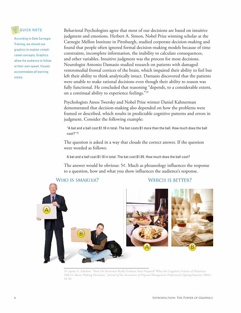
Psychologists Amos Twersky and Nobel Prize winner Daniel Kahnerman demonstrated that decision-making also depended on how the problems were framed or described, which results in predictable cognitive patterns and errors in judgment. Consider the following example:
“A bat and a ball cost $1.10 in total. The bat costs $1 more than the ball. How much does the ball
cost?”10
The question is asked in a way that clouds the correct answer. If the question were worded as follows:
A bat and a ball cost $1.10 in total. The bat cost $1.05. How much does the ball cost?
The answer would be obvious: 5¢. Much as phraseology influences the response to a question, how and what you show influences the audience’s response.
10. Jayme A. Sokolow, “How Do Reviewers Really Evaluate Your Proposal? What the Cognitive Science of Heuristics Tells Us About Making Decisions,” Journal of the Association of Proposal Management Professionals (Spring/Summer 2004): 34-50.
Q U I C K N O T E
According to Dale Carnegie
Training, we should use
graphics to explain compli-
cated concepts. Graphics
allow the audience to follow
at their own speed. Visuals
accommodate all learning
styles.
DO-IT-YOURSELF BILLION DOLLAR GRAPHICS 7
So visuals are processed faster than text, graphics quickly affect our emotions, and our emotions greatly affect our decision-making. If most of our decisions are based on relatively quick intuitional judgment and emotions, then how many decisions are influenced by visually appealing, easily digested graphics? The answer is no secret to advertisers.
Billions of dollars are spent annually to find the right imagery to sell a product, service, or idea. The U.S. military spent $598 million in 2003 on advertising to increase “brand identity” and meet their annual recruitment goals. Nike spent $269 million in 2001 on its image to sell more products. Anheuser-Busch spent $440 million to promote its products in 2001. Pepsi budgeted over $1 billion in 2001 on its image. Not to be outdone, Coca-Cola budgeted $1.4 billion for its image in the same year. The food industry spent over $12 billion on advertising and image in 2010 (over $4 billion of that was spent by fast food restaurants). Graphics help create “brand identity.” Visuals paint the picture of who the advertiser is, what they stand for, and how the audience may benefit. Graphics sell because of their ability to influence. How you use graphics greatly affects how you and your business are perceived.
Study after study, experiment after experiment has proven graphics have immense influence over the audience’s perception of the subject matter and, by association, the presenter (the person, place, or thing most associated with the graphic) because of these neurological and evolutionary factors. The audience’s understanding of the presented material, opinion of the presented material and the presenter, and their emotional state are crucial factors in any decision they will make. Without a doubt, graphics greatly influence an audience’s decisions. Whoever properly wields this intelligence has a powerful advantage over their competition.
Larry Tracy, who now trains corporate executives to make oral presentations for government contracts, headed the Pentagon’s top briefing team and worked for years with the Department of State. He was aware that graphics were so influential in the government’s decision to purchase goods and services that bad buying decisions were made based on the quality of the visuals in the presented materials. This has in turn led to the government, at times, putting constraints on presented graphics by requiring black and white submissions or even requiring that no graphics be used in a presentation to reduce the likelihood of high-quality, polished graphics unfairly persuading evaluators.
I spent many years analyzing how the proposal industry works (an industry that focuses on the submission of written and oral presentations to secure work that will increase or maintain a company’s revenue). I found that the priority of graphic development increases as award value rises. This industry understands the influence that graphics have on their audience. It is common knowledge to companies like Northrop Grumman, Raytheon, Boeing, and Lockheed Martin that graphics are an essential part of winning new government business. In fact, it
Q U I C K N O T E
According to studies
performed at the Wharton
School at the University of
Pennsylvania, the University
of Minnesota Management
Information Systems
Research Center, and 3M:
• Peopleagreemorewitha
position when presented
with visuals.
• Peoplewillpaycloser
attention and react more
positively when visuals
are used.
• Thequalityofameeting
is increased by the use
of visuals.
Q U I C K N O T E
“‘Fifteen years ago, com-
panies competed on price.
Today it’s quality. Tomorrow
it’s design.’—Bob Hayes,
professor emeritus at Harvard
Business School”
(Tom Peters, Design [DK Publishing, Inc., 2005])
8 Introduction: The Power of Graphics
is not uncommon, when exceptional graphics are used, for government evaluators to commend the presenter on their use of graphics.
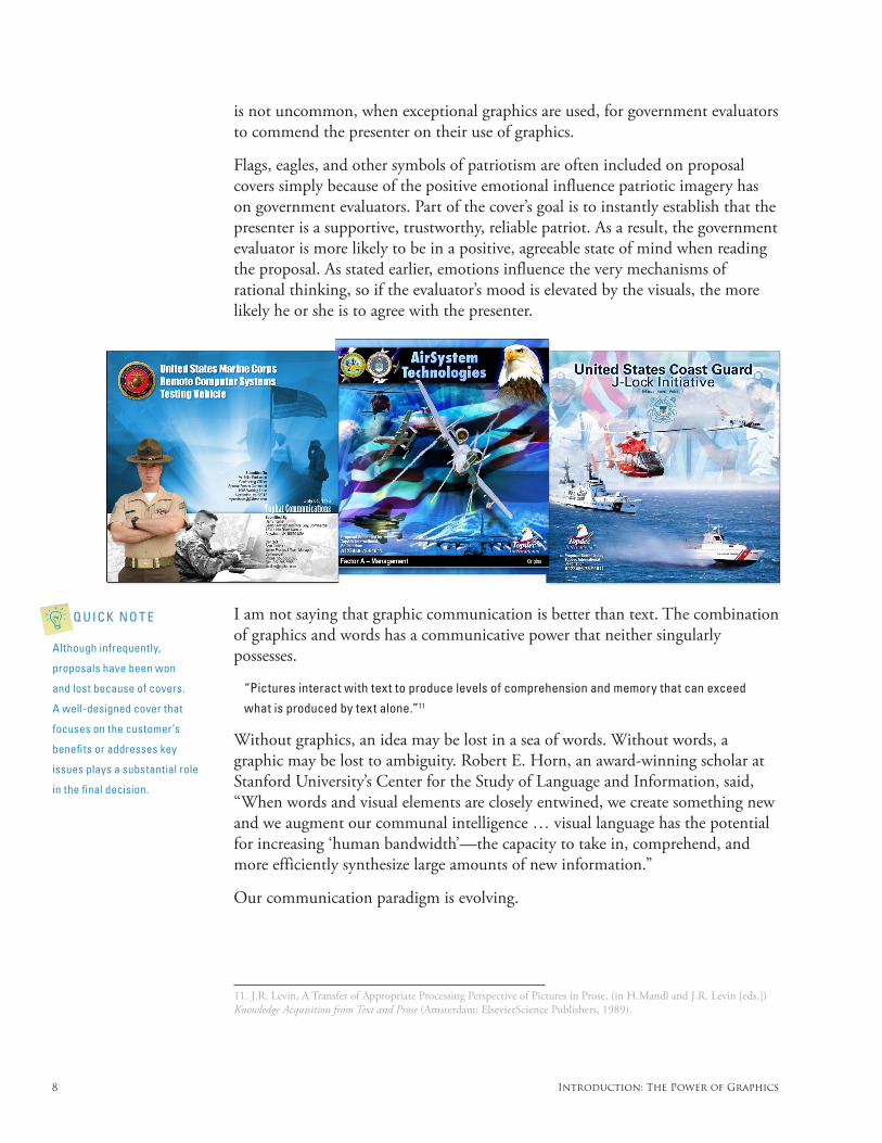
Flags, eagles, and other symbols of patriotism are often included on proposal covers simply because of the positive emotional influence patriotic imagery has on government evaluators. Part of the cover’s goal is to instantly establish that the presenter is a supportive, trustworthy, reliable patriot. As a result, the government evaluator is more likely to be in a positive, agreeable state of mind when reading the proposal. As stated earlier, emotions influence the very mechanisms of rational thinking, so if the evaluator’s mood is elevated by the visuals, the more likely he or she is to agree with the presenter.
I am not saying that graphic communication is better than text. The combination of graphics and words has a communicative power that neither singularly possesses.
“Pictures interact with text to produce levels of comprehension and memory that can exceed
what is produced by text alone.”11
Without graphics, an idea may be lost in a sea of words. Without words, a graphic may be lost to ambiguity. Robert E. Horn, an award-winning scholar at Stanford University’s Center for the Study of Language and Information, said, “When words and visual elements are closely entwined, we create something new and we augment our communal intelligence … visual language has the potential for increasing ‘human bandwidth’—the capacity to take in, comprehend, and more efficiently synthesize large amounts of new information.”
Our communication paradigm is evolving.
11. J.R. Levin, A Transfer of Appropriate Processing Perspective of Pictures in Prose, (in H.Mandl and J.R. Levin [eds.]) Knowledge Acquisition from Text and Prose (Amsterdam: ElsevierScience Publishers, 1989).
Q U I C K N O T E
Although infrequently,
proposals have been won
and lost because of covers.
A well-designed cover that
focuses on the customer’s
benefits or addresses key
issues plays a substantial role
in the final decision.
DO-IT-YOURSELF BILLION DOLLAR GRAPHICS 9
Chapter 1: The Lifecycle of a Successful Graphic
There are two tiers of communication for all graphics: Surface (Cognitive) and Subsurface (Emotional).
Surface (Cognitive)Surface communication is the cognitive process surrounding reading, understanding, and/or learning from the information presented. In other words, it is the graphic’s ability to communicate information that is consistent with your primary objective, such as selling a product or service.
All visuals communicate information:
• Alogocommunicatesthepresenter’sidentityorinformationaboutapresenter’s product or service.
• Aphotographcommunicatesthestylingofanewcarorthelookofanewjacket.
• Abookcovercommunicatesthesubjectmatterofabook.• Assemblyinstructionscommunicatehowtoputabookshelftogether.• Aprocessdiagramconveysthereviewprocessofanevaluationcommittee
or an overview of how binary code is processed.
Subsurface (Emotional)Subsurface communication is the subconscious effect a graphic and its content has on our emotional state—our state of mind.
Many visuals are designed to affect us emotionally. According to independent research, everything we see elicits an emotional response that affects our state of mind—whether we realize it or not. Many graphics harness this aspect of human perception in an effort to influence and motivate the audience. For example, pictures of beautiful people sell us handbags, images of starving children plead with us to donate money, patriotic pictures instill trust and influence us to join the military, even the use of the color red quickens our pulse and influences our mood.
Surface and subsurface communication are tightly linked. Each affects the other. All surface and subsurface data interact to form a cohesive picture of the
Q U I C K N O T E
Jin Woo Kim, professor at
Yonsei University, and Jae
Yun Moon, assistant profes-
sor at Hong Kong University
of Science and Technology,
found that manipulating visual
design factors could induce
a target emotion such as
trustworthiness.
(J. Kim and J.Y. Moon, “Designing Towards Emotional Usability in Customer Interfaces—Trustwor-thiness of Cyber-banking System Interfaces,” Interacting with Computers Volume 10: Issue 1 [March 1998] : 1-29)
Q U I C K N O T E
Using visuals
• ...improveslearning
• ...takesupto62%lesstime
to explain complex ideas
• ...improvesretention
up to 86%
(Based on my research.)
10 Chapter 1: The Lifecycle of a Successful Graphic
presenter and their offerings to the audience. Assuming no other input, these elements combine to create the audience’s lasting impression of the presenter and ultimately results in a final judgment.
In the world of visual communication there are two principal needs:
1) Communicate information
2) Influence or motivate the audience
Aside from those graphics used for pure statistical analysis of empirical data, almost all graphics are influencing the audience to agree with the presenter and arrive at an intended conclusion. It is the intent of the conceptualizer that determines the extent to which subsurface communication is utilized to achieve the primary objective.
A successful graphic should answer the audience’s questions. It should answer the audience’s who, what, where, when, why, and/or how questions. Since everything we see elicits an emotional response that affects our state of mind, the graphic will also communicate other, less identifiable, subsurface ideas such as the credibility, competency, professionalism, reliability, creativity, and strength of the presenter. Your goal is to elicit emotions in the audience that support the author’s and presenter’s goals.
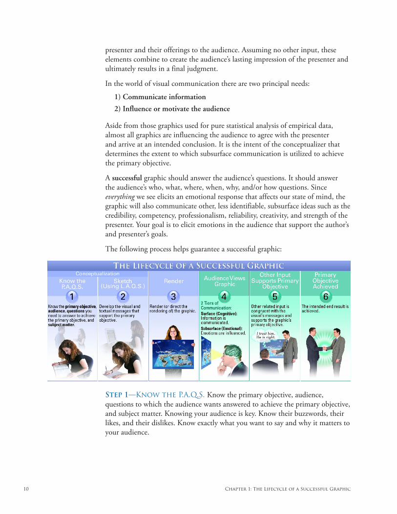
The following process helps guarantee a successful graphic:
Step 1—Know the P.A.Q.S. Know the primary objective, audience, questions to which the audience wants answered to achieve the primary objective, and subject matter. Knowing your audience is key. Know their buzzwords, their likes, and their dislikes. Know exactly what you want to say and why it matters to your audience.
DO-IT-YOURSELF BILLION DOLLAR GRAPHICS 11
Step 2—Conceptualize your graphic. Use the four methods, thirteen design techniques, and twelve techniques for affecting emotions found later in this book to quickly turn any idea into a clear, communicative, compelling visual.
Step 3—Render your graphic (or direct the rendering of your graphic). Be sure your image is rendered the right way. Your graphic should be clean, concise, aesthetically appealing, error free, and rendered in a style faithful to the subject matter and your audience. (You will learn the secrets in Chapters 3 and 4.)
When it is time to present your visual, your graphic has only one other hurdle to jump before accomplishing its primary objective: outside influences. Unfortunately, there are other less controllable and accountable elements that determine audience acceptance. An example is a technical glitch like the loss of power or a computer malfunction. Your graphic’s success is contingent upon the audience’s
• perception(factualornot)ofthepresenter,thematerial,andthe environment• biases• lifeexperience• openmindedness• intelligence• comfort• stateofmind
Consider the following two scenarios:
Scenario 1: A professionally designed, factually accurate PowerPoint presentation contains your
graphic. Unfortunately, the oral presenter is disheveled and dressed inappropriately, wearing a
t-shirt, shorts, and sneakers. The presenter’s appearance distracts the audience from the mate-
rial. Whether your graphic is perceived as credible and factual is now in question.
Scenario 2: Due to past experience, the audience is biased against the presenter. They may have
experienced poor customer service or once owned a defective product made by the presenter’s
company. Acceptance may not occur.
The court system is a perfect example of an industry that mitigates the potential risk of outside influences. Attorneys, aware of the damage preexisting prejudices may have, prepare special questions to weed out jurors who may cost them the win. For high profile cases, chosen jurors are often sequestered to avoid the likelihood that outside influences will affect their decisions.
Controllable elements (data accuracy, spelling, room temperature) as well as outside influences (unintended associations, unexpected technical glitches) can determine whether or not your graphic is given the positive attention it requires to succeed. For this reason, take into account as many variables as possible
Q U I C K N O T E
“Speak, not so that you may
be understood, but so that you
cannot be misunderstood.”
(Quintilian)

12 Chapter 1: The Lifecycle of a Successful Graphic
during the creation and presentation of your graphic. The goal is that everything associated with your graphic is congruent with its primary objective.
It is not necessary for one person to perform all of the steps involved to create a successful graphic. The entire process can be collaborative. For example, one person may have customer insight, another may be a subject matter expert, while others may hold the remaining pieces of the puzzle. Together they may possess the necessary knowledge to produce a successful graphic.
Your visual depictions are limited only by your (or your group’s) imagination and the audience’s understanding of the visual representation you choose. Be creative and have fun.

DO-IT-YOURSELF BILLION DOLLAR GRAPHICS 13
Step
1—
P.A
.Q.S
.
Chapter 2: Step 1—Know the P.A.Q.S.
First, know what you wish to accomplish. What is your primary objective (P)? In a perfect world, what would the audience do or think after viewing your graphic?
Second, know your audience (A). Know who they are, what they want to see, and why they should care. Learn what your audience truly desires. Your target audience is the sole reason why you are creating your visual. Tailor your graphic to your target audience. Make sure your audience can see themselves in your graphic. Connect with their world.
Third, know (and answer) the questions (Q) to which your audience needs answers so that your graphic can achieve its primary objective. Put yourself in their shoes. What would you want to know to move forward? What is it about your graphic that helps your audience? Make it obvious. Highlight your features, benefits, and discriminators. Focus on the audience’s wants and needs.
Fourth, know the subject matter (S). How could you answer the audience’s questions without an understanding of the presented topic? The more you understand your subject matter, the more likely your graphic will be successful.
Knowing your P.A.Q.S. is vital to the success of your graphic. Finding this information is 50% of the conceptualization process. Without it, you are conceptualizing in the dark.
Q U I C K N O T E
Legendary philosopher
Harry Overstreet wrote in
Influencing Human Behavior,
“Action springs out of what
we fundamentally desire.”
14 Chapter 2: Step 1—Know the P.A.Q.S.
Step
1—
P.A
.Q.S
.
The Primary ObjectiveKnow the primary objective of your graphic. The primary objective is the goal or the conclusion at which your audience arrives after viewing your graphic. It is the purpose for which you created your graphic. Your goal may be to simply share information, sell a product or service, explain quantum physics, or help someone navigate the streets of the city as easily as possible. Every graphic has a primary objective.
Your primary objective determines your content. For example, the objective of your graphic might be to convince your audience that a new process for employee orientation is better than the old process. This objective would govern what information you include in your visual.
To establish the primary objective you need to understand the purpose your graphic serves. Essentially, ask yourself, “So what? Why does your audience care?” Once you determine its purpose, there are two possible paths you can choose when developing your graphic:
1) Communicate information. (Your goal is to explain or clarify only. Influencing your audience is not the focus.)2) Influence or motivate. (Includes the explanation or clarification needed to persuade your audience.)
Communicate Information
If your goal is to communicate information, your primary objective is to share facts that educate your audience. The following are examples of primary objectives that explain or clarify and the associated graphic.
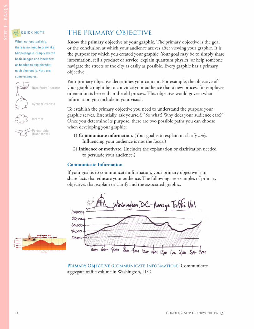
Primary Objective (Communicate Information): Communicate aggregate traffic volume in Washington, D.C.
Q U I C K N O T E
When conceptualizing,
there is no need to draw like
Michelangelo. Simply sketch
basic images and label them
as needed to explain what
each element is. Here are
some examples:
Data Entry Operator
Cyclical Process
Internet
Partnership(Handshake)
DO-IT-YOURSELF BILLION DOLLAR GRAPHICS 15
Step
1—
P.A
.Q.S
.
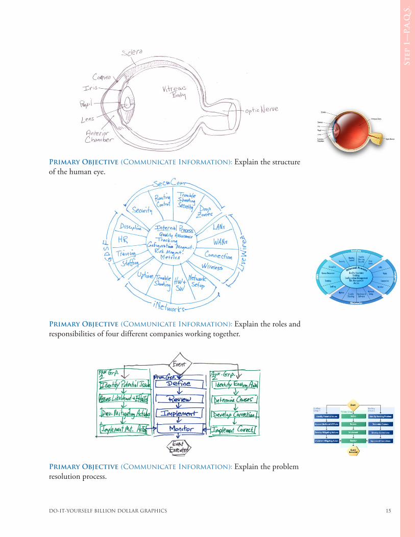
Primary Objective (Communicate Information): Explain the structure of the human eye.
Primary Objective (Communicate Information): Explain the roles and responsibilities of four different companies working together.
Primary Objective (Communicate Information): Explain the problem resolution process.
16 Chapter 2: Step 1—Know the P.A.Q.S.
Step
1—
P.A
.Q.S
.
Influence or Motivate
If your goal is to influence or motivate, your primary objective must include a benefit and how the benefit will be accomplished. (The “how” can be a discriminator when appropriate.) In business, it is often the case that the goal is to persuade. Most authors of graphics fall prey to misunderstanding the true purpose of their graphic. They forget to see it from their audience’s perspective. The following example shows how to turn a bad primary objective into an excellent primary objective where the goal is to influence.
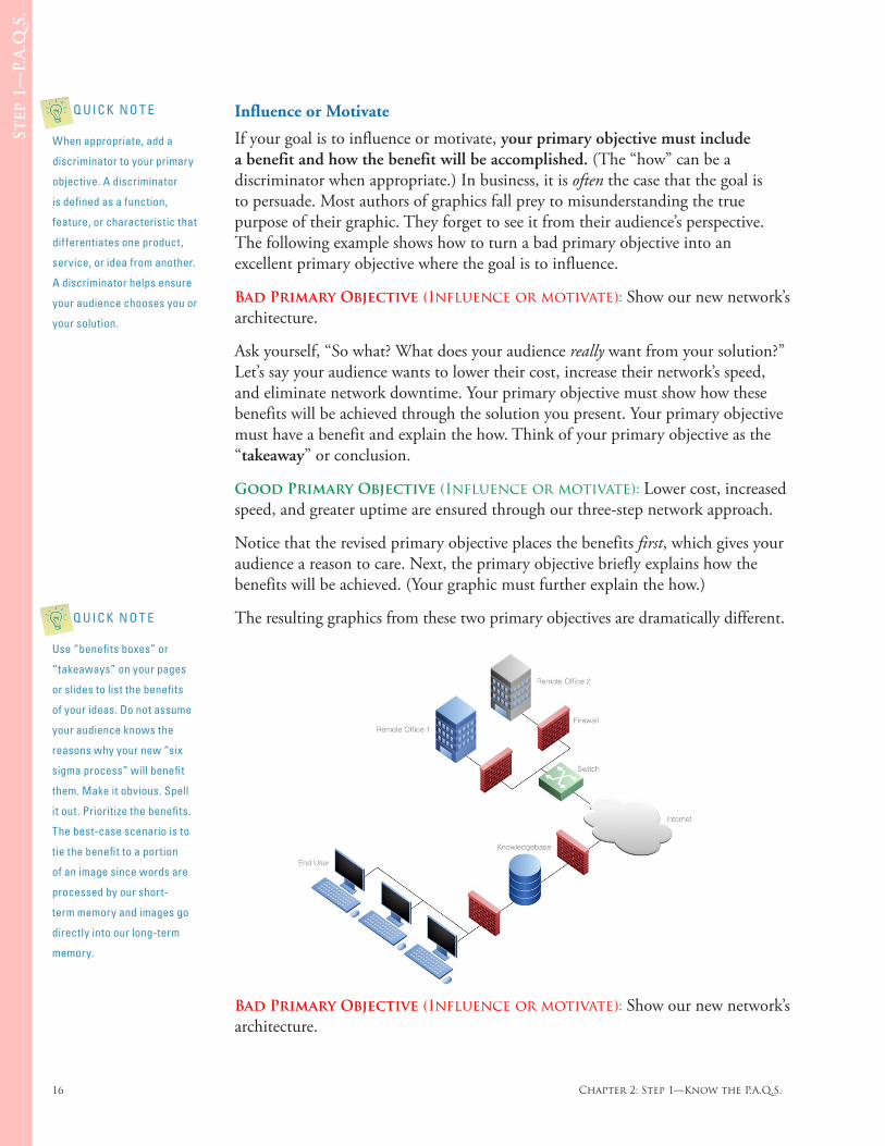
Bad Primary Objective (Influence or motivate): Show our new network’s architecture.
Ask yourself, “So what? What does your audience really want from your solution?” Let’s say your audience wants to lower their cost, increase their network’s speed, and eliminate network downtime. Your primary objective must show how these benefits will be achieved through the solution you present. Your primary objective must have a benefit and explain the how. Think of your primary objective as the “takeaway” or conclusion.
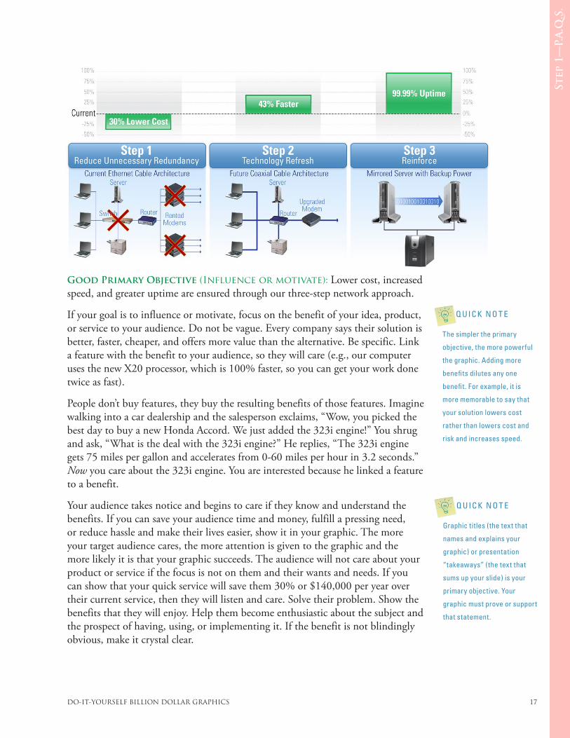
Good Primary Objective (Influence or motivate): Lower cost, increased speed, and greater uptime are ensured through our three-step network approach.
Notice that the revised primary objective places the benefits first, which gives your audience a reason to care. Next, the primary objective briefly explains how the benefits will be achieved. (Your graphic must further explain the how.)
The resulting graphics from these two primary objectives are dramatically different.
Bad Primary Objective (Influence or motivate): Show our new network’s architecture.
Q U I C K N O T E
Use “benefits boxes” or
“takeaways” on your pages
or slides to list the benefits
of your ideas. Do not assume
your audience knows the
reasons why your new “six
sigma process” will benefit
them. Make it obvious. Spell
it out. Prioritize the benefits.
The best-case scenario is to
tie the benefit to a portion
of an image since words are
processed by our short-
term memory and images go
directly into our long-term
memory.
Q U I C K N O T E
When appropriate, add a
discriminator to your primary
objective. A discriminator
is defined as a function,
feature, or characteristic that
differentiates one product,
service, or idea from another.
A discriminator helps ensure
your audience chooses you or
your solution.
DO-IT-YOURSELF BILLION DOLLAR GRAPHICS 17
Step
1—
P.A
.Q.S
.
Good Primary Objective (Influence or motivate): Lower cost, increased speed, and greater uptime are ensured through our three-step network approach.
If your goal is to influence or motivate, focus on the benefit of your idea, product, or service to your audience. Do not be vague. Every company says their solution is better, faster, cheaper, and offers more value than the alternative. Be specific. Link a feature with the benefit to your audience, so they will care (e.g., our computer uses the new X20 processor, which is 100% faster, so you can get your work done twice as fast).
People don’t buy features, they buy the resulting benefits of those features. Imagine walking into a car dealership and the salesperson exclaims, “Wow, you picked the best day to buy a new Honda Accord. We just added the 323i engine!” You shrug and ask, “What is the deal with the 323i engine?” He replies, “The 323i engine gets 75 miles per gallon and accelerates from 0-60 miles per hour in 3.2 seconds.” Now you care about the 323i engine. You are interested because he linked a feature to a benefit.
Your audience takes notice and begins to care if they know and understand the benefits. If you can save your audience time and money, fulfill a pressing need, or reduce hassle and make their lives easier, show it in your graphic. The more your target audience cares, the more attention is given to the graphic and the more likely it is that your graphic succeeds. The audience will not care about your product or service if the focus is not on them and their wants and needs. If you can show that your quick service will save them 30% or $140,000 per year over their current service, then they will listen and care. Solve their problem. Show the benefits that they will enjoy. Help them become enthusiastic about the subject and the prospect of having, using, or implementing it. If the benefit is not blindingly obvious, make it crystal clear.
Q U I C K N O T E
Graphic titles (the text that
names and explains your
graphic) or presentation
“takeaways” (the text that
sums up your slide) is your
primary objective. Your
graphic must prove or support
that statement.
Q U I C K N O T E
The simpler the primary
objective, the more powerful
the graphic. Adding more
benefits dilutes any one
benefit. For example, it is
more memorable to say that
your solution lowers cost
rather than lowers cost and
risk and increases speed.
18 Chapter 2: Step 1—Know the P.A.Q.S.
Step
1—
P.A
.Q.S
.
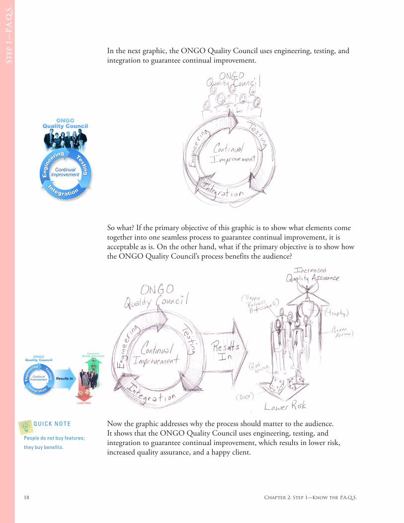
In the next graphic, the ONGO Quality Council uses engineering, testing, and integration to guarantee continual improvement.
So what? If the primary objective of this graphic is to show what elements come together into one seamless process to guarantee continual improvement, it is acceptable as is. On the other hand, what if the primary objective is to show how the ONGO Quality Council’s process benefits the audience?
Now the graphic addresses why the process should matter to the audience. It shows that the ONGO Quality Council uses engineering, testing, and integration to guarantee continual improvement, which results in lower risk, increased quality assurance, and a happy client.
Q U I C K N O T E
People do not buy features;
they buy benefits.
DO-IT-YOURSELF BILLION DOLLAR GRAPHICS 19
Step
1—
P.A
.Q.S
.
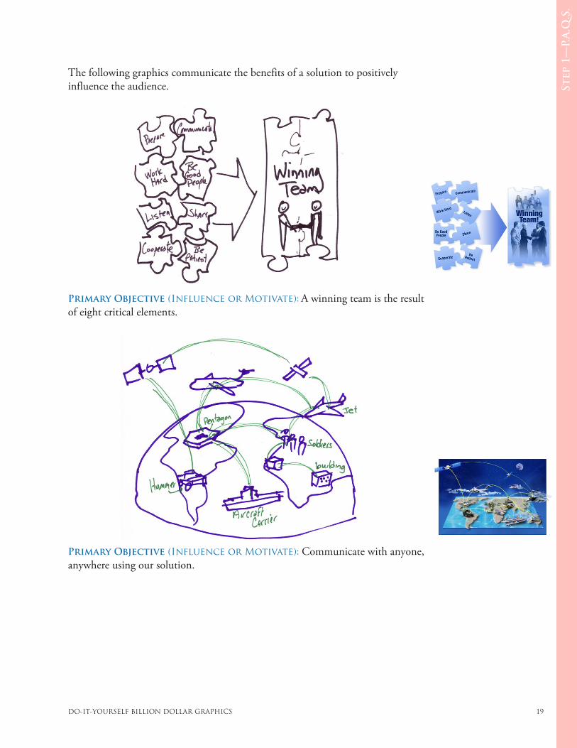
The following graphics communicate the benefits of a solution to positively influence the audience.
Primary Objective (Influence or Motivate): A winning team is the result of eight critical elements.
Primary Objective (Influence or Motivate): Communicate with anyone, anywhere using our solution.
20 Chapter 6: Graphic Types
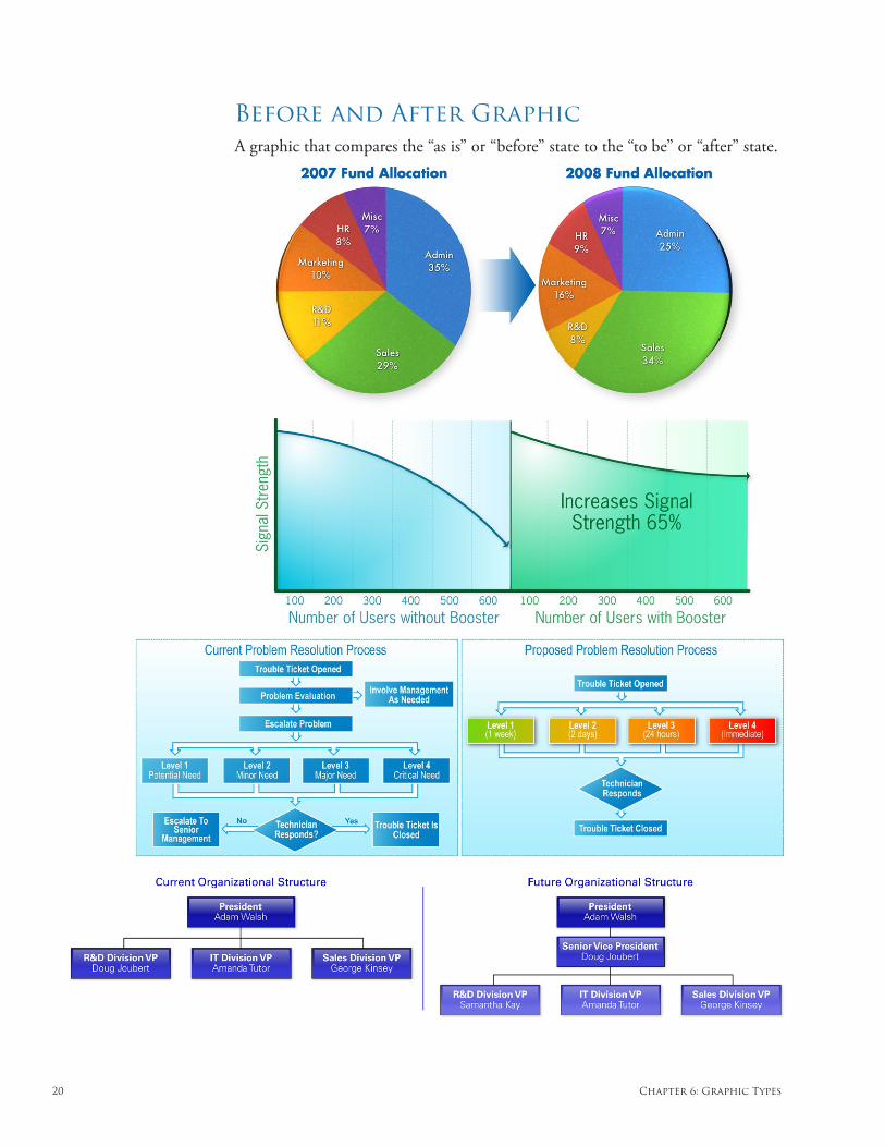
Before and After Graphic A graphic that compares the “as is” or “before” state to the “to be” or “after” state.
DO-IT-YOURSELF BILLION DOLLAR GRAPHICS 21
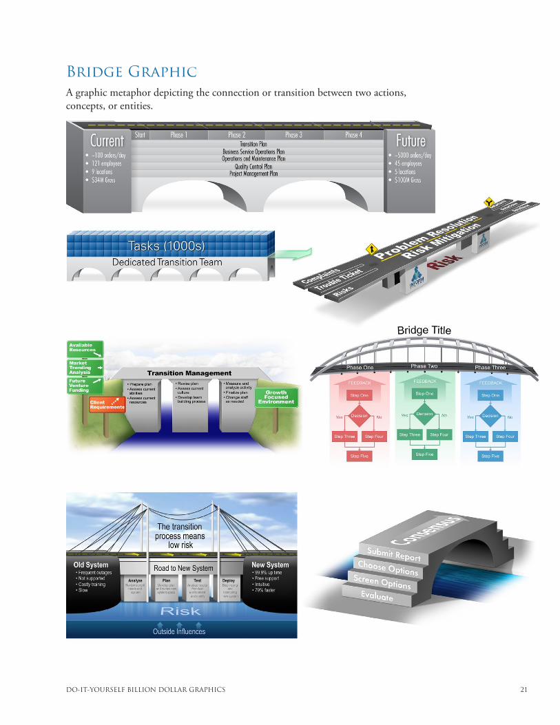
Bridge Graphic A graphic metaphor depicting the connection or transition between two actions, concepts, or entities.
22 Chapter 6: Graphic Types
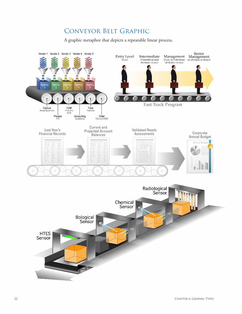
Conveyor Belt Graphic A graphic metaphor that depicts a repeatable linear process.
DO-IT-YOURSELF BILLION DOLLAR GRAPHICS 23
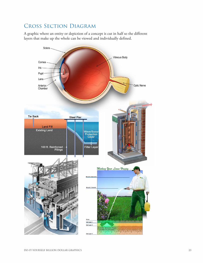
Cross Section Diagram A graphic where an entity or depiction of a concept is cut in half so the different layers that make up the whole can be viewed and individually defined.
24 Chapter 6: Graphic Types
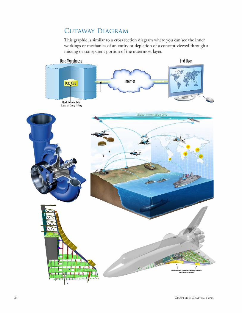
Cutaway DiagramThis graphic is similar to a cross section diagram where you can see the inner workings or mechanics of an entity or depiction of a concept viewed through a missing or transparent portion of the outermost layer.
DO-IT-YOURSELF BILLION DOLLAR GRAPHICS 25
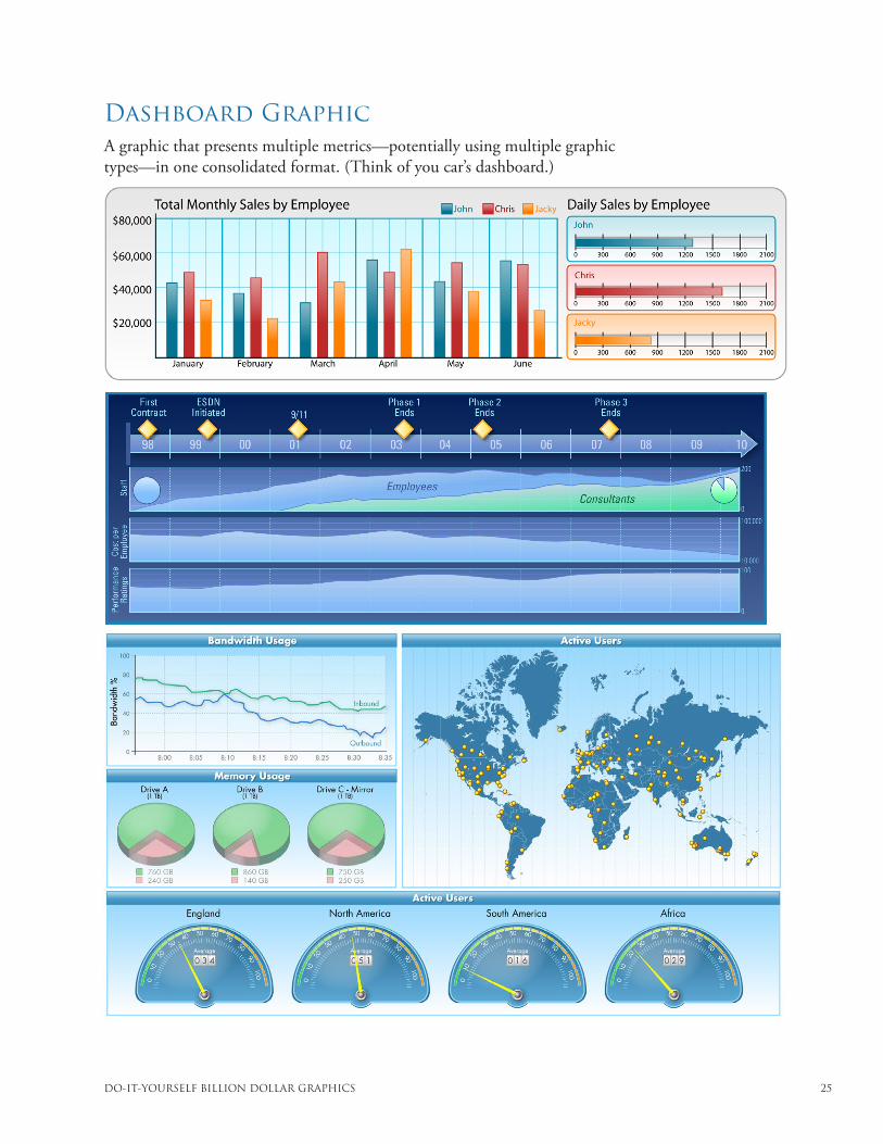
Dashboard Graphic A graphic that presents multiple metrics—potentially using multiple graphic types—in one consolidated format. (Think of you car’s dashboard.)
DO-IT-YOURSELF BILLION DOLLAR GRAPHICS 26
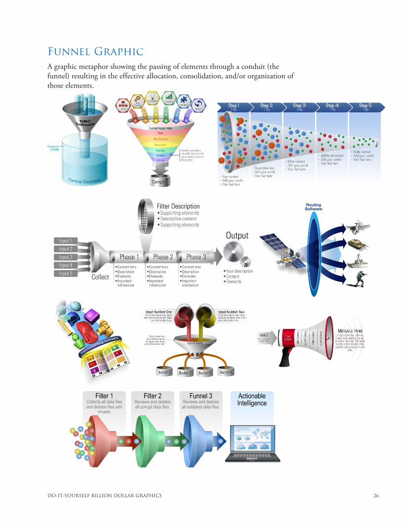
Funnel Graphic A graphic metaphor showing the passing of elements through a conduit (the funnel) resulting in the effective allocation, consolidation, and/or organization of those elements.
DO-IT-YOURSELF BILLION DOLLAR GRAPHICS 27
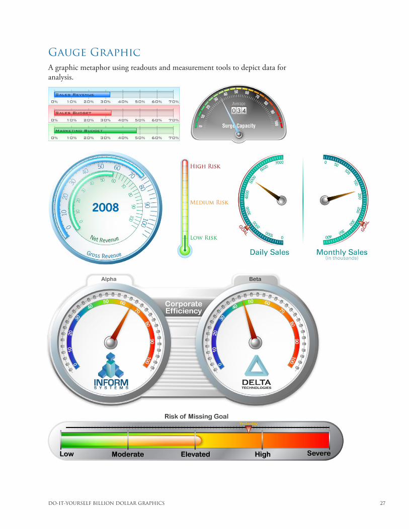
Gauge Graphic A graphic metaphor using readouts and measurement tools to depict data for analysis.
DO-IT-YOURSELF BILLION DOLLAR GRAPHICS 28
Glossary
Aesthetics – A set of principles regarding the nature and appreciation of beauty. The study of aesthetics increased the validity of many critical judgments concerning art. The established aesthetic principles create a shared vocabulary and understanding for the objective evaluation of beauty.
Analogy (visual) – A graphic depiction of an action, concept, or entity that augments (having a logical relevance to that which is augmented) another action, concept, or entity making a comparison in an effort to improve communication. A visual analogy compares a variety of attributes. It is often used to form logical arguments: if two different things are similar in one way, they might be similar in other ways as well.
Area Chart – A graphic that depicts continuous quantitative data usually over time and uses filled areas to communicate amounts, time frames, or values.
Assembly Method – A process for conceptualizing graphics by capturing important chunks of information and assembling them (like building blocks) in a way that better communicates their relationships or interactions.
Author – The graphic’s content creator. The person(s) who is the source of the information contained in the graphic. Often the author directs the creation of the graphic.
Balance (visual) – Balance is achieved when the visual “weight” of both halves of a graphic is similar giving a sense of equilibrium.
Bar Chart – A graphic that depicts the changes in quantitative data using “bars,” where the size of each bar represents the proportional value of the quantitative data.
Before and After Graphic – A graphic that compares the “as is” or “before” state to the “to be” or “after” state.
Bridge Graphic – A graphic metaphor depicting the connection or transition between two actions, concepts, or entities.
Bubble Chart – A graphic that uses circles or spheres to show ranges of quantitative data. It can also illustrate the uncertainty of predicted value.
Building Blocks – A graphic that interconnects data to illustrate how elements work together to create a larger unit.
Calendar – A table showing years (or a year), months, weeks, and days.
Candlestick Chart – A chart traditionally used to analyze values and sales of stocks, bonds, commodities, etc. Price is shown in the vertical axis and time in the horizontal axis.
Chunking – Breaking content into bite-sized chunks that can then be reassembled to show an overview of the content presented.
29 Glossary
Circle Charts – A family of graphics that display quantitative data using a circular format and includes radar graphs, sector graphs, circle column graphs, and many similarly shaped graphics.
Collage – A graphic that is composed of juxtaposed images.
Conceptualization – The process of creating a design or design plan. Effective conceptualization requires research and visualization.
Conveyor Belt Graphic – A graphic metaphor that depicts a repeatable linear process.
Cross Section Diagram – A graphic where an entity or depiction of a concept is cut in half so the different layers that make up the whole can be viewed and individually defined.
Cutaway Diagram – This graphic is similar to a cross section diagram where you can see the inner workings or mechanics of an entity or depiction of a concept viewed through a missing or transparent portion of the outermost layer.
Dashboard Graphic – A graphic that presents multiple metrics (potentially using multiple graphic types) in one consolidated format. (Think of a car’s dashboard.)
Design Techniques – Ways of illustrating concepts.
Discriminator – A function, feature, or characteristic that differentiates one product, service, or idea from another.
Dome Graphic – A graphic that looks like a “snow globe” illustrating the containment of elements. (The dome graphic is especially good at communicating protection/security.)
Earned Value Management System (EVMS) Chart – A risk probability schedule graphic. Used to show how potential changes in a budget at different milestones can have a ripple effect on costs later in the process.
Exploded Diagram – A graphic showing the disassembled parts of an entity or concept placed in a manner that indicates their relative positions when reassembled.
Floor Plan – A graphic depicting the layout of a room(s) or level(s) in a building.
Flow Chart – See Process Diagram.
Funnel Graphic – A graphic metaphor showing the passing of elements through a conduit (the funnel) resulting in the effective allocation, consolidation, and/or organization of those elements.
Gantt Chart – A bar chart representing time and activity used for planning, tracking, and controlling schedules.
Gauge Graphic – A graphic metaphor using readouts and measurement tools to depict data for analysis.
Gear Graphic – A graphic metaphor depicting how parts work together and often illustrates processes and interoperability.
Highlighting – Using contrasting colors, shades, sizes, and visual complexity to draw attention to an element in a graphic.
DO-IT-YOURSELF BILLION DOLLAR GRAPHICS 30
Icon – A representational graphic element that is visually analogous with an action, concept, or entity.
Illustration – A visual representation that is used to make the subject more appealing or easier to understand.
Information Graphic – Any graphic that clarifies and/or explains.
Line Chart – A graphic showing the changes in quantitative data using lines, where the position of a line represents the proportional value of the data.
Literal Method – A process for conceptualizing graphics by showing exactly what is described or stated as a way to clarify, explain, or support a claim.
Looping Graphic – A graphic that depicts a repeating process or event.
Map Graphic – A graphic showing a region of physical space: a continent, country, city, office building, etc.
Matrix – See Table.
Metaphor (visual) – A graphic depiction of an action, concept, or entity that replaces (having the same applicable characteristics as that which is replaced) another action, concept, or entity making an implicit comparison in an effort to improve communication. Essentially, replace one entity or concept for another where the replacement shares the same applicable characteristics.
Method – An approach for conceptualizing successful graphics.
Mindshare – The awareness of a company, product, service, or idea.
Network Diagram – A diagram showing the connections between elements that compose a network.
Noise (visual) – Many visual elements or “busy” textures/imagery.
Ockham’s Razor – A widely accepted and proven postulate asserting that simplicity in design is preferred over complexity.
Organizational Chart – A graphic depicting the hierarchy, arrangement, structure, and/or relationship of a group of elements. (Typically, an organization and its personnel are the subject matter.)
Path Graphic – See Road Graphic.
Peg Graphic – A graphic showing the interconnectivity of entities or ideas to create a unified whole (think Legos®).
Photograph – A picture of a person, place, or thing.
Pie Chart (also called a Segmented Chart) – A graphic that communicates percentages of the whole using proportional segments.
Pipe Graphic – A graphic metaphor representing the isolated linear flow of elements.
Point Chart – A graphic that shows quantitative data using plotted points.
31 Glossary
Presenter – The person, place, or thing most associated with the graphic in the mind of the audience.
• A mall map kiosk: The mall is the presenter.• A PowerPoint presentation: Either the orator(s) or the entity (i.e., company or
association) for whom the presentation was created is the presenter.• Vehicle maintenance instructions: The vehicle manufacturer or dealership is the
presenter.
Primary Objective – The main goal of a graphic.
Process Diagram (also called a Flow Chart) – A graphic showing the flow or progression of steps in a process or event.
Puzzle Graphic – A graphic metaphor representing the synergy of separate elements that creates a new whole.
Pyramid Graphic – A graphic metaphor that depicts hierarchy, arrangement, structure, and/or relationship of a group of elements. The bottom elements support the elements above.
Quantitative Method – A process for conceptualizing graphics by capturing descriptions of quantity (value, amount, or time) and choosing one of thirteen quantitative graphic types to communicate that data.
Render – The physical creation (in any media) of the graphic.
Risk Matrix – A table that depicts varying levels of risk as affected by the influences of one or more variables.
Road Graphic – A graphic metaphor depicting the path between the “as is” or “before” state to the “to be” or “after” state.
Scale Graphic – A graphic metaphor that illustrates comparison.
Segmented Chart – See Pie Chart.
Simile (visual) – A graphic depiction of an action, concept, or entity that augments (having a logical relevance to that which is augmented) another action, concept, or entity making a comparison in an effort to improve communication.
Spiral Graphic – A graphic metaphor that illustrates the evolution of an action, concept, or entity through a cyclical process.
Stacked Diagram – A graphic that depicts the hierarchy, arrangement, structure, and/or relationship of a group of elements. A stacked diagram can also show flow or a progression of steps in a process similar to a pyramid and/or process diagram but can be more versatile.
Stair Graphic – A graphic metaphor depicting steps in a process.
Step-by-Step Graphic – A graphic that depicts the execution of a linear process.

DO-IT-YOURSELF BILLION DOLLAR GRAPHICS 32
Substitution Method – A process for conceptualizing graphics by substituting one action, concept, or entity for another—using a visual metaphor, analogy, or simile—to better clarify or explain information.
Subsurface (Emotional) Communication – Subconscious effects a graphic and its content have on our emotional state, our state of mind.
Surface (Cognitive) Communication – Conscious comprehension of the data presented in the graphic.
Symbol – A representational graphic element that has a learned meaning or accepted connotation for an action, concept, or entity.
System/Enterprise Architecture – A graphic showing the architecture of a system or enterprise.
Symmetry (visual) – Equally divide a graphic in half using a central axis as the dividing line (usually vertically or horizontally divided). The more alike both halves are, the more symmetrical the image.
Table (also called a Matrix) – A grid that correlates data along two axes. A lengthier but more descriptive definition is an array of rows and columns (arranged in a grid) interconnecting elements. The point of row and column convergence reveals the data that links the action, concept, or entity indicated in the row title and the column title.
Target Audience – The person(s) for whom the graphic was intended.
10 Second Rule – A widely accepted and proven postulate that the target audience needs to know and understand the main point (the most important message) of a graphic within 10 seconds or else the graphic will fail to achieve its primary objective.
Timeline – A graphic that linearly represents time.
Vee Diagram – A type of process diagram that illustrates the relationships (between the two arms of the “v” shape) and verification path of interoperable elements.
Venn Diagram – A graphic that shows the relationship and/or synergy of disparate elements through the overlap of those elements.
Visual Noise – Too many visual elements or “busy” textures/imagery in a graphic. Visual noise often induces a negative opinion of the subject matter.
Visualization – To see the graphic components in your mind’s eye before rendering.
Waterfall Diagram – A type of process diagram that depicts the linear flow of steps in a progressive nature.
33 Index
Index
A
accurate (subject matter) 24Adobe Illustrator 71, 78Adobe Photoshop 71, 78Advanced Selling Strategies 33aesthetics 60, 141aesthetically appealing 11, 60, 74aesthetic balance 64–65aesthetic hierarchy and highlights 51 affecting emotions 11, 54alphabetical 52amounts 30, 37, 38, 42, 44, 86, 141analogous colors 61Anheuser-Busch 7animatics 5Apple Keynote 70area chart 37, 39, 86, 141arrows 46, 49, 52Assembly Method 30, 45–47, 48, 141asymmetrical balance 65–66attorneys 11attractive 3, 54, 58, 60, 74, 76, 133, 140audience 6, 7, 9–10, 13, 14, 16, 17, 19, 20–21,
22–23, 24–26, 27audience focused 75, 84
B
balance 64–66, 141bar chart 37–39, 87, 141beauty 56, 60before and after graphic 32, 88, 141behavioral psychologists 6benefit(s) 13, 16, 17, 18, 19, 20, 24, 28, 58, 69, 75, 84benefits boxes 16Berger, John 1black 61blowout 50, 139blue 61, 62Boeing 7Boston Globe 5Bounds, Andy 84bridge graphic 89, 141Brumback, Charles 4bubble chart 37, 40, 90, 141building blocks 45, 91, 141Burmark, Lynell 1, 61busy textures/imagery 63, 143
C
calendar 37, 40, 92, 141callout 50, 139candlestick chart 37, 40, 93, 141Carnegie Melon Institute 6category 52chunking 45, 46, 141circle chart(s) 37, 41, 94, 142clean and simple 66, 69–70, 81, 140clip art 69, 73, 74, 76, 140Coca-Cola 7cognitive 6, 9, 73, 145cognitive dissonance 83cognitively 5, 35collage 95, 142color 51, 60–62color wheel 61combinations of several graphic types 44communicate information 9, 10, 14–15,
34, 54, 73competency 10, 54, 76complementary colors 61complex explanations 50, 79, 81–83complicated 79, 81–83connectivity 49consistency 66, 72, 81consistent 73, 81, 140constraining lines or shapes 51continuation arrow 53Continuing Medical Education (CME) 33contrasting colors 51, 142contrasting shades 51, 142contrasting sizes 51, 142controllable elements 11conveyor belt graphic 96, 142cooperation 50court system 11courtroom graphics 5, 76Courtroom Graphics Come of Cyber-Age 5credibility 3, 10, 25, 32, 54, 76cross section diagram 32, 97, 142culturally dependent meaning 62, 66curved 62cutaway diagram 32, 98, 142
D
Dale Carnegie Training 6, 54Damasio, Antonio 6
DO-IT-YOURSELF BILLION DOLLAR GRAPHICS 34
dashboard graphic 37, 42, 58, 99, 142dashed lines 49database symbol 52Department of Defense 21Department of State 7descriptions 50design techniques 49, 53, 64, 136, 142details 50diagonal lines or arrows 52diagonal shapes or lines 62dimension 77direction 49Discover magazine 1, 3, 54discriminator(s) 13, 16, 18, 28, 75, 84, 142disorder 52disturbing images 59dome graphic 100, 142
E
Earned Value Management System (EVMS) 82, 142emotion(s) 3, 5–8, 9–10, 11, 54–55, 56–59, 60, 67Emotional Design 3, 8emotional response 9–10, 58, 61, 67, 73empirical data 10, 54esteem 56exploded diagram 32, 101, 142
F
fail 20, 73, 79, 83familiarity 57fear 57fear of loss 57feature(s) 13, 18, 19, 20, 75, 84firewall icon 52floor plan 102, 142flow 34, 49, 116, 118, 132, 142, 144, 145flow chart 118, 142, 144font(s) 66, 72, 139Four Methods 30–48funnel graphic 103, 142future state 46
G
Gantt chart 37, 40, 41, 104, 142gauge graphic 42, 105, 142gear graphic 106, 142getting it right 81Good as a Gun: When Cameras Define a War 4government contracts 7graphical hierarchy 45greed 57green 61, 62
grid 43, 52, 71, 81, 128, 145group 51group of elements 112, 120, 125, 143, 144grouping 51
H
happy 58Harris, Robert L. 44hierarchy 45, 51, 112, 120, 125hierarchy of needs 56highlight(ing) 13, 51, 61, 75, 142Hong Kong University
of Science and Technology 9horizontal 52, 62, 139horizontal axis 40, 93, 141horizontal layout 62horizontal shapes 62Horn, Robert E. 8Hyperbole Method 30
I
icon(s) 44, 50, 52, 143illustration 107, 143influence(s) 5–8, 9–11, 14, 16–19, 22,
50, 54, 56, 58, 60Influencing Human Behavior 13Information Graphics: A Comprehensive
Illustrated Reference 44infrequent relationships 49interaction 50interconnecting elements 145Internet symbol 14, 52
J
Jelly Effect, The 84Jones, John Phillip 4
K
Kandel, Eric 54Kahnerman, Daniel 6Kim, Jin Woo 9Kress, Gunther 5
L
label 14, 29, 44, 83, 140lawyers 5, 76legibility 66less influential relationships 49line chart 37, 42, 108, 143linear flow 116, 132
35 Index
lines 42, 49, 51, 52, 62–63, 108, 139linking lines or shapes 51Literal Method 30, 31–36, 139, 143location 30, 31, 52lock icon 52Lockheed Martin 7looping graphic 18, 109, 143love and belonging 56
M
magnitude 39, 52map graphic 19, 32, 82, 110, 143Maslow’s Hierarchy of Needs 56matrix 43, 128, 143, 145Mehrabian, Albert 1Microsoft Office 41Microsoft PowerPoint 66, 70, 71, 74, 78mindshare 62, 143mood 9, 54, 58, 59, 60, 61, 62, 66Moon, Jae Yun 9, 60motivate 9, 14, 16–19, 10, 54–55, 56, 57, 59, 77multiple methods 48, 68muted colors 49
N
negative images 59network diagram 16, 111, 143neurologist(s) 6, 54, 58Neuromarketing: Is There a “Buy Button”
in the Brain? 3, 24New York Times 4Newspaper Association of America 4Nike 7Norman, Don 3Northrop Grumman 7
O
Ockham’s Razor 81, 143orange 61order vs. disorder 52organization 52, 103, 112organizational chart 57, 112, 143overlapping graphic elements 52overstating data 30, 38Overstreet, Harry 13
P
P.A.Q.S. 10, 13–28P.A.Q.S. Questionnaire 28page break 53past state 49
path graphic 122, 143paths 49paths of communication 30, 45patriotic imagery 8peg graphic 47, 113, 143Pentagon 7photograph(s) 9, 32, 57, 59, 69, 71, 74, 114, 143pie chart(s) 37, 38, 43–44, 115, 143pipe graphic 116, 143placement 81point chart 37, 43, 117, 143poorly rendered 79–80positioning 45, 51positive images 58presenter 4, 7–8, 9–11, 21, 54, 64, 73, 144primary objective 9–12, 13–19, 20, 22, 23, 24,
27, 59, 60, 70–71, 73, 81, 83, 144proactive 59problem solving 79, 84process diagram 44, 118, 130, 132, 144professionalism 10, 76–77professionally rendered 60, 76–78propaganda 3proposal 5, 6, 7, 8, 21, 73, 76proposal covers 8 proposal industry 7proposal writing course 76psychologists 1, 6Psychology of Selling, The 33puzzle graphic 19, 47, 119, 144pyramid graphic 47, 120, 144
Q
Quantitative Method 30, 37–44, 139, 144questions (to which the audience wants answers)
10, 13, 20, 22–23, 24–25
R
raster graphics 74Raytheon 7razzle dazzle 83, 140recognizable imagery 36, 83, 140red 2, 9, 61, 62render 11–12, 69–78, 79–80, 84, 144Renvoise, Patrick 3resolution 74, 77, 83risk matrix 121, 144road graphic 122, 144roads 49, 122, 144
DO-IT-YOURSELF BILLION DOLLAR GRAPHICS 36
S
safety and survival 56sans-serif font 66scale break 53scale graphic 123, 144security 56, 100segmented chart 44, 115, 144self-actualization 56sequential 1, 52serif font 66Seven Rules 81–84shade 51shapes 45–46, 51, 62–63shock 59similar physical appearance 51simile (visual) 34, 35, 46, 144Simon, Herbert A. 6simple 66, 69–70, 73, 81simple designs 82space constraints 53spiral graphic 124, 144stacked diagram 125, 144stair graphic 126, 144Stanford Persuasive Technology Lab 3Stanford University’s Center for the Study
of Language and Information 8statistical analysis 10, 54step-by-step graphic 17, 127, 144stimuli 3, 78subject matter 10, 11, 13, 23, 24–26, 28, 56, 58, 63,
72, 73, 79–80, 83, 112Substitution Method 30, 34–36, 46, 145subsurface (emotional)
communication 9–10, 73, 145supplemental relationships 49supportive 47surface (cognitive)
communication 9, 73, 145symbol 34, 36, 52, 145symbols of patriotism 8symmetry 64, 65, 66, 145synthesis 29, 50Syracuse University 4
T
table 40, 43, 92, 121, 128, 145take action 57, 5910 Second Rule 83, 1453M Corporation 1, 4, 7three traps 79, 140time frame(s) 30, 37, 39, 40, 41, 42, 86Time magazine 54
timeline(s) 37, 40, 41, 44, 49, 129, 145too complicated 79Tracy, Brian 33Tracy, Larry 7transparency 49trial support 26trustworthiness 9, 60trustworthy 8, 26, 83truth 24, 56Tufte, Edward 54, 81Twersky, Amos 6
U
unbalanced 64–65unclear 79understating data 38United States military 7University of Minnesota School
of Management 4University of Minnesota School
of Management Information Systems Research Center 7
University of Pennsylvania 7unsettling visual 59
V
value(s) 30, 37, 39, 40, 42, 44, 61, 87, 90, 108vector (graphics/images) 74, 77Vee Diagram 130, 145Venn Diagram 131, 145vertical lines 52, 62–63, 139vertical shapes 62–63, 139violet 61visual analogy 35, 141, 145visual hierarchy 51Visual Literacy: Learn to See, See to Learn 61visual metaphor 3, 34, 35–46, 145visual noise 63–64, 81, 139, 145visual simile 34, 35, 46, 144, 145
W
waterfall diagram 132, 145Wharton School of Research at
the University of Pennsylvania 7, 9weigh 64white 61
Y
Yale University 54, 81yellow 61Yonsei University 9
Billion Dollar Graphics Training
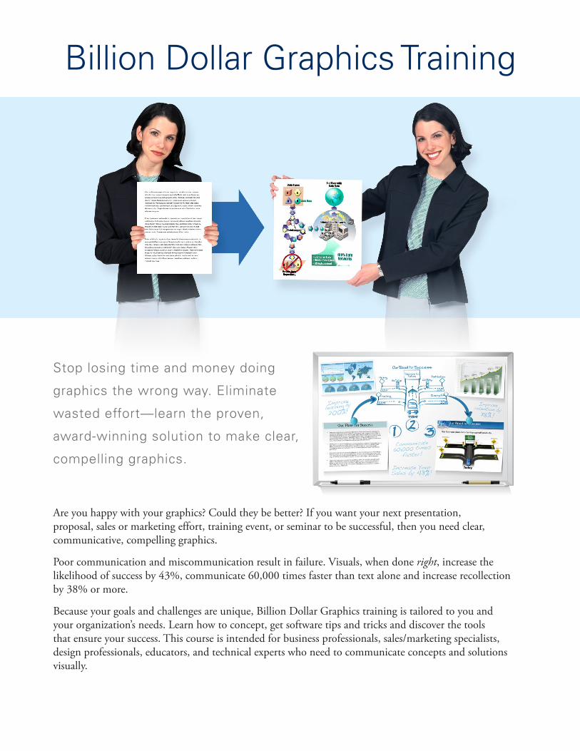
Are you happy with your graphics? Could they be better? If you want your next presentation, proposal, sales or marketing effort, training event, or seminar to be successful, then you need clear, communicative, compelling graphics.
Poor communication and miscommunication result in failure. Visuals, when done right, increase the likelihood of success by 43%, communicate 60,000 times faster than text alone and increase recollection by 38% or more.
Because your goals and challenges are unique, Billion Dollar Graphics training is tailored to you and your organization’s needs. Learn how to concept, get software tips and tricks and discover the tools that ensure your success. This course is intended for business professionals, sales/marketing specialists, design professionals, educators, and technical experts who need to communicate concepts and solutions visually.
Stop losing time and money doing
graphics the wrong way. Eliminate
wasted effort—learn the proven,
award-winning solution to make clear,
compelling graphics.
Organizations Trained (Partial List)■■ Lockheed Martin
■■ Motorola
■■ Raytheon
■■ Northrop Grumman
■■ Orbital
■■ Verizon
■■ HP
One-on-One or Group TrainingFirst, Mike will review your current needs, processes and goals. Then he develops a curriculum for your approval. During training, Mike shares best practices, processes, tips, tricks, and tools tailored to deliver your desired results. Attendees apply what was learned to real-world graphic situations (e.g., conceptualization, proposal development, storyboarding, presentation design, and marketing design). Questions are flushed out while applying what was learned and answered during class, which increases adoption rates and lowers the risk of future errors. In the end, attendees not only walk away with improved skills but also graphics that can be used immediately.
Where and When?Most training is conducted at your facility and scheduled to fit your needs. Conducting training at your facility ensures that real-world, day-to-day challenges can be seen, reviewed and solved. Public classes are also available.
■■ Dell
■■ L3 Communications
■■ Nortel
■■ SAIC
■■ Honeywell
■■ BAE Systems
■■ CSC
“The power in the process is that it eliminates rewrites, gets the message right, and validates your approach all at the same time. It really validates the whole solution.” —Bob Gillette, CRI
“Mike Parkinson’s Billion Dollar Graphics workshop is an indispensable tool ... While his books teach you how to clearly express your ideas through graphics, the [training] provides you with the advantage of learning directly from an expert who is available to answer your questions.” —Nathan Chiantella, Lockheed Martin
“With this new level of efficiency, we can now focus more of our time and effort on creating a winning solution.” —Kathy Furlong, Nortel
“Quality shot up immediately.”
—Michele Miller, Orbital
Call (703) 608-9568 or email [email protected] now for more information.
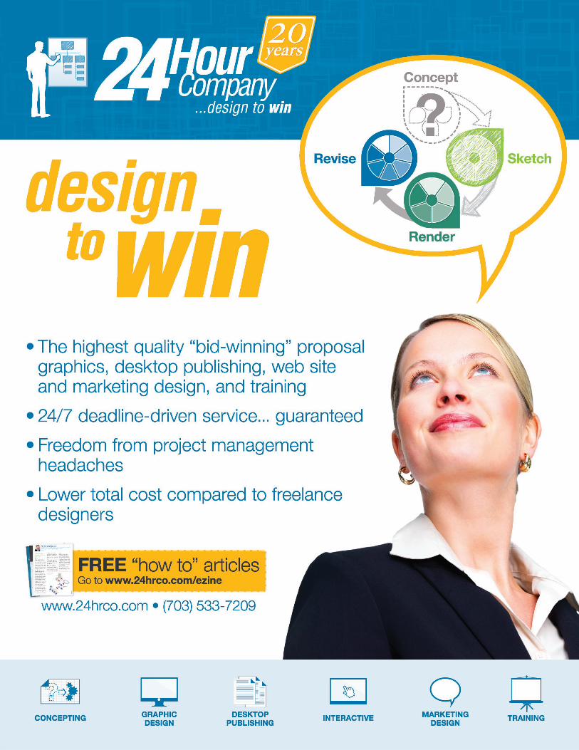
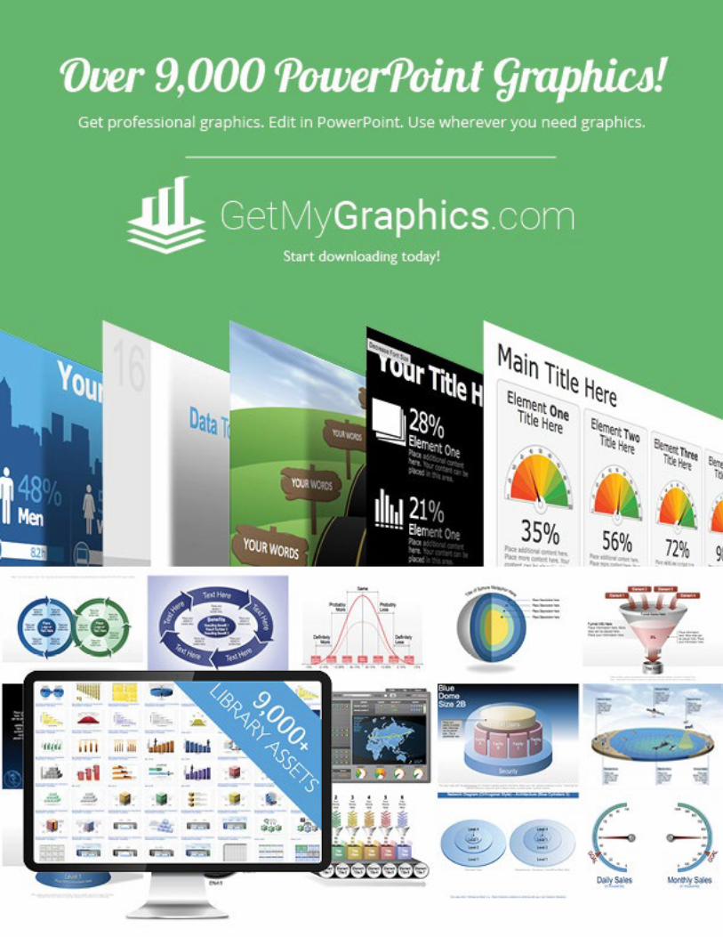
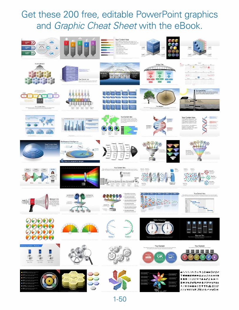
Get these 200 free, editable PowerPoint graphics and Graphic Cheat Sheet with the eBook.
1-50
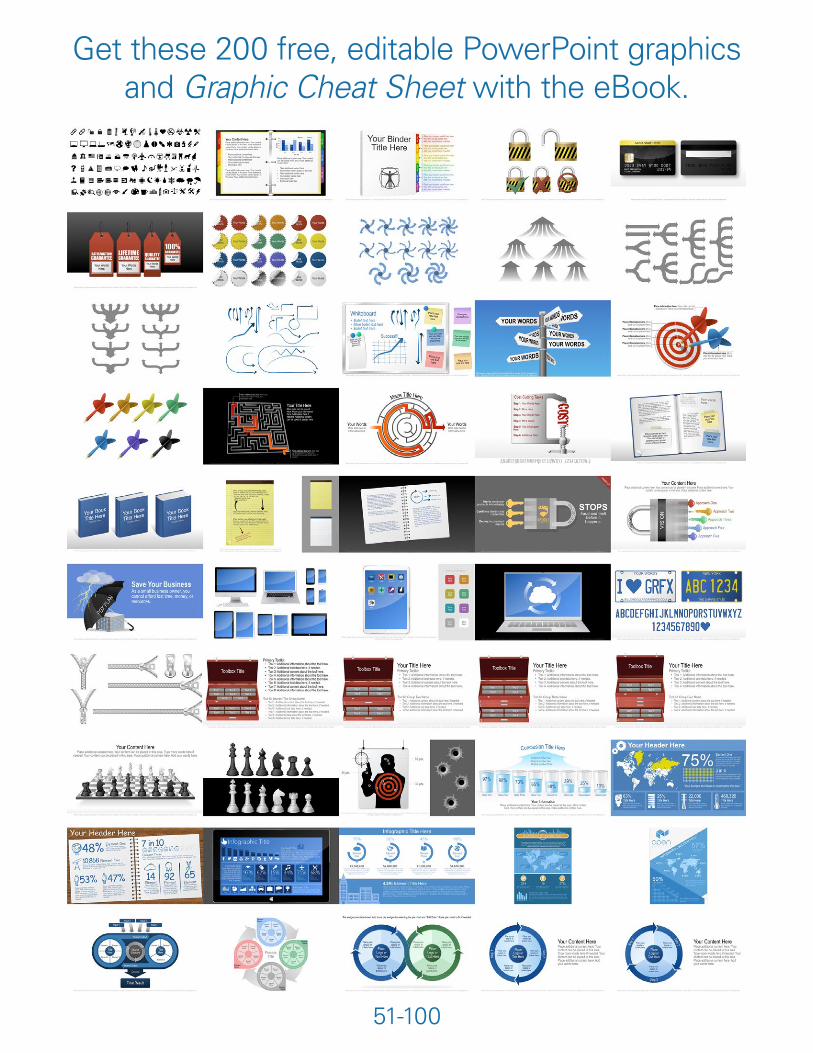
Get these 200 free, editable PowerPoint graphics and Graphic Cheat Sheet with the eBook.
51-100
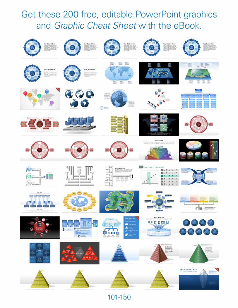
Get these 200 free, editable PowerPoint graphics and Graphic Cheat Sheet with the eBook.
101-150
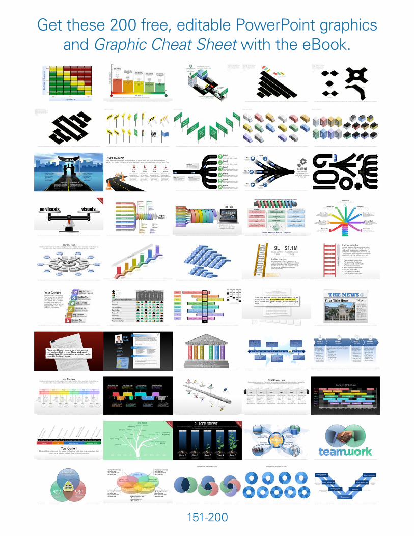
Get these 200 free, editable PowerPoint graphics and Graphic Cheat Sheet with the eBook.
151-200
Preview Copy
© 2010-2016 Billion Dollar Graphics. All rights reserved.
The information to be communicated is easy to understand and not involved.
The information to be communicated is intricate or multivariable.
The information to be communicated is numeric.
Graphic Types...
@Mike_ParkinsonMike Parkinson
Graphic Cheat Sheet
Hierarchy
Simple QuantitativeComplex
Architecture or Structure
Location or Distance
Protection or Isolation
Creative Services
Training
www.24hrco.com • (703) 533-7209
Combine graphics and insert icons, symbols, and photos to build an infinite number of visuals.
1. showing dimensions2. using quantitative charts
Physical Description
Process or Flow
Cause and Effect
Amount or Value(Most graphic types can accommodate amounts and values. The graphic types pictured here are those most often used.)
Time(Most graphic types can show time. The graphic types pictured here are those most often used.)
Synergy
Relationship(Most graphic types can show relationships between elements. The graphic types pictured here are those most often used.)
Transition
Comparison(Another option is to show two of the same graphic type and highlight the similarities or differences between both.)
(o) 703.608.9568
2 2
1
1
1
1
1
1
1
Get these 200 free, editable PowerPoint graphics and Graphic Cheat Sheet with the eBook.
Preview Copy