beautiful web design, 3rd edition
TRANSCRIPT
Summary of Contents
Preface . . . . . . . . . . . . . . . . . . . . . . . . . . . . . . . . . . . . . . . . . . . . . . . . . . . . . . . . . . . . . . . . . . . . . . . xiii
1. Layout and Composition . . . . . . . . . . . . . . . . . . . . . . . . . . . . . . . . . . . . . . . . . . . . . . . . . . . . . . . 1
2. Color . . . . . . . . . . . . . . . . . . . . . . . . . . . . . . . . . . . . . . . . . . . . . . . . . . . . . . . . . . . . . . . . . . . . . . . 49
3. Texture . . . . . . . . . . . . . . . . . . . . . . . . . . . . . . . . . . . . . . . . . . . . . . . . . . . . . . . . . . . . . . . . . . . . . 85
4. Typography . . . . . . . . . . . . . . . . . . . . . . . . . . . . . . . . . . . . . . . . . . . . . . . . . . . . . . . . . . . . . . . . 119
5. Imagery . . . . . . . . . . . . . . . . . . . . . . . . . . . . . . . . . . . . . . . . . . . . . . . . . . . . . . . . . . . . . . . . . . . 155


THE PRINCIPLES OFBEAUTIFUL WEB
DESIGNBY JASON BEAIRD& JAMES GEORGE
The Principles of Beautiful Web Designby Jason Beaird and James George
Copyright © 2014 SitePoint Pty. Ltd.
Cover Design: Alex WalkerProduct Manager: Simon Mackie
Technical Editor: Giovanni DiFeterici
Editor: Paul Fitzpatrick
Printing History:
First Edition: January 2007
Second Edition: November 2010
Third Edition: June 2014
Notice of RightsAll rights reserved. No part of this book may be reproduced, stored in a retrieval system, or transmitted in any form or by
any means, without the prior written permission of the copyright holder, except in the case of brief quotations embedded
in critical articles or reviews.
Notice of LiabilityThe author and publisher have made every effort to ensure the accuracy of the information herein. However, the information
contained in this book is sold without warranty, either express or implied. Neither the authors and SitePoint Pty Ltd, nor
its dealers or distributors, will be held liable for any damages to be caused either directly or indirectly by the instructions
contained in this book, or by the software or hardware products described herein.
Trademark NoticeRather than indicating every occurrence of a trademarked name as such, this book uses the names only in an editorial
fashion and to the benefit of the trademark owner, with no intention of infringement of the trademark.
Published by SitePoint Pty Ltd
Web: www.sitepoint.com
Email: [email protected]
ISBN 978-0-9922794-4-8
Printed and bound in the United States of America
iv

About the Authors
Jason Beaird is a designer and front-end developer with over ten years of experience working on a wide range
of award-winning web projects. With a background in graphic design and a passion for web standards, he’s
always looking for accessible ways to make the Web a more beautiful place. When he’s not pushing pixels in
Photoshop or tinkering with markup, Jason loves sharing his passion for the Web with others. He writes about
his ideas, adventures, and random projects on his personal site, http://jasongraphix.com.
James George is a professional web designer from the United States, who is passionate about the field of design.
He loves connecting with other designers and developers. James enjoys working closely with clients and
businesses to create powerful, beautiful web design solutions. You can find him on Twitter1, Google+2, and
LinkedIn3.
About the Technical Editor
Giovanni DiFeterici is the Creative Director for the UnmatchedStyle brand and for Period-Three, a web design
studio in Columbia, SC. He is the author of The Web Designer’s Roadmap and an organizer for the ConvergeSE
and BDConf web design conference series'. Recently, he cofounded SOCO4, a relaxed coworking space for
creatives, also in Columbia, SC. His goal is to make the web a more engaging and rewarding place to work and
play. When he’s not tinkering with code, you’ll find him painting, running, and spending time with his lovely
wife Amanda and their new son Roman.
About SitePoint
SitePoint specializes in publishing fun, practical, and easy-to-understand content for web professionals. Visit
http://www.sitepoint.com/ to access our blogs, books, newsletters, articles, and community forums.
1 https://twitter.com/creativebeacon/2 https://plus.google.com/u/0/+JamesGeorgeWebDesigner3 http://www.linkedin.com/in/creativepro4 http://soco-work.com/
v


Table of Contents
Preface . . . . . . . . . . . . . . . . . . . . . . . . . . . . . . . . . . . . . . . . . . . . . . . . . . . . . . . . . . . . . . . . . . xiii
Who Should Read This Book . . . . . . . . . . . . . . . . . . . . . . . . . . . . . . . . . . . . . . . . . . . . . . . . . xiv
What’s in This Book . . . . . . . . . . . . . . . . . . . . . . . . . . . . . . . . . . . . . . . . . . . . . . . . . . . . . . . . xiv
Conventions Used in This Book . . . . . . . . . . . . . . . . . . . . . . . . . . . . . . . . . . . . . . . . . . . . . . . xv
Code Samples . . . . . . . . . . . . . . . . . . . . . . . . . . . . . . . . . . . . . . . . . . . . . . . . . . . . . . . . . xv
Tips, Notes, and Warnings . . . . . . . . . . . . . . . . . . . . . . . . . . . . . . . . . . . . . . . . . . . . . . xvi
Supplementary Materials . . . . . . . . . . . . . . . . . . . . . . . . . . . . . . . . . . . . . . . . . . . . . . . . . . . xvi
Want to Take Your Learning Further? . . . . . . . . . . . . . . . . . . . . . . . . . . . . . . . . . . . . . . . . . xvi
Chapter 1 Layout and Composition . . . . . . . . . . . . . . . . . . . . . . . . . . . . 1
The Design Process . . . . . . . . . . . . . . . . . . . . . . . . . . . . . . . . . . . . . . . . . . . . . . . . . . . . . . . . . . 2
Discovery . . . . . . . . . . . . . . . . . . . . . . . . . . . . . . . . . . . . . . . . . . . . . . . . . . . . . . . . . . . . . . 2
Exploration . . . . . . . . . . . . . . . . . . . . . . . . . . . . . . . . . . . . . . . . . . . . . . . . . . . . . . . . . . . . 4
Implementation . . . . . . . . . . . . . . . . . . . . . . . . . . . . . . . . . . . . . . . . . . . . . . . . . . . . . . . . 4
Defining Good Design . . . . . . . . . . . . . . . . . . . . . . . . . . . . . . . . . . . . . . . . . . . . . . . . . . . . . . . 5
Web Page Anatomy . . . . . . . . . . . . . . . . . . . . . . . . . . . . . . . . . . . . . . . . . . . . . . . . . . . . . . . . . 8
Grid Theory . . . . . . . . . . . . . . . . . . . . . . . . . . . . . . . . . . . . . . . . . . . . . . . . . . . . . . . . . . . . . . . 10
The Rule of Thirds . . . . . . . . . . . . . . . . . . . . . . . . . . . . . . . . . . . . . . . . . . . . . . . . . . . . . 11
960 Grid System . . . . . . . . . . . . . . . . . . . . . . . . . . . . . . . . . . . . . . . . . . . . . . . . . . . . . . . 13
Balance . . . . . . . . . . . . . . . . . . . . . . . . . . . . . . . . . . . . . . . . . . . . . . . . . . . . . . . . . . . . . . . . . . 15
Symmetrical Balance . . . . . . . . . . . . . . . . . . . . . . . . . . . . . . . . . . . . . . . . . . . . . . . . . . . 15
Asymmetrical Balance . . . . . . . . . . . . . . . . . . . . . . . . . . . . . . . . . . . . . . . . . . . . . . . . . . 17
Unity . . . . . . . . . . . . . . . . . . . . . . . . . . . . . . . . . . . . . . . . . . . . . . . . . . . . . . . . . . . . . . . . . . . . 19
Proximity . . . . . . . . . . . . . . . . . . . . . . . . . . . . . . . . . . . . . . . . . . . . . . . . . . . . . . . . . . . . . 20
Repetition . . . . . . . . . . . . . . . . . . . . . . . . . . . . . . . . . . . . . . . . . . . . . . . . . . . . . . . . . . . . 21
Emphasis . . . . . . . . . . . . . . . . . . . . . . . . . . . . . . . . . . . . . . . . . . . . . . . . . . . . . . . . . . . . . . . . . 22
Placement . . . . . . . . . . . . . . . . . . . . . . . . . . . . . . . . . . . . . . . . . . . . . . . . . . . . . . . . . . . . 22
Continuance . . . . . . . . . . . . . . . . . . . . . . . . . . . . . . . . . . . . . . . . . . . . . . . . . . . . . . . . . . 23
Isolation . . . . . . . . . . . . . . . . . . . . . . . . . . . . . . . . . . . . . . . . . . . . . . . . . . . . . . . . . . . . . 24
Contrast . . . . . . . . . . . . . . . . . . . . . . . . . . . . . . . . . . . . . . . . . . . . . . . . . . . . . . . . . . . . . 24
Proportion . . . . . . . . . . . . . . . . . . . . . . . . . . . . . . . . . . . . . . . . . . . . . . . . . . . . . . . . . . . . 25
Bread-and-butter Layouts . . . . . . . . . . . . . . . . . . . . . . . . . . . . . . . . . . . . . . . . . . . . . . . . . . . 26
Left-column Navigation . . . . . . . . . . . . . . . . . . . . . . . . . . . . . . . . . . . . . . . . . . . . . . . . 27
Right-column Navigation . . . . . . . . . . . . . . . . . . . . . . . . . . . . . . . . . . . . . . . . . . . . . . . 28
Three-column Navigation . . . . . . . . . . . . . . . . . . . . . . . . . . . . . . . . . . . . . . . . . . . . . . . 29
Finding Inspiration . . . . . . . . . . . . . . . . . . . . . . . . . . . . . . . . . . . . . . . . . . . . . . . . . . . . . . . . . 29
Using a Morgue File . . . . . . . . . . . . . . . . . . . . . . . . . . . . . . . . . . . . . . . . . . . . . . . . . . . . 30
Trends: Popular Favorites . . . . . . . . . . . . . . . . . . . . . . . . . . . . . . . . . . . . . . . . . . . . . . . 31
Fresh Trends . . . . . . . . . . . . . . . . . . . . . . . . . . . . . . . . . . . . . . . . . . . . . . . . . . . . . . . . . . 33
Resizing: Fixed, Fluid, or Responsive Layouts . . . . . . . . . . . . . . . . . . . . . . . . . . . . . . . . . . . 37
Fixed Width Layouts . . . . . . . . . . . . . . . . . . . . . . . . . . . . . . . . . . . . . . . . . . . . . . . . . . . 37
Fluid Layouts . . . . . . . . . . . . . . . . . . . . . . . . . . . . . . . . . . . . . . . . . . . . . . . . . . . . . . . . . 37
Responsive Design . . . . . . . . . . . . . . . . . . . . . . . . . . . . . . . . . . . . . . . . . . . . . . . . . . . . . 38
Screen Resolution . . . . . . . . . . . . . . . . . . . . . . . . . . . . . . . . . . . . . . . . . . . . . . . . . . . . . . . . . . 40
Frameworks . . . . . . . . . . . . . . . . . . . . . . . . . . . . . . . . . . . . . . . . . . . . . . . . . . . . . . . . . . . . . . . 42
Application: Knoxville Reflexology Group . . . . . . . . . . . . . . . . . . . . . . . . . . . . . . . . . . . . . . 44
Getting Started . . . . . . . . . . . . . . . . . . . . . . . . . . . . . . . . . . . . . . . . . . . . . . . . . . . . . . . 45
Chapter 2 Color . . . . . . . . . . . . . . . . . . . . . . . . . . . . . . . . . . . . . . . . . . . . . . . . . . . . . . 49
The Psychology of Color . . . . . . . . . . . . . . . . . . . . . . . . . . . . . . . . . . . . . . . . . . . . . . . . . . . . 49
Color Associations . . . . . . . . . . . . . . . . . . . . . . . . . . . . . . . . . . . . . . . . . . . . . . . . . . . . . 50
Color Temperature . . . . . . . . . . . . . . . . . . . . . . . . . . . . . . . . . . . . . . . . . . . . . . . . . . . . . . . . . 56
Chromatic Value . . . . . . . . . . . . . . . . . . . . . . . . . . . . . . . . . . . . . . . . . . . . . . . . . . . . . . . . . . . 57
Saturation . . . . . . . . . . . . . . . . . . . . . . . . . . . . . . . . . . . . . . . . . . . . . . . . . . . . . . . . . . . . 57
Color Theory 101 . . . . . . . . . . . . . . . . . . . . . . . . . . . . . . . . . . . . . . . . . . . . . . . . . . . . . . . . . . . 58
Red, Yellow, and Blue, or CMYK . . . . . . . . . . . . . . . . . . . . . . . . . . . . . . . . . . . . . . . . . . . . . . 59
The Scheme of Things . . . . . . . . . . . . . . . . . . . . . . . . . . . . . . . . . . . . . . . . . . . . . . . . . . . . . . 61
A Monochromatic Color Scheme . . . . . . . . . . . . . . . . . . . . . . . . . . . . . . . . . . . . . . . . . 62
An Analogous Color Scheme . . . . . . . . . . . . . . . . . . . . . . . . . . . . . . . . . . . . . . . . . . . . 65
A Complementary Color Scheme . . . . . . . . . . . . . . . . . . . . . . . . . . . . . . . . . . . . . . . . . 68
Split-complementary, Triadic, and Tetradic . . . . . . . . . . . . . . . . . . . . . . . . . . . . . . . . . 73
Other Variants . . . . . . . . . . . . . . . . . . . . . . . . . . . . . . . . . . . . . . . . . . . . . . . . . . . . . . . . 75
Creating a Palette . . . . . . . . . . . . . . . . . . . . . . . . . . . . . . . . . . . . . . . . . . . . . . . . . . . . . . . . . . 76
Hexadecimal Notation . . . . . . . . . . . . . . . . . . . . . . . . . . . . . . . . . . . . . . . . . . . . . . . . . . 76
Color Tools and Resources . . . . . . . . . . . . . . . . . . . . . . . . . . . . . . . . . . . . . . . . . . . . . . . . . . . 77
viii
Color Scheme Designer 3 . . . . . . . . . . . . . . . . . . . . . . . . . . . . . . . . . . . . . . . . . . . . . . . 78
Adobe Kuler . . . . . . . . . . . . . . . . . . . . . . . . . . . . . . . . . . . . . . . . . . . . . . . . . . . . . . . . . . 78
COLOURlovers . . . . . . . . . . . . . . . . . . . . . . . . . . . . . . . . . . . . . . . . . . . . . . . . . . . . . . . . . 79
Pictaculous . . . . . . . . . . . . . . . . . . . . . . . . . . . . . . . . . . . . . . . . . . . . . . . . . . . . . . . . . . . 80
Colour Contrast Check . . . . . . . . . . . . . . . . . . . . . . . . . . . . . . . . . . . . . . . . . . . . . . . . . . 81
Application: Choosing a Color Scheme . . . . . . . . . . . . . . . . . . . . . . . . . . . . . . . . . . . . . . . . 82
Chapter 3 Texture . . . . . . . . . . . . . . . . . . . . . . . . . . . . . . . . . . . . . . . . . . . . . . . . . . . 85
Point . . . . . . . . . . . . . . . . . . . . . . . . . . . . . . . . . . . . . . . . . . . . . . . . . . . . . . . . . . . . . . . . . . . . . 86
Line . . . . . . . . . . . . . . . . . . . . . . . . . . . . . . . . . . . . . . . . . . . . . . . . . . . . . . . . . . . . . . . . . . . . . . 87
Shape . . . . . . . . . . . . . . . . . . . . . . . . . . . . . . . . . . . . . . . . . . . . . . . . . . . . . . . . . . . . . . . . . . . . 88
Rounded Corners . . . . . . . . . . . . . . . . . . . . . . . . . . . . . . . . . . . . . . . . . . . . . . . . . . . . . . 91
Rotation . . . . . . . . . . . . . . . . . . . . . . . . . . . . . . . . . . . . . . . . . . . . . . . . . . . . . . . . . . . . . 92
Shapes and Layout . . . . . . . . . . . . . . . . . . . . . . . . . . . . . . . . . . . . . . . . . . . . . . . . . . . . . 94
Volume and Depth . . . . . . . . . . . . . . . . . . . . . . . . . . . . . . . . . . . . . . . . . . . . . . . . . . . . . . . . . 96
Perspective . . . . . . . . . . . . . . . . . . . . . . . . . . . . . . . . . . . . . . . . . . . . . . . . . . . . . . . . . . . 96
Proportion . . . . . . . . . . . . . . . . . . . . . . . . . . . . . . . . . . . . . . . . . . . . . . . . . . . . . . . . . . . . 97
Light and Shadow . . . . . . . . . . . . . . . . . . . . . . . . . . . . . . . . . . . . . . . . . . . . . . . . . . . . . 98
Pattern . . . . . . . . . . . . . . . . . . . . . . . . . . . . . . . . . . . . . . . . . . . . . . . . . . . . . . . . . . . . . . . . . . 100
Building Texture . . . . . . . . . . . . . . . . . . . . . . . . . . . . . . . . . . . . . . . . . . . . . . . . . . . . . . . . . . 105
Aged, Weathered, Worn, and Nostalgic Style . . . . . . . . . . . . . . . . . . . . . . . . . . . . . . 105
Clean and Grainy . . . . . . . . . . . . . . . . . . . . . . . . . . . . . . . . . . . . . . . . . . . . . . . . . . . . . 108
Handcrafted Scrapbook . . . . . . . . . . . . . . . . . . . . . . . . . . . . . . . . . . . . . . . . . . . . . . . . 110
Whimsical Cartoon Style . . . . . . . . . . . . . . . . . . . . . . . . . . . . . . . . . . . . . . . . . . . . . . . 112
Minimal Texture . . . . . . . . . . . . . . . . . . . . . . . . . . . . . . . . . . . . . . . . . . . . . . . . . . . . . . 113
Starting Your Own Textural Trends . . . . . . . . . . . . . . . . . . . . . . . . . . . . . . . . . . . . . . 115
Application: Logo and Content . . . . . . . . . . . . . . . . . . . . . . . . . . . . . . . . . . . . . . . . . . . . . . 116
Chapter 4 Typography . . . . . . . . . . . . . . . . . . . . . . . . . . . . . . . . . . . . . . . . . . . . 119
Taking Type to the Web . . . . . . . . . . . . . . . . . . . . . . . . . . . . . . . . . . . . . . . . . . . . . . . . . . . . 121
Web Fonts with @font-face . . . . . . . . . . . . . . . . . . . . . . . . . . . . . . . . . . . . . . . . . . . . . . 123
Self-hosted Web Fonts . . . . . . . . . . . . . . . . . . . . . . . . . . . . . . . . . . . . . . . . . . . . . . . . 123
Web Font Services . . . . . . . . . . . . . . . . . . . . . . . . . . . . . . . . . . . . . . . . . . . . . . . . . . . . 124
Text Image Replacement . . . . . . . . . . . . . . . . . . . . . . . . . . . . . . . . . . . . . . . . . . . . . . . . . . . 125
ix

Anatomy of a Letterform . . . . . . . . . . . . . . . . . . . . . . . . . . . . . . . . . . . . . . . . . . . . . . . . . . 128
Text Spacing . . . . . . . . . . . . . . . . . . . . . . . . . . . . . . . . . . . . . . . . . . . . . . . . . . . . . . . . . . . . . 130
Horizontal Spacing . . . . . . . . . . . . . . . . . . . . . . . . . . . . . . . . . . . . . . . . . . . . . . . . . . . 130
Vertical Spacing . . . . . . . . . . . . . . . . . . . . . . . . . . . . . . . . . . . . . . . . . . . . . . . . . . . . . . 132
Text Alignment . . . . . . . . . . . . . . . . . . . . . . . . . . . . . . . . . . . . . . . . . . . . . . . . . . . . . . . . . . . 133
Typeface Distinctions . . . . . . . . . . . . . . . . . . . . . . . . . . . . . . . . . . . . . . . . . . . . . . . . . . . . . . 134
Serif Fonts . . . . . . . . . . . . . . . . . . . . . . . . . . . . . . . . . . . . . . . . . . . . . . . . . . . . . . . . . . 135
Sans-serif Fonts . . . . . . . . . . . . . . . . . . . . . . . . . . . . . . . . . . . . . . . . . . . . . . . . . . . . . . 138
Handwritten Fonts . . . . . . . . . . . . . . . . . . . . . . . . . . . . . . . . . . . . . . . . . . . . . . . . . . . . 140
Fixed-width Fonts . . . . . . . . . . . . . . . . . . . . . . . . . . . . . . . . . . . . . . . . . . . . . . . . . . . . 141
Novelty Fonts . . . . . . . . . . . . . . . . . . . . . . . . . . . . . . . . . . . . . . . . . . . . . . . . . . . . . . . . 144
Dingbat Fonts . . . . . . . . . . . . . . . . . . . . . . . . . . . . . . . . . . . . . . . . . . . . . . . . . . . . . . . . 145
Finding Fonts . . . . . . . . . . . . . . . . . . . . . . . . . . . . . . . . . . . . . . . . . . . . . . . . . . . . . . . . . . . . 147
Free Font Galleries . . . . . . . . . . . . . . . . . . . . . . . . . . . . . . . . . . . . . . . . . . . . . . . . . . . . 147
Commercial Font Galleries . . . . . . . . . . . . . . . . . . . . . . . . . . . . . . . . . . . . . . . . . . . . . 147
Individual Artists and Foundries . . . . . . . . . . . . . . . . . . . . . . . . . . . . . . . . . . . . . . . . . 147
Choosing the Right Fonts . . . . . . . . . . . . . . . . . . . . . . . . . . . . . . . . . . . . . . . . . . . . . . . . . . 148
Setting Font Size and Line Height . . . . . . . . . . . . . . . . . . . . . . . . . . . . . . . . . . . . . . . 150
Using Punctuation and Special Characters . . . . . . . . . . . . . . . . . . . . . . . . . . . . . . . . 151
Application: The Fine Print . . . . . . . . . . . . . . . . . . . . . . . . . . . . . . . . . . . . . . . . . . . . . . . . . 152
Chapter 5 Imagery . . . . . . . . . . . . . . . . . . . . . . . . . . . . . . . . . . . . . . . . . . . . . . . . . 155
What to Look For . . . . . . . . . . . . . . . . . . . . . . . . . . . . . . . . . . . . . . . . . . . . . . . . . . . . . . . . . 156
Legitimate Image Sources . . . . . . . . . . . . . . . . . . . . . . . . . . . . . . . . . . . . . . . . . . . . . . . . . . 159
Take It or Make It . . . . . . . . . . . . . . . . . . . . . . . . . . . . . . . . . . . . . . . . . . . . . . . . . . . . . 159
Stock Photography . . . . . . . . . . . . . . . . . . . . . . . . . . . . . . . . . . . . . . . . . . . . . . . . . . . 160
Getting Professional Help . . . . . . . . . . . . . . . . . . . . . . . . . . . . . . . . . . . . . . . . . . . . . . . . . . 166
How Not to Impress . . . . . . . . . . . . . . . . . . . . . . . . . . . . . . . . . . . . . . . . . . . . . . . . . . . . . . . 168
Google Ganking . . . . . . . . . . . . . . . . . . . . . . . . . . . . . . . . . . . . . . . . . . . . . . . . . . . . . . 168
Hotlinking . . . . . . . . . . . . . . . . . . . . . . . . . . . . . . . . . . . . . . . . . . . . . . . . . . . . . . . . . . . 169
Clipart . . . . . . . . . . . . . . . . . . . . . . . . . . . . . . . . . . . . . . . . . . . . . . . . . . . . . . . . . . . . . . 170
Creative Cropping . . . . . . . . . . . . . . . . . . . . . . . . . . . . . . . . . . . . . . . . . . . . . . . . . . . . . . . . . 171
Photoshop Adjustments . . . . . . . . . . . . . . . . . . . . . . . . . . . . . . . . . . . . . . . . . . . . . . . . . . . . 175
File Formats and Resolutions . . . . . . . . . . . . . . . . . . . . . . . . . . . . . . . . . . . . . . . . . . . . . . . 180
x
Creative Image Treatments . . . . . . . . . . . . . . . . . . . . . . . . . . . . . . . . . . . . . . . . . . . . . . . . . 182
Using Images to Enhance Images . . . . . . . . . . . . . . . . . . . . . . . . . . . . . . . . . . . . . . . . 182
Using Pure CSS to Enhance Images . . . . . . . . . . . . . . . . . . . . . . . . . . . . . . . . . . . . . . 184
Application: The Finishing Touches . . . . . . . . . . . . . . . . . . . . . . . . . . . . . . . . . . . . . . . . . . 187
Onward and Upward . . . . . . . . . . . . . . . . . . . . . . . . . . . . . . . . . . . . . . . . . . . . . . . . . . . . . . 190
xi

PrefaceWhen my wife and I moved into our house, one of our first major projects was to update the bath-
room. The horribly gaudy floral wallpaper pattern, along with the gold sink fixtures, obnoxious
mirrors, and tacky lighting, made us feel like we’d stepped into a previous decade every time we
entered the master bathroom. Removing wallpaper is a tough job, but it’s even more difficult when
there are multiple layers of the stuff. This was the case with our bathroom. Apparently the previous
homeowners’ taste in wallpaper changed every few years, and rather than stripping off the wallpaper
and starting over, they just covered ugly with more ugly. Ah, the joys of home ownership!
If there’s one thing our renovation adventures have taught me, it’s that there are strong parallels
between designing a room’s decor and designing a good website.
Good design is about the relationships between the elements involved, and creating a balance
between them.
Whether we’re talking about a website or bathroom makeover, throwing up a new layer of
wallpaper or changing the background color isn’t a design solution in itself—it’s just part of a
solution. While we removed the wallpaper and rollered some paint onto our bathroom, we also
had to change the light fixtures, remove the gold-trimmed shower doors, replace the mirrors,
upgrade the lighting, paint the cabinets, change the switches and plugs, and scrape off the
popcorn ceilings. If we’d just removed the tacky wallpaper and left all the other stuff, we’d still
have an outdated bathroom. Website design is similar: you can only do so many minor updates
before the time comes to scrap what you have and start over.
Fads come and go, but good design is timeless.
Conforming to the latest design trends is a good way to ensure temporary public appeal, but
how long will those trends last? As far as I know, there was hardly ever a time when marquee
and blink tags were accepted as professional web design markup ... but scrolling JavaScript
news tickers, “high readability” hit-counters, and chunky table borders have graced the home
pages of many high-profile sites in the past. These are the shag carpets, sparkly acoustic ceilings,
and faux wood paneling of the web design world. Take a trip in the Internet Wayback Machine,
and look for late-nineties versions of some of the top Fortune 500 and pre-dot-com boom-era
websites. Try to find examples of good and bad design. In the midst of some of the most outdated,
laughable websites, you’re likely to find some pages that still look surprisingly relevant. Most
likely, these designs aren’t dependent on flashy Photoshop filters or trendy image treatments.
As you read this book, keep in mind that good design transcends technology.
The finishing touches make a big impression.
I’ve heard it argued recently that deep down, people really love “anti-marketing design.” The
idea is that we trust sites that have an unpolished appearance and feel amateurish. I think this
argument misses the point. No matter what type of website you’re developing, the design should
be as intentional as the functionality. My wife and I didn’t change the functionality of our

bathroom with the work that we did. We just fine-tuned the details, but it made a world of dif-
ference. Some people might have been able to live with the bathroom the way it was, but I doubt
you’d find anyone who would say it was exactly what they wanted. Similarly, if you’re spending
time developing a website, you should take time to design it. Under no circumstances should
the design feel unpolished or haphazard. If you want to come off as edgy, anti-marketing, and
non-corporate, then do it, and do it well—but there’s no reason to be ignorant about, or feel
intimidated by, design.
My goal with this book is simple: to present what I know about designing for the Web in a way that
anyone can understand and apply. Why? Because the basics of website design should be common
knowledge. We all live in and work on an internet that has been blindly covering up ugly with more
ugly since its inception. It’s time to break that chain and make bold moves toward better design.
Who Should Read This BookIf you’re squeamish about choosing colors, feel uninspired by a blank browser window, or get lost
trying to choose the right font, this book is for you. I take a methodical approach to presenting tra-
ditional graphic design theory as it applies to today’s website development industry. While the
content is directed towards web programmers and developers, it provides a design primer and rel-
evant examples that will benefit readers at any level.
What’s in This BookThis book comprises the following five chapters. You can read them from beginning to end to gain
a complete understanding of the subject, or skip around if you only need a refresher on a particular
topic.
Chapter 1: Layout and Composition
An awareness of design relies heavily on understanding the spatial relationships that exist
between the individual components of a design. The layout chapter kicks off the design process
by investigating possible page components. With these blocks defined, we discuss some tools
and examples that will help you start your own designs on a solid foundation. To wrap up this
discussion, we’ll examine Knoxville Reflexology, a real client project that we’ll be following
as an example through each chapter.
Chapter 2: Color
Perhaps the most mysterious aspect of design is the topic of color selection. Chapter 2 sheds
light on this as we delve into both the aesthetic and scientific aspects of color theory. Armed
with these simple guidelines, and some tips for creating harmonious color combinations, you’ll
see how anyone can choose a set of colors that work well together to complement the overall
message of a website. Finally, we’ll learn how the palette for Knoxville Reflexology was chosen.
xiv
Chapter 3: Texture
An aspect of web design that’s often overlooked, texture is the key to creating designs that stand
out. By understanding how the individual elements of texture function, you’ll learn how to use
points, lines, and shapes to communicate and support your site’s message on a number of levels.
We’ll then get to see firsthand how subtle textures helped shape the identity and character of
our example website.
Chapter 4: Typography
The importance of typography is undeniable. Type is everywhere, and understanding the
mechanics of written language is essential for any visual designer. In this chapter, we’ll dive
beneath the surface of this rich topic, exploring the basics of the letterform, and investigating
various typeface distinctions.
Chapter 5: Imagery
The necessary companions to any well-designed site are the images and illustrations that grace
its pages. In the final chapter, we’ll discuss what we should look for in the visual elements that
we use on our pages, and locate sources of legitimate supporting imagery. Of course, finding
the right image is often just the beginning. We’ll also learn some image-editing basics before
we see the final steps in our example project.
Conventions Used in This BookYou’ll notice that we’ve used certain typographic and layout styles throughout the book to signify
different types of information. Look out for the following items.
Code SamplesCode in this book will be displayed using a fixed-width font, like so:
<h1>A Perfect Summer's Day</h1><p>It was a lovely day for a walk in the park. The birds were singing and the kids were all back at school.</p>
Some lines of code are intended to be entered on one line, but we’ve had to wrap them because of
page constraints. A ➥ indicates a line break that exists for formatting purposes only, and should
be ignored:
URL.open("http://www.sitepoint.com/blogs/2007/05/28/user-style-she➥ets-come-of-age/");
xv
Tips, Notes, and Warnings
Hey, You!
Tips will give you helpful little pointers.
Ahem, Excuse Me …
Notes are useful asides that are related—but not critical—to the topic at hand. Think of them as
extra tidbits of information.
Make Sure You Always …
… pay attention to these important points.
Watch Out!
Warnings will highlight any gotchas that are likely to trip you up along the way.
Supplementary Materialshttp://www.learnable.com/books/the-principles-of-beautiful-web-design/
The book’s website, containing links, updates, resources, and more.
http://www.sitepoint.com/forums/forumdisplay.php?53-CSS-amp-Page-Layout
SitePoint’s forums, for help on any tricky web problems.
Our email address, should you need to contact us for support, to report a problem, or for any
other reason.
Want to Take Your Learning Further?Thanks for buying this book. We appreciate your support. Do you want to continue learning? You
can now get unlimited access to courses and ALL SitePoint books at Learnable for one low price.
Enroll now and start learning today! Join Learnable and you’ll stay ahead of the newest technology
trends: http://www.learnable.com.
xvi
Chapter1Layout and CompositionFor many web developers, myself included, the most intimidating part of the design process is
getting started. Imagine for a moment that you’re sitting at your desk with nothing other than a cup
of coffee and the business card of a potential client who needs a basic corporate website. Usually,
a business card speaks volumes about a company’s identity, and can be used as design inspiration.
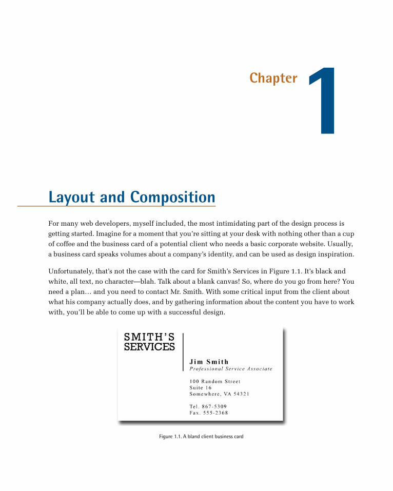
Unfortunately, that’s not the case with the card for Smith’s Services in Figure 1.1. It’s black and
white, all text, no character—blah. Talk about a blank canvas! So, where do you go from here? You
need a plan… and you need to contact Mr. Smith. With some critical input from the client about
what his company actually does, and by gathering information about the content you have to work
with, you’ll be able to come up with a successful design.
Figure 1.1. A bland client business card

Anyone, no matter what level of artistic talent, can come up with a design that works well and looks
good—all it takes is a little experience and a working knowledge of some basic layout principles.
So let’s start with the basics, and before long you’ll have the foundation necessary to design gallery-
quality websites.
The Design ProcessDesigning a website can be a double-edged sword. The process falls somewhere between art, science,
and problem solving. Yes, we want to create an individual site that’s aesthetically pleasing, but our
highest priority should be to meet the needs of our client. These needs may be lofty and elaborate,
or they might just be about making information available. If we fail to listen carefully, though, the
entire project will come falling down, along with our reputation. The technical details of developing,
hosting, and maintaining a website or application can be, well, technical. The process of creating
a design comp, however, can be boiled down to just three key tasks: discovery, exploration, and
implementation.
What’s a Comp?
The word comp is an abbreviation of the phrase “comprehensive dummy”—a term that comes from
the print design world. It’s a complete simulation of a printed layout that’s created before the layout
goes to press. In translating this term to web design, a comp is an image of a layout that’s created
before we begin to prototype the design in HTML.
DiscoveryThe discovery component of the design process is about meeting the clients and learning what they
do. This may feel a little counter-intuitive, but gathering information about who your clients are
and how they run their business is vital in coming up with an appropriate and effective design.
Before you schedule your first meeting with a client, spend some time researching their business.
If they’ve asked you to design a website, they may currently be without one, but google them anyway.
If you’re unable to find any information about their business specifically, try to learn as much as
you can about their industry before the first meeting. Whenever possible, the first meeting with a
client should be conducted in person. Sometimes, distance will dictate that the meeting has to occur
over the phone; but if the client is in town, schedule a time to meet face-to-face.
Keep in mind that this meeting is less about impressing the client, selling yourself, or selling a
website than it is about communication and establishing just what it is the client wants. Try to
listen more than you speak, and bring a pad of paper on which you can make notes. If you bring a
laptop or tablet with you to talk about website examples, limit the time spent using it. Computers
have screens, and people tend to stare at them; and so, if the client isn’t staring at the screen the
whole time, you’re likely to be as you write your notes. If you must drag some technology into the
meeting, use a voice recording app to record the conversation—with the client’s permission, of
The Principles of Beautiful Web Design2

course. In my experience, though, a pad of paper is less threatening and far less distracting to the
often not-so-tech-savvy client.
Client Meetings Don’t Have to Take Place in an Office
Even when I worked for a company in a big office, I had some of my most productive client meetings
at a café or over lunch. The feasibility of this approach depends on the client. If your contact seems
to be more the formal business type, don’t suggest it; in many cases, though, it’s a good way to make
a business meeting more personal.
Here are a few of the questions I like to ask in initial client meetings, even if I’ve already established
the answer myself via a search engine:
■ What does the company do?■ What is your role in the company?1
■ Does the company have an existing logo or brand? What is your goal in developing a website?■ What information do you wish to provide online?■ Who comprises your target audience? Do its members share any common demographics, like
age, sex, or a physical location?■ Who are your competitors and do they have websites?■ Do you have examples of websites you like or dislike?■ What kind of timeline do you have for the project and what is the budget?
If the project is to redesign an existing website, I also like to ask:
■ What are your visitors usually looking for when they come to your site?■ What are the problems with your current design?■ What do you hope to achieve with a redesign?■ Are there any elements of the current site that you want to keep?■ How do you think your visitors will react to a new site design?
Sometimes I start off with more questions than those listed here. Use your imagination and try to
come up with some creative queries that will really give you more insight into the client’s organiz-
ation. If you’re a programmer, avoid the tech jargon. If you’re a designer, avoid talking specifically
about design. Sure, that may be all you’re thinking about, but semantic markup, responsive layouts,
and so on will likely mean very little to the client. Worse still, these types of conversations can
bring misguided design opinions your way before you have a chance to start thinking about the
design yourself.
1 This question is especially important if this person is going to be your main point of contact.
3Layout and Composition
ExplorationThe next stage of the design process is to take the information you’ve learned from the client back
to your laboratory for analysis, dissection, and experimentation. You want to develop a firm grasp
on all the information, products, and services they have to offer, and play around with how these
could be arranged. Put yourself in the shoes of the website visitors and ask yourself what these
people are looking for. If you’re thinking about buying a product, what do you need to know before
you buy? If you’re signing up for a service, where would you learn about the different offerings and
which level of service you need? What is the clearest title possible for page x, and how many steps
does it take to reach page y?
In the world of web design, this is the beginning of a process known as information architecture,
or IA for short. For expansive websites and complex web applications, information architecture is
a career in itself, but the guiding principles of this field can provide a solid foundation for even the
smallest websites. For the exploration stage of our process, we want to focus on organizing the
content and flow of the website into a structure we can design around.
Two of the most essential tools for this task are scrap paper (or a whiteboard if you have one) and
a big pad of sticky notes. Make a list of all the bits and pieces of the website and start arranging
them into groups and subgroups. These are likely to move around quite a bit, and that’s where the
sticky notes come in handy. If you make a note for every section, subsection, and page of the site,
you can arrange them on a wall in the order they’ll appear in your site’s navigation. You’ll want to
avoid overwhelming the visitors with too many options, but you also don’t want to bury information
too deeply within the site; that is, too many clicks away from the home page. There are no hard-
and-fast rules for this activity; just make the information as obvious and as easy to reach as possible.
ImplementationNow that we’ve thought through how we want to organize the information we’re working with, the
implementation step of our design process begins with creating a layout. Regardless of the project,
try to avoid being caught up in the technology associated with building websites—at least at first.
At this point, it’s unimportant whether the site is going to comprise straight HTML, a template for
a content management system, or a Ruby on Rails application; the bottom line is that we have an
interface to design and a blank sheet of paper. “Paper?” That’s right, paper. Did you really think I
was going to let you go back to your precious computer already? No way. Here’s why: it’s easy to
lose focus on the design if you start thinking about the layout in front of a computer. If you start
out on paper, you can ignore the technical limitations of browsers and CSS, and focus on how you
want the final product to look. Now you might think that all good designers carry around fancy
hard-bound sketch books in which they flourish expensive markers and paintbrushes to design Da
Vinci-esque renderings of potential web page layouts. For my part, I use a 79-cent spiral-bound
notebook and any writing instrument I can find on my desk that still works.
The Principles of Beautiful Web Design4

I start out by sketching a few possible layouts. After I’ve produced a few, I decide on one I like,
jump into Photoshop, and use the rectangle tool to block out the areas I’ve marked down on my
paper. Once I’ve defined my layout, I experiment with foreground and background colors until I
have a solid color scheme. I continue twiddling the Photoshop knobs and pushing around pixels
until, finally, magically, I have a comp to show the client.
Simple, right? Okay, perhaps I skipped a few steps in that brief description. Honestly, though, when
people ask me how I do what I do, they usually receive a similar explanation. The truth is that there
are reams of now-subconscious information from my past experience and those old college design
and art classes that have helped me to define my own design process.
Learning how to design is like learning how to program. Some people have a bit of a knack for it,
but anyone can learn. Just as there’s good code and ugly code, there is good design and ugly design.
Learning some of the principles and conventions associated with design will help you to understand
the difference between the good, the bad, and the ugly, moving you towards establishing your own
design process.
Defining Good DesignThere are two main standpoints from which most people determine whether a website design is
“good” or “bad.” There’s a strict usability angle, which focuses on functionality, the effective
presentation of information, and efficiency. Then there’s the purely aesthetic perspective, which
is all about the artistic value and visual appeal of the design. Some people become caught up in
the aesthetics and graphics, and forget about the user, while some usability gurus get lost in their
user testing and forget about visual appeal. In order to reach people and retain their interest, it’s
essential to maximize both.
The most important point to keep in mind is that design is about communication. If you create a
website that works and presents information well, but looks ugly or fails to fit with the client’s
brand, no one will want to use it. Similarly, if you make a beautiful website that is hard to use or
inaccessible, people will leave. Indeed, the elements and functionality of a finished website design
should work as a single cohesive unit, so that:
Users are pleased by the design but drawn to the content
One of the biggest concerns among usability professionals is the time it takes users to scan the
page for the information they want, be it a piece of content, a link to another page, or a form
field. The design should not be a hindrance; it should act as a conduit between the user and
the information.
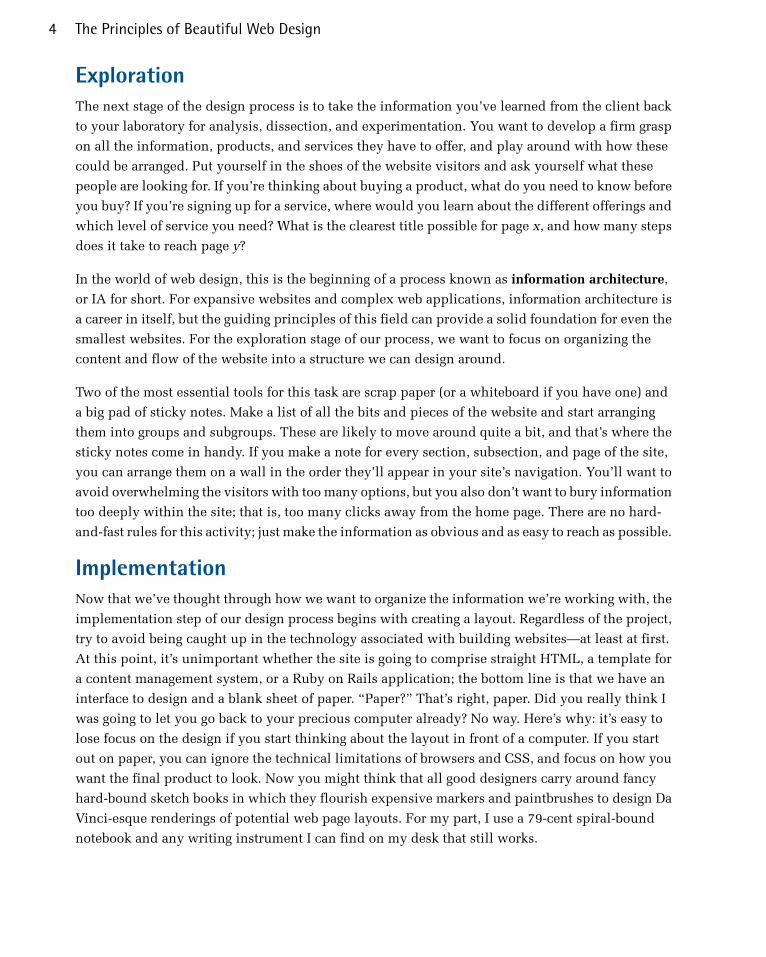
Harmony Republic2 (pictured in Figure 1.2) is a great example of a design that’s both beautiful
and usable. The richly textured, colorful illustrations flow around the structure of the page,
which is embellished with hand-drawn navigation and a simple layout. The abundance of
2 http://www.harmonyrepublic.com/
5Layout and Composition
handcrafted, organic elements creates contrast and helps to draw your eyes to the featured
artists without interfering with the pages’ readability or how it’s organized.
Figure 1.2. Harmony Republic
Users can move about easily via intuitive navigation
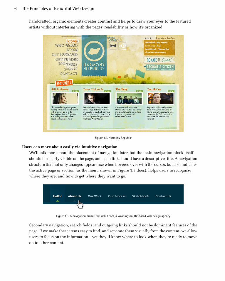
We’ll talk more about the placement of navigation later, but the main navigation block itself
should be clearly visible on the page, and each link should have a descriptive title. A navigation
structure that not only changes appearance when hovered over with the cursor, but also indicates
the active page or section (as the menu shown in Figure 1.3 does), helps users to recognize
where they are, and how to get where they want to go.
Figure 1.3. A navigation menu from nclud.com, a Washington, DC-based web design agency
Secondary navigation, search fields, and outgoing links should not be dominant features of the
page. If we make these items easy to find, and separate them visually from the content, we allow
users to focus on the information—yet they’ll know where to look when they’re ready to move
on to other content.
The Principles of Beautiful Web Design6

Users recognize each page as belonging to the site
Even if there’s a dramatic difference between the layout of the home page and the rest of the
site, a cohesive theme or style should exist across all site pages to help hold the design together.
Take a look at the three screenshots from the Moore School of Business website3 in Figure 1.4.
Although the content blocks on these pages are divided differently, there are several visual in-
dicators that let users know that these are pages from the same site. Much of this unity is due
to the repetition of the identity and navigation blocks. The consistent use of a very limited
color palette (black, gray, yellow, and red) also helps to unify the pages.
Figure 1.4. Pages from the Moore School of Business
3 http://mooreschool.sc.edu/
7Layout and Composition

Web Page AnatomyEven from a non-designer’s standpoint, defining a design that satisfies all the requirements I outlined
above is a simple task. It’s similar to making a phrase on your refrigerator with magnetic poetry
words. Although there are millions of ways to arrange the words, only a few arrangements make
any sense. The magnetic words are like the components, or blocks, of the web page. Although the
number of these necessary blocks depends on the size and subject of the site, most websites have
the components seen in Figure 1.5.
Figure 1.5. Anatomy of a website
Let’s look at each of these components in turn:
Containing block
Every web page has a container. This could be in the form of the page’s body tag, an all-containing
div tag. Without some sort of container, we’d have no place to put the contents of our page.
The elements would drift beyond the bounds of our browser window and off into empty space.
The width of this container can be fluid, meaning that it expands to fill the width of browser
window; or fixed, so that the content is the same width no matter what size the window is.
Logo
When designers refer to an identity, they’re referring to the logo and colors that exist across a
company’s various forms of marketing, such as business cards, letterhead, brochures, and so
on.4The identity block that appears on the website should contain the company’s logo or name,
and sit at the top of each page of the website. The identity block increases brand recognition
while informing users that the pages they’re viewing are part of a single site.
4 Many people use the words “identity” and “branding” interchangeably. Branding is a broad term that describes the process
of developing an awareness of a company, product, or service. The branding process involves advertising, market research,
customer feedback, and much more. Identity is actually a subset of branding in that it deals only with the visual aspects of
branding.
The Principles of Beautiful Web Design8

Navigation
It’s essential that the site’s navigation system is easy to find and use. Users expect to see navig-
ation right at the top of the page. Whether you plan to use vertical menus down the side of the
page, or a horizontal menu across the page, the navigation should be as close to the top of the
layout as possible. At the very least, all main navigation items should appear “above the fold.”
Above the Fold
The fold, as many designers call it, is where the content of a page ends before users scroll down.
This metaphor is derived from the fold in a newspaper. If you look at the cover of a folded
newspaper, most of the headlines and biggest news appear in the top half, so that the most
important news items can be seen at a glance when the newspaper is folded. The location of
the fold on a web page depends on the browser dimensions and the user’s screen resolution.
Content
Content is king. Content consists of any text, images, or videos found on a website. A typical
website visitor will enter and leave a website in a matter of seconds. If visitors are unable to
find what they’re looking for, they’ll undoubtedly close the browser or move on to another site.
It’s important to keep the main content block as the focal point of a design, so that visitors can
scan the page for the information they need.
Footer
Located at the bottom of the page, the footer usually contains copyright, contact, and legal in-
formation, as well as a few links to the main sections of the site. By separating the end content
from the bottom of the browser window, the footer should indicate to users that they’re at the
bottom of the page.
Whitespace
The graphic design term whitespace (or negative space) literally refers to any area of a page
without type or illustrations. While many novice web designers (and most clients) feel a need
to fill every inch of a web page with photos, text, tables, and data, empty space on a page is
every bit as important as having content. Without carefully planned whitespace, a design will
feel closed in, like a crowded room. Whitespace helps a design to breathe by guiding the user’s
eye around a page, but also helps to create balance and unity—two important concepts that
we’ll discuss in more detail later in this chapter.
At this point, we’ve had our initial meeting with Mr. Smith, our theoretical client, and it was
helpful. He explained very thoroughly what his business does and what he wants the site to achieve.
Even though we’ve yet to see actual content, we can use the standard blocks of web page anatomy
to start developing a layout. Although other site-specific blocks are worked into the designs of many
website layouts, the web page anatomy works to summarize the most common blocks.
Now that we have this information, how can we use it to create a foundational layout for Smith’s
Services? It’s time for some grid theory.
9Layout and Composition
Grid TheoryWhen most people think about grids, they think about engineering and architecture. However, the
grid is an essential tool for graphic design as well, and the use of grids in website design have ex-
ploded in popularity in the last few years.
Using a grid is more than simply making elements on the page square and lined up: it’s about pro-
portion as well. That’s where the theory comes into grid theory. Many art historians credit Dutch
painter Piet Mondrian as the father of graphic design for his sophisticated use of grids. Yet classical
grid theory has influenced successful artistic efforts for thousands of years. The concept of dividing
the elements of a composition extends back to the mathematical ideas established by Pythagoras
and his followers, who defined numbers as ratios rather than single units.
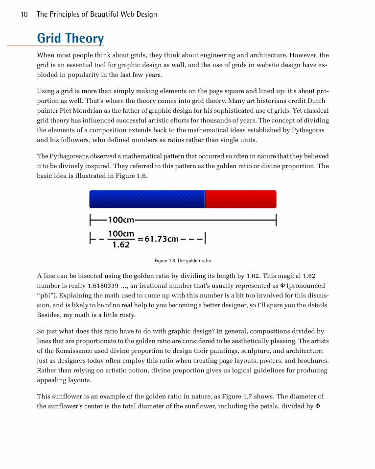
The Pythagoreans observed a mathematical pattern that occurred so often in nature that they believed
it to be divinely inspired. They referred to this pattern as the golden ratio or divine proportion. The
basic idea is illustrated in Figure 1.6.
Figure 1.6. The golden ratio
A line can be bisected using the golden ratio by dividing its length by 1.62. This magical 1.62
number is really 1.6180339 …, an irrational number that’s usually represented as Φ (pronounced
“phi”). Explaining the math used to come up with this number is a bit too involved for this discus-
sion, and is likely to be of no real help to you becoming a better designer, so I’ll spare you the details.
Besides, my math is a little rusty.
So just what does this ratio have to do with graphic design? In general, compositions divided by
lines that are proportionate to the golden ratio are considered to be aesthetically pleasing. The artists
of the Renaissance used divine proportion to design their paintings, sculpture, and architecture,
just as designers today often employ this ratio when creating page layouts, posters, and brochures.
Rather than relying on artistic notion, divine proportion gives us logical guidelines for producing
appealing layouts.
This sunflower is an example of the golden ratio in nature, as Figure 1.7 shows. The diameter of
the sunflower’s center is the total diameter of the sunflower, including the petals, divided by Φ.
The Principles of Beautiful Web Design10

Figure 1.7. The golden ratio in nature
The Rule of ThirdsA simplified version of the golden ratio is the rule of thirds. A line bisected by the golden ratio is
divided into two sections, one of which is approximately twice the size of the other. Dividing a
composition into thirds is an easy way to apply divine proportion without your calculator.
For quick layout experimentation, I like to start off by drawing a bunch of simple rule-of-thirds
grids with pencil and paper. Just draw a rectangle, divide it into thirds horizontally and vertically,
then draw a line between each vertical line to create six columns to work within, as shown in Fig-
ure 1.8.
Figure 1.8. A simple grid
11Layout and Composition

With this simple gridwork in place, we can begin to lay out our elements. This is often referred to
as a wireframe. Wireframes are simple sketches or layouts where you design blocks of content and
their positioning on the page. Wireframes are extremely useful, because you can quickly and easily
move elements around. The largest, outermost rectangle represents the container that we talked
about in the section called “Web Page Anatomy”. When using this method of layout design, I like
to place the biggest block first. Usually, that block represents the content. In my first rule-of-thirds
grid, I place the content block within the two-thirds of the layout at the lower-right. Next, I place
my navigation block in the middle third of the left-hand column. I place the text part of the identity
block over the left side of the content, and the image part of the identity over the menu. Finally, I
squash the copyright block below the content, in the right-hand column of the grid. The result is
the top-left of the four possible layout arrangements shown in Figure 1.9.
Figure 1.9. Four layouts in grids that follow the rule of thirds
These initial sketches provide a quick look into what general layout approaches might work for
your website. No need to stop there, though—the growth in popularity of grid-based design on the
Web has inspired many great articles about—and tools for—designing websites on a grid.
The Principles of Beautiful Web Design12

960 Grid SystemOne of my favorite tools for laying out website components is the set of templates and sketch sheets
from Nathan Smith’s 960 Grid System.5 Inspired by articles from web designers Khoi Vinh and
Mark Boulton, the 960 Grid System is primarily a CSS framework.
CSS Frameworks
A CSS framework is a CSS system that is set up to handle the grid structure of a website. Common
CSS frameworks are based on 12 column, 18 column, or 24 column layouts. The reason these
numbers are chosen is because they offer the most combinations of multiple column widths, since
these numbers are divisible by 1, 2, 3, 4, and 6.
The width of the templates comes from an article by Cameron Moll. In contemplating what width
would fit within 1,024px wide displays, Moll landed at 960px, and pointed out that the number
was divisible by 3, 4, 5, 6, 8, 10, 12, 15, and 16—making it an ideal width for grids. Nathan combined
these ideas into a framework and created three layout foundations: one with 12 columns, one with
16 columns, and one with 24. I personally prefer to work from the 12-column templates, as they
allow me to easily divide content into quarters by spanning four columns, thirds by spanning three,
and halves by spanning six. Using these sketch sheets makes it easy to transition from your sketches
and mock-ups to an actual working prototype. Note that this approach translates well to many
other popular CSS frameworks as well, such as Foundation6 and Bootstrap7, because they are also
based on 12-column grids―we’ll discuss Bootstrap and Foundation in more detail a little later.
As you experiment with different arrangements for your own layouts, use the columns of whatever
grid you’ve chosen as alignment guides for the identity, navigation, content, and footer blocks. It’s
very tempting to arrange all your elements within the same one or two blocks, but try to avoid
this—it’s not very interesting visually. Instead, consider pushing some elements into another column
or off the grid entirely. One of the biggest complaints new designers have about working with grids
is that everything looks boxed in and griddy. To those opposed to using grids for this reason, I say
take a look at websites such as 10K Apart,8 seen in Figure 1.10. The red columns you see are from
the 16-column 960 Grid System template, and do not exist in the actual website. With those columns
hidden, you might never realize this design was created on a grid.
To quote Josef Müller-Brockmann, graphic design pioneer (and author of Grid Systems in Graphic
Design): “The grid system is an aid, not a guarantee. It permits a number of possible uses and each
designer can look for a solution appropriate to his personal style. But one must learn how to use
the grid; it is an art that requires practice.”9
5 http://960.gs/6 http://foundation.zurb.com/7 http://getbootstrap.com/8 http://10k.aneventapart.com/9 Josef Müller-Brockmann, The Graphic Artist and His Design Problems, Arthur Niggli Ltd, Switzerland, 1961, p 92
13Layout and Composition
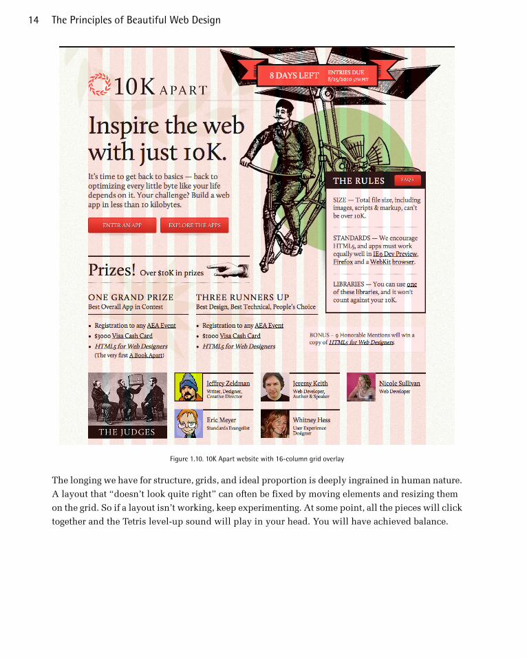
Figure 1.10. 10K Apart website with 16-column grid overlay
The longing we have for structure, grids, and ideal proportion is deeply ingrained in human nature.
A layout that “doesn’t look quite right” can often be fixed by moving elements and resizing them
on the grid. So if a layout isn’t working, keep experimenting. At some point, all the pieces will click
together and the Tetris level-up sound will play in your head. You will have achieved balance.
The Principles of Beautiful Web Design14
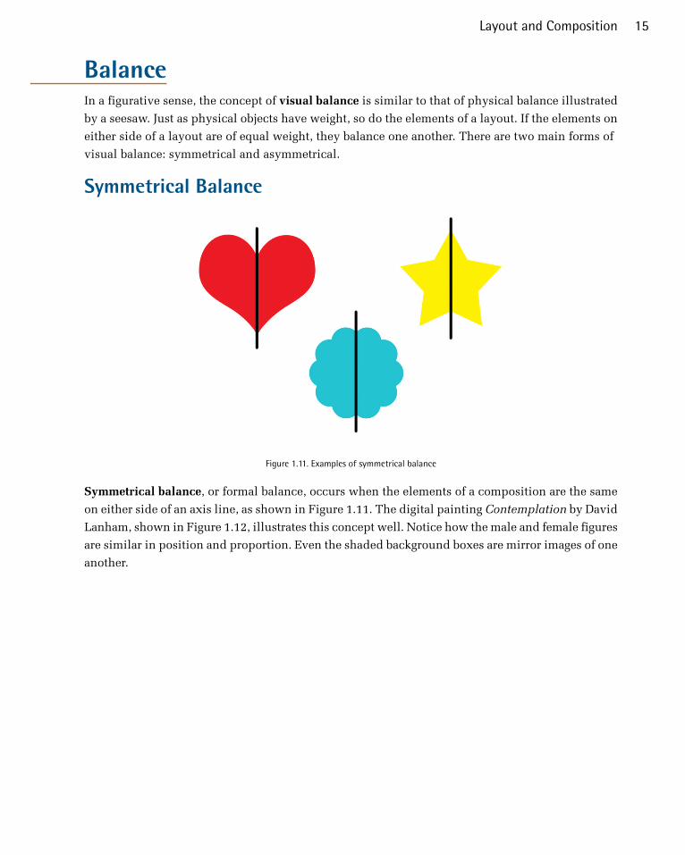
BalanceIn a figurative sense, the concept of visual balance is similar to that of physical balance illustrated
by a seesaw. Just as physical objects have weight, so do the elements of a layout. If the elements on
either side of a layout are of equal weight, they balance one another. There are two main forms of
visual balance: symmetrical and asymmetrical.
Symmetrical Balance
Figure 1.11. Examples of symmetrical balance
Symmetrical balance, or formal balance, occurs when the elements of a composition are the same
on either side of an axis line, as shown in Figure 1.11. The digital painting Contemplation by David
Lanham, shown in Figure 1.12, illustrates this concept well. Notice how the male and female figures
are similar in position and proportion. Even the shaded background boxes are mirror images of one
another.
15Layout and Composition

Figure 1.12. Symmetrical balance: Contemplation by David Lanham10
Although it may not be practical for all designs and clients, this type of symmetry—called horizontal
symmetry—can be applied to website layouts by centering content or balancing it between columns.
The Albion West Coast page11 is an example of such symmetry. Notice on the screenshot in Fig-
ure 1.13 that the content areas are balanced in perfect symmetry, While some elements, like the
hand-drawn sketch in the background, add subtle variation to the site.
Figure 1.13. Albion home page
The two other forms of symmetrical balance are less common in website design, due to the nature
of the medium. They are, however, commonly exhibited in logo and print design:
10 http://dlanham.com/11 http://www.albionwestcoast.com/
The Principles of Beautiful Web Design16

■ bilateral symmetry, which exists when a composition is balanced on more than one axis■ radial symmetry, which occurs when elements are equally spaced around a central point
Asymmetrical Balance
Figure 1.14. An example of asymmetrical balance
Asymmetrical balance, or informal balance, is a little more abstract (and more visually interesting
in general) than symmetrical balance. An example of asymmetrical balance is shown in Figure 1.14.
Rather than mirror images on either side of the layout, asymmetrical balance involves objects of
differing size, shape, tone, or placement. These objects are arranged so that, despite their differences,
they equalize the weight of the page; for instance, if you have a large object on one side of a page,
and partner it with several smaller items on the other side, the composition can still feel balanced.
The concert poster by my friend Jeremy Darty presented in Figure 1.15 is a fine example of asym-
metrical balance. The visual weight of the large pink flamingo on the left is balanced by the combined
weight of the smaller flamingos and text blocks on the right-hand side of the layout. Notice, also,
Jeremy’s use of the rule of thirds. The blue cloud behind the Pop Sucks title takes up one-third of
the vertical space and spans two-thirds of the horizontal.
Figure 1.15. Asymmetrically balanced design by Jeremy Darty
17Layout and Composition
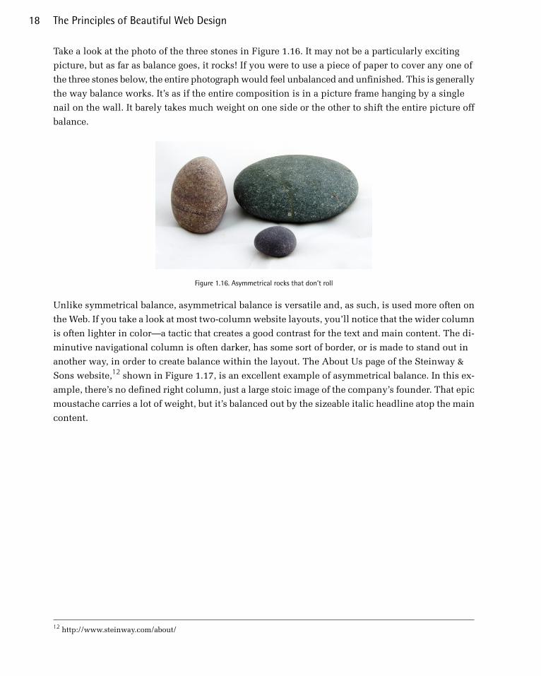
Take a look at the photo of the three stones in Figure 1.16. It may not be a particularly exciting
picture, but as far as balance goes, it rocks! If you were to use a piece of paper to cover any one of
the three stones below, the entire photograph would feel unbalanced and unfinished. This is generally
the way balance works. It’s as if the entire composition is in a picture frame hanging by a single
nail on the wall. It barely takes much weight on one side or the other to shift the entire picture off
balance.
Figure 1.16. Asymmetrical rocks that don’t roll
Unlike symmetrical balance, asymmetrical balance is versatile and, as such, is used more often on
the Web. If you take a look at most two-column website layouts, you’ll notice that the wider column
is often lighter in color—a tactic that creates a good contrast for the text and main content. The di-
minutive navigational column is often darker, has some sort of border, or is made to stand out in
another way, in order to create balance within the layout. The About Us page of the Steinway &
Sons website,12 shown in Figure 1.17, is an excellent example of asymmetrical balance. In this ex-
ample, there’s no defined right column, just a large stoic image of the company’s founder. That epic
moustache carries a lot of weight, but it’s balanced out by the sizeable italic headline atop the main
content.
12 http://www.steinway.com/about/
The Principles of Beautiful Web Design18
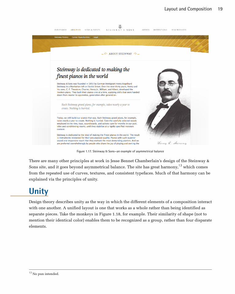
Figure 1.17. Steinway & Sons—an example of asymmetrical balance
There are many other principles at work in Jesse Bennet Chamberlain’s design of the Steinway &
Sons site, and it goes beyond asymmetrical balance. The site has great harmony,13 which comes
from the repeated use of curves, textures, and consistent typefaces. Much of that harmony can be
explained via the principles of unity.
UnityDesign theory describes unity as the way in which the different elements of a composition interact
with one another. A unified layout is one that works as a whole rather than being identified as
separate pieces. Take the monkeys in Figure 1.18, for example. Their similarity of shape (not to
mention their identical color) enables them to be recognized as a group, rather than four disparate
elements.
13 No pun intended.
19Layout and Composition

Figure 1.18. Unity among the monkeys
Although less of an issue these days, unity is one of the many reasons why web designers have always
despised HTML frames. It’s important that unity exists not only within each element of a web page,
but across the entire web page—the page itself must work as a unit. We can use a couple of ap-
proaches to achieve unity in a layout (aside from avoiding frames): proximity and repetition.
ProximityProximity is an obvious, but often overlooked, way to make a group of objects feel like a single unit.
Placing objects close together within a layout creates a focal point towards which the eye will
gravitate. Take a look at the digital painting in Figure 1.19. While composed of a seemingly random
assortment of strokes, the five strokes that are the closest to each other appear to form a unified
object.
Figure 1.19. Creating a group using proximity
We practice the concept of proximity on the Web when we start setting margins and padding for
elements. For instance, when I define the CSS style rules for sites, I usually change the default
margin that exists between common HTML elements such as headings (h1, h2, h3 …), paragraphs,
blockquotes, and even images. By altering these values, I can cause more or less space to appear
between elements, thereby creating groups.
If you look at the two columns of text in Figure 1.20, you’ll notice that they look similar. The only
difference is in the placement of the headings. In the column on the left, the word “Unkgnome” is
The Principles of Beautiful Web Design20
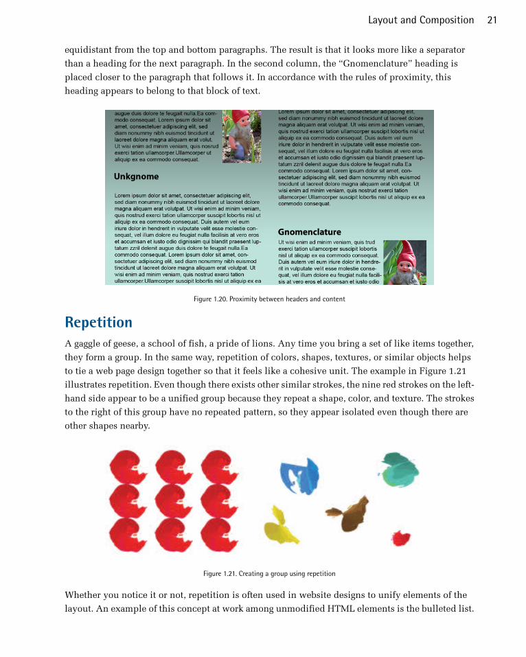
equidistant from the top and bottom paragraphs. The result is that it looks more like a separator
than a heading for the next paragraph. In the second column, the “Gnomenclature” heading is
placed closer to the paragraph that follows it. In accordance with the rules of proximity, this
heading appears to belong to that block of text.
Figure 1.20. Proximity between headers and content
RepetitionA gaggle of geese, a school of fish, a pride of lions. Any time you bring a set of like items together,
they form a group. In the same way, repetition of colors, shapes, textures, or similar objects helps
to tie a web page design together so that it feels like a cohesive unit. The example in Figure 1.21
illustrates repetition. Even though there exists other similar strokes, the nine red strokes on the left-
hand side appear to be a unified group because they repeat a shape, color, and texture. The strokes
to the right of this group have no repeated pattern, so they appear isolated even though there are
other shapes nearby.
Figure 1.21. Creating a group using repetition
Whether you notice it or not, repetition is often used in website designs to unify elements of the
layout. An example of this concept at work among unmodified HTML elements is the bulleted list.
21Layout and Composition

The bullet that precedes each list item is a visual indicator that the bullet items are parts of a whole.
Repeated patterns and textures can also help to unify a design. Take a look at the screenshot of
Dribbble14, a hub for designers and developers to showcase and share their work. This layout contains
many eye-catching elements, but the repeated thumbnail images with the views, comments & like
icons create a sense of unity, while the navigation bar and the open content area give plenty of room
to show off all of this awesome, unique design work.
Figure 1.22. Dribbble homepage
EmphasisClosely related to the idea of unity is the concept of emphasis or dominance. Rather than focusing
on the various elements of a design fitting together, emphasis is about making a particular feature
draw the viewer’s attention. When you design a web page layout, often you’ll identify an item in
the content, or the layout itself, that you want to stand out. Perhaps it’s a button for users to press,
or an error message for them to read. One method of achieving such emphasis is by making that
element into a focal point. A focal point is any element on a page that draws the viewer’s eye, rather
than just being part of the page as a whole or blending in with its surroundings. As with unity, there
are a few tried-and-true methods of achieving a focal point.
PlacementAlthough the constraints of practical web design do not often allow for it, the direct center of a
composition is the point at which users look first, and is typically the strongest location for producing
emphasis. The further from the center an element is, the less likely it will be noticed first. On the
Web, the top-left corner of the page also tends to demand a lot of attention for those of us who read
14 https://dribbble.com/
The Principles of Beautiful Web Design22
from left to right (remember that many languages, like Hebrew and Arabic, are read from right to
left) and scan a page from top to bottom.
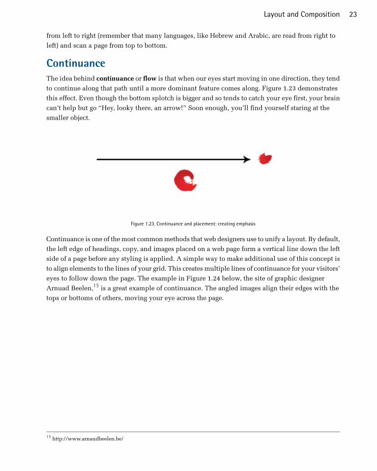
ContinuanceThe idea behind continuance or flow is that when our eyes start moving in one direction, they tend
to continue along that path until a more dominant feature comes along. Figure 1.23 demonstrates
this effect. Even though the bottom splotch is bigger and so tends to catch your eye first, your brain
can’t help but go “Hey, looky there, an arrow!” Soon enough, you’ll find yourself staring at the
smaller object.
Figure 1.23. Continuance and placement: creating emphasis
Continuance is one of the most common methods that web designers use to unify a layout. By default,
the left edge of headings, copy, and images placed on a web page form a vertical line down the left
side of a page before any styling is applied. A simple way to make additional use of this concept is
to align elements to the lines of your grid. This creates multiple lines of continuance for your visitors’
eyes to follow down the page. The example in Figure 1.24 below, the site of graphic designer
Arnuad Beelen,15 is a great example of continuance. The angled images align their edges with the
tops or bottoms of others, moving your eye across the page.
15 http://www.arnaudbeelen.be/
23Layout and Composition

Figure 1.24. Continuance on Arnaud Beelen’s site
IsolationIn the same way that proximity helps us create unity in a design, isolation promotes emphasis. An
item that stands out from its surroundings will tend to demand attention. Even though he’s sad to
be apart from his buddies, the isolated monkey in Figure 1.25 stands out as a focal point on the
page.
Figure 1.25. Isolation: a sad monkey
ContrastContrast is defined as the juxtaposition of dissimilar graphic elements, and is the most common
method used to create emphasis in a layout. The concept is simple: the greater the difference between
a graphic element and its surroundings, the more that element will stand out. Contrast can be created
using differences in color (which I’ll discuss in more detail in Chapter 2), size, and shape. Take a
look at the Twitter home page in Figure 1.26.
The Principles of Beautiful Web Design24
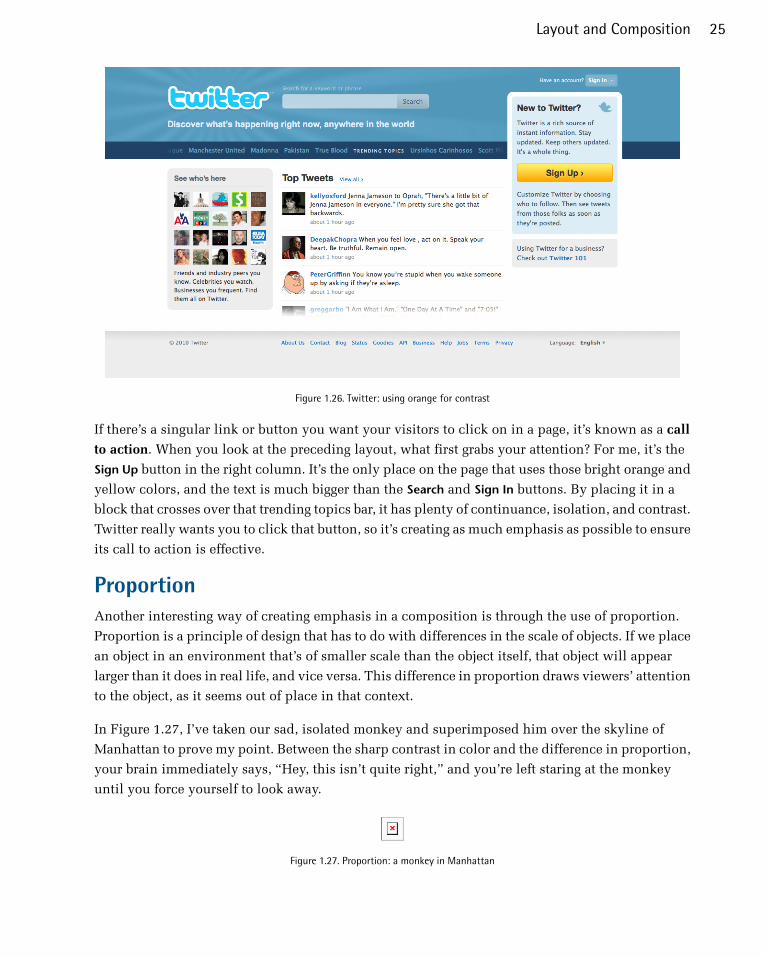
Figure 1.26. Twitter: using orange for contrast
If there’s a singular link or button you want your visitors to click on in a page, it’s known as a call
to action. When you look at the preceding layout, what first grabs your attention? For me, it’s the
Sign Up button in the right column. It’s the only place on the page that uses those bright orange and
yellow colors, and the text is much bigger than the Search and Sign In buttons. By placing it in a
block that crosses over that trending topics bar, it has plenty of continuance, isolation, and contrast.
Twitter really wants you to click that button, so it’s creating as much emphasis as possible to ensure
its call to action is effective.
ProportionAnother interesting way of creating emphasis in a composition is through the use of proportion.
Proportion is a principle of design that has to do with differences in the scale of objects. If we place
an object in an environment that’s of smaller scale than the object itself, that object will appear
larger than it does in real life, and vice versa. This difference in proportion draws viewers’ attention
to the object, as it seems out of place in that context.
In Figure 1.27, I’ve taken our sad, isolated monkey and superimposed him over the skyline of
Manhattan to prove my point. Between the sharp contrast in color and the difference in proportion,
your brain immediately says, “Hey, this isn’t quite right,” and you’re left staring at the monkey
until you force yourself to look away.
Figure 1.27. Proportion: a monkey in Manhattan
25Layout and Composition
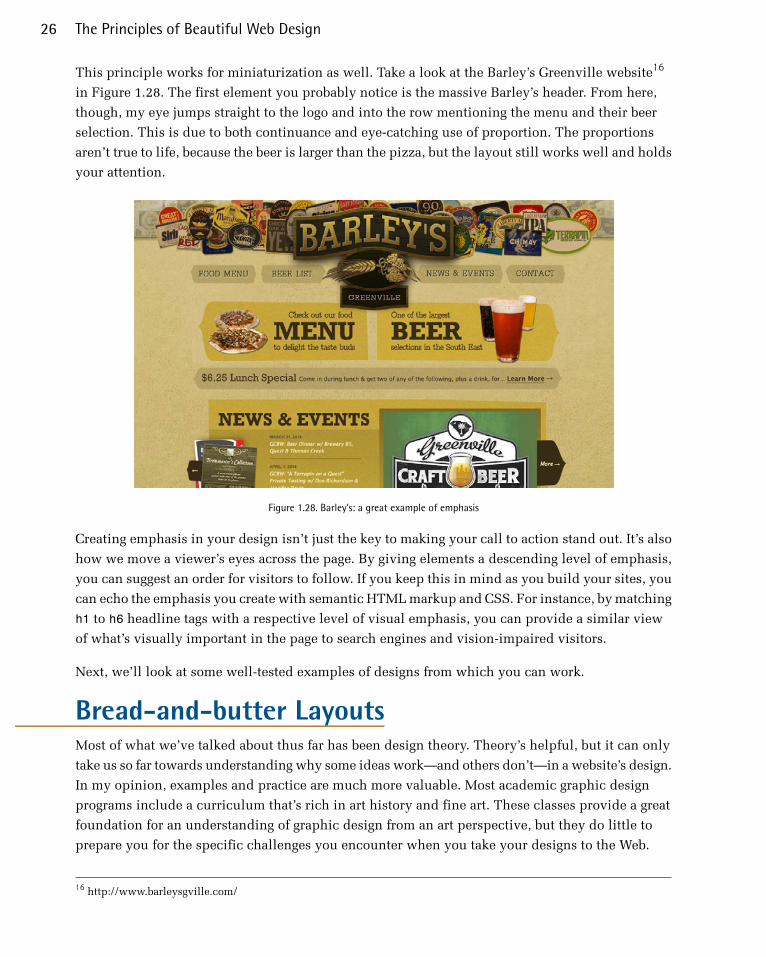
This principle works for miniaturization as well. Take a look at the Barley’s Greenville website16
in Figure 1.28. The first element you probably notice is the massive Barley’s header. From here,
though, my eye jumps straight to the logo and into the row mentioning the menu and their beer
selection. This is due to both continuance and eye-catching use of proportion. The proportions
aren’t true to life, because the beer is larger than the pizza, but the layout still works well and holds
your attention.
Figure 1.28. Barley’s: a great example of emphasis
Creating emphasis in your design isn’t just the key to making your call to action stand out. It’s also
how we move a viewer’s eyes across the page. By giving elements a descending level of emphasis,
you can suggest an order for visitors to follow. If you keep this in mind as you build your sites, you
can echo the emphasis you create with semantic HTML markup and CSS. For instance, by matching
h1 to h6 headline tags with a respective level of visual emphasis, you can provide a similar view
of what’s visually important in the page to search engines and vision-impaired visitors.
Next, we’ll look at some well-tested examples of designs from which you can work.
Bread-and-butter LayoutsMost of what we’ve talked about thus far has been design theory. Theory’s helpful, but it can only
take us so far towards understanding why some ideas work—and others don’t—in a website’s design.
In my opinion, examples and practice are much more valuable. Most academic graphic design
programs include a curriculum that’s rich in art history and fine art. These classes provide a great
foundation for an understanding of graphic design from an art perspective, but they do little to
prepare you for the specific challenges you encounter when you take your designs to the Web.
16 http://www.barleysgville.com/
The Principles of Beautiful Web Design26

Pablo Picasso once said, “I am always doing that which I cannot do, in order that I may learn how
to do it.” While I like to take that approach when designing a new website, it’s important first to
know what you can do. When you look out across the Internet, you can see that the possibilities
for layout are endless. Depending on the goals of the site, though, only a few of those possibilities
make good design sense. That’s why we see certain configurations of identity, navigation, and
content over and over again.
In this section, we’ll talk about the three most common layouts, and explore some of their advantages
and disadvantages.
Left-column NavigationRegardless of whether we’re talking about liquid or fixed-width layout design, the left-column
navigation format is a time-honored standard. The layout of the Arbor Restaurant Site17 pictured
in Figure 1.29, is a classic example of this configuration. Many sites that fit into this mold don’t
necessarily use the left column as the main navigation block—sometimes you’ll see the navigation
along the top of the page—but they still divide the layout below the header into a narrow (one-third
or less) left column and a wide right column. It’s like a security blanket, or that comfortable shirt
with holes in the armpits that you wear once a week—even though it drives your spouse crazy. For
those reasons, a layout featuring left-column navigation is a safe choice for most projects.
Figure 1.29. Left-column navigation at Arbor
The downside to sites that use left-column navigation is that they can appear to lack creativity. It’s
been done so many times, in so many ways, over so many years that these sites tend to look the
same. That’s not to say you should avoid using a left-column navigation layout. At a guess, I’d say
that 75% of the sites I’ve designed have a secondary left-column navigation, but I do try to mix it
up a little when I can.
17 http://www.arbor-restaurant.co.uk/
27Layout and Composition

Speaking of mixing it up, how about picking that left column up and sticking it on the other side
of the content? Then you’d have a right-column navigation layout.
Right-column NavigationIf you’re going to restrict your main content to one side of the page, it’s more widespread these days
to push it to the left, placing navigation, advertising, and subsidiary content on the right. This is
an especially common configuration for news sites, social networks, and websites with expansive
navigation schemes that are unable to be contained within a simple top navigation. BlueCross
BlueShield of South Carolina18 is an example of such a site. It features several different layouts and
color schemes for each section. The screenshot you see in Figure 1.30 is a fourth-level page—that
is, it’s four clicks away from the front page. By keeping the secondary navigation on the right, it
stays out of the way of visitors who, if they’re this deep already, are looking for some very specific
content.
Figure 1.30. Right-column navigation at BlueCross BlueShield of South Carolina
Ultimately, the decision on whether to put a navigation column on the left or the right is a judgment
call that’s really about the amount and type of content you have to organize. If it’s a simple site that
doesn’t require any secondary navigation, consider a narrow, column-less layout. Good design is
often more about what you leave out than what you put in. If you do need a secondary column, just
remember that the content is what your visitors are there for … and more and more, they’re looking
for it on the left.
18 http://www.southcarolinablues.com/
The Principles of Beautiful Web Design28
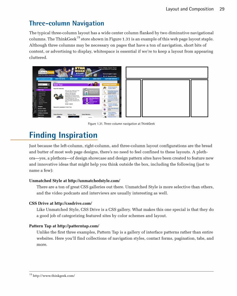
Three-column NavigationThe typical three-column layout has a wide center column flanked by two diminutive navigational
columns. The ThinkGeek19 store shown in Figure 1.31 is an example of this web page layout staple.
Although three columns may be necessary on pages that have a ton of navigation, short bits of
content, or advertising to display, whitespace is essential if we’re to keep a layout from appearing
cluttered.
Figure 1.31. Three-column navigation at ThinkGeek
Finding InspirationJust because the left-column, right-column, and three-column layout configurations are the bread
and butter of most web page designs, there’s no need to feel confined to these layouts. A pleth-
ora—yes, a plethora—of design showcase and design pattern sites have been created to feature new
and innovative ideas that might help you think outside the box, including the following (just to
name a few):
Unmatched Style at http://unmatchedstyle.com/
There are a ton of great CSS galleries out there. Unmatched Style is more selective than others,
and the video podcasts and interviews are usually interesting as well.
CSS Drive at http://cssdrive.com/
Like Unmatched Style, CSS Drive is a CSS gallery. What makes this one special is that they do
a good job of categorizing featured sites by color schemes and layout.
Pattern Tap at http://patterntap.com/
Unlike the first three examples, Pattern Tap is a gallery of interface patterns rather than entire
websites. Here you’ll find collections of navigation styles, contact forms, pagination, tabs, and
more.
19 http://www.thinkgeek.com/
29Layout and Composition
Yahoo Design Pattern Library at http://developer.yahoo.com/ypatterns/
Similar to Pattern Tap, but with far fewer examples and variations, the Yahoo Design Pattern
Library is a great place to learn about standard user interface elements.
Using a Morgue FileI know what you’re thinking: “Great, I have a bunch of galleries and pattern libraries to look at—now
what?” One of the most useful tips my first graphic design professor taught me was to create a
morgue file whenever I was collecting inspiration for a large project. The concept is fairly simple:
if you’re doing an illustration or marketing project that involves trains, you clip out and print up
anything you can find that might give you inspiration and keep it all in a folder. It helps with your
current project, and should you ever need to do another project involving trains, you’ll have lots
of inspiration to hand.
The morgue file idea slipped my mind until a few years ago. I found myself looking for a site I’d
seen in a favorite gallery site, but for which I was unable to remember the name or address. Doubtless
it’s great to have access to lots of inspirational resources, but they’re useless if you can’t find the
specific example you’re looking for. That was when I started my own digital morgue file. Lately,
I’ve been using an application called Ember20 for Mac that allows me to create a screenshot of part
of the screen, or even a whole web page (no more scroll, snap, scroll, snap). Ember also lets you
give each snapshot a name and tags to make them easy to find later. Of course, no matter what op-
erating system you prefer, there are plenty of ways to take a snapshot for your morgue file. Having
a repository of website designs that I can look at has been a handy resource on countless occasions
when I’ve been searching for inspiration.
Capture a Screenshot for Your Own Morgue File
1. Select the browser window that’s displaying the page you wish to save as a screenshot.
2. Copy a screenshot of the browser window to your clipboard:
■ On a PC, press Alt+Print Screen or use the native Snipping Tool (Windows Vista or 7) to grab
a section of the screen.
■ On a Mac, press Shift+Command+4, then Space to turn the cursor into a camera. Then, hold
down Ctrl, and click on the browser window.
3. At this point, you should have a screenshot of the browser window in your clipboard. Open a
new document in your favorite graphics program or document editor, and paste in the screenshot.
4. Save your image or document.
20 http://realmacsoftware.com/ember/
The Principles of Beautiful Web Design30

Trends: Popular FavoritesIf you’re feeling so overwhelmed by the resources above that even contemplating starting a morgue
file for inspiration is beyond you, take a few minutes to browse through those sites all the same.
Look past the colors and textures to the boxes that make up the layout, and try to identify standard
ideas and design trends. By doing this, it’s possible to notice a few trends that seem to be emerging
in website layouts.
Navigationless Magazine StyleIf you’re reading this paragraph, I’m guessing you probably didn’t arrive via the table of contents.
On the Web, we tend to be a lot more goal-oriented and consume information in bits and pieces.
Site navigation allows us to be quick, efficient… and erratic. What if you don’t want your visitors
skipping to another page? What if the information you need to convey is best consumed as a whole,
like a book or magazine article? If that’s the case, why include navigation at all? That’s the approach
that TheDesignBlog21 takes with each of its art-directed articles. Other than a tiny Design Informer
logo in the header graphic, there are no site navigation links on each article’s page until you reach
the comments section in the footer. A trend from one website, you ask? Take a look at the other
examples in Figure 1.32, from Swississ22 and Paste Magazine.23
Figure 1.32. Not much navigation going on here, just great uninterrupted content
21 http://thedsgnblog.com/22 http://www.swiss-miss.com/23 http://www.pastemagazine.com/
31Layout and Composition
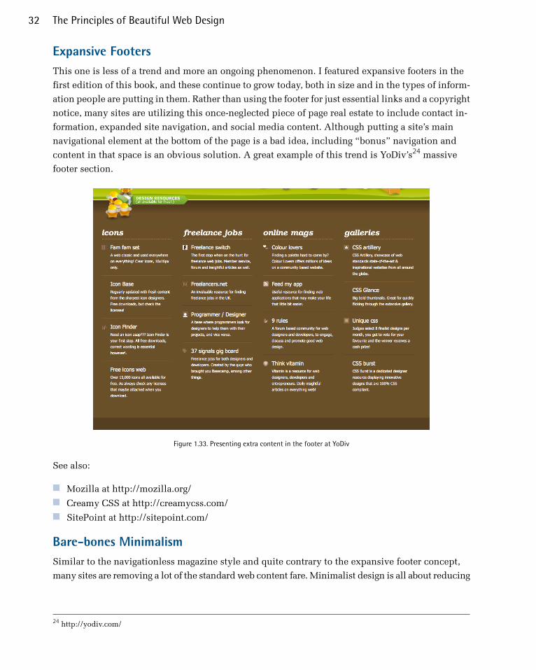
Expansive FootersThis one is less of a trend and more an ongoing phenomenon. I featured expansive footers in the
first edition of this book, and these continue to grow today, both in size and in the types of inform-
ation people are putting in them. Rather than using the footer for just essential links and a copyright
notice, many sites are utilizing this once-neglected piece of page real estate to include contact in-
formation, expanded site navigation, and social media content. Although putting a site’s main
navigational element at the bottom of the page is a bad idea, including “bonus” navigation and
content in that space is an obvious solution. A great example of this trend is YoDiv’s24 massive
footer section.
Figure 1.33. Presenting extra content in the footer at YoDiv
See also:
■ Mozilla at http://mozilla.org/■ Creamy CSS at http://creamycss.com/■ SitePoint at http://sitepoint.com/
Bare-bones MinimalismSimilar to the navigationless magazine style and quite contrary to the expansive footer concept,
many sites are removing a lot of the standard web content fare. Minimalist design is all about reducing
24 http://yodiv.com/
The Principles of Beautiful Web Design32

your design to the most essential elements. In Figure 1.34, Analog Coop25 accomplishes this by re-
ducing its copy to a single, fun-to-read page. For Kha Hoang,26 being a minimalist is having a home
page with simply a list of portfolio links, a quote on design, and some contact info. It’s an easy
concept to apply: just go through each element of each page and ask yourself what it’s adding to
your website. If you’re without an answer, toss it out.
Figure 1.34. Two flavors of minimalism: the Analog Coop and the portfolio of Kha Hoang
Minimalism isn’t a new design trend by any stretch of the imagination—even on the Web. In the
art world, the minimalist movement of the 1960s and ’70s was a reaction against the overly self-
expressive era of abstract expressionism. Similarly, the recent explosion in minimalism and single-
page designs on the Web is a reaction against the overly interactive Web 2.0 era. It’s an attempt at
balancing out the hustle and bustle of social media with the equivalent to a peaceful café or quiet
art gallery.
See also:
■ Brand New at http://www.underconsideration.com/brandnew/■ Sage Media at http://www.sagemediari.com/
Fresh TrendsWith every passing year, new techniques pop up that are interesting or simply offer new ways of
getting attention. They employ new capabilities or new scripts, and are rapidly adopted across the
field of web design. The latest trends do just that—harnessing the power of JavaScript or CSS3 to
add new capabilities, effects, and functionality that we’ve never seen before.
25 http://analog.coop/26 http://khahoang.com/
33Layout and Composition
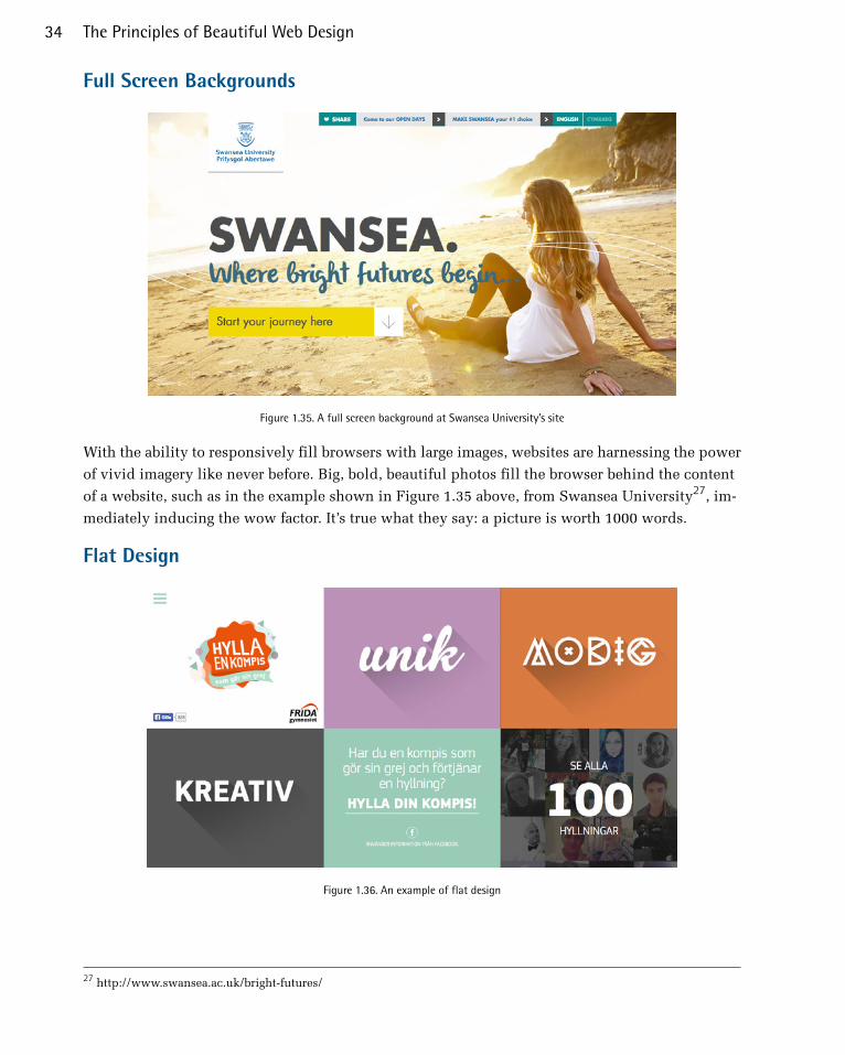
Full Screen Backgrounds
Figure 1.35. A full screen background at Swansea University’s site
With the ability to responsively fill browsers with large images, websites are harnessing the power
of vivid imagery like never before. Big, bold, beautiful photos fill the browser behind the content
of a website, such as in the example shown in Figure 1.35 above, from Swansea University27, im-
mediately inducing the wow factor. It’s true what they say: a picture is worth 1000 words.
Flat Design
Figure 1.36. An example of flat design
27 http://www.swansea.ac.uk/bright-futures/
The Principles of Beautiful Web Design34

It seems like the more modern we become, the more we lean towards simplification. Less is more
takes on a whole new life, with no frills, and no extras. Flat design seeks to refine web design to its
simplest shapes and forms. Previously, web design has been about depth, adding gradients and
rounded shadows to give a website a dimensional look. Now, depth is portrayed with sharp shadows,
or a darker color. A popular example of this is the long shadow effect, which seeks to fool the eye
with a shadow directed on one side of an object.
Video Backgrounds
Figure 1.37. Video backgrounds
Another new development is the ability to play full-screen video backgrounds that respond to the
size of your browser, with scripts such as fitvids.js28. You can also set a web video to autoplay when
the page loads, such as in Doug Aitken’s The Source29 site, as shown in Figure 1.37. The rest of the
website content is overlaid over the video, just as it would be with a full-screen background image.
28 http://fitvidsjs.com/29 http://dougaitkenthesource.com/
35Layout and Composition
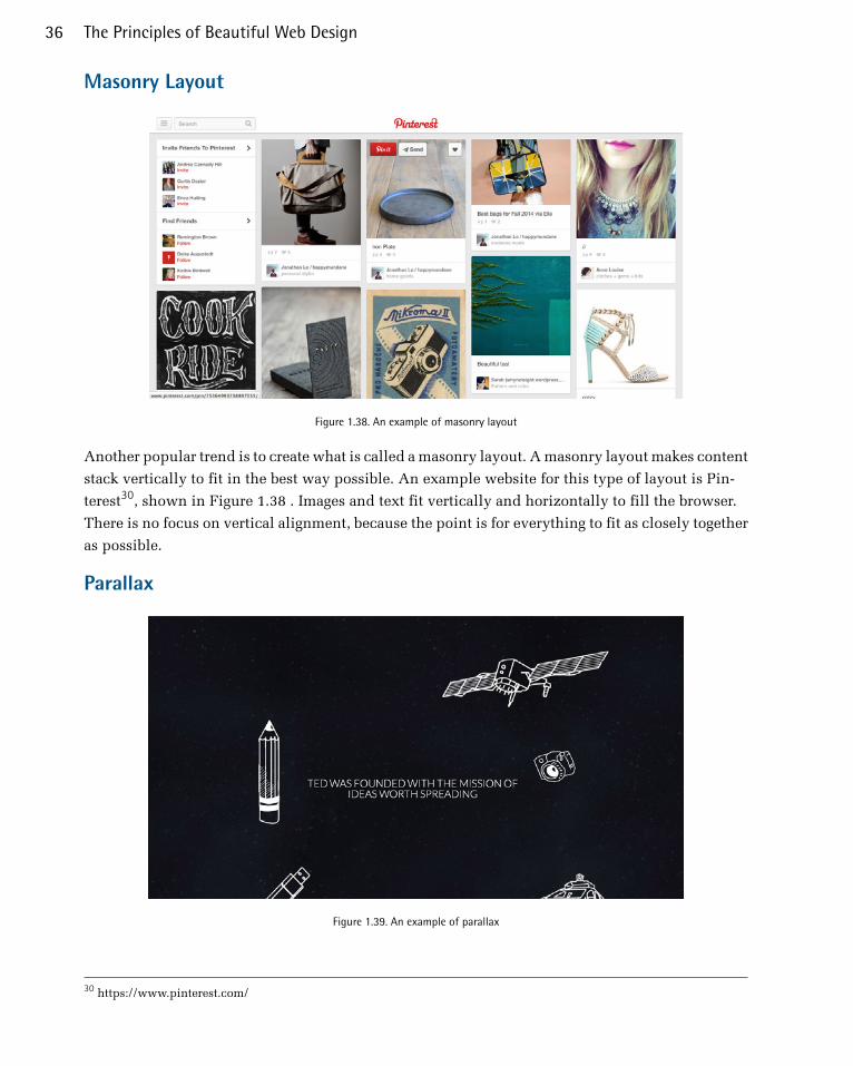
Masonry Layout
Figure 1.38. An example of masonry layout
Another popular trend is to create what is called a masonry layout. A masonry layout makes content
stack vertically to fit in the best way possible. An example website for this type of layout is Pin-
terest30, shown in Figure 1.38 . Images and text fit vertically and horizontally to fill the browser.
There is no focus on vertical alignment, because the point is for everything to fit as closely together
as possible.
Parallax
Figure 1.39. An example of parallax
30 https://www.pinterest.com/
The Principles of Beautiful Web Design36

Parallax scrolling has exploded in popularity. The concept is that a stationary image is placed in
the background, but that the rest of the site scrolls over the top of it, creating a dimensional effect.
TEDxGUC31, shown in Figure 1.39, is a example of parallax scrolling at its best. As you scroll, some
objects scroll, while others stay stationary. This effect is popular because it gives a feeling of being
immersed in the site.
Resizing: Fixed, Fluid, or Responsive LayoutsBack when we were drawing our first layout blocks with pencil and paper, I explained that the
outer rectangle we were designing within was the containing block. In print design, the containing
block is a physical object like a business card or a billboard. On the Web, our container is the browser
window. Should the design fill the browser window, or should it have a set width? This decision
is one that has plagued web designers since the very beginning—all the way back to the days when
we used tables and spacer.gif files to lay out web page content.
Fixed Width LayoutsI mentioned the 960 Grid system earlier, which is used to create a fixed width layout. A layout is
termed “fixed width” when the overall width of the website is a set number of pixels. The example
960 grid layout is 960 pixels wide, and centered in the browser. If the user resizes their browser
window to be wider than 960 pixels, the space from the edge of the browser on the right and left
sides of the website will grow equally. This is fine for larger displays, but when the user has a
browser window smaller than 960 pixels wide (such as could be the case on mobile or tablet dis-
plays), the site is clipped, and scrollbars will appear. It is generally considered to be acceptable for
users to scroll vertically to view more content, but having them scroll in all four directions is un-
desirable. Fixed width layouts used to be commonplace, because the fixed dimensions meant that
layouts originally designed in Photoshop could easily be rendered in the browser, but have been
overtaken by fluid and, increasingly, responsive layouts.
Fluid LayoutsA fluid or liquid layout is designed with percentage-based widths, so that the container stretches
when you resize the browser window. These layouts take more thought to plan, as you have to
foresee problems that might occur at every possible width. Sometimes pixel-width columns are
mixed with percentage-based columns in a fluid layout, but the idea is to show the user as much
horizontal content as will fit on their screen. Typically, fluid layouts take advantage of the min-
width and max-width properties of CSS, ensuring the container doesn’t become ridiculously narrow
or wide.
One reason some designers reject fluid layouts is because they think it impedes them when using
a grid to create their designs. There are several resources available for designing fluid layouts on a
31 http://www.tedxguc.com/
37Layout and Composition

grid, including a fluid adaptation of the 960 Grid System.32 Ultimately, though, the decision to use
one type of layout over the other should really be determined by the target audience, and the access-
ibility goals of each individual website. The pros and cons of each layout type are fairly well-defined,
as Table 1.1 shows.
Table 1.1. Fixed versus liquid layouts: the pros and cons
ConsPros
Fixed width ■■ can appear dwarfed in large browser
windows
gives designer more control over
how an image floated within the
content will look■ takes control away from the user
■ allows for planned whitespace
■ improves readability with narrower
text blocks
Liquid width ■■ challenging to read when text is
spanning a wide distance
adapts to most screen resolutions
and devices
■ ■reduces user scrolling harder to execute successfully
■ limits or imposes on whitespace
With these pros and cons in mind, I’ve designed more fixed-width layouts than liquid. I like having
control over how the content will display, and working with the background space. On the flip
side, I sometimes enjoy the challenges that liquid layouts bring to the table. But, regardless of per-
sonal preference, it’s important to put the needs of your client first. If you’re deciding on the width
of a fixed-width layout, you need to think about the audience for which you’re designing, and create
a layout that meets their needs.
Responsive DesignThe established best practice for all websites now, responsive design has become the solution to a
problem that was once considered the web designer’s nightmare. With the explosion of mobile
technology, gone are the days of designing websites for desktop monitors alone; now we have to
deal with smartphones and tablet devices. Businesses don’t want to miss out on those valuable
visitors, and so we’re tasked to design web experiences for them, too. Before responsive design,
accommodating the growing number of mobile devices meant that web designers were designing
multiple versions of the same site for different screen sizes: obviously not an ideal solution. Respons-
ive design is an attempt to create a single site design that can adapt its content to look great on all
devices. Below in Figure 1.40 is an example of a responsive website33. The site responds to different
32 http://www.designinfluences.com/fluid960gs/33 http://d.alistapart.com/responsive-web-design/ex/ex-site-flexible.html
The Principles of Beautiful Web Design38

screen sizes, but the content is still viewable, and the design still looks consistent and beautiful on
all three.
Figure 1.40. A layout that adapts to mobile, desktop, and JumboTron
How it WorksResponsive design uses CSS to control how the content will look, depending on the screen size of
the device displaying it. One way of doing this is with media queries. The site is instructed to de-
termine a device’s screen resolution. In the stylesheet, you create breakpoints, which are used to
specify the size and structure of elements depending on the screen width of the device. These
39Layout and Composition
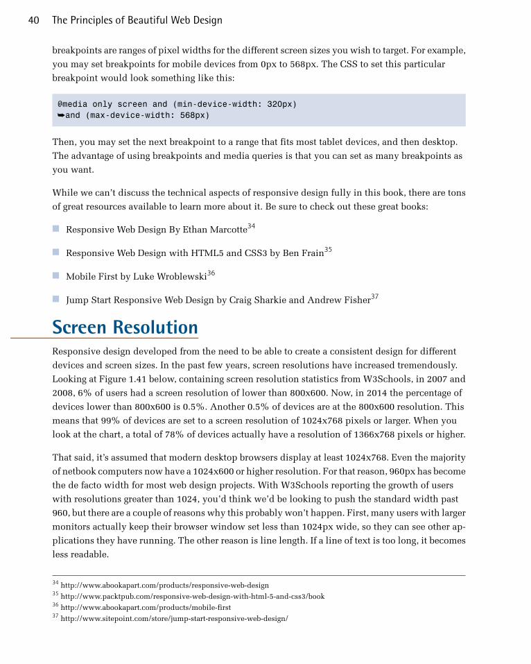
breakpoints are ranges of pixel widths for the different screen sizes you wish to target. For example,
you may set breakpoints for mobile devices from 0px to 568px. The CSS to set this particular
breakpoint would look something like this:
@media only screen and (min-device-width: 320px) ➥and (max-device-width: 568px)
Then, you may set the next breakpoint to a range that fits most tablet devices, and then desktop.
The advantage of using breakpoints and media queries is that you can set as many breakpoints as
you want.
While we can’t discuss the technical aspects of responsive design fully in this book, there are tons
of great resources available to learn more about it. Be sure to check out these great books:
■ Responsive Web Design By Ethan Marcotte34
■ Responsive Web Design with HTML5 and CSS3 by Ben Frain35
■ Mobile First by Luke Wroblewski36
■ Jump Start Responsive Web Design by Craig Sharkie and Andrew Fisher37
Screen ResolutionResponsive design developed from the need to be able to create a consistent design for different
devices and screen sizes. In the past few years, screen resolutions have increased tremendously.
Looking at Figure 1.41 below, containing screen resolution statistics from W3Schools, in 2007 and
2008, 6% of users had a screen resolution of lower than 800x600. Now, in 2014 the percentage of
devices lower than 800x600 is 0.5%. Another 0.5% of devices are at the 800x600 resolution. This
means that 99% of devices are set to a screen resolution of 1024x768 pixels or larger. When you
look at the chart, a total of 78% of devices actually have a resolution of 1366x768 pixels or higher.
That said, it’s assumed that modern desktop browsers display at least 1024x768. Even the majority
of netbook computers now have a 1024x600 or higher resolution. For that reason, 960px has become
the de facto width for most web design projects. With W3Schools reporting the growth of users
with resolutions greater than 1024, you’d think we’d be looking to push the standard width past
960, but there are a couple of reasons why this probably won’t happen. First, many users with larger
monitors actually keep their browser window set less than 1024px wide, so they can see other ap-
plications they have running. The other reason is line length. If a line of text is too long, it becomes
less readable.
34 http://www.abookapart.com/products/responsive-web-design35 http://www.packtpub.com/responsive-web-design-with-html-5-and-css3/book36 http://www.abookapart.com/products/mobile-first37 http://www.sitepoint.com/store/jump-start-responsive-web-design/
The Principles of Beautiful Web Design40
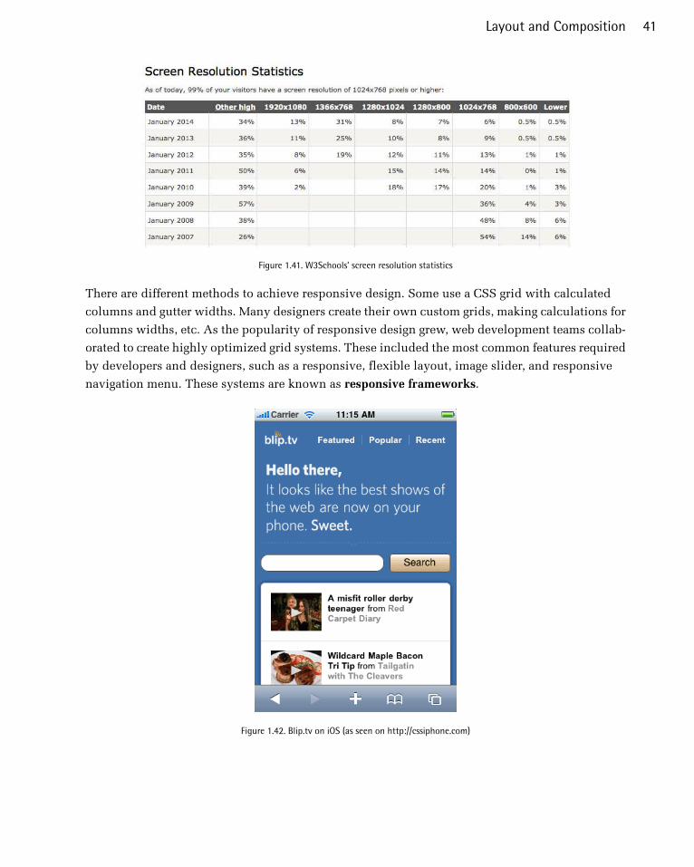
Figure 1.41. W3Schools’ screen resolution statistics
There are different methods to achieve responsive design. Some use a CSS grid with calculated
columns and gutter widths. Many designers create their own custom grids, making calculations for
columns widths, etc. As the popularity of responsive design grew, web development teams collab-
orated to create highly optimized grid systems. These included the most common features required
by developers and designers, such as a responsive, flexible layout, image slider, and responsive
navigation menu. These systems are known as responsive frameworks.
Figure 1.42. Blip.tv on iOS (as seen on http://cssiphone.com)
41Layout and Composition

FrameworksAfter working with responsive web design for a while, we’ve begun to understand the process better
and streamline it. We’ve started creating our own responsive frameworks and can target common
elements that are found on most websites, setting up common structures that work well in most
circumstances. This is great, because we no longer have to reinvent the wheel each time we design
a new site. These frameworks are a workable base that we can use to create a consistent design
across all devices, but that can equally be used to customize designs however we like to create
beautiful, responsive websites.
Many web development frameworks exist to help create beautiful, consistent, responsive websites,
but there are two, in particular, that stand shoulder-to-shoulder in popularity and usefulness.
Foundation38, shown in Figure 1.43, is a mobile framework by Zurb that’s packed with tons of web
development features. Foundation seeks to simplify web development. It does this via a modular
system featuring CSS classes that enable different features. With very little effort, Foundation enables
you to create well-structured layouts. It also makes it relatively simple to implement a host of features
including responsive navigation menus, image sliders, accordion menus, validated forms, buttons,
model popups, panels, tooltips, progress bars, and responsive tables.
Figure 1.43. The Foundation framework
Bootstrap39, shown in Figure 1.44, is the other framework battling for the number one spot as the
responsive framework of choice. Much like Foundation, Bootstrap has a number of its own built-
in components that allow you to quickly create well-structured, mobile-first websites. Bootstrap
has plenty of integrated features that are comparable to Foundation. With Bootstrap, you can create
jumbotrons, panels, wells, navigation bars, progress bars, dropdowns, badges, alerts, tooltips,
38 http://foundation.zurb.com/39 http://getbootstrap.com/
The Principles of Beautiful Web Design42

popups, tabs, carousels, and much more. Bootstrap also integrates the use of glyphicons, which is
an embedded font for use with the framework.
Figure 1.44. The Bootstrap framework
The primary reason people love Foundation and Bootstrap is that they’re highly customizable. You
don’t have to download or even include the JavaScript files for components you aren’t using. Simply
click the checkboxes corresponding to the components you need, and leave the ones you don’t.
And once you’ve made your selections, Foundation and Bootstrap can compile them into custom
downloads. They essentially take all the hard work out of compiling the components of your web
development project.
With developers keen to create the leanest websites possible, with the least amount of JavaScript,
and the smallest file sizes, it’s easy to see why this approach is so popular.
One issue that’s arisen with responsive web design is that traditional navigation menus don’t always
work the same way they do on a mobile device as they do on a desktop screen; when there isn’t
enough screen real estate things can become jumbled. The solution that’s been universally adopted
is the mobile menu. It’s an icon of three lines stacked vertically, as shown in the top-right of the
figure below, that represents an expandable menu, only available when the icon is tapped. The
menu contents then appear as an overlay on top of the site’s content.
Figure 1.45. A Foundation menu on a desktop screen
The menu shown in Figure 1.45 is how the menu in Foundation looks on the desktop. On a mobile
device, such as a phone or a tablet, the menu collapses, until you interact with it like in the examples
shown in Figure 1.46.
43Layout and Composition
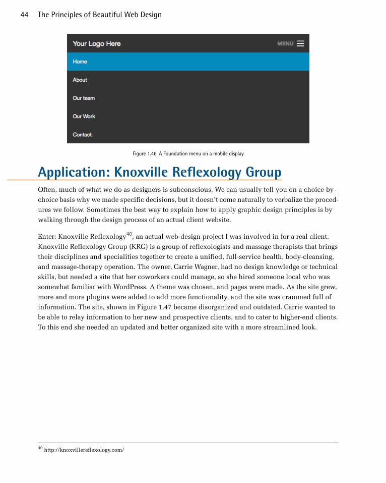
Figure 1.46. A Foundation menu on a mobile display
Application: Knoxville Reflexology GroupOften, much of what we do as designers is subconscious. We can usually tell you on a choice-by-
choice basis why we made specific decisions, but it doesn’t come naturally to verbalize the proced-
ures we follow. Sometimes the best way to explain how to apply graphic design principles is by
walking through the design process of an actual client website.
Enter: Knoxville Reflexology40, an actual web-design project I was involved in for a real client.
Knoxville Reflexology Group (KRG) is a group of reflexologists and massage therapists that brings
their disciplines and specialities together to create a unified, full-service health, body-cleansing,
and massage-therapy operation. The owner, Carrie Wagner, had no design knowledge or technical
skills, but needed a site that her coworkers could manage, so she hired someone local who was
somewhat familiar with WordPress. A theme was chosen, and pages were made. As the site grew,
more and more plugins were added to add more functionality, and the site was crammed full of
information. The site, shown in Figure 1.47 became disorganized and outdated. Carrie wanted to
be able to relay information to her new and prospective clients, and to cater to higher-end clients.
To this end she needed an updated and better organized site with a more streamlined look.
40 http://knoxvillereflexology.com/
The Principles of Beautiful Web Design44
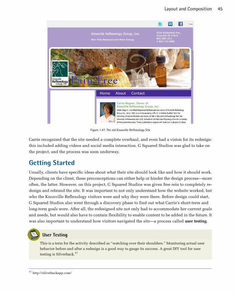
Figure 1.47. The old Knoxville Reflexology Site
Carrie recognised that the site needed a complete overhaul, and even had a vision for its redesign:
this included adding videos and social media interaction. G Squared Studios was glad to take on
the project, and the process was soon underway.
Getting StartedUsually, clients have specific ideas about what their site should look like and how it should work.
Depending on the client, these preconceptions can either help or hinder the design process—more
often, the latter. However, on this project, G Squared Studios was given free rein to completely re-
design and rebrand the site. It was important to not only understand how the website worked, but
who the Knoxville Reflexology visitors were and why they were there. Before design could start,
G Squared Studios also went through a discovery phase to find out what Carrie’s short-term and
long-term goals were. After all, the redesigned site not only had to accommodate her current goals
and needs, but would also have to contain flexibility to enable content to be added in the future. It
was also important to understand how visitors navigated the site—a process called user testing.
User Testing
This is a term for the activity described as “watching over their shoulders.” Monitoring actual user
behavior before and after a redesign is a good way to gauge its success. A great DIY tool for user
testing is Silverback.41
41 http://silverbackapp.com/
45Layout and Composition

The questions asked during this session concerned Carrie’s business benefits from her site, and
what she was trying to do with incoming visitors. During this session, we discovered that her goal
was to build a mailing list of visitors to her site—visitors who were mainly local and regional, and
who needed to find out more information about KRG’s services. We also learned that sells products
in her shop, and is an affiliate with several natural health product companies.
One of the most important things a web designer does is to organize and group like information.
This is an essential part of usability because, if a visitor can’t find something in a logical place, it
makes the site unpleasant to visit. We web designers don’t simply keep all of this information in
our heads; we have tools available to help us organize content. There isn’t a single best method for
organizing the information found on a website.
Many designers and developers have their own way or organizing information. Some use sticky
notes, while others use methods such as artboards, storyboards, etc. I tend to make lists and group
content together. I also use mind-mapping software, which helps to create a central idea and move
out from there. Here I organize pages and group everything together. This helps me get a sense of
how the site will flow, with the main content and page structure all laid out. Then, I can decide
which areas may need extra attention to ensure a varied, but unified layout.
Figure 1.48. Sticky-note information architecture
Once I have organized all of the data I’ve received and analyzed, I create a mock-up of the general
layout of the home page. Some designers and developers use Adobe Illustrator or Photoshop, and
others use mock-up tools like Balsamiq42 to create their basic mock-ups. From the information I
gathered, I created a mock-up, as shown in the figure below.
42 http://balsamiq.com/
The Principles of Beautiful Web Design46
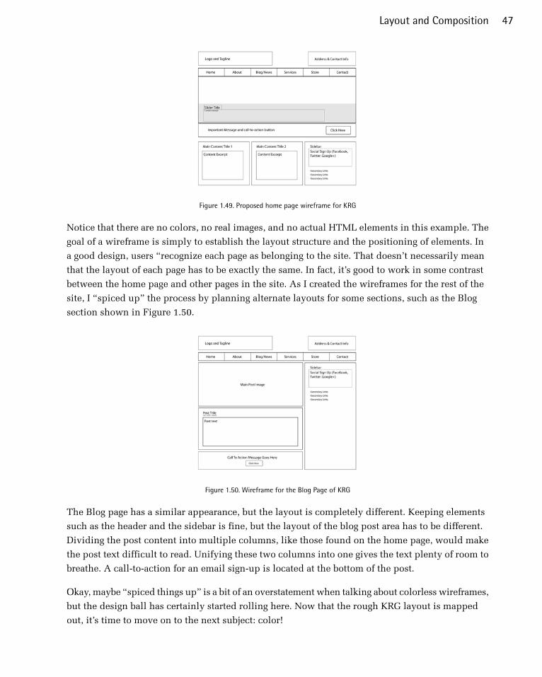
Figure 1.49. Proposed home page wireframe for KRG
Notice that there are no colors, no real images, and no actual HTML elements in this example. The
goal of a wireframe is simply to establish the layout structure and the positioning of elements. In
a good design, users “recognize each page as belonging to the site. That doesn’t necessarily mean
that the layout of each page has to be exactly the same. In fact, it’s good to work in some contrast
between the home page and other pages in the site. As I created the wireframes for the rest of the
site, I “spiced up” the process by planning alternate layouts for some sections, such as the Blog
section shown in Figure 1.50.
Figure 1.50. Wireframe for the Blog Page of KRG
The Blog page has a similar appearance, but the layout is completely different. Keeping elements
such as the header and the sidebar is fine, but the layout of the blog post area has to be different.
Dividing the post content into multiple columns, like those found on the home page, would make
the post text difficult to read. Unifying these two columns into one gives the text plenty of room to
breathe. A call-to-action for an email sign-up is located at the bottom of the post.
Okay, maybe “spiced things up” is a bit of an overstatement when talking about colorless wireframes,
but the design ball has certainly started rolling here. Now that the rough KRG layout is mapped
out, it’s time to move on to the next subject: color!
47Layout and Composition

Chapter2ColorWhether you’re defusing a ticking time bomb, or trying to design a decent-looking site, if you choose
the wrong color—you’re doomed. Okay, so the wrong color selection for a client’s site is unlikely
to be the death of you, but it could curtail your budding career as a web designer. Choosing colors
is no simple matter. There are aesthetic, identity, and usability considerations to take into account.
And, to make matters worse, most modern displays can render more than sixteen million colors.
That’s a huge number of horrible color combinations just waiting to happen!
Fortunately, there’s no need to be a swatchbook-carrying color consultant to make good color
choices. A wealth of knowledge is available, from touchy-feely (as I like to call them) psychological
guidelines to tried-and-true color theories that will help you make the right choices with your
palette.
The Psychology of ColorColor psychology is a field of study that’s devoted to analyzing the emotional and behavioral effects
produced by colors and color combinations. Ecommerce website owners want to know which color
will make their website visitors spend more money. Home decorators are after a color that will
transform a bedroom into a tranquil Zen retreat. Fast-food restaurant owners are dying to know
which color combinations will make you want to super-size your meal. As you can imagine, color
psychology is big business.
Although it’s important to know how your color choices might affect the masses, the idea that
there’s a single, unified, psychological response to specific colors is spurious. Many of the responses
that color psychologists accredit to certain colors are rooted in individual experience. It’s also in-
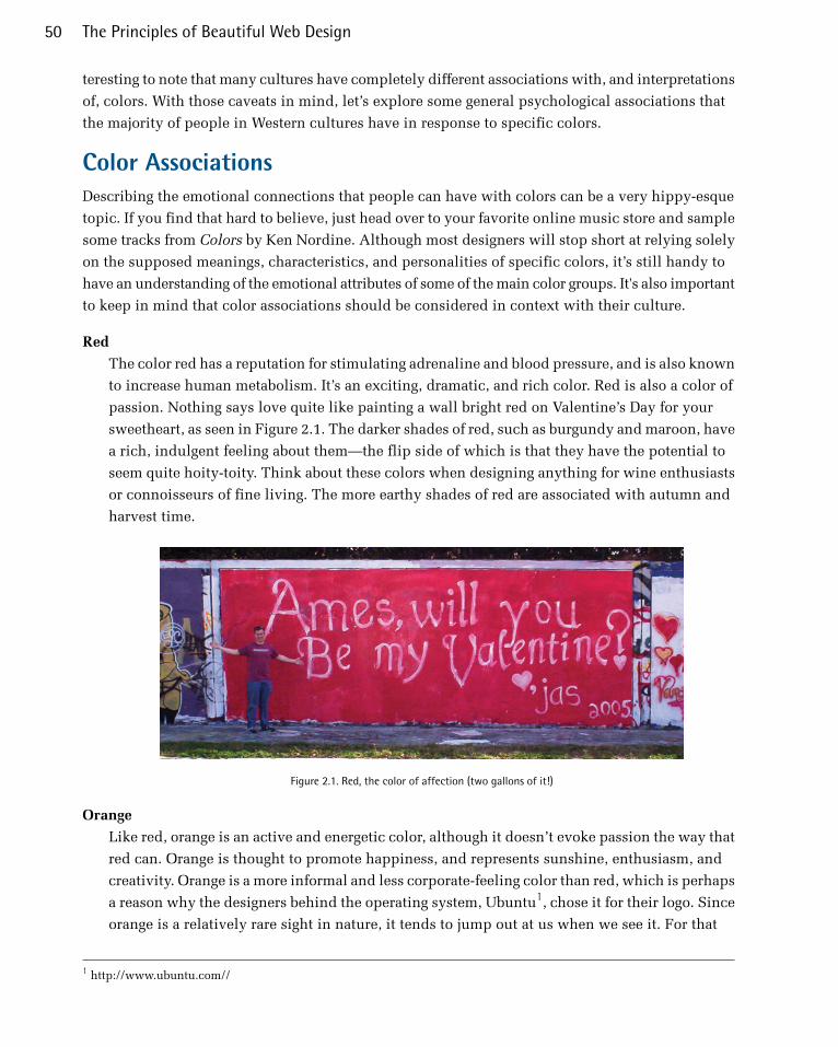
teresting to note that many cultures have completely different associations with, and interpretations
of, colors. With those caveats in mind, let’s explore some general psychological associations that
the majority of people in Western cultures have in response to specific colors.
Color AssociationsDescribing the emotional connections that people can have with colors can be a very hippy-esque
topic. If you find that hard to believe, just head over to your favorite online music store and sample
some tracks from Colors by Ken Nordine. Although most designers will stop short at relying solely
on the supposed meanings, characteristics, and personalities of specific colors, it’s still handy to
have an understanding of the emotional attributes of some of the main color groups. It's also important
to keep in mind that color associations should be considered in context with their culture.
Red
The color red has a reputation for stimulating adrenaline and blood pressure, and is also known
to increase human metabolism. It’s an exciting, dramatic, and rich color. Red is also a color of
passion. Nothing says love quite like painting a wall bright red on Valentine’s Day for your
sweetheart, as seen in Figure 2.1. The darker shades of red, such as burgundy and maroon, have
a rich, indulgent feeling about them—the flip side of which is that they have the potential to
seem quite hoity-toity. Think about these colors when designing anything for wine enthusiasts
or connoisseurs of fine living. The more earthy shades of red are associated with autumn and
harvest time.
Figure 2.1. Red, the color of affection (two gallons of it!)
Orange
Like red, orange is an active and energetic color, although it doesn’t evoke passion the way that
red can. Orange is thought to promote happiness, and represents sunshine, enthusiasm, and
creativity. Orange is a more informal and less corporate-feeling color than red, which is perhaps
a reason why the designers behind the operating system, Ubuntu1, chose it for their logo. Since
orange is a relatively rare sight in nature, it tends to jump out at us when we see it. For that
1 http://www.ubuntu.com//
The Principles of Beautiful Web Design50

reason, it’s often used for objects that require high-visibility, such as life jackets, road cones,
and hunting vests. Orange, like red, also stimulates metabolism and appetite, so it’s a great
color for promoting food and cooking. That’s probably why the picture of a tangerine in Figure 2.2
is making you hungry, even if you don’t like citrus fruits.
Figure 2.2. Orange you glad I didn’t say banana?
Yellow
Like orange, yellow is an active color, and being highly visible, it’s often used for taxicabs and
caution signs. It’s also associated with happiness and, as Figure 2.3 illustrates, is the signature
color of smileys. The original orange and lemon-lime flavors of the sports energy drink Gatorade
are still the brand’s best-selling products; this is likely due—at least partly—to the energetic
characteristics associated with the colors orange and yellow.
Figure 2.3. Yellow, the color of smileys
An anonymous quote that’s often used with color associations says, “Babies cry more in yellow
rooms, husbands and wives fight more in yellow kitchens, and opera singers throw more tantrums
in yellow dressing rooms”. Whether this comment is true or not, the point is that too much
yellow can be overpowering. Come on—if you were a baby stuck in a dressing room with
fighting spouses and tantrum-throwing opera singers, you’d cry too!
Green
Green is most commonly associated with nature. It’s a soothing color that symbolizes growth,
freshness, and hope. There’s little doubt why the color has been so closely tied with environ-
mental protection. Visually, green is much easier on the eyes, and far less dynamic, than yellow,
51Color

orange, or red. Although many website designs using green appeal to visitors’ sense of nature,
green is a versatile color that can also represent wealth, stability, and education. When bright
green is set against a black background, it really pops—lending the design a technological feel.
For me, it brings back memories of my first computer—a trusty old Apple IIe. This was the in-
spiration for the MailChimp loading screen I designed recently, shown in Figure 2.4.
Figure 2.4. ASCII version of Freddie Von Chimpenheimer IV
Blue
When I was a kid, my favorite color was blue. Not just any blue, but cerulean blue from Crayola
crayons. While most kids are less particular about the particular shade, blue is often cited as a
universally loved color. On the touchy-feely level, blue symbolizes openness, intelligence, and
faith, and has been found to have calming effects. On the other hand, blue has also has been
found to reduce appetite. This is probably due, in part, to the rarity of blue in real food. Aside
from blueberries, how many naturally blue foods can you count? Blue, it would seem, is excluded
from nature’s appetite-inducing palette. As such it’s less than ideal for promoting food products.
In addition, blue is sometimes seen as a symbol of bad luck and trouble. This emotional color
connection is evident in blues music, as well as in the paintings of Picasso’s depression-induced
“blue period”. It’s not all about unnatural food colors and melancholy forms of art, though; blue
has universal appeal because of its association with the sky and the sea. For me, the presence
of blue in the stacked stones image in Figure 2.5 makes me feel more at ease.
The Principles of Beautiful Web Design52
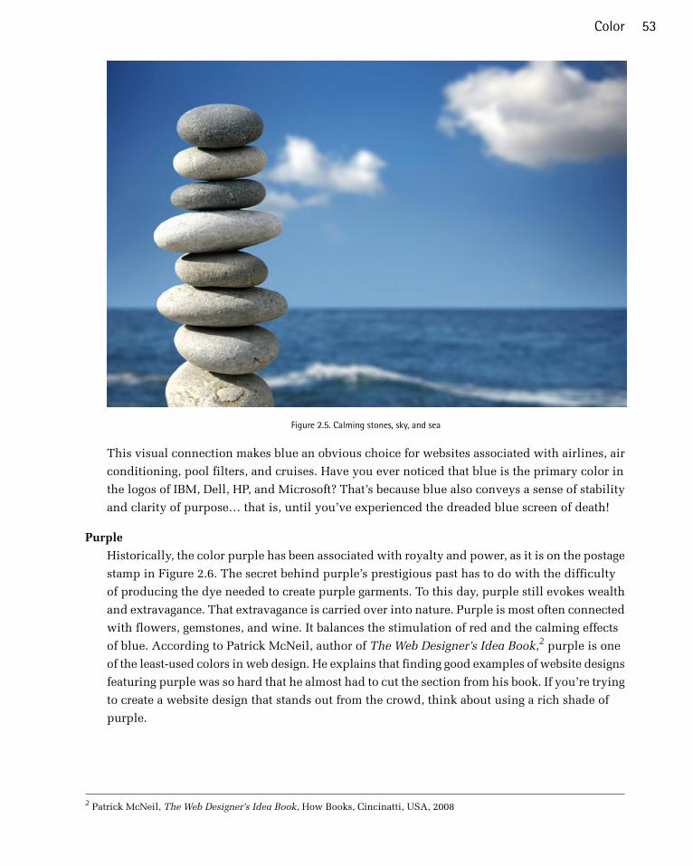
Figure 2.5. Calming stones, sky, and sea
This visual connection makes blue an obvious choice for websites associated with airlines, air
conditioning, pool filters, and cruises. Have you ever noticed that blue is the primary color in
the logos of IBM, Dell, HP, and Microsoft? That’s because blue also conveys a sense of stability
and clarity of purpose… that is, until you’ve experienced the dreaded blue screen of death!
Purple
Historically, the color purple has been associated with royalty and power, as it is on the postage
stamp in Figure 2.6. The secret behind purple’s prestigious past has to do with the difficulty
of producing the dye needed to create purple garments. To this day, purple still evokes wealth
and extravagance. That extravagance is carried over into nature. Purple is most often connected
with flowers, gemstones, and wine. It balances the stimulation of red and the calming effects
of blue. According to Patrick McNeil, author of The Web Designer’s Idea Book,2 purple is one
of the least-used colors in web design. He explains that finding good examples of website designs
featuring purple was so hard that he almost had to cut the section from his book. If you’re trying
to create a website design that stands out from the crowd, think about using a rich shade of
purple.
2 Patrick McNeil, The Web Designer’s Idea Book, How Books, Cincinatti, USA, 2008
53Color

Figure 2.6. Purple coat of arms on a Norwegian postage stamp
White
You might think there’s nothing special about the color of the wind turbines in Figure 2.7, but
the use of white actually helps promote the idea that this is clean power. In Western cultures,
white is considered to be the color of perfection, light, and purity. This is why crisp white
sheets are used in detergent commercials, and why a bride wears a white dress on her wedding
day. For an idea of how ingrained the meaning of white is in our culture, read the poem Design
by Robert Frost.3In it, Frost symbolically contradicts our associations by using white to represent
death and darkness. Interestingly, in Chinese culture, white is a color traditionally associated
with death and mourning. Such cultural distinctions should serve as a reminder to research
the color associations of your target audience, as they may vary greatly from your own.
In design, white is often overlooked because it’s the default background color. Don’t be afraid
to shake it up, though. Try using a dark background with white text, or put a white background
block on an off-white canvas to make it pop. Using colors in unexpected ways can make a bold
statement.
3 This can be found in many a good poetry book, but I used The Norton Anthology of Poetry (5th edition), eds Margaret
Ferguson, Mary Jo Salter, and Jon Stallworthy, WW Norton & Company, New York, 2004.
The Principles of Beautiful Web Design54
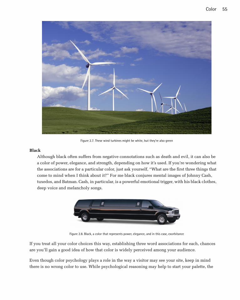
Figure 2.7. These wind turbines might be white, but they’re also green
Black
Although black often suffers from negative connotations such as death and evil, it can also be
a color of power, elegance, and strength, depending on how it’s used. If you’re wondering what
the associations are for a particular color, just ask yourself, “What are the first three things that
come to mind when I think about it?” For me black conjures mental images of Johnny Cash,
tuxedos, and Batman. Cash, in particular, is a powerful emotional trigger, with his black clothes,
deep voice and melancholy songs.
Figure 2.8. Black, a color that represents power, elegance, and in this case, exorbitance
If you treat all your color choices this way, establishing three word associations for each, chances
are you’ll gain a good idea of how that color is widely perceived among your audience.
Even though color psychology plays a role in the way a visitor may see your site, keep in mind
there is no wrong color to use. While psychological reasoning may help to start your palette, the
55Color
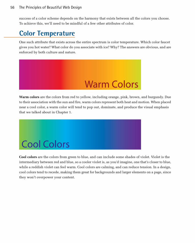
success of a color scheme depends on the harmony that exists between all the colors you choose.
To achieve this, we’ll need to be mindful of a few other attributes of color.
Color TemperatureOne such attribute that exists across the entire spectrum is color temperature. Which color faucet
gives you hot water? What color do you associate with ice? Why? The answers are obvious, and are
enforced by both culture and nature.
Warm colors are the colors from red to yellow, including orange, pink, brown, and burgundy. Due
to their association with the sun and fire, warm colors represent both heat and motion. When placed
near a cool color, a warm color will tend to pop out, dominate, and produce the visual emphasis
that we talked about in Chapter 1.
Cool colors are the colors from green to blue, and can include some shades of violet. Violet is the
intermediary between red and blue, so a cooler violet is, as you'd imagine, one that’s closer to blue,
while a reddish violet can feel warm. Cool colors are calming, and can reduce tension. In a design,
cool colors tend to recede, making them great for backgrounds and larger elements on a page, since
they won’t overpower your content.
The Principles of Beautiful Web Design56
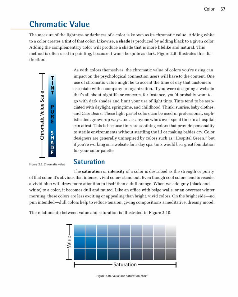
Chromatic ValueThe measure of the lightness or darkness of a color is known as its chromatic value. Adding white
to a color creates a tint of that color. Likewise, a shade is produced by adding black to a given color.
Adding the complementary color will produce a shade that is more lifelike and natural. This
method is often used in painting, because it won't be quite as dark. Figure 2.9 illustrates this dis-
tinction.
Figure 2.9. Chromatic value
As with colors themselves, the chromatic value of colors you’re using can
impact on the psychological connection users will have to the content. One
use of chromatic value might be to accent the time of day that customers
associate with a company or organization. If you were designing a website
that’s all about nightlife or concerts, for instance, you’d probably want to
go with dark shades and limit your use of light tints. Tints tend to be asso-
ciated with daylight, springtime, and childhood. Think: sunrise, baby clothes,
and Care Bears. These light pastel colors can be used in professional, soph-
isticated, grown-up ways, too, as anyone who’s ever spent time in a hospital
can attest. This is because tints are soothing colors that provide personality
to sterile environments without startling the ill or making babies cry. Color
designers are generally uninspired by colors such as “Hospital Green,” but
if you’re working on a website for a day spa, tints would be a great foundation
for your color palette.
SaturationThe saturation or intensity of a color is described as the strength or purity
of that color. It’s obvious that intense, vivid colors stand out. Even though cool colors tend to recede,
a vivid blue will draw more attention to itself than a dull orange. When we add gray (black and
white) to a color, it becomes dull and muted. Like an office with beige walls, or an overcast winter
morning, these colors are less exciting or appealing than bright, vivid colors. On the bright side—no
pun intended—dull colors help to reduce tension, giving compositions a meditative, dreamy mood.
The relationship between value and saturation is illustrated in Figure 2.10.
Figure 2.10. Value and saturation chart
57Color

Color Theory 101To take our knowledge of color further, we’ll first need to gain a grounding in some of the more
technical concepts associated with the subject, such as how colors are formed and how they can
be categorized.
The colors displayed on your computer screen (that is, the colors we’ll be using in our website
designs) are based on an additive color model. In an additive color model, colors are displayed in
percentages of red, green, and blue (RGB) light. If we turn all three of these colors on full blast, we’ll
have white light. If we turn red and green all the way up, but switch off blue, we have yellow.
If you’ve ever owned a color printer, you might be familiar with the acronym CMYK (cyan, magenta,
yellow, and black). Your ink-jet printer, laser printer, and industrial four-color printing press all
create images using cyan, magenta, yellow, and black inks or toners. This process uses a subtractive
color model; by combining colors in this color model, we come close to achieving a grayish black.
There’s no way of producing black combining just cyan, magenta, and yellow. This is why they’re
always supplemented with black—the K in CMYK. Take a look at Figure 2.11 for a better idea of
how additive and subtractive color models work.
Figure 2.11. RGB additive color model (left) and the CMYK subtractive color model (right)
Regardless of whether you’re designing for print or the Web, the lessons of traditional color theory
are key to helping us classify colors and group them together. Recorded studies of color classification
date back to the fourth century BC and the works of Aristotle. Since then, many other great artists
and philosophers have contributed to our knowledge of how colors work, including Isaac Newton,
Johann Wolfgang von Goethe, and Johannes Itten. The works of these individuals, in the 17th, 18th,
and 20th centuries respectively, provide the foundations on which much of our understanding of
color lies. All three theorists explained colors in relation to a color wheel, using red, yellow, and
blue as the primary colors. The color wheel is a simple but effective diagram developed to present
the concepts and terminology of color theory. The traditional artists’ wheel is a circle divided into
12 slices, as Figure 2.12 indicates. Each slice is either a primary color, a secondary color, or a tertiary
color.
The Principles of Beautiful Web Design58
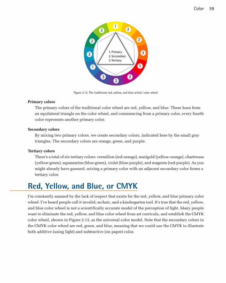
Figure 2.12. The traditional red, yellow, and blue artists’ color wheel
Primary colors
The primary colors of the traditional color wheel are red, yellow, and blue. These hues form
an equilateral triangle on the color wheel, and commencing from a primary color, every fourth
color represents another primary color.
Secondary colors
By mixing two primary colors, we create secondary colors, indicated here by the small gray
triangles. The secondary colors are orange, green, and purple.
Tertiary colors
There’s a total of six tertiary colors: vermilion (red-orange), marigold (yellow-orange), chartreuse
(yellow-green), aquamarine (blue-green), violet (blue-purple), and magenta (red-purple). As you
might already have guessed, mixing a primary color with an adjacent secondary color forms a
tertiary color.
Red, Yellow, and Blue, or CMYKI’m constantly amazed by the lack of respect that exists for the red, yellow, and blue primary color
wheel. I’ve heard people call it invalid, archaic, and a kindergarten tool. It’s true that the red, yellow,
and blue color wheel is not a scientifically accurate model of the perception of light. Many people
want to eliminate the red, yellow, and blue color wheel from art curricula, and establish the CMYK
color wheel, shown in Figure 2.13, as the universal color model. Note that the secondary colors in
the CMYK color wheel are red, green, and blue, meaning that we could use the CMYK to illustrate
both additive (using light) and subtractive (on paper) color.
59Color
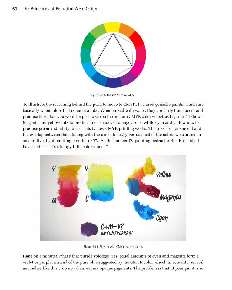
Figure 2.13. The CMYK color wheel
To illustrate the reasoning behind the push to move to CMYK, I’ve used gouache paints, which are
basically watercolors that come in a tube. When mixed with water, they are fairly translucent and
produce the colors you would expect to see on the modern CMYK color wheel, as Figure 2.14 shows.
Magenta and yellow mix to produce nice shades of orangey reds, while cyan and yellow mix to
produce green and minty tones. This is how CMYK printing works. The inks are translucent and
the overlap between them (along with the use of black) gives us most of the colors we can see on
an additive, light-emitting monitor or TV. As the famous TV painting instructor Bob Ross might
have said, “That’s a happy little color model.”
Figure 2.14. Playing with CMY gouache paints
Hang on a minute! What’s that purple splodge? Yes, equal amounts of cyan and magenta form a
violet or purple, instead of the pure blue suggested by the CMYK color wheel. In actuality, several
anomalies like this crop up when we mix opaque pigments. The problem is that, if your paint is so
The Principles of Beautiful Web Design60
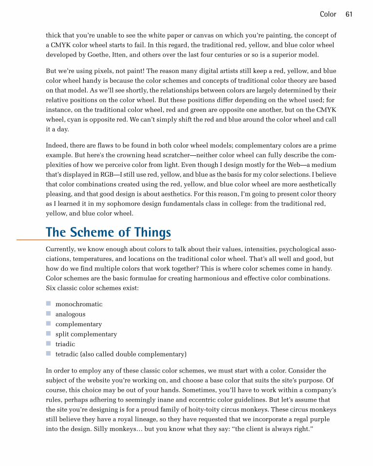
thick that you’re unable to see the white paper or canvas on which you’re painting, the concept of
a CMYK color wheel starts to fail. In this regard, the traditional red, yellow, and blue color wheel
developed by Goethe, Itten, and others over the last four centuries or so is a superior model.
But we’re using pixels, not paint! The reason many digital artists still keep a red, yellow, and blue
color wheel handy is because the color schemes and concepts of traditional color theory are based
on that model. As we’ll see shortly, the relationships between colors are largely determined by their
relative positions on the color wheel. But these positions differ depending on the wheel used; for
instance, on the traditional color wheel, red and green are opposite one another, but on the CMYK
wheel, cyan is opposite red. We can’t simply shift the red and blue around the color wheel and call
it a day.
Indeed, there are flaws to be found in both color wheel models; complementary colors are a prime
example. But here's the crowning head scratcher—neither color wheel can fully describe the com-
plexities of how we perceive color from light. Even though I design mostly for the Web—a medium
that’s displayed in RGB—I still use red, yellow, and blue as the basis for my color selections. I believe
that color combinations created using the red, yellow, and blue color wheel are more aesthetically
pleasing, and that good design is about aesthetics. For this reason, I’m going to present color theory
as I learned it in my sophomore design fundamentals class in college: from the traditional red,
yellow, and blue color wheel.
The Scheme of ThingsCurrently, we know enough about colors to talk about their values, intensities, psychological asso-
ciations, temperatures, and locations on the traditional color wheel. That’s all well and good, but
how do we find multiple colors that work together? This is where color schemes come in handy.
Color schemes are the basic formulae for creating harmonious and effective color combinations.
Six classic color schemes exist:
■ monochromatic■ analogous■ complementary■ split complementary■ triadic■ tetradic (also called double complementary)
In order to employ any of these classic color schemes, we must start with a color. Consider the
subject of the website you’re working on, and choose a base color that suits the site’s purpose. Of
course, this choice may be out of your hands. Sometimes, you’ll have to work within a company’s
rules, perhaps adhering to seemingly inane and eccentric color guidelines. But let’s assume that
the site you’re designing is for a proud family of hoity-toity circus monkeys. These circus monkeys
still believe they have a royal lineage, so they have requested that we incorporate a regal purple
into the design. Silly monkeys… but you know what they say: “the client is always right.”
61Color

A Monochromatic Color SchemeWhen we talked about the value of color earlier, we talked about tints and shades. A monochromatic
color scheme—like the one shown in Figure 2.15—consists of a single base color and any number
of tints or shades of that color.
Figure 2.15. A monochromatic monkey
Monochromatic Color Scheme ExamplesHot pink is a super-saturated color that packs a powerful punch when paired with black and white.
This is obviously what Ruben Sanchez4 was going for with the monochromatic color scheme you
see in Figure 2.16. Each section of this single-page, scrolling site has between a white background
and a pink textured overlay on each image. The simple design, combined with subtle textures,
creates a strong sense of contrast and emphasis.
Figure 2.16. TheSkyWasPink website contrasts color effectively
4 http://www.theskywaspink.es/
The Principles of Beautiful Web Design62
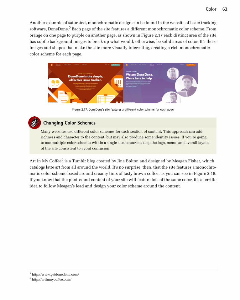
Another example of saturated, monochromatic design can be found in the website of issue tracking
software, DoneDone.5 Each page of the site features a different monochromatic color scheme. From
orange on one page to purple on another page, as shown in Figure 2.17 each distinct area of the site
has subtle background images to break up what would, otherwise, be solid areas of color. It’s these
images and shapes that make the site more visually interesting, creating a rich monochromatic
color scheme for each page.
Figure 2.17. DoneDone's site features a different color scheme for each page
Changing Color Schemes
Many websites use different color schemes for each section of content. This approach can add
richness and character to the content, but may also produce some identity issues. If you’re going
to use multiple color schemes within a single site, be sure to keep the logo, menu, and overall layout
of the site consistent to avoid confusion.
Art in My Coffee6 is a Tumblr blog created by Jina Bolton and designed by Meagan Fisher, which
catalogs latte art from all around the world. It’s no surprise, then, that the site features a monochro-
matic color scheme based around creamy tints of tasty brown coffee, as you can see in Figure 2.18.
If you know that the photos and content of your site will feature lots of the same color, it’s a terrific
idea to follow Meagan’s lead and design your color scheme around the content.
5 http://www.getdonedone.com/6 http://artinmycoffee.com/
63Color

Figure 2.18. Art in My Coffee—featuring colors directly drawn from the site’s subject matter
The site for The Climate Reality Project7 in Figure 2.19 features a special breed of monochromaticism.
And, yes, I just made that word up. Any set of colors that consists solely of black, white, and shades
of gray is known as an achromatic color scheme. The word achromatic literally means “without
color.” Just because the overall scheme of the site has no color, it doesn’t mean the content has to
be colorless as well. Because of the dark background, ample use of “white” space, and lack of sur-
rounding color, the vibrant yellow dots pop off the page, giving life and light to the design.
7 http://climaterealityproject.org/
The Principles of Beautiful Web Design64
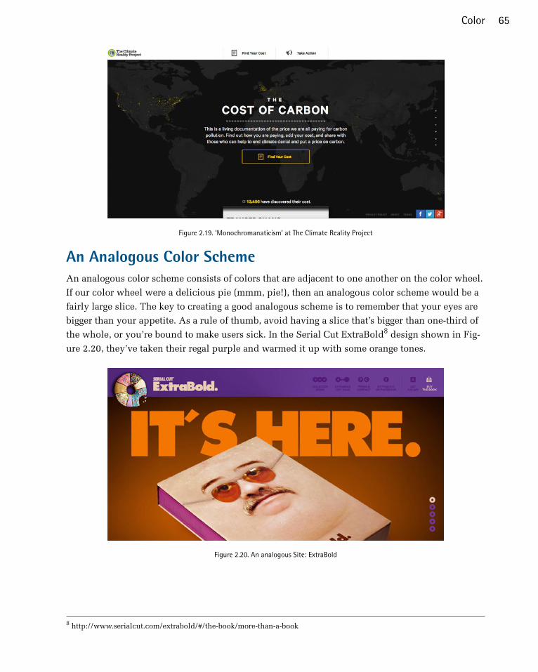
Figure 2.19. ‘Monochromanaticism’ at The Climate Reality Project
An Analogous Color SchemeAn analogous color scheme consists of colors that are adjacent to one another on the color wheel.
If our color wheel were a delicious pie (mmm, pie!), then an analogous color scheme would be a
fairly large slice. The key to creating a good analogous scheme is to remember that your eyes are
bigger than your appetite. As a rule of thumb, avoid having a slice that’s bigger than one-third of
the whole, or you’re bound to make users sick. In the Serial Cut ExtraBold8 design shown in Fig-
ure 2.20, they’ve taken their regal purple and warmed it up with some orange tones.
Figure 2.20. An analogous Site: ExtraBold
8 http://www.serialcut.com/extrabold/#/the-book/more-than-a-book
65Color

Analogous Color Scheme ExamplesThe playful illustration on the home page for Startup Turkey9 is a beautiful example of an analogous
color scheme. From light yellow, to a rosy red Figure 2.21, has a real look of depth. The positioning
of contrasting analogous colors, complete with different shades is the key to creating this gorgeous
effect.
Figure 2.21. The geometric, dimensional look of Startup Turkey
Blinksale,10 shown in Figure 2.22, is a hosted web application that creates, manages, and sends
CSS-formatted and plain-text invoices. It’s also an excellent example of what a creative analogous
color scheme can do for a business website. It crumples up those preconceived notions of how
corporate websites should look, and tosses them into a cool sea of colors ranging from blue-green
to yellow. Note how color contrast makes their call to action the first thing you see. The perspective
lines of the screenshot on the right also take advantage of continuance, constantly guiding your
eyes back toward that sign-up button.
9 http://www.startupturkey.com/10 http://blinksale.com/
The Principles of Beautiful Web Design66
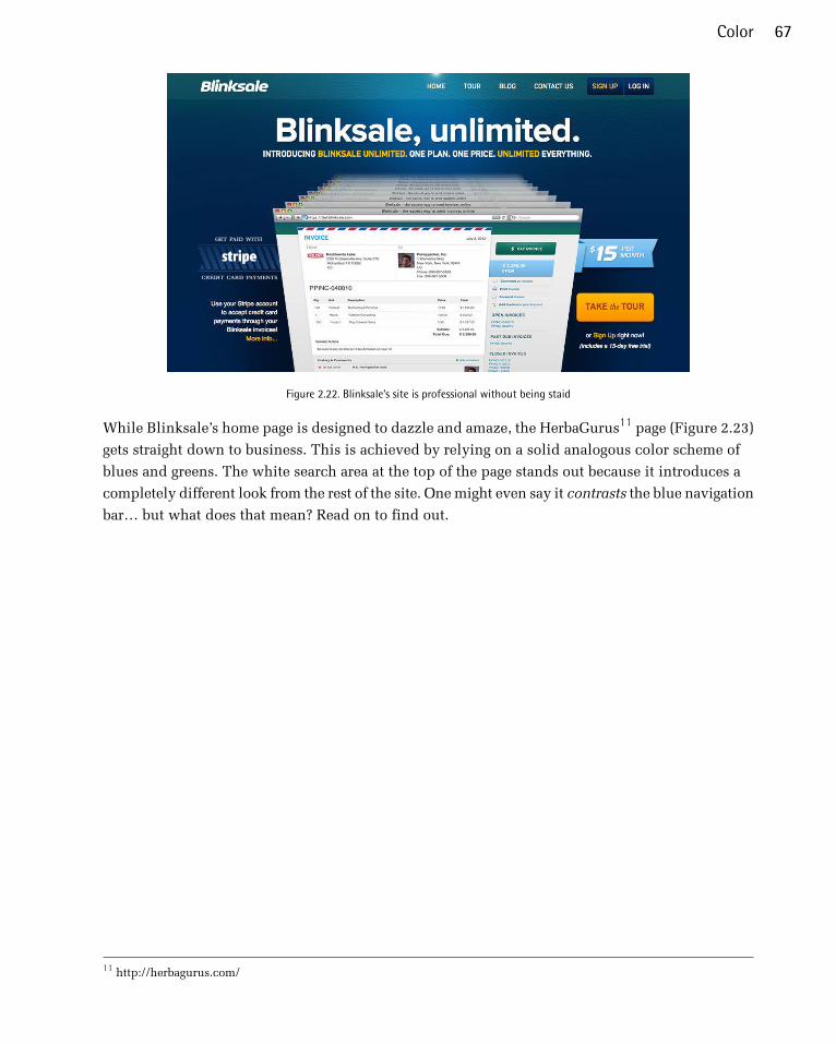
Figure 2.22. Blinksale’s site is professional without being staid
While Blinksale’s home page is designed to dazzle and amaze, the HerbaGurus11 page (Figure 2.23)
gets straight down to business. This is achieved by relying on a solid analogous color scheme of
blues and greens. The white search area at the top of the page stands out because it introduces a
completely different look from the rest of the site. One might even say it contrasts the blue navigation
bar… but what does that mean? Read on to find out.
11 http://herbagurus.com/
67Color

Figure 2.23. HerbaGurus gets down to business
A Complementary Color SchemeComplementary color schemes like the one featured in our updated hoity-toity illustration—shown
in Figure 2.24—consist of colors that are located opposite each other on the color wheel. Placing
red-violet and yellow-green together is uncommon, but the monkeys insisted that I keep some of
their royal purple in the picture. Sheesh… these clients are a bunch of primates.
Figure 2.24. A funky complementary monkey
Complementary Color Scheme ExamplesThe University of Florida is my wife’s undergraduate alma mater, and the school’s orange and blue
team colors provide a strong foundation for a complementary color scheme. Some people may be
The Principles of Beautiful Web Design68

put off by the stark contrast of complementary color schemes found on its athletics website12 (seen
in Figure 2.25), but when the colors represent the business or entity for which you’re designing,
you can’t go wrong.
Figure 2.25. The University of Florida Athletics website uses bold complementary colors
Pittsburgh’s Sprout Fund Spring Program website13 in Figure 2.26 proves that complementary color
schemes don’t have to be as bold as UF’s orange and blue. By toning down the saturation, this red
and green design looks very natural and earthy, helping support the message of biodiversity. The
beautiful illustrations and artistic textures really make this design sing.
12 http://www.gatorzone.com/13 http://www.sproutfund.org/spring/
69Color
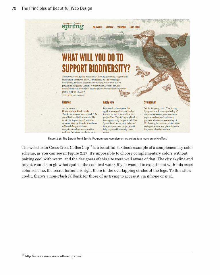
Figure 2.26. The Sprout Fund Spring Program uses complementary colors to a more organic effect
The website for Cross Cross Coffee Cup14 is a beautiful, textbook example of a complementary color
scheme, as you can see in Figure 2.27. It’s impossible to choose complementary colors without
pairing cool with warm, and the designers of this site were well aware of that. The city skyline and
bright, round sun glow hot against the cool teal water. If you wanted to experiment with this exact
color scheme, the secret formula is right there in the overlapping circles of the logo. To this site’s
credit, there’s a non-Flash fallback for those of us trying to access it via iPhone or iPad.
14 http://www.cross-cross-coffee-cup.com/
The Principles of Beautiful Web Design70
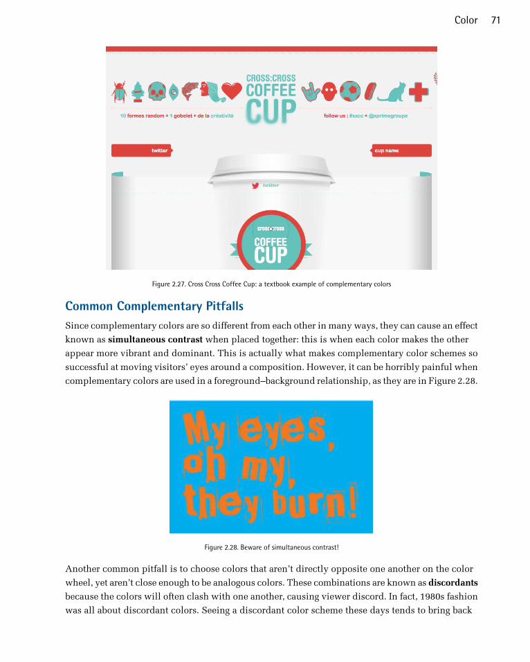
Figure 2.27. Cross Cross Coffee Cup: a textbook example of complementary colors
Common Complementary PitfallsSince complementary colors are so different from each other in many ways, they can cause an effect
known as simultaneous contrast when placed together: this is when each color makes the other
appear more vibrant and dominant. This is actually what makes complementary color schemes so
successful at moving visitors’ eyes around a composition. However, it can be horribly painful when
complementary colors are used in a foreground–background relationship, as they are in Figure 2.28.
Figure 2.28. Beware of simultaneous contrast!
Another common pitfall is to choose colors that aren’t directly opposite one another on the color
wheel, yet aren’t close enough to be analogous colors. These combinations are known as discordants
because the colors will often clash with one another, causing viewer discord. In fact, 1980s fashion
was all about discordant colors. Seeing a discordant color scheme these days tends to bring back
71Color

fond memories of that geometric “designer series” of Trapper Keeper binders I loved so dearly at
school—one’s depicted in Figure 2.29.
Figure 2.29. A discordant Trapper Keeper cover
As this example shows, this pitfall can be made workable if it’s used intentionally. Discordant
colors are whizzbang combinations that really appeal to children, teens, and tweens, so using them
for youth-oriented sites or products is worth considering. They can also be used sparingly in more
grown-up designs to create greater emphasis than can be achieved with just a simple complementary
combination. For an example of this type of color scheme, check out Bulls+Arrows15 in Figure 2.30.
The site features several randomly loading background images, each with a color scheme of its own.
This particular image pairs bright red with a blue-green that’s just far enough from complementary
to give this design an edgy look.
15 http://www.bullsandarrows.com/
The Principles of Beautiful Web Design72

Figure 2.30. The Bulls+Arrows site makes great use of colors that clash
Split-complementary, Triadic, and TetradicSplit-complementary, triadic, and tetradic color schemes sound technical, but they’re just simple
variations of a basic complementary color scheme.
To create a split-complementary color scheme, use the two colors adjacent to your base color’s
complement. For example, take the left-most color scheme shown in Figure 2.31. Red is the base
color here, so instead of using green to form a complementary scheme, we’ll use the two colors
adjacent to green, chartreuse (yellow-green) and aquamarine (blue-green), to form a three-color
split-complementary scheme. Note that, since you’re using your base color with two discordant
colors, this type of color scheme can look juvenile and extreme, but that may be just the effect you
want.
Figure 2.31. Split-complementary color scheme examples
For a triadic color scheme, we just push our split-complements out one more notch on each side,
so that all the colors are equally spaced on the color wheel. Starting with red as our base color again,
we select yellow rather than chartreuse, and instead of aquamarine, we select blue. This divides
73Color

the color wheel into thirds, hence the tri prefix in triadic. In this example, which is the left-most
scheme in Figure 2.32, we have the three primaries (red, yellow, and blue) making up our color
scheme. If you turned the scheme clockwise one notch, you’d have chartreuse (yellow-green), violet
(blue-purple), and vermilion (red-orange), as shown in the middle example in Figure 2.32.
Figure 2.32. Triadic color scheme examples
Knowing that triadic color schemes involve three colors, you have probably deduced that a tetradic
color scheme involves four colors. Tetradic color schemes combine any complementary color scheme
with another complementary color scheme. The left-most example in Figure 2.33 is a tetradic color
scheme that combines orange and blue with yellow and purple.
Figure 2.33. Tetradic color scheme examples
The website for River City Church16 in Jacksonville, Florida (shown in Figure 2.34) is an excellent
example of a tetradic color scheme. Notice that there are exactly four colors in this design besides
black and white. We have the complements orange and blue, paired with pink and green. Finding
pure examples of the six classic color schemes I’ve described above is a difficult task. That’s because,
sometimes, designers make one up from scratch, or because they use a slight variation on one of
these themes. In the section called “Other Variants” below, we’ll discuss a few options.
16 http://www.rccjax.com/
The Principles of Beautiful Web Design74
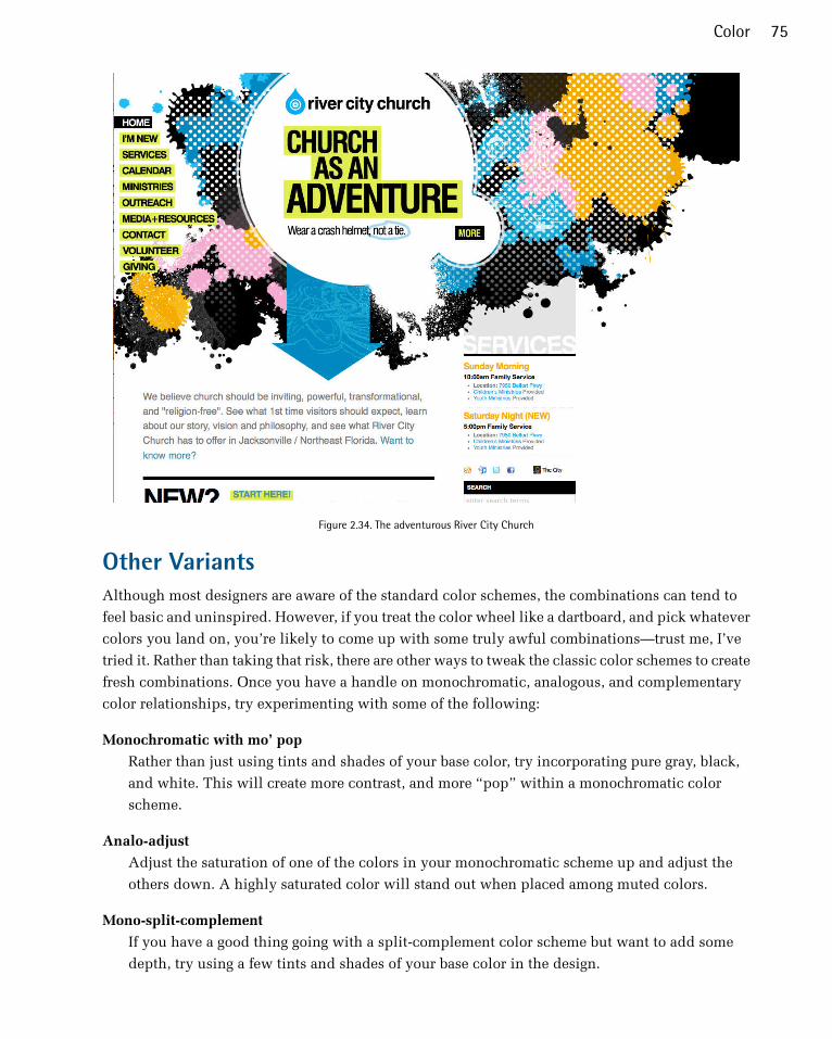
Figure 2.34. The adventurous River City Church
Other VariantsAlthough most designers are aware of the standard color schemes, the combinations can tend to
feel basic and uninspired. However, if you treat the color wheel like a dartboard, and pick whatever
colors you land on, you’re likely to come up with some truly awful combinations—trust me, I’ve
tried it. Rather than taking that risk, there are other ways to tweak the classic color schemes to create
fresh combinations. Once you have a handle on monochromatic, analogous, and complementary
color relationships, try experimenting with some of the following:
Monochromatic with mo’ pop
Rather than just using tints and shades of your base color, try incorporating pure gray, black,
and white. This will create more contrast, and more “pop” within a monochromatic color
scheme.
Analo-adjust
Adjust the saturation of one of the colors in your monochromatic scheme up and adjust the
others down. A highly saturated color will stand out when placed among muted colors.
Mono-split-complement
If you have a good thing going with a split-complement color scheme but want to add some
depth, try using a few tints and shades of your base color in the design.
75Color

Obviously, I just made those names up, but you’ll notice that all three variants are similar to the
main traditional schemes. It’s easy to tweak the traditional color schemes a little for more character,
but remember that the color scheme you choose is the foundation upon which you’ll build your
website’s color palette. And without a firm foundation, the rest of your design could come tumbling
down.
Creating a Palette“A palette?” you might ask. “Isn’t that the same as a color scheme?” Well, yes and no. A color
scheme will only give you two, three, or four colors to work with. Although a limited palette can
be beautiful, you’re probably going to need a few more colors to design your website. It’s better to
nail down this process while you’re thinking in the language of color, rather than pick ancillary
colors at random as you need them for your layout. The number of colors you’ll need will depend
on the complexity of your design. I like to start off with at least five or six solid color choices before
I even think about applying them to my layout.
Hexadecimal NotationSince this is the stage at which we become specific about each color we’re choosing, we’re going
to need a standard way to refer to the colors in our palette. You probably already know about
hexadecimal RGB color values, but if you don’t, here’s the quick drive-through version of the theory.
The hexadecimal counting system is much like the decimal counting system you’re used to, except
that instead of being based on multiples of ten, it’s based on multiples of sixteen, and has six addi-
tional digits: A (which is the equivalent of decimal 10), B (11), C (12), D (13), E (14), and F (15).
Table 2.1 shows how we count from 1 to 255 in decimal and hexadecimal.
So, what does this have to do with color palettes? Earlier in the chapter, I explained that your
monitor uses an additive RGB color model, and that every pixel in the screen is “painted” using a
combination of red, green, and blue light. What I didn’t mention was that there are 256 different
levels of red light, 256 levels of green light, and 256 levels of blue light; we can use these to create
16,777,216 distinct colors.
Thankfully, we have a way of describing each of these colors quickly and easily—using hexadecimal
color codes. A hexadecimal color code specifies the levels of red, green, and blue that go into a
given color. For example, combining red, green, and blue at their highest possible values makes
white. To use white in a web page, we set its red component to 255 (FF in hexadecimal), its green
component to 255 (FF), and its blue component to 255 (FF). We then combine these hexadecimal
values in the order red, green, and blue and come up with the code FFFFFF.
The Principles of Beautiful Web Design76

Table 2.1. Counting from 1 to 255 in hexadecimal
HexadecimalDecimalHexadecimalDecimalHexadecimalDecimal
20321016000
21331117011
22341218022
23351319033
…1420044
F52451521055
F62461622066
F72471723077
F82481824088
F92491925099
FA2501A260A10
FB2511B270B11
FC2521C280C12
FD2531D290D13
FE2541E300E14
FF2551F310F15
Black, which is made by setting red, green, and blue to zero (00), has the code 000000. Red, which
we can create by setting red to FF and leaving green and blue at 00, has the code FF0000. Figure 2.35
shows several standard colors with their hex value. After you’ve seen and used a lot of hex colors,
you’ll start to see the colors in the code. #F26382, for instance, is a coral-colored shade of pink and
#371324 is the color of a slightly purple red wine. Once you think you’ve reached that Jedi Hex-
Master status, head over to http://yizzle.com/whatthehex/ for a little game of “What the Hex?”
Figure 2.35. Hexadecimal color examples
Color Tools and ResourcesNow we all have a basic understanding of how colors are represented as hexadecimal values. The
next step is to find out those values for each color with which we want to work. Many resources
77Color
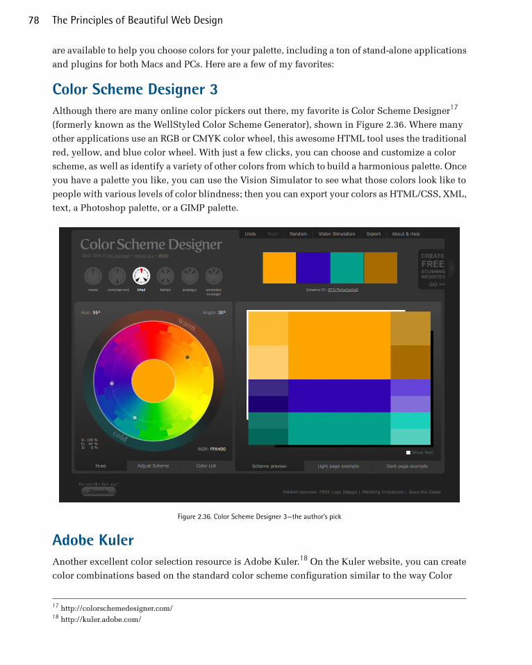
are available to help you choose colors for your palette, including a ton of stand-alone applications
and plugins for both Macs and PCs. Here are a few of my favorites:
Color Scheme Designer 3Although there are many online color pickers out there, my favorite is Color Scheme Designer17
(formerly known as the WellStyled Color Scheme Generator), shown in Figure 2.36. Where many
other applications use an RGB or CMYK color wheel, this awesome HTML tool uses the traditional
red, yellow, and blue color wheel. With just a few clicks, you can choose and customize a color
scheme, as well as identify a variety of other colors from which to build a harmonious palette. Once
you have a palette you like, you can use the Vision Simulator to see what those colors look like to
people with various levels of color blindness; then you can export your colors as HTML/CSS, XML,
text, a Photoshop palette, or a GIMP palette.
Figure 2.36. Color Scheme Designer 3—the author’s pick
Adobe KulerAnother excellent color selection resource is Adobe Kuler.18 On the Kuler website, you can create
color combinations based on the standard color scheme configuration similar to the way Color
17 http://colorschemedesigner.com/18 http://kuler.adobe.com/
The Principles of Beautiful Web Design78
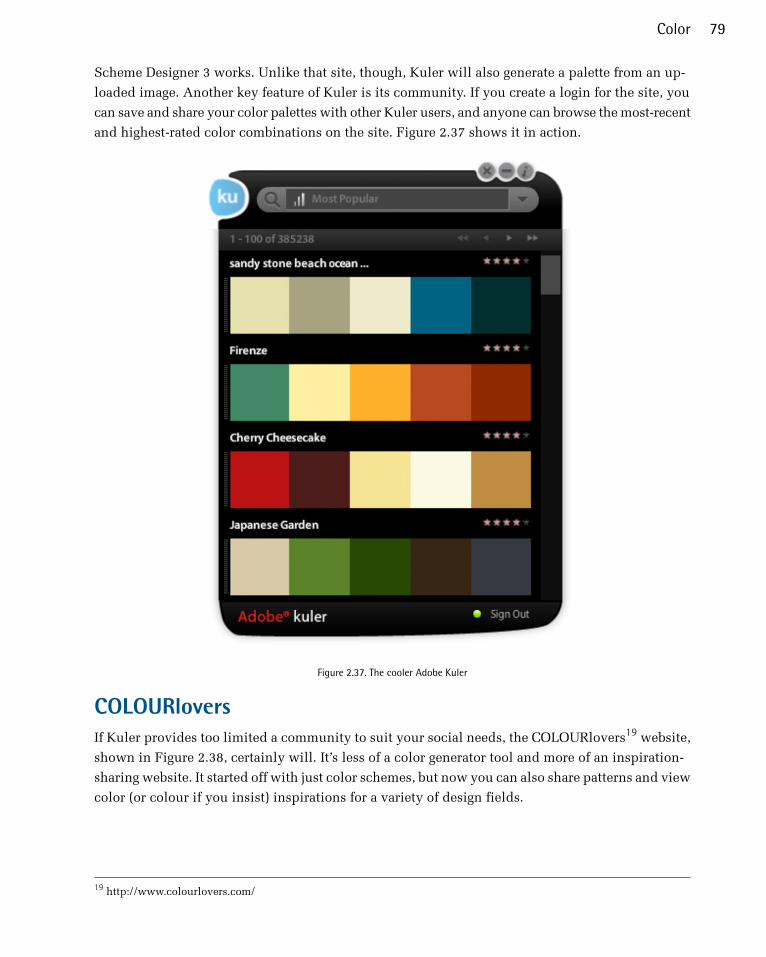
Scheme Designer 3 works. Unlike that site, though, Kuler will also generate a palette from an up-
loaded image. Another key feature of Kuler is its community. If you create a login for the site, you
can save and share your color palettes with other Kuler users, and anyone can browse the most-recent
and highest-rated color combinations on the site. Figure 2.37 shows it in action.
Figure 2.37. The cooler Adobe Kuler
COLOURloversIf Kuler provides too limited a community to suit your social needs, the COLOURlovers19 website,
shown in Figure 2.38, certainly will. It’s less of a color generator tool and more of an inspiration-
sharing website. It started off with just color schemes, but now you can also share patterns and view
color (or colour if you insist) inspirations for a variety of design fields.
19 http://www.colourlovers.com/
79Color

Figure 2.38. COLOURlovers—for lovers of color
PictaculousKuler and COLOURLovers are great tools to meticulously tweak and gain social feedback about
color schemes you’re working on, but what if you see some color inspiration on the go? That’s where
Pictaculous20 comes in handy. Pictaculous is a free MailChimp Labs project that provides color
schemes based on your pictures via email. You simply take a picture with your smartphone and
email it to [email protected]. Within a couple of minutes, you’ll receive an email with a five-
color palette, an assortment of suggested color schemes from Kuler and COLOURLovers, and an
attached Adobe color palette (.aco) file. There are alternatives to doing it by email, though. Figure 2.39
shows Pictaculous’s color suggestions for a picture that I uploaded to http://pictaculous.com/ from
my computer.
20 http://pictaculous.com
The Principles of Beautiful Web Design80

Figure 2.39. Pictaculous Color
Colour Contrast CheckWhen choosing the colors for your palettes, it’s always good to try to pick at least two colors that
have enough contrast to be used as background and text colors. Having a proper contrast between
text and background colors is essential for interactive design; without it, some people may be unable
to read your site. An easy way to confirm that there’s enough contrast between two colors is to plug
the RGB values for your foreground and background into Jonathan Snook’s Colour Contrast Check21
website.
Sometimes combinations that you think would be valid fail to meet the color difference and
brightness requirements of the Web. As Jonathan says in his blog post about the contrast checker,22
“… this tool shouldn’t be taken as gospel… but rather should help guide you towards better colour
choices”.
Being able to come up with a unique color palette is all about keeping your eyes open. If you see a
website, advertisement, illustration, or other graphic that stands out, try to figure out what the
dominant colors are, and what type of color scheme underlies the palette. Remember, though, that
color inspiration can come from anywhere. Is there a color that reminds you of a certain song? How
about the colors of your favorite meal? Maybe there’s even a color in that tacky seventies wallpaper
in your parents’ house that would work well for you. Being aware of the kinds of issues associated
with color usage will give you an eye for color and an ability to come up with original palettes that
fulfill the requirements of your client.
21 http://snook.ca/technical/colour_contrast/colour.html22 http://snook.ca/archives/accessibility_and_usability/colour_color_co
81Color
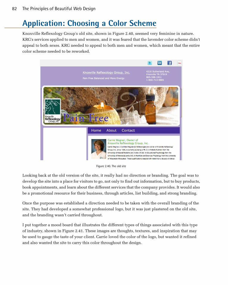
Application: Choosing a Color SchemeKnoxville Reflexology Group's old site, shown in Figure 2.40, seemed very feminine in nature.
KRG's services applied to men and women, and it was feared that the lavender color scheme didn't
appeal to both sexes. KRG needed to appeal to both men and women, which meant that the entire
color scheme needed to be reworked.
Figure 2.40. The old site
Looking back at the old version of the site, it really had no direction or branding. The goal was to
develop the site into a place for visitors to go, not only to find out information, but to buy products,
book appointments, and learn about the different services that the company provides. It would also
be a promotional resource for their business, through articles, list building, and strong branding.
Once the purpose was established a direction needed to be taken with the overall branding of the
site. They had developed a somewhat professional logo, but it was just plastered on the old site,
and the branding wasn’t carried throughout.
I put together a mood board that illustrates the different types of things associated with this type
of industry, shown in Figure 2.41. These images are thoughts, textures, and inspiration that may
be used to gauge the taste of your client. Carrie loved the color of the logo, but wanted it refined
and also wanted the site to carry this color throughout the design.
The Principles of Beautiful Web Design82
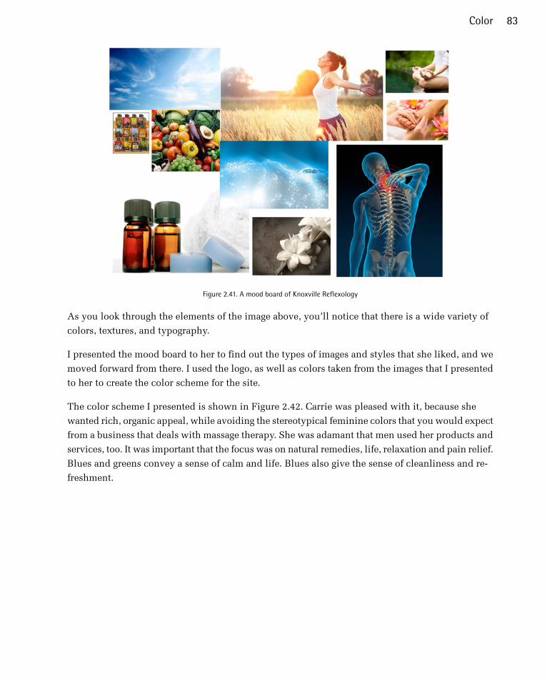
Figure 2.41. A mood board of Knoxville Reflexology
As you look through the elements of the image above, you’ll notice that there is a wide variety of
colors, textures, and typography.
I presented the mood board to her to find out the types of images and styles that she liked, and we
moved forward from there. I used the logo, as well as colors taken from the images that I presented
to her to create the color scheme for the site.
The color scheme I presented is shown in Figure 2.42. Carrie was pleased with it, because she
wanted rich, organic appeal, while avoiding the stereotypical feminine colors that you would expect
from a business that deals with massage therapy. She was adamant that men used her products and
services, too. It was important that the focus was on natural remedies, life, relaxation and pain relief.
Blues and greens convey a sense of calm and life. Blues also give the sense of cleanliness and re-
freshment.
83Color

Figure 2.42. The color scheme presented
The overall color scheme was analogous, except for the dark brown, which was important for bal-
ancing out the brighter blue. Carrie loved the color scheme, because it was organic, rich, and smooth.
The cool colors gave a sense of relief and calm, which is what most of her clients are looking for.
The colors weren't masculine or feminine, but would appeal to both, and would work well with
the types of products she promoted.
It was essential that the site look highly professional and trustworthy, while still being inviting.
The signature blue/green needed to be closely converted to RGB for the website. It was to be carried
out across the site in strategic locations, such as the navigation menu and the call-to-action section.
Colors that worked well with green, but didn't compete with it were to be used to create a sense of
hierarchy within the content.
With the color choices made, it's time to consider adding depth to the site. Even though flat design
is a currently in vogue, there are other options to consider. The right texture can add a lot to a
design, but it has to fit with the concept and overall direction of the site. This is what we'll discuss
in the next chapter.
The Principles of Beautiful Web Design84

Chapter3TextureThere are many well-intentioned designers out there who build a standard two or three-column
website layout, pick a few colors for it, and call it a day. They don’t bother pushing their design
any further, or tweaking any details. Perhaps there’s no time or money in the project budget to go
the extra distance, or maybe they’ve taken the “less is more” axiom a little too literally. Not every
website has to be beautiful, but every website can be. CSS has given web designers a great amount
of control over how a site looks, but I think the real problem is that many people are just unsure
where to start when it comes to customization. This chapter is all about that process: taking your
design a step further with the help of texture.
Texture is anything that gives a distinctive appearance or feel to the surface of a design or object.
When you put your hands on a brick wall, a wooden beam, or a wet bar of soap, what do you feel?
Can you make a website “feel” like one of these surfaces? Thankfully, it’s impossible for a website
to give visitors splinters, but you can make it relate to and evoke memories of real materials. First,
you need a way to describe the surface. You might start off by talking about relative roughness or
smoothness, but there are other factors that give a surface its unique characteristics. Does the texture
incorporate repeated patterns? Does it have a unique shape? What are the lines like that make up
the shape? Does the shape have volume?
These questions might seem random, but they arise directly from the elements of graphic design:
point, line, shape, volume and depth, and pattern. Understanding these components will help you
not only to explain texture, but to create it as well.

PointIf you’ve worked with CSS, then you’re probably familiar with using pixels as a unit of measurement.
One pixel (short for “picture element”) is one of the millions of dots on your computer screen. If
your resolution is set to 1280×1024 pixels, you have 1,310,720 pixels on your screen, arranged in
1,024 rows and 1,280 columns. All these pixels come together to create a digital image.
This is all very elementary technical knowledge, but as we’re about to see, it applies specifically
to the concept of points in graphic design.
Just as the pixel is the fundamental element of digital images, the point (or dot) is the fundamental
element of graphic design, and can be used to build any graphic element. Points have no scale or
dimension unless they have a frame of reference. For instance, a point on a huge billboard might
look like a period, but up close it’s probably about as big as your head. When points are grouped
together, as they are in Figure 3.1, they can create lines, shapes, and volume.
Figure 3.1. Halftone Kitty: a study in points
When you’re working on website graphics, it’s easy to look at the big picture and ignore the points
that make up each image. Points themselves have a lot of power, though. Just take a look at Craig
Robinson’s Flip Flop Flyin’.1 Among other forms of tiny art, Craig creates portraits of famous people,
bands, and groups that he calls Minipops. The one in Figure 3.2 is a close up of Craig’s A-Team
Minipop. Hard-core fans will notice that Hannibal even has his trusty cigar.
1 http://flipflopflyin.com
The Principles of Beautiful Web Design86

Figure 3.2. The A-Team by Craig Robinson
LineWhen two or more points are connected, they form a line. The line is the most common element of
graphic design, and is among the most expressive. When designing websites, most people only
consider lines for CSS borders or hyperlink underlines, but they can be used in countless ways
throughout your web creations.
When a line is diagonal, it evokes a sense of movement and excitement. Like a falling domino, a
diagonal line has potential energy. Using a pattern of horizontal lines as a background element
provides texture and interest to a design, but using a motif of diagonal lines will make the design
feel a little more “on edge,” causing users’ eyes to move around constantly. Compare the two ex-
amples in Figure 3.3. Which keeps your eyes moving around more successfully?
Figure 3.3. Backgrounds created using diagonal and horizontal lines
Just as diagonal lines suggest movement, varying the thickness and direction of a line generates a
sense of expression and character. Jagged lines with sharp angles can feel dangerous and frantic.
Gently rolling, curvy lines tend to feel relaxing and smooth. Lines comprising 90-degree angles
tend to feel sharp and mechanical. Finally, lines with lots of curves and angles convey expressiveness;
for example, handwriting, graffiti, and sketches.
87Texture

When you’re working on the prototype stage of a website’s development, try to keep in mind that
lines are far more useful than just being dividers, borders, and stripes. They’re the foundation of
art, drawing, and design. As the Web is such a rigid and technical medium, it’s easy to forget about
fundamental art tools such as pens and brushes. So try creating variations in the quality of a line,
either by scanning in some of your own traditional artistic endeavors, or using the predefined
brushes in a program like Adobe Illustrator, as I have in Figure 3.4. This is a great way to bring a
traditional artistic feel to a medium that is sometimes all too digital.
Figure 3.4. Experimenting with the quality, direction, and thickness of line
ShapeAny time the two end points of a line come together, a shape is created. There’s probably little more
I can add to your knowledge of the basic geometric shapes: circles, triangles, and rectangles. Arrows,
stars, diamonds, ellipses, plus signs, semicircles, and more are geometric as well—Figure 3.5 illus-
trates a few of them. The precise curves, angles, and straight lines involved in geometric shapes
make them difficult to draw by hand, unless you have a compass, protractor, and ruler. On a com-
puter, though, geometrically defined lines, curves, and angles are usually the default forms in any
image-creating program. For that reason, these types of shapes have a reputation for feeling technical
and mechanical.
The Principles of Beautiful Web Design88

Figure 3.5. Geometric and freeform shapes
The other main category of shape is organic or freeform. Freeform shapes are more abstract than
geometric shapes, and consist of non geometric curves, random angles, and irregular lines, as can
be seen in Figure 3.5. Freeform shapes have a free-flowing nature that conveys a sense of informality
and spontaneity. They can represent the outline of a product, human gestures, or an organic doodle.
Figure 3.6 represents the gradual transformation of a geometric shape into a freeform shape.
Figure 3.6. Transforming a geometric shape into an organic one
When it comes to website design, many people seem to forget that freeform shapes exist. In Chapter 1,
I explained how the anatomy of a website consists of a bunch of blocks. No matter how you arrange
them on the page, these blocks are inherently geometric. Unlike print design, which gives us the
freedom to draw whichever layout shapes we like, the Web limits us to rectangles. However, although
the containing blocks may be rectangular, that doesn’t mean they have to look rectangular. One of
the most common methods we can use to hide the underlying form of an HTML element is to give
it a background image.
89Texture

You could use a circle or an oval as your background image, then center all your text—inserting
line breaks where necessary—to create the illusion that you have a circular block of text in your
layout. Figure 3.7 shows an example of this approach. The problem is that if your text extends
beyond the bottom of the oval, or if you forget to insert a line break somewhere, the oval won’t expand
to fit the text.
Figure 3.7. Text inside an oval
Okay, so if we forget to format our text to fit the background image, this approach can be problem-
atic. Another reason why this technique is impractical is that most web browsers give users the
ability to resize the text, which would also break this fragile, if fanciful, layout technique. In reality,
the best we can do is distract viewers from the fact that a layout is rectangular.
Designing in CSS
Some designers have created amazing artwork without images using pure CSS, such as the robot
shown in Figure 3.8 below. The example shows you just a hint of the actual complex CSS that went
into making this. You can see the full example on CodePen2. Other examples of pure CSS artwork
include Nicolas Gallagher's pure CSS GUI icons3.
Figure 3.8. A robot image created in pure CSS
2 http://codepen.io/m-kafiyan/pen/yhvgF3 http://nicolasgallagher.com/pure-css-gui-icons/demo/
The Principles of Beautiful Web Design90

Rounded CornersSo we’re unable to count on the height of a content block remaining the same at all times, on all
monitors. One thing we can do, though, is remove the 90-degree corners that so often characterize
rectangle-based layouts. From a graphic design perspective, boxes with rounded-off corners soften
the layout, creating a more organic, smoother feel. Remember when I asked if you could make a
website design feel like a wet bar of soap? Well, rounded corners can certainly make a site feel a
little more slippery. Take a look at the boxes on Simon Collison’s home page4 in Figure 3.9. The
corners of each of the boxes you see here have been slightly tapered to give this very gridtacular
layout a slightly softer feel. The upper red box to the left of the image shows a close-up of those
rounded corners.
Figure 3.9. The Celebrated New Miscellany of Mr. Simon Collison
So why does the lower red box in Figure 3.9 show a square corner? This is a close-up of what the
corners on Simon’s site look like in Internet Explorer 8 and below. They are square because Simon
has used the border-radius CSS3 property, which is only supported in Internet Explorer 9 and
up. CSS3 is by far the easiest way to implement rounded corners. Because of the lack of IE support,
though, it might be impractical unless you’re okay with some users seeing square corners. In Simon
Collison’s case, losing the roundedness in IE isn’t a deal breaker. Besides, the real draw of Simon’s
4 http://colly.com/
91Texture
site is his jaw-dropping use of media queries. A media query is a feature of CSS3 that allows us to
define a conditional rule for applying a certain set of styles. In this case, Simon is using them to
automatically change the layout of his site as you resize the browser or view it in different devices.
While it’s not a true “responsive layout” (because it’s not fluid), it’s still an impressive and practical
way to adapt to the many devices we use to access the Web. Now, go on, open http://colly.com in
a browser and resize away.
When I wrote the first edition of this book, border-radius was a glimmering ray of hope for a design
technique we’d been trying to implement for years with HTML and CSS. For that reason, I highlighted
several techniques for creating rounded corners using extraneous markup or JavaScript. Most of
those techniques have been abandoned. If you’re unable to create the effect with simple CSS, I’d
advise you to follow Simon’s lead and keep the corner effect subtle enough; that way, your design
will still look good with square corners. Visit
http://dowebsitesneedtolookexactlythesameineverybrowser.com/ for a further explanation of my
stance on this topic.
RotationI mentioned in the section above that diagonal lines evoke a sense of movement and excitement.
Rotating shapes and elements in your design have the same effect. Rotated objects break up the
horizontal and vertical monotony of the Web and, like rounded corners, help it to feel more organic.
Take a look at the Ithaca Events5 site in Figure 3.10. There’s a lot of rich texture in this design that
gives it a handmade feel. The subtle rotation of the logo, “view all” links at the bottom of each date,
and other background elements give the site a lot of character. To me, this design really looks like
a flyer that might be stapled onto the wall of a local entertainment venue. It’s a perfect look for a
regional arts and culture calendar website.
5 http://www.ithacaevents.com/
The Principles of Beautiful Web Design92
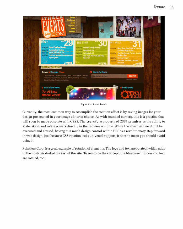
Figure 3.10. Ithaca Events
Currently, the most common way to accomplish the rotation effect is by saving images for your
design pre-rotated in your image editor of choice. As with rounded corners, this is a practice that
will soon be made obsolete with CSS3. The transform property of CSS3 promises us the ability to
scale, skew, and rotate objects directly in the browser window. While the effect will no doubt be
overused and abused, having this much design control within CSS is a revolutionary step forward
in web design. Just because CSS rotation lacks universal support, it doesn’t mean you should avoid
using it.
Pointless Corp. is a great example of rotation of elements. The logo and text are rotated, which adds
to the nostalgic-feel of the rest of the site. To reinforce the concept, the blue/green ribbon and text
are rotated, too.
93Texture

Figure 3.11. Pointless Corp. and their rotated logo and ribbon
Shapes and LayoutRounding corners and rotating elements in your design are just two techniques to make a layout
feel less geometric and more organic. There are plenty of other ways to enhance your designs using
shapes creatively. Take a look at the Speed Kids6 website in Figure 3.12. The designers of this site
used a simplified style of illustration consisting of a variety of basic organic shapes to create the
layout you see here. When I look at the page, the first item I see is the pink octopus. From there,
the arrows created by the splashes under the logo guide my eye down to the playground. Next, the
bars of the playground and the slides guide my eyes downward, to all of the links. Just in case I
missed it, the ripples in the water guide me back toward the center of the page at the bottom, where
all of the links and logos are located.
6 http://www.speedkids.com.br/
The Principles of Beautiful Web Design94
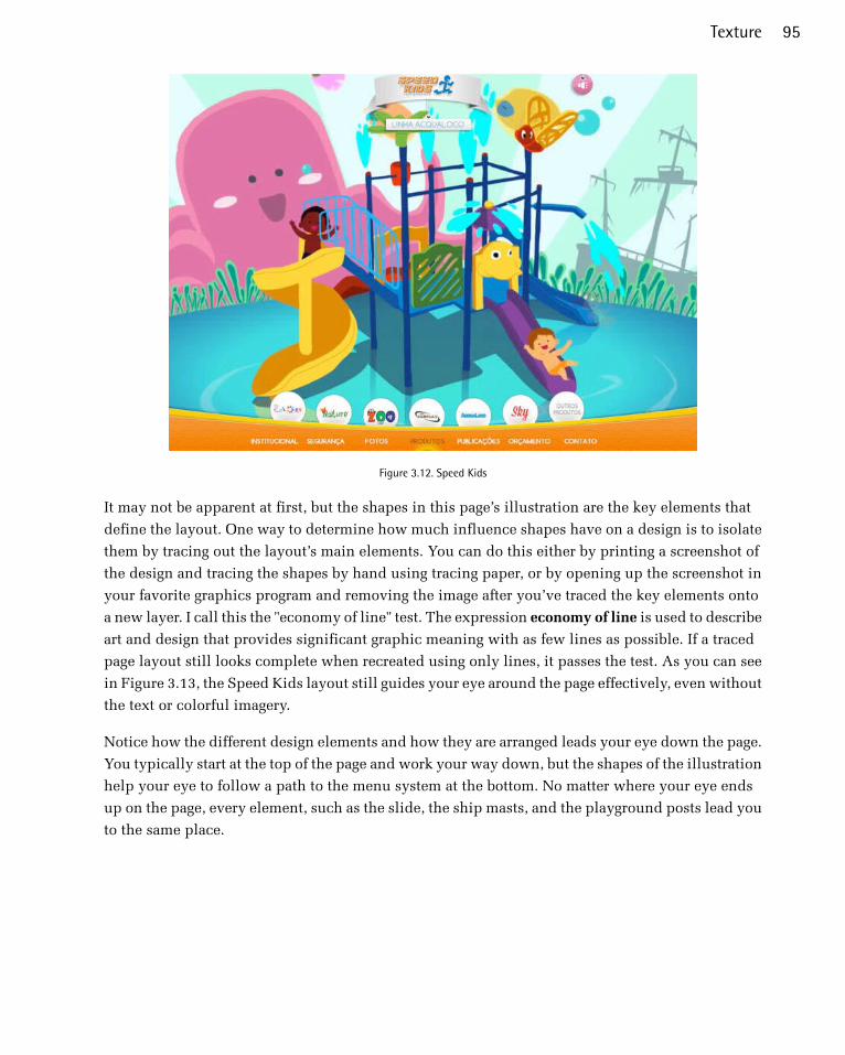
Figure 3.12. Speed Kids
It may not be apparent at first, but the shapes in this page’s illustration are the key elements that
define the layout. One way to determine how much influence shapes have on a design is to isolate
them by tracing out the layout’s main elements. You can do this either by printing a screenshot of
the design and tracing the shapes by hand using tracing paper, or by opening up the screenshot in
your favorite graphics program and removing the image after you’ve traced the key elements onto
a new layer. I call this the "economy of line" test. The expression economy of line is used to describe
art and design that provides significant graphic meaning with as few lines as possible. If a traced
page layout still looks complete when recreated using only lines, it passes the test. As you can see
in Figure 3.13, the Speed Kids layout still guides your eye around the page effectively, even without
the text or colorful imagery.
Notice how the different design elements and how they are arranged leads your eye down the page.
You typically start at the top of the page and work your way down, but the shapes of the illustration
help your eye to follow a path to the menu system at the bottom. No matter where your eye ends
up on the page, every element, such as the slide, the ship masts, and the playground posts lead you
to the same place.
95Texture

Figure 3.13. The economy of line test on Speed Kids' website
Volume and DepthWe’ve talked about point, line, and shape, but now it’s time to take this chapter to another dimension.
The elements we’ve discussed so far only exist in two dimensions: width and height. They’re just
marks on paper or a screen, without any indication of depth; however, as we live in a world of three
dimensions, we’ve learned to rely on visual cues that help us to determine the width, height, and
depth of the objects around us.
PerspectiveWhen we see a path that disappears into the horizon as the Great Wall of China does in Figure 3.14,
we don’t think that its width actually decreases to a single point. Similarly, when we look at an
open door, we’re aware that the top and bottom of the door are parallel, even though they seem to
converge towards the door frame. We’re not fooled by these spatial illusions because we know
(consciously or otherwise) that objects tend to look smaller as they become further away.
The Principles of Beautiful Web Design96
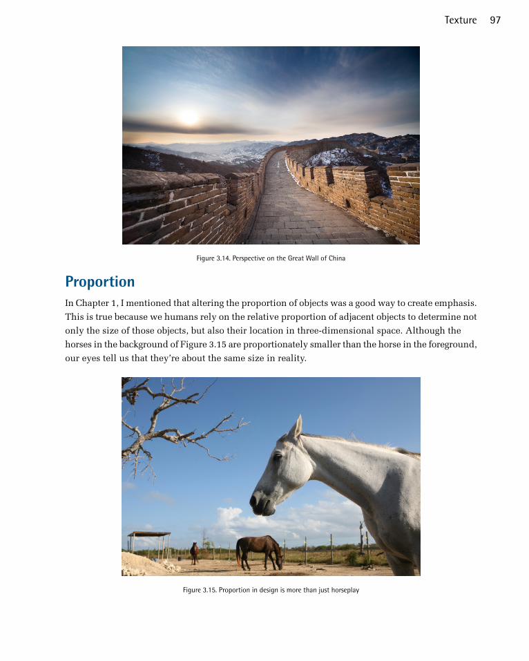
Figure 3.14. Perspective on the Great Wall of China
ProportionIn Chapter 1, I mentioned that altering the proportion of objects was a good way to create emphasis.
This is true because we humans rely on the relative proportion of adjacent objects to determine not
only the size of those objects, but also their location in three-dimensional space. Although the
horses in the background of Figure 3.15 are proportionately smaller than the horse in the foreground,
our eyes tell us that they’re about the same size in reality.
Figure 3.15. Proportion in design is more than just horseplay
97Texture
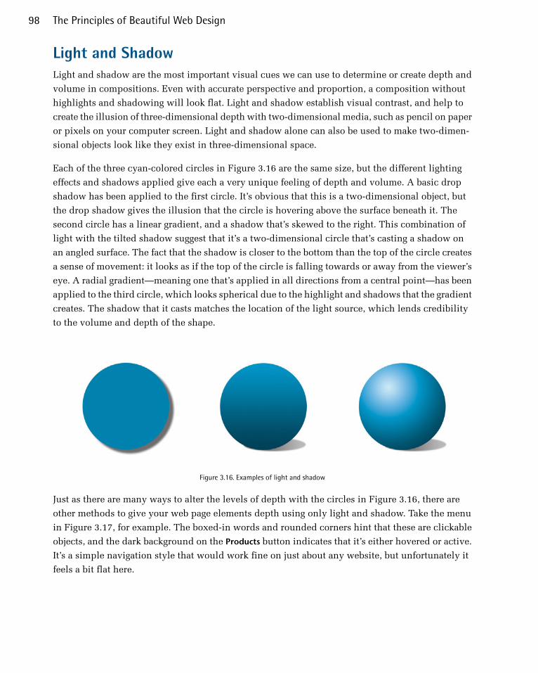
Light and ShadowLight and shadow are the most important visual cues we can use to determine or create depth and
volume in compositions. Even with accurate perspective and proportion, a composition without
highlights and shadowing will look flat. Light and shadow establish visual contrast, and help to
create the illusion of three-dimensional depth with two-dimensional media, such as pencil on paper
or pixels on your computer screen. Light and shadow alone can also be used to make two-dimen-
sional objects look like they exist in three-dimensional space.
Each of the three cyan-colored circles in Figure 3.16 are the same size, but the different lighting
effects and shadows applied give each a very unique feeling of depth and volume. A basic drop
shadow has been applied to the first circle. It’s obvious that this is a two-dimensional object, but
the drop shadow gives the illusion that the circle is hovering above the surface beneath it. The
second circle has a linear gradient, and a shadow that’s skewed to the right. This combination of
light with the tilted shadow suggest that it’s a two-dimensional circle that’s casting a shadow on
an angled surface. The fact that the shadow is closer to the bottom than the top of the circle creates
a sense of movement: it looks as if the top of the circle is falling towards or away from the viewer’s
eye. A radial gradient—meaning one that’s applied in all directions from a central point—has been
applied to the third circle, which looks spherical due to the highlight and shadows that the gradient
creates. The shadow that it casts matches the location of the light source, which lends credibility
to the volume and depth of the shape.
Figure 3.16. Examples of light and shadow
Just as there are many ways to alter the levels of depth with the circles in Figure 3.16, there are
other methods to give your web page elements depth using only light and shadow. Take the menu
in Figure 3.17, for example. The boxed-in words and rounded corners hint that these are clickable
objects, and the dark background on the Products button indicates that it’s either hovered or active.
It’s a simple navigation style that would work fine on just about any website, but unfortunately it
feels a bit flat here.
The Principles of Beautiful Web Design98

Figure 3.17. A clear and functional menu—but it’s a little flat
If these button shapes were really three-dimensional, what would they look like? Would they be
flat with beveled edges, or completely rounded on the top? Would the tops of the buttons be straight
on the horizontal, or would they have rolling curves? What would happen when light hit them?
All these questions can be answered by looking around you. For the example in Figure 3.18, I
imagined that my links were lit from above, so I gave them a slight gradient rather than making the
background color flat. I also added a bevel to the edges to make them feel a bit like glossy, rectan-
gular subway tiles. I wanted the active link to look inset instead of beveled out, so that it appears
to be clicked. I achieved that by adding a shadow to the top of the block instead of a bevel highlight.
I gave the text a little drop shadow as well, to make it feel like the letters were slightly raised from
the button surface.
Figure 3.18. Gradients, shadows, and beveling make this menu pop
Adding shadows to text and objects is another practical way of creating depth in your layout. This
can easily be done in Photoshop using layer styles, but what if the person who’s maintaining the
site lacks access to a copy of Photoshop? As with creating rounded corners and rotating objects,
CSS3 again comes to the rescue. The box-shadow and text-shadow properties promise to make web
design far less dependent on heavy images. A great place to experiment with these and other CSS3
properties is http://css3please.com.
No need to restrict yourself to just adding lighting and shadows to boxy elements, though: try in-
volving some perspective, and think about how real-life objects work when you’re trying to manu-
99Texture

facture a sense of dimension. Take a look at the screenshot from Worry Free Labs in Figure 3.19.
The design of the home page for this Austin, Texas-based design agency is simple and fun, but
there’s a lot of inventive texture going on here as well. The “We Are Worry Free Labs” banner be-
comes a focal point because of its contrast, but another area that gets a lot of attention is where the
mobile devices are displayed. There are long, dramatic shadows next to these devices, calling a lot
of attention to them. Without these elements, these images could be boring and mediocre. As it is,
though, the organic shape and realistic shadows make this a convincing representation of a 3D object
in space.
Figure 3.19. Worry Free Labs using a combination of shape and shadow to strong effect
Drawing from real-world inspiration is the key to adding believable depth to graphic elements.
Rather than settling for a layout filled with flat blocks of color, lines, and shapes, try to think of
ways in which you can incorporate three-dimensional space. Remember that the items that “stick
out” the farthest are likely to become focal points, and that perspective and proportion do very little
without the reinforcement of light and shadow.
PatternI still remember my first exposure to website design. I was in a tenth-grade typing class and the
instructor took it upon herself to teach us HTML. It was optional, but choosing between timed
typing tests and learning how to build web pages was an easy choice to make. By the end of that
year I’d created quite a few little websites. The common denominator among those admittedly
hideous creations was repeating backgrounds. You know the kind I’m talking about: those back-
grounds that tile seamlessly to give the appearance of a continuous water, stone, starry skies, metal,
or canvas texture.
The Principles of Beautiful Web Design100
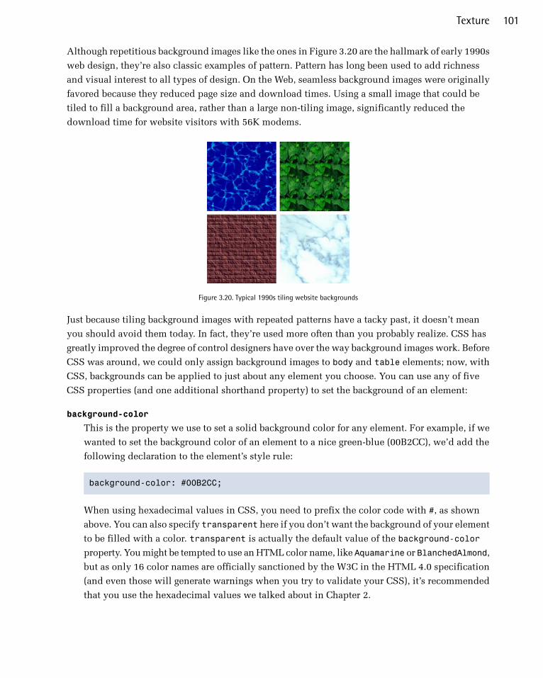
Although repetitious background images like the ones in Figure 3.20 are the hallmark of early 1990s
web design, they’re also classic examples of pattern. Pattern has long been used to add richness
and visual interest to all types of design. On the Web, seamless background images were originally
favored because they reduced page size and download times. Using a small image that could be
tiled to fill a background area, rather than a large non-tiling image, significantly reduced the
download time for website visitors with 56K modems.
Figure 3.20. Typical 1990s tiling website backgrounds
Just because tiling background images with repeated patterns have a tacky past, it doesn’t mean
you should avoid them today. In fact, they’re used more often than you probably realize. CSS has
greatly improved the degree of control designers have over the way background images work. Before
CSS was around, we could only assign background images to body and table elements; now, with
CSS, backgrounds can be applied to just about any element you choose. You can use any of five
CSS properties (and one additional shorthand property) to set the background of an element:
background-color
This is the property we use to set a solid background color for any element. For example, if we
wanted to set the background color of an element to a nice green-blue (00B2CC), we’d add the
following declaration to the element’s style rule:
background-color: #00B2CC;
When using hexadecimal values in CSS, you need to prefix the color code with #, as shown
above. You can also specify transparent here if you don’t want the background of your element
to be filled with a color. transparent is actually the default value of the background-color
property. You might be tempted to use an HTML color name, like Aquamarine or BlanchedAlmond,
but as only 16 color names are officially sanctioned by the W3C in the HTML 4.0 specification
(and even those will generate warnings when you try to validate your CSS), it’s recommended
that you use the hexadecimal values we talked about in Chapter 2.
101Texture

background-image
If we want an image to be used as the background of an element, we can specify that image using
the background-image property. The possible values for this property are url('filename') or
none. If we wanted to set the background of an element to animalcracker.png, we’d add the fol-
lowing declaration to that element’s style rule:
background-image: url('animalcracker.png');
background-repeat
There are four possible values for background-repeat: repeat, repeat-x, repeat-y, and no-
repeat. The default value is repeat, which sees that the specified background image will be
tiled vertically and horizontally. The repeat-x setting will cause the background image to be
repeated horizontally. This is handy if you want to apply a horizontally tiling image or gradient
to an element, but want the rest of that element to be filled with the specified background color.
Similarly, repeat-y specifies that the background image should be repeated vertically. Finally,
no-repeat is used when you have a background image that you don’t want to tile at all. The
effect of each of these settings is shown in Figure 3.21.
Figure 3.21. The effects of different background-repeat settings on animal crackers
background-attachment
This property determines whether the background image stays in the same location or moves
with the content when the page is scrolled. It can be set to the values of fixed or scroll, the
latter of which is the default. When background-attachment is set to fixed, the background
will be fixed relative to the viewport (or browser window), so that when you scroll the page,
the background image will stay in the same location.
background-position
This property controls the position of a background image and accepts two values: the horizontal
and vertical position of the image. These values can be set using keywords (right, center, or
top for the horizontal position; top, center, or bottom for the vertical), using CSS measurements,
or using percentages. For example, if you wanted a background image to be centered horizontally
and aligned to the top of an element, you could specify this using keywords (background-pos-
ition: center top) or using percentages (background-position: 50% 0%). If we wanted to
position the image 300 pixels from the left edge, and 400 pixels from the top, we could use the
The Principles of Beautiful Web Design102
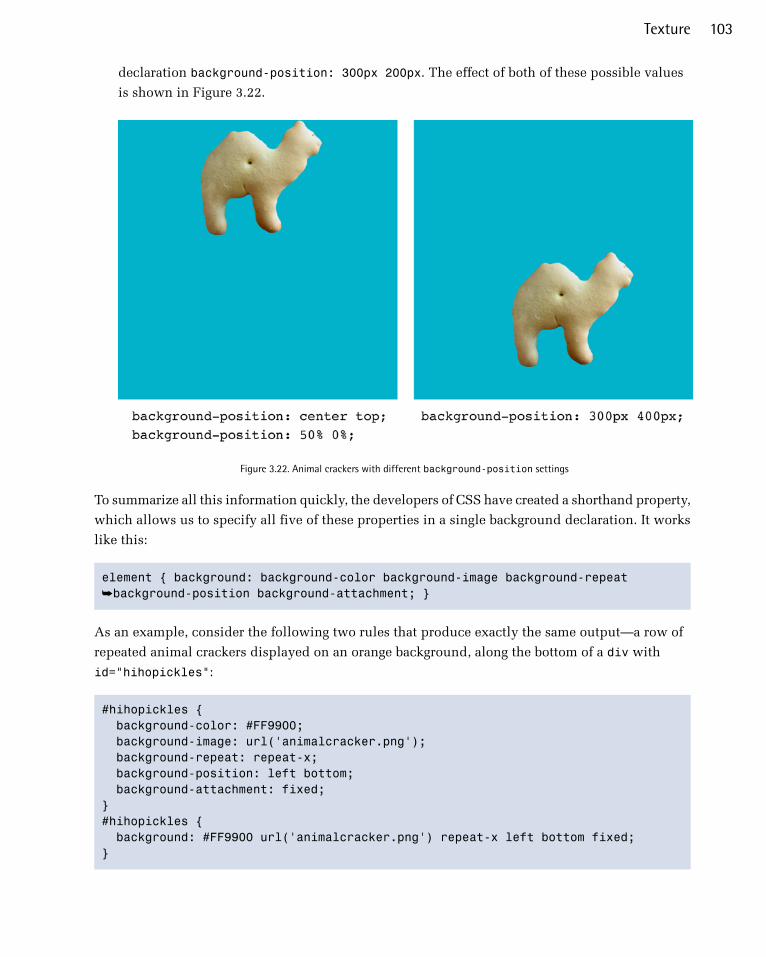
declaration background-position: 300px 200px. The effect of both of these possible values
is shown in Figure 3.22.
Figure 3.22. Animal crackers with different background-position settings
To summarize all this information quickly, the developers of CSS have created a shorthand property,
which allows us to specify all five of these properties in a single background declaration. It works
like this:
element { background: background-color background-image background-repeat ➥background-position background-attachment; }
As an example, consider the following two rules that produce exactly the same output—a row of
repeated animal crackers displayed on an orange background, along the bottom of a div with
id="hihopickles":
#hihopickles { background-color: #FF9900; background-image: url('animalcracker.png'); background-repeat: repeat-x; background-position: left bottom; background-attachment: fixed; }#hihopickles { background: #FF9900 url('animalcracker.png') repeat-x left bottom fixed; }
103Texture

When applied to our document, our hihopickles div might look like the display shown in Fig-
ure 3.23.
Figure 3.23. Hi Ho Pickles!
As I said before, it’s sometimes difficult to spot a repeated background image in a website design.
For a little practice, take a look at the screenshot of Dave McNally’s Tileables7 site in Figure 3.24.
Figure 3.24. Tileables, a resource for never-ending patterns
There are no annoying repeated brick or corny animal cracker backgrounds here—just a sharp, well-
polished resource site for Photoshop pattern packs. But beneath the surface, the Tileables design
uses several repeated backgrounds. Figure 3.25 highlights a few of these.
7 http://tileabl.es/
The Principles of Beautiful Web Design104

Figure 3.25. Three repeated background images in the Tileables design
1. At first glance, this decorative tile looks like a continuous series of textured squares. In reality,
though, it’s a single image of just one color block, that’s then applied as a background to the
header of the site and repeated horizontally and vertically to fill the space.
2. Shown as a preview are some of the other images that you can tile to create repeating patterns.
The image is only used once, but it is repeated infinitely horizontally, vertically, or both.
Building TextureIn review, the texture-related elements I’ve described so far are point, line, shape, depth and volume,
and pattern. Individually, each of these components creates some level of texture; however, when
you begin to use them together, they build on one another to create more complex visual imagery.
How you combine them depends on the type of effect you’re trying to create. So, the question is:
what is the textural effect you want to achieve? Let's look at a few options.
Aged, Weathered, Worn, and Nostalgic StylePerhaps you want to emphasize the timeless nature or nostalgic history of your subject. You might
want to replicate the rich wood found inside a gourmet kitchen or in a traditional Italian home.
Notice the grainy wood texture in the header and below the slider in the Italio Kitchen8 site in
Figure 3.26. It frames the content and provides a great deal of contrast to the smooth, cream colored
sliding gallery area. It also gives a sense of tradition and age.
8 http://italiokitchen.com/
105Texture
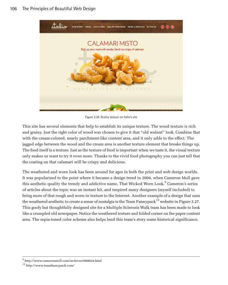
Figure 3.26. Grainy texture on Italio's site
This site has several elements that help to establish its unique texture. The wood texture is rich
and grainy. Just the right color of wood was chosen to give it that “old walnut” look. Combine that
with the cream-colored, nearly parchment-like content area, and it only adds to the effect. The
jagged edge between the wood and the cream area is another texture element that breaks things up.
The food itself is a texture. Just as the texture of food is important when we taste it, the visual texture
only makes us want to try it even more. Thanks to the vivid food photography you can just tell that
the coating on that calamari will be crispy and delicious.
The weathered and worn look has been around for ages in both the print and web design worlds.
It was popularized to the point where it became a design trend in 2004, when Cameron Moll gave
this aesthetic quality the trendy and addictive name, That Wicked Worn Look.9 Cameron’s series
of articles about the topic was an instant hit, and inspired many designers (myself included) to
bring more of that rough and worn-in texture to the Internet. Another example of a design that uses
the weathered aesthetic to create a sense of nostalgia is the Team Fannypack10 website in Figure 3.27.
This goofy but thoughtfully designed site for a Multiple Sclerosis Walk team has been made to look
like a crumpled old newspaper. Notice the weathered texture and folded corner on the paper content
area. The sepia-toned color scheme also helps lend this team’s story some historical significance.
9 http://www.cameronmoll.com/archives/000024.html10 http://www.teamfannypack.com/
The Principles of Beautiful Web Design106

Figure 3.27. Team Fannypack in full sepia
Using strong textures with a grungy feel doesn’t mean your site has to hark back to a bygone era.
The Electric Pulp11 site in Figure 3.28 is an excellent example of a site featuring weathered textures
without looking like it’s come from a library archive.
11 http://electricpulp.com/
107Texture

Figure 3.28. Electric Pulp: modern grunge
The wood grain used on the Electric Pulp site simply exists to evoke an organic, hand-crafted vibe.
The slightly rotated logo, active marker on the navigation menu, and trees at the bottom of the page
all feel hand painted, and the “We Build Websites” text looks as if it was burned into the background.
All of this helps to establish a very recognizable style that you can see repeated in much of the
agency’s client work as well. I guess you could say that rich tangible texture is their calling card.
Although some people feel the wicked worn look is (or was) a fad that has come and gone, I believe
it’s a design option that’s here to stay. Like a comfortable pair of jeans with holes in the knees, or
a faded stack of postcards with tattered edges, there is validity and honor in things that show wear
and tear, and the passage of time.
And now for something completely different …
Clean and GrainyAs a backlash against the worn aesthetic, there was a period of time in the late 2000s when a lot of
designers and developers decided to buck the use of textures entirely. At the time, it seemed to be
a logical reaction. After all, if you want to make a crisp, professional first impression, adding a ton
of extreme textures can be like wearing holey jeans and a concert T-shirt to a job interview. That
The Principles of Beautiful Web Design108
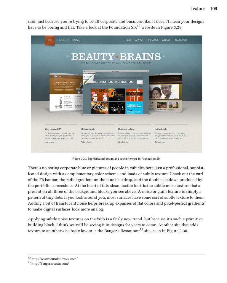
said, just because you’re trying to be all corporate and business-like, it doesn’t mean your designs
have to be boring and flat. Take a look at the Foundation Six12 website in Figure 3.29.
Figure 3.29. Sophisticated design and subtle texture in Foundation Six
There’s no boring corporate blue or pictures of people in cubicles here, just a professional, sophist-
icated design with a complementary color scheme and loads of subtle texture. Check out the curl
of the F6 banner, the radial gradient on the blue backdrop, and the double shadows produced by
the portfolio screenshots. At the heart of this clean, tactile look is the subtle noise texture that’s
present on all three of the background blocks you see above. A noise or grain texture is simply a
pattern of tiny dots. If you look around you, most surfaces have some sort of subtle texture to them.
Adding a bit of translucent noise helps break up expanses of flat colors and pixel-perfect gradients
to make digital surfaces look more analog.
Applying subtle noise textures on the Web is a fairly new trend, but because it’s such a primitive
building block, I think we will be seeing it in designs for years to come. Another site that adds
texture to an otherwise basic layout is the Banger's Restaurant13 site, seen in Figure 3.30.
12 http://www.foundationsix.com/13 http://bangersaustin.com/
109Texture

Figure 3.30. Ubiquitous texture in the Banger's Restaurant website
Earlier in the chapter, I explained that geometric shapes are the norm on the Web, but they have a
very mechanical feel. Without the textures to give this an aged, super-worn feel, this site would
lose most of its nostalgic personality. The basic shapes are enhanced with texture, and grit.
Handcrafted ScrapbookAnother interesting reaction to—or perhaps more a variant of—the wicked worn look has been a
rise in handcrafted designs that look more like a page from a personal journal or scrapbook than a
website. A cool example of this look is the site for Needle in Figure 3.31.
Figure 3.31. Intentional imperfection on the Needle site
The Principles of Beautiful Web Design110
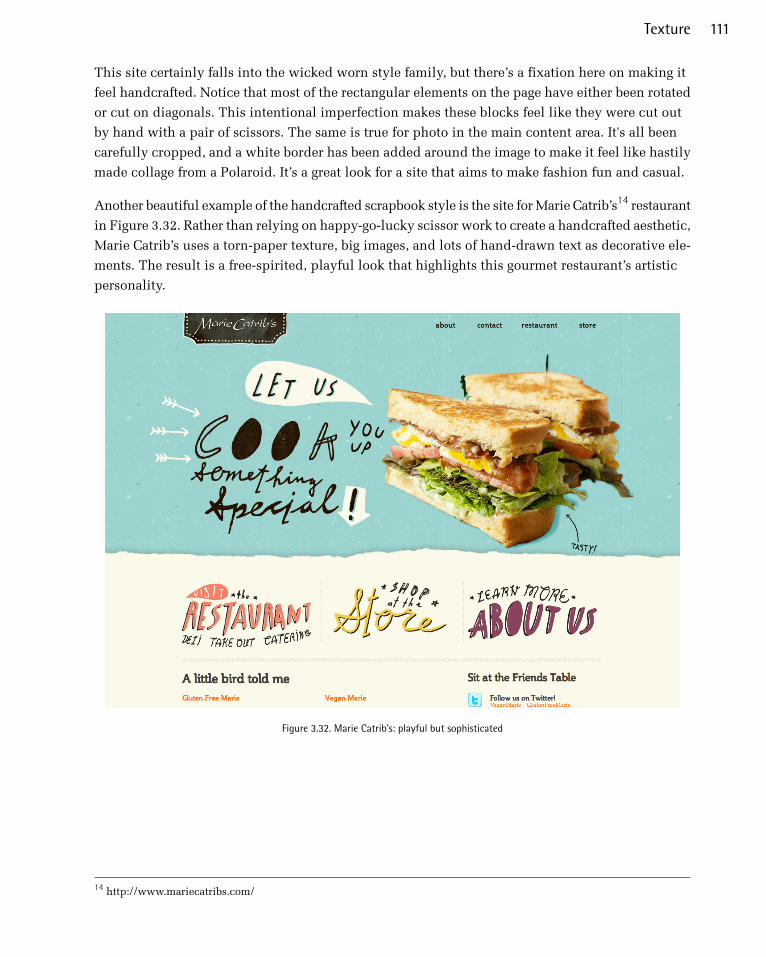
This site certainly falls into the wicked worn style family, but there’s a fixation here on making it
feel handcrafted. Notice that most of the rectangular elements on the page have either been rotated
or cut on diagonals. This intentional imperfection makes these blocks feel like they were cut out
by hand with a pair of scissors. The same is true for photo in the main content area. It's all been
carefully cropped, and a white border has been added around the image to make it feel like hastily
made collage from a Polaroid. It’s a great look for a site that aims to make fashion fun and casual.
Another beautiful example of the handcrafted scrapbook style is the site for Marie Catrib’s14 restaurant
in Figure 3.32. Rather than relying on happy-go-lucky scissor work to create a handcrafted aesthetic,
Marie Catrib’s uses a torn-paper texture, big images, and lots of hand-drawn text as decorative ele-
ments. The result is a free-spirited, playful look that highlights this gourmet restaurant’s artistic
personality.
Figure 3.32. Marie Catrib’s: playful but sophisticated
14 http://www.mariecatribs.com/
111Texture

Whimsical Cartoon StyleMarie Catrib’s site balances playful creativity with sophisticated craft, but what if you want more
of the former than the latter? Using simplified illustrations, vivid colors, and a focus on imagery
over content can help give your designs a childlike feel—what I like to call the whimsical cartoon
style.
If you’re designing for a target audience that consists of young children, the whimsical cartoon style
is a great choice. An example of this is the site for Disney’s Club Penguin,15 seen in Figure 3.33. If
the interactive elements and animation on this page don’t grab a child’s attention, the coloring book-
style illustrations and intense colors certainly will. Notice also the repeated use of rounded corners
throughout the design, helping to tie the top navigation area into the rest of the site.
Figure 3.33. Playful creativity at Disney’s Club Penguin
15 http://www.clubpenguin.com/
The Principles of Beautiful Web Design112
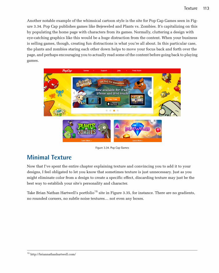
Another notable example of the whimsical cartoon style is the site for Pop Cap Games seen in Fig-
ure 3.34. Pop Cap publishes games like Bejeweled and Plants vs. Zombies. It’s capitalizing on this
by populating the home page with characters from its games. Normally, cluttering a design with
eye-catching graphics like this would be a huge distraction from the content. When your business
is selling games, though, creating fun distractions is what you’re all about. In this particular case,
the plants and zombies staring each other down helps to move your focus back and forth over the
page, and perhaps encouraging you to actually read some of the content before going back to playing
games.
Figure 3.34. Pop Cap Games
Minimal TextureNow that I’ve spent the entire chapter explaining texture and convincing you to add it to your
designs, I feel obligated to let you know that sometimes texture is just unnecessary. Just as you
might eliminate color from a design to create a specific effect, discarding texture may just be the
best way to establish your site’s personality and character.
Take Brian Nathan Hartwell's portfolio16 site in Figure 3.35, for instance. There are no gradients,
no rounded corners, no subtle noise textures… not even any boxes.
16 http://briannathanhartwell.com/
113Texture
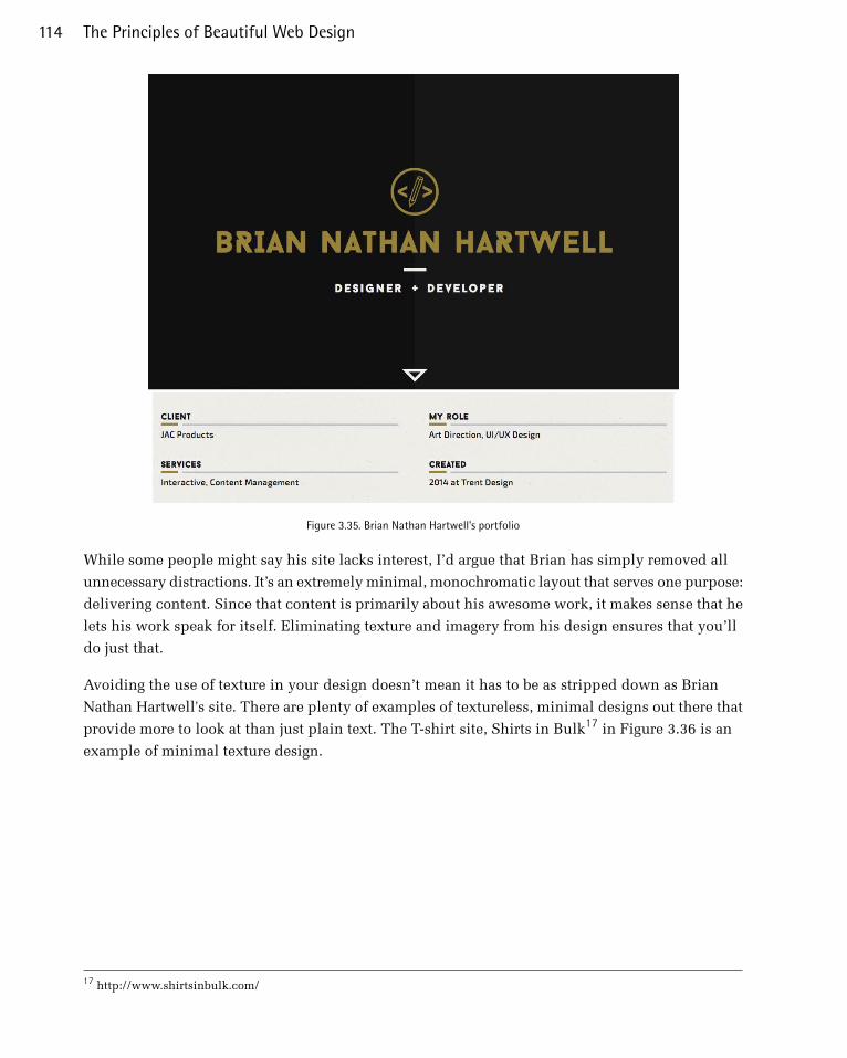
Figure 3.35. Brian Nathan Hartwell's portfolio
While some people might say his site lacks interest, I’d argue that Brian has simply removed all
unnecessary distractions. It’s an extremely minimal, monochromatic layout that serves one purpose:
delivering content. Since that content is primarily about his awesome work, it makes sense that he
lets his work speak for itself. Eliminating texture and imagery from his design ensures that you’ll
do just that.
Avoiding the use of texture in your design doesn’t mean it has to be as stripped down as Brian
Nathan Hartwell's site. There are plenty of examples of textureless, minimal designs out there that
provide more to look at than just plain text. The T-shirt site, Shirts in Bulk17 in Figure 3.36 is an
example of minimal texture design.
17 http://www.shirtsinbulk.com/
The Principles of Beautiful Web Design114
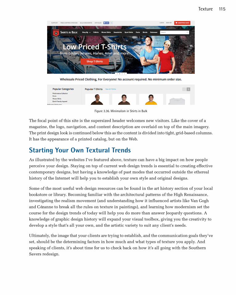
Figure 3.36. Minimalism in Shirts in Bulk
The focal point of this site is the supersized header welcomes new visitors. Like the cover of a
magazine, the logo, navigation, and content description are overlaid on top of the main imagery.
The print design look is continued below this as the content is divided into tight, grid-based columns.
It has the appearance of a printed catalog, but on the Web.
Starting Your Own Textural TrendsAs illustrated by the websites I’ve featured above, texture can have a big impact on how people
perceive your design. Staying on top of current web design trends is essential to creating effective
contemporary designs, but having a knowledge of past modes that occurred outside the ethereal
history of the Internet will help you to establish your own style and original designs.
Some of the most useful web design resources can be found in the art history section of your local
bookstore or library. Becoming familiar with the architectural patterns of the High Renaissance,
investigating the realism movement (and understanding how it influenced artists like Van Gogh
and Cézanne to break all the rules on texture in paintings), and learning how modernism set the
course for the design trends of today will help you do more than answer Jeopardy questions. A
knowledge of graphic design history will expand your visual toolbox, giving you the creativity to
develop a style that’s all your own, and the artistic variety to suit any client’s needs.
Ultimately, the image that your clients are trying to establish, and the communication goals they’ve
set, should be the determining factors in how much and what types of texture you apply. And
speaking of clients, it’s about time for us to check back on how it’s all going with the Southern
Savers redesign.
115Texture

Application: Logo and ContentBy the end of Chapter 2, the Knoxville Reflexology Group redesign project was making great progress.
It had wireframes approved, and I had learned through the use of my mood boards what colors
Carrie might like to see in the final design. Before the actual site design could begin, though, I had
to nail down the KRG branding. The hand-drawn sketch of the logo was streamlined. A vector version
of the original logo wasn't available, so I had to recreate it using vector graphics software. Even
though it has a hand-drawn look, the shapes are clean and crisp, as you can see in Figure 3.37. The
color is solid and the logo leverages negative space. The branding of KRG is now personal and
professional at the same time.
Figure 3.37. KRG Logo
With the logo cleaned up and refined, it was now time to turn our attention to the KRG website.
The approach to the website was to create a sense of cleanliness and sterility. To reinforce that
message, I opted for the approach of using minimal texture in the design of the site, as you can see
in Figure 3.38. Similar to Nathan Hartwell's website mentioned earlier in this chapter, there aren't
even any subtle textures used in the new KRG redesign.
The Principles of Beautiful Web Design116
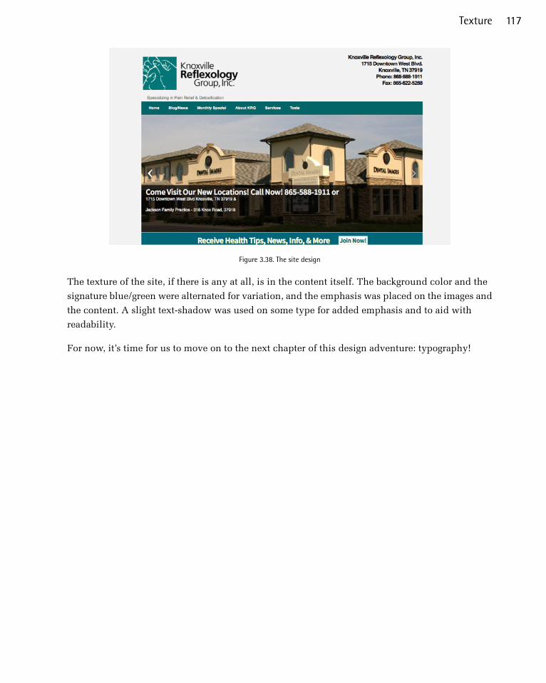
Figure 3.38. The site design
The texture of the site, if there is any at all, is in the content itself. The background color and the
signature blue/green were alternated for variation, and the emphasis was placed on the images and
the content. A slight text-shadow was used on some type for added emphasis and to aid with
readability.
For now, it’s time for us to move on to the next chapter of this design adventure: typography!
117Texture

Chapter4TypographyLet’s face it: the core purpose of all web design is communication. Whether we’re talking about an
online retail store, a web presence for a Fortune 500 company, or a profile for a social networking
site, typography is a vital component of your message. For most people, typography is simply about
arranging a familiar set of shapes to make words, sentences, and paragraphs. But, ironically, having
the ability to set type with only a few mouse clicks or strokes on a keyboard has allowed us to forget
about the creative and artistic possibilities of this medium.
There are numerous obstacles to the effective customization of typography for the Web—and I’ll
address these in the coming pages—but the power of type should be motivation enough to push
the proverbial envelope. Unconvinced? Pick up a magazine, turn on a television, or take a walk
through a grocery store. You will undoubtedly see hundreds of creative and effective uses of type.
It’s the substance of branding, the key to unspoken communication, and an essential piece of the
web design pie.
This Topic May Be Addictive!
After studying typography for some time, you’ll never look at a billboard, brochure, or book the
same way again. You might start snapping pictures of ride signage at theme parks, rather than your
kids. Pondering whether the entrées in a restaurant menu are set in Cantoria or Meyer Two may
become more interesting than choosing between the entrées themselves. The study of typography
is one that draws many people in... and never lets them go! Consider yourself warned.
In order to unlock the potential of type, we must first understand it. Admittedly, this is no easy
task. The minute details of letterforms and the spaces around them have been carefully calculated
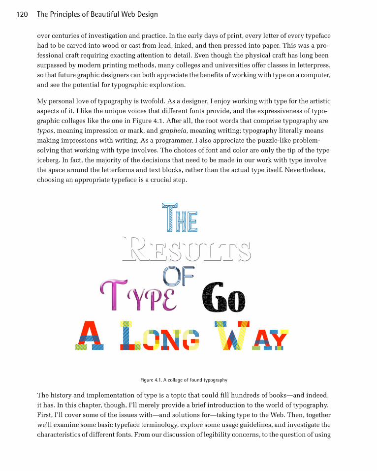
over centuries of investigation and practice. In the early days of print, every letter of every typeface
had to be carved into wood or cast from lead, inked, and then pressed into paper. This was a pro-
fessional craft requiring exacting attention to detail. Even though the physical craft has long been
surpassed by modern printing methods, many colleges and universities offer classes in letterpress,
so that future graphic designers can both appreciate the benefits of working with type on a computer,
and see the potential for typographic exploration.
My personal love of typography is twofold. As a designer, I enjoy working with type for the artistic
aspects of it. I like the unique voices that different fonts provide, and the expressiveness of typo-
graphic collages like the one in Figure 4.1. After all, the root words that comprise typography are
typos, meaning impression or mark, and grapheia, meaning writing; typography literally means
making impressions with writing. As a programmer, I also appreciate the puzzle-like problem-
solving that working with type involves. The choices of font and color are only the tip of the type
iceberg. In fact, the majority of the decisions that need to be made in our work with type involve
the space around the letterforms and text blocks, rather than the actual type itself. Nevertheless,
choosing an appropriate typeface is a crucial step.
Figure 4.1. A collage of found typography
The history and implementation of type is a topic that could fill hundreds of books—and indeed,
it has. In this chapter, though, I’ll merely provide a brief introduction to the world of typography.
First, I’ll cover some of the issues with—and solutions for—taking type to the Web. Then, together
we’ll examine some basic typeface terminology, explore some usage guidelines, and investigate the
characteristics of different fonts. From our discussion of legibility concerns, to the question of using
The Principles of Beautiful Web Design120
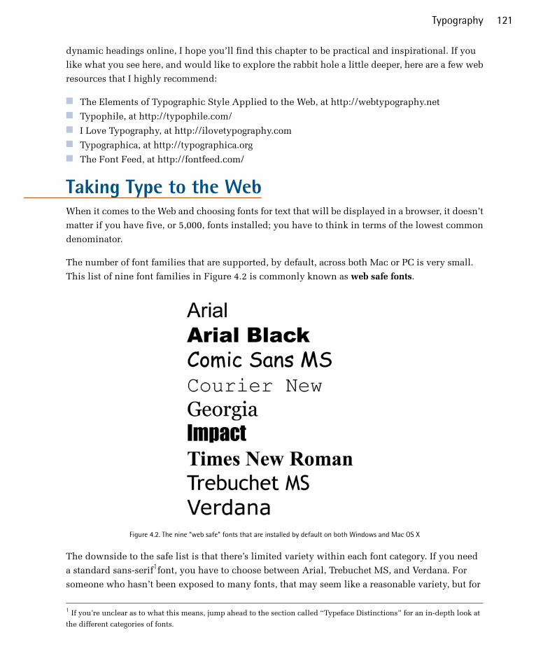
dynamic headings online, I hope you’ll find this chapter to be practical and inspirational. If you
like what you see here, and would like to explore the rabbit hole a little deeper, here are a few web
resources that I highly recommend:
■ The Elements of Typographic Style Applied to the Web, at http://webtypography.net■ Typophile, at http://typophile.com/■ I Love Typography, at http://ilovetypography.com■ Typographica, at http://typographica.org■ The Font Feed, at http://fontfeed.com/
Taking Type to the WebWhen it comes to the Web and choosing fonts for text that will be displayed in a browser, it doesn’t
matter if you have five, or 5,000, fonts installed; you have to think in terms of the lowest common
denominator.
The number of font families that are supported, by default, across both Mac or PC is very small.
This list of nine font families in Figure 4.2 is commonly known as web safe fonts.
Figure 4.2. The nine “web safe” fonts that are installed by default on both Windows and Mac OS X
The downside to the safe list is that there’s limited variety within each font category. If you need
a standard sans-serif1font, you have to choose between Arial, Trebuchet MS, and Verdana. For
someone who hasn’t been exposed to many fonts, that may seem like a reasonable variety, but for
1 If you’re unclear as to what this means, jump ahead to the section called “Typeface Distinctions” for an in-depth look at
the different categories of fonts.
121Typography

those of us who know the nuances of other sans-serif fonts like Helvetica Neue, Futura, and Univers,
using one of the safe fonts can be like using a screwdriver to drive in a nail.
Fortunately, the font-family property of CSS allows you to choose multiple fonts in order of
preference. This is referred to as a font stack. If the first font is unavailable, the second font will be
used; if the second font is absent, the third font will be used, and so on. Let’s say that you want
your section headlines to have a serif font. You think the best font for the job is Calisto MT, so you
specify that first—for the few people that have it installed. Your second choice is your first backup
plan, and for this you choose Georgia. If users don’t have Calisto MT installed, they’ll see Georgia.
Even though Georgia is on the safe list, some people may not have it installed. Times New Roman
is a close equivalent, so you decide that you might as well add it as your next alternative. To finish
off the preferential list, to cater to users who don’t have any of those fonts installed, you add what
the W3C calls a generic font family. The generic font families are serif, sans-serif, cursive
(similar to script or hand lettering), fantasy (or novelty), and monospace. All your font choices so
far have been from the serif family, so that’s the generic family you specify. In summary, your font
stack would look like this:
font-family: 'Calisto MT', Georgia, 'Times New Roman', serif;
Fonts with Spaces
Remember that any font family names that include spaces must be quoted, either using single (')
or double (") quotes.
The key to creating an effective font stack is knowing which fonts are most similar and, more im-
portantly, which ones are installed by default in each operating system. For a handle on the first
part, I recommend reading Nathan Ford’s 2008 article, “Building Better Font Stacks.”2 A great re-
source for checking on the prevalence of specific fonts in various operating systems is Code Style’s
interactive Font Stack Builder.3
2 http://unitinteractive.com/blog/2008/06/26/better-css-font-stacks/3 http://www.codestyle.org/servlets/FontStack
The Principles of Beautiful Web Design122

Web Fonts with @font-faceJason Cranford Teague, the author of Fluid Web Typography,4recently asked in a presentation,
“What do these three things have in common: flying cars, trips to Jupiter, and downloadable web
fonts?” The answer is that we were supposed to have them all by the year 2010. What Teague was
talking about was the ability to display text on a website using fonts not installed on the visitor’s
computer. A mechanism for doing just that has been a part of CSS since 1998. It’s called @font-
face, and it works like this:
@font-face { font-family: "League Gothic"; src: url("/type/league_gothic.otf") format("opentype");} h1 { font-family:"League Gothic", Arial, sans-serif;}
If you’re familiar with CSS, the syntax of @font-face is brilliantly self-explanatory. We’re simply
defining a URL where the font family League Gothic can be found. Once that’s established, you list
it in your font stack the same way you would any other font. So why haven’t we been using this all
along? The two main roadblocks have been resistance from font foundries, and inconsistencies in
supported font formats.
The resistance from the foundries is understandable. They make their money through licensing the
use of their fonts, so want to deter people from downloading, copying, and using them for free. The
licenses that protect these fonts usually don't allow for use of their fonts on the Web. Always be
sure to read the license and usage guidelines. The file format part of the story is a little messier.
Some browsers support the TTF and OTF formats, iOS devices (such as the iPhone and iPad) require
SVG, Internet Explorer only uses Microsoft’s proprietary EOT format, and to cap it all off there’s
an up-and-coming open source format (WOFF) that’s supported by the very latest versions of most
browsers. Over the last few years, though, the technical issues with embedding fonts have been
overcome. This led to a huge explosion in commercial-use free fonts, which, in turn, forced the
foundries to reconsider their position on licensing fonts for embedding.
Unfortunately, though, it looks like we’ll have to wait a long while yet for flying cars and trips to
Jupiter.
Self-hosted Web FontsBecause of the difference in required formats, you can’t just toss a TTF file into a folder on your
site and link to it as I suggested in the simplified @font-face code above. What’s more, doing so
would most likely violate your End User Licensing Agreement (EULA) with the font’s foundry. If
4 Berkeley: New Riders, 2009
123Typography
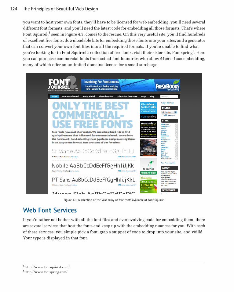
you want to host your own fonts, they’ll have to be licensed for web embedding, you’ll need several
different font formats, and you’ll need the latest code for embedding all those formats. That’s where
Font Squirrel,5 seen in Figure 4.3, comes to the rescue. On this very useful site, you’ll find hundreds
of excellent free fonts, downloadable kits for embedding those fonts into your sites, and a generator
that can convert your own font files into all the required formats. If you’re unable to find what
you’re looking for in Font Squirrel’s collection of free fonts, visit their sister site, Fontspring6. Here
you can purchase commercial fonts from actual font foundries who allow @font-face embedding,
many of which offer an unlimited domains license for a small surcharge.
Figure 4.3. A selection of the vast array of free fonts available at Font Squirrel
Web Font ServicesIf you’d rather not bother with all the font files and ever-evolving code for embedding them, there
are several services that host the fonts and keep up with the embedding nuances for you. With each
of these services, you simple pick a font, grab a snippet of code to drop into your site, and voilà!
Your type is displayed in that font.
5 http://www.fontsquirrel.com/6 http://www.fontspring.com/
The Principles of Beautiful Web Design124
Typekit, at http://typekit.com
This is the original and most popular hosted font solution, developed by industry thought
leaders including Jeffrey Veen and Jason Santa Maria. Because Typekit has a huge library and
a number of type foundries on board, it’s been referred to as the iTunes of fonts. They offer a
free trial library for a single site; otherwise, their pricing is based on a yearly subscription that
varies based on page views per month.
Fontdeck, at http://fontdeck.com
Like Typekit, Fontdeck is a subscription-based service developed by industry leaders. The dif-
ference is that this service developed by Clearleft and OmniTI allows you to pay for only the
fonts you’re using, rather than the entire collection.
WebINK, at http://www.webink.com/
Extensis is the developer of one of the most popular font management applications available.
WebINK is its entry into the hosted web font market. It has the backing of a large number of
font foundries, but the subscriptions are monthly instead of yearly.
Google Fonts, at https://www.google.com/fonts
With some help from Typekit, Google recently released its own font-hosting solution. Currently
the selection is more limited than Fontdeck or Typekit, but because it only hosts creative
commons licensed fonts, it’s completely free.
There are a number of other web font services out there, with more popping up every week. Several
font foundries have even joined in on the action, offering hosted versions of their own fonts. Because
support for @font-face is so new, it’s hard to know which ones will shine and which ones will
fizzle out. Regardless, downloadable web fonts are here to stay. A great place to find the latest info
about @font-face and web fonts is the webfonts.info7 wiki.
Text Image ReplacementWeb typography is nowhere near as limited as it used to be. In the past, if you wanted a beautiful,
highly customized type treatment for your website, you pretty much had to resort to image replace-
ment; in other words, replacing the text on the page with images created in Photoshop or similar
software. Now, with CSS3, you can create some amazing type effects, such as arched text. However,
if you want this effect to display properly in older browsers, you’ll have to use JavaScript as a fallback
when CSS3 features aren’t supported (you can use a tool like Modernizr8 to determine which features
are supported).
Text Image replacement still has its place on the Web in certain instances. Sometimes people disable
JavaScript, or their browser might not support a specific CSS3 feature. If you are worried about
users being unable to display your text as intended due to compatibility issues, then you may want
7 http://webfonts.info/8 http://modernizr.com/
125Typography
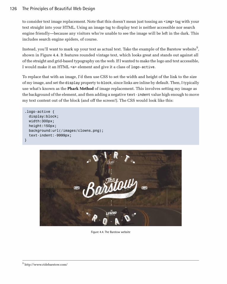
to consider text image replacement. Note that this doesn't mean just tossing an <img> tag with your
text straight into your HTML. Using an image tag to display text is neither accessible nor search
engine friendly—because any visitors who’re unable to see the image will be left in the dark. This
includes search engine spiders, of course.
Instead, you’ll want to mark up your text as actual text. Take the example of the Barstow website9,
shown in Figure 4.4. It features rounded vintage text, which looks great and stands out against all
of the straight and grid-based typography on the web. If I wanted to make the logo and text accessible,
I would make it an HTML <a> element and give it a class of logo-active.
To replace that with an image, I’d then use CSS to set the width and height of the link to the size
of my image, and set the display property to block, since links are inline by default. Then, I typically
use what’s known as the Phark Method of image replacement. This involves setting my image as
the background of the element, and then adding a negative text-indent value high enough to move
my text content out of the block (and off the screen!). The CSS would look like this:
.logo-active { display:block; width:300px; height:150px; background:url(/images/clowns.png); text-indent:-9999px;}
Figure 4.4. The Barstow website
9 http://www.ridebarstow.com/
The Principles of Beautiful Web Design126
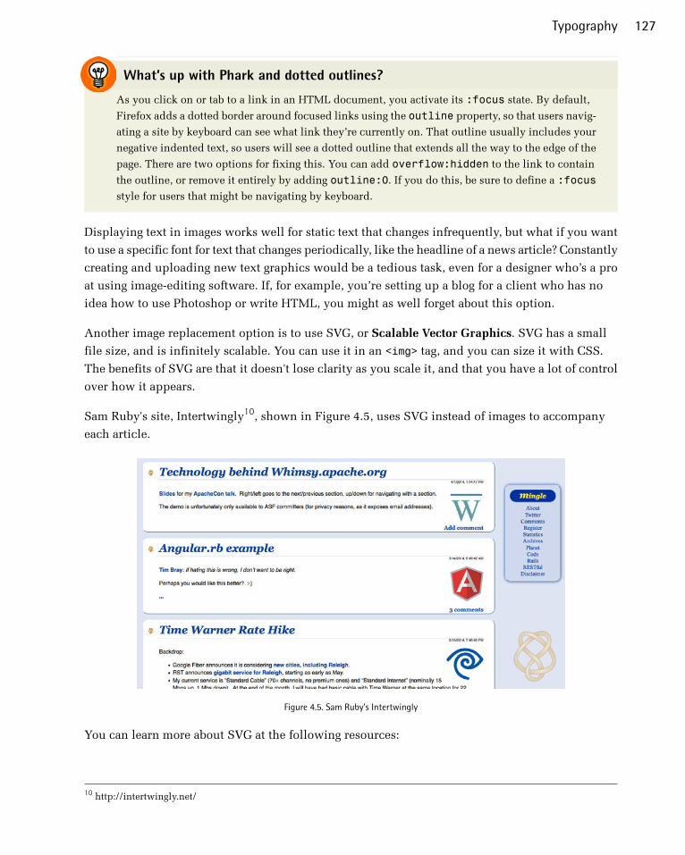
What’s up with Phark and dotted outlines?
As you click on or tab to a link in an HTML document, you activate its :focus state. By default,
Firefox adds a dotted border around focused links using the outline property, so that users navig-
ating a site by keyboard can see what link they’re currently on. That outline usually includes your
negative indented text, so users will see a dotted outline that extends all the way to the edge of the
page. There are two options for fixing this. You can add overflow:hidden to the link to contain
the outline, or remove it entirely by adding outline:0. If you do this, be sure to define a :focus
style for users that might be navigating by keyboard.
Displaying text in images works well for static text that changes infrequently, but what if you want
to use a specific font for text that changes periodically, like the headline of a news article? Constantly
creating and uploading new text graphics would be a tedious task, even for a designer who’s a pro
at using image-editing software. If, for example, you’re setting up a blog for a client who has no
idea how to use Photoshop or write HTML, you might as well forget about this option.
Another image replacement option is to use SVG, or Scalable Vector Graphics. SVG has a small
file size, and is infinitely scalable. You can use it in an <img> tag, and you can size it with CSS.
The benefits of SVG are that it doesn't lose clarity as you scale it, and that you have a lot of control
over how it appears.
Sam Ruby's site, Intertwingly10, shown in Figure 4.5, uses SVG instead of images to accompany
each article.
Figure 4.5. Sam Ruby's Intertwingly
You can learn more about SVG at the following resources:
10 http://intertwingly.net/
127Typography

■ Learnable11
■ A List Apart12
■ CSS Tricks13
Anatomy of a LetterformSome of the design classes I took in college delved fairly deeply into the anatomy and terminology
of type. Many people can already identify serifs, ascenders, and descenders, but for one class, we
had about 100 terms to memorize. While I’ll be nicer here, it’s important that you know some basic
terminology before we continue learning about type. Sure, I could just talk about type using informal
words like squiggles, slants, and thingies to describe letterforms, but that could grow confusing
rather quickly.
Figure 4.6 represents an example of each component of a typeface. We’ll go over them in turn below.
Figure 4.6. The terminology of type
1. Baseline
The baseline is the imaginary horizontal line on which most characters sit. The only character
that hangs below the baseline in Figure 4.6 is the lowercase “q.”
2. Cap height
The cap height or capline is another imaginary line. This one marks the height of all capital
letters in a typeface. Notice that the cap height is below the maximum height of the typeface.
3. Crossbar
A stroke that connects two lines in the capital letterforms of “A” and “H” is called a crossbar.
A horizontal stroke that does not connect two lines, like the one in the lower case “f” or “t,” is
known as a cross stroke.
11 https://learnable.com/books/jump-start-html5-canvas-and-svg#overview12 http://alistapart.com/article/using-svg-for-flexible-scalable-and-fun-backgrounds-part-i13 http://css-tricks.com/using-svg/
The Principles of Beautiful Web Design128

4. Serif
Serif is the name given to the finishing strokes at the bottoms and tops of certain typefaces. I’ll
talk more about serifs when we cover typeface distinctions.
5. Mean line
Another imaginary horizontal line that marks the top edge of the lowercase letters is the mean
line (or midline). Contrary to what you might imply from its name, the mean line isn’t always
exactly centered between the baseline and the cap height.
6. Bowl
The bowl of a letter is the rounded curve that encloses negative space in a letterform. Examples
of bowls can be seen in the letters “D,” “o,” and “g.”
7. Descender
The lower portion of a lowercase letter (such as “g,” “j,” “p,” “q,” and “y”) that extends below
the baseline of a typeface is known as the descender. The only other characters that typically
extend below the baseline are the old-style numerals in some typefaces. These types of numerals,
examples of which from the Georgia typeface can be seen in Figure 4.7, were thought to blend
better with lowercase roman numerals, and they look particularly good when used within a
body of text.
Figure 4.7. Old-style numerals in the Georgia font on the left, and standard numerals in Helvetica on the right
8. Counter
The negative space within a letter is called the counter. In some letters, like “A,” “o,” and “P,”
the counter is fully enclosed. The non-closed negative spaces in letters like “G,” “u,” and “c”
are also known as counters.
9. Stem
A stem is the main vertical or diagonal stroke in a letterform. These include the vertical portions
of the letters “I” and “H,” as well as all the strokes in the letter “W.”
10. Tittle
This is probably my favorite typeface term. Tittle is the name given to the dot above the
lowercase “j” and “i.”
11. Terminal
The end of a stem or stroke that has no serif is known as a terminal. Even the ends of some serif
typefaces have terminals, as you can see in the letter “c” in Figure 4.6.
129Typography
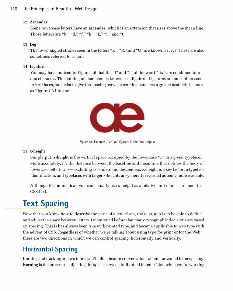
12. Ascender
Some lowercase letters have an ascender, which is an extension that rises above the mean line.
Those letters are “b,” “d,” “f,” “h,” “k,” “l,” and “t.”
13. Leg
The lower angled strokes seen in the letters “K,” “R,” and “Q” are known as legs. These are also
sometimes referred to as tails.
14. Ligature
You may have noticed in Figure 4.6 that the “f” and “i” of the word “fix” are combined into
one character. This joining of characters is known as a ligature. Ligatures are most often seen
in serif faces, and exist to give the spacing between certain characters a greater aesthetic balance,
as Figure 4.8 illustrates.
Figure 4.8. Example of an “ae” ligature in the font Insignia
15. x-height
Simply put, x-height is the vertical space occupied by the lowercase “x” in a given typeface.
More accurately, it’s the distance between the baseline and mean line that defines the body of
lowercase letterforms—excluding ascenders and descenders. X-height is a key factor in typeface
identification, and typefaces with larger x-heights are generally regarded as being more readable.
Although it’s impractical, you can actually use x-height as a relative unit of measurement in
CSS (ex).
Text SpacingNow that you know how to describe the parts of a letterform, the next step is to be able to define
and adjust the space between letters. I mentioned before that many typographic decisions are based
on spacing. This is has always been true with printed type, and became applicable to web type with
the advent of CSS. Regardless of whether we’re talking about using type for print or for the Web,
there are two directions in which we can control spacing: horizontally and vertically.
Horizontal SpacingKerning and tracking are two terms you’ll often hear in conversations about horizontal letter spacing.
Kerning is the process of adjusting the space between individual letters. Often when you’re working
The Principles of Beautiful Web Design130

with type, you’ll notice pairs of letters that appear too close together, or too far apart. Most fonts
have a set of rules that determine the spacing between specific characters. The kerning between the
letters “Wa,” for instance, should be—and is—much tighter than the kerning between “WV.” Most
of the time, the rules for the font are sufficient to make the text readable. Otherwise, you can adjust
the individual letter pairs within your image creation software of choice. Figure 4.9 shows examples
of text with no kerning applied, automatic kerning, and manually adjusted kerning.
Figure 4.9. AWE-inspiring kerning examples
For the text in a web page, it’s impossible to make letter-by-letter kerning adjustments. What you
can do is adjust the letter-spacing CSS property, which is known in the print world as adjusting
the font’s tracking. Like kerning, tracking adjusts the horizontal spacing between letterforms, but
applies to the space between each letter. If you want your text to have a more open, airy feel, try
adding a bit of letter spacing as I’ve done in Figure 4.10.
131Typography

Figure 4.10. Letter spacing example
Another horizontal spacing option in CSS is provided by the word-spacing property. This property
can take a positive or negative length, or the keyword normal. As you might expect, it affects the
amount of whitespace between words.
Vertical SpacingIn print design language, the vertical space between lines of text is known as leading. This term
comes from the early days of letterpress when blank strips of lead were used to separate lines of
metal type. When there were no added spacers, the lines were said to be set “solid.” Text with added
vertical space is much easier to read. As you can see in the first paragraph in Figure 4.11, the default
spacing between lines of text is too small. Ideally, you want the line height on your body copy to
be about one-and-a-half times the size of your text; so if you have 12px text, 18px is a good readable
line height. In the second paragraph we’ve adjusted the CSS line-height property to 1.5em. An
em is a CSS unit that measures the size of a font, from the top of a font’s cap height to the bottom
of its lowest descender. Originally, the em was equal to the width of the capital letter M, which is
where its name came from.
The Principles of Beautiful Web Design132
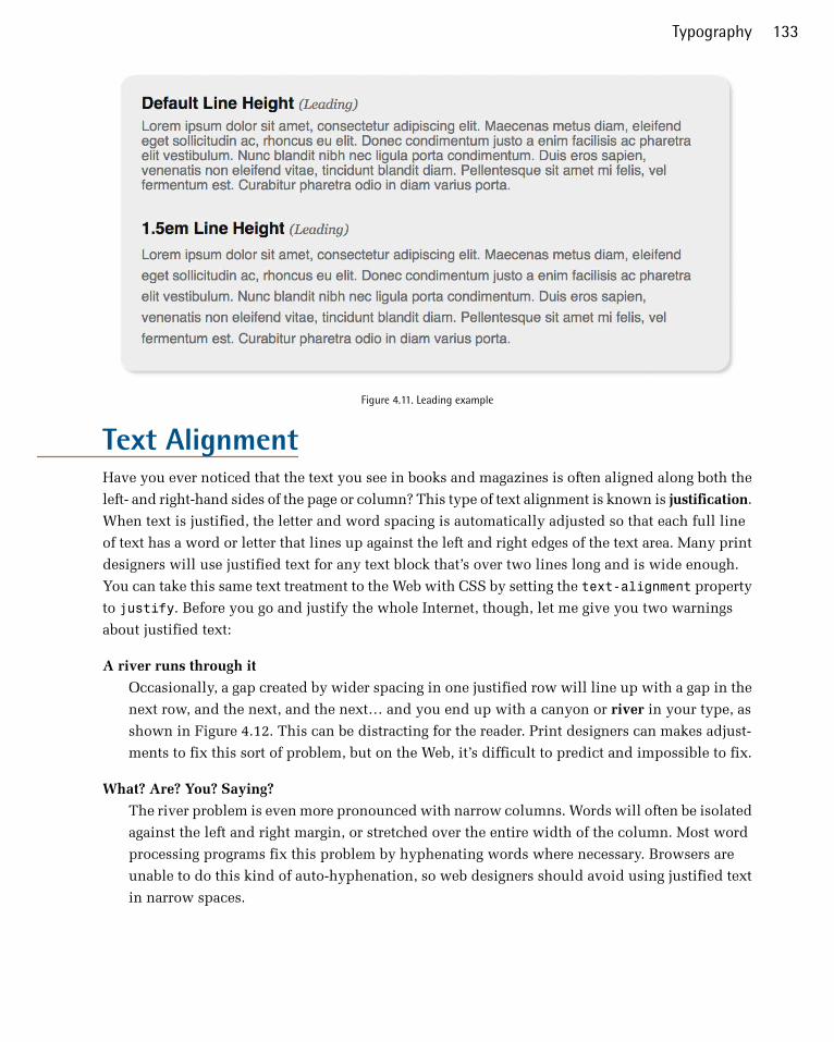
Figure 4.11. Leading example
Text AlignmentHave you ever noticed that the text you see in books and magazines is often aligned along both the
left- and right-hand sides of the page or column? This type of text alignment is known is justification.
When text is justified, the letter and word spacing is automatically adjusted so that each full line
of text has a word or letter that lines up against the left and right edges of the text area. Many print
designers will use justified text for any text block that’s over two lines long and is wide enough.
You can take this same text treatment to the Web with CSS by setting the text-alignment property
to justify. Before you go and justify the whole Internet, though, let me give you two warnings
about justified text:
A river runs through it
Occasionally, a gap created by wider spacing in one justified row will line up with a gap in the
next row, and the next, and the next… and you end up with a canyon or river in your type, as
shown in Figure 4.12. This can be distracting for the reader. Print designers can makes adjust-
ments to fix this sort of problem, but on the Web, it’s difficult to predict and impossible to fix.
What? Are? You? Saying?
The river problem is even more pronounced with narrow columns. Words will often be isolated
against the left and right margin, or stretched over the entire width of the column. Most word
processing programs fix this problem by hyphenating words where necessary. Browsers are
unable to do this kind of auto-hyphenation, so web designers should avoid using justified text
in narrow spaces.
133Typography
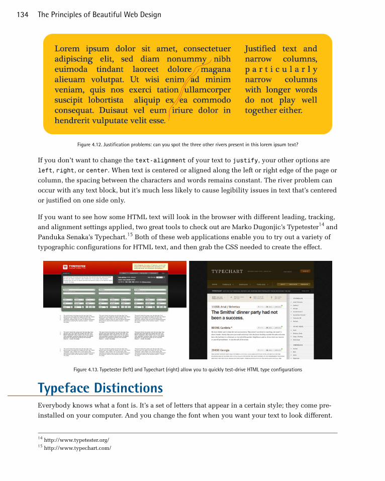
Figure 4.12. Justification problems: can you spot the three other rivers present in this lorem ipsum text?
If you don’t want to change the text-alignment of your text to justify, your other options are
left, right, or center. When text is centered or aligned along the left or right edge of the page or
column, the spacing between the characters and words remains constant. The river problem can
occur with any text block, but it’s much less likely to cause legibility issues in text that’s centered
or justified on one side only.
If you want to see how some HTML text will look in the browser with different leading, tracking,
and alignment settings applied, two great tools to check out are Marko Dugonjic’s Typetester14 and
Panduka Senaka’s Typechart.15 Both of these web applications enable you to try out a variety of
typographic configurations for HTML text, and then grab the CSS needed to create the effect.
Figure 4.13. Typetester (left) and Typechart (right) allow you to quickly test-drive HTML type configurations
Typeface DistinctionsEverybody knows what a font is. It’s a set of letters that appear in a certain style; they come pre-
installed on your computer. And you change the font when you want your text to look different.
14 http://www.typetester.org/15 http://www.typechart.com/
The Principles of Beautiful Web Design134

The average Windows PC has just over 40 fonts installed by default, while the average Mac user
has access to around 100 fonts. Many of these fonts are grouped together into font families, with
each font within the family representing a different variation of the core font. Most font families
include the regular font face, along with italic, bold, and bold italic variants. Some fonts have no
variations at all; some may only have bold or italic, and some commercially available font families
have hundreds of variants.
Figure 4.14. Fourteen Gs
Just as all the members of some families have big ears or abnor-
mally long pinkie toes, every font family has its own unique,
identifiable characteristics. Take a look at the variation that ex-
ists between fonts for the letter “g” in Figure 4.14.
These characteristics are what help us to categorize fonts and
font families. The majority of font families can be classified as
either serif or sans-serif. Of the 14 different fonts represented
in Figure 4.14, seven could be classified as serif and seven as
sans-serif. Can you distinguish between them? Beyond this
distinction, there are many other ways in which we can classify
and group fonts. I prefer to group fonts into six simple categories:
serif, sans-serif, handwritten, monospace, novelty, and dingbats.
Let’s look at each of them now.
Serif FontsHistorians believe that the serif has its origin in Roman stone carving. There is much debate over
the original purpose of these ornamental strokes, but in more recent history, they’ve been proven
to increase legibility in large blocks of text by providing a horizontal line of reference. When designers
choose a serif font, Times New Roman is often the first one that comes to mind. However, there’s
a great variety of serif fonts on offer. To help us with that decision, it’s a good idea to first decide
what type of voice we want our text to have.
135Typography

Figure 4.15. Serif categories
Take a look at the Garamond text in Figure 4.15. Gara-
mond is an old-style serif font. Old-style serif fonts are
adapted from the brushstrokes of Italian scribes and
can be recognized both by the smooth transitions
between thick and thin strokes, and by their rounded
serif edges. When I see an old-style serif font, it exudes
historic, handcrafted charm. At the same time, fonts
like Garamond are extremely versatile: they’re not so
old-fashioned that they're unusable in modern applica-
tions.
The second font in Figure 4.15 is Baskerville, a trans-
itional serif font. The curved angle that connects the
terminal of the stroke to the serif is known as a bracket.
The brackets of transitional serif fonts are rounded, but
the edges of the serifs are squared off. The simple addi-
tion of 90-degree angles and perfectly straight lines
gives this category of font a more modern and mechanical voice. This category of serif fonts is
known as transitional because it provides a transition between old-style and modern serif fonts.
The third font, Didot, is a modern serif font. Modern serif fonts provide a large amount of contrast
between the thick and thin strokes, and their serifs are often completely unbracketed. Modern serif
fonts were introduced during the Industrial Revolution as a radical alternative to the transitional
serif style. Today, these fonts have an association with elegance, sophistication, and fashion. They
represent timelessness more than cutting-edge modernity. Because of their fine line details, modern
serif fonts are really only suitable for use in headlines. The consistent use of Italian Didot in Vogue
magazine,16 as seen in Figure 4.16, helped to establish both the font and the magazine as icons of
style. Other famous magazines that use modern serif font faces for their mastheads include Brides,
W, Elle, Parents, Seventeen, and Harper’s Bazaar. They’re fairly uncommon in web design, but are
certainly a classy choice if high style is what you’re aiming for.
16 http://www.vogue.com/
The Principles of Beautiful Web Design136

Figure 4.16. Modern serifs lending a classy feel to Vogue
In the later part of the 1800s, as advertising, posters, and flyers became more common, a bolder
variation of modern serif fonts was needed to catch people’s attention. It was at this time that slab
serif fonts were first introduced. Slab serif faces like Rockwell have an industrial but friendly voice
that’s far less snooty than modern serifs, and even more contemporary. Because most slab serifs
were designed to be readable from a distance, they make for excellent headlines and have been very
popular on the Web lately. Figure 4.17 shows a couple of beautiful examples of slab serifs in action.
On the left The Sew Weekly’s17 logo features a typeface called Brosse. On the right we have The
Mid-century Modernist,18 which uses Rockwell Light for its logo. I personally think that slab serifs
tend to feel masculine. The Sew Weekly is a beautiful contradiction to that notion, and evidence
that you can go against convention when choosing fonts.
17 http://www.sewweekly.com/18 http://midcenturymodernist.com/
137Typography

Figure 4.17. Slab serifs at the Mid-century Modernist and Sew Weekly
Sans-serif FontsAt the time when typographers began experimenting with slab serifs, the idea of eliminating the
serif altogether seemed like a huge mistake. Serifs were a tradition, so removing them was typo-
graphic castration. The initial sans-serif fonts were so loathed in the 1800s that they were referred
to as grotesque. Eventually, though, people began to warm to the idea of serif-less typefaces, and
by the 1920s some speculated that the serif would soon be eliminated.
Although serif fonts are still used extensively, the popularity and versatility of the sans-serif font
category continues to grow. These types of fonts have a cleaner and more contemporary feel. They
stand out as headlines, especially when paired with body text that’s set in a serif face. This has long
been a standard practice in print design, and is a tip that I was taught in college for creating contrast
between headlines and body copy. On the Web, though, the roles have been reversed for a very long
time. This is mainly due to the one-two punch of low-resolution display hardware, combined with
poor text hinting and rendering in older operating systems. Because of the stroke variation and
minute detail of serif fonts, they can become almost unreadable at small sizes on lower-resolution
displays. As the pixel density of displays increase and older computers die off, we’re free to serif,
or not to serif. Figure 4.18 shows Spoongraphics,19 a design blog I enjoy following, which uses the
time-honored tradition of sans-serif headings and serif body copy.
19 http://blog.spoongraphics.co.uk/
The Principles of Beautiful Web Design138
Figure 4.18. An Example From Spoongraphics
Regardless of how they’re used, sans-serif fonts are extremely legible and practical for almost any
purpose. The most ubiquitous sans-serif fonts on the Web are Arial and Verdana. Each of these font
families exists in the default font sets of both major operating systems, and, as a result, they're
predictably the workhorses of web body copy. In the design world, these families have a reputation
for being overused and generic (and in the design community, Arial has the added stigma of being
widely considered the poor cousin of Helvetica). This makes Arial and Verdana great for body text,
where voiceless legibility is the goal, but for headlines and artistic applications, a more characterful
feel is often required. Sometimes a stronger serif font, or a more distinguished sans-serif, will do
the trick, but there are certainly many more options available outside these two categories.
139Typography
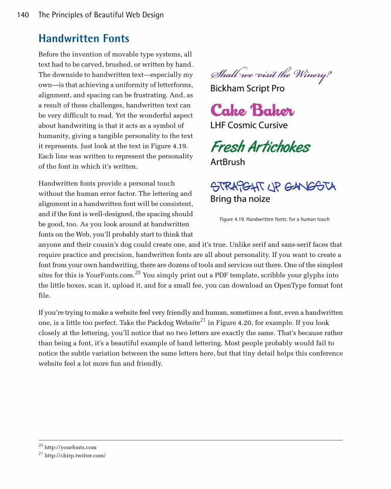
Handwritten Fonts
Figure 4.19. Handwritten fonts: for a human touch
Before the invention of movable type systems, all
text had to be carved, brushed, or written by hand.
The downside to handwritten text—especially my
own—is that achieving a uniformity of letterforms,
alignment, and spacing can be frustrating. And, as
a result of these challenges, handwritten text can
be very difficult to read. Yet the wonderful aspect
about handwriting is that it acts as a symbol of
humanity, giving a tangible personality to the text
it represents. Just look at the text in Figure 4.19.
Each line was written to represent the personality
of the font in which it’s written.
Handwritten fonts provide a personal touch
without the human error factor. The lettering and
alignment in a handwritten font will be consistent,
and if the font is well-designed, the spacing should
be good, too. As you look around at handwritten
fonts on the Web, you’ll probably start to think that
anyone and their cousin’s dog could create one, and it’s true. Unlike serif and sans-serif faces that
require practice and precision, handwritten fonts are all about personality. If you want to create a
font from your own handwriting, there are dozens of tools and services out there. One of the simplest
sites for this is YourFonts.com.20 You simply print out a PDF template, scribble your glyphs into
the little boxes, scan it, upload it, and for a small fee, you can download an OpenType format font
file.
If you’re trying to make a website feel very friendly and human, sometimes a font, even a handwritten
one, is a little too perfect. Take the Packdog Website21 in Figure 4.20, for example. If you look
closely at the lettering, you’ll notice that no two letters are exactly the same. That’s because rather
than being a font, it’s a beautiful example of hand lettering. Most people probably would fail to
notice the subtle variation between the same letters here, but that tiny detail helps this conference
website feel a lot more fun and friendly.
20 http://yourfonts.com21 http://chirp.twitter.com/
The Principles of Beautiful Web Design140
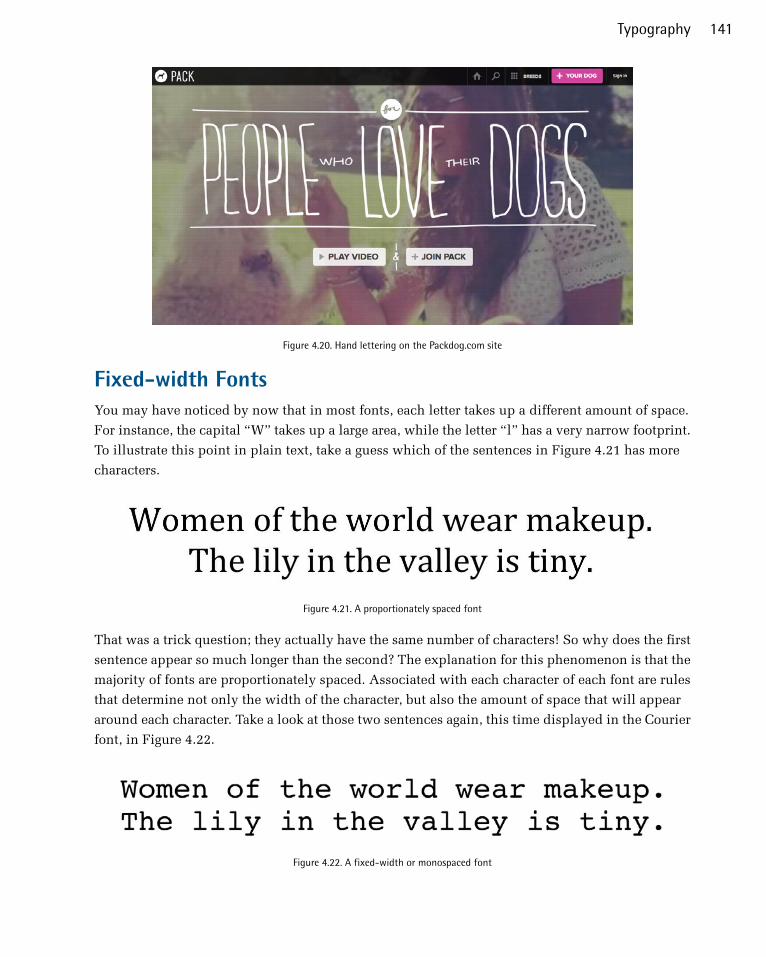
Figure 4.20. Hand lettering on the Packdog.com site
Fixed-width FontsYou may have noticed by now that in most fonts, each letter takes up a different amount of space.
For instance, the capital “W” takes up a large area, while the letter “l” has a very narrow footprint.
To illustrate this point in plain text, take a guess which of the sentences in Figure 4.21 has more
characters.
Figure 4.21. A proportionately spaced font
That was a trick question; they actually have the same number of characters! So why does the first
sentence appear so much longer than the second? The explanation for this phenomenon is that the
majority of fonts are proportionately spaced. Associated with each character of each font are rules
that determine not only the width of the character, but also the amount of space that will appear
around each character. Take a look at those two sentences again, this time displayed in the Courier
font, in Figure 4.22.
Figure 4.22. A fixed-width or monospaced font
141Typography

The reason the two sentences appear to be the same width now is that Courier is a fixed-width or
monospaced font. This category of fonts has uniform spacing, and the letterforms are designed so
that they’re similar in width. Fixed-width fonts were initially designed around the technical limit-
ations of typewriters. Since early typewriters were incapable of moving the typed page a different
distance when a “w” was typed, rather than an “i,” specialized fonts were developed for these
devices. These fonts had to remain readable, despite the spacing being the same for every letter.
Early computer displays employed fixed-width fonts as well, but it was only a short time before
computers were able to display much more legible variable-width (or proportional) fonts.
So why are fixed-width fonts still around today? Mainly for the sanity of coders and accountants.
When you have to write code or display data as text, it’s important that characters line up from row
to row and column to column. If you’re reading this book, you’re probably already familiar with
fixed-width fonts from writing HTML and CSS. The benefits of these monspaced faces can be seen
clearly in Figure 4.23. CSS3, please!22 is a cross-browser CSS3 rule generator that allows you to
experiment with CSS3 properties.
Figure 4.23. Fixed-width fonts in action at CSS3, please!
On the Web, the standard way to display text in a fixed-width font is to wrap it with <pre> and
</pre> tags. pre is short for preformatted text, and aside from displaying fixed-width characters,
the pre element also preserves tabs, spaces, and line breaks. This usually makes displaying code
or tabular data on a website as simple as cutting and pasting from the source. I say usually because
HTML tags that exist within preformatted text will be rendered normally, so if you’re trying to include
any tags in your code, you’ll need to replace any <s with the HTML character code equivalent of
22 http://css3please.com/
The Principles of Beautiful Web Design142

<, and any >s with >. As with every other HTML element, pre can be styled with CSS. Often,
web developers who plan to show code on a page want the code to stand out from the regular text.
Using CSS, the pre tag can be given a border, a background treatment, additional margins, or a
different text treatment to help it to stand out.
Another interesting, albeit obsolete, use of fixed-width fonts is in the creation of ASCII art. ASCII
(American Standard Code for Information Interchange) was one of the original English character
encodings for communications equipment, and for several years the 95 printable characters in this
seven-bit system were the only graphics that ever showed up on a display. Before the Internet existed
outside of the military and academia, there were networks of dial-up bulletin board systems (BBSs),
many of which displayed menus and game graphics in ASCII characters. Having grown up during
the peak of the BBS era, I loved to see the “underground” graphics people could create using only
fixed-width type.
Although you can now create more intricate ASCII art with web apps like ASCII-O-Matic23 or Patrick
Gillespie’s Text Ascii Art Generator,24 the ASCII art created during the late 1980s and early 1990s
was composed character by character, and really pushed the limits of the medium. This type of
artwork, like the Energy BBS title in Figure 4.24, is an often-overlooked link in the history of com-
puter graphics.
Figure 4.24. Energy BBS ASCII art by Carsten Cumbrowski
23 http://www.typorganism.com/asciiomatic/24 http://patorjk.com/software/taag/
143Typography
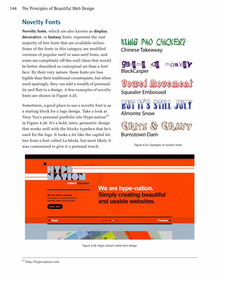
Novelty Fonts
Figure 4.25. Examples of novelty fonts
Novelty fonts, which are also known as display,
decorative, or fantasy fonts, represent the vast
majority of free fonts that are available online.
Some of the fonts in this category are modified
versions of popular serif or sans-serif fonts, and
some are completely off-the-wall ideas that would
be better described as conceptual art than a font
face. By their very nature, these fonts are less
legible than their traditional counterparts, but when
used sparingly, they can add a wealth of personal-
ity and flair to a design. A few examples of novelty
fonts are shown in Figure 4.25.
Sometimes, a good place to use a novelty font is as
a starting block for a logo design. Take a look at
Tony Yoo’s personal portfolio site Hype-nation25
in Figure 4.26. It’s a bold, retro, geometric design
that works well with the blocky typeface that he’s
used for the logo. It looks a lot like the capital let-
ters from a font called La Moda, but most likely it
was customized to give it a personal touch.
Figure 4.26. Hype-nation’s bold retro design
25 http://hype-nation.com
The Principles of Beautiful Web Design144

While I do know a thing or two about typefaces, I’m hardly a font-recognizing machine. Usually, if
I come across an interesting string of text in a font I fail to recognize, the first thing I think is WTF!
I am, of course, referring to MyFont’s excellent WhatTheFont26 automatic font identification system.
All you have to do is crop and clean up a block of type, upload it to WTF, and it will search for
character matches in its database. Figure 4.27 shows some of the matches for the Hype-nation text
above. WTF really is an invaluable tool, and if it fails to recognize your text, the site has a forum
of “cloak-draped font enthusiasts” who love to solve typographic puzzles.
Figure 4.27. MyFonts’ WhatTheFont service
As with all design choices, before you use a novelty font, you should think about your client’s re-
quirements and target audience. Most clients will already have some form of branding in place,
and choosing a bizarre or offbeat novelty font may tarnish the company’s image. Even so, it’s best
to keep an open mind when you’re coming up with themes for a website design. It may be that the
company you’re working with wants to stray from its corporate image.
Dingbat FontsWhen you’re looking for illustrations and artwork to incorporate into the design of a website, you
should consider dingbat or symbol fonts. In the early days of print, dingbats were ornamental
26 http://new.myfonts.com/WhatTheFont/
145Typography
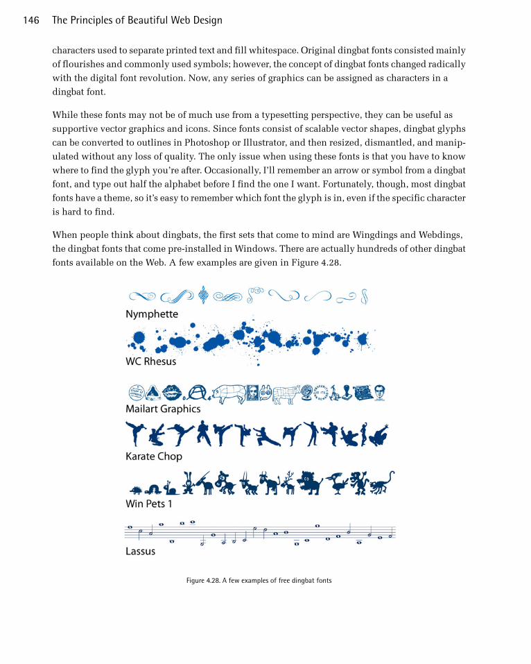
characters used to separate printed text and fill whitespace. Original dingbat fonts consisted mainly
of flourishes and commonly used symbols; however, the concept of dingbat fonts changed radically
with the digital font revolution. Now, any series of graphics can be assigned as characters in a
dingbat font.
While these fonts may not be of much use from a typesetting perspective, they can be useful as
supportive vector graphics and icons. Since fonts consist of scalable vector shapes, dingbat glyphs
can be converted to outlines in Photoshop or Illustrator, and then resized, dismantled, and manip-
ulated without any loss of quality. The only issue when using these fonts is that you have to know
where to find the glyph you’re after. Occasionally, I’ll remember an arrow or symbol from a dingbat
font, and type out half the alphabet before I find the one I want. Fortunately, though, most dingbat
fonts have a theme, so it’s easy to remember which font the glyph is in, even if the specific character
is hard to find.
When people think about dingbats, the first sets that come to mind are Wingdings and Webdings,
the dingbat fonts that come pre-installed in Windows. There are actually hundreds of other dingbat
fonts available on the Web. A few examples are given in Figure 4.28.
Figure 4.28. A few examples of free dingbat fonts
The Principles of Beautiful Web Design146
Finding FontsAlthough I’ve mentioned that you can find fonts on the Web a few times now, I’ve yet to really give
you any places to look for them. If you start googling for fonts, you’ll probably discover that there
are three main categories of font sites out there: free font galleries, commercial font galleries, and
sites for individual artists and foundries. All are great sources of fonts to add to your typographic
tool belt.
Free Font GalleriesThese websites list and categorize free fonts from many designers. Some of the designers listed on
these galleries have their own websites, through which they sell other fonts that they’ve designed.
If you enjoy the fonts created by particular designers, be sure to track down the rest of their work.
Remember that there are a lot of really ugly free fonts out there, and while many websites claim to
offer free fonts, you often have to wade through loads of annoying ads to download them. Also, if
you plan to embed a font (even a free one) into your site using @font-face, be sure that the font’s
license allows it. With that said, here are a few great resources for free fonts:
■ Font Squirrel, at http://fontsquirrel.com/■ The League of Movable Type, at https://www.theleagueofmoveabletype.com/■ DaFont, at http://dafont.com/
Commercial Font GalleriesLike the free and shareware galleries mentioned above, these websites promote fonts from many
different designers and foundries. But unlike those galleries, most of the fonts here cost money. In
most cases, though, you really get what you pay for with typography. If you license a font from one
of these sites, as well as gaining a complete set of characters, the purchased fonts often include
bold, italic, oblique, and other variants.
■ FontShop, at http://fontshop.com/■ Monotype, at http://fonts.com/■ Veer, at http://veer.com/products/fonts/■ MyFonts, at http://myfonts.com/■ Adobe Fonts, at http://adobe.com/type/
Individual Artists and FoundriesMany of my favorite contemporary fonts come from a handful of individual artists and companies.
Most of these websites have a few free fonts, as well as offering fonts for sale:
■ Jos Buivenga’s exljbris Font Foundry, at http://www.exljbris.com/. Creator of such popular
typefaces as Museo, Anivers, and Diavlo.
147Typography

■ Letterhead Fonts, at http://letterheadfonts.com. This little foundry has over 200 high-quality
unique fonts from which to choose.
■ Blue Vinyl Fonts by Jess Latham, at http://bvfonts.com/. Like many font designers, Jess started
designing fonts as a hobby. His freeware and paid fonts have a unique style and are very well
done.
■ Fountain Type by Peter Bruhn, at http://fountaintype.com/. Fountain features some of the best
fonts from about 20-odd designers around the world. The site also provides attractive freeware
fonts.
■ Typodermic Fonts by Ray Larabie, at http://typodermicfonts.com/. Ray is a rock star in the realm
of free fonts. His work is known for having large character sets that are top quality.
■ Misprinted Type by Eduardo Recife, at http://misprintedtype.com/. Eduardo is the man when
it comes to weathered, worn, and eclectic font faces. His work is unmistakably unique, if a little
twisted.
■ Pizzadude by Jakob Fischer, at http://pizzadude.dk/. Jakob has an admittedly goofy and laid-
back style, but has cranked out over 500 handmade fonts since 1998.
Choosing the Right FontsEven if you understand all the technical aspects of letterforms and typeface categories, and have
access to all the fonts in the world, you can still have difficulty choosing the right ones. That’s be-
cause font selection is based just as heavily on artistic license and emotional association as it is on
technical issues. So, where do we begin?
In order to start your quest for the perfect font, you should first define the feelings you’re trying to
evoke in your target audience. Are you trying to show that the company the website represents is
hip and young, or would you rather portray an aura of steadfast wisdom? Do you want to create a
site based on a certain theme, like a Hawaiian luau or a Mexican fiesta, or are you trying to convey
a more formal identity? By asking yourself these kinds of questions, and thinking about fonts on
an emotional level, you should be able to decide reasonably easily whether a given font is appropriate
for your application.
If you’re unable to answer those questions about a particular font, make up your own questions.
Take a look at the screenshot from G'nosh27 in Figure 4.29. What questions do you think the designers
of that site asked themselves as they were choosing the fonts for it? Obviously they were going for
a handwritten feel, but why? I’m guessing they wanted to establish a brand that was as casual and
approachable as possible.
27 http://www.gnosh.co.uk/
The Principles of Beautiful Web Design148
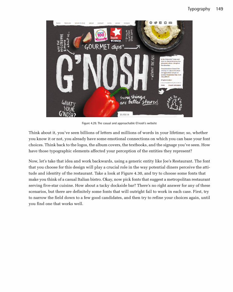
Figure 4.29. The casual and approachable G'nosh's website
Think about it, you’ve seen billions of letters and millions of words in your lifetime; so, whether
you know it or not, you already have some emotional connections on which you can base your font
choices. Think back to the logos, the album covers, the textbooks, and the signage you’ve seen. How
have those typographic elements affected your perception of the entities they represent?
Now, let’s take that idea and work backwards, using a generic entity like Joe’s Restaurant. The font
that you choose for this design will play a crucial role in the way potential diners perceive the atti-
tude and identity of the restaurant. Take a look at Figure 4.30, and try to choose some fonts that
make you think of a casual Italian bistro. Okay, now pick fonts that suggest a metropolitan restaurant
serving five-star cuisine. How about a tacky dockside bar? There’s no right answer for any of these
scenarios, but there are definitely some fonts that will outright fail to work in each case. First, try
to narrow the field down to a few good candidates, and then try to refine your choices again, until
you find one that works well.
149Typography

Figure 4.30. 20 different fonts to make you want to eat at Joe’s
Remember that there are no bad fonts, just inappropriate ones. While a particular font might fail to
work for one purpose, it may strike just the right chord in another situation. The trick is to try to
keep an open mind. If you can narrow the field to a few possibilities, try asking a friend or co-
worker the question, “Which one makes you feel more [adjective]?”, inserting the feeling you’re
aiming to elicit.
Finally, when you’re choosing fonts, it’s important to limit your selection. As a rule of thumb, try
to use at least two, but no more than four different fonts in a website design. Before incorporating
a new font, remember that you probably have some variants (bold, italic, condensed, black, regular,
and so on) at your disposal to vary your type while maintaining consistency. Try to also avoid
combining two different serif fonts or two different sans-serif fonts in the same project. Like the
discordant colors phenomenon I talked about in Chapter 2, placing different fonts from the same
family next to each other in a design can feel eerily uncomfortable.
Setting Font Size and Line HeightThe size of text is—and always has been—a confusing topic. Over 300 years had elapsed in the
history of printed type before the French typefounder Père Sébastien Truchet introduced the typo-
graphic point. Although points have been the standard units of measurement for typography ever
since, the exact size of this standard unit has changed several times throughout history, due to
differences between the English and French units of measurement. It was only with the onset of
digital typography that the official size of the point was set to 1/72 of an inch.
Setting the size of text on the Web has had an equally shaky past. While the size of type in the print
world is measured by points, the size of type on the Web is relative to the resolution of the viewer’s
monitor and can be set in various types of units. The most popular units for setting text on the web
are pixels, points, %, and ems. Without going too deeply into it, it’s easiest to say that 16px = 12pt
= 100% = 1em. In CSS, the pixel (px) is the smallest—and best—relative unit for setting the size of
text. Monitor resolution is set in pixels, as are the dimensions of all display graphics, so it makes
sense to control text size with pixels, as well. So, why doesn’t everyone set web text sizes in pixels?
The Principles of Beautiful Web Design150

Well, mainly because some browsers don’t allow text that’s set in pixels to be scaled. This is poten-
tially an accessibility problem for users unable to read small text. I say it’s potentially a problem,
because most browsers now give users the option to zoom the page rather than having to try to in-
crease the font size. If you want to ensure that the text in your site is scalable as well as zoomable,
you can set your text in ems.
Because I think in pixels, my current approach to setting font size and line height on the Web follows
the logic of Wilson Miner’s 2007 A List Apart article, “Setting Type on the Web to a Baseline Grid.”28
Like our vertical, column-based grids, a baseline grid is a set of equally spaced horizontal lines
which your text should line up with. Following a baseline grid helps give your content a sense of
rhythm instead of feeling arbitrarily placed. The main concept in Wilson’s article is that you remove
the default margin and padding from all elements, set your font-size and line-height in the body
element, then give all elements a line-height and a bottom margin that either matches or is a
multiple of your body line-height. It sounds complicated, but it’s really quite easy.
Using Punctuation and Special Characters
Figure 4.31. The quotation mark key on a standard keyboard
When you type text into any relatively modern word-
processing program, you see nice “curly” opening
and closing punctuation marks when you hit the
double quotation marks key. Curly quotation marks
can’t be found on your keyboard, as Figure 4.31
shows; however, word-processing programs under-
stand that when you put words in quotes, you want
nice left and right quotes, and it replaces the charac-
ters you typed in with the correct ones. The same
goes with apostrophes. Have you ever seen an ASCII
apostrophe like the one on your keyboard in a book
or brochure? Of course not. What we usually see in
printed material is a closing single quotation mark.
In fact, a vast array of characters are unrepresented
on a standard keyboard, even though these characters
show up on web pages and in printed material.
Now, that’s all well and good for people using word processors. For those of us typing text into an
HTML document, though, there’s no system to automatically replace the characters from our key-
boards with the grammatically correct equivalents. Depending on which type of character encoding
your website uses, when you paste these characters directly into an HTML document, you may see
a bunch of gibberish on the rendered page. Additionally, the inclusion in text of characters that are
used by HTML, like < and >, will wreak havoc in your page, as they’ll be interpreted as the beginning
or ending of an HTML tag.
28 http://www.alistapart.com/articles/settingtypeontheweb
151Typography
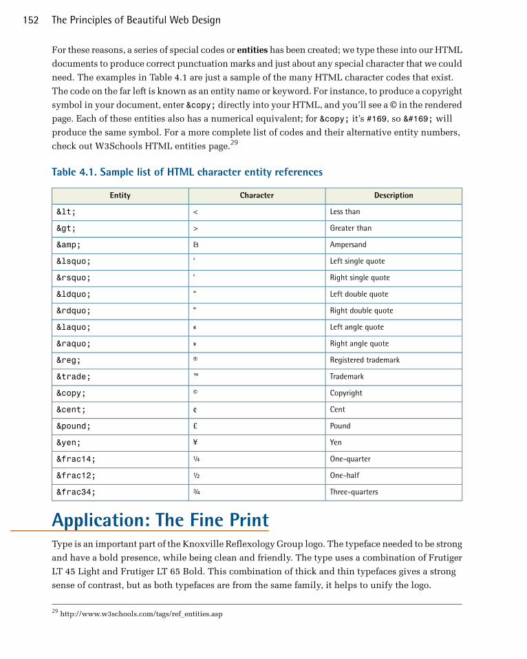
For these reasons, a series of special codes or entities has been created; we type these into our HTML
documents to produce correct punctuation marks and just about any special character that we could
need. The examples in Table 4.1 are just a sample of the many HTML character codes that exist.
The code on the far left is known as an entity name or keyword. For instance, to produce a copyright
symbol in your document, enter © directly into your HTML, and you’ll see a © in the rendered
page. Each of these entities also has a numerical equivalent; for © it’s #169, so © will
produce the same symbol. For a more complete list of codes and their alternative entity numbers,
check out W3Schools HTML entities page.29
Table 4.1. Sample list of HTML character entity references
DescriptionCharacterEntity
Less than<<
Greater than>>
Ampersand&&
Left single quote‘‘
Right single quote’’
Left double quote““
Right double quote””
Left angle quote««
Right angle quote»»
Registered trademark®®
Trademark™™
Copyright©©
Cent¢¢
Pound££
Yen¥¥
One-quarter¼¼
One-half½½
Three-quarters¾¾
Application: The Fine PrintType is an important part of the Knoxville Reflexology Group logo. The typeface needed to be strong
and have a bold presence, while being clean and friendly. The type uses a combination of Frutiger
LT 45 Light and Frutiger LT 65 Bold. This combination of thick and thin typefaces gives a strong
sense of contrast, but as both typefaces are from the same family, it helps to unify the logo.
29 http://www.w3schools.com/tags/ref_entities.asp
The Principles of Beautiful Web Design152

Figure 4.32. KRG typography in the logo
For the headlines and body copy throughout the KRG site, is was important to chose a quality web
font that was sans serif to maximize legibility, and to have a few different weights. Source Sans Pro
Bold was used for the headlines and Source Sans Pro Light was selected for the body text. This is
mainly because KRG wanted to maintain a modern, sleek look. The body text needed to have an
open, inviting feel, so the line height was increased for legibility and to lighten the mood of the
site.
The home page needed to draw the visitor in with the latest news, while offering other content to
explore. It also needed to be informative, covering different procedures and providing price inform-
ation. Certain elements, such as prices, could be made to stand out using special CSS classes ded-
icated just for those purposes. Headlines needed to be clean and bold, with contrasting supportive
text.
Figure 4.33. Source Sans Pro font used on body copy
The fonts themselves were implemented using @font-face, and the fonts are hosted at the site to
provide maximum consistency. As you can see in Figure 4.34 below, the text has plenty of room
to breathe. The menu has plenty of contrast, the news slider has a bold headline that gets your at-
tention while making it easy to read. The text shadow in the callout box below the slider has a text
shadow applied to it with CSS, which adds a slight variation to the rest of the layout.
153Typography
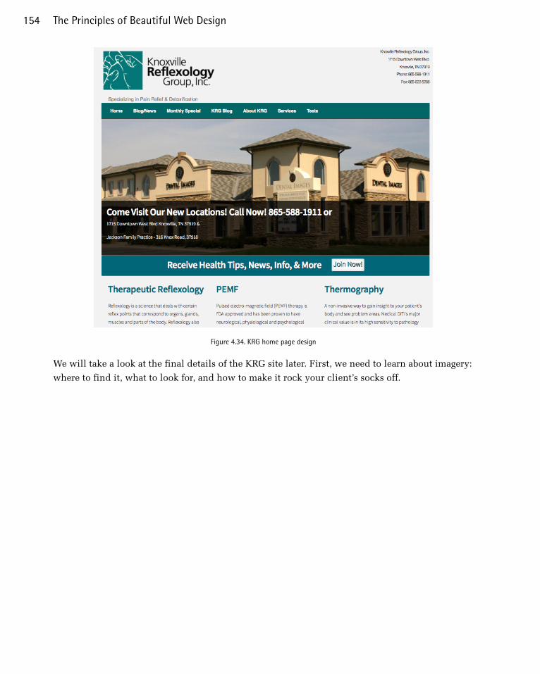
Figure 4.34. KRG home page design
We will take a look at the final details of the KRG site later. First, we need to learn about imagery:
where to find it, what to look for, and how to make it rock your client’s socks off.
The Principles of Beautiful Web Design154
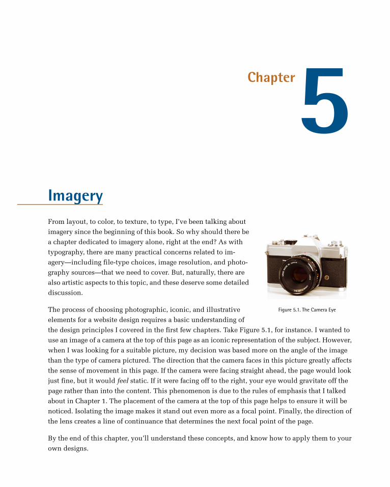
Chapter5Imagery
Figure 5.1. The Camera Eye
From layout, to color, to texture, to type, I’ve been talking about
imagery since the beginning of this book. So why should there be
a chapter dedicated to imagery alone, right at the end? As with
typography, there are many practical concerns related to im-
agery—including file-type choices, image resolution, and photo-
graphy sources—that we need to cover. But, naturally, there are
also artistic aspects to this topic, and these deserve some detailed
discussion.
The process of choosing photographic, iconic, and illustrative
elements for a website design requires a basic understanding of
the design principles I covered in the first few chapters. Take Figure 5.1, for instance. I wanted to
use an image of a camera at the top of this page as an iconic representation of the subject. However,
when I was looking for a suitable picture, my decision was based more on the angle of the image
than the type of camera pictured. The direction that the camera faces in this picture greatly affects
the sense of movement in this page. If the camera were facing straight ahead, the page would look
just fine, but it would feel static. If it were facing off to the right, your eye would gravitate off the
page rather than into the content. This phenomenon is due to the rules of emphasis that I talked
about in Chapter 1. The placement of the camera at the top of this page helps to ensure it will be
noticed. Isolating the image makes it stand out even more as a focal point. Finally, the direction of
the lens creates a line of continuance that determines the next focal point of the page.
By the end of this chapter, you’ll understand these concepts, and know how to apply them to your
own designs.

What to Look ForThe old adage that a picture is worth a thousand words certainly holds true on the Web. Photographs
and illustrations often serve as visual lures that catch passing visitors and reel them into your
content. On the other hand, the wrong images, or even a poor presentation of the right ones, can be
detrimental to a website’s appeal. Every viewer of a photograph or illustration sees that image dif-
ferently, depending on the person’s own background and individual experience. So the thousand
words that one person draws from an image may be different from the thousand words another
person takes from it.
Before you choose an image or illustration to include in the layout or content of a website, ask
yourself the following three questions:
Is it relevant?
Relevant images can add interest to your design and enhance the content of a web page. They
provide visual bookmarks that help visitors remember what was covered on the page, and where
to look when they return. Take a look at the promo page for Grovemade1’s hand-made products
in Figure 5.2. The background photograph is visually compelling and relevant, giving the page
a workshop vibe and personality that another image may be unable to replicate. This is a logical
rule that most people get right when they choose images for content; however, relevance is only
one factor to consider when choosing an image.
Figure 5.2. Grovemade's hand-made products
1 http://grovemade.com/
The Principles of Beautiful Web Design156
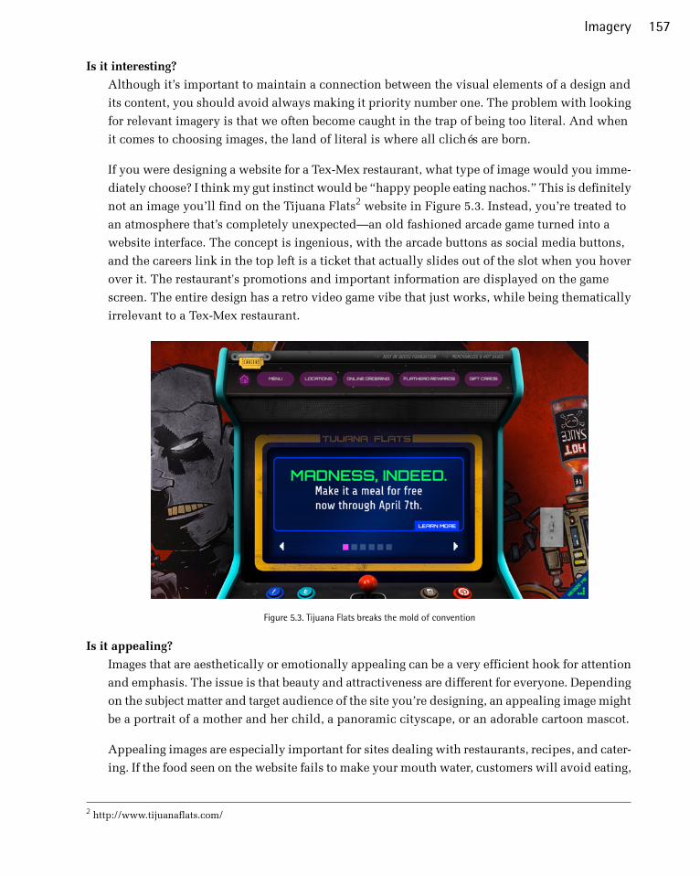
Is it interesting?
Although it’s important to maintain a connection between the visual elements of a design and
its content, you should avoid always making it priority number one. The problem with looking
for relevant imagery is that we often become caught in the trap of being too literal. And when
it comes to choosing images, the land of literal is where all clichés are born.
If you were designing a website for a Tex-Mex restaurant, what type of image would you imme-
diately choose? I think my gut instinct would be “happy people eating nachos.” This is definitely
not an image you’ll find on the Tijuana Flats2 website in Figure 5.3. Instead, you’re treated to
an atmosphere that’s completely unexpected—an old fashioned arcade game turned into a
website interface. The concept is ingenious, with the arcade buttons as social media buttons,
and the careers link in the top left is a ticket that actually slides out of the slot when you hover
over it. The restaurant's promotions and important information are displayed on the game
screen. The entire design has a retro video game vibe that just works, while being thematically
irrelevant to a Tex-Mex restaurant.
Figure 5.3. Tijuana Flats breaks the mold of convention
Is it appealing?
Images that are aesthetically or emotionally appealing can be a very efficient hook for attention
and emphasis. The issue is that beauty and attractiveness are different for everyone. Depending
on the subject matter and target audience of the site you’re designing, an appealing image might
be a portrait of a mother and her child, a panoramic cityscape, or an adorable cartoon mascot.
Appealing images are especially important for sites dealing with restaurants, recipes, and cater-
ing. If the food seen on the website fails to make your mouth water, customers will avoid eating,
2 http://www.tijuanaflats.com/
157Imagery

cooking, or ordering it. The images on the Olivia Restaurant site3, seen in Figure 5.4, are
amazing. They create an atmosphere that makes you want to get in the car and head for the
nearest location. An image like this doesn't just express the idea of a great restaurant, but also
suggests a great experience awaits you there. The chef doesn't just look like a regular old cook,
he looks like an artisan, with amazing craftsmanship.
Figure 5.4. Olivia Restaurant: amazing restaurant photography
I realize that relevancy, interest, and appeal are all very subjective, but sometimes subjectivity and
artistic license are appropriate. If you think it’s a good image for the project, run with it. Generally
speaking, I’d avoid monsters, slime, and aliens in most websites, but as we’ve seen above, given
the right client and target audience, it may be a valid design direction. For every image you choose
for a design, you need to be able to answer “yes” to at least two of the questions above. Why not all
three? Well, sometimes it’s fun to toss in an appealing and interesting image that has nothing to do
with your content. You know, like a bunch of birds carrying a whale in a net (the famous Twitter
“fail whale”, shown in Figure 5.5).
3 http://oliviarestauranter.no/
The Principles of Beautiful Web Design158

Figure 5.5. Twitter's “fail whale”
Legitimate Image SourcesSo where does one acquire interesting, appealing, and relevant imagery to use for a website project?
You basically have three options: create it yourself, purchase stock images, or hire a professional.
The approach you take will depend on the budget and needs of your client, as well as your own
skills.
Take It or Make ItFor me, taking pictures with my own camera or creating my own illustrations is usually a win/win
situation. If local clients need pictures to use on their websites, it gives me a chance to escape the
office and do something different for a change. I’ve had the opportunity to take pictures of products,
restaurants, a factory, apartments, a martial arts studio, storefronts—I was even able to ride around
in a golf cart to take pictures of a golf course one morning, all while I was on the clock. But it’s more
than just a fun outing for me. Clients usually like the idea because it shows them that I want to be
involved in every step of the project. It can also cost them less than it would to contract a profes-
sional photographer.4
The same is usually true for illustration and animation work. Most of the time, a custom site design
requires some level of illustration. For items like icons, buttons, backgrounds, basic drawings, and
logos, you might consider taking a stab at fulfilling the client’s needs yourself. Keep in mind that
illustration doesn’t necessarily have to be complex or time-consuming for the message to be com-
municated successfully. Take a look at the website for the agency Designzillas5 in Figure 5.6. The
cartoon dinosaur isn't necessarily complicated, but it serves as a mascot for the company, and im-
mediately gets your attention. The bright green and yellow work well with the black background,
too.
4 While you may not think of yourself as a photographer, taking good photos is a skill that, like design, can be learned. A
great place to start is SitePoint’s Photography for the Web [http://www.sitepoint.com/books/photography1/].5 http://www.designzillas.com/
159Imagery
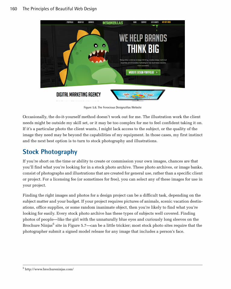
Figure 5.6. The Ferocious Designzillas Website
Occasionally, the do-it-yourself method doesn’t work out for me. The illustration work the client
needs might be outside my skill set, or it may be too complex for me to feel confident taking it on.
If it’s a particular photo the client wants, I might lack access to the subject, or the quality of the
image they need may be beyond the capabilities of my equipment. In those cases, my first instinct
and the next best option is to turn to stock photography and illustrations.
Stock PhotographyIf you’re short on the time or ability to create or commission your own images, chances are that
you’ll find what you’re looking for in a stock photo archive. These photo archives, or image banks,
consist of photographs and illustrations that are created for general use, rather than a specific client
or project. For a licensing fee (or sometimes for free), you can select any of these images for use in
your project.
Finding the right images and photos for a design project can be a difficult task, depending on the
subject matter and your budget. If your project requires pictures of animals, scenic vacation destin-
ations, office supplies, or some random inanimate object, then you’re likely to find what you’re
looking for easily. Every stock photo archive has these types of subjects well covered. Finding
photos of people—like the girl with the unnaturally blue eyes and curiously long sleeves on the
Brochure Ninjas6 site in Figure 5.7—can be a little trickier; most stock photo sites require that the
photographer submit a signed model release for any image that includes a person’s face.
6 http://www.brochureninjas.com/
The Principles of Beautiful Web Design160
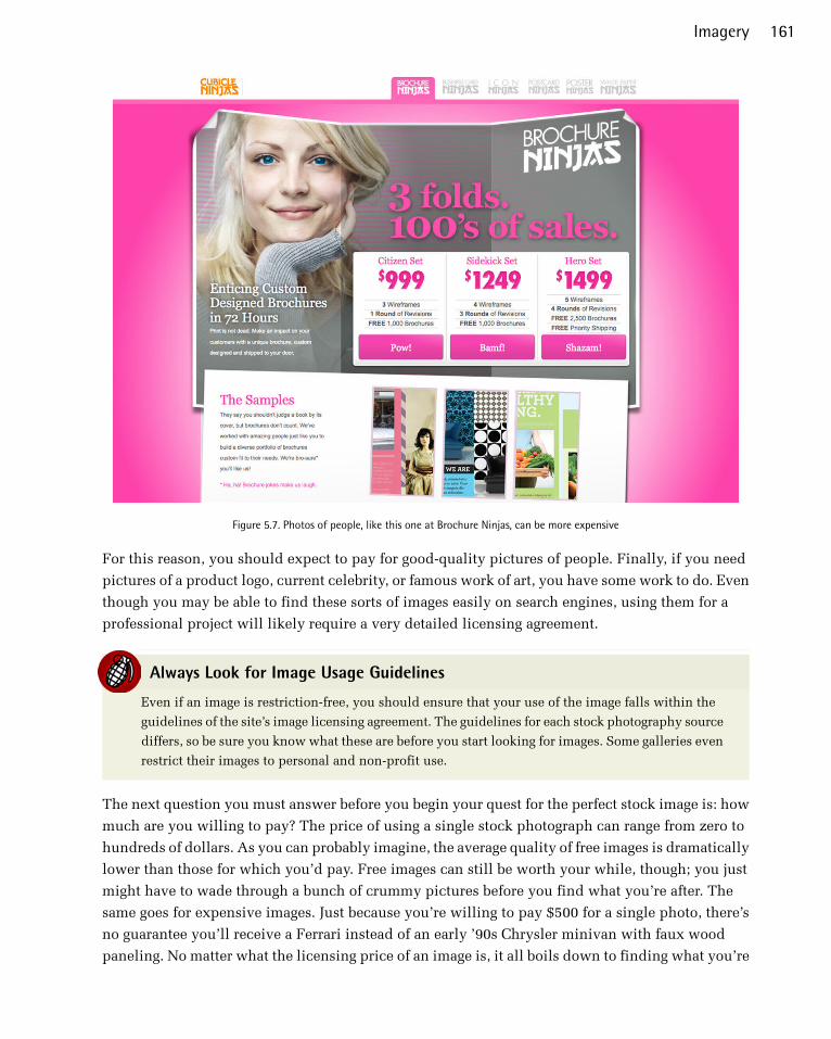
Figure 5.7. Photos of people, like this one at Brochure Ninjas, can be more expensive
For this reason, you should expect to pay for good-quality pictures of people. Finally, if you need
pictures of a product logo, current celebrity, or famous work of art, you have some work to do. Even
though you may be able to find these sorts of images easily on search engines, using them for a
professional project will likely require a very detailed licensing agreement.
Always Look for Image Usage Guidelines
Even if an image is restriction-free, you should ensure that your use of the image falls within the
guidelines of the site’s image licensing agreement. The guidelines for each stock photography source
differs, so be sure you know what these are before you start looking for images. Some galleries even
restrict their images to personal and non-profit use.
The next question you must answer before you begin your quest for the perfect stock image is: how
much are you willing to pay? The price of using a single stock photograph can range from zero to
hundreds of dollars. As you can probably imagine, the average quality of free images is dramatically
lower than those for which you’d pay. Free images can still be worth your while, though; you just
might have to wade through a bunch of crummy pictures before you find what you’re after. The
same goes for expensive images. Just because you’re willing to pay $500 for a single photo, there’s
no guarantee you’ll receive a Ferrari instead of an early ’90s Chrysler minivan with faux wood
paneling. No matter what the licensing price of an image is, it all boils down to finding what you’re
161Imagery
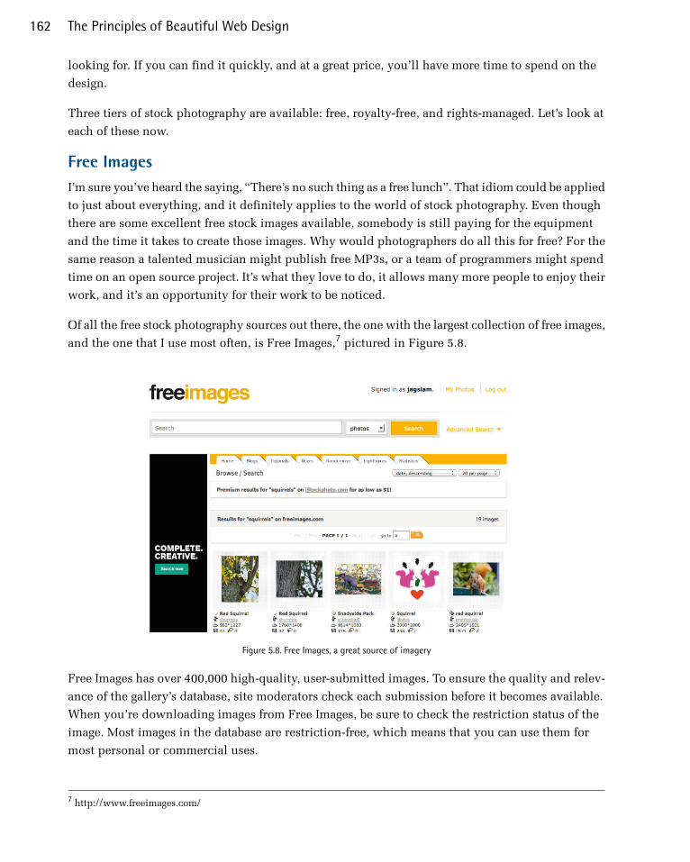
looking for. If you can find it quickly, and at a great price, you’ll have more time to spend on the
design.
Three tiers of stock photography are available: free, royalty-free, and rights-managed. Let’s look at
each of these now.
Free ImagesI’m sure you’ve heard the saying, “There’s no such thing as a free lunch”. That idiom could be applied
to just about everything, and it definitely applies to the world of stock photography. Even though
there are some excellent free stock images available, somebody is still paying for the equipment
and the time it takes to create those images. Why would photographers do all this for free? For the
same reason a talented musician might publish free MP3s, or a team of programmers might spend
time on an open source project. It’s what they love to do, it allows many more people to enjoy their
work, and it’s an opportunity for their work to be noticed.
Of all the free stock photography sources out there, the one with the largest collection of free images,
and the one that I use most often, is Free Images,7 pictured in Figure 5.8.
Figure 5.8. Free Images, a great source of imagery
Free Images has over 400,000 high-quality, user-submitted images. To ensure the quality and relev-
ance of the gallery’s database, site moderators check each submission before it becomes available.
When you’re downloading images from Free Images, be sure to check the restriction status of the
image. Most images in the database are restriction-free, which means that you can use them for
most personal or commercial uses.
7 http://www.freeimages.com/
The Principles of Beautiful Web Design162
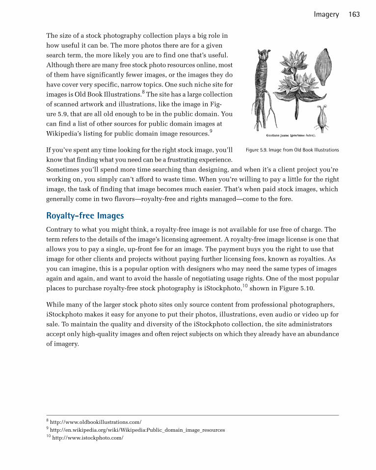
Figure 5.9. Image from Old Book Illustrations
The size of a stock photography collection plays a big role in
how useful it can be. The more photos there are for a given
search term, the more likely you are to find one that’s useful.
Although there are many free stock photo resources online, most
of them have significantly fewer images, or the images they do
have cover very specific, narrow topics. One such niche site for
images is Old Book Illustrations.8 The site has a large collection
of scanned artwork and illustrations, like the image in Fig-
ure 5.9, that are all old enough to be in the public domain. You
can find a list of other sources for public domain images at
Wikipedia’s listing for public domain image resources.9
If you’ve spent any time looking for the right stock image, you’ll
know that finding what you need can be a frustrating experience.
Sometimes you’ll spend more time searching than designing, and when it’s a client project you’re
working on, you simply can’t afford to waste time. When you’re willing to pay a little for the right
image, the task of finding that image becomes much easier. That’s when paid stock images, which
generally come in two flavors—royalty-free and rights managed—come to the fore.
Royalty-free ImagesContrary to what you might think, a royalty-free image is not available for use free of charge. The
term refers to the details of the image’s licensing agreement. A royalty-free image license is one that
allows you to pay a single, up-front fee for an image. The payment buys you the right to use that
image for other clients and projects without paying further licensing fees, known as royalties. As
you can imagine, this is a popular option with designers who may need the same types of images
again and again, and want to avoid the hassle of negotiating usage rights. One of the most popular
places to purchase royalty-free stock photography is iStockphoto,10 shown in Figure 5.10.
While many of the larger stock photo sites only source content from professional photographers,
iStockphoto makes it easy for anyone to put their photos, illustrations, even audio or video up for
sale. To maintain the quality and diversity of the iStockphoto collection, the site administrators
accept only high-quality images and often reject subjects on which they already have an abundance
of imagery.
8 http://www.oldbookillustrations.com/9 http://en.wikipedia.org/wiki/Wikipedia:Public_domain_image_resources10 http://www.istockphoto.com/
163Imagery
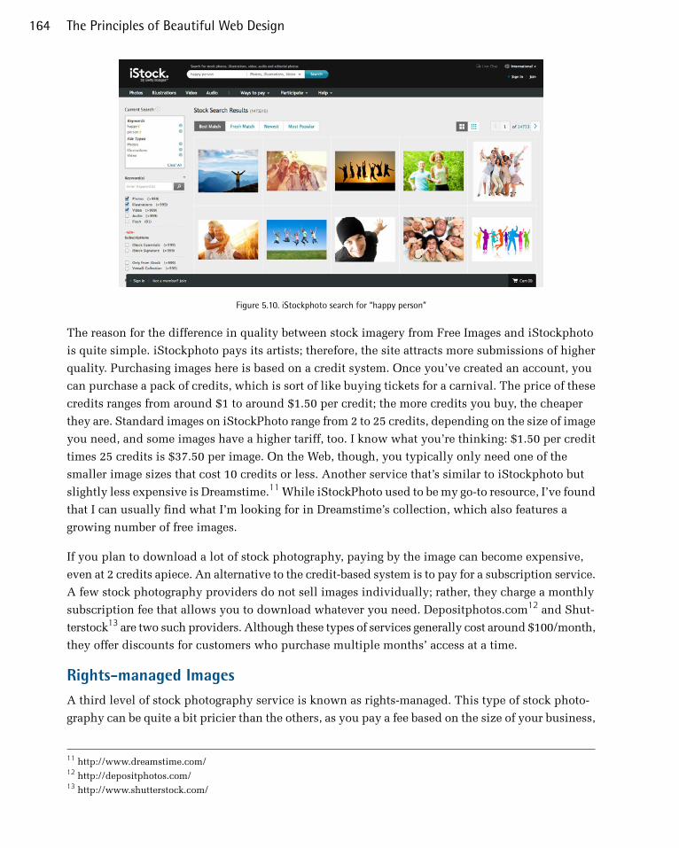
Figure 5.10. iStockphoto search for “happy person”
The reason for the difference in quality between stock imagery from Free Images and iStockphoto
is quite simple. iStockphoto pays its artists; therefore, the site attracts more submissions of higher
quality. Purchasing images here is based on a credit system. Once you’ve created an account, you
can purchase a pack of credits, which is sort of like buying tickets for a carnival. The price of these
credits ranges from around $1 to around $1.50 per credit; the more credits you buy, the cheaper
they are. Standard images on iStockPhoto range from 2 to 25 credits, depending on the size of image
you need, and some images have a higher tariff, too. I know what you’re thinking: $1.50 per credit
times 25 credits is $37.50 per image. On the Web, though, you typically only need one of the
smaller image sizes that cost 10 credits or less. Another service that’s similar to iStockphoto but
slightly less expensive is Dreamstime.11 While iStockPhoto used to be my go-to resource, I’ve found
that I can usually find what I’m looking for in Dreamstime’s collection, which also features a
growing number of free images.
If you plan to download a lot of stock photography, paying by the image can become expensive,
even at 2 credits apiece. An alternative to the credit-based system is to pay for a subscription service.
A few stock photography providers do not sell images individually; rather, they charge a monthly
subscription fee that allows you to download whatever you need. Depositphotos.com12 and Shut-
terstock13 are two such providers. Although these types of services generally cost around $100/month,
they offer discounts for customers who purchase multiple months’ access at a time.
Rights-managed ImagesA third level of stock photography service is known as rights-managed. This type of stock photo-
graphy can be quite a bit pricier than the others, as you pay a fee based on the size of your business,
11 http://www.dreamstime.com/12 http://depositphotos.com/13 http://www.shutterstock.com/
The Principles of Beautiful Web Design164

the number of people who will be exposed to the image, and the amount of time for which the image
will be in use. Most of the larger stock providers have rights-managed options for their exclusive
images; for example, Corbis,14 and Getty Images.15 The photos in a rights-managed collection are
usually of a professional quality.
Because the company in charge of the rights knows who’s using the images and for how long, it’s
extremely unlikely that your client’s competitor will have the exact same image on its home page
that you’ve used for your client. With such a large pool of royalty-free images available, this may
already seem improbable, but whether people notice it or not, this happens all the time. TinEye16
is a great tool for checking how widespread the use of a particular stock image is. This browser
plugin touts itself as a reverse image search engine. You simply right-click on an image that you
want to research, and it searches for matches in its index of nearly two billion images. As you can
see in Figure 5.11, it will even find heavily modified versions of the original image. It’s important
to note here that, while there are many images of female customer service representatives with mi-
crophone headsets on stock photography sites, it’s a horribly overused cliché. You should think
twice before using this type of image, or any picture you can conceive involving business people
standing around or shaking hands. The irony here is that the ad in the TinEye sidebar includes a
different picture of a headset girl. They’re everywhere, I tell you!
14 http://www.corbisimages.com/15 http://www.gettyimages.com/16 http://www.tineye.com/
165Imagery
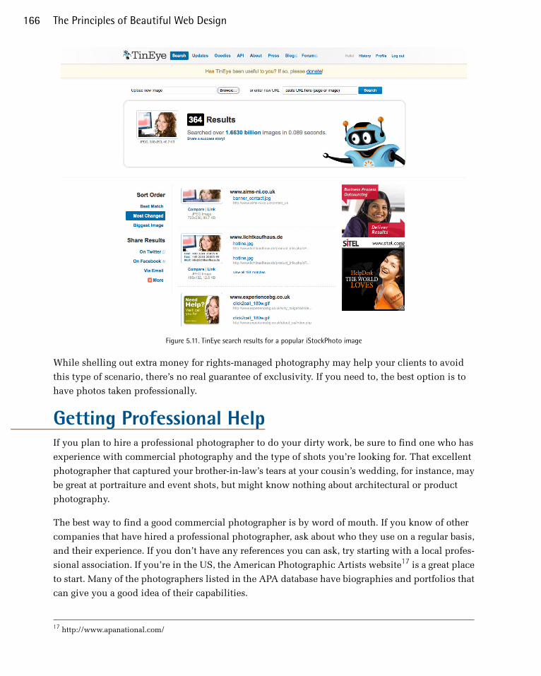
Figure 5.11. TinEye search results for a popular iStockPhoto image
While shelling out extra money for rights-managed photography may help your clients to avoid
this type of scenario, there’s no real guarantee of exclusivity. If you need to, the best option is to
have photos taken professionally.
Getting Professional HelpIf you plan to hire a professional photographer to do your dirty work, be sure to find one who has
experience with commercial photography and the type of shots you’re looking for. That excellent
photographer that captured your brother-in-law’s tears at your cousin’s wedding, for instance, may
be great at portraiture and event shots, but might know nothing about architectural or product
photography.
The best way to find a good commercial photographer is by word of mouth. If you know of other
companies that have hired a professional photographer, ask about who they use on a regular basis,
and their experience. If you don’t have any references you can ask, try starting with a local profes-
sional association. If you’re in the US, the American Photographic Artists website17 is a great place
to start. Many of the photographers listed in the APA database have biographies and portfolios that
can give you a good idea of their capabilities.
17 http://www.apanational.com/
The Principles of Beautiful Web Design166

To have an accurate handle on the costs, be very specific when writing a request for proposal. Be
sure to include the details of each shot you need. State where you’d like to have the pictures taken
if they’re going to be done outside the photographer’s studio, and be ready (with models, locations,
wardrobes, and so on) to take all the pictures on the same day if possible. Most professional photo-
graphers charge by the day or half-day. Daily rates can vary quite a bit, depending on the market
and the photographer’s experience, but they can range from just under one thousand to several
thousand dollars. Another aspect to take into consideration is the photographer’s copyright and
usage guidelines. Many photographers will grant full ownership of the original photographs to your
client upon payment. Some will require credit if the work is used in a commercial publication. A
few photographers may require that they retain exclusive rights to the pictures they take, and they’ll
charge per use of the photos. You should try to negotiate full ownership and usage permissions
whenever possible, but keep in mind that this type of contract may cost more.
If it’s a professional illustrator you’d like to hire, another resource to look into is Hire an illustrator!18
This industry index hosts over 300 artists, and makes it easy to find the person for the job by name,
style, medium, or location. As with hiring a photographer, though, the best way to find the person
for the job is often by word of mouth. In the past, I’ve helped organize a web conference here in
Columbia, South Carolina called Converge SE.19 I credit a lot of the success and personality of past
years' events to the older version of the site that had illustrations of the bizarre “convergent creatures”
(like Sharktopus, seen on the home page on Figure 5.12) that were drawn by Giovanni DiFeterici.
Figure 5.12. The Converge SE site, featuring Sharktopus
I’ve had the opportunity to meet Giovanni and many other local designers, developers, photographers,
animators, videographers, and more at local user group meetups. If you live in or near a big city,
18 http://hireanillustrator.com/i/19 http://convergese.com/
167Imagery

chances are there are user groups for whatever branch of the web, tech, or design industry you’re
interested in. These are great places to find the talent you need to complete your next project, or
even to hire for your team.
No matter what sources you use for your images—whether they’re from a free stock website like
Free Images, or a paid professional creates them—it’s ultimately your clients who should have the
final say. Even though it’s likely that you’ll be choosing the images that you feel best represent their
company, sometimes your clients will disagree with your choices. Always be ready to adapt and
make changes where necessary. As long as you’re creating good work and acquiring your images
from legitimate sources, your hard work should pay off, and the client will be impressed.
How Not to ImpressSo I’ve told you about a few resources where you can obtain imagery for your projects. Now it’s
time to talk about where not to source imagery from.
Google GankingAs a web designer, you may find it inspirational to run a Google image search for topics around
which you’re building a website. Let’s say you’re building a website for a bike shop. If the owner
of the shop has yet to give you any images to work with, doing an image search for mountain biking,
bike races, road bikes, and other related subjects can give you a better visual understanding of the
topic, and an idea about the types of images you’ll want to use on the site. Usually, this type of
search will return some images that would work well in your design. You might even feel the urge
to save some of these images to your computer, open them up in Photoshop, and crop, resize, and
modify them a little to fit your needs. This is known as Google Ganking, and it’s a serious problem
in web design. Unless the images on a website are specifically marked as being free to use or
available in the public domain, you can assume that they’re copyrighted by the site’s owner, so
you’ll need permission to use them. You may think that image owners will never notice that you’ve
ripped off their work, but you risk facing embarrassment when a cease-and-desist letter is sent to
your client, or worse still, the more serious situation of a lawsuit.
The same is true for the most part with images found via a Flickr search. While most Flickr images
are copyrighted by their respective owners, the service also allows uploaders to give their images
one of several standard Creative Commons (CC) licenses.20These licenses provide a series of pre-
defined rules for what you can and can’t do with the licensed works. One of the license options
allows images to be used for commercial purposes. Figure 5.13 shows a search for photos of chip-
munks that have a license allowing commercial use. This is the same search I did on Free Images
in Figure 5.8—but instead of 50 results, I received 2,423. You can see why I’ve seen a few resources
lately that point to CC Flickr images as a great alternative to using stock photography. While it’s a
great image resource, it is not stock photography. At the bare minimum, any image you use from
20 http://www.flickr.com/creativecommons/
The Principles of Beautiful Web Design168

Flickr requires attribution. If you fail to provide a credit link for every Flickr image you use, you
might as well be stealing them.
Figure 5.13. Flickr search for CC-licensed chipmunk photos for commercial use
HotlinkingIf there’s anything that designers hate more than seeing their designs or images ripped off, it’s seeing
them ripped off by a site that’s linking to the files on the designers’ own servers. Usually, images
for a website are placed on the same web server as the site, and are linked to in the way shown
here:
<img src="/images/image.jpg" alt="Image Description" />
However, images can also be linked to from outside the website, using the full URL of the image:
<img src="http://www.somesite.com/images/image.jpg" alt="Image Description " />
Going back to my theoretical bike shop example, let’s suppose I wanted to use a picture of a partic-
ular make and model of bike. Let’s say I found an image of the right bike on the manufacturer’s site
and wanted to use it. Rather than requesting product images from the manufacturer, or even
169Imagery

downloading the image and placing it on my client’s web server, let’s imagine I decide to link
straight to the image on the bike manufacturer’s website. This dubious practice is called hotlinking.
Copyright issues aside, hotlinking uses the bandwidth of the website on which the images are located.
With most hosting accounts, bandwidth is limited and extra bandwidth can be expensive. So as a
real-world metaphor, hotlinking is a bit like using another person’s cell phone minutes to make
your call. Most web professionals know that hotlinking is a big no-no, so the usual hotlinking suspects
are forum users, bloggers, and MySpace users who don’t know any better. So if you were unaware
before, now you know better, too. Not to mention an additional problem with hotlinked images:
the source of the image could pull or remove that image and replace it with something crude or
embarrassing at any time.
ClipartThere are many websites that offer free, or very cheap, clipart and illustration packages. While these
cheesy generic graphics may work for an internal company bulletin or do-it-yourself greeting card,
they should be considered off-limits for any professional project.
Figure 5.14. Clipart could make this happen to YOU
You may think that I’m being a little harsh with that statement, but take a moment to think about
it. If you go to a five-star restaurant, would you expect to be served instant mashed potatoes from
a box? Of course not! You’d expect fresh ingredients, cooked from scratch. As a designer, you have
an obligation to cook something up for your client that’s as original as it is astonishing. While the
quality and “freshness” of stock photography can be questionable as well, there’s nothing worse
than seeing a good design blemished by stale, clichéd clipart. If your clients ask you to use clipart
or a corny animated GIF on their site, you should push back a little. Just remember that if the client
has come to you for the design, it’s your job to provide feedback that’ll make their site look good.
However, you also have to remember that, ultimately, the client is always right. Sometimes a client
The Principles of Beautiful Web Design170

will force a design decision, and you’ll just have to go with it. I guess some people really like their
instant potatoes.
Regardless of how good a job you’ve done choosing images for your design, there’s another critical
factor to consider: presentation. When you’re formatting images for use on your site, their present-
ation will often depend on the constraints of the layout you’ve chosen. The image size, for instance,
may depend on the size of the rectangle you have available in your grid. As the designer, it’s up to
you to determine how an image will be cropped, if an image will have any framing or borders, and
what types of visual effects will be applied to the image, if any.
Creative CroppingOne of the most profound impacts you can make on the presentation of an image comes from wisely
choosing what should be included, and what should not. This process is known as cropping, and
is a fundamental image manipulation technique.
At its most basic level, cropping can be used to eliminate unnecessary or unsightly details from a
picture. The picture in Figure 5.15 is one that I took while wandering around with my wife in
downtown Charleston, South Carolina. It’s an okay picture, but the people in the immediate fore-
ground and the power lines that run down the shady right-hand side of the street are distracting.
Figure 5.15. An unedited photo of downtown Charleston
171Imagery
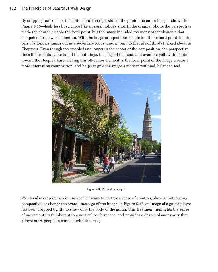
By cropping out some of the bottom and the right side of the photo, the entire image—shown in
Figure 5.15—feels less busy, more like a casual holiday shot. In the original photo, the perspective
made the church steeple the focal point, but the image included too many other elements that
competed for viewers’ attention. With the image cropped, the steeple is still the focal point, but the
pair of shoppers jumps out as a secondary focus, due, in part, to the rule of thirds I talked about in
Chapter 1. Even though the steeple is no longer in the center of the composition, the perspective
lines that run along the top of the buildings, the edge of the road, and even the yellow line point
toward the steeple’s base. Having this off-center element as the focal point of the image creates a
more interesting composition, and helps to give the image a more intentional, balanced feel.
Figure 5.16. Charleston cropped
We can also crop images in unexpected ways to portray a sense of emotion, show an interesting
perspective, or change the overall message of the image. In Figure 5.17, an image of a guitar player
has been cropped tightly to show only the body of the guitar. This treatment highlights the sense
of movement that’s inherent in a musical performance, and provides a degree of anonymity that
allows more people to connect with the image.
The Principles of Beautiful Web Design172

Figure 5.17. Tight cropping to give an image a sense of emotion and movement
When cropping images tightly, like the guitar image above, it’s important to be aware of the overall
size of the image you’re working with. You may want to crop to a very detailed area of the photo
and then enlarge it, but if the image’s resolution is too low, the cropped image will look
pixelated.21Fortunately, images that are used on the Web can have much lower resolutions than
those used in print, but always check the quality of your final image to make sure that it isn’t grainy
or blurry.
Images don’t always have to be contained in boxes. Many of the fun and useful ways in which we
can crop photos are more creative than just trimming off the sides. The photo in Figure 5.18 is one
that I took from the banks of the Saluda River. I love this picture so much in its unedited form that
I made it into a background image for my computer, but let’s try to think outside the box.
Figure 5.18. The Saluda River
Unconventional cropping methods can come off as amateur if they’re poorly executed, but if they’re
done well, they can be used to create some very striking graphics. Let’s say I was designing a website
21 Unless, of course, you find yourself in an episode of CSI.
173Imagery
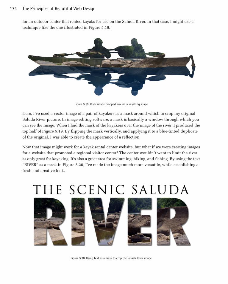
for an outdoor center that rented kayaks for use on the Saluda River. In that case, I might use a
technique like the one illustrated in Figure 5.19.
Figure 5.19. River image cropped around a kayaking shape
Here, I’ve used a vector image of a pair of kayakers as a mask around which to crop my original
Saluda River picture. In image editing software, a mask is basically a window through which you
can see the image. When I laid the mask of the kayakers over the image of the river, I produced the
top half of Figure 5.19. By flipping the mask vertically, and applying it to a blue-tinted duplicate
of the original, I was able to create the appearance of a reflection.
Now that image might work for a kayak rental center website, but what if we were creating images
for a website that promoted a regional visitor center? The center wouldn’t want to limit the river
as only great for kayaking. It’s also a great area for swimming, hiking, and fishing. By using the text
“RIVER” as a mask in Figure 5.20, I’ve made the image much more versatile, while establishing a
fresh and creative look.
Figure 5.20. Using text as a mask to crop the Saluda River image
The Principles of Beautiful Web Design174
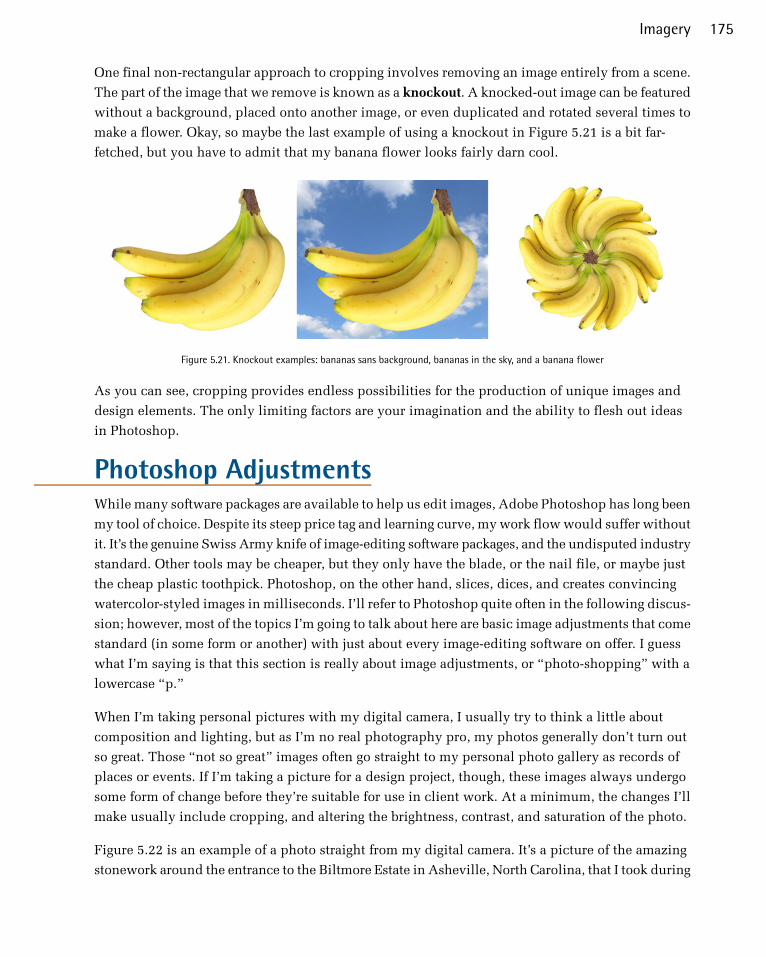
One final non-rectangular approach to cropping involves removing an image entirely from a scene.
The part of the image that we remove is known as a knockout. A knocked-out image can be featured
without a background, placed onto another image, or even duplicated and rotated several times to
make a flower. Okay, so maybe the last example of using a knockout in Figure 5.21 is a bit far-
fetched, but you have to admit that my banana flower looks fairly darn cool.
Figure 5.21. Knockout examples: bananas sans background, bananas in the sky, and a banana flower
As you can see, cropping provides endless possibilities for the production of unique images and
design elements. The only limiting factors are your imagination and the ability to flesh out ideas
in Photoshop.
Photoshop AdjustmentsWhile many software packages are available to help us edit images, Adobe Photoshop has long been
my tool of choice. Despite its steep price tag and learning curve, my work flow would suffer without
it. It’s the genuine Swiss Army knife of image-editing software packages, and the undisputed industry
standard. Other tools may be cheaper, but they only have the blade, or the nail file, or maybe just
the cheap plastic toothpick. Photoshop, on the other hand, slices, dices, and creates convincing
watercolor-styled images in milliseconds. I’ll refer to Photoshop quite often in the following discus-
sion; however, most of the topics I’m going to talk about here are basic image adjustments that come
standard (in some form or another) with just about every image-editing software on offer. I guess
what I’m saying is that this section is really about image adjustments, or “photo-shopping” with a
lowercase “p.”
When I’m taking personal pictures with my digital camera, I usually try to think a little about
composition and lighting, but as I’m no real photography pro, my photos generally don’t turn out
so great. Those “not so great” images often go straight to my personal photo gallery as records of
places or events. If I’m taking a picture for a design project, though, these images always undergo
some form of change before they’re suitable for use in client work. At a minimum, the changes I’ll
make usually include cropping, and altering the brightness, contrast, and saturation of the photo.
Figure 5.22 is an example of a photo straight from my digital camera. It’s a picture of the amazing
stonework around the entrance to the Biltmore Estate in Asheville, North Carolina, that I took during
175Imagery
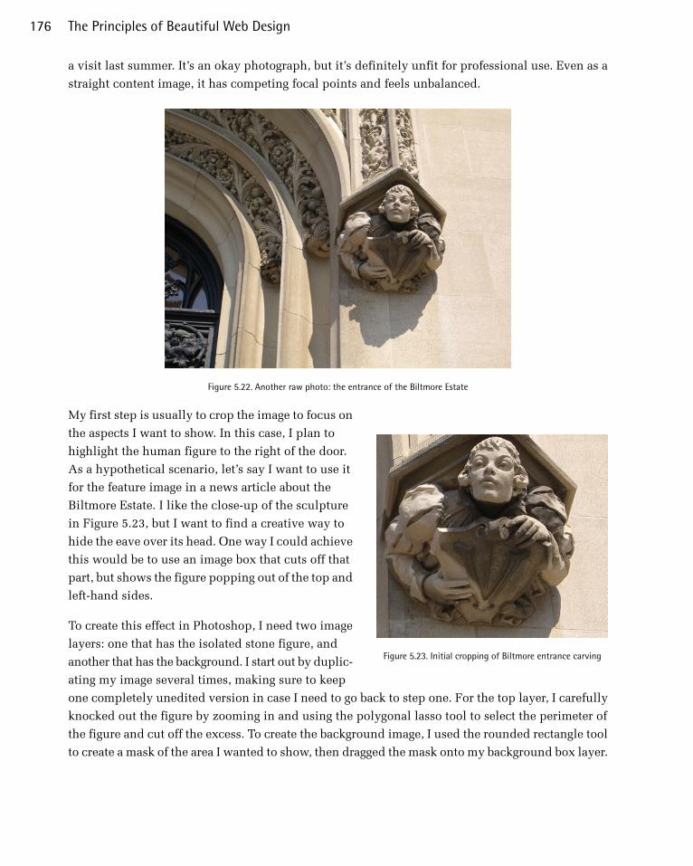
a visit last summer. It’s an okay photograph, but it’s definitely unfit for professional use. Even as a
straight content image, it has competing focal points and feels unbalanced.
Figure 5.22. Another raw photo: the entrance of the Biltmore Estate
Figure 5.23. Initial cropping of Biltmore entrance carving
My first step is usually to crop the image to focus on
the aspects I want to show. In this case, I plan to
highlight the human figure to the right of the door.
As a hypothetical scenario, let’s say I want to use it
for the feature image in a news article about the
Biltmore Estate. I like the close-up of the sculpture
in Figure 5.23, but I want to find a creative way to
hide the eave over its head. One way I could achieve
this would be to use an image box that cuts off that
part, but shows the figure popping out of the top and
left-hand sides.
To create this effect in Photoshop, I need two image
layers: one that has the isolated stone figure, and
another that has the background. I start out by duplic-
ating my image several times, making sure to keep
one completely unedited version in case I need to go back to step one. For the top layer, I carefully
knocked out the figure by zooming in and using the polygonal lasso tool to select the perimeter of
the figure and cut off the excess. To create the background image, I used the rounded rectangle tool
to create a mask of the area I wanted to show, then dragged the mask onto my background box layer.
The Principles of Beautiful Web Design176
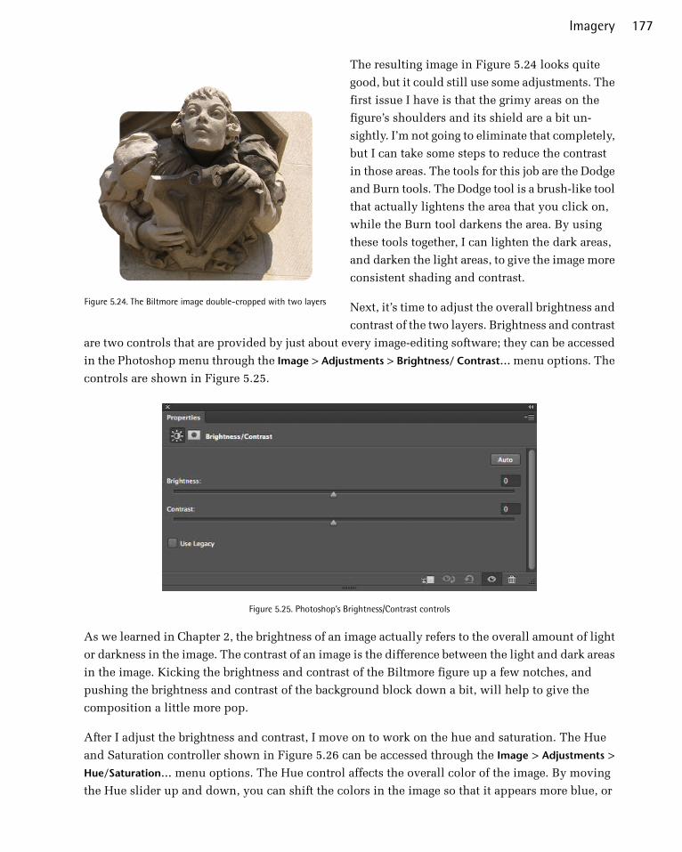
Figure 5.24. The Biltmore image double-cropped with two layers
The resulting image in Figure 5.24 looks quite
good, but it could still use some adjustments. The
first issue I have is that the grimy areas on the
figure’s shoulders and its shield are a bit un-
sightly. I’m not going to eliminate that completely,
but I can take some steps to reduce the contrast
in those areas. The tools for this job are the Dodge
and Burn tools. The Dodge tool is a brush-like tool
that actually lightens the area that you click on,
while the Burn tool darkens the area. By using
these tools together, I can lighten the dark areas,
and darken the light areas, to give the image more
consistent shading and contrast.
Next, it’s time to adjust the overall brightness and
contrast of the two layers. Brightness and contrast
are two controls that are provided by just about every image-editing software; they can be accessed
in the Photoshop menu through the Image > Adjustments > Brightness/ Contrast… menu options. The
controls are shown in Figure 5.25.
Figure 5.25. Photoshop’s Brightness/Contrast controls
As we learned in Chapter 2, the brightness of an image actually refers to the overall amount of light
or darkness in the image. The contrast of an image is the difference between the light and dark areas
in the image. Kicking the brightness and contrast of the Biltmore figure up a few notches, and
pushing the brightness and contrast of the background block down a bit, will help to give the
composition a little more pop.
After I adjust the brightness and contrast, I move on to work on the hue and saturation. The Hue
and Saturation controller shown in Figure 5.26 can be accessed through the Image > Adjustments >
Hue/Saturation… menu options. The Hue control affects the overall color of the image. By moving
the Hue slider up and down, you can shift the colors in the image so that it appears more blue, or
177Imagery

red, or orange, and so on. The overall tone of this image is fine, so I don’t really want to adjust its
hue too much, but it’s sometimes necessary to alter the hue if you want to change the overall color
of an image. The Saturation slider affects how saturated the colors appear within the image. If you
turn the saturation off, you’ll be left with a grayscale image, but if you turn it all the way up, all the
colors will be brighter and more dramatic. I want to increase the saturation in the image of the figure,
and reduce the saturation of the background image. This will further extenuate the contrast, and
give the image the pop that I was talking about before.
Figure 5.26. Photoshop Hue/Saturation Controls
The Principles of Beautiful Web Design178
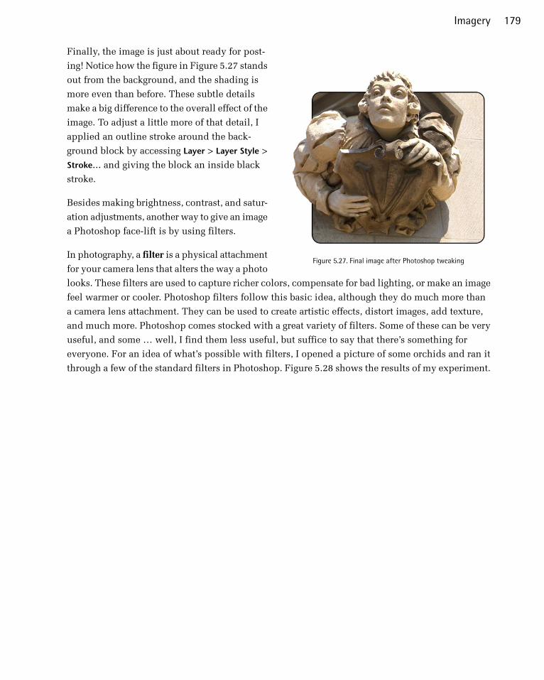
Figure 5.27. Final image after Photoshop tweaking
Finally, the image is just about ready for post-
ing! Notice how the figure in Figure 5.27 stands
out from the background, and the shading is
more even than before. These subtle details
make a big difference to the overall effect of the
image. To adjust a little more of that detail, I
applied an outline stroke around the back-
ground block by accessing Layer > Layer Style >
Stroke… and giving the block an inside black
stroke.
Besides making brightness, contrast, and satur-
ation adjustments, another way to give an image
a Photoshop face-lift is by using filters.
In photography, a filter is a physical attachment
for your camera lens that alters the way a photo
looks. These filters are used to capture richer colors, compensate for bad lighting, or make an image
feel warmer or cooler. Photoshop filters follow this basic idea, although they do much more than
a camera lens attachment. They can be used to create artistic effects, distort images, add texture,
and much more. Photoshop comes stocked with a great variety of filters. Some of these can be very
useful, and some … well, I find them less useful, but suffice to say that there’s something for
everyone. For an idea of what’s possible with filters, I opened a picture of some orchids and ran it
through a few of the standard filters in Photoshop. Figure 5.28 shows the results of my experiment.
179Imagery
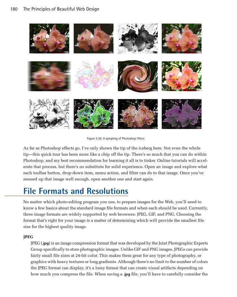
Figure 5.28. A sampling of Photoshop filters
As far as Photoshop effects go, I’ve only shown the tip of the iceberg here. Not even the whole
tip—this quick tour has been more like a chip off the tip. There’s so much that you can do within
Photoshop, and my best recommendation for learning it all is to tinker. Online tutorials will accel-
erate that process, but there’s no substitute for solid experience. Open an image and explore what
each toolbar button, drop-down item, menu action, and filter can do to that image. Once you’ve
messed up that image well enough, open another one and start again.
File Formats and ResolutionsNo matter which photo-editing program you use, to prepare images for the Web, you’ll need to
know a few basics about the standard image file formats and when each should be used. Currently,
three image formats are widely supported by web browsers: JPEG, GIF, and PNG. Choosing the
format that’s right for your image is a matter of determining which will provide the smallest file
size for the highest quality image.
JPEG
JPEG (.jpg) is an image compression format that was developed by the Joint Photographic Experts
Group specifically to store photographic images. Unlike GIF and PNG images, JPEGs can provide
fairly small file sizes at 24-bit color. This makes them great for any type of photography, or
graphics with heavy textures or long gradients. Although there’s no limit to the number of colors
the JPEG format can display, it’s a lossy format that can create visual artifacts depending on
how much you compress the file. When saving a .jpg file, you’ll have to carefully consider the
The Principles of Beautiful Web Design180

amount of compression you apply. As you can see in Figure 5.29, a highly compressed image
might be great for page load speed, but if you go as far as I did with the rightmost strawberry,
it’s very unappetizing.
Figure 5.29. An image of a strawberry saved at increasingly higher levels of JPEG compression
GIF
GIF (Graphics Interchange Format) is an 8-bit format that compresses files on the basis of the
number of colors in the image. Although the compression ratio of the GIF format is good, it
supports a maximum of only 256 colors, and is therefore useless for photographic pages. Two
nifty features of GIF are that it displays transparency (see figure Figure 5.30), and supports an-
imation. In the late 1990s, UNISYS (the company behind the compression algorithm used in
GIF images) tried to claim that GIF was a proprietary format, and charged companies royalties
for any program that created GIF files. This—as well as the 256-color limitation of the format—led
to the creation of the PNG format. Although the GIF format is still widely used on the Web,
using PNG instead is strongly encouraged.
Figure 5.30. A transparent GIF and a 24-bit PNG, shown against different backgrounds
PNG
The PNG (Portable Networks Graphics) format was developed by the W3C as an alternative to
GIF. The lossless compression style of the PNG algorithm works similarly to that of GIF, in that
files with fewer colors end up having the smallest file sizes. PNG images can be saved in either
181Imagery

8-bit or 24-bit format. Both of these flavors of PNG support transparency, but transparency in
24-bit PNG images is implemented by means of an alpha channel that sits alongside the red,
green, and blue channels; this means that each pixel in a PNG image can have up to 256 different
levels of opacity. The effects of this difference are illustrated in Figure 5.30—notice that you
can still see the background image through the PNG image, while the GIF is either completely
opaque or completely transparent. 8-bit transparency is like that of the GIF in Figure 5.30—it’s
either on or off. Therefore, if you plan to put your transparent PNG image over a different
background image or texture, you’ll have to modify the image so that the opaque edges match
the background. I’m hoping that by the time you read this, we’re no longer coding websites for
IE6, but just in case, 24-bit transparency is only supported in IE7 and up. Other than IE6, file
size is another reason to consider saving your PNGs as 8-bit. The 24-bit version of an image can
be several times the size of its 8-bit cousin.
Creative Image TreatmentsOnce you’ve inserted your JPEG, PNG, or GIF image into your web page, you may still find yourself
a bit underwhelmed by its presentation. By default, images that are placed on a web page using an
HTML <img> tag sit inline with the text that surrounds them. A hyperlinked image typically has a
rather unattractive blue border. Not a very exciting default presentation, but that’s what CSS is there
for. What if you want to give an image a frame like one you might use to display a picture on your
wall? What if you want an image to have a border around it that makes it look like a Polaroid picture?
Perhaps you want it to have corner tabs like the ones you’d use to stick an image in a photo album.
In each of these cases, you have two options: apply your desired effects directly to the photo using
image-editing software, or use CSS background images and borders to style the image within your
web page.
Using Images to Enhance ImagesAltering an image to add borders, edge effects, and transparency may seem like minimal hassle. It
only takes a few minutes in Photoshop to give a photo the look you want. But problems can arise
if you have to give every image on a website the same look. And what would happen if you had to
add new images or change any of the existing pics? In either case, a task that would normally involve
only a minor change to your HTML, plus a second or two to copy the new photo to the web server,
might take half an hour or more. On top of that, the whole point of semantic markup is to separate
style from content. An image in the content of a website is just that: a piece of content.
With CSS turned off, the portfolio of graphic and web designer Wing Cheng22 simply looks like a
page full of images, as shown in Figure 5.31.
22 http://wingcheng.com/
The Principles of Beautiful Web Design182
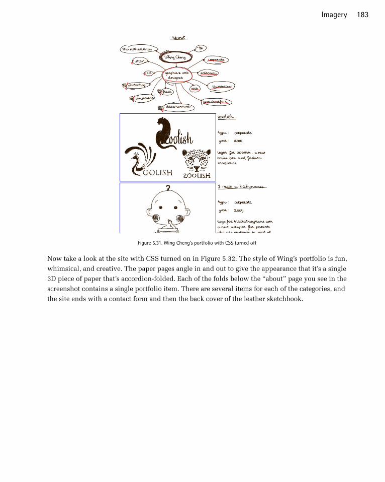
Figure 5.31. Wing Cheng’s portfolio with CSS turned off
Now take a look at the site with CSS turned on in Figure 5.32. The style of Wing’s portfolio is fun,
whimsical, and creative. The paper pages angle in and out to give the appearance that it’s a single
3D piece of paper that’s accordion-folded. Each of the folds below the “about” page you see in the
screenshot contains a single portfolio item. There are several items for each of the categories, and
the site ends with a contact form and then the back cover of the leather sketchbook.
183Imagery

Figure 5.32. The creative portfolio of Wing Cheng
If Wing incorporated the alternating page textures into the background of each portfolio item, the
file size of each image would be much larger, and the site would have taken a very long time to
load. Instead, there are just two different paper textures; one angled in at the bottom and one angled
out. These are applied as 24-bit PNG background images on the div elements that contain each
portfolio item. If she wants to add a new portfolio item, she only needs to shuffle the background
images in the CSS, rather than having to recreate all the images for her entire portfolio.
In this example, the portfolio images were the content, and they were enhanced by the 3D paper
backgrounds placed behind them.
Using Pure CSS to Enhance ImagesApplying a background or overlay is a great way to give your content images a unique and unified
look. Of course, not all CSS-based image effects involve extra images. CSS borders provide myriad
possible effects. As you may already know, the standard CSS2 borders have three properties—width,
style, and color—which are controlled individually via the border-width, border-style, and
border-color properties, and by the shorthand border property. The border-width and border-
color properties are fairly self-explanatory. border-width sets the thickness of the border using
either a CSS measurement (such as 1px or 0.5em) or a keyword (one of thin, medium, or thick).
The border-color property takes a hexadecimal color value.
The Principles of Beautiful Web Design184
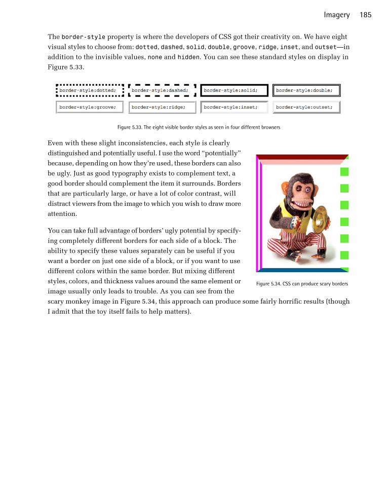
The border-style property is where the developers of CSS got their creativity on. We have eight
visual styles to choose from: dotted, dashed, solid, double, groove, ridge, inset, and outset—in
addition to the invisible values, none and hidden. You can see these standard styles on display in
Figure 5.33.
Figure 5.33. The eight visible border styles as seen in four different browsers
Figure 5.34. CSS can produce scary borders
Even with these slight inconsistencies, each style is clearly
distinguished and potentially useful. I use the word “potentially”
because, depending on how they’re used, these borders can also
be ugly. Just as good typography exists to complement text, a
good border should complement the item it surrounds. Borders
that are particularly large, or have a lot of color contrast, will
distract viewers from the image to which you wish to draw more
attention.
You can take full advantage of borders’ ugly potential by specify-
ing completely different borders for each side of a block. The
ability to specify these values separately can be useful if you
want a border on just one side of a block, or if you want to use
different colors within the same border. But mixing different
styles, colors, and thickness values around the same element or
image usually only leads to trouble. As you can see from the
scary monkey image in Figure 5.34, this approach can produce some fairly horrific results (though
I admit that the toy itself fails to help matters).
185Imagery
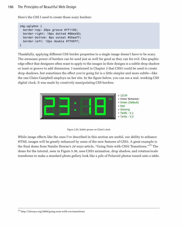
Here’s the CSS I used to create those scary borders:
img.uglybox { border-top: 20px groove #ff1100; border-right: 16px dotted #66ee33; border-bottom: 8px outset #00aaff; border-left: 12px double #ff00ff; }
Thankfully, applying different CSS border properties to a single image doesn’t have to be scary.
The awesome power of borders can be used just as well for good as they can for evil. One graphic
edge effect that designers often want to apply to the images in their designs is a subtle drop shadow
or inset or groove to add dimension. I mentioned in Chapter 3 that CSS3 could be used to create
drop shadows, but sometimes the effect you’re going for is a little simpler and more subtle—like
the one Claire Campbell employs on her site. In the figure below, you can see a real, working CSS
digital clock. It was made by creatively manipulating CSS borders.
Figure 5.35. Subtle groove on Claire's clock
While image effects like the ones I’ve described in this section are useful, our ability to enhance
HTML images will be greatly enhanced by some of the new features of CSS3. A great example is
the final demo from Natalie Downe’s 24 ways article, “Going Nuts with CSS3 Transitions.”23 The
demo for the tutorial, seen in Figure 5.36, uses CSS3 animation, drop shadow, and rotation/scale
transforms to make a standard photo gallery look like a pile of Polaroid photos tossed onto a table.
23 http://24ways.org/2009/going-nuts-with-css-transitions
The Principles of Beautiful Web Design186
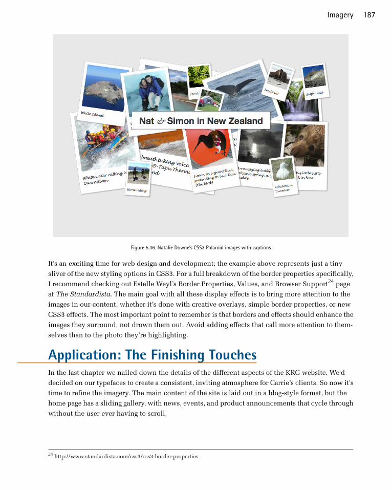
Figure 5.36. Natalie Downe’s CSS3 Polaroid images with captions
It’s an exciting time for web design and development; the example above represents just a tiny
sliver of the new styling options in CSS3. For a full breakdown of the border properties specifically,
I recommend checking out Estelle Weyl’s Border Properties, Values, and Browser Support24 page
at The Standardista. The main goal with all these display effects is to bring more attention to the
images in our content, whether it’s done with creative overlays, simple border properties, or new
CSS3 effects. The most important point to remember is that borders and effects should enhance the
images they surround, not drown them out. Avoid adding effects that call more attention to them-
selves than to the photo they’re highlighting.
Application: The Finishing TouchesIn the last chapter we nailed down the details of the different aspects of the KRG website. We'd
decided on our typefaces to create a consistent, inviting atmosphere for Carrie’s clients. So now it's
time to refine the imagery. The main content of the site is laid out in a blog-style format, but the
home page has a sliding gallery, with news, events, and product announcements that cycle through
without the user ever having to scroll.
24 http://www.standardista.com/css3/css3-border-properties
187Imagery

The most important thing about the imagery is that the individual images needed to be inviting,
while evoking an emotional connection with visitors. One thing that her old site didn’t do was
connect on a personal level with anyone. It was mainly static text, together with an image of Carrie.
Using the right content was key in striking an emotional connection with the site visitors. To start
the process of finding the right imagery, I searched my business stock photography account for
images regarding pain. One of the main images on the site is of a man holding his lower back while
sitting in an office atmosphere. This image should connect with anyone in the situation where
they’ve had try and make it through the work day, even though they were in pain. Coupled with
two simple lines of marketing copy, the message is highly effective.
Figure 5.37. Making an emotional connection by empathy
The three columns of text under the slider also needed some imagery to catch the eye. The first
image is a reflexology illustration from a paid stock photography site. This was necessary, because
it illustrates the parts of the body affected by reflexology, but in a creative, visual way.
The last two images are illustrations, created in Adobe Illustrator. One is a vector illustration of
one of the machines KRG uses, shown in Figure 5.38. I used a photo for reference, but simplified
it, without including any of the words, text or graphics that are usually found on the machine. Many
who come to the site don’t have any idea what Reflexology is, so an image of a “mysterious machine”
is sure to pique interest. The graphic is simple, yet effective.
The Principles of Beautiful Web Design188

Figure 5.38. The in-progress illustration of the PEMF machine
The third image is a graphic of their thermography, or thermal imaging service. It is a good way to
analyze blood flow throughout the body, and a custom graphic to illustrate this concept jumps out
to the viewer against the dark green and the stark, sterile background. The position of the arms is
a typical pose that’s made while the test is performed.
There are a handful of important things to remember when using multiple images in a row: It’s a
good idea to keep them the same height, so they line up, otherwise you may run into alignment issues.
Also, I saved each vector graphic as a transparent PNG, so there wouldn’t be a background or box
around each image. The columns are close together, and the images wouldn’t have enough breathing
room with their backgrounds.
Coming up with the inspiration for these images and graphics wasn’t difficult. When I was in Carrie’s
office, I just looked around and took in all of the imagery that correlated with her business. Integ-
rating things that I saw when I was at the location ties together her business and her website.
189Imagery

Figure 5.39. The final design, with images
Onward and UpwardOne of the most exciting aspects about designing for the Web is the sense of community and inter-
action that exists among web professionals. Whether it’s on blog comments, Twitter, Dribbble,25 or
even local tech meetups, there are always talented people who are willing to share their opinions,
techniques, and expertise. The design community truly is an invaluable resource—but it can also
become an unnecessary crutch. I’m always looking for new sources of inspiration, and because
there are so many authoritative designers out there who offer their ideas and portfolios online, it
would be easy for me to find all the inspiration I need from web design alone. In and of itself, that
isn’t so bad, but if every web designer is getting their ideas from other web designers, eventually
we’ll all end up with the same designs.
While the design principles and guidelines I’ve discussed throughout this book can help you make
aesthetically pleasing and practical design decisions, they’re no substitute for character and origin-
ality. The most important attributes you can bring to the design table are your own personality,
experiences, and interests. These three resources should form the foundations of your design work.
If every designer spent less time trying to emulate the latest design trends and more time defining
their own style, the Web would be a much more interesting place. While I’d love to be able to tell
you how to define your own style, I’m continually trying to learn what this is for myself. I wish
you the best of luck in your future design endeavors, and hope you’ve found this book to be both
helpful and encouraging as you kick off a career—or hobby—in web design.
25 http://dribbble.com/
The Principles of Beautiful Web Design190