basics of spreadsheet design - rider.edu · basics of . spreadsheet design . using . ... your game...
TRANSCRIPT
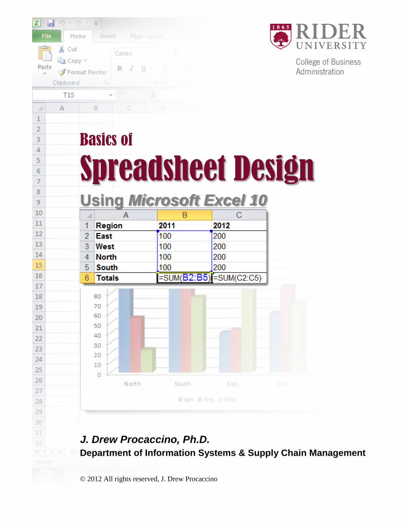
Basics of
Spreadsheet Design Using Microsoft Excel 10 J. Drew Procaccino, Ph.D. Department of Information Systems & Supply Chain Management © 2012 All rights reserved, J. Drew Procaccino

pg. 2
Preface This booklet was originally developed during a fall 2011 sabbatical granted by Rider University. Its purpose is to provide basic knowledge and skills for spreadsheet design and development. I have created and used spreadsheets both personally and professionally for almost 30 years, and have taught spreadsheet design at the college level over 15 years. In my opinion, introductory textbooks are often somewhat deficient in their presentation of some of the fundamentals of spreadsheets, including cell references and formulas. This booklet is my spin on explaining this information to both students and professionals. It is a work-in-progress, so I welcome your feedback ([email protected]). Drew Procaccino Sweigart Hall, Room 315 2083 Lawrenceville Road Lawrenceville, NJ 08648 (609) 896-5259 This document was created in Microsoft Word 10. Screens were captured with TechSmith SnagIt 10, with additional graphics prepared in Microsoft PowerPoint 10 and Adobe Photoshop CS5.1. Microsoft, Excel and PowerPoint are registered trademarks of Microsoft Corporation. TechSmith and SnagIt are registered trademarks of TechSmith Corporation. Adobe and Photoshop are registered trademarks of Adobe Corporation.

Contents
1 Spreadsheets Ya gotta love ‘em!
5 Introduction 6 Cells, Worksheets & Workbooks 7 Elements of Microsoft Excel 7 Your Game Plan 9 Chapter Questions
2 Formulas The power behind a spreadsheet
13 Introduction 14 Cells and Cell References 15 Formulas: 17 Order of Operations 18 Using Auto Fill With Formulas 20 Editing Formulas 20 Viewing Formulas 20 Relative Cell References 24 Absolute Cell References 28 Mixed Cell References 31 Summary of Cell References 32 Multi-Worksheet Formulas 35 Formula Hints 36 Chapter Questions
3 Functions Pre-defined jewels that make life easier
41 Introduction 43 Math & Trig: 43 SUM 44 SUMIF
44 Statistical: 45 AVERAGE 45 COUNT 45 COUNTIF 46 MEDIAN 46 MODE 46 MAX 46 MIN
?? Date/Time: 47 TODAY 47 NOW
47 Financial: 47 PMT
48 Logical: 48 IF
52 Chapter Questions
4 Formatting Making spreadsheets professional & easy to read
55 Introduction 56 Aligning Cell Contents 56 Formatting Numeric Cells 58 Widening Columns 59 Formatting Column Headings 60 Chapter Questions
5 Charting A picture’s worth a thousand words…if done wisely
61 Introduction 62 Type of Data 63 Type of Analysis 64 Chart Selection 66 Chart Types: 67 Column 69 Line 71 Pie 72 Bar 73 Area 74 XY (Scatter) 76 Stock 77 Surface 79 Donut 80 Bubble 81 Radar 82 Creating Charts 84 Resizing Charts 84 Moving Charts 86 Chapter Questions
6 Printing Preparing a spreadsheet to go from screen to paper
87 Introduction

pg. 4
7 Sorting Ordering rows within a spreadsheet
93 Introduction
References
Index
Appendices:
A: Shortcut Keyboard Combinations
B: Auto Fill
C: Qualitative/Quantitative Data
D: Microsoft Excel 10 Specifications
E: Solutions To Chapter Questions

pg. 5
1 Spreadsheets: Ya gotta love ‘em!
Spreadsheets (or electronic spreadsheets) refer to a category of computer software applications that are extremely useful for analyzing numeric data (sometimes referred to as “number crunching”), creating graphics analysis through charts, and managing lists. Originally introduced in 1985, Microsoft Excel has become the most widely used spreadsheet application, which is why it was chosen as the ‘working’ application for this booklet. Other products in the category of spreadsheet applications have included VisiCalc (first introduced in 1979 for the Apple II computer, it was the first electronic spreadsheet), Supercalc (1980), Lotus 1-2-3 (1983), Microsoft Multiplan (1983) and Appleworks (1984).
We begin by discussing the basic concepts of cells, worksheets and workbooks, followed by some important on-screen elements of Excel and some guidelines for designing spreadsheets. We also include notations used in this booklet.
Key Chapter Terms:
• Active Cell • Cell • ChartSheet • Column Heading • Fill Handle
• Formula Bar • Row • Row Heading • Workbook • Worksheet

pg. 6
Cells, Worksheets & Workbooks Columns are labeled by letters from left to right, the first 26 of which are labeled A, B, C…Z. For columns beyond that, labels just include a second letter: AA-AZ, BA-BZ, etc., (and then a third letter, and so on), up to a maximum of 16,384 columns. Rows are labeled in sequence in number sequence from the top down, up to a maximum of 1,048,576. A cell is formed at the intersection of a given column and row. They are the fundamental building blocks of a spreadsheet. A cell’s column and row combine to form a cell reference (or ‘address’). Cell references include a column (letter) first, followed by a row (number). So, for example, the cell reference of the fifth column and tenth row is E10 (not 10E).
Columns and rows, and, subsequently, cells, make up a worksheet. There can be a maximum of over 17 billion cells in a single worksheet, with a ‘matrix’ of 16,384 columns by 1,048,576 rows…good times! A workbook is the file (or ‘document’) that a spreadsheet application creates, and it contains at least one worksheet. And the maximum number of worksheets is limited only by your computer’s memory!
Excel includes three worksheets by default in a new workbook. They are initially named SHEET1, SHEET2 and SHEET3…not very original, but they can easily be renamed (see Ch. 5). Conceptually, a workbook is similar in structure to a word processing document where multiple pages form a document and are stored under a single file name. When a workbook is saved under a name, for example BUDGET.XLSX, all associated worksheets are saved under this name within this workbook. The maximum number of worksheets that can be contained within a given workbook is limited only by the memory of your computer. Worksheets can be inter-connected and related through formulas as part of a larger dynamic numeric model (see Ch. 2).
Fig. 1-1 to the right illustrates the ‘building blocks’ of spreadsheet design and creation.
Lastly, in addition to worksheets, an Excel workbook can include one or more ChartSheets. These are specialized sheets within a workbook that contain only a chart, with no rows, columns or cells (see Ch. 4).
Fig. 1-1: Spreadsheet Building Blocks

pg. 7
Elements of Microsoft Excel In Fig. 1-2 below, we have labeled some items in Excel that are important to understanding spreadsheets, including:
• Command Tabs: conceptually divide major concepts in Excel, providing access to commands and options.
• Ribbon: presents buttons and drop-down lists associated with each command tab. • Name Box: indicates the currently active cell, either by its column and row designation or a
name (if applicable). • Row Headings: numerically label each row in sequence, from top to bottom. • Column Headings: alphabetically label each column, from left to right. • Formula Bar: shows the contents of the active cell. • Active Cell: is indicated by a thick black border. This is the cell where new data will appear or
existing data can be edited. • Fill Handle: is used to Auto Fill text/labels, values or formulas.
Fig. 1-2: Excel Elements
Your Game Plan To begin work on a new worksheet, consider these steps to get up and running:
1. In general, try to visualize the number of columns and rows you will need to present your information. Do you see any opportunities to split up an otherwise single large worksheet (many rows and/or columns) into more logical, manageable “units”? For example, if you had a worksheet with yearly totals for payroll numbers of 10 employees, you would only have 10 rows of data, which easily lays out on a single worksheet. However, suppose you had to track weekly data for each employee. In this case, you might want to consider using a separate worksheet for each month, for example. (See Ch. 5 for our discussion of how to create formulas that combine data from multiple worksheets on to a ‘summary’ worksheet, so called 3-D formulas.)
2. Enter the text/labels that will identify your columns, rows and cells. In general, begin on row 1, perhaps column A, and then save your workbook! (See Ch. 2)
3. Enter your values, and then save your workbook! (See Ch. 2) 4. Enter your formulas, and then save your workbook! Depending on the complexity of your formulas,
you might want to test your formulas with ‘simple’ values that will assist you in finding any errors.
Column Headings (A, B,…I)
Row Headings
(1,2…6)
Active Cell
Formula Bar
Command Tabs
Name Box (cell name of
active cell)
Ribbon
Fill Handle

pg. 8
Never assume that your worksheet has necessarily provided you with correct results! You need to consider that you might have constructed a formula incorrectly (for example, perhaps you didn’t include every cell that you intended to add), thereby resulting in an incorrect result. (See Ch. 2)
5. Edit your formulas as needed (this is discussed in Ch. 2) Save your workbook! 6. Enter your values, and then save your workbook! 7. Create any charts that you may need, and then save your workbook!

pg. 9
Chapter Questions
Short Answer 1. How is a worksheet and a workbook related? ___________________________
2. Does the file BUDGET.XLSX represents a worksheet or a workbook? ___________________________
3. What is a cell? ___________________________
4. How are columns labeled? ___________________________
5. How are rows labeled? ___________________________
6. What is a cell reference? ___________________________
7. Give an example of a cell reference. ___________________________
8. What is the cell reference for the 10th column and 10th row? ___________________________
Matching 1. ______ are typically entered first in a new worksheet.
2. A ______ is formed at the intersection of a given column and row.
3. A least one ______ is contained in a workbook.
4. ______ are typically entered after labels in a new worksheet.
5. Spreadsheet applications, such as Microsoft Excel, produce a file called a ______.
6. Rows are labeled with ______.
7. Columns are labeled with ______.
8. ______ are typically entered after labels and values in a new worksheet.
9. A vertically arranged group of cells is called a ______.
10. A horizontally arranged group of cells is called a ______.
A. Worksheet
B. Row
C. Letters
D. Values
E. Cell
F. Numbers
G. Column
H. Formulas
I. Workbook
J. Labels
Multiple-Choice 1. A ______ refers to a category of computer software applications that can be extremely useful for analyzing numeric
data. A. spreadsheet B. workbook C. cell D. formula
2. Spreadsheet applications, such as Microsoft Excel, produce a file called a ______.
A. spreadsheet B. workbook C. cell D. formula
3. A least one ______ is contained in a workbook.
A. spreadsheet B. workbook C. cell D. worksheet

pg. 10
4. A worksheet is made up of ______ and ______. A. workbooks B. functions C. formulas D. columns, rows
5. A vertically arranged group of cells is called a ______.
A. column B. row C. cell D. worksheet
6. A horizontally arranged group of cells is called a ______.
A. column B. row C. cell D. worksheet
7. Cell E20 is the intersection of the ___ column and ___ row.
A. 4th, 20th B. 20th, 5th C. 5th, 20th D. 4th, 20th
8. A ______ is formed at the intersection of a given column and row.
A. cell B. workbook C. cell D. formula
9. Letters (A. B, C, etc.) are used as ___ designations in a worksheet.
A. column B. row C. formula D. function
10. Numbers (1. 2, 3, etc.) are used as ___ designations in a worksheet.
A. column B. row C. formula D. function
11. ______ are typically entered first in a new worksheet.
A. values B. formulas C. labels D. none of the above
12. ______ are typically entered second in a new worksheet.
A. values B. formulas C. labels D. none of the above
13. ______ are typically entered third in a new worksheet.
A. values B. formulas C. labels D. none of the above

pg. 11
14. All of the following are examples of cell references, except ______. A. C10 B. Z500 C. 1A D. AA10500
15. BUDGET.XLSX is the name of a ______.
A. spreadsheet B. worksheet C. cell D. workbook
16. Quarter 1 is a ______ cell entry.
A. text/label B. value C. formula D. none of the above
17. United States is a ______ cell entry.
A. text/label B. value C. formula D. none of the above
18. 145,234 is a ______ cell entry.
A. text/label B. value C. formula D. none of the above
19. 12/31/2000 is a ______ cell entry.
A. text/label B. value C. formula D. none of the above
20. December 31, 2000 is a ______ cell entry.
A. text/label B. value C. formula D. none of the above
21. C+Y3 is a ______ cell entry.
A. text/label B. value C. formula D. none of the above
22. =C6+Y3 is a ______ cell entry.
A. text/label B. value C. formula D. none of the above
23. In an Excel formula, the symbol for addition is ______.
A. + B. - C. * D. / E. ^

pg. 12
24. In an Excel formula, the symbol for subtraction is ______. A. + B. - C. * D. / E. ^
25. In an Excel formula, the symbol for multiplication is ______.
A. + B. - C. * D. / E. ^
26. In an Excel formula, the symbol for division is ______.
A. + B. - C. * D. / E. ^
27. In an Excel formula, the symbol for exponentiation is ______.
A. + B. - C. * D. / E. ^
28. ___ are typically entered first in a new workbook.
A. Text/labels B. Values C. Formulas D. Functions E. Charts
29. ___ are typically entered second in a new workbook.
A. Text/labels B. Values C. Formulas D. Functions E. Charts
30. ___ are typically entered third in a new workbook.
A. Text/labels B. Values C. Formulas D. Functions E. Charts

pg. 13
2 Formulas: The power behind a spreadsheet
Formulas are the computation power behind a spreadsheet. This chapter presents the fundamentals of creating formulas, including the various types of cell references that can appear in a given formula. Also included is a brief discussion of creating a formula that references cells located on multiple worksheets. We conclude with a few formula-related hints.
Key Chapter Terms: • Absolute cell reference • AutoFill • Cell reference • Formula • Mixed cell reference
• Order of operations • Relative cell reference • Text/label • Value
pg. 14
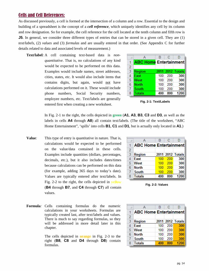
Cells and Cell References: As discussed previously, a cell is formed at the intersection of a column and a row. Essential to the design and building of a spreadsheet is the concept of a cell reference, which uniquely identifies any cell by its column and row designation. So for example, the cell reference for the cell located at the tenth column and fifth row is J5. In general, we consider three different types of entries that can be stored in a given cell. They are (1) text/labels, (2) values and (3) formulas and are usually entered in that order. (See Appendix C for further details related to data and associated levels of measurement.)
Text/label: A cell containing text-based data is non-quantitative. That is, no calculations of any kind would be expected to be performed on this data. Examples would include names, street addresses, cities, states, etc. It would also include items that contains digits, but again, would not have calculations performed on it. These would include phone numbers, Social Security numbers, employee numbers, etc. Text/labels are generally entered first when creating a new worksheet.
Fig. 2-1: Text/Labels
In Fig. 2-1 to the right, the cells depicted in green (A1, A3, B3, C3 and D3, as well as the labels in cells A4 through A8) all contain text/labels. (The title of the worksheet, “ABC Home Entertainment”, ‘spills’ into cells B1, C1 and D1, but is actually only located in A1.)
Value: This type of entry is quantitative in nature. That is,
calculations would be expected to be performed on the value/data contained in these cells. Examples include quantities (dollars, percentages, decimals, etc.), but it also includes dates/times because calculations can be performed on this data (for example, adding 365 days to today’s date). Values are typically entered after text/labels. In Fig. 2-2 to the right, the cells depicted in yellow (B4 through B7, and C4 through C7) all contain values.
Fig. 2-2: Values
Formula: Cells containing formulas do the numeric
calculations in your worksheets. Formulas are typically created last, after text/labels and values. There is much to say regarding formulas, so they will be addressed in more detail later in this chapter.
The cells depicted in orange in Fig. 2-3 to the
right (B8, C8 and D4 through D8) contain formulas.

pg. 15
Fig. 2-3: Formulas In order to enter anything into a cell (text/label, value or formula), or format a cells, you generally first select
that cell. Selecting a cell makes that it active, and that is done by simply pointing to a given cell with your mouse pointer and then clicking your left button once. Your mouse pointer must be . The active cell has a dark, heavy border around it.
(Alternatively, you can use the up <>, down <>, left <> and right <> keys on your keyboard to select different cells.)
If you need to move a selected cell or cells, this can be done through a clicking & dragging. You need to carefully point to and hold your mouse point on any edge of the dark, heavy border of your selected cell(s). When your mouse pointer is a four-sided
arrow, click & drag the cell(s) to its new location. If you drop your cell(s) onto a cell(s) that already contains information (text/labels, values or formulas), you will receive a message indicating that information will be replaced if you proceed.
When working with spreadsheets, you often need to refer to a range of adjacent cells, either arranged horizontally or vertically. For example, in the figure above, the range of cells that includes the four Region labels is the vertical range of cells A4, A5, A6 and A7. Excel utilizes the following notation to simplify such a range by using the first cell reference in the range, followed by a colon (:), and then the ending cell reference. So the notation for cells A4, A5, A6 and A7 is A4:A7. The notation for a horizontal range of cells works the same way. It is helpful at this point in our discussion to mention the three main on-screen pointers that are essential to working in Excel. We list them below in order of most to least commonly used:
• The pointer used to select (or highlight) a cell or range of cells: • The pointer used to Auto Fill the contents of a cell or range of cells: • The pointer used to move (by clicking & dragging) a cell or range of cells:
To select a group of adjacent cells (A1:A4, in the example to the right), click & drag that group of cells with your pointer as a . (You will notice that the first cell of your selected group is white and the remainder is black. Note, however, that all selected cells do have a dark, heavy border.) To select cells that are
nonadjacent, (1) click (& drag if more than one cell) the first cell to be selected, (2) then hold the <Ctrl> key on your keyboard, and (3) then click (& drag if more than one cell) the remaining cell.
Formulas: As fascinating as we’re sure you found the discussion of text/labels and values, we have only begun to present formulas! You may wonder why we don’t just don’t dust off our calculator (or if you can do addition in your head), do the math and then type the results into our worksheet. The problem with that is you might make a mistake, it can be quite tedious and lastly, what if any of the values changed? Wouldn’t it be great to have the results of your math change automatically? That is what formulas will do for you! They are the ‘guts’ of your quantitative analysis, as they represent the real power of a spreadsheet. Basically, formulas do the math for
HOW TO… select a cell
HOW TO… select an adjacent & non-adjacent group of cells
HOW TO… move a cell

pg. 16
you, so if you’re not a big fan of raising 20 to the power of 10, or figuring out the average of the gross national product of every industrialized country on earth, you’re going to love this! However, you do have some work to do, as you need to correctly set up your formulas, and then Excel will handle all of the calculations. And that’s where the fun is…correctly setting up your formulas so they are (1) mathematically correct, and (2) are constructed so they can be re-used in other cells in your worksheet where appropriate.
First of all, every formula begins with an equal sign (=). Not some of them or almost all of them, but every one, no exceptions! Most formulas usually include at least one type of mathematic operation. You may use a formula from time to time that doesn’t actually do any math, but we don’t need to consider those cases at the moment. Mathematic operations include exponentiation (raising a number to a power), multiplication, division, addition and subtraction. Excel can also do comparisons, including equal to, less than, greater than, etc. Table 2-1 summarizes these operations and the symbols that Excel associates with each.
Operation Symbol Parenthesis ( ) Equal = Addition + Subtract - Multiplication * Division / Exponent ^ Greater than > Greater than or equal to
>=
Less than < Less than or equal to <= Not equal to <>
Table 2-1: Excel Mathematical Symbols
Many formulas also contain one or more cell references, of which there are three types: relative, absolute and mixed. (These three types of references are discussed in detail later in this chapter.) Since a cell is defined as the intersection of a column and a row, regardless of the type of cell reference, each must include a column (designated by a letter) and row (designated by a number). The primary difference between them comes into play when, in an effort to save time, you attempt to copy & paste or Auto Fill a formula (discussed later in this section) your formulas to additional cells. Although figuring out which type of cell reference is the most appropriate may take a little more time in some cases, it will save you much more time in the long run, particularly when you begin to development more complicated and larger worksheets. Formulas can also contain one or more constant values. The problem with this, however, is that if any of these values needed to be changed due to error or other reasons, you would need to edit/replace those formulas in order to include the corrected/changed value(s). A better concept when constructing formulas is to consider placing any constant value in its own cell, then reference that cell’s address in your formulas (as opposed to typing the value directly into your formula). Now when you need to update that value, simply do so in the referenced cell, rather than in the formula itself, and your formula will update its result automatically! This is one of the great abilities of a spreadsheet. The ability to run such a “what-if” analysis with your worksheets is greatly enhanced when constant (values) are included in your formulas because your formulas do not need to be edited for any given scenario because only the values in the referenced cells need to be changed.

pg. 17
To illustrate, Fig. 2-4 to the right depicts a formula that will calculate the proposed bonus for Employee 1 by multiplying the employee’s Current Salary, located in cell B2, by the Bonus Pct of 5%, which has been typed into the formula as a constant value. Mathematically, this is fine. The problem is what happens if you want to see the result of a different Bonus Pct, say 4.5% or 6% or whatever? You would have to edit/replace each of the formulas in cells C2:C6.
Fig. 2-4
A better solution is to reference a cell containing the value representing the Bonus Pct, in this case, cell B8, as shown in Fig. 2-5 to the right. Now if you wanted to see the result of a different Bonus Pct, simply enter the new percent in cell B8 and all of the related formulas are automatically recalculated!
Fig. 2-5
To further illustrate what is happening when you reference a cell in a formula, rather than simply type the value contained in that cell in the formula, check out Fig. 2-6 to the right. The arrows are intended to graphically re-enforce the concept of referencing of a cell, in this case, B8.
Fig. 2-6
Order of Operations
Recall from algebra class that a given mathematical equation can produce significantly different results depending on the order that various operations are evaluated. This concept is equally critical to accurate calculations in Excel, which are achieved through the use of formulas. Excel follows these same algebraic rules regarding the order of operations (rules of precedence):
1. Any mathematical operations contained within parenthesis, 2. Exponents (“raised to the power of”), 3. Multiplication and division (if both are present, do leftmost calculation first, from left to right), 4. Addition and subtraction (if both are present, do leftmost calculation first, from left to right), 5. Comparisons (greater/less than, equal to, not equal to).
So to summarize the contents of formulas, they must begin with an equal sign, and may contain one or more cell references, mathematical symbols and values. They can also contain functions, which will discuss in more detail later in this chapter. These elements, or constructs, of formulas are part of the formula’s syntax. The syntax of a formula can be thought of as its structure, which is important because Excel needs formulas to be presented in a particular form. We will discuss syntax forms in more detail later in our discussion of formulas and functions.
pg. 18
Suppose you have constructed the formula to add the 2011 values for the four regions, East, West, North and South in cell B6. The formula you used is =B2+B3+B4+B5, which Excel ‘reads’ as:
“Add the four cells immediately above my current location (second column, 6th row) and place the result in that location.”
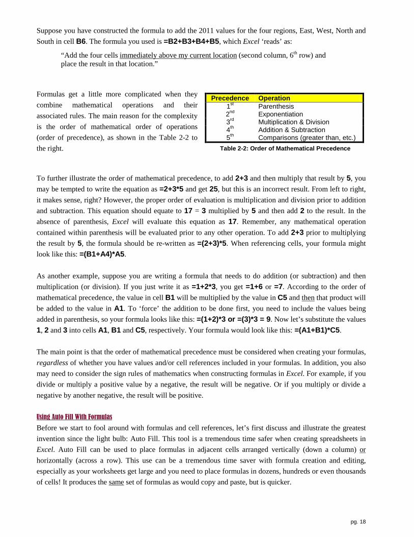
Formulas get a little more complicated when they combine mathematical operations and their associated rules. The main reason for the complexity is the order of mathematical order of operations (order of precedence), as shown in the Table 2-2 to the right. Table 2-2: Order of Mathematical Precedence
Precedence Operation 1st Parenthesis 2nd Exponentiation 3rd Multiplication & Division 4th Addition & Subtraction 5th Comparisons (greater than, etc.)
To further illustrate the order of mathematical precedence, to add 2+3 and then multiply that result by 5, you may be tempted to write the equation as =2+3*5 and get 25, but this is an incorrect result. From left to right, it makes sense, right? However, the proper order of evaluation is multiplication and division prior to addition and subtraction. This equation should equate to 17 = 3 multiplied by 5 and then add 2 to the result. In the absence of parenthesis, Excel will evaluate this equation as 17. Remember, any mathematical operation contained within parenthesis will be evaluated prior to any other operation. To add 2+3 prior to multiplying the result by 5, the formula should be re-written as =(2+3)*5. When referencing cells, your formula might look like this: =(B1+A4)*A5. As another example, suppose you are writing a formula that needs to do addition (or subtraction) and then multiplication (or division). If you just write it as =1+2*3, you get =1+6 or =7. According to the order of mathematical precedence, the value in cell B1 will be multiplied by the value in C5 and then that product will be added to the value in A1. To ‘force’ the addition to be done first, you need to include the values being added in parenthesis, so your formula looks like this: =(1+2)*3 or =(3)*3 = 9. Now let’s substitute the values 1, 2 and 3 into cells A1, B1 and C5, respectively. Your formula would look like this: =(A1+B1)*C5. The main point is that the order of mathematical precedence must be considered when creating your formulas, regardless of whether you have values and/or cell references included in your formulas. In addition, you also may need to consider the sign rules of mathematics when constructing formulas in Excel. For example, if you divide or multiply a positive value by a negative, the result will be negative. Or if you multiply or divide a negative by another negative, the result will be positive. Using Auto Fill With Formulas
Before we start to fool around with formulas and cell references, let’s first discuss and illustrate the greatest invention since the light bulb: Auto Fill. This tool is a tremendous time safer when creating spreadsheets in Excel. Auto Fill can be used to place formulas in adjacent cells arranged vertically (down a column) or horizontally (across a row). This use can be a tremendous time saver with formula creation and editing, especially as your worksheets get large and you need to place formulas in dozens, hundreds or even thousands of cells! It produces the same set of formulas as would copy and paste, but is quicker.
pg. 19
Using Auto Fill is fairly simply: place your pointer over the Auto Fill Handle, which is the small black circle located in the lower-right corner of the selected cell(s): When you place your pointer over the Auto Fill Handle, it becomes a thin cross. Hold
your left button down and drag the pointer to outline all of the cells you need, and then release the button. When you do, the outlined cells are filled in with your formula and the cells remain ‘selected’ (surrounded by a thick black border). At this point, you can continuing to use Auto Fill, you could reverse your direction using the Auto Fill handle so as to remove the formula from a cell or cells, you could apply some formatting to the cells (bold, italic, etc.) or you could delete them (simply press the <Delete> key on your keyboard). Copying and pasting a formula produces the same result as Auto Fill, but Auto Fill is faster! One restriction to Auto Fill is that you can only ‘go’ in one direction at a time, either horizontally or vertically.
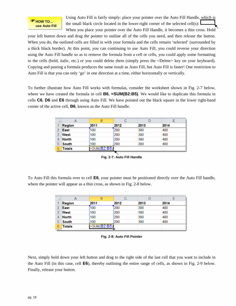
To further illustrate how Auto Fill works with formulas, consider the worksheet shown in Fig. 2-7 below, where we have created the formula in cell B6, =SUM(B2:B5). We would like to duplicate this formula in cells C6, D6 and E6 through using Auto Fill. We have pointed out the black square in the lower right-hand corner of the active cell, B6, known as the Auto Fill handle.
Fig. 2-7: Auto Fill Handle
To Auto Fill this formula over to cell E6, your pointer must be positioned directly over the Auto Fill handle, where the pointer will appear as a thin cross, as shown in Fig. 2-8 below.
Fig. 2-8: Auto Fill Pointer
Next, simply hold down your left button and drag to the right side of the last cell that you want to include in the Auto Fill (in this case, cell E6), thereby outlining the entire range of cells, as shown in Fig. 2-9 below. Finally, release your button.
HOW TO… use Auto Fill

pg. 20
Fig. 2-9
Editing Formulas
There are a few alternative methods for editing the contents of a cell so you can avoid having to re-enter the contents. To edit the contents of a cell, whether it contains a text/label, value or formula, do one of the following:
• Double-click on the cell (puts you in ‘edit’ mode), then use the left/right arrow keys, and the <Delete>/<Backspace> keys on your keyboard. When you are finished, press the <Enter> key.
• Click on the cell and then press the <F2> key (puts you in ‘edit’ mode), then use the left/right arrow keys, and the <Delete>/<Backspace> keys. When you are finished, press the <Enter> key.
• Click on the cell and then click in the formula bar, which is identified below by the dashed line (puts you in ‘edit’ mode), then use the left/right arrow keys, and the <Delete>/<Backspace> keys. When you are finished, press the <Enter> key.
Viewing Formulas
When reviewing the mathematical accuracy of your formulas, or perhaps searching for a known error, you have a couple options. To view the contents of any individual cell, regardless of whether it contains a text/label, value or formula, click
on the cell and then look in the Formula Bar. However, it can be more efficient to be able to view all of the formulas contained in a particular worksheet simultaneously. To do this, hold the <Ctrl> key and then press the tilde <~> key, which is located above the <Tab> key, below the <Esc> key. Don’t worry too much about your formatting at this point, as values and the results of formulas will be left-aligned. Also, your columns might not be wide enough to see all the entire formula(s). You can widen the columns (as discussed in Ch. 4), but your column widths will remain the same when you switch back to ‘normal’ view. To switch back to your ‘normal’ view, simply repeat the key combination, holding down the <Ctrl> key and then pressing the <~> key.
Relative Cell References The important point here is that the cells you need to refer to in order to arrive at a correct result in cell B6 are referred to in terms of where they are relative to where you want the result placed (our ‘destination cell, B6 in this case). Each of the four cells contained in the formula, B2, B3, B4 and B5, are relative cell references; B2 is four rows above in the same column; B3 is three rows, same column; B4 is 2 rows, same column; and B5 is one row, same column. To reinforce the concept, it’s not the actual cell reference or ‘address’ that is the focus here (B2, B3, etc.). Rather, it’s where that cell is relative to where you are building your formula that contains the cell reference.
HOW TO… edit the contents of a cell
HOW TO… view all formulas

pg. 21
To further illustrate the concept of a relative cell reference, we have placed a worksheet in ‘formula mode’ in Fig. 2-10 below, whereby we can see the formulas on screen and then take some screen captures. (This mode is shown by holding the <Ctrl> key and then pressing the Tilde (~) key, which is located above the <Tab> key.) You can see the four cell references, B2, B3, B4 and B5. For visual clarity, formula mode color codes your cell references and the cells they refer to for visual clarity. So the cell reference B2, as well as the cell B2, are colored in blue, B3 in green, B4 in purple and B5 in brown. The formula in cell B6 can be thought as add the four cells immediately above the active (‘target’) cell, same column (B).
Fig. 2-10
Here is a very important consideration when using relative cell references: when attempting to Auto Fill the formula, both the row and column can change in the resulting formula, depending on the cell location of the original formula and the desired location of the second formula. As a result, care must be taken when any formula that contains a relative cell reference is Auto Filled. We will get into more detail soon, but for now, consider the following. When you Auto Fill a formula containing a relative cell reference…
A. …across a row, crossing over one (or more) columns (a ‘horizontal Auto Fill’), will ‘increase’ the column letter in the resulting formula. However, any row designations do not change because you are filling along a single row.
B. …down a column, crossing over one (or more) rows (a ‘vertical Auto Fill’), will ‘increase’ the row number in the resulting formula. However, any column designation do not change because you are filling formulas down a single column.
C. …down a column and across a row, crossing over one (or more) columns and one (or more) rows will ‘increase’ both the column and row designation in the resulting formula.
Another important point that should come out of this discussion is that when you Auto Fill a formula, you are not filling in the result of the formula in the new cells! Rather, you are filling in the formula!! As you will see, this has very important implications when Auto Fill formulas. Let’s take a closer look at how relative cell references behave when we Auto Fill horizontally, vertically and both directions (diagonally). We begin with illustrating how formulas can be Auto Filled horizontally, that is, across a column, and how that affects relative cell references. Referring to Fig. 2-11 below, the formula in cell B6, =B2+B3+B4+B5, ‘reads’ add the four cells immediately above the active cell in the current column (B).
Fig. 2-11

pg. 22
It would save time to not have to create another formula to calculate the total of the regional values for the year 2012 in cell C6, as well as a grand total in cell D6. Think again about the formula in cell B6 (our ‘source’ cell); that is, add the four cells immediately above the active (target) cell. Doesn’t the same idea apply to totaling the values for year 2012 in cell C6: add the four cells immediately above the active (target) cell? Doesn’t it also apply to the totals in cell D6? We can take advantage of a characteristic of relative cell references when we Auto Fill across one or more columns along one row. Recall that when you Auto Fill a formula containing a relative cell reference across a row, crossing over one (or more) columns will ‘increase’ the column letter in the resulting formula, in this case from column B to C to D.
What all this means in our example is that when we Auto Fill the formula in cell B6 to C6 (along row 6), each column in the formula in cell B6 will ‘go up’ one for each column we cross over. However, all rows remain unchanged because our source cell (B6) and target cells (C6 and D6) are located on the same row (6). As shown in Fig. 2-12 below, the resulting formula in cell C6 is =C2+C3+C4+C5. And doesn’t this formula follow the same thinking of add the four cells immediately above the active (target) cell?
Fig. 2-12
As shown in Fig. 2-13 below, we get a similar result in cell D6 when we continue to Auto Fill to the right, still adding the four cells immediately above the active (target) cell. So our resulting formula in cell D6 is =D2+D3+D4+D5. And by the way, what would the resulting formula be if we continued to Auto Fill this formula all the way out to cell Z6 (we’re staying along the same row, but going out to column Z)? The formula would be =Z2+Z3+Z4+Z5. The result of this formula would be 0 (zero), as there are no values in these four cells, but the point is that this still follows out original thinking: add the four cells immediately above the active (target) cell!
Fig. 2-13

pg. 23
Now let’s take a look at how we can use Auto Fill vertically, down a row within a given column, and how that affects relative cell references. Referring to Fig. 2-14 below, the formula in cell D2, =B2+C2, can be thought of as adding the two cells immediately to the left of the active cell in the same row (2).
Fig. 2-14
It would save time to not have to create another formula to calculate the total of each region across both years. Think again about the formula in cell D2 (our ‘source’ cell), that is, add the two cells immediately to the left of the active (target) cell. Doesn’t the same idea apply to totaling the values for the West Region in cell D3: add the two cells immediately to the left of the active (target) cell? Doesn’t it also apply to totaling the values for the North Region in cell D4? And the South Region in cell D5? We can take advantage of a characteristic of relative cell references when we Auto Fill one or more rows down a column. Recall that when you Auto Fill a formula containing a relative cell reference down a column, crossing over one (or more) rows will ‘increase’ the row number in the resulting formula, in this case from row 2 to 3 to 4 to 5.
What that means in our example is that when we Auto Fill the formula in cell D2 to D3 (down column D), each row in the formula in cell D2 will ‘go up’ one for each row we go down. However, all columns remain unchanged because our source cell (D2) and target cells (D3, D4 and D5) are located in the same column (D). As shown in Fig. 2-15 below, the resulting formula in cell D3 is =B3+C3. And doesn’t this formula follow the same thinking of add the two cells immediately to the left of the active (target) cell?
Fig. 2-15
As shown in Fig. 2-16 below, we get a similar result in cell D4 and D5 when we continue to Auto Fill to down, still adding the two cells immediately to the left of the active (target) cell. So our resulting formula in cell D4 is =B4+C4 and in D5 would be =B5+C5. And by the way, what would the resulting formula be if we continued to Auto Fill this formula all the way down to cell D100 (we’re staying within the same column, but going down to row 100)? The formula would be =B100+C100. The result of this formula would be 0

pg. 24
(zero), as there are no values in these two cells, but the point is that this still follows out original thinking: add the two cells immediately to the left of the active (target) cell!
Fig. 2-16
Absolute Cell References Recall that a relative cell reference can be thought of relative to its position to the formula that contains that reference (destination cell). So in cell D4 shown in Fig. 2-16 above, we can refer to the cell reference B4 as being two columns to the left on the same row of our current location. By contrast, an absolute cell reference refers to a specific cell, without regard to where it is located relative to any specific cell. Why is this distinction important? Recall that the column of a relative cell reference changes if we Auto Fill a formula containing that reference horizontally across one (or more) columns along a given row, and the row of a relative cell reference changes if we Auto Fill a formula containing that reference vertically down one (or more) rows within a given column. However, neither the column nor the row of an absolute cell reference change, regardless if we Auto Fill a formula containing such a reference horizontally, vertically or both. An absolute cell reference ‘locks’ the cell reference to a particular cell, not a relative position to that cell, as is the case with a relative cell reference.
When would an absolute cell reference be helpful? It is useful when you have a group of formulas on multiple rows and across multiple columns that need to refer to a single, common cell (a cell that contains a value that many cells need to refer to through their formulas). For example, suppose you want to build a worksheet that calculates the projected sales for multiple regions across multiple months given the sales figure for January. Further, you forecast that sales will increase by 5% for all regions in both February and March. Each of your sales projection formulas need to include this percent increase. You should not simply type the value (0.05 or 5%) in each of your formulas because you might what to change the amount of the projected increase. If you did type these values into your formula, you would have to replace/edit the formulas if the value were to change. Referencing a cell that contains the percent value in formulas, as opposed to typing the value, will result in a much more flexible worksheet.
In Fig. 2-17 below, we begin our illustration of the use of an absolute cell reference by first building a formula with relative cell references, which we can use to test the mathematical accuracy of our first cell, C2. The formula in this cell, =B2*B8+B2, increases the amount of January Sales by 0.05 or 5%. In terms of relative cell references, this formula could be ‘read’ as: multiply the value in the cell one column to the left by the value in the cell one column to the left and six rows down, and add that result to the cell one column to the left.

pg. 25
Fig. 2-17
Since multiplication is completed before addition according to the mathematical order of operations, we do not need to use any parenthesis. However, including (B2*B8) in parenthesis might make your formula a little easier to read and understand. But with or without the parenthesis, the result is 105. This cell will serve as our ‘model’ cell, since we are confident it is mathematically correct. So no problem so far!
Now we need to consider saving the time and trouble of recreating this formula for all regions across all months (cells C3 through C5, and D2 through D5). Wouldn’t it be cool to be able to Auto Fill this formula down to row 5 and over to column D (or vice versa)? Well, remember how the original formula ‘read’: multiply the value in the cell one column to the left by the value in the cell one column to the left and six rows down, and add that result to the cell one column to the left. As a result, when we Auto Fill down to cell C3, we get the result shown in Fig. 2-18 below. See anything wrong here? The problem is while the percent increase located in cell B8 (in green) is one column to the left (B), it is only five rows below cell C3, not six (as it was in cell C2, where we original created the formula). The cell that is one column to the left and 6 rows down, cell B9, is empty! Recall that relative cell references refer to cells based on where those cells are relative to the cell that contains the formula, so Excel is only doing what we told it to do!
Fig. 2-18
Further, as shown in Fig. 2-19 below, the error gets worse as we Auto Fill down to cell C4 and then C5 (check out the cells outlined in green).

pg. 26
Fig. 2-19
Before we attempt to deal with this problem, let’s try to Auto Fill this formula horizontally because we also need to use the increased sales projection across February and March. When we Auto Fill from cell C2 to D2, we get the result shown in Fig. 2-20 below. What’s happening here? Recall again how the original formula read: multiply the value in the cell one column to the left by the value in the cell one column to the left and six rows down, and add that result to the cell one column to the left. The problem is the percent increase located in cell B8 (in green) is two columns to the left of cell D2, not one! The cell that is one column to the left and six rows down, cell C8, is empty. Again, Excel is only doing what we told it to do because we used relative cell references in the original formula.
Fig. 2-20
Further, as shown in Fig. 2-21 below, the error gets worse as we Auto Fill from cell D2 to D3 (check out the cell outlined in green). Both our column and row designations are missing the mark (cell B8).
Fig. 2-21

pg. 27
And it continues to worsen as we continue to Auto Fill down to cell D4, as shown in Fig. 2-22 below.
Fig. 2-22
And finally we see the ‘final’ result as we continue to Auto Fill down to cell D5, as shown in Fig. 2-23 below.
Fig. 2-23
So what to do? First of all, we need to be sure we our working on the ‘model’ cell, C2, our ‘original’ cell if you will, since we know that is mathematically correct. It is very important to resist the temptation to edit other cells! Doing so will only lead to inconsistent formulas among your cells. So working in cell C2 on our ‘original’ formula, we need to convert the cell reference containing the percent increase (B8) from a relative cell reference to an absolute cell reference. This will ‘lock’ the reference specifically to cell B8, so it is not a
relative cell reference. The conversion has two parts: locking the column and locking the row (recall that a cell is defined as the intersection of a column and a row!) To do this, we place a dollar sign ($) in front of both the column designation (B) and the row designation (8). (Please note that the use of the dollar sign has
nothing to do with money or currency; it is merely a symbol that Excel understands when locking a column or row.) The edited reference is now $B$8. So now the formula reads multiply the value in the cell one column to the left by the value in the cell B8, and add that result to the cell one column to the left. Notice that cell B8 is no longer referred to in relative terms, the cell one column to the left and six rows down.
HOW TO… create an absolute cell reference

pg. 28
So the correct revised formula in cell C2 is =B2*$B$8+B2. Now this formula can be Auto Filled down to cell C5. This will fill in cells C3 through C5, and it will also leave all four cells highlights so we can Auto Fill the set of cells one column to the right by pointing to the Auto Fill handle in the lower-right corner of cell C5 and dragging the block of cells one column to the right. The final results are shown in Fig. 2-24 below. In cell C2, note how the absolute cell reference, $B$8, remains locked on B8, even as we Auto Fill both vertically and horizontally. Also note that the two cell references to B2 were kept as relative cell reference so it’s row could change as we Auto Fill down (vertically), and it’s column could change as we Auto Fill across (horizontally). So relative cell references are very useful, just not in every situation with every formula! Same goes for absolute cell references!!
Fig. 2-24
Mixed Cell References Mixed cell references can be thought of as a hybrid mix of relative and absolute cell references. As you may recall, the column designation of a relative cell reference will change if we Auto Fill a formula containing that reference horizontally across columns along a row, and the row designation will change if we Auto Fill vertically over rows down a column. Conversely, neither the column nor the row designation of an absolute cell reference changes when we Auto Fill a formula containing the reference horizontally or vertically. Whereas an absolute cell reference is used to ‘lock’ on to a specific cell (column designation and row designation), a mixed cell reference, in comparison, is used to lock on to either a column or a row designation of a cell, depending on which of two types of mixed cell reference is needed. The first type of mixed cell reference is characterized by a column designation that does not change when you Auto Fill the formula referencing that cell horizontally across columns along a row, while its row designation changes as you Auto Fill vertically over rows down a column. This type of mixed cell reference has a dollar sign in front of its column designation (for example, $C5). The second type is characterized by a row designation that does not change when you Auto Fill the formula referencing that cell vertically over rows

pg. 29
down a column, while its column designation can change as you Auto Fill horizontally across columns along a row. This type of mixed cell reference has a dollar sign in front of its row designation (for example, C$5).
At this point, you’re probably wondering when you would make use of either version of a mixed cell reference. They are extremely useful when you create a formula that needs to ‘lock’ on to either a specific range of vertically adjacent cells (a column of cells) or a specific range of horizontally adjacent cells (a row of cells). Contrast this with an absolute reference that locks on to a specific cell. Consider the partial worksheet shown in Fig. 2-25 below, which calculates taxes based on employee wages. The general idea is that the gross wages of each employee (range of cells depicted in yellow, B4:B8) need to be multiplied by the appropriate tax rate of each tax (range of cells depicted in blue, C3:F3) in order to calculate the various taxes for each employee.
Fig. 2-25: Payroll Worksheet: Without Formulas

pg. 30
Let’s consider how to calculate the Federal Withholding Tax (W/T) for Employee #1 in cell C4. Mathematically, it’s simply $100 (Gross Pay in cell B4) multiplied by 0.15 (Federal W/T in cell C3) or 100 x 0.15. Start with relative cell references to build the initial version of the formula: =B4*C3, as shown in Fig. 2-26 below. In relative terms, the formula for Employee #1’s Federal W/T in cell C4 reads multiply the value in the cell to the left by the value in the cell one row up.
Fig. 2-26: Payroll Worksheet:
Preliminary Formula
This is a good start because we can test whether we have the math correct, which is the most important thing when creating a new formula. The result of this formula is 15, which looks good. Now here is where this gets fun! In order to not have to recreate this formula in all of the remaining employee tax calculations, it would be great to Auto Fill this formula down to row 8 and over to column F, and call it a day. However, our preliminary formula uses two relative cell references (no dollar signs in front of any of the column or row designations), specifically B4 and C3. Recall that the column and/or rows of relative cell references can change, depending on the direction(s) that we Auto Fill formulas that contain them. Since we need to Auto Fill this formula both vertically (down) and horizontally (over), all column and row designations in our formula will change, so we will ‘lose’ our reference to the Gross Pays in column B and the tax rates in row 3.
Because of the use of two relative cell references, recall how this formula ‘reads’: multiply the value in the cell to the left by the value in the cell one row up. As shown in Fig. 2-27 below, if we Auto Fill this formula down to row 8 and over to column F, the resulting formula in cell F8, Employee #5’s NJ W/T, would be =E8*F7, which indeed is multiplying the value in the cell to the left by the value in the cell one row up! Excel is doing what it is supposed to do, given the relative cell references we used in the formula. Unfortunately, the formula is referencing incorrect cells!
Fig. 2-27: Payroll Worksheet: Auto Filled With Incorrect Formulas
As discussed, the formula we have built in cell C4 is mathematically correct. However, in order for us to be able to Auto Fill this formula, we need to make some edits. We can’t have the column designation of our Gross Pay ‘slide’ off column B as we Auto Fill horizontally over to column F, so we make the reference to cell B4 a mixed cell reference

pg. 31
with the column designation locked on to column B by placing dollar sign in front of the column letter ($B).
Fig. 2-28: Payroll Worksheet: Formula Mixed Cell References
We also can’t have the row designation of our Federal W/T ‘slide’ off row 3 as we Auto Fill vertically down to row 8, so we make the reference to cell C3 a mixed cell reference with the row designation locked on to row 3 by placing a dollar sign in front of the row number (C$3). So as shown in Fig. 2-28 above, our final version of
this formula is =$B4*C$3. Now when we Auto Fill this down to row 8 and over to column F (or vice versa), the resulting formula in cell F8, Employee #5’s NJ W/T, is =$B8*F$3. As shown in Fig. 2-29 below, each tax calculation for each employee is properly referenced after using Auto Fill with the original formula in cell C4.
Fig. 2-29: Payroll Worksheet: completed formulas after Auto Fill
It may be helpful to point out a couple things that each cell reference in this formula accomplishes for us, as this formula was filled both vertically and horizontally. Referring to $B4:
1. $B ‘locks’ the column designation B (Gross Pays), so the reference to column B (yellow range of cells) does not change as the formula in cell C4 is Auto Filled over (to column F), and
2. 4 allows the row designation 4 to change as we Auto Fill down (to row 8) so each employee’s Gross Pay is referenced on the applicable row.
Referring to C$3: 1. C allows the column designation C to change as we Auto Fill over (to column F) so each employee’s
Tax Rate is referenced in the applicable column, and 2. $3 ‘locks’ the row designation 3 (Tax Rates), so the reference to row 3 (blue range of cells) does not
change as the formula in cell C4 is Auto Filled down (to row 8).
Summary of Cell References It may be helpful at this point to summarize how each of the cell types ‘reads’ within a formula. Consider the simple one-cell formula in Fig. 2-30 below. From left to right, the cell reference A1 is relative, absolute, mixed with the column locked, and mixed with the row locked. Each formula, in turn, references the cell…
• =A1, which reads one column to the left and one row up (column and row designations are both relative)
• =$A$1, which reads column A and row 1 (column and row designations are both locked and specifically referred to)
HOW TO… create a mixed cell reference

pg. 32
• =$A1, which reads column A and one row up (column designation is locked and specifically referred to, but row designation is relative)
• =A$1, which reads one column to the left and row 1 (column designation is relative, but row is locked and specifically referred to)
Fig. 2-30: Examples of Relative, Absolute & Mixed Cell References
We also present Table 2-4 below which summarizes the changes that occur when you Auto Fill cells with formulas. The columns in the table include the three directions you can Auto Fill: horizontally, vertically or both, and the rows include each of the four types of cell references: relative, absolute, mixed with column locked and mixed with row locked.
If you Auto Fill (or Copy & Paste) a formula in this direction…
…and your cell reference is…
Horizontally across a row
Vertically down a column
Horizontally & Vertically across & down
Relative example: C5
Column changes? Row change?
Yes1
No3 Column changes? Row change?
No4
Yes2 Column changes? Row change?
Yes1
Yes2 Mixed example: $C5
Column changes? Row change?
No5 No3
Column changes? Row change?
No4
Yes2 Column changes? Row change?
No4
Yes2 Mixed example: C$5
Column changes? Row change?
Yes1
No3 Column changes? Row change?
No4
No6 Column changes? Row change?
Yes1
No3 Absolute: example: $C$5
Column changes? Row change?
No5 No3
Column changes? Row change?
No4
No6 Column changes? Row change?
No4
No3 Table 2-3: Auto Fill Direction and Cell Reference Type
Notes: 1 Columns are arranged horizontally across a worksheet; so using Auto Fill across column(s)
changes their columns reference. 2 Rows are arranged vertically down a worksheet; so using Auto Fill over rows change(s) their row
designation. 3 Rows are arranged vertically down a worksheet; so using Auto Fill across column(s) does not
change their row designation, regardless of the presence of a dollar sign in front of the row designation or not.
4 Columns are arranged horizontally across a worksheet; so using Auto Fill over row(s) does not change their column designation, regardless of the presence of a dollar sign in front of the column designation or not.
5 Column designations locked with a dollar sign do not change as you Auto Fill across column(s). 6 Rows designations locked with a dollar sign do not change as you Auto Fill down row(s).
Multi-Worksheet Formulas: If your workbook has more than one worksheet, you may have a need to create formulas that reference cells on multiple worksheets, perhaps in order to summarize data on a summary worksheet. Before discussing multi-worksheet formulas, we briefly present how to move from worksheet to worksheet, how to change the ‘order’ of your worksheets and how to rename your worksheets.
By default, Excel provides three worksheets in a new workbook, and by default, are named SHEET1, SHEET2 and SHEET3. To change the order of your HOW TO…
change the order of worksheets

pg. 33
worksheets, from left to right, click and drag one of the sheet tabs and the drag it to a new location among the sheet tabs. You will see a small downward-facing arrow that indicates where the sheet tab will be placed. Then release your button. Other worksheet-level tasks can be accomplished by right-clicking on a particular sheet tab and then choosing the appropriate option from the pop-up menu. Among the options are:
• Insert adds a new worksheet or chart sheet (which contains only a chart, no cells). • Delete removes the currently selected worksheet. • Rename renames the currently select worksheet.
As mentioned previously, Excel workbooks can have more than one worksheet. To move between worksheets, you have a couple options. The first is to click on the sheet tab of the worksheet you want to go to. The second is to hold down the <Ctrl> key and then press the <PgUp> key to go to the next sheet (to the left of your current sheet) or
the <PgDn> key to go to the previous sheet (to the right of your current sheet).
You can also rename a sheet tab by doing the following: 1. Double-click on the worksheet tab (for example, SHEET1). This selects the current name. 2. Type the replacement name. 3. Press the <Enter> key.
Now we are ready to discuss the creation of a formula that references cells on multiple worksheets. To begin, suppose you have four worksheets, each containing sales data from a three-month period (quarter) for the North, South, East and West sales regions, as well as a summary worksheet. Further, assume that these worksheets are called “Q1”, “Q2”, “Q3”, “Q4” and “Summary”, respectively. “Q1” sheet is shown in Fig. 2-31 to the right.
Further, let’s assume that you need to add the sales data contained on each of the four worksheets and place the results on a fifth worksheet, called “Summary”. Firstly, a hint: whenever possible, it will
make creating your formulas on your summary worksheet much easier if each worksheet is identical in structure, including the summary worksheet. That is, be sure cell entries are in consistent cell locations across all worksheets. For example, include Region North’s data in cell B5 on all five sheets, Region South’s data in B6 on all five sheets, and so on. As mentioned, Fig. 2-31 is the Q1 worksheet. Now let’s assume that each quarter’s data is the identical to “Q1”. To create a 3-D formula, do the following, referring to summary worksheet shown in Fig. 2-32 to the right.
Fig. 2-31: Qtr 1 Worksheet
Fig. 2-32:
Summary Worksheet
1. Press the <=> key. 2. Go to worksheet “Q1”, click on cell B5 and then press the <+> key. 3. Go to worksheet “Q2”, click on cell B5 and then press the <+> key.
HOW TO… create formulas across worksheets
HOW TO… move between worksheets
HOW TO… change the name of a worksheet

pg. 34
4. Go to worksheet “Q3”, click on cell B5 and then press the <+> key. 5. Go to worksheet “Q4” and click on cell B5. 6. Press the <Enter> key. Your formula in cell B5 in worksheet “Summary” is
='Q1'!B5+'Q2'!B5+'Q3'!B5+'Q4'!B5 You might think of such a formula as having three dimensions because the cells referenced in them are located on other worksheets, so the names of the referenced worksheets are one dimension (“Q1” “Q2” “Q3” and “Q4”), and the column designation (letter) and the row designation (number) of the referenced cells are the second and third dimensions (B5).
7. You can Auto Fill the contents on cell B5 down to B8 because relatively speaking, the data for the North region is one row above the South Region, which is one row above the East region, which is one row above the West region on each of the quarterly sheets and the summary sheet!
8. Use the SUM function in cell B9 to calculate a grand total of all of the quarters for all of the regions, resulting in the formula =SUM(B5:B8).

pg. 35
Fig. 2-33 to the right presents a conceptual illustration of what you have done through the use of 3-D formulas in the example above, utilizing the North Region as an example.
Fig. 2-33: Conceptual View of a 3-D Formula
Formula Hints We conclude our discussion of formulas with a few hints that may save you some time and/or aggravation… If your see a string of number signs in a column (######), try to widen your column. This is the symbol used to show that the contents of a cell are too wide to fit in the column. (See Ch. 4 for further information on widening columns.) If the results of your formula display #NAME?, you probably have some type of problem with the syntax (structure) of your formula. That is, something is either misspelled or missing within the formula. For example, if you used the SUM function, but forgot to include the parenthesis and parameters (arguments) within the parenthesis, your formula would be, =SUM. The result would be #NAME?. If your formula displays #DIV/0!, you have attempted to divide by zero, which is not a good thing. Check that what you are dividing by (your denominator) has a value greater than zero, keeping in mind that Excel considers an empty cell to contain zero (0).

pg. 36
Chapter Questions
Short Answer 1. What is a formula? ______________________
2. What does the Excel pointer look like when you are selecting (highlighting) cells? ________________
3. What does the Excel pointer look like when you use Auto Fill? ________________
4. What does the Excel pointer look like when you move a cell(s) or chart? ________________
For Questions #11-16, refer to the worksheet shown to the right and calculate the results of the following formulas, showing your work. Start your calculations within parenthesis, if applicable, and then work your way through the order of operations.
5. =A1+B2*C3/D3= ______________________________________________________________
6. =A1+C3/D3*B2= ______________________________________________________________
7. =A1+B2*(C3/D3)= ______________________________________________________________
8. =(A1+C3)/D3*B2= ______________________________________________________________
9. =A1+(B2*C3)/D3= ______________________________________________________________
10. =(A1+B2)*(C3/D3)= ______________________________________________________________
11. Referring to the worksheet shown below, construct the formula that would multiply each of the three components of the overall grade (C3, E3 and G3) by their respective weightings (B3, D3 and F3), and then add the results. In other words, your need to calculate 33.3*90+33.3*100+33.3*95, but you must use cell references, not values/numbers. Consider if you need to use parenthesis in order to get the correct result.
_____________________________________________________________________________________ _____________________________________________________________________________________ _____________________________________________________________________________________
pg. 37
Multiple-Choice 1. The cell content that performs mathematic computations is ___.
A. text/label B. value C. formula
2. A10 is a ___ cell reference.
A. relative B. mixed C. absolute
3. $A10 is a ___ cell reference.
A. relative B. mixed C. absolute

pg. 38
4. A$10 is a ___ cell reference. A. relative B. mixed C. absolute
5. $A$10 is a ___ cell reference.
A. relative B. mixed C. absolute
For Questions #6-20, first consider the direction(s) you are being asked to Auto Fill (vertically or horizontally) and then the distance (columns and/or rows). Then determine what the formula will change to after Auto Fill.
6. Suppose the following formula was located in cell C2: =A1. The formula would change to ___ if you Auto Fill/Copy & Paste the formula to cell C3. A. =A1 B. =A2 C. =B1 D. =B2 E. =B3
7. Suppose the following formula was located in cell C2: =A1. The formula would change to ___ if you Auto
Fill/Copy & Paste the formula to cell D2. A. =A1 B. =A2 C. =B1 D. =B2 E. =B3
8. Suppose the following formula was located in cell C2: =A1. The formula would change to ___ if you Auto
Fill/Copy & Paste the formula to cell D3. A. =A1 B. =A2 C. =B1 D. =B2 E. =B3
9. Suppose the following formula was located in cell C2: =$A1. The formula would change to ___ if you Auto
Fill/Copy & Paste the formula to cell C3. A. =$A1 B. =$A2 C. =$B1 D. =$B2 E. =$B3
10. Suppose the following formula was located in cell C2: =$A1. The formula would change to ___ if you Auto
Fill/Copy & Paste the formula to cell D2. A. =$A1 B. =$A2 C. =$B1 D. =$B2 E. =$B3
11. Suppose the following formula was located in cell C2: =$A1. The formula would change to ___ if you Auto
Fill/Copy & Paste the formula to cell D3. A. =$A1 B. =$A2 C. =$B1 D. =$B2 E. =$B3

pg. 39
12. Suppose the following formula was located in cell C2: =A$1. The formula would change to ___ if you Auto Fill/Copy & Paste the formula to cell C3. A. =A$1 B. =A$2 C. =B$1 D. =B$2 E. =B$3
13. Suppose the following formula was located in cell C2: =A$1. The formula would change to ___ if you Auto
Fill/Copy & Paste the formula to cell D2. A. =A$1 B. =A$2 C. =B$1 D. =B$2 E. =B$3
14. Suppose the following formula was located in cell C2: =A$1. The formula would change to ___ if you Auto
Fill/Copy & Paste the formula to cell D3. A. =A$1 B. =A$2 C. =B$1 D. =B$2 E. =B$3
15. Suppose the following formula was located in cell C2: =$A$1. The formula would change to ___ if you Auto
Fill/Copy & Paste the formula to cell C3. A. =$A$1 B. =$A$2 C. =$B$1 D. =$B$2 E. =$B$3
16. Suppose the following formula was located in cell C2: =$A$1. The formula would change to ___ if you Auto
Fill/Copy & Paste the formula to cell D2. A. =$A$1 B. =$A$2 C. =$B$1 D. =$B$2 E. =$B$3
17. Suppose the following formula was located in cell C2: =$A$1. The formula would change to ___ if you Auto
Fill/Copy & Paste the formula to cell D3. A. =$A$1 B. =$A$2 C. =$B$1 D. =$B$2 E. =$B$3
18. Suppose the following formula was located in cell D4: =B2+$C2+D$2+$E$2. The formula would change to ___ if
you Auto Fill/Copy & Paste the formula to cell D5. (Hint: first consider the direction(s) you are being asked to Auto Fill (vertically or horizontally) and then the distance (columns and/or rows). A. =B2+$C2+D$2+$E$2 B. =B3+$C3+D$2+$E$2 C. =B3+$C3+D$3+$E$3 D. =C2+$D2+E$2+$F$2 E. =C3+$D3+E$3+$F$3

pg. 40
19. Suppose the following formula was located in cell E4: =B2+$C2+D$2+$E$2. The formula would change to ___ if you Auto Fill/Copy & Paste the formula to cell B1. (Hint: first consider the direction(s) you are being asked to Auto Fill (vertically or horizontally) and then the distance (columns and/or rows). A. =B2+$C2+D$2+$E$2 B. =B3+$C3+D$3+$E$3 C. =C2+$D2+E$2+$F$2 D. =C3+$D3+E$3+$F$3 E. =C2+$C2+E$2+$E$2
20. Suppose the following formula was located in cell E5: =B2+$C2+D$2+$E$2. The formula would change to ___ if
you Auto Fill/Copy & Paste the formula to cell B2. (Hint: first consider the direction(s) you are being asked to Auto Fill (vertically or horizontally) and then the distance (columns and/or rows). A. =C3+$C3+E$2+$E$2 B. =B2+$C2+D$2+$E$2 C. =B3+$C3+D$3+$E$3 D. =C2+$D2+E$2+$F$2 E. =C3+$D3+E$3+$F$3

pg. 41
This page intentionally left blank
pg. 42
3 Functions Pre-defined jewels that make life easier
The ability to quickly produce mathematical results is perhaps the main strength of an electronic spreadsheet. As discussed in the previous chapter, formulas are at the heart of Excel’s ability to produce these results. You can also take advantage of the power and usefulness of functions, which are pre-defined keywords that you can include in formulas to instruct Excel to perform a specific task, saving you time and effort. And although not every formula needs to contain a function, in many cases, the use of a function can make your work simpler.
We begin by discussing the basic concept of functions. Then, we present details of some of the most common and useful functions.
Key Chapter Terms:
• Argument • AutoSum • AVERAGE • COUNT • COUNTIF • Function • IF • MAX
• MEDIAN • MIN • MODE • NOW • PMT • SUM • SUMIF • TODAY

pg. 43
Excel includes a few hundred functions, many of which are related to some type of computation, such as summing the values in a range of cells or finding the average value in a range. Other very useful and powerful functions, however, are not directly related to performing a calculation, including those that deal with date/time, lookup/reference, database and logic. The complete list of categories of functions available in Excel is as follows:
• Financial • Date & Time • Math & Trig • Statistical • Lookup & Reference
• Database • Text • Logical • Information • Engineering
As discussed previously, each formula has a syntax, or structure. We now expand on this to include functions and how they are included in formulas. Recall that all formulas begin with an equal sign (=). They can also contain one or more cell addresses, mathematical operators and/or functions. Functions need at least one argument when used in a formula. An argument is a function’s input or parameter. Often, arguments are cell address(es), but they can also be labels or/and values. However, regardless of their form, arguments are always placed inside of parenthesis ( ). The general syntax of a formula that includes a function is: =FunctionName(Argument1,Argument2,…Argument#).
Functions can be directly typed into a formula. However, as an alternative, Excel provides a tool to help you build formulas that include functions. The [Insert Function] button is located on the far left side of the ribbon under the Formulas command tab. If you know the category of a particular function (for example,
Financial, Logical, Text, Date & Time, Lookup & Reference or Math & Trig), you may also be able to access it through one of the buttons located in the Function Library group under the Formulas command tab (see Fig. 3-1 below). In addition, whether you are typing a formula into a cell or using [Insert Function], any arguments that need to be included in a formula can either be typed or the cell containing any given argument can be clicked on.
Fig. 3-1: Insert Function Button
As shown in Fig. 3-2 below, the Insert Function dialog box provides a couple options to access the functions available in Excel: typing a brief description of a function, or selecting a category and then browsing through the alphabetized list.
HOW TO… include a function in a formula

pg. 44
Fig. 3-2: Insert Function Dialog Box
The following is a discussion of a variety of useful functions, arranged by their functional category, including:
• Math & Trig: SUM, SUMIF • Statistical: AVERAGE, COUNT, COUNTIF, MEDIAN, MODE, MAX, MIN • Date/Time: TODAY, NOW • Financial: PMT • Logical: IF
From the Math & Trig category, we present the SUM and SUMIF functions…
SUM Function The SUM function adds the numeric contents in a specified range of adjacent (vertically or horizontally) cells. The syntax of the formula is =SUM(cell:cell), where cell:cell represents the range of cells that you want to add. For example, as shown in Fig. 3-3 to the right, the formula in cell B6, =SUM(B2:B5), adds the contents of cells B2, B3, B4 and B5. The result here is 230.
Fig. 3-3: SUM Function
To illustrate the efficiency of the SUM function, the formula that would be needed to add cells B2:B5 without using SUM would be =B2+B3+B4+B5. The formula that would be needed to add cells B2:B100 would be =B2+B3+B4+B5+B6+B7+B8+B9+B9…B100! This formula is too labor intensive to create, given the simplicity of its mathematical operation. In addition, it is too prone to error (for example, omitting a cell). By contrast, using the SUM function to add this same range of cells results in the relatively simple formula =SUM(B2:B100). So, the more cells you need to add, the more efficient is the use of the SUM function.

pg. 45
Excel includes a handy feature called Auto Sum that automatically creates a formula utilizing the SUM function to add a range of cells. It takes an educated guess regarding the range of cells that you want to add.
To use Auto Sum, click on the cell where you want the formula to be place and then click the [AutoSum] button, which is located through the Home command tab, Editing Group (shown to the right). Be aware that Auto
Sum can get ‘confused’ by empty cells within the range that you are attempting to add, erroneous not including all the desired cells in the range being added. Also, some numeric labels, such as yearly column headings, can be mistakenly included in the range of cells being added because Excel ‘thinks’ years are part of the values that you want to include in your calculation. As a result, always verify the cells that Excel is attempting to include in your calculation (shown with blinking ‘ants’ around the cells). If the group of cells is not correct, simply click & drag the range of cells you want and then press the <Enter> key.
Note that when adding cells that are not adjacent to each other, you must use the additive mathematical operator (+), with no function. For example, =B1+H4+D3. Also, we should point out here that formulas that only need to subtract, multiply or divide numeric contents of cells do not use any function. To subtract cell B1 from B2, the formula would be =B2-B1. To divide cell B1 by B2, the formula would be =B1/B2. To multiply cell B1 and B2, the formula would read =B1*B2. SUMIF: The SUMIF function adds the numeric contents in a specified range of adjacent (vertically or horizontally) cells, given a specified condition. The syntax of the formula is =SUMIF(cell:cell,condition), where cell:cell represents the range of cells that you want to add and condition specifies the criteria that cells to be included must meet. For example, as shown in Fig. 3-4 to the right, the formula in cell B6, =SUMIF(B2:B5,”>50”), adds the contents of cells B2 through B5 that contain values greater than 50 in the cells B2, B3, B4 and B5. The result here is 160.
Fig. 3-4: SUMIF Function
From the Statistical category, we next present the AVERAGE, COUNT, COUNTIF, MEDIAN, MODE, MAX and MIN functions.
HOW TO… use Auto Sum

pg. 46
AVERAGE: The AVERAGE function calculates the average of the numeric contents in a specified range of adjacent (vertically or horizontally) cells. Any empty cells are not included in the average calculation, but cells containing zero (0) are included. The function sums the contents of the cells, counts the number of values in those cells and then divides by that count. The syntax of the formula is =AVERAGE(cell:cell), where cell:cell represents the range of cells that you want to average. For example, as shown in Fig. 3-5 to the right, the formula in cell B6, =AVERAGE(B2:B5), averages the values in cells B2, B3, B4 and B5. The result here is 57.5. To illustrate the efficiency of the AVERAGE function, the formulas that would be needed to average cells B2:B5 without using AVERAGE would be =(B2+B3+B4+B5)/4 or =SUM(B2:B5)/4.
Fig. 3-5: AVERAGE Function
COUNT: The COUNT function counts the number of cells that contain numbers (including zero) in a specified range of adjacent (vertically or horizontally) cells. The syntax of the formula is =COUNT(cell:cell), where cell:cell represents the range of cells within which you want to count. For example, as shown in Fig. 3-6 to the right, the formula in cell B6, =COUNT(B1:B5), counts the number of cells in B2, B3, B4 and B5 that contain numbers. The result here is 4.
Fig. 3-6: COUNT Function
COUNTIF: The COUNTIF function counts the number of cells that contain a specific value or label in a specified range of adjacent (vertically or horizontally) cells, given a specified condition. The syntax of the formula is =COUNTIF(cell:cell,condition), where cell:cell represents the range of cells within which you want to evaluate and condition specifies the criteria that cells to be included must meet. For example, as shown in Fig. 3-7 to the right, the formula in cell B6, =COUNTIF(B2:B5,100), counts the number of cells that contain the value 100 in the cells B2, B3, B4 and B5. The result here is 1.
Fig. 3-7: COUNTIF Function

pg. 47
MEDIAN: The MEDIAN function finds the median in a specified range of adjacent (vertically or horizontally) cells. Any empty cells are not included in the determination of the median, but cells containing zero (0) are included. The median is the mid-point where 50% of the values are above the point and 50% are below. Unlike the average of a set of values, median is not ‘thrown off’ by an extreme value (large or small) in the data set. The syntax of the formula is =MEDIAN(cell:cell), where cell:cell represents the range of cells for which you want to find the median. For example, as shown in Fig. 3-8 to the right, the formula in cell B6, =MEDIAN(B2:B5), finds the median of the values in cells B2, B3, B4 and B5. The result here is 50.
Fig. 3-8: MEDIAN Function
MODE: The MODE function finds the mode in a specified range of adjacent (vertically or horizontally) cells. Any empty cells are not included in the determination of the mode, but cells containing zero (0) are included. The mode is the most common value. The syntax of the formula is =MODE(cell:cell), where cell:cell represents the range of cells for which you want to find the mode. For example, as shown in Fig. 3-9 to the right, the formula in cell B6, =MODE(B2:B5), finds the mode of the values in cells B2, B3, B4 and B5. The result here is N/A since each of the four included cells has a different value.
Fig. 3-9: MODE Function
MAX: The MAX function finds the maximum value in a specified range of adjacent (vertically or horizontally) cells. Any cells that contain text are ignored. The syntax of the formula is =MAX(cell:cell), where cell:cell represents the range of cells within which you want to evaluate. For example, as shown in Fig. 3-11 to the right, the formula in cell B6, =MAX(B2:B5), finds the maximum value in the cells B2, B3, B4 and B5. The result here is 100.
Fig. 3-11: MAX Function
MIN: The MIN function finds the minimum value in a specified range of adjacent (vertically or horizontally) cells. Any cells that contain text are ignored. The syntax of the formula is =MIN(cell:cell), where cell:cell represents the range of cells within which you want to evaluate. For example, as shown in Fig. 3-10 to the right, the formula in cell B6, =MIN(B2:B5), finds the minimum value in the cells B2, B3, B4 and B5. The result here is 30.
Fig. 3-10: MIN Function

pg. 48
The AutoSum drop-down list, located in the Editing ribbon under the Home Command Tab (shown to the right), includes shortcuts to automatically create
formulas utilizing AVERAGE, COUNT, MAX or MIN. Each takes an educated guess as to the range of cells that you want to include in your formula. To use the feature, click on the cell where you want the formula to be placed and then click the AutoSum drop-down list button and choose the appropriate function. Be aware that Excel can get ‘confused’ by empty cells within the range that you are attempting to use, erroneously not including all the desired cells in the range being added. Also, some numeric labels, such as yearly column headings, can be mistakenly included in the range of cells being added because Excel considers numeric cell contents, such as years, as part of the values that you want to include. As a result, always verify the range of cells that Excel is attempting to include in your formula (shown with blinking ‘ants’ around the range). If the range of cells is not correct, simply click & drag the range of cells you want and then press the <Enter> key.
From Date/Time category, we next present the TODAY and NOW functions.
TODAY: The TODAY function determines the current date from your computer and places it in a cell. There are no arguments associated with this function, so the formula is simply =TODAY(), as shown in cell A1 in Fig. 3-12 to the right.
Fig. 3-12: TODAY Function
NOW: The NOW function determines the current date and time from your computer and places it in a cell. There are no arguments associated with this function, so the formula is simply =NOW(), as shown in cell A1 in Fig. 3-13 to the right.
Fig. 3-13: TODAY Function
From the Financial category, we next present the PMT function.
PMT: The PMT function calculates a fixed loan payment for each period of a loan based on a fixed interest rate and compound interest. This function saves a significant amount of effort when you consider the math necessary to calculate such loan payments. The formula produces a negative number (as a payment is considered to be a cash-related decrease to the payer).
Fig. 3-14: PMT Function
The syntax of the formula is =PMT(Rate,Nper,Pv), where Rate is the interest rate of the loan per payment period (i.e., annual period must be divided by 12 if dealing with monthly payments); Nper is the total number of payments during the life of the loan (typically, years of loan multiplied by 12 months); and Pv is the total
HOW TO… Shortcuts for AVERAGE, COUNT, MAX & MIN

pg. 49
amount of loan. For example, as shown in Fig. 3-14 above, the formula in cell B4, =PMT(B1/12,B2,B3), calculates the amount of a fixed loan payment necessary to satisfy a $100,000 loan to be paid back in full in 36 payments (months) at 5% annual interest rate. The result here is ($2,997.09).
From the Logical category, we next present the IF function.
IF: The IF function provides powerful “yes/no” decision making within an Excel worksheet based on pre-defined conditions (or criteria). Essentially, the IF function evaluates two alternative distinct conditions (or results). Graphically, think of it as a road sign at a fork in the road: you make a decision based on some criteria (condition) to go left (one result) or to go right (alternative result). The syntax of the IF formula is =IF(condition to be evaluated, true/yes result, false/no result), where the arguments are:
• condition to be evaluated is the test that will be run to determine if it happens (is true) or does not happen (is false). Think of this as the question that the formula needs to evaluate; for example, is the value in cell C3 greater than or equal to 10? There are only two results: yes (true) or no (false).
• true/yes result is the result that you want the formula to produce if the condition to be evaluated is true. The result can be a label (must be inside double quotes), a value or a calculation.
• false/no result is the result (label, value or formula) that you want the formula to produce if the condition to be evaluated is not true. The result can be a label (must be inside double quotes), a value or a calculation.
Fig. 3-15 to the right illustrates an IF formula in cell C4 that produces either “PASS” or “FAIL”. This formula evaluates (or ‘asks’) if Student #1’s grade in cell B4 is greater than or equal to 60 (between the opening parenthesis and the first comma). If it is, then the formula evaluates to the true result (located between the commas): “PASS”.
Fig. 3-15: IF Formula of Student Grades
If the grade in cell B4 is not greater than or equal to 60 (it must be less than), then the formula evaluates to the false result (located between the second command and the closing parenthesis): “FAIL”. Student #1’s Grade (cell B4) is 40, which is less than the stated minimum of 60, so the result in cell C4 is “FAIL”. The same holds true for Student #2 in cell C5. However, Student #3’s grade (60) and Student #4 (61) are at or above the ‘cutoff’ criteria of 60, so both cell C6 and C7 return the true/yes result of “PASS”.

pg. 50
Fig. 3-16 to the right depicts the road sign analogy applied to the Student Grade example above. The condition to be evaluated is depicted within the yellow triangle, and each of the two possible results (true and false) shown to the left and right, respectively.
Fig. 3-16
To further your understanding of how the IF formula works, suppose we swapped the logic contained within the condition to be evaluated in the student grade example. In other words, instead of testing whether the value in cell B4 was greater than or less than 60, let’s switch it around to test whether the value in cell B4 is less than 60. How would the formula change? In the original version, the ‘true/yes’ result was “PASS” because we were testing if the value in B4 was greater than or equal to 60. However, when we switched the ‘test’ to evaluate whether the value in B4 was less than 60, the ‘true/yes’ result becomes “FAIL”. Recall that the original formula was IF(B4>=60,”PASS”,”FAIL”). The revised formula is =IF(B4<60,”FAIL”,”PASS”).
So when we switch the condition they are evaluating, greater than or equal to (>=) with less than (<), the true/yes and false/no results are switched. The important point here is that both of these formulas produce the identical results! Referring to Table 3-1 below, follow the logic through both versions of the formulas:
• for a grade below the 60 passing threshold, both versions of the formula produce a result of “FAIL”; • for a grade of 60, which is equal to the passing threshold, both formulas produce a result of “PASS”; • for a grade greater than 60, both formulas also produce a result of “PASS”.
If cell B4 contains...
Evaluating if Student Grade Is Greater Than or Equal to 60
Evaluating if Student Grade Is Less Than 60
then the result using =IF(B4>=60,”PASS”,”FAIL”) is…
And the result using =IF(B4<60,”FAIL”,”PASS”) is…
59 …is not greater than or equal to 60, so the condition to be evaluated is false; the false result is “FAIL”.
…is less than 60, so the condition to be evaluated is true; the true result is “FAIL”.
60 …is greater than or equal to 60, so the condition to be evaluated is true; the true result is “PASS”.
….is not less than 60, so the condition to be evaluated is false; the false result is “PASS”.
61 …is greater than or equal to 60, so the condition to be evaluated is true; the true result is “PASS”.
….is not less than 60, so the condition to be evaluated is false; the false result is “PASS”.
Table 3-1: IF Formulas With Evaluated Conditions Switched

pg. 51
Fig. 3-17 to the right illustrates another example of an IF formula in action. Instead of a label such as “PASS” or “FAIL”, this one produces a calculated result (number) for both the true and false results. Suppose you have a formula that evaluates whether an employee’s salary is greater than or equal to $50,000 per year. If it is, then calculate a pension contribution of Salary * 5%. If it is not greater than or equal to (is less than) $50,000 per year, then calculate a pension contribution of Salary * 3%.
Fig. 3-17: IF Formula of Employee Pension
The formulas will be placed in cells C2:C6. We need to translate the word problem above into something Excel understands and can work with, namely, a formula! We will work in cell C2 and start with =IF(). Then the fun begins, as we need to deal with the arguments contained within the parenthesis. Recall that according to the syntax of the IF formula, we first need to include the condition to be evaluated. As started above, it is “if employee salaries are greater than or equal to $50,000 per year”. Recall that in most cases, it is important not to just type values into your formulas. Rather, refer to the cells that contain the formulas. This way, your formulas are very flexible if any of the values should later need to be changed. So we replace the values with cell references and the words “greater than or equal to” with the comparative symbols >= and we get the condition to be evaluated of =IF(B2>=B8).
Next, we include the result we want to happen if this condition proves to be true. When the salary is greater than or equal to $50,000, the true result is the salary (B2) multiplied by percentage contribution (B9), so our formula now becomes =IF(B2>=B8,B2*B9). The result we want when the condition proves to be false is salary (B2) multiplied by percent contribution (B10). With the false result, our formula is =IF(B2>=B8,B2*B9,B2*B10). Logically and mathematically-speaking, this formula is correct: Employee 1’s Salary of $100,000 is indeed greater than or equal to the Threshold of $50,000, so the formula calculated the Pension contribution using the ‘true’ calculation of 5% of salary (100,000 * 5% = 500).
Now it’s time to consider that we don’t want to have to recreate this formula for the remaining employees. Since we have used relative cell references in this formula, if we Auto Fill it down to the last employee (cell B6), all row designations will increase for each row we Auto Fill down. It’s fine that the row designation changes for each Salary value (B2:B6) because each row represents a different employee. However, the problems arise when we will lose the references to the threshold (cell B8), the greater than or equal to contribution (B9) and the less than contribution (B10). Each IF formula needs to reference (or point to) these three cells. Fig. 3-18 below shows what happens when we Auto Fill this formula down to cell C6 with only relative cell references included in the formula.

pg. 52
Fig. 3-18: IF Formula With Relative Cell References
So, to ‘lock’ on cells (B8, B9 and B10), we need to place a dollar sign in front of the row designation for each, and then Auto Fill the formula down to from cell C2 to C6. (We don’t need a dollar sign in front of any column designations because they don’t change when we Auto Fill down the same column.) We are done! Employee 1, 2 and 3 are now properly calculated at the higher pension contribution (5%), while Employees 4 and 5 are calculated at the lower (3%). Pretty cool, huh? The resulting formulas are shown in Fig. 3-19 below.
Fig. 3-19: IF Formula With Relative & Mixed Cell References
pg. 53
Chapter Questions
Short Answer 1. What is a function? _______________________________________
2. Does every formula need to include a function? _______________________________________
3. Does every function need to be contained within a formula? _______________________________________
4. Is =A2+A3+A4+A5+A6 a legitimate formula? _______________________________________
5. Is =SUM(A2:A6) a legitimate formula? _______________________________________
6. Are the formulas in the previous two questions equivalent? _______________________________________
Multiple-Choice 1. The function used to add a range of cell is ___.
A. SUM B. ADD C. TOTAL D. AVERAGE E. MODE
2. The function used to add a range of cell given a specific condition is ___.
A. SUM B. IF C. TOTAL D. SUMIF E. COUNTIF
3. The function used to count the number of values in a range of cells, add the values and then divide the total by the
count is ___. A. SUM B. AVERAGE C. MIN D. MEDIAN E. MODE
4. The function used to find the total number of values in a range of cells is ___.
A. COUNT B. AVERAGE C. MAX D. MEDIAN E. MODE
5. The function used to find the total number of values that meet a specified criteria (condition) in a range of cells is
___. A. COUNT B. AVERAGE C. MAX D. COUNTIF E. MODE

pg. 54
6. The function used to find the smallest value in a range of cells is ___. A. SUM B. AVERAGE C. MIN D. MEDIAN E. MODE
7. The function used to find the largest value in a range of cells is ___.
A. SUM B. AVERAGE C. MAX D. MEDIAN E. MODE
8. The function used to find the middle value (mid-point) in a range of cells is ___.
A. COUNT B. MEDIAN C. MAX D. COUNTIF E. MODE
9. The function used to find the most common value in a range of cells is ___.
A. COUNT B. MEDIAN C. MAX D. COUNTIF E. MODE
10. The function used to place the current date in a specific cell is ___.
A. TODAY B. MEDIAN C. NOW D. COUNTIF E. MODE
11. The function used to place the current date and time in a specific cell is ___.
A. TODAY B. MEDIAN C. NOW D. COUNTIF E. MODE
12. The function used to evaluate a specific criteria (condition), and then produce a specified result if the criteria is true
(is met) and an alternative result if the criteria is false (is not met) is ___. A. TODAY B. MEDIAN C. IF D. COUNTIF E. MODE
13. The function used to calculate the amount of a loan payment given a fixed interest rate, number of payment periods
and loan amount is ___. A. TODAY B. MEDIAN C. PMT D. COUNTIF E. MODE

pg. 55
14. In the formula, =IF(G11>=5,G5*G8,100), the condition that the formula is evaluating is ___. A. G5*G8 B. 100 C. G11=100 D. G11>=5 E. None of the above
15. In the formula, =IF(G11>=5,G5*G8,100), the ‘true’ result of the formula is ___.
A. G5*G8 B. 100 C. G11>=5 D. all of the above E. None of the above
16. In the formula, =IF(G11>=5,G5*G8,100), the ‘false’ result of the formula is ___.
A. G5*G8 B. 100 C. G11>=5 D. all of the above E. None of the above
17. The general syntax (or structure) of a formula that uses the SUM, AVERAGE, MIN or MAX function is ___.
A. =FunctionName(cell:cell) B. =cell:cell(FunctionName) C. =FunctionName(cell-cell) D. =FunctionName(cell) E. None of the above
18. The correct syntax (or structure) of a formula that uses the SUM function is ___.
A. SUM(A1:A5) B. =SUM(A1+A5) C. =(SUM A1:A5) D. =SUM(A1:A5) E. None of the above
19. Referring to the general formula syntax (or structure), =FunctionName(cell:cell), applicable functions could be
___. A. MODE B. MEDIAN C. AVERAGE D. both A and B E. all of the above

pg. 56
4 Formatting: Making spreadsheets professional & easy to read
Formatting your worksheet will make your creation more attractive to your readers. But more importantly, it will help make it more readable and understandable! In this chapter, we present hints and tips related to aligning the contents of your cells, formatting cells with numeric content, when and how to widen columns, formatting column headings and some suggestions for emphasizing titles, column headings and totals.
Key Chapter Terms:
• Active Cell • Cell • ChartSheet • Column Heading • Fill Handle
• Formula Bar • Row • Row Heading • Workbook • Worksheet

pg. 57
Fig. 4-1 below shows many of the formatting options available through the ribbon under the Home command tab. The related groups are Font, Alignment and Number.
Fig. 4-1: Font, Alignment & Number Groups in the Home Ribbon
Aligning Cell Contents: By default, all cells with text contents are aligned to the left, as are cells containing text-based results of
formulas (for example, labels that are the result of an IF formula). You can re-align the contents of these cells using the paragraph alignment buttons: [Align Text Left], [Center], [Align Text Right], which can be accessed through the Home command tab, Alignment group
shown to the right. Cells with values or formulas that result in a value are right-aligned. (If you apply either the Accounting Number Format or Comma Style (discussed below) to your cell(s) will be decimal aligned.)
Formatting Numeric Cells: If you do not specify any particular numeric format for cells that contain values or formulas that produce a numeric result, Excel uses its default “General” format. With this format, numbers are aligned right (not decimal aligned) and whole numbers are shown without a decimal and zeros. Decimal points are shown, if applicable, and it can include many more decimal places than you probably need! It should also be noted that numbers greater than 999 do not include any comma separators to denote thousands. Examples are shown in Fig 4-2 to the right.
Fig. 4-2:
General Format
The General Format is not a particularly easy format to read due to no commas and the possibility of inconsistent decimals. Excel provides many formatting options, but buttons for the most common and useful can be found under the Home command tab, and the Number Group. From left to right, these formats include:
HOW TO… change the alignment of cells
HOW TO… change the format of numeric cells

pg. 58
• [Accounting Number Format]: dollar sign at far left of column, comma separators,
two decimal places (example: $1,000.55). • [Percent Style]: percent-equivalent of number, percent sign to the right (5%). • [Comma Style]: comma separators, two decimal places (example: 1,000.55).
You can also adjust the number of decimal points after one of these formats has been applied to your selected cell(s) by using the [Increase Decimal] and [Decrease Decimal] buttons located immediately to the right of the three formatting buttons (as shown to the right). As you either increase or
decrease decimals, Excel automatically rounds your numbers. For example, if you decrease the decimal on the value 1,000.557 three times, you would subsequently get the following: 1,000.56, then 1,000.6 then 1001.
It is important to remember to consistently format all numbers, percentages and currency figures! Never have some cells with decimals, some without, some with commas separators, some without, etc. This makes your worksheet unnecessarily difficult to read, not to mention unprofessional. Also, consider using the Account Number Format (which includes the dollar sign) sparingly, perhaps the first row of figures, on rows with subtotals and grand totals, etc. In general, no one really needs to see all of those dollar signs in front of every value or formula result that represent currency!
Clicking the [Format Cells Number] button located at the bottom right of the Number group (see Fig. 4-3 to the right) displays the Number tab of the Format Cells dialog box (see Fig. 4-4 below), which contains many formatting options for numeric cells, beyond just Accounting Number Format, Percent Style and Comma Style. Formatting options include those related to numbers, currency, dates and times, percentages and fractions.
Fig. 4-3:
Format Cells Dialog Box Button
Fig. 4-4: Number Tab of the Format Cells Dialog Box
HOW TO… change the number of decimal places
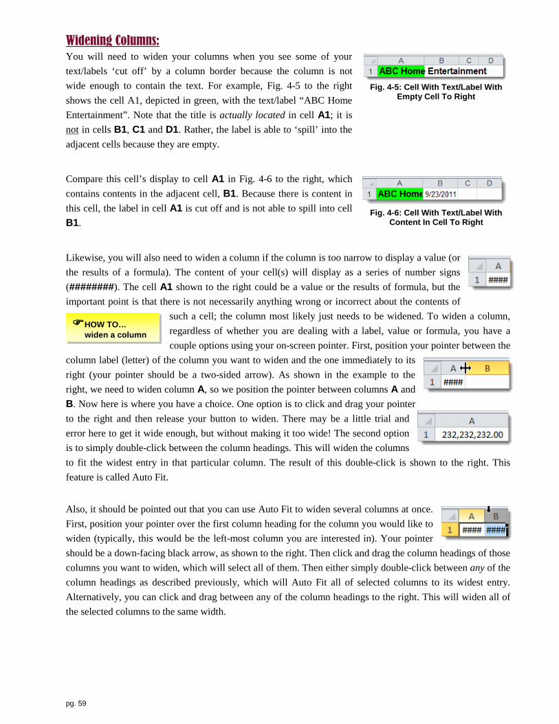
pg. 59
Widening Columns: You will need to widen your columns when you see some of your text/labels ‘cut off’ by a column border because the column is not wide enough to contain the text. For example, Fig. 4-5 to the right shows the cell A1, depicted in green, with the text/label “ABC Home Entertainment”. Note that the title is actually located in cell A1; it is not in cells B1, C1 and D1. Rather, the label is able to ‘spill’ into the adjacent cells because they are empty.
Fig. 4-5: Cell With Text/Label With
Empty Cell To Right
Compare this cell’s display to cell A1 in Fig. 4-6 to the right, which contains contents in the adjacent cell, B1. Because there is content in this cell, the label in cell A1 is cut off and is not able to spill into cell B1.
Fig. 4-6: Cell With Text/Label With
Content In Cell To Right
Likewise, you will also need to widen a column if the column is too narrow to display a value (or the results of a formula). The content of your cell(s) will display as a series of number signs (########). The cell A1 shown to the right could be a value or the results of formula, but the important point is that there is not necessarily anything wrong or incorrect about the contents of
such a cell; the column most likely just needs to be widened. To widen a column, regardless of whether you are dealing with a label, value or formula, you have a couple options using your on-screen pointer. First, position your pointer between the
column label (letter) of the column you want to widen and the one immediately to its right (your pointer should be a two-sided arrow). As shown in the example to the right, we need to widen column A, so we position the pointer between columns A and B. Now here is where you have a choice. One option is to click and drag your pointer to the right and then release your button to widen. There may be a little trial and error here to get it wide enough, but without making it too wide! The second option is to simply double-click between the column headings. This will widen the columns to fit the widest entry in that particular column. The result of this double-click is shown to the right. This feature is called Auto Fit.
Also, it should be pointed out that you can use Auto Fit to widen several columns at once. First, position your pointer over the first column heading for the column you would like to widen (typically, this would be the left-most column you are interested in). Your pointer should be a down-facing black arrow, as shown to the right. Then click and drag the column headings of those columns you want to widen, which will select all of them. Then either simply double-click between any of the column headings as described previously, which will Auto Fit all of selected columns to its widest entry. Alternatively, you can click and drag between any of the column headings to the right. This will widen all of the selected columns to the same width.
HOW TO… widen a column

pg. 60
Formatting Column Headings: You readability and emphasis, consider underlining and bold facing column headings (shortcut: select the cells and then press the <Ctrl> key and then <b>). Also, when aligning column headings, consider either centering all headings or left aligning columns containing text (because by default, text entries are left-aligned), and right aligning columns containing numbers (including currency, because they are either right or decimal-aligned). Most importantly, be consistent!
Emphasis any titles and sub-titles with bolded type and/or enlarged size. Also, consider using cell borders on your column headings, subtotals and grand totals. The [Borders] button is in the Paragraph group under the Home command tab, as shown in Fig. 4-7 below.
Fig. 4-7: Borders Drop-Down List
Compare the difference in the appearance and readability of the worksheets shown below in Fig. 4-8, before and after formatting.
Fig. 4-8: Before & After Formatting (font sizing, bolding and bordering cells)
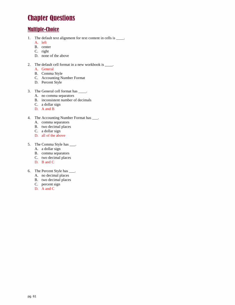
pg. 61
Chapter Questions
Multiple-Choice 1. The default text alignment for text content in cells is ____.
A. left B. center C. right D. none of the above
2. The default cell format in a new workbook is ____.
A. General B. Comma Style C. Accounting Number Format D. Percent Style
3. The General cell format has ____.
A. no comma separators B. inconsistent number of decimals C. a dollar sign D. A and B
4. The Accounting Number Format has ___.
A. comma separators B. two decimal places C. a dollar sign D. all of the above
5. The Comma Style has ___.
A. a dollar sign B. comma separators C. two decimal places D. B and C
6. The Percent Style has ___.
A. no decimal places B. two decimal places C. percent sign D. A and C

pg. 62
5 Charting: A picture’s worth a thousand words…if done wisely
Charts can be a very effective and efficient means to present quantitative analysis. Unlike written documents and oral presentations, charts do not have an inherent beginning, middle and end, as well chosen and attractive, well designed chart can ‘tell a story’ very quickly. However, not all charts are created equal, as the wrong chart, given the data you are using and what you are trying to show, can confuse and/or mislead your reader.
This chapter begins with a discussion of the type of data you need to analyze. Then, we briefly review the types of available analysis, as well as suggested chart types that may be most effective in presenting your message. Next, we present details of the charts available in Excel. Lastly, we present creating, resizing and moving your charts.
Key Chapter Terms:
• Proportion • Comparison • Trend • Distribution • Correlation • X-axis • Y-axis • Z-axis • Data Series • Legend • Data Item • Data Value
• Data Marker • Column Chart • Line Chart • Pie Chart • Bar Chart • Area Chart • XY Scatter • Stock • Surface • Doughnut • Bubble • Radar

pg. 63
Type of Data: We will see later how the nature of your data impacts your choice of chart, but for now, consider that your data can be thought of as being either of two types: discrete or continuous. Discrete data can be measured, but only with a finite set of values; that is, it can only take on certain values within a range (example: 1, 2, 3 or 4, but not 1.5 or 2.8, for example). In contrast, continuous data can be measured (or observed) at any (infinite) value between two measures or levels (for example, any possible air temperature between 0° F and 100° F, and any degree measure in between). Computations can be performed on continuous data.
You also may need to consider how many categories of data will be included in your analysis. While this may not directly impact which chart you may use, for clarity in your analysis, many data series may suggest that you need to break up your data into subsets and then produce multiple charts (of the same type). For example, sales data for four categories/regions (North, South, East and West) for a single year can be depicted on a column chart quite clearly. However, as shown in Fig. 5-1 to the right, sales data for a dozen regions across 10 years produces a colorful mess!
Fig. 5-1: Charting 10 Data Series
An alternative could be to use a series of yearly charts, as shown in Fig. 5-2, or a series of regional charts, as shown in Fig. 5-3 (both figures are below). But with either option, be sure each of your charts is consistently designed for purposes of comparison. For example, each Y-axis needs to start at the same value, preferably zero (0) and each needs to have the same categories along the x-axis.
Fig. 5-2: Series of Yearly Charts
Fig. 5-3: Series of Regional Charts

pg. 64
Type of Analysis: Once you consider the discrete or continue nature of your data and the amount of data you want to include in your chart, your next consideration should be the message you want to convey through your analysis: what is it that you want to show? Your analysis can be grouped into one of the following analysis types: proportion of a whole, comparison, trend over time, distribution or correlation.
Proportion of a whole breaks down a single whole (for example, total number of students in a class) into its proportional parts (percentages) that make up that whole. For example, you have 100 students, of which 25% are freshman, 25% sophomores, 25% juniors and 25% seniors. Sample questions you might be trying to answer are:
• Which class of students was the largest/smallest proportion (percentage)? • Was there a relatively consistent proportion of students in each class?
Comparison compares categories of a single (or multiple) data item with counts or measures (not proportions or percentages). This type of analysis illustrates relative rank of items: larger, smaller, equal amounts. For example, the total number of students in a class is 400, of which 100 are freshman, 100 are sophomores, 100 are juniors and 100 seniors. Sample questions you might be trying to answer are:
• Which class of students was the largest/smallest? • Was there a relatively consistent number of students in each class?
Trend over time shows how a single (or multiple) data series changes (up, down, constant) over time (seconds, minutes, hours, days, weeks, months, years, decades, etc.). For example, you could chart changes in sales volume across a 12-month period. Sample questions you might be trying to answer are:
• Was sales volume relative consistent over the last 12 months? • What was the general sales trend over the last 12 months?
Distribution shows how many values of a particular data series are observed (or measured) across a sequenced list (general smallest to largest, from left to right) of all possible values of the item. For example, you could chart how many hours students reported sleeping the night before their exam (20 students slept three hours, 10 slept four hours, 15 slept five hours, etc.). Sample questions you might be trying to answer are:
• How many students slept five hours? • Was the number of students consistent across all levels of hours slept?
Correlation shows how two data items relate to (correlated with) each other. Items could be strongly or weekly related (or some point in between). Further, if they do exhibit some level of correlation, it could be positive (as the value of item #1 increases, the value of item #2 also tends to increase) or negative (as the value of item #1 decreases, item #2 tends to decrease). For example, you might be interested to see how closely related are hours of sleep the night before an exam to the grades received on that exam. Sample questions you might be trying to answer are:
• Were hours of study strongly related to exam grades? • Were higher hours of study positively related to higher exam grades?

pg. 65
Chart Selection: Before presenting considerations when choosing your chart, we briefly present a few terms associated with typical charts. See Fig. 5-4 and 5-5 below.
• X-axis: shows categories of data within a data set; shown as the horizontal axis on column, line, area, scatter, bubble charts, the vertical axis on bar charts, and as slices in a pie or donut chart.
• Y-axis: shows values of data within a data set; shown as the vertical axis on column, line, area, scatter, bubble charts, and the horizontal axis on bar charts.
• Z-axis: lends 3-D perspective (moves away from the viewer); it is the ‘depth axis’ in a 3-D column chart or surface chart.
• Data series: related set of data that typically would be represented by a specifically colored data marker, such as a line, area, column or bar.
• Legend: identifies data series through a common color in most charts (represents categories of data in a pie or donut chart).
• Data item: single set of data (categories) used along horizontal, vertical or depth axis; often is discrete (categorical) data.
• Data value: specific value included within a chart. • Data marker: graphic representation of a data value (column, bar, slice of pie, shape on a line, etc.).
Fig. 5-4: Chart Axis in 3-D Column Chart
Fig. 5-5: Chart Axis & Legend in 3-D Bar Chart
Categories of Data (data item
along X-axis)
Categories of Data (along Z-axis)
Y-axis
Categories of Data (data item
up & down X-axis)
Y-axis Legend with Data Series
Data Markers

pg. 66
Now that we have presented some key terms related to charts, and after having considered your data and the type of analysis that you want to do, it is time to choose a chart type(s). We will present much more detail on each of these chart types in the following pages, but for now, table 5-1 below presents suggested chart types to use, given the type of analysis you are doing, the nature of your data (discrete or continuous), the number of related sets of data (series) and data items (categories).
If you want to analyze a… Proportion Comparison Trend Distribution Correlation
…an
d yo
u ha
ve…
one
(1) d
ata
serie
s
PIE CHART
COLUMN
discrete X-axis
COLUMN
COLUMN
discrete X-axis
SCATTER (DOT) continuous or discrete axis
BAR
LINE
discrete X-axis
LINE
continuous or discrete X-axis
BUBBLE
continuous or discrete axis
HIGH-LOW-CLOSE
AREA
continuous or discrete X-axis
Paired Bar Chart
(not depicted)
mor
e th
an o
ne (1
+) d
ata
serie
s
COLUMN
100% Stacked (discrete X-axis)
COLUMN Clustered
(discrete X-axis)
LINE
BAR
100% Stacked (discrete X-axis)
BAR
Clustered (discrete X-axis)
AREA
DONUT
RADAR SURFACE
SURFACE
Table 5-1: Selecting A Chart Type

pg. 67
Chart Types: Now that we have reviewed some suggested chart types given your particular considerations, we take a closer look at the variety of charts available. There are many from which to choose, regardless of which software application you are using, but most of your analysis will likely make use of one or more of the following most common types: Pie (including Donut), Line (including Area), Column (including Cylinder, Cone and Pyramid), Bar (including Horizontal Cylinder, Horizontal Cone and Horizontal Pyramid) and/or Scatter (including Bubble). These, as well as additional charts available through Excel, are presented in the following pages, as well as in Fig. 5-6 below.
Fig. 5-6: Major Chart Types
A word about 3-D effect…some chart types, including column, bar, line and pie charts, can be depicted with a 3-D ‘edge’, which can look cool. However, a word of caution: in general, this effect makes these charts more difficult to read accurately, while a 2-D version of the same chart tends to be read with more precision. As an example, check out the ‘readability’ of a 2-D column chart compared to a 3-D column chart in Fig. 5-7 below. So you should ask yourself how preciously your audience needs to read these charts when deciding whether or not to use a 3-D sub-type.

pg. 68
Fig. 5-7: 2-D vs. 3-D Column Charts
In this section, we present each chart type available in Excel in the order they appear on the Insert command tab, Chart group (see Fig. 5-8 below). We also present the charts that are included under the [Other Charts] button.
We include details of each chart type, as well as some of the various sub-types (or versions) with examples of each. We used the same data set for each main chart type for purposes of comparison. Main types of charts include the following:
• Column • Line • Pie • Bar • Area • XY Scatter (also referred to as “Dot Charts”) • Stock • Surface • Doughnut • Bubble • Radar
Fig. 5-8: Chart Group
Column Charts are useful to show comparisons across categories of data, show distributions and show trends over time. Column charts are vertically orientated, as ‘taller’ columns correspond to higher values (along the vertical Y-axis), regardless of their shape (bar, cylinder, cone or pyramid). We limit our illustrations to different examples of 3-D column because 2-D and 3-D versions of Cylinder, Cone and Pyramid give much the same representations of your data.

pg. 69
Sub-types include (see Fig. 5-9 to the right): • 2-D Column: o Clustered Column, Stacked Column,
100% Stacked Column • 3-D Column: o 3-D Clustered Column, Stacked Column in 3-D,
100% Stacked Column in 3-D, 3-D Column • Cylinder: o Clustered Cylinder, Stacked Cylinder,
100% Stacked Cylinder, 3-D Cylinder • Cone: o Clustered Cone, Stacked Cone, 100% Stacked Cone,
3-D Cone • Pyramid: o Clustered Pyramid, Stacked Pyramid,
100% Stacked Pyramid, 3-D Pyramid
Fig. 5-9: Column Chart Types
The sub-type shown in Fig. 5-10 to the right is “Clustered Column in 3-D”. The main analysis is how do the data series (colors) compare to each other within each (clustered) category on the horizontal axis. For example, is “2010 Sales”, “2011 Sales” or “2012 Sales” the largest/smallest within “North”? You can also compare each data series across each category on the horizontal axis. For example, in which region is “2010” the largest/smallest?
Fig. 5-10: Clustered Column in 3-D
The sub-type shown in Fig. 5-11 to the right is “100% Stacked Column in 3-D”. The main analysis is how do the data series (colors) as a percentage compare to each other within each category on the horizontal axis. For example, is “2010 Sales”, “2011 Sales” or “2012 Sales” the largest/smallest percentage of “North”? You can also compare the percentage of each data series across each category on the horizontal axis. For example, in which region is “2010” the largest/smallest percentage?
Fig. 5-11: 100% Stacked Column in 3-D

pg. 70
The sub-type shown in Fig. 5-12 to the right is “3-D Column”. This chart has additional axis or dimension (Z-axis), oriented from front to back, as you view the chart, providing depth. Similar to a clustered column chart, the main analysis is how do the data series (colors arranged as rows) compare to each other within each category on the horizontal axis. However, notice there is no longer a need for a legend to identify the data series, as they are identified by their category rows on this new axis. For example, is “2010 Sales”, “2011 Sales” or “2012 Sales” the largest/smallest within “North”? You can also compare each data series across each category on the horizontal axis. For example, in which region is “2010” the largest/smallest?
Fig. 5-12: 3-D Column Chart
Line Charts are useful to show trends in your data over time and show comparisons. Line charts are vertically orientated, as ‘taller’ points on a line correspond to high values. We limit our illustrations to different examples of 3-D line charts because the 2-D versions without the markers (triangles, squares and diamonds that mark data points) give much the same representations of your data. Sub-types include (see Fig. 5-13 to the right):
• 2-D Line: o Line, Stacked, 100% Stacked, Markers,
Stacked with Markers, 100% Stacked with Markers
• 3-D Line
Fig. 5-13: Line Chart Types
The sub-type shown in Fig. 5-14 to the right is “Line With Markers” (triangles, squares and diamonds that mark data points). The main analysis is how do the data series (colors) change across the horizontal axis. For example, how does “2010 Sales”, “2011 Sales” and “2012 Sales” change from Jan through Dec? You can also compare each data series across each category on the horizontal axis. For example, for which month is “2010 Sales”, “2011 Sales” or “2012 Sales” the largest/smallest?
Fig. 5-14: Line Chart

pg. 71
The sub-type shown in Fig. 5-15 to the right is “Stacked Line With Markers”. The main analysis is how do the totals of the data series (colors) change across the X-axis (for example, for which month is the total of sales years the largest/smallest? You can also compare the total of the data series within each horizontal axis category. For example, for which month is the total of the “2010 Sales, “2011 Sales” and “2012 Sales” the largest/smallest?
Fig. 5-15: Stacked Line Chart
The sub-type shown in Fig. 5-16 to the right is “100% Stacked Line With Markers”. The main analysis is how do the data series (colors) as a percentage change across the horizontal axis (how does “2010 Sales”, “2011 Sales” and “2012 Sales” change from Jan through Dec? You can also compare the percentage of each data series across each category on the X-axis. For example, for which response (“Strongly Agree”, “Agree”, etc.) is the percentage of “Republican”, “Democrat” or “Independent” the largest/smallest?
Fig. 5-16: 100% Stacked Line Chart
The sub-type shown in Fig. 5-17 to the right is “3-D Line”. The main analysis is how do the data series (colors) change across the horizontal axis (how does “2010 Sales”, “2011 Sales” and “2012 Sales” change from Jan through Dec? However, this is a very difficult chart design to read and is therefore not recommended!
Fig. 5-17: 3-D Line Chart

pg. 72
Pie Charts are useful to show proportions of a single whole (100%). Unlike column, bar and line charts, pie charts do not have any vertical or horizontal axis. Larger values (percentages) are simply shown as larger slices of the pie, where the entire pie represents 100% of the quantity being charted. Sub-type include (see Fig. 5-18 to the right):
• 2-D Pie: o Pie, Exploded Pie, Pie of Pie
• 3-D Pie: o Pie in 3-D, Exploded Pie in 3-D, Bar of Pie
• Bar of Pie o Pie in 3-D, Exploded Pie in 3-D, Bar of Pie
Fig. 5-18: Pie Chart Types
The sub-type shown in Fig. 5-19 to the right is “Pie in 3-D”. The main analysis is how do the percentages of each category (for example, “Very Low”, “Low”, “Medium”, “High” and “Very High”) compare?
Fig. 5-19: Pie In 3-D
The sub-type shown in Fig. 5-20 to the right is “Pie of Pie”. The main (larger) pie depicts a two-dimensional analysis of percentages of most of the categories, but the ‘last’ two categories are combined into one category (for example, “Very Low”, “Low”, “Medium” and “High/Very High”). The sub-pie (smaller) then breaks out the combined category into its proportions (for example, “High” and “Very High”). An alternative sub-type breaks out these last two categories into a bar chart (Bar of Pie).
Fig. 5-20: Pie of Pie
The sub-type shown in Fig. 5-21 to the right is “Exploded Pie in 3-D”. This depiction compares the percentages of each category (for example, “Very Low”, “Low”, “Medium”, “High” and “Very High”), this sub-type pulls out (explodes) one or more categories for emphasis.
Fig. 5-21: Exploded Pie in 3-D

pg. 73
Bar Charts are useful to show comparisons. Bar charts are horizontally orientated, as ‘longer’ bars correspond to higher values (along the vertical axis), regardless of their shape (bar, cylinder, cone or pyramid). They are essentially column charts turn clockwise 90°. Sub-types of each variation include clustered, stacked and 100% stacked. We limit our illustrations to different examples of 3-D bar because 2-D and 3-D versions of Cylinder, Cone and Pyramid give much the same representations of your data. Sub-types include (see Fig. 5-22):
• 2-D Bar: o Clustered Bar, Stacked Bar, 100% Stacked Bar
• 3-D Bar: o Clustered Bar in 3-D, Stacked Bar in 3-D,
100% Stacked Bar in 3-D • Cylinder: o Clustered Horizontal Cylinder,
Stacked Horizontal Cylinder, 100% Stacked Horizontal Cylinder
• Cone: o Clustered Horizontal Cone,
Stacked Horizontal Cone, 100% Stacked Horizontal Cone
• Pyramid: o Clustered Horizontal Pyramid,
Stacked Horizontal Pyramid, 100% Stacked Horizontal Pyramid
Fig. 5-22: Bar Chart Types
The sub-type shown in Fig. 5-23 to the right is “Clustered Bar in 3-D” (2-D columns, cylinders, cones and pyramids also available). The main analysis is how the data series (colors) compare to each other within each (clustered) category on the vertical axis. For example, is “2010 Sales”, “2011 Sales” or “2012 Sales” the largest/smallest within “North”? You can also compare each data series across each category on the vertical axis. For example, in which region is “2010” the largest/smallest?
Fig. 5-23: Clustered Bar in 3-D

pg. 74
The sub-type shown in Fig. 5-24 to the right is “Stacked Bar in 3-D”. The main analysis is how the totals of the data series (colors) compare to each other across each item on the vertical axis. For example, in which region is the total of “2010 Sales”, “2011 Sales” and “2012 Sales” the largest/smallest? You can also compare the breakdown of the total of the data series within each vertical axis category. For example, does “2010 Sales”, “2011 Sales” or “2012 Sales” represent the largest/smallest amount of the total sales within “North”?
Fig. 5-24: Stacked Bar in 3-D
The sub-type shown in Fig. 5-25 to the right is “100% Stacked Bar in 3-D”. The main analysis is how the data series (colors) as a percentage compare to each other within each category on the vertical axis. For example, is “2010 Sales”, “2011 Sales” or “2012 Sales” the largest/smallest percentage of “North”? You can also compare the percentage of each data series across each category on the vertical axis. For example, in which region is “2010” the largest/smallest percentage?
Fig. 5-25: 100% Stacked Bar in 3-D Area Charts are useful to show trends in your data over time and show comparisons. They are similar to a line chart, but imply a sense of ‘volume’. Care must be exercise when designing area charts, however, as some of your data can be ‘hidden’ from view as the various areas are rendered from front to back. Area charts are vertically orientated, as ‘taller’ points on a line correspond to higher values. We limit our illustrations to different examples of 3-D area because 2-D and 3-D versions of area give much the same representations of your data. Sub-types include (see Fig. 5-26 to the right):
• 2-D Area: o Area, Stacked Area, 100% Stacked Area
• 3-D Area: o 3-D Area, Stacked Area in 3-D,
100% Stacked Area in 3-D
Fig. 5-26: Area Chart Types

pg. 75
The sub-type shown in Fig. 5-27 to the right is “3-D Area”. The main analysis is how does the data series (colors) change across the X-axis. For example, how does “2010 Sales”, “2011 Sales” and “2012 Sales” change from Jan through Dec? You can also compare each data series across each category on the X-axis. For example, for which month is “2010 Sales”, “2011 Sales” or “2012 Sales” the largest/smallest?
Fig. 5-27: 3-D Area
The sub-type shown in Fig. 5-28 to the right is “Stacked Area in 3-D”. The main analysis is how does the totals of the data series (colors) change across the X-axis. For example, for which month is the total of sales years the largest/smallest? You can also compare the total of the data series within each X-axis category. For example, for which month is the total of the “2010 Sales, “2011 Sales” and “2012 Sales” the largest/smallest?
Fig. 5-28: Stacked Area in 3-D
The sub-type shown in Fig. 5-29 to the right is “100% Stacked Area in 3-D”. The main analysis is how the data series (colors) as a percentage change across the X-axis? How does “2010 Sales”, “2011 Sales” and “2012 Sales” change from Jan through Dec? You can also compare the percentage of each data series across each category on the X-axis. For example, for which response (“Strongly Agree”, “Agree”, etc.) is the percentage of “Republican”, “Democrat” or “Independent” the largest/smallest?
Fig. 5-29: 100% Stacked Area in 3-D XY Scatter Charts (also known as Dot Charts) are useful to show correlations (or relationships) between two sets of data. XY scatter charts are neither vertically nor horizontally oriented, as either data set 1 or data set 2 could be plotted along the X-axis or Y-axis. Sub-types include (see Fig. 5-30 to the right):
• Scatter with only Markers, Scatter with Smooth Lines and Markers, Scatter with Smooth Lines, Scatter with Straight Lines and Markers, Scatter with Straight Lines
Fig. 5-30: XY Scatter Chart Types
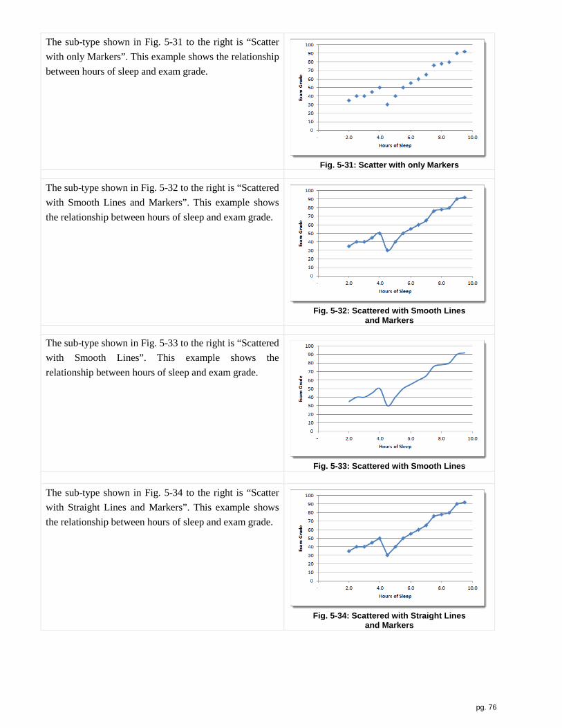
pg. 76
The sub-type shown in Fig. 5-31 to the right is “Scatter with only Markers”. This example shows the relationship between hours of sleep and exam grade.
Fig. 5-31: Scatter with only Markers
The sub-type shown in Fig. 5-32 to the right is “Scattered with Smooth Lines and Markers”. This example shows the relationship between hours of sleep and exam grade.
Fig. 5-32: Scattered with Smooth Lines
and Markers
The sub-type shown in Fig. 5-33 to the right is “Scattered with Smooth Lines”. This example shows the relationship between hours of sleep and exam grade.
Fig. 5-33: Scattered with Smooth Lines
The sub-type shown in Fig. 5-34 to the right is “Scatter with Straight Lines and Markers”. This example shows the relationship between hours of sleep and exam grade.
Fig. 5-34: Scattered with Straight Lines
and Markers

pg. 77
The sub-type shown in Fig. 5-35 to the right is “Scatter with Straight Lines”. This example shows the relationship between hours of sleep and exam grade.
Fig. 5-35: Scattered with Straight Lines
Stock Charts are useful for analysis of stocks. Stock charts are vertically orientated, as ‘taller’ vertical lines and rectangles correspond to higher values. Sub-types include (see Fig. 5-36 to the right):
• High-Low-Close, Open-High-Low-Close, Volume-High-Low-Close, Volume-Open-High-Low-Close
Fig. 5-36: Stock Chart Types
The sub-type shown in Fig. 5-37 to the right is “High-Low-Close”. The top of each vertical line represents the high price for the time period show on the x-axis and the bottom shows the low price. The closing price for each time period is shown as a dot along each vertical line.
Fig. 5-37: High-Low-Close Chart
The sub-type shown in Fig. 5-38 to the right is “Open-High-Low-Close”. The top of each vertical line represents the high price for the time period show on the x-axis and the bottom shows the low price. The opening and closing prices for each time period are shown at the ends of each rectangle.
Fig. 5-38: Open-High-Low-Close Chart

pg. 78
The sub-type shown in Fig. 5-39 to the right is “Volume-High-Low-Close”. The top of each vertical line represents the high price for the time period show on the x-axis and the bottom shows the low price. The volume of stocks for each time period is shown as a column.
Fig. 5-39: Volume-High-Low-Close
The sub-type shown in Fig. 5-40 to the right is “Volume-Open-High-Low-Close”. The top of each vertical line represents the high price for the time period show on the x-axis and the bottom shows the low price. The opening and closing prices for each time period are shown at the ends of each rectangle. The volume of stocks for each time period is shown as a column.
Fig. 5-40: Volume-Open-High-Low-Close
Surface Charts are useful for depicting comparisons and trends among a large amount of data along three axis (X, Y and Z). However, the usefulness of this chart can depend on your data. Sub-types include (see Fig. 5-41 to the right):
• 3-D Surface, Wireframe 3-D Surface, Contour, Wireframe Contour
Fig. 5-41: Surface Chart Types The sub-type shown in Fig. 5-42 to the right is “3-D Surface”. The main analysis is how the data series compare across both horizontal axis (X and Z). The colors correspond to particular levels of values (on the vertical axis, Z), rather than categories on either of the horizontal axis.
Fig. 5-42: 3-D Surface Chart

pg. 79
The sub-type shown in Fig. 5-43 to the right is “Wireframe 3-D Surface”. This can be a difficult chart type to understand, and should be used with caution, if at all!
Fig. 5-43: Wireframe 3-D Surface Chart
The sub-type shown in Fig. 5-44 to the right is “Contour”. This can also be a difficult chart type to understand, and should be used with caution. It is a two-dimensional rendering of a surface chart, so the third dimension (Z-axis) is ‘flattened’ and shown on the right side as a vertical axis. Colors depict relative value.
Fig. 5-44: Contour Chart
The sub-type shown in Fig. 5-45 to the right is “Wireframe Contour”. This can also be a difficult chart type to understand, and should be used with caution. It too is a two-dimensional rendering of a surface chart, so the third dimension (Z-axis) is ‘flattened’ and shown on the right side as a vertical axis. Colors depict relative value.
Fig. 5-45: Wireframe Contour Chart

pg. 80
Donut Charts are useful to show proportions of one or more ‘wholes’ (100%). Similar to pie charts, donut charts do not have any vertical or horizontal axis. Larger values (percentages) are simply shown as larger slices of the donut, where the entire donut represents 100% of the quantity being charted. Unlike a pie chart, however, a donut chart can show the proportions of more than one ‘whole’ through the use of multiple donuts inside of each other. Sub-type include (see Fig. 5-46 to the right):
• Donut, Exploded Donut
Fig. 5-46: Stock Chart Types
The sub-type shown in Fig. 5-47 to the right is “Donut”. The main analysis is how the percentages of each category (for example, “Strongly Agree”, “Agree”, “Neutral”, “Disagree” and “Strongly Disagree”) compare within the outside donut (“Females”) and within the inside donut (“Males”). You can also compare how the percentages of each category between the two donuts (“Females” and “Males”) compare.
Fig. 5-47: Donut Chart
The sub-type shown in Fig. 5-48 to the right is “Exploded Donut”. The part(s) are pulled away from the center for emphasis, much like an exploded pie chart. The main analysis is how the percentages of each category (for example, “Strongly Agree”, “Agree”, “Neutral”, “Disagree” and “Strongly Disagree”) compare within the outside donut (“Females”) and within the inside donut (“Males”). You can also compare how the percentages of each category between the two donuts (“Females” and “Males”) compare.
Fig. 5-48: Exploded Donut Chart
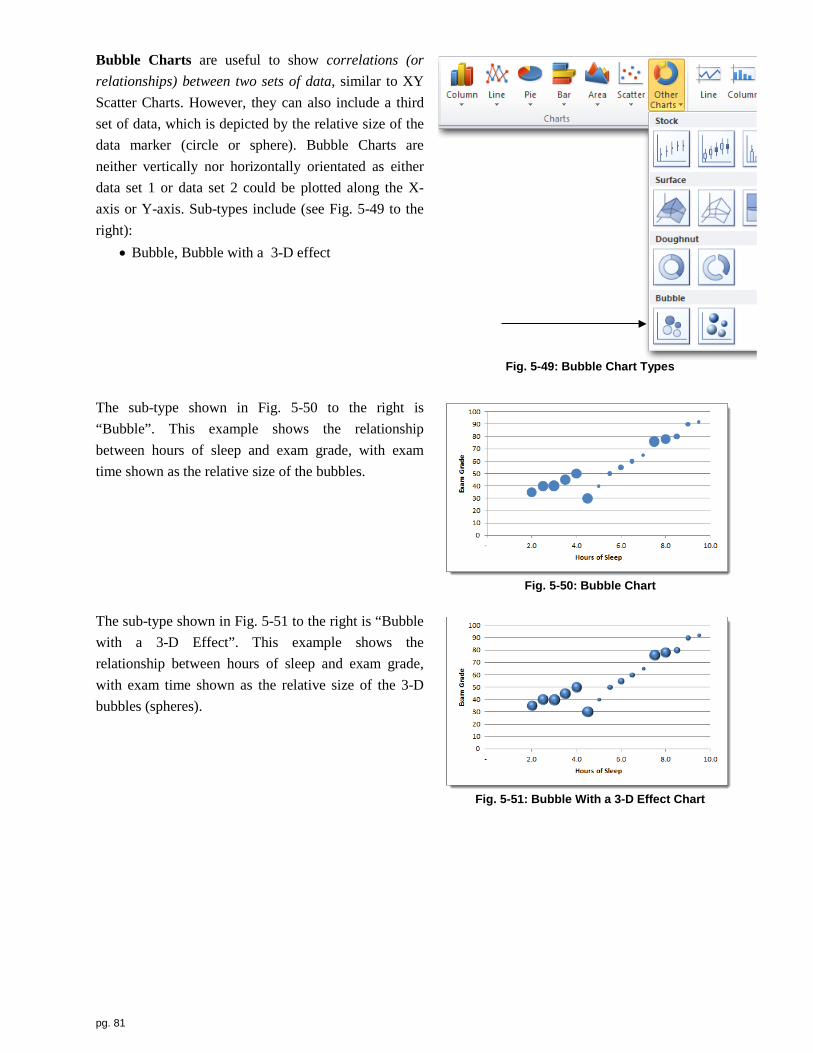
pg. 81
Bubble Charts are useful to show correlations (or relationships) between two sets of data, similar to XY Scatter Charts. However, they can also include a third set of data, which is depicted by the relative size of the data marker (circle or sphere). Bubble Charts are neither vertically nor horizontally orientated as either data set 1 or data set 2 could be plotted along the X-axis or Y-axis. Sub-types include (see Fig. 5-49 to the right):
• Bubble, Bubble with a 3-D effect
Fig. 5-49: Bubble Chart Types
The sub-type shown in Fig. 5-50 to the right is “Bubble”. This example shows the relationship between hours of sleep and exam grade, with exam time shown as the relative size of the bubbles.
Fig. 5-50: Bubble Chart
The sub-type shown in Fig. 5-51 to the right is “Bubble with a 3-D Effect”. This example shows the relationship between hours of sleep and exam grade, with exam time shown as the relative size of the 3-D bubbles (spheres).
Fig. 5-51: Bubble With a 3-D Effect Chart

pg. 82
Radar Charts (also known as Spider Charts) are useful for comparisons. You might think of these charts as a circular version of a line chart. Unlike column and bar charts, categories along the X-axis are ‘wrapped around’ 360° in a circle, as opposed to being arranged linearly along a straight horizontal or vertical axis. Also, the Y-axis is depicted vertically through the middle of the chart. However, the usefulness of this chart can depend on your data. Sub-types include (see Fig. 5-52 to the right):
• Radar, Radar with Markers, Filled Radar
Fig. 5-52: Radar Chart Types
The sub-type shown in Fig. 5-53 to the right is “Radar”. The main analysis is a comparison of each data series around each category on the circular axis. For example, for which month is “2010 Sales”, “2011 Sales” or “2012 Sales” the largest/smallest?
Fig. 5-53: Radar Chart Type
The sub-type shown in Fig. 5-54 to the right is “Radar With Markers”. The main analysis is a comparison of each data series around each category on the circular axis. For example, for which month is “2010 Sales”, “2011 Sales” or “2012 Sales” the largest/smallest?
Fig. 5-54: Radar with Markers Chart Type

pg. 83
The sub-type shown in Fig. 5-55 to the right is “Filled Radar”. This is a ‘circular’ version of an area chart. The main analysis is a comparison of each data series around each category on the circular axis. For example, for which month is “2010 Sales”, “2011 Sales” or “2012 Sales” the largest/smallest?
Fig. 5-55: Filled Radar Chart Type
Creating Charts:
Let’s take a more detailed look at the various steps to creating a chart, using a column chart as an example (other chart types work much the same way).
1. To being, select the cells you wish to chart. See Fig. 5-56 to the
right. If the ranges of cells you want to chart are not adjacent to each other, select the first range, then hold the <Ctrl> key down as your select the remaining ranges.
Fig. 5-56 2. Click the Insert command tab.
3. Click the [Column] button located within the Charts group, as shown in Fig. 5-57 below, or choose the [Line], [Pie], [Bar], [Area], [Scatter] or [Other Charts] button.
Fig. 5-57
4. Click your preferred sub-type (2-D, 3-D, Cylinder, Cone, etc.), as shown in Fig. 5-58 below.
HOW TO… create a chart

pg. 84
Fig. 5-58
Your chart will appear on the current worksheet.
5. To switch your data series (legend) with the X-axis labels, click the [Switch Row/Column] button accessed through the Chart Tools sub-tab and Design tab. See Fig. 5-59 below.
Fig. 5-59
Switching your row and column specifications produces the following:
Fig. 5-60: Before and After
6. To make changes to your chart, right-click on the item that you want to change and select the appropriate item from the pop-up menu.

pg. 85
Resizing Charts: You have two options when resizing a chart: keep the ratio of a chart’s height and width (its aspect ratio) consistent as you resize it or resize it to a new ratio or proportion, thereby ‘distorting’ the original height vs. width relative to other. To maintain your ratio:
1. Click once in the center of your chart to select it. 2. Position your pointer over any of the four corner handles (your pointer should become a double-sided
diagonal arrow). 3. Hold the <Shift> key down. 4. Click & drag toward the center of the chart to shrink it or click & drag away from the center of the
chart to enlarge it. 5. Release the button and then the <Shift> key when you are finished.
To not maintain your ratio so you can stretch or shorten a chart without regard to the original height and width:
1. Click once in the center of your chart to select it. 2. Position your pointer over any of the four corners, side, top or bottom handles (your pointer should
become a double-sided diagonal arrow). 3. Click & drag toward the center of the chart to shrink it or click & drag away from the center of the
chart to enlarge it. 4. Release the button and then the <Shift> key when you are finished.
Moving Charts: You have general two options when moving a chart: keep it as a graphic on the current worksheet, where it will ‘float’ over a block of cells, or move it to a ChartSheet. A ChartSheet is a new sheet within your workbook that will only contain your chart, with
no columns, rows or other charts. To begin, to keep your chart on the current worksheet, do the following: 1. Position your pointer over the outer boarder of your chart, but away from any part of your chart (your
pointer should become a four-sided diagonal arrow). 2. Click & drag the chart to its new location. 3. Release the button to place the chart.
As an alternative, if you want to create a ChartSheet and move your chart to that sheet, do the following: 1. Click anywhere inside your chart. 2. Click the [Move Chart] button located to the far right of the Design command tab, Chart Tools sub-
tab. Fig. 5-61 below shows a ChartSheet. Note the lack of column, rows and cells.
HOW TO… resize a chart
HOW TO… move a chart

pg. 86
Fig. 5-61: ChartSheet

pg. 87
Chapter Questions
Multiple-Choice 1. The chart type most useful for showing proportions of a whole is ___.
A. pie B. line C. column D. scatter
2. The chart type most useful for showing trends over time is ___.
A. line B. column C. bar D. scatter
3. The chart type most useful for showing comparisons is ___.
A. pie B. line C. column D. scatter
4. The chart type most useful for showing the relationship (correlation) between two data items (variables) is ___.
A. pie B. line C. column D. scatter
5. Other types of column charts include ___.
A. Cylinder B. Cone C. Pyramid D. all of the above
6. To create a new chart, select your data and then click the ___ command tab.
A. Formulas B. Insert C. Data D. View

pg. 88
6 Printing: Preparing a spreadsheet to go from screen to paper
It can be a little tricky to get your worksheet to appear on paper. This is especially true with larger worksheets. Most commonly, you may have a row or a column on a second page, which makes your creation more difficult to read. Why does this happen? When developing a word processing document, you are generally working within a screen that shows what your work will look like on a printed page, as the ‘workspace’ is based on a specific page size, typically 8½” x 11”, and page orientation (portrait, taller than wider or landscape, wider than taller). Contrast this with spreadsheet design: your worksheet is based on a collection of columns and rows, not page size and orientation. It is only after you have created your worksheet that you consider how your on-screen (electronic) worksheet will translate to paper.
This chapter presents some tips and hints for you to effectively and efficiently get your worksheet from screen to paper.
Key Chapter Terms:
• Orientation • Scaling • Margins • Page Setup • Page Setting

pg. 89
The secret to getting your on-screen worksheet to paper is, no surprise, the Print option from the File command tab. But this is not because your work then goes to paper! Rather it is because the worksheet you are currently working on appears on the right side of the Print setup screen as a ‘print preview” so you can see what it will look like prior to committing to paper. But it’s important to note that this preview is based on Excel’s default ‘view’ of your work; namely, it depicts your worksheet with the following settings:
• 100% of size (“no scaling”), • portrait-oriented, • “normal margins” (top: 0.75”, bottom: 0.75”, left: 0.70”, right: 0.70”).
This is just a starting point for how to best get your worksheet effectively on paper. Consider the worksheet shown in Fig. 6-1 below. In cells B2:AP42, the value in the corresponding orange cell is squared and then added to the squared value in the corresponding yellow cell. Within its 42 columns and 42 rows, it contains 1,681 calculations in a total of 1,764 cells!
Fig. 6-1: 42 Column x 42 Row Spreadsheet
What is important to note here is that at 100%, this worksheet will not fit on the ‘usual’ 8½” x 11” portrait-orientated piece of paper because it has 42 columns (its 42 rows actually fit fine on this size and oriented page). In fact, this worksheet will print on three pages if you were to just click the [Print] button in the upper-left of the screen. The page count is pointed out in the Fig. 6-2 below.

pg. 90
Fig. 6-2: Print Preview with Portrait Orientation, Normal Margins & No Scaling (100%)
The next step is to make a few adjustments to your print settings to see how you really want your worksheet to appear on paper, and not just how Excel’s default setting show your work. Under Settings, we have several drop-down options available, but most notably, for this worksheet, we probably want to start by switching the orientation to landscape since this worksheet is wider than it is taller (although the number of columns and rows is the same, the columns are wider than the rows are tall). Notice this adjustment has actually added a page, for a total of four. That is because the 42 rows will not fit on a 8½” x 11” landscape-orientated piece of paper. But that’s OK for now. More columns now fit on this page, and as mentioned, this worksheet is wider than it is taller, so this will ultimately help us most effectively make use of the paper. See Fig. 6-3 below.
Fig. 6-3: Print Preview with Landscape Mode

pg. 91
Next, we should consider smaller margins in order to make more use of the page. Let’s try ‘Narrow Margins’, which are top: 0.75”, bottom: 0.75”, left: 0.25”, right: 0.25”. Notice we are now seeing a few more columns on the first page. See Fig. 6-4 below.
Fig. 6-4: Print Preview with Narrow Margins
Lastly, try to adjust the scaling to “Fit Sheet on One Page” under the “Scaling” option. And depending on the number and size of your columns and rows, you might want to try the other options under “Scaling”, “Fit All Columns on One Page” and “Fit All Rows on One Page”. See Fig. 6-5 below.
Fig. 6-5: Print Preview with Scaling (Fit One Sheet on One Page)

pg. 92
As an alternative to the settings available on the left side of the Print screen, you can also click on the Page Setup link at the bottom of Settings. This will display the Page Setup dialog box, which contains all of the settings we have discussed, as well as additional ones. See Fig. 6-6 to the right. A particularly useful one, specifically when displaying formulas (after using the <Ctrl> key and tilde <~> key combination), under the Sheet tab, you will find checkbox options to print “Gridlines” and “Row and columns headings”. The result is shown in Fig. 6-7 below.
Fig. 6-6: Page Setup Dialog Box
Fig. 6-7
To print only a given chart (with no worksheet cells), click once in the chart and then choose Print from the File command tab (or hold down the <Ctrl> key and then press <p>). This will automatically orient your page to ‘landscape’ and center your chart on the page.

pg. 93
This page intentionally left blank

pg. 94
7 Sorting: Ordering rows within a spreadsheet
In addition to performing quantitative and graphical analysis of your data, spreadsheets can be very useful for placing the rows of your worksheet into a specified order. This can be extremely useful in order to organize the data and understand the information contained within a given spreadsheet, particularly larger ones with many rows of data. This is done through sorting the contents of a particular column or columns.
This chapter presents some tips and hints for you to sort the data in your worksheet.
Key Chapter Terms:
• Ascending • Descending • Data Headers
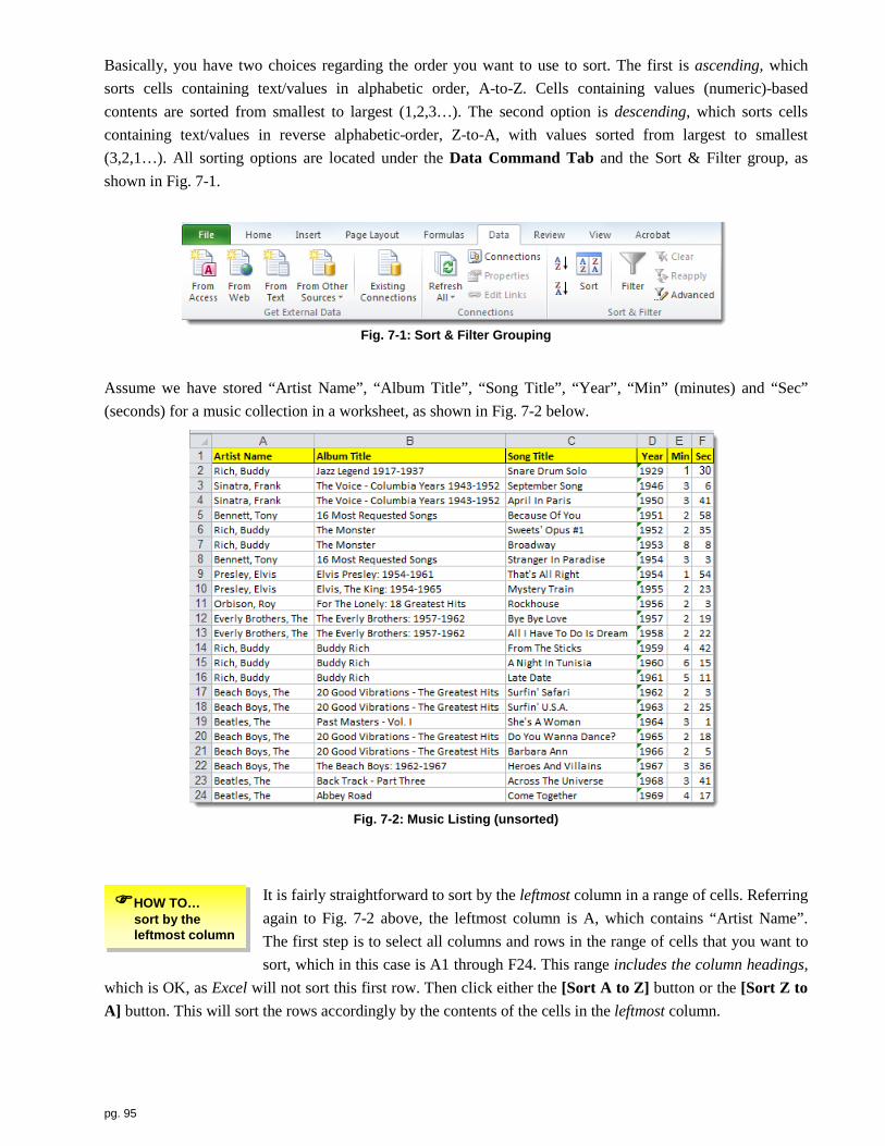
pg. 95
Basically, you have two choices regarding the order you want to use to sort. The first is ascending, which sorts cells containing text/values in alphabetic order, A-to-Z. Cells containing values (numeric)-based contents are sorted from smallest to largest (1,2,3…). The second option is descending, which sorts cells containing text/values in reverse alphabetic-order, Z-to-A, with values sorted from largest to smallest (3,2,1…). All sorting options are located under the Data Command Tab and the Sort & Filter group, as shown in Fig. 7-1.
Fig. 7-1: Sort & Filter Grouping
Assume we have stored “Artist Name”, “Album Title”, “Song Title”, “Year”, “Min” (minutes) and “Sec” (seconds) for a music collection in a worksheet, as shown in Fig. 7-2 below.
Fig. 7-2: Music Listing (unsorted)
It is fairly straightforward to sort by the leftmost column in a range of cells. Referring again to Fig. 7-2 above, the leftmost column is A, which contains “Artist Name”. The first step is to select all columns and rows in the range of cells that you want to sort, which in this case is A1 through F24. This range includes the column headings,
which is OK, as Excel will not sort this first row. Then click either the [Sort A to Z] button or the [Sort Z to A] button. This will sort the rows accordingly by the contents of the cells in the leftmost column.
HOW TO… sort by the leftmost column

pg. 96
To sort by a column other than the leftmost column or to sort by more than one column, again begin by selecting all columns and rows in the range of cells that you want to sort. Let’s assume you want to alphabetically sort by “Artist Name”, then by
“Album Title” and lastly by “Song Title”. Start by again selecting A1 through 25. Then click the [Sort] button. This will display the sort dialog box shown in Fig. 7-3 below.
Fig. 7-3: Sort Dialog Box (one-level sorting)
Next, be sure that the check box, My data has headers, is checked. This tells Excel that you have included column headings within your range of cells. In the Sort by drop-down list, select “Artist Name”. (The default Order is “A to Z”, but if you wanted to switch it to “Z to A”, choose that option from the drop-down Order list to the right.) Then click the [Add Level] button to add an additional column (level) on which to sort. From the Then by drop-down list, select “Album Title”, as shown in Fig. 7-4 below. (Again, the default Order is “A to Z”, but if you wanted to switch it to “Z to A”, choose that option from the drop-down Order list to the right.)
Fig. 7-4: Sort Dialog Box (two-level sorting)
Lastly, click the [Add Level] button again. From the Then by drop-down list on the third row, select “Song Title”, as shown in Fig. 7-5 below. (Again, the default Order is “A to Z”, but if you wanted to switch it to “Z to A”, choose that option from the drop-down Order list to the right.) Then click the [OK] button.
HOW TO… sort by multiple columns

pg. 97
Fig. 7-5: Sort Dialog Box (three-level sorting)
The result of your three-level sort is shown in Fig. 7-6 below. Rows are now sorted first by “Artist Name”, then by “Album Title” and then by “Song Title”.
Fig. 7-6: Music Listing (sorted by Artist Name, Album Title & Song Title)
The result of our sort in Fig. 7-6 above happens to be by the first three columns, from left to right, in order. However, you could use the Sort dialog box to use any column as the first (primary) sort, any column as the second, etc.

pg. 98
References
Babbie, Earl, The Practice of Social Research (9th Ed.), Wadsworth/Thomson Publishing, Belmont, CA 2001.
Doumont, Jean-Luc and Philippe Vandenbroeck, “Choosing The Right Graph”, IEEE Transactions On Professional Communication, Vol. 45, Number 1 (March 2002).
Gaskin, Shelly, Alicia Vargas and Suzanne Marks, Go! With Microsoft Excel 2010 Comprehensive, Prentice Hall, Boston, MA 2011.
Kiess, Harold O., Statistical Concepts (2nd Ed.), Allyn and Bacon, Boston, MA 1996.
Zelazny, Gene, Say It With Charts (4th Ed.), McGraw-Hill, New York, NY 2001.

pg. 99
Index
Absolute cell reference, 19, 30 Accounting Number Format, 60 Active Cell, 9 Addition, 19 Align Text Left, 59 Align Text Right, 59 Aligning Cell Contents, 59 Area Chart, 77 Argument, 44 Auto Fill, 21 Auto Fill Handle, 22 AutoSum, 35 AVERAGE, 46, 47 Bar Chart, 76 Bubble Chart, 84 cell, 3, 8-13, 16-42, 44-56, 59-63, 92, 103, 105-112 Cell reference, 17 Center, 59 Charts Creating, 86 Moving, 88 Resizing, 88 ChartSheet, 8, 88 Click & Drag, 18, 88 Column Chart, 71 Column heading, 9, 62 Columns, 8 Comma Style, 60 Command Tab, 9 Comparison, 67 Constant, 19 Contiguous cells, 18 Continuous data, 66 Correlation, 67 COUNT, 47 COUNTIF, 47 Creating charts, 86 Currency, 62 Data item, 68 Data marker, 68 Data series, 68 Data value, 68 Date, 62 Decrease Decimal, 60 Discrete data, 66 Distribution, 67 Division, 19 Dollar sign, 60 Donut Chart, 83 Dot Chart, 78 Editing Formulas, 23 Expodentiation, 19 Fill Handle, 9 Formatting Column Headings, 62 Formatting Numeric Cells, 59 Formula, 8, 17 Formula Bar, 9
Formulas, 4, 11, 14, 16-19, 21, 32, 33, 35, 44, 51, 90, 112
Function, 43, 44 Greater than, 19, 21 IF, 50 Legend, 68 Less than, 19 Line Chart, 73 Margins, 91-94 MAX, 48 MEDIAN, 48 MIN, 48 Mixed cell reference, 19, 31, 32 MODE, 48 Mouse pointer, 18 Moving Charts, 88 Multiplication, 19, 21 Name Box, 9 Not equal to, 19 NOW, 49 Order of operations, 20 Orientation, 91, 93 Page Setting, 91 Page setup, 91, 95 Percent Style, 60 Percentage, 60 Pie Chart, 75 Pointer, 18 Pop-up menu, 87 Proportion of a whole, 67 Radar Chart, 85 Relative cell reference, 19, 24 Resizing charts, 88 Ribbon, 9 Row Heading, 9 Rows, 8, 11, 35, 94, 99, 111 Scaling, 91, 93, 94 Spreadsheets, 4, 7, 111 Stock Chart, 80 Subtract, 19 SUM, 44, 45 Surface Chart, 81 Text/label, 17 TODAY, 49 Trend over time, 67 Value, 17, 19 Viewing formulas, 23 What-if, 19 Widening columns, 61 Workbook, 8-14, 35, 63, 88, 103, 110, 111 Worksheet, 8 X-axis, 68 XY Scatter Chart, 78 Y-axis, 68 Z-axis, 68

Appendix A: Shortcut Keyboard Combinations The most efficient method to access options and commands within Excel is through a combination of ‘pointing’ to items on-screen and keyboard shortcuts. We have included some useful shortcut keys within Excel that can help speed up your work. Most of these shortcuts are not unique to Excel so they will also work in other Windows-based applications.
WORKBOOK & Related Tasks Shortcut Key Combination On-Screen Equivalent
Create a new workbook <Ctrl><n> 1. File command tab 2. New option
Open an existing workbook <Ctrl><o> 1. File command tab 2. Open option
Save a workbook (with current name & location) <Ctrl><s> 1. File command tab 2. Save option
Close a workbook <Ctrl><w> 1. File command tab 2. Close option
Print a worksheet <Ctrl><p> 1. File command tab 2. Print option
Exit Excel <Alt><F4> 1. File command tab 2. Exit option
NAVIGATION-Related Tasks Shortcut Key Combination On-Screen Equivalent
Activate the cell at the beginning of the current row <Home> Scroll to & click in Column A Activate the cell at the bottom, right of the worksheet <Ctrl><End> Scroll to & click on ending cell Activate the cell at the top, left (A1) of the worksheet <Ctrl><Home> Scroll to & click on cell A1
Go to (jump) to a specific cell <F5> 1. Home command tab 2. [Find & Select] button 3. Go To option
FORMATTING-Related Tasks Shortcut Key Combination On-Screen Equivalent
Bold the contents of the selected cell(s) <Ctrl><b> 1. Home command tab 2. Font group 3. [B] button
Italicize the contents of the selected cell(s) <Ctrl><i> 1. Home command tab 2. Font group 3. [I] button
Underline the contents of the selected cell(s) <Ctrl><u> 1. Home command tab 2. Font group 3. [U] button
Display worksheet formulas instead of numbers <Ctrl><~> N/A
EDITING-Related Tasks Shortcut Key Combination On-Screen Equivalent
Spell check and grammar check a worksheet <F7> 1. Review command tab 2. [Spelling] button
Undo the last task you did <Ctrl><z> 1. [Undo] button (upper-left) Redo the last task you did <Ctrl><y> 1. [Redo] button (upper-left)
Edit the format of numbers, alignment, font attributes, border of the active cell(s), pattern (background) & protection status of active cell(s)
<Ctrl><1> (that’s the digit “one”, not a lowercase “L”)
1. Home command tab 2. [Font dialog box] button (lower, left side of Font
group)
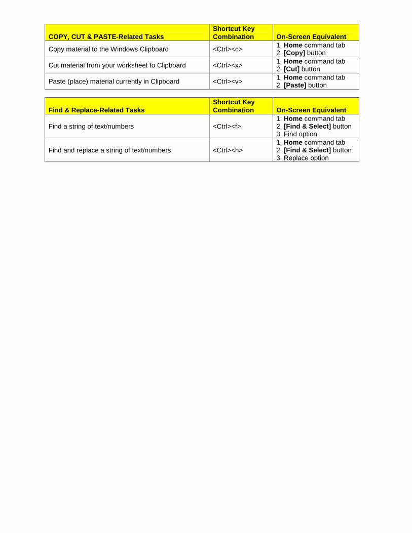
COPY, CUT & PASTE-Related Tasks Shortcut Key Combination On-Screen Equivalent
Copy material to the Windows Clipboard <Ctrl><c> 1. Home command tab 2. [Copy] button
Cut material from your worksheet to Clipboard <Ctrl><x> 1. Home command tab 2. [Cut] button
Paste (place) material currently in Clipboard <Ctrl><v> 1. Home command tab 2. [Paste] button
Find & Replace-Related Tasks Shortcut Key Combination On-Screen Equivalent
Find a string of text/numbers <Ctrl><f> 1. Home command tab 2. [Find & Select] button 3. Find option
Find and replace a string of text/numbers <Ctrl><h> 1. Home command tab 2. [Find & Select] button 3. Replace option

Appendix B: Auto Fill
Auto Fill is an extremely useful Excel tool to save time, beyond even working with formula (see Ch. 2). In addition to placing formulas in adjacent cells, it has a variety of uses, including duplicating labels or values in adjacent contiguous cells, either arranged vertically down a column or horizontally across a row. It can also be used to fill in various ‘series’, including:
• Completing a series of values (for example, 1,2,3…or 2,4,6…or 1,3,5…etc.), • Completing a series of dates (for example, January 1,2,3…or January 5,10,15, etc.), • Completing a series of months (for example, January, February, etc… or Jan, Feb, etc.), • Completing a series of days (for example, Monday, Tuesday, etc… or Mon, Tue, etc.)
To illustrate filling in a series, suppose we want to complete a series of values, 1,2,3,4,5, etc. down a column (across a row works much the same manner). We just need to ‘tell’ Auto Fill
what the sequence consists of. In this case, the sequence is increase the starting value, one, by one on each subsequent row from top to bottom. Begin by entering 1 in cell A1, for example, and then 2 in cell A2. Then select both cells by clicking and dragging them both with the mouse pointer. The Auto Fill handle (black square in the lower right-hand corner of cell A2) indicates that we can now Auto Fill the set of cells, A1 and A2. See Fig. B-1 to the right.
Fig. B-1
To Auto Fill this formula down to cell A10, for example, your pointer must be positioned directly over the Auto Fill handle, where the pointer will appear as a thin cross, as shown in Fig. B-2 to the right.
Fig. B-2
Next, simply hold down your left button and drag to the bottom of the last cell you want to include in the Auto Fill (in this case, cell A10), thereby outlining the entire range of cells. See Fig. B-3 to the right. Finally, release your button. You have used Auto Fill to complete a sequenced series; in this case, values.
Fig. B-3
HOW TO… Auto Fill a series

Suppose we want to complete a series of months, January, February, etc. down a column (across a row works much the same manner). We only need to ‘tell’ Auto Fill that we want to deal with months. So enter your first month, say January (or Jan), in cell A1. Then select that cell by clicking on it. The Auto Fill handle (black square in the lower right-hand corner of cell A1) indicates that we can now Auto Fill the contents of cell A1. See Fig. B-4 to the right.
Fig. B-4
To Auto Fill this formula down to cell A12, for example, your pointer must be positioned directly over the Auto Fill handle, where the pointer will appear as a thin cross, as shown in Fig. B-5 to the right.
Fig. B-5
Next, simply hold down your left button and drag to the bottom of the last cell you want to include in the Auto Fill (in this case, cell A12), thereby outlining the entire range of cells. See Fig. B-6 to the right. Finally, release your button. You have used Auto Fill to complete a sequenced series; in this case, months.
Fig. B-6
Lastly, suppose we want to complete a series of days of the week, Monday, Tuesday, etc. down a column (across a row works much the same manner). We only need to ‘tell’ Auto Fill that we want to deal with days. So enter your first day, say Monday (or Mon), in cell A1. Then select that cell by clicking on it. The Auto Fill handle (black square in the lower right-hand corner of cell A1) indicates that we can now Auto Fill the contents of cell A1. See Fig. B-7 to the right
Fig. B-7
To Auto Fill this formula down to cell A7, for example, your pointer must be positioned directly over the Auto Fill handle, where the pointer will appear as a thin cross, as shown in Fig. B-8 to the right
Fig. B-8

Next, simply hold down your left button and drag to the bottom of the last cell you want to include in the Auto Fill (in this case, cell A7), thereby outlining the entire range of cells. See Fig. B-9 to the right. Finally, release your button. You have used Auto Fill to complete a sequenced series; in this case, days.
Fig. B-9

Appendix C: Qualitative/Quantitative Data
Related to the contents of cells (namely, label/text, value and formula), we present details on the general nature of data as it related to its associated level of measurement. This refers to the qualitative/quantitative nature of data appearing in cells, which can be measured at one of the following levels, from non-quantitative (qualitative) to highly quantitative: nominal, ordinal, interval and ratio.
Qualitative data is measured on a nominal scale, while quantitative data is measured on either an ordinal, interval or ratio scale. A nominal scale is categorical in nature, as data is grouped into particular categories. It is merely a set of labels (or names) and has no inherent order or rank; it has no quantitative (numeric) properties. To be considered nominal, a data item (or variable) must be (1) exhaustive; that is, the labels must include every possible label (“yes”, “no” or “maybe”), and (2) be mutually exclusive; that is, any given item can be described by one, and only one, label. Nominal data is always discrete in nature because it can only take on a limited set of known ‘values’. Examples include a politician’s party affiliation (“Republican”, “Democrat”, “Tea” or “Independent”) or gender (“male” or “female”). Data measured on a nominal scale includes text/label cell entries.
Data measured on an ordinal scale does have an inherent order or rank, so it has a basic quantitative property. It is not merely a set of labels (or names). This data can be thought of as being higher or lower in ‘value’, however, it cannot be assumed that the ‘differences’ between measures (intervals) are equal. As a result, you can’t perform any mathematical functions on this type of data. Similar to nominal data, ordinal data is always discrete because it too can only take on a limited set of known ‘values’. An example is responses to a survey question that asks respondents to rank their opinion of a particular issue as being either “Agree”, “Neutral” or “Disagree” or “3” (agree), “2” (neutral) or “1” (disagree). Data measured on an ordinal scale includes text/label.
An interval scale meets the criteria for an ordinal scale, but in addition, can also be divided into mathematically equal segments. It’s zero (0) point is arbitrary, however, which means that some level of the item being measured is still present at that point (i.e., there is not a complete absence of the item when measured at the zero point). Because of the arbitrary assignment of zero and possibility of values below zero, it cannot be said that a measurement two times as large as another measurement is twice as large, or conversely that a measurement twice as small is half as large. Interval data can only be continuous. An example is the Fahrenheit temperature scale. The difference between 25° F and 10° F is 15°, which is mathematically equal to the difference between 115° F and 90° F. The Fahrenheit scale has an arbitrary zero point, so temperatures can be measured and recorded below zero. As a result, it cannot be said that 100° F is twice as warm as 50° F, or conversely that 50° F is half as hot (twice as cold) as 100° F. We can only say that there is a 50° difference between these two temperatures. Data measured on an interval scale includes values.
A ratio scale represents the highest level of sophistication regarding its associated potential level of computation and analysis. In addition to all of the properties of an interval scale, it also includes an absolute zero (0), as opposed to an arbitrary zero point. As a result, there is no measurement below zero (0) in a ratio scale. Similar to interval data, ratio data be either discrete or continuous. An example of discrete data

measured on a ratio scale is the number of people attending a concert. This represents equal measures across the possible values (increments of one person) and there is an absolute zero (you can’t have less than zero people attending the concert). Because it is discrete data, it is not possible to have a fraction of a person attending, so the number of people can be measured by a known, countable unit of ‘whole’ people. An example of continuous data measured on a ratio scale is the kelvin temperature scale, which contains a zero point that represents the lowest temperature known to exist based on the physical laws of nature. (It is referred to as “absolute zero” and corresponds to -459.67° F!). Temperature can be measured in fractions of a degree, which makes this scale continuous between any given two degrees. So temperatures measured on this scale can be compared at the ‘ratio’ level: it can be said that 100 kelvins is twice as warm as 50 kelvins and 50 kelvins is twice as cold as 100 kelvins. Data measured on a ratio scale includes values.
Table A-1 below summaries the relationship between measurement scales, qualitative/quantitative nature of the data and whether the cell contents is considered to be text/label or value.
Characteristic M E A S U R E M E N T S C A L E
Nominal Ordinal Interval Ratio Nature of Data Qualitative Qualitative Quantitative Quantitative
Cell Contents Text/label Text/label Value Formula
Value Formula
Table C-1: Measurement Scale, Nature of Data & Cell Contents
The charts presented in this booklet display quantitative data. And regardless of whether the detailed-level data that we may enter into a given spreadsheet is text/value, values or formulas (i.e., measured on any of the four measurement scales), we have summary information after that data is processed (totaled, counted, average, etc.). Further, summary information is considered to be at a ratio level of measurement, which can be either discrete or continuous, depending on the data. To illustrate both ends of the measurement scale, nominal to ratio: if we have nominal data (i.e., text/labels) consisting of 100 rows of survey responses from males and females, when we total the number of males and females, we have ratio-level information. Similarly, when we calculated the percentage of males and females, we also have a ratio measure information. Jumping to the other end of the measurement scale, if we collected hours slept and exam grades (i.e., values), our detail-level data is already measured on a ratio scale. And certainly as we total, count or average this data (i.e. results of formulas), the result is also ratio-level information.

Appendix D: Microsoft Excel 10 Specifications The following is provided by Microsoft Corporation http://office.microsoft.com/en-us/excel-help/excel-specifications-and-limits-HP010073849.aspx General Features Maximum Limit Open workbooks Worksheet size Column width Row height Total number of characters in a cell Sheets in a workbook
Limited by available memory and system resources 1,048,576 rows by 16,384 columns 255 characters 409 points 32,767 characters Limited by available memory (default is 3 sheets)
Calculation Specifications Maximum Limit Number precision Smallest allowed negative number Smallest allowed positive number Largest allowed positive number Largest allowed negative number Largest allowed positive number via formula Largest allowed negative number via formula Length of formula contents Arguments in a function Nested levels of functions Number of available worksheet functions Earliest date allowed for calculation Latest date allowed for calculation
15 digits -2.2251E-308 2.2251E-308 9.99999999999999E+307 -9.99999999999999E+307 1.7976931348623158e+308 -1.7976931348623158e+308 8,192 characters 255 64 341 January 1, 1900 December 31, 9999
Charting Specifications Maximum Limit Charts linked to a worksheet Worksheets referred to by a chart Data series in one chart Data points in a data series for 2-D charts Data points in a data series for 3-D charts Data points for all data series in one chart
Limited by available memory 255 255 32,000 4,000 256,000
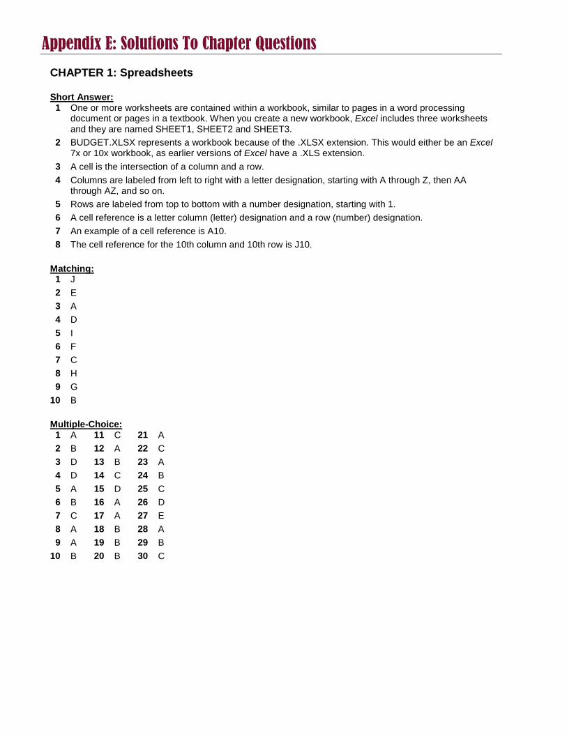
Appendix E: Solutions To Chapter Questions
CHAPTER 1: Spreadsheets Short Answer:
1 One or more worksheets are contained within a workbook, similar to pages in a word processing document or pages in a textbook. When you create a new workbook, Excel includes three worksheets and they are named SHEET1, SHEET2 and SHEET3.
2 BUDGET.XLSX represents a workbook because of the .XLSX extension. This would either be an Excel 7x or 10x workbook, as earlier versions of Excel have a .XLS extension.
3 A cell is the intersection of a column and a row. 4 Columns are labeled from left to right with a letter designation, starting with A through Z, then AA
through AZ, and so on. 5 Rows are labeled from top to bottom with a number designation, starting with 1. 6 A cell reference is a letter column (letter) designation and a row (number) designation. 7 An example of a cell reference is A10. 8 The cell reference for the 10th column and 10th row is J10.
Matching:
1 J 2 E 3 A 4 D 5 I 6 F 7 C 8 H 9 G
10 B Multiple-Choice:
1 A 11 C 21 A 2 B 12 A 22 C 3 D 13 B 23 A 4 D 14 C 24 B 5 A 15 D 25 C 6 B 16 A 26 D 7 C 17 A 27 E 8 A 18 B 28 A 9 A 19 B 29 B
10 B 20 B 30 C

CHAPTER 2: Formulas Short Answer:
1 A formula performs mathematical computations, as well as other purposes in Excel. It is the spreadsheet equivalent of an equation.
2 The pointer used to select a cell or cells is a thick cross. 3 The pointer used to Auto Fill is a thin crosshair. 4 The pointer used to move a cell(s) or chart is a four-sided arrow. 5 5 6 5 7 5 8 6 9 5
10 6 11 The formula is =B3*C3+D3*E3+F3*G3. You do not need parenthesis because multiplication will be
completed prior to addition according to the rules of operation. However, for readability, you could include parenthesis, so the formula would then be =(B3*C3)+(D3*E3)+(F3*G3).
Multiple-Choice:
1 C 11 B 2 A 12 A 3 B 13 C 4 B 14 C 5 C 15 A 6 B 16 A 7 C 17 A 8 D 18 B 9 B 19 E
10 A 20 A

CHAPTER 3: Functions Short Answer:
1 A function is a predefined keyword that Excel understands and which makes life in Excel much easier. It is used to do computations, as well as other purposes, including look-ups, logic-related tasks and tasks related to date and time.
2 No, every formula does not need to contain a function. 3 Yes, every function must be contained in a formula. 4 Yes, =A2+A3+A4+A5+A6 a legitimate formula. 5 Yes, =SUM(A2:A6) a legitimate formula. 6 Yes, the previous two formulas are equivalent.
Multiple-Choice:
1 A 11 C 2 D 12 C 3 B 13 H 4 A 14 D 5 D 15 A 6 C 16 B 7 C 17 A 8 B 18 D 9 E 19 E
10 A CHAPTER 4: Formatting Multiple-Choice:
1 A 2 A 3 D 4 D 5 D 6 D
CHAPTER 5: Charting Multiple-Choice:
1 A 2 A 3 C 4 D 5 D 6 B

About The Author
Drew Procaccino is an Associate Professor of Computer Information Systems in the College of Business Administration at Rider University in Lawrenceville, NJ, where he has taught classes in office productivity software, systems analysis and design, software project development, business graphics, business concepts and management information systems. Drew’s research has included management of software development projects, social shopping, healthcare information seeking behavior and smart card technology. His work has been published in several journals, including Journal of Information & Software Technology, Journal of The American Society For Information Science and Technology, Journal of Information Technology, The Journal of Systems & Software and Communications of The ACM. He has also co-authored two book chapters, one in Knowledge Management For The Information Professional (2002) and the second in Advances In Computers (2004). Drew received a Master in Business Administration from Rider University with a concentration in Information Systems, and a doctorate from the College of Information Science and Technology at Drexel University (Philadelphia, PA). His professional experience includes database design, desktop publishing and software trainer. For contact information and a more detailed list of Drew’s publications, visit his directory page at http://www.rider.edu/faculty/j-drew-procaccino Drew can be reached at [email protected]