basic web application development instructor: matthew schurr
TRANSCRIPT

UNIT 3 : CASCADING STYLE
SHEETSBasic Web Application Development
Instructor: Matthew Schurr

In-Line Styles (Style Attribute)
In HTML, every element can have a style attribute.Example: <div style="…">Content</div>
The style attribute’s value is a string of key-value pairs separated with semicolons:key: value; key2: value; key3: value; …These key-value pairs describe the element’s
appearance, or the appearance of its contents.
For example, we might write:width: 100%; height: 50%; font-size: 16pt; color: red;

How can we describe elements?
When we are designing a website layout, we want to be able to clearly describe an element’s appearance.In many cases, we want to describe the size of an
element, a font, or something else.
What unit is appropriate to describe the size of something in our digital environment?People browsing our website have a variety of different
hardware configurations. This includes the size, resolution, and pixel density of their displays (anything from mobile phones to 70” televisions).

Describing Size The style specification allows us to describe the
size of elements in a variety of different ways.Percentage (%)
○ We can represent size as a percentage of the space available to this element (usually the size of its parent element).
○ Example: width: 100%;Absolute (cm, in, mm, pt)
○ We can use physical size to determine the size of an element. This means the element will be the same physical size for any user, regardless of their screen resolution, size, or pixel density.
○ Example: width: 2cm;

Describing Size (cont)Pixels (px)
○ We can describe the size of an element in pixels. Be aware that the physical size of the element may be different from client to client based on their screen size, resolution, and pixel density.
○ Browsers on some platforms (e.g. iPad) with high-density displays may automatically multiply the values you specify by a fixed factor.
○ Example: width: 1024px;Behavioral (auto, inherit)
○ Inherit means that the element will “inherit” its size from the closest parent element that specifies it. Auto means that the browser will automatically decide the size of the element based on its contents.
○ Example: width: inherit;

Describing Size (cont)Relative (vh, vw, em, rem)
○ We can describe the size of an element relative to something else.vh – viewport height (essentially browser window’s height)vw – viewport width (essentially browser window’s width)em – inherited font size (from closest parent element that specifies) rem – root (<html>) element font size
○ Example: font-size: 1.2em; width: 0.5vh;Calculated (calc)
○ We can set the width to be a mathematical formula based on the other units that are available.
○ WARNING: While support for this is included in the CSS3 specification, older web browsers do not support this function. Use with caution.
○ Example: width: calc(100% - 15px);

Design Standards In this class, we will only be designing websites for
desktop/laptop clients – we will not add extra support for mobile browsers.
Mobile clients (phones and tablets) typically have much smaller horizontal resolutions than desktop clients due to the smaller screen size.
When designing for desktop browsers, your design should support all resolutions that have a width of 1024px and higher.Note: The vertical resolution of the user’s screen is not important
because the browser can scroll. The horizontal resolution is important because we want to avoid having a horizontal scroll bar at all costs.

Describing Colors We also need to be able to clearly define colors when we
are describing elements. Colors are useful when specifying borders, font colors,
background colors, shadow colors, etc. There are many different ways to describe colors in a
digital environment. The following are part of the CSS3 specification:Red-Green-Blue (rgb)
○ 0 <=r <= 255, 0 <= g <= 255, 0 <= b <= 255○ Example: color: rgb(255, 255, 255);
Red-Green-Blue-Alpha (rgba)○ 0 <=r <= 255, 0 <= g <= 255, 0 <= b <= 255, 0 <= a <= 1○ The a (alpha) value specifies the transparency of the color (this
can be used to make see-through backgrounds).○ Example: color: rgba(0, 0, 0, 0.5);

Describing Colors (cont)Hexadecimal (#hex)
○ 000000 < hex < FFFFFF○ Example: color: #FFFFFF;
Hue-Saturation-Lightness (hsl)○ 0 <= h <= 360, 0% <= s <= 100%, 0% <= l <= 100%○ Example: color: hsl(320, 50%, 75%);
Hue-Saturation-Lightness-Alpha (hsla)○ 0 <= h <= 360, 0% <= s <= 100%, 0% <= l <= 100%○ 0 <= a <= 1○ The a value specifies the transparency of the color (this
can be used to make see-through backgrounds).○ Example: color: hsla(320, 50%, 75%, 0.5);

Describing Colors (cont)Predefined Constants
○ Web browsers offer predefined constants for colors. Note that one particular constant MAY NOT be available to all browsers. For this reason, it is best to use hex, hsl, or rgb.
○ Color Names:transparentredbluepinkblackwhite…and so forth.
○ Examples:color: white;color: transparent; /* equivalent to rgba(0,0,0,0) */

Where can I find color codes?
Usually, image editing programs will have a color panel (like the one shown below) that allows you to easily choose colors.
You can also use an image editing program to grab a color code from an image (or screenshot) using the color picking tool.

In-Line Styles (continued) Now that you know how to represent
colors and sizes, we are ready to put them to use describing the elements in our HTML document.

Font-Family The font family tells the browser which font to use when rendering
text in an element.
The font family property allows us to specify a prioritized list of fonts to use. If the first font in the list is not available on the user’s system, the browser will try to use the next one (and so forth) until one works. If none of them work, the browser uses the system’s default font.
Font families that contain a space in their name (e.g. Time New Roman) must be encapsulated in single or double quotes.
Usage: font-family: font1[, font2[,…]];
Example: font-family: Arial, ‘Times New Roman’, serif;

Styling Text Font Size – specifies the size of the text contained in the element
Usage:○ font-size: length;
Example:○ font-size: 1.2em;
Font Color – specifies the color of the textUsage:
○ color: color;Example:
○ color: #FFFFFF;
Font Weight – specifies the weight of the text (e.g. bold, normal, light)Usage:
○ font-weight: (normal | bold | bolder | lighter | inherit | 100 | 200 | 300 | 400 | 500 | 600 | 700 | 800 | 900);
Example:○ font-weight: bold;

Styling Text (cont.) Text Decoration – specifies the decoration of the
text contained in the elementUsage:
○ text-decoration: (none|line-through|underline|overline);Example:
○ text-decoration: underline;
Font Style – specifies the style of the text contained in the element (e.g. italic, oblique)Usage:
○ font-style: (oblique|italic|normal);Example:
○ font-style: italic;

Styling Text (cont.) Letter Spacing – specifies the space in between letters
Usage:○ letter-spacing: length;
Example:○ letter-spacing: 2px;
Word Spacing – specifies the space in between wordsUsage:
○ word-spacing: length;Example:
○ word-spacing: 2px;
Text Indent – specifies the indentation of the first line of a paragraphUsage:
○ text-indent: length;Example:
○ text-indent: 20px;

Styling Text (cont.) Text Align – specifies how text should be aligned
Usage:○ text-align: (left|center|right|justify);
Example:○ text-align: center;
Vertical Align – specifies the vertical alignment of the element’s contents Usage:
○ vertical-align: (length|baseline|sub|super|top|text-top|middle|bottom|text-bottom); Example:
○ vertical-align: middle;
Line Height – specifies the height of a line of text Usage:
○ line-height: length; Example:
○ line-height: 2em; /* Effectively, double spacing. */
Text Transform – specifies a transformation of text Usage:
○ letter-spacing: (none|capitalize|uppercase|lowercase); Example:
○ text-transform: uppercase;

Text Shadow This adds a shadow to text rendered inside the
element. This may be used because:
It looks cool.The shadow makes the text more readable.
It is possible to add multiple shadows by separating them with commas.We could outline text by creating four shadows around it.
Usage:text-shadow: (none | <shadow> [, <shadow>[, …]]); <shadow> = length(x) length(y) length(blur) color [inset]
Example:text-shadow: 0px 0px 4px #000;

Problems with In-Line Styling
As you can see, styling is great. But what if we have two elements that we want to have the same style?We can copy and paste the style attribute.
What if the style attribute is a really long string?This is inefficient – large amounts of information is
repeated.This hurts the readability of the code and wastes
server bandwidth.

Problems with In-Line Styling
What if we have hundreds of elements (for example, cells in a table) that we want to give the same style to?We can still copy paste, but this is annoying and takes a
really long time. But, let’s say we do this.
What if we want to update one part of a style that is duplicated across multiple elements?We have to manually change each occurrence of our style.We can’t always trust find and replace because it may
unintentionally affect other elements’ styles. We need an alternative solution.

The Solution: Style Tags Style tags allow us to take our styles out of
element’s style attribute and put them into a separate <style> tag.<style type="text/css"> /* Style Code */ </style>
Okay, so we’re placing the styles in a separate tag now. How does the browser know which element(s) to apply the properties to?Solution: We can use the CSS markup language to
indicate (or select) the element(s) that should have the style(s) applied.

CSS Syntax and Selectors
The general syntax of CSS is as follows:
/* CSS Comment */
selector {
key: value;
} Selectors identify element(s) in the document. The styles contained in the block following a
selector are applied to the element(s) identified by the selector.
These key-value pairs are the same ones we have been working with!

CSS Syntax and Selectors (cont)
It is not possible to nest selectors. The following mark-up is invalid:
selector {
selector { /* THIS IS INVALID! */
width: 100px;
}
}

Tag and Wildcard Selectors
We can apply styles to HTML tags by name using a tag selector. For example, if we wanted to style all links (<a> tags):
a {
color: #FFF;
} We can also apply a style to every single element using a
wildcard selector.
* {
color: #FFF;
} Wildcard selectors should be used sparingly. Documents may
have thousands of elements and applying a style to every single one of them takes CPU time. Additionally, this may lead to unintended conflicts with other style declarations.

ID Attribute The ID attribute is available globally to any
HTML element.The ID attribute contains a string that uniquely
identifies a single element. It is syntactically incorrect to have two elements with the same ID.
We can use the ID to uniquely identify and reference the element (and, through inheritance, any of its children) in JavaScript and CSS.
<element id="myid"></element>

ID Selectors The ID selector chooses the element whose ID
attribute matches the selector.
<style type="text/css">
#myID {
color: red;
}
</style>
<div id="myID">This text will be red.</div>

Class Attribute The class attribute is also available globally to
any HTML element.The class attribute is similar to the ID attribute but it is
not unique (more than one element can have the same class).
The class attribute exists solely to group elements together so that they can be referenced as a group.
<div class="mystyle"></div>
Elements can have more than one class by separating each class name with a space.<div class="class1 class2"></div>
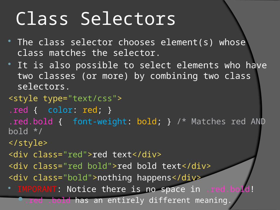
Class Selectors The class selector chooses element(s) whose class
matches the selector. It is also possible to select elements who have two
classes (or more) by combining two class selectors.<style type="text/css">
.red { color: red; }
.red.bold { font-weight: bold; } /* Matches red AND bold */
</style>
<div class="red">red text</div>
<div class="red bold">red bold text</div>
<div class="bold">nothing happens</div> IMPORANT: Notice there is no space in .red.bold!
.red .bold has an entirely different meaning.

Box Model (for block elements)

Property: width Specifies the width of an element.
Note: This can be deceptive. The actual width of the element when it is rendered may be larger than this. Recall the box model.
rendered-width = width + padding-left + padding-right + border-left-width + border-right-width + margin-left + margin-right
Usage:width: (length|auto|inherit);
Example:width: 100px;

Property: max-width Specifies the maximum width of an element.
Elements that grow with the size of their content will stop growing wider upon reaching this limit.Note: This can be deceptive. The actual maximum
width of the element when it is rendered may be larger than this. Recall the box model.
Usage:max-width: (length|none);
Example:max-width: 100px;

Property: min-width Specifies the minimum width of an element.
Elements that grow with the size of their content are guaranteed to be at least this width.Note: This can be deceptive. The actual minimum
width of the element when it is rendered may be larger than this. Recall the box model.
Usage:min-width: (length|none);
Example:min-width: 100px;

Property: height Specifies the height of an element.
Note: This can be deceptive. The actual height of the element when it is rendered may be larger than this. Recall the box model.
rendered-height = height + padding-top + padding-bottom + border-top-width + border-bottom-width + margin-top + margin-bottom
Usage:height: (length|auto|inherit);
Example:height: 100px;

Property: max-height Specifies the maximum height of an element. Elements
that grow with the size of their content will stop growing vertically upon reaching this limit.Note: This can be deceptive. The actual maximum
height of the element when it is rendered may be larger than this. Recall the box model.
Usage:max-height: (length|none);
Example:max-height: 100px;

Property: min-height Specifies the minimum height of an element.
Elements that grow with the size of their content are guaranteed to be at least this height.Note: This can be deceptive. The actual minimum
height of the element when it is rendered may be larger than this. Recall the box model.
Usage:min-height: (length|none);
Example:min-height: 100px;

Property: margin Generates a margin around the element. Usage (all parameters are (length|auto|none):
margin: <top> <right> <bottom> <left>; margin: <top> <right-left> <bottom>; margin: <top-bottom> <right-left>; margin: <all>;
Example: margin: 10px; margin: 10px 20px;
Aliases (if we just want to update one part of the margin): margin-top: (length|auto|none); margin-right: (length|auto|none); margin-bottom: (length|auto|none); margin-left: (length|auto|none);
It is possible to center an object using margins. margin-left: auto; margin-right: auto; width: 200px;

Property: padding Generates padding around the element. All parameters are (length|auto|none):
padding: <top> <right> <bottom> <left>;padding : <top> <right-left> <bottom>;padding : <top-bottom> <right-left>;padding : <all>;
Aliases (if we just want to update one part of the margin):padding-top: (length|auto|none);padding-right: (length|auto|none);padding-bottom: (length|auto|none);padding-left: (length|auto|none);

Property: border Generates a border around the element. border: (none | <border-width> <border-color> <border-style>);
<border-width> = length <border-color> = color <border-style> = (dotted|dashed|solid|double|groove|ridgeinset|outset)
Aliases (if we want to update just one side of the border): border-top: <border-width> <border-color> <border-style>; border-left: <border-width> <border-color> <border-style>; border-bottom: <border-width> <border-color> <border-style>; border-right: <border-width> <border-color> <border-style>;
Aliases also exist for sub-properties. For example: border-left-style: none | <border-style>; border-top-color: <border-color>; border-bottom-width: <border-width>;

Property: border-radius We may want to round the borders on our element to
be smooth and rounded rather than sharp corners. Usage - all parameters are (none|length)
border-radius : <top> <right> <bottom> <left>;border-radius : <top> <right-left> <bottom>;border-radius : <top-bottom> <right-left>;border-radius : <all>;
It is also possible to change the border for one corner at a time.e.g. border-top-radius: 10px;
The produced element will look like this:border-radius: 15px;

Property: outline Generates an outline around the element. The outline
does not take up space. outline: none | <outline-color> <outline-style> <outline-
width> ;<outline-width> = (thin | medium | thick | length)<outline-color> = color<outline-style> = (dotted|dashed|solid|double|groove| ridge|inset|
outset)
We can also specify the distance in between the outline and the border (if we wish).
outline-offset: (none | length);

Property: box-shadow This adds a shadow to an element itself. It is possible to add multiple shadows by
separating them with commas. Usage:
box-shadow: (none | <shadow> [, <shadow>[,…]]) ; <shadow> =
○ length(x)○ length(y)○ length(blur)○ length(spread)○ color○ [inset]
Example:box-shadow: 0px 0px 5px 5px #888;

Positioning Position – it is possible to position an element anywhere on
the page Fixed – the element will stay in place as the user scrolls Relative – the element is positioned relative to its normal position Absolute – the elements are positioned relative to a container
○ Normally, the container against which the element is positioned is the browser view port.
○ If an absolutely positioned element is placed within an element that has a relative position, the absolutely positioned element will be placed relative to the position of the closest ascendant that uses relative positioning.
Static (default) – the normal way in which elements are positioned Usage:
position: (fixed|absolute|relative|static); Example:
position: fixed;

Positioning (cont.) We have discussed how to specify the positioning scheme that an
element should use. We also need a way to specify an offset that an element should have from that position.
The following properties will: For a “static” positioned element: do nothing For a “fixed” positioned element: sets the corresponding edge of an element
to a unit above/below the corresponding edge of its container For a “relative” positioned element: sets the corresponding edge of an
element to a unit above/below/left/right its normal position. For an “absolute” positioned element: sets the corresponding edge of an
element to a unit above/below the corresponding edge of its container Properties: top, bottom, left, right
Note: It is unnecessary to specify both left and right or both top and bottom. Accepted values: (length|0|auto) Example Usage:
top: 10px; left: 10px; bottom: 10px; right: 10px;

Positioning (cont.) When using non-static positioning schemes, it is possible to make
two elements appear in the same space. What determines which element should be on top of the other? The z-index determines which element will appear on top when
two elements occupy the same space. Every element is assigned a default z-index of 0. Absolute/fixed
position elements are assigned a z-index of 1. Elements with higher z-indexes will always appear on top of
elements with lower z-indexes. It is possible to specify negative a negative z-index. Usage:
z-index: integer; Example:
z-index: -50;

Floating Elements CSS provides us with the ability “float” an
element, or push it to the left or right of its container, allowing other elements in the same container to wrap around it.
Elements after the floating element will flow around it. Elements before the floating element will not be affected.
Usage:float: (left|right|none);
Example:float: right;

Floating Elements (cont.) We also need a method to “stop” a float if we want to
rejoin the content into one column. For example, the floating content may be longer than
the content contained elsewhere in the container, and we want to place content beneath the point where the floating content stops. To do this, we usually place an empty <div> tag that clears the float.
Usage:clear: (left|right|both|none);
Example:<div style=“clear: both;”></div>

Floating Elements (cont.)
Floats are very important in layout design.

Backgrounds In our box model, the background is applied only to the parts of the
element within the border. Usage:
background: <color> <position> <size> <repeat> <origin> <clip> <attachment> <image>;○ <color> = color○ <position> = (length(x) length(y) | (left|right|center) [(top|bottom|center)])
Specifies the position of the background image. Requires an image. Defaults to top left.
○ <size> = (length|cover|contain|auto)(x) (length|cover|contain|auto)(y) Specifies the size of the background image. Requires an image. Defaults to image
dimensions.
○ <repeat> = (no-repeat | repeat-x | repeat-y | repeat) Specifies if/how a background-image is repeated. Requires an image.
○ <origin> = (padding-box(default) | border-box | content-box) Specifies what <position> is relative to.
○ <clip> = (border-box(default) | padding-box | content-box) Specifies painting area of background.
○ <attachment> = (scroll(default) | fixed | local) scroll = scrolls w/ element, fixed = fixed w/ regard to viewport, local = scrolls w/ elem contents
○ <image> = (none(default) | url(‘/path/to/image/relative/to/css/code’) )

Backgrounds Example:
background: #00ff00 url('smiley.gif') no-repeat fixed center;
Note: Background properties can be changed individually. e.g. background-repeat: <repeat>;
It is also possible to create gradient backgrounds using pure CSS with the linear-gradient or radial-gradient color functions. I do not recommend doing this by hand – use a program
such as http://www.colorzilla.com/gradient-editor/.

Showing and Hiding Elements Sometimes, we may not want to render an element on the
page, even though it is in the source code.For example, we may want to hide a pop-up box until the user
triggers it. We can hide elements using the display and/or visibility
properties.
Elements can be hidden using the visibility property. Note that while the elements will not be shown, the elements will still take up space on the page as if they were shown.
Usage:visibility: (visible|hidden|collapse);
Example:visibility: hidden;

Display Property It is also possible to hide elements using the display property.
Elements hidden with the display property will not take up space on the page.
The display property can do more than just show/hide elements: it can also set rules for their display.
Usage: display: <type>; <type> =
○ (none | – the element is hidden○ block | – the element acts like a block element○ inline | – the element acts like an inline element○ inline-block | – placed as an inline element, but behaves like a block○ inherit | – follow rules of parent element○ | box | flex | inline-flex | inline-table | list-item | table | table-caption | table-cell |
table-column | table-column-group | table-footer-group | table-header-group | table-row | table-row-group )
Example: display: none;

Overflow Let’s say we have a <div> element that is 100px tall and we
place two pages worth of text in it. What happens to the extra text? Does the element grow past what we specified?
Since the element will not grow past our specification, CSS does allow us to specify how we would like to deal with the overflow.
Usage: overflow: (visible|hidden|scroll|auto|inherit);
○ visible(default) – overflow is not clipped, renders outside the elements box○ hidden – overflow is clipped; content that does not fit in the box is not
rendered○ scroll – overflow is clipped; content that does not fit in the box can be
accessed with a scroll bar (this is always shown regardless of whether clipping occurs)
○ auto – same as “scroll”, but the scroll bar is only shown when content is clipped
Note: You can also set overflow in each direction separately using overflow-x and overflow-y.

Lists Sometimes we will want to change the appearance of a list.
The list-style property should be attached to a <ul> or <ol>. Usage:
list-style: <type> <image> <position>; <type> = (none | circle | decimal | decimal-leading-zero | disc |
lower-alpha | lower-roman | square | upper-alpha | upper-roman)○ What style of bullets to use.
<image> = (none | url(‘/path/to/image’))○ Use your own image as a marker instead of bullets.
<position> = (inside | outside)○ Whether bullets appear inside or outside content flow.
Note: You can also access these properties individual using list-style-type, list-style-image, and list-style-position.
Note: If you want the list elements to populate horizontally rather than vertically, you can tell <li> elements to float and use the box model to spread them out.

Miscellaneous Cursor – determines what cursor the user should
see when hovering over elementcursor: (url(‘/path/to/image’) | auto(default) | crosshair |
default | e-resize | help | move | n-resize | ne-resize | nw-resize | pointer | progress | s-resize | se-resize | sw-resize | text | w-resize | wait | inherit);
Border-Collapse – (for tables) sets whether the table borders are collapsed into a single border or detached as in standard HTMLborder-collapse: (collapse | separate);
Border-Spacing – (for tables) sets the distance between borders of adjacent cells.border-spacing: ( none | length(x) length(y) );

Additional Properties You can find a complete reference of CSS
properties here (or Google for CSS properties):http://www.w3schools.com/cssref/default.asp
You may wish to explore these on your own. For cool effects, take a look at the following:TransitionTransformOpacityFilter

Attribute and Attribute-Value Selectors
There are some times when we will want to style elements based on their attributes. Consider the <input> element. This creates both text-fields and the submission
button – two items that have a fundamentally different appearance. The attribute selector selects elements that have the provided attribute.
[attr] { } The attribute-value selector selects elements based on the provided
attribute and value. [attr="value"] {} – attribute equals “value” [attr~="value"] {} – attribute contains word “value” [attr^="value"] {} – attribute begins with “value” [attr$="value"] {} – attribute ends with “value” [attr*="value"] {} – attribute contains substring “value”
If we wanted to style text fields and the form submission button differently: input[type="text"] { /* Styles */ }
input[type="submit"] { /* Styles */ }

State Selectors We may want to change the appearance of an
element based on its state. For example, we may want links to change color if the user is hovering over them.
The following are state selectors::hover – when mouse is over the element:active – when element is clicked on:focus – when an input element is focused:enabled – when a form element is enabled:disabled – when a form element is disabled:link – a link that has not been visited:visited – a link that has been visited:checked – a checkbox/radio box that is selected::selection – selected/highlighted by user

State Selectors (Example)
<style type="text/css">input[type=text] { /* Applied always (unconditionally). */ color: black; }input[type=text]:hover { /* Applied only when user hovers over box. */ color: blue; border: 1px solid blue;}input[type=text]:focus { /* Applied only when clicks inside box. */ color: red; border: 1px solid red;}</style><input type="text" value="Hello World!" />

Other Selectors :first-letter – the first letter :first-line – the first line :first-child – the first child element :only-child – the only child element :last-child – the last child element :before – insert content before element :after – insert content after element :first-of-type – the first element of type in its parent :last-of-type – the last element of type in its parent :only-of-type – the only element of type in its parent

Other Selectors (cont.) :nth-child(n) – selects every element that is the nth child
of its parent :nth-last-child(n) – selects every element that is the nth
child of its parent, counting from last element :nth-of-type(n) – selects every element that is the nth
element of its type contained by its parent :nth-last-of-type(n) – selects every element that is the nth
element of its type contained by its parent, counting from last element of type
NOTE: In these selectors, n can be a formula or a number.:nth-child(2) – selects the second child element:nth-child(2n) – selects every other child element:nth-child(2n+1) – selects every odd child element

Other Selectors (cont.) :empty – selects elements that have no children :not(selector) – selects elements that do not
match the provided selectore.g. div:not(.class)

Content Property Used with the :before and :after selectors to
insert generated content. Usage:
content: (string | none | normal | counter | attr(name) | open-quote | close-quote | no-open-quote | no-close-quote | url(path) | inherit);
Example:Insert the URL in parenthesis after each link.a:after { content: " (" attr(href) ")"; }

Selector Combinations It is possible to combine selectors by merging them together into
one string. For example, if we wanted to find a <div> tag with the id “myid”
and the class “myclass”: div.myclass#myid {}
Don’t be confused! There should not be a space in-between the combined selectors. The following two selectors are not identical: div .myclass #myid – this matches an element with the id “myid” that is
contained in an element with the class “myclass” that is contained in a <div> tag
div.myclass#myid – this matches a <div> tag with the id “myid” and the class “myclass”
Any of the selectors we learned can be using in a combination (but complex combinations are uncommon in real world use): div>.class #id[attr]:not(div) p[key=value]~ul:hover – this is valid

Selector Inheritance What if we want to select all <p> elements that are contained
inside a <div> that have the class “content”? Selector inheritance allows us to make selections based on the
document’s hierarchy. selector1>selector2 – matches element(s) chosen by selector2
that are direct children of the element(s) chosen by selector1 selector1+selector2 – matches element(s) chosen by selector2
that occur immediately before element(s) chosen by selector1 selector1~selector2 – matches element(s) chosen by selector2
that occur immediately after element(s) chosen by selector1 selector1 selector2 – matches element(s) chosen by selector2
that are inside of elements chosen by selector1 (depth does not matter)
To answer the question at the start of the slide: div.content p

Grouping Selectors Sometimes, we may want to apply the styles in a
block to sets of elements matched by more than one selector. For example, we may want to make all span and all div tags have white text.
We could, of course, do this:
div { color: white; }
span { color: white; } However, we could also create a group of
selectors. This allows us to avoid writing something more than once.
span, div { color: white; }

Cascading Elements will inherit the properties of their parents
unless the inherited properties are overwritten. In other words, properties “cascade” down through the document tree.
It is important to note that not all properties are inherited. For example, border is not but font color is. You can usually guess which properties are inherited
and which are not, or you can check the CSS3 specification.
If you want to force a property to be inherited (even if it is not usually), you can specify it:e.g. border: inherit;

Conflicting Styles Let’s say we have the following HTML document:
<style type="text/css">
#in { color: blue; }
.out #in { color: orange; }
</style>
<div class="out">
<span id="in" style="color: red;">Text</span>
</div>
What color will the text be? Why?

Conflicting Styles CSS resolves conflicts in the following way:
Properties marked as important.○ You can mark any declaration as important by adding !
important after the declaration and before the semicolon.○ e.g. width: 200px !important;
In-Line Styles (attached to the element itself)Style TagsIn order from most specific to least specific selector.
○ For example, .class .class2 is more specific than .class.In order of declaration (last is chosen).
○ e.g. style="color: red; color: blue;" yields blueDefault styles specified by the browser.

CSS Files Allows you to take the content between style tags
and place it in an external file. You can then include the external file onto the page.This makes it easier to organize your code.This also reduces the bandwidth costs for servers – rather
than sending CSS code once per page view it gets sent once per session thanks to caching.
<link rel="stylesheet" href="./file.css" media="projection,screen" />
IMPORTANT: URLs contained in stylesheets are relative to the location of the stylesheet. This is different from URLs contained in in-line styles and <style> tags, which are relative to the location of the HTML document.

Font Declarations You may want to include a font in your design and you want
to be sure that this font is used by all clients, not only those who have the font on their computer.
The font-face declaration allows us to force the user to use a font they don’t have by downloading it over the internet. We do this by creating our own font family.The font families created by the @font-face declaration can be
used by the font-family property.
Here is a sample declaration:@font-face {
font-family: 'Open Sans';
font-style: normal;
font-weight: 400;
src: local('Open Sans'), url('./opensans.woff') format('woff');
}

Google Fonts
A massive, easy to use catalog of open source fonts.
http://www.google.com/fonts

Firefox Developer Tools To open the Firefox Developer Tools, right click
on any element in the page and choose “Inspect Element.”
On the right side, click “Rules” to see what CSS rules are active on the element and where the rules come from.
You can also see which rules cascaded to the element and which rules were marked as obsolete to resolve conflicts.


Examples
One-Column Layout Two-Column Layout Three-Column Layout Table Striping Form Inputs Transparency
All of the code for these example is posted on the course website.