basic design theory - 2
TRANSCRIPT


When used with purpose, fonts can make your designs stand out, convey your message clearly
and get your text to jump off the page. Beginners, try these five tips to enhance your designs.
Remember, mastering text is a crucial factor for visual success!

Typographic hierarchy refers to the order that text is read. The eye is
naturally drawn to large or dominant elements, so choose the largest font size for your title, followed by your subtitle,
then your body text.

Choosing fonts with high contrast is a great rule-of-thumb for striking titles and subtitles.
The fonts above contrast each other by featuring different styles – upper case and
lower case lines of text. The font Anton has been used for the headline „weekender‟, and
Julians Sans One for the subtitle.
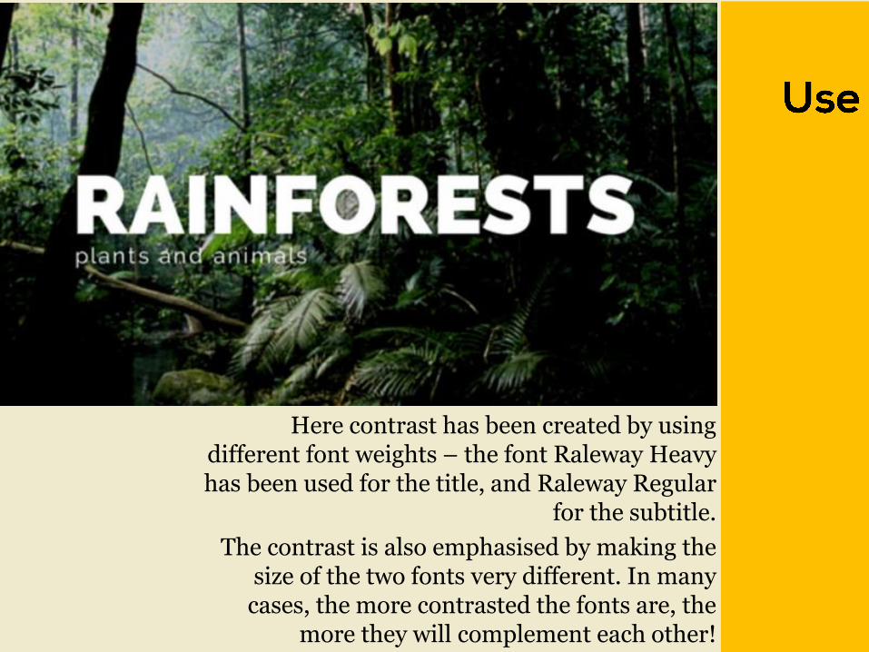
Here contrast has been created by using different font weights – the font Raleway Heavy has been used for the title, and Raleway Regular
for the subtitle.
The contrast is also emphasised by making the size of the two fonts very different. In many
cases, the more contrasted the fonts are, the more they will complement each other!

Font readability is especially important for longer sections
of text. Try avoid using elaborate (script) fonts or upper
case text, as these options can strain the eye. Save these for
titles or headings.
The graphic above uses serif and sans serif fonts, which are
generally a better option. The design also features very high
contrast. The background is very dark, and the text is white.
This is another great way to increase readability with font.

The phrase above has been aligned to form a rectangle shape, creating a geometric block of text.
In order to make different words fit the shape, the font size of each line of text has been altered. In
addition, the letter spacing of the second line has been increased. This is a creative, simple way to
increase the impact of your message.

When used creatively, this bombshell skill holds the potential to make your
designs look professional, read flawlessly, and capture the essence of
your content with impact!

The terms „regular‟ and „bold‟ refer to the weight of a particular font. Regular and bold font pairs are a great way to achieve variation without using more than one font. Bold fonts are the loud-mouth of the pair, so use them for words you want to project or emphasise. See Raleway Regular and Raleway Bold above.

This font combo is the extrovert of the font pairing world – sure of itself and bursting with character! A great option for jazzing up a design. The clean, confident lines of bold fonts balance out the elaborate, decorative nature of script fonts.
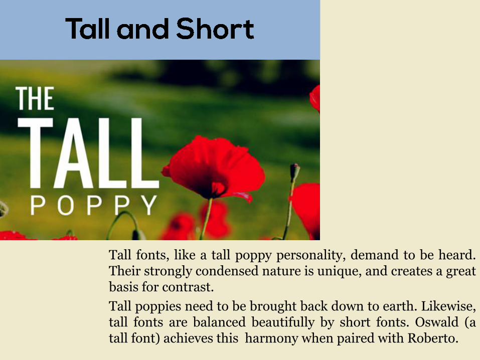
Tall fonts, like a tall poppy personality, demand to be heard. Their strongly condensed nature is unique, and creates a great basis for contrast.
Tall poppies need to be brought back down to earth. Likewise, tall fonts are balanced beautifully by short fonts. Oswald (a tall font) achieves this harmony when paired with Roberto.
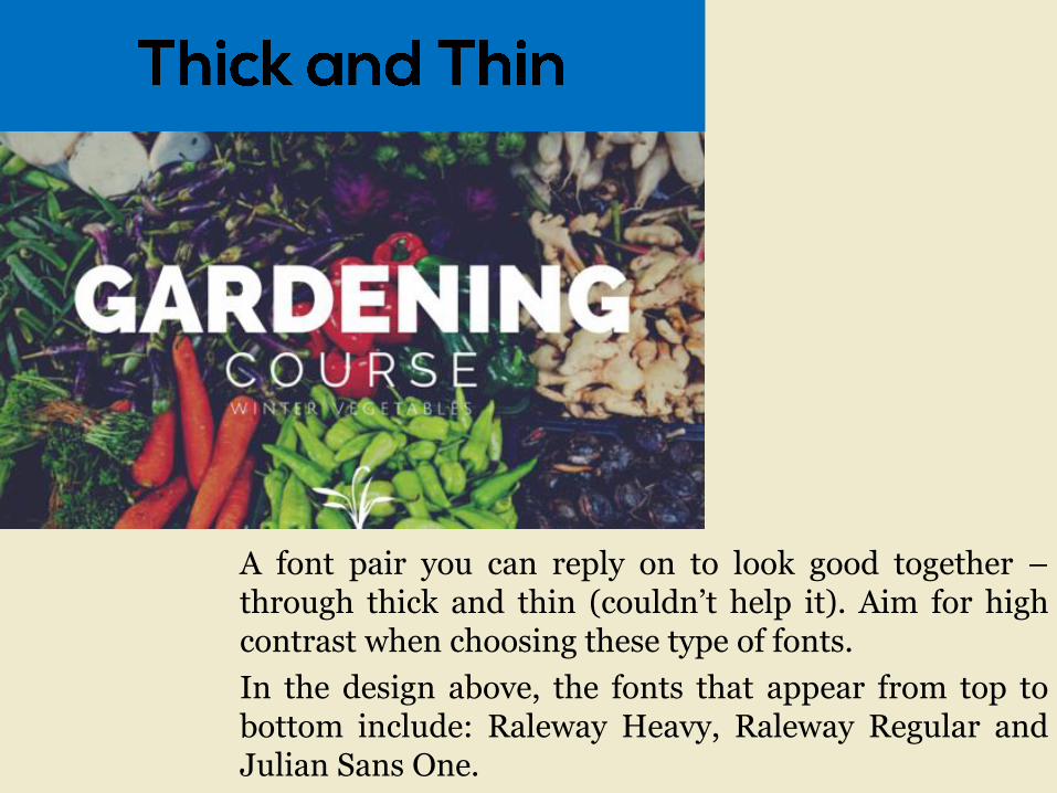
A font pair you can reply on to look good together – through thick and thin (couldn‟t help it). Aim for high contrast when choosing these type of fonts.
In the design above, the fonts that appear from top to bottom include: Raleway Heavy, Raleway Regular and Julian Sans One.
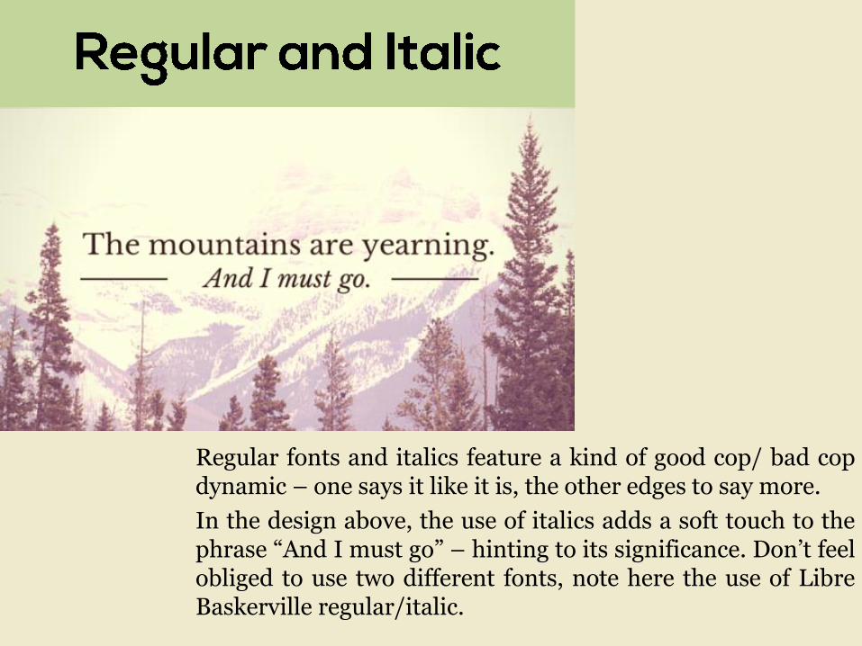
Regular fonts and italics feature a kind of good cop/ bad cop dynamic – one says it like it is, the other edges to say more.
In the design above, the use of italics adds a soft touch to the phrase “And I must go” – hinting to its significance. Don‟t feel obliged to use two different fonts, note here the use of Libre Baskerville regular/italic.

Good graphic design doesn’t happen by mistake, and neither
does clever font marriage.

Sans serifs fonts offer strong geometric lines and are great to use over images, as they can help with legibility.
Applying a bold font can compliment a short word nicely. When used in the centre, it will also anchor your
design. Balance hierarchy by ensuring your focal words are prominent.
Julius Sans One + Roboto Condensed Bold

You don‟t have to use different fonts to get a dramatic effect, use light and bold versions of the same family for versatility.
Round and narrow typefaces offset nicely against each other. Here I have spaced out the narrow wording to give it extra room
to breathe. Extra tip: Apply a solid frame around your text to contain it,
but ensure the weight of the box corresponds to the thickness of the typeface you use.
Raleway Bold/Regular + Archivo Narrow

Take an elegant and traditional approach to your design by using a serif font. Libre Baskerville offers a variation of styles. For example, using an italic pronounces a word or subheading without having to change font-
families.
Break apart sections of your copy to create hierarchy using color. Extra info – if you want to place copy over image make sure you find a clear
space where your text won‟t be invaded by a feature in the photo.
Libre Baskerville Italic + Regular

Finding fonts that look similar for your header, sub and body copy is a clever way to create nuance within your text. Coustard is a heavier typeface, appropriate for
a title font, while Arvo has a little more finesse – good for body copy.
Make sure the font sings the song of the subject, apply an appropriate typeface according to the content. This post was about organic grains so I used a more
traditional serif font selection.
Extra tip: Apply transparency to your background if you are using an image with texture (like seeds in this design) to create contrast and stronger text legibility.
Coustard + Arvo

And the last thing,
Only use maximumly 3 fonts in one design and,
Keep. It. Simple. Stupid.