automating visualization quality assessment
TRANSCRIPT

EG UK Computer Graphics & Visual Computing (2021)K. Xu and M. Turner (Editors)
Automating Visualization Quality Assessment:a Case Study in Higher Education
N. S. Holliman†1
1School of Computing, Newcastle University, United Kingdom
AbstractWe present a case study in the use of machine+human mixed intelligence for visualization quality assessment, applying auto-mated visualization quality metrics to support the human assessment of data visualizations produced as coursework by studentstaking higher education courses. A set of image informatics algorithms including edge congestion, visual saliency and colouranalysis generate machine analysis of student visualizations. The insight from the image informatics outputs has proved helpfulfor the marker in assessing the work and is also provided to the students as part of a written report on their work. Student andexternal reviewer comments suggest that the addition of the image informatics outputs to the standard feedback document wasa positive step. We review the ethical challenges of working with assessment data and of automating assessment processes.
CCS Concepts• Human-centered computing → Visualization design and evaluation methods; Empirical studies in visualization;
1. Introduction
Over the last two academic years, we have been evaluating the useof automatic methods for assessing the quality of visualizationssubmitted as coursework by students on our Data Science MScprogramme. This is part of a strand of work on visualization qual-ity metrics (VizQM) that we are developing in order to both helpinform visualization developers about the quality of their visual-izations and in the longer term as we look towards automating theprocess of visualization production itself.
2. Background
The automatic assessment of computer science coding assignmentshas a history going back to the earliest days of teaching program-ming [Hol60]. Since then, a wide range of methods have been de-veloped to automate the process of testing and marking student pro-gramming assignments [Wil15].
The evaluation of the effectiveness of visualizations using exper-imental methods has a shorter history; one review in 2004 [Pla04]identified four approaches: controlled experiments to test designchoices, usability evaluations (UX), tool comparisons and casestudies in realistic settings. Concluding that "..visualization re-search must understand the principles that will help the field crossthe chasm to wider success".
† Fellow of The Alan Turing Institute, London
Recently the idea that visualizations could be automatically as-sessed using algorithmic quality metrics has been growing in theliterature. This has included using VizQM as a fitness function in aproduction optimisation loop [HBW06, HW15, MPOW17] and asa tool for measuring the effectiveness of the insight a visualizationcan provide [Nor06].
In our teaching, we define a set of visualization principles aslearning objectives and then in summative exercises, seek to teststudent understanding of these principles against a set of markingand feedback criteria. In human marking, we judge the achievementagainst the criteria and explicitly mark the work and provide writtenfeedback. In this case study, we asked the question to what extentcan automatic image informatics algorithms support the process ofgenerating marks and feedback?
2.1. The Objective of Automating Assessments
In reviewing the role of automation in undergraduate computer sci-ence education Wilcox [Wil15] suggests two objectives for auto-matic assessment :
• Does the proposed automation contribute to or detract from stu-dent learning?• Do the benefits outweigh the costs of automation?
Here our goal is to evaluate a mixed intelligence approach, ratherthan full automation. This differs from some coding assignmentswhere data output comparisons and code checking tools can au-tomatically generate proposed marks, although there are questionsabout the reliability of these in all cases [WKF18].
© 2021 The Author(s)Eurographics Proceedings © 2021 The Eurographics Association.
DOI: 10.2312/cgvc.20211316 https://diglib.eg.orghttps://www.eg.org
N.S. Holliman / Automating Visualization Quality Assessment
2.2. Visual Quality Metrics
There is a wide range of literature in visual quality metrics for im-age [ZM20] and video [MYdE15] coding standards which seek tomeasure subjectively and objectively the effect of image compres-sion algorithms on perceived image quality. In visualization, simi-lar visual quality metrics exist but are less well developed and havea number of dimensions that are distinct to the purpose of visual-ization in conveying knowledge [Car08].
A recent review of visualization quality metrics [BBK∗18] setsout to classify metrics as related to low, mid or high-level percep-tion. The authors argue that extant clutter based approaches to qual-ity should be superseded by measures of visual pattern retrieval.While the review is thorough and comprehensive, it could havegone further in linking to interdisciplinary work in experimentalpsychology and ethical philosophy where validated models of per-ception and cognition are being proposed [BXF∗20].
One example of work that crosses over from experimental psy-chology to visualization is this study of the capabilities and limits ofperipheral vision [Ros16]. The author considers how better modelsof peripheral vision can predict the perception of the gist of a scenefrom a glance and which in turn might be used to predict whichvisualization design approaches would enable quicker knowledgeperception.
An example of a review of the emerging field of the philosophyof visualization is presented in [EK20]. This brings into focus whatwe mean by visualization socially and politically and how insight isconstructed in visual presentations of data. When visualizations canengage people globally in a matter of hours, it becomes as impor-tant as ever to understand the influence visualizations can have onhuman cognition. However, algorithmic metrics for these aspectsof the understanding of visualizations are not widely studied; forexample, we are currently unaware of any metrics for the sentimentanalysis of a data visualization.
2.3. Image Metrics for Visualization Quality
While there are very many image metrics that could be applied tomeasure visualization quality we looked for a set of metrics thatcould be applied to student work relatively quickly and easily. Tosupport these we used the Python Imaging Library [Pil95] for basicimage handling functions including image file reading, writing andresizing.
The OpenCV library [Bra00] provides a number of useful toolsincluding a fast low-resolution saliency prediction method. Whilewe did integrate this into our toolset we will concentrate in thisdiscussion on the fine detail saliency metric described below.
Another saliency metric we have tested for use in the metricsis the DeepGaze II algorithm [KWGB17]. This is a deep convo-lutional neural network trained to predict salient features in a stillimage, it ranks highly in the MIT/Tuebingen benchmark [KBJ∗]when tested against gold standard eye-tracking measures of visualsalience. However, as we have not yet used the DeepGaze algorithmover repeated cohorts we do not report in detail on it here.
The image metrics we discuss in this article all come from theAalto Interface Metrics (AIM) system [ODPK∗18] repository. The
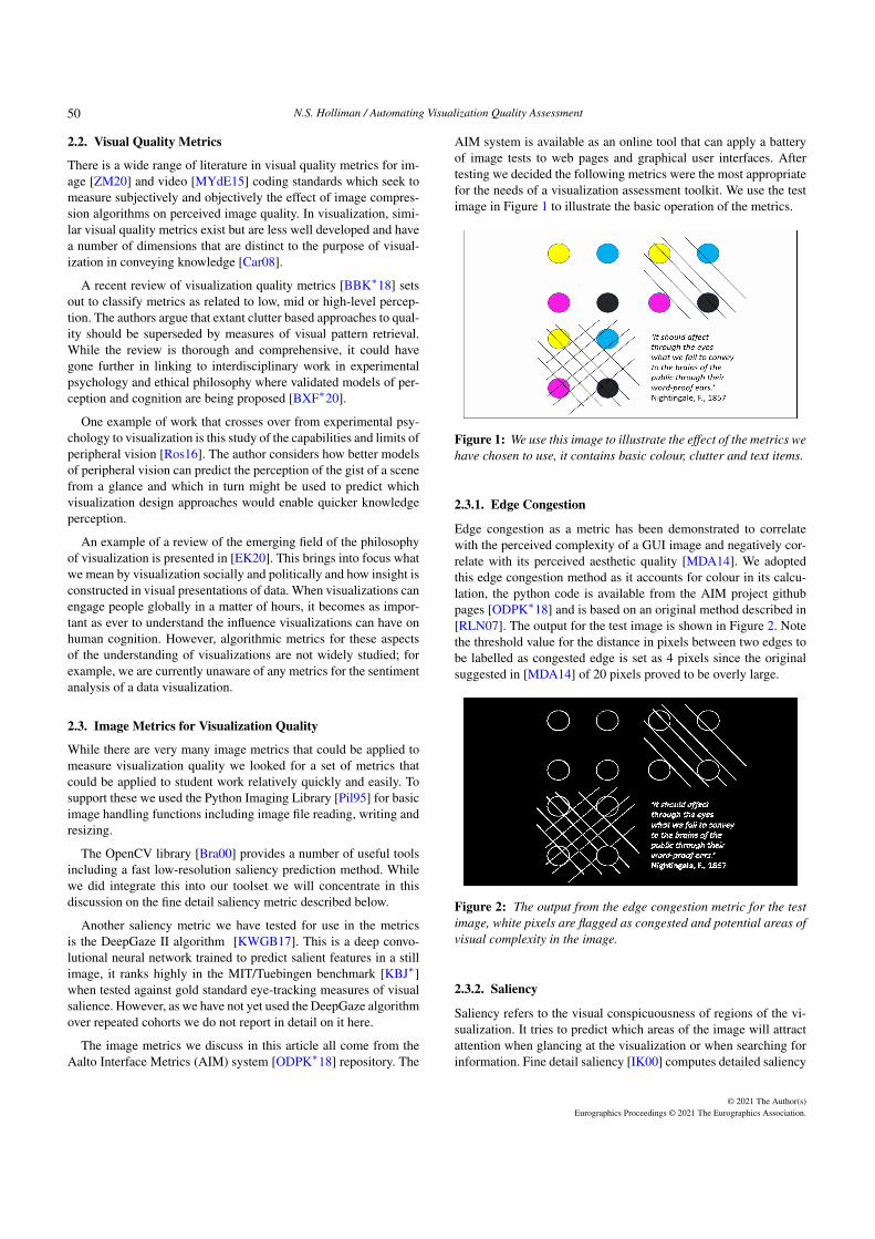
AIM system is available as an online tool that can apply a batteryof image tests to web pages and graphical user interfaces. Aftertesting we decided the following metrics were the most appropriatefor the needs of a visualization assessment toolkit. We use the testimage in Figure 1 to illustrate the basic operation of the metrics.
Figure 1: We use this image to illustrate the effect of the metrics wehave chosen to use, it contains basic colour, clutter and text items.
2.3.1. Edge Congestion
Edge congestion as a metric has been demonstrated to correlatewith the perceived complexity of a GUI image and negatively cor-relate with its perceived aesthetic quality [MDA14]. We adoptedthis edge congestion method as it accounts for colour in its calcu-lation, the python code is available from the AIM project githubpages [ODPK∗18] and is based on an original method described in[RLN07]. The output for the test image is shown in Figure 2. Notethe threshold value for the distance in pixels between two edges tobe labelled as congested edge is set as 4 pixels since the originalsuggested in [MDA14] of 20 pixels proved to be overly large.
Figure 2: The output from the edge congestion metric for the testimage, white pixels are flagged as congested and potential areas ofvisual complexity in the image.
2.3.2. Saliency
Saliency refers to the visual conspicuousness of regions of the vi-sualization. It tries to predict which areas of the image will attractattention when glancing at the visualization or when searching forinformation. Fine detail saliency [IK00] computes detailed saliency
© 2021 The Author(s)Eurographics Proceedings © 2021 The Eurographics Association.
50
N.S. Holliman / Automating Visualization Quality Assessment
of shapes and areas, where brighter pixels are more salient. The ma-chine vision algorithm we used here accounts for image colour inits saliency calculation and we use an implementation of the Itti-Koch algorithm by Akisato Kimura [ODPK∗18].
One simple, subjective way to evaluate the saliency output isto compare where your eyes are drawn to in the original imagewith the predictions from the saliency calculations in Figure 3. Thesaliency algorithm here predicts the coloured discs are more salientthan the text and much more salient than the clutter lines. A possi-ble weakness of this particular algorithm is also illustrated, it tendsto rate yellow areas as having low saliency.
Figure 3: The output from the fine detail saliency metric for thetest image, white pixels are flagged as high saliency and shouldcorrespond to the key data in a visualization.
2.3.3. Colour Metrics
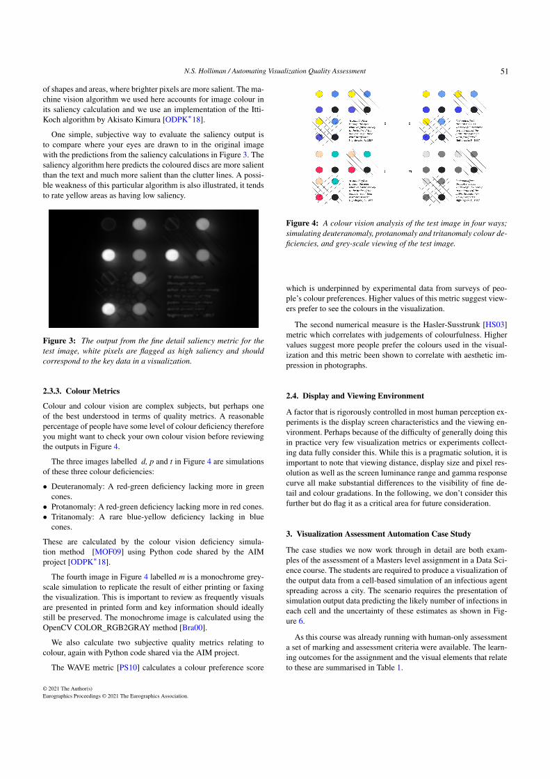
Colour and colour vision are complex subjects, but perhaps oneof the best understood in terms of quality metrics. A reasonablepercentage of people have some level of colour deficiency thereforeyou might want to check your own colour vision before reviewingthe outputs in Figure 4.
The three images labelled d, p and t in Figure 4 are simulationsof these three colour deficiencies:
• Deuteranomaly: A red-green deficiency lacking more in greencones.• Protanomaly: A red-green deficiency lacking more in red cones.• Tritanomaly: A rare blue-yellow deficiency lacking in blue
cones.
These are calculated by the colour vision deficiency simula-tion method [MOF09] using Python code shared by the AIMproject [ODPK∗18].
The fourth image in Figure 4 labelled m is a monochrome grey-scale simulation to replicate the result of either printing or faxingthe visualization. This is important to review as frequently visualsare presented in printed form and key information should ideallystill be preserved. The monochrome image is calculated using theOpenCV COLOR_RGB2GRAY method [Bra00].
We also calculate two subjective quality metrics relating tocolour, again with Python code shared via the AIM project.
The WAVE metric [PS10] calculates a colour preference score
Figure 4: A colour vision analysis of the test image in four ways;simulating deuteranomaly, protanomaly and tritanomaly colour de-ficiencies, and grey-scale viewing of the test image.
which is underpinned by experimental data from surveys of peo-ple’s colour preferences. Higher values of this metric suggest view-ers prefer to see the colours in the visualization.
The second numerical measure is the Hasler-Susstrunk [HS03]metric which correlates with judgements of colourfulness. Highervalues suggest more people prefer the colours used in the visual-ization and this metric been shown to correlate with aesthetic im-pression in photographs.
2.4. Display and Viewing Environment
A factor that is rigorously controlled in most human perception ex-periments is the display screen characteristics and the viewing en-vironment. Perhaps because of the difficulty of generally doing thisin practice very few visualization metrics or experiments collect-ing data fully consider this. While this is a pragmatic solution, it isimportant to note that viewing distance, display size and pixel res-olution as well as the screen luminance range and gamma responsecurve all make substantial differences to the visibility of fine de-tail and colour gradations. In the following, we don’t consider thisfurther but do flag it as a critical area for future consideration.
3. Visualization Assessment Automation Case Study
The case studies we now work through in detail are both exam-ples of the assessment of a Masters level assignment in a Data Sci-ence course. The students are required to produce a visualization ofthe output data from a cell-based simulation of an infectious agentspreading across a city. The scenario requires the presentation ofsimulation output data predicting the likely number of infections ineach cell and the uncertainty of these estimates as shown in Fig-ure 6.
As this course was already running with human-only assessmenta set of marking and assessment criteria were available. The learn-ing outcomes for the assignment and the visual elements that relateto these are summarised in Table 1.
© 2021 The Author(s)Eurographics Proceedings © 2021 The Eurographics Association.
51
N.S. Holliman / Automating Visualization Quality Assessment
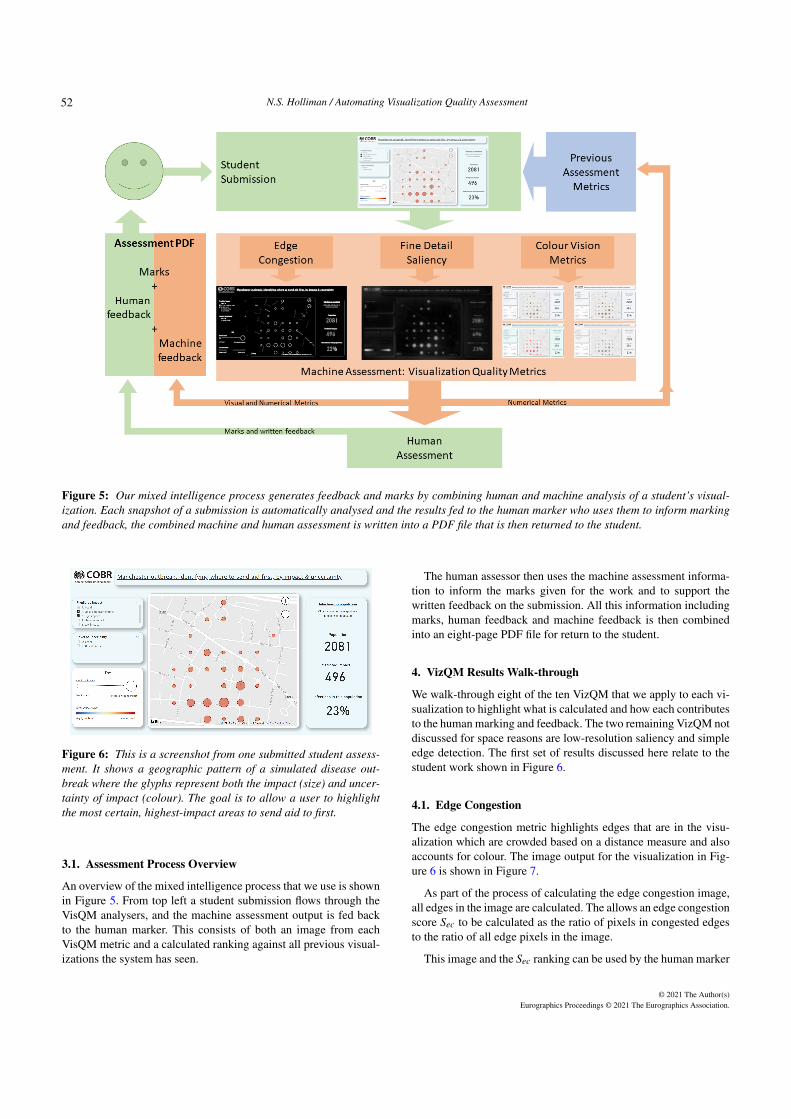
Figure 5: Our mixed intelligence process generates feedback and marks by combining human and machine analysis of a student’s visual-ization. Each snapshot of a submission is automatically analysed and the results fed to the human marker who uses them to inform markingand feedback, the combined machine and human assessment is written into a PDF file that is then returned to the student.
Figure 6: This is a screenshot from one submitted student assess-ment. It shows a geographic pattern of a simulated disease out-break where the glyphs represent both the impact (size) and uncer-tainty of impact (colour). The goal is to allow a user to highlightthe most certain, highest-impact areas to send aid to first.
3.1. Assessment Process Overview
An overview of the mixed intelligence process that we use is shownin Figure 5. From top left a student submission flows through theVisQM analysers, and the machine assessment output is fed backto the human marker. This consists of both an image from eachVisQM metric and a calculated ranking against all previous visual-izations the system has seen.
The human assessor then uses the machine assessment informa-tion to inform the marks given for the work and to support thewritten feedback on the submission. All this information includingmarks, human feedback and machine feedback is then combinedinto an eight-page PDF file for return to the student.
4. VizQM Results Walk-through
We walk-through eight of the ten VizQM that we apply to each vi-sualization to highlight what is calculated and how each contributesto the human marking and feedback. The two remaining VizQM notdiscussed for space reasons are low-resolution saliency and simpleedge detection. The first set of results discussed here relate to thestudent work shown in Figure 6.
4.1. Edge Congestion
The edge congestion metric highlights edges that are in the visu-alization which are crowded based on a distance measure and alsoaccounts for colour. The image output for the visualization in Fig-ure 6 is shown in Figure 7.
As part of the process of calculating the edge congestion image,all edges in the image are calculated. The allows an edge congestionscore Sec to be calculated as the ratio of pixels in congested edgesto the ratio of all edge pixels in the image.
This image and the Sec ranking can be used by the human marker
© 2021 The Author(s)Eurographics Proceedings © 2021 The Eurographics Association.
52

N.S. Holliman / Automating Visualization Quality Assessment
Figure 7: The edge congestion output and a ranking of this outputcompared to all other visualizations the system has seen to dateusing the edge congestion score, Sec, shown as the green verticalline. The blue vertical line shows the mean of the previous valuesin the blue distribution.
as a guide to the clarity of the image, for example, if there is a highranking it suggests an unusually cluttered image. In addition, thelayout of key data items is visible and this contributes to writtenfeedback on the use of gestalt design methods. For example, high-lighting if there is an appropriate use of space or enclosure betweenrelated data elements.
4.2. Saliency
The fine detail saliency metric, shown in Figure 8, can predictwhere the eye is drawn to in the visualization. The hope is thatthe most important aspects of the visualization are highlighted, forexample, the data glyphs more so than the title.
Figure 8: The saliency calculation output and a ranking of thisoutput compared to all other visualizations the system has seen todate using the saliency score, Ssy, shown as the green vertical line.
The saliency score Ssy is calculated as the ratio of salient pixelsto all pixels in the image. Salient pixels are calculated using bythresholding the saliency output against a constant threshold valueIk = 64, which was obtained heuristically through experimentation.
The saliency image is used by the human assessor to identifywhether salient pixels are linked to the key data items in the im-age. In Figure 8 this is true, however, the key at the lower left isthe most salient item on the screen suggesting that there is roomto improve the representation of the key data glyphs. In this case,written feedback could be that using solid filled discs instead ofsemi-transparent ones would help, as would using a brighter colour.
Experience suggests that a low saliency score, Ssy, suggests feed-back for the student that contrast in the visualization could be im-proved to better highlight key items. Saliency can also highlightwhich edges and enclosures are most visible to support feedbackon the enclosure and connectedness gestalt design principles.
4.3. Colour Metrics
The machine evaluation of colour for each visualization is slightlydifferent, six algorithms are applied to each visualization. Four ofthese output only image feedback and two of them only output nu-merical scores that are ranked against previously seen visualiza-tions.
Figure 9: A colour vision analysis of the submitted visualiza-tion in four ways; simulating deuteranomaly, protanomaly and tri-tanomaly colour vision deficiencies, and monochrome grey-scaleviewing of the test image.
The four images give immediate feedback to students and alsosupport human marking and feedback providing direct evidence ofthe success of the colour choices in the four conditions tested. Di-verging colour scales such as used here can often give problems asthey rarely work well in all tested conditions, for example in themonochrome condition simulated here both low and high uncer-tainty values have the same low grey-scale value.
Figure 10: The two numerical metrics, Swv WAVE and Shs Hassler-Susstrunk, are shown as green lines ranked for the submitted visu-alization against all previously seen visualizations.
The Swv WAVE and Shs Hassler-Susstrunk metrics help supportfeedback and marking on the subjective aspects of the visualiza-tion. The Swv metric tends to cluster strongly but some visualiza-tions do pick colours that are particularly high on the preferencescale. The Shs metric has a greater spread but higher values reallydo seem to correlate well with bright and colourful visualizations.The visualization tested here ranks low on colourfulness and thissuggests feedback to the student that it will be less memorable, butalso perhaps clearer than other more colourful visualizations.
© 2021 The Author(s)Eurographics Proceedings © 2021 The Eurographics Association.
53

N.S. Holliman / Automating Visualization Quality Assessment
5. Comparative example
For comparison we include a second visualization submitted by astudent from the same cohort, see Figure 11.
Figure 11: This is a screenshot from a second submitted visual-ization. It shows a geographic pattern of a simulated disease out-break where the glyphs represent both the impact and uncertaintyof impact. The goal is to allow a user to highlight the most certain,highest-impact areas to send aid to first.
5.1. Congestion
The edge congestion analysis, Figure 12, suggest this image rankssimilarly to most other visuals tested. The image highlights thelayout showing how the different elements are grouped with morespace separating less related items. It also suggests potential feed-back that the gridlines could be removed, reducing non-data ink inthe visualization.
Figure 12: The edge congestion output and a ranking compared toall other visualizations the system has seen to date using the edgecongestion score, Sec, shown as the green vertical line.
5.2. Saliency
Ths saliency result, Figure 13, suggests that the most salient fea-tures in the visualization are the data, other than the title of thepage. This suggests weaker contrast in the page title would helpdraw visual attention to data results.
5.3. Colour
The colour vision simulation results, Figure 14, suggest that thisvisual works well across all conditions this is largely due to the al-most monochrome scale for values. Only the very highest values
Figure 13: The saliency calculation output with the saliency scorefor this visualization, Ssy, shown as the green vertical line.
are red, and when not visible this shifts to a dark grey-scale valuewhich still works. The two aesthetic metrics, Figure 15, rank this vi-sualization close to average on colour preference, but with a largelymonochrome colour scheme it ranks a little low on colourfulness.
Figure 14: A colour vision analysis of the submitted visualiza-tion in four ways; simulating deuteranomaly, protanomaly and tri-tanomaly colour vision deficiencies, and monochrome grey-scaleviewing of the test image.
Figure 15: The two numerical metrics, Swv WAVE and Shs Hassler-Susstrunk, are shown as green lines ranked for the submitted visu-alization against all previously seen visualizations.
6. Ethical Considerations
In the current complex ethical context, it is worth re-emphasisingthat the goal of the work here was not to automatically determinestudent grades for their visualizations. It was instead to gener-ate image-informatics results that inform the human feedback andmarking process and additionally provide new types of machinefeedback to students. In this mixed intelligence approach, machine
© 2021 The Author(s)Eurographics Proceedings © 2021 The Eurographics Association.
54

N.S. Holliman / Automating Visualization Quality Assessment
plus human, there needs to be consideration of the potential ethicalconcerns that machine feedback may introduce.
6.1. Ensuring Student Confidence
The UK Office for Statistical Regulation produced a report [Off21]investigating failures of processes involving algorithms in gradingA-levels in the UK in 2021, this has the following key recommen-dations for future algorithmic processes used in student assessment:
• Be open and trustworthy.To implement an open process we were careful to include con-text for the students on how the machine assessment was usedin the assessment and referenced all algorithms in the feedbackdocuments.• Be rigorous and ensure quality throughout.
This article itself is part of our effort to rigorously document thiswork and to reflect on the quality of the assessment achieved.• Meet the need and provide public value.
Student feedback to date has been positive and suggests that thisaddition to the marking process is valued and helps meet a needfor more insightful feedback.
It is an open question whether we should provide a version of themachine assessment tool to future students during the productionof their coursework. This could help provide feedback during thevisualization design process, supporting the work we do in practicallaboratories to guide students in their use of visualization tools andtechniques.
6.2. Privacy of Personal Data
One difficulty in researching new approaches for assessment is theneed to conform to data protection regulations [HM 18], includ-ing obtaining student permission to use their work since the outputfrom an assessment of student work is personal data.
We have taken care to gain permission to use and discuss the vi-sualizations in this report, however, not all students are happy togive permission. This inherently limits how open we can be aboutthe system using real student data and introduces a possible risk ofselection bias. For example, higher-achieving students may be a lothappier for us to share results than lower-achieving students. In thefuture, this could be a motivation for the generation of representa-tive synthetic data sets, a topic of some interest across many areasof data science [Off19].
6.3. High-Risk Algorithms
In April 2021 the European Commission published a draft regu-lation for harmonised rules on the use of AI systems within theEU [Eur21] . This sets out a number of proposals relating in par-ticular to high-risk AI systems, one specific definition of which isgiven in Annex III part 3) b) as:
"AI systems intended to be used for the purpose ofassessing students in educational and vocational train-ing institutions and for assessing participants in testscommonly required for admission to educational institu-tions."
The proposed EC definition of an AI system seems both incom-plete and flawed, but it may be safe to assume it will cover almostall forms of algorithmic processing in the final regulations.
The consequences of such regulations, if also enacted in the UK,would be to require that operators of algorithms are able to explainhow algorithms came to decisions. In general making the operationof machines intelligible to humans may not be practical for manycomplex algorithms. In a mixed intelligence system, this may beless of an issue since the human is making the final judgement in-formed by the machine rather than directed by it. However, a riskremains that the machine assessment may subliminally influencethe human marker.
As we write this there is a global focus on making AI systemsunbiased and fair. It is very much an open question where sourcesof bias come from, are they algorithmic or human or both. Veryoften the machine automation of human processes encodes or re-flects very human biases, rather than fundamental machine biases.In the long term, it may prove easier to design machine processesthat have neutral biases than to change human behaviour to be un-biased. This suggests ethically designed machine assessment couldhave long term benefits in producing fairer assessment outcomes.
7. Conclusion
The conclusions in Table 1 summarise which of the machine as-sessment methods have contributed most to the human marking andfeedback. The helpfulness of the machine feedback varies with as-sessment task but the mixed intelligence approach certainly broughtnew factual information into the assessment process. We concludeby reflecting on the two objectives for automatic assessment pro-cesses that were suggested by Wilcox [Wil15].
7.1. Does the proposed automation contribute to or detractfrom student learning?
In the work here we believe, based on the positive feedback fromour students, that the mixed intelligence approach helps engage stu-dents in the feedback report and encourages reflection on their workin new ways.
The mixed intelligence approach also helps clarify some mark-ing and feedback decisions that need to be made by the marker,for example by visualizing colour problems directly and by rank-ing against simple metrics from previous submissions. This pro-vides automatically generated evidence that a marker can set theirassessment and feedback against.
7.2. Do the benefits outweigh the costs of automation?
The costs are noticeable, even building a system partially reusingexisting code-bases, the toolset here has taken substantial time overtwo years to bring together and test. While it is difficult to comparequantitatively the mixed intelligence approach does now seem to befaster than the previous human-only approach. One reason for thisis that the machine assessment is supporting some subjective judge-ments on visualization much more quickly than relying entirely onhuman interpretation, for example on colour and layout.
© 2021 The Author(s)Eurographics Proceedings © 2021 The Eurographics Association.
55

N.S. Holliman / Automating Visualization Quality Assessment
Learning objective. Visual elements relevant to
the assessment.
Which machine VizQM are most helpful in
the human marking or feedback process.
Fit to task: does the visualization
allow the identification of areas
most and least in need of aid.
Ability to visualize the mean
impact and the variance of the
mean.
This tends to be an entirely human judgement
on the effectiveness of the visualization for
the task as defined.
Use of visual channels to
represent data values.
Shape, brightness,
transparency, size, colour.
Saliency helps predict the likely visibility of
the key data items in the visualization.
Gestalt principles for
design and layout.
Proximity, contrast, repetition,
alignment
Saliency and edge congestion VizQM images
help illustrate layout issues.
Use of colour and appreciation of
differenc colour perception and
reproduction environments.
Colour vision compatibility,
monochrome printing,
colourfulness, Preference
All the colour simulation tools are useful, the
WAVE and Hassler-Susstrunk VizQM can be
helpful for feedback on aesthetics.
Use of interaction. How much is required,
is it effective for the task
Limited use of the current static VizQM
metrics, but saliency does help predict if the
result of an interaction is still effective.
Use of language and text. Clarity, concise, labelling,
layout relative to visuals
Saliency and edge congestion VizQM images
help predict text visibility.
Technical aspects: reliability of
operation, fit on desktop screen.
Is interaction repeatable.
Size and readability.
Limited use of the current VizQM metrics.
Would need better defined and controlled
viewing conditions (screen size, viewing
distance) to predict text readability.
Table 1: The relevant part of our marking scheme detailing the learning objectives, the elements that relate to these and a concluding remarkon which machine assessment VizQM have seemed most helpful during the assessment process.
It is our plan to keep using the mixed intelligence approach andwith less development overhead in future, this may mean futuretime savings in the marking process. Monitoring for bias and er-rors will need to be a routine activity and will become easier as wegather more data on the effectiveness of the system.
7.3. Future directions
There is scope for studying a wider range of image informatics ap-proaches as well as evaluating new versions of these methods suchas Deep Gaze II. In addition recent work on verbalizing visualiza-tions [HT20], if it can be automated, could be adapted to suggestnatural language machine feedback as well as the current imageand metric feedback.
Tools for monitoring bias in machine assessment need furtherconsideration, as do methods for producing balanced machine as-sessment feedback. One approach would be to use multiple saliencyalgorithms and only report saliency predictions for areas in the im-age where the majority of algorithms agree.
The methods we have used show promise in supporting assessorsby providing new forms of evidence to underpin subjective markingprocesses. One wider challenge is how many visualization teacherswould agree with the learning objectives themselves, a subject weare sure is open to future debate.
8. Acknowledgements
First, we need to thank all the students on Newcastle Univer-sity Masters degrees who took the CSC8626 module. This projectwould not have been possible without their hard work.
In addition, we would like to acknowledge the previous work ofall those who developed the code that is (re)published in the AIMproject repository [ODPK∗18]; also, the helpful comments fromthe conference reviewers.
Finally, we thank the Alan Turing Institute for supporting theNewcastle Seedcorn project "Automating Data Visualization" viaEPSRC EP/N510129/1 and for supporting Nick Holliman’s TuringFellowship.
© 2021 The Author(s)Eurographics Proceedings © 2021 The Eurographics Association.
56

N.S. Holliman / Automating Visualization Quality Assessment
References
[BBK∗18] BEHRISCH M., BLUMENSCHEIN M., KIM N. W., SHAO L.,EL-ASSADY M., FUCHS J., SEEBACHER D., DIEHL A., BRANDES U.,PFISTER H., SCHRECK T., WEISKOPF D., KEIM D. A.: Quality metricsfor information visualization. Computer Graphics Forum 37, 3 (2018),625–662. 2
[Bra00] BRADSKI G.: The OpenCV Library. Dr. Dobb’s Journal of Soft-ware Tools (2000). 2, 3
[BXF∗20] BURNS A., XIONG C., FRANCONERI S., CAIRO A., MAH-YAR N.: How to evaluate data visualizations across different levels ofunderstanding. In 2020 IEEE Workshop on Evaluation and Beyond-Methodological Approaches to Visualization (BELIV) (2020), IEEE,pp. 19–28. 2
[Car08] CARPENDALE S.: Evaluating information visualizations. In In-formation visualization. Springer, 2008, pp. 19–45. 2
[EK20] ENGEBRETSEN M., KENNEDY H. (Eds.): Data Visualizationin Society. Amsterdam University Press, 2020. URL: http://www.jstor.org/stable/j.ctvzgb8c7. 2
[Eur21] EUROPEAN COMMISSION: Proposal for a regulation layingdown harmonised rules on artificial intelligence. https://digital-strategy.ec.europa.eu/en/library/proposal-regulation-laying-down-harmonised-rules-artificial-intelligence, 2021. 7
[HBW06] HOUSE D. H., BAIR A. S., WARE C.: An approach to theperceptual optimization of complex visualizations. IEEE Transactionson Visualization and Computer Graphics 12, 4 (2006), 509–521. 1
[HM 18] HM GOVERNMENT OF THE UNITEDKINGDOM: Data protection act 2018.https://www.legislation.gov.uk/ukpga/2018/12/contents/enacted, 2018.7
[Hol60] HOLLINGSWORTH J.: Automatic graders for programmingclasses. Commun. ACM 3, 10 (Oct. 1960), 528–529. 1
[HS03] HASLER D., SUESSTRUNK S. E.: Measuring colorfulness innatural images. In Human vision and electronic imaging VIII (2003),vol. 5007, International Society for Optics and Photonics, pp. 87–95. 3
[HT20] HENKIN R., TURKAY C.: Words of estimative correlation:Studying verbalizations of scatterplots. IEEE Transactions on Visual-ization and Computer Graphics (2020). 8
[HW15] HOLLIMAN N., WATSON P.: Scalable real-time visualizationusing the cloud. IEEE Cloud Computing 2, 6 (2015), 90–96. doi:10.1109/MCC.2015.131. 1
[IK00] ITTI L., KOCH C.: A saliency-based search mechanism for overtand covert shifts of visual attention. Vision research 40, 10-12 (2000),1489–1506. 2
[KBJ∗] KÜMMERER M., BYLINSKII Z., JUDD T., BORJI A., ITTI L.,DURAND F., OLIVA A., TORRALBA A.: Mit/tübingen saliency bench-mark. https://saliency.tuebingen.ai/. 2
[KWGB17] KUMMERER M., WALLIS T. S. A., GATYS L. A., BETHGEM.: Understanding low- and high-level contributions to fixation predic-tion. In Proceedings of the IEEE International Conference on ComputerVision (ICCV) (Oct 2017). 2
[MDA14] MINIUKOVICH A., DE ANGELI A.: Quantification of inter-face visual complexity. In Proceedings of the 2014 international workingconference on advanced visual interfaces (2014), pp. 153–160. 2
[MOF09] MACHADO G. M., OLIVEIRA M. M., FERNANDES L. A.: Aphysiologically-based model for simulation of color vision deficiency.IEEE transactions on visualization and computer graphics 15, 6 (2009),1291–1298. 3
[MPOW17] MICALLEF L., PALMAS G., OULASVIRTA A., WEINKAUFT.: Towards perceptual optimization of the visual design of scatterplots.IEEE transactions on visualization and computer graphics 23, 6 (2017),1588–1599. 1
[MYdE15] MAIA O. B., YEHIA H. C., DE ERRICO L.: A concise reviewof the quality of experience assessment for video streaming. ComputerCommunications 57 (2015), 1–12. 2
[Nor06] NORTH C.: Toward measuring visualization insight. IEEE Com-put. Graph. Appl. 26, 3 (May 2006), 6–9. 1
[ODPK∗18] OULASVIRTA A., DE PASCALE S., KOCH J., LANGERAKT., JOKINEN J., TODI K., LAINE M., KRISTHOMBUGE M., ZHU Y.,MINIUKOVICH A., PALMAS G., WEINKAUF T.: Aalto interface metrics(AIM): A service and codebase for computational gui evaluation. In The31st Annual ACM Symposium on User Interface Software and Technol-ogy Adjunct Proceedings (New York, NY, USA, 2018), UIST ’18 Ad-junct, ACM, pp. 16–19. 2, 3, 8
[Off19] OFFICE FOR NATIONAL STATISTICS: Synthetic data for publicgood. https://datasciencecampus.ons.gov.uk/projects/synthetic-data-for-public-good/, 2019. 7
[Off21] OFFICE FOR STATISTICS REGULATION: En-suring statistical models command public confidence.https://osr.statisticsauthority.gov.uk/publication/ensuring-statistical-models-command-public-confidence/, 2021. 7
[Pil95] PILLOW CONTRIBUTORS: Pillow (PIL port), 1995. URL:https://pillow.readthedocs.io/. 2
[Pla04] PLAISANT C.: The challenge of information visualization eval-uation. In Proceedings of the working conference on Advanced visualinterfaces (2004), pp. 109–116. 1
[PS10] PALMER S. E., SCHLOSS K. B.: An ecological valence theoryof human color preference. Proceedings of the National Academy ofSciences 107, 19 (2010), 8877–8882. 3
[RLN07] ROSENHOLTZ R., LI Y., NAKANO L.: Measuring visual clut-ter. Journal of vision 7, 2 (2007), 17–17. 2
[Ros16] ROSENHOLTZ R.: Capabilities and limitations of peripheral vi-sion. Annual Review of Vision Science 2 (2016), 437–457. 2
[Wil15] WILCOX C.: The role of automation in undergraduate computerscience education. In Proceedings of the 46th ACM Technical Symposiumon Computer Science Education (New York, NY, USA, 2015), SIGCSE’15, Association for Computing Machinery, p. 90–95. 1, 7
[WKF18] WRENN J., KRISHNAMURTHI S., FISLER K.: Who tests thetesters? avoiding the perils of automated testing. In Proceedings of the2018 ACM Conference on International Computing Education Research(2018). 1
[ZM20] ZHAI G., MIN X.: Perceptual image quality assessment: a sur-vey. Science China Information Sciences 63 (2020), 1–52. 2
© 2021 The Author(s)Eurographics Proceedings © 2021 The Eurographics Association.
57