atlas of human adaptation to environmental change ... of human adaptation to environmental change,...
TRANSCRIPT
Atlas of Human Adaptation to Environmental Change, Challenge, and Opportunity: Northern California, Western Oregon, and Western WashingtonHarriet H. Christensen, Wendy J. McGinnis,Terry L. Raettig, and Ellen Donoghue
United States Department ofAgriculture
Forest Service
Pacific NorthwestResearch Station
General TechnicalReportPNW-GTR-478May 2000
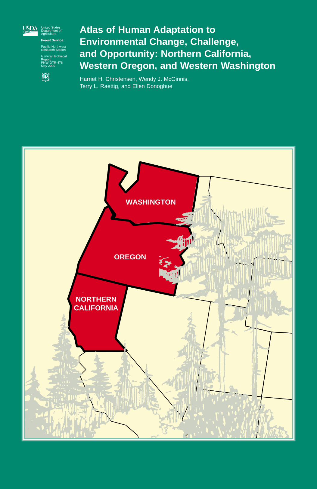
WASHINGTON
OREGON
NORTHERNCALIFORNIA

HARRIET H. CHRISTENSEN is a research social scientist, Forestry Sciences Laboratory, 4043 Roosevelt Way, Seattle, WA 98105-6497; WENDY J. McGINNIS was a research economist and ELLEN DONOGHUE is aresearch social scientist, Forestry Sciences Laboratory, P.O. Box 3890, Portland, OR 97208-3890; and TERRY L.RAETTIG is an economist, Pacific Northwest Research Station, stationed at Olympic National Forest, 1835 BlackLake Blvd. S.W., Olympia, WA 98512-5623.
Authors

Atlas of Human Adaptation to Environmental Change, Challenge, and Opportunity: Northern California, Western Oregon, and Western Washington
Harriet H. Christensen Wendy J. McGinnisTerry L. RaettigEllen Donoghue
U.S. Department of AgricultureForest ServicePacific Northwest Research StationPortland, OregonGeneral Technical Report PNW-GTR-478May 2000

Christensen, Harriet H.; McGinnis, Wendy J.; Raettig, Terry L.; Donoghue, Ellen. 2000. Atlas of human adaptation to environmental change, challenge, and opportunity: northern California, western Oregon, andwestern Washington. Gen. Tech. Rep. PNW-GTR-478. Portland, OR: U.S. Department of Agriculture, ForestService, Pacific Northwest Research Station. 66 p.
This atlas illustrates the dimensions, location, magnitude, and direction of social and economic change since1989 in western Washington, western Oregon, and northern California that have occurred during a major transi-tion period in natural resource management policy as well as large decreases in timber harvests. The diversityand the social and economic health of the Northwest Forest Plan region are synthesized by examining the fun-damental attributes of the region, provinces, and communities; the atlas includes information about ourselves,our settlements, and our natural resources. We set the stage for dialogue, debate, and developing a set of indi-cators to monitor the dimensions of well-being for sustainable development. The atlas is a tool for decision-makers, civic leaders, economic development practitioners, researchers, and others interested in understandingchange, easing the transition, and finding and pursuing opportunities to enrich society.
Keywords: Northwest Forest Plan, social and economic indicators, GIS, atlas, regional scale, provincial scale,county scale.
The Northwest Forest Plan (NWFP) is a new paradigm for forest management. It is intended to provide a sus-tainable balance between the needs of people and the environment by focusing on three areas: economic assis-tance, forestry, and coordination among agencies. It is a major effort to end years of legal gridlock and to addresshuman and ecological needs served by Federal forests of the Pacific Northwest and northern California.
Developed in response to the need to maintain habitat for the northern spotted owl, this new approach to forestmanagement led to reductions in timber harvests across all ownerships in western Washington, western Oregon,and northern California from 1989 to 1994. This fundamental change in forest management reflects social values.These values share common roots with those that led to the passing of the Endangered Species Act, interna-tional agreements for the protection of wildlife, and local, regional, and national responses to international globalenvironmental awareness. Under the Northwest Forest Plan, the decline in timber harvests and subsequentchanges are aimed at achieving, for the most part, long-term societal goals and sustainability.
The period from 1989 to the present has been marked by an abrupt transition with rapid declines in timber har-vest and related effects. Human populations in the Pacific Northwest impacted by change will emerge from thistransition period as having either addressed or disregarded the problems, issues, and opportunities facing ruraleconomies, communities, and regions. The as-yet-unknown long-term impacts of forest management changeswill evolve from the actions and processes that individuals, communities, and society at large initiate during thistransition.
During the late 1980s, many people predicted major impacts, including the demise of the timber industry in manyrural areas and selected community collapse. In a spatial display created from county-level data, this documentdemonstrates how, and in what direction, change has occurred.
This atlas illustrates the dimensions, location, magnitude, and direction of social and economic change in west-ern Washington, western Oregon, and northern California, beginning in 1989. This atlas synthesizes the diversityand the social and economic health of the Northwest Forest Plan region by examining the fundamental attributesof our region, provinces, and counties; it includes information about ourselves, our settlements, and our naturalresources. The stage is set for dialogue, debate, and development of a set of indicators to monitor the dimen-sions of well-being for sustainable development. The atlas is a tool for decisionmakers, civic leaders, economicdevelopment practitioners, researchers, and others interested in understanding change, easing the transition,and finding and pursuing opportunities to enrich society.
Explaining the “why” of change requires a scientific research design with well-defined dependent, intervening,and independent variables, which is beyond the scope of this atlas. A change in a community or county, such ashigh in-migration, is not due to any one factor but several factors. The replacement of labor by technology inmills and factories has had an immense effect on the economic well-being of some rural communities. Ruralresource-based communities also are affected by regional, national and global factors, both political and eco-nomic, such as globalization of the economy and cyclical variations of the market. Our stories attempt to showthe magnitude, location, and direction of change and the possible reasons for change.
Three base maps (maps 1-3) and two Mylar overlays provide context. Following a section on context, we askseven questions. The information addressing each question is accompanied with maps, figures, and tables thatillustrate the collected data. The questions are as follows:
1. What kinds of social and economic changes have taken place in the face of reduced timber harvest? Are Pacific Northwest communities changing? If so, how?
2. What changes have occurred in the timber industry since 1990? Has timber employment changed? Is private harvest increasing?
3. Have changes in Federal harvest had a significant effect on county revenues?
4. Are western Washington, western Oregon, and northern California singularly dependent on naturalresources?
5. What Federal assistance has aided cities and rural areas?
6 How have the population characteristics changed? What are the trends in migration, educational attainment,and changes in ethnicity?
7. What have been the changes in selected social issues such as rates of poverty, property and violent crimes,and alcohol-related incidences?
The stories depicted in each map and accompanying text are complex and require consideration of data acces-sibility and limitations, the external conditions occurring during the time frame of each map, such as recessionsand broader social trends, and undefined relations among indicators. We highlight below some important pointsdepicted in each map.
Abstract
Executive Summary
How This Atlas Will Contribute
Telling the Story

Change in Public TImber Harvest• Public timber harvest is the volume of timber harvested from Federal, state, county, and municipal lands. Public
timber harvests decreased in all but four counties in the region. The volume decreases were particularly largeon the Olympic Peninsula, in the Washington Cascades, and in coastal and southwest Oregon.
Change in Public and Private Timber Harvest• The total change in timber harvest was affected by both the harvest from public lands and the harvest from
privately owned lands. As Federal harvests declined, harvests from other ownerships could either moderate or exacerbate the change.
• The largest declines in total harvests were in many of the same areas that showed large declines in publicharvests, but additional counties in Washington also showed large total decreases.
Change in Wood Products Employment• Employment changes in the wood products industry are affected by the availability of raw material as well as
several other conditions.
• Wood products employment decreased in most counties of the region and percentage decreases were particularly large in the counties along the Columbia River, in southwestern and along coastal Oregon, and in northern California.
• Secondary wood products manufacturing caused increases in wood products employment in certain areas.
Federal Lands-Related Payments to Counties• Federal lands-related payments are relatively more important to the rural counties of southwest Oregon and
Klamath provinces and Skamania and Jefferson Counties in Washington. Federal legislation has insulatedcounties that historically have received large payments from experiencing rapid declines in the Federalpayments as timber harvests and sales values have fallen.
Unemployment Rate Compared to Region• Unemployment rates in the Pacific Northwest have followed national trends since the mid-1980s, but there has
been a large variation in absolute value of the rates in the three states when compared to the Nation.
• Unemployment rates in northern California, the Washington Cascades, and selected coastal counties haveconsistently been higher than the rate in the rest of the region.
Change in Total Employment• Changes in wood products employment provide one indicator of economic performance, but it is important to
know the changes in total employment to have a better understanding of the general health of the economyand availability of potential opportunities for unemployed workers. The lowest increases in total employmentwere in the rural southwestern Oregon and northern California counties. Changes in total employment for acounty may not always reflect changes in specific communities.
Wage Trends• Wages are an indicator of job quality and labor market conditions. Events of the early 1980s were particularly
devastating to the Pacific Northwest.
• Nonmetropolitan wages were consistently lower than metropolitan wages in each state. There was a generaldownward trend in earnings per job in counties along the Columbia River and certain coastal counties. Twelveof the 14 counties in the region that have had experiences with a downward trend in the region are countieswith moderately large percentage declines in wood products industry employment.
Wage Level• The absolute value of wage levels is another useful indicator of economic performance. Wage levels were
relatively high in those counties along the Interstate 5 corridor, from Everett to Salem, and in California coun-ties adjacent to the San Francisco metropolitan area.
• Only four of the counties with the lowest wage level had a generally upward trend in wage levels. This indicat-ed that those counties with the lowest wage level were not likely to increase in wage level ranking in theregion.
Economic Diversity• Economic diversity is the way to assess the structure of the economy by looking at the distribution of jobs
across industries. There were few patterns in economic diversity within the region, except for a concentrationof low diversity in the eastern Washington portion of the region. There was a general trend of increasingindustrial diversity over time in the region and the Nation.
Fastest Growing Nonfarm Industries• The country and the region have undergone a fundamental shift from a manufacturing economy to a knowl-
edge-based economy. Services, trade, finance, and construction were the fastest growing sectors in mostcounties of the region. In very few counties in the region were manufacturing and durable goods manufactur-ing, in particular, the fastest growing industries.
Slowest Growing Nonfarm Industries• The relative decline of manufacturing was evident at the county-level in the Northwest Forest Plan region, and
manufacturing was the slowest growing industry in 38 of the 72 counties. Durable goods manufacturing, whichincludes wood products manufacturing, was the slowest growing industry in 75 percent of these 38 counties.
Change in Timber Harvest andWood Products Employment
Change in Economic Conditions:Economic Performance
Structural Economic Change
Change in County Population• The entire west coast and Pacific Northwest grew faster in population than the United States as a whole
between 1989 and 1994. The population growth persisted even through the economic downturn in California.
• Different patterns were found in population growth. Many western counties considered to be high amenitycounties experienced high migration turnover. Northern California counties tended to exhibit slow to mediumgrowth during this period. The Puget Sound area and northern Cascades counties exhibited fast growth. InOregon, the metropolitan areas and the Crook-Deschutes-Jefferson area had the fastest growth.
Change in Unincorporated and Incorporated Population • Because many of the counties in the NWFP region experienced fairly rapid population growth in the early
1990s, it was useful to examine whether the unincorporated portions experienced the same growth rates asthe incorporated areas. Twenty-three of the 72 counties in the region experienced population growth in bothincorporated and unincorporated portions of the county. Thirteen counties experienced rates of growth in unin-corporated areas that actually exceeded rates for the incorporated population.
Migration Status and Trends• Increasing employment opportunities encourages in-migration and also encourages upward mobility, including
the search for better jobs outside of an area. Of the 36 counties with high in-migration in the region, 27 alsohad high out-migration relative to the rest of the counties in the region.
• Net migration, natural change (the difference between births and deaths), and to a lesser extent, internationalin-migration affect population dynamics. For 16 of 26 metropolitan counties, the majority of the populationgrowth was attributed to natural increase. Some natural decrease occurred along the northern Oregon coast.
Change in Ethnicity• Ethnicity is an indicator of identity and population diversity and has implications for forest management, as
well as for school systems, health providers, and other public services. Asian or Pacific Islanders showed thelargest percentage of increase between 1980 and 1990 in the major metropolitan areas of Oregon, Washington,and northern California. Native American populations increased on the coasts of Oregon and Washington.
Educational Attainment • Educational attainment is one of the most important indicators of lifetime economic opportunities. Nationally,
25 percent of individuals did not have a high school diploma in 1990. The three states fell below the nationalfigure with California at 24 percent, Oregon at 19 percent, and Washington at 16 percent. The percentage ofindividuals that were high school graduates or had some college during 1990 was lower in California and higher in Washington and Oregon as compared to the national percentage.
• The higher educational attainment was found in the major metropolitan areas such as Puget Sound, Portland,and San Francisco suburban areas. In contrast, the lowest educational attainment in the region was in coun-ties traditionally dependent on natural resources, and that creates a challenge for economic and communitydevelopment efforts focusing on diversifying the economy.
Change in Income Maintenance• Income maintenance is an indicator of economic stress and poverty. The largest per capita average annual
change from 1989 to 1994 occurred in northern California and southern Oregon, in the Puget Sound region,and in counties of eastern Washington. The smallest change occurred in the San Francisco Bay area, ShastaCounty, California, and Jackson and Deschutes Counties, Oregon.
Change in Poverty Rate• The poverty rate reflects the distribution of income and is an indicator of economic distress. In 1995,
California had a higher percentage of persons of poverty level than the national level of 14 percent. Oregonand Washington were lower than the national average. Poverty rates increased in the majority of counties inall three states and ranged from 0 to 5 percent for 1979 to 1993.
Change in Violent Crime Rates• High and increasing violent crime rates reflect social and economic distress. Violent crime rate analysis
showed that the majority of the NWFP landscape had no primary trend—neither an increase nor a decrease in violent crime. Pockets of change were evident, however.
Change in Property Crime Rates• An increase in rates of property crime is an indicator of economic or social stress, or both. Downward trends
were reflected in Skagit and Adams Counties, Washington; and Clatsop, Clackamas, Wasco, Marion, Linn,and Jackson Counties and the Oregon coast, Oregon. In Humboldt, Tehema, and Glenn Counties,California, property crime rates appeared to be in an upward trend from 1989 to 1995.
Alcohol-Related Incidences• Alcohol-related incidences are indicators suggesting stress in a person, family, or community. In Oregon,
6 to 10 people per 1,000 population experienced alcohol-related arrests. In Washington, between 10 and 15percent of the total collisions in 1993 were alcohol related. Data from California were unavailable.
• Local differences may have reflected variations in enforcement activities as well as absolute differences in therate of incidences. The lower rates in the largest metropolitan areas may be related to several factors includ-ing the availability of alternative transportation, the prevalence of nonalcohol drug problems, and the closeproximity of alcohol sources in urban areas.
Northwest Economic Adjustment Initiative• The Northwest Economic Adjustment Initiative is one part of the NWFP intended to support the region’s
people and communities during the economic transition resulting from changing natural resource managementpolicies.
• Beginning in fiscal year 1994, $1.2 billion was allocated over 5 years. Four counties in the region receivedbetween $20 and 30 million. Most of the eligible counties received $10 million or less.
Social Issues
Federal Assistance
Characteristics of the Population

The period from 1989 to the present was a time of transition for Washington, Oregon, and California as a resultof changing forest management policies. Counties in the NWFP region have and will continue to experienceimpacts to society and the economy related to changes in public and private forest management. This atlas provides information on many of these social and economic variables, which can be used as indicators ofchange. The information is on state and county levels.
This atlas provides information under six sections, as follows:
1. Change in timber harvest and wood products employment
2. Change in economic conditions—economic performance
3. Structural economic change
4. Characteristics of the population
5. Social issues
6. Federal assistance
With this document, the stage is now set for dialogue, debate, and development of a set of indicators to monitorthe dimensions of our natural resources. This atlas is a tool for those interested in understanding change, easingthe transition, and finding and pursuing opportunities to enrich society.
Summation

1 Introduction
1 Telling the Story
2 Organization of the Atlas
3 Section 1: Overlays and Base Maps
9 Section 2: Change in Timber Harvest and Wood Products Employment
10 Change in Public Timber Harvest
12 Change in Public and Private Timber Harvest
14 Change in Wood Products Employment
16 Federal Lands-Related Payments to Counties
19 Section 3: Change in Economic Conditions—Economic Performance
20 Unemployment Rate Compared to Region
22 Change in Total Employment
24 Wage Trends
26 Wage Level
29 Section 4: Structural Economic Change
30 Economic Diversity
32 Fastest Growing Nonfarm Industries
34 Slowest Growing Nonfarm Industries
37 Section 5: Characteristics of the Population
38 Change in County Population
40 Change in Unincorporated and Incorporated Population
42 Migration Status and Trends
44 Change in Ethnicity
46 Educational Attainment
49 Section 6: Social Issues
50 Change in Income Maintenance
52 Change in Poverty Rate
54 Change in Violent Crime Rates
56 Change in Property Crime Rates
58 Alcohol-Related Incidences
61 Section 7: Federal Assistance
62 Northwest Economic Adjustment Initiative
64 Acknowledgments
64 References
65 Appendix
Section 1: Overlays and Base Maps
Overlay—County Names
Overlay—Provinces of the Northwest Forest Plan
Map 1—Federal and tribal lands
Map 2—Population distribution: 1990 census places
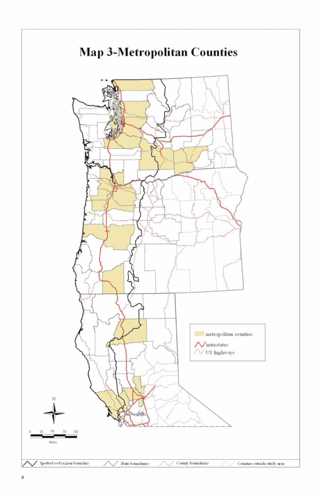
Map 3—Metropolitan counties
Section 2: Change in Timber Harvest and Wood Products Employment
Map 4—Change in public timber harvest
Map 5—Change in public and private timber harvest
Map 6—Change in wood products employment
Map 7—Federal lands-related payments to counties
Figure 1—Timber harvest on public and private lands by state, 1978-94: (A) California, (B) Oregon, and
(C) Washington
Figure 2—Wood products employment, primary and secondary processing industries, 1983-95: (A) California, (B) Oregon, and (C) Washington
Section 3: Change in Economic Conditions—Economic Performance
Map 8—Unemployment rate compared to region
Map 9—Change in total employment
Map 10—Wage trends
Map 11—Wage level
Figure 3—Unemployment rate (precentage of civilian force unemployed), by state, compared to the national unemployment rate, 1984-94
Contents
Map and Figures

Figure 4—Total nonmetropolitan employment by state, 1969-93
Figure 5—Employment trends for counties with reductions of over 100,000 board feet in public timber harvest, 1979-93
Figure 6—Metropolitan and nonmetropolitan wage trends in 1992 dollars compared to the Nation, 1969-93: (A) California, (B) Oregon, and (C) Washington
Section 4: Structural Economic Change
Map 12—Economic diversity
Map 13—Fastest growing nonfarm industries
Map 14—Slowest growing nonfarm industries
Section 5: Characteristics of the Population
Map 15—Change in county population
Map 16—Change in unincorporated and incorporated population
Map 17—Migration status and trends
Map 18—Change in ethnicity
Map 19—Educational attainment
Figure 7—Dominant minority populations in the United States during 1995
Figure 8—Level of educational attainment, Pacific Northwest and northern California, compared to the Nation, 1990
Section 6: Social Issues
Map 20—Change in income maintenance
Map 21—Change in poverty rate
Map 22—Change in violent crime rates
Map 23—Change in property crime rates
Map 24—Alcohol-related incidences
Section 7: Federal Assistance
Map 25—Northwest economic adjustment initiative
Section 2: Change in Timber Harvest and Wood Products Employment
Table 1—Change in jobs, Pacific Northwest and northern California, 1990 to 1994
Section 3: Change in Economic Conditions—Economic Performance
Table 2—Unemployment rates and consistently high unemployment counties, Pacific Northwest and northern California, 1988 to 1995
Section 4: Structural Economic Change
Table 3—Fastest growing industry by county
Table 4—Slowest growing industry by county
Section 5: Characteristics of the Population
Table 5—Population growth rates of incorporated places, by state and size, Pacific Northwest, 1990 to 1995
Table 6—Percentage of population living in unincorporated areas in 1990, Pacific Northwest and northern California
Table 7—Net in-migration and natural increase effects on population growth, Pacific Northwest and northern California, 1990 to 1994
Table 8—Percentage of change of Hispanic origin, Pacific Northwest and northern California county populations, 1980 to 1990
Table 9—Population projections, by the Nation and by states, 2000-2010
Table 10—Percentage of the population with no high school diploma, Pacific Northwest and northern California, 1990
Section 6: Social Issues
Table 11—Average annual per capita income maintenance, Pacific Northwest and northern California, 1989 to 1994
Table 12—Persons below poverty level, for the Nation and by state, 1990 to 1995
Table 13—Change in percentage of poverty, Pacific Northwest and northern California, increase or decrease by county during 1979 to1989 and 1989 to1993
Table 14—Violent crime trends, Pacific Northwest and northern California, 1995
Table 15—Property crime rates, for the Nation and by state, 1995
Table 16—Trends in property crime rates, Pacific Northwest and northern California
Table 17—Trends in both violent and property crime rates, Pacific Northwest and northern California
Table 18—Percentage of alcohol-related incidences out of total number of collisions, Washington, 1993
Table 19—Rate of adult arrests for driving under the influence of intoxicants (DUII), Oregon, 1993
Section 7: Federal Assistance
Table 20—NWEAI funding, by category of assistance
Table 21—NWEAI Federal funding, by department, 1994 through 1996
Table 22—Counties with 1 to 4 agencies reporting less than 12 months of crime data for a specified number of years between 1989 and 1995
Tables
Appendix

This page is intentionally left blank.
The Northwest Forest Plan (NWFP) is a new model for forest management. It is intended to provide a sustain-able balance between the needs of people and the environment. This plan, originally entitled the “Forest Plan fora Sustainable Economy and a Sustainable Environment,” focuses on three areas: economic assistance, forestry,and coordination among agencies. The plan is a major effort to end years of legal gridlock and develop a direc-tion addressing the human and ecological needs served by Federal forests in the Pacific Northwest and northernCalifornia.
In response to the need to maintain habitat for the northern spotted owl (Strix occidentalis caurina), a newapproach to forest management led to reductions in timber harvests across all ownerships from 15.6 billion boardfeet in 1989 to 8.4 billion board feet in 1994 in western Washington, western Oregon, and northern California.This fundamental change in forest management reflects social values. These values share common roots withthose that led to the passing of the Endangered Species Act (U.S. Laws, Statutes 1973), international agree-ments for the protection of wildlife, such as Convention of International Trade of Endangered Species (CITES),and local, regional, and national responses to international global environmental awareness. Under the NWFP,the decline in timber harvests and subsequent changes are aimed at achieving, for the most part, long-termsocietal goals and sustainability.
Historians suggest that it took 150 years to arrive at the current situation in the Pacific Northwest with regard totimber harvest and subsequent effects, as shown in the following list:
Early to mid 1800s Cutting of forests begins with non-Indian settlers.
Late 1800s to early 1900s Lumber camps are noticeable, and commercial timberharvesting increases.
Early 1900s to World War II Widespread logging and industry harvest of old growth from private lands increases.
Post-World War II Logging begins on Federal lands in the Pacific Northwest.
1980s 1988-89 is an all-time peak in timber harvesting activity.
Public perceptions and expectations concerning Federal timber management in the Pacific Northwest lead to increased protection of species and ecosystems.
Timber harvesting declines.
Widespread social and economic changes begin to occur in the region.
The 10 years from 1989 to 1999 were marked by a new transition with rapid declines in timber harvesting andrelated effects. Human populations in the Pacific Northwest impacted by change will emerge from this transitionperiod as having either addressed or disregarded the problems, issues, and opportunities facing rural economies,communities, and regions. The as-yet-unknown long-term impacts of forest management changes will evolvefrom the actions and processes that individuals, communities, and society at large initiated throughout this tran-sition period.
This atlas is a reference book illustrating the dimensions, location, magnitude, and direction of social and eco-nomic change in western Washington, western Oregon, and northern California that have occurred since 1989.We synthesized the diversity and the social and economic health of the NWFP region by examining the funda-mental attributes of our region, provinces, and communities, including information about ourselves, our settle-ments, and our natural resources. We set the stage for dialogue, debate, and development of a set of indicatorsto monitor the dimensions of well-being for sustainable development. This atlas is a tool for decisionmakers,civic leaders, economic development practioners, researchers, and others interested in understanding change,easing the transition, and finding and pursuing opportunities to enrich society.
Three base maps (maps 1-3) and two Mylar1 overlays provide context. Following the section on context, we askseven questions:
1. What kinds of social and economic changes have taken place in the face of reduced timber harvest? Are Pacific Northwest communities changing? If so, how?
2. What changes have occurred in the timber industry since 1990? Has timber employment changed? Is private harvest increasing?
3. Have changes in Federal harvest had a significant effect on county revenues?
4. Are western Washington, western Oregon, and northern California singularly dependent on naturalresources?
5. What Federal assistance has aided cities and rural areas?
6. How have the population characteristics changed? What are the trends in migration, educational attainment,and changes in ethnicity?
7. What have been the changes in selected social issues such as rates of poverty, property and violent crimes,and alcohol-related incidences?
During the late 1980s, many people predicted major impacts, including the demise of the timber industry in manyrural areas and selected community collapse. In a spatial display created from county-level data, this documentdemonstrates how and in what direction change has occurred.
1The use of trade or firm names in this publication is for reader information and does not imply endorsement by the U.S. Department ofAgriculture of any product or service.
Introduction
Telling the Story
1

Explaining the “why” of change requires a scientific research design with well-defined dependent, intervening,and independent variables; that is beyond the scope of this atlas. A change in a community or county, such ashigh in-migration, is not due to any one factor but to several factors. The replacement of labor by technology inmills and factories has had an immense effect on the economic well-being of some rural communities. Ruralresource-based communities also are affected by regional, national and global factors, both political and eco-nomic, such as globalization of the economy and cyclical variations of the market. Our stories attempt to showthe magnitude, location, and direction of change and potential reasons why change has occurred. The focus ofthis material is on the NWFP region and does not directly portray the impacts and effects of implementing theplan. In other words, this is not a cause-and-effect analysis, but rather the status and trends of 22 social andeconomic indicators in the region.
This atlas is divided into seven sections:
1. Overlays and base maps2. Change in timber harvest and wood products employment3. Change in economic conditions—economic performance4. Structural economic change5. Characteristics of the population6. Social issues7. Federal assistance
Mylar transparencies of county names and province boundaries are included and can be overlaid on the othermaps. The content and scope of the atlas are focused on selected indicators from the Northwest Forest Plan. It is intended to complement existing information. We expect the atlas to stimulate interest and discussion. Wewelcome your comments on this atlas.
2
Organization of the Atlas
Section 1:
Overlays and Base Maps
County Names
Provinces of the Northwest Forest Plan
Federal and Tribal Lands
Population Distribution: 1990 Census Places
Metropolitan Counties
3

4

5

6

7
8

Section 2:
Change in Timber Harvest
and Wood Products Employment
Change in Public Timber Harvest
Change in Public and Private Timber Harvest
Change in Wood Products Employment
Federal Lands-Related Payments to Counties
9

10
The debate over how public lands should be managed escalated in the late 1980s. “A series of legislative andlegal battles in the late 1980s led to an injunction in 1991 that prevented the Forest Service from preparing anynew timber sales in northern spotted owl habitat; in 1992, the Bureau of Land Management was also enjoinedfrom any new timber sales in owl habitat” (Tuchmann and others 1996:1). These legal actions virtually haltedFederal timber sales for 3 years. In 1994 the injunctions were lifted as a result of the adoption of the NWFP, andFederal timber was again offered for sale but at a much lower rate. “The [Federal] timber pipeline went downfrom about 5 billion board feet sold and available for harvest before the injunction to about 1 billion board feetthree years later” (Tuchmann and others 1996:3). The NWFP allows for a sustainable Federal timber harvest of1.1 billion board feet per year from the plan region. By 1996, 873 million board feet were offered for sale fromFederal lands.
Reduced levels of public timber sales started to show up in 1989 and 1990, even before the injunctions, as newFederal plans, policy uncertainties, and conflict at the local level began to impact the Federal agencies (see fig.1, a, b, and c). After the injunctions were implemented, there still was volume under contract that could be har-vested (Federal timber sales can be harvested for an extended period after purchase); thus the drop in Federaltimber harvest occurred over several years, but this time line probably was different in different areas. The largedrop in timber harvest between 1989 and 1990 occurred simultaneously with a national recession, which furthercomplicated the assessment of what was happening.
Tuchmann and others (1996) provide a good overview of the events surrounding Federal forestry in the late1980s and early 1990s; however, most of their analysis is for the entire plan region or for metropolitan versusnonmetropolitan portions of the region. Our goal was to further spatially disaggregate, to the county level, someof the information on the timber situation and the economic and social indicators.
Map 4 shows the change in public harvest by county between 1989 and 1994. Harvest referred to as “public”includes the harvest from lands managed by Federal, state, county, and municipal entities (harvest from triballands in Washington also is included as “public”); in most cases, this category is dominated by harvest fromFederal lands. Note that 1989 was one of the higher harvest years in the last decade (see fig. 1, a, b, and c)but near the long-term average harvest for nonrecession years. By 1993 the public harvest in all three stateshad fallen below the levels experienced in the early 1980s recession years. Timber harvest since 1994 hasremained relatively stable. Map 4 shows that the largest declines were in southwest Oregon, especiallyDouglas and Lane Counties, where the 1994 harvest from public lands was more than 600,000 thousandboard feet lower than the 1989 harvest. When the transparency for the provinces is overlaid on the public timber harvest map, it can be seen that the southwest Oregon province is the only one made up entirely ofcounties with decreases greater than 100,000 thousand board feet. At the other end of the spectrum, thenorthwest Sacramento province is composed mostly of counties having decreases of less than 45,000 thousandboard feet. Eighteen counties on the Olympic Peninsula and in the Cascades and coastal areas south of PugetSound that traditionally had large Federal timber harvests also had relatively large decreases in public timberharvests (greater than 100,000 thousand board feet). The two Cascades provinces of Washington are strikingin their uniformity across an eight-county area—all had decreases between 45,000 and 100,000 thousandboard feet. Four counties in northwest Oregon and southwest Washington showed a slightly larger public timberharvest in 1994 compared to 1989. These counties historically had negligible acres of Federal public land andvery small public harvests.
Public and particularly Federal ownership of forest lands (largely lands managed by the USDA Forest Serviceand the Bureau of Land Management) are most important in the Willamette, southwest Oregon, and Klamathprovinces. State-owned lands are locally important in Washington. Private forest lands account for a largerproportion of the ownership and harvest in Washington and parts of northern California (McGinnis and others1996, 1997).
Public timber harvest changes could be calculated for 58 of the 72 counties in the region. In all, timber harvestdeclined in 54 of the 58 counties and increased in 4 counties. Large decreases in public harvest occurredacross the region and in all three individual states.
Displaying the change in public timber harvest in board feet indicates the potential impacts in absolute termsrather than relative terms. Small decreases in public timber harvest may indicate a low level of public timber harvest to begin with rather than a small percentage of decrease in harvest.
Change in Public Timber Harvest
1978 1980 1984 1986 1988 1990 1992 1994
10,000,000
8,000,000
6,000,000
4,000,000
2,000,000
0
Tho
usan
d bo
ard
feet
Private Public
A
1982Year
1966 1970 1974 1978 1982 1986 1990 1994
10,000,000
8,000,000
6,000,000
4,000,000
2,000,000
0
Tho
usan
d bo
ard
feet
Private Public
B
Year
1972 1975 1978 1981 1984 1987 1990 1993
10,000,000
8,000,000
6,000,000
4,000,000
2,000,000
0
Tho
usan
d bo
ard
feet
Private + Indian Public
C
Year
Figure 1—Timber harvest on public and private lands by state, 1978-94: (A) California, (B) Oregon, and (C)Washington.

11

Total timber harvest is affected not only by the public harvest (Federal, state, county, other public) but also by harvests from other ownerships. Land ownership differs by county, and the harvest decisions of landownersdepend on various things, including market conditions, stocking levels, management goals, and changing forestregulatory policies that can affect private as well as public lands. Thus there was uncertainty about how privatetimber harvest would respond as public harvest declined. As Federal harvests declined, harvests from otherownerships could either moderate or exacerbate the change. One possible scenario was that the public timbersupply constriction would cause a price increase with private landowners responding to the price signal byharvesting more timber. In reality, harvest decisions are highly complex and ownership patterns differ, so thateven though prices increased, in many areas private harvest declined too. In some cases private landownerswere constrained by inventory; they lacked sufficient mature timber to increase harvest.
For the region displayed in map 5, 42 percent of harvest came from public lands in 1989 versus 17 percent in1994, and the total harvest dropped from 16 to 9 billion board feet. Of the 55 counties that had decreases inpublic harvest (regardless of whether they are in the “mostly public” group or not), 16 (30 percent) had increasesin private harvest. In Pierce County, Washington, and Tillamook County, Oregon, these increases substantiallyoffset the public decreases.
Map 5 shows how harvest from all owners in 1994 differed from harvest in 1989 (portrayed by the shadings) and whether the difference was primarily the result of change in public harvest, private harvest, or a nearly equalcombination of both (represented by the patterns). We classified the change as “mostly due to public” if theabsolute value of the change in public harvest was at least 1.5 times greater than the absolute value of thechange in private harvest, and the opposite for “mostly due to private.” The remaining counties fell into the “dueequally” category (though the changes may not be exactly equal). Thus, one cannot tell which direction publicand private changed, only their relative magnitudes.
Map 5 shows that the largest declines in total harvest were in many of the same areas that showed largedeclines in public harvest (see map 4), but additional counties in Washington now appear in the categorieshaving larger decreases (over 100,000 thousand board feet decline), thereby indicating declines in private har-vest as well. A larger share of timberlands and harvest in Washington are private compared to Oregon, so thatprivate harvest has a greater potential to affect total harvest in Washington. Change in private timber harvestwas more than 1.5 times greater than change in public harvest for 22 of the 72 counties, and in 15 of these 22private harvest went down (ranging from -750 to -200,000 thousand board feet). Twenty-nine counties were inthe “mostly public” group, and private harvest decreased in all but three of these. The harvest changes in 13counties were not categorized as “mostly public” or “mostly private,” and in all but two (Pierce and Tillamook,mentioned above) private harvest went down as did public harvest. Six counties had small increases in total har-vest, driven by harvest from private lands. Of the 27 counties with declines of more than 100,000 thousand boardfeet in total harvest, 14 were in the “mostly public” category, 5 were in the “mostly private” category, and 8 werein the “equally public and private” category.
Map 5 shows changes in timber harvest to be a complex issue, with total harvest being affected by a variety offactors including but not limited to public policy on Federal lands.
12
Change in Public and PrivateTimber Harvest

13

Economic systems are complex. Wood products employment (especially logging and saw milling) in theNWFP region clearly has been affected by changes in harvest from Federal lands, but many other factorscame into play to determine the changes in wood products employment across the region. As map 5 shows,total harvest was affected by what was happening with other ownerships (stocking levels, management goals,and age class distribution).
Additional factors included the following:
• The availability of wood from sources outside the region (imports) and exports of unprocessed logs.• Increases in labor productivity (a given amount of timber can be processed with fewer employees).• Trends in other segments of the industry, such as growth in secondary manufacturing. • Regional, national, and international economic conditions, which affected demand for wood products.• The structure of the local industry, and log flows from harvesting areas to processing centers.
Map 6 shows how wood products employment (SIC 24)2 changed between 1990 and 1994 in percentageterms. Percentages were used, as opposed to absolute number of jobs, to give a relative sense of how thewood products industry changed in the various counties: Was the change large or small relative to the number ofpeople in the industry in that county? Small percentages can correspond to large absolute numbers of jobs (andvice versa), however; thus, table 1 shows the change in the number of jobs. The map and table are based ondata from each state’s employment department; those data include only those employees covered by unemploy-ment insurance. Certain classes of employees such as proprietors and partners are omitted.
Across the region, the 51 counties having declines in wood products employment far outnumbered the countiesshowing increases in lumber and wood products employment. Importantly, the counties losing wood productsemployment had large relative and absolute declines when compared to the increases in counties gaining lum-ber and wood products employment. Two counties, Douglas and Lane in Oregon, had net losses of more than2,000 lumber and wood products workers between 1990 and 1994. The 23 counties with large relative losses inlumber and wood products employment (greater than 20 percent) are distributed across the region, with concen-trations in those counties having a high proportion of timber harvests coming from public lands or processingfacilities dependent on public lands in other counties.
Ten counties had more people employed in the wood products sector in 1994 than they did in 1990 (eight ofthese were increases of less than 5 percent). There have been important changes in the geographical distribu-tion of the specific industries comprising the lumber and wood products sector (SIC 24). One of these changeswas the increasing share of the sector that is accounted for by secondary manufacturing industries (Raettig andMcGinnis 1996) as employment was declining in primary processing industries. This change is most noticeablein Oregon and Washington (fig. 2, b and c) but also is evident in recent years in California as the recession ofthe early 1990s has abated (fig. 2a). In those counties with increasing wood products employment, the increasewas due to growth in secondary manufacturing (such as mobile home manufacturing in Marion County, Oregon)or the importance of private harvest (in Tillamook County, for example).
Changes in income derived from wood products employment provide another measure of the role of the woodproducts industry in the economy. Changes in income may be either higher or lower than the changes in employ-ment because of such factors as whether part-time or full-time jobs are lost or created, whether the jobs are lowpaying or high paying, and the seasonality of the jobs. In many of the important timber counties of the region,the percentage of decline in payrolls was less than the percentage of decline in employment, thereby indicatingthat wages in the wood products sector actually went up between 1990 and 1994.
2 SIC stands for standard industrial classification. Classification 24 includes all the lumber and wood product industrial sectors.
14
Change in Wood ProductsEmployment
1983 1985 1987 1989 1991 1993 1995
70,000
60,000
50,000
30,000
20,000
0
Avg
. ann
ual e
mpl
oym
ent
A
Year
40,000
10,000
Primary processing Secondary processing
1979 1981 1983 1985 1987 1989 1991
100,000
60,000
40,000
20,000
0
Avg
. ann
ual e
mpl
oym
ent
B
Year
60,000
Primary processing Secondary processing
1993
1979 1981 1983 1985 1987 1989 1991
60,000
50,000
30,000
20,000
0
Avg
. ann
ual e
mpl
oym
ent
C
Year
40,000
Primary processing Secondary processing
1993
10,000
Table 1—Change in jobs, Pacific Northwest and northernCalifornia, 1990 to 1994
Employment changeCounty standard industrialand state classification 24
Percent Number
Napa, CA 76.6 49Jefferson, OR 34.0 316Tillamook, OR 32.7 127Yakima, WA 26.4 394Marion, OR 18.7 603Thurston, WA 15.3 152Humboldt, CA 8.2 317Marin, CA 4.4 3Crook, OR 3.4 65Trinity, CA 1.2 5Colusa, CA NA NASherman, OR NA NAAdams, WA NA NABenton, WA NA NADouglas, WA NA NAFranklin, WA NA NAGrant, WA NA NAIsland, WA NA NAKittitas, WA NA NAWahkiakum, WA NA NAWalla Walla, WA NA NAWhatcom, WA -.5 -6Lewis, WA -.9 -22Washington, OR -2.2 -44San Juan, WA -2.2 -1Mason, WA -2.6 -37Jackson, OR -3.5 -185Yamhill, OR -3.8 -49Clark, WA -4.2 -65Pierce, WA -7.7 -338Lassen, CA -9.8 -69Yolo, CA -10.0 -93Chelan, WA -11.9 -28Linn, OR -12.6 -521King, WA -13.0 -952 Curry, OR -13.3 -97Okanogan, WA -13.7 -166Hood River, OR -14.0 -78Sutter, CA -14.1 -101Snohomish, WA -14.3 -442Jefferson, WA -14.4 -13Pacific, WA -15.0 -97Grays Harbor, WA -16.1 -451Tehama, CA -16.3 -213Lincoln, OR -17.0 -82Benton, OR -19.1 -266Deschutes, OR -19.2 -654Multnomah, OR -19.4 -435Cowlitz, WA -19.5 -610Klamath, OR -20.0 -703Polk, OR -21.7 -193Lane, OR -22.2 -2,269Mendocino, CA -22.6 -724Klickitat, WA -23.3 -181Modoc, CA -23.5 -23Glenn, CA -24.4 -10Josephine, OR -24.6 -485Coos, OR -25.7 -593Columbia, OR -25.9 -273Wasco, OR -26.7 -82Shasta, CA -27.0 -640Douglas, OR -28.3 -2,388Skagit, WA -28.7 -244Sonoma, CA -29.2 -523Clatsop, OR -29.6 -232Clackamas, OR -30.5 -629Lake, CA -32.0 -16Kitsap, WA -33.8 -102Siskiyou, CA -40.9 -508Clallam, WA -45.9 -648Del Norte, CA -53.5 -253Skamania, WA -63.3 -297
NA = not applicable.
Figure 2—Wood products employment, primary and secondary processing industries, 1983-95: (A) California,(B) Oregon, and (C) Washington.

15

Federal agencies historically have returned a portion of the receipts from the sale or lease of natural resourceson Federal lands to local governments. These payments offset, in part, the property and harvest taxes that localgovernments would realize were the Federal lands in private ownership (Bray and Lee 1991). Examples of thesepayments are the return of 25 percent of gross timber receipts from National Forest lands and 50 percent of thetimber revenues from Oregon and California lands managed by the Bureau of Land Management to local gov-ernments (Tuchmann and others 1996). Counties also receive Federal land-related payments through a pro-gram for payments in lieu of taxes (PILT) established in 1976. The PILT payments are based on a complexformula that includes county population, two alternative per-acre payment rates, acres of Federal lands, andreceipts from prior years from Federal natural resource-based programs (Schuster 1995).
Map 7 shows Federal land-related payments as a percentage of county expenditures and is an indication of therelative importance of Federal land payments to a specific county. The percentage of Federal land paymentsused in the calculations for the map included PILT payments, Oregon and California (O&C) payments from theBureau of Land Management, and National Forest payments for 1995. The specific year used in the calculationsis not particularly important because some Federal land payment programs are subject to legislatively mandatedfloors, and short-term trends are dampened. County expenditures used in the calculations for map 7 includedboth total (nonschool) county expenditures and school expenditure for 1991-92 from the Federal goverment census (U.S. Department of Commerce, Bureau of the Census 1997b). National Forest payments can be usedonly for school and road expenditures; O&C payments can be used for any purpose.
Federal land-related payments are most important to the rural counties of the southwest Oregon and Klamathprovinces. Skamania and Jefferson Counties in Washington also receive a relatively large share of funding fromFederal land-related payments. In general, the counties where Federal land payments are relatively more impor-tant are those containing Federal lands with high sales value of natural resources and comparatively low popula-tions. Federal land-related payments are relatively unimportant in the Portland and Seattle metropolitan counties.
Federal legislation has, in the short run, insulated those counties receiving payments from the sale of Federalnatural resources from experiencing rapid declines in the Federal payments as timber harvests and sales valuefall. Federal legislation passed in 1993 specified that payments in 1994 to counties in the region would be at least85 percent of the 1986-90 average (Tuchmann and others 1996). Minimum payments will decrease gradually to58 percent of the base period in 2003. The floor is eliminated in 2004. The PILT legislation also acts as a flooron Federal land payments to local governments; however, inflation has significantly reduced the real value ofPILT payments over time. An adjustment specified to increase the PILT payments has never been fully funded.As the full impact of declining sales value of natural resources (particularly timber) begins to be felt in countiestied to sales value, more counties will be tied primarily to PILT instead of sale value for Federal land-related payments. This has the potential to make more counties dependent on annual congressional funding of the PILTprogram and to increase the amount of funding Congress must appropriate to fully fund the program. Thosecounties most likely to be impacted in the future by changes in the value of Federal land-related payments arethose having the greatest percentage of Federal land-related payments, as indicated in map 7.
16
Federal Lands-Related Paymentsto Counties

17

This page is intentionally left blank.

Section 3:
Change in Economic
Conditions—Economic Performance
Unemployment Rate Compared to Region
Change in Total Employment
Wage Trends
Wage Level
19
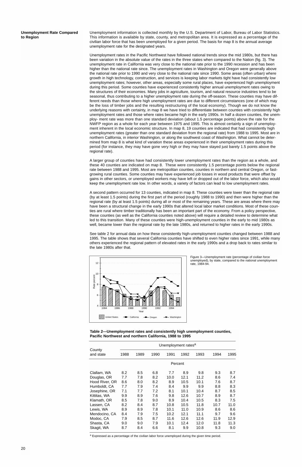
Unemployment information is collected monthly by the U.S. Department of Labor, Bureau of Labor Statistics.This information is available by state, county, and metropolitan area. It is expressed as a percentage of the civilian labor force that has been unemployed for a given period. The basis for map 8 is the annual averageunemployment rate for the designated years.
Unemployment rates in the Pacific Northwest have followed national trends since the mid 1980s, but there hasbeen variation in the absolute value of the rates in the three states when compared to the Nation (fig. 3). Theunemployment rate in California was very close to the national rate prior to the 1990 recession and has beenhigher than the national rate since. The unemployment rates in Washington and Oregon were generally abovethe national rate prior to 1990 and very close to the national rate since 1990. Some areas (often urban) wheregrowth in high technology, construction, and services is keeping labor markets tight have had consistently lowunemployment rates; however, other areas, especially some rural places, have experienced high unemploymentduring this period. Some counties have experienced consistently higher annual unemployment rates owing tothe structures of their economies. Many jobs in agriculture, tourism, and natural resource industries tend to beseasonal, thus contributing to a higher unemployment rate during the off-season. These counties may have dif-ferent needs than those where high unemployment rates are due to different circumstances (one of which maybe the loss of timber jobs and the resulting restructuring of the local economy). Though we do not know theunderlying reasons with certainty, in map 8 we have tried to differentiate between counties with consistently highunemployment rates and those where rates became high in the early 1990s. In half a dozen counties, the unem-ploy- ment rate was more than one standard deviation (about 1.5 percentage points) above the rate for theNWFP region as a whole for each year between 1975 and 1995. This is almost certainly a sign of unemploy-ment inherent in the local economic structure. In map 8, 19 counties are indicated that had consistently highunemployment rates (greater than one standard deviation from the regional rate) from 1988 to 1995. Most are innorthern California, in interior Washington, or along the southwest coast of Washington. What cannot be deter-mined from map 8 is what kind of variation these areas experienced in their unemployment rates during thisperiod (for instance, they may have gone very high or they may have stayed just barely 1.5 points above theregional rate).
A larger group of counties have had consistently lower unemployment rates than the region as a whole, andthese 40 counties are indicated on map 8. These were consistently 1.5 percentage points below the regionalrate between 1988 and 1995. Most are metropolitan counties, counties in northern and central Oregon, or fast-growing rural counties. Some counties may have experienced job losses in wood products that were offset bygains in other sectors, or unemployed workers may have left or dropped out of the labor force, which also wouldkeep the unemployment rate low. In other words, a variety of factors can lead to low unemployment rates.
A second pattern occurred for 13 counties, indicated in map 8. These counties were lower than the regional rate(by at least 1.5 points) during the first part of the period (roughly 1988 to 1990) and then were higher than theregional rate (by at least 1.5 points) during all or most of the remaining years. These are areas where there mayhave been a structural change in the early 1990s that altered local labor market conditions. Most of these coun-ties are rural where timber traditionally has been an important part of the economy. From a policy perspective,these counties (as well as the California counties noted above) will require a detailed review to determine whatled to this transition. Many of these counties were high-unemployment counties in the early to mid 1980s aswell, became lower than the regional rate by the late 1980s, and returned to higher rates in the early 1990s.
See table 2 for annual data on how these consistently high-unemployment counties changed between 1988 and1995. The table shows that several California counties have shifted to even higher rates since 1991, while manyothers experienced the regional pattern of elevated rates in the early 1990s and a drop back to rates similar tothe late 1980s after that.
20
Unemployment Rate Comparedto Region
Table 2—Unemployment rates and consistently high unemployment counties, Pacific Northwest and northern California, 1988 to 1995
Unemployment ratesa
Countyand state 1988 1989 1990 1991 1992 1993 1994 1995
Percent
Clallam, WA 8.2 8.5 6.8 7.7 8.9 9.8 9.3 8.7Douglas, OR 7.7 7.8 8.2 10.0 12.1 11.2 8.6 7.4Hood River, OR 8.6 8.0 8.2 8.9 10.5 10.1 7.6 8.7Humboldt, CA 7.7 7.9 7.4 8.4 9.9 9.9 8.8 8.3Josephine, OR 7.1 7.7 7.2 8.1 10.1 10.4 8.7 8.5Kittitas, WA 9.9 8.9 7.6 9.8 12.6 10.7 8.9 8.7Klamath, OR 8.5 7.8 9.0 8.9 10.4 10.5 8.3 7.5Lassen, CA 8.2 8.4 8.7 10.8 10.5 11.8 10.7 11.0Lewis, WA 8.9 8.9 7.8 10.1 11.0 10.9 8.6 8.6Mendocino, CA 8.4 7.9 7.5 10.2 12.1 11.1 9.7 9.6Modoc, CA 7.9 8.5 8.7 11.6 12.6 12.6 11.9 12.9Shasta, CA 9.0 9.0 7.9 10.1 12.4 12.0 11.8 11.3Skagit, WA 8.7 8.4 6.6 8.1 9.9 10.8 9.3 9.0
a Expressed as a percentage of the civilian labor force unemployed during the given time period.
4
6
8
10
12
Rat
e pe
rcen
t
1084 1986 1988 1990 1992 1994Year
United States California Oregon Washington
Figure 3—Unemployment rate (percentage of civilian force unemployed), by state, compared to the national unemploymentrate, 1984-94.

21

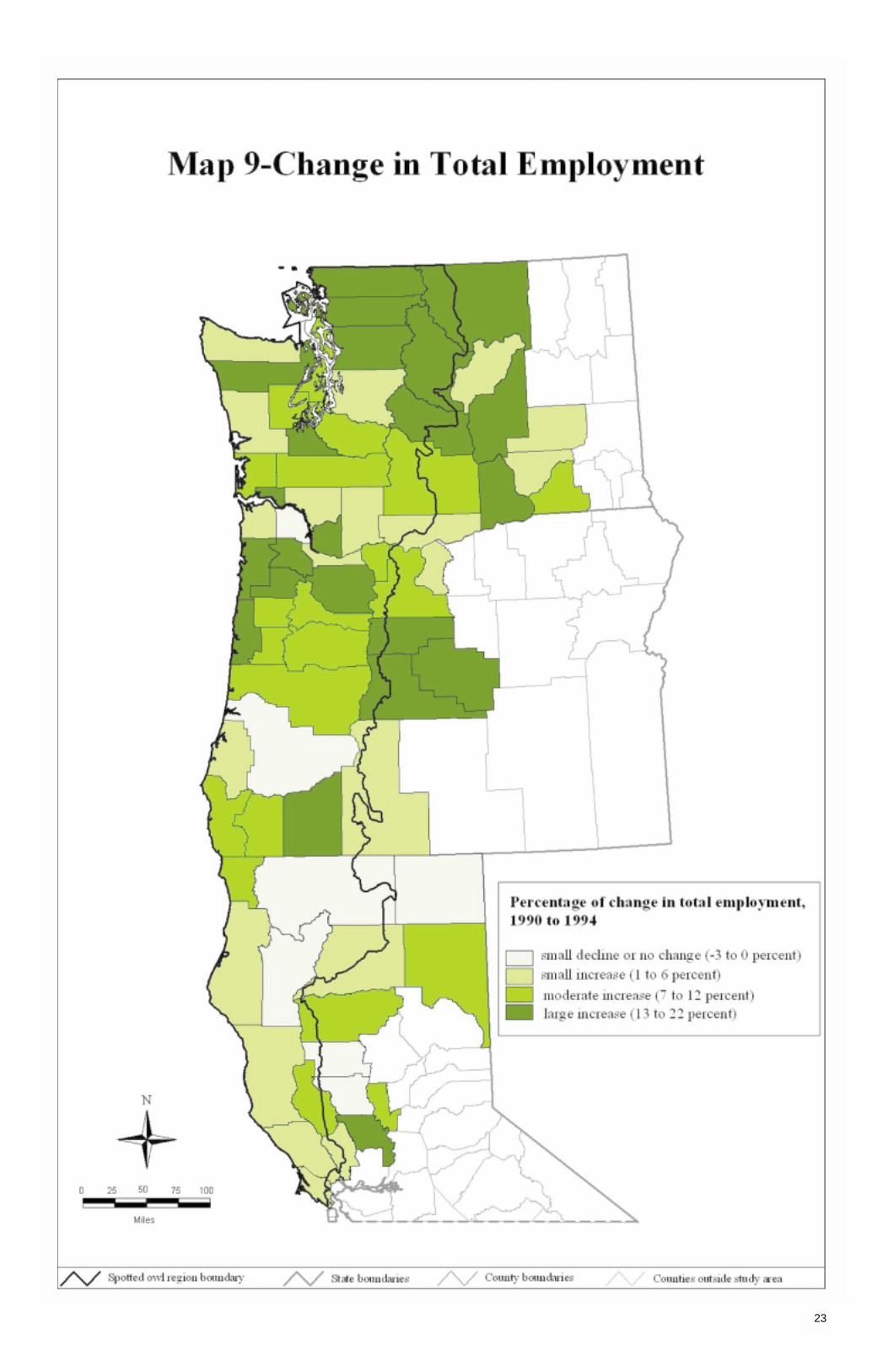
Employment changes in the wood products industry (section 2) provide an indication of economic performancein the region’s counties, but it is also important to know what has happened to employment in all economic sectors combined. This is an indicator of the general health of the economy and the availability of potential alter-native opportunities for unemployed workers. It does not address the quality or suitability of opportunities forworkers who have lost their jobs in specific industries, such as the wood products industry.
Total employment trends in many of the region’s counties followed the pattern shown in figure 4. For the groupsof nonmetropolitan counties in this chart, employment growth slowed, and for some individual counties itdeclined in 1990 and began rebounding by about 1992 or 1993. Map 9 portrays the change in total employmentbetween 1990 and 1994. For the counties that experienced the state trends for nonmetropolitan counties, thismap shows how much employment has rebounded relative to its 1990 level rather than how big the decline wasduring the early 1990s. In all but six cases, county employment surpassed its 1990 level by 1994, and those sixwere all within 3 percent of their 1990 levels. Figure 5 shows the total employment trends for three of thesecounties—Siskiyou and Trinity in California and Douglas in Oregon—that also had reductions of over 100,000thousand board feet in public timber harvest for the same period (see map 4).
Except for Yolo County, California, all the counties with moderate or large gains in total employment for the peri-od were in Washington and Oregon. In Oregon, except for four counties adjacent to the Columbia River, all thecounties in the Oregon Coast area and Willamette and Deschutes provinces had moderate or large gains in totalemployment. The Southwest Oregon province, which had large declines in public timber harvest, showed a mixedpicture for county-level employment growth, with employment growth rates in the southern, more economicallydiverse, part of the province outpacing those in the northern part. In Washington, the counties with larger gainsin total employment were distributed across all provinces. Counties with smaller total employment gains tendedto be rural counties with relatively important forest products industries but also included King County in theSeattle metropolitan area and two counties in the Tri-Cities area of eastern Washington.
The recession of the early 1980s had a larger impact on the nonmetropolitan counties of the region than did therecession of the early 1990s. Recessions, as indicated in figure 4 for the block of nonmetropolitan counties ineach state, reflect employment changes in many industrial sectors. The wood products industry has tended tobe closely tied to national business cycles (fig. 2).
Counties in the Pacific Northwest can be large and include many diverse communities with wide variations inimportant industrial sectors. Employment trends (fig. 4) should be interpreted with caution, because county-leveldata may be a mix of communities with relatively poor economic performance and those with more robust eco-nomic health. Many rural counties that have experienced large decreases in timber harvest and wood productsindustry employment also include urban communities with relatively diverse and healthy economies. Employmentgains in the diverse portion of the county may be locationally and occupationally unavailable to unemployed woodproducts industry workers.
22
Change in Total Employment
1969 1972 1975 1978 1981 1984 1987 1990 1993
Oregon California
Year
Num
ber
of p
eopl
e
500,000
450,000
400,000
350,000
300,000
250,000
200,000
Washington
1979 1981 1983 1985 1987 1989 1991 1993Year
Siskiyou, CA Trinity, CA Douglas, OR
Inde
x of
tota
l em
ploy
men
t (19
90=
100) 105
100
95
90
85
80
75
Figure 4—Total nonmetropolitan employment by state, 1969-93.
Figure 5—Employment trends for counties with reductions of over 100,000 board feetin public timber harvest, 1979-93.
23

Wages often are used as an indicator of job quality and labor market conditions. If high-wage, full-time jobs arelost and replaced by low-wage or part-time jobs in an economy, the average wage level, measured here asBureau of Economic Analysis (BEA) average earnings per job, should drop. Map 10 explores the pattern ofwage changes from 1989 to 1994. To more fully understand wage trends in the Northwest, however, it is neces-sary to view them in the context of a longer time horizon.
Events of the early 1980s were particularly devastating to wages in the Northwest, especially the rural Northwest.Figure 6 shows metropolitan and nonmetropolitan area wage trends (in constant 1992 dollars) for each statecompared to the Nation. Several trends are apparent: First, nonmetropolitan wages were consistently lower thanmetropolitan wages in each state and that gap widened during the 1980s, as nonmetropolitan wages fell furtherduring the recession of the early 1980s or recovered to a lesser degree afterwards. Second, there were differ-ences among the states. Wages were lowest in Oregon and highest in California, but these differences weregreater for the metropolitan portions of the states. Inflation-adjusted wages in the nonmetropolitan portion ofeach state were fairly similar and shared similar trends, declining significantly during the early 1980s andrecovering little afterwards. Third, nonmetropolitan wages declined between 1989 and 1991 but began to riseagain after that (there may have been another drop in 1994, but the most recent year is likely to be revisedand too much emphasis should not be placed on it). Thus it does not seem that there has been a widespreadpermanent shift to lower nonmetropolitan wages since 1989. Fourth, the drop in the early 1990s was muchsmaller than the drop in the early 1980s; however, wages were starting from a lower level in the early 1990s, soit can be argued that smaller reductions may have a large impact on already tight family budgets. The decreasein wages in the rural portions of the NWFP region in the early 1980s also coincided with a period of intenserestructuring and pressure on increasing labor productivity in natural resource industries in general and particu-larly the wood products industry. In any case, it is apparent that the general economic climate during which largestructural shifts take place has an important role in how economies respond. In the early 1980s, a time ofrecession and low economic activity, the loss of high-wage nonmetropolitan jobs was very apparent in the average wage data.
The nonmetropolitan portion of each state may not be representative, however, of the experiences of all non-metropolitan counties in the state. In map 10, we therefore examine county-by-county trends in inflation-adjustedwages in the early 1990s. Counties are the smallest unit for which BEA reports wage information. The shadingsrepresent general patterns in the way wages behaved between 1989 and 1994—general downward trend, downin early 1990s with partial recovery, and full recovery or general upward trend. Seven counties had no clear pat-tern. Six of these seven counties are in the eastern Washington Yakima and Cascades provinces. From thestandpoints of policy and socioeconomic well-being, the 14 counties having a downward trend in wages, includingthose counties with a downward trend in the early 1990s and little recovery since, are cause for concern andwarrant further investigation. With one exception, the counties with downward trends in wages are locatedalong either the Pacific coast or the Columbia River. The 15 counties concentrated in the Southwest Oregonand Klamath provinces that have recovered only partially from a drop in the early 1990s are the next tier to beconcerned about and would be good candidates for more indepth investigation. Given the historical wage trends,most nonmetropolitan counties would benefit from continued economic development efforts targeted at increasingwage levels. There were 36 counties with a more positive wage picture in the early 1990s. These 36 countiesincluded almost all the metropolitan counties in the NWFP region as well as many of the adjacent nonmetro-politan counties. Twelve of the 14 counties in the region that experienced a generally downward trend in wagesalso were counties with moderate to large percentage declines in wood products industry employment between1990 and 1994.
24
Wage Trends
Figure 6—Metropolitan and nonmetropolitan wage trends in 1992 dollars compared to theNation, 1969-93: (A) California, (B) Oregon, and (C) Washington.
A
1992
dol
lars
1969 1971 1973 1975 1977 1979 1981 1983 1985 1987 1989 1991 1993Year
32,000
30,000
28,000
26,000
24,000
22,000
20,000
Metropolitan Nonmetropolitan United States
1992
dol
lars
1969 1971 1973 1975 1977 1979 1981 1983 1985 1987 1989 1991 1993Year
32,000
30,000
28,000
26,000
24,000
22,000
20,000
Metropolitan Nonmetropolitan United States
B
C
1992
dol
lars
1969 1971 1973 1975 1977 1979 1981 1983 1985 1987 1989 1991 1993Year
32,000
30,000
28,000
26,000
24,000
22,000
20,000
Metropolitan Nonmetropolitan United States

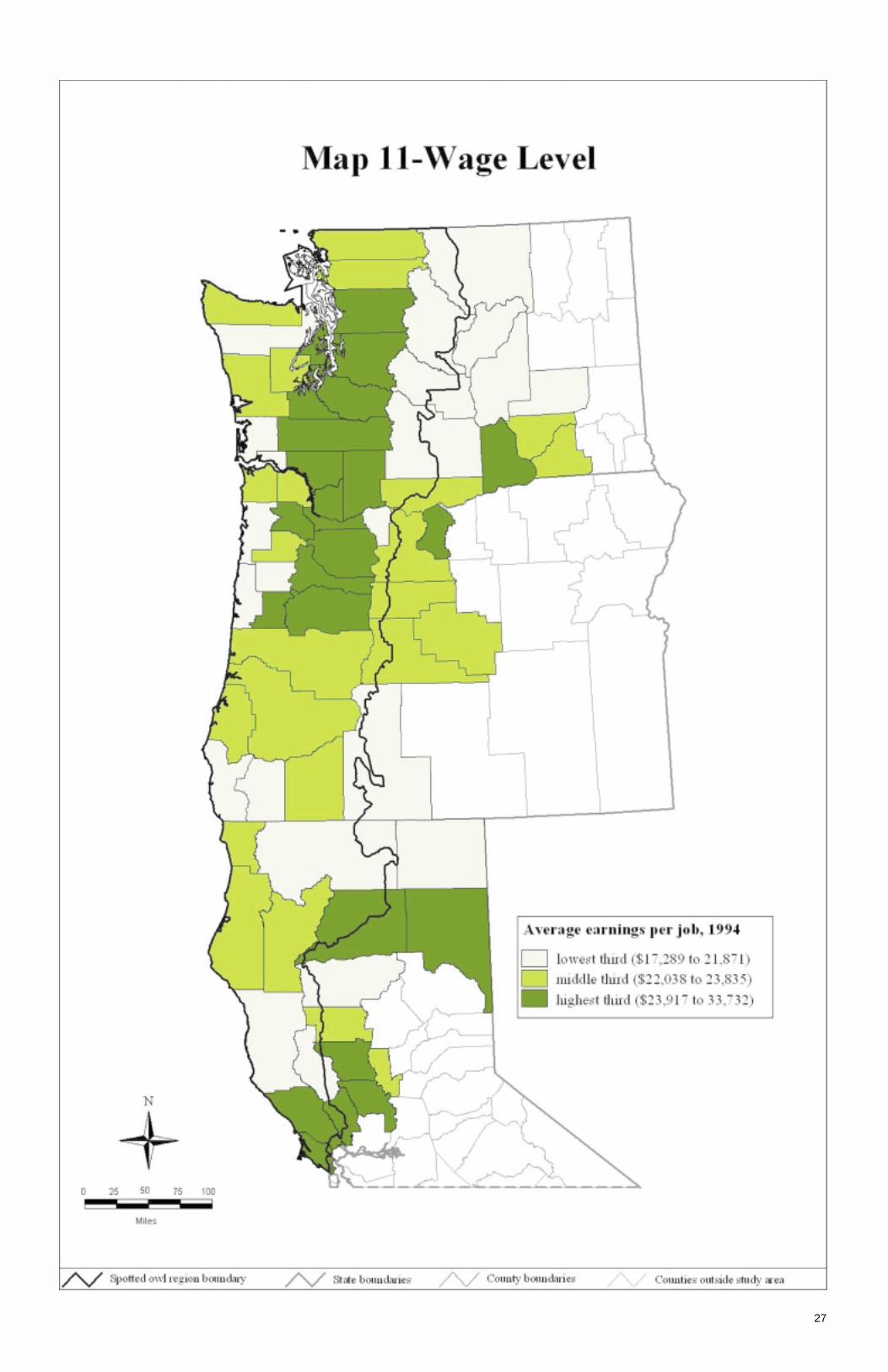
25
Map 10 focuses on the pattern of wage changes in the early 1990s but does not portray areas of high and lowwages relative to the NWFP region. For a broad relative ranking of wages, map 11 divides the counties intothree groups based on their 1994 average annual earnings per job. These earnings within a county are basedon place of employment and are from the BEA regional economic information system (REIS; U.S. Department ofCommerce, Economics and Statistics Administration 1997). Two-thirds of the counties fall within a narrow rangebetween $17,000 and $23,835 per year. This group encompasses most (80 percent) of the nonmetropolitancounties and 40 percent of the metropolitan counties. These metropolitan counties tend to contain the smallermetropolitan areas or be on the fringe of larger metropolitan areas; high-wage jobs may not be present in thecounty, but residents may commute to high-wage jobs in the nearby city.
A large group of the highest wage counties are located along the Interstate 5 corridor roughly from Edmonds,Washington, to Salem, Oregon, in the Willamette, Southwest Washington, and Western Washington Cascadesprovinces. The higher wage group is dominated by metropolitan counties, though eight nonmetropolitan countiesalso fell into this category. Another area of higher wage jobs is in the northern California counties adjacent to theSan Francisco and Sacramento metropolitan areas. These two areas accounted for 20 of the 24 high-wagecounties in the plan region. Twenty-one of the 24 lowest wage level counties are nonmetropolitan counties andare dispersed across the region with particular concentrations in the Eastern Washington Cascades, Yakima,and Klamath provinces. There also are low-wage counties scattered at intervals along the Pacific coast of allthree states.
When the map of wage levels (map 11) is compared with the map of wage trends (map 10), it can be seen thatonly four of the counties with the lowest wage levels had a generally upward trend in wages between 1989 and1994, and two of these are island counties in Puget Sound. Wage trends do not indicate that important changesin the relative rankings of the lowest wage counties are likely in the immediate future. Wage levels also can becompared with changes in wood products employment. Sixteen of the 24 counties with the lowest wage levelalso lost 6 percent or more of wood products employment, and only one of the lowest wage level counties had a6 percent or greater increase in wood products employment. Many other factors affect the relative wage level fora county including the mix of industrial sectors in the county, the relative seasonality of employment in importantindustries in the county, the distance to higher wage level metropolitan areas, labor abundance or scarcity, andinternational markets for major industrial commodities and products from the county.
26
Wage Level
27

This page is intentionally left blank.

Section 4:
Structural Economic Change
Economic Diversity
Fastest Growing Nonfarm Industries
Slowest Growing Nonfarm Industries
29
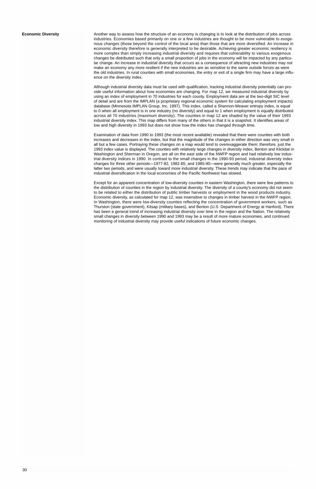
Another way to assess how the structure of an economy is changing is to look at the distribution of jobs acrossindustries. Economies based primarily on one or a few industries are thought to be more vulnerable to exoge-nous changes (those beyond the control of the local area) than those that are more diversified. An increase ineconomic diversity therefore is generally interpreted to be desirable. Achieving greater economic resiliency ismore complex than simply increasing industrial diversity and requires that vulnerability to various exogenouschanges be distributed such that only a small proportion of jobs in the economy will be impacted by any particu-lar change. An increase in industrial diversity that occurs as a consequence of attracting new industries may notmake an economy any more resilient if the new industries are as sensitive to the same outside forces as werethe old industries. In rural counties with small economies, the entry or exit of a single firm may have a large influ-ence on the diversity index.
Although industrial diversity data must be used with qualification, tracking industrial diversity potentially can pro-vide useful information about how economies are changing. For map 12, we measured industrial diversity byusing an index of employment in 70 industries for each county. Employment data are at the two-digit SIC level of detail and are from the IMPLAN (a proprietary regional economic system for calculating employment impacts)database (Minnesota IMPLAN Group, Inc. 1997). This index, called a Shannon-Weaver entropy index, is equalto 0 when all employment is in one industry (no diversity) and equal to 1 when employment is equally distributedacross all 70 industries (maximum diversity). The counties in map 12 are shaded by the value of their 1993industrial diversity index. This map differs from many of the others in that it is a snapshot. It identifies areas oflow and high diversity in 1993 but does not show how the index has changed through time.
Examination of data from 1990 to 1993 (the most recent available) revealed that there were counties with bothincreases and decreases in the index, but that the magnitude of the changes in either direction was very small inall but a few cases. Portraying these changes on a map would tend to overexaggerate them; therefore, just the1993 index value is displayed. The counties with relatively large changes in diversity index, Benton and Klickitat inWashington and Sherman in Oregon, are all on the east side of the NWFP region and had relatively low indus-trial diversity indices in 1990. In contrast to the small changes in the 1990-93 period, industrial diversity indexchanges for three other periods—1977-82, 1982-85, and 1985-90—were generally much greater, especially thelatter two periods, and were usually toward more industrial diversity. These trends may indicate that the pace ofindustrial diversification in the local economies of the Pacific Northwest has slowed.
Except for an apparent concentration of low-diversity counties in eastern Washington, there were few patterns tothe distribution of counties in the region by industrial diversity. The diversity of a county’s economy did not seemto be related to either the distribution of public timber harvests or employment in the wood products industry.Economic diversity, as calculated for map 12, was insensitive to changes in timber harvest in the NWFP region.In Washington, there were low-diversity counties reflecting the concentration of government workers, such asThurston (state government), Kitsap (military bases), and Benton (U.S. Department of Energy at Hanford). Therehas been a general trend of increasing industrial diversity over time in the region and the Nation. The relativelysmall changes in diversity between 1990 and 1993 may be a result of more mature economies, and continuedmonitoring of industrial diversity may provide useful indications of future economic changes.
30
Economic Diversity

31

During the first half of the 20th century, manufacturing was the fastest growing industry in the United States(Council of Economic Advisors 1991). Since the 1950s, the country and the region have undergone a fundamen-tal shift toward a knowledge-based economy with expanding service and finance, insurance, and real estatesectors (Council of Economic Advisors 1991; U.S. Department of Commerce, BEA 1998). This shift is apparentin map 13 which shows the fastest growing (based on increased wages) nonfarm industries in the NWFP regionbetween 1989 and 1994. Services was the fastest growing industry sector for 17 counties; finance, insurance,and real estate (which covers producer services) was the fastest growing sector for six others. Population growthand high-tech industrial expansion were two of the main drivers behind the growth in the construction industry,which was the fastest growing industry in 20 counties, all in Oregon and Washington. Population growth alsocontributed substantially to the growth in real estate. The pace of expansion in the construction industry in theregion is expected to slow in the coming years (Marple’s Business Newsletter 1997).
An array of industrial sectors provided the fastest growing industries in the remaining counties of the NWFPregion. Durable manufacturing was the fastest growing sector in four counties, and nondurable manufacturingwas the fastest growing sector in an additional four counties. Wholesale and retail trade, and state and localgovernment were the fastest growing sectors in 14 counties. Transportation and utilities; agricultural services,forestry, and fishing; and Federal civilian government were the fastest growing sectors in seven counties classi-fied as “other” in map 13 (see table 3). The industrial sectors for map 13 are at the one-digit SIC level of detail; a wide variety of specific industries thus are included in each aggregated sector in map 13, and it is impossibleto determine exactly which industry within the sector is accounting for the growth in a county.
Table 3—Fastest growing industry by county
Countyand state Fastest growing industrya
Glenn, CA Agricultural services, forestry, fisheriesDouglas, OR Civilian, Federal GovernmentAdams, WA Agricultural services, forestry, fisheriesChelan, WA Agricultural services, forestry, fisheriesClark, WA Transportation and public utilitiesDouglas, WA Transportation and public utilitiesKlickitat, WA Transportation and public utilities
a “Other” designation on map 13.
32
Fastest Growing NonfarmIndustries
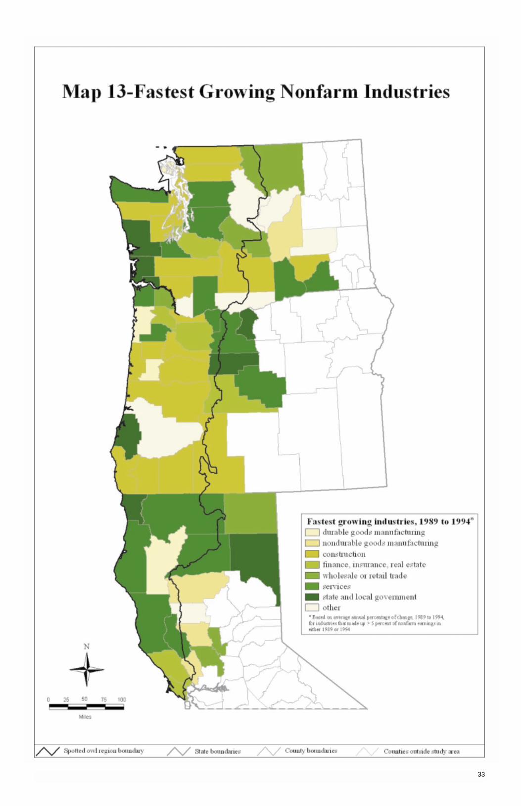
33
Employment and earnings in manufacturing industries have been providing a decreasing share of total employ-ment and earnings in the national economy since the 1960s (Council of Economic Advisors 1991). This sametrend has been evident in the NWFP region where manufacturing provides only 16 percent of total nonfarm laborearnings, down from 25 percent in 1969. In map 14, for 56 of the 72 counties in the region, the “slowest growingindustry” is, in fact, an industry declining in relative terms.
The relative decline of manufacturing was evident at the county level in the NWFP region, and manufacturingwas the “slowest growing industry” in 38 of 72 counties. Durable goods manufacturing, which includes woodproducts manufacturing, was the slowest growing industry in 75 percent of these 38 counties. The countieswhere manufacturing was the slowest growing industrial sector are distributed across the region, with concentra-tions in the lumber- and wood products-producing counties of the Klamath, Southwest Oregon, Deschutes,Western Washington, and Eastern Washington Cascade provinces. The construction sector was the slowestgrowing industrial sector in 10 counties; 8 are in northern California, an area hard hit by the recession of theearly 1990s.
Transportation and utilities, wholesale trade, and agricultural services, forestry, and fishing also were categorizedunder slowest growing industries and were distributed across the region with little evidence of concentration.The “other” category of slowest growing industries was concentrated in the Puget Sound area of Washingtonand included such diverse industries as retail trade, military, and state and local government (see table 4). As istrue with the fastest growing nonfarm industry map (map 13), the industrial sectors shown on map 14 are at theone-digit SIC level of detail so that each category can include a wide variety of specific industries.
Table 4—Slowest growing industry by county
Countyand state Slowest growing industrya
Modoc, CA ServicesBenton, OR Retail tradeWashington, OR State and local governmentIsland, WA MilitaryLewis, WA MiningPierce, WA MilitarySan Juan, WA Retail tradeThurston, WA State and local government
a “Other” designation on map 14.
34
Slowest Growing NonfarmIndustries

35

This page is intentionally left blank.

37
Section 5:
Characteristics of the Population
Change in County Population
Change in Unincorporated and Incorporated Population
Migration Status and Trends
Change in Ethnicity
Educational Attainment

Population growth or decline—in particular, the portion resulting from migration—often parallels changing eco-nomic conditions. It also can be a result of economic change or a factor leading to economic change. Between1989 and 1994, the economy of the Pacific Northwest outperformed the economy of the United States by a widemargin. But when economic indicators for specific counties were examined, it was apparent that the economicgrowth of the larger urban areas had not extended to many of the more rural, resource-based counties. Growingeconomic opportunity may ultimately lead to increased in-migration and population growth, but there are manyexceptions. Some locations possess lifestyle amenities that attract migrants whether or not the economy is pro-viding new employment opportunities, and some in-migrants, such as retirees and specialized consultants, arenot dependent on local employment opportunities. Conversely, some regions with abundant economic opportuni-ties, but a less attractive environment, may not attract enough new workers to fill vacant jobs. It is likely thatsome people are moving to various parts of the Pacific Northwest because of perceived economic opportunitiesand other people are moving for noneconomic reasons and then finding or creating economic activity when theyget there.
In the 1960s, urbanization occurred throughout the United States, and the 1970s saw rapid population growth inthe country’s nonmetropolitan areas. The deep recession of the early 1980s and subsequent economic restructur-ing led to a population retrenchment back to the cities. Nationwide, the early 1990s was a time of renewedpopulation growth for nonmetropolitan areas in general (Fuguitt and Beale 1996). The reasons for this mostrecent turnaround are not well understood. People’s dissatisfaction with urban life, increased opportunities fortelecommuting, and a lack of attractive opportunities in metropolitan areas (especially during the Californiarecession of the early 1990s) are all possible factors, but little is known about the relative importance of theseand other factors in determining the current trend. At the same time, this region experienced job losses in extrac-tive and primary processing industries, which are concentrated in rural areas. So, have rural areas experiencedthe national trend of population growth and retention? or were population losses due to local structural economicchange? Probably both, but map 15 shows that the net result for most counties was population gain.
The entire west coast, including the Pacific Northwest, has grown faster in population than the United States as a whole since 1980. The population growth persisted even through the economic downturn in California. Onlyone county (map 15) had fewer people in 1995 than in 1990 (and it is not a county with significant timberresources). Contrast this to the 1980s when there were job losses in extractive and primary processing indus-tries and when, nationwide, nonmetropolitan areas were experiencing out-migration and population declinesand the Pacific Northwest suffered economic declines. This is an indication that different forces have been atwork in the 1990s, because although we have seen job losses akin to those of the early 1980s in one of theregion’s largest industries, similar losses in population have not occurred. Both the early 1980s and early 1990shad declining timber jobs, but the general economic conditions were worse in the 1980s, as reflected by thedecline in population for 14 counties (nine in Oregon) between 1980 and 1985. Because of the similarities of the two periods, 1980 to 1985 was used for a comparison period for population loss.
That is not to say that population has grown at a high rate uniformly across the region, or that people have notleft the region. Many western counties, considered to be high-amenity counties, are experiencing high migrationturnover, namely where there is high in-migration and high out-migration (U.S. Department of Agriculture 1996;see map 17 below). The colors in map 15 correspond to the percentage of change in county population between1990 and 1995 (i.e., [1995-1990]/1990). Northern California counties tended to exhibit slow to medium growthduring this period. In Washington, the Puget Sound area, Tri-Cities area, and northern Cascade counties exhibit-ed fast growth. In Oregon, the metropolitan areas and the Crook-Deschutes-Jefferson area had the fastestgrowth. As compared to the regional population growth, the U.S. population grew by 5.6 percent between 1990and 1995. Thus, 59 of the 72 counties grew faster than the Nation as a whole. Thirteen counties in the regionexperienced population growth rates three times or greater than the population growth rate for the United States.
County data may not show, however, what is happening in the more rural parts of counties, especially in geo-graphically large, heterogeneous counties. Some communities could be growing very slowly, possibly evendeclining, while others in the same county are growing fast enough to more than compensate for slower growingplaces. Population growth rates of incorporated places by size class (table 5) show that, in Oregon, growth wasnearly uniform across the different size classes: small places on the whole did not decline as larger places grew.For Washington, the table shows that the smaller size classes grew faster than the larger size classes (northernCalifornia has too few incorporated places to be representative of growth by size.) This is not to say that all smallincorporated places grew at these rates, but on the whole, smaller places grew as fast or faster than large placesduring the early 1990s in Oregon and Washington (24 of 460 incorporated places lost population between 1990and 1995; in most of these, the population loss was low). Many people in the Pacific Northwest live in unincor-porated areas, though. What happened to the unincorporated population during this period? We explore thisissue next.
Table 5—Population growth rates of incorporated places, by state and size, Pacific Northwest, 1990 to 1995
Size class and state Population change
Percent
Oregon:Under 2,500 14.72,500 to 9,999 15.210,000 to 49,999 14.850,000 to 99,999 14.3100,000 to 499,999 12.2500,000 and over NA
Washington:Under 2,500 16.52,500 to 9,999 22.110,000 to 49,999 10.550,000 to 99,999 12.9100,000 to 499,999 5.5500,000 and over 3.2
NA = not applicable.
38
Change in County Population
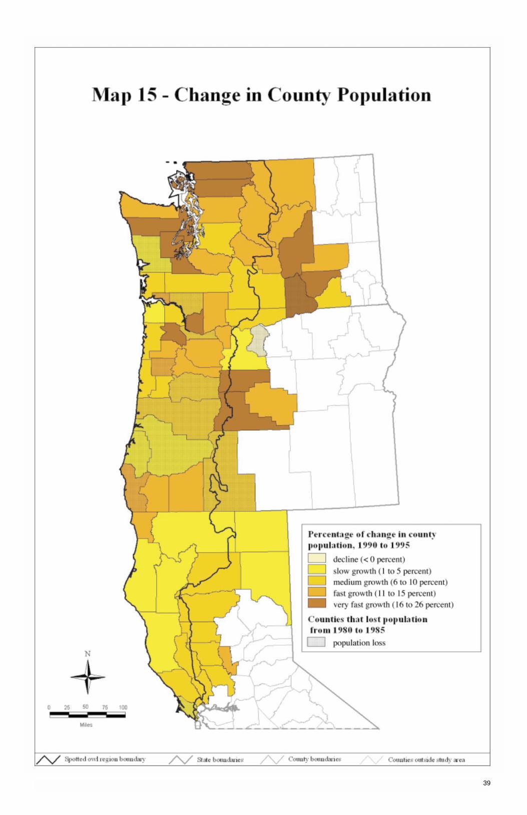
39

One approach for looking at rural and urban population changes is to compare how the unincorporated andincorporated portions of a county’s population are changing. This is only a rural-urban proxy, because manysmaller incorporated places are rural in character and some unincorporated areas are, for all practical purposes,economically and socially integrated with a nearby urban center. This data set nevertheless offers an inclusiveway to examine within-county population changes between decennial censuses, whereas the incorporated placedata alone (see table 6) exclude many people. Many of the counties in the NWFP region experienced fairly rapidpopulation growth in the early 1990s, and we can examine whether the unincorporated portions experienced thesame growth rates as the incorporated areas.
Even a small change in a small population can be a large percentage change. In some areas, most people livein unincorporated areas, while in other places few live outside incorporated areas. For the Washington countiesin the NWFP region, about 46 percent of the population lives in unincorporated places; in the Oregon counties,36 percent; and in the northern California counties, 41 percent. In one county, Trinity in California, all the resi-dents live in unincorporated areas. Table 6 shows the percentage of the population living in unincorporatedareas for all counties.
Map 16 displays the relative population change of the incorporated and unincorporated populations of eachcounty between 1990 and 1995. The purpose of this map is to show differences in the unincorporated andincorpo-rated growth rates, especially for the relatively faster growing counties. Counties are color-coded bywhether their unincorporated and incorporated populations grew more or less than 8 percent during the 5-yearperiod. This comes out to roughly 1.5 percent per year—a modestly high rate of growth in comparison to theU.S. growth rate of just over 1 percent per year during this period. Places with growth rates of less than 8 per-cent may not be declining or growing extremely slowly; they just are not growing faster than 1.5 percent peryear. Also, annexation is one factor that explains shifts from rural to urban growth.
Two categories may indicate slower growing rural areas. One category shows areas where the incorporatedpopulation grew by more than 8 percent while the unincorporated population did not. There were 22 counties inthe map area in this category. These are counties possibly experiencing uneven growth and that perhaps haverural areas not participating in the growth; however, in several of these counties, the incorporated populationgrew in large part from annexations. Further investigation thus would be required to determine the spatial growthpattern of each county. There also were 13 counties where neither the unincorporated nor incorporated popula-tion grew by more than 8 percent. Most of the counties in these two categories were in Oregon and northernCalifornia.
In 23 counties, growth appeared to be widespread, and in 13 counties the rate of growth of unincorporated areasactually exceeded that for the incorporated population. Many of these counties are in Washington or near thegreater Portland area in Oregon. Thus, there are places where rural areas appear to be participating in growth,yet others where they are not. Most likely there is a diversity of conditions within the unincorporated and incorpo-rated portions of individual counties that this aggregated display cannot account for. Unfortunately, we did nothave a good way to measure and display these changes for unincorporated areas between the decennial censuses.
40
Change in Unincorporated andIncorporated Population
Table 6—Percentage of popula-tion living in unincorporated areas in 1990, Pacific Northwestand northern California
County and state Percent
Colusa, CA 56Del Norte, CA 82Glenn, CA 56Humboldt, CA 53Lake, CA 68Lassen, CA 74Marin, CA 28Mendocino, CA 68Modoc, CA 67Napa, CA 33Shasta, CA 50Siskiyou, CA 53Sonoma, CA 42Sutter, CA 51Tehama, CA 63Trinity, CA 100Yolo, CA 16Benton, OR 31Clackamas, OR 57Clatsop, OR 37Columbia, OR 54Coos, OR 41Crook, OR 62Curry, OR 64Deschutes, OR 62Douglas, OR 58Hood River, OR 67Jackson, OR 41Jefferson, OR 67Josephine, OR 70Klamath, OR 65Lane, OR 35Lincoln, OR 45Linn, OR 39Marion, OR 32Multnomah, OR 11Polk, OR 31Sherman, OR 42Tillamook, OR 63Wasco, OR 43Washington, OR 48Yamhill, OR 33Adams, WA 48Benton, WA 25Chelan, WA 44Clallam, WA 57Clark, WA 73Cowlitz, WA 40Douglas, WA 76Franklin, WA 39Grant, WA 48Grays Harbor, WA 39Island, WA 68Jefferson, WA 65King, WA 40Kitsap, WA 73Kittitas, WA 39Klickitat, WA 65Lewis, WA 60Mason, WA 81Okanogan, WA 58Pacific, WA 66Pierce, WA 58San Juan, WA 85Skagit, WA 48Skamania, WA 81Snohomish, WA 56Thurston, WA 58Wahkiakum, WA 85Walla Walla, WA 30Whatcom, WA 46Yakima, WA 47
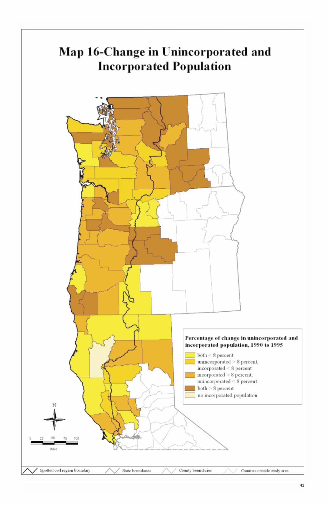
41
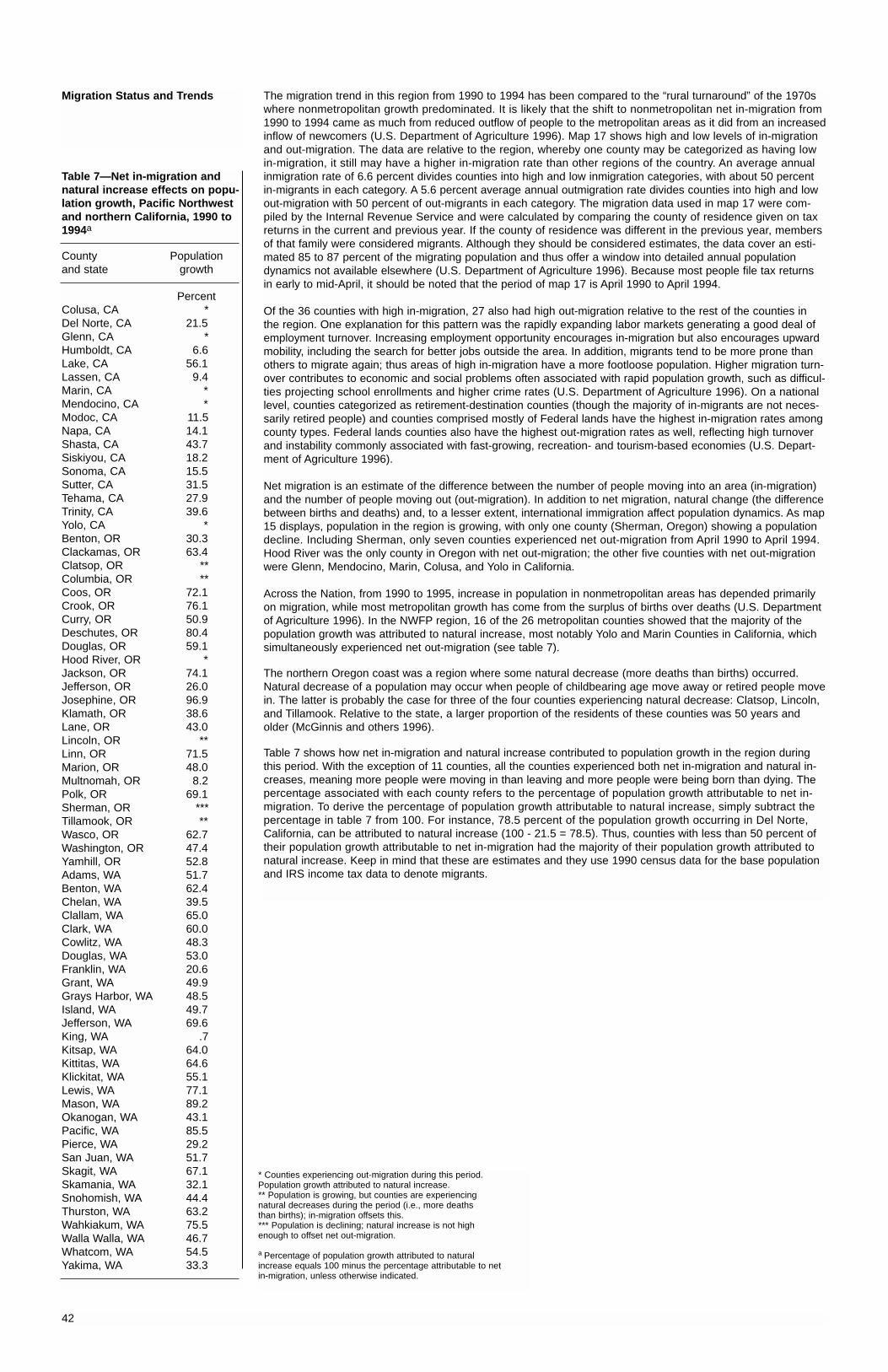
The migration trend in this region from 1990 to 1994 has been compared to the “rural turnaround” of the 1970swhere nonmetropolitan growth predominated. It is likely that the shift to nonmetropolitan net in-migration from1990 to 1994 came as much from reduced outflow of people to the metropolitan areas as it did from an increasedinflow of newcomers (U.S. Department of Agriculture 1996). Map 17 shows high and low levels of in-migrationand out-migration. The data are relative to the region, whereby one county may be categorized as having lowin-migration, it still may have a higher in-migration rate than other regions of the country. An average annualinmigration rate of 6.6 percent divides counties into high and low inmigration categories, with about 50 percentin-migrants in each category. A 5.6 percent average annual outmigration rate divides counties into high and lowout-migration with 50 percent of out-migrants in each category. The migration data used in map 17 were com-piled by the Internal Revenue Service and were calculated by comparing the county of residence given on taxreturns in the current and previous year. If the county of residence was different in the previous year, membersof that family were considered migrants. Although they should be considered estimates, the data cover an esti-mated 85 to 87 percent of the migrating population and thus offer a window into detailed annual populationdynamics not available elsewhere (U.S. Department of Agriculture 1996). Because most people file tax returns in early to mid-April, it should be noted that the period of map 17 is April 1990 to April 1994.
Of the 36 counties with high in-migration, 27 also had high out-migration relative to the rest of the counties in the region. One explanation for this pattern was the rapidly expanding labor markets generating a good deal ofemployment turnover. Increasing employment opportunity encourages in-migration but also encourages upwardmobility, including the search for better jobs outside the area. In addition, migrants tend to be more prone thanothers to migrate again; thus areas of high in-migration have a more footloose population. Higher migration turn-over contributes to economic and social problems often associated with rapid population growth, such as difficul-ties projecting school enrollments and higher crime rates (U.S. Department of Agriculture 1996). On a nationallevel, counties categorized as retirement-destination counties (though the majority of in-migrants are not neces-sarily retired people) and counties comprised mostly of Federal lands have the highest in-migration rates amongcounty types. Federal lands counties also have the highest out-migration rates as well, reflecting high turnoverand instability commonly associated with fast-growing, recreation- and tourism-based economies (U.S. Depart-ment of Agriculture 1996).
Net migration is an estimate of the difference between the number of people moving into an area (in-migration)and the number of people moving out (out-migration). In addition to net migration, natural change (the differencebetween births and deaths) and, to a lesser extent, international immigration affect population dynamics. As map15 displays, population in the region is growing, with only one county (Sherman, Oregon) showing a populationdecline. Including Sherman, only seven counties experienced net out-migration from April 1990 to April 1994.Hood River was the only county in Oregon with net out-migration; the other five counties with net out-migrationwere Glenn, Mendocino, Marin, Colusa, and Yolo in California.
Across the Nation, from 1990 to 1995, increase in population in nonmetropolitan areas has depended primarilyon migration, while most metropolitan growth has come from the surplus of births over deaths (U.S. Departmentof Agriculture 1996). In the NWFP region, 16 of the 26 metropolitan counties showed that the majority of thepopulation growth was attributed to natural increase, most notably Yolo and Marin Counties in California, whichsimultaneously experienced net out-migration (see table 7).
The northern Oregon coast was a region where some natural decrease (more deaths than births) occurred.Natural decrease of a population may occur when people of childbearing age move away or retired people movein. The latter is probably the case for three of the four counties experiencing natural decrease: Clatsop, Lincoln,and Tillamook. Relative to the state, a larger proportion of the residents of these counties was 50 years andolder (McGinnis and others 1996).
Table 7 shows how net in-migration and natural increase contributed to population growth in the region duringthis period. With the exception of 11 counties, all the counties experienced both net in-migration and natural in-creases, meaning more people were moving in than leaving and more people were being born than dying. Thepercentage associated with each county refers to the percentage of population growth attributable to net in-migration. To derive the percentage of population growth attributable to natural increase, simply subtract the percentage in table 7 from 100. For instance, 78.5 percent of the population growth occurring in Del Norte,California, can be attributed to natural increase (100 - 21.5 = 78.5). Thus, counties with less than 50 percent oftheir population growth attributable to net in-migration had the majority of their population growth attributed tonatural increase. Keep in mind that these are estimates and they use 1990 census data for the base populationand IRS income tax data to denote migrants.
42
Migration Status and Trends
Table 7—Net in-migration andnatural increase effects on popu-lation growth, Pacific Northwestand northern California, 1990 to1994a
County Populationand state growth
PercentColusa, CA *Del Norte, CA 21.5Glenn, CA *Humboldt, CA 6.6Lake, CA 56.1Lassen, CA 9.4Marin, CA *Mendocino, CA *Modoc, CA 11.5Napa, CA 14.1Shasta, CA 43.7Siskiyou, CA 18.2Sonoma, CA 15.5Sutter, CA 31.5Tehama, CA 27.9Trinity, CA 39.6Yolo, CA *Benton, OR 30.3Clackamas, OR 63.4Clatsop, OR **Columbia, OR **Coos, OR 72.1Crook, OR 76.1Curry, OR 50.9Deschutes, OR 80.4Douglas, OR 59.1Hood River, OR *Jackson, OR 74.1Jefferson, OR 26.0Josephine, OR 96.9Klamath, OR 38.6Lane, OR 43.0Lincoln, OR **Linn, OR 71.5Marion, OR 48.0Multnomah, OR 8.2Polk, OR 69.1Sherman, OR ***Tillamook, OR **Wasco, OR 62.7Washington, OR 47.4Yamhill, OR 52.8Adams, WA 51.7Benton, WA 62.4Chelan, WA 39.5Clallam, WA 65.0Clark, WA 60.0Cowlitz, WA 48.3Douglas, WA 53.0Franklin, WA 20.6Grant, WA 49.9Grays Harbor, WA 48.5Island, WA 49.7Jefferson, WA 69.6King, WA .7Kitsap, WA 64.0Kittitas, WA 64.6Klickitat, WA 55.1Lewis, WA 77.1Mason, WA 89.2Okanogan, WA 43.1Pacific, WA 85.5Pierce, WA 29.2San Juan, WA 51.7Skagit, WA 67.1Skamania, WA 32.1Snohomish, WA 44.4Thurston, WA 63.2Wahkiakum, WA 75.5Walla Walla, WA 46.7Whatcom, WA 54.5Yakima, WA 33.3
* Counties experiencing out-migration during this period. Population growth attributed to natural increase.** Population is growing, but counties are experiencing natural decreases during the period (i.e., more deaths than births); in-migration offsets this.*** Population is declining; natural increase is not high enough to offset net out-migration.
a Percentage of population growth attributed to natural increase equals 100 minus the percentage attributable to net in-migration, unless otherwise indicated.

43

Ethnicity is an indicator of population diversity. Ethnic composition will affect the identity of a community and isa significant characteristic of the human “ecosystem.” The diversity in human populations in states, counties,and communities has implications for forest management as well as school systems, health providers, andother public services. Diversity also has significant implications in terms of social and economic well-being. For instance, minorities, with the exception of many Asian groups, are disadvantaged in labor markets, NativeAmerican men have high rates of joblessness, and black men face pay discrimination (Swanson 1996).
Natural resource managers need to be aware of who their customers are and how their culture might affect theuse of natural resources. Recent Asian migrants, for example, have a cultural history of extensive use of nontim-ber forest products. Natural resources are a major force in Native Americans culture as well. Other cultures alsohave culture-specific ways of using and relating to natural resources.
These data are from the decennial censuses for 1980 and 1990 and are subject to self-reporting error and processing errors associated with census estimates.3 Minority populations are (1) black; (2) American Indian,Eskimo, and Aleut; (3) Asian and Pacific islander; and (4) other.4 The “other” category includes a number of people with write-in entries such as multiracial, multiethnic, and Spanish-Hispanic origin group names such asCuban, Mexican, Puerto Rican, and others.
Hispanic origin is not a subset of race. A person of Hispanic origin can be of any race. Hispanics may be HispanicAsian, Hispanic American Indian, and so forth. Few persons remain in the “other” category when persons ofHispanic origin are placed in a separate category.
Asian or Pacific islanders showed the largest percentage of increase between 1980 and 1990 in the major met-ropolitan areas of Oregon, Washington, and northern California. This includes the Puget Sound region, Portland-Vancouver area, and the San Francisco area. The “other” category was dominant among minorities in easternWashington.
Refer to map 18 for the county interpretation. The percentage of change in specific minority populations wassmall and ranged from no change to 18 percent (Adams, Washington). Only three counties had double-digitchange (Colusa, California, Douglas, Oregon, and Adams, Washington). The remainder of the counties increasedfrom less than 1 percent to 9.7 percent, and the majority of counties had increases in minority populations from0.2 to 3 percent. In addition to the Asian or Pacific islander change as noted above, Native Americans increasedin several counties, many on the coast of Oregon and Washington. Lane, Benton, and Linn, Oregon, showed anAsian or Pacific islander increase. Two universities and state government offices reside in this area.
In Washington, blacks increased from 2.5 to 3.0 percent of the total population from 1980 to 1990. AmericanIndian population grew from 1.5 to 1.6 percent. The Asian population produced the largest increase: from 2.6 to4.2 percent of the state’s population. Persons of Hispanic origin grew from 2.9 and 4.4 percent (Cook and Jordan1994a).
In table 8, we display the names of counties and the percentage of change for Hispanic populations. The valuesare ranked from a high of 14.7-percent change to a low of -0.1-percent change.
For a listing of specific values for each county, refer to McGinnis and others (1996, 1997). Also see a selectedset of publications by Cook and Jordan (1994a, 1994b, 1995a, 1995b, 1995c, 1995d). These documentsassess county change in Washington by subregions.
Figure 7 shows a projection from the 1990 census and the dominant minority in the West to be Hispanic; in theSouth, Midwest and Northeast it is black. Table 9 displays the projections for numbers of people and projectedchanges by 2010. Projections show relatively large increases in minority and Hispanic origin populations in theUnited States and the region. White populations are projected to remain relatively stable.
44
Change in Ethnicity
Table 8—Percentage of changeof Hispanic origin, Pacific North-west and northern Californiacounty populations, 1980 to 1990
County Populationand state growth
PercentFranklin, WA 14.7Colusa, CA 13.8Adams, WA 10.5Hood River, OR 9.7Yakima, WA 9.1Glenn, CA 8.1Douglas, WA 7.5Okanogan, WA 6.3Chelan, WA 6.2Grant, WA 5.9Napa, CA 5.7Tehama, CA 4.8Mendocino, CA 4.8Del Norte, CA 4.7Sutter, CA 4.7Walla Walla, WA 4.3Jefferson, OR 4.3Lassen, CA 3.9Marin, CA 3.7Sonoma, CA 3.7Benton, WA 3.5Marion, OR 3.3Modoc, CA 3.1Yamhill, OR 3.0Yolo, CA 2.9Wasco, OR 2.7Klickitat, WA 2.6Skagit, WA 2.3Polk, OR 2.2Klamath, OR 2.2Washington, OR 2.0Lake, OR 2.0Pacific, WA 1.3Kittitas, WA 1.3Crook, OR 1.3Skamania, WA 1.1Lewis, WA 1.1Siskiyou, OR 1.1Jackson, OR 1.1Clackamas, OR 1.1Multnomah, OR 1.1Whatcom, WA 1.0Mason, WA . 9Clark, WA .9Thurston, WA .9King, WA .8Pierce, WA .8Shasta, OR .8Humboldt, CA .8Josephine, OR .8Clallam, WA .7Cowlitz, WA .7Benton, OR .7Snohomish, WA .7Tillamook, OR .7Kitsap, WA .7Island, WA .7San Juan, WA .6Linn, OR .6Trinity, CA .6Clatsop, OR .5Curry, OR .5Grays Harbor, WA .5Douglas, OR .5Coos, OR .4Lincoln, OR .4Lane, OR .4Deschutes, OR .3Columbia, OR .3Sherman, OR .1Wahkiakum, WA .1Jefferson, WA -.1
Table 9—Population projections, by the Nation and states, 2000-2010
American Indian,Hispanic origin White Black Eskimo, Aleut Asian, Pacific Islander
Entity 2000 2010 2000 2010 2000 2010 2000 2010 2000 2010
Thousands of people
United States 31,366 41,138 197,062 202,390 33,569 37,466 2,055 2,321 10,585 14,402Washington 360 519 4,881 5,346 179 203 95 112 342 477Oregon 195 278 2,990 3,253 59 71 45 53 110 147California 10,657 14,214 15,562 15,394 2,138 2,268 170 165 4,006 5,603
Source: U.S. Department of Commerce, Bureau of Census 1997a.
Figure 7—Dominant minority populationsin the United States during 1995 (source:Council of Economic Advisors 1998).
3 The 1980 estimates came from the U.S. Department of Commerce, Bureau of the Census (1992), and the 1990 estimates are from theU.S. Department of Commerce, Bureau of the Census (1991a, 1991b).
4 The Office of Management and Budget revised the standards of classifying Federal data on race and ethnicity in October 1997. The newstandards allow respondents to mark one or more race categories on Federal reporting forms. Also, the Asian and Pacific islander categoryis divided into Asian and Native Hawaiian or other Pacific islander. The black category has been changed to black or African American. Aseparate question on Hispanic origin will continue and will have two categories: “Hispanic or Latino” and “not Hispanic or Latino.”
West
South
Midwest
Northwest
0 20 40
Percent of total regional population
Black, non-Hispanic
Asian
Hispanic
American Indian

45
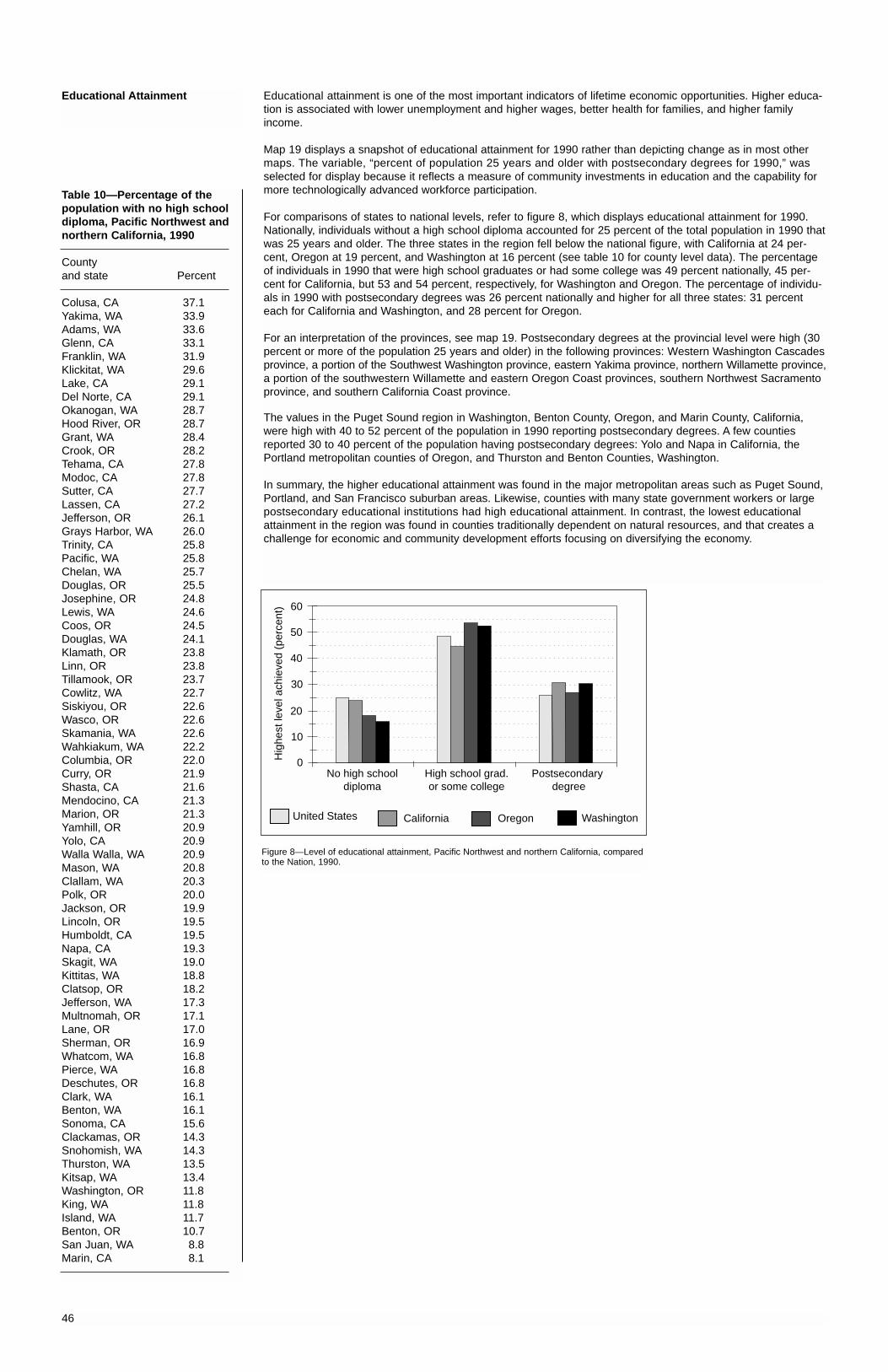
Educational attainment is one of the most important indicators of lifetime economic opportunities. Higher educa-tion is associated with lower unemployment and higher wages, better health for families, and higher familyincome.
Map 19 displays a snapshot of educational attainment for 1990 rather than depicting change as in most othermaps. The variable, “percent of population 25 years and older with postsecondary degrees for 1990,” wasselected for display because it reflects a measure of community investments in education and the capability formore technologically advanced workforce participation.
For comparisons of states to national levels, refer to figure 8, which displays educational attainment for 1990.Nationally, individuals without a high school diploma accounted for 25 percent of the total population in 1990 thatwas 25 years and older. The three states in the region fell below the national figure, with California at 24 per-cent, Oregon at 19 percent, and Washington at 16 percent (see table 10 for county level data). The percentageof individuals in 1990 that were high school graduates or had some college was 49 percent nationally, 45 per-cent for California, but 53 and 54 percent, respectively, for Washington and Oregon. The percentage of individu-als in 1990 with postsecondary degrees was 26 percent nationally and higher for all three states: 31 percenteach for California and Washington, and 28 percent for Oregon.
For an interpretation of the provinces, see map 19. Postsecondary degrees at the provincial level were high (30percent or more of the population 25 years and older) in the following provinces: Western Washington Cascadesprovince, a portion of the Southwest Washington province, eastern Yakima province, northern Willamette province,a portion of the southwestern Willamette and eastern Oregon Coast provinces, southern Northwest Sacramentoprovince, and southern California Coast province.
The values in the Puget Sound region in Washington, Benton County, Oregon, and Marin County, California,were high with 40 to 52 percent of the population in 1990 reporting postsecondary degrees. A few countiesreported 30 to 40 percent of the population having postsecondary degrees: Yolo and Napa in California, thePortland metropolitan counties of Oregon, and Thurston and Benton Counties, Washington.
In summary, the higher educational attainment was found in the major metropolitan areas such as Puget Sound,Portland, and San Francisco suburban areas. Likewise, counties with many state government workers or largepostsecondary educational institutions had high educational attainment. In contrast, the lowest educationalattainment in the region was found in counties traditionally dependent on natural resources, and that creates achallenge for economic and community development efforts focusing on diversifying the economy.
46
Table 10—Percentage of the population with no high schooldiploma, Pacific Northwest andnorthern California, 1990
County and state Percent
Colusa, CA 37.1Yakima, WA 33.9Adams, WA 33.6Glenn, CA 33.1Franklin, WA 31.9Klickitat, WA 29.6Lake, CA 29.1Del Norte, CA 29.1Okanogan, WA 28.7Hood River, OR 28.7Grant, WA 28.4Crook, OR 28.2Tehama, CA 27.8Modoc, CA 27.8Sutter, CA 27.7Lassen, CA 27.2Jefferson, OR 26.1Grays Harbor, WA 26.0Trinity, CA 25.8Pacific, WA 25.8Chelan, WA 25.7Douglas, OR 25.5Josephine, OR 24.8Lewis, WA 24.6Coos, OR 24.5Douglas, WA 24.1Klamath, OR 23.8Linn, OR 23.8Tillamook, OR 23.7Cowlitz, WA 22.7Siskiyou, OR 22.6Wasco, OR 22.6Skamania, WA 22.6Wahkiakum, WA 22.2Columbia, OR 22.0Curry, OR 21.9Shasta, CA 21.6Mendocino, CA 21.3Marion, OR 21.3Yamhill, OR 20.9Yolo, CA 20.9Walla Walla, WA 20.9Mason, WA 20.8Clallam, WA 20.3Polk, OR 20.0Jackson, OR 19.9Lincoln, OR 19.5Humboldt, CA 19.5Napa, CA 19.3Skagit, WA 19.0Kittitas, WA 18.8Clatsop, OR 18.2Jefferson, WA 17.3Multnomah, OR 17.1Lane, OR 17.0Sherman, OR 16.9Whatcom, WA 16.8Pierce, WA 16.8Deschutes, OR 16.8Clark, WA 16.1Benton, WA 16.1Sonoma, CA 15.6Clackamas, OR 14.3Snohomish, WA 14.3Thurston, WA 13.5Kitsap, WA 13.4Washington, OR 11.8King, WA 11.8Island, WA 11.7Benton, OR 10.7San Juan, WA 8.8Marin, CA 8.1
No high school diploma
Postsecondary degree
High school grad. or some college
Hig
hest
leve
l ach
ieve
d (p
erce
nt)
United States California Oregon Washington
60
50
40
30
20
10
0
Figure 8—Level of educational attainment, Pacific Northwest and northern California, comparedto the Nation, 1990.
Educational Attainment
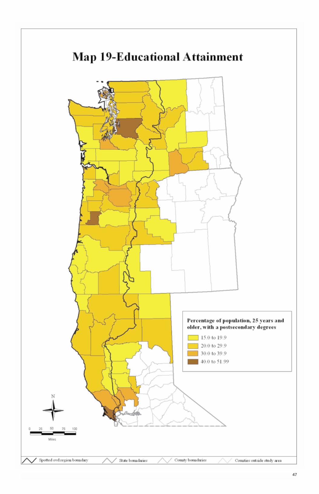
47

This page is intentionally left blank.

Section 6:
Social Issues
Change in Income Maintenance
Change in Proverty Rate
Change in Violent Crime Rates
Change in Property Crime Rates
Alcohol-Related Incidences
49
Income maintenance is an indicator of economic stress and poverty. The number of people on Federal welfarerolls has dropped below 10 million for the first time in almost 27 years (The New York Times 1998). Fewer than4 percent of Americans are now on welfare; more than 30 percent of the decline has come from changes inFederal and state welfare policies and laws. In January 1997, there were 11.4 million people on welfare, 2.8 mil-lion fewer than in January 1993. From January to August 1997, the rolls declined by about 1.4 million people.Map 20 displays the change in dollar amounts of an income maintenance indicator that combines supplementalsecurity income (SSI), food stamps, aid to families with dependent children, and “other” income maintenance(U.S. Department of Commerce, Economics and Statistics Administration 1997).
What do the categories of income maintenance mean? Supplemental security income benefits consist of pay-ments received by the disabled, aged, and blind from both the Federal and state governments. Aid to familieswith dependent children is a state-administered program that receives Federal matching funds to provide payments to low-income families such as single mothers with children. One social issue is the potential intergen-erational permanence of welfare recipients. This category of recipients may not be affected by economic fluc-tuations. Food stamp benefits are issued to qualifying low-income individuals to supplement their ability to purchasefood. Eligibility is determined by the state’s interpretation of Federal regulations; the U.S. Department of Agricul-ture pays the cost of the stamps. The “other” income maintenance payments consist of general assistance bene-fits, emergency assistance benefits, foster care payments, and so forth.
Map 20 indicates that the largest (first quartile) per capita average annual change from 1989 to 1994 occurred in the following provinces: Klamath and portions of Southwest Oregon, Yakima, Southwest Washington, OlympicPeninsula, Western Washington Cascades, and Eastern Washington Cascades. This means that the annual percapita change averaged between $17.00 and $30.00. The smallest (fourth quartile) average annual changeoccurred in all provinces except Oregon Coast, Olympic Peninsula, and Western Washington Cascades. Thechange averaged between $3.00 and $7.99.
The county analyses demonstrate that the largest (first quartile) per capita average annual change from 1989 to 1994 occurred in northern California and southern Oregon, in the Puget Sound region, and counties of east-ern Washington. The smallest (fourth quartile) change occurred in Jackson and Deschutes Counties, Oregon,the San Francisco Bay area, and Shasta County, California. Douglas and Benton Counties in Washingtondemonstrated a small change ($3.00-7.99).
Table 11 shows the average annual per capita income maintenance payments over 6 years. San Juan,Washington, for example, shows an average of $101, and Lake, California, shows $713. The average per capitaincome maintenance payment of $713 is controlled by state policy and is not associated with geographical differ-ences in economic fluctuations. All qualified recipients receive the same amount of money. In Washington, thebase rate is $339. If children are added, Washington may give $100 to the first child; another state may give $0 while another state may give $50. California pays higher benefits than other states. Because states controlpolicy for income maintenance, it is less meaningful to compare among states. County data, however, do tella story and reflect differences in the number of children and the relative number of recipients compared to the total population.
As previously mentioned, SSI goes to the aged, to the permanently disabled, and as survivors’ benefits for chil-dren whose parents have died. None of these categories is directly affected by local economic circumstances.Immigrants may be in a vulnerable position due to social policy changes. The majority of these immigrants areelderly or permanently disabled. The compassionate concern is how this population is to be supported given thatthey cannot join the labor force. Churches, social organizations, and states are scrambling to determine whatcan be done in terms of assistance. Changes in SSI policy can adversely affect an already distressed county bycreating additional burdens on local resources. It is not possible to separate the effects of social policy changes,local economic conditions, and demographic changes on average annual per capita income maintenance payments.
50
Change in Income Maintenance
Table 11—Average annual percapita income maintenance,Pacific Northwest and northernCalifornia, 1989 to 1994
County and state Dollars
Lake, CA 713Del Norte, CA 675Modoc, CA 653Humboldt, CA 634Siskiyou, CA 631Shasta, CA 611Tehama, CA 585Trinity, CA 583Mendocino, CA 582Glenn, CA 551Lassen, CA 526Yakima, WA 472Sutter, CA 468Klickitat, WA 451Yolo, CA 451Grays Harbor, WA 448Okanogan, WA 439Franklin, WA 429Adams, WA 423Colusa, CA 377Grant, WA 357Cowlitz, WA 357Lewis, WA 354Skamania, WA 351Josephine, OR 347Pacific, WA 347Pierce, WA 316Jefferson, OR 309Coos, OR 307Mason, WA 298Clallam, WA 296Walla Walla, WA 289Multnomah, OR 285Linn, OR 283Sonoma, CA 281Klamath, OR 278Chelan, WA 275Douglas, OR 271Sherman, OR 264Marion, OR 260Clark, WA 258Napa, CA 254Lane, OR 253Skagit, WA 245Wahkiakum, WA 242Thurston, WA 240Jackson, OR 235Lincoln, OR 233Jefferson, WA 232Wasco, OR 224King, WA 218Clatsop, OR 217Curry, OR 208Kitsap, WA 207Whatcom, WA 204Kittitas, WA 199Snohomish, WA 196Benton, WA 194Crook, OR 192Yamhill, OR 189Marin, CA 184Tillamook, OR 184Polk, OR 172Douglas, WA 171Hood River, OR 165Columbia, OR 165Deschutes, OR 162Benton, OR 130Island, WA 110Washington, OR 105Clackamas, OR 103San Juan, WA 101

51
The poverty rate reflects, in part, the distribution of income and is an indicator of economic distress. The povertythresholds are established by the U.S. Office of Management and Budget and are based on income for specificfamily sizes, age of the household head, and the number of related children under age 18 in the household.Poverty status is determined for families rather than individuals. Refer to the Statistical Abstract of the UnitedStates 1997, Section 14, (U.S. Department of Commerce, Bureau of the Census 1997c) for additional informationon money income, poverty index, and measurement. Changes in how poverty is defined and measured over timemay limit comparability.
Poverty thresholds in the United States in 1990 ranged from $6,268, for a family of one person 65 years old orolder, to $26,848 for a family of nine or more. The average household size in 1995 was 2.6 persons. The povertylevel for a unit of three persons was $12,158 (U.S. Department of Commerce, Bureau of the Census 1997c).When we compared state to national poverty levels in 1995, California had a higher percentage (16.7 percent) of persons below poverty level than the national average of 13.8 percent. Oregon at 11.2 percent and Washingtonat 12.5 percent were lower than the national average. Use caution with these figures. The percentages of pover-ty levels for the three states are representative of entire states and not just the portion within the NWFP region.For trends, see table 12 for persons below poverty level by state from 1990 to 1995.
Most of the provinces in California and the Southwest Washington, Yakima, and Western Washington Cascadeprovinces reflected increases in poverty rates from 1989 to 1993 (see map 21). Most of western Oregon andWashington showed increases but not to the level for the provinces listed above. Many provinces experienceddecreases in poverty rates. Those included portions of the Klamath, California Coast, and Northwest Sacramentoprovinces; all of the Deschutes province; and some of the other provinces in western Oregon and Washington.Poverty rates in California in the 1990s reflected a nationwide recession that was particularly evident inCalifornia.
Most counties in California experienced a large increase in percentage of change in poverty except for Humboldt,Trinity, and Yolo Counties. Two-thirds of the counties in Oregon had a modest increase in poverty rates, andtwo-thirds of the counties in Washington had a modest-to-large increase.
Table 13 (left) compares the percentage of people in poverty in each county between two periods—the 1980sand 1989-93. The percentage of poverty in over one-half of the counties increased during both periods.Interestingly, some counties went from an increase in poverty to an increase in poverty rate. Whatcom County,Washington, experienced a decrease in poverty rate for both periods.
See the appendix for method of calculation used to determine changes in poverty rates.
52
Table 13—Change in percentageof poverty, Pacific Northwest and northern California, increase (+)or decrease (-) by county, 1979 to1989 and 1989 to 1993
County 1979-89 1989-93
Colusa, CA + +Del Norte, CA + +Lake, CA + +Skamania, WA + +Modoc, CA + +Yakima, WA + +Tehama, CA + +Mendocino, CA + +Siskiyou, CA + +Lassen, CA + +Glenn, CA + +Shasta, CA + +Multnomah, OR + +King, WA + +Grays Harbor, WA + +Clark, WA + +Washington, OR + +Curry, OR + +Marion, OR + +Lewis, WA + +Pierce, WA + +Adams, WA + +Skagit, WA + +Klickitat, WA + +Josephine, OR + +Linn, OR + +Jackson, OR + +Chelan, WA + +Clackamas, OR + +Clallam, WA + +Yamhill, OR + +Douglas, OR + +Cowlitz, WA + +Coos, OR + +Hood River, OR + +Klamath, OR + +Thurston, WA + +Mason, WA + +Lane, OR + +Lincoln, OR + +Kitsap, WA + +Sutter, CA + +Walla Walla, WA + +Sonoma, CA - +Snohomish, WA - +Napa, CA - +Marin, CA - +San Juan, WA - +Sherman, OR - +Island, WA - +Wahkiakum, WA - +Crook, OR + -Wasco, OR + -Pacific, WA + -Humboldt, CA + -Clatsop, OR + -Deschutes, OR + -Douglas, WA + -Okanogan, WA + -Jefferson, WA + -Franklin, WA + -Benton, WA + -Yolo, CA + -Jefferson, OR + -Polk, OR + -Grant, WA + -Columbia, OR + -Trinity, CA + -Tillamook, OR + -Benton, OR + -Kittitas, WA + -Whatcom, WA - -
Table 12—Persons below poverty level, for the Nation and by state, 1990 to 1995
Entitya 1990b 1993 1994 1995
Percent
United States 13.5 15.1 14.5 13.8California 13.9 18.2 17.9 16.7Oregon 9.2 11.8 11.8 11.2Washington 8.9 12.1 11.7 12.5
a Limitations: Values reflect all of California, Oregon, and Washington rather than the western or northern portion of the states.b Prior to 1990, data were based on different procedures and therefore are not comparable. Source: U.S. Department of Commerce, Bureau of the Census 1997c.
Change in Poverty Rate

53
High crime rates and increasingly violent crimes reflect social and economic distress. The Federal Bureau ofInvestigation (FBI) collects data on eight types of crimes from state agencies, county sheriff offices, policeprecincts, and other law enforcement agencies. The FBI continually updates this information, such that, even if a county sheriff’s office submits only 10 months of data for 1995, but a year later submits data for the missing 2months for 1995, the FBI will update its records. Not all agencies, precincts, and other agencies file reports withthe FBI for all months. Occasionally, an agency will report data to the FBI for only 11 months, sometimes fewer.On these occasions, fewer crime incidents will be reported than have actually occurred. We alert the reader to this and note that the data are suggestive only. A list of counties where this occurred, along with the years,appears in the appendix. Also, 12 counties have one agency (sometimes two) that counts data for more thanone county, and some possibility of overcounting may exist (see appendix). Differences in violent crime ratesfor different counties may be affected by different reporting practices and differences in law enforcement andprotection activities.
We divided the eight types of crime into two categories and created indices on violent crime and property crime.The violent crime index included four crimes, as classified by the FBI: murder and nonnegligent manslaughter,forcible rape, robbery, and aggravated assault. The property crime index combined burglary, larceny-theft, motorvehicle theft, and arson. Specific definitions of the eight crimes are given in the appendix.
The number of violent crimes in the United States fell by more than 9 percent in 1995, continuing a downwardtrend that began in 1994. An improved economy and the aging population potentially are reasons for the reduc-tion (Rosenthal 1996). The national violent crime rates for 1995 were 5,278 per 100,000 citizens; 6,564 forOregon; 6,270 for Washington, and 5,831 for California (U.S. Department of Commerce, Bureau of the Census1997a). All three states exceeded the national crime rates, but the reader is cautioned that these statistics reflectthe entire state and not just the NWFP region.
The analyses of rates (per 100,000 population) of violent crime in provinces suggested that the majority of theNWFP landscape showed no primary trend—neither an increase nor a decrease in violent crime. Pockets ofchange were evident, however. Violent crime rates along certain areas of the Oregon coast suggested a “cleardownward trend,” whereas the Williamette province showed a “probable upward trend” in the southern area,“probable downward trend” in the central area, and a “clear upward trend” in the northeastern portion of theprovince, with a “probable upward trend” in the northwest area (map 22). Some “clear downward trend” wasshowing on the west side of the province.
The data suggested “probable upward trends” and “clear upward trends” in the Southwest Washington province.Numbers were indicative of similar trends for the Olympic Peninsula province. The Northwest Sacramentoprovince suggested a “clear upward trend” and the California Coast province suggested a “probable upwardtrend” in violent crime rates. Deschutes, Yakima, Western Washington Cascades, Klamath, and Eastern Wash-ington Cascades provinces were suggestive of “no clear trend.”
Data for Washington basically suggested that the majority of counties had “no clear trend.” A few scattered counties demonstrated “clear upward trends,” “probable upward trends,” and “probable downward trends.” Table14 gives a list of counties with upward or downward trends. Oregon numbers suggested “no clear trend” in 14out of 25 counties; yet counties on the coast had “clear downward trends” as did Columbia, Marion, and LinnCounties with “probably downward trends” in violent crime rates. The northern section of California suggested“no clear trend,” yet seven of the counties indicated some form of upward trend.
54
Change in Violent Crime Rates
Table 14—Violent crime trends, Pacific Northwest and northern California, 1995
Clear downward trend Probable downward trend Probable upward trend Clear upward trend
Coos, OR Columbia, OR Marin, CA Glenn, CALincoln, OR Linn, OR Mendocino, CA Tehama, CAPolk, OR Marion, OR Sonoma, CA Clackamas, OR
San Juan, WA Sutter, CA Jackson, ORYolo, CA Josephine, ORLane, OR Shasta, ORWashington, OR Clark, WACowlitz, WA Grant, WAKitsap, WA Jefferson, WAMason, WA

55

An increase in rates of property crime is an indicator of economic or social stress. The flip side is that adecrease in rates may suggest several factors: a healthy economy, aging population, and increased well-beingin communities and counties. Nationally, the number of property crimes declined 5.6 percent in 1995, down 1.7million to 29.3 million. The rate of burglaries, theft, and theft of motor vehicles was 288 per 1,000 households,down from 308 per 1,000 in 1994 (Rosenthal 1996). Property crime rates for 1995 are displayed in table 15 forthe three states and the United States. The statistics for each state reflected the entire state and not just theportion in the NWFP region.
The analysis of provinces showed that the property crime rates (U.S. Department of Justice 1996) from 1989 to 1995 did not change for most of the region; however, the central and northern provinces indicated downwardtrends as well as some upward trends. No clear pattern exists.
The county analysis (see table 16) suggested downward trends for King and Franklin Counties and possiblySnohomish, Clallam, and Yakima Counties in Washington. Curry County in Oregon and Trinity and Napa Coun-ties in California indicated probable downward trends.
Upward trends appeared in Skagit and Adams Counties, Washington, and Clatsop and Clackamas Counties,Oregon. Upward trends were probable in Cowlitz County, Washington, and in Wasco, Marion, Linn, and JacksonCounties and along the Oregon coast. In Humboldt, Tehema, and Glenn Counties, California, property crimerates appeared to be in an upward trend.
When results of the violent crime map (map 22) are compared to those of the property crime map (map 23), theprovinces and counties in Washington with upward and downward trends in violent crimes do not always showup on the property crime map (see table 17). King County, for instance, showed “no clear trend” in violent crimeand showed “probably downward trend” in property crime. One exception was Cowlitz County, Washington,which showed “probably upward trend” on both maps.
Similar trends were found in California. Two counties—Tehama and Glenn—having clear upward trends in violent crime had probable upward trends in property crime rates. Other counties showed up on only one map.In Oregon, Clackamas County experienced clear upward trends in both violent and property crime rates.
56
Table 16—Trends in property crime rates, Pacific Northwest and northern California
Clear downward trend Probable downward trend Probable upward trend Clear upward trend
Franklin, WA Napa, CA Glenn, CA Clackamas, ORKing, WA Trinity, CA Humboldt, CA Clatsop, OR
Curry, OR Tehama, CA Adams, WAClallam, WA Jackson, OR Skagit, WASnohomish, WA Lincoln, ORYakima, WA Linn, OR
Marion, ORSherman, ORTillamook, ORWasco, ORCowlitz, WA
Table 17—Trends in both violent and property crime rates, Pacific Northwest and northern California
Probable downward trend Clear upward trend in violent in violent crime and probable crime and probable upward
Probable upward trend Clear upward trend upward trend in property crime trend in property crime
Cowlitz, WA Clackamas, OR Linn, OR Glenn, CAMarion, OR Tehama, CA
Jackson, OR
Change in Property Crime Rates
Table 15—Property crime rates, for the Nation and by state, 1995
Property crimesEntity per 100,000 population
United States 4,593Oregon 6,042Washington 5,786California 4,865
Source: U.S. Department of Commerce, Bureau of the Census 1997a.
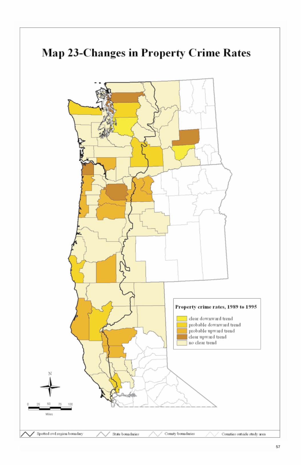
57
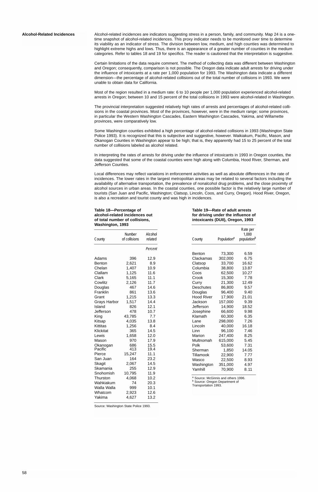
Alcohol-related incidences are indicators suggesting stress in a person, family, and community. Map 24 is a one-time snapshot of alcohol-related incidences. This proxy indicator needs to be monitored over time to determineits viability as an indicator of stress. The division between low, medium, and high counties was determined tohighlight extreme highs and lows. Thus, there is an appearance of a greater number of counties in the mediumcategories. Refer to tables 18 and 19 for specifics. The reader is cautioned that the interpretation is suggestive.
Certain limitations of the data require comment. The method of collecting data was different between Washingtonand Oregon; consequently, comparison is not possible. The Oregon data indicate adult arrests for driving underthe influence of intoxicants at a rate per 1,000 population for 1993. The Washington data indicate a differentdimension—the percentage of alcohol-related collisions out of the total number of collisions in 1993. We wereunable to obtain data for California.
Most of the region resulted in a medium rate: 6 to 10 people per 1,000 population experienced alcohol-relatedarrests in Oregon; between 10 and 15 percent of the total collisions in 1993 were alcohol-related in Washington.
The provincial interpretation suggested relatively high rates of arrests and percentages of alcohol-related colli-sions in the coastal provinces. Most of the provinces, however, were in the medium range; some provinces, in particular the Western Washington Cascades, Eastern Washington Cascades, Yakima, and Willametteprovinces, were comparatively low.
Some Washington counties exhibited a high percentage of alcohol-related collisions in 1993 (Washington StatePolice 1993). It is recognized that this is subjective and suggestive, however. Waikiakum, Pacific, Mason, andOkanogan Counties in Washington appear to be high; that is, they apparently had 15 to 25 percent of the totalnumber of collisions labeled as alcohol related.
In interpreting the rates of arrests for driving under the influence of intoxicants in 1993 in Oregon counties, thedata suggested that some of the coastal counties were high along with Columbia, Hood River, Sherman, andJefferson Counties.
Local differences may reflect variations in enforcement activities as well as absolute differences in the rate ofincidences. The lower rates in the largest metropolitan areas may be related to several factors including theavailability of alternative transportation, the prevalence of nonalcohol drug problems, and the close proximity ofalcohol sources in urban areas. In the coastal counties, one possible factor is the relatively large number oftourists (San Juan and Pacific, Washington; Clatsop, Lincoln, Coos, and Curry, Oregon). Hood River, Oregon, is also a recreation and tourist county and was high in incidences.
58
Alcohol-Related Incidences
Table 19—Rate of adult arrestsfor driving under the influence ofintoxicants (DUII), Oregon, 1993
Rate per 1,000
County Populationa populationb
Benton 73,300 6.59Clackamas 302,000 6.75Clatsop 33,700 16.62Columbia 38,800 13.87Coos 62,500 10.27Crook 15,300 7.78Curry 21,300 12.49Deschutes 86,800 9.57Douglas 96,400 9.40Hood River 17,900 21.01Jackson 157,000 9.39Jefferson 14,900 18.52Josephine 66,600 9.98Klamath 60,300 6.35Lane 298,000 7.26Lincoln 40,000 16.18Linn 96,100 7.46Marion 247,400 8.25Multnomah 615,000 5.45Polk 53,600 7.31Sherman 1,850 14.05Tillamook 22,900 7.77Wasco 22,500 8.93Washington 351,000 4.97Yamhill 70,900 8.11
a Source: McGinnis and others 1996.b Source: Oregon Department ofTransportation 1993.
Table 18—Percentage of alcohol-related incidences out of total number of collisions,Washington, 1993
Number AlcoholCounty of collisions related
Percent
Adams 396 12.9Benton 2,621 8.9Chelan 1,407 10.9Clallam 1,125 11.6Clark 5,165 11.1Cowlitz 2,126 11.7Douglas 467 14.6Franklin 861 13.6Grant 1,215 13.3Grays Harbor 1,517 14.4Island 826 12.1Jefferson 478 10.7King 43,785 7.7Kitsap 4,035 13.8Kittitas 1,256 8.4Klickitat 365 14.5Lewis 1,658 12.0Mason 970 17.9Okanogan 686 15.5Pacific 413 19.4Pierce 15,247 11.1San Juan 164 23.2Skagit 2,067 14.5Skamania 255 12.9Snohomish 10,795 11.9Thurston 4,068 10.2Wahkiakum 74 20.3Walla Walla 999 10.1Whatcom 2,923 12.6Yakima 4,627 13.2
Source: Washington State Police 1993.
59

This page is intentionally left blank.

Section 7:
Federal Assistance
Northwest Economic Adjustment Initiative
61

Changing social values, subsequent legal gridlock, and natural resource management policies have had a pro-found impact on the forest products industry in rural timber-based communities in the Pacific Northwest. TheNWFP is an innovative approach to ecosystem management, economic development, and agency coordination.The Northwest Economic Adjustment Initiative (NWEAI) is one part of the NWFP intended to support the region’speople and communities during the economic transition and ensure that Federal, state, and local agencies worktogether to assist the most affected parts of the region. The NWEAI, through innovative policy and “adap-tive management,” allocated $1.2 billion over 5 years, beginning in fiscal year 1994. Sixteen Federal programshelped to finance community and economic development.
The NWEAI provided assistance to a variety of recipients, as indicated by the four categories of assistance,namely workers and families, business and industry, communities and infrastructure, and ecosystem invest-ments (see table 20). Projects included rural infrastructure projects, such as waste water and drinking watergrants and loans, business and industry loan guarantees, Jobs in the Woods programs,5 and others. With fewexceptions, the proportion of NWEAI funding provided by each department or agency has been relatively consis-tent over the period of the initiative shown in map 25 (table 21).
One of the innovative aspects of the NWEAI is the coordinating structure and responsibilities of the Federal andnon-Federal partners in the NWEAI. From Washington, DC, the multiagency command has policy oversight re-sponsibilities and works to resolve barriers and remove red tape that cannot be overcome in the region. TheRegional Community Economic Revitalization Team (RCERT) is composed of Federal representatives from theparticipating agencies and non-Federal representatives of the three State Community Economic RevitalizationTeams (SCERTs). The RCERT is responsible for ensuring an equitable distribution of funds within the region, foridentifying and addressing barriers and red tape, and for sharing information and innovative approaches acrossthe region. The three SCERTs are responsible for overseeing the day-to-day operations of the initiative withintheir states.
Table 20—NWEAI funding, by category of assistance
Fiscal year
Category of assistance 1994 1995 1996
Percent
Workers and families 7 9 6Business and industry 31 23 29Community and infrastructure 37 53 50Ecosystem investment 25 15 15
Total 100 100 100
Source: Tuchmann and others 1996.
Table 21—NWEAI Federal funding, by department, 1994 through 1996
Fiscal year
Department or agency 1994 1995 1996
Percent
Department of Agriculture:Forest Service 28.4 12.1 12.7Rural Development 45.6 58.3 60.1
Subtotal, USDA 74.0 70.4 72.8
Department of Housing and Urban Development 1.5 9.3 8.2Department of Labor 6.6 8.8 6.0Department of Commerce 8.5 1.6 4.6Department of the Interior 5.5 7.9 5.9Environmental Protection Agency 3.9 2.0 2.5
Total, all departments and agencies 100 100 100
Source: Tuchmann and others 1996.
Not all counties eligible for assistance under the NWFP are depicted in map 25, because they fall outside therange of the northern spotted owl (e.g., Columbia, Ferry, Pend Oreille, and Stevens, Washington; Crook, Oregon;and Lake, California). Some counties within the range of the northern spotted owl have experienced relativelyminor impacts from timber harvest reductions because they are largely urban or suburban and therefore exclud-ed from assistance (e.g., King, Kitsap, and Thurston, Washington; Multnomah and Washington, Oregon). Othercounties (such as Yakima, Washington) were eligible in one year but not in others. Compatible data were notavailable for California, thus the NWEAI’s Federal assistance to counties in California is not depicted in map 25.
The NWEAI funding was related not only to changes in timber harvest and loss in wood products employmentbut also to other factors, such as opportunities for community and rural economic development. Map 25 shows ageneral pattern in the counties that received NWEAI funding and also had relatively high losses in wood prod-ucts employment.
5 Jobs in the Woods is a federally funded program intended to achieve ecosystem management goals and provide employment for displaced timber workers.
62
Northwest Economic AdjustmentInitiative
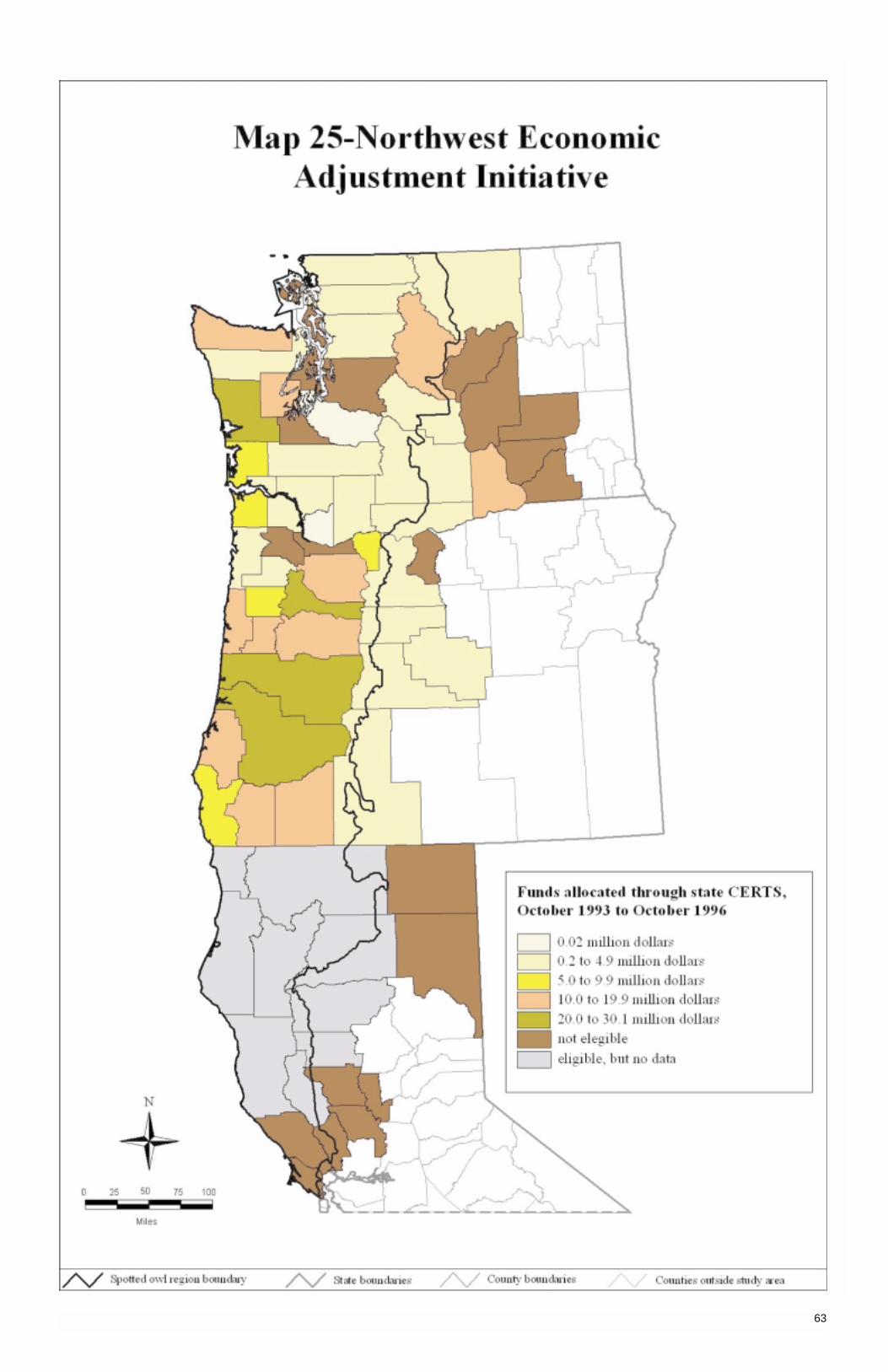
63
Elizabeth Ellis and Judy Mikowski, USDA Forest Service, Pacific Northwest Research Station, Seattle,Washington, and Portland, Oregon, respectively, are recognized for their contributions to this volume.
Rick Jones, Shannon Savage, and Bridget O’Connell, Pacific Meredian Resources, Portland, Oregon, arerecognized for their efforts on the GIS maps and CD-ROM.
Bray, Martha; Lee, Robert G. 1991. Federal forest revenue sharing with local governments in Washington, Oregon, and California. The Northwest Environmental Journal. 7(1): 35-70.
Cook, Annabel Kirschner; Jordan, Mary W. 1994a. Assessing county change: the implications of social and demographic change in south central Washington. Pullman, WA: Washington State University, AssessingCounty Change Project.
Cook, Annabel Kirschner; Jordan, Mary W. 1994b. Assessing county change: the implications of social and demographic change on the Olympic Peninsula. Pullman, WA: Washington State University, AssessingCounty Change Project.
Cook, Annabel Kirschner; Jordan, Mary W. 1995a. Assessing county change: the implications of social and demographic change in north central Washington. Pullman, WA: Washington State University, AssessingCounty Change Project.
Cook, Annabel Kirschner; Jordan, Mary W. 1995b. Assessing county change: the implications of social and demographic change in northeastern Washington. Pullman, WA: Washington State University, AssessingCounty Change Project.
Cook, Annabel Kirschner; Jordan, Mary W. 1995c. Assessing county change: the implications of social and demographic change in southwest Washington. Pullman, WA: Washington State University, AssessingCounty Change Project.
Cook, Annabel Kirschner; Jordan, Mary W. 1995d. Assessing county change: the implications of social and demographic change in the Puget Sound area of Washington. Pullman, WA: Washington State University,Assessing County Change Project.
Council of Economic Advisors. 1991. Economic report of the President. Washington, DC: U.S. Government Printing Office. 411 p.
Council of Economic Advisers. 1998. Changing America, indicators of social and economic well-being by raceand hispanic origin. President’s Initiative on Race. Washington, DC: U.S. Government Printing Office. 74 p.
Fuguitt, Glenn V.; Beale, Calvin L. 1996. Recent trends in nonmetropolitan migration: toward a new turn-around? Growth and Change. 27(Spring): 156-174.
Marple’s Business Newsletter. June 18, 1997. No. 1232. Seattle, WA: Newsletter Publishing Corp. 4 p.
McGinnis, Wendy J.; Phillips, Richard H.; Connaughton, Kent P. 1996. County portraits of Oregon and northern California. Gen. Tech. Rep. PNW-GTR-377. Portland, OR: U.S. Department of Agriculture, ForestService, Pacific Northwest Research Station. 315 p.
McGinnis, Wendy J.; Phillips, Richard H.; Raettig, Terry L.; Connaughton, Kent P. 1997. County portraits of Washington State. Gen. Tech. Rep. PNW-GTR-400. Portland, OR: U.S. Department of Agriculture, ForestService, Pacific Northwest Research Station. 262 p.
Minnesota IMPLAN Group, Inc. 1997. IMPLAN system (1993 data and software). Stillwater, MN: Minnesota Implan Group, Inc., 1940 South Greely Street, Suite 101, Stillwater, MN 55082. www.implan.com.
The New York Times. 1998. Welfare rolls below 10 million—lowest since 1971. January 21; [section unknown]: [page unknown].
Oregon Department of Transportation. 1993. Performance measures for Oregon counties, 1984-1993. [Place of publication unknown].
Raettig, Terry L.; McGinnis, Wendy J. 1996. Wood products employment in the Pacific Northwest: emerging trends. In: Proceedings of the 30th annual Pacific Northwest regional economic conference; 1996 May 2-4;Portland, OR. Portland, OR: Pacific Northwest Regional Economic Conference and Center for UrbanStudies, Portland State University: 45-50.
Rosenthal, Harry F. 1996. Violent crimes ebb for 2nd year. The Oregonian. September 18: [section unknown]: [page unknown]. Portland, OR.
Schuster, Ervin G. 1995. PILT: its purpose and management. Journal of Forestry. 93(8): 31-35.
Swanson, Linda L., ed. 1996. Racial/ethnic minorities in rural areas: progress and stagnation, 1980-90. Agric. Econ. Rep. 731. [Place of publication unknown]: Rural Economy Division, Economic Research Service, U.S.Department of Agriculture.
Tuchmann, E. Thomas; Connaughton, Kent P.; Freedman, Lisa E.; Moriwaki, Clarence. 1996. TheNorthwest forest plan: a report to the President and Congress. Portland, OR: U.S. Department of Agriculture,Forest Service, Office of Forestry and Economic Assistance; Pacific Northwest Research Station. 253 p.
U.S. Department of Agriculture, Economic Research Service. 1996. Rural conditions and trends. Washington, DC. Vol. 7(3).
U.S. Department of Commerce, Bureau of the Census. 1991a. Census of population and housing, 1990: summary tape file 1 on CD-ROM technical documentation. Washington, DC.
U.S. Department of Commerce, Bureau of the Census. 1991b. Census of population and housing, 1990: summary tape file 1A on CD-ROM (Oregon, Washington, California, Idaho). Washington, DC. [Machinereadable data files].
64
Acknowledgments
References
U.S. Department of Commerce, Bureau of the Census. 1992. USA counties on CD-ROM. Washington, DC. [Machine readable data files].
U.S. Department of Commerce, Bureau of the Census. 1994. USA counties. CD-ROM disk. Washington DC. [Machine readable data files and technical documentation files prepared by the Bureau of the Census,Economics and Statistics Administration, U.S. Department of Commerce].
U.S. Department of Commerce, Bureau of the Census. 1997a. Crime rates, by state, 1993 to 1995, and by type, 1995. In: Statistical abstract of the United States 117th ed. [Washington, DC]. (p. 202, table 315).
U.S. Department of Commerce, Bureau of the Census. 1997b. 1992 census of government, finances of county governments. Washington DC: U. S. Government Printing Office. 205 p. Vol. 4:3.
U.S. Department of Commerce, Bureau of the Census, 1997c. Persons below poverty level, by state: 1980 to 1995. In: Statistical abstract of the United States. 117th ed. [Washington, DC]. (p. 477, table 741).
U.S. Department of Commerce, Bureau of the Census, 1997d. Population projections, by Hispanic origin statues-states: 2000 to 2010. In: Statistical abstract of the United States. 117th ed. [Washington, DC]. (p. 38, table 38).
U.S. Department of Commerce, Bureau of the Census, 1997e. Weighted average poverty thresholds: 1980 to 1995. In: Statistical abstract of the United States. 117th ed. [Washington, DC]. (p. 476, table 738).
U.S. Department of Commerce, Bureau of Economic Analysis. 1998. Regional economic information systemCD-ROM disk. Washington DC. [Machine readable data files and technical documentation files prepared bythe Regional Economic Measurement Division (BE55), Bureau of Economic Analysis, Economics andStatistics Administration, U.S. Department of Commerce].
U.S. Department of Commerce, Economics and Statistics Administration, Bureau of Economic Analysis. 1997. Personal income and employment estimates for all counties and metropolitan areas in the UnitedStates, 1969-95 on CD-ROM disk. Regional Economic Information System (REIS). Washington, DC.
U.S. Department of Commerce, Economics and Statistics Administration, Bureau of the Census. 1993.USA counties statistical abstracts. Available at http://www.census.gov/hhes/www/saipe93.html. AccessedMay 1994.
U.S. Department of Justice, Federal Bureau of Investigation. 1996. [Title unknown]. Clarksburg, WV: U.S. Department of Justice, Federal Bureau of Investigation, Criminal Justice Information Services Division.
U.S. Laws, Statues, etc.; Public Law 93-205. The Endangered Species Act of 1973. Act of December 28, 1973. 87 Stat. 884, as amended; 16 U.S.C. 1531-1536,1538-1540.
Washington State Police. 1993. Data summary and highway safety problem analysis. [Place of publication unknown]. (p. 29, tables 2-13).
Unincorporated communities are not included in map 2.
1. Poverty rate and method of calculation:
Percentage of change in persons living below poverty level divided by the number of persons for whompoverty status has been determined:
A (PV02079) ÷ B (PV01079) C (PV 02089) ÷ D (PV01089)
where:A ÷ B AND C ÷ D
= Poverty rate 1979 Rate change in 1979= Poverty rate 1989 Rate change in 1989= the difference between 1979 and 1989
where:PV01079D = B: represents persons for whom poverty status has been determined in 1979.PV01089D = D: represents persons for whom poverty status has been determined in 1989.PV02079D = A: represents persons below poverty level in 1979.PV02089D = C: represents persons below poverty level in 1989.
Calculation is similar to determine the difference between 1989 and 1993.
The data source used in this analysis for 1979 and 1989 was as follows: U.S. Department of Commerce, Bureauof the Census 1994.
65
AppendixPopulation Distribution: 1990 Census Places
Change in Poverty Rate

1. Source of data for map 22 is U.S. Department of Justice 1996.
2. Definitions for the crimes are taken from the Uniform Crime Reports (FBI), though not all jurisdictions report-ing incidents of crime to the FBI use the same definitions. Uniform Crime Report definitions are as follows:(1) murder and nonnegligent manslaughter is the willful (nonnegligent) killing of one human being by another(as determined by police investigation, not the courts, medical examiner, a jury, etc.); (2) forcible rape is thecarnal knowledge of a female (or male for some states) forcibly and against her/his will—attempts to commitrape by force or threat also included; (3) robbery is the taking or attempting to take anything of value from thecare, custody, or control of a person or persons by force or threat of force or violence and/or by putting thevictim in fear; (4) aggravated assault is an unlawful attack by one person upon another for the purpose ofinflicting severe or aggravated bodily injury, usually accompanied by the use of a weapon; (5) burglary is theunlawful entry of a structure to commit a felony or theft; (6) larceny-theft is the unlawful taking, carrying, lead-ing, or riding away of property from the possession or constructive possession of another; (7) motor vehicle isthe theft or attempted theft of a motor vehicle; and (8) arson is defined as any willful or malicious burning orattempt to burn, with or without intent to defraud, a dwelling house, public building, motor vehicle or aircraft,personal property of another, etc. Not all states define these crimes in the same way, and the data reflectonly how the agencies, states, etc., report the crime incidents. Some states, for instance, do not count acrime of rape against a male victim as part of their rape crime data.
3. Counties with one agency (on rare occasion, two) that report data to more than one county:
Oregon WashingtonClackamas ClarkMarion CowlitzMultnomah DouglasPolk KingYamhill Okanogan
PierceSan Juan
4. Table 22 shows the counties with one agency (sometimes, but rarely, two to four agencies) reporting less than12 months of crime data for specified number of years. Some counties have only 6 agencies reporting crimedata and other counties have over 20. The number of agencies reporting for each county is not included.
Table 22—Counties with 1 to 4 agencies reporting less than 12 months of crime data for a specifiednumber of years between 1989 and 1995
1 year 2 years 3 years 4 years 5 Years 6 Years 7 Years
Humboldt, CA Benton, OR Coos, OR Jefferson, OR Marion, OR Jackson, OR Yamhill, ORLassen, CA Clackamas, OR Douglas, OR Polk, OR Snohomish, WA Washington, ORMendocino, CA Clatsop, OR Multnomah, OR Okanogan, WANapa, CA Klamath, OR Grays Harbor, WAShasta, CA Lane, OR King, WASonoma, CA Linn, OR Lewis, WASutter, CA Clark, WAYolo, CA Cowlitz, WACurry, OR Thurston, WAJosephine, OR Whatcom, WALincoln, OR Yakima, WATillamook, ORBenton, WA Pacific, WASan Juan, WASkagit, WA
66
Change in Violent Crime Rates

This page is intentionally left blank.

This page is intentionally left blank.

The Forest Service of the U.S. Department of Agriculture is dedicat-ed to the principle of multiple use management of the Nation’s forestresources for sustained yields of wood, water, forage, wildlife, andrecreation. Through forestry research, cooperation with the Statesand private forest owners, and management of the National Forestsand National Grasslands, it strives—as directed by Congress—toprovide increasingly greater service to a growing Nation.
The U.S. Department of Agriculture (USDA) prohibits discriminationin all its programs and activities on the basis of race, color, nationalorigin, gender, religion, age, disability, political beliefs, sexual orienta-tion, or marital or family status. (Not all prohibited bases apply to allprograms.) Persons with disabilities who require alternative meansfor communication of program information (Braille, large print,audiotape, etc.) should contact USDA's TARGET Center at (202)720-2600 (voice and TDD).
To file a complaint of discrimination, write USDA, Director, Office of Civil Rights, Room 326-W, Whitten Building, 14th andIndependence Avenue, SW, Washington, DC 20250-9410 or call(202) 720-5964 (voice and TDD). USDA is an equal opportunityprovider and employer.
Pacific Northwest Research Station333 S.W. First AvenueP.O. Box 3890Portland, Oregon 97208-3890
