athletic/spirit style guide
TRANSCRIPT
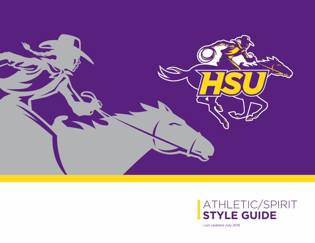
Last updated July 2018
ATHLETIC/SPIRITSTYLE GUIDE
HSU Athletic/Spirit Style Guide | July 20182
CONTENTS
Elements of the Logo � � � � � � � � � � � � � � � � � � � � � � � 3
Official HSU Athletic/Spirit Colors � � � � � � � � � � � � 3
Spirit Logo Combinations � � � � � � � � � � � � � � � � � � � 4
Athletic Logo Combinations � � � � � � � � � � � � � � � � � 5
Athletic Sub-Brands � � � � � � � � � � � � � � � � � � � � � � � � 6
Clear Space � � � � � � � � � � � � � � � � � � � � � � � � � � � � � � � � 7
Improper Uses � � � � � � � � � � � � � � � � � � � � � � � � � � � � � 8
Typefaces � � � � � � � � � � � � � � � � � � � � � � � � � � � � � � � � � 9
Everyone who publishes or promotes on behalf of the
university is responsible for adhering to the latest graphic
standards policy� If you have questions or need help,
please call University Marketing at 325�670�1258
Our University’s brand is its identity� It is what people
think of and feel when they hear our name� It differenti-
ates us from other colleges and universities by visually
sharing what is special about Hardin-Simmons University�
Our logo is a key component in this identity� It is the face
of Hardin-Simmons University� Some may see our logo,
and view us as family, with a common mission of sharing
Christ’s love� To others, we may be a familiar face they
have yet to meet� Our logo is the key visual to commu-
nicate our academic excellence, enthusiastic spirit and
unshakable faith�
As ambassadors of HSU and our brand, we must pro-
mote, protect and advance HSU’s image with both inter-
nal and external audiences� This style guide is an impor-
tant tool in conveying our message to people around
the world—that they would recognize us by our clear,
consistent, and concise “familiar face,” and one day call
us “family�”
Join us in taking pride in our brand�
Jacob Brandt
Director for University Marketing
Todd E. Clower Art Director and Senior Graphic Designer
Join us in taking pride in our brand.
HSU Athletic/Spirit Style Guide | July 20183
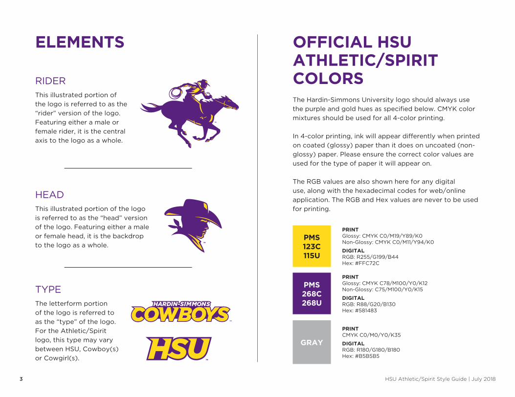
RIDERThis illustrated portion of
the logo is referred to as the
“rider” version of the logo�
Featuring either a male or
female rider, it is the central
axis to the logo as a whole�
HEADThis illustrated portion of the logo
is referred to as the “head” version
of the logo� Featuring either a male
or female head, it is the backdrop
to the logo as a whole�
TYPEThe letterform portion
of the logo is referred to
as the “type” of the logo�
For the Athletic/Spirit
logo, this type may vary
between HSU, Cowboy(s)
or Cowgirl(s)�
ELEMENTS 3UNIVERSITY LOGO STYLE GUIDEELEMENTS OFFICIAL HSU ATHLETIC/SPIRIT COLORS
PMS123C115U
PRINTGlossy: CMYK C0/M19/Y89/K0Non-Glossy: CMYK C0/M11/Y94/K0
DIGITALRGB: R255/G199/B44Hex: #FFC72C
PMS268C268U
PRINTGlossy: CMYK C78/M100/Y0/K12Non-Glossy: C75/M100/Y0/K15
DIGITALRGB: R88/G20/B130Hex: #581483
GRAY
PRINTCMYK C0/M0/Y0/K35
DIGITALRGB: R180/G180/B180Hex: #B5B5B5
The Hardin-Simmons University logo should always use
the purple and gold hues as specified below� CMYK color
mixtures should be used for all 4-color printing�
In 4-color printing, ink will appear differently when printed
on coated (glossy) paper than it does on uncoated (non-
glossy) paper� Please ensure the correct color values are
used for the type of paper it will appear on�
The RGB values are also shown here for any digital
use, along with the hexadecimal codes for web/online
application� The RGB and Hex values are never to be used
for printing�
HSU Athletic/Spirit Style Guide | July 20184
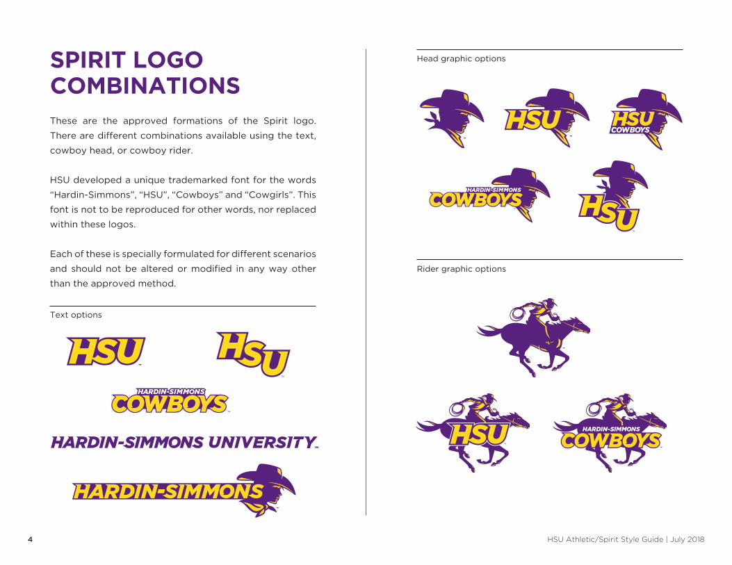
These are the approved formations of the Spirit logo�
There are different combinations available using the text,
cowboy head, or cowboy rider�
HSU developed a unique trademarked font for the words
“Hardin-Simmons”, “HSU”, “Cowboys” and “Cowgirls”� This
font is not to be reproduced for other words, nor replaced
within these logos�
Each of these is specially formulated for different scenarios
and should not be altered or modified in any way other
than the approved method�
SPIRIT LOGOCOMBINATIONS
Text options
Head graphic options
Rider graphic options
HSU Athletic/Spirit Style Guide | July 20185
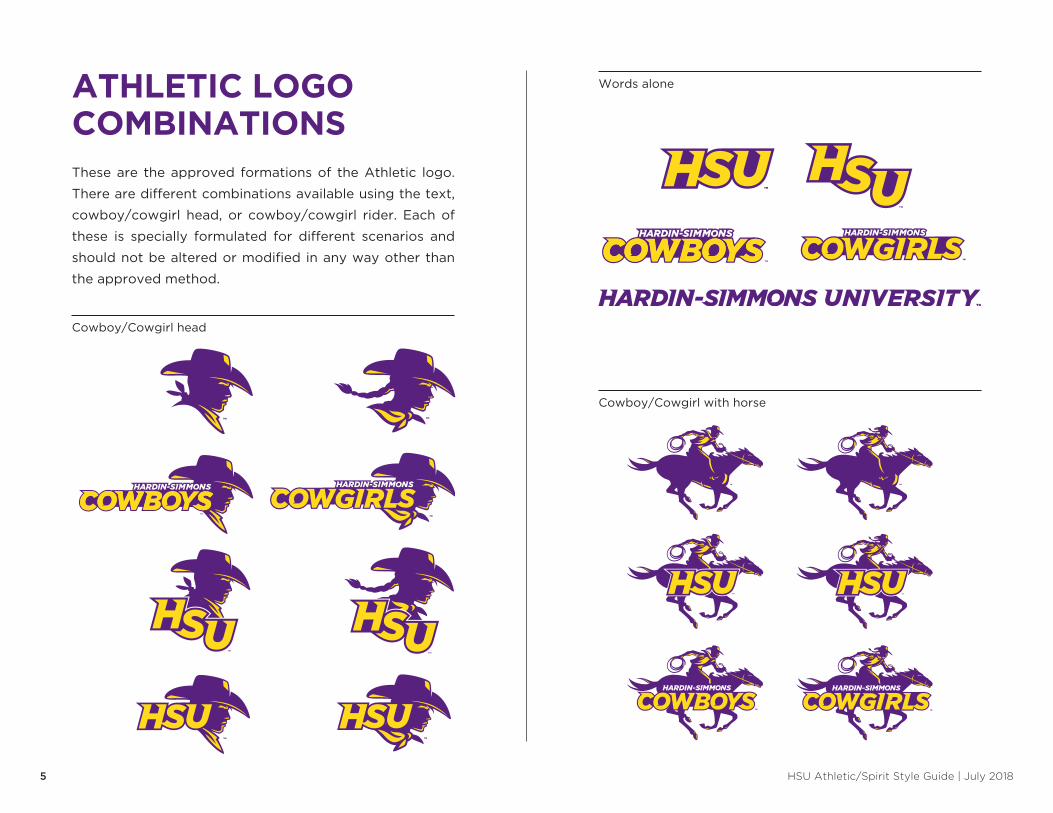
These are the approved formations of the Athletic logo�
There are different combinations available using the text,
cowboy/cowgirl head, or cowboy/cowgirl rider� Each of
these is specially formulated for different scenarios and
should not be altered or modified in any way other than
the approved method�
ATHLETIC LOGOCOMBINATIONS
Cowboy/Cowgirl head
Cowboy/Cowgirl with horse
Words alone

HSU Athletic/Spirit Style Guide | July 20186
To present a unified athletic brand, individual HSU athletic
entities must not have their own logos apart from the
official sub-brand logo versions provided by University
Marketing�
These variations allow the names of sports, and
(in specific cases) offices/departments to appear beneath
the university’s athletic logo�
The following are just examples of each type of these
variations, using a variety of sports�
ATHLETIC LOGOSUB-BRANDS
A T H L E T I C S
HSU Athletic/Spirit Style Guide | July 20187
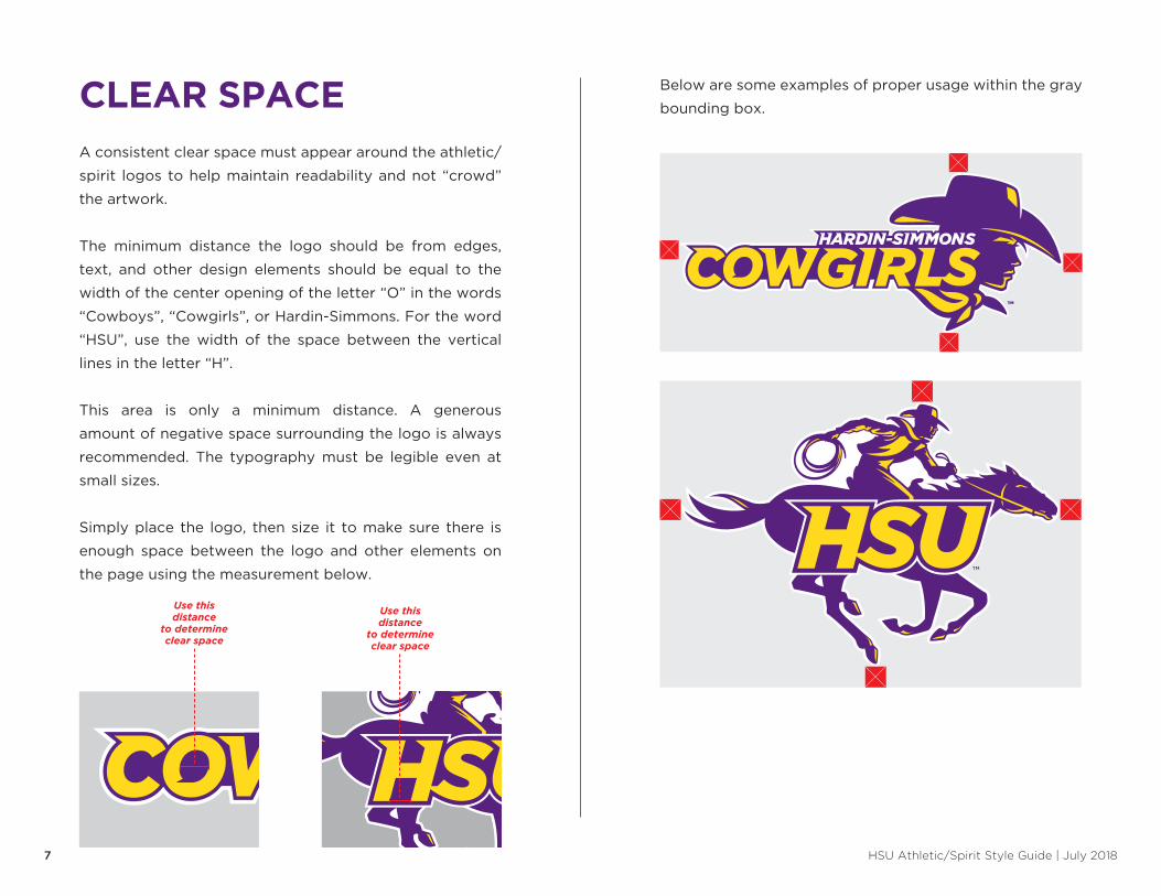
A consistent clear space must appear around the athletic/
spirit logos to help maintain readability and not “crowd”
the artwork�
The minimum distance the logo should be from edges,
text, and other design elements should be equal to the
width of the center opening of the letter “O” in the words
“Cowboys”, “Cowgirls”, or Hardin-Simmons� For the word
“HSU”, use the width of the space between the vertical
lines in the letter “H”�
This area is only a minimum distance� A generous
amount of negative space surrounding the logo is always
recommended� The typography must be legible even at
small sizes�
Simply place the logo, then size it to make sure there is
enough space between the logo and other elements on
the page using the measurement below�
Below are some examples of proper usage within the gray
bounding box�
Use this distance
to determine clear space
Use this distance
to determine clear space
CLEAR SPACE
HSU Athletic/Spirit Style Guide | July 20188
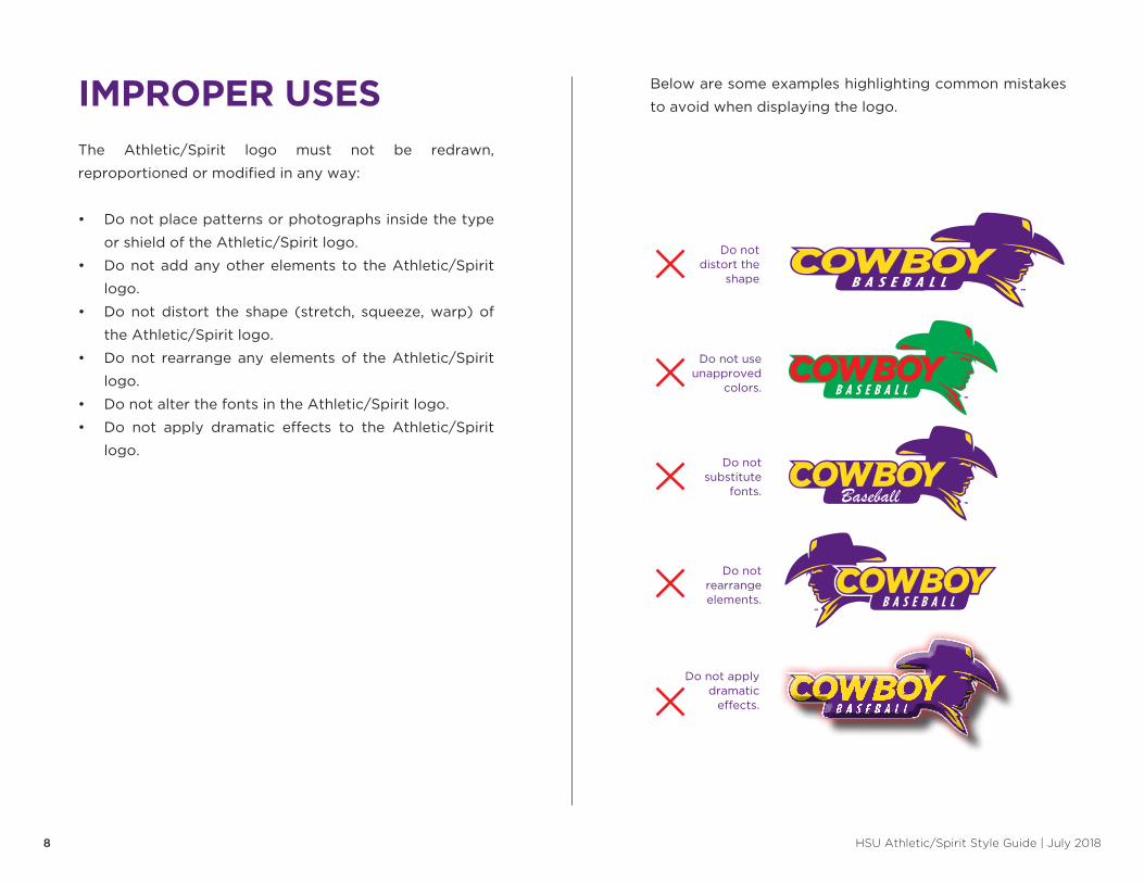
Below are some examples highlighting common mistakes
to avoid when displaying the logo�
Do not use unapproved
colors�
Do not rearrange elements�
Do not distort the
shape
Do not apply dramatic
effects�
Do not substitute
fonts�
The Athletic/Spirit logo must not be redrawn,
reproportioned or modified in any way:
• Do not place patterns or photographs inside the type
or shield of the Athletic/Spirit logo�
• Do not add any other elements to the Athletic/Spirit
logo�
• Do not distort the shape (stretch, squeeze, warp) of
the Athletic/Spirit logo�
• Do not rearrange any elements of the Athletic/Spirit
logo�
• Do not alter the fonts in the Athletic/Spirit logo�
• Do not apply dramatic effects to the Athletic/Spirit
logo�
IMPROPER USES
Baseball
HSU Athletic/Spirit Style Guide | July 20189
Below are some examples highlighting common mistakes
to avoid when displaying the logo�
This is thecorrect color
representationon a dark
background Horse should be the darker color.
Face should be the darker color.
This is thecorrect color
representationon a dark
background
Incorrectrepresentation
on a dark background
Incorrectrepresentation
on a dark background
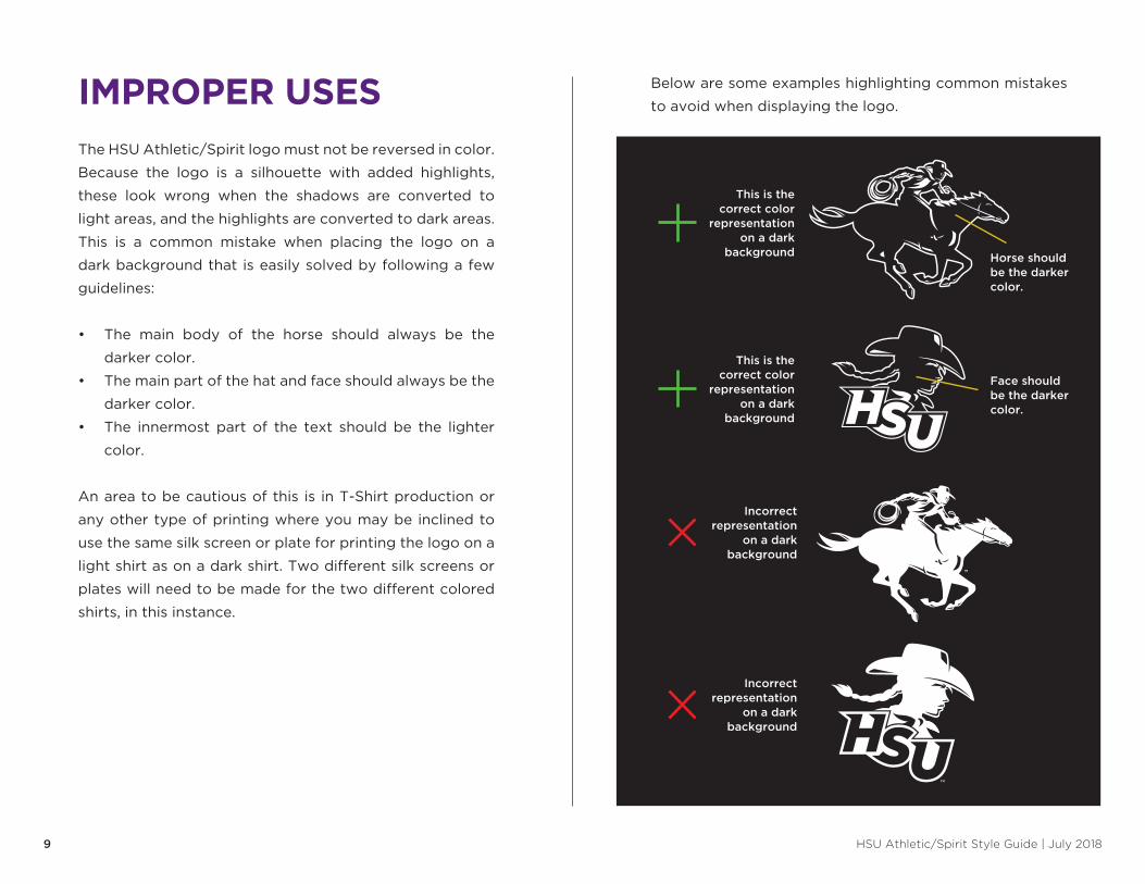
The HSU Athletic/Spirit logo must not be reversed in color�
Because the logo is a silhouette with added highlights,
these look wrong when the shadows are converted to
light areas, and the highlights are converted to dark areas�
This is a common mistake when placing the logo on a
dark background that is easily solved by following a few
guidelines:
• The main body of the horse should always be the
darker color�
• The main part of the hat and face should always be the
darker color�
• The innermost part of the text should be the lighter
color�
An area to be cautious of this is in T-Shirt production or
any other type of printing where you may be inclined to
use the same silk screen or plate for printing the logo on a
light shirt as on a dark shirt� Two different silk screens or
plates will need to be made for the two different colored
shirts, in this instance�
IMPROPER USES
HSU Athletic/Spirit Style Guide | July 201810
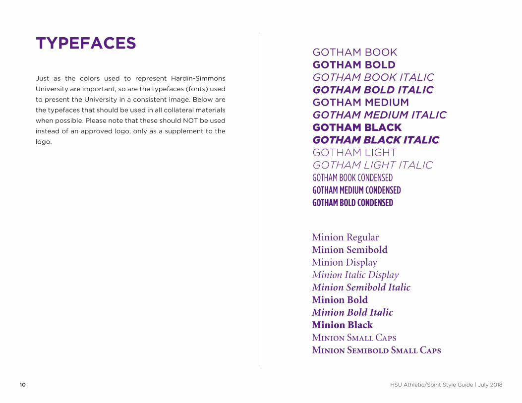
Just as the colors used to represent Hardin-Simmons
University are important, so are the typefaces (fonts) used
to present the University in a consistent image� Below are
the typefaces that should be used in all collateral materials
when possible� Please note that these should NOT be used
instead of an approved logo, only as a supplement to the
logo�
Minion RegularMinion SemiboldMinion DisplayMinion Italic DisplayMinion Semibold ItalicMinion BoldMinion Bold ItalicMinion BlackMinion Small CapsMinion Semibold Small Caps
GOTHAM BOOKGOTHAM BOLDGOTHAM BOOK ITALICGOTHAM BOLD ITALICGOTHAM MEDIUMGOTHAM MEDIUM ITALICGOTHAM BLACKGOTHAM BLACK ITALICGOTHAM LIGHTGOTHAM LIGHT ITALICGOTHAM BOOK CONDENSEDGOTHAM MEDIUM CONDENSEDGOTHAM BOLD CONDENSED
TYPEFACES