assignment for project 2: balance · 2015-01-18 · assignment for project 2: balance after reading...
TRANSCRIPT

ASSIGNMENT for PROJECT 2: BALANCE
After reading the chapter on Balance from your text, Design Basics, and the online lecture material and activities (movies from Lynda.com) for Balance, begin working in Illustrator for the completion of this project. You will be creating two, non-objective compositions with balance as the organizing design principle. You will be required to use the three primary hues, red, yellow and blue, plus black and white for both compositions. Artists have made non-objective art long before the modern era. Certain cultures have forbidden the use of figurative images, such as Islamic art. Movements of art that explored non-objective work range from the Constructivists and De Stijl – who believed that the work of the artist was a means to express revolutionary ideas. Several 20th century artists who worked non-objectively, but with different intentions were Jackson Pollock, Hans Hofmann and Piet Mondrian. Op art and Minimalism also made use of non-objective structures. What we mean in art by non-objective, is a shape or group of shapes that are wholly invented by the artist, not abstracted from that which is real, or representing or mimicking something that is real.

Piet Mondrian Composition #10
Is the Mondrian painting a symmetrical or asymmetrical composition? The term, primary, means colors, called hues that are unable to be mixed with paint using any other colors. While we can mix paint using the hues red and yellow to create orange, we cannot mix any other color to create red or yellow.

Open Illustrator, choose FILE > NEW, and select custom and 600 x 600 pixels for each composition. If the panel won’t allow you to select “custom” then select Pixels first.
Type your number, make sure the Units are set to pixels and press enter or return, then click OK. Begin the symmetry project by creating shapes (using the shape tool) on only one half of the square, divided vertically. This way, as you fill the composition with shapes, you will be able to easily select all

and click Option and drag to duplicate, (select and click Option [Mac] Alt [PC]) then flip horizontally, and your symmetry will be automatic. Another option is to create your design radially, that way everything will be automatically symmetrical, but remember in Part One of Symmetry, you must build a strictly symmetrical design, not Approximate Symmetry. You will primarily be creating your design using the primative shape tool (rectangle, and the other shapes behind it). If you already know how to build shapes using the pen or pencil tools, then that is your option as well. I. Use the OBJECT > ARRANGE to place shapes in the stacking order of your choice. (Below I sent the black rectangle behind the other objects you see in front of it).
II. Open the swatches palette and use it to easily fill the shapes with CMYK red, CMYK yellow, CMYK blue plus black and white. Select the ‘none’ designation for stroke in the tool palette. If you wish to have an outline around your shapes, you can choose a color for the “stroke” also. Use the stroke on your shapes if you believe it really enhances your composition, otherwise leave stroke set to “none.” That is the small rectangle with the slash through it near the bottom of the tools panel. Click on it when the outline of the ‘rectangle’ is on top.
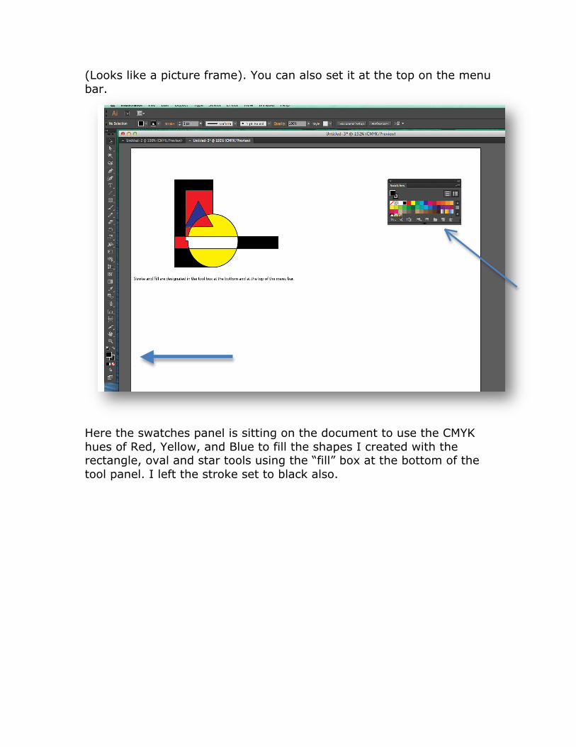
(Looks like a picture frame). You can also set it at the top on the menu bar.
Here the swatches panel is sitting on the document to use the CMYK hues of Red, Yellow, and Blue to fill the shapes I created with the rectangle, oval and star tools using the “fill” box at the bottom of the tool panel. I left the stroke set to black also.

III. Use the direct selection tool to select a point on a shape and further warp or distort it.
pulling a point to warp a shape
Here the direct selection tool (the one with the white arrow) was used to select this corner point of the white bar shape and clicked and dragged to outside the yellow circle. Next I selected the design and used the Pathfinder panel to select and move some components around to make the design a bit more engaging. I also added a couple lines. Then I duplicated the design and flipped it across a vertical axis and moved it diagonally to the bottom of the left hand side of the composition. Finally, I selected the entire left half side and duplicated it to the right half of the composition.

IV. To duplicate your design from one half of the composition, Select > All, (on the one half side) then click and drag, holding the alt on the PC or option key on the Mac to duplicate all the shapes you made on one half of the composition and drag to the other side.
After you have duplicated your shapes to the other half of your design, as stated in IV, you can move them closer together, duplicate again and again, rotate, whatever, etc, as long as you plan for the eventual symmetry.

V. Here you see the group on the right selected (you can do this in the layers panel by clicking into the space on the right side of the layer you wish to select). Then the Object>Transform>Reflect command is selected from the menu. Choose reflect vertically from the panel that opens. You will have created a symmetrical composition, also know as Formal Balance. You can also do this by opening the TRANSFORM panel, under menu Window>Transform, and in the upper right corner of that panel, click on the drop down arrow and select Flip Horizontal. (I know it is confusing) See the screen shot below for this panel.

If you need to slide the selected shapes a bit to fit into your composition, use the arrow keys on your keyboard while the shapes are selected. Now you see the symmetrical design. I then added two rectangles (and Red and a Blue) and sent them to the back (Object>Arrange>Back) and changed some strokes on the pulled points in the upper half to – still symmetrical – See below.

VI. Coloring Shapes That Overlap – this part if from Illustrator CS6 but still operates the same in Illustrator CC. When shapes overlap you can drop color into the parts that intersect. To do this, you can use the live paint bucket tool. Read about this in Lynda.com movies on Live Paint. (Select all the shapes and from the main menu, OBJECT > Live Paint > Make) Then using the live paint bucket, you can drop color into any intersecting/overlapping shapes. The live paint bucket tool is under the shape builder tool if you don’t see it on the top, click the tiny corner and it will open up to several live paint tools. See screen shots below.

Live Paint Bucket You can also do this same operation using the Window>Pathfinder panel and after selecting all the shapes, click on the “divide” button (lower left corner). This will make individual shapes of the intersections that can not only be colored, but also moved to new locations. This is a screen shot of that panel by itself.

To select color use the direct selection arrow to isolate individual shapes to fill with color using the regular “fill” and “stroke” tools as you would normally use when making a shape. You will be graded on how well you follow the requirements of this project to build symmetry and asymmetry. Making shapes is just the beginning. Develop a reason to build the shapes. Are you making some sort of robotic image? Are you working totally non-objectively? You may certainly use organic forms – those of you who know how to draw with the pen tool or pencil can build whatever you wish. Abstraction is a requirement here. Also, consider how will you develop the space as it relates to your shapes. The space shapes are as important to a designer as the positive shapes. You grade will reflect how well you thought about these issues. Formal and Informal balance are not just different in appearance, but also in psychological impact. When you finish your composition, save it in Illustrator and name it your last name and first initial_balance_symmetry.ai. (The native file extension for Illustrator is .ai).Then go to FILE > Save for Web…, and it will open a new panel where you will choose to make your file a GIF with the transparency box unchecked. You will have both the .ai file, and a .gif file. Click on the Dropbox in D2l. This will direct you to a window where you can add your file, YourName_balance_symmetry.gif or call it YourName_balance_PartI.gif and the other file is YourName_balance_asymmetry.gif or YourName_balance_PartII.gif and then upload your files. You can also add a message to me about your file if you choose. Once you click UPLOAD, this will send your file to me for grading. You’ll have the original .ai file saved to your desktop folder along with your .gif file of the same name in case you need to upload it again. Only upload the .gif files for this assignment. Please remember that you may only use underscore or dashes in your file names. Do not leave spaces. DO NOT use any other symbols (such as &, commas, #, quotes, parentheses, brackets, etc.) or your file won’t upload and will mess up the dropbox. The only period you can use is the one in front of your file extension such as .gif The second balance assignment is based on Asymmetry. Re-read the discussions on asymmetry if you’re unclear. Basically, asymmetry is Informal Balance and while you may have many or few elements, they must “feel” to be in balance. Some have called this feeling,

dynamic equilibrium. Remember that a bright hue, an intricate shape, a highly textured form, high contrast, large size and position can all influence the visual “weight” of how a shape reads in 2D space. Shapes located near an edge exhibit more visual weight. Shapes centered in the picture plane also dominate. Shapes placed in the lower right hand corner also exhibit more visual weight. Sometimes, a shape placed above center in the composition can seem too heavy if not supported by shapes below it. So we still measure the visual relationships from quadrant to quadrant in the picture plane, but the shapes themselves, need not be duplicated or arranged in mirrored positions, as in symmetry. Examples of both Symmetry and Asymmetry are below:
Symmetry

Asymmetry The assignment for Symmetry is worth 50 points, and 50 points for Asymmetry.

Another example of this assignment from a student: symmetry
She used the pathfinder or the live paint throughout this design. Christine Meighan

And asymmetry…
Christine Meighan

More student work…
Y. Her - symmetry

Y. Her – asymmetry

V. Benedychuk – symmetry

V. Benedychuk – asymmetry – a very different approach from the tinted and toned use of R,Y, and B to his strong departure into abstraction using overlapping, repetition, and emphasis. He applied the gestalt lessons of repetition, and continuance. He has a foreground element, middle ground elements and distant elements. The entire composition seems purposeful and resonant.