assignment 3, part 1 - units.it
TRANSCRIPT

Assignment 3, Part 1Check again the visualization example you found for Assignment 2
Describe any new weaknesses (or strong points) that you find in it now
If none, say so
Reply to your post in the Examples channel on Teams by Sunday, December 20

Assignment 3, Part 2: Improve this visualization
List all issues with this chart
Improve it (the data is available from Teams and Moodle)
Send the list of issues and the visualization to me via a private chat on Teams by Sunday, December 20

Issues with this chart: responses from 19 students
Line chart used for categorical data (17)
Target data hidden behind actual data (15)
Diagonal text (15)
Data labels positioning and notation (10)
Superfluous grid (10)
Grey used for relevant data (8)
Legend not close to the data (5)
Data sorted by target value (3)
Superfluous exact values (3)
Superfluous decimal on the y axis (2)
Unhelpful title (1)

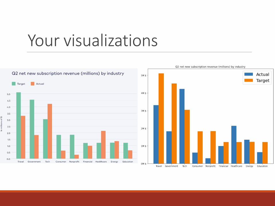
Your visualizations

Your visualizations
Your visualizations

Your visualizations

Your visualizations

Your visualizations

Your visualizations

Your visualizations

Bullet chart