assignment 1 of bba students sdnsakdakdakndnasdasdajbdjasbdasbdbasjbdsb
TRANSCRIPT

8/10/2019 Assignment 1 of BBA students sdnsakdakdakndnasdasdajbdjasbdasbdbasjbdsb
http://slidepdf.com/reader/full/assignment-1-of-bba-students-sdnsakdakdakndnasdasdajbdjasbdasbdbasjbdsb 1/9
Subject Name????
BBA - Section (A)
ASSIGNMENT - 2
Submission by:-
Maryam Abdullah
BBA-0214-3019??
Date: October 10, 2014
Friday
Submitted to:-
Mam. ???

8/10/2019 Assignment 1 of BBA students sdnsakdakdakndnasdasdajbdjasbdasbdbasjbdsb
http://slidepdf.com/reader/full/assignment-1-of-bba-students-sdnsakdakdakndnasdasdajbdjasbdasbdbasjbdsb 2/9
GRAPHS and Its Types :
Graphs are pictures that help us to understand amounts. These amounts are called data. There are
many kinds of graphs, each having special parts.
Different types of graph provide in-depth information about how the data can be represented in
order so that the understanding along presentation can be enhanced. Graphs are used in a variety
of ways, and almost every industry, such as engineering, mathematics, and education.
Few of them are as follow
Bar Graph
Pie Chart or Circle Graph
Line Graph
Histogram
Polygons
Horizontal Bar Graph
Dot Plots Graph. Etc.
Quantitative Data:
Data that can be expressed in the form of the number, or quantity. Data which can be measured
e.g. Length, height, area, volume, weight, speed, time; temperature, humidity, sound levels, cost,
members, ages, etc. are all examples of quantitative data.
Qualitative Data:
Data that cannot be expressed as a number and deals with descriptions. Data can be observed butcannot be measured. E.g. Colors, textures, smells, tastes, appearance, beauty, etc. are the
examples of Qualitative data.
Ungrouped Data:
Such a type of data that is not grouped in a specific order, which is stored as it is collected.
Ungrouped data is always in a raw form. It is also known as Raw data. E.g. List containing Ageof 50 students randomly calculated.
Grouped Data:
Grouped data is data that has been organized into groups known as classes. Each of those classes
is of a certain width and this is referred to as the Class Interval or Class Size. These classescontain the well-classified data.
8/10/2019 Assignment 1 of BBA students sdnsakdakdakndnasdasdajbdjasbdasbdbasjbdsb
http://slidepdf.com/reader/full/assignment-1-of-bba-students-sdnsakdakdakndnasdasdajbdjasbdasbdbasjbdsb 3/9
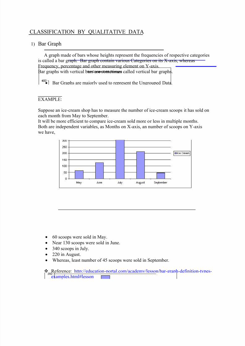
CLASSIFICATION BY QUALITATIVE DATA
1)
Bar Graph
A graph made of bars whose heights represent the frequencies of respective categories
is called a bar graph.
Bar graph contain various Categories on its X-axis, whereasFrequency, percentage and other measuring element on Y-axis.
Bar graphs with vertical bars are sometimes called vertical bar graphs.
Bar Graphs are majorly used to represent the Ungrouped Data.
EXAMPLE:
Suppose an ice-cream shop has to measure the number of ice-cream scoops it has sold on
each month from May to September.
It will be more efficient to compare ice-cream sold more or less in multiple months.Both are independent variables, as Months on X-axis, an number of scoops on Y-axis
we have,
60 scoops were sold in May.
Near 130 scoops were sold in June. 340 scoops in July.
220 in August.
Whereas, least number of 45 scoops were sold in September.
Reference: http://education-portal.com/academy/lesson/bar-graph-definition-types-
examples.html#lesson

8/10/2019 Assignment 1 of BBA students sdnsakdakdakndnasdasdajbdjasbdasbdbasjbdsb
http://slidepdf.com/reader/full/assignment-1-of-bba-students-sdnsakdakdakndnasdasdajbdjasbdasbdbasjbdsb 4/9
2)
Pie Chart:
A pie chart displays data, information, and statistics in an easy to read “pie-chart” together
the sectors create a full-circle 360 degree. A circular chart is divided into sectors telling youhow much of one data element exists. The bigger the slice, the more of the particular data
was gathered.
Pie Charts are used to represent the Ungrouped Data.
EXAMPLE:
The pie chart below shows the percentages of blood types for a group of 200 people.
a) After a survey we got 19% of blood type AB in this group.
b) 40% of blood type O in this group
c) Whereas, 16% and 25% blood type A or B in this group respectively.
By the Percentages we have we can easily calculate the actual number of people with
certain Blood group.
a) 19% * 200 = 19 * 200 / 100 = 38 people.
b) (100% - 40%) * 200 = 60 * 200 / 100 = 120 people.c) (16% + 25%) * 200 = 41 * 200 / 100 = 82 people.
Reference: http://www.analyzemath.com/statistics/pie_chart.html

8/10/2019 Assignment 1 of BBA students sdnsakdakdakndnasdasdajbdjasbdasbdbasjbdsb
http://slidepdf.com/reader/full/assignment-1-of-bba-students-sdnsakdakdakndnasdasdajbdjasbdasbdbasjbdsb 5/9
3)
Line Graph:
Line graph is a graph that uses Line segment to connect the data points and show changes
in data over time. Lines connected together by a point represents the Up & down changing
among the values/variables.
Line Graphs are majorly used to represent the Ungrouped Data.
EXAMPLE:
This Line graph shows the mid-day temperature over a period of 7 days in a City.
Over a week we have days from Sunday to Saturday, on X-axis along the amount of
temperate in Celsius(C) on its Y-axis.
We can see at a glance that the temperature was at its highest peak on Monday and
that it started to fall in the middle of the week before rising again at the end of the
week.
It is the Line graph representation of the Temperature throughout the Week days.
Reference: http://www.bbc.co.uk/bitesize/ks3/maths/handling_data/representing_data/revisio
n/3/

8/10/2019 Assignment 1 of BBA students sdnsakdakdakndnasdasdajbdjasbdasbdbasjbdsb
http://slidepdf.com/reader/full/assignment-1-of-bba-students-sdnsakdakdakndnasdasdajbdjasbdasbdbasjbdsb 6/9
CLASSIFICATION BY QUANITATIVE DATA
1) Histograms:A Histogram is a graphical display of data using bars of different heights. It is
basically a Bar graph that shows frequency data occur within certain ranges or intervals.The height of each bar gives the frequency in the respective intervals.A histogram can be drawn for a frequency distribution, a relative frequency distribution,
or a percentage distribution.
Histograms are used to represent the Grouped Data Only.
EXAMPLE:
Let’s consider the Top ten women’s figure swimming scores for the 2010 Olympic Games.
Swimming figures we have:
Yu-Na Kim 228.56Mao Asada 205.5
Joanie Brochette 202.64
Maria Nags 190.15
Miki Ando 188.86Laura Lewiston 187.97
Rahall Flat 182.49Akiko Suzuki 181.44Alana Leonora 172.46
Kenya Makarov 171.9
Swimming scores intervals with a span of almost 10 points are on X-axis representing the Scores
of the participants.
Whereas, Y-axis show the frequency of women lying within same score intervals.

8/10/2019 Assignment 1 of BBA students sdnsakdakdakndnasdasdajbdjasbdasbdbasjbdsb
http://slidepdf.com/reader/full/assignment-1-of-bba-students-sdnsakdakdakndnasdasdajbdjasbdasbdbasjbdsb 7/9
It can be seen easily from the Histogram that the highest will be 180 – 190 scores
interval, with a frequency of 4.
The least is between 210 – 220 scores span where No women hold any score.
By histogram we can see 2 women at 170- 180 and 200- 210.
Where only single women lie between 190-200 and 220- 230.
Reference: http://www.shmoop.com/basic-statistics- probability/histograms-examples.html
2)
Polygons:
A graph formed by joining the midpoints of the tops of successive bars in a histogramwith straight lines is called a polygon. It is also useful for displaying the properties of
cumulative distribution.
It contains frequency or percentage on its Y-axis and class-intervals on X-axisPolygon can be made by choosing a mid-point of the class-interval along its frequencyand then joining all the points with a line starting and ending on X-axis.
Polygons are also used for the Grouped Data representation Only.

8/10/2019 Assignment 1 of BBA students sdnsakdakdakndnasdasdajbdjasbdasbdbasjbdsb
http://slidepdf.com/reader/full/assignment-1-of-bba-students-sdnsakdakdakndnasdasdajbdjasbdasbdbasjbdsb 8/9
EXAMPLE:
Suppose we need to draw a polygon between numbers of students obtained marks between marks-intervals on x-axis. With a span of 10 marks. Along the frequency on
Y-axis which represents the count of students.
Pointing by the mid-points of the intervals, it becomes more appropriate for a person
to determine the frequency among certain class. Line starting from the first mark interval and joining each Point all thorough the
graph
Line starting from first point ends upon joining the last point representing the Last
marks interval class
This line stretch upon the graph defines the frequency of students obtaining highestand lowest marks each interval.
Reference: http://www.microbiologybytes.com/maths/1011-17.html
8/10/2019 Assignment 1 of BBA students sdnsakdakdakndnasdasdajbdjasbdasbdbasjbdsb
http://slidepdf.com/reader/full/assignment-1-of-bba-students-sdnsakdakdakndnasdasdajbdjasbdasbdbasjbdsb 9/9
Disadvantages of Graph and Charts:
1. Time consuming to create graphs; decisions must be made in advance for layout, color,
materials, etc.
2. Audience knowledge to interpret or understand the graph which makes it quite technical
in nature.
3. Depending upon the medium used it can be find very costly in some cases.
4. If we do even one tiny mistake to calculate the result for the percent/degrees, it would
affect that one whole graph.
5. Graphs or charts work only with discrete data.
6.
It is found not very useful with a large amount of data results.
7. Graphs only handy for two-way representation of data, i.e. X and Y axis.
8. If we need to make any changes after creating a whole graph, It will take a lot more time
to nearly re-create it over again.
9. Drawing a graph free-hand can create ambiguities for the audience understand the minor
differences between mutually-exclusive terms.
10. If the difference between measuring elements is too less as compare to their quantity,
graphs become hard to interpret.
* ` --------------------------------------------------------------------` *