assessing the manipulability of assets traded on nyse and
TRANSCRIPT

Assessing the manipulability of assets traded on NYSE and NASDAQ,
2016-2017 1
15 January 2019
Preliminary Draft
Scott Condie, 2
Sean Warnick, 3
Alex Hoagland,
Matthew Schaelling,
John Wilson
Abstract
Using high-frequency data from the New York Stock Exchange and NASDAQ over the
years 2016-2017, we assess the manipulability of equity shares by considering three
specific manipulation vectors: order book shape-, cross-asset, and
across-exchange-arbitrage manipulability. Stability of these estimates is also
considered. Orderbook shape has a significant effect on future price for a wide swath of
assets, while the possibility of cross-asset and across exchange manipulability vary more
widely across assets. These results suggest that at frequencies from 10 seconds to 10
minutes manipulability of the form studied here is a substantive problem for a wide
swath of publicly traded assets.
1. Introduction
The previous two decades of asset market innovation have introduced substantial
changes to the way markets operate and how they are regulated. The introduction of
automated trading has increased the speed with which orders are submitted and
cancelled, trades are executed, and confirmations are sent. While the introduction of
automated trading strategies may seem to increase the complexity inherent in the
movements in market prices and order books more generally, the behavior of trading
1 This report has been funded by Department of Homeland Security S&T Cyber Security Division contract HSHQDC-15-C-B0060. The opinions presented here are not necessarily the opinions of the Department of Homeland Security or any of its representatives. 2 Department of Economics, Brigham Young University, 136 Faculty Office Building, Provo, UT 84602. [email protected]. +1.801.422.5306. 3 Department of Computer Science, Brigham Young University, 2222 TMCB, Provo, UT 84602. [email protected]. +1.801.422.6463

algorithms is not random and is often motivated by a very limited set of objectives. The
relatively stable set of objectives that the authors of trading algorithms pursue leads to
the possibility that the interaction of these algorithms generates predictability in asset
prices. This predictability opens the door for manipulation.
The motivation of market manipulators may be profit, increasing volatility in a
market or exchange, harming a competitor, conveying false information through price,
destabilizing an exchange or one of myriad other possible motivations. This paper
attempts to characterize the surface of possible manipulations available while remaining
silent on the motivations of the manipulator.
In this paper, we study three potential vectors of market manipulation. The first
we will refer to as order book manipulation. In this type of market manipulation, the
trader attempts to alter prices by submitting and/or cancelling orders in the order book
in order to induce other traders/algorithms to execute orders at current prices or change
the best bid and ask. This form of market manipulation encompasses the commonly
discussed “layering”, “spoofing” and related strategies (see, inter alia, O’Hara 2011,
2015). If HFT algorithms make use of information on the shape of the order book—how
many bids are stacked up against the best bid, the ratio of asks to bid, etc—then a
market manipulator can induce specific behavior in these algorithms by adding or
deleting orders to the book in an effort to change the shape observed by the algorithms.
We test for the presence of this possibility by determining the extent to which orderbook
shape affects the future of prices. We find that for the majority of tickers, changes in the
shape of the orderbook are a significant predictor of the future midpoint price at 10, 60
and 600 second lead times. The distribution of regression R2 s differs between
NASDAQ and NYSE, but both show a significant fraction of tickers where the R2 is
greater than 0.5. These results and analysis appear in section 2.
The second market manipulation vector considered is within-exchange,
cross-asset manipulation. Specifically, we study the extent to which movements in the
price of one asset affect the price in the same exchange of a different asset at high
frequencies. Here, the market manipulator could capitalize on the existence of
cross-asset algorithms that link the prices of assets. If the existence of these algorithms
is suspected, then a manipulator can capitalize on this trading behavior by affecting the
orderbook or price of one stock in order to change the price of another. This analysis is
found in section 3.
Finally, we study the possibility of within-ticker, across exchange manipulation.
That is, whether the behavior of traders and algorithms allows for influencing the price
of a ticker on NASDAQ by manipulating the price of the same asset on NYSE, or vice
versa. This class of manipulation is possible if, for example, relatively large and slow
traders are active on one exchange and algorithmic traders are engaged in simple
arbitrage of the same ticker on another exchange. Given the complexity of modern
markets, it is likely that other forms of market manipulation are possible.
For each potential manipulability vector, we conduct robustness analysis to
determine the extent to which our results are stable over time. This analysis is by far the
most expansive across assets and through time that have been done to date. However,
our results remain susceptible to changes in market conditions. As such, the results that
we find are subject to the critique that if the underlying algorithmic behavior linking
assets changes, then the manipulability of the traded assets will also change.
The question of determining whether manipulation is possible through the
vectors discussed in this paper is connected to the question of the extent to which, e.g.
movements in the price of a ticker on NYSE cause movements in the price of the same
ticker on NASDAQ. Since the shares on both NYSE and NASDAQ represent claims on
the underlying economy, one would expect for them to move together. Modern methods
of determining causality require exogenous variation in the value of the ticker on only
one exchange, in order to determine the causal impact of this change on the price of the
asset on the other exchange. In the absence of such exogenous variation, we attempt to
conduct a robust analysis of necessary conditions for movements on one exchange to
cause movements on another. Specifically, for cross-exchange manipulability and
within-exchange, cross-asset manipulability, we conduct a strict form of Granger
causality testing. We say that ticker X on NASDAQ Granger causes the price to move
for ticker X on NYSE only if changes in the price on NASDAQ lead to changes in the
future price on NYSE after controlling for the predictability of prices on NASDAQ and if
changes of the price on NYSE do not predict future changes in the price on NASDAQ. This strict form of Granger causality provides increased confidence in the results given
the absence of strictly exogenous variation.
The interaction between manipulability and traditional definitions of liquidity
makes this analysis relevant for all assets, even those for which a trader might not
typically be concerned about market manipulation. Liquidity in limit-order markets is
usually operationalized to mean low spreads and deep order books. This definition is
very useful in many circumstances because it suggests that the next trade is likely to
have very little effect on the equilibrium price in the market. A broader definition of
liquidity would account for the reaction to market prices that happens immediately after
a trade is executed. If the human/algorithmic reaction to the execution of a trade is
strong enough then assets which appear to be liquid by traditional definitions (narrow
spreads and thick books) may in fact be significantly less liquid than they appear.
Likewise, it is an often held belief that markets that have narrow spreads and thick
books would be less likely to be manipulated. However, when the human/algorithmic
interaction of traders is considered, such markets may in fact be quite manipulable. If,
for example, order execution or changes in order book shape leads to a large algorithmic

reaction to the observed spread, then a manipulator can use this information to alter
prices in that market. This results in an asset that is significantly less liquid than might
at first look be supposed.
1.1 Context on the structure of markets and the role of high-frequency traders
The structure and operation of equity markets has changed significantly over the
last three decades. Improvements in computing power brought the introduction of
algorithmic trading, a practice of providing and removing liquidity from the market by
sending writing algorithms that allow computer systems to communicate directly with
the servers running an exchange, without any intervening human communication. In
this paper we will label the humans who implement and run such algorithms
High-Frequency Traders, or HFTs for short. Also during this period, changes in
regulations like the introduction of Reg NMS led to the fragmentation of stock markets.
O’Hara (2015) writes that high-frequency traders “make up half or more of all trading
volume.” In addition to the major influx of this new way of trading, O’Hara discusses
how non-HFT traders have changed their strategies in response to HFT algorithms.
Evidence of this change is seen in the decline of HFT industry profits: “for the [HFT]
industry overall, estimated profits have declined from roughly $5 Billion in 2009 to just
over $1 Billion in 2013” (O’Hara 2015). For more on the recent history of the effects of
High-Frequency Trading, see Goldstein, Kumar, and Graves (2014).
Many HFT algorithms make decisions based on information received from the
market, suggesting a manipulation strategy of 1) learning what an algorithm’s objective
function is, 2) feeding the algorithm misleading information in order to 3) trade ahead
of the fooled algorithm and profit. Arnoldi (2016) discusses whether this behavior - if
possible - should be considered punishable as manipulation. Arnoldi concludes that
with the evolving definitions of “manipulation” there should still be strong regulatory
practices to deter manipulators from abusing algorithms. Yang, Paddrik, Hayes, and
Todd (2012) take a simulated data set and a markov decision process model to identify
trading strategies by HFT and non-HFT traders based on individual trading actions.
Their model is capable of identifying high-frequency trading strategies, by observing
orderbook data, with 90% accuracy. In contrast, Cao, Li, Coleman, and Beletreche
(2014) take actual market data from cases of known market manipulation. After
transforming the data, they use machine-learning techniques to create a model for
identifying market manipulation. From these two studies, identifying algorithmic
trading strategies seems plausible.
Related to the question of market manipulability is the question of whether
increased HFT participation in markets has led to less stable markets. Angel and
McCabe (2013) cite as one of the benefits of HFTs their ability to increase market

efficiency through arbitrage. Condie (2018) shows that low-latency markets behave in
predictable ways and that the provision of liquidity, even in very fast markets, can be
predicted. The speed at which algorithms correct price discrepancies across markets
and correlated stocks improves the accuracy of asset prices. However, the Flash Crash of
2010 brought to the attention of many researchers the potential dangers of
High-Frequency Trading algorithms. During the Flash Crash, the Dow Jones Industrial
Average (DJIA) dropped 998.5 points, “the sharpest intraday point drop in history,
followed by an astounding 600-point recovery within 20 minutes” (Madhavan 2012).
More recently, on Feb 5, 2018, the Dow fell 1597 points in intraday trading, but in terms
of percentage drop, the flash crash of 2010 was still more severe (6% vs 9%). Madhavan
(2012) argues that one cause of the flash crash was the fragmentation of the stock
market; with more markets available today, prices are more sensitive to liquidity shocks.
Sornette and Von der Becke (2011) believe that HFTs have contributed to market
crashes in the past and will in the future because of the “increasing inter-dependencies
between various financial instruments and asset classes” HFT creates. In contrast,
Kirilenko, Kyle, and Samadi (2011) study the audit-trail data of the E-mini S&P 500
futures market and conclude that HFTs did not trigger the Flash Crash, but their
responses exacerbated market volatility. A British national was arrested for the kind of
“spoofing” investigated in this paper. The individual entered a guilty plea in 2016 (see
DOJ, 2015 and Viswanatha, 2016). More recently, when China’s central bank announced
that they were launching “spot investigations” on bitcoin exchanges to detect the
presence of market manipulation in Beijing and Shanghai the price of bitcoin fell by
nearly 20% (1,200 yuan), suggesting the presence of market manipulators on these
exchanges (Durden).
As recently as January 2018, lawsuits were filed against UBS, HSBC and
Deutsche Bank (inter alia) for manipulative behavior in asset markets. Each of these
banks have been fined millions of dollars by the United States CFTC and derivatives
regulators for their “spoofing” and manipulation in the U.S. futures markets. This
criminal prosecution, which is the result of a multi-agency investigation involving the
Department of Justice (DoJ) and the Federal Bureau of Investigation (FBI), is the first
of its kind for the CFTC (Price).
2. Order Book Shape & Regressions
The order book is the set of currently active limit orders to buy or sell an asset. Figure 1
shows an example of what an order book might look like for some asset, where limit
order prices are on the horizontal axis and cumulative quantities of shares available are
plotted on the vertical axis. Prices left of the spread are bids, or offers to buy the stock at
a specific price. As the price decreases, demand for purchasing shares at that price

increases and thus the depth increases. To the right of the spread are the asks, or offers
to sell the stock, with an increasing number of shares for sale as the price increases. The
gap between the highest bid and lowest ask is referred to as the spread. Whenever there
is an overlap between the asks and bids, a trade is executed.
Figure 1: Contrived Example Order Book
High-frequency traders purchase data on the current state of the orderbook and
use these data among others to make predictions about near-term price changes. If the
state of the orderbook is a useful predictor of future price changes then these
algorithmic traders can solidify that predictability by making deterministic trading
decisions based on these observations. This introduces the possibility that market
manipulators can use the reaction of these algorithms to alter prices by adding and
removing orders from the orderbook in a way that induces certain behavior from the
algorithmic traders. We examine the extent to which the shape of the order book is
significant in predicting price. This allows us to make inference about how viable such a
manipulation strategy is.
2.1 Data and empirical estimation
We are interested in the effects of order book shape on a stock’s price; therefore, our
dependent variable is the midpoint price at time t, or the average of the highest bid and

lowest ask at time t. For each ticker and month in our sample, we estimated a model
predicting each asset’s midpoint price using the shape characteristics of the order book.
On the right-hand side of each regression are variables representing the fraction of all
orders that are within x% of the midpoint price.
The estimated model is
id BidBins AskBins ,m i,t = β0 + Γ i,t−1 + Λ i,t−1
In the reported model, the bins are 0.1, 0.5, 1, 2, 5, 10, 15, and 30 percent of the
midpoint price away from the midpoint for both bids and asks. The model estimates the
effect of the portion of total bids and asks in each bin (represented by the vectors andΓ
) on midpoint price.Λ
We estimate two classes of models that suggest different channels through which
one might expect the shape of an order book to affect traders’ decisions, and thereby the
midpoint price. First, it may be that HFT algorithms only use the current state of the
order book as input to predict future trends in a stock’s price. In this case, traders are
only concerned with the shape of the order book one period before their actions. On the
other hand, it is realistic to believe that traders monitor the shape of the order book
repeatedly throughout the day and infer future trends not from the current shape of the
order book, but from its evolution over time. In this scenario, traders are concerned
with the changes in the order book shape more than with the actual shape itself.
To accommodate both worldviews—the static (which is based only on the current
shape) and the dynamic (which is based on differences in the shape)—an additional
shape regression model was estimated by changing the bids and asks vectors to
variables representing the changes in these bins. In much of what follows both of these
models were used for analyzing each ticker across both markets for 2016 and 2017.
Going forward we will refer to the static model as the no differences model, and the
dynamic model as the differences model.
Each of these models measures the effect of lagged shape statistics--or change
over time for the differences model--on a current midpoint price. Therefore, specific
lead times were chosen to indicate how the market day should be discretized. There is a
natural tradeoff between using many lead times and using too few; thus, in order to
optimize the tradeoff between depth of analysis and parsimony, we have chosen 3 such
lead times--10 seconds, 1 minute, and 10 minutes. By doing so, we hope to estimate the
impact of shape statistics on price over the span of times relevant to the low-latency
markets that operate today.
Our data sample was generated from all tickers over all months 2016-2017. For
each ticker and month the midpoint price and order book shape were calculated at the
intervals specified by the lead time for each trading day of the month.

2.2 Results and discussion
We begin with an examination of the overall explanatory power for each of the models.
That is, we examine the distribution of R2 for each regression type. Table 1 shows the
average R2 values and standard deviations for both the no differences and differences
regression models for each of the three lead times in both markets and years. It should
be noted that the sample size in each market is approximately 35,000 ticker-month
regressions per specification.
Table 1: Average R2 Over Regression Type & Lead Time
Market NYSE NASDAQ
Lead Time 10
seconds
60
seconds
600
seconds
10
seconds
60
seconds
600
seconds
Year
Regression
Type
2016
Shape,
differences
Shape, no
differences
0.6021
(0.2404)
0.0082
(0.0561)
0.6255
(0.2374)
0.0152
(0.0589)
0.6844
(0.2221)
0.0525
(0.0718)
0.4726
(0.2377)
0.0227
(0.0371)
0.4687
(0.2283)
0.0602
(0.0650)
0.4818
(0.2065)
0.1544
(0.0889)
2017
Shape,
differences
0.6334
(0.2447)
0.6605
(0.2358)
0.7213
(0.2148)
0.4888
(0.2408)
0.4852
(0.2321)
0.4993
(0.2102)
Shape, no
differences
Both years
Shape,
differences
0.0081
(0.0585)
0.6192
(0.2432)
0.0147
(0.0629)
0.6646
(0.2372)
0.0515
(0.0785)
0.7046
(0.2189)
0.0192
(0.0327)
0.4805
(0.2394)
0.0553
(0.0611)
0.4768
(0.2303)
0.1521
(0.0900)
0.4904
(0.2085)

Shape, no
differences
0.0082
(0.0574)
0.0149
(0.0611)
0.0520
(0.0755)
0.0209
(0.0350)
0.0577
(0.0631)
0.1532
(0.0895)
Standard Deviations are denoted in parentheses
Table 1 offers clear evidence that the differences model carries much greater
explanatory power than the no differences model across all three lead times. In both
markets, the average R2 for the no differences model is consistently at or below 0.15
suggesting little explanatory power. In contrast, the differences model average R2 is
significantly higher across all specifications with explanatory power of at least 45% for
both markets. With the exception of the differences model for NASDAQ going from lead
times of 10 seconds to 60 seconds, all R2 do appear to increase nearly monotonically as
the lead time increases.
In addition to the apparent differences in the static and dynamic models, there is
also evidence to suggest differences in the markets themselves. Across all lead times
and years, NYSE shows approximately 20% more explanatory power than NASDAQ in
the differences model. The greatest difference can be seen at the 600 second lead time.
Here, the NYSE model reports the variation in order book shape accounting for over
70% of the variation on midpoint price while the NASDAQ model accounts for just
under 50% of the variation. Unlike the differences models, the no differences models in
NASDAQ offer higher average R2 values than those in NYSE while the overall small
explanatory power can still be seen in both markets.
For further evaluation of the distribution of the R2 values for each regression
type, histograms are displayed in Figure 2. All histograms shown are generated from
60-second lead time specifications (the other lead times have similar distributions).
Figure 2: Histogram of R2’s
2016

2017

Both Years
Figure 2 further confirms the insights from Table 1 that the differences model
better explains the variation in midpoint price than the no differences model. It is
interesting to note again the differences between NYSE and NASDAQ markets. In
NASDAQ the differences model distribution appears to be bimodal, suggesting that

while the model has modest predictive power over many tickers, there is a moderately
sized group of tickers which the model can predict very well. The differences model
distribution for NYSE does not share the the same bimodal characteristic, but there is a
dramatic increase in the amount of tickers the model predicts extremely well clustered
toward 1.
While the analysis above sheds light on how the explanatory power of each model
vary across stocks and lead times, they do not answer the question of how they vary
within individual stocks over time. Figure 3 attempts to answer this question by charting
the average change in R2 per ticker for each regression type across months. The average
R2 value for each figure is also provided as a reference to interpret the magnitude of the
changes. This chart displays the average monthly changes in R2 between months for
each regression type. Data from the 60 second leads was used, though it is
representative of other lead times. Thus, the chart isolates average time effects for each
regression type.
Figure 3: Changes in Regression R2 Over Time
2016
Average R2: Differences 0.63, No differences 0.02
Average R2: Differences 0.47, No differences 0.06
2017

Average R2: Differences 0.66, No differences 0.01
Average R2: Differences 0.49, No differences 0.06
Figure 3 suggests that, in general, there were few changes in R2 for any given
stock and that the distribution of order-book shape explanatory power remains constant
over the sample.
Figure 4 represents an effort to identify those tickers that might be persistently
susceptible to manipulation. This is accomplished by comparing the average R2 value for
a given ticker to the standard deviation of that value across all months. For each market
the tickers are split into two groups based on the trade density of the ticker. That is, low
density and high density tickers are distinguished by their trade volumes being below or
above the median amount across the market . Since low trade volume tickers are more
likely to be manipulable, this separation allows an analysis of the manipulability of
tickers that might carry market power against those that likely do not. Note that there is
a shape imposed on these scatterplots by the fact that R2 is bounded from 0 to 1,
implying that if the mean R2 is 0 or 1, there can be no standard deviation.
There are two ticker categories of interest in Figure 4: persistently susceptible
tickers and temporariliy manipulable tickers. A persistently susceptible ticker can be
found on the bottom right (high R2 , low standard deviation) of each figure. These
tickers are more likely to be susceptible to manipulation, since they are predictably
characterized by changes to the order book on a long-term basis, rather than just for a
single month. Tickers that have a high standard deviation of monthly R2 values but a

moderate mean R2 are potentially manipulable by the fast learning trader, since there is
no guarantee that the predictive power of the order book will be persistant. These
scatterplots address potentially manipulable tickers based on explanatory power. The
effort required to manipulate these tickers is discussed below.
Figure 4: R Squared Mean and Standard Deviation Scatterplots
2016
2017

Both Years

It is clear from the scatterplots that there is more clustering towards the bottom
right in the low density ticker category, indicating more persistently susceptible tickers.
This observation suggests that tickers with lower trade volumes are more likely to be
manipulable than those frequently traded. Thus, a trader seeking to manipulate a ticker
for financial gain must exert more effort for a well known, frequently traded ticker. This
trend can be seen in both markets while the contrast is the most apparent in the
NASDAQ plots. There does not appear to be any major difference between the density
groups in regards to fast trader potentially manipulable tickers.
Regression Coefficients. To gain an understanding of the specifics of these
regression results, we examine the impact of individual covariates on future market
prices. Due to the higher explanatory power, we limit our discussion of covariates to the
differences model. Since coefficients vary widely across each ticker, Table 2 shows only
those values which are representative of all regression outputs under the differences
model. To calculate these for each market and lag specification, we sought tickers with

loadings near the median for all factors. Since no ticker will have exactly the median
value for each coefficient, we programmatically expand a band around the median until
it contained at least one ticker. For example, in 2016 on NASDAQ with a 10 second lead,
we had to expand the window around the median until it contained tickers within 6
percentiles from the median for each coefficient. Since this window then included three
tickers, the average of their values is reported.

Table 2: Median Coefficient Values for Representative Stocks — Interval, Differences,
2016
Variables
NASDAQ
10 Seconds 60 Seconds
600 Seconds
NYSE
10 Seconds 60 Seconds
600 Seconds
Consta
nt
0 0 2.89 x 10⁻⁴ 0 0 2.65 x 10⁻⁴
Bids 0.1 -2.96 x 10⁻¹ -1.95 x 10⁻¹
-5.40 x 10⁻² 9.48 x 10⁻¹
8.42 x 10⁻¹ 7.65 x 10⁻¹
0.5 -3.29x 10⁻¹ -3.29 x 10⁻¹
-5.25 x 10⁻² 9.54 x 10⁻¹
8.63 x 10⁻¹ 7.33 x 10⁻¹
1 -3.63 x 10⁻¹ -3.75 x 10⁻¹
-1.12 x 10⁻⁴ 9.51 x 10⁻¹
8.60 x 10⁻¹ 7.68 x 10⁻¹
2 -3.43 x 10⁻¹ -2.59 x 10⁻¹
-1.56 x 10⁻² 1.08 8.62 x 10⁻¹
7.67 x 10⁻¹
5 -4.11 x 10⁻¹ -2.82 x 10⁻¹
-1.09 x 10⁻¹ 9.96 x 10⁻¹
8.04 x 10⁻¹ 6.90 x 10⁻¹
10 -4.75 x 10⁻¹ -4.14 x 10⁻¹
-2.19 x 10⁻¹ 1.24 8.48 x 10⁻¹
8.18 x 10⁻¹
15 -5.60 x 10⁻¹ -5.45 x 10⁻¹
-2.55 x 10⁻¹ 1.18 8.40 x 10⁻¹
7.82 x 10⁻¹
30 -3.57 x 10⁻² -4.32 x 10⁻²
-1.00 x 10⁻¹ 7.24 x 10⁻¹
4.54 x 10⁻¹ 4.83 x 10⁻¹
Asks 0.1 5.79 x 10⁻¹ 5.90 x 10⁻¹
3.36 x 10⁻¹ -3.32 x 10⁻¹
-3.15 x 10⁻¹ -4.56 x 10⁻¹
0.5 6.17 x 10⁻¹ 5.32 x 10⁻¹
3.35 x 10⁻¹ -2.89 x 10⁻¹
-3.04 x 10⁻¹ -5.38 x 10⁻¹
1 6.81 x 10⁻¹ 4.67 x 10⁻¹
3.21 x 10⁻¹ -3.28 x 10⁻¹
-2.94 x 10⁻¹ -5.09 x 10⁻¹
2 6.66 x 10⁻¹ -2.59 x 10⁻¹
3.20 x 10⁻¹ -4.17 x 10⁻¹
-3.60 x 10⁻¹ -4.55 x 10⁻¹
5 7.40 x 10⁻¹ 6.07 x 10⁻¹
3.98 x 10⁻¹ -3.36 x 10⁻¹
-2.66 x 10⁻¹ -4.61 x 10⁻¹
10 8.23 x 10⁻¹ 8.49 x 10⁻¹
4.68 x 10⁻¹ -2.63 x 10⁻¹
-2.51 x 10⁻¹ -4.21 x 10⁻¹
15 7.46 x 10⁻¹ 1.03 5.40 x 10⁻¹
-1.52 x 10⁻¹ -1.86 x 10⁻¹
-4.02 x 10⁻¹
30 2.67 x 10⁻¹ 3.66 x 10⁻¹
2.39 x 10⁻¹ 3.31 x 10⁻¹
2.70 x 10⁻¹ 1.13 x 10⁻³
R2 0.434 0.228 0.439 0.90 0.95 0.92
Percentiles
from median
6 5 6 6 6 6
Tickers in
sample
3 1 6 2 2 1

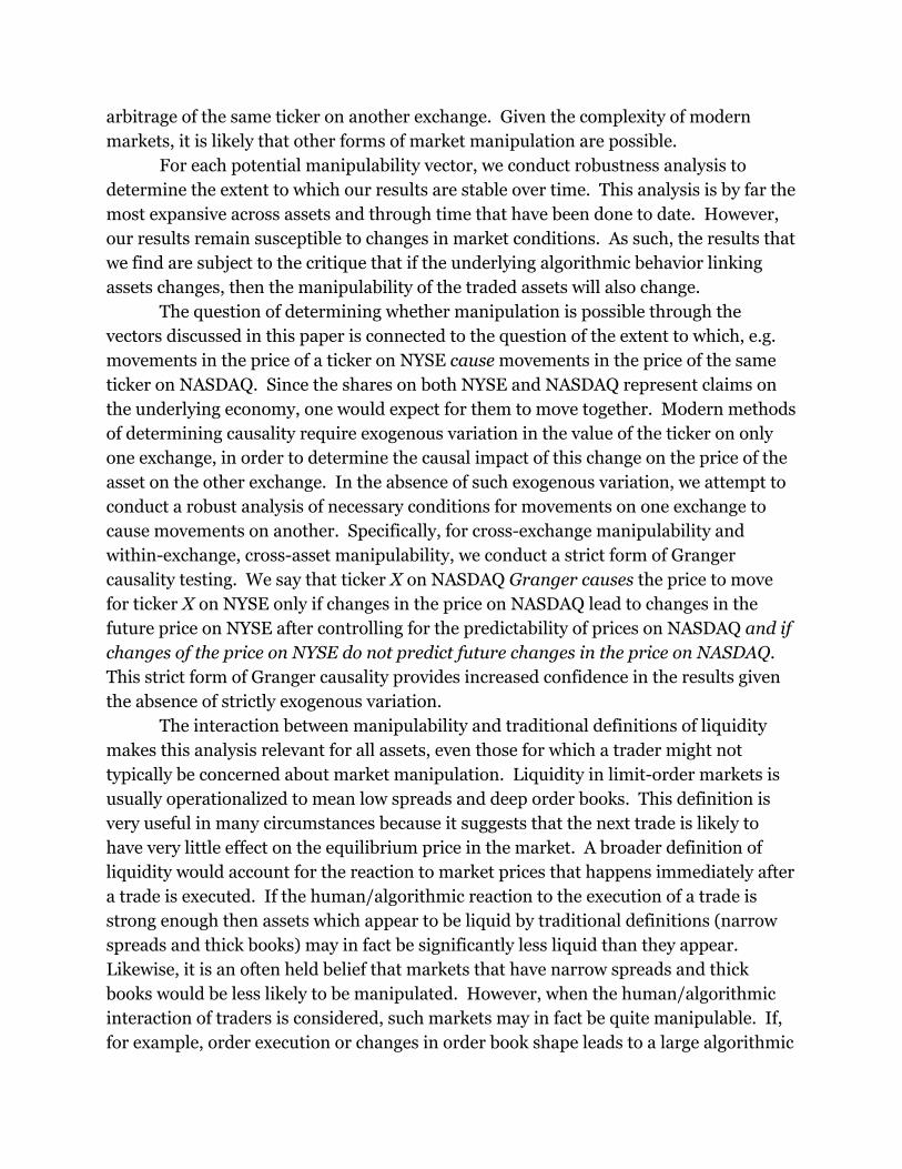
Median Coefficient Values for Representative Stocks — Interval, Differences, 2017
Variables
NASDAQ
10 Seconds 60 Seconds
600 Seconds
NYSE
10 Seconds 60 Seconds
600 Seconds
Consta
nt
0 0 1.99 x 10⁻⁴ 0 0 0
Bids 0.1 -6.15 x 10⁻¹ -5.72 x 10⁻¹
-2.49 x 10⁻¹ 9.79 x 10⁻¹
9.43 x 10⁻¹ 8.28 x 10⁻¹
0.5 -7.30x 10⁻¹ -6.14 x 10⁻¹
-2.54 x 10⁻¹ 9.41 x 10⁻¹
9.11 x 10⁻¹ 7.85 x 10⁻¹
1 -8.50 x 10⁻¹ -6.37 x 10⁻¹
-2.76 x 10⁻¹ 1.04 1.00 9.36 x 10⁻¹
2 -9.02 x 10⁻¹ -6.13 x 10⁻¹
-3.27 x 10⁻¹ 1.08 1.06 9.27 x 10⁻¹
5 -9.87 x 10⁻¹ -6.90 x 10⁻¹
-4.59 x 10⁻¹ 1.14 1.12 1.16
10 -1.11 -7.76 x 10⁻¹ -6.93 x 10⁻¹
1.04 1.02 9.70 x 10⁻¹
15 -1.26 -1.10 -9.06 x 10⁻¹ 1.07 1.04
8.55 x 10⁻¹
30 -1.38 x 10⁻¹ -2.47 x 10⁻²
-1.45 x 10⁻¹ 5.33 x 10⁻¹
4.84 x 10⁻¹ 5.12 x 10⁻¹
Asks 0.1 1.08 8.63 x 10⁻¹ 8.87 x 10⁻¹
-4.60 x 10⁻¹ -4.22 x 10⁻¹
-4.99 x 10⁻¹
0.5 1.16
9.53 x 10⁻¹ 9.00 x 10⁻¹
-4.32 x 10⁻¹ -3.82 x 10⁻¹
-4.12 x 10⁻¹
1 1.23 8.99 x 10⁻¹ 9.03 x 10⁻¹
-4.49 x 10⁻¹ -4.20 x 10⁻¹
-4.16 x 10⁻¹
2 1.26 9.05 x 10⁻¹ 9.25 x 10⁻¹
-4.72 x 10⁻¹ -4.46 x 10⁻¹
-5.24 x 10⁻¹
5 1.35 9.81 x 10⁻¹ 1.01 -4.95 x 10⁻¹
-4.78 x 10⁻¹ -6.23 x 10⁻¹
10 1.51 1.06 1.67
-4.04 x 10⁻¹ -3.76 x 10⁻¹
-5.13 x 10⁻¹
15 1.93 1.41 1.81
-3.30 x 10⁻¹ -2.93 x 10⁻¹
-5.32 x 10⁻¹
30 4.08 x 10⁻¹ 2.09 x 10⁻¹
8.03 x 10⁻¹ 3.68 x 10⁻¹
3.97 x 10⁻¹ 4.40 x 10⁻¹
R2 0.497 0.445 0.466 0.964 0.968 0.904
Percentiles
from median
5 6 5 5 4 6
Tickers in
sample
2 3 1 2 2 1

A few interesting patterns emerge from analyzing this table. First note that while
some consistency is found within each market across lag times, there is very little
consistency across the two markets. This suggests the presence of a fundamental
difference between the two markets in the manipulability of each ticker and the effects
that each characteristic of the tickers’ order book has on the price. For example, a trader
seeking to drop the price of a ticker by adding either bid or ask orders within .5% of the
midpoint price might succeed if trading on NYSE and fail if trading on NASDAQ.
A visual representation of the data from Table 2 is found in Figure 5. This figure
depicts the response of the midpoint price to the addition of 1% of total order book
volume to different price bins. The results correspond to those obtained from the
interval regression, differences model, using data from both years and a 60 second lag
time. While this figure is drawn from NASDAQ data, results from NYSE look nearly
identical. The median midpoint price response is shown, along with the 25th and 75th
percentile midpoint responses.
Figure 5: Midpoint Response to the Addition of 1% of the Order Book to Different Bins

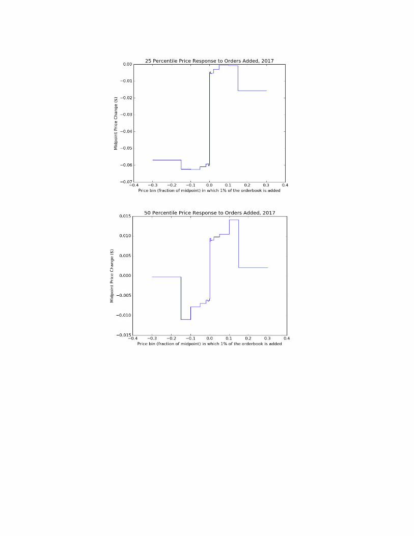

Figure 5 demonstrates some interesting results. Note the presence of positive or
negative drift on some tickers, where the coefficients on all price bins are of the same
sign. This is likely due to the effect of some tickers in the sample decreasing in price
through the course of the month sampled. While this is somewhat unusual, the majority
of tickers actually have mixed signs on coefficients, and this observed phenomenon is
likely a result of selecting tickers with all coefficients near the 25th or 75th percentiles.
Note that there is some question as to what signs one might reasonably expect
coefficients of asks and of bids to have on the midpoint price. As part of our analysis, we
calculated what fraction of ticker-months had ask coefficients all of the same sign, with
bid coefficients all of the opposite sign. For NASDAQ in 2016 with a 60 second lead on
the differences model, results indicate that 23.3% of tickers have all negative bid
coefficients and all positive ask coefficients, while 10.3% of all tickers have all positive
bid coefficients and all negative ask coefficients. For NYSE under the same specification,
the numbers are 2.0% and 16.0% respectively.
These statistics suggest that the majority of tickers in both markets experience
coefficient sign changes as the bin sizes change. The presence of these changes in
average signs of regression coefficients warrant a closer look at their distribution. Figure
6 presents boxplots of each regression coefficient for the shape, differences regression in
both markets. The outer whiskers of each boxplot denote the 25th and 75th percentile.
Figure 6: Boxplot of Regression Coefficients, Shape, Differences Regression, 60 seconds
2016

2017

Notice that each variable is centered near zero, with varying amounts of spread.
The variation in coefficients for the shape covariates seem to slightly increase as bids
and asks move farther away from the book’s midpoint. While there may be evidence to
suggest a positive or negative effect, the means are too close to zero to comfortably
determine if an effect is uniformly positive or negative (at least from the boxplot, which
differs from typical t-tests used in the regression).
We are also interested in how these coefficients change within specific stocks over
time. Given the large volume of data, this was not easily demonstrated in figures, but
will be discussed below by examining a small sample of stocks. We examine the tickers
with the highest potential to be manipulated. We limit our analysis to stocks with high
R2’s for the differences regression, although the results for other potentially manipulable
tickers are similar. In this section, we examine the specific regression output for these
stocks. The results for nine representative stocks can be seen in Table 3.
Table 3: Regression Outputs for Selected Stocks with High R2 (Shape, Differences, 60
sec.)
Representative
Stocks A B C D E F
G H I
Variabl
es
Bids 0.1 0.08 0.81 0.13 3.37 5.08 0.42 0.07 1.15 0.91
0.2 0.14 0.78 0.11 2.40 6.05 0.46 0.06 1.11 0.95
1 0.10 0.76 0.17 2.24 7.67 0.49 0.05 1.08 1.23
2 0.07 0.50 0.14 2.09 10.2
5
0.55 0.07 0.94 1.03
5 0.09 0.33 0.14 2.60 6.69 0.65 0.12 0.82 1.49
10 0.04 0.15 0.06 3.17 2.83 0.24 0.15 0.72 0.93
15 0.01 0.16 0.10 3.13 6.41 0.17 0.10 0.31 1.28
30 0.06 0.15 0.16 2.34 8.37 0.52 0.22 -0.44 1.16
Asks 0.1 0.00 -0.55 -0.05 -3.14 -3.4
2
-0.26 -0.07 -0.08 -0.33
0.2 -0.0
2
-0.55 -0.04 -2.54 -5.8
3
-0.32 -0.06 0.03 -0.48
1 -0.0
3
-0.49 -0.05 -2.54 -6.1
5
-0.36 -0.05 0.12 -1.20
2 -0.0
3
-0.31 -0.03 -2.44 -9.3
2
-0.62 -0.09 0.18 -0.93
5 -0.0
2
-0.17 0.01 -2.67 -7.1
7
-0.58 -0.14 0.18 -0.97
10 0.02 -0.04 0.04 -3.22 -0.4
2
0.08 -0.14 0.08 -0.34
15 0.05 0.37 -0.03 -2.39 -3.3
1
0.18 -0.12 0.66 -0.66
30 0.10 -0.12 -0.04 -0.85 -6.8
5
-0.35 -0.20 0.79 -0.57
Although this table only illustrates a small subset of the available tickers, there
are interesting patterns that can be observed. First, aside from tickers D and E, most of
the average coefficients tend to remain close to zero indicating that their effect on the
midpoint price could be positive or negative at any given time. Tickers D and E have
high variability of coefficient sizes as bin sizes increase. For example, ticker E has a very
low coefficient of -7.17 for the Ask 5 covariate followed by a coefficient near zero at -0.42
for the Ask 10 covariate.
There is also a considerable variability in the signs of the ask covariates across
tickers. Even within this extremely small sample, no ask covariate has the same sign
across all sample tickers. The same cannot be said for the bid covariates as they all
maintain a positive sign across all tickers and bins, with the exception of ticker H for the
bid 30 covariate.

These results suggest that asset-specific knowledge is required to manipulate
many stocks. Figure 7 represents two stocks of our subsample of nine potentially
manipulable tickers. Each graph shows the changes in regression coefficients between
months for 2016 in both NYSE and NASDAQ markets, stacked on top of each other.
Figure 7: Changes in Coefficients Over Time (select stocks, 60 second lead)
NYSE
NASDAQ

Notice that for some months, there are huge positive and negative changes in
coefficients. There is no distinct pattern as to what months will impact which
coefficients in which stock, and an analysis of the other six stocks in this small
subsample only adds to the chaos. These results are suggestive of the results that hold
for 2017.
To synthesize the past few sections of our analysis and include a measure that
combines order book volume, R2, and coefficient size. If a stock consistently has high
predictability and large regression coefficients (reflecting large changes in price for
small changes in the order book), this will do nothing for a malicious trader if the
number of shares on the book for that ticker is so large that the trader cannot effect
meaningful changes in the shape of the orderbook. Similarly, if the ticker is a
low-volume ticker with large coefficients with a low or varying R2, a malicious trader will
incur significant risk in attempting to manipulate the asset’s price. Finally, low-volume
tickers with consistently high R2s but small coefficient values must manipulate the
orderbook a lot to effect small changes in the midpoint, which may expose them to
detection.
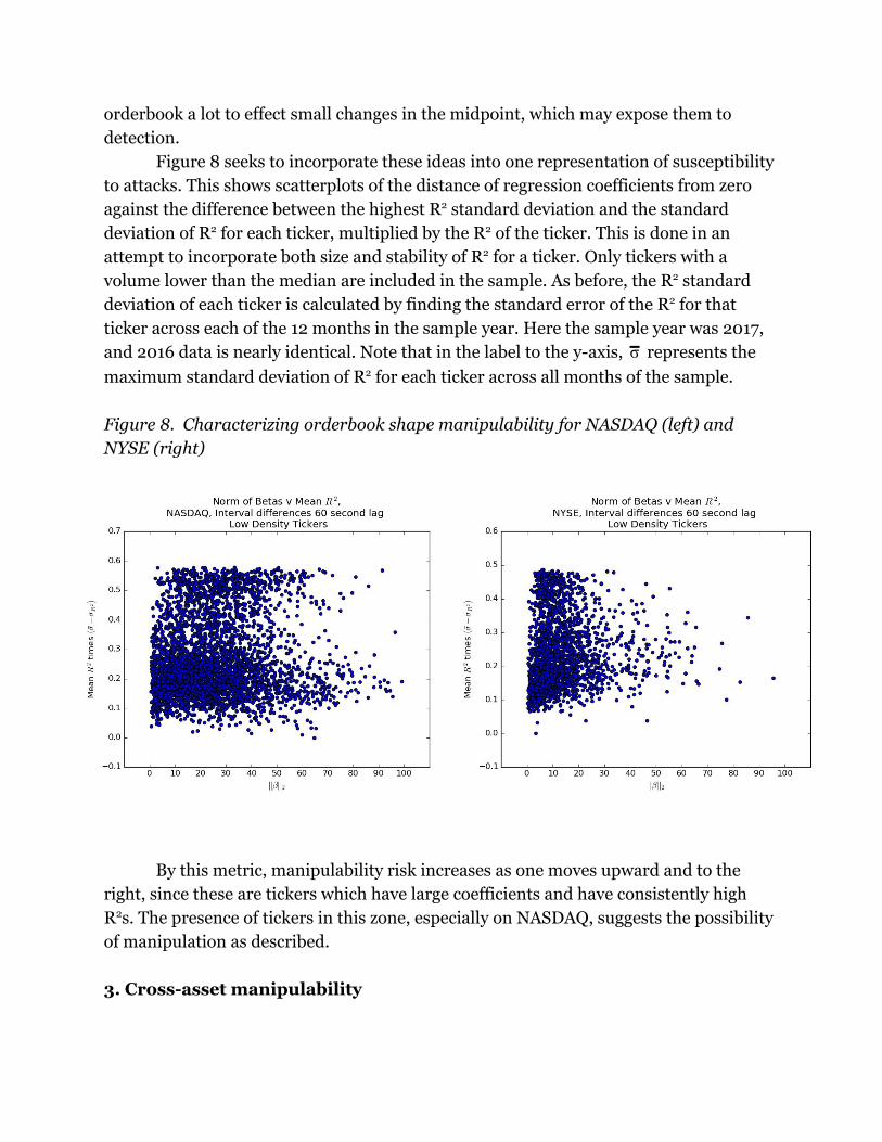
Figure 8 seeks to incorporate these ideas into one representation of susceptibility
to attacks. This shows scatterplots of the distance of regression coefficients from zero
against the difference between the highest R2 standard deviation and the standard
deviation of R2 for each ticker, multiplied by the R2 of the ticker. This is done in an
attempt to incorporate both size and stability of R2 for a ticker. Only tickers with a
volume lower than the median are included in the sample. As before, the R2 standard
deviation of each ticker is calculated by finding the standard error of the R2 for that
ticker across each of the 12 months in the sample year. Here the sample year was 2017,
and 2016 data is nearly identical. Note that in the label to the y-axis, represents theσ
maximum standard deviation of R2 for each ticker across all months of the sample.
Figure 8. Characterizing orderbook shape manipulability for NASDAQ (left) and
NYSE (right)
By this metric, manipulability risk increases as one moves upward and to the
right, since these are tickers which have large coefficients and have consistently high
R2s. The presence of tickers in this zone, especially on NASDAQ, suggests the possibility
of manipulation as described.
3. Cross-asset manipulability

When traders’ algorithms use the price of asset i when determining behavior for asset j, this introduces correlation between asset prices. This correlation opens the possibility
of manipulability as trade in asset j can lead to predictable price movements in stock i.
We examine the possibility of this type of manipulation by studying correlation
and Granger Causality across assets within exchanges. The Granger Causality test used
here explores the predictive power of asset j’s price on asset i, one period from now. We
estimate
ids α mids mids εm i,t = 0 + α1 i,t−1 + β j,t−1 + t
and say that j Granger Causes i if β is not zero statistically.
As above, we run these regressions at 10 second, 1 minute and 10 minute lead
times. Granger Causality tests were estimated for each ticker on both exchanges using
the 5 most correlated assets. We say that ticker j Granger Causes ticker i if our
statistical test shows that ticker j causes ticker i, but ticker i does not cause ticker j. It is
important to note that while Granger causality is not the strongest possible test of
causality, it is likely the strongest test that can be done systematically across the whole
market. As discussed in the introduction, without consistent sources of plausibly 4
exogenous variation, these tests are state of the art. They may not however, be able to
determine causality in situations with confounding variables.
Assets that are most vulnerable to within-exchange, cross-asset manipulation
must have consistently high correlation across a number of months. Assets whose
correlation varies widely would be difficult to manipulate because the effects of market
actions cannot be consistently predicted.
Figure 9 shows histograms of the correlation for all asset pairs studies for each of
the twelve months in both years, for each of the two exchanges NYSE and NASDAQ and
for a ten second lead time. The distribution of correlations is almost identical for the 1
minute and 10 minute lead times. It is noteworthy that both NASDAQ and NYSE display
heterogeneity in the distribution of correlations across months, in particular January
2016 and October/November 2016. This variation in the distribution of correlations
across months suggests the potential for changing economic relations between assets as
well as a changing set of algorithmic relationships between these assets.
Figure 9: Correlation Histograms
NASDAQ 10 Second Lead, 2016
4 Conducting a randomized controlled trial, or obtaining information on the proprietary algorithms are two possible ways to conduct stronger tests of causality.

NASDAQ 10 Second Lead, 2017

NYSE 10 Second Lead, 2016

NYSE 10 Second Lead, 2017
This being said, the distribution of correlations across months is stable for many
months. This discovery begs the question of whether the stability of the correlation
distribution stems from most assets not changing correlation, or whether many pairs
change correlation, but these changes offset each other, leading to a stable distribution.
To address this question, Figure 10 shows the proportion of asset pairs whose
correlation changes in absolute value by more than a particular threshold from month to
month. It is worth noting that for most months, only about 20% of the correlations
change by a magnitude of one or more (for example going from -0.2 to 0.8), which
suggests that most of the changes in ticker distributions evident in the histograms can
be explained by many tickers changing by a small amount, rather than a few tickers
changing by a lot.
Figure 10: Correlation Change Magnitude


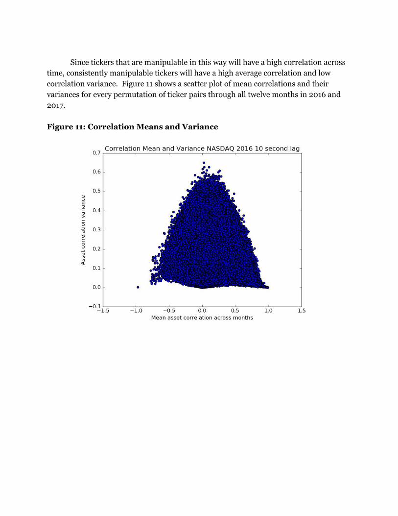
Since tickers that are manipulable in this way will have a high correlation across
time, consistently manipulable tickers will have a high average correlation and low
correlation variance. Figure 11 shows a scatter plot of mean correlations and their
variances for every permutation of ticker pairs through all twelve months in 2016 and
2017.
Figure 11: Correlation Means and Variance
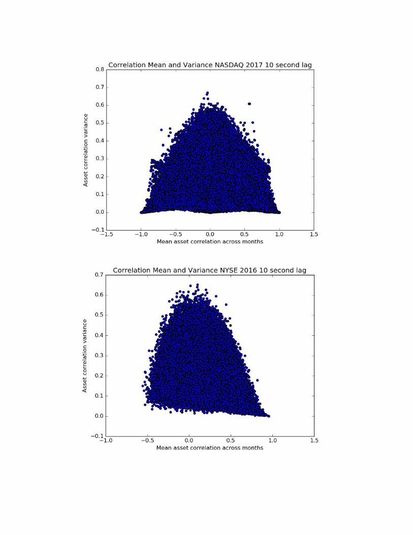
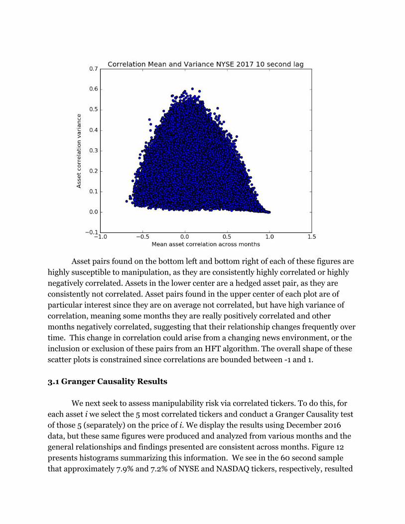
Asset pairs found on the bottom left and bottom right of each of these figures are
highly susceptible to manipulation, as they are consistently highly correlated or highly
negatively correlated. Assets in the lower center are a hedged asset pair, as they are
consistently not correlated. Asset pairs found in the upper center of each plot are of
particular interest since they are on average not correlated, but have high variance of
correlation, meaning some months they are really positively correlated and other
months negatively correlated, suggesting that their relationship changes frequently over
time. This change in correlation could arise from a changing news environment, or the
inclusion or exclusion of these pairs from an HFT algorithm. The overall shape of these
scatter plots is constrained since correlations are bounded between -1 and 1.
3.1 Granger Causality Results
We next seek to assess manipulability risk via correlated tickers. To do this, for
each asset i we select the 5 most correlated tickers and conduct a Granger Causality test
of those 5 (separately) on the price of i. We display the results using December 2016
data, but these same figures were produced and analyzed from various months and the
general relationships and findings presented are consistent across months. Figure 12
presents histograms summarizing this information. We see in the 60 second sample
that approximately 7.9% and 7.2% of NYSE and NASDAQ tickers, respectively, resulted

in none of the five analyzed tickers having a statistically significant coefficient in the
Granger causality test. However, for 27.7% of NYSE and 43.5% of NASDAQ tickers all
five of the examined tickers have significant coefficients.
Figure 12 - Number of Granger Causal Tickers Histogram
2016
2017

To understand the magnitude of manipulability, we analyzed the largest of the
five beta coefficients (in terms of absolute value) for each ticker. These beta coefficients
can be seen in a histogram in Figure 13. In this figure, ease of manipulation is increasing
in the absolute value of the coefficient. Across sample intervals and exchanges, the mean
is consistently positive with a positively skewed distribution. The variance of the betas
grows as the sample intervals increase while the overall “shape” of the distribution
remains roughly the same. This could suggest that the relationships are consistent
across time interval samples and that the relationship is robust.
Figure 13 - Distribution of Granger Causal Betas
2016

2017
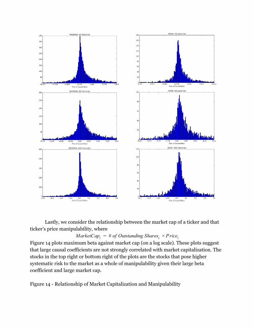
Lastly, we consider the relationship between the market cap of a ticker and that
ticker’s price manipulability, where
arketCap # of Outstanding Shares riceM i = i × P i
Figure 14 plots maximum beta against market cap (on a log scale). These plots suggest
that large causal coefficients are not strongly correlated with market capitalization. The
stocks in the top right or bottom right of the plots are the stocks that pose higher
systematic risk to the market as a whole of manipulability given their large beta
coefficient and large market cap.
Figure 14 - Relationship of Market Capitalization and Manipulability

2016
2017

4. Cross-market Manipulability
In this section, we study the extent to which the price of assets on one exchange Granger
Cause the price of the same asset on another exchange. The relationship between prices
of the same asset on two exchanges is likely to be tightly coupled in equilibrium because
of the natural incentive for price arbitrage. In many economic models, the prices would
be assumed to be the same across exchanges. However, the efforts of arbitrageurs to
profit from price differences (and in so doing drive prices together) require time and
resources. Along with understanding manipulability, the results of this section can also

be interpreted as measuring the speed and extent to which these arbitrageurs are
successful at bringing prices together.
Figure 15. Fraction of total tickers for which the NYSE Granger Causes NASDAQ
(column 1), NASDAQ Granger Causes NYSE (column 2), or neither (column 3),
December 2016.

Figure 15 shows the fraction of tickers where either the price on NYSE Granger Causes
the price on NASDAQ, or the price on NASDAQ Granger Causes the price on NYSE, or
neither, for December 2016. Note that because of our strict definition of Granger
Causality, it is not possible for the price on NASDAQ to Granger Cause the price on
NYSE and the price on NYSE to Granger Cause the price on NASDAQ.
First we note that the fraction of tickers for which there is causality in one
direction is substantial even at the 10 and 60 second lead times. While not as
substantial as the 600 second lead time, approximately 30% of tickers show some
possibility for manipulation in this area. Next we note from these results the
substantial heterogeneity between the 10 and 60 second lead times and the much longer
600 second lead time. This difference could be the result of differences in trader
composition across these exchanges. It suggests a fundamental divergence in the
strategies, resources or information of market participants across the two exchanges and
represents an important area for future research.
From the standpoint of manipulability, the 2016 plots suggest that
cross-exchange manipulability is possible and that the behavior of arbitrageurs is not
consistent across assets and time frames.
5. Conclusion
The linear relationships between the price of an asset, the asset’s orderbook shape,
cross-asset prices and cross-exchange prices studied herein suggest that in low latency
situations the covariance structures often assumed in general equilibrium models need

to be amended to be consistent with observed data. The observations made here suggest
that portions of U.S. equity markets are susceptible to manipulation in the 10 second to
10 minute range. The extent to which such manipulation poses long-term risks to asset
markets depends on the policy response taken in response to these risks. In recent years
NASDAQ has begun implementing circuit breakers that will automatically stop trading
in assets given an abnormally large decline in the asset’s price. These circuit breakers
have the potential to ameliorate some of the problems discussed in this paper since an
asset cannot be manipulated if it doesn’t trade. The research here however, suggests a
potential avenue for making the circuit breakers more efficient. An asset that is more
manipulable as measured by the methods discussed here, may be well served to have a
more strict circuit breaker than one that is less manipulable. This would allow prices to
better reflect investor information in tickers where that sentiment is less likely to be
manipulated. For tickers where the likelihood of manipulation is higher, prices are less
likely to appropriately aggregate investor preferences and more strict circuit breakers
could be warranted.
This research makes clear that the statistical properties of prices on NASDAQ and
NYSE vary. Further understanding of the causes of this difference is a fruitful area of
future research. The role that differences in investor information, resources and/or
strategies across exchanges play in the statistical properties of prices on those exchanges
and their pursuant manipulability will be of interest to academics and policy makers in
finance and national security.
6. References
Angel, James J., and Douglas McCabe. "Fairness in financial markets: The case of high
frequency trading." Journal of Business Ethics 112, no. 4 (2013): 585-595.
Arnoldi, Jakob. "Computer algorithms, market manipulation and the
institutionalization of high frequency trading." Theory, Culture & Society 33, no. 1
(2016): 29-52.
Cao, Yi, Yuhua Li, Sonya Coleman, Ammar Belatreche, and Thomas Martin McGinnity.
"Detecting price manipulation in the financial market." In Computational Intelligence
for Financial Engineering & Economics (CIFEr), 2104 IEEE Conference on, pp. 77-84.
IEEE, 2014.
Condie, Scott. “The information content of order executions at low-latency.” Working
Paper, 1 January 2018, https://papers.ssrn.com/sol3/papers.cfm?abstract_id=3308935

Durden, Tyler. “Bitcoin Plummets After China Launches ‘Market Manipulation’
Investigations Of Bitcoin Exchanges.” Zero Hedge, 11 Jan. 2017,
www.zerohedge.com/news/2017-01-11/bitcoin-plummets-after-china-launches-market-
manipulation-investigations-bitcoin-exc.
DOJ. “Futures Trader Charged with Illegally Manipulating Stock Market, Contributing
to the May 2010 Market 'Flash Crash'.” The United States Department of Justice, 21
Apr. 2015,
www.justice.gov/opa/pr/futures-trader-charged-illegally-manipulating-stock-market-c
ontributing-may-2010-market-flash.
Fisher, Jonathan, Anita Clifford, Freya Dinshaw, and Nicholas Werle. "Criminal forms
of high frequency trading on the financial markets." Law and Financial Markets
Review 9, no. 2 (2015): 113-119.
Goldstein, Michael A., Pavitra Kumar, and Frank C. Graves. "Computerized and
High-Frequency Trading." Financial Review 49, no. 2 (2014): 177-202.
Kirilenko, Andrei, Albert S. Kyle, Mehrdad Samadi, and Tugkan Tuzun. "The flash
crash: The impact of high frequency trading on an electronic market." Available at
SSRN 1686004 (2011).
Kong, Dongmin, and Maobin Wang. "The manipulator's poker: Order-based
manipulation in the chinese stock market." Emerging Markets Finance and Trade 50,
no. 2 (2014): 73-98.
Lee, Eun Jung, Kyong Shik Eom, and Kyung Suh Park. "Microstructure-based
manipulation: Strategic behavior and performance of spoofing traders." Journal of
Financial Markets 16, no. 2 (2013): 227-252.
Madhavan, Ananth. "Exchange-traded funds, market structure, and the flash crash."
Financial Analysts Journal 68, no. 4 (2012): 20-35.
Markham, Jerry W. Law enforcement and the history of financial market
manipulation. ME Sharpe, 2013.
O’Hara, Maureen. "High frequency market microstructure." Journal of Financial
Economics 116, no. 2 (2015): 257-270.

Price, Michelle. “U.S. CFTC to Fine UBS, Deutsche Bank, HSBC for Spoofing,...”
Reuters, Thomson Reuters, 27 Jan. 2018,
www.reuters.com/article/us-usa-cftc-enforcement-exclusive/u-s-cftc-to-fine-ubs-deutsc
he-bank-hsbc-for-spoofing-manipulation-sources-idUSKBN1FF2YK.
Viswanatha, Aruna. “‘Flash Crash’ trader Navinder Sarao pleads guilty to spoofing.” The
Wall Street Journal, 10 November 2016,
https://www.wsj.com/articles/flash-crash-trader-navinder-sarao-pleads-guilty-to-spoof
ing-1478733934.
Yang, Steve, Mark Paddrik, Roy Hayes, Andrew Todd, Andrei Kirilenko, Peter Beling,
and William Scherer. "Behavior based learning in identifying high frequency trading
strategies." In Computational Intelligence for Financial Engineering & Economics
(CIFEr), 2012 IEEE Conference on, pp. 1-8. IEEE, 2012.