art comparative
TRANSCRIPT

7/23/2019 Art Comparative
http://slidepdf.com/reader/full/art-comparative 1/12
IB HL ART
COMPARATIVE STUDY
Chatchai Puipia+
Vincent Van GoghNalat Jaturapattarapong
Grade 12

7/23/2019 Art Comparative
http://slidepdf.com/reader/full/art-comparative 2/12
ARTWORKS
1. Chatchai Puipia,
Vase with Twelve Sunflowers -120 years later, Paintings, Wax, Oil, Acrylic,Pigments, and Gold Leaves on Canvas, 135 x100 x 5 cm. (53.1 x 39.4 x 2 in.)
2. Chatchai Puipia, Self-Portrait, Oil on Canvas,
135 x 100 x 5 cm. (53.1 x 39.4 x 2 in.), 100 Tonsoon Gallery
3. Vincent Van Gogh, Self Portrait with a Grey FeltHat, Oil on canvas, 42 x 34 cm, Stedelijk
Museum, Amsterdam, Netherlands4. Vincent Van Gogh, Sunflowers, Oil on Canvas,
92.1 cm x 73 cm, National Gallery, London.
1.
2.
3.
4.
INTRODUCTIONIn this investigation, I will be exploring two
artists from different period of times in the
world with different culture, to eventually
compare their artworks to each other, and
finally comparing it to my own.
7/23/2019 Art Comparative
http://slidepdf.com/reader/full/art-comparative 3/12
VINCENT VAN GOGH
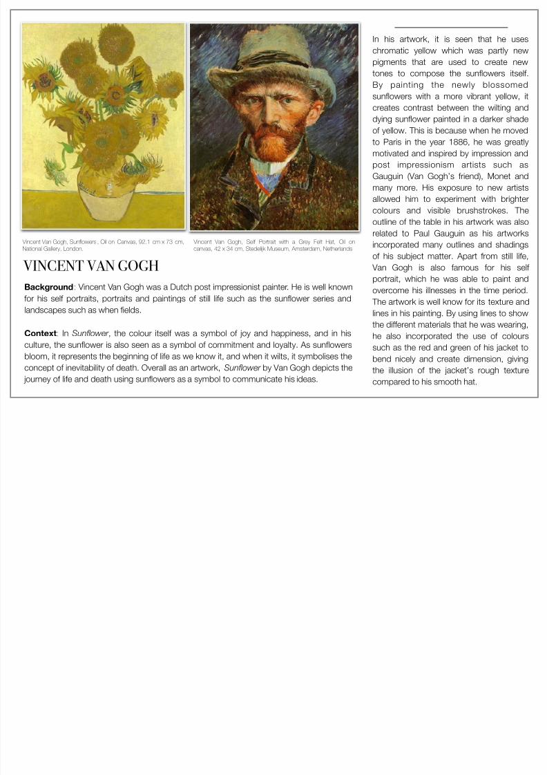
In his artwork, it is seen that he uses
chromatic yellow which was partly new
pigments that are used to create new
tones to compose the sunflowers itself.
By painting the newly blossomed
sunflowers with a more vibrant yellow, itcreates contrast between the wilting and
dying sunflower painted in a darker shade
of yellow. This is because when he moved
to Paris in the year 1886, he was greatly
motivated and inspired by impression and
post impressionism artists such as
Gauguin (Van Gogh’s friend), Monet and
many more. His exposure to new artistsallowed him to experiment with brighter
colours and visible brushstrokes. The
outline of the table in his artwork was also
related to Paul Gauguin as his artworks
incorporated many outlines and shadings
of his subject matter. Apart from still life,
Van Gogh is also famous for his self
portrait, which he was able to paint and
overcome his illnesses in the time period.
The artwork is well know for its texture and
lines in his painting. By using lines to show
the different materials that he was wearing,
he also incorporated the use of colours
such as the red and green of his jacket to
bend nicely and create dimension, giving
the illusion of the jacket’s rough texture
compared to his smooth hat.
Vincent Van Gogh, Sunflowers , Oil on Canvas, 92.1 cm x 73 cm,
National Gallery, London.
Background: Vincent Van Gogh was a Dutch post impressionist painter. He is well knownfor his self portraits, portraits and paintings of still life such as the sunflower series and
landscapes such as when fields.
Context: In Sunflower , the colour itself was a symbol of joy and happiness, and in his
culture, the sunflower is also seen as a symbol of commitment and loyalty. As sunflowers
bloom, it represents the beginning of life as we know it, and when it wilts, it symbolises the
concept of inevitability of death. Overall as an artwork, Sunflower by Van Gogh depicts the
journey of life and death using sunflowers as a symbol to communicate his ideas.
Vincent Van Gogh, Self Portrait with a Grey Felt Hat, Oil on
canvas, 42 x 34 cm, Stedel!k Museum, Amsterdam, Netherlands
7/23/2019 Art Comparative
http://slidepdf.com/reader/full/art-comparative 4/12
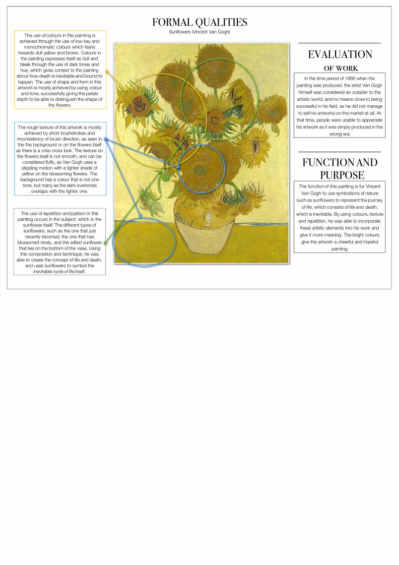
FORMAL QUALITIESSunflowers (Vincent Van Gogh)
The use of colours in this painting is
achieved through the use of low key and
monochromatic colours which leans
towards dull yellow and brown. Colours in
the painting expresses itself as dull and
bleak through the use of dark tones and
hue, which gives context to the paintingabout how death is inevitable and bound to
happen. The use of shape and form in this
artwork is mostly achieved by using colour
and tone, successfully giving the petals
depth to be able to distinguish the shape of
the flowers.
The rough texture of this artwork is mostly
achieved by short brushstrokes and
inconsistency of brush direction, as seen inthe the background or on the flowers itself
as there is a criss cross look. The texture on
the flowers itself is not smooth, and can be
considered fluffy, as Van Gogh uses a
stippling motion with a lighter shade of
yellow on the blossoming flowers. The
background has a colour that is not one
tone, but many as the dark overtones
overlaps with the lighter one.
The use of repetition and pattern in this
painting occurs in the subject; which is the
sunflower itself. The different types of
sunflowers, such as the one that just
recently bloomed, the one that has
blossomed nicely, and the wilted sunflower
that lies on the bottom of the vase. Using
this composition and technique, he was
able to create the concept of life and death,
and uses sunflowers to symbol the
inevitable cycle of life itself.
FUNCTION AND
PURPOSE The function of this painting is for Vincent
Van Gogh to use symbolisms of nature
such as sunflowers to represent the journey
of life, which consists of life and death,which is inevitable. By using colours, texture
and repetition, he was able to incorporate
these artistic elements into his work and
give it more meaning. The bright colours
give the artwork a cheerful and hopeful
painting.
EVALUATION
of work In the time period of 1888 when the
painting was produced, the artist Van Gogh
himself was considered an outsider to the
artistic world, and no means close to being
successful in his field, as he did not manage
to sell his artworks on the market at all. At
that time, people were unable to appreciate
his artwork as it was simply produced in the
wrong era.
7/23/2019 Art Comparative
http://slidepdf.com/reader/full/art-comparative 5/12
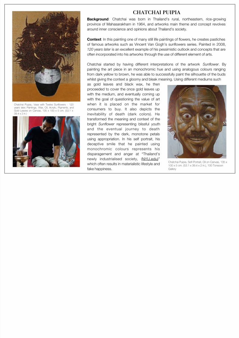
Chatchai Puipia, Vase with Twelve Sunflowers - 120
years later, Paintings, Wax, Oil, Acrylic, Pigments, and
Gold Leaves on Canvas, 135 x 100 x 5 cm. (53.1 x
39.4 x 2 in.)
chatchai puipia Background: Chatchai was born in Thailand’s rural, northeastern, rice-growing
province of Mahasarakham in 1964, and artworks main theme and concept revolves
around inner conscience and opinions about Thailand’s society.
Context: In this painting one of many still life paintings of flowers, he creates pastiches
of famous artworks such as Vincent Van Gogh’s sunflowers series. Painted in 2008,
120 years later is an excellent example of his pessimistic outlook and concepts that are
often incorporated into his artworks through the use of different element of arts.
Chatchai started by having different interpretations of the artwork Sunflower . By
painting the art piece in an monochromic hue and using analogous colours ranging
from dark yellow to brown, he was able to successfully paint the silhouette of the buds
whilst giving the context a gloomy and bleak meaning. Using different mediums such
as gold leaves and black wax, he then
proceeded to cover the once gold leaves up
with the medium, and eventually coming up
with the goal of questioning the value of art
when it is placed on the market for
consumers to buy. It also depicts the
inevitability of death (dark colors). He
transformed the meaning and context of the
bright Sunflower representing blissful youthand the eventual journey to death
represented by the dark, monotone petals
using appropriation. In his self portrait, his
deceptive smile that he painted using
monochromic colours represents his
disparagement and anger at “Thailand’s
newly industrialised society, (NYU.edu)”
which often results in materialistic lifestyle and
fake happiness.
Chatchai Puipia, Self-Portrait, Oil on Canvas, 135 x
100 x 5 cm. (53.1 x 39.4 x 2 in.), 100 TonsoonGallery
7/23/2019 Art Comparative
http://slidepdf.com/reader/full/art-comparative 6/12
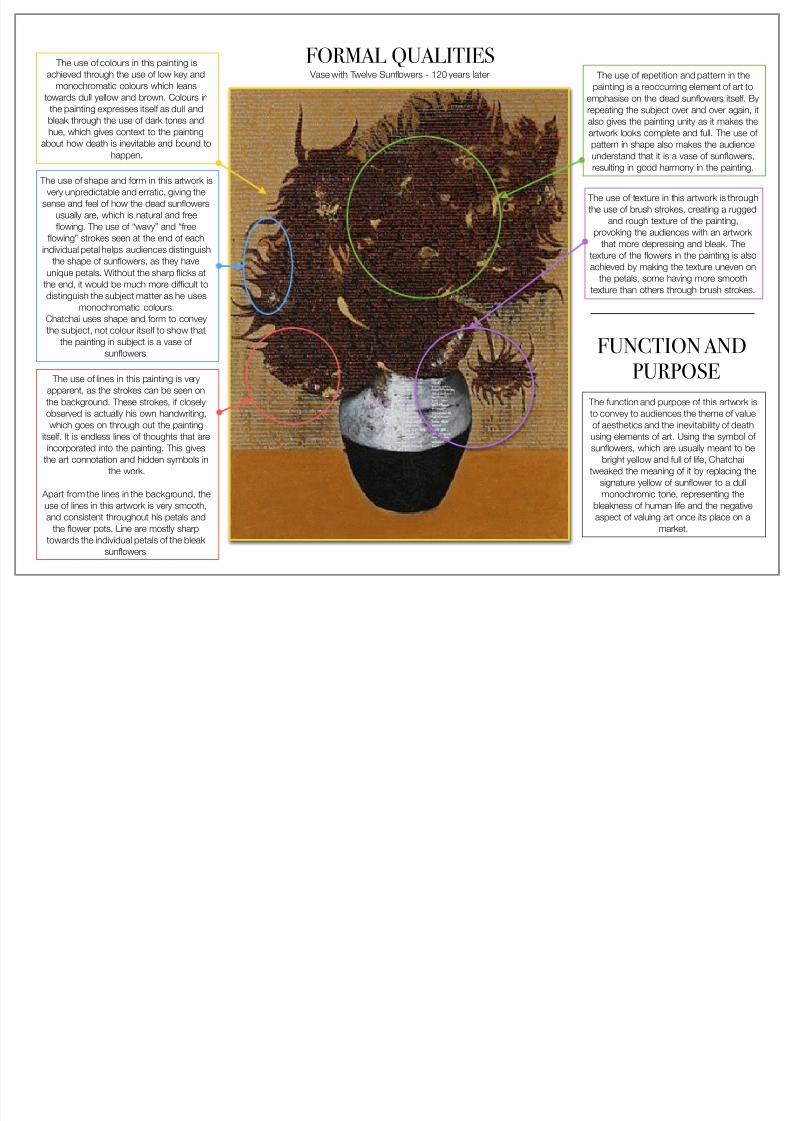
FORMAL QUALITIES Vase with Twelve Sunflowers - 120 years later
The use of colours in this painting is
achieved through the use of low key and
monochromatic colours which leans
towards dull yellow and brown. Colours in
the painting expresses itself as dull and
bleak through the use of dark tones and
hue, which gives context to the painting
about how death is inevitable and bound to
happen.
The use of lines in this painting is very
apparent, as the strokes can be seen on
the background. These strokes, if closely
observed is actually his own handwriting,which goes on through out the painting
itself. It is endless lines of thoughts that are
incorporated into the painting. This gives
the art connotation and hidden symbols in
the work.
Apart from the lines in the background, the
use of lines in this artwork is very smooth,
and consistent throughout his petals and
the flower pots. Line are mostly sharp
towards the individual petals of the bleak
sunflowers.
The use of shape and form in this artwork is
very unpredictable and erratic, giving the
sense and feel of how the dead sunflowers
usually are, which is natural and free
flowing. The use of “wavy” and “free
flowing” strokes seen at the end of each
individual petal helps audiences distinguish
the shape of sunflowers, as they have
unique petals. Without the sharp flicks atthe end, it would be much more difficult to
distinguish the subject matter as he uses
monochromatic colours.
Chatchai uses shape and form to convey
the subject, not colour itself to show that
the painting in subject is a vase of
sunflowers.
The use of repetition and pattern in the
painting is a reoccurring element of art to
emphasise on the dead sunflowers itself. By
repeating the subject over and over again, it
also gives the painting unity as it makes the
artwork looks complete and full. The use of
pattern in shape also makes the audience
understand that it is a vase of sunflowers,
resulting in good harmony in the painting.
FUNCTION AND
PURPOSE
The function and purpose of this artwork is
to convey to audiences the theme of valueof aesthetics and the inevitability of death
using elements of art. Using the symbol of
sunflowers, which are usually meant to be
bright yellow and full of life, Chatchai
tweaked the meaning of it by replacing the
signature yellow of sunflower to a dull
monochromic tone, representing the
bleakness of human life and the negative
aspect of valuing art once its place on a
market.
The use of texture in this artwork is through
the use of brush strokes, creating a rugged
and rough texture of the painting,
provoking the audiences with an artwork
that more depressing and bleak. The
texture of the flowers in the painting is also
achieved by making the texture uneven on
the petals, some having more smoothtexture than others through brush strokes.

7/23/2019 Art Comparative
http://slidepdf.com/reader/full/art-comparative 7/12
FORMAL QUALITIESSelf-Portrait The use of colours in this painting mostly
consists of dark and monochromic colours,
such as darker skin tones and shadows
that is used. The lighter tones, which can
be considered white, is used mostly for the
highlights and contouring of the facialfeatures. Whereas dark hues are used in
areas such as the undertone, the cracks of
his cheeks and the bags underneath his
eyes. By using the technique of low tones
and high tones, he is able to create depth
and give the facial expression more detail.
The colour itself on first impression gives
the audience a dark and pessimistic
concept, which could be the reason why
Chatchai has opted for a darker and
gloomy colour scheme.
The texture of the artwork is smooth, as he
has used long and steady brushstrokes,
which can be seen in the strands of hair
and the outline of his face. The texture of
the skin also looks smooth by the blending
of the different tones of colours that is
created for the face.
The use of lines in this artwork can be
considered very sharp, as the strokes blend
into each other and create a very distinctedge, rather than being rough. The details
can be seen in the hair, the area underneath
the eyes, and the forehead. As the audience
can see, the forehead consists of white
highlights that are the high tones of the
facial features. By using a clean and sharp
line, it is used to give dimension in the
painting. In the hair itself, the lines are very
sharp as we can easily tell apart individual
strands of hair.
The composition and placement of the
subject in the self portrait is centred and
very emphasised on the expression on the
face. The alignment of the subject brings
unity to the whole art piece.
FUNCTION AND
PURPOSE
EVALUATION
of work
This artwork’s period of time is considered
to be monumentally successful, as Chatchai
himself received several prestigious awards
from the art community. This particular
piece, is also up for display in a respected,
well known art gallery in the heart of
Bangkok.
The function and purpose of this artwork to
to communicate the superficiality of
Thailand’s society by masking the emotions
behind fake laughter.

7/23/2019 Art Comparative
http://slidepdf.com/reader/full/art-comparative 8/12
MAKING
COMPARISONS
AND
CONNECTIONS Sunflowers (Vincent Van Gogh)
&
120 Years Later (Chatchai Puipia)
Both of the painting’s subject and main emphasis is on the sunflowers and the concept of life and death behind the artwork. Van Gogh’s time period when producing this painting was
during post impressionist style in 1888, his painting was considered unsuccessful. Whereas in current time period and in his Chatchai’s artwork, it is considered to be a great pastiche
as it follows the style, shape and form. Therefore, cultural context is very different in these two as Van Gogh was critiqued harshly while Chatchai received numerous awards and praise
from international society.
MATERIALS:
The materials that
each artists used
were quite different,
as the only material
that was the same is
the oil paint. Chatchai
has taken a different
approach and used
materials such as
paintings, wax, oil,
acrylic, pigments, and
gold leaves.
SHAPE AND FORM OF THE POT
The similarities in the artwork is the
shape and form of the flower pot or
vase, as it Chatchai’s interpretation
of the vase also resembles a
rounded out diamond, as same as
Van Gogh’s. The vase in both
paintings also have irregular shapes,
and is not perfectly symmetrical as a
typical vase.
COLOUR AND TONES
The most apparent
element of art that is
the difference of
colours and tone. As
the shape and form is
visibly similar to each
other, difference in
colour schemes
stands out the most.
In Van Gogh’s
painting, he made use
of bright colours, such
as bright yellow and
pastel green to
represent the
livelihood of the
flowers, unlike
Chatchai’s
interpretation of the
artwork, where the
colours which are
used are more on the
dark and subtle
colours such as
brown and black itself.
The colours in the artwork is
important in first impressions
of the concept of the artwork
itself. Therefore, the use of
bright colours in Van Gogh’s
piece made the artwork has
optimistic approaches to the
concept of life and death;
whereas the dark colours of
Chatchai’s piece gives a
more gloomy and pessimistic
approach to the concept.
ARRANGEMENT OF THE FLOWERS
The similarities of both paintings lie
in the flowers, but the arrangement
is very similar to each other. The
composition of flowers in Chatchai’s
painting, in my opinion is a flipped
image of Van Gogh’s original
painting. The flowers lean more to
the right, and has a wilting flower on
the right of the image.Flipped Van Gogh’s Piece Chatchai’s
INFLUENCES OF ARTIST
Both artists made us of their
surroundings as inspirations to
their painting. Van Gogh
painted Sunflowers to
brighten up his friend’s
bedroom, which he had to
inspect the surroundings. So
does Chatchai’s which was
inspired by Thailand’s societyand his pessimistic views on
life and death.
HORIZON OF PAINTING
Has the same height for the
width of the table.

7/23/2019 Art Comparative
http://slidepdf.com/reader/full/art-comparative 9/12
MAKING COMPARISONS AND CONNECTIONSSelf Portrait (Chatchai Puipia) & Self Portrait with a Grey Felt Hat (Vincent Van Gogh)
MATERIALS:
The materials that
each artists used were
similar, as they both
used oil paint on
canvas.
THE USE OF LINES
The usage of lines in
both artwork is veryvisible and quite similar
in certain parts, as in
Chatchai’s painting,
there is visible strokes
of strands of hair,
whereas in Van Gogh,
the short brush
strokes are
emphasised by the
use of different
colours. By using short
strokes, the lines didnot blend into each
other.
THE USE OF COLOURS
The usage of colours
in both of these
artworks are different
to each other. Even
though both give off a
vibe of warmth, Van
Gogh’s self portrait in
comparison had morevariety and brightness,
especially around his
facial hair and his
collar. He also used
different tones of
colour, such as the
area around his nose
to create depth and
dimension.
Both of the painting’s subject and main emphasis on the self portrait itself. Chatchai’s self portrait’s context can be considered slightly different from Van Gogh, as he focuses more on the
facial expression of being “excited”, whereas Van Gogh painted a composed portrait of himself. In the two artworks, Chatchai’s self portrait is more expressive than Van Gogh’s. This
suggests the different time period that the painting was produced in. Chatchai’s context is also slightly more pessimistic on Thailand’s society (disagree with materialistic life where
happiness is fake) whereas Van Gogh is simply painting his interpretation of his appearance.
COMPOSITION OF
EYESLooking at the eyes
itself, it can be
observed that
Chatchai’s eyes are
looking towards the
audiences, but Van
Gogh’s turns slightly to
the right, this is
because he used to
refer to his subject bylooking directly in the
mirror. It shows
different methods of
referencing the subject
matter.
STRUCTURE OF FACES (FORM)
The structure of the shapes are similar, asboth heads are facing directly towards the
audience with no side view. The shape of
the face also follows a diamond form, where
the ends of the mouths touches the bottom
side of the diamond, and the top tip of the
diamond is where the forehead ends.
THE USE OF TEXTURE
Chatchai’s use of
texture is more subtle
and smooth than the
one in Van Gogh, as
Van Gogh has
successfully used
different colours and
tones such as greenand dark red to create
a rough jacket,
meanwhile blending
his strokes more to
convey the soft texture
of his felt hat.
EMPHASIS
Both artworks are similar as the mainemphasis is on the self portrait itself.
BALANCE
Both artworks is balanced and has unity as
the main subject is centred entirely in the
middle of the canvas.
PROPORTIONS
Looking at the face, Chatchai’sperspective is more zoomed in
than Van Gogh’s, allowing more
interpretation of his facial
expressions, adding more context
to the concept of his art piece.
7/23/2019 Art Comparative
http://slidepdf.com/reader/full/art-comparative 10/12
ARTIST’S INFLUENCE ON MY OWN ARTWORK
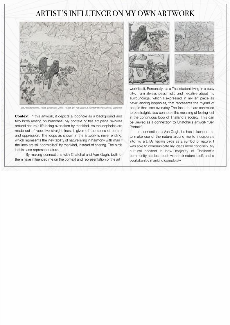
Context: In this artwork, it depicts a loophole as a background and
two birds resting on branches. My context of this art piece revolvesaround nature’s life being overtaken by mankind. As the loopholes are
made out of repetitive straight lines, it gives off the sense of control
and oppression. The loops as shown in the artwork is never ending,
which represents the inevitability of nature living in harmony with man if
the lines are still “controlled” by mankind, instead of sharing. The birds
in this case represent nature.
By making connections with Chatchai and Van Gogh, both of
them have influenced me on the context and representation of the art
Jaturapattarapong, Nalat. Loophole. 2015. Paper. DP Art Studio, KIS International School, Bangkok.
work itself. Personally, as a Thai student living in a busy
city, I am always pessimistic and negative about my
surroundings, which I expressed in my art piece as
never ending loopholes, that represents the myriad of
people that I see everyday. The lines, that are controlled
to be straight, also connotes the meaning of feeling lost
in the continuous loop of Thailand’s society. This can
be viewed as a connection to Chatchai’s artwork “Self
Portrait”.
In connection to Van Gogh, he has influenced me
to make use of the nature around me to incorporate
into my art. By having birds as a symbol of nature, I
was able to communicate my ideas more concisely. My
cultural context is how majority of Thailand’s
community has lost touch with their nature itself, and is
overtaken by mankind completely.

7/23/2019 Art Comparative
http://slidepdf.com/reader/full/art-comparative 11/12
FORMAL QUALITIESLoophole (own artwork)
MATERIALS:
The materials that I have used
for this art piece is a black ink
fine liner, and the medium I
have chosen is paper. (Fine-
liner on paper)
THE USE OF LINES
The usage of lines in this
artwork is very visible and it
consists of short and
translucent strokes. By
controlling the weight of the
liner on paper, and slowly
layering the thickness of the
black ink, I was able to create
a fluffy and furry looking textureby using line.
THE USE OF REPETITION
The usage of lines in this artwork is very visible and it
consists of short and translucent strokes. By controlling
the weight of the liner on paper, and slowly layering the
thickness of the black ink, I was able to create a fluffy
and furry looking texture by using line. By using different
weights on the fine-liner, I was able to create a fluffier
looking cloud on the top of the artwork.
THE USE OF SHAPE AND FORM
The usage of shape and form
in this artwork is very
consistent, as it follows a
pattern itself. The pattern thatis subtle in this artwork is the
pattern of triangles, where I
have connected the triangles
to form smaller triangles inside
it. The effect that I got when
combining one big triangle to
another is the loophole that
I’ve created in here.
THE USE OF COLOUR
The colour that I have chosen
to use is black. This effectedthe context of the artwork as
I’ve decided not to give colour
to the painting. As an artist, I
saw the world in this way,
which is in black and white. I
didn’t feel that the world was
such a optimistic place to be
in.
COMPOSITION AND
ARRANGEMENT
The composition that I havechosen to use is aligning the
birds and branches to the left,
and slightly away from the
middle of the artwork, as I
wanted to emphasis the never
ending loophole in the
background. This contributes
to the context of mankind
overtaking nature, as it is
literally being pushed aside
and destroyed for our own
benefits.

7/23/2019 Art Comparative
http://slidepdf.com/reader/full/art-comparative 12/12
VINCENT VAN GOGH
CHATCHAI PUIPIA OWN ARTWORK
Contextual Idea:
The self portrait depicts
Chatchai himself with an
exaggerated facial
expression to represent Thailand’s developing
industrial society, which
often becomes
materialistic lifestyle and
fake happiness.
Contextual Idea:
Revolves around nature’s life
being overtaken by mankind.
The sense of control and
oppression can seen from the
artwork. The loops as shown
in the artwork is never ending,
which represents the
inevitability of nature living in
harmony with man if the lines
are still “controlled” by
mankind, instead of sharing.
Contextual Idea: As
sunflowers bloom, it
represents the beginning of
life as we know it, and when
it wilts, it symbolises the
concept of inevitability of
death.
MAKING
COMPARISONS
AND
CONNECTIONSSelf Portrait (Chatchai Puipia), Sunflowers
(Vincent Van Gogh), Loophole (own artwork)
Materials:
Used oil colours
Context:
The use of nature such as
flowers and birds to
represent a symbol.
Materials:
Used new materials, such
as wax, gold leaves, acrylic,
and different pigments.
Contextual Idea:
Context is slightly similar,
and has the same
cultural context.
Colours:
Made use of darker
colours, such as black,
brown and dark beige.
Composition:
When painting the self
portrait, the emphasis on
the face is very apparent, as
it is dead centred on the
middle of the canvas.
Colours:
Made use of bright colours
and a wide range of tones,
such as bright yellow for his
sunflowers, and red and
green for his self portrait.
Pattern:
The use of pattern occurs
very apparent (use of
triangles).