art + architecture at at&t stadium would appeal not only to fans of sports and entertainment,...
TRANSCRIPT

ART + ARCH ITECTUREAT
AT&T STAD IUM
A R T + When creating AT&T Stadium, the Jones Family strived from the beginning to create more than a home for the Dallas Cowboys; their dream was to create the next great architectural icon—a place that would appeal not only to fans of sports and entertainment, but also those of architecture, art, design, engineering and technology. To do this, the family traveled the world to experience first-hand many of the finest architectural achievements known to man. These great works of historic design and construction inspired them to think beyond the expected bonds of stadium design.
Structural, practical and artistic elements of these landmarks have been transformed into the heart and soul of AT&T Stadium. Along the way, some of the finest engineers, designers and builders have taken ground-breaking strides with their work to create the next great global icon in this class.
AT&T Stadium is the culmination of visionary leadership, historical precedent and contemporary innovation that will forever change the way the world experiences sports and entertainment.
AT&T Stadium began as a dream: to change the way fans watch football games by making every aspect of the experience more thrilling, gracious, and awe-inspiring than ever before. The Jones family did not mess with the game itself: what takes place on the field is still the focus of any given Sunday. The goal was to transform everything around it, creating a streamlined structure that has become an instant architectural landmark.
A R C H I T E C T U R E

Fans talk about games with great passion. Viewers talk about art with equal passion. Both sports and art bring together people from all walks of life to discuss what we cherish, in ways that stir our deepest beliefs and excite us to share them. We define ourselves, as individuals and groups, by articulating in public what we value in private.
Unique to AT&T Stadium, art and sports work in concert to enhance every fan’s visit. The world class collection is a gift not just to the North Texas community, but to all people who love seeing great achievements and love talking about it with family, friends, and strangers, who suddenly seem to be more like us than we first imagined.
The art collection in the stadium reflects the intimacy of the Jones Family’s personal vision. Unlike most private collections, this one is accessible to massive crowds. It is there to be seen, week after week, season after season, by tourists just passing through and by regulars who return again and again.
The Dallas Cowboys Art Collection consists of 16 commissioned, site-specific works of art along with 43 additional works that were acquired for the stadium collection. Each artist in the collection has pieces in permanent collections of prestigious museums across the country and around the world. The artworks in the stadium would not be out of place in any museum.
To arrive at the collection, the Jones family hired Zlot Buell + Associates, an art advisory firm, to help develop the program for the stadium. Together they invited distinguished leaders in the North Texas cultural community to form an art council that would serve in an advisory capacity to the Jones family. In considering artists to engage in site-specific commissions, the art council examined many works by nationally and internationally recognized artists who were accustomed to working in a monumental scale. The collection of works are united by their boldness, vigor, and resolve: their capacity to not only hold their own in a crowd, but their power to provoke thought in a place where visitors from all over the world come together.
D A L L A S C O W B O Y S A R T C O L L E C T I O N

Anish Kapoor Sky Mirror (2006) Polished stainless steel 35 feet diameter Located in East Plaza Acquisition
The ancient Greeks believed that one of the functions of art was to hold a mirror up to nature. The beauty of their plays and paintings rivaled that of the natural landscape and reflected the perfection of the visible world. In the Renaissance, the duties of art shifted: One of its roles was to hold a mirror up to society, reflecting the complexities of human behavior to help audiences understand themselves in ways that might make the world a better place. Anish Kapoor’s Sky Mirror (2006) combines both of these goals, giving contemporary visitors to AT&T Stadium ever-changing views of the sky above and the ground below while inviting us to reflect on what it means to live in a global world.
Both down-to-earth and out-of-this-world, Kapoor’s stainless steel sculpture is a high-tech monolith and a low-tech monitor. Sky Mirror weighs fifteen tons, stands three stories tall and measures more than thirty-five feet across its concave face. The highly polished disk takes visitors’ minds to Stonehenge, Egyptian pyramids, and Mayan temples, as well as other structures prehistoric peoples constructed to mark the seasons. At the same time, Kapoor’s Minimalist sculpture functions as a huge, two-sided screen—or solar-powered monitor—on which visitors regard an endless, never-to-be-repeated drama. From one side, clouds, planes, birds and stars pass by in the sky, which itself changes from night to day. From the other side, individuals come together, in clusters and crowds, and disperse, moving on but never forgetting our connections to our surroundings and everything in them.
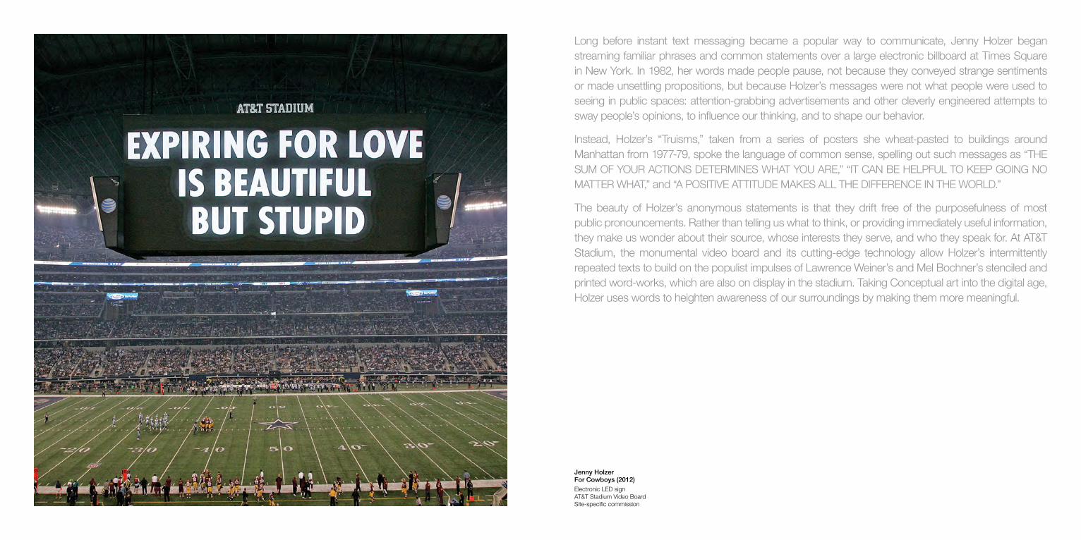
Jenny Holzer For Cowboys (2012) Electronic LED sign AT&T Stadium Video Board Site-specific commission
Long before instant text messaging became a popular way to communicate, Jenny Holzer began streaming familiar phrases and common statements over a large electronic billboard at Times Square in New York. In 1982, her words made people pause, not because they conveyed strange sentiments or made unsettling propositions, but because Holzer’s messages were not what people were used to seeing in public spaces: attention-grabbing advertisements and other cleverly engineered attempts to sway people’s opinions, to influence our thinking, and to shape our behavior.
Instead, Holzer’s “Truisms,” taken from a series of posters she wheat-pasted to buildings around Manhattan from 1977-79, spoke the language of common sense, spelling out such messages as “THE SUM OF YOUR ACTIONS DETERMINES WHAT YOU ARE,” “IT CAN BE HELPFUL TO KEEP GOING NO MATTER WHAT,” and “A POSITIVE ATTITUDE MAKES ALL THE DIFFERENCE IN THE WORLD.”
The beauty of Holzer’s anonymous statements is that they drift free of the purposefulness of most public pronouncements. Rather than telling us what to think, or providing immediately useful information, they make us wonder about their source, whose interests they serve, and who they speak for. At AT&T Stadium, the monumental video board and its cutting-edge technology allow Holzer’s intermittently repeated texts to build on the populist impulses of Lawrence Weiner’s and Mel Bochner’s stenciled and printed word-works, which are also on display in the stadium. Taking Conceptual art into the digital age, Holzer uses words to heighten awareness of our surroundings by making them more meaningful.
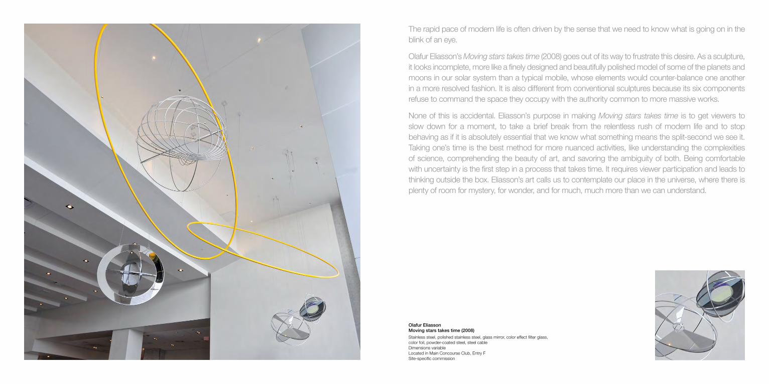
Olafur Eliasson Moving stars takes time (2008) Stainless steel, polished stainless steel, glass mirror, color effect filter glass, color foil, powder-coated steel, steel cable Dimensions variable Located in Main Concourse Club, Entry F Site-specific commission
The rapid pace of modern life is often driven by the sense that we need to know what is going on in the blink of an eye.
Olafur Eliasson’s Moving stars takes time (2008) goes out of its way to frustrate this desire. As a sculpture, it looks incomplete, more like a finely designed and beautifully polished model of some of the planets and moons in our solar system than a typical mobile, whose elements would counter-balance one another in a more resolved fashion. It is also different from conventional sculptures because its six components refuse to command the space they occupy with the authority common to more massive works.
None of this is accidental. Eliasson’s purpose in making Moving stars takes time is to get viewers to slow down for a moment, to take a brief break from the relentless rush of modern life and to stop behaving as if it is absolutely essential that we know what something means the split-second we see it. Taking one’s time is the best method for more nuanced activities, like understanding the complexities of science, comprehending the beauty of art, and savoring the ambiguity of both. Being comfortable with uncertainty is the first step in a process that takes time. It requires viewer participation and leads to thinking outside the box. Eliasson’s art calls us to contemplate our place in the universe, where there is plenty of room for mystery, for wonder, and for much, much more than we can understand.
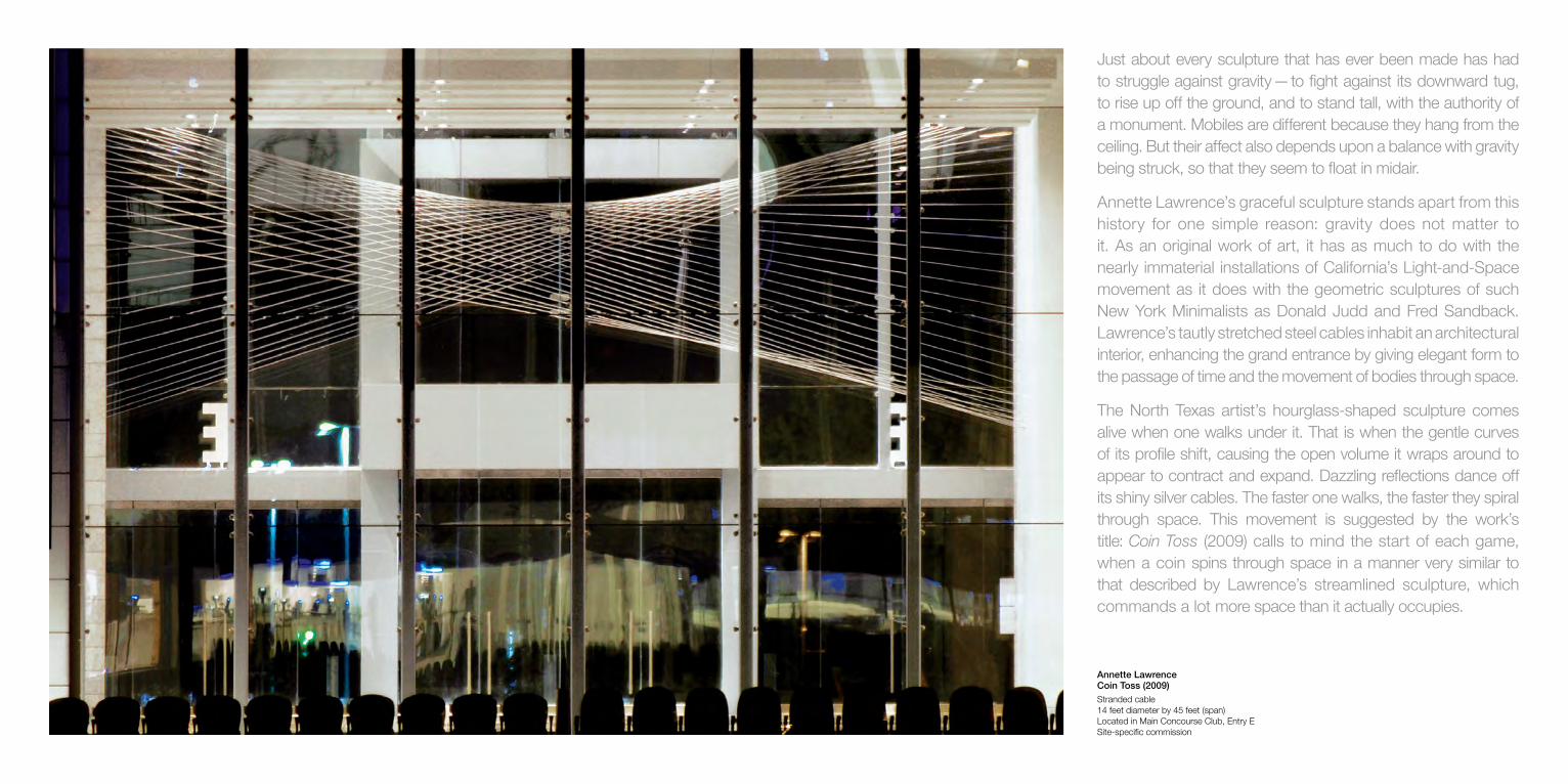
Annette Lawrence Coin Toss (2009) Stranded cable 14 feet diameter by 45 feet (span) Located in Main Concourse Club, Entry E Site-specific commission
Just about every sculpture that has ever been made has had to struggle against gravity — to fight against its downward tug, to rise up off the ground, and to stand tall, with the authority of a monument. Mobiles are different because they hang from the ceiling. But their affect also depends upon a balance with gravity being struck, so that they seem to float in midair.
Annette Lawrence’s graceful sculpture stands apart from this history for one simple reason: gravity does not matter to it. As an original work of art, it has as much to do with the nearly immaterial installations of California’s Light-and-Space movement as it does with the geometric sculptures of such New York Minimalists as Donald Judd and Fred Sandback. Lawrence’s tautly stretched steel cables inhabit an architectural interior, enhancing the grand entrance by giving elegant form to the passage of time and the movement of bodies through space.
The North Texas artist’s hourglass-shaped sculpture comes alive when one walks under it. That is when the gentle curves of its profile shift, causing the open volume it wraps around to appear to contract and expand. Dazzling reflections dance off its shiny silver cables. The faster one walks, the faster they spiral through space. This movement is suggested by the work’s title: Coin Toss (2009) calls to mind the start of each game, when a coin spins through space in a manner very similar to that described by Lawrence’s streamlined sculpture, which commands a lot more space than it actually occupies.

Matthew Ritchie Line of Play (2009) Powder coated aluminum, vinyl and acrylic East Wall, West Wall: 30 feet x 20 feet Ceiling: 34 feet by 10 feet Located in Main Concourse Club, Entry K Site-specific commission
Made of powder-coated aluminum, vinyl, and acrylic paint, Matthew Ritchie’s Line of Play (2009) transforms the age-old medium of drawing. The work becomes a metaphor for the many ways people make sense of just about everything, from our surroundings to life’s purpose to whatever might lie beyond. In Ritchie’s hands, art is an ongoing experiment – an ever-expanding inquiry we puzzle over as we discover new ideas, change our minds about old ones, and come up with more questions.
It all starts with the marks coaches make when they diagram plays. Ritchie transfers the X’s and O’s they draw on chalkboards to a computer, where he turns them into swirling force fields of animated energy. The London-born, New York-based artist describes Line of Play as two figures passing something between them. It does not take a great leap to see what he means, even if it is impossible to identify those figures and that object. That is the point. Ritchie’s futuristic triptych does not depict things we already know, so much as it gives us a glimpse of things we have never seen.
Ritchie emerged as an artist in the 1990s, when the Information Age entered into its digital phase and the Internet made more information accessible to more people than ever before. His works are all based on the possibilities presented by technology’s capacity to bring together advanced systems of inquiry. Ritchie often collaborates with neurologists, physicists, philosophers, historians, and game theorists, in order to push knowledge, consciousness, and beliefs beyond their existing limits.

Jim Campbell Exploded View (Cowboys) (2012–2013) Custom electronic LEDs Dimensions variable Located on Hall of Fame Level, Entry A Site-specific commission
Jim Campbell uses cutting-edge technology to bring mystery into modern life. At a time when high-tech devices allow people all over the globe to see more things more clearly and quickly than ever before, the San Francisco artist takes digital imagery back to the basics. His three-dimensional arrangements of flickering lightbulbs transform two-dimensional images into ghostly apparitions that take on a life of their own. In doing so, Campbell invites us to wonder about the fleeting nature of our perceptions and how they add up to lives that pass by so quickly.
At AT&T Stadium, Campbell starts with footage of great plays from Dallas Cowboys games. Using software, he digitizes the filmed images and then maps every pixel of every frame of every sequence onto a room-size array of hanging LED lights. A specially programmed computer controls the lightbulbs, causing each to turn on and off at precisely time, intervals, sometimes shining brightly and at others glowing softly.
Depending upon where you stand, you see different things. From some places, Campbell’s darkened alcove resembles the night sky, whose twinkling stars form endless constellations. From other vantage points, you see football players running, passing, and tackling. Sometimes they are easy to see, their silhouettes crisp and distinct. At others, they are blurry and ghostly, like faded photographs, early movies, low-res images and fleeting memories. No audio accompanies Campbell’s black-and-white work, which shuns the razzle-dazzle of high-res imagery. The silence amplifies the mysteriousness, creating an atmosphere that is both mesmerizing and meditative.
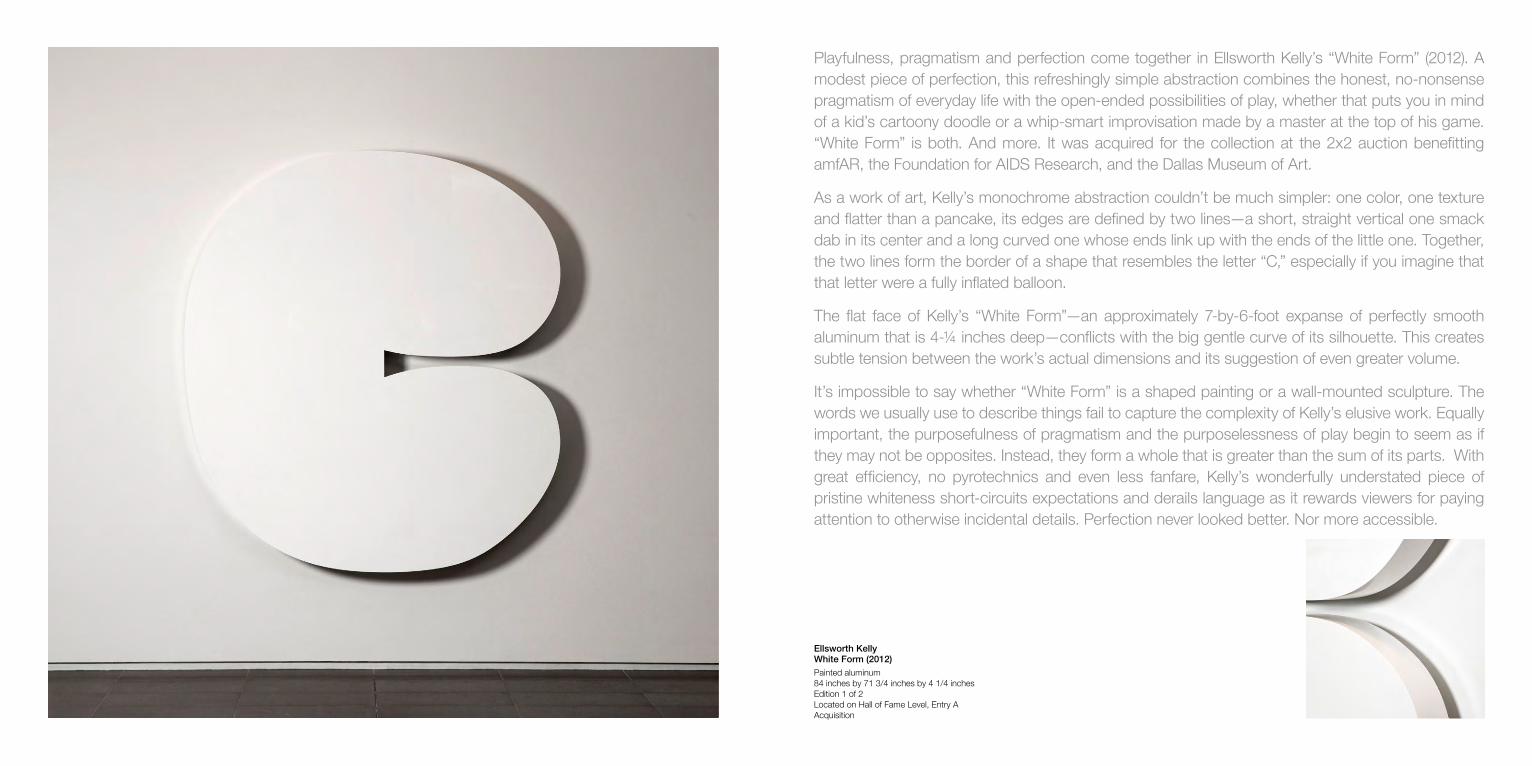
Ellsworth Kelly White Form (2012) Painted aluminum 84 inches by 71 3/4 inches by 4 1/4 inches Edition 1 of 2 Located on Hall of Fame Level, Entry A Acquisition
Playfulness, pragmatism and perfection come together in Ellsworth Kelly’s “White Form” (2012). A modest piece of perfection, this refreshingly simple abstraction combines the honest, no-nonsense pragmatism of everyday life with the open-ended possibilities of play, whether that puts you in mind of a kid’s cartoony doodle or a whip-smart improvisation made by a master at the top of his game. “White Form” is both. And more. It was acquired for the collection at the 2x2 auction benefitting amfAR, the Foundation for AIDS Research, and the Dallas Museum of Art.
As a work of art, Kelly’s monochrome abstraction couldn’t be much simpler: one color, one texture and flatter than a pancake, its edges are defined by two lines—a short, straight vertical one smack dab in its center and a long curved one whose ends link up with the ends of the little one. Together, the two lines form the border of a shape that resembles the letter “C,” especially if you imagine that that letter were a fully inflated balloon.
The flat face of Kelly’s “White Form”—an approximately 7-by-6-foot expanse of perfectly smooth aluminum that is 4-¼ inches deep—conflicts with the big gentle curve of its silhouette. This creates subtle tension between the work’s actual dimensions and its suggestion of even greater volume.
It’s impossible to say whether “White Form” is a shaped painting or a wall-mounted sculpture. The words we usually use to describe things fail to capture the complexity of Kelly’s elusive work. Equally important, the purposefulness of pragmatism and the purposelessness of play begin to seem as if they may not be opposites. Instead, they form a whole that is greater than the sum of its parts. With great efficiency, no pyrotechnics and even less fanfare, Kelly’s wonderfully understated piece of pristine whiteness short-circuits expectations and derails language as it rewards viewers for paying attention to otherwise incidental details. Perfection never looked better. Nor more accessible.

Eva Rothschild Diamonoid (2009) powder coated aluminium 69.9 inches by 110 inches by 7.5 inches Located on Hall of Fame Level, Entry A Acquisition
In the 1960s, artists on the West Coast made sculptures whose shimmering finishes were as sleek as custom-painted hotrods. Sculptors on the East Coast stuck to less flashy finishes, preferring subdued colors, industrial ruggedness, and simple geometry – often repeated to form the rows, stacks and columns of their serial works. Today, Dublin-born and London-based Eva Rothschild combines characteristics of both types of Minimalism. At once seductive and structurally rigorous, her works are as pleasurable to perceive as they are satisfying to contemplate.
From across the room, Diamonoid (2009) appears to be a basic black diamond. But as soon as a viewer moves in any direction, the illusion of stillness, flatness and smooth uniformity disintegrates. Reflections and shadows dance across the mirror-like surface of the specially treated plastic that forms the diamond-shaped backdrop of Rothschild’s wall relief. Similar reflections race along the numerous aluminum bars that echo the shape of the nearly 10-foot-long monochrome.
The best visual effects, however, take place between the powder-coated bars and the industrial-strength plexiglass, where Rothschild makes it difficult for viewers to distinguish between the shifting geometry of the eccentrically angled bars and their crisp reflections in the ink-black plastic. The impression is that of peering into a deep, dark well, where light does not penetrate and tangible reality seems to open into the void. With understated efficiency, Rothschild suggests that this is where the magic – and the mystery – of art begin.
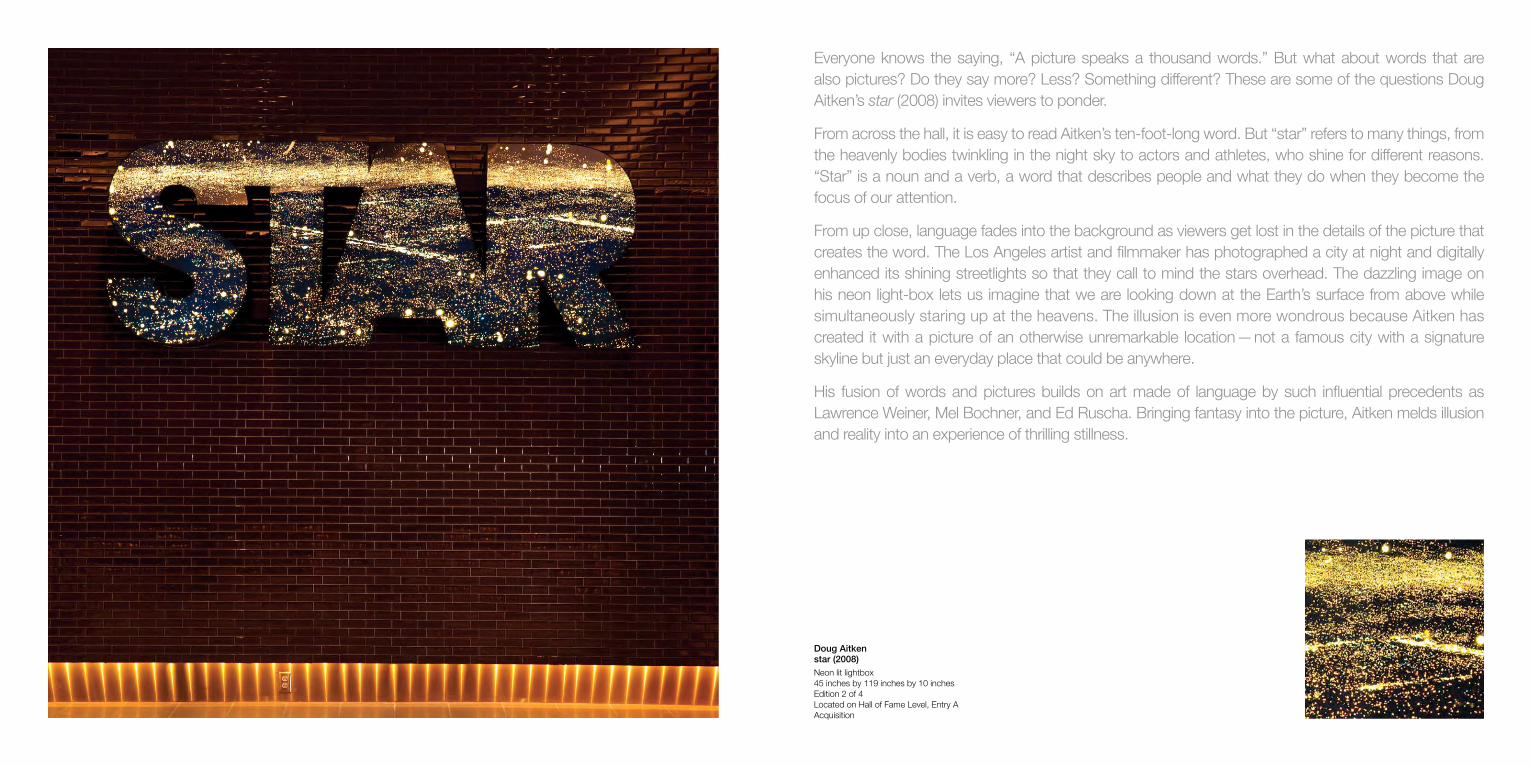
Doug Aitken star (2008) Neon lit lightbox 45 inches by 119 inches by 10 inches Edition 2 of 4 Located on Hall of Fame Level, Entry A Acquisition
Everyone knows the saying, “A picture speaks a thousand words.” But what about words that are also pictures? Do they say more? Less? Something different? These are some of the questions Doug Aitken’s star (2008) invites viewers to ponder.
From across the hall, it is easy to read Aitken’s ten-foot-long word. But “star” refers to many things, from the heavenly bodies twinkling in the night sky to actors and athletes, who shine for different reasons. “Star” is a noun and a verb, a word that describes people and what they do when they become the focus of our attention.
From up close, language fades into the background as viewers get lost in the details of the picture that creates the word. The Los Angeles artist and filmmaker has photographed a city at night and digitally enhanced its shining streetlights so that they call to mind the stars overhead. The dazzling image on his neon light-box lets us imagine that we are looking down at the Earth’s surface from above while simultaneously staring up at the heavens. The illusion is even more wondrous because Aitken has created it with a picture of an otherwise unremarkable location — not a famous city with a signature skyline but just an everyday place that could be anywhere.
His fusion of words and pictures builds on art made of language by such influential precedents as Lawrence Weiner, Mel Bochner, and Ed Ruscha. Bringing fantasy into the picture, Aitken melds illusion and reality into an experience of thrilling stillness.
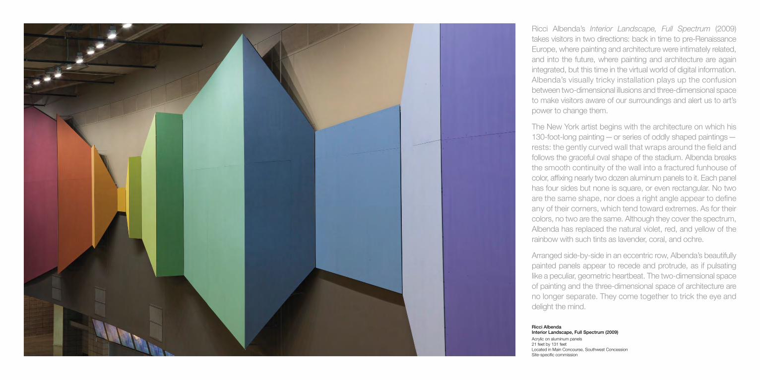
Ricci Albenda Interior Landscape, Full Spectrum (2009) Acrylic on aluminum panels 21 feet by 131 feet Located in Main Concourse, Southwest Concession Site-specific commission
Ricci Albenda’s Interior Landscape, Full Spectrum (2009) takes visitors in two directions: back in time to pre-Renaissance Europe, where painting and architecture were intimately related, and into the future, where painting and architecture are again integrated, but this time in the virtual world of digital information. Albenda’s visually tricky installation plays up the confusion between two-dimensional illusions and three-dimensional space to make visitors aware of our surroundings and alert us to art’s power to change them.
The New York artist begins with the architecture on which his 130-foot-long painting — or series of oddly shaped paintings — rests: the gently curved wall that wraps around the field and follows the graceful oval shape of the stadium. Albenda breaks the smooth continuity of the wall into a fractured funhouse of color, affixing nearly two dozen aluminum panels to it. Each panel has four sides but none is square, or even rectangular. No two are the same shape, nor does a right angle appear to define any of their corners, which tend toward extremes. As for their colors, no two are the same. Although they cover the spectrum, Albenda has replaced the natural violet, red, and yellow of the rainbow with such tints as lavender, coral, and ochre.
Arranged side-by-side in an eccentric row, Albenda’s beautifully painted panels appear to recede and protrude, as if pulsating like a peculiar, geometric heartbeat. The two-dimensional space of painting and the three-dimensional space of architecture are no longer separate. They come together to trick the eye and delight the mind.

Dave Muller Solar Arrangement (2009) Acrylic on wall 21 feet by 131 feet Located in Main Concourse, Northwest Concession Site-specific commission
Like many school kids all over the country, Dave Muller’s first visit to a football field had nothing to do with sports. His science teacher took his class to the local stadium to demonstrate just how big the solar system is. Using a ping-pong ball for the sun, which was placed on one goal line, they needed the entire field, as well as the stands beyond the opposite end zone, to make their accurately scaled model.
Solar Arrangement (2009) plays off of Muller’s memory of that experience. In his expansive mural, the sun is represented by a gorgeous yellow rose. The first three planets, Mercury, Venus, and Earth, are represented by a ball of dry leaves, a ball of crunchy popcorn, and a ball of lush clover. Dashed lines trace small sections of their orbits. Several stars, which resemble snowflakes, twinkle in the background. Muller invites us to ponder our place in the cosmos — to picture the huge crowd gathered here as a tiny speck beneath the heavens. The experience is humbling and eye-opening, both personal and universal.
The hand-drawn, hand-painted richness of Muller’s image makes it intimate and endearing, far warmer and more enchanting than standard diagrams. And like much of Muller’s art, Solar Arrangement has a musical component. Muller is a Los Angeles artist who is also a trumpet player, DJ, and record collector. His sun evokes “The Yellow Rose of Texas,” a legendary song that has been covered again and again and never the same way twice.

Terry Haggerty Two Minds (2009) Acrylic on wall 21 feet by 126 feet Located in Main Concourse, Northeast Concession Site-specific commission
As its title, Two Minds (2009), suggests, Terry Haggerty’s painting is conflicted. On one hand, it presents a system that fuses crisp visual punch with consistent, all-over evenness. On the other, it insists that the quirks provided by unexpected interruptions make art and life both interesting and unpredictable, at once puzzling and fun.
It is impossible to look at Haggerty’s mural without your eyes instantly gliding along its wavy bands of color. From one end to the other, we visually travel speedily along the candy cane-colored curves — as if on a rollercoaster ride. Brightly striped awnings come to mind, as do banners flapping in the wind, garments in Baroque paintings, and 1960s Op Art.
Haggerty’s painting creates the illusion of three-dimensional space by suggesting that some sections recede into the distance and disappear behind other sections. The mind’s eye fills in what is not visible, creating a coherent image. And this is where the London-born, Berlin-based artist throws a monkeywrench into the system.
It is physically impossible for the red and white stripes to curve up and over the “fold” or the “bump” in the upper middle part of the painting. There is simply no way for the stripes to be continuous, unbroken bands. But that is what the mind’s eye wants to see and what our eyes tell us, when carried away by the painting’s visual momentum. And that is exactly what Haggerty wants — a glitch in the system that allows us to be of two minds.

Daniel Buren Unexpected Variable Configurations: A Work in Situ (1998) Wall painted yellow with hand drawn grid and 25 screen-printed aluminum plates 21 feet by 118 feet Edition 10 of 15 and 11 of 15 Located in Main Concourse, Southeast Concession Acquisition
Daniel Buren’s bright yellow wall painting fits into its surroundings at the same time that it stands out from them. This ambiguity leads many viewers to ask: “Is it art or just part of the building?” And that is exactly what the veteran French artist wants you to ask, both of his signature stripe works and everything that has been made by mankind.
Buren’s point is that it is too limiting to think of art as only a precious object that needs to be sequestered in a museum. In his radically democratic view, art is most compelling when it is unexpected, especially when it interacts with its context and alters our perceptions by getting us to think about the world we inhabit.
Buren began his distinguished career in the early 1960s. At that time, messy, abstract painting had become cliché. Buren’s solution was to use ready-made pieces of striped canvas. In 1965, he selected a standard pattern: solid vertical colored stripes alternating with white stripes of the same width, 8.5 centimeters. In 1967, Buren abandoned canvas and began printing his now trademark stripes on posters, which he affixed to walls, fences, benches, and phone booths all over Paris.
Unexpected Variable Configurations: A Work in Situ (1998) is classic Buren. On an immense expanse of identical yellow squares hang 50 aluminum panels, each printed with a black-and-white or white-and-black pattern. The positions of the panels are determined by chance. And like all of Buren’s works, this one invites double takes as viewers see art — and everything around it — with fresh eyes.
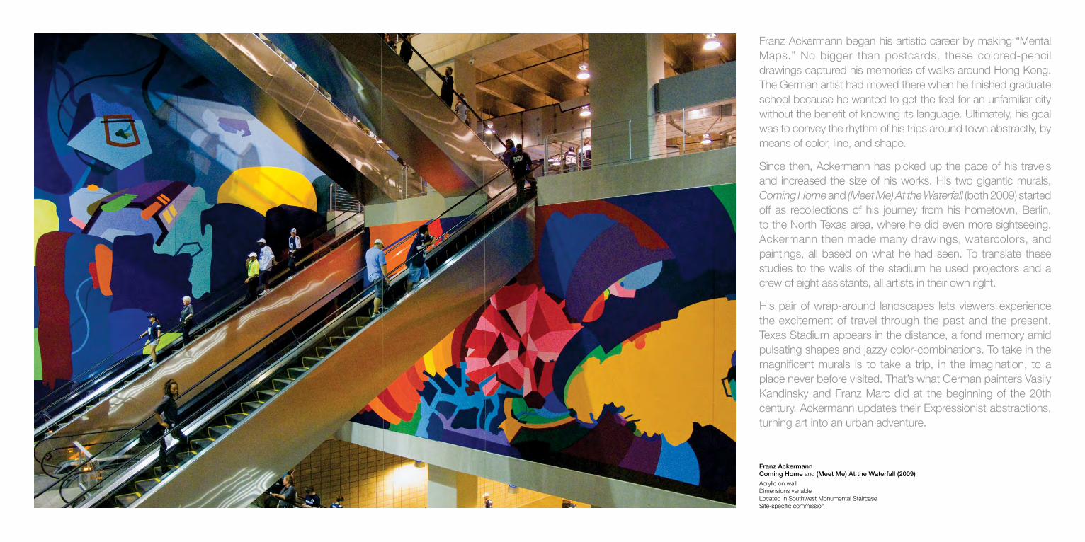
Franz Ackermann Coming Home and (Meet Me) At the Waterfall (2009) Acrylic on wall Dimensions variable Located in Southwest Monumental Staircase Site-specific commission
Franz Ackermann began his artistic career by making “Mental Maps.” No bigger than postcards, these colored-pencil drawings captured his memories of walks around Hong Kong. The German artist had moved there when he finished graduate school because he wanted to get the feel for an unfamiliar city without the benefit of knowing its language. Ultimately, his goal was to convey the rhythm of his trips around town abstractly, by means of color, line, and shape.
Since then, Ackermann has picked up the pace of his travels and increased the size of his works. His two gigantic murals, Coming Home and (Meet Me) At the Waterfall (both 2009) started off as recollections of his journey from his hometown, Berlin, to the North Texas area, where he did even more sightseeing. Ackermann then made many drawings, watercolors, and paintings, all based on what he had seen. To translate these studies to the walls of the stadium he used projectors and a crew of eight assistants, all artists in their own right.
His pair of wrap-around landscapes lets viewers experience the excitement of travel through the past and the present. Texas Stadium appears in the distance, a fond memory amid pulsating shapes and jazzy color-combinations. To take in the magnificent murals is to take a trip, in the imagination, to a place never before visited. That’s what German painters Vasily Kandinsky and Franz Marc did at the beginning of the 20th century. Ackermann updates their Expressionist abstractions, turning art into an urban adventure.
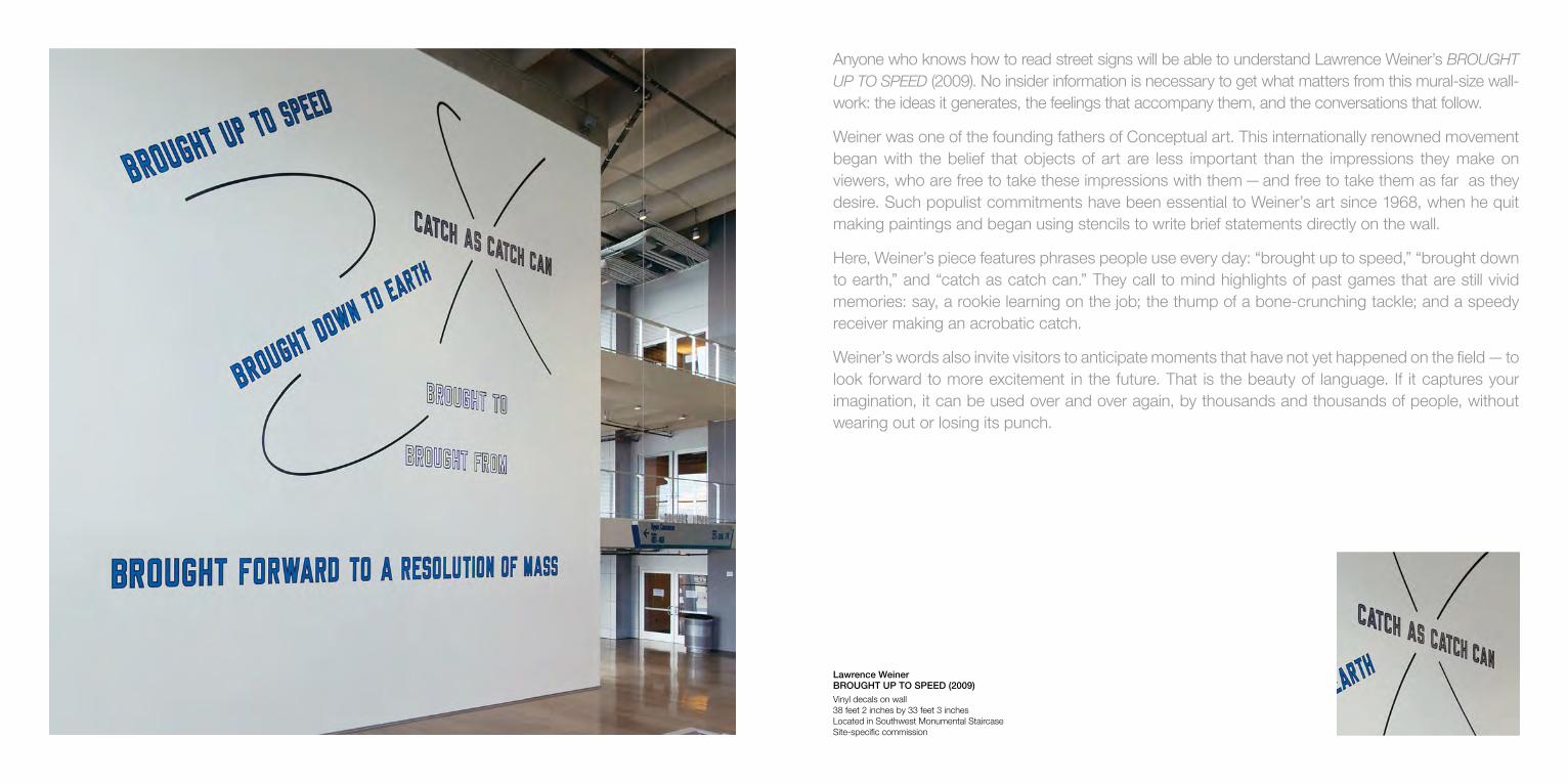
Lawrence Weiner BROUGHT UP TO SPEED (2009) Vinyl decals on wall 38 feet 2 inches by 33 feet 3 inches Located in Southwest Monumental Staircase Site-specific commission
Anyone who knows how to read street signs will be able to understand Lawrence Weiner’s BROUGHT UP TO SPEED (2009). No insider information is necessary to get what matters from this mural-size wall-work: the ideas it generates, the feelings that accompany them, and the conversations that follow.
Weiner was one of the founding fathers of Conceptual art. This internationally renowned movement began with the belief that objects of art are less important than the impressions they make on viewers, who are free to take these impressions with them — and free to take them as far as they desire. Such populist commitments have been essential to Weiner’s art since 1968, when he quit making paintings and began using stencils to write brief statements directly on the wall.
Here, Weiner’s piece features phrases people use every day: “brought up to speed,” “brought down to earth,” and “catch as catch can.” They call to mind highlights of past games that are still vivid memories: say, a rookie learning on the job; the thump of a bone-crunching tackle; and a speedy receiver making an acrobatic catch.
Weiner’s words also invite visitors to anticipate moments that have not yet happened on the field — to look forward to more excitement in the future. That is the beauty of language. If it captures your imagination, it can be used over and over again, by thousands and thousands of people, without wearing out or losing its punch.
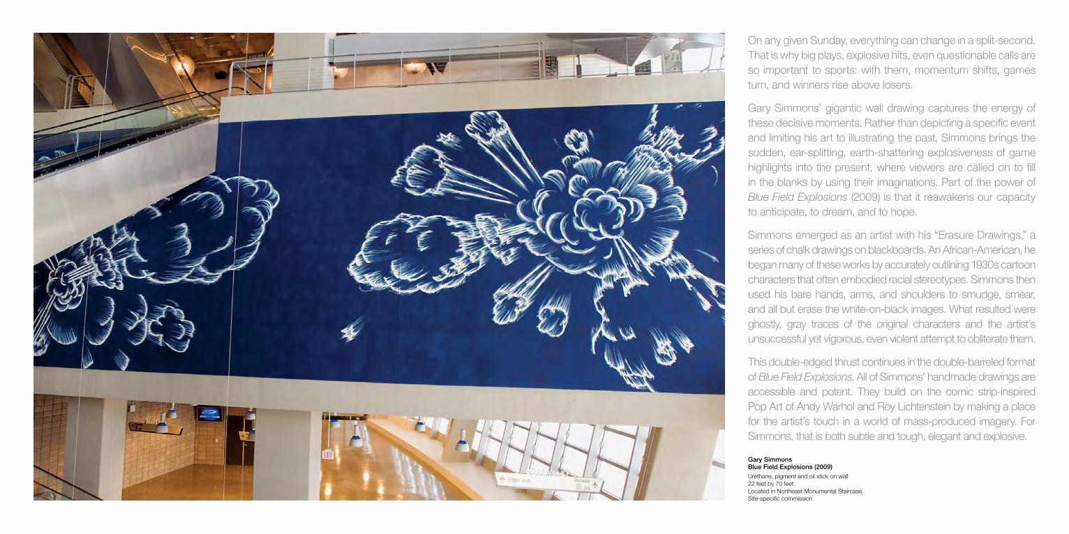
Gary Simmons Blue Field Explosions (2009) Urethane, pigment and oil stick on wall 22 feet by 70 feet Located in Northeast Monumental Staircase Site-specific commission
On any given Sunday, everything can change in a split-second. That is why big plays, explosive hits, even questionable calls are so important to sports: with them, momentum shifts, games turn, and winners rise above losers.
Gary Simmons’ gigantic wall drawing captures the energy of these decisive moments. Rather than depicting a specific event and limiting his art to illustrating the past, Simmons brings the sudden, ear-splitting, earth-shattering explosiveness of game highlights into the present, where viewers are called on to fill in the blanks by using their imaginations. Part of the power of Blue Field Explosions (2009) is that it reawakens our capacity to anticipate, to dream, and to hope.
Simmons emerged as an artist with his “Erasure Drawings,” a series of chalk drawings on blackboards. An African-American, he began many of these works by accurately outlining 1930s cartoon characters that often embodied racial stereotypes. Simmons then used his bare hands, arms, and shoulders to smudge, smear, and all but erase the white-on-black images. What resulted were ghostly, gray traces of the original characters and the artist’s unsuccessful yet vigorous, even violent attempt to obliterate them.
This double-edged thrust continues in the double-barreled format of Blue Field Explosions. All of Simmons’ handmade drawings are accessible and potent. They build on the comic strip-inspired Pop Art of Andy Warhol and Roy Lichtenstein by making a place for the artist’s touch in a world of mass-produced imagery. For Simmons, that is both subtle and tough, elegant and explosive.
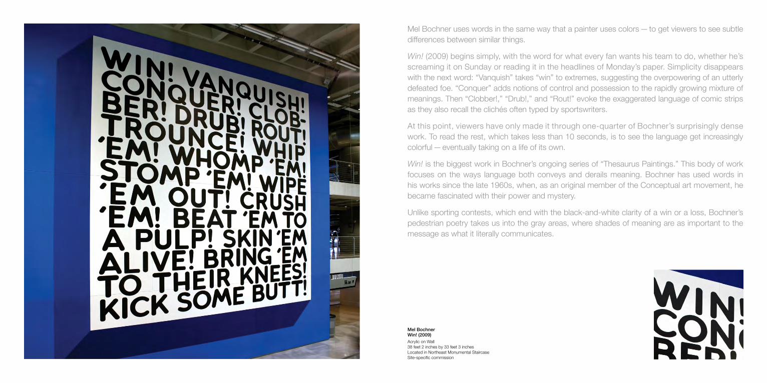
Mel Bochner Win! (2009) Acrylic on Wall 38 feet 2 inches by 33 feet 3 inches Located in Northeast Monumental Staircase Site-specific commission
Mel Bochner uses words in the same way that a painter uses colors — to get viewers to see subtle differences between similar things.
Win! (2009) begins simply, with the word for what every fan wants his team to do, whether he’s screaming it on Sunday or reading it in the headlines of Monday’s paper. Simplicity disappears with the next word: “Vanquish” takes “win” to extremes, suggesting the overpowering of an utterly defeated foe. “Conquer” adds notions of control and possession to the rapidly growing mixture of meanings. Then “Clobber!,” “Drub!,” and “Rout!” evoke the exaggerated language of comic strips as they also recall the clichés often typed by sportswriters.
At this point, viewers have only made it through one-quarter of Bochner’s surprisingly dense work. To read the rest, which takes less than 10 seconds, is to see the language get increasingly colorful — eventually taking on a life of its own.
Win! is the biggest work in Bochner’s ongoing series of “Thesaurus Paintings.” This body of work focuses on the ways language both conveys and derails meaning. Bochner has used words in his works since the late 1960s, when, as an original member of the Conceptual art movement, he became fascinated with their power and mystery.
Unlike sporting contests, which end with the black-and-white clarity of a win or a loss, Bochner’s pedestrian poetry takes us into the gray areas, where shades of meaning are as important to the message as what it literally communicates.

Trenton Doyle Hancock From a Legend to a Choir (2009) Vinyl print 40 feet by 98 feet 6 inches Located on Southeast Ramp Wall Site-specific commission
Trenton Doyle Hancock’s dense work stops visitors in their tracks. Its screaming colors and riotous energy are an eyeful and not for the faint-hearted. But what happens when a viewer spends a few moments with Hancock’s crazy quilt of an image is hardly indelicate. From a Legend to a Choir (2009) builds upon the most democratic aspects of American Pop Art, from Stuart Davis to Andy Warhol to Jean-Michel Basquiat, empowering viewers by letting us bring our own stories to a wildly open-ended narrative.
Hancock’s sprawling mural sets the stage. Its flower-filled setting evokes the biblical Garden of Eden and the psychedelic Summer of Love. Its figures’ striped outfits recall jailhouse garb. Hancock’s cast of characters is a rogue’s gallery: some are headless lumps and others look more like animals than human beings, with a walrus, four-eyed rooster, and other mutants.
These creatures are part of an ongoing saga that Hancock has been telling for the past decade. He calls them “Mounds”—plant-animal hybrids that behave like all of us, sometimes admirably and sometimes badly. Hancock’s homegrown mythology includes a creation story, an epic battle between good and evil, an attempt at reconciliation between color-loving carnivores and scrawny, subterranean vegans, and much more. It has its roots in his personal history. Now based in Houston, Hancock was born in Oklahoma City and raised in Paris, Texas. He is the stepson of a preacher. His roots nourish an inventive imagination out of which springs a world so rich with possibility that viewers cannot help but be drawn into it.

Jim Isermann Untitled (2009) Vacuum-formed styrene wall 40 feet by 96 feet Located on Northwest Ramp Wall Site-specific commission
Jim Isermann’s gigantic wall relief has been conceived and fabricated with the individual in mind. Its basic unit is a seven-foot-square module. This building block is slightly larger than an adult, familiar proportions that do not stretch the imagination, overwhelm the senses, or test the limits of comprehension.
That is what Isermann does when he lays out his human-scale building blocks, arranging 65 of them by turning every other one in the opposite direction. This simple gesture creates a complex pattern that transforms a 4,000-square-foot wall into an astonishingly beautiful abstraction that is a marvel of engineering and a pleasure to behold.
For the logically minded, Isermann’s work is an abstract jigsaw puzzle to be taken apart and reassembled in the mind’s-eye. To study any of its seven-foot sections is to see that each consists of 36 smaller panels that come in 11 different designs, making for nearly 2500 separate parts. For the intuitively inclined, it is not difficult to understand his goals by stepping back and taking in an overall view. He makes basic shapes add up to wholly unexpected experiences that defy explanation as they fuse art, design, and architecture.
For the last 30 years, Isermann has been at the forefront of a movement to combine the logic of industrial production with the freedom of art – to unite the clarity of rationality with the thrill of something more. From wherever one stands, his magnificently user-friendly installation embodies the excitement of being part of something bigger and more profound than usual.

Teresita Fernández Starfield (2009) Mirrored glass cubes on anodized aluminum 14 feet 6 inches by 31 feet 8 inches Located on Hall of Fame Level, Southwest Elevator Lobby Site-specific commission
In the 1960s, a movement called Minimalism stripped art down to the basics: simple shapes, standard materials, and viewers, who were often puzzled by its stubborn silence. Since then, Minimalism has matured, becoming more refined, less abrasive, more gracious. Teresita Fernández takes Minimalism to elegant heights, creating accessible installations that fill the seemingly empty space between things with a sensual charge that transforms otherwise incidental details into evocations of infinity.
In terms of composition and materials, Fernández’s Starfield (2009) could not be simpler: bright dots of light cluster in the center of a glossy black wall. Think disco ball flattened by a steamroller. Then imagine the serene beauty of a crystal-clear night sky in the middle of nowhere, where so many stars twinkle that one cannot help but be awed by the vastness of the cosmos and our tiny place in it. Together, the two images suggest the magic Fernández works in her installation, which is made of nothing but hundreds of mirrored glass cubes (about the size of ice cubes) and sheets of black laminate that cover the wall. The most important element, however, is the space between Starfield and the viewer — and what happens in it.
In every tiny mirror, one sees a miniature reflection. Stepping back, a ghostly silhouette appears in the dark laminate. But when one keeps moving, like a star in the sky, Fernández’s art comes alive, twinkling, shimmering, and reflecting all the colors of the spectrum. Like a rainbow, you cannot touch it or keep it or forget seeing it.

Doug Aitken new horizon (2009) LED lit lightbox 66 inches by 70 inches by 8 1/4 inches Edition 3 of 4 Located on Hall of Fame Level, Southwest Elevator Lobby Acquisition
Doug Aitken’s works grab the eye in a split second. Just as quickly, they invite second looks. Then the game is on: what had seemed obvious becomes complex and open to interpretation.
From far away, Aitken’s new horizon (2009) resembles the shiny blue star on the Cowboys’ helmet. The oval glow at its center recalls the glare of bright lights on a glossy curved surface. From up close, however, it is apparent that Aitken’s nearly six-foot-tall star is actually a laser-sharp photograph of a city’s coastline, shot at night from a plane or helicopter. The Los Angeles artist and filmmaker has mounted his photographic transparency on to an LED light-box. This causes the lights depicted in the image to do what they actually do in the real world: illuminate their surroundings. The picture comes alive as it eliminates the difference between doing and showing, function and form.
Aitken has also used a computer to digitally manipulate the image, making its left and right halves into mirror images of each other. Like a high-tech Rorschach ink blot, the perfectly symmetrical image emphasizes the artifice at the heart of Aitken’s photographs and films. Many of his movies unfold slowly, some across several screens, not telling stories so much as evoking moods and creating atmospheres. Like them, new horizon never lets viewers forget that we are looking at a still image, as it draws us into a drama both serene and strange, at once commonplace and extraordinary.
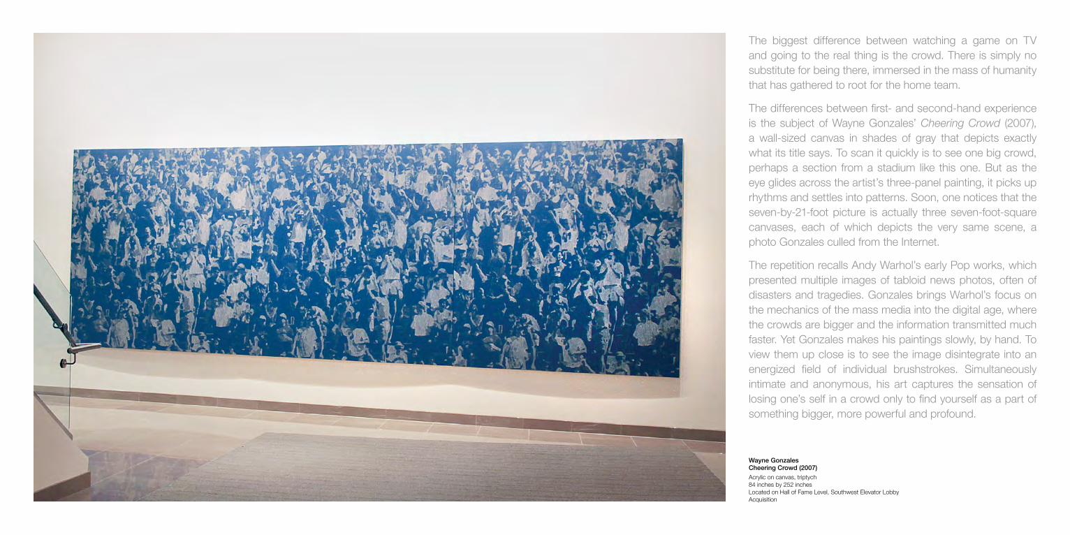
Wayne Gonzales Cheering Crowd (2007) Acrylic on canvas, triptych 84 inches by 252 inches Located on Hall of Fame Level, Southwest Elevator Lobby Acquisition
The biggest difference between watching a game on TV and going to the real thing is the crowd. There is simply no substitute for being there, immersed in the mass of humanity that has gathered to root for the home team.
The differences between first- and second-hand experience is the subject of Wayne Gonzales’ Cheering Crowd (2007), a wall-sized canvas in shades of gray that depicts exactly what its title says. To scan it quickly is to see one big crowd, perhaps a section from a stadium like this one. But as the eye glides across the artist’s three-panel painting, it picks up rhythms and settles into patterns. Soon, one notices that the seven-by-21-foot picture is actually three seven-foot-square canvases, each of which depicts the very same scene, a photo Gonzales culled from the Internet.
The repetition recalls Andy Warhol’s early Pop works, which presented multiple images of tabloid news photos, often of disasters and tragedies. Gonzales brings Warhol’s focus on the mechanics of the mass media into the digital age, where the crowds are bigger and the information transmitted much faster. Yet Gonzales makes his paintings slowly, by hand. To view them up close is to see the image disintegrate into an energized field of individual brushstrokes. Simultaneously intimate and anonymous, his art captures the sensation of losing one’s self in a crowd only to find yourself as a part of something bigger, more powerful and profound.

Wolfgang Tillmans Freischwimmer 155 (2010) Inkjet print 101.57 inches by 181.89 inches Located on Hall of Fame Level, Southeast Elevator Lobby Acquisition
Wolfgang Tillmans’ Freischwimmer 155 (2010) is a super-realistic depiction of a small volume of printer’s ink dissolving in a bath of deep green liquid. As an image, it takes viewers back to a time before the world went digital, when photographers printed pictures the old-fashioned way—with light-sensitive film, paper, and specially mixed chemicals. That’s how Tillmans made this camera-less photograph. Going straight to the darkroom, he submerged a page-size sheet of paper in a carefully mixed solution, dripped in a modest amount of ink, and then, very gently, stirred the mixture. In a sense, he was drawing with liquid. The photographic paper recorded those fleeting, impossible-to-repeat moments.
Then Tillmans digitally scanned his handmade photograph and used an industrial-strength inkjet printer to transform it into a wall-size work. Measuring more than eight by fifteen feet, his beautifully composed print is an immersive environment that is easy to get lost in. Freischwimmer 155 (in English, Free Float) is also a super-saturated abstraction that takes us back to the glory days of abstract painting, when bold gestures and improvised brush-strokes conveyed a sense of infinite possibility. The romance of painting lives on in Tillmans’ high-res image, which brings the past into the present by making room for ambiguity and, even better, real mystery.

Alyson Shotz Crystalline Structure #2 (2013) glass beads and stainless steel wire 108 inches by 120 inches by 120 inches Site specific commission
The space between things is as important to Alyson Shotz’s multipart sculpture as are the materials that make up its many components. That simple shift, from a single thing standing in space to an endless array of elements suspended in midair, distinguishes Shotz’s three-dimensional piece from traditional sculptures. More important, it signals her art’s engagement with the world in which we now live: a global network where everything is connected to everything else and instantaneous communication seems to have diminished the distance that once separated far-away places.
What’s most remarkable about Shotz’s spectacular sculpture is that it makes a place, amid the hustle and bustle of modern life, for quiet contemplation. To see her site-specific sculpture is to be immediately dazzled by its beauty. That, alone, is significant, and worth a visit. But for Shotz, it’s only the beginning.
Rather than making a powerful object that stops viewers in our tracks and invites us to marvel at its magnificence, she draws us into her work’s orbit by making us want to see it from as many angles as possible. That’s when we discover that the material she has sculpted is light—and that the way light moves through her precisely arranged piece is what matters. In a sense, Shotz has composed a silent symphony of reflected and refracted light, its lively luminosity guiding our eyes along lines through space, where various patterns shimmer and sparkle and then disperse, depending upon our position and point of view. It’s a simple sort of interactivity that could not be more low-tech or profound.
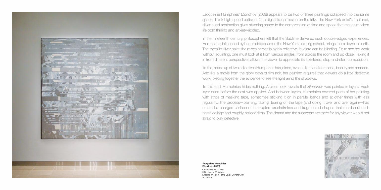
Jacqueline Humphries Blondnoir (2008) Oil and enamel on linen 90 inches by 96 inches Located on Hall of Fame Level, Owners Club Acquisition
Jacqueline Humphries’ Blondnoir (2008) appears to be two or three paintings collapsed into the same space. Think high-speed collision. Or a digital transmission on the fritz. The New York artist’s fractured, silver-hued abstraction gives stunning shape to the compression of time and space that makes modern life both thrilling and anxiety-riddled.
In the nineteenth century, philosophers felt that the Sublime delivered such double-edged experiences. Humphries, influenced by her predecessors in the New York painting school, brings them down to earth. The metallic silver paint she mixes herself is highly reflective. Its glare can be blinding. So to see her work without squinting, one must look at it from various angles, from across the room and up close. Taking it in from different perspectives allows the viewer to appreciate its splintered, stop-and-start composition.
Its title, made up of two adjectives Humphries has joined, evokes light and darkness, beauty and menace. And like a movie from the glory days of film noir, her painting requires that viewers do a little detective work, piecing together the evidence to see the light amid the shadows.
To this end, Humphries hides nothing. A close look reveals that Blondnoir was painted in layers. Each layer dried before the next was applied. And between layers, Humphries covered parts of her painting with strips of masking tape, sometimes sticking it on in parallel bands and at other times with less regularity. The process—painting, taping, tearing off the tape (and doing it over and over again)—has created a charged surface of interrupted brushstrokes and fragmented shapes that recalls cut-and-paste collage and roughly-spliced films. The drama and the suspense are there for any viewer who is not afraid to play detective.

Artists are especially sensitive to the ways their works are illuminated. Too little light, and it is hard to see the details. Too much, and the colors wash out, sometimes causing viewers to squint. To insure that his art is always seen in the best light, Olafur Eliasson has begun to make sculptures that hang from the ceiling and function like lamps.
In the foyer of the Owners Club, Fat super star (2008–09) suggests that art need not be the star of the show for it to bring nuanced experiences to visitors. The same is true of Homage to P. Schatz edition (2012), the two pieces inside the Legends Club, which similarly blur the boundaries between art and design, not to mention beauty and usefulness.
Fat super star is a quiet reminder of the magic of happenstance and the unforgettable resonance of unexpected experiences. Recalling holiday decorations, religious symbols, children’s toys, and the stars on Hollywood Boulevard, Eliasson’s elusive sculpture also resembles a giant jewel and a homemade rainbow. Its surface, made of optical filter glass, causes the white light emitted by its halogen fixtures to refract into the various tints of the spectrum. Casting red, orange, and yellow, as well as green, blue, and violet patterns on the domed ceiling, the mesmerizing sculpture also shines soft beams of light on visitors, who become part of the art.
Something similar happens with the two pieces from Eliasson’s Homage to P. Schatz edition (2012). Their title refers to the German-born sculptor, inventor and mathematician who discovered and patented the ‘oloid,’ an oddly graceful form based on a pair of congruent disks that intersect perpendicularly. That is the form of Eliasson’s internally illuminated sculptures, which light up the room both literally and metaphorically. Made of thin sheets of optical lighting film stretched tautly over aluminum armatures, these multipurpose pieces are focal points that disperse attention throughout their surroundings, inviting everyone to be attentive to everything – and everyone – present.
Olafur Eliasson Fat super star (2008 – 09) Brass, color effect filter glass, mirror, halogen light fixture 39 3/8 inches by 39 3/8 inches by 39 3/8 inches Edition 2 of 10 Located on Hall of Fame Level, Owner’s Club Acquisition
Olafur Eliasson Homage to P. Schatz (2012) Optical lighting film, aluminum rings, LED strips 11 7/8 inches by 11 7/8 inches by 27 3/4 inches Edition 231 and 232 of 360 Located in East and West Vestibules, Legends Club Acquisition

Garth Weiser strips painting down to the basics. TV Keith (2008) is a large abstract canvas from which color has been almost entirely eliminated. The same goes for the free-form gestures that ordinarily provide evidence of the artist’s touch and typically give abstract art its hand-made originality. In the young New York-based painter’s no-nonsense canvas, the shapes are common, the lines are precise, and the composition is rudimentary, a nearly symmetrical division of top and bottom, left and right, circles and rectangles.
Despite the reductive format, Weiser’s work is anything but limited. This deceptively simple image is equally engaged with the materials and techniques of its construction, the world around it, and the history of Minimalist abstraction. It makes room for fascinating reflections about painting’s capacity to multitask, to be not only many things to many people, but to be many things to individual viewers, all at once.
To apply paint, Weiser uses brushes, palette knives, and spray guns. Some parts of his image are atmospheric, others are flat expanses, and still others appear to be three-dimensional, jutting forward like a steely cone, or overlapping like a target’s concentric rings. The line that divides the airy top of the painting from its rock-solid bottom recalls the horizon of wide-open spaces and evokes the landscape of Montana, where Weiser was born. The stylized simplicity of corporate logos and the crisp efficiency of graphic design play important roles in Weiser’s multilayered work, which also recalls the test patterns and static that often appeared on TV screens in the days before the world went digital.
Garth Weiser TV Keith (2008) Acrylic and gouache on canvas 93 inches by 83 inches Located on Hall of Fame Level, Owners Club Acquisition
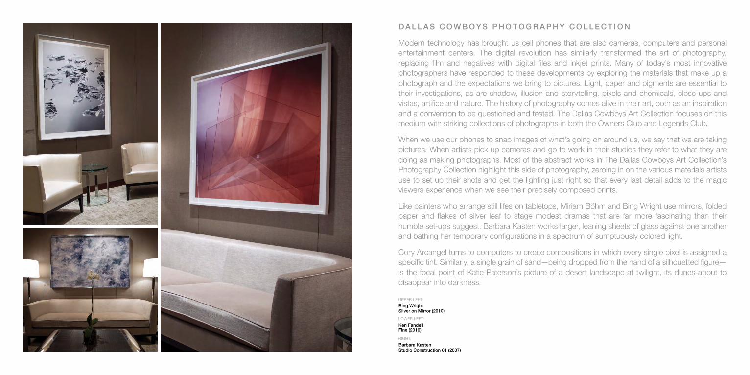
D A L L A S C O W B O Y S P H O T O G R A P H Y C O L L E C T I O N
Modern technology has brought us cell phones that are also cameras, computers and personal entertainment centers. The digital revolution has similarly transformed the art of photography, replacing film and negatives with digital files and inkjet prints. Many of today’s most innovative photographers have responded to these developments by exploring the materials that make up a photograph and the expectations we bring to pictures. Light, paper and pigments are essential to their investigations, as are shadow, illusion and storytelling, pixels and chemicals, close-ups and vistas, artifice and nature. The history of photography comes alive in their art, both as an inspiration and a convention to be questioned and tested. The Dallas Cowboys Art Collection focuses on this medium with striking collections of photographs in both the Owners Club and Legends Club.
When we use our phones to snap images of what’s going on around us, we say that we are taking pictures. When artists pick up cameras and go to work in their studios they refer to what they are doing as making photographs. Most of the abstract works in The Dallas Cowboys Art Collection’s Photography Collection highlight this side of photography, zeroing in on the various materials artists use to set up their shots and get the lighting just right so that every last detail adds to the magic viewers experience when we see their precisely composed prints.
Like painters who arrange still lifes on tabletops, Miriam Böhm and Bing Wright use mirrors, folded paper and flakes of silver leaf to stage modest dramas that are far more fascinating than their humble set-ups suggest. Barbara Kasten works larger, leaning sheets of glass against one another and bathing her temporary configurations in a spectrum of sumptuously colored light.
Cory Arcangel turns to computers to create compositions in which every single pixel is assigned a specific tint. Similarly, a single grain of sand—being dropped from the hand of a silhouetted figure—is the focal point of Katie Paterson’s picture of a desert landscape at twilight, its dunes about to disappear into darkness.
UPPER LEFT:
Bing Wright Silver on Mirror (2010)
LOWER LEFT:
Ken Fandell Fine (2010)
RIGHT:
Barbara Kasten Studio Construction 01 (2007)
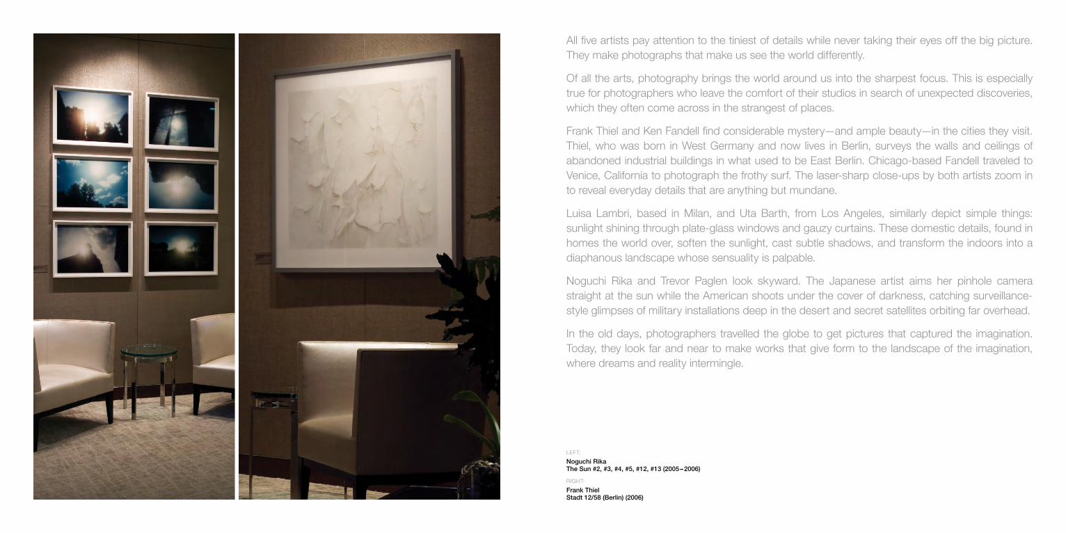
All five artists pay attention to the tiniest of details while never taking their eyes off the big picture. They make photographs that make us see the world differently.
Of all the arts, photography brings the world around us into the sharpest focus. This is especially true for photographers who leave the comfort of their studios in search of unexpected discoveries, which they often come across in the strangest of places.
Frank Thiel and Ken Fandell find considerable mystery—and ample beauty—in the cities they visit. Thiel, who was born in West Germany and now lives in Berlin, surveys the walls and ceilings of abandoned industrial buildings in what used to be East Berlin. Chicago-based Fandell traveled to Venice, California to photograph the frothy surf. The laser-sharp close-ups by both artists zoom in to reveal everyday details that are anything but mundane.
Luisa Lambri, based in Milan, and Uta Barth, from Los Angeles, similarly depict simple things: sunlight shining through plate-glass windows and gauzy curtains. These domestic details, found in homes the world over, soften the sunlight, cast subtle shadows, and transform the indoors into a diaphanous landscape whose sensuality is palpable.
Noguchi Rika and Trevor Paglen look skyward. The Japanese artist aims her pinhole camera straight at the sun while the American shoots under the cover of darkness, catching surveillance-style glimpses of military installations deep in the desert and secret satellites orbiting far overhead.
In the old days, photographers travelled the globe to get pictures that captured the imagination. Today, they look far and near to make works that give form to the landscape of the imagination, where dreams and reality intermingle.
LEFT:
Noguchi Rika The Sun #2, #3, #4, #5, #12, #13 (2005 – 2006)
RIGHT:
Frank Thiel Stadt 12/58 (Berlin) (2006)

From 2006–2009, James Welling photographed Philip Johnson’s “Glass House.” The modern architect had built the home for himself in 1949 in New Canaan, Connecticut. It was an instant hit. Over the years, the see-through structure has become an icon found in every architectural textbook.
The price of fame, in this case, is that people treat the “Glass House” as a masterpiece that merits endless scrutiny. This ignores the larger purpose of the house: to disappear into its surrounding so that people might be more aware of the quiet beauty all around them.
Welling’s picture brings this side of Johnson’s work to the forefront. Using color filters, the Los Angeles photographer invites us to see the house anew: not as a static structure to be looked at, but as a form to be looked through—like the lens of a camera. Welling finds, in Johnson’s often-photographed home, a way of looking at the world that makes us think twice about what we have been missing while enjoying what is right in front of our eyes. In his evocative photograph, historic truthfulness and poetic beauty merge.
James Welling 6618 (2008) Inkjet print Edition of 5 East Vestibule, Owner’s Club
Wolfgang Tillmans paper drop (Krishnamurti) (2006) Framed C-print Entry wall, Legends Club
Wolfgang Tillmans’ large-format photograph of a curled-up corner of a poster-size print invites viewers to ponder the relationship between art and what we say about it. Never tipping the balance toward one or the other, this carefully composed yet casually offhand photograph treats words and images as two sides of the same coin: tools we use to make sense of our surroundings, which are always more captivating when we pay attention to their ambiguities.
The off-centered composition of paper drop (Krishnamurti) (2006) compels viewers to attend to the spaces around the partially rolled-up photograph. The light gray shadow cast on the bright white ground and the dark black shadow in the teardrop-shaped curl give substance to Tillmans’ image. He emphasizes the physicality of images by using film and photographic paper rather than the digital cameras and printers that have all but replaced hands-on processing.
A similar sense of wistfulness is suggested by Tillmans’ title, which refers to Jiddu Krishnamurti (1895-1986), an Indian author whose writings focus on the role consciousness plays in the way we see the world. Seemingly simple, Tillmans’ picture makes space between things so that our thoughts might fill them.

Florian Maier-Aichen’s nighttime shot of Hoover Dam brings Romanticism back to photography in a way that makes both Romanticism and photography look better than ever—far more fascinating than usual and ahead of the curve in their capacity to capture the tenor of our times.
The emotional extremes of the 19th-century movement in art, literature and music are not all that enter Maier-Aichen’s gorgeous picture of a massive federal project completed during the Great Depression. His gelatin silver print evokes the atmosphere of film noir masterpieces and sci-fi fantasies while acknowledging photography’s power to document its surroundings.
Using old-fashioned film and a long exposure, Maier-Aichen employs a low camera angle to set up a symmetrical composition comprised of stark contrasts. The velvety blackness of a starless sky evokes the vastness of the void. An even more emphatic sense of infinity is conveyed at the picture’s center, where the icy whiteness of overexposed hotspots makes much of reality appear to dissolve in the glare.
Although earth, water and air—or rock, river and dam—fill every inch of the photograph, these elements are suffused with mystery and intrigue. With cool efficiency, Maier-Aichen transforms an icon of American engineering into a ghostly apparition whose stillness is sublime.
Florian Maier-Aichen Untitled (2011) Silver gelatin print East Vestibule, Owners Club
Walead Beshty’s seemingly abstract photograph is a mind-bending puzzle that makes us see photography—and the world around us—in a new light.
In the past, photographers generally followed one of two paths: either depicting the world realistically or using the medium’s materials to make abstract studies. Beshty brings these approaches together, creating ingenious intersections where there is more to the picture than meets the eye.
To make Fold (0/90/180/270 directional light sources), July 11th 2009, Annadale-On-Hudson, New York, Foma Multigrade Fiber (2009) Beshty began in a dark studio. He folded a large sheet of photographic paper into a simple geometric configuration and then placed it on a tabletop. Next, he illuminated his temporary sculpture with bright spotlights. Finally, he unfolded the paper, pressed it flat and had it framed. The finished piece is a record of what happened in the darkroom, its creases, shadows and highlights allowing viewers to reconstruct, in the mind’s eye, each step of Beshty’s process. Hiding nothing, but leaving plenty to the imagination, this photograph is a picture of its own making.
Walead Beshty Fold (0º/90º/180º/270º directional light sources), July 11th 2009, Annandale-On-Hudson, New York, Foma Multigrade Fiber (2009) Color photographic paper West Vestibule, Owner’s Club
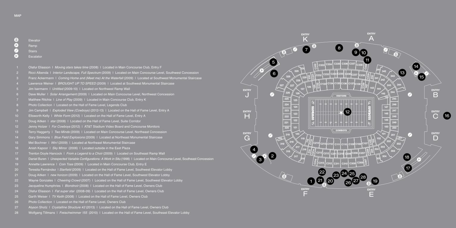
MAP
Elevator
Ramp
Stairs
Escalator
1 Olafur Eliasson | Moving stars takes time (2008) | Located in Main Concourse Club, Entry F 2 Ricci Albenda | Interior Landscape, Full Spectrum (2009) | Located on Main Concourse Level, Southwest Concession 3 Franz Ackermann | Coming Home and (Meet me) At the Waterfall (2009) | Located at Southwest Monumental Staircase 4 Lawrence Weiner | BROUGHT UP TO SPEED (2009) | Located at Southwest Monumental Staircase 5 Jim Isermann | Untitled (2009-10) | Located on Northwest Ramp Wall 6 Dave Muller | Solar Arrangement (2009) | Located on Main Concourse Level, Northwest Concession 7 Matthew Ritchie | Line of Play (2009) | Located in Main Concourse Club, Entry K 8 Photo Collection | Located on the Hall of Fame Level, Legends Club 9 Jim Campbell | Exploded View (Cowboys) (2012-13) | Located on the Hall of Fame Level, Entry A 10 Ellsworth Kelly | White Form (2012) | Located on the Hall of Fame Level, Entry A 11 Doug Aitken | star (2008) | Located on the Hall of Fame Level, Suite Corridor 12 Jenny Holzer | For Cowboys (2012) | AT&T Stadium Video Board and Concourse Monitors 13 Terry Haggerty | Two Minds (2009) | Located on Main Concourse Level, Northeast Concession 14 Gary Simmons | Blue Field Explosions (2009) | Located at Northeast Monumental Staircase 15 Mel Bochner | Win! (2009) | Located at Northeast Monumental Staircase 16 Anish Kapoor | Sky Mirror (2006) | Located outside in the East Plaza 17 Trenton Doyle Hancock | From a Legend to a Choir (2009) | Located on Southeast Ramp Wall 18 Daniel Buren | Unexpected Variable Configurations: A Work in Situ (1998) | Located on Main Concourse Level, Southeast Concession 19 Annette Lawrence | Coin Toss (2009) | Located in Main Concourse Club, Entry E 20 Teresita Fernández | Starfield (2009) | Located on the Hall of Fame Level, Southwest Elevator Lobby 21 Doug Aitken | new horizon (2009) | Located on the Hall of Fame Level, Southwest Elevator Lobby 22 Wayne Gonzales | Cheering Crowd (2007) | Located on the Hall of Fame Level, Southwest Elevator Lobby 23 Jacqueline Humphries | Blondnoir (2008) | Located on the Hall of Fame Level, Owners Club 24 Olafur Eliasson | Fat super star (2008-09) | Located on the Hall of Fame Level, Owners Club 25 Garth Weiser | TV Keith (2008) | Located on the Hall of Fame Level, Owners Club 26 Photo Collection | Located on the Hall of Fame Level, Owners Club 27 Alyson Shotz | Crystalline Structure #2 (2013) | Located on the Hall of Fame Level, Owners Club 28 Wolfgang Tillmans | Freischwimmer 155 (2010) | Located on the Hall of Fame Level, Southeast Elevator Lobby
7
13
1098
6
12
ENTRY
K
ENTRY
F
ENTRY
A
ENTRY
E
ENTRY
B
ENTRY
C
ENTRY
D
ENTRY
J
327
328
329330
229228
227
226
225
224
223
222
221
220
219320
319218
318
317
217
119
216
316
215
118
120
121
122
123
124
125
126
127128
230
129
ENTRY
H
ENTRY
G
103 102
205 204
305304
303
302
301
245146
145
144143142
240
241242
243
244
344
343
342341
203
202
201
250
249
248
247
246
101
150
149
148
147
C311 C310
C21
4
C213 C212 C211 C210 C209 C208 C20
6
C207
C308 C30
7
C309C312C313C31
4
C213 C213 C111 C110 C109 C108 C107 C10
6
C112C11
5
C13
2 C133 C134 C135 C136 C137 C138
C13
9
C23
9C238C237C236C235C234C233C232
C23
1C
332 C333 C334 C335 C336 C337 C338
C33
95
15
14
18
17
16
1 2021
2223 24 25
26 27 1928
2
4
3
11

68
A stadium for the 21st century is born with great expectations. When that stadium is home to the Dallas Cowboys, the expectations are heroic. The brand is a global power, and its home a symbol for all the world to see. The internationally recognized Cowboys brand needed a clear, powerful, progressive, even edgy architectural expression. There would be no superfluous decoration or retro nostalgia encrusting this building. Yet a hint of the recognizable design of historic Texas Stadium, including its signature hole in the roof, would remain.
The Jones family and the global design firm HKS, Inc., under the direction of architect Bryan Trubey, have developed a powerful iconic building through a simple form that excludes purity, clarity and coherence. The form of AT&T Stadium is defined by immense, sweeping arcs in each dimension which unify the structure and instill it with a fluid grace that belies its size.
Movement, the essence of sports, is expressed literally as AT&T Stadium configures itself for the day’s weather, opening its roof and 120-foot high end zone doors to light and air whenever possible. The architecture also implies movement through the interacting rhythms of its canted and convex side walls, signature entry brow, and quarter-mile-long roof support arches.
The theme of openness for this stadium begins outside as landscaped pedestrian promenades sweep toward the stadium, and the concave end zone walls suggest a welcoming embrace. Inside is the largest column-free room in the world, defined by a visible structure. The objective is a space that is emotionally uplifting but never overwhelming, its power restrained by its clarity.
This building, which scored international acclaim with its opening, met those expectations, and more. “A fluid contemporary design that belongs to its own time,” wrote The Dallas Morning News architecture critic David Dillon. The Wall Street Journal’s Mark Yost called it “simply mesmerizing,” and predicted that looking back in 40 years, this stadium “will be seen as monumental—the 21st-century equivalent of the opening of Yankee Stadium in 1923.”
As a complete destination environment, AT&T Stadium asked to be much more than a boldly designed shell. The interior spaces, from granite-finished walls to sophisticated lighting design, had to fulfill the promise of its exterior form. It was designed as a showcase for a collection of serious contemporary art. Along with these luxuries, the cutting-edge technology, the flexibility of spaces to adapt to diverse uses, and the sheer wow factor are attracting a world of events and audiences.
T H E A R C H I T E C T U R E O F AT & T S TA D I U M
AT&T Stadium Arlington, Texas
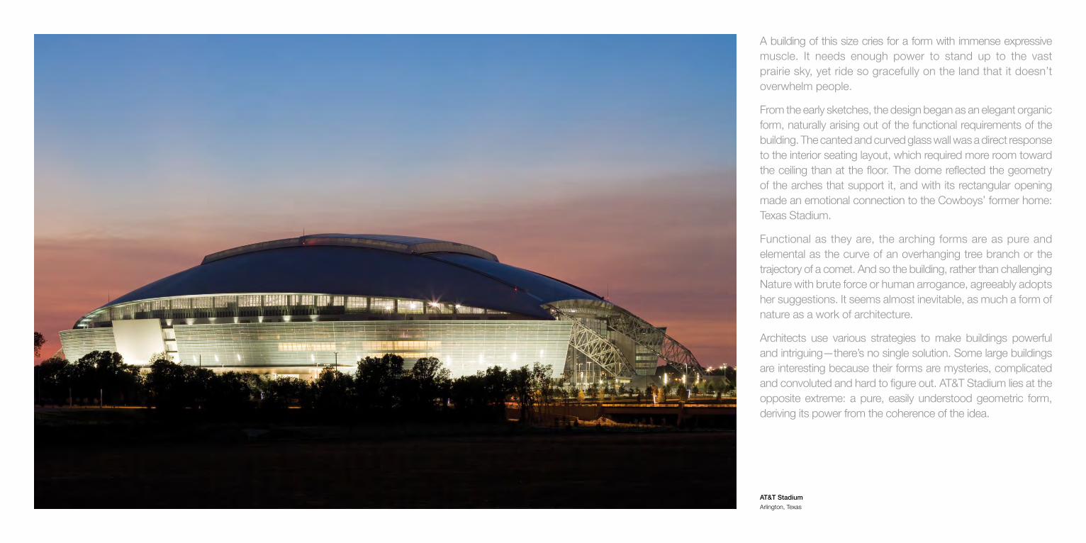
A building of this size cries for a form with immense expressive muscle. It needs enough power to stand up to the vast prairie sky, yet ride so gracefully on the land that it doesn’t overwhelm people.
From the early sketches, the design began as an elegant organic form, naturally arising out of the functional requirements of the building. The canted and curved glass wall was a direct response to the interior seating layout, which required more room toward the ceiling than at the floor. The dome reflected the geometry of the arches that support it, and with its rectangular opening made an emotional connection to the Cowboys’ former home: Texas Stadium.
Functional as they are, the arching forms are as pure and elemental as the curve of an overhanging tree branch or the trajectory of a comet. And so the building, rather than challenging Nature with brute force or human arrogance, agreeably adopts her suggestions. It seems almost inevitable, as much a form of nature as a work of architecture.
Architects use various strategies to make buildings powerful and intriguing—there’s no single solution. Some large buildings are interesting because their forms are mysteries, complicated and convoluted and hard to figure out. AT&T Stadium lies at the opposite extreme: a pure, easily understood geometric form, deriving its power from the coherence of the idea.
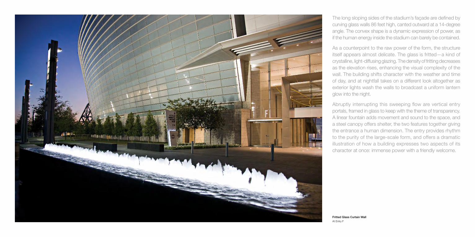
The long sloping sides of the stadium’s façade are defined by curving glass walls 86 feet high, canted outward at a 14-degree angle. The convex shape is a dynamic expression of power, as if the human energy inside the stadium can barely be contained.
As a counterpoint to the raw power of the form, the structure itself appears almost delicate. The glass is fritted—a kind of crystalline, light-diffusing glazing. The density of fritting decreases as the elevation rises, enhancing the visual complexity of the wall. The building shifts character with the weather and time of day, and at nightfall takes on a different look altogether as exterior lights wash the walls to broadcast a uniform lantern glow into the night.
Abruptly interrupting this sweeping flow are vertical entry portals, framed in glass to keep with the theme of transparency. A linear fountain adds movement and sound to the space, and a steel canopy offers shelter, the two features together giving the entrance a human dimension. The entry provides rhythm to the purity of the large-scale form, and offers a dramatic illustration of how a building expresses two aspects of its character at once: immense power with a friendly welcome.
Fritted Glass Curtain Wall At Entry F

Can pure structure also be considered art? Of course: the Eiffel Tower, the Golden Gate Bridge, and now AT&T Stadium.
The twin backbones of the building are the two arched trusses, each spanning the entire 1,290-foot length of the structure. They physically support the roof and its moving parts, visually frame the end zones, and unify the interior and exterior architecture as iconic elements in both contexts. By launching themselves from outside the building, they suggest movement toward and into it.
These structures, the longest single-span arches ever built, imply strength, movement, and even grace—all quintessential qualities in sports. Even the concrete abutments that receive the ends of the arches have a sculptural presence, and yet these are forms that grow out of engineering necessity, not artistic whimsy. Look at them, and you can easily visualize the load from the arches flowing into the ground. The beauty of the structures grows straight out of their integrity.
Arched Truss Located in East and West Plazas

Among the many design challenges of a big building is to make it feel inviting rather than overwhelming. A Gothic cathedral for example was encrusted with human-scaled ornamental details to give it intimacy. Such delicacies would be lost on a 21st-century stadium, so this building instead offers transparency.
The end zones’ transparent walls are actually the world’s largest retractable doors. Both ends feature five sliding glass panels covering an opening 180 feet wide and 120 feet high. With the doors open, the bowl takes on the feel of an intimate amphitheater nestled in a park. When closed, the vast expanses of glass still invite the interior environment to interact with the outdoors.
Outside, pedestrian plazas with formal landscaping and pools flow into the embrace of the building. The idea is not only to gracefully integrate the building into its site, but also to create useful outdoor rooms and a processional entry sequence. Just walking toward the building feels like a celebration.
Exterior Plaza and Retractable Endzone Doors West End Zone
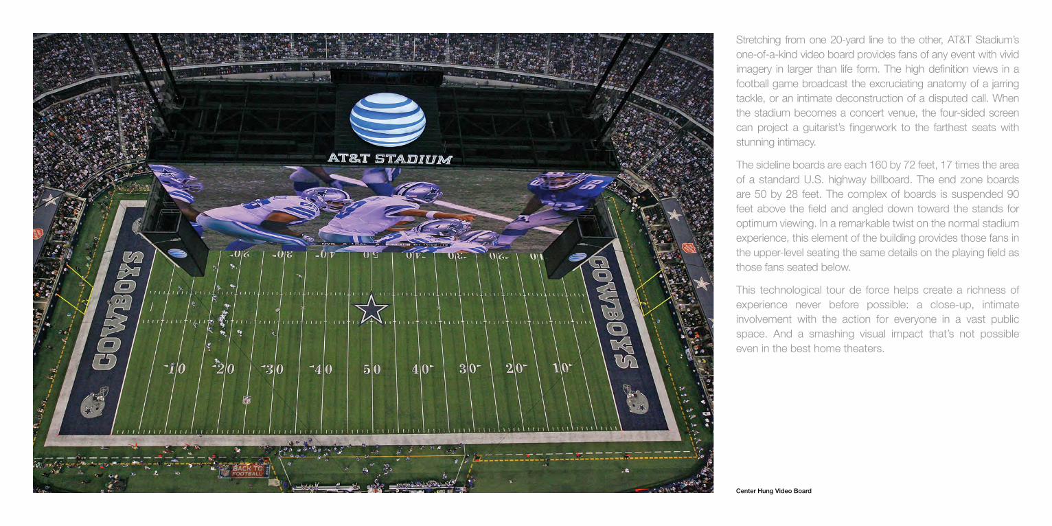
Stretching from one 20-yard line to the other, AT&T Stadium’s one-of-a-kind video board provides fans of any event with vivid imagery in larger than life form. The high definition views in a football game broadcast the excruciating anatomy of a jarring tackle, or an intimate deconstruction of a disputed call. When the stadium becomes a concert venue, the four-sided screen can project a guitarist’s fingerwork to the farthest seats with stunning intimacy.
The sideline boards are each 160 by 72 feet, 17 times the area of a standard U.S. highway billboard. The end zone boards are 50 by 28 feet. The complex of boards is suspended 90 feet above the field and angled down toward the stands for optimum viewing. In a remarkable twist on the normal stadium experience, this element of the building provides those fans in the upper-level seating the same details on the playing field as those fans seated below.
This technological tour de force helps create a richness of experience never before possible: a close-up, intimate involvement with the action for everyone in a vast public space. And a smashing visual impact that’s not possible even in the best home theaters.
Center Hung Video Board

This is a big, bold building that speaks quietly on the inside. The palette of interior finishes stays close to neutral tones to provide a respectful backdrop for the art, but everywhere the interior architecture exudes quality, richness of detail, and distinctive materials. Unlike an earlier generation of raw-boned stadiums, the goal here was to provide visitors with the feeling of walking through a five-star hotel.
The granite was selected only after several expeditions to Italy in search of stone that had never been deployed elsewhere. The luxury suites likewise use exotic woods, custom millwork and Italian glass tiles, but the emphasis is always on clear and straightforward design. Lighting in the clubs is a dynamic architectural element in itself, able to provide drama to suit the character of the event.
The quality of the materials and interior architecture underscores the point that AT&T Stadium is much more than a venue for sports events and concerts. It’s an icon.
LEFT: Silver Level ClubRIGHT: Main Lobby

The numbers alone can boggle the mind. The largest column-free room in the world, AT&T Stadium’s bowl has 104 million cubic feet. The Statue of Liberty could fit inside, its torch enjoying plenty of headroom under the stadium’s 292-foot-high ceiling. The retractable roof becomes a 2.4-acre window to the sky when it opens. With a capacity reaching beyond 100,000 patrons, the venue becomes a global village unto itself on event day.
Numbers, however, never explain how a space feels. It isn’t about size just for the sake of size, for setting records.
There’s an inherent vitality in the sensation of a community enveloped in a single vast space. There’s a feeling of secure satisfaction in being able to view the full quarter-mile sweep of the arched roof trusses; at one glance, the structure explains itself. And the clear sight lines to the field, of course, are an amenity much appreciated by every guest. Even the concourses are destinations, providing not only social gathering places and hospitality but also sweeping vistas of the action.
Form should always follow function, as Louis Sullivan advised. In this building, form and function were conceived together, virtually as a single entity.
LEFT: Miller Lite Club, Event LevelRIGHT: Game day at AT&T Stadium
T O U R D E A R T
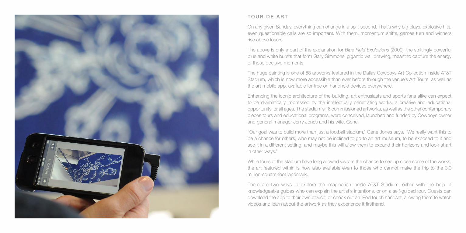
On any given Sunday, everything can change in a split-second. That’s why big plays, explosive hits, even questionable calls are so important. With them, momentum shifts, games turn and winners rise above losers.
The above is only a part of the explanation for Blue Field Explosions (2009), the strikingly powerful blue and white bursts that form Gary Simmons’ gigantic wall drawing, meant to capture the energy of those decisive moments.
The huge painting is one of 58 artworks featured in the Dallas Cowboys Art Collection inside AT&T Stadium, which is now more accessible than ever before through the venue’s Art Tours, as well as the art mobile app, available for free on handheld devices everywhere.
Enhancing the iconic architecture of the building, art enthusiasts and sports fans alike can expect to be dramatically impressed by the intellectually penetrating works, a creative and educational opportunity for all ages. The stadium’s 16 commissioned artworks, as well as the other contemporary pieces tours and educational programs, were conceived, launched and funded by Cowboys owner and general manager Jerry Jones and his wife, Gene.
“Our goal was to build more than just a football stadium,” Gene Jones says. “We really want this to be a chance for others, who may not be inclined to go to an art museum, to be exposed to it and see it in a different setting, and maybe this will allow them to expand their horizons and look at art in other ways.”
While tours of the stadium have long allowed visitors the chance to see up close some of the works, the art featured within is now also available even to those who cannot make the trip to the 3.0 million-square-foot landmark.
There are two ways to explore the imagination inside AT&T Stadium, either with the help of knowledgeable guides who can explain the artist’s intentions, or on a self-guided tour. Guests can download the app to their own device, or check out an iPod touch handset, allowing them to watch videos and learn about the artwork as they experience it firsthand.

86 87
ART COUNCIL
GeneJones,Owner,DallasCowboys
CharlotteJonesAnderson,ExecutiveVicePresident,DallasCowboys
MaryZlot,ArtAdvisor,ZlotBuell+Associates
MichaelAuping,ChiefCurator,MuseumofModernArtofFortWorth
JeffreyGrove,SeniorCuratorofSpecialProjectsandResearch,DallasMuseumofArt
MelissaMeeks,Director,TwoxTwoforAIDSandArt
HowardRachofsky,Collector
GayleStoffel,Collector
CharlesWylie,CuratorialAdvisor
DESIGN AND CONSTRUCTION
HKSArchitectsInc.
ManhattanConstructionCompany
PHOTOGRAPHY
RalphColePhotography,Inc.
ToddEberle
TomFox
RichieHumphreys
JamesD.Smith
DavidWhartonPhotography
HKSArchitectsInc.
WaleadBeshtyandRegenProjects
FlorianMaier-Aichen,Blum&Poe,LosAngeles,303Gallery,NewYork,andGagosianGallery,London
WolfgangTillmansandAndreaRosenGallery,NewYork
JamesWellingandRegenProjects
WRITERS
LawrenceW.Cheek
BrettDaniels
DavidPagel
CREDITS

A T & T S T A D I U M · O N E A T & T W AY · A R L I N G T O N , T E X A S 7 6 0 1 1
8 1 7 . 8 9 2 . 4 0 0 0
D A L L A S C O W B O Y S . C O M