ap statistics monday, 31 august 2015 objective tsw learn (1) the reasons for studying statistics,...
TRANSCRIPT

AP StatisticsMonday, 31 August 2015
• OBJECTIVE TSW learn (1) the reasons for studying statistics, and (2) vocabulary.
• FORM DUE (only if it is signed)– Information Sheet (wire basket)
• If you have T-shirt money, bring it up at the beginning of the period (after the bell rings).
• Assignments (WS and newspaper article) will be collected on Wednesday, 09/02/2015.

Chapter 1 Assignments1) WS Chapter 1
– Due on Wednesday, 02 September 2015.
2) Newspaper article (You may type or hand-write this, but your answers must be complete sentences.)
– Look in the newspaper (you may have to go on-line if you do not get a newspaper) for an article that uses statistics to reach a conclusion.
– In your own words, describe the situation and conclusion.
– Based on the information in the article, is the conclusion reasonable? Why or why not?
– Attach the newspaper article to your sheet.
– Due on Wednesday, 02 September 2015.

1-3 Copyright © 2015, 2010, 2007 Pearson Education, Inc. Chapter 3, Slide 3
Chapter 3Displaying and Summarizing
Quantitative Data
There is no special sheet of notes for today’s presentation, so use your own paper.
1-4 Copyright © 2015, 2010, 2007 Pearson Education, Inc. Chapter 3, Slide 4
Histograms: Displaying the Distribution of Earthquake Magnitudes
The chapter example discusses earthquake magnitudes.
First, slice up the entire span of values covered by the quantitative variable into equal-width piles called bins.
The bins and the counts in each bin give the distribution of the quantitative variable.
1-5 Copyright © 2015, 2010, 2007 Pearson Education, Inc. Chapter 3, Slide 5
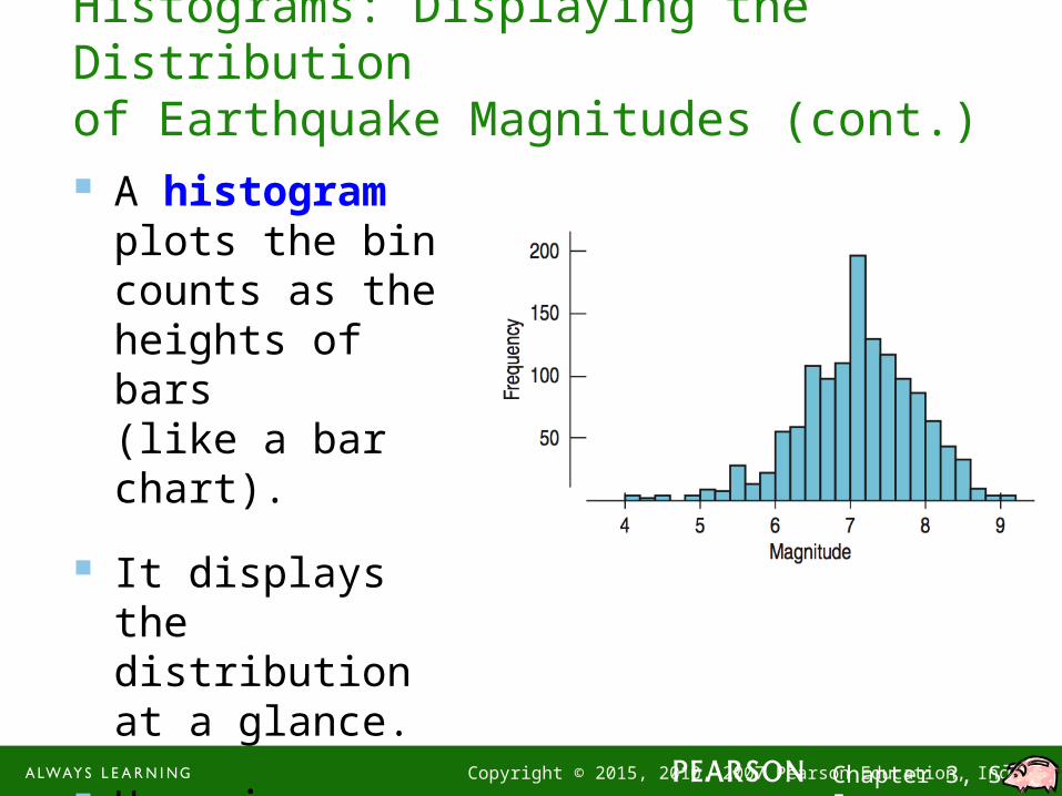
A histogram plots the bin counts as the heights of bars (like a bar chart).
It displays the distribution at a glance.
Here is a histogram of earthquake magnitudes:
Histograms: Displaying the Distributionof Earthquake Magnitudes (cont.)
1-6 Copyright © 2015, 2010, 2007 Pearson Education, Inc. Chapter 3, Slide 6
Histograms: Displaying the Distributionof Earthquake Magnitudes (cont.)
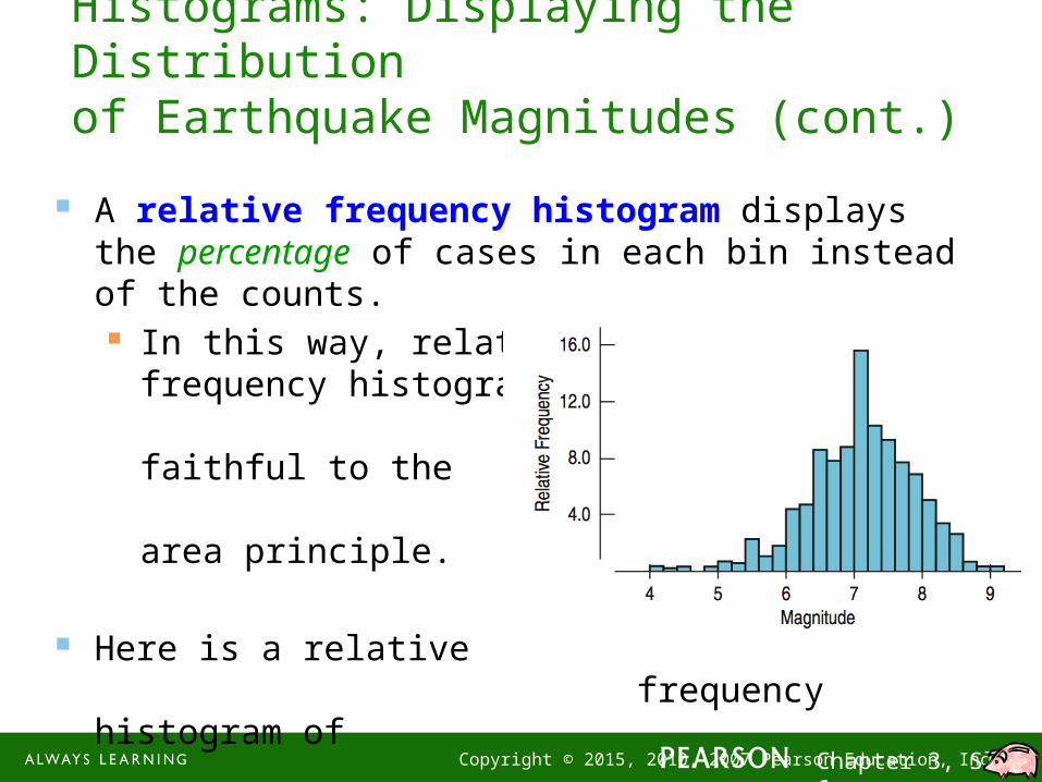
A relative frequency histogram displays the percentage of cases in each bin instead of the counts. In this way, relative
frequency histograms are faithful to the area principle.
Here is a relative frequency histogram of earthquake magnitudes:

Stem-and-Leaf DiagramA quick technique for picturing the distributional pattern associated with numerical data is to create a picture called a stem-and-leaf diagram (Commonly called a stem plot).
1. We want to break up the data into a reasonable number of groups.
2. Looking at the range of the data, we choose the stems (one or more of the leading digits) to get the desired number of groups.
3. The next digits (or digit) after the stem become(s) the leaf.
4. Typically, we truncate (leave off) the remaining digits.
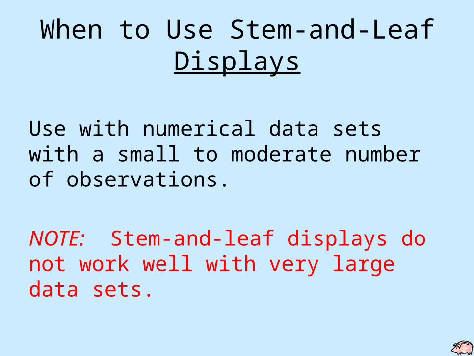
When to Use Stem-and-Leaf Displays
Numerical data sets with a small to moderate number of observations.
This does NOT work well with very large data sets.
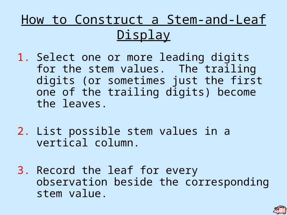
How to Construct a Stem-and-Leaf Display
1. Select one or more leading digits for the stem values. The trailing digits (or sometimes just the first one of the trailing digits) become the leaves.
2. List possible stem values in a vertical column.
3. Record the leaf for every observation beside the corresponding stem value.
4. Indicate the units for stems and leaves somewhere in the display.
AP StatisticsTuesday, 01 September 2015
• OBJECTIVE TSW explore (1) histograms, (2) stem-and-leaf plots, (3) dot plots, and (4) boxplots and (5) describe the center, shape, and spread of a distribution.
• FORM DUE (only if it is signed)– Information Sheet (wire basket)
• Get out WS Chapter 1.
• If you have T-shirt money, bring it up at the beginning of the period (after the bell rings).
• QUIZ: Ch. 1 & 2 will be tomorrow, 09/02/15.– I will TRY (very hard) to post both Ch.1 and Ch. 2 PowerPoints.
• ASSIGNMENTS DUE TOMORROW (09/02/15)– WS Chapter 1– Newspaper Article

WS Chapter 11) categorical (qualitative)
2) categorical (qualitative)
3) quantitative
4) quantitative
5) who: 2500 cars what: distance from the bicycle to the pass car population of interest: all cars passing bicyclists
6) who: workers who buy coffee in an office what: amount of money contributed to collection tray population of interest: all people in honor system payment situations

What a Stem-and-Leaf Display Shows
1. A representative or typical value in the data set.
2. The extent of the spread about such a value.
3. The presence of any gaps in the data.
4. The extent of the symmetry in the distribution of values.
5. The number and location of peaks.6. The presence of any outliers.

Stem Plot
10 11 12 13 14 15 16 17 18 19 20
33154504900500000570000
50
Choosing the 1st two digits as the stem and the 3rd digit as the leaf we have the following:
150 140 155 195 139 200 157 130 113 130 121 140 140 150 125 135 124 130 150 125 120 103 170 124 160
For our first example, we use the weights of 25 female students.
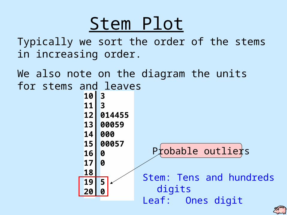
10 11 12 13 14 15 16 17 18 19 20
33014455000590000005700
50
Typically we sort the order of the stems in increasing order.
We also note on the diagram the units for stems and leaves
Stem: Tens and hundredsdigits
Leaf: Ones digit
Probable outliers
Stem Plot
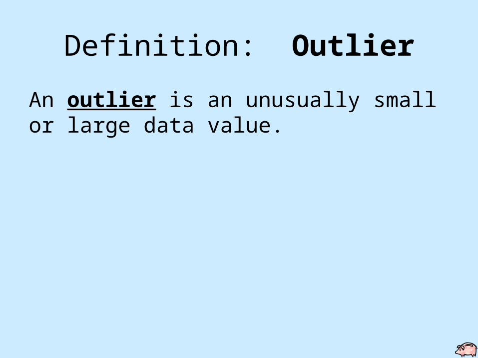
Definition: Outlier
An outlier is an unusually small or large data value.
When to Use Stem-and-Leaf Displays
Use with numerical data sets with a small to moderate number of observations.
NOTE: Stem-and-leaf displays do not work well with very large data sets.
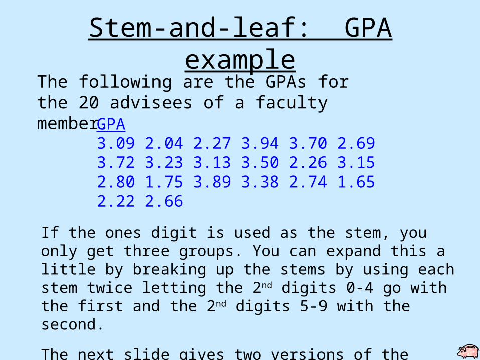
The following are the GPAs for the 20 advisees of a faculty member.
If the ones digit is used as the stem, you only get three groups. You can expand this a little by breaking up the stems by using each stem twice letting the 2nd digits 0-4 go with the first and the 2nd digits 5-9 with the second.
The next slide gives two versions of the stem-and-leaf diagram.
GPA3.09 2.04 2.27 3.94 3.70 2.693.72 3.23 3.13 3.50 2.26 3.152.80 1.75 3.89 3.38 2.74 1.652.22 2.66
Stem-and-leaf: GPA example
Stem-and-leaf: GPA example
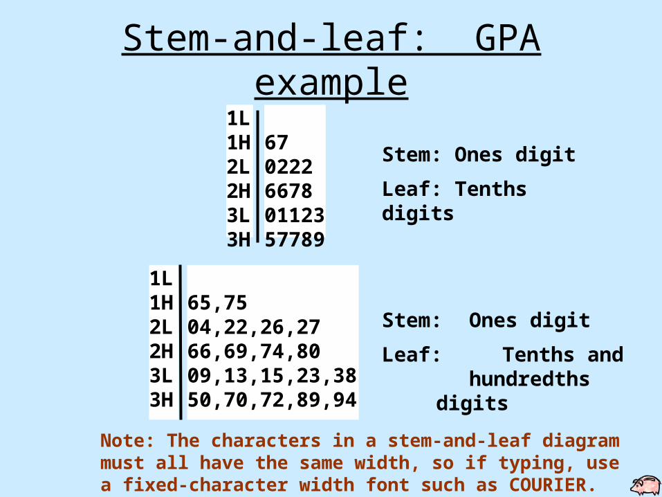
1L 1H 2L 2H 3L 3H
65,7504,22,26,2766,69,74,8009,13,15,23,3850,70,72,89,94
1L 1H 2L 2H 3L 3H
67022266780112357789
Stem: Ones digit
Leaf: Tenths digits
Note: The characters in a stem-and-leaf diagram must all have the same width, so if typing, use a fixed-character width font such as COURIER.
Stem: Ones digit
Leaf:Tenths and hundredths digits
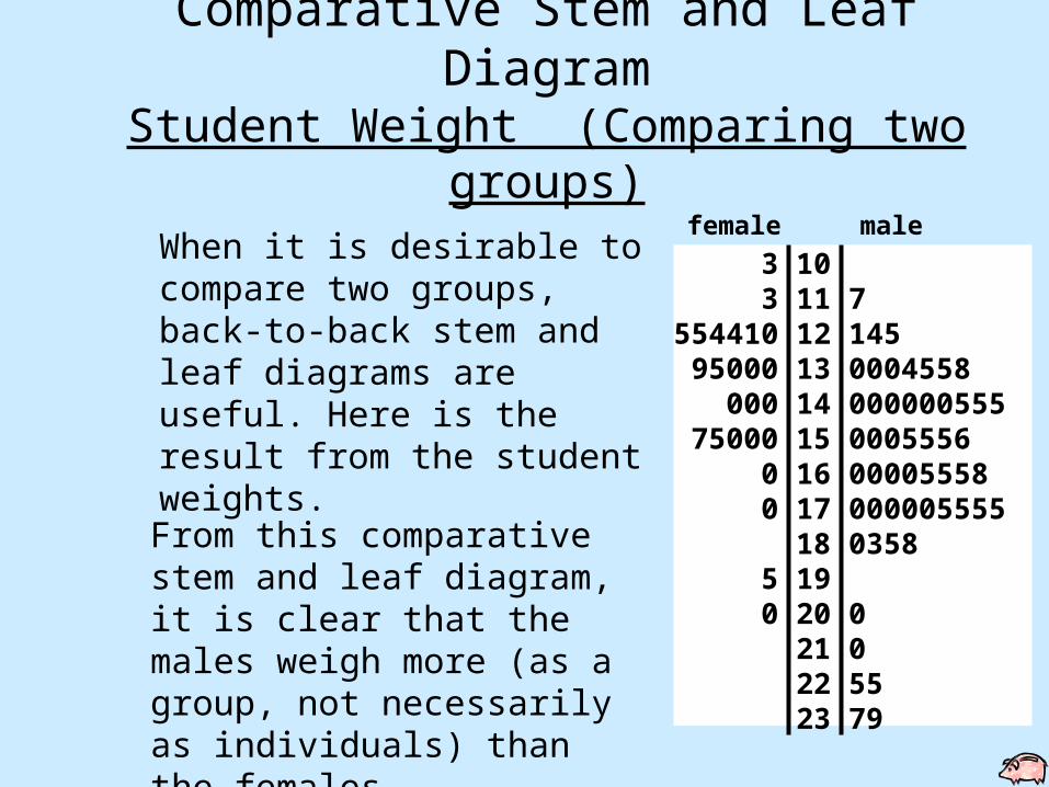
Comparative Stem and Leaf DiagramStudent Weight (Comparing two
groups)
When it is desirable to compare two groups, back-to-back stem and leaf diagrams are useful. Here is the result from the student weights.
From this comparative stem and leaf diagram, it is clear that the males weigh more (as a group, not necessarily as individuals) than the females.
3 10 3 11 7 554410 12 145 95000 13 0004558 000 14 000000555 75000 15 0005556 0 16 00005558 0 17 000005555 18 0358 5 19 0 20 0 21 0 22 55 23 79
female male
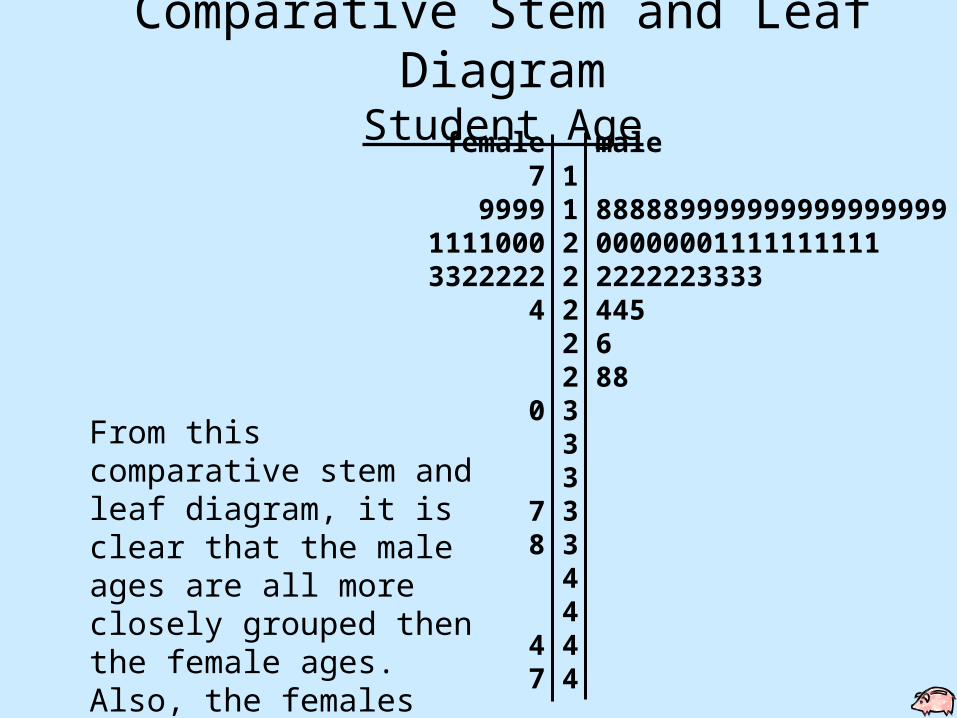
Comparative Stem and Leaf Diagram
Student Age female male 7 1 9999 1 8888899999999999999991111000 2 000000011111111113322222 2 2222223333 4 2 445 2 6 2 88 0 3 3 3 7 3 8 3 4 4 4 4 7 4
From this comparative stem and leaf diagram, it is clear that the male ages are all more closely grouped then the female ages. Also, the females have a number of outliers.
1-21 Copyright © 2015, 2010, 2007 Pearson Education, Inc. Chapter 3, Slide 21
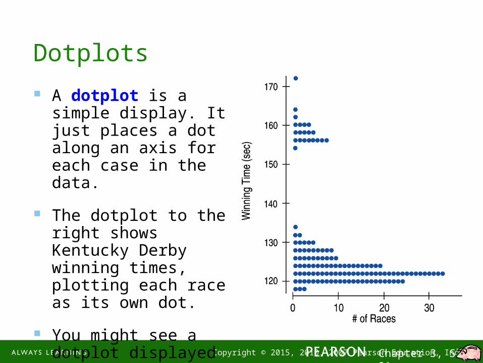
Dotplots
A dotplot is a simple display. It just places a dot along an axis for each case in the data.
The dotplot to the right shows Kentucky Derby winning times, plotting each race as its own dot.
You might see a dotplot displayed horizontally or vertically.

1-22 Copyright © 2015, 2010, 2007 Pearson Education, Inc. Chapter 3, Slide 22
Shape, Center, and Spread
When describing a distribution, make sure to always tell about three things: shape, center, and spread…

1-23 Copyright © 2015, 2010, 2007 Pearson Education, Inc. Chapter 3, Slide 23
What is the Shape of the Distribution?
1) Does the histogram have a single, central hump or several separated humps?
2) Is the histogram symmetric or skewed?
3) Do any unusual features stick out?

1-24 Copyright © 2015, 2010, 2007 Pearson Education, Inc. Chapter 3, Slide 24
Humps
1) Does the histogram have a single, central hump or several separated bumps?
Humps in a histogram are called modes.
A histogram with one main peak is dubbed unimodal; histograms with two peaks are bimodal; histograms with three or more peaks are called multimodal.
1-25 Copyright © 2015, 2010, 2007 Pearson Education, Inc. Chapter 3, Slide 25
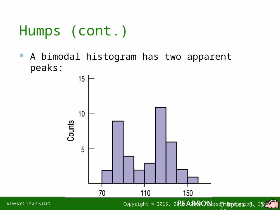
Humps (cont.)
A bimodal histogram has two apparent peaks:
1-26 Copyright © 2015, 2010, 2007 Pearson Education, Inc. Chapter 3, Slide 26
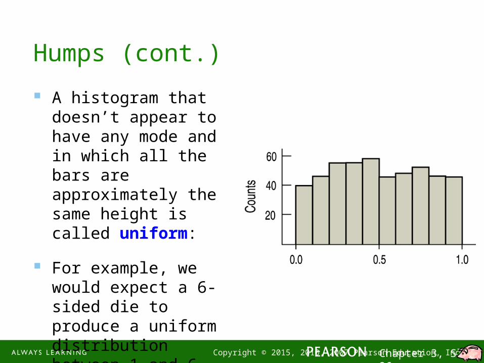
Humps (cont.)
A histogram that doesn’t appear to have any mode and in which all the bars are approximately the same height is called uniform:
For example, we would expect a 6-sided die to produce a uniform distribution between 1 and 6.
1-27 Copyright © 2015, 2010, 2007 Pearson Education, Inc. Chapter 3, Slide 27
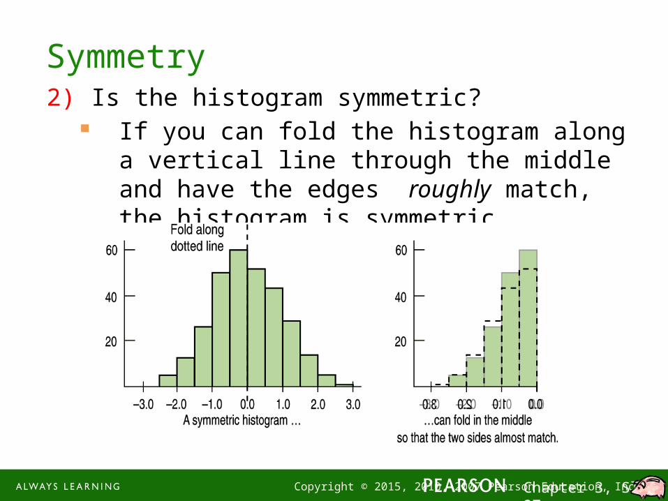
Symmetry2) Is the histogram symmetric?
If you can fold the histogram along a vertical line through the middle and have the edges roughly match, the histogram is symmetric.
AP StatisticsWednesday, 02 September 2015
• OBJECTIVE TSW explore (1) histograms, (2) stem-and-leaf plots, (3) dot plots, and (4) boxplots and (5) describe the center, shape, and spread of a distribution.
• ASSIGNMENTS DUE– WS Chapter 1 wire basket
– Newspaper Article black tray
• If you have T-shirt money, bring it up at the beginning of the period (after the bell rings).
• QUIZ: Ch. 1 & 2 will be after lunch.
1-29 Copyright © 2015, 2010, 2007 Pearson Education, Inc. Chapter 3, Slide 29
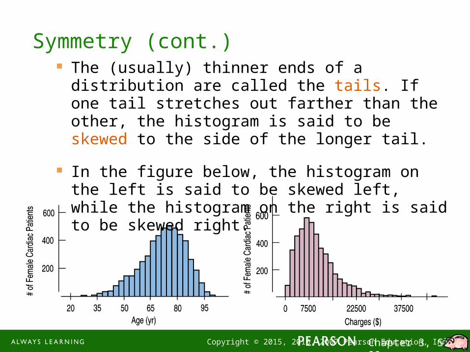
Symmetry (cont.) The (usually) thinner ends of a distribution are called
the tails. If one tail stretches out farther than the other, the histogram is said to be skewed to the side of the longer tail.
In the figure below, the histogram on the left is said to be skewed left, while the histogram on the right is said to be skewed right.
1-30 Copyright © 2015, 2010, 2007 Pearson Education, Inc. Chapter 3, Slide 30
Anything Unusual?
3) Do any unusual features stick out?
Sometimes it’s the unusual features that tell us something interesting or exciting about the data.
You should always mention any stragglers, or outliers, that stand off away from the body of the distribution.
Are there any gaps in the distribution? If so, we might have data from more than one group.

1-31 Copyright © 2015, 2010, 2007 Pearson Education, Inc. Chapter 3, Slide 31
Anything Unusual? (cont.)
The following histogram has outliers—there are three cities in the leftmost bar:
1-32 Copyright © 2015, 2010, 2007 Pearson Education, Inc. Chapter 3, Slide 32
Where is the Center of the Distribution?
If you had to pick a single number to describe all the data what would you pick?
It’s easy to find the center when a histogram is unimodal and symmetric—it’s right in the middle.
On the other hand, it’s not so easy to find the center of a skewed histogram or a histogram with more than one mode.
1-33 Copyright © 2015, 2010, 2007 Pearson Education, Inc. Chapter 3, Slide 33
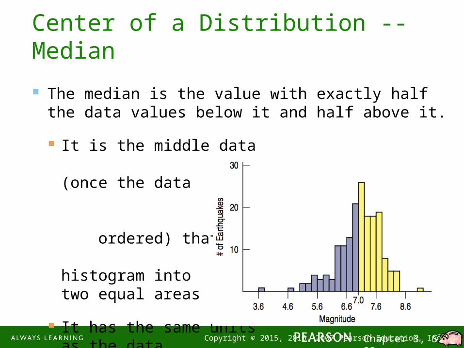
Center of a Distribution -- Median
The median is the value with exactly half the data values below it and half above it.
It is the middle data value (once the data values have been ordered) that divides the histogram into two equal areas
It has the same unitsas the data
1-34 Copyright © 2015, 2010, 2007 Pearson Education, Inc. Chapter 3, Slide 34
How Spread Out is the Distribution?
Variation matters, and Statistics is about variation.
Are the values of the distribution tightly clustered around the center or more spread out?
Always report a measure of spread along with a measure of center when describing a distribution numerically.

1-35 Copyright © 2015, 2010, 2007 Pearson Education, Inc. Chapter 3, Slide 35
Spread: Home on the Range
The range of the data is the difference between the maximum and minimum values:
Range = max – min
A disadvantage of the range is that a single extreme value can make it very large and, thus, not representative of the data overall.
1-36 Copyright © 2015, 2010, 2007 Pearson Education, Inc. Chapter 3, Slide 36
Spread: The Interquartile Range
The interquartile range (IQR) lets us ignore extreme data values and concentrate on the middle of the data.
To find the IQR, we first need to know what quartiles are…

1-37 Copyright © 2015, 2010, 2007 Pearson Education, Inc. Chapter 3, Slide 37
Spread: The Interquartile Range (cont.) Quartiles divide the data into four equal sections.
One quarter of the data lies below the lower quartile, Q1
One quarter of the data lies above the upper quartile, Q3.
The quartiles border the middle half of the data.
The difference between the quartiles is the interquartile range (IQR), so
IQR = upper quartile – lower quartile

1-38 Copyright © 2015, 2010, 2007 Pearson Education, Inc. Chapter 3, Slide 38
Spread: The Interquartile Range (cont.) The lower and upper quartiles are the 25th and 75th
percentiles of the data, so…
The IQR contains the middle 50% of the values of the distribution, as shown in figure:
1-39 Copyright © 2015, 2010, 2007 Pearson Education, Inc. Chapter 3, Slide 39
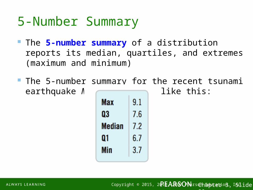
5-Number Summary
The 5-number summary of a distribution reports its median, quartiles, and extremes (maximum and minimum)
The 5-number summary for the recent tsunami earthquake Magnitudes looks like this:

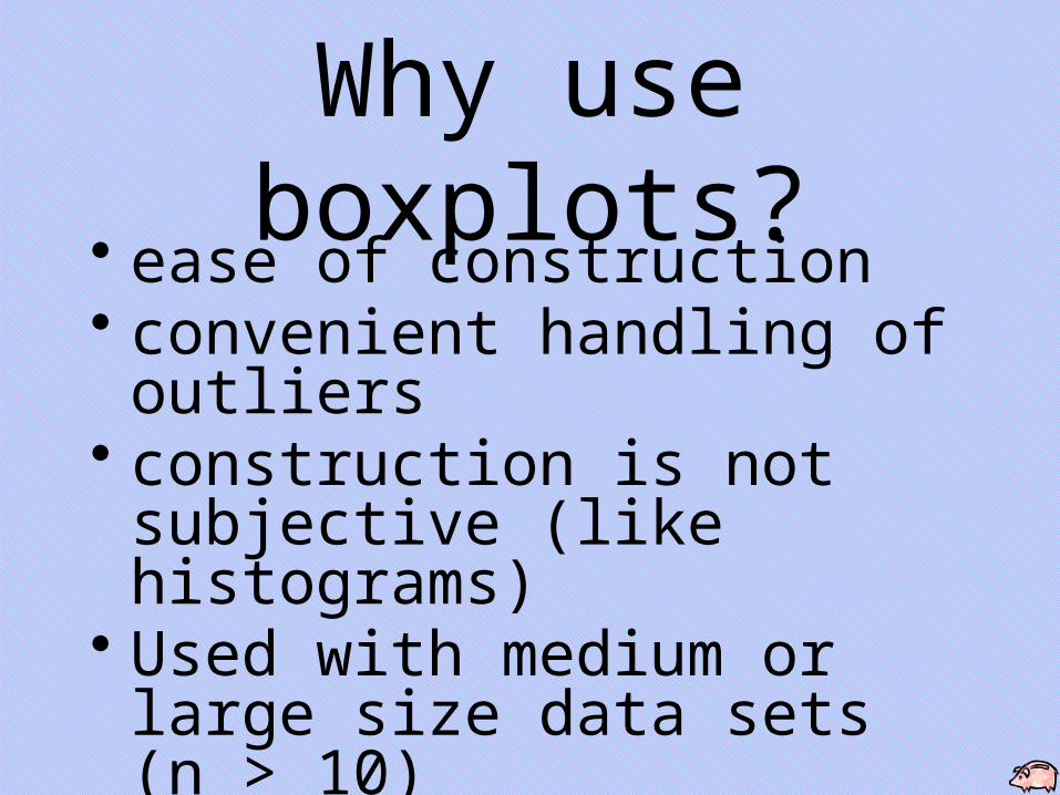
Why use boxplots?• ease of construction• convenient handling of outliers• construction is not subjective
(like histograms)• Used with medium or large size
data sets (n > 10)• useful for comparative displays
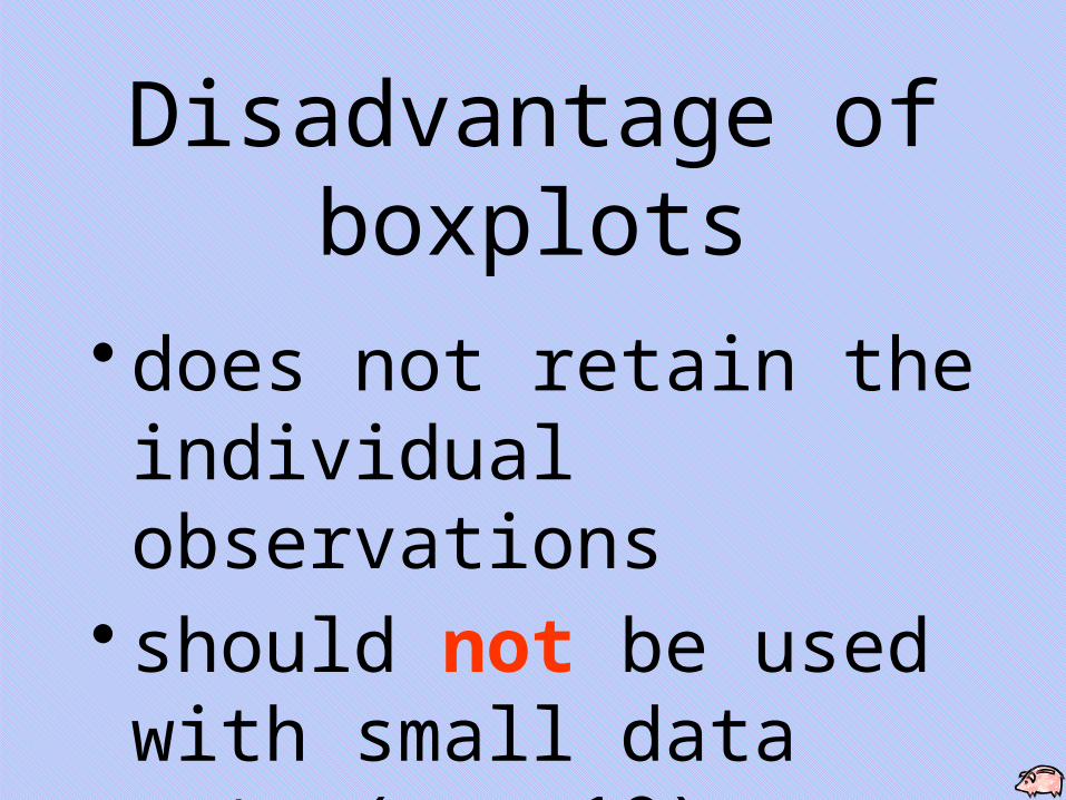
Disadvantage of boxplots
• does not retain the individual observations
• should not be used with small data sets (n < 10)
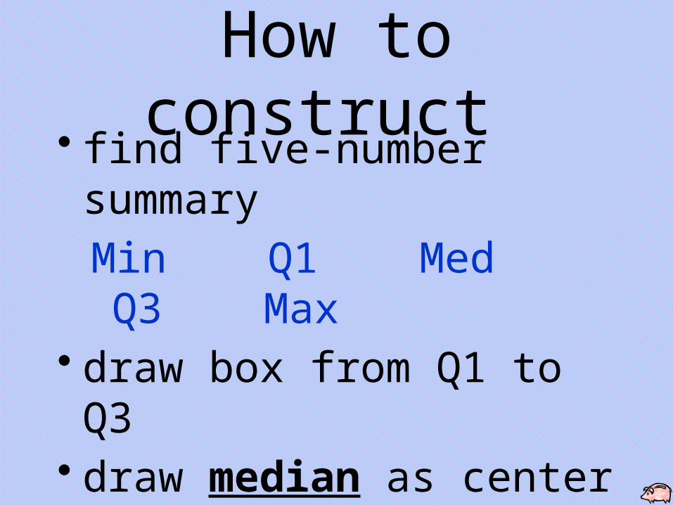
How to construct • find five-number summary
Min Q1 Med Q3 Max• draw box from Q1 to Q3• draw median as center line in
the box• extend whiskers to min & max
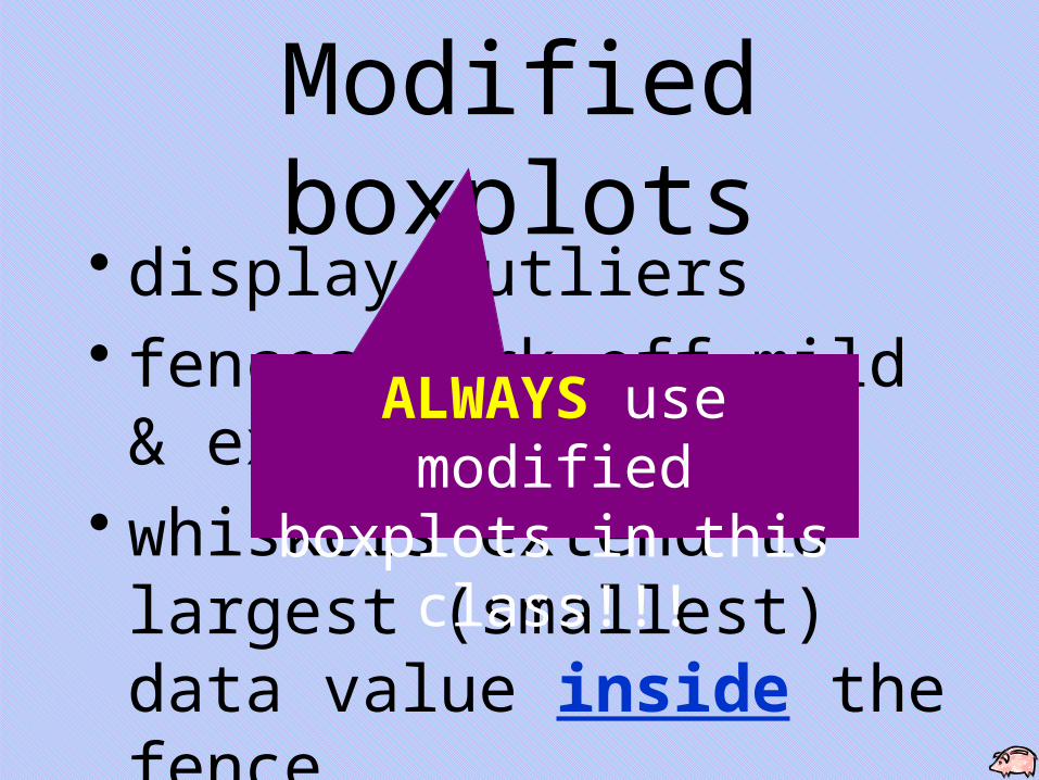
Modified boxplots• display outliers • fences mark off mild &
extreme outliers• whiskers extend to largest
(smallest) data value inside the fence
ALWAYS use modified boxplots in this class!!!
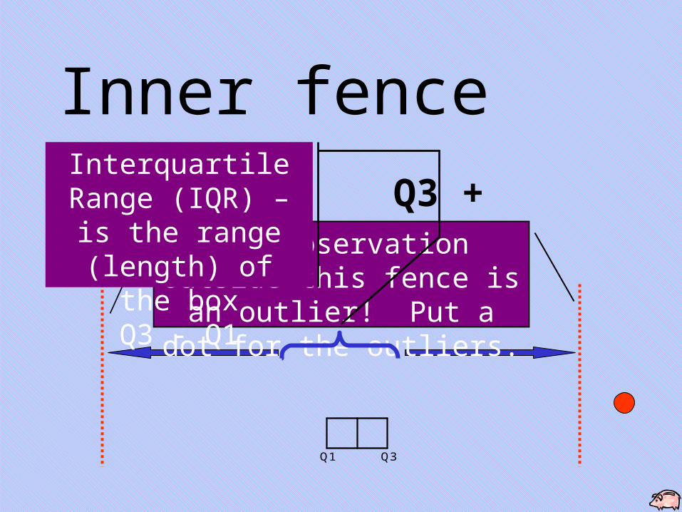
Inner fence
Q1 Q3
Q1 – 1.5IQR Q3 + 1.5IQRAny observation outside this fence is an outlier! Put a dot
for the outliers.
Interquartile Range (IQR) – is the range (length) of the box
Q3 - Q1
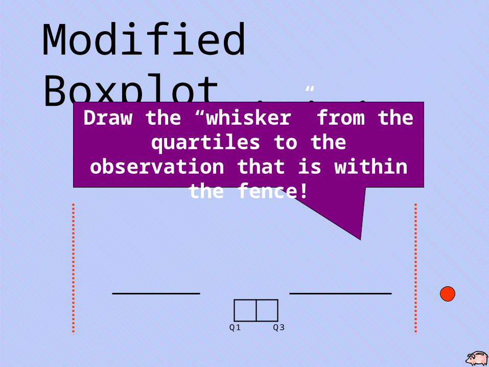
Modified Boxplot . . .
Q1 Q3
Draw the “whisker” from the quartiles to the observation that is within the
fence!
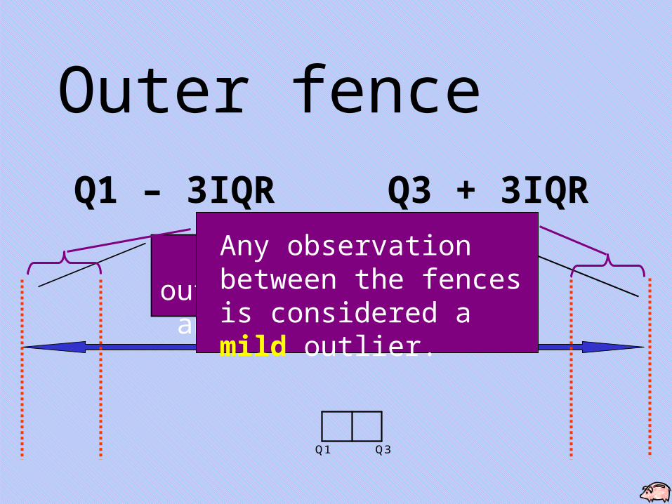
Outer fence
Q1 Q3
Q1 – 3IQR Q3 + 3IQR
Any observation outside this fence is an extreme outlier!
Any observation between the fences is considered a mild outlier.
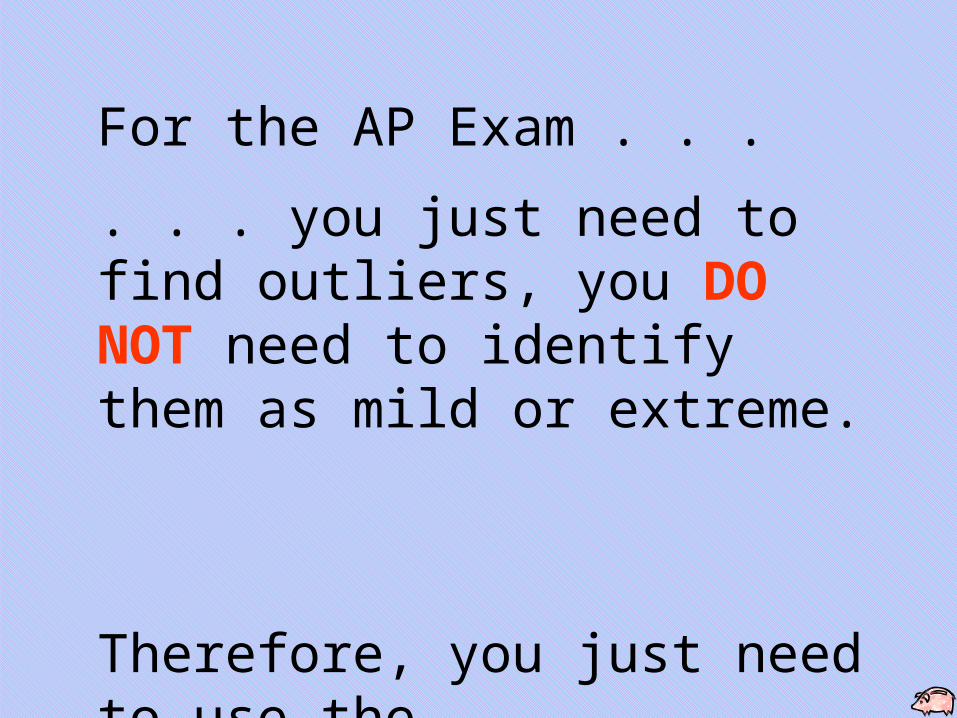
For the AP Exam . . .
. . . you just need to find outliers, you DO NOT need to identify them as mild or extreme.
Therefore, you just need to use the
1.5IQRs
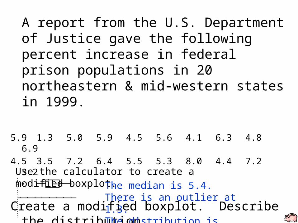
A report from the U.S. Department of Justice gave the following percent increase in federal prison populations in 20 northeastern & mid-western states in 1999.
5.9 1.3 5.0 5.9 4.5 5.6 4.1 6.3 4.86.9
4.5 3.5 7.2 6.4 5.5 5.3 8.0 4.4 7.23.2
Create a modified boxplot. Describe the distribution.Use the calculator to create a modified boxplot.
The median is 5.4.There is an outlier at 1.3.The distribution is fairly symmetrical.

Evidence suggests that a high indoor radon concentration might be linked to the development of childhood cancers. The data that follows is the radon concentration in two different samples of houses. The first sample consisted of houses in which a child was diagnosed with cancer. Houses in the second sample had no recorded cases of childhood cancer.
(see data on note page)
Create parallel boxplots. Compare the distributions.
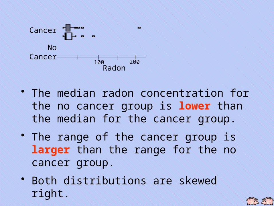
Cancer
No Cancer
100 200Radon
• The median radon concentration for the no cancer group is lower than the median for the cancer group.
• The range of the cancer group is larger than the range for the no cancer group.
• Both distributions are skewed right.
• The cancer group has outliers at 39, 45, 57, and 210. The no cancer group has outliers at 55 and 85.
1-52 Copyright © 2015, 2010, 2007 Pearson Education, Inc. Chapter 3, Slide 52
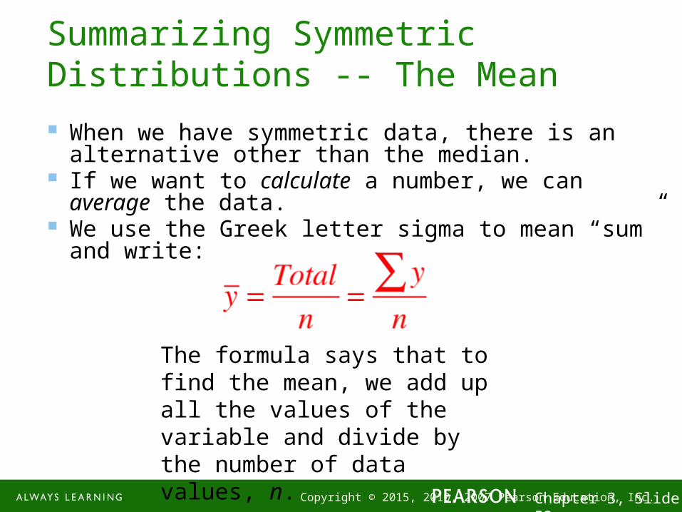
Summarizing Symmetric Distributions -- The Mean
When we have symmetric data, there is an alternative other than the median.
If we want to calculate a number, we can average the data.
We use the Greek letter sigma to mean “sum” and write:
The formula says that to find the mean, we add up all the values of the variable and divide by the number of data values, n.
1-53 Copyright © 2015, 2010, 2007 Pearson Education, Inc. Chapter 3, Slide 53
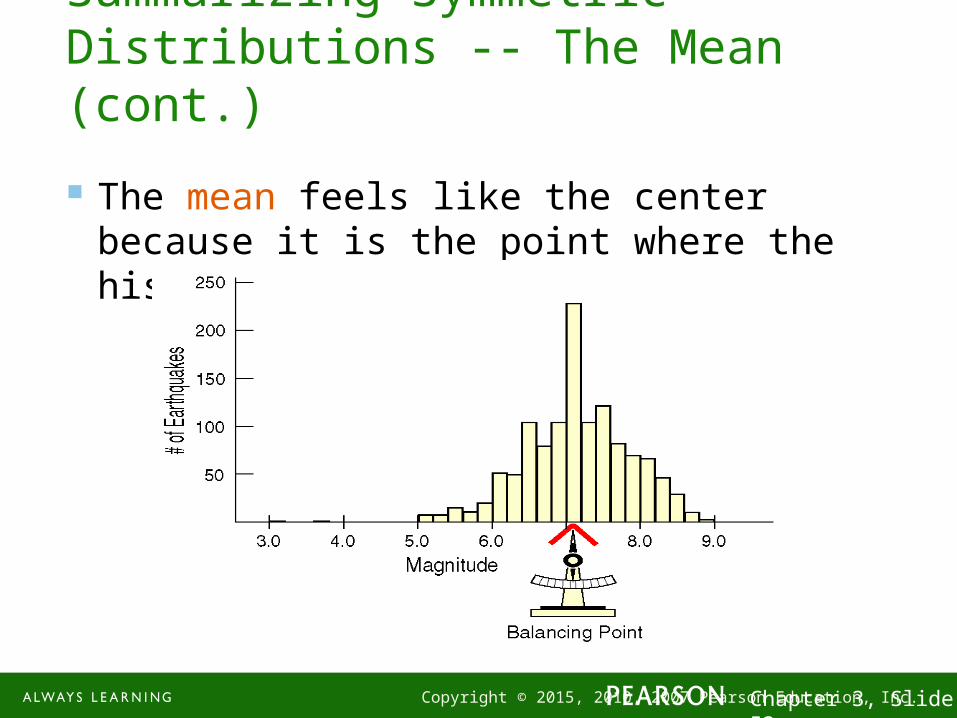
Summarizing Symmetric Distributions -- The Mean (cont.)
The mean feels like the center because it is the point where the histogram balances:

1-54 Copyright © 2015, 2010, 2007 Pearson Education, Inc. Chapter 3, Slide 54
Mean or Median?
Because the median considers only the order of values, it is resistant to values that are extraordinarily large or small; it simply notes that they are one of the “big ones” or “small ones” and ignores their distance from center.
To choose between the mean and median, start by looking at the data. If the histogram is symmetric and there are no outliers, use the mean.
However, if the histogram is skewed or with outliers, you are better off with the median.
1-55 Copyright © 2015, 2010, 2007 Pearson Education, Inc. Chapter 3, Slide 55
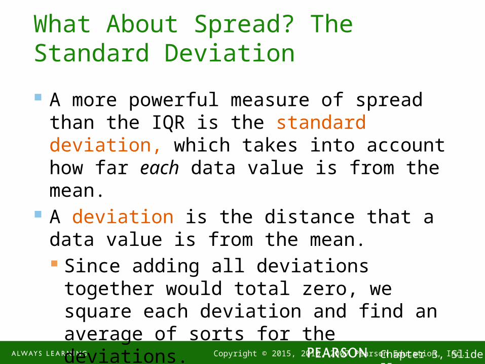
What About Spread? The Standard Deviation
A more powerful measure of spread than the IQR is the standard deviation, which takes into account how far each data value is from the mean.
A deviation is the distance that a data value is from the mean. Since adding all deviations together would total
zero, we square each deviation and find an average of sorts for the deviations.
1-56 Copyright © 2015, 2010, 2007 Pearson Education, Inc. Chapter 3, Slide 56
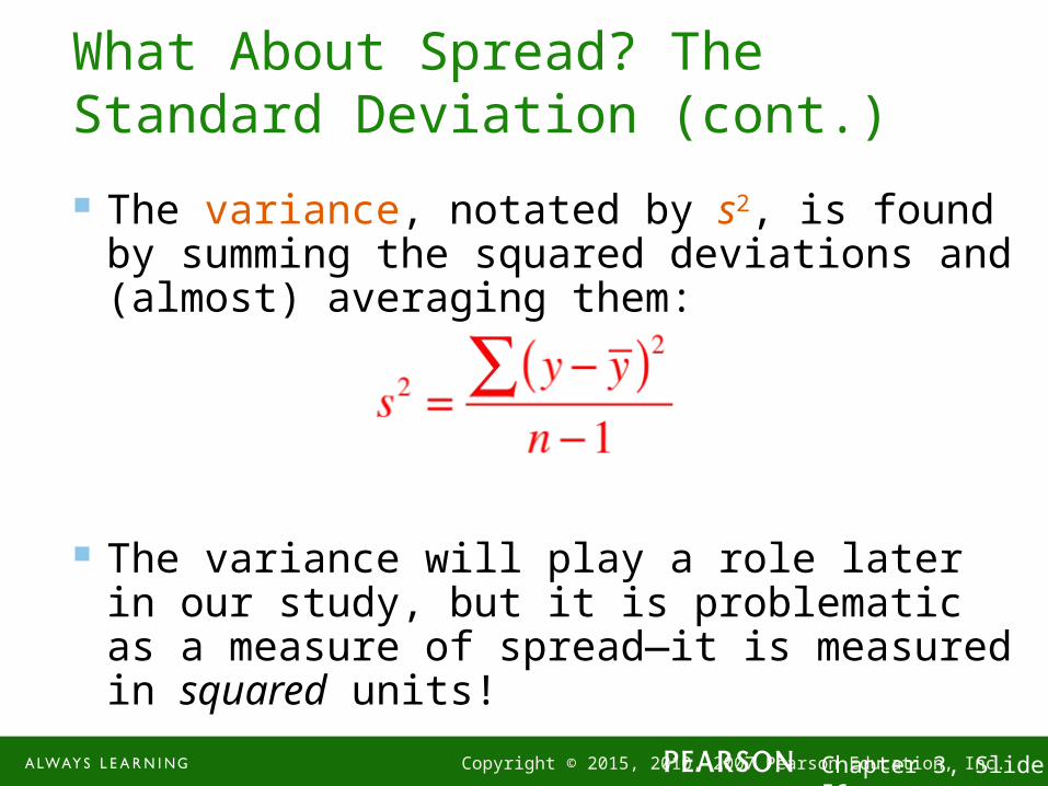
What About Spread? The Standard Deviation (cont.)
The variance, notated by s2, is found by summing the squared deviations and (almost) averaging them:
The variance will play a role later in our study, but it is problematic as a measure of spread—it is measured in squared units!

1-57 Copyright © 2015, 2010, 2007 Pearson Education, Inc. Chapter 3, Slide 57
What About Spread? The Standard Deviation (cont.)
The standard deviation, s, is just the square root of the variance and is measured in the same units as the original data.
1-58 Copyright © 2015, 2010, 2007 Pearson Education, Inc. Chapter 3, Slide 58
Thinking About Variation
Since Statistics is about variation, spread is an important fundamental concept of Statistics.
Measures of spread help us talk about what we don’t know.
When the data values are tightly clustered around the center of the distribution, the IQR and standard deviation will be small.
When the data values are scattered far from the center, the IQR and standard deviation will be large.

1-59 Copyright © 2015, 2010, 2007 Pearson Education, Inc. Chapter 3, Slide 59
Tell -- Draw a Picture
When telling about quantitative variables, start by making a histogram, dotplot, or stem-and-leaf display and discuss the shape of the distribution.
1-60 Copyright © 2015, 2010, 2007 Pearson Education, Inc. Chapter 3, Slide 60
Tell -- Shape, Center, and Spread
Next, always report the shape of its distribution, along with a center and a spread. If the shape is skewed, report the median and
IQR. If the shape is symmetric, report the mean and
standard deviation and possibly the median and IQR as well.
1-61 Copyright © 2015, 2010, 2007 Pearson Education, Inc. Chapter 3, Slide 61
Tell -- What About Unusual Features? If there are multiple modes, try to understand why.
If you identify a reason for the separate modes, it may be good to split the data into two groups.
If there are any clear outliers and you are reporting the mean and standard deviation, report them with the outliers present and with the outliers removed. The differences may be quite revealing. Note: The median and IQR are not likely to be
affected by the outliers.
1-62 Copyright © 2015, 2010, 2007 Pearson Education, Inc. Chapter 3, Slide 62
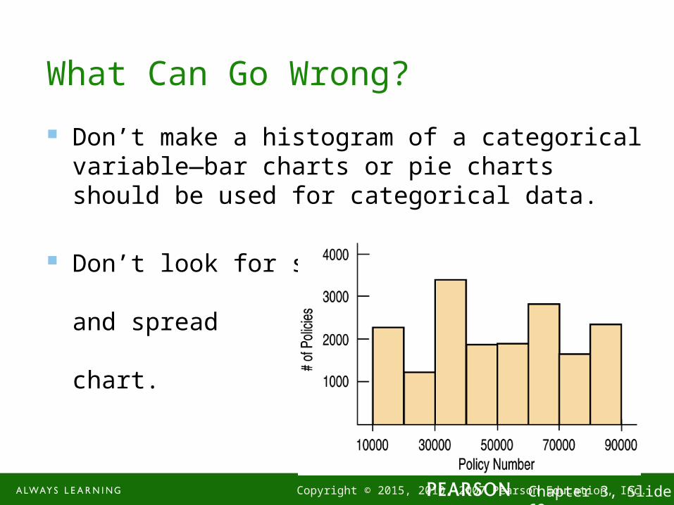
What Can Go Wrong?
Don’t make a histogram of a categorical variable—bar charts or pie charts should be used for categorical data.
Don’t look for shape, center, and spread of a bar chart.
1-63 Copyright © 2015, 2010, 2007 Pearson Education, Inc. Chapter 3, Slide 63
What Can Go Wrong? (cont.)
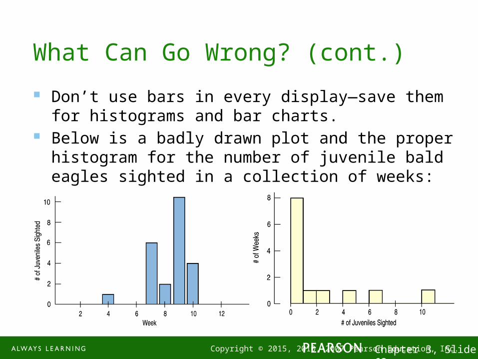
Don’t use bars in every display—save them for histograms and bar charts.
Below is a badly drawn plot and the proper histogram for the number of juvenile bald eagles sighted in a collection of weeks:

1-64 Copyright © 2015, 2010, 2007 Pearson Education, Inc. Chapter 3, Slide 64
What Can Go Wrong? (cont.)
Choose a bin width appropriate to the data. Changing the bin width changes the
appearance of the histogram: