animation: svg and smil animation
TRANSCRIPT
Animation: SVGand SMILAnimation
8
11666-08 08.21.01 2:20 PM Page 208
Basic Animations One of the most visually attractive aspects of SVG is its potential for animation.Most parts of an SVG image can be animated—position onscreen, width, height,color, opacity, stop colors in a gradient, attributes of SVG filters. The visualeffects are potentially legion. But before you get carried away or overwhelmedby the potential, look at how SVG animation is done.
SVG images can be animated by two methods: the use of declarative SVG ele-ments (mostly using elements borrowed from SMIL Animation) or the use ofECMAScript (JavaScript) or another scripting language to manipulate theDocument Object Model (DOM) of an SVG image. The two methods can be com-bined into one image.
This chapter focuses on declarative animation.
In practice, portraying in a book the visual appearances that SVG animation pro-duces is difficult. Therefore, I strongly encourage you to experiment with the SVGcode provided and view these animations on your own computer. A number ofthe animations presented in this chapter are accessible online on the Web sitehttp://www.svgspider.com/default.svg.
In this chapter:• Basic Animations• SVG As an Animation Grammar• Basic Attributes of an Animation• Applying SVG Animation to SVG Static
Elements• More Complex Animations• SVG, SMIL Animation, and SMIL 2.0• The <animate> Element• The <set> Element• The <animateMotion> Element• The <animateColor> Element• The <animateTransform> Element• Rotation Using <animateTransform>• Simple Sample Animations
11666-08 08.21.01 2:20 PM Page 209
Designing SVG Web Graphics
SVG As an AnimationGrammarAnimation is a time-based alteration in the characteristics of an image.During an SVG animation, the SVG rendering engine maintains two copiesof the value to be animated. One is the original value (which is maintainedin the DOM), and the other is the presentation value, the value that givesrise to the onscreen appearance during an animation.
Before I discuss and show you working SVG animations, I want to discussthe general way in which SVG animations are implemented and the vari-ous forms of syntax you can apply.
Basic Attributes of anAnimationTo define an animation, you need to know what is to be animated, whenthe animation will begin, what is the starting value of the attribute to beanimated, and what is the presentation value of that attribute at the end ofthe animation.
The attribute to be animated is specified by the value of theattributeName attribute. For example, if the fill attribute will be ani-mated, you expect to see
attributeName="fill"
as an attribute on the animation element.
The timing of the beginning of an animation is determined by the value ofthe begin attribute. For example, if the animation will begin six secondsafter the page loaded, you see this line in the code:
begin="6s"
210
11666-08 08.21.01 2:20 PM Page 210
Basic Attributes of an Animation
SVG animations can be chained. If the animation will begin five secondsafter the end of the First animation (identified by the id attribute of theformer animation having the value of First), you see
begin="First.end+5s"
and, therefore, achieving the timing you want.
For many of the animations you use, you should define the duration, usingthe dur attribute. If the duration is not specified then, for most animationsthe SVG rendering engine will have insufficient information to implementthe animation. To define the duration of an animation as being ten sec-onds, you use the dur attribute, like this:
dur="10s"
Several general methods exist for altering the values of an attribute. Oneuses both the from and to attributes so that for a color animation, youmight see
from="red" to="blue"
Or, if you are altering the size of a rectangle in steps of ten pixels, youmight use the from and by attributes, like this:
from="100px" by="10px"
which defines the change during the course of the animation. You can omitthe from attribute if it is the same as the original value of the attributedefined in the attributeName and if it is contained in the DocumentObject Model (DOM). However, you should include the from attribute rou-tinely because it acts as a reminder of the need to consider the beginningvalue of the attribute.
Finally, you can specify a variety of values to be displayed during the ani-mation by using a values attribute. If you want to change the x attributeof an element successively from 5 to 10 to 30 to 5, you write somethinglike this:
attributeName="x" values="5; 10; 30; 5"
I haven’t yet discussed what happens at the end of the duration defined bythe dur attribute. The default behavior is that the original value (the onemaintained in the DOM) for the target attribute is again displayed. If you
211
11666-08 08.21.01 2:20 PM Page 211
Designing SVG Web Graphics
want instead to preserve the final version of the presentation attribute,you can do so like this:
fill="freeze"
which freezes the animation with the presentation value still on display.
Be careful not to confuse the fill attribute on a simple SVG graphical shape, like the<rect> or <circle> elements, with the fill attribute of an animation element. Thefill attribute of a graphical shape defines the paint to be applied within the outline of theshape. The fill attribute of an animation element defines whether the original value heldin the DOM or the presentation value created during the animation is displayed after the ani-mation is complete.
The SMIL Animation facilities do not limit you to a one- off animation. Theyprovide syntax to define an indefinitely repeating animation or an anima-tion that repeats a defined number of times. To produce an animation thatrepeats exactly three times, you use
repeatCount="3"
Or, to produce an indefinitely repeating animation, you use
repeatCount="indefinite"
You see later in this chapter many examples of precisely how to use thesemethods. My purpose now is simply to show you the range of syntax avail-able to the SVG designer.
Applying SVG Animation toSVG Static ElementsBefore you go on to look in detail at the animation elements in SVG, lookat how an animation can be added to a simple SVG shape.
Typically, if you have a simple graphical shape with no content, youexpress it as an empty element:
212
WARNING
11666-08 08.21.01 2:20 PM Page 212
Applying SVG Animation to SVG Static Elements
<rect x="100" y="100" width="10px" height="100px"
style="stroke:red; fill:rgb(0,0,0)"/>
However, when you want to add an animation to it, you need to nest theSVG animation element between the start tag and end tag of the elementrepresenting the graphical shape, like this:
<rect x="100" y="100" width="10px" height="100px"
style="stroke:red;
fill:rgb(0,0,0)">
<!-- The animation element goes in here. -->
</rect>
If you want to have an animation that changes both the width and heightattributes of a simple rectangle over a period of ten seconds, therefore, youwould have an SVG image whose source code looks like this:
Listing 8.1 (AnimRect.svg)
<?xml version='1.0'?>
<!DOCTYPE svg PUBLIC "-//W3C//DTD SVG 1.0//EN"
"http://www.w3.org/TR/2001/PR-SVG-20010719/
DTD/svg10.dtd">
<svg width="300" height="250">
<rect x="100" y="100" width="10px" height="100px"
style="stroke:red; fill:rgb(0,0,0)">
<animate attributeName="width" from="10px"
to="100px"
begin="0s" dur="10s" repeatCount="1"
fill="freeze"/>
<animate attributeName="height" from="100px"
to="10px"
begin="0s" dur="10s" repeatCount="1"
fill="freeze"/>
</rect>
</svg>
By nesting the animation elements like this, you define the scope of the ani-mation. Because, in this case, the <animate> element is nested immediate-ly within the <rect> element, the attributes of the containing <rect> ele-ment are animated.
213
11666-08 08.21.01 2:20 PM Page 213
Designing SVG Web Graphics
More Complex AnimationsSo far, the simple syntax you have looked at produces linear changes in anattribute smoothly over the duration of the animation. SVG, however, pro-vides alternative methods to add other nonlinear or noninterpolated anima-tions.
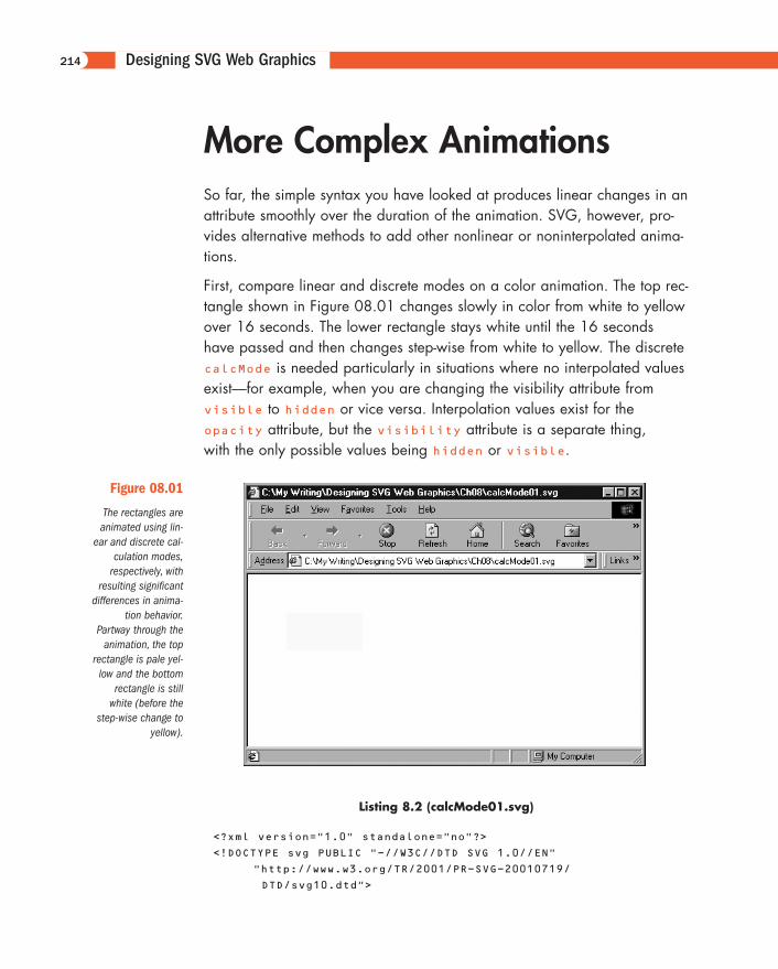
First, compare linear and discrete modes on a color animation. The top rec-tangle shown in Figure 08.01 changes slowly in color from white to yellowover 16 seconds. The lower rectangle stays white until the 16 secondshave passed and then changes step-wise from white to yellow. The discretecalcMode is needed particularly in situations where no interpolated valuesexist—for example, when you are changing the visibility attribute fromvisible to hidden or vice versa. Interpolation values exist for the opacity attribute, but the visibility attribute is a separate thing, with the only possible values being hidden or visible.
214
Figure 08.01
The rectangles areanimated using lin-
ear and discrete cal-culation modes,
respectively, withresulting significant
differences in anima-tion behavior.
Partway through theanimation, the top
rectangle is pale yel-low and the bottom
rectangle is stillwhite (before the
step-wise change toyellow).
Listing 8.2 (calcMode01.svg)
<?xml version="1.0" standalone="no"?>
<!DOCTYPE svg PUBLIC "-//W3C//DTD SVG 1.0//EN"
"http://www.w3.org/TR/2001/PR-SVG-20010719/
DTD/svg10.dtd">
11666-08 08.21.01 2:20 PM Page 214
More Complex Animations
<svg>
<rect x="50" y="50" width="100" height="50"
style="fill:#FFFFFF">
<animate attributeName="fill" calcMode="linear"
from="#FFFFFF" to="#FFFF00" begin="2s" dur="16s"/>
</rect>
<rect x="50" y="150" width="100" height="50"
style="fill:#FFFFFF">
<animate attributeName="fill" calcMode="discrete"
from="#FFFFFF" to="#FFFF00" begin="2s" dur="16s"/>
</rect>
</svg>
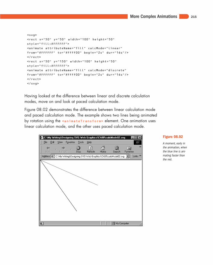
Having looked at the difference between linear and discrete calculationmodes, move on and look at paced calculation mode.
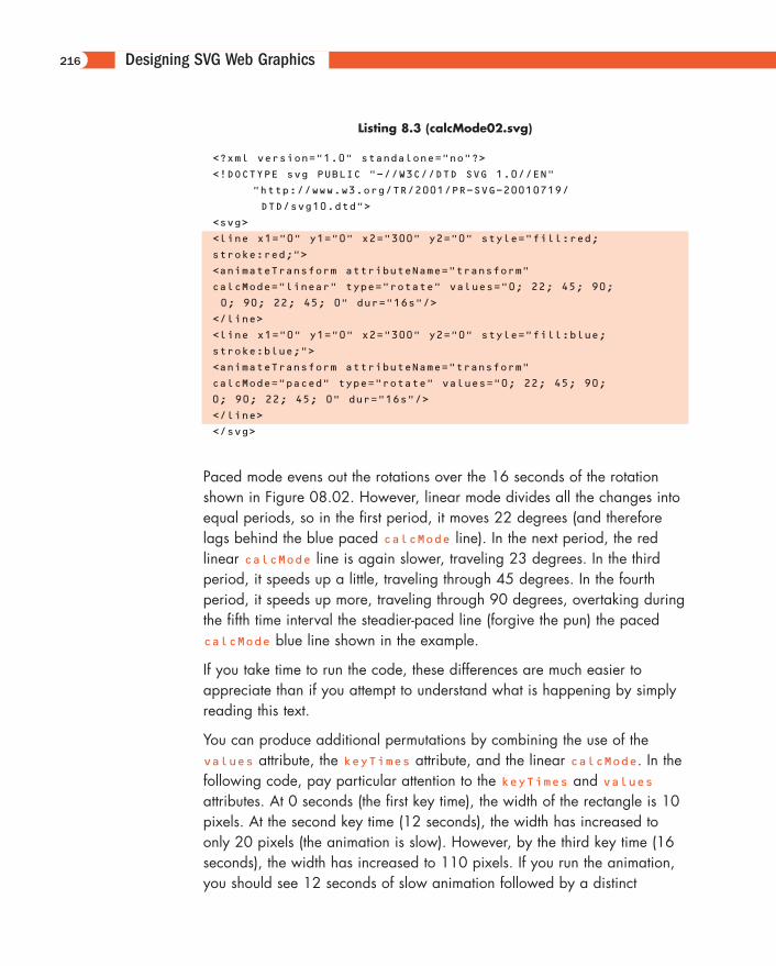
Figure 08.02 demonstrates the difference between linear calculation modeand paced calculation mode. The example shows two lines being animatedby rotation using the <animateTransform> element. One animation useslinear calculation mode, and the other uses paced calculation mode.
215
Figure 08.02
A moment, early inthe animation, whenthe blue line is ani-mating faster thanthe red.
11666-08 08.21.01 2:20 PM Page 215
Designing SVG Web Graphics
Listing 8.3 (calcMode02.svg)
<?xml version="1.0" standalone="no"?>
<!DOCTYPE svg PUBLIC "-//W3C//DTD SVG 1.0//EN"
"http://www.w3.org/TR/2001/PR-SVG-20010719/
DTD/svg10.dtd">
<svg>
<line x1="0" y1="0" x2="300" y2="0" style="fill:red;
stroke:red;">
<animateTransform attributeName="transform"
calcMode="linear" type="rotate" values="0; 22; 45; 90;
0; 90; 22; 45; 0" dur="16s"/>
</line>
<line x1="0" y1="0" x2="300" y2="0" style="fill:blue;
stroke:blue;">
<animateTransform attributeName="transform"
calcMode="paced" type="rotate" values="0; 22; 45; 90;
0; 90; 22; 45; 0" dur="16s"/>
</line>
</svg>
Paced mode evens out the rotations over the 16 seconds of the rotationshown in Figure 08.02. However, linear mode divides all the changes intoequal periods, so in the first period, it moves 22 degrees (and thereforelags behind the blue paced calcMode line). In the next period, the red linear calcMode line is again slower, traveling 23 degrees. In the thirdperiod, it speeds up a little, traveling through 45 degrees. In the fourthperiod, it speeds up more, traveling through 90 degrees, overtaking duringthe fifth time interval the steadier-paced line (forgive the pun) the pacedcalcMode blue line shown in the example.
If you take time to run the code, these differences are much easier toappreciate than if you attempt to understand what is happening by simplyreading this text.
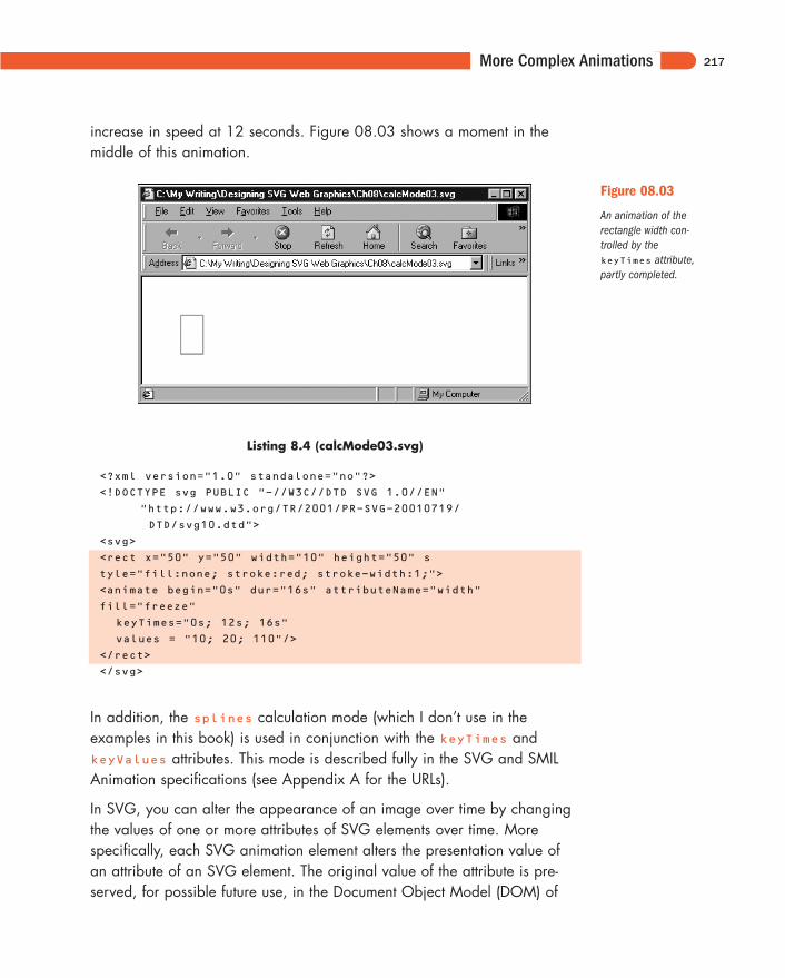
You can produce additional permutations by combining the use of thevalues attribute, the keyTimes attribute, and the linear calcMode. In thefollowing code, pay particular attention to the keyTimes and valuesattributes. At 0 seconds (the first key time), the width of the rectangle is 10pixels. At the second key time (12 seconds), the width has increased toonly 20 pixels (the animation is slow). However, by the third key time (16seconds), the width has increased to 110 pixels. If you run the animation,you should see 12 seconds of slow animation followed by a distinct
216
11666-08 08.21.01 2:20 PM Page 216
More Complex Animations
increase in speed at 12 seconds. Figure 08.03 shows a moment in themiddle of this animation.
217
Figure 08.03
An animation of therectangle width con-trolled by thekeyTimes attribute,partly completed.
Listing 8.4 (calcMode03.svg)
<?xml version="1.0" standalone="no"?>
<!DOCTYPE svg PUBLIC "-//W3C//DTD SVG 1.0//EN"
"http://www.w3.org/TR/2001/PR-SVG-20010719/
DTD/svg10.dtd">
<svg>
<rect x="50" y="50" width="10" height="50" s
tyle="fill:none; stroke:red; stroke-width:1;">
<animate begin="0s" dur="16s" attributeName="width"
fill="freeze"
keyTimes="0s; 12s; 16s"
values = "10; 20; 110"/>
</rect>
</svg>
In addition, the splines calculation mode (which I don’t use in the examples in this book) is used in conjunction with the keyTimes andkeyValues attributes. This mode is described fully in the SVG and SMILAnimation specifications (see Appendix A for the URLs).
In SVG, you can alter the appearance of an image over time by changingthe values of one or more attributes of SVG elements over time. Morespecifically, each SVG animation element alters the presentation value ofan attribute of an SVG element. The original value of the attribute is pre-served, for possible future use, in the Document Object Model (DOM) of
11666-08 08.21.01 2:20 PM Page 217
Designing SVG Web Graphics
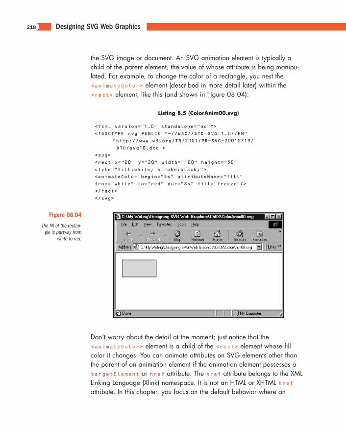
the SVG image or document. An SVG animation element is typically achild of the parent element, the value of whose attribute is being manipu-lated. For example, to change the color of a rectangle, you nest the<animateColor> element (described in more detail later) within the<rect> element, like this (and shown in Figure 08.04):
Listing 8.5 (ColorAnim00.svg)
<?xml version="1.0" standalone="no"?>
<!DOCTYPE svg PUBLIC "-//W3C//DTD SVG 1.0//EN"
"http://www.w3.org/TR/2001/PR-SVG-20010719/
DTD/svg10.dtd">
<svg>
<rect x="20" y="20" width="100" height="50"
style="fill:white; stroke:black;">
<animateColor begin="5s" attributeName="fill"
from="white" to="red" dur="8s" fill="freeze"/>
</rect>
</svg>
218
Figure 08.04
The fill of the rectan-gle is partway from
white to red.
Don’t worry about the detail at the moment; just notice that the<animateColor> element is a child of the <rect> element whose fillcolor it changes. You can animate attributes on SVG elements other thanthe parent of an animation element if the animation element possesses atargetElement or href attribute. The href attribute belongs to the XMLLinking Language (Xlink) namespace. It is not an HTML or XHTML hrefattribute. In this chapter, you focus on the default behavior where an
11666-08 08.21.01 2:21 PM Page 218
More Complex Animations
animation element manipulates with time the presentation value of an attrib-ute on its parent element.
SVG allows you to animate many attributes of SVG elements. You canchange the color of a graphic, change its position, change its transparen-cy, or make part of an image visible or hidden, for example, all by usingthe declarative animation syntax. You can produce particularly attractive orsubtle effects when SVG filters are animated over time.
SVG provides five animation elements:
<animate>
<set>
<animateColor>
<animateMotion>
<animateTransform>
The first four elements are derived directly from SMIL Animation. The fifthanimation element, <animateTransform>, is an SVG-specific animationelement.
The <animate> element allows changes to be made to scalar SVG (XML)attributes or to CSS properties over time. The <set> element is an alterna-tive to the <animate> element in some situations, conveniently allowingnonnumeric values to be set. The <animateColor> element allows color tobe changed over time. The <animateMotion> element allows part of anSVG image to be moved along some path over time.
The <animateTransform> element allows the animation of one or moreof the SVG transformation attributes; for example, scale. SVG provides, inaddition to the <animateTransform> element, four other extensions tothe animation functionality in SMIL Animation. A path attribute permits theanimation of SVG path data. You can use an <mpath> element as a childof an <animateMotion> element to provide access to path data. AkeyPoints attribute has been added to the <animateMotion> element,compared to the SMIL Animation original, to provide additional control ofthe speed of motion animations. A rotate attribute has been added to the<animateMotion> element and determines whether an object being ani-mated along a path changes its orientation to correspond to the directionof the path at a particular point. (Think of how a car turns as a roadcurves.)
219
11666-08 08.21.01 2:21 PM Page 219
Designing SVG Web Graphics
SVG, SMIL Animation, andSMIL 2.0As I indicate in the preceding section, SVG derives four of its five declara-tive animation elements from SMIL Animation. SMIL, by the way, is theSynchronized Multimedia Integration Language. A W3C Recommendationfor SMIL 1.0 was issued on June 15, 1998, and is athttp://www.w3.org/TR/REC-smil. The SMIL Animation specification is, atthe time this book was written, still in the W3C Proposed Recommendationstage. The latest version is at http://www.w3.org/TR/smil-animation. Alsounder development is the SMIL 2.0 specification, also a ProposedRecommendation. The latest version is at http://www.w3.org/TR/smil20.
SMIL Animation is the most important of these three specifications as far asunderstanding SVG animations in isolation is concerned. However, SMIL1.0 and SMIL 2.0 allow the integration of multimedia components withinwhich static or animated SVG graphics can play a useful part. A discussionof those exciting possibilities of the multimedia use of SVG is beyond thescope of this book.
SMIL Animation provides a way of expressing animations using XML-compli-ant elements that describe an animation along a timeline. In addition, SMILAnimation—and, hence, SVG—allows individual animations to be com-bined in visually attractive ways. Many animations described in this chapterare fairly simple because you must understand how each animation compo-nent works. After you understand fully how each one works, you should bein a good position to combine animation elements to good visual effect.
To produce an SVG animation, you declare a target attribute on an SVGelement. For example, if you want to change the width of a rectangle, youuse the width attribute as the target attribute, something like this:
Listing 8.6 (ChangeWidth.svg)
<?xml version="1.0" standalone="no"?>
<!DOCTYPE svg PUBLIC "-//W3C//DTD SVG 1.0//EN"
"http://www.w3.org/TR/2001/PR-SVG-20010719/
DTD/svg10.dtd">
220
11666-08 08.21.01 2:21 PM Page 220
The <animate> Element
<svg width="400" height="300">
<rect x="50" y="100" width="10" height="10"
style="fill:red; stroke:black; stroke-width:3;">
<animate attributeName="width" from="10" to="100"
begin="0s" dur="20s" />
</rect>
</svg>
When the rectangle is first displayed, it has a width of ten user units. TheattributeName attribute of the <animate> element indicates that thetarget attribute is the width attribute of the <rect> element. The anima-tion begins at 0s, which means 0 seconds (immediately) after the image isdisplayed. The duration of the animation, expressed by the dur attribute, is 20 seconds. During that time, the value of the width attribute changesfrom 10 to 100. Visually, what was initially a small square increases pro-gressively in width over a period of 20 seconds:
<animate attributeName="width" from="10" to="100"
begin="0s" dur="20s" />
You have not specified that the rectangle retains its animated shape; there-fore, it snaps back to the appearance of a small square after the animationis complete. If I had wanted the rectangle to retain the shape it had at theend of the animation, I would have added this line:
fill="freeze"
The original value of the target attribute is always available to be displayed again. During the animation, a copy of the original targetattribute is created, and its changing values contribute to the display yousee. However, the original value of the attribute remains unchanged in the SVG document’s Document Object Model (DOM).
The <animate> ElementI look at the <animate> element as a general-purpose SVG animation element because it can do some of everything. For some animations, the more specialized animation elements (<animateColor>,<animateTransform>, <animateMotion>, and <set>) provide additional control or convenience.
221
11666-08 08.21.01 2:21 PM Page 221
Designing SVG Web Graphics
Animating motion
One straightforward type of animation that is possible using the <animate> element is linear animation, which can be done horizontally,vertically, or (by combining two animations) diagonally.
Animate a circle horizontally first:
Listing 8.7 (LinCircleAnim01.svg)
<?xml version="1.0" standalone="no"?>
<!DOCTYPE svg PUBLIC "-//W3C//DTD SVG 1.0//EN"
"http://www.w3.org/TR/2001/PR-SVG-20010719/
DTD/svg10.dtd">
<svg width="500" height="300">
<circle cx="50" cy="50" r="10" style="fill:#990066">
<animate attributeName="cx" from="50" to="450"
begin="2s" dur="10s"
repeatCount="indefinite"/>
</circle>
</svg>
Similarly, you can animate the circle vertically by animating the cy attributerather than the cx attribute:
Listing 8.8 (LinCircleAnim02.svg)
<?xml version="1.0" standalone="no"?>
<!DOCTYPE svg PUBLIC "-//W3C//DTD SVG 1.0//EN"
"http://www.w3.org/TR/2001/PR-SVG-20010719/
DTD/svg10.dtd">
<svg width="500" height="300">
<circle cx="50" cy="50" r="10" style="fill:#990066">
<animate attributeName="cy" from="50" to="250"
begin="2s" dur="10s"
repeatCount="indefinite"/>
</circle>
</svg>
Or, by animating simultaneously the cx and cy attributes, you can movethe circle diagonally across the screen:
222
11666-08 08.21.01 2:21 PM Page 222
The <animate> Element
Listing 8.9 (LinCircleAnim03.svg)
<?xml version="1.0" standalone="no"?>
<!DOCTYPE svg PUBLIC "-//W3C//DTD SVG 1.0//EN"
"http://www.w3.org/TR/2001/PR-SVG-20010719/
DTD/svg10.dtd">
<svg width="500" height="300">
<circle cx="50" cy="50" r="10" style="fill:#990066">
<animate attributeName="cx" from="50" to="450"
begin="2s" dur="10s"
repeatCount="indefinite"/>
<animate attributeName="cy" from="50" to="250"
begin="2s" dur="10s"
repeatCount="indefinite"/>
</circle>
</svg>
Animating size
You can use the <animate> element to animate the size of an SVG element.The example in Listing 8.10 shows indefinitely repeating animations of a rowof squares that change size in response to an <animate> element.
Listing 8.10 (GrowingSquares01.svg)
<?xml version="1.0" standalone="no"?>
<!DOCTYPE svg PUBLIC "-//W3C//DTD SVG 1.0//EN"
"http://www.w3.org/TR/2001/PR-SVG-20010719/
DTD/svg10.dtd">
<svg width="150" height="100">
<rect x="10" y="20" width="0" height="0"
style="fill:none; stroke:red; stroke-width:1">
<animate begin="0s" attributeName="width" values="0;
10; 0; 10; 0;" dur="5s" repeatCount="indefinite"/>
<animate begin="0s" attributeName="height" values="0;
10; 0; 10; 0;" dur="5s" repeatCount="indefinite"/>
</rect>
<rect x="25" y="20" width="0" height="0"
style="fill:none; stroke:yellow; stroke-width:1">
<animate begin="1s" attributeName="width" values="0;
10; 0; 10; 0;" dur="5s" repeatCount="indefinite"/>
<animate begin="1s" attributeName="height" values="0;
10; 0; 10; 0;" dur="5s" repeatCount="indefinite"/>
</rect>
<rect x="40" y="20" width="0" height="0"
223
11666-08 08.21.01 2:21 PM Page 223
Designing SVG Web Graphics
style="fill:none; stroke:blue; stroke-width:1">
<animate begin="2s" attributeName="width" values="0;
10; 0; 10; 0;" dur="5s" repeatCount="indefinite"/>
<animate begin="2s" attributeName="height" values="0;
10; 0; 10; 0;" dur="5s" repeatCount="indefinite"/>
</rect>
<rect x="55" y="20" width="0" height="0"
style="fill:none; stroke:#FF6600; stroke-width:1">
<animate begin="3s" attributeName="width" values="0;
10; 0; 10; 0;" dur="5s" repeatCount="indefinite"/>
<animate begin="3s" attributeName="height" values="0;
10; 0; 10; 0;" dur="5s" repeatCount="indefinite"/>
</rect>
<rect x="70" y="20" width="0" height="0"
style="fill:none; stroke:#00FF00; stroke-width:1">
<animate begin="4s" attributeName="width" values="0;
10; 0; 10; 0;" dur="5s" repeatCount="indefinite"/>
<animate begin="4s" attributeName="height" values="0;
10; 0; 10; 0;" dur="5s" repeatCount="indefinite"/>
</rect>
<rect x="85" y="20" width="0" height="0"
style="fill:none; stroke:#FF00FF; stroke-width:1">
<animate begin="5s" attributeName="width" values="0;
10; 0; 10; 0;" dur="5s" repeatCount="indefinite"/>
<animate begin="5s" attributeName="height" values="0;
10; 0; 10; 0;" dur="5s" repeatCount="indefinite"/>
</rect>
</svg>
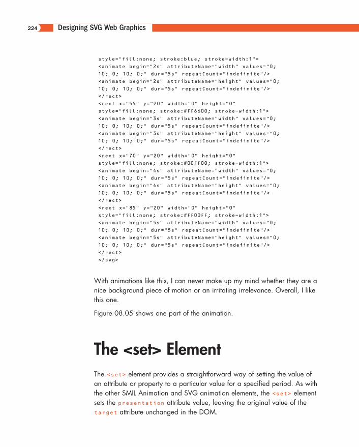
With animations like this, I can never make up my mind whether they are anice background piece of motion or an irritating irrelevance. Overall, I likethis one.
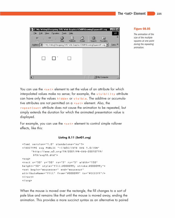
Figure 08.05 shows one part of the animation.
The <set> ElementThe <set> element provides a straightforward way of setting the value ofan attribute or property to a particular value for a specified period. As withthe other SMIL Animation and SVG animation elements, the <set> elementsets the presentation attribute value, leaving the original value of thetarget attribute unchanged in the DOM.
224
11666-08 08.21.01 2:21 PM Page 224
The <set> Element
You can use the <set> element to set the value of an attribute for whichinterpolated values make no sense; for example, the visibility attributecan have only the values hidden or visible. The additive or accumula-tive attributes are not permitted on a <set> element. Also, therepeatCount attribute does not cause the animation to be repeated, butsimply extends the duration for which the animated presentation value isdisplayed.
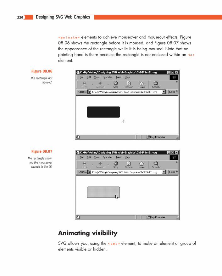
For example, you can use the <set> element to control simple rollovereffects, like this:
Listing 8.11 (Set01.svg)
<?xml version="1.0" standalone="no"?>
<!DOCTYPE svg PUBLIC "-//W3C//DTD SVG 1.0//EN"
"http://www.w3.org/TR/2001/PR-SVG-20010719/
DTD/svg10.dtd">
<svg>
<rect x="50" y="50" rx="5" ry="5" width="150"
height="50" style="fill:#000099; stroke:#000099;">
<set begin="mouseover" end="mouseout"
attributeName="fill" from="#000099" to="#CCCCFF"/>
</rect>
</svg>
When the mouse is moved over the rectangle, the fill changes to a sort ofpale blue and remains like that until the mouse is moved away, ending theanimation. This provides a more succinct syntax as an alternative to paired
225
Figure 08.05
The animation of thesize of the multiplesquares at one pointduring the repeatinganimation.
11666-08 08.21.01 2:21 PM Page 225
Designing SVG Web Graphics
<animate> elements to achieve mouseover and mouseout effects. Figure08.06 shows the rectangle before it is moused, and Figure 08.07 showsthe appearance of the rectangle while it is being moused. Note that nopointing hand is there because the rectangle is not enclosed within an <a>element.
226
Figure 08.06
The rectangle notmoused.
Figure 08.07
The rectangle show-ing the mouseoverchange in the fill.
Animating visibility
SVG allows you, using the <set> element, to make an element or group ofelements visible or hidden.
11666-08 08.21.01 2:21 PM Page 226
The <set> Element
Suppose that you want to keep some text hidden for two seconds andmake it visible for six seconds. Because the text is to be hidden initially,you set the visibility attribute in the <text> element to a value ofhidden. The animation is controlled by a <set> element, which animatesthe visibility attribute from hidden to visible. The begin attributeindicates that the animation begins two seconds after the image is loaded,and the dur attribute indicates that the text is visible for six seconds. Afterthat period, the original value of the visibility property is restored (the textis again hidden).
Listing 8.12 (AnimVisibility.svg)
<?xml version="1.0" standalone="no"?>
<!DOCTYPE svg PUBLIC "-//W3C//DTD SVG 1.0//EN"
"http://www.w3.org/TR/2001/PR-SVG-20010719/
DTD/svg10.dtd">
<svg>
<text id="TextElement" x="40" y="40"
style="font-family:Verdana, sans-serif; font-size:30;
visibility:hidden; fill:#990066;stroke:#990066" >
And now you see me!
<set attributeName="visibility" attributeType="CSS"
to="visible"
begin="2s" dur="6s"/>
</text>
</svg>
You can also make the text visible and keep it visible. To do that, youchange the <set> element as follows:
<set attributeName="visibility" attributeType="CSS"
to="visible"
begin="2s" fill="freeze"/>
Listing 8.12 is a time-based visibility animation. You can also create event-based visibility animations, such as in Listing 8.13, where mousing the rectangle causes the circle to become visible.
Listing 8.13 (Rollover01.svg)
<?xml version='1.0'?>
<!DOCTYPE svg PUBLIC "-//W3C//DTD SVG 1.0//EN"
227
11666-08 08.21.01 2:21 PM Page 227
Designing SVG Web Graphics
"http://www.w3.org/TR/2001/PR-SVG-20010719/
DTD/svg10.dtd">
<svg width="300" height="200">
<g style="display:none">
<animate attributeName="display" from="none" to="block"
begin="Button.mouseover" dur="0.1s" fill="freeze" />
<animate attributeName="display" from="block" to="none"
begin="Button.mouseout"
dur="0.1s" fill="freeze" />
<circle cx="20" cy="25" r="10" style="fill:red;"/>
</g>
<rect id="Button" x="40" y="10" width="100" height="30"
rx="5" ry="5"
style="fill:red;">
<animateColor begin="mouseover" attributeName="fill"
from="red" to="blue"
dur="0.1s" fill="freeze" />
<animateColor begin="mouseout" attributeName="fill"
from="blue" to="red"
dur="0.1s" fill="freeze" />
</rect>
</svg>
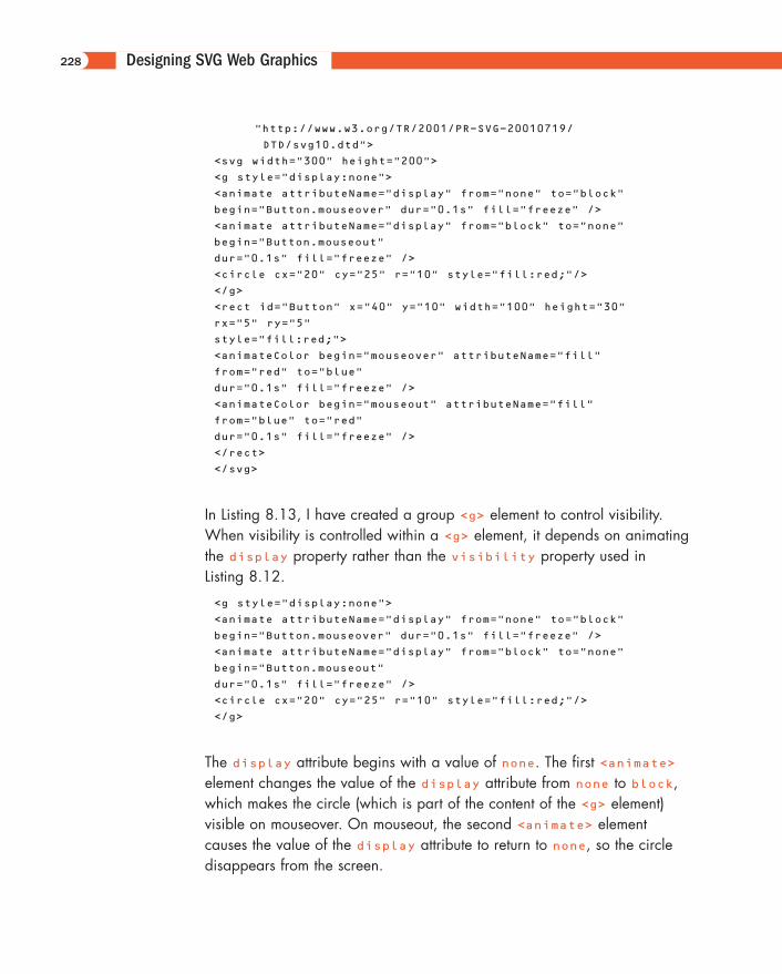
In Listing 8.13, I have created a group <g> element to control visibility.When visibility is controlled within a <g> element, it depends on animatingthe display property rather than the visibility property used in Listing 8.12.
<g style="display:none">
<animate attributeName="display" from="none" to="block"
begin="Button.mouseover" dur="0.1s" fill="freeze" />
<animate attributeName="display" from="block" to="none"
begin="Button.mouseout"
dur="0.1s" fill="freeze" />
<circle cx="20" cy="25" r="10" style="fill:red;"/>
</g>
The display attribute begins with a value of none. The first <animate>element changes the value of the display attribute from none to block,which makes the circle (which is part of the content of the <g> element) visible on mouseover. On mouseout, the second <animate> element causes the value of the display attribute to return to none, so the circledisappears from the screen.
228
11666-08 08.21.01 2:21 PM Page 228
The <set> Element
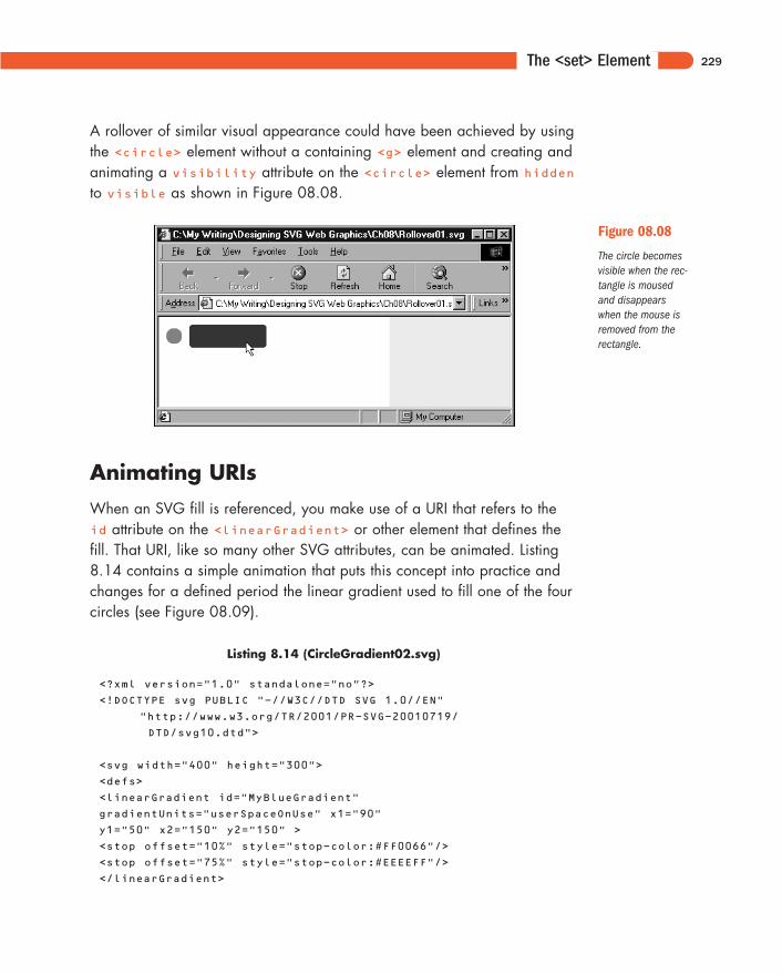
A rollover of similar visual appearance could have been achieved by usingthe <circle> element without a containing <g> element and creating andanimating a visibility attribute on the <circle> element from hiddento visible as shown in Figure 08.08.
229
Figure 08.08
The circle becomesvisible when the rec-tangle is mousedand disappears when the mouse isremoved from therectangle.
Animating URIs
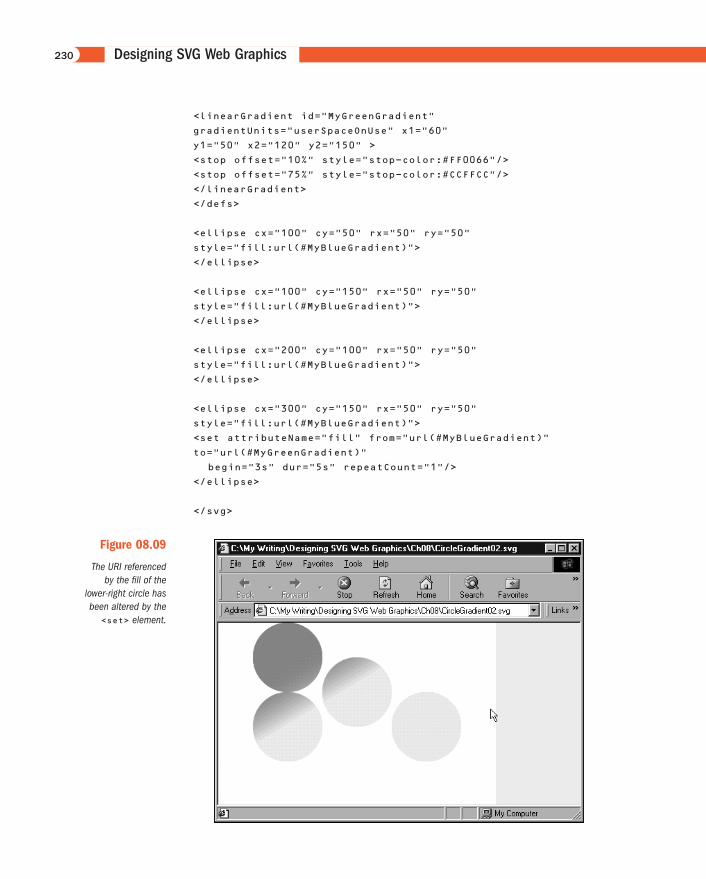
When an SVG fill is referenced, you make use of a URI that refers to theid attribute on the <linearGradient> or other element that defines thefill. That URI, like so many other SVG attributes, can be animated. Listing8.14 contains a simple animation that puts this concept into practice andchanges for a defined period the linear gradient used to fill one of the fourcircles (see Figure 08.09).
Listing 8.14 (CircleGradient02.svg)
<?xml version="1.0" standalone="no"?>
<!DOCTYPE svg PUBLIC "-//W3C//DTD SVG 1.0//EN"
"http://www.w3.org/TR/2001/PR-SVG-20010719/
DTD/svg10.dtd">
<svg width="400" height="300">
<defs>
<linearGradient id="MyBlueGradient"
gradientUnits="userSpaceOnUse" x1="90"
y1="50" x2="150" y2="150" >
<stop offset="10%" style="stop-color:#FF0066"/>
<stop offset="75%" style="stop-color:#EEEEFF"/>
</linearGradient>
11666-08 08.21.01 2:21 PM Page 229
Designing SVG Web Graphics
<linearGradient id="MyGreenGradient"
gradientUnits="userSpaceOnUse" x1="60"
y1="50" x2="120" y2="150" >
<stop offset="10%" style="stop-color:#FF0066"/>
<stop offset="75%" style="stop-color:#CCFFCC"/>
</linearGradient>
</defs>
<ellipse cx="100" cy="50" rx="50" ry="50"
style="fill:url(#MyBlueGradient)">
</ellipse>
<ellipse cx="100" cy="150" rx="50" ry="50"
style="fill:url(#MyBlueGradient)">
</ellipse>
<ellipse cx="200" cy="100" rx="50" ry="50"
style="fill:url(#MyBlueGradient)">
</ellipse>
<ellipse cx="300" cy="150" rx="50" ry="50"
style="fill:url(#MyBlueGradient)">
<set attributeName="fill" from="url(#MyBlueGradient)"
to="url(#MyGreenGradient)"
begin="3s" dur="5s" repeatCount="1"/>
</ellipse>
</svg>
230
Figure 08.09
The URI referencedby the fill of the
lower-right circle hasbeen altered by the<set> element.
11666-08 08.21.01 2:21 PM Page 230
The <set> Element
As you can see in the following code, the from attribute of the <set>element refers to the <LinearGradient> element with an id attribute of MyBlueGradient and then alters to MyGreenGradient the gradientbeing referenced. At the end of the animation, because no fill attributeis on the <set> element, the gradient used returns to the one described bythe fill property of the <ellipse> element:
<ellipse cx="300" cy="150" rx="50" ry="50"
style="fill:url(#MyBlueGradient)">
<set attributeName="fill" from="url(#MyBlueGradient)"
to="url(#MyGreenGradient)"
begin="3s" dur="5s" repeatCount="1"/>
</ellipse>
Chaining animations
So far, you have created animations that are either solitary or timed inde-pendently of each other. SMIL Animation—and, hence, SVG—also allowsyou to chain animations so that, if you have two animations, the secondanimation begins in a defined relationship to some aspect of the timing ofthe first animation. Look now at some examples of how animations can bechained.
In fact, all SVG animations are chained! Pause, and as you look at the following code, think for a moment what I mean:
Listing 8.15 (Chaining01.svg)
<?xml version="1.0" standalone="no"?>
<!DOCTYPE svg PUBLIC "-//W3C//DTD SVG 1.0//EN"
"http://www.w3.org/TR/2001/PR-SVG-20010719/
DTD/svg10.dtd">
<svg width="300" height="100">
<rect x="10" y="45" width="10" height="10"
style="fill:pink;">
<animate begin="2s" dur="10s"
attributeName="width" from="10" to="250"/>
</rect>
</svg>
231
11666-08 08.21.01 2:21 PM Page 231
Designing SVG Web Graphics
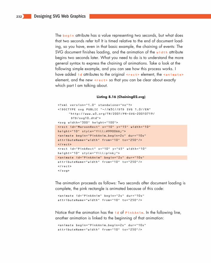
The begin attribute has a value representing two seconds, but what doesthat two seconds refer to? It is timed relative to the end of document load-ing, so you have, even in that basic example, the chaining of events: TheSVG document finishes loading, and the animation of the width attributebegins two seconds later. What you need to do is to understand the moregeneral syntax to express the chaining of animations. Take a look at the following simple example, and you can see how this process works. I have added id attributes to the original <rect> element, the <animate>element, and the new <rect> so that you can be clear about exactlywhich part I am talking about.
Listing 8.16 (Chaining02.svg)
<?xml version="1.0" standalone="no"?>
<!DOCTYPE svg PUBLIC "-//W3C//DTD SVG 1.0//EN"
"http://www.w3.org/TR/2001/PR-SVG-20010719/
DTD/svg10.dtd">
<svg width="300" height="100">
<rect id="MaroonRect" x="10" y="15" width="10"
height="10" style="fill:#990066;">
<animate begin="PinkAnim.begin+2s" dur="10s"
attributeName="width" from="10" to="250"/>
</rect>
<rect id="PinkRect" x="10" y="45" width="10"
height="10" style="fill:pink;">
<animate id="PinkAnim" begin="2s" dur="10s"
attributeName="width" from="10" to="250"/>
</rect>
</svg>
The animation proceeds as follows: Two seconds after document loading iscomplete, the pink rectangle is animated because of this code:
<animate id="PinkAnim" begin="2s" dur="10s"
attributeName="width" from="10" to="250"/>
Notice that the animation has the id of PinkAnim. In the following line,another animation is linked to the beginning of that animation:
<animate begin="PinkAnim.begin+2s" dur="10s"
attributeName="width" from="10" to="250"/>
232
11666-08 08.21.01 2:21 PM Page 232
The <set> Element
by the syntax
begin="PinkAnim.begin+2s"
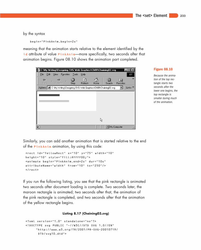
meaning that the animation starts relative to the element identified by theid attribute of value PinkAnim—more specifically, two seconds after thatanimation begins. Figure 08.10 shows the animation part completed.
233
Figure 08.10
Because the anima-tion of the top rec-tangle starts twoseconds after thelower one begins, thetop rectangle issmaller during muchof the animation.
Similarly, you can add another animation that is started relative to the endof the PinkAnim animation, by using this code:
<rect id="YellowRect" x="10" y="75" width="10"
height="10" style="fill:#FFFF00;">
<animate begin="PinkAnim.end+2s" dur="10s"
attributeName="width" from="10" to="250"/>
</rect>
If you run the following listing, you see that the pink rectangle is animatedtwo seconds after document loading is complete. Two seconds later, themaroon rectangle is animated; two seconds after that, the animation of the pink rectangle is completed, and two seconds after that the animationof the yellow rectangle begins.
Listing 8.17 (Chaining03.svg)
<?xml version="1.0" standalone="no"?>
<!DOCTYPE svg PUBLIC "-//W3C//DTD SVG 1.0//EN"
"http://www.w3.org/TR/2001/PR-SVG-20010719/
DTD/svg10.dtd">
11666-08 08.21.01 2:21 PM Page 233
Designing SVG Web Graphics
<svg width="300" height="100">
<rect id="MaroonRect" x="10" y="15" width="10"
height="10" style="fill:#990066;">
<animate begin="PinkAnim.begin+2s" dur="10s"
attributeName="width" from="10" to="250"/>
</rect>
<rect id="PinkRect" x="10" y="45" width="10"
height="10" style="fill:pink;">
<animate id="PinkAnim" begin="2s" dur="10s"
attributeName="width" from="10" to="250"/>
</rect>
<rect id="YellowRect" x="10" y="75" width="10"
height="10" style="fill:#FFFF00;">
<animate begin="PinkAnim.end+2s" dur="10s"
attributeName="width" from="10" to="250"/>
</rect>
</svg>
In case you are interested, the SVG jargon for PinkAnim.end is syncbase,and the 2s is the offset from it.
To modify the code so that the three animations are linked in sequence, youuse as the syncbase for the second animation the end of the first one, anduse as the syncbase for the third animation the end of the second. Thisprocess is implemented in the following code. I don’t want you to getobsessed with the visual impact of changing the width of rectangles; rather,I want you to consider the power that is available if you chain animationsin this way.
Listing 8.18 (Chaining04.svg)
<?xml version="1.0" standalone="no"?>
<!DOCTYPE svg PUBLIC "-//W3C//DTD SVG 1.0//EN"
"http://www.w3.org/TR/2001/PR-SVG-20010719/
DTD/svg10.dtd">
<svg width="300" height="100">
<rect id="MaroonRect" x="10" y="15" width="10"
height="10"
style="fill:#990066;">
<animate id="MaroonAnim" begin="PinkAnim.end"
dur="5s" attributeName="width" from="10"
to="250"/>
</rect>
<rect id="PinkRect" x="10" y="45" width="10"
height="10" style="fill:pink;">
234
11666-08 08.21.01 2:21 PM Page 234
The <set> Element
<animate id="PinkAnim" begin="2s" dur="5s"
attributeName="width" from="10"
to="250"/>
</rect>
<rect id="YellowRect" x="10" y="75" width="10"
height="10"
style="fill:#FFFF00;">
<animate id="YellowAnim" begin="MaroonAnim.end"
dur="5s" attributeName="width" from="10"
to="250"/>
</rect>
</svg>
Look at how you can develop this idea further. Notice that the yellow rec-tangle has an id attribute on its nested <animate> element. To link afourth animation to the chain is a straightforward process: Just referenceYellowAnim.end as the syncbase. If that fourth animation has an idattribute, you can easily add a fifth.
Can you also see how you can use this concept to create and exploit animation visual components?
As far as the “fourth” animation is concerned, the only thing it sees is theend of the YellowAnim animation. What comes before that is immaterial.The three linked animations are essentially an animated visual component,as far as the fourth animation is concerned. At its simplest level, you canlink a further animation, which can be simple or complex, into the end ofthe YellowAnim animation. But nothing stops you from linking it instead tothe MaroonAnim animation, or to the PinkAnim animation. So your simpleanimation could have three different animation paths as spinoffs from thissimple start.
Determining multiple times to beginan animation
So far, you have looked at just using one value for the begin attribute ofan <animate> element. However, SVG allows you to use a list of them.Make use of that facility by modifying the code for the pink rectangle, likethis:
235
11666-08 08.21.01 2:21 PM Page 235
Designing SVG Web Graphics
<rect id="PinkRect" x="10" y="45" width="10"
height="10" style="fill:pink;">
<animate id="PinkAnim" begin="2s; YellowAnim.end"
dur="5s" attributeName="width" from="10"
to="250"/>
</rect>
Notice that the begin attribute of the <animate> element has a value of2s; YellowAnim.end. It contains a list of values. The first value indicatesthat the pink rectangle is animated two seconds after the document finishesloading. The second value indicates that the pink rectangle is animatedwhen the yellow rectangle has finished its animation. You have thereforecreated a looping animation, by chaining the first animation to the end ofthe third.
The ordering of the individual values within the values attribute is immaterial. You caninsert additional values that should occur early after other values without causing any error,always assuming that you remember to separate individual values by semicolons inserted inthe correct place.
To put these two ideas together, you can create a sequence of three anima-tions. At the end of any of the individual animations, you can spin off otheranimations. In addition, you can loop back to the beginning of the first ani-mation, creating a looping animation. Whenever the animations are assimple as those with the rectangles, this process isn’t spectacular; if youapply your creativity, however, to create more sophisticated animation, perhaps involving color changes or animated gradients, for example, youcan begin to glimpse the potential creative power available to you.
You can add another dimension to this process. What if the start of the animations are triggered by user events? What if by mousing part of anSVG image or clicking on a particular part, you can create a cascade ofchained animations—perhaps some of which loop too? Can you see thehuge potential here? Don’t worry if your brain is aching at the practical difficulties in visualizing, planning, and coding all that material—just allowyourself to take a look at the potential power of it.
In the final example in this section I have cheated a bit. Interaction isn’tcovered until Chapter 11, “Creating Interactive SVG Graphics,” so I don’texplain the code for the interactive animations here (although you should
236
NOTE
11666-08 08.21.01 2:21 PM Page 236
The <set> Element
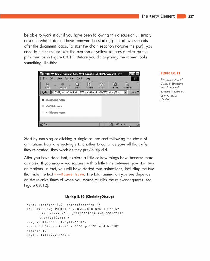
be able to work it out if you have been following this discussion). I simplydescribe what it does. I have removed the starting point at two secondsafter the document loads. To start the chain reaction (forgive the pun), youneed to either mouse over the maroon or yellow squares or click on thepink one (as in Figure 08.11. Before you do anything, the screen lookssomething like this:
237
Figure 08.11
The appearance ofListing 8.19 beforeany of the smallsquares is activatedby mousing or clicking.
Start by mousing or clicking a single square and following the chain of animations from one rectangle to another to convince yourself that, afterthey’re started, they work as they previously did.
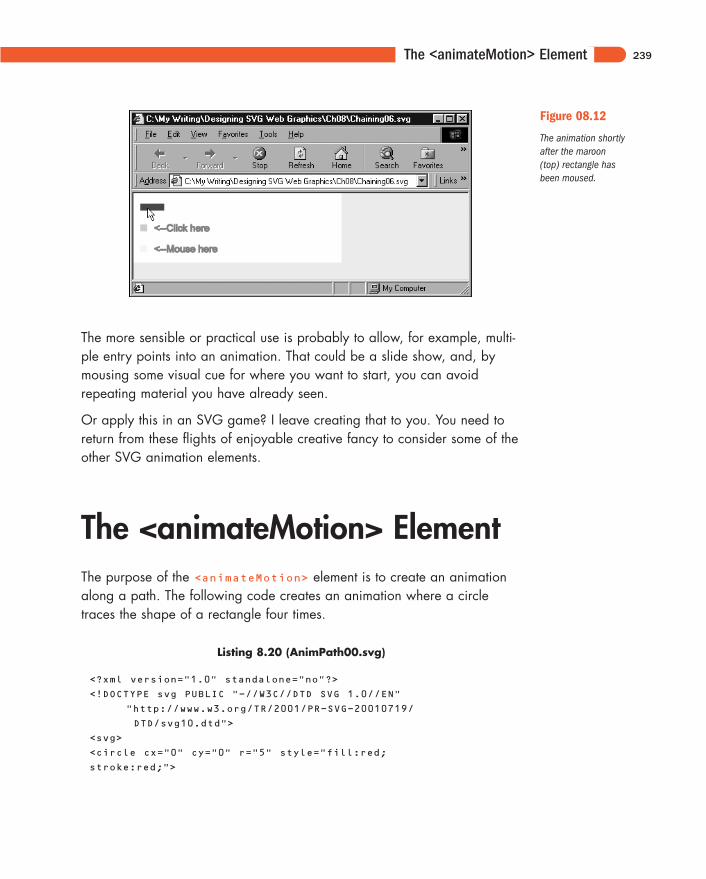
After you have done that, explore a little of how things have become morecomplex. If you mouse two squares with a little time between, you start twoanimations. In fact, you will have started four animations, including the twothat hide the text <--Mouse here. The total animation you see dependson the relative times of when you mouse or click the relevant squares (seeFigure 08.12).
Listing 8.19 (Chaining06.svg)
<?xml version="1.0" standalone="no"?>
<!DOCTYPE svg PUBLIC "-//W3C//DTD SVG 1.0//EN"
"http://www.w3.org/TR/2001/PR-SVG-20010719/
DTD/svg10.dtd">
<svg width="300" height="100">
<rect id="MaroonRect" x="10" y="15" width="10"
height="10"
style="fill:#990066;">
11666-08 08.21.01 2:21 PM Page 237
Designing SVG Web Graphics
<animate id="MaroonAnim" begin="PinkAnim.end;
mouseover" dur="5s" attributeName="width" from="10"
to="250"/>
</rect>
<text x="30" y="25" style="fill:red; stroke:red;
font-size:14">
<animate begin="MaroonAnim.begin" dur="0.1s"
attributeName="visibility" from="visible"
to="hidden" fill="freeze"/>
<animate begin="MaroonAnim.end" dur="0.1s"
attributeName="visibility" from="hidden"
to="visible" fill="freeze"/>
<--Mouse here
</text>
<rect id="PinkRect" x="10" y="45" width="10"
height="10" style="fill:pink;">
<animate id="PinkAnim" begin="YellowAnim.end;
click" dur="5s" attributeName="width" from="10"
to="250"/>
</rect>
<text x="30" y="55" style="fill:red; stroke:red;
font-size:14">
<animate begin="PinkAnim.begin" dur="0.1s"
attributeName="visibility" from="visible" to="hidden"
fill="freeze"/>
<animate begin="PinkAnim.end" dur="0.1s"
attributeName="visibility" from="hidden"
to="visible" fill="freeze"/>
<--Click here
</text>
<rect id="YellowRect" x="10" y="75" width="10"
height="10"
style="fill:#FFFF00;">
<animate id="YellowAnim" begin="MaroonAnim.end;
mouseover" dur="5s" attributeName="width" from="10"
to="250"/>
</rect>
<text x="30" y="85" style="fill:red; stroke:red;
font-size:14">
<animate begin="YellowAnim.begin" dur="0.1s"
attributeName="visibility" from="visible" to="hidden"
fill="freeze"/>
<animate begin="YellowAnim.end" dur="0.1s"
attributeName="visibility" from="hidden" to="visible"
fill="freeze"/>
<--Mouse here
</text>
</svg>
238
11666-08 08.21.01 2:21 PM Page 238
The <animateMotion> Element
The more sensible or practical use is probably to allow, for example, multi-ple entry points into an animation. That could be a slide show, and, bymousing some visual cue for where you want to start, you can avoidrepeating material you have already seen.
Or apply this in an SVG game? I leave creating that to you. You need toreturn from these flights of enjoyable creative fancy to consider some of theother SVG animation elements.
The <animateMotion> ElementThe purpose of the <animateMotion> element is to create an animationalong a path. The following code creates an animation where a circletraces the shape of a rectangle four times.
Listing 8.20 (AnimPath00.svg)
<?xml version="1.0" standalone="no"?>
<!DOCTYPE svg PUBLIC "-//W3C//DTD SVG 1.0//EN"
"http://www.w3.org/TR/2001/PR-SVG-20010719/
DTD/svg10.dtd">
<svg>
<circle cx="0" cy="0" r="5" style="fill:red;
stroke:red;">
239
Figure 08.12
The animation shortlyafter the maroon(top) rectangle hasbeen moused.
11666-08 08.21.01 2:21 PM Page 239
Designing SVG Web Graphics
<animateMotion path="M50,50 150,50 150,100 50,100 z"
dur="5s"
repeatCount="4" />
</circle>
</svg>
Animation on a path
One of the most compelling types of animation is animation on a path. Thepath along which the animation can take place is any path that can beexpressed in SVG, which leaves enormous scope for creativity.
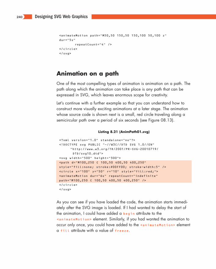
Let’s continue with a further example so that you can understand how toconstruct more visually exciting animations at a later stage. The animationwhose source code is shown next is a small, red circle traveling along asemicircular path over a period of six seconds (see Figure 08.13).
Listing 8.21 (AnimPath01.svg)
<?xml version="1.0" standalone="no"?>
<!DOCTYPE svg PUBLIC "-//W3C//DTD SVG 1.0//EN"
"http://www.w3.org/TR/2001/PR-SVG-20010719/
DTD/svg10.dtd">
<svg width="500" height="300">
<path d="M100,250 C 100,50 400,50 400,250"
style="fill:none; stroke:#00FF00; stroke-width:5" />
<circle x="100" y="50" r="10" style="fill:red;">
<animateMotion dur="6s" repeatCount="indefinite"
path="M100,250 C 100,50 400,50 400,250" />
</circle>
</svg>
As you can see if you have loaded the code, the animation starts immedi-ately after the SVG image is loaded. If I had wanted to delay the start ofthe animation, I could have added a begin attribute to the<animateMotion> element. Similarly, if you had wanted the animation tooccur only once, you could have added to the <animateMotion> elementa fill attribute with a value of freeze.
240
11666-08 08.21.01 2:21 PM Page 240
The <animateMotion> Element
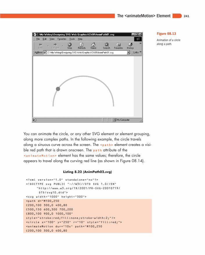
You can animate the circle, or any other SVG element or element grouping,along more complex paths. In the following example, the circle travelsalong a sinuous curve across the screen. The <path> element creates a visi-ble red path that is drawn onscreen. The path attribute of the<animateMotion> element has the same values; therefore, the circleappears to travel along the curving red line (as shown in Figure 08.14).
Listing 8.22 (AnimPath02.svg)
<?xml version="1.0" standalone="no"?>
<!DOCTYPE svg PUBLIC "-//W3C//DTD SVG 1.0//EN"
"http://www.w3.org/TR/2001/PR-SVG-20010719/
DTD/svg10.dtd">
<svg width="1000" height="300">
<path d="M100,250
C200,100 300,0 400,80
C500,150 600,300 700,200
C800,100 900,0 1000,100"
style="stroke:red;fill:none;stroke-width:2;"/>
<circle x="100" y="250" r="10" style="fill:red;">
<animateMotion dur="10s" path="M100,250
C200,100 300,0 400,80
241
Figure 08.13
Animation of a circlealong a path.
11666-08 08.21.01 2:21 PM Page 241
Designing SVG Web Graphics
C500,150 600,300 700,200
C800,100 900,0 1000,100" repeatCount="indefinite"/>
</circle>
</svg>
242
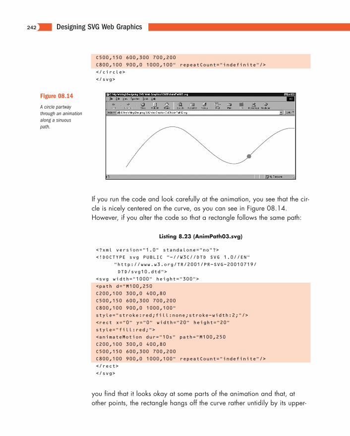
Figure 08.14
A circle partwaythrough an animationalong a sinuouspath.
If you run the code and look carefully at the animation, you see that the cir-cle is nicely centered on the curve, as you can see in Figure 08.14.However, if you alter the code so that a rectangle follows the same path:
Listing 8.23 (AnimPath03.svg)
<?xml version="1.0" standalone="no"?>
<!DOCTYPE svg PUBLIC "-//W3C//DTD SVG 1.0//EN"
"http://www.w3.org/TR/2001/PR-SVG-20010719/
DTD/svg10.dtd">
<svg width="1000" height="300">
<path d="M100,250
C200,100 300,0 400,80
C500,150 600,300 700,200
C800,100 900,0 1000,100"
style="stroke:red;fill:none;stroke-width:2;"/>
<rect x="0" y="0" width="20" height="20"
style="fill:red;">
<animateMotion dur="10s" path="M100,250
C200,100 300,0 400,80
C500,150 600,300 700,200
C800,100 900,0 1000,100" repeatCount="indefinite"/>
</rect>
</svg>
you find that it looks okay at some parts of the animation and that, atother points, the rectangle hangs off the curve rather untidily by its upper-
11666-08 08.21.01 2:21 PM Page 242
The <animateMotion> Element
left corner. The circle is placed symmetrically on the curve because the cir-cle’s center is the reference point for the cx and cy attributes. For the rec-tangle, on the other hand, the upper-left corner is referenced by the x andy attributes.
However, that problem is easily fixed. Simply change the x and y attributesto a negative number that is half the width and height, respectively:
<rect x="-10" y="-10" width="20" height="20"
style="fill:red;">
<animateMotion dur="10s" path="M100,250
C200,100 300,0 400,80
C500,150 600,300 700,200
C800,100 900,0 1000,100" repeatCount="indefinite"/>
</rect>
and the rectangle is then symmetrically displayed. The amended code isincluded in the listing as AnimPath04.svg.
When you want to create an animation along a path, however, you proba-bly don’t use something as symmetrical as a circle or rectangle. Also, youmight want the SVG object being animated to “point” along the directionof a path. Suppose that you have plans to create a simulation of a fair-ground ride. The rectangle stays upright all the time, which doesn’t lookrealistic with a vehicle to follow the track. You need to add a rotateattribute with the value of auto; then, you find that the rectangle followsthe curve in a much more lifelike manner.
Listing 8.24 (AnimPath05.svg)
<?xml version="1.0" standalone="no"?>
<!DOCTYPE svg PUBLIC "-//W3C//DTD SVG 1.0//EN"
"http://www.w3.org/TR/2001/PR-SVG-20010719/
DTD/svg10.dtd">
<svg width="1000" height="300">
<path d="M100,250
C200,100 300,0 400,80
C500,150 600,300 700,200
C800,100 900,0 1000,100"
style="stroke:red;fill:none;stroke-width:2;"/>
<rect x="-20" y="-10" width="40" height="20"
style="fill:red;">
<animateMotion dur="10s" path="M100,250
243
11666-08 08.21.01 2:21 PM Page 243
Designing SVG Web Graphics
C200,100 300,0 400,80
C500,150 600,300 700,200
C800,100 900,0 1000,100" repeatCount="indefinite"
rotate="auto"/>
</rect>
</svg>
You can use a similar technique when you are animating vehicles or aspacecraft or other creative mobile objects along a path.
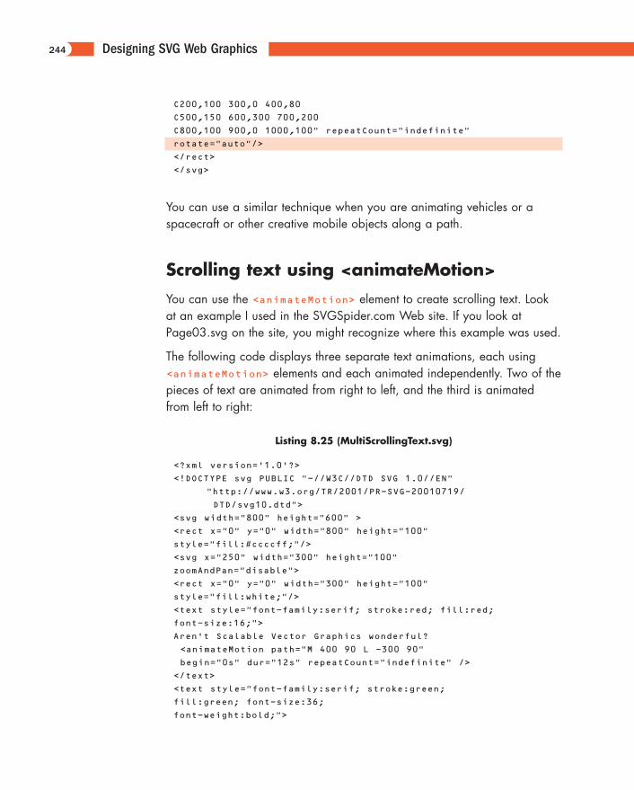
Scrolling text using <animateMotion>
You can use the <animateMotion> element to create scrolling text. Lookat an example I used in the SVGSpider.com Web site. If you look atPage03.svg on the site, you might recognize where this example was used.
The following code displays three separate text animations, each using<animateMotion> elements and each animated independently. Two of thepieces of text are animated from right to left, and the third is animatedfrom left to right:
Listing 8.25 (MultiScrollingText.svg)
<?xml version='1.0'?>
<!DOCTYPE svg PUBLIC "-//W3C//DTD SVG 1.0//EN"
"http://www.w3.org/TR/2001/PR-SVG-20010719/
DTD/svg10.dtd">
<svg width="800" height="600" >
<rect x="0" y="0" width="800" height="100"
style="fill:#ccccff;"/>
<svg x="250" width="300" height="100"
zoomAndPan="disable">
<rect x="0" y="0" width="300" height="100"
style="fill:white;"/>
<text style="font-family:serif; stroke:red; fill:red;
font-size:16;">
Aren't Scalable Vector Graphics wonderful?
<animateMotion path="M 400 90 L -300 90"
begin="0s" dur="12s" repeatCount="indefinite" />
</text>
<text style="font-family:serif; stroke:green;
fill:green; font-size:36;
font-weight:bold;">
244
11666-08 08.21.01 2:21 PM Page 244
The <animateMotion> Element
SVG
<animateMotion begin="4s" path="M -300 70 L 400 70"
dur="12s" repeatCount="indefinite"/>
</text>
<a xlink:href="http://www.svgenius.com/" target="new">
<text y="-5" style="font-family:sans-serif;
stroke:orange; fill:orange; font-size:20;">
Experimental SVG at SVGenius.com
<animateMotion begin="2s" path="M 400 30 L -300 30"
dur="12s" repeatCount="indefinite"/>
</text>
</a>
<rect height="300" width="50" x="0" y="0"
style="opacity:0.3; fill:white;
color:white;"/>
<rect height="300" width="50" x="250" y="0"
style="opacity:0.3; fill:white;
color:white;"/>
<rect x="0" y="0" width="300" height="100"
style="stroke:#000066;
stroke-width:2; fill:none;"/>
</svg>
<rect width="800" height="2" x="0" y="98"
style="stroke:#003399;fill:#003399"/>
</svg>
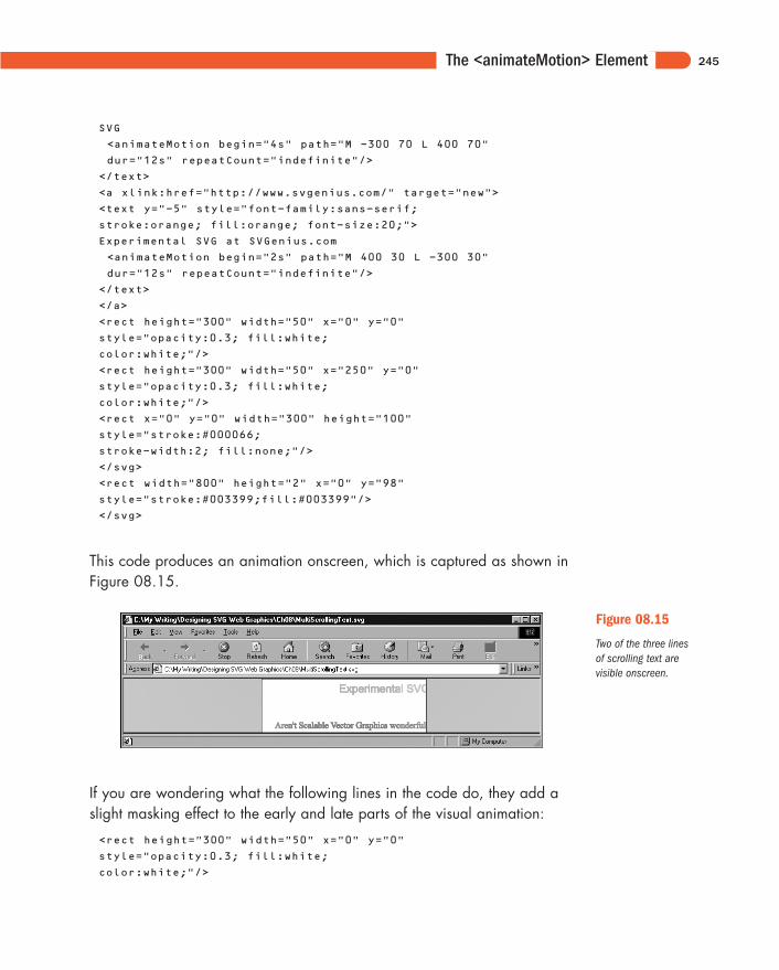
This code produces an animation onscreen, which is captured as shown inFigure 08.15.
245
Figure 08.15
Two of the three linesof scrolling text arevisible onscreen.
If you are wondering what the following lines in the code do, they add aslight masking effect to the early and late parts of the visual animation:
<rect height="300" width="50" x="0" y="0"
style="opacity:0.3; fill:white;
color:white;"/>
11666-08 08.21.01 2:21 PM Page 245
Designing SVG Web Graphics
<rect height="300" width="50" x="250" y="0"
style="opacity:0.3; fill:white;
color:white;"/>
You can use colors other than white and vary the opacity to achieve adesirable effect:
<rect height="300" width="50" x="0" y="0"
style="opacity:0.4; fill:#9999FF;
color:white;"/>
<rect height="300" width="50" x="250" y="0"
style="opacity:0.4; fill:#9999FF;
color:white;"/>
Make sure to change the fill color of the background <rect> element tomatch. In these examples, I used a plain fill for these masking rectangles,but you could use a <linearGradient> element to create a graduatedmask. Of course, you could use shapes other than a <rect> element.
The <animateColor> ElementThe <animateColor> element allows you to change the color of an SVGelement or element group over time.
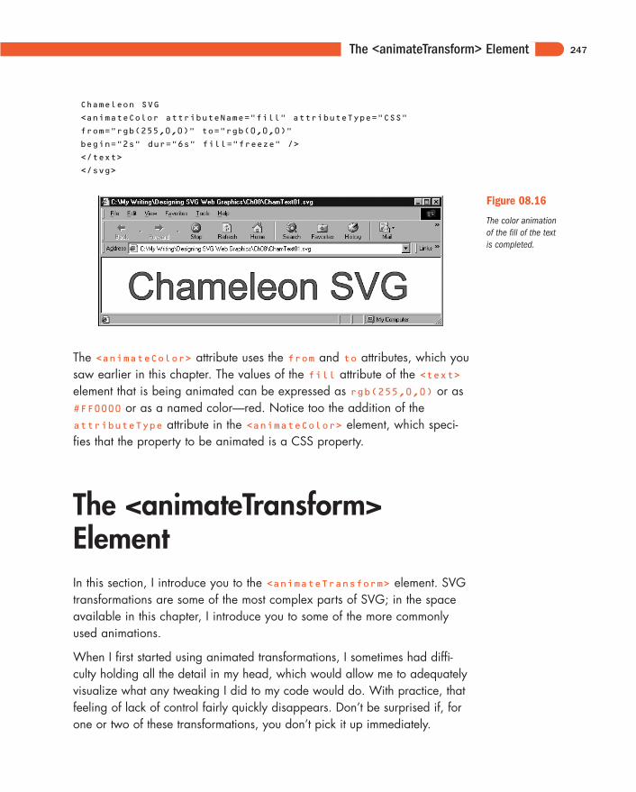
Now create a simple color animation of the color of some text. The followingcode animates the fill of the text Chameleon SVG from red to black (seeFigure 08.16). The animation starts two seconds after the image loads, takessix seconds for the color transition, and is frozen with the new color proper-ties (both the fill and the stroke are black when the animation finishes).
Listing 8.26 (ChamText01.svg)
<?xml version="1.0" standalone="no"?>
<!DOCTYPE svg PUBLIC "-//W3C//DTD SVG 1.0//EN"
"http://www.w3.org/TR/2001/PR-SVG-20010719/
DTD/svg10.dtd">
<svg>
<text x="50" y="80" style="fill:red; stroke:black;
font-family:Arial, sans-serif; font-size:72;">
246
11666-08 08.21.01 2:21 PM Page 246
The <animateTransform> Element
Chameleon SVG
<animateColor attributeName="fill" attributeType="CSS"
from="rgb(255,0,0)" to="rgb(0,0,0)"
begin="2s" dur="6s" fill="freeze" />
</text>
</svg>
247
Figure 08.16
The color animationof the fill of the textis completed.
The <animateColor> attribute uses the from and to attributes, which yousaw earlier in this chapter. The values of the fill attribute of the <text>element that is being animated can be expressed as rgb(255,0,0) or as#FF0000 or as a named color—red. Notice too the addition of theattributeType attribute in the <animateColor> element, which speci-fies that the property to be animated is a CSS property.
The <animateTransform>ElementIn this section, I introduce you to the <animateTransform> element. SVGtransformations are some of the most complex parts of SVG; in the spaceavailable in this chapter, I introduce you to some of the more commonlyused animations.
When I first started using animated transformations, I sometimes had diffi-culty holding all the detail in my head, which would allow me to adequatelyvisualize what any tweaking I did to my code would do. With practice, thatfeeling of lack of control fairly quickly disappears. Don’t be surprised if, forone or two of these transformations, you don’t pick it up immediately.
11666-08 08.21.01 2:21 PM Page 247
Designing SVG Web Graphics
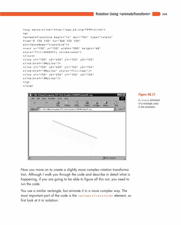
Rotation Using<animateTransform>Take a look at a simple rotation, using a grouping <g> element you used inan example in Chapter 3, “Creating Static Graphics Elements.” The rota-tion turns the rectangle through 360 degrees in a 9-second period, usingits upper-left corner as the pivot point. The code for the transformation isshown here:
<animateTransform begin="1s" dur="10s" type="rotate"
from="0 150 150" to="360 150 150"
attributeName="transform"/>
You should be familiar with the meaning of the begin and dur attributes.You must specify the attributeName property (in this case, transform)and the type attribute (in this case, rotate). Notice that the from attrib-ute contains three values, separated by spaces: 0 150 150. The first num-ber is the starting position in degrees, meaning that it has its normalupright position. The second number is the x coordinate of the pivot pointfor the rotation, and the third number is the y coordinate of the pivot point.
The to attribute, similarly, contains three figures. The first is the number, indegrees, for the position of the rectangle at the end of the animation. Ofcourse, 360 degrees looks the same as 0 degrees; during the period of theanimation, however, the rectangle is rotated smoothly through 360 degrees(from 0 degrees to 360 degrees) over a period of nine seconds. As with thefrom attribute, the second and third numbers of the to attribute describe,respectively, the x and y coordinates of the pivot point (se Figure 08.17).
If you take time to run the code, you see that the rotation is smooth anddoesn’t change in speed throughout the animation, similar to the secondhand on a watch. Here is the full code:
Listing 8.27 (Rotation01.svg)
<?xml version="1.0" standalone="no"?>
<!DOCTYPE svg PUBLIC "-//W3C//DTD SVG 1.0//EN"
"http://www.w3.org/TR/2001/PR-SVG-20010719/
DTD/svg10.dtd">
248
11666-08 08.21.01 2:21 PM Page 248
Rotation Using <animateTransform>
<svg xmlns:xlink="http://www.w3.org/1999/xlink">
<g>
<animateTransform begin="1s" dur="10s" type="rotate"
from="0 150 150" to="360 150 150"
attributeName="transform"/>
<rect x="150" y="150" width="300" height="68"
style="fill:#DDDDFF; stroke:none">
</rect>
<line x1="150" x2="450" y1="152" y2="152"
xlink:href="#MyLine"/>
<line x1="150" x2="450" y1="154" y2="154"
xlink:href="#MyLine" style="fill:red;"/>
<line x1="150" x2="450" y1="156" y2="156"
xlink:href="#MyLine"/>
</g>
</svg>
249
Figure 08.17
A rotate animationof a rectangle, earlyin the animation.
Now you move on to create a slightly more complex rotation transforma-tion. Although I walk you through the code and describe in detail what ishappening, if you are going to be able to figure all this out, you need torun the code.
You use a similar rectangle, but animate it in a more complex way. Themost important part of the code is the <animateTransform> element, sofirst look at it in isolation:
11666-08 08.21.01 2:21 PM Page 249
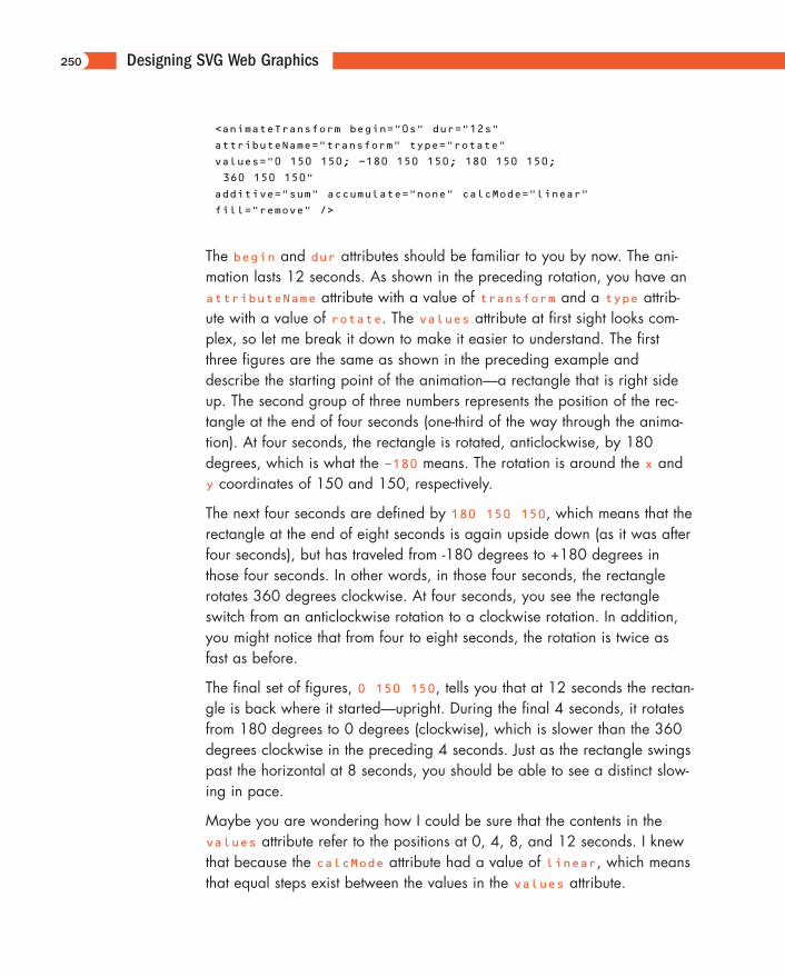
Designing SVG Web Graphics
<animateTransform begin="0s" dur="12s"
attributeName="transform" type="rotate"
values="0 150 150; -180 150 150; 180 150 150;
360 150 150"
additive="sum" accumulate="none" calcMode="linear"
fill="remove" />
The begin and dur attributes should be familiar to you by now. The ani-mation lasts 12 seconds. As shown in the preceding rotation, you have anattributeName attribute with a value of transform and a type attrib-ute with a value of rotate. The values attribute at first sight looks com-plex, so let me break it down to make it easier to understand. The firstthree figures are the same as shown in the preceding example anddescribe the starting point of the animation—a rectangle that is right sideup. The second group of three numbers represents the position of the rec-tangle at the end of four seconds (one-third of the way through the anima-tion). At four seconds, the rectangle is rotated, anticlockwise, by 180degrees, which is what the -180 means. The rotation is around the x andy coordinates of 150 and 150, respectively.
The next four seconds are defined by 180 150 150, which means that therectangle at the end of eight seconds is again upside down (as it was afterfour seconds), but has traveled from -180 degrees to +180 degrees inthose four seconds. In other words, in those four seconds, the rectanglerotates 360 degrees clockwise. At four seconds, you see the rectangleswitch from an anticlockwise rotation to a clockwise rotation. In addition,you might notice that from four to eight seconds, the rotation is twice asfast as before.
The final set of figures, 0 150 150, tells you that at 12 seconds the rectan-gle is back where it started—upright. During the final 4 seconds, it rotatesfrom 180 degrees to 0 degrees (clockwise), which is slower than the 360degrees clockwise in the preceding 4 seconds. Just as the rectangle swingspast the horizontal at 8 seconds, you should be able to see a distinct slow-ing in pace.
Maybe you are wondering how I could be sure that the contents in thevalues attribute refer to the positions at 0, 4, 8, and 12 seconds. I knewthat because the calcMode attribute had a value of linear, which meansthat equal steps exist between the values in the values attribute.
250
11666-08 08.21.01 2:21 PM Page 250
Rotation Using <animateTransform>
If you add an extra set of three values to the values attribute, you see thepositions at 0, 3, 6, 9, and 12 seconds.
Here is the full code:
Listing 8.28 (Rotation02.svg)
<?xml version="1.0" standalone="no"?>
<!DOCTYPE svg PUBLIC "-//W3C//DTD SVG 1.0//EN"
"http://www.w3.org/TR/2001/PR-SVG-20010719/
DTD/svg10.dtd">
<svg xmlns:xlink="http://www.w3.org/1999/xlink">
<defs>
<line id="MyLine" x1="150" x2="450" y1="150" y2="150"
style="fill:#000099;
stroke:#000099; stroke-width:0.05;"/>
</defs>
<g>
<animateTransform dur="12s" attributeName="transform"
type="rotate"
values="0 150 150; -180 150 150; 180 150 150; 360
150 150"
additive="sum" accumulate="none" calcMode="linear"
fill="remove" />
<rect x="150" y="150" width="300" height="68"
style="fill:#DDDDFF;
stroke:none"/>
<line x1="150" x2="450" y1="152" y2="152"
xlink:href="#MyLine"/>
<line x1="150" x2="450" y1="154" y2="154"
xlink:href="#MyLine"
style="fill:red;"/>
<line x1="150" x2="450" y1="156" y2="156"
xlink:href="#MyLine"/>
<use transform="translate(0,8)" xlink:href="#MyLine"/>
<use transform="translate(0,12)" xlink:href="#MyLine"
style="fill:red"/>
</g>
</svg>
If you want to create an endlessly repeating animation, you can modify the<animateTransform> element to look like this:
<animateTransform dur="12s" attributeName="transform"
type="rotate"
values="0 150 150; -180 150 150; 180 150 150; 360
150 150"
251
11666-08 08.21.01 2:21 PM Page 251
Designing SVG Web Graphics
additive="sum" accumulate="none" calcMode="linear"
fill="remove" restart="always"
repeatCount="indefinite" />
<rect x="150" y="150" width="300" height="68"
style="fill:#DDDDFF;
stroke:none"/>
Note the addition of the restart and repeatCount attributes to the<animateTransform> element.
Simple Sample AnimationsIn this section, I show you a few examples of the ways in which you canapply SVG animations.
Animating gradients
Take a look again at the linear gradient you saw early in Chapter 6,“Creating SVG Gradients,” and look at how you can animate it:
Listing 8.29 (AnimBasicLinGradient01.svg)
<?xml version="1.0" standalone="no"?>
<!DOCTYPE svg PUBLIC "-//W3C//DTD SVG 1.0//EN"
"http://www.w3.org/TR/2001/PR-SVG-20010719/
DTD/svg10.dtd">
<svg width="500" height="300">
<defs>
<linearGradient id="MyFirstGradient">
<stop offset="5%" style="stop-color:#FF6600"/>
<stop offset="95%" style="stop-color:#FFFFCC"/>
</linearGradient>
</defs>
<rect style="fill:none; stroke:red"
x="1" y="1" width="498" height="298"/>
<rect x="50" y="50" width="300" height="100"
style="fill:url(#MyFirstGradient); stroke:none"/>
</svg>
252
11666-08 08.21.01 2:21 PM Page 252
Simple Sample Animations
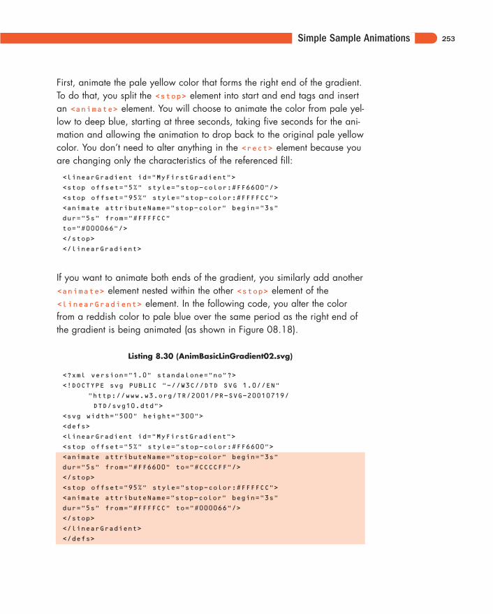
First, animate the pale yellow color that forms the right end of the gradient.To do that, you split the <stop> element into start and end tags and insertan <animate> element. You will choose to animate the color from pale yel-low to deep blue, starting at three seconds, taking five seconds for the ani-mation and allowing the animation to drop back to the original pale yellowcolor. You don’t need to alter anything in the <rect> element because youare changing only the characteristics of the referenced fill:
<linearGradient id="MyFirstGradient">
<stop offset="5%" style="stop-color:#FF6600"/>
<stop offset="95%" style="stop-color:#FFFFCC">
<animate attributeName="stop-color" begin="3s"
dur="5s" from="#FFFFCC"
to="#000066"/>
</stop>
</linearGradient>
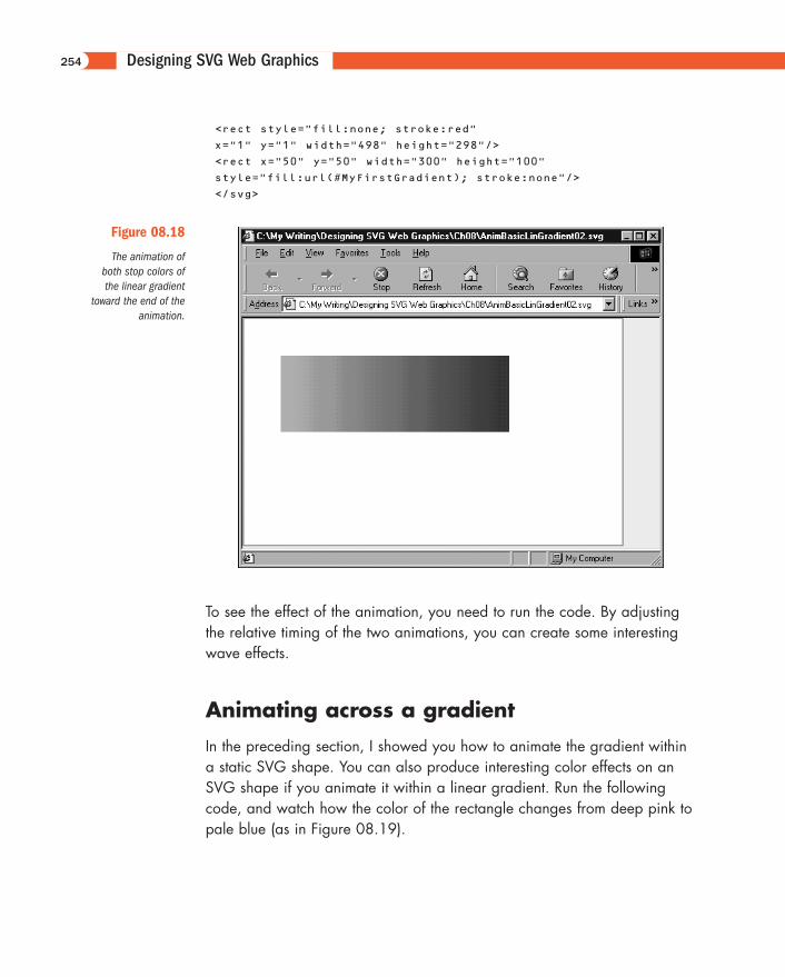
If you want to animate both ends of the gradient, you similarly add another<animate> element nested within the other <stop> element of the<linearGradient> element. In the following code, you alter the colorfrom a reddish color to pale blue over the same period as the right end ofthe gradient is being animated (as shown in Figure 08.18).
Listing 8.30 (AnimBasicLinGradient02.svg)
<?xml version="1.0" standalone="no"?>
<!DOCTYPE svg PUBLIC "-//W3C//DTD SVG 1.0//EN"
"http://www.w3.org/TR/2001/PR-SVG-20010719/
DTD/svg10.dtd">
<svg width="500" height="300">
<defs>
<linearGradient id="MyFirstGradient">
<stop offset="5%" style="stop-color:#FF6600">
<animate attributeName="stop-color" begin="3s"
dur="5s" from="#FF6600" to="#CCCCFF"/>
</stop>
<stop offset="95%" style="stop-color:#FFFFCC">
<animate attributeName="stop-color" begin="3s"
dur="5s" from="#FFFFCC" to="#000066"/>
</stop>
</linearGradient>
</defs>
253
11666-08 08.21.01 2:21 PM Page 253
Designing SVG Web Graphics
<rect style="fill:none; stroke:red"
x="1" y="1" width="498" height="298"/>
<rect x="50" y="50" width="300" height="100"
style="fill:url(#MyFirstGradient); stroke:none"/>
</svg>
254
Figure 08.18
The animation ofboth stop colors ofthe linear gradient
toward the end of theanimation.
To see the effect of the animation, you need to run the code. By adjustingthe relative timing of the two animations, you can create some interestingwave effects.
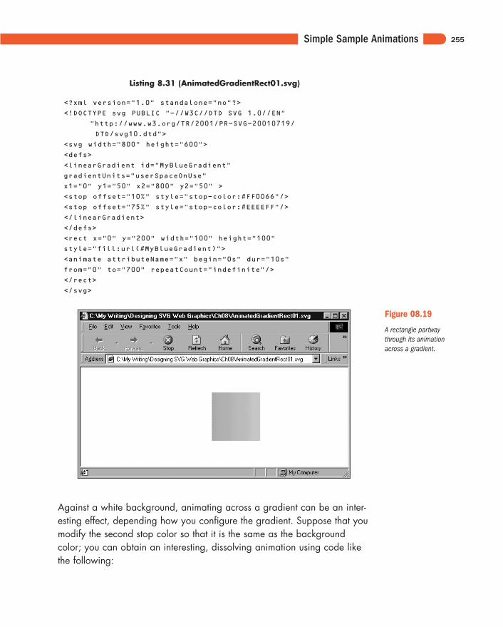
Animating across a gradient
In the preceding section, I showed you how to animate the gradient withina static SVG shape. You can also produce interesting color effects on anSVG shape if you animate it within a linear gradient. Run the followingcode, and watch how the color of the rectangle changes from deep pink topale blue (as in Figure 08.19).
11666-08 08.21.01 2:21 PM Page 254
Simple Sample Animations
Listing 8.31 (AnimatedGradientRect01.svg)
<?xml version="1.0" standalone="no"?>
<!DOCTYPE svg PUBLIC "-//W3C//DTD SVG 1.0//EN"
"http://www.w3.org/TR/2001/PR-SVG-20010719/
DTD/svg10.dtd">
<svg width="800" height="600">
<defs>
<linearGradient id="MyBlueGradient"
gradientUnits="userSpaceOnUse"
x1="0" y1="50" x2="800" y2="50" >
<stop offset="10%" style="stop-color:#FF0066"/>
<stop offset="75%" style="stop-color:#EEEEFF"/>
</linearGradient>
</defs>
<rect x="0" y="200" width="100" height="100"
style="fill:url(#MyBlueGradient)">
<animate attributeName="x" begin="0s" dur="10s"
from="0" to="700" repeatCount="indefinite"/>
</rect>
</svg>
255
Figure 08.19
A rectangle partwaythrough its animationacross a gradient.
Against a white background, animating across a gradient can be an inter-esting effect, depending how you configure the gradient. Suppose that youmodify the second stop color so that it is the same as the backgroundcolor; you can obtain an interesting, dissolving animation using code likethe following:
11666-08 08.21.01 2:21 PM Page 255
Designing SVG Web Graphics
Listing 8.32 (AnimatedGradientRect02.svg)
<?xml version="1.0" standalone="no"?>
<!DOCTYPE svg PUBLIC "-//W3C//DTD SVG 1.0//EN"
"http://www.w3.org/TR/2001/PR-SVG-20010719/
DTD/svg10.dtd">
<svg width="800" height="600">
<defs>
<linearGradient id="MyBlueGradient"
gradientUnits="userSpaceOnUse"
x1="0" y1="50" x2="800" y2="50" >
<stop offset="10%" style="stop-color:#FF0066"/>
<stop offset="75%" style="stop-color:#EEEEFF"/>
</linearGradient>
</defs>
<rect x="0" y="0" width="100%" height="100%"
style="fill:#EEEEFF; stroke:#EEEEFF"/>
<rect x="0" y="200" width="100" height="100"
style="fill:url(#MyBlueGradient)">
<animate attributeName="x" begin="0s" dur="10s"
from="0" to="700" repeatCount="indefinite"/>
</rect>
</svg>
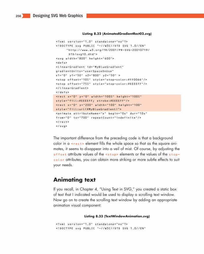
The important difference from the preceding code is that a backgroundcolor in a <rect> element fills the whole space so that as the square ani-mates, it seems to disappear into a veil of mist. Of course, by adjusting theoffset attribute values of the <stop> elements or the values of the stop-color attributes, you can obtain more striking or more subtle effects to suityour needs.
Animating text
If you recall, in Chapter 4, “Using Text in SVG,” you created a static boxof text that I indicated would be used to display a scrolling text window.Now go on to create the scrolling text window by adding an appropriateanimation visual component:
Listing 8.33 (TextWindowAnimation.svg)
<?xml version="1.0" standalone="no"?>
<!DOCTYPE svg PUBLIC "-//W3C//DTD SVG 1.0//EN"
256
11666-08 08.21.01 2:21 PM Page 256
Simple Sample Animations
"http://www.w3.org/TR/2001/PR-SVG-20010719/
DTD/svg10.dtd">
<svg width="200" height="200">
<svg x="0" y="0" width="200" height="200">
<rect x="0" y="0" width="200" height="200"
style="stroke:#990066; fill:none;"/>
<text>
<tspan x="5" y="25" style="font-size:14;
font-family:Arial, sans-serif; stroke:#990066; fill:#990066">
<animate attributeName="y" begin="2s" dur="20s"
from="225" to="-120" repeatCount="indefinite"/>
Scalable Vector Graphics
</tspan>
<tspan x="5" dy="2em" style="font-size:10;
font-family:Arial, sans-serif;">
The World Wide Web Consortium has
</tspan>
<tspan x="5" dy="1em" style="font-size:10;
font-family:Arial, sans-serif;">
announced the availability of its
</tspan>
<tspan x="5" dy="1em" style="font-size:10;
font-family:Arial, sans-serif;">
exciting new XML-based graphics
</tspan>
<tspan x="5" dy="1em" style="font-size:10;
font-family:Arial, sans-serif;">
format, SVG, for the display
</tspan>
<tspan x="5" dy="1em" style="font-size:10;
font-family:Arial, sans-serif;">
of 2D graphics, text and bitmap
</tspan>
<tspan x="5" dy="1em" style="font-size:10;
font-family:Arial, sans-serif;">
graphics.
</tspan>
<tspan x="5" dy="2em" style="font-size:10;
font-family:Arial, sans-serif;">
Further information is available
</tspan>
<tspan x="5" dy="1em" style="font-size:10;
font-family:Arial, sans-serif;">
at the W3C web site,
</tspan>
<tspan x="5" dy="2em" style="font-size:10;
font-family:Arial, sans-serif; fill:blue; stroke:blue">
257
11666-08 08.21.01 2:21 PM Page 257
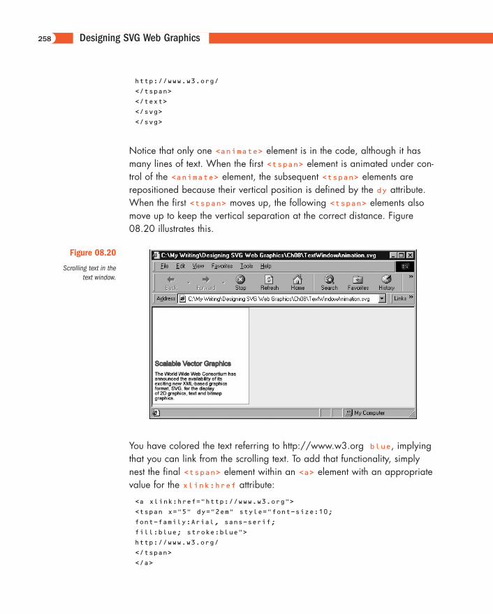
Designing SVG Web Graphics
http://www.w3.org/
</tspan>
</text>
</svg>
</svg>
Notice that only one <animate> element is in the code, although it hasmany lines of text. When the first <tspan> element is animated under con-trol of the <animate> element, the subsequent <tspan> elements arerepositioned because their vertical position is defined by the dy attribute.When the first <tspan> moves up, the following <tspan> elements alsomove up to keep the vertical separation at the correct distance. Figure08.20 illustrates this.
258
Figure 08.20
Scrolling text in thetext window.
You have colored the text referring to http://www.w3.org blue, implyingthat you can link from the scrolling text. To add that functionality, simplynest the final <tspan> element within an <a> element with an appropriatevalue for the xlink:href attribute:
<a xlink:href="http://www.w3.org">
<tspan x="5" dy="2em" style="font-size:10;
font-family:Arial, sans-serif;
fill:blue; stroke:blue">
http://www.w3.org/
</tspan>
</a>
11666-08 08.21.01 2:21 PM Page 258
Simple Sample Animations
Similarly, if you want to link the heading Scalable Vector Graphics directlyto the SVG page at W3C and open that linked page in a new window,you can add this section earlier in the code:
<a xlink:href="http://www.w3.org/Graphics/
SVG/Overview.htm8" target="new">
<tspan x="5" y="25" style="font-size:14;
font-family:Arial, sans-serif;
stroke:#990066; fill:#990066">
<animate attributeName="y" begin="2s" dur="20s"
from="225" to="-120"
repeatCount="indefinite"/>
Scalable Vector Graphics
</tspan>
</a>
Animating horizontal scrolling text
Scrolling text horizontally is also a fairly straightforward process, so youcan produce ticker-tape-like effects.
The following code could form the top “frame” on a Web page, with thewindow on the ticker tape the size of a standard banner ad. A ticker tapelike this one could be used for banner ads, news updates, and weatherinformation, for example.
Listing 8.34 (TickerTape01.svg)
<?xml version="1.0" standalone="no"?>
<!DOCTYPE svg PUBLIC "-//W3C//DTD SVG 1.0//EN"
"http://www.w3.org/TR/2001/PR-SVG-20010719/
DTD/svg10.dtd">
<svg width="800" height="100">
<rect x="0" y="0" width="800" height="100"
style="fill:#CCFFCC;"/>
<svg x="166" y="20" width="468" height="60">
<rect x="0" y="0" width="100%" height="100%"
style="fill:white; stroke:none;"/>
<a xlink:href="mailto://[email protected]">
<text x="700" y="40" style="stroke:green; fill:green;
font-family:Courier, monospace; font-size:20;
font-weight:normal;">
259
11666-08 08.21.01 2:21 PM Page 259
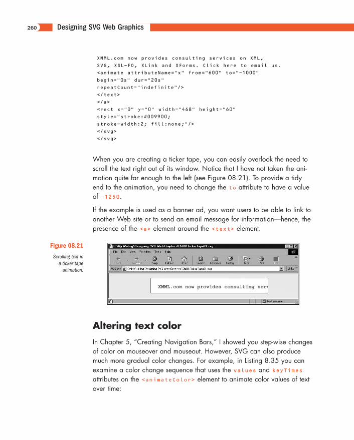
Designing SVG Web Graphics
XMML.com now provides consulting services on XML,
SVG, XSL-FO, XLink and XForms. Click here to email us.
<animate attributeName="x" from="600" to="-1000"
begin="0s" dur="20s"
repeatCount="indefinite"/>
</text>
</a>
<rect x="0" y="0" width="468" height="60"
style="stroke:#009900;
stroke-width:2; fill:none;"/>
</svg>
</svg>
When you are creating a ticker tape, you can easily overlook the need toscroll the text right out of its window. Notice that I have not taken the ani-mation quite far enough to the left (see Figure 08.21). To provide a tidyend to the animation, you need to change the to attribute to have a valueof -1250.
If the example is used as a banner ad, you want users to be able to link toanother Web site or to send an email message for information—hence, thepresence of the <a> element around the <text> element.
260
Figure 08.21
Scrolling text in a ticker tape
animation.
Altering text color
In Chapter 5, “Creating Navigation Bars,” I showed you step-wise changesof color on mouseover and mouseout. However, SVG can also producemuch more gradual color changes. For example, in Listing 8.35 you canexamine a color change sequence that uses the values and keyTimesattributes on the <animateColor> element to animate color values of textover time:
11666-08 08.21.01 2:21 PM Page 260
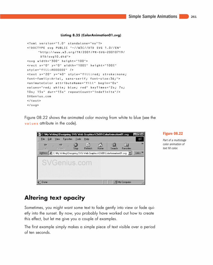
Simple Sample Animations
Listing 8.35 (ColorAnimation01.svg)
<?xml version="1.0" standalone="no"?>
<!DOCTYPE svg PUBLIC "-//W3C//DTD SVG 1.0//EN"
"http://www.w3.org/TR/2001/PR-SVG-20010719/
DTD/svg10.dtd">
<svg width="300" height="100">
<rect x="0" y="0" width="100%" height="100%"
style="fill:#EEEEEE" />
<text x="20" y="40" style="fill:red; stroke:none;
font-family:Arial, sans-serif; font-size:36;">
<animateColor attributeName="fill" begin="0s"
values="red; white; blue; red" keyTimes="2s; 7s;
10s; 15s" dur="15s" repeatCount="indefinite"/>
SVGenius.com
</text>
</svg>
Figure 08.22 shows the animated color moving from white to blue (see thevalues attribute in the code).
261
Figure 08.22
Part of a multistagecolor animation oftext fill color.
Altering text opacity
Sometimes, you might want some text to fade gently into view or fade qui-etly into the sunset. By now, you probably have worked out how to createthis effect, but let me give you a couple of examples.
The first example simply makes a simple piece of text visible over a periodof ten seconds.
11666-08 08.21.01 2:21 PM Page 261
Designing SVG Web Graphics
Listing 8.36 (AnimOpacityInText00.svg)
<?xml version="1.0" standalone="no"?>
<!DOCTYPE svg PUBLIC "-//W3C//DTD SVG 1.0//EN"
"http://www.w3.org/TR/2001/PR-SVG-20010719/
DTD/svg10.dtd">
<svg width="400" height="80">
<text x="20" y="50" style="font-family:Ventana,
Arial, sans-serif; font-size:20; stroke:red; fill:red">
<animate begin="0s" dur="10s" attributeName="opacity"
attributeType="CSS" from="0" to="1" fill="freeze"/>
SVG is truly dynamic and subtle!
</text>
</svg>
You might want a faster animation, and you might want it to repeat. Youcould, as shown in the following example, alter the dur attribute to fourseconds and add a repeatCount attribute with value of 5. If you want itto repeat indefinitely, you could change the value of the repeatCountattribute to indefinite.
Listing 8.37 (AnimOpacityinText01.svg)
<?xml version="1.0" standalone="no"?>
<!DOCTYPE svg PUBLIC "-//W3C//DTD SVG 1.0//EN"
"http://www.w3.org/TR/2001/PR-SVG-20010719/
DTD/svg10.dtd">
<svg width="400" height="80">
<text x="20" y="50" style="font-family:Ventana,
Arial, sans-serif; font-size:20; stroke:red; fill:red">
<animate begin="0s" dur="4s" attributeName="opacity"
attributeType="CSS" from="0" to="1"
fill="freeze" repeatCount="5"/>
SVG is truly dynamic and subtle!
</text>
</svg>
Another option is to create a chain of animations where an animation thatmakes text opaque when it finishes triggers a fade animation, which in turntriggers the first animation. In the following example, the duration of theanimations gives a fairly subtle effect. By changing the duration of eachanimation to a shorter period, you can create a more dynamic (or intrusive)transition. The choice is yours. SVG gives you precise control so that youcan change the animation to exactly the effect you want.
262
11666-08 08.21.01 2:21 PM Page 262
Simple Sample Animations
Listing 8.38 (AnimOpacityInText00.svg)
<?xml version="1.0" standalone="no"?>
<!DOCTYPE svg PUBLIC "-//W3C//DTD SVG 1.0//EN"
"http://www.w3.org/TR/2001/PR-SVG-20010719/
DTD/svg10.dtd">
<svg width="400" height="80">
<text x="20" y="50" style="font-family:Ventana, Arial,
sans-serif; font-size:20; stroke:red; fill:red">
<animate id="MakeVisible" begin="0s; MakeTransparent.end"
dur="4s" attributeName="opacity" attributeType="CSS"
from="0" to="1" fill="freeze" />
<animate id="MakeTransparent" begin="MakeVisible.end"
dur="8s" attributeName="opacity" attributeType="CSS"
from="1"
to="0" fill="freeze" />
SVG is truly dynamic and subtle!
</text>
</svg>
Animating opacity in a gradient
Now revisit one of the gradient examples and apply animations of thestop-opacity properties of the gradient. After the animation is applied,the code looks like this:
Listing 8.39 (AnimGradientOpacity01.svg)
<?xml version='1.0'?>
<!DOCTYPE svg PUBLIC "-//W3C//DTD SVG 1.0//EN"
"http://www.w3.org/TR/2001/PR-SVG-20010719/
DTD/svg10.dtd">
<svg width="800" height="600">
<defs>
<linearGradient id="MyBlueGradient"
gradientUnits="userSpaceOnUse" x1="0"
y1="0" x2="0" y2="100" >
<stop offset="10%" style="stop-color:#000066">
<animate begin="2s" attributeName="stop-opacity"
from="1" to="0" dur="3s" fill="freeze"/>
</stop>
<stop offset="75%" style="stop-color:#AAAADD">
<animate begin="5s" attributeName="stop-opacity"
from="1" to="0" dur="8s" fill="freeze"/>
263
11666-08 08.21.01 2:21 PM Page 263
Designing SVG Web Graphics
</stop>
</linearGradient>
</defs>
<text x="50" y="70" style="font-family:Times, serif;
font-size:72;
fill:url(#MyBlueGradient);">
Hello SVG!
</text>
</svg>
As with many of the other animations in this chapter, the best way toappreciate what is going on is to run the code.
I have animated the stop-opacity property of both <stop> elementscontained within the <linearGradient> element. Notice that I have setthe duration of the first <animate> element to be three seconds, whereasthe start time of the second animation is five seconds and its duration iseight seconds. These settings allow what is essentially a two-step fade ofthe text. During the first three seconds, the top part of the text fades notice-ably. It doesn’t fade completely because color is still being contributed tothe top part of the text by the color defined in the second <stop> element.However, from five seconds onward, the opacity of the remaining color inthe text fades slowly over an 8-second period.
You might not choose to use such slow fades. My main aim in this exampleis to show you that you can independently control the fade of differentparts of a gradient. Of course, this same technique can be applied to otherSVG elements, not just to text, and can also be applied to gradients thathave multiple stop elements, not just two. The potential for subtle, controlledfades in SVG animations is enormous.
Listing 8.40 demonstrates an animation of a filter that uses the<feTurbulence> filter primitive.
Listing 8.40 (AnimTurbulence01.svg)
<?xml version="1.0" standalone="no"?>
<!DOCTYPE svg PUBLIC "-//W3C//DTD SVG 1.0//EN"
"http://www.w3.org/TR/2001/PR-SVG-20010719/
DTD/svg10.dtd">
<svg width="400" height="500">
<defs>
264
11666-08 08.21.01 2:21 PM Page 264
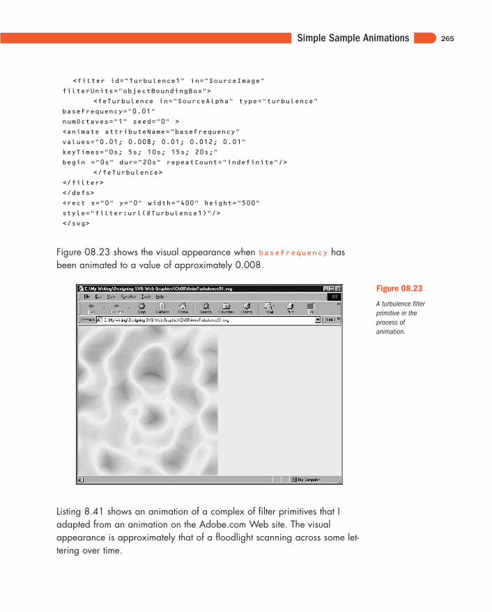
Simple Sample Animations
<filter id="Turbulence1" in="SourceImage"
filterUnits="objectBoundingBox">
<feTurbulence in="SourceAlpha" type="turbulence"
baseFrequency="0.01"
numOctaves="1" seed="0" >
<animate attributeName="baseFrequency"
values="0.01; 0.008; 0.01; 0.012; 0.01"
keyTimes="0s; 5s; 10s; 15s; 20s;"
begin ="0s" dur="20s" repeatCount="indefinite"/>
</feTurbulence>
</filter>
</defs>
<rect x="0" y="0" width="400" height="500"
style="filter:url(#Turbulence1)"/>
</svg>
Figure 08.23 shows the visual appearance when baseFrequency hasbeen animated to a value of approximately 0.008.
265
Figure 08.23
A turbulence filterprimitive in theprocess of animation.
Listing 8.41 shows an animation of a complex of filter primitives that Iadapted from an animation on the Adobe.com Web site. The visualappearance is approximately that of a floodlight scanning across some let-tering over time.
11666-08 08.21.01 2:21 PM Page 265
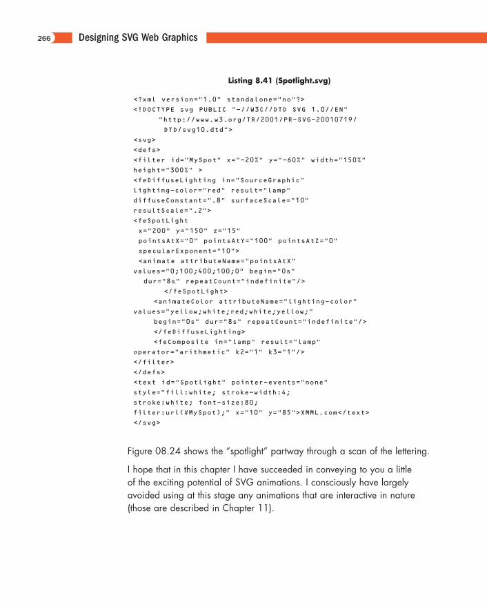
Designing SVG Web Graphics
Listing 8.41 (Spotlight.svg)
<?xml version="1.0" standalone="no"?>
<!DOCTYPE svg PUBLIC "-//W3C//DTD SVG 1.0//EN"
"http://www.w3.org/TR/2001/PR-SVG-20010719/
DTD/svg10.dtd">
<svg>
<defs>
<filter id="MySpot" x="-20%" y="-60%" width="150%"
height="300%" >
<feDiffuseLighting in="SourceGraphic"
lighting-color="red" result="lamp"
diffuseConstant=".8" surfaceScale="10"
resultScale=".2">
<feSpotLight
x="200" y="150" z="15"
pointsAtX="0" pointsAtY="100" pointsAtZ="0"
specularExponent="10">
<animate attributeName="pointsAtX"
values="0;100;400;100;0" begin="0s"
dur="8s" repeatCount="indefinite"/>
</feSpotLight>
<animateColor attributeName="lighting-color"
values="yellow;white;red;white;yellow;"
begin="0s" dur="8s" repeatCount="indefinite"/>
</feDiffuseLighting>
<feComposite in="lamp" result="lamp"
operator="arithmetic" k2="1" k3="1"/>
</filter>
</defs>
<text id="Spotlight" pointer-events="none"
style="fill:white; stroke-width:4;
stroke:white; font-size:80;
filter:url(#MySpot);" x="10" y="85">XMML.com</text>
</svg>
Figure 08.24 shows the “spotlight” partway through a scan of the lettering.
I hope that in this chapter I have succeeded in conveying to you a little of the exciting potential of SVG animations. I consciously have largelyavoided using at this stage any animations that are interactive in nature(those are described in Chapter 11).
266
11666-08 08.21.01 2:21 PM Page 266
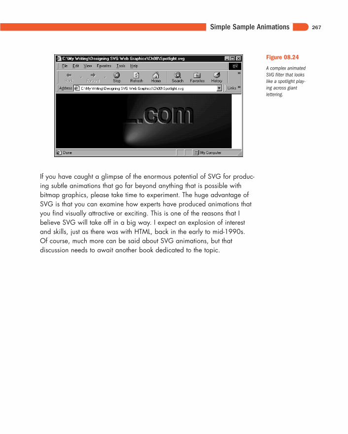
Simple Sample Animations
If you have caught a glimpse of the enormous potential of SVG for produc-ing subtle animations that go far beyond anything that is possible withbitmap graphics, please take time to experiment. The huge advantage ofSVG is that you can examine how experts have produced animations thatyou find visually attractive or exciting. This is one of the reasons that Ibelieve SVG will take off in a big way. I expect an explosion of interestand skills, just as there was with HTML, back in the early to mid-1990s. Of course, much more can be said about SVG animations, but that discussion needs to await another book dedicated to the topic.
267
Figure 08.24
A complex animatedSVG filter that lookslike a spotlight play-ing across giant lettering.
11666-08 08.21.01 2:21 PM Page 267