android quiz app tutorial step 1: define a · pdf fileandroid quiz app tutorial step 1: define...
TRANSCRIPT
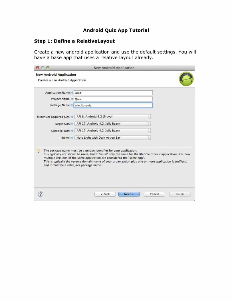
Android Quiz App Tutorial
Step 1: Define a RelativeLayout
Create a new android application and use the default settings. You will
have a base app that uses a relative layout already.
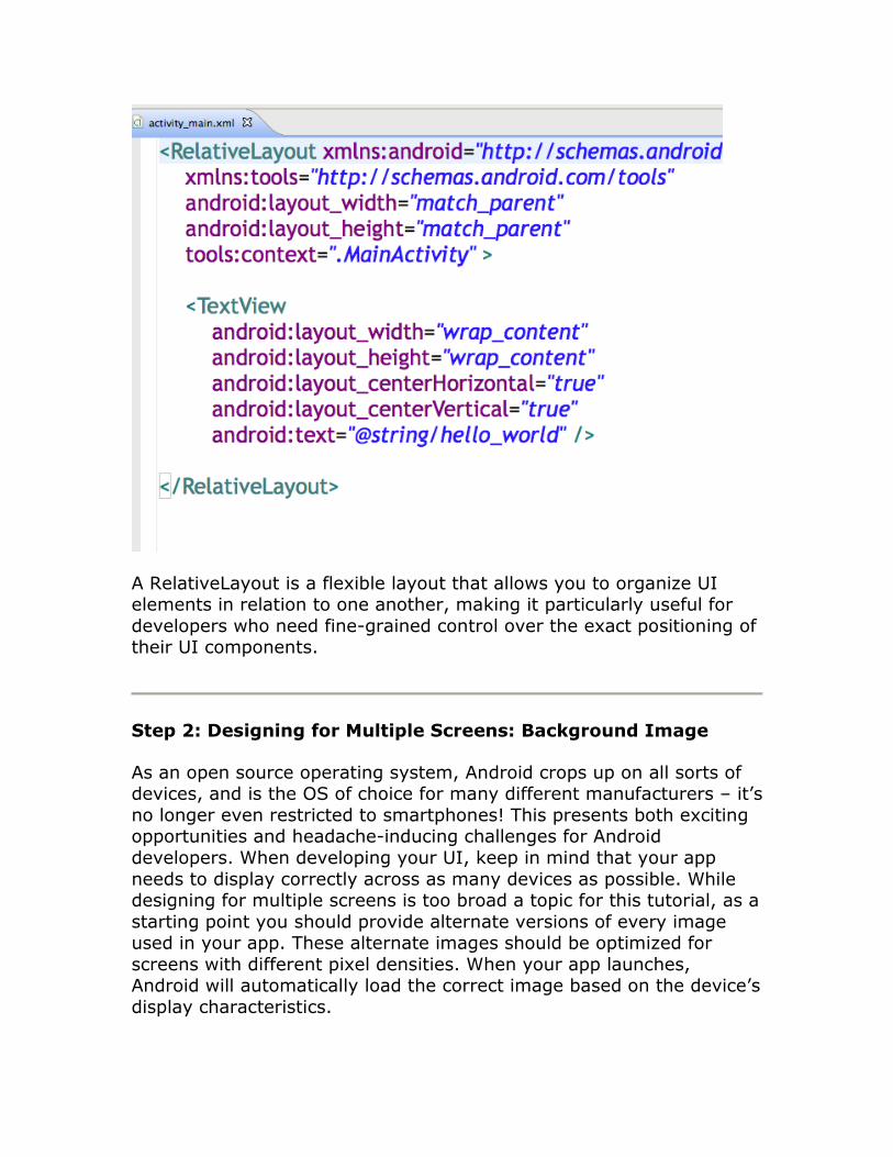
A RelativeLayout is a flexible layout that allows you to organize UI elements in relation to one another, making it particularly useful for
developers who need fine-grained control over the exact positioning of their UI components.
Step 2: Designing for Multiple Screens: Background Image
As an open source operating system, Android crops up on all sorts of devices, and is the OS of choice for many different manufacturers – it’s
no longer even restricted to smartphones! This presents both exciting opportunities and headache-inducing challenges for Android
developers. When developing your UI, keep in mind that your app
needs to display correctly across as many devices as possible. While designing for multiple screens is too broad a topic for this tutorial, as a
starting point you should provide alternate versions of every image used in your app. These alternate images should be optimized for
screens with different pixel densities. When your app launches, Android will automatically load the correct image based on the device’s
display characteristics.
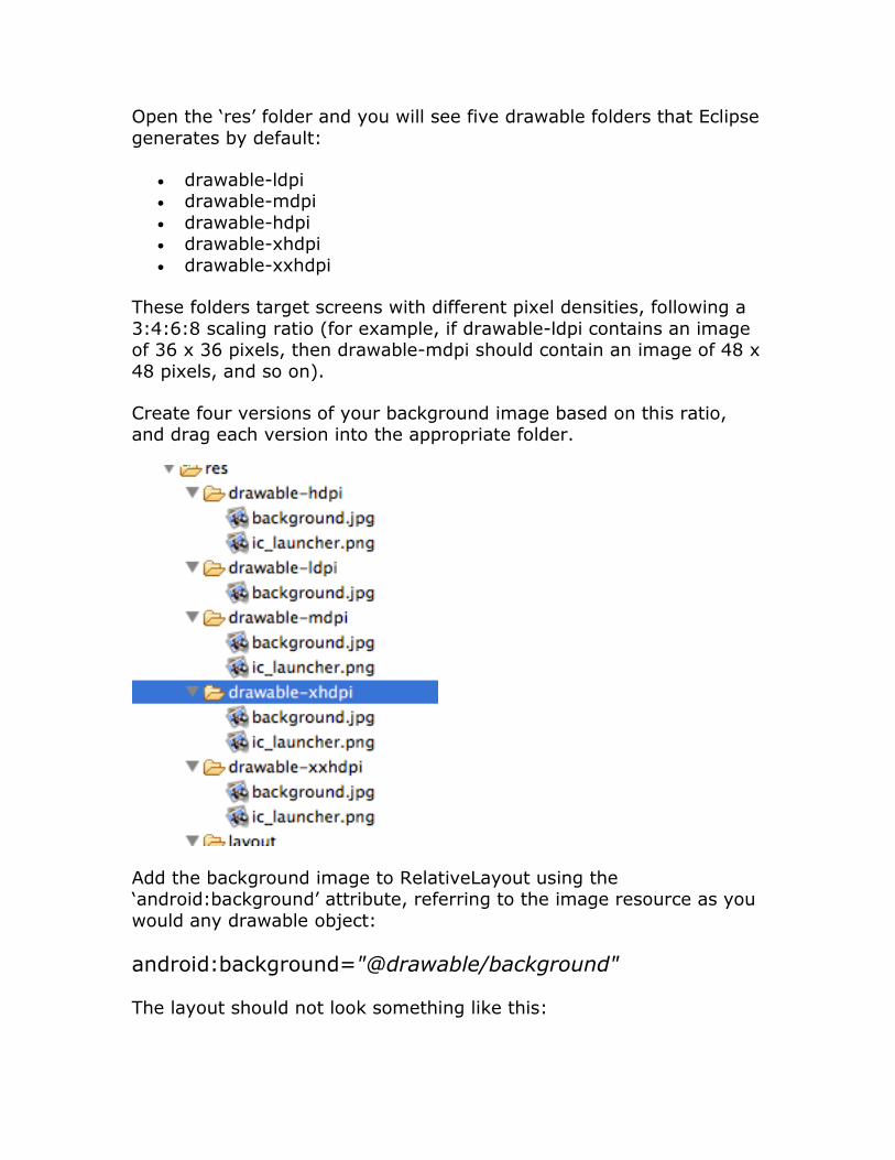
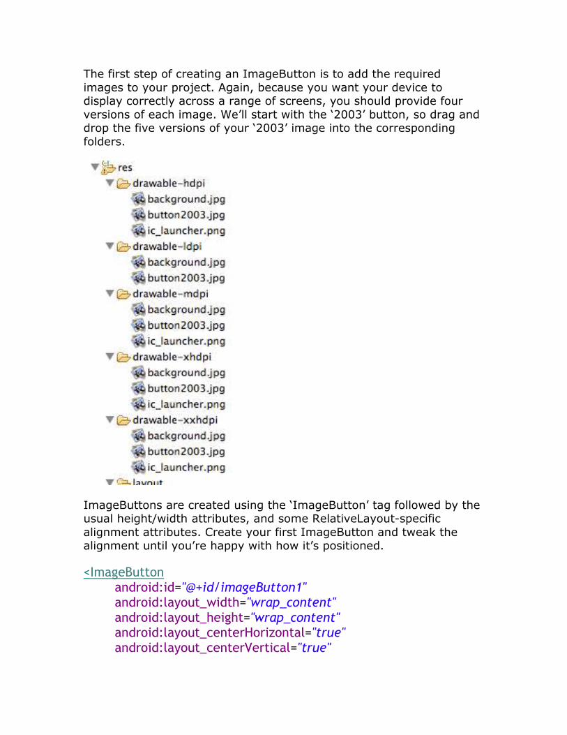
Open the ‘res’ folder and you will see five drawable folders that Eclipse
generates by default:
• drawable-ldpi • drawable-mdpi
• drawable-hdpi • drawable-xhdpi
• drawable-xxhdpi
These folders target screens with different pixel densities, following a
3:4:6:8 scaling ratio (for example, if drawable-ldpi contains an image of 36 x 36 pixels, then drawable-mdpi should contain an image of 48 x
48 pixels, and so on).
Create four versions of your background image based on this ratio, and drag each version into the appropriate folder.
Add the background image to RelativeLayout using the ‘android:background’ attribute, referring to the image resource as you
would any drawable object:
android:background="@drawable/background"
The layout should not look something like this:
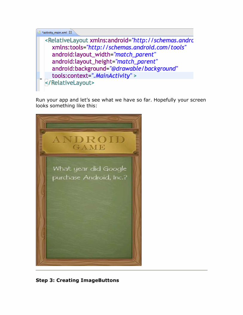
Run your app and let’s see what we have so far. Hopefully your screen looks something like this:
Step 3: Creating ImageButtons
The first step of creating an ImageButton is to add the required
images to your project. Again, because you want your device to display correctly across a range of screens, you should provide four
versions of each image. We’ll start with the ‘2003’ button, so drag and drop the five versions of your ‘2003’ image into the corresponding
folders.
ImageButtons are created using the ‘ImageButton’ tag followed by the usual height/width attributes, and some RelativeLayout-specific
alignment attributes. Create your first ImageButton and tweak the alignment until you’re happy with how it’s positioned.
<ImageButton android:id="@+id/imageButton1" android:layout_width="wrap_content" android:layout_height="wrap_content" android:layout_centerHorizontal="true" android:layout_centerVertical="true"
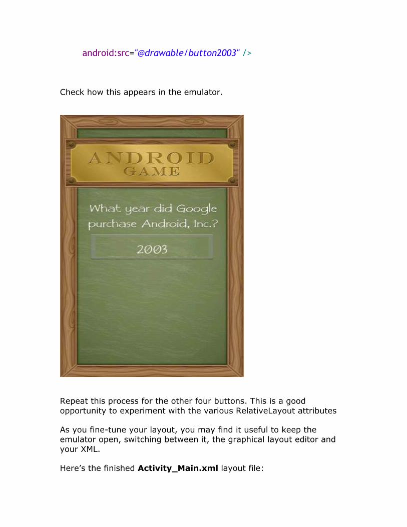
android:src="@drawable/button2003" />
Check how this appears in the emulator.
Repeat this process for the other four buttons. This is a good
opportunity to experiment with the various RelativeLayout attributes
As you fine-tune your layout, you may find it useful to keep the emulator open, switching between it, the graphical layout editor and
your XML.
Here’s the finished Activity_Main.xml layout file:
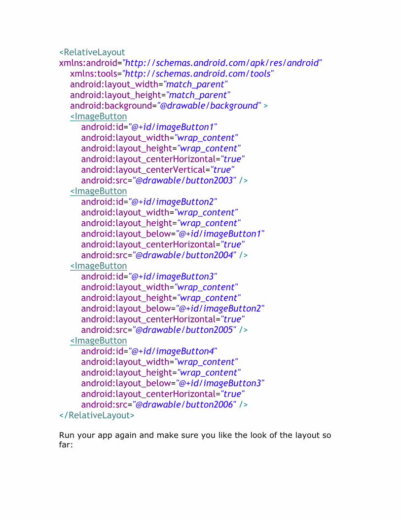
<RelativeLayout xmlns:android="http://schemas.android.com/apk/res/android" xmlns:tools="http://schemas.android.com/tools" android:layout_width="match_parent" android:layout_height="match_parent" android:background="@drawable/background" > <ImageButton android:id="@+id/imageButton1" android:layout_width="wrap_content" android:layout_height="wrap_content" android:layout_centerHorizontal="true" android:layout_centerVertical="true" android:src="@drawable/button2003" /> <ImageButton android:id="@+id/imageButton2" android:layout_width="wrap_content" android:layout_height="wrap_content" android:layout_below="@+id/imageButton1" android:layout_centerHorizontal="true" android:src="@drawable/button2004" /> <ImageButton android:id="@+id/imageButton3" android:layout_width="wrap_content" android:layout_height="wrap_content" android:layout_below="@+id/imageButton2" android:layout_centerHorizontal="true" android:src="@drawable/button2005" /> <ImageButton android:id="@+id/imageButton4" android:layout_width="wrap_content" android:layout_height="wrap_content" android:layout_below="@+id/imageButton3" android:layout_centerHorizontal="true" android:src="@drawable/button2006" /> </RelativeLayout>
Run your app again and make sure you like the look of the layout so far:
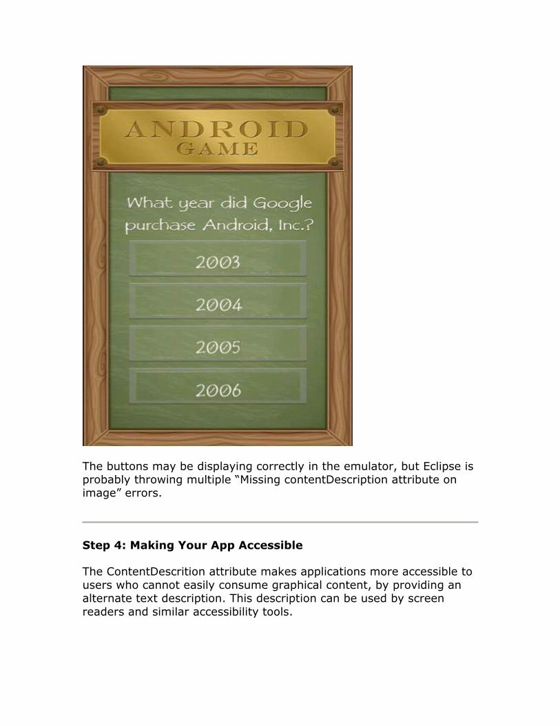
The buttons may be displaying correctly in the emulator, but Eclipse is probably throwing multiple “Missing contentDescription attribute on image” errors.
Step 4: Making Your App Accessible
The ContentDescrition attribute makes applications more accessible to
users who cannot easily consume graphical content, by providing an alternate text description. This description can be used by screen
readers and similar accessibility tools.
The first step is to define some new string resources. Strings are
defined in the res/layout/strings.xml file, so open it and switch to the strings.xml tab if necessary.
String resources are created with the following syntax:
<string name="name">Text to display</string>
Define a string for the ContentDescription of each ImageButton as follows:
<string name="button2003">Answer 2003</string> <string name="button2004">Answer 2004</string> <string name="button2005">Answer 2005</string> <string name="button2006">Answer 2006</string>
Return to your activity_main.xml file and add a ContentDescription attribute to each of the ImageButtons as follows:
Add to each button:
android:contentDescription="@string/button2003”
Do this for all of the buttons and change the names to the correct
button images.
Step 5: Creating Stylish Text
In reality, it’s unlikely you’ll cease developing an app at Version 1.0, as
you cook up new content and release fixes for any pesky bugs that users discover. Therefore, it’s handy if people can tell at a glance what
version of your app they’re running. The easiest way to do this is with a TextView.
Open the strings.xml file and define the current version number as a string:
<string name="Version">Version 1.0</string>
You can quickly create a TextView that calls “@string/Version” but
Android’s default text style isn’t particularly appealing. Thankfully,
TextView has a range of attributes that can give boring old text some
style. In this tutorial we’ll use the following:
• android:textColor – sets the color of your text. It can either be defined as a string resource, or as a color value.
• android:textSize – sets the text size, which can be given either as px (pixels) sp (scaled pixels) dp (density-independent pixels)
in (inches) or mm (millimeters) • android:textStyle – either italic or bold.
Open your Activity_Main.xml file and create your TextView, add some style attributes, and then reference the “Version” string:
<TextView
android:id="@+id/textView1"
android:layout_width="wrap_content"
android:layout_height="wrap_content" android:layout_alignParentBottom="true"
android:layout_alignParentLeft="true"
android:layout_marginLeft="26dp"
android:paddingBottom="5dp"
android:text="@string/Version" android:textColor="#f7f9f6"
android:textSize="13dp"
android:textStyle="italic" />
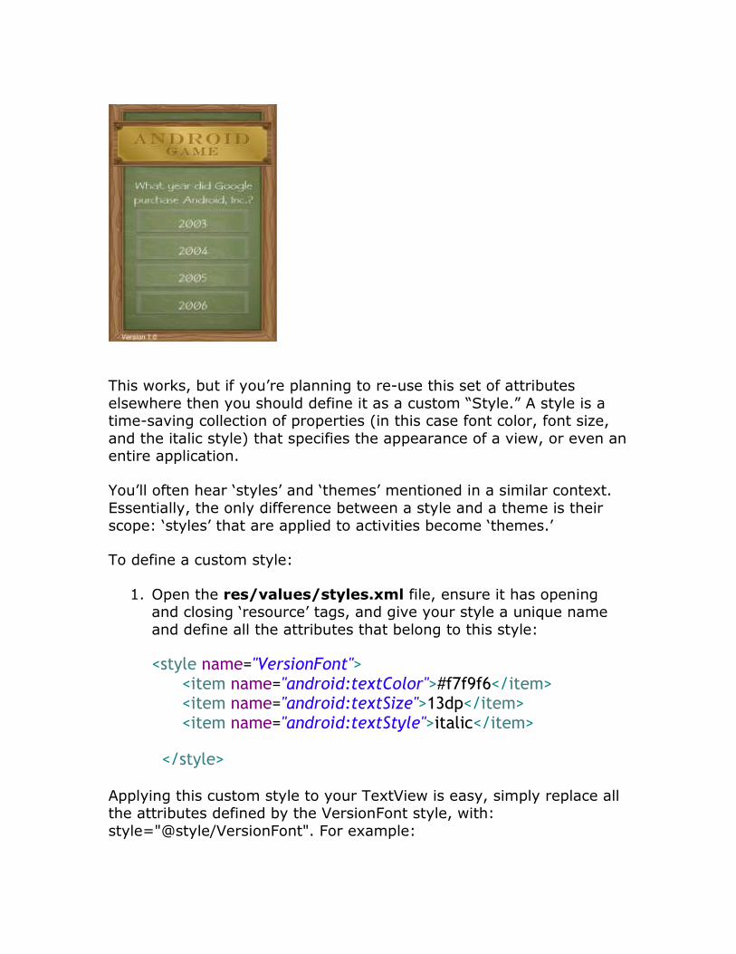
You should now see the version information in the lower part of the
screen as follows:
This works, but if you’re planning to re-use this set of attributes
elsewhere then you should define it as a custom “Style.” A style is a time-saving collection of properties (in this case font color, font size,
and the italic style) that specifies the appearance of a view, or even an entire application.
You’ll often hear ‘styles’ and ‘themes’ mentioned in a similar context.
Essentially, the only difference between a style and a theme is their
scope: ‘styles’ that are applied to activities become ‘themes.’
To define a custom style:
1. Open the res/values/styles.xml file, ensure it has opening and closing ‘resource’ tags, and give your style a unique name
and define all the attributes that belong to this style:
<style name="VersionFont"> <item name="android:textColor">#f7f9f6</item> <item name="android:textSize">13dp</item> <item name="android:textStyle">italic</item>
</style>
Applying this custom style to your TextView is easy, simply replace all the attributes defined by the VersionFont style, with:
style="@style/VersionFont". For example:
<TextView
android:id="@+id/textView1"
android:layout_width="wrap_content" android:layout_height="wrap_content"
android:layout_alignParentBottom="true"
android:layout_alignParentLeft="true"
android:layout_marginLeft="26dp"
android:paddingBottom="5dp" android:text="@string/Version"
style="@style/VersionFont" />
This custom style isn’t defined in the Android namespace, which is why
we don’t need to include an “android:” reference.
Both of these methods are valid ways of styling text, but keep in mind that a custom style can speed up the coding process if you’re going to
re-use the same collection of attributes across your application.
Step 6: Making Your App Interactive
Your UI may be finished, but there’s one final step: letting the user know whether they’ve selected the correct answer. The easiest way to
make buttons ‘tappable’ is by implementing the android:onClick property for each button.
We’ll start by adding it to the first button:
Add for each botton:
android:onClick="onClick2003"
Change the name of the event to match each of the years.
The name of the onClick method must correspond to a public method
in the MainActivity.Java file. Now we need to specify the behavior that “onClick2003″ triggers. A straightforward way of telling the user
they’ve got the question wrong, is with a toast notification.
Add the following method to MainActivity.java:
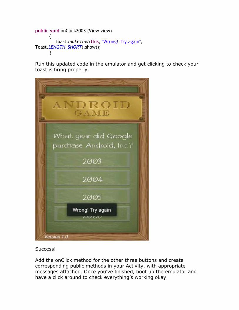
public void onClick2003 (View view) { Toast.makeText(this, "Wrong! Try again", Toast.LENGTH_SHORT).show(); }
Run this updated code in the emulator and get clicking to check your toast is firing properly.
Success!
Add the onClick method for the other three buttons and create corresponding public methods in your Activity, with appropriate
messages attached. Once you’ve finished, boot up the emulator and have a click around to check everything’s working okay.
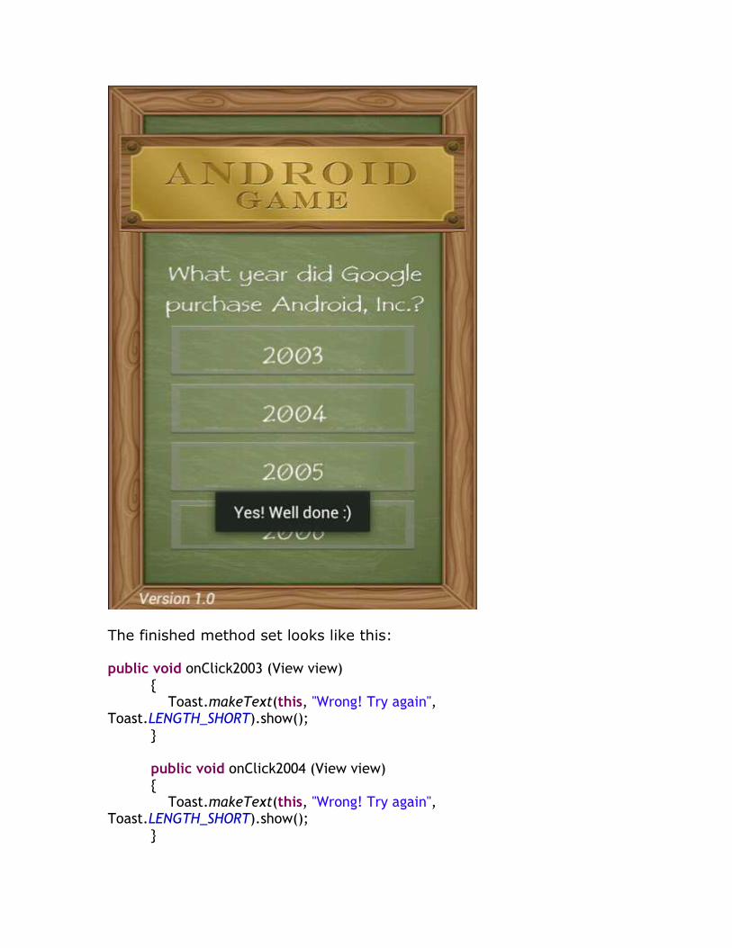
The finished method set looks like this:
public void onClick2003 (View view) { Toast.makeText(this, "Wrong! Try again", Toast.LENGTH_SHORT).show(); } public void onClick2004 (View view) { Toast.makeText(this, "Wrong! Try again", Toast.LENGTH_SHORT).show(); }
public void onClick2005 (View view) { Toast.makeText(this, "Yes! Well done :)", Toast.LENGTH_SHORT).show(); } public void onClick2006 (View view) { Toast.makeText(this, "Wrong! Try again", Toast.LENGTH_SHORT).show(); }
Conclusion
Over the course of this tutorial you’ve learned the essentials of Android
UI design and created a simple, but effective UI that has some working functionality to boot! Try applying some of these techniques to
your own Android projects, to ensure your UI doesn’t let your app down.
Layout RelativeLayout See the UI Overview and Layouts Guide. The attributes" href="https://vdocuments.us/layout-cheat-androidlayoutalignleftidcenter-androidtext4.html">Layout Cheat Sheet · android:layout_alignLeft="@id/center" android:text="4"/> Layout RelativeLayout See the UI Overview and Layouts Guide. The attributes