analysing doublepage spreads
TRANSCRIPT
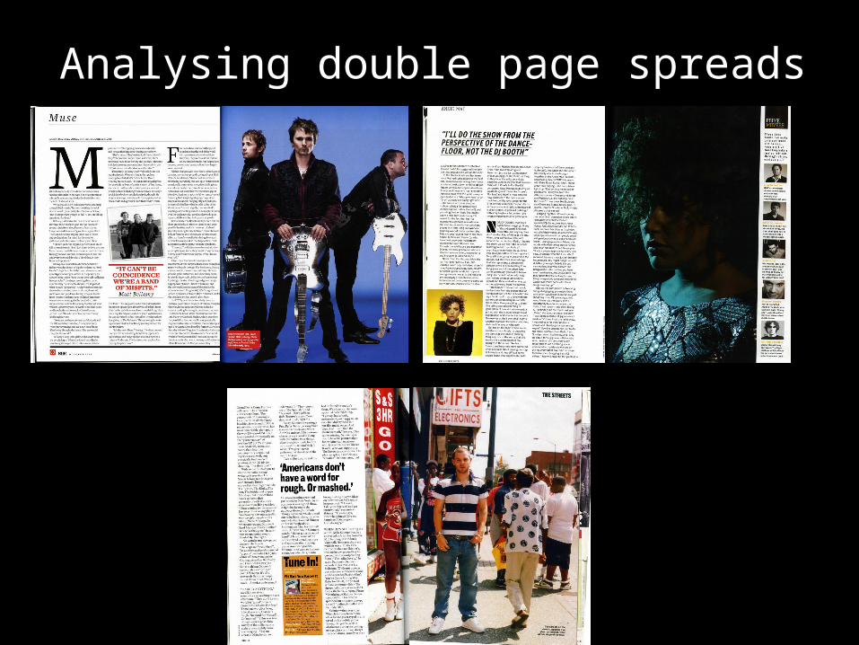
Analysing double page spreads

The top left of the page has the artists name, this is so that if someone was just flicking through the magazine they would know who the article was about right away, even if they did not know who they were from the image.
The first letter of the first sentence is in a very large font and in bold. The reason for this is that it stands out to the reader and catches their attention. Another reason they have done this is because it is the letter ‘M’, which is also the first letter of the name of the band
This second page of this double page spread is a whole A4 image of the band ‘Muse’. They are looking serious, this is made more evident by the moody blue colour of the background. They all have their individual instruments which they are holding or leaning against. This image gives off the same vibe as the picture of Matt Bellamy on the ‘Q’ contents page, a serious musician.
There is quite a lot of writing because it is a serious article, but it is set out in columns, typical of a magazine, because this makes it easier to read
There is hardly anything on the second page except a red inset box telling readers which member of the band is which. This is because they did not want to detract attention away from the image of the band. They used the colour red because that is ‘Q’s signature colour.
The pull quote is Matt Bellamy talking about how they’re a ‘band of misfits’. This fits in with the ‘rock & roll’ vibe and helps the typical reader of ‘Q’ magazine relate to the band muse as they are talking about themselves like they are just regular guys who also find it hard to fit in.
The house style here runs consistently from the cover, the contents page and double page spread, both in the representation of the bands serious and rock attitude, to the black and red masculine colours.

This image fits in very well with the house style of the contents page, this is because they are both very dark, and present the artist as looking dark and serious. It also again has the glamorous look associated with ‘mixmag’ as the artist is wearing a top covered in sequins which catch the light.
Along the side there is a spin off from the article, this is about other people who are similar to the artist the article is about, and a little bit about them. This is to add extra interest to the article and by promoting these artists, ‘mixmag’ is benefitting by appearing to be a magazine who knows what the audience wants to read. The font is also it black and yellow, in keeping with the house style of the contents page.
The pull quote for this is Annie Mac saying how she would put on a show for the benefit of the people on the dance floor, this makes readers like her as they read this because it suggests she cares about what she does and her fans.
The font setting is set out in the typical magazine style of columns so that it is easy to read. Again there is a lot of text with only one pull quote. This different to how it would be in NME for example, as they would have bigger, brighter font and have more insets to catch the attention of the younger audience.
The picture used as the inset in the bottom left corner matches the contents page well as she is wearing yellow and black on a yellow background. The text used throughout has been yellow and black, these colours have been used to suggest, electricity, magic and glamour.

The top left of the page again has the artists name, like in the other ‘Q’. this is so that if someone was just flicking through the magazine they would know who the article was about.
The pull quote for the article with ‘The Streets’ is the lead singer talking about how he has been on tour to another country and how people have not understood him their when he has said words like ‘rough’ (being ugly, or unwell), or mashed (being very drunk). This shows that the lead singer is very British and enjoys partying. They have used the quote so that the male readers of ‘Q’, who also are British and like partying, will relate to the singer and want to read more about his time in America.
The text is yet again is columns and in a similar style to the other double page spread ‘Q’ article. Easy to read and on the left page. This is because this is an expected convention of a double page spread.
The inset is bright orange, this has connotations of energy and fun, and this is the kind of vibe that ‘The Streets’ want to be giving off to their fans. The text is talking about their old track ‘Fit but you know it’. This was an amusing song and reminds the reader of how ‘The Streets’ have produced enjoyable material.
This image is of the leader singer standing on a crowded street, this links in with the bands name. He is the only person looking at the camera which makes him stand out, it also makes him look better than everyone else. Although he is wearing blue, there is also a lot of red in the image from signs and others clothing. This is because red is ‘Q’s colour. Also, the red combined with the white and blue of his shirt are British, and also American colours, to make a link to the fact that he has just been on tour in America.
The text in the bottom right corner has a humorous play on words - the streets on the streets. This would interest the audience and make them want to read the article.