analyse existing media texts
TRANSCRIPT
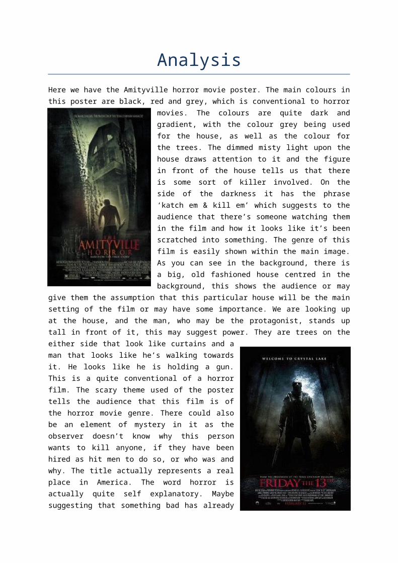
AnalysisHere we have the Amityville horror movie poster. The main colours in this poster are black, red and grey, which is conventional to horror movies. The colours are quite dark and gradient, with the
colour grey being used for the house, as well as the colour for the trees. The dimmed misty light upon the house draws attention to it and the figure in front of the house tells us that there is some sort of killer involved. On the side of the darkness it has the phrase ‘katch em & kill em’ which suggests to the audience that there’s someone watching them in the film and how it looks like it’s been scratched into something. The genre of this film is easily shown within the main image. As you can see in the background, there is a big, old fashioned house centred in the background, this shows the audience or may give them the assumption that this particular house will be the main setting of the film or may have some importance. We are looking up at the house, and the man, who may be the protagonist, stands up tall in front of it, this may suggest power. They are trees on the either side that look like curtains and a man that looks like he’s walking towards it. He looks like he is holding a gun. This is a quite conventional of a horror film. The scary theme used of the poster tells the audience that this film
is of the horror movie genre. There could also be an element of mystery in it as the observer doesn’t know why this person wants to kill anyone, if they have been hired as hit men to do so, or who was and why. The title actually represents a real place in America. The word horror is actually quite self explanatory. Maybe suggesting that something bad has already happened or taken place in this specific area. Also below the title it states that the film itself is based on a true story which tells you that something like this may and can happen and can make people want to go see the film even more. Just above the title there is what looks like a faded newspaper article with the words ‘says she was possessed’ which also brings more to the film as not only has the poster got someone with a weapon in the centre, it talks about possession. This poster is particularly aiming to grab the attention of those diehard fans of horror, or those who enjoyed the gruesomeness of Texas Chainsaw Massacre or like Michael Bay and his style of directing.
On the ‘Friday 13th’ movie poster the tagline can be seen as playing with the audience as in relation to the image and title, it is apparent that it is a joke which would normally be in reality seen as welcoming. However in the context of horror, it conveys that it is a welcoming to the end of a person’s life. The black surrounds the tagline and the edge of the whole poster, therefore suggesting that the characters will be
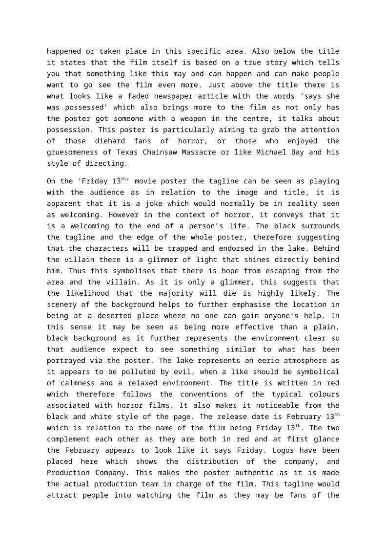
trapped and endorsed in the lake. Behind the villain there is a glimmer of light that shines directly behind him. Thus this symbolises that there is hope from escaping from the area and the villain. As it is only a glimmer, this suggests that the likelihood that the majority will die is highly likely. The scenery of the background helps to further emphasise the location in being at a deserted place where no one can gain anyone’s help. In this sense it may be seen as being more effective than a plain, black background as it further represents the environment clear so that audience expect to see something similar to what has been portrayed via the poster. The lake represents an eerie atmosphere as it appears to be polluted by evil, when a like should be symbolical of calmness and a relaxed environment. The title is written in red which therefore follows the conventions of the typical colours associated with horror films. It also makes it noticeable from the black and white style of the page. The release date is February 13th which is relation to the name of the film being Friday 13th. The two complement each other as they are both in red and at first glance the February appears to look like it says Friday. Logos have been placed here which shows the distribution of the company, and Production Company. This makes the poster authentic as it is made the actual production team in charge of the film. This tagline would attract people into watching the film as they may be fans of the Texas chainsaw massacre and therefore would want to go and see this film as it is made by the same producers. The weapon that he is holding is a machete, which is symbolical of being associated with the death and murder in the context of horror films. The villain is isolated by himself which conveys that he is the sole person responsible and at the heart of where evil takes place. This is because it appears as though he is the one inviting his victims to his territory, where the main events will start to occur, The villains is wearing a mask, which is a typical convention of horror films, as it concealed he identify and makes the person unknown.
On the Nightmare on Elm Street movie poster, the image works very well. This man or ‘thing’ is looking down so we cannot see his eye level but we are able to get a good view of his face.
Automatically we can see that his face is distorted in some way. This intrigues the audience. If you then look further down the image, the audience would come across his hands which at a glance look like they would blend in with his body, but you then see a knife which is attached to his hand, acting as a finger. For people that have seen the original movie, they would automatically recognise that this is Freddy Krueger. The layout of the poster is very conventional but for me it works better than the others that I have analysed. One of the things I like the most about this poster is the way that the man is looking down – I think this would bring in a wider audience because they are enticed. The colour used within this poster is a perfect example of what should be used for a slasher film. The dominant colour in the poster is a dark red mixed with tones of brown and black.
Overall it creates a very dark, hellish feel to it. The title is written in a very sharp and strong font – it is also in capitals which makes it very bold. The font itself manages to look quite scary as it is so striking. The audience should by now be starting to have some basic ideas as to what the film is about. The release date informs the intended audience as to when the film is released. It’s conventionally placed at the bottom of the film poster. The tagline always follows the title as it gives us a small inclination into the storyline. The audience will look at this poster and automatically link
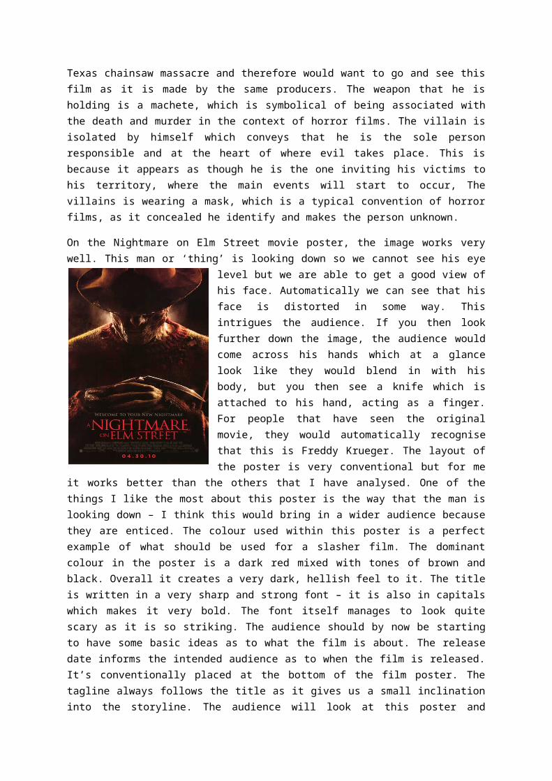
the phrase ‘new nightmare’ to the grotesque looking man above. There’s a small section of writing on the bottom right of the poster; this shows the studio the film producers have worked with. If a particular studio is advertised then it may attract certain people that like other films produced by these companies. Nightmare on Elm Street is directed by Samuel Bayer and distributed by New Line Cinema; therefore fans of Samuel Bayer and New Line Cinema entertainment would see the distribution and would be attracted into watching their latest film.
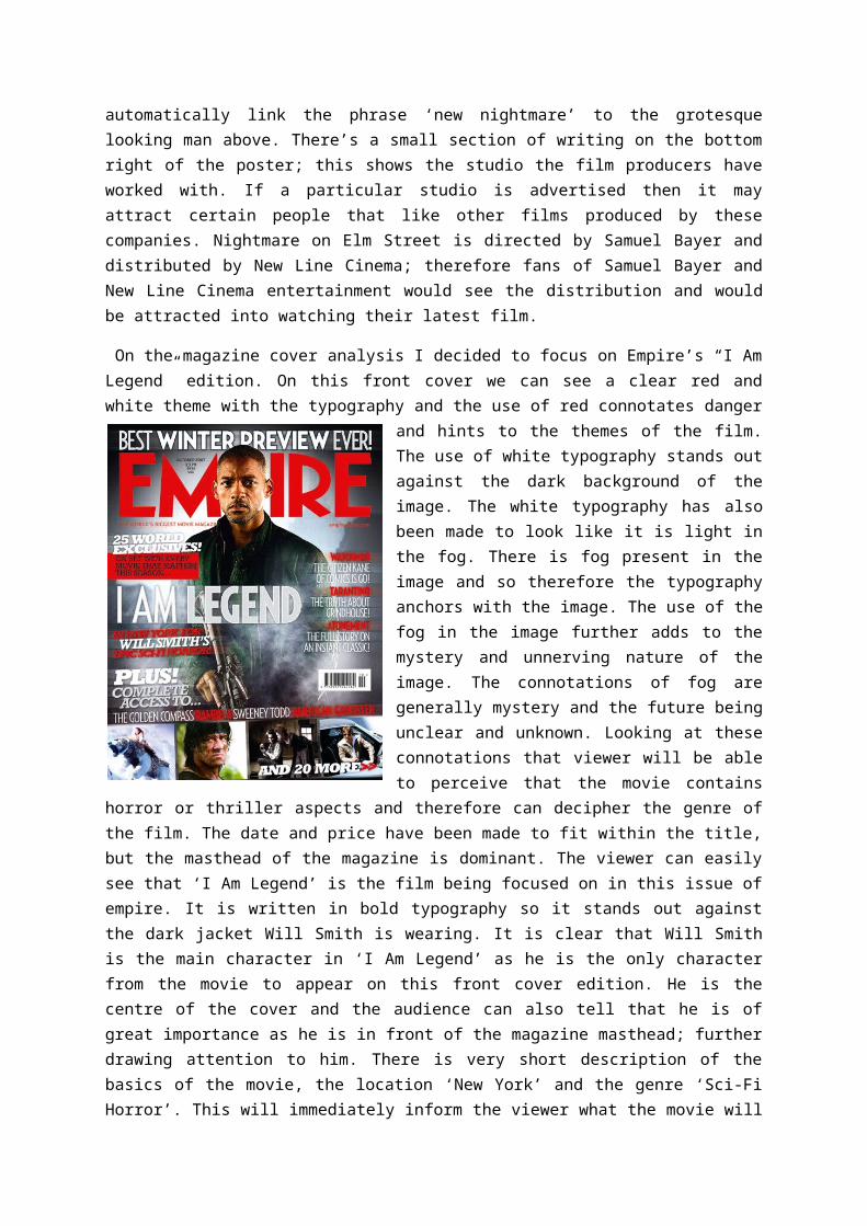
On the magazine cover analysis I decided to focus on Empire’s “I Am Legend” edition. On this front cover we can see a clear red and white theme with the typography and the use of red connotates danger and hints to the themes of the film. The use of white typography stands out against the dark
background of the image. The white typography has also been made to look like it is light in the fog. There is fog present in the image and so therefore the typography anchors with the image. The use of the fog in the image further adds to the mystery and unnerving nature of the image. The connotations of fog are generally mystery and the future being unclear and unknown. Looking at these connotations that viewer will be able to perceive that the movie contains horror or thriller aspects and therefore can decipher the genre of the film. The date and price have been made to fit within the title, but the masthead of the magazine is dominant. The viewer can easily see that ‘I Am Legend’ is the film being focused on in this issue of empire. It is written in bold typography so it stands out against the dark jacket Will Smith is wearing. It is clear that Will Smith is the main character in ‘I Am Legend’ as he is the
only character from the movie to appear on this front cover edition. He is the centre of the cover and the audience can also tell that he is of great importance as he is in front of the magazine masthead; further drawing attention to him. There is very short description of the basics of the movie, the location ‘New York’ and the genre ‘Sci-Fi Horror’. This will immediately inform the viewer what the movie will be like and about. The viewer can clearly see that the character is holding a gun in the image. Usually weapons are seen as a sign of power and masculinity, but in this image the character has his finger ion the trigger (as he can sense or is expecting something bad to jump out at him or take place, therefore holding the trigger as a sign that he is prepared to defend himself) and the character does not appear to be standing in a masculine way. This could signify that the character feels inferior to something, but as this is not included in the cover image it creates a sense of enigma. The backlighting in the image creates silhouettes behind the main character. This creates a sense of light vs. dark, Will Smith being the light as we can clearly see him (and therefore the good in the movie). The use of the silhouettes also creates a sense of mystery and danger as the viewer cannot tell what it is, but can tell from the outline that it looks quite threatening.
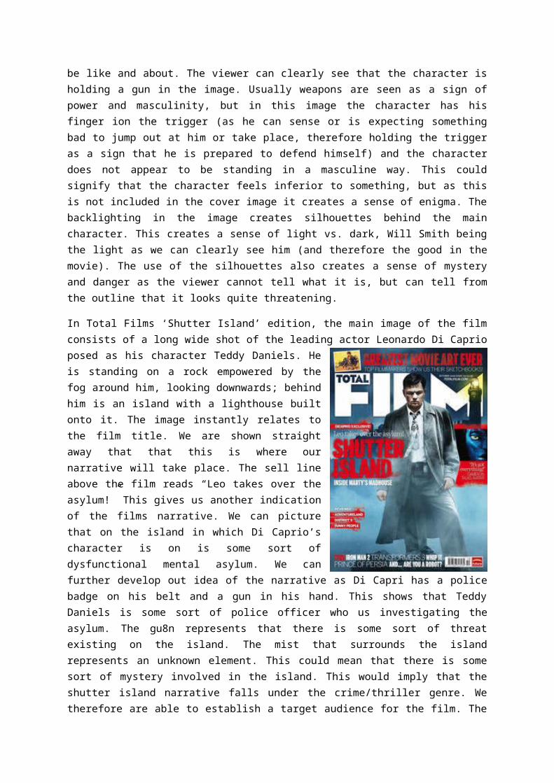
In Total Films ‘Shutter Island’ edition, the main image of the film consists of a long wide shot of the leading actor Leonardo Di Caprio posed as his character Teddy Daniels. He is standing on a rock empowered by the fog around him, looking downwards; behind him is an island with a lighthouse built onto it. The image instantly relates to the film title. We are shown straight away that that this is
where our narrative will take place. The sell line above the film reads “Leo takes over the asylum!” This gives us another indication of the films narrative. We can picture that on the island in which Di Caprio’s character is on is some sort of dysfunctional mental asylum. We can further develop out idea of the narrative as Di Capri has a police badge on his belt and a gun in his hand. This shows that Teddy Daniels is some sort of police officer who us investigating the asylum. The gu8n represents that there is some sort of threat existing on the island. The mist that surrounds the island represents an unknown element. This could mean that there is some sort of mystery involved in the island. This would imply that the shutter island narrative falls under the crime/thriller genre. We therefore are able to establish a target audience for the film. The main image is able to sell itself to the target audience as they would be interested in this sort of narrative. Leonardo Di Caprio is however the main selling point of this film due to his reputation of being a massive top rated Hollywood actor. This brings a large number of Leonardo fans that are attracted to this film because he features in it. The film title that appears on this front cover is similar to the one which is on the films official poster. The blocked and bold red colours which appear in both this front cover and the island appear once more. This creates a symbiotic link between these two promotional media texts as people will be able to distinguish the film through these two pieces of iconography. The magazines masthead is in huge upper case letters and is placed at the top of the front cover, conventionally so. The white stands out against the dark blue setting of the main image allowing it to become striking in the view. The total in the masthead uses the background of the main image to allow it to stand out against the white text, a smart method used. Despite Leonardo’s covering up some part of the masthead, it is still easily recognisable, as the masthead is still shown the same as other previous editions to keep that familiarity and consistency.
One trailer that I looked at was the Friday the 13th
(2009) teaser trailer. From 0:09 to 0:13 of the “Friday 13th” official teaser trailer, there are non diegetic sounds of birds tweeting. This could connote that there is an intruder. There is also an establishing shot of the lake. The lake looks very peaceful but this could be a symbol that the darkness is descending and
unusual events are about to take place. At 0:15 there is a fade to black transition. It cuts away from the lake, which implies that the events will now start to happen. From 0:18 to 0:21 there is a non
diegetic sound which is low and continuous for three rough seconds. This could represent the wind surrounding the cabin which is shown in the next scene. At 0:19 there is a point of view shot of a disintegrated shot of a mysterious looking light and the background is completely black which implies and that there could be something there and the audience can see it. At 0:21 to 0:22 there are two images shown by a long shot and its showing the cabin (a horror concept) in two different angles this could be to show the audience that the cabin is completely isolated which suggests that there may be a killer in there. From 0:22 to 0:24 there is a voiceover of a woman telling the history about her son drowning in the lake, here we can see the narrative being told, that way the trailer is shortly selling the story to the audience. At 27 seconds there is a creaky door, which is another horror concept. Starting at 0:28 and going on to 0:52 there is a voiceover echoed from what assumedly must have been a past interview or hearing, it gives context that a boy named Jason drowned at Camp Crystal Lake. As the voiceover continues there is a flash of white light which is later revealed in the next scene. It is a torch which could connote that there is somebody missing. This same flash of light is repeated at 0:59. At 0:29 there is a diegetic sound of someone scared, running, this makes it out to be a chase scene. At 0:34 there is a doll on the ground. The doll may represent childhood and the feeling of wanting to be young again, this could relate to Jason’s victims as he targets and kills young people. In a way, this could also relate to Jason’s childhood, as he drowned at Camp Crystal Lake due to the negligence of the camp staff. At 0:39 there is an inter-title of the director ‘Michael Bay’, this is used in the trailer as a different piece of advertising. Michael Bay is a very well known director due to his work in some films such as Pearl Harbour, the Bad Boys franchise and Armageddon. This strap may be used to convince those that are fans of Michael Bay movies, to go and watch this one. From 0:40 there are collages of the action that is to feature in the film, each last a second and show a montages of what’s to happen in the film. 59 seconds into the trailer the audience first see a glimpse of the killer, Jason jumps into the scene standing underneath a flickering light bulb, which is suppose to make the audience jump as his appearance is unexpected.
Another trailer I looked at was the Texas Chainsaw Massacre (2013) teaser trailer.