an introduction to applied multivariate analysis with r …stevel/519/an intro to appl… · ·...
TRANSCRIPT


Use R!
Series Editors:Robert Gentleman Kurt Hornik Giovanni Parmigiani
For other titles published in this series, go tohttp://www.springer.com/series/6991


An Introduction to AppliedMultivariate Analysis with R
Brian Everitt • Torsten Hothorn

Series Editors:Robert GentlemanProgram in Computational BiologyDivision of Public Health SciencesFred Hutchinson Cancer Research Center1100 Fairview Avenue, N. M2-B876
USA
Kurt HornikDepartment of Statistik and MathematikWirtschaftsuniversität Wien
A-1090 WienAustria
Giovanni ParmigianiThe Sidney Kimmel ComprehensiveCancer Center at Johns Hopkins University550 North BroadwayBaltimore, MD 21205-2011USA
Augasse 2-6
Seattle, Washington 98109
Printed on acid-free paper
Springer New York Dordrecht Heidelberg London
© Springer Science+Business Media, LLC 2011
software, or by similar or dissimilar methodology now known or hereafter developed is forbidden.
subject to proprietary rights.
Springer is part of Springer Science+Business Media (www.springer.com)
ISBN 978-1-4419-9649-7 e-ISBN 978-1-4419-9650-3 DOI 10.1007/978-1-4419-9650-3
Library of Congress Control Number: 2011926793
All rights reserved. This work may not be translated or copied in whole or in part without the written permission of the publisher (Springer Science+Business Media, LLC, 233 Spring Street, New York, NY 10013, USA), except for brief excerpts in connection with reviews or scholarly analysis. Use in connection with any form of information storage and retrieval, electronic adaptation, computer
The use in this publication of trade names, trademarks, service marks, and similar terms, even if they are not identified as such, is not to be taken as an expression of opinion as to whether or not they are
King’s CollegeLondon, SE5 8AF UK [email protected]
Ludwigstr. 33 80539 München Germany [email protected]
Torsten Hothorn Brian Everitt Institut für Statistik Ludwig-Maximilians-Universität München
Professor Emeritus

To our wives, Mary-Elizabeth and Carolin.


Preface
The majority of data sets collected by researchers in all disciplines are mul-tivariate, meaning that several measurements, observations, or recordings aretaken on each of the units in the data set. These units might be human sub-jects, archaeological artifacts, countries, or a vast variety of other things. In afew cases, it may be sensible to isolate each variable and study it separately,but in most instances all the variables need to be examined simultaneouslyin order to fully grasp the structure and key features of the data. For thispurpose, one or another method of multivariate analysis might be helpful,and it is with such methods that this book is largely concerned. Multivariateanalysis includes methods both for describing and exploring such data and formaking formal inferences about them. The aim of all the techniques is, in ageneral sense, to display or extract the signal in the data in the presence ofnoise and to find out what the data show us in the midst of their apparentchaos.
The computations involved in applying most multivariate techniques areconsiderable, and their routine use requires a suitable software package. Inaddition, most analyses of multivariate data should involve the constructionof appropriate graphs and diagrams, and this will also need to be carriedout using the same package. R is a statistical computing environment that ispowerful, flexible, and, in addition, has excellent graphical facilities. It is forthese reasons that it is the use of R for multivariate analysis that is illustratedin this book.
In this book, we concentrate on what might be termed the “core” or “clas-sical” multivariate methodology, although mention will be made of recent de-velopments where these are considered relevant and useful. But there is anarea of multivariate statistics that we have omitted from this book, and thatis multivariate analysis of variance (MANOVA) and related techniques such asFisher’s linear discriminant function (LDF). There are a variety of reasons forthis omission. First, we are not convinced that MANOVA is now of much morethan historical interest; researchers may occasionally pay lip service to usingthe technique, but in most cases it really is no more than this. They quickly

viii Preface
move on to looking at the results for individual variables. And MANOVA forrepeated measures has been largely superseded by the models that we shalldescribe in Chapter 8. Second, a classification technique such as LDF needsto be considered in the context of modern classification algorithms, and thesecannot be covered in an introductory book such as this.
Some brief details of the theory behind each technique described are given,but the main concern of each chapter is the correct application of the meth-ods so as to extract as much information as possible from the data at hand,particularly as some type of graphical representation, via the R software.
The book is aimed at students in applied statistics courses, both under-graduate and post-graduate, who have attended a good introductory coursein statistics that covered hypothesis testing, confidence intervals, simple re-gression and correlation, analysis of variance, and basic maximum likelihoodestimation. We also assume that readers will know some simple matrix alge-bra, including the manipulation of matrices and vectors and the concepts ofthe inverse and rank of a matrix. In addition, we assume that readers willhave some familiarity with R at the level of, say, Dalgaard (2002). In additionto such a student readership, we hope that many applied statisticians dealingwith multivariate data will find something of interest in the eight chapters ofour book.
Throughout the book, we give many examples of R code used to apply themultivariate techniques to multivariate data. Samples of code that could beentered interactively at the R command line are formatted as follows:
R> library("MVA")
Here, R> denotes the prompt sign from the R command line, and the userenters everything else. The symbol + indicates additional lines, which areappropriately indented. Finally, output produced by function calls is shownbelow the associated code:
R> rnorm(10)
[1] 1.8808 0.2572 -0.3412 0.4081 0.4344 0.7003 1.8944
[8] -0.2993 -0.7355 0.8960
In this book, we use several R packages to access different example data sets(many of them contained in the package HSAUR2), standard functions for thegeneral parametric analyses, and the MVA package to perform analyses. All ofthe packages used in this book are available at the Comprehensive R ArchiveNetwork (CRAN), which can be accessed from http://CRAN.R-project.org.
The source code for the analyses presented in this book is available fromthe MVA package. A demo containing the R code to reproduce the individualresults is available for each chapter by invoking
R> library("MVA")
R> demo("Ch-MVA") ### Introduction to Multivariate Analysis
R> demo("Ch-Viz") ### Visualization

Preface ix
R> demo("Ch-PCA") ### Principal Components Analysis
R> demo("Ch-EFA") ### Exploratory Factor Analysis
R> demo("Ch-MDS") ### Multidimensional Scaling
R> demo("Ch-CA") ### Cluster Analysis
R> demo("Ch-SEM") ### Structural Equation Models
R> demo("Ch-LME") ### Linear Mixed-Effects Models
Thanks are due to Lisa Most, BSc., for help with data processing andLATEX typesetting, the copy editor for many helpful corrections, and to JohnKimmel, for all his support and patience during the writing of the book.
January 2011 Brian S. Everitt, LondonTorsten Hothorn, Munchen


Contents
Preface . . . . . . . . . . . . . . . . . . . . . . . . . . . . . . . . . . . . . . . . . . . . . . . . . . . . . . . . vii
1 Multivariate Data and Multivariate Analysis . . . . . . . . . . . . . . 11.1 Introduction . . . . . . . . . . . . . . . . . . . . . . . . . . . . . . . . . . . . . . . . . . . . 11.2 A brief history of the development of multivariate analysis . . . . 31.3 Types of variables and the possible problem of missing values . 4
1.3.1 Missing values . . . . . . . . . . . . . . . . . . . . . . . . . . . . . . . . . . . . 51.4 Some multivariate data sets . . . . . . . . . . . . . . . . . . . . . . . . . . . . . . . 71.5 Covariances, correlations, and distances . . . . . . . . . . . . . . . . . . . . 12
1.5.1 Covariances . . . . . . . . . . . . . . . . . . . . . . . . . . . . . . . . . . . . . . . 121.5.2 Correlations . . . . . . . . . . . . . . . . . . . . . . . . . . . . . . . . . . . . . . 141.5.3 Distances . . . . . . . . . . . . . . . . . . . . . . . . . . . . . . . . . . . . . . . . . 14
1.6 The multivariate normal density function . . . . . . . . . . . . . . . . . . . 151.7 Summary . . . . . . . . . . . . . . . . . . . . . . . . . . . . . . . . . . . . . . . . . . . . . . . 231.8 Exercises . . . . . . . . . . . . . . . . . . . . . . . . . . . . . . . . . . . . . . . . . . . . . . . 23
2 Looking at Multivariate Data: Visualisation . . . . . . . . . . . . . . . 252.1 Introduction . . . . . . . . . . . . . . . . . . . . . . . . . . . . . . . . . . . . . . . . . . . . 252.2 The scatterplot . . . . . . . . . . . . . . . . . . . . . . . . . . . . . . . . . . . . . . . . . . 26
2.2.1 The bivariate boxplot . . . . . . . . . . . . . . . . . . . . . . . . . . . . . . 282.2.2 The convex hull of bivariate data . . . . . . . . . . . . . . . . . . . . 322.2.3 The chi-plot . . . . . . . . . . . . . . . . . . . . . . . . . . . . . . . . . . . . . . 34
2.3 The bubble and other glyph plots . . . . . . . . . . . . . . . . . . . . . . . . . 342.4 The scatterplot matrix . . . . . . . . . . . . . . . . . . . . . . . . . . . . . . . . . . . 392.5 Enhancing the scatterplot with estimated bivariate densities . . 42
2.5.1 Kernel density estimators . . . . . . . . . . . . . . . . . . . . . . . . . . 422.6 Three-dimensional plots . . . . . . . . . . . . . . . . . . . . . . . . . . . . . . . . . . 472.7 Trellis graphics . . . . . . . . . . . . . . . . . . . . . . . . . . . . . . . . . . . . . . . . . . 502.8 Stalactite plots . . . . . . . . . . . . . . . . . . . . . . . . . . . . . . . . . . . . . . . . . . 532.9 Summary . . . . . . . . . . . . . . . . . . . . . . . . . . . . . . . . . . . . . . . . . . . . . . . 562.10 Exercises . . . . . . . . . . . . . . . . . . . . . . . . . . . . . . . . . . . . . . . . . . . . . . . 60
xii Contents
3 Principal Components Analysis . . . . . . . . . . . . . . . . . . . . . . . . . . . . 613.1 Introduction . . . . . . . . . . . . . . . . . . . . . . . . . . . . . . . . . . . . . . . . . . . . 613.2 Principal components analysis (PCA) . . . . . . . . . . . . . . . . . . . . . . 613.3 Finding the sample principal components . . . . . . . . . . . . . . . . . . . 633.4 Should principal components be extracted from the
covariance or the correlation matrix? . . . . . . . . . . . . . . . . . . . . . . . 653.5 Principal components of bivariate data with correlation
coefficient r . . . . . . . . . . . . . . . . . . . . . . . . . . . . . . . . . . . . . . . . . . . . . 683.6 Rescaling the principal components . . . . . . . . . . . . . . . . . . . . . . . . 703.7 How the principal components predict the observed
covariance matrix . . . . . . . . . . . . . . . . . . . . . . . . . . . . . . . . . . . . . . . 703.8 Choosing the number of components . . . . . . . . . . . . . . . . . . . . . . . 713.9 Calculating principal components scores . . . . . . . . . . . . . . . . . . . . 723.10 Some examples of the application of principal components
analysis . . . . . . . . . . . . . . . . . . . . . . . . . . . . . . . . . . . . . . . . . . . . . . . . 743.10.1 Head lengths of first and second sons . . . . . . . . . . . . . . . . 743.10.2 Olympic heptathlon results . . . . . . . . . . . . . . . . . . . . . . . . . 783.10.3 Air pollution in US cities . . . . . . . . . . . . . . . . . . . . . . . . . . . 86
3.11 The biplot . . . . . . . . . . . . . . . . . . . . . . . . . . . . . . . . . . . . . . . . . . . . . . 923.12 Sample size for principal components analysis . . . . . . . . . . . . . . . 933.13 Canonical correlation analysis . . . . . . . . . . . . . . . . . . . . . . . . . . . . . 94
3.13.1 Head measurements . . . . . . . . . . . . . . . . . . . . . . . . . . . . . . . 963.13.2 Health and personality . . . . . . . . . . . . . . . . . . . . . . . . . . . . . 99
3.14 Summary . . . . . . . . . . . . . . . . . . . . . . . . . . . . . . . . . . . . . . . . . . . . . . . 1013.15 Exercises . . . . . . . . . . . . . . . . . . . . . . . . . . . . . . . . . . . . . . . . . . . . . . . 102
4 Multidimensional Scaling . . . . . . . . . . . . . . . . . . . . . . . . . . . . . . . . . . 1054.1 Introduction . . . . . . . . . . . . . . . . . . . . . . . . . . . . . . . . . . . . . . . . . . . . 1054.2 Models for proximity data . . . . . . . . . . . . . . . . . . . . . . . . . . . . . . . . 1054.3 Spatial models for proximities: Multidimensional scaling . . . . . . 1064.4 Classical multidimensional scaling . . . . . . . . . . . . . . . . . . . . . . . . . 106
4.4.1 Classical multidimensional scaling: Technical details . . . 1074.4.2 Examples of classical multidimensional scaling . . . . . . . . 110
4.5 Non-metric multidimensional scaling . . . . . . . . . . . . . . . . . . . . . . . 1214.5.1 House of Representatives voting . . . . . . . . . . . . . . . . . . . . . 1234.5.2 Judgements of World War II leaders . . . . . . . . . . . . . . . . . 124
4.6 Correspondence analysis . . . . . . . . . . . . . . . . . . . . . . . . . . . . . . . . . . 1274.6.1 Teenage relationships . . . . . . . . . . . . . . . . . . . . . . . . . . . . . . 130
4.7 Summary . . . . . . . . . . . . . . . . . . . . . . . . . . . . . . . . . . . . . . . . . . . . . . . 1314.8 Exercises . . . . . . . . . . . . . . . . . . . . . . . . . . . . . . . . . . . . . . . . . . . . . . . 132
5 Exploratory Factor Analysis . . . . . . . . . . . . . . . . . . . . . . . . . . . . . . . 1355.1 Introduction . . . . . . . . . . . . . . . . . . . . . . . . . . . . . . . . . . . . . . . . . . . . 1355.2 A simple example of a factor analysis model . . . . . . . . . . . . . . . . 1365.3 The k-factor analysis model . . . . . . . . . . . . . . . . . . . . . . . . . . . . . . . 137
Contents xiii
5.4 Scale invariance of the k-factor model . . . . . . . . . . . . . . . . . . . . . . 1385.5 Estimating the parameters in the k-factor analysis model . . . . . 139
5.5.1 Principal factor analysis . . . . . . . . . . . . . . . . . . . . . . . . . . . . 1415.5.2 Maximum likelihood factor analysis . . . . . . . . . . . . . . . . . . 142
5.6 Estimating the number of factors . . . . . . . . . . . . . . . . . . . . . . . . . . 1425.7 Factor rotation . . . . . . . . . . . . . . . . . . . . . . . . . . . . . . . . . . . . . . . . . . 1435.8 Estimating factor scores . . . . . . . . . . . . . . . . . . . . . . . . . . . . . . . . . . 1475.9 Two examples of exploratory factor analysis . . . . . . . . . . . . . . . . 148
5.9.1 Expectations of life . . . . . . . . . . . . . . . . . . . . . . . . . . . . . . . . 1485.9.2 Drug use by American college students . . . . . . . . . . . . . . . 151
5.10 Factor analysis and principal components analysis compared . . 1575.11 Summary . . . . . . . . . . . . . . . . . . . . . . . . . . . . . . . . . . . . . . . . . . . . . . . 1595.12 Exercises . . . . . . . . . . . . . . . . . . . . . . . . . . . . . . . . . . . . . . . . . . . . . . . 159
6 Cluster Analysis . . . . . . . . . . . . . . . . . . . . . . . . . . . . . . . . . . . . . . . . . . . 1636.1 Introduction . . . . . . . . . . . . . . . . . . . . . . . . . . . . . . . . . . . . . . . . . . . . 1636.2 Cluster analysis . . . . . . . . . . . . . . . . . . . . . . . . . . . . . . . . . . . . . . . . . 1656.3 Agglomerative hierarchical clustering . . . . . . . . . . . . . . . . . . . . . . 166
6.3.1 Clustering jet fighters . . . . . . . . . . . . . . . . . . . . . . . . . . . . . . 1716.4 K-means clustering . . . . . . . . . . . . . . . . . . . . . . . . . . . . . . . . . . . . . . 175
6.4.1 Clustering the states of the USA on the basis of theircrime rate profiles . . . . . . . . . . . . . . . . . . . . . . . . . . . . . . . . . 176
6.4.2 Clustering Romano-British pottery . . . . . . . . . . . . . . . . . . 1806.5 Model-based clustering . . . . . . . . . . . . . . . . . . . . . . . . . . . . . . . . . . . 183
6.5.1 Finite mixture densities . . . . . . . . . . . . . . . . . . . . . . . . . . . . 1866.5.2 Maximum likelihood estimation in a finite mixture
density with multivariate normal components . . . . . . . . . 1876.6 Displaying clustering solutions graphically . . . . . . . . . . . . . . . . . . 1916.7 Summary . . . . . . . . . . . . . . . . . . . . . . . . . . . . . . . . . . . . . . . . . . . . . . . 1976.8 Exercises . . . . . . . . . . . . . . . . . . . . . . . . . . . . . . . . . . . . . . . . . . . . . . . 200
7 Confirmatory Factor Analysis and Structural EquationModels . . . . . . . . . . . . . . . . . . . . . . . . . . . . . . . . . . . . . . . . . . . . . . . . . . . . 2017.1 Introduction . . . . . . . . . . . . . . . . . . . . . . . . . . . . . . . . . . . . . . . . . . . . 2017.2 Estimation, identification, and assessing fit for confirmatory
factor and structural equation models . . . . . . . . . . . . . . . . . . . . . . 2027.2.1 Estimation . . . . . . . . . . . . . . . . . . . . . . . . . . . . . . . . . . . . . . . 2027.2.2 Identification . . . . . . . . . . . . . . . . . . . . . . . . . . . . . . . . . . . . . 2037.2.3 Assessing the fit of a model . . . . . . . . . . . . . . . . . . . . . . . . . 204
7.3 Confirmatory factor analysis models . . . . . . . . . . . . . . . . . . . . . . . 2067.3.1 Ability and aspiration . . . . . . . . . . . . . . . . . . . . . . . . . . . . . . 2067.3.2 A confirmatory factor analysis model for drug use . . . . . 211
7.4 Structural equation models . . . . . . . . . . . . . . . . . . . . . . . . . . . . . . . 2167.4.1 Stability of alienation . . . . . . . . . . . . . . . . . . . . . . . . . . . . . . 216
7.5 Summary . . . . . . . . . . . . . . . . . . . . . . . . . . . . . . . . . . . . . . . . . . . . . . . 222

xiv Contents
7.6 Exercises . . . . . . . . . . . . . . . . . . . . . . . . . . . . . . . . . . . . . . . . . . . . . . . 223
8 The Analysis of Repeated Measures Data . . . . . . . . . . . . . . . . . . 2258.1 Introduction . . . . . . . . . . . . . . . . . . . . . . . . . . . . . . . . . . . . . . . . . . . . 2258.2 Linear mixed-effects models for repeated measures data . . . . . . 232
8.2.1 Random intercept and random intercept and slopemodels for the timber slippage data . . . . . . . . . . . . . . . . . . 233
8.2.2 Applying the random intercept and the randomintercept and slope models to the timber slippage data . 235
8.2.3 Fitting random-effect models to the glucose challengedata . . . . . . . . . . . . . . . . . . . . . . . . . . . . . . . . . . . . . . . . . . . . . 240
8.3 Prediction of random effects . . . . . . . . . . . . . . . . . . . . . . . . . . . . . . 2478.4 Dropouts in longitudinal data . . . . . . . . . . . . . . . . . . . . . . . . . . . . . 2488.5 Summary . . . . . . . . . . . . . . . . . . . . . . . . . . . . . . . . . . . . . . . . . . . . . . . 2578.6 Exercises . . . . . . . . . . . . . . . . . . . . . . . . . . . . . . . . . . . . . . . . . . . . . . . 257
References . . . . . . . . . . . . . . . . . . . . . . . . . . . . . . . . . . . . . . . . . . . . . . . . . . . . . 259
Index . . . . . . . . . . . . . . . . . . . . . . . . . . . . . . . . . . . . . . . . . . . . . . . . . . . . . . . . . . 271

1
Multivariate Data and Multivariate Analysis
1.1 Introduction
Multivariate data arise when researchers record the values of several randomvariables on a number of subjects or objects or perhaps one of a variety ofother things (we will use the general term“units”) in which they are interested,leading to a vector-valued or multidimensional observation for each. Such dataare collected in a wide range of disciplines, and indeed it is probably reasonableto claim that the majority of data sets met in practise are multivariate. Insome studies, the variables are chosen by design because they are known tobe essential descriptors of the system under investigation. In other studies,particularly those that have been difficult or expensive to organise, manyvariables may be measured simply to collect as much information as possibleas a matter of expediency or economy.
Multivariate data are ubiquitous as is illustrated by the following fourexamples:
� Psychologists and other behavioural scientists often record the values ofseveral different cognitive variables on a number of subjects.
� Educational researchers may be interested in the examination marks ob-tained by students for a variety of different subjects.
� Archaeologists may make a set of measurements on artefacts of interest.� Environmentalists might assess pollution levels of a set of cities along with
noting other characteristics of the cities related to climate and humanecology.
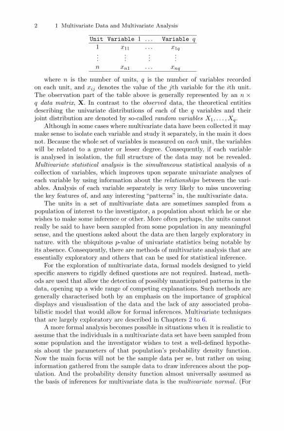
Most multivariate data sets can be represented in the same way, namely ina rectangular format known from spreadsheets, in which the elements of eachrow correspond to the variable values of a particular unit in the data set andthe elements of the columns correspond to the values taken by a particularvariable. We can write data in such a rectangular format as
1 DOI 10.1007/978-1-4419-9650-3_1, © Springer Science+Business Media, LLC 2011 B. Everitt and T. Hothorn, An Introduction to Applied Multivariate Analysis with R: Use R!,
2 1 Multivariate Data and Multivariate Analysis
Unit Variable 1 . . . Variable q1 x11 . . . x1q...
......
...n xn1 . . . xnq
where n is the number of units, q is the number of variables recordedon each unit, and xij denotes the value of the jth variable for the ith unit.The observation part of the table above is generally represented by an n ×q data matrix, X. In contrast to the observed data, the theoretical entitiesdescribing the univariate distributions of each of the q variables and theirjoint distribution are denoted by so-called random variables X1, . . . ,Xq.
Although in some cases where multivariate data have been collected it maymake sense to isolate each variable and study it separately, in the main it doesnot. Because the whole set of variables is measured on each unit, the variableswill be related to a greater or lesser degree. Consequently, if each variableis analysed in isolation, the full structure of the data may not be revealed.Multivariate statistical analysis is the simultaneous statistical analysis of acollection of variables, which improves upon separate univariate analyses ofeach variable by using information about the relationships between the vari-ables. Analysis of each variable separately is very likely to miss uncoveringthe key features of, and any interesting “patterns” in, the multivariate data.
The units in a set of multivariate data are sometimes sampled from apopulation of interest to the investigator, a population about which he or shewishes to make some inference or other. More often perhaps, the units cannotreally be said to have been sampled from some population in any meaningfulsense, and the questions asked about the data are then largely exploratory innature. with the ubiquitous p-value of univariate statistics being notable byits absence. Consequently, there are methods of multivariate analysis that areessentially exploratory and others that can be used for statistical inference.
For the exploration of multivariate data, formal models designed to yieldspecific answers to rigidly defined questions are not required. Instead, meth-ods are used that allow the detection of possibly unanticipated patterns in thedata, opening up a wide range of competing explanations. Such methods aregenerally characterised both by an emphasis on the importance of graphicaldisplays and visualisation of the data and the lack of any associated proba-bilistic model that would allow for formal inferences. Multivariate techniquesthat are largely exploratory are described in Chapters 2 to 6.
A more formal analysis becomes possible in situations when it is realistic toassume that the individuals in a multivariate data set have been sampled fromsome population and the investigator wishes to test a well-defined hypothe-sis about the parameters of that population’s probability density function.Now the main focus will not be the sample data per se, but rather on usinginformation gathered from the sample data to draw inferences about the pop-ulation. And the probability density function almost universally assumed asthe basis of inferences for multivariate data is the multivariate normal . (For

1.2 A brief history of the development of multivariate analysis 3
a brief description of the multivariate normal density function and ways ofassessing whether a set of multivariate data conform to the density, see Sec-tion 1.6). Multivariate techniques for which formal inference is of importanceare described in Chapters 7 and 8. But in many cases when dealing withmultivariate data, this implied distinction between the exploratory and theinferential may be a red herring because the general aim of most multivariateanalyses, whether implicitly exploratory or inferential is to uncover, display,or extract any “signal” in the data in the presence of noise and to discoverwhat the data have to tell us.
1.2 A brief history of the development of multivariateanalysis
The genesis of multivariate analysis is probably the work carried out by FrancisGalton and Karl Pearson in the late 19th century on quantifying the relation-ship between offspring and parental characteristics and the development ofthe correlation coefficient. And then, in the early years of the 20th century,Charles Spearman laid down the foundations of factor analysis (see Chapter 5)whilst investigating correlated intelligence quotient (IQ) tests. Over the nexttwo decades, Spearman’s work was extended by Hotelling and by Thurstone.
Multivariate methods were also motivated by problems in scientific areasother than psychology, and in the 1930s Fisher developed linear discriminantfunction analysis to solve a taxonomic problem using multiple botanical mea-surements. And Fisher’s introduction of analysis of variance in the 1920s wassoon followed by its multivariate generalisation, multivariate analysis of vari-ance, based on work by Bartlett and Roy. (These techniques are not coveredin this text for the reasons set out in the Preface.)
In these early days, computational aids to take the burden of the vastamounts of arithmetic involved in the application of the multivariate meth-ods being proposed were very limited and, consequently, developments wereprimarily mathematical and multivariate research was, at the time, largely abranch of linear algebra. However, the arrival and rapid expansion of the useof electronic computers in the second half of the 20th century led to increasedpractical application of existing methods of multivariate analysis and renewedinterest in the creation of new techniques.
In the early years of the 21st century, the wide availability of relativelycheap and extremely powerful personal computers and laptops allied withflexible statistical software has meant that all the methods of multivariateanalysis can be applied routinely even to very large data sets such as thosegenerated in, for example, genetics, imaging, and astronomy. And the appli-cation of multivariate techniques to such large data sets has now been givenits own name, data mining , which has been defined as “the nontrivial extrac-tion of implicit, previously unknown and potentially useful information from
4 1 Multivariate Data and Multivariate Analysis
data.” Useful books on data mining are those of Fayyad, Piatetsky-Shapiro,Smyth, and Uthurusamy (1996) and Hand, Mannila, and Smyth (2001).
1.3 Types of variables and the possible problem ofmissing values
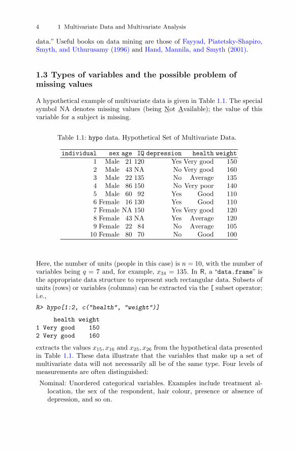
A hypothetical example of multivariate data is given in Table 1.1. The specialsymbol NA denotes missing values (being Not Available); the value of thisvariable for a subject is missing.
Table 1.1: hypo data. Hypothetical Set of Multivariate Data.
individual sex age IQ depression health weight
1 Male 21 120 Yes Very good 1502 Male 43 NA No Very good 1603 Male 22 135 No Average 1354 Male 86 150 No Very poor 1405 Male 60 92 Yes Good 1106 Female 16 130 Yes Good 1107 Female NA 150 Yes Very good 1208 Female 43 NA Yes Average 1209 Female 22 84 No Average 105
10 Female 80 70 No Good 100
Here, the number of units (people in this case) is n = 10, with the number ofvariables being q = 7 and, for example, x34 = 135. In R, a “data.frame” isthe appropriate data structure to represent such rectangular data. Subsets ofunits (rows) or variables (columns) can be extracted via the [ subset operator;i.e.,
R> hypo[1:2, c("health", "weight")]
health weight
1 Very good 150
2 Very good 160
extracts the values x15, x16 and x25, x26 from the hypothetical data presentedin Table 1.1. These data illustrate that the variables that make up a set ofmultivariate data will not necessarily all be of the same type. Four levels ofmeasurements are often distinguished:
Nominal: Unordered categorical variables. Examples include treatment al-location, the sex of the respondent, hair colour, presence or absence ofdepression, and so on.

1.3 Types of variables and the possible problem of missing values 5
Ordinal: Where there is an ordering but no implication of equal distancebetween the different points of the scale. Examples include social class,self-perception of health (each coded from I to V, say), and educationallevel (no schooling, primary, secondary, or tertiary education).
Interval: Where there are equal differences between successive points on thescale but the position of zero is arbitrary. The classic example is the mea-surement of temperature using the Celsius or Fahrenheit scales.
Ratio: The highest level of measurement, where one can investigate the rel-ative magnitudes of scores as well as the differences between them. Theposition of zero is fixed. The classic example is the absolute measure oftemperature (in Kelvin, for example), but other common ones includesage (or any other time from a fixed event), weight, and length.
In many statistical textbooks, discussion of different types of measure-ments is often followed by recommendations as to which statistical techniquesare suitable for each type; for example, analyses on nominal data should belimited to summary statistics such as the number of cases, the mode, etc.And, for ordinal data, means and standard deviations are not suitable. ButVelleman and Wilkinson (1993) make the important point that restricting thechoice of statistical methods in this way may be a dangerous practise for dataanalysis–in essence the measurement taxonomy described is often too strictto apply to real-world data. This is not the place for a detailed discussion ofmeasurement, but we take a fairly pragmatic approach to such problems. Forexample, we will not agonise over treating variables such as measures of de-pression, anxiety, or intelligence as if they are interval-scaled, although strictlythey fit into the ordinal category described above.
1.3.1 Missing values
Table 1.1 also illustrates one of the problems often faced by statisticians un-dertaking statistical analysis in general and multivariate analysis in particular,namely the presence of missing values in the data; i.e., observations and mea-surements that should have been recorded but for one reason or another, werenot. Missing values in multivariate data may arise for a number of reasons;for example, non-response in sample surveys, dropouts in longitudinal data(see Chapter 8), or refusal to answer particular questions in a questionnaire.The most important approach for dealing with missing data is to try to avoidthem during the data-collection stage of a study. But despite all the efforts aresearcher may make, he or she may still be faced with a data set that con-tains a number of missing values. So what can be done? One answer to thisquestion is to take the complete-case analysis route because this is what moststatistical software packages do automatically. Using complete-case analysison multivariate data means omitting any case with a missing value on any ofthe variables. It is easy to see that if the number of variables is large, theneven a sparse pattern of missing values can result in a substantial number ofincomplete cases. One possibility to ease this problem is to simply drop any

6 1 Multivariate Data and Multivariate Analysis
variables that have many missing values. But complete-case analysis is notrecommended for two reasons:
� Omitting a possibly substantial number of individuals will cause a largeamount of information to be discarded and lower the effective sample sizeof the data, making any analyses less effective than they would have beenif all the original sample had been available.
� More worrisome is that dropping the cases with missing values on oneor more variables can lead to serious biases in both estimation and infer-ence unless the discarded cases are essentially a random subsample of theobserved data (the term missing completely at random is often used; seeChapter 8 and Little and Rubin (1987) for more details).
So, at the very least, complete-case analysis leads to a loss, and perhaps asubstantial loss, in power by discarding data, but worse, analyses based juston complete cases might lead to misleading conclusions and inferences.
A relatively simple alternative to complete-case analysis that is often usedis available-case analysis. This is a straightforward attempt to exploit theincomplete information by using all the cases available to estimate quanti-ties of interest. For example, if the researcher is interested in estimating thecorrelation matrix (see Subsection 1.5.2) of a set of multivariate data, thenavailable-case analysis uses all the cases with variables Xi and Xj present toestimate the correlation between the two variables. This approach appears tomake better use of the data than complete-case analysis, but unfortunatelyavailable-case analysis has its own problems. The sample of individuals usedchanges from correlation to correlation, creating potential difficulties whenthe missing data are not missing completely at random. There is no guaran-tee that the estimated correlation matrix is even positive-definite which cancreate problems for some of the methods, such as factor analysis (see Chap-ter 5) and structural equation modelling (see Chapter 7), that the researchermay wish to apply to the matrix.
Both complete-case and available-case analyses are unattractive unless thenumber of missing values in the data set is “small”. An alternative answer tothe missing-data problem is to consider some form of imputation, the prac-tise of “filling in” missing data with plausible values. Methods that imputethe missing values have the advantage that, unlike in complete-case analysis,observed values in the incomplete cases are retained. On the surface, it lookslike imputation will solve the missing-data problem and enable the investi-gator to progress normally. But, from a statistical viewpoint, careful consid-eration needs to be given to the method used for imputation or otherwise itmay cause more problems than it solves; for example, imputing an observedvariable mean for a variable’s missing values preserves the observed samplemeans but distorts the covariance matrix (see Subsection 1.5.1), biasing esti-mated variances and covariances towards zero. On the other hand, imputingpredicted values from regression models tends to inflate observed correlations,biasing them away from zero (see Little 2005). And treating imputed data as

1.4 Some multivariate data sets 7
if they were “real” in estimation and inference can lead to misleading standarderrors and p-values since they fail to reflect the uncertainty due to the missingdata.
The most appropriate way to deal with missing values is by a proceduresuggested by Rubin (1987) known as multiple imputation. This is a MonteCarlo technique in which the missing values are replaced by m > 1 simulatedversions, where m is typically small (say 3–10). Each of the simulated com-plete data sets is analysed using the method appropriate for the investigationat hand, and the results are later combined to produce, say, estimates and con-fidence intervals that incorporate missing-data uncertainty. Details are givenin Rubin (1987) and more concisely in Schafer (1999). The great virtues ofmultiple imputation are its simplicity and its generality. The user may analysethe data using virtually any technique that would be appropriate if the datawere complete. However, one should always bear in mind that the imputedvalues are not real measurements. We do not get something for nothing! Andif there is a substantial proportion of individuals with large amounts of miss-ing data, one should clearly question whether any form of statistical analysisis worth the bother.
1.4 Some multivariate data sets
This is a convenient point to look at some multivariate data sets and brieflyponder the type of question that might be of interest in each case. The firstdata set consists of chest, waist, and hip measurements on a sample of menand women and the measurements for 20 individuals are shown in Table 1.2.Two questions might be addressed by such data;
� Could body size and body shape be summarised in some way by combiningthe three measurements into a single number?
� Are there subtypes of body shapes amongst the men and amongst thewomen within which individuals are of similar shapes and between whichbody shapes differ?
The first question might be answered by principal components analysis (seeChapter 3), and the second question could be investigated using cluster anal-ysis (see Chapter 6).
(In practise, it seems intuitively likely that we would have needed to recordthe three measurements on many more than 20 individuals to have any chanceof being able to get convincing answers from these techniques to the questionsof interest. The question of how many units are needed to achieve a sensibleanalysis when using the various techniques of multivariate analysis will betaken up in the respective chapters describing each technique.)
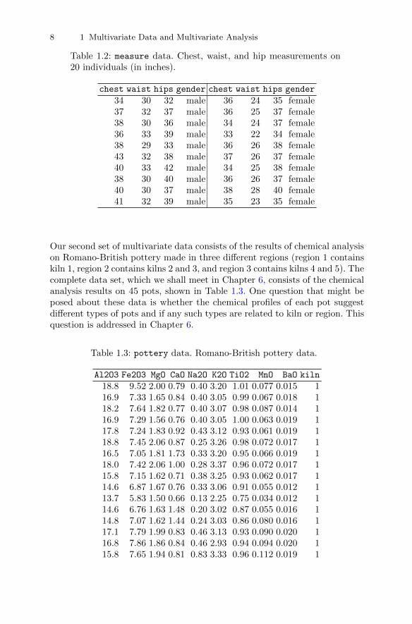
8 1 Multivariate Data and Multivariate Analysis
Table 1.2: measure data. Chest, waist, and hip measurements on20 individuals (in inches).
chest waist hips gender chest waist hips gender
34 30 32 male 36 24 35 female37 32 37 male 36 25 37 female38 30 36 male 34 24 37 female36 33 39 male 33 22 34 female38 29 33 male 36 26 38 female43 32 38 male 37 26 37 female40 33 42 male 34 25 38 female38 30 40 male 36 26 37 female40 30 37 male 38 28 40 female41 32 39 male 35 23 35 female
Our second set of multivariate data consists of the results of chemical analysison Romano-British pottery made in three different regions (region 1 containskiln 1, region 2 contains kilns 2 and 3, and region 3 contains kilns 4 and 5). Thecomplete data set, which we shall meet in Chapter 6, consists of the chemicalanalysis results on 45 pots, shown in Table 1.3. One question that might beposed about these data is whether the chemical profiles of each pot suggestdifferent types of pots and if any such types are related to kiln or region. Thisquestion is addressed in Chapter 6.
Table 1.3: pottery data. Romano-British pottery data.
Al2O3 Fe2O3 MgO CaO Na2O K2O TiO2 MnO BaO kiln
18.8 9.52 2.00 0.79 0.40 3.20 1.01 0.077 0.015 116.9 7.33 1.65 0.84 0.40 3.05 0.99 0.067 0.018 118.2 7.64 1.82 0.77 0.40 3.07 0.98 0.087 0.014 116.9 7.29 1.56 0.76 0.40 3.05 1.00 0.063 0.019 117.8 7.24 1.83 0.92 0.43 3.12 0.93 0.061 0.019 118.8 7.45 2.06 0.87 0.25 3.26 0.98 0.072 0.017 116.5 7.05 1.81 1.73 0.33 3.20 0.95 0.066 0.019 118.0 7.42 2.06 1.00 0.28 3.37 0.96 0.072 0.017 115.8 7.15 1.62 0.71 0.38 3.25 0.93 0.062 0.017 114.6 6.87 1.67 0.76 0.33 3.06 0.91 0.055 0.012 113.7 5.83 1.50 0.66 0.13 2.25 0.75 0.034 0.012 114.6 6.76 1.63 1.48 0.20 3.02 0.87 0.055 0.016 114.8 7.07 1.62 1.44 0.24 3.03 0.86 0.080 0.016 117.1 7.79 1.99 0.83 0.46 3.13 0.93 0.090 0.020 116.8 7.86 1.86 0.84 0.46 2.93 0.94 0.094 0.020 115.8 7.65 1.94 0.81 0.83 3.33 0.96 0.112 0.019 1
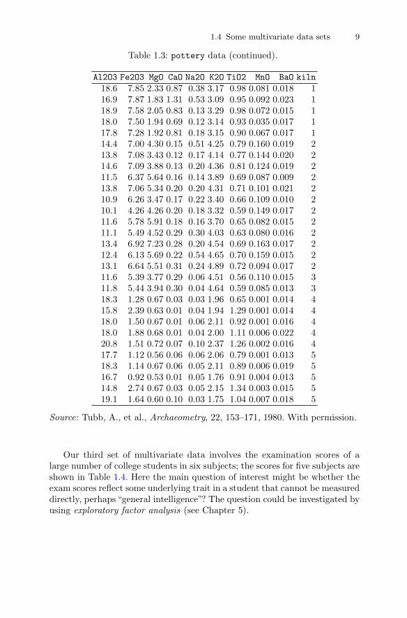
1.4 Some multivariate data sets 9
Table 1.3: pottery data (continued).
Al2O3 Fe2O3 MgO CaO Na2O K2O TiO2 MnO BaO kiln
18.6 7.85 2.33 0.87 0.38 3.17 0.98 0.081 0.018 116.9 7.87 1.83 1.31 0.53 3.09 0.95 0.092 0.023 118.9 7.58 2.05 0.83 0.13 3.29 0.98 0.072 0.015 118.0 7.50 1.94 0.69 0.12 3.14 0.93 0.035 0.017 117.8 7.28 1.92 0.81 0.18 3.15 0.90 0.067 0.017 114.4 7.00 4.30 0.15 0.51 4.25 0.79 0.160 0.019 213.8 7.08 3.43 0.12 0.17 4.14 0.77 0.144 0.020 214.6 7.09 3.88 0.13 0.20 4.36 0.81 0.124 0.019 211.5 6.37 5.64 0.16 0.14 3.89 0.69 0.087 0.009 213.8 7.06 5.34 0.20 0.20 4.31 0.71 0.101 0.021 210.9 6.26 3.47 0.17 0.22 3.40 0.66 0.109 0.010 210.1 4.26 4.26 0.20 0.18 3.32 0.59 0.149 0.017 211.6 5.78 5.91 0.18 0.16 3.70 0.65 0.082 0.015 211.1 5.49 4.52 0.29 0.30 4.03 0.63 0.080 0.016 213.4 6.92 7.23 0.28 0.20 4.54 0.69 0.163 0.017 212.4 6.13 5.69 0.22 0.54 4.65 0.70 0.159 0.015 213.1 6.64 5.51 0.31 0.24 4.89 0.72 0.094 0.017 211.6 5.39 3.77 0.29 0.06 4.51 0.56 0.110 0.015 311.8 5.44 3.94 0.30 0.04 4.64 0.59 0.085 0.013 318.3 1.28 0.67 0.03 0.03 1.96 0.65 0.001 0.014 415.8 2.39 0.63 0.01 0.04 1.94 1.29 0.001 0.014 418.0 1.50 0.67 0.01 0.06 2.11 0.92 0.001 0.016 418.0 1.88 0.68 0.01 0.04 2.00 1.11 0.006 0.022 420.8 1.51 0.72 0.07 0.10 2.37 1.26 0.002 0.016 417.7 1.12 0.56 0.06 0.06 2.06 0.79 0.001 0.013 518.3 1.14 0.67 0.06 0.05 2.11 0.89 0.006 0.019 516.7 0.92 0.53 0.01 0.05 1.76 0.91 0.004 0.013 514.8 2.74 0.67 0.03 0.05 2.15 1.34 0.003 0.015 519.1 1.64 0.60 0.10 0.03 1.75 1.04 0.007 0.018 5
Source: Tubb, A., et al., Archaeometry, 22, 153–171, 1980. With permission.
Our third set of multivariate data involves the examination scores of alarge number of college students in six subjects; the scores for five subjects areshown in Table 1.4. Here the main question of interest might be whether theexam scores reflect some underlying trait in a student that cannot be measureddirectly, perhaps “general intelligence”? The question could be investigated byusing exploratory factor analysis (see Chapter 5).

10 1 Multivariate Data and Multivariate Analysis
Table 1.4: exam data. Exam scores for five psychology students.
subject maths english history geography chemistry physics
1 60 70 75 58 53 422 80 65 66 75 70 763 53 60 50 48 45 434 85 79 71 77 68 795 45 80 80 84 44 46
The final set of data we shall consider in this section was collected in a studyof air pollution in cities in the USA. The following variables were obtained for41 US cities:
SO2: SO2 content of air in micrograms per cubic metre;temp: average annual temperature in degrees Fahrenheit;manu: number of manufacturing enterprises employing 20 or more workers;popul: population size (1970 census) in thousands;wind: average annual wind speed in miles per hour;precip: average annual precipitation in inches;predays: average number of days with precipitation per year.
The data are shown in Table 1.5.
Table 1.5: USairpollution data. Air pollution in 41 US cities.
SO2 temp manu popul wind precip predays
Albany 46 47.6 44 116 8.8 33.36 135Albuquerque 11 56.8 46 244 8.9 7.77 58Atlanta 24 61.5 368 497 9.1 48.34 115Baltimore 47 55.0 625 905 9.6 41.31 111Buffalo 11 47.1 391 463 12.4 36.11 166Charleston 31 55.2 35 71 6.5 40.75 148Chicago 110 50.6 3344 3369 10.4 34.44 122Cincinnati 23 54.0 462 453 7.1 39.04 132Cleveland 65 49.7 1007 751 10.9 34.99 155Columbus 26 51.5 266 540 8.6 37.01 134Dallas 9 66.2 641 844 10.9 35.94 78Denver 17 51.9 454 515 9.0 12.95 86Des Moines 17 49.0 104 201 11.2 30.85 103Detroit 35 49.9 1064 1513 10.1 30.96 129Hartford 56 49.1 412 158 9.0 43.37 127Houston 10 68.9 721 1233 10.8 48.19 103Indianapolis 28 52.3 361 746 9.7 38.74 121Jacksonville 14 68.4 136 529 8.8 54.47 116
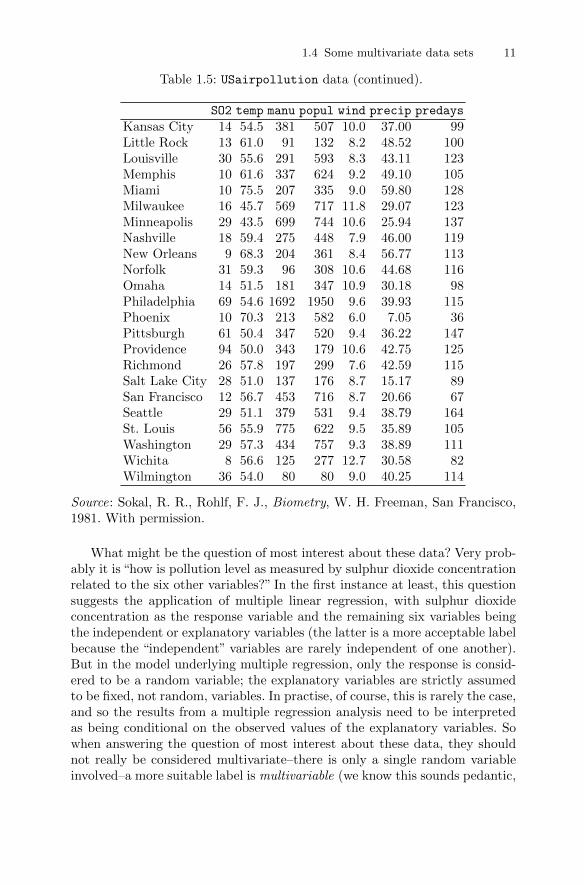
1.4 Some multivariate data sets 11
Table 1.5: USairpollution data (continued).
SO2 temp manu popul wind precip predays
Kansas City 14 54.5 381 507 10.0 37.00 99Little Rock 13 61.0 91 132 8.2 48.52 100Louisville 30 55.6 291 593 8.3 43.11 123Memphis 10 61.6 337 624 9.2 49.10 105Miami 10 75.5 207 335 9.0 59.80 128Milwaukee 16 45.7 569 717 11.8 29.07 123Minneapolis 29 43.5 699 744 10.6 25.94 137Nashville 18 59.4 275 448 7.9 46.00 119New Orleans 9 68.3 204 361 8.4 56.77 113Norfolk 31 59.3 96 308 10.6 44.68 116Omaha 14 51.5 181 347 10.9 30.18 98Philadelphia 69 54.6 1692 1950 9.6 39.93 115Phoenix 10 70.3 213 582 6.0 7.05 36Pittsburgh 61 50.4 347 520 9.4 36.22 147Providence 94 50.0 343 179 10.6 42.75 125Richmond 26 57.8 197 299 7.6 42.59 115Salt Lake City 28 51.0 137 176 8.7 15.17 89San Francisco 12 56.7 453 716 8.7 20.66 67Seattle 29 51.1 379 531 9.4 38.79 164St. Louis 56 55.9 775 622 9.5 35.89 105Washington 29 57.3 434 757 9.3 38.89 111Wichita 8 56.6 125 277 12.7 30.58 82Wilmington 36 54.0 80 80 9.0 40.25 114
Source: Sokal, R. R., Rohlf, F. J., Biometry, W. H. Freeman, San Francisco,1981. With permission.
What might be the question of most interest about these data? Very prob-ably it is “how is pollution level as measured by sulphur dioxide concentrationrelated to the six other variables?” In the first instance at least, this questionsuggests the application of multiple linear regression, with sulphur dioxideconcentration as the response variable and the remaining six variables beingthe independent or explanatory variables (the latter is a more acceptable labelbecause the “independent” variables are rarely independent of one another).But in the model underlying multiple regression, only the response is consid-ered to be a random variable; the explanatory variables are strictly assumedto be fixed, not random, variables. In practise, of course, this is rarely the case,and so the results from a multiple regression analysis need to be interpretedas being conditional on the observed values of the explanatory variables. Sowhen answering the question of most interest about these data, they shouldnot really be considered multivariate–there is only a single random variableinvolved–a more suitable label is multivariable (we know this sounds pedantic,

12 1 Multivariate Data and Multivariate Analysis
but we are statisticians after all). In this book, we shall say only a little aboutthe multiple linear model for multivariable data in Chapter 8. but essentiallyonly to enable such regression models to be introduced for situations wherethere is a multivariate response; for example, in the case of repeated-measuresdata and longitudinal data.
The four data sets above have not exhausted either the questions thatmultivariate data may have been collected to answer or the methods of mul-tivariate analysis that have been developed to answer them, as we shall see aswe progress through the book.
1.5 Covariances, correlations, and distances
The main reason why we should analyse a multivariate data set using multi-variate methods rather than looking at each variable separately using one oranother familiar univariate method is that any structure or pattern in the datais as likely to be implied either by “relationships” between the variables or bythe relative “closeness” of different units as by their different variable values;in some cases perhaps by both. In the first case, any structure or pattern un-covered will be such that it “links” together the columns of the data matrix,X, in some way, and in the second case a possible structure that might bediscovered is that involving interesting subsets of the units. The question nowarises as to how we quantify the relationships between the variables and howwe measure the distances between different units. This question is answeredin the subsections that follow.
1.5.1 Covariances
The covariance of two random variables is a measure of their linear depen-dence. The population (theoretical) covariance of two random variables, Xiand Xj , is defined by
Cov(Xi,Xj) = E(Xi − µi)(Xj − µj),
where µi = E(Xi) and µj = E(Xj); E denotes expectation.If i = j, we note that the covariance of the variable with itself is simply its
variance, and therefore there is no need to define variances and covariancesindependently in the multivariate case. If Xi and Xj are independent of eachother, their covariance is necessarily equal to zero, but the converse is nottrue. The covariance of Xi and Xj is usually denoted by σij . The variance ofvariable Xi is σ2
i = E((Xi − µi)2
). Larger values of the covariance imply a
greater degree of linear dependence between two variables.In a multivariate data set with q observed variables, there are q variances
and q(q − 1)/2 covariances. These quantities can be conveniently arranged ina q × q symmetric matrix, Σ, where
1.5 Covariances, correlations, and distances 13
Σ =
σ21 σ12 . . . σ1q
σ21 σ22 . . . σ2q
......
. . ....
σq1 σq2 . . . σ2q
.
Note that σij = σji. This matrix is generally known as the variance-covariancematrix or simply the covariance matrix of the data.
For a set of multivariate observations, perhaps sampled from some popu-lation, the matrix Σ is estimated by
S =1
n− 1
n∑i=1
(xi − x)(xi − x)>,
where x>i = (xi1, xi2, . . . , xiq) is the vector of (numeric) observations for theith individual and x = n−1
∑ni=1 xi is the mean vector of the observations.
The diagonal of S contains the sample variances of each variable, which weshall denote as s2i .
The covariance matrix for the data in Table 1.2 can be obtained using thevar() function in R; however, we have to “remove” the categorical variablegender from the measure data frame by subsetting on the numerical variablesfirst:
R> cov(measure[, c("chest", "waist", "hips")])
chest waist hips
chest 6.632 6.368 3.000
waist 6.368 12.526 3.579
hips 3.000 3.579 5.945
If we require the separate covariance matrices of men and women, we can use
R> cov(subset(measure, gender == "female")[,
+ c("chest", "waist", "hips")])
chest waist hips
chest 2.278 2.167 1.556
waist 2.167 2.989 2.756
hips 1.556 2.756 3.067
R> cov(subset(measure, gender == "male")[,
+ c("chest", "waist", "hips")])
chest waist hips
chest 6.7222 0.9444 3.944
waist 0.9444 2.1000 3.078
hips 3.9444 3.0778 9.344
where the subset() returns all observations corresponding to females (firststatement) or males (second statement).

14 1 Multivariate Data and Multivariate Analysis
1.5.2 Correlations
The covariance is often difficult to interpret because it depends on the scaleson which the two variables are measured; consequently, it is often standardisedby dividing by the product of the standard deviations of the two variables togive a quantity called the correlation coefficient , ρij , where
ρij =σijσiσj
,
where σi =√σ2i .
The advantage of the correlation is that it is independent of the scales ofthe two variables. The correlation coefficient lies between −1 and +1 and givesa measure of the linear relationship of the variables Xi and Xj . It is positiveif high values of Xi are associated with high values of Xj and negative if highvalues of Xi are associated with low values of Xj . If the relationship betweentwo variables is non-linear, their correlation coefficient can be misleading.
With q variables there are q(q − 1)/2 distinct correlations, which may bearranged in a q×q correlation matrix the diagonal elements of which are unity.For observed data, the correlation matrix contains the usual estimates of theρs, namely Pearson’s correlation coefficient, and is generally denoted by R.The matrix may be written in terms of the sample covariance matrix S
R = D−1/2SD−1/2,
where D−1/2 = diag(1/s1, . . . , 1/sq) and si =√s2i is the sample standard
deviation of variable i. (In most situations considered in this book, we willbe dealing with covariance and correlation matrices of full rank, q, so thatboth matrices will be non-singular, that is, invertible, to give matrices S−1 orR−1.)
The sample correlation matrix for the three variables in Table 1.1 is ob-tained by using the function cor() in R:
R> cor(measure[, c("chest", "waist", "hips")])
chest waist hips
chest 1.0000 0.6987 0.4778
waist 0.6987 1.0000 0.4147
hips 0.4778 0.4147 1.0000
1.5.3 Distances
For some multivariate techniques such as multidimensional scaling (see Chap-ter 4) and cluster analysis (see Chapter 6), the concept of distance betweenthe units in the data is often of considerable interest and importance. So,given the variable values for two units, say unit i and unit j, what servesas a measure of distance between them? The most common measure used isEuclidean distance, which is defined as
1.6 The multivariate normal density function 15
dij =
√√√√ q∑k=1
(xik − xjk)2,
where xik and xjk, k = 1, . . . , q are the variable values for units i and j,respectively. Euclidean distance can be calculated using the dist() functionin R.
When the variables in a multivariate data set are on different scales, itmakes more sense to calculate the distances after some form of standardisa-tion. Here we shall illustrate this on the body measurement data and divideeach variable by its standard deviation using the function scale() beforeapplying the dist() function–the necessary R code and output are
R> dist(scale(measure[, c("chest", "waist", "hips")],
+ center = FALSE))
1 2 3 4 5 6 7 8 9 10 11
2 0.17
3 0.15 0.08
4 0.22 0.07 0.14
5 0.11 0.15 0.09 0.22
6 0.29 0.16 0.16 0.19 0.21
7 0.32 0.16 0.20 0.13 0.28 0.14
8 0.23 0.11 0.11 0.12 0.19 0.16 0.13
9 0.21 0.10 0.06 0.16 0.12 0.11 0.17 0.09
10 0.27 0.12 0.13 0.14 0.20 0.06 0.09 0.11 0.09
11 0.23 0.28 0.22 0.33 0.19 0.34 0.38 0.25 0.24 0.32
12 0.22 0.24 0.18 0.28 0.18 0.30 0.32 0.20 0.20 0.28 0.06
...
(Note that only the distances for the first 12 observations are shown in theoutput.)
1.6 The multivariate normal density function
Just as the normal distribution dominates univariate techniques, the multi-variate normal distribution plays an important role in some multivariate pro-cedures, although as mentioned earlier many multivariate analyses are carriedout in the spirit of data exploration where questions of statistical significanceare of relatively minor importance or of no importance at all. Nevertheless, re-searchers dealing with the complexities of multivariate data may, on occasion,need to know a little about the multivariate density function and in particularhow to assess whether or not a set of multivariate data can be assumed tohave this density function. So we will define the multivariate normal densityand describe some of its properties.
16 1 Multivariate Data and Multivariate Analysis
For a vector of q variables, x> = (x1, x2, . . . , xq), the multivariate normaldensity function takes the form
f(x;µ,Σ) = (2π)−q/2det(Σ)−1/2 exp
{−1
2(x− µ)>Σ−1(x− µ)
},
where Σ is the population covariance matrix of the variables and µ is thevector of population mean values of the variables. The simplest example ofthe multivariate normal density function is the bivariate normal density withq = 2; this can be written explicitly as
f((x1, x2); (µ1, µ2), σ1, σ2, ρ) =(2πσ1σ2(1− ρ2)
)−1/2exp
{− 1
2(1− ρ2)×((
x1 − µ1
σ1
)2
− 2ρx1 − µ1
σ1
x2 − µ2
σ2+
(x2 − µ2
σ2
)2)}
,
where µ1 and µ2 are the population means of the two variables, σ21 and σ2
2
are the population variances, and ρ is the population correlation between thetwo variables X1 and X2. Figure 1.1 shows an example of a bivariate normaldensity function with both means equal to zero, both variances equal to one,and correlation equal to 0.5.
The population mean vector and the population covariance matrix of amultivariate density function are estimated from a sample of multivariateobservations as described in the previous subsections.
One property of a multivariate normal density function that is worthmentioning here is that linear combinations of the variables (i.e., y =a1X1 + a2X2 + · · · + aqXq, where a1, a2, . . . , aq is a set of scalars) arethemselves normally distributed with mean a>µ and variance a>Σa, wherea> = (a1, a2, . . . , aq). Linear combinations of variables will be of importancein later chapters, particularly in Chapter 3.
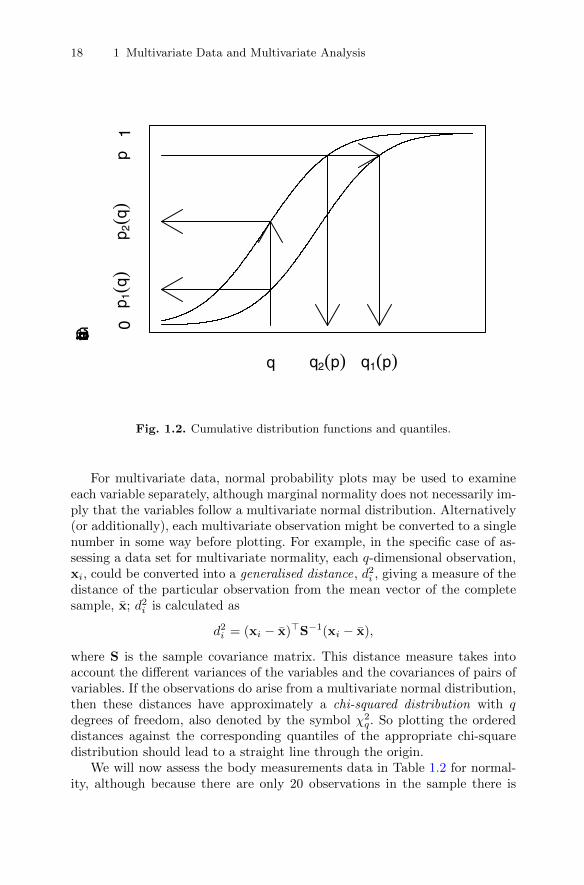
For many multivariate methods to be described in later chapters, the as-sumption of multivariate normality is not critical to the results of the analysis,but there may be occasions when testing for multivariate normality may be ofinterest. A start can be made perhaps by assessing each variable separately forunivariate normality using a probability plot . Such plots are commonly appliedin univariate analysis and involve ordering the observations and then plottingthem against the appropriate values of an assumed cumulative distributionfunction. There are two basic types of plots for comparing two probabilitydistributions, the probability-probability plot and the quantile-quantile plot .The diagram in Figure 1.2 may be used for describing each type.
A plot of points whose coordinates are the cumulative probabilities p1(q)and p2(q) for different values of q with
p1(q) = P(X1 ≤ q),p2(q) = P(X2 ≤ q),

1.6 The multivariate normal density function 17
x1
x2
f(x)
Fig. 1.1. Bivariate normal density function with correlation ρ = 0.5.
for random variables X1 and X2 is a probability-probability plot, while a plotof the points whose coordinates are the quantiles (q1(p), q2(p)) for differentvalues of p with
q1(p) = p−11 (p),
q2(p) = p−12 (p),
is a quantile-quantile plot. For example, a quantile-quantile plot for investi-gating the assumption that a set of data is from a normal distribution would in-
against the quantiles of a standard normal distribution, Φ−1(p(i)), where usu-ally
pi =i− 1
2
nΦ(x) =
∫ x
−∞
1√2πe−
12u
2
du.
This is known as a normal probability plot .
volve plotting the ordered sample values of variable 1 (i.e.,x(1)1, x(2)1, . . . , x(n)1)
18 1 Multivariate Data and Multivariate Analysis
Cum
ulat
ive
dist
ribut
ion
func
tion
q q2(p) q1(p)
0p 1
(q)
p 2(q
)p
1
Fig. 1.2. Cumulative distribution functions and quantiles.
For multivariate data, normal probability plots may be used to examineeach variable separately, although marginal normality does not necessarily im-ply that the variables follow a multivariate normal distribution. Alternatively(or additionally), each multivariate observation might be converted to a singlenumber in some way before plotting. For example, in the specific case of as-sessing a data set for multivariate normality, each q-dimensional observation,xi, could be converted into a generalised distance, d2i , giving a measure of thedistance of the particular observation from the mean vector of the completesample, x; d2i is calculated as
d2i = (xi − x)>S−1(xi − x),
where S is the sample covariance matrix. This distance measure takes intoaccount the different variances of the variables and the covariances of pairs ofvariables. If the observations do arise from a multivariate normal distribution,then these distances have approximately a chi-squared distribution with qdegrees of freedom, also denoted by the symbol χ2
q. So plotting the ordereddistances against the corresponding quantiles of the appropriate chi-squaredistribution should lead to a straight line through the origin.
We will now assess the body measurements data in Table 1.2 for normal-ity, although because there are only 20 observations in the sample there is
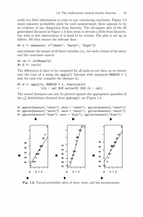
1.6 The multivariate normal density function 19
really too little information to come to any convincing conclusion. Figure 1.3shows separate probability plots for each measurement; there appears to beno evidence of any departures from linearity. The chi-square plot of the 20generalised distances in Figure 1.4 does seem to deviate a little from linearity,but with so few observations it is hard to be certain. The plot is set up asfollows. We first extract the relevant data
R> x <- measure[, c("chest", "waist", "hips")]
and estimate the means of all three variables (i.e., for each column of the data)and the covariance matrix
R> cm <- colMeans(x)
R> S <- cov(x)
The differences di have to be computed for all units in our data, so we iterateover the rows of x using the apply() function with argument MARGIN = 1
and, for each row, compute the distance di:
R> d <- apply(x, MARGIN = 1, function(x)
+ t(x - cm) %*% solve(S) %*% (x - cm))
The sorted distances can now be plotted against the appropriate quantiles ofthe χ2
3 distribution obtained from qchisq(); see Figure 1.4.
R> qqnorm(measure[,"chest"], main = "chest"); qqline(measure[,"chest"])
R> qqnorm(measure[,"waist"], main = "waist"); qqline(measure[,"waist"])
R> qqnorm(measure[,"hips"], main = "hips"); qqline(measure[,"hips"])
●
●
●
●
●
●
●
●
●
●
●●
●
●
●
●
●
●
●
●
−2 0 1 2
3436
3840
42
chest
Theoretical Quantiles
Sam
ple
Qua
ntile
s ●
●
●
●
●
●
●
●●
●
●
●
●
●
●●
●
●
●
●
−2 0 1 2
2224
2628
3032
waist
Theoretical Quantiles
Sam
ple
Qua
ntile
s
●
●
●
●
●
●
●
●
●
●
●
●●
●
●
●
●
●
●
●
−2 0 1 2
3234
3638
4042
hips
Theoretical Quantiles
Sam
ple
Qua
ntile
s
Fig. 1.3. Normal probability plots of chest, waist, and hip measurements.

20 1 Multivariate Data and Multivariate Analysis
R> plot(qchisq((1:nrow(x) - 1/2) / nrow(x), df = 3), sort(d),
+ xlab = expression(paste(chi[3]^2, " Quantile")),
+ ylab = "Ordered distances")
R> abline(a = 0, b = 1)
●●
●●●
●●●●●
●● ● ●
●
● ●
● ●
●
0 2 4 6 8
24
68
χ32 Quantile
Ord
ered
dis
tanc
es
Fig. 1.4. Chi-square plot of generalised distances for body measurements data.
We will now look at using the chi-square plot on a set of data introducedearly in the chapter, namely the air pollution in US cities (see Table 1.5). Theprobability plots for each separate variable are shown in Figure 1.5. Here, wealso iterate over all variables, this time using a special function, sapply(),that loops over the variable names:
R> layout(matrix(1:8, nc = 2))
R> sapply(colnames(USairpollution), function(x) {
+ qqnorm(USairpollution[[x]], main = x)
+ qqline(USairpollution[[x]])
+ })
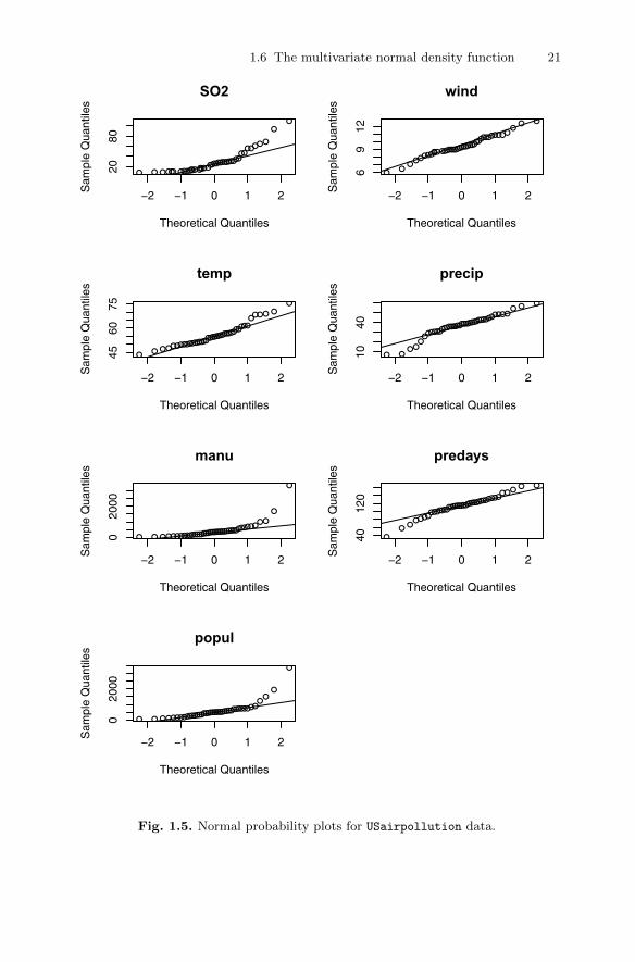
1.6 The multivariate normal density function 21
●
●●
●
●
●
●
●
●
●
●●●
●
●
●
●●●●
●
●● ●●
●●
●
●
●
●
●
●
●●●
●
●
●
●
●
−2 −1 0 1 2
2080
SO2
Theoretical Quantiles
Sam
ple
Qua
ntile
s
●
●●
●
●
●●
●● ●
●
●● ●●
●
●
●
●
●
●
●
●
●●
●
●
●
●●
●
●●
●
●
●
●● ●●
●
−2 −1 0 1 2
4560
75
temp
Theoretical Quantiles
Sam
ple
Qua
ntile
s
● ●●
●●
●
●
●●
●●●
●
●
●●
●●
●● ●●●
● ●●●● ●
●
● ●●●●●●
●●
●●
−2 −1 0 1 2
020
00
manu
Theoretical Quantiles
Sam
ple
Qua
ntile
s
● ●●
●●
●
●
●●●
●●
●
●
●
●●●●
●●●
●●●
●●●●
●
●●● ●●
●● ● ●●●
−2 −1 0 1 2
020
00
popul
Theoretical Quantiles
Sam
ple
Qua
ntile
s
●● ●●
●
●
●
●
●
●
●
●
●●
●
●●
●
●
●●●●
●
●
●●
● ●
●
●
●
●
●●●
●●●
●
●
−2 −1 0 1 2
69
12
wind
Theoretical Quantiles
Sam
ple
Qua
ntile
s●
●
●●
●●
●●
● ●●
●
●●
●●
●
●
●
●●
●
●
●●
●
●
●
●
●
●
●●●
●●
●● ●●
●
−2 −1 0 1 2
1040
precip
Theoretical Quantiles
Sam
ple
Qua
ntile
s
●
●
●●
●●
●●
●●
● ●●
●●
●●●
●●
●●
●●●
●● ●●
●
●
●
●●
●
●
●
●●
●
●
−2 −1 0 1 2
4012
0
predays
Theoretical Quantiles
Sam
ple
Qua
ntile
s
Fig. 1.5. Normal probability plots for USairpollution data.
22 1 Multivariate Data and Multivariate Analysis
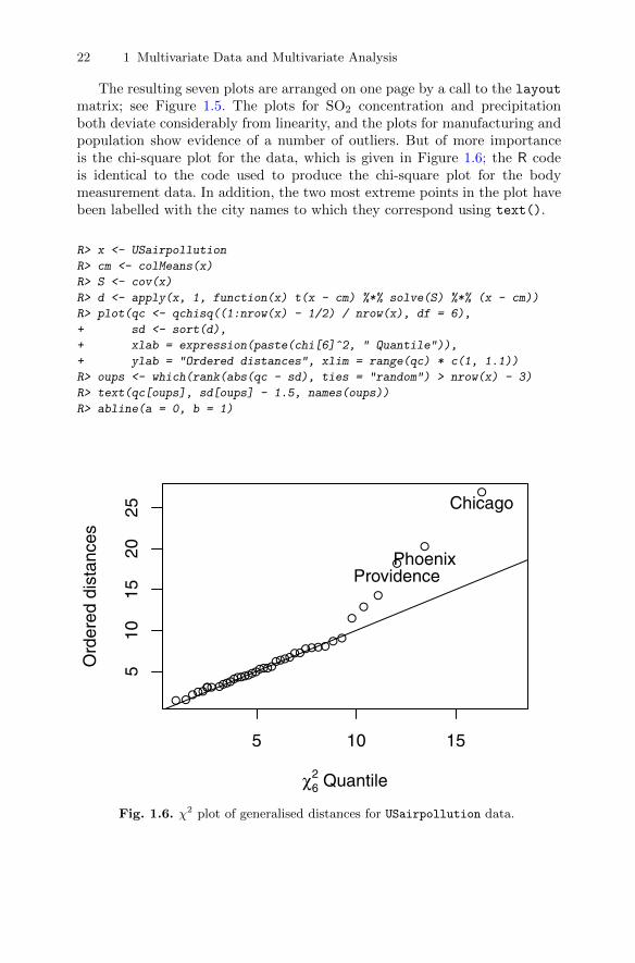
The resulting seven plots are arranged on one page by a call to the layoutmatrix; see Figure 1.5. The plots for SO2 concentration and precipitationboth deviate considerably from linearity, and the plots for manufacturing andpopulation show evidence of a number of outliers. But of more importanceis the chi-square plot for the data, which is given in Figure 1.6; the R codeis identical to the code used to produce the chi-square plot for the bodymeasurement data. In addition, the two most extreme points in the plot havebeen labelled with the city names to which they correspond using text().
R> x <- USairpollution
R> cm <- colMeans(x)
R> S <- cov(x)
R> d <- apply(x, 1, function(x) t(x - cm) %*% solve(S) %*% (x - cm))
R> plot(qc <- qchisq((1:nrow(x) - 1/2) / nrow(x), df = 6),
+ sd <- sort(d),
+ xlab = expression(paste(chi[6]^2, " Quantile")),
+ ylab = "Ordered distances", xlim = range(qc) * c(1, 1.1))
R> oups <- which(rank(abs(qc - sd), ties = "random") > nrow(x) - 3)
R> text(qc[oups], sd[oups] - 1.5, names(oups))
R> abline(a = 0, b = 1)
●●●●●●●●●●●●
●●●●●●●●●●
●●●●●●●●●●●●●
●●
●
●
●
●
5 10 15
510
1520
25
χ62 Quantile
Ord
ered
dis
tanc
es
ProvidencePhoenix
Chicago
Fig. 1.6. χ2 plot of generalised distances for USairpollution data.

1.8 Exercises 23
This example illustrates that the chi-square plot might also be useful fordetecting possible outliers in multivariate data, where informally outliers are“abnormal” in the sense of deviating from the natural data variability. Outlieridentification is important in many applications of multivariate analysis eitherbecause there is some specific interest in finding anomalous observations oras a pre-processing task before the application of some multivariate methodin order to preserve the results from possible misleading effects produced bythese observations. A number of methods for identifying multivariate outliershave been suggested–see, for example, Rocke and Woodruff (1996) and Beckerand Gather (2001)–and in Chapter 2 we will see how a number of the graphicalmethods described there can also be helpful for outlier detection.
1.7 Summary
The majority of data collected in all scientific disciplines are multivariate.To fully understand most such data sets, the variables need to be analysedsimultaneously. The rest of this text is concerned with methods that havebeen developed to make this possible, some with the aim of discovering anypatterns or structure in the data that may have important implications forfuture studies and some with the aim of drawing inferences about the dataassuming they are sampled from a population with some particular probabilitydensity function, usually the multivariate normal.
1.8 Exercises
Ex. 1.1 Find the correlation matrix and covariance matrix of the data inTable 1.1.
Ex. 1.2 Fill in the missing values in Table 1.1 with appropriate mean values,and recalculate the correlation matrix of the data.
Ex. 1.3 Examine both the normal probability plots of each variable in thearchaeology data in Table 1.3 and the chi-square plot of the data. Do theplots suggest anything unusual about the data?
Ex. 1.4 Convert the covariance matrix given below into the correspondingcorrelation matrix.
3.8778 2.8110 3.1480 3.50622.8110 2.1210 2.2669 2.56903.1480 2.2669 2.6550 2.83413.5062 2.5690 2.8341 3.2352
.
Ex. 1.5 For the small set of (10 × 5) multivariate data given below, findthe (10 × 10) Euclidean distance matrix for the rows of the matrix. Analternative to Euclidean distance that might be used in some cases is what

24 1 Multivariate Data and Multivariate Analysis
is known as city block distance (think New York). Write some R code tocalculate the city block distance matrix for the data.
3 6 4 0 74 2 7 4 64 0 3 1 56 2 6 1 11 6 2 1 45 1 2 0 21 1 2 6 11 1 5 4 47 0 1 3 33 3 0 5 1
.
2
Looking at Multivariate Data: Visualisation
2.1 Introduction
According to Chambers, Cleveland, Kleiner, and Tukey (1983), “there is nostatistical tool that is as powerful as a well-chosen graph”. Certainly graphicalpresentation has a number of advantages over tabular displays of numericalresults, not least in creating interest and attracting the attention of the viewer.But just what is a graphical display? A concise description is given by Tufte(1983):
Data graphics visually display measured quantities by means of thecombined use of points, lines, a coordinate system, numbers, symbols,words, shading and color.
Graphs are very popular; it has been estimated that between 900 billion(9×10¹¹) and 2 trillion (2×10¹²) images of statistical graphics are printed eachyear. Perhaps one of the main reasons for such popularity is that graphicalpresentation of data often provides the vehicle for discovering the unexpected;the human visual system is very powerful in detecting patterns, although thefollowing caveat from the late Carl Sagan (in his book Contact) should bekept in mind:
Humans are good at discerning subtle patterns that are really there,but equally so at imagining them when they are altogether absent.
Some of the advantages of graphical methods have been listed by Schmid(1954):
� In comparison with other types of presentation, well-designed charts aremore effective in creating interest and in appealing to the attention of thereader.
� Visual relationships as portrayed by charts and graphs are more easilygrasped and more easily remembered.
� The use of charts and graphs saves time since the essential meaning oflarge measures of statistical data can be visualised at a glance.
DOI 10.1007/978-1-4419-9650-3_2, © Springer Science+Business Media, LLC 2011 25 B. Everitt and T. Hothorn, An Introduction to Applied Multivariate Analysis with R: Use R!,
26 2 Looking at Multivariate Data: Visualisation
� Charts and graphs provide a comprehensive picture of a problem thatmakes for a more complete and better balanced understanding than couldbe derived from tabular or textual forms of presentation.
� Charts and graphs can bring out hidden facts and relationships and canstimulate, as well as aid, analytical thinking and investigation.
Schmid’s last point is reiterated by the legendary John Tukey in his ob-servation that “the greatest value of a picture is when it forces us to noticewhat we never expected to see”.
The prime objective of a graphical display is to communicate to ourselvesand others, and the graphic design must do everything it can to help peopleunderstand. And unless graphics are relatively simple, they are unlikely tosurvive the first glance. There are perhaps four goals for graphical displays ofdata:
� To provide an overview;� To tell a story;� To suggest hypotheses;� To criticise a model.
In this chapter, we will be largely concerned with graphics for multivari-ate data that address one or another of the first three bulleted points above.Graphics that help in checking model assumptions will be considered in Chap-ter 8.
During the last two decades, a wide variety of new methods for display-ing data graphically have been developed. These will hunt for special ef-fects in data, indicate outliers, identify patterns, diagnose models, and gener-ally search for novel and perhaps unexpected phenomena. Graphical displaysshould aim to tell a story about the data and to reduce the cognitive effortrequired to make comparisons. Large numbers of graphs might be required toachieve these goals, and computers are generally needed to supply them forthe same reasons that they are used for numerical analyses, namely that theyare fast and accurate.
So, because the machine is doing the work, the question is no longer “shallwe plot?” but rather “what shall we plot?” There are many exciting possibil-ities, including interactive and dynamic graphics on a computer screen (seeCook and Swayne 2007), but graphical exploration of data usually begins atleast with some simpler static graphics. The starting graphic for multivariatedata is often the ubiquitous scatterplot , and this is the subject of the nextsection.
2.2 The scatterplot
The simple xy scatterplot has been in use since at least the 18th century andhas many virtues–indeed, according to Tufte (1983):

2.2 The scatterplot 27
The relational graphic–in its barest form the scatterplot and itsvariants–is the greatest of all graphical designs. It links at least twovariables, encouraging and even imploring the viewer to assess thepossible causal relationship between the plotted variables. It confrontscausal theories that x causes y with empirical evidence as to the actualrelationship between x and y.
The scatterplot is the standard for representing continuous bivariate databut, as we shall see later in this chapter, it can be enhanced in a variety ofways to accommodate information about other variables.
To illustrate the use of the scatterplot and a number of other techniquesto be discussed, we shall use the air pollution in US cities data introduced inthe previous chapter (see Table 1.5).
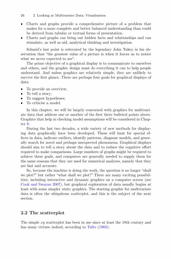
Let’s begin our examination of the air pollution data by taking a look at abasic scatterplot of the two variables manu and popul. For later use, we firstset up two character variables that contain the labels to be printed on the twoaxes:
R> mlab <- "Manufacturing enterprises with 20 or more workers"
R> plab <- "Population size (1970 census) in thousands"
The plot() function takes the data, here as the data frame USairpollution,along with a “formula” describing the variables to be plotted; the part left ofthe tilde defines the variable to be associated with the ordinate, the part rightof the tilde is the variable that goes with the abscissa:
R> plot(popul ~ manu, data = USairpollution,
+ xlab = mlab, ylab = plab)
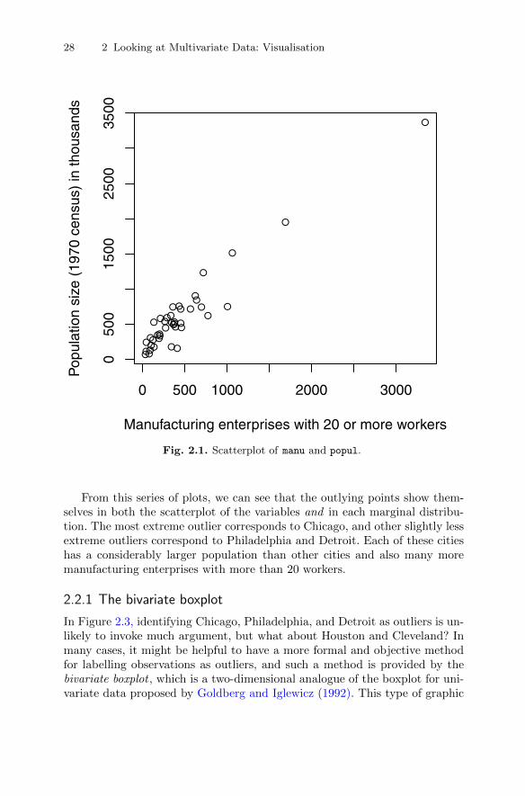
The resulting scatterplot is shown in Figure 2.2. The plot clearly uncoversthe presence of one or more cities that are some way from the remainder, butbefore commenting on these possible outliers we will construct the scatterplotagain but now show how to include the marginal distributions of manu andpopul in two different ways. Plotting marginal and joint distributions togetheris usually good data analysis practise. In Figure 2.2, the marginal distributionsare shown as rug plots on each axis (produced by rug()), and in Figure 2.3the marginal distribution of manu is given as a histogram and that of popul
as a boxplot. And also in Figure 2.3 the points are labelled by an abbreviatedform of the corresponding city name.
The necessary R code for Figure 2.3 starts with dividing the device intothree plotting areas by means of the layout() function. The first plot basicallyresembles the plot() command from Figure 2.1, but instead of points the ab-breviated name of the city is used as the plotting symbol. Finally, the hist()
and boxplots() commands are used to depict the marginal distributions. Thewith() command is very useful when one wants to avoid explicitly extractingvariables from data frames. The command of interest, here the calls to hist()
and boxplot(), is evaluated “inside” the data frame, here USairpollution
(i.e., variable names are resolved within this data frame first).
28 2 Looking at Multivariate Data: Visualisation
●●
●
●
●
●
●
●
●
●
●
●
●
●
●
●
●
● ●
●
●●
●
● ●
●●●●
●
●●
●●
●
●
●●
●
●
●
0 500 1000 2000 3000
050
015
0025
0035
00
Manufacturing enterprises with 20 or more workers
Pop
ulat
ion
size
(19
70 c
ensu
s) in
thou
sand
s
Fig. 2.1. Scatterplot of manu and popul.
From this series of plots, we can see that the outlying points show them-selves in both the scatterplot of the variables and in each marginal distribu-tion. The most extreme outlier corresponds to Chicago, and other slightly lessextreme outliers correspond to Philadelphia and Detroit. Each of these citieshas a considerably larger population than other cities and also many moremanufacturing enterprises with more than 20 workers.
2.2.1 The bivariate boxplot
In Figure 2.3, identifying Chicago, Philadelphia, and Detroit as outliers is un-likely to invoke much argument, but what about Houston and Cleveland? Inmany cases, it might be helpful to have a more formal and objective methodfor labelling observations as outliers, and such a method is provided by thebivariate boxplot , which is a two-dimensional analogue of the boxplot for uni-variate data proposed by Goldberg and Iglewicz (1992). This type of graphic
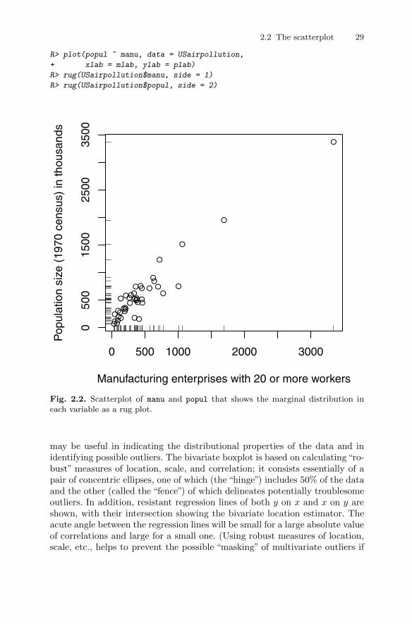
2.2 The scatterplot 29
R> plot(popul ~ manu, data = USairpollution,
+ xlab = mlab, ylab = plab)
R> rug(USairpollution$manu, side = 1)
R> rug(USairpollution$popul, side = 2)
●●
●
●
●
●
●
●
●
●
●
●
●
●
●
●
●
● ●
●
●●
●
● ●
●●●●
●
●●
●●
●
●
●●
●
●
●
0 500 1000 2000 3000
050
015
0025
0035
00
Manufacturing enterprises with 20 or more workers
Pop
ulat
ion
size
(19
70 c
ensu
s) in
thou
sand
s
Fig. 2.2. Scatterplot of manu and popul that shows the marginal distribution ineach variable as a rug plot.
may be useful in indicating the distributional properties of the data and inidentifying possible outliers. The bivariate boxplot is based on calculating “ro-bust” measures of location, scale, and correlation; it consists essentially of apair of concentric ellipses, one of which (the “hinge”) includes 50% of the dataand the other (called the “fence”) of which delineates potentially troublesomeoutliers. In addition, resistant regression lines of both y on x and x on y areshown, with their intersection showing the bivariate location estimator. Theacute angle between the regression lines will be small for a large absolute valueof correlations and large for a small one. (Using robust measures of location,scale, etc., helps to prevent the possible “masking” of multivariate outliers if
30 2 Looking at Multivariate Data: Visualisation
R> layout(matrix(c(2, 0, 1, 3), nrow = 2, byrow = TRUE),
+ widths = c(2, 1), heights = c(1, 2), respect = TRUE)
R> xlim <- with(USairpollution, range(manu)) * 1.1
R> plot(popul ~ manu, data = USairpollution, cex.lab = 0.9,
+ xlab = mlab, ylab = plab, type = "n", xlim = xlim)
R> with(USairpollution, text(manu, popul, cex = 0.6,
+ labels = abbreviate(row.names(USairpollution))))
R> with(USairpollution, hist(manu, main = "", xlim = xlim))
R> with(USairpollution, boxplot(popul))
0 1000 2000 3000
010
0020
0030
00
Manufacturing enterprises with 20 or more workers
Pop
ulat
ion
size
(19
70 c
ensu
s) in
thou
sand
s
AlbnAlbq
Atln
Bltm
Bffl
Chrl
Chcg
Cncn
ClvlClmb
Dlls
Dnvr
DsMn
Dtrt
Hrtf
Hstn
IndnJcksKnsC
LttR
LsvlMmph
Miam
MlwkMnnp
NshvNwOrNrflOmah
Phld
PhnxPtts
PrvdRchmSlLC
SnFrSttl St.LWshn
WchtWlmn
manu
Fre
quen
cy
0 1000 2000 3000
0
●
●
●
010
0020
0030
00
Fig. 2.3. Scatterplot of manu and popul that shows the marginal distributions byhistogram and boxplot.

2.2 The scatterplot 31
the usual measures are employed when these may be distorted by the pres-ence of the outliers in the data.) Full details of the construction are given inGoldberg and Iglewicz (1992). The scatterplot of manu and popul includingthe bivariate boxplot is shown in Figure 2.4. Figure 2.4 clearly tells us thatChicago, Philadelphia, Detroit, and Cleveland should be regarded as outliersbut not Houston, because it is on the “fence” rather than outside the “fence”.
R> outcity <- match(lab <- c("Chicago", "Detroit",
+ "Cleveland", "Philadelphia"), rownames(USairpollution))
R> x <- USairpollution[, c("manu", "popul")]
R> bvbox(x, mtitle = "", xlab = mlab, ylab = plab)
R> text(x$manu[outcity], x$popul[outcity], labels = lab,
+ cex = 0.7, pos = c(2, 2, 4, 2, 2))
●●
●
●
●
●
●
●
●
●
●
●
●
●
●
●
●
● ●
●
●●
●
● ●
●●●●
●
● ●
●●
●
●
●●
●
●
●
0 1000 2000 3000
010
0020
0030
00
Manufacturing enterprises with 20 or more workers
Pop
ulat
ion
size
(19
70 c
ensu
s) in
thou
sand
s
Chicago
Detroit
Cleveland
Philadelphia
Fig. 2.4. Scatterplot of manu and popul showing the bivariate boxplot of the data.
Suppose now that we are interested in calculating the correlation betweenmanu and popul. Researchers often calculate the correlation between two vari-
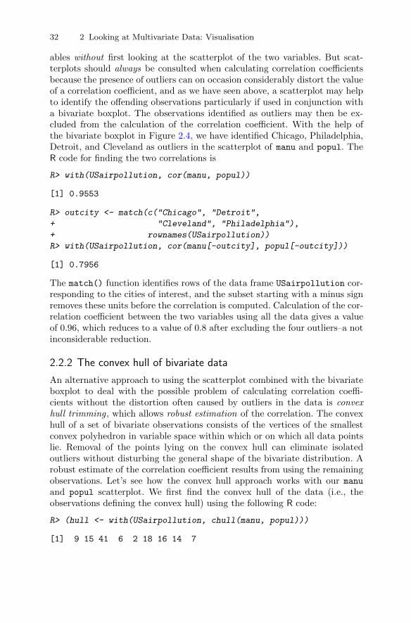
32 2 Looking at Multivariate Data: Visualisation
ables without first looking at the scatterplot of the two variables. But scat-terplots should always be consulted when calculating correlation coefficientsbecause the presence of outliers can on occasion considerably distort the valueof a correlation coefficient, and as we have seen above, a scatterplot may helpto identify the offending observations particularly if used in conjunction witha bivariate boxplot. The observations identified as outliers may then be ex-cluded from the calculation of the correlation coefficient. With the help ofthe bivariate boxplot in Figure 2.4, we have identified Chicago, Philadelphia,Detroit, and Cleveland as outliers in the scatterplot of manu and popul. TheR code for finding the two correlations is
R> with(USairpollution, cor(manu, popul))
[1] 0.9553
R> outcity <- match(c("Chicago", "Detroit",
+ "Cleveland", "Philadelphia"),
+ rownames(USairpollution))
R> with(USairpollution, cor(manu[-outcity], popul[-outcity]))
[1] 0.7956
The match() function identifies rows of the data frame USairpollution cor-responding to the cities of interest, and the subset starting with a minus signremoves these units before the correlation is computed. Calculation of the cor-relation coefficient between the two variables using all the data gives a valueof 0.96, which reduces to a value of 0.8 after excluding the four outliers–a notinconsiderable reduction.
2.2.2 The convex hull of bivariate data
An alternative approach to using the scatterplot combined with the bivariateboxplot to deal with the possible problem of calculating correlation coeffi-cients without the distortion often caused by outliers in the data is convexhull trimming, which allows robust estimation of the correlation. The convexhull of a set of bivariate observations consists of the vertices of the smallestconvex polyhedron in variable space within which or on which all data pointslie. Removal of the points lying on the convex hull can eliminate isolatedoutliers without disturbing the general shape of the bivariate distribution. Arobust estimate of the correlation coefficient results from using the remainingobservations. Let’s see how the convex hull approach works with our manu
and popul scatterplot. We first find the convex hull of the data (i.e., theobservations defining the convex hull) using the following R code:
R> (hull <- with(USairpollution, chull(manu, popul)))
[1] 9 15 41 6 2 18 16 14 7
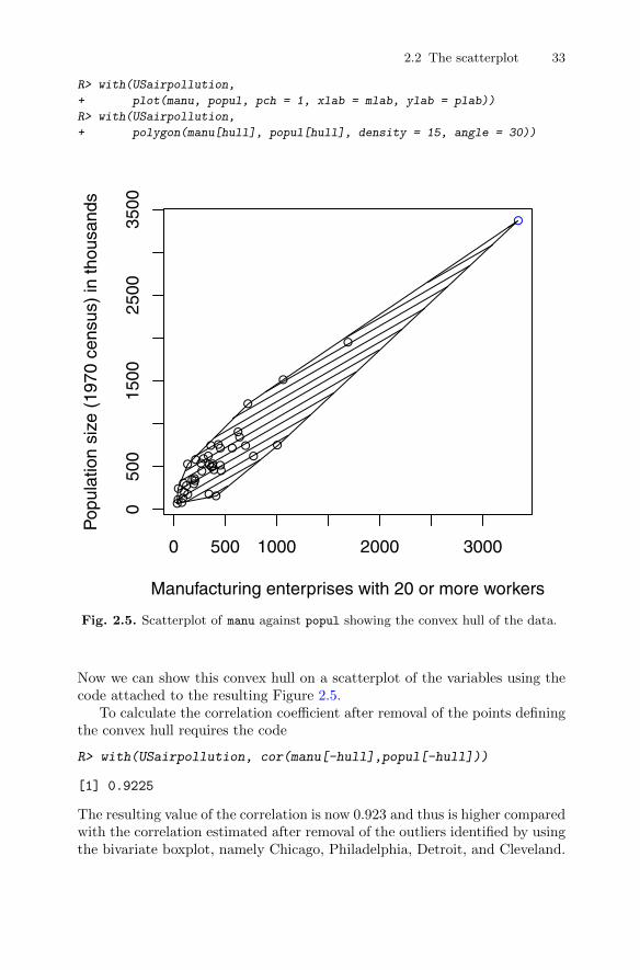
2.2 The scatterplot 33
R> with(USairpollution,
+ plot(manu, popul, pch = 1, xlab = mlab, ylab = plab))
R> with(USairpollution,
+ polygon(manu[hull], popul[hull], density = 15, angle = 30))
●●
●
●
●
●
●
●
●
●
●
●
●
●
●
●
●
● ●
●
●●
●
● ●
●●●●
●
●●
●●
●
●
●●
●
●
●
0 500 1000 2000 3000
050
015
0025
0035
00
Manufacturing enterprises with 20 or more workers
Pop
ulat
ion
size
(19
70 c
ensu
s) in
thou
sand
s
Fig. 2.5. Scatterplot of manu against popul showing the convex hull of the data.
Now we can show this convex hull on a scatterplot of the variables using thecode attached to the resulting Figure 2.5.
To calculate the correlation coefficient after removal of the points definingthe convex hull requires the code
R> with(USairpollution, cor(manu[-hull],popul[-hull]))
[1] 0.9225
The resulting value of the correlation is now 0.923 and thus is higher comparedwith the correlation estimated after removal of the outliers identified by usingthe bivariate boxplot, namely Chicago, Philadelphia, Detroit, and Cleveland.
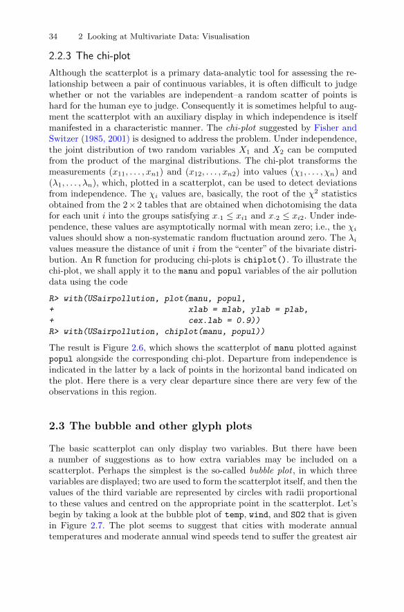
34 2 Looking at Multivariate Data: Visualisation
2.2.3 The chi-plot
Although the scatterplot is a primary data-analytic tool for assessing the re-lationship between a pair of continuous variables, it is often difficult to judgewhether or not the variables are independent–a random scatter of points ishard for the human eye to judge. Consequently it is sometimes helpful to aug-ment the scatterplot with an auxiliary display in which independence is itselfmanifested in a characteristic manner. The chi-plot suggested by Fisher andSwitzer (1985, 2001) is designed to address the problem. Under independence,the joint distribution of two random variables X1 and X2 can be computedfrom the product of the marginal distributions. The chi-plot transforms themeasurements (x11, . . . , xn1) and (x12, . . . , xn2) into values (χ1, . . . , χn) and(λ1, . . . , λn), which, plotted in a scatterplot, can be used to detect deviationsfrom independence. The χi values are, basically, the root of the χ2 statisticsobtained from the 2×2 tables that are obtained when dichotomising the datafor each unit i into the groups satisfying x·1 ≤ xi1 and x·2 ≤ xi2. Under inde-pendence, these values are asymptotically normal with mean zero; i.e., the χivalues should show a non-systematic random fluctuation around zero. The λivalues measure the distance of unit i from the “center” of the bivariate distri-bution. An R function for producing chi-plots is chiplot(). To illustrate thechi-plot, we shall apply it to the manu and popul variables of the air pollutiondata using the code
R> with(USairpollution, plot(manu, popul,
+ xlab = mlab, ylab = plab,
+ cex.lab = 0.9))
R> with(USairpollution, chiplot(manu, popul))
The result is Figure 2.6, which shows the scatterplot of manu plotted againstpopul alongside the corresponding chi-plot. Departure from independence isindicated in the latter by a lack of points in the horizontal band indicated onthe plot. Here there is a very clear departure since there are very few of theobservations in this region.
2.3 The bubble and other glyph plots
The basic scatterplot can only display two variables. But there have beena number of suggestions as to how extra variables may be included on ascatterplot. Perhaps the simplest is the so-called bubble plot , in which threevariables are displayed; two are used to form the scatterplot itself, and then thevalues of the third variable are represented by circles with radii proportionalto these values and centred on the appropriate point in the scatterplot. Let’sbegin by taking a look at the bubble plot of temp, wind, and SO2 that is givenin Figure 2.7. The plot seems to suggest that cities with moderate annualtemperatures and moderate annual wind speeds tend to suffer the greatest air
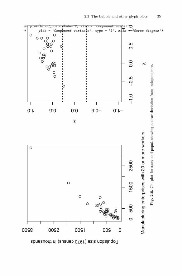
2.3 The bubble and other glyph plots 35
●●
●
●
●
●
●
●
●
●
●
●
●
●
●
●
●
●●
●
●●
●
●●
●●
●●
●
●● ●
● ●
●
●●
●
● ● 050
015
0025
00
0500150025003500
Man
ufac
turin
g en
terp
rises
with
20
or m
ore
wor
kers
Population size (1970 census) in thousands
●●
●
●●
●
●
●
●●
●
●
●
●●
●
●
●●
●●
●
●●
●
●
●
●
●
●
●
●
●●
●
●
−1.
0−
0.5
0.0
0.5
1.0
−1.0−0.50.00.51.0
λ
χFig.2.6.
Chi-
plo
tfo
rmanu
andpopul
show
ing
acl
ear
dev
iati
on
from
indep
enden
ce.
R> plot(blood_pcacor$sdev^2, xlab = "Component number",
+ ylab = "Component variance", type = "l", main = "Scree diagram")

36 2 Looking at Multivariate Data: Visualisation
pollution, but this is unlikely to be the whole story because none of the othervariables in the data set are used in constructing Figure 2.7. We could try toinclude all variables on the basic temp and wind scatterplot by replacing thecircles with five-sided “stars”, with the lengths of each side representing eachof the remaining five variables. Such a plot is shown in Figure 2.8, but it failsto communicate much, if any, useful information about the data.
R> ylim <- with(USairpollution, range(wind)) * c(0.95, 1)
R> plot(wind ~ temp, data = USairpollution,
+ xlab = "Average annual temperature (Fahrenheit)",
+ ylab = "Average annual wind speed (m.p.h.)", pch = 10,
+ ylim = ylim)
R> with(USairpollution, symbols(temp, wind, circles = SO2,
+ inches = 0.5, add = TRUE))
● ●●
●
●
●
●
●
●
●
●
●
●
●
●
●
●
●
●
●●
●●
●
●
●
●
●●
●
●
●
●
●
● ●
● ●●
●
●
45 50 55 60 65 70 75
67
89
1011
12
Average annual temperature (Fahrenheit)
Ave
rage
ann
ual w
ind
spee
d (m
.p.h
.)
● ●
●
●
●
●
●
●●
●●
●
●●●
●
●
●
●●
●
●
●
● ●
● ●
●
Fig. 2.7. Bubble plot of temp, wind, and SO2.

2.3 The bubble and other glyph plots 37
R> plot(wind ~ temp, data = USairpollution,
+ xlab = "Average annual temperature (Fahrenheit)",
+ ylab = "Average annual wind speed (m.p.h.)", pch = 10,
+ ylim = ylim)
R> with(USairpollution,
+ stars(USairpollution[,-c(2,5)], locations = cbind(temp, wind),
+ labels = NULL, add = TRUE, cex = 0.5))
● ●●
●
●
●
●
●
●
●
●
●
●
●
●
●
●
●
●
●●
●●
●
●
●
●
●●
●
●
●
●
●
● ●
● ●●
●
●
45 50 55 60 65 70 75
67
89
1011
12
Average annual temperature (Fahrenheit)
Ave
rage
ann
ual w
ind
spee
d (m
.p.h
.)
Fig. 2.8. Scatterplot of temp and wind showing five-sided stars representing theother variables.
In fact, both the bubble plot and “stars” plot are examples of symbol orglyph plots, in which data values control the symbol parameters. For example,a circle is a glyph where the values of one variable in a multivariate observationcontrol the circle size. In Figure 2.8, the spatial positions of the cities inthe scatterplot of temp and wind are combined with a star representationof the five other variables. An alternative is simply to represent the sevenvariables for each city by a seven-sided star and arrange the resulting stars in

38 2 Looking at Multivariate Data: Visualisation
a rectangular array; the result is shown in Figure 2.9. We see that some stars,for example those for New Orleans, Miami, Jacksonville, and Atlanta, havesimilar shapes, with their higher average annual temperature being distinctive,but telling a story about the data with this display is difficult.
Stars, of course, are not the only symbols that could be used to representdata, and others have been suggested, with perhaps the most well known beingthe now infamous Chernoff’s faces (see Chernoff 1973). But, on the whole,such graphics for displaying multivariate data have not proved themselves tobe effective for the task and are now largely confined to the past history ofmultivariate graphics.
R> stars(USairpollution, cex = 0.55)
AlbanyAlbuquerque
AtlantaBaltimore
BuffaloCharleston
ChicagoCincinnati
ClevelandColumbus
DallasDenver
Des MoinesDetroit
HartfordHouston
IndianapolisJacksonville
Kansas CityLittle Rock
LouisvilleMemphis
MiamiMilwaukee
MinneapolisNashville
New OrleansNorfolk
OmahaPhiladelphia
PhoenixPittsburgh
ProvidenceRichmond
Salt Lake CitySan Francisco
SeattleSt. Louis
WashingtonWichita
Wilmington
Fig. 2.9. Star plot of the air pollution data.

2.4 The scatterplot matrix 39
2.4 The scatterplot matrix
There are seven variables in the air pollution data, which between them gen-erate 21 possible scatterplots. But just making the graphs without any coor-dination will often result in a confusing collection of graphs that are hard tointegrate visually. Consequently, it is very important that the separate plotsbe presented in the best way to aid overall comprehension of the data. Thescatterplot matrix is intended to accomplish this objective. A scatterplot ma-trix is nothing more than a square, symmetric grid of bivariate scatterplots.The grid has q rows and columns, each one corresponding to a different vari-able. Each of the grid’s cells shows a scatterplot of two variables. Variable jis plotted against variable i in the ijth cell, and the same variables appear incell ji, with the x- and y-axes of the scatterplots interchanged. The reason forincluding both the upper and lower triangles of the grid, despite the seemingredundancy, is that it enables a row and a column to be visually scanned tosee one variable against all others, with the scales for the one variable lined upalong the horizontal or the vertical. As a result, we can visually link featureson one scatterplot with features on another, and this ability greatly increasesthe power of the graphic.
The scatterplot matrix for the air pollution data is shown in Figure 2.10.The plot was produced using the function pairs(), here with slightly enlargeddot symbols, using the arguments pch = "." and cex = 1.5.
The scatterplot matrix clearly shows the presence of possible outliers inmany panels and the suggestion that the relationship between the two aspectsof rainfall, namely precip, predays, and SO2 might be non-linear. Remem-bering that the multivariable aspect of these data, in which sulphur dioxideconcentration is the response variable, with the remaining variables being ex-planatory, might be of interest, the scatterplot matrix may be made morehelpful by including the linear fit of the two variables on each panel, and sucha plot is shown in Figure 2.11. Here, the pairs() function was customised bya small function specified to the panel argument: in addition to plotting thex and y values, a regression line obtained via function lm() is added to eachof the panels.
Now the scatterplot matrix reveals that there is a strong linear relationshipbetween SO2 and manu and between SO2 and popul, but the (3, 4) panel showsthat manu and popul are themselves very highly related and thus predictiveof SO2 in the same way. Figure 2.11 also underlines that assuming a linearrelationship between SO2 and precip and SO2 and predays, as might be thecase if a multiple linear regression model is fitted to the data with SO2 as thedependent variable, is unlikely to fully capture the relationship between eachpair of variables.
In the same way that the scatterplot should always be used alongside thenumerical calculation of a correlation coefficient, so should the scatterplotmatrix always be consulted when looking at the correlation matrix of a set ofvariables. The correlation matrix for the air pollution data is
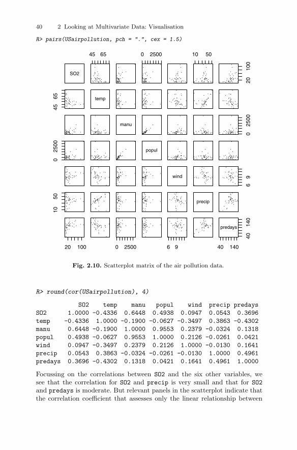
40 2 Looking at Multivariate Data: Visualisation
R> pairs(USairpollution, pch = ".", cex = 1.5)
SO2
45 65 0 2500 10 50
2010
0
4565 temp
manu
025
00
025
00
popul
wind
69
1050
precip
20 100 0 2500 6 9 40 14040
140
predays
Fig. 2.10. Scatterplot matrix of the air pollution data.
R> round(cor(USairpollution), 4)
SO2 temp manu popul wind precip predays
SO2 1.0000 -0.4336 0.6448 0.4938 0.0947 0.0543 0.3696
temp -0.4336 1.0000 -0.1900 -0.0627 -0.3497 0.3863 -0.4302
manu 0.6448 -0.1900 1.0000 0.9553 0.2379 -0.0324 0.1318
popul 0.4938 -0.0627 0.9553 1.0000 0.2126 -0.0261 0.0421
wind 0.0947 -0.3497 0.2379 0.2126 1.0000 -0.0130 0.1641
precip 0.0543 0.3863 -0.0324 -0.0261 -0.0130 1.0000 0.4961
predays 0.3696 -0.4302 0.1318 0.0421 0.1641 0.4961 1.0000
Focussing on the correlations between SO2 and the six other variables, wesee that the correlation for SO2 and precip is very small and that for SO2
and predays is moderate. But relevant panels in the scatterplot indicate thatthe correlation coefficient that assesses only the linear relationship between

2.4 The scatterplot matrix 41
R> pairs(USairpollution,
+ panel = function (x, y, ...) {
+ points(x, y, ...)
+ abline(lm(y ~ x), col = "grey")
+ }, pch = ".", cex = 1.5)
SO2
45 65 0 2500 10 50
2010
0
4565 temp
manu
025
00
025
00
popul
wind
69
1050
precip
20 100 0 2500 6 9 40 140
4014
0
predays
Fig. 2.11. Scatterplot matrix of the air pollution data showing the linear fit of eachpair of variables.
two variables may not be suitable here and that in a multiple linear regres-sion model for the data quadratic effects of predays and precip might beconsidered.

42 2 Looking at Multivariate Data: Visualisation
2.5 Enhancing the scatterplot with estimated bivariatedensities
As we have seen above, scatterplots and scatterplot matrices are good athighlighting outliers in a multivariate data set. But in many situations an-other aim in examining scatterplots is to identify regions in the plot wherethere are high or low densities of observations that may indicate the pres-ence of distinct groups of observations; i.e., “clusters” (see Chapter 6). Buthumans are not particularly good at visually examining point density, andit is often a very helpful aid to add some type of bivariate density estimateto the scatterplot. A bivariate density estimate is simply an approximationto the bivariate probability density function of two variables obtained from asample of bivariate observations of the variables. If, of course, we are willingto assume a particular form of the bivariate density of the two variables, forexample the bivariate normal, then estimating the density is reduced to esti-mating the parameters of the assumed distribution. More commonly, however,we wish to allow the data to speak for themselves and so we need to look fora non-parametric estimation procedure. The simplest such estimator wouldbe a two-dimensional histogram, but for small and moderately sized data setsthat is not of any real use for estimating the bivariate density function simplybecause most of the “boxes” in the histogram will contain too few observa-tions; and if the number of boxes is reduced, the resulting histogram will betoo coarse a representation of the density function.
Other non-parametric density estimators attempt to overcome the deficien-cies of the simple two-dimensional histogram estimates by “smoothing” themin one way or another. A variety of non-parametric estimation procedureshave been suggested, and they are described in detail in Silverman (1986) andWand and Jones (1995). Here we give a brief description of just one popularclass of estimators, namely kernel density estimators.
2.5.1 Kernel density estimators
From the definition of a probability density, if the random variable X has adensity f ,
f(x) = limh→0
1
2hP(x− h < X < x+ h). (2.1)
For any given h, a naıve estimator of P(x− h < X < x+ h) is the proportionof the observations x1, x2, . . . , xn falling in the interval (x− h, x+ h),
f(x) =1
2hn
n∑i=1
I(xi ∈ (x− h, x+ h)); (2.2)
i.e., the number of x1, . . . , xn falling in the interval (x− h, x+ h) divided by2hn. If we introduce a weight function W given by
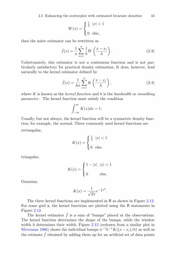
2.5 Enhancing the scatterplot with estimated bivariate densities 43
W (x) =
12|x| < 1
0 else,
then the naıve estimator can be rewritten as
f(x) =1
n
n∑i=1
1
hW
(x− xih
). (2.3)
Unfortunately, this estimator is not a continuous function and is not par-ticularly satisfactory for practical density estimation. It does, however, leadnaturally to the kernel estimator defined by
f(x) =1
hn
n∑i=1
K
(x− xih
), (2.4)
where K is known as the kernel function and h is the bandwidth or smoothingparameter . The kernel function must satisfy the condition∫ ∞
−∞K(x)dx = 1.
Usually, but not always, the kernel function will be a symmetric density func-tion; for example, the normal. Three commonly used kernel functions are
rectangular,
K(x) =
12 |x| < 1
0 else.
triangular,
K(x) =
1− |x| |x| < 1
0 else,
Gaussian,
K(x) =1√2πe−
12x
2
.
The three kernel functions are implemented in R as shown in Figure 2.12.For some grid x, the kernel functions are plotted using the R statements inFigure 2.12.
The kernel estimator f is a sum of “bumps” placed at the observations.The kernel function determines the shape of the bumps, while the windowwidth h determines their width. Figure 2.13 (redrawn from a similar plot inSilverman 1986) shows the individual bumps n−1h−1K((x−xi)/h) as well as
the estimate f obtained by adding them up for an artificial set of data points

44 2 Looking at Multivariate Data: Visualisation
R> rec <- function(x) (abs(x) < 1) * 0.5
R> tri <- function(x) (abs(x) < 1) * (1 - abs(x))
R> gauss <- function(x) 1/sqrt(2*pi) * exp(-(x^2)/2)
R> x <- seq(from = -3, to = 3, by = 0.001)
R> plot(x, rec(x), type = "l", ylim = c(0,1), lty = 1,
+ ylab = expression(K(x)))
R> lines(x, tri(x), lty = 2)
R> lines(x, gauss(x), lty = 3)
R> legend("topleft", legend = c("Rectangular", "Triangular",
+ "Gaussian"), lty = 1:3, title = "kernel functions",
+ bty = "n")
−3 −2 −1 0 1 2 3
0.0
0.2
0.4
0.6
0.8
1.0
x
K(x
)
kernel functions
RectangularTriangularGaussian
Fig. 2.12. Three commonly used kernel functions.
R> x <- c(0, 1, 1.1, 1.5, 1.9, 2.8, 2.9, 3.5)
R> n <- length(x)
For a grid
R> xgrid <- seq(from = min(x) - 1, to = max(x) + 1, by = 0.01)
on the real line, we can compute the contribution of each measurement in x,with h = 0.4, by the Gaussian kernel (defined in Figure 2.12, line 3) as follows:
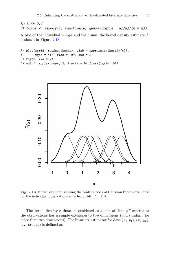
2.5 Enhancing the scatterplot with estimated bivariate densities 45
R> h <- 0.4
R> bumps <- sapply(x, function(a) gauss((xgrid - a)/h)/(n * h))
A plot of the individual bumps and their sum, the kernel density estimate f ,is shown in Figure 2.13.
R> plot(xgrid, rowSums(bumps), ylab = expression(hat(f)(x)),
+ type = "l", xlab = "x", lwd = 2)
R> rug(x, lwd = 2)
R> out <- apply(bumps, 2, function(b) lines(xgrid, b))
−1 0 1 2 3 4
0.00
0.10
0.20
0.30
x
f(x)
Fig. 2.13. Kernel estimate showing the contributions of Gaussian kernels evaluatedfor the individual observations with bandwidth h = 0.4.
The kernel density estimator considered as a sum of “bumps” centred atthe observations has a simple extension to two dimensions (and similarly formore than two dimensions). The bivariate estimator for data (x1, y1), (x2, y2),. . . , (xn, yn) is defined as
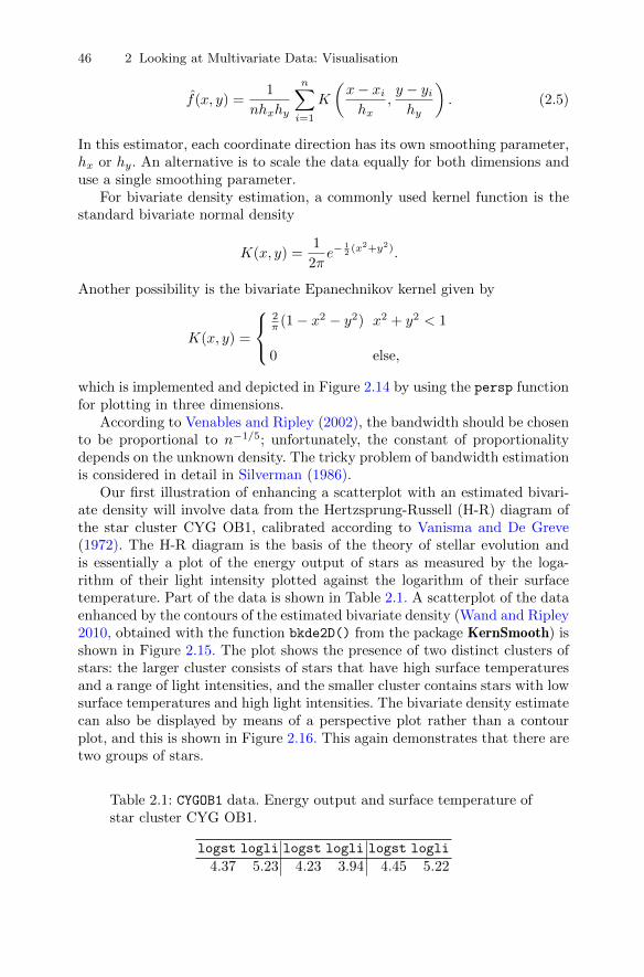
46 2 Looking at Multivariate Data: Visualisation
f(x, y) =1
nhxhy
n∑i=1
K
(x− xihx
,y − yihy
). (2.5)
In this estimator, each coordinate direction has its own smoothing parameter,hx or hy. An alternative is to scale the data equally for both dimensions anduse a single smoothing parameter.
For bivariate density estimation, a commonly used kernel function is thestandard bivariate normal density
K(x, y) =1
2πe−
12 (x
2+y2).
Another possibility is the bivariate Epanechnikov kernel given by
K(x, y) =
2π (1− x2 − y2) x2 + y2 < 1
0 else,
which is implemented and depicted in Figure 2.14 by using the persp functionfor plotting in three dimensions.
According to Venables and Ripley (2002), the bandwidth should be chosento be proportional to n−1/5; unfortunately, the constant of proportionalitydepends on the unknown density. The tricky problem of bandwidth estimationis considered in detail in Silverman (1986).
Our first illustration of enhancing a scatterplot with an estimated bivari-ate density will involve data from the Hertzsprung-Russell (H-R) diagram ofthe star cluster CYG OB1, calibrated according to Vanisma and De Greve(1972). The H-R diagram is the basis of the theory of stellar evolution andis essentially a plot of the energy output of stars as measured by the loga-rithm of their light intensity plotted against the logarithm of their surfacetemperature. Part of the data is shown in Table 2.1. A scatterplot of the dataenhanced by the contours of the estimated bivariate density (Wand and Ripley2010, obtained with the function bkde2D() from the package KernSmooth) isshown in Figure 2.15. The plot shows the presence of two distinct clusters ofstars: the larger cluster consists of stars that have high surface temperaturesand a range of light intensities, and the smaller cluster contains stars with lowsurface temperatures and high light intensities. The bivariate density estimatecan also be displayed by means of a perspective plot rather than a contourplot, and this is shown in Figure 2.16. This again demonstrates that there aretwo groups of stars.
Table 2.1: CYGOB1 data. Energy output and surface temperature ofstar cluster CYG OB1.
logst logli logst logli logst logli
4.37 5.23 4.23 3.94 4.45 5.22
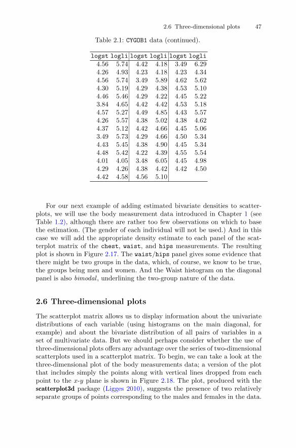
2.6 Three-dimensional plots 47
Table 2.1: CYGOB1 data (continued).
logst logli logst logli logst logli
4.56 5.74 4.42 4.18 3.49 6.294.26 4.93 4.23 4.18 4.23 4.344.56 5.74 3.49 5.89 4.62 5.624.30 5.19 4.29 4.38 4.53 5.104.46 5.46 4.29 4.22 4.45 5.223.84 4.65 4.42 4.42 4.53 5.184.57 5.27 4.49 4.85 4.43 5.574.26 5.57 4.38 5.02 4.38 4.624.37 5.12 4.42 4.66 4.45 5.063.49 5.73 4.29 4.66 4.50 5.344.43 5.45 4.38 4.90 4.45 5.344.48 5.42 4.22 4.39 4.55 5.544.01 4.05 3.48 6.05 4.45 4.984.29 4.26 4.38 4.42 4.42 4.504.42 4.58 4.56 5.10
For our next example of adding estimated bivariate densities to scatter-plots, we will use the body measurement data introduced in Chapter 1 (seeTable 1.2), although there are rather too few observations on which to basethe estimation. (The gender of each individual will not be used.) And in thiscase we will add the appropriate density estimate to each panel of the scat-terplot matrix of the chest, waist, and hips measurements. The resultingplot is shown in Figure 2.17. The waist/hips panel gives some evidence thatthere might be two groups in the data, which, of course, we know to be true,the groups being men and women. And the Waist histogram on the diagonalpanel is also bimodal , underlining the two-group nature of the data.
2.6 Three-dimensional plots
The scatterplot matrix allows us to display information about the univariatedistributions of each variable (using histograms on the main diagonal, forexample) and about the bivariate distribution of all pairs of variables in aset of multivariate data. But we should perhaps consider whether the use ofthree-dimensional plots offers any advantage over the series of two-dimensionalscatterplots used in a scatterplot matrix. To begin, we can take a look at thethree-dimensional plot of the body measurements data; a version of the plotthat includes simply the points along with vertical lines dropped from eachpoint to the x-y plane is shown in Figure 2.18. The plot, produced with thescatterplot3d package (Ligges 2010), suggests the presence of two relativelyseparate groups of points corresponding to the males and females in the data.
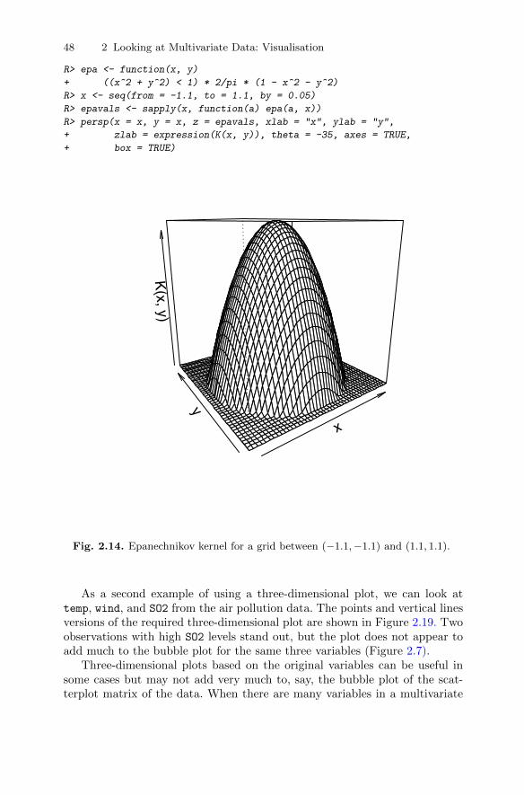
48 2 Looking at Multivariate Data: Visualisation
R> epa <- function(x, y)
+ ((x^2 + y^2) < 1) * 2/pi * (1 - x^2 - y^2)
R> x <- seq(from = -1.1, to = 1.1, by = 0.05)
R> epavals <- sapply(x, function(a) epa(a, x))
R> persp(x = x, y = x, z = epavals, xlab = "x", ylab = "y",
+ zlab = expression(K(x, y)), theta = -35, axes = TRUE,
+ box = TRUE)
x
y
K(x, y)
Fig. 2.14. Epanechnikov kernel for a grid between (−1.1,−1.1) and (1.1, 1.1).
As a second example of using a three-dimensional plot, we can look attemp, wind, and SO2 from the air pollution data. The points and vertical linesversions of the required three-dimensional plot are shown in Figure 2.19. Twoobservations with high SO2 levels stand out, but the plot does not appear toadd much to the bubble plot for the same three variables (Figure 2.7).
Three-dimensional plots based on the original variables can be useful insome cases but may not add very much to, say, the bubble plot of the scat-terplot matrix of the data. When there are many variables in a multivariate
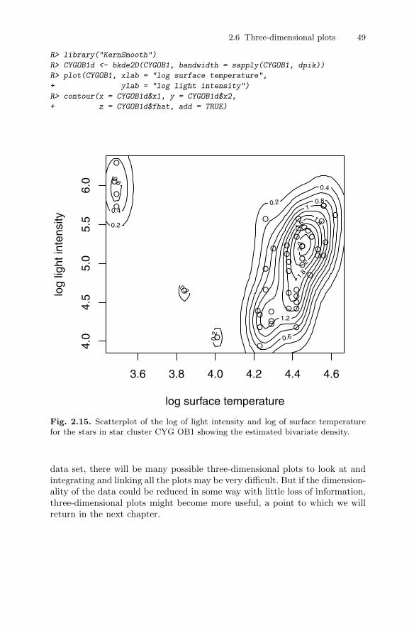
2.6 Three-dimensional plots 49
R> library("KernSmooth")
R> CYGOB1d <- bkde2D(CYGOB1, bandwidth = sapply(CYGOB1, dpik))
R> plot(CYGOB1, xlab = "log surface temperature",
+ ylab = "log light intensity")
R> contour(x = CYGOB1d$x1, y = CYGOB1d$x2,
+ z = CYGOB1d$fhat, add = TRUE)
●
●
●
●
●
●
●
●
●
●
●
● ●
●
●
●
●
●●
●
●
●
●
●
●
●●
●
●
●
●
●
●
●
●
●
●
● ●
●
●
●
●●
●
●
●
3.6 3.8 4.0 4.2 4.4 4.6
4.0
4.5
5.0
5.5
6.0
log surface temperature
log
light
inte
nsity 0.2
0.2
0.2
0.2 0.4
0.4
0.6
0.6
0.8 1
1.2
1.4
1.6
1
.8
2
2.2
Fig. 2.15. Scatterplot of the log of light intensity and log of surface temperaturefor the stars in star cluster CYG OB1 showing the estimated bivariate density.
data set, there will be many possible three-dimensional plots to look at andintegrating and linking all the plots may be very difficult. But if the dimension-ality of the data could be reduced in some way with little loss of information,three-dimensional plots might become more useful, a point to which we willreturn in the next chapter.
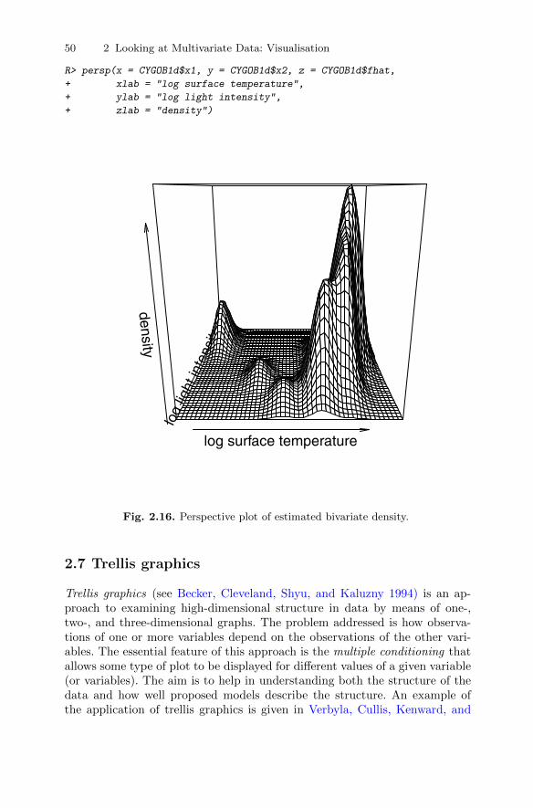
50 2 Looking at Multivariate Data: Visualisation
R> persp(x = CYGOB1d$x1, y = CYGOB1d$x2, z = CYGOB1d$fhat,
+ xlab = "log surface temperature",
+ ylab = "log light intensity",
+ zlab = "density")
log surface temperature
log
light
inte
nsity
density
Fig. 2.16. Perspective plot of estimated bivariate density.
2.7 Trellis graphics
Trellis graphics (see Becker, Cleveland, Shyu, and Kaluzny 1994) is an ap-proach to examining high-dimensional structure in data by means of one-,two-, and three-dimensional graphs. The problem addressed is how observa-tions of one or more variables depend on the observations of the other vari-ables. The essential feature of this approach is the multiple conditioning thatallows some type of plot to be displayed for different values of a given variable(or variables). The aim is to help in understanding both the structure of thedata and how well proposed models describe the structure. An example ofthe application of trellis graphics is given in Verbyla, Cullis, Kenward, and

2.7 Trellis graphics 51
chest
22 26 30
0.002 0.004
0.006 0.008 0.01
3438
42
0.005
0.01
0.015
2226
30
0.002
0.004
0.006
0.0
08
0.0
1 0.0
12
waist 0.002 0.004
0.006
0.0
08
0.0
1
34 38 42
0.0
05
0.01
0.015
0.002 0.004
0.006 0.008
0.01
32 36 40
3236
40
hips
Fig. 2.17. Scatterplot matrix of body measurements data showing the estimatedbivariate densities on each panel.
Welham (1999). With the recent publication of Sarkar’s excellent book (seeSarkar 2008) and the development of the lattice (Sarkar 2010) package, trel-lis graphics are likely to become more popular, and in this section we willillustrate their use on multivariate data.
For the first example, we return to the air pollution data and the temp,wind, and SO2 variables used previously to produce scatterplots of SO2 andtemp conditioned on values of wind divided into two equal parts that we shallcreatively label “Light” and“High”. The resulting plot is shown in Figure 2.20.The plot suggests that in cities with light winds, air pollution decreases withincreasing temperature, but in cities with high winds, air pollution does notappear to be strongly related to temperature.
A more complex example of trellis graphics is shown in Figure 2.21. Herethree-dimensional plots of temp, wind, and precip are shown for four levels ofSO2. The graphic looks pretty, but does it convey anything of interest about
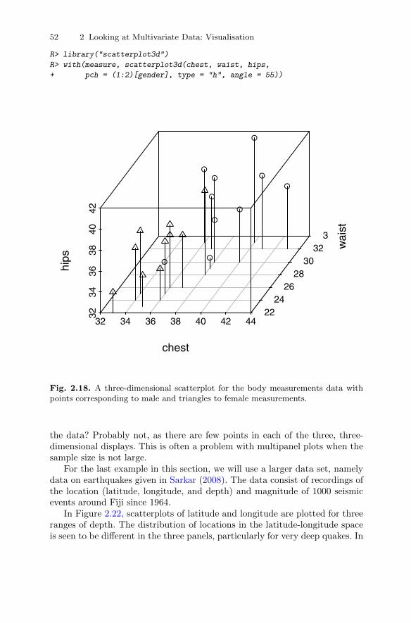
52 2 Looking at Multivariate Data: Visualisation
R> library("scatterplot3d")
R> with(measure, scatterplot3d(chest, waist, hips,
+ pch = (1:2)[gender], type = "h", angle = 55))
32 34 36 38 40 42 44
3234
3638
4042
2224
2628
3032
34
chestw
aist
hips
●
●●
●
●
●
●
●
●●
Fig. 2.18. A three-dimensional scatterplot for the body measurements data withpoints corresponding to male and triangles to female measurements.
the data? Probably not, as there are few points in each of the three, three-dimensional displays. This is often a problem with multipanel plots when thesample size is not large.
For the last example in this section, we will use a larger data set, namelydata on earthquakes given in Sarkar (2008). The data consist of recordings ofthe location (latitude, longitude, and depth) and magnitude of 1000 seismicevents around Fiji since 1964.
In Figure 2.22, scatterplots of latitude and longitude are plotted for threeranges of depth. The distribution of locations in the latitude-longitude spaceis seen to be different in the three panels, particularly for very deep quakes. In
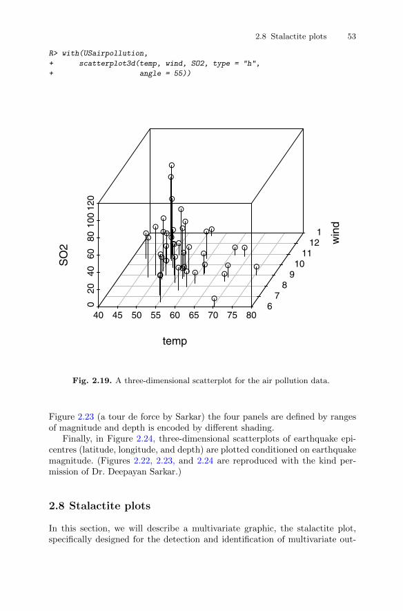
2.8 Stalactite plots 53
R> with(USairpollution,
+ scatterplot3d(temp, wind, SO2, type = "h",
+ angle = 55))
40 45 50 55 60 65 70 75 80
0 2
0 4
0 6
0 8
010
012
0
6 7
8 9
1011
1213
tempw
ind
SO
2
●●●●
●●
●
●
●
●●
●
●
●
●
●
●●
●
●
●
●
●
●
●
●
●● ●
●
●
●●
●
●
●●●
●●
●
Fig. 2.19. A three-dimensional scatterplot for the air pollution data.
Figure 2.23 (a tour de force by Sarkar) the four panels are defined by rangesof magnitude and depth is encoded by different shading.
Finally, in Figure 2.24, three-dimensional scatterplots of earthquake epi-centres (latitude, longitude, and depth) are plotted conditioned on earthquakemagnitude. (Figures 2.22, 2.23, and 2.24 are reproduced with the kind per-mission of Dr. Deepayan Sarkar.)
2.8 Stalactite plots
In this section, we will describe a multivariate graphic, the stalactite plot,specifically designed for the detection and identification of multivariate out-
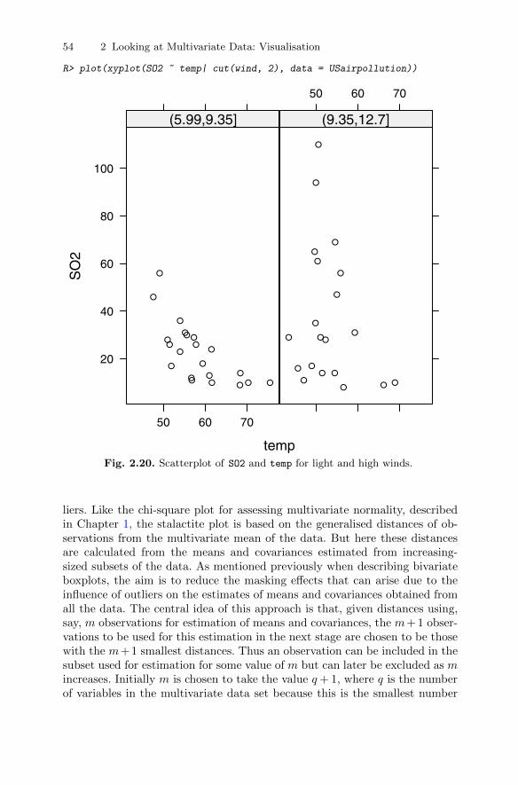
54 2 Looking at Multivariate Data: Visualisation
R> plot(xyplot(SO2 ~ temp| cut(wind, 2), data = USairpollution))
temp
SO
2
20
40
60
80
100
50 60 70
●
●
●
●
●●
●
●
●●
●
● ●
●
● ●
●●
●
●
●
(5.99,9.35]
50 60 70
●
●
●
●
●
●
●
●
●
●●
●●
●
●
●
●
●
●
●
(9.35,12.7]
Fig. 2.20. Scatterplot of SO2 and temp for light and high winds.
liers. Like the chi-square plot for assessing multivariate normality, describedin Chapter 1, the stalactite plot is based on the generalised distances of ob-servations from the multivariate mean of the data. But here these distancesare calculated from the means and covariances estimated from increasing-sized subsets of the data. As mentioned previously when describing bivariateboxplots, the aim is to reduce the masking effects that can arise due to theinfluence of outliers on the estimates of means and covariances obtained fromall the data. The central idea of this approach is that, given distances using,say, m observations for estimation of means and covariances, the m+ 1 obser-vations to be used for this estimation in the next stage are chosen to be thosewith the m+1 smallest distances. Thus an observation can be included in thesubset used for estimation for some value of m but can later be excluded as mincreases. Initially m is chosen to take the value q+ 1, where q is the numberof variables in the multivariate data set because this is the smallest number
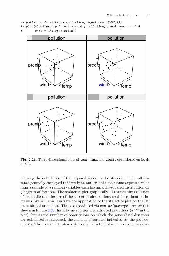
2.8 Stalactite plots 55
R> pollution <- with(USairpollution, equal.count(SO2,4))
R> plot(cloud(precip ~ temp * wind | pollution, panel.aspect = 0.9,
+ data = USairpollution))
tempwind
precip
pollution
tempwind
precip
pollution
tempwind
precip
pollution
tempwind
precip
pollution
Fig. 2.21. Three-dimensional plots of temp, wind, and precip conditioned on levelsof SO2.
allowing the calculation of the required generalised distances. The cutoff dis-tance generally employed to identify an outlier is the maximum expected valuefrom a sample of n random variables each having a chi-squared distribution onq degrees of freedom. The stalactite plot graphically illustrates the evolutionof the outliers as the size of the subset of observations used for estimation in-creases. We will now illustrate the application of the stalactite plot on the UScities air pollution data. The plot (produced via stalac(USairpollution)) isshown in Figure 2.25. Initially most cities are indicated as outliers (a“*” in theplot), but as the number of observations on which the generalised distancesare calculated is increased, the number of outliers indicated by the plot de-creases. The plot clearly shows the outlying nature of a number of cities over
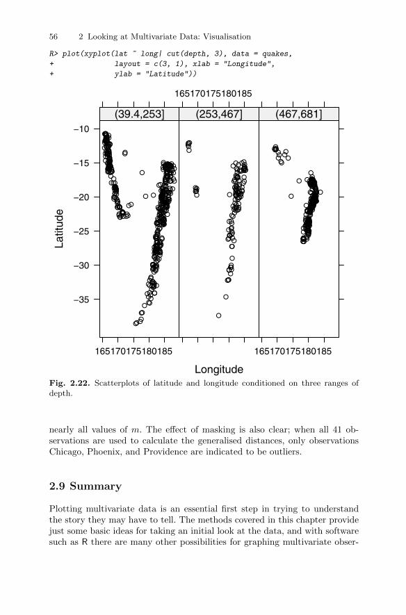
56 2 Looking at Multivariate Data: Visualisation
R> plot(xyplot(lat ~ long| cut(depth, 3), data = quakes,
+ layout = c(3, 1), xlab = "Longitude",
+ ylab = "Latitude"))
Longitude
Latit
ude
−35
−30
−25
−20
−15
−10
165170175180185
●
●
●
●●
●
●
●
●
●
●
● ●
●●
●●
●
●
●
●●
●
●
●●
●
●
●
●
●
●
●●●
●
●
●
●
●
●
●
●
●
●●
●
●
●
●
●
●
●
●
● ●
●
●
●
●
●
●
●
●
●
●
●
●
●
●
●
●
●
●●
●
●
●●
●
●
●
●
●
●
●
●
●●
●
●
●
●
●
●
● ●
●
●
●
●
●
●
●
●
●
●
●
●
●
●
●
●
●
●
●
●
●
●●
●
●
●
●
●
●
●
●
●
●
●
●
●
●
●
●
●
●
●
●
●
●
●
●
●●●●●●●●●●●
●
●
●
●
●
●
●
●
●
●
●
●
●
●
●●
●●●●●
●
●
●
●
●
●
●
●
●
●
●
●
●●
●
●
●
●
●
●●
●
●
●
●
●
●●
●
●
●
●
●
●●
●
●
●
●
●
●
●
●
●
●
●
●●
●
●
●
●
●
●
●
●
●
●
●
●
●
●
●
●
●
●
●●
●
●●●
●
●
●
●
●
●
●
●
●
●
●
●
●
●
●●●
●
●●●●●●●●●
●
●
●
●
●●●●●
●
●
●
●
●
●
●
●
●
●
●
●
●
●
●●
●
●
●
●●
●●
●
●●
●
●
●
●
●
●
●
●
●
●
●
●
●●
●
●
●
●
●
●
●
●
●
●
●
●
●
●
●
●
●
●
●
●
●●
●
●
●
●●
●●
●
●
●
●
●●
●
●
●
●
●●
●
●●
●
●
●
●
●
●
●
●
●
●●
●
●●
●
●
●
●●
●
●
●
●
●
●
●
●
●
●●●
●●
●
●
●●
●●
●
●●
●
●
●
●
●
●
●
●
●
●
●
●
●
●●
●
●
●
●
●●●
●
●●
●
●
●
●
●
●
●
● ●
●
●
●
●
●
●
●
●
●
●
●
●
●
●
●
●
●
●
●
●●
●
●
●
●●
●
●
●●
●
●
●
●●
●
●
●
●
●
●
●
●
●●
●
●
●
●
●
●●
●●
●
●●
●
●
●
●
●
●
●
(39.4,253]
165170175180185
●
● ●
●
●
●
●
●
●
●
●
●
●
●
●
●
● ●
●
●
●
●
●
●
●
●
●●
● ●
●
●
●
●
●
●
●
●
●●
●
●
●
●
●
●
●
● ●●
●
●●● ●
●
●
●
●
●
●
●●
●
●
●●
●
●
●
●
●
●●
●
●●
●
●
●
●
●
●
●
●
●●
●
●
●
●
●
●
●
●
●
●
●
●
●
●
●
●
●
●
●
●
●●●
●
●●
●●
●
●
●
●
●
●
● ●
●
●
(253,467]
165170175180185
●●
●
●
●
●
●
●
●
●●
●
●
●
●
●
●
●
●●
●●
●
●
●●
●
●
●
●
●
●●
●
●
●
●
●
●
●
●
●
●
●●
●
●●●
●
●●
●
●
●
●
●
●
●
●
●
●
●●
●
●
●
●●
●●
●
●
●
●●
●
●
●
●●
●
●
●
●
●
●●
●
●
●●
●
●
●
●●
●
●
●●●
●
●
●
●
●
●
●
●
●
●
●
●
●
●
●
●●
●
●
●
●
●
●
●●
●●
●●
●
●
●
●●
●●●
●
●
●
●
●
●
●
●
●●
●
●●
●
●
●
●
●
●●
●
●●
●
●
●
●
●●●
●●
●
●
●
●
●●●●
●
●
●
●
●●
●
●
●●●
●
●
●
●
●
●
●●
●
●●
●
●●●●
●●●
●
●
●
●
●●●
● ●
●●
●●●
●
●●
●
●●●
●●
●
●
●●●●
●
●●●
●
●●
●
●●
●
●●
●
●●
●●
●
●
●●● ●
●
●
●
●
●
●
●
●●
●
●
●
●●
●●
●
●
●
●
●●●●●
●
●
●
●
●
●●●
●
●
●
●●●
●
●
●
●●●
●
●
●
●●
●
●●
●
●
●●
●
●●
●
●
●●
●●
●
●
●
●
●
●
●
●
●
●●
●
●
●
●●●
●
●●
●
●
●
●●
●
●●●
●
●
●
●
●
●
●
●
●
●
(467,681]
Fig. 2.22. Scatterplots of latitude and longitude conditioned on three ranges ofdepth.
nearly all values of m. The effect of masking is also clear; when all 41 ob-servations are used to calculate the generalised distances, only observationsChicago, Phoenix, and Providence are indicated to be outliers.
2.9 Summary
Plotting multivariate data is an essential first step in trying to understandthe story they may have to tell. The methods covered in this chapter providejust some basic ideas for taking an initial look at the data, and with softwaresuch as R there are many other possibilities for graphing multivariate obser-
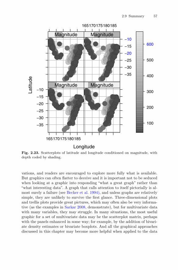
2.9 Summary 57
Longitude
Latit
ude
−35
−30
−25
−20
−15
−10
165170175180185
●
●●●
●●●●●
●●●●●●●
●●●●
●●●●●●●●●●●●
●●●●●
●●●●●●
●
●●●●●●●●●
●●●●
●●●●●●●●●●●●●●●●●●
●●●●●●●●
●●●●●●
●●●●●●●●●●●●●●
●●●●●●●●●●●●●●●●●●●●●
●●●●
●●●●●●●●●
●●●
●
●
●●
●●●●
●●●
●●●●●●●●●●●●
●●●●
●●●
●●●
●●●
●●●●●
●●●●●●●●●●
●●
●
●
●●●
●●
●
●●●
●
●●●
●
●●●
●●●●
●
●●●
●●●●
●
●●
●●●●
● ●●●
●
●●●
●●
●
●
●●
●●●●●
●
●● ●●●
●●
●●
●
●
●●
●●
●
●●
●
●
●
●
●
●
●
●●
●
●
●
●
●
●
●
●
●●
●●
●
●
●●
●
●●
●
●
●●
●
●
●●
●
●
●●● ●
●●●
●
●
●● ●●
●
●
●●
● ●●
●●
● ●●●●●
●
●
●●●●
●● ●
●●
●
●●
●
●●
● ●●
●●
●
●
●
● ●●
●●
●
●●
●● ●
●
●●
●●
●●
● ●
●●
●●●
●
●
●
●●
●●
●●
●
●●
●●●
●●
●●●●●● ●
●●●●
●
●
●
●●
●
●●
●
●●●
●
●●
●
●
●●
●●
●●●
●●
●●●
●●●
●
●
●●
●
●
●●
●
●●
●●●●
●●
●● ●●
●
●
●
●
●
●
●●●
● ●●
●
●●●
●
●
Magnitude
●
●●●●●
●
●●●●●●●
●●●●●
●●●●●●●●●●●●●●
●
●●●●●●●●
●
●●●●●●●●●●●●●●●●●●●●●●●●●●●●
●●●●●●●●●●●●●●●●●●●●●●●●●
●●●●●●●●●●
●●●●●●●●●●●●
●
●●●●●●
●
●●●
●●●●●●●
●●●
●●●●●
●●●●●
●
●
●
●●●
●●
●●●
●●●
●●●●●●
●●
●●
●●●
●●●
●●●●
●●●
●
●●●●●●●
●
●
●
●
●
●●●
●●
●
●●●
●
●●●
●
●●●●
●
●●●
●
●●●
●●●
●●
●●●
●
●●●
●●
●●●●
● ●●●
●
●●
●● ●●●
●●
●●●
●
●
● ●●●●
●
●●●●
●
●● ●
●●●
●●
●
●●● ●
●●●
●
●●
●
●●
●
●●●●
●
●
●
●●●
●
●
●●
●●
●
●●
●
●
●
●
●
●●
●
●●
●●
●●●●
●
●
●●
●
●
●●
●●
●
●
●●
●
● ●
●●●●●
●
●
●●
●●
●
●●
●● ●●
●
●●●●
●
●●●●●●●
●●
●
●
●
●
●●●●
●
●●
●
●●
●●
●
●●
●●
●●
●
●●
● ●
●●
●●●
●●
●
●
●
●●
●
●
● ●●
●
●●
●
●
●●●●●
●
●
●
●
●
●●
●●●
●
●●●
●●
●●●
●●
●●
●●
●●
●
●
● ●●
●
●●●●
●●● ●
●●●
●
●●
●●
●●
●●
●●
●
Magnitude
●●
●●
●●●
●●●●●
●
●●●●●●●●●●●
●
●●
●●●●●●●●●●●●●●●●●●●●●●
●●●●●●●
●●●
●●●●●●●●●●●●●●●●●●●●●●●●●●●●
●
●●●●●●●
●
●●●●
●●●●●●●●
●●●
●●●
●●
●●
●●●●
●●
●●●
●●●
●●●●
●●●●●●
●
●●●
●●●●●●●●●
●
●●●●●
●●●
●●●●●●
●●●●
●
●
●
●●
●●
●
●
●
●
●●●
●●●●
●
●
● ●●●
●●
●●●●●● ●
●
● ●●
●
● ●●●●
●
●●●●● ●
●● ●●●
●●
●
●●●●●
●
●●●●●● ●
●
●●
●●●
●
●
●●●
●
●
● ●
●
●
●
●
●
●● ●●
●
●
●●
●
●●
●
●●
●●
●
●
●
●
●●
●●●
●
●●
●
●●●
●
●●●●●
●● ●
●
●●
●
●●
● ●
●
●●
●
●
●●●●●●
●●
●●
●
●●●
●
●●
●
●●●●
●●
●
●●●
●
●
●●
●
●
●
●●
●● ●●●
●●●●
●●
●
●●
●●
●
●
●●
●●●
●
●●
●●●
●
●●
●●●●●●
●
●●
●
●
●
●
●●
●
●●●
●●
●●
●●●
●●
●
●
●
●
●
●
● ●
●●
●
Magnitude
165170175180185
−35
−30
−25
−20
−15
−10
●●●
●
●
●●●●●●●●●●●
●
●
●
●●
●●●●●●●●●●●●●●●●●●●●●●●●●●
●●●●●●
●●●●●●●●
●●●●●●●
●●●●●
●●●●
●●●●●
● ●●●●●●●●●●
●●●●●●●
●●
●
●●
●●●●
●●●●●●●
●●●
●●●
●
●
●●●●●●●●●
●
●●●●●●
●●●
●●
●●
●
●●●●●
●
●
●●
●
●●●●●
●●●
●
●
●
●
●
●●●●●●●
●●
●
●
●
●
●●●
●●●
●
●● ●●● ●●●●●●
●●
●●●●
●●
●● ●
●
●●
●
●
●
●●●
●●
●
●●
●●
●
●
●
●●
●
●
●●
●
●
●●
●● ●
●●
●●●
●
●●●
●
●●
● ●●●
●●●
●
●●
●●●
●
●
●●
●●●
●
●
●
●
●●
● ●●
●
●
●● ●●●●●
●●●
●●
●
●●
●●● ●●●
●
●●●● ●
●●●●●
●●●
●
●●● ●●
●●
●
●
●
● ●●●
●
●●
●●
●
●●
●●
●
●
●
●●
●●●●●
●
●
●
●
●
●
●●
●●
●
●
●
●
●●
●
●
●
●
●● ●● ●
●
●
●
● ●
●
●
●
●
●●
● ●
●
●
●● ●
●
●●
●
●
●
●
●●●
● ●
●
●
Magnitude
100
200
300
400
500
600
Fig. 2.23. Scatterplots of latitude and longitude conditioned on magnitude, withdepth coded by shading.
vations, and readers are encouraged to explore more fully what is available.But graphics can often flatter to deceive and it is important not to be seducedwhen looking at a graphic into responding “what a great graph” rather than“what interesting data”. A graph that calls attention to itself pictorially is al-most surely a failure (see Becker et al. 1994), and unless graphs are relativelysimple, they are unlikely to survive the first glance. Three-dimensional plotsand trellis plots provide great pictures, which may often also be very informa-tive (as the examples in Sarkar 2008, demonstrate), but for multivariate datawith many variables, they may struggle. In many situations, the most usefulgraphic for a set of multivariate data may be the scatterplot matrix, perhapswith the panels enhanced in some way; for example, by the addition of bivari-ate density estimates or bivariate boxplots. And all the graphical approachesdiscussed in this chapter may become more helpful when applied to the data
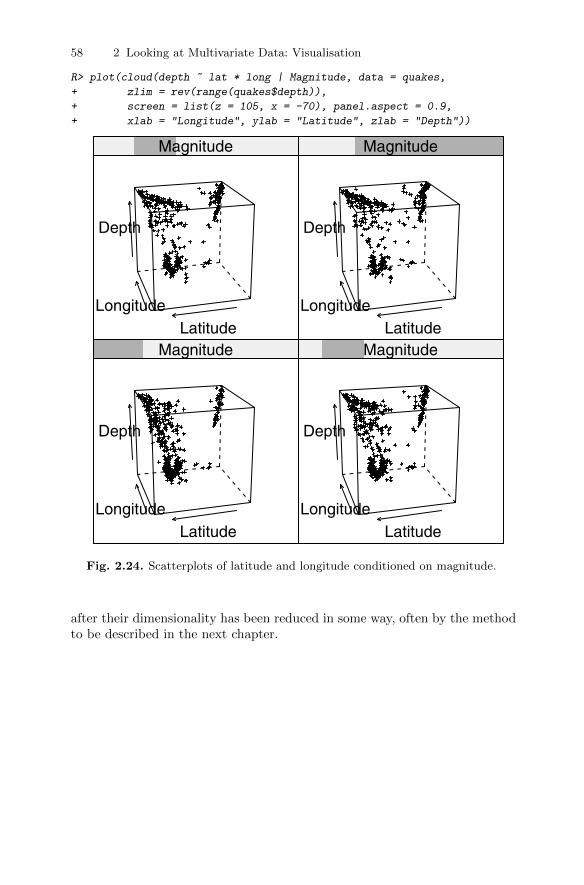
58 2 Looking at Multivariate Data: Visualisation
R> plot(cloud(depth ~ lat * long | Magnitude, data = quakes,
+ zlim = rev(range(quakes$depth)),
+ screen = list(z = 105, x = -70), panel.aspect = 0.9,
+ xlab = "Longitude", ylab = "Latitude", zlab = "Depth"))
LongitudeLatitude
Depth
Magnitude
LongitudeLatitude
Depth
Magnitude
LongitudeLatitude
Depth
Magnitude
LongitudeLatitude
Depth
Magnitude
Fig. 2.24. Scatterplots of latitude and longitude conditioned on magnitude.
after their dimensionality has been reduced in some way, often by the methodto be described in the next chapter.
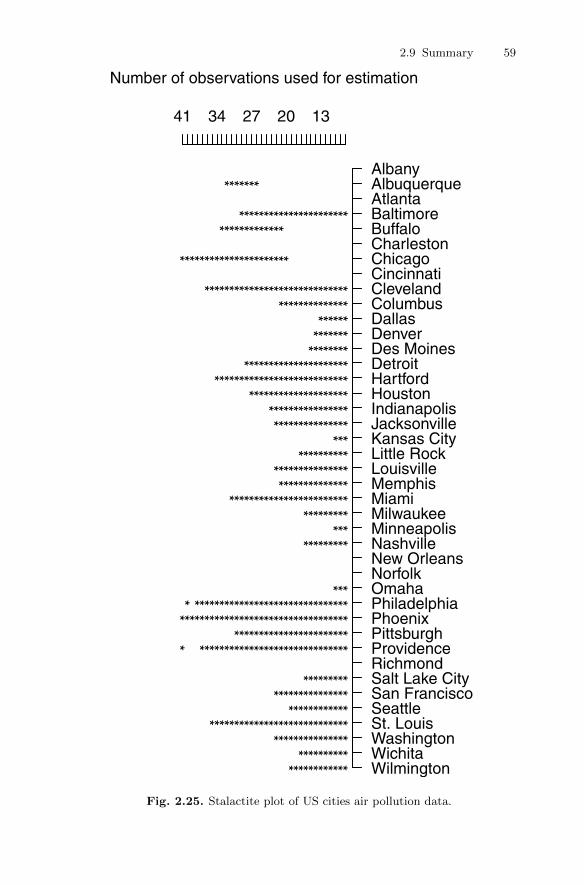
2.9 Summary 59
Number of observations used for estimation
AlbanyAlbuquerqueAtlantaBaltimoreBuffaloCharlestonChicagoCincinnatiClevelandColumbusDallasDenverDes MoinesDetroitHartfordHoustonIndianapolisJacksonvilleKansas CityLittle RockLouisvilleMemphisMiamiMilwaukeeMinneapolisNashvilleNew OrleansNorfolkOmahaPhiladelphiaPhoenixPittsburghProvidenceRichmondSalt Lake CitySan FranciscoSeattleSt. LouisWashingtonWichitaWilmington
41 34 27 20 13
**
**
**
**
**
**
**
**
**
**
**
**
**
**
**
**
**
**
**
**
**
**
**
**
**
**
**
**
**
**
**
**
**
**
**
**
**
**
**
**
**
**
**
**
**
**
**
**
**
**
**
**
**
**
**
**
**
**
**
**
**
**
**
**
**
**
**
**
**
**
**
**
**
**
**
**
**
**
**
**
**
**
**
**
**
**
**
**
**
**
**
**
**
**
**
**
**
**
**
**
**
**
**
**
**
**
**
**
**
**
**
**
**
**
**
**
**
**
**
**
**
**
**
**
**
**
**
**
**
**
**
**
**
**
**
**
**
**
**
**
**
**
**
**
**
**
**
**
**
**
**
**
**
**
**
**
**
**
**
**
**
**
**
**
**
**
**
**
**
**
**
**
**
**
**
**
**
**
**
**
**
**
**
**
**
**
**
**
**
**
**
**
**
**
**
**
**
**
**
**
**
**
**
**
**
**
**
**
**
**
**
**
**
**
**
**
**
**
**
**
**
**
**
**
**
**
**
**
**
**
**
**
**
**
**
**
**
**
**
**
**
**
**
**
**
**
**
**
**
**
**
**
**
**
**
**
**
**
**
**
**
**
**
**
**
**
**
**
**
Fig. 2.25. Stalactite plot of US cities air pollution data.

60 2 Looking at Multivariate Data: Visualisation
2.10 Exercises
Ex. 2.1 Use the bivariate boxplot on the scatterplot of each pair of variablesin the air pollution data to identify any outliers. Calculate the correlationbetween each pair of variables using all the data and the data with anyidentified outliers removed. Comment on the results.
Ex. 2.2 Compare the chi-plots with the corresponding scatterplots for eachpair of variables in the air pollution data. Do you think that there is anyadvantage in the former?
Ex. 2.3 Construct a scatterplot matrix of the body measurements data thathas the appropriate boxplot on the diagonal panels and bivariate boxplotson the other panels. Compare the plot with Figure 2.17, and say whichdiagram you find more informative about the data.
Ex. 2.4 Construct a further scatterplot matrix of the body measurementsdata that labels each point in a panel with the gender of the individual,and plot on each scatterplot the separate estimated bivariate densities formen and women.
Ex. 2.5 Construct a scatterplot matrix of the chemical composition ofRomano-British pottery given in Chapter 1 (Table 1.3), identifying eachunit by its kiln number and showing the estimated bivariate density oneach panel. What does the resulting diagram tell you?
Ex. 2.6 Construct a bubble plot of the earthquake data using latitude andlongitude as the scatterplot and depth as the circles, with greater depthsgiving smaller circles. In addition, divide the magnitudes into three equalranges and label the points in your bubble plot with a different symboldepending on the magnitude group into which the point falls.
3
Principal Components Analysis
3.1 Introduction
One of the problems with a lot of sets of multivariate data is that there aresimply too many variables to make the application of the graphical techniquesdescribed in the previous chapters successful in providing an informative ini-tial assessment of the data. And having too many variables can also causeproblems for other multivariate techniques that the researcher may want toapply to the data. The possible problem of too many variables is sometimesknown as the curse of dimensionality (Bellman 1961). Clearly the scatterplots,scatterplot matrices, and other graphics included in Chapter 2 are likely to bemore useful when the number of variables in the data, the dimensionality ofthe data, is relatively small rather than large. This brings us to principal com-ponents analysis, a multivariate technique with the central aim of reducingthe dimensionality of a multivariate data set while accounting for as much ofthe original variation as possible present in the data set. This aim is achievedby transforming to a new set of variables, the principal components, that arelinear combinations of the original variables, which are uncorrelated and areordered so that the first few of them account for most of the variation in allthe original variables. In the best of all possible worlds, the result of a principalcomponents analysis would be the creation of a small number of new variablesthat can be used as surrogates for the originally large number of variables andconsequently provide a simpler basis for, say, graphing or summarising thedata, and also perhaps when undertaking further multivariate analyses of thedata.
3.2 Principal components analysis (PCA)
The basic goal of principal components analysis is to describe variation in aset of correlated variables, x> = (x1, . . . , xq), in terms of a new set of uncor-related variables, y> = (y1, . . . , yq), each of which is a linear combination of
DOI 10.1007/978-1-4419-9650-3_3, © Springer Science+Business Media, LLC 2011
61B. Everitt and T. Hothorn, An Introduction to Applied Multivariate Analysis with R: Use R!,
62 3 Principal Components Analysis
the x variables. The new variables are derived in decreasing order of “impor-tance” in the sense that y1 accounts for as much as possible of the variation inthe original data amongst all linear combinations of x. Then y2 is chosen toaccount for as much as possible of the remaining variation, subject to beinguncorrelated with y1, and so on. The new variables defined by this process,y1, . . . , yq, are the principal components.
The general hope of principal components analysis is that the first fewcomponents will account for a substantial proportion of the variation in theoriginal variables, x1, . . . , xq, and can, consequently, be used to provide a con-venient lower-dimensional summary of these variables that might prove usefulfor a variety of reasons. Consider, for example, a set of data consisting ofexamination scores for several different subjects for each of a number of stu-dents. One question of interest might be how best to construct an informativeindex of overall examination performance. One obvious possibility would bethe mean score for each student, although if the possible or observed range ofexamination scores varied from subject to subject, it might be more sensibleto weight the scores in some way before calculating the average, or alterna-tively standardise the results for the separate examinations before attemptingto combine them. In this way, it might be possible to spread the students outfurther and so obtain a better ranking. The same result could often be achievedby applying principal components to the observed examination results and us-ing the student’s scores on the first principal components to provide a measureof examination success that maximally discriminates between them.
A further possible application for principal components analysis arises inthe field of economics, where complex data are often summarised by some kindof index number; for example, indices of prices, wage rates, cost of living,and so on. When assessing changes in prices over time, the economist willwish to allow for the fact that prices of some commodities are more variablethan others, or that the prices of some of the commodities are consideredmore important than others; in each case the index will need to be weightedaccordingly. In such examples, the first principal component can often satisfythe investigator’s requirements.
But it is not always the first principal component that is of most interestto a researcher. A taxonomist, for example, when investigating variation inmorphological measurements on animals for which all the pairwise correlationsare likely to be positive, will often be more concerned with the second andsubsequent components since these might provide a convenient descriptionof aspects of an animal’s “shape”. The latter will often be of more interestto the researcher than aspects of an animal’s “size” which here, because ofthe positive correlations, will be reflected in the first principal component.For essentially the same reasons, the first principal component derived from,say, clinical psychiatric scores on patients may only provide an index of theseverity of symptoms, and it is the remaining components that will give thepsychiatrist important information about the “pattern” of symptoms.
3.3 Finding the sample principal components 63
The principal components are most commonly (and properly) used as ameans of constructing an informative graphical representation of the data (seelater in the chapter) or as input to some other analysis. One example of thelatter is provided by regression analysis; principal components may be usefulhere when:
� There are too many explanatory variables relative to the number of obser-vations.
� The explanatory variables are highly correlated.
Both situations lead to problems when applying regression techniques,problems that may be overcome by replacing the original explanatory vari-ables with the first few principal component variables derived from them.An example will be given later, and other applications of the technique aredescribed in Rencher (2002).
In some disciplines, particularly psychology and other behavioural sciences,the principal components may be considered an end in themselves and re-searchers may then try to interpret them in a similar fashion as for the factorsin an exploratory factor analysis (see Chapter 5). We shall make some com-ments about this practise later in the chapter.
3.3 Finding the sample principal components
Principal components analysis is overwhelmingly an exploratory technique formultivariate data. Although there are inferential methods for using the sampleprincipal components derived from a random sample of individuals from somepopulation to test hypotheses about population principal components (seeJolliffe 2002), they are very rarely seen in accounts of principal componentsanalysis that appear in the literature. Quintessentially principal componentsanalysis is an aid for helping to understand the observed data set whether ornot this is actually a “sample” in any real sense. We use this observation asthe rationale for describing only sample principal components in this chapter.
The first principal component of the observations is that linear combina-tion of the original variables whose sample variance is greatest amongst allpossible such linear combinations. The second principal component is definedas that linear combination of the original variables that accounts for a maxi-mal proportion of the remaining variance subject to being uncorrelated withthe first principal component. Subsequent components are defined similarly.The question now arises as to how the coefficients specifying the linear com-binations of the original variables defining each component are found. A littletechnical material is needed to answer this question.
The first principal component of the observations, y1, is the linear combi-nation
y1 = a11x1 + a12x2 + · · ·+ a1qxq
64 3 Principal Components Analysis
whose sample variance is greatest among all such linear combinations. Be-cause the variance of y1 could be increased without limit simply by increasingthe coefficients a>1 = (a11, a12, . . . , a1q), a restriction must be placed on thesecoefficients. As we shall see later, a sensible constraint is to require that thesum of squares of the coefficients should take the value one, although otherconstraints are possible and any multiple of the vector a1 produces basicallythe same component. To find the coefficients defining the first principal com-ponent, we need to choose the elements of the vector a1 so as to maximisethe variance of y1 subject to the sum of squares constraint, which can bewritten a>1 a1 = 1. The sample variance of y1 that is a linear function of thex variables is given by (see Chapter 1) a>1 Sa1, where S is the q × q samplecovariance matrix of the x variables. To maximise a function of several vari-ables subject to one or more constraints, the method of Lagrange multipliersis used. Full details are given in Morrison (1990) and Jolliffe (2002), and wewill not give them here. (The algebra of an example with q = 2 is, however,given in Section 3.5.) We simply state that the Lagrange multiplier approachleads to the solution that a1 is the eigenvector or characteristic vector of thesample covariance matrix, S, corresponding to this matrix’s largest eigenvalueor characteristic root . The eigenvalues λ and eigenvectors γ of a q× q matrixA are such that Aγ = λγ; for more details, see, for example, Mardia, Kent,and Bibby (1979).
The second principal component, y2, is defined to be the linear combination
y2 = a21x1 + a22x2 + · · ·+ a2qxq
(i.e., y2 = a>2 x, where a>2 = (a21, a22, . . . , a2q) and x> = (x1, x2, . . . , xq)) thathas the greatest variance subject to the following two conditions:
a>2 a2 = 1,
a>2 a1 = 0.
(The second condition ensures that y1 and y2 are uncorrelated; i.e., that thesample correlation is zero.)
Similarly, the jth principal component is that linear combination yj = a>j xthat has the greatest sample variance subject to the conditions
a>j aj = 1,
a>j ai = 0 (i < j).
Application of the Lagrange multiplier technique demonstrates that the vectorof coefficients defining the jth principal component, aj , is the eigenvector of Sassociated with its jth largest eigenvalue. If the q eigenvalues of S are denotedby λ1, λ2, . . . , λq, then by requiring that a>i ai = 1 it can be shown that thevariance of the ith principal component is given by λi. The total varianceof the q principal components will equal the total variance of the originalvariables so that
3.4 Covariance or the correlation matrix? 65
q∑i=1
λi = s21 + s22 + · · ·+ s2q ,
where s2i is the sample variance of xi. We can write this more concisely as∑qi=1 λi = trace(S).Consequently, the jth principal component accounts for a proportion Pj
of the total variation of the original data, where
Pj =λj
trace(S).
The first m principal components, where m < q account for a proportion P (m)
of the total variation in the original data, where
P (m) =
∑mj=1 λj
trace(S).
In geometrical terms, it is easy to show that the first principal componentdefines the line of best fit (in the sense of minimising residuals orthogonal tothe line) to the q-dimensional observations in the sample. These observationsmay therefore be represented in one dimension by taking their projectiononto this line; that is, finding their first principal component score. If theobservations happen to be collinear in q dimensions, this representation wouldaccount completely for the variation in the data and the sample covariancematrix would have only one non-zero eigenvalue. In practise, of course, suchcollinearity is extremely unlikely, and an improved representation would begiven by projecting the q-dimensional observations onto the space of the bestfit, this being defined by the first two principal components. Similarly, thefirst m components give the best fit in m dimensions. If the observations fitexactly into a space of m dimensions, it would be indicated by the presenceof q − m zero eigenvalues of the covariance matrix. This would imply thepresence of q−m linear relationships between the variables. Such constraintsare sometimes referred to as structural relationships . In practise, in the vastmajority of applications of principal components analysis, all the eigenvaluesof the covariance matrix will be non-zero.
3.4 Should principal components be extracted from thecovariance or the correlation matrix?
One problem with principal components analysis is that it is not scale-invariant. What this means can be explained using an example given in Mardiaet al. (1979). Suppose the three variables in a multivariate data set are weightin pounds, height in feet, and age in years, but for some reason we would likeour principal components expressed in ounces, inches, and decades. Intuitivelytwo approaches seem feasible;

66 3 Principal Components Analysis
1. Multiply the variables by 16, 12, and 1/10, respectively and then carryout a principal components analysis on the covariance matrix of the threevariables.
2. Carry out a principal components analysis on the covariance matrix of theoriginal variables and then multiply the elements of the relevant compo-nent by 16, 12, and 1/10.
Unfortunately, these two procedures do not generally lead to the same result.So if we imagine a set of multivariate data where the variables are of com-pletely different types, for example length, temperature, blood pressure, oranxiety rating, then the structure of the principal components derived fromthe covariance matrix will depend upon the essentially arbitrary choice of unitsof measurement; for example, changing the length from centimetres to incheswill alter the derived components. Additionally, if there are large differencesbetween the variances of the original variables, then those whose variancesare largest will tend to dominate the early components. Principal componentsshould only be extracted from the sample covariance matrix when all theoriginal variables have roughly the same scale. But this is rare in practise andconsequently, in practise, principal components are extracted from the correla-tion matrix of the variables, R. Extracting the components as the eigenvectorsof R is equivalent to calculating the principal components from the originalvariables after each has been standardised to have unit variance. It should benoted, however, that there is rarely any simple correspondence between thecomponents derived from S and those derived from R. And choosing to workwith R rather than with S involves a definite but possibly arbitrary decisionto make variables “equally important”.
To demonstrate how the principal components of the covariance matrix of adata set can differ from the components extracted from the data’s correlationmatrix, we will use the example given in Jolliffe (2002). The data in thisexample consist of eight blood chemistry variables measured on 72 patients ina clinical trial. The correlation matrix of the data, together with the standarddeviations of each of the eight variables, is
R> blood_corr
[,1] [,2] [,3] [,4] [,5] [,6] [,7] [,8]
[1,] 1.000 0.290 0.202 -0.055 -0.105 -0.252 -0.229 0.058
[2,] 0.290 1.000 0.415 0.285 -0.376 -0.349 -0.164 -0.129
[3,] 0.202 0.415 1.000 0.419 -0.521 -0.441 -0.145 -0.076
[4,] -0.055 0.285 0.419 1.000 -0.877 -0.076 0.023 -0.131
[5,] -0.105 -0.376 -0.521 -0.877 1.000 0.206 0.034 0.151
[6,] -0.252 -0.349 -0.441 -0.076 0.206 1.000 0.192 0.077
[7,] -0.229 -0.164 -0.145 0.023 0.034 0.192 1.000 0.423
[8,] 0.058 -0.129 -0.076 -0.131 0.151 0.077 0.423 1.000

3.4 Covariance or the correlation matrix? 67
R> blood_sd
rblood plate wblood neut lymph bilir sodium potass
0.371 41.253 1.935 0.077 0.071 4.037 2.732 0.297
There are considerable differences between these standard deviations. We canapply principal components analysis to both the covariance and correlationmatrix of the data using the following R code:
R> blood_pcacov <- princomp(covmat = blood_cov)
R> summary(blood_pcacov, loadings = TRUE)
Importance of components:
Comp.1 Comp.2 Comp.3 Comp.4
Standard deviation 41.2877 3.880213 2.641973 1.624584
Proportion of Variance 0.9856 0.008705 0.004036 0.001526
Cumulative Proportion 0.9856 0.994323 0.998359 0.999885
Comp.5 Comp.6 Comp.7 Comp.8
Standard deviation 3.540e-01 2.562e-01 8.511e-02 2.373e-02
Proportion of Variance 7.244e-05 3.794e-05 4.188e-06 3.255e-07
Cumulative Proportion 1.000e+00 1.000e+00 1.000e+00 1.000e+00
Loadings:
Comp.1 Comp.2 Comp.3 Comp.4 Comp.5 Comp.6 Comp.7 Comp.8
rblood 0.943 0.329
plate -0.999
wblood -0.192 -0.981
neut 0.758 -0.650
lymph -0.649 -0.760
bilir 0.961 0.195 -0.191
sodium 0.193 -0.979
potass 0.329 -0.942
R> blood_pcacor <- princomp(covmat = blood_corr)
R> summary(blood_pcacor, loadings = TRUE)
Importance of components:
Comp.1 Comp.2 Comp.3 Comp.4 Comp.5
Standard deviation 1.671 1.2376 1.1177 0.8823 0.7884
Proportion of Variance 0.349 0.1915 0.1562 0.0973 0.0777
Cumulative Proportion 0.349 0.5405 0.6966 0.7939 0.8716
Comp.6 Comp.7 Comp.8
Standard deviation 0.6992 0.66002 0.31996
Proportion of Variance 0.0611 0.05445 0.01280
Cumulative Proportion 0.9327 0.98720 1.00000
Loadings:
68 3 Principal Components Analysis
Comp.1 Comp.2 Comp.3 Comp.4 Comp.5 Comp.6 Comp.7 Comp.8
[1,] -0.194 0.417 0.400 0.652 0.175 -0.363 0.176 0.102
[2,] -0.400 0.154 0.168 -0.848 0.230 -0.110
[3,] -0.459 0.168 -0.274 0.251 0.403 0.677
[4,] -0.430 -0.472 -0.171 0.169 0.118 -0.237 0.678
[5,] 0.494 0.360 -0.180 -0.139 0.136 0.157 0.724
[6,] 0.319 -0.320 -0.277 0.633 -0.162 0.384 0.377
[7,] 0.177 -0.535 0.410 -0.163 -0.299 -0.513 0.367
[8,] 0.171 -0.245 0.709 0.198 0.469 -0.376
(The “blanks” in this output represent very small values.) Examining the re-sults, we see that each of the principal components of the covariance matrixis largely dominated by a single variable, whereas those for the correlationmatrix have moderate-sized coefficients on several of the variables. And thefirst component from the covariance matrix accounts for almost 99% of thetotal variance of the observed variables. The components of the covariancematrix are completely dominated by the fact that the variance of the platevariable is roughly 400 times larger than the variance of any of the sevenother variables. Consequently, the principal components from the covariancematrix simply reflect the order of the sizes of the variances of the observedvariables. The results from the correlation matrix tell us, in particular, that aweighted contrast of the first four and last four variables is the linear functionwith the largest variance. This example illustrates that when variables are onvery different scales or have very different variances, a principal componentsanalysis of the data should be performed on the correlation matrix, not onthe covariance matrix.
3.5 Principal components of bivariate data withcorrelation coefficient r
Before we move on to look at some practical examples of the application ofprincipal components analysis, it will be helpful to look in a little more detailat the mathematics of the method in one very simple case. We will do thisin this section for bivariate data where the two variables, x1 and x2, havecorrelation coefficient r. The sample correlation matrix in this case is simply
R =
(1.0 rr 0.1
).
In order to find the principal components of the data we need to find theeigenvalues and eigenvectors of R. The eigenvalues are found as the roots ofthe equation
det(R− λI) = 0.
This leads to the quadratic equation in λ

3.5 Principal components of bivariate data with correlation coefficient r 69
(1− λ)2 − r2 = 0,
and solving this equation leads to eigenvalues λ1 = 1 + r, λ2 = 1 − r. Notethat the sum of the eigenvalues is two, equal to trace(R). The eigenvectorcorresponding to λ1 is obtained by solving the equation
Ra1 = λ1a1.
This leads to the equations
a11 + ra12 = (1 + r)a11,
ra11 + a12 = (1 + r)a12.
The two equations are identical, and both reduce to requiring a11 = a12. Ifwe now introduce the normalisation constraint a>1 a1 = 1, we find that
a11 = a12 =1√2.
Similarly, we find the second eigenvector is given by a21 = 1√2
and a22 = − 1√2.
The two principal components are then given by
y1 =1√2
(x1 + x2), y2 =1√2
(x1 − x2).
We can calculate the sample variance of the first principal component as
Var(y1) = Var
[1√2
(x1 + x2)
]=
1
2Var(x1 + x2)
=1
2[Var(x1) + Var(x2) + 2Cov(x1, x2)]
=1
2(1 + 1 + 2r) = 1 + r.
Similarly, the variance of the second principal component is 1− r.Notice that if r < 0, the order of the eigenvalues and hence of the principal
components is reversed; if r = 0, the eigenvalues are both equal to 1 and anytwo solutions at right angles could be chosen to represent the two components.Two further points should be noted:
1. There is an arbitrary sign in the choice of the elements of ai. It is custom-ary (but not universal) to choose ai1 to be positive.
2. The coefficients that define the two components do not depend on r, al-though the proportion of variance explained by each does change with r.As r tends to 1, the proportion of variance accounted for by y1, namely(1 + r)/2, also tends to one. When r = 1, the points all align on a straightline and the variation in the data is unidimensional.

70 3 Principal Components Analysis
3.6 Rescaling the principal components
The coefficients defining the principal components derived as described in theprevious section are often rescaled so that they are correlations or covariancesbetween the original variables and the derived components. The rescaled co-efficients are often useful in interpreting a principal components analysis. Thecovariance of variable i with component j is given by
Cov(xi, yj) = λjaji.
The correlation of variable xi with component yj is therefore
rxi,yj =λjaji√
Var(xi)Var(yj)=
λjaji
si√λj
=aji√λj
si.
If the components are extracted from the correlation matrix rather than thecovariance matrix, the correlation between variable and component becomes
rxi,yj = aji√λj
because in this case the standard deviation, si, is unity. (Although for con-venience we have used the same nomenclature for the eigenvalues and theeigenvectors extracted from the covariance matrix or the correlation matrix,they will, of course, not be equal.) The rescaled coefficients from a principalcomponents analysis of a correlation matrix are analogous to factor loadings,as we shall see in Chapter 5. Often these rescaled coefficients are presented asthe results of a principal components analysis and used in interpretation.
3.7 How the principal components predict the observedcovariance matrix
In this section, we will look at how the principal components reproduce theobserved covariance or correlation matrix from which they were extracted. Tobegin, let the initial vectors a1,a2, . . . ,aq, that define the principal compo-nents be used to form a q × q matrix, A = (a1, a2, . . . ,aq); we assume thatthese are vectors extracted from the covariance matrix, S, and scaled so thata>i ai = 1. Arrange the eigenvalues λ1, λ2, . . . , λq along the main diagonal of adiagonal matrix, Λ. Then it can be shown that the covariance matrix of theobserved variables x1, x2, . . . , xq is given by
S = AΛA>.
This is known as the spectral decomposition of S. Rescaling the vectorsa1, a2, . . . ,aq so that the sum of squares of their elements is equal to the
corresponding eigenvalue (i.e., calculating a∗i = λ12i ai) allows S to be written
more simply as

3.8 Choosing the number of components 71
S = A∗A∗>,
where A∗ =(a∗1 . . . a
∗q
).
If the matrix A∗m is formed from, say, the first m components rather thanfrom all q, then A∗mA∗m
> gives the predicted value of S based on these mcomponents. It is often useful to calculate such a predicted value based on thenumber of components considered adequate to describe the data to informallyassess the “fit” of the principal components analysis. How this number ofcomponents might be chosen is considered in the next section.
3.8 Choosing the number of components
As described earlier, principal components analysis is seen to be a techniquefor transforming a set of observed variables into a new set of variables thatare uncorrelated with one another. The variation in the original q variablesis only completely accounted for by all q principal components. The useful-ness of these transformed variables, however, stems from their property ofaccounting for the variance in decreasing proportions. The first component,for example, accounts for the maximum amount of variation possible for anylinear combination of the original variables. But how useful is this artificialvariate constructed from the observed variables? To answer this question wewould first need to know the proportion of the total variance of the originalvariables for which it accounted. If, for example, 80% of the variation in amultivariate data set involving six variables could be accounted for by a sim-ple weighted average of the variable values, then almost all the variation canbe expressed along a single continuum rather than in six-dimensional space.The principal components analysis would have provided a highly parsimonioussummary (reducing the dimensionality of the data from six to one) that mightbe useful in later analysis.
So the question we need to ask is how many components are needed toprovide an adequate summary of a given data set. A number of informal andmore formal techniques are available. Here we shall concentrate on the former;examples of the use of formal inferential methods are given in Jolliffe (2002)and Rencher (2002).
The most common of the relatively ad hoc procedures that have been sug-gested for deciding upon the number of components to retain are the following:
� Retain just enough components to explain some specified large percentageof the total variation of the original variables. Values between 70% and90% are usually suggested, although smaller values might be appropriateas q or n, the sample size, increases.
� Exclude those principal components whose eigenvalues are less than theaverage,
∑qi=1
λi
q . Since∑q
i=1 λi = trace(S), the average eigenvalue is alsothe average variance of the original variables. This method then retains
72 3 Principal Components Analysis
those components that account for more variance than the average for theobserved variables.
� When the components are extracted from the correlation matrix,trace(R) = q, and the average variance is therefore one, so applying therule in the previous bullet point, components with eigenvalues less thanone are excluded. This rule was originally suggested by Kaiser (1958), butJolliffe (1972), on the basis of a number of simulation studies, proposedthat a more appropriate procedure would be to exclude components ex-tracted from a correlation matrix whose associated eigenvalues are lessthan 0.7.
� Cattell (1966) suggests examination of the plot of the λi against i, the so-called scree diagram. The number of components selected is the value of icorresponding to an“elbow”in the curve, i.e., a change of slope from“steep”to “shallow”. In fact, Cattell was more specific than this, recommendingto look for a point on the plot beyond which the scree diagram defines amore or less straight line, not necessarily horizontal. The first point on thestraight line is then taken to be the last component to be retained. Andit should also be remembered that Cattell suggested the scree diagram inthe context of factor analysis rather than applied to principal componentsanalysis.
� A modification of the scree digram described by Farmer (1971) is the log-eigenvalue diagram consisting of a plot of log(λi) against i.
Returning to the results of the principal components analysis of the bloodchemistry data given in Section 3.3, we find that the first four componentsaccount for nearly 80% of the total variance, but it takes a further two com-ponents to push this figure up to 90%. A cutoff of one for the eigenvaluesleads to retaining three components, and with a cutoff of 0.7 four componentsare kept. Figure 3.1 shows the scree diagram and log-eigenvalue diagram forthe data and the R code used to construct the two diagrams. The formerplot may suggest four components, although this is fairly subjective, and thelatter seems to be of little help here because it appears to indicate retainingseven components, hardly much of a dimensionality reduction. The exampleillustrates that the proposed methods for deciding how many components tokeep can (and often do) lead to different conclusions.
3.9 Calculating principal components scores
If we decide that we need, say, m principal components to adequately repre-sent our data (using one or another of the methods described in the previoussection), then we will generally wish to calculate the scores on each of thesecomponents for each individual in our sample. If, for example, we have derivedthe components from the covariance matrix, S, then the m principal compo-nents scores for individual i with original q×1 vector of variable values xi areobtained as
3.9 Calculating principal components scores 73
R> plot(log(blood_pcacor$sdev^2), xlab = "Component number",
+ ylab = "log(Component variance)", type="l",
+ main = "Log(eigenvalue) diagram")
1 2 3 4 5 6 7 8
0.0
2.5
Scree diagram
Component number
Com
pone
nt v
aria
nce
1 2 3 4 5 6 7 8
−2.
01.
0
Log(eigenvalue) diagram
Component numberlog(
Com
pone
nt v
aria
nce)
Fig. 3.1. Scree diagram and log-eigenvalue diagram for principal components of thecorrelation matrix of the blood chemistry data.
yi1 = a>1 xi
yi2 = a>2 xi...
yim = a>mxi
If the components are derived from the correlation matrix, then xi wouldcontain individual i’s standardised scores for each variable.
R> plot(blood_pcacor$sdev^2, xlab = "Component number",
+ ylab = "Component variance", type = "l", main = "Scree diagram")

74 3 Principal Components Analysis
The principal components scores calculated as above have variances equalto λj for j = 1, . . . ,m. Many investigators might prefer to have scores withmean zero and variance equal to unity. Such scores can be found as
z = Λ−1m A>mx,
where Λm is an m × m diagonal matrix with λ1, λ2, . . . , λm on the maindiagonal, Am = (a1 . . .am), and x is the q × 1 vector of standardised scores.We should note here that the first m principal components scores are the samewhether we retain all possible q components or just the first m. As we shallsee in Chapter 5, this is not the case with the calculation of factor scores.
3.10 Some examples of the application of principalcomponents analysis
In this section, we will look at the application of PCA to a number of datasets, beginning with one involving only two variables, as this allows us toillustrate graphically an important point about this type of analysis.
3.10.1 Head lengths of first and second sons
Table 3.1: headsize data. Head Size Data.
head1 breadth1 head2 breadth2 head1 breadth1 head2 breadth2
191 155 179 145 190 159 195 157195 149 201 152 188 151 187 158181 148 185 149 163 137 161 130183 153 188 149 195 155 183 158176 144 171 142 186 153 173 148208 157 192 152 181 145 182 146189 150 190 149 175 140 165 137197 159 189 152 192 154 185 152188 152 197 159 174 143 178 147192 150 187 151 176 139 176 143179 158 186 148 197 167 200 158183 147 174 147 190 163 187 150174 150 185 152
The data in Table 3.1 give the head lengths and head breadths (in millimetres)for each of the first two adult sons in 25 families. Here we shall use only thehead lengths; the head breadths will be used later in the chapter. The meanvector and covariance matrix of the head length measurements are found using

3.10 Some examples of the application of principal components analysis 75
R> head_dat <- headsize[, c("head1", "head2")]
R> colMeans(head_dat)
head1 head2
185.7 183.8
R> cov(head_dat)
head1 head2
head1 95.29 69.66
head2 69.66 100.81
The principal components of these data, extracted from their covariance ma-trix, can be found using
R> head_pca <- princomp(x = head_dat)
R> head_pca
Call:
princomp(x = head_dat)
Standard deviations:
Comp.1 Comp.2
12.691 5.215
2 variables and 25 observations.
R> print(summary(head_pca), loadings = TRUE)
Importance of components:
Comp.1 Comp.2
Standard deviation 12.6908 5.2154
Proportion of Variance 0.8555 0.1445
Cumulative Proportion 0.8555 1.0000
Loadings:
Comp.1 Comp.2
head1 0.693 -0.721
head2 0.721 0.693
and arey1 = 0.693x1 + 0.721x2 y2 = −0.721x1 + 0.693x2
with variances 167.77 and 28.33. The first principal component accounts for aproportion 167.77/(167.77 + 28.33) = 0.86 of the total variance in the originalvariables. Note that the total variance of the principal components is 196.10,which as expected is equal to the total variance of the original variables,found by adding the relevant terms in the covariance matrix given earlier; i.e.,95.29 + 100.81 = 196.10.

76 3 Principal Components Analysis
How should the two derived components be interpreted? The first compo-nent is essentially the sum of the head lengths of the two sons, and the secondcomponent is the difference in head lengths. Perhaps we can label the firstcomponent “size” and the second component “shape”, but later we will havesome comments about trying to give principal components such labels.
To calculate an individual’s score on a component, we simply multiply thevariable values minus the appropriate mean by the loading for the variableand add these values over all variables. We can illustrate this calculation usingthe data for the first family, where the head length of the first son is 191 mmand for the second son 179 mm. The score for this family on the first principalcomponent is calculated as
0.693 · (191− 185.72) + 0.721 · (179− 183.84) = 0.169,
and on the second component the score is
−0.721 · (191− 185.72) + 0.693 · (179− 183.84) = −7.61.
The variance of the first principal components scores will be 167.77, and thevariance of the second principal component scores will be 28.33.
We can plot the data showing the axes corresponding to the principalcomponents. The first axis passes through the mean of the data and has slope0.721/0.693, and the second axis also passes through the mean and has slope−0.693/0.721. The plot is shown in Figure 3.2. This example illustrates thata principal components analysis is essentially simply a rotation of the axes ofthe multivariate data scatter. And we can also plot the principal componentsscores to give Figure 3.3. (Note that in this figure the range of the x-axis andthe range for the y-axis have been made the same to account for the largervariance of the first principal component.)
We can use the principal components analysis of the head size data todemonstrate how the principal components reproduce the observed covariancematrix. We first need to rescale the principal components we have at this pointby multiplying them by the square roots of their respective variances to givethe new components
y1 = 12.952(0.693x1 + 0.721x2), i.e., y1 = 8.976x1 + 9.338x2
and
y2 = 5.323(−0.721x1 + 0.693x2), i.e., y2 = −3.837x1 + 3.688x2,
leading to the matrix A∗2 as defined in Section 1.5.1:
A∗2 =
(8.976 −3.8379.338 3.688
).
Multiplying this matrix by its transpose should recreate the covariance matrixof the head length data; doing the matrix multiplication shows that it doesrecreate S:
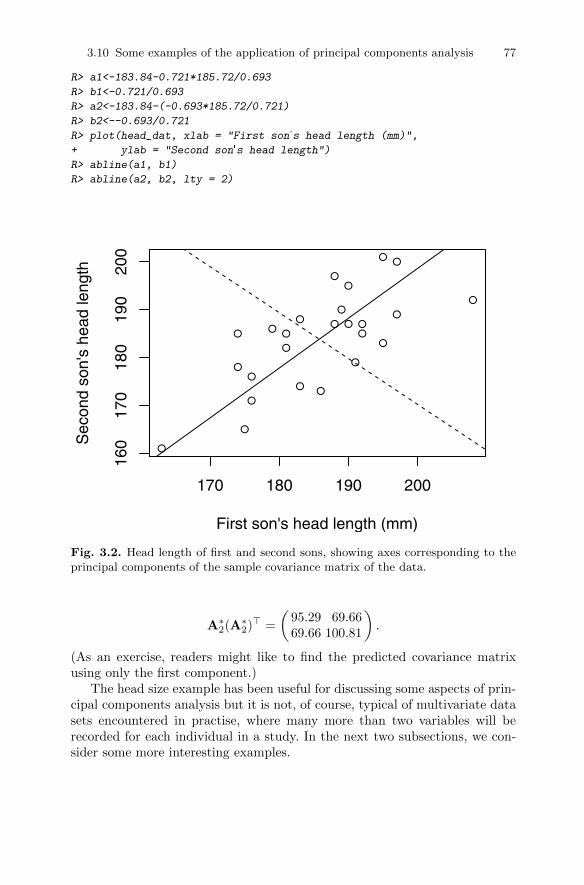
3.10 Some examples of the application of principal components analysis 77
R> a1<-183.84-0.721*185.72/0.693
R> b1<-0.721/0.693
R> a2<-183.84-(-0.693*185.72/0.721)
R> b2<--0.693/0.721
R> plot(head_dat, xlab = "First son's head length (mm)",
+ ylab = "Second son's head length")
R> abline(a1, b1)
R> abline(a2, b2, lty = 2)
●
●
●
●
●
●● ●
●
●●
●
●
●
●
●
●
●
●
●
●
●●
●
●
170 180 190 200
160
170
180
190
200
First son's head length (mm)
Sec
ond
son'
s he
ad le
ngth
Fig. 3.2. Head length of first and second sons, showing axes corresponding to theprincipal components of the sample covariance matrix of the data.
A∗2(A∗2)> =
(95.29 69.6669.66 100.81
).
(As an exercise, readers might like to find the predicted covariance matrixusing only the first component.)
The head size example has been useful for discussing some aspects of prin-cipal components analysis but it is not, of course, typical of multivariate datasets encountered in practise, where many more than two variables will berecorded for each individual in a study. In the next two subsections, we con-sider some more interesting examples.
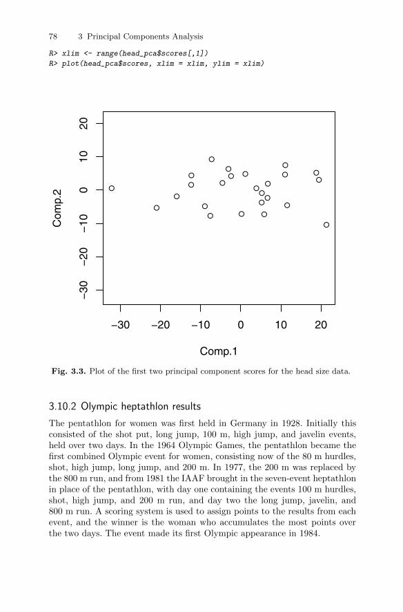
78 3 Principal Components Analysis
R> xlim <- range(head_pca$scores[,1])
R> plot(head_pca$scores, xlim = xlim, ylim = xlim)
●
●● ●
●
●
●
●
●
●
●
●
●
●
●●
●●
●
●●
●
●●
●
−30 −20 −10 0 10 20
−30
−20
−10
010
20
Comp.1
Com
p.2
Fig. 3.3. Plot of the first two principal component scores for the head size data.
3.10.2 Olympic heptathlon results
The pentathlon for women was first held in Germany in 1928. Initially thisconsisted of the shot put, long jump, 100 m, high jump, and javelin events,held over two days. In the 1964 Olympic Games, the pentathlon became thefirst combined Olympic event for women, consisting now of the 80 m hurdles,shot, high jump, long jump, and 200 m. In 1977, the 200 m was replaced bythe 800 m run, and from 1981 the IAAF brought in the seven-event heptathlonin place of the pentathlon, with day one containing the events 100 m hurdles,shot, high jump, and 200 m run, and day two the long jump, javelin, and800 m run. A scoring system is used to assign points to the results from eachevent, and the winner is the woman who accumulates the most points overthe two days. The event made its first Olympic appearance in 1984.
3.10 Some examples of the application of principal components analysis 79
Table 3.2: heptathlon data. Results of Olympic heptathlon, Seoul, 1988.
hurdles highjump shot run200m longjump javelin run800m score
Joyner-Kersee (USA) 12.69 1.86 15.80 22.56 7.27 45.66 128.51 7291
John (GDR) 12.85 1.80 16.23 23.65 6.71 42.56 126.12 6897
Behmer (GDR) 13.20 1.83 14.20 23.10 6.68 44.54 124.20 6858Sablovskaite (URS) 13.61 1.80 15.23 23.92 6.25 42.78 132.24 6540
Choubenkova (URS) 13.51 1.74 14.76 23.93 6.32 47.46 127.90 6540
Schulz (GDR) 13.75 1.83 13.50 24.65 6.33 42.82 125.79 6411Fleming (AUS) 13.38 1.80 12.88 23.59 6.37 40.28 132.54 6351
Greiner (USA) 13.55 1.80 14.13 24.48 6.47 38.00 133.65 6297Lajbnerova (CZE) 13.63 1.83 14.28 24.86 6.11 42.20 136.05 6252
Bouraga (URS) 13.25 1.77 12.62 23.59 6.28 39.06 134.74 6252
Wijnsma (HOL) 13.75 1.86 13.01 25.03 6.34 37.86 131.49 6205Dimitrova (BUL) 13.24 1.80 12.88 23.59 6.37 40.28 132.54 6171
Scheider (SWI) 13.85 1.86 11.58 24.87 6.05 47.50 134.93 6137
Braun (FRG) 13.71 1.83 13.16 24.78 6.12 44.58 142.82 6109Ruotsalainen (FIN) 13.79 1.80 12.32 24.61 6.08 45.44 137.06 6101
Yuping (CHN) 13.93 1.86 14.21 25.00 6.40 38.60 146.67 6087Hagger (GB) 13.47 1.80 12.75 25.47 6.34 35.76 138.48 5975
Brown (USA) 14.07 1.83 12.69 24.83 6.13 44.34 146.43 5972
Mulliner (GB) 14.39 1.71 12.68 24.92 6.10 37.76 138.02 5746Hautenauve (BEL) 14.04 1.77 11.81 25.61 5.99 35.68 133.90 5734
Kytola (FIN) 14.31 1.77 11.66 25.69 5.75 39.48 133.35 5686
Geremias (BRA) 14.23 1.71 12.95 25.50 5.50 39.64 144.02 5508Hui-Ing (TAI) 14.85 1.68 10.00 25.23 5.47 39.14 137.30 5290
Jeong-Mi (KOR) 14.53 1.71 10.83 26.61 5.50 39.26 139.17 5289Launa (PNG) 16.42 1.50 11.78 26.16 4.88 46.38 163.43 4566
In the 1988 Olympics held in Seoul, the heptathlon was won by one of thestars of women’s athletics in the USA, Jackie Joyner-Kersee. The results forall 25 competitors in all seven disciplines are given in Table 3.2 (from Hand,Daly, Lunn, McConway, and Ostrowski 1994). We shall analyse these datausing principal components analysis with a view to exploring the structure ofthe data and assessing how the derived principal components scores (discussedlater) relate to the scores assigned by the official scoring system.
But before undertaking the principal components analysis, it is good dataanalysis practise to carry out an initial assessment of the data using one oranother of the graphics described in Chapter 2. Some numerical summariesmay also be helpful before we begin the main analysis. And before any of these,it will help to score all seven events in the same direction so that “large” valuesare indicative of a “better” performance. The R code for reversing the valuesfor some events, then calculating the correlation coefficients between the tenevents and finally constructing the scatterplot matrix of the data is
R> heptathlon$hurdles <- with(heptathlon, max(hurdles)-hurdles)
R> heptathlon$run200m <- with(heptathlon, max(run200m)-run200m)
R> heptathlon$run800m <- with(heptathlon, max(run800m)-run800m)

80 3 Principal Components Analysis
R> score <- which(colnames(heptathlon) == "score")
R> round(cor(heptathlon[,-score]), 2)
hurdles highjump shot run200m longjump javelin run800m
hurdles 1.00 0.81 0.65 0.77 0.91 0.01 0.78
highjump 0.81 1.00 0.44 0.49 0.78 0.00 0.59
shot 0.65 0.44 1.00 0.68 0.74 0.27 0.42
run200m 0.77 0.49 0.68 1.00 0.82 0.33 0.62
longjump 0.91 0.78 0.74 0.82 1.00 0.07 0.70
javelin 0.01 0.00 0.27 0.33 0.07 1.00 -0.02
run800m 0.78 0.59 0.42 0.62 0.70 -0.02 1.00
R> plot(heptathlon[,-score])
The scatterplot matrix appears in Figure 3.4.
hurdles
1.50 1.85 0 2 4 36 44
02
1.50
1.85
highjump
shot
1014
02
4
run200m
longjump
5.0
7.0
3644 javelin
0 2 10 14 5.0 7.0 0 20
020run800m
Fig. 3.4. Scatterplot matrix of the seven heptathlon events after transforming somevariables so that for all events large values are indicative of a better performance.
3.10 Some examples of the application of principal components analysis 81
Examination of the correlation matrix shows that most pairs of events arepositively correlated, some moderately (for example, high jump and shot) andothers relatively highly (for example, high jump and hurdles). The exceptionsto this general observation are the relationships between the javelin event andthe others, where almost all the correlations are close to zero. One explanationmight be that the javelin is a very “technical” event and perhaps the trainingfor the other events does not help the competitors in the javelin. But beforewe speculate further, we should look at the scatterplot matrix of the sevenevents shown in Figure 3.4. One very clear observation in this plot is that forall events except the javelin there is an outlier who is very much poorer thanthe other athletes at these six events, and this is the competitor from PapuaNew Guinea (PNG), who finished last in the competition in terms of pointsscored. But surprisingly, in the scatterplots involving the javelin, it is thiscompetitor who again stands out, but in this case she has the third highestvalue for the event. It might be sensible to look again at both the correlationmatrix and the scatterplot matrix after removing the competitor from PNG;the relevant R code is
R> heptathlon <- heptathlon[-grep("PNG", rownames(heptathlon)),]
R> score <- which(colnames(heptathlon) == "score")
R> round(cor(heptathlon[,-score]), 2)
hurdles highjump shot run200m longjump javelin run800m
hurdles 1.00 0.58 0.77 0.83 0.89 0.33 0.56
highjump 0.58 1.00 0.46 0.39 0.66 0.35 0.15
shot 0.77 0.46 1.00 0.67 0.78 0.34 0.41
run200m 0.83 0.39 0.67 1.00 0.81 0.47 0.57
longjump 0.89 0.66 0.78 0.81 1.00 0.29 0.52
javelin 0.33 0.35 0.34 0.47 0.29 1.00 0.26
run800m 0.56 0.15 0.41 0.57 0.52 0.26 1.00
The new scatterplot matrix is shown in Figure 3.5. Several of the cor-relations are changed to some degree from those shown before removal ofthe PNG competitor, particularly the correlations involving the javelin event,where the very small correlations between performances in this event and theothers have increased considerably. Given the relatively large overall changein the correlation matrix produced by omitting the PNG competitor, we shallextract the principal components of the data from the correlation matrix afterthis omission. The principal components can now be found using
R> heptathlon_pca <- prcomp(heptathlon[, -score], scale = TRUE)
R> print(heptathlon_pca)
Standard deviations:
[1] 2.08 0.95 0.91 0.68 0.55 0.34 0.26
Rotation:
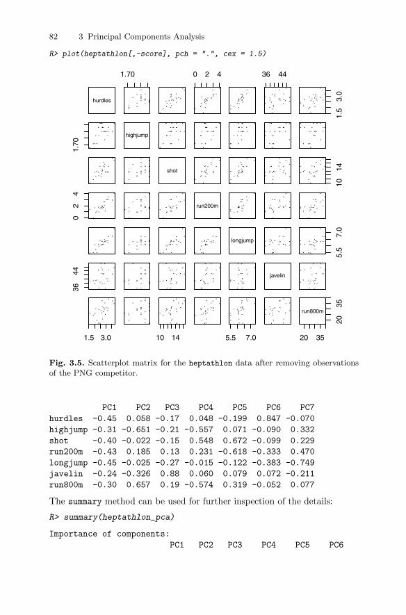
82 3 Principal Components Analysis
R> plot(heptathlon[,-score], pch = ".", cex = 1.5)
hurdles
1.70 0 2 4 36 44
1.5
3.0
1.70
highjump
shot
1014
02
4
run200m
longjump
5.5
7.0
3644 javelin
1.5 3.0 10 14 5.5 7.0 20 3520
35
run800m
Fig. 3.5. Scatterplot matrix for the heptathlon data after removing observationsof the PNG competitor.
PC1 PC2 PC3 PC4 PC5 PC6 PC7
hurdles -0.45 0.058 -0.17 0.048 -0.199 0.847 -0.070
highjump -0.31 -0.651 -0.21 -0.557 0.071 -0.090 0.332
shot -0.40 -0.022 -0.15 0.548 0.672 -0.099 0.229
run200m -0.43 0.185 0.13 0.231 -0.618 -0.333 0.470
longjump -0.45 -0.025 -0.27 -0.015 -0.122 -0.383 -0.749
javelin -0.24 -0.326 0.88 0.060 0.079 0.072 -0.211
run800m -0.30 0.657 0.19 -0.574 0.319 -0.052 0.077
The summary method can be used for further inspection of the details:
R> summary(heptathlon_pca)
Importance of components:
PC1 PC2 PC3 PC4 PC5 PC6
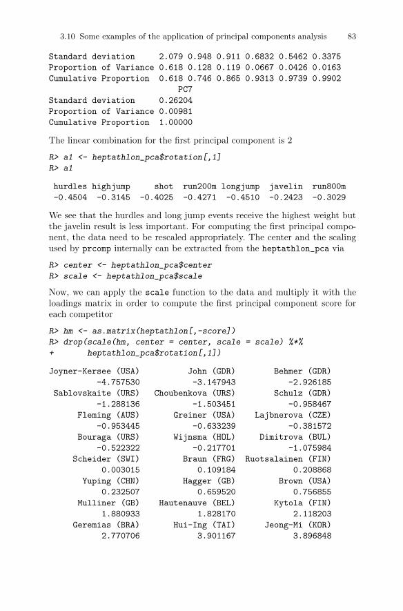
3.10 Some examples of the application of principal components analysis 83
Standard deviation 2.079 0.948 0.911 0.6832 0.5462 0.3375
Proportion of Variance 0.618 0.128 0.119 0.0667 0.0426 0.0163
Cumulative Proportion 0.618 0.746 0.865 0.9313 0.9739 0.9902
PC7
Standard deviation 0.26204
Proportion of Variance 0.00981
Cumulative Proportion 1.00000
The linear combination for the first principal component is 2
R> a1 <- heptathlon_pca$rotation[,1]
R> a1
hurdles highjump shot run200m longjump javelin run800m
-0.4504 -0.3145 -0.4025 -0.4271 -0.4510 -0.2423 -0.3029
We see that the hurdles and long jump events receive the highest weight butthe javelin result is less important. For computing the first principal compo-nent, the data need to be rescaled appropriately. The center and the scalingused by prcomp internally can be extracted from the heptathlon_pca via
R> center <- heptathlon_pca$center
R> scale <- heptathlon_pca$scale
Now, we can apply the scale function to the data and multiply it with theloadings matrix in order to compute the first principal component score foreach competitor
R> hm <- as.matrix(heptathlon[,-score])
R> drop(scale(hm, center = center, scale = scale) %*%
+ heptathlon_pca$rotation[,1])
Joyner-Kersee (USA) John (GDR) Behmer (GDR)
-4.757530 -3.147943 -2.926185
Sablovskaite (URS) Choubenkova (URS) Schulz (GDR)
-1.288136 -1.503451 -0.958467
Fleming (AUS) Greiner (USA) Lajbnerova (CZE)
-0.953445 -0.633239 -0.381572
Bouraga (URS) Wijnsma (HOL) Dimitrova (BUL)
-0.522322 -0.217701 -1.075984
Scheider (SWI) Braun (FRG) Ruotsalainen (FIN)
0.003015 0.109184 0.208868
Yuping (CHN) Hagger (GB) Brown (USA)
0.232507 0.659520 0.756855
Mulliner (GB) Hautenauve (BEL) Kytola (FIN)
1.880933 1.828170 2.118203
Geremias (BRA) Hui-Ing (TAI) Jeong-Mi (KOR)
2.770706 3.901167 3.896848
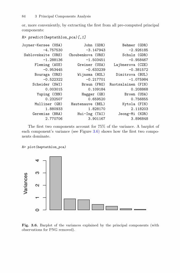
84 3 Principal Components Analysis
or, more conveniently, by extracting the first from all pre-computed principalcomponents:
R> predict(heptathlon_pca)[,1]
Joyner-Kersee (USA) John (GDR) Behmer (GDR)
-4.757530 -3.147943 -2.926185
Sablovskaite (URS) Choubenkova (URS) Schulz (GDR)
-1.288136 -1.503451 -0.958467
Fleming (AUS) Greiner (USA) Lajbnerova (CZE)
-0.953445 -0.633239 -0.381572
Bouraga (URS) Wijnsma (HOL) Dimitrova (BUL)
-0.522322 -0.217701 -1.075984
Scheider (SWI) Braun (FRG) Ruotsalainen (FIN)
0.003015 0.109184 0.208868
Yuping (CHN) Hagger (GB) Brown (USA)
0.232507 0.659520 0.756855
Mulliner (GB) Hautenauve (BEL) Kytola (FIN)
1.880933 1.828170 2.118203
Geremias (BRA) Hui-Ing (TAI) Jeong-Mi (KOR)
2.770706 3.901167 3.896848
The first two components account for 75% of the variance. A barplot ofeach component’s variance (see Figure 3.6) shows how the first two compo-nents dominate.
R> plot(heptathlon_pca)
Var
ianc
es
01
23
4
Fig. 3.6. Barplot of the variances explained by the principal components (withobservations for PNG removed).
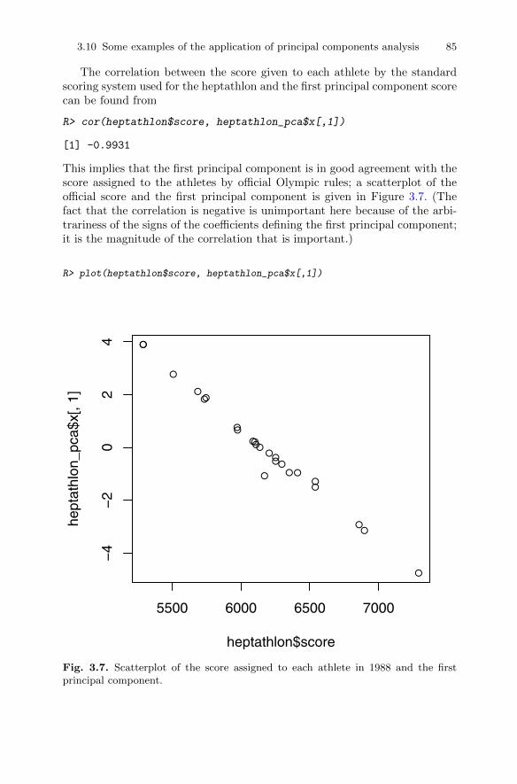
3.10 Some examples of the application of principal components analysis 85
The correlation between the score given to each athlete by the standardscoring system used for the heptathlon and the first principal component scorecan be found from
R> cor(heptathlon$score, heptathlon_pca$x[,1])
[1] -0.9931
This implies that the first principal component is in good agreement with thescore assigned to the athletes by official Olympic rules; a scatterplot of theofficial score and the first principal component is given in Figure 3.7. (Thefact that the correlation is negative is unimportant here because of the arbi-trariness of the signs of the coefficients defining the first principal component;it is the magnitude of the correlation that is important.)
R> plot(heptathlon$score, heptathlon_pca$x[,1])
●
●●
●●
●●●
●●●
●
●●●●
●●
●●●
●
●●
5500 6000 6500 7000
−4
−2
02
4
heptathlon$score
hept
athl
on_p
ca$x
[, 1]
Fig. 3.7. Scatterplot of the score assigned to each athlete in 1988 and the firstprincipal component.

86 3 Principal Components Analysis
3.10.3 Air pollution in US cities
In this subsection, we will return to the air pollution data introduced in Chap-ter 1. The data were originally collected to investigate the determinants of pol-lution, presumably by regressing SO2 on the six other variables. Here, however,we shall examine how principal components analysis can be used to explorevarious aspects of the data, and will then look at how such an analysis canalso be used to address the determinants of pollution question.
To begin we shall ignore the SO2 variable and concentrate on the others,two of which relate to human ecology (popul, manu) and four to climate (temp,Wind, precip, predays). A case can be made to use negative temperaturevalues in subsequent analyses since then all six variables are such that highvalues represent a less attractive environment. This is, of course, a personalview, but as we shall see later, the simple transformation of temp does aidinterpretation.
Prior to undertaking the principal components analysis on the air pollutiondata, we will again construct a scatterplot matrix of the six variables, but herewe include the histograms for each variable on the main diagonal. The diagramthat results is shown in Figure 3.8.
A clear message from Figure 3.8 is that there is at least one city, andprobably more than one, that should be considered an outlier. (This shouldcome as no surprise given the investigation of the data in Chapter 2.) On themanu variable, for example, Chicago, with a value of 3344, has about twice asmany manufacturing enterprises employing 20 or more workers as the city withthe second highest number (Philadelphia). We shall return to this potentialproblem later in the chapter, but for the moment we shall carry on with aprincipal components analysis of the data for all 41 cities.
For the data in Table 1.5, it seems necessary to extract the principal com-ponents from the correlation rather than the covariance matrix, since the sixvariables to be used are on very different scales. The correlation matrix andthe principal components of the data can be obtained in R using the followingcommand line code:
R> cor(USairpollution[,-1])
manu popul wind precip predays negtemp
manu 1.00000 0.95527 0.23795 -0.03242 0.13183 0.19004
popul 0.95527 1.00000 0.21264 -0.02612 0.04208 0.06268
wind 0.23795 0.21264 1.00000 -0.01299 0.16411 0.34974
precip -0.03242 -0.02612 -0.01299 1.00000 0.49610 -0.38625
predays 0.13183 0.04208 0.16411 0.49610 1.00000 0.43024
negtemp 0.19004 0.06268 0.34974 -0.38625 0.43024 1.00000
R> usair_pca <- princomp(USairpollution[,-1], cor = TRUE)
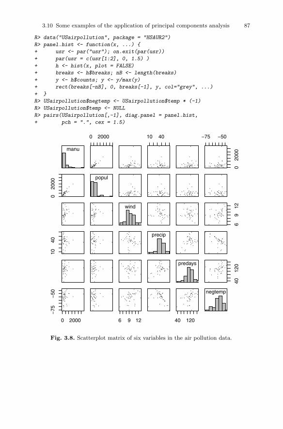
3.10 Some examples of the application of principal components analysis 87
R> data("USairpollution", package = "HSAUR2")
R> panel.hist <- function(x, ...) {
+ usr <- par("usr"); on.exit(par(usr))
+ par(usr = c(usr[1:2], 0, 1.5) )
+ h <- hist(x, plot = FALSE)
+ breaks <- h$breaks; nB <- length(breaks)
+ y <- h$counts; y <- y/max(y)
+ rect(breaks[-nB], 0, breaks[-1], y, col="grey", ...)
+ }
R> USairpollution$negtemp <- USairpollution$temp * (-1)
R> USairpollution$temp <- NULL
R> pairs(USairpollution[,-1], diag.panel = panel.hist,
+ pch = ".", cex = 1.5)
manu
0 2000 10 40 −75 −50
020
00
020
00
popul
wind
69
12
1040
precip
predays
4012
0
0 2000
−75
−50
6 9 12 40 120
negtemp
Fig. 3.8. Scatterplot matrix of six variables in the air pollution data.
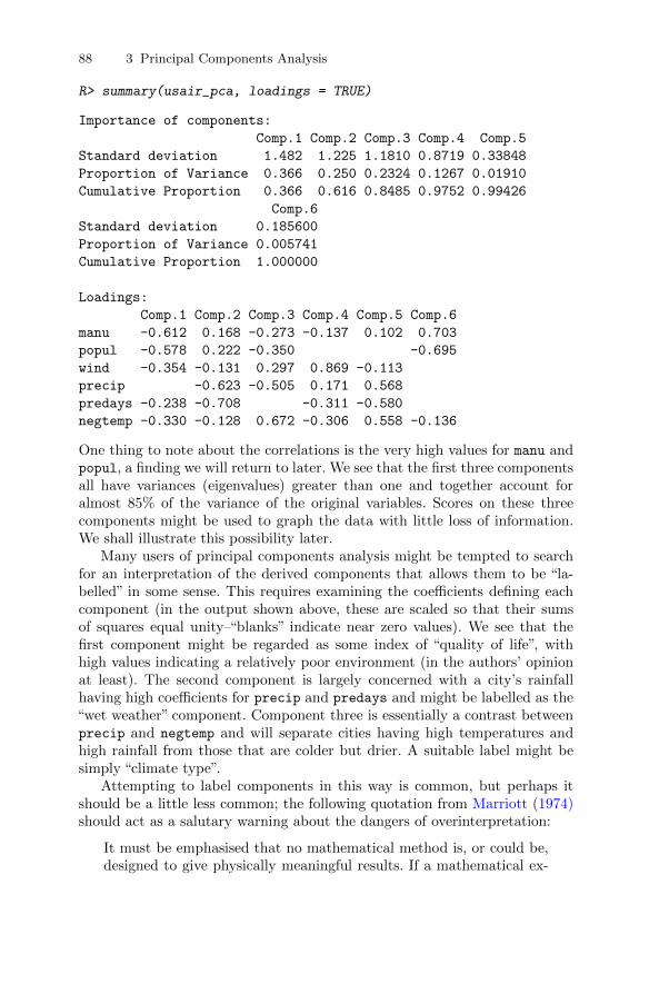
88 3 Principal Components Analysis
R> summary(usair_pca, loadings = TRUE)
Importance of components:
Comp.1 Comp.2 Comp.3 Comp.4 Comp.5
Standard deviation 1.482 1.225 1.1810 0.8719 0.33848
Proportion of Variance 0.366 0.250 0.2324 0.1267 0.01910
Cumulative Proportion 0.366 0.616 0.8485 0.9752 0.99426
Comp.6
Standard deviation 0.185600
Proportion of Variance 0.005741
Cumulative Proportion 1.000000
Loadings:
Comp.1 Comp.2 Comp.3 Comp.4 Comp.5 Comp.6
manu -0.612 0.168 -0.273 -0.137 0.102 0.703
popul -0.578 0.222 -0.350 -0.695
wind -0.354 -0.131 0.297 0.869 -0.113
precip -0.623 -0.505 0.171 0.568
predays -0.238 -0.708 -0.311 -0.580
negtemp -0.330 -0.128 0.672 -0.306 0.558 -0.136
One thing to note about the correlations is the very high values for manu andpopul, a finding we will return to later. We see that the first three componentsall have variances (eigenvalues) greater than one and together account foralmost 85% of the variance of the original variables. Scores on these threecomponents might be used to graph the data with little loss of information.We shall illustrate this possibility later.
Many users of principal components analysis might be tempted to searchfor an interpretation of the derived components that allows them to be “la-belled” in some sense. This requires examining the coefficients defining eachcomponent (in the output shown above, these are scaled so that their sumsof squares equal unity–“blanks” indicate near zero values). We see that thefirst component might be regarded as some index of “quality of life”, withhigh values indicating a relatively poor environment (in the authors’ opinionat least). The second component is largely concerned with a city’s rainfallhaving high coefficients for precip and predays and might be labelled as the“wet weather” component. Component three is essentially a contrast betweenprecip and negtemp and will separate cities having high temperatures andhigh rainfall from those that are colder but drier. A suitable label might besimply “climate type”.
Attempting to label components in this way is common, but perhaps itshould be a little less common; the following quotation from Marriott (1974)should act as a salutary warning about the dangers of overinterpretation:
It must be emphasised that no mathematical method is, or could be,designed to give physically meaningful results. If a mathematical ex-
3.10 Some examples of the application of principal components analysis 89
pression of this sort has an obvious physical meaning, it must be at-tributed to a lucky change, or to the fact that the data have a stronglymarked structure that shows up in analysis. Even in the latter case,quite small sampling fluctuations can upset the interpretation; for ex-ample, the first two principal components may appear in reverse order,or may become confused altogether. Reification then requires consid-erable skill and experience if it is to give a true picture of the physicalmeaning of the data.
Even if we do not care to label the three components, they can still be usedas the basis of various graphical displays of the cities. In fact, this is often themost useful aspect of a principal components analysis since regarding theprincipal components analysis as a means of providing an informative viewof multivariate data has the advantage of making it less urgent or temptingto try to interpret and label the components. The first few component scoresprovide a low-dimensional “map” of the observations in which the Euclideandistances between the points representing the individuals best approximatein some sense the Euclidean distances between the individuals based on theoriginal variables. We shall return to this point in Chapter 4.
So we will begin by looking at the scatterplot matrix of the first threeprincipal components and in each panel show the relevant bivariate boxplot;points are labelled by abbreviated city names. The plot and the code used tocreate it are shown in Figure 3.9.
The plot again demonstrates clearly that Chicago is an outlier and suggeststhat Phoenix and Philadelphia may also be suspects in this respect. Phoenixappears to offer the best quality of life (on the limited basis of the six variablesrecorded), and Buffalo is a city to avoid if you prefer a drier environment. Weleave further interpretation to the readers.
We will now consider the main goal in the researcher’s mind when col-lecting the air pollution data, namely determining which of the climate andhuman ecology variables are the best predictors of the degree of air pollutionin a city as measured by the sulphur dioxide content of the air. This ques-tion would normally be addressed by multiple linear regression, but there isa potential problem with applying this technique to the air pollution data,and that is the very high correlation between the manu and popul variables.We might, of course, deal with this problem by simply dropping either manu
or popul, but here we will consider a possible alternative approach, and thatis regressing the SO2 levels on the principal components derived from the sixother variables in the data (see Figure 3.10). Using principal components inregression analysis is discussed in detail in Jolliffe (2002); here we simply givean example. The first question we need to ask is “how many principal compo-nents should be used as explanatory variables in the regression?” The obviousanswer to this question is to use the number of principal components thatwere identified as important in the original analysis; for example, those witheigenvalues greater than one. But this is a case where the obvious answer is
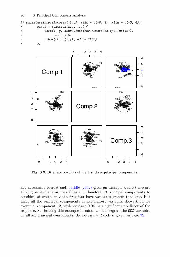
90 3 Principal Components Analysis
R> pairs(usair_pca$scores[,1:3], ylim = c(-6, 4), xlim = c(-6, 4),
+ panel = function(x,y, ...) {
+ text(x, y, abbreviate(row.names(USairpollution)),
+ cex = 0.6)
+ bvbox(cbind(x,y), add = TRUE)
+ })
Comp.1
−6 −2 0 2 4
AlbnAlbq
Atln
BltmBffl
Chrl
Chcg
Cncn
Clvl
Clmb DllsDnvrDsMn
Dtrt
HrtfHstnIndn
Jcks
KnsC
LttR
LsvlMmphMiam
MlwkMnnp
NshvNwOr
NrflOmah
Phld
Phnx
PttsPrvd
Rchm SlLCSnFr
Sttl St.LWshnWchtWlmn●
●
●
●
●
●
●
●
●
● ● ●●
●
●●●
●
●
●
●●
●
●●
●●
●●
●
●
●●
● ●●
● ●●●●
−6
−2
02
4
AlbnAlbq
Atln
BltmBffl
Chrl
Chcg
Cncn
Clvl
ClmbDlls DnvrDsMn
Dtrt
HrtfHstn Indn
Jcks
KnsC
LttR
LsvlMmphMiam
MlwkMnnp
NshvNwOr
NrflOmah
Phld
Phnx
PttsPrvd
Rchm SlLCSnFr
SttlSt.LWshnWchtWlmn
●
●
●
●
●
●
●
●
●
●● ●●
●
●● ●
●
●
●
●●
●
●●
●●
●●
●
●
●●
● ●●
●●●●
●
−6
−2
02
4
Albn
Albq
AtlnBltm
BfflChrl
Chcg
CncnClvl
Clmb
DllsDnvr
DsMnDtrt
Hrtf
HstnIndn
Jcks
KnsCLttRLsvlMmph
Miam
MlwkMnnp NshvNwOrNrfl
OmahPhld
Phnx
PttsPrvdRchm
SlLCSnFr
Sttl
St.LWshnWcht
Wlmn●
●
●●
●●
●
●●
●
●●
●●
●
●●
●
●●●●
●
●● ●●●
●●
●
●●●
●●
●
●●●
● Comp.2 Albn
Albq
AtlnBltm
BfflChrl
Chcg
CncnClvl
Clmb
DllsDnvr
DsMnDtrt
Hrtf
HstnIndn
Jcks
KnsCLttRLsvlMmph
Miam
MlwkMnnpNshvNwOr Nrfl
OmahPhld
Phnx
PttsPrvdRchm
SlLCSnFr
Sttl
St.LWshnWcht
Wlmn●
●
●●
●●
●
●●
●
●●
●●
●
●●
●
●●●●
●
●●●● ●
●●
●
●●●
●●
●
●●
●
●
−6 −2 0 2 4
AlbnAlbq
AtlnBltm
Bffl
Chrl
Chcg
Cncn
Clvl Clmb
Dlls
DnvrDsMn
DtrtHrtf
Hstn
Indn
Jcks
KnsC
LttRLsvlMmph
Miam
MlwkMnnp
Nshv
NwOr
Nrfl
Omah
PhldPhnx
PttsPrvd
Rchm
SlLC
SnFrSttlSt.LWshn
WchtWlmn● ●
●●
●
●
●
●
● ●
●
●●
●●
●
●
●
●
●●●
●
●●
●
●
●
●
●●
●●
●
●
●●●●
●●
Albn Albq
AtlnBltm
Bffl
Chrl
Chcg
Cncn
ClvlClmb
Dlls
DnvrDsMn
DtrtHrtf
Hstn
Indn
Jcks
KnsC
LttRLsvlMmph
Miam
MlwkMnnp
Nshv
NwOr
Nrfl
Omah
PhldPhnx
PttsPrvd
Rchm
SlLC
SnFrSttlSt.LWshn
WchtWlmn● ●
●●
●
●
●
●
●●
●
●●
●●
●
●
●
●
●●●
●
●●
●
●
●
●
●●
●●
●
●
●●
●●
●●
−6 −2 0 2 4
−6
−2
02
4Comp.3
Fig. 3.9. Bivariate boxplots of the first three principal components.
not necessarily correct and, Jolliffe (2002) gives an example where there are13 original explanatory variables and therefore 13 principal components toconsider, of which only the first four have variances greater than one. Butusing all the principal components as explanatory variables shows that, forexample, component 12, with variance 0.04, is a significant predictor of theresponse. So, bearing this example in mind, we will regress the SO2 variableson all six principal components; the necessary R code is given on page 92.
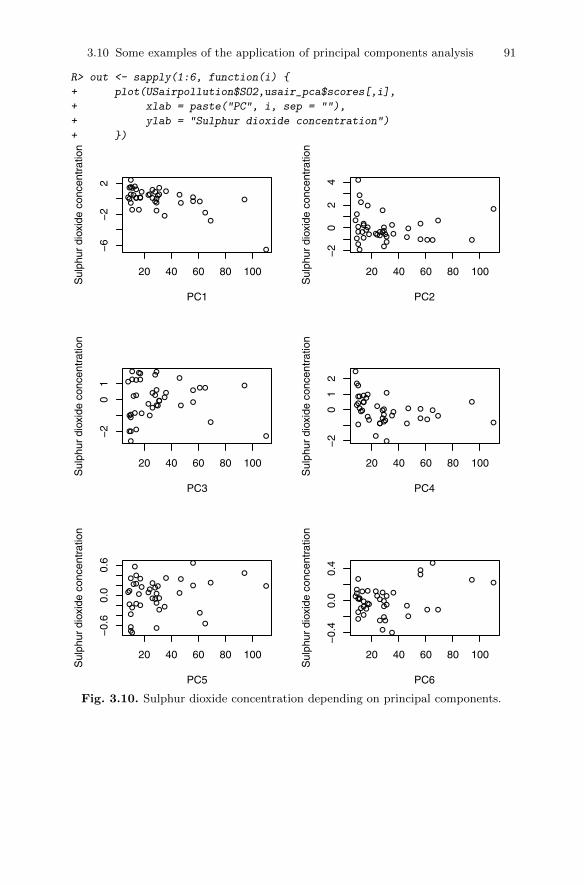
3.10 Some examples of the application of principal components analysis 91
R> out <- sapply(1:6, function(i) {
+ plot(USairpollution$SO2,usair_pca$scores[,i],
+ xlab = paste("PC", i, sep = ""),
+ ylab = "Sulphur dioxide concentration")
+ })
●●
●
●●
●
●
●
●
●● ●●
●
●● ●
●
●
●
●●●
● ●
●●
●●
●
●
● ●
●●●
● ●●●●
20 40 60 80 100
−6
−2
2
PC1
Sul
phur
dio
xide
con
cent
ratio
n
●
●
●●
●●
●
●●
●
●
●
● ●
●
●●
●
●● ●●
●
● ●●
● ●
● ●
●
● ●
●
●
●
●
●●
●
●
20 40 60 80 100
−2
02
4
PC2S
ulph
ur d
ioxi
de c
once
ntra
tion
●●
●
●
●
●
●
●
●●
●
●●
●●
●
●
●
●
●●
●
●
● ●
●
●
●
●
●●
● ●
●
●
●●
●●
●
●
20 40 60 80 100
−2
01
PC3
Sul
phur
dio
xide
con
cent
ratio
n
●
● ● ●
●
●
●
●
●
●
●
●
●
● ●
●
●
●●
●
●
●● ●
●●
●
●●
●
●●
●
●●
●
●
●●
●
●
20 40 60 80 100
−2
01
2
PC4
Sul
phur
dio
xide
con
cent
ratio
n
●
●
●
●
●
●
●●
●
●● ●
●
●
●
●
●
●
●
●
●●
●
●
●
●●
●
● ●
●
●
●
●
●
●
●
●
●●
●
20 40 60 80 100
−0.
60.
00.
6
PC5
Sul
phur
dio
xide
con
cent
ratio
n
●● ●
●
● ●
●
●
●
●
● ●
●
●
●
●
●
●
●
●
●
●
●
●●
●
●
●● ●
●
●
●
●●
● ●
●
●
●●
20 40 60 80 100
−0.
40.
00.
4
PC6
Sul
phur
dio
xide
con
cent
ratio
n
Fig. 3.10. Sulphur dioxide concentration depending on principal components.
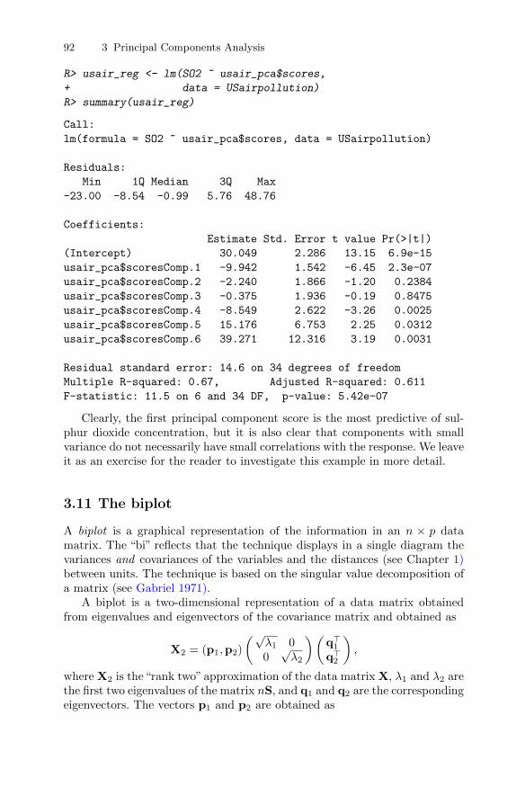
92 3 Principal Components Analysis
R> usair_reg <- lm(SO2 ~ usair_pca$scores,
+ data = USairpollution)
R> summary(usair_reg)
Call:
lm(formula = SO2 ~ usair_pca$scores, data = USairpollution)
Residuals:
Min 1Q Median 3Q Max
-23.00 -8.54 -0.99 5.76 48.76
Coefficients:
Estimate Std. Error t value Pr(>|t|)
(Intercept) 30.049 2.286 13.15 6.9e-15
usair_pca$scoresComp.1 -9.942 1.542 -6.45 2.3e-07
usair_pca$scoresComp.2 -2.240 1.866 -1.20 0.2384
usair_pca$scoresComp.3 -0.375 1.936 -0.19 0.8475
usair_pca$scoresComp.4 -8.549 2.622 -3.26 0.0025
usair_pca$scoresComp.5 15.176 6.753 2.25 0.0312
usair_pca$scoresComp.6 39.271 12.316 3.19 0.0031
Residual standard error: 14.6 on 34 degrees of freedom
Multiple R-squared: 0.67, Adjusted R-squared: 0.611
F-statistic: 11.5 on 6 and 34 DF, p-value: 5.42e-07
Clearly, the first principal component score is the most predictive of sul-phur dioxide concentration, but it is also clear that components with smallvariance do not necessarily have small correlations with the response. We leaveit as an exercise for the reader to investigate this example in more detail.
3.11 The biplot
A biplot is a graphical representation of the information in an n × p datamatrix. The “bi” reflects that the technique displays in a single diagram thevariances and covariances of the variables and the distances (see Chapter 1)between units. The technique is based on the singular value decomposition ofa matrix (see Gabriel 1971).
A biplot is a two-dimensional representation of a data matrix obtainedfrom eigenvalues and eigenvectors of the covariance matrix and obtained as
X2 = (p1,p2)
(√λ1 00√λ2
)(q>1q>2
),
where X2 is the“rank two”approximation of the data matrix X, λ1 and λ2 arethe first two eigenvalues of the matrix nS, and q1 and q2 are the correspondingeigenvectors. The vectors p1 and p2 are obtained as
3.12 Sample size for principal components analysis 93
pi =1√λi
Xqi; i = 1, 2.
The biplot is the plot of the n rows of√n(p1,p2) and the q rows of
n−1/2(√λ1q1,
√λ2q2) represented as vectors. The distance between the points
representing the units reflects the generalised distance between the units (seeChapter 1), the length of the vector from the origin to the coordinates rep-resenting a particular variable reflects the variance of that variable, and thecorrelation of two variables is reflected by the angle between the two corre-sponding vectors for the two variables–the smaller the angle, the greater thecorrelation. Full technical details of the biplot are given in Gabriel (1981)and in Gower and Hand (1996). The biplot for the heptathlon data omittingthe PNG competitor is shown in Figure 3.11. The plot in Figure 3.11 clearlyshows that the winner of the gold medal, Jackie Joyner-Kersee, accumulatesthe majority of her points from the three events long jump, hurdles, and 200m. We can also see from the biplot that the results of the 200 m, the hurdlesand the long jump are highly correlated, as are the results of the javelin andthe high jump; the 800 m time has relatively small correlation with all theother events and is almost uncorrelated with the high jump and javelin results.The first component largely separates the competitors by their overall score,with the second indicating which are their best events; for example, John,Choubenkova, and Behmer are placed near the end of the vector, representingthe 800 m event because this is, relatively speaking, the event in which theygive their best performance. Similarly Yuping, Scheider, and Braun can beseen to do well in the high jump. We shall have a little more to say about thebiplot in the next chapter.
3.12 Sample size for principal components analysis
There have been many suggestions about the number of units needed whenapplying principal components analysis. Intuitively, larger values of n shouldlead to more convincing results and make these results more generalisable.But unfortunately many of the suggestions made, for example that n shouldbe greater than 100 or that n should be greater than five times the numberof variables, are based on minimal empirical evidence. However, Guadagnoliand Velicer (1988) review several studies that reach the conclusion that it isthe minimum value of n rather than the ratio of n to q that is most relevant,although the range of values suggested for the minimum value of n in thesepapers, from 50 to 400, sheds some doubt on their value. And indeed otherauthors, for example Gorsuch (1983) and Hatcher (1994), lean towards theratio of the minimum value of n to q as being of greater importance andrecommend at least 5:1.
Perhaps the most detailed investigation of the problem is that reported inOsborne and Costello (2004), who found that the “best” results from principal
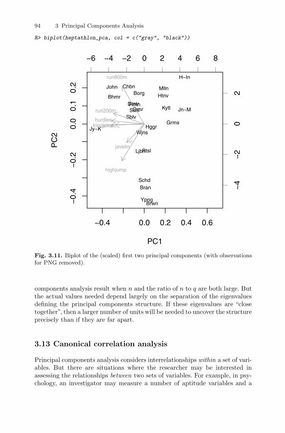
94 3 Principal Components Analysis
R> biplot(heptathlon_pca, col = c("gray", "black"))
−0.4 0.0 0.2 0.4 0.6
−0.
4−
0.2
0.0
0.1
0.2
PC1
PC
2
Jy−K
John
Bhmr
Sblv
Chbn
SchlFlmn
Grnr
Ljbn
Borg
Wjns
Dmtr
SchdBran
Rtsl
Ypng
Hggr
Brwn
MllnHtnv
Kytl
Grms
H−In
Jn−M
−6 −4 −2 0 2 4 6 8
−4
−2
02
hurdles
highjump
shot
run200m
longjump
javelin
run800m
Fig. 3.11. Biplot of the (scaled) first two principal components (with observationsfor PNG removed).
components analysis result when n and the ratio of n to q are both large. Butthe actual values needed depend largely on the separation of the eigenvaluesdefining the principal components structure. If these eigenvalues are “closetogether”, then a larger number of units will be needed to uncover the structureprecisely than if they are far apart.
3.13 Canonical correlation analysis
Principal components analysis considers interrelationships within a set of vari-ables. But there are situations where the researcher may be interested inassessing the relationships between two sets of variables. For example, in psy-chology, an investigator may measure a number of aptitude variables and a
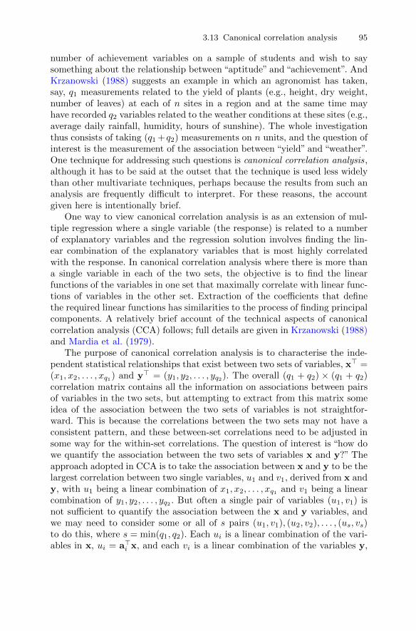
3.13 Canonical correlation analysis 95
number of achievement variables on a sample of students and wish to saysomething about the relationship between “aptitude” and “achievement”. AndKrzanowski (1988) suggests an example in which an agronomist has taken,say, q1 measurements related to the yield of plants (e.g., height, dry weight,number of leaves) at each of n sites in a region and at the same time mayhave recorded q2 variables related to the weather conditions at these sites (e.g.,average daily rainfall, humidity, hours of sunshine). The whole investigationthus consists of taking (q1 + q2) measurements on n units, and the question ofinterest is the measurement of the association between “yield” and “weather”.One technique for addressing such questions is canonical correlation analysis,although it has to be said at the outset that the technique is used less widelythan other multivariate techniques, perhaps because the results from such ananalysis are frequently difficult to interpret. For these reasons, the accountgiven here is intentionally brief.
One way to view canonical correlation analysis is as an extension of mul-tiple regression where a single variable (the response) is related to a numberof explanatory variables and the regression solution involves finding the lin-ear combination of the explanatory variables that is most highly correlatedwith the response. In canonical correlation analysis where there is more thana single variable in each of the two sets, the objective is to find the linearfunctions of the variables in one set that maximally correlate with linear func-tions of variables in the other set. Extraction of the coefficients that definethe required linear functions has similarities to the process of finding principalcomponents. A relatively brief account of the technical aspects of canonicalcorrelation analysis (CCA) follows; full details are given in Krzanowski (1988)and Mardia et al. (1979).
The purpose of canonical correlation analysis is to characterise the inde-pendent statistical relationships that exist between two sets of variables, x> =(x1, x2, . . . , xq1) and y> = (y1, y2, . . . , yq2). The overall (q1 + q2) × (q1 + q2)correlation matrix contains all the information on associations between pairsof variables in the two sets, but attempting to extract from this matrix someidea of the association between the two sets of variables is not straightfor-ward. This is because the correlations between the two sets may not have aconsistent pattern, and these between-set correlations need to be adjusted insome way for the within-set correlations. The question of interest is “how dowe quantify the association between the two sets of variables x and y?” Theapproach adopted in CCA is to take the association between x and y to be thelargest correlation between two single variables, u1 and v1, derived from x andy, with u1 being a linear combination of x1, x2, . . . , xq1 and v1 being a linearcombination of y1, y2, . . . , yq2 . But often a single pair of variables (u1, v1) isnot sufficient to quantify the association between the x and y variables, andwe may need to consider some or all of s pairs (u1, v1), (u2, v2), . . . , (us, vs)to do this, where s = min(q1, q2). Each ui is a linear combination of the vari-ables in x, ui = a>i x, and each vi is a linear combination of the variables y,
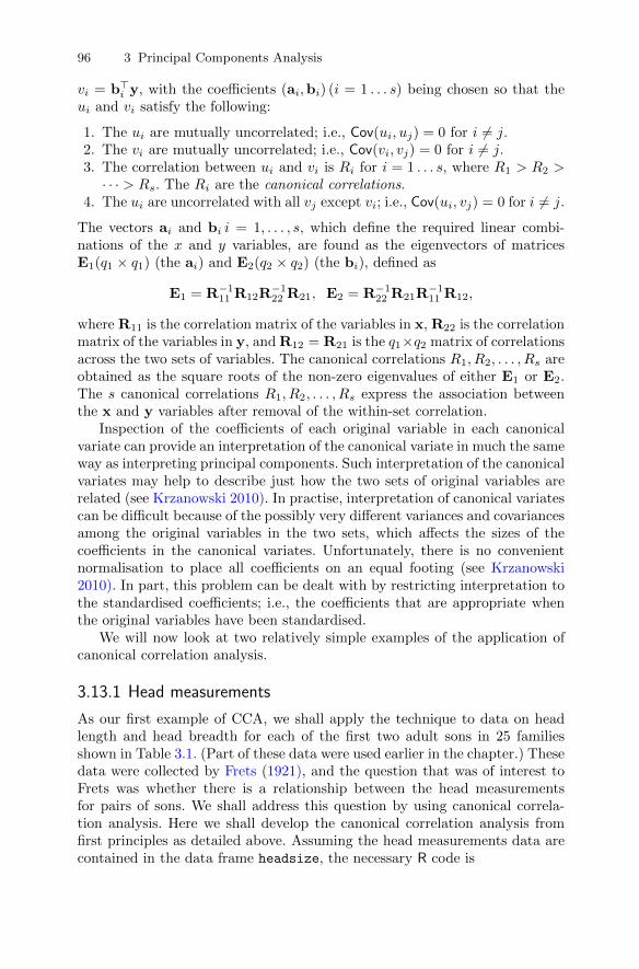
96 3 Principal Components Analysis
vi = b>i y, with the coefficients (ai,bi) (i = 1 . . . s) being chosen so that theui and vi satisfy the following:
1. The ui are mutually uncorrelated; i.e., Cov(ui, uj) = 0 for i 6= j.2. The vi are mutually uncorrelated; i.e., Cov(vi, vj) = 0 for i 6= j.3. The correlation between ui and vi is Ri for i = 1 . . . s, where R1 > R2 >· · · > Rs. The Ri are the canonical correlations.
4. The ui are uncorrelated with all vj except vi; i.e., Cov(ui, vj) = 0 for i 6= j.
The vectors ai and bi i = 1, . . . , s, which define the required linear combi-nations of the x and y variables, are found as the eigenvectors of matricesE1(q1 × q1) (the ai) and E2(q2 × q2) (the bi), defined as
E1 = R−111 R12R−122 R21, E2 = R−122 R21R
−111 R12,
where R11 is the correlation matrix of the variables in x, R22 is the correlationmatrix of the variables in y, and R12 = R21 is the q1×q2 matrix of correlationsacross the two sets of variables. The canonical correlations R1, R2, . . . , Rs areobtained as the square roots of the non-zero eigenvalues of either E1 or E2.The s canonical correlations R1, R2, . . . , Rs express the association betweenthe x and y variables after removal of the within-set correlation.
Inspection of the coefficients of each original variable in each canonicalvariate can provide an interpretation of the canonical variate in much the sameway as interpreting principal components. Such interpretation of the canonicalvariates may help to describe just how the two sets of original variables arerelated (see Krzanowski 2010). In practise, interpretation of canonical variatescan be difficult because of the possibly very different variances and covariancesamong the original variables in the two sets, which affects the sizes of thecoefficients in the canonical variates. Unfortunately, there is no convenientnormalisation to place all coefficients on an equal footing (see Krzanowski2010). In part, this problem can be dealt with by restricting interpretation tothe standardised coefficients; i.e., the coefficients that are appropriate whenthe original variables have been standardised.
We will now look at two relatively simple examples of the application ofcanonical correlation analysis.
3.13.1 Head measurements
As our first example of CCA, we shall apply the technique to data on headlength and head breadth for each of the first two adult sons in 25 familiesshown in Table 3.1. (Part of these data were used earlier in the chapter.) Thesedata were collected by Frets (1921), and the question that was of interest toFrets was whether there is a relationship between the head measurementsfor pairs of sons. We shall address this question by using canonical correla-tion analysis. Here we shall develop the canonical correlation analysis fromfirst principles as detailed above. Assuming the head measurements data arecontained in the data frame headsize, the necessary R code is

3.13 Canonical correlation analysis 97
R> headsize.std <- sweep(headsize, 2,
+ apply(headsize, 2, sd), FUN = "/")
R> R <- cor(headsize.std)
R> r11 <- R[1:2, 1:2]
R> r22 <- R[-(1:2), -(1:2)]
R> r12 <- R[1:2, -(1:2)]
R> r21 <- R[-(1:2), 1:2]
R> (E1 <- solve(r11) %*% r12 %*% solve(r22) %*%r21)
head1 breadth1
head1 0.3225 0.3168
breadth1 0.3019 0.3021
R> (E2 <- solve(r22) %*% r21 %*% solve(r11) %*%r12)
head2 breadth2
head2 0.3014 0.3002
breadth2 0.3185 0.3232
R> (e1 <- eigen(E1))
$values
[1] 0.621745 0.002888
$vectors
[,1] [,2]
[1,] 0.7270 -0.7040
[2,] 0.6866 0.7102
R> (e2 <- eigen(E2))
$values
[1] 0.621745 0.002888
$vectors
[,1] [,2]
[1,] -0.6838 -0.7091
[2,] -0.7297 0.7051
Here the four linear functions are found to be
u1 = +0.73x1 + 0.69x2,
u2 = −0.70x1 + 0.71x2,
v1 = −0.68x3 − 0.73x4,
v2 = −0.71x3 + 0.71x4.
R> girth1 <- headsize.std[,1:2] %*% e1$vectors[,1]
R> girth2 <- headsize.std[,3:4] %*% e2$vectors[,1]
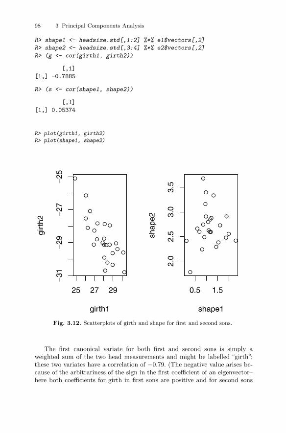
98 3 Principal Components Analysis
R> shape1 <- headsize.std[,1:2] %*% e1$vectors[,2]
R> shape2 <- headsize.std[,3:4] %*% e2$vectors[,2]
R> (g <- cor(girth1, girth2))
[,1]
[1,] -0.7885
R> (s <- cor(shape1, shape2))
[,1]
[1,] 0.05374
R> plot(girth1, girth2)
R> plot(shape1, shape2)
●
●
●●
●
●
●●
●
●
●
●
●
●
●
●
●
●
●
●
●
●
●
●
●
25 27 29
−31
−29
−27
−25
girth1
girt
h2
●
●
●
●
●
●
●
●
●
●
●
●
●
●
●
●
●
●
●
●
● ●
●●●
0.5 1.5
2.0
2.5
3.0
3.5
shape1
shap
e2
Fig. 3.12. Scatterplots of girth and shape for first and second sons.
The first canonical variate for both first and second sons is simply aweighted sum of the two head measurements and might be labelled “girth”;these two variates have a correlation of −0.79. (The negative value arises be-cause of the arbitrariness of the sign in the first coefficient of an eigenvector–here both coefficients for girth in first sons are positive and for second sons
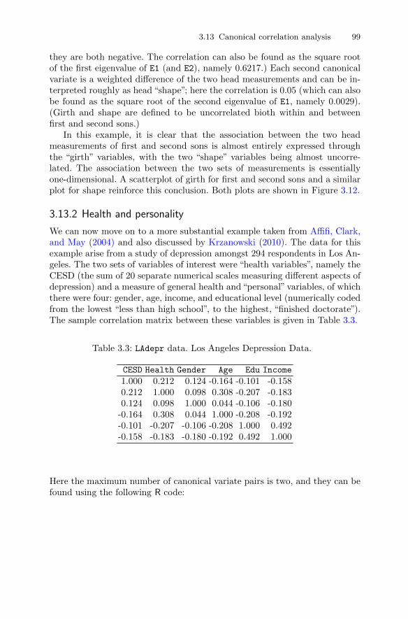
3.13 Canonical correlation analysis 99
they are both negative. The correlation can also be found as the square rootof the first eigenvalue of E1 (and E2), namely 0.6217.) Each second canonicalvariate is a weighted difference of the two head measurements and can be in-terpreted roughly as head “shape”; here the correlation is 0.05 (which can alsobe found as the square root of the second eigenvalue of E1, namely 0.0029).(Girth and shape are defined to be uncorrelated bioth within and betweenfirst and second sons.)
In this example, it is clear that the association between the two headmeasurements of first and second sons is almost entirely expressed throughthe “girth” variables, with the two “shape” variables being almost uncorre-lated. The association between the two sets of measurements is essentiallyone-dimensional. A scatterplot of girth for first and second sons and a similarplot for shape reinforce this conclusion. Both plots are shown in Figure 3.12.
3.13.2 Health and personality
We can now move on to a more substantial example taken from Affifi, Clark,and May (2004) and also discussed by Krzanowski (2010). The data for thisexample arise from a study of depression amongst 294 respondents in Los An-geles. The two sets of variables of interest were “health variables”, namely theCESD (the sum of 20 separate numerical scales measuring different aspects ofdepression) and a measure of general health and “personal” variables, of whichthere were four: gender, age, income, and educational level (numerically codedfrom the lowest “less than high school”, to the highest, “finished doctorate”).The sample correlation matrix between these variables is given in Table 3.3.
Table 3.3: LAdepr data. Los Angeles Depression Data.
CESD Health Gender Age Edu Income
1.000 0.212 0.124 -0.164 -0.101 -0.1580.212 1.000 0.098 0.308 -0.207 -0.1830.124 0.098 1.000 0.044 -0.106 -0.180
-0.164 0.308 0.044 1.000 -0.208 -0.192-0.101 -0.207 -0.106 -0.208 1.000 0.492-0.158 -0.183 -0.180 -0.192 0.492 1.000
Here the maximum number of canonical variate pairs is two, and they can befound using the following R code:
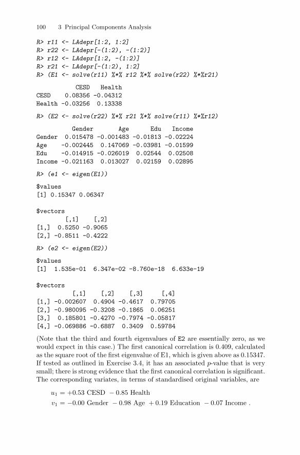
100 3 Principal Components Analysis
R> r11 <- LAdepr[1:2, 1:2]
R> r22 <- LAdepr[-(1:2), -(1:2)]
R> r12 <- LAdepr[1:2, -(1:2)]
R> r21 <- LAdepr[-(1:2), 1:2]
R> (E1 <- solve(r11) %*% r12 %*% solve(r22) %*%r21)
CESD Health
CESD 0.08356 -0.04312
Health -0.03256 0.13338
R> (E2 <- solve(r22) %*% r21 %*% solve(r11) %*%r12)
Gender Age Edu Income
Gender 0.015478 -0.001483 -0.01813 -0.02224
Age -0.002445 0.147069 -0.03981 -0.01599
Edu -0.014915 -0.026019 0.02544 0.02508
Income -0.021163 0.013027 0.02159 0.02895
R> (e1 <- eigen(E1))
$values
[1] 0.15347 0.06347
$vectors
[,1] [,2]
[1,] 0.5250 -0.9065
[2,] -0.8511 -0.4222
R> (e2 <- eigen(E2))
$values
[1] 1.535e-01 6.347e-02 -8.760e-18 6.633e-19
$vectors
[,1] [,2] [,3] [,4]
[1,] -0.002607 0.4904 -0.4617 0.79705
[2,] -0.980095 -0.3208 -0.1865 0.06251
[3,] 0.185801 -0.4270 -0.7974 -0.05817
[4,] -0.069886 -0.6887 0.3409 0.59784
(Note that the third and fourth eigenvalues of E2 are essentially zero, as wewould expect in this case.) The first canonical correlation is 0.409, calculatedas the square root of the first eigenvalue of E1, which is given above as 0.15347.If tested as outlined in Exercise 3.4, it has an associated p-value that is verysmall; there is strong evidence that the first canonical correlation is significant.The corresponding variates, in terms of standardised original variables, are
u1 = +0.53 CESD − 0.85 Health
v1 = −0.00 Gender − 0.98 Age + 0.19 Education − 0.07 Income .

3.14 Summary 101
High coefficients correspond to CESD (positively) and health (negatively)for the perceived health variables, and to Age (negatively) and Education(positively) for the personal variables. It appears that relatively older andmedicated people tend to have lower depression scores, but perceive theirhealth as relatively poor, while relatively younger but educated people havethe opposite health perception. (We are grateful to Krzanowski 2010, for thisinterpretation.)
The second canonical correlation is 0.261, calculated as the square rootof the second eigenvalue, found from the R output above to be 0.06347; thiscorrelation is also significant (see Exercise 3.4). The corresponding canonicalvariates are
u1 = −0.91 CESD − 0.42 Health
v1 = +0.49 Gender − 0.32 Age − 0.43 Education − 0.69 Income .
Since the higher value of the Gender variable is for females, the interpretationhere is that relatively young, poor, and uneducated females are associated withhigher depression scores and, to a lesser extent, with poor perceived health(again this interpretation is due to Krzanowski 2010).
3.14 Summary
Principal components analysis is among the oldest of multivariate techniques,having been introduced originally by Pearson (1901) and independently byHotelling (1933). It remains, however, one of the most widely employed meth-ods of multivariate analysis, useful both for providing a convenient methodof displaying multivariate data in a lower dimensional space and for possiblysimplifying other analyses of the data. The reduction in dimensionality thatcan often be achieved by a principal components analysis is possible only if theoriginal variables are correlated; if the original variables are independent ofone another a principal components analysis cannot lead to any simplification.
The examples of principal components analysis given in this chapter haveinvolved variables that are continuous. But when used as a descriptive tech-nique there is no reason for the variables in the analysis to be of any particulartype. So variables might be a mixture of continuous, ordinal, and even binaryvariables. Linear functions of continuous variables are perhaps easier to inter-pret than corresponding functions of binary variables, but the basic objectiveof principal components analysis, namely to summarise most of the“variation”present in the original q variables, can be achieved regardless of the nature ofthe observed variables.
The results of a canonical correlation analysis have the reputation of oftenbeing difficult to interpret, and in many respects this is a reputation thatis well earned. Certainly one has to know the variables very well to haveany hope of extracting a convincing explanation of the results. But in some
102 3 Principal Components Analysis
circumstances (the heads measurement data is an example) CCA can providea useful description and informative insights into the association between twosets of variables.
Finally, we should mention a technique known as independent componentanalysis (ICA), a potentially powerful technique that seeks to uncover hiddenvariables in high-dimensional data. In particular, ICA is often able to separateindependent sources linearly mixed in several sensors; for example, in prenataldiagnostics a multichannel electrocardiogram (ECG) may be used to record amixture of maternal and foetal electrical activity, including foetal heart rateand maternal heart rate. However, the maternal ECG will be much strongerthan the foetal signal, and the signal recorded is also likely to be affected byother sources of electrical interference. Such data can be separated into theircomponent signals by ICA, as demonstrated in Izenman (2008).
Similar mixtures of signals arise in many other areas, for example monitor-ing of human brain-wave activity and functional magnetic resonance imagingexperiments, and consequently ICA has become increasingly used in such ar-eas. Details of the methods are given in Hyvarinen (1999) and Hyvarinen,Karhunen, and Oja (2001). Interestingly, the first step in analysing multivari-ate data with ICA is often a principal components analysis. We have chosennot to describe ICA in this book because it is technically demanding andalso rather specialised, but we should mention in passing that the method isavailable in R via the add-on package fastICA (Marchini, Heaton, and Ripley2010).
3.15 Exercises
Ex. 3.1 Construct the scatterplot of the heptathlon data showing the contoursof the estimated bivariate density function on each panel. Is this graphicmore useful than the unenhanced scatterplot matrix?
Ex. 3.2 Construct a diagram that shows the SO2 variable in the air pollutiondata plotted against each of the six explanatory variables, and in eachof the scatterplots show the fitted linear regression and a fitted locallyweighted regression. Does this diagram help in deciding on the most ap-propriate model for determining the variables most predictive of sulphurdioxide levels?
Ex. 3.3 Find the principal components of the following correlation matrixgiven by MacDonnell (1902) from measurements of seven physical char-acteristics in each of 3000 convicted criminals:

3.15 Exercises 103
R =
Head lengthHead breadthFace breadthLeft finger lengthLeft forearm lengthLeft foot lengthHeight
1.0000.402 1.0000.396 0.618 1.0000.301 0.150 0.321 1.0000.305 0.135 0.289 0.846 1.0000.339 0.206 0.363 0.759 0.797 1.0000.340 0.183 0.345 0.661 0.800 0.736 1.000
.
How would you interpret the derived components?Ex. 3.4 Not all canonical correlations may be statistically significant. An
approximate test proposed by Bartlett (1947) can be used to deter-mine how many significant relationships exist. The test statistic fortesting that at least one canonical correlation is significant is Φ2
0 =−{n− 1
2(q1 + q2 + 1)
}∑si=1 log(1−λi), where the λi are the eigenvalues
of E1 and E2. Under the null hypothesis that all correlations are zero, Φ20
has a chi-square distribution with q1×q2 degrees of freedom. Write R codeto apply this test to the headsize data (Table 3.1) and the depression
data (Table 3.3).Ex. 3.5 Repeat the regression analysis for the air pollution data described
in the text after removing whatever cities you think should be regardedas outliers. For the results given in the text and the results from theoutliers-removed data, produce scatterplots of sulphur dioxide concentra-tion against each of the principal component scores. Interpret your results.


4
Multidimensional Scaling
4.1 Introduction
In Chapter 3, we noted in passing that one of the most useful ways of usingprincipal components analysis was to obtain a low-dimensional “map” of thedata that preserved as far as possible the Euclidean distances between the ob-servations in the space of the original q variables. In this chapter, we will makethis aspect of principal component analysis more explicit and also introducea class of other methods, labelled multidimensional scaling , that aim to pro-duce similar maps of data but do not operate directly on the usual multivariatedata matrix, X. Instead they are applied to distance matrices (see Chapter 1),which are derived from the matrix X (an example of a distance matrix de-rived from a small set of multivariate data is shown in Subsection 4.4.2), andalso to so-called dissimilarity or similarity matrices that arise directly in anumber of ways, in particular from judgements made by human raters abouthow alike pairs of objects, stimuli, etc., of interest are. An example of a di-rectly observed dissimilarity matrix is shown in Table 4.5, with judgementsabout political and war leaders that had major roles in World War II beinggiven by a subject after receiving the simple instructions to rate each pair ofpoliticians on a nine-point scale, with 1 indicating two politicians they regardas very similar and 9 indicating two they regard as very dissimilar. (If thenine point-scale had been 1 for very dissimilar and 9 for very similar, then theresult would have been a rating of similarity, although similarities are oftenscaled to lie in a [0, 1] interval. The term proximity is often used to encompassboth dissimilarity and similarity ratings.)
4.2 Models for proximity data
Models are fitted to proximities in order to clarify, display, and help under-stand and possibly explain any structure or pattern amongst the observed or
DOI 10.1007/978-1-4419-9650-3_4, © Springer Science+Business Media, LLC 2011
105B. Everitt and T. Hothorn, An Introduction to Applied Multivariate Analysis with R: Use R!,
106 4 Multidimensional Scaling
calculated proximities not readily apparent in the collection of numerical val-ues. In some areas, particularly psychology, the ultimate goal in the analysis ofa set of proximities is more specific, namely the development of theories for ex-plaining similarity judgements; in other words, trying to answer the question,“what makes things seem alike or seem different?” According to Carroll andArabie (1980) and Carroll, Clark, and DeSarbo (1984), models for the analysisof proximity data can be categorised into one of three major classes: spatialmodels, tree models, and hybrid models. In this chapter and in this book, weonly deal with the first of these three classes. For details of tree models andhybrid models, see, for example, Everitt and Rabe-Hesketh (1997).
4.3 Spatial models for proximities: Multidimensionalscaling (MDS)
A spatial representation of a proximity matrix consists of a set of n m-dimensional coordinates, each one of which represents one of the n units inthe data. The required coordinates are generally found by minimising somemeasure of “fit” between the distances implied by the coordinates and the ob-served proximities. In simple terms, a geometrical model is sought in which thelarger the observed distance or dissimilarity between two units (or the smallertheir similarity), the further apart should be the points representing them inthe model. In general (but not exclusively), the distances between the pointsin the spatial model are assumed to be Euclidean. Finding the best-fitting setof coordinates and the appropriate value of m needed to adequately representthe observed proximities is the aim of the many methods of multidimensionalscaling that have been proposed. The hope is that the number of dimensions,m, will be small, ideally two or three, so that the derived spatial configurationcan be easily plotted. Multidimensional scaling is essentially a data reductiontechnique because the aim is to find a set of points in low dimension thatapproximate the possibly high-dimensional configuration represented by theoriginal proximity matrix. The variety of methods that have been proposedlargely differ in how agreement between fitted distances and observed prox-imities is assessed. In this chapter, we will consider two methods, classicalmultidimensional scaling and non-metric multidimensional scaling .
4.4 Classical multidimensional scaling
First, like all MDS techniques, classical scaling seeks to represent a proximitymatrix by a simple geometrical model or map. Such a model is characterisedby a set of points x1,x2, . . . ,xn, in m dimensions, each point representingone of the units of interest, and a measure of the distance between pairs ofpoints. The objective of MDS is to determine both the dimensionality, m,of the model, and the n m-dimensional coordinates, x1,x2, . . . ,xn, so that

4.4 Classical multidimensional scaling 107
the model gives a “good” fit for the observed proximities. Fit will often bejudged by some numerical index that measures how well the proximities andthe distances in the geometrical model match. In essence, this simply meansthat the larger an observed dissimilarity between two stimuli (or the smallertheir similarity), the further apart should be the points representing them inthe final geometrical model.
The question now arises as to how we estimate m, and the coordinate val-ues x1,x2, . . . ,xn, from the observed proximity matrix. Classical scaling pro-vides an answer to this question based on the work of Young and Householder(1938). To begin, we must note that there is no unique set of coordinate valuesthat give rise to a set of distances since the distances are unchanged by shiftingthe whole configuration of points from one place to another or by rotation orreflection of the configuration. In other words, we cannot uniquely determineeither the location or the orientation of the configuration. The location prob-lem is usually overcome by placing the mean vector of the configuration atthe origin. The orientation problem means that any configuration derived canbe subjected to an arbitrary orthogonal transformation (see Chapter 5). Suchtransformations can often be used to facilitate the interpretation of solutions,as will be seen later (and again see Chapter 5).
4.4.1 Classical multidimensional scaling: Technical details
To begin our account of the method, we shall assume that the proximitymatrix we are dealing with is a matrix of Euclidean distances, D, derivedfrom a raw n × q data matrix, X. In Chapter 1, we saw how to calculateEuclidean distances from X; classical multidimensional scaling is essentiallyconcerned with the reverse problem: given the distances, how do we find X?First assume X is known and consider the n× n inner products matrix, B
B = XX>. (4.1)
The elements of B are given by
bij =
q∑k=1
xikxjk. (4.2)
It is easy to see that the squared Euclidean distances between the rows of Xcan be written in terms of the elements of B as
d2ij = bii + bjj − 2bij . (4.3)
If the bs could be found in terms of the ds in the equation above, then therequired coordinate values could be derived by factoring B as in (4.1). Nounique solution exists unless a location constraint is introduced; usually thecentre of the points x is set at the origin, so that
∑ni=1 xik = 0 for all k =
1, 2 . . .m. These constraints and the relationship given in (4.2) imply that the
108 4 Multidimensional Scaling
sum of the terms in any row of B must be zero. Consequently, summing therelationship given in (4.2) over i, over j, and finally over both i and j leadsto the series of equations
n∑i=1
d2ij = T + nbjj ,
n∑j=1
d2ij = T + nbii,
n∑i=1
n∑j=1
d2ij = 2nT,
where T =∑ni=1 bii is the trace of the matrix B. The elements of B can now
be found in terms of squared Euclidean distances as
bij = −1
2
(d2ij − d2i. − d2.j + d2..
),
where
d2i. =1
n
n∑j=1
d2ij ,
d2.j =1
n
n∑i=1
d2ij ,
d2.. =1
n2
n∑i=1
n∑j=1
d2ij .
Having now derived the elements of B in terms of Euclidean distances, itremains to factor it to give the coordinate values. In terms of its spectraldecomposition (see Chapter 3), B can be written as
B = VΛV>,
where Λ = diag (λ1, . . . , λn) is the diagonal matrix of eigenvalues of B andV = (V1, . . . ,Vn) the corresponding matrix of eigenvectors, normalised sothat the sum of squares of their elements is unity, that is, ViV
>i = 1. The
eigenvalues are assumed to be labelled such that λ1 ≥ λ2 ≥ · · · ≥ λn. WhenD arises from an n × q matrix of full rank, then the rank of B is q, so thatthe last n− q of its eigenvalues will be zero. So B can be written as
B = V1Λ1V>1 ,
where V1 contains the first q eigenvectors and Λ1 the q non-zero eigenvalues.The required coordinate values are thus
4.4 Classical multidimensional scaling 109
X = V1Λ121 ,
where Λ121 = diag
(λ
121 , . . . , λ
12q
).
Using all q-dimensions will lead to complete recovery of the original Eu-clidean distance matrix. The best-fitting m-dimensional representation isgiven by the m eigenvectors of B corresponding to the m largest eigenval-ues. The adequacy of the m-dimensional representation can be judged by thesize of the criterion
Pm =
∑mi=1 λi∑ni=1 λi
.
Values of Pm of the order of 0.8 suggest a reasonable fit.It should be mentioned here that where the proximity matrix contains
Euclidean distances calculated from an n × q data matrix X, classical scal-ing can be shown to be equivalent to principal components analysis, with therequired coordinate values corresponding to the scores on the principal com-ponent extracted from the covariance matrix of the data. One result of thisduality is that classical multidimensional scaling is also referred to as principalcoordinates–see Gower (1966). And the m-dimensional principal componentssolution (m < q) is “best” in the sense that it minimises the measure of fit
S =
n∑i=1
n∑i=1
(d2ij −
(d(m)ij
)2),
where dij is the Euclidean distance between individuals i and j based on their
original q variable values and d(m)ij is the corresponding distance calculated
from the m principal component scores.When the observed proximity matrix is not Euclidean, the matrix B is
not positive-definite. In such cases, some of the eigenvalues of B will be neg-ative; correspondingly, some coordinate values will be complex numbers. If,however, B has only a small number of small negative eigenvalues, a usefulrepresentation of the proximity matrix may still be possible using the eigen-vectors associated with the m largest positive eigenvalues. The adequacy ofthe resulting solution might be assessed using one of the following two criteriasuggested by Mardia et al. (1979):
P (1)m =
∑mi=1 |λi|∑ni=1 |λi|
,
P (2)m =
∑mi=1 λ
2i∑n
i=1 λ2i
.
Again we would look for values above 0.8 to claim a “good” fit. Alternatively,Sibson (1979) recommends one of the following two criteria for deciding onthe number of dimensions for the spatial model to adequately represent theobserved proximities:
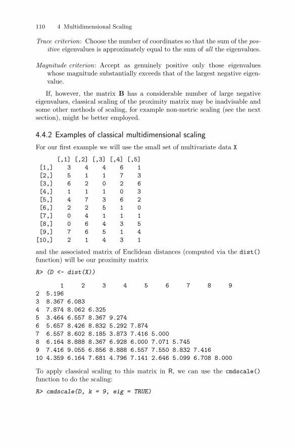
110 4 Multidimensional Scaling
Trace criterion: Choose the number of coordinates so that the sum of the pos-itive eigenvalues is approximately equal to the sum of all the eigenvalues.
Magnitude criterion: Accept as genuinely positive only those eigenvalueswhose magnitude substantially exceeds that of the largest negative eigen-value.
If, however, the matrix B has a considerable number of large negativeeigenvalues, classical scaling of the proximity matrix may be inadvisable andsome other methods of scaling, for example non-metric scaling (see the nextsection), might be better employed.
4.4.2 Examples of classical multidimensional scaling
For our first example we will use the small set of multivariate data X
[,1] [,2] [,3] [,4] [,5]
[1,] 3 4 4 6 1
[2,] 5 1 1 7 3
[3,] 6 2 0 2 6
[4,] 1 1 1 0 3
[5,] 4 7 3 6 2
[6,] 2 2 5 1 0
[7,] 0 4 1 1 1
[8,] 0 6 4 3 5
[9,] 7 6 5 1 4
[10,] 2 1 4 3 1
and the associated matrix of Euclidean distances (computed via the dist()
function) will be our proximity matrix
R> (D <- dist(X))
1 2 3 4 5 6 7 8 9
2 5.196
3 8.367 6.083
4 7.874 8.062 6.325
5 3.464 6.557 8.367 9.274
6 5.657 8.426 8.832 5.292 7.874
7 6.557 8.602 8.185 3.873 7.416 5.000
8 6.164 8.888 8.367 6.928 6.000 7.071 5.745
9 7.416 9.055 6.856 8.888 6.557 7.550 8.832 7.416
10 4.359 6.164 7.681 4.796 7.141 2.646 5.099 6.708 8.000
To apply classical scaling to this matrix in R, we can use the cmdscale()
function to do the scaling:
R> cmdscale(D, k = 9, eig = TRUE)

4.4 Classical multidimensional scaling 111
$points
[,1] [,2] [,3] [,4] [,5] [,6]
[1,] -1.6038 -2.38061 -2.2301 -0.3657 0.11536 0.000e+00
[2,] -2.8246 2.30937 -3.9524 0.3419 0.33169 -2.797e-08
[3,] -1.6908 5.13970 1.2880 0.6503 -0.05134 -1.611e-09
[4,] 3.9528 2.43234 0.3834 0.6864 -0.03461 -7.393e-09
[5,] -3.5985 -2.75538 -0.2551 1.0784 -1.26125 -5.198e-09
[6,] 2.9520 -1.35475 -0.1899 -2.8211 0.12386 -2.329e-08
[7,] 3.4690 -0.76411 0.3017 1.6369 -1.94210 -1.452e-08
[8,] 0.3545 -2.31409 2.2162 2.9240 2.00450 -1.562e-08
[9,] -2.9362 0.01280 4.3117 -2.5123 -0.18912 -1.404e-08
[10,] 1.9257 -0.32527 -1.8734 -1.6189 0.90299 6.339e-09
[,7] [,8] [,9]
[1,] 1.791e-08 NaN NaN
[2,] -1.209e-09 NaN NaN
[3,] 1.072e-09 NaN NaN
[4,] 1.088e-08 NaN NaN
[5,] -2.798e-09 NaN NaN
[6,] -7.146e-09 NaN NaN
[7,] 3.072e-09 NaN NaN
[8,] 2.589e-10 NaN NaN
[9,] 7.476e-09 NaN NaN
[10,] 3.303e-09 NaN NaN
$eig
[1] 7.519e+01 5.881e+01 4.961e+01 3.043e+01 1.037e+01
[6] 2.101e-15 5.769e-16 -2.819e-15 -3.233e-15 -6.274e-15
$x
NULL
$ac
[1] 0
$GOF
[1] 1 1
Note that as q = 5 in this example, eigenvalues six to nine are essentially zeroand only the first five columns of points represent the Euclidean distance ma-trix. First we should confirm that the five-dimensional solution achieves com-plete recovery of the observed distance matrix. We can do this simply by com-paring the original distances with those calculated from the five-dimensionalscaling solution coordinates using the following R code:
R> max(abs(dist(X) - dist(cmdscale(D, k = 5))))
[1] 1.243e-14

112 4 Multidimensional Scaling
This confirms that all the differences are essentially zero and that therefore theobserved distance matrix is recovered by the five-dimensional classical scalingsolution.
We can also check the duality of classical scaling of Euclidean distances andprincipal components analysis mentioned previously in the chapter by com-paring the coordinates of the five-dimensional scaling solution given abovewith the first five principal component (up to signs) scores obtained by apply-ing PCA to the covariance matrix of the original data; the necessary R codeis
R> max(abs(prcomp(X)$x) - abs(cmdscale(D, k = 5)))
[1] 3.035e-14
Now let us look at two examples involving distances that are not Eu-clidean. First, we will calculate the Manhattan distances between the rows ofthe small data matrix X. The Manhattan distance for units i and j is givenby∑qk=1 |xik − xjk|, and these distances are not Euclidean. (Manhattan dis-
tances will be familiar to those readers who have walked around New York.)The R code for calculating the Manhattan distances and then applying clas-sical multidimensional scaling to the resulting distance matrix is:
R> X_m <- cmdscale(dist(X, method = "manhattan"),
+ k = nrow(X) - 1, eig = TRUE)
The criteria P(1)m and P
(2)m can be computed from the eigenvalues as follows:
R> (X_eigen <- X_m$eig)
[1] 2.807e+02 2.494e+02 2.289e+02 9.251e+01 4.251e+01
[6] 2.197e+01 -7.105e-15 -1.507e+01 -2.805e+01 -5.683e+01
Note that some of the eigenvalues are negative in this case.
R> cumsum(abs(X_eigen)) / sum(abs(X_eigen))
[1] 0.2763 0.5218 0.7471 0.8382 0.8800 0.9016 0.9016 0.9165
[9] 0.9441 1.0000
R> cumsum(X_eigen^2) / sum(X_eigen^2)
[1] 0.3779 0.6764 0.9276 0.9687 0.9773 0.9796 0.9796 0.9807
[9] 0.9845 1.0000
The values of both criteria suggest that a three-dimensional solution seems tofit well.
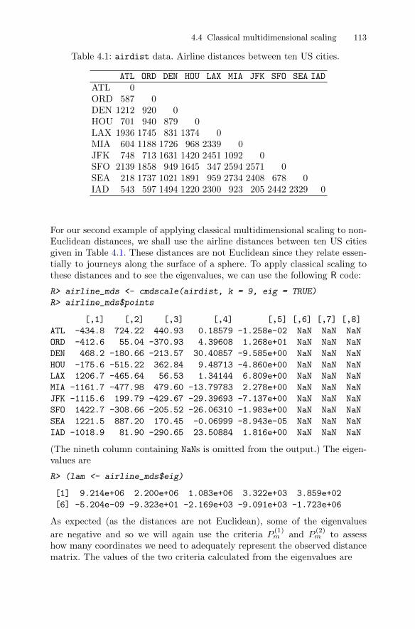
4.4 Classical multidimensional scaling 113
Table 4.1: airdist data. Airline distances between ten US cities.
ATL ORD DEN HOU LAX MIA JFK SFO SEA IAD
ATL 0ORD 587 0DEN 1212 920 0HOU 701 940 879 0LAX 1936 1745 831 1374 0MIA 604 1188 1726 968 2339 0JFK 748 713 1631 1420 2451 1092 0SFO 2139 1858 949 1645 347 2594 2571 0SEA 218 1737 1021 1891 959 2734 2408 678 0IAD 543 597 1494 1220 2300 923 205 2442 2329 0
For our second example of applying classical multidimensional scaling to non-Euclidean distances, we shall use the airline distances between ten US citiesgiven in Table 4.1. These distances are not Euclidean since they relate essen-tially to journeys along the surface of a sphere. To apply classical scaling tothese distances and to see the eigenvalues, we can use the following R code:
R> airline_mds <- cmdscale(airdist, k = 9, eig = TRUE)
R> airline_mds$points
[,1] [,2] [,3] [,4] [,5] [,6] [,7] [,8]
ATL -434.8 724.22 440.93 0.18579 -1.258e-02 NaN NaN NaN
ORD -412.6 55.04 -370.93 4.39608 1.268e+01 NaN NaN NaN
DEN 468.2 -180.66 -213.57 30.40857 -9.585e+00 NaN NaN NaN
HOU -175.6 -515.22 362.84 9.48713 -4.860e+00 NaN NaN NaN
LAX 1206.7 -465.64 56.53 1.34144 6.809e+00 NaN NaN NaN
MIA -1161.7 -477.98 479.60 -13.79783 2.278e+00 NaN NaN NaN
JFK -1115.6 199.79 -429.67 -29.39693 -7.137e+00 NaN NaN NaN
SFO 1422.7 -308.66 -205.52 -26.06310 -1.983e+00 NaN NaN NaN
SEA 1221.5 887.20 170.45 -0.06999 -8.943e-05 NaN NaN NaN
IAD -1018.9 81.90 -290.65 23.50884 1.816e+00 NaN NaN NaN
(The nineth column containing NaNs is omitted from the output.) The eigen-values are
R> (lam <- airline_mds$eig)
[1] 9.214e+06 2.200e+06 1.083e+06 3.322e+03 3.859e+02
[6] -5.204e-09 -9.323e+01 -2.169e+03 -9.091e+03 -1.723e+06
As expected (as the distances are not Euclidean), some of the eigenvalues
are negative and so we will again use the criteria P(1)m and P
(2)m to assess
how many coordinates we need to adequately represent the observed distancematrix. The values of the two criteria calculated from the eigenvalues are
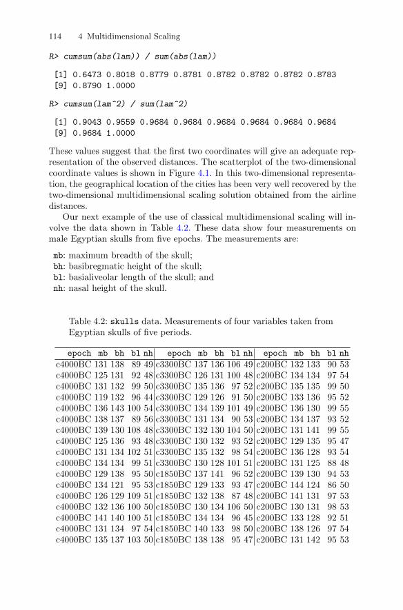
114 4 Multidimensional Scaling
R> cumsum(abs(lam)) / sum(abs(lam))
[1] 0.6473 0.8018 0.8779 0.8781 0.8782 0.8782 0.8782 0.8783
[9] 0.8790 1.0000
R> cumsum(lam^2) / sum(lam^2)
[1] 0.9043 0.9559 0.9684 0.9684 0.9684 0.9684 0.9684 0.9684
[9] 0.9684 1.0000
These values suggest that the first two coordinates will give an adequate rep-resentation of the observed distances. The scatterplot of the two-dimensionalcoordinate values is shown in Figure 4.1. In this two-dimensional representa-tion, the geographical location of the cities has been very well recovered by thetwo-dimensional multidimensional scaling solution obtained from the airlinedistances.
Our next example of the use of classical multidimensional scaling will in-volve the data shown in Table 4.2. These data show four measurements onmale Egyptian skulls from five epochs. The measurements are:
mb: maximum breadth of the skull;bh: basibregmatic height of the skull;bl: basialiveolar length of the skull; andnh: nasal height of the skull.
Table 4.2: skulls data. Measurements of four variables taken fromEgyptian skulls of five periods.
epoch mb bh bl nh epoch mb bh bl nh epoch mb bh bl nh
c4000BC 131 138 89 49 c3300BC 137 136 106 49 c200BC 132 133 90 53c4000BC 125 131 92 48 c3300BC 126 131 100 48 c200BC 134 134 97 54c4000BC 131 132 99 50 c3300BC 135 136 97 52 c200BC 135 135 99 50c4000BC 119 132 96 44 c3300BC 129 126 91 50 c200BC 133 136 95 52c4000BC 136 143 100 54 c3300BC 134 139 101 49 c200BC 136 130 99 55c4000BC 138 137 89 56 c3300BC 131 134 90 53 c200BC 134 137 93 52c4000BC 139 130 108 48 c3300BC 132 130 104 50 c200BC 131 141 99 55c4000BC 125 136 93 48 c3300BC 130 132 93 52 c200BC 129 135 95 47c4000BC 131 134 102 51 c3300BC 135 132 98 54 c200BC 136 128 93 54c4000BC 134 134 99 51 c3300BC 130 128 101 51 c200BC 131 125 88 48c4000BC 129 138 95 50 c1850BC 137 141 96 52 c200BC 139 130 94 53c4000BC 134 121 95 53 c1850BC 129 133 93 47 c200BC 144 124 86 50c4000BC 126 129 109 51 c1850BC 132 138 87 48 c200BC 141 131 97 53c4000BC 132 136 100 50 c1850BC 130 134 106 50 c200BC 130 131 98 53c4000BC 141 140 100 51 c1850BC 134 134 96 45 c200BC 133 128 92 51c4000BC 131 134 97 54 c1850BC 140 133 98 50 c200BC 138 126 97 54c4000BC 135 137 103 50 c1850BC 138 138 95 47 c200BC 131 142 95 53
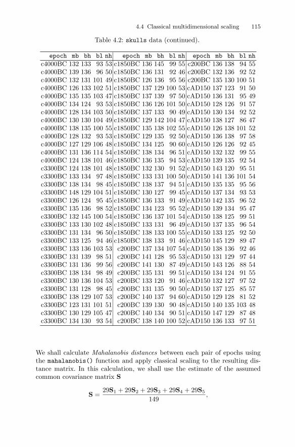
4.4 Classical multidimensional scaling 115
Table 4.2: skulls data (continued).
epoch mb bh bl nh epoch mb bh bl nh epoch mb bh bl nh
c4000BC 132 133 93 53 c1850BC 136 145 99 55 c200BC 136 138 94 55c4000BC 139 136 96 50 c1850BC 136 131 92 46 c200BC 132 136 92 52c4000BC 132 131 101 49 c1850BC 126 136 95 56 c200BC 135 130 100 51c4000BC 126 133 102 51 c1850BC 137 129 100 53 cAD150 137 123 91 50c4000BC 135 135 103 47 c1850BC 137 139 97 50 cAD150 136 131 95 49c4000BC 134 124 93 53 c1850BC 136 126 101 50 cAD150 128 126 91 57c4000BC 128 134 103 50 c1850BC 137 133 90 49 cAD150 130 134 92 52c4000BC 130 130 104 49 c1850BC 129 142 104 47 cAD150 138 127 86 47c4000BC 138 135 100 55 c1850BC 135 138 102 55 cAD150 126 138 101 52c4000BC 128 132 93 53 c1850BC 129 135 92 50 cAD150 136 138 97 58c4000BC 127 129 106 48 c1850BC 134 125 90 60 cAD150 126 126 92 45c4000BC 131 136 114 54 c1850BC 138 134 96 51 cAD150 132 132 99 55c4000BC 124 138 101 46 c1850BC 136 135 94 53 cAD150 139 135 92 54c3300BC 124 138 101 48 c1850BC 132 130 91 52 cAD150 143 120 95 51c3300BC 133 134 97 48 c1850BC 133 131 100 50 cAD150 141 136 101 54c3300BC 138 134 98 45 c1850BC 138 137 94 51 cAD150 135 135 95 56c3300BC 148 129 104 51 c1850BC 130 127 99 45 cAD150 137 134 93 53c3300BC 126 124 95 45 c1850BC 136 133 91 49 cAD150 142 135 96 52c3300BC 135 136 98 52 c1850BC 134 123 95 52 cAD150 139 134 95 47c3300BC 132 145 100 54 c1850BC 136 137 101 54 cAD150 138 125 99 51c3300BC 133 130 102 48 c1850BC 133 131 96 49 cAD150 137 135 96 54c3300BC 131 134 96 50 c1850BC 138 133 100 55 cAD150 133 125 92 50c3300BC 133 125 94 46 c1850BC 138 133 91 46 cAD150 145 129 89 47c3300BC 133 136 103 53 c200BC 137 134 107 54 cAD150 138 136 92 46c3300BC 131 139 98 51 c200BC 141 128 95 53 cAD150 131 129 97 44c3300BC 131 136 99 56 c200BC 141 130 87 49 cAD150 143 126 88 54c3300BC 138 134 98 49 c200BC 135 131 99 51 cAD150 134 124 91 55c3300BC 130 136 104 53 c200BC 133 120 91 46 cAD150 132 127 97 52c3300BC 131 128 98 45 c200BC 131 135 90 50 cAD150 137 125 85 57c3300BC 138 129 107 53 c200BC 140 137 94 60 cAD150 129 128 81 52c3300BC 123 131 101 51 c200BC 139 130 90 48 cAD150 140 135 103 48c3300BC 130 129 105 47 c200BC 140 134 90 51 cAD150 147 129 87 48c3300BC 134 130 93 54 c200BC 138 140 100 52 cAD150 136 133 97 51
We shall calculate Mahalanobis distances between each pair of epochs usingthe mahalanobis() function and apply classical scaling to the resulting dis-tance matrix. In this calculation, we shall use the estimate of the assumedcommon covariance matrix S
S =29S1 + 29S2 + 29S3 + 29S4 + 29S5
149,
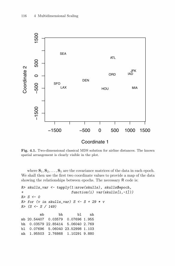
116 4 Multidimensional Scaling
−1500 −500 0 500 1000 1500
−15
00−
500
050
015
00
Coordinate 1
Coo
rdin
ate
2
ATL
ORD
DEN
HOULAX MIA
JFK
SFO
SEA
IAD
Fig. 4.1. Two-dimensional classical MDS solution for airline distances. The knownspatial arrangement is clearly visible in the plot.
where S1,S2, . . . ,S5 are the covariance matrices of the data in each epoch.We shall then use the first two coordinate values to provide a map of the datashowing the relationships between epochs. The necessary R code is:
R> skulls_var <- tapply(1:nrow(skulls), skulls$epoch,
+ function(i) var(skulls[i,-1]))
R> S <- 0
R> for (v in skulls_var) S <- S + 29 * v
R> (S <- S / 149)
mb bh bl nh
mb 20.54407 0.03579 0.07696 1.955
bh 0.03579 22.85414 5.06040 2.769
bl 0.07696 5.06040 23.52998 1.103
nh 1.95503 2.76868 1.10291 9.880
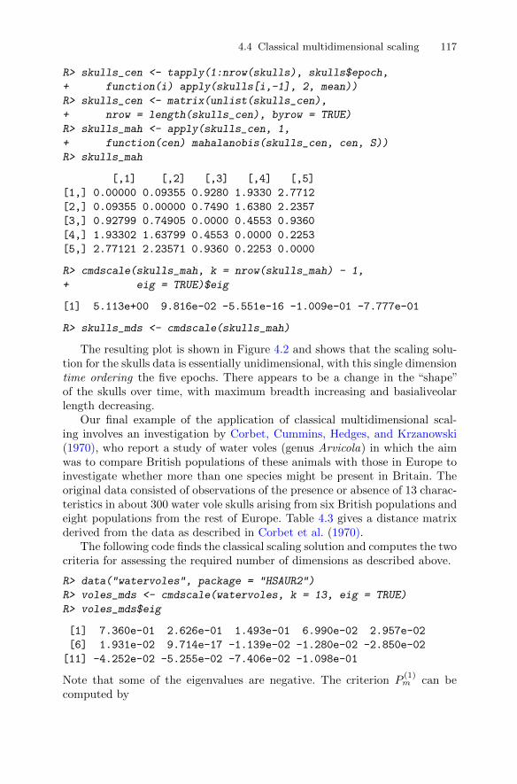
4.4 Classical multidimensional scaling 117
R> skulls_cen <- tapply(1:nrow(skulls), skulls$epoch,
+ function(i) apply(skulls[i,-1], 2, mean))
R> skulls_cen <- matrix(unlist(skulls_cen),
+ nrow = length(skulls_cen), byrow = TRUE)
R> skulls_mah <- apply(skulls_cen, 1,
+ function(cen) mahalanobis(skulls_cen, cen, S))
R> skulls_mah
[,1] [,2] [,3] [,4] [,5]
[1,] 0.00000 0.09355 0.9280 1.9330 2.7712
[2,] 0.09355 0.00000 0.7490 1.6380 2.2357
[3,] 0.92799 0.74905 0.0000 0.4553 0.9360
[4,] 1.93302 1.63799 0.4553 0.0000 0.2253
[5,] 2.77121 2.23571 0.9360 0.2253 0.0000
R> cmdscale(skulls_mah, k = nrow(skulls_mah) - 1,
+ eig = TRUE)$eig
[1] 5.113e+00 9.816e-02 -5.551e-16 -1.009e-01 -7.777e-01
R> skulls_mds <- cmdscale(skulls_mah)
The resulting plot is shown in Figure 4.2 and shows that the scaling solu-tion for the skulls data is essentially unidimensional, with this single dimensiontime ordering the five epochs. There appears to be a change in the “shape”of the skulls over time, with maximum breadth increasing and basialiveolarlength decreasing.
Our final example of the application of classical multidimensional scal-ing involves an investigation by Corbet, Cummins, Hedges, and Krzanowski(1970), who report a study of water voles (genus Arvicola) in which the aimwas to compare British populations of these animals with those in Europe toinvestigate whether more than one species might be present in Britain. Theoriginal data consisted of observations of the presence or absence of 13 charac-teristics in about 300 water vole skulls arising from six British populations andeight populations from the rest of Europe. Table 4.3 gives a distance matrixderived from the data as described in Corbet et al. (1970).
The following code finds the classical scaling solution and computes the twocriteria for assessing the required number of dimensions as described above.
R> data("watervoles", package = "HSAUR2")
R> voles_mds <- cmdscale(watervoles, k = 13, eig = TRUE)
R> voles_mds$eig
[1] 7.360e-01 2.626e-01 1.493e-01 6.990e-02 2.957e-02
[6] 1.931e-02 9.714e-17 -1.139e-02 -1.280e-02 -2.850e-02
[11] -4.252e-02 -5.255e-02 -7.406e-02 -1.098e-01
Note that some of the eigenvalues are negative. The criterion P(1)m can be
computed by

118 4 Multidimensional Scaling
Table
4.3
:watervoles
data
.W
ate
rvole
sdata
-dis
sim
ilari
tym
atr
ix.
Srry
Shrp
Yrks
Prth
Abrd
ElnG
Alps
Ygsl
Grmn
Nrwy
PyrI
PyII
NrtS
SthS
Surr
ey0.0
00
Shro
psh
ire
0.0
99
0.0
00
York
shir
e0.0
33
0.0
22
0.0
00
Per
thsh
ire
0.1
83
0.1
14
0.0
42
0.0
00
Ab
erdee
n0.1
48
0.2
24
0.0
59
0.0
68
0.0
00
Ele
an
Gam
hna
0.1
98
0.0
39
0.0
53
0.0
85
0.0
51
0.0
00
Alp
s0.4
62
0.2
66
0.3
22
0.4
35
0.2
68
0.0
25
0.0
00
Yugosl
avia
0.6
28
0.4
42
0.4
44
0.4
06
0.2
40
0.1
29
0.0
14
0.0
00
Ger
many
0.1
13
0.0
70
0.0
46
0.0
47
0.0
34
0.0
02
0.1
06
0.1
29
0.0
00
Norw
ay0.1
73
0.1
19
0.1
62
0.3
31
0.1
77
0.0
39
0.0
89
0.2
37
0.0
71
0.0
00
Pyre
nee
sI
0.4
34
0.4
19
0.3
39
0.5
05
0.4
69
0.3
90
0.3
15
0.3
49
0.1
51
0.4
30
0.0
00
Pyre
nee
sII
0.7
62
0.6
33
0.7
81
0.7
00
0.7
58
0.6
25
0.4
69
0.6
18
0.4
40
0.5
38
0.6
07
0.0
00
Nort
hSpain
0.5
30
0.3
89
0.4
82
0.5
79
0.5
97
0.4
98
0.3
74
0.5
62
0.2
47
0.3
83
0.3
87
0.0
84
0.0
00
South
Spain
0.5
86
0.4
35
0.5
50
0.5
30
0.5
52
0.5
09
0.3
69
0.4
71
0.2
34
0.3
46
0.4
56
0.0
90
0.0
38
0.0
00
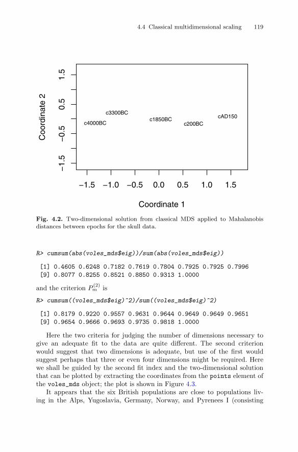
4.4 Classical multidimensional scaling 119
−1.5 −1.0 −0.5 0.0 0.5 1.0 1.5
−1.
5−
0.5
0.5
1.5
Coordinate 1
Coo
rdin
ate
2
c4000BC
c3300BCc1850BC
c200BCcAD150
Fig. 4.2. Two-dimensional solution from classical MDS applied to Mahalanobisdistances between epochs for the skull data.
R> cumsum(abs(voles_mds$eig))/sum(abs(voles_mds$eig))
[1] 0.4605 0.6248 0.7182 0.7619 0.7804 0.7925 0.7925 0.7996
[9] 0.8077 0.8255 0.8521 0.8850 0.9313 1.0000
and the criterion P(2)m is
R> cumsum((voles_mds$eig)^2)/sum((voles_mds$eig)^2)
[1] 0.8179 0.9220 0.9557 0.9631 0.9644 0.9649 0.9649 0.9651
[9] 0.9654 0.9666 0.9693 0.9735 0.9818 1.0000
Here the two criteria for judging the number of dimensions necessary togive an adequate fit to the data are quite different. The second criterionwould suggest that two dimensions is adequate, but use of the first wouldsuggest perhaps that three or even four dimensions might be required. Herewe shall be guided by the second fit index and the two-dimensional solutionthat can be plotted by extracting the coordinates from the points element ofthe voles_mds object; the plot is shown in Figure 4.3.
It appears that the six British populations are close to populations liv-ing in the Alps, Yugoslavia, Germany, Norway, and Pyrenees I (consisting
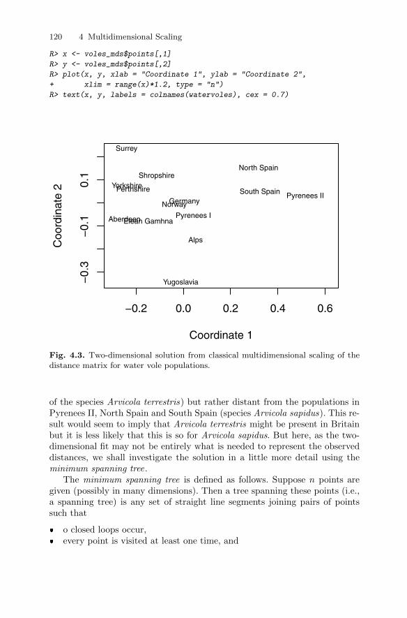
120 4 Multidimensional Scaling
R> x <- voles_mds$points[,1]
R> y <- voles_mds$points[,2]
R> plot(x, y, xlab = "Coordinate 1", ylab = "Coordinate 2",
+ xlim = range(x)*1.2, type = "n")
R> text(x, y, labels = colnames(watervoles), cex = 0.7)
−0.2 0.0 0.2 0.4 0.6
−0.
3−
0.1
0.1
Coordinate 1
Coo
rdin
ate
2
Surrey
ShropshireYorkshirePerthshire
AberdeenElean Gamhna
Alps
Yugoslavia
GermanyNorway
Pyrenees I
Pyrenees II
North Spain
South Spain
Fig. 4.3. Two-dimensional solution from classical multidimensional scaling of thedistance matrix for water vole populations.
of the species Arvicola terrestris) but rather distant from the populations inPyrenees II, North Spain and South Spain (species Arvicola sapidus). This re-sult would seem to imply that Arvicola terrestris might be present in Britainbut it is less likely that this is so for Arvicola sapidus. But here, as the two-dimensional fit may not be entirely what is needed to represent the observeddistances, we shall investigate the solution in a little more detail using theminimum spanning tree.
The minimum spanning tree is defined as follows. Suppose n points aregiven (possibly in many dimensions). Then a tree spanning these points (i.e.,a spanning tree) is any set of straight line segments joining pairs of pointssuch that
� o closed loops occur,� every point is visited at least one time, and

4.5 Non-metric multidimensional scaling 121
� the tree is connected (i.e., it has paths between any pairs of points).
The length of the tree is defined to be the sum of the length of its segments,and when a set of n points and the lengths of all
(n2
)segments are given, then
the minimum spanning tree is defined as the spanning tree with minimumlength. Algorithms to find the minimum spanning tree of a set of n pointsgiven the distances between them are given in Prim (1957) and Gower andRoss (1969).
The links of the minimum spanning tree (of the spanning tree) of theproximity matrix of interest may be plotted onto the two-dimensional scalingrepresentation in order to identify possible distortions produced by the scalingsolutions. Such distortions are indicated when nearby points on the plot arenot linked by an edge of the tree.
To find the minimum spanning tree of the water vole proximity matrix, thefunction mst from the package ape (Paradis, Bolker, Claude, Cuong, Desper,Durand, Dutheil, Gascuel, Heibl, Lawson, Lefort, Legendre, Lemon, Noel,Nylander, Opgen-Rhein, Schliep, Strimmer, and de Vienne 2010) can be used,and we can plot the minimum spanning tree on the two-dimensional scalingsolution as shown in Figure 4.4.
The plot indicates, for example, that the apparent closeness of the popu-lations in Germany and Norway, suggested by the points representing themin the MDS solution, does not accurately reflect their calculated dissimilarity;the links of the minimum spanning tree show that the Aberdeen and EleanGamhna populations are actually more similar to the German water voles thanthose from Norway. This suggests that the two-dimensional solution may notgive an adequate representation of the whole distance matrix.
4.5 Non-metric multidimensional scaling
In some psychological work and in market research, proximity matrices arisefrom asking human subjects to make judgements about the similarity or dis-similarity of objects or stimuli of interest. When collecting such data, theinvestigator may feel that realistically subjects are only able to give “ordinal”judgements; for example, when comparing a range of colours they might beable to specify with some confidence that one colour is brighter than anotherbut would be far less confident if asked to put a value to how much brighter.Such considerations led, in the 1960s, to the search for a method of multidi-mensional scaling that uses only the rank order of the proximities to producea spatial representation of them. In other words, a method was sought thatwould be invariant under monotonic transformations of the observed proxim-ity matrix; i.e., the derived coordinates will remain the same if the numericalvalues of the observed proximities are changed but their rank order is not.Such a method was proposed in landmark papers by Shepard (1962a,b) andby Kruskal (1964a). The quintessential component of the method proposed in
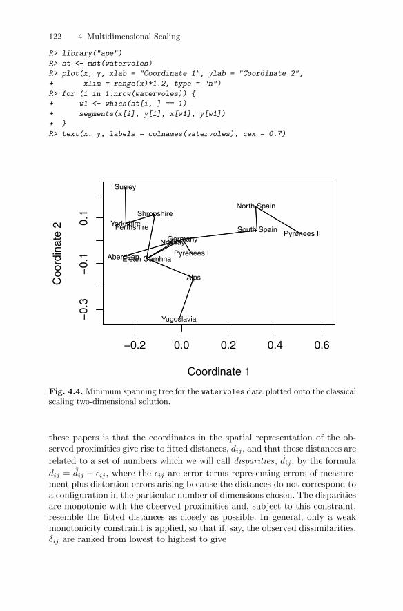
122 4 Multidimensional Scaling
R> library("ape")
R> st <- mst(watervoles)
R> plot(x, y, xlab = "Coordinate 1", ylab = "Coordinate 2",
+ xlim = range(x)*1.2, type = "n")
R> for (i in 1:nrow(watervoles)) {
+ w1 <- which(st[i, ] == 1)
+ segments(x[i], y[i], x[w1], y[w1])
+ }
R> text(x, y, labels = colnames(watervoles), cex = 0.7)
−0.2 0.0 0.2 0.4 0.6
−0.
3−
0.1
0.1
Coordinate 1
Coo
rdin
ate
2
Surrey
ShropshireYorkshirePerthshire
AberdeenElean Gamhna
Alps
Yugoslavia
GermanyNorway
Pyrenees I
Pyrenees II
North Spain
South Spain
Fig. 4.4. Minimum spanning tree for the watervoles data plotted onto the classicalscaling two-dimensional solution.
these papers is that the coordinates in the spatial representation of the ob-served proximities give rise to fitted distances, dij , and that these distances are
related to a set of numbers which we will call disparities, dij , by the formula
dij = dij + εij , where the εij are error terms representing errors of measure-ment plus distortion errors arising because the distances do not correspond toa configuration in the particular number of dimensions chosen. The disparitiesare monotonic with the observed proximities and, subject to this constraint,resemble the fitted distances as closely as possible. In general, only a weakmonotonicity constraint is applied, so that if, say, the observed dissimilarities,δij are ranked from lowest to highest to give
4.5 Non-metric multidimensional scaling 123
δi1j1 < δi2j2 < · · · < δiN jN ,
where N = n(n− 1)/2, then
di1j1 ≤ di2j2 ≤ · · · ≤ diN jN .
Monotonic regression (see Barlow, Bartholomew, Bremner, and Brunk 1972)is used to find the disparities, and then the required coordinates in the spatialrepresentation of the observed dissimilarities, which we denote by X(n×m),are found by minimising a criterion, S, known as Stress, which is a functionof X(n×m) and is defined as
S(X) = min∑i<j
(dij − dij)2/∑i<j
d2ij ,
where the minimum is taken over dij such that dij is monotonic with theobserved dissimilarities. In essence, Stress represents the extent to which therank order of the fitted distances disagrees with the rank order of the ob-served dissimilarities. The denominator in the formula for Stress is chosen tomake the final spatial representation invariant under changes of scale; i.e.,uniform stretching or shrinking. An algorithm to minimise Stress and so findthe coordinates of the required spatial representation is described in a secondpaper by Kruskal (1964b). For each value of the number of dimensions, m,in the spatial configuration, the configuration that has the smallest Stress iscalled the best-fitting configuration in m dimensions, Sm, and a rule of thumbfor judging the fit as given by Kruskal is Sm ≥ 20%, poor, Sm = 10%, fair,Sm ≤ 5%, good; and Sm = 0, perfect (this only occurs if the rank order ofthe fitted distances matches the rank order of the observed dissimilarities andevent, which is, of course, very rare in practise). We will now look at someapplications of non-metric multidimensional scaling.
4.5.1 House of Representatives voting
Romesburg (1984) gives a set of data that shows the number of times 15 con-gressmen from New Jersey voted differently in the House of Representativeson 19 environmental bills. Abstentions are not recorded, but two congressmenabstained more frequently than the others, these being Sandman (nine absten-tions) and Thompson (six abstentions). The data are available in Table 4.4and of interest is the question of whether party affiliations can be detected inthe data.
We shall now apply non-metric scaling to the voting behaviour shown inTable 4.4. Non-metric scaling is available with the function isoMDS from thepackage MASS (Venables and Ripley 2010, 2002)
R> library("MASS")
R> data("voting", package = "HSAUR2")
R> voting_mds <- isoMDS(voting)

124 4 Multidimensional Scaling
and we again plot the two-dimensional solution (Figure 4.5). The figure sug-gests that voting behaviour is essentially along party lines, although there ismore variation among Republicans. The voting behaviour of one of the Re-publicans (Rinaldo) seems to be closer to his Democratic colleagues ratherthan to the voting behaviour of other Republicans.
Table 4.4: voting data. House of Representatives voting data; (R) isshort for Republican, (D) for Democrat.
Hnt Snd Hwr Thm Fry Frs Wdn Roe Hlt Rdn Mns Rnl Mrz Dnl PttHunt(R) 0Sandman(R) 8 0Howard(D) 15 17 0Thompson(D) 15 12 9 0Freylinghuysen(R) 10 13 16 14 0Forsythe(R) 9 13 12 12 8 0Widnall(R) 7 12 15 13 9 7 0Roe(D) 15 16 5 10 13 12 17 0Heltoski(D) 16 17 5 8 14 11 16 4 0Rodino(D) 14 15 6 8 12 10 15 5 3 0Minish(D) 15 16 5 8 12 9 14 5 2 1 0Rinaldo(R) 16 17 4 6 12 10 15 3 1 2 1 0Maraziti(R) 7 13 11 15 10 6 10 12 13 11 12 12 0Daniels(D) 11 12 10 10 11 6 11 7 7 4 5 6 9 0Patten(D) 13 16 7 7 11 10 13 6 5 6 5 4 13 9 0
The quality of a multidimensional scaling can be assessed informally byplotting the original dissimilarities and the distances obtained from a mul-tidimensional scaling in a scatterplot, a so-called Shepard diagram. For thevoting data, such a plot is shown in Figure 4.6. In an ideal situation, thepoints fall on the bisecting line; in our case, some deviations are observable.
4.5.2 Judgements of World War II leaders
As the first example of the application of non-metric multidimensional scaling,we shall use the method to get a spatial representation of the judgements ofthe dissimilarities in ideology of a number of world leaders and politiciansprominent at the time of the Second World War, shown in Table 4.5. Thesubject made judgements on a nine-point scale, with the anchor points ofthe scale, 1 and 9, being described as indicating “very similar” and “verydissimilar”, respectively; this was all the subject was told about the scale.
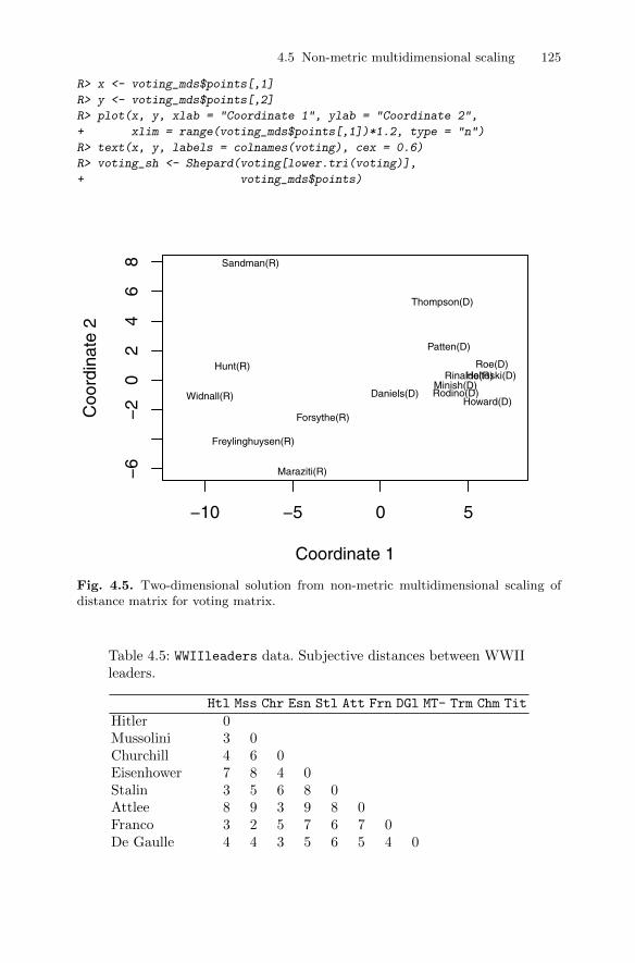
4.5 Non-metric multidimensional scaling 125
R> x <- voting_mds$points[,1]
R> y <- voting_mds$points[,2]
R> plot(x, y, xlab = "Coordinate 1", ylab = "Coordinate 2",
+ xlim = range(voting_mds$points[,1])*1.2, type = "n")
R> text(x, y, labels = colnames(voting), cex = 0.6)
R> voting_sh <- Shepard(voting[lower.tri(voting)],
+ voting_mds$points)
−10 −5 0 5
−6
−2
02
46
8
Coordinate 1
Coo
rdin
ate
2
Hunt(R)
Sandman(R)
Howard(D)
Thompson(D)
Freylinghuysen(R)
Forsythe(R)
Widnall(R)
Roe(D)Heltoski(D)
Rodino(D)Minish(D)
Rinaldo(R)
Maraziti(R)
Daniels(D)
Patten(D)
Fig. 4.5. Two-dimensional solution from non-metric multidimensional scaling ofdistance matrix for voting matrix.
Table 4.5: WWIIleaders data. Subjective distances between WWIIleaders.
Htl Mss Chr Esn Stl Att Frn DGl MT- Trm Chm Tit
Hitler 0Mussolini 3 0Churchill 4 6 0Eisenhower 7 8 4 0Stalin 3 5 6 8 0Attlee 8 9 3 9 8 0Franco 3 2 5 7 6 7 0De Gaulle 4 4 3 5 6 5 4 0

126 4 Multidimensional Scaling
Table 4.5: WWIIleaders data (continued).
Htl Mss Chr Esn Stl Att Frn DGl MT- Trm Chm Tit
Mao Tse-Tung 8 9 8 9 6 9 8 7 0Truman 9 9 5 4 7 8 8 4 4 0Chamberlin 4 5 5 4 7 2 2 5 9 5 0Tito 7 8 2 4 7 8 3 2 4 5 7 0
The non-metric multidimensional scaling applied to these distances is
R> (WWII_mds <- isoMDS(WWIIleaders))
initial value 20.504211
iter 5 value 15.216103
iter 5 value 15.207237
iter 5 value 15.207237
final value 15.207237
converged
$points
[,1] [,2]
Hitler -2.5820 -1.75961
Mussolini -3.8807 -1.24756
Churchill 0.3110 1.46671
Eisenhower 2.9852 2.87822
Stalin -1.4274 -3.75699
Attlee -2.1067 5.07317
Franco -2.8590 0.07878
De Gaulle 0.6591 -0.20656
Mao Tse-Tung 4.1605 -4.57583
Truman 4.4962 0.29294
Chamberlin -2.1420 2.75877
Tito 2.3859 -1.00203
$stress
[1] 15.21
The two-dimensional solution appears in Figure 4.7. Clearly, the three fascistsgroup together as do the three British prime ministers. Stalin and Mao Tse-Tung are more isolated compared with the other leaders. Eisenhower seemsmore related to the British government than to his own President Truman.Interestingly, de Gaulle is placed in the center of the MDS solution.
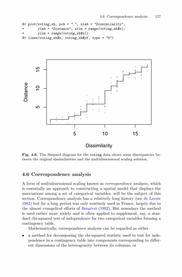
4.6 Correspondence analysis 127
R> plot(voting_sh, pch = ".", xlab = "Dissimilarity",
+ ylab = "Distance", xlim = range(voting_sh$x),
+ ylim = range(voting_sh$x))
R> lines(voting_sh$x, voting_sh$yf, type = "S")
5 10 15
510
15
Dissimilarity
Dis
tanc
e
Fig. 4.6. The Shepard diagram for the voting data shows some discrepancies be-tween the original dissimilarities and the multidimensional scaling solution.
4.6 Correspondence analysis
A form of multidimensional scaling known as correspondence analysis, whichis essentially an approach to constructing a spatial model that displays theassociations among a set of categorical variables, will be the subject of thissection. Correspondence analysis has a relatively long history (see de Leeuw1983) but for a long period was only routinely used in France, largely due tothe almost evangelical efforts of Benzecri (1992). But nowadays the methodis used rather more widely and is often applied to supplement, say, a stan-dard chi-squared test of independence for two categorical variables forming acontingency table.
Mathematically, correspondence analysis can be regarded as either
� a method for decomposing the chi-squared statistic used to test for inde-pendence in a contingency table into components corresponding to differ-ent dimensions of the heterogeneity between its columns, or

128 4 Multidimensional Scaling
−4 −2 0 2 4 6
−4
−2
02
46
Coordinate 1
Coo
rdin
ate
2
HitlerMussolini
Churchill
Eisenhower
Stalin
Attlee
Franco De Gaulle
Mao Tse−Tung
Truman
Chamberlin
Tito
Fig. 4.7. Non-metric multidimensional scaling of perceived distances of World WarII leaders.
� a method for simultaneously assigning a scale to rows and a separate scaleto columns so as to maximise the correlation between the two scales.
Quintessentially, however, correspondence analysis is a technique for dis-playing multivariate (most often bivariate) categorical data graphically byderiving coordinates to represent the categories of both the row and columnvariables, which may then be plotted so as to display the pattern of associationbetween the variables graphically. A detailed account of correspondence anal-ysis is given in Greenacre (2007), where its similarity to principal componentsand the biplot is stressed. Here we give only accounts of the method demon-strating the use of classical multidimensional scaling to get a two-dimensionalmap to represent a set of data in the form of a two-dimensional contingencytable.
The general two-dimensional contingency table in which there are r rowsand c columns can be written as
4.6 Correspondence analysis 129
y1 . . . c
1 n11 . . . n1c n1·2 n21 . . . n2c n2·
x...
... . . ....
...r nr1 . . . nrc nr·n·1 . . . n·c n
using an obvious dot notation for summing the counts in the contingency tableover rows or over columns. From this table we can construct tables of columnproportions and row proportions given by
Column proportions pcij = nij/n·j ,Row proportions prij = nij/ni·.
What is known as the chi-squared distance between columns i and j is definedas
d(cols)ij =
r∑k=1
1
pk·(pcki − pckj)2,
wherepk· = nk·/n.
The chi-square distance is seen to be a weighted Euclidean distance based oncolumn proportions. It will be zero if the two columns have the same valuesfor these proportions. It can also be seen from the weighting factors, 1/pk·,that rare categories of the column variable have a greater influence on thedistance than common ones.
A similar distance measure can be defined for rows i and j as
d(rows)ij =
c∑k=1
1
p·k(prik − prjk)2,
wherep·k = n·k/n.
A correspondence analysis“map”of the data can be found by applying classicalMDS to each distance matrix in turn and plotting usually the first two coordi-nates for column categories and those for row categories on the same diagram,suitably labelled to differentiate the points representing row categories fromthose representing column categories. The resulting diagram is interpreted byexamining the positions of the points representing the row categories and thecolumn categories. The relative values of the coordinates of these points reflectassociations between the categories of the row variable and the categories ofthe column variable. Assuming that a two-dimensional solution provides anadequate fit for the data (see Greenacre 1992), row points that are close to-gether represent row categories that have similar profiles (conditional distribu-tions) across columns. Column points that are close together indicate columns
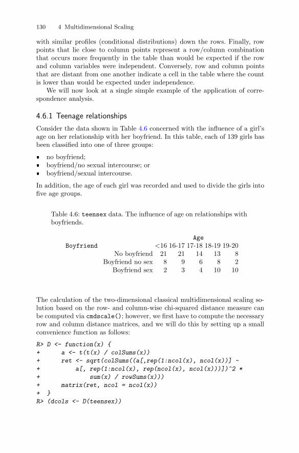
130 4 Multidimensional Scaling
with similar profiles (conditional distributions) down the rows. Finally, rowpoints that lie close to column points represent a row/column combinationthat occurs more frequently in the table than would be expected if the rowand column variables were independent. Conversely, row and column pointsthat are distant from one another indicate a cell in the table where the countis lower than would be expected under independence.
We will now look at a single simple example of the application of corre-spondence analysis.
4.6.1 Teenage relationships
Consider the data shown in Table 4.6 concerned with the influence of a girl’sage on her relationship with her boyfriend. In this table, each of 139 girls hasbeen classified into one of three groups:
� no boyfriend;� boyfriend/no sexual intercourse; or� boyfriend/sexual intercourse.
In addition, the age of each girl was recorded and used to divide the girls intofive age groups.
Table 4.6: teensex data. The influence of age on relationships withboyfriends.
Age
Boyfriend <16 16-17 17-18 18-19 19-20No boyfriend 21 21 14 13 8
Boyfriend no sex 8 9 6 8 2Boyfriend sex 2 3 4 10 10
The calculation of the two-dimensional classical multidimensional scaling so-lution based on the row- and column-wise chi-squared distance measure canbe computed via cmdscale(); however, we first have to compute the necessaryrow and column distance matrices, and we will do this by setting up a smallconvenience function as follows:
R> D <- function(x) {
+ a <- t(t(x) / colSums(x))
+ ret <- sqrt(colSums((a[,rep(1:ncol(x), ncol(x))] -
+ a[, rep(1:ncol(x), rep(ncol(x), ncol(x)))])^2 *
+ sum(x) / rowSums(x)))
+ matrix(ret, ncol = ncol(x))
+ }
R> (dcols <- D(teensex))

4.7 Summary 131
[,1] [,2] [,3] [,4] [,5]
[1,] 0.00000 0.08537 0.2574 0.6629 1.0739
[2,] 0.08537 0.00000 0.1864 0.5858 1.0142
[3,] 0.25743 0.18644 0.0000 0.4066 0.8295
[4,] 0.66289 0.58581 0.4066 0.0000 0.5067
[5,] 1.07385 1.01423 0.8295 0.5067 0.0000
R> (drows <- D(t(teensex)))
[,1] [,2] [,3]
[1,] 0.0000 0.2035 0.9275
[2,] 0.2035 0.0000 0.9355
[3,] 0.9275 0.9355 0.0000
Applying classical MDS to each of these distance matrices gives the re-quired two-dimensional coordinates with which to construct our “map” of thedata. Plotting those with suitable labels and with the axes suitably scaledto reflect the greater variation on dimension one than on dimension two (seeGreenacre 1992) is achieved using the R code presented with Figure 4.8.
The points representing the age groups in Figure 4.8 give a two-dimensionalrepresentation in which the Euclidean distance between two points representsthe chi-squared distance between the corresponding age groups (and similarlyfor the points representing the type of relationship). For a contingency tablewith r rows and c columns, it can be shown that the chi-squared distancescan be represented exactly in min r − 1, c− 1 dimensions; here, since r = 3and c = 5, this means that the Euclidean distances in Figure 4.8 will actuallyequal the corresponding chi-squared distances (readers might like to checkthat this is the case as an exercise). When both r and c are greater thanthree, an exact two-dimensional representation of the chi-squared distancesis not possible. In such cases, the derived two-dimensional coordinates willgive only an approximate representation, and so the question of the adequacyof the fit will need to be addressed. In some of these cases, more than twodimensions may be required to give an acceptable fit (again see Greenacre1992, for details).
Examining the plot in Figure 4.8, we see that it tells the age-old storyof girls travelling through their teenage years, initially having no boyfriend,then acquiring a boyfriend, and then having sex with their boyfriend, a storythat has broken the hearts of fathers everywhere, at least temporarily, untiltheir wives suggest they reflect back to the time when they themselves wereteenagers.
4.7 Summary
Multidimensional scaling and correspondence analysis both aim to help inunderstanding particular types of data by displaying the data graphically.
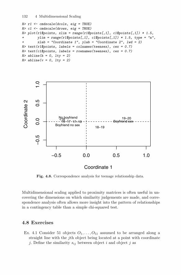
132 4 Multidimensional Scaling
R> r1 <- cmdscale(dcols, eig = TRUE)
R> c1 <- cmdscale(drows, eig = TRUE)
R> plot(r1$points, xlim = range(r1$points[,1], c1$points[,1]) * 1.5,
+ ylim = range(r1$points[,1], c1$points[,1]) * 1.5, type = "n",
+ xlab = "Coordinate 1", ylab = "Coordinate 2", lwd = 2)
R> text(r1$points, labels = colnames(teensex), cex = 0.7)
R> text(c1$points, labels = rownames(teensex), cex = 0.7)
R> abline(h = 0, lty = 2)
R> abline(v = 0, lty = 2)
−0.5 0.0 0.5 1.0
−0.
50.
00.
51.
0
Coordinate 1
Coo
rdin
ate
2
<1616−17 17−18
18−19
19−20No boyfriend
Boyfriend no sexBoyfriend sex
Fig. 4.8. Correspondence analysis for teenage relationship data.
Multidimensional scaling applied to proximity matrices is often useful in un-covering the dimensions on which similarity judgements are made, and corre-spondence analysis often allows more insight into the pattern of relationshipsin a contingency table than a simple chi-squared test.
4.8 Exercises
Ex. 4.1 Consider 51 objects O1, . . . , O51 assumed to be arranged along astraight line with the jth object being located at a point with coordinatej. Define the similarity sij between object i and object j as

4.8 Exercises 133
sij =
9 if i = j8 if 1 ≤ |i− j| ≤ 37 if 4 ≤ |i− j| ≤ 6· · ·
1 if 22 ≤ |i− j| ≤ 240 if |i− j| ≥ 25.
Convert these similarities into dissimilarities (δij) by using
δij =√sii + sjj − 2sij
and then apply classical multidimensional scaling to the resulting dissim-ilarity matrix. Explain the shape of the derived two-dimensional solution.
Ex. 4.2 Write an R function to calculate the chi-squared distance matricesfor both rows and columns in a two-dimensional contingency table.
Ex. 4.3 In Table 4.7 (from Kaufman and Rousseeuw 1990), the dissimilaritymatrix of 18 species of garden flowers is shown. Use some form of multidi-mensional scaling to investigate which species share common properties.
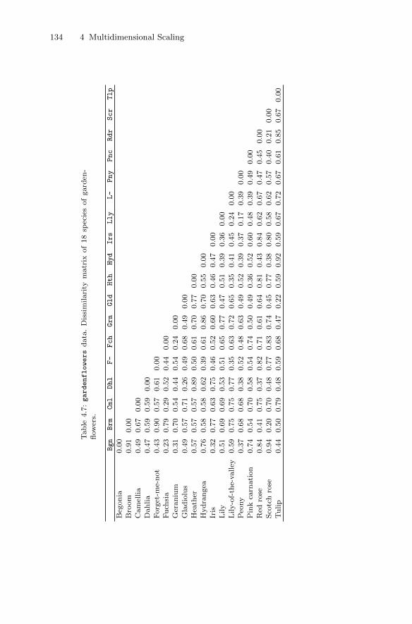
134 4 Multidimensional Scaling
Tab
le4.7
:gardenflowers
data
.D
issi
milari
tym
atr
ixof
18
spec
ies
of
gard
en-
flow
ers.
Bgn
Brm
Cml
Dhl
F-
Fch
Grn
Gld
Hth
Hyd
Irs
Lly
L-
Pny
Pnc
Rdr
Scr
Tlp
Beg
on
ia0.0
0
Bro
om
0.9
10.0
0
Cam
ellia
0.4
90.6
70.0
0D
ahlia
0.4
70.5
90.5
90.0
0
Forg
et-m
e-not
0.4
30.9
00.5
70.6
10.0
0F
uch
sia
0.2
30.7
90.2
90.5
20.4
40.0
0
Ger
an
ium
0.3
10.7
00.5
40.4
40.5
40.2
40.0
0
Gla
dio
lus
0.4
90.5
70.7
10.2
60.4
90.6
80.4
90.0
0H
eath
er0.5
70.5
70.5
70.8
90.5
00.6
10.7
00.7
70.0
0
Hyd
rangea
0.7
60.5
80.5
80.6
20.3
90.6
10.8
60.7
00.5
50.0
0
Iris
0.3
20.7
70.6
30.7
50.4
60.5
20.6
00.6
30.4
60.4
70.0
0L
ily
0.5
10.6
90.6
90.5
30.5
10.6
50.7
70.4
70.5
10.3
90.3
60.0
0
Lily-o
f-th
e-valley
0.5
90.7
50.7
50.7
70.3
50.6
30.7
20.6
50.3
50.4
10.4
50.2
40.0
0P
eony
0.3
70.6
80.6
80.3
80.5
20.4
80.6
30.4
90.5
20.3
90.3
70.1
70.3
90.0
0
Pin
kca
rnati
on
0.7
40.5
40.7
00.5
80.5
40.7
40.5
00.4
90.3
60.5
20.6
00.4
80.3
90.4
90.0
0
Red
rose
0.8
40.4
10.7
50.3
70.8
20.7
10.6
10.6
40.8
10.4
30.8
40.6
20.6
70.4
70.4
50.0
0S
cotc
hro
se0.9
40.2
00.7
00.4
80.7
70.8
30.7
40.4
50.7
70.3
80.8
00.5
80.6
20.5
70.4
00.2
10.0
0
Tulip
0.4
40.5
00.7
90.4
80.5
90.6
80.4
70.2
20.5
90.9
20.5
90.6
70.7
20.6
70.6
10.8
50.6
70.0
0

5
Exploratory Factor Analysis
5.1 Introduction
In many areas of psychology, and other disciplines in the behavioural sciences,often it is not possible to measure directly the concepts of primary interest.Two obvious examples are intelligence and social class. In such cases, the re-searcher is forced to examine the concepts indirectly by collecting informationon variables that can be measured or observed directly and can also realis-tically be assumed to be indicators, in some sense, of the concepts of realinterest. The psychologist who is interested in an individual’s “intelligence”,for example, may record examination scores in a variety of different subjects inthe expectation that these scores are dependent in some way on what is widelyregarded as “intelligence” but are also subject to random errors. And a soci-ologist, say, concerned with people’s “social class” might pose questions abouta person’s occupation, educational background, home ownership, etc., on theassumption that these do reflect the concept he or she is really interested in.
Both “intelligence” and “social class” are what are generally referred to aslatent variables–i.e., concepts that cannot be measured directly but can be as-sumed to relate to a number of measurable or manifest variables . The methodof analysis most generally used to help uncover the relationships between theassumed latent variables and the manifest variables is factor analysis. Themodel on which the method is based is essentially that of multiple regression,except now the manifest variables are regressed on the unobservable latentvariables (often referred to in this context as common factors), so that directestimation of the corresponding regression coefficients (factor loadings) is notpossible.
A point to be made at the outset is that factor analysis comes in two dis-tinct varieties. The first is exploratory factor analysis, which is used to inves-tigate the relationship between manifest variables and factors without makingany assumptions about which manifest variables are related to which factors.The second is confirmatory factor analysis which is used to test whether aspecific factor model postulated a priori provides an adequate fit for the co-
DOI 10.1007/978-1-4419-9650-3_5, © Springer Science+Business Media, LLC 2011
135B. Everitt and T. Hothorn, An Introduction to Applied Multivariate Analysis with R: Use R!,
136 5 Exploratory Factor Analysis
variances or correlations between the manifest variables. In this chapter, weshall consider only exploratory factor analysis. Confirmatory factor analysiswill be the subject of Chapter 7.
Exploratory factor analysis is often said to have been introduced by Spear-man (1904), but this is only partially true because Spearman proposed onlythe one-factor model as described in the next section. Fascinating accounts ofthe history of factor analysis are given in Thorndike (2005) and Bartholomew(2005).
5.2 A simple example of a factor analysis model
To set the scene for the k-factor analysis model to be described in the nextsection, we shall in this section look at a very simple example in which thereis only a single factor.
Spearman considered a sample of children’s examination marks in threesubjects, Classics (x1), French (x2), and English (x3), from which he calculatedthe following correlation matrix for a sample of children:
R =ClassicsFrenchEnglish
1.000.83 1.000.78 0.67 1.00
.
If we assume a single factor, then the single-factor model is specified as follows:
x1 = λ1f + u1,
x2 = λ2f + u2,
x3 = λ3f + u3.
We see that the model essentially involves the simple linear regression of eachobserved variable on the single common factor. In this example, the under-lying latent variable or common factor, f , might possibly be equated withintelligence or general intellectual ability. The terms λ1, λ2, and λ3 which areessentially regression coefficients are, in this context, known as factor load-ings, and the terms u1, u2, and u3 represent random disturbance terms andwill have small variances if their associated observed variable is closely relatedto the underlying latent variable. The variation in ui actually consists of twoparts, the extent to which an individual’s ability at Classics, say, differs fromhis or her general ability and the extent to which the examination in Classicsis only an approximate measure of his or her ability in the subject. In practiseno attempt is made to disentangle these two parts.
We shall return to this simple example later when we consider how toestimate the parameters in the factor analysis model. Before this, however, weneed to describe the factor analysis model itself in more detail. The descriptionfollows in the next section.
5.3 The k-factor analysis model 137
5.3 The k-factor analysis model
The basis of factor analysis is a regression model linking the manifest vari-ables to a set of unobserved (and unobservable) latent variables. In essence themodel assumes that the observed relationships between the manifest variables(as measured by their covariances or correlations) are a result of the relation-ships of these variables to the latent variables. (Since it is the covariances orcorrelations of the manifest variables that are central to factor analysis, wecan, in the description of the mathematics of the method given below, assumethat the manifest variables all have zero mean.)
To begin, we assume that we have a set of observed or manifest variables,x> = (x1, x2, . . . , xq), assumed to be linked to k unobserved latent variablesor common factors f1, f2, . . . , fk, where k < q, by a regression model of theform
x1 = λ11f1 + λ12f2 + · · ·+ λ1kfk + u1,
x2 = λ21f1 + λ22f2 + · · ·+ λ2kfk + u2,
...
xq = λq1f1 + λq2f2 + · · ·+ λqkfk + uq.
The λjs are essentially the regression coefficients of the x-variables on thecommon factors, but in the context of factor analysis these regression coeffi-cients are known as the factor loadings and show how each observed variable,xi, depends on the common factors. The factor loadings are used in the inter-pretation of the factors; i.e., larger values relate a factor to the correspondingobserved variables and from these we can often, but not always, infer a mean-ingful description of each factor (we will give examples later).
The regression equations above may be written more concisely as
x = Λf + u,
where
Λ =
λ11 . . . λ1k...
...λq1 . . . λqk
, f =
f1...fq
, u =
u1...uq
.
We assume that the random disturbance terms u1, . . . , uq are uncorrelatedwith each other and with the factors f1, . . . , fk. (The elements of u are spe-cific to each xi and hence are generally better known in this context as specificvariates.) The two assumptions imply that, given the values of the commonfactors, the manifest variables are independent; that is, the correlations ofthe observed variables arise from their relationships with the common factors.Because the factors are unobserved, we can fix their locations and scales arbi-trarily and we shall assume they occur in standardised form with mean zeroand standard deviation one. We will also assume, initially at least, that the

138 5 Exploratory Factor Analysis
factors are uncorrelated with one another, in which case the factor loadingsare the correlations of the manifest variables and the factors. With these ad-ditional assumptions about the factors, the factor analysis model implies thatthe variance of variable xi, σ
2i , is given by
σ2i =
k∑j=1
λ2ij + ψi,
where ψi is the variance of ui. Consequently, we see that the factor analysismodel implies that the variance of each observed variable can be split intotwo parts: the first, h2i , given by h2i =
∑kj=1 λ
2ij , is known as the communality
of the variable and represents the variance shared with the other variablesvia the common factors. The second part, ψi, is called the specific or uniquevariance and relates to the variability in xi not shared with other variables. Inaddition, the factor model leads to the following expression for the covarianceof variables xi and xj :
σij =
k∑l=1
λilλjl.
We see that the covariances are not dependent on the specific variates in anyway; it is the common factors only that aim to account for the relationshipsbetween the manifest variables.
The results above show that the k-factor analysis model implies that thepopulation covariance matrix, Σ, of the observed variables has the form
Σ = ΛΛ> + Ψ ,
whereΨ = diag(Ψi).
The converse also holds: if Σ can be decomposed into the form given above,then the k-factor model holds for x. In practise, Σ will be estimated by thesample covariance matrix S and we will need to obtain estimates of Λ and Ψso that the observed covariance matrix takes the form required by the model(see later in the chapter for an account of estimation methods). We will alsoneed to determine the value of k, the number of factors, so that the modelprovides an adequate fit for S.
5.4 Scale invariance of the k-factor model
Before describing both estimation for the k-factor analysis model and how todetermine the appropriate value of k, we will consider how rescaling the xvariables affects the factor analysis model. Rescaling the x variables is equiv-alent to letting y = Cx, where C = diag(ci) and the ci, i = 1, . . . , q are the
5.5 Estimating the parameters in the k-factor analysis model 139
scaling values. If the k-factor model holds for x with Λ = Λx and Ψ = Ψx,then
y = CΨxf + Cu
and the covariance matrix of y implied by the factor analysis model for x is
Var(y) = CΣC = CΛxC + CΨxC.
So we see that the k-factor model also holds for y with factor loading matrixΛy = CΛx and specific variances Ψy = CΨxC = c2iψi. So the factor loadingmatrix for the scaled variables y is found by scaling the factor loading matrixof the original variables by multiplying the ith row of Λx by ci and similarlyfor the specific variances. Thus factor analysis is essentially unaffected by therescaling of the variables. In particular, if the rescaling factors are such thatci = 1/si, where si is the standard deviation of the xi, then the rescaling isequivalent to applying the factor analysis model to the correlation matrix ofthe x variables and the factor loadings and specific variances that result canbe found simply by scaling the corresponding loadings and variances obtainedfrom the covariance matrix. Consequently, the factor analysis model can beapplied to either the covariance matrix or the correlation matrix because theresults are essentially equivalent. (Note that this is not the same as whenusing principal components analysis, as pointed out in Chapter 3, and we willreturn to this point later in the chapter.)
5.5 Estimating the parameters in the k-factor analysismodel
To apply the factor analysis model outlined in the previous section to a sampleof multivariate observations, we need to estimate the parameters of the modelin some way. These parameters are the factor loadings and specific variances,and so the estimation problem in factor analysis is essentially that of finding Λ(the estimated factor loading matrix) and Ψ (the diagonal matrix containingthe estimated specific variances), which, assuming the factor model outlined inSection 5.3, reproduce as accurately as possible the sample covariance matrix,S. This implies
S ≈ ΛΛ>
+ Ψ .
Given an estimate of the factor loading matrix, Λ, it is clearly sensible toestimate the specific variances as
ψi = s2i −k∑j=1
λ2ij , i = 1, . . . , q
so that the diagonal terms in S are estimated exactly.
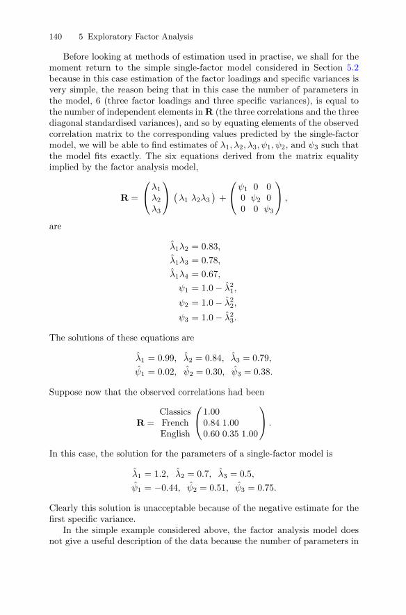
140 5 Exploratory Factor Analysis
Before looking at methods of estimation used in practise, we shall for themoment return to the simple single-factor model considered in Section 5.2because in this case estimation of the factor loadings and specific variances isvery simple, the reason being that in this case the number of parameters inthe model, 6 (three factor loadings and three specific variances), is equal tothe number of independent elements in R (the three correlations and the threediagonal standardised variances), and so by equating elements of the observedcorrelation matrix to the corresponding values predicted by the single-factormodel, we will be able to find estimates of λ1, λ2, λ3, ψ1, ψ2, and ψ3 such thatthe model fits exactly. The six equations derived from the matrix equalityimplied by the factor analysis model,
R =
λ1λ2λ3
(λ1 λ2λ3 ) +
ψ1 0 00 ψ2 00 0 ψ3
,
are
λ1λ2 = 0.83,
λ1λ3 = 0.78,
λ1λ4 = 0.67,
ψ1 = 1.0− λ21,ψ2 = 1.0− λ22,ψ3 = 1.0− λ23.
The solutions of these equations are
λ1 = 0.99, λ2 = 0.84, λ3 = 0.79,
ψ1 = 0.02, ψ2 = 0.30, ψ3 = 0.38.
Suppose now that the observed correlations had been
R =ClassicsFrenchEnglish
1.000.84 1.000.60 0.35 1.00
.
In this case, the solution for the parameters of a single-factor model is
λ1 = 1.2, λ2 = 0.7, λ3 = 0.5,
ψ1 = −0.44, ψ2 = 0.51, ψ3 = 0.75.
Clearly this solution is unacceptable because of the negative estimate for thefirst specific variance.
In the simple example considered above, the factor analysis model doesnot give a useful description of the data because the number of parameters in

5.5 Estimating the parameters in the k-factor analysis model 141
the model equals the number of independent elements in the correlation ma-trix. In practise, where the k-factor model has fewer parameters than thereare independent elements of the covariance or correlation matrix (see Sec-tion 5.6), the fitted model represents a genuinely parsimonious description ofthe data and methods of estimation are needed that try to make the covari-ance matrix predicted by the factor model as close as possible in some sense tothe observed covariance matrix of the manifest variables. There are two mainmethods of estimation leading to what are known as principal factor anal-ysis and maximum likelihood factor analysis, both of which are now brieflydescribed.
5.5.1 Principal factor analysis
Principal factor analysis is an eigenvalue and eigenvector technique similar inmany respects to principal components analysis (see Chapter 3) but operatingnot directly on S (or R) but on what is known as the reduced covariancematrix , S∗, defined as
S∗ = S− Ψ ,
where Ψ is a diagonal matrix containing estimates of the ψi. The “ones” onthe diagonal of S have in S∗ been replaced by the estimated communalities,∑kj=1 λ
2ij , the parts of the variance of each observed variable that can be
explained by the common factors. Unlike principal components analysis, factoranalysis does not try to account for all the observed variance, only that sharedthrough the common factors. Of more concern in factor analysis is accountingfor the covariances or correlations between the manifest variables.
To calculate S∗ (or with R replacing S, R∗) we need values for the com-munalities. Clearly we cannot calculate them on the basis of factor loadingsbecause these loadings still have to be estimated. To get around this seem-ingly “chicken and egg” situation, we need to find a sensible way of findinginitial values for the communalities that does not depend on knowing the fac-tor loadings. When the factor analysis is based on the correlation matrix ofthe manifest variables, two frequently used methods are:
� Take the communality of a variable xi as the square of the multiple corre-lation coefficient of xi with the other observed variables.
� Take the communality of xi as the largest of the absolute values of thecorrelation coefficients between xi and one of the other variables.
Each of these possibilities will lead to higher values for the initial communalitywhen xi is highly correlated with at least some of the other manifest variables,which is essentially what is required.
Given the initial communality values, a principal components analysis isperformed on S∗ and the first k eigenvectors used to provide the estimates ofthe loadings in the k-factor model. The estimation process can stop here orthe loadings obtained at this stage can provide revised communality estimates
142 5 Exploratory Factor Analysis
calculated as∑kj=1 λ
2ij , where the λ2ijs are the loadings estimated in the pre-
vious step. The procedure is then repeated until some convergence criterionis satisfied. Difficulties can sometimes arise with this iterative approach if atany time a communality estimate exceeds the variance of the correspondingmanifest variable, resulting in a negative estimate of the variable’s specificvariance. Such a result is known as a Heywood case (see Heywood 1931) andis clearly unacceptable since we cannot have a negative specific variance.
5.5.2 Maximum likelihood factor analysis
Maximum likelihood is regarded, by statisticians at least, as perhaps the mostrespectable method of estimating the parameters in the factor analysis. Theessence of this approach is to assume that the data being analysed have amultivariate normal distribution (see Chapter 1). Under this assumption andassuming the factor analysis model holds, the likelihood function L can beshown to be − 1
2nF plus a function of the observations where F is given by
F = ln |ΛΛ> + Ψ |+ trace(S|ΛΛ> + Ψ |−1)− ln |S| − q.
The function F takes the value zero ifΛΛ>+Ψ is equal to S and values greaterthan zero otherwise. Estimates of the loadings and the specific variances arefound by minimising F with respect to these parameters. A number of iterativenumerical algorithms have been suggested; for details see Lawley and Maxwell(1963), Mardia et al. (1979), Everitt (1984, 1987), and Rubin and Thayer(1982).
Initial values of the factor loadings and specific variances can be found ina number of ways, including that described above in Section 5.5.1. As withiterated principal factor analysis, the maximum likelihood approach can alsoexperience difficulties with Heywood cases.
5.6 Estimating the number of factors
The decision over how many factors, k, are needed to give an adequate rep-resentation of the observed covariances or correlations is generally criticalwhen fitting an exploratory factor analysis model. Solutions with k = m andk = m + 1 will often produce quite different factor loadings for all factors,unlike a principal components analysis, in which the first m components willbe identical in each solution. And, as pointed out by Jolliffe (2002), with toofew factors there will be too many high loadings, and with too many factors,factors may be fragmented and difficult to interpret convincingly.
Choosing k might be done by examining solutions corresponding to dif-ferent values of k and deciding subjectively which can be given the mostconvincing interpretation. Another possibility is to use the scree diagram ap-proach described in Chapter 3, although the usefulness of this method is not

5.7 Factor rotation 143
so clear in factor analysis since the eigenvalues represent variances of principalcomponents, not factors.
An advantage of the maximum likelihood approach is that it has an associ-ated formal hypothesis testing procedure that provides a test of the hypothesisHk that k common factors are sufficient to describe the data against the alter-native that the population covariance matrix of the data has no constraints.The test statistic is
U = N min(F ),
where N = n + 1 − 16(2q + 5) − 2
3k. If k common factors are adequate toaccount for the observed covariances or correlations of the manifest variables(i.e., Hk is true), then U has, asymptotically, a chi-squared distribution withν degrees of freedom, where
ν =1
2(q − k)2 − 1
2(q + k).
In most exploratory studies, k cannot be specified in advance and so a sequen-tial procedure is used. Starting with some small value for k (usually k = 1),the parameters in the corresponding factor analysis model are estimated usingmaximum likelihood. If U is not significant, the current value of k is accepted;otherwise k is increased by one and the process is repeated. If at any stage thedegrees of freedom of the test become zero, then either no non-trivial solutionis appropriate or alternatively the factor model itself, with its assumption oflinearity between observed and latent variables, is questionable. (This proce-dure is open to criticism because the critical values of the test criterion havenot been adjusted to allow for the fact that a set of hypotheses are beingtested in sequence.)
5.7 Factor rotation
Up until now, we have conveniently ignored one problematic feature of thefactor analysis model, namely that, as formulated in Section 5.3, there is nounique solution for the factor loading matrix. We can see that this is so byintroducing an orthogonal matrix M of order k × k and rewriting the basicregression equation linking the observed and latent variables as
x = (ΛM)(M>f) + u.
This “new” model satisfies all the requirements of a k-factor model as previ-ously outlined with new factors f∗ = Mf and the new factor loadings ΛM.This model implies that the covariance matrix of the observed variables is
Σ = (ΛM)(ΛM)> + Ψ ,
144 5 Exploratory Factor Analysis
which, since MM> = I, reduces to Σ = ΛΛ>+Ψ as before. Consequently,factors f with loadings Λ and factors f∗ with loadings ΛM are, for any or-thogonal matrix M, equivalent for explaining the covariance matrix of theobserved variables. Essentially then there are an infinite number of solutionsto the factor analysis model as previously formulated.
The problem is generally solved by introducing some constraints in theoriginal model. One possibility is to require the matrix G given by
G = ΛΨ−1Λ
to be diagonal, with its elements arranged in descending order of magnitude.Such a requirement sets the first factor to have maximal contribution to thecommon variance of the observed variables, and the second has maximal con-tribution to this variance subject to being uncorrelated with the first and soon (cf. principal components analysis in Chapter 3). The constraint aboveensures that Λ is uniquely determined, except for a possible change of sign ofthe columns. (When k = 1, the constraint is irrelevant.)
The constraints on the factor loadings imposed by a condition such asthat given above need to be introduced to make the parameter estimates inthe factor analysis model unique, and they lead to orthogonal factors thatare arranged in descending order of importance. These properties are not,however, inherent in the factor model, and merely considering such a solutionmay lead to difficulties of interpretation. For example, two consequences of afactor solution found when applying the constraint above are:
� The factorial complexity of variables is likely to be greater than one re-gardless of the underlying true model; consequently variables may havesubstantial loadings on more than one factor.
� Except for the first factor, the remaining factors are often bipolar ; i.e.,they have a mixture of positive and negative loadings.
It may be that a more interpretable orthogonal solution can be achieved usingthe equivalent model with loadings Λ∗ = ΛM for some particular orthogonalmatrix, M. Such a process is generally known as factor rotation, but beforewe consider how to choose M (i.e., how to “rotate” the factors), we need toaddress the question “is factor rotation an acceptable process?”
Certainly factor analysis has in the past been the subject of severe criticismbecause of the possibility of rotating factors. Critics have suggested that thisapparently allows investigators to impose on the data whatever type of solu-tion they are looking for; some have even gone so far as to suggest that factoranalysis has become popular in some areas precisely because it does enableusers to impose their preconceived ideas of the structure behind the observedcorrelations (Blackith and Reyment 1971). But, on the whole, such suspicionsare not justified and factor rotation can be a useful procedure for simplifyingan exploratory factor analysis. Factor rotation merely allows the fitted factoranalysis model to be described as simply as possible; rotation does not alter

5.7 Factor rotation 145
the overall structure of a solution but only how the solution is described. Ro-tation is a process by which a solution is made more interpretable withoutchanging its underlying mathematical properties. Initial factor solutions withvariables loading on several factors and with bipolar factors can be difficultto interpret. Interpretation is more straightforward if each variable is highlyloaded on at most one factor and if all factor loadings are either large andpositive or near zero, with few intermediate values. The variables are thussplit into disjoint sets, each of which is associated with a single factor. Thisaim is essentially what Thurstone (1931) referred to as simple structure. Inmore detail, such structure has the following properties:
� Each row or the factor loading matrix should contain at least one zero.� Each column of the loading matrix should contain at least k zeros.� Every pair of columns of the loading matrix should contain several vari-
ables whose loadings vanish in one column but not in the other.� If the number of factors is four or more, every pair of columns should
contain a large number of variables with zero loadings in both columns.� Conversely, for every pair of columns of the loading matrix only a small
number of variables should have non-zero loadings in both columns.
When simple structure is achieved, the observed variables will fall into mu-tually exclusive groups whose loadings are high on single factors, perhapsmoderate to low on a few factors, and of negligible size on the remainingfactors. Medium-sized, equivocal loadings are to be avoided.
The search for simple structure or something close to it begins after aninitial factoring has determined the number of common factors necessary andthe communalities of each observed variable. The factor loadings are thentransformed by post-multiplication by a suitably chosen orthogonal matrix.Such a transformation is equivalent to a rigid rotation of the axes of the origi-nally identified factor space. And during the rotation phase of the analysis, wemight choose to abandon one of the assumptions made previously, namely thatfactors are orthogonal, i.e., independent (the condition was assumed initiallysimply for convenience in describing the factor analysis model). Consequently,two types of rotation are possible:
� orthogonal rotation, in which methods restrict the rotated factors to beinguncorrelated, or
� oblique rotation, where methods allow correlated factors.
As we have seen above, orthogonal rotation is achieved by post-multiplyingthe original matrix of loadings by an orthogonal matrix. For oblique rotation,the original loadings matrix is post-multiplied by a matrix that is no longerconstrained to be orthogonal. With an orthogonal rotation, the matrix ofcorrelations between factors after rotation is the identity matrix. With anoblique rotation, the corresponding matrix of correlations is restricted to haveunit elements on its diagonal, but there are no restrictions on the off-diagonalelements.

146 5 Exploratory Factor Analysis
So the first question that needs to be considered when rotating factorsis whether we should use an orthogonal or an oblique rotation. As for manyquestions posed in data analysis, there is no universal answer to this ques-tion. There are advantages and disadvantages to using either type of rotationprocedure. As a general rule, if a researcher is primarily concerned with get-ting results that “best fit” his or her data, then the factors should be rotatedobliquely. If, on the other hand, the researcher is more interested in the gen-eralisability of his or her results, then orthogonal rotation is probably to bepreferred.
One major advantage of an orthogonal rotation is simplicity since theloadings represent correlations between factors and manifest variables. Thisis not the case with an oblique rotation because of the correlations betweenthe factors. Here there are two parts of the solution to consider;
� factor pattern coefficients, which are regression coefficients that multiplywith factors to produce measured variables according to the common factormodel, and
� factor structure coefficients, correlation coefficients between manifest vari-ables and the factors.
Additionally there is a matrix of factor correlations to consider. In many caseswhere these correlations are relatively small, researchers may prefer to returnto an orthogonal solution.
There are a variety of rotation techniques, although only relatively feware in general use. For orthogonal rotation, the two most commonly usedtechniques are known as varimax and quartimax .
� Varimax rotation, originally proposed by Kaiser (1958), has as its rationalethe aim of factors with a few large loadings and as many near-zero load-ings as possible. This is achieved by iterative maximisation of a quadraticfunction of the loadings–details are given in Mardia et al. (1979). It pro-duces factors that have high correlations with one small set of variablesand little or no correlation with other sets. There is a tendency for anygeneral factor to disappear because the factor variance is redistributed.
� Quartimax rotation, originally suggested by Carroll (1953), forces a givenvariable to correlate highly on one factor and either not at all or very lowon other factors. It is far less popular than varimax.
For oblique rotation, the two methods most often used are oblimin and pro-max .
� Oblimin rotation, invented by Jennrich and Sampson (1966), attempts tofind simple structure with regard to the factor pattern matrix through aparameter that is used to control the degree of correlation between thefactors. Fixing a value for this parameter is not straightforward, but Pett,Lackey, and Sullivan (2003) suggest that values between about −0.5 and0.5 are sensible for many applications.
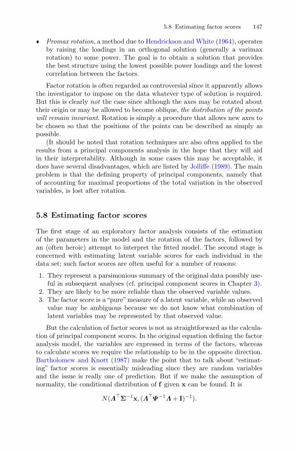
5.8 Estimating factor scores 147
� Promax rotation, a method due to Hendrickson and White (1964), operatesby raising the loadings in an orthogonal solution (generally a varimaxrotation) to some power. The goal is to obtain a solution that providesthe best structure using the lowest possible power loadings and the lowestcorrelation between the factors.
Factor rotation is often regarded as controversial since it apparently allowsthe investigator to impose on the data whatever type of solution is required.But this is clearly not the case since although the axes may be rotated abouttheir origin or may be allowed to become oblique, the distribution of the pointswill remain invariant. Rotation is simply a procedure that allows new axes tobe chosen so that the positions of the points can be described as simply aspossible.
(It should be noted that rotation techniques are also often applied to theresults from a principal components analysis in the hope that they will aidin their interpretability. Although in some cases this may be acceptable, itdoes have several disadvantages, which are listed by Jolliffe (1989). The mainproblem is that the defining property of principal components, namely thatof accounting for maximal proportions of the total variation in the observedvariables, is lost after rotation.
5.8 Estimating factor scores
The first stage of an exploratory factor analysis consists of the estimationof the parameters in the model and the rotation of the factors, followed byan (often heroic) attempt to interpret the fitted model. The second stage isconcerned with estimating latent variable scores for each individual in thedata set; such factor scores are often useful for a number of reasons:
1. They represent a parsimonious summary of the original data possibly use-ful in subsequent analyses (cf. principal component scores in Chapter 3).
2. They are likely to be more reliable than the observed variable values.3. The factor score is a“pure”measure of a latent variable, while an observed
value may be ambiguous because we do not know what combination oflatent variables may be represented by that observed value.
But the calculation of factor scores is not as straightforward as the calcula-tion of principal component scores. In the original equation defining the factoranalysis model, the variables are expressed in terms of the factors, whereasto calculate scores we require the relationship to be in the opposite direction.Bartholomew and Knott (1987) make the point that to talk about “estimat-ing” factor scores is essentially misleading since they are random variablesand the issue is really one of prediction. But if we make the assumption ofnormality, the conditional distribution of f given x can be found. It is
N(Λ>Σ−1x, (Λ>Ψ−1Λ+ I)−1).
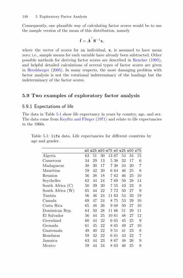
148 5 Exploratory Factor Analysis
Consequently, one plausible way of calculating factor scores would be to usethe sample version of the mean of this distribution, namely
f = Λ>
S−1x,
where the vector of scores for an individual, x, is assumed to have meanzero; i.e., sample means for each variable have already been subtracted. Otherpossible methods for deriving factor scores are described in Rencher (1995),and helpful detailed calculations of several types of factor scores are givenin Hershberger (2005). In many respects, the most damaging problem withfactor analysis is not the rotational indeterminacy of the loadings but theindeterminacy of the factor scores.
5.9 Two examples of exploratory factor analysis
5.9.1 Expectations of life
The data in Table 5.1 show life expectancy in years by country, age, and sex.The data come from Keyfitz and Flieger (1971) and relate to life expectanciesin the 1960s.
Table 5.1: life data. Life expectancies for different countries byage and gender.
m0 m25 m50 m75 w0 w25 w50 w75
Algeria 63 51 30 13 67 54 34 15Cameroon 34 29 13 5 38 32 17 6Madagascar 38 30 17 7 38 34 20 7Mauritius 59 42 20 6 64 46 25 8Reunion 56 38 18 7 62 46 25 10Seychelles 62 44 24 7 69 50 28 14South Africa (C) 50 39 20 7 55 43 23 8South Africa (W) 65 44 22 7 72 50 27 9Tunisia 56 46 24 11 63 54 33 19Canada 69 47 24 8 75 53 29 10Costa Rica 65 48 26 9 68 50 27 10Dominican Rep. 64 50 28 11 66 51 29 11El Salvador 56 44 25 10 61 48 27 12Greenland 60 44 22 6 65 45 25 9Grenada 61 45 22 8 65 49 27 10Guatemala 49 40 22 9 51 41 23 8Honduras 59 42 22 6 61 43 22 7Jamaica 63 44 23 8 67 48 26 9Mexico 59 44 24 8 63 46 25 8
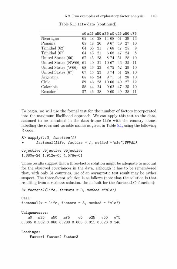
5.9 Two examples of exploratory factor analysis 149
Table 5.1: life data (continued).
m0 m25 m50 m75 w0 w25 w50 w75
Nicaragua 65 48 28 14 68 51 29 13Panama 65 48 26 9 67 49 27 10Trinidad (62) 64 63 21 7 68 47 25 9Trinidad (67) 64 43 21 6 68 47 24 8United States (66) 67 45 23 8 74 51 28 10United States (NW66) 61 40 21 10 67 46 25 11United States (W66) 68 46 23 8 75 52 29 10United States (67) 67 45 23 8 74 51 28 10Argentina 65 46 24 9 71 51 28 10Chile 59 43 23 10 66 49 27 12Colombia 58 44 24 9 62 47 25 10Ecuador 57 46 28 9 60 49 28 11
To begin, we will use the formal test for the number of factors incorporatedinto the maximum likelihood approach. We can apply this test to the data,assumed to be contained in the data frame life with the country nameslabelling the rows and variable names as given in Table 5.1, using the followingR code:
R> sapply(1:3, function(f)
+ factanal(life, factors = f, method ="mle")$PVAL)
objective objective objective
1.880e-24 1.912e-05 4.578e-01
These results suggest that a three-factor solution might be adequate to accountfor the observed covariances in the data, although it has to be rememberedthat, with only 31 countries, use of an asymptotic test result may be rathersuspect. The three-factor solution is as follows (note that the solution is thatresulting from a varimax solution. the default for the factanal() function):
R> factanal(life, factors = 3, method ="mle")
Call:
factanal(x = life, factors = 3, method = "mle")
Uniquenesses:
m0 m25 m50 m75 w0 w25 w50 w75
0.005 0.362 0.066 0.288 0.005 0.011 0.020 0.146
Loadings:
Factor1 Factor2 Factor3
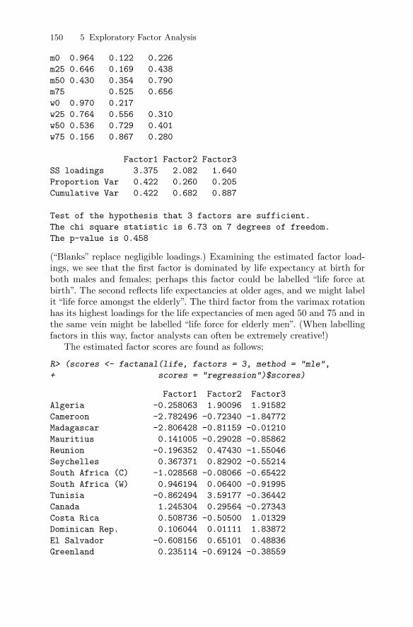
150 5 Exploratory Factor Analysis
m0 0.964 0.122 0.226
m25 0.646 0.169 0.438
m50 0.430 0.354 0.790
m75 0.525 0.656
w0 0.970 0.217
w25 0.764 0.556 0.310
w50 0.536 0.729 0.401
w75 0.156 0.867 0.280
Factor1 Factor2 Factor3
SS loadings 3.375 2.082 1.640
Proportion Var 0.422 0.260 0.205
Cumulative Var 0.422 0.682 0.887
Test of the hypothesis that 3 factors are sufficient.
The chi square statistic is 6.73 on 7 degrees of freedom.
The p-value is 0.458
(“Blanks” replace negligible loadings.) Examining the estimated factor load-ings, we see that the first factor is dominated by life expectancy at birth forboth males and females; perhaps this factor could be labelled “life force at
it “life force amongst the elderly”. The third factor from the varimax rotationhas its highest loadings for the life expectancies of men aged 50 and 75 and inthe same vein might be labelled “life force for elderly men”. (When labellingfactors in this way, factor analysts can often be extremely creative!)
The estimated factor scores are found as follows;
R> (scores <- factanal(life, factors = 3, method = "mle",
+ scores = "regression")$scores)
Factor1 Factor2 Factor3
Algeria -0.258063 1.90096 1.91582
Cameroon -2.782496 -0.72340 -1.84772
Madagascar -2.806428 -0.81159 -0.01210
Mauritius 0.141005 -0.29028 -0.85862
Reunion -0.196352 0.47430 -1.55046
Seychelles 0.367371 0.82902 -0.55214
South Africa (C) -1.028568 -0.08066 -0.65422
South Africa (W) 0.946194 0.06400 -0.91995
Tunisia -0.862494 3.59177 -0.36442
Canada 1.245304 0.29564 -0.27343
Costa Rica 0.508736 -0.50500 1.01329
Dominican Rep. 0.106044 0.01111 1.83872
El Salvador -0.608156 0.65101 0.48836
Greenland 0.235114 -0.69124 -0.38559
birth”. The second reflects life expectancies at older ages, and we might label
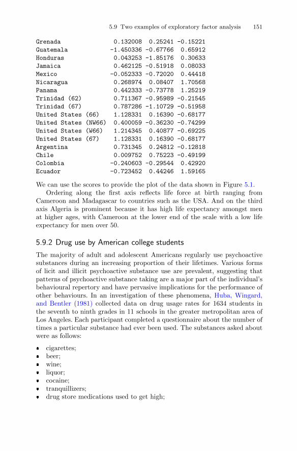
5.9 Two examples of exploratory factor analysis 151
Grenada 0.132008 0.25241 -0.15221
Guatemala -1.450336 -0.67766 0.65912
Honduras 0.043253 -1.85176 0.30633
Jamaica 0.462125 -0.51918 0.08033
Mexico -0.052333 -0.72020 0.44418
Nicaragua 0.268974 0.08407 1.70568
Panama 0.442333 -0.73778 1.25219
Trinidad (62) 0.711367 -0.95989 -0.21545
Trinidad (67) 0.787286 -1.10729 -0.51958
United States (66) 1.128331 0.16390 -0.68177
United States (NW66) 0.400059 -0.36230 -0.74299
United States (W66) 1.214345 0.40877 -0.69225
United States (67) 1.128331 0.16390 -0.68177
Argentina 0.731345 0.24812 -0.12818
Chile 0.009752 0.75223 -0.49199
Colombia -0.240603 -0.29544 0.42920
Ecuador -0.723452 0.44246 1.59165
We can use the scores to provide the plot of the data shown in Figure 5.1.Ordering along the first axis reflects life force at birth ranging from
Cameroon and Madagascar to countries such as the USA. And on the thirdaxis Algeria is prominent because it has high life expectancy amongst menat higher ages, with Cameroon at the lower end of the scale with a low lifeexpectancy for men over 50.
5.9.2 Drug use by American college students
The majority of adult and adolescent Americans regularly use psychoactivesubstances during an increasing proportion of their lifetimes. Various formsof licit and illicit psychoactive substance use are prevalent, suggesting thatpatterns of psychoactive substance taking are a major part of the individual’sbehavioural repertory and have pervasive implications for the performance ofother behaviours. In an investigation of these phenomena, Huba, Wingard,and Bentler (1981) collected data on drug usage rates for 1634 students inthe seventh to ninth grades in 11 schools in the greater metropolitan area ofLos Angeles. Each participant completed a questionnaire about the number oftimes a particular substance had ever been used. The substances asked aboutwere as follows:
� cigarettes;� beer;� wine;� liquor;� cocaine;� tranquillizers;� drug store medications used to get high;
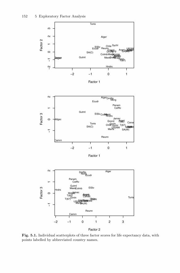
152 5 Exploratory Factor Analysis
−2 −1 0 1
−2
−1
01
23
Factor 1
Fact
or 2
Alger
CamrnMdgsc
Marts
ReunnSychl
SA(C) SA(W)
Tunis
Canad
CstRc
DmRp.
ElSlv
Grnln
Grend
Gutml
Hndrs
JamacMexic
Nicrg
PanamT(62)T(67)
US(66
US(NW
US(W6US(67Argnt
Chile
Colmb
Ecudr
−2 −1 0 1
−1
01
2
Factor 1
Fact
or 3
Alger
Camrn
Mdgsc
Marts
Reunn
SychlSA(C)SA(W)
Tunis Canad
CstRc
DmRp.
ElSlv
GrnlnGrend
Gutml
HndrsJamac
Mexic
Nicrg
Panam
T(62)T(67)
US(66US(NW US(W6US(67
Argnt
Chile
Colmb
Ecudr
−2 −1 0 1 2 3
−1
01
2
Factor 2
Fact
or 3
Alger
Camrn
Mdgsc
Marts
Reunn
SychlSA(C)SA(W)
TunisCanad
CstRc
DmRp.
ElSlv
GrnlnGrend
Gutml
HndrsJamac
Mexic
Nicrg
Panam
T(62)T(67)
US(66US(NW US(W6US(67
Argnt
Chile
Colmb
Ecudr
Fig. 5.1. Individual scatterplots of three factor scores for life expectancy data, withpoints labelled by abbreviated country names.
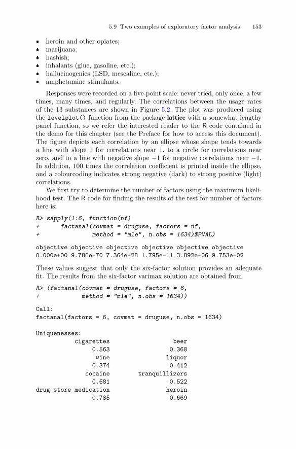
5.9 Two examples of exploratory factor analysis 153
� heroin and other opiates;� marijuana;� hashish;� inhalants (glue, gasoline, etc.);� hallucinogenics (LSD, mescaline, etc.);� amphetamine stimulants.
Responses were recorded on a five-point scale: never tried, only once, a fewtimes, many times, and regularly. The correlations between the usage ratesof the 13 substances are shown in Figure 5.2. The plot was produced usingthe levelplot() function from the package lattice with a somewhat lengthypanel function, so we refer the interested reader to the R code contained inthe demo for this chapter (see the Preface for how to access this document).The figure depicts each correlation by an ellipse whose shape tends towardsa line with slope 1 for correlations near 1, to a circle for correlations nearzero, and to a line with negative slope −1 for negative correlations near −1.In addition, 100 times the correlation coefficient is printed inside the ellipse,and a colourcoding indicates strong negative (dark) to strong positive (light)correlations.
We first try to determine the number of factors using the maximum likeli-hood test. The R code for finding the results of the test for number of factorshere is:
R> sapply(1:6, function(nf)
+ factanal(covmat = druguse, factors = nf,
+ method = "mle", n.obs = 1634)$PVAL)
objective objective objective objective objective objective
0.000e+00 9.786e-70 7.364e-28 1.795e-11 3.892e-06 9.753e-02
These values suggest that only the six-factor solution provides an adequatefit. The results from the six-factor varimax solution are obtained from
R> (factanal(covmat = druguse, factors = 6,
+ method = "mle", n.obs = 1634))
Call:
factanal(factors = 6, covmat = druguse, n.obs = 1634)
Uniquenesses:
cigarettes beer
0.563 0.368
wine liquor
0.374 0.412
cocaine tranquillizers
0.681 0.522
drug store medication heroin
0.785 0.669

154 5 Exploratory Factor Analysis
drug store medicationcocaine
heroininhalants
hallucinogenicstranquillizers
amphetaminemarijuana
hashishcigarettes
liquorbeerwine
drug
sto
re m
edic
atio
nco
cain
ehe
roin
inha
lant
sha
lluci
noge
nics
tran
quill
izer
sam
phet
amin
em
ariju
ana
hash
ish
ciga
rette
sliq
uor
beer
win
e
1002120312322231516 9 12101121100322728352819301112 7 52032100293236311522 8 10 6 731272910034323930302426201823283234100375120371014 9 72235363237100553238202615142328313951551003947242920181519153020323910053514844361630223037384753100303732249 11 8 241020245130100444542
12121026142629483744100605810 7 6 20 9 1520443245601006211 5 7 18 7 14183624425862100
−1.0 −0.5 0.0 0.5 1.0
Fig. 5.2. Visualisation of the correlation matrix of drug use. The numbers in thecells correspond to 100 times the correlation coefficient. The color and the shape ofthe plotting symbols also correspond to the correlation in this cell.
marijuana hashish
0.318 0.005
inhalants hallucinogenics
0.541 0.620
amphetamine
0.005
Loadings:
Factor1 Factor2 Factor3 Factor4 Factor5
cigarettes 0.494 0.407
beer 0.776 0.112
wine 0.786
liquor 0.720 0.121 0.103 0.115 0.160
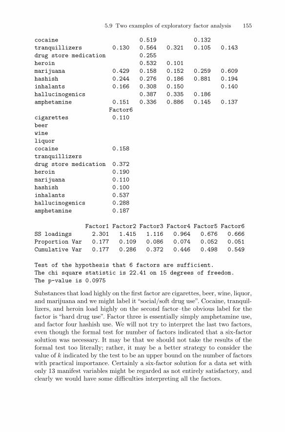
5.9 Two examples of exploratory factor analysis 155
cocaine 0.519 0.132
tranquillizers 0.130 0.564 0.321 0.105 0.143
drug store medication 0.255
heroin 0.532 0.101
marijuana 0.429 0.158 0.152 0.259 0.609
hashish 0.244 0.276 0.186 0.881 0.194
inhalants 0.166 0.308 0.150 0.140
hallucinogenics 0.387 0.335 0.186
amphetamine 0.151 0.336 0.886 0.145 0.137
Factor6
cigarettes 0.110
beer
wine
liquor
cocaine 0.158
tranquillizers
drug store medication 0.372
heroin 0.190
marijuana 0.110
hashish 0.100
inhalants 0.537
hallucinogenics 0.288
amphetamine 0.187
Factor1 Factor2 Factor3 Factor4 Factor5 Factor6
SS loadings 2.301 1.415 1.116 0.964 0.676 0.666
Proportion Var 0.177 0.109 0.086 0.074 0.052 0.051
Cumulative Var 0.177 0.286 0.372 0.446 0.498 0.549
Test of the hypothesis that 6 factors are sufficient.
The chi square statistic is 22.41 on 15 degrees of freedom.
The p-value is 0.0975
Substances that load highly on the first factor are cigarettes, beer, wine, liquor,and marijuana and we might label it “social/soft drug use”. Cocaine, tranquil-lizers, and heroin load highly on the second factor–the obvious label for thefactor is “hard drug use”. Factor three is essentially simply amphetamine use,and factor four hashish use. We will not try to interpret the last two factors,even though the formal test for number of factors indicated that a six-factorsolution was necessary. It may be that we should not take the results of theformal test too literally; rather, it may be a better strategy to consider thevalue of k indicated by the test to be an upper bound on the number of factorswith practical importance. Certainly a six-factor solution for a data set withonly 13 manifest variables might be regarded as not entirely satisfactory, andclearly we would have some difficulties interpreting all the factors.

156 5 Exploratory Factor Analysis
One of the problems is that with the large sample size in this example, evensmall discrepancies between the correlation matrix predicted by a proposedmodel and the observed correlation matrix may lead to rejection of the model.One way to investigate this possibility is simply to look at the differencesbetween the observed and predicted correlations. We shall do this first for thesix-factor model using the following R code:
R> pfun <- function(nf) {
+ fa <- factanal(covmat = druguse, factors = nf,
+ method = "mle", n.obs = 1634)
+ est <- tcrossprod(fa$loadings) + diag(fa$uniquenesses)
+ ret <- round(druguse - est, 3)
+ colnames(ret) <- rownames(ret) <-
+ abbreviate(rownames(ret), 3)
+ ret
+ }
R> pfun(6)
cgr ber win lqr ccn trn dsm hrn
cgr 0.000 -0.001 0.014 -0.018 0.010 0.001 -0.020 -0.004
ber -0.001 0.000 -0.002 0.004 0.004 -0.011 -0.001 0.007
win 0.014 -0.002 0.000 -0.001 -0.001 -0.005 0.008 0.008
lqr -0.018 0.004 -0.001 0.000 -0.008 0.021 -0.006 -0.018
ccn 0.010 0.004 -0.001 -0.008 0.000 0.000 0.008 0.004
trn 0.001 -0.011 -0.005 0.021 0.000 0.000 0.006 -0.004
dsm -0.020 -0.001 0.008 -0.006 0.008 0.006 0.000 -0.015
hrn -0.004 0.007 0.008 -0.018 0.004 -0.004 -0.015 0.000
mrj 0.001 0.002 -0.004 0.003 -0.004 -0.004 0.008 0.006
hsh 0.000 0.000 0.000 0.000 0.000 0.000 0.000 0.000
inh 0.010 -0.004 -0.007 0.012 -0.003 0.002 0.004 -0.002
hll -0.005 0.005 -0.001 -0.005 -0.008 -0.008 -0.002 0.020
amp 0.000 0.000 0.000 0.000 0.000 0.000 0.000 0.000
mrj hsh inh hll amp
cgr 0.001 0 0.010 -0.005 0
ber 0.002 0 -0.004 0.005 0
win -0.004 0 -0.007 -0.001 0
lqr 0.003 0 0.012 -0.005 0
ccn -0.004 0 -0.003 -0.008 0
trn -0.004 0 0.002 -0.008 0
dsm 0.008 0 0.004 -0.002 0
hrn 0.006 0 -0.002 0.020 0
mrj 0.000 0 -0.006 0.003 0
hsh 0.000 0 0.000 0.000 0
inh -0.006 0 0.000 -0.002 0
hll 0.003 0 -0.002 0.000 0
amp 0.000 0 0.000 0.000 0

5.10 Factor analysis and principal components analysis compared 157
The differences are all very small, underlining that the six-factor model doesdescribe the data very well. Now let us look at the corresponding matrices forthe three- and four-factor solutions found in a similar way in Figure 5.3. Again,in both cases the residuals are all relatively small, suggesting perhaps that useof the formal test for number of factors leads, in this case, to overfitting. Thethree-factor model appears to provide a perfectly adequate fit for these data.
5.10 Factor analysis and principal components analysiscompared
Factor analysis, like principal components analysis, is an attempt to explain aset of multivariate data using a smaller number of dimensions than one beginswith, but the procedures used to achieve this goal are essentially quite differentin the two approaches. Some differences between the two are as follows:
� Factor analysis tries to explain the covariances or correlations of the ob-served variables by means of a few common factors. Principal componentsanalysis is primarily concerned with explaining the variance of the observedvariables.
� If the number of retained components is increased, say from m to m+1, thefirst m components are unchanged. This is not the case in factor analysis,where there can be substantial changes in all factors if the number offactors is changed.
� The calculation of principal component scores is straightforward, but thecalculation of factor scores is more complex, and a variety of methods havebeen suggested.
� There is usually no relationship between the principal components of thesample correlation matrix and the sample covariance matrix. For maximumlikelihood factor analysis, however, the results of analysing either matrixare essentially equivalent (which is not true of principal factor analysis).
Despite these differences, the results from both types of analyses are fre-quently very similar. Certainly, if the specific variances are small, we wouldexpect both forms of analyses to give similar results. However, if the specificvariances are large, they will be absorbed into all the principal components,both retained and rejected, whereas factor analysis makes special provisionfor them.
Lastly, it should be remembered that both principal components analy-sis and factor analysis are similar in one important respect–they are bothpointless if the observed variables are almost uncorrelated. In this case, factoranalysis has nothing to explain and principal components analysis will simplylead to components that are similar to the original variables.

158 5 Exploratory Factor Analysis
R>pfun(3)
cgr
ber
win
lqr
ccn
trn
dsm
hrn
mrj
hsh
inh
hll
amp
cgr
0.000-0.001
0.009
-0.013
0.011
0.009
-0.011
-0.004
0.003
-0.027
0.039
-0.017
0.002
ber-0.001
0.000
-0.002
0.002
0.002
-0.014
0.000
0.005
-0.001
0.019
-0.002
0.009
-0.007
win
0.009-0.002
0.000
0.000-0.002
-0.004
0.012
0.013
0.001-0.017
-0.007
0.004
0.002
lqr-0.013
0.002
0.000
0.000-0.008
0.024
-0.017
-0.020-0.001
0.014
-0.002
-0.015
0.006
ccn
0.011
0.002
-0.002
-0.008
0.000
0.031
0.038
0.082
-0.002
0.041
0.023
-0.030-0.075
trn
0.009-0.014
-0.004
0.024
0.031
0.000
-0.021
0.026
-0.002
-0.016
-0.038
-0.058
0.044
dsm-0.011
0.000
0.012
-0.017
0.038
-0.021
0.000
0.021
0.007-0.040
0.113
0.000-0.038
hrn-0.004
0.005
0.013
-0.020
0.082
0.026
0.021
0.000
0.006
-0.035
0.031
-0.005-0.049
mrj
0.003-0.001
0.001
-0.001-0.002-0.002
0.007
0.006
0.000
0.001
0.003-0.002
-0.002
hsh-0.027
0.019
-0.017
0.014
0.041
-0.016
-0.040
-0.035
0.001
0.000
-0.035
0.034
0.010
inh
0.039-0.002
-0.007
-0.002
0.023-0.038
0.113
0.031
0.003
-0.035
0.000
0.007
-0.015
hll-0.017
0.009
0.004
-0.015-0.030-0.058
0.000
-0.005-0.002
0.034
0.007
0.000
0.041
amp
0.002-0.007
0.002
0.006-0.075
0.044
-0.038
-0.049-0.002
0.010
-0.015
0.041
0.000
R>pfun(4)
cgr
ber
win
lqr
ccn
trn
dsm
hrn
mrj
hsh
inh
hll
amp
cgr
0.000-0.001
0.008
-0.012
0.009
0.008
-0.015
-0.007
0.001
-0.023
0.037
-0.020
0.000
ber-0.001
0.000
-0.001
0.001
0.000
-0.016
-0.002
0.003-0.001
0.018
-0.005
0.006
0.000
win
0.008-0.001
0.000
0.000-0.001
-0.005
0.012
0.014
0.001-0.020
-0.008
0.001
0.000
lqr-0.012
0.001
0.000
0.000-0.004
0.029
-0.015
-0.015-0.001
0.018
0.001
-0.010-0.001
ccn
0.009
0.000
-0.001
-0.004
0.000
0.024
-0.014
0.007-0.003
0.035
-0.022
-0.028
0.000
trn
0.008-0.016
-0.005
0.029
0.024
0.000
-0.020
0.027-0.001
0.001
-0.032
-0.028
0.001
dsm-0.015-0.002
0.012
-0.015
-0.014
-0.020
0.000-0.018
0.003
-0.042
0.090
0.008
0.000
hrn-0.007
0.003
0.014
-0.015
0.007
0.027
-0.018
0.000
0.003-0.037
-0.001
0.005
0.000
mrj
0.001-0.001
0.001
-0.001-0.003-0.001
0.003
0.003
0.000
0.000
0.001-0.002
0.000
hsh-0.023
0.018
-0.020
0.018
0.035
0.001
-0.042
-0.037
0.000
0.000
-0.031
0.055
-0.001
inh
0.037-0.005
-0.008
0.001-0.022-0.032
0.090
-0.001
0.001
-0.031
0.000
0.021
0.000
hll-0.020
0.006
0.001
-0.010-0.028-0.028
0.008
0.005-0.002
0.055
0.021
0.000
0.000
amp
0.000
0.000
0.000-0.001
0.000
0.001
0.000
0.000
0.000
-0.001
0.000
0.000
0.000
Fig.5.3.
Diff
eren
ces
bet
wee
nth
ree-
and
four-
fact
or
solu
tions
and
act
ual
corr
elati
on
matr
ixfo
rth
edru
guse
data
.
5.12 Exercises 159
5.11 Summary
Factor analysis has probably attracted more critical comments than any otherstatistical technique. Hills (1977), for example, has gone so far as to suggestthat factor analysis is not worth the time necessary to understand it andcarry it out. And Chatfield and Collins (1980) recommend that factor analysisshould not be used in most practical situations. The reasons for such an openlysceptical view about factor analysis arise first from the central role of latentvariables in the factor analysis model and second from the lack of uniqueness ofthe factor loadings in the model, which gives rise to the possibility of rotatingfactors. It certainly is the case that, since the common factors cannot bemeasured or observed, the existence of these hypothetical variables is open toquestion. A factor is a construct operationally defined by its factor loadings,and overly enthusiastic reification is not recommended. And it is the case that,given one factor loading matrix, there are an infinite number of factor loadingmatrices that could equally well (or equally badly) account for the variancesand covariances of the manifest variables. Rotation methods are designed tofind an easily interpretable solution from among this infinitely large set ofalternatives by finding a solution that exhibits the best simple structure.
Factor analysis can be a useful tool for investigating particular features ofthe structure of multivariate data. Of course, like many models used in dataanalysis, the one used in factor analysis may be only a very idealised approx-imation to the truth. Such an approximation may, however, prove a valuablestarting point for further investigations, particularly for the confirmatory fac-tor analysis models that are the subject of Chapter 7.
For exploratory factor analysis, similar comments apply about the size ofn and q needed to get convincing results, such as those given in Chapter 3for principal components analysis. And the maximum likelihood method forthe estimation of factor loading and specific variances used in this chapter isonly suitable for data having a multivariate normal distribution (or at least areasonable approximation to such a distribution). Consequently, for the factoranalysis of, in particular, binary variables, special methods are needed; see,for example, Muthen (1978).
5.12 Exercises
Ex. 5.1 Show how the result Σ = ΛΛ> + Ψ arises from the assumptions ofuncorrelated factors, independence of the specific variates, and indepen-dence of common factors and specific variances. What form does Σ takeif the factors are allowed to be correlated?
Ex. 5.2 Show that the communalities in a factor analysis model are unaffectedby the transformation Λ∗ = ΛM.
Ex. 5.3 Give a formula for the proportion of variance explained by the jthfactor estimated by the principal factor approach.

160 5 Exploratory Factor Analysis
Ex. 5.4 Apply the factor analysis model separately to the life expectanciesof men and women and compare the results.
Ex. 5.5 The correlation matrix given below arises from the scores of 220 boysin six school subjects: (1) French, (2) English, (3) History, (4) Arithmetic,(5) Algebra, and (6) Geometry. Find the two-factor solution from a max-imum likelihood factor analysis. By plotting the derived loadings, find anorthogonal rotation that allows easier interpretation of the results.
R =
FrenchEnglishHistoryArithmeticAlgebraGeometry
1.000.44 1.000.41 0.35 1.000.29 0.35 0.16 1.000.33 0.32 0.19 0.59 1.000.25 0.33 0.18 0.47 0.46 1.00
.
Ex. 5.6 The matrix below shows the correlations between ratings on ninestatements about pain made by 123 people suffering from extreme pain.Each statement was scored on a scale from 1 to 6, ranging from agreementto disagreement. The nine pain statements were as follows:1. Whether or not I am in pain in the future depends on the skills of the
doctors.2. Whenever I am in pain, it is usually because of something I have done
or not done,3. Whether or not I am in pain depends on what the doctors do for me.4. I cannot get any help for my pain unless I go to seek medical advice.5. When I am in pain I know that it is because I have not been taking
proper exercise or eating the right food.6. People’s pain results from their own carelessness.7. I am directly responsible for my pain,8. relief from pain is chiefly controlled by the doctors.9. People who are never in pain are just plain lucky.
1.00−0.04 1.00
0.61 −0.07 1.000.45 −0.12 0.59 1.000.03 0.49 0.03 −0.08 1.00−0.29 0.43 −0.13 −0.21 0.47 1.00−0.30 0.30 −0.24 −0.19 0.41 0.63 1.00
0.45 −0.31 0.59 0.63 −0.14 −0.13 −0.26 1.000.30 −0.17 0.32 0.37 −0.24 −0.15 −0.29 0.40 1.00
.
(a) Perform a principal components analysis on these data, and exam-ine the associated scree plot to decide on the appropriate number ofcomponents.
(b) Apply maximum likelihood factor analysis, and use the test describedin the chapter to select the necessary number of common factors.

5.12 Exercises 161
(c) Rotate the factor solution selected using both an orthogonal and anoblique procedure, and interpret the results.


6
Cluster Analysis
6.1 Introduction
An intelligent being cannot treat every object it sees as a unique entityunlike anything else in the universe. It has to put objects in categoriesso that it may apply its hard-won knowledge about similar objectsencountered in the past to the object at hand (Pinker 1997).
One of the most basic abilities of living creatures involves the grouping ofsimilar objects to produce a classification. The idea of sorting similar thingsinto categories is clearly a primitive one because early humans, for example,must have been able to realise that many individual objects shared certainproperties such as being edible, or poisonous, or ferocious, and so on. Andclassification in its widest sense is needed for the development of language,which consists of words that help us to recognise and discuss the differenttypes of events, objects, and people we encounter. Each noun in a language,for example, is essentially a label used to describe a class of things that havestriking features in common; thus animals are called cats, dogs, horses, etc.,and each name collects individuals into groups. Naming and classifying areessentially synonymous.
As well as being a basic human conceptual activity, classification of thephenomena being studied is an important component of virtually all scientificresearch. In the behavioural sciences, for example, these “phenomena” maybe individuals or societies, or even patterns of behaviour or perception. Theinvestigator is usually interested in finding a classification in which the itemsof interest are sorted into a small number of homogeneous groups or clusters,the terms being synonymous. Most commonly the required classification is onein which the groups are mutually exclusive (an item belongs to a single group)rather than overlapping (items can be members of more than one group). Atthe very least, any derived classification scheme should provide a convenientmethod of organizing a large, complex set of multivariate data, with the classlabels providing a parsimonious way of describing the patterns of similarities
DOI 10.1007/978-1-4419-9650-3_6, © Springer Science+Business Media, LLC 2011
163B. Everitt and T. Hothorn, An Introduction to Applied Multivariate Analysis with R: Use R!,

164 6 Cluster Analysis
and differences in the data. In market research, for example, it might be usefulto group a large number of potential customers according to their needs ina particular product area. Advertising campaigns might then be tailored forthe different types of consumers as represented by the different groups.
But often a classification may seek to serve a more fundamental purpose. Inpsychiatry, for example, the classification of psychiatric patients with differentsymptom profiles into clusters might help in the search for the causes of mentalillnesses and perhaps even lead to improved therapeutic methods. And thesetwin aims of prediction (separating diseases that require different treatments)and aetiology (searching for the causes of disease) for classifications will bethe same in other branches of medicine.
Clearly, a variety of classifications will always be possible for whatever isbeing classified. Human beings could, for example, be classified with respectto economic status into groups labelled lower class, middle class, and upperclass or they might be classified by annual consumption of alcohol into low,medium, and high. Clearly, different classifications may not collect the sameset of individuals into groups, but some classifications will be more useful thanothers, a point made clearly by the following extract from Needham (1965) inwhich he considers the classification of human beings into men and women:
The usefulness of this classification does not begin and end with allthat can, in one sense, be strictly inferred from it–namely a statementabout sexual organs. It is a very useful classification because classify-ing a person as man or woman conveys a great deal more information,about probable relative size, strength, certain types of dexterity andso on. When we say that persons in class man are more suitable thanpersons in class woman for certain tasks and conversely, we are onlyincidentally making a remark about sex, our primary concern beingwith strength, endurance, etc. The point is that we have been ableto use a classification of persons which conveys information on manyproperties. On the contrary a classification of persons into those withhairs on their forearms between 3/16 and 1
4 inch long and those with-out, though it may serve some particular use, is certainly of no generaluse, for imputing membership in the former class to a person conveysinformation on this property alone. Put another way, there are noknown properties which divide up a set of people in a similar way.
In a similar vein, a classification of books based on subject matter intoclasses such as dictionaries, novels, biographies, and so on is likely to be farmore useful than one based on, say, the colour of the book’s binding. Suchexamples illustrate that any classification of a set of multivariate data is likelyto be judged on its usefulness.

6.2 Cluster analysis 165
6.2 Cluster analysis
Cluster analysis is a generic term for a wide range of numerical methods withthe common goal of uncovering or discovering groups or clusters of obser-vations that are homogeneous and separated from other groups. Clusteringtechniques essentially try to formalise what human observers do so well intwo or three dimensions. Consider, for example, the scatterplot shown in Fig-ure 6.1. The conclusion that there are three natural groups or clusters of dotsis reached with no conscious effort or thought. Clusters are identified by theassessment of the relative distances between points, and in this example therelative homogeneity of each cluster and the degree of their separation makesthe task very simple. The examination of scatterplots based either on the orig-inal data or perhaps on the first few principal component scores of the data isoften a very helpful initial phase when intending to apply some form of clusteranalysis to a set of multivariate data.
Cluster analysis techniques are described in detail in Gordon (1987, 1999)in and Everitt, Landau, Leese, and Stahl (2011). In this chapter, we give arelatively brief account of three types of clustering methods: agglomerativehierarchical techniques, k-means clustering, and model-based clustering.
●
●
●
●
●
●
● ●●
●●
●
●●
●
●●
●
●
●
●●
●
●
●
●
●●
●●
●
●
●
●
●
●
●
●●●
●●
●● ●
●
●
●●●
●●
●
●
●
5 10 15 20
02
46
810
x1
x 2
Fig. 6.1. Bivariate data showing the presence of three clusters.

166 6 Cluster Analysis
6.3 Agglomerative hierarchical clustering
This class of clustering methods produces a hierarchical classification of data.In a hierarchical classification, the data are not partitioned into a particularnumber of classes or groups at a single step. Instead the classification consistsof a series of partitions that may run from a single “cluster” containing allindividuals to n clusters, each containing a single individual. Agglomerativehierarchical clustering techniques produce partitions by a series of successivefusions of the n individuals into groups. With such methods, fusions, oncemade, are irreversible, so that when an agglomerative algorithm has placedtwo individuals in the same group they cannot subsequently appear in differentgroups. Since all agglomerative hierarchical techniques ultimately reduce thedata to a single cluster containing all the individuals, the investigator seekingthe solution with the best-fitting number of clusters will need to decide whichdivision to choose. The problem of deciding on the“correct”number of clusterswill be taken up later.
An agglomerative hierarchical clustering procedure produces a series ofpartitions of the data, Pn, Pn−1, . . . , P1. The first, Pn, consists of n single-member clusters, and the last, P1, consists of a single group containing all nindividuals. The basic operation of all methods is similar:
(START) Clusters C1, C2, . . . , Cn each containing a single individual.(1) Find the nearest pair of distinct clusters, say Ci and Cj , merge Ci and
Cj , delete Cj , and decrease the number of clusters by one.(2) If the number of clusters equals one, then stop; otherwise return to 1.
But before the process can begin, an inter-individual distance matrix orsimilarity matrix needs to be calculated. There are many ways to calculatedistances or similarities between pairs of individuals, but here we only dealwith a commonly used distance measure, Euclidean distance, which was de-fined in Chapter 1 but as a reminder is calculated as
dij =
√√√√ q∑k=1
(xik − xjk)2,
where dij is the Euclidean distance between individual i with variable valuesxi1, xi2, . . . , xiq and individual j with variable values xj1, xj2, . . . , xjq. (De-tails of other possible distance measures and similarity measures are given inEveritt et al. 2011). The Euclidean distances between each pair of individualscan be arranged in a matrix that is symmetric because dij = dji and has zeroson the main diagonal. Such a matrix is the starting point of many clusteringexamples, although the calculation of Euclidean distances from the raw datamay not be sensible when the variables are on very different scales. In suchcases, the variables can be standardised in the usual way before calculatingthe distance matrix, although this can be unsatisfactory in some cases (seeEveritt et al. 2011, for details).
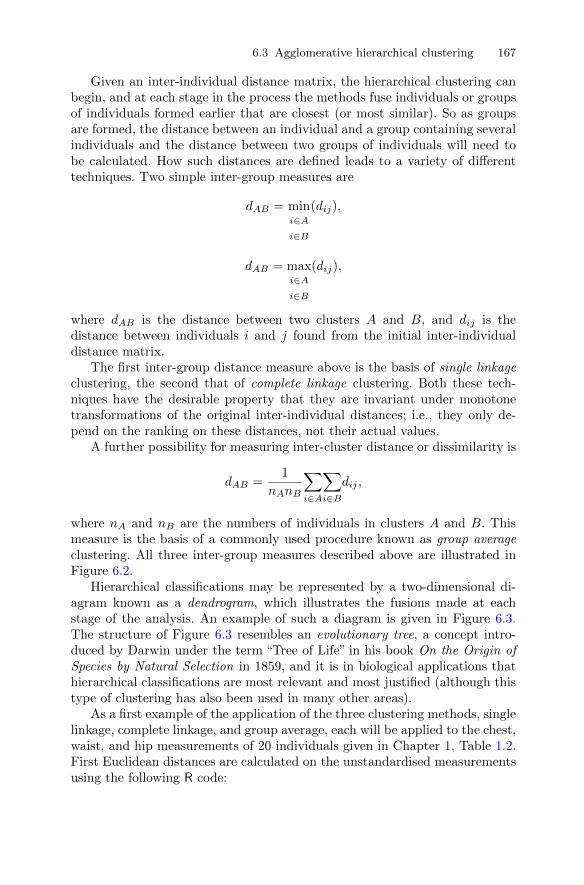
6.3 Agglomerative hierarchical clustering 167
Given an inter-individual distance matrix, the hierarchical clustering canbegin, and at each stage in the process the methods fuse individuals or groupsof individuals formed earlier that are closest (or most similar). So as groupsare formed, the distance between an individual and a group containing severalindividuals and the distance between two groups of individuals will need tobe calculated. How such distances are defined leads to a variety of differenttechniques. Two simple inter-group measures are
dAB = mini∈Ai∈B
(dij),
dAB = maxi∈A
i∈B
(dij),
where dAB is the distance between two clusters A and B, and dij is thedistance between individuals i and j found from the initial inter-individualdistance matrix.
The first inter-group distance measure above is the basis of single linkageclustering, the second that of complete linkage clustering. Both these tech-niques have the desirable property that they are invariant under monotonetransformations of the original inter-individual distances; i.e., they only de-pend on the ranking on these distances, not their actual values.
A further possibility for measuring inter-cluster distance or dissimilarity is
dAB =1
nAnB
∑i∈A
∑i∈B
dij ,
where nA and nB are the numbers of individuals in clusters A and B. Thismeasure is the basis of a commonly used procedure known as group averageclustering. All three inter-group measures described above are illustrated inFigure 6.2.
Hierarchical classifications may be represented by a two-dimensional di-agram known as a dendrogram, which illustrates the fusions made at eachstage of the analysis. An example of such a diagram is given in Figure 6.3.The structure of Figure 6.3 resembles an evolutionary tree, a concept intro-duced by Darwin under the term “Tree of Life” in his book On the Origin ofSpecies by Natural Selection in 1859, and it is in biological applications thathierarchical classifications are most relevant and most justified (although thistype of clustering has also been used in many other areas).
As a first example of the application of the three clustering methods, singlelinkage, complete linkage, and group average, each will be applied to the chest,waist, and hip measurements of 20 individuals given in Chapter 1, Table 1.2.First Euclidean distances are calculated on the unstandardised measurementsusing the following R code:
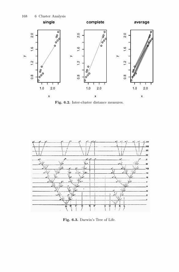
168 6 Cluster Analysis
Fig. 6.2. Inter-cluster distance measures.
Fig. 6.3. Darwin’s Tree of Life.

6.3 Agglomerative hierarchical clustering 169
R> (dm <- dist(measure[, c("chest", "waist", "hips")]))
1 2 3 4 5 6 7 8 9 10
2 6.16
3 5.66 2.45
4 7.87 2.45 4.69
5 4.24 5.10 3.16 7.48
6 11.00 6.08 5.74 7.14 7.68
7 12.04 5.92 7.00 5.00 10.05 5.10
8 8.94 3.74 4.00 3.74 7.07 5.74 4.12
9 7.81 3.61 2.24 5.39 4.58 3.74 5.83 3.61
10 10.10 4.47 4.69 5.10 7.35 2.24 3.32 3.74 3.00
11 7.00 8.31 6.40 9.85 5.74 11.05 12.08 8.06 7.48 10.25
12 7.35 7.07 5.48 8.25 6.00 9.95 10.25 6.16 6.40 8.83
13 7.81 8.54 7.28 9.43 7.55 12.08 11.92 7.81 8.49 10.82
14 8.31 11.18 9.64 12.45 8.66 14.70 15.30 11.18 11.05 13.75
15 7.48 6.16 4.90 7.07 6.16 9.22 9.00 4.90 5.74 7.87
16 7.07 6.00 4.24 7.35 5.10 8.54 9.11 5.10 5.00 7.48
17 7.81 7.68 6.71 8.31 7.55 11.40 10.77 6.71 7.87 9.95
18 6.71 6.08 4.58 7.28 5.39 9.27 9.49 5.39 5.66 8.06
19 9.17 5.10 4.47 5.48 7.07 6.71 5.74 2.00 4.12 5.10
20 7.68 9.43 7.68 10.82 7.00 12.41 13.19 9.11 8.83 11.53
11 12 13 14 15 16 17 18 19
2
3
4
5
6
7
8
9
10
11
12 2.24
13 2.83 2.24
14 3.74 5.20 3.74
15 3.61 1.41 3.00 6.40
16 3.00 1.41 3.61 6.40 1.41
17 3.74 2.24 1.41 5.10 2.24 3.32
18 2.83 1.00 2.83 5.83 1.00 1.00 2.45
19 6.71 4.69 6.40 9.85 3.46 3.74 5.39 4.12
20 1.41 3.00 2.45 2.45 4.36 4.12 3.74 3.74 7.68
Application of each of the three clustering methods described earlier tothe distance matrix and a plot of the corresponding dendrogram are achievedusing the hclust() function:

170 6 Cluster Analysis
R> plot(cs <- hclust(dm, method = "single"))
R> plot(cc <- hclust(dm, method = "complete"))
R> plot(ca <- hclust(dm, method = "average"))
The resulting plots (for single, complete, and average linkage) are given in theupper part of Figure 6.4.
17
56 10
4 23 9
8 1914
13 1716 15 12 18
11 20
1.0
2.0
3.0
4.0
Single
hclust (*, "single")dm
Hei
ght
−4 0 4
−4
2
PC1
PC
2 1
22
2 222
222 2
22
2
222
22
2
76 102 4 8 193 9
1 516 15 12 18 13 17
1411 20
05
1015
Complete
hclust (*, "complete")dm
Hei
ght
−4 0 4
−4
2
PC1
PC
2 1
22
2 122
222 1
11
1
111
12
1
76 10
53 9 8 192 4
116 15 12 1813 17
1411 200
24
68
Average
hclust (*, "average")dm
Hei
ght
−4 0 4
−4
2
PC1
PC
2 1
22
2 222
222 1
11
1
111
12
1
Fig. 6.4. Cluster solutions for measure data. The top row gives the cluster dendro-grams along with the cutoff used to derive the classes presented (in the space of thefirst two principal components) in the bottom row.
We now need to consider how we select specific partitions of the data (i.e.,a solution with a particular number of groups) from these dendrograms. Theanswer is that we “cut” the dendrogram at some height and this will give apartition with a particular number of groups. How do we choose where to cutor, in other words, how do we decide on a particular number of groups that is,in some sense, optimal for the data? This is a more difficult question to answer.
6.3 Agglomerative hierarchical clustering 171
One informal approach is to examine the sizes of the changes in height in thedendrogram and take a “large” change to indicate the appropriate number ofclusters for the data. (More formal approaches are described in Everitt et al.2011) Even using this informal approach on the dendrograms in Figure 6.4, itis not easy to decide where to “cut”.
So instead, because we know that these data consist of measurements onten men and ten women, we will look at the two-group solutions from eachmethod that are obtained by cutting the dendrograms at suitable heights. Wecan display and compare the three solutions graphically by plotting the firsttwo principal component scores of the data, labelling the points to identifythe cluster solution of one of the methods by using the following code:
R> body_pc <- princomp(dm, cor = TRUE)
R> xlim <- range(body_pc$scores[,1])
R> plot(body_pc$scores[,1:2], type = "n",
+ xlim = xlim, ylim = xlim)
R> lab <- cutree(cs, h = 3.8)
R> text(body_pc$scores[,1:2], labels = lab, cex = 0.6)
The resulting plots are shown in the lower part of Figure 6.4. The plots ofdendrograms and principal components scatterplots are combined into a singlediagram using the layout() function (see the chapter demo for the completeR code). The plot associated with the single linkage solution immediatelydemonstrates one of the problems with using this method in practise, andthat is a phenomenon known as chaining, which refers to the tendency toincorporate intermediate points between clusters into an existing cluster ratherthan initiating a new one. As a result, single linkage solutions often containlong “straggly” clusters that do not give a useful description of the data. Thetwo-group solutions from complete linkage and average linkage, also shown inFigure 6.4, are similar and in essence place the men (observations 1 to 10)together in one cluster and the women (observations 11 to 20) in the other.
6.3.1 Clustering jet fighters
The data shown in Table 6.1 as originally given in Stanley and Miller (1979)and also in Hand et al. (1994) are the values of six variables for 22 US fighteraircraft. The variables are as follows:
FFD: first flight date, in months after January 1940;SPR: specific power, proportional to power per unit weight;RGF: flight range factor;PLF: payload as a fraction of gross weight of aircraft;SLF: sustained load factor;CAR: a binary variable that takes the value 1 if the aircraft can land on a
carrier and 0 otherwise.
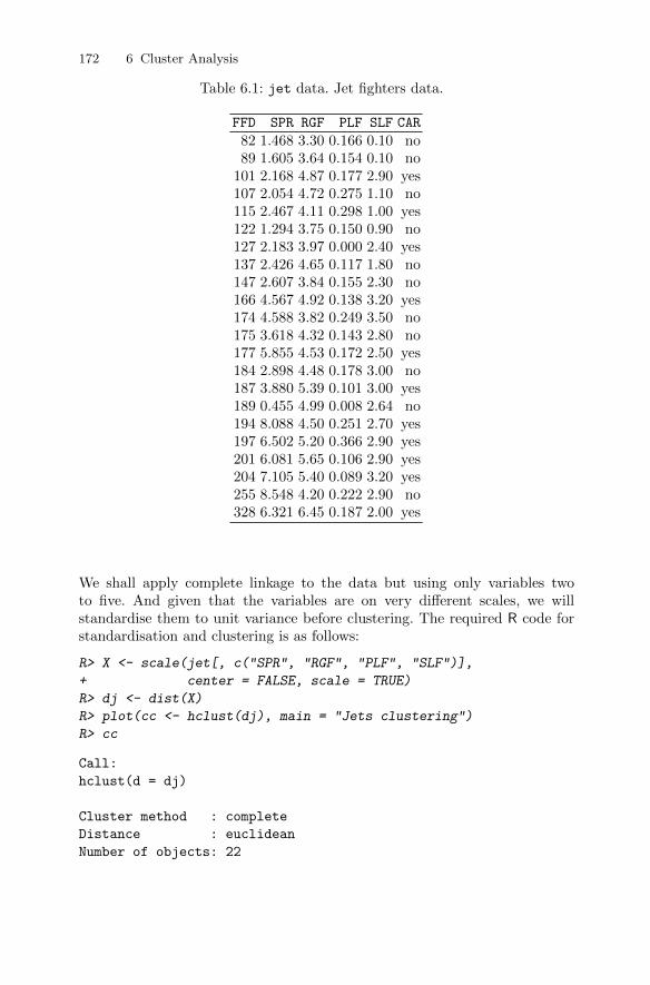
172 6 Cluster Analysis
Table 6.1: jet data. Jet fighters data.
FFD SPR RGF PLF SLF CAR
82 1.468 3.30 0.166 0.10 no89 1.605 3.64 0.154 0.10 no
101 2.168 4.87 0.177 2.90 yes107 2.054 4.72 0.275 1.10 no115 2.467 4.11 0.298 1.00 yes122 1.294 3.75 0.150 0.90 no127 2.183 3.97 0.000 2.40 yes137 2.426 4.65 0.117 1.80 no147 2.607 3.84 0.155 2.30 no166 4.567 4.92 0.138 3.20 yes174 4.588 3.82 0.249 3.50 no175 3.618 4.32 0.143 2.80 no177 5.855 4.53 0.172 2.50 yes184 2.898 4.48 0.178 3.00 no187 3.880 5.39 0.101 3.00 yes189 0.455 4.99 0.008 2.64 no194 8.088 4.50 0.251 2.70 yes197 6.502 5.20 0.366 2.90 yes201 6.081 5.65 0.106 2.90 yes204 7.105 5.40 0.089 3.20 yes255 8.548 4.20 0.222 2.90 no328 6.321 6.45 0.187 2.00 yes
We shall apply complete linkage to the data but using only variables twoto five. And given that the variables are on very different scales, we willstandardise them to unit variance before clustering. The required R code forstandardisation and clustering is as follows:
R> X <- scale(jet[, c("SPR", "RGF", "PLF", "SLF")],
+ center = FALSE, scale = TRUE)
R> dj <- dist(X)
R> plot(cc <- hclust(dj), main = "Jets clustering")
R> cc
Call:
hclust(d = dj)
Cluster method : complete
Distance : euclidean
Number of objects: 22

6.3 Agglomerative hierarchical clustering 173
The resulting dendrogram in Figure 6.5 strongly suggests the presence oftwo groups of fighters. In Figure 6.6, the data are plotted in the space ofthe first two principal components of the correlation matrix of the relevantvariables (SPR to SLF). And in Figure 6.6 the points are labelled by clusternumber for the two-group solution and the colours used are the values of theCAR variable. The two-group solution largely corresponds to planes that canand cannot land on a carrier.
Call:
hclust(d = dj)
Cluster method : complete
Distance : euclidean
Number of objects: 22
YF
−10
7AF
−10
6AF
−10
0AF
−10
2AF
−10
4BF
−4B
F−
101A
F−
111A F4D
−1
F−
105B
F9F
−2
F−
94A
F3D
−1
FH
−1
FJ−
1F
−89
AF
−8A
XF
10F
−1
F−
86A
F3H
−2
F9F
−6
F11
F−
10.0
0.5
1.0
1.5
2.0
Jets clustering
hclust (*, "complete")dj
Hei
ght
Fig. 6.5. Hierarchical clustering (complete linkage) of jet data.
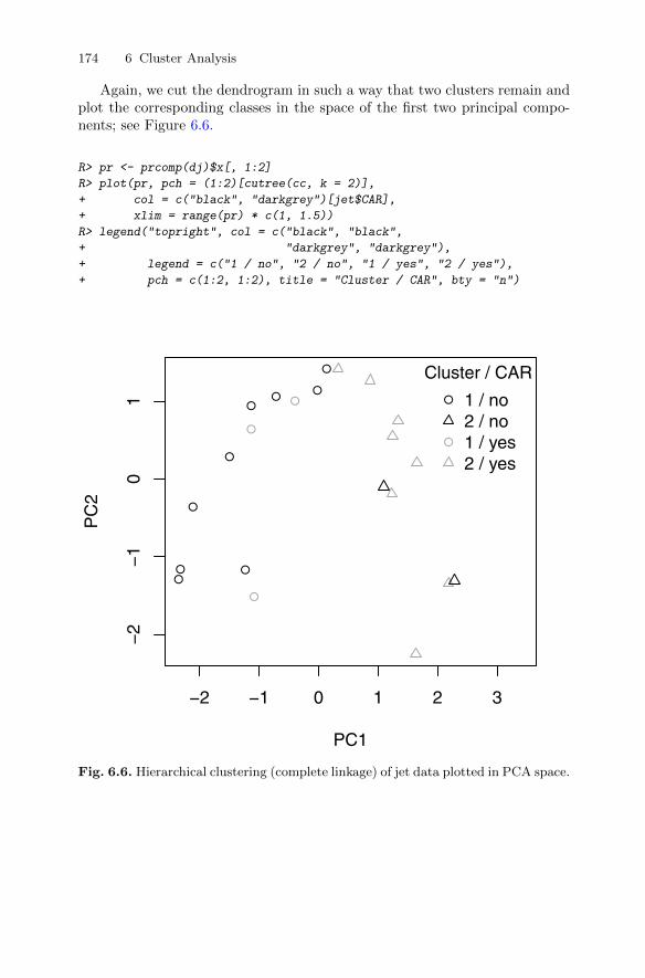
174 6 Cluster Analysis
Again, we cut the dendrogram in such a way that two clusters remain andplot the corresponding classes in the space of the first two principal compo-nents; see Figure 6.6.
R> pr <- prcomp(dj)$x[, 1:2]
R> plot(pr, pch = (1:2)[cutree(cc, k = 2)],
+ col = c("black", "darkgrey")[jet$CAR],
+ xlim = range(pr) * c(1, 1.5))
R> legend("topright", col = c("black", "black",
+ "darkgrey", "darkgrey"),
+ legend = c("1 / no", "2 / no", "1 / yes", "2 / yes"),
+ pch = c(1:2, 1:2), title = "Cluster / CAR", bty = "n")
●●
●
●
●
●
●
●●
●
●
●
−2 −1 0 1 2 3
−2
−1
01
PC1
PC
2
●
●
Cluster / CAR
1 / no2 / no1 / yes2 / yes
Fig. 6.6. Hierarchical clustering (complete linkage) of jet data plotted in PCA space.
6.4 K-means clustering 175
6.4 K-means clustering
The k-means clustering technique seeks to partition the n individuals in aset of multivariate data into k groups or clusters, (G1, G2, . . . , Gk), where Gidenotes the set of ni individuals in the ith group, and k is given (or a possiblerange is specified by the researcher–the problem of choosing the“true”value ofk will be taken up later) by minimising some numerical criterion, low values ofwhich are considered indicative of a“good”solution. The most commonly usedimplementation of k-means clustering is one that tries to find the partitionof the n individuals into k groups that minimises the within-group sum ofsquares (WGSS) over all variables; explicitly, this criterion is
WGSS =
q∑j=1
k∑l=1
∑i∈Gl
(xij − x(l)j )2,
where x(l)j = 1
ni
∑i∈Gl
xij is the mean of the individuals in group Gl on variable
j.The problem then appears relatively simple; namely, consider every pos-
sible partition of the n individuals into k groups, and select the one with thelowest within-group sum of squares. Unfortunately, the problem in practise isnot so straightforward. The numbers involved are so vast that complete enu-meration of every possible partition remains impossible even with the fastestcomputer. The scale of the problem immediately becomes clear by looking atthe numbers in Table 6.2.
Table 6.2: Number of possible partitions depending on the samplesize n and number of clusters k.
n k Number of possible partitions15 3 2, 375, 10120 4 45, 232, 115, 90125 8 690, 223, 721, 118, 368, 580
100 5 1068
The impracticability of examining every possible partition has led to thedevelopment of algorithms designed to search for the minimum values of theclustering criterion by rearranging existing partitions and keeping the newone only if it provides an improvement. Such algorithms do not, of course,guarantee finding the global minimum of the criterion. The essential steps inthese algorithms are as follows:
176 6 Cluster Analysis
1. Find some initial partition of the individuals into the required number ofgroups. (Such an initial partition could be provided by a solution from oneof the hierarchical clustering techniques described in the previous section.)
2. Calculate the change in the clustering criterion produced by“moving”eachindividual from its own cluster to another cluster.
3. Make the change that leads to the greatest improvement in the value ofthe clustering criterion.
4. Repeat steps (2) and (3) until no move of an individual causes the clus-tering criterion to improve.
(For a more detailed account of the typical k-means algorithm see Steinley2008)
The k-means approach to clustering using the minimisation of the within-group sum of squares over all the variables is widely used but suffers fromthe two problems of (1) not being scale-invariant (i.e., different solutions mayresult from clustering the raw data and the data standardised in some way)and (2) of imposing a “spherical” structure on the data; i.e., it will find clus-ters shaped like hyper-footballs even if the “true” clusters in the data are ofsome other shape (see Everitt et al. 2011, for some examples of the latterphenomenon). Nevertheless, the k-means method remains very popular. Withk-means clustering, the investigator can choose to partition the data into aspecified number of groups. In practice, solutions for a range of values for thenumber of groups are found and in some way the optimal or “true” numberof groups for the data must be chosen. Several suggestions have been madeas to how to answer the number of groups question, but none is completelysatisfactory. The method we shall use in the forthcoming example is to plotthe within-groups sum of squares associated with the k-means solution foreach number of groups. As the number of groups increases the sum of squareswill necessarily decrease, but an obvious “elbow” in the plot may be indicativeof the most useful solution for the investigator to look at in detail. (Comparethis with the scree plot described in Chapter 3.)
6.4.1 Clustering the states of the USA on the basis of their crimerate profiles
The Statistical Abstract of the USA (Anonymous 1988, Table 265) gives ratesof different types of crime per 100,000 residents of the 50 states of the USA plusthe District of Columbia for the year 1986. The data are given in Table 6.3.
Table 6.3: crime data. Crime data.
Murder Rape Robbery Assault Burglary Theft Vehicle
ME 2.0 14.8 28 102 803 2347 164NH 2.2 21.5 24 92 755 2208 228VT 2.0 21.8 22 103 949 2697 181MA 3.6 29.7 193 331 1071 2189 906
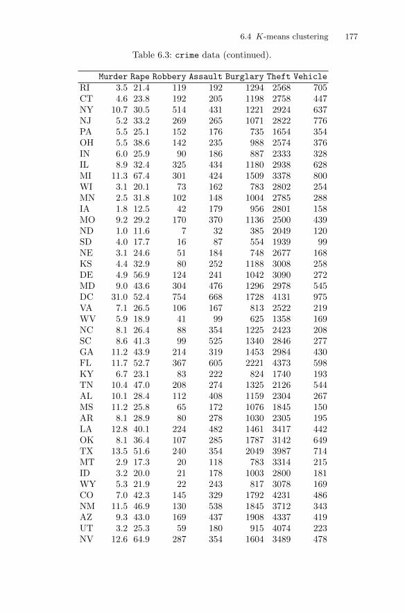
6.4 K-means clustering 177
Table 6.3: crime data (continued).
Murder Rape Robbery Assault Burglary Theft Vehicle
RI 3.5 21.4 119 192 1294 2568 705CT 4.6 23.8 192 205 1198 2758 447NY 10.7 30.5 514 431 1221 2924 637NJ 5.2 33.2 269 265 1071 2822 776PA 5.5 25.1 152 176 735 1654 354OH 5.5 38.6 142 235 988 2574 376IN 6.0 25.9 90 186 887 2333 328IL 8.9 32.4 325 434 1180 2938 628MI 11.3 67.4 301 424 1509 3378 800WI 3.1 20.1 73 162 783 2802 254MN 2.5 31.8 102 148 1004 2785 288IA 1.8 12.5 42 179 956 2801 158MO 9.2 29.2 170 370 1136 2500 439ND 1.0 11.6 7 32 385 2049 120SD 4.0 17.7 16 87 554 1939 99NE 3.1 24.6 51 184 748 2677 168KS 4.4 32.9 80 252 1188 3008 258DE 4.9 56.9 124 241 1042 3090 272MD 9.0 43.6 304 476 1296 2978 545DC 31.0 52.4 754 668 1728 4131 975VA 7.1 26.5 106 167 813 2522 219WV 5.9 18.9 41 99 625 1358 169NC 8.1 26.4 88 354 1225 2423 208SC 8.6 41.3 99 525 1340 2846 277GA 11.2 43.9 214 319 1453 2984 430FL 11.7 52.7 367 605 2221 4373 598KY 6.7 23.1 83 222 824 1740 193TN 10.4 47.0 208 274 1325 2126 544AL 10.1 28.4 112 408 1159 2304 267MS 11.2 25.8 65 172 1076 1845 150AR 8.1 28.9 80 278 1030 2305 195LA 12.8 40.1 224 482 1461 3417 442OK 8.1 36.4 107 285 1787 3142 649TX 13.5 51.6 240 354 2049 3987 714MT 2.9 17.3 20 118 783 3314 215ID 3.2 20.0 21 178 1003 2800 181WY 5.3 21.9 22 243 817 3078 169CO 7.0 42.3 145 329 1792 4231 486NM 11.5 46.9 130 538 1845 3712 343AZ 9.3 43.0 169 437 1908 4337 419UT 3.2 25.3 59 180 915 4074 223NV 12.6 64.9 287 354 1604 3489 478

178 6 Cluster Analysis
Table 6.3: crime data (continued).
Murder Rape Robbery Assault Burglary Theft Vehicle
WA 5.0 53.4 135 244 1861 4267 315OR 6.6 51.1 206 286 1967 4163 402CA 11.3 44.9 343 521 1696 3384 762AK 8.6 72.7 88 401 1162 3910 604HI 4.8 31.0 106 103 1339 3759 328
Murder
10 50 100 600 1500
020
1050 Rape
Robbery
060
0
100
600
Assault
Burglary
500
1500
Theft
0 20 0 600 500 200 1000
200
1000
Vehicle
Fig. 6.7. Scatterplot matrix of crime data.
To begin, let’s look at the scatterplot matrix of the data shown in Fig-ure 6.7. The plot suggests that at least one of the cities is considerably dif-ferent from the others in its murder rate at least. The city is easily identifiedusing

6.4 K-means clustering 179
R> subset(crime, Murder > 15)
Murder Rape Robbery Assault Burglary Theft Vehicle
DC 31 52.4 754 668 1728 4131 975
i.e., the murder rate is very high in the District of Columbia. In order to checkif the other crime rates are also higher in DC, we label the corresponding pointsin the scatterplot matrix in Figure 6.8. Clearly, DC is rather extreme in mostcrimes (the clear message is don’t live in DC).
Murder
10 50
+ +100 600
+ +1500
+
020
+
1050 + Rape + + + + +
+ +Robbery
+ + +
060
0+
100
600 + + +
Assault
+ + +
+ + + +Burglary
+50
0+
1500
+ + + + +Theft
+
0 20
+ +
0 600
+ +
500
+ +
200 1000
200
1000
Vehicle
Fig. 6.8. Scatterplot matrix of crime data with DC observation labelled using aplus sign.
We will now apply k-means clustering to the crime rate data after removingthe outlier, DC. If we first calculate the variances of the crime rates for thedifferent types of crimes we find the following:
R> sapply(crime, var)
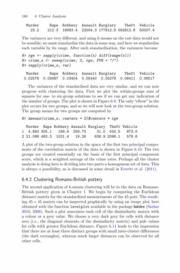
180 6 Cluster Analysis
Murder Rape Robbery Assault Burglary Theft Vehicle
23.2 212.3 18993.4 22004.3 177912.8 582812.8 50007.4
The variances are very different, and using k-means on the raw data would notbe sensible; we must standardise the data in some way, and here we standardiseeach variable by its range. After such standardisation, the variances become
R> rge <- sapply(crime, function(x) diff(range(x)))
R> crime_s <- sweep(crime, 2, rge, FUN = "/")
R> sapply(crime_s, var)
Murder Rape Robbery Assault Burglary Theft Vehicle
0.02578 0.05687 0.03404 0.05440 0.05278 0.06411 0.06517
The variances of the standardised data are very similar, and we can nowprogress with clustering the data. First we plot the within-groups sum ofsquares for one- to six-group solutions to see if we can get any indication ofthe number of groups. The plot is shown in Figure 6.9. The only“elbow” in theplot occurs for two groups, and so we will now look at the two-group solution.The group means for two groups are computed by
R> kmeans(crime_s, centers = 2)$centers * rge
Murder Rape Robbery Assault Burglary Theft Vehicle
1 4.893 305.1 189.6 259.70 31.0 540.5 873.0
2 21.098 483.3 1031.4 19.26 638.9 2096.1 578.6
A plot of the two-group solution in the space of the first two principal compo-nents of the correlation matrix of the data is shown in Figure 6.10. The twogroups are created essentially on the basis of the first principal componentscore, which is a weighted average of the crime rates. Perhaps all the clusteranalysis is doing here is dividing into two parts a homogenous set of data. Thisis always a possibility, as is discussed in some detail in Everitt et al. (2011).
6.4.2 Clustering Romano-British pottery
The second application of k-means clustering will be to the data on Romano-British pottery given in Chapter 1. We begin by computing the Euclideandistance matrix for the standardised measurements of the 45 pots. The result-ing 45× 45 matrix can be inspected graphically by using an image plot, hereobtained with the function levelplot available in the package lattice (Sarkar2010, 2008). Such a plot associates each cell of the dissimilarity matrix witha colour or a grey value. We choose a very dark grey for cells with distancezero (i.e., the diagonal elements of the dissimilarity matrix) and pale valuesfor cells with greater Euclidean distance. Figure 6.11 leads to the impressionthat there are at least three distinct groups with small inter-cluster differences(the dark rectangles), whereas much larger distances can be observed for allother cells.
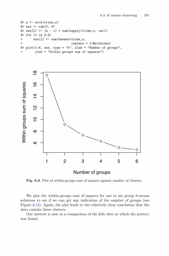
6.4 K-means clustering 181
R> n <- nrow(crime_s)
R> wss <- rep(0, 6)
R> wss[1] <- (n - 1) * sum(sapply(crime_s, var))
R> for (i in 2:6)
+ wss[i] <- sum(kmeans(crime_s,
+ centers = i)$withinss)
R> plot(1:6, wss, type = "b", xlab = "Number of groups",
+ ylab = "Within groups sum of squares")
●
●
●
●
●●
1 2 3 4 5 6
68
1012
1416
18
Number of groups
With
in g
roup
s su
m o
f squ
ares
Fig. 6.9. Plot of within-groups sum of squares against number of clusters.
We plot the within-groups sum of squares for one to six group k-meanssolutions to see if we can get any indication of the number of groups (seeFigure 6.12). Again, the plot leads to the relatively clear conclusion that thedata contain three clusters.
Our interest is now in a comparison of the kiln sites at which the potterywas found.
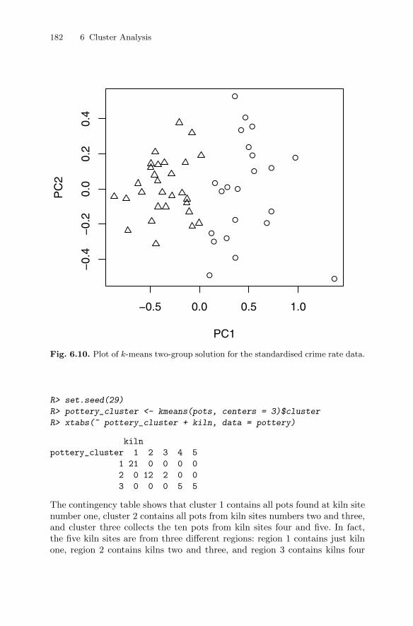
182 6 Cluster Analysis
●
●
● ●
●●
●
●●
●
●
●●
●
●
●
●
●
●
●
●
●
−0.5 0.0 0.5 1.0
−0.
4−
0.2
0.0
0.2
0.4
PC1
PC
2
Fig. 6.10. Plot of k-means two-group solution for the standardised crime rate data.
R> set.seed(29)
R> pottery_cluster <- kmeans(pots, centers = 3)$cluster
R> xtabs(~ pottery_cluster + kiln, data = pottery)
kiln
pottery_cluster 1 2 3 4 5
1 21 0 0 0 0
2 0 12 2 0 0
3 0 0 0 5 5
The contingency table shows that cluster 1 contains all pots found at kiln sitenumber one, cluster 2 contains all pots from kiln sites numbers two and three,and cluster three collects the ten pots from kiln sites four and five. In fact,the five kiln sites are from three different regions: region 1 contains just kilnone, region 2 contains kilns two and three, and region 3 contains kilns four
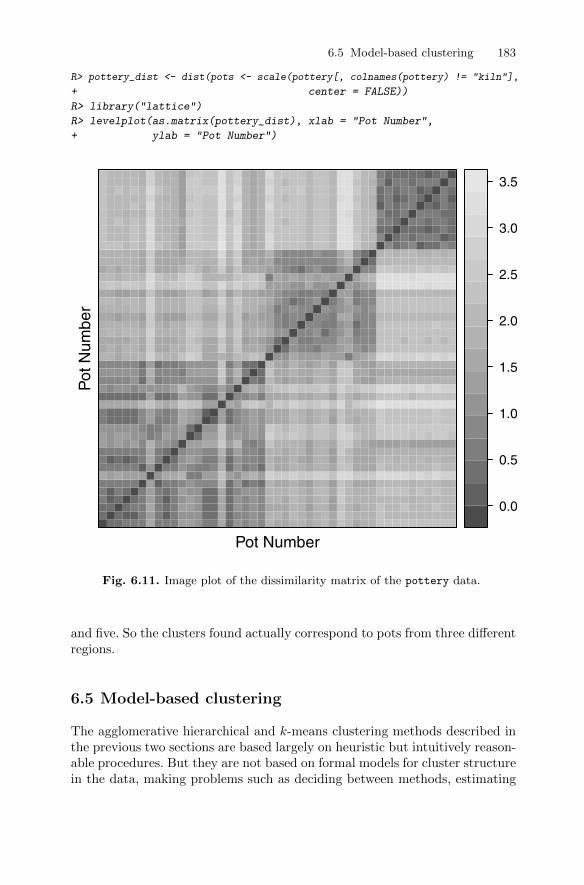
6.5 Model-based clustering 183
R> library("lattice")
R> levelplot(as.matrix(pottery_dist), xlab = "Pot Number",
+ ylab = "Pot Number")
Pot Number
Pot
Num
ber
0.0
0.5
1.0
1.5
2.0
2.5
3.0
3.5
Fig. 6.11. Image plot of the dissimilarity matrix of the pottery data.
and five. So the clusters found actually correspond to pots from three differentregions.
6.5 Model-based clustering
The agglomerative hierarchical and k-means clustering methods described inthe previous two sections are based largely on heuristic but intuitively reason-able procedures. But they are not based on formal models for cluster structurein the data, making problems such as deciding between methods, estimating
R> pottery_dist <- dist(pots <- scale(pottery[, colnames(pottery) != "kiln"],
+ center = FALSE))
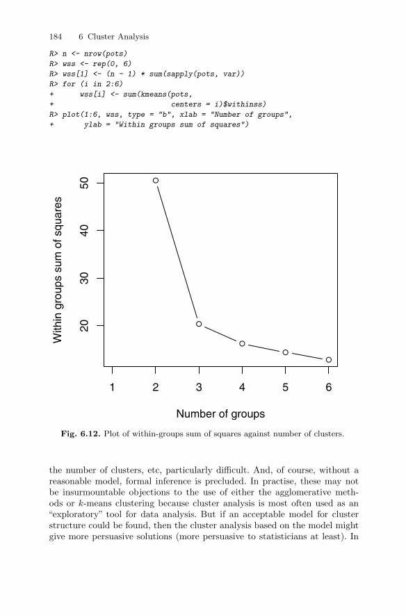
184 6 Cluster Analysis
R> n <- nrow(pots)
R> wss <- rep(0, 6)
R> wss[1] <- (n - 1) * sum(sapply(pots, var))
R> for (i in 2:6)
+ wss[i] <- sum(kmeans(pots,
+ centers = i)$withinss)
R> plot(1:6, wss, type = "b", xlab = "Number of groups",
+ ylab = "Within groups sum of squares")
●
●
●
●●
1 2 3 4 5 6
2030
4050
Number of groups
With
in g
roup
s su
m o
f squ
ares
Fig. 6.12. Plot of within-groups sum of squares against number of clusters.
the number of clusters, etc, particularly difficult. And, of course, without areasonable model, formal inference is precluded. In practise, these may notbe insurmountable objections to the use of either the agglomerative meth-ods or k-means clustering because cluster analysis is most often used as an“exploratory” tool for data analysis. But if an acceptable model for clusterstructure could be found, then the cluster analysis based on the model mightgive more persuasive solutions (more persuasive to statisticians at least). In
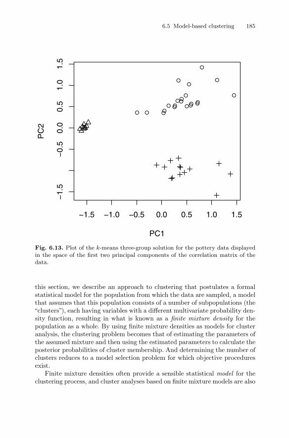
6.5 Model-based clustering 185
●●
●●
●
●
●
●●●
●
●●
●●
●
●
●
●● ●
−1.5 −1.0 −0.5 0.0 0.5 1.0 1.5
−1.
5−
0.5
0.0
0.5
1.0
1.5
PC1
PC
2
Fig. 6.13. Plot of the k-means three-group solution for the pottery data displayedin the space of the first two principal components of the correlation matrix of thedata.
this section, we describe an approach to clustering that postulates a formalstatistical model for the population from which the data are sampled, a modelthat assumes that this population consists of a number of subpopulations (the“clusters”), each having variables with a different multivariate probability den-sity function, resulting in what is known as a finite mixture density for thepopulation as a whole. By using finite mixture densities as models for clusteranalysis, the clustering problem becomes that of estimating the parameters ofthe assumed mixture and then using the estimated parameters to calculate theposterior probabilities of cluster membership. And determining the number ofclusters reduces to a model selection problem for which objective proceduresexist.
Finite mixture densities often provide a sensible statistical model for theclustering process, and cluster analyses based on finite mixture models are also
186 6 Cluster Analysis
known as model-based clustering methods; see Banfield and Raftery (1993).Finite mixture models have been increasingly used in recent years to clus-ter data in a variety of disciplines, including behavioural, medical, genetic,computer, environmental sciences, and robotics and engineering; see, for ex-ample, Everitt and Bullmore (1999), Bouguila and Amayri (2009), Bran-chaud, Cham, Nenadic, Andersen, and Burdick (2010), Dai, Erkkila, Yli-Harja, and Lahdesmaki (2009), Dunson (2009), Ganesalingam, Stahl, Wi-jesekera, Galtrey, Shaw, Leigh, and Al-Chalabi (2009), Marin, Mengersen,and Roberts (2005), Meghani, Lee, Hanlon, and Bruner (2009), Pledger andPhillpot (2008), and van Hattum and Hoijtink (2009).
Finite mixture modelling can be seen as a form of latent variable analysis(see, for example, Skrondal and Rabe-Hesketh 2004), with “subpopulation”being a latent categorical variable and the latent classes being described bythe different components of the mixture density; consequently, cluster analysisbased on such models is also often referred to as latent class cluster analysis.
6.5.1 Finite mixture densities
Finite mixture densities are described in detail in Everitt and Hand (1981),Titterington, Smith, and Makov (1985), McLachlan and Basford (1988),McLachlan and Peel (2000), and Fruhwirth-Schnatter (2006); they are a fam-ily of probability density functions of the form
f(x; p,θ) =c∑j=1
pjgj(x; θj), (6.1)
where x is a p-dimensional random variable, p> = (p1, p2, . . . , pc−1), andθ> = (θ>1 ,θ
>2 , . . . , θ
>c ), with the pj being known as mixing proportions and
the gj , j = 1, . . . , c, being the component densities, with density gj beingparameterised by θj. The mixing proportions are non-negative and are suchthat
∑cj=1 pj = 1. The number of components forming the mixture (i.e., the
postulated number of clusters) is c.Finite mixtures provide suitable models for cluster analysis if we assume
that each group of observations in a data set suspected to contain clusterscomes from a population with a different probability distribution. The lattermay belong to the same family but differ in the values they have for theparameters of the distribution; it is such an example that we consider in thenext section, where the components of the mixture are multivariate normalwith different mean vectors and possibly different covariance matrices.
Having estimated the parameters of the assumed mixture density, observa-tions can be associated with particular clusters on the basis of the maximumvalue of the estimated posterior probability
P(cluster j|xi) =pjgj(xi; θj)
f(xi; p, θ), j = 1, . . . , c. (6.2)

6.5 Model-based clustering 187
6.5.2 Maximum likelihood estimation in a finite mixture density withmultivariate normal components
Given a sample of observations x1,x2, . . . ,xn, from the mixture density givenin Equation (6.1) the log-likelihood function, l, is
l(p, θ) =
n∑i=1
ln f(xi; p,θ). (6.3)
Estimates of the parameters in the density would usually be obtained as asolution of the likelihood equations
∂l(ϕ)
∂(ϕ)= 0, (6.4)
where ϕ> = (p>,θ>). In the case of finite mixture densities, the likelihoodfunction is too complicated to employ the usual methods for its maximisation;for example, an iterative Newton–Raphson method that approximates thegradient vector of the log-likelihood function l(ϕ) by a linear Taylor seriesexpansion (see Everitt (1984)).
Consequently, the required maximum likelihood estimates of the parame-ters in a finite mixture model have to be computed in some other way. In thecase of a mixture in which the jth component density is multivariate normalwith mean vector µj and covariance matrix Σj , it can be shown (see Everittand Hand 1981, for details) that the application of maximum likelihood resultsin the series of equations
pj =1
n
n∑i=1
P(j|xi), (6.5)
µj =1
npj
n∑i=1
xiP(j|xi), (6.6)
Σj =1
n
n∑i=1
(xi − µj)(xi − µj)>P(j|xi), (6.7)
where the P(j|xi)s are the estimated posterior probabilities given in equation(6.2).
Hasselblad (1966, 1969), Wolfe (1970), and Day (1969) all suggest an it-erative scheme for solving the likelihood equations given above that involvesfinding initial estimates of the posterior probabilities given initial estimatesof the parameters of the mixture and then evaluating the right-hand sides ofEquations 6.5 to 6.7 to give revised values for the parameters. From these,new estimates of the posterior probabilities are derived, and the procedure isrepeated until some suitable convergence criterion is satisfied. There are po-tential problems with this process unless the component covariance matrices
188 6 Cluster Analysis
are constrained in some way; for example, it they are all assumed to be thesame–again see Everitt and Hand (1981) for details.
This procedure is a particular example of the iterative expectation max-imisation (EM) algorithm described by Dempster, Laird, and Rubin (1977) inthe context of likelihood estimation for incomplete data problems. In estimat-ing parameters in a mixture, it is the “labels” of the component density fromwhich an observation arises that are missing. As an alternative to the EM algo-rithm, Bayesian estimation methods using the Gibbs sampler or other MonteCarlo Markov Chain (MCMC) methods are becoming increasingly popular–see Marin et al. (2005) and McLachlan and Peel (2000).
Fraley and Raftery (2002, 2007) developed a series of finite mixture den-sity models with multivariate normal component densities in which they allowsome, but not all, of the features of the covariance matrix (orientation, size,and shape–discussed later) to vary between clusters while constraining othersto be the same. These new criteria arise from considering the reparameterisa-tion of the covariance matrix Σj in terms of its eigenvalue description
Σj = DjΛjD>j , (6.8)
where Dj is the matrix of eigenvectors and Λj is a diagonal matrix with theeigenvalues of Σj on the diagonal (this is simply the usual principal compo-nents transformation–see Chapter 3). The orientation of the principal compo-nents of Σj is determined by Dj , whilst Λj specifies the size and shape of thedensity contours. Specifically, we can write Λj = λjAj , where λj is the largesteigenvalue of Σj and Aj = diag(1, α2, . . . , αp) contains the eigenvalue ratiosafter division by λj . Hence λj controls the size of the jth cluster and Aj itsshape. (Note that the term “size” here refers to the volume occupied in space,not the number of objects in the cluster.) In two dimensions, the parame-ters would reflect, for each cluster, the correlation between the two variables,and the magnitudes of their standard deviations. More details are given inBanfield and Raftery (1993) and Celeux and Govaert (1995), but Table 6.4gives a series of models corresponding to various constraints imposed on thecovariance matrix. The models make up what Fraley and Raftery (2003, 2007)term the “MCLUST” family of mixture models. The mixture likelihood ap-proach based on the EM algorithm for parameter estimation is implementedin the Mclust() function in the R package mclust and fits the models in theMCLUST family described in Table 6.4.
Model selection is a combination of choosing the appropriate clusteringmodel for the population from which the n observations have been taken(i.e., are all clusters spherical, all elliptical, all different shapes or somewherein between?) and the optimal number of clusters. A Bayesian approach isused (see Fraley and Raftery 2002), applying what is known as the BayesianInformation Criterion (BIC). The result is a cluster solution that “fits” theobserved data as well as possible, and this can include a solution that has onlyone “cluster” implying that cluster analysis is not really a useful technique forthe data.
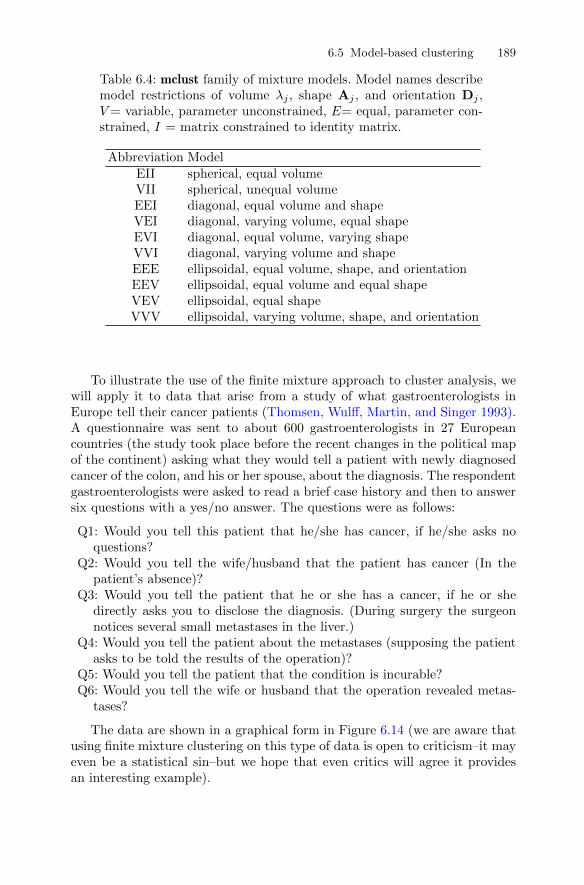
6.5 Model-based clustering 189
Table 6.4: mclust family of mixture models. Model names describemodel restrictions of volume λj , shape Aj , and orientation Dj ,V= variable, parameter unconstrained, E= equal, parameter con-strained, I = matrix constrained to identity matrix.
Abbreviation ModelEII spherical, equal volumeVII spherical, unequal volumeEEI diagonal, equal volume and shapeVEI diagonal, varying volume, equal shapeEVI diagonal, equal volume, varying shapeVVI diagonal, varying volume and shapeEEE ellipsoidal, equal volume, shape, and orientationEEV ellipsoidal, equal volume and equal shapeVEV ellipsoidal, equal shapeVVV ellipsoidal, varying volume, shape, and orientation
To illustrate the use of the finite mixture approach to cluster analysis, wewill apply it to data that arise from a study of what gastroenterologists inEurope tell their cancer patients (Thomsen, Wulff, Martin, and Singer 1993).A questionnaire was sent to about 600 gastroenterologists in 27 Europeancountries (the study took place before the recent changes in the political mapof the continent) asking what they would tell a patient with newly diagnosedcancer of the colon, and his or her spouse, about the diagnosis. The respondentgastroenterologists were asked to read a brief case history and then to answersix questions with a yes/no answer. The questions were as follows:
Q1: Would you tell this patient that he/she has cancer, if he/she asks noquestions?
Q2: Would you tell the wife/husband that the patient has cancer (In thepatient’s absence)?
Q3: Would you tell the patient that he or she has a cancer, if he or shedirectly asks you to disclose the diagnosis. (During surgery the surgeonnotices several small metastases in the liver.)
Q4: Would you tell the patient about the metastases (supposing the patientasks to be told the results of the operation)?
Q5: Would you tell the patient that the condition is incurable?Q6: Would you tell the wife or husband that the operation revealed metas-
tases?
The data are shown in a graphical form in Figure 6.14 (we are aware thatusing finite mixture clustering on this type of data is open to criticism–it mayeven be a statistical sin–but we hope that even critics will agree it providesan interesting example).

190 6 Cluster Analysis
●●
●●
●
●●
●●
●●
●
●●
●●
●●
●●
●●
●
●●
●●
●●
●●
●●
●●
●●
●●
●●
●
●●
●●
●●
●●
●●
●●
●●
●●
●●
●
● ●●
●●
●●
●●
●●
●●
●●
●●
●●
●●
●●
●●
●●
●●
●
●●
●●
●●
●●
●●
●●
●●
●●
●●
●●
●●
●●
●●
●●
●●
●●
●●
●●
●●
●●
●●
●
●●
●●
●●
●●
●●
●●
●●
●●
●●
●●
●●
●
●●
●●
●
●●
●
●●
●●
●●
●
●●
●●
●
●●
●●
●●
●●
●●
●●
●●
●●
●●
●●
●●
●●
●●
●●
●●
●●
●
●●
●●
●●
●●
●●
●●
●●
●●
●●
●●
●●
●●
●
●●
●●
●●
●●
●●
●●
●
●●
●●
●●
●●
●
●●
●●
●●
●●
●●
●●
●●
●●
●
●●
●●
●●
●●
●●
●●
●●
●●
●●
●
●●
●●
●●
●●
●●
●●
●●
●●
●●
●●
●
●●
●●
●●
●●
●●
●●
●
●●
●●
●●
●●
●●
●●
●●
●
●●
●●
●●
●●
●●
●●
●●
●●
●●
●●
●●
●●
●●
●●
●●
●●
●●
●●
●●
●●
●
●●
●●
●●
●●
●●
●●
●●
●●
●●
●●
●●
●
●●
●●
●
●●
●
●●
●●
●●
●●
●●
●
●●
●●
●●
●●
●●
●●
●●
●●
●●
●●
●●
●●
●●
●●
●●
●●
●●
●
●●
●●
●●
●●
●●
●●
●●
●●
●●
●
●●
●●
●●
●
●●
●●
●●
●●
●●
●●
●
●●
●
●●
●●
●●
●●
●●
●●
●●
●●
●
●●
●●
●●
●●
●●
●●
●●
●●
●●
●●
●●
●●
●●
●●
●●
●●
●●
●●
●●
●●
●
●●
●●
●●
●●
●●
●●
●
●●
●●
●●
●●
●●
●●
●●
●●
●●
●●
●●
●●
●●
●●
●●
●●
●●
●●
●●
●●
●●
●●
●●
●●
●●
●●
●●
●●
●●
●●
●●
●●
●●
●●
●●
●●
●●
●
●●
●●
●
●●
●
●●
●●
●●
●
●●
●●
●
●●
●●
●●
●●
●●
●●
●●
●●
●●
●●
●●
●●
●●
●●
●●
●●
●●
●●
●●
●●
●●
●●
●●
●●
●●
●●
●●
●●
●●
●
●●
●●
●●
●●
●●
●●
●
●●
●
●●
●●
●
●●
●●
●
●●
●●
●●
●●
●●
●
●●
●●
●●
●●
●●
●●
●●
●●
●●
●●
●●
●●
●●
●●
●●
●●
●●
●●
●●
●●
●●
●●
●●
●●
●●
●●
●●
●●
●●
●●
●●
●●
●●
●●
●●
●●
●●
●●
●●
●●
●●
●●
●●
●●
●
●●
●●
●●
●●
●●
●●
●●
●●
●●
●●
●
●●
●●
●●
●●
●●
●●
●●
●●
●●
●●
●●
●
●●
●●
●
●●
●
●●
●●
●●
●
●●
●●
●
●●
●●
●●
●●
●●
●●
●●
●●
●●
●●
●●
●●
●●
●●
●●
●●
●●
●●
●●
●●
●●
●●
●●
●●
●●
●●
●●
●
●●
●●
●●
●
●●
●●
●●
●●
●●
●●
●
●●
●
●●
●●
●
●●
●●
●●
●●
●●
●●
●●
●●
●●
●●
●●
●●
●●
●●
●●
●
●●
●●
●●
●●
●●
●●
●●
●●
●●
●
●●
●●
●●
●●
●●
●●
●●
●
●●
●●
●●
●
●●
●●
●●
●
●●
●●
●●
●●
●●
●●
●●
●●
●●
●●
●
●●
●●
●●
●●
●●
●●
●●
●●
●●
●●
●
●●
●●
●●
●●
●●
●●
●●
●●
●●
●●
●●
●
●●
●●
●●
●●
●
●●
●●
●●
●
●●
●●
●
●●
●●
●●
●●
●●
●●
●●
●●
●●
●●
●●
●●
●●
●●
●●
●●
●
●●
●●
●●
●●
●●
●●
●●
●●
●
●●
●●
●●
●
●●
●●
●●
●●
●●
●●
●
●●
●
●●
●●
●
●●
●●
●
●●
●●
●●
●●
●
●●
●●
●●
●●
●●
●●
●●
●●
●●
●
●●
●●
●●
●●
●●
●●
●●
●●
●
●●
●
●●
●●
●●
●●
●●
●●
●●
●●
●●
●●
●●
●●
●●
●●
●●
●●
●●
●●
●●
●●
●●
●●
●●
●
●●
●●
●●
●●
●●
●●
●●
●●
●●
●●
●
●●
●●
●●
●
●●
●●
●●
●●
●●
●●
●●
●●
●●
●
●●
●
●●
●●
●●
●
●●
●●
●
●●
●●
●●
●●
●●
●●
●●
●●
●●
●●
●●
●●
●●
●●
●●
●●
●●
●
●●
●●
●●
●●
●●
●●
●●
●●
●●
●
●●
●●
●●
●
●●
●●
●●
●●
●●
●●
●
●●
●E
ston
iaLa
tvia
Lith
uani
aC
ISP
olan
dS
lova
kia
Cze
chia
Hun
gary
Rom
ania
Bul
garia
Alb
ania
Yugo
slav
iaG
reec
eIta
lyP
ortu
gal
Spa
inF
ranc
eS
witz
erla
ndB
elgi
umN
ethe
rland
sG
erm
any
EireUK
Den
mar
kF
inla
ndS
wed
enN
orw
ayIc
elan
d
Que
stio
n 1
Que
stio
n 2
Que
stio
n 3
Que
stio
n 4
Que
stio
n 5
Que
stio
n 6
Fig.6.14.
Gast
roen
tero
logis
tsques
tionnair
edata
.D
ark
circ
les
indic
ate
a‘y
es’,
op
enci
rcle
sa
‘no’.
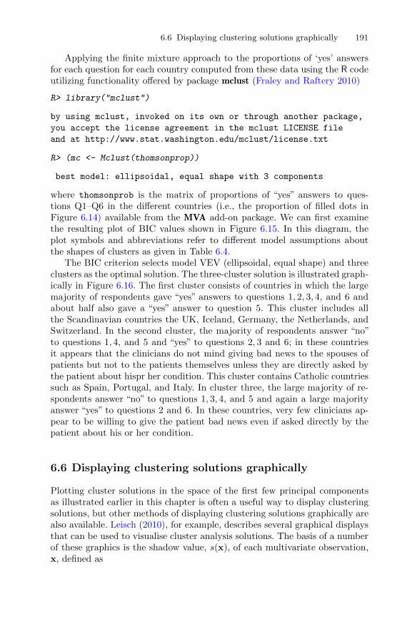
6.6 Displaying clustering solutions graphically 191
Applying the finite mixture approach to the proportions of ‘yes’ answersfor each question for each country computed from these data using the R codeutilizing functionality offered by package mclust (Fraley and Raftery 2010)
R> library("mclust")
by using mclust, invoked on its own or through another package,
you accept the license agreement in the mclust LICENSE file
and at http://www.stat.washington.edu/mclust/license.txt
R> (mc <- Mclust(thomsonprop))
best model: ellipsoidal, equal shape with 3 components
where thomsonprob is the matrix of proportions of “yes” answers to ques-tions Q1–Q6 in the different countries (i.e., the proportion of filled dots inFigure 6.14) available from the MVA add-on package. We can first examinethe resulting plot of BIC values shown in Figure 6.15. In this diagram, theplot symbols and abbreviations refer to different model assumptions aboutthe shapes of clusters as given in Table 6.4.
The BIC criterion selects model VEV (ellipsoidal, equal shape) and threeclusters as the optimal solution. The three-cluster solution is illustrated graph-ically in Figure 6.16. The first cluster consists of countries in which the largemajority of respondents gave “yes” answers to questions 1, 2, 3, 4, and 6 andabout half also gave a “yes” answer to question 5. This cluster includes allthe Scandinavian countries the UK, Iceland, Germany, the Netherlands, andSwitzerland. In the second cluster, the majority of respondents answer “no”to questions 1, 4, and 5 and “yes” to questions 2, 3 and 6; in these countriesit appears that the clinicians do not mind giving bad news to the spouses ofpatients but not to the patients themselves unless they are directly asked bythe patient about hispr her condition. This cluster contains Catholic countriessuch as Spain, Portugal, and Italy. In cluster three, the large majority of re-spondents answer “no” to questions 1, 3, 4, and 5 and again a large majorityanswer “yes” to questions 2 and 6. In these countries, very few clinicians ap-pear to be willing to give the patient bad news even if asked directly by thepatient about his or her condition.
6.6 Displaying clustering solutions graphically
Plotting cluster solutions in the space of the first few principal componentsas illustrated earlier in this chapter is often a useful way to display clusteringsolutions, but other methods of displaying clustering solutions graphically arealso available. Leisch (2010), for example, describes several graphical displaysthat can be used to visualise cluster analysis solutions. The basis of a numberof these graphics is the shadow value, s(x), of each multivariate observation,x, defined as
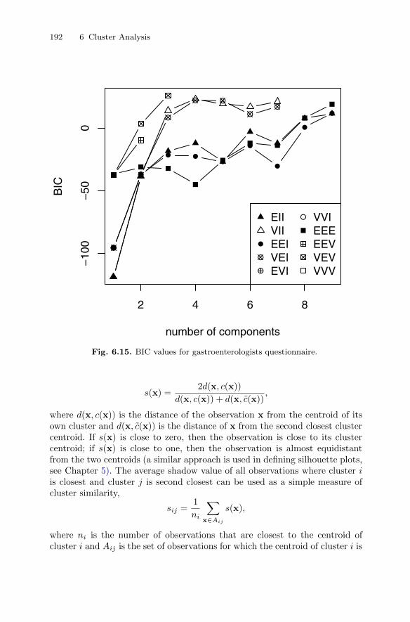
192 6 Cluster Analysis
2 4 6 8
−10
0−
500
number of components
BIC
●
●
● ●●
●
●
●
●
●
●
●
● ●
●●
●●●
●
●
●EIIVIIEEIVEIEVI
VVIEEEEEVVEVVVV
Fig. 6.15. BIC values for gastroenterologists questionnaire.
s(x) =2d(x, c(x))
d(x, c(x)) + d(x, c(x)),
where d(x, c(x)) is the distance of the observation x from the centroid of itsown cluster and d(x, c(x)) is the distance of x from the second closest clustercentroid. If s(x) is close to zero, then the observation is close to its clustercentroid; if s(x) is close to one, then the observation is almost equidistantfrom the two centroids (a similar approach is used in defining silhouette plots,see Chapter 5). The average shadow value of all observations where cluster iis closest and cluster j is second closest can be used as a simple measure ofcluster similarity,
sij =1
ni
∑x∈Aij
s(x),
where ni is the number of observations that are closest to the centroid ofcluster i and Aij is the set of observations for which the centroid of cluster i is
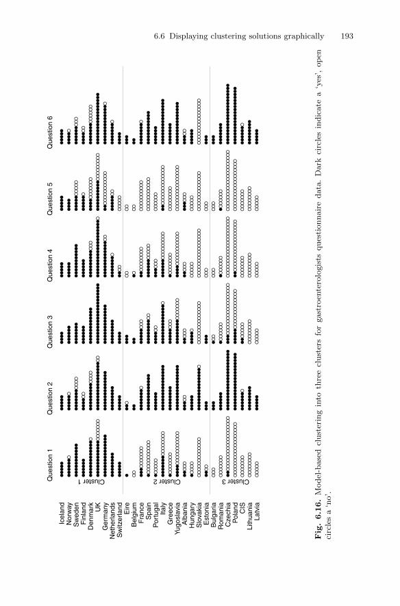
6.6 Displaying clustering solutions graphically 193
●●
●●
●
●●
●●
●●
●
●●
●●
●●
●●
●●
●
●●
●●
●●
●●
●●
●●
●●
●●
●●
●
●●
●●
●●
●●
●●
●●
●●
●●
●●
●
●●
●●
●●
●●
●●
●●
●●
●●
●●
●●
●●
●●
●●
●
● ●●
●●
●●
●●
●●
●●
●●
●●
●●
●●
●●
●●
●●
●●
●●
●●
●●
●●
●●
●●
●●
●●
●
●●
●●
●●
●●
●●
●●
●●
●●
●●
●●
●●
●
●●
●●
●
●●
●●
●
●●
●●
●●
●●
●●
●●
●
●●
●●
●●
●
●●
●●
●●
●
●●
●●
●●
●●
●●
●●
●●
●●
●●
●●
●●
●●
●●
●●
●●
●●
●●
●●
●●
●●
●●
●●
●
●●
●●
●●
●●
●●
●●
●
●●
●●
●
●●
●●
●●
●●
●●
●●
●●
●●
●
●●
●●
●●
●●
●●
●●
●●
●●
●●
●
●●
●●
●●
●●
●●
●●
●●
●●
●●
●●
●●
●●
●●
●●
●●
●
●●
●●
●●
●●
●●
●●
●
●●
●
●●
●●
●●
●●
●●
●●
●●
●●
●●
●●
●●
●●
●●
●●
●●
●●
●●
●●
●●
●●
●●
●
●●
●●
●●
●●
●●
●●
●●
●●
●●
●●
●●
●
●●
●●
●
●●
●●
●
●●
●●
●●
●●
●●
●●
●●
●
●●
●
●●
●
●●
●●
●●
●●
●●
●●
●●
●●
●●
●●
●●
●●
●●
●●
●●
●●
●●
●●
●●
●●
●●
●●
●
●●
●●
●●
●
●●
●●
●●
●●
●●
●●
●
●●
●●
●●
●●
●●
●●
●●
●●
●
●●
●●
●●
●●
●●
●●
●●
●●
●●
●●
●●
●●
●●
●●
●●
●●
●●
●●
●●
●●
●●
●●
●●
●●
●●
●
●●
●●
●●
●●
●●
●●
●●
●
●●
●●
●●
●●
●●
●●
●●
●●
●●
●●
●●
●●
●●
●●
●●
●●
●●
●●
●●
●●
●●
●●
●●
●●
●●
●●
●●
●●
●●
●●
●●
●
●●
●●
●
●●
●●
●
●●
●●
●●
●●
●●
●●
●●
●●
●
●●
●
●●
●●
●●
●
●●
●●
●●
●●
●●
●●
●●
●●
●●
●●
●●
●●
●●
●●
●●
●●
●●
●●
●●
●●
●●
●●
●
●●
●●
●●
●●
●●
●●
●
●●
●●
●
●●
●●
●
●●
●●
●●
●●
●●
●
●●
●●
●●
●●
●●
●●
●●
●●
●●
●●
●●
●●
●●
●●
●●
●●
●●
●●
●●
●●
●●
●●
●●
●●
●●
●●
●●
●●
●●
●●
●●
●●
●●
●●
●●
●●
●●
●●
●●
●●
●●
●●
●●
●●
●
●●
●●
●●
●●
●●
●●
●●
●●
●●
●●
●
●●
●●
●●
●●
●●
●●
●●
●●
●●
●●
●●
●
●●
●●
●
●●
●●
●
●●
●●
●●
●●
●●
●●
●●
●●
●●
●
●●
●
●●
●●
●●
●
●●
●●
●●
●●
●●
●●
●●
●●
●●
●●
●●
●●
●●
●●
●●
●●
●●
●●
●●
●
●●
●●
●●
●
●●
●●
●●
●●
●●
●●
●
●●
●●
●
●●
●●
●●
●●
●●
●●
●●
●●
●●
●●
●●
●●
●●
●●
●●
●
●●
●●
●●
●●
●●
●●
●●
●●
●●
●
●●
●●
●●
●●
●●
●●
●
●●
●●
●●
●
●●
●●
●
●●
●●
●●
●●
●●
●●
●●
●●
●●
●●
●●
●●
●
●●
●●
●●
●●
●●
●●
●●
●●
●●
●●
●
●●
●●
●●
●●
●●
●●
●●
●●
●●
●●
●●
●
●●
●●
●●
●●
●●
●
●●
●●
●●
●●
●●
●●
●
●●
●
●●
●
●●
●●
●●
●
●●
●●
●●
●●
●●
●●
●●
●●
●●
●●
●●
●●
●●
●●
●●
●●
●●
●●
●
●●
●●
●●
●
●●
●●
●●
●●
●●
●●
●
●●
●●
●
●●
●●
●
●●
●●
●●
●●
●
●●
●●
●●
●●
●●
●●
●●
●●
●●
●
●●
●●
●●
●●
●●
●●
●●
●●
●
●●
●●
●●
●●
●●
●●
●●
●●
●●
●●
●●
●●
●●
●●
●
●●
●●
●●
●●
●●
●●
●●
●●
●●
●●
●
●●
●●
●●
●●
●●
●●
●●
●●
●●
●●
●
●●
●●
●●
●
●●
●●
●●
●●
●●
●●
●●
●●
●●
●
●●
●●
●
●●
●●
●●
●●
●●
●●
●●
●
●●
●
●●
●
●●
●●
●●
●
●●
●●
●●
●●
●●
●●
●●
●●
●●
●●
●●
●●
●●
●●
●●
●●
●●
●●
●●
●
●●
●●
●●
●
●●
●●
●●
●●
●●
●●
●La
tvia
Lith
uani
aC
ISP
olan
dC
zech
iaR
oman
iaB
ulga
riaE
ston
iaS
lova
kia
Hun
gary
Alb
ania
Yugo
slav
iaG
reec
eIta
lyP
ortu
gal
Spa
inF
ranc
eB
elgi
umEire
Sw
itzer
land
Net
herla
nds
Ger
man
yU
KD
enm
ark
Fin
land
Sw
eden
Nor
way
Icel
and
Que
stio
n 1
Que
stio
n 2
Que
stio
n 3
Que
stio
n 4
Que
stio
n 5
Que
stio
n 6
Cluster 1 Cluster 2 Cluster 3
Fig.6.16.
Model
-base
dcl
ust
erin
gin
toth
ree
clust
ers
for
gast
roen
tero
logis
tsques
tionnair
edata
.D
ark
circ
les
indic
ate
a‘y
es’,
op
enci
rcle
sa
‘no’.
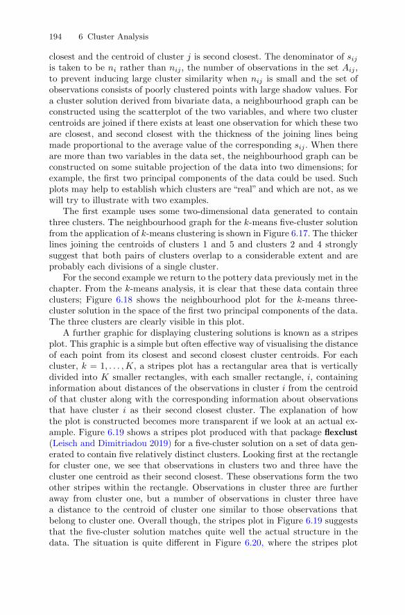
194 6 Cluster Analysis
closest and the centroid of cluster j is second closest. The denominator of sijis taken to be ni rather than nij , the number of observations in the set Aij ,to prevent inducing large cluster similarity when nij is small and the set ofobservations consists of poorly clustered points with large shadow values. Fora cluster solution derived from bivariate data, a neighbourhood graph can beconstructed using the scatterplot of the two variables, and where two clustercentroids are joined if there exists at least one observation for which these twoare closest, and second closest with the thickness of the joining lines beingmade proportional to the average value of the corresponding sij . When thereare more than two variables in the data set, the neighbourhood graph can beconstructed on some suitable projection of the data into two dimensions; forexample, the first two principal components of the data could be used. Suchplots may help to establish which clusters are “real” and which are not, as wewill try to illustrate with two examples.
The first example uses some two-dimensional data generated to containthree clusters. The neighbourhood graph for the k-means five-cluster solutionfrom the application of k-means clustering is shown in Figure 6.17. The thickerlines joining the centroids of clusters 1 and 5 and clusters 2 and 4 stronglysuggest that both pairs of clusters overlap to a considerable extent and areprobably each divisions of a single cluster.
For the second example we return to the pottery data previously met in thechapter. From the k-means analysis, it is clear that these data contain threeclusters; Figure 6.18 shows the neighbourhood plot for the k-means three-cluster solution in the space of the first two principal components of the data.The three clusters are clearly visible in this plot.
A further graphic for displaying clustering solutions is known as a stripesplot. This graphic is a simple but often effective way of visualising the distanceof each point from its closest and second closest cluster centroids. For eachcluster, k = 1, . . . , K, a stripes plot has a rectangular area that is verticallydivided into K smaller rectangles, with each smaller rectangle, i, containinginformation about distances of the observations in cluster i from the centroidof that cluster along with the corresponding information about observationsthat have cluster i as their second closest cluster. The explanation of howthe plot is constructed becomes more transparent if we look at an actual ex-ample. Figure 6.19 shows a stripes plot produced with that package flexclust(Leisch and Dimitriadou 2019) for a five-cluster solution on a set of data gen-erated to contain five relatively distinct clusters. Looking first at the rectanglefor cluster one, we see that observations in clusters two and three have thecluster one centroid as their second closest. These observations form the twoother stripes within the rectangle. Observations in cluster three are furtheraway from cluster one, but a number of observations in cluster three havea distance to the centroid of cluster one similar to those observations thatbelong to cluster one. Overall though, the stripes plot in Figure 6.19 suggeststhat the five-cluster solution matches quite well the actual structure in thedata. The situation is quite different in Figure 6.20, where the stripes plot
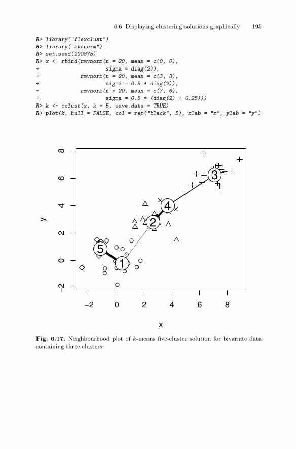
6.6 Displaying clustering solutions graphically 195
R> library("flexclust")
R> library("mvtnorm")
R> set.seed(290875)
R> x <- rbind(rmvnorm(n = 20, mean = c(0, 0),
+ sigma = diag(2)),
+ rmvnorm(n = 20, mean = c(3, 3),
+ sigma = 0.5 * diag(2)),
+ rmvnorm(n = 20, mean = c(7, 6),
+ sigma = 0.5 * (diag(2) + 0.25)))
R> k <- cclust(x, k = 5, save.data = TRUE)
R> plot(k, hull = FALSE, col = rep("black", 5), xlab = "x", ylab = "y")
●
●
●
●
●
●
●
●
●
●
●
● ●
−2 0 2 4 6 8
−2
02
46
8
x
y
1
2
3
4
5
Fig. 6.17. Neighbourhood plot of k-means five-cluster solution for bivariate datacontaining three clusters.
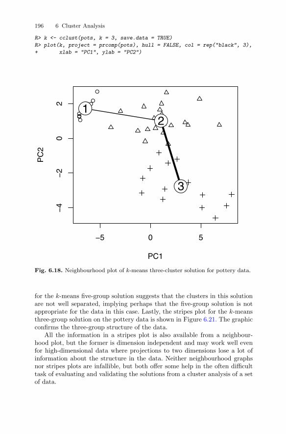
196 6 Cluster Analysis
R> k <- cclust(pots, k = 3, save.data = TRUE)
R> plot(k, project = prcomp(pots), hull = FALSE, col = rep("black", 3),
+ xlab = "PC1", ylab = "PC2")
●●
●
●
●
●
●
●
●
●
−5 0 5
−4
−2
02
PC1
PC
2
12
3
Fig. 6.18. Neighbourhood plot of k-means three-cluster solution for pottery data.
for the k-means five-group solution suggests that the clusters in this solutionare not well separated, implying perhaps that the five-group solution is notappropriate for the data in this case. Lastly, the stripes plot for the k-meansthree-group solution on the pottery data is shown in Figure 6.21. The graphicconfirms the three-group structure of the data.
All the information in a stripes plot is also available from a neighbour-hood plot, but the former is dimension independent and may work well evenfor high-dimensional data where projections to two dimensions lose a lot ofinformation about the structure in the data. Neither neighbourhood graphsnor stripes plots are infallible, but both offer some help in the often difficulttask of evaluating and validating the solutions from a cluster analysis of a setof data.
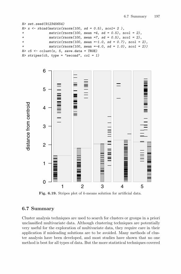
6.7 Summary 197
R> set.seed(912345654)
R> x <- rbind(matrix(rnorm(100, sd = 0.5), ncol= 2 ),
+ matrix(rnorm(100, mean =4, sd = 0.5), ncol = 2),
+ matrix(rnorm(100, mean =7, sd = 0.5), ncol = 2),
+ matrix(rnorm(100, mean =-1.0, sd = 0.7), ncol = 2),
+ matrix(rnorm(100, mean =-4.0, sd = 1.0), ncol = 2))
R> c5 <- cclust(x, 5, save.data = TRUE)
R> stripes(c5, type = "second", col = 1)
0
1
2
3
4
5
6
dist
ance
from
cen
troi
d
1 2 3 4 5Fig. 6.19. Stripes plot of k-means solution for artificial data.
6.7 Summary
Cluster analysis techniques are used to search for clusters or groups in a prioriunclassified multivariate data. Although clustering techniques are potentiallyvery useful for the exploration of multivariate data, they require care in theirapplication if misleading solutions are to be avoided. Many methods of clus-ter analysis have been developed, and most studies have shown that no onemethod is best for all types of data. But the more statistical techniques covered
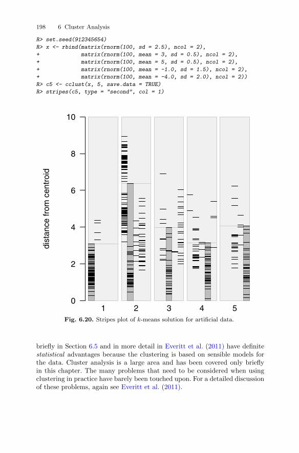
198 6 Cluster Analysis
R> set.seed(912345654)
R> x <- rbind(matrix(rnorm(100, sd = 2.5), ncol = 2),
+ matrix(rnorm(100, mean = 3, sd = 0.5), ncol = 2),
+ matrix(rnorm(100, mean = 5, sd = 0.5), ncol = 2),
+ matrix(rnorm(100, mean = -1.0, sd = 1.5), ncol = 2),
+ matrix(rnorm(100, mean = -4.0, sd = 2.0), ncol = 2))
R> c5 <- cclust(x, 5, save.data = TRUE)
R> stripes(c5, type = "second", col = 1)
0
2
4
6
8
10
dist
ance
from
cen
troi
d
1 2 3 4 5Fig. 6.20. Stripes plot of k-means solution for artificial data.
briefly in Section 6.5 and in more detail in Everitt et al. (2011) have definitestatistical advantages because the clustering is based on sensible models forthe data. Cluster analysis is a large area and has been covered only brieflyin this chapter. The many problems that need to be considered when usingclustering in practice have barely been touched upon. For a detailed discussionof these problems, again see Everitt et al. (2011).
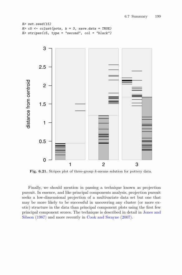
6.7 Summary 199
R> set.seed(15)
R> c5 <- cclust(pots, k = 3, save.data = TRUE)
R> stripes(c5, type = "second", col = "black")
0
0.5
1
1.5
2
2.5
3
dist
ance
from
cen
troi
d
1 2 3Fig. 6.21. Stripes plot of three-group k-means solution for pottery data.
Finally, we should mention in passing a technique known as projectionpursuit. In essence, and like principal components analysis, projection pursuitseeks a low-dimensional projection of a multivariate data set but one thatmay be more likely to be successful in uncovering any cluster (or more ex-otic) structure in the data than principal component plots using the first fewprincipal component scores. The technique is described in detail in Jones andSibson (1987) and more recently in Cook and Swayne (2007).

200 6 Cluster Analysis
6.8 Exercises
Ex. 6.1 Apply k-means to the crime rate data after standardising each vari-able by its standard deviation. Compare the results with those given inthe text found by standardising by a variable’s range.
Ex. 6.2 Calculate the first five principal components scores for the Romano-British pottery data, and then construct the scatterplot matrix of thescores, displaying the contours of the estimated bivariate density for eachpanel of the plot and a boxplot of each score in the appropriate place onthe diagonal. Label the points in the scatterplot matrix with their kilnnumbers.
Ex. 6.3 Return to the air pollution data given in Chapter 1 and use finitemixtures to cluster the data on the basis of the six climate and ecologyvariables (i.e., excluding the sulphur dioxide concentration). Investigatehow sulphur dioxide concentration varies in the clusters you find bothgraphically and by formal significance testing.
7
Confirmatory Factor Analysis and StructuralEquation Models
7.1 Introduction
An exploratory factor analysis as described in Chapter 5 is used in the earlyinvestigation of a set of multivariate data to determine whether the factoranalysis model is useful in providing a parsimonious way of describing andaccounting for the relationships between the observed variables. The analysiswill determine which observed variables are most highly correlated with thecommon factors and how many common factors are needed to give an ade-quate description of the data. In an exploratory factor analysis, no constraintsare placed on which manifest variables load on which factors. In this chapter,we will consider confirmatory factor analysis models in which particular man-ifest variables are allowed to relate to particular factors whilst other manifestvariables are constrained to have zero loadings on some of the factors. A con-firmatory factor analysis model may arise from theoretical considerations orbe based on the results of an exploratory factor analysis where the investigatormight wish to postulate a specific model for a new set of similar data, one inwhich the loadings of some variables on some factors are fixed at zero becausethey were “small” in the exploratory analysis and perhaps to allow some pairsof factors but not others to be correlated. It is important to emphasise thatwhilst it is perfectly appropriate to arrive at a factor model to submit to aconfirmatory analysis from an exploratory factor analysis, the model must betested on a fresh set of data. Models must not be generated and tested on thesame data.
Confirmatory factor analysis models are a subset of a more general ap-proach to modelling latent variables known as structural equation modellingor covariance structure modelling . Such models allow both response and ex-planatory latent variables linked by a series of linear equations. Althoughmore complex than confirmatory factor analysis models, the aim of structuralequation models is essentially the same, namely to explain the correlationsor covariances of the observed variables in terms of the relationships of thesevariables to the assumed underlying latent variables and the relationships pos-
DOI 10.1007/978-1-4419-9650-3_7, © Springer Science+Business Media, LLC 2011
201B. Everitt and T. Hothorn, An Introduction to Applied Multivariate Analysis with R: Use R!,
202 7 Confirmatory Factor Analysis and Structural Equation Models
tulated between the latent variables themselves. Structural equation modelsrepresent the convergence of relatively independent research traditions in psy-chiatry, psychology, econometrics, and biometrics. The idea of latent variablesin psychometrics arises from Spearman’s early work on general intelligence.The concept of simultaneous directional influences of some variables on othershas been part of economics for several decades, and the resulting simultaneousequation models have been used extensively by economists but essentially onlywith observed variables. Path analysis was introduced by Wright (1934) in abiometrics context as a method for studying the direct and indirect effectsof variables. The quintessential feature of path analysis is a diagram show-ing how a set of explanatory variables influence a dependent variable underconsideration. How the paths are drawn determines whether the explanatoryvariables are correlated causes, mediated causes, or independent causes. Someexamples of path diagrams appear later in the chapter. (For more details ofpath analysis, see Schumaker and Lomax 1996).
Later, path analysis was taken up by sociologists such as Blalock (1961),Blalock (1963) and then by Duncan (1969), who demonstrated the value ofcombining path-analytic representation with simultaneous equation models.And, finally, in the 1970s, several workers most prominent of whom wereJoreskog (1973), Bentler (1980), and Browne (1974), combined all these var-ious approaches into a general method that could in principle deal with ex-tremely complex models in a routine manner.
7.2 Estimation, identification, and assessing fit forconfirmatory factor and structural equation models
7.2.1 Estimation
Structural equation models will contain a number of parameters that needto be estimated from the covariance or correlation matrix of the manifestvariables. Estimation involves finding values for the model parameters thatminimise a discrepancy function indicating the magnitude of the differencesbetween the elements of S, the observed covariance matrix of the manifestvariables and those of Σ(θ), the covariance matrix implied by the fitted model(i.e., a matrix the elements of which are functions of the parameters of themodel), contained in the vector θ = (θ1, . . . , θt)
>.There are a number of possibilities for discrepancy functions; for example,
the ordinary least squares discrepancy function, FLS, is
FLS(S,Σ(θ)) =∑i<j
∑j
(sij − σij(θ))2,
where sij and σij(θ) are the elements of S and Σ(θ). But this criterion hasseveral problems that make it unsuitable for estimation; for example, it is not

7.2 Estimation, identification, and assessing fit 203
independent of the scale of the manifest variables, and so different estimates ofthe model parameters would be produced using the sample covariance matrixand the sample correlation matrix. Other problems with the least squarescriterion are detailed in Everitt (1984).
The most commonly used method of estimating the parameters in confir-matory factor and structural equation models is maximum likelihood underthe assumption that the observed data have a multivariate normal distribu-tion. It is easy to show that maximising the likelihood is now equivalent tominimising the discrepancy function, FML, given by
FML(S,Σ(θ)) = log |Σ(θ)| − log |S|+ tr(SΣ(θ)−1)− q
(cf. maximum likelihood factor analysis in Chapter 5). We see that by varyingthe parameters θ1, . . . , θt so that Σ(θ) becomes more like S, FML becomessmaller. Iterative numerical algorithms are needed to minimise the functionFML with respect to the parameters, but for details see Everitt (1984) andEveritt and Dunn (2001).
7.2.2 Identification
Consider the following simple example of a model in which there are threemanifest variables, x, xp, and y, and two latent variables, u and v, with therelationships between the manifest and latent variables being
x = u+ δ,
y = v + ε,
xp = u+ δp.
If we assume that δ, δp, and ε have expected values of zero, that δ and δp areuncorrelated with each other and with u, and that ε is uncorrelated with v,then the covariance matrix of the three manifest variables may be expressed interms of parameters representing the variances and covariances of the residualsand the latent variables as
Σ(θ) =
θ1 + θ2θ3 θ4 + θ5θ3 θ4 θ4 + θ6
,
where θ> = (θ1, θ2, θ3, θ4, θ5, θ6) and θ1 = Var(v), θ2 = Var(ε), θ3 = Cov(v, u),θ4 = Var(u), θ5 = Var(δ), and θ6 = Var(δp). It is immediately apparent thatestimation of the parameters in this model poses a problem. The two param-eters θ1 and θ2 are not uniquely determined because one can be, for example,increased by some amount and the other decreased by the same amount with-out altering the covariance matrix predicted by the model. In other words, inthis example, different sets of parameter values (i.e., different θs) will lead tothe same predicted covariance matrix, Σ(θ). The model is said to be uniden-tifiable. Formally, a model is identified if and only if Σ(θ1) = Σ(θ2) implies

204 7 Confirmatory Factor Analysis and Structural Equation Models
that θ1 = θ2. In Chapter 5, it was pointed out that the parameters in the ex-ploratory factor analysis model are not identifiable unless some constraints areintroduced because different sets of factor loadings can give rise to the samepredicted covariance matrix. In confirmatory factor analysis models and moregeneral covariance structure models, identifiability depends on the choice ofmodel and on the specification of fixed, constrained (for example, two param-eters constrained to equal one another), and free parameters. If a parameter isnot identified, it is not possible to find a consistent estimate of it. Establishingmodel identification in confirmatory factor analysis models (and in structuralequation models) can be difficult because there are no simple, practicable,and universally applicable rules for evaluating whether a model is identified,although there is a simple necessary but not sufficient condition for identifi-cation, namely that the number of free parameters in a model, t, be less thanq(q + 1)/2. For a more detailed discussion of the identifiability problem, seeBollen and Long (1993).
7.2.3 Assessing the fit of a model
Once a model has been pronounced identified and its parameters estimated,the next step becomes that of assessing how well the model-predicted co-variance matrix fits the covariance matrix of the manifest variables. A globalmeasure of fit of a model is provided by the likelihood ratio statistic givenby X2 = (N − 1)FMLmin, where N is the sample size and FMLmin is theminimised value of the maximum likelihood discrepancy function given inSubsection 7.2.1. If the sample size is sufficiently large, the X2 statistic pro-vides a test that the population covariance matrix of the manifest variablesis equal to the covariance implied by the fitted model against the alternativehypothesis that the population matrix is unconstrained. Under the equalityhypothesis, X2 has a chi-squared distribution with degrees of freedom ν givenby 1
2q(q + 1)− t, where t is the number of free parameters in the model.The likelihood ratio statistic is often the only measure of fit quoted for
a fitted model, but on its own it has limited practical use because in largesamples even relatively trivial departures from the equality null hypothesiswill lead to its rejection. Consequently, in large samples most models may berejected as statistically untenable. A more satisfactory way to use the testis for a comparison of a series of nested models where a large difference inthe statistic for two models compared with the difference in the degrees offreedom of the models indicates that the additional parameters in one of themodels provide a genuine improvement in fit.
Further problems with the likelihood ratio statistic arise when the observa-tions come from a population where the manifest variables have a non-normaldistribution. Browne (1982) demonstrates that in the case of a distributionwith substantial kurtosis, the chi-squared distribution may be a poor approx-imation for the null distribution of X2. Browne suggests that before usingthe test it is advisable to assess the degree of kurtosis of the data by using
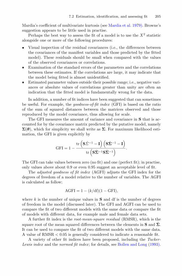
7.2 Estimation, identification, and assessing fit 205
Mardia’s coefficient of multivariate kurtosis (see Mardia et al. 1979). Browne’ssuggestion appears to be little used in practise.
Perhaps the best way to assess the fit of a model is to use the X2 statisticalongside one or more of the following procedures:
� Visual inspection of the residual covariances (i.e., the differences betweenthe covariances of the manifest variables and those predicted by the fittedmodel). These residuals should be small when compared with the valuesof the observed covariances or correlations.
� Examination of the standard errors of the parameters and the correlationsbetween these estimates. If the correlations are large, it may indicate thatthe model being fitted is almost unidentified.
� Estimated parameter values outside their possible range; i.e., negative vari-ances or absolute values of correlations greater than unity are often anindication that the fitted model is fundamentally wrong for the data.
In addition, a number of fit indices have been suggested that can sometimesbe useful. For example, the goodness-of-fit index (GFI) is based on the ratioof the sum of squared distances between the matrices observed and thosereproduced by the model covariance, thus allowing for scale.
The GFI measures the amount of variance and covariance in S that is ac-counted for by the covariance matrix predicted by the putative model, namelyΣ(θ), which for simplicity we shall write as Σ. For maximum likelihood esti-mation, the GFI is given explicitly by
GFI = 1−tr(SΣ−1 − I
)(SΣ−1 − I
)tr(SΣ−1SΣ−1
) .
The GFI can take values between zero (no fit) and one (perfect fit); in practise,only values above about 0.9 or even 0.95 suggest an acceptable level of fit.
The adjusted goodness of fit index (AGFI) adjusts the GFI index for thedegrees of freedom of a model relative to the number of variables. The AGFIis calculated as follow;
AGFI = 1− (k/df)(1−GFI),
where k is the number of unique values in S and df is the number of degreesof freedom in the model (discussed later). The GFI and AGFI can be used tocompare the fit of two different models with the same data or compare the fitof models with different data, for example male and female data sets.
A further fit index is the root-mean-square residual (RMSR), which is the
square root of the mean squared differences between the elements in S and Σ.It can be used to compare the fit of two different models with the same data.A value of RMSR < 0.05 is generally considered to indicate a reasonable fit.
A variety of other fit indices have been proposed, including the Tucker-Lewis index and the normed fit index ; for details, see Bollen and Long (1993).
206 7 Confirmatory Factor Analysis and Structural Equation Models
7.3 Confirmatory factor analysis models
In a confirmatory factor model the loadings for some observed variables onsome of the postulated common factors will be set a priori to zero. Addi-tionally, some correlations between factors might also be fixed at zero. Such amodel is fitted to a set of data by estimating its free parameters; i.e., those notfixed at zero by the investigator. Estimation is usually by maximum likelihoodusing the FML discrepancy function.
We will now illustrate the application of confirmatory factor analysis withtwo examples.
7.3.1 Ability and aspiration
Calsyn and Kenny (1977) recorded the values of the following six variables for556 white eighth-grade students:
SCA: self-concept of ability;PPE: perceived parental evaluation;PTE: perceived teacher evaluation;PFE: perceived friend’s evaluation;EA: educational aspiration;CP: college plans.
Calsyn and Kenny (1977) postulated that two underlying latent variables,ability and aspiration, generated the relationships between the observed vari-ables. The first four of the manifest variables were assumed to be indicatorsof ability and the last two indicators of aspiration; the latent variables, abilityand aspiration, are assumed to be correlated. The regression-like equationsthat specify the postulated model are
SCA = λ1f1 + 0f2 + u1,
PPE = λ2f1 + 0f2 + u2,
PTE = λ3f1 + 0f2 + u3,
PFE = λ4f1 + 0f2 + u4,
AE = 0f1 + λ5f2 + u5,
CP = 0f1 + λ6f2 + u6,
where f1 represents the ability latent variable and f2 represents the aspirationlatent variable. Note that, unlike in exploratory factor analysis, a number offactor loadings are fixed at zero and play no part in the estimation process.The model has a total of 13 parameters to estimate, six factor loadings (λ1to λ6), six specific variances (ψ1 to ψ6), and one correlation between abilityand aspiration (ρ). (To be consistent with the nomenclature used in Sub-section 7.2.1, all parameters should be suffixed thetas; this could, however,become confusing, so we have changed the nomenclature and use lambdas,etc., in a manner similar to how they are used in Chapter 5.) The observed

7.3 Confirmatory factor analysis models 207
correlation matrix given in Figure 7.1 has six variances and 15 correlations,a total of 21 terms. Consequently, the postulated model has 21 − 13 = 8 de-grees of freedom. The figure depicts each correlation by an ellipse whose shapetends towards a line with slope 1 for correlations near 1, to a circle for correla-tions near zero, and to a line with negative slope −1 for negative correlationsnear −1. In addition, 100 times the correlation coefficient is printed inside theellipse and colour-coding indicates strong negative (dark) to strong positive(light) correlations.
EA
CP
PFE
PTE
SCA
PPE
EA
CP
PF
E
PT
E
SC
A
PP
E
100 72 37 40 46 43
72 100 41 48 56 52
37 41 100 57 58 61
40 48 57 100 70 68
46 56 58 70 100 73
43 52 61 68 73 100
−1.0 −0.5 0.0 0.5 1.0
Fig. 7.1. Correlation matrix of ability and aspiration data; values given are corre-lation coefficients ×100.
The R code, contained in the package sem (Fox, Kramer, and Friendly2010), for fitting the model is
R> ability_model <- specify.model(file = "ability_model.txt")
R> ability_sem <- sem(ability_model, ability, 556)

208 7 Confirmatory Factor Analysis and Structural Equation Models
Here, the model is specified in a text file (called ability_model.txt in ourcase) with the following content:
Ability -> SCA, lambda1, NA
Ability -> PPE, lambda2, NA
Ability -> PTE, lambda3, NA
Ability -> PFE, lambda4, NA
Aspiration -> EA, lambda5, NA
Aspiration -> CP, lambda6, NA
Ability <-> Aspiration, rho, NA
SCA <-> SCA, theta1, NA
PPE <-> PPE, theta2, NA
PTE <-> PTE, theta3, NA
PFE <-> PFE, theta4, NA
EA <-> EA, theta5, NA
CP <-> CP, theta6, NA
Ability <-> Ability, NA, 1
Aspiration <-> Aspiration, NA, 1
The model is specified via arrows in the so-called reticular action model(RAM) notation. The text consists of three columns. The first one correspondsto an arrow specification where single-headed or directional arrows correspondto regression coefficients and double-headed or bidirectional arrows correspondto variance parameters. The second column denotes parameter names, and thethird one assigns values to fixed parameters. Further details are available fromthe corresponding pages of the manual for the sem package.
The results from fitting the ability and aspiration model to the observedcorrelations are available via
R> summary(ability_sem)
Model Chisquare = 9.2557 Df = 8 Pr(>Chisq) = 0.32118
Chisquare (null model) = 1832.0 Df = 15
Goodness-of-fit index = 0.99443
Adjusted goodness-of-fit index = 0.98537
RMSEA index = 0.016817 90% CI: (NA, 0.05432)
Bentler-Bonnett NFI = 0.99495
Tucker-Lewis NNFI = 0.9987
Bentler CFI = 0.9993
SRMR = 0.012011
BIC = -41.310
Normalized Residuals
Min. 1st Qu. Median Mean 3rd Qu. Max.
-0.4410 -0.1870 0.0000 -0.0131 0.2110 0.5330
Parameter Estimates

7.3 Confirmatory factor analysis models 209
Estimate Std Error z value Pr(>|z|)
lambda1 0.86320 0.035182 24.5355 0.0000000
lambda2 0.84932 0.035489 23.9323 0.0000000
lambda3 0.80509 0.036409 22.1123 0.0000000
lambda4 0.69527 0.038678 17.9757 0.0000000
lambda5 0.77508 0.040365 19.2020 0.0000000
lambda6 0.92893 0.039417 23.5665 0.0000000
rho 0.66637 0.030955 21.5273 0.0000000
theta1 0.25488 0.023502 10.8450 0.0000000
theta2 0.27865 0.024263 11.4847 0.0000000
theta3 0.35184 0.026916 13.0715 0.0000000
theta4 0.51660 0.034820 14.8365 0.0000000
theta5 0.39924 0.038214 10.4475 0.0000000
theta6 0.13709 0.043530 3.1493 0.0016366
lambda1 SCA <--- Ability
lambda2 PPE <--- Ability
lambda3 PTE <--- Ability
lambda4 PFE <--- Ability
lambda5 EA <--- Aspiration
lambda6 CP <--- Aspiration
rho Aspiration <--> Ability
theta1 SCA <--> SCA
theta2 PPE <--> PPE
theta3 PTE <--> PTE
theta4 PFE <--> PFE
theta5 EA <--> EA
theta6 CP <--> CP
Iterations = 28
(Note that the two latent variables have their variances fixed at one, althoughit is the fixing that is important, not the value at which they are fixed;these variances cannot be free parameters to be estimated.) The z values testwhether parameters are significantly different from zero. All have very smallassociated p-values. Of particular note amongst the parameter estimates isthe correlation between “true” ability and “true” aspiration; this is known asa disattenuated correlation and is uncontaminated by measurement error inthe observed indicators of the two latent variables. In this case the estimate is0.666, with a standard error of 0.031. An approximate 95% confidence intervalfor the disattenuated correlation is [0.606, 0.727].
A path diagram (see Everitt and Dunn 2001) for the correlated, two-factormodel is shown in Figure 7.2. Note that the R function path.diagram()“only”produces a textual representation of the graph, here in file ability_sem.dot.
210 7 Confirmatory Factor Analysis and Structural Equation Models
The graphviz graph visualisation software (Gansner and North 2000) needs tobe installed in order to compile the corresponding PDF file.
R> path.diagram(ability_sem)
Fig. 7.2. Ability path diagram.
The fit of the model can be partially judged using the chi-square statisticdescribed in Subsection 7.2.3, which in this case takes the value 9.256 witheight degrees of freedom and an associated p-value of 0.321, suggesting thatthe postulated model fits the data very well. (The chi-square test for the nullmodel is simply a test that the population covariance matrix of the observedvariables is diagonal; i.e., that the observed variables are independent. Inmost cases, this null model will be rejected; if it is not, the model-fittingexercise is a waste of time.) The various fit indices also indicate that the

7.3 Confirmatory factor analysis models 211
model is a good fit for the data. Also helpful in assessing the fit of the modelare the summary statistics for the normed residuals, which are essentiallythe differences between corresponding elements of S and Σ(θ) but scaled sothat they are unaffected by the differences in the variances of the observedvariables. The normed residuals, r∗ij , are defined as
r∗ij =sij − σij
(σij σj2 + σ2
ij)/n)1/2.
Generally the absolute values of the normed residuals should all be less than 2to claim that the current model fits the data well. In the ability and aspirationexample, this seems to be the case. (Note that with confirmatory factor modelsthe standard errors of parameters become of importance because they allowthe investigator to assess whether parameters might be dropped from themodel to find a more parsimonious model that still provides an adequate fit tothe data. In exploratory factor analysis, standard errors of factor loadings canbe calculated, but they are hardly ever used; instead an informal interpretationof factors is made.)
7.3.2 A confirmatory factor analysis model for drug use
For our second example of fitting a confirmatory factor analysis model, wereturn to the drug use among students data introduced in Chapter 5. Inthe original investigation of these data reported by Huba et al. (1981), aconfirmatory factor analysis model was postulated, the model arising fromconsideration of previously reported research on student drug use. The modelinvolved the following three latent variables:
f1: Alcohol use, with non-zero loadings on beer, wine, spirits, and cigaretteuse.
f2: Cannabis use, with non-zero loadings on marijuana, hashish, cigarette,and wine use. The cigarette variable is assumed to load on both the first andsecond latent variables because it sometimes occurs with both alcohol andmarijuana use and at other times does not. The non-zero loading on wine wasallowed because of reports that wine is frequently used with marijuana andthat consequently some of the use of wine might be an indicator of tendenciestoward cannabis use.
f3: Hard drug use, with non-zero loadings on amphetamines, tranquillizers,hallucinogenics, hashish, cocaine, heroin, drug store medication, inhalants,and spirits. The use of each of these substances was considered to suggest astrong commitment to the notion of psychoactive drug use.
Each pair of latent variables is assumed to be correlated so that thesecorrelations are allowed to be free parameters that need to be estimated. Thevariance of each latent variance must, however, be fixed–they are not freeparameters that can be estimated–and here as usual we will specify that eachof these variances takes the value one. So the proposed model can be specifiedby the following series of equations:

212 7 Confirmatory Factor Analysis and Structural Equation Models
cigarettes = λ1f1 + λ2f2 + 0f3 + u1,
beer = λ3f1 + 0f2 + 0f3 + u2,
wine = λ4f1 + λ5f2 + 0f3 + u3,
spirits = λ6f1 + 0f2 + λ7f3 + u4,
cocaine = 0f1 + 0f2 + λ8f3 + u5,
tranquillizers = 0f1 + 0f2 + λ9f3 + u6,
drug store medication = 0f1 + 0f2 + λ10f3 + u7,
heroin = 0f1 + 0f2 + λ11f3 + u8,
marijuana = 0f1 + λ12f2 + 0f3 + u9,
inhalants = 0f1 + 0f2 + λ15f3 + u11,
hallucinogenics = 0f1 + 0f2 + λ16f3 + u12,
amphetamines = 0f1 + 0f2 + λ17f3 + u13.
The proposed model also allows for non-zero correlations between eachpair of latent variables and so has a total of 33 parameters to estimate–17loadings (λ1 to λ17), 13 specific variances (ψ1 to ψ13), and three correlationsbetween latent variables (ρ1 to ρ3). Consequently, the model has 91−33 = 58degrees of freedom. We first abbreviate the names of the variables via
R> rownames(druguse) <- colnames(druguse) <- c("Cigs",
+ "Beer", "Wine", "Liqr", "Cocn", "Tran", "Drug",
+ "Hern", "Marj", "Hash", "Inhl", "Hall", "Amph")
To fit the model, we can use the R code
R> druguse_model <- specify.model(file = "druguse_model.txt")
R> druguse_sem <- sem(druguse_model, druguse, 1634)
where the model (stored in the text file druguse_model.txt) reads
Alcohol -> Cigs, lambda1, NA
Alcohol -> Beer, lambda3, NA
Alcohol -> Wine, lambda4, NA
Alcohol -> Liqr, lambda6, NA
Cannabis -> Cigs, lambda2, NA
Cannabis -> Wine, lambda5, NA
Cannabis -> Marj, lambda12, NA
Cannabis -> Hash, lambda13, NA
Hard -> Liqr, lambda7, NA
Hard -> Cocn, lambda8, NA
Hard -> Tran, lambda9, NA
Hard -> Drug, lambda10, NA
Hard -> Hern, lambda11, NA
7.3 Confirmatory factor analysis models 213
Hard -> Hash, lambda14, NA
Hard -> Inhl, lambda15, NA
Hard -> Hall, lambda16, NA
Hard -> Amph, lambda17, NA
Cigs <-> Cigs, theta1, NA
Beer <-> Beer, theta2, NA
Wine <-> Wine, theta3, NA
Liqr <-> Liqr, theta4, NA
Cocn <-> Cocn, theta5, NA
Tran <-> Tran, theta6, NA
Drug <-> Drug, theta7, NA
Hern <-> Hern, theta8, NA
Marj <-> Marj, theta9, NA
Hash <-> Hash, theta10, NA
Inhl <-> Inhl, theta11, NA
Hall <-> Hall, theta12, NA
Amph <-> Amph, theta13, NA
Alcohol <-> Alcohol, NA, 1
Cannabis <-> Cannabis, NA, 1
Hard <-> Hard, NA, 1
Alcohol <-> Cannabis, rho1, NA
Alcohol <-> Hard, rho2, NA
Cannabis <-> Hard, rho3, NA
The results of fitting the proposed model are
R> summary(druguse_sem)
Model Chisquare = 324.09 Df = 58 Pr(>Chisq) = 0
Chisquare (null model) = 6613.7 Df = 78
Goodness-of-fit index = 0.9703
Adjusted goodness-of-fit index = 0.9534
RMSEA index = 0.053004 90% CI: (0.047455, 0.058705)
Bentler-Bonnett NFI = 0.951
Tucker-Lewis NNFI = 0.94525
Bentler CFI = 0.95929
SRMR = 0.039013
BIC = -105.04
Normalized Residuals
Min. 1st Qu. Median Mean 3rd Qu. Max.
-3.0500 -0.8800 0.0000 -0.0217 0.9990 4.5800
Parameter Estimates
Estimate Std Error z value Pr(>|z|)
lambda1 0.35758 0.034332 10.4153 0.0000e+00
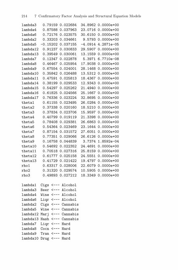
214 7 Confirmatory Factor Analysis and Structural Equation Models
lambda3 0.79159 0.022684 34.8962 0.0000e+00
lambda4 0.87588 0.037963 23.0716 0.0000e+00
lambda6 0.72176 0.023575 30.6150 0.0000e+00
lambda2 0.33203 0.034661 9.5793 0.0000e+00
lambda5 -0.15202 0.037155 -4.0914 4.2871e-05
lambda12 0.91237 0.030833 29.5907 0.0000e+00
lambda13 0.39549 0.030061 13.1559 0.0000e+00
lambda7 0.12347 0.022878 5.3971 6.7710e-08
lambda8 0.46467 0.025954 17.9038 0.0000e+00
lambda9 0.67554 0.024001 28.1468 0.0000e+00
lambda10 0.35842 0.026488 13.5312 0.0000e+00
lambda11 0.47591 0.025813 18.4367 0.0000e+00
lambda14 0.38199 0.029533 12.9343 0.0000e+00
lambda15 0.54297 0.025262 21.4940 0.0000e+00
lambda16 0.61825 0.024566 25.1667 0.0000e+00
lambda17 0.76336 0.023224 32.8695 0.0000e+00
theta1 0.61155 0.023495 26.0284 0.0000e+00
theta2 0.37338 0.020160 18.5210 0.0000e+00
theta3 0.37834 0.023706 15.9597 0.0000e+00
theta4 0.40799 0.019119 21.3398 0.0000e+00
theta5 0.78408 0.029381 26.6863 0.0000e+00
theta6 0.54364 0.023469 23.1644 0.0000e+00
theta7 0.87154 0.031572 27.6051 0.0000e+00
theta8 0.77351 0.029066 26.6126 0.0000e+00
theta9 0.16758 0.044839 3.7374 1.8592e-04
theta10 0.54692 0.022352 24.4691 0.0000e+00
theta11 0.70518 0.027316 25.8159 0.0000e+00
theta12 0.61777 0.025158 24.5551 0.0000e+00
theta13 0.41729 0.021422 19.4797 0.0000e+00
rho1 0.63317 0.028006 22.6079 0.0000e+00
rho2 0.31320 0.029574 10.5905 0.0000e+00
rho3 0.49893 0.027212 18.3349 0.0000e+00
lambda1 Cigs <--- Alcohol
lambda3 Beer <--- Alcohol
lambda4 Wine <--- Alcohol
lambda6 Liqr <--- Alcohol
lambda2 Cigs <--- Cannabis
lambda5 Wine <--- Cannabis
lambda12 Marj <--- Cannabis
lambda13 Hash <--- Cannabis
lambda7 Liqr <--- Hard
lambda8 Cocn <--- Hard
lambda9 Tran <--- Hard
lambda10 Drug <--- Hard
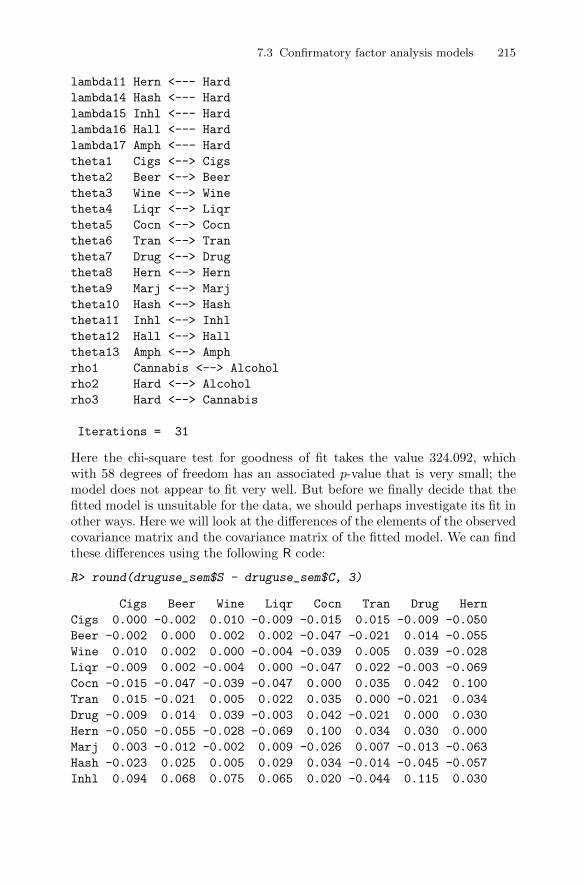
7.3 Confirmatory factor analysis models 215
lambda11 Hern <--- Hard
lambda14 Hash <--- Hard
lambda15 Inhl <--- Hard
lambda16 Hall <--- Hard
lambda17 Amph <--- Hard
theta1 Cigs <--> Cigs
theta2 Beer <--> Beer
theta3 Wine <--> Wine
theta4 Liqr <--> Liqr
theta5 Cocn <--> Cocn
theta6 Tran <--> Tran
theta7 Drug <--> Drug
theta8 Hern <--> Hern
theta9 Marj <--> Marj
theta10 Hash <--> Hash
theta11 Inhl <--> Inhl
theta12 Hall <--> Hall
theta13 Amph <--> Amph
rho1 Cannabis <--> Alcohol
rho2 Hard <--> Alcohol
rho3 Hard <--> Cannabis
Iterations = 31
Here the chi-square test for goodness of fit takes the value 324.092, whichwith 58 degrees of freedom has an associated p-value that is very small; themodel does not appear to fit very well. But before we finally decide that thefitted model is unsuitable for the data, we should perhaps investigate its fit inother ways. Here we will look at the differences of the elements of the observedcovariance matrix and the covariance matrix of the fitted model. We can findthese differences using the following R code:
R> round(druguse_sem$S - druguse_sem$C, 3)
Cigs Beer Wine Liqr Cocn Tran Drug Hern
Cigs 0.000 -0.002 0.010 -0.009 -0.015 0.015 -0.009 -0.050
Beer -0.002 0.000 0.002 0.002 -0.047 -0.021 0.014 -0.055
Wine 0.010 0.002 0.000 -0.004 -0.039 0.005 0.039 -0.028
Liqr -0.009 0.002 -0.004 0.000 -0.047 0.022 -0.003 -0.069
Cocn -0.015 -0.047 -0.039 -0.047 0.000 0.035 0.042 0.100
Tran 0.015 -0.021 0.005 0.022 0.035 0.000 -0.021 0.034
Drug -0.009 0.014 0.039 -0.003 0.042 -0.021 0.000 0.030
Hern -0.050 -0.055 -0.028 -0.069 0.100 0.034 0.030 0.000
Marj 0.003 -0.012 -0.002 0.009 -0.026 0.007 -0.013 -0.063
Hash -0.023 0.025 0.005 0.029 0.034 -0.014 -0.045 -0.057
Inhl 0.094 0.068 0.075 0.065 0.020 -0.044 0.115 0.030
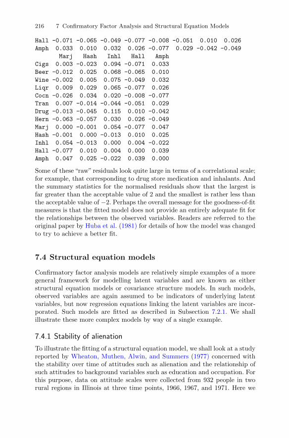
216 7 Confirmatory Factor Analysis and Structural Equation Models
Hall -0.071 -0.065 -0.049 -0.077 -0.008 -0.051 0.010 0.026
Amph 0.033 0.010 0.032 0.026 -0.077 0.029 -0.042 -0.049
Marj Hash Inhl Hall Amph
Cigs 0.003 -0.023 0.094 -0.071 0.033
Beer -0.012 0.025 0.068 -0.065 0.010
Wine -0.002 0.005 0.075 -0.049 0.032
Liqr 0.009 0.029 0.065 -0.077 0.026
Cocn -0.026 0.034 0.020 -0.008 -0.077
Tran 0.007 -0.014 -0.044 -0.051 0.029
Drug -0.013 -0.045 0.115 0.010 -0.042
Hern -0.063 -0.057 0.030 0.026 -0.049
Marj 0.000 -0.001 0.054 -0.077 0.047
Hash -0.001 0.000 -0.013 0.010 0.025
Inhl 0.054 -0.013 0.000 0.004 -0.022
Hall -0.077 0.010 0.004 0.000 0.039
Amph 0.047 0.025 -0.022 0.039 0.000
Some of these “raw” residuals look quite large in terms of a correlational scale;for example, that corresponding to drug store medication and inhalants. Andthe summary statistics for the normalised residuals show that the largest isfar greater than the acceptable value of 2 and the smallest is rather less thanthe acceptable value of −2. Perhaps the overall message for the goodness-of-fitmeasures is that the fitted model does not provide an entirely adequate fit forthe relationships between the observed variables. Readers are referred to theoriginal paper by Huba et al. (1981) for details of how the model was changedto try to achieve a better fit.
7.4 Structural equation models
Confirmatory factor analysis models are relatively simple examples of a moregeneral framework for modelling latent variables and are known as eitherstructural equation models or covariance structure models. In such models,observed variables are again assumed to be indicators of underlying latentvariables, but now regression equations linking the latent variables are incor-porated. Such models are fitted as described in Subsection 7.2.1. We shallillustrate these more complex models by way of a single example.
7.4.1 Stability of alienation
To illustrate the fitting of a structural equation model, we shall look at a studyreported by Wheaton, Muthen, Alwin, and Summers (1977) concerned withthe stability over time of attitudes such as alienation and the relationship ofsuch attitudes to background variables such as education and occupation. Forthis purpose, data on attitude scales were collected from 932 people in tworural regions in Illinois at three time points, 1966, 1967, and 1971. Here we
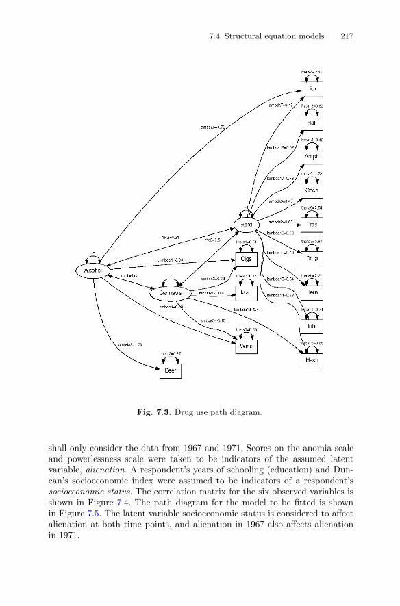
7.4 Structural equation models 217
Fig. 7.3. Drug use path diagram.
shall only consider the data from 1967 and 1971. Scores on the anomia scaleand powerlessness scale were taken to be indicators of the assumed latentvariable, alienation. A respondent’s years of schooling (education) and Dun-can’s socioeconomic index were assumed to be indicators of a respondent’ssocioeconomic status. The correlation matrix for the six observed variables isshown in Figure 7.4. The path diagram for the model to be fitted is shownin Figure 7.5. The latent variable socioeconomic status is considered to affectalienation at both time points, and alienation in 1967 also affects alienationin 1971.
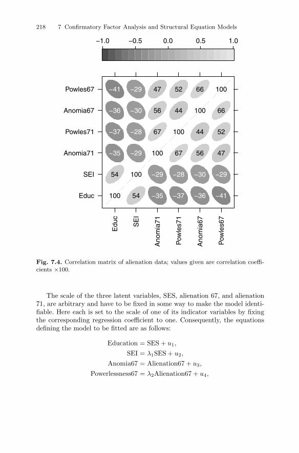
218 7 Confirmatory Factor Analysis and Structural Equation Models
Educ
SEI
Anomia71
Powles71
Anomia67
Powles67
Edu
c
SE
I
Ano
mia
71
Pow
les7
1
Ano
mia
67
Pow
les6
7
100 54 −35 −37 −36 −41
54 100 −29 −28 −30 −29
−35 −29 100 67 56 47
−37 −28 67 100 44 52
−36 −30 56 44 100 66
−41 −29 47 52 66 100
−1.0 −0.5 0.0 0.5 1.0
Fig. 7.4. Correlation matrix of alienation data; values given are correlation coeffi-cients ×100.
The scale of the three latent variables, SES, alienation 67, and alienation71, are arbitrary and have to be fixed in some way to make the model identi-fiable. Here each is set to the scale of one of its indicator variables by fixingthe corresponding regression coefficient to one. Consequently, the equationsdefining the model to be fitted are as follows:
Education = SES + u1,
SEI = λ1SES + u2,
Anomia67 = Alienation67 + u3,
Powerlessness67 = λ2Alienation67 + u4,

7.4 Structural equation models 219
Anomia71 = Alienation71 + u5,
Powerlessness71 = λ3Alienation71 + u6,
Alienation67 = β1SES + u7,
Alienation71 = β2SES + β3Alienation67 + u8.
In addition to the six regression coefficients in these equations, the modelalso has to estimate the variances of the eight error terms, u1, . . . , u8, and thevariance of the error term for the latent variables, SES. The necessary R codefor fitting the model is
R> alienation_model <- specify.model(
+ file = "alienation_model.txt")
R> alienation_sem <- sem(alienation_model, alienation, 932)
where the model reads
SES -> Educ, NA, 1
SES -> SEI, lambda1, NA
Alienation67 -> Anomia67, NA, 1
Alienation67 -> Powles67, lambda2, NA
Alienation71 -> Anomia71, NA, 1
Alienation71 -> Powles71, lambda3, NA
SES -> Alienation67, beta1, NA
SES -> Alienation71, beta2, NA
Alienation67 -> Alienation71, beta3, NA
Educ <-> Educ, theta1, NA
SEI <-> SEI, theta2, NA
SES <-> SES, delta0, NA
Anomia67 <-> Anomia67, theta3, NA
Powles67 <-> Powles67, theta4, NA
Anomia71 <-> Anomia71, theta5, NA
Powles71 <-> Powles71, theta6, NA
Alienation67 <-> Alienation67, delta1, NA
Alienation71 <-> Alienation71, delta2, NA
The parameter estimates are
R> summary(alienation_sem)
Model Chisquare = 71.532 Df = 6 Pr(>Chisq) = 1.9829e-13
Chisquare (null model) = 2131.5 Df = 15
Goodness-of-fit index = 0.97514
Adjusted goodness-of-fit index = 0.913
RMSEA index = 0.10831 90% CI: (0.086636, 0.13150)
Bentler-Bonnett NFI = 0.96644
Tucker-Lewis NNFI = 0.9226
Bentler CFI = 0.96904
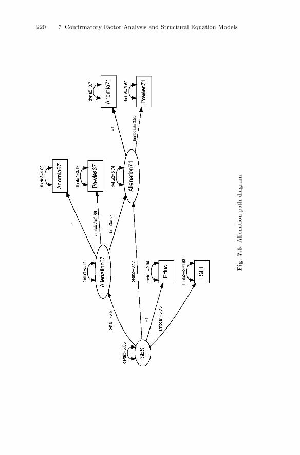
220 7 Confirmatory Factor Analysis and Structural Equation Models
Fig.7.5.
Alien
ati
on
path
dia
gra
m.
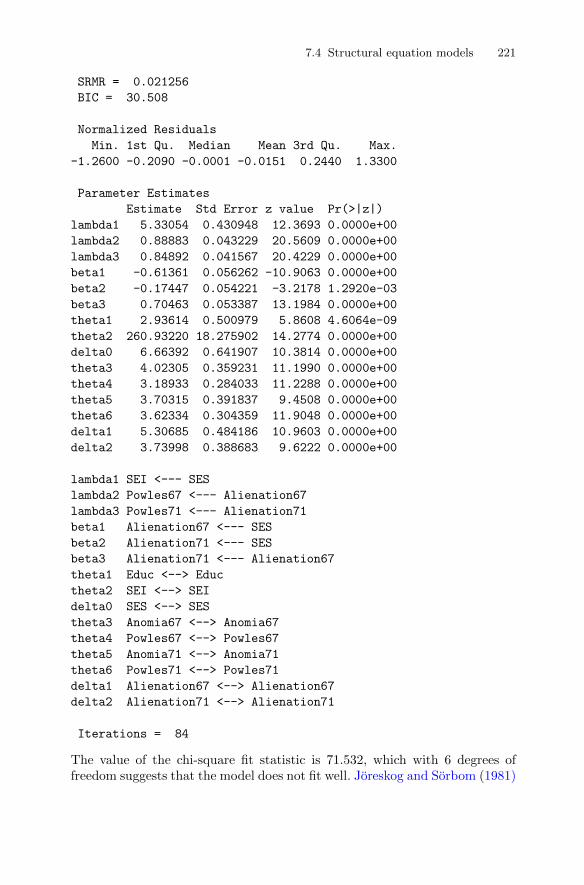
7.4 Structural equation models 221
SRMR = 0.021256
BIC = 30.508
Normalized Residuals
Min. 1st Qu. Median Mean 3rd Qu. Max.
-1.2600 -0.2090 -0.0001 -0.0151 0.2440 1.3300
Parameter Estimates
Estimate Std Error z value Pr(>|z|)
lambda1 5.33054 0.430948 12.3693 0.0000e+00
lambda2 0.88883 0.043229 20.5609 0.0000e+00
lambda3 0.84892 0.041567 20.4229 0.0000e+00
beta1 -0.61361 0.056262 -10.9063 0.0000e+00
beta2 -0.17447 0.054221 -3.2178 1.2920e-03
beta3 0.70463 0.053387 13.1984 0.0000e+00
theta1 2.93614 0.500979 5.8608 4.6064e-09
theta2 260.93220 18.275902 14.2774 0.0000e+00
delta0 6.66392 0.641907 10.3814 0.0000e+00
theta3 4.02305 0.359231 11.1990 0.0000e+00
theta4 3.18933 0.284033 11.2288 0.0000e+00
theta5 3.70315 0.391837 9.4508 0.0000e+00
theta6 3.62334 0.304359 11.9048 0.0000e+00
delta1 5.30685 0.484186 10.9603 0.0000e+00
delta2 3.73998 0.388683 9.6222 0.0000e+00
lambda1 SEI <--- SES
lambda2 Powles67 <--- Alienation67
lambda3 Powles71 <--- Alienation71
beta1 Alienation67 <--- SES
beta2 Alienation71 <--- SES
beta3 Alienation71 <--- Alienation67
theta1 Educ <--> Educ
theta2 SEI <--> SEI
delta0 SES <--> SES
theta3 Anomia67 <--> Anomia67
theta4 Powles67 <--> Powles67
theta5 Anomia71 <--> Anomia71
theta6 Powles71 <--> Powles71
delta1 Alienation67 <--> Alienation67
delta2 Alienation71 <--> Alienation71
Iterations = 84
The value of the chi-square fit statistic is 71.532, which with 6 degrees offreedom suggests that the model does not fit well. Joreskog and Sorbom (1981)

222 7 Confirmatory Factor Analysis and Structural Equation Models
suggest that the model can be improved by allowing the measurement errorsfor anomia in 1967 and in 1971 to be correlated. Fitting such a model in Rrequires the addition of the following line to the code above:
Anomia67 <-> Anomia71, psi, NA
The chi-square fit statistic is now 6.359 with 5 degrees of freedom. Clearly theintroduction of correlated measurement errors for the two measurements ofanomia has greatly improved the fit of the model. However, Bentler (1982),in a discussion of this example, suggests that the importance of the structureremaining to be explained after fitting the original model is in practical termsvery small, and Browne (1982) criticises the tendency to allow error termsto become correlated simply to obtain an improvement in fit unless there aresound theoretical reasons why particular error terms should be related.
7.5 Summary
The possibility of making causal inferences about latent variables is one thathas great appeal, particularly for social and behavioural scientists, simplybecause the concepts in which they are most interested are rarely measurabledirectly. And because such models can nowadays be relatively easily fitted,researchers can routinely investigate quite complex models. But perhaps acaveat issued more than 20 years ago still has some relevance–the following isfrom Cliff (1983):
Correlational data are still correlational and no computer program cantake account of variables that are not in the analysis. Causal relationscan only be established through patient, painstaking attention to allthe relevant variables, and should involve active manipulation as afinal confirmation.
The maximum likelihood estimation approach described in this chapteris based on the assumption of multivariate normality for the data. When amultivariate normality assumption is clearly untenable, for example with cate-gorical variables, applying the maximum likelihood methods can lead to biasedresults, although when there are five or more response categories (and the dis-tribution of the data is normal) the problems from disregarding the categoricalnature of variables are likely to be minimised (see Marcoulides 2005). Muthen(1984) describes a very general approach for structural equation modellingthat can be used when the data consist of a mixture of continuous, ordinal,and dichotomous variables.
Sample size issues for structural equation modelling have been consid-ered by MacCullum, Browne, and Sugawara (1996), and Muthen and Muthen(2002) illustrate how to undertake a Monte Carlo study to help decide onsample size and determine power.
7.6 Exercises 223
7.6 Exercises
Ex. 7.1 The matrix below shows the correlations between ratings on ninestatements about pain made by 123 people suffering from extreme pain.Each statement was scored on a scale from 1 to 6, ranging from agreementto disagreement. The nine pain statements were as follows:1. Whether or not I am in pain in the future depends on the skills of the
doctors.2. Whenever I am in pain, it is usually because of something I have done
or not done.3. Whether or not I am in pain depends on what the doctors do for me.4. I cannot get any help for my pain unless I go to seek medical advice.5. When I am in pain, I know that it is because I have not been taking
proper exercise or eating the right food.6. People’s pain results from their own carelessness.7. I am directly responsible for my pain,8. relief from pain is chiefly controlled by the doctors.9. People who are never in pain are just plain lucky.
1.00−0.04 1.00
0.61 −0.07 1.000.45 −0.12 0.59 1.000.03 0.49 0.03 −0.08 1.00−0.29 0.43 −0.13 −0.21 0.47 1.00−0.30 0.30 −0.24 −0.19 0.41 0.63 1.00
0.45 −0.31 0.59 0.63 −0.14 −0.13 −0.26 1.000.30 −0.17 0.32 0.37 −0.24 −0.15 −0.29 0.40 1.00
.
Fit a correlated two-factor model in which questions 1, 3, 4, and 8 areassumed to be indicators of the latent variable Doctor’s Responsibilityand questions 2, 5, 6, and 7 are assumed to be indicators of the latentvariable Patient’s Responsibility. Find a 95% confidence interval for thecorrelation between the two latent variables.
Ex. 7.2 For the stability of alienation example, fit the model in which themeasurement errors for anomia in 1967 and anomia in 1971 are allowedto be correlated.
Ex. 7.3 Meyer and Bendig (1961) administered the five Thurstone PrimaryMental Ability tests, verbal meaning (V), space (S), reasoning (R), nu-merical (N), and word fluency (W), to 49 boys and 61 girls in grade 8 andagain three and a half years later in grade 11. The observed correlationmatrix is shown below. Fit a single-factor model to the correlations thatallows the factor at time one to be correlated with the factor at time two.

224 7 Confirmatory Factor Analysis and Structural Equation Models
V S R N W V S R N WV 1.00S 0.37 1.00R 0.42 0.33 1.00N 0.53 0.14 0.38 1.00
W 0.38 0.10 0.20 0.24 1.00V 0.81 0.34 0.49 0.58 0.32 1.00S 0.35 0.65 0.20 −0.04 0.11 0.34 1.00R 0.42 0.32 0.75 0.46 0.26 0.46 0.18 1.00N 0.40 0.14 0.39 0.73 0.19 0.55 0.06 0.54 1.00
W 0.24 0.15 0.17 0.15 0.43 0.24 0.15 0.20 0.16 1.00

8
The Analysis of Repeated Measures Data
8.1 Introduction
The multivariate data sets considered in previous chapters have involved mea-surements or observations on a number of different variables for each object orindividual in the study. In this chapter, however, we will consider multivariatedata of a different nature, namely data resulting from the repeated measure-ments of the same variable on each unit in the data set. Examples of suchdata are common in many disciplines. But before we introduce some actualrepeated measures data sets, we need to make a small digression in order tointroduce the two different “formats”, the wide and the long forms, in whichsuch data are commonly stored and dealt with. The simplest way to do thisis by way of a small example data set:
R> ex_wide
ID Group Day.1 Day.2 Day.5 Day.7
1 1 1 15 15 10 7
2 2 1 10 9 11 12
3 3 1 8 7 6 9
4 4 2 11 8 13 7
5 5 2 11 12 11 11
6 6 2 12 12 6 10
We can pretend that these data come from a clinical trial in which individualshave been assigned to two treatment groups and have a response variable ofinterest recorded on days 1, 2, 5 and 7. As given in this table, the data are intheir wide form (as are most of the data sets met in earlier chapters); each rowof data corresponds to an individual and contains all the repeated measures forthe individual as well as other variables that might have been recorded–in thiscase the treatment group of the individual. These data can be put into theirlong form, in which each row of data now corresponds to one of the repeatedmeasurements along with the values of other variables associated with this
DOI 10.1007/978-1-4419-9650-3_8, © Springer Science+Business Media, LLC 2011
225B. Everitt and T. Hothorn, An Introduction to Applied Multivariate Analysis with R: Use R!,

226 8 The Analysis of Repeated Measures Data
particular measurement (for example, the time the measurement was taken)by using the reshape() function in R. The code needed to rearrange the dataex_wide into their long form is as follows:
R> reshape(ex_wide, direction = "long", idvar = "ID",
+ varying = colnames(ex_wide)[-(1:2)])
ID Group time Day
1.1 1 1 1 15
2.1 2 1 1 10
3.1 3 1 1 8
4.1 4 2 1 11
5.1 5 2 1 11
6.1 6 2 1 12
1.2 1 1 2 15
2.2 2 1 2 9
3.2 3 1 2 7
4.2 4 2 2 8
5.2 5 2 2 12
6.2 6 2 2 12
1.5 1 1 5 10
2.5 2 1 5 11
3.5 3 1 5 6
4.5 4 2 5 13
5.5 5 2 5 11
6.5 6 2 5 6
1.7 1 1 7 7
2.7 2 1 7 12
3.7 3 1 7 9
4.7 4 2 7 7
5.7 5 2 7 11
6.7 6 2 7 10
Here, varying contains the names of the variables containing the repeatedmeasurements. Note that the name of the variable consists of the name itselfand the time point, separated by a dot. This long form of repeated measuresdata is used when applying the models to be described in Section 8.2, althoughthe wide format is often more convenient for plotting the data and computingsummary statistics.
So now let us take a look at two repeated measurement data sets thatwe shall be concerned with in this chapter. The first, shown in its long formin Table 8.1, is taken from Crowder (1998) and gives the loads required toproduce slippage x of a timber specimen in a clamp. There are eight speci-mens each with 15 repeated measurements. The second data set, in Table 8.2reported in Zerbe (1979) and also given in Davis (2003), consists of plasmainorganic phosphate measurements obtained from 13 control and 20 obese pa-tients 0, 0.5, 1, 1.5, 2, and 3 hours after an oral glucose challenge. These two
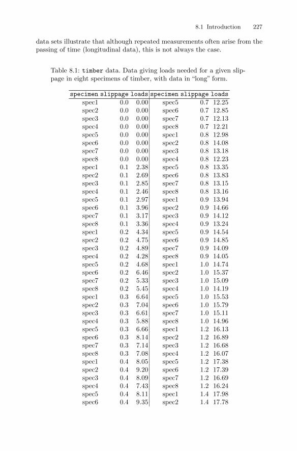
8.1 Introduction 227
data sets illustrate that although repeated measurements often arise from thepassing of time (longitudinal data), this is not always the case.
Table 8.1: timber data. Data giving loads needed for a given slip-page in eight specimens of timber, with data in “long” form.
specimen slippage loads specimen slippage loads
spec1 0.0 0.00 spec5 0.7 12.25spec2 0.0 0.00 spec6 0.7 12.85spec3 0.0 0.00 spec7 0.7 12.13spec4 0.0 0.00 spec8 0.7 12.21spec5 0.0 0.00 spec1 0.8 12.98spec6 0.0 0.00 spec2 0.8 14.08spec7 0.0 0.00 spec3 0.8 13.18spec8 0.0 0.00 spec4 0.8 12.23spec1 0.1 2.38 spec5 0.8 13.35spec2 0.1 2.69 spec6 0.8 13.83spec3 0.1 2.85 spec7 0.8 13.15spec4 0.1 2.46 spec8 0.8 13.16spec5 0.1 2.97 spec1 0.9 13.94spec6 0.1 3.96 spec2 0.9 14.66spec7 0.1 3.17 spec3 0.9 14.12spec8 0.1 3.36 spec4 0.9 13.24spec1 0.2 4.34 spec5 0.9 14.54spec2 0.2 4.75 spec6 0.9 14.85spec3 0.2 4.89 spec7 0.9 14.09spec4 0.2 4.28 spec8 0.9 14.05spec5 0.2 4.68 spec1 1.0 14.74spec6 0.2 6.46 spec2 1.0 15.37spec7 0.2 5.33 spec3 1.0 15.09spec8 0.2 5.45 spec4 1.0 14.19spec1 0.3 6.64 spec5 1.0 15.53spec2 0.3 7.04 spec6 1.0 15.79spec3 0.3 6.61 spec7 1.0 15.11spec4 0.3 5.88 spec8 1.0 14.96spec5 0.3 6.66 spec1 1.2 16.13spec6 0.3 8.14 spec2 1.2 16.89spec7 0.3 7.14 spec3 1.2 16.68spec8 0.3 7.08 spec4 1.2 16.07spec1 0.4 8.05 spec5 1.2 17.38spec2 0.4 9.20 spec6 1.2 17.39spec3 0.4 8.09 spec7 1.2 16.69spec4 0.4 7.43 spec8 1.2 16.24spec5 0.4 8.11 spec1 1.4 17.98spec6 0.4 9.35 spec2 1.4 17.78
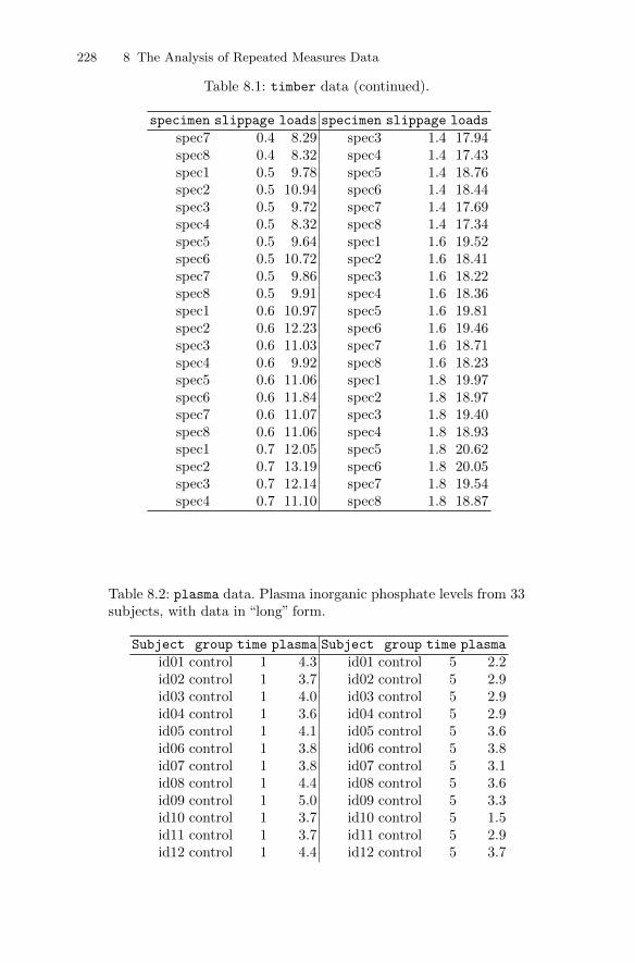
228 8 The Analysis of Repeated Measures Data
Table 8.1: timber data (continued).
specimen slippage loads specimen slippage loads
spec7 0.4 8.29 spec3 1.4 17.94spec8 0.4 8.32 spec4 1.4 17.43spec1 0.5 9.78 spec5 1.4 18.76spec2 0.5 10.94 spec6 1.4 18.44spec3 0.5 9.72 spec7 1.4 17.69spec4 0.5 8.32 spec8 1.4 17.34spec5 0.5 9.64 spec1 1.6 19.52spec6 0.5 10.72 spec2 1.6 18.41spec7 0.5 9.86 spec3 1.6 18.22spec8 0.5 9.91 spec4 1.6 18.36spec1 0.6 10.97 spec5 1.6 19.81spec2 0.6 12.23 spec6 1.6 19.46spec3 0.6 11.03 spec7 1.6 18.71spec4 0.6 9.92 spec8 1.6 18.23spec5 0.6 11.06 spec1 1.8 19.97spec6 0.6 11.84 spec2 1.8 18.97spec7 0.6 11.07 spec3 1.8 19.40spec8 0.6 11.06 spec4 1.8 18.93spec1 0.7 12.05 spec5 1.8 20.62spec2 0.7 13.19 spec6 1.8 20.05spec3 0.7 12.14 spec7 1.8 19.54spec4 0.7 11.10 spec8 1.8 18.87
Table 8.2: plasma data. Plasma inorganic phosphate levels from 33subjects, with data in “long” form.
Subject group time plasma Subject group time plasma
id01 control 1 4.3 id01 control 5 2.2id02 control 1 3.7 id02 control 5 2.9id03 control 1 4.0 id03 control 5 2.9id04 control 1 3.6 id04 control 5 2.9id05 control 1 4.1 id05 control 5 3.6id06 control 1 3.8 id06 control 5 3.8id07 control 1 3.8 id07 control 5 3.1id08 control 1 4.4 id08 control 5 3.6id09 control 1 5.0 id09 control 5 3.3id10 control 1 3.7 id10 control 5 1.5id11 control 1 3.7 id11 control 5 2.9id12 control 1 4.4 id12 control 5 3.7
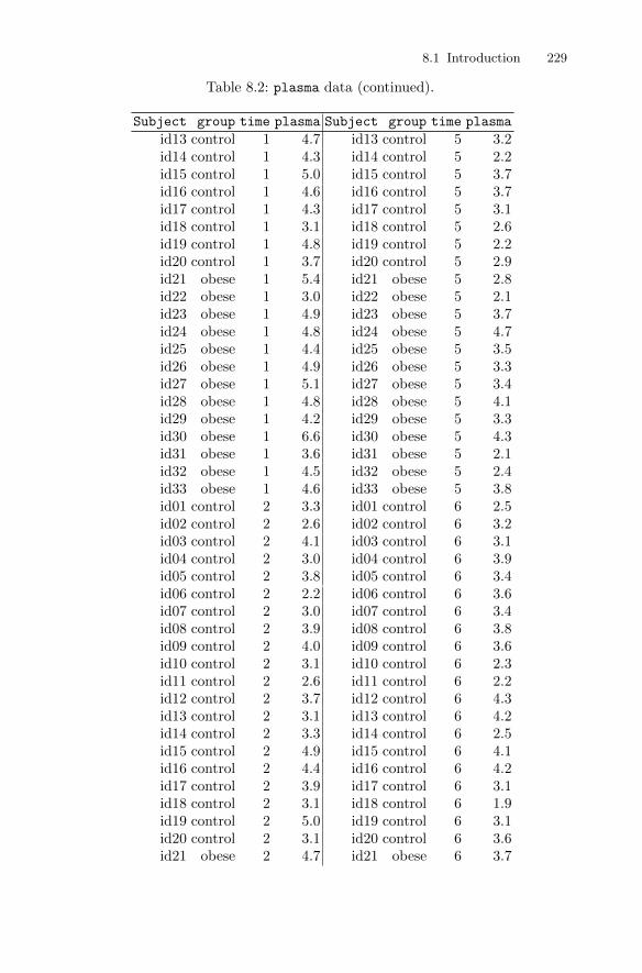
8.1 Introduction 229
Table 8.2: plasma data (continued).
Subject group time plasma Subject group time plasma
id13 control 1 4.7 id13 control 5 3.2id14 control 1 4.3 id14 control 5 2.2id15 control 1 5.0 id15 control 5 3.7id16 control 1 4.6 id16 control 5 3.7id17 control 1 4.3 id17 control 5 3.1id18 control 1 3.1 id18 control 5 2.6id19 control 1 4.8 id19 control 5 2.2id20 control 1 3.7 id20 control 5 2.9id21 obese 1 5.4 id21 obese 5 2.8id22 obese 1 3.0 id22 obese 5 2.1id23 obese 1 4.9 id23 obese 5 3.7id24 obese 1 4.8 id24 obese 5 4.7id25 obese 1 4.4 id25 obese 5 3.5id26 obese 1 4.9 id26 obese 5 3.3id27 obese 1 5.1 id27 obese 5 3.4id28 obese 1 4.8 id28 obese 5 4.1id29 obese 1 4.2 id29 obese 5 3.3id30 obese 1 6.6 id30 obese 5 4.3id31 obese 1 3.6 id31 obese 5 2.1id32 obese 1 4.5 id32 obese 5 2.4id33 obese 1 4.6 id33 obese 5 3.8id01 control 2 3.3 id01 control 6 2.5id02 control 2 2.6 id02 control 6 3.2id03 control 2 4.1 id03 control 6 3.1id04 control 2 3.0 id04 control 6 3.9id05 control 2 3.8 id05 control 6 3.4id06 control 2 2.2 id06 control 6 3.6id07 control 2 3.0 id07 control 6 3.4id08 control 2 3.9 id08 control 6 3.8id09 control 2 4.0 id09 control 6 3.6id10 control 2 3.1 id10 control 6 2.3id11 control 2 2.6 id11 control 6 2.2id12 control 2 3.7 id12 control 6 4.3id13 control 2 3.1 id13 control 6 4.2id14 control 2 3.3 id14 control 6 2.5id15 control 2 4.9 id15 control 6 4.1id16 control 2 4.4 id16 control 6 4.2id17 control 2 3.9 id17 control 6 3.1id18 control 2 3.1 id18 control 6 1.9id19 control 2 5.0 id19 control 6 3.1id20 control 2 3.1 id20 control 6 3.6id21 obese 2 4.7 id21 obese 6 3.7
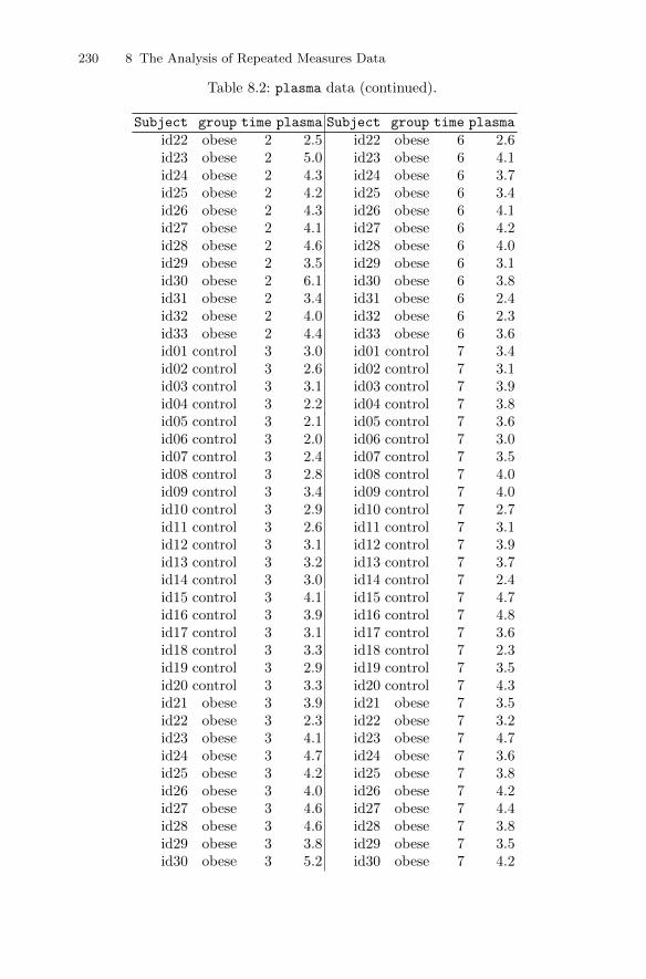
230 8 The Analysis of Repeated Measures Data
Table 8.2: plasma data (continued).
Subject group time plasma Subject group time plasma
id22 obese 2 2.5 id22 obese 6 2.6id23 obese 2 5.0 id23 obese 6 4.1id24 obese 2 4.3 id24 obese 6 3.7id25 obese 2 4.2 id25 obese 6 3.4id26 obese 2 4.3 id26 obese 6 4.1id27 obese 2 4.1 id27 obese 6 4.2id28 obese 2 4.6 id28 obese 6 4.0id29 obese 2 3.5 id29 obese 6 3.1id30 obese 2 6.1 id30 obese 6 3.8id31 obese 2 3.4 id31 obese 6 2.4id32 obese 2 4.0 id32 obese 6 2.3id33 obese 2 4.4 id33 obese 6 3.6id01 control 3 3.0 id01 control 7 3.4id02 control 3 2.6 id02 control 7 3.1id03 control 3 3.1 id03 control 7 3.9id04 control 3 2.2 id04 control 7 3.8id05 control 3 2.1 id05 control 7 3.6id06 control 3 2.0 id06 control 7 3.0id07 control 3 2.4 id07 control 7 3.5id08 control 3 2.8 id08 control 7 4.0id09 control 3 3.4 id09 control 7 4.0id10 control 3 2.9 id10 control 7 2.7id11 control 3 2.6 id11 control 7 3.1id12 control 3 3.1 id12 control 7 3.9id13 control 3 3.2 id13 control 7 3.7id14 control 3 3.0 id14 control 7 2.4id15 control 3 4.1 id15 control 7 4.7id16 control 3 3.9 id16 control 7 4.8id17 control 3 3.1 id17 control 7 3.6id18 control 3 3.3 id18 control 7 2.3id19 control 3 2.9 id19 control 7 3.5id20 control 3 3.3 id20 control 7 4.3id21 obese 3 3.9 id21 obese 7 3.5id22 obese 3 2.3 id22 obese 7 3.2id23 obese 3 4.1 id23 obese 7 4.7id24 obese 3 4.7 id24 obese 7 3.6id25 obese 3 4.2 id25 obese 7 3.8id26 obese 3 4.0 id26 obese 7 4.2id27 obese 3 4.6 id27 obese 7 4.4id28 obese 3 4.6 id28 obese 7 3.8id29 obese 3 3.8 id29 obese 7 3.5id30 obese 3 5.2 id30 obese 7 4.2
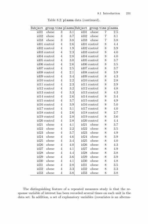
8.1 Introduction 231
Table 8.2: plasma data (continued).
Subject group time plasma Subject group time plasma
id31 obese 3 3.1 id31 obese 7 2.5id32 obese 3 3.7 id32 obese 7 3.1id33 obese 3 3.8 id33 obese 7 3.8id01 control 4 2.6 id01 control 8 4.4id02 control 4 1.9 id02 control 8 3.9id03 control 4 2.3 id03 control 8 4.0id04 control 4 2.8 id04 control 8 4.0id05 control 4 3.0 id05 control 8 3.7id06 control 4 2.6 id06 control 8 3.5id07 control 4 2.5 id07 control 8 3.7id08 control 4 2.1 id08 control 8 3.9id09 control 4 3.4 id09 control 8 4.3id10 control 4 2.2 id10 control 8 2.8id11 control 4 2.3 id11 control 8 3.9id12 control 4 3.2 id12 control 8 4.8id13 control 4 3.3 id13 control 8 4.3id14 control 4 2.6 id14 control 8 3.4id15 control 4 3.7 id15 control 8 4.9id16 control 4 3.9 id16 control 8 5.0id17 control 4 3.1 id17 control 8 4.0id18 control 4 2.6 id18 control 8 2.7id19 control 4 2.8 id19 control 8 3.6id20 control 4 2.8 id20 control 8 4.4id21 obese 4 4.1 id21 obese 8 3.7id22 obese 4 2.2 id22 obese 8 3.5id23 obese 4 3.7 id23 obese 8 4.9id24 obese 4 4.6 id24 obese 8 3.9id25 obese 4 3.4 id25 obese 8 4.0id26 obese 4 4.0 id26 obese 8 4.3id27 obese 4 4.1 id27 obese 8 4.9id28 obese 4 4.4 id28 obese 8 3.8id29 obese 4 3.6 id29 obese 8 3.9id30 obese 4 4.1 id30 obese 8 4.8id31 obese 4 2.8 id31 obese 8 3.5id32 obese 4 3.3 id32 obese 8 3.3id33 obese 4 3.8 id33 obese 8 3.8
The distinguishing feature of a repeated measures study is that the re-sponse variable of interest has been recorded several times on each unit in thedata set. In addition, a set of explanatory variables (covariates is an alterna-
232 8 The Analysis of Repeated Measures Data
tive term that is often used in this context) are available for each; some of theexplanatory variables may have been recorded only once for each unit and sotake the same value for each of the repeated response values for that unit–an example would be treatment group in a clinical trial. Other explanatoryvariables may take different values for each of the different response variablevalues–an example would be age; these are sometimes called time-varying co-variates.
The main objective in such a study is to characterise change in the repeatedvalues of the response variable and to determine the explanatory variablesmost associated with any change. Because several observations of the responsevariable are made on the same individual, it is likely that the measurementswill be correlated rather than independent, even after conditioning on theexplanatory variables. Consequently, repeated measures data require specialmethods of analysis, and models for such data need to include parameterslinking the explanatory variables to the repeated measurements, parametersanalogous to those in the usual multiple regression model, and, in addition,parameters that account for the correlational structure of the repeated mea-surements. It is the former parameters that are generally of most interest,with the latter often being regarded as nuisance parameters. But providingan adequate model for the correlational structure of the repeated measuresis necessary to avoid misleading inferences about the parameters that are ofmost importance to the researcher.
Over the last decade, methodology for the analysis of repeated measuresdata has been the subject of much research and development, and there arenow a variety of powerful techniques available. Comprehensive accounts ofthese methods are given in Diggle, Heagerty, Liang, and Zeger (2003), Davis(2003), and Skrondal and Rabe-Hesketh (2004). Here we will concentrate ona single class of methods, linear mixed-effects models.
8.2 Linear mixed-effects models for repeated measuresdata
Linear mixed-effects models for repeated measures data formalise the sensibleidea that an individual’s pattern of responses is likely to depend on manycharacteristics of that individual, including some that are unobserved. Theseunobserved variables are then included in the model as random variables,that is, random effects. The essential feature of the model is that correlationamongst the repeated measurements on the same unit arises from shared,unobserved variables. Conditional on the values of the random effects, therepeated measurements are assumed to be independent, the so-called localindependence assumption.
Linear mixed-effects models are introduced in the next subsection by de-scribing two commonly used models, the random intercept and random inter-cept and slope models, in the context of the timber slippage data in Table 8.1.
8.2 Linear mixed-effects models for repeated measures data 233
8.2.1 Random intercept and random intercept and slope models forthe timber slippage data
Let yij represent the load in specimen i needed to produce a slippage of xj ,with i = 1, . . . , 8 and j = 1, . . . , 15. If we choose to ignore the repeatedmeasures structure of the, data we could fit a simple linear regression modelof the form
yij = β0 + β1xj + εij . (8.1)
The model in Equation (8.1) can be fitted using the long form of the data inassociation with the lm() function in R as follows:
R> summary(lm(loads ~ slippage, data = timber))
Call:
lm(formula = loads ~ slippage, data = timber)
Residuals:
Min 1Q Median 3Q Max
-3.516 -0.981 0.408 1.298 2.491
Coefficients:
Estimate Std. Error t value Pr(>|t|)
(Intercept) 3.516 0.264 13.3 <2e-16
slippage 10.373 0.283 36.6 <2e-16
Residual standard error: 1.65 on 118 degrees of freedom
Multiple R-squared: 0.919, Adjusted R-squared: 0.918
F-statistic: 1.34e+03 on 1 and 118 DF, p-value: <2e-16
We see that the slippage effect is large and highly significant.But such a model assumes that the repeated observations are independent
of one another which is totally unrealistic for most repeated measures datasets. A more realistic model is the random intercept model , where by partition-ing the total residual that is present in the usual linear regression model (8.1)into a subject-specific random component ui that is constant over slippage plusan error term εij that varies randomly over slippage, some correlational struc-ture for the repeated measures is introduced. The random intercept model is
yij = (β0 + ui) + β1xj + εij . (8.2)
(The error terms and parameters in Equations (8.1) and (8.2) are, of course,not the same.) The ui are assumed to be normally distributed with zero meanand variance σ2
u, and the εij are assumed normally distributed with zero meanand variance σ2. The ui and the εij are assumed to be independent of eachother and the xj . The subject-specific random effects allow for differencesin the intercepts of each individual’s regression fit of load on slippage. Therepeated measurements for each timber specimen vary about that specimen’s
234 8 The Analysis of Repeated Measures Data
own regression line, and this can differ in intercept but not in slope fromthe regression lines of other specimens. In the random-effects model, thereis possible heterogeneity in the intercepts of the individuals. In this model,slippage has a fixed effect .
How does the random intercept model introduce a correlational structurefor the repeated measurements? First, the random intercept model impliesthat the total variance of each repeated measurement is
Var(ui + εij) = σ2u + σ2.
(Due to this decomposition of the total residual variance into a between-subject component, σ2
u, and a within-subject component, σ2, the model issometimes referred to as a variance component model .) The covariance be-tween the total residuals at two slippage levels j and j p in the same specimeni is
Cov(ui + εij , ui + εijp) = σ2u.
The covariance will be non-zero if the variance of the subject-specific randomeffects is non-zero. (Note that this covariance is induced by the shared randomintercept; for specimens with ui > 0, the total residuals will tend to be greaterthan the mean, and for specimens with ui < 0 they will tend to be less thanthe mean.) It follows from the two relations above that the residual correlation(i.e., the correlation between pairs of repeated measurements) is given by
Cor(ui + εij , ui + εijp) =σ2u
σ2u + σ2
.
This is an intra-class correlation that is interpreted as the proportion of thetotal residual variance that is due to residual variability between subjects. Soa random intercept model constrains the variance of each repeated measure tobe the same and the covariance between any pair of repeated measurementsto be equal. This is usually called the compound symmetry structure. Theseconstraints often are not realistic for repeated measures data. For example,for longitudinal data, it is more common for measures taken closer to eachother in time to be more highly correlated than those taken further apart.In addition, the variances of the later repeated measures are often greaterthan those taken earlier. Consequently, for many such data sets, the randomintercept model will not do justice to the observed pattern of covariancesbetween the repeated measures.
A model that allows a more realistic structure for the covariances is therandom slope and intercept model that provides for heterogeneity in bothslopes and intercepts.
In this model, there are two types of random effects, the first modellingheterogeneity in intercepts, ui1, and the second modelling heterogeneity inslopes, ui2. Explicitly, the model is
yij = (β0 + ui1) + (β1 + ui2)xj + εij , (8.3)
8.2 Linear mixed-effects models for repeated measures data 235
where the parameters are not, of course, the same as in (8.1). The two randomeffects are assumed to have a bivariate normal distribution with zero meansfor both variables, variances σ2
u1and σ2
u2, and covariance σu1u2
. With thismodel, the total residual is ui1 + ui2xj + εij with variance
Var(ui1 + ui2xj + εij) = σ2u1
+ 2σu1u2xj + σ2
u2x2j + σ2,
which is no longer constant for different values of xj . Similarly, the covariancebetween two total residuals of the same individual,
Cov(ui1 + xjui2 + εij , ui1 + xjpui2 + εijp) = σ2u1
+ σu1u2(xj + xjp) + σ2
u2xjxjp ,
is not constrained to be the same for all pairs j and j p. The random interceptand slope model allows for the repeated measurements to have different vari-ances and for pairs of repeated measurements to have different correlations.
Linear mixed-effects models can be estimated by maximum likelihood.However, this method tends to underestimate the variance components. Amodified version of maximum likelihood, known as restricted maximum like-lihood , is therefore often recommended; this provides consistent estimates ofthe variance components. Details are given in Diggle et al. (2003), Longford(1993), and Skrondal and Rabe-Hesketh (2004).
Competing linear mixed-effects models can be compared using a likelihoodratio test. If, however, the models have been estimated by restricted maximumlikelihood, this test can only be used if both models have the same set of fixedeffects (Longford 1993).
8.2.2 Applying the random intercept and the random intercept andslope models to the timber slippage data
Before beginning any formal model-fitting exercise, it is good data analysispractise to look at some informative graphic (or graphics) of the data. Herewe first produce a plot of the trajectories of each timber specimen over theslippage levels; see Figure 8.1.
The figure shows that loads required to achieve a given slippage level in-crease with slippage value, with the increase gradually leveling off; this ex-plains the large slippage effect found earlier when applying simple linear re-gression to the data.
We can now fit the two linear mixed-effects models (8.2) and (8.3) asdescribed in the previous subsection using the lme() function from the packagenlme (Pinheiro, Bates, DebRoy, Sarkar, and R Development Core Team 2010):
R> timber.lme <- lme(loads ~ slippage,
+ random = ~1 | specimen,
+ data = timber, method = "ML")
R> timber.lme1 <- lme(loads ~ slippage,
+ random = ~slippage | specimen,
+ data = timber, method = "ML")
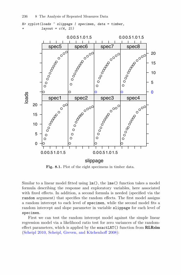
236 8 The Analysis of Repeated Measures Data
R> xyplot(loads ~ slippage | specimen, data = timber,
+ layout = c(4, 2))
slippage
load
s
0
5
10
15
20
0.0 0.5 1.0 1.5
●
●
●
●●
●●●●●●
●
●●●
spec1
●
●
●
●
●
●●●●●
●●
●●●
spec2
0.0 0.5 1.0 1.5
●
●
●
●●●●●●●●
●●●
●
spec3
●
●
●●●●●●●●●
●●
●●
spec4●
●
●
●●●●●●●●
●●
●●
spec5
0.0 0.5 1.0 1.5
●
●
●●●●●●●●●
●●
●●
spec6
●
●
●
●●●●●●●●
●●
●●
spec7
0.0 0.5 1.0 1.5
0
5
10
15
20
●
●
●●●●●●●●●
●●
●●
spec8
Fig. 8.1. Plot of the eight specimens in timber data.
Similar to a linear model fitted using lm(), the lme() function takes a modelformula describing the response and exploratory variables, here associatedwith fixed effects. In addition, a second formula is needed (specified via therandom argument) that specifies the random effects. The first model assignsa random intercept to each level of specimen, while the second model fits arandom intercept and slope parameter in variable slippage for each level ofspecimen.
First we can test the random intercept model against the simple linearregression model via a likelihood ratio test for zero variances of the random-effect parameters, which is applied by the exactLRT() function from RLRsim(Scheipl 2010, Scheipl, Greven, and Kuchenhoff 2008):

8.2 Linear mixed-effects models for repeated measures data 237
R> library("RLRsim")
R> exactRLRT(timber.lme)
Using restricted likelihood evaluated at ML estimators.
Refit with method="REML" for exact results.
simulated finite sample distribution of RLRT. (p-value
based on 10000 simulated values)
data:
RLRT = 0, p-value = 0.4419
We see that the random intercept model does not improve upon the simplelinear model. Nevertheless, we continue to work with the mixed-effects modelssimply because the “observations”, due to their repeated measurement struc-ture, cannot be assumed to be independent.
Now we can do the same for the two random-effect models
R> anova(timber.lme, timber.lme1)
Model df AIC BIC logLik Test L.Ratio
timber.lme 1 4 466.7 477.8 -229.3
timber.lme1 2 6 470.7 487.4 -229.3 1 vs 2 1.497e-08
p-value
timber.lme
timber.lme1 1
The p-value associated with the likelihood ratio test is very small, indicatingthat the random intercept and slope model is to be preferred over the simplerrandom intercept model for these data. The results from this model are:
R> summary(timber.lme1)
Linear mixed-effects model fit by maximum likelihood
Data: timber
AIC BIC logLik
470.7 487.4 -229.3
Random effects:
Formula: ~slippage | specimen
Structure: General positive-definite, Log-Cholesky param.
StdDev Corr
(Intercept) 3.106e-04 (Intr)
slippage 1.028e-05 0
Residual 1.636e+00
Fixed effects: loads ~ slippage
Value Std.Error DF t-value p-value
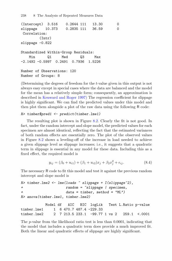
238 8 The Analysis of Repeated Measures Data
(Intercept) 3.516 0.2644 111 13.30 0
slippage 10.373 0.2835 111 36.59 0
Correlation:
(Intr)
slippage -0.822
Standardized Within-Group Residuals:
Min Q1 Med Q3 Max
-2.1492 -0.5997 0.2491 0.7936 1.5226
Number of Observations: 120
Number of Groups: 8
(Determining the degrees of freedom for the t-value given in this output is notalways easy except in special cases where the data are balanced and the modelfor the mean has a relatively simple form; consequently, an approximation isdescribed in Kenward and Roger 1997) The regression coefficient for slippageis highly significant. We can find the predicted values under this model andthen plot them alongside a plot of the raw data using the following R code:
R> timber$pred1 <- predict(timber.lme1)
The resulting plot is shown in Figure 8.2. Clearly the fit is not good. Infact, under the random intercept and slope model, the predicted values for eachspecimen are almost identical, reflecting the fact that the estimated variancesof both random effects are essentially zero. The plot of the observed valuesin Figure 8.2 shows a leveling-off of the increase in load needed to achievea given slippage level as slippage increases; i.e., it suggests that a quadraticterm in slippage is essential in any model for these data. Including this as afixed effect, the required model is
yij = (β0 + ui1) + (β1 + ui2)xj + β2x2j + εij . (8.4)
The necessary R code to fit this model and test it against the previous randomintercept and slope model is
R> timber.lme2 <- lme(loads ~ slippage + I(slippage^2),
+ random = ~slippage | specimen,
+ data = timber, method = "ML")
R> anova(timber.lme1, timber.lme2)
Model df AIC BIC logLik Test L.Ratio p-value
timber.lme1 1 6 470.7 487.4 -229.33
timber.lme2 2 7 213.5 233.1 -99.77 1 vs 2 259.1 <.0001
The p-value from the likelihood ratio test is less than 0.0001, indicating thatthe model that includes a quadratic term does provide a much improved fit.Both the linear and quadratic effects of slippage are highly significant.
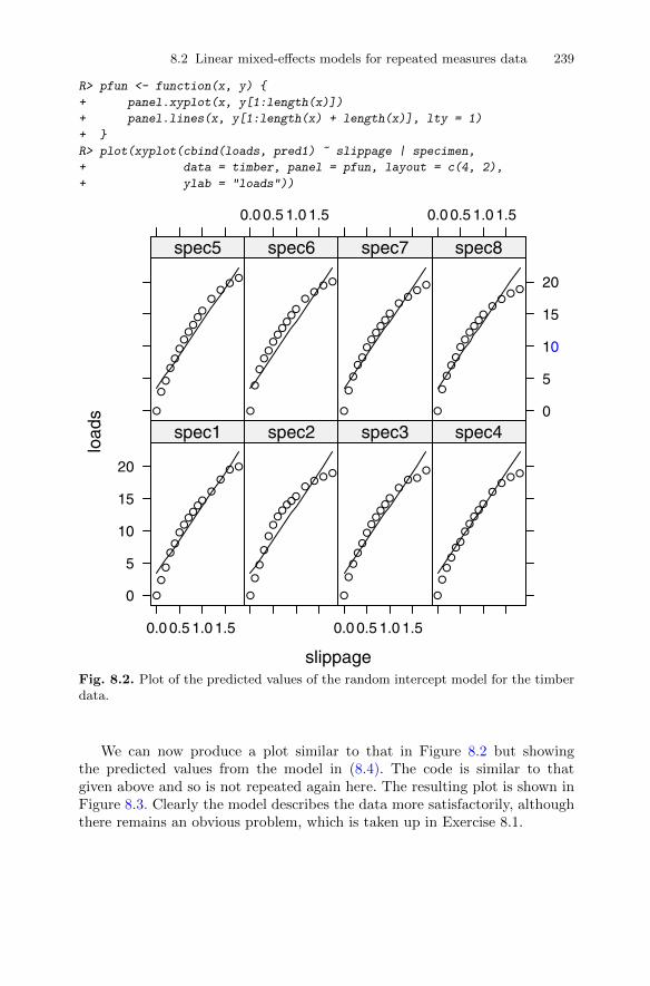
8.2 Linear mixed-effects models for repeated measures data 239
R> pfun <- function(x, y) {
+ panel.xyplot(x, y[1:length(x)])
+ panel.lines(x, y[1:length(x) + length(x)], lty = 1)
+ }
R> plot(xyplot(cbind(loads, pred1) ~ slippage | specimen,
+ data = timber, panel = pfun, layout = c(4, 2),
+ ylab = "loads"))
slippage
load
s
0
5
10
15
20
0.0 0.5 1.0 1.5
●
●
●
●●●●●●●●
●
●●●
spec1
●
●
●
●
●●●●●●●
●●●●
spec2
0.0 0.5 1.0 1.5
●
●
●●●●●●●●●
●●●
●
spec3
●
●●●●●●●●●●
●●
●●
spec4●
●●
●●●●●●●●
●●
●●
spec5
0.0 0.5 1.0 1.5
●
●
●●●●●●●●●
●●
●●
spec6
●
●
●●●●●●●●●
●●
●●
spec7
0.0 0.5 1.0 1.5
0
5
10
15
20
●
●
●●●●●●●●●
●●
●●
spec8
Fig. 8.2. Plot of the predicted values of the random intercept model for the timberdata.
We can now produce a plot similar to that in Figure 8.2 but showingthe predicted values from the model in (8.4). The code is similar to thatgiven above and so is not repeated again here. The resulting plot is shown inFigure 8.3. Clearly the model describes the data more satisfactorily, althoughthere remains an obvious problem, which is taken up in Exercise 8.1.

240 8 The Analysis of Repeated Measures Data
slippage
load
s
0
5
10
15
20
0.0 0.5 1.0 1.5
●
●
●
●●
●●●●●●
●
●●●
spec1
●
●
●
●
●
●●●●●
●●
●●●
spec2
0.0 0.5 1.0 1.5
●
●
●
●●●●●●●●
●●●
●
spec3
●
●
●●●●●●●●●
●●
●●
spec4●
●
●
●●●●●●●●
●●
●●
spec5
0.0 0.5 1.0 1.5
●
●
●●●●●●●●●
●●
●●
spec6
●
●
●
●●●●●●●●
●●
●●
spec7
0.0 0.5 1.0 1.5
0
5
10
15
20
●
●
●●●●●●●●●
●●
●●
spec8
Fig. 8.3. Plot of the predicted values of the random intercept model including aquadratic term for the timber data.
8.2.3 Fitting random-effect models to the glucose challenge data
Now we can move on to consider the glucose challenge data given in its longform in Table 8.2. Again we will begin by plotting the data so that we getsome ideas as to what form of linear mixed-effect model might be appropriate.First we plot the raw data separately for the control and the obese groups inFigure 8.4. First, we transform the plasma data from long into wide formand apply the parallel() function from package lattice to set up a parallel-coordinates plot.
The profiles in both groups show some curvature, suggesting that aquadratic effect of time may be needed in any model. There also appearsto be some difference in the shapes of the curves in the two groups, suggestingperhaps the need to consider a group × time interaction. Next we plot thescatterplot matrices of the repeated measurements for the two groups usingthe code in Figure 8.5.
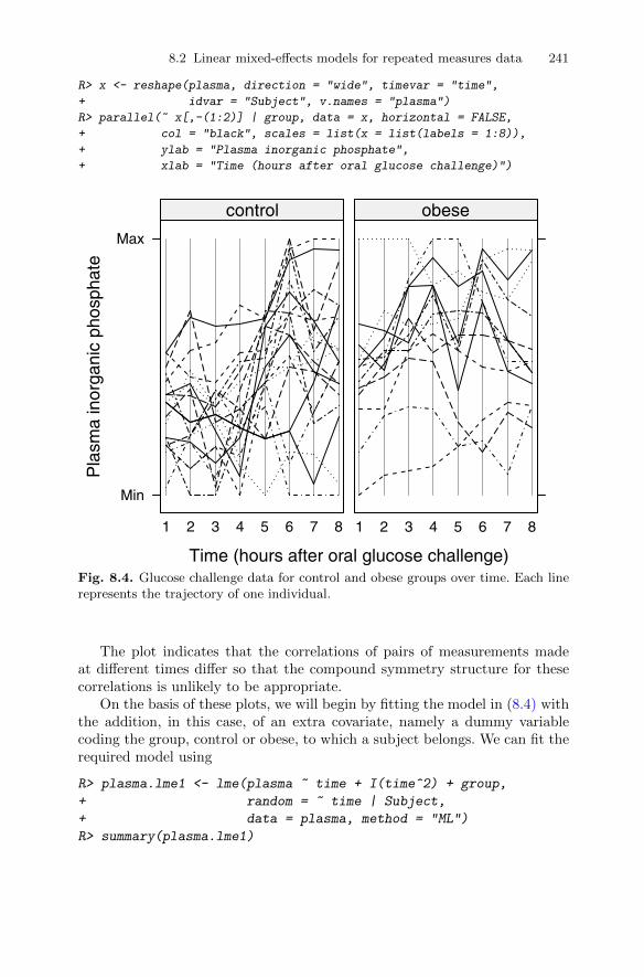
8.2 Linear mixed-effects models for repeated measures data 241
R> x <- reshape(plasma, direction = "wide", timevar = "time",
+ idvar = "Subject", v.names = "plasma")
R> parallel(~ x[,-(1:2)] | group, data = x, horizontal = FALSE,
+ col = "black", scales = list(x = list(labels = 1:8)),
+ ylab = "Plasma inorganic phosphate",
+ xlab = "Time (hours after oral glucose challenge)")
Time (hours after oral glucose challenge)
Pla
sma
inor
gani
c ph
osph
ate
Min
Max
1 2 3 4 5 6 7 8
control
1 2 3 4 5 6 7 8
obese
Fig. 8.4. Glucose challenge data for control and obese groups over time. Each linerepresents the trajectory of one individual.
The plot indicates that the correlations of pairs of measurements madeat different times differ so that the compound symmetry structure for thesecorrelations is unlikely to be appropriate.
On the basis of these plots, we will begin by fitting the model in (8.4) withthe addition, in this case, of an extra covariate, namely a dummy variablecoding the group, control or obese, to which a subject belongs. We can fit therequired model using
R> plasma.lme1 <- lme(plasma ~ time + I(time^2) + group,
+ random = ~ time | Subject,
+ data = plasma, method = "ML")
R> summary(plasma.lme1)
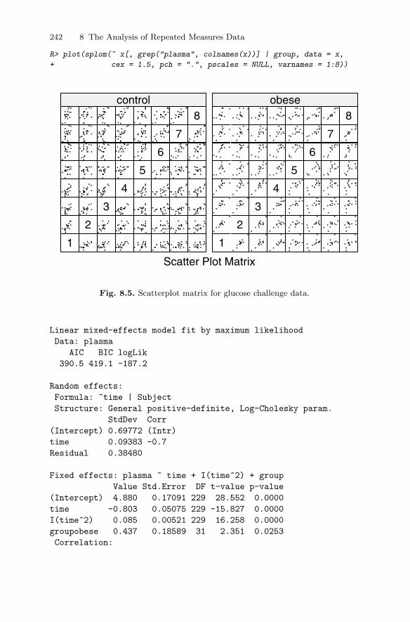
242 8 The Analysis of Repeated Measures Data
R> plot(splom(~ x[, grep("plasma", colnames(x))] | group, data = x,
+ cex = 1.5, pch = ".", pscales = NULL, varnames = 1:8))
Scatter Plot Matrix
1
2
3
4
5
6
7
8control
1
2
3
4
5
6
7
8obese
Fig. 8.5. Scatterplot matrix for glucose challenge data.
Linear mixed-effects model fit by maximum likelihood
Data: plasma
AIC BIC logLik
390.5 419.1 -187.2
Random effects:
Formula: ~time | Subject
Structure: General positive-definite, Log-Cholesky param.
StdDev Corr
(Intercept) 0.69772 (Intr)
time 0.09383 -0.7
Residual 0.38480
Fixed effects: plasma ~ time + I(time^2) + group
Value Std.Error DF t-value p-value
(Intercept) 4.880 0.17091 229 28.552 0.0000
time -0.803 0.05075 229 -15.827 0.0000
I(time^2) 0.085 0.00521 229 16.258 0.0000
groupobese 0.437 0.18589 31 2.351 0.0253
Correlation:

8.2 Linear mixed-effects models for repeated measures data 243
(Intr) time I(t^2)
time -0.641
I(time^2) 0.457 -0.923
groupobese -0.428 0.000 0.000
Standardized Within-Group Residuals:
Min Q1 Med Q3 Max
-2.771508 -0.548688 -0.002765 0.564435 2.889633
Number of Observations: 264
Number of Groups: 33
The regression coefficients for linear and quadratic time are both highlysignificant. The group effect is also significant, and an asymptotic 95% confi-dence interval for the group effect is obtained from 0.437±1.96×0.186, giving[−3.209, 4.083].
Here, to demonstrate what happens if we make a very misleading assump-tion about the correlational structure of the repeated measurements, we willcompare the results with those obtained if we assume that the repeated mea-surements are independent. The independence model can be fitted in the usualway with the lm() function
R> summary(lm(plasma ~ time + I(time^2) + group, data = plasma))
Call:
lm(formula = plasma ~ time + I(time^2) + group,
data = plasma)
Residuals:
Min 1Q Median 3Q Max
-1.6323 -0.4401 0.0347 0.4750 2.0170
Coefficients:
Estimate Std. Error t value Pr(>|t|)
(Intercept) 4.85761 0.16686 29.11 < 2e-16
time -0.80328 0.08335 -9.64 < 2e-16
I(time^2) 0.08467 0.00904 9.37 < 2e-16
groupobese 0.49332 0.08479 5.82 1.7e-08
Residual standard error: 0.673 on 260 degrees of freedom
Multiple R-squared: 0.328, Adjusted R-squared: 0.32
F-statistic: 42.3 on 3 and 260 DF, p-value: <2e-16
We see that, under the independence assumption, the standard error for thegroup effect is about one-half of that given for model plasma.lme1 and ifused would lead to a much stronger claim of evidence of a difference betweencontrol and obese patients.
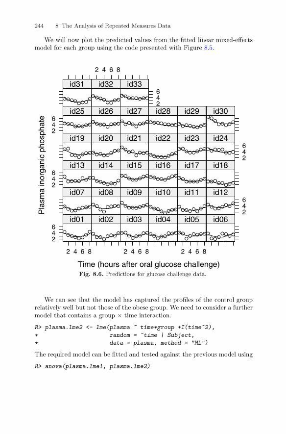
244 8 The Analysis of Repeated Measures Data
We will now plot the predicted values from the fitted linear mixed-effectsmodel for each group using the code presented with Figure 8.5.
Time (hours after oral glucose challenge)
Pla
sma
inor
gani
c ph
osph
ate
246
2 4 6 8
●●●●●●
●●
id01
●●●
●●●●
●
id02
2 4 6 8
●●●
●●●●●
id03
●●●●●
●●●
id04
2 4 6 8
●●●
●●●●●
id05
●●●●
●●●●
id06
●●●●●●●●
id07●●
●●
●●●●
id08●
●●●●●●●
id09
●●●●
●●●●
id10
●●●●●
●●
●
id11
246
●●●●●●●
●
id12246
●●●●●
●●●
id13
●●●●●●●
●
id14●●
●●●●●●
id15●●●●●●●●
id16
●●●●●●●●
id17
●●●●●
●●●
id18
●●
●●●●●●
id19
●●●●●●
●●
id20●
●●●
●●●●
id21
●●●●●●●●
id22●●
●●●●●●
id23
246
●●●●●●●●
id24246
●●●●●●●●
id25●●●●
●●●●
id26●
●●●●
●●●
id27●●●●●●●●
id28
●●●●●●●●
id29●●
●●●●●●
id30
●●●●●●●
●
id31
2 4 6 8
●●●●●●
●●
id32
246
●●●●●●●●
id33
Fig. 8.6. Predictions for glucose challenge data.
We can see that the model has captured the profiles of the control grouprelatively well but not those of the obese group. We need to consider a furthermodel that contains a group × time interaction.
R> plasma.lme2 <- lme(plasma ~ time*group +I(time^2),
+ random = ~time | Subject,
+ data = plasma, method = "ML")
The required model can be fitted and tested against the previous model using
R> anova(plasma.lme1, plasma.lme2)
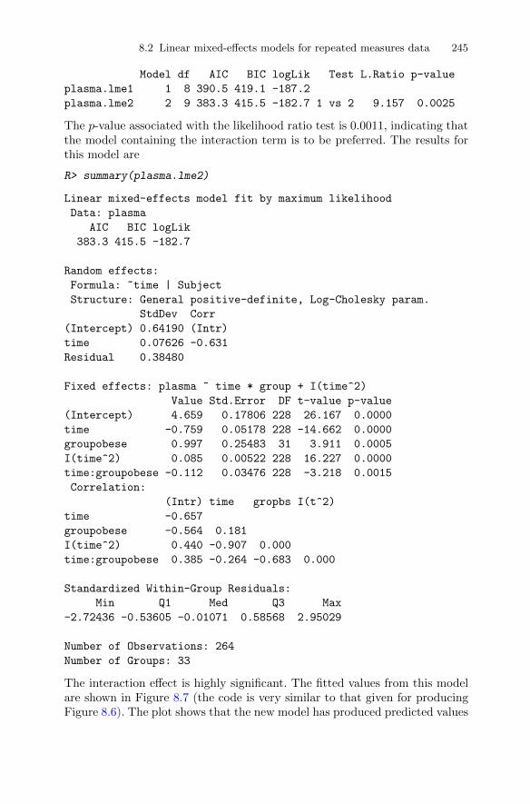
8.2 Linear mixed-effects models for repeated measures data 245
Model df AIC BIC logLik Test L.Ratio p-value
plasma.lme1 1 8 390.5 419.1 -187.2
plasma.lme2 2 9 383.3 415.5 -182.7 1 vs 2 9.157 0.0025
The p-value associated with the likelihood ratio test is 0.0011, indicating thatthe model containing the interaction term is to be preferred. The results forthis model are
R> summary(plasma.lme2)
Linear mixed-effects model fit by maximum likelihood
Data: plasma
AIC BIC logLik
383.3 415.5 -182.7
Random effects:
Formula: ~time | Subject
Structure: General positive-definite, Log-Cholesky param.
StdDev Corr
(Intercept) 0.64190 (Intr)
time 0.07626 -0.631
Residual 0.38480
Fixed effects: plasma ~ time * group + I(time^2)
Value Std.Error DF t-value p-value
(Intercept) 4.659 0.17806 228 26.167 0.0000
time -0.759 0.05178 228 -14.662 0.0000
groupobese 0.997 0.25483 31 3.911 0.0005
I(time^2) 0.085 0.00522 228 16.227 0.0000
time:groupobese -0.112 0.03476 228 -3.218 0.0015
Correlation:
(Intr) time gropbs I(t^2)
time -0.657
groupobese -0.564 0.181
I(time^2) 0.440 -0.907 0.000
time:groupobese 0.385 -0.264 -0.683 0.000
Standardized Within-Group Residuals:
Min Q1 Med Q3 Max
-2.72436 -0.53605 -0.01071 0.58568 2.95029
Number of Observations: 264
Number of Groups: 33
The interaction effect is highly significant. The fitted values from this modelare shown in Figure 8.7 (the code is very similar to that given for producingFigure 8.6). The plot shows that the new model has produced predicted values
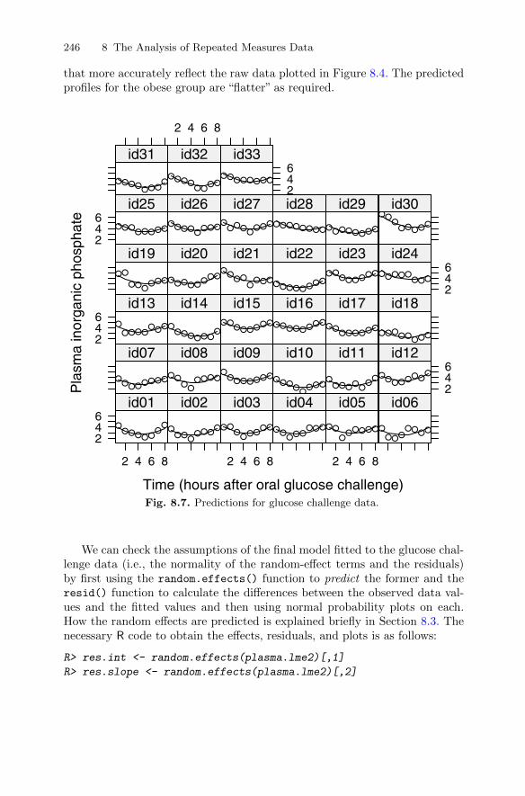
246 8 The Analysis of Repeated Measures Data
that more accurately reflect the raw data plotted in Figure 8.4. The predictedprofiles for the obese group are “flatter” as required.
Time (hours after oral glucose challenge)
Pla
sma
inor
gani
c ph
osph
ate
246
2 4 6 8
●●●●●●
●●
id01
●●●
●●●●
●
id02
2 4 6 8
●●●
●●●●●
id03
●●●●●
●●●
id04
2 4 6 8
●●●
●●●●●
id05
●●●●
●●●●
id06
●●●●●●●●
id07●●
●●
●●●●
id08●
●●●●●●●
id09
●●●●
●●●●
id10
●●●●●
●●
●
id11
246
●●●●●●●
●
id12246
●●●●●
●●●
id13
●●●●●●●
●
id14●●
●●●●●●
id15●●●●●●●●
id16
●●●●●●●●
id17
●●●●●
●●●
id18
●●
●●●●●●
id19
●●●●●●
●●
id20●
●●●
●●●●
id21
●●●●●●●●
id22●●
●●●●●●
id23
246
●●●●●●●●
id24246
●●●●●●●●
id25●●●●
●●●●
id26●
●●●●
●●●
id27●●●●●●●●
id28
●●●●●●●●
id29●●
●●●●●●
id30
●●●●●●●
●
id31
2 4 6 8
●●●●●●
●●
id32
246
●●●●●●●●
id33
Fig. 8.7. Predictions for glucose challenge data.
We can check the assumptions of the final model fitted to the glucose chal-lenge data (i.e., the normality of the random-effect terms and the residuals)by first using the random.effects() function to predict the former and theresid() function to calculate the differences between the observed data val-ues and the fitted values and then using normal probability plots on each.How the random effects are predicted is explained briefly in Section 8.3. Thenecessary R code to obtain the effects, residuals, and plots is as follows:
R> res.int <- random.effects(plasma.lme2)[,1]
R> res.slope <- random.effects(plasma.lme2)[,2]
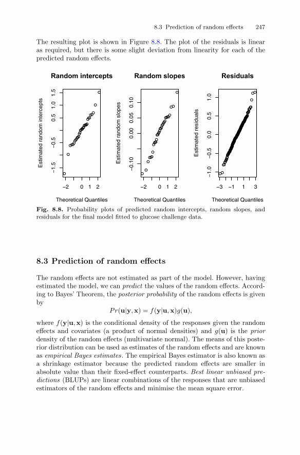
8.3 Prediction of random effects 247
The resulting plot is shown in Figure 8.8. The plot of the residuals is linearas required, but there is some slight deviation from linearity for each of thepredicted random effects.
●
●
●
●
●
●
●
●
●
●
●
●●
●
●
●
●
●
●
●
●
●
●
●
●
●●
●
●
●
●
●
●
−2 0 1 2
−1.
5−
0.5
0.5
1.0
1.5
Random intercepts
Theoretical Quantiles
Est
imat
ed r
ando
m in
terc
epts
●
●
●
●
●
●
●
●
●
●
●
●
●
●
●
●
●
●
●
●
●
●
●
●
●●
●
●
●
●
●
●
●
−2 0 1 2
−0.
100.
000.
050.
10
Random slopes
Theoretical Quantiles
Est
imat
ed r
ando
m s
lope
s●
●
●●●
●
●
●
●
●
●
●
●●
●
●
●
●
●
●
●
●●
●
●
●●
●
●
●
●
●
●
●
●
●
●
●
●
●
●
●
●
●
●
●
●
●
●●
●
●
●
●
●
●
●
●
●
●
●
●
●
●●●●
●●
●
●
●
●●
●
●
●
●
●
●
●●
●
●
●
●
●●●
●●
●
●●
●●
●●
●
●
●●
●●●
●
●
●●
●●
●●
●
●●
●
●●
●
●
●
●
●
●●
●
●
●
●●
●
●
●
●●
●
●
●
●
●
●
●
●
●
●
●●
●
●
●
●
●
●●
●
●
●●
●
●
●
●●
●
●
●
●
●
●
●
●●
●●
●
●
●
●
●●
●
●
●
●●
●●
●●
●
●●
●
●
●
●
●●
●
●
●
●
●
●
●
●●
●
●●
●
●●
●
●
●
●
●
●●
●
●
●●
●
●●
●
●●
●
●
●
●
●●
●●
●
●
●●
●
●●●
●
●
●●
●
●●
●
●●
●
●
●
●●
●
●
−3 −1 1 3
−1.
0−
0.5
0.0
0.5
1.0
Residuals
Theoretical QuantilesE
stim
ated
res
idua
ls
Fig. 8.8. Probability plots of predicted random intercepts, random slopes, andresiduals for the final model fitted to glucose challenge data.
8.3 Prediction of random effects
The random effects are not estimated as part of the model. However, havingestimated the model, we can predict the values of the random effects. Accord-ing to Bayes’ Theorem, the posterior probability of the random effects is givenby
Pr(u|y,x) = f(y|u,x)g(u),
where f(y|u,x) is the conditional density of the responses given the randomeffects and covariates (a product of normal densities) and g(u) is the priordensity of the random effects (multivariate normal). The means of this poste-rior distribution can be used as estimates of the random effects and are knownas empirical Bayes estimates. The empirical Bayes estimator is also known asa shrinkage estimator because the predicted random effects are smaller inabsolute value than their fixed-effect counterparts. Best linear unbiased pre-dictions (BLUPs) are linear combinations of the responses that are unbiasedestimators of the random effects and minimise the mean square error.

248 8 The Analysis of Repeated Measures Data
8.4 Dropouts in longitudinal data
A problem that frequently occurs when collecting longitudinal data is thatsome of the intended measurements are, for one reason or another, not made.In clinical trials, for example, some patients may miss one or more protocolscheduled visits after treatment has begun and so fail to have the requiredoutcome measure taken. There will be other patients who do not completethe intended follow-up for some reason and drop out of the study before theend date specified in the protocol. Both situations result in missing values ofthe outcome measure. In the first case, these are intermittent, but droppingout of the study implies that once an observation at a particular time pointis missing, so are all the remaining planned observations. Many studies willcontain missing values of both types, although in practise it is dropouts thatcause the most problems when analysing the resulting data set.
An example of a set of longitudinal data in which a number of patients havedropped out is given in Table 8.3. These data are essentially a subset of thosecollected in a clinical trial that is described in detail in Proudfoot, Goldberg,Mann, Everitt, Marks, and Gray (2003). The trial was designed to assess theeffectiveness of an interactive program using multimedia techniques for thedelivery of cognitive behavioural therapy for depressed patients and knownas Beat the Blues (BtB). In a randomised controlled trial of the program,patients with depression recruited in primary care were randomised to eitherthe BtB program or to Treatment as Usual (TAU). The outcome measureused in the trial was the Beck Depression Inventory II (see Beck, Steer, andBrown 1996), with higher values indicating more depression. Measurements ofthis variable were made on five occasions, one prior to the start of treatmentand at two monthly intervals after treatment began. In addition, whether ornot a participant in the trial was already taking anti-depressant medicationwas noted along with the length of time they had been depressed.
Table 8.3: BtheB data. Data of a randomised trial evaluating theeffects of Beat the Blues.
drug length treatment bdi.pre bdi.2m bdi.3m bdi.5m bdi.8m
No >6m TAU 29 2 2 NA NAYes >6m BtheB 32 16 24 17 20Yes <6m TAU 25 20 NA NA NANo >6m BtheB 21 17 16 10 9Yes >6m BtheB 26 23 NA NA NAYes <6m BtheB 7 0 0 0 0Yes <6m TAU 17 7 7 3 7No >6m TAU 20 20 21 19 13Yes <6m BtheB 18 13 14 20 11Yes >6m BtheB 20 5 5 8 12No >6m TAU 30 32 24 12 2

8.4 Dropouts in longitudinal data 249
Table 8.3: BtheB data (continued).
drug length treatment bdi.pre bdi.2m bdi.3m bdi.5m bdi.8m
Yes <6m BtheB 49 35 NA NA NANo >6m TAU 26 27 23 NA NAYes >6m TAU 30 26 36 27 22Yes >6m BtheB 23 13 13 12 23No <6m TAU 16 13 3 2 0No >6m BtheB 30 30 29 NA NANo <6m BtheB 13 8 8 7 6No >6m TAU 37 30 33 31 22Yes <6m BtheB 35 12 10 8 10No >6m BtheB 21 6 NA NA NANo <6m TAU 26 17 17 20 12No >6m TAU 29 22 10 NA NANo >6m TAU 20 21 NA NA NANo >6m TAU 33 23 NA NA NANo >6m BtheB 19 12 13 NA NAYes <6m TAU 12 15 NA NA NAYes >6m TAU 47 36 49 34 NAYes >6m BtheB 36 6 0 0 2No <6m BtheB 10 8 6 3 3No <6m TAU 27 7 15 16 0No <6m BtheB 18 10 10 6 8Yes <6m BtheB 11 8 3 2 15Yes <6m BtheB 6 7 NA NA NAYes >6m BtheB 44 24 20 29 14No <6m TAU 38 38 NA NA NANo <6m TAU 21 14 20 1 8Yes >6m TAU 34 17 8 9 13Yes <6m BtheB 9 7 1 NA NAYes >6m TAU 38 27 19 20 30Yes <6m BtheB 46 40 NA NA NANo <6m TAU 20 19 18 19 18Yes >6m TAU 17 29 2 0 0No >6m BtheB 18 20 NA NA NAYes >6m BtheB 42 1 8 10 6No <6m BtheB 30 30 NA NA NAYes <6m BtheB 33 27 16 30 15No <6m BtheB 12 1 0 0 NAYes <6m BtheB 2 5 NA NA NANo >6m TAU 36 42 49 47 40No <6m TAU 35 30 NA NA NANo <6m BtheB 23 20 NA NA NANo >6m TAU 31 48 38 38 37

250 8 The Analysis of Repeated Measures Data
Table 8.3: BtheB data (continued).
drug length treatment bdi.pre bdi.2m bdi.3m bdi.5m bdi.8m
Yes <6m BtheB 8 5 7 NA NAYes <6m TAU 23 21 26 NA NAYes <6m BtheB 7 7 5 4 0No <6m TAU 14 13 14 NA NANo <6m TAU 40 36 33 NA NAYes <6m BtheB 23 30 NA NA NANo >6m BtheB 14 3 NA NA NANo >6m TAU 22 20 16 24 16No >6m TAU 23 23 15 25 17No <6m TAU 15 7 13 13 NANo >6m TAU 8 12 11 26 NANo >6m BtheB 12 18 NA NA NANo >6m TAU 7 6 2 1 NAYes <6m TAU 17 9 3 1 0Yes <6m BtheB 33 18 16 NA NANo <6m TAU 27 20 NA NA NANo <6m BtheB 27 30 NA NA NANo <6m BtheB 9 6 10 1 0No >6m BtheB 40 30 12 NA NANo >6m TAU 11 8 7 NA NANo <6m TAU 9 8 NA NA NANo >6m TAU 14 22 21 24 19Yes >6m BtheB 28 9 20 18 13No >6m BtheB 15 9 13 14 10Yes >6m BtheB 22 10 5 5 12No <6m TAU 23 9 NA NA NANo >6m TAU 21 22 24 23 22No >6m TAU 27 31 28 22 14Yes >6m BtheB 14 15 NA NA NANo >6m TAU 10 13 12 8 20Yes <6m TAU 21 9 6 7 1Yes >6m BtheB 46 36 53 NA NANo >6m BtheB 36 14 7 15 15Yes >6m BtheB 23 17 NA NA NAYes >6m TAU 35 0 6 0 1Yes <6m BtheB 33 13 13 10 8No <6m BtheB 19 4 27 1 2No <6m TAU 16 NA NA NA NAYes <6m BtheB 30 26 28 NA NAYes <6m BtheB 17 8 7 12 NANo >6m BtheB 19 4 3 3 3No >6m BtheB 16 11 4 2 3
8.4 Dropouts in longitudinal data 251
Table 8.3: BtheB data (continued).
drug length treatment bdi.pre bdi.2m bdi.3m bdi.5m bdi.8m
Yes >6m BtheB 16 16 10 10 8Yes <6m TAU 28 NA NA NA NANo >6m BtheB 11 22 9 11 11No <6m TAU 13 5 5 0 6Yes <6m TAU 43 NA NA NA NA
To begin, we shall graph the data here by plotting the boxplots of eachof the five repeated measures separately for each treatment group. Assumingthe data are available as the data frame BtheB, the necessary code is givenwith Figure 8.9.
Figure 8.9 shows that there is a decline in BDI values in both groups, withperhaps the values in the BtheB group being lower at each post-randomisationvisit. We shall fit both random intercept and random intercept and slopemodels to the data including the pre-BDI values, treatment group, drugs, andlength as fixed-effect covariates. First we need to rearrange the data into thelong form using the following code:
R> BtheB$subject <- factor(rownames(BtheB))
R> nobs <- nrow(BtheB)
R> BtheB_long <- reshape(BtheB, idvar = "subject",
+ varying = c("bdi.2m", "bdi.3m", "bdi.5m", "bdi.8m"),
+ direction = "long")
R> BtheB_long$time <- rep(c(2, 3, 5, 8), rep(nobs, 4))
The resulting data frame BtheB_long contains a number of missing values,and in applying the lme() function these will need to be dropped. But noticeit is only the missing values that are removed, not participants that have atleast one missing value. All the available data are used in the model-fittingprocess. We can fit the two models and test which is most appropriate using
R> BtheB_lme1 <- lme(bdi ~ bdi.pre + time + treatment + drug +
+ length, random = ~ 1 | subject, data = BtheB_long,
+ na.action = na.omit)
R> BtheB_lme2 <- lme(bdi ~ bdi.pre + time + treatment + drug +
+ length, random = ~ time | subject, data = BtheB_long,
+ na.action = na.omit)
This results in
R> anova(BtheB_lme1, BtheB_lme2)
Model df AIC BIC logLik Test L.Ratio p-value
BtheB_lme1 1 8 1883 1912 -933.5
BtheB_lme2 2 10 1886 1922 -933.2 1 vs 2 0.5665 0.7533

252 8 The Analysis of Repeated Measures Data
R> ylim <- range(BtheB[,grep("bdi", names(BtheB))],
+ na.rm = TRUE)
R> tau <- subset(BtheB, treatment == "TAU")[,
+ grep("bdi", names(BtheB))]
R> boxplot(tau, main = "Treated as Usual", ylab = "BDI",
+ xlab = "Time (in months)", names = c(0, 2, 3, 5, 8),
+ ylim = ylim)
R> btheb <- subset(BtheB, treatment == "BtheB")[,
+ grep("bdi", names(BtheB))]
R> boxplot(btheb, main = "Beat the Blues", ylab = "BDI",
+ xlab = "Time (in months)", names = c(0, 2, 3, 5, 8),
+ ylim = ylim)
0 3 8
010
2030
4050
Treated as Usual
Time (in months)
BD
I
●
●●
0 3 8
010
2030
4050
Beat the Blues
Time (in months)
BD
I
Fig. 8.9. Boxplots for the repeated measures by treatment group for the BtheBdata.
Clearly, the simpler random intercept model is adequate for these data. Theresults from this model can be found using
R> summary(BtheB_lme1)
Linear mixed-effects model fit by REML
Data: BtheB_long
AIC BIC logLik
1883 1912 -933.5
8.4 Dropouts in longitudinal data 253
Random effects:
Formula: ~1 | subject
(Intercept) Residual
StdDev: 7.206 5.029
Fixed effects: bdi ~ bdi.pre + time + treatment + drug + length
Value Std.Error DF t-value p-value
(Intercept) 5.574 2.2995 182 2.424 0.0163
bdi.pre 0.640 0.0799 92 8.013 0.0000
time -0.702 0.1469 182 -4.775 0.0000
treatmentBtheB -2.315 1.7152 92 -1.350 0.1804
drugYes -2.816 1.7729 92 -1.588 0.1156
length>6m 0.179 1.6816 92 0.106 0.9155
Correlation:
(Intr) bdi.pr time trtmBB drugYs
bdi.pre -0.683
time -0.232 0.019
treatmentBtheB -0.390 0.121 0.017
drugYes -0.074 -0.236 -0.022 -0.323
length>6m -0.244 -0.241 -0.036 0.002 0.157
Standardized Within-Group Residuals:
Min Q1 Med Q3 Max
-2.68699 -0.50847 -0.06085 0.42067 3.81414
Number of Observations: 280
Number of Groups: 97
The effect of most interest in this study is, of course, the treatment effect,and our analysis shows that this is not significant at the 5% level. The onlyeffect that is significant is time, the negative value of its regression coefficientshowing that the BDI values decline over the eight months of the study.
We now need to consider briefly how the dropouts may affect the analysesreported above. To understand the problems that patients dropping out cancause for the analysis of data from a longitudinal trial, we need to considera classification of dropout mechanisms first introduced by Rubin (1976). Thetype of mechanism involved has implications for which approaches to analysisare suitable and which are not. Rubin’s suggested classification involves threetypes of dropout mechanisms:
� Dropout completely at random (DCAR). Here the probability that a pa-tient drops out does not depend on either the observed or missing values ofthe response. Consequently, the observed (non-missing) values effectivelyconstitute a simple random sample of the values for all subjects. Possibleexamples include missing laboratory measurements because of a dropped
254 8 The Analysis of Repeated Measures Data
test tube (if it was not dropped because of the knowledge of any measure-ment), the accidental death of a participant in a study, or a participantmoving to another area. Intermittent missing values in a longitudinal dataset, whereby a patient misses a clinic visit for transitory reasons (“wentshopping instead” or the like) can reasonably be assumed to be DCAR.Completely random dropout causes the least problems for data analysis,but it is a strong assumption.
� Dropout at random (DAR). The dropout at random mechanism occurswhen the probability of dropping out depends on the outcome measuresthat have been observed in the past but given this information is condi-tionally independent of all the future (unrecorded) values of the outcomevariable following dropout. Here “missingness” depends only on the ob-served data, with the distribution of future values for a subject who dropsout at a particular time being the same as the distribution of the futurevalues of a subject who remains in at that time, if they have the samecovariates and the same past history of outcome up to and including thespecific time point. Murray and Findlay (1988) provide an example of thistype of missing value from a study of hypertensive drugs in which theoutcome measure was diastolic blood pressure. The protocol of the studyspecified that the participant was to be removed from the study when hisor her blood pressure got too large. Here blood pressure at the time ofdropout was observed before the participant dropped out, so although thedropout mechanism is not DCAR since it depends on the values of bloodpressure, it is DAR, because dropout depends only on the observed part ofthe data. A further example of a DAR mechanism is provided by Heitjan(1997) and involves a study in which the response measure is body massindex (BMI). Suppose that the measure is missing because subjects whohad high body mass index values at earlier visits avoided being measuredat later visits out of embarrassment, regardless of whether they had gainedor lost weight in the intervening period. The missing values here are DARbut not DCAR; consequently methods applied to the data that assumedthe latter might give misleading results (see later discussion).
� Non-ignorable (sometimes referred to as informative). The final type ofdropout mechanism is one where the probability of dropping out dependson the unrecorded missing values–observations are likely to be missingwhen the outcome values that would have been observed had the pa-tient not dropped out are systematically higher or lower than usual (cor-responding perhaps to their condition becoming worse or improving). Anon-medical example is when individuals with lower income levels or veryhigh incomes are less likely to provide their personal income in an inter-view. In a medical setting, possible examples are a participant droppingout of a longitudinal study when his or her blood pressure became toohigh and this value was not observed, or when their pain became intolera-ble and we did not record the associated pain value. For the BDI exampleintroduced above, if subjects were more likely to avoid being measured if
8.4 Dropouts in longitudinal data 255
they had put on extra weight since the last visit, then the data are non-ignorably missing. Dealing with data containing missing values that resultfrom this type of dropout mechanism is difficult. The correct analyses forsuch data must estimate the dependence of the missingness probability onthe missing values. Models and software that attempt this are available(see for example, Diggle and Kenward 1994), but their use is not routineand, in addition, it must be remembered that the associated parameterestimates can be unreliable.
Under what type of dropout mechanism are the mixed-effects models con-sidered in this chapter valid? The good news is that such models can be shownto give valid results under the relatively weak assumption that the dropoutmechanism is DAR (Carpenter, Pocock, and Lamm 2002). When the missingvalues are thought to be informative, any analysis is potentially problematical.But Diggle and Kenward (1994) have developed a modelling framework forlongitudinal data with informative dropouts, in which random or completelyrandom dropout mechanisms are also included as explicit models. The essen-tial feature of the procedure is a logistic regression model for the probability ofdropping out, in which the explanatory variables can include previous valuesof the response variable and, in addition, the unobserved value at dropout asa latent variable (i.e., an unobserved variable). In other words, the dropoutprobability is allowed to depend on both the observed measurement historyand the unobserved value at dropout. This allows both a formal assessmentof the type of dropout mechanism in the data and the estimation of effectsof interest, for example, treatment effects under different assumptions aboutthe dropout mechanism. A full technical account of the model is given in Dig-gle and Kenward (1994), and a detailed example that uses the approach isdescribed in Carpenter et al. (2002).
One of the problems for an investigator struggling to identify the dropoutmechanism in a data set is that there are no routine methods to help, althougha number of largely ad hoc graphical procedures can be used as described inDiggle (1998), Everitt (2002), and Carpenter et al. (2002).
We shall now illustrate one very simple graphical procedure for assessingthe dropout mechanism suggested in Carpenter et al. (2002). That involvesplotting the observations for each treatment group, at each time point, dif-ferentiating between two categories of patients: those who do and those whodo not attend their next scheduled visit. Any clear difference between thedistributions of values for these two categories indicates that dropout is notcompletely at random. For the Beat the Blues data, such a plot is shown inFigure 8.10. When comparing the distribution of BDI values for patients whodo (circles) and do not (bullets) attend the next scheduled visit, there is noapparent difference, and so it is reasonable to assume dropout completely atrandom.
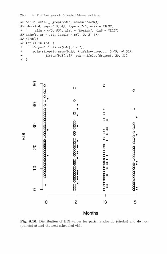
256 8 The Analysis of Repeated Measures Data
R> bdi <- BtheB[, grep("bdi", names(BtheB))]
R> plot(1:4, rep(-0.5, 4), type = "n", axes = FALSE,
+ ylim = c(0, 50), xlab = "Months", ylab = "BDI")
R> axis(1, at = 1:4, labels = c(0, 2, 3, 5))
R> axis(2)
R> for (i in 1:4) {
+ dropout <- is.na(bdi[,i + 1])
+ points(rep(i, nrow(bdi)) + ifelse(dropout, 0.05, -0.05),
+ jitter(bdi[,i]), pch = ifelse(dropout, 20, 1))
+ }
Months
BD
I
0 2 3 5
010
2030
4050
●
●
●
●
●
●
●
●
●
●
●
●
●
●
●
●
●
●
●
●
●
●
●
●
●
●
●
●
●
●
●
●
●
●
●
●
●
●
●
●
●
●
●●
●
●
●
●
●
●●
●
●
●
●
●
●
●
●
●
●●
●
●
●
●
●
●
●●
●
●
●
●
●
●
●
●●
●
●
●
●
●
●
●
●
●
●
●
●
●
●
●
●●
●
●
●
●
●
●
●
●
●
●
●
●
●
●
●
●
●●
●●
●
●
●
●
●
●
●●
●
●
●
●
●
●●
●
●●
●
●
●
●
●
●
●
●
●
●
●
●
●
●
●
●
●
●
●
●
●
●
●
●
●
●
●
●
●
●
●
●
●
●
●
●
●
●
● ●
●
●●●
●
●
●
●
●
●
●
●
●
●
●
●
●
●
●
●
●
●
●
●
●
●
●
●
●
●
●
●●
●
●
●
●
●
●
●
●
●
●
●
●
●
●
●
●
●●
●
●
●●
●
●
●
●
●
●
●
●
●
●
●
●●
●
●
●●
●
●
●
●
●●
●
●
●
●
●
●
●
●●
●
●●
●
●●
●●
●
●
●
●
●
●●
●
●
●
●
●
●
●
●
●
●
●
●
●
●
●
●
●
●
●●
●
●
●
●
●
●
●
●●
●
●
●●●
●
●
●
●
●●
●●
●
●
●
●
●
●●
●●
●
Fig. 8.10. Distribution of BDI values for patients who do (circles) and do not(bullets) attend the next scheduled visit.
8.6 Exercises 257
8.5 Summary
Linear mixed-effects models are extremely useful for modelling longitudinaldata in particular and repeated measures data more generally. The modelsallow the correlations between the repeated measurements to be accountedfor so that correct inferences can be drawn about the effects of covariates ofinterest on the repeated response values. In this chapter, we have concentratedon responses that are continuous and conditional on the explanatory variables,and random effects have a normal distribution. But random-effects models canalso be applied to non-normal responses, for example binary variables–see, forexample Everitt (2002) and Skrondal and Rabe-Hesketh (2004).
The lack of independence of repeated measures data is what makes themodelling of such data a challenge. But even when only a single measure-ment of a response is involved, correlation can, in some circumstances, occurbetween the response values of different individuals and cause similar prob-lems. As an example, consider a randomised clinical trial in which subjectsare recruited at multiple study centres. The multicentre design can help toprovide adequate sample sizes and enhance the generalisability of the results.However, factors that vary by centre, including patient characteristics andmedical practise patterns, may exert a sufficiently powerful effect to makeinferences that ignore the “clustering” seriously misleading. Consequently, itmay be necessary to incorporate random effects for centres into the analysis.
8.6 Exercises
Ex. 8.1 The final model fitted to the timber data did not constrain the fittedcurves to go through the origin, although this is clearly necessary. Fitan amended model where this constraint is satisfied, and plot the newpredicted values.
Ex. 8.2 Investigate a further model for the glucose challenge data that allowsa random quadratic effect.
Ex. 8.3 Fit an independence model to the Beat the Blues data, and com-pare the estimated treatment effect confidence interval with that from therandom intercept model described in the text.
Ex. 8.4 Construct a plot of the mean profiles of the two treatment groups inthe Beat the Blues study showing also the predicted mean profiles underthe model used in the chapter. Repeat the exercise with a model thatincludes only a time effect.
Ex. 8.5 Investigate whether there is any evidence of an interaction betweentreatment and time for the Beat the Blues data.


References
Affifi, A. A., Clark, V. A., and May, S. (2004), Computer-Aided MultivariateAnalysis, London, UK: Chapman & Hall, 4th edition. Cited on p. 99.
Anonymous (1988), “Statistical abstract of the USA,” Technical Report 159,U.S. Department of Commerce, Washington, DC. Cited on p. 176.
Banfield, J. D. and Raftery, A. E. (1993), “Model-based Gaussian and non-Gaussian clustering,” Biometrics , 49, 803–821. Cited on p. 186, 188.
Barlow, R. E., Bartholomew, D. J., Bremner, J. M., and Brunk, H. D. (1972),Statistical Inference under Order Restrictions, New York: John Wiley &Sons. Cited on p. 123.
Bartholomew, D. and Knott, M. (1987), Latent Variable Models and FactorAnalysis, London, UK: Griffin. Cited on p. 147.
Bartholomew, D. J. (2005), “History of factor analysis: A statistical perspec-tive,” in Encyclopedia of Statistics in Behavioral Science, eds. B. S. Everittand D. Howell, Chichester, UK: John Wiley & Sons. Cited on p. 136.
Bartlett, M. S. (1947), “Multivariate analysis,” Journal of the Royal StatisticalSociety, Series B , 9, 176–197. Cited on p. 103.
Beck, A., Steer, R., and Brown, G. (1996), BDI-II Manual, The PsychologicalCorporation, San Antonio, TX, 2nd edition. Cited on p. 248.
Becker, C. and Gather, U. (2001), “The largest nonidentifiable outlier: A com-parison of multivariate simultaneous outlier identification rules,” Computa-tional Statistics & Data Analysis, 36, 119–127. Cited on p. 23.
Becker, R., Cleveland, W., Shyu, M., and Kaluzny, S. (1994), “Trellis dis-plays: User’s guide,”Technical report, AT&T Research, URL http://www2.
research.att.com/areas/stat/doc/94.10.ps. Cited on p. 50, 57.Bellman, R. (1961), Adaptive Control Processes, Princeton, NJ: Princeton
University Press. Cited on p. 61.Bentler, P. (1980), “Multivariate analysis with latent variables: Causal mod-
eling,” Annual Review of Psychology , 31, 419–456. Cited on p. 202.Bentler, P. (1982), “Linear systems with multiple levels and types of latent
variables,” in Systems under Indirect Observation, eds. K. G. Joreskog andH. Wold, Amsterdam: North-Holland, pp. 101–130. Cited on p. 222.
259DOI 10.1007/978-1-4419-9650-3, © Springer Science+Business Media, LLC 2011 B. Everitt and T. Hothorn, An Introduction to Applied Multivariate Analysis with R: Use R!,

260 References
Benzecri, J. (1992), Correspondence Analysis Handbook , New York: MarcelDekker Inc. Cited on p. 127.
Blackith, R. E. and Reyment, R. A. (1971), Multivariate Morphometrics, Lon-don, UK: Academic Press. Cited on p. 144.
Blalock, H. M. J. (1961), “Correlation and causality: The multivariate case,”Social Forces, 39, 246–251. Cited on p. 202.
Blalock, H. M. J. (1963), “Making causal inferences for unmeasured variablesfrom correlations among indicators,” The American Journal of Sociology ,69, 53–62. Cited on p. 202.
Bollen, K. and Long, J. (1993), Testing Structural Equation Models, NewburyPark, CA: Sage Publications. Cited on p. 204, 205.
Bouguila, N. and Amayri, O. (2009), “A discrete mixture-based kernel forSVMs: Application to spam and image categorization,” Information Pro-cessing and Management , 45, 631–642. Cited on p. 186.
Branchaud, E. A., Cham, J. G., Nenadic, Z., Andersen, R. A., and Burdick,J. (2010), “A miniature robot for autonomous single neuron recordings,”Proceedings of the 2005 IEEE International Conference on Robotics andAutomation, pp. 1920–1926. Cited on p. 186.
Browne, M. (1982), “Covariance structures,” in Topics in Applied MultivariateAnalysis , ed. D. M. Hawkins, London, UK: Cambridge University Press.Cited on p. 204, 222.
Browne, M. W. (1974), “Generalized least squares estimates in the analysis ofcovariance structures,” South African Statistical Journal , 8, 1–24. Cited onp. 202.
Calsyn, J. R. and Kenny, D. A. (1977), “Self-concept of ability and perceivedevaluation of others. Cause or effect of academic achievement?” Journal ofEducational Psychology , 69, 136–145. Cited on p. 206.
Carpenter, J., Pocock, S., and Lamm, C. J. (2002), “Coping with missingdata in clinical trials: A model-based approach applied to asthma trials,”Statistics in Medicine, 21, 1043–1066. Cited on p. 255.
Carroll, J., Clark, L., and DeSarbo, W. (1984), “The representation of three-way proximity data by single and multiple tree structure models,” Journalof Classification, 1, 25–74. Cited on p. 106.
Carroll, J. B. (1953), “An analytical solution for approximating simple struc-ture in factor analysis,” Psychometrika, 18, 23–38. Cited on p. 146.
Carroll, J. D. and Arabie, P. (1980), “Multidimensional scaling,” Annual Re-view of Psychology , 31, 607–649. Cited on p. 106.
Cattell, R. B. (1966), “The scree test for the number of factors,” MultivariateBehavioural Research, 1, 245–276. Cited on p. 72.
Celeux, G. and Govaert, G. (1995), “A classification EM algorithm for cluster-ing and two stochastic versions,”Computational Statistics & Data Analysis,14, 315–332. Cited on p. 188.
Chambers, J. M., Cleveland, W. S., Kleiner, B., and Tukey, P. A. (1983),Graphical Methods for Data Analysis, London, UK: Chapman & Hall/CRC.Cited on p. 25.

References 261
Chatfield, C. and Collins, A. (1980), Introduction to Multivariate Analysis,London, UK: Chapman & Hall. Cited on p. 159.
Chernoff, H. (1973), “The use of faces to represent points in k-dimensionalspace graphically,”Journal of the American Statistical Association, 68, 361–368. Cited on p. 38.
Cliff, N. (1983), “Some cautions concerning the application of causal modelingmethods,” Multivariate Behavioral Research, 18, 115–126. Cited on p. 222.
Cook, D. and Swayne, D. F. (2007), Interactive and Dynamic Graphics forData Analysis, New York: Springer-Verlag. Cited on p. 26, 199.
Corbet, G. B., Cummins, J., Hedges, S. R., and Krzanowski, W. J. (1970),“The taxonomic structure of British water voles, genus Arvicola,” Journalof Zoology , 61, 301–316. Cited on p. 117.
Crowder, M. J. (1998),“Nonlinear growth curve,” in Encyclopedia of Biostatis-tics, eds. P. Armitage and T. Colton, Chichester, UK: John Wiley & Sons.Cited on p. 226.
Dai, X. F., Erkkila, T., Yli-Harja, O., and Lahdesmaki, H. (2009), “A jointfinite mixture model for clustering genes from independent Gaussian andbeta distributed data,” BMC Bioinformatics, 10. Cited on p. 186.
Dalgaard, P. (2002), Introductory Statistics with R , New York: Springer-Verlag. Cited on p. viii.
Davis, C. S. (2003), Statistical Methods in the Analysis of Repeated Measure-ments, New York: Springer-Verlag. Cited on p. 226, 232.
Day, N. (1969), “Estimating the components of a mixture of normal distribu-tions,” Biometrika, 56, 463–474. Cited on p. 187.
de Leeuw, J. (1983), “On the prehistory of correspondence analysis,” StatisticaNeerlandica, 37, 161–164. Cited on p. 127.
Dempster, A., Laird, N., and Rubin, D. (1977), “Maximum likelihood fromincomplete data via the EM algorithm,” Journal of the Royal StatisticalSociety, Series B , 39, 1–38. Cited on p. 188.
Diggle, P. J. (1998), “Dealing with missing values in longitudinal studies,”in Statistical Analysis of Medical Data, eds. B. S. Everitt and G. Dunn,London, UK: Arnold. Cited on p. 255.
Diggle, P. J., Heagerty, P. J., Liang, K. Y., and Zeger, S. L. (2003), Analysis ofLongitudinal Data, Oxford, UK: Oxford University Press. Cited on p. 232,235.
Diggle, P. J. and Kenward, M. G. (1994), “Informative dropout in longitudinaldata analysis,” Journal of the Royal Statistical Society, Series C , 43, 49–93.Cited on p. 255.
Duncan, O. (1969),“Some linear models for two-wave, two-variable panel anal-ysis,” Psychological Bulletin, 72, 177–182. Cited on p. 202.
Dunson, D. B. (2009), “Bayesian nonparametric hierarchical modeling,” Bio-metrical Journal , 51, 273–284. Cited on p. 186.
Everitt, B. (1984), An Introduction to Latent Variable Models , London, UK:Chapman & Hall. Cited on p. 142, 187, 203.

262 References
Everitt, B. (1987), Introduction to Optimization Methods and Their Applica-tion in Statistics, London, UK: Chapman & Hall. Cited on p. 142.
Everitt, B. and Bullmore, E. (1999), “Mixture model mapping of brain acti-vation in functional magnetic resonance images,” Human Brain Mapping ,7, 1–14. Cited on p. 186.
Everitt, B. and Hand, D. (1981), Finite Mixture Distributions, Chapman &Hall/CRC. Cited on p. 186, 187, 188.
Everitt, B. S. (2002), Modern Medical Statistics, London, UK: Arnold. Citedon p. 255, 257.
Everitt, B. S. and Dunn, G. (2001), Applied Multivariate Data Analysis, Lon-don, UK: Arnold, 2nd edition. Cited on p. 203, 209.
Everitt, B. S., Landau, S., Leese, M., and Stahl, D. (2011), Cluster Analysis,Chichester, UK: John Wiley & Sons, 5th edition. Cited on p. 165, 166, 171,176, 180, 198.
Everitt, B. S. and Rabe-Hesketh, S. (1997), The Analysis of Proximity Data,London, UK: Arnold. Cited on p. 106.
Farmer, S. A. (1971), “An investigation into the results of principal com-ponents analysis of data derived from random numbers,” Statistician, 20,63–72. Cited on p. 72.
Fayyad, U. M., Piatetsky-Shapiro, G., Smyth, P., and Uthurusamy, R., eds.(1996), Advances in Knowledge Discovery and Data Mining, Menlo Park,CA: AAAI Press/The MIT Press. Cited on p. 4.
Fisher, N. I. and Switzer, P. (1985), “Chi-plots for assessing dependence,”Biometrika, 72, 253–265. Cited on p. 34.
Fisher, N. I. and Switzer, P. (2001), “Graphical assessment of dependence: Isa picture worth a 100 tests?”The American Statistician, 55, 233–239. Citedon p. 34.
Fox, J., Kramer, A., and Friendly, M. (2010), sem: Structural Equation Mod-els, URL http://CRAN.R-project.org/package=sem, R package version0.9-21. Cited on p. 207.
Fraley, C. and Raftery, A. (2010), mclust: Model-Based Clustering / NormalMixture Modeling, URL http://CRAN.R-project.org/package=mclust,R package version 3.4.8. Cited on p. 191.
Fraley, C. and Raftery, A. E. (2002), “Model-based clustering, discriminantanalysis, and density estimation,” Journal of the American Statistical As-sociation, 97, 611–631. Cited on p. 188.
Fraley, C. and Raftery, A. E. (2003), “Enhanced model-based clustering, den-sity estimation, and discriminant analysis software: MCLUST,” Journal ofClassification, 20, 263–286. Cited on p. 188.
Fraley, C. and Raftery, A. E. (2007), “Bayesian regularization for normal mix-ture estimation and model-based clustering,” Journal of Classification, 24,155–181. Cited on p. 188.
Frets, G. P. (1921), “Heredity of head form in man,” Genetica, 3, 193–384.Cited on p. 96.

References 263
Fruhwirth-Schnatter, S. (2006), Finite Mixture and Markov Switching Models,New York: Springer-Verlag. Cited on p. 186.
Gabriel, K. R. (1971),“The biplot graphic display of matrices with applicationto principal component analysis,” Biometrika, 58, 453–467. Cited on p. 92.
Gabriel, K. R. (1981), “Biplot display of multivariate matrices for inspectionof data and diagnosis,” in Interpreting Multivariate Data, ed. V. Barnett,Chichester, UK: John Wiley & Sons. Cited on p. 93.
Ganesalingam, J., Stahl, D., Wijesekera, L., Galtrey, C., Shaw, C. E., Leigh,P. N., and Al-Chalabi, A. (2009),“Latent cluster analysis of ALS phenotypesidentifies prognostically differing groups,” PLoS One, 4. Cited on p. 186.
Gansner, E. and North, S. (2000), “An open graph visualization system andits applications to software engineering,” Software-Practice & Experience,30, 1203–1233. Cited on p. 210.
Goldberg, K. and Iglewicz, B. (1992), “Bivariate extensions of the boxplot,”Technometrics, 34, 307–320. Cited on p. 28, 31.
Gordon, A. (1999), Classification, Boca Raton, FL: Chapman & Hall/CRC,2nd edition. Cited on p. 165.
Gordon, A. D. (1987), “A review of hierarchical classification,” Journal of theRoyal Statistical Society, Series A, 150, 119–137. Cited on p. 165.
Gorsuch, R. L. (1983), Factor Analysis, Hillsdale, NJ: Lawrence ErlbaumAssociates, 2nd edition. Cited on p. 93.
Gower, J. (1966), “Some distance properties of latent root and vector methodsused in multivariate analysis,” Biometrika, 53, 325–338. Cited on p. 109.
Gower, J. C. and Hand, D. J. (1996), Biplots, London, UK: Chapman &Hall/CRC. Cited on p. 93.
Gower, J. C. and Ross, G. J. S. (1969), “Minimum spanning trees and singlelinkage cluster analysis,” Applied Statistics, 18, 54–64. Cited on p. 121.
Greenacre, M. (1992), “Correspondence analysis in medical research,” Statis-tical Methods in Medical Research, 1, 97. Cited on p. 129, 131.
Greenacre, M. (2007), Correspondence Analysis in Practice, Boca Raton, FL:Chapman & Hall/CRC, 2nd edition. Cited on p. 128.
Guadagnoli, E. and Velicer, W. F. (1988), “Relation of sample size to the sta-bility of component patterns,” Psychological Bulletin, 103, 265–275. Citedon p. 93.
Hand, D. J., Daly, F., Lunn, A. D., McConway, K. J., and Ostrowski, E. (1994),A Handbook of Small Datasets, London, UK: Chapman & Hall/CRC. Citedon p. 79, 171.
Hand, D. J., Mannila, H., and Smyth, P. (2001), Principles of Data Mining ,Cambridge, MA: The MIT Press. Cited on p. 4.
Hasselblad, V. (1966), “Estimation of parameters for a mixture of normaldistributions,” Technometrics, 8, 431–444. Cited on p. 187.
Hasselblad, V. (1969), “Estimation of finite mixtures of distributions from theexponential family,” Journal of the American Statistical Association, 64,1459–1471. Cited on p. 187.

264 References
Hatcher, L. (1994), A Step-by-Step Approach to Using the SAS System forFactor Analysis and Structural Equation Modeling , Cary, NC: SAS Insti-tute. Cited on p. 93.
Heitjan, D. F. (1997), “Annotation: What can be done about missing data?Approaches to imputation,” American Journal of Public Health, 87, 548–550. Cited on p. 254.
Hendrickson, A. and White, P. (1964), “Promax: A quick method for rotationto oblique simple structure,”British Journal of Mathematical and StatisticalPsychology , 17, 65–70. Cited on p. 147.
Hershberger, S. L. (2005), “Factor score estimation,” in Encyclopedia of Be-havioral Statistics, eds. B. S. Everitt and D. C. Howell, Chichester, UK:John Wiley & Sons. Cited on p. 148.
Heywood, H. (1931), “On finite sequences of real numbers,” Proceedings of theRoyal Society of London, Series A, Containing Papers of a Mathematicaland Physical Character , 134, 486–501. Cited on p. 142.
Hills, M. (1977), “Book review,” Applied Statistics, 26, 339–340. Cited onp. 159.
Hotelling, H. (1933), “Analysis of a complex of statistical variables into prin-cipal components,” Journal of Educational Psychology , 24, 417–441. Citedon p. 101.
Huba, G. J., Wingard, J., and Bentler, P. (1981), “A comparison of two latentvariable causal models for adolescent drug use,” Journal of Personality andSocial Psychology , 40, 180–193. Cited on p. 151, 211, 216.
Hyvarinen, A. (1999), “The fixed-plot algorithm and maximum likelihood es-timation for independent component analysis,” Neural Processing Letters,10, 1–5. Cited on p. 102.
Hyvarinen, A., Karhunen, L., and Oja, E. (2001), Independent ComponentAnalysis , New York: John Wiley & Sons. Cited on p. 102.
Izenman, A. J. (2008), Modern Multivariate Techniques, New York: Springer-Verlag. Cited on p. 102.
Jennrich, R. and Sampson, P. (1966), “Rotation for simple loadings,” Psy-chometrika, 31, 313–323. Cited on p. 146.
Jolliffe, I. (1972), “Discarding variables in a principal component analysis.I: Artificial data,” Journal of the Royal Statistical Society, Series C , 21,160–173. Cited on p. 72.
Jolliffe, I. (1989), “Rotation of ill-defined principal components,” Journal ofthe Royal Statistical Society, Series C , 38, 139–148. Cited on p. 147.
Jolliffe, I. (2002), Principal Component Analysis, New York: Springer-Verlag.Cited on p. 63, 64, 66, 71, 89, 90, 142.
Jones, M. C. and Sibson, R. (1987), “What is projection pursuit?” Journal ofthe Royal Statistical Society, Series A, 150, 1–38. Cited on p. 199.
Joreskog, K. G. (1973), “Analysis of covariance structures,” in MultivariateAnalysis, Volume II , ed. P. R. Krishnaiah, New York: Academic Press.Cited on p. 202.

References 265
Joreskog, K. G. and Sorbom, D. (1981), “Analysis of linear structural rela-tionships by maximum likelihood and least squares,” Technical Report 81-8,University of Uppsala, Uppsala, Sweden. Cited on p. 221.
Kaiser, H. (1958), “The varimax criterion for analytic rotation in factor anal-ysis,” Psychometrika, 23, 187–200. Cited on p. 72, 146.
Kaufman, L. and Rousseeuw, P. J. (1990), Finding Groups in Data: An In-troduction to Cluster Analysis, New York: John Wiley & Sons. Cited onp. 133.
Kenward, M. G. and Roger, J. H. (1997), “Small sample inference for fixedeffects from restricted maximum likelihood,”Biometrics, 53, 983–997. Citedon p. 238.
Keyfitz, N. and Flieger, W. (1971), Population: Facts and Methods of Demog-raphy, San Francisco, CA: W.H. Freeman. Cited on p. 148.
Kruskal, J. B. (1964a), “Multidimensional scaling by optimizing goodness-of-fit to a nonmetric hypothesis,” Psychometrika, 29, 1–27. Cited on p. 121.
Kruskal, J. B. (1964b), “Nonmetric multidimensional scaling: A numericalmethod,” Psychometrika, 29, 115–129. Cited on p. 123.
Krzanowski, W. J. (1988), Principles of Multivariate Analysis, Oxford, UK:Oxford University Press. Cited on p. 95.
Krzanowski, W. J. (2010), “Canonical correlation,” in Encyclopaedic Compan-ion to Medical Statistics, eds. B. Everitt and C. Palmer, Chichester, UK:John Wiley & Sons, 2nd edition. Cited on p. 96, 99, 101.
Lawley, D. and Maxwell, A. (1963), Factor Analysis as a Statistical Method ,London, UK: Butterworths. Cited on p. 142.
Leisch, F. (2010), “Neighborhood graphs, stripes and shadow plots for clustervisualization,” Statistics and Computing, 20, 457–469. Cited on p. 191.
Leisch, F. and Dimitriadou, E. (2019), flexclust: Flexible Cluster Algorithms,URL http://CRAN.R-project.org/package=flexclust, R package ver-sion 1.3-1. Cited on p. 194.
Ligges, U. (2010), scatterplot3d: 3D Scatter Plot, URL http://CRAN.
R-project.org/package=scatterplot3d, R package version 0.3-31. Citedon p. 47.
Little, R. (2005), “Missing data,” in Encyclopedia of Statistics in BehavioralScience, eds. B. S. Everitt and D. Howell, Chichester, UK: John Wiley &Sons, pp. 1234–1238. Cited on p. 6.
Little, R. and Rubin, D. (1987), Statistical Analysis with Missing Data, NewYork: John Wiley & Sons. Cited on p. 6.
Longford, N. T. (1993), Random Coefficient Models, Oxford, UK: Oxford Uni-versity Press. Cited on p. 235.
MacCullum, R. C., Browne, M. W., and Sugawara, H. M. (1996), “Poweranalysis and determination of ssample size for covariance structure models,”Psychological Methods, 1, 130–149. Cited on p. 222.
MacDonnell, W. R. (1902),“On criminal anthropometry and the identificationof criminals,” Biometrika, 1, 177–227. Cited on p. 102.

266 References
Marchini, J. L., Heaton, C., and Ripley, B. D. (2010), fastICA: FastICAAlgorithms to perform ICA and Projection Pursuit, URL http://CRAN.
R-project.org/package=fastICA, R package version 1.1-13. Cited onp. 102.
Marcoulides, G. A. (2005), “Structural equation modeling: Nontraditional al-ternatives,” in Encyclopedia of Statistics in Behavioral Science, eds. B. S.Everitt and D. Howell, Chichester, UK: John Wiley & Sons. Cited on p. 222.
Mardia, K. V., Kent, J. T., and Bibby, J. M. (1979), Multivariate Analysis,London, UK: Academic Press. Cited on p. 64, 65, 95, 109, 142, 146, 205.
Marin, J. M., Mengersen, K., and Roberts, C. (2005),“Bayesian modelling andinferences on mixtures of distributions,” in Bayesian Thinking, Modelingand Computation, eds. D. Dey and C. R. Rao, Amsterdam: Elsevier, pp.15840–15845. Cited on p. 186, 188.
Marriott, F. (1974), The Interpretation of Multiple Observations , London,UK: Academic Press. Cited on p. 88.
McLachlan, G. and Basford, K. (1988), Mixture Models: Inference and Appli-cations to Clustering , New York: Marcel Dekker Inc. Cited on p. 186.
McLachlan, G. and Peel, D. (2000), Finite Mixture Models, New York: JohnWiley & Sons. Cited on p. 186, 188.
Meghani, S. H., Lee, C. S., Hanlon, A. L., and Bruner, D. W. (2009), “Latentclass cluster analysis to understand heterogeneity in prostate cancer treat-ment utilities,” BMC Medical Informatics and Decision Making, 9. Citedon p. 186.
Meyer, W. and Bendig, A. (1961), “A longitudinal study of the primary men-tal abilities test,” Journal of Educational Psychology , 52, 50–60. Cited onp. 223.
Morrison, D. (1990), Multivariate Statistical Methods , New York: McGraw-Hill, 3rd edition. Cited on p. 64.
Murray, G. D. and Findlay, J. G. (1988), “Correcting for bias caused bydropouts in hypertension trials,” Statistics in Medicine, 7, 941–946. Citedon p. 254.
Muthen, B. O. (1978), “Contributions to factor analysis of dichotomous vari-ables,” Psychometrika, 43, 551–560. Cited on p. 159.
Muthen, B. O. (1984),“A general structural equation model with dichotomous,ordered categorical, and continuous latent variable indicators,” Psychome-trika, 49, 115–132. Cited on p. 222.
Muthen, L. K. and Muthen, B. O. (2002), “How to use a Monte Carlo study todecide on sample size and determine power,” Structural Equation Modeling ,9, 599–620. Cited on p. 222.
Needham, R. M. (1965), “Computer methods for classification and grouping,”in The Use of Computers in Anthropology , ed. J. Hymes, The Hague: Mou-ton, pp. 345–356. Cited on p. 164.
Osborne, J. W. and Costello, A. B. (2004), “Sample size and subject to itemratio in principal components analysis,” Practical Assessment, Research &

References 267
Evaluation, 9, URL http://www.pareonline.net/getvn.asp?v=9&n=11.Cited on p. 93.
Paradis, E., Bolker, B., Claude, J., Cuong, H. S., Desper, R., Durand, B.,Dutheil, J., Gascuel, O., Heibl, C., Lawson, D., Lefort, V., Legendre, P.,Lemon, J., Noel, Y., Nylander, J., Opgen-Rhein, R., Schliep, K., Strimmer,K., and de Vienne, D. (2010), ape: Analyses of Phylogenetics and Evolution,URL http://CRAN.R-project.org/package=ape, R package version 2.6-2.Cited on p. 121.
Pearson, K. (1901), “LIII. on lines and planes of closest fit to systems of pointsin space,” Philosophical Magazine Series 6 , 2, 559–572. Cited on p. 101.
Pett, M., Lackey, N., and Sullivan, J. (2003), Making Sense of Factor Analysis:The Use of Factor Analysis for Instrument Development in Health CareResearch, Thousand Oaks, CA: Sage Publications. Cited on p. 146.
Pinheiro, J., Bates, D., DebRoy, S., Sarkar, D., and R Development CoreTeam (2010), nlme: Linear and Nonlinear Mixed Effects Models, URL http:
//CRAN.R-project.org/package=nlme, R package version 3.1-97. Cited onp. 235.
Pinker, S. (1997), How the Mind Works, London, UK: The Penguin Press.Cited on p. 163.
Pledger, S. and Phillpot, P. (2008), “Using mixtures to model heterogeneity inecological capture-recapture studies,” Biometrical Journal , 50, 1022–1034.Cited on p. 186.
Prim, R. C. (1957), “Shortest connection networks and some generalizations,”Bell System Technical Journal , 36, 1389–1401. Cited on p. 121.
Proudfoot, J., Goldberg, D., Mann, A., Everitt, B. S., Marks, I., and Gray,J. A. (2003), “Computerized, interactive, multimedia cognitive-behaviouralprogram for anxiety and depression in general practice,” PsychologicalMedicine, 33, 217–227. Cited on p. 248.
Rencher, A. (2002), Methods of Multivariate Analysis, New York: John Wiley& Sons. Cited on p. 63, 71.
Rencher, A. C. (1995), Methods of Multivariate Analysis, New York: JohnWiley & Sons. Cited on p. 148.
Rocke, D. and Woodruff, D. (1996), “Identification of outliers in multivariatedata,”Journal of the American Statistical Association, 91, 1047–1061. Citedon p. 23.
Romesburg, H. C. (1984), Cluster Analysis for Researchers, Belmont, CA:Lifetime Learning Publications. Cited on p. 123.
Rubin, D. (1976), “Inference and missing data,” Biometrika, 63, 581–592.Cited on p. 253.
Rubin, D. (1987), Multiple Imputation for Survey Nonresponse, New York:John Wiley & Sons. Cited on p. 7.
Rubin, D. B. and Thayer, D. T. (1982), “EM algorithms for ML factor anal-ysis,” Psychometrika, 47, 69–76. Cited on p. 142.
Sarkar, D. (2008), Lattice: Multivariate Data Visualization with R, New York:Springer-Verlag. Cited on p. 51, 52, 57, 180.

268 References
Sarkar, D. (2010), lattice: Lattice Graphics, URL http://CRAN.R-project.
org/package=lattice, R package version 0.19-13. Cited on p. 51, 180.Schafer, J. (1999), “Multiple imputation: A primer,” Statistical Methods in
Medical Research, 8, 3–15. Cited on p. 7.Scheipl, F. (2010), RLRsim: Exact (Restricted) Likelihood Ratio Tests
for Mixed and Additive models., URL http://CRAN.R-project.org/
package=RLRsim, R package version 2.0-5. Cited on p. 236.Scheipl, F., Greven, S., and Kuchenhoff, H. (2008), “Size and power of tests for
a zero random effect variance or polynomial regression in additive and linearmixed models,” Computational Statistics & Data Analysis , 52, 3283–3299.Cited on p. 236.
Schmid, C. F. (1954), Handbook of Graphic Presentation, New York: RonaldPress. Cited on p. 25.
Schumaker, R. E. and Lomax, R. G. (1996), A Beginner’s Guide to StructuralEquation Modeling, Mahwah, NJ: Lawrence Erlbaum Associates. Cited onp. 202.
Shepard, R. N. (1962a),“The analysis of proximities: Multidimensional scalingwith unknown distance function, Part I,”Psychometrika, 27, 125–140. Citedon p. 121.
Shepard, R. N. (1962b), “The analysis of proximities: Multidimensional scal-ing with unknown distance function, Part II,” Psychometrika, 27, 219–246.Cited on p. 121.
Sibson, R. (1979), “Studies in the robustness of multidimensional scaling. Per-turbational analysis of classical scaling,” Journal of the Royal StatisticalSociety, Series B , 41, 217–229. Cited on p. 109.
Silverman, B. (1986), Density Estimation, London, UK: Chapman &Hall/CRC. Cited on p. 42, 43, 46.
Skrondal, A. and Rabe-Hesketh, S. (2004), Generalized Latent Variable Model-ing: Multilevel, Longitudinal and Structural Equation Models, Boca Raton,FL: Chapman & Hall/CRC. Cited on p. 186, 232, 235, 257.
Sokal, R. R. and Rohlf, F. (1981), Biometry , San Francisco, CA: W. H. Free-man, 2nd edition. Cited on p. .
Spearman, C. (1904), “General intelligence objectively determined and mea-sured,” The American Journal of Psychology , 15, 201–293. Cited on p. 136.
Stanley, W. and Miller, M. (1979), “Measuring technological change in jetfighter aircraft,” Technical Report R-2249-AF, Rand Corporation, SantaMonica, CA. Cited on p. 171.
Steinley, D. (2008), “Stability analysis in k-means clustering,” British Journalof Mathematical and Statistical Psychology , 61, 255–273. Cited on p. 176.
Thomsen, O. O., Wulff, H. R., Martin, A., and Singer, P. A. (1993), “Whatdo gastronenterologists in Europe tell cancer patients?” The Lancet , 341,473–476. Cited on p. 189.
Thorndike, R. M. (2005), “History of factor analysis: A psychological perspec-tive,” in Encyclopedia of Statistics in Behavioral Science, eds. B. S. Everittand D. Howell, Chichester, UK: John Wiley & Sons. Cited on p. 136.

References 269
Thurstone, L. L. (1931), “Multiple factor analysis,” Psychology Review , 39,406–427. Cited on p. 145.
Titterington, D., Smith, A., and Makov, U. (1985), Statistical Analysis ofFinite Mixture Distributions, John Wiley & Sons. Cited on p. 186.
Tubb, A., Parker, N. J., and Nickless, G. (1980), “The analysis of Romano-British pottery by atomic absorption spectrophotometry,” Archaeometry ,22, 153–171. Cited on p. .
Tufte, E. R. (1983), The Visual Display of Quantitative Information, Cheshire,CT: Graphics Press. Cited on p. 25, 26.
van Hattum, P. and Hoijtink, H. (2009), “Market segmentation using brandstrategy research: Bayesian inference with respect to mixtures of log-linearmodels,” Journal of Classification, 26, 297–328. Cited on p. 186.
Vanisma, F. and De Greve, J. P. (1972), “Close binary systems before andafter mass transfer,” Astrophysics and Space Science, 87, 377–401. Citedon p. 46.
Velleman, P. and Wilkinson, L. (1993), “Nominal, ordinal, interval, and ratiotypologies are misleading,” The American Statistician, 47, 65–72. Cited onp. 5.
Venables, W. and Ripley, B. D. (2010), MASS: Support Functions andDatasets for Venables and Ripley’s MASS, URL http://CRAN.R-project.
org/package=MASS, R package version 7.3-9. Cited on p. 123.Venables, W. N. and Ripley, B. D. (2002), Modern Applied Statistics with S ,
New York: Springer-Verlag, 4th edition. Cited on p. 46, 123.Verbyla, A., Cullis, B., Kenward, M., and Welham, S. (1999), “The analysis
of designed experiments and longitudinal data by using smoothing splines,”Journal of the Royal Statistical Society, Series C , 48, 269–311. Cited onp. 50.
Wand, M. and Ripley, B. D. (2010), KernSmooth: Functions for KernelSmoothing, URL http://CRAN.R-project.org/package=KernSmooth, Rpackage version 2.23-4. Cited on p. 46.
Wand, M. P. and Jones, M. C. (1995), Kernel Smoothing, London, UK: Chap-man & Hall/CRC. Cited on p. 42.
Wheaton, B., Muthen, B., Alwin, D., and Summers, G. (1977), “Assessingreliability and stability in panel models,” Sociological Methodology , 7, 84–136. Cited on p. 216.
Wolfe, J. (1970), “Pattern clustering by multivariate mixture analysis,” Mul-tivariate Behavioral Research, 5, 329–350. Cited on p. 187.
Wright, S. (1934), “The method of path coefficients,” The Annals of Mathe-matical Statistics, 5, 161–215. Cited on p. 202.
Young, G. and Householder, A. S. (1938), “Discussion of a set of points interms of their mutual distances,” Psychometrika, 3, 19–22. Cited on p. 107.
Zerbe, G. O. (1979), “Randomization analysis of the completely randomizeddesign extended to growth and response curves,” Journal of the AmericanStatistical Association, 74, 215–221. Cited on p. 226.

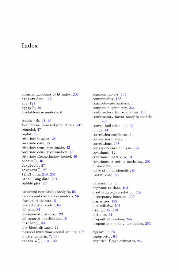
Index
adjusted goodness of fit index, 205airdist data, 112ape, 121apply(), 19available-case analysis, 6
bandwidth, 43, 46Best linear unbiased predictions, 247bimodal, 47biplot, 92bivariate boxplot, 28bivariate data, 27bivariate density estimate, 42bivariate density estimation, 45bivariate Epanechnikov kernel, 46bkde2D(), 46boxplot(), 27boxplots(), 27BtheB data, 248, 251BtheB_long data, 251bubble plot, 34
canonical correlation analysis, 95canonicaml correlation analysis, 96characteristic root, 64characteristic vector, 64chi-plot, 34chi-squared distance, 129chi-squared distribution, 18chiplot(), 34city block distance, 24classical multidimensional scaling, 106cluster analysis, 7, 14cmdscale(), 110, 130
common factors, 135communality, 138complete-case analysis, 5compound symmetry, 234confirmatory factor analysis, 135confirmatory factor analysis models,
201convex hull trimming, 32cor(), 14correlation coefficient, 14correlation matrix, 6correlations, 138correspondence analysis, 127covariance, 12covariance matrix, 6, 13covariance structure modelling, 201crime data, 176curse of dimensionality, 61CYGOB1 data, 46
data mining, 3depression data, 103disattenuated correlation, 209discrepancy function, 202disparities, 122dissimilarity, 105dist(), 15, 110distance, 14dropout at random, 254dropout completely at random, 253
eigenvalue, 64eigenvector, 64empirical Bayes estimates, 247
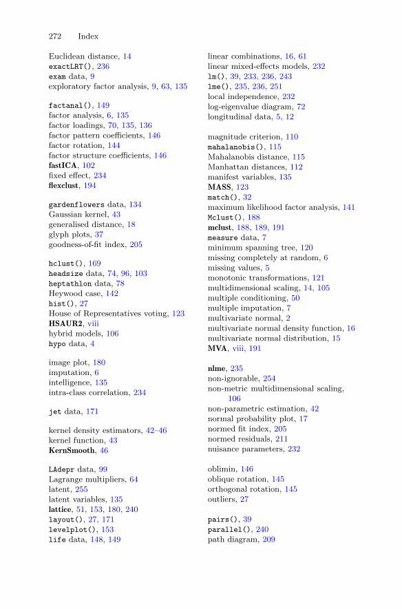
272 Index
Euclidean distance, 14exactLRT(), 236exam data, 9exploratory factor analysis, 9, 63, 135
factanal(), 149factor analysis, 6, 135factor loadings, 70, 135, 136factor pattern coefficients, 146factor rotation, 144factor structure coefficients, 146fastICA, 102fixed effect, 234flexclust, 194
gardenflowers data, 134Gaussian kernel, 43generalised distance, 18glyph plots, 37goodness-of-fit index, 205
hclust(), 169headsize data, 74, 96, 103heptathlon data, 78Heywood case, 142hist(), 27House of Representatives voting, 123HSAUR2, viiihybrid models, 106hypo data, 4
image plot, 180imputation, 6intelligence, 135intra-class correlation, 234
jet data, 171
kernel density estimators, 42–46kernel function, 43KernSmooth, 46
LAdepr data, 99Lagrange multipliers, 64latent, 255latent variables, 135lattice, 51, 153, 180, 240layout(), 27, 171levelplot(), 153life data, 148, 149
linear combinations, 16, 61linear mixed-effects models, 232lm(), 39, 233, 236, 243lme(), 235, 236, 251local independence, 232log-eigenvalue diagram, 72longitudinal data, 5, 12
magnitude criterion, 110mahalanobis(), 115Mahalanobis distance, 115Manhattan distances, 112manifest variables, 135MASS, 123match(), 32maximum likelihood factor analysis, 141Mclust(), 188mclust, 188, 189, 191measure data, 7minimum spanning tree, 120missing completely at random, 6missing values, 5monotonic transformations, 121multidimensional scaling, 14, 105multiple conditioning, 50multiple imputation, 7multivariate normal, 2multivariate normal density function, 16multivariate normal distribution, 15MVA, viii, 191
nlme, 235non-ignorable, 254non-metric multidimensional scaling,
106non-parametric estimation, 42normal probability plot, 17normed fit index, 205normed residuals, 211nuisance parameters, 232
oblimin, 146oblique rotation, 145orthogonal rotation, 145outliers, 27
pairs(), 39parallel(), 240path diagram, 209
Index 273
path.diagram(), 209plasma data, 228, 240plot(), 27posterior probability, 247pottery data, 8principal components, 61principal components analysis, 7, 61principal coordinates, 109principal factor analysis, 141probability plot, 16probability-probability plot, 16promax, 146proximity, 105
qchisq(), 19quantile-quantile plot, 16quartimax, 146
random effects, 232random intercept, 232random intercept and slope, 232random intercept model, 233random slope and intercept model, 234random variables, 2random.effects(), 246rectangular kernel function, 43reduced covariance matrix, 141repeated-measures data, 12reshape(), 226resid(), 246restricted maximum likelihood, 235RLRsim, 236robust estimation, 32root-mean-square residual, 205rug(), 27
sapply(), 20scale(), 15scatterplot, 26scatterplot matrix, 39scatterplot3d, 47
sem, 207, 208Shepard diagram, 124similarity matrices, 105single-factor model, 136skulls data, 114smoothing parameter, 43social class, 135spatial models, 106specific variates, 137spectral decomposition, 70structural equation modelling, 6, 201structural relationships, 65subject-specific random component, 233subset(), 13
teensex data, 130text(), 22timber data, 227time-varying covariates, 232trace criterion, 109tree models, 106Trellis graphics, 50triangular kernel function, 43Tucker-Lewis index, 205
unidentifiable, 203unobserved, 255USairpollution data, 10
var(), 13variance component model, 234variance-covariance matrix, 13varimax, 146voting data, 124
watervoles data, 118Windows, in kernel density estimation,
43with(), 27WWIIleaders data, 124