alberto cairo* introduction - power from...
TRANSCRIPT
Uncertainty and graphicacy: How should statisticians, journalists, and designers reveal uncertainty in graphics for public consumption?Alberto Cairo*
(*) University of Miami
INTRODUCTIONIn January 2012, I moved to Florida to teach at the University of Miami. One of the first recommendations I got from local friends was to always pay attention to forecasts during hurricane season.
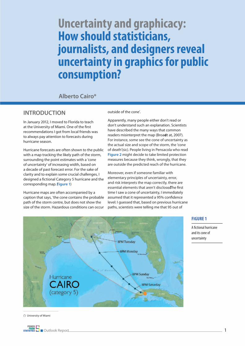
Hurricane forecasts are often shown to the public with a map tracking the likely path of the storm, surrounding the point estimates with a ‘cone of uncertainty’ of increasing width, based on a decade of past forecast error. For the sake of clarity and to explain some crucial challenges, I designed a fictional Category 5 hurricane and the corresponding map. (Figure 1)
Hurricane maps are often accompanied by a caption that says, ‘the cone contains the probable path of the storm centre, but does not show the size of the storm. Hazardous conditions can occur
outside of the cone’.
Apparently, many people either don’t read or don’t understand such an explanation. Scientists have described the many ways that common readers misinterpret the map (Broad et at., 2007). For instance, some see the cone of uncertainty as the actual size and scope of the storm, the ‘cone of death’(sic). People living in Pensacola who read Figure 2 might decide to take limited protection measures because they think, wrongly, that they are outside the predicted reach of the hurricane.
Moreover, even if someone familiar with elementary principles of uncertainty, error, and risk interprets the map correctly, there are essential elements that aren’t disclosed. The first time I saw a cone of uncertainty, I immediately assumed that it represented a 95% confidence level: I guessed that, based on previous hurricane paths, scientists were telling me that 95 out of
Outlook Report 1
FIGURE 1
and its cone of uncertainty

Outlook Report2
Uncertainty and graphicacy
100 times, the path of my namesake hurricane would be within the boundaries of the cone of uncertainty.
I was shocked when I discovered my mistake. The confidence level of the cone of uncertainty is just 66%. Translated to language that normal human beings like me can understand, this means that 1 out of 3 times the path of the hurricane could be outside of the cone. That’s a lot. I can’t help but connect this 1/3 forecast to Donald Trump’s victory in the 2016 presidential election. Many models had given him exactly that chance (others gave him 15%, which is also quite high, roughly like rolling any single number on a 6-sided dice), but many Americans were surprised anyway.
I began thinking about how we could better convey the uncertainty without using the cone. Figure 3 is based on a series of lines showing different possible paths, coloured with a darker-lighter gradient proportional to higher and lower probabilities.
Then I realized that this didn’t address one of the challenges of the original map: It does show possible paths the hurricane could take, but it doesn’t say anything about its possible diameter, which is something that can also be estimated. The problem? If we overlay the storm itself over its possible paths, we may experience a strong backfire effect in the form of “scientists know nothing! This thing could go anywhere!” (Figure
FIGURE 2
When presented with the cone of uncertainty, some readers see the boundaries of a storm.
FIGURE 3
An alternative map of the hurricane path forecast

Outlook Report 3
Uncertainty and graphicacy
4), even if this is exactly the reality of the forecast model.
Being incapable of creating anything helpful, I concluded that sometimes it might be better to just communicate a clear message to people, like in Figure 5, edited to make it appropriate for audiences of all ages (Saunders and Senkbeil).
THE BIG CONUNDRUM: GRAPHICACY AND UNCERTAINTY
This personal story illustrates the main problem I see in communicating uncertainty to the public, particularly through visual means like charts,
graphs, or data maps. On one hand, representing the fuzziness of data is essential, the ethical thing to do for scientists, designers, and journalists. On the other hand, we may be doing it for audiences who don’t really grasp what they are seeing, either because they don’t understand uncertainty or because they have little knowledge of the grammar and vocabulary of visualization.
They lack ‘graphicacy’, the term I favour to refer to graphical literacy.
In the past decade, there has been an ongoing debate in the visualization community about the best ways to visualize uncertainty. In a broad overview of the discussion, Bonneau et.al. (3)
FIGURE 4
Overlaying the possible size of the storm may be more confusing than helpful
FIGURE 5
A clearer message to the public?

Outlook Report4
defined uncertainty as the ‘lack of information’ due to factors like randomness (aleatoric uncertainty) or lack of knowledge (epistemic uncertainty) and described three sources of it: the sampling of the data, the models based on it, and the visualization process itself. They then described several popular methods of revealing uncertainty. Being a visualization professional and scholar myself, I’m an advocate for using these methods and inventing others.
However, the second part of the aforementioned problem worries me much more: Most people can’t wrap their head around elementary notions of uncertainty and visualization.
MISUNDERSTANDING UNCERTAINTY
On April 28, 2017, Bret Stephens, a conservative writer notorious for his denialist positions on climate change, published his first column in The New York Times. It was titled “Climate of Complete Certainty” (4) and its main point was that because all forecast models are faulty, we should hold judgment about what measures to implement now to prepare for a future in which temperatures may be higher and sea levels may rise.
Here’s a representative paragraph:
Anyone who has read the 2014 report of the Intergovernmental Panel on Climate Change knows that, while the modest (0.85 degrees Celsius, or about 1.5 degrees Fahrenheit) warming of the earth since 1880 is indisputable, as is the human influence on that warming, much else that passes as accepted fact is really a matter
of probabilities. That’s especially true of the sophisticated but fallible models and simulations by which scientists attempt to peer into the climate future. To say this isn’t to deny science. It’s to acknowledge it honestly.
The Times received complaints about the first half of this paragraph. Stephens’ ‘modest’ increase of 0.85 degrees in average temperature is likely the largest and fastest—it happened in little more than a century—in the past 10,000 years (Marcott, 2013) (5).
The second half of the paragraph got less attention, though, perhaps because it sounds reasonable to uninformed ears, even being misleading, too. What Stephens conveniently forgot to mention is that, with no exceptions I’m aware of, all models predicting climate change-related variables such as CO2 concentrations, global temperatures, and sea level rise have indeed large degrees of uncertainty, but they all also point in the same direction: upward (Figure 6). Another convenient omission is that uncertainty cuts both ways: future sea level rise, temperatures, or CO2 emissions could be lower than predicted but, with equal probability, they could be higher.
Stephens’ column illustrates the fact that a good chunk of the general public—this includes journalists—sees science as either ‘indisputable’ facts or ‘fallible’ probabilistic models that aren’t better than mere opinions.
That kind of binary thinking is pervasive, and it needs to be addressed at all educational levels: How do we teach people from a younger age that science is always a probabilistic work in
Uncertainty and graphicacy
FIGURE 6
Sea level rise according to the IPCC report of 2013. Two scenarios, called RCP8.5 and RCP2.6, are shown in red and blue, with their corresponding uncertainty (66% confidence).

Outlook Report 5
progress but, as faulty and limited as it is, it’s also by far the best set of methods we have to fathom reality? How do we make the public accept at last that any assertion in science is always imperfect, incomplete, and likely to evolve —but also that a scientific theory is never a ‘theory’ in the common sense of the word, equal to mere ‘opinion’?
Sometimes, uncertainty is completely overlooked, even if people are aware of its existence. The following is a case I discuss in one of my books about data visualization (6). On December 19, 2014, the front page of Spanish national newspaper El País read “Catalan public opinion swings toward ‘no’ for independence, says survey” (7).
Historically, the population of Catalonia has been more or less evenly divided between those who want the region to become a new country and those who don’t, with a slight majority of the former. For the first time in many years, El País said, the ‘no’ surpassed the ‘yes’ in the periodical opinion survey conducted by the Centre d’Estudis d’Opinió (CEO), run by the government of Catalonia.
The data, though, revealed a different picture. Out of a random sample of 1,100 people, 45.3% said indeed that they opposed independence, and 44.5% said that they favoured it. However, the margin of error was quite large (+/-2.95), enormous in comparison to the tiny difference between those percentages, so the journalists who wrote that story shouldn’t have said that Catalonia swung toward ‘no’. All they could have said is that the ‘yes’ to independence lost support in the past five or six years and that ‘yes’ and ‘no’ were tied.
MISREPRESENTING UNCERTAINTY
A common misconception about visualization is that it consists of pictures that can be interpreted intuitively. Many believe this because they conceive of visualizations as mere decorative illustrations and are used to seeing just bar graphs, time-series line graphs, pie charts, choropleth maps, and proportional symbol maps. They consider them ‘easy to read’ because they are graphic forms with a history of hundreds of years.
My guess is that the process of widespread adoption of graphic forms follows a trickle-down process: (a) a pioneer invents a way of encoding and showing data, (b) a small community of experts adopts it, (c) eventually the media tentatively tries to use it as well, (d) by being constantly exposed to the new graphic form, the general public begins seeing it as ‘intuitive’.
The first maps representing data appeared around the 17th Century (Robinson, 1982) (8), and between 1786 and 1801 William Playfair published his foundational Commercial and Political Atlas and Statistical Breviary, the first books to systematically use—and explain—visuals such as the time-series line graph, the bar graph, the pie chart, and the bubble chart (Spence, 2006) (9) (Figure 7).
Reading graphs and charts is far from intuitive. Visualizations are based on a grammar and an ever-expanding vocabulary (Wilkinson) (10). Decoding them requires at least a basic grasp of their components, such as axes and labels, and their conventions, like the fact that data is mapped onto spatial properties of objects—their height,
Uncertainty and graphicacy
FIGURE 7
A graph from William Playfair’s Commercial and Political Atlas, 1786

Outlook Report6
length, size, angle, or colour. Borrowing from cartographer Mark Monmonier, who has written extensively about visual communication, I like to call this skill ‘graphicacy’, as a fourth component of a well-rounded education, alongside literacy, articulacy, and numeracy.
Learning to read graphics is, in this sense, akin to learning how to read written language: the first time anyone faced a time-series line graph—a graphic that contemporary middle school students see and draw on a regular basis—she was probably puzzled. That’s why Playfair himself, quite wisely, wrote explanations of how to read his inventions in his books. He knew people at the time were used to seeing data depicted just as numerical tables.
This is an example of Playfair defending the time-series line graph against potential skeptical readers:
The advantage proposed by this method, is not that of giving a more accurate statement than by figures, but it is to give a more simple and permanent idea of the gradual progress and comparative amounts, at different periods, by representing to the eye a figure, the proportions of which correspond with the amount of the sums intended to be expressed.
The vocabulary of visualization has increased mightily since the early data maps and Playfair’s books. Michael Friendly talks of a first “Golden Age” of statistical graphics (Friendly) (11), which spanned roughly between 1850 and 1900. This was the time of Florence Nightingale’s polar-area
diagrams, Charles Joseph Minard’s famous maps (Figure 8), or Francis Galton’s multiple inventions, the scatter plot among them.
According to Friendly, this ‘Golden Age’ was followed by a ‘Dark Age’, in which graphics were abandoned by statisticians and researchers as mere ornaments.
I’d argue that a second Golden Age of visualization began in the 1960s and 1970s, with the work of people such as Jacques Bertin, author of The Semiology of Graphics (1967), and John W. Tukey, author of Exploratory Data Analysis (1977). The timeline on Figure 9 is a rough summary of these ages.
After five decades, we still live in this second Golden Age. Websites like the Data Visualization Catalogue (http://www.datavizcatalogue.com/) list more than 60 different charts and graphs, and this is with no intention of being comprehensive: Some recent inventions, such as the funnel plot (created in 1984), the lollipop graph (a variation of the bar graph), the horizon graph (a time-series graphic concocted for data sets with high variation), or the cartogram (a data map in which regions are distorted and scale according to variables like population) are missing.
But this second Golden Age has two classes of citizens: experts and the rest of the population. Experts like statisticians, scientists of all kinds, data journalists, business analysts, etc., are reasonably well acquainted with the visualization vocabulary. The general public isn’t.
Uncertainty and graphicacy
FIGURE 8
An 1858 map by Charles Joseph Minard showing cattle sent to Paris from the rest of France.

Outlook Report 7
A survey by the Pew Research Center revealed that around six in ten of American adults could interpret a scatter plot correctly (12). That leaves four out of ten people who have trouble decoding a graphic that has been around at least since Sir Francis Galton decided to display the relationship between head circumference and height (Friendly and Denis) (13) in the context of his studies about heritability and regression. This happened almost a century and a half ago, but the ability to read a scatter plot doesn’t seem to have trickled down completely yet.
Why is this relevant? Because the methods to represent uncertainty graphically—error bars, gray backgrounds, color gradients, etc.—are much more modern than the scatter plot, so they have had not centuries, but just a few decades, to become popularized.
The sixty-year gap between Friendly’s first Golden
Age (1850-1900) and my proposed second Golden Age (from 1960 on, roughly) is crucial to understand my argument. Friendly’s “Dark Age” of statistical graphics (1900-1960) coincided with the golden age of inferential statistics, to which the study of uncertainty is closely tied. As a matter of mere coincidence perhaps, Sir Ronald Fisher was born in 1890 and died in 1962. His The Design of Experiments was published in 1935.
This may explain the troubles that people have interpreting bread-and-butter visual depictions of uncertainty like error bars (Correll and Gleicher, 2014) (14) or gray areas behind line charts, like the one on the famous “hockey-stick” chart of average global temperatures between the years 1000 and 2000 (Yoo) (15) (Figure 10).
When seeing graphs and charts like this, too many readers don’t see standard deviations (two, in the case of the hockey stick chart), confidence
Uncertainty and graphicacy
FIGURE 9
A timeline of the two Golden Ages and the Dark Age of visualization
FIGURE 10
The ‘hockey stick’ chart, by Michael E. Mann, Raymond S. Bradley, and Malcolm K. Hughes, appeared in the IPCC Third Assessment Report (2001)

Outlook Report8
Uncertainty and graphicacy
intervals, or probability distributions, but an either-or illustration: the “true”—whatever that means—value is inside the error area, with equal chances of being anywhere within its boundaries, and no chance that it may lie beyond them.
Are non-specialised readers stupid? No, they aren’t. That’s exactly what these graphics suggest, visually speaking. The only reason some of us know better, and can often (not always) read them properly, may be that we grasp what someone means when discussing uncertainty. We can see more than what graphics show because our pre-existing knowledge allows us to.
We may be trying to convey a 20th Century message with 19th Century tools to minds that are stuck in earlier centuries. What to do, then?
WHAT CAN STATISTICIANS, JOURNALISTS, OR DESIGNERS DO TO BETTER CONVEY UNCERTAINTY AND INCREASE GRAPHICACY?
Here are some tentative and preliminary suggestions of what communities interested in the proper depiction of data and evidence can do:
1. Discuss and visualise uncertainty when uncertainty is a crucial component of a truthful and informative messageWhen is uncertainty informative? It always is, of course. When communicating any message based on data to the general public, it is paramount to be transparent about all sources of uncertainty listed at the beginning of this chapter, regardless of whether they can be quantified or not.
However, the place for this discussion may change depending on the relevance of uncertainty to preserve the truthfulness of the message: If it is essential, it ought to be shown clearly and prominently; if it doesn’t affect the message much, it can be relegated to an appendix or footnote.
Go back to the example from El País discussed above. Imagine that we displayed the values on a graph. Should we add error bars or any other way of showing the 95% confidence intervals? I believe we should, as only then would readers be able to see how much the “Yes” and the “No” overlap and the fact that the slight difference between the two is likely just due to sampling error, which could be explained textually (Figure 11).
Imagine that in the story this graphic belongs to we added a couple of paragraphs like this:
When conducting surveys, researchers randomly select a sample of the population they want to study, 1,100 people in this case. If the sample is correctly designed, it’ll be representative of the population as a whole, but never perfectly representative. There will always be some level of uncertainty, or ‘sampling error’, often expressed as “the margin of error at the 95% confidence level is +/-2.95, which we can round to +/- 3.”
This sounds like a word salad, but it’s actually easy to understand: What researchers are telling you is that they estimate that if they could conduct the same survey 100 times with different samples of exactly the same size, in 95 of them the actual percentages for the ‘Yes’ and the ‘no’ in the Catalonian population would be between a range of roughly 3 percentage points higher or lower than those 44.5% and 45.3% .
In other words, in 95 surveys out of 100, the ‘Yes’ is between 41.5% and 47.5%, and the ‘No’ is between 42.3% and 48.3%. The researchers can’t say anything about the other imaginary 5 surveys. In those, the values for ‘Yes’ and ‘No’ could be above or beyond those ranges.
As you’ll notice in the chart, the difference between the percentages for ‘No’ and ‘Yes’ is much smaller than the margin of error. In cases like this, often (not always) the difference may be simply non-existent.
Clunky and cumbersome? Perhaps. It could use some serious editing. But this is exactly what news organisations, which best use data in their
FIGURE 11
Charts showing the uncertainty of El País’s story

Outlook Report 9
Uncertainty and graphicacy
reporting, —places like The New York Times, FiveThirtyEight, or ProPublica—are doing in their stories. They don’t just report point estimates and uncertainty, but they explain how to interpret them.
This has two main benefits: First, it fits into the narrative. It’s a crucial piece in El País story, as sampling error renders the differences almost meaningless. Second, it increases numeracy among the general public. I still remember the first time I grasped concepts like the standard deviation or statistical significance. It was thanks to non-technical explanations in popular outlets, not in textbooks.
Now let’s think of the opposite case: Imagine that in El País story, the difference between both percentages was much larger and statistically significant, like 45.3% ‘No’ and 30% ‘Yes’. Would visualising the uncertainty or explaining what a margin of error is add anything to the story? I’d argue that not much.
It’s in cases like this when we can relegate these elements to a secondary space, like a footnote, an appendix, or a methodology section written in fine print. We ought not to conceal uncertainty completely, but we shouldn’t gratuitously let it interfere with the flow of a story or clutter a graph for no good reason.
2. Use modern methods of representation of uncertainty but include little explanations of how to read them and interpret them
During my career as a journalist in Spain, Brazil,
and the U.S., one of the objections I’ve faced more often when trying to employ unusual graphic forms in newspapers or magazines was that “our reader” would have a hard time understanding them.
This is a legitimate concern. As discussed above, the first time we see a novel graph, chart, or map, it’s unlikely that we’ll know how to read it at a glance. Before we can decode a graphic, we need to understand its logic, grammar, and conventions.
William Playfair added written explanations to his graphs, the same way that the anonymous author of Figure 12, published in 1849 by The New York Daily News, wisely wrote a caption describing exactly what the graph already shows.
Why did the designer feel the need to be that redundant? Because he knew that most of his readers would probably had never seen a time-series graph before. Sometimes, how-to-read explanations can combine textual and visual elements, like on Figure 13, a graphic on air quality levels by visualization designer Andy Kriebel.
The same way that explaining uncertainty helps increase numeracy among the public, verbalizing how to read a graph, chart, or map, as redundant as it may sound, can increase graphicacy. The first time readers face a complex-looking new graphic, they will surely feel puzzled but if someone explains it to them, next time they will be able to read it ‘intuitively’. This is applicable to methods of representing point estimates and
FIGURE 12
Source: Scott Klein https://www.propublica.org/nerds/item/infographics-in-the-time-of-choleray

Outlook Report10
Uncertainty and graphicacy
uncertainty, summarized by authors like Pew Research Center’s Diana Yoo (Figure 14)(15). We should use them, but also tell the public what it is that they are seeing.
3. Embrace simplicityIncreasing graphicacy among the public and communicating uncertainty will require scientists and designers to be clear without being simplistic. Conveying complex ideas is always based on a trade-off between simplicity and depth. We can follow Albert Einstein’s classic dictum “Everything should be made as simple as possible, but not simpler,” which apparently derived from this longer quote:
It can scarcely be denied that the supreme goal of all theory is to make the irreducible basic elements as simple and as few as possible without having to surrender the adequate representation of a single datum of experience.
Einstein was referring to science, but I believe that this can be repurposed as a rule for visual design or written communication: Strive to be concise, but not to the point that the act of reducing complexity compromises the integrity of your message.
In my books, inspired by designer Nigel Holmes, I wrote that I prefer the verb “to clarify” instead of “to simplify”, as simplification is commonly equated to gross reduction of complexity. To clarify, sometimes we need to indeed reduce the amount of information we show, but very often we need to increase it instead, to put data
in its proper context. Remember, for instance, how inadequate averages like the mean or the median can be to represent their underlying data sets. If a distribution has a very wide range, or if its shape is skewed or bimodal, an average alone can be a very misleading means to represent it.
In his book Risk Savvy (2014) psychologist Gerd Gigerenzer asks us to read the following hypothetical statistics and then infer the probability of your having breast cancer if you test positive in a mammography:
Around 1% of women who are 50 or older have breast cancer.
You are a woman in that age group and you take a mammography that has an effectiveness of 90% if you have cancer.
If you don’t have breast cancer, the mammography will still yield a positive result 10% of the time. These are false positives.
You get a positive in the mammography. What is the probability that you have breast cancer?
Go ahead, try to solve that. It’s hard, isn’t it? Many people say that the probability is 90%, as they stick to the effectiveness of the test alone. Again: Are people stupid? No. The problem isn’t them, but the design of the message itself. Humans evolved to count things, not to engage in probabilistic reasoning.
Gigerenzer then suggests we use natural frequencies—“a 1 out of 5 chance” rather than
FIGURE 13
Air quality levels by state, by Andy Kriebely

Outlook Report 11
Uncertainty and graphicacy
“a 20% chance”— and proposes presenting the same problem translating the percentages above into counts. In parentheses below I put the original percentages:
In any group of 1,000 women 50 or older, roughly 10 have breast cancer, and 990 don’t (prevalence is 1%).
Of the 10 who do have breast cancer, 9 will get a positive in a mammography, and one will test negative (this is the 90% effectiveness of the test).
Of the 990 who don’t have breast cancer, 99 will
also test positive anyway (10% of tests are false positives).
It is much more likely that you are among the 99 who tested positive without having cancer than among the 9 who also tested positive and have cancer. The probability of your having cancer even after getting a positive in a test is quite low: 9 out of 108 (this 108 is the result of adding up all women who tested positive, both those who do have cancer and those who don’t).
Both messages require readers to pay attention,
FIGURE 14
14: Ways of showing error. Graphic by Diana Yoo
FIGURE 15
Based on “Visualizing Uncertainty About the Future” by David Spiegelhalter, Mike Pearson, and Ian Short: http://science.sciencemag.org/content/333/6048/1393

Outlook Report12
Uncertainty and graphicacy
but the second one is more attuned to what normal human brains can do, particularly if we do it graphically, as in Figure 15. The most effective messages are often those that combine the verbal —someone explaining the information to you with patience and care— and the visual, an aid that takes care of part of the mental effort of picturing all those figures and memorizing them. A visualisation, after
all, is a tool that expands both our perception and our cognition (Spiegelhalter et al.) (16). Take advantage of it.
Acknowledgements
Special thanks go to: Caitlyn McColeman, Travis Dawry, Nathanael Aff, Hayley Horn, Stephen Key, Claude Aschenbrenner, Nick Cox, Andy Kriebel, Diana Yoo, Scott Klein
References:● “Misinterpretations of the “Cone of Uncertainty” in Florida during the 2004 Hurricane Season.”
BY KENNETH BROAD, ANTHONY LEISEROWITZ, JESSICA WEINKLE, AND MARISSA STEKETEE. In AMERICAN METEOROLOGICAL SOCIETY, May 2007, DOI:10.1175/BAMS-88-5-65
● Many authors are working on new methods to address this challenge. See, for instance “Perceptions of hurricane hazards in the mid-Atlantic region” by Michelle E. Saunders and Jason C. Senkbeil: https://www.google.com/url?sa=t&rct=j&q=&esrc=s&source=web&cd=1&ved=0ahUKEwiYzv73xe3UAhWhwVQKHQ_gA0cQFggoMAA&url=http%3A%2F%2Fonlinelibrary.wiley.com%2Fdoi%2F10.1002%2Fmet.1611%2Fpdf&usg=AFQjCNEkLbEYNw2u1zh4o-EdJ6QHpjjcfw
● A good introduction is “Overview and State-of-the-Art of Uncertainty Visualization”: http://www.sci.utah.edu/publications/Bon2014a/Overview-Uncertainty-Visualization-2015.pdf
● https://www.nytimes.com/2017/04/28/opinion/climate-of-complete-certainty.html
● “A Reconstruction of Regional and Global Temperature for the Past 11,300 Years.” Science 339, 1198 (2013). Shaun A. Marcott et al. DOI: 10.1126/science.1228026
● The Truthful Art: Data, Charts, and Maps for Communication. Peachpit Press, 2016.
● https://elpais.com/elpais/2014/12/19/inenglish/1419000488_941616.html
● Early Thematic Mapping in the History of Cartography. Arthur H. Robinson. University of Chicago Press, 1982.
● “William Playfair and the Psychology of Graphs.” Ian Spence: http://www.psych.utoronto.ca/users/spence/Spence%20(2006).pdf
● Not surprisingly, one of the best books about visualization ever written is titled The Grammar of Graphics, by Leland Wilkinson.
● “The Golden Age of Statistical Graphics.” Michael Friendly: https://arxiv.org/pdf/0906.3979.pdf
● “The art and science of the scatterplot” http://www.pewresearch.org/fact-tank/2015/09/16/the-art-and-science-of-the-scatterplot/
● “The early origins and development of the scatter plot.” Michael Friendly and Daniel Denis: http://datavis.ca/papers/friendly-scat.pdf
● “Error bars considered harmful: Exploring Alternate Encodings for Mean and Error.” Michael Correll and Michael Gleicher: https://graphics.cs.wisc.edu/Papers/2014/CG14/Preprint.pdf● Diana Yoo, Pew Research Center: “Visualizing uncertainty in a changing information environment” https://www.dropbox.com/s/7z52g557qxlq7tg/6Visualizing%20uncertainty%20-%20DY%20FINAL.pdf?dl=0
● The diagram is based on “Visualizing uncertainty about the future” by David Spiegelhalter, Mike Pearson, and Ian Short: http://science.sciencemag.org/content/333/6048/1393