aesthetics in information visualization - lmu münchen · aesthetics in information visualization...
TRANSCRIPT
Aesthetics in Information VisualizationAlexander Lang
Abstract— The importance of visualization in conveying knowledge is undisputed. For example, the rise and fall of stocks is pro-cessed and understood faster by examining the corresponding line graph than looking at the raw underlying numbers. For theeffectiveness of this cognitive process several factors have been identified in research, like for example the background knowledge,as well as its inherent aesthetics qualities. This text focuses on the latter. It has been argued that the higher the aesthetic value ofthe visualization is, the more engaged the viewer is in trying to decode its meaning. But what does “aesthetics” mean? Does an infor-mative graphic have to be artistic to be effective? Since the perception of aesthetics is a highly subjective matter, what kind of effortshould be put into creating a visualization? What connections between aesthetics and information visualization exist anyway? Thesequestions are the subject of the following text. It starts with an introduction to the relevant terms and subfields of aesthetic informationvisualization research. It then proceeds with a discussion of several examples of information visualization that were created with astrong aesthetic concern. Since these results often resemble works of art, finally their artistic value is debated.
Index Terms—Information, Visualization, Aesthetics, Art
1 INTRODUCTION
Our society is defined by information. Every day we create vastamounts of data and transport them through many channels oftelecommunication. In order to process the vast amount of data werely on the power of visualization. With graphs we are able to gain in-sight in the data, by detecting patterns and trends and are able to checkand verify the data.
As computers have become ubiquitous, so has the display ofcomputer-generated and processed data.
Technological advancements in display technology have con-tributed to that development. The price of liquid crystal displays hasfallen dramatically over the last years and even LC- and DLP projec-tors are affordable to many households. In the near future we can ex-pect technologies like organic displays and E-ink based displays withadvantages like less power consumption, less noise, richer contrast andcolors and more.
“The purpose of visualization is insight, not pictures.”[28]
As true as this statement is, there has been a rising interest in creatingvisualization that should have an aesthetic quality. More and morepeople are able today to create visualizations that are more than barand pie charts out of MS Excel data.
Software like Adobe Flash and the programming environment Pro-cessing are targeted at the designers with little programming experi-ence and facilitate the process of creating a graphic representation.
Cheap hardware, easy-to-use software tools, growing internet com-munities and the availability and democratization of data[35] have allcontributed to the fact that creating visualizations is as easy as neverbefore.
But are these all good visualizations? By what means can the qual-ity of a visualization be measured anyway? Edward Tufte discussedthat matter already some 20 years ago in his groundbreaking book TheVisual Display of Quantitative Information[33].
Aesthetics has been found as an important aspect. Several worksof research propose that “enhancing the artistic merit of a visual-ization can result in a more effective and more productive visualanalysis.”[31]. There is more to the display than efficiency of com-municating data. Visualizations can also be used to convey culturaland social messages and concerns.
• Alexander Lang is studying Media Informatics at the University ofMunich, Germany, E-mail: [email protected]
• This research paper was written for the Media Informatics AdvancedSeminar on Information Visualization, 2008/2009
The following text presents an overview of the aesthetic and artisticaspects in information visualization. It first provides an overview ofthe terms aesthetics, art, and information visualization and then tries tocombine them by explaining different models of information aesthet-ics that have been identified in previous literature. Several subfieldswith different aims and aspects are presented, namely Artistic Infor-mation Visualization and Ambient Information Visualization. AmbientInformation Visualization is about making the display of informationmore humane and integrative to our lives. Several examples of infor-mation visualization with aesthetic or artistic concern are discussed.Finally the implications of Aesthetic Information Visualization on artand vice versa are explored.
2 OVERVIEW
2.1 Information VisualizationInformation visualization is defined as the graphical representation ofabstract data. It therefore differs from scientific visualization whichvisualizes real-world phenomena, like the human body or the flow ofair[17]. Several key criteria for an information visualization have beenproposed[17]:
• The data are external, that is they were not generated by an algo-rithm within the visualization program
• The source data are not an image itself
• The graphic must be readable, that is the viewer should be able totransfer the graphic representation back to the underlying values,(that process may require some learning effort, though)
In terms of intended aim two modes can be identified: exploratoryand expository aim of use. If the visualization is used to explore thedataset, that is find new hypotheses, then the visualization should dis-play the dataset in its entirety and offer interactivity by zoom and filtermechanisms. If the visualization has the aim to expose a certain is-sue, then interaction is often limited and only the data necessary toconvey the intended message is represented. What qualities should agood visualization have and how can it be qualified? Traditionally, thevalue of information visualization is measured by how efficiently andeffectively knowledge is conveyed [34].
“Effectively designed visual representations facilitate theunderstanding of complex phenomena by selectively em-phasizing the most important features and relationshipswhile minimizing the distracting effects of extraneous de-tails.” [26]
The graphic should present the information in a way that catches theviewer’s attention, facilitates reading of the data and enables the user
to detect underlying patterns and trends. The key purpose of the graph-ical representation is thereby to enhance cognition by offloading “themental internal representations onto an external medium to relieve thecognitive burden and speed up processing.” [32] Although severalguidelines exist, research strives for a better understanding of the cre-ation of an efficient visualization.
2.2 AestheticsWhat is aesthetics? How is it defined and how can it be measured?No definite answer can be given, in fact these questions have been thetopic of philosophic discussions since the 18th century. Kant, Adorno,Goodman, and many more elaborated on aesthetics and its role in so-ciety. The term “aesthetics” is well known in everyday-speech andwe use it to refer to anything visually beautiful and pleasing our eyes.Aesthetics has been termed as “the measurement of beauty”[27]. Al-though aesthetics is not only about beauty or vision but of the stirringof any combination of the senses that causes pleasure in the viewer.Beauty has been regarded “as one of the many facets of an aestheticexperience” [8] with other key components being pleasantness, emo-tions and satisfaction[27]. It has been defined as “pleasurable sub-jective experience that is directed toward an object and not mediatedby intervening reasoning.”[24] Studies in perceptual psychology haveidentified several views on the aesthetic experience[24]:
• The objectivist view regards beauty as an imminent property ofan object that produces a pleasurable experience to any viewer.Several features are thought to contribute to it and determine it,like symmetry, balance, complexity, figure-ground-contrast andmore. For example a symmetrical object would be more beauti-ful than an asymmetrical one.
• The subjectivist view holds that anything can be beautiful, alldepends on the viewer and his cognitive and cultural background.
Another view considered more modern is a combination of the pre-vious two. It has been proposed “that beauty is grounded in theprocessing experiences of the perceiver that emerge from the inter-action of stimulus properties and perceivers cognitive and affectiveprocesses.”[24] The perception of beauty can therefore be explained asfunction of how fluently a viewer can process an object. Important arehereby the two phases of recognition that have been identified[10][36]:
• The preattentive phase denotes the low-level process that hap-pens before the conscious attention and that processes sensoryinformation and
• the interpretative phase that processes arbitrary information, thatis representation that must be learned, for example the appear-ance of a word like “dog” has nothing to do with the appearanceof the animal[36] or the metaphor color (red as hot/dangerous,green as safe, blue as cold)[6]
Aesthetics therefore has also been described as the “combination ofcognitive and sensory modes of experience [..]”[8]. Several cognitiveaspects have been proposed and examined, for example in graph de-sign, symmetry, relations according to the Golden Ratio and a minimalnumber of bends and edge crossings are desirable[8][4]. A minimumof complexity is strongly favoured by E. Tufte. He rejects the useof “chart-junk”, that is, elements in a graph that do not convey data.Other researchers argue, based on empirical testing, that the minimaldesigns are not the preferred ones, thereby indicating a lower aestheticappreciation[12].
Above guidelines are only hints to follow while creating a visualiza-tion. Some like the Gestalt principles can be based on the very humanperception. But in the end the highly subjective nature of aesthetic as-sessment renders it impossible to create a definitely measurable resultthat is equally appreciated. Integrating aesthetics in information visu-alization is yet one of the ten most important unresolved questions inthis field[3].
So why is aesthetics an important factor in information visual-ization? Aesthetics has been identified as a key factor to engage a
viewer[31]. Once the viewer is analyzing the graphic, it has beenshown that a correlation exists between latency in task abandonmentand erroneous response time (that is the time until a false informationis extracted) in relation to the perceived aesthetic of visualizations [2].Therefore the more aesthetically a graphic is perceived, the longer theviewer will try to decode the meaning of it or extract a certain infor-mation.
2.3 Art
In this section the relation between aesthetics and art is examined.Aesthetics has been termed as the theory of art, as a “critical reflec-tion on art, culture, and nature”[14]. These terms are not to be usedinterchangeably:
“Aesthetics is concerned with the theory of sensual percep-tion, while art is a social practice involved in certain formsof research and investigation processes and in the construc-tion of particular types of artifacts.” [23]
The aesthetic pleasure, that is the perceived beauty is not be beconfused with the aesthetic value. A beautiful object may have littleor no aesthetic value: it does not provoke thought or create a newview on culture or society. Accordingly, an object may have aestheticvalue without producing aesthetic pleasure [24]. The “subversive andquestioning power may act as a substitute for the pure beauty to ratethe quality of art.”[21].
3 AESTHETIC INFORMATION VISUALIZATION
This section brings the previous sections of information visualization,aesthetics and art together and examines the implications.
Following framework has been created for an assessment of thecomprehension of an aesthetic information visualization[30]:
• That data are visualized, that is the display is recognized as avisualization, not just as a decorative picture.
• What is being visualized, e.g. weather, e-mail traffic, etc.
• How to read the visualization, e.g. which metaphor within thevisual denotes what
Only if all three criteria are clear to the viewer the visualization is ofuse to the viewer as information visualization.
It is possible, though, that the data is not readable anymore by theviewer, that is the purpose of the display is not to communicate infor-mation but it only uses data to create the picture. This is for examplethe case in the visualization of music, popularized by the Winamp me-dia player 1.
Based on these qualities, aesthetic information visualization there-fore can be placed on a continuous scale, ranging from readable andrecognizable and not readable and not recognizable[17].
Another, more exhaustive model has been created, based on dif-ferent quantities: According to this, information aesthetics can beplaced on a continuous scale based on artistic intentions and interpre-tative engagement with the extremes of functional information visual-ization (little aesthetic concerns) and information art (high aestheticconcerns)[19].
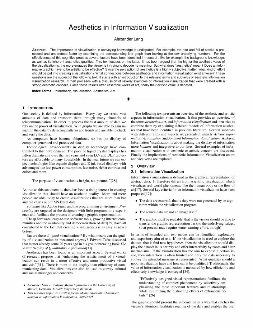
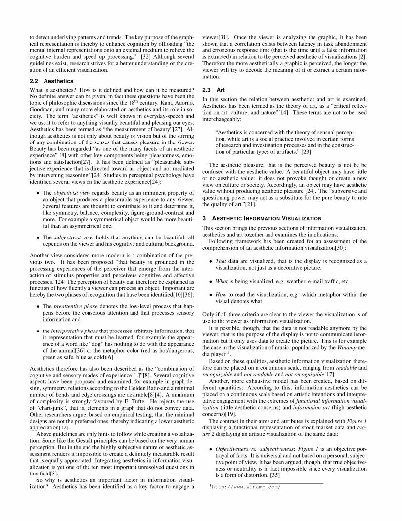
The contrast in their aims and attributes is explained with Figure 1displaying a functional representation of stock market data and Fig-ure 2 displaying an artistic visualization of the same data:
• Objectiveness vs. subjectiveness: Figure 1 is an objective por-trayal of facts. It is universal and not based on a personal, subjec-tive point of view. It has been argued, though, that true objective-ness or neutrality is in fact impossible since every visualizationis a form of distortion. [35]
1http://www.winamp.com/
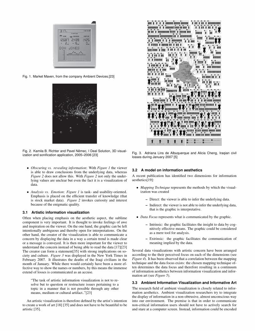
Fig. 1. Market Maven, from the company Ambient Devices.[23]
Fig. 2. Kamila B. Richter and Pavel Nemec, I Deal Solution, 3D visual-ization and sonification application, 2005–2006 [23]
• Obscuring vs. revealing information: With Figure 1 the vieweris able to draw conclusions from the underlying data, whereasFigure 2 does not allow this. With Figure 2 not only the under-lying values are unclear but even the fact it is a visualization ofdata.
• Analysis vs. Emotion: Figure 1 is task- and usability-oriented.Emphasis is placed on the efficient transfer of knowledge (thatis stock market data). Figure 2 invokes curiosity and interestbecause of the enigmatic quality.
3.1 Artistic information visualizationOften when placing emphasis on the aesthetic aspect, the sublimecomponent is very important. It is thought to invoke feelings of aweand inspiration on the viewer. On the one hand, the graphic can be leftintentionally ambiguous and thereby open for interpretations. On theother hand, the creator of the visualization is able to communicate aconcern by displaying the data in a way a certain trend is made clearor a message is conveyed. It is then more important for the viewer tounderstand the concern instead of being able to read the data [17][23]The creator can form a statement[35] with strong implications on so-ciety and culture. Figure 3 was displayed in the New York Times inFebruary 2007. It illustrates the deaths of the Iraqi civilians in themonth of January. While there would certainly have been a more ef-fective way to show the names or numbers, by this means the immenseextend of losses is communicated as an accuse.
“The task of artistic information visualization is not to re-solve but to question or restructure issues pertaining to atopic in a manner that is not possible through any othermeans, medium or cultural artifact..”[23]
An artistic visualization is therefore defined by the artist’s intentionto create a work of art [18] [35] and does not have to be beautiful to beartistic [35].
Fig. 3. Adriana Lins de Albuquerque and Alicia Cheng, Iraqian civillosses during January 2007 [5]
3.2 A model on information aestheticsA recent publication has identified two dimensions for informationaesthetics[19]:
• Mapping Technique represents the methods by which the visual-ization was created
– Direct: the viewer is able to infer the underlying data.
– Indirect: the viewer is not able to infer the underlying data,that is the graphic is interpretative.
• Data Focus represents what is communicated by the graphic.
– Intrinsic: the graphic facilitates the insight to data by cog-nitively effective means. The graphic could be consideredas a mere tool for analysis.
– Extrinsic: the graphic facilitates the communication ofmeaning implied by the data.
Several data visualizations with artistic concern have been arrangedaccording to the their perceived focus on each of the dimensions (seeFigure 4). It has been observed that a correlation between the mappingtechnique and the data focus exists: the chosen mapping technique of-ten determines the data focus and therefore resulting in a continuumof information aesthetics between information visualization and infor-mation art (see Figure 5).
3.3 Ambient Information Visualization and Informative ArtThe research field of ambient visualization is closely related to infor-mation aesthetics. Ambient visualization researchers try to integratethe display of information in a non-obtrusive, almost unconscious wayinto our environment. The premise is that in order to communicatenon-critical information users should not have to actively search forand stare at a computer screen. Instead, information could be encoded
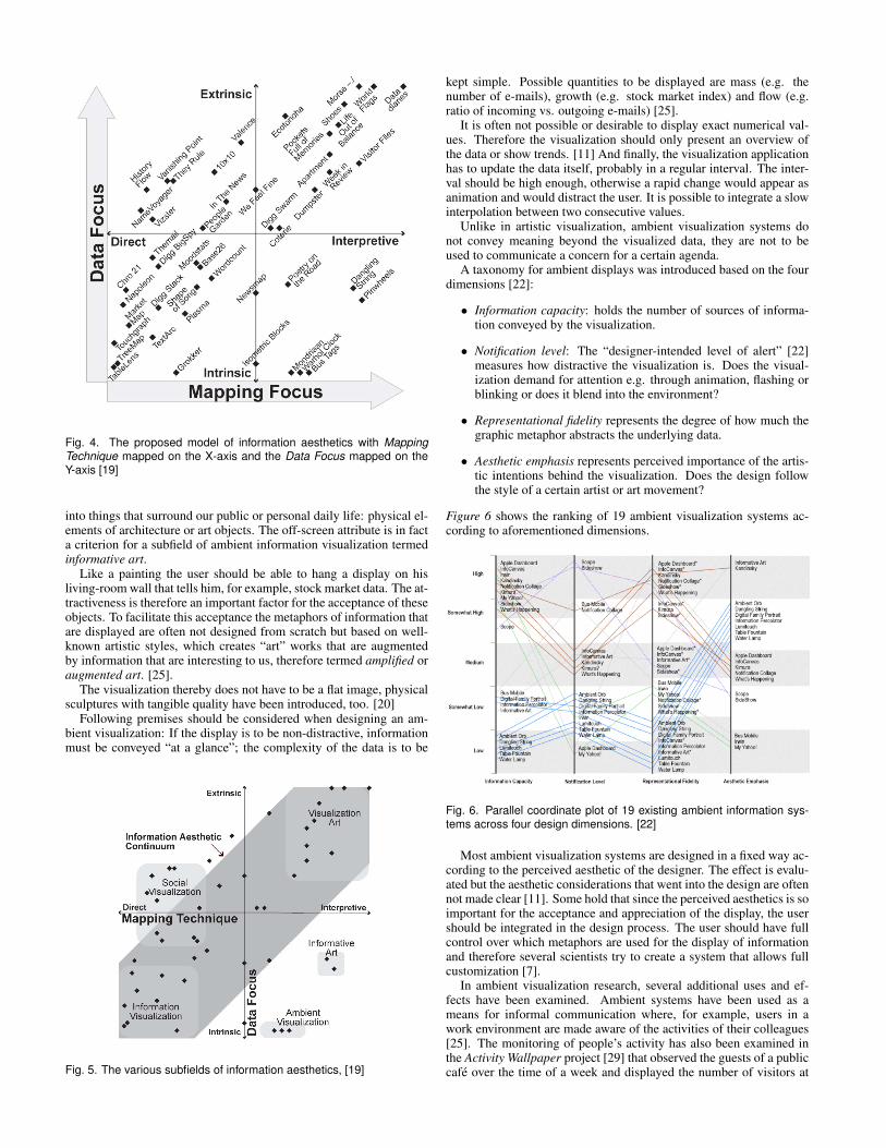
Fig. 4. The proposed model of information aesthetics with MappingTechnique mapped on the X-axis and the Data Focus mapped on theY-axis [19]
into things that surround our public or personal daily life: physical el-ements of architecture or art objects. The off-screen attribute is in facta criterion for a subfield of ambient information visualization termedinformative art.
Like a painting the user should be able to hang a display on hisliving-room wall that tells him, for example, stock market data. The at-tractiveness is therefore an important factor for the acceptance of theseobjects. To facilitate this acceptance the metaphors of information thatare displayed are often not designed from scratch but based on well-known artistic styles, which creates “art” works that are augmentedby information that are interesting to us, therefore termed amplified oraugmented art. [25].
The visualization thereby does not have to be a flat image, physicalsculptures with tangible quality have been introduced, too. [20]
Following premises should be considered when designing an am-bient visualization: If the display is to be non-distractive, informationmust be conveyed “at a glance”; the complexity of the data is to be
Fig. 5. The various subfields of information aesthetics, [19]
kept simple. Possible quantities to be displayed are mass (e.g. thenumber of e-mails), growth (e.g. stock market index) and flow (e.g.ratio of incoming vs. outgoing e-mails) [25].
It is often not possible or desirable to display exact numerical val-ues. Therefore the visualization should only present an overview ofthe data or show trends. [11] And finally, the visualization applicationhas to update the data itself, probably in a regular interval. The inter-val should be high enough, otherwise a rapid change would appear asanimation and would distract the user. It is possible to integrate a slowinterpolation between two consecutive values.
Unlike in artistic visualization, ambient visualization systems donot convey meaning beyond the visualized data, they are not to beused to communicate a concern for a certain agenda.
A taxonomy for ambient displays was introduced based on the fourdimensions [22]:
• Information capacity: holds the number of sources of informa-tion conveyed by the visualization.
• Notification level: The “designer-intended level of alert” [22]measures how distractive the visualization is. Does the visual-ization demand for attention e.g. through animation, flashing orblinking or does it blend into the environment?
• Representational fidelity represents the degree of how much thegraphic metaphor abstracts the underlying data.
• Aesthetic emphasis represents perceived importance of the artis-tic intentions behind the visualization. Does the design followthe style of a certain artist or art movement?
Figure 6 shows the ranking of 19 ambient visualization systems ac-cording to aforementioned dimensions.
Fig. 6. Parallel coordinate plot of 19 existing ambient information sys-tems across four design dimensions. [22]
Most ambient visualization systems are designed in a fixed way ac-cording to the perceived aesthetic of the designer. The effect is evalu-ated but the aesthetic considerations that went into the design are oftennot made clear [11]. Some hold that since the perceived aesthetics is soimportant for the acceptance and appreciation of the display, the usershould be integrated in the design process. The user should have fullcontrol over which metaphors are used for the display of informationand therefore several scientists try to create a system that allows fullcustomization [7].
In ambient visualization research, several additional uses and ef-fects have been examined. Ambient systems have been used as ameans for informal communication where, for example, users in awork environment are made aware of the activities of their colleagues[25]. The monitoring of people’s activity has also been examined inthe Activity Wallpaper project [29] that observed the guests of a publiccafe over the time of a week and displayed the number of visitors at
a certain time of a day, therefore providing insight about peak-hours,people’s habits etc.(see Figure 7).
Fig. 7. A projection of the Activity Wallpaper: each day of the week ismapped to a column, each timeslot is mapped to a row, the amount ofpeople is mapped to the amount of symbols [29]
Works by Skog et al. [11][30] examined the display of bus arrivaltimes and global weather reports. They used the style of Piet Mondrianto create the visualization, encoding information in the color and sizeand position of the rectangles (see Figure 8).
Fig. 8. A visualization of the current weather in six cities around theworld: Los Angeles, Gotheborg, Tokyo, Rio de Janiero, Capetown andSydney. Cities are represented by rectangles, weather is representedby color (red: cloudy, blue: rain- or snowfall, yellow: sunny) [30]
Kosara criticized that these mappings were not easily compre-hended, as well as even the fact that the image underlay data [16].
Another use of ambient information visualization has been pro-posed: persuasive ambient visualization. Like the film An inconve-nient truth by which the viewer is expected to think about his attitudetowards environment, these displays aim to encourage their viewers tochange their behaviour or their belief. It was proposed that a displaywithin a shopping environment that showed how many local productswere being bought in comparison to foreign products, would encour-age clients to buy more local products [20]. The success is debatable.Several ethical issues are raised as well. There is a certain danger ofmanipulation that should not be neglected, since ambient displays aremeant to be perceived almost unconsciously. Also the aforementionedactivity monitoring of public spaces is not uncritical, privacy concernsare raised if cameras are used to survey the people [25].
4 EXAMPLES
This section presents three examples of visualization projects that werecreated with an aesthetic concern in mind or involved art practices.
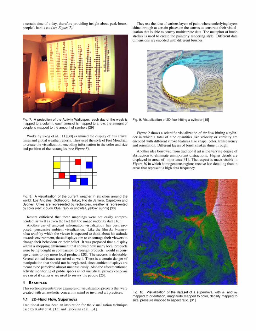
4.1 2D-Fluid Flow, SupernovaTraditional art has been an inspiration for the visualization techniqueused by Kirby et al. [15] and Tateosian et al. [31].
They use the idea of various layers of paint where underlying layersshine through at certain places on the canvas to construct their visual-ization that is able to convey multivariate data. The metaphor of brushstrokes is used to create the painterly rendering style. Different datadimensions are encoded with different brushes.
Fig. 9. Visualization of 2D flow hitting a cylinder [15]
Figure 9 shows a scientific visualization of air flow hitting a cylin-der in which a total of nine quantities like velocity or vorticity areencoded with different stroke features like shape, color, transparencyand orientation. Different layers of brush strokes shine through.
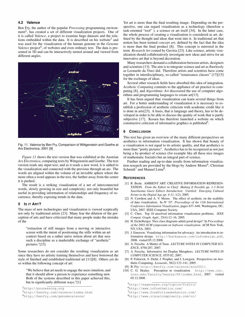
Another idea borrowed from traditional art is the varying degree ofabstraction to eliminate unimportant distractions. Higher details aredisplayed in areas of importance[31]. That aspect is made visible inFigure 10 in which homogeneous regions receive less detailing than inareas that represent a high data frequency.
Fig. 10. Visualization of the dataset of a supernova, with ∆x and ∆ymapped to orientation, magnitude mapped to color, density mapped tosize, pressure mapped to aspect ratio. [31]
4.2 ValenceBen Fry, the author of the popular Processing programming environ-ment2, has created a set of different visualization projects. One ofit is called Valence, a project to examine huge datasets and the rela-tions embedded within the data. It is described on his website3 andwas used for the visualization of the human genome in the GenomeValence project4, of websites and even ordinary text. The data is pre-sented in 3D and can be interactively turned around and viewed fromdifferent angles.
Fig. 11. Valence by Ben Fry, Comparison of Wittgenstein and Goethe atArs Electronica, 2001 [9]
Figure 11 shows the text version that was exhibited at the AustrianArs Electronica, comparing texts by Wittgenstein and Goethe. The textversion reads any input text, and as it reads a new word, it is added tothe visualization and connected with the previous through an arc. Thewords are aligned within the volume of an invisible sphere where themore often a word appears in the text, the further away from the centerit is pushed.
The result is a striking visualization of a net of interconnectedwords, slowly growing in size and complexity; not only beautiful butuseful in providing information of relationships and frequency of oc-currence, thereby exposing trends in the data.
5 IS IT ART?The mass of new technologies and visualization is viewed scepticallynot only by traditional artists [23]. Many fear the dilution of the per-ception of arts and have criticized that many people make the mistakeof the
“extraction of still images from a moving or interactivescreen with the intent of positioning the stills within an artcontext based on a rather naıve notion about art that seessuch a discipline as a marketable exchange of “aesthetic”pictures.”[23]
Some researchers do not consider the resulting visualization as artsince they have no artistic training themselves and have borrowed thestyle of finished and established traditional art [11][8]. Others yet doso within the following concept of art:
“We believe that art needs to engage the users intuition, andthat it should allow a person to experience something new.Both of the systems described in this paper achieved this,but in significantly different ways.”[1]
2http://processing.org3http://benfry.com/valence/index.html4http://benfry.com/genomevalence/
Yet art is more than the final resulting image: Depending on the per-spective, one can regard visualization as a technology (therefore atask-oriented “tool” ), a science or art itself [34]. In the latter case,the whole process of creating a visualization is considered as art, de-fined by the thought and ideas that went into it. In traditional art thatnotion has been termed concept art, defined by the fact that the ideais more than the final product [8]. This concept is mirrored in theterm Research Art coined by Gaviria [23]. Like science, artistic visu-alization should collaboratively investigate new ideas and strive for aninnovative art that is beyond decoration.
Many researchers demand a collaboration between artists, designersand scientists [13]. The aim is to integrate science and art as flawlesslyas Leonardo da Vinci did. Therefore artists and scientists have cometogether in interdisciplinary, so-called “renaissance classes” [17][15]for the exchange of ideas.
Several other research fields have absorbed this idea of integration.Aesthetic Computing commits to the appliance of art practice to com-puting [8], and Algorithmic Art discovered the use of computer algo-rithms and programming languages to create art[13].
It has been argued that visualization can learn several things fromart. For a better understanding of visualization it is necessary to es-tablish a profession of aesthetic criticism with academic credit like itis done in arts[23]. A basis, that is language and theory, has to be de-veloped in order to be able to discuss the quality of work that is partlysubjective [17]. Kosara has therefore launched a website on whichconstructive criticism of informative graphics is published5.
6 CONCLUSION
This text has given an overview of the many different perspectives onaesthetics in information visualization. It has shown that beauty ofa visualization is not equal to its artistic quality, and that aesthetics ismore than “pretty pictures”. Aesthetics has to be recognized as not justbeing a by-product of science (for example like all these nice imagesof mathematic fractals) but an integral part of science.
Further reading and up-to-date results from information visualiza-tion research are provided by the blogs by Andrew Moere6, ChristianSchmidt7 and Manuel Lima8.
REFERENCES
[1] R. Beale. AMBIENT ART: CREATIVE INFORMATION REPRESEN-TATION. From the Editor in Chief: Making It Possible pp. 1-3 PerttiSaariluoma Guest Editors Introduction: Untitled: Emerging CulturalForms in the Digital Age pp. 4-11, 1(2), 2005.
[2] N. Cawthon and A. V. Moere. The effect of aesthetic on the usabilityof data visualization. In IV ’07: Proceedings of the 11th InternationalConference Information Visualization, pages 637–648, Washington, DC,USA, 2007. IEEE Computer Society.
[3] C. Chen. Top 10 unsolved information visualization problems. IEEEComput. Graph. Appl., 25(4):12–16, 2005.
[4] H. Eichelberger. Nice class diagrams admit good design? In Proceedingsof the 2003 ACM symposium on Software visualization. ACM New York,NY, USA, 2003.
[5] J. Emerson. Visualizing information for advocacy: An introduction to in-formation design. http://backspace.com/infodesign.pdf,2008. visited 05.12.2008.
[6] A. Ferscha. A Matter of Taste. LECTURE NOTES IN COMPUTER SCI-ENCE, 4794:287, 2007.
[7] A. Ferscha. Informative Art Display Metaphors. LECTURE NOTES INCOMPUTER SCIENCE, 4555:82, 2007.
[8] P. Fishwick, S. Diehl, J. Prophet, and J. Lowgren. Perspectives on Aes-thetic Computing. Leonardo, 38(2):133–141, 2005.
[9] B. Fry. http://benfry.com/valence/ars2001/.[10] C. G. Healey. Perception in visualization. http://www.csc.
ncsu.edu/faculty/healey/PP/index.html, 2007. visited05.12.2008.
5http://eagereyes.org/topics/VisCrit6http://www.infosthetics.com/7http://www.formfollowsbehavior.com/8http://www.visualcomplexity.com/vc/

[11] L. E. Holmquist and T. Skog. Informative art: information visualizationin everyday environments. In GRAPHITE ’03: Proceedings of the 1st in-ternational conference on Computer graphics and interactive techniquesin Australasia and South East Asia, pages 229–235, New York, NY, USA,2003. ACM.
[12] O. Inbar, N. Tractinsky, and J. Meyer. Minimalism in information visu-alization: attitudes towards maximizing the data-ink ratio. In ECCE ’07:Proceedings of the 14th European conference on Cognitive ergonomics,pages 185–188, New York, NY, USA, 2007. ACM.
[13] G. Judelman. Aesthetics and inspiration for visualization design: bridg-ing the gap between art and science. In Information Visualisation, 2004.IV 2004. Proceedings. Eighth International Conference on, pages 245–250, 2004.
[14] M. Kelly. Encyclopedia of aesthetics. Oxford University Press.[15] R. KIRBY, D. KEEFE, and D. LAIDLAW. 45 Painting and Visualization.
The Visualization Handbook, 2005.[16] R. Kosara. When informative art isn’t. http://eagereyes.org/
VisCrit/InformativeArt.html, 2006. visited 05.12.2008.[17] R. Kosara. Visualization criticism - the missing link between information
visualization and art. In IV ’07: Proceedings of the 11th InternationalConference Information Visualization, pages 631–636, Washington, DC,USA, 2007. IEEE Computer Society.
[18] D. Laidlaw, D. Kremers, F. Frankel, V. Interrante, and T. Banchoff. Artand visualization: oil and water? In Proceedings of the conferenceon Visualization’98, pages 507–509. IEEE Computer Society Press LosAlamitos, CA, USA, 1998.
[19] A. Lau and A. V. Moere. Towards a model of information aesthetics ininformation visualization. In IV ’07: Proceedings of the 11th Interna-tional Conference Information Visualization, pages 87–92, Washington,DC, USA, 2007. IEEE Computer Society.
[20] A. Moere. Towards Designing Persuasive Ambient Visualization. InWorkshop at Pervasive 2007 Designing and Evaluating Ambient Infor-mation Systems.
[21] B. Otjacques and F. Feltz. Redesign of classic information visualizationtechniques in an artistic computing perspective. In APGV ’07: Proceed-ings of the 4th symposium on Applied perception in graphics and visual-ization, pages 131–131, New York, NY, USA, 2007. ACM.
[22] Z. Pousman and J. Stasko. A taxonomy of ambient information systems:four patterns of design. In AVI ’06: Proceedings of the working confer-ence on Advanced visual interfaces, pages 67–74, New York, NY, USA,2006. ACM.
[23] A. Ramirez Gaviria. When Is Information Visualization Art? Determin-ing the Critical Criteria. Leonardo, 41(5):479–482, 2008.
[24] R. Reber, N. Schwarz, and P. Winkielman. Processing Fluency and Aes-thetic Pleasure: Is Beauty in the Perceiver’s Processing Experience? Per-sonality and Social Psychology Review, 8(4):364, 2004.
[25] J. Redstrom, T. Skog, and L. Hallnas. Informative art: using amplified art-works as information displays. In Proceedings of DARE 2000 on Design-ing augmented reality environments, pages 103–114. ACM New York,NY, USA, 2000.
[26] T.-M. Rhyne, D. H. Laidlaw, T. Munzner, and V. Interrante. Visualizationneeds more visual design! (panel session). In I. J. Edward Swan, editor,VIS ’99: Proceedings of the conference on Visualization ’99, pages 485–490, Los Alamitos, CA, USA, 1999. IEEE Computer Society Press.
[27] B. Salem and M. Rauterberg. Aesthetics as a Key Dimension for Design-ing Ubiquitous Entertainment Systems. In The 2nd International Work-shop on Ubiquitous Homeubiquitous society and entertainment, pages85–94, 2005.
[28] B. Shneiderman. Extreme visualization: squeezing a billion records into amillion pixels. In SIGMOD ’08: Proceedings of the 2008 ACM SIGMODinternational conference on Management of data, pages 3–12, New York,NY, USA, 2008. ACM.
[29] T. Skog. Activity wallpaper: ambient visualization of activity informa-tion. In DIS ’04: Proceedings of the 5th conference on Designing inter-active systems, pages 325–328, New York, NY, USA, 2004. ACM.
[30] T. Skog, S. Ljungblad, and L. Holmquist. Between aesthetics and utility:designing ambient information visualizations. In Information Visualiza-tion, 2003. INFOVIS 2003. IEEE Symposium on, pages 233–240, 2003.
[31] L. G. Tateosian, C. G. Healey, and J. T. Enns. Engaging viewers throughnonphotorealistic visualizations. In NPAR ’07: Proceedings of the 5thinternational symposium on Non-photorealistic animation and rendering,pages 93–102, New York, NY, USA, 2007. ACM.
[32] M. Tudoreanu. Designing effective program visualization tools for reduc-
ing user’s cognitive effort. In Proceedings of the 2003 ACM symposiumon Software visualization. ACM Press New York, NY, USA, 2003.
[33] E. Tufte. The visual display of quantitative information, 1983, Cheshire.[34] J. van Wijk. The value of visualization. In Proceedings of IEEE Visual-
ization, volume 2005, 2005.[35] F. Viegas and M. Wattenberg. Artistic Data Visualization: Beyond Vi-
sual Analytics. LECTURE NOTES IN COMPUTER SCIENCE, 4564:182,2007.
[36] C. Ware. Information Visualization: Perception for Design. MorganKaufmann, 2004.