advweb-1/20 depaul university snl 262 web page design design information instructor: david a. lash
Post on 21-Dec-2015
215 views
TRANSCRIPT

AdvWeb-1/20
DePaul University
SNL 262
Web Page Design
Design InformationInstructor: David A. Lash

AdvWeb-2/20
Towards a better design
Rule 1 - Look Professional– Make sure site is available– Make sure links work– Anticipate traffic level to site

AdvWeb-3/20
Professional ?
http://www.montcopa.org/da/dabio.htm
Too Large
130K

AdvWeb-4/20
Professional?
Do You need that design element– Animated graphics – Moving/Blinking text – Music – Mystery Meat Navigation

AdvWeb-5/20
Know your Audience
Design to the target audience
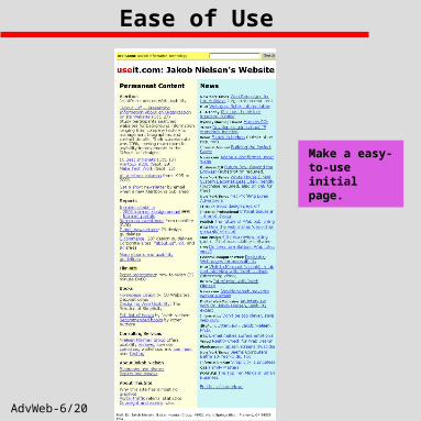
AdvWeb-6/20
Ease of Use
Make a easy-to-use initial page.

AdvWeb-7/20
Some Navigation Issues
Can a user tell where they are within a site? Can user tell what are navigation options from
current page? Can user find what they are looking for? Can the user tell what else is at the site? Can the user tell who’s site they are looking at?

AdvWeb-8/20
Top 10 Design Flaws
http://www.useit.com/alertbox/9605.html By Jakob Nielsen, SunSoft Distinguished Engineer
1. Frame use:
Can be confusing
2. Too Much Technology
3. Scrolling Text, Marquees, and Constantly Running Animation's
4. Complex URLs
5. Orphan Pages -
Should be clear on Each page how it fits

AdvWeb-9/20
Top 10 Design Flaws
http://www.useit.com/alertbox/9605.html By Jakob Nielsen, SunSoft Distinguished Engineer
6. Long Scrolling Pages
7. Lack of Navigation Support
8. Non-Standard Link Colors
9. Outdated Information
10. Overly Long Download Times
AdvWeb-10/20
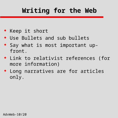
Writing for the Web
Keep it short Use Bullets and sub bullets Say what is most important up-front. Link to relativist references (for more
information) Long narratives are for articles only.

AdvWeb-11/20
Testing Your Site
Some things to consider before making your site “production”.
1. Spell Check Each Page Separately
2. Validate All HTML Code
3. Make sure to test pages somewhere
besides your desktop.
4. Try Different browsers and different browser
versions
5. Try different access speeds.
6. Test EACH link .
7. Each form/application needs special care
- What happens is skip a field, send bad
data or skip form entirely.

AdvWeb-12/20
Content Is King
Doesn’t matter how well designed the site is if content is stale or dull.
– Why would someone come back to your site?– Why would someone come to your site in the
first place? Can EACH of these people find information
quickly and easily? – This can be a very large problem. For example
consider the depaul or MicroSoft site. How many different reason might people visit?

AdvWeb-13/20
Using Pull-outs
If use a pullout make it relevant to something.
Purple on purple is hard to read.

AdvWeb-14/20
Over use of Center
Everything shouldn’t be centered like this.
AdvWeb-15/20
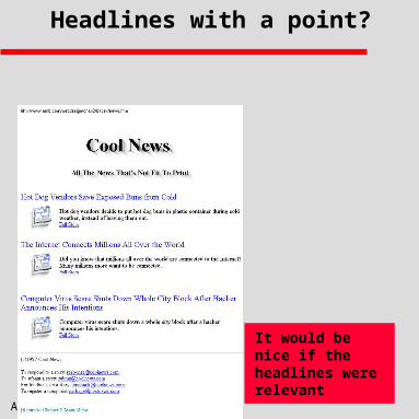
Headlines with a point?
It would be nice if the headlines were relevant
AdvWeb-16/20
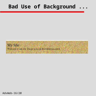
Bad Use of Background ...

AdvWeb-17/20
Setting Up Your Forms
These elements should use a table to evenly line them up and clean up this form.

AdvWeb-18/20
Clean Navigation
Use of table to separate site.
Clean Navigation.
Clearly can tell where landing on top of page.
Contact info.
AdvWeb-19/20
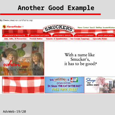
Another Good Example

AdvWeb-20/20
Barnes and Noble