advanced medical virology
TRANSCRIPT

•F Bonakdar.Hashemi, PhD
•11/4
/2018
•F. Bo
nakdar H
ashem
i, PhD
•1
F. Bonakdar Hashemi, PhD
Department of Microbiology
School of Medicine
Tehran University of Medical Sciences
Principles of Molecular Virology, 5th Ed.
Alan J. Cann
Advanced Medical Virology:
Winter 2018

•F Bonakdar.Hashemi, PhD
Instructions to make your presentations acceptable
•11/4
/2018
•2
Guidelines to Basic Power Point Presentation

•F Bonakdar.Hashemi, PhD
Basic Rules for Presentations Contrast is important
For paper…
Dark text on a light background.
•11/4
/2018
•3
‒ Light text on dark background
•F Bonakdar.Hashemi, PhD
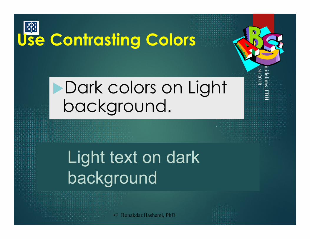
Use Contrasting Colors
Dark colors on Light background.
•11/4
/2018
•Guidelines_F
BH
•4
Light text on dark background
•F Bonakdar.Hashemi, PhD
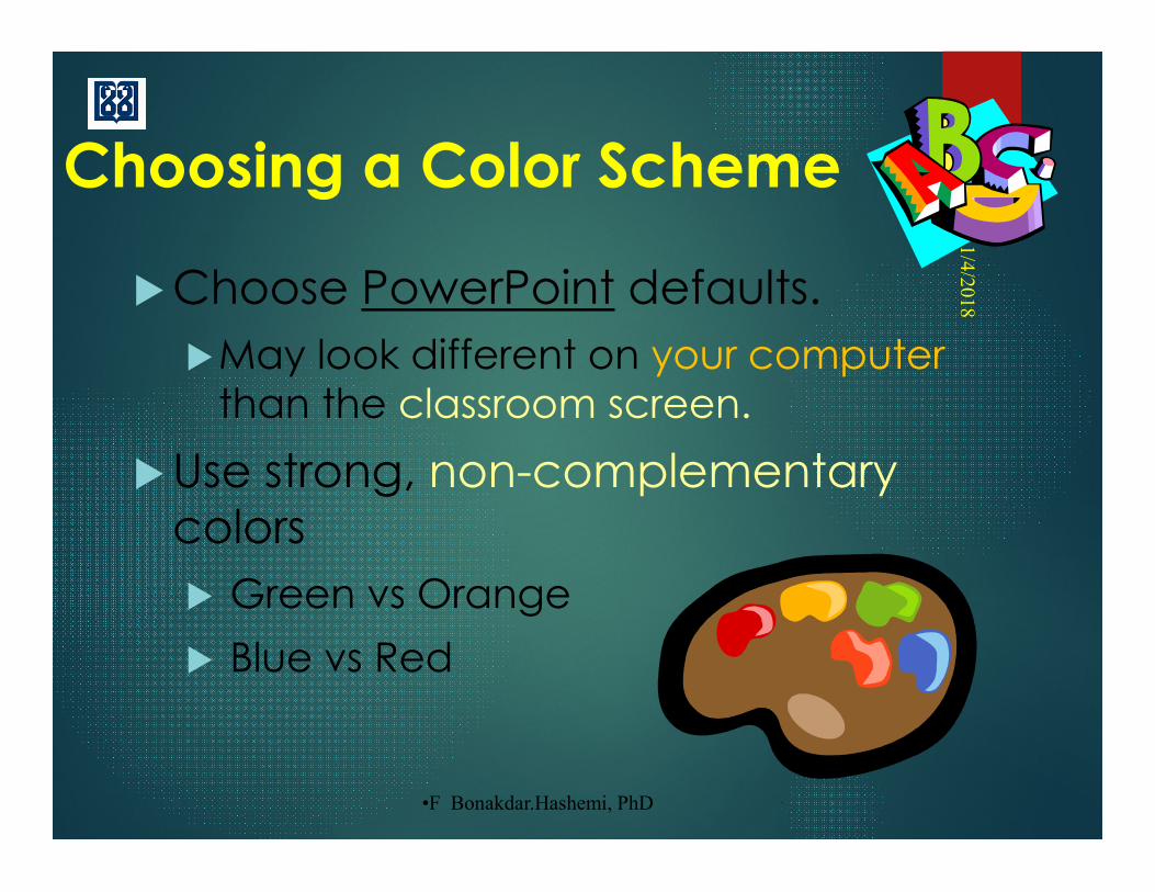
Choosing a Color Scheme
Choose PowerPoint defaults.
May look different on your computer than the classroom screen.
Use strong, non-complementarycolors
Green vs Orange
Blue vs Red
•11/4
/2018
•5

•F Bonakdar.Hashemi, PhD
Choosing a Color Scheme
Complementary colors: pairs of colors which, when combined, cancel each other out.
They produce a grey-scale color, like white or black, when combined.
•11/4
/2018
•6
•F Bonakdar.Hashemi, PhD
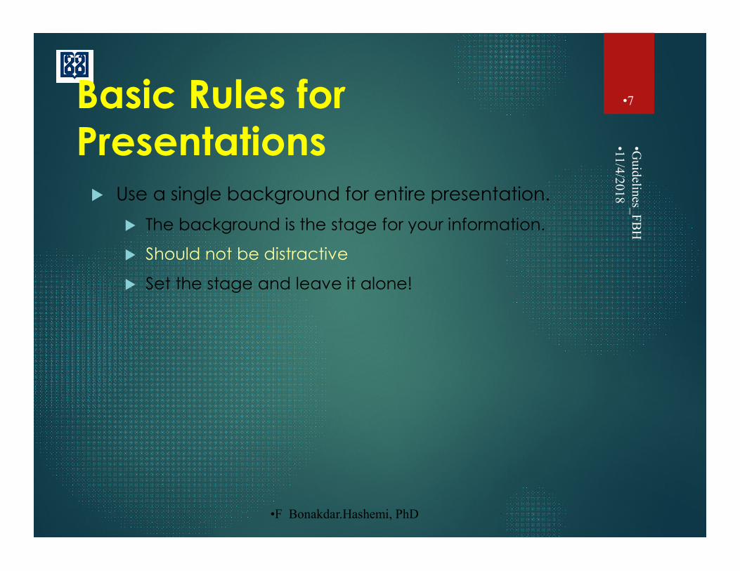
Basic Rules for Presentations Use a single background for entire presentation.
The background is the stage for your information.
Should not be distractive
Set the stage and leave it alone!
•11/4
/2018
•Guidelines_F
BH
•7

•F Bonakdar.Hashemi, PhD
•11/4
/2018
•8
Bacterial Vaccines
•F. Bonakdar Hashemi, PhD
•Medical Microbiology
•Background too busy
•Not enough contrast
•Serif font

•F Bonakdar.Hashemi, PhD
Basic Rules for Presentations
Dazzle the audience with the information… not distracting graphics or style.
•11/4/2018
•9
In science:
• The medium is not the message.
• The information is the message.

•F Bonakdar.Hashemi, PhD
Basic Rules for Presentations Using a projector…
Light text on a semi-dark background.
The eye is attracted to the light on the screen.
•11/4
/2018
•10

•F Bonakdar.Hashemi, PhD
Basic Rules for Presentations
Text Direction Generally, left-justify bullets (English).
Keeps things neat.. and easy to follow.
•11/4
/2018
•Guidelines_F
BH
•11
Timing and practice (very important)
Pair-up and practice at least twice
•F Bonakdar.Hashemi, PhD
Basic Rules for Presentations •11
/4/2018
•Guidelines_F
BH
•12
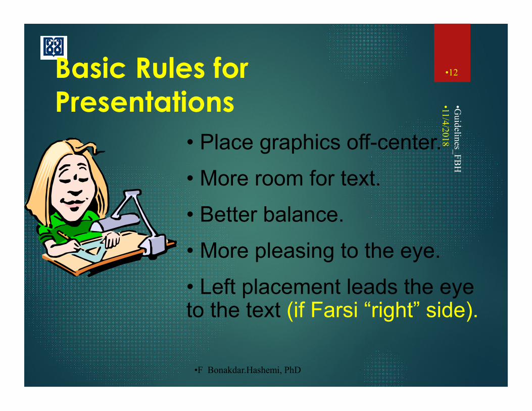
• Place graphics off-center.
• More room for text.
• Better balance.
• More pleasing to the eye.
• Left placement leads the eye to the text (if Farsi “right” side).
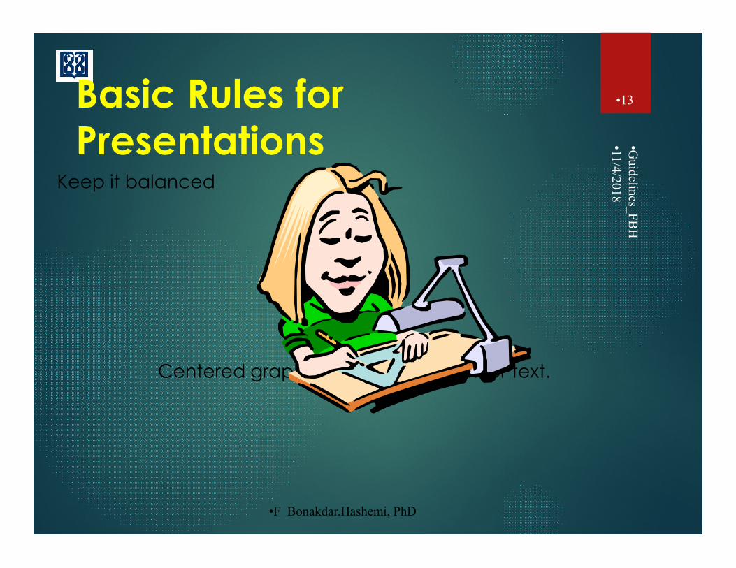
•F Bonakdar.Hashemi, PhD
Basic Rules for Presentations
Keep it balanced
Centered graphics leave little room for text.
•11/4
/2018
•Guidelines_F
BH
•13

•F Bonakdar.Hashemi, PhD
Basic Rules for Presentations
Do not center bullet points.
It makes the text uneven and ragged.
Looks disorganized and hard to read
Hard to follow the points in the presentation.
•11/4
/2018
•Guidelines_F
BH
•14

•F Bonakdar.Hashemi, PhD
Use Restraint With Fonts
Employ only a few fonts; stick to familiar fonts
Stay away from gimmicky fonts unless for a theme.
Keep type sizes consistent.
Serif vs Sans Serif.
Do NOT USE ALL CAPS.
•11/4
/2018
•Guidelines_F
BH
•15

•F Bonakdar.Hashemi, PhD
Choose Fonts Wisely
Italics are more difficult to read.
Use bold when you want:
to emphasize a point
some words to stand out.
•11/4
/2018
•Guidelines_F
BH
•16

•F Bonakdar.Hashemi, PhD
Choose Fonts Wisely
Font size
Not Easy to read (24 pt)
Easier to read (32 pt)
Easy to read (40 pt)
•11/4
/2018
•Guidelines_F
BH
•17
•F Bonakdar.Hashemi, PhD
Basic Rules - Capitalization•11
/4/2018
•Guidelines_F
BH
•18
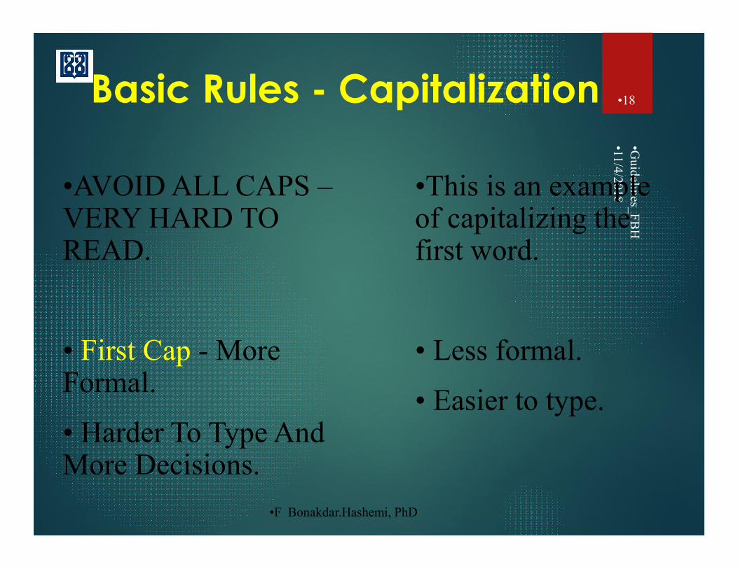
•AVOID ALL CAPS –VERY HARD TO READ.
• First Cap - More Formal.
• Harder To Type And More Decisions.
•This is an example of capitalizing the first word.
• Less formal.
• Easier to type.

•F Bonakdar.Hashemi, PhD
Basic Rules -Capitalization •11
/4/2018
•Guidelines_F
BH
•19
Three types of capitalization:
1) Capitalizing the first letter of the first word in a sentence
• Easiest to read
• Most formal

•F Bonakdar.Hashemi, PhD
Basic Rules -Capitalization •11
/4/2018
•Guidelines_F
BH
•20
Three types of capitalization:
2) Capitalizing the First Letter in Each Word
• Reserved for titles

•F Bonakdar.Hashemi, PhD
Basic Rules -Capitalization •11
/4/2018
•Guidelines_F
BH
•21
Three types of capitalization:
3) CAPITALIZING ALL LETTERS IN ALL WORDS
• least formal
• hardest to read
•F Bonakdar.Hashemi, PhD
Avoid Text Overload
•11/4/2018
•Guidelines_FBH
•22
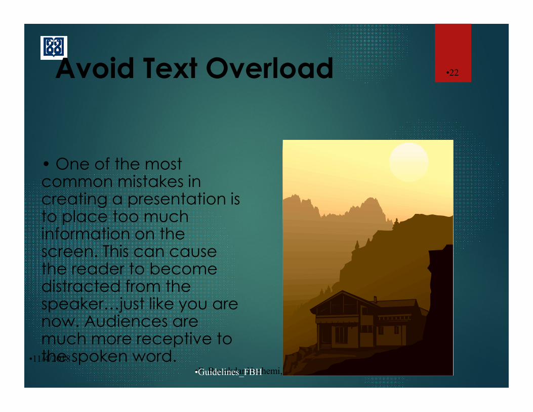
• One of the most common mistakes in creating a presentation is to place too much information on the screen. This can cause the reader to become distracted from the speaker…just like you are now. Audiences are much more receptive to the spoken word.

•F Bonakdar.Hashemi, PhD
Avoid Text Overload Having too much text: can defeat the purpose of
PowerPoint.
Slides begin to look like a jumble of text, making slides difficult to read and unrecognizable from each other.
They will not listen to you.
People will either try to read and copy everything down or they will lose interest.
If you have more information to include use more slides or create handouts.
•11/4
/2018
•Guidelines_F
BH
•23

•F Bonakdar.Hashemi, PhD
Water Purity•11
/4/2018
•24

•F Bonakdar.Hashemi, PhD
Basic Presentation Guidelines
Do not give too much information at once (gradual build).
Stick with the same transition.
Be creative, but keep it simple.
Six words per line.
Six lines per page.
•11/4
/2018
•25
•F Bonakdar.Hashemi, PhD
Review: Basic Rules of Presentation
Keeping it simple…
1. Make bulleted points easy to read.
Keep text easy to understand.
Use concise wording.
2. Bullets are focal points.
Presenter provides elaboration and explanation
•11/4
/2018
•Guidelines_F
BH
•26
•F Bonakdar.Hashemi, PhD
Review:Basic Rules of Presentation
Keep it simple…
3. Large font size and slide number in every frame
4. Phrase formation: List only the key points.
One space after ; ,
Two spaces after . :
5. Summarize and review
•11/4
/2018
•Guidelines_F
BH
•27

•F Bonakdar.Hashemi, PhD
Basic Presentation Mistakes.•11
/4/2018
•Guidelines_F
BH
•28
Too much information is not desirable
Reading off of the slide is distracting
Make eye contact with the audience
Audiences are more receptive to :
• Photos/graphs
• The spoken word.

•F Bonakdar.Hashemi, PhD
Clip Art & Graphics
Few excellent graphics; better than many poor ones.
Photographs can be powerful, but distracting
Use sparingly!
•11/4
/2018
•Guidelines_F
BH
•29

•F Bonakdar.Hashemi, PhD
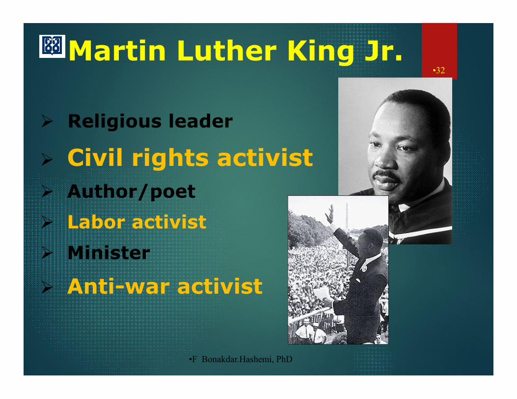
Martin Luther King Jr.•11
/4/2018
•30
• Religious leader
• Civil rights activist
• Author/poet
• Labor activist
• Minister
• Antiwar activist

•F Bonakdar.Hashemi, PhD
•Religious leader
•Civil rights activist
•Author/poet
•Labor activist
•Minister
•Antiwar activist
•11/4
/2018
•Guidelines_F
BH
•31
•F Bonakdar.Hashemi, PhD
Martin Luther King Jr.•11
/4/2018
•32
Religious leader
Civil rights activist
Author/poet
Labor activist
Minister
Anti-war activist
•F Bonakdar.Hashemi, PhD
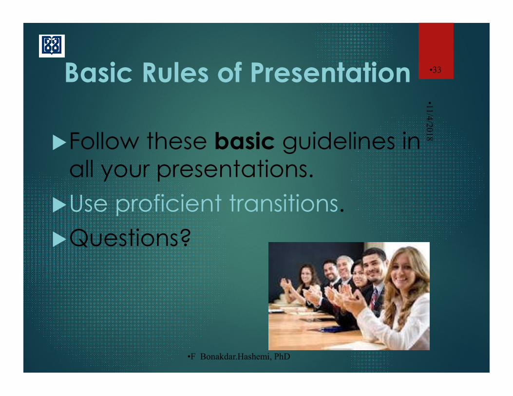
Basic Rules of Presentation
Follow these basic guidelines in all your presentations.
Use proficient transitions.
Questions?
•11/4
/2018
•33