adobe photoshop - graphics techniques for web design.pdf
DESCRIPTION
TECNICAS GRÁFICASTRANSCRIPT

Adobe Seminars: Web Page Designby Lisa Lopuck and Sheryl Hampton
Adobe Seminars: Web Page Design is a portable seminar on web page
design taught by experienced professionals that documents Adobe
software such as Adobe Photoshop 4, Adobe Illustrator 7, and Adobe
PageMill 2, as well as the latest HTML language protocols.
This October 1997 Adobe Press book will bring all the essential information
of a two-day seminar into a compact and reusable format, complete with
CD and step-by-step techniques. Two noted Web seminar instructors, Lisa
Lopuck and Sheryl Hampton of ElectraVision, have distilled their training
sessions into over a hundred two-page techniques using popular Adobe
applications to simulate how Web pages are actually created. The result is a
reference book of clear, simple explanations and designs that are reusable
page after Web page.
Adobe Seminars: Web Page Design
Publication Date: Oct. 1, 1997
US $40
ISBN: 1-56830-426-9
4-color, 264 pages, includes ImageClub CD
The techniques withinthis Acrobat™ PDF fileare from the upcom-ing Adobe Press bookAdobe Seminars:Web Page Design.
, : , .
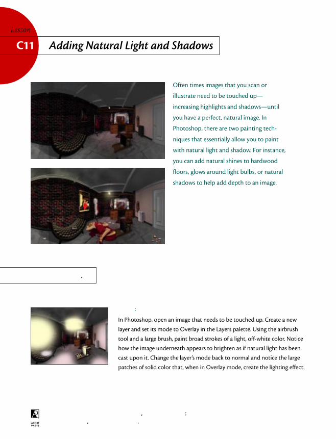
Often times images that you scan or
illustrate need to be touched up—
increasing highlights and shadows—until
you have a perfect, natural image. In
Photoshop, there are two painting tech-
niques that essentially allow you to paint
with natural light and shadow. For instance,
you can add natural shines to hardwood
floors, glows around light bulbs, or natural
shadows to help add depth to an image.
:
In Photoshop, open an image that needs to be touched up. Create a new
layer and set its mode to Overlay in the Layers palette. Using the airbrush
tool and a large brush, paint broad strokes of a light, off-white color. Notice
how the image underneath appears to brighten as if natural light has been
cast upon it. Change the layer’s mode back to normal and notice the large
patches of solid color that, when in Overlay mode, create the lighting effect.
Adding Natural Light and ShadowsC11Lesson
.
, : , .
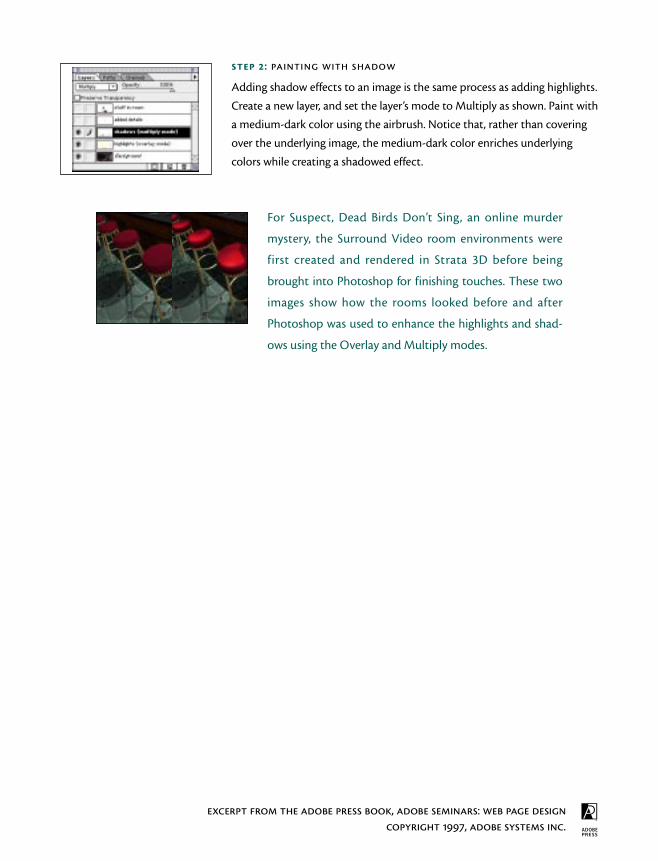
:
Adding shadow effects to an image is the same process as adding highlights.
Create a new layer, and set the layer’s mode to Multiply as shown. Paint with
a medium-dark color using the airbrush. Notice that, rather than covering
over the underlying image, the medium-dark color enriches underlying
colors while creating a shadowed effect.
For Suspect, Dead Birds Don’t Sing, an online murder
mystery, the Surround Video room environments were
first created and rendered in Strata 3D before being
brought into Photoshop for finishing touches. These two
images show how the rooms looked before and after
Photoshop was used to enhance the highlights and shad-
ows using the Overlay and Multiply modes.

BEGINNER
Layers
on
LuanneCohen
LuanneSeymourCohen,CreativeDirectorat AdobeSystems,shares somesuper tipsforworkingwithlayersin Adobe®
Photoshop® 4.0

2
CREATING DROP SHADOWS USING LAYERS
Layers paletteThe active layer ishighlighted and has apaintbrush icon next toit. The eye icons let youturn layers visibility onand off.
Drop shadows are easy to create using layers in Photoshop 4.0.In this example, the framed picture is on its own layer (pictureframe). The area around the frame is transparent, allowing thebackground to show through.
1. Make a copy of the firstlayer (picture frame) bydragging the layer name tothe New Layer icon at thebottom of the Layers palette.This copy (picture framecopy) is placed on top of theoriginal layer.
2. Select the original “pictureframe” layer in the palette,and then use the move toolto offset the layer (which isunderneath the copy).Release the mouse buttonwhen the layer is slightlyoffset. This will become thedrop shadow. At this stage,the original and the copy arethe same color(s).
FinetuningThe arrow keys on thekeyboard allow you tomove the layer in one-pixel increments.
3. For a more realisticshadow, select a foregroundcolor other than black. Inthis example, we used theeyedropper tool to select adark brown from the image.
3
CREATING DROP SHADOWS USING LAYERS
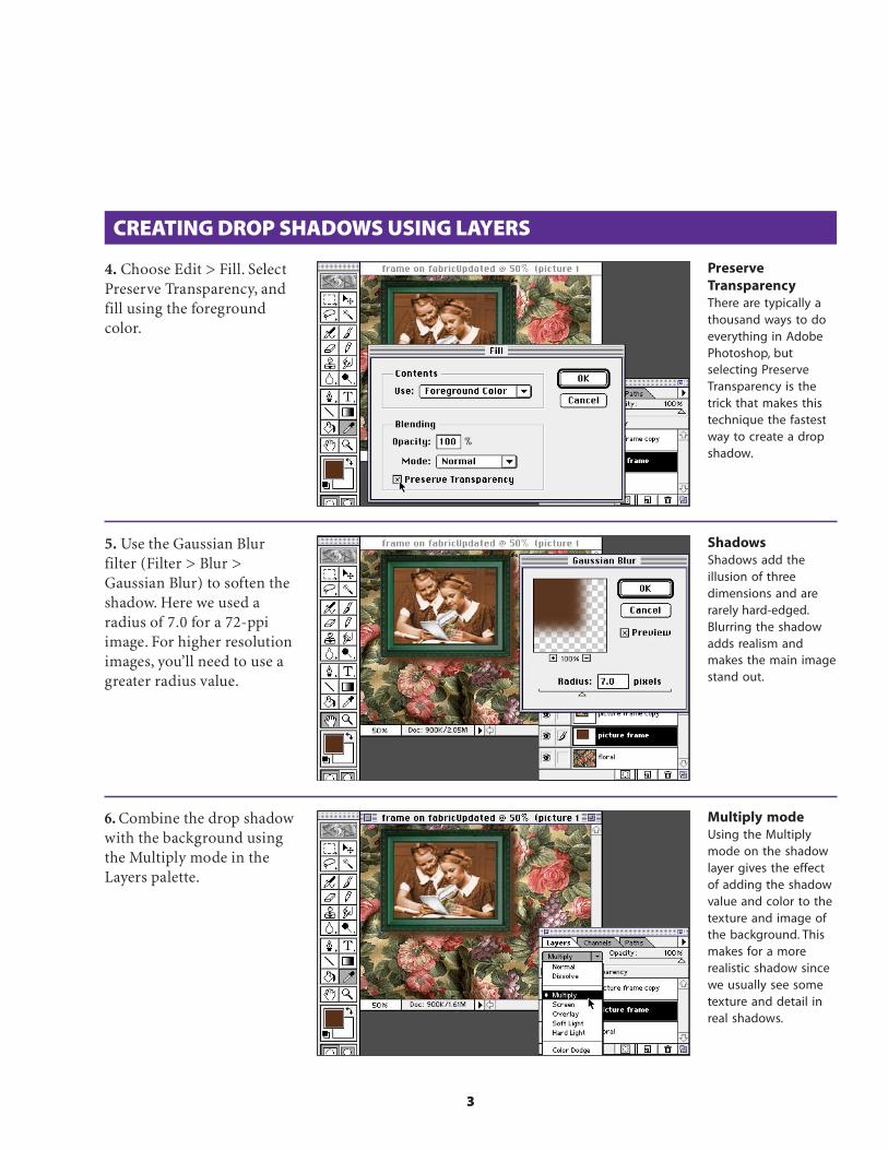
4. Choose Edit > Fill. SelectPreserve Transparency, andfill using the foregroundcolor.
PreserveTransparencyThere are typically athousand ways to doeverything in AdobePhotoshop, butselecting PreserveTransparency is thetrick that makes thistechnique the fastestway to create a dropshadow.
ShadowsShadows add theillusion of threedimensions and arerarely hard-edged.Blurring the shadowadds realism andmakes the main imagestand out.
Multiply modeUsing the Multiplymode on the shadowlayer gives the effectof adding the shadowvalue and color to thetexture and image ofthe background. Thismakes for a morerealistic shadow sincewe usually see sometexture and detail inreal shadows.
5. Use the Gaussian Blurfilter (Filter > Blur >Gaussian Blur) to soften theshadow. Here we used aradius of 7.0 for a 72-ppiimage. For higher resolutionimages, you’ll need to use agreater radius value.
6. Combine the drop shadowwith the background usingthe Multiply mode in theLayers palette.

4
Layer masksYou can create layermasks two ways.Choose Add LayerMask from the Layersmenu. Or you cancreate a selection andchoose Select > SaveSelection. Instead ofcreating a newchannel, choose themask option from theChannel pop-up menu.
BLENDING FROM ONE IMAGE TO ANOTHER
Blending one image gradually into another is easy to do using layersin Photoshop 4.0. In this example, we will blend the red satin fabricfrom one layer into the floral fabric on another layer by using a layermask on one of the layers.
1. Select the top layer (floral)and choose Layer > AddLayer Mask > Reveal All.
2. With the layer maskselected, choose the gradienttool and create a gradient.Make sure your foregroundand background colors areblack and white. Rememberthat you are drawing on alayer mask that is grayscale.The areas that are white andgray will reveal the colorimage. The areas that aresolid black will block it out.
GradientsYou can use any anglefor your layer maskgradient. If you want asmall transition areawith larger solid areasof the two images,draw the gradientvector well inside theimage areas instead offrom edge to edge.
3. You may want to experi-ment with different mid-points for the blend. Double-click the gradient tool iconto bring up the Gradient ToolOptions palette. Select Edit,and here you can set themidpoint. Then redraw thegradient in the layer mask.

5
BLENDING LAYERS WITH THE LAYER OPTIONS PALETTE
Blending parts of one layer into another is easy to do using the layerssliders in Photoshop 4.0. In this example, we will show just a few ofthe hundreds of possible combinations you can use when you playwith the options in the Layer Options palette.
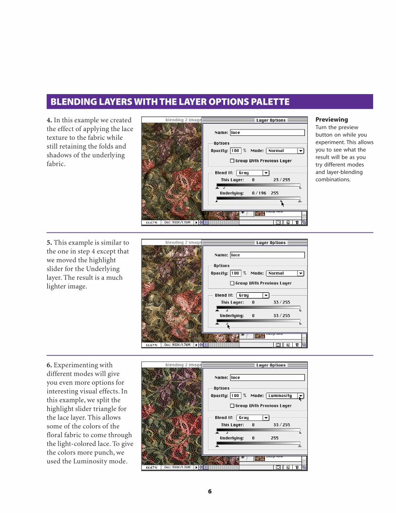
1. Create or open an imagethat has two layers you wantto blend together. In thisexample we want to revealthe lower layer imagethrough the dark back-ground color from the lacelayer. Select the top layer.
2. Double-click the layername in the Layers palette tobring up the Layer Optionsdialog box. Since we want todrop out the dark back-ground on the lace layer, wewill move the shadowtriangle on the This Layerslider to the right.
3. Another effect might be tohave the floral backgroundshow through only thehighlighted areas of the lace.To do this, split the highlightslider triangle by holdingdown the Option/Alt keyand drag it to the left.
Smooth blendingFor smoother transi-tions, you can split thetriangles in half. Holddown the Option/Altkey while dragging thetriangle, and it willsplit. For example, instep 3 the range forhighlight values is nowbetween 23 and 255.This means that all thepixels between thosetwo values will appearwith only some of theiroriginal colors.
Blending slidersUse the sliders in theLayer Options palette todefine which pixels willappear in your compos-ite image. For example,if you want to hide allthe dark areas, movethe shadow slider to theright. All the pixelvalues between 0 andthe new shadow valuenumber will not showin the composite image.
ShortcutsThroughout thisdocument, “Command/Ctrl” means Commandon the Macintosh andCtrl on Windows.“Option/Alt” meansOption on the Macintoshand Alt on Windows.
6
BLENDING LAYERS WITH THE LAYER OPTIONS PALETTE
4. In this example we createdthe effect of applying the lacetexture to the fabric whilestill retaining the folds andshadows of the underlyingfabric.
5. This example is similar tothe one in step 4 except thatwe moved the highlightslider for the Underlyinglayer. The result is a muchlighter image.
6. Experimenting withdifferent modes will giveyou even more options forinteresting visual effects. Inthis example, we split thehighlight slider triangle forthe lace layer. This allowssome of the colors of thefloral fabric to come throughthe light-colored lace. To givethe colors more punch, weused the Luminosity mode.
PreviewingTurn the previewbutton on while youexperiment. This allowsyou to see what theresult will be as youtry different modesand layer-blendingcombinations.

7
MASKING SEVERAL LAYERS WITH ONE IMAGE
Sometimes you want to mask or crop more than one image with thesame shape. To allow for the most flexibility, use a clipping groupwith your layers. In this example we used type as the masking layerand two different fabric layers. We wanted to leave them on separatelayers to allow for more experimentation.
1. Open or create a file thatcontains all the layers thatyou want to mask through acommon mask. The layerthat will mask the othersshould be the bottom-mostlayer. In this example we willmask both the lace and thefloral layers with the big typelayer. Remember to put yourmask shape on a transparentbackground.
2. Make a clipping group byholding the Option/Alt keyand clicking between thelayers that will be in thegroup. Notice how the cursorchanges to indicate that youare making a clipping group,and the Layer thumbnailindents.
3. Option/Alt click betweenall the layers that will be inthe clipping group. Note: Youcan move layers aroundwithin a group, but once youmove a layer outside of thegroup, it will no longer bemasked by the base layer.
Group modesAll clipping groupshave a base layer. Thisis the bottom layer inthe group, and itdefines the shape ofthe mask throughwhich all the otherlayers in the group aredisplayed. The baselayer defines themode and transpar-ency of all the layersin its group.
Clipping groupsAs you click the linesbetween the layers tomake a clipping group,they become dottedlines. The base layer isthe one with theunderlined layer name.
Base layer (mask)The shape that masksall the layers in theclipping group mustbe on a transparentbackground or theeffect will not work.The masking shape iscreated by every pixelon the base layer nomatter what color it is.The edge of the maskshape is whereverthere is a pixel next toa transparent area.

8
CREATING LAYER MASKS FROM SELECTIONS
It’s easy to add a layer mask to a layer and draw or paint on thatmask. But sometimes you want to mask specific areas of an imagethat are not easy to create on a blank layer mask. This techniquedemonstrates how you can create layer masks from any selectionmade on any layer.
1. In this example we justadded the layer with the eyes,but we want the eyes to showthrough only the glasseslenses.
2. Sometimes it’s easier tohide all layers except theones you need to create theselection. Use the selectiontools to create a selectionthat defines the area youwant to mask. In this ex-ample, we turned off theeyes layer even though itwill eventually contain thelayer mask.
Viewing layersTo quickly turn off alllayers except the oneyou want to work on,Option/Alt+click theeye icon for that layerin the Layers palette.To turn all the layersback on again, againOption+click thelayer’s eye icon.
Selections on layersYou can make aselection on any layer,and if you click adifferent layer in theLayers palette, theselection is still active.This is a real time-saver,because you select thearea only once, but youcan make changes tothat same area onseveral different layerswithout reselectingeach time.
3. Once your selection ismade, turn on all the otherlayers (Option/Alt+click onthe eye icon). Make the layerthat will contain the layermask the active layer in theLayers palette. Don’t deselectthe selection you made instep 2!

9
CREATING LAYER MASKS FROM SELECTIONS
4. Choose Select > SaveSelection. Use the Channelspop-up menu to select theMask option that will benamed after the currentlyactive layer. Instead of savinga channel to the Channelspalette, this will save theselection as a layer mask toyour layer.
Layer masks on/offYou can temporarilyturn the layer mask offwithout discarding it.Simply Shift+click thelayer mask thumbnailin the Layers palette.Click it again to turn itback on.
Layer masksLayer masks are reallyjust alpha channelsthat are attached to alayer. You can editthem just as you dochannels. To view themask as full size, holdthe Option/Alt keyand click the thumb-nail of the layer maskin the Layers palette.To return to the layerview, Option/Alt+clickthe thumbnail again.
5. Once your selection issaved as a layer mask, it willappear as a thumbnail nextto the layer thumbnail in theLayers palette. In this ex-ample we switched the layermode to Hard Light for amore transparent effect.
Adobe, the Adobe logo, andPhotoshop are trademarks ofAdobe Systems Incorporated.Macintosh is a registeredtrademark of Apple Computer,Inc. Windows is a registeredtrademark of Microsoft in theU.S. and other countries.
©1996 Adobe SystemsIncorporated. All Rights Reserved.
PS4.0 11/96

Color Enhancementusing “Digital Gels”
INTERMEDIATE

2
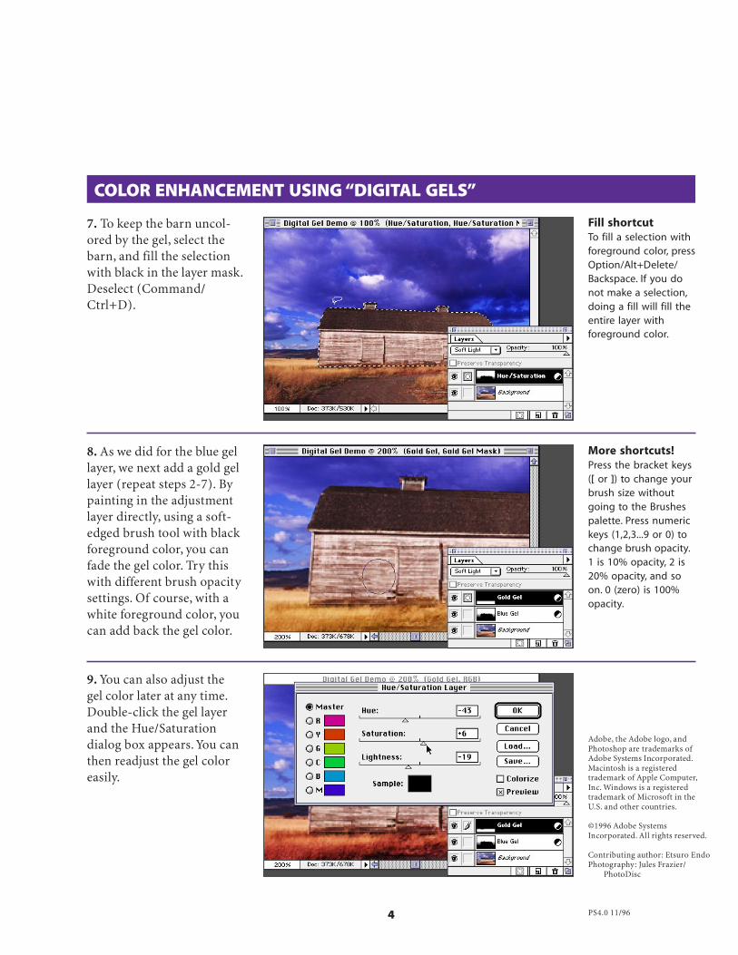
COLOR ENHANCEMENT USING “DIGITAL GELS”
1. Here’s the image we’ll startwith in Photoshop. Our goalis to add dramatic coloreffects to this conventionalphotography. We’ll add ablue-violet effect to the skyand gold to the field.
Professional photographers often use “gels” (gelatin filters) for creativecolor enhancements. Here’s how to add dramatic color effects using“digital gels” in Photoshop. With this technique, you can isolate eachcolor effect on an independent layer and get more flexibility and controlthan you would with traditional gels set in front of the camera lens.
2. Select New AdjustmentLayer from the Layers palettemenu, and in the Type pop-up menu, choose Hue/Saturation. Name the newlayer and click OK.
Adjustment LayerWith Photoshop 4.0’snew Adjustment layers,you can easily makechanges to underlyinglayers without affectingthe actual layers.
3. The Hue/Saturationdialog box appears. Click theColorize option. This trans-forms the layer you createdin step 2 into a digital gel.Make sure the preview box ischecked. Don’t click OK yet.
ShortcutsThroughout thisdocument, “Command/Ctrl” means Commandon the Macintosh andCtrl on Windows.“Option/Alt” meansOption on the Macintoshand Alt on Windows.

3
4. Move the Hue slider tofind the color you want. Usethe Saturation and Lightnesssliders to finetune the color.Click OK when you obtain acolor you like.
COLOR ENHANCEMENT USING “DIGITAL GELS”
5. Set the mode in the Layerspalette to Soft Light.
TipsPress the D key toset foreground andbackground colors tothe default black andwhite. You can alsouse the X key toexchange these colors.While you drag thegradient tool, pressthe Shift key toconstrain the move-ment to a perfectvertical direction.
6. With the Adjustment layerstill selected, choose thegradient tool. Pressing theD key, set the foregroundand background colors tothe default (black/white).Click and drag upward overthe image from the horizontoward the sky. This willlimit the gel effect to the skyportion of the image—thegradient mask you created.
Lightness settingThe Lightness sliderin the Hue/Saturationdialog box acts like a“gamma” control. Unliketraditional gels, high-lights and shadowsretain their originallightness values as ifthey are auto-exposed.In Soft Light blendingmode, changing thelightness of a layeraffects the midtones ofthe underlying image.
4
7. To keep the barn uncol-ored by the gel, select thebarn, and fill the selectionwith black in the layer mask.Deselect (Command/Ctrl+D).
8. As we did for the blue gellayer, we next add a gold gellayer (repeat steps 2-7). Bypainting in the adjustmentlayer directly, using a soft-edged brush tool with blackforeground color, you canfade the gel color. Try thiswith different brush opacitysettings. Of course, with awhite foreground color, youcan add back the gel color.
9. You can also adjust thegel color later at any time.Double-click the gel layerand the Hue/Saturationdialog box appears. You canthen readjust the gel coloreasily.
COLOR ENHANCEMENT USING “DIGITAL GELS”
More shortcuts!Press the bracket keys([ or ]) to change yourbrush size withoutgoing to the Brushespalette. Press numerickeys (1,2,3...9 or 0) tochange brush opacity.1 is 10% opacity, 2 is20% opacity, and soon. 0 (zero) is 100%opacity.
Fill shortcutTo fill a selection withforeground color, pressOption/Alt+Delete/Backspace. If you donot make a selection,doing a fill will fill theentire layer withforeground color.
Adobe, the Adobe logo, andPhotoshop are trademarks ofAdobe Systems Incorporated.Macintosh is a registeredtrademark of Apple Computer,Inc. Windows is a registeredtrademark of Microsoft in theU.S. and other countries.
©1996 Adobe SystemsIncorporated. All rights reserved.
Contributing author: Etsuro EndoPhotography: Jules Frazier/
PhotoDisc
PS4.0 11/96

Adobe Seminars: Web Page Designby Lisa Lopuck and Sheryl Hampton
Adobe Seminars: Web Page Design is a portable seminar on web page
design taught by experienced professionals that documents Adobe
software such as Adobe Photoshop 4, Adobe Illustrator 7, and Adobe
PageMill 2, as well as the latest HTML language protocols.
This October 1997 Adobe Press book will bring all the essential information
of a two-day seminar into a compact and reusable format, complete with
CD and step-by-step techniques. Two noted Web seminar instructors, Lisa
Lopuck and Sheryl Hampton of ElectraVision, have distilled their training
sessions into over a hundred two-page techniques using popular Adobe
applications to simulate how Web pages are actually created. The result is a
reference book of clear, simple explanations and designs that are reusable
page after Web page.
Adobe Seminars: Web Page Design
Publication Date: Oct. 1, 1997
US $40
ISBN: 1-56830-426-9
4-color, 264 pages, includes ImageClub CD
The techniques withinthis Acrobat™ PDF fileare from the upcom-ing Adobe Press bookAdobe Seminars:Web Page Design.

, : , .
To keep the download time to a minimum,
yet keep a rich feel to a Web page, people
often use a decorative background tile. The
problem with background tiles, however, is
correctly preparing graphics so that they
match when placed on top of the tile.
Because you cannot predict where the tile
will fall on the Web page, people often
assume that they need to use rough-edged
aliased graphics. This exercise, however,
shows how to prepare soft-edged, anti-
aliased graphics that will match your tile.
:
Prepare an anti-aliased, soft-edged image merged into a single transparent
layer and set aside for later.
Compositing Graphics to a Background TileC7Lesson
. Object Gear, Amusements: Dog Biscuits, CrocodileFont: Image Club Overprint
:
Create a new layer and fill it with the background tile (To create a back-
ground tile, see Exercise C5.) To fill a layer with a background tile, first
select the tile with the Marquee selection tool and then choose Define
Pattern from the Edit menu. With the pattern defined, choose Fill from the
Edit menu and select “Pattern” from the Contents pop-up options.

, : , .
: The Mac system palette includes all of the Web safe colors plus 40 extra.
On 16 and 24 bit displays, you will not notice any change in quality. On
8 bit displays, the 40 extra colors will dither, but the effect is negligible.
: When you create a new file, its dimensions will
automatically be the size of the copied image.
: As opposed to generating a “shrink-to-fit” selection by
Command-clicking on the layer icon, the Magic Wand
works best in this case because you are creating an aliased
selection that will include the soft anti-aliased edges.
:
Leave the background tile layer and select the image layer. Using the Magic
Wand, you need to make an aliased selection around the image. To do this,
set the Wand’s tolerance to zero and uncheck the anti-aliased option. Click
on the transparent area around the image and then choose Similar from the
Select menu to make sure you capture all the transparent areas. Invert the
selection so that the object is selected.
:
With the selection still active, merge the image layer with the background
tile layer (or create an “option merge,” see Lesson B7). Make sure the new
merged layer is the active layer, and copy the selected portion. Although
you have an aliased selection, you will be grabbing the soft-edges that have
been blended to the background tile pattern.
:
Create a new file and fill it with a solid color from the web palette (see
Lesson E2 regarding the Web-safe color palette). This will become your
transparent color so be sure to select a color that is not in your image (a
bright color often works well). Paste the copied image into this new file.
:
Change the image’s mode from RGB to Index Color and select either the
Web colors or the Mac System palette. Next, export the image as a Gif using
Photoshop’s Gif 89A export feature located in the File menu. When the Gif
89A interface comes up, position the cursor over the color to be transpar-
ent and click once; the area should turn gray. Decide whether you want the
image to be interlaced or non-interlaced and click OK.

Adobe Seminars: Web Page Designby Lisa Lopuck and Sheryl Hampton
Adobe Seminars: Web Page Design is a portable seminar on web page
design taught by experienced professionals that documents Adobe
software such as Adobe Photoshop 4, Adobe Illustrator 7, and Adobe
PageMill 2, as well as the latest HTML language protocols.
This October 1997 Adobe Press book will bring all the essential information
of a two-day seminar into a compact and reusable format, complete with
CD and step-by-step techniques. Two noted Web seminar instructors, Lisa
Lopuck and Sheryl Hampton of ElectraVision, have distilled their training
sessions into over a hundred two-page techniques using popular Adobe
applications to simulate how Web pages are actually created. The result is a
reference book of clear, simple explanations and designs that are reusable
page after Web page.
Adobe Seminars: Web Page Design
Publication Date: Oct. 1, 1997
US $40
ISBN: 1-56830-426-9
4-color, 264 pages, includes ImageClub CD
The techniques withinthis Acrobat™ PDF fileare from the upcom-ing Adobe Press bookAdobe Seminars:Web Page Design.

, : , .
: Image Club graphics have a perfect selection stored as a path. Simply
go into the Paths palette, and load the path as a selection. To quickly
convert the path to a selection, Hold down the Command key (Mac)
or the Control key (Windows), and click the path’s icon.
One of the more common tasks in Photoshop
is combining images to create a custom
collage. In this exercise, you create a Web site
banner, complete with text, that wraps to the
image by combining multiple images in
Photoshop, (see Session D!0).
:
In Photoshop, open a few images that you would like to incorporate into your
collage so that each image is open in a separate window. Create a new file
with a white background that will be large enough to assemble your collage.
Creating a CollageD9Session
. Object Gear Gentleman’s Study: Personal LetterObject Gear Travels: Helm, WaterObject Gear Amusements: Starfish 2Font: Adobe Kepler
:
Using the Move tool, click one of the images and drag it into the new file.
Drag the remaining images into the new file in the same way. If the image is
on a solid background, the background comes with the image when it is
dragged into the new file. To bring in just the image, select the background
with the Magic Wand tool set on a tolerance of at least 32, with the anti-
aliased checkbox selected. Invert the selection, and then drag the image
into the new file using the Move tool.

, : , .
: You can access other Free Transform
functions by pressing the Control key
while clicking and holding anywhere in
the document. A pop-up menu
appears with more Transform
functions like Skew and Perspective.
:
Resize each of the elements of your collage using the Free Transform
function located in the Layer menu. To scale the image proportionately,
hold down the Shift key while dragging one of the corner handles. To rotate
the image, click and drag outside of the envelope.
:
To create the faded effect on the ocean image, create a layer mask for the
ocean layer. Using the Paintbrush tool and a large brush, paint black into
the layer mask. Painting with black is like painting with transparency. The
advantage to using a layer mask is you can “erase” your image without really
erasing your image. To turn on and off the effects of the layer mask, hold
down the Shift key and click the Layer Mask icon.
:
Now that all the images are in place, you can add a few finishing touches to
polish the look. Add an instant drop shadow (see Session D1) for the
starfish, and create cast shadows (see Session D2) for both the helm and
the letter. Enhance the color contrast of the helm using both the Curves
and the Levels functions. Finally, you can add text that wraps to the shape
of the helm by following the instructions in Session D!0 .

Creative Masking Techniquesfor Compositing
Adobe Digital Video Evangelist George Jardinedemonstrates creative masking techniques
with Adobe® Photoshop®
INTERMEDIATE

2
CREATIVE MASKING TECHNIQUES FOR COMPOSITING
Making complex selections and creating the most effective channel(or mask) for compositing operations in Adobe Photoshop can be afine art. Frequently the best mask for a given image already exists,ready to be used. In this exercise, I’ll show you a method for creatinga mask directly from an object in an image. This technique worksbest for objects on a dark background.
1. Here’s an image we’dlike to composite againsta background of anothercolor—a photo of a cloudedblue sky, for instance. It’sobvious that creating aselection of the bird will bedifficult, especially whileattempting to preserve themotion blur in the wings.
2. It looks as if the luminosityof the RGB composite mightbe a good place to startcreating our mask. Load theluminosity of any group ofvisible layers as a selectionby pressing Option/Alt+Command/Ctrl+~. Next,save the selection into a newchannel by choosing Select >Save Selection. Deselect andgo to the new channel.
3. Use Levels or Curves toeliminate most of the mid-tones in your new mask,preserving only the darkestedges. Notice the gray tonesalong the blurred portion ofthe wings. These areas willcreate semi-transparencyduring compositing. Be sureto use a paint brush to cleanup your mask channel.
Super-user tips!You can load theluminosity of the RGBcomposite as a selectionby Command/Alt+clicking the RGBcomposite channel inthe Channels palette,and you can easily savethe current selectioninto a new channel byclicking the SaveSelection icon at thebottom of the Channelspalette.
ShortcutsThroughout thisdocument, “Command/Ctrl” means Commandon Macintosh and Ctrlon Windows systems.“Option/Alt” meansOption on Macintoshand Alt on Windows.

3
4. Set your target back tothe RGB composite and loadyour finished channel as aselection. Drag the selectedarea onto the new background.
CREATIVE MASKING TECHNIQUES FOR COMPOSITING
5. Notice that the semi-transparent areas along theedges are too dark as theycontain some black from thebackground of the originalimage. Finish the compositeby using the dodge tool tolighten these edges. Set it toShadow mode, and use asoft-edged brush set to 80%or 90% opacity.
Dodge and burn toolsIf the hue shifts whenyou use the dodge orburn tools, try convert-ing your image to LABmode first. The dodgeand burn tools onlyaffect Luminosity whenused in LAB mode.
6. Here’s our finishedcomposite. Nice.
Adobe, the Adobe logo, andPhotoshop are trademarks ofAdobe Systems Incorporated.Macintosh is a registeredtrademark of Apple Computer,Inc. Windows is a registeredtrademark of Microsoft in theU.S. and other countries.
©1996 Adobe SystemsIncorporated. All rights reserved.
Photo ©1995 Don Fogg
PS4.0 11/96

DIGITAL DUPLICATION
The new Free Transform in Adobe® Photoshop® 5.0 can give you a whole newperspective on life! Have you ever wanted to scale and move objects in a step andrepeat pattern, as you do in Adobe® Illustrator®? Well, now you can. So let’s getrolling and discover the secrets of transformation in Photoshop 5.0.
1. Let’s say you need an imageof a typical business meeting.You have this image from theAdobe Image Library, but it justdoesn’t look like it’s going to bea very big meeting. Let’s implythat we’re anticipating a fewmore attendees by adding a fewmore note pads. How will wepull this off? We’ll duplicate thenotepads by scaling and movingthem with perfect perspective.And the one incredible featurewe’ll use to do it is the powerfulFree Transform in Photoshop.
Adobe Senior CreativeDirector Russell Brown
reveals secrets oftransfromation in
Photoshop 5.0. INTERMEDIATE
2. Before we start, it’s impor-tant to note that this techniqueworks best on images with asequence of objects in per-spective. This technique willattempt to match and copy thesequence so that it createsmore objects with the correctperspective. Now, let’s beginby placing guides around thelast object in the sequence wewant to duplicate. (You’ll beusing guides in combinationwith the Free Transform.)Choose View > Snap to Guidesbefore you start.
ShortcutsThroughout thisdocument, “Command/Ctrl” means Commandon the Macintosh andCtrl on Windows.“Option/Alt” meansOption on theMacintosh and Alton Windows.
GuidesTo create guides, clickand drag from theruler at the edge ofthe image. Show rulersby choosing View >Show Rulers.

Digital Duplication 2
3. Turn off the Guides tempo-rarily by choosing View > HideGuides. Now, select the second-to-the-last object in thesequence you want to duplicate.In this case, I selected thesecond-to-the-last note pad andits shadow using the polygontool found under the lasso tool.(Click and hold the lasso tool toreveal the polygon tool.)
4. Next, while pressing theOption/Alt key, select FreeTransform from the Edit menu.The Option/Alt key willmodify the transformation andmake a copy of the selectioninstead of cutting it out of thebackground image. Thismodification is a very impor-tant step in this process.
5. Turn the Guides back on.Choose View > Show Guides.Move the object you aretransforming over the lastimage in the sequence andsnap it to one of the cornersformed by the guides.
TransformationsYou can move objectsthat are being trans-formed in one-pixelincrements by usingthe keyboard arrows.Using the Shift key incombination with thearrow keys will movethe object 10 pixels.
ShortcutThe keyboard shortcutcombination for thisstep is: Option/Alt+Command/Ctrl+T.

Digital Duplication 3
The Magic Key Combination!7. OK, this is the final andmost important step to thisentire process. Press Option/Alt+Command/Ctrl+Shift+T.This crazy combination of keyswill transform the last trans-formed image again to make acopy. Repeat this combinationof keys until you have as manyobjects as you need to fillyour image.
6. Stretch the four corners ofthe image out to the cornerscreated by the guides. This willdistort the image to match theangle and perspective of thesequence. When finished, pressthe Enter key. The object will betransformed to match yourdistortion and positioning.
8. As you can see, I repeated thesame process down the otherside of the table and now thehigh-powered meeting is readyto start!
PathsThis same keyboardcombination willwork with paths inPhotoshop. Justtransform a path andthen use these samekeys to duplicate asequence of paths.
Adobe, the Adobe logo,Illustrator and Photoshop aretrademarks of Adobe SystemsIncorporated. Macintosh is atrademark of Apple Computer,Inc., registered in the U.S. andother countries. Windows iseither a registered trademarkor a trademark of Microsoft inthe U.S. and/or other countries.
©1998 Adobe SystemsIncorporated. All rightsreserved.
Photo Credit © Adobe ImageLibrary.
PS5.0 9/98

Russell Brown, Senior Creative Directorat Adobe, shows you how to remove those
pesky stains from your fine imagesusing Adobe® Photoshop®
ADVANCED
Digital StainRemover
2
STAGE 1: THE EASY STUFF
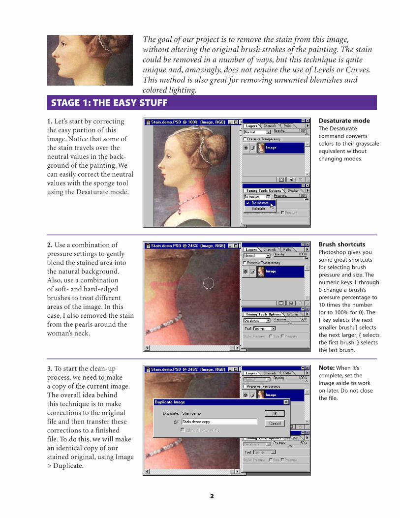
The goal of our project is to remove the stain from this image,without altering the original brush strokes of the painting. The staincould be removed in a number of ways, but this technique is quiteunique and, amazingly, does not require the use of Levels or Curves.This method is also great for removing unwanted blemishes andcolored lighting.
1. Let’s start by correctingthe easy portion of thisimage. Notice that some ofthe stain travels over theneutral values in the back-ground of the painting. Wecan easily correct the neutralvalues with the sponge toolusing the Desaturate mode.
2. Use a combination ofpressure settings to gentlyblend the stained area intothe natural background.Also, use a combinationof soft- and hard-edgedbrushes to treat differentareas of the image. In thiscase, I also removed the stainfrom the pearls around thewoman’s neck.
3. To start the clean-upprocess, we need to makea copy of the current image.The overall idea behindthis technique is to makecorrections to the originalfile and then transfer thesecorrections to a finishedfile. To do this, we will makean identical copy of ourstained original, using Image> Duplicate.
Note: When it’scomplete, set theimage aside to workon later. Do not closethe file.
Desaturate modeThe Desaturatecommand convertscolors to their grayscaleequivalent withoutchanging modes.
Brush shortcutsPhotoshop gives yousome great shortcutsfor selecting brushpressure and size. Thenumeric keys 1 through0 change a brush’spressure percentage to10 times the number(or to 100% for 0). The[ key selects the nextsmaller brush; ] selectsthe next larger; { selectsthe first brush; } selectsthe last brush.
3
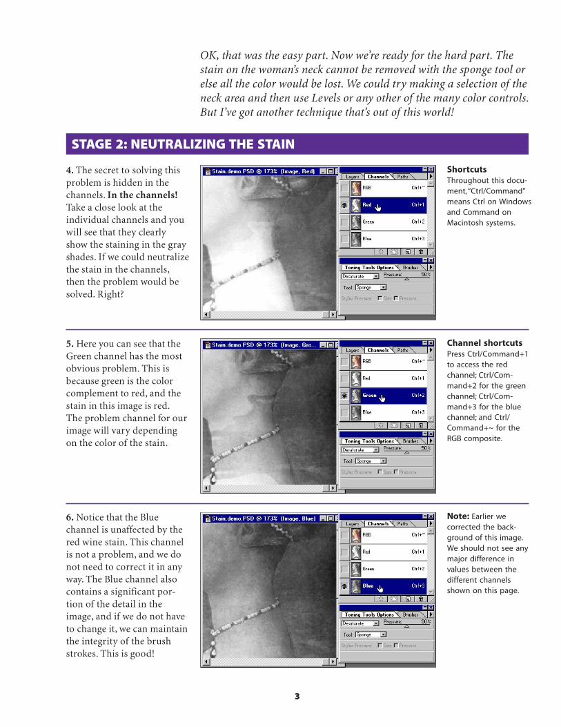
STAGE 2: NEUTRALIZING THE STAIN
4. The secret to solving thisproblem is hidden in thechannels. In the channels!Take a close look at theindividual channels and youwill see that they clearlyshow the staining in the grayshades. If we could neutralizethe stain in the channels,then the problem would besolved. Right?
5. Here you can see that theGreen channel has the mostobvious problem. This isbecause green is the colorcomplement to red, and thestain in this image is red.The problem channel for ourimage will vary dependingon the color of the stain.
6. Notice that the Bluechannel is unaffected by thered wine stain. This channelis not a problem, and we donot need to correct it in anyway. The Blue channel alsocontains a significant por-tion of the detail in theimage, and if we do not haveto change it, we can maintainthe integrity of the brushstrokes. This is good!
Note: Earlier wecorrected the back-ground of this image.We should not see anymajor difference invalues between thedifferent channelsshown on this page.
OK, that was the easy part. Now we’re ready for the hard part. Thestain on the woman’s neck cannot be removed with the sponge tool orelse all the color would be lost. We could try making a selection of theneck area and then use Levels or any other of the many color controls.But I’ve got another technique that’s out of this world!
ShortcutsThroughout this docu-ment, “Ctrl/Command”means Ctrl on Windowsand Command onMacintosh systems.
Channel shortcutsPress Ctrl/Command+1to access the redchannel; Ctrl/Com-mand+2 for the greenchannel; Ctrl/Com-mand+3 for the bluechannel; and Ctrl/Command+~ for theRGB composite.

4
STAGE 3: SELECTING THE STAINED AREA
7. Return to the RGB com-posite. Double-click the lassotool and set the Featheroption to a value that willgive you a soft edge. Remem-ber, the value you use isbased on the resolution ofthe image. The higher theresolution, the greater thefeather value. Make a selec-tion of the stained area.
8. Select Quick Mask modefrom the Tool palette andedit the selection area withthe paintbrush tools. This isa great way to create a maskthat matches your imageexactly. It’s important to taketime here to create a goodselection; it will pay off inthe end.
9. Finally, paint over anyother areas that do not needto be corrected. In this case,we protected the pearls. Thepearls were corrected earlierand do not need any morecorrection.
Super tipUse the Levels controlsto adjust the area ofthe Quick Mask. Levelsare often overlookedas a convenient way toadjust a selection whilein Quick Mask mode.
Quick Mask modePress the letter Q onthe keyboard to changeto Quick Mask mode.To change the colorof the mask, simplydouble-click the QuickMask channel in theChannels palette ordouble-click the QuickMask icon. An adjust-ment dialog box willappear.

5
STAGE 4: NEUTRALIZING THE STAIN
10. Return to Selection modeby pressing the Q key. ChooseLayer > New > Layer ViaCopy (Ctrl/Command+J) tocopy the selected area to anew layer.
11. Invert the new layerfrom the Image menu (Ctrl/Command+I).
12. Set the mode for the layerto Color. The results shouldlook something like this.

6
13. Next, we need to view theRed channel only. To do this,press Ctrl/Command+1 onthe keyboard. You will beviewing a grayscale represen-tation of the composite ofthe two layers.
14. Here is where the magicstarts! Adjust the opacity ofthe second layer until thegray values in the Redchannel match the surround-ing image. It’s magic! It’samazing! Your friends andrelatives will be thrilled!Here you see that, by adjust-ing the opacity of the in-verted layer, we can neutral-ize the color problems oneach channel. WOW!
Hint: For best results,make sure that theabrupt edges havecompletely vanishedinto the surroundingimage.
15. The next step is a littletricky. Our goal is to get acopy of this corrected Redchannel into the duplicateimage we made earlier. Butwait! Copy and Paste will notwork! Doing a copy and pastewould only copy the targetedlayer. We must use a specialpower-user technique. PressCtrl/Command+A to selectthe entire image. Then selectEdit>Define Pattern.
In the next few steps, we will correct the individual Red and Greenchannels of this image. Then we will copy the corrected results andplace them into the second image. A little complex, but it works!
Define PatternDefine Pattern is oneof the few ways tomake a copy of acomposite image.The Copy commandwill not copy informa-tion on other layers.
Warning: You mustmake a selectionbefore you can chooseDefine Pattern fromthe Edit menu.
STAGE 5: DIGITAL MAGIC
Before
After

7
17. Next, select Edit > Filland completely fill the Redchannel with the pattern wejust created. Continue thisprocess (from step 14) ofmaking corrections on theGreen channel of the firstimage and then transferringthe results to the secondimage. Remember, theopacity value of eachchannel may differ.
16. After you define thepattern, bring the secondcopied image to the fore-ground. Press Ctrl/Com-mand+1 on the keyboard.This displays the Redchannel only.
18. Here is a comparison ofthe Green channel before thedigital correction (on the left)and after the adjustments (onthe right). The stain has beenliterally neutralized. Amazingbut true!
STAGE 5: DIGITAL MAGIC
Note: Copyingcorrections directlyinto the originalwill not work! Thecorrected channelsmust be integratedwith a copy of theimage to make thistechnique work.
Pattern FillRemember, fillingwith a pattern is theonly technique thatworks. In this case,only the Red andGreen channels mustbe replaced.

8
19. After you’ve made all thecorrections, press Ctrl/Command+~ to display thefull-color image. OH NO!There’s a slight hue shift tothe image! You will quicklynotice that even the greatmaster is not perfect. Theabrupt edge is gone, but aslight discoloring may stillexist.
20. We can easily fix thiswith a soft-edged brush setto Color mode and opacityof 50% or less. Press the Alt/Option key to sample thecolor you want to use in thatarea (a Sample Size of 3 by 3Average is best), and thenpaint over it with the newcolor.
21. When you’re done, theimage should look perfect.No new brush strokes—andeverything as good as new!
FinetuningWe still need to doa bit more touchingup to complete thisproject. In this case Itook a color samplefrom the woman’s faceand transferred it tothe discolored areasof her neck.
STAGE 5: DIGITAL MAGIC
Adobe, the Adobe logo, andPhotoshop are trademarks ofAdobe Systems Incorporated.Macintosh is a registeredtrademark of Apple Computer,Inc. Windows is a registeredtrademark of Microsoft in theU.S. and other countries.
©1996 Adobe SystemsIncorporated. All rights reserved.
Photography: Classic PIOPartners, Doug Menuez andPhotoDisc
Special thanks to Russ Sparkman
PS4.0 11/96
Sample area
DISPLACE SHADOWS WITH PHOTOSHOP
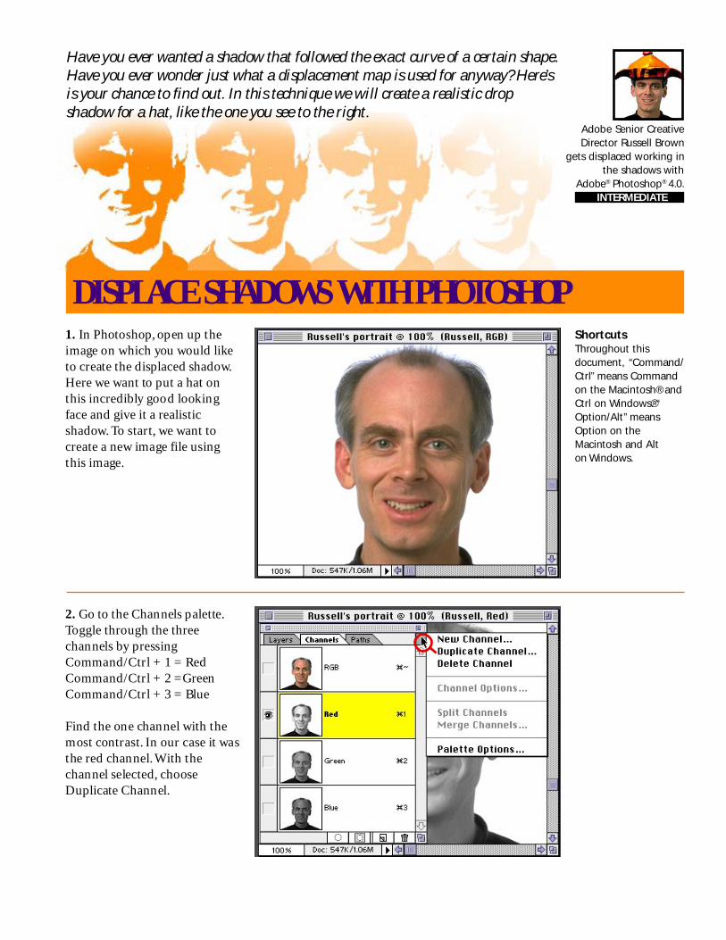
Have you ever wanted a shadow that followed the exact curve of a certain shape.Have you ever wonder just what a displacement map is used for anyway? Here’sis your chance to find out. In this technique we will create a realistic dropshadow for a hat, like the one you see to the right.
1. In Photoshop, open up theimage on which you would liketo create the displaced shadow.Here we want to put a hat onthis incredibly good lookingface and give it a realisticshadow. To start, we want tocreate a new image file usingthis image.
2. Go to the Channels palette.Toggle through the threechannels by pressingCommand/Ctrl + 1 = RedCommand/Ctrl + 2 =GreenCommand/Ctrl + 3 = Blue
Find the one channel with themost contrast. In our case it wasthe red channel. With thechannel selected, chooseDuplicate Channel.
ShortcutsThroughout thisdocument, “Command/Ctrl” means Commandon the Macintosh® andCtrl on Windows.®“Option/Alt” meansOption on theMacintosh and Alton Windows.
Adobe Senior CreativeDirector Russell Brown
gets displaced working inthe shadows with
Adobe® Photoshop® 4.0. INTERMEDIATE

Displacing Shadows With Photoshop 2
3. In the dialog box you willwant to choose “New” underDocument. Then in the Namefield type in “Blur map”. Note: ifyou are on Windows you mustgive it the .psd extension.
4. You should now have a newimage with the file name Blurmap open on your desktop.Notice: if you check its chan-nels, it has only one channel.This is important because weonly want to displace ourshadow vertically. In order tohave true horizontal displace-ment there must be a secondchannel.
Displacement mapA Displacment mapis basically a secondimage that theDisplacement filteruses to determine howto distort the selection.Any Photoshop fileexcept bitmaps canbe used.
5. Now we want to smooth outthe gradations in this image andhave detail without any speck-ling. The best way to do this isto choose Filter > Noise > De-speckle. Repeat filter three tofour times. (Command/Ctrl + F)The softer and smoother thedisplacement map, thesmoother the shadow effect.Once you have done this, savethe image and put it aside.

Displacing Shadows With Photoshop 3
8. Now, we want to create ourshadow. Select the bottom layerand click the new layer icon.This will create a new layerbetween the hat and our face forthe shadow. With this layer stillselected, create an approximateshadow using one of the selec-tion tools. (Remember, the theexact shaping will be done withthe Diplacement filter). Fillyour selection with 50% gray.Deselect, and choose Filter >Blur > Gaussian blur to createa soft shadow.
6. Let’s go back to our originalimage. Get back in RGB com-posite mode. (Command/Ctrl +~) Next, open the image thatyou want the shadow to fallunder. In this case, we want tohave a realistic shadow fallingunder the brim of this hat.Ahha, now it’s starting to makesense! Notice that our hatalready has a transparentbackground.
7. Bring in the second imageeither by copying and pastingor dragging and dropping. Sizeit using the transform tool(Command/Ctrl + T). Place itinto final position. You’ll wantto do this in order to see wherethe shadow needs to fall.
ShadowsAnother quick way tocreate a soft shadow ismake your selectionthen choose Select >Feather. Type in a pixelvalue for the selectionedges to be feathered.
Transform!To bring up the dialogbox for the Transformtool, try the shortcutShift + Command/Ctrl + T.

Displacing Shadows With Photoshop 4
10. Next, a dialog box appearsasking for a file to use for thedisplacment map. Navigate towhere you saved the Blur mapfile and select it. Click OK andwait for the results. Wow! Theshadow magically bends overthe contour of this perfect face.Ahaa.
11. Now, to make it a littlemore realistic, set the mode toMulitply. Looks OK, but wecan do better than this!
9. With the shadow layer stillselected choose Filter > Distort> Displace. Enter 0 in theHorizontal scale and approxi-mately 30 in the Vertical scale.(Although you may want toexperiment with the amount.)The rest of the settings can staythe same. Click OK.
Displacement FilterRemember, the imagewe’re using for ourdisplacement map hasonly one channel.Through experimenta-tion, we have foundthat only the verticalscale is needed for agood-looking shadow.
Multiply ModeEffectively like sand-wiching two negativestogether, this modelooks at the colorinformation in thechannels and multipliesthe base color by theblend color, darkeningthe color underneath it.
Displacing Shadows With Photoshop 5
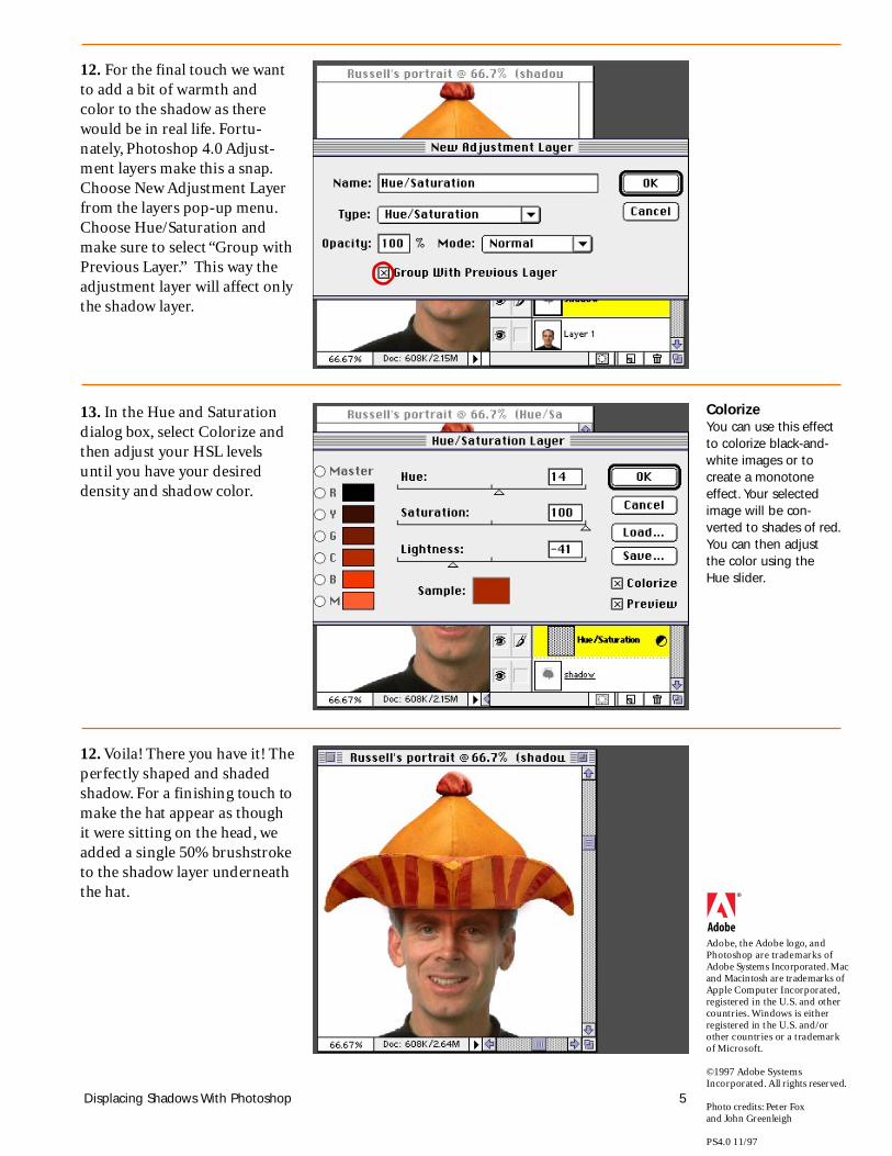
12. For the final touch we wantto add a bit of warmth andcolor to the shadow as therewould be in real life. Fortu-nately, Photoshop 4.0 Adjust-ment layers make this a snap.Choose New Adjustment Layerfrom the layers pop-up menu.Choose Hue/Saturation andmake sure to select “Group withPrevious Layer.” This way theadjustment layer will affect onlythe shadow layer.
13. In the Hue and Saturationdialog box, select Colorize andthen adjust your HSL levelsuntil you have your desireddensity and shadow color.
12. Voila! There you have it! Theperfectly shaped and shadedshadow. For a finishing touch tomake the hat appear as thoughit were sitting on the head, weadded a single 50% brushstroketo the shadow layer underneaththe hat.
Adobe, the Adobe logo, andPhotoshop are trademarks ofAdobe Systems Incorporated. Macand Macintosh are trademarks ofApple Computer Incorporated,registered in the U.S. and othercountries. Windows is eitherregistered in t he U.S. and/orother countries or a trademarkof Microsoft.
©1997 Adobe SystemsIncorporated. All rights reserved.
Photo credits: Peter Foxand John Greenleigh
PS4.0 11/97
ColorizeYou can use this effectto colorize black-and-white images or tocreate a monotoneeffect. Your selectedimage will be con-verted to shades of red.You can then adjustthe color using theHue slider.

NicerLookingFadeEffect
INTERMEDIATE

2
NICER LOOKING FADE EFFECT
1. Let’s quickly review how toget a fade effect in Photoshop.Place an image to fade on alayer, and choose Layer >Add Layer Mask > Reveal All.Make sure that the LayerMask Thumbnail icon isselected in the Layers palette.Using the gradient tool, set todefault black and white, andclick and drag over the image.
Have you ever had a fade effect look as if it’s starting or ending tooabruptly—or almost being cut off? Here we explain how to use AdobePhotoshop to solve that problem and achieve better fade effects.Although the visible quality enhancement with this technique mayvary, it’s a good tip to know…
2. Now let’s check out thefade effect you’ve created.You may notice that the fadelooks as if it’s starting orending too quickly or almostas if it’s being cut off. Thehigher the lightness contrastbetween the fading imageand the background, and theshorter the distance of thefade, the more obvious thisbecomes.
Layers PaletteThe eye icon in the firstcolumn lets you knowif the layer is visible ornot. The second columnhas two icons, onebeing the paintbrushwhich tells you that youare painting on thelayer, the other tellingyou that the layer maskis selected.
3. Here’s how to solve theproblem. Follow the sameprocess described in step 1,but when you draw a gradi-ent on the layer mask, draw itabout 25% longer than usualtoward both the starting andending directions.

3
4. With the layer mask chan-nel still selected as the currenttarget channel, choose Image> Adjust > Curves. By addingtwo control points, shape anS-curve as shown here. Youmay want to adjust the curveto change the look of the fadetransition. If you like the fadeeffect in the preview, click OK.
NICER LOOKING FADE EFFECT
5. By applying the S-curve-based tonal correction to thelayer mask, you add speedchanges to the fade transi-tion—some speed accelera-tion at the beginning andsome speed reduction at theend. This prevents the fadefrom starting or ending tooquickly; thus you get a morenatural-looking fade.
Note: Fading edges also canbe created with the Featheroption on the Select menuand some Selection tools.Feather always createsnatural-looking fading edgesbecause it has the S-curveeffect built-in.
Curves dialog boxTo add a control pointin the Curves dialogbox, click and drag onthe graph area. Toremove a controlpoint from a curve,drag the control pointoff the graph area.
Right: Fade createdwith the S-curvetechnique.
Left: Fade effect withdefault gradient.
Adobe, the Adobe logo, andPhotoshop are trademarks ofAdobe Systems Incorporated.
©1996 Adobe SystemsIncorporated. All rights reserved.
Contributing author: Etsuro EndoPhotography: PhotoDisc
PS4.0 11/96

LayerMania
Russell Brown,Senior CreativeDirector atAdobe Systems,performs layersmagic withAdobe®
Photoshop®
ADVANCED
2
BLENDER DEMO PART 1 - LIGHTING EFFECTS
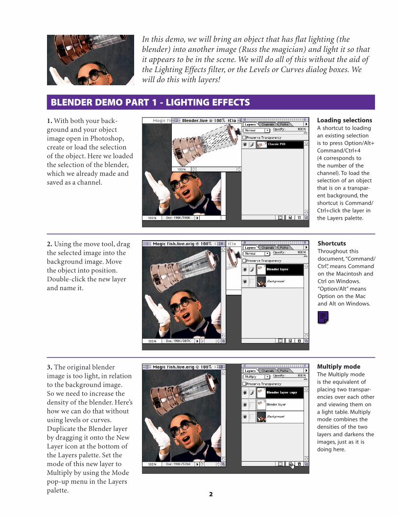
In this demo, we will bring an object that has flat lighting (theblender) into another image (Russ the magician) and light it so thatit appears to be in the scene. We will do all of this without the aid ofthe Lighting Effects filter, or the Levels or Curves dialog boxes. Wewill do this with layers!
1. With both your back-ground and your objectimage open in Photoshop,create or load the selectionof the object. Here we loadedthe selection of the blender,which we already made andsaved as a channel.
Loading selectionsA shortcut to loadingan existing selectionis to press Option/Alt+Command/Ctrl+4(4 corresponds tothe number of thechannel). To load theselection of an objectthat is on a transpar-ent background, theshortcut is Command/Ctrl+click the layer inthe Layers palette.
2. Using the move tool, dragthe selected image into thebackground image. Movethe object into position.Double-click the new layerand name it.
3. The original blenderimage is too light, in relationto the background image.So we need to increase thedensity of the blender. Here’show we can do that withoutusing levels or curves.Duplicate the Blender layerby dragging it onto the NewLayer icon at the bottom ofthe Layers palette. Set themode of this new layer toMultiply by using the Modepop-up menu in the Layerspalette.
Multiply modeThe Multiply modeis the equivalent ofplacing two transpar-encies over each otherand viewing them ona light table. Multiplymode combines thedensities of the twolayers and darkens theimages, just as it isdoing here.
ShortcutsThroughout thisdocument, “Command/Ctrl”, means Commandon the Macintosh andCtrl on Windows.“Option/Alt” meansOption on the Macand Alt on Windows.

3
4. To increase density evenmore, duplicate the copiedlayer two more times. Noticehow the blender darkenswith each layer duplicated.
BLENDER DEMO PART 1 - LIGHTING EFFECTS
5. The top portion of theblender is still not lit cor-rectly. We need to erase someof each of the layers, andwe can do this using layermasks. With the topmostlayer selected, choose Layer> Add Layer Mask > RevealAll. Add a layer mask to thenext two layers also.
6. Target the topmost layermask. Then select the gradi-ent tool, make sure yourdefault colors are white andblack, and click and drag atthe same diagonal as theblender to create a smoothtransition. Repeat this stepfor each layer that has a layermask. Notice how the high-lights start to form along thetop edge. BINGO!
Default ColorsPressing the D key onthe keyboard when alayer mask is selectedgives you the defaultwhite and black asyour foreground andbackground colors.Ifon a Layer image, thedefault colors wouldbe black and white asyour foreground andbackground.

4
BLENDER DEMO PART 1 - LIGHTING EFFECTS
7. Next, a reflection of mynice shiny head and whitegloves needs to appear onthe blender so that it lookslike it’s really part of thescene. Duplicate the Back-ground layer by dragging itonto the New Layer icon inthe Layers palette.
8. Choose Layer > Transform> Scale, and drag the lowermiddle point up to compressand distort the image. Don’tdouble-click yet.
9. The reflection should bean exact mirrored image, sowith the transform pointsstill active, choose Layer >Transform > Flip Vertical.Double-click inside theimage. Then, using the movetool, move the image intoposition.
FinetuningIf the image needsmore adjustments, usethe dodge and burntools or select thepaintbrush tool andpaint black on thelayer mask to addmore highlight effects.

5
BLENDER DEMO PART 1 - LIGHTING EFFECTS
10. The image shouldappear inside the blender.Move the Background copylayer up between the Blenderlayers. Hold down Option/Alt,and move the pointer over theline between the Backgroundcopy layer and the Blenderlayer below it. When thepointer changes to the clip-ping group icon, click todefine the two layers as aclipping group.
Clipping groupsA clipping group issomewhat like usingthe Paste Into com-mand with two layers.In this case, think of theblender layer as themasking shape and thebackground copy asthe image that will bepasted into the mask.
Overlay modeColors are overlaidon the existing pixelswhile the highlightsand shadows of thebase color arepreserved. The basecolor is not replacedbut is mixed with theblend color to reflectthe lightness anddarkness of theoriginal image.
11. With the Backgroundcopy layer still selected inthe Layers palette, chooseOverlay from the Modepop-up menu.
12. Using the move tool,move the image into placeso you can see the reflectionin the surface. If the imageis too light, duplicate theBackground copy layer bydragging it onto the NewLayer icon at the bottom ofthe palette.
Reflections 101Don’t forget your basicphysics when makingrealistic reflections.The angle of incidencealways equals theangle of reflection.
Angle of incid
ence
Angle of reflection

6
BLENDER DEMO PART 1 - LIGHTING EFFECTS
14. With the Backgroundcopy layer targeted, select theeraser tool with a mediumsize, soft edge. Clean up thehard edge of the reflection inthe blender by erasing theimage. Also, because thereflection would not appearthat high on the blender, takeout some of the reflectionappearing higher up on thesurface. And there you haveit, the fantastic blender trick!
13. Merge the layers thatcreate the reflection forfurther finetuning. WithBackground copy 2 selected,choose Merge Down fromthe Layers palette pop-upmenu.
FlexibilityBy creating thereflection on a layer ofits own, you can easilyedit and reposition itat any time.

7
BLENDER DEMO PART 2 - WORKING WITH SMALL ANIMALS
1. Continuing to work withthe blender image from theprevious demo, choosePreferences > Display &Cursors. Select Brush Sizeand Precise. Click OK. Selectthe paintbrush tool with amedium size, soft-edgebrush.
In this next portion of the demo, we’ll experiment with moreadvanced capabilities to enhance the blender. Yes, it’s a little moretricky, because more layers will be added. First, we’ll tone down thebright highlights on the blender with some great brush tricks, andthen we’ll add a fish so that it looks as if it’s inside the blender.
Brush size tipTo change your brushsize without going tothe Brushes palette,press the OpenBracket and CloseBracket ([ and ]) keysto reduce and enlargethe brush size.
2. Target the original Blenderlayer. While holding downthe Option/Alt key (whichtoggles you from the paint-brush to the eyedroppertool), select a light coppercolor from the blender totone back the highlight areas.Then check Preserve Trans-parency in the Layers palette.
PreserveTransparencyPreserve Transparencywill protect thetransparent areas inthe image and allowyou to paint onlywhere there are pixels.Preserve Transparencycreates something likean invisible mask.
3. Double-click the paint-brush tool to bring up thepaintbrush options. Choosean opacity of 50% and selectDarken mode in the pop-upmenu.
Darken modeWith Darken mode,the paintbrush willpaint only where thechosen foregroundcolor is darker thenthe highlight color. Itwill not paint in thedark shadow areas.

8
BLENDER DEMO PART 2 - WORKING WITH SMALL ANIMALS
4. Paint over the highlightareas. Notice that you don’thave to worry about goingbeyond the boundaries ofthe blender—PreserveTransparency is at work!Continue painting over allthe highlight areas to tonethem back. Feather thehighlight at the top of theblender to keep the curva-ture of the lid.
Opacity tipWhen a selection toolis active, pressing anyof the numeric keyschanges the opacityto a correspondingpercentage. Press 1 for10% and 0 (zero) for100%, and so on.
5. Now, as a challenge for yousuper users, we’re going toput a fish inside the blender.With the move tool, drag thefish into the blender imageand position it in theblender. Move the fish tothe topmost layer.
6. Select the lasso tool, andthen target the originalBlender layer. Holding downthe Option/Alt key, click theblender area around the fish,selecting the area that will besandwiched over the fish.
Note: No small animalswere harmed in thecreation of this demo.
9
BLENDER DEMO PART 2 - WORKING WITH SMALL ANIMALS
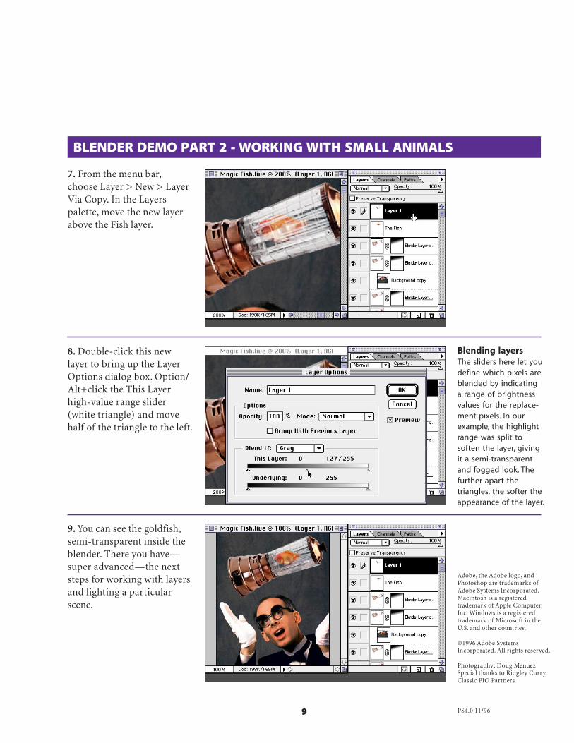
7. From the menu bar,choose Layer > New > LayerVia Copy. In the Layerspalette, move the new layerabove the Fish layer.
8. Double-click this newlayer to bring up the LayerOptions dialog box. Option/Alt+click the This Layerhigh-value range slider(white triangle) and movehalf of the triangle to the left.
Blending layersThe sliders here let youdefine which pixels areblended by indicatinga range of brightnessvalues for the replace-ment pixels. In ourexample, the highlightrange was split tosoften the layer, givingit a semi-transparentand fogged look. Thefurther apart thetriangles, the softer theappearance of the layer.
Adobe, the Adobe logo, andPhotoshop are trademarks ofAdobe Systems Incorporated.Macintosh is a registeredtrademark of Apple Computer,Inc. Windows is a registeredtrademark of Microsoft in theU.S. and other countries.
©1996 Adobe SystemsIncorporated. All rights reserved.
Photography: Doug MenuezSpecial thanks to Ridgley Curry,Classic PIO Partners
PS4.0 11/96
9. You can see the goldfish,semi-transparent inside theblender. There you have—super advanced—the nextsteps for working with layersand lighting a particularscene.

MAKING SEAMLESS PATTERNS
To make a pattern in Adobe® Photoshop®, you simply select an area using therectangle marquee tool and then choose Edit > Define Pattern. Almostalways, however, filling an area with this pattern will leave telltale tilinglines, or grids. For a pattern to tile seamlessly, the edges of the pattern tilesmust align exactly to create a continuous image. This technique shows howto create a pattern tile with edges that won’t be visible when the tile repeats.
1. Open the image thatcontains the area you wantto use for a pattern tile.
2. Crop the image to the sizeand area you want the patterntile to be.
The tile imageImages with plain ortextured backgroundsare the best candidatesfor a smoothly tilingpattern because it iseasier to smooth awaythe tile lines. Try toavoid images withgradations becausethese are very difficultto touch up. Also,select an image orobject that doesn’tbleed off the edge ofthe tile.
Luanne Seymour Cohen,Creative Director at
Adobe Systems showsyou how to make aPhotoshop pattern
without seam lines.INTERMEDIATE
ShortcutsThroughout thisdocument, “Command/Ctrl” means Commandon the Macintosh andCtrl on Windows.“Option/Alt” meansOption on the Macintoshand Alt on Windows.
Making Seamless Patterns 2
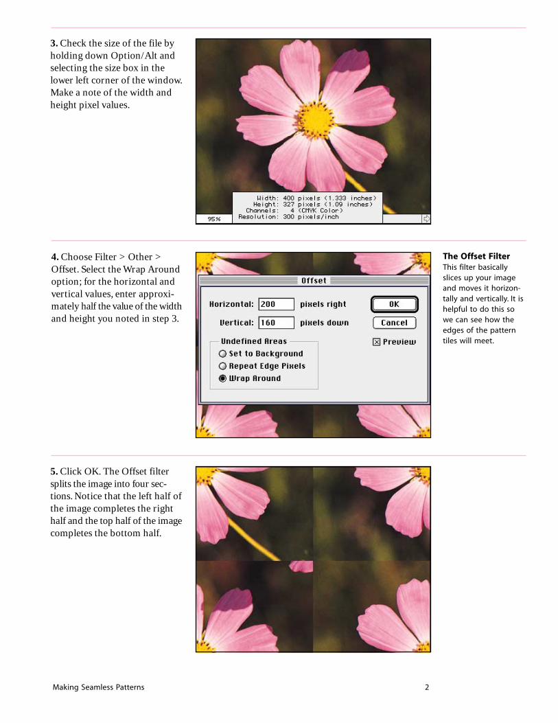
3. Check the size of the file byholding down Option/Alt andselecting the size box in thelower left corner of the window.Make a note of the width andheight pixel values.
4. Choose Filter > Other >Offset. Select the Wrap Aroundoption; for the horizontal andvertical values, enter approxi-mately half the value of the widthand height you noted in step 3.
5. Click OK. The Offset filtersplits the image into four sec-tions. Notice that the left half ofthe image completes the righthalf and the top half of the imagecompletes the bottom half.
The Offset FilterThis filter basicallyslices up your imageand moves it horizon-tally and vertically. It ishelpful to do this sowe can see how theedges of the patterntiles will meet.

Making Seamless Patterns 3
6. Now use the rubber stamptool to blend the center seamsbetween the four sections ofthe image. I use a soft-edgedbrush set at 50% opacity. Thegoal is to try to blend thebackgrounds of each rectangletogether and to remove otherelements that you don’t want torepeat. (In this example, I re-moved the stem and the straybit of petal.)
Cloning a smoothbackgroundTry to clone usingmultiple, short brushstrokes so that thestroke itself is notvisible. Use a brushthat is similar in sizeand texture to thebackground. For thissoft, diffused back-ground I used a soft,transparent brush.
→ →
7. To put the finishing toucheson the pattern tile, we mustreverse the offset process.Choose Filter > Other > Offset.This brings up the filter dialogbox last used. Add a minusbefore each of the pixel valuesto reverse the offset effect.Click OK.
8. Check to see if any problemswere created by painting orcloning near the edge of the tilein step 6. If so, carefully coverthese up using the rubber stamptool again. Use a small brushand be careful not to changeany of the pixels right on theedges of the tile. In this ex-ample, the arrows point to theareas where I painted too closeto the edge and need to repair.
Filter shortcutsTo apply the last filteryou used, simply pressCommand/Ctrl+F. Ifyou want the samefilter but need toadjust some values,press Command/Ctrl+Option/Alt+F. Thedialog box of the lastused filter will appear.

Making Seamless Patterns 4
11. Evaluate the overall look ofthe pattern and identify anyproblem areas. If you like theeffect, save the pattern tile file.If you want to touch up the tile,return to step 8.
10. Create a new file to use as apattern fill test. Make sure thatthe file is several times largerthan the pattern tile. Select alarge area (or the entire file),and choose Edit > Fill. Fromthe Use pop-up menu, choosePattern. Use a Mode of Normaland an Opacity of 100% so thatyou can easily identify anyproblems in the pattern. Click OK.
9. Next, test the pattern tile forany flaws. Choose Select > All(Command/Ctrl A); thenchoose Edit > Define Pattern.
PS4.0 12/97
Adobe, the Adobe logo, andPhotoshop are trademarks ofAdobe Systems Incorporated.Macintosh is a trademark ofApple Computer, Inc. registeredin the U.S. and other countries.Windows is either a registeredtrademark or a trademark ofMicrosoft in the U.S. and/orother countries.
©1997 Adobe SystemsIncorporated. All rights reserved.
Photograph: Digital Vision.
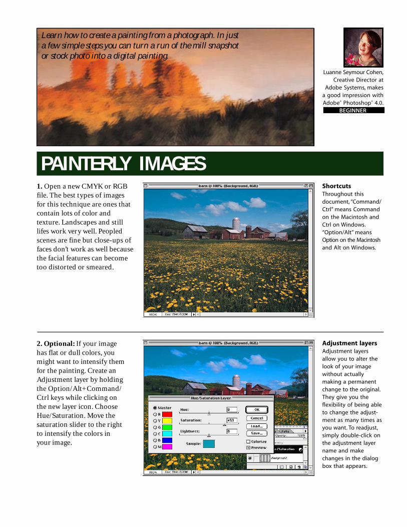
PAINTERLY IMAGES1. Open a new CMYK or RGBfile. The best types of imagesfor this technique are ones thatcontain lots of color andtexture. Landscapes and stilllifes work very well. Peopledscenes are fine but close-ups offaces don’t work as well becausethe facial features can becometoo distorted or smeared.
2. Optional: If your imagehas flat or dull colors, youmight want to intensify themfor the painting. Create anAdjustment layer by holdingthe Option/Alt+Command/Ctrl keys while clicking onthe new layer icon. ChooseHue/Saturation. Move thesaturation slider to the rightto intensify the colors inyour image.
Adjustment layersAdjustment layersallow you to alter thelook of your imagewithout actuallymaking a permanentchange to the original.They give you theflexibility of being ableto change the adjust-ment as many times asyou want. To readjust,simply double-click onthe adjustment layername and makechanges in the dialogbox that appears.
Luanne Seymour Cohen,Creative Director at
Adobe Systems, makesa good impression withAdobe® Photoshop® 4.0.
BEGINNER
Learn how to create a painting from a photograph. In justa few simple steps you can turn a run of the mill snapshotor stock photo into a digital painting.
ShortcutsThroughout thisdocument, “Command/Ctrl” means Commandon the Macintosh andCtrl on Windows.“Option/Alt” meansOption on the Macintoshand Alt on Windows.
Painterly Images 2
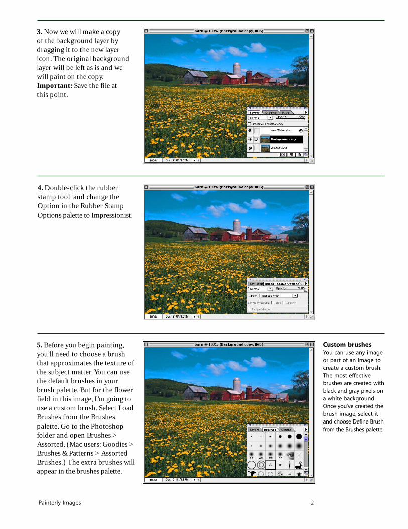
3. Now we will make a copyof the background layer bydragging it to the new layericon. The original backgroundlayer will be left as is and wewill paint on the copy.Important: Save the file atthis point.
Custom brushesYou can use any imageor part of an image tocreate a custom brush.The most effectivebrushes are created withblack and gray pixels ona white background.Once you’ve created thebrush image, select itand choose Define Brushfrom the Brushes palette.
5. Before you begin painting,you’ll need to choose a brushthat approximates the texture ofthe subject matter. You can usethe default brushes in yourbrush palette. But for the flowerfield in this image, I’m going touse a custom brush. Select LoadBrushes from the Brushespalette. Go to the Photoshopfolder and open Brushes >Assorted. (Mac users: Goodies >Brushes & Patterns > AssortedBrushes.) The extra brushes willappear in the brushes palette.
4. Double-click the rubberstamp tool and change theOption in the Rubber StampOptions palette to Impressionist.

Painterly Images 3
6. Select your brush and beginpainting the image. The impres-sionist tool samples the colorsthat are in the saved image andallows you to smear them. It’s asif the photo was made of wetpaint and you are moving itaround with a brush. Note: Donot save the file while youpaint! If you want to keepinterim copies, choose File >Save a Copy. If you save the fileduring the painting process youwill no longer be painting withthe original source pixels.
7. You may want to zoom in topaint certain sections or objectsin your image. Or change thebrushes or brush stroke direc-tion based on the subjectmatter. In this example, I triedto match the brush strokedirection to the texture of therusty shed.
8. Continue brushing the entireimage until you are satisfiedwith the result. You may want togo back over certain areas witha smaller brush, if you want torecover detail that might havebeen lost.
ImpressionistoptionWhen you use theImpressionist option ofthe rubber stamp tool,Photoshop reads thepixels from the last-saved version of thefile. As you drag overan area with the brush,it smears the pixels fromthe image to create animpressionistic effect.
PS4.0 12/97
Adobe, the Adobe logo, andPhotoshop are trademarks ofAdobe Systems Incorporated.Mac and Macintosh aretrademarks of Apple Computer,Inc. registered in the U.S. andother countries. Windows iseither a registered trademarkor a trademark of Microsoft inthe U.S. and/or other countries.
©1997 Adobe SystemsIncorporated. All rights reserved.
Photograph: DigitalVision.
Luanne Seymour Cohen,Creative Director at
Adobe Systems, Inc.,shares a technique on
how to create coolposterized images with
Adobe Streamline,Adobe Photoshop and
Adobe Illustrator.INTERMEDIATE
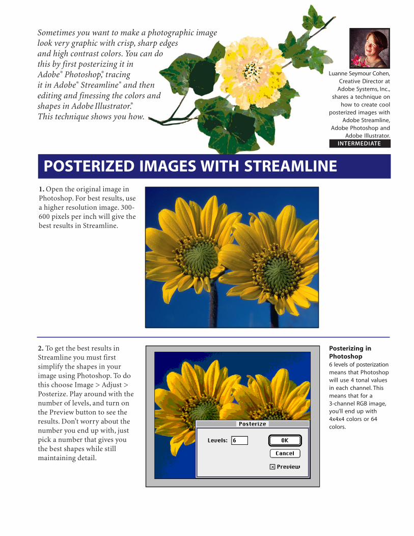
1. Open the original image inPhotoshop. For best results, usea higher resolution image. 300-600 pixels per inch will give thebest results in Streamline.
2. To get the best results inStreamline you must firstsimplify the shapes in yourimage using Photoshop. To dothis choose Image > Adjust >Posterize. Play around with thenumber of levels, and turn onthe Preview button to see theresults. Don’t worry about thenumber you end up with, justpick a number that gives youthe best shapes while stillmaintaining detail.
Posterizing inPhotoshop6 levels of posterizationmeans that Photoshopwill use 4 tonal valuesin each channel. Thismeans that for a3-channel RGB image,you’ll end up with4x4x4 colors or 64colors.
POSTERIZED IMAGES WITH STREAMLINE
Sometimes you want to make a photographic imagelook very graphic with crisp, sharp edgesand high contrast colors. You can dothis by first posterizing it inAdobe® Photoshop®, tracingit in Adobe® Streamline® and thenediting and finessing the colors andshapes in Adobe Illustrator®.This technique shows you how.

Posterizing Images With Streamline 2
3. Save the file with a new name.You can save the file in TIFF,TIFF compressed, PICT,Photoshop, or Photoshop 2.0format.
4. Switch to Streamline andopen the Photoshop file youjust saved. Choose Options >Settings. Select one of the presetColor settings. Don’t worry ifthe number of colors is differentfrom what you want because wewill adjust that later.
5. Choose Options > Color/B&W Setup. This is where youwill experiment with theMaximum # of colors for yourposterization. Select the Add newcolors to custom color list. SelectReduce detail. Deselect (forphotographic image) or selectColor averaging (for imageswith large areas of color).
Streamline’sposterizationStreamline creates agraph of the imagecolor values (histo-gram). Then it dividesthe colors evenly into acolor palette thatcontains the numberof colors selected inthe Color/B&W Setupdialog.

Posterizing Images With Streamline 3
6. Click the Preview button tosee how the image’s colorshapes will be divided up. Keeptrying different numbers ofcolors and complexity levels,(don’t forget to click Preview),until you are satisfied with theshapes and level of detail in thepreview. The actual colors canbe changed later in Illustrator.
7. Choose Options >Conversion Setup. ChooseOutline for a photographicimage. If your image has a lot ofnoise correct it by increasingthe Noise Suppression slider. Ifyour image has straight andcurved lines, make thatselection also.
8. Because you’ve changed someof the specifications, Streamlinehas given your settings a newname. You can change it in theSettings dialog if you want, thenclick Create.
Experimentationpays offIn the image at the left,I tried several differentcolor settings startingwith 6 colors. I foundthat 16 was theminimum number Ineeded to retain thedetail in the flowercenters. Anything lessand the detail I wantedwas lost.
Noise SuppressionPixel areas with adiameter measuringthe number of pixelsselected in the NoiseSuppression setting areignored duringconversion.
Naming SettingsIf you make a changeto either the ConversionSetup or Color/B&WSetup after you havesaved your settings youwill need to resave thenew settings with adifferent name.

Posterizing Images With Streamline 4
9. Once your settings areadjusted, you are ready toautotrace the image. ChooseFile > Convert and Streamlinewill begin the autotrace process.When the tracing is complete,choose File > Save Art As andsave in Adobe Illustratorformat. Streamline will add orreplace a suffix of .ai to the filename.
10. Open the .ai file in Illustrator.Choose Window > ShowSwatches and view by Name.Notice that there are nowseveral new spot colors at thebottom of the Swatches palette.They are named “Auto Color”followed by a number.
11. To adjust or change a color,double click on an Auto Colorin the Swatches palette. Movethe Swatch Options dialog soyou can see the image. Adjustthe sliders to the desired color.The artwork will update in thewindow so you can preview thenew color change. Click OK.
Smoothing pathsIf the shapes thatStreamline created aretoo complex or havetoo many anchorpoints, use the SmoothPath feature. Select thepath or paths thatneed simplifying.Choose Edit > SmoothPath. Choose Minimum,Medium or Maximum.
Auto ColorsThe colors created byStreamline are named“Auto Color” and arespot colors inIllustrator.
Posterizing Images With Streamline 5
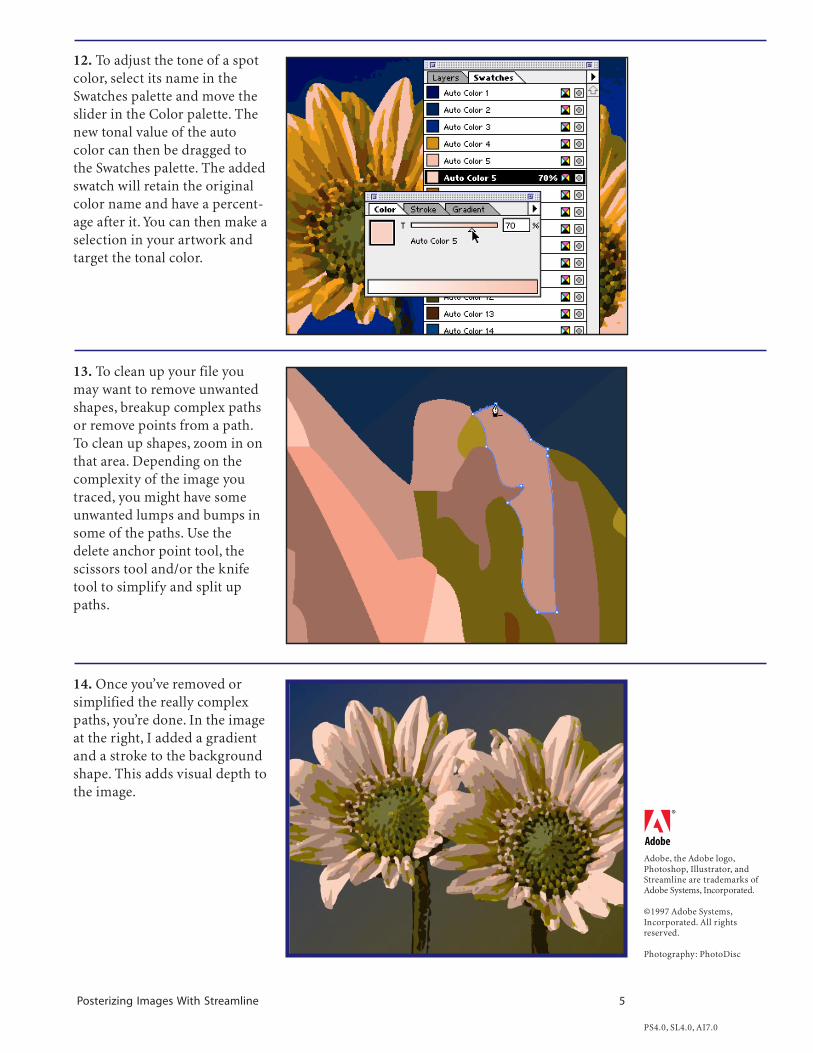
12. To adjust the tone of a spotcolor, select its name in theSwatches palette and move theslider in the Color palette. Thenew tonal value of the autocolor can then be dragged tothe Swatches palette. The addedswatch will retain the originalcolor name and have a percent-age after it. You can then make aselection in your artwork andtarget the tonal color.
13. To clean up your file youmay want to remove unwantedshapes, breakup complex pathsor remove points from a path.To clean up shapes, zoom in onthat area. Depending on thecomplexity of the image youtraced, you might have someunwanted lumps and bumps insome of the paths. Use thedelete anchor point tool, thescissors tool and/or the knifetool to simplify and split uppaths.
14. Once you’ve removed orsimplified the really complexpaths, you’re done. In the imageat the right, I added a gradientand a stroke to the backgroundshape. This adds visual depth tothe image.
Adobe, the Adobe logo,Photoshop, Illustrator, andStreamline are trademarks ofAdobe Systems, Incorporated.
©1997 Adobe Systems,Incorporated. All rightsreserved.
Photography: PhotoDisc
PS4.0, SL4.0, AI7.0

QUICK PICTURE FRAMES
Adobe® Photoshop® 5.0 comes with more than 100 different Actions. Several ofthese Actions create frames. If you like the frame but want to customize it foryour image, you can do so easily. In this technique, you will make a pictureframe for your image and then change its color using an adjustment layer.Adjustment layers allow you to alter thecolor of the framewithout losing itsshading, bevelingand texture.
1. Open the image you want toframe. The image size must bemore than 100 pixels in bothwidth and height. This actionworks best on a flattened or aone-layer file. Here we are usingthe Wilderness file found in theAdobe Photoshop 5.0 GoodiesSampler folder.
2. Choose Window > ShowActions to display the Actionspalette. Open the DefaultActions set.
100 free ActionsPhotoshop 5.0 shipswith eight Action setscontaining more than100 different Actions.You can find them inthe Goodies folderinside the Photoshop5.0 application folderfor both Mac andWindows versions.
Luanne Seymour Cohen,Adobe Imaging
Evangelist, customizes Actions inAdobe Photoshop 5.0.
BEGINNER

Quick Picture Frames 2
3. Select the Wood Frame - 50pixel Action and click the Playbutton. Once you click the Playbutton a dialog box will appear.Click Continue if you have atleast a 100 pixel wide and tallimage. Click Stop if your imageis smaller than this. Applyingthe Action to your image willmake your image 100 pixelswider and 100 pixels taller thanthe original image.
4. The Action creates a “wood”frame around your image. Ifyou are satisfied with the image,save the file now and you arefinished. If you want to changethe color of the frame, go tostep 5.
5. Select the frame layer. Fromthe Layers palette, choose NewAdjustment Layer.
Layer EffectsTo change a layereffect setting, double-click on the layer effecticon, located in theLayer palette.

Quick Picture Frames 3
Adobe, the Adobe logo, andPhotoshop are trademarks ofAdobe Systems Incorporated.Macintosh is a trademark ofApple Computer, Inc. registeredin the U.S. and other countries.Windows is either a registeredtrademark or a trademark ofMicrosoft in the U.S. and/orother countries.
©1998 Adobe SystemsIncorporated. All rights reserved.
Photo credit © Adobe ImageLibrary.
PS 5.0 5/98
6. Choose the type of adjust-ment you want to make. In thiscase we want to change thecolor of the frame so chooseHue/Saturation. Click GroupWith Previous Layer so that thecolor adjustment affects onlythe frame layer.
7. Select the Colorize option.Then move the Hue slider untilyou find the color you want. Tomake the color more or lessintense, adjust the Saturationslider. To make the color lighteror darker, adjust the Lightnessslider.
8. Click OK to view the results.Remember, you used an adjust-ment layer for maximumflexibility, so you can doubleclick on it at any time andchange the values.
Adjustment LayersIf you want to experi-ment with color orcontrast adjustmentsbut you don’t want topermanently changethe original, useadjustment layers. Theyfloat above the layersyou want to alter. Ifyou don’t like theeffect, just double clickon the adjustmentlayer and change thevalues. You can applyan adjustment layer toan entire file or to justone layer at a time.

Adobe Senior Art DirectorRussell Preston Brown in
a virtual paradise withAdobe® Photoshop® 4.0™
INTERMEDIATE
RAINBOW IN PARADISE WITH PHOTOSHOP 4.0
For all you Photoshoppers wanting your own slice of paradise, here is the tip foryou! You will learn how to create your own rainbow using the new Photoshopgradient tool, along with channels and layer masks. It’s a virtual pot of gold.
1. Open the image you want tobegin working on. As you cansee, I have chosen an imagethat lends itself to a natural-looking rainbow, with a darkstormy background and fronthighlights.
2. Open Gradient Tool optionsby double-clicking on the Gradi-ent tool. Click the Edit buttonto bring up your Gradient Editordialog box.
ShortcutsThroughout thisdocument, “Command/Ctrl”, means Commandon the Macintosh andCtrl on Windows.“Option/Alt” meansOption on theMacintosh and Alt onWindows.

Rainbow in Paradise with Photoshop 4.0 2
3. Next, select New to begincreating your rainbow gradient.Once you name the new gradi-ent, start adding colors bysimply clicking below thegradient bar. Edit your newcolor by clicking in the colorswatch area.
4. The key step here is to makesure that your color bands areat one end of the bar, as in theexample shown. I’ve chosenthe following simple set offour colors: 28-137-18 / 210-255-0 / 255-60-0 /0-0-0 for black
You can also experiment to findyour own color solutions, if soyou might be tempted to createthat soft blend right here–butdon’t do it! We will do that later.Click OK once you have thegradient you want.Download gradient for PCDownload gradient for Mac
Duplicating ColorsBy holding down theOption/Alt key whileclicking on any colorsquare, you canduplicate that color.
Tab Tab Tab!When your colorsare close together,use the Tab key tomove through yourselections to ensureyou don’t accidentlyselect the wrong one.
5. Finally, set the Type ofgradient to Radial.

Rainbow in Paradise with Photoshop 4.0 3
6. Create a new layer for therainbow by pressing the newlayer icon. Then zoom out sothat you can start the gradientwell below the actual image.
8. So first, set the Layer mode toScreen and move the opacityback to 60%.
Screen ModeThis Blend mode is liketaking two separatetransparencies andprojecting them on topof each other. Resultingcolors will always belighter. Black willchange nothing andwhite remains white.
7. Click and drag your gradienttool about two-thirds the wayup the image. Yikes! Right awayyou will notice two obviousproblems: The gradient will beblack with harsh bands of color.

Rainbow in Paradise with Photoshop 4.0 4
9. Next we want to soften thebands of color. Choose Filter >Blur > Gaussian Blur. Yourimage resolution will determinehow much you will want to setyour blur to. I chose about 9pixels for this 72-dpi image.
There is still one thing that weneed to do. We need to makethe rainbow appear as thoughit’s coming from behind thetrees. We can do this using asimple layer mask.
How much blur?The degree of Gaussianblur will depend onyour image size andresolution. For lowerresolution, less blur willbe sufficient, for higherresolution you willneed to go higher.
11. Duplicate this channel bydragging it over the new chan-nel icon. To heighten thecontrast as I’ve done, you canadjust the levels by choosingImage > Adjust > Levels.
10. You could paint a mask tohide parts of the rainbow orstart with one of the channelsin your image. I am going touse the channels, but somephotos may not work as wellas this one. First turn off theRainbow layer (click on the eyenext to the layer) and go to theChannels palette. Now, vieweach channel separately tofind which one has the bestcontrast to make a layer mask.
Display ShortcutTo go through yourchannels quickly youcan use these shortcuts:Command/Ctrl+1 = RedCommand/Ctrl+2 = GreenCommand/Ctrl+3 = BlueCommand/Ctrl+~ = Composite

Rainbow in Paradise with Photoshop 4.0 5
13. Switch back to the compos-ite channel and then back toyour Layers palette. Target yourrainbow layer. With the channelas your selection click the layermask icon.
Layers ShortcutTo load the channelselection from yourLayers palette, press:Command/Ctrl +Option/Alt + 4
14. There you have it! Theperfect rainbow in paradise.
12. Turn this new channel into aselection either by dragging itover the dotted circle at thebottom or using the shortcut:Command/Ctrl + click on thetarget channel.
Adobe, the Adobe logo, andPhotoshop are trademarks ofAdobe Systems Incorporated.Macintosh is a registeredtrademark of Apple Computer,Inc. Windows is a registeredtrademark of Microsoft in theU.S. and other countries.
©1997 Adobe SystemsIncorporated. All rightsreserved.
PS4.0 8/97

RepairingDigitalPhotographs
Adobe Senior Creative DirectorRussell Brown shows you how to repair your
digital images with Adobe® Photoshop®
ADVANCED

2
REPAIRING DIGITAL PHOTOGRAPHS, PART 1
In this demo, we will repair a photograph taken with a low-resolutiondigital camera—in this case, the Kodak DC50. Often these camerasproduce excellent results, but they have a few deficiencies that can berepaired digitally using layers. This technique is also quite useful forrepairing badly scanned images.
1. Open your digital imagefile in Photoshop. Zoom inon the image and take a closelook at the problem areas,especially noting the skintone in this image.
2. Go through the RGBchannels. Press Command/Ctrl+1 for the Red channel,Command/Ctrl+2 for theGreen, and Command/Ctrl+3 for the Blue channel.Notice the artifacting andextra noise in the Bluechannel. The Blue channelis the telltale channel of ascanned image and often willshow the errors of the scan.
Blue channelThe CCD (ChargedCouple Device) inthe camera is leastsensitive to the blues,and it is more difficultto interpret those colors.Also, when you capturean image with a digitalcamera, it’s compressedwith JPEG compression.The combination ofthese two factorscreates noise in theblue channel.
3. Zoom out of the imageand return to the RGBcomposite. Here’s how toeasily fix this image usingPhotoshop layers. Duplicatethe Base Layer by dragging itonto the New Layer icon atthe bottom of the Layerspalette. Double-click thisnew layer and rename itColor Blur.
PreferencesFor this demo, wechose Preferences >Display & Cursors, andselected. Brush Sizeand Precise.
ShortcutsThroughtout this docu-ment, “Command/Ctrl”means Command on theMacintosh® and Ctrl onWindows®. “Option/Alt”means Option on theMacintosh and Alton Windows.

3
REPAIRING DIGITAL PHOTOGRAPHS, PART 1
4. Choose Filter > Blur >Gaussian Blur. Choose valuesbased on the resolution ofthe image. You want to softenthe image—not lose theimage completely, but softenit—especially in the troubledarea of the blue channel.
5. With the Color Blur layerstill targeted, create anoverlay of the two layersusing Color mode from thepop-up menu in the Layerspalette.
6. Zoom in to the imageand look at the same area.Press Command/Ctrl+3 togo to the blue channel again.See how the noise has beensmoothed out. Amazing buttrue! But wait, there’s more...
Color modeColors are overlaid onthe existing pixels whilethe highlights andshadows of the basecolor are preserved.The base color is notreplaced, but is mixedwith the blend color toreflect the lightness anddarkness of the original.
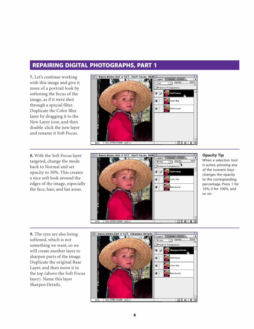
4
REPAIRING DIGITAL PHOTOGRAPHS, PART 1
7. Let’s continue workingwith this image and give itmore of a portrait look bysoftening the focus of theimage, as if it were shotthrough a special filter.Duplicate the Color Blurlayer by dragging it to theNew Layer icon, and thendouble-click the new layerand rename it Soft Focus.
8. With the Soft Focus layertargeted, change the modeback to Normal and setopacity to 30%. This createsa nice soft look around theedges of the image, especiallythe face, hair, and hat areas.
9. The eyes are also beingsoftened, which is notsomething we want, so wewill create another layer tosharpen parts of the image.Duplicate the original BaseLayer, and then move it tothe top (above the Soft Focuslayer). Name this layerSharpen Details.
Opacity TipWhen a selection toolis active, pressing anyof the numeric keyschanges the opacityto the correspondingpercentage. Press 1 for10%, 0 for 100%, andso on.

5
REPAIRING DIGITAL PHOTOGRAPHS, PART 1
10. Create a new layer byclicking the New Layer icon,and then move it to thebottom of the stack. Option-click the eye icon for thislayer, and then choose SelectAll and fill the layer withwhite. Deselect. This newlayer is needed only topreview the effects of blend-ing layers—which you areabout to see.
Fill shortcutPressing Option/Alt+Delete fills the areawith the foregroundcolor. PressingCommand/Ctrl+Deletefills the area with thebackground color.
11. Click the eye icon forthe Sharpen Details layer sothat only the bottom and toplayers are visible. Target theSharpen Details layer.
12. Now we will isolate theareas of this layer that needto overlay the image. Double-click the layer to bring up theLayer Options dialog box.Make sure Preview is checked.Move the This Layer high-value range slider (whitetriangle) to the left. Noticethat areas of the face and hatare being eliminated.
Blending LayersThe sliders here let youdefine which pixels areblended by indicatinga range of brightnessvalues for the replace-ment pixels. In ourexample, the highlightrange was split tosoften the layer, givingit a semi-transparentand fogged look. Thefurther apart thetriangles, the softer theappearance of the layer.
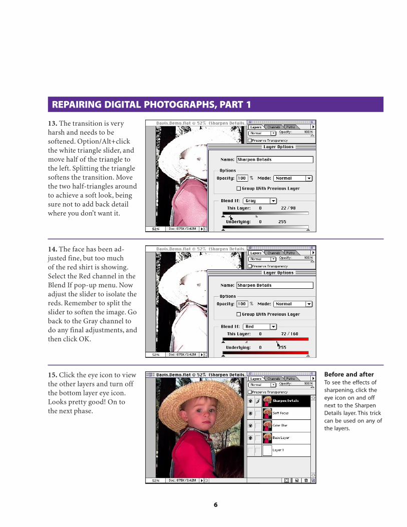
6
REPAIRING DIGITAL PHOTOGRAPHS, PART 1
13. The transition is veryharsh and needs to besoftened. Option/Alt+clickthe white triangle slider, andmove half of the triangle tothe left. Splitting the trianglesoftens the transition. Movethe two half-triangles aroundto achieve a soft look, beingsure not to add back detailwhere you don’t want it.
14. The face has been ad-justed fine, but too muchof the red shirt is showing.Select the Red channel in theBlend If pop-up menu. Nowadjust the slider to isolate thereds. Remember to split theslider to soften the image. Goback to the Gray channel todo any final adjustments, andthen click OK.
15. Click the eye icon to viewthe other layers and turn offthe bottom layer eye icon.Looks pretty good! On tothe next phase.
Before and afterTo see the effects ofsharpening, click theeye icon on and offnext to the SharpenDetails layer. This trickcan be used on any ofthe layers.
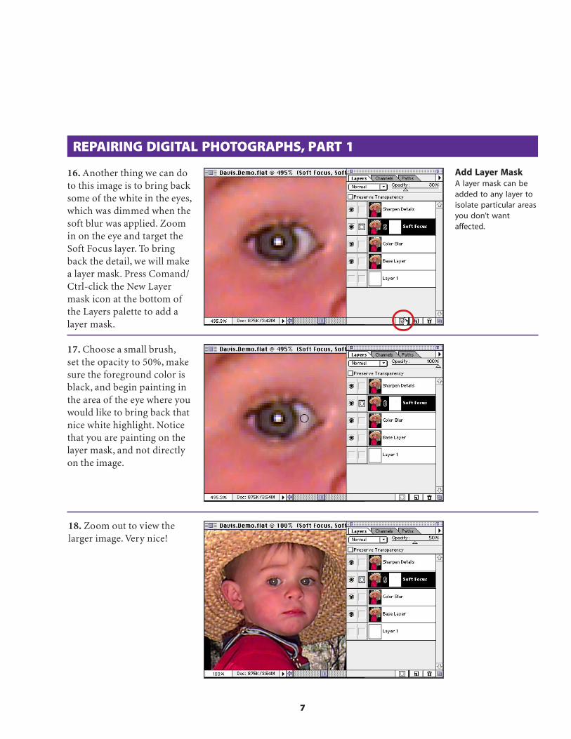
7
16. Another thing we can doto this image is to bring backsome of the white in the eyes,which was dimmed when thesoft blur was applied. Zoomin on the eye and target theSoft Focus layer. To bringback the detail, we will makea layer mask. Press Comand/Ctrl-click the New Layermask icon at the bottom ofthe Layers palette to add alayer mask.
REPAIRING DIGITAL PHOTOGRAPHS, PART 1
17. Choose a small brush,set the opacity to 50%, makesure the foreground color isblack, and begin painting inthe area of the eye where youwould like to bring back thatnice white highlight. Noticethat you are painting on thelayer mask, and not directlyon the image.
18. Zoom out to view thelarger image. Very nice!
Add Layer MaskA layer mask can beadded to any layer toisolate particular areasyou don’t wantaffected.

8
REPAIRING DIGITAL PHOTOGRAPHS, PART 2
Continuing to work with the same digital image, I’d like to alter thefocus range. Low-resolution digital cameras offer no control of depthof field, but we can add a professional quality to the image—as ifthere were a depth of field control. To do this, we will first separate thelittle boy from the background, and then we’ll blur the background.
1. With your digital imagefile still open in Photoshop,save a version with all thelayers. For this exercise, weneed to flatten the image sothat it becomes one compositelayer. After saving, chooseFlatten Image from the LayersPalette pop-up menu.
2. Now we need to create aselection mask so that the littleboy in front can be separatedfrom the background image.Zoom in on the edge of thehat. Double-click the paint-brush tool to bring up thePaintbrush Options palette.Select 100% opacity, and onthe Mode pop-up menu,choose Dissolve. Select a largehard-edge brush from theBrushes palette.
3. Make sure the defaultforeground and backgroundcolors are black and whiterespectively (press D on thekeyboard). Then choose theQuick Mask mode on theTool palette, just below thebackground color.
Dissolve modeDissolve gives thebrush a ragged, rough,dissolving qualitywhich takes on someof the quality of theedge of the hat in theimage. This allows usto simulate the samegrain of the photo sothe mask will not lookfake.
Quick Mask modeWith Quick Maskmode on, you canpaint directly on thesurface of the image,without affecting it, tomake a mask. Press Qto toggle betweenQuick Mask mode andStandard mode.
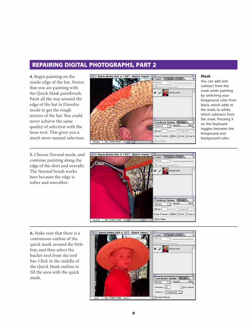
9
4. Begin painting on theinside edge of the hat. Noticethat you are painting withthe Quick Mask paintbrush.Paint all the way around theedge of the hat in Dissolvemode to get the roughtexture of the hat. You couldnever achieve the samequality of selection with thelasso tool. This gives you amuch more natural selection.
REPAIRING DIGITAL PHOTOGRAPHS, PART 2
5. Choose Normal mode, andcontinue painting along theedge of the shirt and overalls.The Normal brush workshere because the edge issofter and smoother.
MaskYou can add andsubtract from themask while paintingby switching yourforeground color fromblack, which adds tothe mask, to white,which subtracts fromthe mask. Pressing Xon the keyboardtoggles between theforeground andbackground color.
6. Make sure that there is acontinuous outline of thequick mask around the littleboy, and then select thebucket tool from the toolbar. Click in the middle ofthe Quick Mask outline tofill the area with the quickmask.

10
REPAIRING DIGITAL PHOTOGRAPHS, PART 2
7. Return to Selection modeby clicking the icon to theleft of the Quick Mask iconor by pressing Q.
8. Go to the Channelspalette, and click the Selec-tion icon at the bottom tosave the selection as achannel.
9. Deselect. Click the newchannel to view it and makeit active.
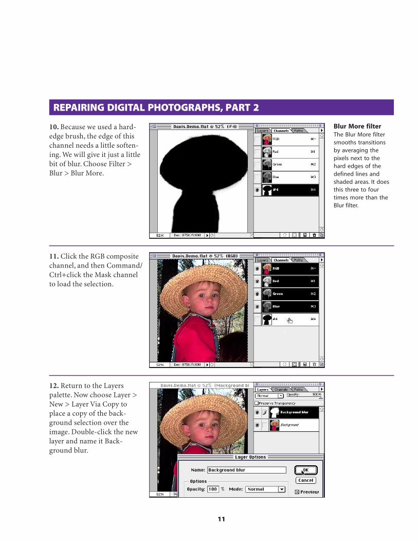
11
REPAIRING DIGITAL PHOTOGRAPHS, PART 2
10. Because we used a hard-edge brush, the edge of thischannel needs a little soften-ing. We will give it just a littlebit of blur. Choose Filter >Blur > Blur More.
11. Click the RGB compositechannel, and then Command/Ctrl+click the Mask channelto load the selection.
12. Return to the Layerspalette. Now choose Layer >New > Layer Via Copy toplace a copy of the back-ground selection over theimage. Double-click the newlayer and name it Back-ground blur.
Blur More filterThe Blur More filtersmooths transitionsby averaging thepixels next to thehard edges of thedefined lines andshaded areas. It doesthis three to fourtimes more than theBlur filter.

12
REPAIRING DIGITAL PHOTOGRAPHS, PART 2
13. With this new layertargeted, turn off the viewof the Background layer byclicking the eye icon. You cansee that the background hasbeen isolated from theforeground (the little boy).
14. Now we will blur thebackground, yet make itlook realistic against theboy. Choose Filter > Blur >Gaussian Blur. Your blurvalue will vary, depending onyour resolution. Click OK.
15. Click the eye icon on theBackground layer to view itagain. There is a problem;the blur is blurring into thehat. To fix this, choose Layer> Matting > Defringe. Theamount of defringe you usewill depend on the resolu-tion of your image and thequality of the edge. Viewyour results. Excellent!
DefringeDefringe will push theblur back to meet theedge of the hat. Thisgives a more solid andresolved edge againstthe hat and bleedsunderneath the hat.
Adobe, the Adobe logo, andPhotoshop are trademarks of AdobeSystems Incorporated. Macintosh isa registered trademark of AppleComputer, Inc. Windows is aregistered trademark of Microsoftin the U.S. and other countries.
©1996 Adobe SystemsIncorporated. All rights reserved.
Special thanks to Russ Sparkmanand Etsuro Endo.
PS4.0 11/96

RussGoes
SurfingwithGIF
Russell Brown,
Senior Creative
Director at
Adobe Systems,
shares some
super tips and
techniques for
preparing
images for the
World Wide
Web in Adobe®
Photoshop® 4.0INTERMEDIATE

2
CREATING TRANSPARENT AREAS WITH A CHANNEL MASK
OK, Web surfers. I have a great tip and technique just for you.I’m going to show you how to magically make a color in an indexedcolor image appear transparent in one area and opaque in another.“How can I use this?” you ask. Well, it’s a great way to see through abackground color but not disturb that same color inside the image.
1. Open an indexed colorimage that has a solidbackground that you want toremove. This image has ablack background and blackoutlines inside the letter-forms. (If the backgroundcolor doesn’t also appearwithin your image, you don’tneed this technique. Thetools in the GIF Export filterlet you mask out any singlecolor throughout the image.)
2. Double-click the magicwand tool in the toolbox.This image has an anti-aliased edge, so increasingthe tolerance ensures thatthe selection eats into thecolored foreground edgesand eliminates any blackhalo around the selection.Here I chose a Tolerance of60 and, checked the Anti-aliased option.
3. Now click all the areas inthe image that you want to betransparent on your Webpage. Remember, the Shift keylets you add to the selection;the Command/Ctrl key letsyou subtract from the selec-tion. When everything thatyou want to be transparent isselected, choose Select >Inverse. In my image, thisselects everything but thebackground.
ShortcutsThroughout thisdocument, “Command/Ctrl”, means Commandon the Macintosh andCtrl on Windows.

3
4. Choose Select > SaveSelection, and save thisselection as a New channel.Click OK.
5. Deselect (Command/Ctrl+D). Then choose File >Export > GIF89a Export.
CREATING TRANSPARENT AREAS WITH A CHANNEL MASK
6. Just to make sure youunderstand why we made themask, let’s first use theeyedropper to select thebackground color in thisimage and make it transpar-ent. Aha! Our dilemma isclear: All the blacks in theimage become transparent,including the outlinesaround the letterforms.
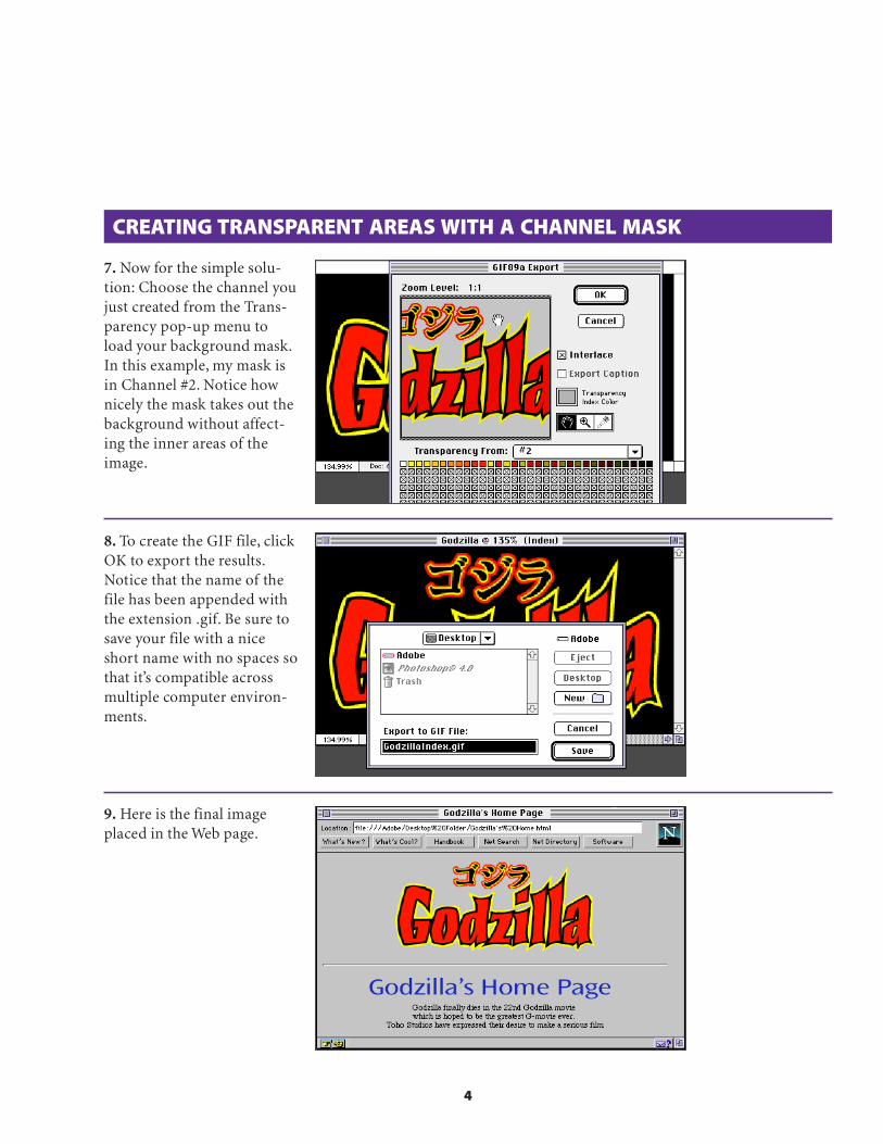
4
8. To create the GIF file, clickOK to export the results.Notice that the name of thefile has been appended withthe extension .gif. Be sure tosave your file with a niceshort name with no spaces sothat it’s compatible acrossmultiple computer environ-ments.
9. Here is the final imageplaced in the Web page.
CREATING TRANSPARENT AREAS WITH A CHANNEL MASK
7. Now for the simple solu-tion: Choose the channel youjust created from the Trans-parency pop-up menu toload your background mask.In this example, my mask isin Channel #2. Notice hownicely the mask takes out thebackground without affect-ing the inner areas of theimage.
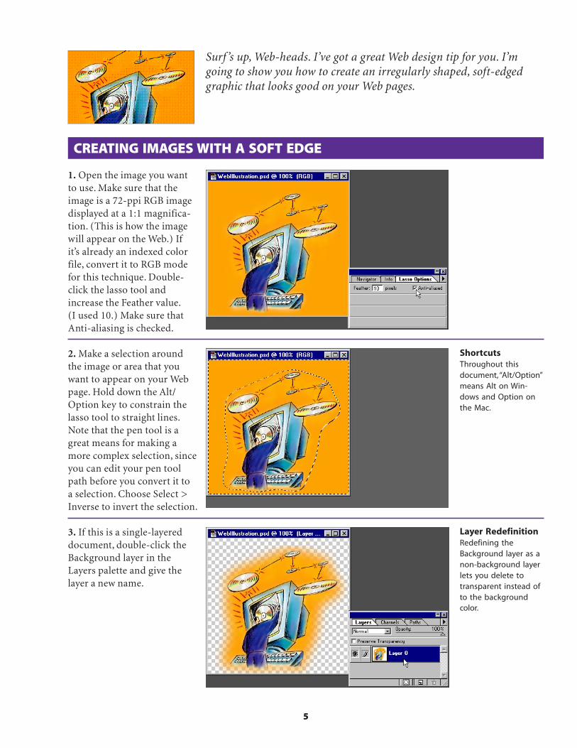
5
Surf ’s up, Web-heads. I’ve got a great Web design tip for you. I’mgoing to show you how to create an irregularly shaped, soft-edgedgraphic that looks good on your Web pages.
CREATING IMAGES WITH A SOFT EDGE
1. Open the image you wantto use. Make sure that theimage is a 72-ppi RGB imagedisplayed at a 1:1 magnifica-tion. (This is how the imagewill appear on the Web.) Ifit’s already an indexed colorfile, convert it to RGB modefor this technique. Double-click the lasso tool andincrease the Feather value.(I used 10.) Make sure thatAnti-aliasing is checked.
2. Make a selection aroundthe image or area that youwant to appear on your Webpage. Hold down the Alt/Option key to constrain thelasso tool to straight lines.Note that the pen tool is agreat means for making amore complex selection, sinceyou can edit your pen toolpath before you convert it toa selection. Choose Select >Inverse to invert the selection.
3. If this is a single-layereddocument, double-click theBackground layer in theLayers palette and give thelayer a new name.
Layer RedefinitionRedefining theBackground layer as anon-background layerlets you delete totransparent instead ofto the backgroundcolor.
ShortcutsThroughout thisdocument, “Alt/Option”means Alt on Win-dows and Option onthe Mac.

6
CREATING IMAGES WITH A SOFT EDGE
4. You’re now ready to exportthe image to GIF. Choose File> Export > GIF89a Export. Ifthe filter doesn’t appear in theExport submenu, reinstall thefilter or check your Plug-inPreferences to make sure thatthe correct plug-ins folder isselected. Click the Transpar-ency color box and selectyour transparency color if itis something other than thestandard Netscape gray.
5. Preview the image andexperiment with reducingthe number of colors in theAdaptive palette. The fewerthe colors in the image, thesmaller and faster the imagewill be for display and whendownloaded over the Web.With larger images, choosingfewer colors can make a bigdifference in file size; withsmaller images, the differ-ence is less significant.
6. To finish, click OK in theGIF89a Export dialog box toexport the file. Notice thatthe name of the file has beenappended with the extension.gif. Be sure to save the filewith a nice short name withno spaces so that it is com-patible across multiplecomputer environments.
Adobe, the Adobe logo, AdobePhotoshop are trademarks ofAdobe Systems Incorporated.Macintosh is a registeredtrademark of Apple Computer,Inc. Windows is a registeredtrademark of MicrosoftCorporation. Netscape andNetscape Navigator aretrademarks of NetscapeCommunications Corporation.All other products or namebrands are trademarks orregistered trademarks of theirrespective holders.
©1996 Adobe SystemsIncorporated. All rights reserved.
Cover photo: PhotoDisc, Inc.
PS4.0 11/96

TIMESAVING SELECTIONS
Ever found yourself trying to make an elliptical selection with a round tool?Well here are a couple of great new ways to get a handle on time and learn someAdobe® Photoshop® 5.0 timely techniques.
1. The goal of this project isto make elliptical selectionseasily and quickly. We’ll startby making a standard selectionwith the ellipse tool as shownin this image. We can accessthe ellipse tool by clicking andholding the marquee tool onthe tool palette. No need tomake the ellipse selectionexact. That’s the beauty ofthis technique.
Adobe Senior CreativeDirector Russell Brown
makes selections theeasy way with
Photoshop 5.0. INTERMEDIATE
2. Now, to introduce a newfeature found only in AdobePhotoshop 5.0 or later… Fromthe Select menu, choose Trans-form Selection, as shown to theright. This new feature willtransform the shape of theselection without altering itscontents. It’s new! It’s wild!You’ll use it all the time!
ShortcutsThroughout thisdocument, “Command/Ctrl” means Commandon the Macintosh andCtrl on Windows.

Timesaving Selections 2
3. WOW! You can now rotate,scale, and distort the selectionuntil the ellipse fits the shape ofthe face of the watch. Press theEnter key and the newly trans-formed selection will be pre-cisely in position. Amazing!But wait – there’s more!
Technique number two!1. Here’s another, less obviousapproach to transforming aselection. We’ll use it to trans-form the watch as we did withtechnique number one. How-ever, this time we’ll get a specialkind of preview!
Once again, make a selectionwith the ellipse tool as shown tothe right. Remember, there’s noneed to be exact.
2. In the tool box, click on theedit in quick mask mode icon.The flashing selection will nowbe displayed as a Quick Mask.The default color for the QuickMask is red with a 50% opacity.As you can see here the QuickMask appears like a transparentlayer of plastic over the image.Painting on this layer withwhite will add to the selectionand painting with black willsubtract from the selection.
SelectionsTo reshape the selec-tions, simply selectand move any of thecontrol points available.To rotate the selection,move the mouse justoutside the selectionuntil you see therotation icon, and thenrotate the selection.Special note: You cannow change the pointof rotation by movingthe central controlpoint to any otherlocation on the image.
Quick masksMake a selection. Ashortcut for the edit inQuick Mask mode is topress the Q key on thekeyboard.

Timesaving Selections 3
3. This time, choose FreeTransform from the Edit menu.
4. The transformation controlvectors appear as before, butthis time we are transforminga visible mask. The selectionarea becomes much more clearand distinct.
5. As before, we can rotate,scale, and distort the QuickMask with the transformationtool until it fits the watch faceexactly. Then we can press theEnter key to apply thetransformation.
Super user tipDouble-clicking insidethe transformationregion is a quick andeasy way to apply thetransformation.

Timesaving Selections 4
6. Fifty percent red is thedefault color for the QuickMask. However, it’s possible tochange the color of the QuickMask to help make the previewof the selection more distinct.On the the Channels palette,double-click the words QuickMask. The Quick Mask Optionsdialog box will appear.
8. As you can see in this ex-ample, the new Quick Maskcolor makes the selected areamore distinct. The selection canbe transformed with moreaccuracy when the color hasgreater contrast.
7. Experiment with changingthe color and opacity of theQuick Mask until it is moreapparent with your image.
Cropping an imageThis same techniquecan be used topreview the croppingof an image. Trysetting the Color towhite and the Opacityto 100% to block outthe image outside thecropping area.

Timesaving Selections 5
9. After completing the trans-formation of the Quick Mask,select the edit in standard modeicon, or press the Q key on yourkeyboard, to revert the QuickMask back to a selection.
10. Here’s a simple way to usethis selection. Open up a newimage. In this case, I’m usingan image of a desert roadstretching to the horizon. Selectthe entire image by choosingSelect > All or Command/Ctrl+A. Then copy the selectionby choosing Edit > Copy orCommand/Ctrl+C. Close theimage you copied.
11. With your selection made,choose Edit > Paste Into. Thenas the final step in this project,set the Mode for this newlycreated layer to Multiply, withan Opacity of 85%.
And there it is: You’ve learnedhow to control time and space.
ChannelsTo make a Quick Maskinto a channel, targetthe Channel palette,select Duplicate fromthe pop-up menu, andclick OK. This makes acopy of the Quick Maskand a permenant alphachannel you can loadas a selection anytime.
Adobe, the Adobe logo, andPhotoshop are trademarks ofAdobe Systems Incorporated.Macintosh is a trademark ofApple Computer, Inc.,registered in the U.S. andother countries. Windows iseither a registered trademarkor a trademark of Microsoft inthe U.S. and/or othercountries.
©1998 Adobe SystemsIncorporated. All rightsreserved.
Photo credit © Adobe ImageLibrary.
PS5.0 9/98
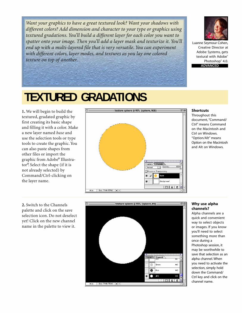
Luanne Seymour Cohen,Creative Director at
Adobe Systems, getstextural with Adobe®
Photoshop® 4.0.ADVANCED
TEXTURED GRADATIONS
Want your graphics to have a great textured look? Want your shadows withdifferent colors? Add dimension and character to your type or graphics usingtextured gradations. You’ll build a different layer for each color you want tospatter onto your image. Then you’ll add a layer mask and texturize it. You’llend up with a multi-layered file that is very versatile. You can experimentwith different colors, layer modes, and textures as you lay one coloredtexture on top of another.
1. We will begin to build thetextured, gradated graphic byfirst creating its basic shapeand filling it with a color. Makea new layer named base anduse the selection tools or typetools to create the graphic. Youcan also paste shapes fromother files or import thegraphic from Adobe® Illustra-tor®. Select the shape (if it isnot already selected) byCommand/Ctrl-clicking onthe layer name.
2. Switch to the Channelspalette and click on the saveselection icon. Do not deselectyet! Click on the new channelname in the palette to view it.
Why use alphachannels?Alpha channels are aquick and convenientway to select objectsor images. If you knowyou’ll need to selectsomething more thanonce during aPhotoshop session, itmay be worthwhile tosave that selection as analpha channel. Whenyou need to activate theselection, simply holddown the Command/Ctrl key and click on thechannel name.
ShortcutsThroughout thisdocument, “Command/Ctrl” means Commandon the Macintosh andCtrl on Windows.“Option/Alt” meansOption on the Macintoshand Alt on Windows.
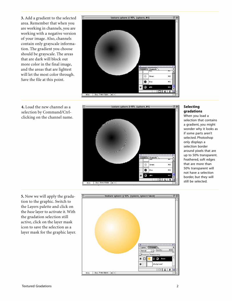
Textured Gradations 2
3. Add a gradient to the selectedarea. Remember that when youare working in channels, you areworking with a negative versionof your image. Also, channelscontain only grayscale informa-tion. The gradient you chooseshould be grayscale. The areasthat are dark will block outmore color in the final image,and the areas that are lightestwill let the most color through.Save the file at this point.
SelectinggradationsWhen you load aselection that containsa gradient, you mightwonder why it looks asif some parts aren’tselected. Photoshoponly displays aselection borderaround pixels that areup to 50% transparent.Feathered, soft edgesthat are more than50% transparent willnot have a selectionborder, but they willstill be selected.
5. Now we will apply the grada-tion to the graphic. Switch tothe Layers palette and click onthe base layer to activate it. Withthe gradation selection stillactive, click on the layer maskicon to save the selection as alayer mask for the graphic layer.
4. Load the new channel as aselection by Command/Ctrl-clicking on the channel name.

Textured Gradations 3
6. To get a richer lookingtexture, you will want to createmore than one colored texturelayer. A quick way to create anew layer is simply to duplicatethe existing one. Option/Alt-drag the base layer onto the newlayer icon in the Layers palette.Give the layer a new name.Because the layer masks havesome transparency, the dupli-cate layer saturates the imagewith more color.
7. Lets fill this second layer withthe color of the shadow we wantin the final artwork. Pick a newforeground color. To fill onlythe area of your graphic, selectthe Preserve Transparencyoption, and then fill the layerwith the new color (Option/Alt+Delete/Backspace). Don’tworry if the colors don’t lookright yet, because they willchange once we add the texture.
8. Now we will add texture tothe shaded layer. Click on thelayer mask for the shadedlayer. Choose Filter > Noise >Add Noise. Select UniformDistribution, and experimentwith the slider to see whatvalues work best for yourimage. When you’re satisfiedwith the result, click OK.There are many other texturesbesides noise that you can usein this step. See page 4 for afew examples of other textures.
Layer masksThe great advantageof using layer masksin a technique likethis is that you aren’tcommitted to a certaincolor for your graphic.You can change thecolors at any timeduring the designprocess simply byusing the PreserveTransparency optionand filling the layerwith a new color.
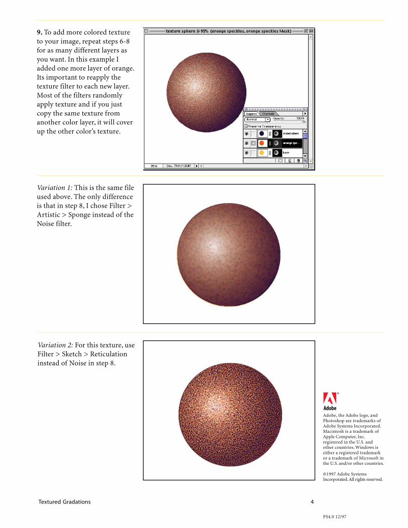
Textured Gradations 4
9. To add more colored textureto your image, repeat steps 6-8for as many different layers asyou want. In this example Iadded one more layer of orange.Its important to reapply thetexture filter to each new layer.Most of the filters randomlyapply texture and if you justcopy the same texture fromanother color layer, it will coverup the other color’s texture.
Variation 1: This is the same fileused above. The only differenceis that in step 8, I chose Filter >Artistic > Sponge instead of theNoise filter.
Variation 2: For this texture, useFilter > Sketch > Reticulationinstead of Noise in step 8.
Adobe, the Adobe logo, andPhotoshop are trademarks ofAdobe Systems Incorporated.Macintosh is a trademark ofApple Computer, Inc.registered in the U.S. andother countries. Windows iseither a registered trademarkor a trademark of Microsoft inthe U.S. and/or other countries.
©1997 Adobe SystemsIncorporated. All rights reserved.
PS4.0 12/97

Photoshop 5.0 makes selections more easy with the magnetic lasso tool;gives you more power when working with the type tool; and makessimple layer effects a one-step process.
Adobe Senior DesignerLisa Jeans Trail
shows the basics ofthree new features in
Adobe® Photoshop® 5.0.BEGINNER
2. To make a selection within aselection, hold down the optionkey while dragging. With theobject selected, hold down thecommand key or select themove tool and click inside theselection and drag and drop theimage onto another file.
ShortcutsThroughout thisdocument, “Command/Ctrl” means Commandon the Macintosh andCtrl on Windows.
Three New Features Overview1. Open an image in AdobePhotoshop that has an object toselect. From the Tool paletteselect the magnetic lasso tool,found under the lasso tool.Click once and begin draggingnear the object; the magneticlasso tool will distinguish theedges for you. To finish off theselection, place the tool over thestarting point and click. Yourselection is made.
Magnetic lassoDouble-click on themagnetic lasso in thetool box to access itsoptions.• Lasso width is the
distance from thepointer at which thelasso will detect edges.
• Frequency is the rateat which the lasso setsfastening points (ahigher value anchorsmore quickly).
• Edge Contrast is thelasso’s sensitivity toedges (a higher valuedetects high contrastedges).

Three New Features 2
3. The image is placed on a newlayer and can now be scaled androtated using Free Transform(Command/Ctrl+T). Once theimage is placed as you wouldlike, press the Return/Enter keyto set the transformation.
4. Next, let’s add text to theimage. Select the type tool andclick approximately where thetext should be placed. Move thedialog box so you can make useof the new Preview option.Notice that you can now high-light part of your text and applymultiple styles and sizes as wellas control the leading. You alsohave the ability to change thecolor of the text while in thedialog box. Click OK once yourtext is as you would like it.
5. You can add some new layereffects with the text layer stillselected. Here we are going toadd the Bevel and Embosseffect. I’ve used an Inner Beveland then tried different modeand opacity settings to achievethe effect I like. I even specifiedthe shadow color by clicking onthe color box.
TransformationYet another newfeature in version5.0 is the ability totransform selectionsfound on the Select >Transform Selectionmenu. This allows youto transform a selec-tion only and not theimage underneath.
Moving typeWhile in the Type Tooldialog, you can nowclick outside the dialogand move our typeinto position–just onemore feature thatmakes working withtype in Photoshop 5.0that much easier.

Three New Features 3
6. Click OK once you have theeffect you want.
7. Even with an effect added tothe text layer, the text is stillfully editable. Double-click onthe “T” in the text layer to bringup the Type Tool dialog boxand make any changes. See howthe layer effect is added to yourchanges.
Adobe, the Adobe logo, andPhotoshop are trademarks ofAdobe Systems Incorporated.Macintosh is a trademark ofApple Computer, Inc. registeredin the U.S. and other countries.Windows is a either a registeredtrademark or trademark ofMicrosoft in the U.S. and/orother countries.`
©1998 Adobe SystemsIncorporated. All rights reserved.
Photo Credit © PhotoGear,ObjectGear
PS 5.0 4 /98
8. You can also make changesto the layer effect by double-clicking on circle f (the layereffect icon) to the right of thelayer name. This brings up theeffect dialog box last used onthat layer. You can then eithermake changes to the existingeffect or select a new effectfrom the pop-up menu.
Copy/paste effectsWith the new layereffects you can copyand paste effectsbetween layers. Selecta layer with an effectand choose Layer >Effects > Copy Effects.Then select the layer towhich you would to addthe effect to and chooseLayer > Paste Effects.
Adobe Seminars: Web Page Designby Lisa Lopuck and Sheryl Hampton
Adobe Seminars: Web Page Design is a portable seminar on web page
design taught by experienced professionals that documents Adobe
software such as Adobe Photoshop 4, Adobe Illustrator 7, and Adobe
PageMill 2, as well as the latest HTML language protocols.
This October 1997 Adobe Press book will bring all the essential information
of a two-day seminar into a compact and reusable format, complete with
CD and step-by-step techniques. Two noted Web seminar instructors, Lisa
Lopuck and Sheryl Hampton of ElectraVision, have distilled their training
sessions into over a hundred two-page techniques using popular Adobe
applications to simulate how Web pages are actually created. The result is a
reference book of clear, simple explanations and designs that are reusable
page after Web page.
Adobe Seminars: Web Page Design
Publication Date: Oct. 1, 1997
US $40
ISBN: 1-56830-426-9
4-color, 264 pages, includes ImageClub CD
The techniques withinthis Acrobat™ PDF fileare from the upcom-ing Adobe Press bookAdobe Seminars:Web Page Design.

, : , .
Web graphics always need to be made as small as
possible in terms of file size. A few factors that
contribute to making smaller files include: reducing
the color palette, using flat color whenever possible,
avoiding horizontal gradients, and finally, trimming
your graphics to their smallest possible size. In this
case, the image to be cut out has highly feathered
edges. These types of graphics are difficult to cut out
by eye-balling it alone. Often times, you will end up
cropping too closely and you will see a hard edge
once the image is on the Web (as shown).
:
If the image is in multiple layers, merge them together. Use the Option
Merge technique discussed in Lesson B7 to keep the source layers intact.
Trimming Graphics to the Smallest Possible SizeC4Lesson
. Object Gear, Vol. 1 Design Elements: Skull SteerObject Gear, Travels: Road SignPhoto Gear, Skyscapes: Clouds#7font: Garage Gothic Black
: Instead of using option + merge, you can simply turn
on all the eyeball icons of the layers to be merged,
and select Duplicate from the Image menu. Check
the Merged Layers Only check box to create a new
merged file apart from your source file.

, : , .
:
Using the Magic Wand tool, set on a tolerance of zero and with no anti-
aliasing, select the transparent background surrounding the image. To
ensure that you capture all the transparency, choose Similar from the Select
menu. Invert the selection. This selection shows you the absolute outer
edges of your image.
:
In order to crop the image according to the selection created in Step 2, you
need to convert the selection into a rectangular one. Hold down the shift
key to add to the current selection using the Marquee tool until you have a
perfect rectangle.
Because you are adding to the selection, you do not have to do it all in
one step; you can build it in stages. For example, start at the top-most point
and draw to one of the side-most points.
If the Crop function is grayed out in the Image menu, your selection is
not a perfect, there may be a tiny bulge somewhere. Crop the image with
the Crop function once the selection is perfect.
: The crop tool does not work in this
case because it erases your Magic
Wand selection.

WET PAINT TYPE
Need a liquid logotype? Then try this Photoshop technique to create wetwords. First you pick a script typeface design. Then you add some dripsand drops around it. Use the Plaster filter to create a soft rounded effecton the type.Try some of the variations for different wet effects. Finally,you add the color and ...
1. Create a new file. Select theChannels palette and create anew channel named mask. Weare going to create black andwhite artwork in the channels,instead of layers, to giveourselves more flexibility withcoloring and highlighting thefinal art.
2. Be sure that your foregroundcolor is set to white and themask channel is selected. Usethe type tool to create yourtype. Position the type beforeyou deselect it. Type created inchannels is only a selection, nota separate layer that can beedited and moved later.
Liquid typefacesThe best typefaces touse for this techniqueare script or calli-graphic. If you want aslightly eroded look,choose a face withmore pronouncedthicks and thins. Thetypeface used in thisillustration is Ex Ponto.
Luanne Seymour Cohen,Creative Director at
Adobe Systems, getswet and wild with
the Plaster filter inAdobe® Photoshop® 4.0.
ADVANCED
ShortcutsThroughout thisdocument, “Command/Ctrl” means Commandon the Macintosh andCtrl on Windows,“Option/Alt” meansOption on the Macintoshand Alt on Windows.
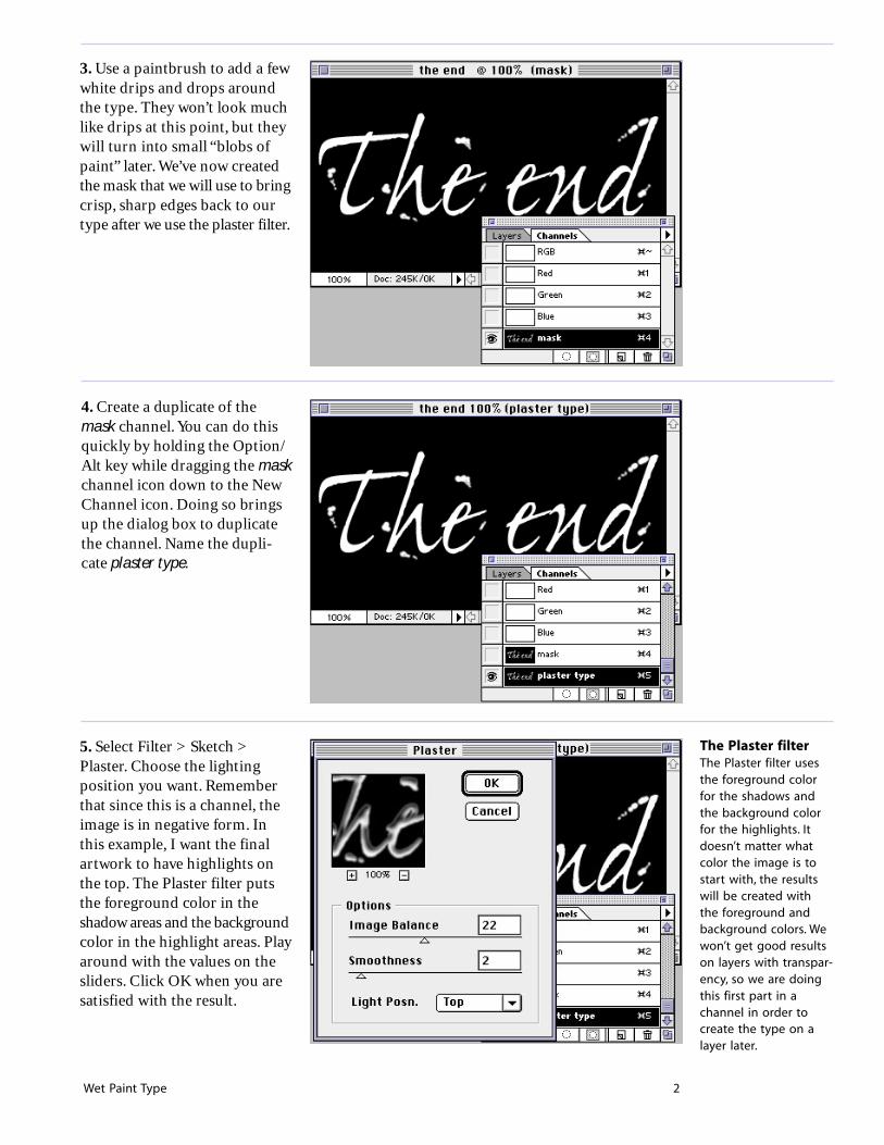
Wet Paint Type 2
3. Use a paintbrush to add a fewwhite drips and drops aroundthe type. They won’t look muchlike drips at this point, but theywill turn into small “blobs ofpaint” later. We’ve now createdthe mask that we will use to bringcrisp, sharp edges back to ourtype after we use the plaster filter.
The Plaster filterThe Plaster filter usesthe foreground colorfor the shadows andthe background colorfor the highlights. Itdoesn’t matter whatcolor the image is tostart with, the resultswill be created withthe foreground andbackground colors. Wewon’t get good resultson layers with transpar-ency, so we are doingthis first part in achannel in order tocreate the type on alayer later.
5. Select Filter > Sketch >Plaster. Choose the lightingposition you want. Rememberthat since this is a channel, theimage is in negative form. Inthis example, I want the finalartwork to have highlights onthe top. The Plaster filter putsthe foreground color in theshadow areas and the backgroundcolor in the highlight areas. Playaround with the values on thesliders. Click OK when you aresatisfied with the result.
4. Create a duplicate of themask channel. You can do thisquickly by holding the Option/Alt key while dragging the maskchannel icon down to the NewChannel icon. Doing so bringsup the dialog box to duplicatethe channel. Name the dupli-cate plaster type.

Wet Paint Type 3
8. Choose a foreground colorfor the type and fill the selec-tion (Option/Alt+Delete/Backspace). I recommenddarker colors for this step.
6. Return to the Layers paletteand click on the backgroundlayer to view it. Option/Alt-clickon the new layer icon to create anew layer. Name it wet type.
7. With the wet type layerselected, load the plaster typechannel as a selection. You cando this from the Channelspalette or from the Select menu.Choose Select > Load Selection.Select plaster type as the Chan-nel. Click OK.
Selection shortcutsIf you want a quickway to load channelswithout using menus,try this. Separate theLayers palette from theChannels palette. Whenyou are on a certainlayer and you need toload a selection, holdthe Command/Alt keyand click on thechannel name in thechannel palette. Thecursor will change tothe selection cursor toremind you that it willnow load the selection.
Fill shortcutsTo fill with 100% of theforeground color, pressOption/Alt+Delete/Backspace. To fill with100% of the backgroundcolor, press Ctrl+Option/Alt+Delete/Backspace.

Wet Paint Type 4
9. The Plaster filter softens andspreads the letter forms. This isfine for a plaster effect but forliquid, we need a crisper,cleaner edge. Use the magicwand (set to anti-aliased, 32tolerance) to select the trans-parent background of the wettype layer. Choose Select >Similar to add any protectedareas that you might have missed.
10. To encompass a little moreof the type’s new bulgy shape,expand the selection. ChooseSelect > Modify > Expand.Expand the selection by 1 pixel.If your image is very highresolution, you might want totry 2. You’ll have to experimentwith this value on your own.
11. Invert the selection bychoosing Select > Inverse(Command/Ctrl+Shift+I).
Select similarOnce you’ve created aselection, you can addto it automatically usingthe Select Similar com-mand. Photoshop ana-lyzes the colors of thepixels currently select-ed and proceeds toselect all the otherpixels in the image ofthose same values. Inthis example, we wantall the white areasselected. Because theselection is anti-aliased,it also picked up theoff-white areas alongthe edges of the letters.

Wet Paint Type 5
13. Deselect and evaluate theresult. You may like it as is oryou might want to increase thecontrast and sharpen up thesmooth gradations. If so, usethe Unsharp Mask filter. SeeVariation 1 for this effect.
12. Next we will make a layermask with only the selectedareas showing through themask. Click on the layer maskicon in the Layers palette, orchoose Select > Save Selectionand select wet type Mask as thechannel. This automaticallycreates a layer mask with theselection. Basically, we arehiding the fuzzy edges with thislayer mask.
Variation 1: You can increasethe contrast and make it look“glossier” by using the UnsharpMask filter. In this example Iused the following values:Amount: 440%Radius: 0.6 pixelsThreshold: 8 levels
Unsharp maskUnsharp mask isa traditional filmcompositing techniqueused to sharpen edgesin an image.The Radiusvalue determines thenumber of pixelssurrounding the edges’pixels that will besharpened. Increasingthe Threshold valueallows you to protectsome areas of yourimage from the noiseintroduced by sharpen-ing. Usually thethreshold is increasedfor skin tones.

Wet Paint Type 6
Variation 2: For a puddlingpaint effect, try the followingsettings in step 5. The top imagewas created with Image Balanceset at 8 and Smoothness at 12. Ifyou want your letters to looksparsely painted as shown inthe lower image, try using 40for Image Balance and 4 forSmoothness.
Variation 3: To add a shadow ofa different color, you’ll need tomake a copy of the plaster typechannel. Name the new channelshadow. Open the Levels dialog(Command/Ctrl+L) and movethe black input slider to theright. The light pixels remainingin the preview are the areaswhere the shadow will appear inyour image. Experiment withthe values depending on howheavy or light you want theshadow. In this example, we usedInput Levels of 187, 1.00, 255.
Variation 3 cont’d.: Repeat steps6 through 13, but name the newlayer shadow. If you want toexperiment with colors, turn onthe Preserve Transparencyoption so you can simply fillthe layer with a new color.
PS4.0 12/97
Adobe, the Adobe logo, andPhotoshop are trademarks ofAdobe Systems Incorporated.Macintosh is a trademark ofApple Computer, Inc.registered in the U.S. and othercountries. Windows is eithera registered trademark or atrademark of Microsoft in theU.S. and/or other countries.
©1997 Adobe SystemsIncorporated. All rights reserved.

White toTransparentMagic
INTERMEDIATE
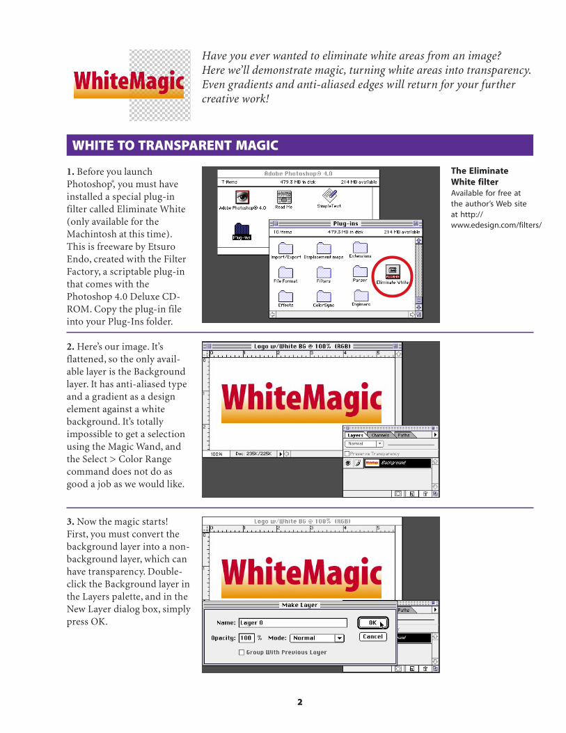
2
WHITE TO TRANSPARENT MAGIC
1. Before you launchPhotoshop®, you must haveinstalled a special plug-infilter called Eliminate White(only available for theMachintosh at this time).This is freeware by EtsuroEndo, created with the FilterFactory, a scriptable plug-inthat comes with thePhotoshop 4.0 Deluxe CD-ROM. Copy the plug-in fileinto your Plug-Ins folder.
Have you ever wanted to eliminate white areas from an image?Here we’ll demonstrate magic, turning white areas into transparency.Even gradients and anti-aliased edges will return for your furthercreative work!
2. Here’s our image. It’sflattened, so the only avail-able layer is the Backgroundlayer. It has anti-aliased typeand a gradient as a designelement against a whitebackground. It’s totallyimpossible to get a selectionusing the Magic Wand, andthe Select > Color Rangecommand does not do asgood a job as we would like.
The EliminateWhite filterAvailable for free atthe author’s Web siteat http://www.edesign.com/filters/
3. Now the magic starts!First, you must convert thebackground layer into a non-background layer, which canhave transparency. Double-click the Background layer inthe Layers palette, and in theNew Layer dialog box, simplypress OK.
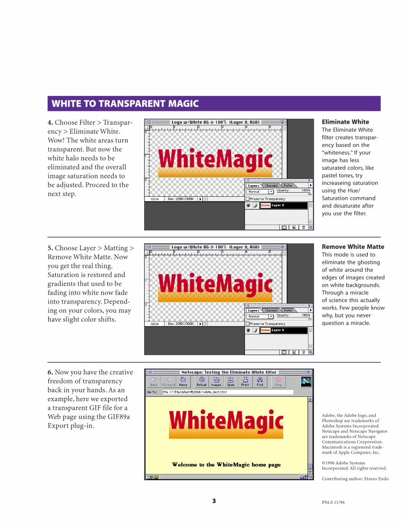
3
4. Choose Filter > Transpar-ency > Eliminate White.Wow! The white areas turntransparent. But now thewhite halo needs to beeliminated and the overallimage saturation needs tobe adjusted. Proceed to thenext step.
WHITE TO TRANSPARENT MAGIC
5. Choose Layer > Matting >Remove White Matte. Nowyou get the real thing.Saturation is restored andgradients that used to befading into white now fadeinto transparency. Depend-ing on your colors, you mayhave slight color shifts.
6. Now you have the creativefreedom of transparencyback in your hands. As anexample, here we exporteda transparent GIF file for aWeb page using the GIF89aExport plug-in.
Eliminate WhiteThe Eliminate Whitefilter creates transpar-ency based on the“whiteness.” If yourimage has lesssaturated colors, likepastel tones, tryincreaseing saturationusing the Hue/Saturation commandand desaturate afteryou use the filter.
Remove White MatteThis mode is used toeliminate the ghostingof white around theedges of images createdon white backgrounds.Through a miracleof science this actuallyworks. Few people knowwhy, but you neverquestion a miracle.
Adobe, the Adobe logo, andPhotoshop are trademarks ofAdobe Systems Incorporated.Netscape and Netscape Navigatorare trademarks of NetscapeCommunications Corporation.Macintosh is a registered trade-mark of Apple Computer, Inc.
©1996 Adobe SystemsIncorporated. All rights reserved.
Contributing author: Etsuro Endo
PS4.0 11/96