adobe photoshop cs5 -...
TRANSCRIPT

Adobe Photoshop CS5: Basics 3.0 Hours
The workshop will cover creating and manipulating basic graphics in Adobe Photoshop, and sorting and tagging in Adobe
Bridge. Topics include an overview of common toolbar features, creating images using layers, and adding text to images.
This workshop assumes no experience with Photoshop or Bridge, but requires a working knowledge of the Microsoft
Windows operating system.
Worksheets:
The Photoshop Interface ................................................................................................................. 1
Open an Image ................................................................................................................................ 1
The Mechanics of Photoshop ......................................................................................................... 3
Menus ............................................................................................................................................. 3
Edit Menu .................................................................................................................................. 3
View Menu ................................................................................................................................ 4
Window Menu .......................................................................................................................... 4
Select Menu .............................................................................................................................. 5
Layer Menu ............................................................................................................................... 5
Image Menu .............................................................................................................................. 6
Mode ................................................................................................................................................ 6
Image Size ........................................................................................................................................ 7
Canvas Size ....................................................................................................................................... 7
Photoshop Toolbox ......................................................................................................................... 8
The Option Bar ................................................................................................................................ 9
Palettes ........................................................................................................................................... 9
Navigator Palette .................................................................................................................... 10
Color Palette ........................................................................................................................... 10
Swatches Palette ..................................................................................................................... 10
Styles Palette ........................................................................................................................... 11
Character Palette .................................................................................................................... 11
Paragraph Palette ................................................................................................................... 12
Layer Palette ........................................................................................................................... 12
History Palette ........................................................................................................................ 13

Updated: 10/14/2015
Saving Files .................................................................................................................................... 13
To Save File for Web ............................................................................................................... 14
Resolution ..................................................................................................................................... 15
Exercises ........................................................................................................................................ 16
Exercises 1 – No Layers .......................................................................................................... 16
Exercises 2 – Layers ................................................................................................................. 16
Exercises 3 – Repairing Red Eye .............................................................................................. 17
Exercises 4 – Repairing Spots, Scratches, or Blemishes .......................................................... 17
Exercises 5 – Cropping ............................................................................................................ 18
Exercises 6 – Select and Blur ................................................................................................... 18
Exercises 7 – Motivational Poster/Demotivational Poster ..................................................... 20
Glossary ......................................................................................................................................... 21
Page 1
The Photoshop Interface
This is the Adobe Photoshop Workspace. The Photoshop toolbox is the heart of the Photoshop program.
One click gets you to the tool you want to use. Note in the succeeding pictures the tools that have a
small black triangle in the corner. That designates more tool options on that button. For example the
brush tool can be the brush or the pencil.
Open an Image To open an image, click on File on the menu bar. To open an existing image, click on Open or Browse in
Bridge then search for your image file. Once you have located the file you want, double clicking will
open the file. You can also use the Adobe Bridge button in the Options Bar. Adobe Bridge is a separate
program for searching and organizing the image files on your computer.
Palettes in the Icon Only View
To open an existing Use the Adobe Click on Open or
Toolbox
Options Bar
Open Adobe Mini Bridge
Layout Workspace Open AdobeBridge
Menu Bar
Page 2
To open a new blank canvas, click on New and the box below will pop up. There are several decisions to
make right from the start. What color mode should I choose? What size canvas is needed? Should the
background be transparent or a color? What should the resolution be?
You can choose a name for your image here. You will also have the opportunity to name the file when
you save it later.
Choose the size of your document by setting the Width and Height. You can choose from some preset
sizes (click on the triangle to see the options in the drop down box) or create custom sizes. The size can
be in pixels or in inches by changing the drop down. When working with images for an onscreen
application use pixels. For print applications, use inches or cm.
Resolution affects the sharpness and clarity of an image. Resolution refers to the number of pixels (dots
on a printer or squares on a monitor) per inch. If you are producing images for the web, the default of
72 pixels per inch (ppi) will be fine. That is what most computer monitors show. If you create your image
for the web at a higher resolution, the picture will be very large when it tries to open, the file will be
large, and it will take a very long time to download. However, if the image is to be printed, it will need to
be a much higher resolution, frequently 300 ppi. For printing, the actual term is dots per inch (dpi) and
the more dots you have per inch will give more detail and a smoother looking picture.
The Color Mode drop down box gives the opportunity to set the color mode. Color mode tells the
computer how to identify colors. Grayscale gives 256 variations of white to black. This would be the
mode to choose for black and white images. RGB creates color from differing amounts of Red, Green
and Blue. This is good for onscreen images. CMYK is the mode to choose for images for print. This uses
blends of Cyan, Magenta, Yellow and Black.
The area labeled Background Contents is for the background of the image. The background usually
defaults to white, but you may want to set a transparent background or even a specific color for the full
background of the image.
Page 3
The Mechanics of Photoshop Photoshop has so many tools, options and actions that can be used to create, enhance, modify and
manipulate images. The following information is just a sampling of what is available. The menus in
Photoshop are “context sensitive”. That means if you select a menu and an option is grayed out, the
option is not available in that situation. Many of the items show the keyboard shortcut for that item. If a
keyboard shortcut is not available, one can be created and saved in the Edit > Keyboard Shortcuts
option.
Menus
On the Photoshop Menu Bar are several items, each
with its own set of options in a drop down box.
Shown here are the first two menu items, File and
Edit. The operations listed in these menus are very
similar to many other applications. Several items
have their own set of options as designated by the
small black triangle. Hovering on the item with the
triangle shows the fly out menu. If you don’t see the
choices you want you may have to click Show All
Menu Items at the bottom of the menu.
Edit Menu
Step Backward which will continue to undo actions.
Fill will fill the entire selection or layer with a color or
a pattern.
Stroke will paint a colored border around a selection,
layer, or path.
Free Transform will allow the manipulation of an
image. This allows the changing of size and shape in a
freeform manner. Use the mouse to move the
bounding lines around and press enter to apply the
changes.
Transform allows certain set changes such as scale,
rotate, skew, flip, perspective. These are all listed on
the fly out menu.
Preferences will allow changes to settings for general
display options, file‐saving options, cursor options,
transparency options, and options for plug‐ins and
scratch disks. Most of these options are set in the
Preferences dialog box. Preference settings are saved
each time you exit the application. To start, it is okay
to stick with the defaults.
Page 4
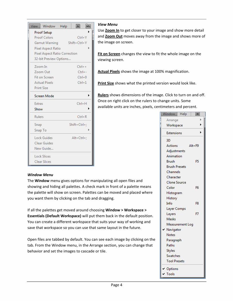
View Menu
Use Zoom In to get closer to your image and show more detail
and Zoom Out moves away from the image and shows more of
the image on screen.
Fit on Screen changes the view to fit the whole image on the
viewing screen.
Actual Pixels shows the image at 100% magnification.
Print Size shows what the printed version would look like.
Rulers shows dimensions of the image. Click to turn on and off.
Once on right click on the rulers to change units. Some
available units are inches, pixels, centimeters and percent.
Window Menu
The Window menu gives options for manipulating all open files and
showing and hiding all palettes. A check mark in front of a palette means
the palette will show on screen. Palettes can be moved and placed where
you want them by clicking on the tab and dragging.
If all the palettes get moved around choosing Window > Workspace >
Essentials (Default Workspace) will put them back in the default position.
You can create a different workspace that suits your way of working and
save that workspace so you can use that same layout in the future.
Open files are tabbed by default. You can see each image by clicking on the
tab. From the Window menu, in the Arrange section, you can change that
behavior and set the images to cascade or tile.
Page 5
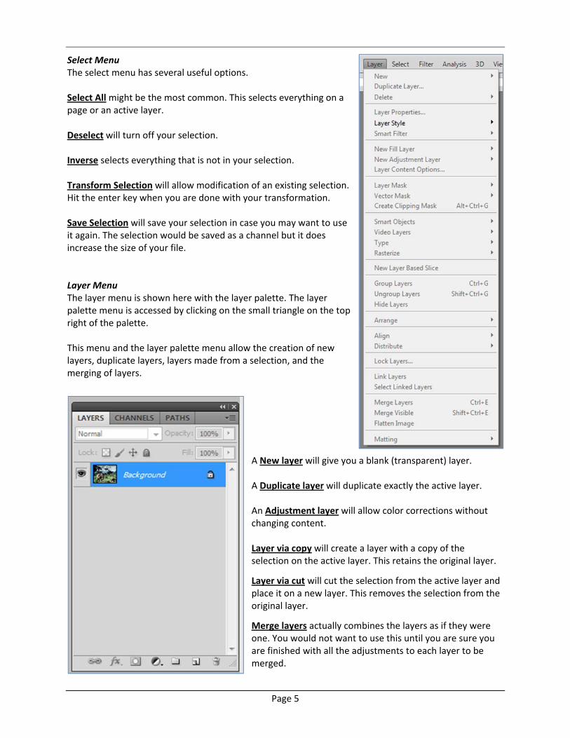
Select Menu The select menu has several useful options. Select All might be the most common. This selects everything on a page or an active layer. Deselect will turn off your selection. Inverse selects everything that is not in your selection. Transform Selection will allow modification of an existing selection. Hit the enter key when you are done with your transformation. Save Selection will save your selection in case you may want to use it again. The selection would be saved as a channel but it does increase the size of your file. Layer Menu The layer menu is shown here with the layer palette. The layer palette menu is accessed by clicking on the small triangle on the top right of the palette. This menu and the layer palette menu allow the creation of new layers, duplicate layers, layers made from a selection, and the merging of layers.
A New layer will give you a blank (transparent) layer. A Duplicate layer will duplicate exactly the active layer. An Adjustment layer will allow color corrections without changing content. Layer via copy will create a layer with a copy of the selection on the active layer. This retains the original layer.
Layer via cut will cut the selection from the active layer and place it on a new layer. This removes the selection from the original layer.
Merge layers actually combines the layers as if they were one. You would not want to use this until you are sure you are finished with all the adjustments to each layer to be merged.
Page 6
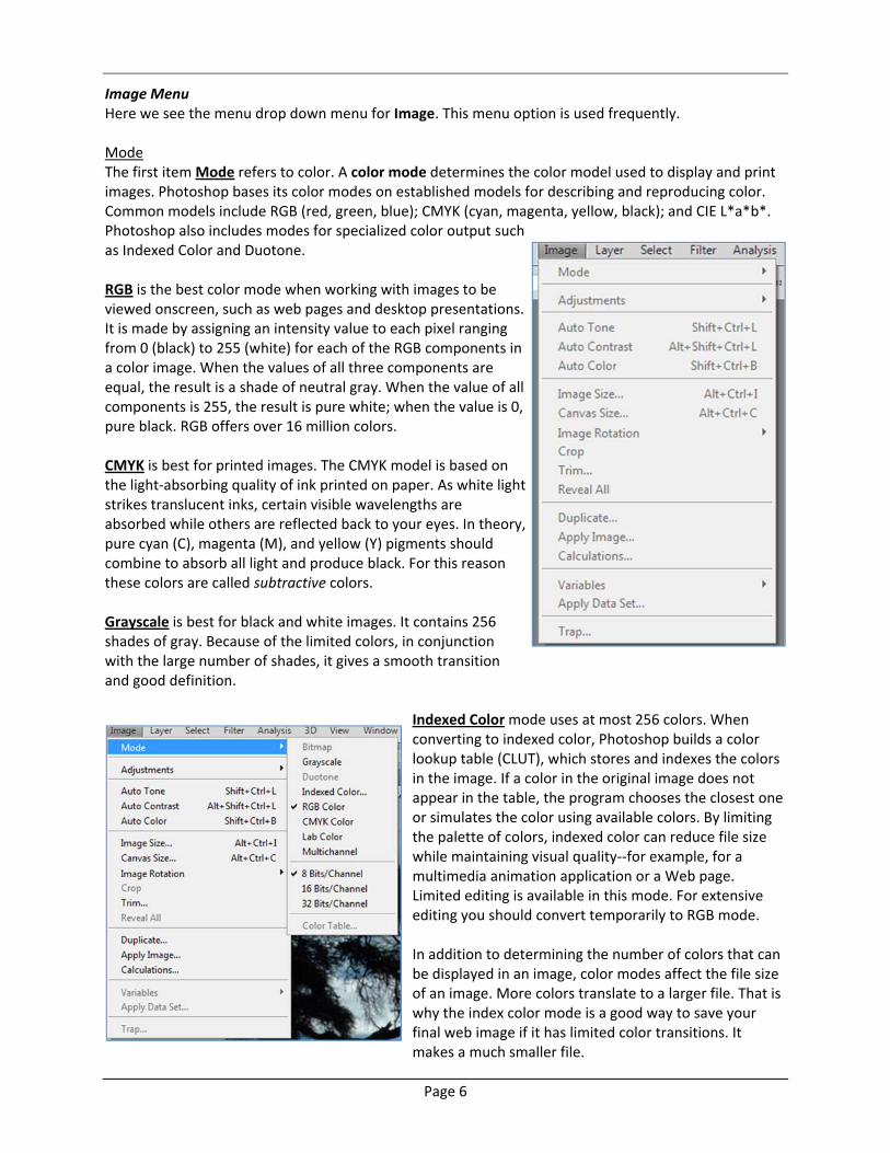
Image Menu Here we see the menu drop down menu for Image. This menu option is used frequently. Mode The first item Mode refers to color. A color mode determines the color model used to display and print images. Photoshop bases its color modes on established models for describing and reproducing color. Common models include RGB (red, green, blue); CMYK (cyan, magenta, yellow, black); and CIE L*a*b*. Photoshop also includes modes for specialized color output such as Indexed Color and Duotone. RGB is the best color mode when working with images to be viewed onscreen, such as web pages and desktop presentations. It is made by assigning an intensity value to each pixel ranging from 0 (black) to 255 (white) for each of the RGB components in a color image. When the values of all three components are equal, the result is a shade of neutral gray. When the value of all components is 255, the result is pure white; when the value is 0, pure black. RGB offers over 16 million colors. CMYK is best for printed images. The CMYK model is based on the light‐absorbing quality of ink printed on paper. As white light strikes translucent inks, certain visible wavelengths are absorbed while others are reflected back to your eyes. In theory, pure cyan (C), magenta (M), and yellow (Y) pigments should combine to absorb all light and produce black. For this reason these colors are called subtractive colors. Grayscale is best for black and white images. It contains 256 shades of gray. Because of the limited colors, in conjunction with the large number of shades, it gives a smooth transition and good definition.
Indexed Color mode uses at most 256 colors. When converting to indexed color, Photoshop builds a color lookup table (CLUT), which stores and indexes the colors in the image. If a color in the original image does not appear in the table, the program chooses the closest one or simulates the color using available colors. By limiting the palette of colors, indexed color can reduce file size while maintaining visual quality‐‐for example, for a multimedia animation application or a Web page. Limited editing is available in this mode. For extensive editing you should convert temporarily to RGB mode. In addition to determining the number of colors that can be displayed in an image, color modes affect the file size of an image. More colors translate to a larger file. That is why the index color mode is a good way to save your final web image if it has limited color transitions. It makes a much smaller file.
Page 7
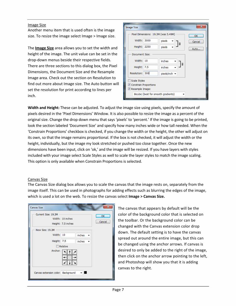
Image Size Another menu item that is used often is the image
size. To resize the image select Image > Image size.
The Image Size area allows you to set the width and
height of the image. The unit value can be set in the
drop‐down menus beside their respective fields.
There are three sections to this dialog box, the Pixel
Dimensions, the Document Size and the Resample
Image area. Check out the section on Resolution to
find out more about Image size. The Auto button will
set the resolution for print according to lines per
inch.
Width and Height: These can be adjusted. To adjust the image size using pixels, specify the amount of
pixels desired in the ‘Pixel Dimensions’ Window. It is also possible to resize the image as a percent of the
original size. Change the drop down menu that says ‘pixels’ to ‘percent.’ If the image is going to be printed,
look the section labeled ‘Document Size’ and specify how many inches wide or how tall needed. When the
‘Constrain Proportions’ checkbox is checked, if you change the width or the height, the other will adjust on
its own, so that the image remains proportional. If the box is not checked, it will adjust the width or the
height, individually, but the image my look stretched or pushed too close together. Once the new
dimensions have been input, click on ‘ok,’ and the image will be resized. If you have layers with styles
included with your image select Scale Styles as well to scale the layer styles to match the image scaling.
This option is only available when Constrain Proportions is selected.
Canvas Size The Canvas Size dialog box allows you to scale the canvas that the image rests on, separately from the
image itself. This can be used in photographs for adding effects such as blurring the edges of the image,
which is used a lot on the web. To resize the canvas select Image > Canvas Size.
The canvas that appears by default will be the
color of the background color that is selected on
the toolbar. Or the background color can be
changed with the Canvas extension color drop
down. The default setting is to have the canvas
spread out around the entire image, but this can
be changed using the anchor arrows. If canvas is
desired to only be added to the right of the image,
then click on the anchor arrow pointing to the left,
and Photoshop will show you that it is adding
canvas to the right.
Page 8
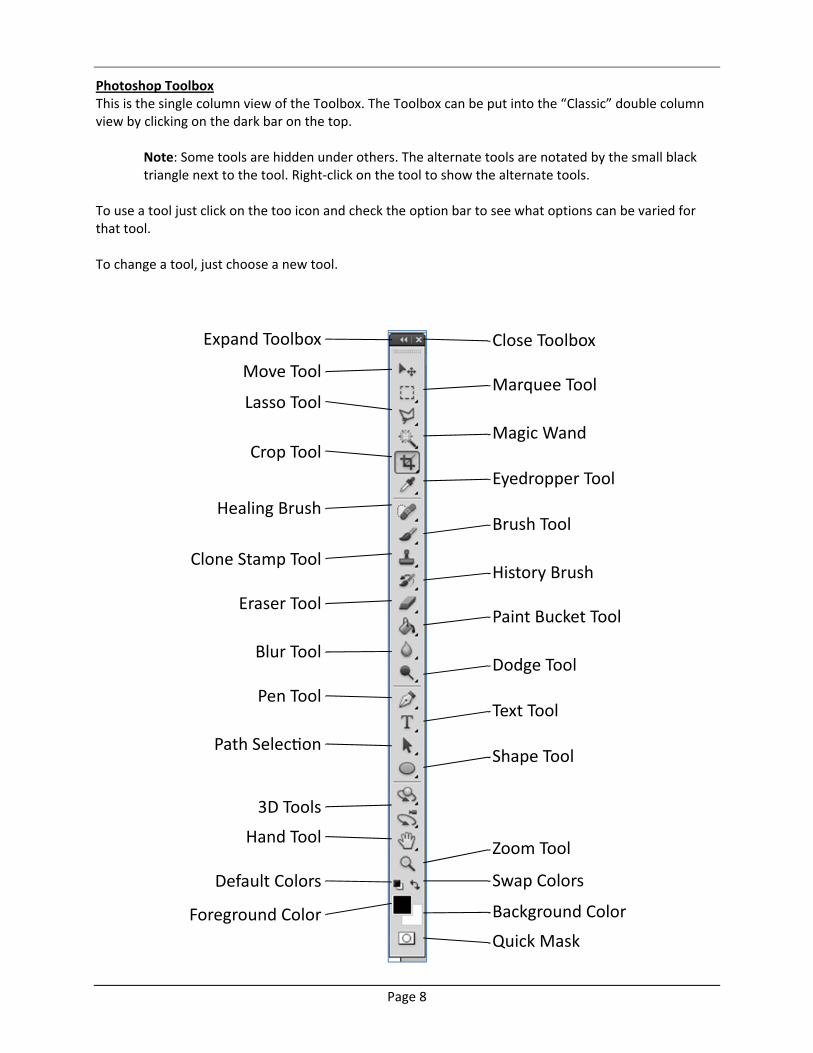
Photoshop Toolbox This is the single column view of the Toolbox. The Toolbox can be put into the “Classic” double column view by clicking on the dark bar on the top.
Note: Some tools are hidden under others. The alternate tools are notated by the small black triangle next to the tool. Right‐click on the tool to show the alternate tools.
To use a tool just click on the too icon and check the option bar to see what options can be varied for that tool. To change a tool, just choose a new tool.
Expand Toolbox
Move Tool
Lasso Tool
Crop Tool
Healing Brush
Clone Stamp Tool
Eraser Tool
Blur Tool
Pen Tool
Path Selec on
3D Tools
Hand Tool
Default Colors
Foreground Color
Close Toolbox
Marquee Tool
Magic Wand
Eyedropper Tool
Brush Tool
History Brush
Paint Bucket Tool
Dodge Tool
Text Tool
Shape Tool
Zoom Tool
Swap Colors
Background Color
Quick Mask
Page 9
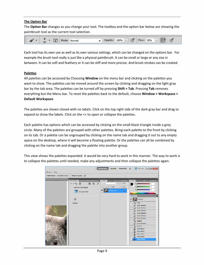
The Option Bar
The Option Bar changes as you change your tool. The toolbox and the option bar below are showing the
paintbrush tool as the current tool selection.
Each tool has its own use as well as its own various settings, which can be changed on the options bar. For
example the brush tool really is just like a physical paintbrush. It can be small or large or any size in
between. It can be soft and feathery or it can be stiff and more precise. And brush strokes can be created.
Palettes
All palettes can be accessed by Choosing Window on the menu bar and clicking on the palettes you
want to show. The palettes can be moved around the screen by clicking and dragging on the light gray
bar by the tab area. The palettes can be turned off by pressing Shift + Tab. Pressing Tab removes
everything but the Menu bar. To reset the palettes back to the default, choose Window > Workspace >
Default Workspace.
The palettes are shown closed with no labels. Click on the top right side of the dark gray bar and drag to
expand to show the labels. Click on the << to open or collapse the palettes.
Each palette has options which can be accessed by clicking on the small black triangle inside a grey
circle. Many of the palettes are grouped with other palettes. Bring each palette to the front by clicking
on its tab. Or a palette can be ungrouped by clicking on the name tab and dragging it out to any empty
space on the desktop, where it will become a floating palette. Or the palettes can all be combined by
clicking on the name tab and dragging the palette into another group.
This view shows the palettes expanded. It would be very hard to work in this manner. The way to work is
to collapse the palettes until needed, make any adjustments and then collapse the palettes again.
Page 10
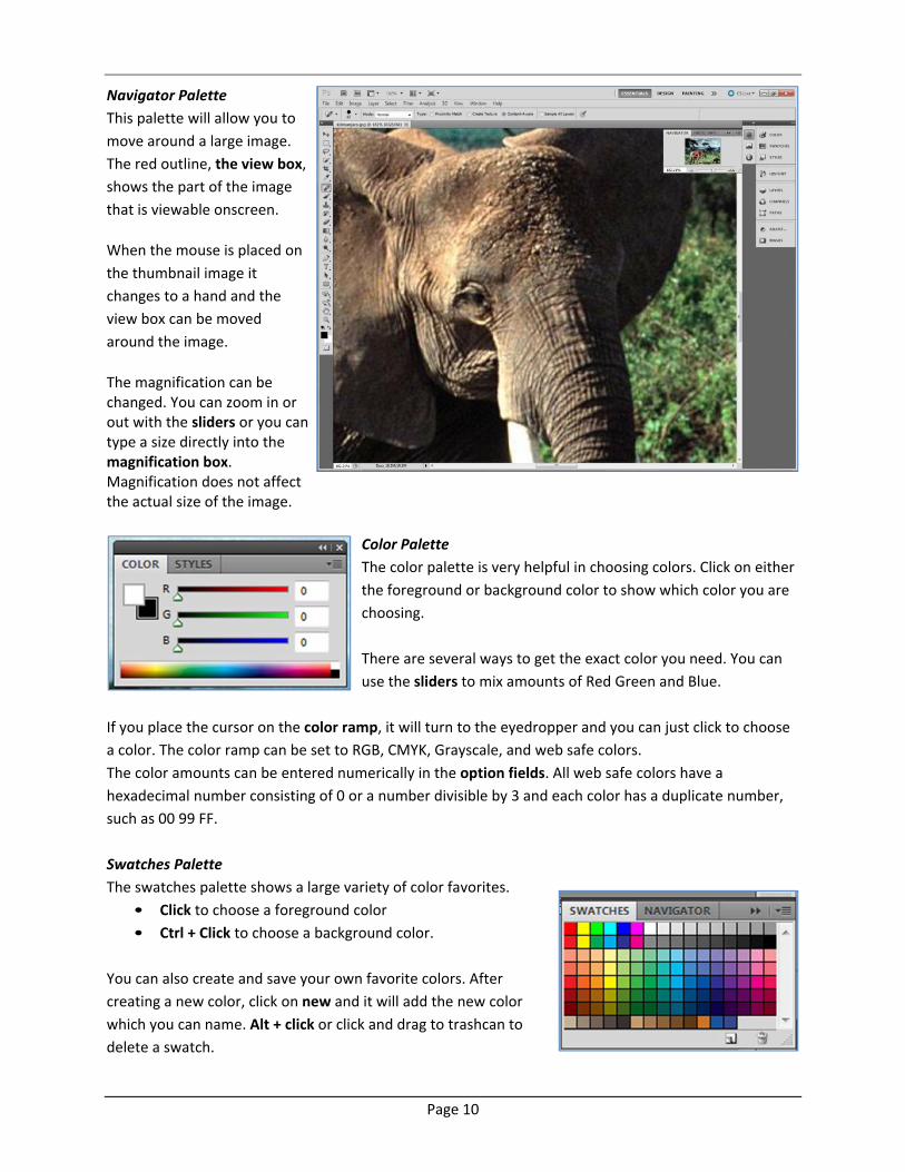
Navigator Palette This palette will allow you to
move around a large image.
The red outline, the view box,
shows the part of the image
that is viewable onscreen.
When the mouse is placed on
the thumbnail image it
changes to a hand and the
view box can be moved
around the image.
The magnification can be changed. You can zoom in or out with the sliders or you can type a size directly into the magnification box. Magnification does not affect the actual size of the image.
Color Palette
The color palette is very helpful in choosing colors. Click on either
the foreground or background color to show which color you are
choosing.
There are several ways to get the exact color you need. You can
use the sliders to mix amounts of Red Green and Blue.
If you place the cursor on the color ramp, it will turn to the eyedropper and you can just click to choose
a color. The color ramp can be set to RGB, CMYK, Grayscale, and web safe colors.
The color amounts can be entered numerically in the option fields. All web safe colors have a
hexadecimal number consisting of 0 or a number divisible by 3 and each color has a duplicate number,
such as 00 99 FF.
Swatches Palette
The swatches palette shows a large variety of color favorites.
• Click to choose a foreground color
• Ctrl + Click to choose a background color.
You can also create and save your own favorite colors. After
creating a new color, click on new and it will add the new color
which you can name. Alt + click or click and drag to trashcan to
delete a swatch.
Page 11
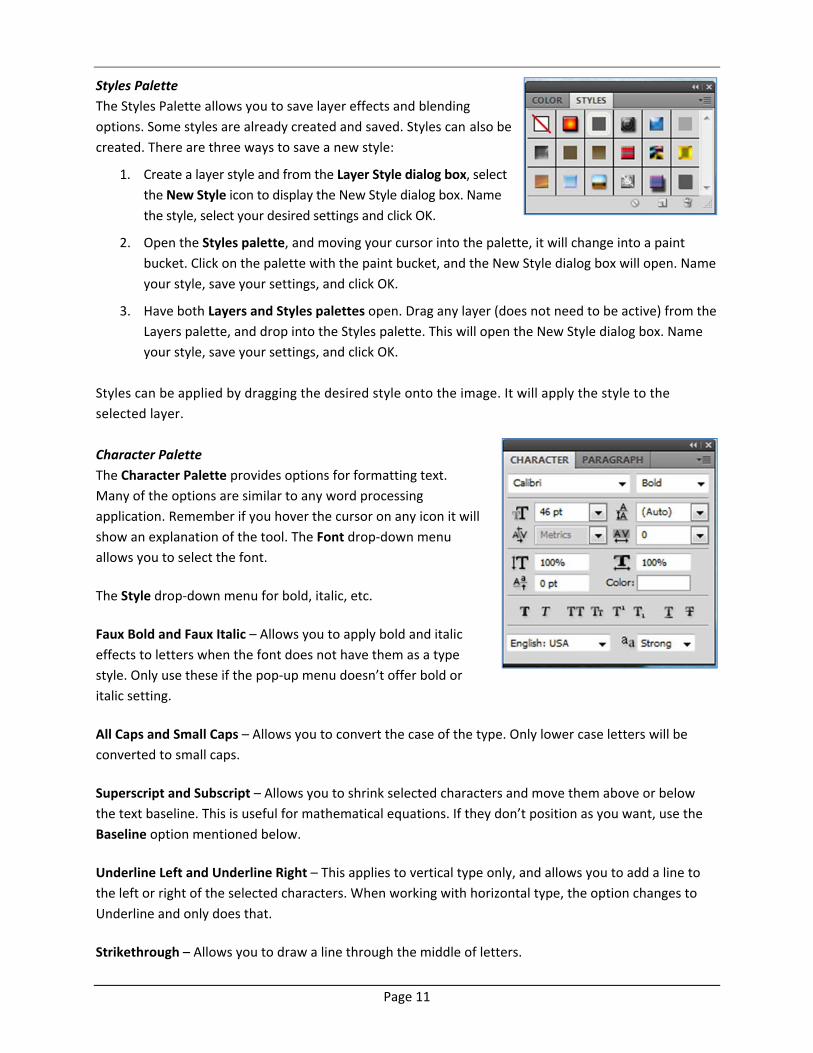
Styles Palette
The Styles Palette allows you to save layer effects and blending
options. Some styles are already created and saved. Styles can also be created. There are three ways to save a new style:
1. Create a layer style and from the Layer Style dialog box, select
the New Style icon to display the New Style dialog box. Name
the style, select your desired settings and click OK.
2. Open the Styles palette, and moving your cursor into the palette, it will change into a paint
bucket. Click on the palette with the paint bucket, and the New Style dialog box will open. Name
your style, save your settings, and click OK.
3. Have both Layers and Styles palettes open. Drag any layer (does not need to be active) from the
Layers palette, and drop into the Styles palette. This will open the New Style dialog box. Name
your style, save your settings, and click OK.
Styles can be applied by dragging the desired style onto the image. It will apply the style to the
selected layer.
Character Palette
The Character Palette provides options for formatting text.
Many of the options are similar to any word processing
application. Remember if you hover the cursor on any icon it will
show an explanation of the tool. The Font drop‐down menu
allows you to select the font.
The Style drop‐down menu for bold, italic, etc.
Faux Bold and Faux Italic – Allows you to apply bold and italic
effects to letters when the font does not have them as a type
style. Only use these if the pop‐up menu doesn’t offer bold or
italic setting.
All Caps and Small Caps – Allows you to convert the case of the type. Only lower case letters will be
converted to small caps.
Superscript and Subscript – Allows you to shrink selected characters and move them above or below
the text baseline. This is useful for mathematical equations. If they don’t position as you want, use the
Baseline option mentioned below.
Underline Left and Underline Right – This applies to vertical type only, and allows you to add a line to
the left or right of the selected characters. When working with horizontal type, the option changes to
Underline and only does that.
Strikethrough – Allows you to draw a line through the middle of letters.
Page 12
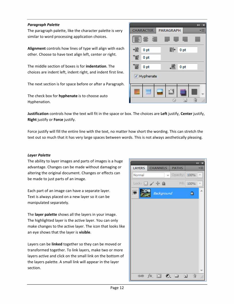
Paragraph Palette
The paragraph palette, like the character palette is very
similar to word processing application choices.
Alignment controls how lines of type will align with each
other. Choose to have text align left, center or right.
The middle section of boxes is for indentation. The
choices are indent left, indent right, and indent first line.
The next section is for space before or after a Paragraph.
The check box for hyphenate is to choose auto
Hyphenation.
Justification controls how the text will fit in the space or box. The choices are Left justify, Center justify,
Right justify or Force justify.
Force justify will fill the entire line with the text, no matter how short the wording. This can stretch the
text out so much that it has very large spaces between words. This is not always aesthetically pleasing.
Layer Palette
The ability to layer images and parts of images is a huge
advantage. Changes can be made without damaging or
altering the original document. Changes or effects can
be made to just parts of an image.
Each part of an image can have a separate layer.
Text is always placed on a new layer so it can be
manipulated separately.
The layer palette shows all the layers in your image.
The highlighted layer is the active layer. You can only
make changes to the active layer. The icon that looks like
an eye shows that the layer is visible.
Layers can be linked together so they can be moved or
transformed together. To link layers, make two or more
layers active and click on the small link on the bottom of
the layers palette. A small link will appear in the layer
section.
Page 13
A B C
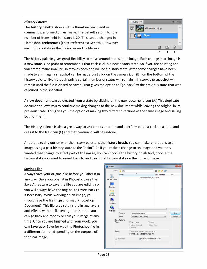
History Palette
The history palette shows with a thumbnail each edit or
command performed on an image. The default setting for the
number of items held in history is 20. This can be changed in
Photoshop preferences (Edit>Preferences>General). However
each history state in the file increases the file size.
The history palette gives great flexibility to move around states of an image. Each change in an image is
a new state. One point to remember is that each click is a new history state. So if you are painting and
you create many small brush strokes each one will be a history state. After some changes have been
made to an image, a snapshot can be made. Just click on the camera icon (B.) on the bottom of the
history palette. Even though only a certain number of states will remain in history, the snapshot will
remain until the file is closed or saved. That gives the option to “go back” to the previous state that was
captured in the snapshot.
A new document can be created from a state by clicking on the new document icon (A.) This duplicate
document allows you to continue making changes to the new document while leaving the original in its
previous state. This gives you the option of making two different versions of the same image and saving
both of them.
The History palette is also a great way to undo edits or commands performed. Just click on a state and
drag it to the trashcan (C) and that command will be undone.
Another exciting option with the history palette is the history brush. You can make alterations to an
image using a past history state as the “paint”. So if you make a change to an image and you only
wanted that change to affect part of the image, you can choose the history brush tool, choose the
history state you want to revert back to and paint that history state on the current image.
Saving Files
Always save your original file before you alter it in
any way. Once you open it in Photoshop use the
Save As feature to save the file you are editing so
you will always have the original to revert back to
if necessary. While working on an image, you
should save the file in .psd format (Photoshop
Document). This file type retains the image layers
and effects without flattening them so that you
can go back and modify or edit your image at any
time. Once you are finished with your work, you
can Save as or Save for web the Photoshop file in
a different format, depending on the purpose of
the final image.
Page 14
When savings images for the web use these file formats:
.png – If the picture is line art, has large areas of solid color and uses a limited color palette.
.jpeg or .jpg– If the picture is a photograph.
.eps – For print using a Postscript compatible printer.
.tif – For print using most printers and page layout programs.
Note: If you want to Import a picture into another graphic program other options you may want to look
at are .bmp or .pict.
To Save as PSD: Select File > Save. Select the proper location and type in a name for the file. Make sure
the file format menu says ‘Photoshop(*.PSD).’
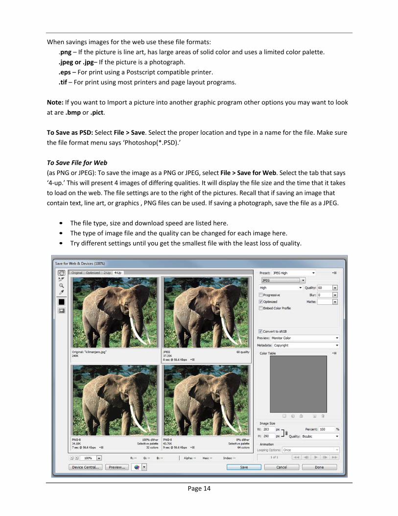
To Save File for Web
(as PNG or JPEG): To save the image as a PNG or JPEG, select File > Save for Web. Select the tab that says
‘4‐up.’ This will present 4 images of differing qualities. It will display the file size and the time that it takes
to load on the web. The file settings are to the right of the pictures. Recall that if saving an image that
contain text, line art, or graphics , PNG files can be used. If saving a photograph, save the file as a JPEG.
• The file type, size and download speed are listed here.
• The type of image file and the quality can be changed for each image here.
• Try different settings until you get the smallest file with the least loss of quality.

Page 15
Resolution
Each of these images in the first set below is set to be 1 inch by 1 inch. They don’t look the same in the first
picture, because the real size of the images is 300 pixels by 300 pixels and 72 pixels by 72 pixels. So, on
screen, which is usually closer to 72 pixels per inch, the smaller image looks like it is really 1 inch by 1 inch.
However, when printed they are each 1 inch by 1 inch. You can verify this by creating each new image
and then looking at View > Print Size vs. View> Actual pixels. The 300 pixel image looks much better than
the 72 pixel image when printed since there are more pixels (dots) per inch. The more dots when
printing, the smoother and more detailed the print. A 1‐by‐1‐inch image with a resolution of 72 ppi
contains a total of 5184 pixels (72 pixels wide x 72 pixels high = 5184). The same 1‐by‐1‐ inch image with
a resolution of 300 ppi contains a total of 90,000 pixels.
These three images are each 72 pixels by 72 pixels. They look the same on screen, but each one as a
print will be a different size. The 72 dpi will be one inch, the 144 dpi will be .5 inch and the 300 dpi will
be .24 inch. Again, you can verify this by creating each new image and then looking at View >Print Size
vs. View> Actual pixels.
View > Actual Pixels View > Print size
View > Actual Pixels View > Print size
Page 16
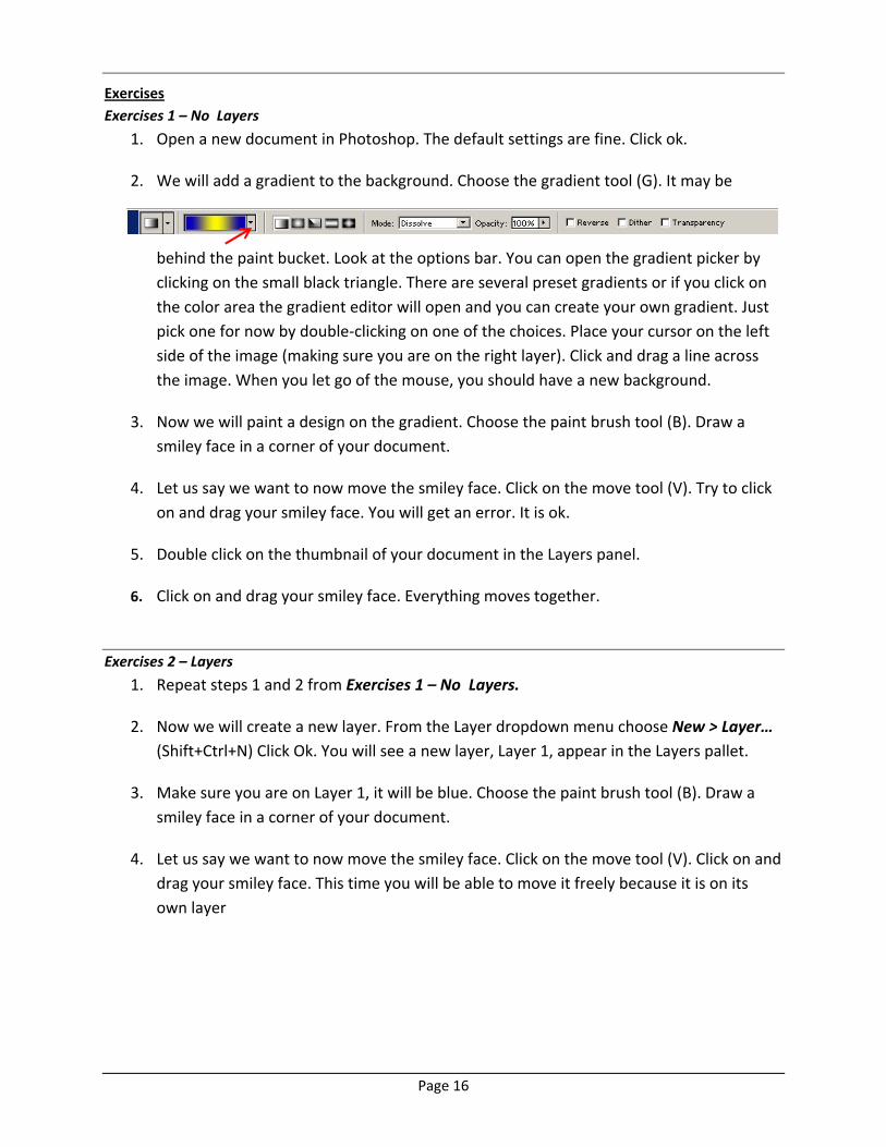
Exercises
Exercises 1 – No Layers
1. Open a new document in Photoshop. The default settings are fine. Click ok.
2. We will add a gradient to the background. Choose the gradient tool (G). It may be
behind the paint bucket. Look at the options bar. You can open the gradient picker by
clicking on the small black triangle. There are several preset gradients or if you click on
the color area the gradient editor will open and you can create your own gradient. Just
pick one for now by double‐clicking on one of the choices. Place your cursor on the left
side of the image (making sure you are on the right layer). Click and drag a line across
the image. When you let go of the mouse, you should have a new background.
3. Now we will paint a design on the gradient. Choose the paint brush tool (B). Draw a
smiley face in a corner of your document.
4. Let us say we want to now move the smiley face. Click on the move tool (V). Try to click
on and drag your smiley face. You will get an error. It is ok.
5. Double click on the thumbnail of your document in the Layers panel.
6. Click on and drag your smiley face. Everything moves together.
Exercises 2 – Layers
1. Repeat steps 1 and 2 from Exercises 1 – No Layers.
2. Now we will create a new layer. From the Layer dropdown menu choose New > Layer…
(Shift+Ctrl+N) Click Ok. You will see a new layer, Layer 1, appear in the Layers pallet.
3. Make sure you are on Layer 1, it will be blue. Choose the paint brush tool (B). Draw a
smiley face in a corner of your document.
4. Let us say we want to now move the smiley face. Click on the move tool (V). Click on and
drag your smiley face. This time you will be able to move it freely because it is on its
own layer
Page 17
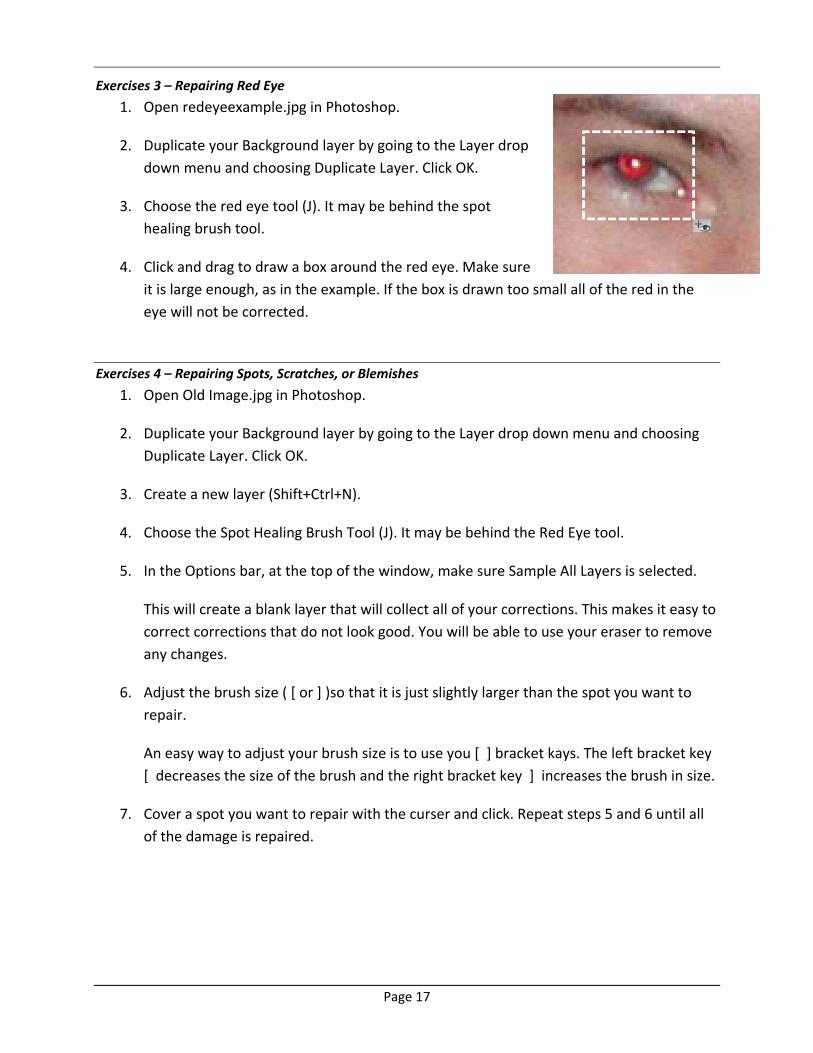
Exercises 3 – Repairing Red Eye
1. Open redeyeexample.jpg in Photoshop.
2. Duplicate your Background layer by going to the Layer drop
down menu and choosing Duplicate Layer. Click OK.
3. Choose the red eye tool (J). It may be behind the spot
healing brush tool.
4. Click and drag to draw a box around the red eye. Make sure
it is large enough, as in the example. If the box is drawn too small all of the red in the
eye will not be corrected.
Exercises 4 – Repairing Spots, Scratches, or Blemishes
1. Open Old Image.jpg in Photoshop.
2. Duplicate your Background layer by going to the Layer drop down menu and choosing
Duplicate Layer. Click OK.
3. Create a new layer (Shift+Ctrl+N).
4. Choose the Spot Healing Brush Tool (J). It may be behind the Red Eye tool.
5. In the Options bar, at the top of the window, make sure Sample All Layers is selected.
This will create a blank layer that will collect all of your corrections. This makes it easy to
correct corrections that do not look good. You will be able to use your eraser to remove
any changes.
6. Adjust the brush size ( [ or ] )so that it is just slightly larger than the spot you want to
repair.
An easy way to adjust your brush size is to use you [ ] bracket kays. The left bracket key
[ decreases the size of the brush and the right bracket key ] increases the brush in size.
7. Cover a spot you want to repair with the curser and click. Repeat steps 5 and 6 until all
of the damage is repaired.
Page 18
Exercises 5 – Cropping
1. In this example we want to make a 4”x6” postcard with text. First open Desert.jpg in
Photoshop.
2. Choose your Crop tool (C). In the Options bar, at the top of the window, set the Width to
6 inches and the Heights to 4 inches.
3. Click and drag to draw the crop box. Everything within the box will be kept. Anything
that is darkened outside of the box will be cut and removed.
The box can be moved after you draw it by clicking and dragging inside of the box.
The crop box can also be resized by clicking and dragging one of the handles, the little
boxes at the corner of the crop box.
When you are happy with the look you have to apply the crop by clicking on the check
mark, , on the right side of the options bar.
4. Choose your text tool (T). Set your font, font size and font color in the options bar.
5. Click in the image where you want your text to start. Type your message.
When you are happy with what it says you have to apply the crop by clicking on the
check mark, , on the right side of the options bar.
If you want to move the text click on the move tool. Click and drag to reposition it.
Exercises 6 – Select and Blur
1. In this example we want to blur the background leaving the foreground in focus. First
open Tulips.jpg in Photoshop.
2. Duplicate your Background layer by going to the Layer drop down menu and choosing
Duplicate Layer. Click OK.
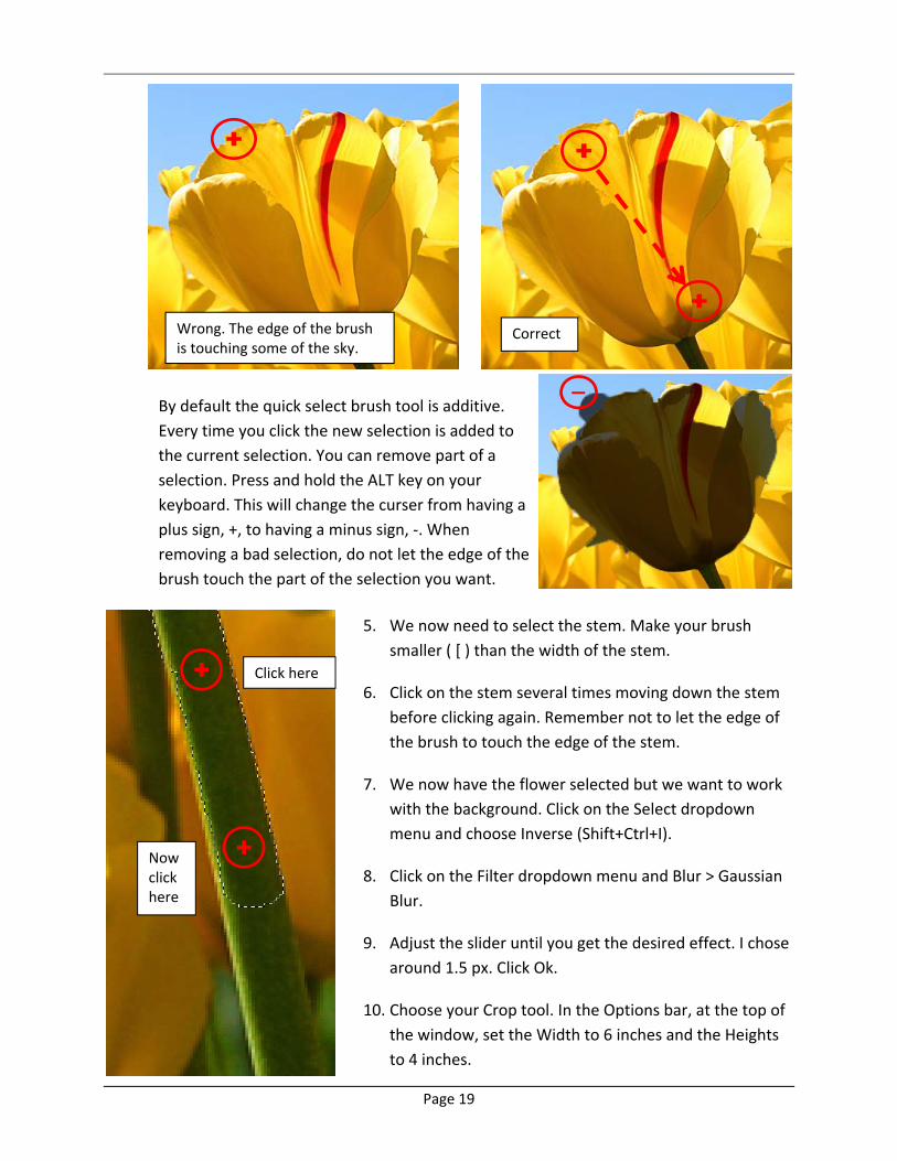
3. We want to blur everything in the background. It is easier to select the foreground and
then invert the selection. Choose your Quick Selection Tool (W). Set your brush size to 40.
4. Click and drag within the flower from one side to another. ***Don’t let the edge of your
brush leave the flower or even touch the edge of the flower. This may have to be done
several times to select the entire flower.
Page 19
Click here
Now click here
By default the quick select brush tool is additive.
Every time you click the new selection is added to
the current selection. You can remove part of a
selection. Press and hold the ALT key on your
keyboard. This will change the curser from having a
plus sign, +, to having a minus sign, ‐. When
removing a bad selection, do not let the edge of the
brush touch the part of the selection you want.
5. We now need to select the stem. Make your brush
smaller ( [ ) than the width of the stem.
6. Click on the stem several times moving down the stem
before clicking again. Remember not to let the edge of
the brush to touch the edge of the stem.
7. We now have the flower selected but we want to work
with the background. Click on the Select dropdown
menu and choose Inverse (Shift+Ctrl+I).
8. Click on the Filter dropdown menu and Blur > Gaussian
Blur.
9. Adjust the slider until you get the desired effect. I chose
around 1.5 px. Click Ok.
10. Choose your Crop tool. In the Options bar, at the top of
the window, set the Width to 6 inches and the Heights
to 4 inches.
Wrong. The edge of the brush is touching some of the sky.
Correct
Page 20
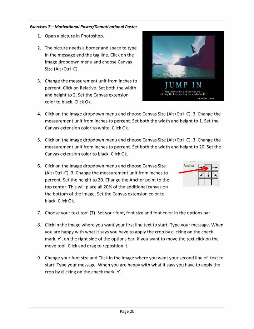
Exercises 7 – Motivational Poster/Demotivational Poster
1. Open a picture in Photoshop.
2. The picture needs a border and space to type
in the message and the tag line. Click on the
Image dropdown menu and choose Canvas
Size (Alt+Ctrl+C).
3. Change the measurement unit from inches to
percent. Click on Relative. Set both the width
and height to 2. Set the Canvas extension
color to black. Click Ok.
4. Click on the Image dropdown menu and choose Canvas Size (Alt+Ctrl+C). 3. Change the
measurement unit from inches to percent. Set both the width and height to 1. Set the
Canvas extension color to white. Click Ok.
5. Click on the Image dropdown menu and choose Canvas Size (Alt+Ctrl+C). 3. Change the
measurement unit from inches to percent. Set both the width and height to 20. Set the
Canvas extension color to black. Click Ok.
6. Click on the Image dropdown menu and choose Canvas Size
(Alt+Ctrl+C). 3. Change the measurement unit from inches to
percent. Set the height to 20. Change the Anchor point to the
top center. This will place all 20% of the additional canvas on
the bottom of the image. Set the Canvas extension color to
black. Click Ok.
7. Choose your text tool (T). Set your font, font size and font color in the options bar.
8. Click in the image where you want your first line text to start. Type your message. When
you are happy with what it says you have to apply the crop by clicking on the check
mark, , on the right side of the options bar. If you want to move the text click on the
move tool. Click and drag to reposition it.
9. Change your font size and Click in the image where you want your second line of text to
start. Type your message. When you are happy with what it says you have to apply the
crop by clicking on the check mark, .
Page 21
Glossary
anti‐aliasing By slightly blurring the edges of text and /or shapes the edges appear smoother. Alias is the
stair step look when there are not enough pixels to make a smooth transition between colors or at the
edge of an image.
adjustment layer A layer that allows adjustments to color or tone without changing the content.
alpha channel The non‐color layer where selections can be saved.
blending modes The process of comparing two layers and creating a new imaging effect.
brightness Relative lightness or darkness of color. 0% is black to 100% is white
CLUT The Color lookup table (CLUT) used with Gif files, saves only necessary colors for a particular
image, making a smaller file size.
CMYK Color process using cyan, magenta, yellow, and black. Used mostly for printed images.
color modes Different ways of identifying colors. See CMYK, RGB. Whenever possible, avoid multiple
conversions between color modes, because color values are rounded and lost with each conversion.
contiguous Adjacent areas that are not interrupted by other colors
crop Cuts off part of an image that is unwanted. The crop tool can only crop in a rectangle shape.
dithering A process that combines two or more colors into patterns to fool the human eye into thinking
it is seeing new solid colors. The image appears to have more colors than it actually does.
feather Replaces a hard edge with a soft edge. Feathering fades an image into the surrounding area. You
can use this technique to create a vignette effect.
GIF file A good file choice for the web. Gif uses 8 bit color Gif files to create a color look up table (CLUT)
holding up to256 colors. Because of the limited number of colors, and the process of tracking repeating
pixels, gif files compress well. Gif also supports animation.
gradient Blending two or more colors together gradually to create a new fill. Fill moves from one color
to the next.
grayscale Uses 256 shades of gray to create a smooth looking monochrome image.
hue Color as shown on a color wheel as degrees from 0 to 360
Image Resolution It is customary to use inches for images to be printed and pixels for onscreen images.
When creating images for the web, you need to consider the equipment your audience will be seeing
your images on. A 15‐inch monitor typically displays 800 pixels horizontally and 600 vertically. Unless
you know your audience has specific equipment it is best to use 800 X 600 as a norm. An image of that
size would fill the screen of a 15 inch monitor, so you need to judge your image pixel size accordingly.
Page 22
JPEG (Joint Photographic Experts Group) File format that is good for photos or images with many varying
colors. Uses 24 bit color (millions of colors)
kerning The space between individual pairs of characters or letters.
layer Individual image components similar to clear acetate overlays. Each image can have multiple layers
allowing modification of parts of an image without changing the original. Allows effects to be added to
specific parts of an image
leading The space between lines of text. This is usually shown in points, compared to the font point size.
marquee Selection tool that allows rectangle and elliptical selection.
mask Defines an area of an image or layer to isolate and protect as you apply color changes, filters, or
other effects to the rest of the image.
Merge To merge layers combines the layers so they can be worked on or moved as one image. Two or
more layers can be combined while other layers stay separate
noise A coarse dotted pattern added to images for effect or to give a graphic feel.
path A linear outline of an image or shape. Created with the pen tool
pixels The dots (round or square) that make up images.
PNG file Portable Network Graphics. is a bitmapped image format that employs lossless compression
and is a replacement for GIF
PSD file Photoshop’s default file format. This is the only format that preserves all of Photoshop’s
features. These files can be saved as GIF’s JPEG’s or TIFF’s, etc so they will be recognized by other
applications
rasterize This is the process of changing vector images so they will have pixel data. After creating a text
layer, Photoshop will require it to be rasterized before some effects can be applied.
resolution The number of dots (pixels) per inch in digital images. The resolution needs to be different for
onscreen images and print images. See the section on Resolution for a more complete explanation.
RGB Color mode using blends of Red, Green and Blue. This is the most common color mode used for
onscreen images .All the colors together create white (hexadecimal #FF FF FF) or RGB values of 255, 255,
255. The absence of colors is black (hexadecimal # 00 00 00) or RGB values of 0,0,0.
rollover Graphic that changes as you move over it with your mouse cursor.
rotate Change the view of an image. Nothing changes except the way it is presented. An image can be
rotated clockwise or counterclockwise. Images can also be flipped horizontally or vertically. This option
is located under the image menu in Photoshop.
Page 23
sample point A point that defines pixel data to be used in some tools. The Clone Stamp Tool uses a
sample point to use for its paint.
saturation strength or purity of color from 0% gray to fully saturated at 100%
scaling Changing size of an image, layer, or effect.
Sharpening Method of bringing out additional detail in digital images. The best method of sharpening in
Photoshop is to use the unsharp mask filter
slice Divides a large image for web use into smaller pieces (tiles). This helps the image load faster and
can provide parts of the image for rollover or hyperlinks
snapshot An image in the History palette that preserves any changes that have been made to the image.
By taking a snapshot of an image that version of the image will not be lost even if some history is erased.
stroke An outline around an image, a shape, or a path
thumbnail A very small version of a larger image.
tonality This has to do with blacks and whites and shades of gray. Exaggerating the tonality can make a
very expressive image.
tracking The process of creating an equal amount of spacing across a range of letters.
transform Modifying the position, scale or proportions of a layer or image. Can add perspective or
distortion.
vertical type Text in a column rather than the normal horizontal.
warp Distortion of an image or shape or text. Photoshop has many different preset warp effects.
work path This is a path that is in process of being created. Photoshop uses the pen tool to create a
path. Once the path is completed it is saved and given a name