adam fox preliminary task and planning & research
TRANSCRIPT

OCR Media Studies – AS Level
Unit G321: Foundation Portfolio in Media
Planning & Research
Name: Candidate Number: Center Name: St. Andrew’s Catholic SchoolCenter Number:
Set Brief - Print
Music Magazine – Production
Preliminary Task Progression and Planning & Research
Section 1) –Preliminary Task

Preliminary Task Progression–Evidence
Front CoverStep-by-step
Step 1: I inserted a shape to form the background for the masthead
Step 2: I inserted the barcode

Step 3: I then added the issue, date and the price on the top yellow band to present it neatly on the cover using the text tool.
Step 4: Next I added the website for the magazine to include some cross media convergence.

Step 5: I typed in the masthead in the same font as the date, issue, price and website to maintain the brand identity of the magazine. The font is MV Boli.
Step 6: I typed in the strapline on top of the masthead to make it look professional and able to be seen.

Step 7: I have added the idents of Facebook and twitter for extended cross media convergence.
Step 8: Next I inserted the St. Andrews logo to enhance the magazines brand identity.

Step 9: To assert the brand identity further, I added the masthead in smaller version on top of the barcode.
Step 10: Then inserted a medium close up of Mrs Spreckly, removing the background using the quick selection tool and the transform tool to resize so that it overlapped the masthead

Step 11: I typed out the headline over the image, moved the text over to the jacket so that it was more readable.
Step 12: I then typed all of my cover lines in keeping to the brand identity of blue and yellow. The grey text is to make it more readable.
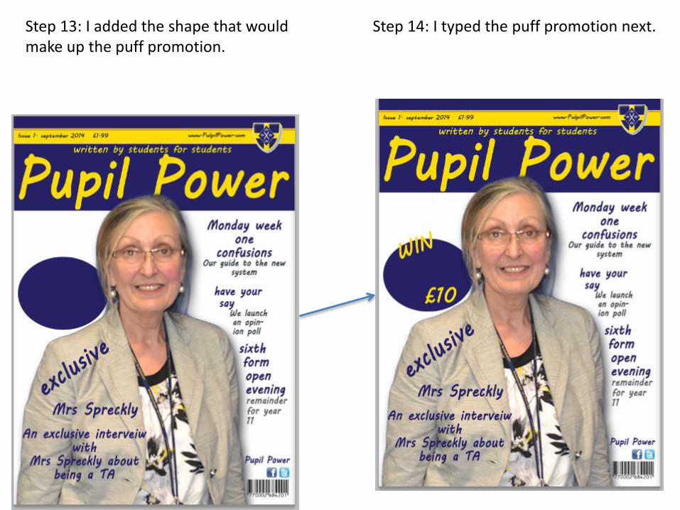
Step 13: I added the shape that would make up the puff promotion.
Step 14: I typed the puff promotion next.

Step 15: I then added the st Andrews logo to the bottom right hand corner to add to the brand identity.
Step 16: finally I inserted an image of an Odeon voucher to complete the puff promotion and the front cover.

I moved the puff promotion up to fill in the dead space in the top left corner. Then to fill ion the space that the puff promotion occupied I typed another cover line from the contents page.
I made the “win” have a blue stroke effect to make it look mare professional.
I cut part of the text to make it more catchy and less cluttered.
I made the word “opinion” fit onto one line so that it was easier to read and looked more purposeful .
I deleted and replaced the shape layers sop that they fitted together better without the red line that occurred before.

Preliminary Task Progression–Evidence
Contents PageStep-by-step
Step 1: I created shapes to house the headings to indicated the categories of the stories.
Step 2: I then copied the shapes twice using the “duplicate layer” tool and moving the copies into position.

Step 3: next, I typed the headings in the shapes to show the different categories in he magazine.
Step 4: next, I inserted the st Andrews logo onto the shapes to form the brand identity.

Step 5: I inserted a shape at the top to act as the background for the masthead.
Step 6 I copied the masthead from the front cover by cli8king and dragging the layer between the two documents.

Step 7: I typed out the main stories in the “whole school” section of the magazine.
Step 8: I then typed out the stories for the GCSE section of the magazine.

Step 9: I then typed out the stories for the “sixth form” section of the magazine.
Step 10: I created the shape at the bottom of the page to affirm the brand identity and as a housing for the issue, website and page number.

Step 12: I pasted the editorial from a word document and changed “pupil power "to the same style that I used for the masthead.
Step 11: I added the st Andrews logo at the bottom to further the brand identity and act as a break between the issue information and the page number.

Step 12: I then added the editor information such as the signature to form a relationship with the reader.
Step 12: I typed and changed the drop capital to make it big and sty Andrews blue to make it stand out and keep the house style of the magazine.

Step 13: I inserted the pictures that I took around the school to accompany the main cover lines.
Step 14: I then typed out the story information to anchor the pictures

Step 15: I copied the picture of Mrs spreckly from the front cover by copying the layer.
Step 16: I inserted the social media link from the front cover to present multi media convergence.

Step 17: I inserted the editor photo in the space in the editorial and gave it a blue stroke effect to continue the brand identity.
Step 18: I typed the editor email contact details to form a relationship with the reader because they have access to contact me if they have questions.

Step 19: finely I inserted the thumbnails top accompany the cover lines.

I have moved the image so that it doesn't overlap the editorial text.
I have changed the colour of the “pupil power” text to make it readable but still in keeping with the masthead style.
I changed the masthead text to read “contents” so that it indicates the page better and in the style of the masthead.

Section 2) – Log Book

Music Magazine – Genre research
The production process:1. Firstly they need to set a date of publication, once
this is set they have to work to get the magazine ready for this time.
2. They now need to decide what will go into the magazine.
3. They then gather the content through writers both internally and externally. The artwork and graphics are also worked on.
4. The sub-editor is commissioned to:•Check the accuracy of all facts in the articles
•Make sure that words are properly spelled•Make sure that grammar and punctuation are used correctly• Make sure that all articles follow the house-style
•Work on the page layout.5. They then have to layout all the pages using programs
such as InDesign or PageMaker.6. Now they have to proofread there work to make sure
there are no mistakes in the magazine.7. The DTP file of the whole magazine is sent to the
printing company were it is checked again by the editor and is they are satisfied then the printers will print the magazine.
8. Finally the magazines are distributed out to the public.
Source: http://hosbeg.com/the-magazine-production-process/
• Sales of music magazines are falling, such as at IPC Media, Uncut suffered the second biggest circulation decline of them all in terms of percentages, down 14.2% year on year to 62,305 copies sold each month. Sister title NME’s decline was only slightly less, 14% year on year to 27,650.
• Rivals Bauer Media’s music magazines didn’t fair much better though. Although Mojo saw a very slight rise in sales in the second half of 2011 versus the first half, and is now the biggest paid-for music title, year on year circulation was down 7.5% to 87,555. Q fell 3.6% to 77,522, and Kerrang – which, to be fair, is losing sales less slowly than most of its competitors (remember, at one point NME and Kerrang were more or less neck and neck) – saw a 2.1% decline to 42,077 copies.
• Source: http://www.completemusicupdate.com/article/music-press-see-more-declines-in-latest-circulation-figures/

Established Magazine for my Research
The exclusivity of this cover line helps sell the magazine because it will make the audience assume that no other magazine has this information and will therefore buy this magazine. The words “last” and “unseen” creates the connotation of this exclusivity.
By advertising the “covers to collect” the magazine is attracting the readers to return and by more magazines to try and find the collectors editions.
These reviews will attract fans of john Lennon as the reviews will unlock an in-depth history of him.
The main image is in front of the masthead, which gives the reader the connotation that john Lennon is the most important thing, even more than the magazine itself. This could also suggest a sense of humility of Q magazine because it shows that they are not getting in the way of the main story.
The strapline “collectors issue” conveys an essence of exclusivity that will tract more buyers.
The red background for the masthead is effective as the colour red has connotations of power and passion, this illustrates that Q have passion for the music they publicise
The barcode is positioned in the corner so it doesn't get in the way.

Target Audience –
The target audience for Q magazine can be denoted as young adults of 15-24 (Hartley) and of the higher socio-economic needs category of A-C1. The majority of their readership is males because Q denote a wide range of music genres that will appeal to all ethnicities.
They could also be described as ‘explorers’ and ‘survivors’ (Maslow) as they are sure to learn something new about a band or group, for example John Lennon from the band the beatles
What is the USP of this magazine?
From the research completed into this media product, I think the USP is the story on John Lennon at 70 years old, as Lennon is a massive figure head of rock and roll music. By having this story covered Q are insuring a wide spectrum of readers and a big increase in the number of sales.

Publisher research
http://www.bauermedia.co.uk/brands/q
1. Bauer Media is a division of the Bauer Media Group, Europe’s largest privately owned publishing Group. The Group is a worldwide media empire offering over 300 magazines in 15 countries, as well as online, TV and radio stations.
2. they are the publisher of Q magazine and “Q is the UK’s number one actively-purchased music magazine “they also say that “Q is about quality and character. Q’s readers prize its lavish photography, in-depth reporting and sense of humour.”
3. Bauer has been recognised for it’s innovations in engaging with their audiences as they have many multi-media platforms, the main two are magazines and radio.

Conventions of a Music Magazine
This free CD is the unique selling point of the magazine because although other magazines may cover the rolling stones they are unlikely to have the CD on offer.
By having the headline in bold and with a border around the words the readers attention is draw to this much quicker. The central positioning of this also helps with immediately noticing it.
The main image is In front of the masthead. This states that the story is more important that the magazine.
Because the cover lines are in red to make the main part stand out more.
The masthead is big and bold to make it more noticeable. The 3D effect also helps it to get noticed.

Target Audience –
The target audience for MOJO magazine can be denoted as young adults of 15-24 but also as older adults of 45-54 (Hartley). These readers could be classified as explorers as the magazine will teach them something new about the genre of classic rock or about the bands (Maslow).
What is the USP of this magazine?
From the research completed into this media product, I think the USP is the CD of The Rolling Stones because as I mentioned previously no one would have heard this before and no other magazine would have been able to get this CD. the verbal code “uncovered” will convey the USP as it has connotations of a new discovery and that will attract the audience as they have the desire to learn new things about the subject that they are passionate about.

Publisher research Source: http://www.bauermedia.co.uk/press/nrs
• Mojo magazine is published by Bauer media. Bauer media has 19 million costumers per week.
• This graphs the percentage of the readers of mojo in terms of gender. As the graph clearly demonstrates, the audience of mojo magazine is heavily slanted towards the male audience.
24%
17.10%17.20%
28.80%
10.40%
2.50%
0%
10%
20%
30%
40%15-24
25-34
35-44
45-54
55-64
65+
This shows the demographic of mojo’s readership across all ages groups. This graph shows that the magazine is popular in the young peoples market, 25-24 being 24%, but the highest popularity is in the 45-54 Age group with 28.8% . This shows that Bauer are able to create a magazine with a wide breadth of target audience.
73.10%
26.90%
0.00%
10.00%
20.00%
30.00%
40.00%
50.00%
60.00%
70.00%
80.00%
male female
Series1