acropolis, light, fall 2012
DESCRIPTION
The First Art and Art History Magazine on The College of William & Mary CampusTRANSCRIPT

A CROPOLIS LIGHT

ACROPOLIS LIGHT
The Art & Art History Publication

Fall Issue 2012 Approaching Shadow | Fan Ho | 1954
Embers | Carter Lyon | 2012
Letter from the Editor
Calendar of Events
Student Articles
Contemporary Artists
Scholarship
Profiles
Major Requirements
Just For Fun Page

5435 Richmond Rd.
Williamsburg, VA. 23188
(757) 675-6627
lindamatneygallery.com
Opening reception
for X-RA*DI*ANCE:
February 10, 2013
2pm-6pm.
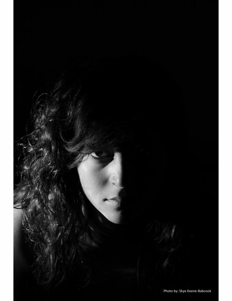
Photo by: Skye Keene-Babcook

ACROPOLIS
Editor-in-Chief
Michelle Repper
Executive Layout Editors
Sofia Chabolla & Becca Schall
Executive Scholarship Editor
Morgan Doyle
Executive Article Editor
Matthew Chiarello
Executive Photography Editor
Stephanie Krauss
Treasurer
Won Kun Lee
Contributors
Vincent van Gogh, Starry Night Over the Rhone, 1888
Courtney Raterman
Cristina Stancioiu
Jarrett Ley
Carter Lyon
Lucy Macon
Alan Braddock
Skye Keene-Babcook
Joél Elías Carela
Travis Carr
Ashley Irizarry

LETTER FROM THE EDITOR Dear Reader,
Welcome to the second issue of Acropolis, the only art and art history maga-
zine on campus. Many changes differentiate our final product this semester from
last semester; in the fall our magazine was entitled: Spirit of the Living Watching ,
which we decided to change to Acropolis. The fall semester was certainly a learn-
ing experience, and we gleaned a lot from producing “Genesis,” our first issue. We
became familiar with the process of creating a magazine, and gained a feel for
what content our readership responded to. This semester we received funding from
the Publications Council to publish our magazine in print, and we were inducted
into the Publications Council, which will mean more stability in the future in terms
of funding. In order to utilize the advantages of both print and online publishing,
we decided to have an abbreviated print version and an extended on-line version
of this issue (which can be found at issuu.com). The print version will give the
reader a rich glimpse of our publication. It includes a calendar of events, articles,
photographs, profiles of students and professors, contemporary art exposés,
information for art and art history students, scholarship abstracts and a comics
page. The online version will have all of the same content, except it will include ex-
tended versions of almost every section, and helpful links for interested readers.
This semester we chose the theme “light” because light is such an integral
element in all of art. It is in fact so integral that it is often forgotten as a formal ele-
ment when considering the merits of a work. We wanted to bring this element back
to the conscious critical mind. How can light define a work? How does light help a
work realize its full potential? These are the questions we want you to ask when
looking through the pages of the Spring 2012 Acropolis.
We could not be happier to present
to you our first ever print issue: “Light,”
and we know that there will be many more
print and online magazines for you to
look forward to in the future.
Happy reading!
Michelle S. Repper
Class of 2013
Majors: Art & Art History/ South Asian Studies
Editor-in-Chief

Photo by: Michelle Repper

EVENTS 2 0 1 3

Sun Mon Tue Wed Thu Fri Sat 1
New Year’s
Day
2 3 4 5
6 7 8 9 10 11 12
13 14 15
16
W&M
Classes
Start
17 18 19
20
Inauguration
Day
21
MLK DAY
22 23
24 25 26
27
28 29 30 31
JANUARY
30 31
Events, Exhibitions, and Dates
21 MLK Day

Sun Mon Tue Wed Thu Fri Sat
1
2
Groundhog
Day
3 4 5 6 7 8 9
10 Opening Re-
ception for “X-
RA*DI*ENCE”
show 2-6PM Linda
Matney Gallery
11
12
Fat Tuesday
Mardi Gras
13 14
Valentine’s
Day
15 16
W&M Global
Film Festival
17
W&M Global
Film Festival
18
W&M Global
Film Festival
19
W&M Global
Film Festival
20 21 22 23
24
36
Events, Exhibitions, and Dates
27 28
FEBRUARY
26
Michelangelo: Sacred and Profane Masterpieces from the Casa Buonarroti February 9 - April 14
A Brush with Passion: Mattia Preti (1613-1699) February 9 - April 14
24 25 26
CW Antiques Forum: Feb 24-26th, 8:30 am to 7pm @ Williamsburg Lodge Conference Center
1 2

Sun Mon Tue Wed Thu Fri Sat 1
2
3 4 5 6
7 8 9
10
Daylight
Savings
11 12
13 14
15 16
17
18 19 20 21 22 23
24
Easter
25 26
Passover
27 28 29 30
_________
31
MARCH Events, Exhibitions, and Dates
Spring Break 2013
Panorama Photos by: Skye Keene-Babcook
Domestic, Wild, Divine: Artists Look at Animals NOV 21 – APR 04
Mellon Galleries

Sun Mon Tue Wed Thu Fri Sat 1 2 3 4 5 6
7 8 9 10 11 12 13
14
15 16 17 18 19 20
21 22 23 24 25 26
W&M
Last Day of
Classes
27
28
29 30
12 13
APRIL Events, Exhibitions, and Dates
The Smithsonian: Thomas Day: Master Craftsman & Free Man of Color: Apr 12- Jul 28
28 29
The Smithsonian The Civil War and American Art: Nov 16-Apr 28

Photo by: Skye Keene-Babcook

STUDENT ARTICLES

As I hopped off of the shuttle bus, my
very first impression of the building featured
a white sign with bold black letters nailed
onto the door. It read: “I am working so
please do not disturb. I do not sign auto-
graphs.” Here was the former home and stu-
dio of famous American painter Andrew
Wyeth, part of a three generation artistic leg-
acy. With the help of his wife, Betsy, and his
son, Jamie, the Brandywine River Museum
has restored and staged the Chadds Ford,
Pennsylvania building, giving visitors a
glimpse into the life of this prolific painter.
Originally, the family lived here, but after sev-
eral years they moved, leaving the space
solely to Andrew. He worked here from 1940
to 2008.
When I walked into this private space -
past the sign warning against outsiders - I
was immediately surrounded by Andrew’s
family, friends, and models. The walls of the
foyer and hallway are filled top to bottom with
photographs documenting the people and
places important to Wyeth. One corner even
features phone numbers and names hand-
written by Andrew directly onto the wall. Off
to the right sits the kitchen, an eclectic mix of
retro appliances and simple, wooden furni-
ture that was once the social center of the
home.
To the left lies a large, open room with streamlined but aged wood floors. Large win-dows look out onto the surrounding field from three different walls. Midmorning summer
A Visit with Andrew The Private Studio of A. Wyeth
By: Morgan Doyle
Photos Taken by: Morgan Doyle
Read more at issuu.com/acropolisarthistory

Photos Taken by: Morgan Doyle
Read more at issuu.com/acropolisarthistory
light came pouring into the otherwise dark
room as I glanced around. A few pieces of
furniture and a fireplace sit lonely and
dwarfed in the large space. Almost immedi-
ately I had a strange feeling that I had been
there before. And I had. Numerous paintings
feature the elements found here including
Monologue (1965), The Kass (1975), and
Helga Painting (1988). By moving a few steps
this way or turning my body that way, I recre-
ated the views that Andrew saw and re-
corded.
As amusing as my déjà vu was, con-
necting the physical space to two-dimensional
representations of it, a small, run-down room
off to the side was even more fascinating.
Here - where the uneven paint peeled off the
walls and the ceiling threatened to crumble,
where sketches chaotically adorned the walls
and coffee-stained drawings scattered about
floor – was where Andrew made tangible his
artistic visions. Here was where the true proc-
ess occurred.
A large easel stood in the middle of the
room, shielding the canvas from eyes peeking
in through the doorway. An over life-sized
mirror was placed near the wall, behind both
the easel and where Andrew would have
stood to work. Though hidden from his sight
the majority of the time, Andrew used the mir-
ror to alter his view of a canvas in progress,
giving him a fresh perspective after long
hours of work. In this workspace, Andrew sur-
rounded himself with sketches and drawings
of his subjects. He used these as studies for
his paintings, carefully observing and realiz-
ing specific forms or deciding on poses and
positions. They ranged from quick outlines to
detailed figures and were haphazardly strewn
about the room, posted up on the walls and
thrown across the floor. For Andrew, the
drawings were important because of the idea
he was able to get out of his head and the
practice his hand received; the process was
more important than the product, hence the
careless placements and coffee stains.
On tabletops lie the various paints and
brushes Andrew used. He strayed away from
conventional oil paints and instead preferred
egg tempera. The medium suited Andrew
quite well – he found that the mix of egg yolk
and pigment gave him rich, real colors, par-
ticularly earth tones. He was also able to
paint slowly and give his finished pieces a
high level of detail. On the other hand,

Andrew worked swiftly with watercol-
ors. He used this medium for moments of
free artistic expression, versus the controlled
and painstaking process of egg tempera.
When a watercolor did need more detail, An-
drew used a dry-brush technique.
Compared to his disastrous work-
space, Andrew’s paintings are known for
their elegant simplicity and clean detail. The
contradiction of the two was shocking. I
could barely concentrate in the studio, my
eye wandering from object to object, from
peeling paint to pencil sketch, examining this
area and then the next, trying to see and
comprehend. Somehow, the chaos of the
room was turned into a masterful work of art.
As I walked out of the door into the
bright sun-lit field, I found myself thinking
about the creative energy that had once
flowed through the house. Of all the ideas
and visions that ran through Andrew’s mind,
we, as the public, only see a minute portion.
The final versions of artists’ inspired exer-
tions and efforts are deliberately framed and
methodically hung against crisp, white
walls. Curators specifically choose each
work of art and then meticulously arrange
and display them in museum showrooms.
Though we think that we can appreciate art
in this sterile, controlled environment, there
is so much that we miss. We completely ne-
glect the process, which is just as important
as the final object.
When we put ourselves in this posi-
tion, we cannot fully value the amount of
mental and physical effort that the artist put
forth into realizing his artistic vision. So
much of the decision and alteration process
is missed. We also tend to forget the person
behind these masterpieces. We fail to re-
member that they had parents and child-
hoods, friends and relationships, children
and struggles. Visiting Andrew’s studio and
home made me acutely aware of the dis-
crepancies between artistic vision and the
final work of art. The short experience I had
with his personal space gave me such a dif-
ferent perspective on not only his pieces, but
on art in general. º
Photos Taken by: Morgan Doyle

A Discussion of Andrew Wyeth’s Studio, in
Chadds Ford, Pennsylvania, open to the
public as of July 3rd
. The museum is featur-
ing an exhibition titled A Painter’s View: The
Andrew Wyeth Studio in conjunction with
the opening.
How does a visit to the studio help our
understanding of Andrew’s creative process
and his final works?
I think it gives visitors a chance to see
what inspired him, specifically. When you look at
his work you’re not necessarily aware that he
had a great interest in military history. When you
look at a landscape you may not see that as an
obvious reference. But when you go to the stu-
dio you find out that there was, in fact, an early
silent film, The Big Parade, that he watched
over 200 times that dealt with World War I. He
collected military uniforms, he collected swords
and sabers, he collected over 1200 military
miniature figures, from the time he was a child.
And so you get to see a lot of those objects that
he surrounded himself with and get to learn
about how that did impact his work and you can
look for those influences.
You also get to see the room where he actually did the painting. And the mess that it is in there. One of his famous quotes is “Art is messy.” And again you don’t necessarily see that when you look at his work. His work is very detailed, at times it seems very controlled on the
Interview with Mary Cronin Supervisor of Education at the Brandywine River Museum Morgan Doyle
Photos Taken by: Morgan Doyle

surface. But when you get into this room
and you see that there’s paint on the floor, on the
wall, the ceiling is sagging, you get the idea that
he did paint in a very free style overall. And you
can start to look for that in his work.
Was there anything particular or unique
to his methods? Was the messiness unique?
I think he’s probably right that for many art-
ists art is messy, even if the finished product
doesn’t express that. He wasn’t afraid to get his
hands dirty and experiment with paint, experiment
with media.
How important was medium to Andrew?
He very consciously chose the media that
he used. His father was an oil painter, and when
he first started out [under his father] he worked in
pencil and he worked in oil. It was later that his
brother-in-law, Peter Hurd, introduced him to egg
tempera and it really wasn’t until after his father’s
death that he explored that medium further.
[Tempura] allowed him to spend more time with a
subject, to paint in great detail, to really delve into
every nook and cranny of something. I think he
consciously chose to do egg tempera rather than
oil and he also very consciously chose to work in
watercolor. Initially, he just had this great facility
for watercolor. He was very successful. His works
sold quickly. But as time went on he used that for
sort of taking a break when he was working on
tempera to capture something quickly. And he
also did many works in dry brush watercolor,
which is similar to tempera in that it allows for
great detail. I think medium with Andrew Wyeth’s
work is very significant. And whether he chose to
create a quick watercolor study of something ver-
sus a finished tempera piece was very significant
for him.
What are the benefits of a visit to any
artistic studio, particularly for the general pub-
lic?
There are definitely visitors here who may
have a vague idea of who the Wyeth’s might be
but they’re not that familiar with their work. And
we have two studios on view, both the N.C.
Wyeth’s studio, Andrew’s father, and Andrew
Wyeth’s. They’re very different. But I think in both
cases you get to see ‘what did that artist have
around them for everyday inspiration?’ ‘what was
important to them?’ ‘what was their environment?’.
The N.C. studio you can look out the window and
there’s a tree he put into his illustrations. [It’s] in-
teresting that he would paint things that were so
close but he could use his imagination and trans-
port the viewer to medieval England. …I think you
get insight into how an artist works, what are their
sources, what are their references. A lot of art is
from imagination, but a great deal of it is from ob-
servation as well. I think it’s a combination of the
two. So when you see a studio you start to under-
stand that more, that [artists] observe things that
are right there and then they use their imagination
to transform those things. You’ll rarely find some-
thing in the studio and then see a painting of it
that looks exactly like what the object is, because
artists are always picking and choosing and edit-
ing… the way a writer would. º

Public perception of contemporary art is frequently considered to be muddled, and a trip to the Museum of Modern Art or the Guggen-heim in New York may have visitors leaving more puzzled than enlightened. Artists Dan Fla-vin and Tracey Emin are far more literal when it comes to “enlightenment,” each utilizing fluores-cent lights in their primary works, although in markedly different ways. Flavin’s greens cross-ing greens (to Piet Mondrian who lacked green) from 1966 strikingly dissimilar from Emin’s With You I Want To Live of 2007. Flavin’s utter ab-stractness and Emin’s strict depictions appear to be polar opposites, despite their use of the same media. The purposes of their production each emerge seamlessly through fluorescent
lights, and this form in turn importantly affects the ultimate messages present in their works. Although Flavin only began working with electric lights in 1961, his relatively rapid aban-donment of canvas altogether in 1968 came to define him as a conceptual artist. His “barred corridors” such as greens crossing greens fo-cused on the inherent relationship between space and sculpture. In his exploration of light and space, Flavin thwarted limits set by institu-tionalized means of display. Greens crossing greens intrudes into the viewer’s space, block-ing access to the gallery at the Guggenheim. Flavin’s lights do not simply light an area; they flood the walls in patterns of color and light, im-mersing the viewer and the space in synthetic
Dan Flavin’s and Tracey Emin’s Eye-Catchers by Courtney Raterman
Greens crossing greens (to Piet Mondrian who lacked green), Dan Flavin, 1966
Fluorescent Light Transformations

With You I Want To Live, Tracey Emin, 2007
light. Furthermore, his ability to transform basic
fluorescent bulbs into aesthetic objects enabled him
to emerge at the fore of both the industrial and the
found art movements. The emphasis on simple,
geometric forms and indistinct relationships among
parts became the notable attributes of the minimalist
movement. Whereas Flavin’s use of light emerged
in the fabric of stark essentialism, Emin’s light fix-
tures operate on the premises of complete declara-
tions. Using fluorescents to construct phrases of
hope, collapse, love, and loss, light lends pathos to
her works that only augment the candor and explicit
nature of the words themselves. Her work With You
I Want To Live is exemplary of the tenderness easily
accessible in her art while it simultaneously details
variegated emotions and notions of stylized self-
promotion. The work reveals her obsession with
passion, complete with peaks and chasms, brightly
shining on the face of each viewer in its immediate
zone. Her straight-forwardness is nowhere more
clear than in her tent stitched with 102 names of
people she ever slept with , entitled aptly, Everyone
I Have Ever Slept With. Though subtlety seems not
to be the archetypal adjective when describing
Emin, her earnest nature keeps her art relevant and
her audiences craving more. Her art’s ability to com-
municate states of the soul through a medium as
conventional as a light bulb lends a universality that
is evocative, strange, and beautiful at the same
time.
Flavin and Emin’s employment of florescent
bulbs as the basic building blocks of their works
speaks heavily to the timelessness of light and the
questions it continues to ask of both its environment
and viewers alike. The shadows that dance on the
walls of international museums indicate light’s con-
tinued ascent to the ranks of high art. Flavin’s con-
ception of his work as a unified piece through the
handling of formal, phenomenological, and implicit
characteristics demand the viewer to consider

Everyone I Have Ever Slept With
1963=1995, Tracey Emin, 1995
formal dichotomies of color, design, and intensity as well as the apparent and the latent, the severe and the whimsical. Whereas Flavin’s purpose is perhaps more discrete, Emin’s internal truths and secrets are illuminated brightly - in plain form - for all the world to see. How might these two artists connect with each other through their usage of light in their art? Each artist’s wide-ranging oeuvre leaves art critics and zealots alike contemplating eye-catching col-ors scrawled luminously into their locations, trans-forming museums and galleries into spectacles. Perhaps it is light’s ubiquitous nature that, when inverted into new arrangements, provides an acute awareness about the human experience . Light’s extensive appeal to human emotion pro-vides significant accessibility for even the most perplexed and removed art viewers, enveloping all in its ephemeral and mesmerizing glow. º
Everyone I Have Ever Slept With 1963=1995,
Tracey Emin, 1995


The Effect of Light Frederic Edwin Church’s painting El Khasne, Petra (1874)
Frederic Edwin Church’s El Khasne,
Petra, portrays Al-Khazneh (Treasury), a
temple (or tomb) in the ancient rock city of
Petra, Jordan. Executed in 1874, Church
uses light and shadow to emphasize the dra-
matic setting and inspire wonder. Dark rock
walls on either side of the painting create a
sense of claustrophobia, forcing the viewers’
eyes upward towards the rock-cut temple of
Petra, a structure suffused with golden light.
The relatively bare and simple land-
scape in El Khasne marked a significant de-
parture from Church’s typical works that de-
picted panoramic scenes of lush, vibrant wil-
derness. Church was a popular painter of the
Hudson River School, a group of nineteenth
century artists known for their grandiose
paintings of American wilderness. Like other
Hudson River School painters, Church’s sub-
lime landscapes attempted to forge a
uniquely American form of art that fostered
national identity by portraying vast regions of
American territory. Church, however, pushed
the limits of mid-century landscape art by de-
picting natural scenes located outside the
boundaries of the United States, while still
drawing a link between the distant land and
the American nation. Light was one of the
most important elements he used to portray
national spirit. Gerald L. Carr, an art historian
with several books on Church, explains that
“[t]he thing that most energized Church as an
artist was light. It is apparent in all his fin-
ished paintings, outdoor studies, and studio
canvases.” Light in Church’s paintings has a
self-illuminating quality so that the canvas
seems to glow with its own internal light. Carr
describes this aesthetic phenomenon as one
in which “[l]ight splashes his painted sur-
faces, and radiates, or seems to radiate from
beneath them.” This self-illumination has a
striking effect, suggesting transcendence and
the inherent spiritual power of the natural
world.
Light came to play a different role in
Church’s later works; rather than evoking
community, Church’s use of light emphasized
a subjective experience that encouraged mel-
ancholy introspection.
The sweeping landscapes celebrating
American identity that characterized Church’s
early work shifted during the 1860s. Amer-
ica’s descent into Civil War left Church disillu-
sioned; and although Church painted land-
scapes until the end of his life in 1900, the
tone of his work in the latter part of the nine-
teenth century shifted away from triumphant
nationalism. El Khasne, Petra is one of the
paintings that emerged from this post-Civil
War mentality that de-emphasized a commu-
nity vision. His earlier works rarely included
human figures or man-made structures, but
paintings executed from the late 1860s and
onward focused less on the natural land-
scape and more on the human element, par-
ticularly ruins. This is not to say that Church
abandoned the landscape, it remained cen-
tral to his style and content; yet, these later
landscapes are characterized by a despon-
Ashley Irizarry

dent, versus an exultant tone. The mental
shift Church experienced did not change his
artwork altogether, as Church continued to
demonstrate a dedication to the dramatic in-
terplay of light, color, and shadow to create
beautiful and awe-inspiring scenes.
In contrast to his early work, light in El
Khasne evokes a subjective experience
rather than an all-encompassing vision of na-
tionhood. Replacing the bird’s-eye vantage
point of his other paintings, El Khasne situ-
ates the viewer in the narrow foreground. The
extreme verticality created by the dark can-
yon walls induces discomfort, which is only
relieved by the slim entrance into the open
sunlight at the foot of the temple. In his book
examining the relationship between imagery
and nineteenth century American religion and
nationalism, John Davis argues that “[t]he
structure of El Khasne, Petra replicates a
state of anxiety and anticipation. The glowing
temple offers itself as a kind of visual escape,
the need to move forward to the light becom-
ing all but irresistible.” The uncomfortable
narrowness created in the foreground intensi-
fies the effect of the light; the bright walls rev-
eled between the canyon provide relief from
the darkness, but not an escape from the dis-
comfort of the scene. The light is brilliant, but
also blinding.
The colors of Al-Khazneh (the tomb-temple)
also contribute to the powerful effects of the
light in the painting. Instead of a busy ar-
rangement of colors, Al-Khazneh’s surface is
plain, adorned only by the angles, lines, and
curves of temple’s architecture. However, the
pale yellow-brown of Petra’s walls amplify the
golden effect of the sunlight, creating a feel-
ing of transcendence. In a letter to his friend,
E.D. Palmer, Church asks him to “imagine
this fairy like Temple blazing like sunlight
amongst those savage black rocks.”
This interaction between sunlight and
the plain walls of the rock-cut edifice pushes
viewers toward a personal, spiritual revela-
tion. The harsh brightness of the sun reflect-
ing off of the exterior of Al-Khazneh mutes
the details of the temple. Figures cut between
the pillars are discernible, but barely distin-
guishable. One cannot tell exactly what each
image represents, while the finer features of

the column capitals are drowned into vague
swirls. In suppressing the temple’s details,
the light becomes a spiritual force in the
painting, overwhelming the viewer so that
personal identity is subsumed within a larger
divine power.
This loss of the viewer’s identity within
a higher power was a significant aspect of
Church’s artwork immediately following the
Civil War. Religious themes had always been
a key component of his work, but after the
publication of Darwin’s Origin of Species in
1859, Church experienced a religious crisis,
which he sought to mitigate by visiting Bibli-
cal sites in the Middle East. The paintings
that came out of this trip, including El
Khasne, engaged with theology in a different
way than before. Church’s panoramic wilder-
ness scenes paralleled the grand, imposing
power of God, the viewer is supposed to
draw peace and comfort from a God-imbued
landscape. In El Khasne, the viewer is meant
to feel blinded and isolated. The deep shad-
owed canyon before the city is lonely, even
the small human figures on the left side of
the canvas do nothing to alleviate the soli-
tude of the viewer’s experience. Instead, the
figures heighten the sense of isolation. The
two men are located far back in the canvas,
away from the implicit viewer, leaving the
onlooker deserted. Like the decorative fig-
ures on Al-Khazneh, their features are indis-
tinguishable. Blurred into darkness rather
than light the painting’s observer cannot con-
nect with these shadowed figures. By turning
them away from the entrance to Petra, they
appear unconcerned with the transcendent
light behind them, leaving the viewer alone in
their spiritual revelation.
Light in Church’s El Khasne, Petra
acts as spiritual force, provoking a personal
experience of the ancient rock city in Jordan.
Contrasted with Church’s serene and sub-
lime wilderness landscapes, light in this
painting marks a departure from the tran-
scendent nationalism in his early artwork. El
Khasne is both transcendent and disquieting;
the constricted space opening into dazzling
sunlight paralleling the artist’s own experi-
ence of Petra. As a piece that parallels the
artist’s own experience at Petra, El Khasne is
a work that is both transcendent and disqui-
eting with the constricted space opening into
dazzling sunlight. º
1. Jordan Tourism Board, “Petra,” Jordan Tourism Board, http://www.visitjordan.com/default.aspx?tabid=63.
2. Frances K. Pohl, Framing America: A Social History of American Art (New York: Thames & Hudson Inc., 2002), 135.
3. Berry-Hill Galleries, “Consultant and Author of the Frederic E. Church Catalogue Raisonne,” Berry-Hill, http://www.berry-hill.com/about/GLcarr.html
4. Gerald L. Carr, Frederic Edwin Church: Romantic Land-scapes and Seascapes (New York: Adelson Galleries, 2007), 66.
5. John Davis, The Landscape of Belief: Encountering the Holy Land in Nineteenth-Century American Art and Culture (Princeton, NJ: Princeton University Press: 1996), 172.
6. Davis, The Landscape of Belief, 196. 7. The painting’s title, El Khasne is actually a misspelling of
the tomb-temple’s real name, Al-Khazneh. Church probably gave a phonetic spelling of the building.
8. Frederic E. Church to E.D. Palmer, Jaffa—Palestine, 10 March 1868. Quoted in Kevin J. Avery, Treasures from Olana: Landscapes by Frederic Edwin Church (Ithaca, NY: Cornell University Press: 2005), 55.

Fingerings, Judith Anne Braun
CONTEM- PORARY ARTISTS


Contemporary Artist
Tomas Saraceno
On the Roof “Cloud City” Tomás Saraceno, Summer 2012
Metropolitan Museum of Art in New York
Pictures courtesy of the MET exhibi-
tionThis summer, as part of the MET’s
annual roof-garden installation,
Argentine artist Tomás Saraceno created
a massive maze of reflective and trans-
parent modules. Viewers were able to en-
ter Saraceno’s “Cloud City” to gain an en-
tirely new perspective views of the iconic
New York City skyline.


Amanda Means Amanda Means uses photography to
capture her chaotic surrounding environment
with images of nature and common house-
hold objects. Her exploration in photography
focuses on the duality of natural and human
built environments. These negative gelatin
silver prints show extreme detail in their light
& dark contrast of plants.
Flower (Number 86)
Amanda Means, 1996
Gelatin Silver Print
Above
Across: Sensitive Form
Amanda Means, 1990
Contemporary Artist

Ai Weiwei is a contemporary Chinese
artist who works in a variety of media, includ-
ing sculpture, photography and architec-
ture. He is celebrated worldwide for incorpo-
rating social and political criticism into his
works and is a particularly outspoken dissi-
dent against governmental corruption in
China. Unresponsive authorities have cen-
sored, surveilled, and imprisoned him for his
opinions, but he remains a prominent activist
in China. His artworks reflect a repeated fo-
cus on threatened freedom of expression
and its universal impact upon the world. Ai
often revitalizes the collective memory of
past abhorrences to the Chinese people by
its government through his art.
Clockwise from upper left
Dropping a Han Dynasty Urn, 1995
Light Installation in Tokyo, Japan
Fountain of Light, 2007
20 Chairs from Qing dynasty Han Dynasty Urn with Coca-Cola
Logo, 1994 | Paint and Han Dy-nasty urn, (206-220)
Map of China, 2004 | Iron wood
from dismantled Qing Dynasty tem-ples (1644-1911)
Ai Weiwei Contemporary Artist


Woman Framed by Sunburst Sculpture, 1930s

ART HISTORY SCHOLARSHIP

The Harlem Renaissance is usually dis-
cussed in terms of its relationship to the African-
American community and black visual and literary
expression; but there is another minority group that
left a lasting impression upon the movement. A vi-
brant homosexual subculture existed in Harlem, and
many of its members were also leading lights of the
Harlem Renaissance; these included artists like
Richmond Barthe and Aaron Douglas, and writers
such as Alain Locke and (probably) Langston
Hughes. The influence of homosexuality on the
works produced during the Harlem Renaissance is
wide and varied. The in-depth evaluations of the
many pieces of artwork, literature, and even music
that address homosexual themes reveal an impor-
tant connection between the two. This gay subcul-
ture also served as an outlet for a younger genera-
tion of artists to oppose the proper, middle-class val-
ues of W.E.B. DuBois’ talented tenth and Alain
Locke’s “New Negro” by focusing on sexual devi-
ance, the lower classes, and other transgressions. In
Harlem, this subculture, though not always implicitly
approved of or accepted, thrived and involved nu-
merous key figures of the Renaissance. Conse-
quently, it is just as important to see the Harlem
Renaissance as a flourishing of black gay culture as
it is to see it as a flourishing of black culture.
It is important to first establish that this homo-
sexual subculture did not emerge out of a vacuum;
Harlem’s development as a center for vibrant night-
life, sexual fluidity, and experimentation peaked dur-
ing the Harlem Renaissance as “the efforts of anti-
vice movements in white areas of New York led to
the closure of numerous establishments that offered
or tolerated sexual entertainment.”1 Harlem, then,
became the place to which those of all races jour-
neyed to either act as spectator or participant in a
wide range of sexually “deviant” behavior. These in-
cluded both heterosexual and homosexual spaces,
as oftentimes both existed in the same place. In this
way the presence of a homosexual subculture during
the Harlem Renaissance is not analogous, to say, a
modern gay community, as sexual identities were
largely viewed with a degree of fluidity; as George
Chauncey states, “the binary of homo-/
heterosexuality did not yet govern most people’s per-
ception of sexual relationships during the 1920s.”2
Still many did outwardly identify as homosexual, in-
cluding prominent artists and writers like Richard
Bruce Nugent, Richmond Barthe, Carl Van Vechten,
and the founder of the New Negro Movement him-
self, Alain Locke.
These spaces for sexual experimentation and
queer expression included “drag balls, ‘pansy pa-
rades,’ buffet flats, and rent parties,”3 and were a
significant part of Harlem’s dynamic nightlife scene.
Harlem was famous for its over-the-top drag balls,
which Langston Hughes famously described as
Homosexuality and the Harlem Renaissance A Radical Vision of the New Negro Through the Lens of Sexual Transgression
Fig. 1 Aaron Douglas, Cover of FIRE!!, 1926

“spectacles in color.”4 Highly-anticipated, these
events could draw crowds of upwards of five thou-
sand people and featured a beauty contest in which
“the fashionably dressed drags would vie for the title
of Queen of the Ball.”5 However these events were
nearly just as much for the spectators as for those
participating in this early form of queer performativ-
ity; many would come to these drag balls merely to
gawk at the men dressed in elaborate gowns and
make-up and women dressed in suits and top hats.
Whether the majority of this audience was there to
indulge in a “deviant” form of sexual expression or
out of mere fascination is unclear, though their pres-
ence highlights the fact that this subculture held a
certain kind of perverse allure to those who would
normally have existed far outside its reach.
Gay-oriented clubs and speakeasies were
also popular, as they offered a safe space for public
homosocial interaction. Probably the most famous
was Harry Hansberry’s Clam House on 133rd Street;
its main attraction was the performer Gladys Bent-
ley, a “250-pound masculine, dark-skinned lesbian,
who performed all night long in a white tuxedo and
top hat.” 6 Bentley was renowned for her stage pres-
ence, deep singing voice, and ability to incorporate
raunchy lyrics into her songs. These songs made
use of “double entendres and often directly referred
to sex, gay men, and lesbians.”7 Blair Niles, a white
female author, published a famous gay novel in
1931 titled Strange Brother which includes a speak-
easy called The Lobster Pot which is based on the
Clam House; it even features a lesbian performer
named Sybil whose characterization owes much to
the persona of Bentley.8 Its prominent presence in
literature and popular culture of the time confirms
that it was not some hyper-marginalized space that
existed completely outside of the mainstream; of
course it did operate on the outer skirts of middle-
class propriety, but it did still attract people of all
walks of life, not just those “in the lifestyle.” This
again stresses the fluidity and toleration of experi-
mentation that can largely characterize the era.
Private spaces of homosexual interaction
and display like the rent parties and buffet flats of-
fered a more explicit area for expression. Rent par-
ties were extremely popular for all members of Har-
lem’s nightlife scene, and predominantly homosex-
ual rent parties were far from scarce. Raucous and
booze-filled, they featured heavily in literature of the
time including Wallace Thurman’s 1932 novel Infants
of the Spring, which includes a scene in which a bi-
sexual Harlem artist shows off his latest male lover
at a rent party.9 Heiress A’Lelia Walker, a local ce-
lebrity, was also known for throwing lavish parties
that “had a distinctly gay ambiance,”10 while Alexan-
Figs. 2. Aaron Douglas, Three Drawings from FIRE!!, 1926

Alexander Gumby’s literary salon became a
popular spot for homosocial interaction in which an
evening could include “‘reefer,’ bathtub gin, a game
of truth, and homosexual exploits.” 11 And these
over-the-top affairs seem almost tame in compari-
son to some of the more debauched private parties,
namely those termed “buffet flats;” wild parties
where all forms of illegal activity took place, they
gained a reputation for their offering of “a variety of
sexual pleasures cafeteria- style.” Both private and
public spaces for sexual deviance allowed for the
emergence and expression of homosexuality, often
directly alongside heterosexual illicitness. All of this
contributes to the overall feel that Harlem, though it
didn’t necessarily feature a gay community in the
way modern society would conceptualize it, was a
scene where anything goes; and clearly one of
which was homosexuality.
As has already been stressed, a large num-
ber of prominent members of the Harlem Renais-
sance were engaged in this homosexual subculture
that emerged in the 1920s. Many of these, generally
a younger generation of artists and writers, came to
be known collectively as The Cabaret School;
Langston Hughes, Wallace Thurman, Claude McKay
and Carl Van Vechten were all considered to be
“members.” This group stood largely in direct con-
trast to the ideologies of the Fathers of the Harlem
Renaissance, namely W.E.B. DuBois and Alain
Locke; these proponents of the New Negro move-
ment wanted the Harlem Renaissance to promote
black morality and positive role models, to use art
and literature as propaganda in the face of en-
trenched stereotypes held by white society. They
therefore saw the Cabaret School, with “its tendency
toward black sensuousness, exhibitionism, primitiv-
ism, and sensationalism, as a distraction, or worse,
an impediment to their vision of the Renaissance.”
13 The works of this Cabaret School, and those
more tangentially related to it, are the main focus of
this essay for they operated within this newly emer-
gent, though complex, realm in which homosexuality
was an extremely important component. Of course,
not all out-gay figures of Harlem were opposed to
DuBois’ ideology of the talented tenth; Locke himself
was a known homosexual, and the poet Countee
Cullen also “had little difficulty adopting the privi-
leges and double standards of middle- class gay
male identities in the early twentieth century.” 14
Perhaps the group’s greatest collective
achievement is the publication of FIRE!! in 1926,
ironically just one year after Alain Locke published
Figs. 3-4. Aaron Douglas, Three Drawings from FIRE!!, 1926 ; Fig. 5. Richard Bruce Nugent, Jesus and Judas, 1947

his seminal work The New Negro. A literary and art
publication, it lasted for only a single issue, yet it is
considered one of the most influential works of the
Harlem Renaissance. Featuring writings by
Langston Hughes, Richard Bruce Nugent, Zorea
Neal Hurston and Wallace Thurman, and artwork by
Aaron Douglas, the magazine served as a contro-
versial and even radical proclamation against Du-
Bois and Locke’s vision of black identity in the Har-
lem Renaissance. Many of its creators and contribu-
tors were either openly gay (as in the case of Rich-
ard Bruce Nugent) or a bit more ambiguous (Aaron
Douglas, Langston Hughes, Wallace Thurman). Re-
gardless, the issue had a very obvious dialogue with
the world of homosexuality and sexual fluidity. Farah
Jasmine Griffin writes that “the journal succeeded in
shattering expectations of respectability.” 16 By ex-
plicitly dealing with topics like homosexuality, bi-
sexuality, prostitution, and other vices and their rela-
tion to the African-American community, FIRE!! was
flying in the face of DuBois’ talented tenth.
Aaron Douglas contributed both the cover
(see Fig. 1) and several drawings (see Figs. 2-4)
that appear within the pages of FIRE!!. Best known
for his semi-abstracted depictions of history of the
African-American, such as Aspects of Negro Life:
From Slavery Through Reconstruction (1934) and
Into Bondage (1936), his work produced as a
younger artist for FIRE!! is markedly different. The
cover, at first glance, is a strikingly graphic repre-
sentation of a red sphinx with a chain attached to it
against a black background. Upon further inspection
it becomes clear that the black background in ques-
tion is actually the profile of an African man, and the
chain is in fact an earring.
The sphinx, with it’s implicit ties to Egyptian/
African culture and an advanced civilization, is found
inside the African man as is the title of the journal:
FIRE!!.
This was not the first nor the last time Douglas used
distinctly African or Egyptian imagery in his artwork;
in fact he, “often spoke of the significance of Egyp-
tian forms to his own art.” 17 By choosing an easily
recognizable symbol of Egyptian civilization, one
known by both whites and blacks, and by physically
positioning it within the same space as the African
figure he is making the bold connection between the
two; he, and FIRE!! by extension, is positing that the
great classical civilization of Egypt was very much
an African civilization. By doing so he situates
FIRE!! in an over-centuries long debate about the
relationship between Egypt and the African conti-
Fig. 6. Nugent, John the Baptist, 1930 ; Fig. 7. Nugent, Cover of Opportunity, 1926 ; Fig. 8. Nugent, Narcissus

nent, and the civilization’s importance in determining
African-American identity. Other artists of the era
also sought inspiration from Egypt and the other
great African civilization, Ethiopia, including Meta
Warrick Fuller’s Ethiopia Awakening (1910), Lois
Mailou Jones’ The Ascent of Ethiopia (1934), and
the stage production of DuBois’ Star of Ethiopia
(1913). This is to say that “by the time the Douglas
image appears on the cover of FIRE!! Black intellec-
tuals had devoted a century of energy, time, and ink
to arguing that Egypt was an African, Black African
civilization.” 18 The journal, then, however incendi-
ary and revolutionary its content might have been, is
still very much in dialogue with many of the standard
themes of the Harlem Renaissance.
Douglas’ other contribution to FIRE!! comes
in the form of three simple line drawings, each de-
picting a different African-American type. The first is
of a preacher, the second an artist, and the third and
final a waitress. These are particularly different from
the work that most would associated with Douglas’
career; they are essentially caricatures, drawn with
fluid lines and an eye for both verisimilitude and the
grotesque. Aside from their stylistic differences with
Douglas’ more abstracted murals (for which he was
most famous), his selection of subject matter here is
important. Focusing on everyday, ordinary African-
Americans, as opposed to the physicians, intellectu-
als, and businessmen of the talented tenth, is itself a
highly-charged political statement for the time pe-
riod. In Douglas’ rendering they are messy and even
ugly, proof of the lack of fear this younger generation
of the Harlem Renaissance had in delving into the
lives of the emergent black working class and crimi-
nal and sexual underworld, a subject the old guard
considered off-limits and potentially detrimental to
the progress of the New Negro.
If the publication of FIRE!! shocked main-
stream leaders of the Harlem Renaissance and
sparked a new wave of younger visionaries, the
works created independently by some of its contribu-
tors, particularly Richard Bruce Nugent, embraced
homoerotic themes in ways that provoked and dis-
turbed to an even greater degree. Both a writer and
an artist, Nugent was openly gay, and his sexuality
was one of the foremost influences on his work. For
example, in his series of Bible stories, he conflates
homosexuality with a wide array of Christian stories
and characters and the accompanying drawings,
including an extremely homoerotic depiction of Je-
sus and Judas as potential lovers (see Fig. 5) His
pieces were designed to confront and “directly chal-
lenge both homophobia and shallow piety.” 20 This
content would be extremely controversial today, let
alone back in the twenties. His Salome series (see
Fig. 6) also drew connections between transgressive
sexuality and biblical themes, and his figures
“present sexuality as performance, as artifice - as
drag.” 21
Nugent’s homosexuality was also apparent in
his contributions to more mainstream Harlem publi-
cations, including his March 1926 cover for the jour-
nal Opportunity (see Fig. 7). The palm tree on the
left is actually a large phallus, a tongue-in-cheek
joke played on the New Negro readers that Opportu-
nity generally reached, and the young man bears
more than a passing resemblance to the drag
queens, who were beginning to gain popularity22.
One of Nugent’s favorite subjects to depict was that
Fig 9. Nugent, Mr. Brooklyn

of dance, which he used to “express primitive vitality
and freedom from sexual inhibition” 23 the breaking
away from Victorian black middle-class ideals of
propriety and rigidity. His dancers were almost al-
ways nude or barely-clothed, and their elegant mo-
tion and contorted bodies imply a level sensuous-
ness and provocation that DuBois would have likely
found distasteful. His drawing of Narcissus (see Fig.
8), a mythological subject prominent in classical art
and literature, is a further example of the influence
of homosexuality on his work; the figure stands with
his back to the viewer fully nude, with the emphasis
on the sensuality and body of the figure itself rather
than the mythological story of Narcissus. Another
undated work, titled Mr. Brooklyn (see Fig. 9), oper-
ates as an abstracted celebration and glorification of
the black male with limbs, body parts, and faces
morphing and changing into one another in an orgy
of skin.
If Nugent “skillfully attacked prevailing sex-
ual, religious, and racial norms simply by celebrating
the joyous potential of transgressive sexuality,” 24
his contemporary (and supposed one-time lover)
Richmond Barthe was far less confrontational.
Barthe was extremely well-known for his bronze
sculptures of the nude male form, and his subjects
ranged from dancers or athletes, to mythological
figures or ordinary workers. Regardless of the sub-
ject, though, each of Barthe’s sculptures, with their
emphasis on the male form, musculature, and sen-
suality, can be read through a homoerotic and ho-
mosexual lens. In works like The Feral Benga
(1935) (see Fig. 10) he deconstructs the notion of
the sexually aggressive black male, transforming the
figure from a warrior brandishing a long sword into
an elegant, sensual dancer whose implied move-
ments read not as violent and war-like but as soft
and even slightly feminine. Similarly his sculpture
Boy With Flute (1940) (see Fig. 11) unashamedly
depicts the nude male form with an eye to body
composition and musculature, this time portraying a
subject holding a clearly phallic object. Stevedore
(1937) (see Fig. 12), though not a fully nude compo-
sition, continues Barthe’s fascination with the male
form this time adapted to portray a lower-class dock
worker. By choosing depict an “ordinary” subject,
Barthe also situates himself comfortably within the
narrative of the Cabaret School and it’s members
who decided to focus on the lives of everyday Afri-
can-Americans, both good and bad. Though
Barthe’s work is more subtly homoerotic than Nu-
gent’s, the fact that he received a notable amount of
press and acclaim despite being an openly gay artist
is particularly noteworthy, again highlighting the de-
gree of acceptance and even fascination with art
and literature that existed outside the realm of nor-
mative sexual mores.
Carl Van Vechten, perhaps the most publicly
Fig 10. Richmond Barthe, Feral Benga, 1935
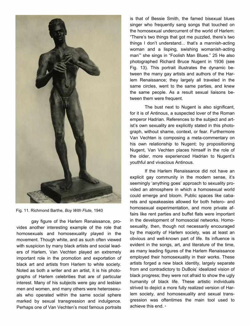
gay figure of the Harlem Renaissance, pro-
vides another interesting example of the role that
homosexuals and homosexuality played in the
movement. Though white, and as such often viewed
with suspicion by many black artists and social lead-
ers of Harlem, Van Vechten played an extremely
important role in the promotion and exportation of
black art and artists from Harlem to white society.
Noted as both a writer and an artist, it is his photo-
graphs of Harlem celebrities that are of particular
interest. Many of his subjects were gay and lesbian
men and women, and many others were heterosexu-
als who operated within the same social sphere
marked by sexual transgression and indulgence.
Perhaps one of Van Vechten’s most famous portraits
is that of Bessie Smith, the famed bisexual blues
singer who frequently sang songs that touched on
the homosexual undercurrent of the world of Harlem:
“There’s two things that got me puzzled, there’s two
things I don’t understand... that’s a mannish-acting
woman and a lisping, swishing womanish-acting
man’” she sings in “Foolish Man Blues.” 25 He also
photographed Richard Bruce Nugent in 1936 (see
Fig. 13). This portrait illustrates the dynamic be-
tween the many gay artists and authors of the Har-
lem Renaissance; they largely all traveled in the
same circles, went to the same parties, and knew
the same people. As a result sexual liaisons be-
tween them were frequent.
The bust next to Nugent is also significant,
for it is of Antinous, a suspected lover of the Roman
emperor Hadrian. References to the subject and art-
ist’s own sexuality are explicitly stated in this photo-
graph, without shame, context, or fear. Furthermore
Van Vechten is composing a meta-commentary on
his own relationship to Nugent; by propositioning
Nugent, Van Vechten places himself in the role of
the older, more experienced Hadrian to Nugent’s
youthful and vivacious Antinous.
If the Harlem Renaissance did not have an
explicit gay community in the modern sense, it’s
seemingly ‘anything goes’ approach to sexuality pro-
vided an atmosphere in which a homosexual world
could emerge and bloom. Public spaces like caba-
rets and speakeasies allowed for both hetero- and
homosexual experimentation, and more private af-
fairs like rent parties and buffet flats were important
in the development of homosocial networks. Homo-
sexuality, then, though not necessarily encouraged
by the majority of Harlem society, was at least an
obvious and well-known part of life. Its influence is
evident in the songs, art, and literature of the time,
as many leading figures of the Harlem Renaissance
employed their homosexuality in their works. These
artists forged a new black identity, largely separate
from and contradictory to DuBois’ idealized vision of
black progress; they were not afraid to show the ugly
humanity of black life. These artistic individuals
strived to depict a more fully realized version of Har-
lem society, and homosexuality and sexual trans-
gression was oftentimes the main tool used to
achieve this end. º
Fig. 11. Richmond Barthe, Boy With Flute, 1940

Endnotes
1—2; 7. A.B. Christa Schwarz. 9, 3, 11.
3; 13—14. Shane Vogel. 3, 19.
4 - 6; 8 –11; 25. Eric Garber.
12.—taken out for published essay.
15—18. Farah Jasmine Griffin. 46, 50, 52.
19—taken out for published essay.
20—24; 26 Thomas H. Wirth. 45, 59-60, 60, 57, 59, 226.
Bibliography
Garber, Eric. “A Spectacle in Color: The Lesbian and Gay Subculture of Jazz Age Harlem.” Hidden from History: Reclaiming the Gay and Lesbian
Past, vol. 1. eds. Martin Bauml Duberman, Martha Vicinus and George Chauncey Jr. New York: NAL Books, 1989. accessed May 1 2012 http://
xroads.virginia.edu/~ug97/blues/garber.html.
Griffin, Farah Jasmine. “On Time, In Time, Through Time: Aaron Douglas, Fire!! and the Writers of the Harlem Renaissance.” American Studies
49 (2008): 45-53, accessed May 2 2012 https://journals.ku.edu/index.php/amerstud/article/viewFile/3942/3756.
Schwarz, A.B. Christa. Gay Voices of the Harlem Renaissance. Indianapolis: Indiana University Press, 2003.
Vogel, Shane. The Scene of Harlem Cabaret: Race, Sexuality, Performance. Chicago: University of Chicago Press, 2009.
Wirth, Thomas H., ed. Gay Rebel of the Harlem Renaissance: Selections from the Work of Richard Bruce Nugent. Durham, NC: Duke University
Press, 2002.
Fig. 12. Richmond Barthe, Stevedore, 1937 Fig. 13. Carl Van Vechten, Richard Bruce Nugent, 1936

The Body & Power of Christ:
Shifting Perspectives and
Ideas in Rembrandt's Lazarus
Matthew Chiarello
Introductory Remarks
Summoned by the commanding call of
Christ, the reanimated figure of Lazarus arises from
his reopened tomb and rejoins the realm of the liv-
ing. This miraculous scene of dominion over death
– originally articulated in the Gospel of John as the
crowning sign of Christ’s spiritual mission – mani-
fests itself in the early works of Rembrandt van
Rijn1. Not only was the miracle featured as the sub-
ject of a 1630 painting entitled The Raising of Laza-
rus, but it also appears in several etchings dated
from relatively early in the artist’s career. Of the for-
mer, the artist appears to highlight the figure of
Christ and the dynamic force of his presence. Of
the latter, however, particularly in an etched image
created in 1632, Rembrandt appears to shift the fo-
cus of the narrative away from the gravitas of Christ
and towards the power of the miracle itself.
The Figure of Christ
As the purple sleeve of Christ’s cloak falls
back from his upraised palm and the ghostly figure
of a once-dead man lurches upward from the tomb,
the viewer of Rembrandt’s 1630 Lazarus is con-
fronted by an imposing scene of spiritual might
(Figure A). Within the bounds of the vertically ori-
ented rectangular canvas, the artist presents the
dominating figure of Christ placed slightly left of cen-
ter with the depictions of Lazarus’ sisters, Martha
and Mary, crowded to his right. These two relatives,
along with several other slightly obscured figures,
appear to be caught in a moment of awe and visible
disbelief as they witness the lifting of Lazarus from
his tomb. As for the saved man himself, Lazarus
drifts upward from the perpendicular, arching away
from his four day repose in death at the bottom right
of the image. The remainder of the painting is
doused primarily in darkness, evoking the depths of
a final reobeys the call of Christ, so too is the paint-
ing’s audience commanded by the hand of the artist
to consider the overwhelming power of the piece’s
central figure. This forceful presentation of Christ,
which stands as an integral aspect of this particular
work, is achieved both through compositional ar-
rangement and by means of rendering a scene of
fluid action.
In terms of the former element, Rembrandt
shows Christ commanding a position of authority.
As abovementioned, he stands in a domineering
pose, eyes steadfast, hand aloft, and mouth agape.
His raised right arm and outward facing palm cast in
glancing light and situated at the highest point of the
work draw the viewer’s gaze immediately to Christ
and to the power he wielded. This sense of spiritual
might is compounded by the sheer size of the figure,
which dominates the center-left of the canvas.
Christ’s relative size persists despite the fact that he
hovers in the middle ground of the image and is situ-
ated behind the figures of Martha, Mary, Lazarus,
and two hunched male acolytes. In addition to the
Figure A: The Raising of Lazarus Rembrandt van Rijn1630

emphasis placed on figural arrangements, Rem-
brandt creates a space, which allows for the presen-
tation of the biblical narrative in a highly dynamic
fashion. Having recently departed from the tutelage
of Peter Lastman in 1625, Rembrandt employs a
style that could be typified as his “early period,” from
roughly 1620 into the 1630s2. The sweeping ges-
ture of Christ, the momentum of Mary as she leans
forward, and the drifting upward of Lazarus all
speak to aspects of narrative motion characteristic
of Rembrandt’s early work3. This dynamism is sig-
nificant in this particular painting as it appears to be
instigated by Christ’s actions. That is to say that
had Christ not commanded Lazarus in this instant,
the image would be static; all of the motion hinges
on the words of Jesus. Thus, through his composi-
tion and his narrative dynamics, Rembrandt pre-
sents his audience with a potent rendering of both
the gravity of Jesus’ presence as well as the power
intrinsic to Christ’s figure.
The Power of Christ
Two years after completing the above dis-
cussed painting, Rembrandt revisits the New Testa-
ment healing scene by way of a moderately sized
(36.8 x 25.5 cm) etching (Figure B). Here again, the
looming figure of Jesus is placed to the left of cen-
ter, with a crowd of rapt followers and the swooning
siblings of Lazarus surrounding the open stone sar-
cophagus. Yet, with his back now turned towards
the viewer’s gaze and with his eyes presumably
locked onto the body of Lazarus, this etched Christ
occupies a wholly different space in this rendering
than he does in the 1630 image. Here, the viewer’s
position as originally established in the earlier ver-
sion – facing Christ and Lazarus – has been sup-
planted by a group of surprised onlookers. And
while these spectators are granted a frontal view of
the scene, the viewer of the 1632 etching is rele-
gated to a position nearly behind Christ. This ar-
rangement not only departs from the pictorial tradi-
tion as captured in a contemporaneous painting of
the subject by Jan Lievens, but also prefigures a
unique distortion of perspective employed in such
works as Antonio Ciseri’s Ecce Homo (Figures C &
E)4. Within this rotated view, rather than lock eyes
with the imposing central figure in the original work,
the viewer is forced to follow Christ’s obscured and
diverted gaze away from his body and towards the
realization of his miracle. In fact, of the twelve dis-
cernible figures in the image (including Jesus but
discounting Lazarus) eleven of them appear to be
marveling at the reanimated corpse and not at the
agent responsible. This collective stare, then, ac-
tively redirects the gaze of the viewer away from
Christ and towards the miraculous anchor of the im-
age embodied in the form of Lazarus.
Such a transition away from the figure of Je-
sus and towards the miracle itself is equally evinced
by the light and shadow that Rembrandt employs in
this etching. While the light in the 1630 work trick-
les into the tomb from behind the figures at the
viewer’s left and barely glints off portions of Christ
and Lazarus, in the etching it emanates brightly
from the center. This light source appears to be
Figure B:
The Raising of Lazarus, Rembrandt van Rijn1632

situated in the space between Christ and Lazarus,
bathing the resurrected man, his savior, and Christ’s
followers in a radiant glow and conversely throwing
the surrounding area behind these figures into inky
crosshatched darkness. This bright patch is per-
haps the clearest indication of Rembrandt’s intended
subject matter. Rather than highlight Christ – as it
does in the 1630 work – the light here places em-
phasis on the miracle, perhaps even being created
as a byproduct of the act itself. This illumination -
coupled with the altered arrangement and perspec-
tive – speaks to a shift in overall content from Christ
to his ministry.
Concluding Remarks
Although the works above discussed are
united under the same narrative mantel, they di-
verge heavily in terms of meaning and conveyance
of message. While the 1630 painting focuses on the
power of Christ, the 1632 image emphasizes the
nature of the miracle itself. While this shift might
appear slight, its ramifications are of significance,
especially in light of Rembrandt’s later work on the
subject in 1642 (Figure E). In this work, completed
nearly a decade after the first etching, Rembrandt
combines the methods examined above in that he
provides the viewer with a visible Christ, ancillary
figures beholding the miracle, and a light source
similar to that found in the 1632 etching. This syn-
thesis speaks to an evolution of both style and moti-
vation during the early portion of Rembrandt’s ca-
reer and can be seen in large part in the works
above.
Endnotes
1John. Bible Gateway. Web. <http://www.biblegateway.com/passage/?search=John+11:1&version=NIV>.
2 Straten, Roelof Van., Harmenszoon Van Rijn Rembrandt, Jan Lievens, and Ingrid W. L. Moerman. Young Rembrandt: the Leiden
Years, 1606-1632. Leiden, Netherlands: Foleor, 2005. Print.
3 Westermann, Mariët, and Harmenszoon Van Rijn Rembrandt. Rembrandt. London: Phaidon, 2000. Print.
4 The latter, despite the fact that it was composed nearly 200 years after Rembrandt’s death, could certainly claim this Lazarus of
1632 as among its direct antecedents.
5 Silver, Larry & Perlove, Shelley. "Rembrandt's Jesus." Rembrandt and the Face of Jesus. 74-107. Print.
Figure E
Rembrandt Harmensz. Van Rijn, The Raising of Lazarus: Small
Plate, c. 1642. Engraving and etching on paper; plate 5 7/8 x
4 1/2 inches; sheet 14 5/8 x 10 1/6 inches. Museum of Fine
Arts, Boston. (Cat. 23A)

Figure C (top):
Antonio Ciseri’s Ecce Homo, 1642 Oil on Cavas
Figure D (bottom):
Jan Lievens, The Raising of Lazarus, 1631. Oil on Canvas; Brigh-
ton Museum and Art Gallery

The potential for symbolic depth and intellec-
tual value in a seemingly simple medieval peddler
figure wandering through the Dutch countryside ex-
pands far-beyond what viewers may initially think.
Bosch’s peddler is a true man of mystery, one who
serves as a metaphor for the entire spectrum of mo-
rality - ranging from the Prodigal Son to the lowliest
of sinners and everything in between. However,
Bosch does not necessarily include the peddler in
his artwork simply as a symbolic or metaphorical
figure. In conjunction with his meticulously detailed
surrounding landscapes, the peddler is a motif that
takes on a whole new level of significance when it is
taken as a springboard for discussion, contempla-
tion, and meditation of the struggles that lie at the
core of our human existence. Ambiguity aside, the
two most frequently compared and important depic-
tions of traveling peddlers by Bosch are found in the
Rotterdam tondo and exterior wings of The Hay-
wain. These two best-known and most frequently
studied surviving depictions of the traveling peddler
attributed to Bosch serve as a window into the 16th
century intellectual response to the ongoing condi-
tions of uncertainty, chaos, and temptations.
While Bosch’s exact intent in creating each
of his peddler panels will never be known, theories
abound. The peddler figures represented in Bosch’s
Rotterdam tondo and Haywain Tryptch are figures
that have long been topics of discussion by their
viewers, resulting in centuries of intellectual dis-
course linking elements of the peddler to topics of
16th century political development and social situa-
tions. Such discussions have extended as far as
deep contemplations involving not only the world in
which we live, but also heaven and hell and of our
roles and duties as co-inhabitants not only to each
other but also to a greater being/God. Through the
slightest details Bosch manages to convey sugges-
tions of how we ought to live our lives and navigate
the unavoidable obstacles every man is confronted
with.
The Rotterdam tondo peddler is thought to
have originally been the exterior portion of an altar-
piece that opened by separating the image of the
traveling peddler down the middle. Inside were other
famous pieces such as Bosch’s Ship of Fools/
Allegory of Intemperance (right interior panel),
Death of the Miser (left interior panel), as well as
another lost work (Dickson 74). The second peddler
depiction mentioned was originally found on the ex-
terior of Bosch’s Haywain triptych and is, at first
glance, seemingly similar to the Rotterdam tondo
but upon closer examination, exhibits distinct differ-
ences that make the two peddler representations
interesting contrasts. The number of interpretations,
theories, and metaphors surrounding these two ped-
dler images are varied and numerous. But after ex-
ploring a wide array of legitimate possibilities ex-
plaining Bosch’s intent, I’ve come to the conclusion
that despite the overwhelming similarities between
the two images, the different landscapes, slightly
altered postures and facial expressions, as well as
other detail-oriented differences point to the Rotter-
dam landloper and the Haywain wayfarer as oppo-
sites; the former represents the weak sinner on the
verge of corruption, unable to resist worldly tempta-
tion and the latter represents the man who has re-
mained strong and will consequently be saved.
The characterization of Bosch’s Rot-terdam tondo peddler as a sinner heading down a path in life that leads to a dead end is, in my opin-ion, Bosch’s most likely intended interpretation. It makes sense to have a character with whom the audience of the time could identify as a subtle, more tangible warning before introducing the more ridicu-lous and exaggerexaggerated interior images of the altarpiece which reflect life governed purely by in-
Bosch’s Ambiguous Traveler: A Springboard for Personal Interpretation and Contemplation
by Lucy Macon

dulgence and acceptance of vices such as folly and
gluttony. The peddler on the outside is one who has
clearly strayed and is at a pivotal turning point in his
life journey where he can chose to resist the evils of
the world or continue living a life of sin and excess.
When the previously adjoined illustrations are re-
vealed, Bosch suggests the landloper has made the
easier choice and thus fallen victim to the evils of
the world depicted in the interior works. Art histori-
ans who favor this interpretation include Ludwig von
Baldass who in 1943 suggested that at the time
Bosch depicts the traveler he has yet to give in and
is instead in the process of deciding whether or not
to resist the evils by which he is surrounded. Bal-
dass argues that the peddler is not an interpretation
of a reformed prodigal son back on the path of the
righteous after coming from the brothel because the
dog is barking at him and thus unfamiliar with our
traveler. The pigs, which are interpreted by support-
ers of the prodigal son analysis as those to which
the prodigal son from the bible tended, Baldass pro-
poses to instead be connected to “the moral turpi-
tude and depravity of the brothel” (de Bruyn 133).
Building on the growing amount of evidence that the
peddler in the Rotterdam tondo is someone who is
distracted by and about to give into temptations
rather than someone who has already given in, is
Dirk Bax’s analysis of the woman in the window.
Judging by her curious facial expression, she is
looking at the peddler as more of an anonymous
passer-by rather than a familiar departing client (de
Bruyn 133). More specific details foreshadowing the
choice that the landloper is about to make include
the owl perched in the branches above him which is
interpreted as “a symbol of evil and serves to rein-
force other negative elements of the
scene” (Dickson 95). Another detail pointed out by
Andrew Pigler is the large size of the peddler’s bur-
den, which is “inconsistent with a down-and-out son
returning to his father’s house” (de Bruyn 133). Ulti-
mately, what I consider to be the most problematic
obstacle in the interpretation of the Rotterdam tondo
landloper as a prodigal son is the closed gate, which
blatantly suggests that the door to salvation will not
open easily (or at all) for our traveler.
In addition to the argument that the
Rotterdam tondo figure represents a fallen man on a
path without hope, there are also foundationally
sounds theories supporting the opposite conclusion,
that this peddler is actually a Prodigal Son. The first
person to attribute the Rotterdam tondo to Bosch,
Gustav Glück, “took the principle character to be the
prodigal son at the moment of repentance” (de
Bruyn 133). The criteria upon which Glück arrives at
this conclusion are his interpretation of the dilapi-
dated building and the pigs. He views the former as
a disreputable tavern representative of the indulgent
life led by the prodigal son and the latter as the pigs
to whom he had tended before returning home and
repenting. The cow on the right behind the closed
gate is, according to Glück, the fatted calf that would
be killed upon the return of the prodigal son. To this
prodigal son interpretation of the Rotterdam tondo,
art historians Charles de Tolnay and Marcel Brion
have added the idea that the peddler’s hair is grey
as a result of the hardship he has faced and the ex-
cessive nature of his lifestyle (de Bruyn 133). The
grey hair is a perfect example of one of the elements
that contributes to the ambiguity of the Rotterdam
tondo. Different accredited art historians have used
The Peddler, or The Prodigal Son
By: Hieronymous Bosch
1495, 71 x 70.6cm, Museum Boymans-Beuningen, Rotter-
dam (rectangular panel cut into tondo).
Dendrochronlogical Date: 1486 same tree
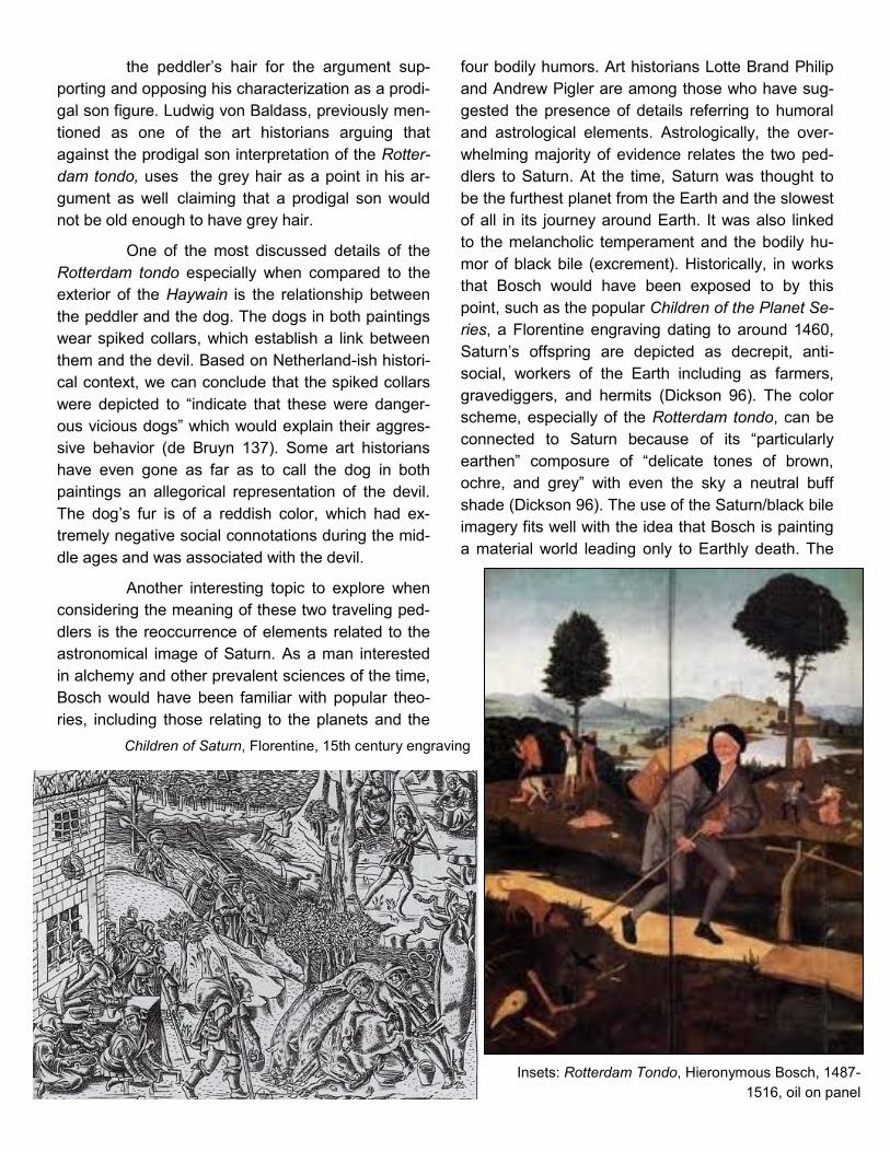
Children of Saturn, Florentine, 15th century engraving
the peddler’s hair for the argument sup-
porting and opposing his characterization as a prodi-
gal son figure. Ludwig von Baldass, previously men-
tioned as one of the art historians arguing that
against the prodigal son interpretation of the Rotter-
dam tondo, uses the grey hair as a point in his ar-
gument as well claiming that a prodigal son would
not be old enough to have grey hair.
One of the most discussed details of the
Rotterdam tondo especially when compared to the
exterior of the Haywain is the relationship between
the peddler and the dog. The dogs in both paintings
wear spiked collars, which establish a link between
them and the devil. Based on Netherland-ish histori-
cal context, we can conclude that the spiked collars
were depicted to “indicate that these were danger-
ous vicious dogs” which would explain their aggres-
sive behavior (de Bruyn 137). Some art historians
have even gone as far as to call the dog in both
paintings an allegorical representation of the devil.
The dog’s fur is of a reddish color, which had ex-
tremely negative social connotations during the mid-
dle ages and was associated with the devil.
Another interesting topic to explore when
considering the meaning of these two traveling ped-
dlers is the reoccurrence of elements related to the
astronomical image of Saturn. As a man interested
in alchemy and other prevalent sciences of the time,
Bosch would have been familiar with popular theo-
ries, including those relating to the planets and the
four bodily humors. Art historians Lotte Brand Philip
and Andrew Pigler are among those who have sug-
gested the presence of details referring to humoral
and astrological elements. Astrologically, the over-
whelming majority of evidence relates the two ped-
dlers to Saturn. At the time, Saturn was thought to
be the furthest planet from the Earth and the slowest
of all in its journey around Earth. It was also linked
to the melancholic temperament and the bodily hu-
mor of black bile (excrement). Historically, in works
that Bosch would have been exposed to by this
point, such as the popular Children of the Planet Se-
ries, a Florentine engraving dating to around 1460,
Saturn’s offspring are depicted as decrepit, anti-
social, workers of the Earth including as farmers,
gravediggers, and hermits (Dickson 96). The color
scheme, especially of the Rotterdam tondo, can be
connected to Saturn because of its “particularly
earthen” composure of “delicate tones of brown,
ochre, and grey” with even the sky a neutral buff
shade (Dickson 96). The use of the Saturn/black bile
imagery fits well with the idea that Bosch is painting
a material world leading only to Earthly death. The
Insets: Rotterdam Tondo, Hieronymous Bosch, 1487-
1516, oil on panel

Saturn related imagery especially supports the con-
clusion that I find most likely: the Rotterdam tondo
peddler is one who is leaning towards/has already
made the choice to give in to temptations. He is crip-
pled like the children of Saturn and thus has chosen
to follow a similar path.
The display/illustration of voluntary poverty
is also a possible interpretation, especially in the
case of the Haywain wayfarer, that I find highly likely
based on the history of Hertogenbosch, the town
from which Bosch came. Voluntary poverty is ex-
actly what the name implies- the purposeful practice
of self-denial and discipline in an attempt to emulate
Christ. Those who willingly subject themselves to
voluntary poverty in an attempt to renounce the ma-
terial goods with which the world tempts us are often
referred to as the faithful good. The concept of vol-
untary poverty is founded on the premise that “the
contemplative life of the saints and the meditation on
Christ’s sacrifice are the sole means of escaping the
evil that pervades every aspect of life” (ArtBook,
Bosch 126). This literal interpretation of the bible
was practiced by the Franciscan order of monks,
who had a large presence in Hertogenbosch. The
Franciscans “encouraged a simple life of poverty
and detachment from the material world- purpose-
fully poor, they took literally their founders belief that
the things of the world belong to no one and are
simply on loan from the Almighty” (Dickson 100).
Evidence that the peddler on the exterior Haywain
wings is one of the faithful good (sometimes referred
to as fideles boni) is that all though this landloper is
clearly poor, he doesn’t display the negative, stigma-
tizing characteristics associated with poverty that the
Rotterdam Tondo wayfarer exhibits (Dickson 99).
There were two types of poverty recognized by
Christians in the pre-industrial era: the man who is
poor because of low social position and bad luck
and the man who is poor because he has chosen
the path of Christ. This suggests The that the Hay-
wain wayfarer can be included in the second group
while the Rotterdam tondo landloper is part of the
first.
The arguments for and against the Rotter-
dam tondo peddler as a prodigal son each have logi-
cal, legitimate points. The question of whether the
Rotterdam tondo figure is the prodigal son or not
has created a definitive divide amongst art histori-
ans. Most use the Haywain wayfarer as a compari-
son because of the obvious similarities between the
two. Both figures are impoverished, lone travelers
glancing behind at a dog with a spiked collar. The
differences are in each man’s facial expression and
his posture, the dog’s behavior, and the surrounding
landscape. The Rotterdam tondo landloper pos-
sesses an expression of reluctance and uncertainty,
hinting that he is on the verge of giving into tempta-
tion. However the Haywain wayfarer’s expression is
one of fear and trepidation as he tries to maintain his
determined and strong will. In comparing the two
wayfarers those art historians who support the Rot-
terdam Tondo as a representation of the prodigal
son take a different side when interpreting the
closed wings of the Haywain. Increasingly however
the general consensus is that Bosch would not have
painted two themes as similar as the Haywain exte-
rior and the Rotterdam landloper while having one
represent the prodigal son and the other not. This
line of reasoning led to a reevaluation and more
general reclassification of the peddler not as the
prodigal son, but instead as an “allegorical reference
to man on his journey through life” for which the
term homo viator (Latin for travelling man) has been
coined (de Bruyn134).
The idea of the homo viator leaves more
room for individual interpretation of the man-in-
question’s fate. Some believe him to be a helplessly
sinful figure surrounded by a world filled with vice,
while others see him as a righteous pilgrim resisting
the evil that surrounds him. Whatever he is, there is
most definitely “an indissoluble alliance of figure and
landscape: nature reflects the lonely wander’s nos-
talgia, which, in turn, is a reflection of the melan-
choly lot of all mankind” (Delevoy 39). The isolation
of the traveler and the landscape ties back to the
idea of the homo viator as a man who is “exiled
within himself” (Delevoy 39) while on “a pilgrimage
through sin” (ArtBook, Bosch 126). The key empha-
sis of his situation is the choice that he faces and
the fact that he indeed possesses the option to de-
termine the rest of his journey.
I prefer to take elements of each of these

interpretations and combine them to form my own
patchwork meaning of Bosch’s peddler. Personally, I
am in favor of the theory that Bosch has repeated
the same image twice, making small changes in de-
tail, with the intention of having them represent two
opposite ways of living. I believe he is using the jour-
neying peddler motif to illustrate the quintessential
struggle man faces in his journey through life against
the temptations of the material world to which so
many fall victim, as illustrated by the works that were
intended to accompany both wayfarer pieces. The
Haywain peddler and the Rotterdam peddler were
created to serve as openings/introductory pieces to
other illustrations. In each instance the interior/
associated paintings depict (though in different
forms/contexts) the fall of the masses and the re-
sults of living an impure, unrestrained life. It makes
sense to me that as an artist Bosch would precede
each of these scenes of worldly chaos with a rein-
forcement of the fact that the folly, gluttony, and
chaos shown inside is the result of an individual
choice that each man makes on his own at one point
on his journey through life. These opening images
depict the peddler at a time where he has paused to
think about how to proceed in relation to his sur-
roundings. In a sense Bosch uses this scene to
communicate the message that “when the wings are
shut on this world of selfish greed and perversity,
there appears the figure of a man who has managed
to escape from it” (Delevoy 38). As we go through
our lives we are provided with the opportunity to fol-
low Christ’s example and that is up to us whether we
take the difficult, lonely road that leads to salvation
or settle for what’s easiest.
The complexity of the peddler’s role in Bosch’s art-
work leads scholars to view him as an eternally am-
biguous figure that has carefully guarded his identity,
meaning, and purpose. Bosch’s peddler is a playful
figure that denies the world’s best scholars and spe-
cialists the satisfaction of claiming a definite and
specific interpretation. He is elusive of a singular de-
finitive reading and considered ambiguous by many
accredited art historians. His refusal to reveal his
purpose and thus be pigeonholed into a certain in-
terpretation forces the viewer to engage in personal
meditation and intellectual discussion in order to
form a well-rounded understanding of Bosch’s mes-
sage.
Haywain Triptych, Hieronymous Bosch,1510, oil on canvas
ART & ART HISTORY DEPARTMENT

Alan Braddock Ph.D., Art History, University of Delaware, 2002
M.L.S., Library Science, University of Maryland,
College Park, 1995
M.A., History of Art, Johns Hopkins University, 1988
B.A., Grinnell College, Art and Art History, 1984
Published books:
Thomas Eakins and the Cultures of Modernity
A Keener Perception: Ecocritical Studies in American
Art History, co-edited with Christoph Irmscher
The Department of Art &
Art History at W&M is
great. Superb students,
wonderful faculty col-
leagues, and a real sense
of community.
One meaning [of “light”] concerns the idea of
“enlightenment” (with and without a capital “E”),
involving a belief in the power of observation to
reveal truths about the world we inhabit… For
various reasons… postmodernism taught us to be
skeptical about “enlightenment” and “truth” as
universalizing ideals, but lately a number of people
in my field have become intrigued by the power of
observation to inform us about things in our
world. Those things will always be somewhat elu-
sive—their “truth” always receding somewhat
from the light into darkness—but we have a re-
sponsibility, I think, to see and imagine them as
best we can. Art still has an important role to play
in that.
New Professor

PhD, Art History, University of California, Los
Angeles, 2009
MA, Art History, Southern Methodist Univer-
sity, Dallas, TX, 2003
MA, Medieval Studies, Central European
University, Budapest, Hungary, 1999
BA, History and Theory of Art, University of
the Arts, Bucharest, Romania, 1998
Cristina Stancioiu
New Professor
The Art History Department provides
a wonderful, collegial, and dynamic
milieu in which to teach and carry out
research. I am constantly inspired by
my colleagues’ research agendas, and
the Department’s engagement with
students’ interests and learning… I
hope to inspire my students to travel
and explore our world, to reassess fa-
miliar cultures, and to learn about
those that seem distant and foreign. I
feel that I can do that here.
Selected Publications:
“On the Painted Ancestry of Domenikos
Theotokopoulos’ Sacred Landscape of
Mount Sinai and the Monastery of St.
Catherine”
“I ever loved thee, lady mine and yet my
love increases: Rhodian Portrait Ceramics
and Cultural Dialogue in the Mediterra-
nean”
“Not in the excellent ancient Greek style:
Beauty and Aesthetics in Late Byzantium”
Light is intrinsic to Medieval art and architecture. In
Byzantium, light was carefully considered and inte-
grated in the very structure of buildings, but also in
their decoration, through the selection of mosaic as a
preferred medium… In the Medieval West, the Gothic
cathedral was built around light… Symbolic of divine
light, natural light is filtered through monumental
stained glass windows, creating a colorful jewel-like
effect inside the church, an image Medieval people
associated with the beauty and brightness of Heavenly
Jerusalem.


Jarrett Ley
College of William & Mary
Art & Art History
Graduation: May 2013
Pratt Institute, School of Architecture
Architecture Design
Rome Semester, 2012
Columbia University, GSAPP
Introduction to Architecture, 2011
[I am interested in]
the way that art his-
tory begins to inform
design.
When an architect designs a
structure or space, one of the
most critical elements is the
way that it engages with its
existing context, and in a con-
text, one of the most impor-
tant elements is that natural
light is operating within the
space… The first thing that we
do in architectural de-
sign...101 with Ed [Pease] is a
project about shadows… you
have to design… something
that in some way is playing
with light and shadow… your
architecture has to be rele-
vant and operating within its
existing conditions.

Art & Art History Major Art History Concentration 39 credits in Art and Art History (maximum of 48 credits) ART 211, 212 and ARTH 251, 252 Three credits in each of the following five fields: 1. Medieval (351, 352, 353) 2. Renaissance and Baroque (360, 362, 363, 364, 365, 366) 3. Modern (370, 371, 372, 375) 4. American (381, 383) 5. Non-Western (393, 394, 395) Methods in Art History (ARTH 480) & another 400-level Major Computing Proficiency & Major Writing Requirement
Art Concentration 39 credits in Art and Art History (maximum of 48 credits) ART 211, 212, 460, and ARTH 251, 252 Two-Dimensional Art: 20 credits including ART 309, ART 311 or ART 317, and ART 315 or ART 316 Three-Dimensional Art: 20 Art credits, 3-credits of either ART 319 or 320, and 3-credits in drawing: ART 309, 310, 311 or 317 Printmaking: 20 credits including ART 323 and ART 324 Six upper level (400) Art History course credits Senior Major reviews & ART 460 both semesters of senior year Major Computing Proficiency & Major Writing Requirement
Art or Art History Minor Art Minor: ART 211, 212 Five 300 or 400 level courses in Art. Art History Minor: ARTH 251, 252 Five 300 or 400 level courses in Art History Art & Art History Minor: ART 211, 212, ARTH 251, 252 Three 300 or 400 level courses in any combination of Art & Art History

Just for FUN
Photo by: Life Magazine

Botched restoration of the ‘ecco
homo’ fresco. From left, the
original version by Elías García
Martínez, a 19th-century painter;
a deteriorated version of the
fresco; the restored version by 81
-year-old Cecilia Giménez.

Thomas Pavitte created the most complex
connect the dots puzzle in history; it took
him nine hours to complete the puzzle fea-
turing 6,293 dots, to reveal the Mona Lisa.

Photo by: Skye Keene-Babcook