a visual analytics process for maritime resource...
TRANSCRIPT

A Visual Analytics Process for MaritimeResource Allocation and Risk Assessment
Abish Malik ∗ Ross Maciejewski∗, Member, IEEE Ben Maule† David S. Ebert∗, Fellow, IEEE
∗Purdue University Visualization and Analytics Center (PURVAC) †United States Coast Guard
ABSTRACT
In this paper, we present our collaborative work with the U.S. CoastGuard’s Ninth District and Atlantic Area Commands where we de-veloped a visual analytics system to analyze historic response oper-ations and assess the potential risks in the maritime environment as-sociated with the hypothetical allocation of Coast Guard resources.The system includes linked views and interactive displays that en-able the analysis of trends, patterns and anomalies among the U.S.Coast Guard search and rescue (SAR) operations and their asso-ciated sorties. Our system allows users to determine the potentialchange in risks associated with closing certain stations in terms ofresponse time, potential lives and property lost and provides opti-mal direction as to the nearest available station. We provide mar-itime risk assessment tools that allow analysts to explore CoastGuard coverage for SAR operations and identify regions of highrisk. The system also enables a thorough assessment of all SAR op-erations conducted by each Coast Guard station in the Great Lakesregion. Our system demonstrates the effectiveness of visual analyt-ics in analyzing risk within the maritime domain and is currentlybeing used by analysts at the Coast Guard Atlantic Area.
Keywords: Visual analytics, risk assessment, Coast Guard
1 INTRODUCTION
As modern datasets increase in size and complexity, it becomes in-creasingly difficult for analysts and decision makers to extract ac-tionable information for making effective decisions. In order to bet-ter facilitate the exploration of such datasets, tool sets are requiredthat allow users to interact with their data and assist them in theiranalysis. Furthermore, such datasets can be utilized to explore theconsequences and risks associated with making decisions, therebyproviding insights to analysts and aiding them in making informeddecisions.
Besides the sheer volume and complexity of such datasets, an-alysts must also deal with data quality issues, including uncertain,incomplete and contradictory data. Moreover, analysts are oftenfaced with different decisions and are required to weigh all pos-sible consequences of these decisions using such datasets in orderto arrive at a solution that minimizes the associated risks within agiven time constraint. Using traditional methods of sifting throughsheets of data to explore potential risks can be highly inefficient anddifficult due to the nature and size of these datasets. Therefore, ad-vanced tools are required that enable a more timely exploration andanalysis. Our work focuses on the use of visual analytics [17, 31]in the realm of risk assessment and analysis and demonstrates theeffectiveness of visual analytics in this domain. The work describedin this paper is based on the application of visual analytics to an-alyze historic response operations and assess the potential risks in
∗e-mail: {amalik|rmacieje|ebertd}@purdue.edu†email: [email protected]
the maritime environment based on notational station closures. Ourwork was done in collaboration with the U.S. Coast Guard’s NinthDistrict and Atlantic Area Commands that are responsible for allCoast Guard operations in the five U.S. Great Lakes. In particular,we focused on the Auxiliary stations that are staffed by Coast Guardvolunteers and civilians. These Auxiliary stations assist their parentstations in their operations and usually operate on a seasonal basisusing a small fleet of boats for conducting their operations. How-ever, the number of Auxiliary personnel that volunteer their timeat these stations has decreased over recent years. This has requiredCoast Guard analysts to develop possible courses of action and ana-lyze the risks and benefits with each option. Several options includeseasonal or weekend only staffing of these units, or at worst, clo-sure. Closure, however, may involve increased risks to the boatingpublic and a complete analysis of the risks associated with closingan Auxiliary station needs to be evaluated. The results of this typeof analysis would assist the decision makers in determining the op-timal course of action.
In particular, the analysts are interested in determining the spa-tial and temporal distribution of response cases and their associatedsorties (a boat or an aircraft deployed to respond to an incident)for all SAR operations conducted in the Great Lakes and how clos-ing certain Auxiliary stations affects the workload of the stationsthat absorb these cases. Coast Guard policy mandates the launchof a sortie within 30 minutes and have an asset (boat or aircraft)on scene within two hours of receiving a distress call [32]. Clos-ing these stations implies a potential for longer response times thatcould potentially translate into the loss of lives and property.
To address these challenges, we developed a visual analytics sys-tem that supports decision making and risk assessment and allowsan interactive analysis of trends, patterns and anomalies among theU.S. Coast Guard’s Ninth District operations and their associatedsorties. Our system, shown in Figure 1, allows enhanced explo-ration of multivariate spatiotemporal datasets. We have incorpo-rated enhanced tools that enable maritime risk assessment and anal-ysis. Our system includes linked spatiotemporal views for multi-variate data exploration and analysis and allows users to determinethe potential increase or decrease in risks associated with closingone or more Coast Guard stations. The system enables a thoroughassessment of all operations conducted by each station. In addi-tion, the system provides analysts with the tools to determine whichCoast Guard stations are more optimally suited to assume controlof the operations of the closed station(s) by comparing the distancesfrom available stations to all SAR cases previously handled by theclosed station(s). Our system features include the following:
• Risk profile visualizations and interactive risk assessmenttools for exploring the impact of closing Coast Guard stations
• Optimization algorithms that assist with the interactive explo-ration of case load distribution in resource allocation
• Linked filters combined with spatial and temporal views forinteractive risk analysis/exploration
Our work focuses on providing analysts with interactive visualanalytics tools that equip them to deal with risk assessment scenar-

Figure 1: A screenshot of our risk assessment visual analytics system. Here, the user is visualizing all search and rescue (SAR) operationsconducted by the U.S. Coast Guard in the Great Lakes region in July 2008. The main viewing area (a) shows the map view with the circlesshowing the locations of SAR incidents in the Great Lakes. The right-most window (b) shows an interactive menu showing all distress types withSAR cases selected in blue. The top window (c) shows the time-series and the left window (d) shows the calendar views of the SAR incidentreport data. The bottom-left window (e) shows the time slider with radio buttons that allow different temporal aggregation levels. A legend for allDistrict Nine maritime zones is shown in the upper right (f).
ios associated with closing Coast Guard stations. We emphasizethat although our risk assessment toolkit and the examples givenin this paper have been based in the maritime domain, these tech-niques apply equally as well to other domains (e.g., criminal offenseanalysis, syndromic surveillance).
2 RELATED WORK
In recent years, there has been a rapid growth in the development ofnew visual analytics tools and techniques for advanced data anal-ysis and exploration (e.g., [30, 34]). From traditional scatterplots[8] and parallel coordinate plots [16] to tools like Theme River [15]and spiral graphs [7], these systems incorporate different forms ofvisualizations to provide enhanced analytical tools to users. Al-though these tools allow users to explore their data and assist themin their decision making process, researchers have only recentlystarted to employ visual analytics techniques for risk-assessmentand decision-making domain that allow users to perform a thoroughanalysis of risks associated with different decisions.
Migut and Worring [21] propose an interactive approach to riskassessment where they demonstrate a risk assessment frameworkthat integrates interactive visual exploration with machine learningtechniques to support the risk assessment and decision making pro-cess. They use a series of 2D visualizations including scatterplotsand mosaic plots to visualize numerical and ordinal attributes of thedatasets. While the authors demonstrate the effectiveness of using
visual analytics in the field of risk assessment, their work is mainlyfocused on building classification models that users may interac-tively use to classify their data entities and visualize the effects ontheir classification. Gandhi and Lee [13] also apply visual analyt-ics techniques to the realm of requirements-driven risk assessment.Specifically, they use cohesive bar and arc graphs to illustrate therisks due to the cascading effects of non-compliance with Certifi-cation and Accreditation requirements for the U.S. Department ofDefense. Sanusi and Mustafa [25] introduce a framework to de-velop a visualization tool that may be used for risk assessment inthe software development domain. Their proposed framework al-low users to identify the components of the software system thatare likely to have a high fault rate. Direct visualizations of riskuse tools like bar graphs and confidence interval charts to visualizemeasures of risk and are usually constructed using spreadsheet pro-grams like Microsoft Excel [12, 13]. Although widely used, thesetechniques fail to work for our purposes primarily due to the natureof the risk analysis that is required. The Coast Guard SAR datasetis spatiotemporal in nature and the exploration of risk requires do-main knowledge that is difficult to incorporate algorithmically.
With respect to the temporal nature of risk assessment, re-searchers have also developed different visualization systems thatallow users to explore risks associated with financial decisions re-lated with investments and mutual funds, among other financialplanning scenarios. Rudolph et al. [24] propose a personal finance

decision making visual analytics tool that allows users to analyzeboth short-term and long-term risks associated with making invest-ment decisions. Savikhin et al. [26] also demonstrate the benefitsof applying visual analytics techniques to aid users in their eco-nomic decision making and, by extension, to general decision mak-ing tasks. Both of the previous examples only explore temporaldatasets. In this work, we apply visual analytics techniques to ex-plore risks using multivariate spatio-temporal datasets that guideanalysts in making complex decisions.
As is the case with most multivariate datasets, data tends to be in-herently unreliable, incomplete and contradictory. In order to reachto correct conclusions, analysts must take these into account in theiranalysis. In this regard, Correa et. al. [9] describe a framework thatsupports uncertainty and reliability issues in the different stages ofthe visual analytics process. They argue that with an explicit rep-resentation of uncertainty, analysts can make informed decisionsbased on the levels of confidence of the data. Our system factorsdata reliability issues in the risk assessment process and providesconfidence levels at all stages of risk assessment that, in turn, en-able analysts to better understand the underlying nature of the dataand guides them in making effective decisions.
There also exist many geospatial and temporal analytical systemsthat provide users with the ability to explore their spatiotemporaldatasets in order to find patterns and provide an overview of the datain a visual analytics platform (e.g., [1, 2, 3, 14]). As the needs of ourend users are unique, this warrants developing a stand alone systemto address the challenges faced by the Coast Guard analysts. Weplan on further examining these robust geo-temporal analysis toolsand the degree to which they can be extended to meet the CoastGuard requirements that have been identified in this paper.
There has also been much work done in visualizing large datasetsusing interactive cross-filtered and linked views that allow users toexplore their datasets. Stasko et. al. [30] use multiple coordi-nated views of documents to reveal connections between entitiesacross different documents. Eick and Johnson [10] utilize multi-ple linked views to visualize abstract, non-geometric datasets inorder to reduce visual clutter and provide users with insights intotheir datasets. Eick and Wills [11] also demonstrate the effective-ness of linking and interaction techniques in the visualization oflarge networks. Our system utilizes these practices and allows usersto interactively explore their multi-dimensional and multi-attributedatasets using a series of multi-coordinated linked views.
Researchers have also explored different methods to addressthe challenges posed to maritime security and safety. Willemset. al. [34] introduce a novel geographic visualization that sup-ports coastal surveillance systems and decision making analystsin gaining insights into vessel movements. They utilize densityestimated heatmaps to reveal finer details and anomalies in ves-sel movements. Scheepens et. al. [27] also present methods toexplore multivariate trajectories with density maps and allow theexploration of anomalously behaving vessels. Lane et. al. [18]present techniques that allow analysts to discover potential risksand threats to maritime safety by analyzing the behavior of vesselmovements and determining the probability that they are anoma-lous. Some other models for anomaly detection in sea traffic canbe found in [19, 22]. Researchers have also proposed several ap-proaches to maritime domain awareness. For example, Roy andDavenport [23] present a knowledge based categorization of mar-itime anomalies built on a taxonomy of maritime situational factsinvolved in maritime anomaly detection. We observe that thesemethods and models may help in risk analysis and understandingthe impact of weather and varying speeds of Coast Guard vessels inthe Great Lakes to identify high risk regions.
There has also been much work done to assess and mitigate risksto critical infrastructure and transportation in the maritime domain.Adler and Fuller [5] provide dynamic scenario- and simulation-
based risk management models to assess risks to critical maritimeinfrastructure and strategies implemented for mitigating these risks.Mansouri et. al. [20] also propose a risk management-based deci-sion analysis framework that enables decision makers to identify,analyze, and prioritize risks involved in maritime infrastructure andtransportation systems. Their framework is based on risk analy-sis and management methodologies that allows understanding un-certainty and enables analysts to devise strategies to identify thevulnerabilities of the system. Furthermore, work has been done toquantify risks in the maritime transportation domain, a summary ofwhich can be found in [29]. While these methods facilitate mar-itime infrastructure risk analysis, our work is focused on assessingmaritime risks from multivariate spatiotemporal SAR data sets. Inthis paper, we present a visual analytics approach to maritime riskassessment and provide examples that demonstrate the advantagesof applying visual analytics in this domain.
3 VISUAL ANALYTICS RISK ASSESSMENT ENVIRONMENT
Our visual analytics system provides enhanced risk assessment andanalytical tools to analysts and has been built to operate for SARincident report data. Our system has been implemented in a customWindows-based geographical information system that allows draw-ing on an OpenStreetMap map [4], using Visual C++, MySQL andOpenGL. The system displays geo-referenced data on a map andallows users to temporally scroll through their data. We providelinked windows that facilitate user interaction between the spatialand temporal domains of the data. We also provide advanced fil-tering techniques that allow users to interactively explore throughdata. In addition, we have adapted the calendar view presented byvanWijk and Selow [33] and extended it to explore seasonal andcyclical trends of SAR operations and also as means to filter data tosupport advanced analysis.
Figure 1 presents a screenshot of our system. The main view-ing window (Figure 1 (a)) shows the map view where the user canexplore the spatial distribution of all cases handled by the CoastGuard. We utilize density estimated heatmaps (Section 3.2) toquickly identify hotspots. Users may draw a bounding box overincident points on the map that generates a summary of all inci-dents enclosed by the box. We also provide tape measure tools thatallow users to measure the distance between two points on a map.The top-most window (Figure 1 (c)) shows the time-series view ofthe data where multiple lines graphs can be overlaid for comparisonand analysis. Users may visualize time-series plots by department,distress type and Coast Guard Captain of the Port (COTP) zone toexplore summer cyclical patterns. The left-most window (Figure1 (d)) shows the calendar view of the selected Coast Guard cases.The total number of columns on the calendar may be changed asdesired to reveal seasonal trends and patterns. The bottom window(Figure 1 (e)) shows the time-slider widget that is used to tempo-rally scroll through the data while dynamically updating all otherlinked windows. The radio buttons beneath the time slider pro-vide several temporal aggregation methods for the data. The right-most window (Figure 1 (b)) shows the distress type menu whereall SAR cases (highlighted in blue) have been selected for visual-ization. Users may select multiple distress types using this menu,dynamically updating all linked views. We use similar menus tofilter cases by other data fields. Users may also interactively searchthe menu using the search box provided on top of the menu. Finally,the top-right window (Figure 1 (f)) shows an interactive legend ofthe different Coast Guard District Nine maritime zones. This leg-end allows users to click on any of the zones that highlights all casesfalling in the zone by filling the circles on the map with a solid colorand dimming out the other cases being displayed on the map.
A key feature of our system is the interactive distress, stationand COTP zone filtering component. Users interactively generatecombinations of filters that are applied to the data being visualized
through the use of menus (like the one shown in Figure 1 (b)) andedit controls. The choices of filters applied affects both the geospa-tial viewing region and all temporal plots.
3.1 Coast Guard SAR data
The SAR data is collected by all U.S. Coast Guard stations andstored in a central repository. When the Coast Guard is called intoaction, a response case is generated, usually by the maritime zonethat has authority in that region that receives the distress call (re-ferred to by the Coast Guard as the Search Mission Coordinatoror SMC). Upon receiving the call, this authority will determine ifresources will be applied, including which unit will provide the re-source, the resource type and number. Therefore, a response casemay generate zero, one, or many sorties to respond to an incident.While analyzing risks associated with the various mitigation op-tions, including station closure, analysts are interested in analyzingthe spatiotemporal distribution of both the response cases and theirassociated sorties.
The SAR data consists of two main components: (1) responsecases and (2) response sorties. Each entry in the response case andsortie dataset contains information that provides details of the inci-dents (e.g., number of lives saved, lost, assisted) and contains thegeographic location of the distress.
Uncertainty in decision making
As is the case with most large datasets, anomalies and missing dataintroduce errors and uncertainty. The SAR data is no exception. Wefind that many SAR cases do not have an associated geographic lo-cation, or have a wrong geographic location associated with them.These inherent errors in data affect the spatial probability estimatesand introduce a certain amount of uncertainty in the decisions thatmust be considered for an effective risk analysis and assessment. Asnoted in [17], visual analytics methods help people make informeddecisions only if they are made aware of data quality problems. Inthis regard, we incorporate uncertainty and confidence levels asso-ciated with the SAR dataset in our visualizations by displaying theaccuracy of the results at each step of the risk assessment process.This is shown as a percentage that shows the total cases with reli-able data that can be used in the decision making process (Figure2). This percentage is calculated by using the following formula:
Accuracy =N−G
N×100 (1)
Here, N is the total number of cases and G is the number ofcases with unreliable values (e.g., unknown geographic coordi-nates, swapped negative signs). When such errors are not obvious,the data is assumed to be correct and is displayed to the analyston the map. The analyst can further report errors in the data andcontribute to the data cleaning process.
3.2 Geospatial displays
Our system provides analysts with the ability to plot incidents aspoints on the map and as density estimated heatmaps (Figure 1 (a)).In addition, we provide users with the option of coloring each in-cident circle with a color on a sequential color scale [6] that repre-sents its data value. For example, users may choose to visualize theaverage response time to respond to an incident for all SAR caseson the map and identify cases with higher response times. Fur-thermore, to explore the spatial distribution of the SAR cases andquickly identify hotspots, we employ a modified variable kerneldensity estimation technique (Equation 2) that scales the parameterof estimation by allowing the kernel scale to vary based upon thedistance from the point Xi to the kth nearest neighbor x in the setcomprising of N [28].
f̂ (x) =1N
N
∑i=1
1min(h,di,k)
K
(x−Xi
min(h,di,k)
)(2)
Here, N is the total number of samples, di,k is the distance fromthe i-th sample to the k-th nearest neighbor and h is the maximumallowed kernel width. We choose the maximum kernel width basedon asset speed and travel time. Furthermore, we use the Epanech-nikov kernel [28] (equation 3) to reduce calculation time:
K(u) =34(1−u2)1(||u||≤1) (3)
where the function 1(||u||≤1) evaluates to 1 if the inequality is trueand to zero otherwise.
3.3 Time series displays
Along with the graphical interface, our system provides a variety ofvisualization features for both spatial and temporal views. For tem-poral views, we provide line and stacked bar graphs and calendarviews to visualize time series SAR incident report data.
The line graph visualization allow users to overlay multiplegraphs for easy comparison and to visualize trends. Both line graphand stacked bar graph visualizations are supported and can be inter-changed using the radio buttons provided. Users may choose to vi-sualize SAR cases handled by individual stations or maritime zones,or visualize them by distress types. The data is plotted based on atemporal aggregation level that the user selects on the time-sliderwidget (Figure 1 (e)). In Figure 1 (c), we show the line graph dis-play of all SAR cases aggregated by month. We can easily observepeaks in the number of SAR cases in the summer months for allmaritime zones in the Great Lakes region.
The calendar view visualization was first developed by van Wijkand Selow [33]. This visualization provides a means to allow thevisualization of data over time, laid in the format of a calendar. Inour implementation (Figure 1 (d)), we shade each date entry basedon the overall yearly trend. Users may interactively change the to-tal number of columns of the calendar thereby changing the cyclelength of the calendar view, enabling users to explore both seasonaland cyclical trends of their datasets. The system also draws his-tograms for each row and column. This allows analysts to visualizeweekday and weekly trends of SAR incidents and further assiststhem in determining an effective resource allocation scheme. Fur-thermore, we have modified our calendar view to support an in-teractive database querying method for easily acquiring summarystatistics from the SAR database.
4 RISK ASSESSMENT PROCESS
In this section, we describe the different methods and techniquesthat we apply in the Coast Guard risk assessment process.
4.1 Problem description
To bound the problem, the Coast Guard analysts provided a seriesof questions for use in their analysis. These questions are brieflysummarized below.
1. Assuming a maximum transit speed of 15 nautical miles perhour, how many cases occur per year in which a parent stationcould not have a surface asset on scene within two hours?
2. For each Auxiliary station, what are the types (by percentage)of SAR response cases occurring per year?
3. For each Auxiliary station, what is the temporal (by hour,month and day of week) distribution of the response caseload?

Figure 2: Average response time risk assessment when Auxiliary station Y is closed. The system automatically chooses the stations (shownin the upper-left window) that are optimally suited to respond to cases previously handled by station Y, along with a count of cases that eachstation absorbs. The station Y cases (black circles) to be handled by stations D and E are circled in red. The top graph shows the averageresponse time distribution of these stations to respond to station Y’s cases. We find that only 93% of the cases responded to by station Y havean associated geographic location.
4. What is the average annual case load that would be absorbedby each parent station in the absence of the Auxiliary stationand what percentage increase would this represent to the par-ent station’s annual case load?
5. Based on the historical data for all cases (SAR and others),what is the expected annual response case demand brokendown by response type (i.e., Person in Water, Vessel Flood-ing, etc.)?
6. Assess the potential risks associated with closing certain Aux-iliary stations in terms of additional case load absorbed, livespotentially lost, and other available factors.
Our visual analytics system was developed to assist the CoastGuard analysts in answering these questions and to model the po-tential risks of closing one or more Auxiliary stations. Furthermore,we allow analysts to explore the effects of closing multiple stationsand provide a summary of stations that are most optimal to absorbthe work load of the closed stations. Analysts may restrict the sta-tions that absorb the work load of the closed stations to determinethe stations that prove most effective, thereby informing optimaloperational execution for the station that is nearest to respond tothe distress case.
We perform our analysis under the assumption that the path be-tween a station and a distress location is a straight line. While thisassumption presents a best-case scenario to the analyst, discussionswith our Coast Guard partners indicated this was an acceptable ap-proximation as using channel and waterway information would re-sult in a large computational overhead. With this assumption inplace, if a station absorbing an Auxiliary station’s cases increasesthe maritime risks in the region (e.g., if the average response timeexceeds the two hour time limit for most SAR incidents), then clos-ing the Auxiliary station could prove to be dangerous for the mar-itime and public safety of the region. This straight line approxima-tion provides details on the best case scenario.
4.2 Average response time for SAR incidentsAs stated before, a Coast Guard policy mandates the rescue re-source to be on scene within two hours of a distress (e.g., disabledvessel, person in water). Given the cold water temperatures in theGreat Lakes, even in the summer, increase in response time can po-tentially impact the success of a case. Therefore, given the optionof closing a station, the analysts desire to know the nearest availableresource to respond and calculate the time to respond to the scene.A typical Coast Guard vessel travels at a speed of 15 nautical miles
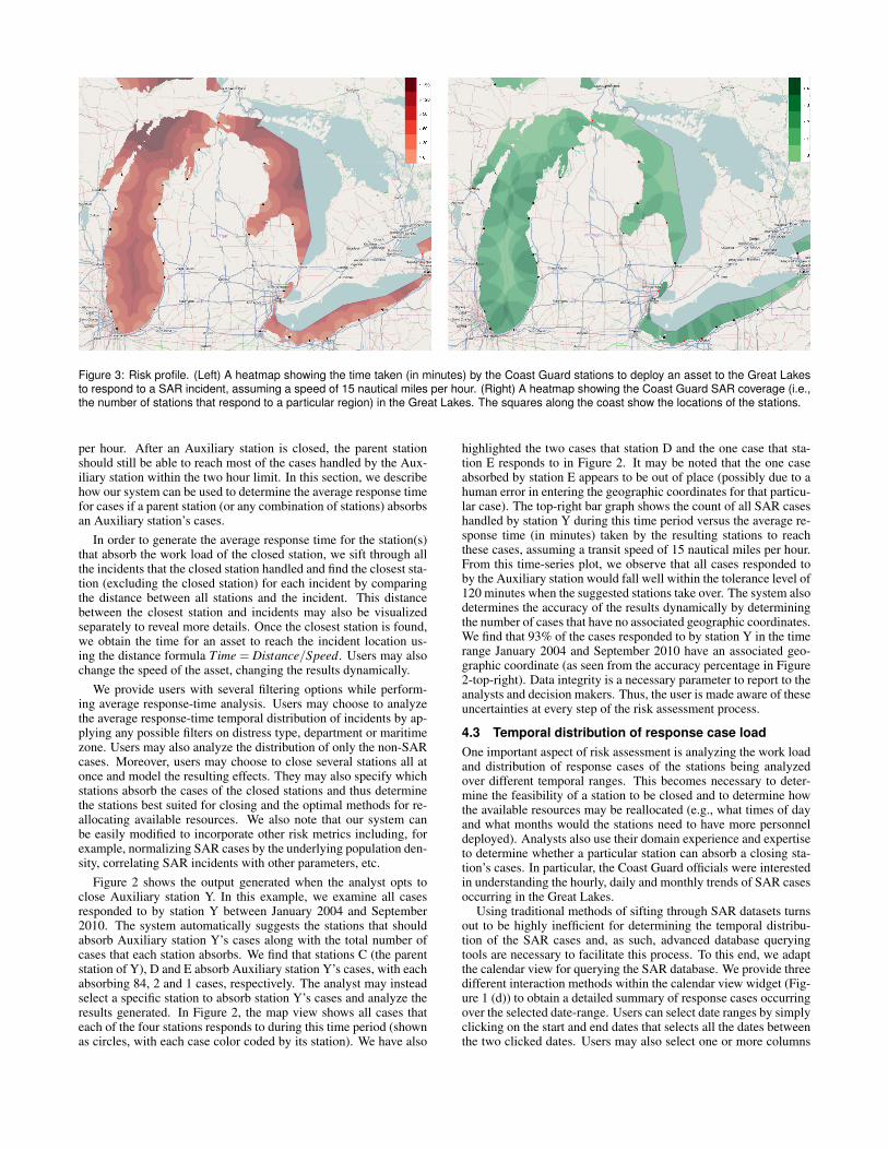
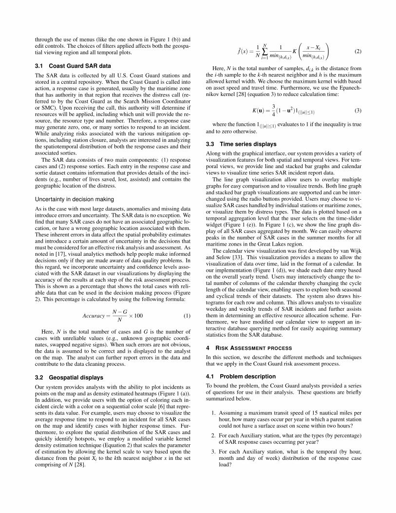
Figure 3: Risk profile. (Left) A heatmap showing the time taken (in minutes) by the Coast Guard stations to deploy an asset to the Great Lakesto respond to a SAR incident, assuming a speed of 15 nautical miles per hour. (Right) A heatmap showing the Coast Guard SAR coverage (i.e.,the number of stations that respond to a particular region) in the Great Lakes. The squares along the coast show the locations of the stations.
per hour. After an Auxiliary station is closed, the parent stationshould still be able to reach most of the cases handled by the Aux-iliary station within the two hour limit. In this section, we describehow our system can be used to determine the average response timefor cases if a parent station (or any combination of stations) absorbsan Auxiliary station’s cases.
In order to generate the average response time for the station(s)that absorb the work load of the closed station, we sift through allthe incidents that the closed station handled and find the closest sta-tion (excluding the closed station) for each incident by comparingthe distance between all stations and the incident. This distancebetween the closest station and incidents may also be visualizedseparately to reveal more details. Once the closest station is found,we obtain the time for an asset to reach the incident location us-ing the distance formula Time = Distance/Speed. Users may alsochange the speed of the asset, changing the results dynamically.
We provide users with several filtering options while perform-ing average response-time analysis. Users may choose to analyzethe average response-time temporal distribution of incidents by ap-plying any possible filters on distress type, department or maritimezone. Users may also analyze the distribution of only the non-SARcases. Moreover, users may choose to close several stations all atonce and model the resulting effects. They may also specify whichstations absorb the cases of the closed stations and thus determinethe stations best suited for closing and the optimal methods for re-allocating available resources. We also note that our system canbe easily modified to incorporate other risk metrics including, forexample, normalizing SAR cases by the underlying population den-sity, correlating SAR incidents with other parameters, etc.
Figure 2 shows the output generated when the analyst opts toclose Auxiliary station Y. In this example, we examine all casesresponded to by station Y between January 2004 and September2010. The system automatically suggests the stations that shouldabsorb Auxiliary station Y’s cases along with the total number ofcases that each station absorbs. We find that stations C (the parentstation of Y), D and E absorb Auxiliary station Y’s cases, with eachabsorbing 84, 2 and 1 cases, respectively. The analyst may insteadselect a specific station to absorb station Y’s cases and analyze theresults generated. In Figure 2, the map view shows all cases thateach of the four stations responds to during this time period (shownas circles, with each case color coded by its station). We have also
highlighted the two cases that station D and the one case that sta-tion E responds to in Figure 2. It may be noted that the one caseabsorbed by station E appears to be out of place (possibly due to ahuman error in entering the geographic coordinates for that particu-lar case). The top-right bar graph shows the count of all SAR caseshandled by station Y during this time period versus the average re-sponse time (in minutes) taken by the resulting stations to reachthese cases, assuming a transit speed of 15 nautical miles per hour.From this time-series plot, we observe that all cases responded toby the Auxiliary station would fall well within the tolerance level of120 minutes when the suggested stations take over. The system alsodetermines the accuracy of the results dynamically by determiningthe number of cases that have no associated geographic coordinates.We find that 93% of the cases responded to by station Y in the timerange January 2004 and September 2010 have an associated geo-graphic coordinate (as seen from the accuracy percentage in Figure2-top-right). Data integrity is a necessary parameter to report to theanalysts and decision makers. Thus, the user is made aware of theseuncertainties at every step of the risk assessment process.
4.3 Temporal distribution of response case loadOne important aspect of risk assessment is analyzing the work loadand distribution of response cases of the stations being analyzedover different temporal ranges. This becomes necessary to deter-mine the feasibility of a station to be closed and to determine howthe available resources may be reallocated (e.g., what times of dayand what months would the stations need to have more personneldeployed). Analysts also use their domain experience and expertiseto determine whether a particular station can absorb a closing sta-tion’s cases. In particular, the Coast Guard officials were interestedin understanding the hourly, daily and monthly trends of SAR casesoccurring in the Great Lakes.
Using traditional methods of sifting through SAR datasets turnsout to be highly inefficient for determining the temporal distribu-tion of the SAR cases and, as such, advanced database queryingtools are necessary to facilitate this process. To this end, we adaptthe calendar view for querying the SAR database. We provide threedifferent interaction methods within the calendar view widget (Fig-ure 1 (d)) to obtain a detailed summary of response cases occurringover the selected date-range. Users can select date ranges by simplyclicking on the start and end dates that selects all the dates betweenthe two clicked dates. Users may also select one or more columns

Figure 4: Risk assessment using linked views. Here, the analyst has chosen to close Auxiliary station X and is analyzing the risks associatedwith this decision. Each circle on the map represents a SAR case and has been color coded by its owner station. The system shows that stationsA and B are best suited to absorb station X’s cases, with station B absorbing 144 cases and station A absorbing 15 cases.
of the calendar to generate the summary statistics. This allows themto query the database and acquire the summary of events occurring,for example, only on a particular week day. Finally, users may se-lect any combination of individual dates and obtain the summary ofall selected response cases on those dates. These querying methodsallow analysts to easily determine the temporal patterns of responsecases over any date range. The system provides summary statisticsof SAR incidents for all stations and includes the total number oflives saved, assisted, affected, total property damaged and savedand the count of all cases occurring over the selected date range.Users may select any date, row, column, or combinations thereof inthe calendar view using the mouse to access the summary statistics.Furthermore, the system also allows users to visualize the hourlyand monthly distribution of cases for any time period after all filtersare applied.
4.4 Risk profileOur system also provides users with the ability to interactively gen-erate risk profiles that can be used to identify regions with littleSAR coverage by the Coast Guard stations in the Great Lakes. Fig-ure 3 illustrates the risk profile heatmaps that present an overviewof the Coast Guard SAR coverage in the Great Lakes. Selectedfilter settings affect the visual output, and in this case, we are look-ing exclusively at small boat station coverage. When areas of lowcoverage exist, resources with additional capability (e.g., aircraft)are often provided to ensure coverage of all areas. Figure 3 (Left)shows the time (in minutes) that the Coast Guard stations would
take to respond to a SAR incident in the Great Lakes, assuming atransit speed of 15 nautical miles per hour. This profile is generatedassuming that the station closest to a location responds to an inci-dent in the Great Lakes. The regions in the Great Lakes that takethe longest time for the Coast Guard to respond to a SAR case canbe clearly seen in this figure. Users may interactively close stations,filter on a different resource type (e.g., boat, aircraft), or change theasset speed, updating the risk profile interactively. This further en-ables the analysts to visualize the increase or decrease in risk whena station is closed. Moreover, analysts can set the lower thresholdof the color scale to 120 minutes (or any arbitrary time), therebyallowing them to easily identify regions that may take more than120 minutes to respond. We plan on incorporating contour linesinto our system to demarcate the regions that may take more thanthe set threshold response time.
Figure 3 (Right) provides another risk profile visualization thatallows officials to identify regions with low Coast Guard coveragefor SAR operations in the Great Lakes. Regions with high SARcoverage by the Coast Guard stations are shown by darker colors.This further allows analysts to identify stations where resourcesmay be reallocated without increasing maritime risk.
5 EXPLORING RISK USING SPATIOTEMPORAL LINKEDVIEWS
While examining which Auxiliary stations are most suitable toclose, analysts need to weigh all options and analyze the potentialincrease or decrease in associated risks. They must also consider
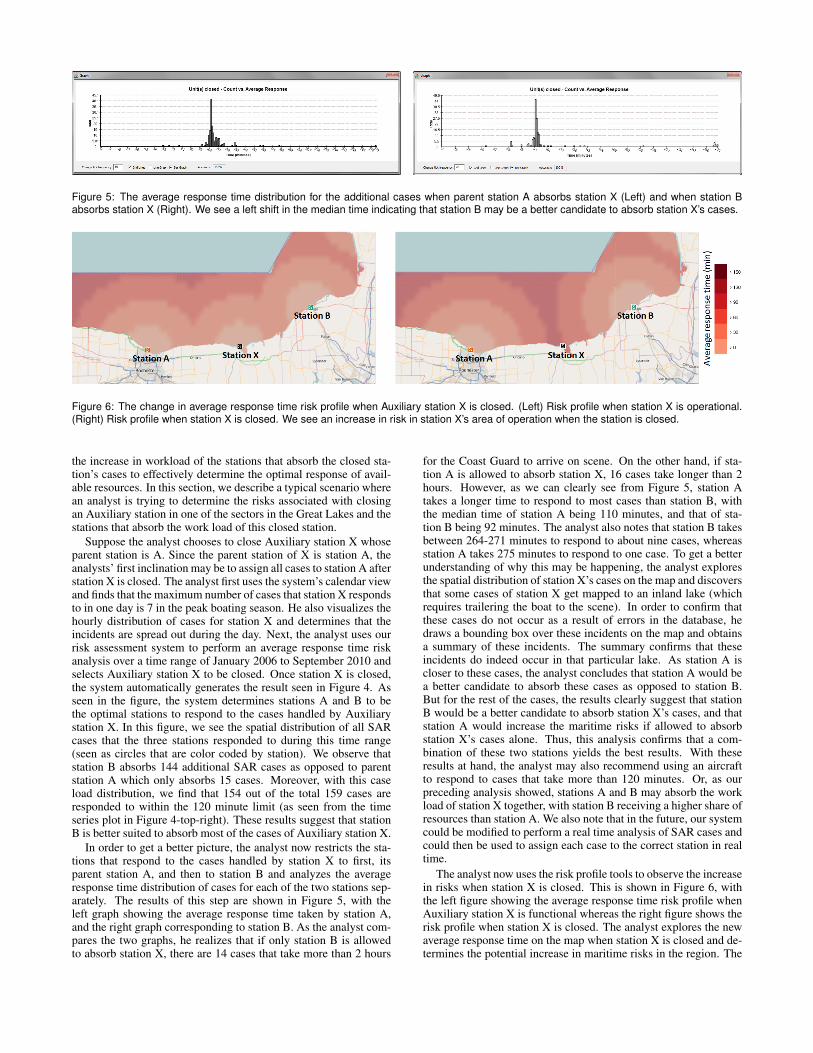
Figure 5: The average response time distribution for the additional cases when parent station A absorbs station X (Left) and when station Babsorbs station X (Right). We see a left shift in the median time indicating that station B may be a better candidate to absorb station X’s cases.
Figure 6: The change in average response time risk profile when Auxiliary station X is closed. (Left) Risk profile when station X is operational.(Right) Risk profile when station X is closed. We see an increase in risk in station X’s area of operation when the station is closed.
the increase in workload of the stations that absorb the closed sta-tion’s cases to effectively determine the optimal response of avail-able resources. In this section, we describe a typical scenario wherean analyst is trying to determine the risks associated with closingan Auxiliary station in one of the sectors in the Great Lakes and thestations that absorb the work load of this closed station.
Suppose the analyst chooses to close Auxiliary station X whoseparent station is A. Since the parent station of X is station A, theanalysts’ first inclination may be to assign all cases to station A afterstation X is closed. The analyst first uses the system’s calendar viewand finds that the maximum number of cases that station X respondsto in one day is 7 in the peak boating season. He also visualizes thehourly distribution of cases for station X and determines that theincidents are spread out during the day. Next, the analyst uses ourrisk assessment system to perform an average response time riskanalysis over a time range of January 2006 to September 2010 andselects Auxiliary station X to be closed. Once station X is closed,the system automatically generates the result seen in Figure 4. Asseen in the figure, the system determines stations A and B to bethe optimal stations to respond to the cases handled by Auxiliarystation X. In this figure, we see the spatial distribution of all SARcases that the three stations responded to during this time range(seen as circles that are color coded by station). We observe thatstation B absorbs 144 additional SAR cases as opposed to parentstation A which only absorbs 15 cases. Moreover, with this caseload distribution, we find that 154 out of the total 159 cases areresponded to within the 120 minute limit (as seen from the timeseries plot in Figure 4-top-right). These results suggest that stationB is better suited to absorb most of the cases of Auxiliary station X.
In order to get a better picture, the analyst now restricts the sta-tions that respond to the cases handled by station X to first, itsparent station A, and then to station B and analyzes the averageresponse time distribution of cases for each of the two stations sep-arately. The results of this step are shown in Figure 5, with theleft graph showing the average response time taken by station A,and the right graph corresponding to station B. As the analyst com-pares the two graphs, he realizes that if only station B is allowedto absorb station X, there are 14 cases that take more than 2 hours
for the Coast Guard to arrive on scene. On the other hand, if sta-tion A is allowed to absorb station X, 16 cases take longer than 2hours. However, as we can clearly see from Figure 5, station Atakes a longer time to respond to most cases than station B, withthe median time of station A being 110 minutes, and that of sta-tion B being 92 minutes. The analyst also notes that station B takesbetween 264-271 minutes to respond to about nine cases, whereasstation A takes 275 minutes to respond to one case. To get a betterunderstanding of why this may be happening, the analyst exploresthe spatial distribution of station X’s cases on the map and discoversthat some cases of station X get mapped to an inland lake (whichrequires trailering the boat to the scene). In order to confirm thatthese cases do not occur as a result of errors in the database, hedraws a bounding box over these incidents on the map and obtainsa summary of these incidents. The summary confirms that theseincidents do indeed occur in that particular lake. As station A iscloser to these cases, the analyst concludes that station A would bea better candidate to absorb these cases as opposed to station B.But for the rest of the cases, the results clearly suggest that stationB would be a better candidate to absorb station X’s cases, and thatstation A would increase the maritime risks if allowed to absorbstation X’s cases alone. Thus, this analysis confirms that a com-bination of these two stations yields the best results. With theseresults at hand, the analyst may also recommend using an aircraftto respond to cases that take more than 120 minutes. Or, as ourpreceding analysis showed, stations A and B may absorb the workload of station X together, with station B receiving a higher share ofresources than station A. We also note that in the future, our systemcould be modified to perform a real time analysis of SAR cases andcould then be used to assign each case to the correct station in realtime.
The analyst now uses the risk profile tools to observe the increasein risks when station X is closed. This is shown in Figure 6, withthe left figure showing the average response time risk profile whenAuxiliary station X is functional whereas the right figure shows therisk profile when station X is closed. The analyst explores the newaverage response time on the map when station X is closed and de-termines the potential increase in maritime risks in the region. The

Figure 7: The monthly (left) and hourly (right) distributions of SAR incidents handled by Auxiliary station X between Jan. 2006 and Sept. 2010.
analyst thus identifies the regions in station X’s area of operationthat take a greater time to respond.
The analyst also visualizes the monthly and hourly distributionsof all SAR cases responded to by the closed Auxiliary station Xbetween January 2006 and September 2010 (shown in Figure 7,where the left graph shows the monthly distribution and the rightgraph shows the hourly distribution). We see that all activity occursin the summer months with a peak occurring in July and the stationresponds to most cases mainly during evening hours. The analystalso visualizes the temporal activity of stations A and B, and deter-mines the potential work load increase for both stations. This helpsthe analyst determine how the available resources must be reallo-cated if Auxiliary station X is to be closed. Furthermore, the ana-lyst chooses to visualize the case distribution of Auxiliary stationX between January 2006 and September 2010 using the interactivecalendar view widget. This generates a summary dialog box thatprovides the details of the SAR cases responded to by station X andincludes details including the total number of lives assisted, savedand lost. This further helps the analyst understand the risks associ-ated with closing this station by providing an overview of the casesoccurring in this region. With all these results at hand, the analystuses his domain knowledge to make an informed decision.
6 DOMAIN EXPERT FEEDBACK
Our system was assessed by an analyst at the U.S. Coast Guard’sNinth District who is currently using the system to determine thepotential risks in the maritime domain associated with the hypothet-ical allocation of Coast Guard resources. The analyst emphasizedthe need of such systems in the maritime domain that allow users toquickly and easily process large datasets in order to derive action-able results. The analyst noted that processing the desired queriestook him a fraction of the time when using our system as comparedto using other software (e.g., Microsoft Excel) that he had been pre-viously using in his analysis. He was impressed by the fact that thesystem is intuitive to use and requires little user training. He ob-served that the system’s ability to process large datasets allows himto quickly filter the data into manageable subsets while providinginteractive spatiotemporal displays that further aid him (and ulti-mately the senior level decision makers) in making a decision usingthe best information available.
7 CONCLUSIONS AND FUTURE WORK
Our current work demonstrates the benefits of visual analytics inanalyzing risk and historic resource allocation in the maritime do-main. Our visual analytics system provides analysts with a suiteof tools for analyzing risks and consequences of taking major de-cisions that translate into important measures including potentiallives and property lost. Our results show how our system can beused as an effective risk assessment tool when examining variousmitigation strategies to a known or emergent problem.
Before this system was developed, Coast Guard officials ex-plored possible mitigation strategies, including the implementationof seasonal or weekend only Auxiliary duty stations, but the sheervolume of data and information inhibited the efficient processing
of the data. However, using our system, the decision makers werequickly made aware that most response cases happened on Mon-days/Tuesdays at some of the units. This further asserts the benefitsof the use of visual analytics in the maritime domain.
In addition to performing risk analysis on the Coast Guard SARcases, our system can also be used to conduct a thorough review ofthe operations (i.e. non-distress cases) conducted by different CoastGuard stations. Users may choose to visualize different datasetsand analyze how each station performs in terms of factors includingaverage response times, average distance to target, lives saved, livesassisted, lives affected, etc. Hence, the officials may analyze theefficiency of each Coast Guard station and identify problem areasthat may require further attention.
Future work includes deploying our system to assist in the anal-ysis and optimization of all operations conducted by the U.S. CoastGuard Ninth District and expanding the use of our system to otherCoast Guard districts. We plan on implementing algorithms thatfactor the geography of the coast line in the risk assessment processin order to get accurate response times by the Coast Guard assets.We also plan on employing prediction algorithms in the temporaldomain as well as spatiotemporal correlation algorithms that cor-relate different datasets (e.g., weather, water temperature) with theresponse dataset to provide insights into the operation of the CoastGuard stations. Furthermore, we plan on incorporating additionalrisk metrics to provide insights into different risk scenarios.
8 APPENDIX
In this section, we briefly provide some domain specific terms anddefinitions:
Coast Guard Auxiliary: Volunteers that support the Coast Guard.Coast Guard Ninth District: The area of Coast Guard operations
that encompasses the Great Lakes.Atlantic Area Command: The area of Coast Guard operations
East of the Rocky Mountains.Captain of the Port (COTP) Zone: Further division of Coast
Guard operations within a Coast Guard District.Unit or Station: The operational execution arm of the Coast
Guard. For example, the small boat station provides the boat andpersonnel to execute the assigned mission.
Coast Guard asset: A boat or an aircraft reserved to performCoast Guard operations.
Coast Guard sortie: An asset that responds to an incident.
9 ACKNOWLEDGMENTS
The authors would like to thank Capt. Eric Vogelbacher, SteffenKoch and Zichang Liu for their feedback. This work is supportedby the U.S. Department of Homeland Security’s VACCINE Centerunder Award Number 2009-ST-061-CI0002.
10 DISCLAIMER
The views and conclusions contained in this document are thoseof the authors and should not be interpreted as necessarily repre-senting the official policies, either expressed or implied, of the U.S.Department of Homeland Security or the U.S. Coast Guard.

REFERENCES
[1] Command Post Of The Future (CPOF). Internet: http://www.gdc4s.com/documents/cpof_datasheet_web.pdf, [June20, 2011].
[2] ESRI, ArcView. Internet: http://www.esri.com/software/arcgis/arcview/index.html, [June 9, 2011].
[3] Oculus, GeoTime. Internet: http://www.oculusinfo.com/SoftwareProducts/GeoTime.html, [June 25, 2011].
[4] OpenStreetMap. Internet: http://www.openstreetmap.org,[June 15, 2011].
[5] R. Adler and J. Fuller. An integrated framework for assessing and mit-igating risks to maritime critical infrastructure. In IEEE Conferenceon Technologies for Homeland Security, pages 252 –257, May 2007.
[6] C. A. Brewer. Designing Better Maps: A Guide for GIS users. ESRIPress, 2005.
[7] J. V. Carlis and J. A. Konstan. Interactive visualization of serial peri-odic data. In Proceedings of the Symposium on User Interface Soft-ware and Technology, pages 29–38, 1998.
[8] W. S. Cleveland and M. E. McGill, editors. Dynamic Graphics forStatistics. Wadsworth and Brooks/Cole, 1988.
[9] C. Correa, Y.-H. Chan, and K.-L. Ma. A framework for uncertainty-aware visual analytics. In IEEE Symposium on Visual Analytics Sci-ence and Technology, pages 51 –58, Oct. 2009.
[10] S. G. Eick and B. S. Johnson. Interactive data visualization at AT&TBell laboratories. In Conference companion on human factors in com-puting systems, pages 17–18, New York, NY, USA, 1995.
[11] S. G. Eick and G. J. Wills. Navigating large networks with hierarchies.In Proceedings of the 4th conference on visualization, Visualization1993, pages 204–209, Washington, DC, USA, 1993. IEEE ComputerSociety.
[12] M. Feather, S. Cornford, J. Kiper, and T. Menzies. Experiences us-ing visualization techniques to present requirements, risks to them,and options for risk mitigation. In First International Workshop onRequirements Engineering Visualization, Sept. 2006.
[13] R. A. Gandhi and S.-W. Lee. Visual analytics for requirements-drivenrisk assessment. In Second International Workshop on RequirementsEngineering Visualization, October 2007.
[14] F. Hardisty and A. C. Robinson. The geoviz toolkit: using component-oriented coordination methods for geographic visualization and analy-sis. International Journal Geographical Information Science, 25:191–210, February 2011.
[15] S. Havre, E. Hetzler, P. Whitney, and L. Nowell. Themeriver: Visual-izing thematic changes in large document collections. IEEE Transac-tions on Visualization and Computer Graphics, 8(1):9–20, 2002.
[16] A. Inselberg. Parallel Coordinates: Visual Multidimensional Geome-try and Its Applications. Springer, September 2009.
[17] D. Keim, J. Kohlhammer, G. Ellis, and F. Mansmann, editors. Mas-tering the information age: Solving problems with Visual Analytics.EuroGraphics, 2010.
[18] R. Lane, D. Nevell, S. Hayward, and T. Beaney. Maritime anomalydetection and threat assessment. In 13th Conference on InformationFusion, pages 1 –8, July 2010.
[19] R. Laxhammar. Anomaly detection for sea surveillance. In 11th In-ternational Conference on Information Fusion, pages 1 –8, July 2008.
[20] M. Mansouri, R. Nilchiani, and A. Mostashari. A risk management-based decision analysis framework for resilience in maritime infras-tructure and transportation systems. In 3rd Annual IEEE Systems Con-ference, pages 35 –41, March 2009.
[21] M. Migut and M. Worring. Visual exploration of classification modelsfor risk assessment. In Proceedings of the IEEE Symposium on VisualAnalytics Science and Technology, pages 11–18, October 2010.
[22] B. Ristic, B. La Scala, M. Morelande, and N. Gordon. Statistical anal-ysis of motion patterns in AIS data: Anomaly detection and motionprediction. In 11th International Conference on Information Fusion,pages 1 –7, July 2008.
[23] J. Roy and M. Davenport. Categorization of maritime anomalies fornotification and alerting purpose. NATO Workshop on Data Fusionand Anomaly Detection for Maritime Situational Awareness, pages15–17, September 2009.
[24] S. Rudolph, A. Savikhin, and D. Ebert. Finvis: Applied visual ana-
lytics for personal financial planning. In IEEE Symposium on VisualAnalytics Science and Technology, pages 195 –202, Oct. 2009.
[25] N. M. Sanusi and N. Mustafa. A visualization tool for risk assessmentin software development. In International Symposium on InformationTechnology, pages 1–4, August 2008.
[26] A. Savikhin, R. Maciejewski, and D. Ebert. Applied visual analyt-ics for economic decision-making. In Proceedings of the IEEE Sym-posium on Visual Analytics Science and Technology, pages 107–114,October 2008.
[27] R. Scheepens, N. Willems, H. van de Watering, and J. J. van Wijk.Interactive visualization of multivariate trajectory data with densitymaps. In Proceedings of the Pacific Visualization 2011, pages 147–154, March 2011.
[28] B. W. Silverman. Density Estimation for Statistics and Data Analysis.Chapman & Hall/CRC, 1986.
[29] C. G. Soares and A. P. Teixeira. Risk assessment in maritime trans-portation. Reliability Engineering and System Safety, 74(3):299 – 309,2001.
[30] J. Stasko, C. Gorg, Z. Liu, and K. Singal. Jigsaw: Supporting in-vestigative analysis through interactive visualization. In Proceedingsof the IEEE Symposium on Visual Analytics Science and Technology,pages 131–138, 2007.
[31] J. J. Thomas and K. A. Cook, editors. Illuminating the Path: The R&DAgenda for Visual Analytics. IEEE Press, 2005.
[32] U. S. C. G. U.S. Department of Homeland Security. U.S. Coast GuardAddendum to the United States National Search and Rescue Supple-ment (NSS) to the International Aeronautical and Maritime Searchand Rescue Manual (IAMSAR). September 2009.
[33] J. J. V. Wijk and E. R. V. Selow. Cluster and calendar based visual-ization of time series data. In Proceedings of the IEEE Symposium onInformation Visualization, pages 4–9, San Francisco, CA, USA, 1999.IEEE Computer Society.
[34] N. Willems, H. van de Wetering, and J. J. van Wijk. Visualization ofvessel movements. Computer Graphics Forum, 28(3):959–966, 2009.