a short history of 18-19th century british hand … · a short history of 18-19th century british...
TRANSCRIPT
A SHORT HISTORY OF 18-19TH CENTURY
BRITISH HAND-COLOURED PRINTS; WITH A
FOCUS ON GAMBOGE, CHROME YELLOW
AND QUERCITRON; THEIR SENSITIVITIES
AND THEIR IMPACT ON AQUEOUS
CONSERVATION TREATMENTS
Stacey Mei Kelly (13030862) A Dissertation presented at Northumbria University for the degree of MA in Conservation of Fine Art, 2015
VA0742
Page 1 of 72
Table of Contents
List of figures……………………………………………………………………………………...…2
List of tables……………………………………………………………………………………….....2
Abstract………………………………………………………………………………………………3
Introduction……………………………………………………………………………..………...…3
Research aims, methodology and resources………………………………………………….…....4
1. Aims……………………………………………………………………………………..…...4
2. Research Questions…………………………………………………………………..…...….4
3. Literature review……………………………………………………………………….....….5
4. Case Study Survey………………………………………………………………………..….5
5. Empirical Work……………………………………………………………………………....6
Chapter 1: A Brief History of Hand-coloured Prints in Britain………………………………....6
1.1 The popularity of hand-coloured prints…………………………………………………….....6
1.2 The people behind hand-colouring……………………………………………………..….….9
1.3 Materials and Methods……………………………………………………………………....14
Chapter 2: Yellow Pigments: A focus on Gamboge, Chrome Yellow, and Quercitron……….19
2.1 Why Gamboge, Chrome Yellow, and Quercitron……………………………………….…..19
2.2 Gamboge……………………………………………………………………………….....….20
2.2.1 History…………………………………………………………………………….…....20
2.2.2 Working properties…………………………………………………………………..…21
2.2.3 Physical and chemical properties…………………………………………………..…..21
2.2.4 Methods of identification…………………………………………………………..…...22
2.3 Chrome Yellow (Lead Chromate) ………………………………………………………..…23
2.3.1 History……………………………………………………………………………...…..23
2.3.2 Working properties……………………………………………………………………..24
2.3.3 Physical and chemical properties………………………………………………………24
2.3.4 Methods of identification………………………………………………………….....…25
2.4 Quercitron………………………………………………………………………………..…..25
2.4.1 History……………………………………………………………………………...…..25
2.4.2 Working properties……………………………………………………………………..26
2.4.3 Physical and chemical properties……………………………………………………....26
2.4.4 Methods of identification…………………………………………………………….....27
2.5 Summary of the sensitivities of Gamboge, Chrome Yellow and Quercitron……………..…27
2.6 Limitations………………………………………………………………………………..….27
Chapter 3: The Aqueous Treatment of hand-coloured prints containing sensitive yellow
pigments…………………………………………………………………………………………….28
3.1 Common types of damage seen on hand-coloured prints……………………………………28
3.2 Possible issues of aqueous treatment of hand-coloured prints………………………………29
3.3 Conservation treatment of hand-coloured prints…………………………………………….30
3.3.1 Removal of surface dirt ……………………………………………………………..…30
3.3.2 Removal of discolouration, staining, and other soluble degradation products……..…31
3.3.3 Fixing fugitive pigments………………………………………………………………..32
3.3.4 Humidification prior to washing…………………………………………………….…32
3.3.5 Methods of washing and alkalisation………………………………………………….33
3.3.6 Materials suitable for treatment……………………………………………………….38
3.3.7 Additional treatment options……………………………………………………..……38
3.3.8 Drying and Flattening…………………………………………………………………39
Conclusion………………………………………………………………………………………….39
List of References……………………………………………………………………………….….40
Appendix 1: Common pigments used in Britain in the 18th and 19th century with data
gathered from various artist treatises and manuals……………………………………………..49
Page 2 of 72
Appendix 2: Recipes for several pigment components…………………………………………..53
Appendix 3: List of prints hand-coloured by J. B. Hogarth…………………………………….55
Appendix 4: List of print colourists found……………………………………………………….56
Appendix 5: Pigment Swatches……………………………………………………………………58
Appendix 6: Case Study Survey…………………………………………………………………..63
List of figures
Figure 1 Robert Melville Grindlay (1786-1877), engraved by George Hunt. View of the
excavated temple of Kailasa, Ellora, India, 1830 (Published), Hand-coloured aquatint
painted by J.B. Hogarth. ©Victoria and Albert Museum, London.
Figure 2 Advertisement from John Heaviside Clark's A Practical Essay on the Art of Colouring
and Painting Landscapes in Water Colours. Published in 1807, printed and sold by
Edward Orme.
Figure 3 A close up image showing layers of washes applied by hand, as well as paint applied in
a less-precise manner, spilling over the printed lines. Henry Alken (1785-1851)
Symptoms of coming from the Hunt, of Star Gazing, Going to the Hunt, of an Elegant
Writer, of Toasting an old Friend. Hand-coloured soft ground etching. Published by
Thomas McLean, London, 1822. ©Alnwick Castle, Northumberland.
Figure 4 A close up image showing brush strokes as well as paint applied beyond the print
image. Henry Alken (1785-1851) Moments of Fancy, not a bit of fancy, a bit of fancy,
all fancy and whim, a political fancy, a dangerous fancy. Hand-coloured soft ground
etching. Published by Thomas McLean, London, 1822. ©Alnwick Castle,
Northumberland
Figure 5 A close up image showing misalignment of the yellow plate used during printing.
Alfred Concanen (1835-1886) (Lithographer) The Troubadour's Rum Tum Tum,
Chromolithograph. Published by Duff & Stewart ca. 19th century. ©Victoria and Albert
Museum, London.
Figure 6 Chemical Structure of Gambogic acid
Figure 7 A close up of suspected gamboge pigment; photomicrograph at 20x magnification
showing translucent, stain-like appearance of the pigment in the paper fibres in Theodor
Friedrich Ludwig Nees von Esenbeck, Lithographed by H. von Arnz and A. Henry,
Verbascum Thapsiforme Schr, (1828-1833) Hand-coloured lithograph, ©Burt Hall
Archive, Northumbria University, Newcastle-upon-Tyne
Figure 8 Chemical Structure of Quercetin
List of tables
Table 1 Sensitivities of Gamboge, Chrome Yellow and Quercitron
Table 2 Risks and benefits of several washing and alkalisation methods in relation to hand-
coloured prints
Page 3 of 72
Abstract
Not much research has been done in the field of British hand-coloured prints in the 18th and
19th centuries. This paper provides a brief overview of the history and production of hand-
coloured prints, the people involved, and the common materials used. Three sensitive yellow
pigments gamboge, quercitron and chrome yellow, which were commonly used in hand-
colouring are also discussed in detail, covering their history, physical and chemical
properties, as well as methods of identification. These pigments were selected due to the
common usage of yellow pigments in many hand-coloured prints, used both alone and as a
mixture to achieve numerous shades of green and orange. Yellow pigments are also known to
be very fugitive pigments, with these three pigments being some of the most sensitive. The
details of their sensitivities are then used to provide possible aqueous treatment options for
the conservation of hand-coloured prints, with focus on the removal of discolouration and
soluble degradation products. Possible treatment options include double-screen washing,
blotter washing, low-pressure table washing, partial immersion, and the use of rigid Gellan
gels. Local and targeted treatment options as well as additional treatment steps like fixing and
the use of templates are also discussed.
Introduction
The use of colour is evident in most art forms, adding depth, symbolism, expression and
beauty to an artwork. It can be seen from the earliest practises, to the present. In the 18th and
19th centuries, the demand for hand-coloured prints amongst the British public increased
dramatically. This growth in the market has led to large collections of such material in
museum and archival collections.
Unfortunately, the addition of colour by hand to a print has often been viewed with criticism
by artists and connoisseurs of prints. This process of adding colour has ‘dismembered
thousands of books and ruined many fine prints’ (Griffiths, 1996: p. 113). By colouring a
print that was made with the intention of it being black and white, the original intention of the
artists’ work is lost. Old prints with colouring are almost immediately considered dubious,
where the colour is assumed to be a ‘cosmetic addition’ made to either compensate for
deficiencies, or to appeal to public demand (Dackerman, 2002). Hand-colouring can also be
done at any time after printing, making it difficult to accurately determine the time of its
application, and whether the colouring is contemporary to the print. These views of colouring
Page 4 of 72
have led to the neglect of this entire phenomenon of printmaking. However, there is no doubt
that these prints are historically and artistically valuable as many of them capture the social
and political histories of the time. As such, this paper aims to provide an account of the
process, industry, materials used, and conservation treatment of hand-coloured prints in
Britain.
Research aims, methodology and resources
1. This paper aims to:
Provide the first detailed account of the history behind the production of hand-coloured
prints in Britain
To contribute to the lack of research in the field of hand-coloured prints in Britain, with
the view of informing conservators, art historians and conservation scientists
To provide a reference of the physical properties of several commonly used yellow
pigments to aid conservators in the visual identification of yellow pigments used in hand-
coloured prints during this period. This informs conservation practice by aiding
conservators in the industry who do not have access to instrumental analysis methods to
narrow down the possible range of pigments in the print at hand, thereby providing
immediate understand of the possible risks involved prior to aqueous treatment.
2. The aims of this paper will be achieved by addressing the following questions:
How the social and industrial framework in Britain shaped the popularity of hand-
coloured prints
Who were the people behind the production and distribution of hand-coloured prints
What were the common materials used in hand-colouring, specifically watercolour
pigments
What were the popular yellow pigments employed in hand-colouring, their availability,
composition, and sensitivities with a focus on Gamboge, Quercitron, and Chrome Yellow
What are the physical characteristics of common yellow pigments that will aid in their
visual identification
What are the risks associated with the aqueous treatment of hand-coloured prints
containing fugitive yellow pigments
Page 5 of 72
3. Literature Review
There exists several comprehensive studies of the British print industry including Timothy
Clayton’s The English Print 1688-1802, which provides a detailed overview of the
distribution networks of English prints across the British Empire, as well as the attitudes and
social context of the period under consideration, which contributed to the popularity of the
print. Martin Hardie’s English Coloured Books, although not primarily concerned with prints,
provides an account of the history of colour in printed material, with brief mention of hand-
colouring.
Publications focusing on the field of hand-colouring are scarce. Most notable is Elizabeth
Miller’s Hand-coloured British Prints, a catalogue of an exhibition held in 1987 at the
Victoria and Albert Museum. It covers a brief overview of hand-colouring, and describes the
materials and techniques of the industry. Susan Dackerman’s Painted Prints: The Revelation
of Color concentrates on hand-coloured Renaissance prints. While not completely in line with
the focus of this research, it is ground-breaking in its re-evaluation of the importance of
‘painted prints’. An article written by David Alexander in 1997 investigates the individuals
behind the colouring of prints in the 17th and 18th centuries.
4. Case Study Survey
Hand-coloured prints from several institutions namely the archives unit at Alnwick Castle,
The University of Aberdeen collection, and the Burt Hall Archive at Northumbria University
were selected for observation based on the date of their production, provenance, and the
presence of yellow pigments used in the hand-colouring. Several prints with differing yellow
pigments from similar series were selected where possible for comparative study. These
include The Artist’s Room, and The Cellar Quartetto from The Tour of Doctor Syntax, In
search of a Wife published by R. Ackermann in 1821, as well as several prints from The
Symptoms of Being Amused and Moments of Fancy by Henry Alken, published by Thomas
McLean in 1822.
The examination techniques used on these prints differed based on the availability of
equipment at the various institutions. The prints were examined under magnification using a
magnifying lens, or when possible, a binocular microscope in the range of 6.3x to 40x
magnification with a fibre optics light angled to create raking light. Ultra-violet (UV) torches
were used to record the behaviour of the yellow pigments under UV light and when facilities
Page 6 of 72
allowed, prints were photographed and examined under infrared (IR) Reflectography and
False Colour Infrared (FCIR) photography1. Their behaviour under these differing
wavelengths were recorded to analyse the possible pigment compositions present. This data
will be used as an aid in the visual identification of common yellow pigments via comparison
with a chart of authentic painted samples described in section 5.
Due to the subjective nature of technical analysis, additional resources will also be consulted
to add to these observations including technical case studies, artist treatises, manuals, and
colourmen catalogues. Artist treatises, manuals and catalogues provide useful accounts of the
materials recommended during the time, where to obtain such ingredients, recipes for the
manufacture of pigments, and hints on the usage of colours. These were often written by the
artists themselves, and were meant for other artists, or students of art. Such contemporary
resources, although sometimes difficult to interpret, are rich and accurate sources of
information.
5. Empirical Work
To aid in the visual examination of the selected case studies, as well as to provide a source of
reference for conservators and conservation scientists, pigment swatches of several common
yellow pigments including: Yellow ochre, Aureolin, Cadmium Yellow, Indian yellow,
Messicot, Naples Yellow, Lemon Yellow, Chrome Yellow, and Gamboge were made. These
samples also underwent technical examination, with the results compiled to serve as a
reference point for the behaviours of these pigments under different wavelengths of light.
Chapter 1: A Brief History of Hand-coloured Prints in Britain
1.1 The popularity of hand-coloured prints
Since the beginnings of printmaking in the 15th century, prints have been available in both
monochrome, and colour. The addition of colour seems a natural process to the finishing of a
print, completing the image, giving it expression, form, and beauty. ‘Every passion and
affection of the mind has its appropriate tint and colouring…it heightens joy, warms love,
inflames anger, deepens sadness, and adds coldness to the cheek of death itself’ (Reeves and
Sons Amateurs’ and Artists’ Companion etc., 1851: p. 42).
1 Also called Infrared False Colour (IRFC)
Page 7 of 72
Prior to the late 18th century, the majority of illustrations were printed in black and white and
finished by hand-colouring.2 A hand-coloured print is a print that has had colour added over it
after printing. It is sometimes known as a coloured print. In contrast, a colour print is one that
has been printed using coloured inks (Gascoigne, 2011). Hand-colouring was usually done
using watercolours, although prints coloured with gouache or even oils paints have been
found.3 These media were applied either directly using brushes, or through the use of stencils
(Ward, 2009). Naturally, prints coloured with stencils allowed quicker production times, and
were used to provide flat colour for objects such as playing cards and wallpaper (Hermans,
1987).
The need for colour was recognised by artists, publishers and consumers. As a result, even
though hand-colouring prints was a tedious process, incurring high costs at the production
end, it was done at a large scale to meet the demands of the public. Coloured prints sold at a
premium, almost double the cost of a plain print, and people were willing to pay for them.4
There were many reasons artists and publishers added colour to a print. The simplest and
most obvious one, was for the purpose of decoration. Adding colour to a print made it more
attractive, making it easier for a print-seller to sell, and more eye catching for a buyer. Prints
were also used as carriers of information, instructing the public on various specialist subjects
including fashion, botany, ornithology, etc., and colour was a means of accurately
representing such information.
In the 18th and 19th centuries, the British public was increasingly prosperous, eager for
entertainment and knowledge. Society was described as wealthy, curious and idle (Remarks
on the Importance of the Study of Political pamphlets etc., 1765). This period saw a surge in
growth of the print industry. London had become the centre of the art world, and the place for
the production of new prints (Clayton, 1997). The population had nearly doubled and people
were moving into the cities. Literacy among the public and lower classes was steadily
increasing. The flourishing economy created an increasingly wealthy public, stimulating
immense growth in the artistic sectors. People were intellectually curious, eager for
2 It should be noted that there have been a few instances of early woodcut illustrations printed in colour. The
most well-known example of pre 18th century colour printing in England is in The Book of St. Albans, printed in
1486. It contains sixty-six printed pages, with coloured initials and coat-of-arms, printed using wood blocks
inked with red, yellow, blue and green (Hardie, 1990). 3 Gouache colours are made similar to transparent watercolours containing larger pigment particles and the
addition of inert pigment like precipitated chalk, allowing transparent pigments to be rendered opaque (Mayer
1991: p. 293). 4 During the 1730s, satirical prints were sold at sixpence plain or a shilling coloured (Alexander, 1997). Printed
sheets for toy theatres were sold for a penny plain and two-pence coloured (Gascoigne, 2011).
Page 8 of 72
knowledge and amusement, and this curiosity was seen across all social ranks. Art and
connoisseurship became part of the everyday life of the English upper and lower classes and
the luxury trade in London. There was no ‘shortage of patrons or a deficiently educated
public…the traditional patron/benefactor was lost in the surge of new customers: women,
amateur artists, calico printers, interior decorators’ (Lippincott, 1983: p. 73). The public was
also politically aware, giving rise to an interest in political satires and caricatures.
The print industry supplied the needs of this public, often fuelling the fashions of the age. In
the 1740s, the popular fad of having a print room emerged amongst the British nobility.
These print rooms were rooms with walls covered with decorative prints, embellished with
ornamental borders, a trend started by Lady Cardigan that continued to the Regency
(Entwisle, 1970). Print-sellers responded quickly to this trend; ‘Prints of all kinds for Pannels,
Ceilings, &c. of the newest fashion’ as well as ‘One hundred different borderings5 for
hanging of rooms or Prints’ were advertised by George Bickham the Younger.6 It was also
common for men to purchase caricatures to decorate their Billiard Rooms. Colouring of these
prints to accommodate these trends was probably done not only to make the prints more
striking, but to also have them take on the appearance of watercolour or even oil paintings,
which were considered more valuable art forms.7
Another influencer of the coloured print was the increase in impact women had over the print
industry. Much of the coloured prints issued during the time were aimed at the amusement
and common interest of ladies, including series’ of floral prints, and prints specific to their
hobbies, including sewing, painting, japanning and basic print collecting. 8 Philip Overton
advertised some of his prints as ‘useful…for the Ladies as patterns for working and painting
in water-colours, or Furniture for the Closet’.9 He also advertised approximately five hundred
prints sold coloured and plain of landscapes, flowers, birds, etc. for japanning.10
As mentioned earlier, many prints were purchased by hobbyists, who collected prints of
particular subjects out of interest or study. Such subjects like entomology, botany and
5 Papers with printed or painted designs specifically used for decorating a room, or outlining details within a
room. 6 See General Advertiser, 8 October 1751 7 From the catalogue of Stubbs's sale in 1807 it appears that he also offered impressions of his own prints
coloured with oils to look like paintings, examples include The Lion Devouring the Horse, The Lion, and Lord
Pigot (Public Advertiser, 17 May, 20 May and 3 June 1769). 8 Prints of the same subject or series were often collected and bound in albums. 9 See Daily Post, 9 February 1732 10 See Craftsman, 25 October 1729
Page 9 of 72
ornithology could hardly be fully appreciated in the simple markings of black and white.
Hand-colouring added a wealth of information to these prints, and also made truer and more
beautiful copies of the original. Satirical prints were a range of prints that were also usually
coloured, as colour often symbolised part of the satire being presented. Fashion plates were
also another set of prints that could not be fully appreciated without colour. Ackermann’s
Repository of arts, literature commerce, manufactures and politics featured fashion plates in
every edition, advising and illustrating ladies and gents fashions (Jones, 2010).
1.2 The people behind hand-colouring
Unlike artists, etchers, and engravers, colourists are not usually acknowledged on a print.
This may signify their lower position in the hierarchy of print production. This lack of
acknowledgement makes it difficult to identify the individuals involved in the hand-colouring
industry. Eye-witness accounts of this process in the 18th and 19th century have not yet been
found, adding to the mystery of the entire trade. However, based on older accounts,
advertisements, and personal journals, a basic idea of the people involved in the industry, as
well as the process can be pieced together.
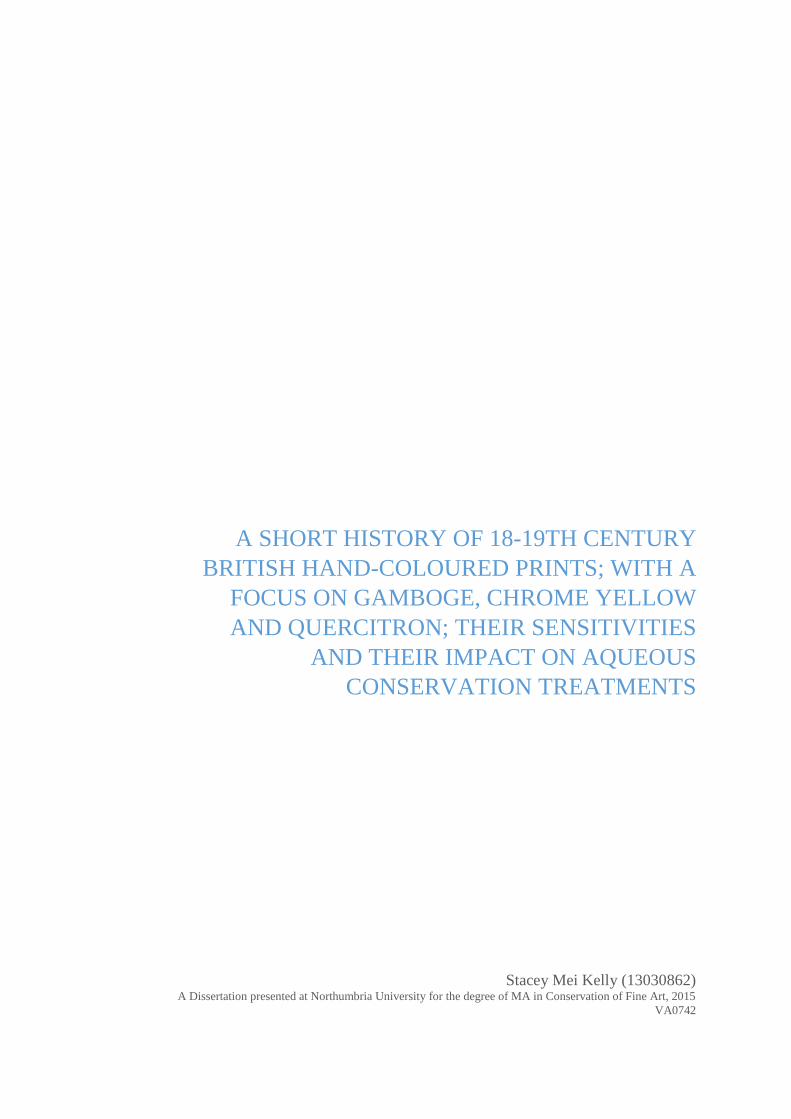
There have been incidents where a colourist was acknowledged on a print, but these are
altogether rare. A collection of coloured plates was published by Rudolph Ackermann in
1826, where Part I and II of the publication entitled Scenery Costumes and Architecture
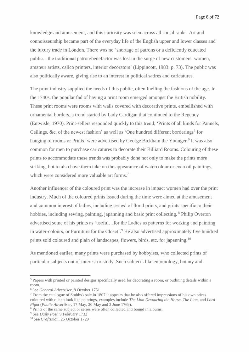
chiefly on the Western Side of India by Captn. Robert Melville Grindlay, Member of the
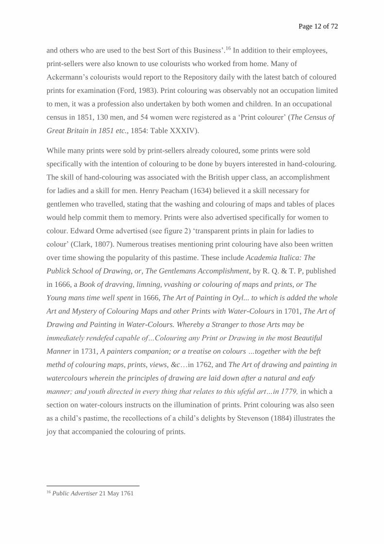
Royal Asiatic Society & of the Society of Arts, &C., consisted of ten prints coloured by J. B.
Hogarth, a water-colourist (see figure 1). Artists have sometimes coloured their own prints
which can be seen in Eleazar Albin’s (1731) A Natural History of Birds, which was described
in the title page to be ‘Published by the Author Eleazar Albin, and carefully colour'd by his
Daughter and Self, from the Originals, drawn from the live Birds’. In 1731, Mark Catesby
published The Natural History of Carolina, Florida, and the Bahama Islands, which
contained two hundred and twenty hand-coloured plates coloured by the author. He described
his selection of paints in the preface, choosing colours ‘most resembling nature that were
durable and would retain their lustre’ (Catesby, 1731). William Lewin (1800), a naturalist and
artist issued The Birds of Great Britain, with Their Eggs, Accurately Figured, which
contained three hundred and twenty-three plates hand-painted by himself. In 1785, John
Binns released James Bolton’s Filices Britannicae, which was sold in plain or neatly
Page 10 of 72
coloured, “the figures drawn, the plates engraved, and the prints coloured by the authors own
hand”.11
Figure 1 Robert Melville Grindlay (1786-1877), engraved by George Hunt. View of the excavated temple of
Kailasa, Ellora, India, 1830 (Published), Hand-coloured aquatint painted by J.B. Hogarth. ©Victoria and Albert
Museum, London.
Print-sellers and publishers were likely to have had colourists amongst their staff. Arthur
Pond, a print-seller and connoisseur in the 1730s was known to have had his prints coloured
by his servant Peter Maddox, Enoch Markham his shop assistant, and later further assisted by
Thomas Black a drapery painter, and David Bellis a colourman and painting-restorer
(Lippincott, 1983). These men were paid approximately two to seven shillings per print they
coloured, except for Black who was paid a standard day wage (Ibid.).
American print-sellers Currier & Ives based in New York in the 19th century were well
known for their hand-coloured prints. Their hand-colouring process has been described in
full:
The “stock prints” were colored, in the shop on the fifth floor at 33 Spruce Street, by
a staff of about twelve young women and girls, all trained colorists and mostly of
German descent. They worked at long tables, from a model. Many of these models
were coloured by Mr. Maurer and Mrs. Palmer, and all were first approved by one of
the partners. The model was put in the middle of the table, in a position that made it
visible to all. Each colorist would apply one color, and then pass the print on to the
next colorist, and so on until the print had been fully colored. It would then go to the
11 St. James Chronicle or the British Evening Post (London, England), October 27, 1785 – October 29, 1785;
issue 3845
Page 11 of 72
woman in charge, who was known as the “finisher,” and who would touch it up
where necessary. (Peters, 1976: p. 34)
It is possible that a similar process existed in the larger print-sellers in England. Rudolph
Ackermann, a publisher of decorative prints and illustrated books offered work to European
émigrés during the ‘Reign of Terror’ (1793-94) as engravers, draughtsmen and colourists
(Ford, 1983). It is likely that these colourists worked on one print at a time, colouring it in
full, or on a batch of prints, filling in all the prints, one colour at a time. An advertisement by
a Dr Hill points to the use of such a ‘factory’ method of colouring, searching for print
colourers ‘to undertake a complete set of the prints of a vegetable system…used to colour for
the shops in the large way, and good work and perfect cleanliness are expected. Patterns are
given with them.’12 The ‘large way’ mentioned by Dr Hill may signify the same process
undertaken at Currier and Ives.
Apprentices in these print shops were also sometimes responsible for colouring prints. Turner
and Girtin as young apprentice painters were known to have hand-coloured prints for Mr.
John Raphael Smith, a Mezzotint engraver to supplement their income (Reeves and Sons
Amateurs’ and Artists’ Companion etc., 1851). Apprentices were promoted step by step in
their fields and those working in print shops possibly spent two to three years colouring
prints. Arthur Pond was also known to rely heavily on his apprentices, along with his
assistant Thomas Black to manage the colouring of prints in his shop (Lippincott, 1983).
Most of these resident colourists remain unknown, although a few other instances of named
individuals have arisen.13 In 1750, several plates of Kensington and Hampton Court were said
to be ‘coloured by the ingenious Mrs Chandler well known to be inimitable in her art’
(Alexander, 1997: p. 166). Fan-sellers and their workers were also known to have coloured
prints. Their presence as distributors of coloured prints indicates their skills as colourists
(Clayton, 1997). Advertisements for print colourers often specified fan-painters as potential
candidates, ‘To flower and fan-painters, colourers of prints, &C. Wanted immediately’.14 In
1734, subscriptions for The Wonders of the Deep were taken in by Martha Gamble, who also
delivered the final prints in 1736. She was a fan-seller and may have been responsible for the
colouring of the prints.15 Advertisements looking for colourists also called for ‘Fan-Painters
12 Gazetteer; New Daily Advertiser (London) Wednesday 15 April 1772, Issue 13456 13 See Appendix 4 for a small list of named colourists found 14 Daily Advertiser, Thursday 31 October 1776 Issue 14312 15 Craftsman, 2 February 1734; London Evening Post, 24-6 February 1736
Page 12 of 72
and others who are used to the best Sort of this Business’.16 In addition to their employees,
print-sellers were also known to use colourists who worked from home. Many of
Ackermann’s colourists would report to the Repository daily with the latest batch of coloured
prints for examination (Ford, 1983). Print colouring was observably not an occupation limited
to men, it was a profession also undertaken by both women and children. In an occupational
census in 1851, 130 men, and 54 women were registered as a ‘Print colourer’ (The Census of
Great Britain in 1851 etc., 1854: Table XXXIV).
While many prints were sold by print-sellers already coloured, some prints were sold
specifically with the intention of colouring to be done by buyers interested in hand-colouring.
The skill of hand-colouring was associated with the British upper class, an accomplishment
for ladies and a skill for men. Henry Peacham (1634) believed it a skill necessary for
gentlemen who travelled, stating that the washing and colouring of maps and tables of places
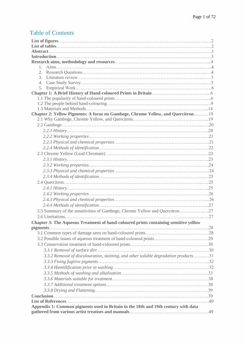
would help commit them to memory. Prints were also advertised specifically for women to
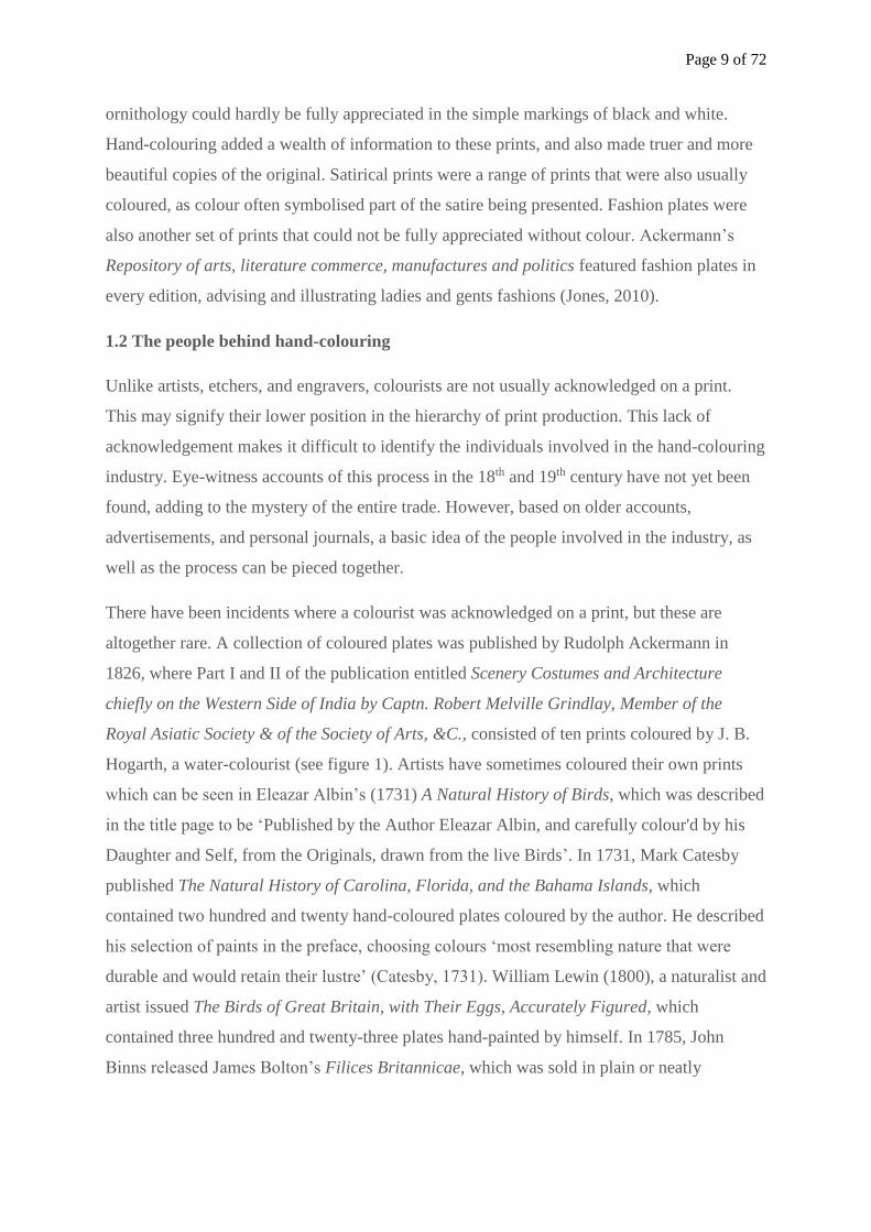
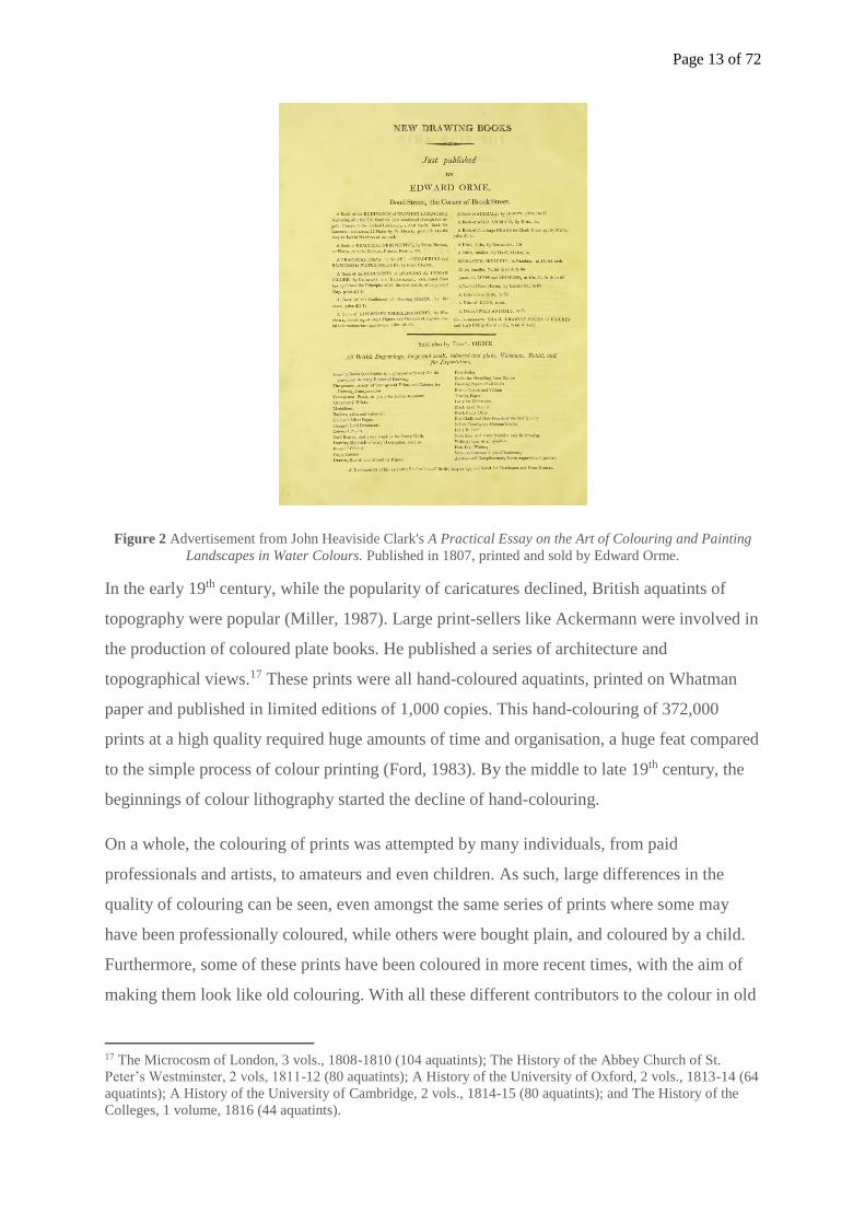
colour. Edward Orme advertised (see figure 2) ‘transparent prints in plain for ladies to
colour’ (Clark, 1807). Numerous treatises mentioning print colouring have also been written
over time showing the popularity of this pastime. These include Academia Italica: The
Publick School of Drawing, or, The Gentlemans Accomplishment, by R. Q. & T. P, published
in 1666, a Book of dravving, limning, vvashing or colouring of maps and prints, or The
Young mans time well spent in 1666, The Art of Painting in Oyl... to which is added the whole
Art and Mystery of Colouring Maps and other Prints with Water-Colours in 1701, The Art of
Drawing and Painting in Water-Colours. Whereby a Stranger to those Arts may be
immediately rendefed capable of…Colouring any Print or Drawing in the most Beautiful
Manner in 1731, A painters companion; or a treatise on colours …together with the beft
methd of colouring maps, prints, views, &c…in 1762, and The Art of drawing and painting in
watercolours wherein the principles of drawing are laid down after a natural and eafy
manner; and youth directed in every thing that relates to this ufeful art…in 1779, in which a
section on water-colours instructs on the illumination of prints. Print colouring was also seen
as a child’s pastime, the recollections of a child’s delights by Stevenson (1884) illustrates the
joy that accompanied the colouring of prints.
16 Public Advertiser 21 May 1761
Page 13 of 72
Figure 2 Advertisement from John Heaviside Clark's A Practical Essay on the Art of Colouring and Painting
Landscapes in Water Colours. Published in 1807, printed and sold by Edward Orme.
In the early 19th century, while the popularity of caricatures declined, British aquatints of
topography were popular (Miller, 1987). Large print-sellers like Ackermann were involved in
the production of coloured plate books. He published a series of architecture and
topographical views.17 These prints were all hand-coloured aquatints, printed on Whatman
paper and published in limited editions of 1,000 copies. This hand-colouring of 372,000
prints at a high quality required huge amounts of time and organisation, a huge feat compared
to the simple process of colour printing (Ford, 1983). By the middle to late 19th century, the
beginnings of colour lithography started the decline of hand-colouring.
On a whole, the colouring of prints was attempted by many individuals, from paid
professionals and artists, to amateurs and even children. As such, large differences in the
quality of colouring can be seen, even amongst the same series of prints where some may
have been professionally coloured, while others were bought plain, and coloured by a child.
Furthermore, some of these prints have been coloured in more recent times, with the aim of
making them look like old colouring. With all these different contributors to the colour in old
17 The Microcosm of London, 3 vols., 1808-1810 (104 aquatints); The History of the Abbey Church of St.
Peter’s Westminster, 2 vols, 1811-12 (80 aquatints); A History of the University of Oxford, 2 vols., 1813-14 (64
aquatints); A History of the University of Cambridge, 2 vols., 1814-15 (80 aquatints); and The History of the
Colleges, 1 volume, 1816 (44 aquatints).
Page 14 of 72
prints, it is necessary to understand the common materials used during the time, not just to
sieve out the modern coloured versions, but to understand the risks involved when handling
and treating these prints.
1.3 Materials and Methods
Before identifying the materials present in hand-coloured prints, it is necessary to understand
how to differentiate hand-coloured prints from colour prints. While some hand-coloured
prints were coloured in oil paints, body colour and gouache, watercolours were the most
common medium for this process. Watercolour washes are a colloidal dispersion, containing
small particles of pigment suspended in a liquid like water or gum. The pigment particles are
applied in a liquid state, allowing the water molecules and particles to distribute evenly. The
water then evaporates, allowing the particles to stick to the paper via the gum (Cohn, 1977).
The most common gum used in the 18-19th century watercolours is gum arabic (Ormsby et.
al., 2005). Gum arabic is derived from the Acacia tree and is classified as a lyophilic
colloid.18 When mixed with a liquid, high forces of attraction exists between the colloidal
particles and the liquid. As such, these solutions are stable, and do not precipitate or
coagulate easily (Miller-Keane Encyclopedia and Dictionary of Medicine, Nursing, and
Allied Health, Seventh Edition, 2003). These properties are extremely useful in watercolours
as gum arabic sustains an even dispersion of pigment particles in water until the water
evaporates off the surface of the paper, and the pigment is gummed into place. It also allows
for an effective wash where each particle of pigment is used in the most efficient manner,
allowing the pigment to be spread over the largest possible surface while maintaining a strong
colour. According to Hauser and Lynn (1940), stable particles that do not congeal have
sufficient time to disperse evenly in positions of minimum free energy to each other, allowing
a close packed dense sediment to form. Differing amounts of gum are needed for different
pigments based on their differing properties. Colours that needed to stand out like blues and
browns were more heavily gummed, and lighter tones like lake and vermilion were less
gummed (Constant-Vignier, 1830, cited in Cohn, 1977). Some pigments like Gamboge
required no gumming at all (Standage, 1896).
Watercolours were applied using brushes of different sizes, sometimes with the aid of
stencils. Hand-coloured prints coloured using brushes are likely to be more detailed, with
18 A colloid is a mixture of minute particles dispersed in a second substance. Lyophilic colloids refers to a
colloid that readily absorbs solvents and distributes it evenly throughout the medium. (Miller-Keane
Encyclopedia and Dictionary of Medicine, Nursing, and Allied Health, Seventh Edition, 2003)
Page 15 of 72
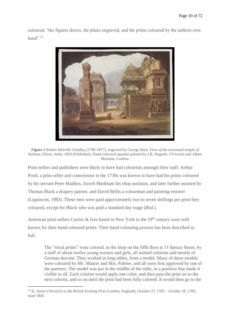
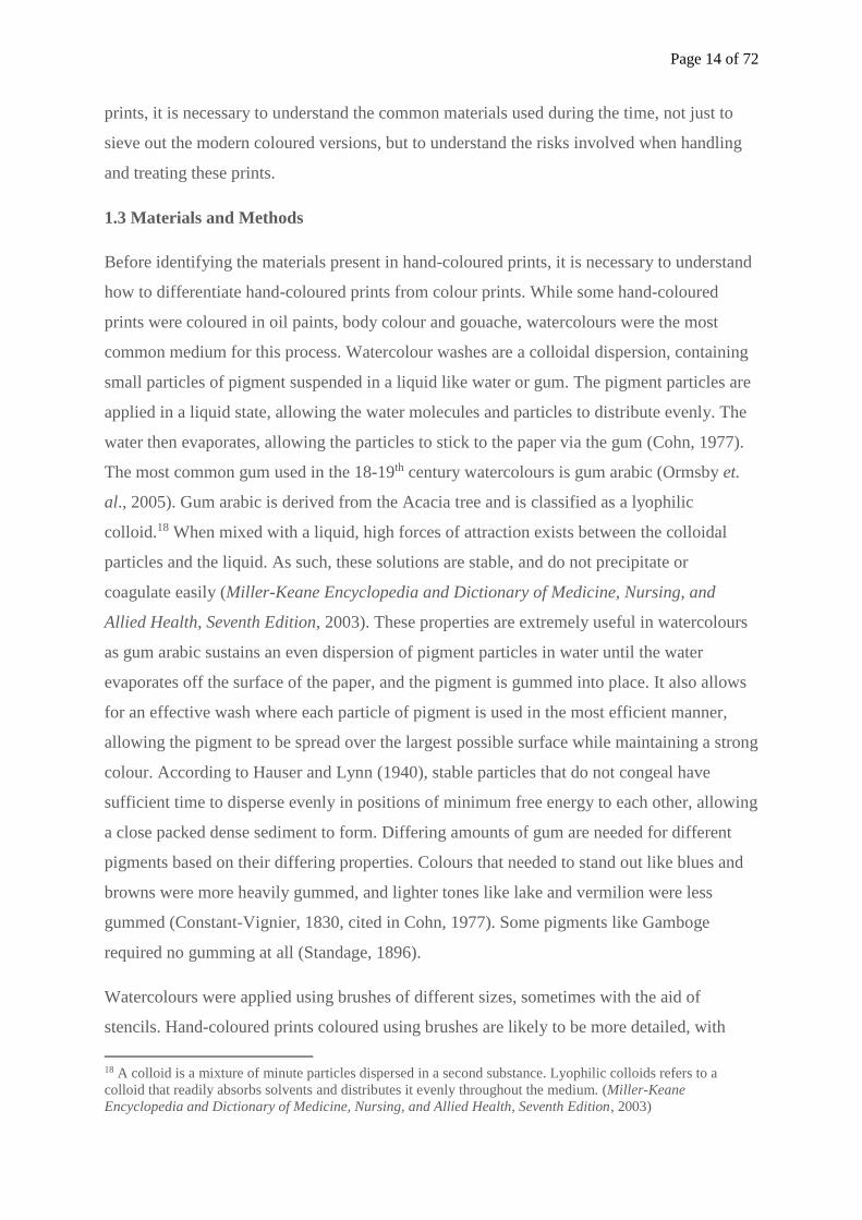
shadings, and flourishes. Marks bearing the appearance of brush strokes may also be seen
particularly along the edges of a colour (see figure 4). Hand-colouring executed using stencils
are usually done with flat colour, over larger areas. Its usage will reduce the presence of
brush strokes, making it slightly more difficult to identify hand-colouring (Gascoigne, 2011).
If a single colour across the print appears misaligned with the printed image, it can suggest
that a stencil has been used. Under magnification, pigment particles in watercolour washes
can often be seen to settle at the wet/dry interface, leading to a darker edge. Washes applied
by hand will often leave no areas of white in the painted area, unlike colour prints which
often exhibit uniform white dots of uncoloured paper. Hand-coloured washes often appear
uneven, where blobs of pigment have collected where the brush was lifted from the paper.
Certain layers of pigment may lie above the inked areas of the print, as well as other washes
(see figure 3). Occasionally, the watercolour may not have been precisely applied, leading to
the wash spilling over the printed image, or slightly missing the edge of the printed image
(see figure 3 and 4). Watercolour brushes were often made from red and brown sable hair
from the tail of the kolinsky (brown sable was considered superior prior to the twentieth
century), Siberian hair, and camel hair – both from the Russian squirrels’ tails (Cohn, 1997).
Figure 3 A close up image showing layers of washes applied by hand, as well as paint applied in a less-precise
manner, spilling over the printed lines. Henry Alken (1785-1851) Symptoms of coming from the Hunt, of Star
Gazing, Going to the Hunt, of an Elegant Writer, of Toasting an old Friend. Hand-coloured soft ground etching.
Published by Thomas McLean, London, 1822. ©Alnwick Castle, Northumberland.
Overlapping
washes
Paint applied
beyond the image
Page 16 of 72
Figure 4 A close up image showing brush strokes as well as paint applied beyond the print image. Henry Alken
(1785-1851) Moments of Fancy, not a bit of fancy, a bit of fancy, all fancy and whim, a political fancy, a
dangerous fancy. Hand-coloured soft ground etching. Published by Thomas McLean, London, 1822. ©Alnwick
Castle, Northumberland.
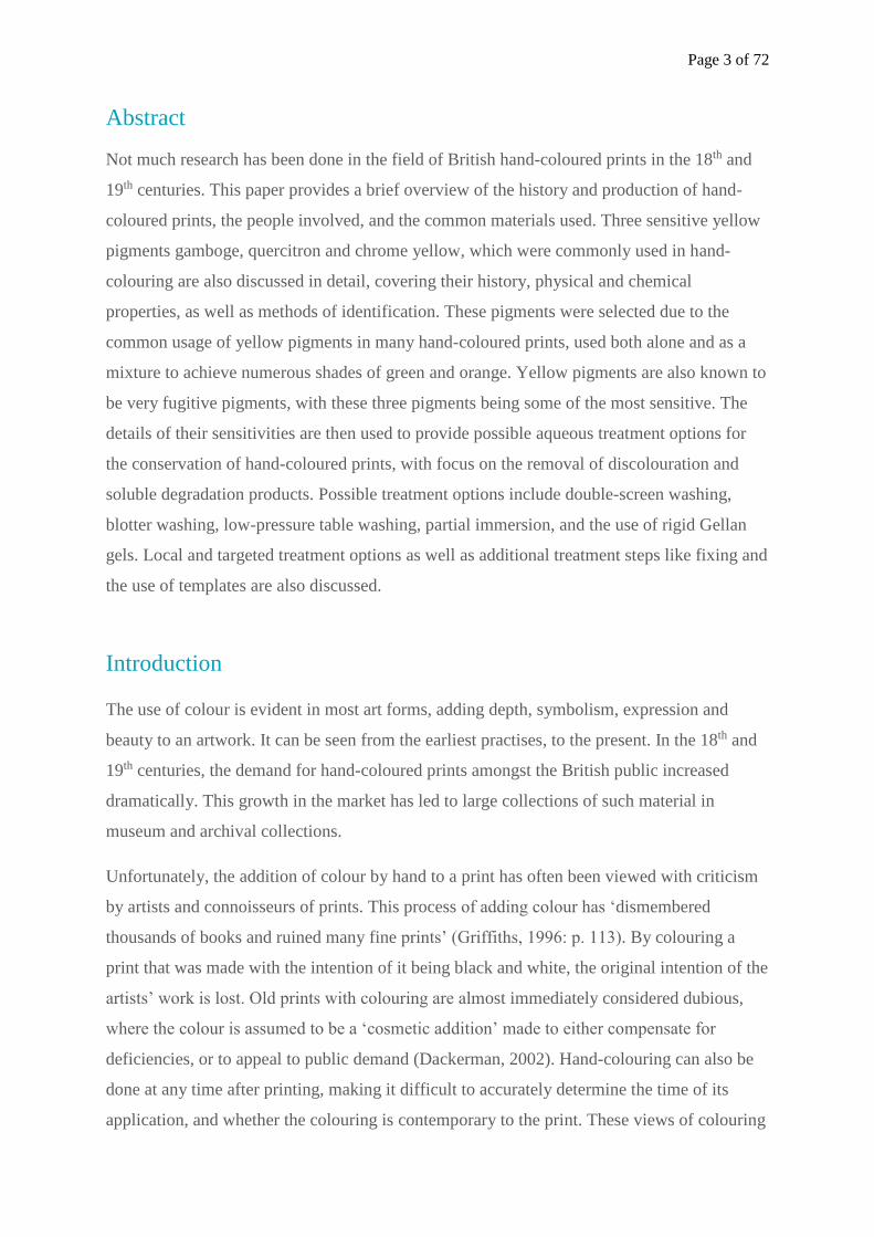
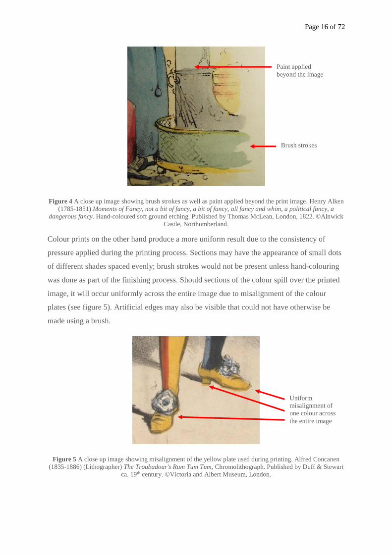
Colour prints on the other hand produce a more uniform result due to the consistency of
pressure applied during the printing process. Sections may have the appearance of small dots
of different shades spaced evenly; brush strokes would not be present unless hand-colouring
was done as part of the finishing process. Should sections of the colour spill over the printed
image, it will occur uniformly across the entire image due to misalignment of the colour
plates (see figure 5). Artificial edges may also be visible that could not have otherwise be
made using a brush.
Figure 5 A close up image showing misalignment of the yellow plate used during printing. Alfred Concanen
(1835-1886) (Lithographer) The Troubadour's Rum Tum Tum, Chromolithograph. Published by Duff & Stewart
ca. 19th century. ©Victoria and Albert Museum, London.
Brush strokes
Paint applied
beyond the image
Uniform
misalignment of
one colour across
the entire image
Page 17 of 72
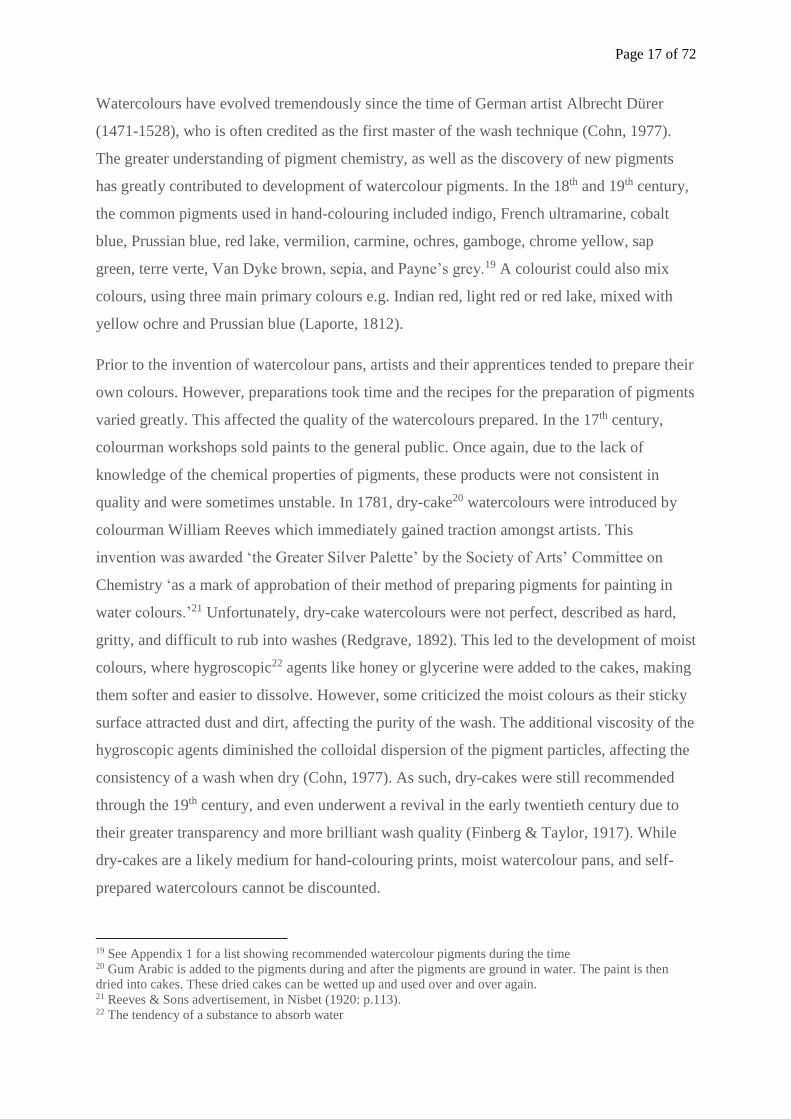
Watercolours have evolved tremendously since the time of German artist Albrecht Dürer
(1471-1528), who is often credited as the first master of the wash technique (Cohn, 1977).
The greater understanding of pigment chemistry, as well as the discovery of new pigments
has greatly contributed to development of watercolour pigments. In the 18th and 19th century,
the common pigments used in hand-colouring included indigo, French ultramarine, cobalt
blue, Prussian blue, red lake, vermilion, carmine, ochres, gamboge, chrome yellow, sap
green, terre verte, Van Dyke brown, sepia, and Payne’s grey.19 A colourist could also mix
colours, using three main primary colours e.g. Indian red, light red or red lake, mixed with
yellow ochre and Prussian blue (Laporte, 1812).
Prior to the invention of watercolour pans, artists and their apprentices tended to prepare their
own colours. However, preparations took time and the recipes for the preparation of pigments
varied greatly. This affected the quality of the watercolours prepared. In the 17th century,
colourman workshops sold paints to the general public. Once again, due to the lack of
knowledge of the chemical properties of pigments, these products were not consistent in
quality and were sometimes unstable. In 1781, dry-cake20 watercolours were introduced by
colourman William Reeves which immediately gained traction amongst artists. This
invention was awarded ‘the Greater Silver Palette’ by the Society of Arts’ Committee on
Chemistry ‘as a mark of approbation of their method of preparing pigments for painting in
water colours.’21 Unfortunately, dry-cake watercolours were not perfect, described as hard,
gritty, and difficult to rub into washes (Redgrave, 1892). This led to the development of moist
colours, where hygroscopic22 agents like honey or glycerine were added to the cakes, making
them softer and easier to dissolve. However, some criticized the moist colours as their sticky
surface attracted dust and dirt, affecting the purity of the wash. The additional viscosity of the
hygroscopic agents diminished the colloidal dispersion of the pigment particles, affecting the
consistency of a wash when dry (Cohn, 1977). As such, dry-cakes were still recommended
through the 19th century, and even underwent a revival in the early twentieth century due to
their greater transparency and more brilliant wash quality (Finberg & Taylor, 1917). While
dry-cakes are a likely medium for hand-colouring prints, moist watercolour pans, and self-
prepared watercolours cannot be discounted.
19 See Appendix 1 for a list showing recommended watercolour pigments during the time 20 Gum Arabic is added to the pigments during and after the pigments are ground in water. The paint is then
dried into cakes. These dried cakes can be wetted up and used over and over again. 21 Reeves & Sons advertisement, in Nisbet (1920: p.113). 22 The tendency of a substance to absorb water
Page 18 of 72
The convenience provided by watercolour pans led to the emergence of several well-known
artist suppliers including Winsor and Newton, Robersons, Rowney, Ackermann’s and
Reeves. Watercolours work especially well on paper, which was probably the reason behind
their popularity for hand-colouring prints. However, the most suitable properties in a paper
for watercolours are not necessarily the best properties for printing. For example, engraving
and etching require a softly sized23 paper, which would mould itself to the grooves of the
plate to pick up the printing ink. However, watercolours require highly sized paper to allow
the fluid to remain on the surface of the paper. As such, either a medium sized paper may
have been used during the printing process, or the paper was sized after printing, but before
colouring. Sizing may have been executed using gelatine and alum, or alum and rosin. When
papermaker James Whatman developed wove24 paper, its smoother surface made it ideal for
the use of watercolours. It quickly became popular for the printing of aquatints and
caricatures (Clayton, 1997). Ackermann was also known to have hand-coloured aquatint
plates printed on Whatman paper. Glazing was sometimes done on hand-coloured prints,
more commonly in the foreground to add depth to the work. This was done on sized paper to
prevent it from seeping through the paper. Glazing was most commonly done using gum
Arabic. In 1843, Ackermann published drawings by Charles and Karl Bodmer which
contained hand-colouring, finished with gum Arabic, in what was described to be a ‘truly
lavish book’ (Ford, 1983: pp. 125-126).
Before the 1840s, most papers were handmade using cotton and linen fibres from old rags,
with a rough25 finish, and heavily sized (Hunter, 1978). It is unlikely that a hand-coloured
print was produced on calendered or glossy papers due to the surface qualities needed for the
use of watercolours. After the 1840s, hand-coloured prints could have been produced on
either handmade or machine-made paper using rags, cotton fibre or wood pulp. Paper finishes
included rough, HOT26, and NOT27.
23 Size or Sizing is a water-resisting agent, such as a glue or gelatinous material added to paper, during
manufacture (engine sizing), or after the sheet is made (tub-sizing), to make the paper more or less impervious
to ink or moisture (Labarre, 1969: p. 245). 24 Wove paper is made using woven wire moulds. The paper surface is covered with a fine brass screening
which when left in the paper, would leave a distinct impression resembling fabric. It offers a smoother surface
than laid paper, which was more commonly used prior to the rediscovery of wove paper in 1750 (Hunter 1978:
p. 126-127). 25 Paper with a coarse surface, with larger and open grains (Krill, 1987) 26 To achieve a smooth finish, paper is placed between polished plates and subjected to the pressure of heavy
metal rolls. For an extremely smooth surface, these plates are heated in a steam-jacketed chamber before
pressing (Hunter, 1978: p. 450).
Page 19 of 72
Chapter 2: Yellow Pigments: A focus on Gamboge, Chrome Yellow,
and Quercitron
2.1 Why Gamboge, Chrome Yellow, and Quercitron
Yellow is one of the three primary colours, a necessity on the artists’ palette. As a pigment, it
is commonly used alone, as well as mixed with blue pigments to produce a large range of
greens, and red to produce orange. Yellow pigments are well known for being sensitive, often
fading over time when exposed to light, and fugitive in water, solvents, and changes in pH.
They are derived from several sources, including both natural, and artificial products. During
the 18th and 19th centuries, the following yellow pigments were at some point recommended
for use for water colouring: Yellow ochre (pre-history-present), Chrome yellow (1816-
limited use at present), Aureolin or Cobalt Yellow (1852-present), Indian Yellow (15th
century-1883), Lemon Yellow (1830-present), Naples Yellow (16th century-present),
Gamboge (17th century-limited use at present), Quercitron (Early 19th-early 20th century), and
Orpiment (Antiquity-19th century). The oldest of these pigments is yellow ochre, which was
used by the ancient Egyptians. The chrome, cadmiums and cobalt yellows were discovered
later in the mid-19th century.
With watercolours, the more durable, opaque pigments are less manageable, with larger
particles that remain on the surface of the paper. Conversely, the beautiful, delicate,
transparent colours with a strong capacity for washing, are the most fugitive (Gullick &
Timbs, 1859). It is natural for less informed individuals to have used these beautiful yet
fugitive colours, especially if they were affordable, and readily available. This section will
focus specifically on gamboge, chrome yellow, and quercitron, covering their discovery,
manufacturing process, characteristics, and working properties. These pigments are the focus
of this paper due to their extremely sensitives natures, coupled with their beauty, affordability
and ease of use, which contributed to their common usage during the time. Other pigments
commonly used for hand-colouring will be studied in future research.
The identification of pigments on hand-coloured prints provides not just an insight into the
common materials available during the time, but also the techniques, skills and concerns of
the colourists. Understanding the common materials available also provides more information
27 Referring to papers that are not hot-pressed, with a slightly rough and unglazed finish, produced by pressing
wet paper against itself (Bower, 1999: p. 128).
Page 20 of 72
to the conservator, allowing better understanding of the potential risks that may arise during
treatment. Unfortunately, it is extremely difficult to identify materials without contact or
sampling. Additionally, not many institutions or conservation studios have access to pigment
identification methods such as Raman Spectroscopy, Scanning electron microscopy with
energy dispersive X-ray spectroscopy (SEM/EDX), Fourier transform infrared (FTIR), High
performance liquid chromatography (HPLC) etc. While accurate identification is impossible
via visual observation, knowledge of materials combined with a basic idea of behaviours of
certain pigments can narrow down the possible range of pigments, allowing conservators to
make more informed treatment decisions.
2.2 Gamboge
2.2.1 History
Gamboge is an organic pigment derived from the plant kingdom. It is made from the gum
resin of various types of evergreen trees grown in South-East Asia, most notably of the genus
Garcinia. Once extracted, the resin would harden and be sold in lumps, cylinders or cakes,
yellowish brown on the outside and orange red on the inside (Riffault, Vergnaud, and
Toussaint, 1874). Gamboge was not often seen in Europe and Britain prior to the 1600s, and
was considered a novelty when the East India Company imported a batch in 1615 (Harley,
2001). While it has been listed as an oil colour), it is most often used in watercolour painting
due to its transparent nature, clear and bright colour, and ease of use (Church, 1890; Weber,
1923. De Massoul described Gamboge to be ‘a most beautiful yellow, easy to use, and
generally employed for water colours’ (1797: p. 146-147). It was also employed as a varnish
for decorative items including metals, woods, and leather (Winter, 1997).
Gamboge was recommended for use in several artist treatises throughout the 18th and 19th
centuries. In 1762, John Hoofnail recommended a tincture of gamboge for colouring prints. A
tincture of gamboge (also called extract) was prepared by precipitating the colouring matter
of gamboge in alcohol, giving the product a powdery texture that is miscible in oil, with
improved colour, and usable for glazing (Field, 1835). In 1844, Fielding recommended
gamboge as an ‘excellent water-colour’, ‘proper for mixing with other pigments’, ‘durable
itself’ while protecting other colours (1844: p. 48). It was also listed as one of twelve
pigments recommended to beginners.28 John Clark (1848) used gamboge in his work and
28 ‘To the beginner, we would venture to recommend, in his first attempts, not more than ten or twelve – as
yellow ochre, gamboge, Indian yellow, burnt sienna, venetian red, lake, Vandyke brown, brown, pink, indigo,
Page 21 of 72
suggested it in his treatise for drawing and painting in water-colours. Even in 1904, Gamboge
was still listed as a watercolour, and was one of three yellows listed by Mary Breakell
recommended for student-use due to its affordability. It was listed in Reeves and Sons’s 1853
catalogue, Winsor and Newton’s 1840s catalogues, Rowney’s 1850s catalogues, and
Roberson and Co.’s recipe book (c. 1860s).
2.2.2 Working Properties
Gamboge is reportedly easy to prepare, requiring little to no additives. Clark described a
lump of gamboge to possess ‘all the qualities required’ to produce colour (1807: p. 9). It dries
well and can be used with other colours (Standage, 1896). It was used on its own to produce a
bright, transparent yellow, or mixed with blues like Prussian blue and Indigo for green, or
burnt sienna for orange. It was also painted over white pigments. It has a refractive index of
1.58.
While recommended by many authorities including Field (1835) in the early to mid-19th
century, it was later condemned, mostly due to issues with its lightfastness. Gamboge was
described by Standage to vary in permanence, ‘somewhat fugitive under certain
circumstances’, and ‘occasionally darkens in tone’ (1891: pp. 29-30). He also described
Hooker’s Green, a pigment comprised of a mixture of gamboge and Prussian blue to be ‘not
permanent but very serviceable’ (1891: p. 36). Muckley listed it ‘in the second order or
permanence’, which changes when used alone or combined with other colours (1893: p. 37).
A report on the action of light on watercolours by Russell and Abney also listed gamboge as
‘a colour that faded but did not entirely disappear’ when exposed to light (Russell and Abney,
1888 in Standage, 1891: Appendix A).
2.2.3 Physical and Chemical Properties
Gamboge is composed of approximately 15-25% water-soluble, carbohydrate based gum, and
70-80 percent resin, which is soluble in organic solvents. Small amounts of esters,
hydrocarbons, wax, ash residue, and vegetable detritus have also been reported (Dieterich,
1901; Winter, 2008). However, the exact quantities of these components differ greatly based
on the source and variety of the gamboge. The resin in gamboge is composed mainly of
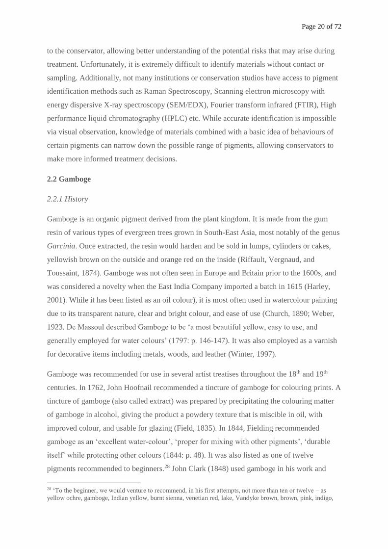
gambogic acid (C38H44O8) (see figure 6), which imparts the yellow-orange colour in the resin.
cobalt, and raw umber; after a degree of facility has been acquired with these, the list may be enlarged’
(Fielding, 1844: p. 11).
Page 22 of 72
It also contains a carboxylic acid group, forming soluble salts with alkali. The phenolic
groups present in the resin leads to a colour change from yellow to orange when an alkali
hydroxide is added (Winter, 1997). Gamboge is also known to darken when exposed to
ammonia, and can be bleached in strong heat (Ibid.).
2.2.4 Methods of Identification
Gamboge under visible light appears as a bright, clear, translucent yellow. The gambogic acid
present in gamboge possesses an amorphous structure, allowing dispersions of gamboge in
water to be finely divided. This characteristic is seen under magnification on paper as a
yellow stain on the paper fibres. Gamboge absorbs strongly under ultra-violet fluorescence,
appearing a dark brown colour. Under infrared reflectography, gamboge transmits, appearing
translucent. Using false-colour infrared photography, gamboge appears as a very pale
yellow.29 Gamboge can also be identified using instrumental methods of analysis like FTIR,
Raman spectroscopy, and thin-layer chromatography.
29 See Appendix 5 for a table showing properties of gamboge in visible light, UVF, IRR, and FCIR.
Figure 6 Chemical Structure of Gambogic acid
O
O O O
O
O
O
O
Page 23 of 72
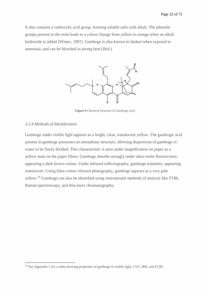
Figure 7 A close up of suspected gamboge pigment; photomicrograph at 20x magnification showing
translucent, stain-like appearance of the pigment in the paper fibres in Theodor Friedrich Ludwig Nees von
Esenbeck, Lithographed by H. von Arnz and A. Henry, Verbascum Thapsiforme Schr, (1828-1833) Hand-
coloured lithograph, ©Burt Hall Archive, Northumbria University, Newcastle-upon-Tyne.
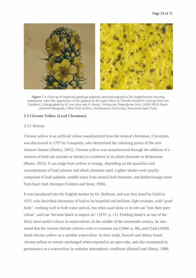
2.3 Chrome Yellow (Lead Chromate)
2.3.1 History
Chrome yellow is an artificial colour manufactured from the mineral chromium. Chromium
was discovered in 1797 by Vauquelin, who determined the colouring power of the new
element chrome (Harley, 2001). Chrome yellow was manufactured through the addition of a
solution of lead salt (acetate or nitrate) to a solution of an alkali chromate or dichromate
(Bearn, 1923). It can range from yellow to orange, depending on the quantities and
concentrations of lead solution and alkali chromate used. Lighter shades were usually
composed of lead sulphate, middle tones from neutral lead chromate, and darker/orange tones
from basic lead chromate (Gettens and Stout, 1966).
It was introduced into the English market by Dr. Bollman, and was first listed by Field in
1835, who described chromates of lead to be beautiful and brilliant, light resistant, with ‘good
body’, working well in both water and oil, but when used alone or in tint can ‘lose their pure
colour’, and can ‘become black in impure air’ (1835: p. 11). Fielding listed it as one of the
thirty most useful colours in watercolours. In the middle of the nineteenth century, he also
stated that the various chrome yellows were in common use (1844: p. 48), and Clark (1848)
listed chrome yellow as a suitable watercolour. In their study, Russell and Abney found
chrome yellow to remain unchanged when exposed in an open tube, and also mentioned its
permanence as a watercolour in ordinary atmospheric conditions (Russell and Abney, 1888,
Page 24 of 72
cited in Standage, 1891: Appendix A). It was present in Winsor & Newton, Rowney and
Reeves artist catalogues since 1835, and was still listed in Weber and co.’s 1923 catalogue. It
was an affordable pigment, often sold at 1s per cake.
2.3.2 Working Properties
Chrome yellow is a brilliant yellow with good covering power due to its high refractive index
of 2.3-2.7 and good tinting strength (Kühn and Curran, 1986). It was used alone, as well as
mixed with Prussian blue for green cinnibar and chrome green. Chrome yellow was not often
recommended due to its chemical properties which will be mentioned shortly, but also due to
its brilliancy, which has been described to ‘not accord with the modest hues of nature, nor
harmonise well with the sober beauty of other colours’ (Field, 1835: p. 77).
Various authorities discounted the use of chrome yellow, citing its inability to work well with
other pigments, tendency to blacken, and poor lightfastness. Chrome yellow was said to
severely damage other pigments, especially Prussian and Antwerp blues (Field, 1835; Taylor,
1887). The lead content of the pigment causes discolouration when exposed to sulphurous
gases, compounds, and pigments of organic origin like Lakes, Indigo, Gamboge, etc. Breakell
(1904) recommended that chrome yellows should be completely avoided for use in water-
colouring.
2.3.3 Physical and Chemical Properties
Chrome yellow refers to pigments composed of lead chromate or lead chromate sulphate. The
ASTM Standard identifies three main chrome yellow pigments: primrose yellow contains a
minimum of 50% PbCrO4, Lemon Yellow (or Light) contains a minimum of 65% PbCrO4,
and Medium contains a minimum of 87% PbCrO4 (American Society for Testing and
Materials, 1977). Other constituents of the pigment include lead sulphate, lead carbonate, and
lead phosphate. Other additives or extenders30 such as china clay and diatomaceous earth may
also be added (Kühn and Curran, 1986).
The monoclinic crystalline structures of chrome yellow are known to darken and turn brown
over time due to a photochemical reaction by visible and ultra-violet radiation (Weber, 1923;
Kühn & Curran 1986). This darkening also occurs in the absence of oxygen and moisture,
and in the presence of hydrogen sulphide (Church, 1890). When mixed with organic
30 Extenders are inert, colourless or white body used to diffuse or dilute pigments, especially those with high
tentorial strength, making them more economical to produce (Gettens and Stout, 1966).
Page 25 of 72
pigments, chrome yellow may adopt a greenish tone, attributed to the reduction of chrome to
chromium oxide. The addition of alkali will also cause chrome yellow to transform into red
basic lead chromate.
2.3.4 Methods of Identification
Chrome Yellow under visible light is a brilliant, opaque yellow. The particles in chrome
yellow are extremely fine and opaque and may appear under magnification as a thin layer of
fine particles on the paper surface. Chrome yellow absorbs strongly under UV, appearing a
dark brown colour. Under IRR, chrome yellow transmits, appearing transparent. In FCIR,
chrome yellow appears as a pale yellow. Chrome yellow can also be identified using
instrumental methods of analysis like X-ray diffraction and Infrared Spectroscopy.
2.4 Quercitron
2.4.1 History
Quercitron is a yellow dye derived from the inner bark of a group of oak trees known as
Quercus velutina in North America. It was introduced to England by Dr Edward Bancroft in
1775, but was only used as a pigment for painting approximately fifteen years after its
introduction (Harley, 2001). Quercitron was often put forward as the most durable of the
yellow lakes (Field, 1835; Martel, 1859; Salter, 1869; Church 1890). A lake is prepared by
precipitating organic extracts on mineral bases like aluminium of the oxides. The
recommended white earth for fixing lakes was the white precipitate of alumina. (Taylor,
1887). Quercitron Lake was thus manufactured by extraction from the bark with water, the
addition of alum, followed by precipitation with salt (Gettens & Stout, 1966).
Quercitron was used throughout the nineteenth century, and was sold under a variety of
names including yellow carmine, Italian pink, brown pink, Dutch pink, English pink, and
yellow lake (Taylor, 1887; Clarke, 2009). Quercitron was first mentioned by name by Field,
who described it as ‘a beautiful yellow colour’ when ground (1835: p. 84). Smith (1827) used
both Italian pink and brown pink in his treatise, although it is not clear if these were derived
from the bark of the black oak tree. It was also listed (under English and Dutch pink) as one
of the most employed yellows in a water-colour treatise published in 1843 (The Hand-book of
the elements of painting in water colours, 1843). Standage described it to be a bright,
transparent yellow that is ‘fairly durable when pure’ (1896: p. 43). In 1801, a treatise on
Ackermann’s watercolours listed Ackermann’s Yellow, described to have a beautiful and rich
Page 26 of 72
colour, similar to the tint of gall-stone (Ackermann, 1801). Harley (2001) suggests that this
pigment may have been quercitron due to the similar description. Yellow lake and Italian
pink were listed in the earliest Winsor & Newton, Rowney, and Reeves’s catalogues.
2.4.2 Working Properties
Quercitron is a bright, transparent yellow. It was often used alone or combined with other
yellows to ‘add richness and depth’, and good as a glaze or finishing colour (Field, 1835:
p.84). It was easy to use and could be bought ready prepared. Quercitron could also be mixed
with Prussian blue to produce olive green (The Hand-book of the elements of painting in
water colours, 1843). Yellow lakes were not usually recommended for use due to its non-
permanent qualities. Field (1835) categorised Quercitron Lake as a pigment that altered under
the action of light, oxygen and pure air. Standage believed that all lakes ‘should be used with
caution and looked upon with suspicion (1896, p.43).’ However, Quercitron must have still
been in use in the late nineteenth, and early twentieth century as Breaknell (1904: p. 19) listed
‘Yellow pinks, Dutch, English and Italian, Brown Pink, &C.’ as colours that should be
avoided in water-colour work.
2.4.3 Physical and Chemical Properties
The colouring constituent of Quercitron is quercetin (C15H10O7) (see figure 8). Under
magnification, it appears a light, greyish yellow which changes into a fine yellow upon the
addition of alum. Quercitron is soluble in water and alcohol, sensitive to acids and alkalis,
and light fugitive (Brill, 1980). It decolourises in the presence of acid, and turns yellow-
brown with alkalis (Brill, 1980; Gettens & Stout, 1966).
OH
O
O
HO
OH
OH
OH
Figure 8 Chemical Structure of Quercetin
Page 27 of 72
2.4.4 Methods of Identification
Quercitron is a bright, translucent colour under visible light. The fine particles of the pigment
allow it to penetrate the fibres of the paper, appearing as a yellow stain under magnification.
It fluoresces yellow under UV, transmits in IR appearing transparent, and appears a very pale
yellow in FCIR photography. Quercitron can also be identified using instrumental methods of
analysis such as HPLC.
2.5 Summary of the sensitivities of Gamboge, Chrome Yellow and Quercitron
Gamboge Chrome Yellow
(Lead Chromate) Quercitron
Light Poor - Fades Poor – darkens and
turns brown Poor - Fades
Organic Solvents31
(e.g. IMS, acetone,
etc.)
Resin component is
highly soluble Stable Soluble
Alkali Colour change to
orange-red
Soluble – colour
change to red
Colour change to
yellow-brown
Water
Gum component
soluble in water,
leading to possible
strikethrough of
pigment
Insoluble
Soluble in hot water
Insoluble in cold
water
Weak acids Insoluble Insoluble Decolourises
Inorganic acids Insoluble Soluble Decolourises
Table 1 Sensitivities of Gamboge, Chrome Yellow and Quercitron
2.6 Limitations
Unfortunately, visual examination coupled with technical analysis cannot provide completely
accurate results. The type and quantity of the medium, the size of the pigment particles, and
the external conditions the print was exposed to all contribute to altering the appearance of a
pigment. In addition, many yellow colourants display similar behaviours under UV, IR, and
31 Organic solvents are compounds that have at least 1 carbon atom and 1 hydrogen atom. Organic solvents can
dissolve oils, fats, resins, etc.
Page 28 of 72
FCIR. It is therefore necessary to pair this information with the provenance of the artwork,
and to weigh all sensitivities and risks of the pigments prior to treatment.
Chapter 3: The Aqueous Treatment of hand-coloured prints
containing sensitive yellow pigments
3.1 Common types of damage seen on hand-coloured prints
In the eighteenth and nineteenth centuries, it was common for hand-coloured prints to be
collected and bound into folios, thereby keeping them in relatively stable environments, away
from light and other atmospheric pollutants. However, as mentioned in chapter 1, many such
prints were used for decorative purposes, exposed for long periods of time to the elements,
leading to physical and chemical damage.
The common types of damage associated with prints include (but are not limited to)
discolouration, tears, abrasions and losses due to physical damage, the accumulation of
surface dirt and other accretions that affect the visual integrity of the print, the build-up of
brown spots due to mould or metal particles embedded in the support, and planar distortions
of the support. The degradation and discolouration of paper are caused by external factors
such as prolonged exposure to heat, light, air pollutants, and moisture. One of the main
causes of discolouration is caused by photo-oxidation, when light, in the presence of oxygen
causes oxidation of the components of paper, leading to the formation of carbonyl and
carboxylic acid groups attached to the cellulose chain. This increases the number of
conjugated double bonds, which absorb light in the visible region, causing discolouration
seen in oxidised paper (Daniels, 1988). Oxidation also occurs during the natural ageing of
paper (auto-oxidation), and can be accelerated by hydrolysis, where the cellulose molecules
of the paper break in the presence of water, leading to shortened cellulose chains which
results in the embrittlement of paper. Gaseous pollutants like sulphur dioxide and nitric
oxides form acids in the presence of moisture and oxygen. These pollutants increase the
acidity of paper, thereby increasing the rate of acid hydrolysis and/or catalysing oxidation
(Banks, 1989). Internal factors of the paper like sizing and bleaching also contribute to the
degradation of paper. A by-product of the degradation of the alum used in sizing is sulphuric
acid, contributing to acidic build up in the paper. Oxidative bleaching during the
Page 29 of 72
papermaking process forms carboxyl groups which also contribute to the acidic build up in a
paper (Hey, 1979). Excess acidity in paper is considered to be the main factor of paper
decomposition (Daniels, 1980).
The common types of damage the watercolour medium may experience include loose and
friable media due to physical damage of the object, instability in the media leading to flaking
or friability due to changes in relative humidity (RH), sigmoid cracks caused by poor storage
and handling i.e. flexing or rolling an object, and cracking in pigment due to high pigment
volume concentration (HPVC) and deterioration of the binder. Many of these issues are more
commonly seen in thicker areas of paint, or gouache.
3.2 Possible issues of aqueous treatment of hand-coloured prints
Different types of paper react differently to the introduction of water due to various factors,
including the type of paper, level of degradation, size, and structure (Keyes, 1994). Hand-
coloured prints will mostly consist of medium weight, sized paper, made from cotton and
linen fibres, or wood-pulp. Prints that were poorly stored and handled would have
experienced some form of degradation mentioned above. Degraded papers tend to absorb
water unevenly across the sheet. More degraded areas will absorb water faster, as cellulose
chain scission caused by oxidation and hydrolysis produced more hydroxyl sites in those
areas, attracting water molecules. Degradation of the size in the paper can also occur due to
mechanical and biological damage, this may not occur evenly across the paper, contributing
to the uneven wetting of a paper. Un-sized areas will absorb water quickly, which can lead to
damage to the media, and distortions in the paper.
The stability of pigment during treatment is affected not just by their molecular and electronic
structures, but by their manufacturing constituents including the binding agent and other
additives (Daniels, 1995). In the case of hand-coloured prints from the 18th and 19th centuries,
the binding agent is likely to be gum Arabic, and humectants likely honey, sugar, and
glycerol are also likely constituents of the media. These additives are potentially water-
soluble. Aged gum Arabic is known to swell in water during treatment, but is less likely to
completely dissolve due to ‘the irreversible loss of water, and aggregation of polymer chains’
(Daniels, 1995: p. 31). Watercolours are also known to be less soluble with age (Daniels,
1995). Gamboge, Chrome Yellow and quercitron are extremely sensitive pigments, and
treatment should be planned to protect their vulnerabilities.
Page 30 of 72
Before discussing the possible conservation techniques that may be suitable for hand-
coloured prints containing fugitive pigments like gamboge, chrome yellow and quercitron, it
is necessary to reiterate the importance of maintaining the integrity of the object.
Conservation treatment should ensue with the aim of improving the long-term stability of the
object while preserving the essential characteristics of the paper and media. Aqueous
treatments cause irreversible changes to the support and media of an object. No two prints
will react exactly the same way during treatment, it is up to the conservator to determine the
best treatment method for a particular object, through a thorough assessment of the risks and
benefits involved.
3.3 Conservation treatment of hand-coloured prints
Conservation treatments commonly adopted for the treatment of prints include surface
cleaning, humidification and washing, alkalisation, consolidation, and repair. Other
treatments like backing removal or adhesive removal may also be necessary depending on the
needs of the print. This chapter will examine the suitability of frequently used aqueous
conservation treatments for the treatment of hand-coloured prints containing sensitive yellow
pigments. It will cover the risks and benefits of each treatment, and provide recommendations
for practice.
3.3.1 Removal of surface dirt
Before commencing any form of aqueous treatment, it is first necessary to remove any
foreign particles from the surface of the artwork. These particles can include dust, dirt, insect
excrement, mould spores, or other surface deposits, which can disfigure, obscure, abrade,
cause stains, and increase acid levels in paper due to the metallic impurities in dust and dirt
that can be converted via hydrolysis into sulphuric or nitric acid (Paper Conservation
Catalogue, 1992). The removal of these degradation material is strongly recommended prior
to aqueous treatment which can drive these particles further into the interstices of the paper,
preventing later removal.
As with all conservation treatments, the method of treatment should be considered based on
the nature of the object at hand. Surface cleaning has its risks and can cause altercations in an
object such as planar distortions, abrasions, tears and losses, and roughening and lifting of
paper fibres. For example, severely degraded or fragile papers cannot withstand the abrasive
nature of certain surface cleaning methods like erasers, or vulcanised rubber sponges. In the
Page 31 of 72
case of hand-coloured prints, a soft brush is recommended to remove loose dirt across the
entire print followed by grated eraser using gentle motions while avoiding areas with media
to prevent any losses of pigment. It is for the conservator to decide if the type, stability,
strength and level of deterioration of the paper can withstand surface cleaning with the grated
eraser. Special care should be taken around tears and losses to prevent further damage.
3.3.2 Removal of discolouration, staining, and other soluble degradation products
While visual examination and technical analysis make it possible to infer the possible
reactions the media and support will have when exposed to the various solutions and solvents
involved in conservation treatment, it can never be done with absolute surety. Prior to
aqueous treatment, the support and media should undergo spot testing with the proposed
treatment solutions to ensure the object can withstand interventive treatment. Spot testing
should be carried out in discreet areas, and all varying states of deterioration in the media and
support of the print should be tested. Attributes like age (mentioned above) may influence the
response of watercolours, where suspected quercitron, chrome yellow, and gamboge
pigments may not react as expected during spot testing. Treatment should however continue
with caution.
Severely degraded prints would benefit from washing and alkalisation treatments to remove
harmful soluble degradation products and water-soluble pollutants, thereby improving the
aesthetic and long-term stability of the print. Washing can also improve the strength and
flexibility of paper by rehydrating and regenerating fibre-to-fibre bonding (Cumming &
Colbourne, 1998). Alkalisation also aims ‘to convert the paper from an acidic to an alkaline
condition’ (Hey, 1979: p. 66).’ Unfortunately, hand-coloured prints are exposed to numerous
risks when undergoing such treatment. The watercolour pigment on the prints are susceptible
to changes in colour, and surface qualities (Cook & Mansell, 1981). Paint applied in thicker
layers are also vulnerable to solubility, as well as swelling during treatment (Maynor, 1993).
Prints containing yellow pigments like gamboge, quercitron and chrome yellow are extremely
sensitive, reacting to organic solvents, water and alkali, all of which are common solutions
introduced during aqueous conservation treatments. The following materials and techniques
aim to provide the conservator with greater control over moisture during treatment, to allow
aqueous treatment to continue in the presence of such sensitive media.
Page 32 of 72
3.3.3 Fixing fugitive pigments
Prior to beginning aqueous treatment, fixing via the creation of a film over the media can be
done to protect the media against water, reducing the loss of sensitive pigments. Gamboge
and quercitron, are sensitive to organic solvents like IMS, acetone and xylene, common
solvents used in conjunction with fixatives like Paraloid B72, and Klucel-G, which are
therefore not recommended for use during the treatment of such prints.
Cyclododecane is a ‘waxlike hydrocarbon material’ which can be used as a temporary
fixative (Brückle et. al., 1999: p. 162). It can be evenly applied in a thin layer over the media
as a hot melt using a heated spatula due to its low melting point. It is non-toxic, requires no
solvents, and sublimates at a rate of 0.03mm per 24 hours (Hangleiter, Jägers, and Jägers,
1995, in Bluher, Haberditzl, and Wimmer, 1999). It should be applied on both sides of the
paper, using a light box. Care must be taken during treatment as dimensional changes
between the film and the paper can cause small cracks in the film, allowing water to penetrate
the media. Wrinkles and tensions can also be observed around the film after treatment which
can be relaxed after light introduction of moisture (Bluher et al, 1999). Application should be
done with care to reduce producing a ‘halo’ effect around the media, caused by the fixative
being applied beyond the media, preventing the area from undergoing aqueous treatment,
trapping discolouration and degradation products. This treatment is a suitable option for
prints with small areas of gamboge or quercitron, or even other water-sensitive watercolours.
Past studies have shown the use of cyclododecane to be more effective on thicker papers with
sizing, which correspond to the papers used in earlier hand-coloured prints (Brückle, Nichols,
and Strickler, 1999).
3.3.4 Humidification prior to washing
Humidification introduces moisture to the paper and medium evenly, and slowly, in a
controlled manner, also making the paper more responsive to subsequent aqueous treatments
(Bruckle and Banik, 2012). Humidification treatment is also beneficial to prints with uneven
sizing due to degradation, allowing size and un-sized areas to absorb water at a similar rate
during washing. When a paper is wetted before washing, discoloured material will be rapidly
released on immersion, making treatment more effective (Hey, 1979). Humidification is
beneficial to hand-coloured prints, especially those with thickly applied pigment, controlling
the expansion and contraction of the paper, thereby reducing stress that may lead to the
dislocation of media (Kosek, 2012). Humidification also relaxes the paper, removing
Page 33 of 72
distortions which in turn allow a more even wetting during treatment. Care should be taken
during humidification treatment to avoid physically touching areas with pigment due to the
swelling of the binding agent, which may cause changes to the surface of the media.
Humidification must be done prior to double-screen washing, partial immersion, and low-
pressure table washing.
The use of a humidification chamber is recommended for the treatment of hand-coloured
prints. This can be created using photographic trays and a sheet of Perspex as a cover. An
ultrasonic humidifier can serve as a source of moisture with the print positioned away from
the tube to prevent condensation from dripping onto the print. The RH should be maintained
around 80%. The print should be supported on a sheet of Reemay/Bondina of similar texture
to prevent contact with the artwork. Hand-coloured prints can also be humidified using a
dahlia spray or ultrasonic humidifier without a chamber. While a slightly more aggressive
method of humidification, it allows the introduction of moisture quickly, but gently using a
very fine mist. This allows the print to begin washing treatment quickly. Such a course of
treatment may be undertaken due to the sensitivities of the pigments involved, where the
prints should not be exposed to elevated levels of humidity for long periods of time
(Gamboge). The verso of the prints should be checked regularly to ensure no strikethrough of
the pigment occurs. Wetting agents like IMS should be avoided due to the sensitivities of the
pigments in question (Gamboge and Quercitron).
3.3.5 Methods of washing and alkalisation
Washing and alkalisation treatment can expose the media and support of the hand-coloured
print to numerous risks, including irreversible changes to the support, leading to changes in
colour, tone, opacity, thickness, texture, loss of sizing, fillers, coatings and additives, and
changes in the dimensions of the paper (Paper Conservation Catalog, 1990; Paper
Conservation Catalog, 1985). Sensitive media can respond adversely to the introduction of
water and alkali, leading to changes in colour, bleeding, loss, and strikethrough. The need to
treat such sensitive objects have led to the development of several less aggressive methods of
washing and alkalisation to reduce the possibility of pigment migration during treatment.
These include double-screen washing, blotter washing, washing using the low-pressure table,
partial immersion, and the use of rigid Gellan gels. While these methods are less effective
than immersion washing, they are safer, offering more control (Kijima, et. al., 2007).
Page 34 of 72
However, the risks of bleeding and loss of sensitive pigments still remain, and discretion is
needed to decide the suitability of each type of treatment with the object at hand.
The use of double-screen washing is suitable for prints with thick layers of paint, and/or
prints on more brittle supports, with multiple tears and losses. This technique allows the print
to be fully supported from the beginning, to the end of treatment. It also allows easy removal
during aqueous treatment should anything adverse occur. Two washing screens larger than
the print are placed screen-to-screen in a photographic tray. Weights are placed over the trays
to secure the screens. The water level is then brought up to the bottom of the top screen, and
air pockets removed using a syringe. The humidified print is then placed on the screen.
Washing using this method should only be used for prints containing non water-soluble
pigments, or pigments that have been fixed. Alkalisation using this method should not be
attempted on prints containing gamboge, quercitron or chrome yellow that have not been
fixed as bleeding, loss, and changes in colour will occur.
Blotter washing is a less aggressive method, suitable for discoloured prints with soluble
media, also providing support for physically damaged prints. An open blotter wash is
recommended instead of the sandwich technique to avoid contact the blotter and the pigment
which could lead to damage. Blotter washing utilises capillary action to draw discolouration
from the support. Two damp sheets of blotter larger than the print are placed at the bottom of
a tray. The blotter should be slightly less damp than the print, allowing it to draw moisture
and discolouration from the print. These should be covered by a sheet of Reemay/Bondina of
similar texture, and the print laid over it. The tray will then be covered using a sheet of
Perspex, preventing the object from drying out. If necessary, the object should be re-
humidified. The print should be observed throughout treatment, as the blotter absorbs
discolouration, a new damp blotter should replace it. An even contact between the object and
the blotter is necessary to reduce the formation of tidelines. May be a suitable treatment
option for prints containing quercitron and chrome yellow.
The low-pressure table is a washing method that applies suction to direct the flow of water
and other aqueous solutions through the object. The supported (by screen or
Reemay/Bondina) humidified print is placed over an absorbent material on the low-pressure
table, and the desired moisture is introduced in a controlled manner using a spray, brush or
dropper. The low-pressure table is a suitable method which also allows for targeted, localised
treatment (Weidner, 1974). The sensitive areas of the print are masked using Reemay and
Page 35 of 72
Melinex, and water and alkali can be introduced to non-sensitive areas of the print. Care must
be taken to ensure the print is fully humidified during treatment to prevent cocking or creases
formed due to uneven drying on the low-pressure table. This method can be used for the
washing and alkalisation treatment of prints containing gamboge, quercitron and chrome
yellow, provided the sensitive areas are masked during treatment, and the introduction of
aqueous material is properly controlled, minimising the risks of lateral movement of such
material into the sensitive areas of the object. Possible strikethrough of pigment should also
be closely monitored.
Partial immersion is a washing method that uses the high surface tension of water to allow
full immersion of stable areas of a print, while keeping the sensitive areas afloat. The
humidified print is float washed in a bath over a support of Reemay, with the area to be
submerged placed closest to the body. Using a brush, a water line is drawn along the object,
defining the area to be submerged. The edges of the support are then pushed gently into the
bath while keeping the print afloat, allowing it to become fully saturated. The area of the
object that is to be submerged is then gently pushed beneath the waterline, using a brush or
fingertips. Prior to removal, the edge of the water should be feathered out to prevent the
formation of tidelines. The print should then be lifted out appropriately without allowing the
water to flood the non-submerged areas of the object. Once again, alkalisation should not be
attempted on prints containing gamboge, quercitron or chrome yellow using this method
unless fixed as bleeding, loss, and changes in colour will occur. Short wash cycles of 15
minutes with rapid drying can also be considered with this option to reduce prolonged high
levels of humidity to prevent strikethrough of gamboge.
In recent years, more studies have been undertaken regarding the treatment of works of art on
paper using rigid aqueous Gellan gels32, an aqueous treatment method that can be used on
papers with sensitive media (Iannuccelli & Sotgiu, 2010; Möller, 2014; Sullivan, et al, 2014).
The gel removes soluble degradation products via capillary action. The Gellan gum gel is
prepared in concentrations of 1-4% in water, depending on the absorbency of the paper
(Möller, 2014). The dispersion is then heated to boiling point using a microwave, and poured
into a basin to cool, and form into a gel. The print should be treated from the verso, where the
gel is placed on a sheet of Perspex, an interweaving layer of Japanese paper with similar
surface qualities to the print is placed over the gel, and the print placed recto-up over the
32 Rigid aqueous Gellan gels are a microbial exopolysaccharide that allows a constant and controlled release of
water onto the paper (Iannuccelli & Sotgiu, 2010: p. 25).
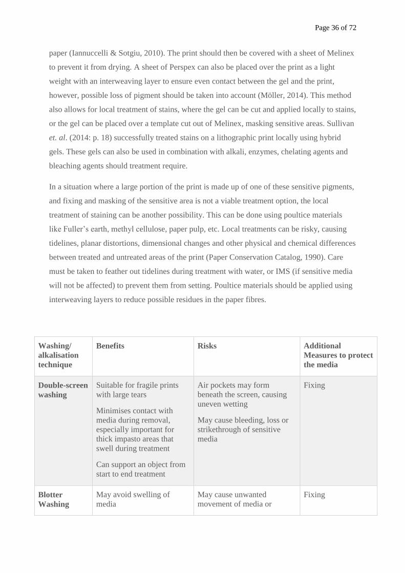
Page 36 of 72
paper (Iannuccelli & Sotgiu, 2010). The print should then be covered with a sheet of Melinex
to prevent it from drying. A sheet of Perspex can also be placed over the print as a light
weight with an interweaving layer to ensure even contact between the gel and the print,
however, possible loss of pigment should be taken into account (Möller, 2014). This method
also allows for local treatment of stains, where the gel can be cut and applied locally to stains,
or the gel can be placed over a template cut out of Melinex, masking sensitive areas. Sullivan
et. al. (2014: p. 18) successfully treated stains on a lithographic print locally using hybrid
gels. These gels can also be used in combination with alkali, enzymes, chelating agents and
bleaching agents should treatment require.
In a situation where a large portion of the print is made up of one of these sensitive pigments,
and fixing and masking of the sensitive area is not a viable treatment option, the local
treatment of staining can be another possibility. This can be done using poultice materials
like Fuller’s earth, methyl cellulose, paper pulp, etc. Local treatments can be risky, causing
tidelines, planar distortions, dimensional changes and other physical and chemical differences
between treated and untreated areas of the print (Paper Conservation Catalog, 1990). Care
must be taken to feather out tidelines during treatment with water, or IMS (if sensitive media
will not be affected) to prevent them from setting. Poultice materials should be applied using
interweaving layers to reduce possible residues in the paper fibres.
Washing/
alkalisation
technique
Benefits Risks Additional
Measures to protect
the media
Double-screen
washing
Suitable for fragile prints
with large tears
Minimises contact with
media during removal,
especially important for
thick impasto areas that
swell during treatment
Can support an object from
start to end treatment
Air pockets may form
beneath the screen, causing
uneven wetting
May cause bleeding, loss or
strikethrough of sensitive
media
Fixing
Blotter
Washing
May avoid swelling of
media
May cause unwanted
movement of media or
Fixing
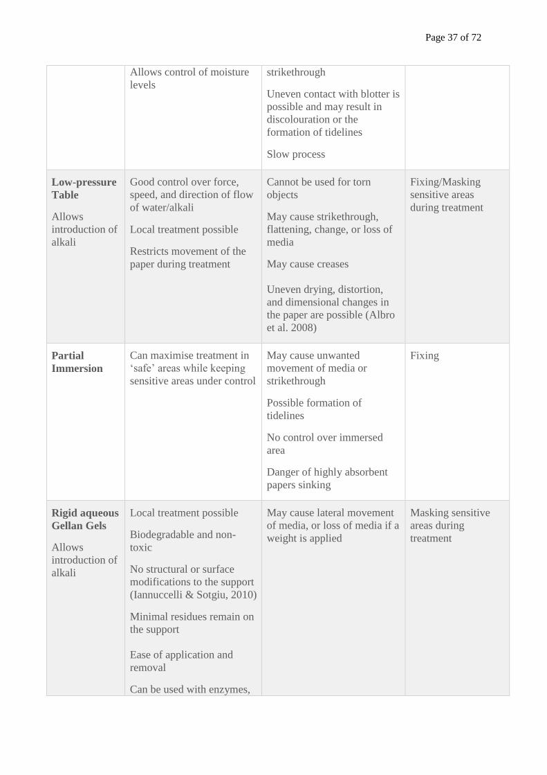
Page 37 of 72
Allows control of moisture
levels
strikethrough
Uneven contact with blotter is
possible and may result in
discolouration or the
formation of tidelines
Slow process
Low-pressure
Table
Allows
introduction of
alkali
Good control over force,
speed, and direction of flow
of water/alkali
Local treatment possible
Restricts movement of the
paper during treatment
Cannot be used for torn
objects
May cause strikethrough,
flattening, change, or loss of
media
May cause creases
Uneven drying, distortion,
and dimensional changes in
the paper are possible (Albro
et al. 2008)
Fixing/Masking
sensitive areas
during treatment
Partial
Immersion
Can maximise treatment in
‘safe’ areas while keeping
sensitive areas under control
May cause unwanted
movement of media or
strikethrough
Possible formation of
tidelines
No control over immersed
area
Danger of highly absorbent
papers sinking
Fixing
Rigid aqueous
Gellan Gels
Allows
introduction of
alkali
Local treatment possible
Biodegradable and non-
toxic
No structural or surface
modifications to the support
(Iannuccelli & Sotgiu, 2010)
Minimal residues remain on
the support
Ease of application and
removal
Can be used with enzymes,
May cause lateral movement
of media, or loss of media if a
weight is applied
Masking sensitive
areas during
treatment
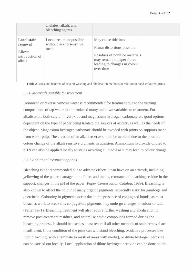
Page 38 of 72
chelates, alkali, and
bleaching agents
Local stain
removal
Allows
introduction of
alkali
Local treatment possible
without risk to sensitive
media
May cause tidelines
Planar distortions possible
Residues of poultice materials
may remain in paper fibres
leading to changes in colour
over time
Table 2 Risks and benefits of several washing and alkalisation methods in relation to hand-coloured prints
3.3.6 Materials suitable for treatment
Deionized or reverse osmosis water is recommended for treatment due to the varying
compositions of tap water that introduced many unknown variables to treatment. For
alkalisation, both calcium hydroxide and magnesium hydrogen carbonate are good options,
dependant on the type of paper being treated, the sources of acidity, as well as the needs of
the object. Magnesium hydrogen carbonate should be avoided with prints on supports made
from wood-pulp. The creation of an alkali reserve should be avoided due to the possible
colour change of the alkali sensitive pigments in question. Ammonium hydroxide diluted to
pH 9 can also be applied locally to stains avoiding all media as it may lead to colour change.
3.3.7 Additional treatment options
Bleaching is not recommended due to adverse effects it can have on an artwork, including
yellowing of the paper, damage to the fibres and media, remnants of bleaching residue in the
support, changes in the pH of the paper (Paper Conservation Catalog, 1989). Bleaching is
also known to affect the colour of many organic pigments, especially risky for gamboge and
quercitron. Colouring in pigments occur due to the presence of conjugated bonds, as most
bleaches work to break this conjugation, pigments may undergo changes to colour or fade
(Feller 1971). Bleaching treatment will also require further washing and alkalisation to
remove post-treatment residues, and neutralise acidic compounds formed during the
bleaching process. It should be used as a last resort if all other methods of stain removal are
insufficient. If the condition of the print can withstand bleaching, oxidative processes like
light bleaching (with a template to mask of areas with media), or dilute hydrogen peroxide
can be carried out locally. Local application of dilute hydrogen peroxide can be done on the
Page 39 of 72
low-pressure table, or through the use of gels. Thorough washing and alkalisation should
follow bleaching treatment.
As most hand-coloured prints are single-sided, tears can be repaired from the verso using
strips of Japanese paper. The strips should be cut to shape and feathered if possible to
produce a less obtrusive and more flexible repair. Losses can also be treated through the
attachment of an infill. The repair papers should be of similar or slightly less thickness to the
object, and have a similar texture, and colour. They should also be flexible, ensuring the
reinforcement will tear instead of the support should the print be mishandled. Chain lines and
grain directions should also be matched, to ensure the expansion and contraction rates of the
two papers match. Infills should always be the same colour, or lighter than the original
support. A small amount of wheat starch paste (of a thick creamy consistency) or methyl
cellulose can be used as an adhesive due to their flexibility, strength, and good ageing
properties. The adhesive should be made to an appropriate consistency, as too wet adhesive
can lead to tidelines, distortions and bleeding of the media. Pulp infills applied locally using
the fritted disk is a possible treatment method if the losses or tears are located away from any
water-sensitive media (gamboge and quercitron). This will provide a more aesthetic result.
3.3.8 Drying and Flattening
Controlled drying is recommended for hand-coloured prints after aqueous treatment. It allows
moisture to be released slowly, reducing stress on the paper and media, and leads to less
distortions. A sheet of blotting paper is placed at the base of a photographic tray larger than
the print. The print, while supported on a sheet of Reemay/Bondina, is placed on the blotter.
The tray is then covered with a sheet of Perspex, while leaving a small gap to allow for air
circulation. The blotting paper should be changed within the first hour. If necessary, and
when the media allows, prints in the final stages of drying can be transferred to the nipping
press between sheets of fresh blotters and an interweaving layer of similarly textured
Bondina/Reemay to remove any planar distortions likely to form. The interweaving layer
provides additional protection to the media.
Conclusion
This research has discussed some of the materials present in hand-coloured prints, and the
impact of these materials on conservation treatment. Specifically, the presence of fugitive
pigments like gamboge, quercitron and chrome yellow adds a range of complexities when
Page 40 of 72
considering aqueous conservation treatments like washing and alkalisation. Less intensive
methods like double-screen washing, blotter washing, low-pressure table washing, partial
immersion, and the use of rigid Gellan gels are possible treatment options. Additional
treatment steps like fixing are also recommended to prevent loss, bleeding, colour change,
strikethrough and lateral movement of the sensitive pigments. Localised treatment combined
with the use of templates are recommended for washing (prints with gamboge and quercitron)
and alkalisation treatments (prints with gamboge, quercitron and chrome yellow). These
measures also help to reduce the swelling of the gum, loss of soluble additives in the binder
(sugar, glycerol, honey), and reduce possible changes in the paper as well as the media. As
with all conservation treatment, it lies with the conservator to choose the best treatment
option based on the materials present, the needs, and condition of the artwork.
List of References
A book of dravving, limning, vvashing or colouring of maps and prints: and the art of
painting, with the names and mixtures of colours used by the picture-drawers. Or, The
young-mans time well spent. In which he hath the ground-work to make him fit for
doing any thing by hand, ... By the use of this work, you may draw all parts of a
man, ... And directions for birds, beasts, landskips, ships, and the like. Moreover,
grounds to lay silver or gold upon; and how silver or gold shall be laid or limned
upon size; and the way to temper gold and silver, and other mettals, and divers kinds
of colours, to write, or to limne withal upon vellum, parchment, or paper, and how to
lay them upon the work which thou intendest to make; and how to varnish it when
thou hast done. How also to diaper and shadow things, and to highten them, to stand
off: to deepen them, and make them glister. In this book you have the necessary
instruments for drawing, and the use of them; and how to make artificial pastiles to
draw withal. Very useful for all handicrafts, and ingenuous gentlemen and youths. By
hammer and hand, all arts do stand (1666) London: Printed by M. Simmons.
Ackermann, R. (1801) A Treatise on Ackermann’s Superfine Water-Colours: With Directions
on How to Prepare and Use Them: Including Succint Hints on Drawing and Painting.
Hurst, London
Albin, E. (1731) The Natural History of Birds, 1st edn. London, Printed for the author.
Page 41 of 72
Albro, S., Biggs, J., Dekle, C., Haude, M., Karnes, C. and Khan, Y. (2008) “Developing
Guidelines for Iron-Gall Ink Treatment at the Library of Congress”, The Book and
Paper Group Annual, 27, pp. 129-165.
Alexander, D. 1997, “Sixpence plain a shilling coloured”, Country Life, CXCI (24), pp. 166-
169.
American Society for Testing and Materials, Annual Book of ASTM Standards Part 28, No.
D211-67. Standard specification for chrome yellow and chrome orange, Philadelphia.
Banik, G. and Brückle, I. (2011) Paper and Water. London: Routledge/Taylor & Francis
Group.
Banks, P. (1989) “Environmental Conditions for the Storage of Paper-Based Records.”
Proceedings of Conservation in Archives: International Symposium, Ottawa, Canada
1988. Paris: International Council on Archives, pp. 77–88.
Bearn, J. G. (1923) The Chemistry of Paints, Pigments, and Varnishes, London: Ernest Benn,
Ltd.
Bluher, A., Haberditzl, A. & Wimmer, T. (1999) “Aqueous Conservation Treatment of 20th
Century Papers Containing Water-Sensitive Inks and Dyes”, Restaurator, 20, pp. 181-
197.
Bower, P. (1999) Turner’s Later Papers, London: Tate Gallery Publishing Limited
Breakell, M. L. (1904) The Wallet Series. Water-colour painting, London: Edward Arnold.
Brill, T. B. (1980) Light: Its Interaction with Art and Antiquities, New York: Plenum Press.
Brückle, I. and Banik, G. (2012) “The Introduction of Water into Paper”, in Banik, G. and
Bruckle, I. Paper and Water. New York: Routledge, pp. 255-288.
Brückle, I, Thornton, J., Nichols, K., and Strickler, G. (1999) “Cyclododecane: Technical
Note on Some Uses in Paper and Objects Conservation”, Journal of the American
Institute for Conservation, 38, pp. 162-175.
Catesby, M. (1731) The Natural History of Carolina, Florida and the Bahama Islands,
London: Printed at the expense of the author.
Church, A. H. (1890) The Chemistry of Paints and Painting, London, Seeley and Co.
Limited.
Clark, J. H. (1807) A Practical Essay on the Art of Colouring and Painting Landscapes in
Water Colours. Accompanied with Ten Engravings, London: Edward Orme
Clark, J. (1848) Elements of drawing and painting in water-colours: being supplement to the
elements of drawing and perspective, published in chambers’s educational course,
London: W. M. S. ORR & CO.
Page 42 of 72
Clarke, M. (2009) “A Nineteenth-Century Colourman’s Terminology”, Studies in
Conservation 54, pp. 160-169.
Clayton, T. (1997) The English Print 1688-1802. London: Yale University Press.
Cohn, M. B. (1977) Wash and Gouache, A Study of the Development of the Materials of
Watercolour, Massachusetts: Fogg Art Museum.
Cook, I. and Mansell, H. “The Effects of Conservation Treatments on Watercolours” ICCM
Bulletin 1981; 7(2-3), pp. 73-103.
Cumming, L. & Colbourne, J. (1998) “The conservation of Mrs. Marton, an eighteenth-
century pastel and gouache portrait by Daniel Gardner”, The Paper Conservator,
22(1), pp. 38-47.
Dackerman, S. (2002) Painted Prints. Maryland: The Pennsylvania University Press.
Daniels, V. (1980) “Aqueous Deacidification of Paper”, The Conservation of Library and
Archive Materials and the Graphic Arts, The Society of Archivists and The Institute
of Paper Conservation, London, pp. 121-125.
Daniels, V. (1988) “The Discolouration of Paper on ageing”, The Paper Conservator, 12(1),
pp. 93-100.
Daniels, V. (1995) “Factors Influencing the Wash-fastness of Watercolours”, The Paper
Conservator, 19(1), pp. 31-40.
De Massoul, C. (1797) A Treatise on the Art of Painting and the Composition of Colours,
London: Published and sold by the author.
Dieterich, K. (1901) Analysis of Resins, Balsams, and Gum-Resins: Their Chemistry and
Pharmacognosis, for the Use of the Scientific and Technical Research Chemist, with a
Bibliography, Translated by C. Salter, London.
Entwisle, E. A. (1970) The Book of Wallpaper. London: Redwood Press Limited.
Feller, R. (1971) “Notes on the chemistry of bleaching”, Bulletin of the American Group.
International Institute for Conservation of Historic and Artistic Works, 11(2), pp. 39-
57.
Field, G. (1835) Chromatography; or, a treatise on Colours and Pigments, and of their
Powers in Painting, &c., London: C. Tilt.
Fielding, T. H. (1844) Ackermann's Manual of Colours used in the different branches of
water-colour painting, London: R. Ackermann.
Finberg, A. J. and Taylor, E. A. (1917) The Development of British Landscape Painting in
Water-colours, Edited by Charles Holme. London: The Studio Ltd.
Page 43 of 72
Ford, J. (1983) Ackermann 1783-1983: The Business of Art, London: Arthur Ackermann
Publishing Limited.
Gascoigne, B. (2011) How to Identify Prints. 2nd edn. London: Thames & Hudson Ltd.
Gettens, R. J, and Stout, G. L. (1966) Painting Materials: A Short Encyclopaedia, New York:
Dover Corporation Inc.
Griffiths, A. (1996) Prints and Printmaking. 2nd edn. Avon: The Bath Press.
Gullick, T. J. and Timbs, J. (1859) Painting Popularity Explained, London: Kent & Co.
Hardie, M. (1990) English Coloured Books, London: Fitzhouse Books.
Harley, R. D. (2001) Artists’ Pigments c. 1600-1835, London: Archetype Publications Ltd.
Hauser, E. A. and Lynn, J. E. (1940) Experiments in Colloid Chemistry. New York: McGraw
Hill
Hermans, J. M. (1987) Playing‐cards, their historical production and conservation, The
Conservator, 11(1), pp. 51-56.
Hey, M. (1979) “The Washing and Aqueous Deacidification of Paper”, The Paper
Conservator, 4(1), pp. 66-80.
Hoofnail, J. (1762) The painter's companion; or A treatise on colours. Shewing how to make
the several sorts from their proper ingredients; together with the best method of
colouring maps, prints, views, &c. The whole being practical improvements on the
experiments of the Honourable Robert Boyle, etc. London: J. Pritchard
Hunter, D. (1978) Papermaking. 2nd edn. United Kingdom: Constable and Company, Ltd.
Iannuccelli, S. and Sotgiu, S. (2010) “Wet Treatments of Works of Art on Paper with Rigid
Gellan Gels”, The Book and Paper Group Annual, 29(4), pp. 25-39.
Jones, T. D. (2010) “Ackermann’s Repository 1809-28”, The British Art Journal, XI(1), pp.
69-74.
Keyes, K. (1994) “Some practical methods for the treatment with moisture of moisture-
sensitive works on paper”, in Burgess, H. (ed.) Conservation of Historic and Artistic
Works on Paper: Proceedings of a Conference – Symposium 88, Ottawa: Canadian
Conservation Institute, pp. 99-107.
Kijima, T., Inaba, M., & Uchida, Y. (2007). “Evaluation of aqueous washing methods of
paper by the measurement of organic acid extraction”, Restaurator, 28(3), pp. 169-
184.
Kosek, J. (2012) “Washing Paper in Conservation”, in Banik, G. and Bruckle, I. Paper and
Water,. New York: Routledge, pp. 313-339.
Krill, J. (1987) English Artists Paper. London: Trefoil Publications Ltd.
Page 44 of 72
Kühn, H, and Curran, M. (1986) “Chrome Yellow and Other Chromate Pigments”, in Artists’
Pigments: A Handbook of Their History and Characteristics Vol. 1, Edited by Robert
L. Feller, London: Archetype Publications Ltd, pp. 187-201.
Labarre, E. J. (1952) Dictionary and Encyclopaedia of Paper and Paper-making. 2nd edn.
Reprint, Amsterdam: Swets & Zeitlinger, 1969
Laporte, J. (1812) The progress of a water-coloured drawing wherein is represented to the
reader the various gradations through which a drawing passes, from the out-line to
its finished state. The intention of this little work is to enable young people, where an
eminent master cannot be had, to cultivate the delightful art of drawing in colours
with system and advantage. London, printed for the author.
Lewin, W. (1800) The Birds of Great Britain, with their eggs, accurately figured. London:
Johnson
Lippincott, L. (1983) Selling Art In Georgian London, The Rise of Arthur Pond. London:
Yale University Press.
Martel, C. (1859) The Materials Used in Painting With a Few Remarks on Varnishing and
Cleaning Pictures. London: George Rowney and co.
Mayer, R. (1991) The Artist’s Handbook of Materials and Techniques. 5th edn. New York:
Viking Adult.
Maynore, C. I. (1993) “Media Problems”, Paper Conservation Catalog, 9th edn. Washington
D.C. American Institute for Conservation, Part 3.
Miller, E. (1987) Hand Coloured British Prints. London: The Victoria and Albert Museum.
Möller, L. (2014) “Cleaning of Watercolour Drawings A study of the use of Gellan gum gel
on water sensitive media”, Göteborgs Universitet., Available at:
https://gupea.ub.gu.se/handle/2077/36483 (Accessed 4 April 2015).
Muckley, W. J. (1893) A Handbook for Painters and Art Students on the Character, Nature,
and Use of Colours, Their Permanent, or Fugitive Qualities, and the Vehicles Proper
to Employ, With an Appendix Giving Permanent Hues and Tints, London: Bailliere,
Tindall and Cox.
Nisbet, H. (1920) On Painting in Water Colours. 6th edn. London: Reeves & Sons.
Ormsby, B. A, Townsend, J. H., Singer, B. W, and Dean, J. R. (2005) “British Watercolour
Cakes from the Eighteenth to the Early Twentieth Century”, Studies in Conservation,
51(1), pp. 45-66.
Page 45 of 72
Miller-Keane Encyclopedia and Dictionary of Medicine, Nursing, and Allied Health, Seventh
Edition (2003) Lyophilic colloid. Available at: http://medical-
dictionary.thefreedictionary.com/lyophilic+colloid (Accessed 4 April 2015).
Peacham, H. (1634) The Compleat Gentleman, London: Printed for Francis Constable.
Peters, H. T. (1976) Currier & Ives, Printmakers to the American People. A Chronicle of the
Firm, and of the Artists and their Work, with Notes on Collecting; Reproductions of
142 of the Prints and Originals, Forming a Pictorial Record of American Life and
Manners in the Last Century; and a Checklist of All Known Prints Published by N.
Currier and Currier & Ives. New York: Doubleday, Doran & Company, Inc.
Redgrave, G. R. (1892) A History of Watercolour Painting in England. London: Sampson
Low, Marston.
Reeves and Sons Amateurs’ and Artists’ Companion, with an Almanack for the year 1852,
Being the first after the leap year. Containing Hints on water-colours, history of
painting, biographical dictionary of celebrated English painters, and other useful
information. (1851) London: Reeves and sons
Remarks on the Importance of the Study of Political pamphlets, Weekly Papers, Periodical
Papers, Daily Papers, Political Music &c. (1765) London: Printed for W. Nicoll.
Riffault,J. R. D, Vergnaud, A. D., and Toussaint, G. A. (1874) A Practical Treatise on the
manufacture of colors for painting. Comprising the origin, definition, and
classification of colors; the treatment of the raw materials etc. Translated by A. A.
Fesquet, Edited by F. Malepeyre. Philadelphia: Henry Carey Baird.
Roberson and Co. Recipe Book (c.1860s) MS.788.1993, 116 Fitzwilliam Museum
Cambridge.
R. Q. & T. P (1666) Academia Italica: The publick school of drawing, or, The gentlemans
accomplishment: being the ingenious, pleasant and antient recreation of the noble,
and the honour of arts, wherein you have plain examples and directions to guide you
to the knowledge, first, of the noble and useful art of drawing, with a discourse of all
the external parts of mans body, whereby it plainly appeareth how one part joyneth to
another, by which means the judgement is well informed of every parts plyableness,
and therefore the knowledge of the anotomy [sic] is of great concernment to this most
admirable art : secondly, the manner of washing or colouring maps and prints, with
the names of several colours proper for that purpose, and how they may be mixed,
and what colours set off best together : as also how you should shadow things to
cause them to shew more natural and beautiful : with instructions what you must do to
Page 46 of 72
paist [sic] maps or prints smooth on cloth or paper : and likewise what you must do to
them to cause them to bear your colours and varnish : with divers rare secrets for
making, ordering, and preserving of colours, the which was never fully and really
discovered until now. London: Printed by Peter Lillicrap.
Salter, T. W. (1869) Field’s Chromatography; or, A Treatise on Colours and Pigments, as
used by Artists. An Entirely New and Practical Edition: Revised, Rewritten, and
Brought Down to the Present Time, London: Winsor and Newton.
Smith, J. (1701) The Art of Painting in Oyl. Wherein is included each particular
circumstance relating to that art and mystery. Containing the best and most approved
rules for preparing, mixing, and working of oyl colours. The whole treatise being so
full compleat...that all persons whatsoever, may be able by these directions, to paint
in oyl-colours all manner of timber work ; such as posts, pails, pallisadoes, gates,
doors, or any thing else that requires either use, beauty, or preservation, from the
violence or injury of the weather. In which is also particularly laid down, all the
several circumstances required in painting of sun-dials, printed pictures, shash-
windows, &c. in oily-colours. The third impression with ... many matters added ... to
which is added, the whole art and mystery of colouring maps, and other prints with
water-colours. London: Printed for Samuel Crouch.
Smith, T. (1827) The art of drawing in its various branches : exemplified in a course of
twenty-eight progressive lessons, calculated to afford those who are unacquainted
with the art, the means of acquiring a competent knowledge without the aid of a
master : being the only work of the kind in which the principles of effect are explained
in a clear, methodical, and at the same time familiar style. London: Printed for
Sherwood, Gilbert and Piper.
Standage, H. C. (1891) A Handbook of the chemical and artistic qualities of Water-Colour
Pigments ... containing an appendix analysing the Report (made to the Science and
Art Department) on the action of Light on Water-Colours. London: Reeves & Sons.
Standage, H. C. (1896) The Artists’ Manual of Pigments Showing Their Composition,
Conditions of Permanency, Non-permanency, and adulterations; Effects in
Combination With Each Other and With Vehicles; and the Most Reliable Tests of
Purity, Together with the Science and Art Department’s Examination Questions on
Painting. 3rd edn. London: Crosby, Lockwood and Son.
Stevenson, R. L. (1884) “A Penny Plain and Twopence Coloured”, The Magazine of Art,
Vol.7, January, pp. 227-232.
Page 47 of 72
Sullivan, M., Brogdon-Grantham, S. and Taira, K. (2014) “New Approaches to Cleaning
Works of Art on Paper and Photographs”, Winterthur/University of Delaware
Program in Art Conservation, Available at: http://cool.conservation-
us.org/anagpic/2014pdf/anagpic2014_sullivan_etal_paper.pdf (Accessed 4 April
2014)
Taylor, J. S. (1887) A Descriptive Handbook of Modern Water-colour Pigments Illustrated
With Seventy-two Colour Washes Skilfully Gradated by Hand on Whatman’s Drawing
Paper, London, Winsor and Newton, Ltd.
The Art of Drawing, and Painting In Water-colours: Whereby a Stranger to Those Arts May
Be Immediately Rendered Capable of Delineating Any View Or Prospect with the
Utmost Exactness; of Colouring Any Print Or Drawing In the Most Beautiful Manner;
and of Taking Off Medals Instantly, by Various Ways, Never Before Made Publick:
Intermix'd with Several Curious Receipts for the Use of Painters, Statuaries,
Founders, &c. With Instructions for Making Transparent Colours of Every Sort;
Partly From Some Curious Personages In Holland, France, and Italy; but Chiefly
From a Manuscript of the Great Mr. Boyle; Particularly a Receipt of That
Gentleman's, for Making a Blue Colour Equal to Ultramarine. The fourth edition.
(1731) London: Printed for J. Peele.
The art of drawing, and painting in water-colours. Wherein the principles of drawing are laid
down after a natural and easy manner; and youth directed in every thing that relates
to this useful art, according to the practice of the best masters. To which are annexed,
familiar directions whereby a stranger in the art of drawing may be readily taught to
delineate any view or prospect with the utmost exactness; of colouring any print or
drawing in the most elegant manner; and of taking off medals, &c. instantly, after a
variety of different ways never before made public; intermixed with curious receipts
for the use of painters, statuaries, founders, &c. With instructions for preparing,
mixing and managing all sorts of water-colours used in painting, so as to represent
nature in the greatest perfection. (1779) London: Printed for G, Keith.
The Book and Paper Group of the American Institute for Conservation of Historic and
Artistic Works (1985) ‘Chapter 20: Alkalization and Neutralization’ in Paper
Conservation Catalogue. 2nd edn. Washington D.C.: American Institute for
Conservation Book and Paper Group.
The Book and Paper Group of the American Institute for Conservation of Historic and
Artistic Works (1989) ‘Chapter 19: Bleaching’ in Paper Conservation Catalogue.6th
Page 48 of 72
edn. Washington D.C.: American Institute for Conservation Book and Paper Group.
pp. 1-38.
The Book and Paper Group of the American Institute for Conservation of Historic and
Artistic Works (1990) ‘Chapter 16: Washing’ in Paper Conservation Catalogue.7th
edn. Washington D.C.: American Institute for Conservation Book and Paper Group.
pp. 1-49.
The Book and Paper Group of the American Institute for Conservation of Historic and
Artistic Works (1992) ‘Chapter 14: Surface Cleaning’ in Paper Conservation
Catalogue. 8th edn. Washington D.C.: American Institute for Conservation Book and
Paper Group. pp. 1-43
The Census of Great Britain in 1851 comprising an account of the numbers and distribution
of the people, their ages, conjugal condition, occupations and birthplace etc. (1854)
London: Longman, Brown, Green, and Longmans.
The Hand-book of the elements of painting in water colours, with practical instructions for
mixing and shading the same (1843) London: H. G. Clarke and co.
Ward, G. W. R. (ed.) (2009) The Grove Encyclopedia of Materials and Techniques in Art.
New York, Oxford University Press, Inc.
Weber, F. W. (1923) Artists’ Pigments: Their Chemical and Physical Properties. New York:
D. Van Nostrand Company.
Weidner, M. K. (1974) “A Vacuum Table of use in Paper Conservation”, Bulletin of the
American Institute for Conservation, 14(2), pp. 115-122.
Winter, J. (1997) “Gamboge” in Artists’ Pigments: A Handbook of Their History and
Characteristics Vol. 3 ,Edited by Elizabeth West Fitzhugh, New York: Oxford
University Press, pp. 143-156.
Winter, J. (2008) East Asian Paintings: Materials, Structures and Deterioration Mechanisms,
London: Archetype Publications Ltd.
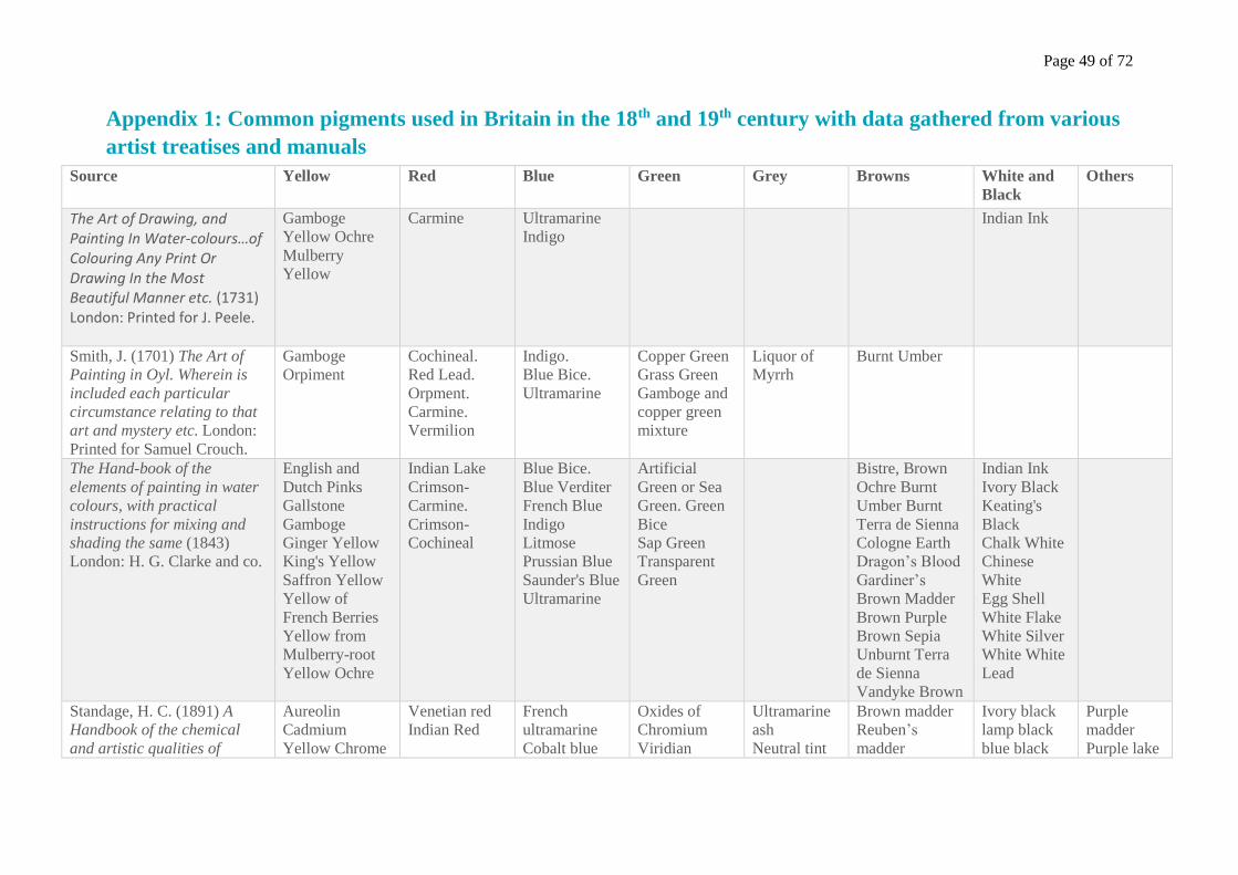
Page 49 of 72
Appendix 1: Common pigments used in Britain in the 18th and 19th century with data gathered from various
artist treatises and manuals
Source Yellow Red Blue Green Grey Browns White and
Black
Others
The Art of Drawing, and Painting In Water-colours…of Colouring Any Print Or Drawing In the Most Beautiful Manner etc. (1731) London: Printed for J. Peele.
Gamboge
Yellow Ochre
Mulberry
Yellow
Carmine Ultramarine
Indigo
Indian Ink
Smith, J. (1701) The Art of
Painting in Oyl. Wherein is
included each particular
circumstance relating to that
art and mystery etc. London:
Printed for Samuel Crouch.
Gamboge
Orpiment
Cochineal.
Red Lead.
Orpment.
Carmine.
Vermilion
Indigo.
Blue Bice.
Ultramarine
Copper Green
Grass Green
Gamboge and
copper green
mixture
Liquor of
Myrrh
Burnt Umber
The Hand-book of the
elements of painting in water
colours, with practical
instructions for mixing and
shading the same (1843)
London: H. G. Clarke and co.
English and
Dutch Pinks
Gallstone
Gamboge
Ginger Yellow
King's Yellow
Saffron Yellow
Yellow of
French Berries
Yellow from
Mulberry-root
Yellow Ochre
Indian Lake
Crimson-
Carmine.
Crimson-
Cochineal
Blue Bice.
Blue Verditer
French Blue
Indigo
Litmose
Prussian Blue
Saunder's Blue
Ultramarine
Artificial
Green or Sea
Green. Green
Bice
Sap Green
Transparent
Green
Bistre, Brown
Ochre Burnt
Umber Burnt
Terra de Sienna
Cologne Earth
Dragon’s Blood
Gardiner’s
Brown Madder
Brown Purple
Brown Sepia
Unburnt Terra
de Sienna
Vandyke Brown
Indian Ink
Ivory Black
Keating's
Black
Chalk White
Chinese
White
Egg Shell
White Flake
White Silver
White White
Lead
Standage, H. C. (1891) A
Handbook of the chemical
and artistic qualities of
Aureolin
Cadmium
Yellow Chrome
Venetian red
Indian Red
French
ultramarine
Cobalt blue
Oxides of
Chromium
Viridian
Ultramarine
ash
Neutral tint
Brown madder
Reuben’s
madder
Ivory black
lamp black
blue black
Purple
madder
Purple lake
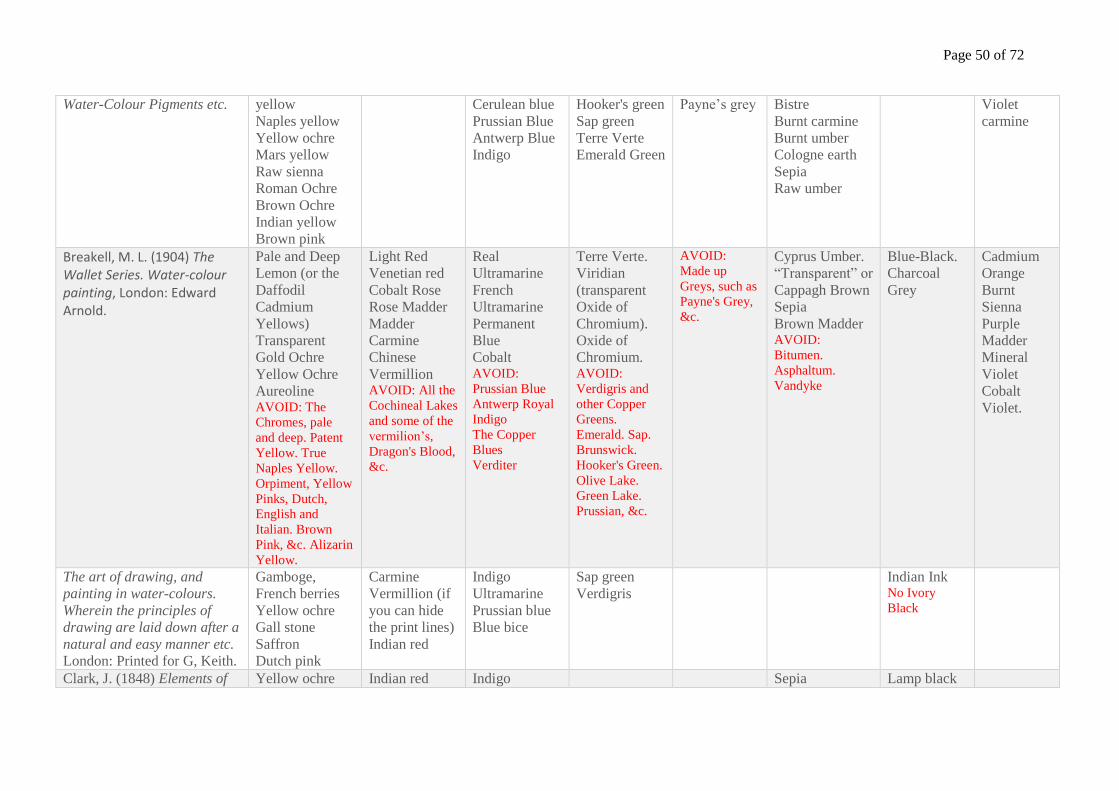
Page 50 of 72
Water-Colour Pigments etc. yellow
Naples yellow
Yellow ochre
Mars yellow
Raw sienna
Roman Ochre
Brown Ochre
Indian yellow
Brown pink
Cerulean blue
Prussian Blue
Antwerp Blue
Indigo
Hooker's green
Sap green
Terre Verte
Emerald Green
Payne’s grey Bistre
Burnt carmine
Burnt umber
Cologne earth
Sepia
Raw umber
Violet
carmine
Breakell, M. L. (1904) The Wallet Series. Water-colour painting, London: Edward Arnold.
Pale and Deep
Lemon (or the
Daffodil
Cadmium
Yellows)
Transparent
Gold Ochre
Yellow Ochre
Aureoline AVOID: The
Chromes, pale
and deep. Patent
Yellow. True
Naples Yellow.
Orpiment, Yellow
Pinks, Dutch,
English and
Italian. Brown
Pink, &c. Alizarin
Yellow.
Light Red
Venetian red
Cobalt Rose
Rose Madder
Madder
Carmine
Chinese
Vermillion AVOID: All the
Cochineal Lakes
and some of the
vermilion’s,
Dragon's Blood,
&c.
Real
Ultramarine
French
Ultramarine
Permanent
Blue
Cobalt AVOID:
Prussian Blue
Antwerp Royal
Indigo
The Copper
Blues
Verditer
Terre Verte.
Viridian
(transparent
Oxide of
Chromium).
Oxide of
Chromium. AVOID:
Verdigris and
other Copper
Greens.
Emerald. Sap.
Brunswick.
Hooker's Green.
Olive Lake.
Green Lake.
Prussian, &c.
AVOID:
Made up
Greys, such as
Payne's Grey,
&c.
Cyprus Umber.
“Transparent” or
Cappagh Brown
Sepia
Brown Madder AVOID:
Bitumen.
Asphaltum.
Vandyke
Blue-Black.
Charcoal
Grey
Cadmium
Orange
Burnt
Sienna
Purple
Madder
Mineral
Violet
Cobalt
Violet.
The art of drawing, and
painting in water-colours.
Wherein the principles of
drawing are laid down after a
natural and easy manner etc. London: Printed for G, Keith.
Gamboge,
French berries
Yellow ochre
Gall stone
Saffron
Dutch pink
Carmine
Vermillion (if
you can hide
the print lines)
Indian red
Indigo
Ultramarine
Prussian blue
Blue bice
Sap green
Verdigris
Indian Ink No Ivory
Black
Clark, J. (1848) Elements of Yellow ochre Indian red Indigo Sepia Lamp black
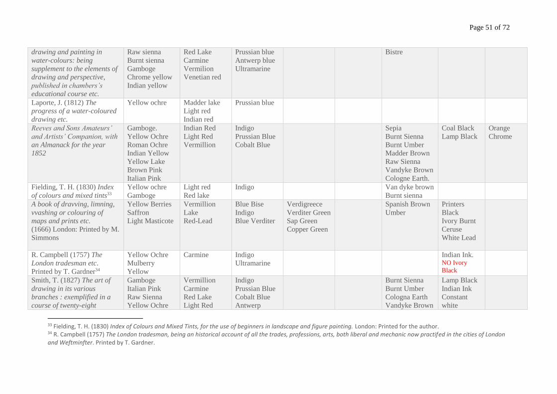
Page 51 of 72
drawing and painting in
water-colours: being
supplement to the elements of
drawing and perspective,
published in chambers’s
educational course etc.
Raw sienna
Burnt sienna
Gamboge
Chrome yellow
Indian yellow
Red Lake
Carmine
Vermilion
Venetian red
Prussian blue
Antwerp blue
Ultramarine
Bistre
Laporte, J. (1812) The
progress of a water-coloured
drawing etc.
Yellow ochre Madder lake
Light red
Indian red
Prussian blue
Reeves and Sons Amateurs’
and Artists’ Companion, with
an Almanack for the year
1852
Gamboge.
Yellow Ochre
Roman Ochre
Indian Yellow
Yellow Lake
Brown Pink
Italian Pink
Indian Red
Light Red
Vermillion
Indigo
Prussian Blue
Cobalt Blue
Sepia
Burnt Sienna
Burnt Umber
Madder Brown
Raw Sienna
Vandyke Brown
Cologne Earth.
Coal Black
Lamp Black
Orange
Chrome
Fielding, T. H. (1830) Index
of colours and mixed tints33
Yellow ochre
Gamboge
Light red
Red lake
Indigo Van dyke brown
Burnt sienna
A book of dravving, limning,
vvashing or colouring of
maps and prints etc. (1666) London: Printed by M.
Simmons
Yellow Berries
Saffron
Light Masticote
Vermillion
Lake
Red-Lead
Blue Bise
Indigo
Blue Verditer
Verdigreece
Verditer Green
Sap Green
Copper Green
Spanish Brown
Umber
Printers
Black
Ivory Burnt
Ceruse
White Lead
R. Campbell (1757) The
London tradesman etc.
Printed by T. Gardner34
Yellow Ochre
Mulberry
Yellow
Carmine Indigo
Ultramarine
Indian Ink. NO Ivory
Black
Smith, T. (1827) The art of
drawing in its various
branches : exemplified in a
course of twenty-eight
Gamboge
Italian Pink
Raw Sienna
Yellow Ochre
Vermillion
Carmine
Red Lake
Light Red
Indigo
Prussian Blue
Cobalt Blue
Antwerp
Burnt Sienna
Burnt Umber
Cologna Earth
Vandyke Brown
Lamp Black
Indian Ink
Constant
white
33 Fielding, T. H. (1830) Index of Colours and Mixed Tints, for the use of beginners in landscape and figure painting. London: Printed for the author. 34 R. Campbell (1757) The London tradesman, being an historical account of all the trades, professions, arts, both liberal and mechanic now practifed in the cities of London and Weftminfter. Printed by T. Gardner.

Page 52 of 72
progressive lessons etc. Roman Ochre
Indian Yellow
Gallstone
Brown Pink
Raw Umber AVOID: Yellow
Lake
Madder Lake AVOID: Indian
Red, Red Lead
aka Saturnine
Red
Ultramarine Sepia
Page 53 of 72
Appendix 2: Recipes for several pigment components
2.1 Recipe for Alum-water
Recipe 1
Take a quart of fair water, and boyl it in a quarter of a pound of Allum, feeth it until the Allum be
diffolved, then let it ftand a day, and the make ufe of it. With this water you must wet over your
pictures, that you intend to colour, for it will keep the colours from finking into the paper, alfo it
will add a luftre unto the colours, and make them fhew fairer, and it will alfo make them
continue the longer without fading, you muft let the paper dry of it felf after you have once
wetted it, before you either lay on your colours, or before you wet it again , for fome paper will
need to be wet four or five times. (A book of dravving, limning, vvashing or colouring of maps
and prints etc., 1666: p. 10)
Recipe 2
‘Alum-water – take four ounces of roche-alum, and a pint of pure spring water; boil it till the alum is
thoroughly dissolved; filter it through blotting paper, and it is fit for use’. (The Hand-book of the
elements of painting in water colours etc. 1843: p. 52)
2.2 Recipe for Gum-water
Recipe 1
Take clean water a pint, and put into three ounces of the cleareft and whiteft Gum-Araback, and
let it ftand until the Gum be diffolved, and fo mix all your colours with it, if the Gum-water be
very thick it will make the colours fhine, but then your colours will not work fo eafily, therefore
the beft is, that the water be nor made too thick nor too thin. (A book of dravving, limning,
vvashing or colouring of maps and prints etc., 1666: p. 10)
Recipe 2
Gum – Dissolve an ounce of the best white gum-Arabic, and half an ounce of double refined
sugar, in a quart of spring-water; strain it through a piece of muslin; then bottle it off for use,
keeping it free from dust. (The Hand-book of the elements of painting in water colours etc. 1843:
p. 53)
Recipe 3
Take the whitest sort of gum-Arabic, bruise and tie it in a piece of woollen cloth; steep it in
spring water till dissolved. If too stiff, which is known by the shining of the colors, add more
water; if too weak more gum. With this water you may temper most of your colours. (The Hand-
book of the elements of painting in water colours etc. 1843: p. 53)
2.3 Preparing Gamboge
Recipe 1
‘Gamboge – This is a rich and mellow color of nature’s own production. It dissolves freely and
immediately when brought into contact with the most simple fluid; it sometimes requires help, but in
general it will shade itself. This pigment requires neither grinding nor gumming and produces an
Page 54 of 72
endless variety of the most beautiful tints.’ (The Hand-book of the elements of painting in water
colours etc. 1843: p. 27)
Recipe 2
‘It diffolves the Minute the Water touches it, therefore wants neither grinding nor gumming.’ (The
delights of flower-painting etc. 1756, p. 14).35
35 The delights of flower-painting. In which is laid down the fundamental principles of that delightful art. To which is annexed, a curious defcription of the manner in which fifty of the moft capital flowers are now finifhed by the feveral Masters in that branch; being an introduction to paint all sorts of flowers & c. to which is added a catalogue of the colours proper for the execution of them, their names, qualities, and manner of preparing, (1756) 2nd edn. London: Printed for D. Voisin.
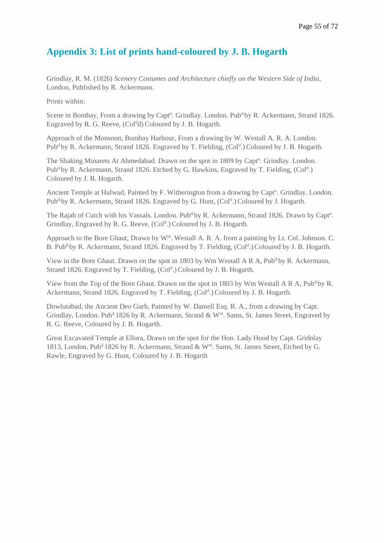
Page 55 of 72
Appendix 3: List of prints hand-coloured by J. B. Hogarth
Grindlay, R. M. (1826) Scenery Costumes and Architecture chiefly on the Western Side of India,
London, Published by R. Ackermann.
Prints within:
Scene in Bombay, From a drawing by Captn. Grindlay. London. Pubd.by R. Ackermann, Strand 1826.
Engraved by R. G. Reeve, (Coldd) Coloured by J. B. Hogarth.
Approach of the Monsoon, Bombay Harbour, From a drawing by W. Westall A. R. A. London.
Pubd.by R. Ackermann, Strand 1826. Engraved by T. Fielding, (Cold.) Coloured by J. B. Hogarth.
The Shaking Minarets At Ahmedabad. Drawn on the spot in 1809 by Captn. Grindlay. London.
Pubd.by R. Ackermann, Strand 1826. Etched by G. Hawkins, Engraved by T. Fielding, (Cold.)
Coloured by J. B. Hogarth.
Ancient Temple at Hulwud, Painted by F. Witherington from a drawing by Captn. Grindlay. London.
Pubd.by R. Ackermann, Strand 1826. Engraved by G. Hunt, (Cold.) Coloured by J. Hogarth.
The Rajah of Cutch with his Vassals. London. Pubd.by R. Ackermann, Strand 1826. Drawn by Captn.
Grindlay, Engraved by R. G. Reeve, (Cold.) Coloured by J. B. Hogarth.
Approach to the Bore Ghaut, Drawn by Wm. Westall A. R. A. from a painting by Lt. Col. Johnson. C.
B. Pubd.by R. Ackermann, Strand 1826. Engraved by T. Fielding, (Cold.) Coloured by J. B. Hogarth.
View in the Bore Ghaut. Drawn on the spot in 1803 by Wm Westall A R A, Pubd.by R. Ackermann,
Strand 1826. Engraved by T. Fielding, (Cold.) Coloured by J. B. Hogarth.
View from the Top of the Bore Ghaut. Drawn on the spot in 1803 by Wm Westall A R A, Pubd.by R.
Ackermann, Strand 1826. Engraved by T. Fielding, (Cold.) Coloured by J. B. Hogarth.
Dowlutabad, the Ancient Deo Gurh, Painted by W. Daniell Esq. R. A., from a drawing by Capt.
Grindlay, London. Pubd.1826 by R. Ackermann, Strand & Wm. Sams, St. James Street, Engraved by
R. G. Reeve, Coloured by J. B. Hogarth.
Great Excavated Temple at Ellora, Drawn on the spot for the Hon. Lady Hood by Capt. Gridnlay
1813, London. Pubd.1826 by R. Ackermann, Strand & Wm. Sams, St. James Street, Etched by G.
Rawle, Engraved by G. Hunt, Coloured by J. B. Hogarth
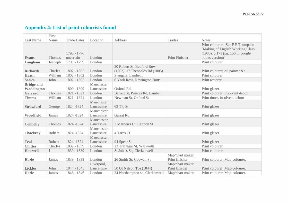
Page 56 of 72
Appendix 4: List of print colourists found
Last Name
First
Name Trade Dates Location Address Trades Notes
Evans Thomas
1790 - 1790
uncertain London Print Finisher
Print colourer. [See F P Thompson
`Making of English Working Class'
(1980), p 171 (pg. 156 in google
books version)]
Langham Jospeph 1799 - 1799 London Print colourer
Richards Charles 1802 - 1805 London
30 Robert St, Bedford Row
(1802). 17 Theobalds Rd (1805) Print colourer, oil painter &c
Heath William 1802 - 1802 London Stangate, Lambeth Print colourer
Scales John 1802 - 1805 London 6 York Row, Newington Butts Print restorer
Bridge and
Waddington 1809 - 1809
Manchester,
Lancashire Oxford Rd Print glazer
Garrard Thomas 1821 - 1821 London Barrett St, Princes Rd, Lambeth Print colourer, insolvent debtor
Timms William 1821 - 1821 London Newman St, Oxford St Print tinter, insolvent debtor
Strawford George 1824 -1824
Manchester,
Lancashire 63 Tib St Print glazer
Woodfield James 1824 -1824
Manchester,
Lancashire Garrat Rd Print glazer
Connolly Thomas 1824 -1824
Manchester,
Lancashire 3 Marden's Ct, Cannon St Print glazer
Thackray Robert 1824 -1824
Manchester,
Lancashire 4 Tarr's Ct Print glazer
Teal Robert 1824 -1824
Manchester,
Lancashire 94 Spear St Print glazer
Chittey Charles 1839 - 1839 London 23 Trafalgar St, Walworth Print colourer
Hatswell J 1839 - 1839 London St John's Sq, Clerkenwell Print colourer
Hazle James 1839 - 1839 London 26 Smith St, Goswell St
Map/chart maker,
Print finisher Print colourer. Map-colourer.
Lickley John 1844 - 1845
Liverpool,
Lancashire 50 Gt Nelson Tce (1844)
Map/chart maker,
Print finisher Print colourer. Map-colourer.
Hazle James 1846 - 1846 London 34 Northampton sq. Clerkenwell Map/chart maker, Print colourer. Map-colourer.
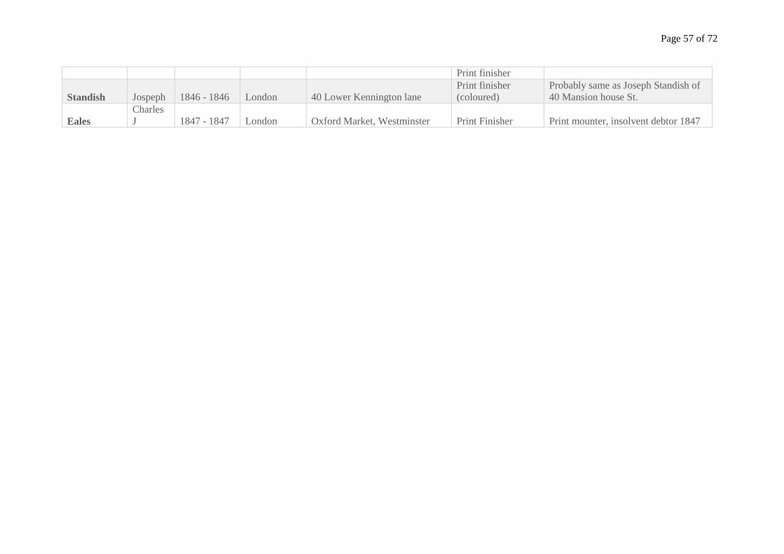
Page 57 of 72
Print finisher
Standish Jospeph 1846 - 1846 London 40 Lower Kennington lane
Print finisher
(coloured)
Probably same as Joseph Standish of
40 Mansion house St.
Eales
Charles
J 1847 - 1847 London Oxford Market, Westminster Print Finisher Print mounter, insolvent debtor 1847
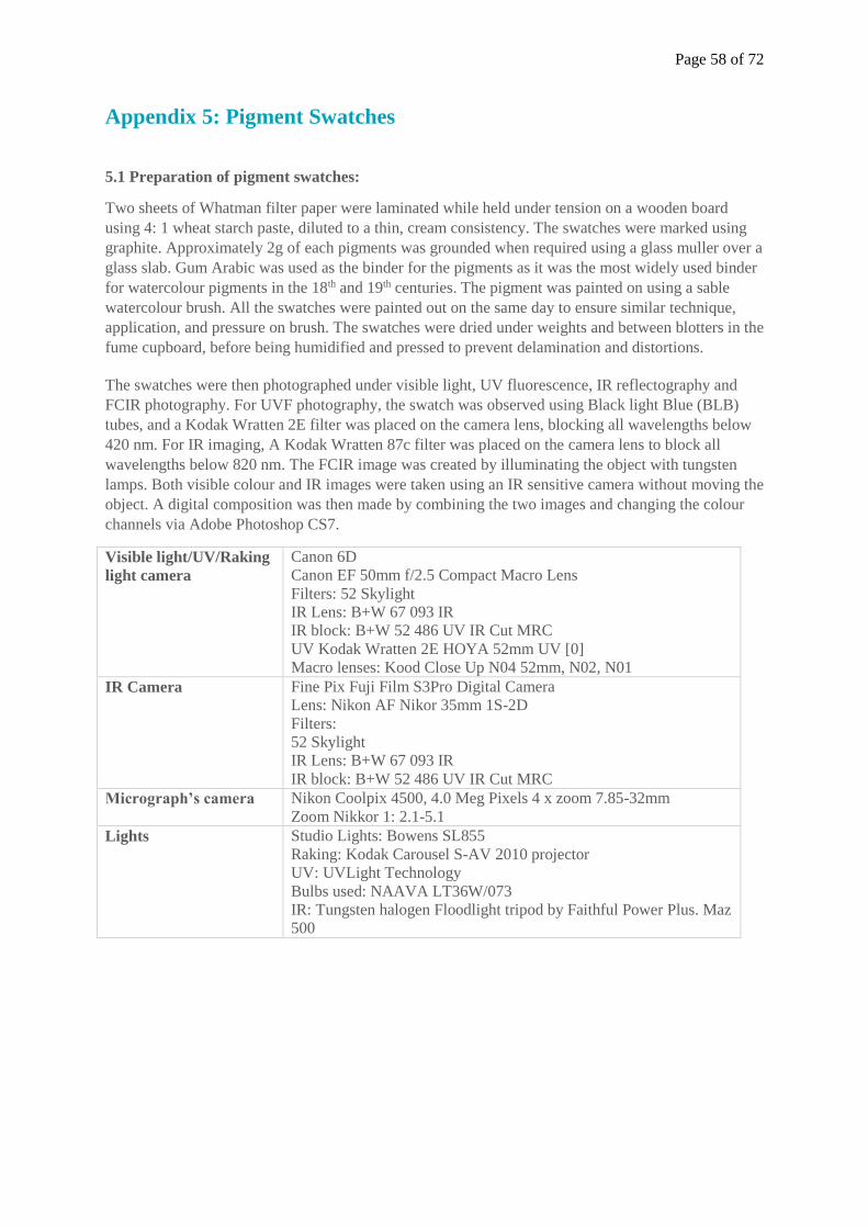
Page 58 of 72
Appendix 5: Pigment Swatches
5.1 Preparation of pigment swatches:
Two sheets of Whatman filter paper were laminated while held under tension on a wooden board
using 4: 1 wheat starch paste, diluted to a thin, cream consistency. The swatches were marked using
graphite. Approximately 2g of each pigments was grounded when required using a glass muller over a
glass slab. Gum Arabic was used as the binder for the pigments as it was the most widely used binder
for watercolour pigments in the 18th and 19th centuries. The pigment was painted on using a sable
watercolour brush. All the swatches were painted out on the same day to ensure similar technique,
application, and pressure on brush. The swatches were dried under weights and between blotters in the
fume cupboard, before being humidified and pressed to prevent delamination and distortions.
The swatches were then photographed under visible light, UV fluorescence, IR reflectography and
FCIR photography. For UVF photography, the swatch was observed using Black light Blue (BLB)
tubes, and a Kodak Wratten 2E filter was placed on the camera lens, blocking all wavelengths below
420 nm. For IR imaging, A Kodak Wratten 87c filter was placed on the camera lens to block all
wavelengths below 820 nm. The FCIR image was created by illuminating the object with tungsten
lamps. Both visible colour and IR images were taken using an IR sensitive camera without moving the
object. A digital composition was then made by combining the two images and changing the colour
channels via Adobe Photoshop CS7.
Visible light/UV/Raking
light camera
Canon 6D
Canon EF 50mm f/2.5 Compact Macro Lens
Filters: 52 Skylight
IR Lens: B+W 67 093 IR
IR block: B+W 52 486 UV IR Cut MRC
UV Kodak Wratten 2E HOYA 52mm UV [0]
Macro lenses: Kood Close Up N04 52mm, N02, N01
IR Camera Fine Pix Fuji Film S3Pro Digital Camera
Lens: Nikon AF Nikor 35mm 1S-2D
Filters:
52 Skylight
IR Lens: B+W 67 093 IR
IR block: B+W 52 486 UV IR Cut MRC
Micrograph’s camera Nikon Coolpix 4500, 4.0 Meg Pixels 4 x zoom 7.85-32mm
Zoom Nikkor 1: 2.1-5.1
Lights Studio Lights: Bowens SL855
Raking: Kodak Carousel S-AV 2010 projector
UV: UVLight Technology
Bulbs used: NAAVA LT36W/073
IR: Tungsten halogen Floodlight tripod by Faithful Power Plus. Maz
500
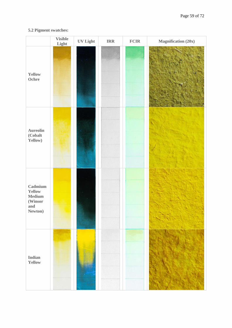
Page 59 of 72
5.2 Pigment swatches:
Visible
Light UV Light IRR FCIR Magnification (20x)
Yellow
Ochre
Aureolin
(Cobalt
Yellow)
Cadmium
Yellow
Medium
(Winsor
and
Newton)
Indian
Yellow
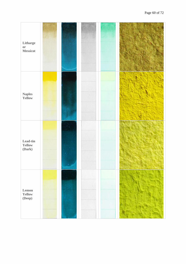
Page 60 of 72
Litharge
or
Messicot
Naples
Yellow
Lead-tin
Yellow
(Dark)
Lemon
Yellow
(Deep)
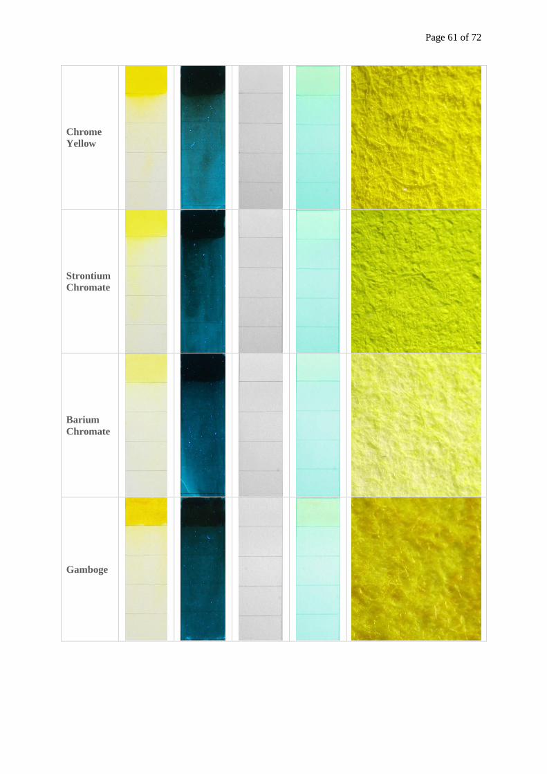
Page 61 of 72
Chrome
Yellow
Strontium
Chromate
Barium
Chromate
Gamboge

Page 62 of 72
Extract of
gamboge
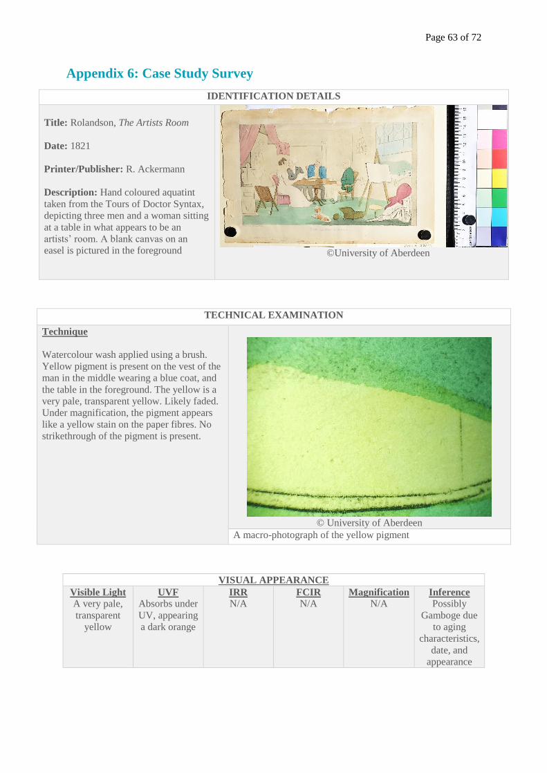
Page 63 of 72
Appendix 6: Case Study Survey
IDENTIFICATION DETAILS
Title: Rolandson, The Artists Room
Date: 1821
Printer/Publisher: R. Ackermann
Description: Hand coloured aquatint
taken from the Tours of Doctor Syntax,
depicting three men and a woman sitting
at a table in what appears to be an
artists’ room. A blank canvas on an
easel is pictured in the foreground
©University of Aberdeen
TECHNICAL EXAMINATION
Technique
Watercolour wash applied using a brush.
Yellow pigment is present on the vest of the
man in the middle wearing a blue coat, and
the table in the foreground. The yellow is a
very pale, transparent yellow. Likely faded.
Under magnification, the pigment appears
like a yellow stain on the paper fibres. No
strikethrough of the pigment is present.
© University of Aberdeen
A macro-photograph of the yellow pigment
VISUAL APPEARANCE
Visible Light
A very pale,
transparent
yellow
UVF
Absorbs under
UV, appearing
a dark orange
IRR
N/A FCIR
N/A Magnification
N/A Inference
Possibly
Gamboge due
to aging
characteristics,
date, and
appearance
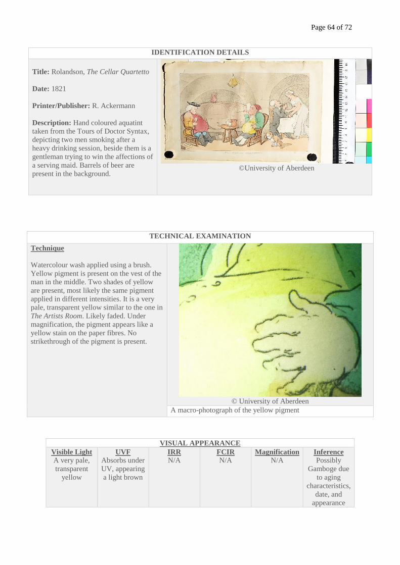
Page 64 of 72
IDENTIFICATION DETAILS
Title: Rolandson, The Cellar Quartetto
Date: 1821
Printer/Publisher: R. Ackermann
Description: Hand coloured aquatint
taken from the Tours of Doctor Syntax,
depicting two men smoking after a
heavy drinking session, beside them is a
gentleman trying to win the affections of
a serving maid. Barrels of beer are
present in the background.
©University of Aberdeen
TECHNICAL EXAMINATION
Technique
Watercolour wash applied using a brush.
Yellow pigment is present on the vest of the
man in the middle. Two shades of yellow
are present, most likely the same pigment
applied in different intensities. It is a very
pale, transparent yellow similar to the one in
The Artists Room. Likely faded. Under
magnification, the pigment appears like a
yellow stain on the paper fibres. No
strikethrough of the pigment is present.
© University of Aberdeen
A macro-photograph of the yellow pigment
VISUAL APPEARANCE
Visible Light
A very pale,
transparent
yellow
UVF
Absorbs under
UV, appearing
a light brown
IRR
N/A FCIR
N/A Magnification
N/A Inference
Possibly
Gamboge due
to aging
characteristics,
date, and
appearance
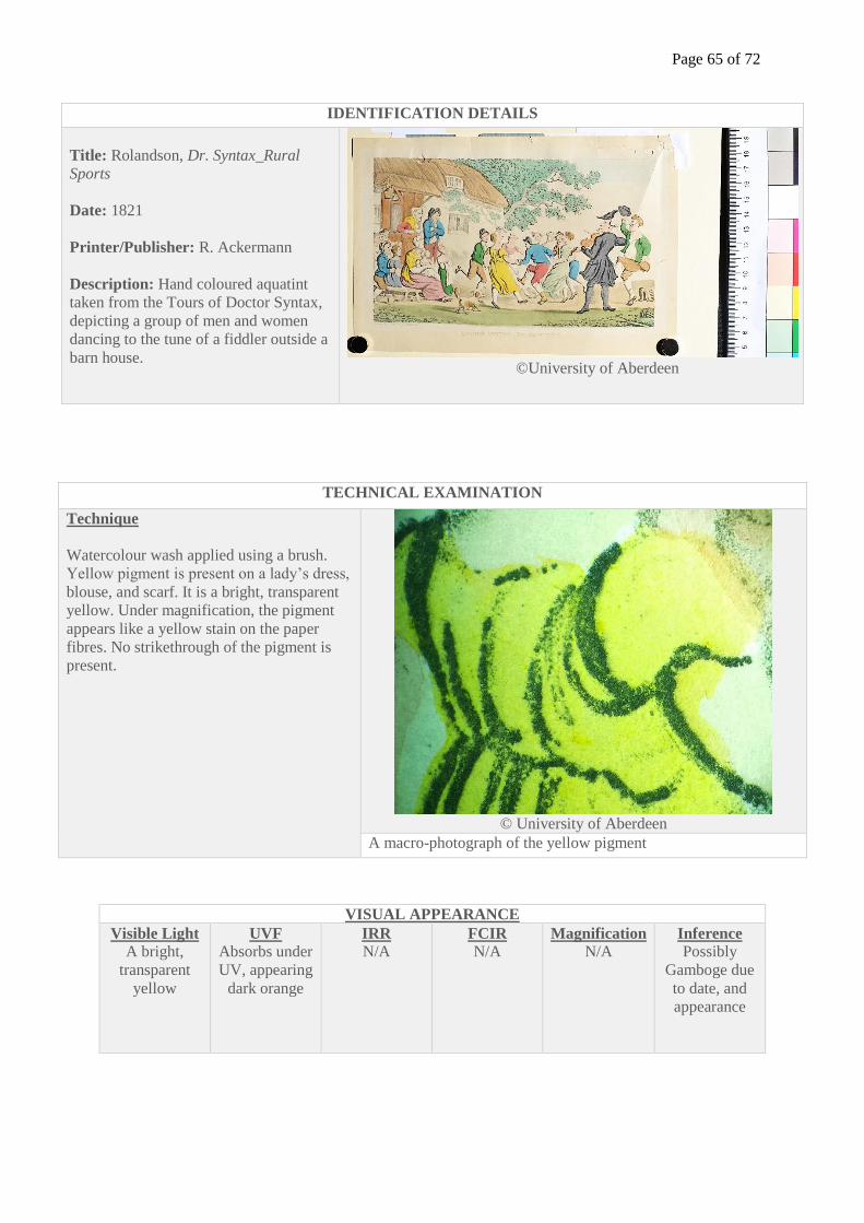
Page 65 of 72
IDENTIFICATION DETAILS
Title: Rolandson, Dr. Syntax_Rural
Sports
Date: 1821
Printer/Publisher: R. Ackermann
Description: Hand coloured aquatint
taken from the Tours of Doctor Syntax,
depicting a group of men and women
dancing to the tune of a fiddler outside a
barn house.
©University of Aberdeen
TECHNICAL EXAMINATION
Technique
Watercolour wash applied using a brush.
Yellow pigment is present on a lady’s dress,
blouse, and scarf. It is a bright, transparent
yellow. Under magnification, the pigment
appears like a yellow stain on the paper
fibres. No strikethrough of the pigment is
present.
© University of Aberdeen
A macro-photograph of the yellow pigment
VISUAL APPEARANCE
Visible Light
A bright,
transparent
yellow
UVF
Absorbs under
UV, appearing
dark orange
IRR
N/A FCIR
N/A Magnification
N/A Inference
Possibly
Gamboge due
to date, and
appearance
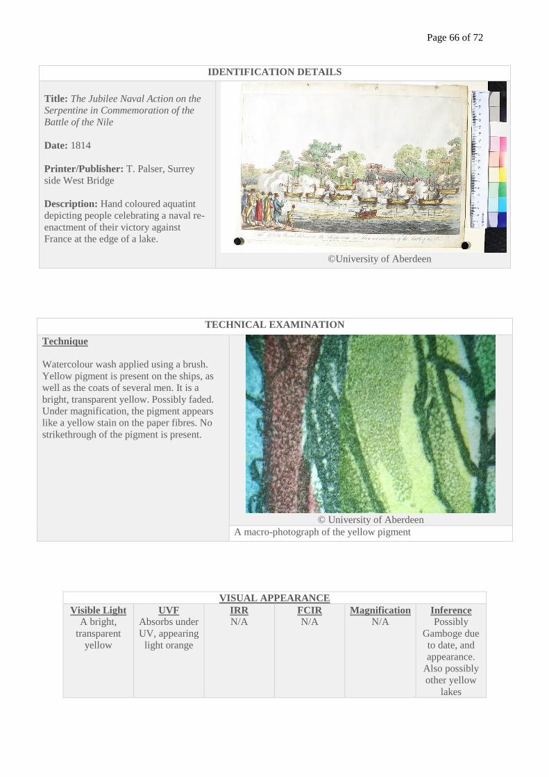
Page 66 of 72
IDENTIFICATION DETAILS
Title: The Jubilee Naval Action on the
Serpentine in Commemoration of the
Battle of the Nile
Date: 1814
Printer/Publisher: T. Palser, Surrey
side West Bridge
Description: Hand coloured aquatint
depicting people celebrating a naval re-
enactment of their victory against
France at the edge of a lake.
©University of Aberdeen
TECHNICAL EXAMINATION
Technique
Watercolour wash applied using a brush.
Yellow pigment is present on the ships, as
well as the coats of several men. It is a
bright, transparent yellow. Possibly faded.
Under magnification, the pigment appears
like a yellow stain on the paper fibres. No
strikethrough of the pigment is present.
© University of Aberdeen
A macro-photograph of the yellow pigment
VISUAL APPEARANCE
Visible Light
A bright,
transparent
yellow
UVF
Absorbs under
UV, appearing
light orange
IRR
N/A FCIR
N/A Magnification
N/A Inference
Possibly
Gamboge due
to date, and
appearance.
Also possibly
other yellow
lakes
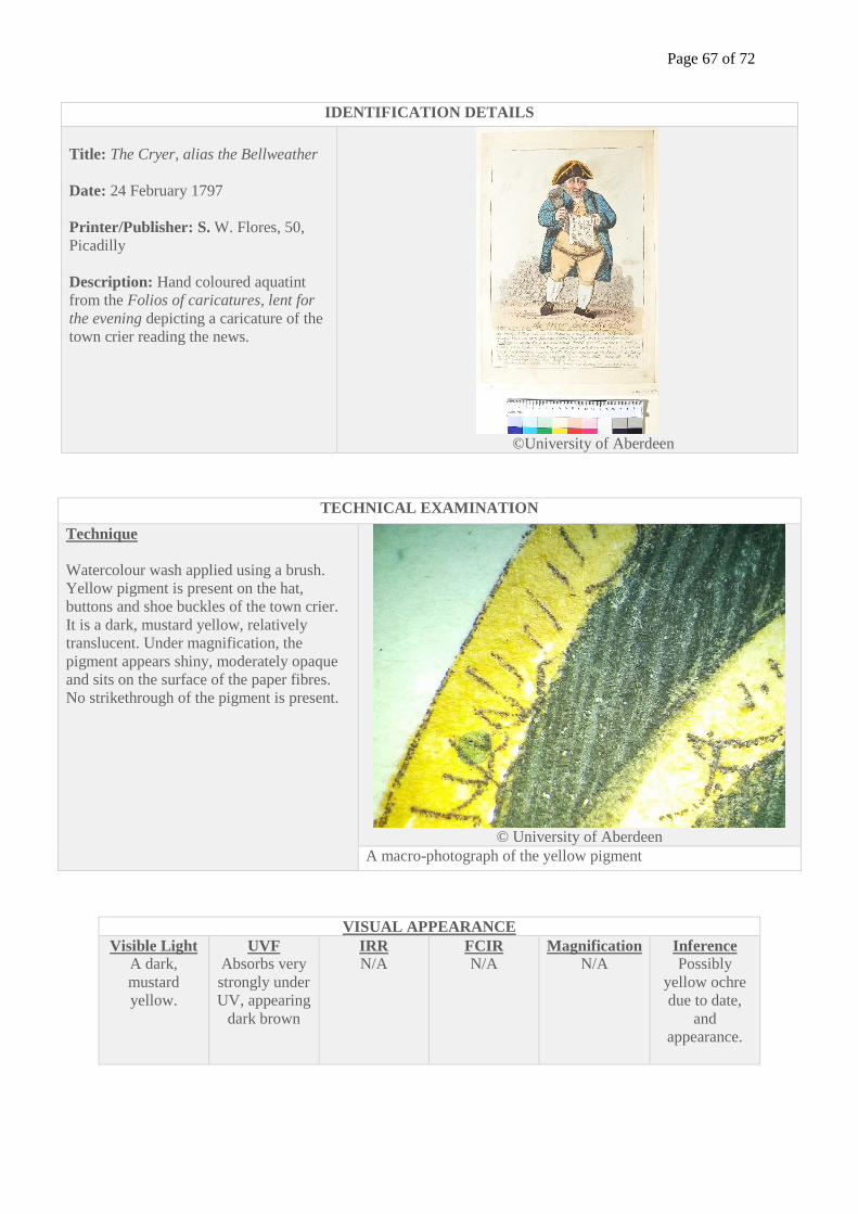
Page 67 of 72
IDENTIFICATION DETAILS
Title: The Cryer, alias the Bellweather
Date: 24 February 1797
Printer/Publisher: S. W. Flores, 50,
Picadilly
Description: Hand coloured aquatint
from the Folios of caricatures, lent for
the evening depicting a caricature of the
town crier reading the news.
©University of Aberdeen
TECHNICAL EXAMINATION
Technique
Watercolour wash applied using a brush.
Yellow pigment is present on the hat,
buttons and shoe buckles of the town crier.
It is a dark, mustard yellow, relatively
translucent. Under magnification, the
pigment appears shiny, moderately opaque
and sits on the surface of the paper fibres.
No strikethrough of the pigment is present.
© University of Aberdeen
A macro-photograph of the yellow pigment
VISUAL APPEARANCE
Visible Light
A dark,
mustard
yellow.
UVF
Absorbs very
strongly under
UV, appearing
dark brown
IRR
N/A FCIR
N/A Magnification
N/A Inference
Possibly
yellow ochre
due to date,
and
appearance.
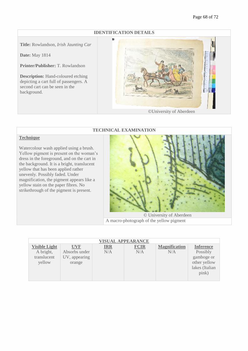
Page 68 of 72
IDENTIFICATION DETAILS
Title: Rowlandson, Irish Jaunting Car
Date: May 1814
Printer/Publisher: T. Rowlandson
Description: Hand-coloured etching
depicting a cart full of passengers. A
second cart can be seen in the
background.
©University of Aberdeen
TECHNICAL EXAMINATION
Technique
Watercolour wash applied using a brush.
Yellow pigment is present on the woman’s
dress in the foreground, and on the cart in
the background. It is a bright, translucent
yellow that has been applied rather
unevenly. Possibly faded. Under
magnification, the pigment appears like a
yellow stain on the paper fibres. No
strikethrough of the pigment is present.
© University of Aberdeen
A macro-photograph of the yellow pigment
VISUAL APPEARANCE
Visible Light
A bright,
translucent
yellow
UVF
Absorbs under
UV, appearing
orange
IRR
N/A FCIR
N/A Magnification
N/A Inference
Possibly
gamboge or
other yellow
lakes (Italian
pink)
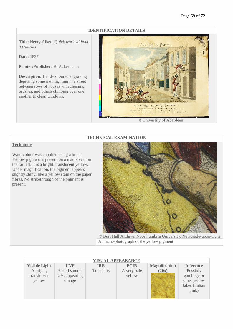
Page 69 of 72
IDENTIFICATION DETAILS
Title: Henry Alken, Quick work without
a contract
Date: 1837
Printer/Publisher: R. Ackermann
Description: Hand-coloured engraving
depicting some men fighting in a street
between rows of houses with cleaning
brushes, and others climbing over one
another to clean windows.
©University of Aberdeen
TECHNICAL EXAMINATION
Technique
Watercolour wash applied using a brush.
Yellow pigment is present on a man’s vest on
the far left. It is a bright, translucent yellow.
Under magnification, the pigment appears
slightly shiny, like a yellow stain on the paper
fibres. No strikethrough of the pigment is
present.
© Burt Hall Archive, Noorthumbria University, Newcastle-upon-Tyne
A macro-photograph of the yellow pigment
VISUAL APPEARANCE
Visible Light
A bright,
translucent
yellow
UVF
Absorbs under
UV, appearing
orange
IRR
Transmits FCIR
A very pale
yellow
Magnification
(20x)
Inference
Possibly
gamboge or
other yellow
lakes (Italian
pink)
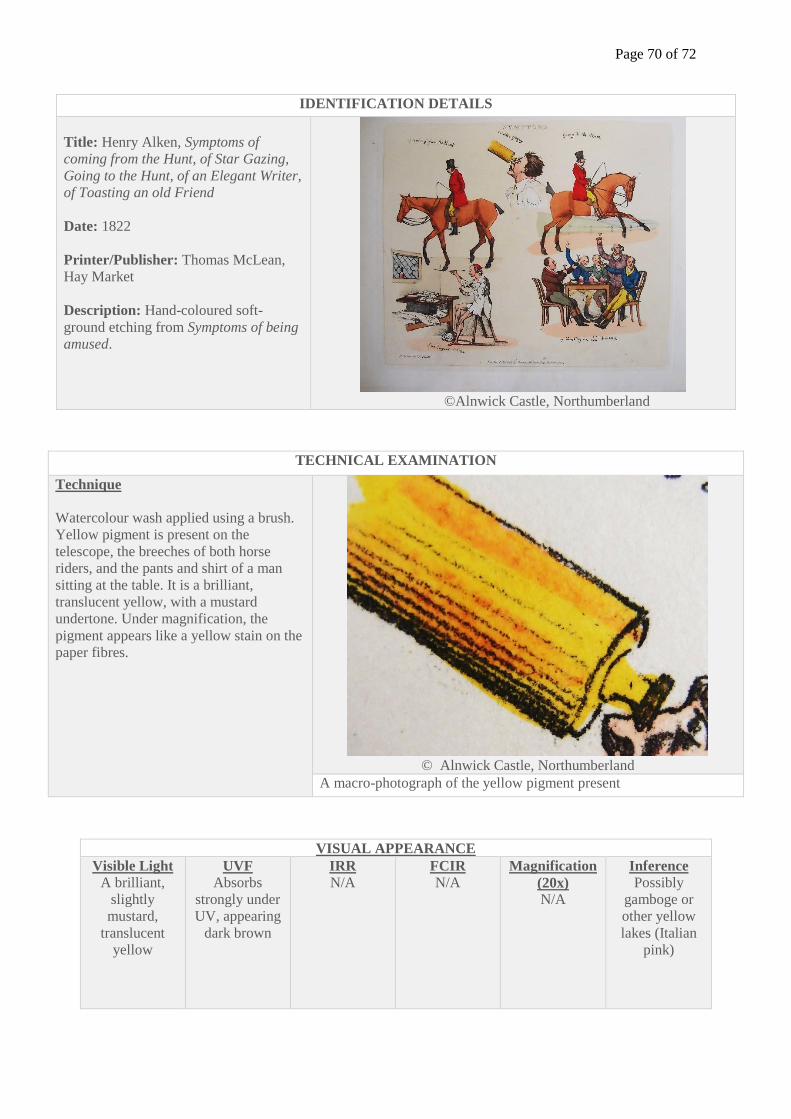
Page 70 of 72
IDENTIFICATION DETAILS
Title: Henry Alken, Symptoms of
coming from the Hunt, of Star Gazing,
Going to the Hunt, of an Elegant Writer,
of Toasting an old Friend
Date: 1822
Printer/Publisher: Thomas McLean,
Hay Market
Description: Hand-coloured soft-
ground etching from Symptoms of being
amused.
©Alnwick Castle, Northumberland
TECHNICAL EXAMINATION
Technique
Watercolour wash applied using a brush.
Yellow pigment is present on the
telescope, the breeches of both horse
riders, and the pants and shirt of a man
sitting at the table. It is a brilliant,
translucent yellow, with a mustard
undertone. Under magnification, the
pigment appears like a yellow stain on the
paper fibres.
© Alnwick Castle, Northumberland
A macro-photograph of the yellow pigment present
VISUAL APPEARANCE
Visible Light
A brilliant,
slightly
mustard,
translucent
yellow
UVF
Absorbs
strongly under
UV, appearing
dark brown
IRR
N/A FCIR
N/A Magnification
(20x)
N/A
Inference
Possibly
gamboge or
other yellow
lakes (Italian
pink)
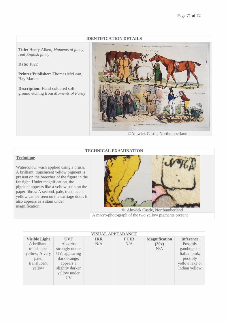
Page 71 of 72
IDENTIFICATION DETAILS
Title: Henry Alken, Moments of fancy,
real English fancy
Date: 1822
Printer/Publisher: Thomas McLean,
Hay Market
Description: Hand-coloured soft-
ground etching from Moments of Fancy.
©Alnwick Castle, Northumberland
TECHNICAL EXAMINATION
Technique
Watercolour wash applied using a brush.
A brilliant, translucent yellow pigment is
present on the breeches of the figure in the
far right. Under magnification, the
pigment appears like a yellow stain on the
paper fibres. A second, pale, translucent
yellow can be seen on the carriage door. It
also appears as a stain under
magnification.
© Alnwick Castle, Northumberland
A macro-photograph of the two yellow pigments present
VISUAL APPEARANCE
Visible Light
A brilliant,
translucent
yellow; A very
pale,
translucent
yellow
UVF
Absorbs
strongly under
UV, appearing
dark orange;
appears a
slightly darker
yellow under
UV
IRR
N/A FCIR
N/A Magnification
(20x)
N/A
Inference
Possibly
gamboge or
Italian pink;
possibly
yellow lake or
Indian yellow
Page 72 of 72
IDENTIFICATION DETAILS
Title: Pigal, Quelle Scie!
Date: 1822 (possibly hand-coloured
later)
Printer/Publisher: Cher Gihaut et
Martinet
Description: Hand-coloured lithograph
from Scenes de Société depicting an old
woman and a young woman with their
arms linked. The young woman has an
irritable look on her face.
TECHNICAL EXAMINATION
Technique
Watercolour wash applied using a brush.
A light, translucent yellow pigment is
present on the skirt and sleeves of the old
woman. Under magnification, the pigment
appears like a yellow stain on the paper
fibres.
A macro-photograph of the yellow pigment present
VISUAL APPEARANCE
Visible Light
A light,
translucent
yellow
UVF
Appears a
light yellow
under UV
IRR
Transmits FCIR
A pale yellow Magnification
(20x)
Inference
Possibly
Quercitron