a really big change…
TRANSCRIPT
63
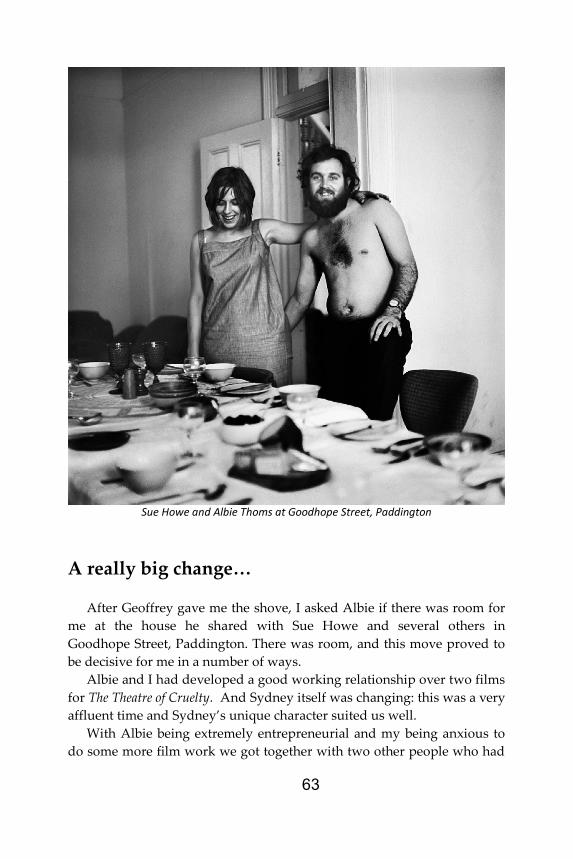
Sue Howe and Albie Thoms at Goodhope Street, Paddington
A really big change… After Geoffrey gave me the shove, I asked Albie if there was room for
me at the house he shared with Sue Howe and several others in Goodhope Street, Paddington. There was room, and this move proved to be decisive for me in a number of ways.
Albie and I had developed a good working relationship over two films for The Theatre of Cruelty. And Sydney itself was changing: this was a very affluent time and Sydney’s unique character suited us well.
With Albie being extremely entrepreneurial and my being anxious to do some more film work we got together with two other people who had
64
worked on The Theatre of Cruelty, John Clark and Aggy Read, to form a co-operative group that we decided to call “Ubu Films”, named after Alfred Jarry’s Ubu Roi, a play that Albie had produced and I had seen and liked a little time earlier.
The original costumes for Ubu Roi, designed by Pierre Bonnard, had Ubu as a shapeless lump bearing a huge spiral on his belly. I loved this spiral and used it as the logo for Ubu Films, creating the original graphic by putting a sheet of card on a gramophone turntable, then with the card turning while holding a fat felt pen to it, moving the pen outward to draw the spiral.
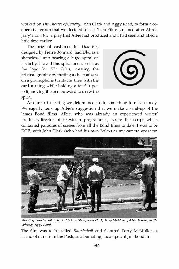
At our first meeting we determined to do something to raise money. We eagerly took up Albie’s suggestion that we make a send-up of the James Bond films. Albie, who was already an experienced writer/ producer/director of television programmes, wrote the script which contained parodies of scenes from all the Bond films to date. I was to be DOP, with John Clark (who had his own Bolex) as my camera operator.
The film was to be called Blunderball and featured Terry McMullen, a friend of ours from the Push, as a bumbling, incompetent Jim Bond. In
Shooting Blunderball. L. to R: Michael Steel; John Clark; Terry McMullen; Albie Thoms; Keith Whitely; Aggy Read.
65
fact almost all the characters in the film were played by people from the Push, to which Albie was as firmly connected as I was.
In those days there was little, if any, theatrical film production happening in Australia. Feature film production had dried up at the start of the Second World War, so there was little marketing expertise for us to draw on. Of course, for film making to be successful there has to be publicity. We had to make it up ourselves. I think this is what made
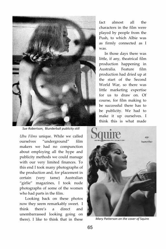
Ubu Films unique. While we called ourselves “underground” film makers we had no compunction about employing all the hype and publicity methods we could manage with our very limited finances. To this end I took many photographs of the production and, for placement in certain (very tame) Australian “girlie” magazines, I took nude photographs of some of the women who had parts in the film.
Looking back on these photos now they seem remarkably sweet. I think there’s a direct and unembarrassed looking going on there). I like to think that in these
Sue Robertson, Blunderball publicity still
Mary Patterson on the cover of Squire
66
photographs there’s none of the vulgar posturing and sexual dishonesty of the usual publicity material. If I’m right it seems that, much as I thought I wanted to be, I wasn’t really cut out to be blatantly commercial.
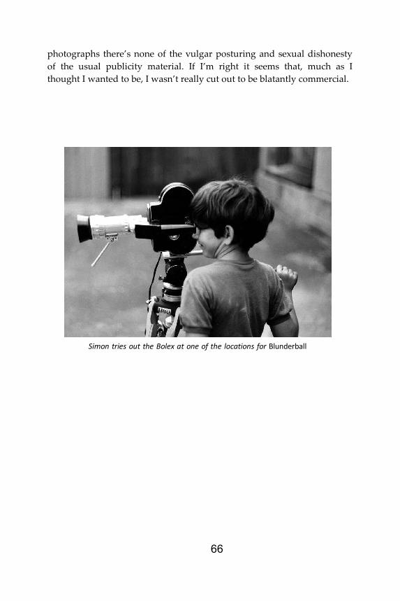
Simon tries out the Bolex at one of the locations for Blunderball
67
After Blunderball ... After Blunderball, which left us all enthused about the processes of film
making (including the marketing and screening), we were ready to start on more of the same. Or should I say we were anxious to improve on what we’d done so far?
One of the problems of working with very limited budgets is that personal standards of quality can be swamped by other requirements, at least they were in my case. Of course I can’t deny that my personal standards for photography were originally formed in the context of commercial magazine production in the 1950’s rather than “fine art” photography. Whatever the merits of that self-assessment, the work done under the
umbrella of Ubu Films is described in extreme detail in Peter Mudie’s book, Sydney Underground Movies.
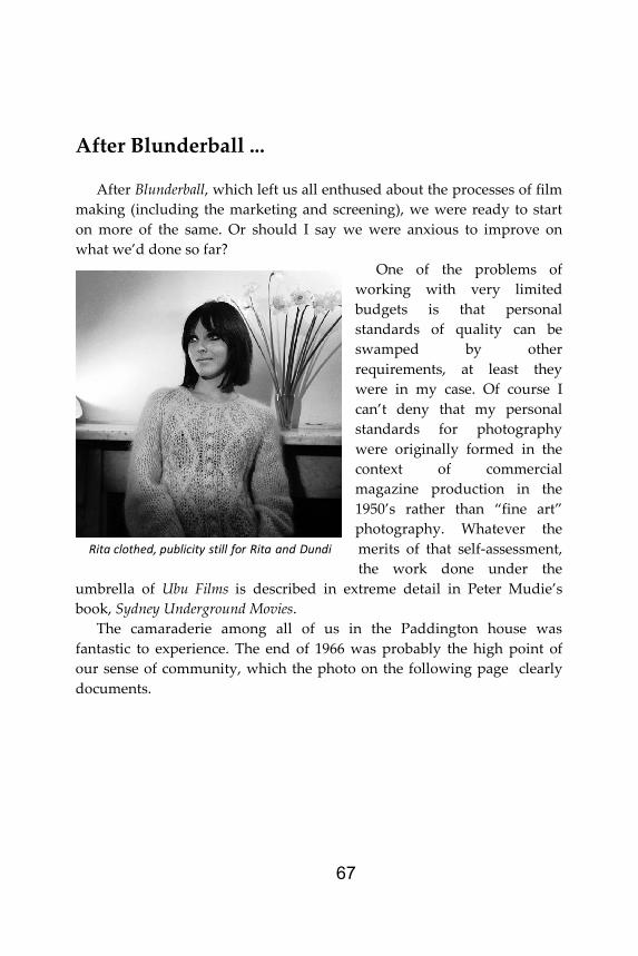
The camaraderie among all of us in the Paddington house was fantastic to experience. The end of 1966 was probably the high point of our sense of community, which the photo on the following page clearly documents.
Rita clothed, publicity still for Rita and Dundi

68
And although I was deeply involved in photography and film making I hadn’t lost my love of painting. For some years, although my “lifestyle”
and financial situation made it difficult, I had been attempting to base my imagery on “pin-up” or “glamour” photographs I came upon while I was still working in the printing industry. There are obvious similarities here with the “Pop Art” being done in the United States, although I came to my subject matter independently. The painting on the wall behind Sue is a good example of where I had come to in the mid-1960s.
However, although it doesn’t really show in the above example, I began working like this not in emulation of the Americans but in direct response to what I perceived as looks of unease, even unhappiness on the faces of the models for the photographs I took as my starting points. I
Sue Howe and Aggy Read at Boxing Day dinner at Goodhope Street, 1966
69
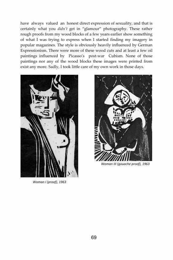
have always valued an honest direct expression of sexuality, and that is certainly what you didn’t get in “glamour” photography. These rather rough proofs from my wood blocks of a few years earlier show something of what I was trying to express when I started finding my imagery in popular magazines. The style is obviously heavily influenced by German Expressionism. There were more of these wood cuts and at least a few oil paintings influenced by Picasso’s post-war Cubism. None of those paintings nor any of the wood blocks these images were printed from exist any more. Sadly, I took little care of my own work in those days.
Woman I (proof), 1963
Woman III (gouache proof), 1963
70
Extreme abstraction in films ... Ubu Films and before that the Theatre of Cruelty had given me the
opportunity to take up again and develop on 16mm film some techniques I had first tried out on 8mm some years before. These techniques could be described as “animation”, although certainly not animation as people brought up on a strict Disney diet might recognise.
In the very early 1960s I had exploited this effect when I filmed a wall in Redfern with my 8mm camera. Instead of running the camera continuously I stood close to the wall and shot numerous “still” frames of related details of torn posters, peeling paint and so on. The result when I
projected the processed film delighted me. The images were extremely dynamic “dancing” I might have said as well as being, I like to think, a very vivid form of “social realism”. (If that description offends a lot of Australian film makers I’m delighted. Many of these people have worked with such a limited idea of the expressive capabilities of their medium, and have criticised any work that doesn’t conform to their notion of cinema as illustrated literature ... but I won’t go on, I’ll just wind myself up into a spluttering, resentful old windbag, and that won’t do, will it?)
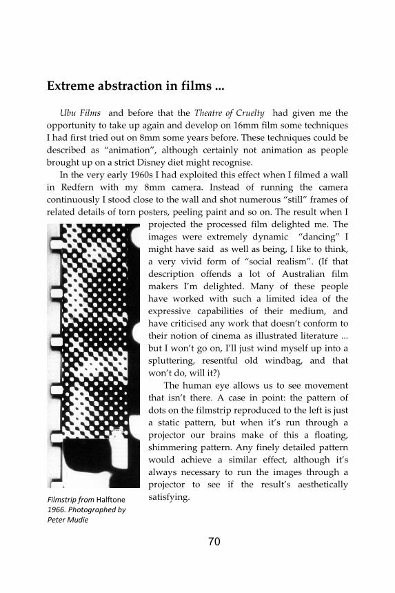
The human eye allows us to see movement that isn’t there. A case in point: the pattern of dots on the filmstrip reproduced to the left is just a static pattern, but when it’s run through a projector our brains make of this a floating, shimmering pattern. Any finely detailed pattern would achieve a similar effect, although it’s always necessary to run the images through a projector to see if the result’s aesthetically satisfying. Filmstrip from Halftone
1966. Photographed by Peter Mudie

71
In the case of the little film, Halftone, the strips were printed from a halftone4 negative through an enlarger onto strips of 16mm film, so that the original dot patterns were spread across the full width of the strips and thus covered the soundtrack area as well as the image area. After editing, I asked the lab to run the film through the printer twice, printing the image area first, then to wind the original and print material back to the start and print the soundtrack area with the image starting twenty-eight frames earlier, to allow for the offset between picture start and audio start on a standard 16mm print. The result was a film in which the pattern you saw on the screen also created the sound you heard from the speakers.
Halftone and Poem 25 (hand drawn directly on film) were two of a large number of films made without cameras in the Ubu period. We called them “synthetic films”. Poem 25, like most synthetic films, was drawn directly on blank film and was only truly effective in the theatre
where a performer spoke numbers in sync with the hand-drawn numbers dancing on the screen.
4 A “halftone” image is used in printing to convert tonal images to varying sized dots of ink, usually in regular patterns.
Frame from Poem 25, 1965
72
Harbour ...
Towards the end of 1966 and early 1967 I worked on two films
virtually back-to-back. These were Harbour, our first experience of working with Eastmancolor negative film, and The Tribulations of Mr DuPont Nomore. Harbour was to some extent a remake of a film I’d made many years before on 8mm black-and-white film, while Tribulations was developed out of a momentary incident while I was still living with Judy; it was an escape fantasy (and fairly crass at that).
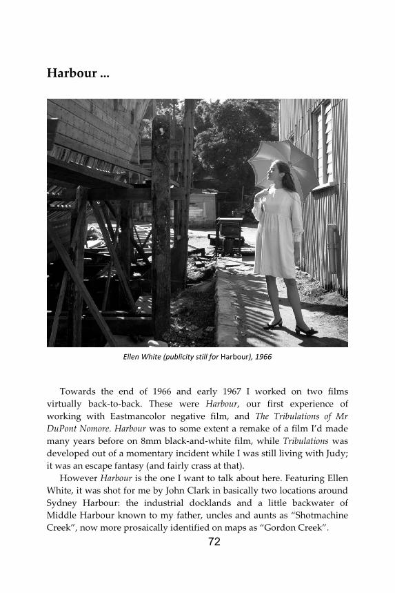
However Harbour is the one I want to talk about here. Featuring Ellen White, it was shot for me by John Clark in basically two locations around Sydney Harbour: the industrial docklands and a little backwater of Middle Harbour known to my father, uncles and aunts as “Shotmachine Creek”, now more prosaically identified on maps as “Gordon Creek”.
Ellen White (publicity still for Harbour), 1966
73
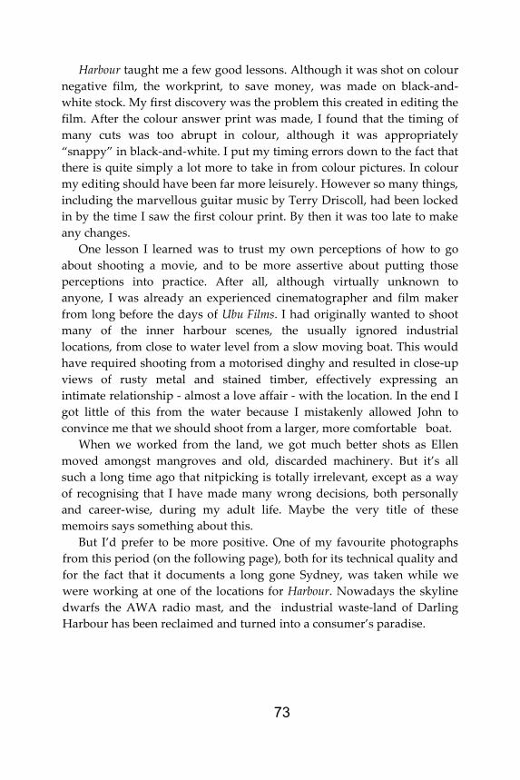
Harbour taught me a few good lessons. Although it was shot on colour negative film, the workprint, to save money, was made on black-and-white stock. My first discovery was the problem this created in editing the film. After the colour answer print was made, I found that the timing of many cuts was too abrupt in colour, although it was appropriately “snappy” in black-and-white. I put my timing errors down to the fact that there is quite simply a lot more to take in from colour pictures. In colour my editing should have been far more leisurely. However so many things, including the marvellous guitar music by Terry Driscoll, had been locked in by the time I saw the first colour print. By then it was too late to make any changes.
One lesson I learned was to trust my own perceptions of how to go about shooting a movie, and to be more assertive about putting those perceptions into practice. After all, although virtually unknown to anyone, I was already an experienced cinematographer and film maker from long before the days of Ubu Films. I had originally wanted to shoot many of the inner harbour scenes, the usually ignored industrial locations, from close to water level from a slow moving boat. This would have required shooting from a motorised dinghy and resulted in close-up views of rusty metal and stained timber, effectively expressing an intimate relationship - almost a love affair - with the location. In the end I got little of this from the water because I mistakenly allowed John to convince me that we should shoot from a larger, more comfortable boat.
When we worked from the land, we got much better shots as Ellen moved amongst mangroves and old, discarded machinery. But it’s all such a long time ago that nitpicking is totally irrelevant, except as a way of recognising that I have made many wrong decisions, both personally and career-wise, during my adult life. Maybe the very title of these memoirs says something about this.
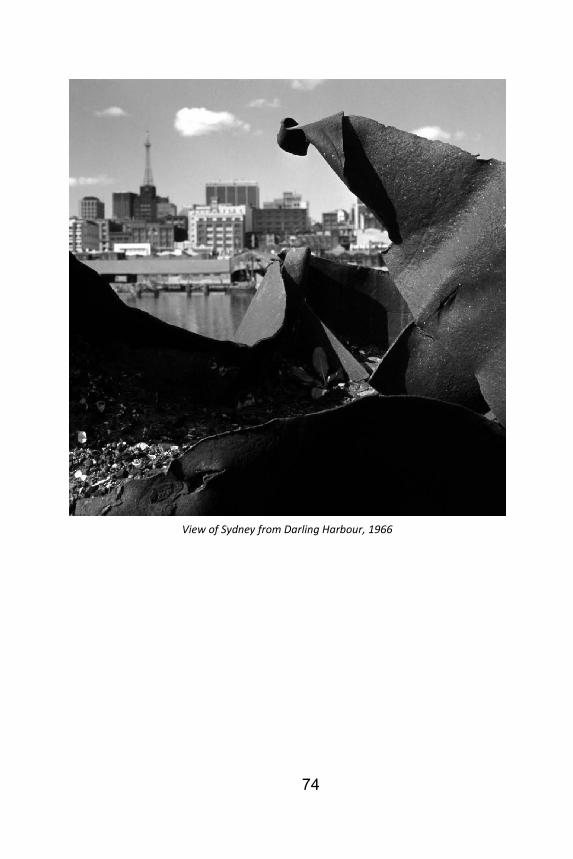
But I’d prefer to be more positive. One of my favourite photographs from this period (on the following page), both for its technical quality and for the fact that it documents a long gone Sydney, was taken while we were working at one of the locations for Harbour. Nowadays the skyline dwarfs the AWA radio mast, and the industrial waste-land of Darling Harbour has been reclaimed and turned into a consumer’s paradise.
74
View of Sydney from Darling Harbour, 1966