a platform for mobile visualization of shm data - · pdf file3.2 a graphical representation of...
TRANSCRIPT

A Platform for Mobile Visualization of SHM
Data
by
Matthew Woelk
A Thesis submitted to the Faculty of Graduate Studies of
The University of Manitoba
in partial fulfillment of the requirements of the degree of
MASTER OF SCIENCE
Department of Electrical and Computer Engineering
University of Manitoba
Winnipeg
Copyright c© 2014 by Matthew Woelk

Abstract
This thesis presents a system to display Structural Health Monitoring (SHM) data interactively at
multiple scales that range from milliseconds to years. SHM data is collected from dozens of sensors
hundreds of times per second for years, which produces hundreds of gigabytes of data. Typical ways
of visualizing large SHM datasets produce static plots that take significant time to render. The
system presented in this thesis improves upon standard tools by providing an interactive interface
and a speed-optimized binning algorithm. Using the interface, a user is able to view data collected
from a bridge’s sensors at multiple scales in a web browser. This allows a user to visually inspect
the entire range of their data to detect anomalies, as well as both short and long-term trends. To
render the data, the system uses a binning algorithm to calculate a five-number summary of a range
of data. Those bins are combined, two at a time, to generate increasingly high levels of bins, which
are then rendered as a binned line chart. The chart is rendered using a standard web browser on
both desktop and mobile devices. By using the system, a user can pinch or scroll to zoom the plot,
and drag to pan through time, in order to easily navigate through the data.
i

Acknowledgements
I would like to thank my advisor Dr. Dean K. McNeill for his ongoing support, as well as Dr.
Witold Kinsner and Dr. Rasit Eskicioglu for their time in reading the thesis and for their feedback.
ii
Contents
Abstract i
Acknowledgements ii
Contents iii
List of Tables v
List of Figures vi
1 Introduction 11.1 Additional Goals . . . . . . . . . . . . . . . . . . . . . . . . . . . . . . . . . . . . . . 2
2 Implementation 32.1 Data . . . . . . . . . . . . . . . . . . . . . . . . . . . . . . . . . . . . . . . . . . . . . 4
3 Binning Algorithm 53.1 Calculation of Properties . . . . . . . . . . . . . . . . . . . . . . . . . . . . . . . . . . 6
3.1.1 Average . . . . . . . . . . . . . . . . . . . . . . . . . . . . . . . . . . . . . . . 63.1.2 Maximum . . . . . . . . . . . . . . . . . . . . . . . . . . . . . . . . . . . . . . 63.1.3 Minimum . . . . . . . . . . . . . . . . . . . . . . . . . . . . . . . . . . . . . . 63.1.4 First Quartile . . . . . . . . . . . . . . . . . . . . . . . . . . . . . . . . . . . . 73.1.5 Third Quartile . . . . . . . . . . . . . . . . . . . . . . . . . . . . . . . . . . . 7
3.2 Accuracy . . . . . . . . . . . . . . . . . . . . . . . . . . . . . . . . . . . . . . . . . . 8
4 Display of Binned Data 9
5 User Interface 115.1 Web Technologies . . . . . . . . . . . . . . . . . . . . . . . . . . . . . . . . . . . . . . 115.2 Scalable Vector Graphics . . . . . . . . . . . . . . . . . . . . . . . . . . . . . . . . . . 115.3 JavaScript Libraries . . . . . . . . . . . . . . . . . . . . . . . . . . . . . . . . . . . . 125.4 Controls . . . . . . . . . . . . . . . . . . . . . . . . . . . . . . . . . . . . . . . . . . . 135.5 Slider . . . . . . . . . . . . . . . . . . . . . . . . . . . . . . . . . . . . . . . . . . . . 135.6 Menus . . . . . . . . . . . . . . . . . . . . . . . . . . . . . . . . . . . . . . . . . . . . 15
5.6.1 Lines Menu . . . . . . . . . . . . . . . . . . . . . . . . . . . . . . . . . . . . . 155.6.2 Edit Menu . . . . . . . . . . . . . . . . . . . . . . . . . . . . . . . . . . . . . 19
5.7 Visual Aids . . . . . . . . . . . . . . . . . . . . . . . . . . . . . . . . . . . . . . . . . 225.8 Temperature and Cloud Cover . . . . . . . . . . . . . . . . . . . . . . . . . . . . . . 225.9 Rendering Frequency . . . . . . . . . . . . . . . . . . . . . . . . . . . . . . . . . . . . 245.10 Management of Uncertainty . . . . . . . . . . . . . . . . . . . . . . . . . . . . . . . . 24
6 System Architecture 266.1 Database Server . . . . . . . . . . . . . . . . . . . . . . . . . . . . . . . . . . . . . . 266.2 Visualization Server . . . . . . . . . . . . . . . . . . . . . . . . . . . . . . . . . . . . 276.3 Client . . . . . . . . . . . . . . . . . . . . . . . . . . . . . . . . . . . . . . . . . . . . 28
iii

6.4 Containers . . . . . . . . . . . . . . . . . . . . . . . . . . . . . . . . . . . . . . . . . . 28
7 Conclusions 30
8 Future Directions 31
References 33
Appendices 34
iv

List of Tables
8.1 Formats for tick labels. . . . . . . . . . . . . . . . . . . . . . . . . . . . . . . . . . . . 368.2 Distance between tick labels and corresponding distance between ticks. . . . . . . . . 37
v

List of Figures
1.1 Rendering using the proposed method reduces the amount of data required to berendered to a constant value. 6000 data points represents 30 seconds of data. . . . . 2
2.1 A comparison between a typical chart of raw data and a binned version of that samedata. . . . . . . . . . . . . . . . . . . . . . . . . . . . . . . . . . . . . . . . . . . . . . 3
2.2 Users can zoom in and out of the charts to reveal trends in the data. The upperdiagram shows two minutes of data, while the lower diagram shows four and a halfhours, centred around the same region. . . . . . . . . . . . . . . . . . . . . . . . . . . 4
2.3 The result of zooming out to a view of three days of data. Shorter term trends areno longer visible while daily trends are now visually apparent. . . . . . . . . . . . . . 4
3.1 Binning results from level 0 to level 2. Each value is the average of the two valuesfrom the level beneath it. . . . . . . . . . . . . . . . . . . . . . . . . . . . . . . . . . 6
3.2 A graphical representation of calculating approximate quartiles for two examples.The highest two quartiles are used for q3, and the lowest two are used for q1. . . . . 7
3.3 The histogram for the approximated q1 and q3 compared to the actual values of q1,q3, and average. This shows the number of results for each resulting calculation q1and q3. . . . . . . . . . . . . . . . . . . . . . . . . . . . . . . . . . . . . . . . . . . . 8
4.1 Examples of Horizon Charts that were considered before Binned Line Charts weredecided upon. Positive values are red, negative values are blue, and the darkness ofa colour represents its magnitude. . . . . . . . . . . . . . . . . . . . . . . . . . . . . . 9
4.2 The maximum values of each bin are connected with blue lines to show trends overtime. Similarly, average and minimum values are connected with red and green lines,respectively. The inner quartile region between the first and third quartiles is shownas a light-red area. . . . . . . . . . . . . . . . . . . . . . . . . . . . . . . . . . . . . . 10
5.1 The relationship between JavaScript libraries on the server and client. . . . . . . . . 12
5.2 The effect of the handle, which is on the left side of each diagram, can be seen. Theupper diagram shows a handle pointing to level 15. Moving that handle down to 17(as shown in the centre diagram) shows bins that are two levels higher. Moving theslider so that the handle points to level 18 (as shown in the lower diagram) changesthe chart to show bins of level 18. . . . . . . . . . . . . . . . . . . . . . . . . . . . . . 14
5.3 With the LinesMenu selected, the user can choose which lines are to be displayedin the charts. The first diagram shows a chart with only the average lines visible,while the second diagram shows only the maximum and minimum lines. . . . . . . . 16
5.4 Isolating the average lines and quartile regions allow the user to see subtle trendswith more clarity. . . . . . . . . . . . . . . . . . . . . . . . . . . . . . . . . . . . . . . 17
5.5 The user can choose which interpolation method is used to render the lines. Thefirst diagram is a typical view, and the second diagram shows the same view, butusing linear interpolation between points instead of the default step interpolation. . 18
5.6 The interface with the Edit Menu selected. The charts are non-interactive andare therefore greyed-out. Add, remove, multiply, subtract, and move buttons areaccessible in this view. . . . . . . . . . . . . . . . . . . . . . . . . . . . . . . . . . . . 20
vi

5.7 The top digram shows sensors 19 and 20. The second diagram is the result ofcombining those sensors with multiplication, and the third diagram shows the resultof subtraction. . . . . . . . . . . . . . . . . . . . . . . . . . . . . . . . . . . . . . . . 21
5.8 Two loading indicators are visible. In the top-left an arc slowly rotates, and on eachchart where data has not yet been loaded, lines move across the region whenever datais being loaded from the visualization server. These are indicated with red arrows. . 23
5.9 Temperature is rendered using the same type of chart, which is shown in the topchart of both of these diagrams, while cloud cover is shown as light or dark dependingon the amount of sunlight. Two binning levels are shown for the same time range. . 23
5.10 Whenever a region of size a is displayed in a view, another region is rendered oneither side. When the view moves to within ten percent of the edge of the totalrendered region, a new region is rendered centered around the view. . . . . . . . . . 24
5.11 Missing data is shown in two regions with grey rectangles. An approximation of theaverage value is available and shown in the rightmost region with a red dashed line. 25
6.1 The architecture of the system. Raw data is stored on the Database Server, andbinned data is stored on the Visualization Server. The Clients connect to the Visu-alization server over the Internet. . . . . . . . . . . . . . . . . . . . . . . . . . . . . . 26
6.2 How many data points are generated for each level when there are 1000 points ofraw data. . . . . . . . . . . . . . . . . . . . . . . . . . . . . . . . . . . . . . . . . . . 28
vii
Chapter 1
Introduction
In the area of Structural Health Monitoring (SHM) groups of sensors on bridges gather mea-
surements and can generate large amounts of data. These databases can grow to be hundreds of
gigabytes in size.
Common methods of displaying this data produce plots that are visually cluttered and unin-
formative when viewing large amounts of data. These charts are produced by plotting the data as
points connected by a line, which require that every raw data point is processed in order to produce
the plot. This becomes a very time-intensive process for databases that are hundreds of gigabytes
in size, and makes rendering an interactive display infeasible, especially on a mobile device. The
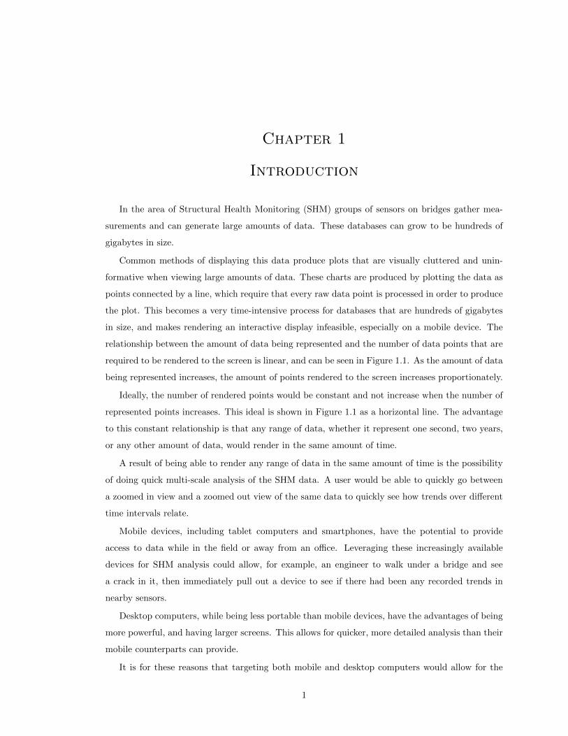
relationship between the amount of data being represented and the number of data points that are
required to be rendered to the screen is linear, and can be seen in Figure 1.1. As the amount of data
being represented increases, the amount of points rendered to the screen increases proportionately.
Ideally, the number of rendered points would be constant and not increase when the number of
represented points increases. This ideal is shown in Figure 1.1 as a horizontal line. The advantage
to this constant relationship is that any range of data, whether it represent one second, two years,
or any other amount of data, would render in the same amount of time.
A result of being able to render any range of data in the same amount of time is the possibility
of doing quick multi-scale analysis of the SHM data. A user would be able to quickly go between
a zoomed in view and a zoomed out view of the same data to quickly see how trends over different
time intervals relate.
Mobile devices, including tablet computers and smartphones, have the potential to provide
access to data while in the field or away from an office. Leveraging these increasingly available
devices for SHM analysis could allow, for example, an engineer to walk under a bridge and see
a crack in it, then immediately pull out a device to see if there had been any recorded trends in
nearby sensors.
Desktop computers, while being less portable than mobile devices, have the advantages of being
more powerful, and having larger screens. This allows for quicker, more detailed analysis than their
mobile counterparts can provide.
It is for these reasons that targeting both mobile and desktop computers would allow for the
1

0 2000 4000 6000data points represented
0
2000
4000
6000
data
points
rendered
Raw DataBinned Data
Figure 1.1: Rendering using the proposed method reduces the amount of data required to berendered to a constant value. 6000 data points represents 30 seconds of data.
broadest range of SHM data analysis capabilities.
The formal thesis question for the work presented is, “Can a system be designed and built to
represent SHM data on both desktop and mobile devices, for which any range of data chosen to be
represented requires an equal number of points to be rendered to the screen?”
Links to a screencast demonstrating the use of this project and its code can be found in Appendix
A.
1.1 Additional Goals
Two additional goals were established for this project. The first goal stated that the project should
be faster then typical systems where users statically render a chosen range of data from a database
to the screen using standard plotting tools, and the second goal stated that the project should be
open source and flexible, meaning that it would be freely available for anyone to use on most types
of hardware.
2

Chapter 2
Implementation
In order to speed up access times for the data at multiple view scales, the proposed system
separates data into regions called “bins” and then renders them to the screen. The bins of the first
level are made by combining two raw data points and calculating five properties of the pair. The
properties of higher-level bins are calculated by combining the properties of the two bins that are
one level lower which occupy the same time period. Bins from the level of the user’s choosing are
displayed to the screen, where the properties of adjacent bins are connected by lines.
A visual comparison between the display of a typical plotting method and the proposed method
is shown in Figure 2.1. Figure 2.2 shows higher level bins in a five hour range and at this scale
a periodic trend can be seen in the data that has a period of about thirty minutes. The chart in
Figure 2.3 is displaying three days of even higher level bins and has a visible trend with a period
of one day.
Figure 2.1: A comparison between a typical chart of raw data and a binned version of that samedata.
3

Figure 2.2: Users can zoom in and out of the charts to reveal trends in the data. The upperdiagram shows two minutes of data, while the lower diagram shows four and a half hours, centredaround the same region.
Figure 2.3: The result of zooming out to a view of three days of data. Shorter term trends are nolonger visible while daily trends are now visually apparent.
2.1 Data
The data was previously collected using a National Instruments Compact RIO system in the same
manner as described in [4–6]. The strain gauges of the Compact RIO system were attached to
the girders of the bridge, and gave readings in terms of microstrain. The database for this project
contained two and a half years of data, acquired at a rate of 200 samples per second.
4

Chapter 3
Binning Algorithm
To achieve the goal of displaying sensor data over a wide range of time scales (levels of display)
on a mobile system, the data needs to be compressed. For transmission, storage, and for efficiency
of processing on the mobile device, it is not sufficient to simply transmit raw data. Our method
uses a binning algorithm to compress the data in a way that makes it efficient to transfer and
manipulate, and also making it easy to visually identify trends in the data at whichever scale is
being displayed. Additionally, our method was created so that viewing a number of bins requires
the same amount of data to be sent from the server, regardless of the level of those bins. As a
result, low-level data is just as quick to render as high-level data, making it just as fast to view.
Our method is a lossy compression method, meaning that the raw data cannot be reconstructed
from the compressed version. This method starts by combining raw samples by grouping them into
adjacent pairs and calculating five properties of the pair. To generate higher bins, pairs of two bins
from the lower level are combined. An example of calculating the average for bins of level one and
two can be seen in Figure 3.1.
When a pair is binned this way, the maximum, minimum, average, and an approximation of the
first and third quartiles are found for that pair. These 5 properties make up the bin, and were chosen
because they are a standard five-number summary, as described in [8] but with two differences. The
first difference is that the average replaced the median as a measure of the location of the data, and
the second is that the quartiles are an approximation. This modified five-number summary was
chosen because those five properties all share the property of being able to be generated based on
the bin data of any lower level. Because of this, the client can receive a level and calculate all levels
above that for the given data range, without requiring the raw data. This reduces the required
amount of data to be sent between the client and the server, which are described in Chapter 6, and
also speeds up the initial binning process on the server.
5

Figure 3.1: Binning results from level 0 to level 2. Each value is the average of the two values fromthe level beneath it.
3.1 Calculation of Properties
The following equations show how the properties of each bin are calculated. property1 and property2
refer to properties of bin 1 and 2 respectively, where property is one of average, q1, q3, minimum,
or maximum. When level 1 is being calculated it uses raw data, so property1 refers to the first of
the two raw values being binned, for any value of property.
3.1.1 Average
The average is calculated from the two lower average values using the following equation.
average =average1 + average2
2(3.1)
3.1.2 Maximum
The maximum value is found by applying the max function to the two maximum values from the
lower level bins, as can be seen in the following equation. The max function returns the highest of
its two arguments.
maximum = max(maximum1,maximum2) (3.2)
3.1.3 Minimum
Similarly, the minimum values is found by applying the min function to the two minimum values
from the lower level bins. The following equation is used, where min is a function that returns the
lowest of its two arguments.
6

minimum = min(minimum1,minimum2) (3.3)
3.1.4 First Quartile
The first quartile is found by taking the average of the lowest of the following four values: the
first bin’s first and third quartile, and the second bin’s first and third quartile. Figure 3.2 shows
a graphical representation of this process. The quartiles calculated using the following equation,
where the mintwo function returns the two lowest of its arguments, and the avg function returns
the average value of its two arguments, calculated in the same manner as equation 3.1. q1 and q3
represent the first and third quartiles, and their subscript endings indicate which bin they are from
(for example: q31 is from the first bin).
q1 = avg(mintwo(q11, q31, q12, q32)) (3.4)
3.1.5 Third Quartile
Finally, the third quartile is calculated similarly to the first quartile, but instead of using the lowest
two values it uses the maxtwo function to return the highest two of the four values, which are then
averaged. This can be seen in the following equation.
q3 = avg(maxtwo(q11, q31, q12, q32)) (3.5)
Bin: 1 2 1 and 2 together
q3q1
Figure 3.2: A graphical representation of calculating approximate quartiles for two examples. Thehighest two quartiles are used for q3, and the lowest two are used for q1.
7

3.2 Accuracy
The values for the average, maximum, and minimum are accurate, while the quartiles are approx-
imations. The same data values when rearranged in time give different results for the quartiles
approximation. To quantify the accuracy, the algorithm was run on the set of numbers from one
through eight in every permutation. The results for the first quartile were as follows. 82.9% of
results were between the actual first quartile and the average, 8.6% were between the actual first
quartile and the minimum value, and 8.6% were the same as the actual first quartile. Figure 3.3
shows the histogram for the algorithm when used on the test data.
The reason this approximation was chosen over a true quartile was so that any level could be
calculated from the level below it, allowing the client to receive one level, and calculate all levels
above that for the same time range. Although the quartiles are not precise they still allow the user
to visually compare the spread of data for different regions, and thus still provide useful information.
1.00 2.00 3.00 4.00 5.00 6.00 7.00 8.000
2000
4000
6000
8000
10000q1q3q1 (actual)q3 (actual)average
Figure 3.3: The histogram for the approximated q1 and q3 compared to the actual values of q1,q3, and average. This shows the number of results for each resulting calculation q1 and q3.
8

Chapter 4
Display of Binned Data
Multiple plotting methods were considered before the binning display was chosen, one of which
was the Horizon Chart [7]. Figure 4.1 shows four examples of horizon charts, the last of which is
a constantly increasing line. The advantage of horizon charts is that small trends can be easily
distinguished due to the plot being vertically stretched and layered, rather than vertically com-
pressed all in one layer like most charts. Horizon charts can show one property at a time, which is
layered on itself, meaning that if we wanted to show all five properties it would require five charts.
The relationships and distances between those properties would not be clearly distinguishable when
spatially isolated.
0 2 4 6 81 3 5 7 9
0 2 4 6 81 3 5 7 9
0 2 4 6 81 3 5 7 9
0 2 4 6 81 3 5 7 9
Figure 4.1: Examples of Horizon Charts that were considered before Binned Line Charts weredecided upon. Positive values are red, negative values are blue, and the darkness of a colourrepresents its magnitude.
To display the binned data, a chart is drawn that is a combination of line and area charts.
Figure 4.2 shows an example of this. The maximum, minimum, and average values are plotted as
line charts, and the quartiles make up the top and bottom of an area chart.
Line and area charts were chosen because they emphasize horizontal trends in the data over
their relation to the other properties of their own bin. A step interpolation was chosen for the line
and area charts rather than a linear, monotonic, or other interpolation because it clearly shows
the boundaries of each bin. That way, as the user adjusts which level they are viewing, and the
granularity and density of the data with it, they can clearly see the width of each bin.
The minimal design was inspired by the works of Edward Tufte [12] [13].
9

Figure 4.2: The maximum values of each bin are connected with blue lines to show trends overtime. Similarly, average and minimum values are connected with red and green lines, respectively.The inner quartile region between the first and third quartiles is shown as a light-red area.
Tick marks and tick labels are chosen to be at logical intervals depending on the current time
range being viewed. For example, when the time range in view is three minutes, ticks are shown
every ten seconds, and tick labels are shown every thirty seconds. Table 8.2 in Appendix B shows
distances between tick labels and the corresponding distance between tick marks. The smallest
time interval is chosen so that tick labels would be no less than 100 pixels away from each other
when rendered.
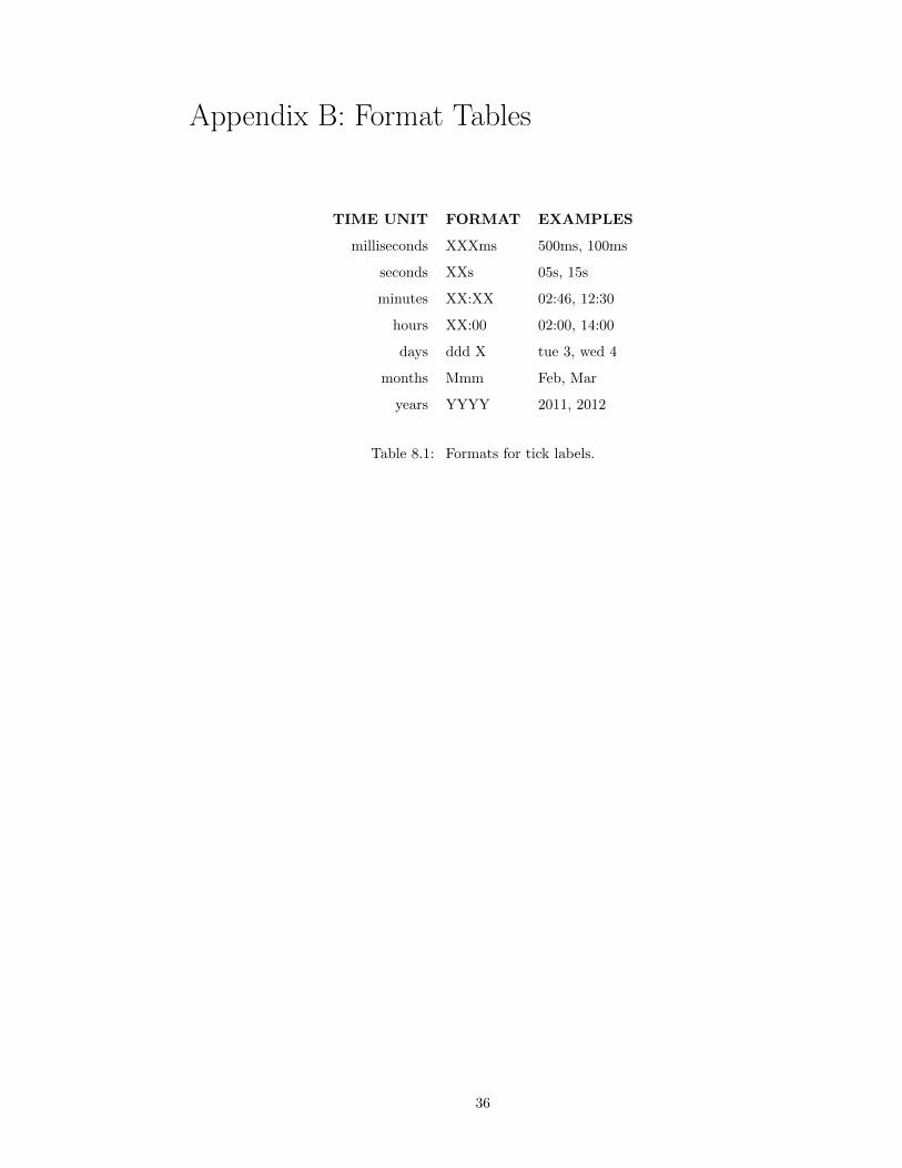
Tick labels have a format that was chosen for its unambiguity and visual distinctiveness. The
format of each time unit is different and chosen to be visually distinct. This is done using a
combination of uppercase and lowercase letters and familiar punctuation marks. The day of the
week is included with the date to give context within the week. These formats can be seen in
Table 8.1 in Appendix B.
Ticks labels will always show the highest round unit into which it fits. For example, January
1st, 2012 at midnight will have the label “2012” because it rounds evenly into years, while January
1st, 2012 at 500 milliseconds after midnight will show “500ms” because the smallest unit it rounds
evenly into is milliseconds.
Colours were chosen to be visually distinct, and were tested with an application called Color Or-
acle [9] which simulates the three types of congenital color vision deficiencies. Even with simulated
color vision deficiencies it was easy to distinguish and identify the different lines of the chart.
10

Chapter 5
User Interface
5.1 Web Technologies
The user interface for the application was written using standard web technologies rather than
being written as a native application for each platform. The main advantage of native applications
is speed, which we thought we would be able to achieve using web technologies, and the advantage
of using web technologies is that once written, it would run on any up-to-date device. This means
that our application would need to be written once for the web, rather than once for each operating
system in order to make it compatible.
In reality, each browser has its own bugs and rendering differences, which caused some platform-
specific problems. In the end, simple primitive objects were chosen instead of newer HTML5
elements, and standard layout techniques were chosen instead of newer CSS3 techniques in order
to achieve similar usability on each platform. For example, a custom JavaScript and SVG slider
was created instead of using a range HTML5 input tag, CSS transitions were used instead of the
HTML5 details tag, and CSS floats were used instead of the newer flex boxes.
As a result, the user interface for the application can be viewed in any up-to-date web browser.
HTML was used for document layout, CSS was used for colours and styles, and SVG was used
for chart elements. JavaScript was used for all of the calculations on the client, using the libraries
D3.js [1], Underscore.js [3], Socket.io [11], and FastClick [10].
5.2 Scalable Vector Graphics
Scalable Vector Graphics (SVG) components were used to render the chart elements for a number
of reasons. SVG provides lower-level primitives to work with, such as circles, rectangles, and lines;
and provides fine control of those elements relative to their container, while still being able to be
styled using CSS. Rendering images on the server was not considered due to the large amount
of bandwidth that would be required in order to send every frame to the client. This would be
more data than sending the information once and having the client render the result. Also, if the
client received one image and scaled it as much as it could before requiring a new image, the result
11

would look distorted whereas the arbitrary resolution of SVG elements do not look distorted when
scaled. This could be mitigated by sending higher resolution images to the client, but would, as a
result, increase the amount of data required to be sent. Using an HTML5 canvas instead of SVG
elements was considered but not attempted due to its higher development time resulting from fewer
examples being available and higher coding complexity.
5.3 JavaScript Libraries
Four JavaScript libraries were used in this project. Socket.io was used to send requests and retrieve
data from the server, Underscore.js was used to organize and parse the data, D3.js was used to map
the data to SVG elements and organize them into charts, and FastClick was used to more quickly
respond to user interactions on mobile devices. The relationship between the various libraries can
be seen in Figure 5.1.
FastClick solves the problem of a 300ms delay in action resulting from tapping on iOS and
Android mobile devices. The purpose of the delay is to allow the user time to double-tap, which
resizes the view. For this project, double-tapping is not used since the view port is given a static
size.
Figure 5.1: The relationship between JavaScript libraries on the server and client.
12

5.4 Controls
The user interface was designed for full-featured use on both mobile and desktop clients. On a
desktop, a user is able to use common mouse movements, while on a mobile smartphone or tablet
device users can use familiar multi-touch gestures.
The interface supports pinching in order to zoom in and out of the chart, and the user can drag
charts left and right in order to scroll horizontally.
Using a mouse, the user can use their scroll wheel to zoom in and out of the chart, and they
can click and drag left and right in order to scroll the chart horizontally.
As the user navigates the charts, the y− axis changes its scale in order to fit exactly the range
of rendered data. This rendered data is triple that which is visible, as is explained in Section 5.9.
In addition, when the user rotates their mobile screen or resizes their desktop window, the charts
automatically resize to fit the entire horizontal space.
5.5 Slider
The interface contains a single slider that controls all of the charts together. The slider is a vertical
list of numbers corresponding to the bin level, and it has a handle which highlights whichever level it
points to. The slider can be seen at the left in Figure 5.2. The user can control which level is shown
in the charts by dragging the handle until it is beside the corresponding number. Additionally, the
numbers on the slider can also be clicked on to move the handle to that level. By dragging the
slider up and down, the user can very finely control the zoom level of the chart. Whichever level
the handle is pointing to is shown on the charts.
The slider is linked with the charts, so as the user zooms the charts using either the mouse or
multi-touch gestures, the slider moves synchronously. Since the slider moves past the handle, the
user can see as they are zooming precisely when the level will change, giving them an intuitive
understanding of the system.
The slider is restricted to showing levels between zero, which represents the raw data, and
thirty-two, which is higher than the highest bin generated by the system for our data set.
13

Figure 5.2: The effect of the handle, which is on the left side of each diagram, can be seen. Theupper diagram shows a handle pointing to level 15. Moving that handle down to 17 (as shown inthe centre diagram) shows bins that are two levels higher. Moving the slider so that the handlepoints to level 18 (as shown in the lower diagram) changes the chart to show bins of level 18.
14

5.6 Menus
The interface has two menus, both of which are exposed and hidden using toggle buttons. They
are the Edit Menu and the Lines Menu, and are visible in Figure 5.2.
5.6.1 Lines Menu
Figure 5.3 shows the interface with the LinesMenu selected. In this view the user can toggle which
lines are being displayed, as well as the interpolation used to render them.
The user is able to choose any combination of the maximum, minimum, and average lines, as
well as the quartile region. For example, the user could disable all lines except for the average in
order to view periodic variations in the average. This is shown in Figure 5.3. In addition, the user
can display the quartile region as two separate lines instead of an area.
Showing fewer lines can help identify underlying trends in the data. For example, in Figure 5.4
the average lines are isolated, which allows the user to see subtle trends with a period of about
thirty minutes in both charts.
Choosing between step and linear interpolation of the data can also help the user visually identify
trends in the data. To clearly see how the five properties relate within bins, step interpolation is
most useful, and to see trends in steep lines, linear interpolation is better. A comparison is shown
in Figure 5.5. It can be seen that linear interpolation provides less visual distinction between bins,
but in regions with more vertical change those trends become more visually understandable.
15

Figure 5.3: With the LinesMenu selected, the user can choose which lines are to be displayed inthe charts. The first diagram shows a chart with only the average lines visible, while the seconddiagram shows only the maximum and minimum lines.
16
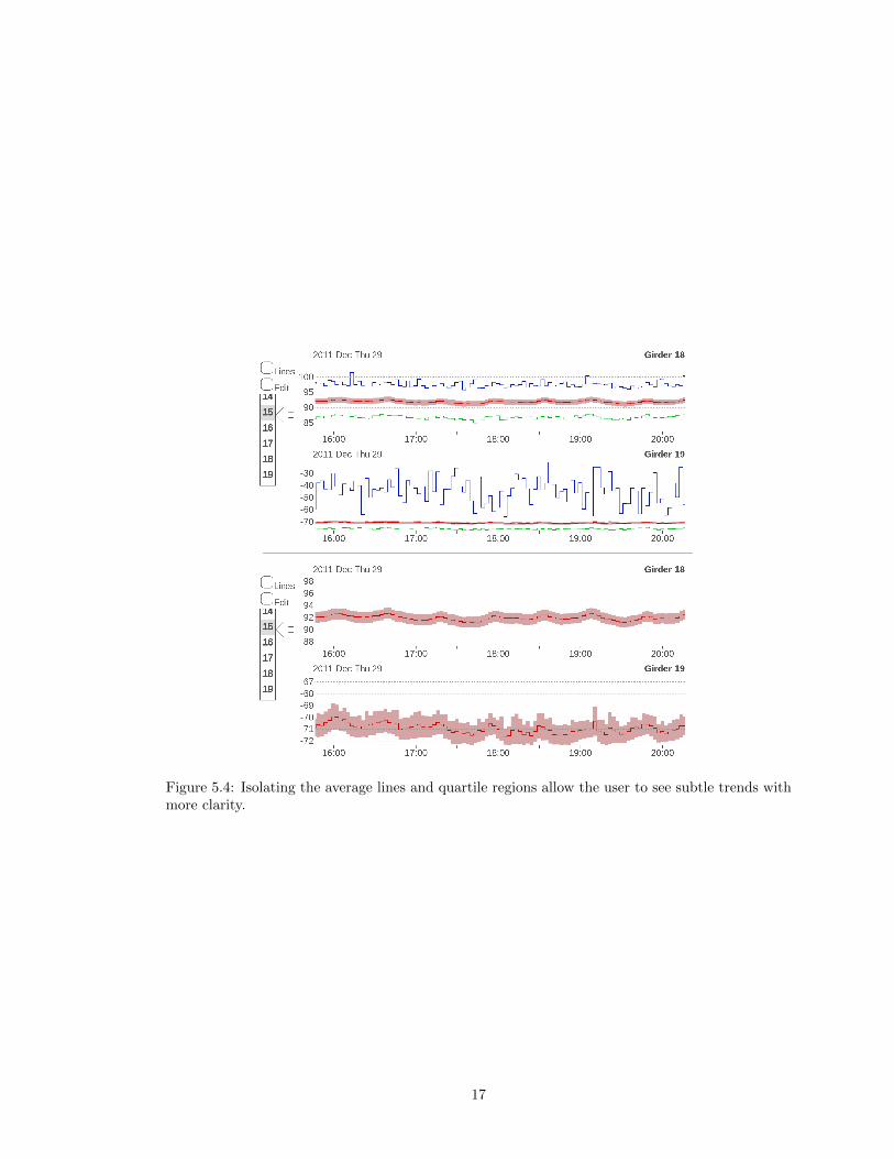
Figure 5.4: Isolating the average lines and quartile regions allow the user to see subtle trends withmore clarity.
17

Figure 5.5: The user can choose which interpolation method is used to render the lines. Thefirst diagram is a typical view, and the second diagram shows the same view, but using linearinterpolation between points instead of the default step interpolation.
18

5.6.2 Edit Menu
The Edit Menu allows the user to perform four actions using the overlay shown in Figure 5.6.
They can add charts to the screen, remove charts from the screen, swap the location of two charts,
or combine two adjacent charts.
Each visible chart has a removal button, and each chart that is available for display has an
add button with its name beside it. Clicking an add button adds that chart to the bottom of the
column of visible charts, and clicking a removal button removes the chart and adds its name to
its alphabetical position in the list of available charts below. Clicking a swap button between two
charts swaps the position of those charts.
Clicking the multiply button between two charts combines them to become one chart, wherein
each data point is the result of multiplying the two corresponding points from the charts. The data
for each sensor is first normalized to be between zero and one, so that the result of multiplication
is also between zero and one. The purpose of this view is to see similarities between the two chosen
charts. Trends in both will be amplified by multiplication, and differences will be suppressed. Click-
ing the subtraction button between two charts combines them using subtraction. The lower chart
is subtracted from the higher one. Data is normalized as with multiplication, with an additional
normalization step after the subtraction process has occurred, so that the results are between zero
and one. When a chart that is the combination of two other charts is removed, it splits back into
its two original charts. These charts are shown in Figure 5.7.
19

Figure 5.6: The interface with the Edit Menu selected. The charts are non-interactive and aretherefore greyed-out. Add, remove, multiply, subtract, and move buttons are accessible in thisview.
20

Figure 5.7: The top digram shows sensors 19 and 20. The second diagram is the result of combiningthose sensors with multiplication, and the third diagram shows the result of subtraction.
21
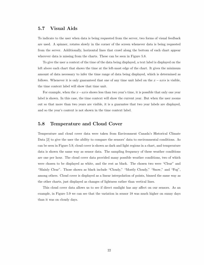
5.7 Visual Aids
To indicate to the user when data is being requested from the server, two forms of visual feedback
are used. A spinner, rotates slowly in the corner of the screen whenever data is being requested
from the server. Additionally, horizontal lines that crawl along the bottom of each chart appear
wherever data is missing from the charts. These can be seen in Figure 5.8.
To give the user a context of the time of the data being displayed, a text label is displayed on the
left above each chart that shows the time at the left-most edge of the chart. It gives the minimum
amount of data necessary to infer the time range of data being displayed, which is determined as
follows. Whenever it is only guaranteed that one of any time unit label on the x− axis is visible,
the time context label will show that time unit.
For example, when the x−axis shows less than two year’s time, it is possible that only one year
label is shown. In this case, the time context will show the current year. But when the user zooms
out so that more than two years are visible, it is a guarantee that two year labels are displayed,
and so the year’s context is not shown in the time context label.
5.8 Temperature and Cloud Cover
Temperature and cloud cover data were taken from Environment Canada’s Historical Climate
Data [2] to give the user the ability to compare the sensors’ data to environmental conditions. As
can be seen in Figure 5.9, cloud cover is shown as dark and light regions in a chart, and temperature
data is shown the same way as sensor data. The sampling frequency of these weather conditions
are one per hour. The cloud cover data provided many possible weather conditions, two of which
were chosen to be displayed as white, and the rest as black. The chosen two were “Clear” and
“Mainly Clear”. Those shown as black include “Cloudy,” “Mostly Cloudy,” “Snow,” and “Fog”,
among others. Cloud cover is displayed as a linear interpolation of points, binned the same way as
the other charts, just displayed as changes of lightness rather than vertical lines.
This cloud cover data allows us to see if direct sunlight has any affect on our sensors. As an
example, in Figure 5.9 we can see that the variation in sensor 18 was much higher on sunny days
than it was on cloudy days.
22

30s05:12 05:13 30s30s05:11 05:14
92
94
96
98
90
2012 Jan Tue 03 05h Girder 18
Lines
Edit
5
6
7
8
9
10
11
12
13
14
Figure 5.8: Two loading indicators are visible. In the top-left an arc slowly rotates, and on eachchart where data has not yet been loaded, lines move across the region whenever data is beingloaded from the visualization server. These are indicated with red arrows.
Figure 5.9: Temperature is rendered using the same type of chart, which is shown in the top chartof both of these diagrams, while cloud cover is shown as light or dark depending on the amount ofsunlight. Two binning levels are shown for the same time range.
23

5.9 Rendering Frequency
To allow for quicker execution when scrolling, more than the required amount of chart is rendered
on each side of the displayed region. Whenever the user gets to the edge of this extended space,
enough additional data is requested from the server to render a space three times the width of the
chart’s displayed range. This allows a buffer of scrolling space before the client needs to request
data from the server again. Figure 5.10 shows a diagram of this.
To reduce the number of times SVG elements are generated, re-rendering only happens when
new data is received from the server, when the user gets to the edge of the buffered region, or when
the chart switches to showing a different level. Whenever the user zooms the data within a level or
scrolls the chart horizontally, the existing SVG elements are moved or stretched instead of being
re-rendered.
Figure 5.10: Whenever a region of size a is displayed in a view, another region is rendered on eitherside. When the view moves to within ten percent of the edge of the total rendered region, a newregion is rendered centered around the view.
5.10 Management of Uncertainty
If even a single data point is missing in a bin’s region, that bin will be displayed as missing data.
This is a result of two design decisions. The first design decision is that each level should be able
to be generated using only the level one lower than itself. The second design decision is that each
bin should represent the raw data beneath it will full accuracy. Because of these, if we cannot say
that a bin fully represents the data in its range, then we display it as missing data.
Data that is missing from the database is indicated with a vertical column of grey, as can be
seen in Figure 5.11. If either of the two bins that would combine to make the missing bin are
available on the client, a horizontal dashed line will be displayed at the value of the non-missing
average point as an approximation of the average of the two bins. This is to indicate to the user
24
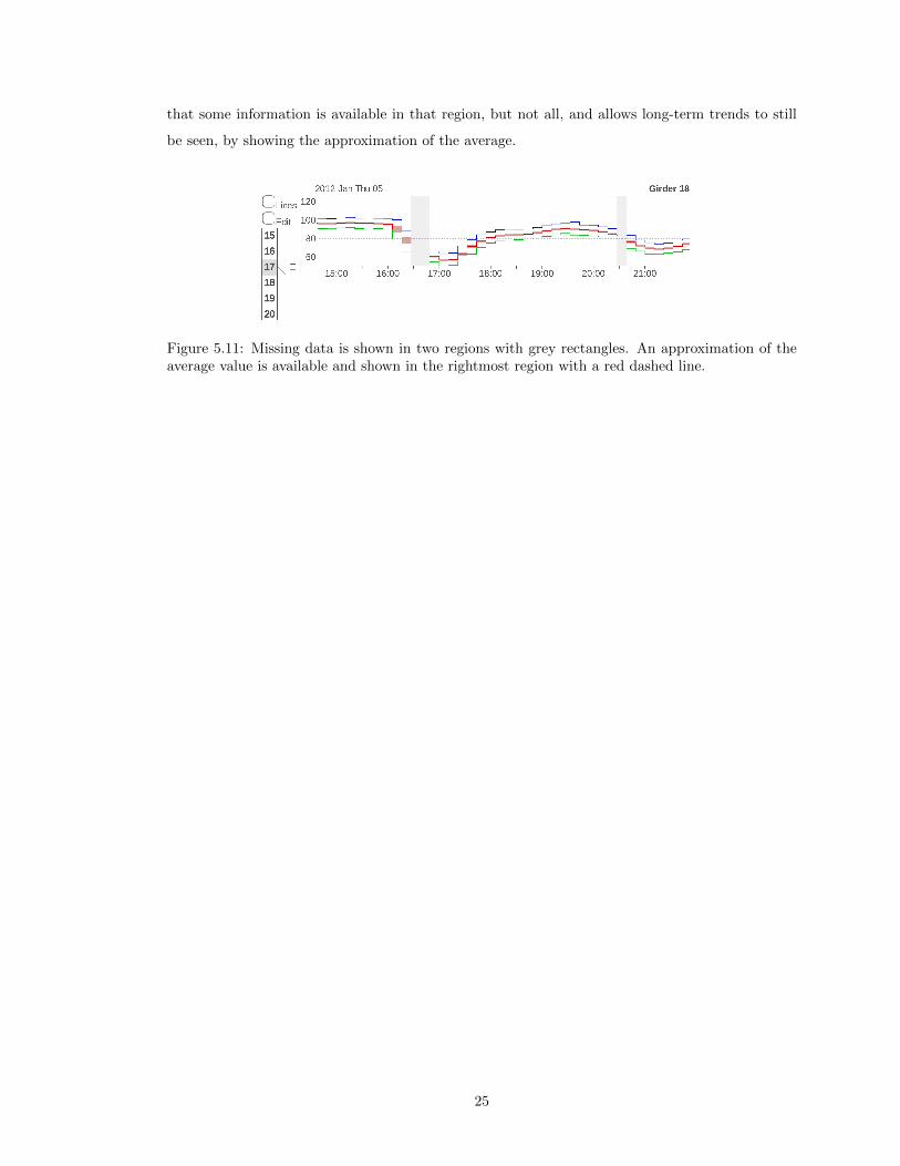
that some information is available in that region, but not all, and allows long-term trends to still
be seen, by showing the approximation of the average.
Figure 5.11: Missing data is shown in two regions with grey rectangles. An approximation of theaverage value is available and shown in the rightmost region with a red dashed line.
25

Chapter 6
System Architecture
The system consists of three components: the database server, the visualization server, and the
client. The database server stores the raw data arriving from the system (bridge) being monitored,
which is sent by request to the visualization server. The visualization server bins that data and
sends the client both binned and raw data as required by the user’s current level of view. The client
displays the data and allows the user to interact with it. This system architecture can be seen in
Figure 6.1.
Figure 6.1: The architecture of the system. Raw data is stored on the Database Server, and binneddata is stored on the Visualization Server. The Clients connect to the Visualization server over theInternet.
6.1 Database Server
The database server is a MySQL server, which holds all of the raw data collected from the gauges
on a bridge. This raw data has been gathered and stored by a previous project by sampling the
sensors at 200Hz. A portion of this data was used for the development of the visualization system,
corresponding to a period of nine months, which is roughly 4.7 × 10⁹ samples per sensor.
The database server has one MySQL database for each month. Each of those databases is then
26

split into multiple tables of approximately 5 days each, and has one field for each sensor of the
bridge. This database is read-only, so the visualization server cannot modify its data.
6.2 Visualization Server
The visualization server connects to both the database server and the client. Its job is to pre-process
the raw data for ultimate delivery to a client by converting it into binned data. The client connects
to the visualization server using Socket.io, which runs both in the browser and on the server using
Node.js. The JavaScript code used to bin the data is identical for both the client and visualization
server.
The visualization server has a CouchDB database that stores all of the binned data. CouchDB
was chosen for three main reasons. The first reason is that it uses technologies that were already in
use for this project such as JavaScript, JSON (which easily translates to JavaScript objects), and
HTTP. The second reason is that CouchDB makes it easy to add servers in order to serve more
clients through its replication feature. The third reason is that CouchDB emphasized ease of use,
making it quick and easy to learn.
The server first sends a read-only MySQL request to the database server and bins the received
data. The binning process starts by splitting the data into groups of two, as described in Chapter 3
and calculating the five properties for each of those pairs to make level one’s bins. It continues
to calculate bins two and higher using the previous level’s bins, and stores them in the CouchDB
database.
Data is stored in the CouchDB database as a series of documents with unique IDs. Each
document stores one container of 32 bins. The reasons for this are described in Section 6.4. The
ID contains the following pieces of information: the sensor type (girder, temperature), the sensor
number, an abbreviated representation of the property being stored (average, minimum, etc.) the
level of bin, and the time in milliseconds of the beginning of the container.
For purposes of storage efficiency, levels zero through five are not stored in the CouchDB
database. When the client requests them, the server requests the raw data for the requested
section of time from the database server and sends it directly to the client. This is done because
each level stores twice as much data as the level above it. As can be seen in Figure 6.2, level one
contains 2.5 times as much information as the raw data from level zero, and each level above that
contains the amount of the one lower. By not storing levels zero through five in the CouchDB
database the total number of stored data points is at most 7.4× 10⁸ data values, which is just 16%
of the 4.7 × 10⁹ raw data values in our test data set.
The trade-off is that sending level five to the client takes noticeably longer than sending the
equivalent binned data. Sending raw data instead of binned in these cases requires a maximum of
27

Figure 6.2: How many data points are generated for each level when there are 1000 points of rawdata.
6.4 times the number of bytes to be sent. It was decided that, since the main intended use-case
for the system is viewing trends over longer periods of time, this struck a balance between client
responsiveness and storage requirement.
The CouchDB database is stored with key values, where each key points to a container. Con-
tainers are described in Section 6.4. The key contains the sensor identifier (consisting of its type
and number), as well as the time value for the container. When the visualization server requests
data from the database, it usually receives either two or three containers, depending on the size of
the client’s screen and their zoom level. This makes querying the database quick, as it only needs
to send a couple of keys to get all the data it needs. The trade-off here is that the client does not
always want the entire container but only needs a section of it, so more than the required amount
of data is received each time.
The visualization server software has been chosen to be able to run on any OSX, Linux, or
Windows system, is open-source, and is available at no cost. These choices have been made to
allow for a maximum amount of freedom in deploying the system.
6.3 Client
The client is any computer or mobile device with an up-to-date web browser. Fluidity of user
interface on mobile devices varies with the processing power of the device, with newer devices
offering the best performance. For details about rendering on the client and the technologies used,
see Chapter 5.
6.4 Containers
To reduce access times on both the client and the server, bins are stored in containers. This way, to
access a specific bin, the container will be selected, and from within it the bin will be chosen. This
28
reduces the total number of keys in the data structures, meaning there is less to search through to
find the correct bin. On the server, this translates to fewer Couchdb documents, and on the client
it means JavaScript objects with fewer keys.
A container size of 32 bins was chosen for the following two reasons. The first is that it was
important that the container size be a power of two so that bin containers would align with each
other between levels, just as bins do. The second reason is that an average of approximately 64
bins, are shown on the screen at any given time. This means that one container of 32 bins will
be fetched from the server and used completely, and two or more containers will be fetched and
partially displayed. Had smaller containers been chosen, more of them would be fetched, which
would increase overhead but decrease the number of unused bins. On the other hand, larger
containers would mean less overhead but more unused bins.
29

Chapter 7
Conclusions
In answer to this work’s formal thesis question, a system was designed and built to represent
SHM data on both desktop and mobile devices, for which any range of data chosen to be represented
would require an equal number of points to be rendered to the screen. The work presented showed
the implementation of one answer to the thesis question, and achieved the following related goals.
The first goal stated that the project should be faster then typical static rendering tools. As a
result of the compressing binning algorithm, any level of data was able to be accessed in the same
amount of time. Additionally, the interface’s auto-rendering technique further reduced rendering
delays by rendering data before it was requested by the user. The combination of pre-binning and
dynamic user interface allowed this project to meet its goal of being much quicker than standard
plotting methods.
The second goal stated that the project should be open source and flexible, meaning that it
would be freely available for anyone to use on most types of hardware. The source code for this
project was selected to use tools that can run on any major operating system, and were given
an open-source license. The client was also written specifically to be able to run on any system
with an up-to-date web browser, including devices with either a mouse and keyboard or a touch
interface. Through these choices, this project has met its goal of being flexible, allowing for freedom
in deployment and usage of the system.
30

Chapter 8
Future Directions
Using this system as a baseline, many additional types of information could be added to give
the user even greater knowledge of their bridge, and there are some technical aspects of the system
that could be experimented with.
Temperature readings from temperature sensors on the bridge could be added to the screen as
their own sensor. This would allow the user to see how their bridge is behaving relative to the air
temperature, or the temperature of the bridge.
Another sensor reading that could be added would be acceleration readings from accelerometers.
This would be able to show vibration data to complement the strain data.
Another area of research that this system could integrate is Bridge Weigh-In-Motion (B-WIM)
data. B-WIM uses strain gauge information to determine the mass of vehicles that are traveling
over the bridge. Adding vehicle masses to the charts would allow the user to gain an intuitive
understanding of the relationship between strain and vehicle mass, as well as displaying how different
girders react to different vehicle masses.
One technical aspect of the system that could be experimented with is the width of each bin.
The current system relies on the sampling rate being constant throughout the data range, and
missing samples have to be dealt with according to the process described in Section 5.10. A
possible alternative method would be to have dynamic bin sizes. This would absorb empty bins,
and the resulting chart would be much cleaner. This may not be desirable though, as knowledge
of the uncertainty about the data would be lost.
A way to dynamically present the current binning information would be to display different bin
levels in different parts of the chart, depending on the underlying details. For instance, high detail
could be shown to the user (lower-level bins) in areas where there is a significant spike in the data,
whereas everywhere else a higher, less data-intensive level could be shown.
Another area of research that this system could benefit from is anomaly detection. This could
take the form of threshold highlighting, where values above a threshold are made visually distinct,
allowing the user to easily skim the diagram for anomalies.
A possibly useful feature that could be added is the ability to compare a sensor with itself
shifted in time. This way a user could more easily see trends from week to week, or day to day.
31

One last method of analysis that could be added to the system would be to combine charts
together using mathematical operations beyond the current multiplication and subtraction. These
aggregate charts could show the difference between two sensors’ readings to allow the user to visually
compare the behavior of two parts of a bridge.
32

References
[1] Michael Bostock. Data Driven Documents. http://d3js.org.
[2] Environment Canada. Historical climate data. http://climate.weather.gc.ca/.
[3] Document Cloud. underscore.js. http://underscorejs.org.
[4] D. K. McNeill and M. Soiferman. Morphological Filtering of SHM Datasets. In Proceedings of
the 8th International Workshop on Structural Health Monitoring, 2011.
[5] D. McNeill, M. Soiferman, and G. Rutherford. Compensation techniques for extracting long-
term trends in SHM data. In Proceedings of the 7th International Workshop on Structural
Health Monitoring, 2009.
[6] G. Rutherford and D. McNeill. Statistical Vehicle Classification Methods Derived from Girder
Strains in Bridge. Canadian Journal of Civil Engineering, 38:200–209, 2011.
[7] Jeffrey Heer, Nicholas Kong, and Maneesh Agrawala. Sizing the horizon: the effects of chart
size and layering on the graphical perception of time series visualizations. In Proceedings of
the SIGCHI Conference on Human Factors in Computing Systems, pages 1303–1312. ACM,
2009.
[8] D.C. Hoaglin, F. Mosteller, and J.W. Tukey. Understanding robust and exploratory data anal-
ysis. Wiley Classics Library Editions. Wiley, 2000.
[9] Bernhard Jenny. Color oracle. http://colororacle.org/.
[10] FT Labs. Fastclick. http://ftlabs.github.io/fastclick/.
[11] Guillermo Rauch. Socket.io. http://socket.io.
[12] Edward Rolf Tufte. http://www.edwardtufte.com.
[13] Edward Rolf Tufte. The Visual Display of Quantitative Information. Graphics Press LLC,
2nd edition, 2001.
33

Appendices
34

Appendix A: Links
A screencast demonstrating the use of this project can be viewed at http://youtu.be/EaIYcongb-s.
The code for this project is publicly available at https://github.com/MattWoelk/shmotg.
35
Appendix B: Format Tables
TIME UNIT FORMAT EXAMPLES
milliseconds XXXms 500ms, 100ms
seconds XXs 05s, 15s
minutes XX:XX 02:46, 12:30
hours XX:00 02:00, 14:00
days ddd X tue 3, wed 4
months Mmm Feb, Mar
years YYYY 2011, 2012
Table 8.1: Formats for tick labels.
36

Distance between tick labels Distance between ticks
200 ms 50 ms
500 ms 100 ms
1 s 500 ms
2 s 1 s
5 s 1 s
15 s 5 s
30 s 10 s
1 min 30 s
2 min 1 min
5 min 1 min
15 min 5 min
30 min 10 min
1 h 30 min
3 h 1 h
6 h 3 h
12 h 3 h
1 day 12 h
2 day 1 day
5 day 1 day
10 day 5 day
15 day 5 day
1 month 1 month
2 month 2 month
3 month 3 month
6 month 6 month
1 year 1 year
Table 8.2: Distance between tick labels and corresponding distance between ticks.
37