a hands-on guide to participatory data analysis | by
TRANSCRIPT

DABBLING IN THE DATA A Hands-on Guide to Participatory Data Analysis | By Public Profit

This guide was developed by Public Profit | Oakland, CA www.publicprofit.net

DABBLING IN THE DATA | Page 1 | WWW.PUBLICPROFIT.NET
DABBLING IN THE DATA A Hands-on Guide to Participatory Data Analysis
You, too, can dabble in the data! For many people, data analysis can seem like a daunting task, requiring specialized knowledge and years of training. This guide provides a gentle introduction to practical approaches to explore and analyze data frequently used in youth-serving organizations. The activities in this guide are suitable for a variety of group sizes so that users can draw on the experiences, knowledge, and insights of a variety of people involved with their programs (youth included!). We encourage you to get creative with who gets involved and to translate these activities to suit your group.
PURPOSE OF ACTIVITIES
The activities in this guide are suitable for two purposes: • Learning analysis techniques - We include activities
designed to introduce or refresh users with concepts and skills, such as calculating descriptive statistics on a set of numbers using data that is universally available such as participants’ own birth month, height and shoe size.
• Learning ways to analyze data you have in hand - The
second kind of activity requires some preparation, usually involving gathering information about your organization and preparing the data. We included these activities for users who already have some data in mind, and are ready to get to analyzing data!
About this Guide
DABBLING IN THE DATA | Page 2 | WWW.PUBLICPROFIT.NET
HOW TO NAVIGATE THIS GUIDE There are many different entry points into using this guide. We recommend reviewing the activity preview pages at the beginning of each activity category section to find a suitable activity for your needs. You will find a full list of the activities in this guide, organized by section on page 3. Every activity includes information that you will need to prepare and complete the activity:
• Activity Description and Objective – review to get a sense
for the sequence of steps. • Materials, Room Set Up – lists the tools and recommended
space to hold our session. • Activity Steps –step-by-step instructions on how to execute
the activity. • Group Size – in general, small is 5-7 people, medium is 7-10
and large is more than 10. Activities with extended preparation or are more complex to facilitate may include: • Adaptations – we provide these based on adaptions we
have made while using the activity ourselves! • Example Scenario – it may help to read example scenarios
when they are included to get a sense for possible applications for the activity.
• Selecting Data and Prep – some activities are more complex and we include expanded explanations to help with prep.
SOURCES Many of the activities included are based on methods developed from others in the field. When possible, we list sources on the first page of the activity. For some activities where no single source is cited, we acknowledge that we have drawn from many sources.
DABBLING IN THE DATA | Page 3 | WWW.PUBLICPROFIT.NET
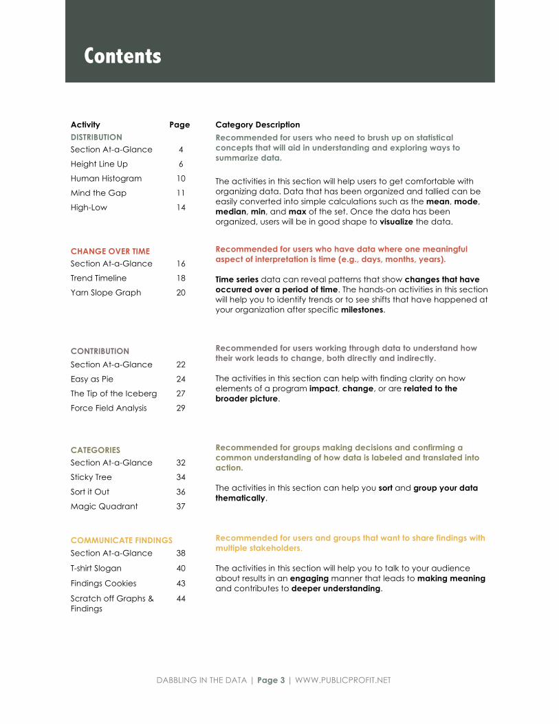
Activity Page Category Description
Recommended for users who need to brush up on statistical concepts that will aid in understanding and exploring ways to summarize data.
The activities in this section will help users to get comfortable with organizing data. Data that has been organized and tallied can be easily converted into simple calculations such as the mean, mode, median, min, and max of the set. Once the data has been organized, users will be in good shape to visualize the data.
DISTRIBUTION Section At-a-Glance 4
Height Line Up 6
Human Histogram 10
Mind the Gap 11
High-Low 14
CHANGE OVER TIME Recommended for users who have data where one meaningful aspect of interpretation is time (e.g., days, months, years). Time series data can reveal patterns that show changes that have occurred over a period of time. The hands-on activities in this section will help you to identify trends or to see shifts that have happened at your organization after specific milestones.
Section At-a-Glance 16
Trend Timeline 18
Yarn Slope Graph 20
CONTRIBUTION Recommended for users working through data to understand how their work leads to change, both directly and indirectly. The activities in this section can help with finding clarity on how elements of a program impact, change, or are related to the broader picture.
Section At-a-Glance 22
Easy as Pie 24
The Tip of the Iceberg 27
Force Field Analysis 29
CATEGORIES Recommended for groups making decisions and confirming a common understanding of how data is labeled and translated into action. The activities in this section can help you sort and group your data thematically.
Section At-a-Glance 32
Sticky Tree 34
Sort it Out 36
Magic Quadrant 37
COMMUNICATE FINDINGS Recommended for users and groups that want to share findings with multiple stakeholders. The activities in this section will help you to talk to your audience about results in an engaging manner that leads to making meaning and contributes to deeper understanding.
Section At-a-Glance 38
T-shirt Slogan 40
Findings Cookies 43
Scratch off Graphs & Findings
44
Contents

DABBLING IN THE DATA | Page 4 | WWW.PUBLICPROFIT.NET
DISTRIBUTION The activities in this section will help you to get comfortable with organizing your data. Data that has been organized and tallied can be easily converted into simple calculations such as the mean, mode, median, min, and max of the set.
What the terms mean Min/Max: The smallest and largest value in a set of numbers. Mean: The sum of a set of numbers, divided by the number of entries in a set (average). Median: The “middle” value in a set of numbers. Mode: The most common or frequent number in a set. Frequency: How often a number is present in a set. Histogram: The number of values in each category, represented by bars.

DABBLING IN THE DATA | Page 5 | WWW.PUBLICPROFIT.NET
Height Line Up A basic data primer; learn how to calculate and visualize the mean, mode, median, min, and max using participants as data points.
P.6
Human Histogram Using data points represented by participants, the group will arrange themselves into a histogram to see how data is distributed.
P.10
Mind the Gap Visually explore the distribution of data, compare it, and discover gaps that may be important.
P.11
High-Low Explore the distribution of data in relation to the overall mean of the data set to help drive decision-making.
P.14
Distribution Activities

DABBLING IN THE DATA | Page 6 | WWW.PUBLICPROFIT.NET
ACTIVITY STEPS
1 Group participants into groups of 7 to 10 and distribute the worksheet provided on the next page.
TIP! For small groups, the facilitator may collect and record data with the full group and walk through the steps in the worksheet all together.
2 Have participants line up in height order within their groups and complete the tasks listed on the worksheet.
3 Ask participants to share out their responses to the following questions:
• What did you gain from the activity?
• What kind of information do descriptive statistics provide?
• What are some limitations of descriptive statistics you encountered?
Distribution Activities
HEIGHT LINE UP Group Size Small to Medium Time 30-45 mins.
The Height Line Up is a data primer on how to generate some basic information about a set of numbers (descriptive statistics).
Each participant will contribute his/her height as a data point and then get to practice organizing, calculating, and visualizing the “basics” about the data. This activity can help you and your staff to feel more engaged with data analysis.
OBJECTIVE
Learn how to calculate and visualize the mean, mode, median, min, and max from a set of numbers. MATERIALS
o Writing tools
o Flipchart
o Rulers/tape measure
o Activity worksheet (following this activity description)
ROOM SET UP
This activity can take place inside or outside, as long as there is plenty of room for people to move around and line up behind one another. SOURCE
Preskill, H. & Russ-Eft, D. (2005). Understanding descriptive statistics. Building Evaluation Capacity, 291-293.

DABBLING IN THE DATA | Page 7 | WWW.PUBLICPROFIT.NET
HEIGHT LINE UP WORKSHEET | PAGE 1 OF 3 Instructions: In your group, line up by height from the lowest to highest. Follow the steps listed below. Each person should have a worksheet to record data individually. STEP 1: RECORD YOUR DATA Record the height and foot size of each person who is lined up in the table below. Height (inches) 12 inches per foot Example: 5’6” = write 66 Shoe Size For women’s sizes, subtract 1.5 (in order to convert all sizes to the same unit). Example: Size 10 women’s = write 8.5 Example: Size 11 men’s = write 11
STEP 2: CREATE A FREQUENCY DISTRIBUTION TABLE Review the list of heights you recorded in Step 1 and count the number of times each height occurs the list. Write each height into the spaces provided at right from the lowest to the highest height. For example, if two people are 60 inches tall, then the frequency of 60” would be 2. Don’t worry about shoe sizes for this step, you will use them further on in this activity. Your frequency distribution may have fewer categories than the number of rows provided in the table – it’s ok to leave some rows blank!
Height (inches) Shoe Size
Height (inches) Frequency
Add up the frequencies and write in the box to the right

DABBLING IN THE DATA | Page 8 | WWW.PUBLICPROFIT.NET
HEIGHT LINE UP WORKSHEET | PAGE 2 OF 3
STEP 7: WHAT DO YOU SEE?
y-a
xis
=Sh
oe
Siz
e
x-axis = Height (inches)
STEP 3: WHAT IS THE MODE? The mode is the number that appears most frequently. Determine the mode and write the mode in the box to the right.
Mode
STEP 4: WHAT IS THE RANGE? A range is made up of the lowest height (min) and highest height (max).
Range Min= Max=
STEP 5: WHAT IS THE MEDIAN? The median is the number that is right in the middle of all the values. You can find the median by arranging your numbers from lowest to highest heights and locating the middle value. For example, if you have 5 heights listed in Step 2, the 3rd height is the median. If you have an even number of heights, pick the two middle values from the list, add them together and divide by 2.
Median
STEP 6: WHAT IS THE MEAN? Add all heights together (from the Step 1 table) and divide by the total number of heights you recorded to get the mean.
Mean
Create a scatter plot showing inches of height on the x-axis and inches for shoe size on the y-axis. Start by labeling both axes and adding tick marks and value labels to the chart. Next, plot each data point from your set. What are the trends you see?

DABBLING IN THE DATA | Page 9 | WWW.PUBLICPROFIT.NET
HEIGHT LINE UP WORKSHEET | PAGE 3 OF 3
STEP 8: LET’S DO IT ONE MORE TIME Using the data you collected for step 1, create a class frequency distribution of your group heights using the categories listed in the table below. Class frequency distribution is different from the frequency distribution you complete in steps 2 because the values are grouped together, using class intervals. To get class intervals, you divide the range into groupings, such as the classes we’ve provided in the table below.
Enter the count of people whose height falls into each category, under the column “Frequency.” Examine the class frequency distribution. What is the modal class interval? Hint: Which class has the highest frequency? What is the median class interval? Hint: Which class includes the median value from step 5? Things to think about: • What, if anything, did you learn from this activity? • What kinds of information do descriptive statistics provide? • Did your impression of the data change between looking at the data as frequencies
and then grouped by class frequencies? • What are some limitations of descriptive statistics? What don’t they tell you? • How is this activity useful for you?
Class Frequency
Under 60”
60”-64”
65”-69”
70”-74”
75” or taller
Under 60”
Add up the frequencies and write in the box to the right

DABBLING IN THE DATA | Page 10 | WWW.PUBLICPROFIT.NET
ACTIVITY STEPS 1 Tell the group that they will be moving
around and creating a human histogram (a histogram is a graphical representation of the distribution of numerical data).
In a large open area, place the month signs on the floor, side by side.
2 Instruct participants to find their birth month and form a single-file line at their month.
3 Ask participants to share out their responses to the following questions:
• What do you notice about the groups around you?
• Which month has the most people? The least?
• What kind of information does a histogram provide?
• How might we use this activity with programmatic data?
Distribution Activities
HUMAN HISTOGRAM Group Size Any size Time 15-20 mins.
The Human Histogram gets participants out of their seats and into the data.
Each participant will represent a data point in a data set. The group will organize themselves into a human histogram to see how the data is distributed. OBJECTIVE
Participants will represent data points in a human histogram of the group’s birthdays in order to demonstrate how to create a histogram and understand distribution. MATERIALS
o 12 sheets of paper, with each month of the year written on it
ROOM SET UP
This activity can take place inside or outside, as long as there is plenty of room for people to move around and line up behind one another.
ADAPTATIONS
Try this activity with data your organization has already collected and that is meaningful to you.

DABBLING IN THE DATA | Page 11 | WWW.PUBLICPROFIT.NET
SELECTING DATA & PREP Prior to meeting, make sure to gather the data you would like to use, review the questions below to guide you in making sure that the data you will be using is ready to go.
What are you calculating?
For example, if you are calculating pre-test versus post-test total score, verify that there is a column (or variable) with those scores in it.
TIP! If your data is not in a spreadsheet, where can people find the data? Consider typing up the data so that it’s in a table or worksheet to make it easier to manage with the group.
TIP! If your group is pressed for time, consider doing calculations in advance so that the group can focus on plotting and discussing data. Alternately, you can also break this activity out into multiple sessions.
TIP! If you are using pre-test/post-test make sure you are able to match the pre-test score to the post-test score for each individual.
What variable will be used as the “grouping” category?
What characteristics would be helpful to compare by groups? Is that information in your data?
Continue on next page
Distribution Activities
MIND THE GAP
Group Size Small to Medium Time 15-20 mins.
Mind the Gap is and activity that can be useful for exploring where there are meaningful differences among groups. In this activity, the focus will be visualizing data to look specifically at differences in order to generate ideas about what may contribute to the differences. OBJECTIVE
Explore the distribution of data, compare data, and discover gaps that may be important.
MATERIALS
o Blank sheets of paper for everyone in the group
o Writing utensils
o Simple data set that you are interested in analyzing the differences in (ex. Girls vs. Boys, Pre-test vs. Post-test scores, Self-assessment vs. External assessment)
ROOM SET UP
A classroom-style room with tables works best so that people can work in groups and have a surface for writing.
ADAPTATIONS
Try this method with other types of data that you may be interested in analyzing. For example, you may have different types of data that can be assigned to people by categories based on community characteristics to launch a conversation.

DABBLING IN THE DATA | Page 12 | WWW.PUBLICPROFIT.NET
ACTIVITY STEPS
1
Pass out the data you would like to analyze and walk through it with the group.
Guiding Questions:
• What figure are you interested in learning more about? • What groups are the most meaningful for us to compare?
Example Data Set:
Based on this data set, the group may decide that it is interested in seeing pre-test and post-test changes for boys versus girls.
2
Ask participants to calculate averages (sum of the all the values divided by the number of values)
Values to Calculate:
• What is the total average for the entire data set? • What are the averages for each of the groups we are interested in
comparing?
Example Calculations:
Based on the example data set in Step 1, you would calculate:
Pre-test avg. for boys: 4.1+ 4.5 + 3.2 + 2.1 = (13.9) / 4 boys = 3.48
Post-test avg. for boys: 4.3 + 4.5 + 3.3 + 2.5 = (14.4)/4 boys = 3.65
Pre-test avg. for girls: 3.5 + 2.47 + 3.7 + 4.6 = (14.27) divided by 4 girls = 3.57
Post-test avg. for girls: 3.1 + 2.6 + 4.1 + 4.6 = (14.4) divided by 4 girls = 3.6
Pre-test avg. for boys and girls: 4.1 + 3.5 + 2.47 + 3.7 + 4.5 + 4.6 + 3.2 + 2.1 =
(28.17) divided by 8 boys and girls = 3.52
Post-test avg. for boys and girls: 4.3 + 3.1 + 2.6 + 4.1 + 4.5 + 4.6 + 3.3 + 2.5=
(29) divided by 8 boys and girls = 3.62

DABBLING IN THE DATA | Page 13 | WWW.PUBLICPROFIT.NET
3 Ask participants to set up their individual sheets with the following:
1. Draw a line across their sheets of paper; one line for every group we calculated averages for.
2. Label the length of the line.
4 Guide participants in plotting the figures by asking them to draw a bubble along the line that approximately corresponds to the values for each group.
5 When participants are done plotting their scores, have them determine where the greatest differences or gaps in the data occur.
6 Ask participants to share out their responses to the following questions:
• Where are the greatest differences? • Why might these differences occur? • What additional information might you need in order to better understand
these differences?
The dots correspond to the group averages you calculated in step 2. TIP! In this figure, a filled-in bubble represents the pre-test scores and open bubble represents a post-test score to make it easier to tell them apart. You can also use different colors.
Using the example data from Steps 1 and 2, you would draw three lines for: boys, girls and boys/girls together. The line would be labeled with a 1 one for the smallest (left of the line) and right for the biggest number (right of the line).

DABBLING IN THE DATA | Page 14 | WWW.PUBLICPROFIT.NET
ACTIVITY STEPS
1 Begin by calculating the overall average score for your data set and draw a line in the middle of your paper. Write the average next to the line.
2 Place scores for variables that are higher than the average above the line. Place lower scores below the line.
3 You can do successive rounds of mapping to get a deeper understanding of a category that fell below the mean.
Discuss what your data tells you and develop action steps based on what you learn.
Still not sure how to use this activity? See the example on the next page.
Continue on next page
Distribution Activities
HIGH-LOW
Group Size Small to Medium Time 15-20 mins.
High-Low can help to determine how data is distributed relative to the mean so you can hone in on focus areas for further discussion. OBJECTIVE
Explore the distribution of data in relation to the mean of the data set overall. MATERIALS
o Blank sheets of paper for everyone in the group
o Writing utensils o Simple, small data set that you are
interested in analyzing differences in (ex. Girls vs. Boys, Pre-test vs. Post-test scores, Self-assessment vs. External assessment)
ROOM SET UP
A classroom-style room with tables works best so that people can work in groups and have a surface for writing.

DABBLING IN THE DATA | Page 15 | WWW.PUBLICPROFIT.NET
HIGH-LOW ACTIVITY | EXAMPLE SCENARIO You’re using a new STEM (Science, Technology, Engineering, and Math) curriculum this year but you know you won’t have time to get through every lesson. To tailor the curriculum to your students, you use the end of the year cumulative assessment in the curriculum as a pre-test to determine where you should focus your efforts for the year. Overall, students average a score of 43 (out of 100) on this pre-test and you have broken down the scores for each topic (Science, Technology, Engineering, and Math). You decide to map the highs and the lows for this assessment, drawing the average score line (43) in the middle of a piece of chart paper. Students scored an average of 57 for the technology portion of the test, 31 for engineering, 39 for math, and 51 for science. You map the scores for technology (57) and science (51) above the average score. Similarly, you map the scores for engineering (31) and math (39) below the line. From this graph, you see that you should hone in on the engineering and math lessons, since these had the lowest average scores. You decide that you want to get an even deeper understanding of how to focus your math lessons. There are 4 math lessons in the curriculum and you have the average score for each lesson. Again, draw a line to represent the average overall score for the math portion of the test on a new piece of paper. Then map the average scores for each lesson where they fall in relation to the average. Based on what you see, you can determine which lessons would be more helpful for you to focus on.

DABBLING IN THE DATA | Page 16 | WWW.PUBLICPROFIT.NET
CHANGE OVER TIME Time series data can reveal patterns in your data that can tell you about changes that occur over a period of time. The hands-on activities in this section will help you to identify trends or shifts at your organization after specific milestones.
What the terms mean Time series: A sequence of data points measured over a time interval. Trend: A general direction data points are moving towards. Milestone: A significant event or point in development.

DABBLING IN THE DATA | Page 17 | WWW.PUBLICPROFIT.NET
Trend Timeline Explore milestones and identify important organizational highlights by visualizing the activities, organizational changes, and external influences that have affected your program over a self-defined time period.
P.18
Yarn Slope Graph Visualize changes at your program that occur over time. Time series graphs can help with spotting patterns, trends, or shifts in your program.
P.20
Change Over Time Activities
Milestones

DABBLING IN THE DATA | Page 18 | WWW.PUBLICPROFIT.NET
SELECTING DATA & PREP
Prior to meeting, prep the paper surface you will be writing on. Mark a timeline for any given period you are looking at (e.g., days, months, fiscal quarters, years, etc.). Place key metrics (e.g., number of youth served, hours of training completed, number of staff hired, etc.) at relevant intervals along the line.
TIP! Brainstorm in advance to get a good sense of the timeframe you would like the group to focus on and to make sure you’ve included all the metrics that you would like to explore.
Continue on next page
Change Over Time
TREND TIMELINE Group Size Any size Time 10-15 mins.
Explore how organizational milestones have influenced your program. Gain a deeper understanding of how your program has changed over time.
This activity is a great way for staff to contribute their insights on how milestones are connected to the key metrics you rely on.
OBJECTIVE
Review key metrics and milestones to understand if/how they are related.
MATERIALS
o Markers in a variety of colors
o Tape
o A large paper surface (you may need to tape several sheets of easel paper together) on the wall
ROOM SET UP
Choose a space with enough room for the wall chart.
Milestones
Select the time intervals (e.g. days, months, fiscal quarters, years, etc.)

DABBLING IN THE DATA | Page 19 | WWW.PUBLICPROFIT.NET
ACTIVITY STEPS
1 Post the wall chart timeline on the wall for everyone to see and discuss what the group is looking at.
2 Ask the group to think about the key organizational milestones that took place in the same time period.
TIP! No milestone is too small!
Make sure everyone in the group has the opportunity to contribute so that a wide range of perspectives is captured.
3 Discuss how the key metrics might be related to the organizational milestone.
TREND TIMELINE | EXAMPLE SCENARIO
Your arts education organization is finishing up the last cycle of a three-year initiative and you are bringing the group together to debrief. You want to further understand what happened over the past three years. You made a big chart with a three-year timeline across the bottom and have put in key metrics about the number of lessons your organization delivered over the past three years, resulting in more youth being able to attend lessons. You ask the group what trends they see—that the organization has increased its total lessons exponentially every year of the initiative. You ask the group to think about the most important organizational highlights that took place throughout the past three years. They mention that following the first year the organization received additional grant funding, which allowed for growth in staff. Because there was more staff, the capacity to do more presentations grew. They also mention that after the second year, the organization partnered with several school districts in the area, which increased the number of classroom presentations given. The group discusses how the organization’s funding and collaboration with school districts is related to the increase in number of presentations by the organization.

DABBLING IN THE DATA | Page 20 | WWW.PUBLICPROFIT.NET
SELECTING DATA & PREP
Prior to meeting, make sure to gather the data you would like to use, review the questions below to guide you in making sure that the data you will be using is ready to go.
What is your time period?
Determine what time interval to use (e.g., days, weeks, months) and make sure the data set you bring to share with the group is calculated that way.
Percentage, counts, averages.
When calculating data to prep for visualizing, think through the scale and number format that you will be using. For example, if you are calculating youth attendance by month, you would plot the count of youth, at monthly intervals. However, if you were plotting your program’s progress towards average daily attendance (ADA) goals, you would plot the percentage towards fulfilling your goal. Alternatively, if you were plotting the level of youth satisfaction measured annually through a survey with a scale of 1-10, you may decide to plot the average.
TIP! If you are using multiple types of data, make sure to think about how different values can be converted so that they are expressed in the same unit.
Continue on next page
Change Over Time
YARN SLOPE GRAPH
Group Size Any size Time 10-15 mins.
Yarn Slope Graph gets groups working side-by-side in creating a graph of one or more types of data that is plotted over time, using common office supplies.
OBJECTIVE
Place data on a life-size slope graph to analyze changes and trends over time.
MATERIALS
o Foam core board or large piece of chart paper (large corkboard could work also)
o Thumb tacks if you are using a surface that can be pierced; tape if you are using paper surface
o Yarn or string
o Scratch paper
o Sticky notes
o Markers in a variety of colors
o A data set you would like to graph over time, with calculations
ROOM SET UP
Choose a space with enough room for the wall chart.
ADAPTATIONS
Add layers to your story by using multiple pieces of data, and assign each type of data to smaller breakout groups.

DABBLING IN THE DATA | Page 21 | WWW.PUBLICPROFIT.NET
ACTIVITY STEPS
1 Write in the time period intervals as the x-axis and the appropriate unit for your y-axis.
2 Take your yarn and tape or pin it to the surface at each data point.
3 Ask the group to brainstorm some key events or changes that were made during this timeline and instruct people to write them down on sticky notes.
4 Depending on the size of the group, either ask people to share out and place their item on the graph, or collect, group, and summarize the groups’ input before placing the items on the graph.
5 Take a step back and discuss what you see. Which events appear to have the most impact? What is the data telling you about the relationships you see?
YARN SLOPE GRAPH | EXAMPLE SCENARIO
You want to make a graph of your summer program’s attendance. You have averaged the overall attendance for each month. It makes the most sense to measure time in monthly intervals. You draw the x-axis on the plotting surface and label the x-axis with months 1-3 along the bottom. Your y-axis represents the count of participants. Then you plot the average attendance for each month. In Month 1, you averaged 104 participants. At the Month 1 mark, you pin your yarn to the place that represents 104 participants. During the second month, there was an average of 82 participants; you pin the yarn there. In Month 3, an average of 95 participants came to your program, so you pin the yarn to its final point and cut off the tails. Next, you brainstorm with your team about the important things that happened in your program and put them on your time line. For example, your program worked really hard to get kids signed up for Month 1 before summer started. You know enrollment dropped during Month 2 because many people went on vacations, but you worked hard to get the word out. The local TV station also did a short feature of your program on the news, and by the time Month 3 came along, enrollment went back up. Discuss these events in relation to the timeline and the data you have plotted. What are the relationships and impact that seem likely?

DABBLING IN THE DATA | Page 22 | WWW.PUBLICPROFIT.NET
CONTRIBUTION The activities in this section can help with finding clarity on how program elements impact, change, or are represented in the broader picture.
What the terms mean Contribution: The part played by a person or thing in bringing about a result or helping something to advance. Impact: The influence exerted by a contribution. Qualitative Data: Data that is not numerical but can be described with characteristics.

DABBLING IN THE DATA | Page 23 | WWW.PUBLICPROFIT.NET
Easy as Pie Visualize all the possible influences that impact an outcome by visualizing the larger outcome as a pie (the whole) and assigning slices to all the factors, both within your sphere of influence and outside of it.
P.24
The Tip of the Iceberg Go beneath the surface to explore how your work is contributing to your organization’s mission.
P.27
Force Field Analysis Visualize the forces working internally and externally that contribute to the impact that your organization seeks to make.
P.29
Contribution Activities

DABBLING IN THE DATA | Page 24 | WWW.PUBLICPROFIT.NET
ACTIVITY STEPS
Continue on next page
1 Announce to the group members that you will be exploring how they are contributing to a major goal or outcome in order to better understand the impact that they are making.
2 Begin a brainstorm conversation with the group by asking about the to name what the “big picture” goal or outcome is.
Once the goal or outcome is named, write it over the large circle (the “pie”).
For example, some major youth outcomes might be increasing high school graduation rates or college enrollment rates.
TIP! If you have a large group, you can split people into smaller groups and ask each group to come to an agreement about one outcome that they would like to focus on.
Brainstorm all the slices and estimate how much each slice contributes to the whole pie
Contribution
EASY AS PIE Group Size Small to Medium Time 20-30 mins.
Easy as Pie is best for exploring how your organization’s activities are contributing to a major goal or outcome.
OBJECTIVE
Visualize all the possible influences that impact an outcome by representing the larger outcome as a pie (the whole) and assigning slices to all the factors, both within your sphere of influence and outside of it.
MATERIALS
o Markers in a variety of colors
o Tape
o Sticky notes
o Prep one piece of chart paper by drawing a large circle on it, representing an empty “pie” for each outcome that you plan to talk about
TIP! You are not limited to analyzing only one outcome, but it’s best to focus the group’s attention on one at a time.
TIP! If you have a large group, you can split into smaller groups and have each subgroup analyze different contributing factors.
ROOM SET UP
A space with room for people to walk around works best.

DABBLING IN THE DATA | Page 25 | WWW.PUBLICPROFIT.NET
Still not sure how to use this activity? See the example on the next page.
Continue on next page
3 Once you have determined the outcome you will focus on, hand out small pieces of paper (sticky notes are really handy if you have them!) and ask the group to come up and write things that they feel contribute or can affect this outcome. Keeping with our example of increasing high school graduation rates, participating in academic support activities in your program may be one example.
Ask people to jot down their ideas and post them on the board next to the pie.
TIP! Keep an eye on what is being posted, and try to group similar items/themes as they get placed on the wall, this will help the group see similarities and make the next step smoother.
4 Next, start a discussion with the group to determine what the value of the slice is, relative to the big picture. The value should be expressed as percentage value (e.g., 5%, 10%, 14%, 50%), and speak to your group’s assessment of the relative contribution of the slice to the outcome. For each slice, ask the person who posted the slice to share why they came up with that item and assigned the value.
TIP! As the group assigns values to each slice, write the value assigned (%) on the upper right of the sheet of paper. Wait until all slices have been discussed and quickly double check that the percentages add up to 100%.
TIP! Be sure your program is one of the influences included.
5 Once all the slices have been discussed and values have been designed, draw in the slices of the pie.
Discuss the implications with the group and prompt them to pay attention to the relative percentage values assigned to each slice, paying special attention to the slice or slices that are drawn from you program.

DABBLING IN THE DATA | Page 26 | WWW.PUBLICPROFIT.NET
EASY AS PIE| EXAMPLE SCENARIO
Your organization aims to reduce child and adolescent obesity in your neighborhood, but your staff doesn’t seem to think that their work is making an impact because obesity rates for youth are still climbing. You gather all program staff and ask them to think of some things they are trying to impact through their work. They see promoting healthy eating and nutrition as one of the biggest outcomes of their work and you all agree to focus your attention on this. Participants go up to the chart paper on the walls and write down things that they feel contribute to or can affect this outcome (for example, participating in your program, having better access to fresh and local foods, minimizing fast food restaurants in the area, and accessibility of information). When the group is done brainstorming, everyone comes back together to decide how much each factor that they wrote down contributes to the overall pie, or big picture. To help group members visualize this, you have drawn an empty “pie” on a piece of chart paper. For example, the group might decide collectively that participating in the program has a greater impact on promoting healthy eating and nutrition than minimizing fast food restaurants because you provide youth with healthy snack options, whereas the work being done to decrease fast food joints in your community is slow and has not proven fruitful. The group decides that the program accounts for 20% of this outcome and the decrease in fast food accounts for only 5%. You think that access to fresh and local foods is a huge contributor to this outcome, and therefore decide that it accounts for 50% of the pie. The group also decides that accessibility of information is also a large contributor to this outcome and you decide that this accounts for 25% of the pie. Lead a group discussion to talk about what you see and the implications it has. The group now has a better understanding of how their work may contribute to the bigger picture of reducing youth obesity rates.

DABBLING IN THE DATA | Page 27 | WWW.PUBLICPROFIT.NET
PREP
The image of the iceberg is the central visual to guide participants through the discussion. To prepare the iceberg image, follow the steps below:
Draw an iceberg on a piece of chart paper.
The iceberg jutting out from the water is symbolic of the visible activity.
Draw the waterline close to the top of the iceberg so that the majority of the iceberg is actually below the water.
The area below the water line is the space that will used to place factors that emerge during the discussion.
Continue on next page
Contribution
TIP OF THE ICEBERG Group Size Small to Medium Time 15-20 mins.
Go beneath the surface to explore how your work is contributing to your organization’s mission. This activity starts of by naming an activity – the work described at the “surface” – and then the discussion will move into the underlying connection(s) to other factors that are often hidden beneath the surface.
OBJECTIVE
Facilitate a conversation framed around the concept of the iceberg (surface versus deeper level) to help the group understand different factors that contribute to what is observed.
MATERIALS
o Markers in a variety of colors
o Sticky notes
o Chart paper, prepared in advance (see detailed preparation to the right)
ROOM SET UP
A space with empty wall space and room for people to walk around works best.

DABBLING IN THE DATA | Page 28 | WWW.PUBLICPROFIT.NET
ACTIVITY STEPS
1 Announce to the group that you will be exploring how your organization is contributing to a major goal or outcome in order to better understand the impact that you are making.
Explain to the group that their work can sometimes be like an iceberg: What you see on the surface is not always the whole picture and sometimes there are underlying factors that contribute to what you observe
2 As a group, decide on a goal your organization is trying to fight for, or an issue you are trying to mitigate. Write this at the top of the chart paper.
TIP! If your organization already has a clearly defined mission or outcome statement, use that!
3 Tell the group to brainstorm factors that they see or information they know of that make any kind of contribution to the larger goal Ask participants to share out and write the group’s ideas on the tip of the iceberg.
4 Have the group break into small groups and ask them to think about additional factors that are often hidden or forgotten – underneath the iceberg – that may affect your goal. Share out and write these on the iceberg below the waterline
5 Ask the group to think about how their work maps onto this iceberg. Discuss the implications of the iceberg and how you can continue to contribute to the larger goal.
To generate a starting point if your group is not sure what to discuss, refer back to the iceberg visual and ask participants to share what they wrote down and how it connects to the visual.

DABBLING IN THE DATA | Page 29 | WWW.PUBLICPROFIT.NET
PREP
Forces of change influencing your organization’s work are categorized as “for change” or “against change,” with the goal placed between the two forces. To prepare the visual aid for this activity, follow the steps below:
Write the main goal of your organization, or the impact your organization hopes to achieve, on a piece of chart paper. You can also draw an image to represent that goal if you’d like.
Place another piece of chart paper to the left of the goal. Draw an arrow pointing towards the goal labeled as “Force FOR Change.”
Place another piece of chart paper to the right of the goal. Draw an arrow pointing towards the goal labeled as “Force AGAINST Change.”
Continue on next page
Contribution
FORCE FIELD ANALYSIS Group Size Small to Medium Time 30-60 mins.
Analyze the forces that are working for and against the impact your organization seeks to make.
OBJECTIVE
Visualize the forces working within and external to your organization that influence the impact that your organization seeks to make.
MATERIALS
o Writing instruments
o Tape
o Sticky notes
o Chart paper, prepared in advance
ROOM SET UP
A space with empty wall space and room for people to walk around works best.
SOURCE
Gray, D., Brown, S., & Macanufo, J. (2010). Force field analysis. Game Storming: A Playbook for Innovators, Rulebreakers, and Changemakers, 174-176. Sebastopol, CA: O’Reilly.
Force For Change
Force Against Change
Goal

DABBLING IN THE DATA | Page 30 | WWW.PUBLICPROFIT.NET
ACTIVITY STEPS
1 Introduce the chart paper and tell participants that they will be taking stock of the organization’s contribution to the goal. The goal may be your organization’s mission or milestone goal decided as a group.
2 Ask each person to take 5-10 minutes to generate ideas about what elements are working for that goal. Advise them that these can be factors put in place by your organization or external factors. Have them write these on sticky notes (one idea per sticky).
3 Have the group complete the same task for factors that are working against that goal.
4 Next, draw a simple scale (1-5) and tell the group that a 1 means the force is weak, while a 5 means the force is strong. Ask the group to review each idea FOR change and add a number to each sticky note so that they are giving weight to each idea. Carry out the same task for each idea AGAINST change.
5 Collect all of the sticky notes FOR change and put them up on the wall.
6 Ask the group to sort them until you have clustered most of the FOR change stickies, and then develop an overarching category for each cluster.
7 Write the categories from step 6 on the arrows pointing toward the change topic or goal on your main chart.
8 As you categorize each cluster, calculate the average score for each using the rankings given to each sticky in that category.

DABBLING IN THE DATA | Page 31 | WWW.PUBLICPROFIT.NET
9 Repeat steps 5-8 for all of the sticky notes generated AGAINST change.
10 Add the number of categories you wrote in the FOR arrow and write the total under the arrow. Repeat the process for the AGAINST arrow.
11 Summarize the overall findings with the group by recapping the “story” now written in your force field image. Make sure to read the categories on each arrow, including the numeric totals.
Ask the group to talk about what strikes them about the image, how it relates to the work each person contributes to the mission and what might be next steps, based on the discussion.

DABBLING IN THE DATA | Page 32 | WWW.PUBLICPROFIT.NET
CATEGORIES Categorizing information can be useful in finding and making meaning in data. The activities in this section will help you develop ways to group data into themes that have common qualities.
What the terms mean Qualitative Data Analysis: the process of moving from raw qualitative data to understanding and interpreting its meaning. Theme: characteristics used to sort data in order to perform qualitative data analysis.

DABBLING IN THE DATA | Page 33 | WWW.PUBLICPROFIT.NET
Sticky Tree Make sense of data by gathering multiple perspectives and analyze as a group. Understand relationships and pathways that are contributing to your organizational goals using data that is already being collected.
P.34
Sort It Out Qualitative data analysis requires the analyst to develop categories and themes. This group sorting activity will provide participants with the opportunity understand how to develop categories.
P.36
Magic Quadrant This structured conversation activity can help your group to reach a decision based on your organizational goals. By categorizing potential solutions to reach a goal, participants will gain an understanding of the impact and related level of effort of each possible step.
P.37
Categories Activities

DABBLING IN THE DATA | Page 34 | WWW.PUBLICPROFIT.NET
FOCUSING YOUR DISCUSSION & FACILITATOR PREP
This activity requires prep by the facilitator and the participants. The facilitator should be familiar with the structure of how qualitative data was collected (e.g., through structured interviews, focus group questions, observation guidelines). The participants should prep by reviewing their notes on how the data was collected and the content so that the content is fresh in their mind.
The facilitator should prep an open-ended question about the data or a research question. We recommend taking a measured approach when starting off and limiting the topic to just one question.
TIP! The facilitator should consider whether a template notes sheet would help the group to have similar notes prepped for the session.
TIP! If you have a larger group you can split it into small groups to answer the question on sticky notes together.
Continue on next page
Categories
STICKY TREE Group Size Small to Medium Time 30-60 mins.
Members of your organization may be collecting qualitative data aligned with a pre-determined set of questions (e.g., focus group, interviews). The Sticky Tree activity provides a structure to gather multiple perspectives while synthesizing the data as a group.
OBJECTIVE
In successive rounds, participants will co-analyze qualitative data that is summarized into bite-sized takeaways written on sticky notes.
MATERIALS
o Sticky Wall or large poster paper
o Markers in a variety of colors
o Sticky notes or index cards
o Participants’ qualitative data notes
o Guiding questions
ROOM SET UP
A space with empty wall space and room for people to walk around works best.
SOURCE
Learning for Action, Participatory Qualitative Analysis. Presented by JT Taylor and Emily Drake at American Evaluation Association Conference, October 2014

DABBLING IN THE DATA | Page 35 | WWW.PUBLICPROFIT.NET
ACTIVITY STEPS
1 As the facilitator, you will present the pre-chosen question to the group and field any clarifying questions that arise. You may want to post the primary question on your sticky wall to help focus the conversation during the next steps.
2 Give participants 5-10 minutes to review the set of notes they brought with them. Instruct participants to brainstorm their findings – the information in their notes that addresses the pre-chosen question – and write them on sticky notes.
After the brainstorm time has passed, ask each person to give you their favorite or most applicable 1-2 notes. Ask each person to initial their note in case you need to ask follow up questions or need to clarify what is written.
3 Once you have collected all the notes, read each note aloud to the group and post them to the sticky wall as you read them.
After you've read all the notes, ask participants to help decide grouping of similar items. As time and room allows, you may consider asking people to get up and participate in moving the stickies around into groups.
The goal of this step is to have all the sticky notes posted on the sticky wall and grouped together. Hold off on naming the groupings for the next step.
4 As a group, determine a label for each group of notes. Include a brief description based on their common theme.
TIP! This activity can include multiple rounds. To determine if another round is needed, briefly recap the groupings and their labels. Ask the group whether the groupings sufficiently addresses the question. To complete another round, ask participants to write additional notes on sticky notes that may reflect any missing information and then go through steps 1-4 again.
5 After completing the desired number of rounds ask participants, “What insight into answering the question do we get from this group?” for each theme of notes.

DABBLING IN THE DATA | Page 36 | WWW.PUBLICPROFIT.NET
ACTIVITY STEPS
1 Place participants into groups of 3 to 5 people, distribute bags of candy, and tell them they have 5 minutes to organize their candy into piles.
2 After 5 minutes has passed, ask groups to explain how they sorted the candy. Ask them to explain their thinking about how they determined categories.
3 Next, ask groups organize the candy by color, shape, and degree of hardness.
4 Have each group discuss its experience sorting the candy using the two different approaches.
Focus on the issue of emerging or predetermined categories.
5 Debrief the activity by asking
participants the following questions:
What challenges did you encounter while sorting with and without predetermined categories?
Was the candy sorted differently on each round?
When might you use a predetermined set of categories for analyzing data?
Categories
SORT IT OUT Group Size Small to Medium Time 15-30 mins.
Qualitative data analysis requires the analyst to develop categories and themes. This group sorting activity will provide participants with the opportunity to learn how sorting is done.
OBJECTIVE
Participants will get hands-on practice using simple candy sort to gain experience in developing categories and sorting concepts into themes.
MATERIALS
o A variety of wrapped candy (mini chocolates, Starbursts, Jolly Ranchers, etc. work well)
o Plastic bags
o Put 15-30 pieces of candy into each bag (make enough bags so that each group gets one)
o Sticky Wall or large poster paper
ROOM SET UP
A space with tables or areas for small groups to work.
SOURCE
Preskill, H. & Russ-Eft, D. (2005). Developing qualitative data analysis categories and themes. Building Evaluation Capacity, 273-275.

DABBLING IN THE DATA | Page 37 | WWW.PUBLICPROFIT.NET
ACTIVITY STEPS
1 Start by asking the group “What do we need to reach our goal or make our decision?”
2 On a piece of chart paper, draw a 2x2 table with “Effort” along the bottom and “Impact” along the side.
3 Explain what the quadrants mean (see image above).
Generate a discussion with the full group on what it means for your organization to choose activities in each of the quadrants. Decide as a group which quadrant you wish your futures activities to be in.
4 Ask participants to jot down ideas on sticky notes about steps that may help to reach your goal. Post the sticky notes on the magic quadrant at the appropriate levels of impact and effort.
5 Discuss what the group decides and the implications.
Categories
MAGIC QUADRANT Group Size Small to Medium Time 15-20 mins.
This structured conversation activity can help your group to reach a decision based on your organizational goals. By categorizing potential solutions to reach a goal, participants will gain an understanding of the impact and related level of effort of each possible step.
OBJECTIVE
Participants will generate potential steps and then categorize each step by the level of effort and impact.
MATERIALS
o Chart paper
o Markers
o Sticky notes (optional)
o A goal, topic, or decision that needs to be discussed by the group
ROOM SET UP
A space with empty wall space and room for people to walk around works best.
SOURCE
Gray, D., Brown, S., & Macanufo, J. (2010). Impact & Effort Matrix. Game Storming: A Playbook for Innovators, Rulebreakers, and Changemakers, 241. Sebastopol, CA: O’Reilly.
High Impact & Low Effort
High Impact & High Effort
Low Impact & Low Effort
Low Impact & High Effort
Imp
ac
t
Level of Effort

DABBLING IN THE DATA | Page 38 | WWW.PUBLICPROFIT.NET
COMMUNICATING FINDINGS Activities in this section are meant to provoke conversation and help get your audience more invested and interested in your data.
What the terms mean Findings: What is discovered after analyzing data. Recommendations: Actions that can be taken to change or adapt based on the findings.

DABBLING IN THE DATA | Page 39 | WWW.PUBLICPROFIT.NET
T-SHIRT SLOGAN T-shirt slogans are memorable and to-the-point. This activity will guide participants through the process of summarizing what a set of data reveals into a slogan that is then shared and discussed by the group.
P.40
FINDING COOKIES Communicate key findings through this fun (and edible) presentation method. This activity can help your group move from findings to recommendations through an interactive group discussion.
P.43
SCRATCH OFF GRAPHS & FINDINGS Share and build excitement while revealing key pieces of data through this hands-on presentation method.
P.44
Communicating Findings

DABBLING IN THE DATA | Page 40 | WWW.PUBLICPROFIT.NET
SELECTING DATA & PREP
Prior to meeting, make sure to gather the data you would like to use, review the questions below to guide you in making sure that the data you will be using is ready to go.
What data is most meaningful to summarize?
Consider selecting data that is actionable and most meaningful to the group you will be gathering for this activity.
What format will you use distribute data to the group?
Remember the goal of the activity is to summarize findings at a high level.
TIP! You may consider speeding the process up during the group breakouts by providing computations in advance.
Continue on next page
Communicating Findings
T-SHIRT SLOGAN Group Size Any size Time 15-20 mins.
T-shirt slogans are memorable and to-the-point. This activity will guide participants through the process of summarizing what a set of data reveals into a slogan that is then shared and discussed by the group.
OBJECTIVE
Participants will synthesize findings from a set of data into summary statements, written as t-shirt slogans.
MATERIALS
o T-shirt handouts for all participants (page 41)
o Markers in a variety of colors
o Data
ROOM SET UP
A space with tables or areas for small groups to work.

DABBLING IN THE DATA | Page 41 | WWW.PUBLICPROFIT.NET
ACTIVITY STEPS
1 Divide your group into small teams (2-3 people each) and distribute the data you would like them to examine.
2 Pass out the T-shirt handout to each team and ask the group to think about what the data means and how they can convey that message through a t-shirt slogan.
3 Ask teams to work together on a design for their t-shirts.
4 Come back together and have groups share their t-shirt slogans.
5 Debrief the activity by asking questions such as:
a) What are some common themes you recognize across the different t-shirts?
b) What challenges did you have in coming up with a slogan?
c) What did you learn about converting numbers and data into a meaningful message?

DABBLING IN THE DATA | Page 42 | WWW.PUBLICPROFIT.NET

DABBLING IN THE DATA | Page 43 | WWW.PUBLICPROFIT.NET
ACTIVITY STEPS
1 Frame this activity for your audience – these are not fortune cookies, they are findings cookies. Share the process of how you arrived at each finding, especially whether you used any guiding principle or questions.
2 Distribute the findings cookies you prepared in advance to each participant.
Ask each person to take a few minutes to open up his or her findings cookie and read the finding inside. After reading their finding, participants should take 1-2 minutes to think about what they read so they can share out their findings, along with anything that strikes them about the finding.
Make sure your audience understands what the findings mean and offer to answer any questions they might have.
3 Taking turns, ask each person to share their finding and say what it means to the work they contribute, as well as the work of the whole group.
4 After each person has had a chance to share, discuss what the findings implicate and move toward making recommendations.
Communicating Findings
FINDINGS COOKIES Group Size Small to Medium Time 15-20 mins.
Communicate key findings through this fun (and edible) presentation method. This activity can help your group move from findings to recommendations through an interactive group discussion.
OBJECTIVE
Participants will receive custom fortune cookies with key findings stuffed in them to share. Participants will serve as the spokesperson for each finding and help to generate a discussion.
MATERIALS
o Homemade fortune cookies: http://allrecipes.com/recipe/fortune-cookies-so-easy/
o Small strips of paper with findings typed up on them. Every strip should have a different finding on it. Since there is limited space on each strip, word each finding succinctly.
ADAPTATIONS
If you are in a time crunch, use plastic eggs instead of cookies – participants could have a “finding egg hunt” around the room before reading their findings aloud and discussing them.
ROOM SET UP
A room that allows for everyone to have a group discussion works best.
SOURCE
Evergreen, S. (2014, February 19). Findings Cookies (Web log comment). Retrieved from http://stephanieevergreen.com/findings-cookies/

DABBLING IN THE DATA | Page 44 | WWW.PUBLICPROFIT.NET
ACTIVITY STEPS
1 Explain to the group that they will be learning about key findings, and distribute the scratch-off findings.
Distribute the scratch-off findings, along with a coin, to either individuals or to small groups.
2 Once you have distributed the scratch-off findings, ask each person/group to use the coin to scratch off the painted area. Once the finding is revealed, give each person/group a few minutes to read the finding and to think about a response to share to the group, based on the finding.
TIP! Be sure to circulate during this period to provide assistance to anyone that may need help in understanding the findings.
3 After the discussion period, call the group back together and ask each person/group to share their findings along with anything that strikes them about the finding.
4 Once every finding has been shared, shift the conversation to what recommendations or actions emerged during the session.
Communicating Findings
SCRATCH OFF GRAPHS & FINDINGS Group Size Any size Time 15-20 mins.
Share and build excitement while revealing key pieces of data through this hands-on presentation method.
OBJECTIVE
Participants will share data highlights from scratch-off findings and then discuss the implications of each finding.
MATERIALS
Prepare the scratch-off props in advance. Print your evaluation findings and graphs on cardstock, tape over the section you would like to be hidden, and then paint over the tape with scratch-off paint.
For scratch-off prep:
o Scratch-off paint (mix 1 part dish soap to 2 parts acrylic paint). You may need to apply multiple coats and allow for ample drying time in order for the paint to dry completely
o Cardstock with evaluation findings and graphs printed on them
o Clear packing tape
For session:
o Coins to scratch off paint
SOURCE
Evergreen, S. (2013, January 30). Scratch-off Graphs (Web log comment). Retrieved from http://stephanieevergreen.com/scratch-off-graphs/

DABBLING IN THE DATA | Page 45 | WWW.PUBLICPROFIT.NET
Sources
Evergreen, S. (2013, January 30). Scratch-off Graphs (Web log comment). Retrieved from http://stephanieevergreen.com/scratch-off-graphs/
Evergreen, S. (2014, February 19). Findings Cookies (Web log comment). Retrieved from http://stephanieevergreen.com/findings-cookies/
Gray, D., Brown, S., & Macanufo, J. (2010). Force field analysis. Game Storming: A Playbook for Innovators, Rulebreakers, and Changemakers, 174-176. Sebastopol, CA: O’Reilly.
Gray, D., Brown, S., & Macanufo, J. (2010). Impact & Effort Matrix. Game Storming: A Playbook for Innovators, Rulebreakers, and Changemakers, 241. Sebastopol, CA: O’Reilly.
Learning for Action, Participatory Qualitative Analysis. Presented by JT Taylor and Emily Drake at American Evaluation Association Conference, October 2014
Preskill, H. & Russ-Eft, D. (2005). Developing qualitative data analysis categories and themes. Building Evaluation Capacity, 273-275.
Preskill, H. & Russ-Eft, D. (2005). Understanding descriptive statistics. Building Evaluation Capacity, 291-293.

Other Resources by Public Profit
Creative Ways to Solicit Youth Input A Hands-One Guide for Youth Practitioners
All youth serving organizations seek to improve at least one life outcome for youth. But documenting and measuring those changes can be a challenge. And while surveys are the go-to way to get kids' input, they are not always the best way to capture the services, outcomes, or products of youth serving organizations. The Creative Ways are low-cost, engaging ways to bring young people's voices to the forefront.
Professional Learning Communities In the Expanded Learning Field
When Expanded Learning staff are well-supported, programs thrive. Too often, however, we rely on short-term fixes, like brief workshops, to help these professionals hone their craft.
Kids in high quality Expanded Learning programs are more likely to attend school, broaden their horizons, and learn new skills. Likewise, Professional Learning Communities can improve staff members’ practice by engaging adults in meaningful conversations about their work and encouraging them to practice new skills.
Professional Learning Communities in the Expanded Learning Time Field summarizes more than a decade of research about PLCs and presents lessons learned from several PLCs for Expanded Learning Opportunities.
Download soft copies at www.publicprofit.net