a comparative analysis of two different canadian hospital ... · context: hospital report cards...
TRANSCRIPT
The Quality of Quality:
A Comparative Analysis of Two Different Canadian Hospital Report Cards
The 2007 Hospital Report Research Collaborative’s Ontario Hospital Report and
The 2008 Fraser Institute’s British Columbia Hospital Report Card
Brian Postl, MD; Michael Moffatt, MD, MSc; Sara Kreindler, DPhil;
and M. Nawal Lutfiyya, PhD
Winnipeg Regional Health Authority
1800-155 Carlton Street
Winnipeg, Manitoba R3C 4Y1
A report prepared for the British Columbia Ministry of Health
November 2008

Executive Summary
Context: Hospital report cards have been around for at least a century. In their
contemporary expression, hospital report cards are often seen as originating with the
mandatory report cards on coronary artery bypass graft surgery (CABG) in New York
and Pennsylvania in the early 1990s. While hospital report cards have proliferated in
the US as well as the UK, Canada has adopted their use at a slower pace and as a
result has fewer of them. The late 1990s were witness to the first Ontario Hospital
Report. In response to the Ontario Hospital Report, Canada’s Fraser Institute developed
and publicly released its own version of a hospital report card. As report cards become
increasingly popular in Canada, it is worth reflecting on pitfalls to be avoided in their
production as well as on how they might best function to help hospitals achieve a
standard of excellence. This care in reflection is particularly important given the fact that
the fervor or enthusiasm for the public reporting of quality improvement data is well
ahead of the science that supports such reporting.
Objective: In this paper we compare the Ontario Hospital Report with one produced by
the Fraser Institute for both British Columbia and Ontario. The two reports are quite
different in format although both use a similar data source from the Canadian Institute of
Health Information (CIHI).
Analysis Design: The two hospital report cards were evaluated according to the
following: 1) relevance of the indicators (importance of areas covered,
comprehensiveness of the picture of hospital performance, validity of indicators as
2
measures of quality); 2) relevance of the methodology (does methodology compensate
for indicator limitations, sufficiency and quality of data used, appropriateness of scoring
system), and 3) analysis and interpretation of results (objective presentation of results,
presentation of limitations, utility of presentation of results).
Results: The Ontario Hospital Report employed a balanced scoreboard approach. This
specific hospital report card should be regarded as a work in progress. Some of the
indicators used were fairly new, and even some of the more established indicators could
benefit from validation studies. Nevertheless, the process by which the research group
has developed and is refining this hospital report card---including extensive stakeholder
participation, repeated investigation of data quality issues, and ongoing assessment of
indicators---is very strong. This process inspires confidence that the report is currently
as good as it can be, and that it will continue to improve. Moreover, the data analysis
and interpretation of the report card was scientifically sound. The results were
objectively reported, limitations clearly described, and over-interpretation and
sensationalism avoided. In contrast, the Fraser Institute report used indicators
developed by the Agency for Healthcare Research and Quality (AHRQ), an organization
with a history of rigorous research in the service of healthcare quality and safety.
However, the manner in which these indicators were used and interpreted was not
always appropriate. The Fraser Institute report makes inflated claims about what can
be concluded from Hospital standardized mortality ratios (HSMRs) and adverse-event
indicators by ignoring or glossing over serious methodological controversies. Through a
combination of too much and too little information, the report makes it easy for the
3
reader to potentially draw inaccurate conclusions, and difficult to draw sound ones.
Nevertheless, the AHRQ Patient Safety Indicators are worthy of further study and
scientifically responsible use.
Conclusions: There is at present no clear agreement about which indicators should be
included in hospital report cards. Considerable argument has also taken place
regarding what type(s) of data should be used for report cards. Additionally, there is
some controversy about whether comparative information should be reported publicly,
and if so, at what level of specificity (i.e., individual providers vs. individual hospitals).
Ultimately the pragmatic utility of a hospital report card is that it provides an avenue for
accountability. Any individual hospital report card will have pragmatic utility
encompassed by limitations. On balance hospital report cards are able to identify
broadly both areas of concern and areas deserving recognition. Hospital report cards
can also provide rudimentary direction for quality improvement planning. If asked to
choose between pursuing one or the other of the two styles and methodologies of the
report cards compared here we would recommend the balanced report card produced in
Ontario over the report card produced by the Fraser Institute.
4

Introduction
Even though hospital report cards have become a “. . .prominent part of the
quality improvement landscape over the last quarter century” (1; p. 1240) they are
hardly a new invention. Indeed hospital report cards, or facsimiles of such, have been
around for at least a century if not longer. (2, 3) Some date their existence to 1863
when Florence Nightingale published the third edition of her Notes on Hospitals (4)
while others to 1532 when Henry VII began gathering weekly Bills of Mortality (5) in
response to plague-related deaths. In their most contemporary expression, hospital
report cards are often seen as originating with the mandatory coronary artery bypass
graft surgery (CABG) report cards in New York and Pennsylvania in the early 1990s. (6)
While in the US hospital report cards of many stripes have flourished and are readily
available both online and in print (7) they are newer to the Canadian quality-
improvement landscape.
In the late 1990s the Cardiac Care Network of Ontario (CCN) published a CABG
focused report card (8) that was similar in information and scope to the earlier US
CABG report cards (New York and Pennsylvania). (6) The publication of this Ontario
CABG report card has become an annual event. The late 1990s were also witness to
the first Ontario Hospital Report. (9) In response to the Ontario Hospital Report, the
Fraser Institute in Canada developed and publicly released its own version of a hospital
report card. (10) To date, the Fraser Institute has focused its hospital report card efforts
on two provinces: Ontario and British Columbia. (10, 11)
Regardless of where one dates the origin of hospital report cards to, it is an ironic
fact that just as today, when Nightingale published her evaluations of mortality in
5

London’s hospitals, methodological arguments over statistical analyses and numerator
and denominator inclusion and exclusion criteria ensued. (12-14) Like today, these
debates were carried out in both the popular press and the medical literature. (15)
What in large measure has given rise to the contemporary report card movement
is the persistent gap between healthcare and quality despite the expenditure of
considerable resources. (16) As such there tend to be two overarching reasons driving
the current hospital report card movement: 1) the perceived need to provide information
to the public to enable informed and educated choices when selecting health care
services, and 2) the perceived need to stimulate healthcare providers to improve care
outcomes. (3) Hospital report cards are often directed to two disparate audiences---
patients and decision-makers. Recent studies suggest that, although many patients
express a desire for hospital report cards, these have had minimal impact on patient
behavior. (1, 17) On the other hand, there is evidence that decision-makers attend to
and use hospital report card information. (1, 18)
While in their current manifestation hospital report cards tend to be of 2 types---
those that measure outcomes and those that measure processes (1, 7)---some report
cards have made a concerted effort to include both process and outcome measures.
(19) Hospital report cards tend also to be diverse in terms of target (CABG, acute
inpatient care, nursing processes, etc.), methodology (survey vs. chart review vs.
analysis of administrative/billing data) and transparency level (hospitals identified by
name, providers identified by name, neither level of data publicly available).
There is at present no clear agreement about which indicators should be
included in hospital report cards. For instance, the Agency for Healthcare Research and
6
Quality (AHRQ) has developed 32 patient safety indicators (PSIs) or measures (20) to
identify potentially preventable complications of acute inpatient care that can be used to
analyze hospital discharge (administrative) data. (20) Likewise, to explore nursing's
contribution to patient care in acute-care settings, the American Nurses Association has
also developed and implemented a hospital report card that includes a number of
outcome, process, and structural indicators, for which data is collected via a
combination of patient interviews and survey as well as a nurse’s survey. (21) Most
recently, the Hospital Quality Alliance, a public-private collaboration of several
organizations including: the American Medical Association, Blue Cross and Blue Shield
Association, National Business Coalition on Health and the Joint Commission on
Accreditation of Hospitals (JCAHO), developed the Hospital Compare database that
requires some US hospitals (acute care hospitals) but not others (rural, non-critical
access hospitals) to report clinical data. (22) The Hospital Compare indicators include
eight acute myocardial infarction (AMI/heart attack) measures, four measures related to
heart failure care, six pneumonia care measures and two measures related to surgical
infection prevention. (23)
In many instances, the reliability and validity of many of the indicators used have
not been demonstrated. For instance, while the AHRQ indicators result from a
systematic process; this process does not include steps to validate the indicator results.
(24) AHRQ acknowledges this on their webpage which explicitly states that using these
indicators with administrative data is only a first step, and recommends that research
with clinical data be conducted to assess the sensitivity and specificity of the indicators.
(19)
7
Considerable argument has also taken place regarding what type(s) of data
should be used for report cards. Some argue that clinical or medical chart data are
superior, while others that administrative or billing data such as hospital discharge data
provide more or just as reliable information. Still others argue for the collection of
primary data via surveys or interviews. In an interesting way, the improvements in
standards and quality of care at the root of this reporting, have not yet been built into the
measures supporting that reporting.
Additionally, there is some controversy about whether comparative information
should be reported publicly, and if so, at what level of specificity (i.e., individual
providers vs. individual hospitals). Public reporting of provider names has been noted
to heighten the level of anxiety among providers, especially since it may impact their
market share. Such reporting leads to the understandable demand that data reliability
and measurement methodologies achieve near perfection---a literal impossibility. (25)
There is greater, though not complete, agreement that hospital report cards
should identify hospitals by name. (26) One argument in favor of this approach is that
public reporting may have the greatest potential to spur hospitals to action. In a key
randomized study, hospitals undertook more quality-improvement activities after
receiving publicly-reported than privately-reported quality information. (18)
In general, there has been limited research on the effects that report cards may
have on healthcare delivery. (1, 26-27) The research that has been conducted has
yielded mixed results. For instance, the New York CABG report card initially resulted in
a reduction of risk-adjusted mortality from 4.17% to 2.45% during the first three years of
the report’s life. (16) However, less dramatic results have been documented since then.
8
(16) Furthermore, public reporting has been associated with some adverse
consequences: in order to improve their scores, providers may “game” the system by
rejecting the sickest patients. (1) However, from the perspective of public
accountability, public reporting of hospital names would seem to have the advantage.
(1) If a goal of report cards is to provide the public with comparative information about
hospital performance, then this goal can only be achieved when hospital names are
transparent. Moreover, public disclosure is seen as evidence of transparency and
willingness to be held accountable. Although not a measure that can be easily
validated, it appears that political currency can best be achieved by reasonable
transparency.
Finally, while a notion of quality care underlies the effectiveness of all hospital
report cards, a shared definition of such does not exist. The definition of quality
proposed by the Institute of Medicine (IOM) in 1990, however, comes close to capturing
this elusive term for all parties. (3) In the context of healthcare, the IOM defined quality
as the “. . . degree to which health services for individuals and populations increase the
likelihood of desired health outcomes and are consistent with the current professional
knowledge.” (28)
Ultimately the pragmatic utility of a hospital report card is that it provides an
avenue for accountability. While not always welcomed, accountability, in the current
healthcare environment is far from a bad thing. The accountability offered by hospital
report cards regarding the quality of provided care is an important counterbalance to
escalating healthcare costs and increased awareness of health disparities. That said,
hospital report cards can only provide information on the specific indicators selected for
9
inclusion. Without exception, this means that any individual hospital report card will
have pragmatic utility encompassed by limitations. On balance hospital report cards are
able to identify broadly both areas of concern and areas deserving recognition. Hospital
report cards can also provide rudimentary direction for quality improvement planning.
Hospital report cards cannot provide definitive information on the quality of care. No
single report card will be able to provide a complete picture of all factors informing or
influencing the provision of acute inpatient care or the outcomes of such.
The Research Question
In this paper we compare the Ontario Hospital Report (9) with one produced by
the Fraser Institute for both British Columbia and Ontario. (10, 11) The two reports are
quite different in format although both use a similar data source from the Canadian
Institute of Health Information (CIHI).
The Ontario Hospital Report (9) was developed by the Hospital Report Research
Collaborative (HRRC) made up largely of academic researchers, with start-up funding
from the Ontario Hospital Association. Since inception, this project has grown and the
Ontario hospital report has become an annual occurrence. Funding for the project has
also grown and is currently provided by a joint partnership between the Ontario Hospital
Association and the Ontario Ministry of Health and Long Term Care. The Acute Care
report was produced by the Canadian Institute for Health Information (CIHI) in
conjunction with research teams from the HRRC. (29)
Similar to the objectives of most hospital report cards, the Ontario Hospital
Report (9) has the stated objectives of: 1) improving the quality of care provided by
10

Ontario's hospitals; 2) enhancing hospital accountability; and 3) conducting research
into the determinants of good performance in health care. While it is clear that this
annual report card is designed largely for use by health care providers and managers
who are interested in the performance of hospitals in Ontario, it suggests possible use
by members of the public. The Ontario Hospital Report (9) employs a balanced
scorecard approach. (30)
In contrast, the Fraser Institute is a private sector Canadian think tank,
headquartered in British Columbia, which espouses free market principles. The Fraser
Institute has called for the private involvement in Canadian health care which is not
surprising given their stated vision of: “a free and prosperous world where individuals
benefit from greater choice, competitive markets, and personal responsibility.” (10, 11)
The funding source for the Fraser Institute Hospital Report Card has not been
disclosed.
The Fraser Institute’s Hospital Report Card (10, 11) adapted both Patient Safety
Indicators (PSIs) and Inpatient Quality Indicators (IQIs) developed by AHRQ in
conjunction with Stanford University to Canadian circumstances. The overall goal of the
2008 British Columbia Fraser Institute’s Hospital Report Card was to contribute to the
improvement of inpatient care by providing hospital-specific information about quality of
service directly to patients and to the general public.
Comparing these two reports is not easy. As mentioned earlier, hospital report
cards are newer to Canada and as such the plethora of formats related to acute
inpatient care does not presently exist for the Canadian health system. Comparing two
hospital report cards that rely on similar data examined through very different lenses
11
allows for a proactive assessment of the reports that could help health planners decide
the utility of each.
Comparison of the Two Hospital Report Cards
The following analysis compares the 2007 Ontario Hospital Report – Acute Care
(9) and the 2008 Fraser Institute’s Hospital Report Card for British Columbia. (11)
While the focus is, in part, on the hospital report card that the Fraser Institute produced
for British Columbia, the exact same format was used in the hospital report card the
institute produced for Ontario. Hence, all comments made about the British Columbia
hospital report card pertain to the on they produced for Ontario.
The analysis of the 2007 Ontario Hospital Report takes into account information
presented in the most recent technical summaries that are available to the public. (31-
34) It is possible that these documents do not reflect the most recent changes or
improvements to indicator calculation; however, there were no obvious discrepancies
between the 2006 technical summaries and the 2007 report (e.g., different indicators).
The reports are evaluated according to the following: 1) relevance of the indicators
(importance of areas covered, comprehensiveness picture of hospital performance,
validity of indicators as measures of quality); 2) relevance of the methodology (does
methodology compensate for indicator limitations, sufficiency and quality of data used,
appropriateness of scoring system), and 3) analysis and interpretation (objective
presentation of results, presentation of limitations, utility of presentation of results). The
Ontario Hospital Report Card (9) is discussed first. Table 1 (p. 29-30) presents a
summary comparison of the two hospital report cards.
12
The Ontario Hospital Report Card
Relevance of the Indicators and the Methodology
Overall observations. The Ontario Hospital Report Card includes indicators in
four distinct domains: clinical utilization and outcomes, system integration and change,
patient satisfaction, and financial performance and condition. This Balanced Scorecard
reflects an increasingly popular approach. Some might argue that clinical outcomes are
more important than processes, patient satisfaction scores, or financial performance.
However, to the extent that concerns exist about the validity of outcome-related
indicators, other categories of indicators may provide valuable “checks and balances.”
By choosing a balanced scorecard approach the producers are allowing that a
hospital’s performance may vary across distinct aspects of quality. In 2007, no hospital
attained “top performer” status in more than one quadrant. Since no attempt is made to
aggregate the four domains, there is no need to assess convergent validity among
them. On the other hand, the observed lack of association between process, outcome,
and patient-satisfaction indicators might be further explored. (35, 36)
The report presents results in terms of risk-adjusted rates (clinical utilization and
outcomes), risk-adjusted scores (patient satisfaction), or simply scores (financial
performance, system integration and change). The scores are not transformed in any
unusual way, and calculations appear to be statistically sound. To be designated as
high performers in a certain domain, hospitals must attain above-average scores on
several indicators, with no below-average scores.
A key strength of the report is the high degree of stakeholder participation in the
process of indicator selection and/or development. The engagement of content experts
13

and key representatives from many Ontario hospitals increases the likelihood that the
findings will be credible to, and used by, local decision-makers. The technical
summaries also reveal that the authors sought to validate the indicators over the years,
and to improve them in an ongoing way.
The relevance of the specific indicators and methodologies are discussed
separately for each of the four domains.
Clinical utilization and outcomes. The Ontario Hospital Report does not focus
on risk-adjusted mortality rates but rather on risk-adjusted rates of readmissions and
adverse events. A key limitation of risk-adjusted indicators in general is that “risk-
adjustment only reduces the effect of differences in the patient population across
hospitals; it cannot eliminate the effect of these differences completely.” (31, p. 44) As
indicated in the technical summary, hospitals that treat sicker, rare, or highly specialized
groups of patients may score poorly even if quality of care is not an issue.
Standardization techniques are less effective in identifying extremes of acuity,
demography or utilization.
The validity of adverse-event indicators can be threatened by the difficulty of
distinguishing an adverse event from a pre-existing comorbidity. (24, 37) To mitigate
this threat, the CIHI---the organization overseeing the Discharge Abstract Database
(DAD), the data source for this report---instructed hospitals to use separate codes
depending on whether a condition was present at admission (Type 1) or developed after
admission (Type 2). Only Type 2 diagnoses were included in the adverse-event
indicators. So far, re-abstraction studies have not suggested that coding confusion
14
between Type 1 and Type 2 diagnoses is a serious problem. (38) However, inaccurate
coding may still occur to some extent. (24)
CIHI (38) has recognized that there may be inter-hospital differences in the
propensity to report adverse events. Particularly in Ontario, over-reporting for fiscal
reasons has been identified as a potential problem. Accordingly, the Ontario Hospital
Report indicators only counted adverse events that were associated with a length-of-
stay (LOS) above the provincial median, or with patient death. This method could help
to counteract the effects of over-coding (i.e., by ignoring events that actually had no
impact on patient management). However, this method might also penalize hospitals
characterized by long LOS for other reasons. Further validation studies could shed light
on this issue.
The use of broad groupings (medical, surgical) may produce more reliable results
than the use of condition-specific groups where conditions may be rare. However, size
bias may still be an issue for some outcome measures, especially the indicator of
surgical adverse events (which recorded values of zero for most small hospitals and half
of the community hospitals).
The authors clearly gave serious thought to the question of which cases should
be included in various calculations (31). It makes sense to exclude patients with cancer
or compromised immune systems, who are at high risk of adverse outcomes,
readmission, or death even if they receive high-quality care. It also makes sense that
the denominator of the readmission indicators excludes patients who died.
System integration and change. The indicators used for this quadrant have
face validity; the items measured were widely thought to reflect greater system
15
integration and innovation. However, a crucial question is: Do all these processes,
roles, and systems actually produce better care? Hospitals were assigned points simply
for having a particular staff position or intervention in place, regardless of whether this
person or thing was demonstrated effective in promoting quality, safety, access, and/or
efficiency. Mission statements, patient safety officers, and electronic records may be a
helpful start, but they do not guarantee that the mission statement will be followed, the
officer will effect real change, or the electronic record will actually be used to improve
care processes. A recent mixed-methods study (39) suggested that the predictors of
effective care might actually be intangibles such as common purpose, staff
engagement, and strong leadership.
In an effort to avoid the biases associated with self-report, the questionnaire
employed avoided soliciting attitudes or subjective judgments, and asked managers to
simply state whether certain interventions were present or absent. However, reporting
biases may still exist. This could be offset by use of some other source of data to
validate managers’ reports. As well, questionnaires could be completed by more than
one individual at each hospital, allowing for the calculation of inter-rater reliability.
Patient satisfaction. There are many methods for learning about patient
experiences, but if one is seeking an indicator of patient satisfaction, then the only
viable option is to use a patient satisfaction survey. However, such surveys have their
limitations. For instance: they tend to pick up a biased sample, they often show a
strong positive bias (i.e., most patients will give positive scores even if their experiences
have been negative), and they offer an incomplete opportunity for patients to express
their views, and as such may miss important aspects of the hospital experience. (40)
16

Nevertheless, the Picker questionnaire, used in this report, is thought to be among the
best patient satisfaction surveys. (41) It was developed with input from stakeholders,
including patients, and encompasses some system-level issues such as coordination of
care.
The observed response rate of 48% overall (and as low as 33% for a given
hospital) is a serious limitation. Although the risk-adjustment procedure may help to
make inter-hospital comparisons more reliable, some types of patients (e.g., those with
low English or French literacy) may not be represented in the sample.
Financial performance and condition. This domain taps a variety of areas,
including financial performance itself, percent spent on certain budget items, sick time,
and nursing productivity. Information about such matters may not be of primary
importance to patients, but would be important to decision-makers (the primary
audience for this hospital report card). As validation studies have not yet been
conducted, it is difficult to determine how accurately these indicators reflect efficiency
vs. waste (rather than, for instance, issues related to case mix or hospital
specialization). Scores on these indicators are particularly difficult to interpret because
excessively high and low scores are both thought to be undesirable. It is not clear how
the rankings took this problem into account.
Analysis, Interpretation, and Presentation
Overall Integrity. Overall, the Ontario Hospital Report offers an objective
presentation of the results. The authors clearly state that factors other than quality of
care can influence scores, and they offer some descriptions of non-quality-of-care
17

factors that could systematically affect the results. They also clearly note that high
scores in one area do not imply high scores in another.
Nevertheless, it would be helpful for some more detail about the methodology
(e.g., risk-adjustment procedure) to be available with the report, perhaps in an
appendix. While the technical summaries, unlike the report itself, are difficult to find
online they are even more forthright about the limitations of the actual hospital report
card. On the other hand, certain limitations (e.g., potential effect of reporting practices
on adverse event scores, limitations of manager self-report, very low response rates for
patient-satisfaction surveys) are not really addressed in either the report or the technical
summaries.
The authors chose to highlight the “top performers” in each area rather than offer
a complete list of ranks or a list of both top and bottom performers. This may be
appropriate since indicators may not be sufficiently sensitive to identify individual ranks,
and public reporting of “bottom performers” can carry risks (e.g., patient dumping).
Utility. The report’s length, style, and use of visual aids (in particular, box plots)
make it user-friendly for decision-makers. It is easy to see patterns (or the lack thereof)
in the tables provided, and the reader is not overwhelmed with data. On the other hand,
the report is still rather complex and technical for use by lay readers. Despite this, the
complexity is probably not beyond the reports primary readership---policy makers.
The separate presentation of teaching, community, and small hospitals promotes
more valid comparisons. The presentation of results by Local Health Integration
Networks (LHIN) is also useful. The discussion of province-wide trends is a welcome
18
additional focus; rather than place all the emphasis on competition between hospitals,
the report also comments on developments in the health system as a whole.
General Discussion
The Ontario Hospital Report might be best regarded as a work in progress.
Some of the indicators are fairly new, and even some of the more established indicators
(e.g., adverse events) could benefit from further validation studies. However, the
process by which the research group is developing and refining its hospital report –
including extensive stakeholder participation, repeated investigation of data quality
issues, and ongoing improvement of indicators – is very strong. This process inspires
confidence that the report is currently as good as it can be, and that it will continue to
improve. In the meantime, the researchers have analyzed and interpreted the data in a
way that is scientifically sound. They have also reported the results objectively, clearly
describing at least some of the project’s limitations, and avoiding over-interpretation and
sensationalism. Although some areas may require further development, the Ontario
Hospital Report’s overall process and product form a viable model for provincial hospital
report cards.
Fraser Institute Hospital Report Card
Relevance of the Indicators
Hospital standardized mortality ratios (HSMRs), which form the backbone of the
Fraser Institute report, are a controversial measure of hospital quality. (36, 42, 43).
Although some research has supported the potential of HSMRs to distinguish at least
19
the best from the worst hospitals, many studies have raised serious doubts about
whether HSMRs should be used as a sole means of comparing hospital performance.
A systematic review concluded that HSMR calculations are too heavily subject to both
systematic and random error to yield conclusions about the quality of a particular
hospital or the relative quality of two hospitals. (44) A subsequent study confirmed that
“even with perfect risk adjustment, identifying poor quality hospitals on the basis of
mortality rate performance is highly inaccurate.” (45) Moreover, there is evidence that
even today’s sophisticated methods of risk-adjustment are far from perfect. Studies
have found that current methods of risk-adjustment may have little impact on hospital
mortality rates (46), and that different methods of risk-adjustment often yield different
results. (44) In addition, problems with data availability and quality may further weaken
the effectiveness of risk-adjustment. Without sufficient adjustment for patient risk, the
hospitals with the highest mortality rates are likely to be the ones that treat the sickest
patients, not the ones that provide the poorest care. Furthermore, it has been noted
that mortality rates provide neither a sensitive nor specific indicator of quality, since
“most deaths do not reflect quality problems, and most quality problems do not cause
death.” (43, p. 155).
The Patient Safety Indicators (PSIs) used in the report were developed by the
AHRQ. Some attempts have been made to validate these indicators, and the Fraser
Institute is to be commended for contributing to their further testing. However, early
validation studies have raised some serious cautions that should not be overlooked.
First, figures may be distorted by systematic between-hospital differences in reporting
practices (38). Some have argued that such indicators actually measure the propensity
20
to report adverse events, not the true incidence of adverse events. (47) A second,
equally significant problem is the difficulty of distinguishing between actual adverse
events and conditions that were present on admission. (24). The Fraser Institute report
makes no mention of utilizing CIHI’s Type 1 and Type 2 diagnosis codes, which might
have helped to distinguish between comorbidities and complications. Third, in order to
use the ARHQ PSIs, the Case Mix Groups or CMGs, used by Canadian hospitals had to
be converted to Diagnosis-related Groups of DRGs used by US hospitals. There is no
easy way of converting one to the other without losing important contextual information.
Finally, PSIs are not adjusted for important patient risk factors and hospital variables.
(48)
An issue often raised in the context of HSMRs and PSIs is that of convergent
validity. (49) For instance, past research has found that hospital mortality rates were
unrelated to quality-of-care measures. (35, 36) Since quality and safety are complex
issues, one might expect some variability across hospital domains. However, if one
measure of hospital quality is completely uncorrelated with another, one might question
whether both can be valid. This question becomes even more pointed when the two
measures are intended to tap the same dimension of quality. In the Fraser Institute
report, the aggregation of mortality indicators and PSIs implies an assumption that the
two types of indicators are essentially measuring the same thing---clinical outcomes.
However, prior research has brought such an assumption into question. For instance,
Isaac and Jha’s analysis (49) showed a lack of association between hospital mortality
rates and PSIs. Nevertheless, Isaac and Jha’s (49) findings should be interpreted with
caution, since they compared surgical mortality rates with non-surgical PSIs.
21

Accordingly, we re-examined some of the scores presented in the Fraser Institute report
to ascertain whether the PSIs were correlated with the mortality rates. Our results
indicated that none of the PSIs emerged as a significant predictor of mortality rates (see
Appendix A).
In addition to the indicator groups described above, the Fraser Institute report
also presents some data on utilization. This could be a relevant indicator for procedures
where high volumes appear to predict better outcomes. (50) However, it is more
questionable to use volumes as an indicator of appropriateness, since there is no
current consensus on whether typical practices reflect appropriate use, over-use, or
under-use. (52, 53)
Relevance of the Methodology
Data availability and quality. Data on in-hospital mortality are readily available,
and this is the major asset of HSMRs. However, in-hospital mortality may not be as
“definite” an event as is assumed. For instance, hospitals that provide palliative care
(rather than discharge patients to receive palliative care in other settings) are likely to
show inflated mortality rates. (42) While the Fraser Institute report did not take into
account whether patients were receiving palliative care, it was noted that they might do
so in future reports. A broader, still-unresolved issue concerns whether hospital
mortality rates would be more accurate if they included deaths occurring shortly after
discharge. (42, 53)
The All Patient Refined Diagnosis-related Group (APR-DRG) is a highly regarded
means of risk-adjustment. (54) However, there are times when data quality issues can
22
make risk-adjustment weak in practice. Some hospitals may tend to under-report
comorbidities (weakening the risk-adjustment procedure), or may report irrelevant
conditions. (43) Reporting practices may differ systematically between hospitals,
creating error. (38) As earlier noted, the Fraser Institute analysts do not appear to have
used CIHI’s Type 1 and Type 2 diagnosis codes to promote a full and accurate list of
comorbidities. Furthermore, the Canadian dataset lacks information on patient race and
SES that would otherwise be included in APR-DRG calculations.
The Fraser Institute report notes that many of the PSIs were subject to size bias
(i.e., small institutions showed artificially low or otherwise distorted rates). This would
not be a problem if such indicators were reported only for sufficiently large hospitals;
however, they are reported for all hospitals. A composite score would be less subject to
size bias, although less precise. Moreover, potential data quality issues involving PSIs
have not yet been explored in Canada.
Scoring and ranking. The scoring system where the lowest performer on each
indicator receives 0 points and the highest performer receives 100, could result in a
distorted view of the actual degree of variability on different indicators. Indicators with
very low variability would appear to have the same spread of scores as indicators with
high variability. This problem could have been avoided by the use of Z scores. The
current scoring system could introduce error into the process of combining indicator
scores to produce the Hospital Mortality Index (HMI).
23

Analysis, Interpretation and Presentation
Overall integrity. On the whole, the Fraser Institute report appears to de-
emphasize its limitations. It does not address the controversy surrounding HSMRs, or
discuss non-quality-of-care factors that could systematically affect results. To their
credit, the authors acknowledge that data on comorbidities are subject to some serious
quality issues, but they do not acknowledge that this could affect risk-adjustment and
potentially some of the PSIs (i.e., by hindering the correct identification of
complications).
In addition, some of the statements made in the report are questionable; for
instance, the report claims to offer an “absolute” rather than “relative” measure of
patient safety (p. 16) but the scores are based on inter-hospital comparisons---by
definition a relative measure.
Utility. Public reporting of hospital performance is not very useful if the identities
of the hospitals are unknown. The lack of hospital identifiers in this report, however, is
not the Fraser Institute’s fault. As stated in the report: “None of BC’s 95 acute-care
hospitals granted us authorization to identify them by name in this report” (11: Appendix
D, Hospital Identification). We do not know why this permission was not granted, and
as such, it is difficult to pinpoint the reason for the lack of transparency.
The results are not presented by size or type of hospital, nor by health region but
by municipality. This choice is perplexing since healthcare is not a municipal
responsibility. The report’s approach of separating out mortality attributable to different
conditions is potentially useful, but does not resolve the larger issues surrounding
24

HSMR validity. It would also be more useful if the prominently displayed table of HMI
rankings were to specify which differences were statistically significant.
Although patients are identified as a primary intended audience for this report, its
format is not user-friendly. There is a great amount of repetition, with the same 27
pages repeated 10 times, and data for each indicator is presented in four different ways.
In addition, there is a fair amount of extraneous information; in particular, the
methodological appendices mix important material, such as indicator definitions, with
minute detail about the calculation of such variables as age. Use of specialized
vocabulary is also an issue. With the growing concern of health literacy the use of
unexplained medical terminology (e.g., iatrogenic pneumothorax) contributes to the lack
of user-friendliness of the report card to patients as end-users.
General Discussion. The Fraser Institute report uses indicators developed by
the AHRQ, an organization with a history of rigorous research in the service of
healthcare quality and safety. However, the manner in which these indicators are used
and interpreted is not always appropriate. The report makes inflated claims about what
can be concluded from HSMRs and adverse-event indicators by ignoring or glossing
over serious methodological controversies. Through a combination of what might be
seen as too much and too little information, the report makes it easy for the reader to
potentially draw inaccurate conclusions, and difficult to draw sound ones. Nevertheless,
the AHRQ Patient Safety Indicators are worthy of further study and scientifically
responsible use.
25
Conclusions, Lessons Learned and Recommendations
This project has compared two different Canadian hospital report cards in order
to provide an assessment aimed at helping concerned parties make decisions about the
utility of one type of report card over another. Hospital report cards have become a part
of the international health care landscape for a variety of reasons, the most prominent
being: to facilitate consumer choice, to promote public accountability, and to guide
hospitals in concerted quality improvement efforts. In their contemporary manifestation
the development, production and dissemination of hospital report cards is high on the
policy agenda in the US and the UK. (26) At present there is a wide array of hospital
quality reports and reporting initiatives in the US. (26) In the UK, hospital report cards
are central to National Health Service. (26) In Scotland, hospital report cards have been
used to asses the quality of care received in all of its hospitals since the mid-1990s.
(26, 55)
While hospital report cards have proliferated in the US as well as the UK,
Canada has adopted their use at a slower pace and as a result has fewer of them. (26)
As report cards become increasingly popular in Canada, it is worth reflecting on pitfalls
to be avoided in their production as well as how they might best function in terms of
helping hospitals achieve a standard of excellence.
This care in reflection is particularly important given the fact that the fervor or
enthusiasm for the public reporting of quality data is well ahead of the science that
supports such reporting. Indeed, as indicated throughout this paper, there has been a
growing body of evaluative research literature addressing the impact and use of hospital
report cards that has emerged in tandem with the different hospital report card initiatives
26

themselves. This body of literature underscores the fact that there continue to be
multiple methodological questions that need to be acknowledged and addressed in
order to maximize the effectiveness and minimize the adverse consequences of the
public reporting of quality of care data in the form of hospital report cards.
That said there are eight recommending conclusions we can draw from our
analysis. First, despite methodological flaws, hospital report cards have the potential to
increase healthcare system accountability. Hospital report cards are useful in providing
some degree of accountability compelling hospitals (or health systems) to self-reflect,
and to hopefully work on improving the quality of patient care provided. There is some
evidence from the scientific literature that this happens.
Second, the methodological concerns identified with hospital report cards are
many and need to be acknowledged along with the recognition that hospital report cards
are still somewhat early in their development. Hospital report cards should be seen as
still evolving.
Third, hospital report cards are in and of themselves complex and multi-faceted;
no hospital report card can provide a comprehensive picture of all aspects of the quality
of care provided by an organization as complex as a hospital. Each report card has
limitations, and these need to be recognized and articulated by report card producers.
Fourth, for hospital report cards to be effective, time and attention must be
directed to ensuring stakeholder involvement and buy-in. Minimally, the major
stakeholders are health ministries and regional healthcare authorities, hospital
administrators, all levels of health care providers, and patients.
27

28
Fifth, to achieve public acceptance and utility hospital identifiers need to be
included in the report card. This transparency should be accompanied by extensive
public education.
Sixth, hospital report card style and presentation are significant contributors to
the actual utility of a report card. A hospital report card that is hundreds of pages long
with complex tables and text will have much less utility than one that is shorter and
clearer in its presentation. Since patients constitute one of the stakeholders and are a
significant audience for many report cards, presentation and style should take issues of
health literacy into account.
Seventh, secular trends influencing care and healthcare outcomes may be equal
in importance to inter-hospital comparisons. Efforts must be made when developing
hospital report cards to include these in their analyses and eventual conclusions.
Finally, for all of the reason already discussed, if asked to choose between
pursuing one or the other of the two styles and methodologies of the report cards
compared here we would recommend the balanced report card produced in Ontario
over the report card produced by the Fraser Institute.
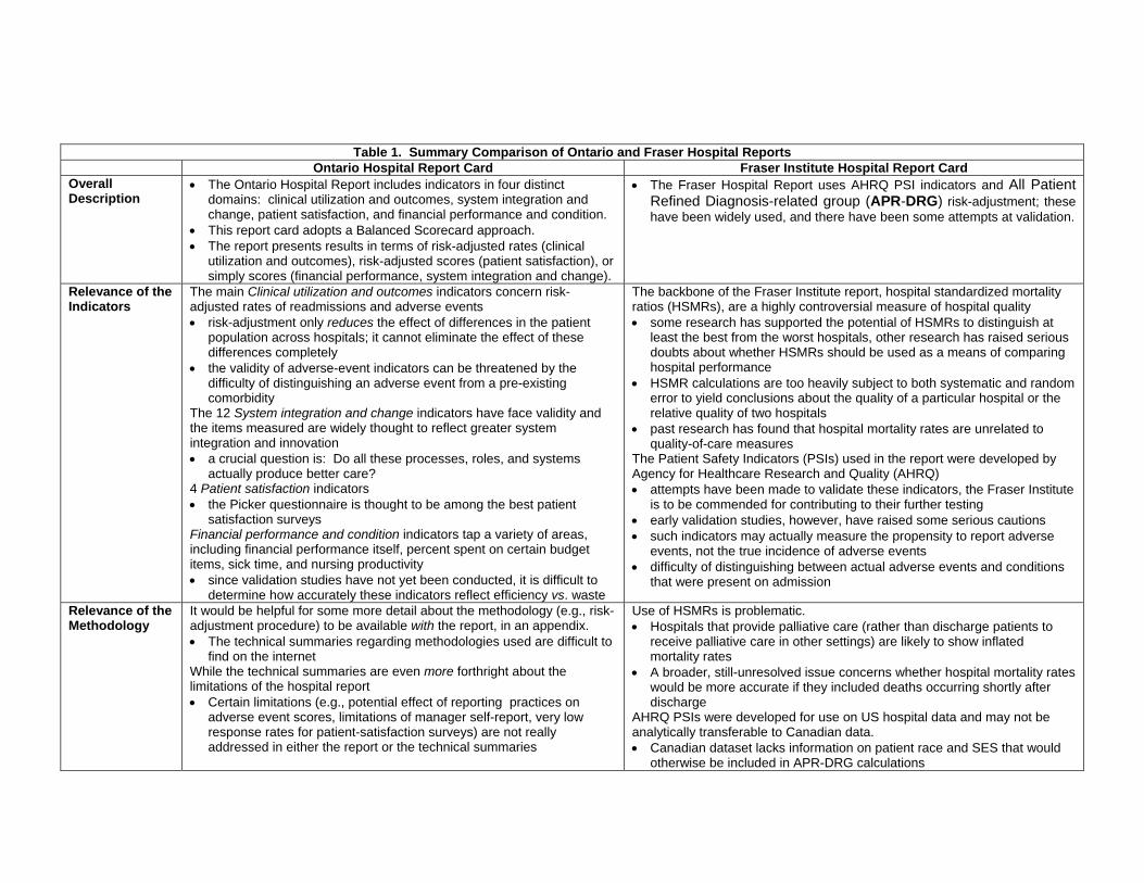
Table 1. Summary Comparison of Ontario and Fraser Hospital Reports Ontario Hospital Report Card Fraser Institute Hospital Report Card Overall Description
The Ontario Hospital Report includes indicators in four distinct domains: clinical utilization and outcomes, system integration and change, patient satisfaction, and financial performance and condition.
This report card adopts a Balanced Scorecard approach. The report presents results in terms of risk-adjusted rates (clinical
utilization and outcomes), risk-adjusted scores (patient satisfaction), or simply scores (financial performance, system integration and change).
The Fraser Hospital Report uses AHRQ PSI indicators and All Patient Refined Diagnosis-related group (APR-DRG) risk-adjustment; these have been widely used, and there have been some attempts at validation.
Relevance of the Indicators
The main Clinical utilization and outcomes indicators concern risk-adjusted rates of readmissions and adverse events risk-adjustment only reduces the effect of differences in the patient
population across hospitals; it cannot eliminate the effect of these differences completely
the validity of adverse-event indicators can be threatened by the difficulty of distinguishing an adverse event from a pre-existing comorbidity
The 12 System integration and change indicators have face validity and the items measured are widely thought to reflect greater system integration and innovation a crucial question is: Do all these processes, roles, and systems
actually produce better care? 4 Patient satisfaction indicators the Picker questionnaire is thought to be among the best patient
satisfaction surveys Financial performance and condition indicators tap a variety of areas, including financial performance itself, percent spent on certain budget items, sick time, and nursing productivity since validation studies have not yet been conducted, it is difficult to
determine how accurately these indicators reflect efficiency vs. waste
The backbone of the Fraser Institute report, hospital standardized mortality ratios (HSMRs), are a highly controversial measure of hospital quality some research has supported the potential of HSMRs to distinguish at
least the best from the worst hospitals, other research has raised serious doubts about whether HSMRs should be used as a means of comparing hospital performance
HSMR calculations are too heavily subject to both systematic and random error to yield conclusions about the quality of a particular hospital or the relative quality of two hospitals
past research has found that hospital mortality rates are unrelated to quality-of-care measures
The Patient Safety Indicators (PSIs) used in the report were developed by Agency for Healthcare Research and Quality (AHRQ) attempts have been made to validate these indicators, the Fraser Institute
is to be commended for contributing to their further testing early validation studies, however, have raised some serious cautions such indicators may actually measure the propensity to report adverse
events, not the true incidence of adverse events difficulty of distinguishing between actual adverse events and conditions
that were present on admission
Relevance of the Methodology
It would be helpful for some more detail about the methodology (e.g., risk-adjustment procedure) to be available with the report, in an appendix. The technical summaries regarding methodologies used are difficult to
find on the internet While the technical summaries are even more forthright about the limitations of the hospital report Certain limitations (e.g., potential effect of reporting practices on
adverse event scores, limitations of manager self-report, very low response rates for patient-satisfaction surveys) are not really addressed in either the report or the technical summaries
Use of HSMRs is problematic. Hospitals that provide palliative care (rather than discharge patients to
receive palliative care in other settings) are likely to show inflated mortality rates
A broader, still-unresolved issue concerns whether hospital mortality rates would be more accurate if they included deaths occurring shortly after discharge
AHRQ PSIs were developed for use on US hospital data and may not be analytically transferable to Canadian data. Canadian dataset lacks information on patient race and SES that would
otherwise be included in APR-DRG calculations

30
Table 1. Summary Comparison of Ontario an rd F aser Hospital Reports Ontario Hospital Report Card Fraser Institute Hospital Report Card Analysis, Interpretation, and Presentation
The Ontario Hospital Report offers a fair and objective presentation of the results authors forthrightly state that factors other than quality of care can
influence scores authors offer some description of non-quality-of-care factors that could
systematically affect the results authors clearly note that high scores in one area do not imply high
scores in another The report’s length, style, and use of visual aids (in particular, box plots) make it user-friendly for decision-makers It is easy to see patterns (or the lack thereof) in the tables provided,
and the reader is not overwhelmed with data the report is still rather complex and technical for use by lay readers
The report prominently displays a full list of hospital rankings on the HMI, but fails to note which differences are statistically significant.
The report does not address the well-known controversy about HSMRs, or remind the reader about non-quality-of-care factors that could systematically affect the results
The report does not break down the results by size or type of hospital, nor by health region
The report is not user-friendly. There is a great amount of repetition, with the same 27 pages repeated
10 times, and data for each indicator presented in four different ways
Report Strengths
Attempts to give a broad picture of performance across four domains
Uses indicators that are refined and improved over time, based on extensive investigation of local coding practices and issues
Many efforts to avoid biases (i.e., risk-adjustment, additional inclusion criteria, distinguishing between Type 1 and 2 diagnoses)
Stakeholder involvement and ownership
Presentation of results is statistically appropriate and user-friendly (to decision-makers)
Generally clear and objective account of what can and cannot be concluded from the results.
Attempts to focus on an area of primary importance
Uses AHRQ indicators and APR-DRG risk-adjustment; these have been widely used, and there have been some attempts at validation.
Some efforts to avoid biases (i.e., risk-adjustment)
Report Weaknesses
Indicators in some areas are relatively new and of uncertain validity.
There may be inadequate data in the areas of system integration (one manager’s report) and patient satisfaction (low response rates).
Focuses almost exclusively on HSMR, which is known to have serious limitations as a means of comparing hospital performance.
Unbalanced discussion with inflated and potentially misleading claims. Only token efforts to address limitations.
Very lengthy, repetitious, and not user-friendly to either decision-makers or patients.

References
1. Werner RM, Asch DA. The unintended consequences of publicly reporting quality
information. JAMA. 2005;293:1239-44.
2. Iezzoni LI. 100 apples divided by 15 red herrings: a cautionary tale from the mid-19th
century on comparing hospital mortality rates. Ann Intern Med. 1996;124:1079-85.
3. Ireson CI, Ford MA, Hower JM, Schwartz RW. Outcome report cards: a necessity in
the health care market. Arch Surg. 2002;137:46-51.
4. Nightingale F. Notes on Hospitals. 3d ed. London: Longman, Green, Longman,
Roberts, and Green; 1863.
5. Walker HM. Studies in the History of Statistical Method. Baltimore: Williams &
Wilkins; 1929.
6. Dranove D, Kessler D, McClellan M, Satterthwaite M. Is More Information Better?
The Effects of “Report Cards” on Health Care Providers. Journal of Political Economy.
2003; 3: 555-588.
7. Rosenstein AH. Am J Med Qual. 2004;19:183-92.
8. Ghali WA, Rothwell DM, Quan H, Brant R, Tu JV. A Canadian comparison of data
sources for coronary artery bypass surgery outcome "report cards". Am Heart J.
2000;140:402-8
9. Baker GR, Anderson G, Brooks N, Brown A, McKillop I, Murray MA, Pink GH. The
Hospital Report '98: A System-wide review of Ontario's hospitals.
http://www.hospitalreport.ca/downloads/previous/1998/1998_HospitalReport.pdf Last
Accessed 9 December 2008.
10. Esmail N., Hazel M. The Fraser Institute Hospital Report Card: Ontario 2008.

11. Esmail N., Hazel M. The Fraser Institute Hospital Report Card: British Columbia
2008.
12. Woodward J. To Do the Sick No Harm: A Study of the British Voluntary Hospital
System to 1875. London: Routledge & Kegan Paul; 1974.
13. Eyler JM. Victorian Social Medicine. The Ideas and Methods of William Farr.
Baltimore: Johns Hopkins University Press; 1979.
14. Bristowe JS, Holmes T. Report on the Hospitals of the United Kingdom. Sixth
Report of the Medical Officer of the Privy Council, 1863. London: George E. Eyre and
William Spottiswoode, for her Majesty's Stationery Office; 1864.
15. Kong D. High hospital death rates. Boston Globe. 30 October 1994:1, 6, 7.
16. Drozda JP Jr, Hagan EP, Mirro MJ, Peterson ED, Wright JS; American College of
Cardiology Foundation Writing Committee. J Am Coll Cardiol. 2008;51:1993-2001.
17. Howard DH, Kaplan B. Inquiry. 2006;43:150-9.
18. Hibbard JH, Stockard J, Tusler M. Health Affairs. 2003;22:84-94.
19. Lilford R, Mohammed MA, Spiegelhalter D, Thomson R. Use and misuse of
process and outcome data in managing performance of acute medical care: avoiding
institutional stigma. Lancet. 2004; 363: 1147–54.
20. Agency for Healthcare Research and Quality (AHRQ) Quality Indicators.
http://www.qualityindicators.ahrq.gov/
Last Accessed 9 December 2008.
21. Moore K, Lynn MR, McMillen BJ, Evans S. Implementation of the ANA report card.
J Nurs Adm. 1999;29:48-54.
32
22. Lutfiyya MN, Bhat DK, Gandhi SR, Nguyen C, Weidenbacher-Hoper VL, Lipsky MS.
.A comparison of quality of care indicators in urban acute care hospitals and rural critical
access hospitals in the United States. Int J Qual Health Care. 2007;19:141-9.
23. United States Department of Health and Human Services. Hospital Compare.
Information for professionals. http://www.hospitalcompare.hhs.gov/
Last Accessed 22 June 2006.
24. Bahl V, Thompson MA, Kau TY, Hu HM, Campbell DA. Do the AHRQ patient
safety indicators flag conditions that are present at the time of hospital admission? Med
Care 2008;46: 516–522
25. Harper DL. Cleveland's five-year experience with public reporting of hospital quality
performance measurements. Healthcare Quarterly. 1999;2:47-49.
26. Marshall MN, Shekelle PG, Davies HTO, Smith PC. Public reporting on quality in
the United States and the United Kingdom. Health Affairs. 2003;22:134-148.
27. Leatherman S, Berwick D, Iles D, Lewin LS, Davidoff F, Nolan T, Bisognano M. The
business case for quality: case studies and an analysis. Health Affairs. 2003;260:17-30.
28. Institute of Medicine. Crossing the Quality Chasm. A New Health System for the
21st Century. Washington D.C.: National Academy Press, 2000.
29. Canadian Institute for Health Information.
http://secure.cihi.ca/cihiweb/dispPage.jsp?cw_page=PG_890_E&cw_topic=890&cw_rel
=AR_1070_E
Last Accessed 5 Dec 2008.
30. Kaplan RS, Norton DP. The balanced scorecard--measures that drive
performance. Harvard Business Review. 1992; January-February: 71- 79.
33
31. Choy L, Tallentire M, Anderson G. Hospital report 2006: Acute care
clinical utilization and outcomes technical summary.
http://www.hospitalreport.ca/downloads/2006/AC/2006_AC_cuo_techreport.pdf
Last Accessed 9 Dec 2008.
32. Glussich A, Button I, McGillis-Hall L, McKillop I, Pink G, Zinck G, et al. Hospital
report 2006: Acute care: Financial performance and condition technical summary.
http://www.hospitalreport.ca/downloads/2006/AC/2006_AC_finance_techreport.pdf
Last Accessed 9 Dec 2008.
33. Loreti M, Murray M. A. Hospital report 2006: Acute care: Patient satisfaction
technical summary.
http://www.hospitalreport.ca/downloads/2006/AC/2006_AC_ps_techreport.pdf
Last Accessed 9 Dec 2008.
34. Wagg J, Tse J, Seeman N, Baker R, Flintoft V, Paul J.
Hospital report 2006: Acute care: System integration and change technical summary.
http://www.hospitalreport.ca/downloads/2006/AC/2006_AC_sic_technotes.pdf
Last Accessed 9 Dec 2008.
35. Griffith JR, Knutzen SR, Alexander JA. Structural versus outcomes measures in
hospitals: A comparison of Joint Commission and Medicare outcomes scores in
hospitals. Quality Management in Health Care. 2002;10:29-38.
36. Pitches DW, Mohammed MA, Lilford RJ. What is the empirical evidence that
hospitals with higher-risk adjusted mortality rates provide poorer quality care? A
systematic review of the literature. BMC Health Services Research. 2007; 7: 91.
34

37. Glance LG, Dick AW, Osler TM, Mukamel DB. Accuracy of hospital report cards
based on administrative data. Health Services Research. 2006; 41(4 Pt 1):1413-1437.
38. Canadian Institute for Health Information. Coding variations in the discharge
abstract database (DAD) data. Ottawa, ON: CIHI, 2003.
39. Keroack MA, Youngberg BJ, Cerese JL, Krsek C, Prellwitz LW, Tervelyan E.
Organizational factors associated with high performance in quality and safety in
academic medical centers. Academic Medicine. 2007;82:1178-86.
40. Williams B, Coyle J, Healy D. The meaning of patient satisfaction: an explanation of
high reported levels. Social Science and Medicine. 1998; 47: 1351-1359.
41. Perneger TV, Kossovsky MP, Cathieni F, di Florio V, Burnand B. A randomized
trial of four patient satisfaction questionnaires. Medical Care. 2003; 41:1343-1352.
42. Penfold RB, Dean S, Flemons W, Moffatt, M. Do hospital standardized mortality
ratios measure patient safety? HSMRs in the Winnipeg Regional Health Authority.
Healthcare Papers. 2008; 8:8-24.
43. Shojania KG, Forster AJ. Hospital mortality: When failure is not a good measure of
success. CMAJ. 2008;179:153-157.
44. Thomas JW, Hofer TP. Research evidence on the validity of risk-adjusted mortality
rate as a measure of hospital quality of care. Medical Care Research and Review. 1998;
5: 371-404.
45. Thomas JW, Hofer TP. Accuracy of risk-adjusted mortality rate as a measure of
hospital quality of care. Medical Care. 1999; 37: 83-92.
35
46. Dimick JB, Birkmeyer JD. Ranking hospitals on surgical quality: Does risk-
adjustment always matter? Journal of the American College of Surgeons. 2008; 207:
347-351.
47. Jarman B. In defence of the hospital standardized mortality ratio. Healthcare
Papers. 2008; 8:37-42.
48. Tabak YP, Johannes RS, Silber JH, Kurtz SG. Should do-not-resuscitate status be
included as a mortality risk adjustor? The impact of DNR variations on performance
reporting. Medical Care. 2005; 43: 658-666.
49. Isaac T, Jha AK. Are patient safety indicators related to widely used measures of
hospital quality? Journal of General Internal Medicine. 2008;23: 1373-1378.
50. Hannan EL, Wu C, Ryan TJ, Bennett E, Culliford AT, Gold JP, et al. Do hospitals
and surgeons with higher coronary artery bypass graft surgery volumes still have lower
risk-adjusted mortality rates? Circulation. 2003; 108:795-801.
51. Hemingway H, Crook AM, Feder G, Banerjee S, Dawson JR, Magee P, et al.
Underuse of coronary revascularization procedures in patients considered appropriate
candidates for revascularization. NEJM. 2001; 344: 645-654.
52. Kent GM, Power L, Gregory DM, Barrett BJ, MacCallum GC, Stone EW, et al. Need
for coronary artery bypass grafting in Newfoundland and Labrador: The impact of
increased demand. The Canadian Journal of Cardiology. 2004; 20: 399-404.
53. Johnson ML., Gordon HS, Petersen NJ, Wray NP, Shroyer AL, Grover FL., et al.
Effect of definition of mortality on hospital profiles. Medical Care. 2002; 40:7-16.
36
54. Averill R, Goldfield N, Hughes J, Muldoon J, Gay J, McCullough E, et al. What are
APR-DRGS? An introduction to severity of illness and risk mortality adjustment
methodology. 2003.
http://www.3m.com/us/healthcare/his/products/ coding/refined_drg.jhtml
Last accessed 9 Dec 2008.
55. Russell Mannion R, Goddard M. Public disclosure of comparative clinical
performance data: lessons from the Scottish experience. Journal of Evaluation in
Clinical Practice. 2003; 9: 277–286.
37
38
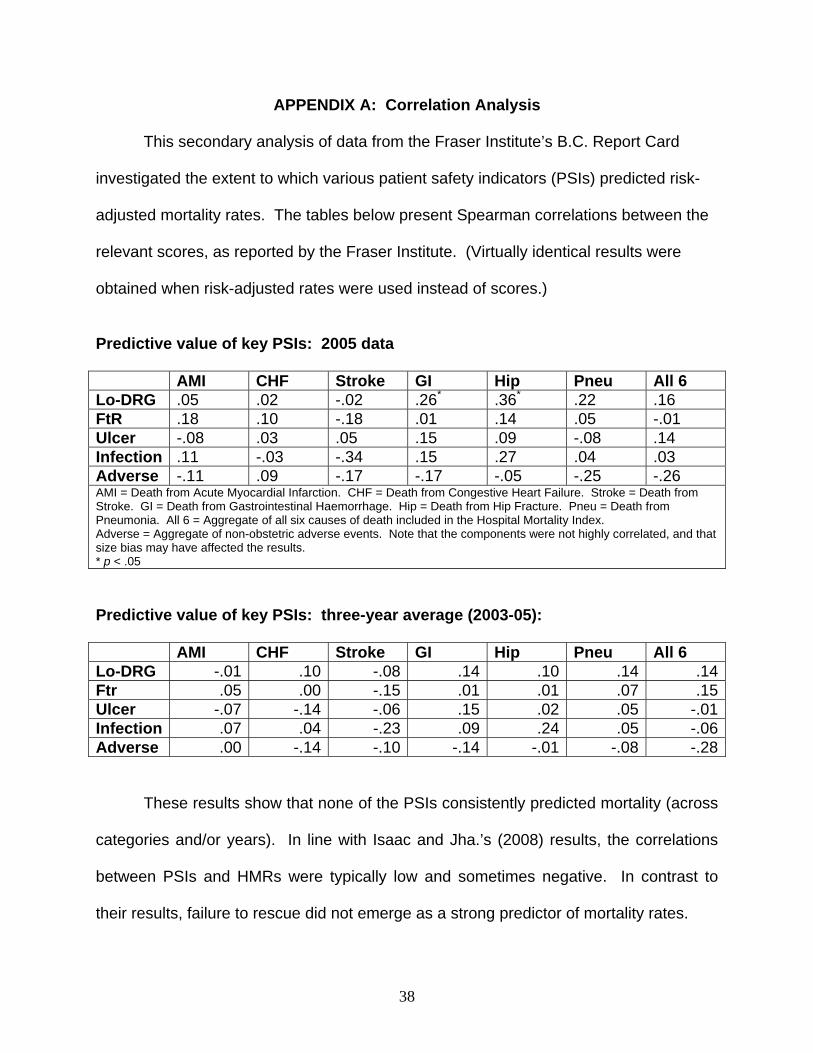
APPENDIX A: Correlation Analysis
This secondary analysis of data from the Fraser Institute’s B.C. Report Card
investigated the extent to which various patient safety indicators (PSIs) predicted risk-
adjusted mortality rates. The tables below present Spearman correlations between the
relevant scores, as reported by the Fraser Institute. (Virtually identical results were
obtained when risk-adjusted rates were used instead of scores.)
Predictive value of key PSIs: 2005 data AMI CHF Stroke GI Hip Pneu All 6 Lo-DRG .05 .02 -.02 .26* .36* .22 .16 FtR .18 .10 -.18 .01 .14 .05 -.01 Ulcer -.08 .03 .05 .15 .09 -.08 .14 Infection .11 -.03 -.34 .15 .27 .04 .03 Adverse -.11 .09 -.17 -.17 -.05 -.25 -.26 AMI = Death from Acute Myocardial Infarction. CHF = Death from Congestive Heart Failure. Stroke = Death from Stroke. GI = Death from Gastrointestinal Haemorrhage. Hip = Death from Hip Fracture. Pneu = Death from Pneumonia. All 6 = Aggregate of all six causes of death included in the Hospital Mortality Index. Adverse = Aggregate of non-obstetric adverse events. Note that the components were not highly correlated, and that size bias may have affected the results. * p < .05
Predictive value of key PSIs: three-year average (2003-05): AMI CHF Stroke GI Hip Pneu All 6 Lo-DRG -.01 .10 -.08 .14 .10 .14 .14Ftr .05 .00 -.15 .01 .01 .07 .15Ulcer -.07 -.14 -.06 .15 .02 .05 -.01Infection .07 .04 -.23 .09 .24 .05 -.06Adverse .00 -.14 -.10 -.14 -.01 -.08 -.28
These results show that none of the PSIs consistently predicted mortality (across
categories and/or years). In line with Isaac and Jha.’s (2008) results, the correlations
between PSIs and HMRs were typically low and sometimes negative. In contrast to
their results, failure to rescue did not emerge as a strong predictor of mortality rates.