a bountiful selection of new css selectors -...
TRANSCRIPT
B A S I S I n t e r n a t i o n a l A d v a n t a g e • V o l u m e 1 7 • D e c e m b e r 2 0 1 3
hile the BBj® browser user interface (BUI) has taken advantage of cascading style sheets (CSS) ever since
its introduction, BASIS has shifted its CSS capabilities into overdrive with the release of BBj 14.0! One of the most noticeable changes is that all BUI apps benefit from a brand new default look and feel. The underlying changes that made the new theme possible were due to the addition of several new CSS selectors to most of the BBj controls. This article gives an overview of how the new selectors allowed BASIS to update BUI in general, and how they give developers the power to create even more advanced and customized user experiences.
Selectors for Complex ControlsIn the same way website designers use CSS selectors to apply styling to specific areas of a web page, BBj developers can use them to identify controls that make up the graphical user interface of their application. Because CSS selectors are flexible, you can use them to select entire classes of controls
A Bountiful Selection of New CSS Selectors W
Figure 1. A sample message box
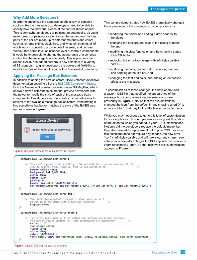
(e.g. all BBjButtons), single controls (e.g. the [Exit] button), or even portions of complex controls (e.g. the [OK] button on a message box). The message box is a prime example of one of BBj’s more complex controls as it is composed of various pieces including the
• Dialog window • Title bar • Message icon • Message text • Response buttons (e.g. Yes/No/Cancel)
All of the components are combined to provide the user with a functional message box, an example of which is shown in Figure 1.
Figure 2 shows the same message box, but this time BASIS added custom CSS to give a 2-pixel colored border to the various components, thus making it easier to visualize the discrete pieces that make up a standard message box.
.BBjMsgBox
.BBjMsgBox-title
.BBjMsgBox-panel
.BBjMsgBox-message-panel
.BBjMsgBox-icon
.BBjMsgBox-message
.BBjMsgBox-button-panel
.BBjMsgBox-buttonBy Nick DeckerEngineering Supervisor
Figure 2. A sample message box identifying each of its selectors
12
Language/Interpreter
links.basis.com/13toc
B A S I S I n t e r n a t i o n a l A d v a n t a g e • V o l u m e 1 7 • D e c e m b e r 2 0 1 3
Why Add More Selectors?In order to customize the appearance effectively of complex controls like the message box, developers need to be able to specify how the individual pieces of the control should appear. This is somewhat analogous to painting an automobile, as you’d never dream of painting your entire car the same color. Various parts of the car are made up of different materials and colors, such as chrome siding, black tires, and white pin striping, all of which work in concert to provide detail, interest, and contrast. Without that same level of influence over a control’s components, it would be impossible to change the appearance of a complex control like the message box effectively. This is precisely the reason BASIS has added numerous new selectors to a variety of BBj controls – to give developers the power and flexibility to modify the look of their application with a fine level of granularity.
Applying the Message Box SelectorsIn addition to adding the new selectors, BASIS created extensive documentation covering all of the BUI CSS Component Styles. Find the Message Box selectors listed under BBjMsgBox, which shows a dozen different selectors that provide developers with the power to modify the style of each of the message box’s components. Developers can now create custom definitions for several of the available message box selectors, transforming it into something that better matches the style of the BASIS web app as shown in Figure 3.
• modifying the border and adding a drop shadow to the dialog,
• changing the background color of the dialog to match the app,
• modifying the size, font, color, and hover/active states of the OK button,
• replacing the error icon image with infinitely scalable pure CSS,
• modifying the color, gradient, drop shadow, font, and side padding of the title bar, and
• changing the font and color, and adding an embossed effect to the message.
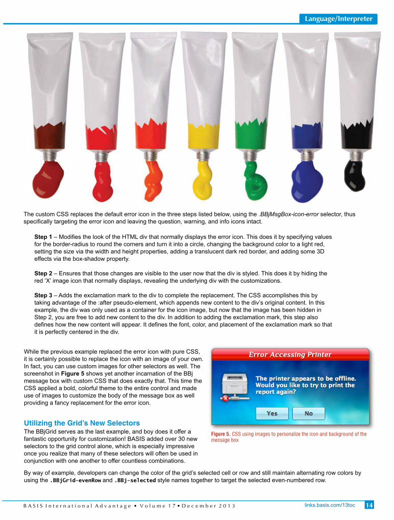
To accomplish all of these changes, the developers used a custom CSS file that modified the appearance of the message box’s components via the selectors shown previously in Figure 2. Notice that the customizations changed the icon from the default image showing a red ‘X’ to a more subtle ‘!’ that may look a little less ominous to users.
While you may not choose to go to this level of customization for your application, this sample serves as a great illustration of the extent to which you can take your BUI customizations. Not only did the developers replace the default image, but they also created its replacement out of pure CSS. Because this technique does not require any images, the new error ‘icon’ is infinitely scalable and will look clear and sharp – even if the user repeatedly enlarges the BUI app with the browser’s zoom functionality. The CSS that achieved this customization appears in Figure 4.
Figure 3. The same message box with custom CSS applied
Figure 4. Custom CSS that replaces the error icon
This sample demonstrates how BASIS dramatically changed the appearance of the message box’s components by
13
Language/Interpreter
links.basis.com/13toc
B A S I S I n t e r n a t i o n a l A d v a n t a g e • V o l u m e 1 7 • D e c e m b e r 2 0 1 3
While the previous example replaced the error icon with pure CSS, it is certainly possible to replace the icon with an image of your own. In fact, you can use custom images for other selectors as well. The screenshot in Figure 5 shows yet another incarnation of the BBj message box with custom CSS that does exactly that. This time the CSS applied a bold, colorful theme to the entire control and made use of images to customize the body of the message box as well providing a fancy replacement for the error icon.
Utilizing the Grid’s New SelectorsThe BBjGrid serves as the last example, and boy does it offer a fantastic opportunity for customization! BASIS added over 30 new selectors to the grid control alone, which is especially impressive once you realize that many of these selectors will often be used in conjunction with one another to offer countless combinations.
Figure 5. CSS using images to personalize the icon and background of the message box
The custom CSS replaces the default error icon in the three steps listed below, using the .BBjMsgBox-icon-error selector, thus specifically targeting the error icon and leaving the question, warning, and info icons intact.
Step 1 – Modifies the look of the HTML div that normally displays the error icon. This does it by specifying values for the border-radius to round the corners and turn it into a circle, changing the background color to a light red, setting the size via the width and height properties, adding a translucent dark red border, and adding some 3D effects via the box-shadow property.
Step 2 – Ensures that those changes are visible to the user now that the div is styled. This does it by hiding the red ‘X’ image icon that normally displays, revealing the underlying div with the customizations.
Step 3 – Adds the exclamation mark to the div to complete the replacement. The CSS accomplishes this by taking advantage of the :after pseudo-element, which appends new content to the div’s original content. In this example, the div was only used as a container for the icon image, but now that the image has been hidden in Step 2, you are free to add new content to the div. In addition to adding the exclamation mark, this step also defines how the new content will appear. It defines the font, color, and placement of the exclamation mark so that it is perfectly centered in the div.
By way of example, developers can change the color of the grid’s selected cell or row and still maintain alternating row colors by using the .BBjGrid-evenRow and .BBj-selected style names together to target the selected even-numbered row.
14
Language/Interpreter
links.basis.com/13toc
B A S I S I n t e r n a t i o n a l A d v a n t a g e • V o l u m e 1 7 • D e c e m b e r 2 0 1 3 links.basis.com/13toc
Figure 6. The GridCSS demo showing the default version along with two custom themes
For more information, refer to • BUI CSS Component Styles at links.basis.com/buicss• Adding Style to BBx Web Apps With Custom CSS at links.basis.com/11css
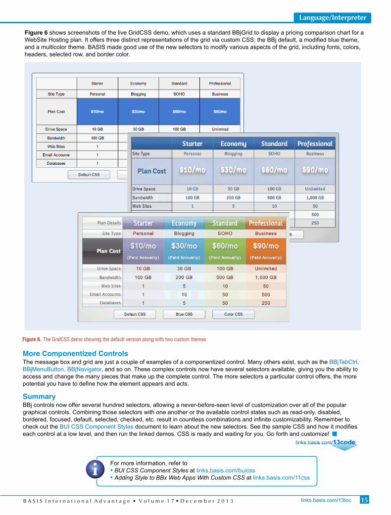
Figure 6 shows screenshots of the live GridCSS demo, which uses a standard BBjGrid to display a pricing comparison chart for a WebSite Hosting plan. It offers three distinct representations of the grid via custom CSS: the BBj default, a modified blue theme, and a multicolor theme. BASIS made good use of the new selectors to modify various aspects of the grid, including fonts, colors, headers, selected row, and border color.
More Componentized ControlsThe message box and grid are just a couple of examples of a componentized control. Many others exist, such as the BBjTabCtrl, BBjMenuButton, BBjNavigator, and so on. These complex controls now have several selectors available, giving you the ability to access and change the many pieces that make up the complete control. The more selectors a particular control offers, the more potential you have to define how the element appears and acts.
SummaryBBj controls now offer several hundred selectors, allowing a never-before-seen level of customization over all of the popular graphical controls. Combining those selectors with one another or the available control states such as read-only, disabled, bordered, focused, default, selected, checked, etc. result in countless combinations and infinite customizability. Remember to check out the BUI CSS Component Styles document to learn about the new selectors. See the sample CSS and how it modifies each control at a low level, and then run the linked demos. CSS is ready and waiting for you. Go forth and customize!
15
Language/Interpreter