5. pre production (aa)
TRANSCRIPT
Pre-Production
Aaron Acaster

Style sheet
“Gamer” font. I like this because it is quite bold and fits in with the genre very well.
“Game Font” This font stands out to me because its different and unique with out looking too weird and obscure. I think that with the right colour scheme, a title with this font would draw peoples eyes.
“Vaio Con Dios” font would fit a gaming magazine perfectly because its bold and has the aspects of the previous two that I like. It has the curviness and the boldness and those are both the aspects I like about the other two.
I like this font because its similar to a font used by a very well known game. So the potential customer will see it and know right away what the magazine is about.

All these colours I’ve chosen are common colours used in magazines of this genre. They all stand out and can be used boldly. I think that I will use some of these colours in my final design because for a start they stand out and would look good used correctly in a gaming magazine. But also when looking at similar products, I realised that other game magazines use colours to not only catch peoples eyes but to emphasise the main character. The colours are either a background from the game or something to complement the art style of the character. Not something completely random.
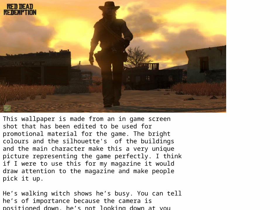
This wallpaper is made from an in game screen shot that has been edited to be used for promotional material for the game. The bright colours and the silhouette's of the buildings and the main character make this a very unique picture representing the game perfectly. I think if I were to use this for my magazine it would draw attention to the magazine and make people pick it up.
He’s walking witch shows he’s busy. You can tell he’s of importance because the camera is positioned down, he’s not looking down at you witch shows he’s not a threat. This is true to the character because he’s a loyal man. He kills, but only people that he feels deserve it. That is represented perfectly by this image.

I think this picture would suit a two page spread rather than the front cover of the magazine. This is a good representation of the game. It would suit a two page spread because it’s a landscape picture and its an in game screenshot that is barley edited and just looks like a good way to show off what you are able to do in the game.
The bright blue sky in the background and the main character in centre focus would entice the reader to read a review of this game by seeing a few images like this.

This picture would be perfect for a front cover because its simple and shows the traits of the character. For example, he's holding his trade mark silver ballers so instantly long time fans will recognise him. Also his face is covered up by the shadows witch shows to new fans that you don’t know very much about him and he's mysterious. More obviously it signifies that it’s a stealth game and you literally have to hide in the shadows. The character has been made for promotional art
Overall colours are very masculine. The black on his suit have been darkened to look more mysterious and to make the whites stand out more. The colours are very masculine. The red on his tie and the inside of his jacket are dark, yet the stand out over the black. The red is almost blood red symbolising the name of the game “blood money”.
He's is stood and his body is facing away from the camera yet his head and his line of sight is looking directly at you. He is positioned in such a way where he's almost looking down on you. His guns are pointing towards the ground, showing he's not a threat. However the fact he has them out is showing he can be a threat if he wanted to be.
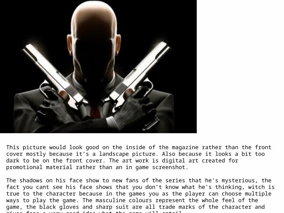
This picture would look good on the inside of the magazine rather than the front cover mostly because it’s a landscape picture. Also because it looks a bit too dark to be on the front cover. The art work is digital art created for promotional material rather than an in game screenshot.
The shadows on his face show to new fans of the series that he's mysterious, the fact you cant see his face shows that you don’t know what he's thinking, witch is true to the character because in the games you as the player can choose multiple ways to play the game. The masculine colours represent the whole feel of the game, the black gloves and sharp suit are all trade marks of the character and gives fans a very good idea what the game will entail.
He is in his trade mark pose with his trade mark guns. So within one glance fans will know what the article is about.

This picture would suit a front cover of a magazine. Unlike the previous images you can see his face he looks angry but slightly smug. His facial expression is defiantly true to the character and will show potential readers exactly what his intentions are.
The fact he is holding his fibre wire isn’t a good sign, because he only gets it out when he as intentions of killing. This is mostly the reason for the look on his face. There is half a shadow over him symbolising that as the player you can chose how to play, you can chose to be stealthy or go in all guns blazing.
The pose he's positioned in is quite a signature pose for the character, he's placed in front of a black background witch I will probably remove for the front cover. His bottom half has been cut out because his suit and face are showing all that needs to be shown.

Layout 1

Layout 2


Props & LocationsProps/Costume needed Locations needed
The Computer The classroom
Photoshop The classroom
PowerPoint The classroom
Microsoft word The classroom
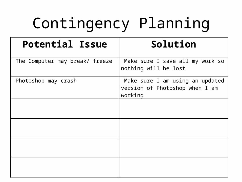
Contingency PlanningPotential Issue Solution
The Computer may break/ freeze Make sure I save all my work so nothing will be lost
Photoshop may crash Make sure I am using an updated version of Photoshop when I am working

Health and SafetyPotential Issue How will the issue be
avoided? I may start to get a headache Make sure I take frequent breaks
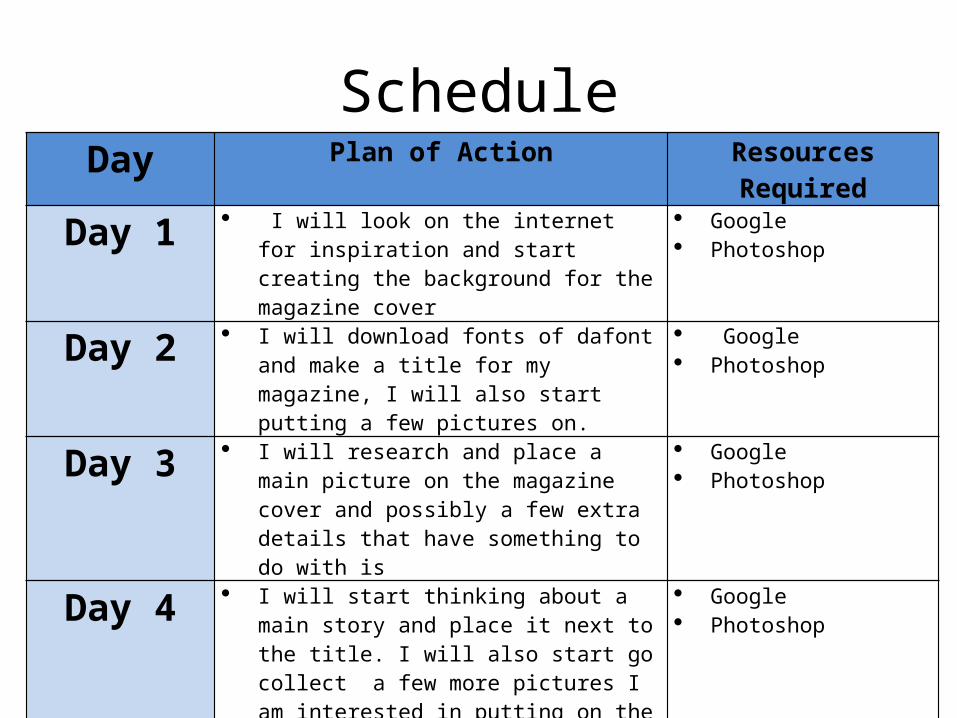
ScheduleDay Plan of Action Resources Required
Day 1 I will look on the internet for inspiration and start creating the background for the magazine cover
Google Photoshop
Day 2 I will download fonts of dafont and make a title for my magazine, I will also start putting a few pictures on.
Google Photoshop
Day 3 I will research and place a main picture on the magazine cover and possibly a few extra details that have something to do with is
Google Photoshop
Day 4 I will start thinking about a main story and place it next to the title. I will also start go collect a few more pictures I am interested in putting on the cover.
I will start to add more pictures and place the finishing touches on the cover.
Google Photoshop
Day 5 I will start production on the double page spread by looking for inspiration in other gaming magazines and gathering a few images
I will also start on creating the main picture that will cover up a whole page
Photoshop Google
Day 6 I will find a good pull quote and place it in the middle of the page.
I will start putting little bits of key information over the big picture I started production on the previous day.
I will also make a logo for the “news station” witch is what I'm calling the article
Photoshop Google
Day 7 I will add the main pieces of text and place them in the centre
I will get screen shots of the game and put them above the text
Photoshop
Day 8 I will add little details such as the page number, a twitter name and logo for the company developing the game and a boarder
Photoshop