4 things we learnt about who views red bull’s content ...… · more about how tableau works with...
TRANSCRIPT

4 charts Every social media
manager needs
Andy Cotgreave
Social Content Manager

This chart shows the performance on social networks
for 4 companies between July and December
1. Slope chart for growth of followers/reach
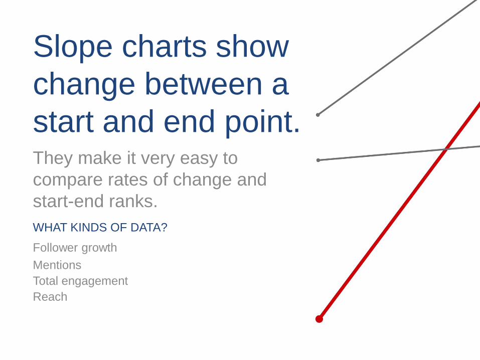
Slope charts show
change between a
start and end point. They make it very easy to
compare rates of change and
start-end ranks.
WHAT KINDS OF DATA?
Follower growth
Mentions
Total engagement
Reach
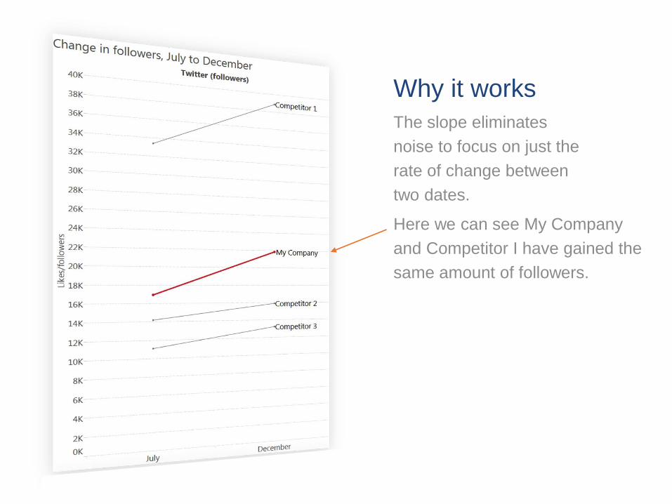
Here we can see My Company
and Competitor I have gained the
same amount of followers.
Why it works
The slope eliminates
noise to focus on just the
rate of change between
two dates.

The labels enable you to see
the rank of you and our
competitors.
Why it works
The slope eliminates
noise to focus on just the
rate of change between
two dates.
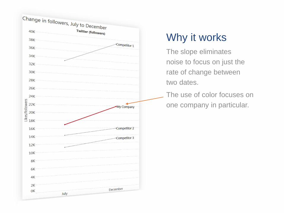
The use of color focuses on
one company in particular.
Why it works
The slope eliminates
noise to focus on just the
rate of change between
two dates.

2. Maps for global/regional clicks on links
This map shows number of clicks on a global brand’s
socially shared links. The blue shows clicks on desktops,
orange shows mobile clicks.

Maps allow you to see
where your audience
is and what regional
differences exist.
WHAT KINDS OF DATA?
Clicks on links in social networks
Geo-tagged tweets or Facebook posts
Locations of your followers

Why it works
Maps represent the real
world. It is fast and easy
to interpret mapped data.

Quickly spot active and inactive
regions. For example, there is lots
of activity in Brazil, but very little
across Africa.
Why it works
Maps represent the real
world. It is fast and easy
to interpret mapped data.

See differences in behavior.
For example, South Americans
tend to click on content on their
Desktop (blue).
North American, West Europe
and parts of Asia are mostly
using mobile devices (orange).
Why it works
Maps represent the real
world. It is fast and easy
to interpret mapped data.

3. Reach vs. Engagement Scatter plot This chart shows data downloaded from Facebook Insights. It shows
organic reach compared to engagement for all posts over a 3 month
period.

WHAT KINDS OF DATA?
Organic/paid reach
Likes
Followers
Number of tweets
Scatter plots let you compare
2 or more measures to find
relationships and
correlations. They make it easy to see
outliers and clusters.

For example, status updates
have the highest reach, but the
lowest engagement.
Why it works
Using color highlights how
different types of posts
perform.
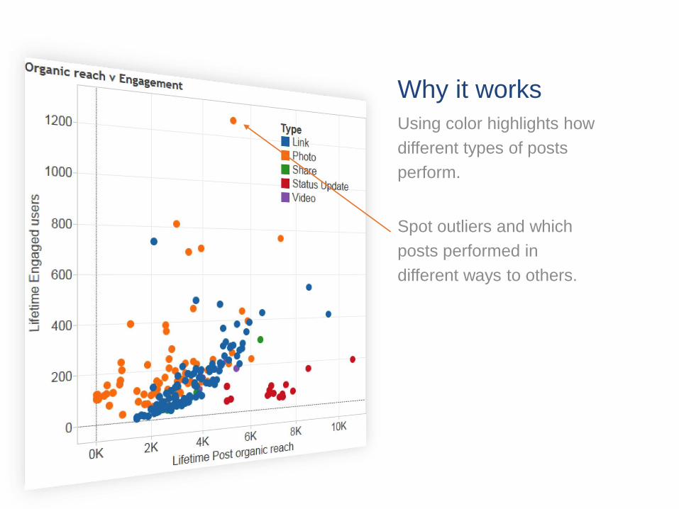
Spot outliers and which
posts performed in
different ways to others.
Why it works
Using color highlights how
different types of posts
perform.

4. Click-through rate on a boxplot This chart shows click-through rates for links on different
channels over a 6 month period. The box-whisker highlights
the median and quartiles for each social network.

Boxplots allow you to
compare distributions
of data among
different categories.
WHAT KINDS OF DATA?
Click through rates
Engagement by Facebook post category
Follower of followers (reach) of you and
your competitors’ Twitter accounts

In this case, we see that while
Facebook has the some very
successful outliers, its upper
IQR is lower than Twitter’s.
Why it works
The whisker shows the
interquartile range (IQR), a
measure of where most data
points are.

Outliers are easily visible.
For example, Reddit has
generally low click-through
rates, but one post
outperformed the others.
Why it works
The whisker shows the
interquartile range (IQR), a
measure of where most data
points are.

We can see that Google+ has a
narrow range, but it’s quite high
compared to LinkedIn.
Why it works
The whisker shows the
interquartile range (IQR), a
measure of where most data
points are.

With Tableau, you can ask the
questions that matter to you,
and drive deeper, actionable
insight about your social
channels and audience.
Click Here and Explore Now!
Explore our social analytics page to learn
more about how Tableau works with social
media data.
About Tableau
See how Tableau can help you by downloading the free trial
at www.tableau.com/trial.
Tableau Software helps people see
and understand data.
Tableau helps anyone quickly analyze, visualize
and share information. More than 15,000
customer accounts get rapid results with Tableau
in the office and on-the-go. And tens of thousands
of people use Tableau Public to share data in
their blogs and websites.