4-7 scatter plots course 3 warm up warm up problem of the day problem of the day lesson presentation...
TRANSCRIPT
4-7 Scatter Plots
Course 3
Warm Up
Problem of the Day
Lesson Presentation
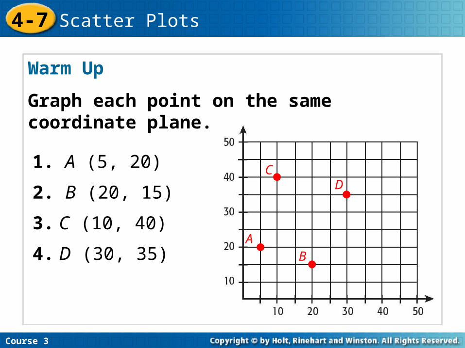
Warm Up
Graph each point on the same coordinate plane.
Course 3
4-7 Scatter Plots
1. A (5, 20)
2. B (20, 15)
3. C (10, 40)
4. D (30, 35)A
B
CD
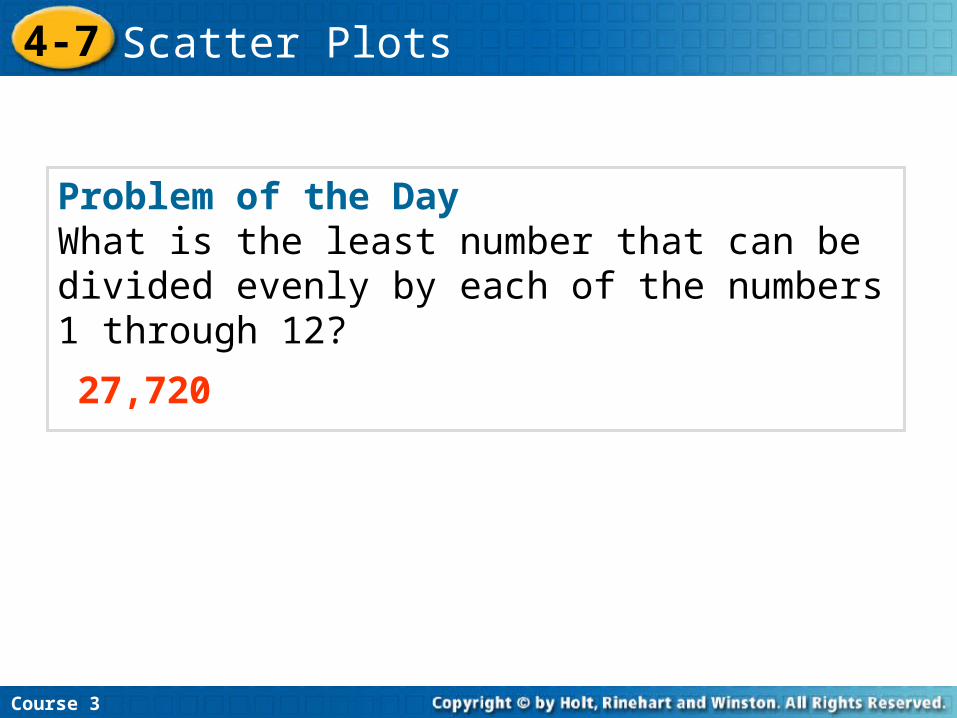
Problem of the DayWhat is the least number that can be divided evenly by each of the numbers 1 through 12?
27,720
Course 3
4-7 Scatter Plots

Learn to create and interpret scatter plots.
Course 3
4-7 Scatter Plots

Vocabulary
scatter plotcorrelationline of best fit
Insert Lesson Title Here
Course 3
4-7 Scatter Plots
Course 3
4-7 Scatter Plots
A scatter plot shows relationships between two sets of data.
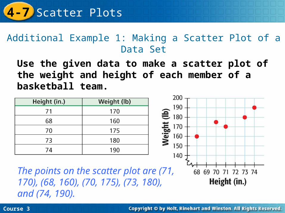
Use the given data to make a scatter plot of the weight and height of each member of a basketball team.
Additional Example 1: Making a Scatter Plot of a Data Set
Course 3
4-7 Scatter Plots
The points on the scatter plot are (71, 170), (68, 160), (70, 175), (73, 180), and (74, 190).
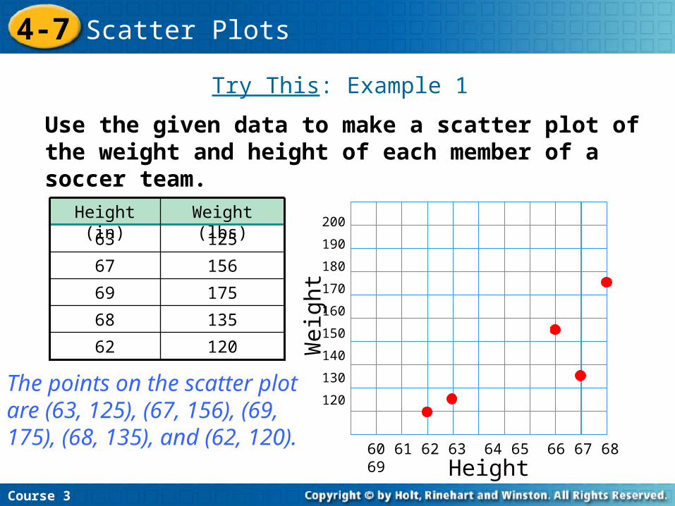
Use the given data to make a scatter plot of the weight and height of each member of a soccer team.
Try This: Example 1
Course 3
4-7 Scatter Plots
12062
13568
17569
15667
12563
Weight (lbs)Height (in)200
190
180
170
160
150
140
130
120
60 61 62 63 64 65 66 67 68 69
The points on the scatter plot are (63, 125), (67, 156), (69, 175), (68, 135), and (62, 120). Height
Weig
ht
Course 3
4-7 Scatter Plots
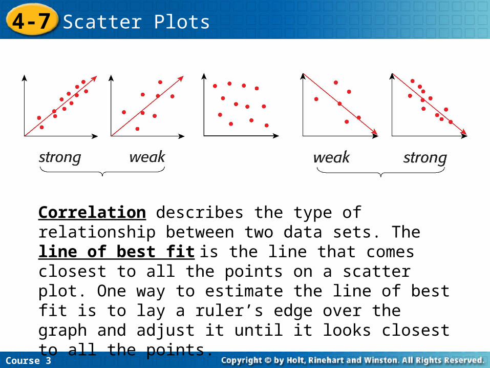
Correlation describes the type of relationship between two data sets. The line of best fit is the line that comes closest to all the points on a scatter plot. One way to estimate the line of best fit is to lay a ruler’s edge over the graph and adjust it until it looks closest to all the points.
Course 3
4-7 Scatter Plots
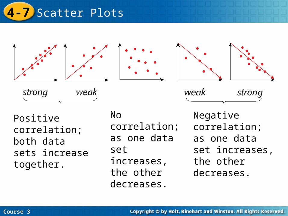
Positive correlation; both data sets increase together.
Negative correlation; as one data set increases, the other decreases.
No correlation; as one data set increases, the other decreases.

Additional Example 2A: Identifying the Correlation of Data
Course 3
4-7 Scatter Plots
A. The size of a jar of baby food and the number of jars of baby food a baby will eat.
Negative correlation: The more food in each jar, the fewer number of jars of baby food a baby will eat.
Do the data sets have a positive, a negative, or no correlation?.
Do the data sets have a positive, a negative, or no correlation?.
Additional Example 2B: Identifying the Correlation of Data
Course 3
4-7 Scatter Plots
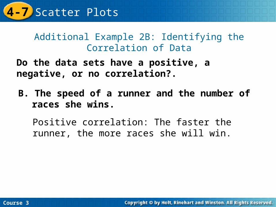
B. The speed of a runner and the number of races she wins.
Positive correlation: The faster the runner, the more races she will win.
Do the data sets have a positive, a negative, or no correlation?.
Additional Example 2C: Identifying the Correlation of Data
Course 3
4-7 Scatter Plots
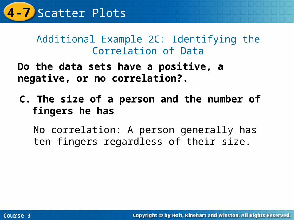
C. The size of a person and the number of fingers he has
No correlation: A person generally has ten fingers regardless of their size.
Try This: Example 2A
Course 3
4-7 Scatter Plots
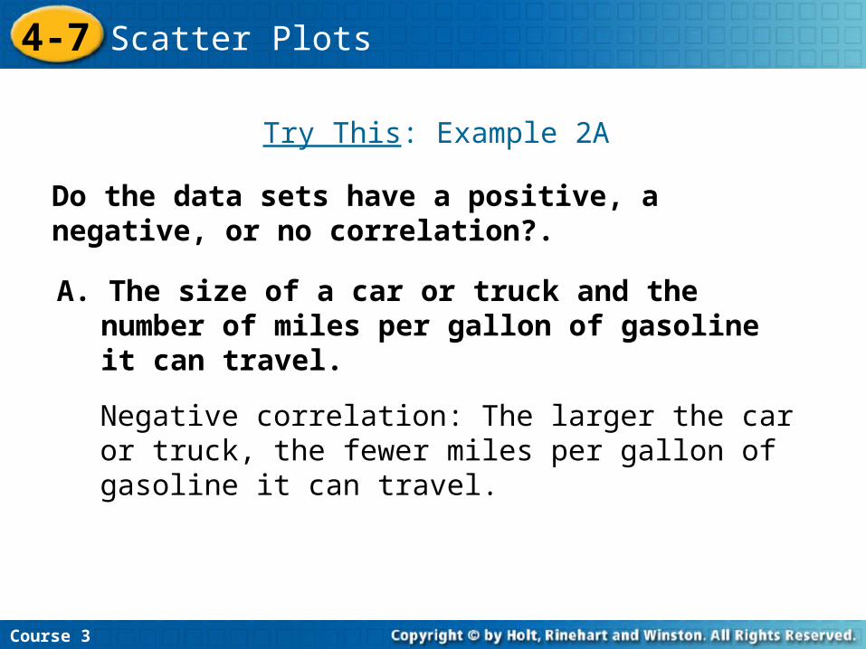
A. The size of a car or truck and the number of miles per gallon of gasoline it can travel.
Negative correlation: The larger the car or truck, the fewer miles per gallon of gasoline it can travel.
Do the data sets have a positive, a negative, or no correlation?.
Do the data sets have a positive, a negative, or no correlation?.
Course 3
4-7 Scatter Plots
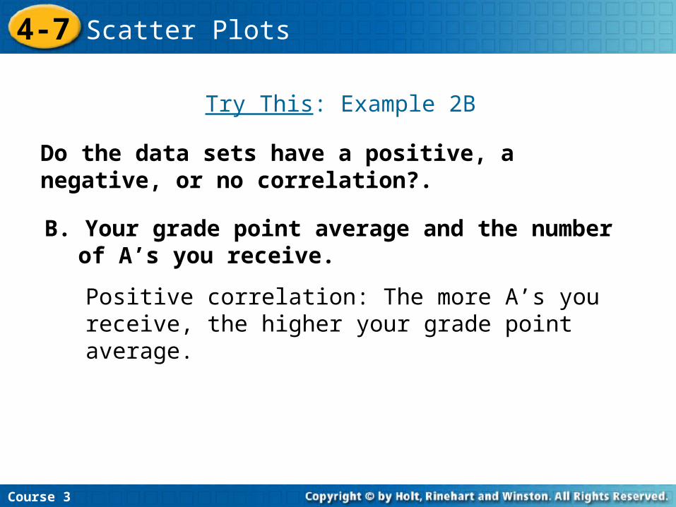
B. Your grade point average and the number of A’s you receive.
Positive correlation: The more A’s you receive, the higher your grade point average.
Try This: Example 2B
Do the data sets have a positive, a negative, or no correlation?.
Course 3
4-7 Scatter Plots
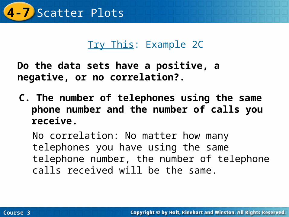
C. The number of telephones using the same phone number and the number of calls you receive.
No correlation: No matter how many telephones you have using the same telephone number, the number of telephone calls received will be the same.
Try This: Example 2C
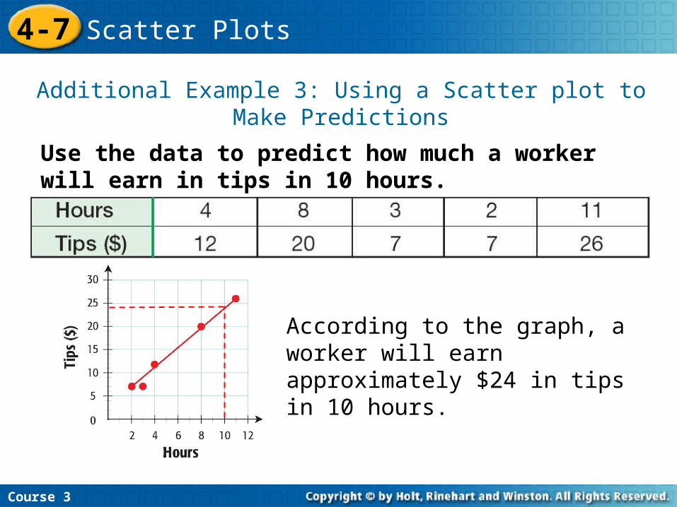
Use the data to predict how much a worker will earn in tips in 10 hours.
Additional Example 3: Using a Scatter plot to Make Predictions
Course 3
4-7 Scatter Plots
According to the graph, a worker will earn approximately $24 in tips in 10 hours.
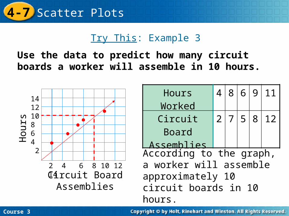
Use the data to predict how many circuit boards a worker will assemble in 10 hours.
Try This: Example 3
Course 3
4-7 Scatter Plots
According to the graph, a worker will assemble approximately 10 circuit boards in 10 hours.
Hours Worked
4 8 6 9 11
Circuit Board Assemblies
2 7 5 8 12
141210 8 6 4 2
2 4 6 8 10 12 14
Hou
rs
Circuit Board Assemblies
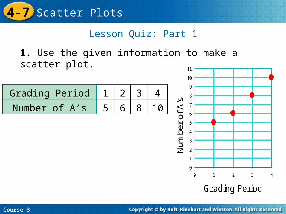
Lesson Quiz: Part 1
1. Use the given information to make a scatter plot.
Insert Lesson Title Here
Course 3
4-7 Scatter Plots
Grading Period 1 2 3 4
Number of A’s 5 6 8 10
0
1
2
3
4
5
6
7
8
9
10
11
0 1 2 3 4
Grading PeriodN
umbe
r of
A's
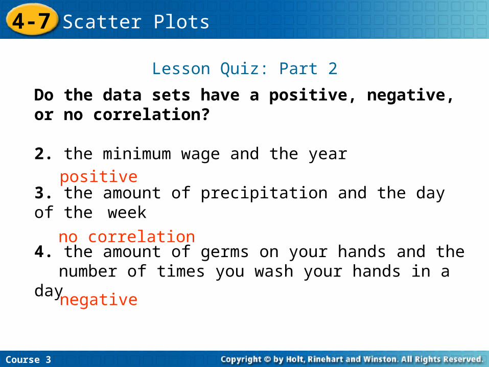
Lesson Quiz: Part 2
Do the data sets have a positive, negative, or no correlation?
2. the minimum wage and the year
3. the amount of precipitation and the day of the week
4. the amount of germs on your hands and the number of times you wash your hands in a day
no correlation
positive
Insert Lesson Title Here
negative
Course 3
4-7 Scatter Plots