flowcyt.rutgers.edu · 2017-10-27 · iii contents safety notice, xiii product alerts, xiii chapter...
TRANSCRIPT
Instructions for Use
Kaluza™
Flow Cytometry Analysis Software
For Research Use Only. Not for use in diagnostic procedures.
September 2009
Beckman Coulter, Inc.250 South Kraemer Blvd.Brea, CA 92821
A75667AA

Kaluza™ Instructions for UsePN A75667AA (September 2009)
Copyright © 2009 Beckman Coulter, Inc..
All rights reserved. No part of this document may be reproduced or transmitted in any form or by any means, electronic, mechanical, photocopying, recording, or otherwise, without prior written permission from Beckman Coulter, Inc.
Find us on the World Wide Web at: www.beckmancoulter.com

Contents
Safety Notice, xiii
Product Alerts, xiii
CHAPTER 1: Introduction to Kaluza Analysis Software, 1-1
Overview, 1-1Distinguishing Features, 1-1
Radial Menus, 1-1Radar Plot, 1-2Logicle Scale, 1-2Interactive Report Sheet, 1-2
Getting Started, 1-3Protocol File Compatibility, 1-3System Requirements, 1-3Launching Kaluza Analysis Software, 1-3Using the License Key, 1-4
Setting-Up a Computer Using a Single License Key, 1-4Setting-Up Computers Using a Network License Key, 1-4License Key Troubleshooting, 1-5
Components of the Main Workspace, 1-6Tooltips, 1-6Warning and Information Messages, 1-7Right-Click Options, 1-7Using Radial Menus, 1-7Drag and Drop, 1-8Pop-up Menu Set-Up, 1-9Indication of Option Availability, 1-9System Performance, 1-9
Main Workspace, 1-10Application Menu, 1-10
Application Menu Options, 1-10Quick-Access Toolbar, 1-13Application Title Bar, 1-14Analysis List, 1-15
Multi-Selecting Files, 1-17Importing Files by Dragging into Analysis List, 1-17Changing the Sequence of Analysis List Rows, 1-19Replacing or Importing a Data Set or Protocol into an Analysis
iii
Contents
List Row, 1-20Applying Data Sets to a Composite or Compensation Composite
File, 1-21Clear Analysis List, 1-21Save Analysis List, 1-22
Attributes Pane, 1-23Parameters Pane, 1-23Compensation Pane, 1-23Color Precedence Pane, 1-23
Display Options for the Analysis List and Attributes Pane, 1-24Hiding a Component Pane, 1-24Displaying a Component Pane, 1-25Hiding the Attributes Pane, 1-25Displaying the Attributes Pane, 1-25Resizing the Analysis List or Attributes Panes, 1-25Resizing Attribute Component Panes, 1-26
Ribbon, 1-26Switching Active Ribbon Tabs, 1-26Hiding the Ribbon Toolbar, 1-26Restoring the Ribbon Toolbar, 1-27Using the Ribbon Toolbars, 1-27Plots & Tables Tab, 1-27Gates & Tools Tab, 1-28Edit Tab, 1-28Page Layout Tab, 1-29Galleries & Grouping Tab, 1-30
Sheet Tab Bar, 1-30
Basic Editing for Plots, Gates, and Sheet Items, 1-30
Selecting Sheet Items, 1-32
CHAPTER 2: Data Analysis, 2-1
Kaluza File Type Summary, 2-1
Protocols, 2-2Creating a New Protocol, 2-2Saving a Protocol, 2-3Saving an Analysis, 2-3Applying a Protocol to a Raw Data Set, 2-4Resolving Parameter Mismatch, 2-5Applying a Different Protocol to an Analysis Entry, 2-5
Composite Protocols, 2-6Creating a New Composite Protocol, 2-6Saving a Composite Analysis, 2-7Setting Up a Composite Protocol, 2-8
Add All Plots, 2-8Overlay Plots, 2-8Changing the Data Set Associated with a Plot, 2-8Gating in Composite Protocols, 2-9
iv

Contents
Updating Parameter and Compensation Data for Individual Data Sets, 2-9
Linking Compensation Between All Data Sets, 2-9Copying Compensation to Other Data Sets, 2-10
Saving a Composite Protocol, 2-11Using the Galleries & Grouping Tab, 2-12
Galleries, 2-12Arranging Data Sets, 2-13
Plots & Tables, 2-15Histogram Plots, 2-15
Setting Up Histogram Plots, 2-15Dot, Density, and Contour Plots, 2-18
Setting Up Dot, Density, and Contour Plots, 2-19Tree Plots, 2-21
Setting Up Tree Plots, 2-21Radar Plots, 2-24
Setting Up Radar Plots, 2-24Overlay Plots, 2-26
Setting Up Overlay Plots, 2-26Overlay Marker, 2-28
Add All Plots, 2-29Gate Statistics Table, 2-29FCS Information Table, 2-31Adding Plots to the Plot Sheet, 2-33Plot Set-Up, 2-33
Editing Plots, 2-33Setting Up Statistics, 2-34Setting Up Plot Display, 2-36Using the Gates & Tools Plot Radial Menu, 2-38Setting Up Plot Data, 2-40Using the Coloring Menu, 2-42
Parameters, 2-44Changing the Parameters Pane Display, 2-44Updating Parameters, 2-45Updating Content Within the Parameters Pane, 2-45Information Icon, 2-46Additional Information for Composite Protocols, 2-46Choosing Scale Type, 2-46
Gates & Tools, 2-47Linear Gates, 2-47Quadrant Gates, 2-48Hinged Quadrant Gates, 2-49Polygon Gates, 2-50Freehand Gates, 2-51Rectangle Gates, 2-52Ellipse Gates, 2-53Boolean Gates, 2-53Setting Up Gates, 2-56
Editing Gates, 2-56
v

Contents
Setting Up Gate Display, 2-56Adding a New Gate, 2-58Data Menu, 2-59Resizing, Reshaping, and Moving Gates, 2-63Methods for Applying Gates to Plots, 2-64Establishing Color Precedence of Gates, 2-65
Tools, 2-69Annotation Tool, 2-69Overlay Marker, 2-69Selection Tool, 2-70
Compensation, 2-70Introduction to Compensation, 2-70Compensation Pane, 2-72Adjusting Compensation, 2-72
Adjusting Spillover Values in the Compensation Pane, 2-72Adjusting Spillover Using the Spillover Sliders Directly on the
Plot(s), 2-73Saving a Compensation File, 2-74Importing a Compensation File, 2-74Resetting Spillover and Autofluorescence Vector Values, 2-75Accounting for Autofluorescence, 2-75Automatic Compensation and Autofluorescence Vector Generation:
Using the Generate Compensation Feature, 2-77Generating Compensation and Autofluorescence Vector
Values, 2-77Using Compensation Sheets, 2-79Recalculating the Generated Compensation and
Autofluorescence Vector Values by Editing Gate Position, 2-80
Manual Updates to the Generated Spillover Matrix, 2-80Saving, Importing, and Resetting the Generated Spillover
Matrix, 2-81Using the Logicle Scale, 2-81Composite Analysis Compensation Options, 2-82
Using Kaluza with Other Applications, 2-82Exporting Statistics, 2-84
Merge Data Sets, 2-84
CHAPTER 3: Sheet Set-Up, 3-1
Using Sheets, 3-1Sheet Radial Menus Options, 3-1
Display Menu, 3-1Gates & Tools Menu, 3-1Plots & Tables Menu, 3-2Edit Menu, 3-2
Adjusting the Size of a Sheet Item, 3-2Moving Plots/Sheet Items, 3-3
vi

Contents
Adding an Image to a Sheet, 3-3Formatting an Image, 3-4Adding Text, 3-5Formatting a Text Box, 3-6
Using the Sheet Tab Bar, 3-8
Report Sheet, 3-8Page Layout, 3-9
Layout, 3-9Page Setup, 3-9Master Page, 3-10Formatting the Date/Time and Page Number Display, 3-10Customizing the Display of the Date/Time and Page
Number, 3-13Printing Report Sheets, 3-14
CHAPTER 4: Glossary, 4-1
Terms and Definitions, 4-1
Trademarks and Acknowledgements, Trademarks-1
Beckman Coulter, Inc.Customer End User License Agreement, Warranty-1
vii

Figures
Figures
1.1 Kaluza License Error Message, 1-5
1.2 Kaluza Main Workspace, 1-6
1.3 Tooltip Example, 1-6
1.4 Warning Message/Tooltip, 1-7
1.5 Pop-Up Menu Set-Up, 1-9
1.6 Unavailable Options, 1-9
1.7 Application Menu, 1-11
1.8 Analysis Options Screen, 1-12
1.9 Quick-Access Toolbar, 1-13
1.10 Application Title Bar, 1-14
1.11 Analysis List Example, 1-15
1.12 Ribbon Header, 1-26
1.13 Plots & Tables Tab, 1-27
1.14 Ribbon—Gates & Tools Tab, 1-28
1.15 Ribbon—Edit Tab, 1-28
1.16 Ribbon—Page Layout Tab, 1-29
1.17 Ribbon—Galleries & Grouping Tab, 1-30
1.18 Sheet Tab Bar, 1-30
2.1 Selecting Data Sets in Composite Protocols, 2-9
2.2 By Data Set Arrangement, 2-14
2.3 Edit Radial Menu, 2-33
2.4 Statistics Radial Menu, 2-34
2.5 Plot Statistics, 2-35
2.6 Display Radial Menu, 2-36
2.7 Gates & Tools Radial Menu, 2-38
2.8 Data Radial Menu, 2-41
2.9 Coloring Radial Menu, 2-42
2.10 Show More Information, 2-45
2.11 Updating Parameters, 2-45
2.12 Boolean Gating—Example Using “NOT”, 2-54
2.13 Boolean Gating–—Example Using “AND”, 2-54
2.14 Boolean Gating—Example Using “OR”, 2-54
2.15 Boolean Gating—Example Using Parenthesis, 2-54
2.16 Boolean Gate Example, 2-55
2.17 Edit Radial Menu, 2-56
viii

Figures
2.18 Display Radial Menu, 2-56
2.19 Gates & Tools Radial Menu, 2-59
2.20 Data Radial Menu, 2-59
2.21 X/Y Coordinates List, 2-61
2.22 Fluorescence Spillover—FITC, 2-71
2.23 Compensation Pane, 2-72
2.24 Spillover Sliders, 2-73
2.25 Autofluorescence Vector Column, 2-75
2.26 Merged Data Set Display—Using the “Time” Parameter, 2-85
3.1 Display Radial Menu, 3-6
ix

Figures
x

Tables
Tables
1.1 Quick-Access Toolbar Functions, 1-14
1.2 Application Title Bar Functions, 1-14
1.3 Analysis List Function Availability, 1-16
1.4 Editing Plots, Gates, and Sheet Items, 1-31
1.5 Edit Ribbon—Selection Descriptions, 1-32
2.1 Kaluza File Types, 2-1
2.2 Resolving Parameter Mismatch, 2-5
2.3 Histogram Plot Set-Up Options, 2-17
2.4 Dot, Contour, and Density Plot Set-Up Options, 2-20
2.5 Tree Plot Set-Up Options, 2-23
2.6 Radar Plot Set-Up Options, 2-25
2.7 Overlay Plot Set-Up Options, 2-27
2.8 Resizing, Reshaping, and Moving Gates, 2-63
2.9 Compensation Options, 2-82
2.10 Using Kaluza Sheet Items in Spreadsheet Applications, 2-83
2.11 Using Kaluza Sheet Items in Word-Processing Applications, 2-83
3.1 Sheet Tab Bar Functions, 3-8
3.2 Page Layout Ribbon—Layout, 3-9
3.3 Page Layout Ribbon—Page Setup, 3-9
3.4 Page Layout Ribbon—Master Page, 3-10
3.5 Page Number Options, 3-11
3.6 Date/Time Options, 3-12
xi

Tables
xii

Safety Notice
Read all product manuals and consult with Beckman Coulter-trained personnel before attempting to use this product. Do not attempt to perform any procedure before carefully reading all instructions. Always follow product labeling and manufacturer’s recommendations. If in doubt as to how to proceed in any situation, contact your Beckman Coulter representative.
Product Alerts
WARNING
This computer program is protected by international copyright and patent laws. Unauthorized copying, use, distribution, transfer, or sale is a violation of those laws that may result in civil or criminal penalties. This computer program may also be subject to additional restrictions contained in a license granted by Beckman Coulter, Inc. to the authorized user of this computer program or to the authorized owner or other authorized user of the system onto which this computer program is installed. Any violation of the license provisions may result in additional civil penalties, including an injunction and damages. Please refer to the computer program or system agreement or to the computer program or system documentation for the terms and conditions of that license.
CAUTION
If you purchased this product from anyone other than Beckman Coulter or an authorized Beckman Coulter distributor, and it is not presently under a Beckman Coulter service maintenance agreement, Beckman Coulter cannot guarantee that the product is fitted with the most current mandatory engineering revisions or that you will receive the most current information bulletins concerning the product. If you purchased this product from a third party and would like further information concerning this topic, call your Beckman Coulter Representative.
A75667AA xiii

Safety NoticeProduct Alerts
A75667AA xiv

CHAPTER 1
Introduction to Kaluza Analysis Software
Overview
Kaluza is stand-alone flow cytometry analysis software. This software includes remarkably advanced features, while maintaining an intuitive, user-friendly interface. Because of the simple nature of Kaluza, you’ll spend less time searching for options and more time analyzing data. Described in the following section are several of the innovative features that Kaluza offers.
Distinguishing Features
Radial Menus
Tree Plot
Radial menus provide quick access to the tools necessary for making changes on the plot sheet or report sheet. Radial menus appear by right-clicking directly on a plot, gate, or on the whitespace of the sheet. As you hover over an icon, a menu appears for that icon, allowing you to make your changes instantly.
The tree plot enables a unique and comprehensive approach to comparing the physical characteristics of the events included in your analysis. Tree plots provide a useful data comparison tool, as one tree plot can condense data from up to 28 bivariate plots.
The tree plot includes:
• Branches, which are used to categorize cell populations based on whether they have a negative or positive result for a specified phenotypic data type. Branches are located at the top of the plot.
• Bars, which are the event populations used to characterize every possible negative/positive branch combination. Bars are the central focus of the tree plot, as they are the pictorial representation of this phenotypic classification system. Bars can be viewed as either Count or % Gated.
Both bars and branches are based on gated data that has already been established within the Protocol.
A75667AA 1-1
Introduction to Kaluza Analysis SoftwareOverview
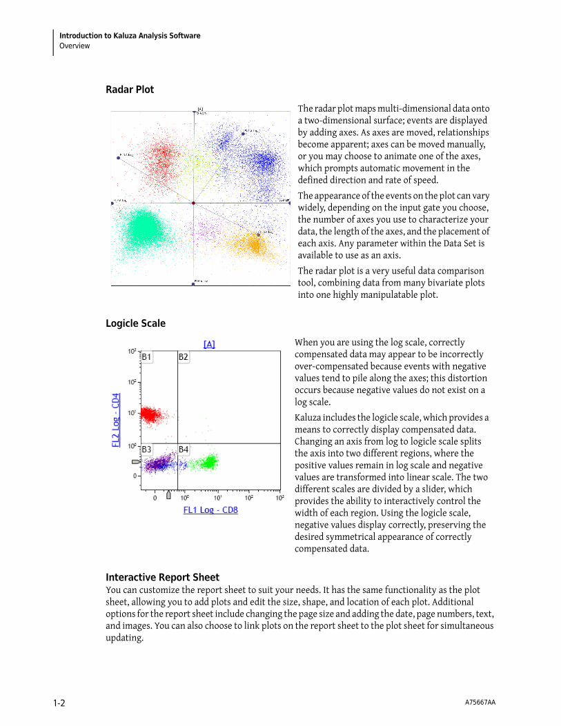
Radar Plot
Logicle Scale
Interactive Report SheetYou can customize the report sheet to suit your needs. It has the same functionality as the plot sheet, allowing you to add plots and edit the size, shape, and location of each plot. Additional options for the report sheet include changing the page size and adding the date, page numbers, text, and images. You can also choose to link plots on the report sheet to the plot sheet for simultaneous updating.
The radar plot maps multi-dimensional data onto a two-dimensional surface; events are displayed by adding axes. As axes are moved, relationships become apparent; axes can be moved manually, or you may choose to animate one of the axes, which prompts automatic movement in the defined direction and rate of speed.
The appearance of the events on the plot can vary widely, depending on the input gate you choose, the number of axes you use to characterize your data, the length of the axes, and the placement of each axis. Any parameter within the Data Set is available to use as an axis.
The radar plot is a very useful data comparison tool, combining data from many bivariate plots into one highly manipulatable plot.
When you are using the log scale, correctly compensated data may appear to be incorrectly over-compensated because events with negative values tend to pile along the axes; this distortion occurs because negative values do not exist on a log scale.
Kaluza includes the logicle scale, which provides a means to correctly display compensated data. Changing an axis from log to logicle scale splits the axis into two different regions, where the positive values remain in log scale and negative values are transformed into linear scale. The two different scales are divided by a slider, which provides the ability to interactively control the width of each region. Using the logicle scale, negative values display correctly, preserving the desired symmetrical appearance of correctly compensated data.
A75667AA 1-2

Introduction to Kaluza Analysis SoftwareGetting Started 1
Getting Started
This section contains instructions and important information for improving your experience with Kaluza.
NOTE Refer to CHAPTER 4, Glossary, for definitions of unfamiliar terms.
Protocol File Compatibility
Kaluza is a stand-alone analysis software, meaning that you do not need to be connected to a flow cytometer to analyze listmode data. In fact, you can import and set up analyses using data files (.lmd or .fcs) from instruments from any manufacturer.
IMPORTANT When working with data files containing embedded protocols derived from BCI systems (such as Elite™, Altra™, XL™, FC500, Gallios™, and Navios™ flow cytometers), please consider the following:
1. Kaluza imports gates, regions, plots, and color precedence information. If, however, a gate and a region from the embedded source protocol have the same name, only the region is imported. The gate with the same name is not imported. Adjust gating as necessary.
2. Reports and statistics are not imported.
System Requirements
For Kaluza to install properly, your system must satisfy the following:
• Operating system:
— Microsoft® Windows XP 32 bit Operating System with Service Pack 3, or
— Windows Vista® 32 bit Operating System with Service Pack 2
• Minimum resolution: 1024 X 768
The layout of the main workspace is optimized for high-resolution widescreen monitors; however, the software can function with a resolution as low as 1024 X 768.
Launching Kaluza Analysis Software
The shortcut for Kaluza software was created on your desktop during the installation process (as described in the software CD package). To launch the software, double-click the Kaluza icon.
A75667AA 1-3

Introduction to Kaluza Analysis SoftwareGetting Started
Using the License Key
A license key enables the use of Kaluza after the trial period has ended. License keys are provided by HASP®.
Setting-Up a Computer Using a Single License Key
To set up a single license key:
1 Install Kaluza on your computer using the instructions included in the software CD package.
2 Plug the USB key into host computer USB port. This allows full access to Kaluza.
NOTE For additional information regarding the HASP key, refer to the instructions on the website at http://localhost:1947.
Setting-Up Computers Using a Network License Key
Prior to setting up user computers on a network license, you must set up the host computer. Follow the instructions in CHAPTER 1, Setting-Up a Computer Using a Single License Key, to complete host computer setup.
To connect network computers to the host computer:
1 Install Kaluza on all computers that need to run Kaluza.
2 Open a web browser program.
3 Enter the following address into the address bar: http://localhost:1947
You are now connected to the HASP License Manager Admin Control Center.
4 From the Administration Options section, select Configuration.
5 Select the Access to Remote License Managers tab.
6 Select the Allow Access to Remote Licenses check box.
7 Type the computer name of the host machine into the Specify Search Parameters field.
A75667AA 1-4

Introduction to Kaluza Analysis SoftwareGetting Started 1
8 Select Submit, which connects the computer to the network license key and grants full access to Kaluza.
NOTE To verify that a computer is connected to the network license key, select the icon after
launching Kaluza; this initiates the About screen. In the License Type section of the screen, a Network license type is indicated when the network license key is recognized by the computer.
NOTE For additional information regarding the HASP key, refer to the instructions on the website at http://localhost:1947.
License Key Troubleshooting
If you currently have a HASP license key but are unable to access Kaluza due to a license expiration error similar to the one shown in Figure 1.1, your computer’s virus scanner may be preventing access to the HASP license service. To enable access, contact your local Technical Support personnel to request to permission for hasplms (HASP License Manager) service on your computer.
Figure 1.1 Kaluza License Error Message
A75667AA 1-5

Introduction to Kaluza Analysis SoftwareGetting Started
Components of the Main Workspace
The components of the Kaluza main workspace are detailed in Figure 1.2.
Figure 1.2 Kaluza Main Workspace
Tooltips
Hover your mouse cursor over hotspot areas of the screen to display information related to your current location. This information, known as tooltips, provides clear instructions, saving you time and eliminating guesswork. Figure 1.3 is an example of a tooltip that appears when the mouse cursor hovers over the Redo icon.
Figure 1.3 Tooltip Example
A75667AA 1-6

Introduction to Kaluza Analysis SoftwareGetting Started 1
Warning and Information Messages
Warning and information messages display at the location of the issue and often give instructions for a resolution. For example, in Figure 1.4, a warning appeared because the imported Protocol parameter names did not match those in the Data Set; when hovering over the warning, a tooltip appears, providing instructions for resolving the error.
Figure 1.4 Warning Message/Tooltip
Right-Click Options
NOTE Normally, right-click options provide alternatives to standard procedures and are not included in the instructions in this manual unless they are the only way to use a particular option.
When you click the right mouse button, menu options that apply to a particular region of the screen appear. Specifically, right-click menus are available in the Analysis List pane, the Attributes pane, and the Sheet Tab Bar.
A unique type of menu, the Radial Menu, is available with a right-click in the plot or report sheet. See CHAPTER 1, Using Radial Menus, for an overview on Radial Menu functionality.
Using Radial Menus
Radial menus are incredibly useful tools, as they enable convenient access to the menu items that are applicable to your current location on the plot sheet or report sheet. Radial menus appear by right-clicking on one of three areas: plots, gates, and sheet whitespace. For details, see CHAPTER 2, Plot Set-Up, CHAPTER 2, Setting Up Gates, or CHAPTER 3, Sheet Radial Menus Options.
To use a Radial Menu:
1 Right-click on the location that you wish to update. A Radial Menu appears.
A75667AA 1-7

Introduction to Kaluza Analysis SoftwareGetting Started
2 Move your mouse over the menu. As you hover over the icons located on the Radial Menu, the menu for that icon appears. For example, hovering over the Coloring icon brings the Coloring menu, as shown in the figure below.
3 Make the necessary changes within the appropriate menu. When you are satisfied with your
changes, close the menu by selecting or by clicking on some other part of the software.
NOTE You can move a Radial Menu to any location of the screen. To move a Radial Menu, left-click on any blank part of the menu and drag it to the preferred location.
Drag and Drop
NOTE Kaluza includes multiple methods for achieving a particular outcome. When the “drag and drop” method is available for a task, it is the option that is noted in the instructions.
Many functions in Kaluza employ the drag and drop method. Examples include:
• Creating plots by dragging/dropping an icon from the Ribbon onto the sheet.
• Opening files by dragging/dropping into the Analysis List.
• Within the Analysis List, importing/replacing a Protocol associated with a Data Set.
• Within the Analysis List, importing/replacing a Data Set associated with a Protocol.
• Changing the order of entries on the Analysis List.
• Moving a sheet item to a different location.
A75667AA 1-8

Introduction to Kaluza Analysis SoftwareGetting Started 1
Pop-up Menu Set-Up
Pop-up menus, which appear after selecting hyperlinks located on plots, may include headings and subheadings within the menu, both of which are not selectable; however, they do include information that is available for selecting under applicable headings. For example, in Figure 1.5, Gates is the heading. Headings appear in white font/grey highlight. The subheadings (Recent gates and By category in Figure 1.5) use a dark grey font and are highlighted in light grey. An arrow located next to a menu item indicates that additional sub-menu options are available, as demonstrated by Common, Quadrant, and Boolean. Sub-menus pop-up when you hover your mouse cursor over a row that includes an arrow.
Figure 1.5 Pop-Up Menu Set-Up
Indication of Option Availability
The availability of options depends on the items that you have set up in your data analysis. When options are not available, they appear transparent compared to the options that are available. For example, in Figure 1.6, Print report sheets is not an available option because the selected analysis file does not contain a report sheet.
Figure 1.6 Unavailable Options
System Performance
To optimize the performance of the application, consider the following:
• Conducting a full disk virus scan while running Kaluza negatively affects performance.
• Optimize the reaction time when moving gates or updating compensation by setting the application to temporarily decrease the number of events that appear on the plot. This is achieved through the Kaluza Options menu (see CHAPTER 1, Kaluza Options).
A75667AA 1-9

Introduction to Kaluza Analysis SoftwareMain Workspace
Main Workspace
The components that make up the Kaluza workspace are described in detail in the following sections. Refer to Figure 1.2 to view the location of each component in the Kaluza workspace.
Application Menu
The Kaluza software Application button is located in the upper left-hand corner of the application workspace. Select this button to open the Application menu.
Application Menu Options
From the Application menu, as shown in Figure 1.7, select one of the following options:
• Recently Used Items: Provides access to the 13 most recently used files. The files are listed in chronological order, with the most recently used file at the top of the list. To open a file on the list, click on the file name.
• New: Creates a new entry in the Analysis List. Options include:
— Analysis List: Creates a new Analysis List.
— Protocol: Creates a new Protocol entry in the Analysis List.
NOTE (Ctrl) + (N)also creates a new Protocol entry in the Analysis List.
— Composite: Creates a new Composite entry in the Analysis List.
— Compensation: Creates a new Compensation entry in the Analysis List.
• Open: Opens a file into the Kaluza application from the location you choose from the Open dialog box.
NOTE Other options for opening files in Kaluza include:
— Selecting from the main screen after opening the application.
— Pressing the (Ctrl) + (O) keys on your keyboard.
• Save selected analysis: Saves the selected analyses within the Analysis List to the location of your choice.
NOTE (Ctrl) + (S) also saves the selected Analysis List row as an analysis.
A75667AA 1-10

Introduction to Kaluza Analysis SoftwareMain Workspace 1
• Save selected as: Provides a list of file types to which you can save the selected entry. Depending on the type of Analysis List entry you are saving, the options vary, and may include one or more of the following:
— Analysis: Saves the selected analysis (*.analysis).
— Analysis List: Saves the selected analysis entries as an Analysis List (*.analysis).
— Protocol: Saves the Protocol from the selected analysis (*.protocol).
— Composite: Saves the selected analysis files as a Composite (*.composite).
— Compensation: Saves the Spillover Matrix and Autofluorescence Vector from the selected analysis (*.compensation).
• Print selected: Provides options for printing plots and reports. Options include:
— Print current sheets: Prints the current sheet in the selected analysis.
— Print report sheets: Prints the report sheets in the selected analysis.
— Print all sheets: Prints all sheets in the selected analysis.
IMPORTANT The Oki B6300 printer has been tested in Kaluza and is guaranteed to produce expected results. Other printers have not been tested, and therefore, quality is not guaranteed.
NOTE (Ctrl) + (P)prints the current sheet in the selected analysis.
• Export selected statistics: Exports statistics as a *.csv file for the selected entries/analyses within the Analysis List.
• Kaluza Options: Allows you to adjust settings for the Kaluza application (see CHAPTER 1, Kaluza Options, for details).
• Exit Kaluza: Closes the application. Select to complete this operation.
Figure 1.7 Application Menu
A75667AA 1-11

Introduction to Kaluza Analysis SoftwareMain Workspace
Analysis Options ScreenFigure 1.8 is an example of the Analysis Options screen, which appears when multiple entries are selected within the Analysis List. Refer to the following sections for complete details.
• CHAPTER 2, Composite Protocols
• CHAPTER 2, Automatic Compensation and Autofluorescence Vector Generation: Using the Generate Compensation Feature
• CHAPTER 2, Merge Data Sets
• CHAPTER 2, Exporting Statistics
• CHAPTER 1, Application Menu for:
— Save Selected as Analysis List
— Print All Sheets from Selected
— Print Report Sheets from Selected
Figure 1.8 Analysis Options Screen
Kaluza OptionsThe Kaluza Options menu allows you to adjust settings for the Kaluza application. These settings include:
• Display Options:
— Display the text in either standard or large font.
— Optimize the reaction time when moving gates or updating compensation by setting the application to temporarily decrease the number of events that appear on the plot.
• Statistics Options:
— Display between 0 and 4 decimal places for both fractional numbers and percents.
— Include a thousands separator for both whole and fractional numbers.
• Compensation Options:
— Display between 0 and 4 decimal places in the Spillover Matrix, including the Autofluorescence Vector column.
A75667AA 1-12

Introduction to Kaluza Analysis SoftwareMain Workspace 1
• Restore all defaults:
— Reinstate the default Kaluza Options menu settings (example shows default settings).
To make changes to the Kaluza Options menu:
1 Select > . The Kaluza Options menu appears (shown in the following figure).
2 Make your changes using the radio buttons, check boxes, and up/down arrows, or use the
button to reset all values.
If you wish to view the changes you made prior to closing the Kaluza Options menu, select Apply.
3 Click OK to implement changes and close the menu.
Quick-Access Toolbar
The Quick-Access toolbar (see Figure 1.9) provides convenient access to Kaluza functions, including undo, redo, save, and print.
Figure 1.9 Quick-Access Toolbar
When you use the Quick-Access toolbar, the save and print functions are limited. Additional options for printing and saving are available through the Application Menu (see CHAPTER 1, Application Menu). The functions available on the Quick-Access toolbar are described in Table 1.1.
A75667AA 1-13

Introduction to Kaluza Analysis SoftwareMain Workspace
Application Title Bar
The Application Title Bar is located at the top of the application (see Figure 1.10). For location in the Kaluza main workspace, see Figure 1.2.
Figure 1.10 Application Title Bar
The Application Title Bar displays the software name and version, and contains the application button, the quick access toolbar, and the following additional components described in Table 1.2:
Table 1.1 Quick-Access Toolbar Functions
Icon Description Function
Undo
Redo
• Undo: Steps the software back one action per click of this icon.
NOTE (Ctrl)+(Z) is an additional method for undoing previous actions.
• Redo: Steps the software forward one action per click of this icon (only available after using the undo function).
NOTE (Ctrl)+(Y) is an additional method for redoing actions.
Unlimited undo and redo is available within a session and is limited only by available memory and disk resources.
IMPORTANT Undo/redo is not available on functions that do not impact program data. These functions include zoom, scrolling a window, selecting a different tab from the Sheet Tab Bar, etc.
Save Saves the selected entry as a *.analysis file to a location of your choice.
Print Prints current sheet of the selected analysis entry.
Table 1.2 Application Title Bar Functions
Icon Description Function
Minimize Minimizes the Kaluza screen.
Maximize Maximizes the Kaluza screen to fit the full dimensions of the monitor.
Close Closes the application.
InformationProvides information about Kaluza including the version, compute engine type, serial number, license type, and copyright information.
Help Provides the complete Instructions for Use in a PDF file format.
A75667AA 1-14

Introduction to Kaluza Analysis SoftwareMain Workspace 1
Analysis List
The Analysis List, which occupies the left-hand side of the screen, is a list of Data Sets and Protocols currently open within the application. The Analysis List can be comprised of one or more analysis files, as well as Composite and Compensation Composite files.
NOTE The Analysis List contains a maximum of 400 rows.
Analysis List Set-UpAs shown in Figure 1.11, there are four columns in the Analysis List:
• The # column shows the row number of each Analysis List entry.
• The Data Set column displays the file name of the Data Set used in an Analysis List row.
• The Protocol column displays the file name of the Protocol used in an Analysis List row.
• The * column indicates that the Analysis List row has been modified and there are unsaved changes.
For details on Analysis List display, see CHAPTER 1, Display Options for the Analysis List and Attributes Pane.
Figure 1.11 Analysis List Example
Using the Analysis ListYou can populate each row in the Analysis List with the Data Set and Protocol independently, allowing you to mix and match Data Sets and Protocols from different files. You can also replace Protocols or Data Sets currently within an analysis row by importing (dragging and dropping) a new file into the column you wish to update.
The Analysis List is the hub for setting up your data analyses, and Kaluza is designed to allow you to easily customize each analysis. Listed in Table 1.3 are the tasks you are able to complete from the Analysis List, as well as the methods that enable you to complete each function.
A75667AA 1-15

Introduction to Kaluza Analysis SoftwareMain Workspace
IMPORTANT Function availability depends on the type of Analysis List row(s) currently selected.
Table 1.3 Analysis List Function Availability
FunctionDragging and
Dropping
Analysis List Menu(accessible byright-clicking)
Keyboard Shortcut
Select All – (Ctrl) + (A)Cut – (Ctrl) + (X)Copy – (Ctrl) + (C)Paste – (Ctrl) + (V)Paste Special – –
Replace Data Set in an Analysis File or Composite
– –
• Clear Data Set(s) or • Clear Data Set from row X.X
– –
Clear Protocol – –
Import Protocol – –
Delete Analysisa
a. Deleting an entry from the Analysis List does not delete the source file.
– (Delete)Merge Data Sets – –
Add to New Composite –
Add to New Compensation –
Import Compensation –
Export Selected Statistics – –
Save Selected Analysis – (Ctrl) + (S)Save Selected As…
• Analysis • Analysis List • Protocol • Composite • Compensation
– –
Print Selected…
• Print Current Sheet • Print Report Sheets • Print All Sheets
— (Ctrl) + (P)
(applies to Print Current Sheet only)
Delete Row X.X from Compensation/ Composite
— —
A75667AA 1-16

Introduction to Kaluza Analysis SoftwareMain Workspace 1
Multi-Selecting Files
By selecting multiple rows on the Analysis List, additional options become available for the entries. These options are shown on the Analysis Options screen (see Figure 1.8), which appears immediately after a second row is selected. The following sections describe the methods for multi-selecting files on the Analysis List.
Multi-Selecting a Consecutive Group of Entries on the Analysis ListTo multi-select a consecutive group of entries:
1 Select the entry located at the top of the group.
2 Press and hold the (Shift) key and select the entry located at the bottom of the group.
3 When you are finished, release the (Shift) key. The entries are now ready to act as a group.
Multi-Selecting Random Entries on the Analysis ListTo multi-select random entries:
1 Press and hold the (Ctrl)key while selecting the entries you wish to include in your selection.
2 Release the (Ctrl)key when you have finished making your selections. The entries are now ready to act as a group.
Importing Files by Dragging into Analysis List
To import a file into the Analysis List by dragging and dropping from your computer:
1 Locate the file(s) you wish to include on the Analysis List.
A75667AA 1-17

Introduction to Kaluza Analysis SoftwareMain Workspace
2 Select the file(s), drag into the list, and release the mouse button. As an example, in the figure below, four files are being dragged into the Analysis List.
The four files appear on the Analysis List as selected entries, as shown in the figure below. Notice that the original file names appear on the Analysis List.
Additionally, when you hover your mouse cursor over an Analysis List row, the tooltip shows pertinent details regarding the file, as shown in the figure below.
Your file(s) are now imported into Kaluza and ready for you to begin your analysis. For details on data analysis, refer to CHAPTER 2, Data Analysis.
A75667AA 1-18

Introduction to Kaluza Analysis SoftwareMain Workspace 1
Changing the Sequence of Analysis List Rows
To move an Analysis List row to another location within the list:
1 Select the Analysis List row(s) you wish to move.
2 Click on the selected row(s) and, without releasing the mouse button, drag to the new location. When an orange line (as shown in the figure below) is in the new location for the row(s), release the mouse button.
NOTE If you moved multiple rows simultaneously, they appear in the new location in the same hierarchal order in which they were originally on the list.
NOTE Cutting and pasting Analysis List rows moves them to the bottom of the list. Dragging and dropping is the only way to change the order of files on the list.
A75667AA 1-19

Introduction to Kaluza Analysis SoftwareMain Workspace
Replacing or Importing a Data Set or Protocol into an Analysis List Row
To assign a Data Set or a Protocol to a new entry or a saved file within the Analysis List:
1 Locate the file you wish to assign to the Analysis List row.
NOTE You may choose a file from your computer or from within the current Analysis List.
2 Select and drag the file into the column of the Analysis List row that you wish to update. For example, in the figure below, the Data Set from the first row on the Analysis List is being moved to replace the Data Set on the fifth row (this means that the Protocol from the fifth row will now be applied to the Data Set from the first row).
3 Once the appropriate Analysis List cell turns orange, release the mouse button.
A75667AA 1-20
Introduction to Kaluza Analysis SoftwareMain Workspace 1
Applying Data Sets to a Composite or Compensation Composite File
To apply a Data Set to a Composite or Compensation Composite entry on the Analysis List:
1 Depending on your starting point, the procedure will vary slightly:
2 Continue building your Composite or Compensation Composite file. Refer to CHAPTER 2, Composite Protocols or CHAPTER 2, Automatic Compensation and Autofluorescence Vector Generation: Using the Generate Compensation Feature.
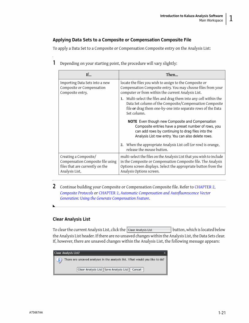
Clear Analysis List
To clear the current Analysis List, click the button, which is located below the Analysis List header. If there are no unsaved changes within the Analysis List, the Data Sets clear. If, however, there are unsaved changes within the Analysis List, the following message appears:
If… Then…
Importing Data Sets into a new Composite or Compensation Composite entry,
locate the files you wish to assign to the Composite or Compensation Composite entry. You may choose files from your computer or from within the current Analysis List.
1. Multi-select the files and drag them into any cell within the Data Set column of the Composite/Compensation Composite file or drag them one-by-one into separate rows of the Data Set column.
NOTE Even though new Composite and Compensation Composite entries have a preset number of rows, you can add rows by continuing to drag files into the Analysis List row entry. You can also delete rows.
2. When the appropriate Analysis List cell (or row) is orange, release the mouse button.
Creating a Composite/Compensation Composite file using files that are currently on the Analysis List,
multi-select the files on the Analysis List that you wish to include in the Composite or Compensation Composite file. The Analysis Options screen displays. Select the appropriate button from the Analysis Options screen.
A75667AA 1-21

Introduction to Kaluza Analysis SoftwareMain Workspace
Select the appropriate option based on the outcome you need:
• Clear Analysis List: Clears the list and does not save any changes made within the Data Sets.
• Save Analysis List: Saves all selected entries as single file. For additional details, see CHAPTER 1, Save Analysis List.
• Cancel: Returns you to the current list without making any changes.
Save Analysis List
You can save multiple Analysis List entries as a single Analysis List file, allowing for easy retrieval. To save selected entries as an Analysis List:
IMPORTANT Unsaved changes to the source Analysis file do not appear within that file after saving a selected group as an Analysis List. Changes only appear in the new *.analysis file.
1 Determine which files you wish to include in the Analysis List file.
• To save all of the open files as an Analysis List, click once within the Analysis List pane and press (Ctrl) + (A) on your keyboard to select all the files.
• To save a selected group of open files as an Analysis List, (Ctrl) + click each file you wish to be included in the Analysis List file.
NOTE The options available when multiple files are selected are displayed on the Analysis Options screen.
2 Select Save Selected as Analysis List from the Analysis Options screen.
NOTE Additional options for saving an Analysis List include either right-clicking on one of the selected files and choosing Save selected as > Analysis List or selecting the Application button and choosing Save selected as > Analysis List.
3 When the Save Analysis dialog box appears, select the destination for the file by navigating to the location using icons in the dialog box or the drop-down in the Save in: field.
4 Enter a file name in the File name: field.
5 Select Save.
A75667AA 1-22

Introduction to Kaluza Analysis SoftwareMain Workspace 1
Attributes Pane
The Attributes pane, which is located next to the Analysis List is comprised of three component panes, including the Parameters, Compensation, and Color Precedence panes.
For details on the Attributes pane display, see CHAPTER 1, Display Options for the Analysis List and Attributes Pane.
Parameters Pane
Compensation Pane
Color Precedence Pane
The parameters pane is a list of the parameters collected in the original Data Set file. This pane enables you to alter parameter names, descriptions, types, detectors, and measurement type. See CHAPTER 2, Parameters, for complete instructions on updating parameters from within the Parameters pane.
The Compensation pane contains tools for adjusting the compensation Spillover and Autofluorescence Vector values related to a particular Data Set. See CHAPTER 2, Adjusting Compensation, for in-depth instructions on how to use the Compensation pane.
The Color Precedence pane displays event coloring and precedence of coloring for gates in the current Protocol. See CHAPTER 2, Establishing Color Precedence of Gates, for in-depth instructions on how to use the Color Precedence pane.
A75667AA 1-23

Introduction to Kaluza Analysis SoftwareMain Workspace
Display Options for the Analysis List and Attributes Pane
As a default, Kaluza displays the Analysis List and the three component panes of the Attributes pane. To optimize your workspace, you may wish to change the size or hide a component of a pane, or even the entire pane.
Hiding a Component Pane
To hide a component pane:
1 Select the button in the component pane you wish to close.
The three Attributes component panes each have vertically-docked buttons, where the color indicates the status of the pane. The white button indicates the pane is closed, and a gold button indicates that the pane is open. When the Analysis List has been closed, it is shown as a vertically-docked white button. For example, in the figure below, the Analysis List and the Compensation panes had been closed.
NOTE An additional way to close an Attributes component pane is to select the gold button corresponding to the pane you wish to hide.
A75667AA 1-24
Introduction to Kaluza Analysis SoftwareMain Workspace 1
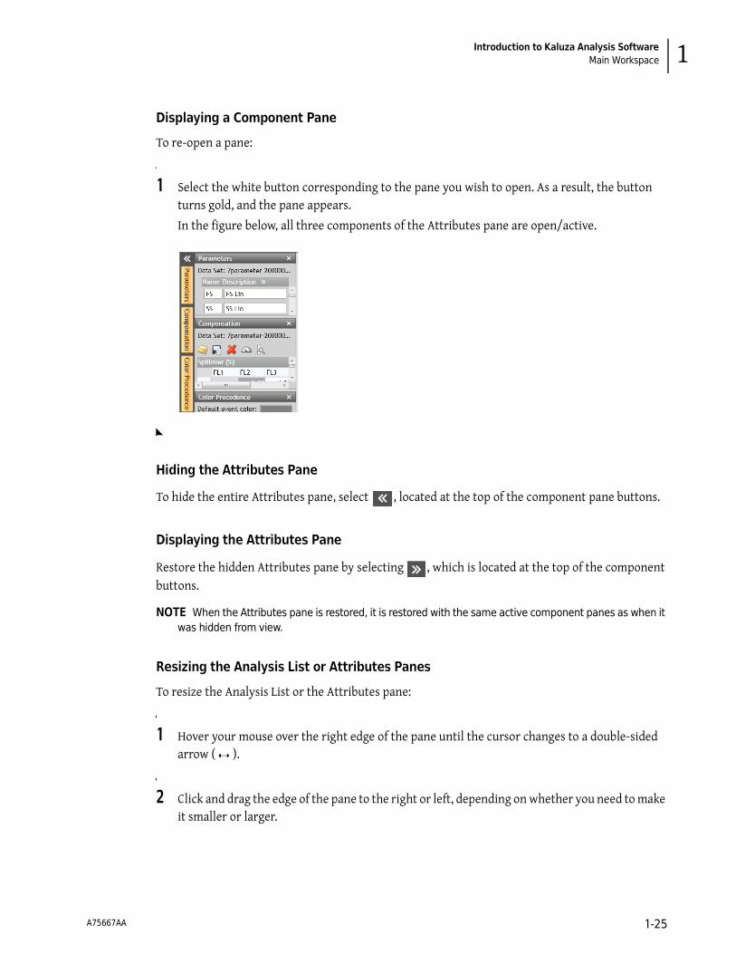
Displaying a Component Pane
To re-open a pane:
1 Select the white button corresponding to the pane you wish to open. As a result, the button turns gold, and the pane appears.
In the figure below, all three components of the Attributes pane are open/active.
Hiding the Attributes Pane
To hide the entire Attributes pane, select , located at the top of the component pane buttons.
Displaying the Attributes Pane
Restore the hidden Attributes pane by selecting , which is located at the top of the component buttons.
NOTE When the Attributes pane is restored, it is restored with the same active component panes as when it was hidden from view.
Resizing the Analysis List or Attributes Panes
To resize the Analysis List or the Attributes pane:
1 Hover your mouse over the right edge of the pane until the cursor changes to a double-sided arrow ( ).
2 Click and drag the edge of the pane to the right or left, depending on whether you need to make it smaller or larger.
A75667AA 1-25

Introduction to Kaluza Analysis SoftwareMain Workspace
3 When you are satisfied with the size, release the mouse button.
Resizing Attribute Component Panes
To resize (lengthen or shorten) the Parameters, Compensation, or Color Precedence panes:
1 Hover your mouse over the bottom edge of the pane until the cursor changes to a double-sided
arrow ( ).
2 Click and drag the edge of the pane up or down, depending on whether you need to make it smaller or larger.
3 When you are satisfied with the size, release the mouse button.
Ribbon
The Ribbon, which is located directly above the sheet workspace, contains tabs for convenient access to the most-used items within the application. The tabs that display can change, given the current task you are completing. Refer to the following sections for details on each tab type:
• CHAPTER 1, Plots & Tables Tab
• CHAPTER 1, Gates & Tools Tab
• CHAPTER 1, Edit Tab
• CHAPTER 1, Page Layout Tab
• CHAPTER 1, Galleries & Grouping Tab
Switching Active Ribbon Tabs
To switch between active tabs, select the title of a different tab on the Ribbon Toolbar. Figure 1.12 is an example of the Ribbon header.
Figure 1.12 Ribbon Header
Hiding the Ribbon Toolbar
To maximize the sheet area, you can hide the contents of the Ribbon so that just the header is in view. To hide the Ribbon toolbar, double click on any of the Ribbon tabs.
A75667AA 1-26

Introduction to Kaluza Analysis SoftwareMain Workspace 1
Restoring the Ribbon Toolbar
There are two options for restoring a previously hidden toolbar.
• Temporary restoration: To temporarily restore the Ribbon toolbar, click once on the Ribbon tab you wish to view. The Ribbon toolbar appears until you click your mouse in another area of the application.
• Complete restoration: To completely restore the Ribbon toolbar, double-click on any Ribbon tab.
Using the Ribbon Toolbars
To make changes or add items to a sheet, use one or both methods described below:
• Selecting the icon located on the tab: Select the icon for the specific item you need; this either changes your cursor or adds the new item you selected below any items already on the sheet.
• Dragging and dropping: Select the item that you wish to add to the sheet, and then drag and drop it in the location of your choice.
Plots & Tables Tab
The Plots & Tables Ribbon tab (see Figure 1.13) is divided into three sections, including Plots, Tables, and Sheet Items.
Figure 1.13 Plots & Tables Tab
PlotsThe Plots section of the Plots & Tables tab displays all plots that are available. Refer to the following sections for details:
• CHAPTER 2, Histogram Plots
• CHAPTER 2, Dot, Density, and Contour Plots
• CHAPTER 2, Tree Plots
• CHAPTER 2, Radar Plots
• CHAPTER 2, Overlay Plots
• CHAPTER 2, Add All Plots
TablesFrom the Tables section of the Plots & Tables tab, you can choose to add a Gate Statistics table, which displays gate color, logic, and statistics, or an FCS Information table, which is a table showing the raw data keywords that you choose to display, to the sheet. For additional details, see CHAPTER 2, FCS Information Table, or CHAPTER 2, Gate Statistics Table.
A75667AA 1-27

Introduction to Kaluza Analysis SoftwareMain Workspace
Sheet ItemsThe Sheet Items section of the Plots & Tables tab is used for adding an image or text to your sheet. For additional details, see CHAPTER 3, Adding an Image to a Sheet, or CHAPTER 3, Adding Text.
Gates & Tools Tab
Figure 1.14 Ribbon—Gates & Tools Tab
ToolsChange your cursor to a different mode by selecting one of the tools described in the following sections:
• CHAPTER 2, Selection Tool
• CHAPTER 2, Annotation Tool
• CHAPTER 2, Overlay Marker
GatesThe Gates section of this tab displays all options available for gating data. Refer to the following sections for details:
• CHAPTER 2, Linear Gates
• CHAPTER 2, Quadrant Gates
• CHAPTER 2, Hinged Quadrant Gates
• CHAPTER 2, Polygon Gates
• CHAPTER 2, Freehand Gates
• CHAPTER 2, Rectangle Gates
• CHAPTER 2, Ellipse Gates
• CHAPTER 2, Boolean Gates
Plot ModeChoosing the Adjust Compensation icon from the Plot Mode section of the Gates & Tools tab displays the Compensation Sliders on all applicable plots on the plot sheet. See CHAPTER 2, Adjusting Spillover Using the Spillover Sliders Directly on the Plot(s), for details.
Edit Tab
Figure 1.15 Ribbon—Edit Tab
A75667AA 1-28

Introduction to Kaluza Analysis SoftwareMain Workspace 1
ClipboardThe Clipboard section of this tab displays all of the editing options available for sheets. These options include (see CHAPTER 1, Basic Editing for Plots, Gates, and Sheet Items, for details):
• Cut
• Copy
• Paste
• Paste as Link
• Delete
SelectionThe Selection section of the Edit tab enables you to select/deselect items on your sheet. See CHAPTER 1, Selecting Sheet Items, for details.
Page Layout Tab
Figure 1.16 Ribbon—Page Layout Tab
The Page Layout Ribbon tab is available only when using a report sheet. The options available from the Page Layout Ribbon tab include:
LayoutThe Layout section of the Page Layout tab includes the Quick Arrange icon. See CHAPTER 3, Layout, for details.
Page SetupThe Page Setup section of the Page Layout tab provides options to customize your report pages. See CHAPTER 3, Page Setup, for more information. These options include:
• Show Grid
• Orientation
• Size
• Margin
Master PageThe Master Page portion of the Page Layout tab gives options for creating or making changes to a master page. See CHAPTER 3, Master Page, for details. These options include:
• Edit Master Page
• Page Number
• Date/Time
A75667AA 1-29

Introduction to Kaluza Analysis SoftwareBasic Editing for Plots, Gates, and Sheet Items
Galleries & Grouping Tab
Figure 1.17 Ribbon—Galleries & Grouping Tab
The Galleries & Grouping Ribbon tab appears when you work with Composite or Compensation Composite files. The Galleries & Grouping tab is split into two different sections.
GalleriesThe Galleries section allows you to view and interact with the Protocols from the source files used to create a Composite or Compensation Composite file. For details, see CHAPTER 2, Galleries.
GroupingThe Grouping section of the Galleries & Grouping tab includes two options for displaying the plots that have been dragged to the plot sheet from Data Set galleries. Refer to the following sections for details:
• CHAPTER 2, Freeform Arrangement
• CHAPTER 2, By Data Set Arrangement
Sheet Tab Bar
Figure 1.18 Sheet Tab Bar
The Sheet Tab Bar (see Figure 1.18) is located at the bottom of the sheet area. The Sheet Tab Bar provides three main functions (see CHAPTER 3, Using the Sheet Tab Bar for details):
• Change zoom
• Add new sheet
• Switch between sheets using the sheet tabs
Basic Editing for Plots, Gates, and Sheet Items
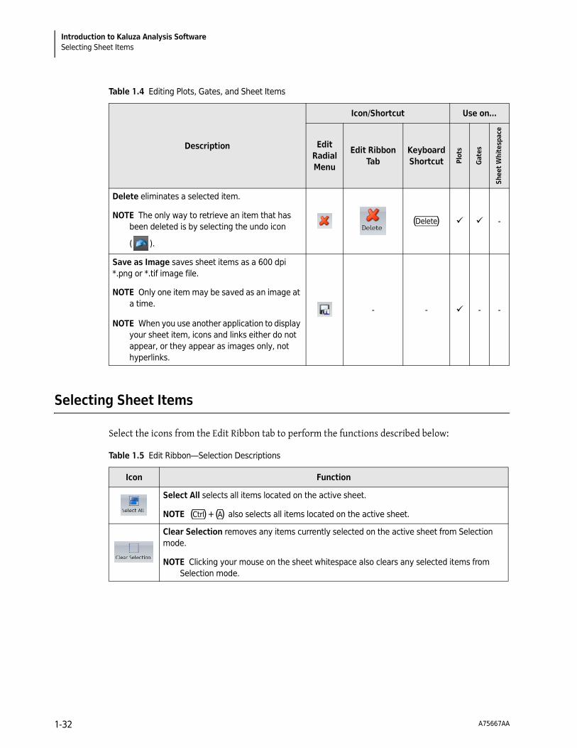
You can use the Edit Ribbon tab, Edit Radial Menu (available through the icon), or keyboard shortcuts to perform basic editing functions, including cut, copy, paste, paste as link, delete, and save as image. Table 1.4 provides details regarding the availability of these functions and any specific details regarding use.
NOTE Plots, gates, and other sheet items must be selected prior to performing editing tasks. Most functions are available for multi-selection.
A75667AA 1-30

Introduction to Kaluza Analysis SoftwareBasic Editing for Plots, Gates, and Sheet Items 1
Table 1.4 Editing Plots, Gates, and Sheet Items
Description
Icon/Shortcut Use on…
Edit Radial Menu
Edit Ribbon Tab
Keyboard Shortcut Pl
ots
Gat
es
Shee
t W
hite
spac
e
Cut is used to remove an item from the sheet or plot. The removed item is available for pasting to any valid location.
(Ctrl)+(X) -
Copy is used to duplicate a selected item. The selected item is available for pasting to any valid location.
(Ctrl)+(C) -
Paste inserts data made available by Cut or Copy to the location of your choice. (Ctrl)+(V)
Paste as Link allows you to paste a copied plot as a linked item, which means that the pasted plot, as well as any gates or other data located on the plot, change when the original changes and vice versa.
Once a plot is linked to another, the symbol
displays in the upper-left-hand corner of the both the original and the linked item.
NOTE If you receive an error similar to the one shown in the figure below when pasting a plot as a link on a report sheet, resizing the plot so that all of the content is showing eliminates the error.
- - -
A75667AA 1-31
Introduction to Kaluza Analysis SoftwareSelecting Sheet Items
Selecting Sheet Items
Select the icons from the Edit Ribbon tab to perform the functions described below:
Delete eliminates a selected item.
NOTE The only way to retrieve an item that has been deleted is by selecting the undo icon
( ).
(Delete) -
Save as Image saves sheet items as a 600 dpi *.png or *.tif image file.
NOTE Only one item may be saved as an image at a time.
NOTE When you use another application to display your sheet item, icons and links either do not appear, or they appear as images only, not hyperlinks.
- - - -
Table 1.4 Editing Plots, Gates, and Sheet Items
Description
Icon/Shortcut Use on…
Edit Radial Menu
Edit Ribbon Tab
Keyboard Shortcut Pl
ots
Gat
es
Shee
t W
hite
spac
e
Table 1.5 Edit Ribbon—Selection Descriptions
Icon Function
Select All selects all items located on the active sheet.
NOTE (Ctrl)+(A) also selects all items located on the active sheet.
Clear Selection removes any items currently selected on the active sheet from Selection mode.
NOTE Clicking your mouse on the sheet whitespace also clears any selected items from Selection mode.
A75667AA 1-32

CHAPTER 2
Data Analysis
Kaluza File Type Summary
Table 2.1 lists the types of files that you can create using Kaluza, as well as important details about the content included in each file type. Review the table to determine the file type you need to create, and then refer to the appropriate section within this chapter for details on creating each file type.
Table 2.1 Kaluza File Types
File Type ExtensionSaving
MechanismWhat is Saved What is NOT Saved
Analysis *.analysis Save
• Data Set • Plots (including all
customizations) • Tables • Gates (including gate coloring
definitions) • Parameter definitions • Compensation Spillover
Matrix and Autofluorescence Vector values
• Annotations • All sheets included with the
analysis
-
Analysis List *.analysis Save as‡
All entries selected on the Analysis List are saved as analyses (even if a Data Set is not present) and are saved as a bundle.
Unsaved changes to a source Analysis file do not appear within that file after saving a selected group as an Analysis List. Changes only appear in the new *.analysis file.
Protocol *.protocol Save as‡
• Plots (including all customizations)
• Tables • Gates (including gate coloring
definitions) • Annotations • All sheets included with the
analysis
Data Sets are not saved with a *.protocol file.
A75667AA 2-1

Data AnalysisProtocols
‡ Save as” must be selected each time you wish to save an entry as any file type other than a *.analysis file.
Protocols
Rather than repeatedly setting up Analysis files for each raw Data Set, you can set up and save Protocols, allowing you to develop standards, save time, and provide consistent results for easier data comparison.
Creating a New Protocol
To create a new Protocol:
1 Select > New > Protocol. This will create a new entry in the Analysis List.
2 Locate the raw Data Set file from which you would like to create your Protocol. Drag and drop the file into the Data Set column. The cell contains the instructions “<drop data set here>,” as shown in the figure below. The raw Data Set file is now imported into Kaluza and is ready for you to begin your Analysis. Refer to CHAPTER 2, Plots & Tables, CHAPTER 2, Gates & Tools, and CHAPTER 2, Automatic Compensation and Autofluorescence Vector Generation: Using the Generate Compensation Feature, for complete details on creating the Analysis.
Composite *.composite Save as‡
• Plots (including all customizations)
• Tables • Gates (including gate coloring
definitions) • Annotations • All sheets included with the
analysis • The number of available Data
Set entries within the Analysis List
Data sets are not saved with a *.composite file.
Compensation *.compensation Save as‡Compensation Spillover Matrix and Autofluorescence Vector values only
Protocols, Data Sets, sheets, etc.
Table 2.1 Kaluza File Types
File Type ExtensionSaving
MechanismWhat is Saved What is NOT Saved
A75667AA 2-2
Data AnalysisProtocols 2
3 When you are satisfied with your Protocol, you may save the Protocol alone, or you may save the Analysis.
• To save the Protocol only, follow the procedure in CHAPTER 2, Saving a Protocol.
• To save the Analysis, follow the procedure in CHAPTER 2, Saving an Analysis.
Saving a Protocol
To save the Protocol from an Analysis:
NOTE When saving a file as a Protocol, only the Protocol-related information will be saved; i.e., the plot types including the specific parameters associated with each plot and the gates. Saved Protocol files are used for the Analysis of raw Data Sets.
1 Select the Analysis List row of the protocol you wish to save.
2 Select > Save selected as > Protocol.
3 In the Save Protocol dialog box, select the destination for the file by navigating to the location using icons in the dialog box or the drop-down list in the Save in field.
4 Enter a file name in the File name field.
5 Select Save. The file is saved with the *.protocol extension and is now ready to apply to raw Data Sets.
Saving an Analysis
To save an Analysis:
1 Select the Analysis List row of the analysis you wish to save.
2 Select > Save selected as > Analysis.
3 In the Save Analysis dialog box, select the destination for the file by navigating to the location using icons in the dialog box or the drop-down list in the Save in field.
A75667AA 2-3

Data AnalysisProtocols
4 Enter a file name in the File name field.
5 Select Save. The file is saved with the *.analysis extension.
Applying a Protocol to a Raw Data Set
To apply a Protocol to a raw Data Set:
1 Open the raw data file by dragging it into the Analysis List.
2 Drag the Protocol file into the Protocol column of that Analysis List row (refer to the figure below). The Protocol is now applied to the Data Set.
NOTE You may import a Protocol from several different file types, including *.protocol files, analysis files, and *.lmd files.
IMPORTANT When working with data files containing embedded protocols derived from BCI systems (such as Elite™, Altra™, XL™, FC500, Gallios™, and Navios™ flow cytometers), please consider the following:
1. Kaluza imports gates, regions, plots, and color precedence information. If, however, a gate and a region from the embedded source protocol have the same name, only the region is imported. The gate with the same name is not imported. Adjust gating as necessary.
2. Reports and statistics are not imported.
IMPORTANT Check the Parameters pane for data mismatch. If you see errors similar to those in CHAPTER 2, Resolving Parameter Mismatch, follow the instructions in that section to determine how to correct the errors.
NOTE An additional method for applying a Protocol to a Data Set is explained in CHAPTER 1, Replacing or Importing a Data Set or Protocol into an Analysis List Row.
A75667AA 2-4

Data AnalysisProtocols 2
Resolving Parameter Mismatch
Applying a Different Protocol to an Analysis Entry
To change the Protocol used for Data Set analysis:
1 Open the Analysis file by dragging and dropping into the Analysis List.
If the parameters derived from the raw data file do not match with those that have been set up in the Protocol, you get an error message for each mismatched parameter.
The two mismatch indicators are discussed in Table 2.2 (both are shown in context in the figure to the left).
Table 2.2 Resolving Parameter Mismatch
If… Then…
a parameter is used in the Protocol but not present in the Data Set,
an error message shows:
To resolve this error:
1. Click within the red rectangle; this prompts the appearance of a drop-down list, which provides options for replacing the mismatched reference with the correct parameter.
2. Choose the appropriate parameter from the list. This removes the error and updates the description.
NOTE References to the parameter on plots also appear in red, indicating a mismatch error. When the error is corrected, the parameter name is updated to match the one in the Protocol.
a parameter is present in the Data Set but is not used in the Protocol,
the symbol appears next to the parameter. To resolve, use that parameter on
any plot.
A75667AA 2-5

Data AnalysisComposite Protocols
2 Locate the file that contains the Protocol you wish to apply to the Data Set and drag the file into the Protocol column of that Analysis List row, replacing the current Protocol (make sure the designated cell is highlighted in orange prior to releasing the mouse button). The Data Set for this file now has the new Protocol associated with it.
IMPORTANT This action completely replaces the Protocol previously associated with the Data Set.
Composite Protocols
Composite Protocols allow you to create one Protocol that links multiple Data Sets. When you save a Composite Protocol, it retains all of the plot types, the specific parameters associated with the plots, and the gates, allowing you to import raw Data Sets and conduct the same Analysis.
Creating a New Composite Protocol
To create a new Composite:
1 Select > New > Composite. This creates a new Composite Protocol entry in the Analysis List.
2 Locate the files you wish to include in your Composite. You can either choose Analysis files and/or Data Set files that are already located within the Analysis List, or you can choose files that are stored on your computer.
NOTE Even though the default for a new Composite entry contains two rows, you can import up to 32 Data Sets/analyses into your Composite.
3 Multi-select the files and drag into the <drop data set here> cells within the Composite. When the cells become highlighted in orange (as shown in the figure below), release your mouse button to complete the importing process.
NOTE For details on multi-selecting, see CHAPTER 1, Multi-Selecting Files.
A75667AA 2-6
Data AnalysisComposite Protocols 2
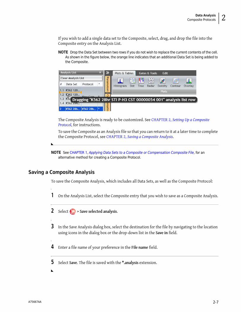
If you wish to add a single data set to the Composite, select, drag, and drop the file into the Composite entry on the Analysis List.
NOTE Drop the Data Set between two rows if you do not wish to replace the current contents of the cell. As shown in the figure below, the orange line indicates that an additional Data Set is being added to the Composite.
The Composite Analysis is ready to be customized. See CHAPTER 2, Setting Up a Composite Protocol, for instructions.
To save the Composite as an Analysis file so that you can return to it at a later time to complete the Composite Protocol, see CHAPTER 2, Saving a Composite Analysis.
NOTE See CHAPTER 1, Applying Data Sets to a Composite or Compensation Composite File, for an alternative method for creating a Composite Protocol.
Saving a Composite Analysis
To save the Composite Analysis, which includes all Data Sets, as well as the Composite Protocol:
1 On the Analysis List, select the Composite entry that you wish to save as a Composite Analysis.
2 Select > Save selected analysis.
3 In the Save Analysis dialog box, select the destination for the file by navigating to the location using icons in the dialog box or the drop-down list in the Save in field.
4 Enter a file name of your preference in the File name field.
5 Select Save. The file is saved with the *.analysis extension.
A75667AA 2-7

Data AnalysisComposite Protocols
Setting Up a Composite Protocol
The following sections describe the options available for setting up a Composite Protocol.
NOTE For instructions on creating a Composite Protocol, see CHAPTER 2, Creating a New Composite Protocol.
Add All Plots
Select the icon to add plots for each Data Set to the plot sheet. For each Data Set included in the Protocol, these plots compare:
• Fluorescence parameters to each other using dot plots
• Each parameter to count using histogram plots
IMPORTANT Forward Scatter to Side Scatter (FS/SS) is added for Data Set 1 only. The remaining Data Sets do not display FS/SS plots; the gate on the FS/SS plot from Data Set 1 is the basis for all other Data Sets.
NOTE Add All Plots does not work for Data Sets with more than 13 fluorescence parameters due to the possibility of surpassing the limit of gates/plots allowed by the software.
Overlay Plots
Histograms from any Data Set within the Composite may be added to an overlay plot. For additional details, see CHAPTER 2, Setting Up Overlay Plots.
Changing the Data Set Associated with a Plot
The Data Set associated with a plot may be selected or changed by completing the following steps:
1 Select the plot header. A pop-up list appears.
2 Hover your mouse over Data Sets; this displays a list of the Data Sets that you may choose from to apply to the plot (see figure below).
3 Select the appropriate Data Set.
A75667AA 2-8

Data AnalysisComposite Protocols 2
Gating in Composite Protocols
When gating in Composite Protocols, gates are duplicated on plots using the same parameters in the other Data Sets; it does not matter which Data Set contains the gate. Despite the fact that plots are gated using the same coordinates of the gate originated on a plot from another Data Set, results are based on the event data from its own Data Set, not from the plot that contains the original gate.
Updating Parameter and Compensation Data for Individual Data Sets
For Composite Protocols, the data within the Parameters and Compensation panes, as well as within some Radial Menus, can be updated for the individual Data Sets within the Composite. When working in a Composite, the title block of these panes or Radial Menus includes a drop-down list, allowing you to choose an individual Data Set to interact with (see Figure 2.1).
NOTE When the Data Set is changed in the Parameters or Compensation pane, the other pane simultaneously updates to the newly selected Data Set.
Figure 2.1 Selecting Data Sets in Composite Protocols
Linking Compensation Between All Data Sets
As a default, each Data Set within a Composite Analysis contains unique Spillover values. Use the following steps to link Spillover and Autofluorescence Vector values so that all Data Sets contain the same values.
IMPORTANT For this option to be available, ALL Data Sets within the Composite must contain the same parameters, and, other than the Description field, the content within each parameter field must match exactly.
IMPORTANT Once the Spillover and Autofluorescence Vector values for each Data Set are linked, the values are retained. If the link is disabled, values do not return to those set prior to creating the link.
1 Update, if necessary, the Spillover and Autofluorescence Vector values that you would like to use as the default for all Data Sets within the Composite. Refer to CHAPTER 2, Automatic Compensation and Autofluorescence Vector Generation: Using the Generate Compensation Feature, for details on various methods for adjusting Spillover values.
A75667AA 2-9

Data AnalysisComposite Protocols
2 To update ALL Data Sets within the Composite to the Spillover and Autofluorescence Vector values currently displayed in the Spillover Matrix, select the Link compensation for all Data Sets
icon ( ), which is located in the Compensation pane. Once the Spillover and Autofluorescence Vector values are linked, the drop-down list located at the top of the Compensation pane is disabled.
NOTE As long as Spillover and Autofluorescence Vector values are linked, any changes made to the Spillover and Autofluorescence Vector values will update compensation for the corresponding parameter on all Data Sets.
To disable the compensation link between Data Sets, select the icon.
Copying Compensation to Other Data Sets
To copy Spillover and Autofluorescence Vector values to other Data Sets, use the following steps.
NOTE You cannot copy Spillover and Autofluorescence Vector values to a larger matrix. You can, however, copy Spillover and Autofluorescence Vector values to a matrix containing fewer fluorescence parameters.
1 From the drop-down list located in the Compensation pane header, select the Data Set that you wish to copy to other Data Sets.
2 Select the icon in the Compensation pane; this opens the Copy to Data Sets pop-up menu, as shown in the figure below.
A75667AA 2-10

Data AnalysisComposite Protocols 2
3 Depending on the preferred outcome, do one of the following:
• To copy to specific Data Sets: Select the Data Set(s) you wish to copy Spillover and Autofluorescence Vector values to by clicking within the check box next to the Data Set name(s).
• To copy to all Data Sets: Click the button.
You may remove any selections that have been made by clicking the button or by deselecting the check box.
4 When you are satisfied with your selection(s), select . The Spillover and Autofluorescence Vector values for all applicable Data Sets change.
IMPORTANT A notification of parameter name mismatch does not appear until after is selected.
Saving a Composite Protocol
To save the Composite Protocol from an Analysis file:
NOTE When saving a file as a Composite, only the Protocol-related information will be saved; i.e., the plot types, the specific parameters associated with the plots, and the gates. Raw Data Sets can be imported into saved Composite Protocol files.
1 On the Analysis List, select the Composite entry that you wish to save as a Composite Protocol.
2 Select > Save selected as > Composite.
3 In the Save Composite dialog box, select the destination for the file by navigating to the location using icons in the dialog box or the drop-down list in the Save in field.
4 Enter the file name in the File name field.
5 Select Save. The file has been saved with the *.composite extension and is now ready for importing raw Data Sets.
A75667AA 2-11

Data AnalysisComposite Protocols
Using the Galleries & Grouping Tab
The Galleries & Grouping Ribbon tab appears when you use Composite and Compensation Composite files. The contents of the Galleries & Grouping tab are described below.
Galleries
When creating a Composite or Compensation Composite file from an Analysis file, the Protocol is retained with the Data Set. Plots from the original Analysis file (the gallery) can be added to the plot sheet by doing the following.
NOTE For details on creating a Composite Protocol, see CHAPTER 2, Creating a New Composite Protocol. See CHAPTER 2, Automatic Compensation and Autofluorescence Vector Generation: Using the Generate Compensation Feature, for details on creating a Compensation Composite.
1 Open the Composite by dragging and dropping into the Analysis List (or select the Analysis List row if the file is already open in the application).
2 Select the Galleries & Grouping tab on the Ribbon. Notice that all of the Data Sets in your Composite Protocol file are displayed in the Galleries section, as shown in red outline in the figure below.
A75667AA 2-12

Data AnalysisComposite Protocols 2
3 Select the drop-down arrow for the Data Set that you wish to add to the plot sheet. The plot gallery from the Analysis file Protocol appears, as shown in the figure below.
NOTE Events and gate coloring will not appear in the gallery, but appear correctly when copied onto the plot sheet.
NOTE You can resize the gallery by clicking and dragging the borders to the length and width that you prefer. You can also use Zoom.
4 Select the plots you wish to add to the plot sheet.
5 Drag and drop the selected plots to the preferred location on the sheet.
Arranging Data Sets
The Grouping section of the Galleries & Grouping tab has the following two options for displaying the plots that have been dragged to the plot sheet from Data Set galleries.
Freeform ArrangementThe application defaults to the freeform arrangement. If the By Data Set arrangement had
previously been selected, choose the icon to allow for selecting and moving plots to any location on the sheet.
A75667AA 2-13
Data AnalysisComposite Protocols
By Data Set Arrangement
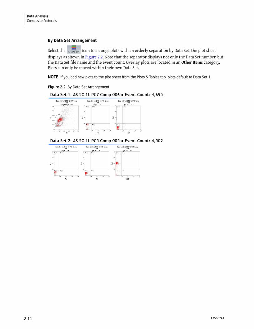
Select the icon to arrange plots with an orderly separation by Data Set; the plot sheet displays as shown in Figure 2.2. Note that the separator displays not only the Data Set number, but the Data Set file name and the event count. Overlay plots are located in an Other Items category. Plots can only be moved within their own Data Set.
NOTE If you add new plots to the plot sheet from the Plots & Tables tab, plots default to Data Set 1.
Figure 2.2 By Data Set Arrangement
A75667AA 2-14
Data AnalysisPlots & Tables 2
Plots & Tables
Kaluza offers seven different plot types and two tables, each of which can be customized to meet your needs. The following sections describe the options available for setting up plots or tables.
Histogram Plots
Setting Up Histogram Plots
IMPORTANT The content within the Parameters pane directly affects how parameters are displayed on plots. Complete instructions for updating parameter names, descriptions, types, detectors, and measurement type are in CHAPTER 2, Updating Content Within the Parameters Pane.
To set up a histogram plot:
1 From the Plots & Tables Ribbon tab, select the icon, and drag it to the preferred location on your sheet.
2 Hover your mouse over the parameter hyperlink at the bottom of the histogram plot.
3 Select the hyperlink. The list of parameters appears.
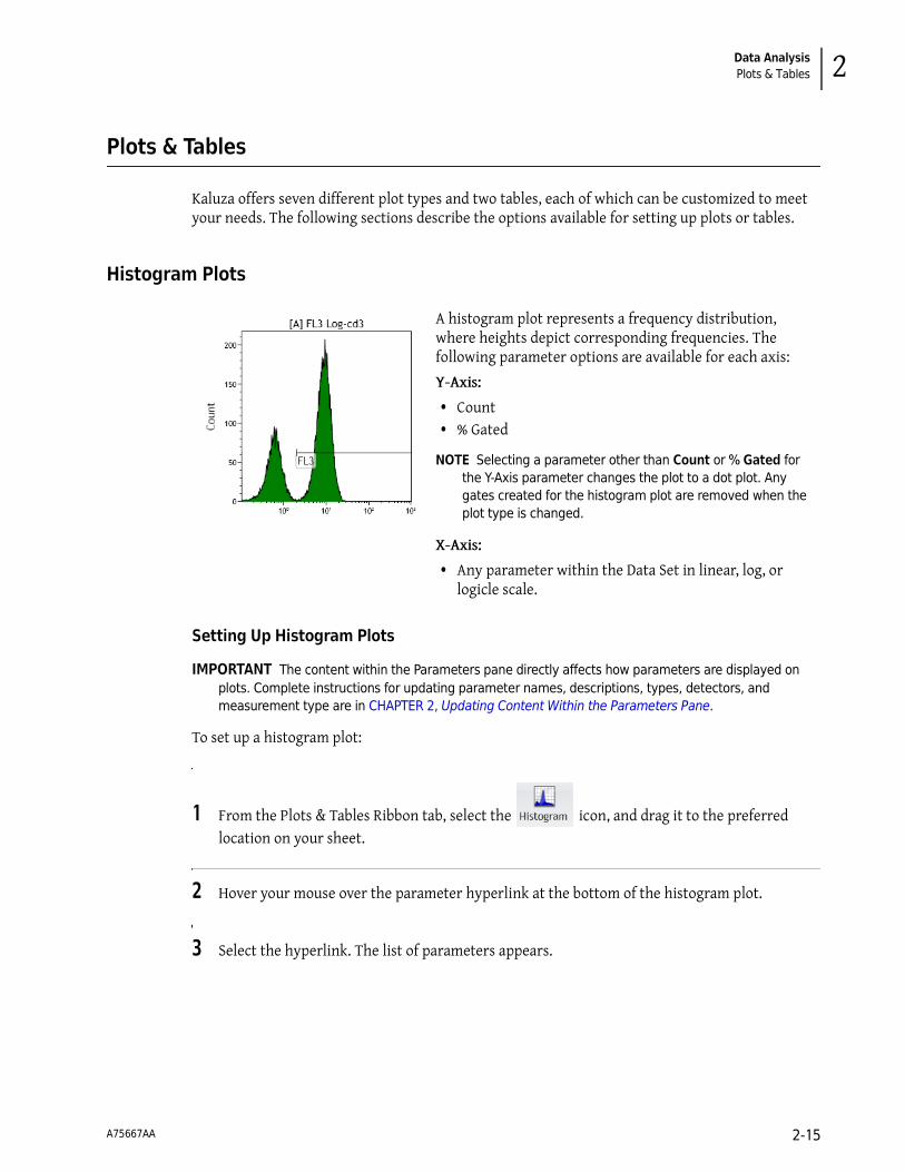
A histogram plot represents a frequency distribution, where heights depict corresponding frequencies. The following parameter options are available for each axis:
Y-Axis:
• Count • % Gated
NOTE Selecting a parameter other than Count or % Gated for the Y-Axis parameter changes the plot to a dot plot. Any gates created for the histogram plot are removed when the plot type is changed.
X-Axis:
• Any parameter within the Data Set in linear, log, or logicle scale.
A75667AA 2-15

Data AnalysisPlots & Tables
4 Select the new parameter.
5 Select the hyperlink located on the Y-axis of the plot if you need to change the measurement type.
6 Choose the appropriate measurement type from the pop-up list.
NOTE Events in histogram plots default to being scaled on count.
7 Choose a gate for your plot, if needed, using the hyperlink located at the top of the plot.
8 Continue customizing your plot using the Radial Menus. Table 2.3 provides specific information, as well as links to general options, for setting up a histogram plot.
If… Then…
Using the default scale type for the parameter,
Select the parameter from the pop-up. You do not have to select the scale type.
Default scale types are as follows:
• FS/SS: Linear scale • Fluorescence: Log scale
Using a scale type other than the default,
1. Hover your mouse over the parameter. A pop-up appears, allowing you to choose the scale type for your parameter.
2. Select the scale that best suits your data. For additional details on available scale types, see CHAPTER 2, Choosing Scale Type.
A75667AA 2-16

Data AnalysisPlots & Tables 2
Table 2.3 Histogram Plot Set-Up Options
Radial Menu
Plot Set-Up Details
Data
The Histogram Options section within the Data Radial Menu is for customizing your histogram plots for optimal data presentation. Specifically, these options are available:
• Smoothing your data for a more pleasant appearance. • Clipping the first and last channels (for scaling purposes only). • Adjusting the Y-axis scale to better fit your data.
Refer to CHAPTER 2, Setting Up Plot Data, for general information on making changes to plot data, including parameter axis data, input gates, and bivariate resolution.
Edit
Use the Edit Radial Menu to perform basic plot editing functions, including cut, copy, paste, paste as link, delete, and save as image. Refer to CHAPTER 1, Basic Editing for Plots, Gates, and Sheet Items, for details.
Statistics
Use the Statistics Radial Menu to choose statistics to display at the bottom of the plot. For details, refer to CHAPTER 2, Setting Up Statistics.
Display
Use the Display Radial Menu to alter the size of a plot or to change the information that displays on a plot. For details, refer to CHAPTER 2, Setting Up Plot Display.
Gates &
Tools
Use the Gates & Tools Radial Menu to add a gate, annotation, or overlay marker to a plot. Refer to CHAPTER 2, Using the Gates & Tools Plot Radial Menu, for details.
For details on gating a histogram plot, see CHAPTER 2, Linear Gates.
Coloring
Use the Coloring Radial Menu to update the coloring associated with a plot. See CHAPTER 2, Using the Coloring Menu, for details.
A75667AA 2-17

Data AnalysisPlots & Tables
Dot, Density, and Contour Plots
Dot, density, and contour plots compare two parameters to determine their relationship. You can choose any parameter within the Data Set for an axis. Density and contour plots are specific types of dot plots with different starting options for the coloring algorithm.
NOTE Selecting Count or % Gated as a Y-Axis parameter changes a dot, density, or contour plot to a histogram plot.
A dot plot compares two parameters to determine their relationship. Each event that contains markers for the two sets of data being compared appears as a dot.
A density plot is a five-color representation of the number or percentage of events that occur in comparing X-axis and Y-axis parameters. Greater and lesser density of event occurrences are represented by different colors.
A contour plot is a five-color outlined representation of the number or percentage of events that occur in comparing X-axis and Y-axis parameters. Greater and lesser density of event occurrences are represented by different colors.
A75667AA 2-18

Data AnalysisPlots & Tables 2
Setting Up Dot, Density, and Contour Plots
To set up a dot, density, or contour plot:
1 From the Plots & Tables Ribbon tab, select the , , or icon, and drag it to the preferred location on your sheet.
2 Select the <Choose a parameter> hyperlink. A pop-up appears with a list of parameters.
NOTE If you are updating a parameter, the currently selected parameter contains a dot next to the parameter name/description (FL2 in the figure below), and the scale used for the parameter contains a check mark next to the scale type (FL2 Log in the figure below).
3 Make your selection by clicking on the appropriate parameter from the pop-up menu. The scale for the parameter you choose defaults to log for fluorescence parameters and linear for all others. If you wish to choose a scale other than the default, hover your mouse over the parameter you wish to display, and choose the scale type for the parameter from the pop-up list.
4 Repeat this process for the other parameter, if necessary.
5 If needed, choose a gate for your plot using the hyperlink located at the top of the plot.
6 Continue customizing your plot using the Radial Menus. Table 2.4 provides specific information, as well as links to general options, for setting up a dot, contour, or density plot.
A75667AA 2-19

Data AnalysisPlots & Tables
Table 2.4 Dot, Contour, and Density Plot Set-Up Options
Radial Menu
Plot Set-Up Details
Data
The Bivariate Options section of the data menu provides the following options:
• Swap axes with the click of a button. This automatically reorients any gates on the plot. • Change the resolution. Options include:
— 128 X 128— 256 X 256— 512 X 512— 1024 X 1024
Refer to CHAPTER 2, Setting Up Plot Data, for general information on making changes to plot data including parameter axis data, input gates, and bivariate resolution.
Edit
Use the Edit Radial Menu to perform basic plot editing functions, including cut, copy, paste, paste as link, delete, and save as image. Refer to CHAPTER 1, Basic Editing for Plots, Gates, and Sheet Items, for details.
Statistics
Use the Statistics Radial Menu to choose statistics to display at the bottom of the plot. For details, refer to CHAPTER 2, Setting Up Statistics.
Display
Use the Display Radial Menu to alter the size of a plot or to change the information that displays on a plot. For details, refer to CHAPTER 2, Setting Up Plot Display.
Gates &
Tools
Use the Gates & Tools Radial Menu to add a gate, annotation, or overlay marker to a plot. Refer to CHAPTER 2, Using the Gates & Tools Plot Radial Menu, for details.
For details on gating the plot, see CHAPTER 2, Gates & Tools.
Coloring
Banded coloring uses five colors to show event density. When the Use Banded Coloring radio button is selected, select the drop-down arrow located directly under Use Banded Coloring and choose the option you prefer from the drop-down list. The available options include:
• Density • Contour with outliers • Contour • Contour with density
Set Band Ranges Manually allows you to specify the banded color ranges. Select the check box to enable manually setting band ranges. Select the up/down arrows or select the entry and type the new value into the field.
For additional details and options associated with using the Coloring Radial Menu, refer to CHAPTER 2, Using the Coloring Menu.
A75667AA 2-20

Data AnalysisPlots & Tables 2
Tree Plots
Setting Up Tree Plots
To set up a tree plot:
1 For each phenotype that you wish to include in your tree plot as branches or bars, create a histogram plot for that phenotype. Then, on each plot, create a gate that includes the events that are positive for that phenotype. For example, in the figure below, gate “L” includes the events that are positive for the CD-19 protein.
For additional information, see CHAPTER 2, Histogram Plots, and CHAPTER 2, Linear Gates.
2 Select from the Plots & Tables Ribbon tab; this adds a new tree plot to the sheet.
The tree plot enables a unique and comprehensive approach to comparing the physical characteristics of the events included in your Analysis. Tree plots provide a useful data comparison tool, as one tree plot can condense data from up to 28 bivariate plots.
The tree plot includes:
• Branches, which are used to categorize cell populations based on whether they have a negative or positive result for a specified phenotypic data type. Branches are located at the top of the plot.
• Bars, which are the event populations used to characterize every possible negative/positive branch combination. Bars are the central focus of the tree plot, as they are the pictorial representation of this phenotypic classification system. Bars can be viewed as either Count or % Gated.
Both bars and branches are based on gated data that has already been established within the Protocol.
A75667AA 2-21

Data AnalysisPlots & Tables
3 Choose the input gate (if needed) to filter your data by selecting the [Ungated] hyperlink located at the top of the plot and choosing the gate from the pop-up menu.
4 Use the <Choose Branches> hyperlink to choose the branches of the tree; branches can be any gate within the Protocol. Each branch added to the tree further classifies gated events based on whether they are positive or negative for the phenotypic characteristic defined in the branch(es) of greater precedence.
NOTE The combined number of branches and bars may not total more than eight.
5 Use the <Choose bars> hyperlink to choose the bars that you wish to display on the plot. The plot displays all the positive and negative combinations for the bars that are selected. All possible positive/negative combinations are represented by a different color. These colored bars will display on the graph when they also meet the positive/negative criteria of the lowest branches. The length of the bars are directly correlated with the Y-axis data, which is either Count or % Gated.
NOTE As you hover your mouse over a bar, the names of the gates, including the positive or negative classification, displays in the branches that are associated to that bar.
NOTE A legend for the bars, including the colors and the definition of the positive/negative phenotypic data classification specifically associated with each bar, is, by default, located at the bottom of the plot.
6 Select the appropriate Y-axis data type for viewing the bars. The default measurement type is Count. If you wish to change the measurement type to % Gated, select the <Count> hyperlink, and from the pop-up list, choose % Gated.
7 Continue customizing your plot using the Radial Menus. Table 2.5 provides specific information, as well as links to general options, for setting up a tree plot.
IMPORTANT You may use tree bars as an input gate for other plots, including other tree plots. To gate a plot using a tree bar, press the (Alt) key and select and drag the tree bar onto the appropriate plot and release your mouse button to complete the process.
A75667AA 2-22
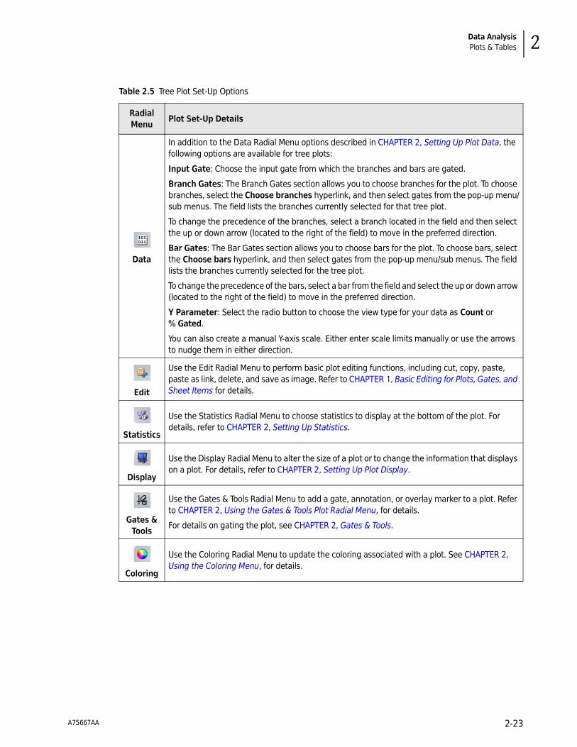
Data AnalysisPlots & Tables 2
Table 2.5 Tree Plot Set-Up Options
Radial Menu
Plot Set-Up Details
Data
In addition to the Data Radial Menu options described in CHAPTER 2, Setting Up Plot Data, the following options are available for tree plots:
Input Gate: Choose the input gate from which the branches and bars are gated.
Branch Gates: The Branch Gates section allows you to choose branches for the plot. To choose branches, select the Choose branches hyperlink, and then select gates from the pop-up menu/sub menus. The field lists the branches currently selected for that tree plot.
To change the precedence of the branches, select a branch located in the field and then select the up or down arrow (located to the right of the field) to move in the preferred direction.
Bar Gates: The Bar Gates section allows you to choose bars for the plot. To choose bars, select the Choose bars hyperlink, and then select gates from the pop-up menu/sub menus. The field lists the branches currently selected for the tree plot.
To change the precedence of the bars, select a bar from the field and select the up or down arrow (located to the right of the field) to move in the preferred direction.
Y Parameter: Select the radio button to choose the view type for your data as Count or % Gated.
You can also create a manual Y-axis scale. Either enter scale limits manually or use the arrows to nudge them in either direction.
Edit
Use the Edit Radial Menu to perform basic plot editing functions, including cut, copy, paste, paste as link, delete, and save as image. Refer to CHAPTER 1, Basic Editing for Plots, Gates, and Sheet Items for details.
Statistics
Use the Statistics Radial Menu to choose statistics to display at the bottom of the plot. For details, refer to CHAPTER 2, Setting Up Statistics.
Display
Use the Display Radial Menu to alter the size of a plot or to change the information that displays on a plot. For details, refer to CHAPTER 2, Setting Up Plot Display.
Gates &
Tools
Use the Gates & Tools Radial Menu to add a gate, annotation, or overlay marker to a plot. Refer to CHAPTER 2, Using the Gates & Tools Plot Radial Menu, for details.
For details on gating the plot, see CHAPTER 2, Gates & Tools.
Coloring
Use the Coloring Radial Menu to update the coloring associated with a plot. See CHAPTER 2, Using the Coloring Menu, for details.
A75667AA 2-23

Data AnalysisPlots & Tables
Radar Plots
Setting Up Radar Plots
To set up a radar plot:
1 Select from the Plots & Tables Ribbon tab. This adds a new radar plot to the sheet.
2 Choose an input gate, if necessary, using the hyperlink located at the top of the plot. For details on gating your plot, see CHAPTER 2, Gates & Tools.
3 Choose the plot axes you wish to include in the plot by selecting <Choose plot axes> and choosing the parameters you want to display on your radar plot.
4 Arrange your plot by selecting axis handles and dragging to the preferred location, then release your mouse button. You can move axes in a 360° radius, and lengthen or shorten them.
5 Continue customizing your plot using the Radial Menus. Table 2.6 provides specific information, as well as links to general options, for setting up a radar plot.
The radar plot maps multi-dimensional data onto a two-dimensional surface; events are displayed by adding axes. As axes are moved, relationships become apparent; axes can be moved manually, or you may choose to animate one of the axes, which prompts automatic movement in the defined direction and rate of speed.
The appearance of the events on the plot can vary widely, depending on the input gate you choose, the number of axes you use to characterize your data, the length of the axes, and the placement of each axis. Any parameter within the Data Set is available to use as an axis.
The radar plot is a very useful data comparison tool, combining data from many bivariate plots into one highly manipulatable plot.
A75667AA 2-24

Data AnalysisPlots & Tables 2
Table 2.6 Radar Plot Set-Up Options
Radial Menu
Plot Set-Up Details
Data
In addition to the Data Radial Menu options described in CHAPTER 2, Setting Up Plot Data, the following options are available for radar plots.
The Axes section is for choosing the axes to include in the plot. The options include:
• Choose plot axes: Choose axes to include on the plot. To select parameters to use as plot axes, select the Choose plot axes hyperlink. From the pop-up menu, select the parameters you wish to include as plot axes, and use the additional pop-up menu to define the scale for each parameter.
• Add All: Add all the parameters associated with the Data Set to the radar plot as axes. • Remove All: Remove all axes that had previously been added to the plot. • Reset All: Reset the length and placement of each axis. After resetting, axes are evenly
spaced and appear in order by name in a counter-clockwise pattern.The Axis Configuration section is where the angle and length of a selected axis is defined. You may also animate an axis, which prompts automatic movement of the selected axis (in the rate and direction defined in the Radar Options section of this menu). The location of events displayed on the plot is updated in real-time as the animation is in process. To remove a selected
axis, choose the icon.
In the Radar Options section, the following options are available:
• Origin: Manually update X and Y coordinates of the location of the plot origin. Entering negative values moves the origin to the left or up, and entering positive values moves the origin down or to the right.
• Animation Rate: Define the animation rate and direction of movement. Moving the animation slider to the left of center initiates clockwise movement; the farther to the left the slider is moved, the faster the animation. Moving the animation slider to the right initiates counter-clockwise movement; the farther to the right the slider is moved, the faster the animation.
• Zoom: Change the zoom. Moving the slider to the left to zooms out and to the right zooms in.
Edit
Use the Edit Radial Menu to perform basic plot editing functions, including cut, copy, paste, paste as link, delete, and save as image. Refer to CHAPTER 1, Basic Editing for Plots, Gates, and Sheet Items, for details.
Statistics
Use the Statistics Radial Menu to choose statistics to display at the bottom of the plot. For details, refer to CHAPTER 2, Setting Up Statistics.
Display
Use the Display Radial Menu to alter the size of a plot or to change the information that displays on a plot. For details, refer to CHAPTER 2, Setting Up Plot Display.
Gates &
Tools
Use the Gates & Tools Radial Menu to add to a gate, annotation, or overlay marker to a plot. Refer to CHAPTER 2, Using the Gates & Tools Plot Radial Menu, for details.
For details on gating your plot, see CHAPTER 2, Gates & Tools.
Coloring
Use the Coloring Radial Menu to update the coloring associated with a plot. See CHAPTER 2, Using the Coloring Menu, for details.
A75667AA 2-25

Data AnalysisPlots & Tables
Overlay Plots
Setting Up Overlay Plots
NOTE Up to eight histograms may be added to an overlay plot.
To set up an overlay plot:
1 Select from the Plots & Tables Ribbon tab. This adds a new overlay plot to the sheet.
2 Select the <Choose histograms> hyperlink located at the bottom of the plot.
3 Hover your mouse over Add new histogram and select the histograms that you wish to be displayed in your overlay plot by choosing from the additional pop-up lists.
4 If necessary, choose a gate for your plot using the Overlay hyperlink located at the top of the plot. Hover your mouse over the histogram you wish to gate and choose the gate using the pop-up lists. For details on gating your plot, see CHAPTER 2, Gates & Tools.
5 Select the appropriate Y-axis data type that you wish to gauge your histograms. The default measurement type is Count. If you wish to change the measurement type to % Gated, select the <Count> hyperlink, and from the pop-up list, choose % Gated.
6 Continue customizing your plot using the Radial Menus. Table 2.7 provides specific information, as well as links to general options, for setting up an overlay plot.
NOTE An additional method for adding histograms to an overlay plot is to press the(Alt) key and select and drag a histogram, dot, contour, density, or radar plot into an overlay plot. Using this method, one histogram is added for each parameter contained in the plot. The input gate selected for the original plot is retained in the overlay plot.
An overlay plot is a combination of multiple histogram plots displayed in a single plot.
A75667AA 2-26
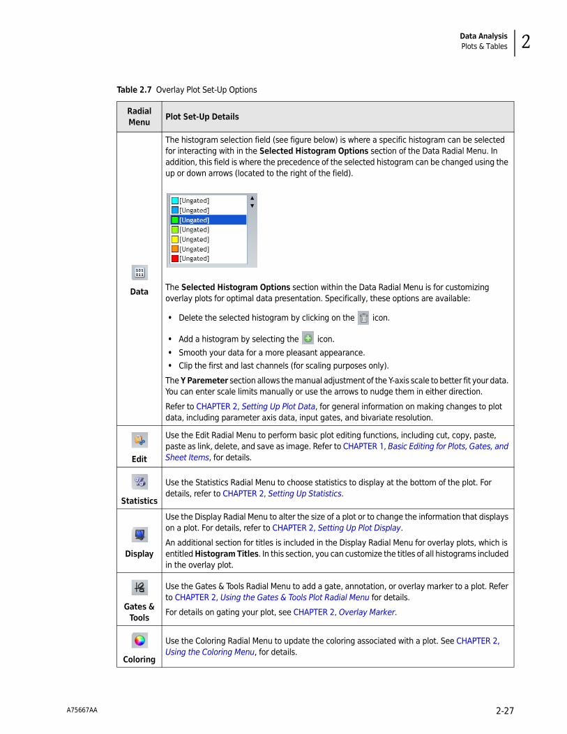
Data AnalysisPlots & Tables 2
Table 2.7 Overlay Plot Set-Up Options
Radial Menu
Plot Set-Up Details
Data
The histogram selection field (see figure below) is where a specific histogram can be selected for interacting with in the Selected Histogram Options section of the Data Radial Menu. In addition, this field is where the precedence of the selected histogram can be changed using the up or down arrows (located to the right of the field).
The Selected Histogram Options section within the Data Radial Menu is for customizing overlay plots for optimal data presentation. Specifically, these options are available:
• Delete the selected histogram by clicking on the icon.
• Add a histogram by selecting the icon.
• Smooth your data for a more pleasant appearance. • Clip the first and last channels (for scaling purposes only).
The Y Paremeter section allows the manual adjustment of the Y-axis scale to better fit your data. You can enter scale limits manually or use the arrows to nudge them in either direction.
Refer to CHAPTER 2, Setting Up Plot Data, for general information on making changes to plot data, including parameter axis data, input gates, and bivariate resolution.
Edit
Use the Edit Radial Menu to perform basic plot editing functions, including cut, copy, paste, paste as link, delete, and save as image. Refer to CHAPTER 1, Basic Editing for Plots, Gates, and Sheet Items, for details.
Statistics
Use the Statistics Radial Menu to choose statistics to display at the bottom of the plot. For details, refer to CHAPTER 2, Setting Up Statistics.
Display
Use the Display Radial Menu to alter the size of a plot or to change the information that displays on a plot. For details, refer to CHAPTER 2, Setting Up Plot Display.
An additional section for titles is included in the Display Radial Menu for overlay plots, which is entitled Histogram Titles. In this section, you can customize the titles of all histograms included in the overlay plot.
Gates &
Tools
Use the Gates & Tools Radial Menu to add a gate, annotation, or overlay marker to a plot. Refer to CHAPTER 2, Using the Gates & Tools Plot Radial Menu for details.
For details on gating your plot, see CHAPTER 2, Overlay Marker.
Coloring
Use the Coloring Radial Menu to update the coloring associated with a plot. See CHAPTER 2, Using the Coloring Menu, for details.
A75667AA 2-27

Data AnalysisPlots & Tables
Overlay Marker
To create an overlay marker:
1 On the plot that you need to insert overlay markers, right-click to access the Plot Radial Menu.
2 Hover over the icon to access the Gates & Tools menu.
3 Select the icon.
4 Click and drag across the histogram to create the marker and release the mouse button when completed. Repeat this procedure to create additional markers.
The Overlay Marker tool is for creating statistical markers within overlay plots. These markers are applicable only to the overlay plot in which they reside and are used to produce statistics for histograms within that plot.
A75667AA 2-28

Data AnalysisPlots & Tables 2
Add All Plots
Selecting adds the following to the plot sheet:
• One dot plot comparing forward scatter and side scatter.
• Dot plots comparing all fluorescence parameters to each other.
• One histogram plot for each fluorescence parameter. These plots demonstrate the count of events on the Y-axis and fluorescence intensity on the X-axis.
NOTE The following gates are added when choosing this option:
— An ellipse gate is located on the forward scatter/side scatter dot plot. (All additional default plots use this gate.)
— A quadrant gate is located on each dot plot comparing fluorescence parameters.
— A linear gate is located on each histogram plot.
NOTE Add All Plots does not work for Data Sets with more than 13 fluorescence parameters due to the possibility of surpassing the limit of gates/plots allowed by the software.
Gate Statistics Table
To create a Gate Statistics table:
1 From the Plots & Tables Ribbon tab, select the icon, and drag it to the preferred location on your sheet.
2 Right-click within the empty table to access the Radial Menu.
You can add a table, showing gates (including gate coloring, if applicable), logic, and population statistics to a sheet. Set up and customize the table using the Radial Menu. The gates that you choose to display in the table appear in the currently defined order of precedence (the gate with the highest precedence is at the top of the table).
A75667AA 2-29

Data AnalysisPlots & Tables
3 Hover over the icon to access the Data menu. The Data menu appears with the following options:
• Add All Gates: Adds all gates associated with the Protocol.
• Add All Colored Gates: Adds gates that have been assigned a color.
• Select Gates…: Allows you to select the gates you wish to display on your Gate Statistics table. To make specific gate selections:
— Select the Select Gates… hyperlink. A pop-up menu appears with gate categories.
— Hover your mouse over the gate type you wish to add to the Gate Statistics table and, from the additional pop-up window, select the gate(s) you wish to add to the table. Continue this process for each type of gate you wish to add.
• Remove All Gates: Removes all gates previously set up for the table.
• Show the “All” Gate: Adds a row to the table for all the events associated with the Data Set. When you choose to show statistics for the table, this option serves as a gauge for the other statistics within the table.
NOTE Colored gates are listed by precedence.
NOTE You may also add gates to the table as follows:
• Select gates from within the Color Precedence pane, and then drag and drop them in the table.
• Press the (Alt) key, selecting a gate from a plot, and then drag and drop them in the table.
4 Make your selections. Select when changes are completed.
NOTE To add statistics and logic to the Gate Statistics table, access the Radial Menu by positioning your
cursor over the table. Choose options from the Statistic ( ) and/or the Display menu ( ) to
add features to the table.
A75667AA 2-30

Data AnalysisPlots & Tables 2
FCS Information Table
To create an FCS Information table:
1 From the Plots & Tables Ribbon tab, select the icon, and drag it to the preferred location on your sheet. An empty table appears in that location.
2 Right-click within the empty table to access the Radial Menu.
3 Hover over the icon to access the Data menu. A list of available keywords appears.
NOTE Other than parameter names and descriptions (which always appear as defined in the Parameters pane) keywords cannot be changed; they appear exactly as derived from the source file.
4 Select the keywords you wish to display in the information table by clicking the corresponding
check boxes. When you are finished, select .
NOTE By reentering the Data menu, you can make changes to the Available Keywords list at any time by selecting or deselecting items on the list.
You can add FCS information derived from a raw flow cytometry data file to your displayed sheet. From the FCS keyword information stored in your original Data Set, select any FCS keywords that you wish to display within the information table. Use the Radial Menu to set up and customize the FCS Information Table.
A75667AA 2-31

Data AnalysisPlots & Tables
5 Apply formatting to your information table as follows:
a. Right-click in the table to access the Radial Menu.
b. Hover your mouse over the icon to access the Display menu (see figure below for reference).
c. Use the FCS Information Table Options to format your table. These options include:
• Even/odd row color selection: To select a row color, click within the color field of the rows you wish to change. In the color palette, select your preferred color.
• Show Keyword in Label: Displays the keyword for each data entry in your table.
• Show Description in Label: Displays the description associated with each data entry in your table.
• Show Border: Outlines the information table.
• Change precedence of the data within your table: To move data up or down in your table, select the corresponding keyword, and then select the up or down arrow until it is located in the location you prefer.
NOTE Additional details regarding the Display menu can be found in CHAPTER 2, Setting Up Plot Data.
6 When you have completed your changes, select .
A75667AA 2-32

Data AnalysisPlots & Tables 2
Adding Plots to the Plot Sheet
To add a plot to the plot sheet, select the Plots & Tables Ribbon tab.
• To add the new plot to the bottom of the plots already included on the sheet: Select the icon corresponding to the type of plot you wish to include in your Analysis.
• To add the new plot to a specific location on the plot sheet: Click the icon and drag to the location you prefer. Release the mouse button.
NOTE This option is not available for Add All Plots.
IMPORTANT If data seems to be missing from a plot, or if only a small number of events appear on the left or the bottom of the plot, the Data Set may have been acquired on an instrument with more than four decades of dynamic range. Adjust the number of displayed decades using the Data menu (see CHAPTER 2, Setting Up Plot Data, for details).
Plot Set-Up
Kaluza offers an array of options for customizing your plots. The following sections highlight these options and give instructions on how to employ the techniques for using these options. Because Radial Menus are the main source for making changes to your plots, the sections to follow will focus primarily on using the Radial Menus to make your changes.
NOTE Radial menu options will vary, depending on the plot type.
Editing Plots
To perform basic plot editing functions, including cut, copy, paste, paste as link, delete, and save as image, use the Edit Radial Menu (see Figure 2.3). Refer to CHAPTER 1, Basic Editing for Plots, Gates, and Sheet Items, for a description of the functions available on the Edit Radial Menu.
NOTE All Edit Radial Menu options are available for multi-selection, except for Save as Image.
Figure 2.3 Edit Radial Menu
A75667AA 2-33

Data AnalysisPlots & Tables
Setting Up StatisticsTo choose statistics to display at the bottom of the plot, use the Statistics Radial Menu (refer to Figure 2.4), which provides access for selecting statistics to display on the plot.
• For general instructions on using the Statistics Radial Menu, see CHAPTER 2, Using the Statistics Radial Menu.
• Figure 2.5 is an example of statistics displayed on a plot.
NOTE Available statistics are different, depending on the type of plot you are working with.
Figure 2.4 Statistics Radial Menu
The Statistics menu contains the following options:
• Check All: Selects all statistics available for a plot.
• Uncheck All: Removes all selections previously set for a plot.
• Statistics Visible: Displays chosen statistics on a plot. When deselected, any statistics you previously chose will be retained, but will not display on your plot. By default, Statistics Visible is selected.
• Population Statistics: Allows you to choose statistics related to all events within a plot, including Number, % Total, and % Gated.
• X Statistics/Y Statistics: Allows you to choose statistics related to the X and Y axes, including Median, Mean, Mode, CV, Half Peak CV, Minimum, Maximum, and Standard Deviation.
NOTE This option is not available for the tree or radar plot. Histogram plots, including the overlay plot, only display X statistics.
• Statistics Options...: Allows you to make systemic changes to the appearance of statistics, including using thousands separators in whole numbers and/or fractions and choosing between 0 and 4 decimal places in fractional numbers and/or percents.
For additional details, see CHAPTER 1, Kaluza Options.
A75667AA 2-34

Data AnalysisPlots & Tables 2
Figure 2.5 Plot Statistics
Using the Statistics Radial MenuTo use the Statistics menu:
1 Select the plot for which you wish to display statistics.
2 Access the Radial Menu by right-clicking on the selected plot.
3 Hover your mouse over the icon to access the Statistics menu.
4 Make your selection(s) using the buttons and/or check boxes.
5 Select to complete the process.
A75667AA 2-35

Data AnalysisPlots & Tables
Setting Up Plot Display
To alter the size of a plot or to change the information that displays on a plot, use the Display Radial Menu (refer to Figure 2.6).
For general instructions on using the Display Radial Menu, see CHAPTER 2, Using the Display Radial Menu.
NOTE Display menu options are different, depending on the type of plot you are working with.
Figure 2.6 Display Radial Menu
The Display menu contains the following options:
• Maximize: Increases the size of the plot to fit within the sheet portion of the application. The Maximize option is only available for items on the plot sheet, not the report sheet.
NOTE Double-clicking on a plot also maximizes a plot.
After you have maximized a plot, three buttons appear below the plot:
— Previous: Shows the previous plot located on the sheet in the maximized view.
— Restore: Returns the plot to its previous size.
NOTE Double-clicking on a maximized plot also returns the plot to the previous size.
— Next: Shows the next plot located on the sheet in maximized view.
• Reset Size: Returns a plot that has been resized back to the default size and shape.
A75667AA 2-36

Data AnalysisPlots & Tables 2
• Title: Allows you to customize the title that appears at the top of the plot. You may select Use Custom Title, which prompts a Title field, allowing you to create your own title. Additional options include showing the following information in the plot title:
— Input Gate
— Data Set Name
— Name
— Description
— Scale (linear, log, or logicle)
• Axes: Allows you to customize the axes included in your plot. Choose Use Custom Axes to prompt a field to display for each axis in the plot, which allows you to create your own title. If Use Custom Axes is not selected, you may include:
— Name
— Description
— Scale
Additional options include the following:
— Axis Tick Marks
— Axis Grid Lines
Using the Display Radial MenuTo use the Display menu:
1 Select the plot for which you wish to change the display.
2 Access the Radial Menu by right-clicking on the selected plot.
3 Hover your mouse over the icon to access the Display menu.
4 Make your updates in the Display menu.
5 Select to complete the process.
A75667AA 2-37

Data AnalysisPlots & Tables
Using the Gates & Tools Plot Radial Menu
To add a gate, annotation, or overlay marker to a plot, the Gates & Tools menu (refer to Figure 2.7) provides immediate access for choosing these options.
NOTE The Gates & Tools menu includes the same options no matter where you are currently located on the sheet. If a gate selected from the menu is not appropriate for the current sheet location, the cursor appears as a symbol. When you are in an appropriate location for the gate type, the cursor changes to the symbol for the gate type you selected, indicating that you may begin drawing.
For an in-depth description of gating, see CHAPTER 2, Gates & Tools.
Figure 2.7 Gates & Tools Radial Menu
GatesGates that are accessible through the Gates & Tools menu include the following:
• Linear
• Quadrant
• Hinged
• Polygon
• Freehand
• Rectangle
• Ellipse
To enable Gate-Drawing mode:
1 Access the Radial Menu by right-clicking on a plot.
2 Hover your mouse over the icon to access the Gates & Tools menu.
3 Select the gate type you need from the menu.
NOTE As you hover your mouse over each icon, the tooltip shows the name of the gate that corresponds with the icon.
A75667AA 2-38
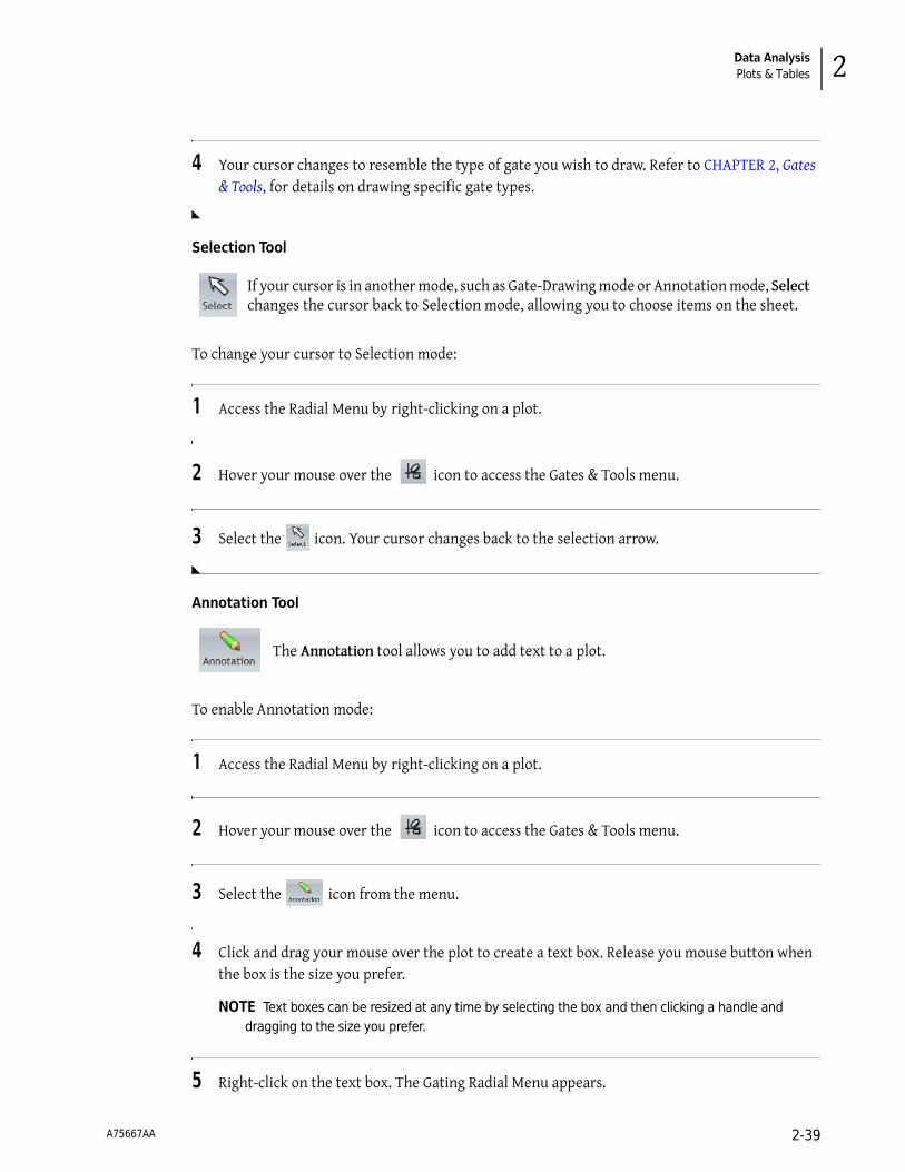
Data AnalysisPlots & Tables 2
4 Your cursor changes to resemble the type of gate you wish to draw. Refer to CHAPTER 2, Gates & Tools, for details on drawing specific gate types.
Selection Tool
To change your cursor to Selection mode:
1 Access the Radial Menu by right-clicking on a plot.
2 Hover your mouse over the icon to access the Gates & Tools menu.
3 Select the icon. Your cursor changes back to the selection arrow.
Annotation Tool
To enable Annotation mode:
1 Access the Radial Menu by right-clicking on a plot.
2 Hover your mouse over the icon to access the Gates & Tools menu.
3 Select the icon from the menu.
4 Click and drag your mouse over the plot to create a text box. Release you mouse button when the box is the size you prefer.
NOTE Text boxes can be resized at any time by selecting the box and then clicking a handle and dragging to the size you prefer.
5 Right-click on the text box. The Gating Radial Menu appears.
If your cursor is in another mode, such as Gate-Drawing mode or Annotation mode, Select changes the cursor back to Selection mode, allowing you to choose items on the sheet.
The Annotation tool allows you to add text to a plot.
A75667AA 2-39

Data AnalysisPlots & Tables
6 Hover over the icon, which initiates a data field.
7 Click within the data field and type your annotation.
8 Select when finished.
NOTE Refer to CHAPTER 3, Formatting a Text Box, to customize the annotation.
Overlay Marker
Setting Up Plot Data
To change data associated with a plot, including the parameter axis data, input gates, and bivariate resolution, use the Data Radial Menu (refer to Figure 2.8).
For general instructions on using the Data Radial Menu, see CHAPTER 2, Using the Data Radial Menu.
Data Menu Options—All PlotsThe Data menu for all plots contain the following options:
• Input Gate: Allows you to change the input gate from which a plot is gated.
• X Parameter/Y Parameter: Allows you to make axis-related data changes, including the following:
— Change the X or Y parameter.
— Select a different scale; options include linear, log, or logicle.
— Select the number of decades displayed (log only).
— Change the negative percentage (logicle only).
An Overlay Marker is for creating statistical markers within overlay plots. These are applicable only to the overlay plot in which they reside and are used to produce statistics for each of the histograms within the plot. See CHAPTER 2, Overlay Plots, for details.
A75667AA 2-40

Data AnalysisPlots & Tables 2
Figure 2.8 Data Radial Menu
Using the Data Radial MenuTo use the Data menu:
1 Select the plot for which you wish to change the data.
2 Access the Radial Menu by right-clicking on the selected plot.
3 Hover your mouse over the icon to access the Data menu. The Data menu for the specific plot type appears.
4 Enter your updates.
5 Select to complete the process.
A75667AA 2-41

Data AnalysisPlots & Tables
Using the Coloring Menu
To update the coloring associated with a plot, use the Coloring Radial Menu (Figure 2.9 is an example of the Coloring menu when on a dot plot), which provides access to making multiple types of coloring updates to plots.
Figure 2.9 Coloring Radial Menu
Updating ColorsColor blocks are designed to allow you to change the color of bands in contour and density plots, the bars in tree plots, and the histograms in overlay plots.
NOTE Other than the ability to turn on/off gate coloring, changes to gate coloring are not made through the Plot Radial Menu. Use the Color Precedence pane or the gating Radial Menu to change the color associated with events in a gate (see CHAPTER 2, Color Events, for details).
To make changes to coloring:
1 Access the Radial Menu by right-clicking on a plot.
2 Hover your mouse over the icon to access the Coloring menu.
3 Click the color block you wish to change. The color palette appears.
A75667AA 2-42

Data AnalysisPlots & Tables 2
4 Select any color from the palette that does not contain a heavy black outline (these colors are already used). Refer to the figure below for details.
NOTE The current color contains a check mark.
5 Select to finish the process.
Gate ColoringYou may choose between displaying the gate coloring set up in your Protocol or using single color for the plot.
• Use Single Color: Changes all events on the plot to the default event color (set up in the Color Precedence pane).
• Use Gate Coloring: Displays gate coloring used in the Protocol. Use the Color Precedence pane to change gate coloring.
NOTE For dot, contour, and density plots, a third option is Use Banded Coloring, which is described in Table 2.4.
To turn on/off gate coloring on a plot:
1 Access the Radial Menu by right-clicking on the plot.
2 Hover your mouse over the icon to access the Coloring menu.
3 Choose the radio button for the option you prefer.
4 Select to finish the process.
A75667AA 2-43

Data AnalysisPlots & Tables
OpacityOpacity allows you to change the opacity associated with the histograms on an overlay plot.
To change the opacity:
1 Access the Radial Menu by right-clicking on a plot.
2 Hover your mouse over the icon to access the Coloring menu.
3 Select the slider and move to the left or right depending on the opacity level you prefer. Refer to the figure below.
4 Select to finish the process.
Parameters
The Parameters pane displays a list of the parameters collected from the raw flow cytometry Data Set file. This pane enables you to edit parameter names, descriptions, types, detectors, and measurement type.
IMPORTANT If Kaluza does not instantly recognize a parameter from an imported raw Data Set file, it will flag the parameter as a possible unknown in the Type field (parameter fields are described in detail throughout this section). If an incorrect assumption is made, the parameter may not appear in the Spillover Matrix (see CHAPTER 2, Adjusting Compensation).
Changing the Parameters Pane Display
As a default, the Parameters pane displays Name and Description attributes only.
• Click on the Show more information icon ( ) located in the table header (see Figure 2.10), Type, Detector, and Measurement attributes will also be visible.
• To collapse the additional attributes, select the Show less information icon ( ).
A75667AA 2-44
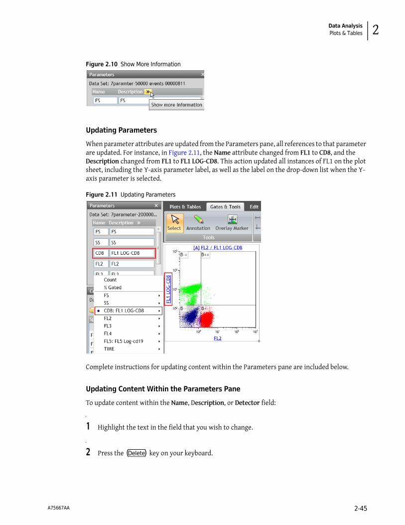
Data AnalysisPlots & Tables 2
Figure 2.10 Show More Information
Updating Parameters
When parameter attributes are updated from the Parameters pane, all references to that parameter are updated. For instance, in Figure 2.11, the Name attribute changed from FL1 to CD8, and the Description changed from FL1 to FL1 LOG-CD8. This action updated all instances of FL1 on the plot sheet, including the Y-axis parameter label, as well as the label on the drop-down list when the Y-axis parameter is selected.
Figure 2.11 Updating Parameters
Complete instructions for updating content within the Parameters pane are included below.
Updating Content Within the Parameters Pane
To update content within the Name, Description, or Detector field:
1 Highlight the text in the field that you wish to change.
2 Press the (Delete) key on your keyboard.
A75667AA 2-45

Data AnalysisPlots & Tables
3 Type the new content into the field and press (Enter) .
IMPORTANT To ensure a parameter displays on the Spillover Matrix (see CHAPTER 2, Adjusting Spillover Values in the Compensation Pane), the fluorescence detector must have a name (i.e., the Detector field cannot be blank) and Type must be set to “Fluorescence.”
To update the Type or Measurement field:
1 Click on the drop-down arrow on the right-hand side of the field you wish to change.
2 Select a new value.
NOTE When the Type field is set to “Unknown,” the parameter does not appear on the sheet when Add All Plots is selected, and the parameter does not appear on the Spillover Matrix.
Information Icon
When a parameter is present in a Data Set, but is not used in the Protocol, the icon appears on the left-hand side of the corresponding parameter. Once the parameter is used in the Protocol, the icon is no longer present.
Additional Information for Composite Protocols
When a Composite Protocol is the active Analysis, the data within the Parameters pane can be updated for the individual Data Sets within the Composite. The pane’s title block changes to a drop-down, allowing you to select an individual Data Set. To change to a different Data Set, simply select the drop-down arrow located on the right-hand side of the top of the pane and select the new Data Set.
NOTE When the Data Set in the Parameters pane is changed, the Compensation pane simultaneously changes to that Data Set.
Choosing Scale Type
Choosing the appropriate scale for your data is very important. The ability to produce meaningful plots is dependent upon selecting the appropriate scale.
Logarithmic ScaleLogarithmic scales are useful when the data includes a large range of values, as the logarithm scale changes the range by using ratios (for example, cell surface marker fluorescence parameters). Fluorescence parameters are best displayed in logarithmic scales because the scale is expanded to display weak signals and compressed to show strong signals. In Kaluza, decade width can be adjusted to fit the data.
A75667AA 2-46

Data AnalysisGates & Tools 2
Linear ScaleLinear scales contain divisions that are uniformly spaced. The linear scale is good for showing forward scatter and side scatter parameters.
Logicle Scale
When using the log scale, correctly compensated data may appear to be incorrectly over-compensated because events with negative values tend to pile along the axes; this distortion occurs because negative values do not exist on a log scale.
Kaluza includes the logicle scale, which provides a means to correctly display compensated data. Changing an axis from log to logicle scale splits the axis into two different regions, where the positive values remain in log scale and negative values are transformed into linear scale. The two different scales are divided by a slider, which provides the ability to interactively control the width of each region. When you use the logicle scale, negative values display correctly, preserving the desired symmetrical appearance of correctly compensated data.
Gates & Tools
Kaluza offers eight different gate types, allowing you to precisely define your data. These gate types are described in detail in the following sections.
IMPORTANT If you wish to make multiple gates of the same type, hold down the(Shift) key to remain in
drawing mode. Release the (Shift) key to escape that mode.
IMPORTANT Each Protocol/Analysis may contain a maximum of 320 gates, which can be spread across multiple sheets. Up to 31 gates can be assigned a color.
Linear Gates
To create a linear gate:
1 From the Gates & Tools Ribbon tab, select the icon.
Linear gates are used for histogram plots. A linear gate encompasses events that fall within the linear range that you define and includes all events within the vertical/horizontal frame.
A75667AA 2-47

Data AnalysisGates & Tools
2 On the histogram plot, click and drag your mouse over the area that you wish to be included in the gate.
3 Release your mouse button when you are satisfied.
4 Move or resize your gate by following instructions in CHAPTER 2, Resizing, Reshaping, and Moving Gates.
5 Customize your gate by following instructions in CHAPTER 2, Setting Up Gates.
Quadrant Gates
To create a quadrant gate:
1 From the Gates & Tools Ribbon tab, select the icon.
2 Click your mouse anywhere within the dot, contour, or density plot to create the new gate; this adds a quadrant gate to the plot, with the center-point in the location where you clicked your mouse.
3 Move or resize your gate by following instructions in CHAPTER 2, Resizing, Reshaping, and Moving Gates.
The quadrant gate is available for use on dot, density, and contour plots. When you choose this option, each plot is divided into four gated sections by perpendicular lines. Quadrant gates can be moved at your discretion. Each quadrant of the gate is assigned positive/negative values, depending on the position:
• -+ (upper left quadrant) • ++ (upper right quadrant) • -- (lower left quadrant) • +- (lower right quadrant)
NOTE Multiple quadrants can be placed on a single plot.
A75667AA 2-48
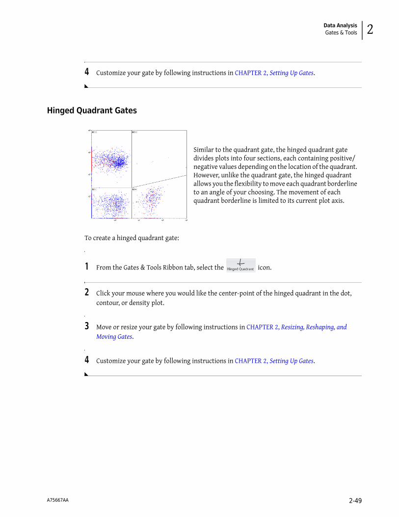
Data AnalysisGates & Tools 2
4 Customize your gate by following instructions in CHAPTER 2, Setting Up Gates.
Hinged Quadrant Gates
To create a hinged quadrant gate:
1 From the Gates & Tools Ribbon tab, select the icon.
2 Click your mouse where you would like the center-point of the hinged quadrant in the dot, contour, or density plot.
3 Move or resize your gate by following instructions in CHAPTER 2, Resizing, Reshaping, and Moving Gates.
4 Customize your gate by following instructions in CHAPTER 2, Setting Up Gates.
Similar to the quadrant gate, the hinged quadrant gate divides plots into four sections, each containing positive/negative values depending on the location of the quadrant. However, unlike the quadrant gate, the hinged quadrant allows you the flexibility to move each quadrant borderline to an angle of your choosing. The movement of each quadrant borderline is limited to its current plot axis.
A75667AA 2-49

Data AnalysisGates & Tools
Polygon Gates
To create a polygon gate:
1 From the Gates & Tools Ribbon tab, select the icon.
2 Click your mouse where you wish to begin creating your gate.
3 Determine the path you need for your gate and continue clicking your mouse at the location of each direction change. As you draw the gate, a new line will be added each time you click your mouse, and the default gate color will display, working as a guide to show your progress.
4 Double-click or select the initial point when the gate is completed.
5 Move or resize your gate by following instructions in CHAPTER 2, Resizing, Reshaping, and Moving Gates.
6 Customize your gate by following instructions in CHAPTER 2, Setting Up Gates.
The polygon gate allows you to create a gate with up to 128 sides; this allows you set up a very specific zone of events to include in your gate. The polygon gate is available on dot, density, and contour plots.
A75667AA 2-50

Data AnalysisGates & Tools 2
Freehand Gates
To create a freehand gate:
1 From the Gates & Tools Ribbon tab, select the icon.
2 Determine the path you need for your gate.
3 Click your mouse where you wish to begin creating your gate, and, without releasing your mouse button, draw your gate to the size and shape you need. As you draw the gate, the default gate color will display, working as a guide to show your progress.
4 Release your mouse when you are finished.
5 Move or resize your gate by following instructions in CHAPTER 2, Resizing, Reshaping, and Moving Gates.
6 Customize your gate by following instructions in CHAPTER 2, Setting Up Gates.
The freehand gate is a very flexible option that gives you complete control over the size and shape of your gate. The freehand gate is available on dot, density, and contour plots.
A75667AA 2-51

Data AnalysisGates & Tools
Rectangle Gates
To create a rectangular gate:
1 From the Gates & Tools Ribbon tab, select the icon.
2 Determine the size you need for your rectangular gate.
3 Click your mouse where you would like to begin your rectangle and drag to the size you need. Release your mouse when finished.
4 Move or resize your gate by following instructions in CHAPTER 2, Resizing, Reshaping, and Moving Gates.
5 Customize your gate by following instructions in CHAPTER 2, Setting Up Gates.
The rectangle gate is available on dot, density, and contour plots.
A75667AA 2-52

Data AnalysisGates & Tools 2
Ellipse Gates
To create an ellipse gate:
1 From the Gates & Tools Ribbon tab, select the icon.
2 Determine the path you need for your gate.
3 Click your mouse where you would like to begin your ellipse and drag to the size you need. Release your mouse when finished.
4 Move or resize your gate by following instructions in CHAPTER 2, Resizing, Reshaping, and Moving Gates.
5 Customize your gate by following instructions in CHAPTER 2, Setting Up Gates.
Boolean Gates
The boolean gate allows you to set up a new gate by selecting current gates and defining whether to include and/or exclude the events that are located within those gates. Once defined, the boolean gate can be used for gating other plots.
To create a boolean gate:
The ellipse gate consists of curved lines. These gates can be sized and shaped using the eight default handles and rotated using the handle. The ellipse gate is available on the dot, density, and contour plots.
A75667AA 2-53
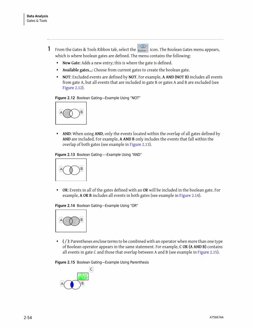
Data AnalysisGates & Tools
1 From the Gates & Tools Ribbon tab, select the icon. The Boolean Gates menu appears, which is where boolean gates are defined. The menu contains the following:
• New Gate: Adds a new entry; this is where the gate is defined.
• Available gates…: Choose from current gates to create the boolean gate.
• NOT: Excluded events are defined by NOT. For example, A AND (NOT B) includes all events from gate A, but all events that are included in gate B or gates A and B are excluded (see Figure 2.12).
Figure 2.12 Boolean Gating—Example Using “NOT”
• AND: When using AND, only the events located within the overlap of all gates defined by AND are included. For example, A AND B only includes the events that fall within the overlap of both gates (see example in Figure 2.13).
Figure 2.13 Boolean Gating–—Example Using “AND”
• OR: Events in all of the gates defined with an OR will be included in the boolean gate. For example, A OR B includes all events in both gates (see example in Figure 2.14).
Figure 2.14 Boolean Gating—Example Using “OR”
• ( / ): Parentheses enclose terms to be combined with an operator when more than one type of Boolean operator appears in the same statement. For example, C OR (A AND B) contains all events in gate C and those that overlap between A and B (see example in Figure 2.15).
Figure 2.15 Boolean Gating—Example Using Parenthesis
A75667AA 2-54
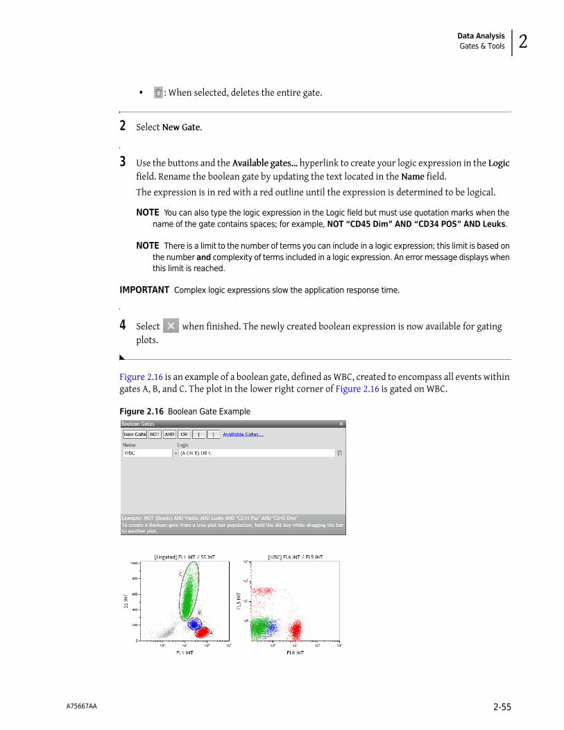
Data AnalysisGates & Tools 2
• : When selected, deletes the entire gate.
2 Select New Gate.
3 Use the buttons and the Available gates… hyperlink to create your logic expression in the Logic field. Rename the boolean gate by updating the text located in the Name field.
The expression is in red with a red outline until the expression is determined to be logical.
NOTE You can also type the logic expression in the Logic field but must use quotation marks when the name of the gate contains spaces; for example, NOT “CD45 Dim” AND “CD34 POS” AND Leuks.
NOTE There is a limit to the number of terms you can include in a logic expression; this limit is based on the number and complexity of terms included in a logic expression. An error message displays when this limit is reached.
IMPORTANT Complex logic expressions slow the application response time.
4 Select when finished. The newly created boolean expression is now available for gating plots.
Figure 2.16 is an example of a boolean gate, defined as WBC, created to encompass all events within gates A, B, and C. The plot in the lower right corner of Figure 2.16 is gated on WBC.
Figure 2.16 Boolean Gate Example
A75667AA 2-55

Data AnalysisGates & Tools
Setting Up Gates
Kaluza offers an array of options for customizing your gates. The following sections highlight these options and give instructions on how to employ the techniques for using these options.
Editing Gates
Use the Edit Radial Menu (see Figure 2.17) to perform basic editing functions for a selected gate, including cut, copy, paste, and delete. Refer to CHAPTER 1, Basic Editing for Plots, Gates, and Sheet Items, for a description of the functions.
Figure 2.17 Edit Radial Menu
Setting Up Gate Display
Use the Display Radial Menu (see Figure 2.18) to alter the name of a gate, change the color of events that fall within the gate, and choose a statistic to appear next to the gate.
Figure 2.18 Display Radial Menu
Gate NameThe Gate Name field allows you to enter a custom name for your gate. To update a gate name:
1 With your mouse positioned over the gate, right-click to access the Radial Menu.
2 Hover over the icon to access the Display menu. The Display menu appears.
A75667AA 2-56

Data AnalysisGates & Tools 2
3 Delete the current gate name and enter the revised name into the field (field location is outlined in red in the figure below).
4 Select to complete the process.
Color EventsUse the Color events section of the Display menu to define a new color for your gate or remove gate coloring. The two procedures below describe the process for completing these tasks.
To update the color of the events that fall within a gate:
1 With your mouse positioned over the gate, right-click to access the Radial Menu.
2 Hover over the icon to access the Display menu. The Display menu appears.
3 Select the color block. The color palette appears.
4 Choose the new color for the gated events.
5 Select to complete the process.
To add/remove gate coloring:
1 With your mouse positioned over the gate, right-click to access the Radial Menu.
2 Hover over the icon to access the Display menu. The Display menu appears.
3 Select/deselect the Color events check box to change your event coloring preference.
A75667AA 2-57

Data AnalysisGates & Tools
4 Select to complete the process.
Gate StatisticsThe Statistic: drop-down is where you can choose to display a statistic directly on the plot. Statistic options include Number, % Total, and % Gated. You can also choose to include a statistic label.
To display a statistic directly on the plot:
1 With your mouse positioned over the gate, right-click to access the Radial Menu.
2 Hover over the icon to access the Display menu. The Display menu appears.
3 Select the Statistic: drop-down list and choose the preferred statistic.
4 If you wish to show a label, select the checkbox located next to Show Label.
5 Select to complete the process.
The figure below shows an example of a gate displaying the % Gated statistic, including the statistic label.
Adding a New Gate
Use the Gates & Tools Radial Menu (see Figure 2.19) to add a gate, annotation, or overlay marker to a plot.
NOTE The Gates & Tools menu includes the same options no matter where you are currently located on the sheet. If a gate selected from the menu is not appropriate for the current sheet location, the cursor will
display as a symbol. When you are in an appropriate location for the gate type, the cursor changes
to the symbol for the gate type you selected, indicating that you may begin drawing.
A75667AA 2-58

Data AnalysisGates & Tools 2
Refer to CHAPTER 2, Using the Gates & Tools Plot Radial Menu, for details on using this menu.
For an in-depth description of gating, see CHAPTER 2, Gates & Tools.
Figure 2.19 Gates & Tools Radial Menu
Data Menu
Use the Data Radial Menu (see Figure 2.20) for one or more of the following activities:
• Viewing coordinates
• Changing location
• Changing the size or angle
• Linking to other gates
Refer to CHAPTER 2, Resizing, Reshaping, and Moving Gates, for additional methods for changing data.
Figure 2.20 Data Radial Menu
Center PointCenter Point allows you to change the location of the center point of the gate. (Applies to elliptical, quadrant, and hinged quadrant gates.) To change the center point location using the Radial Menu:
1 With your mouse positioned over the gate, right-click to access the Radial Menu.
2 Hover over the icon to access the Data menu. The Data menu appears.
3 The Center Point field for the X-axis is on the left, and the Y-axis field is on the right. Update the coordinates either by deleting the number currently located within the fields and entering the new value, or by using the up/down arrows to nudge in either direction.
A75667AA 2-59

Data AnalysisGates & Tools
4 Select to complete the process.
Top/Bottom/Left/RightThe Top, Bottom, Left, and Right fields allow you to enter coordinates of the intersection points for each side of hinged quadrant gates. To update coordinates using the Radial Menu:
1 With your mouse positioned over the gate, right-click to access the Radial Menu.
2 Hover over the icon to access the Data menu. The Data menu appears.
3 Update the Top, Bottom, Left, and/or Right fields either by deleting the number currently located within the fields and entering the new value or by using the up/down arrows to nudge in either direction.
4 Select to complete the process.
X Radius/Y Radius/AngleThe X Radius, Y Radius, and Angle fields allow you to enter the size of the radius in relation to the X/Y axes and the angle of an elliptical gate. To update coordinates using the Radial Menu:
1 With your mouse positioned over the gate, right-click to access the Radial Menu.
2 Hover over the icon to access the Data menu. The Data menu appears.
3 Update the X Radius, Y Radius, and Angle fields either by deleting the number currently located within the fields and entering the new value or by using the up/down arrows to nudge in either direction.
4 Select to complete the process.
A75667AA 2-60

Data AnalysisGates & Tools 2
X0/X1/Y0/Y1The X0, X1, Y0, and Y1 fields allow you to change the size of a rectangle gate by changing the coordinates of each side of the rectangle. To update coordinates using the Radial Menu:
1 With your mouse positioned over the gate, right-click to access the Radial Menu.
2 Hover over the icon to access the Data menu. The Data menu appears.
3 Update the X0, X1, Y0, and Y1 fields either by deleting the number currently located within the fields and entering the new value or by using the up/down arrows to nudge in either direction.
4 Select to complete the process.
X/Y Coordinates
In polygon and freehand gates, the Data menu displays the X and Y coordinates of each handle (change of direction) located on the gate. Figure 2.21 shows the X/Y coordinates list for a freehand gate.
Figure 2.21 X/Y Coordinates List
NOTE To make changes to the shape of polygon or freehand gates, follow the methods described in CHAPTER 2, Resizing, Reshaping, and Moving Gates.
A75667AA 2-61

Data AnalysisGates & Tools
Link to GatesLink to Gates… allows you to change other freehand, polygon, linear, rectangle, and ellipse gates within your Protocol to the same size, shape and X/Y coordinate locations as the current gate. Gates cannot be linked to gates of other types, except for polygon and freehand, which can be linked together. When gates are linked, changes made to one gate automatically apply to all gates that are linked.
NOTE You may only link gates of the same type.
To link gates:
1 With your mouse positioned over the gate, right-click to access the Radial Menu.
2 Hover over the icon to access the Data menu. The Data menu appears.
3 Select the Link to Gates… hyperlink. A pop-up window appears with a list of gates applicable for linking.
4 Select the gate(s) that you wish to link to the current gate.
5 Select to complete the process.
X0/X1/HeightThe X0, X1, and Height fields allow you to change the length and height of a linear gate or overlay marker by changing the coordinates of each side of the line or the height coordinate on the Y-axis.To update coordinates using the Radial Menu:
1 With your mouse positioned over the linear gate or overlay marker, right-click to access the Radial Menu.
2 Hover over the icon to access the Data menu. The Data menu appears.
3 Update the X0, X1, and Height fields either by deleting the number currently located within the fields and entering a new value or by using the up/down arrows to nudge in either direction.
4 Select to complete the process.
A75667AA 2-62

Data AnalysisGates & Tools 2
Resizing, Reshaping, and Moving Gates
Refer to Table 2.8 for complete instructions on updating the physical characteristics of a gate.
Table 2.8 Resizing, Reshaping, and Moving Gates
Item Details
Resize and Reshape Gates: Handles allow for resizing and/or reshaping a portion of, or an entire, gate.
Move Gates: When your mouse enters the confines of a gate, the cursor changes to a ,
indicating that the movement of an entire gate is enabled. Move a gate by selecting and dragging when you see this cursor.
NOTE To optimize the reaction time when moving gates, you can set the application to temporarily decrease the number of events that display on the plot. See CHAPTER 1, Kaluza Options, for details.
• To move the gate a fixed amount, select the gate, and then press the appropriate arrow key(s) on your keyboard until you are satisfied with the position.
• Smaller adjustments can be made by pressing the (Ctrl) key while using the arrow keys.
Lengthen or Shorten, Reposition, Change Angle, and Stretch or Compress Gates: The cursor changes to a double-sided arrow when you move your mouse near a handle. The type of arrow indicates the direction of movement. Select and drag a handle to:
• Lengthen or shorten linear gates or overlay markers. • Reposition quadrants in the quadrant and hinged gates. • Change angles of the quadrants in the hinged gates. • Horizontally, vertically, or diagonally stretch or compress entire gates, including
polygon, freehand, rectangular, and elliptical gates.
Reshape Polygon Gates: The cursor changes to a when you hover your mouse over a polygon handle. This cursor indicates that you can reshape the polygon. Select and drag a handle to reshape.
Rotate Elliptical Gates: By moving your mouse over the circular handle, the indicates
it is ready for you to rotate an elliptical gate on the center of axis.
Move a Gate Name: When you move your mouse over a gate name, the indicates that
a gate name is ready for movement. Select and drag the name to move to a new location.
A75667AA 2-63

Data AnalysisGates & Tools
Methods for Applying Gates to Plots
In addition to using the Data menu (see CHAPTER 2, Setting Up Plot Data), there are three other methods for assigning a gate to a plot.
Gating Plots Using the Plot HyperlinkTo gate a plot using the hyperlink:
1 Select the hyperlink located at the top of a plot. A pop-up menu appears, which contains a list of gates, including recently created gates and gates by category (common, quadrant, and boolean).
NOTE In Overlay plots, you will first have to choose the histogram before you select the gate.
2 Select the gate for your plot from the pop-up (s). The events within your plot are now filtered, based on the events in the gate you selected.
Gating Plots Using the Color Precedence PaneTo gate a plot using the Color Precedence pane:
1 From within the Color Precedence pane, select the row of the gate that you wish to apply to the plot.
2 Drag the gate onto the plot and release your mouse button to complete the process.
Gating Plots by Dragging/DroppingTo gate a plot using the drag/drop method:
NOTE Not only will the following procedure work for all gate types, you can also gate plots on tree bars from a tree plot.
1 Press the (Alt) key, and, while pressed, select the gate or tree bar that you wish to use as the input gate for a plot.
2 Drag the gate or tree bar onto the plot and release your mouse button/ (Alt) key to complete the process.
A75667AA 2-64

Data AnalysisGates & Tools 2
Establishing Color Precedence of Gates
The Color Precedence pane displays the event coloring and precedence of coloring for gates in the current Protocol. The pane contains three main sections, including Default Event Color, Gates With Color, and Gates Without Color. These sections, along with the procedures for making changes within the Color Precedence pane, are described below:
Default Event Color
Gates With Color
NOTE Multi-selection is available for the following procedures.
Updating Color PrecedenceTo change the precedence of a gate:
1 From the Color Precedence pane, select anywhere within the row of the gate you need to move.
2 At this point, there are two ways to change the gate precedence hierarchy:
a. Drag and Drop Method: With the row still selected, drag it to the new location and release the mouse button.
OR
b. Using Buttons (located on the right-hand side of the pane):
• To move the gate up or down one space: select the or buttons until the gate is in the appropriate location.
• To move the gate to the top or bottom of the list: select the or button.
Default Event Color displays the color of events that have not been assigned to a gate. This color is also the default color of events on a plot when Use Single Color is selected from the Coloring Radial Menu (see CHAPTER 2, Using the Coloring Menu for details).
Gates With Color displays gates in order of precedence. The gate located at the top of the list has the highest precedence, and the gate at the bottom has the lowest precedence. When an event belongs to more than one gate, it appears on the plot sheet in the color with the highest applicable precedence. All enabled gates in the current Protocol are displayed in the Gates With Color section of the Color Precedence pane.
NOTE You can assign color to up to 31 gates per Protocol/Analysis. Colored gates can be located on multiple sheets within the same Protocol/Analysis.
A75667AA 2-65
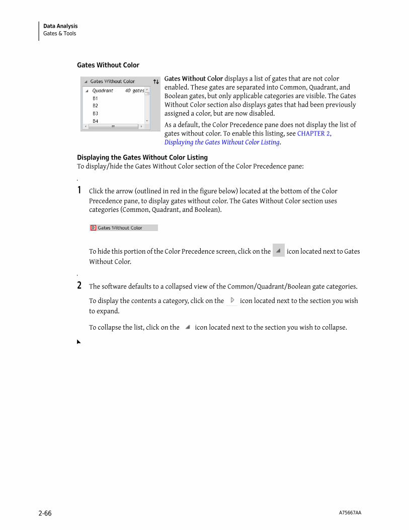
Data AnalysisGates & Tools
Gates Without Color
Displaying the Gates Without Color ListingTo display/hide the Gates Without Color section of the Color Precedence pane:
1 Click the arrow (outlined in red in the figure below) located at the bottom of the Color Precedence pane, to display gates without color. The Gates Without Color section uses categories (Common, Quadrant, and Boolean).
To hide this portion of the Color Precedence screen, click on the icon located next to Gates Without Color.
2 The software defaults to a collapsed view of the Common/Quadrant/Boolean gate categories.
To display the contents a category, click on the icon located next to the section you wish to expand.
To collapse the list, click on the icon located next to the section you wish to collapse.
Gates Without Color displays a list of gates that are not color enabled. These gates are separated into Common, Quadrant, and Boolean gates, but only applicable categories are visible. The Gates Without Color section also displays gates that had been previously assigned a color, but are now disabled.
As a default, the Color Precedence pane does not display the list of gates without color. To enable this listing, see CHAPTER 2, Displaying the Gates Without Color Listing.
A75667AA 2-66

Data AnalysisGates & Tools 2
Assigning Color to a Gate Without ColorTo assign color to a gate without color:
1 Select anywhere within the row of the gate you need to color.
2 There are three ways to enable gate coloring:
• Click and Drag: With the row still selected, drag the row to the Gates With Color section of the pane and release the mouse button.
• Up/Down Icon: Select the button to move the gate to the Gates With Color section.
NOTE If gate coloring had been disabled, the gate will retain the former level of precedence when re-enabled.
• Right-Click: Right-click on the selected gate(s) and select Enable coloring.
Changing the Name of a GateGate names are editable and can be changed by:
NOTE Changing the gate name using the Color Precedence pane changes the gate name in all locations within the application.
1 Position your mouse over the gate name that you wish to change and click twice. An editable field is indicated by the text appearing highlighted.
NOTE Copy, cut, and paste is available by right-clicking on the text field or using keyboard shortcuts once the field is editable (highlighted).
2 Enter the new name in the field.
IMPORTANT When changing gate names, keep the following in mind:
• Gate names cannot be left blank.
• The maximum length is 255 characters.
• Gate names cannot be repeated.
3 To save your changes, press (Enter) on your keyboard or click on another gate.
A75667AA 2-67

Data AnalysisGates & Tools
Changing the Color of a GateNew gates are automatically assigned a unique color. Gates that have been moved from the Gates Without Color section, however, might not be assigned a unique color. When this occurs, you will
receive a warning message similar to this: . To correct the error, update one of the colors by following the procedure below.
To change the color of a gate:
1 Click on the color swatch of the gate color you wish to change. The color palette appears. The colors that have a bold, black outline are the colors that are already in use. The color that contains a check mark is the current color assigned to that gate. Refer to the figure below for an example.
2 Choose a new color from the palette. This action changes the color of all events shown on the plot sheet that fall within that gate and have the higher precedence.
Deleting a Gate From the Color Precedence PaneTo delete a gate:
1 From the Color Precedence pane, select within the row of the gate you wish to delete.
2 There are two ways to delete a gate:
a. Right-Click: Right-click on the selected gate and select Delete from the menu.
b. Keyboard: Press (Delete) on your keyboard.
NOTE You may also delete a gate directly from the plot by right-clicking on the gate and selecting
from the Edit Radial Menu.
NOTE If you have imported a Protocol from a *.lmd file, it should include gates that are not visible on any plots. To delete these gates, right-click on the gate from within the Color Precedence pane and select Delete from the menu.
A75667AA 2-68

Data AnalysisGates & Tools 2
Tools
The tools described in the following sections allow you to customize your plots/sheet.
Annotation Tool
The annotation tool allows you to add a text box to a plot by clicking and dragging within the plot.
To annotate a plot:
1 Right-click on the plot you wish to annotate.
2 Hover over the icon to access the Gates & Tools menu.
3 Select .
4 Click and drag your mouse over the plot to create a text box. Release the mouse button when the box is the size you prefer.
NOTE You can resize text boxes at any time by selecting the box and clicking and dragging a handle.
5 Right-click on the text box. The Gating Radial Menu appears.
6 Hover over the icon, which initiates a Data field.
7 Click within the data field and type your annotation.
8 Select when finished.
NOTE Refer to CHAPTER 3, Formatting a Text Box, to customize the annotation.
Overlay Marker
The Overlay Marker tool is for creating statistical markers within overlay plots. A marker is applicable only to the overlay plot in which they reside and are used to produce statistics for histograms within that plot. See CHAPTER 2, Overlay Marker, for details.
A75667AA 2-69
Data AnalysisCompensation
Selection Tool
Choose to change the cursor to Selection mode, which allows you to make changes to the plot sheet, as well as individual plots.
Compensation
Introduction to Compensation
To understand the need for fluorescence compensation, you must start with the basic flow cytometry concepts. These concepts are described in this section.
When particles are processed through a flow cytometer, they (or the attached fluorochromes) are excited by a laser. As these laser-excited events return to their former, unexcited state, they release energy. The intensity of the released energy depends on two factors, including:
• The type of fluorochrome(s) attached to, or intrinsic to (autofluorescence) the event.
• The amount of fluorescence molecules that are attached to each event.
The energy released from each event is detected by photomultiplier tubes (PMTs), via a series of dichroic mirrors and optical band-pass filters that allow only a specific region of the spectrum to reach each PMT. Each PMT located within a flow cytometer detects a different color range; however, because the emission spectra for different fluorescence stains overlap and signals cross over to PMTs other than the one specified for a particular fluorochrome, it is necessary to correct spillover.
Figure 2.22 illustrates fluorescence spillover (FL1) from a particle labeled with FITC, a green dye fluorescing into PMT2 (FL2), PMT3 (FL3), and (PMT4) FL4. Some of the FITC-emitted light reaches every one of the four fluorescence detectors shown in this example. Because PMTs are very high-gain devices, even a very small amount of light can be measured, and it is quite possible for three, or even all four, detectors (as in this example), to generate a measurable signal. This phenomenon, where part of the signal from a fluorochrome spills over into a detector other than its primary or “intended” detector, is called “crosstalk” or "spillover." This may occur for all fluorochromes in use and must be dealt with. Color compensation electronically removes the crosstalk or spillover. The Spillover Matrix shows the combined spillover effects for all fluorochromes present.
A75667AA 2-70

Data AnalysisCompensation 2
Figure 2.22 Fluorescence Spillover—FITC
In the figure below, the plot on the left is not compensated, and the plot on the right shows correctly compensated fluorescence parameters. When fluorescence parameters are correctly compensated, they are aligned both horizontally and vertically.
The sections below describe the methods for automatically generating Spillover and Autofluorescence Vector values (refer to CHAPTER 2, Automatic Compensation and Autofluorescence Vector Generation: Using the Generate Compensation Feature), and making manual adjustments to compensation using Spillover Sliders (see CHAPTER 2, Adjusting Spillover Using the Spillover Sliders Directly on the Plot(s)) or the Spillover Matrix (see CHAPTER 2, Adjusting Spillover Values in the Compensation Pane).
Before CompensatingEvent Populations
After Correctly CompensatingEvent Populations
A75667AA 2-71

Data AnalysisCompensation
Compensation Pane
The Compensation pane (see Figure 2.23) contains tools for adjusting Spillover and Autofluorescence Vector values related to a particular Data Set. The main component of the Compensation pane is the Spillover Matrix, which includes all fluorescence parameters associated with a Data Set and, if applicable, a column that displays the autofluorescence vector. Other tools, which are described in the following sections, are also available in the Compensation pane:
• CHAPTER 2, Saving a Compensation File
• CHAPTER 2, Importing a Compensation File
• CHAPTER 2, Resetting Spillover and Autofluorescence Vector Values
• CHAPTER 2, Adjusting Spillover Using the Spillover Sliders Directly on the Plot(s)
• CHAPTER 2, Displaying the Autofluorescence Vector
Figure 2.23 Compensation Pane
Adjusting Compensation
The following sections describe the methods for adjusting compensation.
Adjusting Spillover Values in the Compensation Pane
The Spillover Matrix allows you to manually enter Spillover percentages into the matrix and/or to view Spillover percentages that have already been adjusted using the Spillover Sliders on the plot sheet.
To manually update a value within a cell of the Spillover Matrix:
A75667AA 2-72
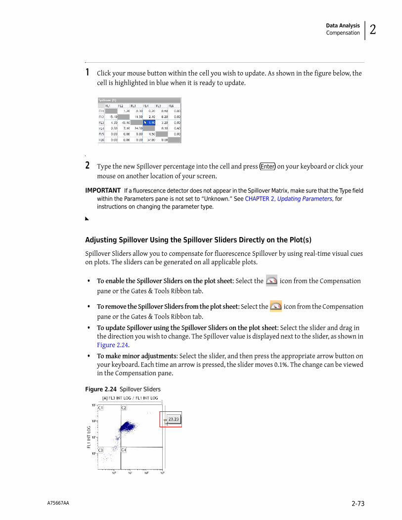
Data AnalysisCompensation 2
1 Click your mouse button within the cell you wish to update. As shown in the figure below, the cell is highlighted in blue when it is ready to update.
2 Type the new Spillover percentage into the cell and press (Enter) on your keyboard or click your mouse on another location of your screen.
IMPORTANT If a fluorescence detector does not appear in the Spillover Matrix, make sure that the Type field within the Parameters pane is not set to “Unknown.” See CHAPTER 2, Updating Parameters, for instructions on changing the parameter type.
Adjusting Spillover Using the Spillover Sliders Directly on the Plot(s)
Spillover Sliders allow you to compensate for fluorescence Spillover by using real-time visual cues on plots. The sliders can be generated on all applicable plots.
• To enable the Spillover Sliders on the plot sheet: Select the icon from the Compensation pane or the Gates & Tools Ribbon tab.
• To remove the Spillover Sliders from the plot sheet: Select the icon from the Compensation pane or the Gates & Tools Ribbon tab.
• To update Spillover using the Spillover Sliders on the plot sheet: Select the slider and drag in the direction you wish to change. The Spillover value is displayed next to the slider, as shown in Figure 2.24.
• To make minor adjustments: Select the slider, and then press the appropriate arrow button on your keyboard. Each time an arrow is pressed, the slider moves 0.1%. The change can be viewed in the Compensation pane.
Figure 2.24 Spillover Sliders
A75667AA 2-73

Data AnalysisCompensation
Saving a Compensation File
The Spillover Matrix and Autofluorescence Vector can be saved into a *.compensation file for use with other Data Sets. To save a *.compensation file:
1 From the Compensation pane, select the icon, which is located above the Spillover Matrix. The Save Compensation dialog box appears.
2 Select the destination for the file by navigating to the location using icons in the dialog box or the drop-down list in the Save in field.
3 Enter a file name into the File name field.
4 Select Save.
NOTE Additional options for saving a *.compensation file are described in CHAPTER 1, Using the Analysis List.
Importing a Compensation File
The Spillover Matrix and Autofluorescence Vector from a previously saved *.compensation file can be applied to a Data Set.
To import a *.compensation file:
1 Select the icon above the Spillover Matrix. The Import Compensation dialog box appears.
2 Navigate to the *.compensation file using the icons in the dialog box or the drop-down list in the Look in field. Once you find the file, select it, and verify that the file name appears in the File Name field.
3 Select Open. The new Spillover percentages appear in the Spillover Matrix.
NOTE Additional options for importing a *.compensation file are described in CHAPTER 1, Using the Analysis List.
A75667AA 2-74

Data AnalysisCompensation 2
Resetting Spillover and Autofluorescence Vector Values
The icon located above the Spillover Matrix resets Spillover and Autofluorescence Vector values associated with the Data Set to 0.00.
Accounting for Autofluorescence
To increase the accuracy of fluorescence compensation, Autofluorescence Vector values need to be factored in prior to determining Spillover percentages. An Autofluorescence Vector is the value that is subtracted from the data prior to Spillover compensation and then added back afterwards.
Accounting for autofluorescence allows a greater degree of accuracy when interpreting data due to the increased ability to decipher which fluorochromes have attached to the surface of a cell. The true level of absorption of fluorochromes, or fluorescence intensity, is also more evident when factoring in autofluorescence.
When autofluorescence is considered, it enables a more “true” compensation because it changes the coordinates of each event to a state as if they contained no autofluorescence, compensates the events based on this assumption, and then adds the value back in to re-account for the intensity level.
Displaying the Autofluorescence Vector
To show the Autofluorescence Vector in the Spillover Matrix, select the icon; this adds a column to the left-hand side of the Spillover Matrix (highlighted in red in Figure 2.25).
Figure 2.25 Autofluorescence Vector Column
The Autofluorescence Vector is one of the following:
• 0.3164, if using a *.lmd file derived from a Beckman Coulter instrument.
• the value established using the Kaluza “Generate Compensation” feature (see CHAPTER 2, Automatic Compensation and Autofluorescence Vector Generation: Using the Generate Compensation Feature), where the Spillover Matrix is generated with an Autofluorescence Data Set input.
• 0.000, if the Kaluza Spillover Matrix is generated without an autofluorescence Data Set input, or if the Data Set is derived from an non-Beckman Coulter instrument.
NOTE The Autofluorescence Vector value might be rounded, depending on the number of decimal places you elected to display in the Kaluza Options dialog box.
To hide the Autofluorescence Vector, select the icon.
A75667AA 2-75

Data AnalysisCompensation
Determining Autofluorescence Vector ValuesTo manually determine an Autofluorescence Vector value for a fluorescence parameter:
IMPORTANT Optimally, you should start by using a Data Set from an unstained sample. If this is not available, negative populations allow for Autofluorescence Vector calculations.
1 Create a histogram plot for the fluorescence parameter by setting the Y-axis to Count and the X-axis to the specific fluorescence parameter.
2 Create a linear gate on the histogram that includes events from the negative population (the events located in the first decade, as indicated by the red outline in the figure below).
3 Using the Statistics Radial Menu, choose to display the X-Median value.
4 Find the value corresponding to negative population for the gate that you created in step 2.
For example, in the figure in step 2, the “L” gate includes the negative population for FL2. The value that you would enter into the Autofluorescence column for FL1 is 0.42.
5 Enter the X-Med value for the negative population into the Autofluorescence Vector column in the Compensation pane.
Updating the Autofluorescence VectorTo update the Autofluorescence Vector:
1 Click within the cell you wish to update. The cell is highlighted in blue when it is ready to update.
A75667AA 2-76

Data AnalysisCompensation 2
2 Type the new autofluorescence value into the cell and press (Enter) .
NOTE Valid Autofluorescence Vector values range from 0 to 1024.
Automatic Compensation and Autofluorescence Vector Generation: Using the Generate Compensation Feature
To enable the most accurate data analyses, Kaluza has a feature that calculates Spillover and Autofluorescence Vector values. These values are viewed in the Compensation pane and can be saved and applied to Data Sets containing the same fluorescence parameters.
NOTE If you add or replace a row within the Compensation file that contains different parameters than the other files, errors will display in the Parameters pane, and the data will not display in the Verification Data Set.
Prior to generating Spillover and Autofluorescence Vector calculations, you need one Data Set file for each fluorescence parameter containing events stained using only one fluorescent dye. The following are optional:
• An unstained Data Set (to determine autofluorescence)
NOTE If an unstained Data Set is not included in the calculation, the Autofluorescence Vector value is set to 0.00.
• One Data Set that includes dyes from all fluorescence parameters (as verification)
Generating Compensation and Autofluorescence Vector Values
To create the Spillover Matrix and Autofluorescence Vector (if applicable):
1 Select > New > Compensation. This creates a new Compensation entry in the Analysis List.
2 Choose the files to use for the compensation calculation. You can either choose Analysis files and/or Data Set files that are already located within the Analysis List, or you can choose files that are stored on your computer.
NOTE Even though the default for a new Compensation Composite file contains six entries, you can import up to 32 Data Sets/analyses into your Spillover and Autofluorescence Vector calculation; the total number that you can assign roles to, however, depends on the number of fluorescence parameters in your calculation.
A75667AA 2-77
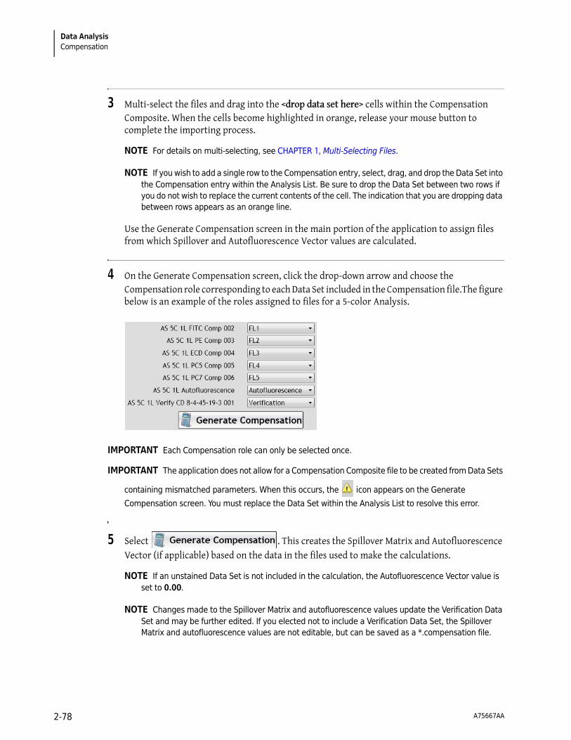
Data AnalysisCompensation
3 Multi-select the files and drag into the <drop data set here> cells within the Compensation Composite. When the cells become highlighted in orange, release your mouse button to complete the importing process.
NOTE For details on multi-selecting, see CHAPTER 1, Multi-Selecting Files.
NOTE If you wish to add a single row to the Compensation entry, select, drag, and drop the Data Set into the Compensation entry within the Analysis List. Be sure to drop the Data Set between two rows if you do not wish to replace the current contents of the cell. The indication that you are dropping data between rows appears as an orange line.
Use the Generate Compensation screen in the main portion of the application to assign files from which Spillover and Autofluorescence Vector values are calculated.
4 On the Generate Compensation screen, click the drop-down arrow and choose the Compensation role corresponding to each Data Set included in the Compensation file.The figure below is an example of the roles assigned to files for a 5-color Analysis.
IMPORTANT Each Compensation role can only be selected once.
IMPORTANT The application does not allow for a Compensation Composite file to be created from Data Sets
containing mismatched parameters. When this occurs, the icon appears on the Generate
Compensation screen. You must replace the Data Set within the Analysis List to resolve this error.
5 Select . This creates the Spillover Matrix and Autofluorescence Vector (if applicable) based on the data in the files used to make the calculations.
NOTE If an unstained Data Set is not included in the calculation, the Autofluorescence Vector value is set to 0.00.
NOTE Changes made to the Spillover Matrix and autofluorescence values update the Verification Data Set and may be further edited. If you elected not to include a Verification Data Set, the Spillover Matrix and autofluorescence values are not editable, but can be saved as a *.compensation file.
A75667AA 2-78

Data AnalysisCompensation 2
If you receive an error message as shown in the figure below, select it to view the complete list of errors. Errors can be resolved by interacting with the data sheets (see CHAPTER 2, Using Compensation Sheets) or by checking your original file to ensure the Data Set is appropriate.
NOTE There are two ways to reenter the Generate Compensation screen:
• Select until the screen reappears.
• Delete all sheets in the Protocol by one of the following methods:
— Right-click on the Compensation entry in Analysis List row and select Clear Protocol.
— Right-click on each sheet tab and select Delete Sheet. The sheet tabs are on the Sheet Tab Bar, which is located in the lower right portion of the application.
Using Compensation Sheets
When a Spillover and Autofluorescence Vector calculation is generated, a new sheet for each Compensation role is also added to the application. As a default, each Spillover sheet includes:
• An information block in the upper left corner of the sheet, describing how the calculation is derived for autofluorescence or compensation.
• One dot plot showing forward scatter vs. side scatter. This plot includes a default gate and statistics showing the % Gated and Number of events exhibiting fluorescence markers for that role, as well as the total number of events in that Data Set.
• One histogram plot for each fluorescence parameter in the Compensation Composite file. Default statistics display for Number and X-Mean for each fluorescence parameter in comparison to the control, or in the case of the autofluorescence file, Number and X-Median are the default statistics.
By default, the Verification sheet contains the plots that appear when you select the icon. However, all plots use the logicle scale (rather than log).
To alternate between sheets, select the Compensation role on the Sheet Tab Bar (located at the bottom of the application) that you wish to view. The active role is highlighted in white, as with the FL1 sheet in the following figure:
Adding Plots From the Original Analysis FileIf a compensation calculation was created using an Analysis file, you can add plots from the source file Protocol to the sheets. Refer to CHAPTER 2, Using the Galleries & Grouping Tab for complete details.
Arranging PlotsFor details on arranging plots on sheets, see CHAPTER 2, Arranging Data Sets.
A75667AA 2-79

Data AnalysisCompensation
Saving OptionsThere are two options available for saving after using the Generate Compensation feature:
• Save the compensation values alone (see CHAPTER 2, Saving a Compensation File)
• Save the entire composite analysis (see CHAPTER 2, Saving a Composite Analysis)
Recalculating the Generated Compensation and Autofluorescence Vector Values by Editing Gate Position
To make updates to calculations, edit the gate positions located on the sheet belonging to the Compensation role that needs to be changed. The Spillover Matrix updates in real time when you move a gate.
NOTE A common error that you might receive occurs when the default gate encompasses no events. When that happens, the statistics in the histogram plots will show as N/A, and the plots will be empty (as shown in the example figure below). If you move the gate in the forward scatter/side scatter plot to encompass events, the errors disappear.
Manual Updates to the Generated Spillover Matrix
To fine-tune the generated Compensation calculations, manual adjustments can be made by following the procedure described in CHAPTER 2, Adjusting Spillover Values in the Compensation Pane, or CHAPTER 2, Adjusting Spillover Using the Spillover Sliders Directly on the Plot(s).
IMPORTANT After you manually adjust the Spillover Matrix, any adjustments made within the fluorescence sheets recalculate the entire matrix.
IMPORTANT If you wish to remove manual adjustments, select the icon for a recalculation based on
the fluorescence data inputs.
A75667AA 2-80

Data AnalysisCompensation 2
Saving, Importing, and Resetting the Generated Spillover Matrix
To save, import, or reset the generated Spillover Matrix, refer to the procedures in the following sections:
• CHAPTER 2, Saving a Compensation File
• CHAPTER 2, Importing a Compensation File
• CHAPTER 2, Resetting Spillover and Autofluorescence Vector Values
Using the Logicle Scale
To display the logicle scale (refer to CHAPTER 2, Logicle Scale, for an overview) and use the sliders, follow the steps below.
1 Hover your mouse over the parameter you wish to change to logicle. The parameter changes to a hyperlink.
2 Select the hyperlink. The list of parameters appears.
NOTE Currently selected parameters contain a dot next to the parameter name/description, and the current scale used for the parameter (if applicable) contains a check mark next to the scale type.
3 Hover your mouse over the parameter that you wish to display using the logicle scale, and from the pop-up menu, choose the logicle scale type for that parameter.
Repeat this step for the other plot parameter, if necessary.
Changing a parameter to the logicle scale adds a slider to the axis, as shown in red outline in the figure below.
4 Select and drag the slider to adjust the scale to display negative values. As demonstrated on the X-axis in the figure above, the numerical value appears and changes as you move the slider.
5 Release your mouse button once you are satisfied with the display of the compensated events.
A75667AA 2-81

Data AnalysisUsing Kaluza with Other Applications
Composite Analysis Compensation Options
When a Composite Protocol is the active Analysis, you can update the data within the Compensation pane for the individual Data Sets within the Composite. The title block for that pane changes to a drop-down, allowing you to select an individual Data Set. To change to a different Data Set, select the drop-down arrow located on the right-hand side of the top of the pane and select the new Data Set you wish to display.
NOTE When the Data Set in the Compensation pane changes, the Parameters pane simultaneously changes to that Data Set.
In addition to the options for adjusting compensation already mentioned in this section, the options listed in Table 2.9 are available for a Composite Analysis (see CHAPTER 2, Updating Parameter and Compensation Data for Individual Data Sets, for complete details):
Using Kaluza with Other Applications
Kaluza offers the ability to drag and drop, copy and paste, and save images into other applications. These features work with Microsoft Office products, as well as other applications, which are too numerous to mention.
IMPORTANT Copy/paste to Microsoft Excel®, Microsoft PowerPoint®, and Microsoft Word has been tested in Kaluza and is guaranteed to produce expected results. Other applications have not been tested, and therefore, quality is not guaranteed.
The response of the application when dragging/dropping or copying/pasting items from Kaluza is dependent upon on the type of sheet item(s) you are working with. The tables below describe the response of the application for each type of sheet item.
Table 2.9 Compensation Options
Icon Description
Link compensation for all data sets: Links Spillover and Autofluorescence Vector values to the other Data Sets in the active Composite Protocol.
Copy compensation to other data sets: Copies Spillover and Autofluorescence Vector values to any or all other Data Sets within the Composite Protocol.
A75667AA 2-82

Data AnalysisUsing Kaluza with Other Applications 2
Table 2.10 Using Kaluza Sheet Items in Spreadsheet Applications
When Copying/Pasting or Dragging/Dropping...
Spreadsheet Application Response
A Plot
The actual plot does not appear within the application. Plot data, including selected statistics, appear in columns. One column for each statistic available within the Kaluza application appears, even if no data is available for that statistic. This allows for a tidy presentation and easy data comparison of statistics for multiple sheet items.
A Gate Statistics Table
The actual gate statistics table does not appear within the application; however, the statistics currently selected for the table display within separate columns. One column for each statistic available within the Kaluza application appears, even if no data is available for that statistic. This allows for a tidy presentation and easy data comparison of statistics for multiple sheet items.
An FCS Information TableDescriptions, keywords, values, and basic Data Set information appears in columns, with a new row for each selected keyword.
A Text BoxAll contents of the text box are located within one cell; text is editable.
Multiple Plots, FCS Information Tables, and/or Gate Statistics Tables
Gate statistics tables and plots contain the same set of statistics, and are in the format described above. FCS Information Table data appears below the plot and Gate Statistics Table data.
NOTE More than one text box cannot be imported into another application at a time.
Table 2.11 Using Kaluza Sheet Items in Word-Processing Applications
When Copying/Pasting or Dragging/Dropping...
Word-Processing Application Response
A Plot A 96 dpi image.
IMPORTANT Using the Save as Image option saves the image with a 600 dpi resolution. See CHAPTER 1, Basic Editing for Plots, Gates, and Sheet Items, for details.
NOTE When you use another application to display your sheet item, icons and links either do not appear, or they appear as images only, not hyperlinks.
A Gate Statistics Table
An FCS Information Table
A Text Box Editable text.
Multiple Plots, FCS Information Tables, and/or Gate Statistics Tables
Not available.
A75667AA 2-83

Data AnalysisMerge Data Sets
Exporting Statistics
Statistics that have been selected for your plots from the Statistics Radial Menu can be exported into a *.csv spreadsheet file. For additional information on setting up statistics for your plots, see CHAPTER 2, Setting Up Statistics.
To export statistics currently on plots within the selected Protocol (statistics must be selected for plots prior to completing this procedure):
1 Select > Export selected statistics. The Export Statistics dialog box appears.
2 In the Export Statistics dialog box, select the destination for the file by navigating to the location using icons in the dialog box or the drop-down list in the Save in field.
3 Enter a file name into the File name field.
4 Select Save to complete the process.
Additionally, you may review statistics in spreadsheet format for individual or multiple selected plots by following the instructions in CHAPTER 2, Using Kaluza with Other Applications.
Merge Data Sets
You can merge up to 10 Data Sets into one file. Prior to merging Data Sets, ensure that each of the following are identical:
• Number of Parameters,
• Parameter Names,
• Range,
• Scale,
• Number of decades (when using log scale), and
• Spillover matrix values (FCS files).
To merge Data Sets:
1 Drag and drop the files you wish to merge into the Analysis List.
NOTE If you choose to merge Analysis files, only the Protocol from the file of the highest precedence on the Analysis List is transferred into the merged file.
A75667AA 2-84

Data AnalysisMerge Data Sets 2
2 Multi-select the files you wish to include in your merged file. The Analysis Options screen appears.
3 Select the button. The Data Sets are now merged into a single listmode file. Note that the merged file contains the name of the file of highest precedence on the Analysis List, and the file appears with the “merged” icon in the Data Set column, as shown in the following figure:
NOTE Plots containing the Time parameter include a time buffer between each merged Data Set file, as shown in Figure 2.26.
Figure 2.26 Merged Data Set Display—Using the “Time” Parameter
A75667AA 2-85

Data AnalysisMerge Data Sets
A75667AA 2-86

CHAPTER 3
Sheet Set-Up
Using Sheets
The sheet, which makes up the main portion of the Kaluza workspace, is where you will spend most of your time, as this is where you set up Protocols and Composites, analyze your data, and create interactive reports. The following sections describe the options available to design your sheet for optimal data presentation and also include some time-saving techniques. Descriptions will focus primarily on the Radial Menus and Ribbon items since they contain the majority of tools to update your sheets.
IMPORTANT Each sheet can contain a maximum of 100 items.
Sheet Radial Menus Options
Display Menu
Use the Display menu ( ) to choose to:
• Add compensation sliders to applicable plots. For additional information, see CHAPTER 2, Adjusting Spillover Using the Spillover Sliders Directly on the Plot(s).
• Switch between freeform and Data Set grouping. For additional information, see CHAPTER 2, Freeform Arrangement, or CHAPTER 2, By Data Set Arrangement.
Gates & Tools Menu
Use the Gates & Tools menu ( ) to draw a gate, change to Selection mode, make an annotation, or to add overlay markers to a overlay plot. See CHAPTER 2, Gates & Tools for additional information.
The sheet Radial Menu provides access for changing or adding items to your sheet. The following sections provide an overview of the options available when you right-click on sheet whitespace to access the Radial Menu.
A75667AA 3-1
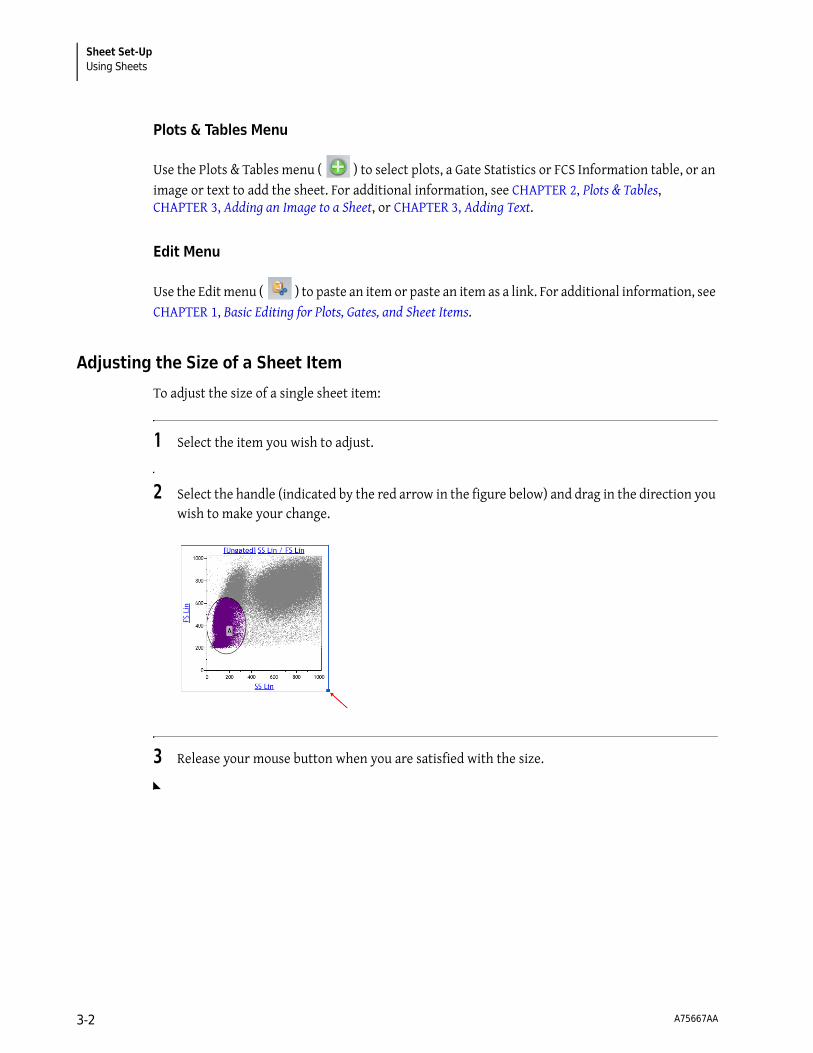
Sheet Set-UpUsing Sheets
Plots & Tables Menu
Use the Plots & Tables menu ( ) to select plots, a Gate Statistics or FCS Information table, or an image or text to add the sheet. For additional information, see CHAPTER 2, Plots & Tables, CHAPTER 3, Adding an Image to a Sheet, or CHAPTER 3, Adding Text.
Edit Menu
Use the Edit menu ( ) to paste an item or paste an item as a link. For additional information, see CHAPTER 1, Basic Editing for Plots, Gates, and Sheet Items.
Adjusting the Size of a Sheet Item
To adjust the size of a single sheet item:
1 Select the item you wish to adjust.
2 Select the handle (indicated by the red arrow in the figure below) and drag in the direction you wish to make your change.
3 Release your mouse button when you are satisfied with the size.
A75667AA 3-2

Sheet Set-UpUsing Sheets 3
Moving Plots/Sheet Items
To move a sheet item to a new location on your sheet:
1 Select the plot you wish to move.
2 Drag the plot to the new location. As you drag you plot, a gray box will appear (as shown in the figure below) indicating the locations you can drop the plot. When the gray box appears in the location of your preference, release your mouse button.
NOTE Additional methods for moving plots/sheet items are discussed in CHAPTER 1, Basic Editing for Plots, Gates, and Sheet Items.
Adding an Image to a Sheet
An image can be added to your sheet by doing the following:
1 Right-click in the whitespace where you would like to add an image. The Sheet Radial Menu appears.
2 Hover over the icon to view the Plots & Tables menu, and select the icon from the menu. An outline, indicating the location of the image you choose appears on the sheet as shown in the figure below.
A75667AA 3-3

Sheet Set-UpUsing Sheets
IMPORTANT The following image file types have been tested in Kaluza and are guaranteed to produce expected results. Other available file types have not been tested, and therefore, their quality is not guaranteed.
• *.bmp
• *.jpg
3 Click on the Browse button within the image outline. The Open Image dialog box appears.
4 Navigate to your image file using the Look in: field or the icons/folders located in the dialog box.
5 Select the image file, and then select Open. The image appears your sheet.
Formatting an Image
• Maximize: Select Maximize to increase the size of the image to fit within the sheet portion of the application.
NOTE Double-clicking on an item also maximizes the image to fit the sheet portion of the application.
After you have maximized an image, three buttons appear below the maximized item:
— Previous: Shows the previous sheet item in the maximized view.
— Restore: Returns the item to its previous size.
— Next: Shows the next sheet item in maximized view.
• Reset Size: Select Reset Size to return an item that has been resized back to the default size and shape.
• Stretch: Choose the Stretch radio button to allow the image to stretch/compress when resizing.
• Maintain Aspect Ratio: Choose the Maintain Aspect Ratio radio button to constrain the image to the original aspect ratio when resizing.
The Display Radial Menu allows you to choose options for resizing an image. The options included within the Display menu are described below. Changes made within the menu occur in real time, allowing you to refine the appearance until you are satisfied.
A75667AA 3-4

Sheet Set-UpUsing Sheets 3
To change the display of an image:
1 Right-click within the confines of the image to access the Radial Menu.
2 Hover your mouse over the icon to access the Display menu.
3 Make changes within the menu. Refer to the descriptions above for details.
4 Select when you are finished making your selections.
NOTE You can replace the current image by right-clicking on an image and accessing the menu. Select
Browse and locate/select the new image using the Open Image dialog box.
Adding Text
1 Right-click in the whitespace where you would like to add text. The Sheet Radial Menu appears.
2 Hover over the icon to view the Plots & Tables menu, and select the icon. An outline, indicating the location of the text, appears on the sheet as shown in the figure below.
3 Click once within the text box, and type your text. When you are finished, click on the sheet whitespace or another plot to exit edit mode.
NOTE To format the text box, refer to CHAPTER 3, Formatting a Text Box.
NOTE For instructions regarding resizing the text box, see CHAPTER 3, Adjusting the Size of a Sheet Item.
A75667AA 3-5

Sheet Set-UpUsing Sheets
Formatting a Text Box
The Display Radial Menu allows you to customize your text box. The options included within the Display menu are described below. Changes made within the menu occur in real time, allowing you to refine the appearance until you are satisfied.
Figure 3.1 Display Radial Menu
• Maximize: Select Maximize to increase the size of the item to fit within the sheet portion of the application.
NOTE Double-clicking on an item also maximizes the item to fit the sheet portion of the application.
After you have maximized an item, three buttons appear below the maximized item:
— Previous: Shows the previous sheet item in the maximized view.
— Restore: Returns the item to its previous size.
— Next: Shows the next sheet item in maximized view.
• Reset Size: Select Reset Size to return an item that has been resized back to the default size and shape.
• Font Drop-down: Use the font drop-down field to change the font used in the text box. To change the font, select the new font from the drop-down list.
IMPORTANT The following fonts have been tested in Kaluza and are guaranteed to produce expected results. The other available fonts have not been tested, and therefore, their quality is not guaranteed.
— Trebuchet MS (default font)
— Arial
— Times New Roman
• Font Size Field: Use the font size field to either manually enter a font size or to incrementally increase/decrease the current font size by one point each time the arrow is clicked.
IMPORTANT The following font sizes have been tested in Kaluza and are guaranteed to produce expected results. The other available font sizes have not been tested, and therefore, their quality is not guaranteed.
— 13.00 (default size when application is in small font theme)
— 15.25 (default size when application is in large font theme)
• Foreground Color: Use the foreground color field to choose the color of the text by selecting the current color, and then selecting the new color from the palette.
• Background Color: Use the background color field to choose the color background for the entire text box. To change the color, select the current color; then select the new color from the palette.
A75667AA 3-6
Sheet Set-UpUsing Sheets 3
• Bold: Select to change the text to bold font.
• Italics: Select to italicize the text.
• Underline: Select to underline the text.
• Opacity Slider: Use the opacity slider to change the degree of opacity of the text box. Select and drag the slider to the preferred level of opacity and release the mouse button when you are satisfied.
To customize a text box:
1 Right-click within the confines of the text box to access the Radial Menu.
2 Hover your mouse over the icon to access the Display menu.
3 Make changes within the menu. Refer to the descriptions above for details.
4 Select when you are finished making your selections.
A75667AA 3-7

Sheet Set-UpUsing the Sheet Tab Bar
Using the Sheet Tab Bar
The Sheet Tab Bar (see Figure 1.18) is located at the bottom of the sheet area (see Figure 1.2). The Sheet Tab Bar provides the three main functions described below:
Report Sheet
The Report Sheet is where you create reports from your data plots. In addition to the options listed in CHAPTER 3, Using Sheets, you can do the following while working in a report sheet:
• Arrange plots.
• Change page orientation, page size, and margin size.
• Add page numbers.
• Add a date and time stamp.
• Create and edit a master page, which can include plots, tables, graphics, text, page numbers, and/or a date and time stamp.
The features listed above are available through the Ribbon or through the Radial Menus. The following sections describe details for formatting a report sheet. See CHAPTER 3, Using the Sheet Tab Bar, for instructions on adding a report sheet.
Table 3.1 Sheet Tab Bar Functions
Item Function/Procedure
Zoom uses a slider. Ranges are between 50% and 500%.
To change the zoom, select and drag the slider, or select the - or + buttons.
New Sheet… adds a new plot sheet or report sheet.
To add a new sheet:
1. Select the hyperlink. A drop-down appears that enables you to choose between adding a new plot sheet or a new report sheet.
2. Select the type of sheet you need. A new sheet is added as the active sheet.
NOTE You can add up to 32 sheets per Analysis file.
Sheet Tabs allow you to do the following:
• Move between open sheets: The active sheet is highlighted in white (Plot Sheet 1 in the figure to the left is the active sheet). To display a different sheet, select the name of the sheet tab that you wish to display.
• Rename sheets: To rename a sheet, double-click the sheet tab. Enter the new sheet name into the highlighted field. Click your mouse away from the tab or press (Enter) to save the change.
• Reorder sheets: To reorder sheets, select the sheet tab that you wish to move and drag it to the preferred location. While moving the sheet an arrow displays, showing the location that the sheet can be dropped. When the arrow is in the appropriate location, release the mouse button.
A75667AA 3-8

Sheet Set-UpReport Sheet 3
Page Layout
The Page Layout Ribbon tab is available only when you use a Report Sheet. The sections below detail the functions available within the Page Layout tab.
Layout
The Layout section of the Page Layout Ribbon tab allows you to arrange items on your report sheet. See Table 3.2 for details.
Page Setup
The Page Setup section of the Page Layout Ribbon tab provides options to customize your report pages. These options include those within Table 3.3:
Table 3.2 Page Layout Ribbon—Layout
Icon Function
Quick Arrange arranges the plots on the report sheet so that plots are not overlapping. Plots retain the same order they were in prior to selecting this option.
Table 3.3 Page Layout Ribbon—Page Setup
Icon Function
Show Grid toggles the grid on the background of the report sheet on/off.
Orientation contains a drop-down list that allows you to choose between the portrait or landscape page orientation. The adjustment is made instantly when the new orientation is selected.
Size contains a drop-down list that allows you to change the page size to one that is appropriate for your needs. There are many sizes to choose from, including standard, A, and JIS sizes. Your selection applies to all pages within the active report sheet.
IMPORTANT The following page sizes have been tested in Kaluza and are guaranteed to produce expected results. Other page sizes have not been tested, and therefore, quality is not guaranteed.
• Letter (8.5 X 11”) • A4 (210 X 297 mm)
Margin fields contain editable fields that you can customize for each margin. Use the up and down arrows located next to the appropriate margin field to incrementally increase or decrease the margin by 0.10. You can also manually type the preferred size into the field. Any changes you make within margin fields occur instantly on the report sheet.
A75667AA 3-9

Sheet Set-UpReport Sheet
Master Page
The Master Page portion of the Page Layout tab give options for creating or making changes to a master page for the current report sheet in the selected Protocol.
In addition to the options described in Table 3.4, you can add anything to the master page that can be added to a plot sheet.
Formatting the Date/Time and Page Number Display
The Data menu within the Radial Menu allows you to customize the appearance of page numbers and the date/time. The options included within the Data menu are described below. Changes made within the menu occur in real time, allowing you to refine the appearance until you are satisfied.
Table 3.4 Page Layout Ribbon—Master Page
Icon Function
Edit Master Page allows you to make changes to the master page. The changes you make to the master page are displayed on all pages within the active report sheet. You can add the following items to the master page:
• Any sheet item • Page numbers • Date and time • Text • Graphics
IMPORTANT Make sure Edit Master Page is selected prior to creating your master page. Otherwise, the items you choose will only appear on the current page of the report, and not the master page. To escape master page mode, select Edit Master Page once again.
Page Number displays the page number on the report sheet. The page number only appears on each page if you place it on the master page.
You can move the page number by selecting within the text box and dragging to the preferred location.
Refer to CHAPTER 3, Page Number Format, and CHAPTER 3, Customizing the Display of the Date/Time and Page Number, to make change to the page number.
Date/Time adds the date and time to the report sheet. The date/time only appears on each page if you place it on the master page.
You can move the date/time by selecting within the text box and dragging to the preferred location.
Refer to CHAPTER 3, Date/Time Format, and CHAPTER 3, Customizing the Display of the Date/Time and Page Number, to make change to the time/date.
NOTE The date/time is updated when the report is printed.
A75667AA 3-10

Sheet Set-UpReport Sheet 3
Page Number FormatOptions for formatting page numbers include the following:
To update the page number format:
1 If the page number is not already located on the master page, from the Page Layout Ribbon tab,
select the icon. Then, select the icon, which adds the page number using the default format to the master page.
2 Right-click within the confines of the page number text box.
3 Hover your mouse over the icon to access the Data menu.
4 Select the drop-down arrow and, from the list, choose the page number format of your preference.
5 Select to exit the menu.
Table 3.5 Page Number Options
Option Example Description
Current Page Only Page 1 Displays the current page number.
Long Page 1 of 3 Displays the current page number and the total number of pages within the report.
Short 1 Displays only the page number.
A75667AA 3-11

Sheet Set-UpReport Sheet
Date/Time FormatOptions for formatting the date and time include the following:
To update the date/time format:
1 If the date and time is not already located on the master page, from the Page Layout Ribbon tab,
select the icon. Then, select the icon, which adds the date and time using the default format to the master page.
2 Right-click within the confines of the date/time text box.
3 Hover your mouse over the icon to access the Data menu.
4 Select the drop-down arrow and, from the list, choose the date/time format of your preference.
5 Select to exit the menu.
Table 3.6 Date/Time Options
Option Example
Long Date Sunday, June 28, 2009
Long Date and Time Sunday, June 28, 2009 1:30 PM
Short Date 06/28/2009
Short Date and Time 06/28/2009 1:30 PM
Time 1:30 PM
A75667AA 3-12

Sheet Set-UpReport Sheet 3
Customizing the Display of the Date/Time and Page Number
The Display menu within the Radial Menu allows you to customize the appearance of page numbers and the date/time. The options included within the Display menu are described below. Changes made within the menu occur in real time, allowing you to refine the appearance until you are satisfied.
• Font Drop-down: Use the font drop-down field to change the font used in the text box. To change the font, select the new font from the drop-down list.
IMPORTANT The following fonts have been tested in Kaluza and are guaranteed to produce expected results. The other available fonts have not been tested, and therefore, their quality is not guaranteed.
— Trebuchet MS (default font)
— Arial
— Times New Roman
• Font Size Field: Use the font size field to either manually enter a font size or to incrementally increase/decrease the current font size by one point each time the arrow is clicked.
IMPORTANT The following font sizes have been tested in Kaluza and are guaranteed to produce expected results. The other available font sizes have not been tested, and therefore, their quality is not guaranteed.
— 13.00 (default size when application is in small font theme)
— 15.25 (default size when application is in large font theme)
• Foreground Color: Use the foreground color field to choose the color of the text by selecting the current color, and then selecting the new color from the palette.
• Background Color: Use the background color field to choose the color background for the entire text box. To change the color, select the current color; then select the new color from the palette.
• Bold: Select to change the text to bold font.
• Italics: Select to italicize the text.
• Underline: Select to underline the text.
• Opacity Slider: Use the opacity slider to change the degree of opacity of the text box. Select and drag the slider to the preferred level of opacity and release the mouse button when you are satisfied.
To customize the page number or date/time:
1 If the page number is not already located on the master page, from the Page Layout Ribbon tab,
select the icon. Then, select the or the icon, which adds the default page number or date/time to the report sheet.
2 Right-click within the confines of the text box to access the Radial Menu.
A75667AA 3-13

Sheet Set-UpReport Sheet
3 Hover your mouse over the icon to access the Display menu.
4 Make changes within the menu. Refer to the descriptions above for details.
5 Select when you are finished making your selections.
Printing Report Sheets
IMPORTANT The Oki B6300 printer has been tested in Kaluza and is guaranteed to produce expected results. Other printers have not been tested, and therefore, quality is not guaranteed.
To print a report sheet:
1 Select the Analysis List row of the report you wish to print.
2 Select > Print Selected > Print report sheets.
3 In the Print dialog box, select the printer you wish to use and, if necessary, select printing preferences for your report.
4 Select Print.
A75667AA 3-14

CHAPTER 4
Glossary
Terms and Definitions
Analysis/Analysis File — A file that contains raw data as well as the Protocol used to analyze that data.
Analysis List — A list of open files within the application. The list may be comprised of up to 400 rows, including raw Data Sets, Analysis files, Protocols, Composites, and Compensation Composite files.
Autofluorescencea — Fluorescence associated with a cell, usually caused by components and chemicals within the cell structure itself.
Autofluorescence Vector — An autofluorescence vector is the value that is subtracted from the data prior to spillover compensation and then added back afterwards. This increases the accuracy of fluorescence compensation.
Bivariate Plot — A plot containing two variables, one is displayed on the X-axis, and the other on the Y-axis.
Boolean Gatea — Gates created by adding or subtracting populations – utilizes the “and,” “not,” and “or” functions when defining the population of choice.
Color Precedence — The hierarchy of colors associated with gated events; when an event falls within several different gates, color precedence determines the display color.
Compensation — The mathematical process by which multi-parameter flow cytometric data is corrected for spectral overlap.
Composite — A file that contains multiple Data Sets analyzed by one Protocol.
Data Set — Raw data, derived from events within a sample, as captured by the flow cytometer.
Event — An individual particle, detected by a flow cytometer, from which raw data is derived.
FCSa — Flow Cytometry Standard. A set of standards developed for reading and writing flow cytometry data files in a standardized format.
Fluorochromea — Fluorescent substance used in biological staining to produce fluorescence in a specimen.
Fluorescencea — Excitation light energy is absorbed by fluorescence molecule; the molecule transitions to an excited state, and as it returns to unexcited ground-state, a specific wavelength of light is emitted and read by a detector.
A75667AA 4-1

GlossaryTerms and Definitions
Gallery — Plots created within an Analysis file Protocol. Galleries are only available for viewing and adding to the plot sheet when working in a Composite file.
Gate — A subset of events, defined by a boundary, that allows for further examination.
Linear Scale — A scale that contains divisions that are uniformly spaced. The linear scale is good for showing forward scatter and side scatter parameters.
Logarithmic Scale — A scale that contains divisions based on exponential values. Logarithmic scales are useful when the data includes a large range of values. Fluorescence parameters are best displayed in the logarithmic scale because both weak and strong signals are appropriately accounted for.
Logicle Scale — A scale that allows for correctly displaying compensated data. When using the logicle scale, negative space can be displayed on one or both axes. This optimizes your ability to compensate fluorescence parameters, giving events a Gaussian appearance.
Opacity — The degree to which light can/cannot penetrate an object. The greater the opacity, the more defined the object appears.
Parametera — Types of data collected from the flow cytometer detectors, including such measurements as light scatter and fluorescence, area, height, and width.
Plot — Used as a data analysis tool, a plot is a graphical representation of the raw data collected from the flow cytometric sample. Plots are customized based on the parameters chosen to represent the data.
Protocol — The plots, parameters, and gates used for data analysis.
Ribbon — The section above the sheet area of the application screen for which you may perform a number of tasks from within the Plots & Tables, Gates & Tools, Edit, Page Layout, or Galleries & Grouping tab.
Spillover — The amount of light emitted from a fluorochrome that is detected by unintended detectors.
a. “Flow Cytometry Glossary.” http://www.flocyte.com. August 3, 2009 http://www.flocyte.org/FRTP/Resources/flow_cytometry_glossary.html
A75667AA 4-2

Trademarks and Acknowledgements
TrademarksAltra™ is a trademark of Beckman Coulter, Inc.Elite™ is a trademark of Beckman Coulter, Inc.Excel® is a registered trademark of the Microsoft Corporation.Gallios™ is a trademark of Beckman Coulter, Inc.HASP® is a registered trademark of Aladdin Knowledge Systems, Ltd.Kaluza™ is a trademark of Beckman Coulter, Inc.Navios™ is a trademark of Beckman Coulter, Inc.Oki is a registered trademark of Oki America, Inc.PowerPoint® is a registered trademark of the Microsoft Corporation.Windows is a registered trademark of Microsoft Corporation in the United States and other countries. Windows Vista® is a registered trademark of Microsoft Corporation.XL™ is a trademark of Beckman Coulter, Inc.All other trademarks and service marks are the property of their respective owners.
AcknowledgementsInfo-Zip
Copyright (c) 1990-2007 Info-ZIP. All rights reserved. For the purposes of this copyright and license, "Info-ZIP" is defined as the following set of individuals: Mark Adler, John Bush, Karl Davis, Harald Denker, Jean-Michel Dubois, Jean-loup Gailly, Hunter Goatley, Ed Gordon, Ian Gorman, Chris Herborth, Dirk Haase, Greg Hartwig, Robert Heath, Jonathan Hudson, Paul Kienitz, David Kirschbaum, Johnny Lee, Onno van der Linden, Igor Mandrichenko, Steve P. Miller, Sergio Monesi, Keith Owens, George Petrov, Greg Roelofs, Kai Uwe Rommel, Steve Salisbury, Dave Smith, Steven M. Schweda, Christian Spieler, Cosmin Truta, Antoine Verheijen, Paul von Behren, Rich Wales, Mike White. This software is provided "as is," without warranty of any kind, express or implied. In no event shall Info-ZIP or its contributors be held liable for any direct, indirect, incidental, special or consequential damages arising out of the use of or inability to use this software. Permission is granted to anyone to use this software for any purpose, including commercial applications, and to alter it and redistribute it freely, subject to the above disclaimer and the following restrictions: Redistributions of source code (in whole or in part) must retain the above copyright notice, definition, disclaimer, and this list of conditions. Redistributions in binary form (compiled executables and libraries) must reproduce the above copyright notice, definition, disclaimer, and this list of conditions in documentation and/or other materials provided with the distribution. The sole exception to this condition is redistribution of a standard UnZipSFX binary (including SFXWiz) as part of a self-extracting archive; that is permitted without inclusion of this license, as long as the normal SFX banner has not been removed from the binary or disabled. Altered versions--including, but not limited to, ports to new operating systems, existing ports with new graphical interfaces, versions with modified or added functionality, and dynamic, shared, or static library versions not from Info-ZIP--must be plainly marked as such and must not be
A75667AA Trademarks-1

Trademarks and Acknowledgements
misrepresented as being the original source or, if binaries, compiled from the original source. Such altered versions also must not be misrepresented as being Info-ZIP releases--including, but not limited to, labeling of the altered versions with the names "Info-ZIP" (or any variation thereof, including, but not limited to, different capitalizations), "Pocket UnZip," "WiZ" or "MacZip" without the explicit permission of Info-ZIP. Such altered versions are further prohibited from misrepresentative use of the Zip-Bugs or Info-ZIP e-mail addresses or the Info-ZIP URL(s), such as to imply Info-ZIP will provide support for the altered versions. Info-ZIP retains the right to use the names "Info-ZIP," "Zip," "UnZip," "UnZipSFX," "WiZ," "Pocket UnZip," "Pocket Zip," and "MacZip" for its own source and binary releases.
A75667AA Trademarks-2

Beckman Coulter, Inc.Customer End User License Agreement
This Product contains software that is owned by Beckman Coulter, Inc. or its suppliers and is protected by United States and international copyright laws and international trade provisions. You must treat the software contained in this Product like any other copyrighted material. This license and your right to use the Product terminate automatically if you violate any part of this agreement.
This is a license agreement and not an agreement for sale. Beckman Coulter hereby licenses this Software to you under the following terms and conditions:
You May:
1. Use this Software on the computer supplied to you by Beckman Coulter or any other computer that is properly configured to run this Software;
2. Copy the CD containing this Software, provided that the contents contained therein are copied in their entirety, with no additions or subtractions from the CD image;
3. Install this Software on a network or plurality of computers, but only one user is permitted to actively use this Software for each Software license obtained;
4. Transfer this Software, and license to use this Software, to another person or entity; 5. Use this Software for the duration of a trial period, during which, this Software will be without
warranty or liability by Beckman Coulter.
You May Not:1. Use, copy, or transfer copies of this licensed Software, except as provided in this license
agreement;2. Alter, merge, modify, or adapt this Software in any way, including disassembling, decompiling,
or circumventing the licensing technology contained in this Software; 3. Sell, rent, lease, or sublicense this Software or any copy;4. Make this Software, or any portion of this Software, available on any public network.
Limited WarrantyBeckman Coulter warrants that the software will substantially conform to the published specifications for the Product in which it is contained, provided that it is used on the computer hardware and in the operating system environment for which it was designed. Should the media on which your software arrives prove defective, Beckman Coulter will replace said media free of charge within 90 days of delivery of the Product. This is your sole remedy for any breech of warranty for this software.
Except as specifically noted above, Beckman Coulter makes no warranty or representation, either expressed or implied, with respect to this software or its documentation including quality, performance, merchantability, or fitness for a particular purpose.
No Liability for Consequential DamagesIn no event shall Beckman Coulter or its suppliers be liable for any damages whatsoever (including, without limitation, damages for loss of profits, business interruption, loss of information, or other pecuniary loss) arising out of the use of or inability to use the Beckman Coulter Product software. Because some states do not allow the exclusion or limitation of liability for consequential damages, the above limitation might not apply to you.
A75667AA Warranty-1

Beckman Coulter, Inc. Customer End User License Agreement
GeneralThis agreement constitutes the entire agreement between you and Beckman Coulter and supersedes any prior agreement concerning this Product software. It shall not be modified except by written agreement dated subsequent to the date of this agreement signed by an authorized Beckman Coulter representative. Beckman Coulter is not bound by any provision of any purchase order, receipt, acceptance, confirmation, correspondence, or otherwise, unless Beckman Coulter specifically agrees to the provision in writing. This agreement is governed by the laws of the State of California.
A75667AA Warranty-2

Beckman Coulter, Inc. Customer End User License Agreement
A75667AA Warranty-3

www.beckmancoulter.com