2013 logo trends on logolounge - etouches · bill gardner the 2014 logolounge logo trend report,i...
TRANSCRIPT
Bill Gardner
The 2014 LogoLoungeLogo Trend Report
,IKRPHLVRXU¿UVWSODFHDQGZRUNLVRXUVHFRQGSODFHWKHQPRELOHVFUHHQVKDYHGH¿QLWHO\EHFRPHRXUWKLUGSODFH6PDUWSKRQHXVHKDVLQFUHDVHGIURPSHUFHQWLQWRPRUHWKDQSHUFHQWWRGD\DQGZLWKSHUFHQWRIDOO$PHULFDQVRQOLQHUHJXODUO\WKDWSHUFHQWDJHRIPRELOHXVHUVLVERXQGWRNHHSHGJLQJXS
7KHIDFWWKDWVRPDQ\SHRSOHQRZYLHZWKHZRUOGWKURXJKDZLQGRZWKHVL]HRIDEXVLQHVVFDUGKDVVSHOOHGDQLQHYLWDEOHFKDQJHLQORJRGHVLJQ,WXVHGWREHWKDWPLQXWHIDYLFRQVKDGWREHNHSWH[WUHPHO\VLPSOH1RZDVDUXOHORJRVPXVWEHDVZHOO²EXWWKDWGRHVQ¶WPHDQERULQJ'HVLJQHUVFRQWLQXHWRSXVKEDFNDQGHYROYHWKHPHDQLQJRI³VLPSOH´
7KDWORJRVKDYHWREHVFDODEOHKDVDOZD\VEHHQXQGHUVWRRG%XWRXUSHUFHSWLRQRI³VPDOO´KDVFKDQJHG²LQVRPHFDVHV³WLQ\´LVEHLQJUDWKHUJHQHURXV'LPHQVLRQDQGGHWDLODUHQHFHVVDULO\UHPRYHGVRWKDWWKHVHORJRVUHDGSURSHUO\RQPRELOHVFUHHQV'HVLJQVKDYHEHFRPHPRUHDQGPRUHÀDW6XUIDFHVDUHSODLQDQGGH¿QHGE\PRQRZHLJKWOLQHV
2IFRXUVHWKHUH¶VDOLPLWWRWKLVÀDWWHQLQJRXWDQGUHPRYDORILQIRUPDWLRQ'HVLJQHUVDQGDXGLHQFHVDOLNHQHHGDQHVFDSHIURPDOOWKLQJVGLJLWDO7KH\QHHGDFKDQFHWRGHFRPSUHVVDQGWDNHDGHHSEUHDWKLQDSODFHWKDWSURYLGHVVKHOWHUIURPLQIRUPDWLRQ¶VIUDQWLFSDFH(YHU\RQHQHHGVWRVWHSRXWVLGHDQGEDVNLQVXQOLJKWQRWVFUHHQOLJKW$QGVRWKHSHQGXOXPVWDUWVWRVZLQJEDFN
3HRSOHVHHPWREHPRUHDQGPRUHGUDZQEDFNWRZKDWLVUHDOZKHWKHUWKDWLVSHUXVLQJKDQGPDGHKDWVRQ3LQWHUHVWH[SORULQJRWKHUFXOWXUHVRURXURZQIDPLO\KLVWRULHVRUUHFRQQHFWLQJZLWKVWRULHVIURPP\WKRORJ\RURXUFKLOGKRRGV%\EULQJLQJEDFNZKDWLVKXPDQPDGHZHJDLQDVHQVHRIFRQWURORYHUWKHGLJLWDOWLGHWKDWWKUHDWHQVWRRYHUWDNHXV
'HVLJQHUVKDYHUHVSRQGHGWRWKHPRELOHVFUHHQ¶VKDUVKUHTXLVLWHVLQDYDULHW\RIZD\VPDQ\RIZKLFKDUHGHWDLOHGLQWKLV\HDU¶V7UHQG5HSRUW$UWLVDQFUDIWLQJLVHYHUPRUHLPSRUWDQWDVHYLGHQFHGE\WKH³+DQG7\SH´VROXWLRQLQDEXQGDQFHWKLV\HDU&RORUVDUHEULJKWHUDQGOLJKWHU7\SRJUDSKLFVROXWLRQVZKLFKFDQEHDEVRUEHGLPPHGLDWHO\ZLWKQRV\PEROLFLQWHUSUHWDWLRQDUHHYHUPRUHLPSRUWDQW
'HVLJQHUVDOVRKDYHIRXQGLQJHQLRXVFUHDWLYHZRUNDURXQGVVXFKDVLQWURGXFLQJORQJVKDGRZVWRYHU\ÀDWGHVLJQVVXJJHVWLQJWKDWGLPHQVLRQLVVWLOOWKHUH/RJRGHVLJQVPD\EHUHGXFHGWROLQHZRUNVHHWKH³*HR:LUHV´WUHQGEHORZEXWQRZHYHU\IDFHWRIWKHGHVLJQLVYLVLEOH7KHVHGHVLJQVDUHVLPSOHUEXWQRZVRPHKRZPRUHFRPSOH[,QRWKHUGHVLJQVOLNHWKLV\HDU¶V³3RPSRQV´VROXWLRQVDUHOHVVUHOLDQWRQH[DFWVSHFL¿FVKDSHVLQVWHDGFRPPXQLFDWLQJZLWKHQHUJ\DQGHPRWLRQ
$VZLWKDOOWKLQJVLW¶VDERXWEDODQFH:KHQDQ\WKLQJSXVKHVSHRSOHWRRIDURQHZD\WKHQDWXUDOUHDFWLRQLVWRSXVKEDFN3HUFHSWLYHGHVLJQHUVZLOODOZD\VEHDEOHOHDUQIURPZDWFKLQJWKHSHQGXOXPDVLWVZLQJVEHWZHHQSHRSOH¶VZDQWVDQGQHHGVDQGWHFKQRORJ\¶VJLIWVDQGGHPDQGV$V3URFWRU*DPEOH¶VJOREDOPDUNHWLQJDQGEUDQGEXLOGLQJRI¿FHU0DUF3ULWFKDUGVDLG³&UHDWLYLW\ZLWKRXWLQVLJKWLVZRUWKOHVV´7RGD\LQVLJKWPHDQVOHDUQLQJKRZWRPRYHGHVLJQIRUZDUGE\WXUQLQJGLJLWDOOLPLWDWLRQVLQWRFRPPXQLFDWLRQDGYDQWDJHV
:HDOVRVDZSOHQW\RI
ā0RXQWDLQVERWKUHSUHVHQWLQJJHRJUDSKLFHQWLWLHVDVZHOODVDPHWDSKRUIRUDFKLHYLQJJUHDWKHLJKWVRUUHDFKLQJDVXPPLWRIVXFFHVV
ā$FRUQVDSOHQW\DVDUHWXUQWRQDWXUHDQGWKHSURPLVHRISRWHQWLDODQGJUHDWQHVVIURPDQDXVSLFLRXVEHJLQQLQJ7KHVHGHPRQVWUDWHGSODQQLQJIRUWKHIXWXUHDQGDVDUHPLQGHUWKHEHVWWLPHWRSODQWDWUHHZDV\HVWHUGD\
ā%HHVLQHYHU\IRUPDQGDIHZKLYHVDVZHOO$YHUVDWLOHV\PERORIIHUWLOLW\LQGXVWU\GHGLFDWLRQDQGWHDPZRUN$OOWKHFULWLFDOLQJUHGLHQWVIRUDVWLFN\UHZDUGGHOLYHUHGZLWKRXWDVWLQJ
ā'LJLWDOFRQWUROOHUVZKHWKHUIRUDJDPHRURWKHUZLVHVHHPWRV\PEROL]HWKHDELOLW\WRPDQDJHDQ\FKDOOHQJHDWWKHSXVKRIDEXWWRQRUÀLFNRIWKHZULVW
ā6\PEROVDUHEHLQJDGRSWHGE\FRQVXPHUVDWDQH[WUDRUGLQDU\SDFHDQGPDQ\RIWKHVHIURPGLJLWDOGHYLFHVRUDVVRFLDWLRQVZLWKWKDWLQGXVWU\&ORXGV:L)LZDYHVORDGLQJZKHHOVDQGDUXVKRILFRQVIURPRXUPRELOHGHYLFHVDUHSURYLGLQJWKHDQDORJLHVIRUWKHQH[WJHQHUDWLRQRIORJRV
ā)DFHWLQJFDQQRWEHVWRSSHGDVLWFRQWLQXHVWRHYROYH6LQFHLW¿UVWKLWWKHVFHQHLQLWKDVVSURXWHGPRUHRIIVKRRWVWKDQDK\GUDDWDNQLIH¿JKW
ā)ODWRYHUO\VLPSOHORJRVDUHJLYLQJUHDOLVPDEUHDWKHU6NHXPRUSKLFGHVLJQLVVR\HVWHUGD\8QIRUWXQDWHO\GHVLJQHUVDUHEUHDNLQJWKHVXUIDFHWHQVLRQE\OHWWLQJORQJVKDGRZVFUHHSRQWRWKHIDFHVRIWKHLUZRUN6RLIZH¶UHOLYLQJLQÀDWZRUOGZKDW¶VFDVWLQJWKHVKDGRZ"
The 2014 Trend Report
$WWKHZULWLQJRIWKLVUHSRUWWKHUHDUHPRUHWKDQORJRRQWKH/RJR/RXQJHZHEVLWHVXEPLWWHGIURPGHVLJQHUVDOORYHUWKHZRUOG7KHODVW\HDU¶VVXEPLVVLRQV±LQDOO±ZHUHH[DPLQHGIRUWKLVUHSRUW
,QVWXG\LQJWKHVHODUJHFROOHFWLRQVWUHQGVDUHQRWHG7KHLQWHQWLRQRIWKLVUHSRUWLVWRVKDUHZLWK\RXZKDWZHVHHQRWWRPDNHVXJJHVWLRQVIRUZKDW\RXVKRXOGGR2IWHQDWUHQGZHVHHPD\EHDQRXWJURZWKRIDGLUHFWLRQLGHQWL¿HGLQDSUHYLRXVUHSRUW3URRIWKDWWKHSURGXFWRIWKLVLQGXVWU\LVSDUWRIDKHDOWK\HYROXWLRQDU\F\FOH
3HUKDSVWKHJUHDWHVWYDOXHRIWKHVHUHSRUWVLVWRHQDEOHGHVLJQHUVWRPDSRXWWKHWUDMHFWRU\RIVSHFL¿FVW\OHVFRQFHSWVWHFKQLTXHVDQGVROXWLRQV2QFHDFKDLQRIGHVLJQHYROXWLRQLVLGHQWL¿HGLWLVPXFKVLPSOHUWRIRUHFDVWDQGGHVLJQWKHQH[WVWHSLQWKHVHTXHQFH:HHQFRXUDJH\RXWRYLVLWZZZ/RJR/RXQJHFRPZKHUHWKHODVWGHFDGHRIUHSRUWVFDQEHYLHZHGLQWKHLUHQWLUHW\7KHVHUHVRXUFHVDQGWKHWUHQGVLGHQWL¿HGKHUHFRPELQHGZLWK\RXUXQLTXHLQWHUSUHWDWLRQDQGLQJHQXLW\PD\IXHOWKHEHJLQQLQJRIDWUXO\H[FHSWLRQDOORJR
6SHFLDOWKDQNVWRVRPHRIWKHZRUOG¶VEHVWLGHQWLW\GHVLJQHUVIRUWKHLUJHQHURXVVXJJHVWLRQVWKDWKHOSHGHQKDQFHWKLVUHSRUWLQFOXGLQJ%ULDQ0LOOHU%ULDQ:LHQV$GDP$QGHUVRQ6WHSKDQ6PLWK7\:LONLQV$OHQ3DYORYLF%UHWW6WLOHV9DOHUD1DP]RY-HURQ$PHV'HQLV8O\DQRY6KHUZLQ6FKZDUW]URFNDQGRWKHUV$QRWHRIDSSUHFLDWLRQDVZHOOWRWKH/RJR/RXQJHPHPEHUVZKRVHZRUNLVGLVSOD\HGKHUH
2014 Logo Trends
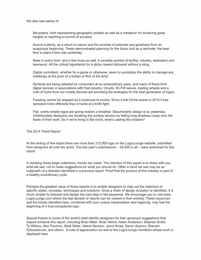
Mono Crest
Let's start this year's report with the spawn of the most prolific trend we identified in last year's report. The use of mono-weight line work and in thiscase as used in crests or other combination marks that utilize typography and illustration. Last year we identified “Line Craft” using the same singleweight stroke throughout and this year the movement has invaded with a vengeance. We identified at least five strains of mono including the mostubiquitous “Mono Script,” “Mono Icons” and this year's “Mono Crest.”
The non-scalable single line weight gained serious use as the go-to for icon designers, and the simplicity can also be seen where it carries forward intoillustration work. These crests have a lightness that proves half of the idiom, "you can never be too rich or too thin." Certainly there is a refinementhere, but it allows designers to embrace the rich language they've used for years in crests without tonality or color. These are bit like stripping away theheavy flesh to expose a really striking bone structure.
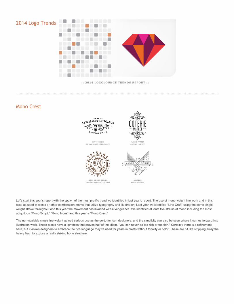
Letter Stacks
Lowly hyphens should abandon hope and designers should be admonished as they lose care for the need to break words between consonants. A
primary concern here is whether mathematically the total number of letters gives us an even break. The solution for a stubborn name that's too long to
behave is to parse it into a stack of segments and box them up. Presto, you have a compact solution that suddenly stands out on a T-shirt's logo
ghetto.
Typographically, the font is less important but obviously these are seldom lower case. Upper case letters have a parity that allows designers to arrange
them like building blocks. Some of this ilk is visually encased and others just arranged to create the illusion of a shape. Either way, this solution is not a
true puzzle but it chides viewers enough to actively draw them into the discovery process. It is that modest participation that can initiate the brand
bonding process for the consumer.
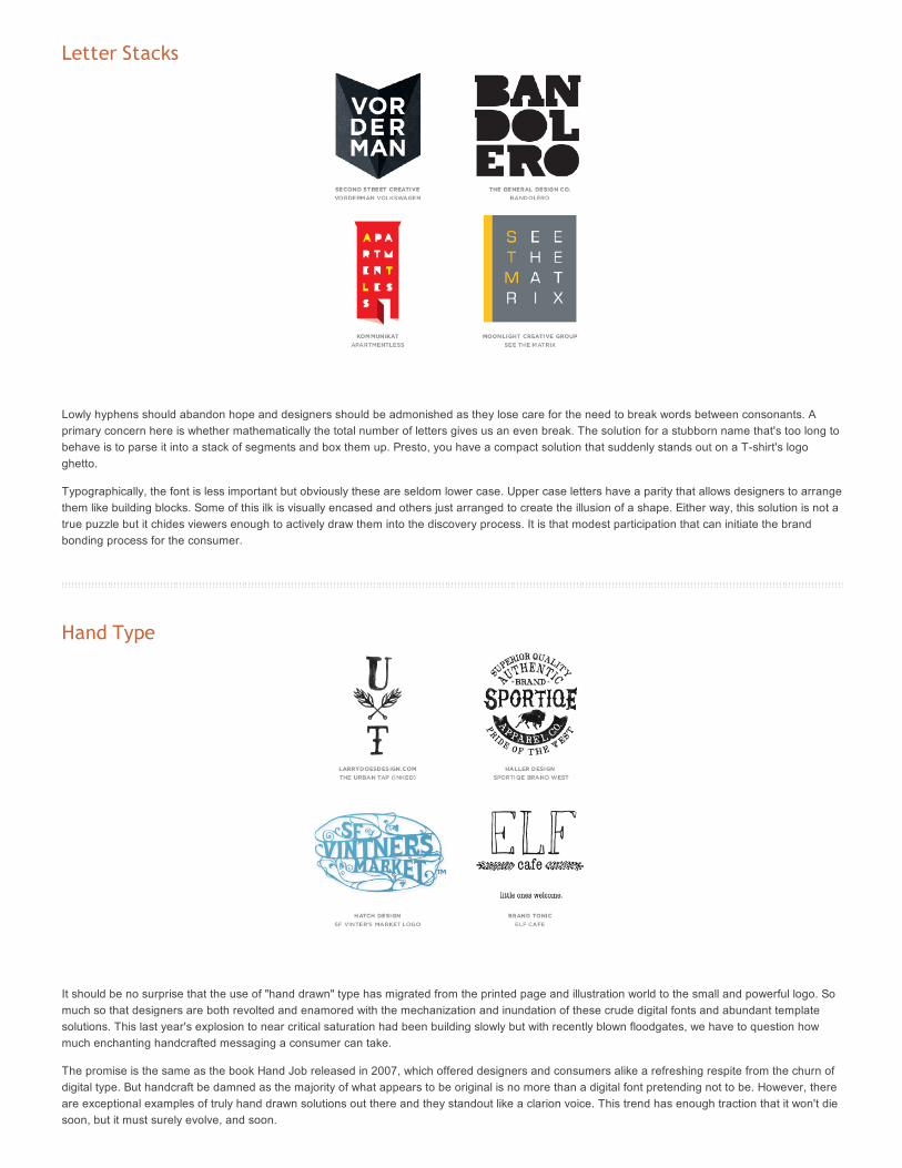
Hand Type
It should be no surprise that the use of "hand drawn" type has migrated from the printed page and illustration world to the small and powerful logo. So
much so that designers are both revolted and enamored with the mechanization and inundation of these crude digital fonts and abundant template
solutions. This last year's explosion to near critical saturation had been building slowly but with recently blown floodgates, we have to question how
much enchanting handcrafted messaging a consumer can take.
The promise is the same as the book Hand Job released in 2007, which offered designers and consumers alike a refreshing respite from the churn of
digital type. But handcraft be damned as the majority of what appears to be original is no more than a digital font pretending not to be. However, there
are exceptional examples of truly hand drawn solutions out there and they standout like a clarion voice. This trend has enough traction that it won't die
soon, but it must surely evolve, and soon.
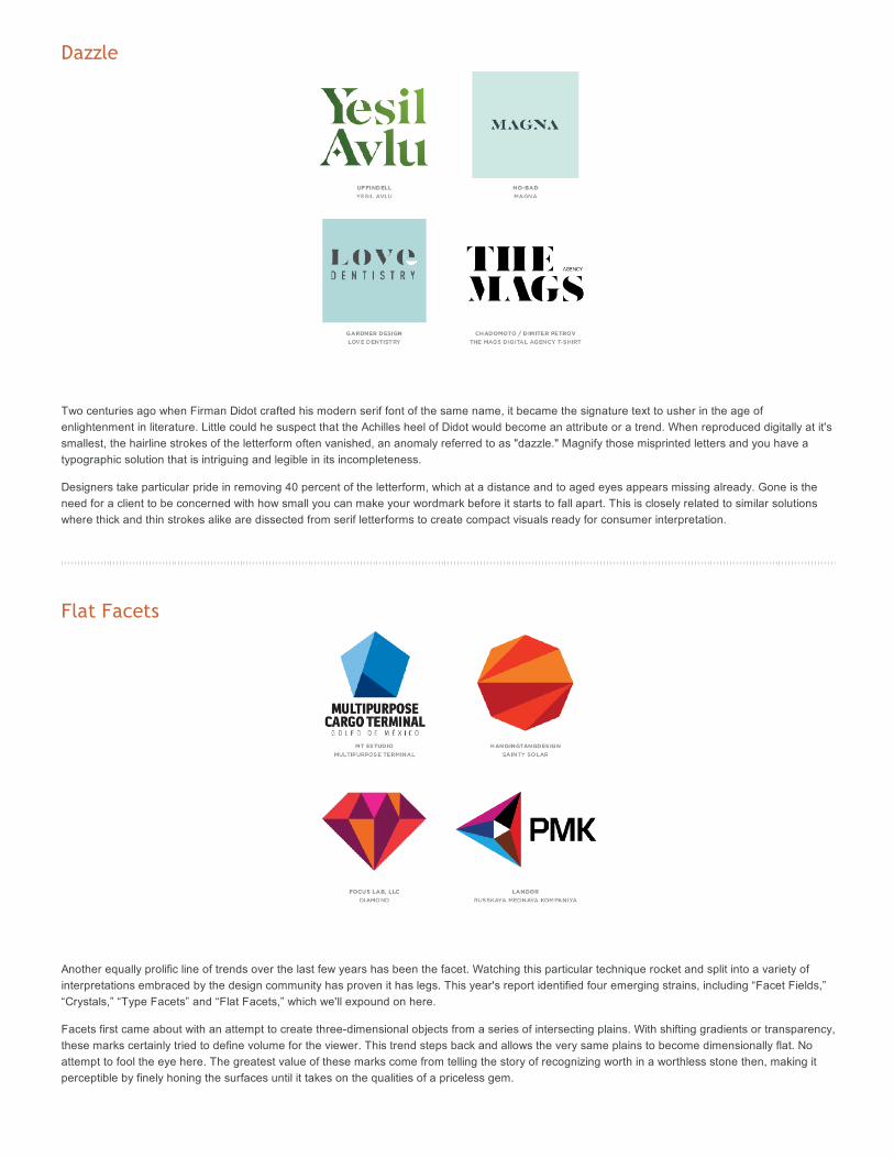
Dazzle
Two centuries ago when Firman Didot crafted his modern serif font of the same name, it became the signature text to usher in the age ofenlightenment in literature. Little could he suspect that the Achilles heel of Didot would become an attribute or a trend. When reproduced digitally at it'ssmallest, the hairline strokes of the letterform often vanished, an anomaly referred to as "dazzle." Magnify those misprinted letters and you have atypographic solution that is intriguing and legible in its incompleteness.
Designers take particular pride in removing 40 percent of the letterform, which at a distance and to aged eyes appears missing already. Gone is theneed for a client to be concerned with how small you can make your wordmark before it starts to fall apart. This is closely related to similar solutionswhere thick and thin strokes alike are dissected from serif letterforms to create compact visuals ready for consumer interpretation.
Flat Facets
Another equally prolific line of trends over the last few years has been the facet. Watching this particular technique rocket and split into a variety ofinterpretations embraced by the design community has proven it has legs. This year's report identified four emerging strains, including “Facet Fields,”“Crystals,” “Type Facets” and “Flat Facets,” which we'll expound on here.
Facets first came about with an attempt to create three-dimensional objects from a series of intersecting plains. With shifting gradients or transparency,these marks certainly tried to define volume for the viewer. This trend steps back and allows the very same plains to become dimensionally flat. Noattempt to fool the eye here. The greatest value of these marks come from telling the story of recognizing worth in a worthless stone then, making itperceptible by finely honing the surfaces until it takes on the qualities of a priceless gem.
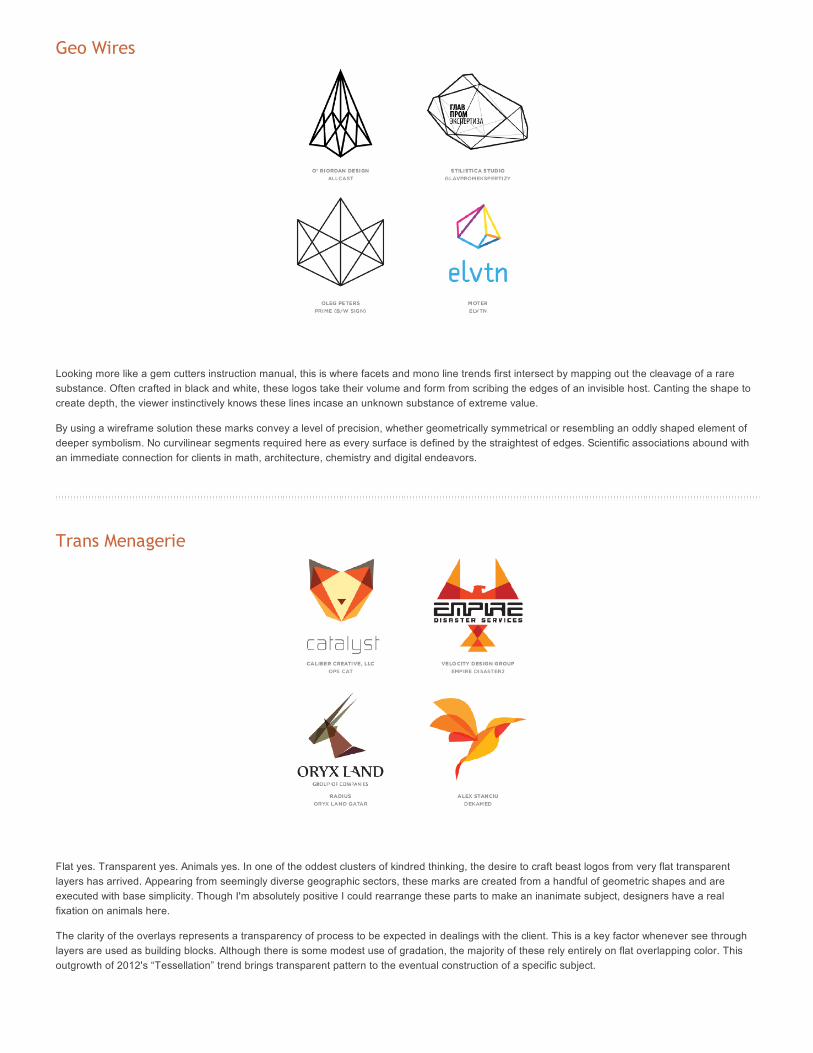
Geo Wires
Looking more like a gem cutters instruction manual, this is where facets and mono line trends first intersect by mapping out the cleavage of a rare
substance. Often crafted in black and white, these logos take their volume and form from scribing the edges of an invisible host. Canting the shape to
create depth, the viewer instinctively knows these lines incase an unknown substance of extreme value.
By using a wireframe solution these marks convey a level of precision, whether geometrically symmetrical or resembling an oddly shaped element of
deeper symbolism. No curvilinear segments required here as every surface is defined by the straightest of edges. Scientific associations abound with
an immediate connection for clients in math, architecture, chemistry and digital endeavors.
Trans Menagerie
Flat yes. Transparent yes. Animals yes. In one of the oddest clusters of kindred thinking, the desire to craft beast logos from very flat transparent
layers has arrived. Appearing from seemingly diverse geographic sectors, these marks are created from a handful of geometric shapes and are
executed with base simplicity. Though I'm absolutely positive I could rearrange these parts to make an inanimate subject, designers have a real
fixation on animals here.
The clarity of the overlays represents a transparency of process to be expected in dealings with the client. This is a key factor whenever see through
layers are used as building blocks. Although there is some modest use of gradation, the majority of these rely entirely on flat overlapping color. This
outgrowth of 2012's “Tessellation” trend brings transparent pattern to the eventual construction of a specific subject.
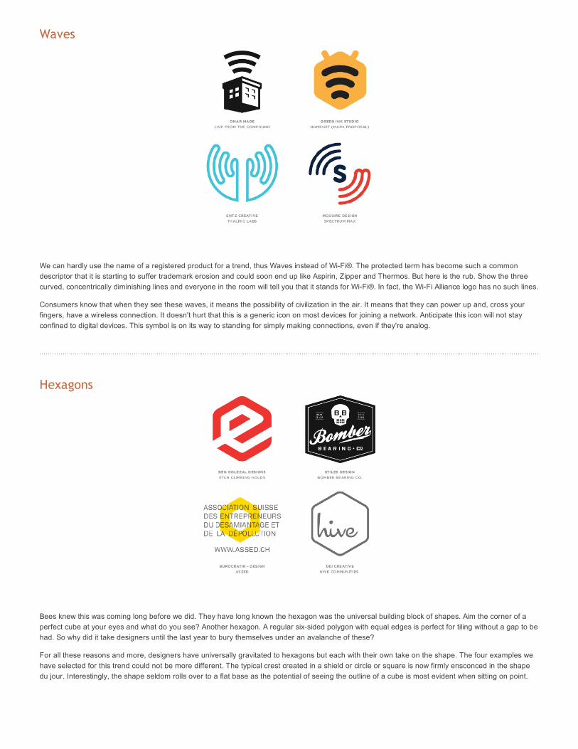
Waves
We can hardly use the name of a registered product for a trend, thus Waves instead of Wi-Fi®. The protected term has become such a commondescriptor that it is starting to suffer trademark erosion and could soon end up like Aspirin, Zipper and Thermos. But here is the rub. Show the threecurved, concentrically diminishing lines and everyone in the room will tell you that it stands for Wi-Fi®. In fact, the Wi-Fi Alliance logo has no such lines.
Consumers know that when they see these waves, it means the possibility of civilization in the air. It means that they can power up and, cross yourfingers, have a wireless connection. It doesn't hurt that this is a generic icon on most devices for joining a network. Anticipate this icon will not stayconfined to digital devices. This symbol is on its way to standing for simply making connections, even if they're analog.
Hexagons
Bees knew this was coming long before we did. They have long known the hexagon was the universal building block of shapes. Aim the corner of aperfect cube at your eyes and what do you see? Another hexagon. A regular six-sided polygon with equal edges is perfect for tiling without a gap to behad. So why did it take designers until the last year to bury themselves under an avalanche of these?
For all these reasons and more, designers have universally gravitated to hexagons but each with their own take on the shape. The four examples wehave selected for this trend could not be more different. The typical crest created in a shield or circle or square is now firmly ensconced in the shapedu jour. Interestingly, the shape seldom rolls over to a flat base as the potential of seeing the outline of a cube is most evident when sitting on point.
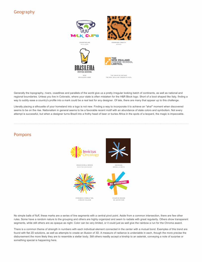
Geography
Generally the topography, rivers, coastlines and parallels of the world give us a pretty irregular looking batch of continents, as well as national andregional boundaries. Unless you live in Colorado, where your state is often mistaken for the H&R Block logo. Short of a boot shaped like Italy, finding away to subtly ease a country's profile into a mark could be a real test for any designer. Of late, there are many that appear up to this challenge.
Literally placing a silhouette of your homeland into a logo is not new. Finding a way to incorporate it to achieve an "aha!" moment when discoveredseems to be on the rise. Nationalism in general seems to be a favorable recent motif with an abundance of state colors and symbolism. Not everyattempt is successful, but when a designer turns Brazil into a frothy head of beer or buries Africa in the spots of a leopard, the magic is impeccable.
Pompons
No simple balls of fluff, these marks are a series of line segments with a central pivot point. Aside from a common intersection, there are few otherrules. Some have a random nature to the grouping and others are highly organized and seem to radiate with great regularity. Others show transparentsegments, while still others are as opaque as night. Color can be very limited, or it could just as well give the rainbow a run for the Chroma award.
There is a common theme of strength in numbers with each individual element connected in the center with a mutual bond. Examples of this trend arefound with flat 2D solutions, as well as attempts to create an illusion of 3D. A measure of radiance is undeniable in each, though the more precise thedisbursement the more likely they are to resemble a stellar body. Still others readily accept a kinship to an asterisk, conveying a note of surprise orsomething special is happening here.
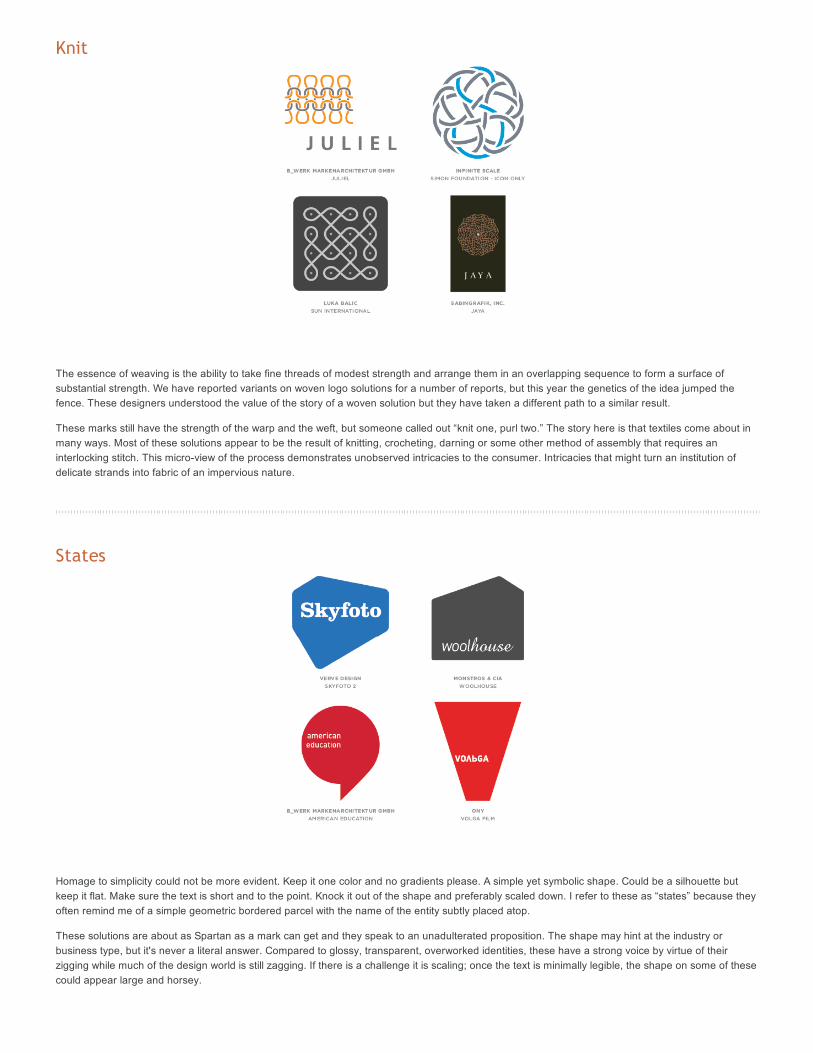
Knit
The essence of weaving is the ability to take fine threads of modest strength and arrange them in an overlapping sequence to form a surface of
substantial strength. We have reported variants on woven logo solutions for a number of reports, but this year the genetics of the idea jumped the
fence. These designers understood the value of the story of a woven solution but they have taken a different path to a similar result.
These marks still have the strength of the warp and the weft, but someone called out “knit one, purl two.” The story here is that textiles come about in
many ways. Most of these solutions appear to be the result of knitting, crocheting, darning or some other method of assembly that requires an
interlocking stitch. This micro-view of the process demonstrates unobserved intricacies to the consumer. Intricacies that might turn an institution of
delicate strands into fabric of an impervious nature.
States
Homage to simplicity could not be more evident. Keep it one color and no gradients please. A simple yet symbolic shape. Could be a silhouette but
keep it flat. Make sure the text is short and to the point. Knock it out of the shape and preferably scaled down. I refer to these as “states” because they
often remind me of a simple geometric bordered parcel with the name of the entity subtly placed atop.
These solutions are about as Spartan as a mark can get and they speak to an unadulterated proposition. The shape may hint at the industry or
business type, but it's never a literal answer. Compared to glossy, transparent, overworked identities, these have a strong voice by virtue of their
zigging while much of the design world is still zagging. If there is a challenge it is scaling;; once the text is minimally legible, the shape on some of these
could appear large and horsey.
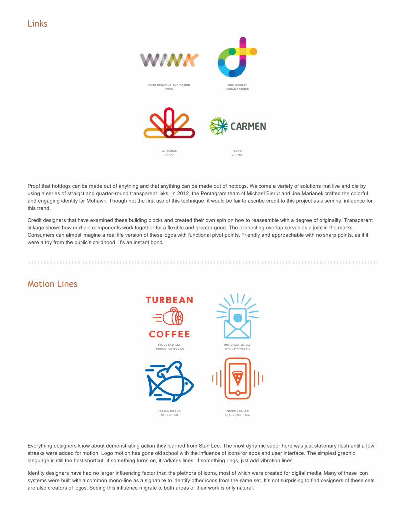
Links
Proof that hotdogs can be made out of anything and that anything can be made out of hotdogs. Welcome a variety of solutions that live and die byusing a series of straight and quarter-round transparent links. In 2012, the Pentagram team of Michael Bierut and Joe Marianek crafted the colorfuland engaging identity for Mohawk. Though not the first use of this technique, it would be fair to ascribe credit to this project as a seminal influence forthis trend.
Credit designers that have examined these building blocks and created their own spin on how to reassemble with a degree of originality. Transparentlinkage shows how multiple components work together for a flexible and greater good. The connecting overlap serves as a joint in the marks.Consumers can almost imagine a real life version of these logos with functional pivot points. Friendly and approachable with no sharp points, as if itwere a toy from the public's childhood. It's an instant bond.
Motion Lines
Everything designers know about demonstrating action they learned from Stan Lee. The most dynamic super hero was just stationary flesh until a fewstreaks were added for motion. Logo motion has gone old school with the influence of icons for apps and user interface. The simplest graphiclanguage is still the best shortcut. If something turns on, it radiates lines. If something rings, just add vibration lines.
Identity designers have had no larger influencing factor than the plethora of icons, most of which were created for digital media. Many of these iconsystems were built with a common mono-line as a signature to identify other icons from the same set. It's not surprising to find designers of these setsare also creators of logos. Seeing this influence migrate to both areas of their work is only natural.