2011 congestion assessment and resource … b – congestion assessment and resource integration...
TRANSCRIPT
2011 Congestion Assessment and Resource Integration Study
CARIS – Phase 1
Appendices B-H
FINAL REPORT
March 20, 2012

Caution and Disclaimer The contents of these materials are for information purposes and are provided “as is” without representation or warranty of any kind, including without limitation, accuracy, completeness or fitness for any particular purposes. The New York Independent System Operator (NYISO) assumes no responsibility to the reader or any other party for the consequences of any errors or omissions. The NYISO may revise these materials at any time in its sole discretion without notice to the reader.
Table of Contents
Appendix B – Congestion Assessment and Resource Integration Study (CARIS) Process
B.1. Phase 1 – Study Phase
B.2. Phase 2 – Projects Phase
Appendix C – Baseline System Assumptions and Methodology
C.1. CARIS Model ‐ Base Case Modeling Assumptions for 2011‐2020 1. Base Case Load Forecast 2. Power Flow Data 3. Transmission Model 4. Production Cost Model 5. External Areas Fuel Forecasts 6. Generic Solution Cost Matrix
Appendix D – Overview of CARIS Modeling
D.1. Model Overview (MAPS, PROBE)
D.2. Modeling Validation
Appendix E –Detailed Results of 2011 CARIS Phase 1
E.1. Congestion Assessment – Historic and Projected E.1.1. Historic Congestion Assessment E.1.2. Metrics Assessment
E.2. Selection of Three Studies
E.3 Generic Solutions
E.4. Benefit/Cost Analysis
Appendix F – Initial CARIS Manual (link)
Appendix G ‐ 2010 RNA and CRP Reports (link)
Appendix H ‐ Generic Solution Results – Additional Details
H.1. Study 1: Central East ‐ New Scotland ‐ Pleasant Valley (CE‐NS‐PV)
Appendix B – Congestion Assessment and Resource Integration Study (CARIS) Process
CARIS consists of two phases: Phase 1, the Study Phase, and Phase 2, the Project Phase. This process is described below and explained in full detail in the Initial CARIS Manual found in Appendix F.
B.1. Phase 1 – Study Phase
Phase 1 of the CARIS is depicted in the following diagram:
Figure B-1: Phase 1 or Study Phase of the CARIS Process
NYISO 2011 Congestion Assessment and Resource Integration Study- Appendices B-1
B.2. Phase 2 – Projects Phase
Phase 2 of the CARIS is depicted in the following diagram:
Figure B-2: Phase 2 – Project Phase of the CARIS process
NYISO 2011 Congestion Assessment and Resource Integration Study- Appendices B-2
NYISO 2011 Congestion Assessment and Resource Integration Study- Appendices
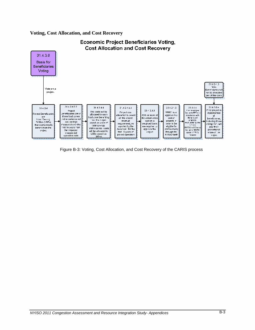
Voting, Cost Allocation, and Cost Recovery
Figure B-3: Voting, Cost Allocation, and Cost Recovery of the CARIS process
B-3
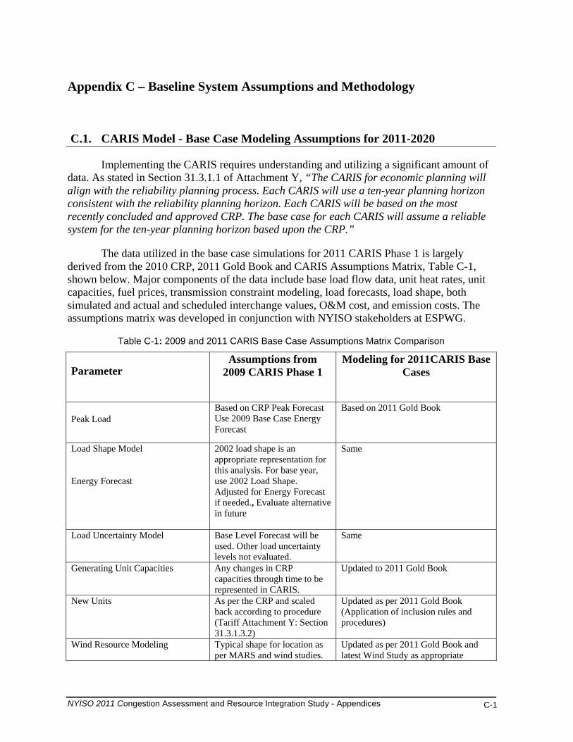
Appendix C – Baseline System Assumptions and Methodology
C.1. CARIS Model - Base Case Modeling Assumptions for 2011-2020
Implementing the CARIS requires understanding and utilizing a significant amount of data. As stated in Section 31.3.1.1 of Attachment Y, “The CARIS for economic planning will align with the reliability planning process. Each CARIS will use a ten-year planning horizon consistent with the reliability planning horizon. Each CARIS will be based on the most recently concluded and approved CRP. The base case for each CARIS will assume a reliable system for the ten-year planning horizon based upon the CRP.”
The data utilized in the base case simulations for 2011 CARIS Phase 1 is largely derived from the 2010 CRP, 2011 Gold Book and CARIS Assumptions Matrix, Table C-1, shown below. Major components of the data include base load flow data, unit heat rates, unit capacities, fuel prices, transmission constraint modeling, load forecasts, load shape, both simulated and actual and scheduled interchange values, O&M cost, and emission costs. The assumptions matrix was developed in conjunction with NYISO stakeholders at ESPWG.
Table C-1: 2009 and 2011 CARIS Base Case Assumptions Matrix Comparison
Parameter
Assumptions from 2009 CARIS Phase 1
Modeling for 2011CARIS Base Cases
Peak Load Based on CRP Peak Forecast Use 2009 Base Case Energy Forecast
Based on 2011 Gold Book
Load Shape Model Energy Forecast
2002 load shape is an appropriate representation for this analysis. For base year, use 2002 Load Shape. Adjusted for Energy Forecast if needed., Evaluate alternative in future
Same
Load Uncertainty Model Base Level Forecast will be used. Other load uncertainty levels not evaluated.
Same
Generating Unit Capacities Any changes in CRP capacities through time to be represented in CARIS.
Updated to 2011 Gold Book
New Units As per the CRP and scaled back according to procedure (Tariff Attachment Y: Section 31.3.1.3.2)
Updated as per 2011 Gold Book (Application of inclusion rules and procedures)
Wind Resource Modeling Typical shape for location as per MARS and wind studies.
Updated as per 2011 Gold Book and latest Wind Study as appropriate
NYISO 2011 Congestion Assessment and Resource Integration Study - Appendices C-1
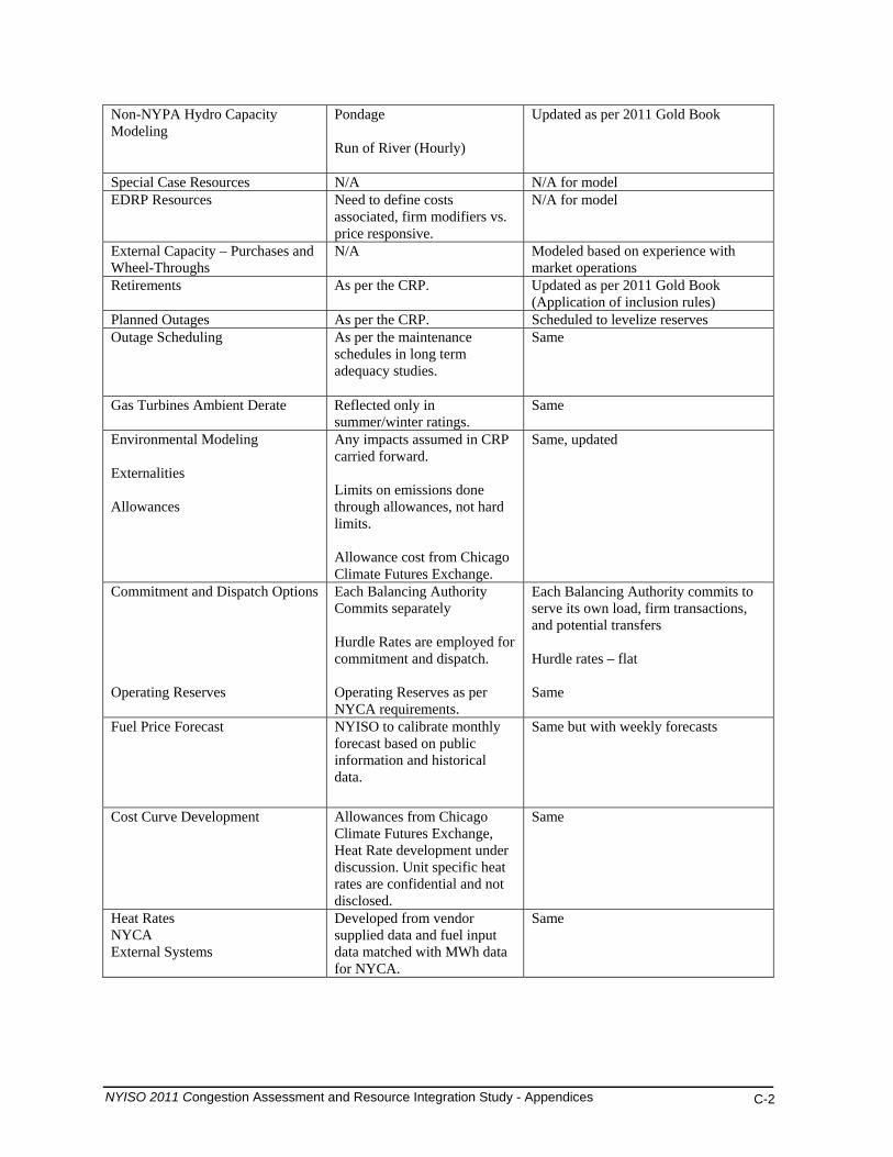
Non-NYPA Hydro Capacity Modeling
Pondage Run of River (Hourly)
Updated as per 2011 Gold Book
Special Case Resources N/A N/A for model EDRP Resources Need to define costs
associated, firm modifiers vs. price responsive.
N/A for model
External Capacity – Purchases and Wheel-Throughs
N/A Modeled based on experience with market operations
Retirements As per the CRP. Updated as per 2011 Gold Book (Application of inclusion rules)
Planned Outages As per the CRP. Scheduled to levelize reserves Outage Scheduling
As per the maintenance schedules in long term adequacy studies.
Same
Gas Turbines Ambient Derate Reflected only in summer/winter ratings.
Same
Environmental Modeling Externalities Allowances
Any impacts assumed in CRP carried forward. Limits on emissions done through allowances, not hard limits. Allowance cost from Chicago Climate Futures Exchange.
Same, updated
Commitment and Dispatch Options Operating Reserves
Each Balancing Authority Commits separately Hurdle Rates are employed for commitment and dispatch. Operating Reserves as per NYCA requirements.
Each Balancing Authority commits to serve its own load, firm transactions, and potential transfers Hurdle rates – flat Same
Fuel Price Forecast NYISO to calibrate monthly forecast based on public information and historical data.
Same but with weekly forecasts
Cost Curve Development Allowances from Chicago Climate Futures Exchange, Heat Rate development under discussion. Unit specific heat rates are confidential and not disclosed.
Same
Heat Rates NYCA External Systems
Developed from vendor supplied data and fuel input data matched with MWh data for NYCA.
Same
NYISO 2011 Congestion Assessment and Resource Integration Study - Appendices C-2
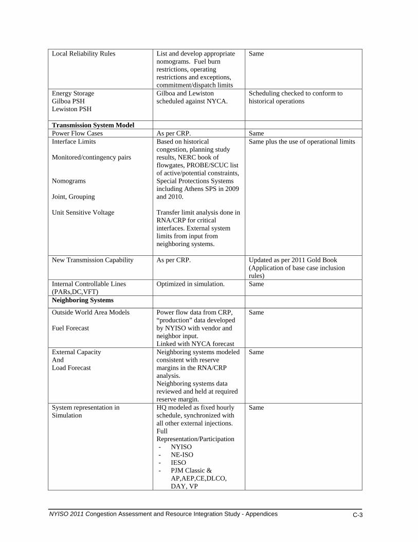
Local Reliability Rules List and develop appropriate nomograms. Fuel burn restrictions, operating restrictions and exceptions, commitment/dispatch limits
Same
Energy Storage Gilboa PSH Lewiston PSH
Gilboa and Lewiston scheduled against NYCA.
Scheduling checked to conform to historical operations
Transmission System Model Power Flow Cases As per CRP. Same Interface Limits Monitored/contingency pairs Nomograms Joint, Grouping Unit Sensitive Voltage
Based on historical congestion, planning study results, NERC book of flowgates, PROBE/SCUC list of active/potential constraints, Special Protections Systems including Athens SPS in 2009 and 2010. Transfer limit analysis done in RNA/CRP for critical interfaces. External system limits from input from neighboring systems.
Same plus the use of operational limits
New Transmission Capability As per CRP.
Updated as per 2011 Gold Book (Application of base case inclusion rules)
Internal Controllable Lines (PARs,DC,VFT)
Optimized in simulation. Same
Neighboring Systems
Outside World Area Models Fuel Forecast
Power flow data from CRP, “production” data developed by NYISO with vendor and neighbor input. Linked with NYCA forecast
Same
External Capacity And Load Forecast
Neighboring systems modeled consistent with reserve margins in the RNA/CRP analysis. Neighboring systems data reviewed and held at required reserve margin.
Same
System representation in Simulation
HQ modeled as fixed hourly schedule, synchronized with all other external injections. Full Representation/Participation - NYISO - NE-ISO - IESO - PJM Classic &
AP,AEP,CE,DLCO, DAY, VP
Same
NYISO 2011 Congestion Assessment and Resource Integration Study - Appendices C-3
Proxy Bus Injection: HQ-NYISO, HQ-NE-ISO, NB-NEISO, HQ - IESO Transmission Only/Zeroed Out: MECS,FE,SPP, MAR, NIPS,OVEC,TVA, FRCC,SERC,ERCOT,WECC
External Controllable Lines (PARs,DC,VFT, Radial lines)
A,B,C and J,K “wheel” Both sets set at 600 min, 1200 max, imbalance monitored Ramapo +/- 1000 MW Norwalk +/- 100 MW L33,34 - +/- 300 MW PV20 – 130, 0 MW Neptune and CSC as per CRP firm X 24 hrs, economy remainder
Modified to reflect updated protocols, tariff, and market operation,
Detailed descriptions of key data used in the 2011 CARIS are listed below. The data was developed based on the NYISO’s Tariff requirements and procedures and in collaboration with stakeholders at ESPWG.
1. Base Case Load Forecast
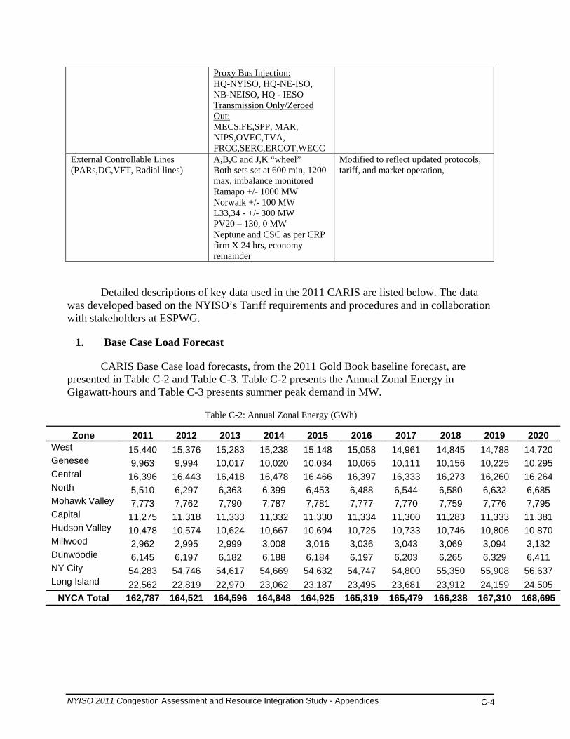
CARIS Base Case load forecasts, from the 2011 Gold Book baseline forecast, are presented in Table C-2 and Table C-3. Table C-2 presents the Annual Zonal Energy in Gigawatt-hours and Table C-3 presents summer peak demand in MW.
Table C-2: Annual Zonal Energy (GWh)
Zone 2011 2012 2013 2014 2015 2016 2017 2018 2019 2020 West 15,440 15,376 15,283 15,238 15,148 15,058 14,961 14,845 14,788 14,720 Genesee 9,963 9,994 10,017 10,020 10,034 10,065 10,111 10,156 10,225 10,295 Central 16,396 16,443 16,418 16,478 16,466 16,397 16,333 16,273 16,260 16,264 North 5,510 6,297 6,363 6,399 6,453 6,488 6,544 6,580 6,632 6,685 Mohawk Valley 7,773 7,762 7,790 7,787 7,781 7,777 7,770 7,759 7,776 7,795 Capital 11,275 11,318 11,333 11,332 11,330 11,334 11,300 11,283 11,333 11,381 Hudson Valley 10,478 10,574 10,624 10,667 10,694 10,725 10,733 10,746 10,806 10,870 Millwood 2,962 2,995 2,999 3,008 3,016 3,036 3,043 3,069 3,094 3,132 Dunwoodie 6,145 6,197 6,182 6,188 6,184 6,197 6,203 6,265 6,329 6,411 NY City 54,283 54,746 54,617 54,669 54,632 54,747 54,800 55,350 55,908 56,637 Long Island 22,562 22,819 22,970 23,062 23,187 23,495 23,681 23,912 24,159 24,505
NYCA Total 162,787 164,521 164,596 164,848 164,925 165,319 165,479 166,238 167,310 168,695
NYISO 2011 Congestion Assessment and Resource Integration Study - Appendices C-4

Table C-3: Summer Peak Demand by Zone (MW)
Zone 2011 2012 2013 2014 2015 2016 2017 2018 2019 2020 West 2,550 2,554 2,550 2,549 2,525 2,495 2,476 2,458 2,451 2,443 Genesee 1,947 1,970 1,987 1,998 2,002 2,005 2,017 2,030 2,047 2,064 Central 2,795 2,825 2,834 2,855 2,849 2,831 2,820 2,814 2,817 2,822 North 648 742 752 757 763 766 773 777 783 790 Mohawk Valley 1,308 1,312 1,321 1,322 1,318 1,310 1,305 1,302 1,305 1,309 Capital 2,173 2,201 2,222 2,234 2,233 2,230 2,227 2,230 2,248 2,264 Hudson Valley 2,256 2,290 2,321 2,345 2,357 2,366 2,375 2,387 2,408 2,428 Millwood 702 711 722 729 732 736 744 750 756 763 Dunwoodie 1,464 1,472 1,484 1,492 1,497 1,497 1,509 1,521 1,538 1,554 NY City 11,505 11,635 11,720 11,785 11,830 11,880 12,015 12,200 12,405 12,585Long Island 5,364 5,470 5,520 5,543 5,572 5,633 5,655 5,721 5,775 5,845 NYCA Total 32,712 33,182 33,433 33,609 33,678 33,749 33,916 34,190 34,533 34,867
2. Power Flow Data
The CARIS uses the network topology, system impedance and transmission line ratings as set forth in the assumption matrix.
3. Transmission Model
New York Control Area Model
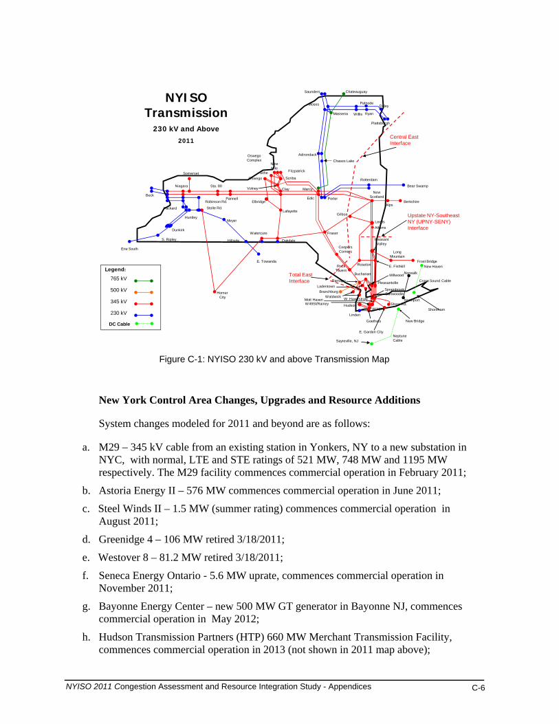
Figure C-1 below displays the bulk power system for NYCA, which generally consists of facilities 230 kV and above, but also includes certain 138 kV facilities and a small number of 115 kV facilities. The balance of the facilities 138 kV and below are considered non-bulk or sub-transmission facilities for purposes of this study. The figure also displays key transmission interfaces for New York.
NYISO 2011 Congestion Assessment and Resource Integration Study - Appendices C-5
NYISO Transmission
230 kV and Above2011
Legend:
345 kV
500 kV
230 kV
765 kV
Willis
Shore Rd.
E. FishkillRoseton
Coopers Corners
Rock Tavern
Buchanan
Ramapo
Rotterdam
New Scotland
Leeds
Gilboa
Fraser
Stolle Rd.
Meyer
Hillside
Alps
Watercure
Oakdale
Adirondack
Clay
Lafayette
Pannell
Sta. 80
Somerset
Niagara
Huntley
Dunkirk
Oswego Complex
Porter
Marcy
Edic
Saunders Chateauguay
Homer City
Plattsburgh
Moses
Massena
W49St/Rainey
Beck
S. Ripley
Erie South
Bear Swamp
Berkshire
Frost Bridge
Long Mountain
Norwalk
Northport
Branchburg
Linden
Hudson
E. Towanda
Goethals
Robinson Rd. Elbridge
Ladentown
Waldwick W. Haverstraw
Pleasantville
SitheOswego
Volney
Fitzpatrick
Scriba
Nine Mile
E. Garden City
Packard
Pleasant Valley
Farragut
Sprainbrook Dunwoodie
Millwood
DC Cable
Cross Sound Cable
New Haven
Shoreham
Mott Haven
Ryan
PatnodeDuley
Chases Lake
Athens
New Bridge
Sayreville, NJNeptune Cable
Central EastInterface
Total EastInterface
Upstate NY-SoutheastNY (UPNY-SENY)Interface
Figure C-1: NYISO 230 kV and above Transmission Map
New York Control Area Changes, Upgrades and Resource Additions
System changes modeled for 2011 and beyond are as follows:
a. M29 – 345 kV cable from an existing station in Yonkers, NY to a new substation in NYC, with normal, LTE and STE ratings of 521 MW, 748 MW and 1195 MW respectively. The M29 facility commences commercial operation in February 2011;
b. Astoria Energy II – 576 MW commences commercial operation in June 2011;
c. Steel Winds II – 1.5 MW (summer rating) commences commercial operation in August 2011;
d. Greenidge 4 – 106 MW retired 3/18/2011;
e. Westover 8 – 81.2 MW retired 3/18/2011;
f. Seneca Energy Ontario - 5.6 MW uprate, commences commercial operation in November 2011;
g. Bayonne Energy Center – new 500 MW GT generator in Bayonne NJ, commences commercial operation in May 2012;
h. Hudson Transmission Partners (HTP) 660 MW Merchant Transmission Facility, commences commercial operation in 2013 (not shown in 2011 map above);
NYISO 2011 Congestion Assessment and Resource Integration Study - Appendices C-6

i. Munnsville Wind Power 0.6 MW rating increase commences commercial operation in December 2013;
j. Nine Mile Pt2 – 115 MW uprate commences commercial operation in June 2012 and 53 MW uprate commences commercial operation in June 2014; and
k. For study purposes, Athens Special Protection System (SPS) is assumed to no longer be in service starting January 2011.
External Area Model
The external areas immediately adjacent to the NYCA are actively modeled, except for Hydro Quebec (HQ). Those areas include ISO-NE, IESO, and PJM (PJM Classic, AP, AEP, CE, DLCO, DAY and VP). Since HQ is asynchronously tied to the bulk system, proxy buses representing the direct ties from HQ to NYISO and HQ to ISO-NE are modeled. The HQ to NYISO capacity modeled is 1300 MW. External areas surrounding the above areas are only modeled to capture the impact of loop flows.
Six generating plants were also added to the base case in PJM. These additions totaled thirteen generating units with a summer rated capacity of 2621 MWs. Table C-4 lists the new units with associated data.
Table C-4: Generating Units Added to PJM
Unit Name
Summer Capacity
Type/Fuel
Installation Date
Company Name
Fort Martin 585 Coal March 2011 AP Peach Bottom 550 CC - NG July 2011 PECO Bremo Tenaska 625 CC - NG April 2011 Dominion VP Clinch River 534 Coal March 2012 Dominion VP Kearny 1 36.4 LM6000-NG June 2012 PSE&G Kearny 2 36.4 LM6000-NG June 2012 PSE&G Kearny 3 36.4 LM6000-NG June 2012 PSE&G Kearny 4 36.4 LM6000-NG June 2012 PSE&G Kearny 5 36.4 LM6000-NG June 2013 PSE&G Kearny 6 36.4 LM6000-NG June 2013 PSE&G Hunlock Creek 3 30 CT - NG June 2011 UGI Utilities Hunlock Creek 1 39.3 CT - NG June 2011 UGI Utilities Hunlock Creek 2 39.3 CT – NG June 2011 UGI Utilities
Hurdle Rates and Interchange Models
Hurdle rates set the conditions in which economic interchange can be transacted between neighboring markets/control areas. They represent a minimum savings level that needs to be achieved before energy will flow across the interface. Hurdle rates help ensure that the production-cost simulation is reasonably consistent with the historical pattern of internal
NYISO 2011 Congestion Assessment and Resource Integration Study - Appendices C-7
NYCA generation and imports. Hurdle rates are used to allow the simulation model to reflect inter-regional energy market transaction costs.
Two independent hurdle rates are used in the CARIS, one for the commitment of generation and a separate one for the dispatch of generation. Both commitment and dispatch hurdle rates are held constant throughout the 2011-2020 study period as discussed with NYISO stakeholders at ESPWG. The hurdle rate values produce results consistent with NYCA historic total import levels.
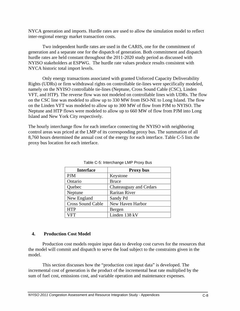
Only energy transactions associated with granted Unforced Capacity Deliverability Rights (UDRs) or firm withdrawal rights on controllable tie-lines were specifically modeled, namely on the NYISO controllable tie-lines (Neptune, Cross Sound Cable (CSC), Linden VFT, and HTP). The reverse flow was not modeled on controllable lines with UDRs. The flow on the CSC line was modeled to allow up to 330 MW from ISO-NE to Long Island. The flow on the Linden VFT was modeled to allow up to 300 MW of flow from PJM to NYISO. The Neptune and HTP flows were modeled to allow up to 660 MW of flow from PJM into Long Island and New York City respectively.
The hourly interchange flow for each interface connecting the NYISO with neighboring control areas was priced at the LMP of its corresponding proxy bus. The summation of all 8,760 hours determined the annual cost of the energy for each interface. Table C-5 lists the proxy bus location for each interface.
Table C-5: Interchange LMP Proxy Bus
Interface Proxy bus PJM Keystone Ontario Bruce Quebec Chateauguay and Cedars Neptune Raritan River New England Sandy Pd Cross Sound Cable New Haven Harbor HTP Bergen VFT Linden 138 kV
4. Production Cost Model
Production cost models require input data to develop cost curves for the resources that the model will commit and dispatch to serve the load subject to the constraints given in the model.
This section discusses how the “production cost input data” is developed. The incremental cost of generation is the product of the incremental heat rate multiplied by the sum of fuel cost, emissions cost, and variable operation and maintenance expenses.
NYISO 2011 Congestion Assessment and Resource Integration Study - Appendices C-8

Heat Rates
Fuel costs represent the largest variable expense for fossil fueled generating units. Cost curves are the product of fuel prices and incremental heat rates. Individual unit heat rates are commercially sensitive confidential information and thus are not widely available from generator owners. Unit heat rate input data was updated based on the U.S. Environmental Protection Agency’s (EPA) Clean Air Market Data and, where available, unit production data from the U.S. Energy Information Administration (USEIA).
Consideration was given to using this approach across all of the units in the simulation. However, the relatively smaller impact of heat rate inaccuracies for non-NYCA units and the magnitude of the effort to correct heat rates for all units in the simulation led to the conclusion that vendor-supplied heat rate information could be used for all non-NYCA units.
CARIS simulation models employ power points which represent minimum, intermediary, and maximum power levels where generating units can be simulated to operate on a sustained basis. Each power point is tied to a point on the heat rate curve allowing incremental heat rates to be determined for each unit. The power points and incremental heat rates are developed on a Summer/Winter basis.
Heat Rates of marginal units in all zones display the expected seasonal patterns with summer months having the highest values. Also, there is a progression by which the monthly averages are the lowest in Zone A. The further east a zone is located in the NYCA, the higher is the implied heat rate. The relative magnitudes of differences across zones are consistent with the differences in the generation fuel-mixes.
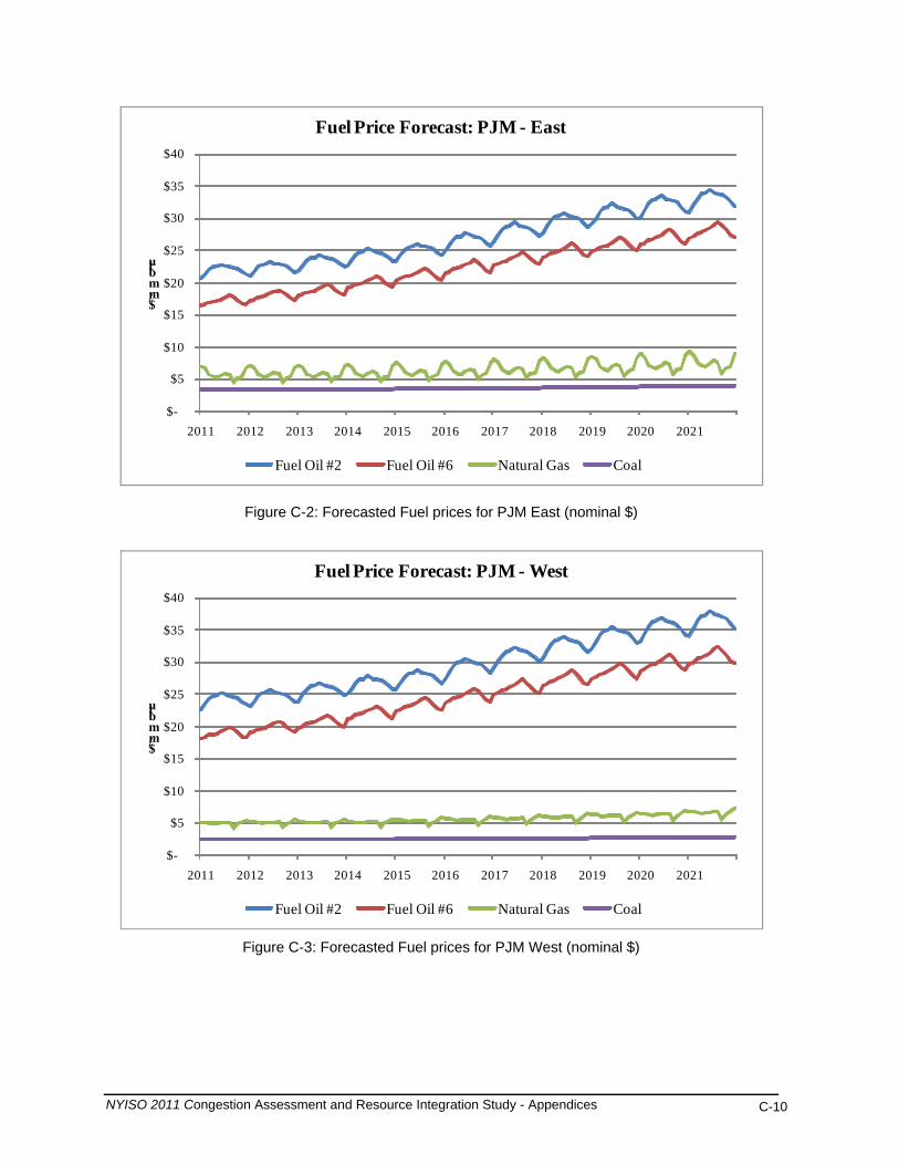
5. External Areas Fuel Forecasts
Table C-6 shows the regional bases expressed as a multiple of the U.S. national average annual price for each fuel. Figures C-2 through C-5 illustrate forecasted fuel price prices for external areas from which weekly fuel price forecasts were developed.
Table C-6: External Areas Fuel Forecast Regional Multiplier
PJM- East PJM- West ISONE IESO
Fuel Oil #2 0.970 1.070 0.960 1.100
Fuel Oil #6 0.970 1.070 0.960 1.100
Natural Gas 1.158 1.012 1.168 1.028
Coal 1.430 1.050 1.500 1.200
NYISO 2011 Congestion Assessment and Resource Integration Study - Appendices C-9
NYISO 2011 Congestion Assessment and Resource Integration Study - Appendices C-10
$-
$5
$10
$15
$20
$25
$30
$35
$40
2011 2012 2013 2014 2015 2016 2017 2018 2019 2020 2021
$/mmbtu
Fuel Price Forecast: PJM - East
Fuel Oil #2 Fuel Oil #6 Natural Gas Coal
Figure C-2: Forecasted Fuel prices for PJM East (nominal $)
$-
$5
$10
$15
$20
$25
$30
$35
$40
2011 2012 2013 2014 2015 2016 2017 2018 2019 2020 2021
$/mmbtu
Fuel Price Forecast: PJM - West
Fuel Oil #2 Fuel Oil #6 Natural Gas Coal
Figure C-3: Forecasted Fuel prices for PJM West (nominal $)

NYISO 2011 Congestion Assessment and Resource Integration Study - Appendices C-11
$-
$5
$10
$15
$20
$25
$30
$35
$40
2011 2012 2013 2014 2015 2016 2017 2018 2019 2020 2021
$/mmbtu
Fuel Price Forecast: ISO-NE
Fuel Oil #2 Fuel Oil #6 Natural Gas Coal
Figure C-4: Forecasted Fuel prices for ISO-NE (nominal $)
$-
$5
$10
$15
$20
$25
$30
2011 2012 2013 2014 2015 2016 2017 2018 2019 2020 2021
$/mmbtu
$35
$40
$45
Fuel Price Forecast: IESO
Fuel Oil #2 Fuel Oil #6 Natural Gas Coal
Figure C-5: Forecasted Fuel prices for IESO (nominal $)
NYISO 2011 Congestion Assessment and Resource Integration Study - Appendices C-12
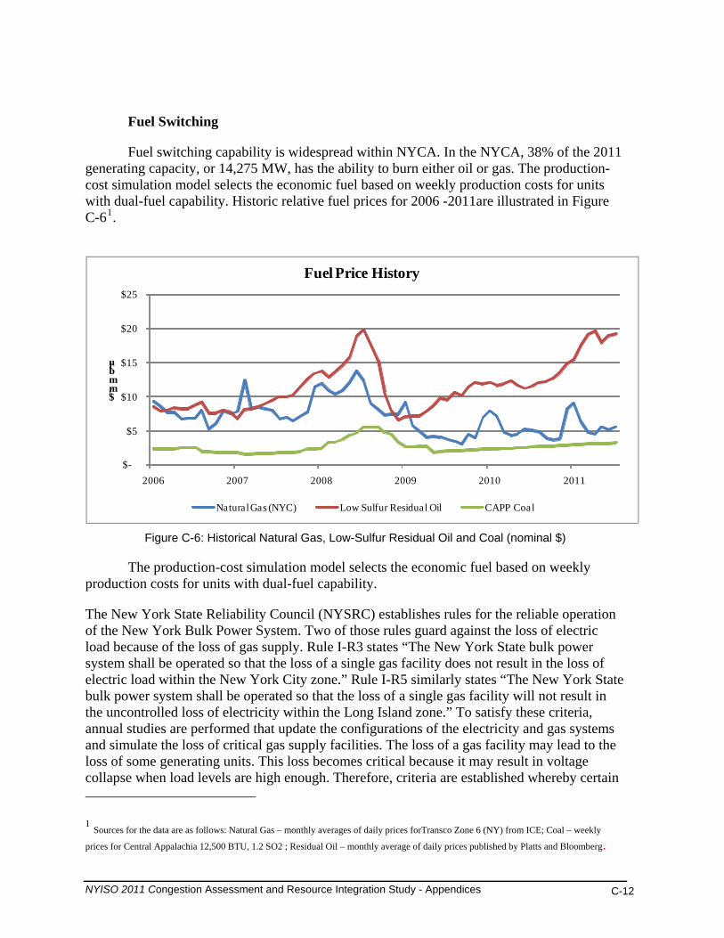
Fuel Switching
Fuel switching capability is widespread within NYCA. In the NYCA, 38% of the 2011 generating capacity, or 14,275 MW, has the ability to burn either oil or gas. The production-cost simulation model selects the economic fuel based on weekly production costs for units with dual-fuel capability. Historic relative fuel prices for 2006 -2011are illustrated in Figure C-61.
$-
$5
$10
$15
$20
$25
2006 2007 2008 2009 2010 2011
$/mmbtu
Fuel Price History
Natural Gas (NYC) Low Sulfur Residual Oil CAPP Coal
Figure C-6: Historical Natural Gas, Low-Sulfur Residual Oil and Coal (nominal $)
The production-cost simulation model selects the economic fuel based on weekly production costs for units with dual-fuel capability.
The New York State Reliability Council (NYSRC) establishes rules for the reliable operation of the New York Bulk Power System. Two of those rules guard against the loss of electric load because of the loss of gas supply. Rule I-R3 states “The New York State bulk power system shall be operated so that the loss of a single gas facility does not result in the loss of electric load within the New York City zone.” Rule I-R5 similarly states “The New York State bulk power system shall be operated so that the loss of a single gas facility will not result in the uncontrolled loss of electricity within the Long Island zone.” To satisfy these criteria, annual studies are performed that update the configurations of the electricity and gas systems and simulate the loss of critical gas supply facilities. The loss of a gas facility may lead to the loss of some generating units. This loss becomes critical because it may result in voltage collapse when load levels are high enough. Therefore, criteria are established whereby certain 1 Sources for the data are as follows: Natural Gas – monthly averages of daily prices forTransco Zone 6 (NY) from ICE; Coal – weekly
prices for Central Appalachia 12,500 BTU, 1.2 SO2 ; Residual Oil – monthly average of daily prices published by Platts and Bloomberg.
units that are capable of doing so are required to switch to minimum oil burn levels so that in the event of the worst single gas system contingency these units stay on-line at minimum generation levels and support system voltage. Some new combined cycle gas turbine units in these zones have the ability to “auto-swap” from gas-burn to oil-burn with a limited loss of output that can be quickly recovered. As the generator fleet in these zones has experienced a shift to increased use of combined cycle units with auto-swap capability, the amount of oil used in steam units to satisfy minimum oil burn criteria has decreased. In order to simulate the use of oil in steam units to satisfy these reliability criteria, both Ravenswood ST3 and Northport ST4 are modeled to burn oil for the first 3 dispatch points during the Summer Capability Period (736 MW and 249 MW respectively). During the winter and above the 3rd power point they are allowed to switch economically.
Generation Maintenance Modeling modifications were made to large units in NY to reflect updated outage rates
and scheduled maintenance. The MAPS scheduling process was employed to achieve a levelized amount of reserves throughout the year in NY. Other than these changes, the process used to model maintenance was consistent with the 2009 process, which is described below.
Levels (MW) of generation unavailability were developed based on historic 2007 and
2008 generation unavailability reported in FERC Form 714, which reports 2 types of monthly unavailability: Planned (maintenance outages) and Unplanned (forced outages). Each generating unit was then assigned an unavailability period for each outage type. Planned or maintenance outage durations are based on established maintenance durations by generating unit technology (i.e. nuclear refueling, steam unit major overhauls, gas turbine inspection). Unplanned or forced outage durations were determined for each generating units based on its most recent 5-year average forced outage rate (EFORd).
Both unavailability periods were then scheduled throughout a calendar year in such a way that the level of unavailability (MW) for each type of outage at the hour of the monthly peak is consistent with the 2007 and 2008 monthly levels of unavailability. The outage duration periods were fixed for each of the study years 2009 through 2018.
6. Generic Solution Cost Matrix
The NYISO defines generic solutions to alleviate congestion for each resource type (generation, transmission, and demand response), as required by the Tariff, Attachment Y, Section 31.3.1.3.3. The costs of each solution must be estimated to report B/C ratios in CARIS Phase 1 for each generic solution. The NYISO, in consultation with its stakeholders, estimates a high, mid and low cost for each solution type in CARIS Phase 1. This establishes a broader range of costs in order to provide more useful information to developers and other interested parties. The Generic Solution Cost Matrix should not be utilized for purposes outside of the CARIS generic solution process. No assessment was made concerning the actual feasibility of any generic solution proposed. These estimates should not be assumed as reflective or predictive of actual projects or imply that specific facilities can necessarily be built for these generic solution estimates.
NYISO 2011 Congestion Assessment and Resource Integration Study - Appendices C-13

Each high, mid and low cost estimate for the generic solutions was accomplished by using the appropriate generic solution cost matrix methodology. This methodology was based on utilizing typical MW block size generic solutions, a standard set of assumptions and order of magnitude costs for each resource type. The order of magnitude cost estimates took into account the cost differences between geographical areas within New York. Three sets of costs were developed that are reflective of the differences in labor, land and permitting costs in each area.
Transmission cost estimates are based on information provided by Transmission Owners, which accounted for considerations such as zonal-specific construction parameters (e.g., spatial limitations in downstate zones). As part of this process the 2009 CARIS Phase 1 cost estimates were reviewed and updated by the Transmission Owners. The low cost estimate for the upstate geographic area remained the same as used in the 2009 CARIS Phase 1. The updated costs used in this 2011 CARIS Phase 1 were presented to NYISO stakeholders for discussion at ESPWG.
Generation costs estimates were based on available NYISO consultant estimates for developing new combined cycle units in Zones F and J. The combined cycle generator plant costs for Zone G (exclusive of interconnection costs) were estimated to be the average of the generation costs for Upstate and Downstate.
The demand response resource type costs were based on New York utility EEPS filings for their Demand Side Management programs. This customer installed cost approach provides the improved methodology suggested in the 2009 CARIS report.
The generic solutions cost matrix and assumptions for all three types of solutions are presented in Table C-7 through Table C-10 below.
NYISO 2011 Congestion Assessment and Resource Integration Study - Appendices C-14

Table C-7: Transmission Cost Matrix
Base Case Modeling Assumptions for 2011-2020 CARIS Phase 1
Generic Transmission Cost Matrix Order of Magnitude Unit Prices
(Estimates should not be assumed reflective or predictive of actual project costs)
Transmission Substation
Cost Range Zone
Line System
Voltage (kV)
Block Capacity
(MVA) Construction
Type Transmission Cost ($M/Mile)
Line Terminal Addition per
Substation ($M)
System Upgrade Facilities
($M) High Zone A-G 345 1000 Overhead $7.3 $9 $9 Mid Zone A-G 345 1000 Overhead $5 $6 $6 Low Zone A-G 345 1000 Overhead $2 $3 $3 High Zone H-J 345 600 Undergrd $30 $30 $30 Mid Zone H-J 345 600 Undergrd $27 $25 $20 Low Zone H-J 345 600 Undergrd $24 $20 $10 High Zone K 138 500 Undergrd $20 $5 $4 Mid Zone K 138 500 Undergrd $15 $3.5 $2.5 Low Zone K 138 500 Undergrd $10 $2 $1
Assumptions:
1. Estimates herein should not be utilized for purposes outside of the CARIS process. Also, these estimates should not be assumed as reflective or predictive of actual projects or imply that facilities can necessarily be built for these generic solution order of magnitude estimates. Estimate ranges were identified after Transmission Owner input and discussions at the ESPWG.2. Lines constructed within Zones A through G will be comprised of single circuit AC overhead construction. 3. Lines constructed within Zones H through K will be comprised of AC underground cable construction. 4. The transmission line will be interconnected into an existing 345kV substation for Zones A-J and 138kV for Zone K. 5. The cost for lines that cross between Zones G and Zones H or I will be pro-rated as overhead or underground based on the mileage of the line included within each Zone. 6. The line can be permitted and constructed utilizing the shortest distance between the two selected substations. 7. The existing substation selected as the interconnection point consists of open air construction and has sufficient space within the fenced yard for adding a new breaker and a half bay for the new line terminal. If the selected substation is Gas-Insulated, a factor of 4 times will be applied to the base substation terminal costs. 8. The control house at the existing substations selected as the interconnection point has sufficient space for installing the new protection and communication equipment for the new line terminal. 9. Estimates include costs for material, construction labor, engineering labor, permits, testing and commissioning. The estimates do not include Allowance of Funds During Construction (AFDC).
NYISO 2011 Congestion Assessment and Resource Integration Study - Appendices C-15

10. The cost per mile includes a range to account for the variable land and permitting costs associated with a project such as utilizing an existing ROW, expanding an existing ROW or obtaining new ROW. 11. The substation line terminal costs include a range to account for necessary protection and communication equipment. 12. System Upgrade Facilities costs include a range to account for line terminal relay upgrades and replacement of overdutied breakers. 13. If upon a cursory review of the location for the potential solution identifies unusual complexities, a contingency factor will be applied to the costs included in the matrix. These complexities may include but are not limited to right of way restrictions, terrain and/or permitting difficulties, etc. Field inspections will not be completed as part of the cursory review.
Table C-8: Generation Cost Matrix
Base Case Modeling Assumptions for 2011-2020 CARIS Phase 1
Generic Generation Cost Matrix Order of Magnitude Unit Costs
(Estimates should not be assumed reflective or predictive of actual project costs)
Cost Range Plant Location Plant Block Size Capacity (MW)
Plant Cost per Block Size* ($M)
High Zone A-F 500 $850 Mid Zone A-F 500 $696 Low Zone A-F 500 $543 High Zone G 500 $994 Mid Zone G 500 $811 Low Zone G 500 $628 High Zone H-J 500 $1,139 Mid Zone H-J 500 $926 Low Zone H-J 500 $712 * Costs are based on a 547 MW unit size. Assumptions:
1. Estimates herein should not be utilized for purposes outside of the CARIS process. Also, these estimates should not be assumed as reflective or predictive of actual projects or imply that facilities can necessarily be built for these generic solution order of magnitude estimates. Estimate ranges were identified based upon NYISO filings at FERC and Consultant estimates.2. It is assumed that the plant will be gas combined cycle type. Configured as a 2 x 2 x1 7FA.05 block with selective catalytic reduction (SCRs), total generation 500MW.
NYISO 2011 Congestion Assessment and Resource Integration Study - Appendices C-16
3. The plant cost includes real estate and permitting. 4. The plant cost includes generator step-up transformer and generator substation yard including associated protection and communication equipment. 5. The plant will be interconnected into an existing 345kV substation for Zones A-J and 138kV for Zone K. 6. The generator lead will be rated 345kV, 1673A, 1000MVA for Zones A-J and 138kV, 2092A, 500MVA for Long Island. The generator lead will be built with overhead construction for Zones A-G and underground construction for Zones H-K. 7. It is assumed that the existing substation selected as the interconnection point consists of open-air construction and has sufficient space within the fenced yard for adding a new breaker and a half bay for the new line terminal. If the selected substation is gas-insulated, a factor of 4 times will be applied to the base substation terminal costs. 8. It is assumed that the plant will require a 10in dia. gas line extension to bring a 450 psig gas supply to the plant and a single gas regulator station per block along with gas conditioning, startup gas heaters and metering. It is assumed that an adequate gas supply is available. 9. It is assumed that the existing substation selected as the interconnection point and outgoing transmission lines has adequate rating to interconnect new generation. 10. It is assumed that the control house at the existing substation selected as the interconnection point has sufficient space for installing the new protection and communication equipment for the new line terminal. 11. It is assumed that the generator lead and gas line can be permitted and constructed utilizing the shortest distance. 12. It is assumed that the ROW is generally unobstructed and significant relocation of underground interferences is not required and that rock excavation is not required. 13. It is assumed that the ROW does not require mitigation of environmentally sensitive areas. 14. Estimates include costs for material, construction labor, engineering labor, permits, testing and commissioning. The estimates do not include Allowance of Funds During Construction (AFDC) 15. The plant cost includes a range to account for the variable land and permitting costs associated with a project. 16. The cost per mile includes a range to account for the variable land and permitting costs associated with a project such as utilizing an existing ROW, expanding an existing ROW or obtaining new ROW. 17. The substation line terminal costs include a range to account for necessary protection and communication equipment. 18. System Upgrade Facilities costs include a range to account for line terminal relay upgrades and replacement of overdutied breakers. 19. The transmission and gas transmission unit cost will be applied during the study as necessary dependent on the location of the congestion location to be studied.
20. If upon a cursory review of the location for the generic solution identifies unusual complexities, a contingency factor will be applied to the costs included in the matrix. These complexities may include but are not limited to right of way restrictions, terrain and/or permitting difficulties, etc. Field inspections will not be completed as part of the cursory review.
NYISO 2011 Congestion Assessment and Resource Integration Study - Appendices C-17

Table C-9: Generator Cost per Unit - 2010 Price Level
GENERATOR COST PER UNIT - 2010 Demand Curve Reset Cost Estimates ($M)
Zone Size Combined Cycle EPC
Costs Non-EPC
Costs Total Unit Cost
$/kW UPSTATE (Capital-F) 547 MW 2 X 2 X 1 7FA.05 $613 $149 $762 $1,393
Zone G 547 MW 2 X 2 X 1 7FA.05 $719 $169 $888 $1,623
DOWNSTATE (NYC-J) 547 MW 2 X 2 X 1 7FA.05 $825 $188 $1,013 $1,853
Table C-10: Demand Response Cost Matrix
Base Case Modeling Assumptions for 2011-2020 CARIS Phase 1
Generic Demand Response Cost Matrix Order of Magnitude Unit Costs
(Estimates should not be assumed reflective or predictive of actual project costs)
Cost Range Zone
Demand Response
Quantity (MW) Portfolio Type Total Portfolio
Cost ($M) High Zone A-G 100 Energy Efficiency 280 Mid Zone A-G 100 Energy Efficiency 225 Low Zone A-G 100 Energy Efficiency 170 High Zone A-G 100 Demand Response 56 Mid Zone A-G 100 Demand Response 45 Low Zone A-G 100 Demand Response 33 High Zone H-J 100 Energy Efficiency 350 Mid Zone H-J 100 Energy Efficiency 280 Low Zone H-J 100 Energy Efficiency 210 High Zone H-J 100 Demand Response 68 Mid Zone H-J 100 Demand Response 55 Low Zone H-J 100 Demand Response 41 High Zone K 100 Energy Efficiency 285 Mid Zone K 100 Energy Efficiency 228 Low Zone K 100 Energy Efficiency 170 High Zone K 100 Demand Response 86 Mid Zone K 100 Demand Response 70
NYISO 2011 Congestion Assessment and Resource Integration Study - Appendices C-18
NYISO 2011 Congestion Assessment and Resource Integration Study - Appendices C-19
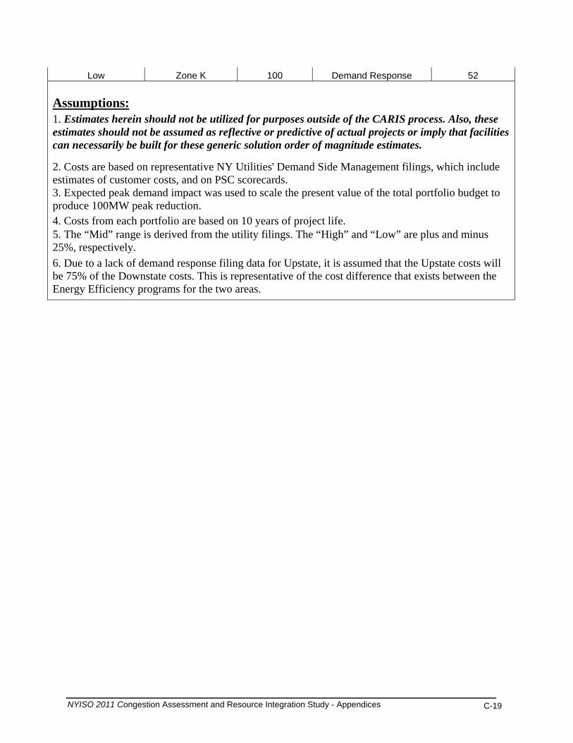
Low Zone K 100 Demand Response 52
Assumptions:
1. Estimates herein should not be utilized for purposes outside of the CARIS process. Also, these estimates should not be assumed as reflective or predictive of actual projects or imply that facilities can necessarily be built for these generic solution order of magnitude estimates.
2. Costs are based on representative NY Utilities' Demand Side Management filings, which include estimates of customer costs, and on PSC scorecards. 3. Expected peak demand impact was used to scale the present value of the total portfolio budget to produce 100MW peak reduction. 4. Costs from each portfolio are based on 10 years of project life. 5. The “Mid” range is derived from the utility filings. The “High” and “Low” are plus and minus 25%, respectively. 6. Due to a lack of demand response filing data for Upstate, it is assumed that the Upstate costs will be 75% of the Downstate costs. This is representative of the cost difference that exists between the Energy Efficiency programs for the two areas.

Appendix D – Overview of CARIS Modeling
D.1. Model Overview (MAPS, PROBE)
Production cost simulation software is the primary analytical tool utilized in the CARIS process. The software performs a security constrained economic dispatch and calculates the minimum hourly production cost of supply resources to meet the load.
MAPS – General Electric’s Market Analysis and Portfolio Simulation
In conducting the 2011 CARIS analysis the NYISO utilized GE MAPS as the production cost simulation software. MAPS software mimics the operation of the NYISO Day-Ahead electricity market by simulating security constrained unit commitment (SCUC) and economic dispatch of the generation and by monitoring transmission system flows under both normal and contingency conditions. This enables calculation of hourly production costs accounting for the constraints imposed by the transmission system on the economic dispatch of generation. MAPS features the following:
• Detailed representation of the large scale transmission network. The transmission system is modeled in terms of individual transmission lines, interfaces (group of lines), phase-angle regulators (PARs), and HVDC lines. MAPS software models voltage and stability considerations through operating nomograms that define how voltage and stability limits can change hourly as a function of loads, generation, and flows elsewhere on the system.
• Detailed generation modeling for thermal, hydro, pumped storage, wind, solar, and other renewables. Generation system data capabilities include multi-step cost curves based on heat rates, emission costs, fuel costs, and unit cycling capabilities. The generation units, along with chronological hourly load profiles, are assigned to individual buses on the system. Hourly load profiles are adjusted to meet peak and energy forecasts, which are inputs entered into the model on a monthly or annual basis. Information on hourly loads at each bus in the system is required to calculate electrical flows on the transmission system. This parameter is specified by assigning one or a combination of several hourly load profiles to each load bus.
PROBE -– PoRtfolio Ownership and Bid Evaluation
PROBE software, developed by PowerGEM LLC, is the day-ahead market simulation tool which has been utilized by the NYISO as an analysis tool to conduct the NYISO’s historic congestion analysis. The results of the historic congestion analysis, expressed as a change in production cost, along with additional metrics such as generator payments, load payments and
NYISO 2011 Congestion Assessment and Resource Integration Study - Appendices D-1
congestion payments, have been reported on a quarterly basis on the NYISO’s website since 2003.
Similar to MAPS, PROBE software emulates the Day-Ahead Market (DAM) SCUC operation by using a Linear Programming-based optimization engine. Unlike MAPS however, PROBE uses actual submitted generator parameters, hourly bids and network status, including transmission outages, used by the NYISO to clear the day-ahead market. In addition, PROBE conducts an unconstrained simulation by removing all transmission constraints (other constraints such as generator ramp rates and minimum run times are still enforced). Unit commitment and dispatch are then recalculated for this unconstrained scenario without any changes in bids from those actually submitted. The constrained and unconstrained results are compared to derive the change in bid production costs, load payments and generation payments. All calculations represent all market segments such as the energy, start-up, and ancillary services bids for generators, import/export bids, virtual bids (virtuals), and fixed and price-capped demand bids.
In contrast to other planning-type software products, PROBE is designed to reproduce the day-ahead market clearing calculation as closely as possible. To accomplish this, PROBE was customized to model the NYISO’s SCUC operation, including, but not limited to, rules on co-optimization of energy and ancillary services, market mitigation, and marginal losses.
The major difference between MAPS results and PROBE results is that MAPS does not simulate: (a) virtual bidding; (b) transmission outages; (c) fixed load and price-capped load; (d) production costs based on mitigated bids; (e) Bid Production Cost Guarantee (BPCG) payments; and (f) co-optimization with ancillary services.
D.2. Modeling Validation
Database Verification
To verify the 2011 CARIS database, the NYISO conducted a data and modeling verification process in conjunction with GE. First, the NYISO Planning Staff reviewed all input data and program parameters. After Staff completed its review, modifications and any necessary corrections, the base cases were sent to GE for further verification.
The following topics were examined as part of data verification:
• Forecasts of load data for NYISO zones and external areas (externals);
• Transmission Losses, Spinning Reserves and Thermal Unit Commitment Options
• Transmission interface transfer limits, contingencies and nomograms;
• Commitment and dispatch hurdle Rates;
• Generator incremental heat rates and emissions rates;
• Modeling of combined cycle units;
• Fuel price forecasts;
NYISO 2011 Congestion Assessment and Resource Integration Study - Appendices D-2

NYISO 2011 Congestion Assessment and Resource Integration Study - Appendices D-3
• Modeling of pumped storage and hydro units; and,
• Accuracy of generator size, type and location
GE reviewed all the warnings created by the programs to ensure that the results were not affected. Discrepancies noted by GE were corrected by NYISO as necessary. After the development of the scenarios, similar data verification was performed by the NYISO Staff and any changes made were reviewed by GE. All of these changes were accomplished before the finalization of the 2011 CARIS base case.

Appendix E –Detailed Results of 2011 CARIS Phase 1
E.1. Congestion Assessment – Historic and Projected
One of the features of a Locational Based Marginal Price (LBMP) market is the ability to identify grid locations that are difficult to serve with economic generation due to transmission bottlenecks (constraints) and quantify the cost of this congestion. The NYISO calculates and publishes LBMP’s with three components:
1. Energy component – marginal electricity cost without the adjusted cost of congestion and losses;
2. Congestion component – the cost of out-of merit generation dispatch relative to an assumed unconstrained reference point at Marcy substation; and
3. Losses component – the cost for supplying the losses from the accessible marginal generators to a specific point on the grid.
E.1.1. Historic Congestion Assessment
The NYISO reports historic congestion results on its website on a quarterly basis. The cost of congestion reported is the sum of the day ahead market LBMP congestion component multiplied by the amount of load being affected (positively or negatively) by congestion (later referred to as “congestion payments”). While this congestion cost is relatively simple to calculate, this value is generally regarded as an over-simplified and deceiving congestion impact metric because:
1. This calculation does not incorporate the effect of any potential market responses from supply and demand when congestion is removed; and
2. The congestion cost is relative to an assumed uncongested reference point. If this reference point is moved, the congestion cost is shifted to the LBMP energy component. The congestion versus energy cost calculation becomes arbitrary depending on the reference point chosen.
To better measure the true cost of transmission congestion, the NYISO developed analytical tools and protocols. The fundamental idea is to calculate what the day-ahead hourly clearing prices would be if there were no transmission constraints, using the same data and calculation approach as the NYISO SCUC. The congestion cost is the difference between the actual SCUC transmission constrained LBMP’s, loads, and bids, and the same calculation with all transmission constraints ignored. Annual cost is the sum of daily costs.
The reported numbers are the result of a simulation of the NYCA market using the hourly bids and network status actually used by NYISO to clear the day-ahead market. The simulation performs a security constrained unit commitment for the market “as it was”, then removes all transmission constraints. Other constraints such as desired net interchange (DNI), generator ramp rates and minimum run times are still enforced. Unit commitment and dispatch are then
NYISO 2011 Congestion Assessment and Resource Integration Study - Appendices E-1
recalculated for this unconstrained scenario without any changes to the bids actually submitted. The constrained and unconstrained results are compared to derive the cost of congestion. The calculations represent all market segments (e.g., fixed load, virtual load and generation, imports and exports), and actual hour-by-hour network status. The unconstrained case fixes the amount of virtual load and generation at their original MW levels.
Historic Congestion Metrics
To explore the impact of congestion, four congestion metrics were developed: Bid Production Cost metric; Congestion Payment metric; Generator Payment metric; and Load Payment metric. All metrics report the difference between a constrained and an unconstrained value.
1. Change in Bid Production Cost (BPC) – This is the primary congestion impact metric set forth by the Operating Committee. The calculation compares the change in total production cost, based on mitigated bids, with and without transmission constraints limiting the unit commitment and dispatch. This metric measures the economic inefficiency introduced by the existence of transmission bottlenecks, and is considered the societal cost of transmission congestion. A positive number indicates that transmission congestion increased the total cost to produce the electricity supply in the NYCA.
Production cost always decrease when constraints are removed. The objective of
SCUC is to minimize bid production cost; LBMPs are the result of the commitment and dispatch that result from achieving this objective under generation unit and transmission constrained conditions. Since SCUC does not directly attempt to minimize LBMPs, relieving all or some of the constraints may or may not decrease the market based electricity cost to load. In the LBMP markets, the load in a location pays the marginal price of the supply at that location, not the bid price of the generator. The result of relieving constraints in an LBMP market depends on how much load is affected, where the load is, and the response of supply and demand as those constraints are relieved.
2. Change in Congestion Payments – This calculation, which represents the sum
of the LBMP congestion component multiplied by the load affected, does not account for the change in the energy component of the LBMP as constraints are removed. With no simulation truly required to arrive at this congestion impact metric, the congestion cost in an unconstrained market is 0. This is considered to be the accounting cost of congestion.
Congestion payments can be hedged with TCCs. The difference between the total
congestion payment and the congestion payment associated with TCCs is the unhedged congestion payment reported in the NYISO’s quarterly historic congestion analysis reports. For the historic analysis, it was assumed that all TCCs are owned by load and are available for hedging the congestion payments. A positive number indicate that congestion increases the cost paid by load.
3. Change in Generation Payments – In addition to the LBMP payments to
generation (or other supply sources such as virtual generation, or imports), generators are
NYISO 2011 Congestion Assessment and Resource Integration Study - Appendices E-2

also paid a BPCG and for Ancillary Services. BPCG compensates generators that are committed for reliability despite the fact their bids are greater than the LBMP at the generator location. This phenomenon can happen if ramp rates, minimum run times or other limits force unit operation, which minimizes overall production cost, even including BPCG payments. A positive number means generation payments went up due to congestion.
4. Change in Load Payments – This metric is the opposite side of the generation
payments calculation. The calculation uses simulation to include the local energy cost response when transmission constraints are removed. Whereas the change in production cost measures efficiency, this metric determines how much more New York load actually pays due to congestion and the market design. This is considered the bill impact. The load payment congestion impact includes the effect of all market segments that can change when transmission constraints are relieved. These segments are:
• LBMP Components – The LBMP congestion component will equal zero when there
are no transmission constraints, and the unconstrained generation will sell more energy at a price that is higher on the generator’s incremental cost curve. The unconstrained generator bid price will be lower than the bid price of the out of merit generator dispatched in the transmission limited case. The result is a likely increase in the LBMP energy component as the LBMP congestion component decreases. The LBMP loss component will also change depending on the location and prices of the generation unbottled when constraints are relieved. Ancillary service costs (e.g., reserves) also affect LBMPs, as generators trade-off between selling ancillary services or energy.
• Load payments due to congestion are hedged with TCCs based on the assumption that
all TCCs were credited to load. The TCC auction cost is not accounted for since it is part of the Transmission Service Charge (TSC).
• TCC shortfall – In the event of a TCC shortfall (or surplus), the load pays for the
imbalance. As transmission constraints are relieved, the imbalance changes. While the shortfall may be compensated for elsewhere in the TSC, from a congestion impact perspective this is considered a load cost. Although the NYISO OATT describes details of the allocation of shortfall by transmission owner, for purposes of this analysis the shortfall is stated for the NYCA only.
• Rate Schedule 1 imbalances – In accordance with the NYISO OATT, imbalances of energy payments and loss payments are a component of the OATT-defined Rate Schedule 1 payments. Relieving or eliminating transmission constraints affects these payments, and is thus considered a congestion impact in this analysis. Like shortfall, this analysis states the Rate Schedule 1 effect for the NYCA only.
A positive number indicates that congestion increased the load payments.
NYISO 2011 Congestion Assessment and Resource Integration Study - Appendices E-3
Historic Congestion Results
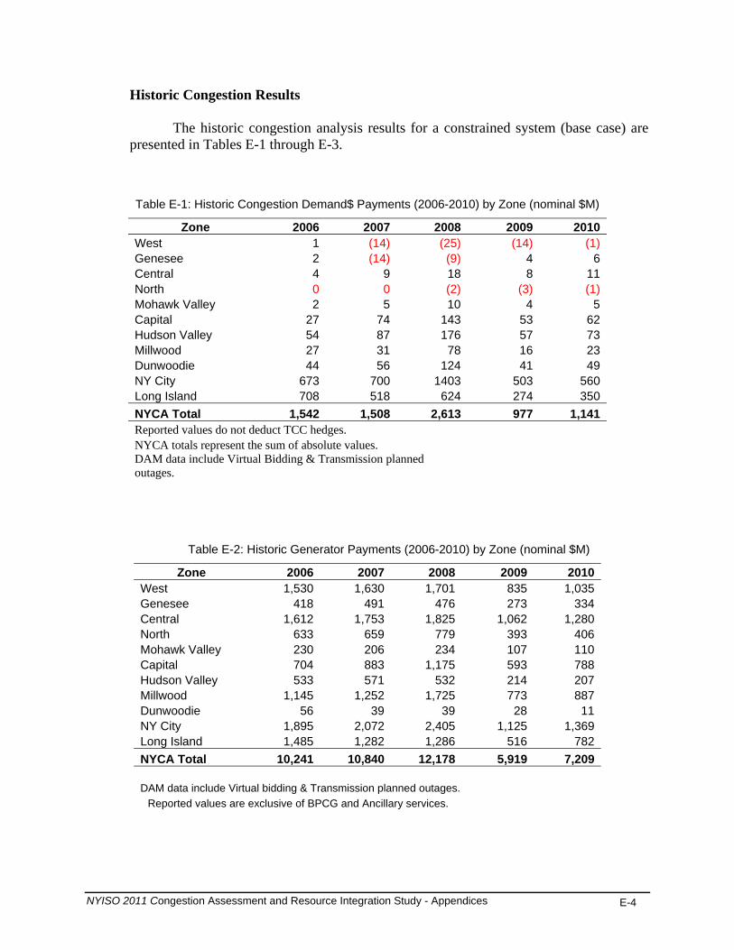
The historic congestion analysis results for a constrained system (base case) are presented in Tables E-1 through E-3.
Table E-1: Historic Congestion Demand$ Payments (2006-2010) by Zone (nominal $M)
Zone 2006 2007 2008 2009 2010West 1 (14) (25) (14) (1)Genesee 2 (14) (9) 4 6Central 4 9 18 8 11 North 0 0 (2) (3) (1)Mohawk Valley 2 5 10 4 5 Capital 27 74 143 53 62 Hudson Valley 54 87 176 57 73 Millwood 27 31 78 16 23 Dunwoodie 44 56 124 41 49 NY City 673 700 1403 503 560 Long Island 708 518 624 274 350 NYCA Total 1,542 1,508 2,613 977 1,141 Reported values do not deduct TCC hedges. NYCA totals represent the sum of absolute values. DAM data include Virtual Bidding & Transmission planned outages.
Table E-2: Historic Generator Payments (2006-2010) by Zone (nominal $M)
Zone 2006 2007 2008 2009 2010West 1,530 1,630 1,701 835 1,035Genesee 418 491 476 273 334Central 1,612 1,753 1,825 1,062 1,280North 633 659 779 393 406Mohawk Valley 230 206 234 107 110Capital 704 883 1,175 593 788Hudson Valley 533 571 532 214 207Millwood 1,145 1,252 1,725 773 887Dunwoodie 56 39 39 28 11NY City 1,895 2,072 2,405 1,125 1,369Long Island 1,485 1,282 1,286 516 782NYCA Total 10,241 10,840 12,178 5,919 7,209 DAM data include Virtual bidding & Transmission planned outages.
Reported values are exclusive of BPCG and Ancillary services.
NYISO 2011 Congestion Assessment and Resource Integration Study - Appendices E-4
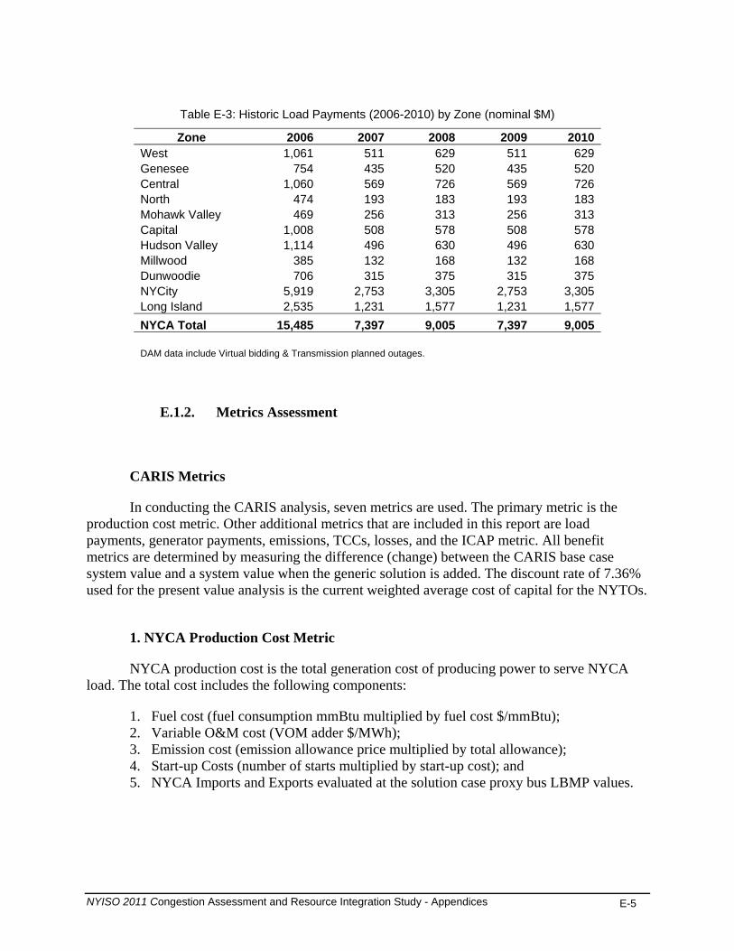
Table E-3: Historic Load Payments (2006-2010) by Zone (nominal $M) Zone 2006 2007 2008 2009 2010
West 1,061 511 629 511 629Genesee 754 435 520 435 520Central 1,060 569 726 569 726North 474 193 183 193 183Mohawk Valley 469 256 313 256 313Capital 1,008 508 578 508 578Hudson Valley 1,114 496 630 496 630Millwood 385 132 168 132 168Dunwoodie 706 315 375 315 375NYCity 5,919 2,753 3,305 2,753 3,305Long Island 2,535 1,231 1,577 1,231 1,577NYCA Total 15,485 7,397 9,005 7,397 9,005 DAM data include Virtual bidding & Transmission planned outages.
E.1.2. Metrics Assessment
CARIS Metrics
In conducting the CARIS analysis, seven metrics are used. The primary metric is the production cost metric. Other additional metrics that are included in this report are load payments, generator payments, emissions, TCCs, losses, and the ICAP metric. All benefit metrics are determined by measuring the difference (change) between the CARIS base case system value and a system value when the generic solution is added. The discount rate of 7.36% used for the present value analysis is the current weighted average cost of capital for the NYTOs.
1. NYCA Production Cost Metric
NYCA production cost is the total generation cost of producing power to serve NYCA load. The total cost includes the following components:
1. Fuel cost (fuel consumption mmBtu multiplied by fuel cost $/mmBtu); 2. Variable O&M cost (VOM adder $/MWh); 3. Emission cost (emission allowance price multiplied by total allowance); 4. Start-up Costs (number of starts multiplied by start-up cost); and 5. NYCA Imports and Exports evaluated at the solution case proxy bus LBMP values.
NYISO 2011 Congestion Assessment and Resource Integration Study - Appendices E-5

2. Demand$ Congestion
The congestion value (Demand$) is calculated as the congestion component of the LBMP paid by NYCA load (sum of the total zonal loads). It is defined as the shadow price of each constrained element multiplied by the load affected and calculated as follows:
Demand$ congestion by constraint for all areas and all hours = (Shadow Price x (Zone Generation Shift Factor (GSF) x Zone Load)).
Total Demand$ congestion = Sum of all constraints’ Demand$ congestion.
3. Generator Payment Metric This metric measures the change in NYCA generation payments plus net imports. The
NYCA generation payments are calculated by measuring only the LBMP payments (energy, congestion, losses). Thus, total generator payments are estimated for this information metric as the sum of the LBMP payments to NYCA generators plus the payments for net imports.
Generator payment by zone represents zonal LBMP based payment to generators located in a zone. The hourly payment to each generator is determined as the hourly generator MW dispatch multiplied by the generator’s LBMP or spot price. The annual generator payment for NYCA generators is then the sum of all 8,760 hourly generator payments.
Annual generator LBMP payment = sum of all hours (generator LBMP x generator MW dispatch).
Zonal generator payment = sum of generator payment located in a zone.
4. LBMP Load Payment Metric
The LBMP Load Payment metric is the hourly load-weighted average LBMP price for each zone multiplied by the zonal load. The annual load payment is then the sum of all 8,760 hourly load payments.
Annual Zonal LBMP payment = sum of all hours (zonal LBMP x zonal load).
Zonal LBMP = zonal average load-weighted LMP.
Note: actual consumer payments will be net of any TCC hedges or bilateral contracts.
5. TCC Payment Metric
The TCC payment metric is calculated differently for Phase 1 than for Phase 2 of the CARIS process, as described in the NYISO Tariff. In this CARIS Phase 1, the change in the TCC Payment is calculated as the change in load payment minus the sum of the
NYISO 2011 Congestion Assessment and Resource Integration Study - Appendices E-6
NYISO 2011 Congestion Assessment and Resource Integration Study - Appendices E-7
generator payments and the net import payments. This is not a measure of the Transmission Owners’ TCC auction revenues.
6. ICAP Metric
Revisions to Attachment Y of the OATT after the completion of the 2009 CARIS Report
have resulted in new procedures for calculation of the ICAP Metrics. The procedures used in this 2011 CARIS Report are described below.
When a generator, transmission line, or demand response/energy efficiency project is
built to relieve transmission congestion, the general consequence is a reduction in system production costs. A secondary effect that one of these projects may cause is to reduce the Installed Capacity (ICAP) costs for the entire NY control area. This appendix section serves to describe the methodology and present the detailed results for the quantification of ICAP savings achieved by three types of generic congestion solutions in the CARIS process.
Calculations used to determine ICAP savings are described in NYISO OATT Attachment Y Section 31.3.1.3.5.6. Information regarding the determination of the currently published NYISO ICAP demand curve is beyond the scope of this document and can be found in the NYISO Installed Capacity Manual2.
The NYISO has three separate capacity zones: New York City (NYC), Long Island (LI), and NYCA. The demand curves are used to set the clearing price for existing generation capacity in the capacity market auctions. Locational capacity requirements are inherent within each demand curve so as to meet reliability criteria.
Actual calculation consists of two steps. In the first step, the MW impact of a generic solution is determined through Loss of Load Expectation (LOLE) analysis, where LOLE is the resource adequacy criterion. The MW impact is indicative of reduced installed capacity requirement made possible by the congestion mitigation solutions. A transmission solution that enables better utilization of the existing generating resources in the State will allow a lower IRM and lower LCR. Generation solutions, depending on their location in the NYCA, will contribute as an ICAP source and may reduce the IRM and LCR requirements. For DR, the reduced load downstream of congestion will lower both the overall ICAP and the LCR requirements. The ICAP reduction can be larger than the nameplate of the solution in megawatts. Using year 2020, the ICAP MW impact for each study area resulting from the application of generic solutions is calculated. This represents the potential reduction in ICAP procurement obligations and the associated ICAP costs.
Second, the ICAP cost reduction benefit is translated to a dollar amount through two
pricing variations for each of the years of the ten year study period. For Variant 1, the ISO measured the cost impact of a solution for each planning year by: (i) forecasting the cost per 2 NYISO Installed Capacity Manual, http://www.nyiso.com/public/webdocs/products/icap/icap_manual/icap_mnl.pdf

megawatt-year of Installed Capacity under the assumption that the solution is not in place, based on the latest available 2011 ICAP Demand Curve for the NYCA and the amount of Installed Capacity available in the NYCA, and (ii) multiplying that forecasted cost per megawatt-year by the sum of the megawatt impact. For Variant 2, the ISO measured the cost impact of a solution for each planning year by: (i) forecasting the cost per megawatt-year of Installed Capacity under the assumption that the solution is in place, based on the latest available ICAP Demand Curve for the NYCA and the amount of Installed Capacity available in the NYCA; (ii) subtracting that forecasted cost per megawatt-year from the forecasted cost per megawatt-year of Installed Capacity calculated in Variant 1 (without the solution in place); and (iii) multiplying that difference by fifty percent (50%) of the assumed amount of NYCA Installed Capacity available. The ICAP cost metrics are indicative measures of the additional potential benefits resulting from the implementation of a CARIS solution. The metrics are not precise determinants of future capacity prices and are calculated for the purpose of providing additional information. . The two variants for savings calculations can be better defined and understood by looking at the ICAP Demand Curve diagram below, Figure E-1.
Figure E-1: CARIS ICAP Demand Curve
NYISO 2011 Congestion Assessment and Resource Integration Study - Appendices E-8
Variant #1 of the ICAP savings calculation can now be determined by simply multiplying the MW Impact values in the table above with the pre-project capacity price of the demand curve for the corresponding study year. The MW Impact values are also used to calculate the post-project capacity price for Variant #2, which is then subtracted from the pre-project price and multiplied by 50% of the projected available capacity for the three capacity zones in that year. The results of these calculations for all 10 years of the CARIS study are contained in the Tables E-4 and E-5 below.
The two ICAP cost variants are indicative of a range of the potential benefits to load resulting from the implementation of a CARIS solution. The metrics are not precise determinants of future capacity prices and are calculated for the purpose of providing additional information. Calculation of the ICAP metric begins with the evaluation of a MW impact.
NYISO 2011 Congestion Assessment and Resource Integration Study - Appendices E-9
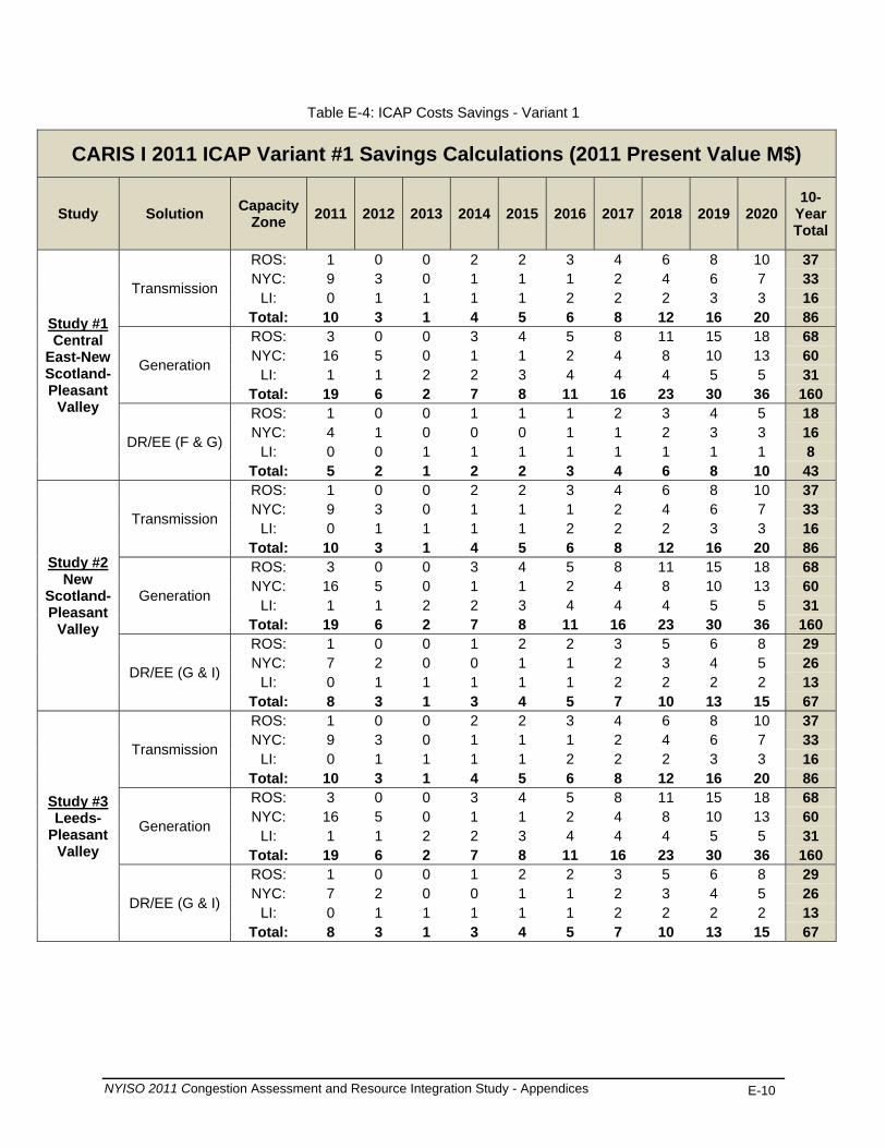
Table E-4: ICAP Costs Savings - Variant 1
CARIS I 2011 ICAP Variant #1 Savings Calculations (2011 Present Value M$)
Study Solution Capacity Zone 2011 2012 2013 2014 2015 2016 2017 2018 2019 2020
10-Year Total
Study #1 Central
East-New Scotland-Pleasant
Valley
Transmission
ROS: 1 0 0 2 2 3 4 6 8 10 37 NYC: 9 3 0 1 1 1 2 4 6 7 33
LI: 0 1 1 1 1 2 2 2 3 3 16 Total: 10 3 1 4 5 6 8 12 16 20 86
Generation
ROS: 3 0 0 3 4 5 8 11 15 18 68 NYC: 16 5 0 1 1 2 4 8 10 13 60
LI: 1 1 2 2 3 4 4 4 5 5 31 Total: 19 6 2 7 8 11 16 23 30 36 160
DR/EE (F & G)
ROS: 1 0 0 1 1 1 2 3 4 5 18 NYC: 4 1 0 0 0 1 1 2 3 3 16
LI: 0 0 1 1 1 1 1 1 1 1 8 Total: 5 2 1 2 2 3 4 6 8 10 43
Study #2 New
Scotland-Pleasant
Valley
Transmission
ROS: 1 0 0 2 2 3 4 6 8 10 37 NYC: 9 3 0 1 1 1 2 4 6 7 33
LI: 0 1 1 1 1 2 2 2 3 3 16 Total: 10 3 1 4 5 6 8 12 16 20 86
Generation
ROS: 3 0 0 3 4 5 8 11 15 18 68 NYC: 16 5 0 1 1 2 4 8 10 13 60
LI: 1 1 2 2 3 4 4 4 5 5 31 Total: 19 6 2 7 8 11 16 23 30 36 160
DR/EE (G & I)
ROS: 1 0 0 1 2 2 3 5 6 8 29 NYC: 7 2 0 0 1 1 2 3 4 5 26
LI: 0 1 1 1 1 1 2 2 2 2 13 Total: 8 3 1 3 4 5 7 10 13 15 67
Study #3 Leeds-
Pleasant Valley
Transmission
ROS: 1 0 0 2 2 3 4 6 8 10 37 NYC: 9 3 0 1 1 1 2 4 6 7 33
LI: 0 1 1 1 1 2 2 2 3 3 16 Total: 10 3 1 4 5 6 8 12 16 20 86
Generation
ROS: 3 0 0 3 4 5 8 11 15 18 68 NYC: 16 5 0 1 1 2 4 8 10 13 60
LI: 1 1 2 2 3 4 4 4 5 5 31 Total: 19 6 2 7 8 11 16 23 30 36 160
DR/EE (G & I)
ROS: 1 0 0 1 2 2 3 5 6 8 29 NYC: 7 2 0 0 1 1 2 3 4 5 26
LI: 0 1 1 1 1 1 2 2 2 2 13 Total: 8 3 1 3 4 5 7 10 13 15 67
NYISO 2011 Congestion Assessment and Resource Integration Study - Appendices E-10

Table E-5: ICAP Costs Savings - Variant 2
CARIS I 2011 ICAP Variant #2 Savings Calculations (2011 Present Value M$)
Study Solution Capacity Zone 2011 2012 2013 2014 2015 2016 2017 2018 2019 2020
10-Year Total
Study #1 Central
East-New Scotland-Pleasant
Valley
Transmission
ROS: 37 1 3 48 62 75 81 76 71 67 522 NYC: 82 81 1 18 24 35 61 57 53 50 464
LI: 9 21 27 26 24 23 21 20 19 18 208 Total: 129 103 32 92 110 133 164 153 143 134 1,193
Generation
ROS: 37 1 3 48 62 75 107 141 132 124 731 NYC: 153 84 1 18 24 35 80 106 99 93 694
LI: 9 21 35 40 45 42 40 37 35 33 337 Total: 199 107 40 106 131 152 226 285 266 249 1,762
DR/EE (F & G)
ROS: 37 1 3 48 45 43 40 38 36 33 326 NYC: 41 40 1 18 17 23 31 29 27 25 253
LI: 9 15 14 13 12 11 11 10 9 9 112 Total: 88 56 18 79 75 77 82 77 72 67 691
Study #2 New
Scotland-Pleasant
Valley
Transmission
ROS: 37 1 3 48 62 75 81 76 71 67 522 NYC: 82 81 1 18 24 35 61 57 53 50 464
LI: 9 21 27 26 24 23 21 20 19 18 208 Total: 129 103 32 92 110 133 164 153 143 134 1,193
Generation
ROS: 37 1 3 48 62 75 107 141 132 124 731 NYC: 153 84 1 18 24 35 80 106 99 93 694
LI: 9 21 35 40 45 42 40 37 35 33 337 Total: 199 107 40 106 131 152 226 285 266 249 1,762
DR/EE (G & I)
ROS: 37 1 3 48 62 67 63 60 56 53 451 NYC: 65 63 1 18 24 33 48 45 42 39 378
LI: 9 21 21 20 19 18 17 16 15 14 170 Total: 111 86 26 86 105 118 129 120 113 106 999
Study #3 Leeds-
Pleasant Valley
Transmission
ROS: 37 1 3 48 62 75 81 76 71 67 522 NYC: 82 81 1 18 24 35 61 57 53 50 464
LI: 9 21 27 26 24 23 21 20 19 18 208 Total: 129 103 32 92 110 133 164 153 143 134 1,193
Generation
ROS: 37 1 3 48 62 75 107 141 132 124 731 NYC: 153 84 1 18 24 35 80 106 99 93 694
LI: 9 21 35 40 45 42 40 37 35 33 337 Total: 199 107 40 106 131 152 226 285 266 249 1,762
DR/EE (G & I)
ROS: 37 1 3 48 62 67 63 60 56 53 451 NYC: 65 63 1 18 24 33 48 45 42 39 378
LI: 9 21 21 20 19 18 17 16 15 14 170 Total: 111 86 26 86 105 118 129 120 113 106 999
NYISO 2011 Congestion Assessment and Resource Integration Study - Appendices E-11

The base case that was used for LOLE calculations was the 2010 NYISO Reliability Needs Assessment (RNA) base case. Updates were made to match with the capacity resources contained in the production cost simulation base case. A series of project cases was created to simulate transmission, generation, and demand response/energy efficiency projects. To simulate the three transmission project cases, the following changes to interface transfer limits were made, as indicated in Table E-6.
Table E-6: MARS Interface Modifications for ICAP Calculations
To simulate the generation project case, 1000 MW of capacity was added to Zone G. The demand response and energy efficiency project cases were created by adding 100 MW of SCR generation and 100 MW load modifiers to Zones F & G or G & I, depending upon the study.
After the base case and project case LOLE values were determined, capacity was removed from each NYISO zone in the each project case, based on the zonal total capacity ratio, until the base case LOLE was reached. The resultant amount of capacity removed is equivalent to the MW Impact of that project case. The MW Impact results for each of the project cases, for the 2020 study year are presented in Table E-7.
Table E-7: ICAP MW Impact
Study Solutions 2020 MW Impact (MW)
ROS NYC LI Total
Study 1: Central East-New Scotland-Pleasant
Valley
Transmission 443 161 96 700 Generation 824 299 177 1300
Demand Response 222 80 48 350
Study 2: New Scotland-Pleasant Valley
Transmission 443 161 96 700 Generation 824 299 177 1300
Demand Response 348 126 75 550
Study 3:Leeds-Pleasant Valley
Transmission 443 161 96 700 Generation 824 299 177 1300
Demand Response 348 126 75 550
NYISO 2011 Congestion Assessment and Resource Integration Study - Appendices E-12
NYISO 2011 Congestion Assessment and Resource Integration Study - Appendices E-13
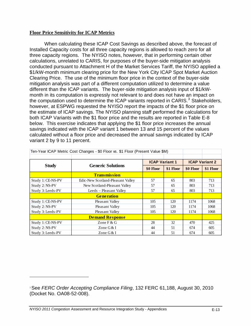
Floor Price Sensitivity for ICAP Metrics
When calculating these ICAP Cost Savings as described above, the forecast of Installed Capacity costs for all three capacity regions is allowed to reach zero for all three capacity regions. The NYISO notes, however, that in performing certain other calculations, unrelated to CARIS, for purposes of the buyer-side mitigation analysis conducted pursuant to Attachment H of the Market Services Tariff, the NYISO applied a $1/kW-month minimum clearing price for the New York City ICAP Spot Market Auction Clearing Price. The use of the minimum floor price in the context of the buyer-side mitigation analysis was part of a different computation utilized to determine a value different than the ICAP variants. The buyer-side mitigation analysis input of $1/kW- month in its computation is expressly not relevant to and does not have an impact on the computation used to determine the ICAP variants reported in CARIS.3 Stakeholders, however, at ESPWG requested the NYISO report the impacts of the $1 floor price on the estimate of ICAP savings. The NYISO planning staff performed the calculations for both ICAP Variants with the $1 floor price and the results are reported in Table E-8 below. This exercise indicates that applying the $1 floor price increases the annual savings indicated with the ICAP variant 1 between 13 and 15 percent of the values calculated without a floor price and decreased the annual savings indicated by ICAP variant 2 by 9 to 11 percent. Ten-Year ICAP Metric Cost Changes - $0 Floor vs. $1 Floor (Present Value $M)
$0 Floor $1 Floor $0 Floor $1 Floor
Transmission Study 1: CE-NS-PV Edic-New Scotland-Pleasant Valley 57 65 803 713 Study 2: NS-PV New Scotland-Pleasant Valley 57 65 803 713 Study 3: Leeds-PV Leeds – Pleasant Valley 57 65 803 713
Generation Study 1: CE-NS-PV Pleasant Valley 105 120 1174 1068 Study 2: NS-PV Pleasant Valley 105 120 1174 1068 Study 3: Leeds-PV Pleasant Valley 105 120 1174 1068
Demand Response Study 1: CE-NS-PV Zone F & G 28 32 470 425 Study 2: NS-PV Zone G & I 44 51 674 605 Study 3: Leeds-PV Zone G & I 44 51 674 605
ICAP Variant 1 ICAP Variant 2Study Generic Solutions
3 See FERC Order Accepting Compliance Filing, 132 FERC 61,188, August 30, 2010 (Docket No. OA08-52-008).

NYISO 2011 Congestion Assessment and Resource Integration Study - Appendices E-14
CARIS Base Case Metrics Results
When comparing historic PROBE values of congestion and other metrics with the projected CARIS values, it is important to note that there are significant differences in assumptions used by these tools. MAPS, unlike PROBE, did not simulate the following: (a) virtual bidding; (b) transmission outages; (c) fixed load and price-capped load; (d) production costs based on mitigated bids;(e) BPCG payments; and (f) co-optimization with ancillary services.
The detailed projected CARIS base case results are presented in Tables E-8 through E-21. Table E-8 below presents the summation of the NYCA zonal base case results for the ten-year study period (except for NYCA-wide production costs ).
Table E-8: Projected CARIS Base Case Results 2011-2020 (nominal $M)
Base Case Summary 2011 2012 2013 2014 2015 2016 2017 2018 2019 2020NYCA-Wide Production Costs ($M) 4,386 5,035 5,186 5,378 5,631 5,909 6,145 6,434 6,765 7,134NYCA Demand$ Congestion ($M) 709 646 670 636 672 740 796 929 1,023 1,098Load LBMP Payments ($M) 7,853 8,765 9,027 9,376 9,822 10,412 10,823 11,348 11,905 12,536Generator LBMP Payments ($M) 6,461 7,310 7,488 7,794 8,126 8,775 9,108 9,494 9,907 10,362Load Pmts Losses ($M) 418 462 476 500 523 575 599 631 665 707SO Costs ($M) 4 9 9 8 8 9 9 10 10 112
SO2 Emissions (Tons) 39,817 29,062 28,308 26,072 24,708 26,773 27,450 28,728 29,322 29,525CO2 Costs ($M) 87 397 482 568 644 765 827 897 972 1,048CO2 Emissions ('000s Tons) 40,758 39,725 39,353 39,153 38,431 40,251 40,490 40,861 41,198 41,314NOx Costs ($M) 16 19 26 36 35 37 37 38 39 40NOx Emissions (Tons) 26,753 23,591 23,299 22,762 22,072 22,995 23,302 23,864 24,160 24,334LBMP ($/MWh) 47 52 54 56 58 62 64 66 69 72System Congestion Rents ($M) 927 828 847 855 880 926 954 1,052 1,105 1,164

NYISO 2011 Congestion Assessment and Resource Integration Study - Appendices E-15
Table E-9: Projected Production Costs (2011-2020) by Zone (nominal $M)
Zone 2011 2012 2013 2014 2015 2016 2017 2018 2019 2020West 360 404 411 419 416 438 458 484 502 517 Genesee 31 36 36 36 37 37 37 38 38 39 Central 480 546 558 587 602 637 656 675 698 720 North 13 15 15 19 20 23 23 23 22 23 Mohawk Valley 4 4 4 5 5 5 5 4 4 4 Capital 766 898 921 963 1,007 1,059 1,103 1,154 1,200 1,258 Hudson Valley 110 86 84 82 83 99 112 133 148 165 Millwood 116 132 134 136 138 140 141 143 145 147 Dunwoodie - - - - - - - - - - NY City 1,196 1,446 1,467 1,529 1,608 1,803 1,874 1,939 2,039 2,139 Long Island 454 508 528 543 571 640 663 697 735 771 NYCA-wide 4,386 5,035 5,186 5,378 5,631 5,909 6,145 6,434 6,765 7,134
Table E-10: Projected Load Payments (2011-2020) by Zone (nominal $M) Zone 2011 2012 2013 2014 2015 2016 2017 2018 2019 2020West 583 661 676 705 734 761 782 800 827 855 Genesee 410 464 478 500 524 550 572 593 619 649 Central 670 758 779 816 853 893 921 949 984 1,024 North 216 281 292 306 324 343 358 371 388 408 Mohawk Valley 312 350 362 377 394 415 429 443 461 481 Capital 524 579 597 617 646 684 707 734 767 801 Hudson Valley 530 587 607 630 661 703 731 764 801 840 Millwood 151 167 172 178 187 200 208 220 231 244 Dunwoodie 320 352 362 374 391 416 433 458 482 510 NY City 2,893 3,187 3,275 3,388 3,545 3,770 3,923 4,153 4,382 4,640 Long Island 1,244 1,378 1,428 1,484 1,563 1,678 1,761 1,863 1,964 2,084 Total NYCA 7,853 8,765 9,027 9,376 9,822 10,412 10,823 11,348 11,905 12,536
Table E-11: Projected Generator Payments (2011-2020) by Zone (nominal $M) Zone 2011 2012 2013 2014 2015 2016 2017 2018 2019 2020West 1,027 1,111 1,131 1,160 1,184 1,240 1,285 1,334 1,380 1,428 Genesee 187 212 217 227 238 249 257 265 274 287 Central 1,202 1,369 1,406 1,476 1,543 1,637 1,692 1,751 1,817 1,896 North 327 370 380 400 419 443 457 471 487 509 Mohawk Valley 122 138 143 149 155 163 169 174 181 188 Capital 909 1,072 1,100 1,153 1,203 1,284 1,333 1,388 1,441 1,504 Hudson Valley 169 123 121 118 120 139 156 183 201 222 Millwood 780 861 885 915 958 1,019 1,056 1,104 1,151 1,202 Dunwoodie 0 0 0 0 0 0 0 0 0 0 NY City 1,246 1,513 1,545 1,616 1,697 1,918 1,991 2,071 2,180 2,287 Long Island 491 541 560 579 609 683 711 753 795 839 Total NYCA 6,461 7,310 7,488 7,794 8,126 8,775 9,108 9,494 9,907 10,362

NYISO 2011 Congestion Assessment and Resource Integration Study - Appendices E-16
Table E-12: Projected Generator GWh
Zone 2011 2012 2013 2014 2015 2016 2017 2018 2019 2020West 26,143 24,879 24,644 24,213 23,584 23,661 23,733 23,908 23,863 23,799 Genesee 4,678 4,694 4,679 4,681 4,680 4,692 4,675 4,676 4,675 4,690 Central 28,778 29,222 29,155 29,532 29,430 29,750 29,684 29,647 29,660 29,703 North 8,024 8,061 8,038 8,095 8,105 8,164 8,131 8,108 8,084 8,114 Mohawk Valley 2,988 2,988 2,992 2,998 2,986 2,984 2,982 2,983 2,983 2,981 Capital 19,341 20,759 20,710 20,964 20,958 21,221 21,241 21,312 21,278 21,357 Hudson Valley 3,142 1,992 1,913 1,768 1,709 1,898 2,056 2,324 2,463 2,605 Millwood 15,763 15,789 15,763 15,763 15,764 15,789 15,762 15,763 15,763 15,789 Dunwoodie 6 6 6 6 6 6 6 6 6 6 NY City 23,052 25,819 25,603 25,957 26,044 27,904 27,830 27,542 27,767 27,825 Long Island 8,454 8,612 8,675 8,659 8,683 9,240 9,219 9,281 9,392 9,440 Total NYCA 140,369 142,821 142,178 142,636 141,947 145,306 145,319 145,550 145,933 146,309
Table E-13: Projected Loss Payments (2011-2020) by Zone (nominal $M)
Zone 2011 2012 2013 2014 2015 2016 2017 2018 2019 2020WestGenesee
(39) (35) (35) (35) (35) (44) (46) (48) (50) (52) (9) (9) (9) (8) (9) (12) (12) (13) (13) (14)
(2) (1) (1) (1) (1) (2) (2) (1) (1) (1) Central 5 8 9 10 10 9 9 9 10 10 NorthMohawk Valley 10 12 12 13 13 14 14 14 15 16 Capital 21 22 22 23 25 28 29 29 31 32 Hudson Valley 38 42 43 45 47 52 54 57 59 62 Millwood 12 13 14 14 15 17 18 18 19 21 Dunwoodie 26 28 29 30 31 35 36 38 40 42 NY City 246 263 269 280 290 327 340 359 379 403 Long Island 110 119 123 129 135 151 158 167 177 189 Total NYCA 418 462 476 500 523 575 599 631 665 707
Table E-14: Projected SO2 Emission Costs (2011-2020) by Zone (nominal $M)
Zone 2011 2012 2013 2014 2015 2016 2017 2018 2019 2020West 2.06 4.83 4.77 4.45 4.22 4.51 4.66 4.79 4.90 4.90 Genesee 0.00 0.00 0.00 0.00 0.00 0.00 0.00 0.00 0.00 0.00 Central 0.14 0.07 0.08 0.07 0.06 0.08 0.08 0.10 0.11 0.12 North 0.04 0.12 0.13 0.13 0.14 0.19 0.20 0.21 0.21 0.20 Mohawk Valley 0.00 0.00 0.00 0.00 0.00 0.00 0.00 0.00 0.00 0.00 Capital 0.01 0.02 0.02 0.02 0.02 0.02 0.03 0.03 0.03 0.03 Hudson Valley 1.13 1.81 1.80 1.59 1.54 1.84 2.08 2.52 2.77 3.01 Millwood 0.00 0.00 0.00 0.00 0.00 0.00 0.00 0.00 0.00 0.00 Dunwoodie - - - - - - - - - - NY City 0.02 0.09 0.09 0.09 0.09 0.11 0.11 0.11 0.11 0.11 Long Island 0.58 1.77 1.82 1.85 1.89 2.12 2.16 2.24 2.32 2.41 Total NYCA 3.98 8.72 8.70 8.22 7.98 8.87 9.32 9.99 10.46 10.79
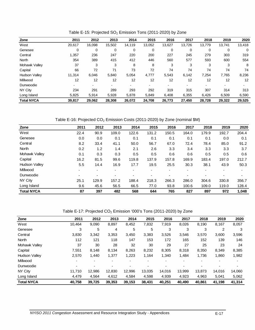
NYISO 2011 Congestion Assessment and Resource Integration Study - Appendices E-17
Table E-15: Projected SO2 Emission Tons (2011-2020) by Zone
Zone 2011 2012 2013 2014 2015 2016 2017 2018 2019 2020West 20,617 16,098 15,502 14,119 13,052 13,627 13,726 13,779 13,741 13,418 Genesee 0 0 0 0 0 0 0 0 0 0 Central 1,357 236 247 220 200 227 245 279 303 319 North 354 389 415 412 446 560 577 593 600 554 Mohawk Valley 37 3 3 8 8 3 3 3 3 8 Capital 66 72 71 73 72 74 74 74 74 74 Hudson Valley 11,314 6,046 5,840 5,054 4,777 5,543 6,142 7,254 7,765 8,236 Millwood 12 12 12 12 12 12 12 12 12 12 Dunwoodie - - - - - - - - - - NY City 234 291 289 293 292 319 315 307 314 313 Long Island 5,825 5,914 5,928 5,878 5,849 6,408 6,355 6,426 6,509 6,590 Total NYCA 39,817 29,062 28,308 26,072 24,708 26,773 27,450 28,728 29,322 29,525
Table E-16: Projected CO2 Emission Costs (2011-2020) by Zone (nominal $M)
Zone 2011 2012 2013 2014 2015 2016 2017 2018 2019 2020West 22.4 90.9 109.0 122.6 131.2 150.5 164.0 179.9 192.7 204.4 Genesee 0.0 0.0 0.1 0.1 0.1 0.1 0.1 0.1 0.0 0.1 Central 8.2 33.4 41.1 50.0 56.7 67.0 72.4 78.4 85.0 91.2 North 0.2 1.2 1.4 2.1 2.6 3.3 3.4 3.3 3.3 3.7 Mohawk Valley 0.1 0.3 0.3 0.5 0.5 0.6 0.6 0.5 0.5 0.6 Capital 16.2 81.5 99.6 119.8 137.9 157.8 169.9 183.4 197.0 212.7 Hudson Valley 5.5 14.4 16.9 17.7 19.5 25.5 30.3 38.1 43.9 50.3 Millwood - - - - - - - - - - Dunwoodie - - - - - - - - - - NY City 25.1 129.9 157.2 188.4 218.3 266.3 286.0 304.6 330.8 356.7 Long Island 9.6 45.6 56.5 66.5 77.0 93.8 100.6 109.0 119.0 128.4 Total NYCA 87 397 482 568 644 765 827 897 972 1,048
Table E-17: Projected CO2 Emission ‘000’s Tons (2011-2020) by Zone
Zone 2011 2012 2013 2014 2015 2016 2017 2018 2019 2020West 10,464 9,090 8,897 8,452 7,832 7,919 8,026 8,190 8,167 8,057 Genesee 3 5 4 5 5 3 3 3 2 3 Central 3,830 3,342 3,353 3,450 3,383 3,526 3,546 3,570 3,600 3,596 North 112 121 118 147 153 172 165 152 139 146 Mohawk Valley 37 30 28 32 30 29 27 25 23 24 Capital 7,551 8,148 8,134 8,263 8,232 8,305 8,318 8,350 8,349 8,385 Hudson Valley 2,570 1,440 1,377 1,223 1,164 1,340 1,484 1,736 1,860 1,982 Millwood - - - - - - - - - - Dunwoodie - - - - - - - - - - NY City 11,710 12,986 12,830 12,996 13,035 14,016 13,999 13,873 14,016 14,060 Long Island 4,479 4,564 4,612 4,584 4,598 4,939 4,923 4,963 5,041 5,062 Total NYCA 40,758 39,725 39,353 39,153 38,431 40,251 40,490 40,861 41,198 41,314

NYISO 2011 Congestion Assessment and Resource Integration Study - Appendices E-18
Table E-18: Projected NOx Emission Costs 2011-2020) by Zone (nominal $M)
Zone 2011 2012 2013 2014 2015 2016 2017 2018 2019 2020West 6.1 7.3 9.9 13.8 13.0 13.0 13.2 13.4 13.5 13.7Genesee 0.0 0.0 0.0 0.0 0.0 0.0 0.0 0.0 0.0 0.0Central 1.4 1.1 1.6 2.3 2.2 2.3 2.4 2.5 2.6 2.7North 0.2 0.3 0.4 0.6 0.6 0.7 0.7 0.7 0.7 0.7Mohawk Valley 0.1 0.2 0.2 0.4 0.4 0.4 0.4 0.4 0.4 0.4Capital 0.6 0.8 1.1 1.6 1.5 1.5 1.5 1.5 1.5 1.5Hudson Valley 2.2 1.7 2.2 2.9 2.8 3.2 3.5 4.1 4.4 4.8Millwood 0.6 0.8 1.2 1.7 1.7 1.7 1.7 1.7 1.7 1.7Dunwoodie 0.0 0.0 0.0 0.0 0.0 0.0 0.0 0.0 0.0 0.0NY City 1.4 2.0 2.7 4.0 4.0 4.5 4.5 4.4 4.5 4.6Long Island 3.4 4.6 6.3 9.2 9.2 9.6 9.6 9.7 9.8 10.1Total NYCA 16.1 18.9 25.6 36.4 35.3 36.8 37.3 38.2 39.0 40.3
Table E-19: Projected NOx in Tons (2011-2020) by Zone
Zone 2011 2012 2013 2014 2015 2016 2017 2018 2019 2020West 10,130 9,130 8,974 8,646 8,108 8,134 8,225 8,376 8,347 8,264 Genesee 6 7 6 7 7 6 6 6 6 6 Central 2,348 1,418 1,437 1,411 1,360 1,436 1,473 1,541 1,592 1,612 North 393 396 396 400 402 409 408 407 405 405 Mohawk Valley 227 228 226 229 228 227 225 223 222 222 Capital 920 966 961 972 942 931 928 926 927 926 Hudson Valley 3,635 2,109 2,003 1,795 1,720 1,983 2,197 2,552 2,728 2,919 Millwood 1,046 1,049 1,046 1,046 1,046 1,049 1,046 1,046 1,046 1,050 Dunwoodie - - - - - - - - - - NY City 2,359 2,545 2,483 2,518 2,521 2,799 2,797 2,753 2,799 2,803 Long Island 5,687 5,743 5,764 5,738 5,738 6,021 5,996 6,034 6,089 6,127 Total NYCA 26,753 23,591 23,299 22,762 22,072 22,995 23,302 23,864 24,160 24,334
Table E-20: Projected System Congestion Rents (nominal $M)
2011 2012 2013 2014 2015 2016 2017 2018 2019 2020 Total Congestion Rents
927
828
847
855
880
926
954
1,052
1,105
1,164

NYISO 2011 Congestion Assessment and Resource Integration Study - Appendices E-19
Table E-21: Projected Zonal LBMP $/MWh (2011-2020) by Zone
Zone 2011 2012 2013 2014 2015 2016 2017 2018 2019 2020West 39.87 45.44 46.74 48.88 51.21 53.44 55.28 57.04 59.16 61.41Genesee 41.48 46.86 48.18 50.26 52.65 55.14 57.07 58.91 61.12 63.57Central 42.79 48.34 49.74 51.85 54.30 57.12 59.16 61.16 63.47 66.04North 41.03 46.52 47.86 49.91 52.27 54.94 56.93 58.82 61.03 63.50Mohawk Valley 43.75 49.28 50.71 52.82 55.30 58.23 60.33 62.40 64.78 67.42Capital 47.85 52.77 54.29 56.15 58.77 62.24 64.52 67.09 69.76 72.59Hudson Valley 50.06 55.21 56.82 58.74 61.47 65.24 67.69 70.60 73.56 76.67Millwood 50.95 56.02 57.65 59.55 62.32 66.19 68.70 71.76 74.83 78.03Dunwoodie 51.20 56.26 57.90 59.79 62.57 66.47 68.99 72.08 75.17 78.40NY City 51.88 56.94 58.64 60.59 63.39 67.31 69.88 73.05 76.23 79.57Long Island 54.44 59.88 61.70 63.90 66.92 70.99 73.90 77.28 80.63 84.29NYCA Avg. LBMP 46.85 52.14 53.66 55.68 58.29 61.57 63.86 66.38 69.07 71.95
E.2. Selection of Three Studies
The process for selecting the three CARIS studies occurs in two steps, as described below.
In Step 1, both historic (5 years) and projected (10 years) congested elements for the
fifteen- year period are ranked in ascending order based on the calculated present value of Demand$ congestion. Initially, the top five positive and top two negative congested elements are identified for further consideration. This initial list is then revised to include any orphaned elements (elements for which there is no historic congestion data) if their projected congestion is higher than other elements’ projected congestion. If the projected congestion for a specific element is declining in the future years (thus indicating a diminishing return), then that element is removed from the list and is no longer considered for further analysis. The remaining top congested elements (up to five) are then further considered as primary elements for inclusion in Step 2.
In Step 2, the top congested elements from Step 1 are relieved independently to
determine if any needs to be grouped with other elements that show significant congestion when a primary element is relieved. The top congested elements are relieved by increasing their limit to 9999 MW for a mid and horizon year. In addition, the impedance of the circuit is reduced to reflect the impact of a new parallel circuit. The primary constraint will be assessed for grouping with a new element if the new element is electrically adjacent to the primary element and in the top five of congested elements based on Demand$ congestion. If the new element meets these criteria, the process is repeated with the new element’s limit also increased to 9999 to identify any additional electrically adjacent elements that become significantly congested. The change in production cost savings is used as a guideline for groupings. For example, elements are grouped if the production cost savings are increased by 50% or more. If, however, after the initial grouping the production cost savings is not more than $3 million, the primary element is eliminated from the list considered for study selection. In addition, a significant declining trend in congestion over an identified congested element in the later years of the study period will also eliminate that element from the rankings. The study selection procedures provide the NYISO with flexibility for grouping, assessing and recommending the three studies provided that the grouping process for each CARIS is reviewed with ESPWG. It is expected that the three groupings/elements with the most production cost savings will be selected as the three studies. The production cost savings based on modifying an existing element’s limit will be different than that achieved when applying a transmission solution since an impedance value for a line is not being introduced.
Table E-22 shows the Demand$ congestion for the base case and the relaxation cases for
year 2015 and 2020.
NYISO 2011 Congestion Assessment and Resource Integration Study - Appendices E-20
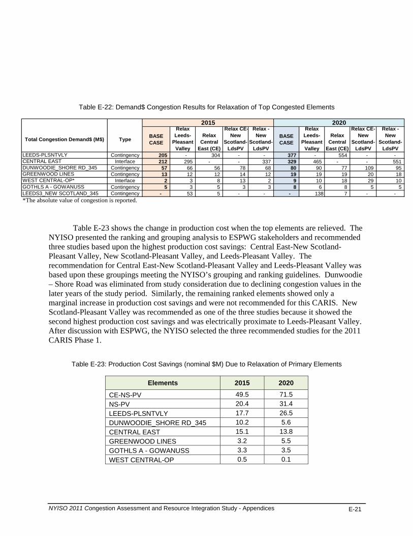
Table E-22: Demand$ Congestion Results for Relaxation of Top Congested Elements
Total Congestion Demand$ (M$) Type BASE CASE
Relax Leeds-
Pleasant Valley
Relax Central
East (CE)
Relax CE-New
Scotland-LdsPV
Relax - New
Scotland-LdsPV
BASE CASE
Relax Leeds-
Pleasant Valley
Relax Central
East (CE)
Relax CE-New
Scotland-LdsPV
Relax - New
Scotland-LdsPV
LEEDS-PLSNTVLY Contingency 205 - 304 - - 377 - 554 - - CENTRAL EAST Interface 212 295 - - 337 329 465 - - 551 DUNWOODIE_SHORE RD_345 Contingency 57 66 56 78 68 80 90 77 109 95 GREENWOOD LINES Contingency 13 12 12 14 12 19 19 19 20 18 WEST CENTRAL-OP* Interface 2 3 8 13 2 9 10 18 29 10 GOTHLS A - GOWANUSS Contingency 5 3 5 3 3 8 6 8 5 5 LEEDS3_NEW SCOTLAND_345 Contingency - 53 5 - - - 138 7 - - *The absolute value of congestion is reported.
2015 2020
Table E-23 shows the change in production cost when the top elements are relieved. The NYISO presented the ranking and grouping analysis to ESPWG stakeholders and recommended three studies based upon the highest production cost savings: Central East-New Scotland-Pleasant Valley, New Scotland-Pleasant Valley, and Leeds-Pleasant Valley. The recommendation for Central East-New Scotland-Pleasant Valley and Leeds-Pleasant Valley was based upon these groupings meeting the NYISO’s grouping and ranking guidelines. Dunwoodie – Shore Road was eliminated from study consideration due to declining congestion values in the later years of the study period. Similarly, the remaining ranked elements showed only a marginal increase in production cost savings and were not recommended for this CARIS. New Scotland-Pleasant Valley was recommended as one of the three studies because it showed the second highest production cost savings and was electrically proximate to Leeds-Pleasant Valley. After discussion with ESPWG, the NYISO selected the three recommended studies for the 2011 CARIS Phase 1.
Table E-23: Production Cost Savings (nominal $M) Due to Relaxation of Primary Elements
Elements 2015 2020
CE-NS-PV 49.5 71.5 NS-PV 20.4 31.4 LEEDS-PLSNTVLY 17.7 26.5 DUNWOODIE_SHORE RD_345 10.2 5.6 CENTRAL EAST 15.1 13.8 GREENWOOD LINES 3.2 5.5 GOTHLS A - GOWANUSS 3.3 3.5 WEST CENTRAL-OP 0.5 0.1
NYISO 2011 Congestion Assessment and Resource Integration Study - Appendices E-21
E.3 Generic Solutions
The NYISO developed generic solutions for each of the three studies. The generic
solutions are each added to the base case in order to determine the impact on congestion for the grouped elements in each study. It is assumed that each of the generic solutions is installed in the first study year (2011). This assumption allows for the calculation of the full ten-year production cost and additional metrics resulting from the generic solution. The transfer limits were adjusted as necessary in the generic solution cases.
For each study, one block of transmission (>1000MW), two blocks of generation (1000MW), and two blocks of demand response (400MW) were implemented after considering whether a majority of the congestion on the grouped elements being studied could be relieved and whether diminishing returns could be realized from implementing additional blocks. Disclaimers:
• Other solutions may exist which will better alleviate the congestion on the studied elements.
• No engineering, physical feasibility study, routing study or siting study has been completed for the generic solutions. Therefore, it is unknown if the generic solutions can be physically constructed as proposed.
Study1: Central East-New Scotland-Pleasant Valley
Table E-24 below presents the change in the number of congested hours by constraints after the generic solution has been applied. Negative values indicate a reduction in congested hours. Detailed results for all CARIS metrics, representing the change between the base case values and the values after the three generic solutions have been applied, are presented in Attachment H.
NYISO 2011 Congestion Assessment and Resource Integration Study - Appendices E-22
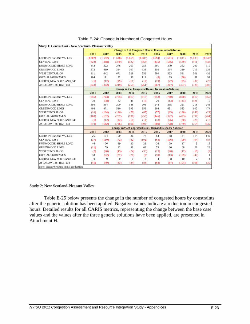
NYISO 2011 Congestion Assessment and Resource Integration Study - Appendices E-23
Table E-24: Change in Number of Congested Hours
2011 2012 2013 2014 2015 2016 2017 2018 2019 2020LEEDS-PLEASANT VALLEY (1,707) (1,592) (1,618) (1,665) (1,683) (1,694) (1,681) (1,811) (1,833) (1,948)
(322) (388) (370) (422) (363) (445) (546) (539) (511) (548)
(8) (30)(1) (12) (19) (11) (12) (19) (27) (25) (37) (20)
(343) (302) (249) (259) (264) (267) (247) (307) (329) (307)
(856) (743) (765) (817) (817) (853) (780) (820) (817) (869)(38) (18) (13) (115) (121)
(10) (104) (126) (70) (87) (77) (63) (130) (142) (24)(108) (192) (207) (196) (253) (446) (322) (423) (397) (264)
(1) (12) (12) (10) (11) (18) (26) (20) (29) (13)(610) (682) (726) (606) (592) (689) (728) (779) (764) (639)
(37) (110) (72) (82) (102) (63) (106) (99) (94) (84)
(11)(2) (20) (43) (24) (36) (23) (20) (17) (15) (7)
(22) (37) (76) (9) (59) (13) (109) (42)
(41) (49) (33) (84) (84) (68) (67) (104) (106) (30)
CENTRAL EASTDUNWOODIE-SHORE ROAD 442 322 276 263 258 291 279 282 290 319GREENWOOD LINES 372 419 314 367 333 156 294 210 215 233WEST CENTRAL-OP 311 642 671 528 552 580 523 581 501 432GOTHALS-GOWANUS 104 111 92 96 111 89 81 91LEEDS3_NEW SCOTLAND_345ASTORIAW 138_HG5_138
2011 2012 2013 2014 2015 2016 2017 2018 2019 2020LEEDS-PLEASANT VALLEYCENTRAL EAST 30 32 41 20 19DUNWOODIE-SHORE ROAD 350 254 200 188 201 248 235 221 218 241GREENWOOD LINES 408 471 530 593 559 604 651 523 602 474WEST CENTRAL-OPGOTHALS-GOWANUSLEEDS3_NEW SCOTLAND_345ASTORIAW 138_HG5_138
2011 2012 2013 2014 2015 2016 2017 2018 2019 2020LEEDS-PLEASANT VALLEY 26 104 100 86 77 64 88 134 114 142CENTRAL EASTDUNWOODIE-SHORE ROAD 46 26 29 20 23 26 29 17 5 15GREENWOOD LINES 59 12 98 63 79 60 68 28 29WEST CENTRAL-OPGOTHALS-GOWANUS 33 1LEEDS3_NEW SCOTLAND_345 0 9 0 0 3 4 8 10 2 4ASTORIAW 138_HG5_138Note: Negative values imply a reduction.
Study 1: Central East - New Scotland - Pleasant Valley
Change in # of Congested Hours: Demand Response Solution
Change in # of Congested Hours: Transmission Solution
Change in # of Congested Hours: Generation Solution
Study 2: New Scotland-Pleasant Valley
Table E-25 below presents the change in the number of congested hours by constraints after the generic solution has been applied. Negative values indicate a reduction in congested hours. Detailed results for all CARIS metrics, representing the change between the base case values and the values after the three generic solutions have been applied, are presented in Attachment H.
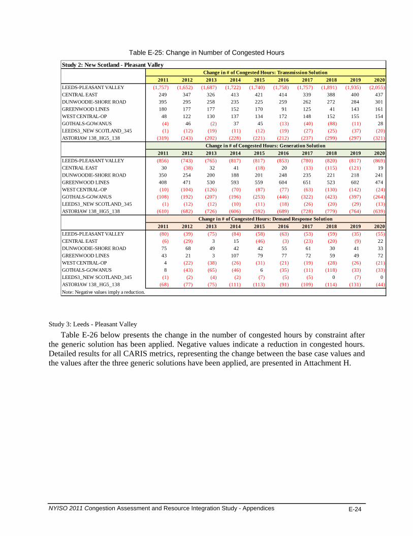
NYISO 2011 Congestion Assessment and Resource Integration Study - Appendices E-24
Table E-25: Change in Number of Congested Hours
2011 2012 2013 2014 2015 2016 2017 2018 2019 2020LEEDS-PLEASANT VALLEY (1,757) (1,652) (1,687) (1,722) (1,740) (1,758) (1,757) (1,891) (1,935) (2,055)
(4) (2) (13) (40) (88) (11)(1) (12) (19) (11) (12) (19) (27) (25) (37) (20)
(319) (243) (202) (228) (221) (212) (237) (299) (297) (321)
(856) (743) (765) (817) (817) (853) (780) (820) (817) (869)(38) (18) (13) (115) (121)
(10) (104) (126) (70) (87) (77) (63) (130) (142) (24)(108) (192) (207) (196) (253) (446) (322) (423) (397) (264)
(1) (12) (12) (10) (11) (18) (26) (20) (29) (13)(610) (682) (726) (606) (592) (689) (728) (779) (764) (639)
(80) (39) (75) (84) (58) (63) (53) (59) (35) (55)(6) (29) (46) (3) (23) (20) (9)
(22) (38) (26) (31) (21) (19) (28) (26) (21)(43) (65) (46) (35) (11) (118) (33) (33)
(1) (2) (4) (2) (7) (5) (5) (7)(68) (77) (75) (111) (113) (91) (109) (114) (131) (44)
CENTRAL EAST 249 347 326 413 421 414 339 388 400 437DUNWOODIE-SHORE ROAD 395 295 258 235 225 259 262 272 284 301GREENWOOD LINES 180 177 177 152 170 91 125 41 143 161WEST CENTRAL-OP 48 122 130 137 134 172 148 152 155 154GOTHALS-GOWANUS 46 37 45 28LEEDS3_NEW SCOTLAND_345ASTORIAW 138_HG5_138
2011 2012 2013 2014 2015 2016 2017 2018 2019 2020LEEDS-PLEASANT VALLEYCENTRAL EAST 30 32 41 20 19DUNWOODIE-SHORE ROAD 350 254 200 188 201 248 235 221 218 241GREENWOOD LINES 408 471 530 593 559 604 651 523 602 474WEST CENTRAL-OPGOTHALS-GOWANUSLEEDS3_NEW SCOTLAND_345ASTORIAW 138_HG5_138
2011 2012 2013 2014 2015 2016 2017 2018 2019 2020LEEDS-PLEASANT VALLEYCENTRAL EAST 3 15 22DUNWOODIE-SHORE ROAD 75 68 49 42 42 55 61 30 41 33GREENWOOD LINES 43 21 3 107 79 77 72 59 49 72WEST CENTRAL-OP 4GOTHALS-GOWANUS 8 6LEEDS3_NEW SCOTLAND_345 0 0ASTORIAW 138_HG5_138Note: Negative values imply a reduction.
Change in # of Congested Hours: Generation Solution
Change in # of Congested Hours: Demand Response Solution
Study 2: New Scotland - Pleasant ValleyChange in # of Congested Hours: Transmission Solution
Study 3: Leeds - Pleasant Valley Table E-26 below presents the change in the number of congested hours by constraint after
the generic solution has been applied. Negative values indicate a reduction in congested hours. Detailed results for all CARIS metrics, representing the change between the base case values and the values after the three generic solutions have been applied, are presented in Attachment H.
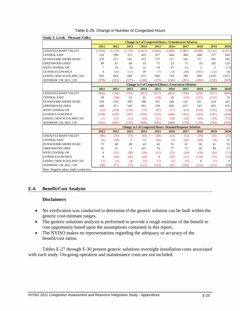
NYISO 2011 Congestion Assessment and Resource Integration Study - Appendices E-25
Table E-26: Change in Number of Congested Hours
2011 2012 2013 2014 2015 2016 2017 2018 2019 2020LEEDS-PLEASANT VALLEY (1,830) (1,710) (1,770) (1,811) (1,843) (1,866) (1,881) (2,048) (2,131) (2,261)
(8)(8) (17)
(16) (11) (7) (3) (49) (101) (14)
(278) (233) (177) (180) (172) (166) (202) (180) (239) (209)
(856) (743) (765) (817) (817) (853) (780) (820) (817) (869)(38) (18) (13) (115) (121)
(10) (104) (126) (70) (87) (77) (63) (130) (142) (24)(108) (192) (207) (196) (253) (446) (322) (423) (397) (264)
(1) (12) (12) (10) (11) (18) (26) (20) (29) (13)(610) (682) (726) (606) (592) (689) (728) (779) (764) (639)
(80) (39) (75) (84) (58) (63) (53) (59) (35) (55)(6) (29) (46) (3) (23) (20) (9)
(22) (38) (26) (31) (21) (19) (28) (26) (21)(43) (65) (46) (35) (11) (118) (33) (33)
(1) (2) (4) (2) (7) (5) (5) (7)(68) (77) (75) (111) (113) (91) (109) (114) (131) (44)
CENTRAL EAST 316 398 372 425 477 464 380 406 377 436DUNWOODIE-SHORE ROAD 279 211 165 153 157 171 185 177 165 193GREENWOOD LINES 89 67 68 33 71 23 73 102 135WEST CENTRAL-OP 7 24 31 50 67 23 2 5GOTHALS-GOWANUS 9 39 54LEEDS3_NEW SCOTLAND_345 659 604 646 675 692 719 780 909 1,010 1,073ASTORIAW 138_HG5_138
2011 2012 2013 2014 2015 2016 2017 2018 2019 2020LEEDS-PLEASANT VALLEYCENTRAL EAST 30 32 41 20 19DUNWOODIE-SHORE ROAD 350 254 200 188 201 248 235 221 218 241GREENWOOD LINES 408 471 530 593 559 604 651 523 602 474WEST CENTRAL-OPGOTHALS-GOWANUSLEEDS3_NEW SCOTLAND_345ASTORIAW 138_HG5_138
2011 2012 2013 2014 2015 2016 2017 2018 2019 2020LEEDS-PLEASANT VALLEYCENTRAL EAST 3 15 22DUNWOODIE-SHORE ROAD 75 68 49 42 42 55 61 30 41 33GREENWOOD LINES 43 21 3 107 79 77 72 59 49 72WEST CENTRAL-OP 4GOTHALS-GOWANUS 8 6LEEDS3_NEW SCOTLAND_345 0 0ASTORIAW 138_HG5_138Note: Negative values imply a reduction.
Study 3: Leeds - Pleasant ValleyChange in # of Congested Hours: Transmission Solution
Change in # of Congested Hours: Generation Solution
Change in # of Congested Hours: Demand Response Solution
E.4. Benefit/Cost Analysis
Disclaimers
• No verification was conducted to determine if the generic solution can be built within the generic cost estimate ranges.
• The generic solutions analysis is performed to provide a rough estimate of the benefit to cost opportunity based upon the assumptions contained in this report.
• The NYISO makes no representations regarding the adequacy or accuracy of the benefit/cost ratios.
Tables E-27 through E-30 present generic solutions overnight installation costs associated
with each study. On-going operation and maintenance costs are not included.

NYISO 2011 Congestion Assessment and Resource Integration Study - Appendices E-26
Table E-27: Generic Solution Costs for Each Study ($M)
Study 1: Study 2: Study 3:
Studies Central East-New Scotland-Pleasant
Valley
New Scotland-Pleasant Valley
Leeds - Pleasant Valley
Substation TerminalsEdic to New Scotland to
Pleasant Valley
New Scotland to Pleasant Valley
Leeds to Pleasant Valley
Miles (# of terminals) 155 (3) 65 (2) 39 (2)High $1,168 $502 $312Mid $799 $343 $213Low $322 $139 $87
Substation Terminal Pleasant Valley Pleasant Valley Pleasant Valley# of 500 MW Blocks 2 2 2
High $1,988 $1,988 $1,988Mid $1,622 $1,622 $1,622Low $1,256 $1,256 $1,256
Zone F & G G&I G&I# of 200 MW Blocks 2 2 2
High $672 $754 $754Mid $540 $605 $605Low $406 $454 $454
Demand Response
Transmission
Generation
Generic Solution Cost Summary ($M)
Table E-28: Generic Solutions for Study 1: Central East to New Scotland to Pleasant Valley
Generic Solution Study 1: Central East-New Scotland-Pleasant Valley
(Estimates should not be assumed reflective or predictive of actual project costs) Transmission Solution: Edic to New Scotland to Pleasant Valley
Cost Range Quantity Unit Pricing
($M) Total ($M) High
Transmission Line (Miles) 155 $7.3 $1,131.5Substation Line Terminal 3 $9 $27.0
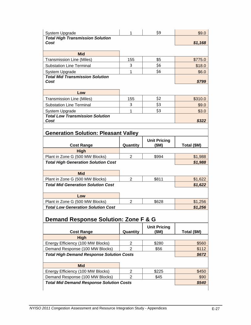
System Upgrade 1 $9 $9.0Total High Transmission Solution Cost $1,168
Mid Transmission Line (Miles) 155 $5 $775.0Substation Line Terminal 3 $6 $18.0System Upgrade 1 $6 $6.0Total Mid Transmission Solution Cost $799
Low Transmission Line (Miles) 155 $2 $310.0Substation Line Terminal 3 $3 $9.0System Upgrade 1 $3 $3.0Total Low Transmission Solution Cost $322
Generation Solution: Pleasant Valley
Cost Range Quantity Unit Pricing
($M) Total ($M) High
Plant in Zone G (500 MW Blocks) 2 $994 $1,988Total High Generation Solution Cost $1,988
Mid Plant in Zone G (500 MW Blocks) 2 $811 $1,622Total Mid Generation Solution Cost $1,622
Low Plant in Zone G (500 MW Blocks) 2 $628 $1,256Total Low Generation Solution Cost $1,256
Demand Response Solution: Zone F & G
Cost Range Quantity Unit Pricing
($M) Total ($M) High
Energy Efficiency (100 MW Blocks) 2 $280 $560Demand Response (100 MW Blocks) 2 $56 $112Total High Demand Response Solution Costs $672
Mid Energy Efficiency (100 MW Blocks) 2 $225 $450Demand Response (100 MW Blocks) 2 $45 $90Total Mid Demand Response Solution Costs $540
NYISO 2011 Congestion Assessment and Resource Integration Study - Appendices E-27

Low Energy Efficiency (100 MW Blocks) 2 $170 $340Demand Response (100 MW Blocks) 2 $33 $66Total Low Demand Response Solution Costs $406
Table E-29: Generic Solutions for Study 2: New Scotland- Pleasant Valley
Generic Solution Study 2: New Scotland-Pleasant Valley
(Estimates should not be assumed reflective or predictive of actual project costs)
Transmission Solution: New Scotland to Pleasant Valley
Cost Range Quantity Unit Pricing
($M) Total ($M) High
Transmission Line (Miles) 65 $7.3 $474.5Substation Line Terminal 2 $9 $18.0System Upgrade 1 $9 $9.0Total High Transmission Solution Cost $502
Mid Transmission Line (Miles) 65 $5 $325.0Substation Line Terminal 2 $6 $12.0System Upgrade 1 $6 $6.0Total Mid Transmission Solution Cost $343
Low Transmission Line (Miles) 65 $2 $130.0Substation Line Terminal 2 $3 $6.0System Upgrade 1 $3 $3.0Total Low Transmission Solution Cost $139
Generation Solution: Pleasant Valley
Cost Range Quantity Unit Pricing
($M) Total ($M) High
Plant in Zone G (500 MW Blocks) 2 $994 $1,988Total High Generation Solution Cost $1,988
Mid Plant in Zone G (500 MW Blocks) 2 $811 $1,622Total Mid Generation Solution Cost $1,622
NYISO 2011 Congestion Assessment and Resource Integration Study - Appendices E-28
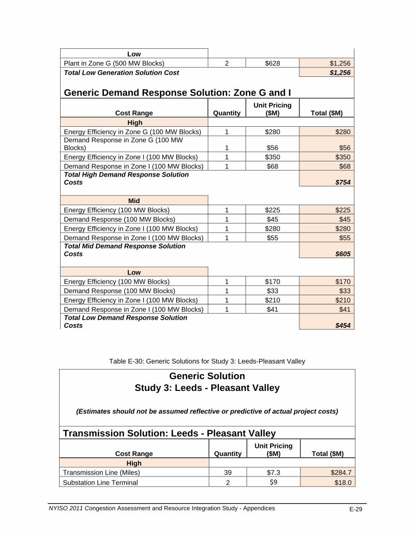
Low Plant in Zone G (500 MW Blocks) 2 $628 $1,256Total Low Generation Solution Cost $1,256
Generic Demand Response Solution: Zone G and I
Cost Range Quantity Unit Pricing
($M) Total ($M) High
Energy Efficiency in Zone G (100 MW Blocks) 1 $280 $280Demand Response in Zone G (100 MW Blocks) 1 $56 $56Energy Efficiency in Zone I (100 MW Blocks) 1 $350 $350Demand Response in Zone I (100 MW Blocks) 1 $68 $68Total High Demand Response Solution Costs $754
Mid Energy Efficiency (100 MW Blocks) 1 $225 $225Demand Response (100 MW Blocks) 1 $45 $45Energy Efficiency in Zone I (100 MW Blocks) 1 $280 $280Demand Response in Zone I (100 MW Blocks) 1 $55 $55Total Mid Demand Response Solution Costs $605
Low Energy Efficiency (100 MW Blocks) 1 $170 $170Demand Response (100 MW Blocks) 1 $33 $33Energy Efficiency in Zone I (100 MW Blocks) 1 $210 $210Demand Response in Zone I (100 MW Blocks) 1 $41 $41Total Low Demand Response Solution Costs $454
Table E-30: Generic Solutions for Study 3: Leeds-Pleasant Valley
Generic Solution Study 3: Leeds - Pleasant Valley
(Estimates should not be assumed reflective or predictive of actual project costs) Transmission Solution: Leeds - Pleasant Valley
Cost Range Quantity Unit Pricing
($M) Total ($M) High
Transmission Line (Miles) 39 $7.3 $284.7Substation Line Terminal 2 $9 $18.0
NYISO 2011 Congestion Assessment and Resource Integration Study - Appendices E-29
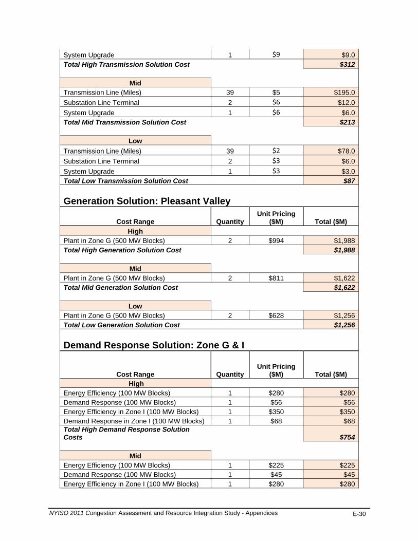
System Upgrade 1 $9 $9.0Total High Transmission Solution Cost $312
Mid Transmission Line (Miles) 39 $5 $195.0Substation Line Terminal 2 $6 $12.0System Upgrade 1 $6 $6.0Total Mid Transmission Solution Cost $213
Low Transmission Line (Miles) 39 $2 $78.0Substation Line Terminal 2 $3 $6.0System Upgrade 1 $3 $3.0Total Low Transmission Solution Cost $87
Generation Solution: Pleasant Valley
Cost Range Quantity Unit Pricing
($M) Total ($M) High
Plant in Zone G (500 MW Blocks) 2 $994 $1,988Total High Generation Solution Cost $1,988
Mid Plant in Zone G (500 MW Blocks) 2 $811 $1,622Total Mid Generation Solution Cost $1,622
Low Plant in Zone G (500 MW Blocks) 2 $628 $1,256Total Low Generation Solution Cost $1,256
Demand Response Solution: Zone G & I
Cost Range Quantity Unit Pricing
($M) Total ($M) High
Energy Efficiency (100 MW Blocks) 1 $280 $280Demand Response (100 MW Blocks) 1 $56 $56Energy Efficiency in Zone I (100 MW Blocks) 1 $350 $350Demand Response in Zone I (100 MW Blocks) 1 $68 $68Total High Demand Response Solution Costs $754
Mid Energy Efficiency (100 MW Blocks) 1 $225 $225Demand Response (100 MW Blocks) 1 $45 $45Energy Efficiency in Zone I (100 MW Blocks) 1 $280 $280
NYISO 2011 Congestion Assessment and Resource Integration Study - Appendices E-30

NYISO 2011 Congestion Assessment and Resource Integration Study - Appendices E-31
Demand Response in Zone I (100 MW Blocks) 1 $55 $55Total High Demand Response Solution Costs $605
Low Energy Efficiency (100 MW Blocks) 1 $170 $170Demand Response (100 MW Blocks) 1 $33 $33Energy Efficiency in Zone I (100 MW Blocks) 1 $210 $210Demand Response in Zone I (100 MW Blocks) 1 $41 $41Total High Demand Response Solution Costs $454

Appendix F – Initial CARIS Manual (link)
http://www.nyiso.com/public/webdocs/services/planning/initial_caris_manual_bic_approved/Initial_CARIS_Manual.pdf
The NYISO’s existing CRPP manual and existing Initial CARIS manual are currently
being integrated into a single Comprehensive System Planning Process (CSPP) Manual.
NYISO 2011 Congestion Assessment and Resource Integration Study - Appendices F-1
Appendix G - 2010 RNA and CRP Reports (link)
The 2010 RNA and CRP reports can be found through the following links: http://www.nyiso.com/public/webdocs/services/planning/reliability_assessments/2010_R
eliability_Needs_Assessment_Final_Report_September_2010.pdf http://www.nyiso.com/public/webdocs/services/planning/reliability_assessments/CRP_20
10_FINAL_REPORT_January_11__2011.pdf
NYISO 2011 Congestion Assessment and Resource Integration Study - Appendices G-1
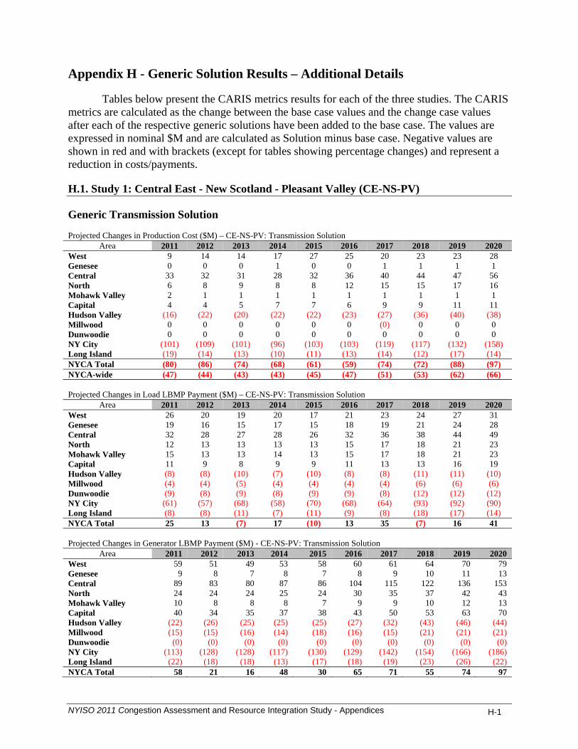
Appendix H - Generic Solution Results – Additional Details
Tables below present the CARIS metrics results for each of the three studies. The CARIS metrics are calculated as the change between the base case values and the change case values after each of the respective generic solutions have been added to the base case. The values are expressed in nominal $M and are calculated as Solution minus base case. Negative values are shown in red and with brackets (except for tables showing percentage changes) and represent a reduction in costs/payments.
H.1. Study 1: Central East - New Scotland - Pleasant Valley (CE-NS-PV)
Generic Transmission Solution Projected Changes in Production Cost ($M) – CE-NS-PV: Transmission Solution
Area 2011 2012 2013 2014 2015 2016 2017 2018 2019 2020 West 9 14 14 17 27 25 20 23 23 28 Genesee 0 0 0 1 0 0 1 1 1 1 Central 33 32 31 28 32 36 40 44 47 56 North 6 8 9 8 8 12 15 15 17 16 Mohawk Valley 2 1 1 1 1 1 1 1 1 1 Capital 4 4 5 7 7 6 9 9 11 11 Hudson Valley (16) (22) (20) (22) (22) (23) (27) (36) (40) (38) Millwood 0 0 0 0 0 0 (0) 0 0 0 Dunwoodie 0 0 0 0 0 0 0 0 0 0 NY City (101) (109) (101) (96) (103) (103) (119) (117) (132) (158) Long Island (19) (14) (13) (10) (11) (13) (14) (12) (17) (14) NYCA Total (80) (86) (74) (68) (61) (59) (74) (72) (88) (97) NYCA-wide (47) (44) (43) (43) (45) (47) (51) (53) (62) (66) Projected Changes in Load LBMP Payment ($M) – CE-NS-PV: Transmission Solution
Area 2011 2012 2013 2014 2015 2016 2017 2018 2019 2020 West 26 20 19 20 17 21 23 24 27 31 Genesee 19 16 15 17 15 18 19 21 24 28 Central 32 28 27 28 26 32 36 38 44 49 North 12 13 13 13 13 15 17 18 21 23 Mohawk Valley 15 13 13 14 13 15 17 18 21 23 Capital 11 9 8 9 9 11 13 13 16 19 Hudson Valley (8) (8) (10) (7) (10) (8) (8) (11) (11) (10) Millwood (4) (4) (5) (4) (4) (4) (4) (6) (6) (6) Dunwoodie (9) (8) (9) (8) (9) (9) (8) (12) (12) (12) NY City (61) (57) (68) (58) (70) (68) (64) (93) (92) (90) Long Island (8) (8) (11) (7) (11) (9) (8) (18) (17) (14) NYCA Total 25 13 (7) 17 (10) 13 35 (7) 16 41 Projected Changes in Generator LBMP Payment ($M) - CE-NS-PV: Transmission Solution
Area 2011 2012 2013 2014 2015 2016 2017 2018 2019 2020 West 59 51 49 53 58 60 61 64 70 79 Genesee 9 8 7 8 7 8 9 10 11 13 Central 89 83 80 87 86 104 115 122 136 153 North 24 24 24 25 24 30 35 37 42 43 Mohawk Valley 10 8 8 8 7 9 9 10 12 13 Capital 40 34 35 37 38 43 50 53 63 70 Hudson Valley (22) (26) (25) (25) (25) (27) (32) (43) (46) (44) Millwood (15) (15) (16) (14) (18) (16) (15) (21) (21) (21) Dunwoodie (0) (0) (0) (0) (0) (0) (0) (0) (0) (0) NY City (113) (128) (128) (117) (130) (129) (142) (154) (166) (186) Long Island (22) (18) (18) (13) (17) (18) (19) (23) (26) (22) NYCA Total 58 21 16 48 30 65 71 55 74 97
NYISO 2011 Congestion Assessment and Resource Integration Study - Appendices H-1

Projected Changes in Congestion Demand ($M) - CE-NS-PV: Transmission Solution
Area 2011 2012 2013 2014 2015 2016 2017 2018 2019 2020 West (1) 3 3 4 4 6 7 8 11 11 Genesee (1) 1 2 1 2 3 4 5 6 5 Central (1) (1) (1) (2) (2) (2) (2) (2) (3) (3) North (2) (3) (3) (3) (3) (3) (3) (3) (3) (4) Mohawk Valley (1) (1) (1) (1) (1) (1) (1) (2) (2) (2) Capital (13) (12) (12) (13) (12) (14) (14) (17) (19) (20) Hudson Valley (30) (27) (28) (27) (27) (30) (32) (38) (43) (46) Millwood (11) (10) (10) (10) (10) (11) (12) (14) (15) (17) Dunwoodie (22) (19) (20) (19) (19) (22) (23) (27) (31) (33) NY City (174) (154) (159) (155) (159) (178) (188) (230) (255) (276) Long Island (57) (50) (50) (48) (49) (57) (62) (77) (86) (93) NYCA Total (313) (274) (280) (272) (276) (308) (327) (397) (440) (476) Projected Changes in CO2 Cost ($M) - CE-NS-PV: Transmission Solution
Area 2011 2012 2013 2014 2015 2016 2017 2018 2019 2020 West 0.5 2.9 3.4 4.8 8.7 8.7 7.2 8.5 8.9 10.8 Genesee 0.0 0.0 0.0 0.1 0.1 0.1 0.1 0.1 0.1 0.1 Central 1.0 3.7 4.0 4.1 5.1 6.6 7.6 8.9 9.9 12.5 North 0.1 0.8 1.0 1.0 1.1 1.8 2.3 2.5 2.9 2.7 Mohawk Valley 0.1 0.1 0.1 0.1 0.1 0.2 0.2 0.3 0.3 0.3 Capital 0.1 0.3 0.5 0.8 1.0 0.9 1.5 1.5 1.9 1.9 Hudson Valley (0.5) (3.1) (3.5) (4.0) (4.2) (5.0) (5.8) (8.6) (10.0) (9.4) Millwood 0.0 0.0 0.0 0.0 0.0 0.0 0.0 0.0 0.0 0.0 Dunwoodie 0.0 0.0 0.0 0.0 0.0 0.0 0.0 0.0 0.0 0.0 NY City (2.0) (9.4) (10.4) (11.4) (13.3) (14.5) (17.6) (17.7) (20.5) (25.4) Long Island (0.4) (1.3) (1.4) (1.2) (1.5) (1.9) (2.1) (1.9) (2.7) (2.3) NYCA Total (1.1) (5.9) (6.3) (5.7) (2.9) (3.0) (6.6) (6.5) (9.4) (8.8) Projected Changes in CO2 Emissions (%) - CE-NS-PV: Transmission Solution
Area 2011 2012 2013 2014 2015 2016 2017 2018 2019 2020 West 2.2% 3.2% 3.1% 3.9% 6.7% 5.8% 4.4% 4.7% 4.6% 5.3%
Genesee 102.3% 63.8% 70.2% 94.9% 89.7% 109.1% 165.3% 158.2% 182.9% 157.6%
Central 12.6% 11.1% 9.7% 8.2% 9.0% 9.8% 10.5% 11.4% 11.7% 13.6%
North 57.0% 63.0% 66.1% 48.6% 44.3% 55.7% 68.7% 74.9% 87.1% 74.2%
Mohawk Valley 103.7% 36.3% 30.7% 25.7% 26.6% 34.6% 37.8% 48.9% 47.6% 46.8%
Capital 0.5% 0.4% 0.5% 0.7% 0.7% 0.6% 0.9% 0.8% 1.0% 0.9%
Hudson Valley -9.9% -21.5% -20.6% -22.6% -21.7% -19.4% -19.2% -22.5% -22.7% -18.7%
Millwood - - - - - - - - - -
Dunwoodie - - - - - - - - - -
NY City -8.0% -7.2% -6.6% -6.1% -6.1% -5.5% -6.2% -5.8% -6.2% -7.1%
Long Island -4.1% -2.8% -2.5% -1.8% -2.0% -2.0% -2.1% -1.8% -2.3% -1.8%
NYCA Total -1.3% -1.5% -1.3% -1.0% -0.5% -0.4% -0.8% -0.7% -1.0% -0.8%
NYISO 2011 Congestion Assessment and Resource Integration Study - Appendices H-2

Projected Changes in SO2 Cost ($M) - CE-NS-PV: Transmission Solution
Area 2011 2012 2013 2014 2015 2016 2017 2018 2019 2020 West 0.06 0.27 0.25 0.29 0.33 0.33 0.34 0.37 0.38 0.44 Genesee 0.00 0.00 0.00 0.00 0.00 0.00 0.00 0.00 0.00 0.00 Central 0.02 0.03 0.02 0.02 0.02 0.02 0.03 0.03 0.03 0.05 North 0.01 0.04 0.04 0.04 0.04 0.06 0.07 0.07 0.07 0.07 Mohawk Valley 0.01 0.00 0.00 0.00 0.00 0.00 0.00 0.01 0.00 0.00 Capital 0.00 0.00 0.00 0.00 0.00 0.00 0.00 0.00 0.00 0.00 Hudson Valley (0.08) (0.33) (0.32) (0.30) (0.27) (0.28) (0.31) (0.47) (0.53) (0.45) Millwood 0.00 0.00 0.00 0.00 0.00 0.00 0.00 0.00 0.00 0.00 Dunwoodie 0.00 0.00 0.00 0.00 0.00 0.00 0.00 0.00 0.00 0.00 NY City (0.00) (0.01) (0.01) (0.01) (0.01) (0.01) (0.01) (0.01) (0.01) (0.01) Long Island (0.02) (0.05) (0.04) (0.04) (0.03) (0.05) (0.05) (0.02) (0.05) (0.02) NYCA Total 0.00 (0.05) (0.06) 0.01 0.07 0.08 0.07 (0.02) (0.10) 0.06 Projected Changes in SO2 Emissions (%) - CE-NS-PV: Transmission Solution
Area 2011 2012 2013 2014 2015 2016 2017 2018 2019 2020 West 3.0% 5.6% 5.2% 6.6% 7.7% 7.4% 7.2% 7.8% 7.7% 8.9%
Genesee 8.4% 7.4% 7.4% 11.1% 9.6% 8.6% 10.6% 10.2% 10.2% 11.5%
Central 18.3% 37.2% 21.7% 23.8% 25.6% 31.1% 32.5% 33.7% 32.2% 38.9%
North 38.1% 37.5% 35.1% 30.3% 28.3% 31.3% 35.7% 31.9% 34.9% 32.1%
Mohawk Valley 274.6
% 146.0
% 3.3% 58.1% 76.8% 277.3
% 279.3
% 446.1% 382.8% 135.5%
Capital 1.4% 1.3% 1.1% 1.4% 1.4% 1.1% 1.6% 1.5% 1.7% 1.7%
Hudson Valley -7.4% -18.2% -17.7% -18.9% -17.6% -15.3% -14.8% -18.5% -19.3% -15.0%
Millwood 0.0% 0.0% 0.0% 0.0% 0.0% 0.0% 0.0% 0.0% 0.0% 0.0%
Dunwoodie - - - - - - - - - -
NY City -10.0% -9.7% -9.4% -8.5% -8.5% -7.9% -9.0% -9.5% -10.6% -12.0%
Long Island -3.6% -2.8% -2.3% -1.9% -1.8% -2.3% -2.3% -1.1% -2.0% -1.0%
NYCA Total 0.1% -0.5% -0.7% 0.1% 0.9% 0.9% 0.7% -0.2% -1.0% 0.6%
Projected Changes in NOx Cost ($M) - CE-NS-PV: Transmission Solution
Area 2011 2012 2013 2014 2015 2016 2017 2018 2019 2020 West 0.1 0.2 0.2 0.4 0.7 0.6 0.5 0.5 0.5 0.6
Genesee 0.0 0.0 0.0 0.0 0.0 0.0 0.0 0.0 0.0 0.0
Central 0.2 0.2 0.2 0.2 0.2 0.3 0.3 0.4 0.4 0.5
North 0.0 0.0 0.0 0.0 0.0 0.0 0.0 0.0 0.0 0.0
Mohawk Valley 0.0 0.0 0.0 0.0 0.0 0.0 0.0 0.0 0.0 0.0
Capital 0.0 0.0 0.0 0.0 0.0 0.0 0.0 0.0 0.0 0.0
Hudson Valley (0.3) (0.4) (0.5) (0.7) (0.6) (0.7) (0.8) (1.0) (1.1) (1.0)
Millwood 0.0 0.0 0.0 0.0 0.0 0.0 0.0 0.0 0.0 0.0
Dunwoodie 0.0 0.0 0.0 0.0 0.0 0.0 0.0 0.0 0.0 0.0
NY City (0.1) (0.2) (0.2) (0.3) (0.3) (0.3) (0.3) (0.3) (0.4) (0.4)
Long Island (0.1) (0.1) (0.1) (0.1) (0.1) (0.1) (0.1) (0.1) (0.1) (0.1)
NYCA Total (0.1) (0.3) (0.3) (0.4) (0.0) (0.1) (0.4) (0.5) (0.6) (0.3)
NYISO 2011 Congestion Assessment and Resource Integration Study - Appendices H-3

Projected Changes in NOx Emissions (%) - CE-NS-PV: Transmission Solution
Area 2011 2012 2013 2014 2015 2016 2017 2018 2019 2020 West 1.9% 2.5% 2.4% 3.0% 5.5% 4.7% 3.4% 3.7% 3.7% 4.2%
Genesee 24.3% 17.4% 13.7% 19.7% 18.4% 15.7% 18.4% 18.5% 16.2% 21.9%
Central 14.6% 14.3% 10.4% 9.9% 10.5% 12.3% 13.3% 14.9% 15.0% 19.0%
North 3.5% 3.9% 4.0% 3.6% 3.4% 4.8% 5.6% 5.5% 6.0% 5.3%
Mohawk Valley 6.0% 3.9% 3.5% 2.8% 2.5% 3.1% 3.2% 3.4% 3.2% 3.3%
Capital 1.2% 1.2% 1.2% 1.0% 1.4% 1.5% 1.9% 2.1% 2.2% 2.5%
Hudson Valley -11.6% -23.0% -22.0% -24.0% -23.2% -21.6% -21.4% -24.6% -24.3% -20.8%
Millwood 0.0% 0.0% 0.0% 0.0% 0.0% 0.0% 0.0% 0.0% 0.0% 0.0%
Dunwoodie - - - - - - - - - -
NY City -10.0% -8.8% -7.8% -7.0% -7.0% -6.8% -7.7% -6.7% -8.6% -8.9%
Long Island -2.3% -1.6% -1.5% -1.1% -1.1% -1.3% -1.3% -1.1% -1.4% -0.9%
NYCA Total -0.8% -1.4% -1.3% -1.0% -0.1% -0.4% -1.0% -1.2% -1.6% -0.9%
Projected LBMP $/MWh - CE-NS-PV: Transmission Solution
Area 2011 2012 2013 2014 2015 2016 2017 2018 2019 2020 West 41.43 46.69 47.94 50.12 52.30 54.73 56.83 58.59 60.90 63.39 Genesee 43.18 48.27 49.53 51.71 53.95 56.65 58.85 60.69 63.19 65.95 Central 44.57 49.90 51.29 53.45 55.79 58.94 61.26 63.39 66.04 68.88 North 43.23 48.55 49.90 52.02 54.29 57.29 59.57 61.63 64.21 67.01 Mohawk Valley 45.62 50.94 52.35 54.54 56.92 60.19 62.57 64.76 67.48 70.42 Capital 48.62 53.42 54.86 56.74 59.37 63.04 65.53 68.05 70.92 73.94 Hudson Valley 49.45 54.58 56.06 58.13 60.71 64.58 67.19 69.78 72.77 75.92 Millwood 49.90 54.98 56.47 58.54 61.14 65.08 67.72 70.36 73.40 76.61 Dunwoodie 50.13 55.21 56.69 58.77 61.37 65.34 67.98 70.66 73.72 76.95 NY City 51.00 56.12 57.63 59.71 62.34 66.30 68.96 71.77 74.95 78.32 Long Island 54.21 59.61 61.35 63.67 66.57 70.72 73.69 76.78 80.17 83.91 NYCA Average 47.39 52.57 54.01 56.13 58.61 62.08 64.56 66.95 69.80 72.85 Projected Changes in Generator GWh - CE-NS-PV: Transmission Solution
Area 2011 2012 2013 2014 2015 2016 2017 2018 2019 2020 West 237 305 293 347 542 477 371 405 397 442 Genesee 6 6 6 9 7 7 8 7 7 9 Central 762 622 601 509 560 617 659 694 718 814 North 126 149 153 141 133 188 222 222 237 212 Mohawk Valley 41 17 15 13 12 15 16 17 16 17 Capital 36 36 79 138 141 92 145 138 184 173 Hudson Valley (323) (377) (341) (341) (318) (332) (366) (487) (517) (465) Millwood 0 0 0 0 0 0 (1) 0 0 1 Dunwoodie 0 0 0 0 0 0 0 0 0 0 NY City (1,617) (1,713) (1,562) (1,434) (1,445) (1,360) (1,502) (1,392) (1,487) (1,710) Long Island (258) (186) (169) (124) (136) (146) (145) (127) (162) (128) NYCA Total (989) (1,140) (926) (744) (504) (441) (591) (523) (606) (635)
NYISO 2011 Congestion Assessment and Resource Integration Study - Appendices H-4
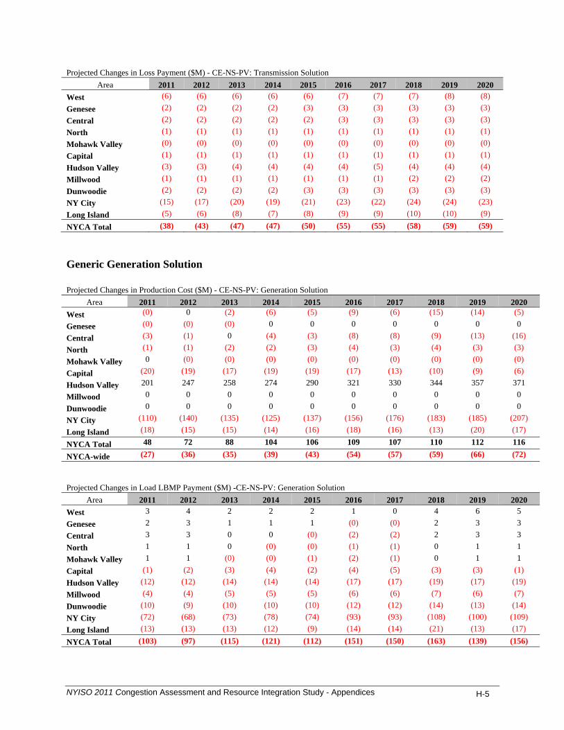
Projected Changes in Loss Payment ($M) - CE-NS-PV: Transmission Solution
Area 2011 2012 2013 2014 2015 2016 2017 2018 2019 2020 West (6) (6) (6) (6) (6) (7) (7) (7) (8) (8) Genesee (2) (2) (2) (2) (3) (3) (3) (3) (3) (3) Central (2) (2) (2) (2) (2) (3) (3) (3) (3) (3) North (1) (1) (1) (1) (1) (1) (1) (1) (1) (1) Mohawk Valley (0) (0) (0) (0) (0) (0) (0) (0) (0) (0) Capital (1) (1) (1) (1) (1) (1) (1) (1) (1) (1) Hudson Valley (3) (3) (4) (4) (4) (4) (5) (4) (4) (4) Millwood (1) (1) (1) (1) (1) (1) (1) (2) (2) (2) Dunwoodie (2) (2) (2) (2) (3) (3) (3) (3) (3) (3) NY City (15) (17) (20) (19) (21) (23) (22) (24) (24) (23) Long Island (5) (6) (8) (7) (8) (9) (9) (10) (10) (9) NYCA Total (38) (43) (47) (47) (50) (55) (55) (58) (59) (59) Generic Generation Solution Projected Changes in Production Cost ($M) - CE-NS-PV: Generation Solution
Area 2011 2012 2013 2014 2015 2016 2017 2018 2019 2020 West (0) 0 (2) (6) (5) (9) (6) (15) (14) (5)
Genesee (0) (0) (0) 0 0 0 0 0 0 0
Central (3) (1) 0 (4) (3) (8) (8) (9) (13) (16)
North (1) (1) (2) (2) (3) (4) (3) (4) (3) (3)
Mohawk Valley 0 (0) (0) (0) (0) (0) (0) (0) (0) (0)
Capital (20) (19) (17) (19) (19) (17) (13) (10) (9) (6)
Hudson Valley 201 247 258 274 290 321 330 344 357 371
Millwood 0 0 0 0 0 0 0 0 0 0
Dunwoodie 0 0 0 0 0 0 0 0 0 0
NY City (110) (140) (135) (125) (137) (156) (176) (183) (185) (207)
Long Island (18) (15) (15) (14) (16) (18) (16) (13) (20) (17)
NYCA Total 48 72 88 104 106 109 107 110 112 116
NYCA-wide (27) (36) (35) (39) (43) (54) (57) (59) (66) (72) Projected Changes in Load LBMP Payment ($M) -CE-NS-PV: Generation Solution
Area 2011 2012 2013 2014 2015 2016 2017 2018 2019 2020 West 3 4 2 2 2 1 0 4 6 5 Genesee 2 3 1 1 1 (0) (0) 2 3 3 Central 3 3 0 0 (0) (2) (2) 2 3 3 North 1 1 0 (0) (0) (1) (1) 0 1 1 Mohawk Valley 1 1 (0) (0) (1) (2) (1) 0 1 1 Capital (1) (2) (3) (4) (2) (4) (5) (3) (3) (1) Hudson Valley (12) (12) (14) (14) (14) (17) (17) (19) (17) (19) Millwood (4) (4) (5) (5) (5) (6) (6) (7) (6) (7) Dunwoodie (10) (9) (10) (10) (10) (12) (12) (14) (13) (14) NY City (72) (68) (73) (78) (74) (93) (93) (108) (100) (109) Long Island (13) (13) (13) (12) (9) (14) (14) (21) (13) (17) NYCA Total (103) (97) (115) (121) (112) (151) (150) (163) (139) (156)
NYISO 2011 Congestion Assessment and Resource Integration Study - Appendices H-5

Projected Changes in Generator LBMP Payment ($M) -CE-NS-PV: Generation Solution
Area 2011 2012 2013 2014 2015 2016 2017 2018 2019 2020 West 6 7 2 (2) (1) (8) (5) (7) (4) 3 Genesee 1 1 0 0 0 (1) (0) 1 2 1 Central (0) 4 0 (5) (6) (14) (14) (10) (11) (13) North 0 1 (2) (1) (3) (5) (4) (3) (2) (2) Mohawk Valley 1 1 0 0 (0) (0) (0) 0 1 1 Capital (15) (18) (17) (19) (17) (19) (15) (8) (4) 4 Hudson Valley 215 274 286 304 323 361 371 386 404 420 Millwood (19) (19) (20) (21) (20) (26) (26) (28) (28) (30) Dunwoodie (0) (0) (0) (0) (0) (0) (0) (0) (0) (0) NY City (133) (164) (165) (156) (165) (195) (214) (227) (223) (246) Long Island (25) (21) (20) (19) (20) (24) (23) (26) (26) (27) NYCA Total 30 65 64 80 90 70 70 79 109 110 Projected Changes in Congestion Demand ($M) - CE-NS-PV: Generation Solution
Area 2011 2012 2013 2014 2015 2016 2017 2018 2019 2020 West 0 (0) (1) (0) (1) (1) (1) (1) (2) (2) Genesee 0 (0) 0 0 0 (0) (0) (0) (1) (0) Central (0) (1) (0) (0) (0) (0) (0) (0) (0) (0) North (0) (0) (0) (0) (0) (0) (0) (0) (0) (0) Mohawk Valley (1) (1) (1) (1) (1) (1) (1) (1) (1) (1) Capital (3) (6) (4) (4) (3) (3) (4) (5) (5) (3) Hudson Valley (14) (15) (14) (14) (13) (15) (15) (20) (19) (21) Millwood (5) (5) (5) (5) (5) (6) (6) (7) (7) (8) Dunwoodie (11) (11) (10) (10) (10) (11) (11) (15) (14) (16) NY City (84) (85) (77) (81) (76) (87) (89) (119) (116) (125) Long Island (19) (20) (14) (12) (10) (11) (12) (26) (19) (24) NYCA Total (137) (144) (126) (127) (118) (136) (139) (195) (185) (199) Projected Changes in CO2 Cost ($M) -CE-NS-PV: Generation Solution
Area 2011 2012 2013 2014 2015 2016 2017 2018 2019 2020 West 0.0 (0.0) (0.5) (1.7) (1.9) (3.4) (2.4) (6.0) (6.0) (2.4) Genesee (0.0) (0.0) (0.0) 0.0 0.0 0.0 0.0 0.0 0.0 0.0 Central (0.2) (0.2) (0.0) (0.6) (0.5) (1.3) (1.6) (1.9) (2.9) (3.7) North (0.0) (0.1) (0.2) (0.2) (0.4) (0.5) (0.5) (0.6) (0.6) (0.6) Mohawk Valley 0.0 (0.0) (0.0) (0.0) (0.0) (0.0) (0.0) (0.0) (0.0) (0.0) Capital (0.4) (1.8) (1.9) (2.4) (2.8) (2.7) (2.1) (1.7) (1.5) (1.1) Hudson Valley 3.7 21.4 26.7 32.8 38.6 46.1 48.8 51.4 54.5 58.7 Millwood 0.0 0.0 0.0 0.0 0.0 0.0 0.0 0.0 0.0 0.0 Dunwoodie 0.0 0.0 0.0 0.0 0.0 0.0 0.0 0.0 0.0 0.0 NY City (2.3) (12.7) (14.6) (15.4) (18.6) (23.3) (27.5) (29.3) (30.2) (34.8) Long Island (0.4) (1.4) (1.6) (1.8) (2.2) (2.7) (2.4) (2.2) (3.3) (3.0) NYCA Total 0 5 8 11 12 12 12 10 10 13
NYISO 2011 Congestion Assessment and Resource Integration Study - Appendices H-6
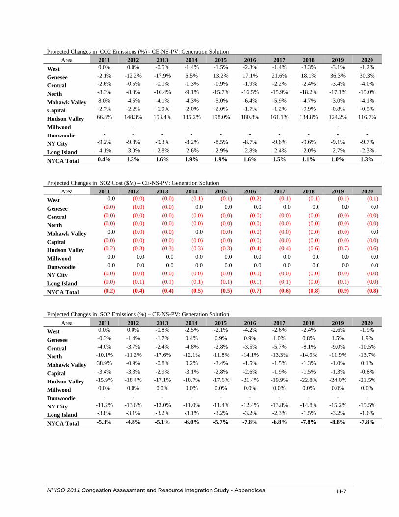
Projected Changes in CO2 Emissions (%) - CE-NS-PV: Generation Solution
Area 2011 2012 2013 2014 2015 2016 2017 2018 2019 2020 West 0.0% 0.0% -0.5% -1.4% -1.5% -2.3% -1.4% -3.3% -3.1% -1.2%
Genesee -2.1% -12.2% -17.9% 6.5% 13.2% 17.1% 21.6% 18.1% 36.3% 30.3%
Central -2.6% -0.5% -0.1% -1.3% -0.9% -1.9% -2.2% -2.4% -3.4% -4.0%
North -8.3% -8.3% -16.4% -9.1% -15.7% -16.5% -15.9% -18.2% -17.1% -15.0%
Mohawk Valley 8.0% -4.5% -4.1% -4.3% -5.0% -6.4% -5.9% -4.7% -3.0% -4.1%
Capital -2.7% -2.2% -1.9% -2.0% -2.0% -1.7% -1.2% -0.9% -0.8% -0.5%
Hudson Valley 66.8% 148.3% 158.4% 185.2% 198.0% 180.8% 161.1% 134.8% 124.2% 116.7%
Millwood - - - - - - - - - -
Dunwoodie - - - - - - - - - -
NY City -9.2% -9.8% -9.3% -8.2% -8.5% -8.7% -9.6% -9.6% -9.1% -9.7%
Long Island -4.1% -3.0% -2.8% -2.6% -2.9% -2.8% -2.4% -2.0% -2.7% -2.3%
NYCA Total 0.4% 1.3% 1.6% 1.9% 1.9% 1.6% 1.5% 1.1% 1.0% 1.3%
Projected Changes in SO2 Cost ($M) – CE-NS-PV: Generation Solution
Area 2011 2012 2013 2014 2015 2016 2017 2018 2019 2020 West 0.0 (0.0) (0.0) (0.1) (0.1) (0.2) (0.1) (0.1) (0.1) (0.1)
Genesee (0.0) (0.0) (0.0) 0.0 0.0 0.0 0.0 0.0 0.0 0.0
Central (0.0) (0.0) (0.0) (0.0) (0.0) (0.0) (0.0) (0.0) (0.0) (0.0)
North (0.0) (0.0) (0.0) (0.0) (0.0) (0.0) (0.0) (0.0) (0.0) (0.0)
Mohawk Valley 0.0 (0.0) (0.0) 0.0 (0.0) (0.0) (0.0) (0.0) (0.0) 0.0
Capital (0.0) (0.0) (0.0) (0.0) (0.0) (0.0) (0.0) (0.0) (0.0) (0.0)
Hudson Valley (0.2) (0.3) (0.3) (0.3) (0.3) (0.4) (0.4) (0.6) (0.7) (0.6)
Millwood 0.0 0.0 0.0 0.0 0.0 0.0 0.0 0.0 0.0 0.0
Dunwoodie 0.0 0.0 0.0 0.0 0.0 0.0 0.0 0.0 0.0 0.0
NY City (0.0) (0.0) (0.0) (0.0) (0.0) (0.0) (0.0) (0.0) (0.0) (0.0)
Long Island (0.0) (0.1) (0.1) (0.1) (0.1) (0.1) (0.1) (0.0) (0.1) (0.0)
NYCA Total (0.2) (0.4) (0.4) (0.5) (0.5) (0.7) (0.6) (0.8) (0.9) (0.8)
Projected Changes in SO2 Emissions (%) – CE-NS-PV: Generation Solution
Area 2011 2012 2013 2014 2015 2016 2017 2018 2019 2020 West 0.0% 0.0% -0.8% -2.5% -2.1% -4.2% -2.6% -2.4% -2.6% -1.9%
Genesee -0.3% -1.4% -1.7% 0.4% 0.9% 0.9% 1.0% 0.8% 1.5% 1.9%
Central -4.0% -3.7% -2.4% -4.8% -2.8% -3.5% -5.7% -8.1% -9.0% -10.5%
North -10.1% -11.2% -17.6% -12.1% -11.8% -14.1% -13.3% -14.9% -11.9% -13.7%
Mohawk Valley 38.9% -0.9% -0.8% 0.2% -3.4% -1.5% -1.5% -1.3% -1.0% 0.1%
Capital -3.4% -3.3% -2.9% -3.1% -2.8% -2.6% -1.9% -1.5% -1.3% -0.8%
Hudson Valley -15.9% -18.4% -17.1% -18.7% -17.6% -21.4% -19.9% -22.8% -24.0% -21.5%
Millwood 0.0% 0.0% 0.0% 0.0% 0.0% 0.0% 0.0% 0.0% 0.0% 0.0%
Dunwoodie - - - - - - - - - -
NY City -11.2% -13.6% -13.0% -11.0% -11.4% -12.4% -13.8% -14.8% -15.2% -15.5%
Long Island -3.8% -3.1% -3.2% -3.1% -3.2% -3.2% -2.3% -1.5% -3.2% -1.6%
NYCA Total -5.3% -4.8% -5.1% -6.0% -5.7% -7.8% -6.8% -7.8% -8.8% -7.8%
NYISO 2011 Congestion Assessment and Resource Integration Study - Appendices H-7
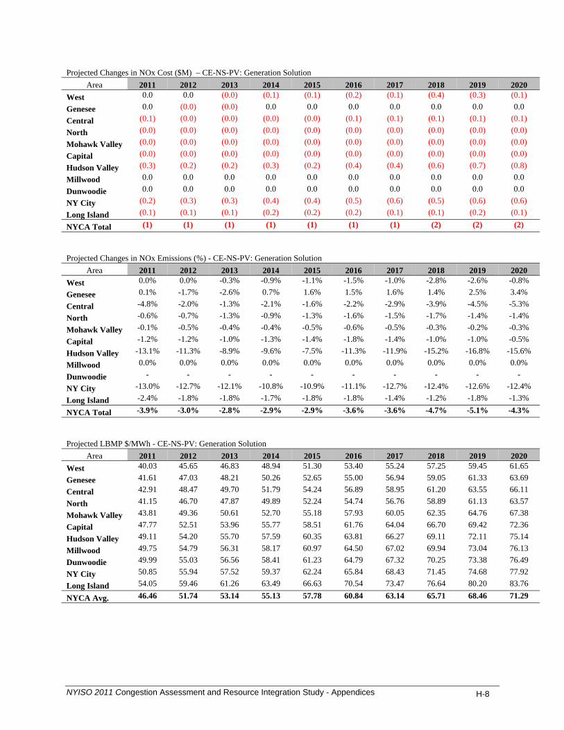
Projected Changes in NOx Cost ($M) – CE-NS-PV: Generation Solution
Area 2011 2012 2013 2014 2015 2016 2017 2018 2019 2020 West 0.0 0.0 (0.0) (0.1) (0.1) (0.2) (0.1) (0.4) (0.3) (0.1)
Genesee 0.0 (0.0) (0.0) 0.0 0.0 0.0 0.0 0.0 0.0 0.0
Central (0.1) (0.0) (0.0) (0.0) (0.0) (0.1) (0.1) (0.1) (0.1) (0.1)
North (0.0) (0.0) (0.0) (0.0) (0.0) (0.0) (0.0) (0.0) (0.0) (0.0)
Mohawk Valley (0.0) (0.0) (0.0) (0.0) (0.0) (0.0) (0.0) (0.0) (0.0) (0.0)
Capital (0.0) (0.0) (0.0) (0.0) (0.0) (0.0) (0.0) (0.0) (0.0) (0.0)
Hudson Valley (0.3) (0.2) (0.2) (0.3) (0.2) (0.4) (0.4) (0.6) (0.7) (0.8)
Millwood 0.0 0.0 0.0 0.0 0.0 0.0 0.0 0.0 0.0 0.0
Dunwoodie 0.0 0.0 0.0 0.0 0.0 0.0 0.0 0.0 0.0 0.0
NY City (0.2) (0.3) (0.3) (0.4) (0.4) (0.5) (0.6) (0.5) (0.6) (0.6)
Long Island (0.1) (0.1) (0.1) (0.2) (0.2) (0.2) (0.1) (0.1) (0.2) (0.1)
NYCA Total (1) (1) (1) (1) (1) (1) (1) (2) (2) (2)
Projected Changes in NOx Emissions (%) - CE-NS-PV: Generation Solution
Area 2011 2012 2013 2014 2015 2016 2017 2018 2019 2020 West 0.0% 0.0% -0.3% -0.9% -1.1% -1.5% -1.0% -2.8% -2.6% -0.8%
Genesee 0.1% -1.7% -2.6% 0.7% 1.6% 1.5% 1.6% 1.4% 2.5% 3.4%
Central -4.8% -2.0% -1.3% -2.1% -1.6% -2.2% -2.9% -3.9% -4.5% -5.3%
North -0.6% -0.7% -1.3% -0.9% -1.3% -1.6% -1.5% -1.7% -1.4% -1.4%
Mohawk Valley -0.1% -0.5% -0.4% -0.4% -0.5% -0.6% -0.5% -0.3% -0.2% -0.3%
Capital -1.2% -1.2% -1.0% -1.3% -1.4% -1.8% -1.4% -1.0% -1.0% -0.5%
Hudson Valley -13.1% -11.3% -8.9% -9.6% -7.5% -11.3% -11.9% -15.2% -16.8% -15.6%
Millwood 0.0% 0.0% 0.0% 0.0% 0.0% 0.0% 0.0% 0.0% 0.0% 0.0%
Dunwoodie - - - - - - - - - -
NY City -13.0% -12.7% -12.1% -10.8% -10.9% -11.1% -12.7% -12.4% -12.6% -12.4%
Long Island -2.4% -1.8% -1.8% -1.7% -1.8% -1.8% -1.4% -1.2% -1.8% -1.3%
NYCA Total -3.9% -3.0% -2.8% -2.9% -2.9% -3.6% -3.6% -4.7% -5.1% -4.3%
Projected LBMP $/MWh - CE-NS-PV: Generation Solution
Area 2011 2012 2013 2014 2015 2016 2017 2018 2019 2020 West 40.03 45.65 46.83 48.94 51.30 53.40 55.24 57.25 59.45 61.65
Genesee 41.61 47.03 48.21 50.26 52.65 55.00 56.94 59.05 61.33 63.69
Central 42.91 48.47 49.70 51.79 54.24 56.89 58.95 61.20 63.55 66.11
North 41.15 46.70 47.87 49.89 52.24 54.74 56.76 58.89 61.13 63.57
Mohawk Valley 43.81 49.36 50.61 52.70 55.18 57.93 60.05 62.35 64.76 67.38
Capital 47.77 52.51 53.96 55.77 58.51 61.76 64.04 66.70 69.42 72.36
Hudson Valley 49.11 54.20 55.70 57.59 60.35 63.81 66.27 69.11 72.11 75.14
Millwood 49.75 54.79 56.31 58.17 60.97 64.50 67.02 69.94 73.04 76.13
Dunwoodie 49.99 55.03 56.56 58.41 61.23 64.79 67.32 70.25 73.38 76.49
NY City 50.85 55.94 57.52 59.37 62.24 65.84 68.43 71.45 74.68 77.92
Long Island 54.05 59.46 61.26 63.49 66.63 70.54 73.47 76.64 80.20 83.76
NYCA Avg. 46.46 51.74 53.14 55.13 57.78 60.84 63.14 65.71 68.46 71.29
NYISO 2011 Congestion Assessment and Resource Integration Study - Appendices H-8
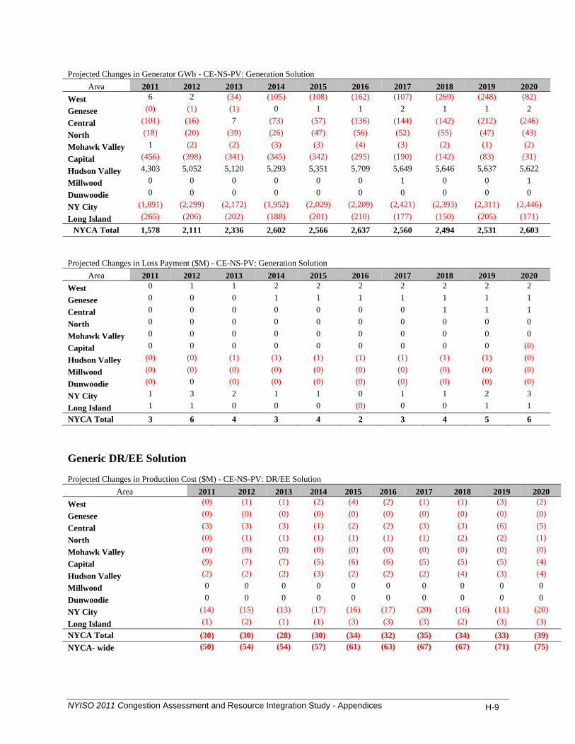
Projected Changes in Generator GWh - CE-NS-PV: Generation Solution
Area 2011 2012 2013 2014 2015 2016 2017 2018 2019 2020 West 6 2 (34) (105) (108) (162) (107) (269) (248) (82)
Genesee (0) (1) (1) 0 1 1 2 1 1 2
Central (101) (16) 7 (73) (57) (136) (144) (142) (212) (246)
North (18) (20) (39) (26) (47) (56) (52) (55) (47) (43)
Mohawk Valley 1 (2) (2) (3) (3) (4) (3) (2) (1) (2)
Capital (456) (398) (341) (345) (342) (295) (190) (142) (83) (31)
Hudson Valley 4,303 5,052 5,120 5,293 5,351 5,709 5,649 5,646 5,637 5,622
Millwood 0 0 0 0 0 0 1 0 0 1
Dunwoodie 0 0 0 0 0 0 0 0 0 0
NY City (1,891) (2,299) (2,172) (1,952) (2,029) (2,209) (2,421) (2,393) (2,311) (2,446)
Long Island (265) (206) (202) (188) (201) (210) (177) (150) (205) (171) NYCA Total 1,578 2,111 2,336 2,602 2,566 2,637 2,560 2,494 2,531 2,603
Projected Changes in Loss Payment ($M) - CE-NS-PV: Generation Solution
Area 2011 2012 2013 2014 2015 2016 2017 2018 2019 2020 West 0 1 1 2 2 2 2 2 2 2
Genesee 0 0 0 1 1 1 1 1 1 1
Central 0 0 0 0 0 0 0 1 1 1
North 0 0 0 0 0 0 0 0 0 0
Mohawk Valley 0 0 0 0 0 0 0 0 0 0
Capital 0 0 0 0 0 0 0 0 0 (0)
Hudson Valley (0) (0) (1) (1) (1) (1) (1) (1) (1) (0)
Millwood (0) (0) (0) (0) (0) (0) (0) (0) (0) (0)
Dunwoodie (0) 0 (0) (0) (0) (0) (0) (0) (0) (0)
NY City 1 3 2 1 1 0 1 1 2 3
Long Island 1 1 0 0 0 (0) 0 0 1 1 NYCA Total 3 6 4 3 4 2 3 4 5 6
Generic DR/EE Solution Projected Changes in Production Cost ($M) - CE-NS-PV: DR/EE Solution
Area 2011 2012 2013 2014 2015 2016 2017 2018 2019 2020 West (0) (1) (1) (2) (4) (2) (1) (1) (3) (2)
Genesee (0) (0) (0) (0) (0) (0) (0) (0) (0) (0)
Central (3) (3) (3) (1) (2) (2) (3) (3) (6) (5)
North (0) (1) (1) (1) (1) (1) (1) (2) (2) (1)
Mohawk Valley (0) (0) (0) (0) (0) (0) (0) (0) (0) (0)
Capital (9) (7) (7) (5) (6) (6) (5) (5) (5) (4)
Hudson Valley (2) (2) (2) (3) (2) (2) (2) (4) (3) (4)
Millwood 0 0 0 0 0 0 0 0 0 0
Dunwoodie 0 0 0 0 0 0 0 0 0 0
NY City (14) (15) (13) (17) (16) (17) (20) (16) (11) (20)
Long Island (1) (2) (1) (1) (3) (3) (3) (2) (3) (3) NYCA Total (30) (30) (28) (30) (34) (32) (35) (34) (33) (39) NYCA- wide (50) (54) (54) (57) (61) (63) (67) (67) (71) (75)
NYISO 2011 Congestion Assessment and Resource Integration Study - Appendices H-9

Projected Changes in Load LBMP Payment ($M) - CE-NS-PV: DR/EE Solution
Area 2011 2012 2013 2014 2015 2016 2017 2018 2019 2020 West (0) (1) (2) (0) (1) (2) (2) (2) (1) (1)
Genesee (0) (1) (2) (0) (0) (2) (2) (2) (1) (1)
Central (1) (1) (3) (1) (1) (3) (3) (3) (2) (2)
North (0) (0) (1) (0) (0) (1) (1) (1) (1) (1)
Mohawk Valley (0) (0) (1) (0) (1) (1) (1) (1) (1) (1)
Capital (28) (32) (33) (33) (34) (37) (39) (40) (42) (43)
Hudson Valley (26) (29) (31) (30) (32) (35) (36) (37) (38) (39)
Millwood (0) (0) (1) (0) (1) (1) (1) (1) (1) (1)
Dunwoodie (1) (1) (2) (1) (1) (2) (2) (2) (1) (1)
NY City (7) (8) (15) (5) (8) (16) (13) (16) (8) (8)
Long Island (1) (3) (5) 0 (1) (4) (3) (5) (0) (1)
NYCA Total (66) (76) (95) (71) (79) (104) (101) (109) (96) (99)
Projected Changes in Generator LBMP Payment ($M) - CE-NS-PV: DR/EE Solution
Area 2011 2012 2013 2014 2015 2016 2017 2018 2019 2020 West (1) (2) (4) (3) (5) (5) (4) (5) (5) (5)
Genesee (0) (0) (1) (0) (0) (1) (1) (1) (1) (1)
Central (4) (5) (8) (4) (5) (8) (8) (9) (8) (9)
North (1) (1) (2) (1) (2) (3) (2) (3) (2) (2)
Mohawk Valley (0) (0) (1) (0) (0) (1) (0) (0) (0) (0)
Capital (13) (15) (16) (11) (12) (15) (14) (15) (16) (13)
Hudson Valley (3) (3) (3) (4) (2) (3) (3) (6) (4) (5)
Millwood (2) (2) (4) (1) (2) (4) (3) (4) (2) (2)
Dunwoodie (0) (0) (0) (0) (0) (0) (0) (0) (0) (0)
NY City (15) (18) (21) (18) (19) (24) (26) (24) (15) (24)
Long Island (2) (3) (4) (1) (3) (5) (4) (4) (2) (3)
NYCA Total (41) (50) (64) (42) (51) (67) (66) (71) (56) (64)
Projected Changes in Congestion Demand ($M) - CE-NS-PV: DR/EE Solution
Area 2011 2012 2013 2014 2015 2016 2017 2018 2019 2020 West (0) 0 0 0 0 (0) 0 0 0 (0)
Genesee (0) (0) 0 (0) 0 (0) 0 0 0 0
Central (0) (0) (0) (0) (0) (0) (0) (0) (1) (0)
North (0) (0) (0) (0) (0) (0) (0) (0) (0) (0)
Mohawk Valley (0) (0) (0) (0) (0) (0) (0) (0) (0) (0)
Capital (4) (5) (4) (4) (4) (4) (5) (5) (6) (6)
Hudson Valley (4) (4) (4) (3) (3) (4) (4) (5) (4) (4)
Millwood (0) (0) (0) (0) (0) (0) (0) (0) (0) (0)
Dunwoodie (1) (1) (1) (0) (1) (1) (0) (1) 0 (0)
NY City (5) (5) (4) (3) (4) (5) (3) (6) 1 (0)
Long Island (1) (1) (0) 1 (0) 1 1 (1) 4 2
NYCA Total (15) (16) (14) (9) (13) (14) (11) (18) (7) (9)
NYISO 2011 Congestion Assessment and Resource Integration Study - Appendices H-10
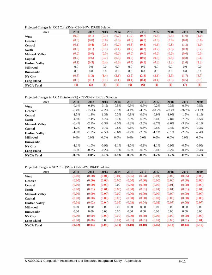
Projected Changes in CO2 Cost ($M) - CE-NS-PV: DR/EE Solution
Area 2011 2012 2013 2014 2015 2016 2017 2018 2019 2020 West (0.0) (0.1) (0.1) (0.7) (1.2) (0.7) (0.3) (0.5) (1.0) (1.0)
Genesee (0.0) (0.0) (0.0) (0.0) (0.0) (0.0) (0.0) (0.0) (0.0) (0.0)
Central (0.1) (0.4) (0.5) (0.2) (0.5) (0.4) (0.6) (0.8) (1.3) (1.0)
North (0.0) (0.1) (0.1) (0.1) (0.2) (0.2) (0.2) (0.3) (0.3) (0.2)
Mohawk Valley (0.0) (0.0) (0.0) (0.0) (0.0) (0.0) (0.0) (0.0) (0.0) (0.0)
Capital (0.2) (0.6) (0.7) (0.6) (0.9) (0.9) (0.8) (0.8) (0.8) (0.6)
Hudson Valley (0.1) (0.3) (0.4) (0.6) (0.4) (0.5) (0.3) (1.2) (1.0) (1.2)
Millwood 0.0 0.0 0.0 0.0 0.0 0.0 0.0 0.0 0.0 0.0
Dunwoodie 0.0 0.0 0.0 0.0 0.0 0.0 0.0 0.0 0.0 0.0
NY City (0.3) (1.3) (1.4) (2.1) (2.2) (2.4) (3.1) (2.6) (1.7) (3.3)
Long Island (0.0) (0.1) (0.1) (0.1) (0.4) (0.4) (0.4) (0.3) (0.5) (0.5)
NYCA Total (1) (3) (3) (4) (6) (6) (6) (6) (7) (8)
Projected Changes in CO2 Emissions (%) - CE-NS-PV: DR/EE Solution
Area 2011 2012 2013 2014 2015 2016 2017 2018 2019 2020 West -0.1% -0.1% -0.1% -0.5% -0.9% -0.5% -0.2% -0.3% -0.5% -0.5%
Genesee -6.4% -15.3% -7.2% -5.1% -4.1% -4.6% -18.2% -28.4% -26.7% -11.1%
Central -1.5% -1.3% -1.3% -0.3% -0.8% -0.6% -0.9% -1.0% -1.5% -1.1%
North -4.5% -7.4% -8.7% -3.7% -7.9% -6.6% -5.4% -7.8% -7.9% -6.5%
Mohawk Valley -6.4% -2.9% -3.3% -2.5% -3.3% -2.6% -2.7% -2.6% -3.3% -2.1%
Capital -1.2% -0.8% -0.7% -0.5% -0.6% -0.6% -0.5% -0.4% -0.4% -0.3%
Hudson Valley -1.3% -1.8% -2.5% -3.6% -2.2% -2.0% -1.1% -3.1% -2.3% -2.4%
Millwood 0.0% 0.0% 0.0% 0.0% 0.0% 0.0% 0.0% 0.0% 0.0% 0.0% Dunwoodie - - - - - - - - - - NY City -1.1% -1.0% -0.9% -1.1% -1.0% -0.9% -1.1% -0.9% -0.5% -0.9%
Long Island -0.3% -0.3% -0.2% -0.1% -0.5% -0.5% -0.4% -0.2% -0.4% -0.4%
NYCA Total -0.8% -0.8% -0.7% -0.8% -0.9% -0.7% -0.7% -0.7% -0.7% -0.7% Projected Changes in SO2 Cost ($M) - CE-NS-PV: DR/EE Solution
Area 2011 2012 2013 2014 2015 2016 2017 2018 2019 2020 West (0.00) (0.00) (0.01) (0.04) (0.05) (0.04) (0.01) (0.02) (0.05) (0.03) Genesee (0.00) (0.00) (0.00) (0.00) (0.00) (0.00) (0.00) (0.00) (0.00) (0.00) Central (0.00) (0.00) (0.00) 0.00 (0.00) (0.00) (0.00) (0.01) (0.00) (0.00) North (0.00) (0.01) (0.01) (0.00) (0.00) (0.01) (0.01) (0.01) (0.01) (0.01) Mohawk Valley (0.00) (0.00) (0.00) (0.00) (0.00) (0.00) (0.00) (0.00) (0.00) (0.00) Capital (0.00) (0.00) (0.00) (0.00) (0.00) (0.00) (0.00) (0.00) (0.00) (0.00) Hudson Valley (0.01) (0.02) (0.04) (0.06) (0.03) (0.04) (0.02) (0.07) (0.06) (0.07) Millwood 0.00 0.00 0.00 0.00 0.00 0.00 0.00 0.00 0.00 0.00 Dunwoodie 0.00 0.00 0.00 0.00 0.00 0.00 0.00 0.00 0.00 0.00 NY City (0.00) (0.00) (0.00) (0.00) (0.00) (0.00) (0.00) (0.00) (0.00) (0.00) Long Island (0.00) (0.00) 0.00 (0.01) (0.01) (0.01) (0.01) (0.00) (0.01) (0.01) NYCA Total (0.02) (0.04) (0.06) (0.11) (0.10) (0.10) (0.05) (0.12) (0.14) (0.12)
NYISO 2011 Congestion Assessment and Resource Integration Study - Appendices H-11
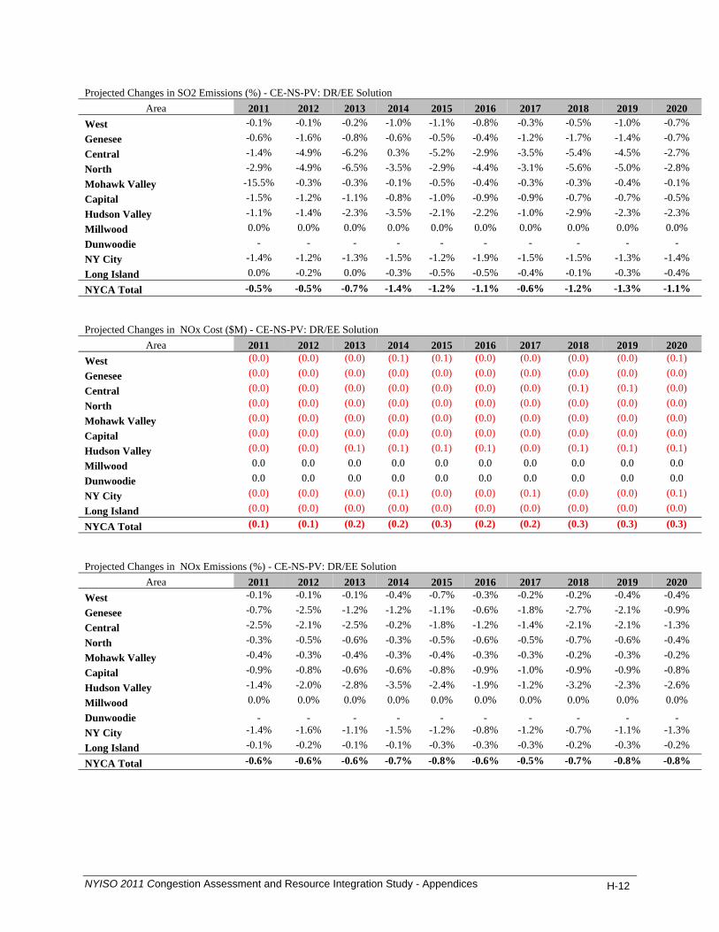
Projected Changes in SO2 Emissions (%) - CE-NS-PV: DR/EE Solution
Area 2011 2012 2013 2014 2015 2016 2017 2018 2019 2020 West -0.1% -0.1% -0.2% -1.0% -1.1% -0.8% -0.3% -0.5% -1.0% -0.7% Genesee -0.6% -1.6% -0.8% -0.6% -0.5% -0.4% -1.2% -1.7% -1.4% -0.7% Central -1.4% -4.9% -6.2% 0.3% -5.2% -2.9% -3.5% -5.4% -4.5% -2.7% North -2.9% -4.9% -6.5% -3.5% -2.9% -4.4% -3.1% -5.6% -5.0% -2.8% Mohawk Valley -15.5% -0.3% -0.3% -0.1% -0.5% -0.4% -0.3% -0.3% -0.4% -0.1% Capital -1.5% -1.2% -1.1% -0.8% -1.0% -0.9% -0.9% -0.7% -0.7% -0.5% Hudson Valley -1.1% -1.4% -2.3% -3.5% -2.1% -2.2% -1.0% -2.9% -2.3% -2.3% Millwood 0.0% 0.0% 0.0% 0.0% 0.0% 0.0% 0.0% 0.0% 0.0% 0.0% Dunwoodie - - - - - - - - - - NY City -1.4% -1.2% -1.3% -1.5% -1.2% -1.9% -1.5% -1.5% -1.3% -1.4% Long Island 0.0% -0.2% 0.0% -0.3% -0.5% -0.5% -0.4% -0.1% -0.3% -0.4% NYCA Total -0.5% -0.5% -0.7% -1.4% -1.2% -1.1% -0.6% -1.2% -1.3% -1.1% Projected Changes in NOx Cost ($M) - CE-NS-PV: DR/EE Solution
Area 2011 2012 2013 2014 2015 2016 2017 2018 2019 2020 West (0.0) (0.0) (0.0) (0.1) (0.1) (0.0) (0.0) (0.0) (0.0) (0.1)
Genesee (0.0) (0.0) (0.0) (0.0) (0.0) (0.0) (0.0) (0.0) (0.0) (0.0)
Central (0.0) (0.0) (0.0) (0.0) (0.0) (0.0) (0.0) (0.1) (0.1) (0.0)
North (0.0) (0.0) (0.0) (0.0) (0.0) (0.0) (0.0) (0.0) (0.0) (0.0)
Mohawk Valley (0.0) (0.0) (0.0) (0.0) (0.0) (0.0) (0.0) (0.0) (0.0) (0.0)
Capital (0.0) (0.0) (0.0) (0.0) (0.0) (0.0) (0.0) (0.0) (0.0) (0.0)
Hudson Valley (0.0) (0.0) (0.1) (0.1) (0.1) (0.1) (0.0) (0.1) (0.1) (0.1)
Millwood 0.0 0.0 0.0 0.0 0.0 0.0 0.0 0.0 0.0 0.0
Dunwoodie 0.0 0.0 0.0 0.0 0.0 0.0 0.0 0.0 0.0 0.0
NY City (0.0) (0.0) (0.0) (0.1) (0.0) (0.0) (0.1) (0.0) (0.0) (0.1)
Long Island (0.0) (0.0) (0.0) (0.0) (0.0) (0.0) (0.0) (0.0) (0.0) (0.0)
NYCA Total (0.1) (0.1) (0.2) (0.2) (0.3) (0.2) (0.2) (0.3) (0.3) (0.3)
Projected Changes in NOx Emissions (%) - CE-NS-PV: DR/EE Solution
Area 2011 2012 2013 2014 2015 2016 2017 2018 2019 2020 West -0.1% -0.1% -0.1% -0.4% -0.7% -0.3% -0.2% -0.2% -0.4% -0.4%
Genesee -0.7% -2.5% -1.2% -1.2% -1.1% -0.6% -1.8% -2.7% -2.1% -0.9%
Central -2.5% -2.1% -2.5% -0.2% -1.8% -1.2% -1.4% -2.1% -2.1% -1.3%
North -0.3% -0.5% -0.6% -0.3% -0.5% -0.6% -0.5% -0.7% -0.6% -0.4%
Mohawk Valley -0.4% -0.3% -0.4% -0.3% -0.4% -0.3% -0.3% -0.2% -0.3% -0.2%
Capital -0.9% -0.8% -0.6% -0.6% -0.8% -0.9% -1.0% -0.9% -0.9% -0.8%
Hudson Valley -1.4% -2.0% -2.8% -3.5% -2.4% -1.9% -1.2% -3.2% -2.3% -2.6%
Millwood 0.0% 0.0% 0.0% 0.0% 0.0% 0.0% 0.0% 0.0% 0.0% 0.0%
Dunwoodie - - - - - - - - - - NY City -1.4% -1.6% -1.1% -1.5% -1.2% -0.8% -1.2% -0.7% -1.1% -1.3%
Long Island -0.1% -0.2% -0.1% -0.1% -0.3% -0.3% -0.3% -0.2% -0.3% -0.2%
NYCA Total -0.6% -0.6% -0.6% -0.7% -0.8% -0.6% -0.5% -0.7% -0.8% -0.8%
NYISO 2011 Congestion Assessment and Resource Integration Study - Appendices H-12

Projected LBMP $/MWh - CE-NS-PV: DR/EE Solution
Area 2011 2012 2013 2014 2015 2016 2017 2018 2019 2020 West 39.85 45.40 46.63 48.86 51.17 53.31 55.14 56.92 59.07 61.32
Genesee 41.45 46.81 48.05 50.22 52.60 55.00 56.92 58.76 61.01 63.46
Central 42.76 48.27 49.59 51.80 54.23 56.95 58.99 61.00 63.33 65.90
North 41.01 46.49 47.74 49.88 52.23 54.80 56.80 58.70 60.93 63.40
Mohawk Valley 43.71 49.21 50.55 52.77 55.23 58.06 60.16 62.24 64.63 67.28
Capital 47.59 52.38 53.85 55.82 58.43 61.79 64.04 66.57 69.23 72.07
Hudson Valley 49.92 55.02 56.54 58.60 61.28 64.95 67.41 70.31 73.34 76.44
Millwood 50.83 55.86 57.40 59.43 62.16 65.94 68.46 71.51 74.66 77.86
Dunwoodie 51.09 56.11 57.66 59.69 62.42 66.22 68.76 71.84 75.02 78.24
NY City 51.78 56.81 58.42 60.50 63.26 67.07 69.67 72.82 76.08 79.43
Long Island 54.39 59.78 61.55 63.90 66.86 70.87 73.81 77.13 80.61 84.25
NYCA Average 46.76 52.01 53.45 55.59 58.17 61.36 63.65 66.17 68.90 71.79 Projected Changes in Generator GWh - CE-NS-PV: DR/EE Solution
Area 2011 2012 2013 2014 2015 2016 2017 2018 2019 2020 West (10) (11) (11) (44) (74) (36) (18) (24) (41) (38)
Genesee (0) (1) (1) (1) (0) (0) (1) (1) (1) (0)
Central (75) (71) (64) (28) (40) (34) (51) (49) (89) (67)
North (10) (18) (20) (11) (23) (22) (18) (23) (22) (18)
Mohawk Valley (3) (1) (2) (1) (2) (1) (1) (1) (1) (1)
Capital (185) (152) (145) (82) (108) (101) (61) (80) (69) (33)
Hudson Valley (40) (32) (40) (51) (28) (28) (20) (61) (49) (55)
Millwood 0 (0) (0) (0) (0) (0) (0) (0) 0 1
Dunwoodie 0 0 0 (0) 0 0 0 (0) (0) 0
NY City (242) (248) (216) (267) (236) (226) (287) (218) (133) (243)
Long Island (20) (22) (14) (10) (29) (33) (29) (19) (27) (26)
NYCA Total (584) (556) (513) (494) (540) (482) (486) (476) (432) (481)
Projected Changes in Loss Payment ($M) - CE-NS-PV: DR/EE Solution
Area 2011 2012 2013 2014 2015 2016 2017 2018 2019 2020 West 0 0 1 1 1 1 1 1 1 1
Genesee 0 0 0 0 0 0 0 0 0 0
Central 0 0 0 0 0 0 0 0 0 0
North 0 0 0 0 0 0 0 0 0 0
Mohawk Valley 0 0 (0) (0) 0 (0) (0) (0) (0) (0)
Capital (2) (2) (2) (2) (2) (2) (3) (3) (3) (3)
Hudson Valley (2) (2) (2) (2) (2) (3) (3) (3) (3) (3)
Millwood 0 0 (0) 0 0 (0) 0 (0) (0) 0
Dunwoodie 0 0 (0) 0 0 (0) 0 0 0 0
NY City 1 1 (0) 1 1 0 0 0 0 1
Long Island 0 0 (0) 0 0 0 0 0 0 0
NYCA Total (2) (2) (4) (2) (2) (4) (3) (4) (4) (4)
NYISO 2011 Congestion Assessment and Resource Integration Study - Appendices H-13
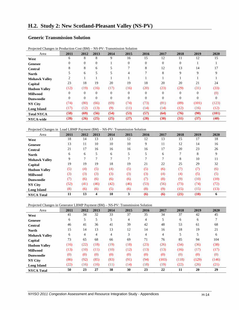
H.2. Study 2: New Scotland-Pleasant Valley (NS-PV) Generic Transmission Solution Projected Changes in Production Cost ($M) – NS-PV: Transmission Solution
Area 2011 2012 2013 2014 2015 2016 2017 2018 2019 2020 West 6 8 8 9 16 15 12 11 12 15
Genesee 0 0 0 1 0 0 0 0 1 1
Central 8 8 6 5 7 8 12 13 14 17
North 5 6 5 5 4 7 8 9 9 9
Mohawk Valley 2 1 1 1 1 1 1 1 1 1
Capital 23 18 19 20 19 18 20 20 21 24
Hudson Valley (12) (19) (16) (17) (16) (20) (23) (29) (31) (33)
Millwood 0 0 0 0 0 0 0 0 0 (0)
Dunwoodie 0 0 0 0 0 0 0 0 0 0
NY City (74) (80) (66) (69) (74) (73) (81) (89) (101) (123)
Long Island (17) (12) (13) (9) (11) (14) (14) (12) (16) (12)
Total NYCA (58) (69) (56) (54) (53) (57) (64) (76) (90) (101)
NYCA-wide (28) (26) (25) (25) (27) (28) (30) (31) (37) (40)
Projected Changes in Load LBMP Payment ($M) – NS-PV: Transmission Solution
Area 2011 2012 2013 2014 2015 2016 2017 2018 2019 2020 West 18 14 13 13 12 12 13 15 17 18
Genesee 13 11 10 10 10 9 11 12 14 16
Central 21 17 16 16 16 16 17 20 23 26
North 6 6 5 6 5 5 6 7 8 9
Mohawk Valley 9 7 7 7 7 7 7 8 10 11
Capital 19 19 19 18 19 21 22 25 29 32
Hudson Valley (5) (4) (5) (4) (5) (5) (6) (7) (7) (6)
Millwood (3) (3) (3) (3) (3) (3) (4) (4) (5) (5)
Dunwoodie (7) (6) (6) (6) (6) (7) (8) (9) (10) (10)
NY City (52) (41) (46) (42) (46) (53) (56) (73) (74) (72)
Long Island (8) (6) (6) (5) (6) (8) (9) (15) (15) (13)
NYCA Total 11 13 4 10 3 (6) (6) (21) (10) 6
Projected Changes in Generator LBMP Payment ($M) – NS-PV: Transmission Solution
Area 2011 2012 2013 2014 2015 2016 2017 2018 2019 2020 West 41 34 32 33 37 35 34 37 42 45
Genesee 6 5 5 5 4 4 5 6 6 7
Central 46 41 36 41 39 42 48 53 61 68
North 15 14 13 13 12 14 16 18 19 21
Mohawk Valley 6 4 4 4 3 4 4 5 5 6
Capital 73 65 68 66 69 71 76 85 94 104
Hudson Valley (16) (22) (18) (19) (18) (23) (26) (34) (36) (38)
Millwood (13) (10) (11) (10) (12) (13) (13) (16) (17) (17)
Dunwoodie (0) (0) (0) (0) (0) (0) (0) (0) (0) (0)
NY City (86) (92) (85) (83) (91) (94) (103) (118) (129) (146)
Long Island (22) (16) (16) (11) (14) (18) (19) (22) (26) (21)
NYCA Total 50 23 27 38 30 23 22 11 20 29
NYISO 2011 Congestion Assessment and Resource Integration Study - Appendices H-14
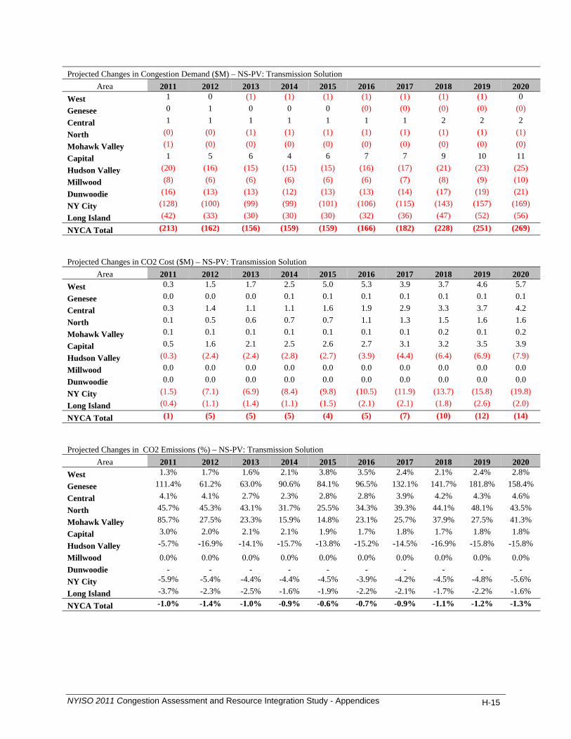
Projected Changes in Congestion Demand ($M) – NS-PV: Transmission Solution
Area 2011 2012 2013 2014 2015 2016 2017 2018 2019 2020 West 1 0 (1) (1) (1) (1) (1) (1) (1) 0
Genesee 0 1 0 0 0 (0) (0) (0) (0) (0)
Central 1 1 1 1 1 1 1 2 2 2
North (0) (0) (1) (1) (1) (1) (1) (1) (1) (1)
Mohawk Valley (1) (0) (0) (0) (0) (0) (0) (0) (0) (0)
Capital 1 5 6 4 6 7 7 9 10 11
Hudson Valley (20) (16) (15) (15) (15) (16) (17) (21) (23) (25)
Millwood (8) (6) (6) (6) (6) (6) (7) (8) (9) (10)
Dunwoodie (16) (13) (13) (12) (13) (13) (14) (17) (19) (21)
NY City (128) (100) (99) (99) (101) (106) (115) (143) (157) (169)
Long Island (42) (33) (30) (30) (30) (32) (36) (47) (52) (56)
NYCA Total (213) (162) (156) (159) (159) (166) (182) (228) (251) (269)
Projected Changes in CO2 Cost ($M) – NS-PV: Transmission Solution
Area 2011 2012 2013 2014 2015 2016 2017 2018 2019 2020 West 0.3 1.5 1.7 2.5 5.0 5.3 3.9 3.7 4.6 5.7
Genesee 0.0 0.0 0.0 0.1 0.1 0.1 0.1 0.1 0.1 0.1
Central 0.3 1.4 1.1 1.1 1.6 1.9 2.9 3.3 3.7 4.2
North 0.1 0.5 0.6 0.7 0.7 1.1 1.3 1.5 1.6 1.6
Mohawk Valley 0.1 0.1 0.1 0.1 0.1 0.1 0.1 0.2 0.1 0.2
Capital 0.5 1.6 2.1 2.5 2.6 2.7 3.1 3.2 3.5 3.9
Hudson Valley (0.3) (2.4) (2.4) (2.8) (2.7) (3.9) (4.4) (6.4) (6.9) (7.9)
Millwood 0.0 0.0 0.0 0.0 0.0 0.0 0.0 0.0 0.0 0.0
Dunwoodie 0.0 0.0 0.0 0.0 0.0 0.0 0.0 0.0 0.0 0.0
NY City (1.5) (7.1) (6.9) (8.4) (9.8) (10.5) (11.9) (13.7) (15.8) (19.8)
Long Island (0.4) (1.1) (1.4) (1.1) (1.5) (2.1) (2.1) (1.8) (2.6) (2.0)
NYCA Total (1) (5) (5) (5) (4) (5) (7) (10) (12) (14)
Projected Changes in CO2 Emissions (%) – NS-PV: Transmission Solution
Area 2011 2012 2013 2014 2015 2016 2017 2018 2019 2020 West 1.3% 1.7% 1.6% 2.1% 3.8% 3.5% 2.4% 2.1% 2.4% 2.8%
Genesee 111.4% 61.2% 63.0% 90.6% 84.1% 96.5% 132.1% 141.7% 181.8% 158.4%
Central 4.1% 4.1% 2.7% 2.3% 2.8% 2.8% 3.9% 4.2% 4.3% 4.6%
North 45.7% 45.3% 43.1% 31.7% 25.5% 34.3% 39.3% 44.1% 48.1% 43.5%
Mohawk Valley 85.7% 27.5% 23.3% 15.9% 14.8% 23.1% 25.7% 37.9% 27.5% 41.3%
Capital 3.0% 2.0% 2.1% 2.1% 1.9% 1.7% 1.8% 1.7% 1.8% 1.8%
Hudson Valley -5.7% -16.9% -14.1% -15.7% -13.8% -15.2% -14.5% -16.9% -15.8% -15.8%
Millwood 0.0% 0.0% 0.0% 0.0% 0.0% 0.0% 0.0% 0.0% 0.0% 0.0% Dunwoodie - - - - - - - - - - NY City -5.9% -5.4% -4.4% -4.4% -4.5% -3.9% -4.2% -4.5% -4.8% -5.6%
Long Island -3.7% -2.3% -2.5% -1.6% -1.9% -2.2% -2.1% -1.7% -2.2% -1.6%
NYCA Total -1.0% -1.4% -1.0% -0.9% -0.6% -0.7% -0.9% -1.1% -1.2% -1.3%
NYISO 2011 Congestion Assessment and Resource Integration Study - Appendices H-15

Projected Changes in SO2 Cost ($M) – NS-PV: Transmission Solution
Area 2011 2012 2013 2014 2015 2016 2017 2018 2019 2020 West 0.03 0.13 0.12 0.15 0.19 0.17 0.18 0.17 0.20 0.23
Genesee 0.00 0.00 0.00 0.00 0.00 0.00 0.00 0.00 0.00 0.00
Central 0.00 0.02 0.01 0.01 0.01 0.01 0.02 0.02 0.02 0.02
North 0.01 0.03 0.03 0.03 0.02 0.03 0.04 0.04 0.04 0.04
Mohawk Valley 0.01 0.00 0.00 0.00 (0.00) 0.00 0.00 0.00 0.00 0.01
Capital 0.00 0.00 0.00 0.00 0.00 0.00 0.00 0.00 0.00 0.00
Hudson Valley (0.03) (0.24) (0.19) (0.18) (0.15) (0.20) (0.20) (0.32) (0.32) (0.37)
Millwood 0.00 0.00 0.00 0.00 0.00 0.00 0.00 0.00 0.00 0.00
Dunwoodie 0.00 0.00 0.00 0.00 0.00 0.00 0.00 0.00 0.00 0.00
NY City (0.00) (0.01) (0.01) (0.01) (0.01) (0.01) (0.01) (0.01) (0.01) (0.01)
Long Island (0.02) (0.04) (0.05) (0.03) (0.03) (0.06) (0.05) (0.02) (0.04) (0.01)
NYCA Total 0.00 (0.10) (0.08) (0.03) 0.04 (0.05) (0.01) (0.12) (0.10) (0.10)
Projected Changes in SO2 Emissions (%) – NS-PV: Transmission Solution
Area 2011 2012 2013 2014 2015 2016 2017 2018 2019 2020 West 1.6% 2.7% 2.5% 3.3% 4.5% 3.7% 3.9% 3.5% 4.0% 4.7%
Genesee 9.0% 7.0% 6.7% 10.5% 8.8% 7.5% 8.4% 9.0% 9.7% 11.1%
Central 3.6% 24.0% 13.7% 13.1% 14.7% 13.7% 20.6% 19.5% 18.3% 15.3%
North 30.3% 28.0% 23.2% 21.6% 17.1% 17.4% 22.5% 17.8% 20.8% 19.3%
Mohawk Valley 225.4% 144.4% 1.9% 1.1% -0.2% 139.1% 139.9% 431.8% 143.0% 190.7%
Capital 5.4% 4.0% 3.8% 3.8% 3.6% 3.3% 3.5% 3.5% 3.6% 3.8%
Hudson Valley -3.0% -13.1% -10.6% -11.5% -9.6% -10.7% -9.7% -12.7% -11.5% -12.2%
Millwood 0.0% 0.0% 0.0% 0.0% 0.0% 0.0% 0.0% 0.0% 0.0% 0.0%
Dunwoodie - - - - - - - - - -
NY City -7.9% -8.1% -6.5% -6.3% -6.4% -6.0% -6.3% -7.4% -8.5% -9.4%
Long Island -3.1% -2.1% -2.6% -1.5% -1.6% -3.0% -2.3% -0.9% -1.7% -0.6%
NYCA Total 0.1% -1.2% -1.0% -0.4% 0.5% -0.6% -0.1% -1.2% -1.0% -0.9%
Projected Changes in NOx Cost ($M) – NS-PV: Transmission Solution
Area 2011 2012 2013 2014 2015 2016 2017 2018 2019 2020 West 0.1 0.1 0.1 0.2 0.4 0.4 0.2 0.2 0.2 0.3
Genesee 0.0 0.0 0.0 0.0 0.0 0.0 0.0 0.0 0.0 0.0
Central 0.1 0.1 0.1 0.1 0.1 0.1 0.2 0.2 0.2 0.2
North 0.0 0.0 0.0 0.0 0.0 0.0 0.0 0.0 0.0 0.0
Mohawk Valley 0.0 0.0 0.0 0.0 0.0 0.0 0.0 0.0 0.0 0.0
Capital 0.0 0.0 0.0 0.0 0.0 0.0 0.1 0.1 0.1 0.1
Hudson Valley (0.2) (0.3) (0.3) (0.5) (0.4) (0.6) (0.6) (0.8) (0.8) (0.9)
Millwood 0.0 0.0 0.0 0.0 0.0 0.0 0.0 0.0 0.0 0.0
Dunwoodie 0.0 0.0 0.0 0.0 0.0 0.0 0.0 0.0 0.0 0.0
NY City (0.1) (0.1) (0.2) (0.2) (0.2) (0.2) (0.3) (0.2) (0.3) (0.4)
Long Island (0.1) (0.1) (0.1) (0.1) (0.1) (0.1) (0.1) (0.1) (0.1) (0.1)
NYCA Total (0.1) (0.3) (0.3) (0.4) (0.2) (0.3) (0.5) (0.6) (0.7) (0.7)
NYISO 2011 Congestion Assessment and Resource Integration Study - Appendices H-16
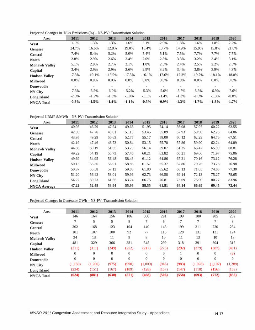
Projected Changes in NOx Emissions (%) – NS-PV: Transmission Solution
Area 2011 2012 2013 2014 2015 2016 2017 2018 2019 2020 West 1.1% 1.3% 1.3% 1.6% 3.1% 2.9% 1.8% 1.6% 1.8% 2.2%
Genesee 24.7% 16.6% 12.8% 19.0% 16.4% 13.7% 14.9% 15.9% 15.8% 21.8%
Central 7.4% 8.4% 5.2% 5.0% 5.4% 5.1% 7.5% 7.7% 7.7% 7.7%
North 2.8% 2.9% 2.6% 2.4% 2.0% 2.8% 3.3% 3.2% 3.4% 3.1%
Mohawk Valley 5.1% 2.9% 2.7% 2.1% 1.8% 2.3% 2.4% 2.5% 2.2% 2.5%
Capital 3.4% 2.9% 2.9% 2.6% 2.9% 3.2% 3.4% 3.8% 3.9% 4.3%
Hudson Valley -7.5% -19.1% -15.9% -17.5% -16.1% -17.6% -17.3% -19.2% -18.1% -18.0%
Millwood 0.0% 0.0% 0.0% 0.0% 0.0% 0.0% 0.0% 0.0% 0.0% 0.0%
Dunwoodie - - - - - - - - - - NY City -7.3% -6.5% -6.0% -5.2% -5.3% -5.0% -5.7% -5.5% -6.9% -7.6%
Long Island -2.0% -1.2% -1.5% -1.0% -1.1% -1.4% -1.3% -1.0% -1.3% -0.8%
NYCA Total -0.8% -1.5% -1.4% -1.1% -0.5% -0.9% -1.3% -1.7% -1.8% -1.7%
Projected LBMP $/MWh – NS-PV: Transmission Solution
Area 2011 2012 2013 2014 2015 2016 2017 2018 2019 2020 West 40.93 46.29 47.54 49.66 51.95 54.14 56.08 57.97 60.22 62.55
Genesee 42.59 47.76 49.01 51.10 53.45 55.89 57.93 59.90 62.25 64.86
Central 43.95 49.29 50.63 52.75 55.17 58.00 60.12 62.29 64.76 67.51
North 42.19 47.46 48.73 50.84 53.15 55.78 57.86 59.90 62.24 64.89
Mohawk Valley 44.86 50.19 51.55 53.70 56.14 59.07 61.25 63.47 65.99 68.81
Capital 49.22 54.19 55.73 57.46 60.21 63.82 66.21 69.06 71.97 75.06
Hudson Valley 49.69 54.95 56.48 58.43 61.12 64.86 67.31 70.16 73.12 76.28
Millwood 50.15 55.36 56.91 58.86 61.57 65.37 67.86 70.76 73.78 76.98
Dunwoodie 50.37 55.58 57.13 59.08 61.80 65.62 68.13 71.05 74.08 77.30
NY City 51.20 56.43 58.01 59.96 62.73 66.58 69.14 72.13 75.27 78.65
Long Island 54.27 59.73 61.55 63.74 66.75 70.81 73.69 76.90 80.27 83.96
NYCA Average 47.22 52.48 53.94 55.96 58.55 61.81 64.14 66.69 69.45 72.44
Projected Changes in Generator GWh – NS-PV: Transmission Solution
Area 2011 2012 2013 2014 2015 2016 2017 2018 2019 2020 West 146 164 156 186 308 291 199 180 205 232
Genesee 7 5 5 8 7 6 7 7 7 8
Central 202 168 123 104 140 148 199 211 220 254
North 101 107 100 92 77 115 128 131 131 124
Mohawk Valley 34 13 11 9 8 10 11 13 10 13
Capital 481 329 366 381 345 299 318 291 304 315
Hudson Valley (211) (311) (249) (252) (217) (273) (292) (379) (387) (401)
Millwood 0 0 0 0 0 0 1 0 0 (2)
Dunwoodie 0 0 0 0 0 0 0 0 0 0
NY City (1,150) (1,206) (975) (990) (1,009) (946) (983) (1,028) (1,107) (1,289)
Long Island (234) (151) (167) (109) (128) (157) (147) (118) (156) (109)
NYCA Total (624) (881) (630) (571) (468) (506) (558) (693) (772) (856)
NYISO 2011 Congestion Assessment and Resource Integration Study - Appendices H-17

Projected Changes in Loss Payment: ($M) – NS-PV Transmission Solution
Area 2011 2012 2013 2014 2015 2016 2017 2018 2019 2020 West (3) (3) (3) (3) (3) (4) (4) (4) (4) (4) Genesee (1) (1) (1) (1) (1) (2) (1) (2) (2) (2) Central (1) (1) (1) (1) (1) (1) (1) (1) (1) (1) North (0) (1) (1) (1) (1) (1) (1) (1) (1) (1) Mohawk Valley 0 0 0 0 0 0 0 0 0 0 Capital 1 1 1 1 1 1 1 2 2 2 Hudson Valley (1) (2) (2) (2) (2) (2) (2) (2) (2) (2) Millwood (0) (1) (1) (1) (1) (1) (1) (1) (1) (1) Dunwoodie (1) (1) (1) (1) (1) (1) (1) (1) (1) (1) NY City (6) (8) (10) (9) (9) (11) (11) (11) (10) (9) Long Island (1) (2) (3) (3) (3) (4) (4) (4) (4) (3) NYCA Total (14) (18) (21) (20) (21) (25) (24) (24) (24) (23) Generic Generation Solution Projected Changes in Production Cost ($M) - NS-PV: Generation Solution
Area 2011 2012 2013 2014 2015 2016 2017 2018 2019 2020 West (0) 0 (2) (6) (5) (9) (6) (15) (14) (5)
Genesee (0) (0) (0) 0 0 0 0 0 0 0
Central (3) (1) 0 (4) (3) (8) (8) (9) (13) (16)
North (1) (1) (2) (2) (3) (4) (3) (4) (3) (3)
Mohawk Valley 0 (0) (0) (0) (0) (0) (0) (0) (0) (0)
Capital (20) (19) (17) (19) (19) (17) (13) (10) (9) (6)
Hudson Valley 201 247 258 274 290 321 330 344 357 371
Millwood 0 0 0 0 0 0 0 0 0 0
Dunwoodie 0 0 0 0 0 0 0 0 0 0
NY City (110) (140) (135) (125) (137) (156) (176) (183) (185) (207)
Long Island (18) (15) (15) (14) (16) (18) (16) (13) (20) (17) NYCA Total 48 72 88 104 106 109 107 110 112 116 NYCA-wide (27) (36) (35) (39) (43) (54) (57) (59) (66) (72) Projected Changes in Load LBMP Payment ($M) -NS-PV: Generation Solution
Area 2011 2012 2013 2014 2015 2016 2017 2018 2019 2020 West 3 4 2 2 2 1 0 4 6 5 Genesee 2 3 1 1 1 (0) (0) 2 3 3 Central 3 3 0 0 (0) (2) (2) 2 3 3 North 1 1 0 (0) (0) (1) (1) 0 1 1 Mohawk Valley 1 1 (0) (0) (1) (2) (1) 0 1 1 Capital (1) (2) (3) (4) (2) (4) (5) (3) (3) (1) Hudson Valley (12) (12) (14) (14) (14) (17) (17) (19) (17) (19) Millwood (4) (4) (5) (5) (5) (6) (6) (7) (6) (7) Dunwoodie (10) (9) (10) (10) (10) (12) (12) (14) (13) (14) NY City (72) (68) (73) (78) (74) (93) (93) (108) (100) (109) Long Island (13) (13) (13) (12) (9) (14) (14) (21) (13) (17) NYCA Total (103) (97) (115) (121) (112) (151) (150) (163) (139) (156)
NYISO 2011 Congestion Assessment and Resource Integration Study - Appendices H-18
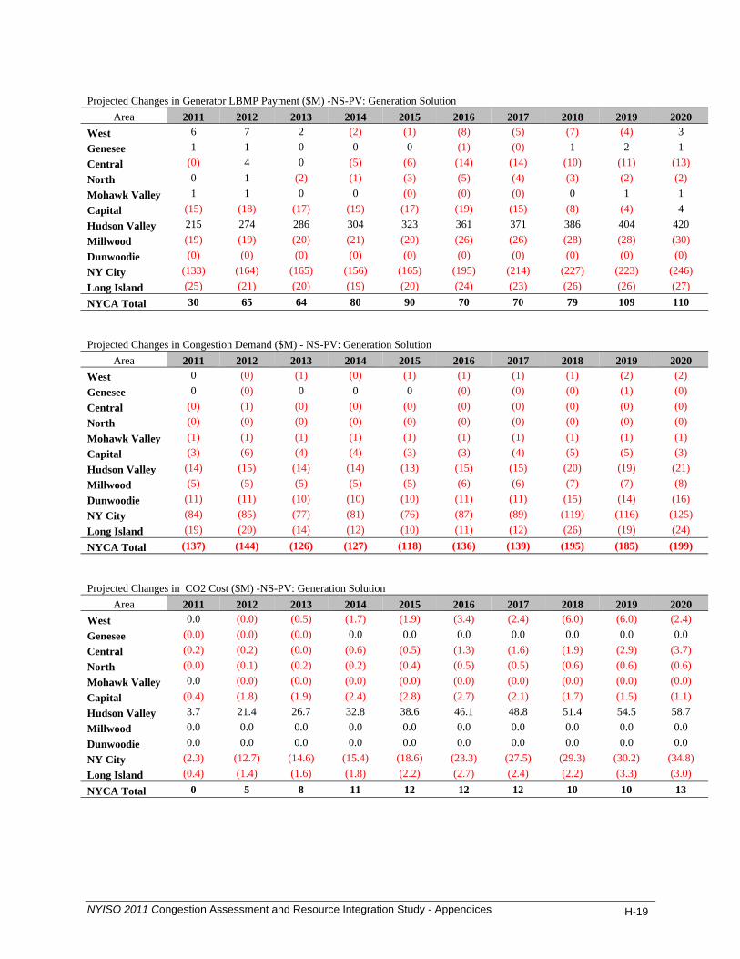
Projected Changes in Generator LBMP Payment ($M) -NS-PV: Generation Solution
Area 2011 2012 2013 2014 2015 2016 2017 2018 2019 2020 West 6 7 2 (2) (1) (8) (5) (7) (4) 3 Genesee 1 1 0 0 0 (1) (0) 1 2 1 Central (0) 4 0 (5) (6) (14) (14) (10) (11) (13) North 0 1 (2) (1) (3) (5) (4) (3) (2) (2) Mohawk Valley 1 1 0 0 (0) (0) (0) 0 1 1 Capital (15) (18) (17) (19) (17) (19) (15) (8) (4) 4 Hudson Valley 215 274 286 304 323 361 371 386 404 420 Millwood (19) (19) (20) (21) (20) (26) (26) (28) (28) (30) Dunwoodie (0) (0) (0) (0) (0) (0) (0) (0) (0) (0) NY City (133) (164) (165) (156) (165) (195) (214) (227) (223) (246) Long Island (25) (21) (20) (19) (20) (24) (23) (26) (26) (27) NYCA Total 30 65 64 80 90 70 70 79 109 110 Projected Changes in Congestion Demand ($M) - NS-PV: Generation Solution
Area 2011 2012 2013 2014 2015 2016 2017 2018 2019 2020 West 0 (0) (1) (0) (1) (1) (1) (1) (2) (2) Genesee 0 (0) 0 0 0 (0) (0) (0) (1) (0) Central (0) (1) (0) (0) (0) (0) (0) (0) (0) (0) North (0) (0) (0) (0) (0) (0) (0) (0) (0) (0) Mohawk Valley (1) (1) (1) (1) (1) (1) (1) (1) (1) (1) Capital (3) (6) (4) (4) (3) (3) (4) (5) (5) (3) Hudson Valley (14) (15) (14) (14) (13) (15) (15) (20) (19) (21) Millwood (5) (5) (5) (5) (5) (6) (6) (7) (7) (8) Dunwoodie (11) (11) (10) (10) (10) (11) (11) (15) (14) (16) NY City (84) (85) (77) (81) (76) (87) (89) (119) (116) (125) Long Island (19) (20) (14) (12) (10) (11) (12) (26) (19) (24) NYCA Total (137) (144) (126) (127) (118) (136) (139) (195) (185) (199) Projected Changes in CO2 Cost ($M) -NS-PV: Generation Solution
Area 2011 2012 2013 2014 2015 2016 2017 2018 2019 2020 West 0.0 (0.0) (0.5) (1.7) (1.9) (3.4) (2.4) (6.0) (6.0) (2.4) Genesee (0.0) (0.0) (0.0) 0.0 0.0 0.0 0.0 0.0 0.0 0.0 Central (0.2) (0.2) (0.0) (0.6) (0.5) (1.3) (1.6) (1.9) (2.9) (3.7) North (0.0) (0.1) (0.2) (0.2) (0.4) (0.5) (0.5) (0.6) (0.6) (0.6) Mohawk Valley 0.0 (0.0) (0.0) (0.0) (0.0) (0.0) (0.0) (0.0) (0.0) (0.0) Capital (0.4) (1.8) (1.9) (2.4) (2.8) (2.7) (2.1) (1.7) (1.5) (1.1) Hudson Valley 3.7 21.4 26.7 32.8 38.6 46.1 48.8 51.4 54.5 58.7 Millwood 0.0 0.0 0.0 0.0 0.0 0.0 0.0 0.0 0.0 0.0 Dunwoodie 0.0 0.0 0.0 0.0 0.0 0.0 0.0 0.0 0.0 0.0 NY City (2.3) (12.7) (14.6) (15.4) (18.6) (23.3) (27.5) (29.3) (30.2) (34.8) Long Island (0.4) (1.4) (1.6) (1.8) (2.2) (2.7) (2.4) (2.2) (3.3) (3.0) NYCA Total 0 5 8 11 12 12 12 10 10 13
NYISO 2011 Congestion Assessment and Resource Integration Study - Appendices H-19
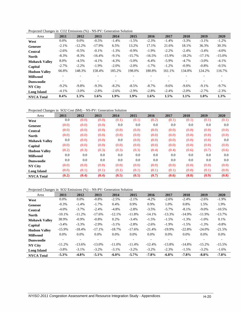
Projected Changes in CO2 Emissions (%) - NS-PV: Generation Solution
Area 2011 2012 2013 2014 2015 2016 2017 2018 2019 2020 West 0.0% 0.0% -0.5% -1.4% -1.5% -2.3% -1.4% -3.3% -3.1% -1.2%
Genesee -2.1% -12.2% -17.9% 6.5% 13.2% 17.1% 21.6% 18.1% 36.3% 30.3%
Central -2.6% -0.5% -0.1% -1.3% -0.9% -1.9% -2.2% -2.4% -3.4% -4.0%
North -8.3% -8.3% -16.4% -9.1% -15.7% -16.5% -15.9% -18.2% -17.1% -15.0%
Mohawk Valley 8.0% -4.5% -4.1% -4.3% -5.0% -6.4% -5.9% -4.7% -3.0% -4.1%
Capital -2.7% -2.2% -1.9% -2.0% -2.0% -1.7% -1.2% -0.9% -0.8% -0.5%
Hudson Valley 66.8% 148.3% 158.4% 185.2% 198.0% 180.8% 161.1% 134.8% 124.2% 116.7%
Millwood - - - - - - - - - -
Dunwoodie - - - - - - - - - -
NY City -9.2% -9.8% -9.3% -8.2% -8.5% -8.7% -9.6% -9.6% -9.1% -9.7%
Long Island -4.1% -3.0% -2.8% -2.6% -2.9% -2.8% -2.4% -2.0% -2.7% -2.3%
NYCA Total 0.4% 1.3% 1.6% 1.9% 1.9% 1.6% 1.5% 1.1% 1.0% 1.3%
Projected Changes in SO2 Cost ($M) – NS-PV: Generation Solution
Area 2011 2012 2013 2014 2015 2016 2017 2018 2019 2020 West 0.0 (0.0) (0.0) (0.1) (0.1) (0.2) (0.1) (0.1) (0.1) (0.1)
Genesee (0.0) (0.0) (0.0) 0.0 0.0 0.0 0.0 0.0 0.0 0.0
Central (0.0) (0.0) (0.0) (0.0) (0.0) (0.0) (0.0) (0.0) (0.0) (0.0)
North (0.0) (0.0) (0.0) (0.0) (0.0) (0.0) (0.0) (0.0) (0.0) (0.0)
Mohawk Valley 0.0 (0.0) (0.0) 0.0 (0.0) (0.0) (0.0) (0.0) (0.0) 0.0
Capital (0.0) (0.0) (0.0) (0.0) (0.0) (0.0) (0.0) (0.0) (0.0) (0.0)
Hudson Valley (0.2) (0.3) (0.3) (0.3) (0.3) (0.4) (0.4) (0.6) (0.7) (0.6)
Millwood 0.0 0.0 0.0 0.0 0.0 0.0 0.0 0.0 0.0 0.0
Dunwoodie 0.0 0.0 0.0 0.0 0.0 0.0 0.0 0.0 0.0 0.0
NY City (0.0) (0.0) (0.0) (0.0) (0.0) (0.0) (0.0) (0.0) (0.0) (0.0)
Long Island (0.0) (0.1) (0.1) (0.1) (0.1) (0.1) (0.1) (0.0) (0.1) (0.0)
NYCA Total (0.2) (0.4) (0.4) (0.5) (0.5) (0.7) (0.6) (0.8) (0.9) (0.8)
Projected Changes in SO2 Emissions (%) – NS-PV: Generation Solution
Area 2011 2012 2013 2014 2015 2016 2017 2018 2019 2020 West 0.0% 0.0% -0.8% -2.5% -2.1% -4.2% -2.6% -2.4% -2.6% -1.9%
Genesee -0.3% -1.4% -1.7% 0.4% 0.9% 0.9% 1.0% 0.8% 1.5% 1.9%
Central -4.0% -3.7% -2.4% -4.8% -2.8% -3.5% -5.7% -8.1% -9.0% -10.5%
North -10.1% -11.2% -17.6% -12.1% -11.8% -14.1% -13.3% -14.9% -11.9% -13.7%
Mohawk Valley 38.9% -0.9% -0.8% 0.2% -3.4% -1.5% -1.5% -1.3% -1.0% 0.1%
Capital -3.4% -3.3% -2.9% -3.1% -2.8% -2.6% -1.9% -1.5% -1.3% -0.8%
Hudson Valley -15.9% -18.4% -17.1% -18.7% -17.6% -21.4% -19.9% -22.8% -24.0% -21.5%
Millwood 0.0% 0.0% 0.0% 0.0% 0.0% 0.0% 0.0% 0.0% 0.0% 0.0%
Dunwoodie - - - - - - - - - -
NY City -11.2% -13.6% -13.0% -11.0% -11.4% -12.4% -13.8% -14.8% -15.2% -15.5%
Long Island -3.8% -3.1% -3.2% -3.1% -3.2% -3.2% -2.3% -1.5% -3.2% -1.6%
NYCA Total -5.3% -4.8% -5.1% -6.0% -5.7% -7.8% -6.8% -7.8% -8.8% -7.8%
NYISO 2011 Congestion Assessment and Resource Integration Study - Appendices H-20

Projected Changes in NOx Cost ($M) – NS-PV: Generation Solution
Area 2011 2012 2013 2014 2015 2016 2017 2018 2019 2020 West 0.0 0.0 (0.0) (0.1) (0.1) (0.2) (0.1) (0.4) (0.3) (0.1)
Genesee 0.0 (0.0) (0.0) 0.0 0.0 0.0 0.0 0.0 0.0 0.0
Central (0.1) (0.0) (0.0) (0.0) (0.0) (0.1) (0.1) (0.1) (0.1) (0.1)
North (0.0) (0.0) (0.0) (0.0) (0.0) (0.0) (0.0) (0.0) (0.0) (0.0)
Mohawk Valley (0.0) (0.0) (0.0) (0.0) (0.0) (0.0) (0.0) (0.0) (0.0) (0.0)
Capital (0.0) (0.0) (0.0) (0.0) (0.0) (0.0) (0.0) (0.0) (0.0) (0.0)
Hudson Valley (0.3) (0.2) (0.2) (0.3) (0.2) (0.4) (0.4) (0.6) (0.7) (0.8)
Millwood 0.0 0.0 0.0 0.0 0.0 0.0 0.0 0.0 0.0 0.0
Dunwoodie 0.0 0.0 0.0 0.0 0.0 0.0 0.0 0.0 0.0 0.0
NY City (0.2) (0.3) (0.3) (0.4) (0.4) (0.5) (0.6) (0.5) (0.6) (0.6)
Long Island (0.1) (0.1) (0.1) (0.2) (0.2) (0.2) (0.1) (0.1) (0.2) (0.1)
NYCA Total (1) (1) (1) (1) (1) (1) (1) (2) (2) (2)
Projected Changes in NOx Emissions (%) - NS-PV: Generation Solution
Area 2011 2012 2013 2014 2015 2016 2017 2018 2019 2020 West 0.0% 0.0% -0.3% -0.9% -1.1% -1.5% -1.0% -2.8% -2.6% -0.8%
Genesee 0.1% -1.7% -2.6% 0.7% 1.6% 1.5% 1.6% 1.4% 2.5% 3.4%
Central -4.8% -2.0% -1.3% -2.1% -1.6% -2.2% -2.9% -3.9% -4.5% -5.3%
North -0.6% -0.7% -1.3% -0.9% -1.3% -1.6% -1.5% -1.7% -1.4% -1.4%
Mohawk Valley -0.1% -0.5% -0.4% -0.4% -0.5% -0.6% -0.5% -0.3% -0.2% -0.3%
Capital -1.2% -1.2% -1.0% -1.3% -1.4% -1.8% -1.4% -1.0% -1.0% -0.5%
Hudson Valley -13.1% -11.3% -8.9% -9.6% -7.5% -11.3% -11.9% -15.2% -16.8% -15.6%
Millwood 0.0% 0.0% 0.0% 0.0% 0.0% 0.0% 0.0% 0.0% 0.0% 0.0%
Dunwoodie - - - - - - - - - -
NY City -13.0% -12.7% -12.1% -10.8% -10.9% -11.1% -12.7% -12.4% -12.6% -12.4%
Long Island -2.4% -1.8% -1.8% -1.7% -1.8% -1.8% -1.4% -1.2% -1.8% -1.3%
NYCA Total -3.9% -3.0% -2.8% -2.9% -2.9% -3.6% -3.6% -4.7% -5.1% -4.3%
Projected LBMP $/MWh - NS-PV: Generation Solution
Area 2011 2012 2013 2014 2015 2016 2017 2018 2019 2020 West 40.03 45.65 46.83 48.94 51.30 53.40 55.24 57.25 59.45 61.65
Genesee 41.61 47.03 48.21 50.26 52.65 55.00 56.94 59.05 61.33 63.69
Central 42.91 48.47 49.70 51.79 54.24 56.89 58.95 61.20 63.55 66.11
North 41.15 46.70 47.87 49.89 52.24 54.74 56.76 58.89 61.13 63.57
Mohawk Valley 43.81 49.36 50.61 52.70 55.18 57.93 60.05 62.35 64.76 67.38
Capital 47.77 52.51 53.96 55.77 58.51 61.76 64.04 66.70 69.42 72.36
Hudson Valley 49.11 54.20 55.70 57.59 60.35 63.81 66.27 69.11 72.11 75.14
Millwood 49.75 54.79 56.31 58.17 60.97 64.50 67.02 69.94 73.04 76.13
Dunwoodie 49.99 55.03 56.56 58.41 61.23 64.79 67.32 70.25 73.38 76.49
NY City 50.85 55.94 57.52 59.37 62.24 65.84 68.43 71.45 74.68 77.92
Long Island 54.05 59.46 61.26 63.49 66.63 70.54 73.47 76.64 80.20 83.76
NYCA Avg. 46.46 51.74 53.14 55.13 57.78 60.84 63.14 65.71 68.46 71.29
NYISO 2011 Congestion Assessment and Resource Integration Study - Appendices H-21
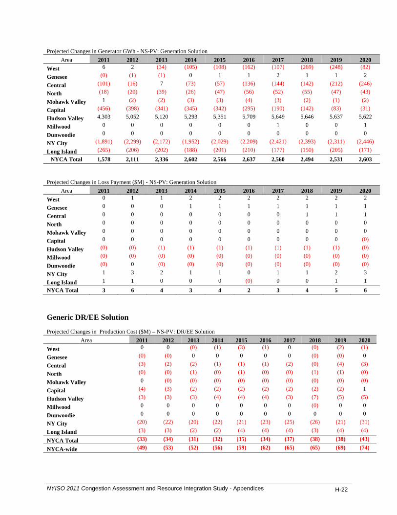
Projected Changes in Generator GWh - NS-PV: Generation Solution
Area 2011 2012 2013 2014 2015 2016 2017 2018 2019 2020 West 6 2 (34) (105) (108) (162) (107) (269) (248) (82)
Genesee (0) (1) (1) 0 1 1 2 1 1 2
Central (101) (16) 7 (73) (57) (136) (144) (142) (212) (246)
North (18) (20) (39) (26) (47) (56) (52) (55) (47) (43)
Mohawk Valley 1 (2) (2) (3) (3) (4) (3) (2) (1) (2)
Capital (456) (398) (341) (345) (342) (295) (190) (142) (83) (31)
Hudson Valley 4,303 5,052 5,120 5,293 5,351 5,709 5,649 5,646 5,637 5,622
Millwood 0 0 0 0 0 0 1 0 0 1
Dunwoodie 0 0 0 0 0 0 0 0 0 0
NY City (1,891) (2,299) (2,172) (1,952) (2,029) (2,209) (2,421) (2,393) (2,311) (2,446)
Long Island (265) (206) (202) (188) (201) (210) (177) (150) (205) (171) NYCA Total 1,578 2,111 2,336 2,602 2,566 2,637 2,560 2,494 2,531 2,603
Projected Changes in Loss Payment ($M) - NS-PV: Generation Solution
Area 2011 2012 2013 2014 2015 2016 2017 2018 2019 2020 West 0 1 1 2 2 2 2 2 2 2
Genesee 0 0 0 1 1 1 1 1 1 1
Central 0 0 0 0 0 0 0 1 1 1
North 0 0 0 0 0 0 0 0 0 0
Mohawk Valley 0 0 0 0 0 0 0 0 0 0
Capital 0 0 0 0 0 0 0 0 0 (0)
Hudson Valley (0) (0) (1) (1) (1) (1) (1) (1) (1) (0)
Millwood (0) (0) (0) (0) (0) (0) (0) (0) (0) (0)
Dunwoodie (0) 0 (0) (0) (0) (0) (0) (0) (0) (0)
NY City 1 3 2 1 1 0 1 1 2 3
Long Island 1 1 0 0 0 (0) 0 0 1 1 NYCA Total 3 6 4 3 4 2 3 4 5 6
Generic DR/EE Solution Projected Changes in Production Cost ($M) – NS-PV: DR/EE Solution
Area 2011 2012 2013 2014 2015 2016 2017 2018 2019 2020 West 0 0 (0) (1) (3) (1) 0 (0) (2) (1)
Genesee (0) (0) 0 0 0 0 0 (0) (0) 0
Central (3) (2) (2) (1) (1) (1) (2) (0) (4) (3)
North (0) (0) (1) (0) (1) (0) (0) (1) (1) (0)
Mohawk Valley 0 (0) (0) (0) (0) (0) (0) (0) (0) (0)
Capital (4) (3) (2) (2) (2) (2) (2) (2) (2) 1
Hudson Valley (3) (3) (3) (4) (4) (4) (3) (7) (5) (5)
Millwood 0 0 0 0 0 0 0 (0) 0 0
Dunwoodie 0 0 0 0 0 0 0 0 0 0
NY City (20) (22) (20) (22) (21) (23) (25) (26) (21) (31)
Long Island (3) (3) (2) (2) (4) (4) (4) (3) (4) (4)
NYCA Total (33) (34) (31) (32) (35) (34) (37) (38) (38) (43)
NYCA-wide (49) (53) (52) (56) (59) (62) (65) (65) (69) (74)
NYISO 2011 Congestion Assessment and Resource Integration Study - Appendices H-22

Projected Changes in Load LBMP Payment ($M) – NS-PV: DR/EE Solution
Area 2011 2012 2013 2014 2015 2016 2017 2018 2019 2020 West 0 1 (0) (0) 1 (1) (0) (1) 0 1 Genesee 0 0 (0) (0) 1 (1) (0) (1) 0 0 Central 0 1 (0) (0) 1 (2) (0) (1) 0 (0) North 0 0 (0) (0) 0 (0) (0) (0) 0 (0) Mohawk Valley (0) 0 (0) (0) 0 (1) (0) (1) 0 (0) Capital (0) (1) (1) (1) (0) (2) (1) (2) (1) (1) Hudson Valley (28) (30) (30) (31) (32) (35) (36) (38) (38) (40) Millwood (1) (1) (1) (1) (1) (1) (1) (2) (1) (1) Dunwoodie (25) (27) (28) (28) (29) (32) (33) (35) (35) (38) NY City (15) (15) (13) (13) (11) (22) (17) (25) (16) (22) Long Island (3) (4) (4) (3) (3) (6) (3) (8) (2) (6) NYCA Total (73) (77) (77) (77) (72) (103) (93) (113) (92) (107) Projected Changes in Generator LBMP Payment ($M) – NS-PV: DR/EE Solution
Area 2011 2012 2013 2014 2015 2016 2017 2018 2019 2020 West 1 1 (1) (1) (1) (2) 0 (1) (1) (0) Genesee 0 0 0 (0) 0 (0) (0) (0) 0 0 Central (3) (1) (2) (2) (1) (4) (4) (3) (4) (3) North (0) (0) (1) (0) (0) (1) (1) (1) (0) (0) Mohawk Valley 0 0 (0) (0) 0 (0) (0) (0) 0 (0) Capital (3) (3) (3) (2) (1) (5) (1) (3) (2) 2 Hudson Valley (5) (4) (4) (5) (4) (5) (5) (9) (6) (7) Millwood (4) (4) (4) (3) (3) (5) (4) (6) (4) (5) Dunwoodie (0) (0) (0) (0) (0) (0) (0) (0) (0) (0) NY City (25) (28) (27) (26) (26) (33) (33) (38) (27) (41) Long Island (5) (6) (4) (4) (5) (7) (6) (7) (5) (7) NYCA Total (44) (45) (45) (43) (40) (62) (54) (69) (48) (62) Projected Changes in Congestion Demand ($M) – NS-PV: DR/EE Solution
Area 2011 2012 2013 2014 2015 2016 2017 2018 2019 2020 West 0 0 (0) 0 (0) (0) 0 (0) (0) (1) Genesee 0 (0) (0) 0 (0) 0 (0) (0) (0) (0) Central (0) (0) (0) (0) (0) (0) (0) (0) (0) 0 North (0) (0) (0) (0) (0) (0) (0) (0) (0) (0) Mohawk Valley (0) (0) (0) (0) (0) (0) (0) (0) (0) (0) Capital (1) (1) (0) (1) (1) (1) (1) (1) (1) (1) Hudson Valley (5) (5) (4) (4) (5) (5) (5) (7) (6) (7) Millwood (1) (1) (1) (1) (1) (1) (1) (1) (1) (1) Dunwoodie (5) (5) (4) (4) (4) (5) (5) (6) (6) (7) NY City (15) (17) (11) (11) (14) (15) (16) (21) (17) (21) Long Island (3) (5) (3) (2) (4) (3) (3) (6) (3) (5) NYCA Total (30) (35) (24) (22) (28) (31) (32) (42) (34) (43)
NYISO 2011 Congestion Assessment and Resource Integration Study - Appendices H-23

Projected Changes in CO2 Cost ($M) – NS-PV: DR/EE Solution
Area 2011 2012 2013 2014 2015 2016 2017 2018 2019 2020 West 0.0 0.0 (0.0) (0.3) (1.0) (0.3) 0.1 (0.1) (0.6) (0.4) Genesee (0.0) (0.0) 0.0 0.0 0.0 0.0 0.0 (0.0) (0.0) 0.0 Central (0.1) (0.3) (0.3) (0.1) (0.2) (0.2) (0.5) 0.0 (0.9) (0.7) North (0.0) (0.0) (0.1) (0.0) (0.1) (0.0) (0.1) (0.1) (0.1) (0.0) Mohawk Valley 0.0 (0.0) (0.0) (0.0) (0.0) (0.0) (0.0) (0.0) (0.0) (0.0) Capital (0.1) (0.3) (0.2) (0.2) (0.3) (0.3) (0.3) (0.3) (0.3) 0.1 Hudson Valley (0.1) (0.4) (0.6) (0.8) (0.8) (0.9) (0.8) (1.9) (1.5) (1.3) Millwood 0.0 0.0 0.0 0.0 0.0 0.0 0.0 0.0 0.0 0.0 Dunwoodie 0.0 0.0 0.0 0.0 0.0 0.0 0.0 0.0 0.0 0.0 NY City (0.4) (2.0) (2.2) (2.7) (2.8) (3.3) (3.8) (4.1) (3.1) (5.1) Long Island (0.1) (0.3) (0.2) (0.3) (0.5) (0.6) (0.6) (0.4) (0.6) (0.6) NYCA Total (1) (3) (4) (4) (6) (6) (6) (7) (7) (8) Projected Changes in CO2 Emissions (% ) – NS-PV: DR/EE Solution
Area 2011 2012 2013 2014 2015 2016 2017 2018 2019 2020 West 0.0% 0.0% 0.0% -0.3% -0.8% -0.2% 0.0% 0.0% -0.3% -0.2% Genesee -3.5% -12.1% 4.7% 3.7% 5.3% 8.7% 0.6% -14.5% -3.0% 7.8% Central -1.1% -0.8% -0.6% -0.2% -0.4% -0.3% -0.6% 0.0% -1.1% -0.8% North -1.3% -2.7% -4.5% -1.8% -3.8% -0.6% -1.9% -3.4% -2.7% -0.5% Mohawk Valley 6.9% -1.7% -1.5% -1.2% -1.3% -0.4% -1.0% -0.8% -1.4% -0.3% Capital -0.5% -0.4% -0.2% -0.2% -0.2% -0.2% -0.2% -0.1% -0.2% 0.1% Hudson Valley -1.8% -2.7% -3.4% -4.5% -4.0% -3.5% -2.7% -5.0% -3.3% -2.6% Millwood 0.0% 0.0% 0.0% 0.0% 0.0% 0.0% 0.0% 0.0% 0.0% 0.0% Dunwoodie - - - - - - - - - - NY City -1.7% -1.5% -1.4% -1.4% -1.3% -1.2% -1.3% -1.3% -0.9% -1.4% Long Island -0.7% -0.6% -0.4% -0.4% -0.6% -0.6% -0.6% -0.4% -0.5% -0.5% NYCA Total -0.9% -0.8% -0.7% -0.8% -0.9% -0.7% -0.7% -0.8% -0.7% -0.8% Projected Changes in SO2 Cost ($M) – NS-PV: DR/EE Solution
Area 2011 2012 2013 2014 2015 2016 2017 2018 2019 2020 West 0.00 0.01 (0.00) (0.02) (0.03) (0.02) 0.01 0.00 (0.03) (0.01) Genesee (0.00) (0.00) 0.00 0.00 0.00 0.00 0.00 (0.00) (0.00) 0.00 Central (0.00) (0.00) (0.00) 0.00 (0.00) (0.00) (0.00) 0.00 (0.00) (0.00) North (0.00) (0.00) (0.00) (0.00) (0.00) (0.00) (0.00) (0.01) (0.00) (0.00) Mohawk Valley 0.00 (0.00) (0.00) (0.00) (0.00) (0.00) (0.00) (0.00) (0.00) 0.00 Capital (0.00) (0.00) (0.00) (0.00) (0.00) (0.00) (0.00) (0.00) (0.00) 0.00 Hudson Valley (0.02) (0.04) (0.05) (0.07) (0.06) (0.06) (0.05) (0.12) (0.09) (0.07) Millwood 0.00 0.00 0.00 0.00 0.00 0.00 0.00 0.00 0.00 0.00 Dunwoodie 0.00 0.00 0.00 0.00 0.00 0.00 0.00 0.00 0.00 0.00 NY City (0.00) (0.00) (0.00) (0.00) (0.00) (0.00) (0.00) (0.00) (0.00) (0.00) Long Island (0.00) (0.01) (0.01) (0.01) (0.01) (0.01) (0.01) (0.00) (0.01) (0.01) NYCA Total (0.02) (0.04) (0.07) (0.11) (0.11) (0.10) (0.06) (0.13) (0.14) (0.10)
NYISO 2011 Congestion Assessment and Resource Integration Study - Appendices H-24

Projected Changes in SO2 Emissions (%) – NS-PV: DR/EE Solution
Area 2011 2012 2013 2014 2015 2016 2017 2018 2019 2020 West 0.1% 0.1% -0.1% -0.5% -0.8% -0.6% 0.2% 0.0% -0.6% -0.3% Genesee -0.3% -1.2% 0.4% 0.3% 0.4% 0.6% 0.0% -0.9% -0.2% 0.5% Central -0.9% -3.1% -2.3% 0.5% -2.3% -1.0% -2.6% 1.6% -3.7% -1.8% North -0.6% -1.8% -3.8% -0.6% -1.3% -2.1% -1.8% -3.2% -1.0% -0.6% Mohawk Valley 29.5% -0.2% -0.2% -0.1% -0.1% -0.2% -0.1% -0.1% -0.2% 0.5% Capital -0.6% -0.5% -0.3% -0.3% -0.3% -0.4% -0.3% -0.2% -0.3% 0.1% Hudson Valley -1.4% -2.0% -3.0% -4.4% -3.6% -3.3% -2.3% -4.8% -3.2% -2.3% Millwood 0.0% 0.0% 0.0% 0.0% 0.0% 0.0% 0.0% 0.0% 0.0% 0.0% Dunwoodie - - - - - - - - - - NY City -2.0% -1.9% -1.9% -1.9% -1.5% -2.2% -2.4% -2.2% -2.4% -2.0% Long Island -0.3% -0.4% -0.3% -0.6% -0.7% -0.6% -0.6% -0.1% -0.3% -0.4% NYCA Total -0.4% -0.5% -0.8% -1.3% -1.3% -1.2% -0.7% -1.3% -1.3% -0.9% Projected Changes in NOx Cost ($M) – NS-PV: DR/EE Solution
Area 2011 2012 2013 2014 2015 2016 2017 2018 2019 2020 West 0.00 0.00 (0.00) (0.02) (0.08) (0.02) 0.00 (0.01) (0.03) (0.02) Genesee (0.00) (0.00) 0.00 0.00 0.00 0.00 (0.00) (0.00) (0.00) 0.00 Central (0.02) (0.01) (0.02) (0.00) (0.02) (0.01) (0.02) 0.01 (0.04) (0.02) North (0.00) (0.00) (0.00) (0.00) (0.00) (0.00) (0.00) (0.00) (0.00) (0.00) Mohawk Valley (0.00) (0.00) (0.00) (0.00) (0.00) (0.00) (0.00) (0.00) (0.00) (0.00) Capital (0.00) (0.00) (0.00) (0.00) (0.00) (0.01) (0.00) (0.00) (0.00) (0.00) Hudson Valley (0.04) (0.05) (0.08) (0.13) (0.12) (0.11) (0.10) (0.22) (0.13) (0.14) Millwood 0.00 0.00 0.00 0.00 0.00 0.00 0.00 0.00 0.00 0.00 Dunwoodie 0.00 0.00 0.00 0.00 0.00 0.00 0.00 0.00 0.00 0.00 NY City (0.03) (0.04) (0.05) (0.08) (0.06) (0.07) (0.07) (0.07) (0.09) (0.08) Long Island (0.01) (0.01) (0.02) (0.03) (0.04) (0.04) (0.04) (0.02) (0.03) (0.03) NYCA Total (0.10) (0.13) (0.17) (0.27) (0.33) (0.25) (0.24) (0.31) (0.33) (0.29) Projected Changes in NOx Emissions (%) – NS-PV: DR/EE Solution
Area 2011 2012 2013 2014 2015 2016 2017 2018 2019 2020 West 0.0% 0.0% 0.0% -0.2% -0.6% -0.1% 0.0% -0.1% -0.2% -0.1% Genesee -0.1% -1.9% 0.6% 0.4% 0.6% 0.9% 0.0% -1.4% -0.2% 0.8% Central -1.4% -1.3% -1.1% 0.0% -0.9% -0.4% -1.0% 0.5% -1.7% -0.9% North -0.1% -0.2% -0.3% -0.1% -0.2% -0.1% -0.2% -0.3% -0.2% 0.0% Mohawk Valley 0.0% -0.2% -0.2% -0.1% -0.1% 0.0% -0.1% -0.1% -0.1% 0.0% Capital -0.3% -0.3% -0.1% -0.2% -0.2% -0.3% -0.3% -0.2% -0.3% 0.0% Hudson Valley -1.9% -3.2% -3.7% -4.6% -4.2% -3.6% -2.9% -5.3% -3.0% -2.8% Millwood 0.0% 0.0% 0.0% 0.0% 0.0% 0.0% 0.0% 0.0% 0.0% 0.0% Dunwoodie - - - - - - - - - - NY City -1.9% -2.1% -2.0% -1.9% -1.6% -1.5% -1.6% -1.5% -1.9% -1.7% Long Island -0.4% -0.3% -0.2% -0.3% -0.4% -0.4% -0.4% -0.2% -0.3% -0.3% NYCA Total -0.6% -0.7% -0.7% -0.7% -0.9% -0.7% -0.6% -0.8% -0.8% -0.7%
NYISO 2011 Congestion Assessment and Resource Integration Study - Appendices H-25
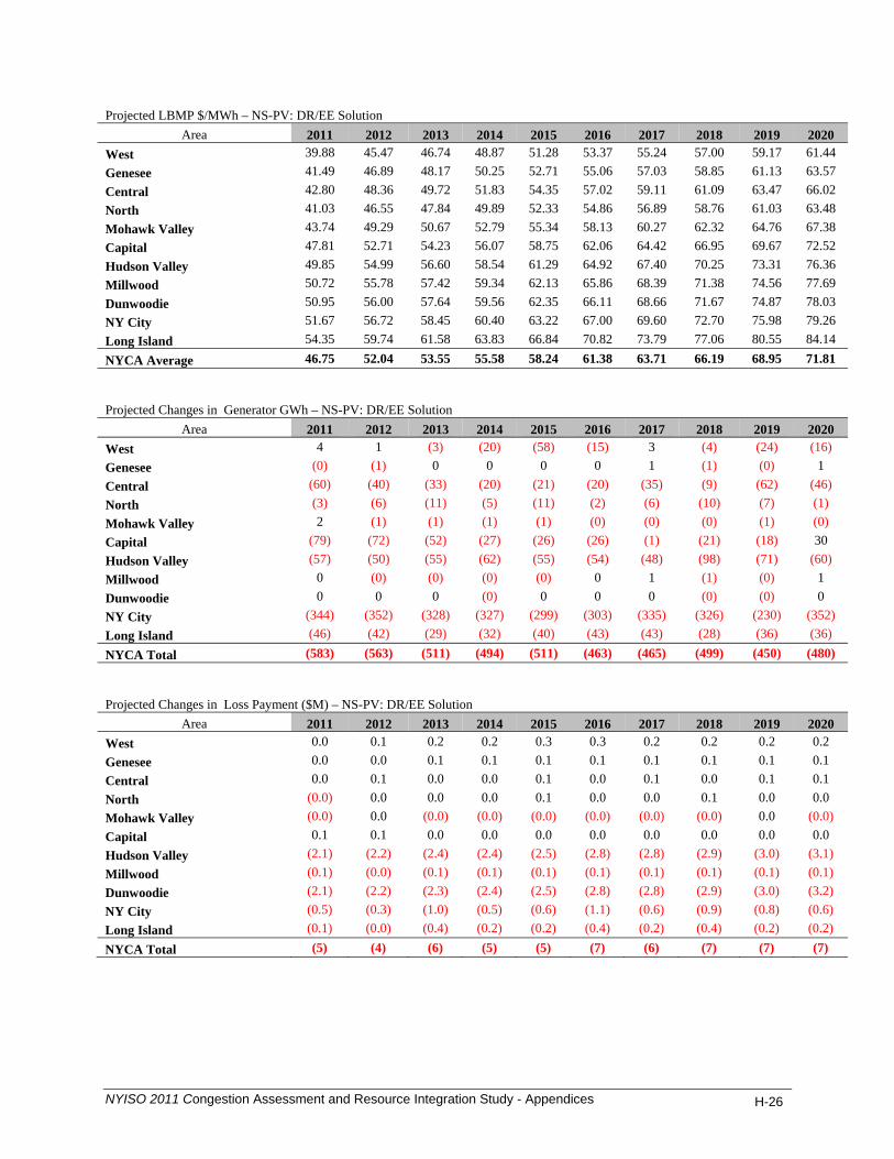
Projected LBMP $/MWh – NS-PV: DR/EE Solution
Area 2011 2012 2013 2014 2015 2016 2017 2018 2019 2020 West 39.88 45.47 46.74 48.87 51.28 53.37 55.24 57.00 59.17 61.44 Genesee 41.49 46.89 48.17 50.25 52.71 55.06 57.03 58.85 61.13 63.57 Central 42.80 48.36 49.72 51.83 54.35 57.02 59.11 61.09 63.47 66.02 North 41.03 46.55 47.84 49.89 52.33 54.86 56.89 58.76 61.03 63.48 Mohawk Valley 43.74 49.29 50.67 52.79 55.34 58.13 60.27 62.32 64.76 67.38 Capital 47.81 52.71 54.23 56.07 58.75 62.06 64.42 66.95 69.67 72.52 Hudson Valley 49.85 54.99 56.60 58.54 61.29 64.92 67.40 70.25 73.31 76.36 Millwood 50.72 55.78 57.42 59.34 62.13 65.86 68.39 71.38 74.56 77.69 Dunwoodie 50.95 56.00 57.64 59.56 62.35 66.11 68.66 71.67 74.87 78.03 NY City 51.67 56.72 58.45 60.40 63.22 67.00 69.60 72.70 75.98 79.26 Long Island 54.35 59.74 61.58 63.83 66.84 70.82 73.79 77.06 80.55 84.14 NYCA Average 46.75 52.04 53.55 55.58 58.24 61.38 63.71 66.19 68.95 71.81 Projected Changes in Generator GWh – NS-PV: DR/EE Solution
Area 2011 2012 2013 2014 2015 2016 2017 2018 2019 2020 West 4 1 (3) (20) (58) (15) 3 (4) (24) (16) Genesee (0) (1) 0 0 0 0 1 (1) (0) 1 Central (60) (40) (33) (20) (21) (20) (35) (9) (62) (46) North (3) (6) (11) (5) (11) (2) (6) (10) (7) (1) Mohawk Valley 2 (1) (1) (1) (1) (0) (0) (0) (1) (0) Capital (79) (72) (52) (27) (26) (26) (1) (21) (18) 30 Hudson Valley (57) (50) (55) (62) (55) (54) (48) (98) (71) (60) Millwood 0 (0) (0) (0) (0) 0 1 (1) (0) 1 Dunwoodie 0 0 0 (0) 0 0 0 (0) (0) 0 NY City (344) (352) (328) (327) (299) (303) (335) (326) (230) (352) Long Island (46) (42) (29) (32) (40) (43) (43) (28) (36) (36) NYCA Total (583) (563) (511) (494) (511) (463) (465) (499) (450) (480) Projected Changes in Loss Payment ($M) – NS-PV: DR/EE Solution
Area 2011 2012 2013 2014 2015 2016 2017 2018 2019 2020 West 0.0 0.1 0.2 0.2 0.3 0.3 0.2 0.2 0.2 0.2 Genesee 0.0 0.0 0.1 0.1 0.1 0.1 0.1 0.1 0.1 0.1 Central 0.0 0.1 0.0 0.0 0.1 0.0 0.1 0.0 0.1 0.1 North (0.0) 0.0 0.0 0.0 0.1 0.0 0.0 0.1 0.0 0.0 Mohawk Valley (0.0) 0.0 (0.0) (0.0) (0.0) (0.0) (0.0) (0.0) 0.0 (0.0) Capital 0.1 0.1 0.0 0.0 0.0 0.0 0.0 0.0 0.0 0.0 Hudson Valley (2.1) (2.2) (2.4) (2.4) (2.5) (2.8) (2.8) (2.9) (3.0) (3.1) Millwood (0.1) (0.0) (0.1) (0.1) (0.1) (0.1) (0.1) (0.1) (0.1) (0.1) Dunwoodie (2.1) (2.2) (2.3) (2.4) (2.5) (2.8) (2.8) (2.9) (3.0) (3.2) NY City (0.5) (0.3) (1.0) (0.5) (0.6) (1.1) (0.6) (0.9) (0.8) (0.6) Long Island (0.1) (0.0) (0.4) (0.2) (0.2) (0.4) (0.2) (0.4) (0.2) (0.2) NYCA Total (5) (4) (6) (5) (5) (7) (6) (7) (7) (7)
NYISO 2011 Congestion Assessment and Resource Integration Study - Appendices H-26

H.3. Study 3: Leeds – Pleasant Valley (L-PV) Generic Transmission Solution Projected Changes in Production Cost ($M) – L-PV: Transmission Solution
Area 2011 2012 2013 2014 2015 2016 2017 2018 2019 2020 West 4 5 5 6 13 11 8 7 9 10
Genesee 0 0 0 0 0 0 0 0 0 0
Central 7 8 7 7 8 9 10 10 13 16
North 4 5 5 5 4 6 7 7 7 6
Mohawk Valley 1 1 1 0 0 0 0 0 0 0
Capital 19 14 14 13 13 11 13 13 14 16
Hudson Valley (8) (14) (12) (12) (11) (13) (15) (22) (22) (23)
Millwood 0 0 0 0 0 0 0 (0) (0) 0
Dunwoodie 0 0 0 0 0 0 0 0 0 0
NY City (56) (54) (52) (55) (56) (56) (67) (62) (78) (89)
Long Island (13) (9) (9) (5) (8) (11) (11) (9) (11) (9)
NYCA Total (41) (44) (42) (40) (38) (42) (55) (54) (67) (70)
NYCA-wide (22) (18) (18) (19) (21) (21) (23) (22) (28) (30)
Projected Changes in Load LBMP Payment ($M) – L-PV: Transmission Solution
Area 2011 2012 2013 2014 2015 2016 2017 2018 2019 2020 West 14 10 9 9 9 9 11 10 13 12 Genesee 10 7 7 7 7 7 9 8 10 10 Central 16 12 10 12 12 12 14 13 16 16 North 4 3 3 3 3 3 4 3 4 4 Mohawk Valley 7 5 4 5 5 5 6 5 6 6 Capital 19 16 16 15 16 17 19 20 22 24 Hudson Valley 1 (1) (1) (1) (1) (1) 0 (2) 0 (1) Millwood (1) (2) (2) (2) (2) (2) (2) (3) (2) (3) Dunwoodie (3) (4) (4) (4) (4) (4) (4) (6) (5) (7) NY City (21) (29) (31) (27) (29) (31) (26) (48) (42) (47) Long Island 2 (5) (4) (2) (2) (3) (2) (10) (6) (10) NYCA Total 47 11 7 16 14 11 29 (10) 16 5 Projected Changes in Generator LBMP Payment ($M) – L-PV: Transmission Solution
Area 2011 2012 2013 2014 2015 2016 2017 2018 2019 2020 West 29 23 21 24 29 27 27 25 31 30 Genesee 5 3 3 3 3 3 4 4 4 4 Central 35 29 26 31 28 31 36 34 43 44 North 11 9 9 9 8 10 12 12 13 12 Mohawk Valley 4 2 2 2 2 2 3 2 3 3 Capital 75 61 63 60 64 65 73 79 90 97 Hudson Valley (9) (16) (14) (13) (11) (14) (16) (25) (24) (25) Millwood (6) (7) (7) (6) (8) (8) (6) (11) (9) (11) Dunwoodie (0) (0) (0) (0) (0) (0) (0) (0) (0) (0) NY City (57) (65) (64) (63) (65) (67) (74) (81) (90) (103) Long Island (13) (13) (12) (7) (9) (12) (12) (16) (15) (16) NYCA Total 73 27 27 40 42 38 45 22 46 34
NYISO 2011 Congestion Assessment and Resource Integration Study - Appendices H-27

Projected Changes in Congestion Demand ($M) - L-PV: Transmission Solution
Area 2011 2012 2013 2014 2015 2016 2017 2018 2019 2020 West 2 1 0 0 (0) (1) (1) (2) (3) (4) Genesee 1 1 1 1 1 1 0 (1) (2) (2) Central 2 2 2 2 2 3 3 3 4 4 North (0) (0) (0) (0) (0) (0) (0) (0) (0) (0) Mohawk Valley 0 0 0 0 0 0 0 1 1 1 Capital 8 8 9 7 8 9 10 11 12 14 Hudson Valley (9) (9) (7) (8) (8) (8) (8) (10) (10) (11) Millwood (4) (4) (4) (4) (4) (4) (4) (5) (5) (6) Dunwoodie (10) (9) (8) (8) (8) (8) (9) (11) (11) (12) NY City (74) (66) (61) (63) (66) (66) (70) (87) (93) (98) Long Island (23) (21) (18) (18) (18) (18) (22) (28) (29) (33) NYCA Total (106) (96) (85) (91) (93) (93) (102) (129) (138) (146) Projected Changes in CO2 Cost ($M) - L-PV: Transmission Solution
Area 2011 2012 2013 2014 2015 2016 2017 2018 2019 2020 West 0.2 1.0 1.1 1.8 4.2 4.1 2.8 2.4 3.3 3.7 Genesee 0.0 0.0 0.0 0.1 0.0 0.1 0.0 0.0 0.1 0.1 Central 0.3 1.1 1.1 1.4 1.5 2.0 2.2 2.4 3.2 3.9 North 0.1 0.5 0.5 0.6 0.5 0.9 1.1 1.2 1.2 1.1 Mohawk Valley 0.0 0.1 0.1 0.1 0.1 0.1 0.1 0.1 0.1 0.1 Capital 0.4 1.2 1.5 1.6 1.7 1.6 1.9 2.1 2.3 2.7 Hudson Valley (0.2) (1.9) (2.0) (2.0) (1.7) (2.5) (3.1) (5.3) (5.3) (5.3) Millwood 0.0 0.0 0.0 0.0 0.0 0.0 0.0 0.0 0.0 0.0 Dunwoodie 0.0 0.0 0.0 0.0 0.0 0.0 0.0 0.0 0.0 0.0 NY City (1.1) (4.6) (5.4) (6.6) (7.3) (8.0) (10.0) (9.4) (12.1) (14.2) Long Island (0.3) (0.9) (1.0) (0.6) (1.1) (1.7) (1.7) (1.4) (1.7) (1.5) NYCA Total (1) (4) (4) (4) (2) (4) (7) (8) (9) (9) Projected Changes in CO2 Emissions (%) - L-PV: Transmission Solution
Area 2011 2012 2013 2014 2015 2016 2017 2018 2019 2020 West 0.7% 1.1% 1.0% 1.4% 3.2% 2.7% 1.7% 1.3% 1.7% 1.8% Genesee 74.2% 48.0% 71.3% 72.3% 61.3% 85.8% 88.1% 87.8% 150.9% 102.5% Central 3.7% 3.4% 2.6% 2.8% 2.7% 3.0% 3.0% 3.0% 3.8% 4.3% North 38.2% 37.3% 37.6% 28.1% 21.2% 28.4% 33.1% 36.4% 36.3% 30.6% Mohawk Valley 57.7% 17.6% 17.4% 11.9% 10.0% 12.4% 13.7% 14.8% 12.9% 12.4% Capital 2.4% 1.5% 1.5% 1.4% 1.2% 1.0% 1.1% 1.1% 1.2% 1.3% Hudson Valley -3.7% -13.1% -11.6% -11.3% -8.8% -10.0% -10.3% -13.9% -12.1% -10.6% Millwood 0.0% 0.0% 0.0% 0.0% 0.0% 0.0% 0.0% 0.0% 0.0% 0.0% Dunwoodie - - - - - - - - - - NY City -4.5% -3.6% -3.4% -3.5% -3.4% -3.0% -3.5% -3.1% -3.7% -4.0% Long Island -2.9% -1.9% -1.8% -0.9% -1.5% -1.8% -1.7% -1.2% -1.5% -1.2% NYCA Total -0.7% -0.9% -0.8% -0.7% -0.3% -0.5% -0.8% -0.9% -0.9% -0.9%
NYISO 2011 Congestion Assessment and Resource Integration Study - Appendices H-28
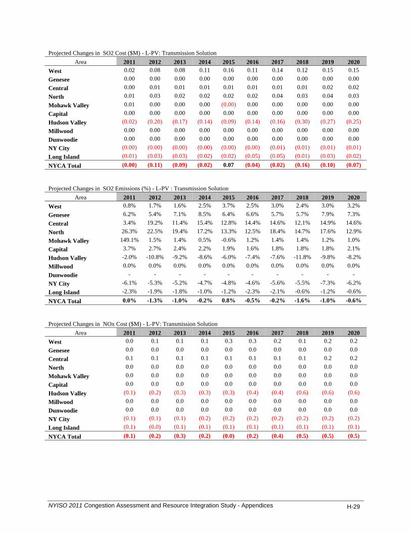
Projected Changes in SO2 Cost ($M) - L-PV: Transmission Solution
Area 2011 2012 2013 2014 2015 2016 2017 2018 2019 2020 West 0.02 0.08 0.08 0.11 0.16 0.11 0.14 0.12 0.15 0.15 Genesee 0.00 0.00 0.00 0.00 0.00 0.00 0.00 0.00 0.00 0.00 Central 0.00 0.01 0.01 0.01 0.01 0.01 0.01 0.01 0.02 0.02 North 0.01 0.03 0.02 0.02 0.02 0.02 0.04 0.03 0.04 0.03 Mohawk Valley 0.01 0.00 0.00 0.00 (0.00) 0.00 0.00 0.00 0.00 0.00 Capital 0.00 0.00 0.00 0.00 0.00 0.00 0.00 0.00 0.00 0.00 Hudson Valley (0.02) (0.20) (0.17) (0.14) (0.09) (0.14) (0.16) (0.30) (0.27) (0.25) Millwood 0.00 0.00 0.00 0.00 0.00 0.00 0.00 0.00 0.00 0.00 Dunwoodie 0.00 0.00 0.00 0.00 0.00 0.00 0.00 0.00 0.00 0.00 NY City (0.00) (0.00) (0.00) (0.00) (0.00) (0.00) (0.01) (0.01) (0.01) (0.01) Long Island (0.01) (0.03) (0.03) (0.02) (0.02) (0.05) (0.05) (0.01) (0.03) (0.02) NYCA Total (0.00) (0.11) (0.09) (0.02) 0.07 (0.04) (0.02) (0.16) (0.10) (0.07) Projected Changes in SO2 Emissions (%) - L-PV : Transmission Solution
Area 2011 2012 2013 2014 2015 2016 2017 2018 2019 2020 West 0.8% 1.7% 1.6% 2.5% 3.7% 2.5% 3.0% 2.4% 3.0% 3.2% Genesee 6.2% 5.4% 7.1% 8.5% 6.4% 6.6% 5.7% 5.7% 7.9% 7.3% Central 3.4% 19.2% 11.4% 15.4% 12.8% 14.4% 14.6% 12.1% 14.9% 14.6% North 26.3% 22.5% 19.4% 17.2% 13.3% 12.5% 18.4% 14.7% 17.6% 12.9% Mohawk Valley 149.1% 1.5% 1.4% 0.5% -0.6% 1.2% 1.4% 1.4% 1.2% 1.0% Capital 3.7% 2.7% 2.4% 2.2% 1.9% 1.6% 1.8% 1.8% 1.8% 2.1% Hudson Valley -2.0% -10.8% -9.2% -8.6% -6.0% -7.4% -7.6% -11.8% -9.8% -8.2% Millwood 0.0% 0.0% 0.0% 0.0% 0.0% 0.0% 0.0% 0.0% 0.0% 0.0% Dunwoodie - - - - - - - - - - NY City -6.1% -5.3% -5.2% -4.7% -4.8% -4.6% -5.6% -5.5% -7.3% -6.2% Long Island -2.3% -1.9% -1.8% -1.0% -1.2% -2.3% -2.1% -0.6% -1.2% -0.6% NYCA Total 0.0% -1.3% -1.0% -0.2% 0.8% -0.5% -0.2% -1.6% -1.0% -0.6% Projected Changes in NOx Cost ($M) - L-PV: Transmission Solution
Area 2011 2012 2013 2014 2015 2016 2017 2018 2019 2020 West 0.0 0.1 0.1 0.1 0.3 0.3 0.2 0.1 0.2 0.2 Genesee 0.0 0.0 0.0 0.0 0.0 0.0 0.0 0.0 0.0 0.0 Central 0.1 0.1 0.1 0.1 0.1 0.1 0.1 0.1 0.2 0.2 North 0.0 0.0 0.0 0.0 0.0 0.0 0.0 0.0 0.0 0.0 Mohawk Valley 0.0 0.0 0.0 0.0 0.0 0.0 0.0 0.0 0.0 0.0 Capital 0.0 0.0 0.0 0.0 0.0 0.0 0.0 0.0 0.0 0.0 Hudson Valley (0.1) (0.2) (0.3) (0.3) (0.3) (0.4) (0.4) (0.6) (0.6) (0.6) Millwood 0.0 0.0 0.0 0.0 0.0 0.0 0.0 0.0 0.0 0.0 Dunwoodie 0.0 0.0 0.0 0.0 0.0 0.0 0.0 0.0 0.0 0.0 NY City (0.1) (0.1) (0.1) (0.2) (0.2) (0.2) (0.2) (0.2) (0.2) (0.2) Long Island (0.1) (0.0) (0.1) (0.1) (0.1) (0.1) (0.1) (0.1) (0.1) (0.1) NYCA Total (0.1) (0.2) (0.3) (0.2) (0.0) (0.2) (0.4) (0.5) (0.5) (0.5)
NYISO 2011 Congestion Assessment and Resource Integration Study - Appendices H-29

Projected Changes in NOx Emissions (%) - L-PV: Transmission Solution
Area 2011 2012 2013 2014 2015 2016 2017 2018 2019 2020 West 0.6% 0.9% 0.8% 1.1% 2.6% 2.3% 1.2% 0.9% 1.3% 1.3% Genesee 15.9% 12.0% 11.7% 14.9% 11.5% 10.5% 8.8% 8.7% 12.3% 13.8% Central 5.9% 6.6% 4.3% 5.7% 4.8% 5.3% 5.4% 5.0% 6.3% 6.9% North 2.3% 2.3% 2.3% 2.1% 1.6% 2.3% 2.8% 2.6% 2.6% 2.2% Mohawk Valley 3.5% 2.2% 2.0% 1.5% 1.2% 1.5% 1.5% 1.5% 1.2% 1.2% Capital 2.6% 2.2% 2.1% 1.8% 2.0% 2.1% 2.3% 2.5% 2.6% 2.9% Hudson Valley -4.8% -14.1% -12.6% -12.1% -9.7% -11.5% -11.9% -15.2% -13.3% -12.1% Millwood 0.0% 0.0% 0.0% 0.0% 0.0% 0.0% 0.0% 0.0% 0.0% 0.0% Dunwoodie - - - - - - - - - - NY City -5.4% -4.7% -4.5% -4.3% -3.9% -3.9% -4.2% -3.8% -5.0% -5.2% Long Island -1.6% -1.0% -1.0% -0.5% -0.8% -1.2% -1.0% -0.7% -0.9% -0.6% NYCA Total -0.6% -1.1% -1.1% -0.7% 0.0% -0.5% -1.0% -1.4% -1.3% -1.1% Projected LBMP $/MWh - L-PV: Transmission Solution
Area 2011 2012 2013 2014 2015 2016 2017 2018 2019 2020 West 40.68 46.03 47.28 49.45 51.75 53.95 55.97 57.68 59.94 62.16 Genesee 42.30 47.46 48.71 50.86 53.20 55.67 57.78 59.54 61.90 64.36 Central 43.65 48.97 50.30 52.49 54.91 57.73 59.92 61.86 64.33 66.92 North 41.76 47.05 48.31 50.47 52.80 55.43 57.56 59.34 61.71 64.18 Mohawk Valley 44.54 49.85 51.21 53.41 55.86 58.79 61.03 63.02 65.55 68.20 Capital 49.33 54.00 55.53 57.32 60.01 63.55 66.01 68.62 71.49 74.46 Hudson Valley 50.20 55.16 56.75 58.72 61.40 65.19 67.76 70.50 73.59 76.66 Millwood 50.68 55.59 57.20 59.16 61.86 65.72 68.32 71.12 74.26 77.38 Dunwoodie 50.90 55.81 57.42 59.38 62.08 65.97 68.58 71.40 74.57 77.70 NY City 51.68 56.62 58.25 60.24 62.98 66.89 69.57 72.45 75.70 79.00 Long Island 54.61 59.82 61.65 63.88 66.89 70.98 73.94 77.06 80.52 84.09 NYCA Average 47.30 52.40 53.87 55.94 58.52 61.81 64.22 66.60 69.42 72.28 Projected Changes in Generator GWh - L-PV: Transmission Solution
Area 2011 2012 2013 2014 2015 2016 2017 2018 2019 2020 West 78 107 97 129 257 224 138 112 144 147 Genesee 5 4 6 7 5 5 5 4 5 5 Central 187 145 126 135 142 162 161 165 203 235 North 84 88 87 81 64 95 107 108 100 87 Mohawk Valley 23 9 8 6 5 6 6 6 5 5 Capital 401 265 280 256 241 175 211 206 219 241 Hudson Valley (135) (233) (201) (180) (141) (175) (201) (294) (282) (269) Millwood 0 0 0 0 0 0 0 (1) (1) 0 Dunwoodie 0 0 0 0 0 0 0 0 0 0 NY City (855) (800) (756) (780) (759) (724) (821) (707) (852) (919) Long Island (181) (125) (119) (63) (96) (121) (112) (87) (102) (79) NYCA Total (393) (541) (471) (408) (283) (352) (505) (488) (562) (546)
NYISO 2011 Congestion Assessment and Resource Integration Study - Appendices H-30

Projected Changes in Loss Payment ($M) - L-PV: Transmission Solution
Area 2011 2012 2013 2014 2015 2016 2017 2018 2019 2020 West (2) (2) (1) (2) (2) (2) (2) (2) (3) (3) Genesee (1) (1) (1) (1) (1) (1) (1) (1) (1) (1) Central (0) (1) (0) (1) (1) (1) (1) (1) (1) (1) North (0) (0) (0) (0) (0) (1) (1) (1) (1) (1) Mohawk Valley 0 0 0 0 0 0 0 0 0 0 Capital 0 0 0 1 1 1 1 1 1 1 Hudson Valley (0) (1) (1) (1) (1) (1) (1) (1) (1) (1) Millwood (0) (0) (0) (0) (0) (0) (0) (1) (0) (1) Dunwoodie (0) (1) (1) (1) (1) (1) (1) (1) (1) (1) NY City (2) (5) (6) (5) (5) (6) (6) (7) (5) (6) Long Island (0) (1) (2) (2) (2) (2) (2) (2) (2) (2) NYCA Total (6) (11) (12) (12) (12) (14) (14) (15) (13) (14) Generic Generation Solution Projected Changes in Production Cost ($M) – L-PV: Generation Solution
Area 2011 2012 2013 2014 2015 2016 2017 2018 2019 2020 West (0) 0 (2) (6) (5) (9) (6) (15) (14) (5)
Genesee (0) (0) (0) 0 0 0 0 0 0 0
Central (3) (1) 0 (4) (3) (8) (8) (9) (13) (16)
North (1) (1) (2) (2) (3) (4) (3) (4) (3) (3)
Mohawk Valley 0 (0) (0) (0) (0) (0) (0) (0) (0) (0)
Capital (20) (19) (17) (19) (19) (17) (13) (10) (9) (6)
Hudson Valley 201 247 258 274 290 321 330 344 357 371
Millwood 0 0 0 0 0 0 0 0 0 0
Dunwoodie 0 0 0 0 0 0 0 0 0 0
NY City (110) (140) (135) (125) (137) (156) (176) (183) (185) (207)
Long Island (18) (15) (15) (14) (16) (18) (16) (13) (20) (17)
NYCA Total 48 72 88 104 106 109 107 110 112 116
NYCA-wide (27) (36) (35) (39) (43) (54) (57) (59) (66) (72) Projected Changes in Load LBMP Payment ($M) -L-PV: Generation Solution
Area 2011 2012 2013 2014 2015 2016 2017 2018 2019 2020 West 3 4 2 2 2 1 0 4 6 5 Genesee 2 3 1 1 1 (0) (0) 2 3 3 Central 3 3 0 0 (0) (2) (2) 2 3 3 North 1 1 0 (0) (0) (1) (1) 0 1 1 Mohawk Valley 1 1 (0) (0) (1) (2) (1) 0 1 1 Capital (1) (2) (3) (4) (2) (4) (5) (3) (3) (1) Hudson Valley (12) (12) (14) (14) (14) (17) (17) (19) (17) (19) Millwood (4) (4) (5) (5) (5) (6) (6) (7) (6) (7) Dunwoodie (10) (9) (10) (10) (10) (12) (12) (14) (13) (14) NY City (72) (68) (73) (78) (74) (93) (93) (108) (100) (109) Long Island (13) (13) (13) (12) (9) (14) (14) (21) (13) (17) NYCA Total (103) (97) (115) (121) (112) (151) (150) (163) (139) (156)
NYISO 2011 Congestion Assessment and Resource Integration Study - Appendices H-31

Projected Changes in Generator LBMP Payment ($M) -L-PV: Generation Solution
Area 2011 2012 2013 2014 2015 2016 2017 2018 2019 2020 West 6 7 2 (2) (1) (8) (5) (7) (4) 3 Genesee 1 1 0 0 0 (1) (0) 1 2 1 Central (0) 4 0 (5) (6) (14) (14) (10) (11) (13) North 0 1 (2) (1) (3) (5) (4) (3) (2) (2) Mohawk Valley 1 1 0 0 (0) (0) (0) 0 1 1 Capital (15) (18) (17) (19) (17) (19) (15) (8) (4) 4 Hudson Valley 215 274 286 304 323 361 371 386 404 420 Millwood (19) (19) (20) (21) (20) (26) (26) (28) (28) (30) Dunwoodie (0) (0) (0) (0) (0) (0) (0) (0) (0) (0) NY City (133) (164) (165) (156) (165) (195) (214) (227) (223) (246) Long Island (25) (21) (20) (19) (20) (24) (23) (26) (26) (27) NYCA Total 30 65 64 80 90 70 70 79 109 110 Projected Changes in Congestion Demand ($M) - L-PV: Generation Solution
Area 2011 2012 2013 2014 2015 2016 2017 2018 2019 2020 West 0 (0) (1) (0) (1) (1) (1) (1) (2) (2) Genesee 0 (0) 0 0 0 (0) (0) (0) (1) (0) Central (0) (1) (0) (0) (0) (0) (0) (0) (0) (0) North (0) (0) (0) (0) (0) (0) (0) (0) (0) (0) Mohawk Valley (1) (1) (1) (1) (1) (1) (1) (1) (1) (1) Capital (3) (6) (4) (4) (3) (3) (4) (5) (5) (3) Hudson Valley (14) (15) (14) (14) (13) (15) (15) (20) (19) (21) Millwood (5) (5) (5) (5) (5) (6) (6) (7) (7) (8) Dunwoodie (11) (11) (10) (10) (10) (11) (11) (15) (14) (16) NY City (84) (85) (77) (81) (76) (87) (89) (119) (116) (125) Long Island (19) (20) (14) (12) (10) (11) (12) (26) (19) (24) NYCA Total (137) (144) (126) (127) (118) (136) (139) (195) (185) (199) Projected Changes in CO2 Cost ($M) -L-PV: Generation Solution
Area 2011 2012 2013 2014 2015 2016 2017 2018 2019 2020 West 0.0 (0.0) (0.5) (1.7) (1.9) (3.4) (2.4) (6.0) (6.0) (2.4) Genesee (0.0) (0.0) (0.0) 0.0 0.0 0.0 0.0 0.0 0.0 0.0 Central (0.2) (0.2) (0.0) (0.6) (0.5) (1.3) (1.6) (1.9) (2.9) (3.7) North (0.0) (0.1) (0.2) (0.2) (0.4) (0.5) (0.5) (0.6) (0.6) (0.6) Mohawk Valley 0.0 (0.0) (0.0) (0.0) (0.0) (0.0) (0.0) (0.0) (0.0) (0.0) Capital (0.4) (1.8) (1.9) (2.4) (2.8) (2.7) (2.1) (1.7) (1.5) (1.1) Hudson Valley 3.7 21.4 26.7 32.8 38.6 46.1 48.8 51.4 54.5 58.7 Millwood 0.0 0.0 0.0 0.0 0.0 0.0 0.0 0.0 0.0 0.0 Dunwoodie 0.0 0.0 0.0 0.0 0.0 0.0 0.0 0.0 0.0 0.0 NY City (2.3) (12.7) (14.6) (15.4) (18.6) (23.3) (27.5) (29.3) (30.2) (34.8) Long Island (0.4) (1.4) (1.6) (1.8) (2.2) (2.7) (2.4) (2.2) (3.3) (3.0) NYCA Total 0 5 8 11 12 12 12 10 10 13
NYISO 2011 Congestion Assessment and Resource Integration Study - Appendices H-32

Projected Changes in CO2 Emissions (%) - L-PV: Generation Solution
Area 2011 2012 2013 2014 2015 2016 2017 2018 2019 2020 West 0.0% 0.0% -0.5% -1.4% -1.5% -2.3% -1.4% -3.3% -3.1% -1.2%
Genesee -2.1% -12.2% -17.9% 6.5% 13.2% 17.1% 21.6% 18.1% 36.3% 30.3%
Central -2.6% -0.5% -0.1% -1.3% -0.9% -1.9% -2.2% -2.4% -3.4% -4.0%
North -8.3% -8.3% -16.4% -9.1% -15.7% -16.5% -15.9% -18.2% -17.1% -15.0%
Mohawk Valley 8.0% -4.5% -4.1% -4.3% -5.0% -6.4% -5.9% -4.7% -3.0% -4.1%
Capital -2.7% -2.2% -1.9% -2.0% -2.0% -1.7% -1.2% -0.9% -0.8% -0.5%
Hudson Valley 66.8% 148.3% 158.4% 185.2% 198.0% 180.8% 161.1% 134.8% 124.2% 116.7%
Millwood - - - - - - - - - -
Dunwoodie - - - - - - - - - -
NY City -9.2% -9.8% -9.3% -8.2% -8.5% -8.7% -9.6% -9.6% -9.1% -9.7%
Long Island -4.1% -3.0% -2.8% -2.6% -2.9% -2.8% -2.4% -2.0% -2.7% -2.3%
NYCA Total 0.4% 1.3% 1.6% 1.9% 1.9% 1.6% 1.5% 1.1% 1.0% 1.3%
Projected Changes in SO2 Cost ($M) – L-PV: Generation Solution
Area 2011 2012 2013 2014 2015 2016 2017 2018 2019 2020 West 0.0 (0.0) (0.0) (0.1) (0.1) (0.2) (0.1) (0.1) (0.1) (0.1)
Genesee (0.0) (0.0) (0.0) 0.0 0.0 0.0 0.0 0.0 0.0 0.0
Central (0.0) (0.0) (0.0) (0.0) (0.0) (0.0) (0.0) (0.0) (0.0) (0.0)
North (0.0) (0.0) (0.0) (0.0) (0.0) (0.0) (0.0) (0.0) (0.0) (0.0)
Mohawk Valley 0.0 (0.0) (0.0) 0.0 (0.0) (0.0) (0.0) (0.0) (0.0) 0.0
Capital (0.0) (0.0) (0.0) (0.0) (0.0) (0.0) (0.0) (0.0) (0.0) (0.0)
Hudson Valley (0.2) (0.3) (0.3) (0.3) (0.3) (0.4) (0.4) (0.6) (0.7) (0.6)
Millwood 0.0 0.0 0.0 0.0 0.0 0.0 0.0 0.0 0.0 0.0
Dunwoodie 0.0 0.0 0.0 0.0 0.0 0.0 0.0 0.0 0.0 0.0
NY City (0.0) (0.0) (0.0) (0.0) (0.0) (0.0) (0.0) (0.0) (0.0) (0.0)
Long Island (0.0) (0.1) (0.1) (0.1) (0.1) (0.1) (0.1) (0.0) (0.1) (0.0)
NYCA Total (0.2) (0.4) (0.4) (0.5) (0.5) (0.7) (0.6) (0.8) (0.9) (0.8)
Projected Changes in SO2 Emissions (%) – L-PV: Generation Solution
Area 2011 2012 2013 2014 2015 2016 2017 2018 2019 2020 West 0.0% 0.0% -0.8% -2.5% -2.1% -4.2% -2.6% -2.4% -2.6% -1.9% Genesee -0.3% -1.4% -1.7% 0.4% 0.9% 0.9% 1.0% 0.8% 1.5% 1.9% Central -4.0% -3.7% -2.4% -4.8% -2.8% -3.5% -5.7% -8.1% -9.0% -10.5% North -10.1% -11.2% -17.6% -12.1% -11.8% -14.1% -13.3% -14.9% -11.9% -13.7% Mohawk Valley 38.9% -0.9% -0.8% 0.2% -3.4% -1.5% -1.5% -1.3% -1.0% 0.1% Capital -3.4% -3.3% -2.9% -3.1% -2.8% -2.6% -1.9% -1.5% -1.3% -0.8% Hudson Valley -15.9% -18.4% -17.1% -18.7% -17.6% -21.4% -19.9% -22.8% -24.0% -21.5% Millwood 0.0% 0.0% 0.0% 0.0% 0.0% 0.0% 0.0% 0.0% 0.0% 0.0% Dunwoodie - - - - - - - - - - NY City -11.2% -13.6% -13.0% -11.0% -11.4% -12.4% -13.8% -14.8% -15.2% -15.5% Long Island -3.8% -3.1% -3.2% -3.1% -3.2% -3.2% -2.3% -1.5% -3.2% -1.6% NYCA Total -5.3% -4.8% -5.1% -6.0% -5.7% -7.8% -6.8% -7.8% -8.8% -7.8%
NYISO 2011 Congestion Assessment and Resource Integration Study - Appendices H-33

Projected Changes in NOx Cost ($M) – L-PV: Generation Solution
Area 2011 2012 2013 2014 2015 2016 2017 2018 2019 2020 West 0.0 0.0 (0.0) (0.1) (0.1) (0.2) (0.1) (0.4) (0.3) (0.1)
Genesee 0.0 (0.0) (0.0) 0.0 0.0 0.0 0.0 0.0 0.0 0.0
Central (0.1) (0.0) (0.0) (0.0) (0.0) (0.1) (0.1) (0.1) (0.1) (0.1)
North (0.0) (0.0) (0.0) (0.0) (0.0) (0.0) (0.0) (0.0) (0.0) (0.0)
Mohawk Valley (0.0) (0.0) (0.0) (0.0) (0.0) (0.0) (0.0) (0.0) (0.0) (0.0)
Capital (0.0) (0.0) (0.0) (0.0) (0.0) (0.0) (0.0) (0.0) (0.0) (0.0)
Hudson Valley (0.3) (0.2) (0.2) (0.3) (0.2) (0.4) (0.4) (0.6) (0.7) (0.8)
Millwood 0.0 0.0 0.0 0.0 0.0 0.0 0.0 0.0 0.0 0.0
Dunwoodie 0.0 0.0 0.0 0.0 0.0 0.0 0.0 0.0 0.0 0.0
NY City (0.2) (0.3) (0.3) (0.4) (0.4) (0.5) (0.6) (0.5) (0.6) (0.6)
Long Island (0.1) (0.1) (0.1) (0.2) (0.2) (0.2) (0.1) (0.1) (0.2) (0.1)
NYCA Total (1) (1) (1) (1) (1) (1) (1) (2) (2) (2)
Projected Changes in NOx Emissions (%) - L-PV: Generation Solution
Area 2011 2012 2013 2014 2015 2016 2017 2018 2019 2020 West 0.0% 0.0% -0.3% -0.9% -1.1% -1.5% -1.0% -2.8% -2.6% -0.8%
Genesee 0.1% -1.7% -2.6% 0.7% 1.6% 1.5% 1.6% 1.4% 2.5% 3.4%
Central -4.8% -2.0% -1.3% -2.1% -1.6% -2.2% -2.9% -3.9% -4.5% -5.3%
North -0.6% -0.7% -1.3% -0.9% -1.3% -1.6% -1.5% -1.7% -1.4% -1.4%
Mohawk Valley -0.1% -0.5% -0.4% -0.4% -0.5% -0.6% -0.5% -0.3% -0.2% -0.3%
Capital -1.2% -1.2% -1.0% -1.3% -1.4% -1.8% -1.4% -1.0% -1.0% -0.5%
Hudson Valley -13.1% -11.3% -8.9% -9.6% -7.5% -11.3% -11.9% -15.2% -16.8% -15.6%
Millwood 0.0% 0.0% 0.0% 0.0% 0.0% 0.0% 0.0% 0.0% 0.0% 0.0%
Dunwoodie - - - - - - - - - -
NY City -13.0% -12.7% -12.1% -10.8% -10.9% -11.1% -12.7% -12.4% -12.6% -12.4%
Long Island -2.4% -1.8% -1.8% -1.7% -1.8% -1.8% -1.4% -1.2% -1.8% -1.3%
NYCA Total -3.9% -3.0% -2.8% -2.9% -2.9% -3.6% -3.6% -4.7% -5.1% -4.3%
Projected LBMP $/MWh - L-PV: Generation Solution
Area 2011 2012 2013 2014 2015 2016 2017 2018 2019 2020 West 40.03 45.65 46.83 48.94 51.30 53.40 55.24 57.25 59.45 61.65 Genesee 41.61 47.03 48.21 50.26 52.65 55.00 56.94 59.05 61.33 63.69 Central 42.91 48.47 49.70 51.79 54.24 56.89 58.95 61.20 63.55 66.11 North 41.15 46.70 47.87 49.89 52.24 54.74 56.76 58.89 61.13 63.57 Mohawk Valley 43.81 49.36 50.61 52.70 55.18 57.93 60.05 62.35 64.76 67.38 Capital 47.77 52.51 53.96 55.77 58.51 61.76 64.04 66.70 69.42 72.36 Hudson Valley 49.11 54.20 55.70 57.59 60.35 63.81 66.27 69.11 72.11 75.14 Millwood 49.75 54.79 56.31 58.17 60.97 64.50 67.02 69.94 73.04 76.13 Dunwoodie 49.99 55.03 56.56 58.41 61.23 64.79 67.32 70.25 73.38 76.49 NY City 50.85 55.94 57.52 59.37 62.24 65.84 68.43 71.45 74.68 77.92 Long Island 54.05 59.46 61.26 63.49 66.63 70.54 73.47 76.64 80.20 83.76 NYCA Avg. 46.46 51.74 53.14 55.13 57.78 60.84 63.14 65.71 68.46 71.29
NYISO 2011 Congestion Assessment and Resource Integration Study - Appendices H-34

Projected Changes in Generator GWh - L-PV: Generation Solution
Area 2011 2012 2013 2014 2015 2016 2017 2018 2019 2020 West 6 2 (34) (105) (108) (162) (107) (269) (248) (82)
Genesee (0) (1) (1) 0 1 1 2 1 1 2
Central (101) (16) 7 (73) (57) (136) (144) (142) (212) (246)
North (18) (20) (39) (26) (47) (56) (52) (55) (47) (43)
Mohawk Valley 1 (2) (2) (3) (3) (4) (3) (2) (1) (2)
Capital (456) (398) (341) (345) (342) (295) (190) (142) (83) (31)
Hudson Valley 4,303 5,052 5,120 5,293 5,351 5,709 5,649 5,646 5,637 5,622
Millwood 0 0 0 0 0 0 1 0 0 1
Dunwoodie 0 0 0 0 0 0 0 0 0 0
NY City (1,891) (2,299) (2,172) (1,952) (2,029) (2,209) (2,421) (2,393) (2,311) (2,446)
Long Island (265) (206) (202) (188) (201) (210) (177) (150) (205) (171) NYCA Total 1,578 2,111 2,336 2,602 2,566 2,637 2,560 2,494 2,531 2,603
Projected Changes in Loss Payment ($M) - L-PV: Generation Solution
Area 2011 2012 2013 2014 2015 2016 2017 2018 2019 2020 West 0 1 1 2 2 2 2 2 2 2
Genesee 0 0 0 1 1 1 1 1 1 1
Central 0 0 0 0 0 0 0 1 1 1
North 0 0 0 0 0 0 0 0 0 0
Mohawk Valley 0 0 0 0 0 0 0 0 0 0
Capital 0 0 0 0 0 0 0 0 0 (0)
Hudson Valley (0) (0) (1) (1) (1) (1) (1) (1) (1) (0)
Millwood (0) (0) (0) (0) (0) (0) (0) (0) (0) (0)
Dunwoodie (0) 0 (0) (0) (0) (0) (0) (0) (0) (0)
NY City 1 3 2 1 1 0 1 1 2 3
Long Island 1 1 0 0 0 (0) 0 0 1 1 NYCA Total 3 6 4 3 4 2 3 4 5 6
Generic DR/EE Solution Projected Changes in Production Cost ($M) – L-PV: DR/EE Solution
Area 2011 2012 2013 2014 2015 2016 2017 2018 2019 2020 West 0 0 (0) (1) (3) (1) 0 (0) (2) (1)
Genesee (0) (0) 0 0 0 0 0 (0) (0) 0
Central (3) (2) (2) (1) (1) (1) (2) (0) (4) (3)
North (0) (0) (1) (0) (1) (0) (0) (1) (1) (0)
Mohawk Valley 0 (0) (0) (0) (0) (0) (0) (0) (0) (0)
Capital (4) (3) (2) (2) (2) (2) (2) (2) (2) 1
Hudson Valley (3) (3) (3) (4) (4) (4) (3) (7) (5) (5)
Millwood 0 0 0 0 0 0 0 (0) 0 0
Dunwoodie 0 0 0 0 0 0 0 0 0 0
NY City (20) (22) (20) (22) (21) (23) (25) (26) (21) (31)
Long Island (3) (3) (2) (2) (4) (4) (4) (3) (4) (4)
NYCA Total (33) (34) (31) (32) (35) (34) (37) (38) (38) (43)
NYCA-wide (49) (53) (52) (56) (59) (62) (65) (65) (69) (74)
NYISO 2011 Congestion Assessment and Resource Integration Study - Appendices H-35
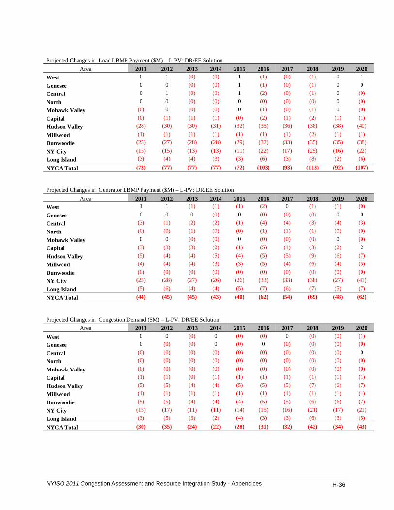
Projected Changes in Load LBMP Payment ($M) – L-PV: DR/EE Solution
Area 2011 2012 2013 2014 2015 2016 2017 2018 2019 2020 West 0 1 (0) (0) 1 (1) (0) (1) 0 1 Genesee 0 0 (0) (0) 1 (1) (0) (1) 0 0 Central 0 1 (0) (0) 1 (2) (0) (1) 0 (0) North 0 0 (0) (0) 0 (0) (0) (0) 0 (0) Mohawk Valley (0) 0 (0) (0) 0 (1) (0) (1) 0 (0) Capital (0) (1) (1) (1) (0) (2) (1) (2) (1) (1) Hudson Valley (28) (30) (30) (31) (32) (35) (36) (38) (38) (40) Millwood (1) (1) (1) (1) (1) (1) (1) (2) (1) (1) Dunwoodie (25) (27) (28) (28) (29) (32) (33) (35) (35) (38) NY City (15) (15) (13) (13) (11) (22) (17) (25) (16) (22) Long Island (3) (4) (4) (3) (3) (6) (3) (8) (2) (6) NYCA Total (73) (77) (77) (77) (72) (103) (93) (113) (92) (107) Projected Changes in Generator LBMP Payment ($M) – L-PV: DR/EE Solution
Area 2011 2012 2013 2014 2015 2016 2017 2018 2019 2020 West 1 1 (1) (1) (1) (2) 0 (1) (1) (0) Genesee 0 0 0 (0) 0 (0) (0) (0) 0 0 Central (3) (1) (2) (2) (1) (4) (4) (3) (4) (3) North (0) (0) (1) (0) (0) (1) (1) (1) (0) (0) Mohawk Valley 0 0 (0) (0) 0 (0) (0) (0) 0 (0) Capital (3) (3) (3) (2) (1) (5) (1) (3) (2) 2 Hudson Valley (5) (4) (4) (5) (4) (5) (5) (9) (6) (7) Millwood (4) (4) (4) (3) (3) (5) (4) (6) (4) (5) Dunwoodie (0) (0) (0) (0) (0) (0) (0) (0) (0) (0) NY City (25) (28) (27) (26) (26) (33) (33) (38) (27) (41) Long Island (5) (6) (4) (4) (5) (7) (6) (7) (5) (7) NYCA Total (44) (45) (45) (43) (40) (62) (54) (69) (48) (62) Projected Changes in Congestion Demand ($M) – L-PV: DR/EE Solution
Area 2011 2012 2013 2014 2015 2016 2017 2018 2019 2020 West 0 0 (0) 0 (0) (0) 0 (0) (0) (1) Genesee 0 (0) (0) 0 (0) 0 (0) (0) (0) (0) Central (0) (0) (0) (0) (0) (0) (0) (0) (0) 0 North (0) (0) (0) (0) (0) (0) (0) (0) (0) (0) Mohawk Valley (0) (0) (0) (0) (0) (0) (0) (0) (0) (0) Capital (1) (1) (0) (1) (1) (1) (1) (1) (1) (1) Hudson Valley (5) (5) (4) (4) (5) (5) (5) (7) (6) (7) Millwood (1) (1) (1) (1) (1) (1) (1) (1) (1) (1) Dunwoodie (5) (5) (4) (4) (4) (5) (5) (6) (6) (7) NY City (15) (17) (11) (11) (14) (15) (16) (21) (17) (21) Long Island (3) (5) (3) (2) (4) (3) (3) (6) (3) (5) NYCA Total (30) (35) (24) (22) (28) (31) (32) (42) (34) (43)
NYISO 2011 Congestion Assessment and Resource Integration Study - Appendices H-36
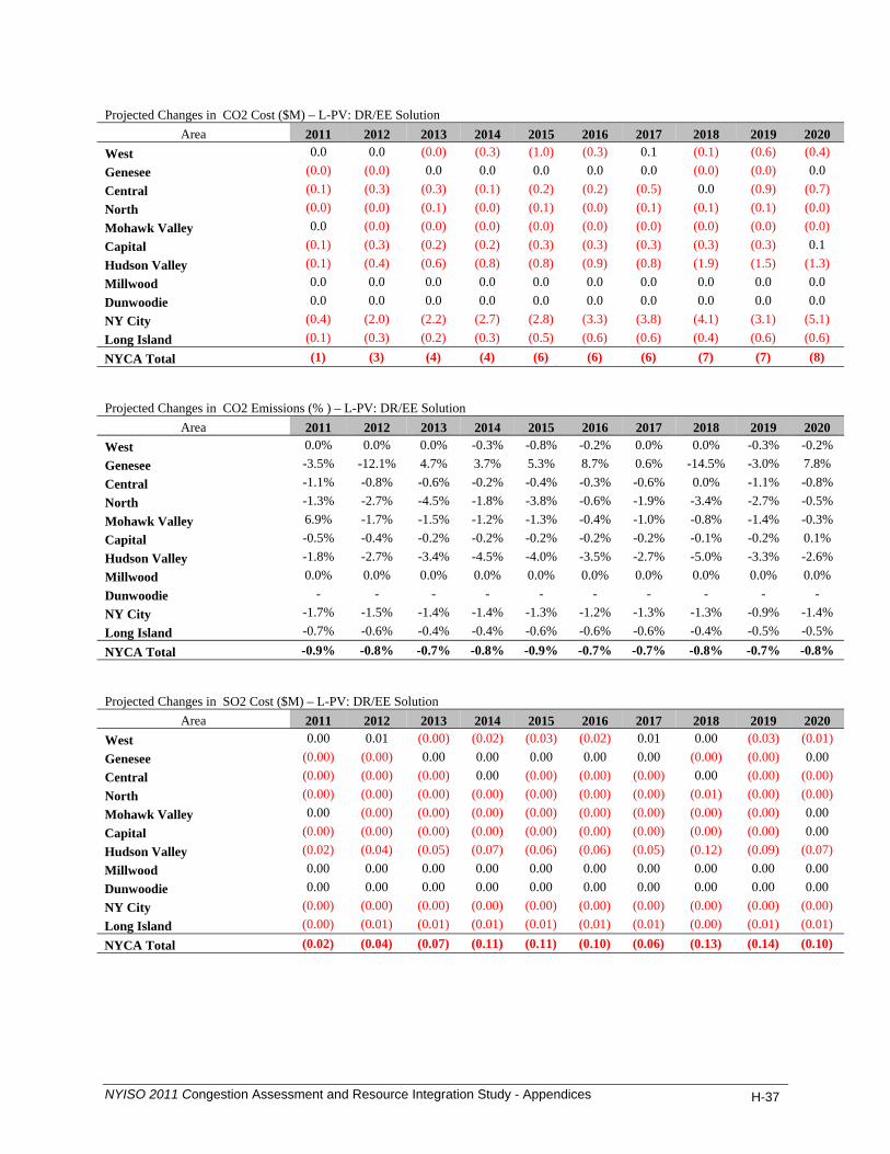
Projected Changes in CO2 Cost ($M) – L-PV: DR/EE Solution
Area 2011 2012 2013 2014 2015 2016 2017 2018 2019 2020 West 0.0 0.0 (0.0) (0.3) (1.0) (0.3) 0.1 (0.1) (0.6) (0.4) Genesee (0.0) (0.0) 0.0 0.0 0.0 0.0 0.0 (0.0) (0.0) 0.0 Central (0.1) (0.3) (0.3) (0.1) (0.2) (0.2) (0.5) 0.0 (0.9) (0.7) North (0.0) (0.0) (0.1) (0.0) (0.1) (0.0) (0.1) (0.1) (0.1) (0.0) Mohawk Valley 0.0 (0.0) (0.0) (0.0) (0.0) (0.0) (0.0) (0.0) (0.0) (0.0) Capital (0.1) (0.3) (0.2) (0.2) (0.3) (0.3) (0.3) (0.3) (0.3) 0.1 Hudson Valley (0.1) (0.4) (0.6) (0.8) (0.8) (0.9) (0.8) (1.9) (1.5) (1.3) Millwood 0.0 0.0 0.0 0.0 0.0 0.0 0.0 0.0 0.0 0.0 Dunwoodie 0.0 0.0 0.0 0.0 0.0 0.0 0.0 0.0 0.0 0.0 NY City (0.4) (2.0) (2.2) (2.7) (2.8) (3.3) (3.8) (4.1) (3.1) (5.1) Long Island (0.1) (0.3) (0.2) (0.3) (0.5) (0.6) (0.6) (0.4) (0.6) (0.6) NYCA Total (1) (3) (4) (4) (6) (6) (6) (7) (7) (8) Projected Changes in CO2 Emissions (% ) – L-PV: DR/EE Solution
Area 2011 2012 2013 2014 2015 2016 2017 2018 2019 2020 West 0.0% 0.0% 0.0% -0.3% -0.8% -0.2% 0.0% 0.0% -0.3% -0.2% Genesee -3.5% -12.1% 4.7% 3.7% 5.3% 8.7% 0.6% -14.5% -3.0% 7.8% Central -1.1% -0.8% -0.6% -0.2% -0.4% -0.3% -0.6% 0.0% -1.1% -0.8% North -1.3% -2.7% -4.5% -1.8% -3.8% -0.6% -1.9% -3.4% -2.7% -0.5% Mohawk Valley 6.9% -1.7% -1.5% -1.2% -1.3% -0.4% -1.0% -0.8% -1.4% -0.3% Capital -0.5% -0.4% -0.2% -0.2% -0.2% -0.2% -0.2% -0.1% -0.2% 0.1% Hudson Valley -1.8% -2.7% -3.4% -4.5% -4.0% -3.5% -2.7% -5.0% -3.3% -2.6% Millwood 0.0% 0.0% 0.0% 0.0% 0.0% 0.0% 0.0% 0.0% 0.0% 0.0% Dunwoodie - - - - - - - - - - NY City -1.7% -1.5% -1.4% -1.4% -1.3% -1.2% -1.3% -1.3% -0.9% -1.4% Long Island -0.7% -0.6% -0.4% -0.4% -0.6% -0.6% -0.6% -0.4% -0.5% -0.5% NYCA Total -0.9% -0.8% -0.7% -0.8% -0.9% -0.7% -0.7% -0.8% -0.7% -0.8% Projected Changes in SO2 Cost ($M) – L-PV: DR/EE Solution
Area 2011 2012 2013 2014 2015 2016 2017 2018 2019 2020 West 0.00 0.01 (0.00) (0.02) (0.03) (0.02) 0.01 0.00 (0.03) (0.01) Genesee (0.00) (0.00) 0.00 0.00 0.00 0.00 0.00 (0.00) (0.00) 0.00 Central (0.00) (0.00) (0.00) 0.00 (0.00) (0.00) (0.00) 0.00 (0.00) (0.00) North (0.00) (0.00) (0.00) (0.00) (0.00) (0.00) (0.00) (0.01) (0.00) (0.00) Mohawk Valley 0.00 (0.00) (0.00) (0.00) (0.00) (0.00) (0.00) (0.00) (0.00) 0.00 Capital (0.00) (0.00) (0.00) (0.00) (0.00) (0.00) (0.00) (0.00) (0.00) 0.00 Hudson Valley (0.02) (0.04) (0.05) (0.07) (0.06) (0.06) (0.05) (0.12) (0.09) (0.07) Millwood 0.00 0.00 0.00 0.00 0.00 0.00 0.00 0.00 0.00 0.00 Dunwoodie 0.00 0.00 0.00 0.00 0.00 0.00 0.00 0.00 0.00 0.00 NY City (0.00) (0.00) (0.00) (0.00) (0.00) (0.00) (0.00) (0.00) (0.00) (0.00) Long Island (0.00) (0.01) (0.01) (0.01) (0.01) (0.01) (0.01) (0.00) (0.01) (0.01) NYCA Total (0.02) (0.04) (0.07) (0.11) (0.11) (0.10) (0.06) (0.13) (0.14) (0.10)
NYISO 2011 Congestion Assessment and Resource Integration Study - Appendices H-37
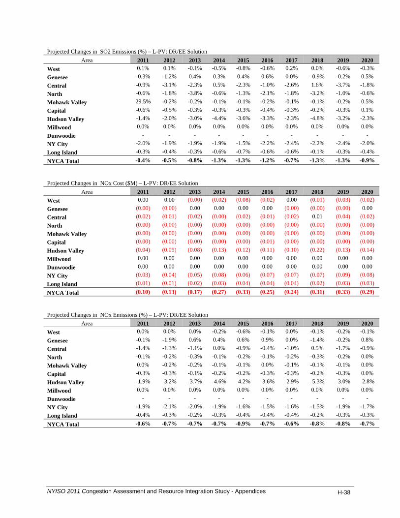
Projected Changes in SO2 Emissions (%) – L-PV: DR/EE Solution
Area 2011 2012 2013 2014 2015 2016 2017 2018 2019 2020 West 0.1% 0.1% -0.1% -0.5% -0.8% -0.6% 0.2% 0.0% -0.6% -0.3% Genesee -0.3% -1.2% 0.4% 0.3% 0.4% 0.6% 0.0% -0.9% -0.2% 0.5% Central -0.9% -3.1% -2.3% 0.5% -2.3% -1.0% -2.6% 1.6% -3.7% -1.8% North -0.6% -1.8% -3.8% -0.6% -1.3% -2.1% -1.8% -3.2% -1.0% -0.6% Mohawk Valley 29.5% -0.2% -0.2% -0.1% -0.1% -0.2% -0.1% -0.1% -0.2% 0.5% Capital -0.6% -0.5% -0.3% -0.3% -0.3% -0.4% -0.3% -0.2% -0.3% 0.1% Hudson Valley -1.4% -2.0% -3.0% -4.4% -3.6% -3.3% -2.3% -4.8% -3.2% -2.3% Millwood 0.0% 0.0% 0.0% 0.0% 0.0% 0.0% 0.0% 0.0% 0.0% 0.0% Dunwoodie - - - - - - - - - - NY City -2.0% -1.9% -1.9% -1.9% -1.5% -2.2% -2.4% -2.2% -2.4% -2.0% Long Island -0.3% -0.4% -0.3% -0.6% -0.7% -0.6% -0.6% -0.1% -0.3% -0.4% NYCA Total -0.4% -0.5% -0.8% -1.3% -1.3% -1.2% -0.7% -1.3% -1.3% -0.9% Projected Changes in NOx Cost ($M) – L-PV: DR/EE Solution
Area 2011 2012 2013 2014 2015 2016 2017 2018 2019 2020 West 0.00 0.00 (0.00) (0.02) (0.08) (0.02) 0.00 (0.01) (0.03) (0.02) Genesee (0.00) (0.00) 0.00 0.00 0.00 0.00 (0.00) (0.00) (0.00) 0.00 Central (0.02) (0.01) (0.02) (0.00) (0.02) (0.01) (0.02) 0.01 (0.04) (0.02) North (0.00) (0.00) (0.00) (0.00) (0.00) (0.00) (0.00) (0.00) (0.00) (0.00) Mohawk Valley (0.00) (0.00) (0.00) (0.00) (0.00) (0.00) (0.00) (0.00) (0.00) (0.00) Capital (0.00) (0.00) (0.00) (0.00) (0.00) (0.01) (0.00) (0.00) (0.00) (0.00) Hudson Valley (0.04) (0.05) (0.08) (0.13) (0.12) (0.11) (0.10) (0.22) (0.13) (0.14) Millwood 0.00 0.00 0.00 0.00 0.00 0.00 0.00 0.00 0.00 0.00 Dunwoodie 0.00 0.00 0.00 0.00 0.00 0.00 0.00 0.00 0.00 0.00 NY City (0.03) (0.04) (0.05) (0.08) (0.06) (0.07) (0.07) (0.07) (0.09) (0.08) Long Island (0.01) (0.01) (0.02) (0.03) (0.04) (0.04) (0.04) (0.02) (0.03) (0.03) NYCA Total (0.10) (0.13) (0.17) (0.27) (0.33) (0.25) (0.24) (0.31) (0.33) (0.29) Projected Changes in NOx Emissions (%) – L-PV: DR/EE Solution
Area 2011 2012 2013 2014 2015 2016 2017 2018 2019 2020 West 0.0% 0.0% 0.0% -0.2% -0.6% -0.1% 0.0% -0.1% -0.2% -0.1% Genesee -0.1% -1.9% 0.6% 0.4% 0.6% 0.9% 0.0% -1.4% -0.2% 0.8% Central -1.4% -1.3% -1.1% 0.0% -0.9% -0.4% -1.0% 0.5% -1.7% -0.9% North -0.1% -0.2% -0.3% -0.1% -0.2% -0.1% -0.2% -0.3% -0.2% 0.0% Mohawk Valley 0.0% -0.2% -0.2% -0.1% -0.1% 0.0% -0.1% -0.1% -0.1% 0.0% Capital -0.3% -0.3% -0.1% -0.2% -0.2% -0.3% -0.3% -0.2% -0.3% 0.0% Hudson Valley -1.9% -3.2% -3.7% -4.6% -4.2% -3.6% -2.9% -5.3% -3.0% -2.8% Millwood 0.0% 0.0% 0.0% 0.0% 0.0% 0.0% 0.0% 0.0% 0.0% 0.0% Dunwoodie - - - - - - - - - - NY City -1.9% -2.1% -2.0% -1.9% -1.6% -1.5% -1.6% -1.5% -1.9% -1.7% Long Island -0.4% -0.3% -0.2% -0.3% -0.4% -0.4% -0.4% -0.2% -0.3% -0.3% NYCA Total -0.6% -0.7% -0.7% -0.7% -0.9% -0.7% -0.6% -0.8% -0.8% -0.7%
NYISO 2011 Congestion Assessment and Resource Integration Study - Appendices H-38

NYISO 2011 Congestion Assessment and Resource Integration Study - Appendices H-39
Projected LBMP $/MWh – L-PV: DR/EE Solution
Area 2011 2012 2013 2014 2015 2016 2017 2018 2019 2020 West 39.88 45.47 46.74 48.87 51.28 53.37 55.24 57.00 59.17 61.44 Genesee 41.49 46.89 48.17 50.25 52.71 55.06 57.03 58.85 61.13 63.57 Central 42.80 48.36 49.72 51.83 54.35 57.02 59.11 61.09 63.47 66.02 North 41.03 46.55 47.84 49.89 52.33 54.86 56.89 58.76 61.03 63.48 Mohawk Valley 43.74 49.29 50.67 52.79 55.34 58.13 60.27 62.32 64.76 67.38 Capital 47.81 52.71 54.23 56.07 58.75 62.06 64.42 66.95 69.67 72.52 Hudson Valley 49.85 54.99 56.60 58.54 61.29 64.92 67.40 70.25 73.31 76.36 Millwood 50.72 55.78 57.42 59.34 62.13 65.86 68.39 71.38 74.56 77.69 Dunwoodie 50.95 56.00 57.64 59.56 62.35 66.11 68.66 71.67 74.87 78.03 NY City 51.67 56.72 58.45 60.40 63.22 67.00 69.60 72.70 75.98 79.26 Long Island 54.35 59.74 61.58 63.83 66.84 70.82 73.79 77.06 80.55 84.14 NYCA Average 46.75 52.04 53.55 55.58 58.24 61.38 63.71 66.19 68.95 71.81 Projected Changes in Generator GWh – L-PV: DR/EE Solution
Area 2011 2012 2013 2014 2015 2016 2017 2018 2019 2020 West 4 1 (3) (20) (58) (15) 3 (4) (24) (16) Genesee (0) (1) 0 0 0 0 1 (1) (0) 1 Central (60) (40) (33) (20) (21) (20) (35) (9) (62) (46) North (3) (6) (11) (5) (11) (2) (6) (10) (7) (1) Mohawk Valley 2 (1) (1) (1) (1) (0) (0) (0) (1) (0) Capital (79) (72) (52) (27) (26) (26) (1) (21) (18) 30 Hudson Valley (57) (50) (55) (62) (55) (54) (48) (98) (71) (60) Millwood 0 (0) (0) (0) (0) 0 1 (1) (0) 1 Dunwoodie 0 0 0 (0) 0 0 0 (0) (0) 0 NY City (344) (352) (328) (327) (299) (303) (335) (326) (230) (352) Long Island (46) (42) (29) (32) (40) (43) (43) (28) (36) (36) NYCA Total (583) (563) (511) (494) (511) (463) (465) (499) (450) (480) Projected Changes in Loss Payment ($M) – L-PV: DR/EE Solution
Area 2011 2012 2013 2014 2015 2016 2017 2018 2019 2020 West 0.0 0.1 0.2 0.2 0.3 0.3 0.2 0.2 0.2 0.2 Genesee 0.0 0.0 0.1 0.1 0.1 0.1 0.1 0.1 0.1 0.1 Central 0.0 0.1 0.0 0.0 0.1 0.0 0.1 0.0 0.1 0.1 North (0.0) 0.0 0.0 0.0 0.1 0.0 0.0 0.1 0.0 0.0 Mohawk Valley (0.0) 0.0 (0.0) (0.0) (0.0) (0.0) (0.0) (0.0) 0.0 (0.0) Capital 0.1 0.1 0.0 0.0 0.0 0.0 0.0 0.0 0.0 0.0 Hudson Valley (2.1) (2.2) (2.4) (2.4) (2.5) (2.8) (2.8) (2.9) (3.0) (3.1) Millwood (0.1) (0.0) (0.1) (0.1) (0.1) (0.1) (0.1) (0.1) (0.1) (0.1) Dunwoodie (2.1) (2.2) (2.3) (2.4) (2.5) (2.8) (2.8) (2.9) (3.0) (3.2) NY City (0.5) (0.3) (1.0) (0.5) (0.6) (1.1) (0.6) (0.9) (0.8) (0.6) Long Island (0.1) (0.0) (0.4) (0.2) (0.2) (0.4) (0.2) (0.4) (0.2) (0.2) NYCA Total (5) (4) (6) (5) (5) (7) (6) (7) (7) (7)