11 serious mistakes in online store usability
TRANSCRIPT

Online StoreUsability
in
SeriousMistakes
11

Our clients are located in 160 countries
160
We have completed >1000 e-commerce projects
>1000years in e-commerce
10
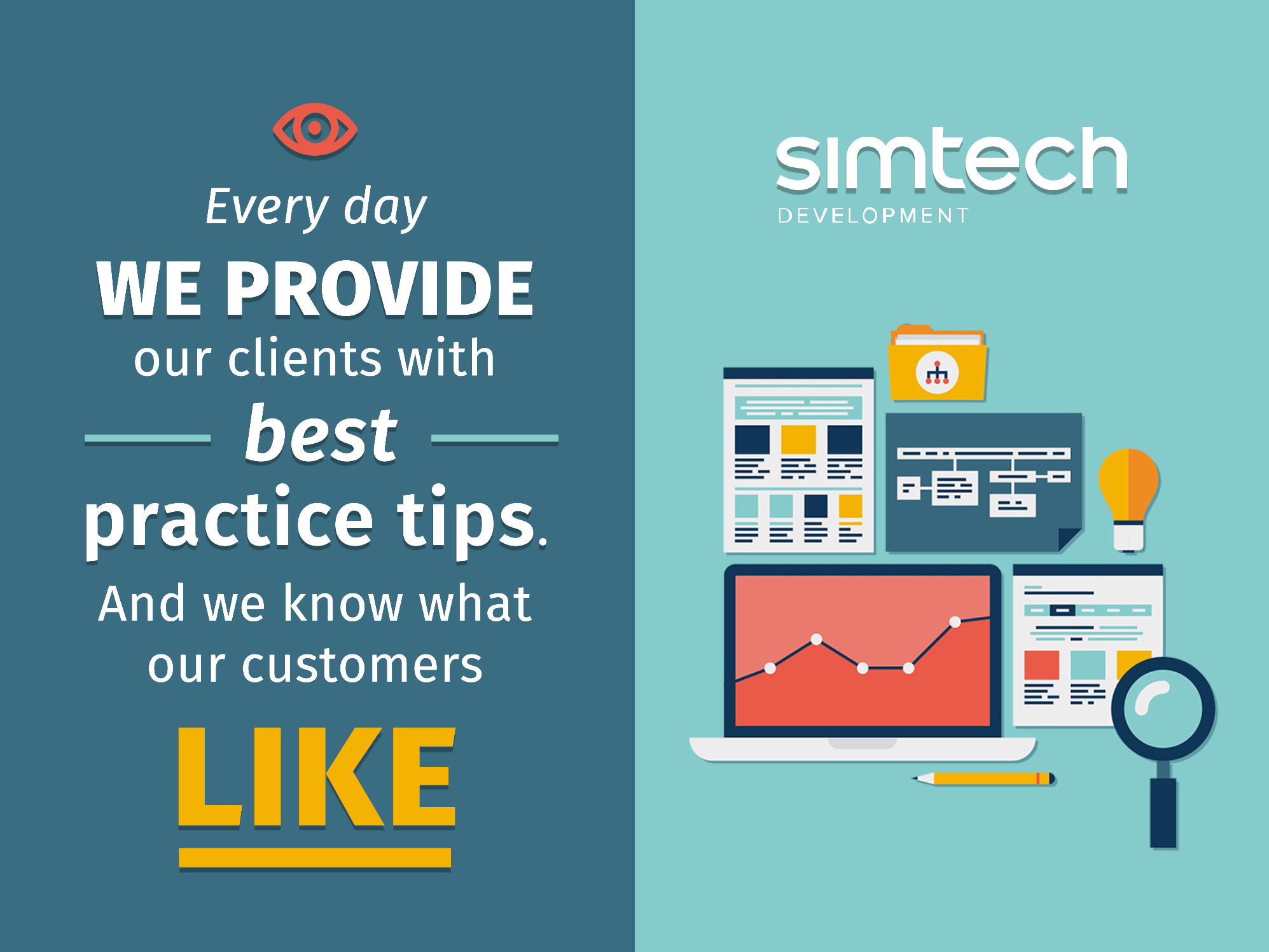
Every day
our clients with
And we know whatour customers
WE PROVIDE
bestpractice tips.
LIKE
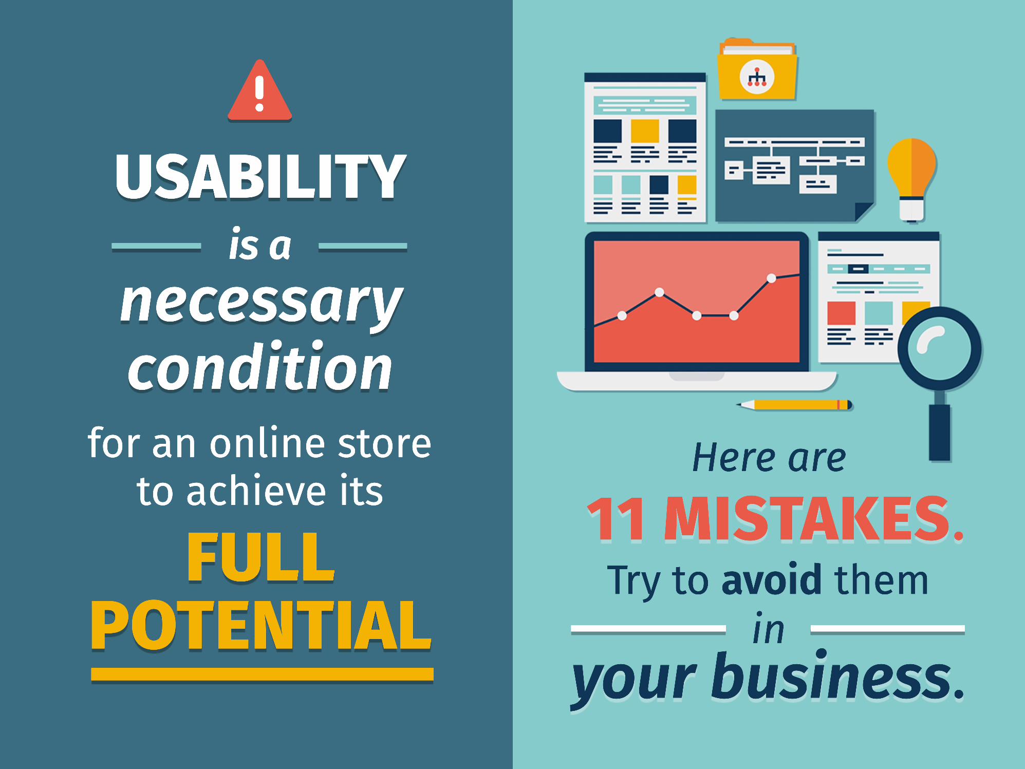
Here are
Try to avoid themin
your business.
11 MISTAKES.
is a
for an online store to achieve its
USABILITY
necessary condition
FULL FULL POTENTIAL
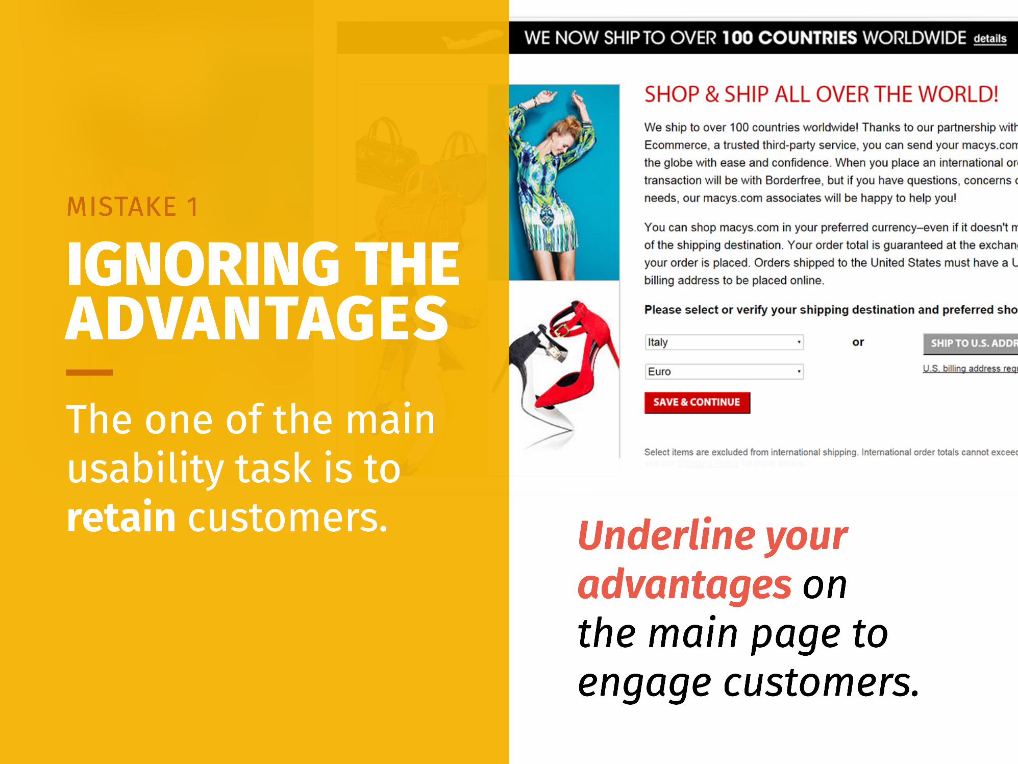
Underline your advantages onthe main page to engage customers.
The one of the main usability task is to retain customers.
IGNORING THE ADVANTAGES
MISTAKE 1
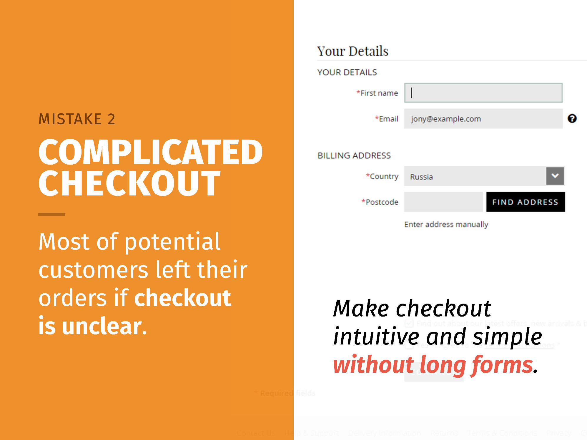
Make checkout intuitive and simple without long forms.
Most of potential customers left their orders if checkoutis unclear.
COMPLICATED CHECKOUT
MISTAKE 2
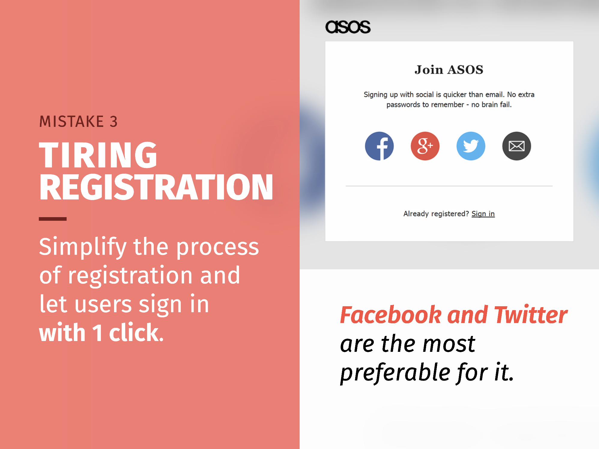
Facebook and Twitter are the most preferable for it.
Simplify the process of registration and let users sign inwith 1 click.
TIRING REGISTRATION
MISTAKE 3
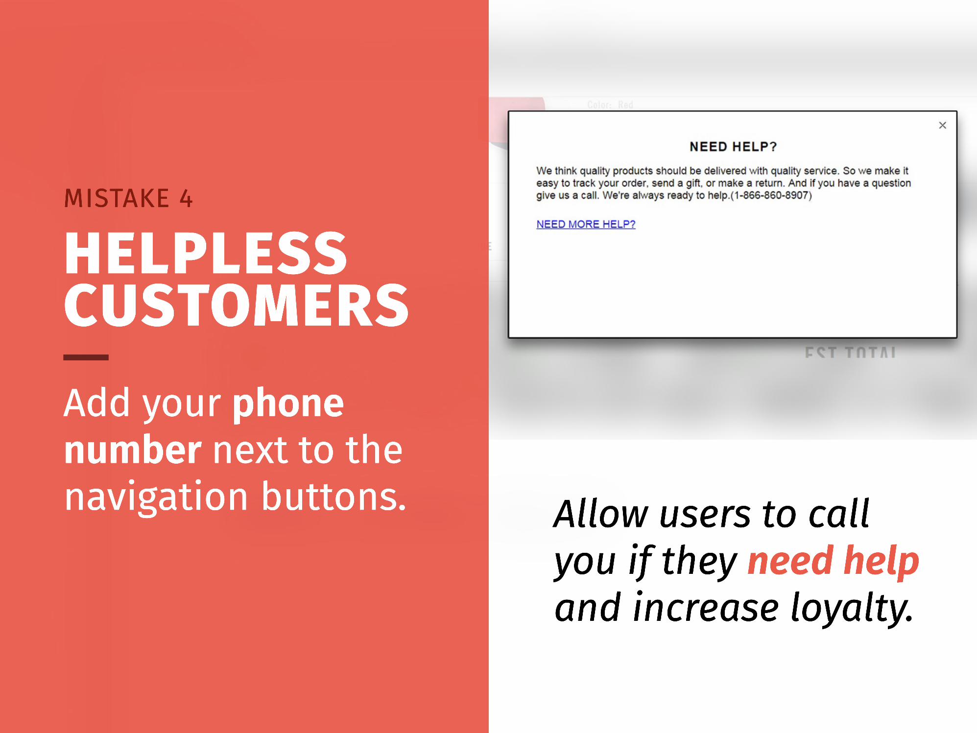
Allow users to call you if they need help and increase loyalty.
Add your phone number next to the navigation buttons.
HELPLESS CUSTOMERS
MISTAKE 4
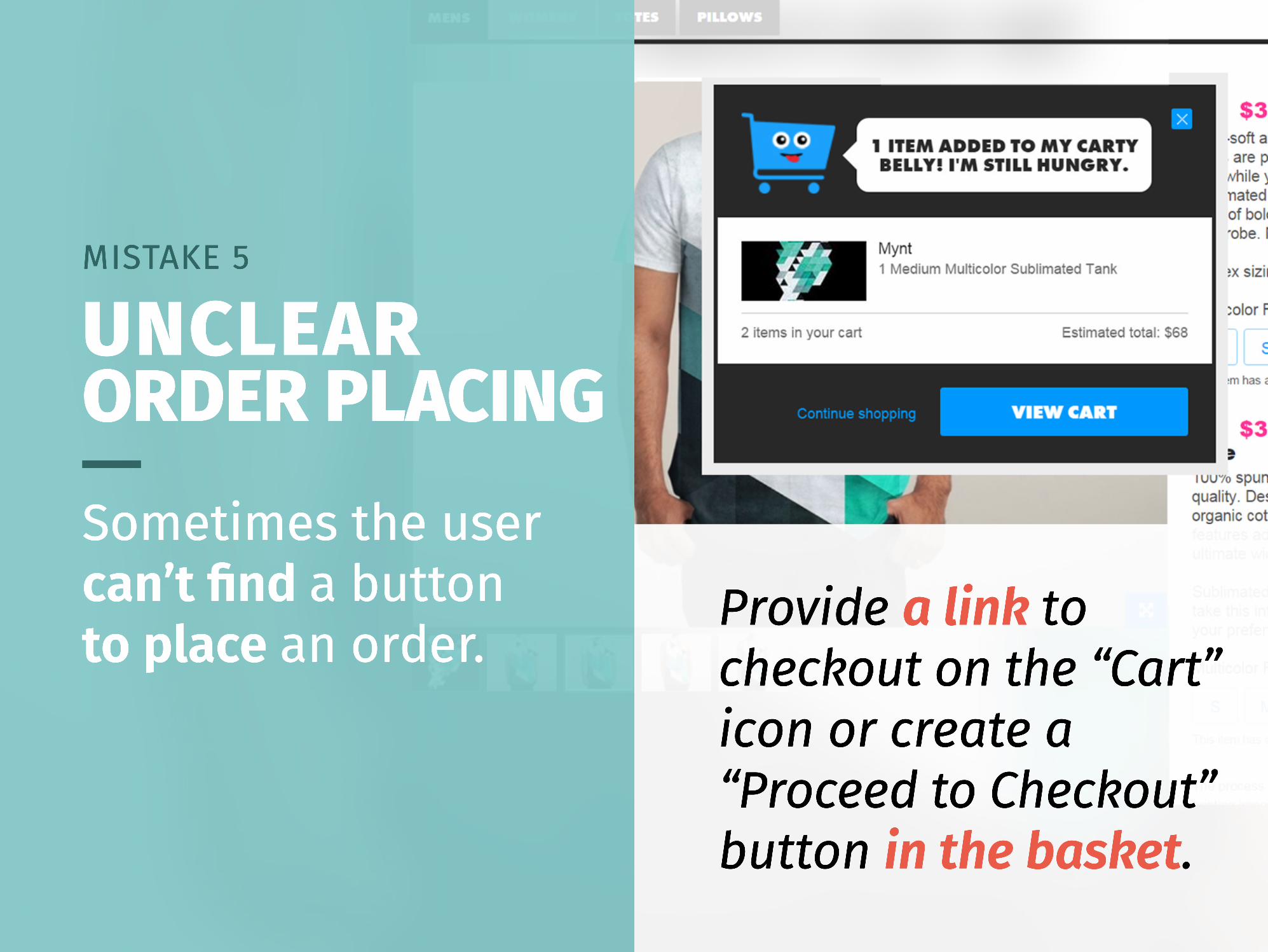
Provide a link to checkout on the “Cart” icon or create a “Proceed to Checkout” button in the basket.
Sometimes the user can’t find a buttonto place an order.
UNCLEAR ORDER PLACING
MISTAKE 5
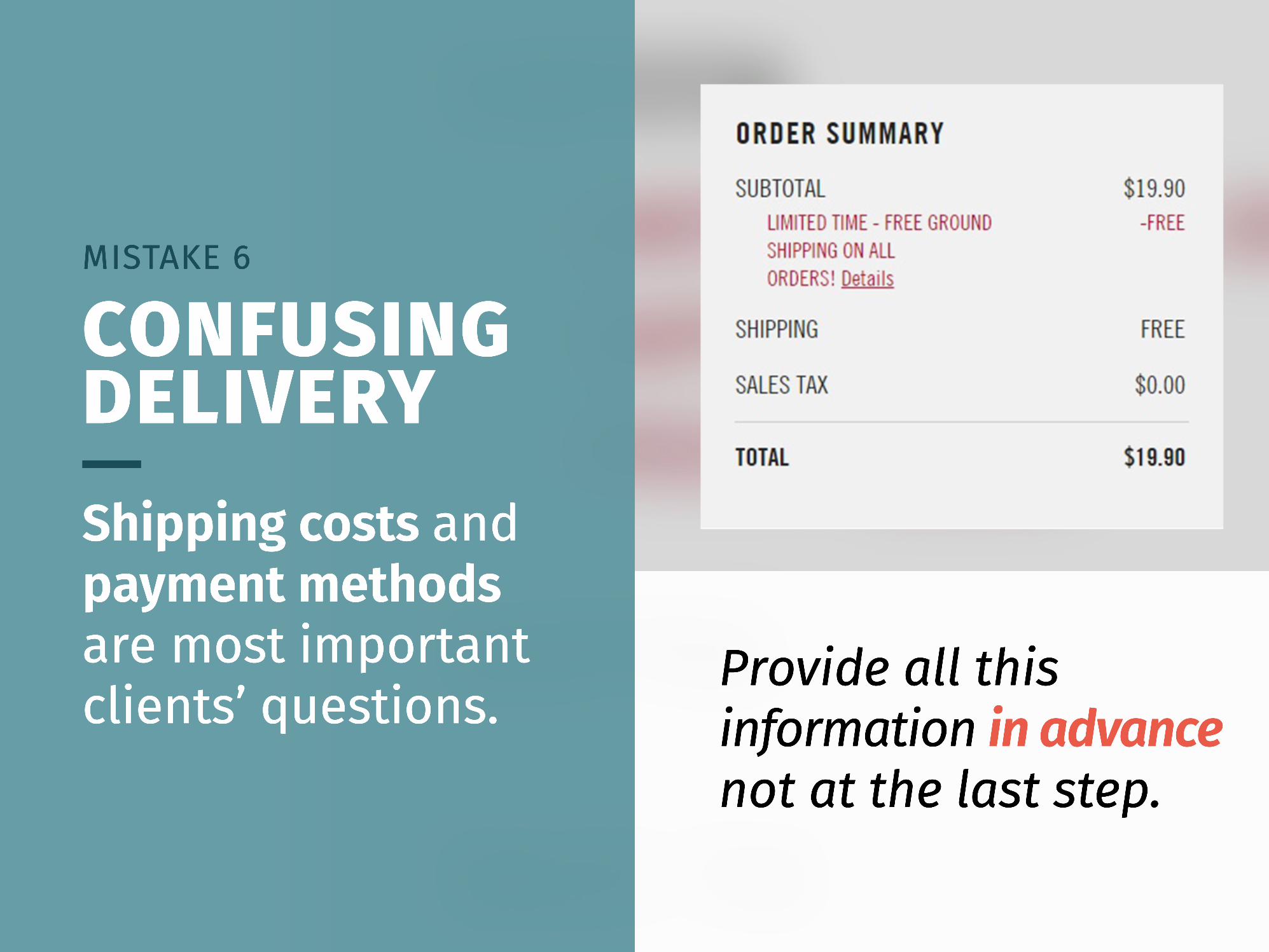
Provide all this information in advance not at the last step.
Shipping costs and payment methods are most important clients’ questions.
CONFUSING DELIVERY
MISTAKE 6
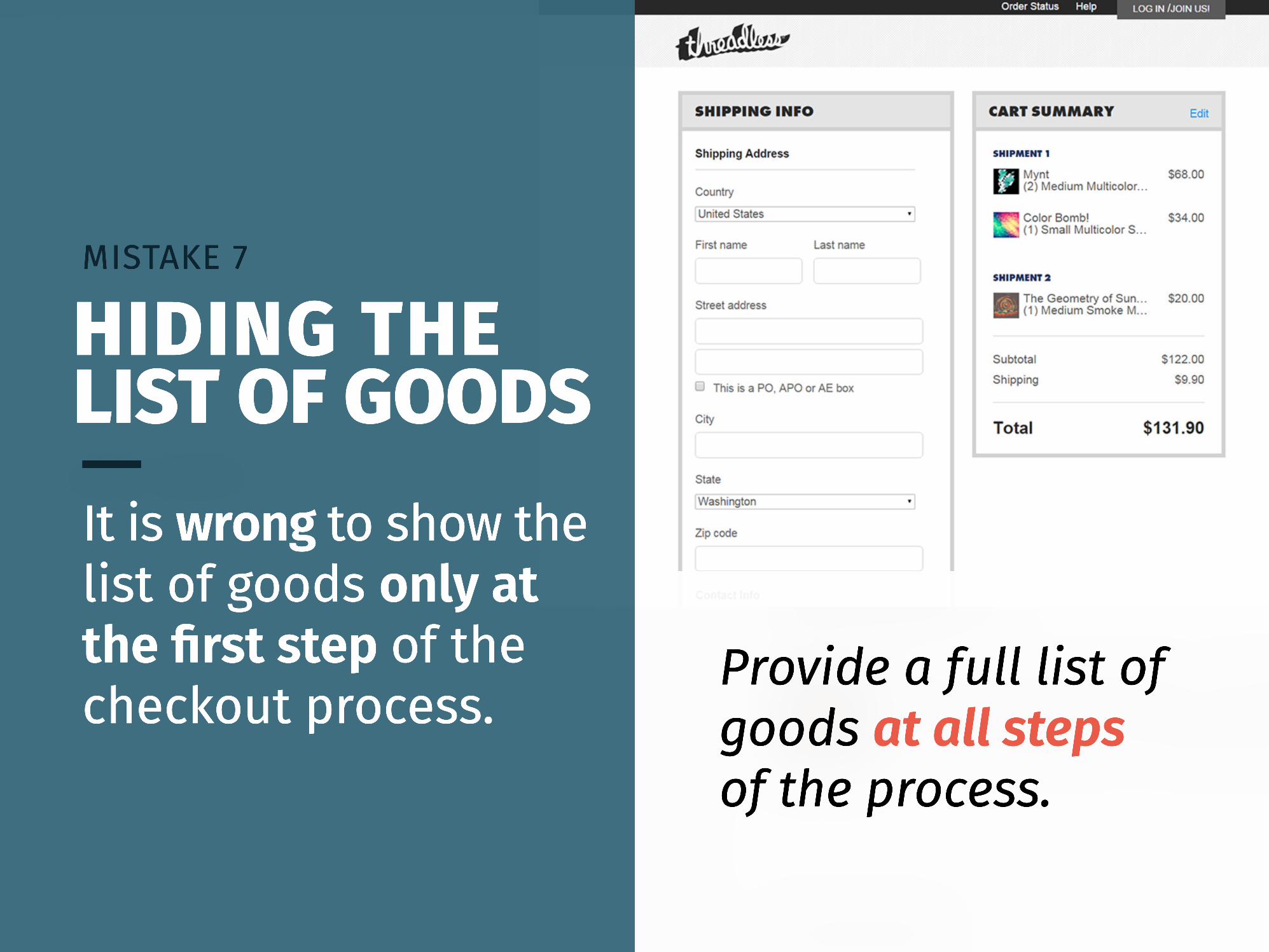
Provide a full list of goods at all stepsof the process.
It is wrong to show the list of goods only at the first step of the checkout process.
HIDING THE LIST OF GOODS
MISTAKE 7
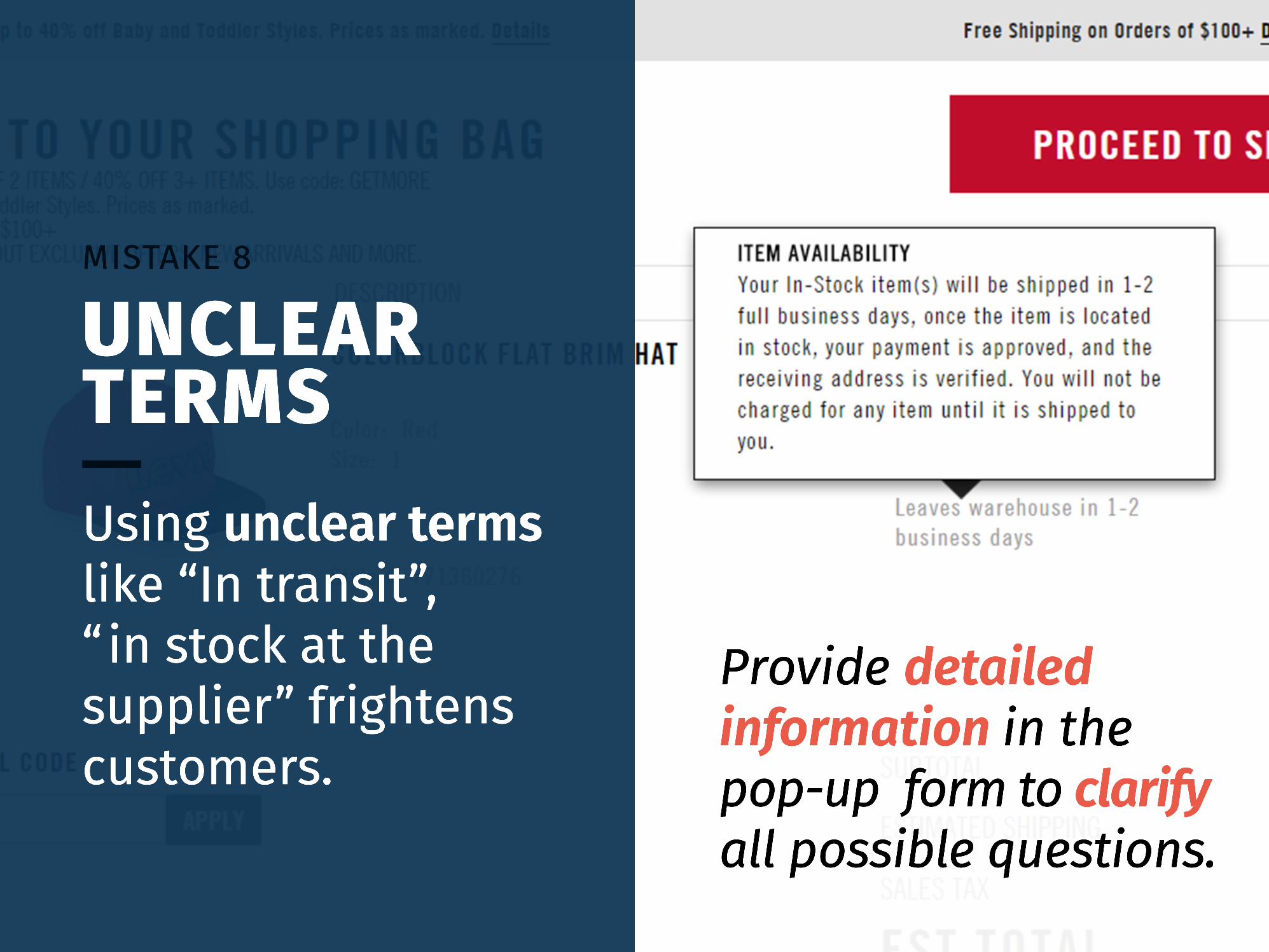
Provide detailed information in the pop-up form to clarify all possible questions.
Using unclear terms like “In transit”,“in stock at the supplier” frightens customers.
UNCLEAR TERMS
MISTAKE 8

Name it correctlylike “Proceed to Checkout” or“Continue Shopping”.
Naming a button “Next” does nottell the customer anything.
OBSCURE EXPECTATION
MISTAKE 9
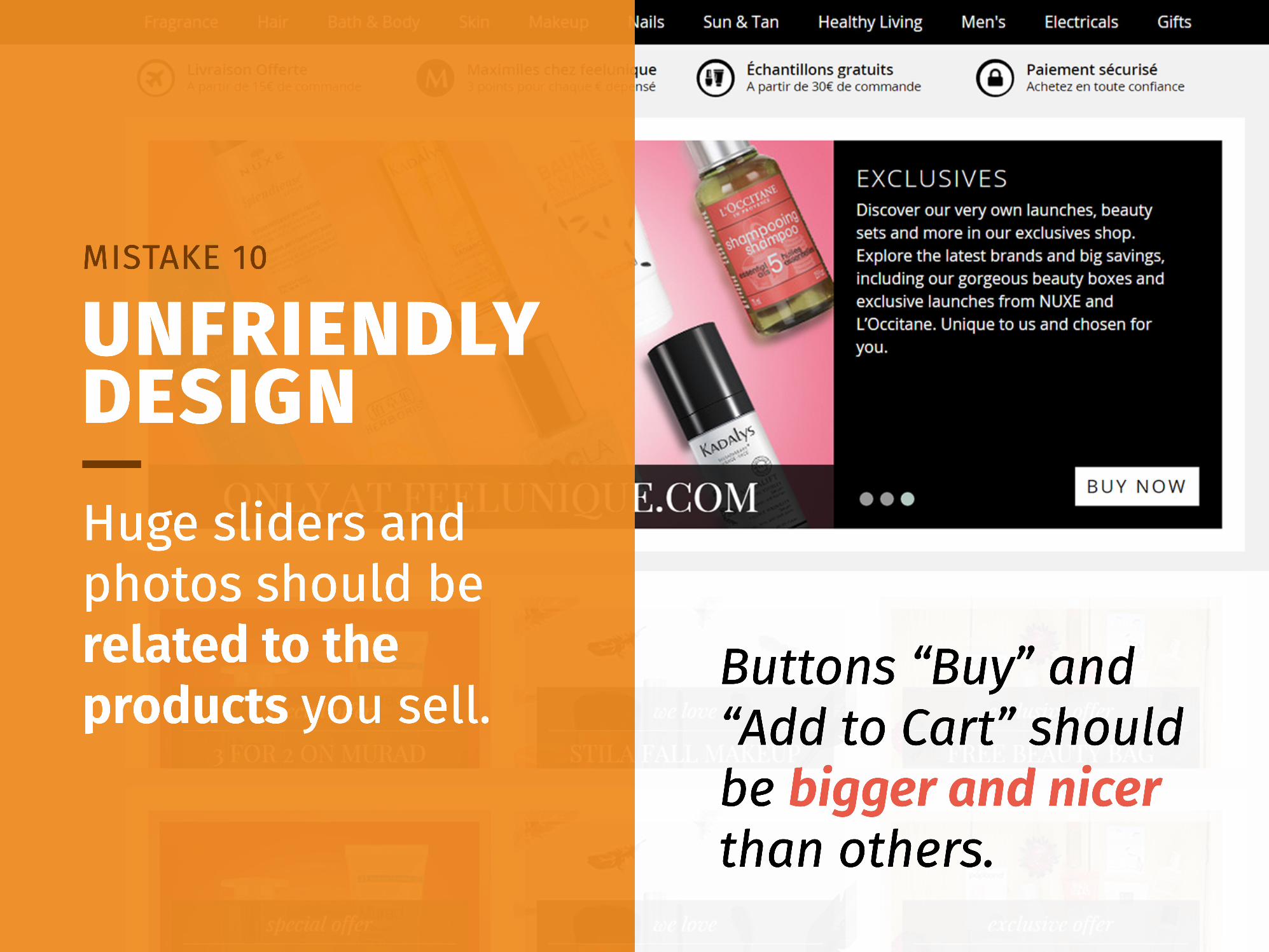
Buttons “Buy” and “Add to Cart” should be bigger and nicer than others.
Huge sliders and photos should be related to the products you sell.
UNFRIENDLY DESIGN
MISTAKE 10
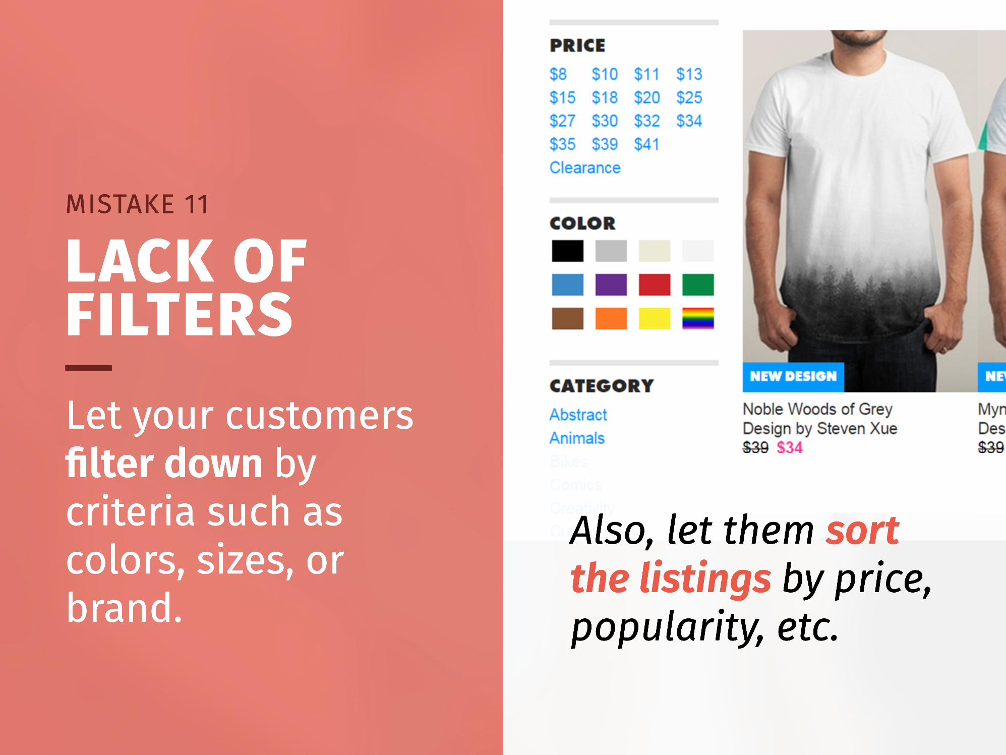
Also, let them sort the listings by price, popularity, etc.
Let your customers filter down by criteria such as colors, sizes, or brand.
LACK OF FILTERS
MISTAKE 11
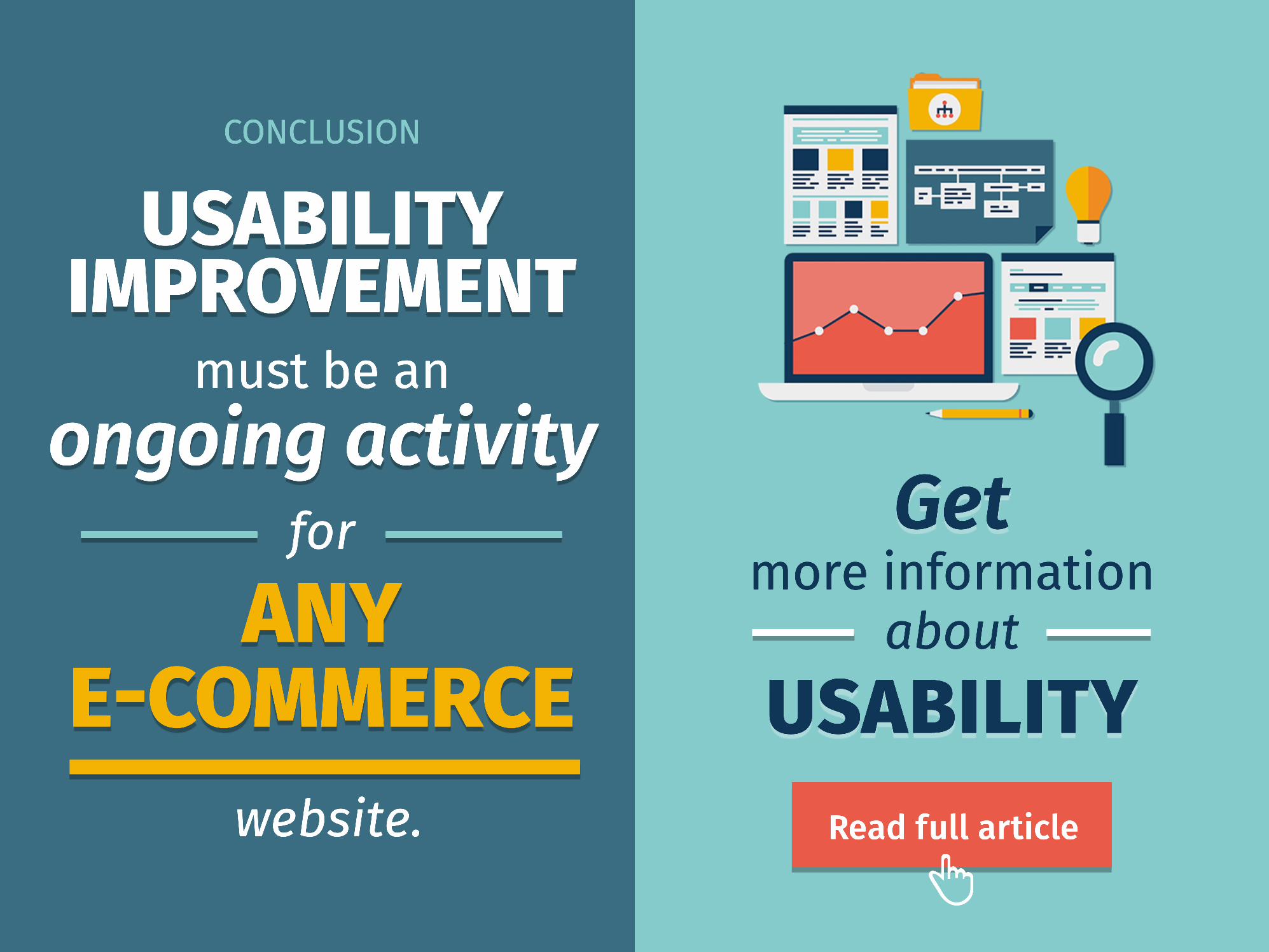
Read full article
more information
about
Get
USABILITY
must be an for
website.
CONCLUSION
USABILITY IMPROVEMENT
ongoing activity
ANY E-COMMERCE

simtechdev
Contacts us
LOOKINGFOR HELP IN DEVELOPINGYOUR ONLINE STORE?
simtechdev.com