10 reasons why you should have responsive-web-design
TRANSCRIPT
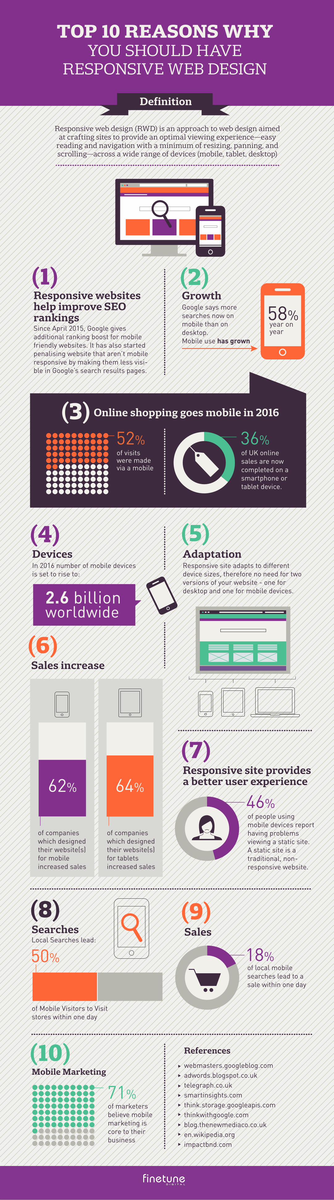
Responsive websites help improve SEO rankings Since April 2015, Google gives additional ranking boost for mobile friendly websites. It has also started penalising website that aren’t mobile responsive by making them less visi-ble in Google’s search results pages.
DevicesIn 2016 number of mobile devices is set to rise to:
(5)
(2)
AdaptationResponsive site adapts to different device sizes, therefore no need for two versions of your website - one for desktop and one for mobile devices.
GrowthGoogle says more searches now on mobile than on desktop. Mobile use has grown
Online shopping goes mobile in 2016
of UK online sales are now completed on a smartphone or tablet device.
of people using mobile devices report having problems viewing a static site. A static site is a traditional, non-responsive website.
of visits were made via a mobile
36% 52%
of marketers believe mobile marketing is core to their business
71%
46%
58%year on year
(4)
(3)
(1)
(6)
(7)
Sales increase
(8)Searches
of companies which designed their website(s) for tablets increased sales
64%
of companies which designed their website(s) for mobile increased sales
62%
50%
Responsive site provides a better user experience
2.6 billion worldwide
18%Local Searches lead:
(10)Mobile Marketing
Sales
(9)
of Mobile Visitors to Visit stores within one day
of local mobile searches lead to a sale within one day
TOP 10 REASONS WHY YOU SHOULD HAVE
RESPONSIVE WEB DESIGN
References
webmasters.googleblog.comadwords.blogspot.co.uktelegraph.co.uksmartinsights.comthink.storage.googleapis.comthinkwithgoogle.comblog.thenewmediaco.co.uken.wikipedia.orgimpactbnd.com
Responsive web design (RWD) is an approach to web design aimed at crafting sites to provide an optimal viewing experience—easy
reading and navigation with a minimum of resizing, panning, and scrolling—across a wide range of devices (mobile, tablet, desktop)
Definition