1 emerging and recurring data-driven storytelling ... · 1 emerging and recurring data-driven...
TRANSCRIPT
1
Emerging and Recurring Data-DrivenStorytelling Techniques: Analysis of a Curated
Collection of Recent StoriesCharles D. Stolper, Bongshin Lee, Nathalie Henry Riche, and John Stasko
Abstract—Storytelling with data is becoming an important component of many fields such as graphic design, the advocacy of causes,and journalism. New techniques for integrating data visualization into narrative stories have now become commonplace. Authors areenabling new reader experiences, such as linking textual narrative and data visualizations through dynamic queries embedded in thetext. Novel means of communicating position and navigating within the narrative also have emerged, such as utilizing scrolling toadvance narration and initiate animations. We advance the study of narrative visualization through an analysis of a curated collection ofrecent data-driven stories shared on the web. Drawing from the results of this analysis, we present a set of techniques being employedin these examples, organized under four high-level categories that help authors to tell stories in creative ways: communicating narrativeand explaining data, linking separated story elements, enhancing structure and navigation, and providing controlled exploration. Wedescribe the benefits of each storytelling technique along with a number of example applications of the ideas through recentdata-driven stories. Additionally, we discuss the trends we observed as well as how the field has evolved and grown. Finally, weconclude with a discussion of areas for future research.
Index Terms—Storytelling, narrative visualization, information visualization.
F
1 INTRODUCTION
T HE art of storytelling with visualization has rapidly evolvedover the past few years. Advancements in web-based visu-
alization technology (e.g., the rapid adoption of D3 [7]) fosterednovel dynamic data-driven storytelling on the web. Authors haveintroduced a variety of novel narrative visualization techniques andrefined existing ones while narrative visualizations have continuedto grow in popularity amongst both authors and readers. Some ofthese stories even include innovative techniques that are new tothe information visualization research community. For example,Visualizing MBTA Data [9] tells the story of Boston’s publictransit using a range of interesting storytelling and visualizationtechniques including clever linkages between text and visualiza-tion. We speculate that the developers of exploratory, analyticvisualizations could benefit by learning about and adopting ideasfrom many of these stories.
In this work, we set out to investigate the current state ofdata-driven storytelling. Our goal was to identify and describethe spectrum of techniques that today’s data-storytellers are using,and to inform the design of future data-storytelling tools. In doingso, we provide a curated collection of interesting examples ofstorytelling with data visualization and the techniques each uses.We reflect on how authors currently tell stories to identify theaspects that have been under-explored by the research communityand that have great potential.
We report on a qualitative analysis of 45 stories, includ-ing news organizations’ online presences (e.g., The New York
• Charles D. Stolper and John Stasko are with the School of InteractiveComputing, Georgia Institute of Technology, Atlanta, GA, 30308.E-mail: {charles.stolper,stasko}@cc.gatech.edu.
• Bongshin Lee and Nathalie Henry Riche are with Microsoft Research, OneMicrosoft Way, Redmond, WA 98052.E-mail: {bongshin,nath}@microsoft.com.
Times, The Economist, FiveThirtyEight), popular visualizationblogs (e.g., Visual.ly, FlowingData, Eagereyes), and storytellingtools’ websites (e.g., Tableau Public, Infogr.am). To have a morefocused and detailed discussion, we reviewed storytelling throughLee et. al’s lens [23], excluding those extreme “reader-driven”storytelling examples that lack an author-defined “plot.” Our setof stories ranges from more conventional narrative visualizations,such as long articles including visualizations or data-driven videos,to novel or experimental examples of data-driven storytelling.The results of our analysis are 20 visual, data-driven storytellingtechniques falling under four broad categories of aids that authorsuse to help tell their stories. In describing each of the categories,we provide example stories from the dataset that exemplify thecategory and the associated techniques used to achieve it. We alsodiscuss the trends we observed across these different techniquesand how the field has evolved since its beginnings. We concludewith a discussion of research opportunities especially for thedesign of authoring tools for data-driven storytelling.
The contributions of this article are fourfold: 1) Descriptionsand examples of 20 data-driven storytelling techniques groupedunder four broad categories common to this area, 2) A curatedcollection of 45 author-driven narrative visualization stories codedwith the techniques and categories, 3) An analysis of how the areahas evolved in recent years and the techniques that appear to begrowing in popularity, and 4) Research opportunities specificallyfor the design of authoring tools for data-driven storytellingderived from our analysis.
2 RELATED WORK
2.1 Understanding Narrative Visualization
Recognizing the increasing need and use of visualization intelling stories with data, the visualization research community
2
has made several efforts to better understand and characterizethis topic. In 2010, Segel and Heer [28] introduced the termnarrative visualization to describe asynchronous storytelling usingdata-driven graphics. Through an analysis of 58 examples ofnarrative visualization, they identified seven genres of narrativevisualization: magazine style, annotated chart, partitioned poster,flow chart, comic strip, slide show, and film/video/animation,and presented three design patterns for interactive stories: themartini glass structure, interactive slideshows, and drill-downstories. Our analysis differs from theirs in that we focus onmore detailed storytelling techniques (particular mechanisms oroperations) rather than the broader genres and design patterns theyexamined. For example, we found stories where multiple differenttechniques were used in a particular genre or pattern from theiranalysis. Hullman and Diakopoulos [14] expanded the discussionof narrative visualization, studying the rhetorical devices usedin narrative visualization through the analysis of 51 examplenarrative visualizations. We aim to further advance this discussionto incorporate the novel data-driven storytelling techniques thathave emerged since these two articles were published.
More recently, other researchers have conducted analyses toinvestigate ways to help people create data-driven stories moreeasily and effectively. In an effort to understand the effect ofsequences in narrative visualization to inform the design of anautomatic sequencing algorithm, Hullman et al. [16] provide afocused analysis of transitions between scenes in 42 “explicitly-ordered” stories. These stories included slideshows (interactive,recorded live and archived online, or merely archived online),animated data videos, and interactive timelines. Inspired by thegrowing number of data videos, Amini et al. [4] analyzed 50professionally designed data videos, one of the seven genres in[28]. They extracted the most salient constituents from thesevideos as a first step toward developing a novel tool that can enablepeople to generate compelling data stories using video. Choe etal. [9] analyzed 30 recorded presentation videos to specificallyexamine visualization types and annotations for Quantified-Selfpresenters used to convey their insight during their presentation.As discussed in the future opportunties section later, our analysisfurther informs the design and development of a storytellingsystem that help people create compelling data-driven stories.
Several researchers have discussed broader reserach oppor-tunities and challenges in using visualization as a presentationand communication medium. Kosara and Mackinlay [21] providea high-level overview of storytelling research, calling for moreattention to storytelling with data. They describe different sto-rytelling scenarios, list noteworthy examples, and discuss manyfuture research opportunities in this area. Ma et al. [24] discussthe challenges and possibilities of telling stories using scientificvisualization. Lee et al. [23] present a visual data storytellingprocess (or VDSP) involving roles such as data analysts, scripters,editors, presenters, and audiences. They also take a narrower viewof what constitutes a visual data story than Segel and Heer in orderto foster a more focused discussion. (In selecting the stories forour corpus, we used Lee et. al’s narrower scope of visual datastories [23], thereby excluding the more extreme cases of “reader-driven” storytelling that [28] discusses.)
2.2 Systems to Create Narrative Visualization
Just as a better understanding of narrative visualization techniquescan help inform the design of visualization storytelling tools,available tools can help define and popularize techniques. While a
number of systems for more-easily telling data-driven stories exist,little research has been conducted in this area. Here we brieflysummarize example research and commercial systems that influ-enced or might incorporate various data-storytelling techniques.
Slide-based presentation systems such as Microsoft Power-Point [26] and Apple Keynote [5] have been used for visualization-based storytelling (mainly in a synchronus setting). Visualizationsare usually embedded as static figures because of their rudimentarysupport for visualization. These systems have strong support fortextual narrative and annotations, but tend to have little support forinteraction beyond navigating between slides.
In response to this limited interaction with the data and chartcomponents, the Tableau system has recently incorporated story-telling aspects into its software. The feature, which is called StoryPoints [11] (Figure 4), enables an author to create scene-basedstories each consisting of visualizations or dashboards. StoryPoints allows the author to customize the interaction on a givendashboard, enabling stories with author-specified interaction. InStory Points, each scene is given a title-caption, which is displayedon the breadcrumbs at the top of the display along with navigationbuttons. If the scene allows interaction by the reader, a resetbutton is provided to return the scene to the author’s initially-provided display. The New York Times recently described theinternal tool (Mr. Chartmaker) they use to create and embed chartsin their stories [3] including support for annotations, highlighting,adapting charts for different screen sizes, and providing authorswith the ability to include interactive elements.
Additional research efforts have enabled people with little orno programming skills to create narrative visualization, supportinginteractions and animations. Timeline JS [19] allows an authorto create interactive timelines from various data inputs. The toolgenerates slides consisting of text, images, videos, and maps alongwith an interactive timeline that can be used as navigation betweenthe slides. TimeLineCurator [12] is a web-based tool for creatingTimeline JS projects. It helps people easily generate a visual time-line by automatically extracting temporal events from freeformtext and enabling them to interactively curate the events. TheVisualEyes tool [10] provides an interface for creating data-drivenstories. The interface allows the author to add visualizations, im-ages, text, and maps, all coordinated through the use of interactivewidgets. While the interface does not require programming, manyof the customization settings are lower-level and benefit fromsignificant experience with the system. Ellipsis [27] was designedto allow the author to incorporate storytelling techniques (such asdata-driven annotation, triggered animation, and incremental dataloading) into their stories with reduced coding.
Due to the popularity of infographics, the last decade has seenan emergence of tools supporting their creation. These tools rangefrom those supporting the creation of a simple form containing asingle chart, to more sophisticated ones including multiple visuals,text, and limited interactions. For example, Infogr.am [2] and In-foactive [1] are two websites for creating interactive infographics.Each allows an author to upload data in order to generate variouschart types, including controlled interaction such as filtering usinglegends. The author can add section headers, narrative text, andimages in order to convey the story. Each also supports a varietyof themes that modify the color scheme, text font, and headerstyles. We aim to expand the understanding of narrative visual-ization categories (and associated visual storytelling techniques),informing the design of these and future storytelling systems.
3
SketchStory [22] is a rare system designed explicitly forsynchronous data storytelling. It allows an author to create a storyin advance and then use simple gestures to present the story toan audience. SketchStory includes support for interaction suchas brushing and linking between visualizations and handwrittenannotations. The gestures, however, make the system impracticalfor asynchronous storytelling. While we do not analyze anysynchronous stories, the techniques and categories we identifyfrom the asynchronous narrative visualization would be still usefulfor the design of synchronous storytelling systems.
3 ANALYSIS METHOD AND PROCESS
Our goals in conducting this analysis were to better understandthe state-of-the-art data-driven storytelling techniques that authorsare using in everyday practice, to identify new developments,and to reflect how the field has evolved recently. Our first stepwas to identify a corpus of data stories on which to conduct ouranalysis. To generate this corpus, we followed the methodologyused by Segel and Heer [28], Hullman and Diakopoulos [14], andHullman et al. [16]: We began by surveying a number of popularblogs’ “best visualization of 2014” lists [17], [18], [20], [30],[31] looking for those that incorporate stories. Additionally, weincluded a selection of popular or staff recommended stories fromthe Visual.ly community. To identify those techniques that existingtools support, we included highlighted examples from a numberof tools’ webpages, including Tableau Story Points, Timeline JS,and Infogr.am. Finally, we supplemented this set with storiesfrom frequent visual data journalism sources such as The NewYork Times, The Washington Post, The Guardian, Bloomberg,FiveThirtyEight, and The Economist in order to counterbalancestandard practice against the novelty effect that might be presentin the “best of” and “recommended” lists.
Our corpus is admittedly not comprehensive or representativeof the field as a whole, since no collection short of all examplescould be. We simply sought to examine a broad suite of storiesand include particular examples that would be relatively repre-sentative of the current state of the field and that, in many cases,the community has found especially interesting. Throughout thearticle we will refrain from making specific quantitative ratios orjudgments about a technique’s prevalence. Instead, we make moregeneral estimates on the commonality and frequency of differenttechniques based on the larger set of examples we consideredwhen constructing our more focused collection.
Unlike the broader scopes of Segel and Heer and Hullmanet al., we were specifically looking for asynchronous, author-driven, data stories. Due to the difficulty in defining the boundarybetween author-driven and reader-driven stories, we used a proxycondition: the stories must have some form of author-specifiedordering and narrative. The ordering condition excluded the “drill-down” stories described by Segel and Heer that give the reader acomplete freedom to choose the order that they experience thestory, but it included the flow-chart genre they described thatimplies an author-chosen ordering even if the reader ignores it.The narrative condition excluded the majority of dashboards onTableau Public for example. We did not limit stories merely toslide-shows and videos, as Hullman et al. do, as this would excludemany of the scrolling-based stories that dominate the currentlandscape. Ultimately, our stories align to the category “Self-running presentations for a large audience” defined by Kosara andMackinlay [21].
To ensure that the pieces were data-driven, we mandated thatstories include a form of glyph-based data visualization. This hadthe effect of excluding much of the output of FiveThirtyEight,which has a penchant for including data tables rather than visual-izations in much of their work. Finally, we had many discussionsamongst the authors regarding “list of fact” infographics (forexample, Girl Power1 and The Science of Happiness2). This genreis very popular online, often consisting a tall, vertical canvas onwhich a designer places a series of textual blurbs and small visualsaround a theme. We differentiated these “list of fact” infographicsfrom the infographics medium as a whole because this specificsub-medium lacks authorial narrative. We chose to exclude themfor this reason. In the end, the resulting dataset we documenthere consists of 45 stories, which were published after Segel andHeer’s analysis including 1 from 2011, 3 from 2012, 8 from 2013,18 from 2014, and 15 from the first three months of 2015.
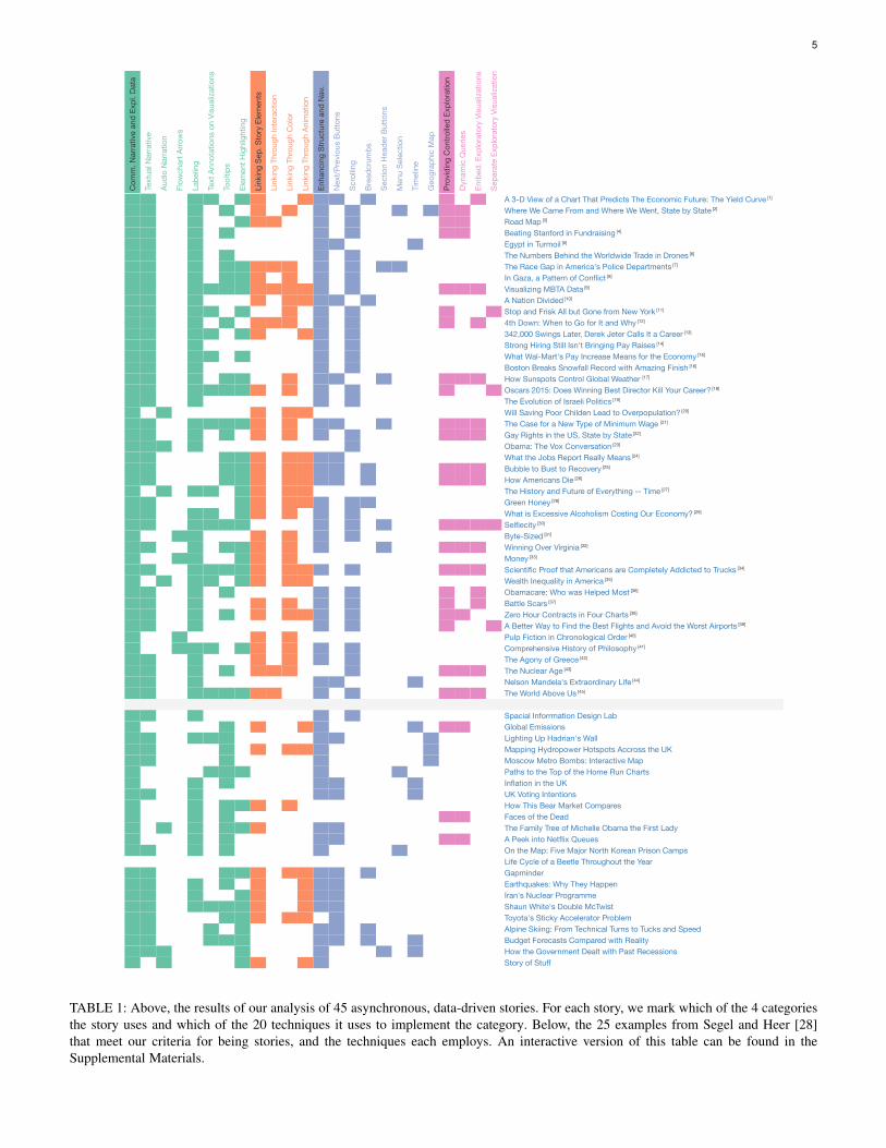
We began by analyzing each story, open tagging the narrativevisualization features that we found in each. Once all of the storieswere analyzed, we merged equivalent tags as well as noticed thatsome tags were a higher level of abstraction than other tags. Wegrouped the lower-level tags under the higher level tags, generatingour set of data storytelling categories and techniques. We thenrecoded the entire set of stories based upon these final tags. Theresults of this analysis can be found in Table 1 and we use thefollowing section to describe the categories and techniques ingreater detail. An accompanying website3 provides an interactiveversion of the table and includes direct links to each story.
Some of the techniques we identified are innovative and new(e.g., linking between the text and chart, using menus as bread-crumbs, or creatively constraining the reader through scrolling),while others are well known (e.g., tooltips or brushing and linkingbetween visualizations). Our goal was to document all the tech-niques authors used, whether new or old, such that our datasetand analysis can act as a snapshot of the state of asynchronous,author-driven, visualization-driven storytelling. Later in this articlewe compare the set of stories we selected to those in Segel andHeer [28] to help understand how the field has changed and grownsince their article was published. As time passes, undoubtedly newtechniques will emerge and become more common. Further analy-sis following the same described method will generate equivalentsnapshots in the future. Such a series of analyses enables directcomparison between different time points, allowing for identifyingnovel techniques and categories within the space of author-driven,visualization-driven storytelling.
4 VISUALIZATION-DRIVEN STORYTELLING TECH-NIQUES
In this section, we enumerate the different techniques we identifiedunder four broad categories:
• Communicating Narrative and Explaining Data• Linking Separated Story Elements• Enhancing Structure and Navigation• Providing Controlled Exploration
Each category is a key component of data-driven storytelling andhelps differentiate these stories from more general exploratory
1. http://www.nssfblog.com/infographic-girl-power/2. http://www.webpagefx.com/blog/general/the-science-of-happiness/3. http://www.cc.gatech.edu/gvu/ii/dds/charts/corpus.html
4
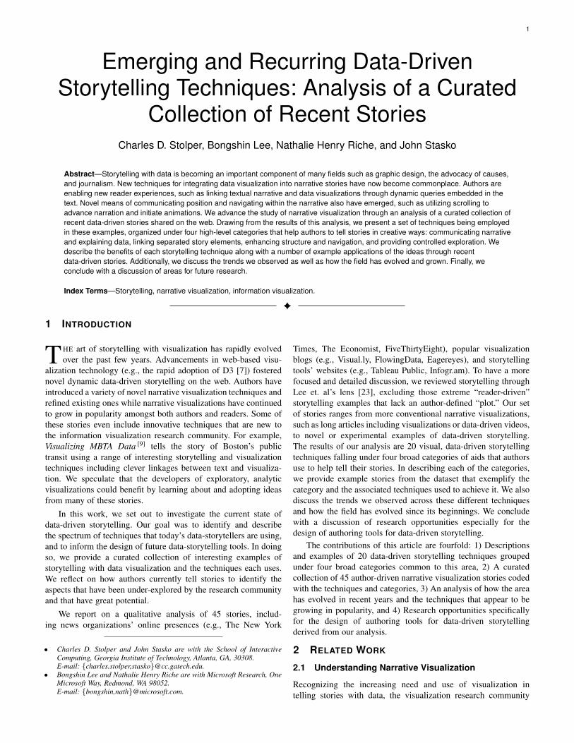
Fig. 1: A scene from The Yield Curve [1], a story from The NewYork Times. This scene includes a slide title, textual narrative, anddot-style breadcrumbs. In addition, the annotation and arrow onthe chart stay with the data point even as the reader freely rotatesthe 3D model.
data visualization tools. While most stories in our dataset em-ploy techniques from multiple of these categories, the specifictechniques themselves vary strongly in frequency within theircategory and across the collection. In the subsections that follow,we describe each of the categories and its techniques in detail, pro-viding specific examples from the story collection that exemplifythe technique. This section serves as more of a documentationand explanation of the categories and techniques. The followingsection then reflects on the technique’s prevalence, growth, andevolution over the last few years since the initial articles aboutdata-driven storytelling [14], [28] appeared.
In the descriptions below, we use the term “visualization” torefer to the interactive pictorial representations of data that occurin stories. We employ the term “chart” when the pictorial represen-tation is static. We also use the general term story “element” as amore general notion including both those pictorial representationsas well as text, headers, annotations, and so on.
4.1 Communicating Narrative and Explaining Data
As we focused our analysis on asynchronous stories withoutaccompanying human presentation, nearly every story in ourdataset has some form of author narration. These techniquesenable authors to use the storytelling methods associated withother mediums, such as writing, in conjunction with data to helpexplain and communicate their messages. We found a variety oftechniques used to convey their stories.
The simplest technique was simply using long textual narra-tive to convey key points, interspersing the visualizations through-out. A large number of the stories we observed utilized thistechnique. Note that long-form textual narration did not alwaysconstitute paragraphs in a magazine-style article. Many slideshows include longer narrative components, including What theJobs Report Really Means [24] and How Sunspots Control GlobalWeather [17], where each slide contains long narrative text to ac-company the visualization. (Throughout this article we refer to theexample narrative websites via a superscripted, bracketed numberto an item in Appendix A. Conventional bracketed numbers stillrefer to cited items in the References.)
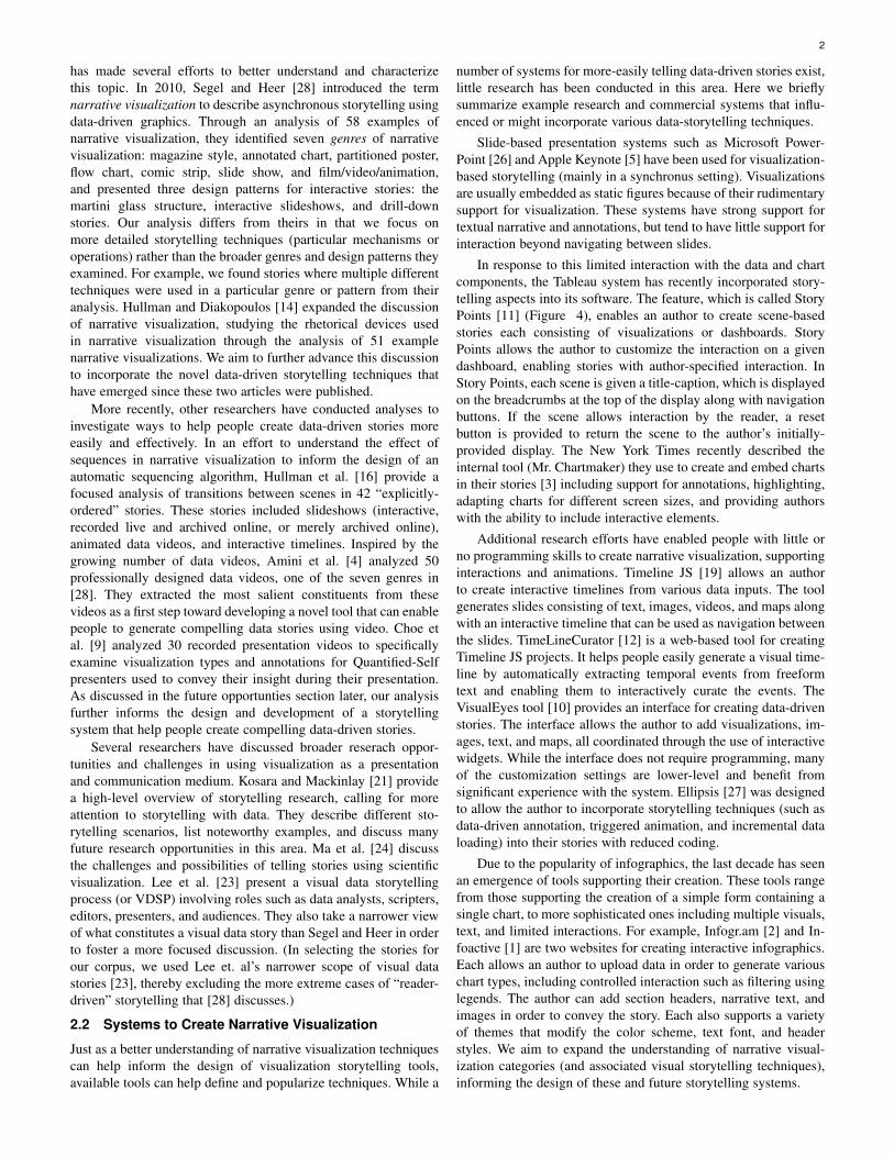
Fig. 2: Two scenes from Addicted to Trucks [34], a story fromBloomberg. These consist of the single set of glyphs repositionedinto different groups when the user scrolls to a certain position.The authors have also added text annotations directly on the charts.
The communication of narrative and explanation of data neednot be confined to text—multiple forms of media can be em-ployed. Data videos and recorded demonstrations such as WealthInequality in America [35] and Will Saving Poor Children Leadto Overpopulation? [20] use audio narration rather than writtennarration. This enables the author to more closely tie together theelements of the story (as the narrative is temporally linked to thevisual elements) but in exchange for making it more difficult forthe reader to experience the story at his or her own pace.
Moving past narrative text and audio narration, many storiesinclude textual annotations to help communicate narrative andpresent data. In some cases, these annotations are labeling aboveor below a visualization or titling a slide or section. Zero HourContracts in Four Charts [38], The Evolution of Israeli Politics [19],and The Yield Curve [1] (Figure 1) use some variant of thistechnique. These titles are often differentiated from the rest ofthe text using a different typeface or font-style.
In some cases, the annotations help guide the reader throughthe author’s intended narrative structure. Flowchart arrows con-nect components of the story when the author’s intended orderingmay be unclear. For example, Pulp Fiction in ChronologicalOrder [40] and Comprehensive History of Philosophy [41] both useflowchart arrows to help guide the reader between the chronologi-cal events.
In all of the above techniques, the annotations are distinctfrom the charts. Conversely, many authors include text annotationon visualizations themselves. These annotations can direct thereader’s attention to those aspects that the author deems crucial tothe story. These on-chart annotations can still come in a varietyof forms, however. In 342,000 Swings Later [13], the authors markvarious groups of elements in the visualization such as swingsper at-bat, swings per hit, and swings per home run on thevisualization rather than in the textual narrative. In The Historyand Future of Everything–Time [27], the authors mark interestingevents along the animated timeline. In some cases these events areduplicated in the audio narration, but not always. Approximatelyhalf of the stories we analyzed included some form of textualannotation directly on the chart, so it is quite a common technique.
Clearly, annotation is an important aspect of storytelling withdata. Hullman et al. [15] study annotation on charts carefully, anddetermine different types and purposes of annotations. They alsocreated a system that can automatically produce annotated linegraphs of a stock’s behavior.
Many of the stories we analyzed provided interactive expla-nation in the form of tooltips: additional details provided to thereader when he or she mouses over an element of the visualization.
5
A 3-D View of a Chart That Predicts The Economic Future: The Yield Curve [1]
Where We Came From and Where We Went, State by State [2]
Road Map [3]
Beating Stanford in Fundraising [4]
Egypt in Turmoil [5]
The Numbers Behind the Worldwide Trade in Drones [6]
The Race Gap in America's Police Departments [7]
In Gaza, a Pattern of Conflict [8]
Visualizing MBTA Data [9]
A Nation Divided [10]
Stop and Frisk All but Gone from New York [11]
4th Down: When to Go for It and Why [12]
342,000 Swings Later, Derek Jeter Calls It a Career [13]
Strong Hiring Still Isn't Bringing Pay Raises [14]
What Wal-Mart's Pay Increase Means for the Economy [15]
Boston Breaks Snowfall Record with Amazing Finish [16]
How Sunspots Control Global Weather [17]
Oscars 2015: Does Winning Best Director Kill Your Career? [18]
The Evolution of Israeli Politics [19]
Will Saving Poor Childen Lead to Overpopulation? [20]
The Case for a New Type of Minimum Wage [21]
Gay Rights in the US, State by State [22]
Obama: The Vox Conversation [23]
What the Jobs Report Really Means [24]
Bubble to Bust to Recovery [25]
How Americans Die [26]
The History and Future of Everything -- Time [27]
Green Honey [28]
What is Excessive Alcoholism Costing Our Economy? [29]
Selfiecity [30]
Byte-Sized [31]
Winning Over Virginia [32]
Money [33]
Scientific Proof that Americans are Completely Addicted to Trucks [34]
Wealth Inequality in America [35]
Obamacare: Who was Helped Most [36]
Battle Scars [37]
Zero Hour Contracts in Four Charts [38]
A Better Way to Find the Best Flights and Avoid the Worst Airports [39]
Pulp Fiction in Chronological Order [40]
Comprehensive History of Philosophy [41]
The Agony of Greece [42]
The Nuclear Age [43]
Nelson Mandela's Extraordinary Life [44]
The World Above Us [45]
Spacial Inforrmation Design LabGlobal EmissionsLighting Up Hadrian's WallMapping Hydropower Hotspots Accross the UKMoscow Metro Bombs: Interactive MapPaths to the Top of the Home Run ChartsInflation in the UKUK Voting IntentionsHow This Bear Market ComparesFaces of the DeadThe Family Tree of Michelle Obama the First LadyA Peek into Netflix QueuesOn the Map: Five Major North Korean Prison CampsLife Cycle of a Beetle Throughout the YearGapminderEarthquakes: Why They HappenIran's Nuclear ProgrammeShaun White's Double McTwistToyota's Sticky Accelerator ProblemAlpine Skiing: From Technical Turns to Tucks and SpeedBudget Forecasts Compared with RealityHow the Government Dealt with Past RecessionsStory of Stuff
Com
m. N
arra
tive
and
Expl
. Dat
a
Text
ual N
arra
tive
Audi
o Na
rratio
n
Flow
char
t Arro
ws
Labe
ling
Text
Ann
otat
ions
on
Visu
aliza
tions
Tool
tips
Elem
ent H
ighl
ight
ing
Link
ing
Sep.
Sto
ry E
lem
ents
Link
ing
Thro
ugh
Inte
ract
ion
Link
ing
Thro
ugh
Colo
r
Link
ing
Thro
ugh
Anim
atio
n
Enha
ncin
g St
ruct
ure
and
Nav.
Next
/Pre
vious
But
tons
Scro
lling
Brea
dcru
mbs
Sect
ion
Head
er B
utto
ns
Men
u Se
lect
ion
Tim
elin
e
Geo
grap
hic
Map
Prov
idin
g Co
ntro
lled
Expl
orat
ion
Dyna
mic
Que
ries
Embe
d. E
xplo
rato
ry V
isual
izatio
ns
Sepa
rate
Exp
lora
tory
Visu
aliza
tion
TABLE 1: Above, the results of our analysis of 45 asynchronous, data-driven stories. For each story, we mark which of the 4 categoriesthe story uses and which of the 20 techniques it uses to implement the category. Below, the 25 examples from Segel and Heer [28]that meet our criteria for being stories, and the techniques each employs. An interactive version of this table can be found in theSupplemental Materials.
6
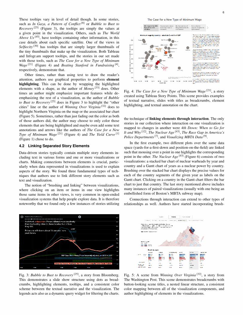
These tooltips vary in level of detail though. In some stories,such as In Gaza, a Pattern of Conflict [8] or Bubble to Bust toRecovery [25] (Figure 3), the tooltips are simply the values ata given point in the visualization. Others, such as The WorldAbove Us [45], have tooltips containing other information, in thiscase details about each specific satellite. One of the views inSelfiecity [30] has tooltips that are simply larger thumbnails ofthe tiny thumbnails that make up the visualization. Both Tableauand Infogr.am support tooltips, and the stories in our set madewith those tools, such as The Case for a New Type of MinimumWage [21] (Figure 4) and Beating Stanford in Fundraising [4],respectively, demonstrate that.
Other times, rather than using text to draw the reader’sattention, authors use graphical properties to perform elementhighlighting. This can be done by wrapping the highlightedelements with a shape, as the author of Money [33] does. Othertimes an author might emphasize important features while de-emphasizing the rest of a visualization, as the author of Bubbleto Bust to Recovery [25] does in Figure 3 to highlight the “othercities” line or the author of Winning Over Virginia [32] does tohighlight Northern Virginia on the map or the associated bar chart(Figure 5). Sometimes, rather than just fading out the color as bothof those authors did, the author may choose to only color thoseelements that are being highlighted and maybe even add some textannotations and arrows like the authors of The Case for a NewType of Minimum Wage [21] (Figure 4) and The Yield Curve [1]
(Figure 1) chose to do.
4.2 Linking Separated Story Elements
Data-driven stories typically contain multiple story elements in-cluding text in various forms and one or more visualizations orcharts. Making connections between elements is crucial, partic-ularly when data represented in visualizations is used to explainaspects of the story. We found three fundamental types of tech-niques that authors use to link different story elements such astext and visualization.
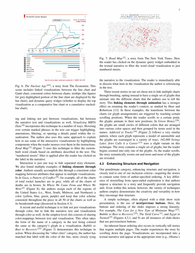
The notion of “brushing and linking” between visualizations,where clicking on an item or items in one view highlightsthose same items in other views, is very common in open-endedvisualization systems that help people explore data. It is thereforenoteworthy that we found only a few instances of stories utilizing
Fig. 3: Bubble to Bust to Recovery [25], a story from Bloomberg.This demonstrates a slide show structure using dots as bread-crumbs, highlighting elements, tooltips, and a consistent colorscheme between the textual narrative and the visualization. Thelegends acts also as a dynamic query widget for filtering the charts.
Fig. 4: The Case for a New Type of Minimum Wage [21], a storycreated using Tableau Story Points. This scene provides examplesof textual narrative, slides with titles as breadcrumbs, elementhighlighting, and textual annotation on the chart.
the technique of linking elements through interaction. The onlystories in our collection where interaction on one visualization ismapped to changes in another were 4th Down: When to Go forIt and Why [12], The Nuclear Age [43], The Race Gap in America’sPolice Departments [7], and Visualizing MBTA Data [9].
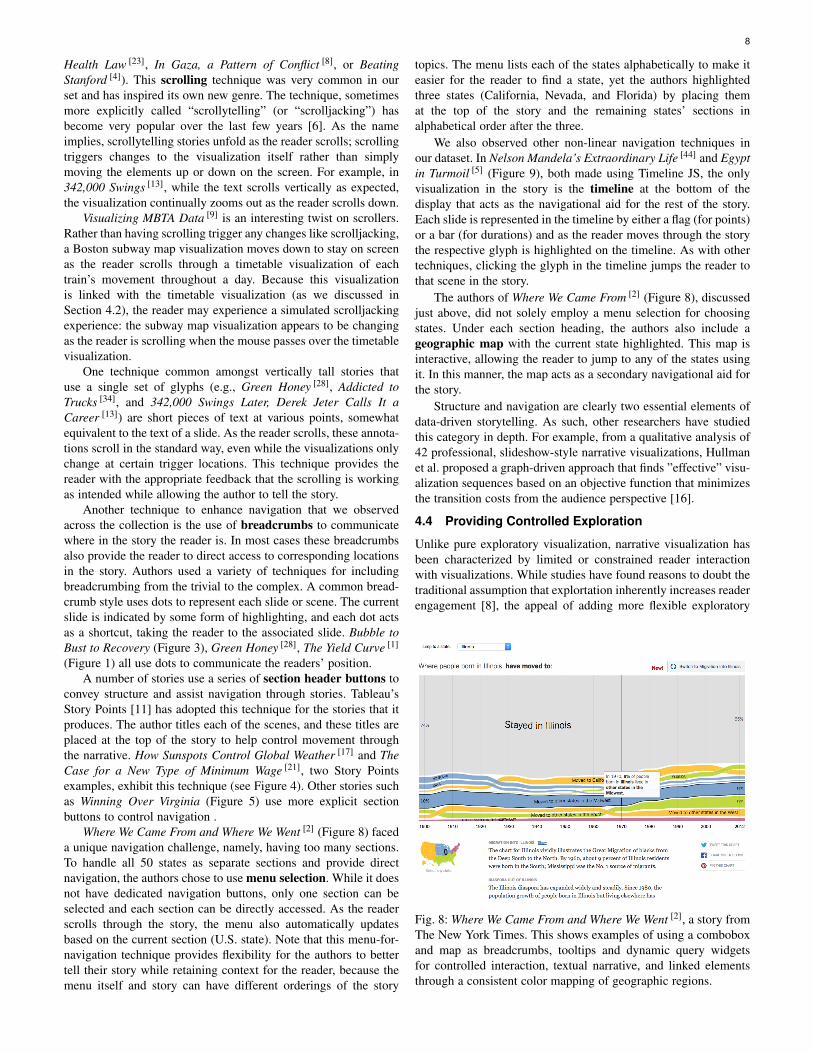
In the first example, two different plots over the same dataspace (yards-for-a-first-down and position-on-the-field) are linkedsuch that mousing over a point in one highlights the correspondingpoint in the other. The Nuclear Age [43] (Figure 6) consists of twovisualizations: a stacked bar chart of nuclear warheads by year andcountry and a Gantt chart of years as a nuclear power by country.Brushing over the stacked bar chart displays the precise values foreach of the country segments of the given year as labels on theGantt chart. Clicking on a country in the Gantt chart filters the barchart to just that country. The last story mentioned above includesmany instances of paired visualizations (usually with one being anembellished form of Boston’s MBTA subway map).
Connections through interaction can extend to other types ofrelationships as well. Authors have started incorporating brush-
Fig. 5: A scene from Winning Over Virginia [32], a story fromThe Washington Post. This scene demonstrates breadcrumbs withbutton-looking scene titles, a nested linear structure, a consistentcolor mapping between all of the visualization components, andauthor highlighting of elements in the visualizations.
7
Fig. 6: The Nuclear Age [43], a story from The Economist. Thisscene includes linked visualizations between the line chart andGantt chart, consistent colors between charts, tooltips (the figuresfor grey-highlighted portion of the line chart are displayed by thebar chart), and dynamic query widget (whether to display the topvisualization as a comparative line chart or a cumulative stacked-bar chart).
ing and linking not just between visualizations, but betweenthe narrative text and visualizations as well. Visualizing MBTAData [9] incorporates this technique in a number of ways. Hoveringover certain marked phrases in the text can trigger highlighting,annotations, filtering, or opening a details panel within the vi-sualization. The author also uses this same approach to explainhow to use some of the interactive visualizations by highlightingcomponents when the reader mouses over them in the instructions.Road Map [3] (Figure 7) uses this technique to filter the custom-built word clouds based on attributes described in the text. The“numbered streets” filter is applied after the reader has clicked onthe label in the narrative.
Interaction is just one way to link separated story elements.We also found multiple examples of linking elements throughcolor. Authors usually accomplish this through a consistent colormapping between attributes that appear in multiple visualizations.In In Gaza, a Pattern of Conflict [8], for example, all of the chartsof total rocket launches are in grey, while all of the charts ofdeaths are in brown. In Where We Came From and Where WeWent [2] (Figure 8), the authors assign each of the regions ofthe United States (i.e., West, South, Midwest, and Northeast) acolor (yellow, blue, green, purple) and keep that color schemeconsistent throughout the piece in all 50 of the charts as well asits breadcrumb-map (discussed in Section 4.3).
A recent and useful technique is to link not just visualizationsthrough color, but to link the narrative text and visualizationthrough color as well. At the simplest level, this consists of sharingcolor-mappings between text and visualization. This often takesthe form of the name of a category in the text being coloredthe same as the category’s glyph in a visualization. Bubble toBust to Recovery [25] (Figure 3) demonstrates this technique inaction. When discussing the “other cities” category, the author hasmatched that label with the color of the line, more closely tying
Fig. 7: Road Map [3], a story form The New York Times. Herethe reader has clicked on the dynamic query widget embedded inthe textual narrative to filter the word cloud visualization to justnumbered streets.
the narrative to the visualization. The reader is immediately ableto discern what item in the visualization the author is referencingin the text.
Three recent stories in our set chose not to link multiple chartsthrough brushing, opting instead to have a single set of glyphs thatanimate into the different charts that the authors use to tell thestory. This linking elements through animation has a strongereffect on retaining the reader’s context, as studied by Heer andRobertson [13]. In these examples, the transitions between thecharts (or glyph arrangements) are triggered by reaching certainscrolling positions. When the reader scrolls to a certain point,the glyphs animate to their new positions. In Green Honey [28],the glyphs are small circles of different colors that are arrangedinto various color spaces and then grouped by terms used in thenames. Addicted to Trucks [34] (Figure 2) follows a very similarpattern, where each glyph represents a model of automobile andthe glyphs are rearranged in a variety of ways. 342,000 SwingsLater, Jeter Calls it a Career [13] uses a slight variant on thistechnique. The story contains a single set of glyphs, but the readerbegins zoomed into only one of the glyphs. As the reader scrolls,the story semantically zooms out and more and more of the glyphsare revealed.
4.3 Enhancing Structure and Navigation
Our penultimate category, enhancing structure and navigation, isclosely tied to one of our inclusion criteria—requiring the storiesto contain some form of author-specified ordering. A key differ-ence of storytelling from open-ended exploration is that authorsimpose a structure to a story and frequently provide navigationaids. Even within this notion, however, the variety of techniquesauthors employ demonstrates the creativity and versatility in howthey encourage that structure.
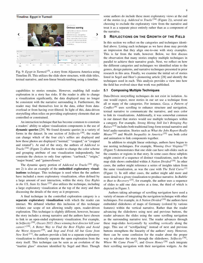
A simple technique, often aligned with a slide show stylepresentation, is the use of next/previous buttons. Here, thebuttons and ordering of the slides imposes a strong linearity.For example, The Case for a New Type of Minimum Wage [21],Bubble to Bust to Recovery [25], The Yield Curve [1], and Egypt inTurmoil [5] (Figures 4,3,1, and 9) are all instances of slide-showsthat use previous/next buttons.
An inherent linear ordering also occurs in vertically tall storiesthat require multiple pages. The reader experiences the story byscrolling down the page. Visualizations are incorporated into atextual narrative and appear at the appropriate time (e.g., Obama’s
8
Health Law [23], In Gaza, a Pattern of Conflict [8], or BeatingStanford [4]). This scrolling technique was very common in ourset and has inspired its own new genre. The technique, sometimesmore explicitly called “scrollytelling” (or “scrolljacking”) hasbecome very popular over the last few years [6]. As the nameimplies, scrollytelling stories unfold as the reader scrolls; scrollingtriggers changes to the visualization itself rather than simplymoving the elements up or down on the screen. For example, in342,000 Swings [13], while the text scrolls vertically as expected,the visualization continually zooms out as the reader scrolls down.
Visualizing MBTA Data [9] is an interesting twist on scrollers.Rather than having scrolling trigger any changes like scrolljacking,a Boston subway map visualization moves down to stay on screenas the reader scrolls through a timetable visualization of eachtrain’s movement throughout a day. Because this visualizationis linked with the timetable visualization (as we discussed inSection 4.2), the reader may experience a simulated scrolljackingexperience: the subway map visualization appears to be changingas the reader is scrolling when the mouse passes over the timetablevisualization.
One technique common amongst vertically tall stories thatuse a single set of glyphs (e.g., Green Honey [28], Addicted toTrucks [34], and 342,000 Swings Later, Derek Jeter Calls It aCareer [13]) are short pieces of text at various points, somewhatequivalent to the text of a slide. As the reader scrolls, these annota-tions scroll in the standard way, even while the visualizations onlychange at certain trigger locations. This technique provides thereader with the appropriate feedback that the scrolling is workingas intended while allowing the author to tell the story.
Another technique to enhance navigation that we observedacross the collection is the use of breadcrumbs to communicatewhere in the story the reader is. In most cases these breadcrumbsalso provide the reader to direct access to corresponding locationsin the story. Authors used a variety of techniques for includingbreadcrumbing from the trivial to the complex. A common bread-crumb style uses dots to represent each slide or scene. The currentslide is indicated by some form of highlighting, and each dot actsas a shortcut, taking the reader to the associated slide. Bubble toBust to Recovery (Figure 3), Green Honey [28], The Yield Curve [1]
(Figure 1) all use dots to communicate the readers’ position.A number of stories use a series of section header buttons to
convey structure and assist navigation through stories. Tableau’sStory Points [11] has adopted this technique for the stories that itproduces. The author titles each of the scenes, and these titles areplaced at the top of the story to help control movement throughthe narrative. How Sunspots Control Global Weather [17] and TheCase for a New Type of Minimum Wage [21], two Story Pointsexamples, exhibit this technique (see Figure 4). Other stories suchas Winning Over Virginia (Figure 5) use more explicit sectionbuttons to control navigation .
Where We Came From and Where We Went [2] (Figure 8) faceda unique navigation challenge, namely, having too many sections.To handle all 50 states as separate sections and provide directnavigation, the authors chose to use menu selection. While it doesnot have dedicated navigation buttons, only one section can beselected and each section can be directly accessed. As the readerscrolls through the story, the menu also automatically updatesbased on the current section (U.S. state). Note that this menu-for-navigation technique provides flexibility for the authors to bettertell their story while retaining context for the reader, because themenu itself and story can have different orderings of the story
topics. The menu lists each of the states alphabetically to make iteasier for the reader to find a state, yet the authors highlightedthree states (California, Nevada, and Florida) by placing themat the top of the story and the remaining states’ sections inalphabetical order after the three.
We also observed other non-linear navigation techniques inour dataset. In Nelson Mandela’s Extraordinary Life [44] and Egyptin Turmoil [5] (Figure 9), both made using Timeline JS, the onlyvisualization in the story is the timeline at the bottom of thedisplay that acts as the navigational aid for the rest of the story.Each slide is represented in the timeline by either a flag (for points)or a bar (for durations) and as the reader moves through the storythe respective glyph is highlighted on the timeline. As with othertechniques, clicking the glyph in the timeline jumps the reader tothat scene in the story.
The authors of Where We Came From [2] (Figure 8), discussedjust above, did not solely employ a menu selection for choosingstates. Under each section heading, the authors also include ageographic map with the current state highlighted. This map isinteractive, allowing the reader to jump to any of the states usingit. In this manner, the map acts as a secondary navigational aid forthe story.
Structure and navigation are clearly two essential elements ofdata-driven storytelling. As such, other researchers have studiedthis category in depth. For example, from a qualitative analysis of42 professional, slideshow-style narrative visualizations, Hullmanet al. proposed a graph-driven approach that finds ”effective” visu-alization sequences based on an objective function that minimizesthe transition costs from the audience perspective [16].
4.4 Providing Controlled Exploration
Unlike pure exploratory visualization, narrative visualization hasbeen characterized by limited or constrained reader interactionwith visualizations. While studies have found reasons to doubt thetraditional assumption that explortation inherently increases readerengagement [8], the appeal of adding more flexible exploratory
Fig. 8: Where We Came From and Where We Went [2], a story fromThe New York Times. This shows examples of using a comboboxand map as breadcrumbs, tooltips and dynamic query widgetsfor controlled interaction, textual narrative, and linked elementsthrough a consistent color mapping of geographic regions.
9
Fig. 9: Egypt in Turmoil [5], a story from Aljazeera America usingTimeline JS. This utilizes the slide show structure, with slide titles,textual narrative, and non-linear breadcrumbing using a timeline.
capabilities to stories remains. However, enabling full readerexploration in a story has risks. If the reader is able to changea visualization significantly, the data displayed may no longerbe consistent with the narrative surrounding it. Furthermore, thereader may find themselves lost in the data, either from data-overload or from having over-filtered. In light of this, data-drivenstorytelling often relies on providing exploratory elements that arecontrolled or constrained.
An interaction technique that has become common to constraina readers’ ability to adjust visualization components is the use ofdynamic queries [29]. We found dynamic queries in a variety offorms in the dataset. In one section of Selfiecity [30], the readercan change which of the four city’s selfies are displayed andhow those photos are displayed (“normal,” “cropped,” or “croppedand rotated”). At end of the story, the authors of Addicted toTrucks [34] (Figure 2) allow the reader to change the color schemeand grouping attribute of one visualization independently, butconstrain the choices to only four options: “car/truck,” “origin,”“major brand,” and “gainers/losers.”
The dynamic query portion of Addicted to Trucks [34] (Fig-ure 2) is also an example of the embedded exploratory visual-izations technique. This technique is used when the the authorshave included a more exploratory visualization, often defined bya large amount of user interaction, within the story. Gay Rightsin the US, State by State [22] also utilizes the technique, includinga large exploratory visualization at the top of the story and thendiscussing the details of the story as it progresses.
A final technique in the controlled exploration category is aseparate exploratory visualization with which the reader caninteract. We debated whether this inclusion of this techniqueviolates our scope of not allowing totally open, reader-drivenexploration. This technique is slightly different, however, becausethe story includes a strong narrative and the authors have chosento link to an open-ended exploratory visualization. For example,in Selfiecity [30], Oscars 2015: Does winning best director kill yourcareer? [18], A Better Way to Find the Best Flights and Avoidthe Worst Airports [39], and Stop and Frisk All but Gone fromNew York [11], the authors provide a link to a separate exploratoryvisualization to distinctly separate the open exploration from thestory itself. This technique can be seen as an evolution of the“martini glass” structure identified by Segel and Heer. Though
some authors do include these more exploratory views at the endof the stories (e.g. Addicted to Trucks [34] (Figure 2)), several arechoosing to exclude the exploratory view from the narrative andtreat it as a separate piece entirely rather than as a component ofthe narrative.
5 REFLECTIONS ON THE GROWTH OF THE FIELD
In this section we reflect on the categories and techniques identi-fied above. Listing each technique as we have done may providean impression that they align one-to-one with story examples.This is far from the truth, however. Below, we first discussthe observation that many stories employ multiple techniques inparallel to achieve their narrative goals. Next, we reflect on howthe different categories and techniques we identified relate to thegenres, design patterns, and narrative techniques presented in priorresearch in this area. Finally, we examine the initial set of storieslisted in Segel and Heer’s pioneering article [28] and identify thetechniques used in each. This analysis provides a view into howthe field has evolved since that work was published.
5.1 Composing Multiple Techniques
Data-Driven storytelling techniques do not exist in isolation. Asone would expect, most stories in our set use a technique fromall or many of the categories. For instance, Gaza, a Pattern ofConflict [8] uses scrolling to enhance structure and navigation,textual narrative to communicate the narrative, and uses colorto link its visualizations. Additionally, it was somewhat commonin our dataset that stories would use multiple techniques withina category. For example, Strong Hiring Still Isn’t Bringing PayRaises [14] includes both traditional long-form textual narrative andbrief audio narration. Stories such as What the Jobs Report ReallyMeans [24] and Wealth Inequality in America [35] use both colorand animation to link components together.
In addition to straight linear orderings, authors have begun touse nesting techniques. For example, Winning Over Virginia [32]
(Figure 5) demonstrates that one slide can have sub-slides such asthe counties or regions in that story. In some cases these subplotsmight consist of a sequence of distinct visualizations, such as themap slide shows embedded within A Nation Divided [10]. In othercases, the author might reference a series of insights taken fromthe same visualization, as was the case with The Yield Curve [1]
(Figure 1). In still other cases, the author might add more andmore detail to a given visualization to produce narrative. In Bubbleto Bust to Recovery [25], for example, the author uses a sequenceof slides to add one data series at a time, the third of which isdepicted in Figure 3.
Authors taking advantage of scrolling navigation have used avariety of means of integrating the navigation technique with othertechniques. For example, in A Nation Divided [10] the authors haveembedded slideshows of maps of Germany (colored by variousfeatures) within the vertical narrative. Rather than the readeradvancing the slideshows using next and previous buttons, thereader advances the slides using the same scrolling navigationas the surrounding narrative text. The reader advances throughthese map-slides horizontally by scrolling vertically along thepage. This use of “scrolljacking” instead of next and previousbuttons strengthens the linearity of the authors’ story. However,there can be some confusion for the reader about the properway to advance the story through the slideshows. Selfiecity [30],Where We Came From [2], and Green Honey [28] each integratetheir scrolling navigation with their navigation widgets. As the
10
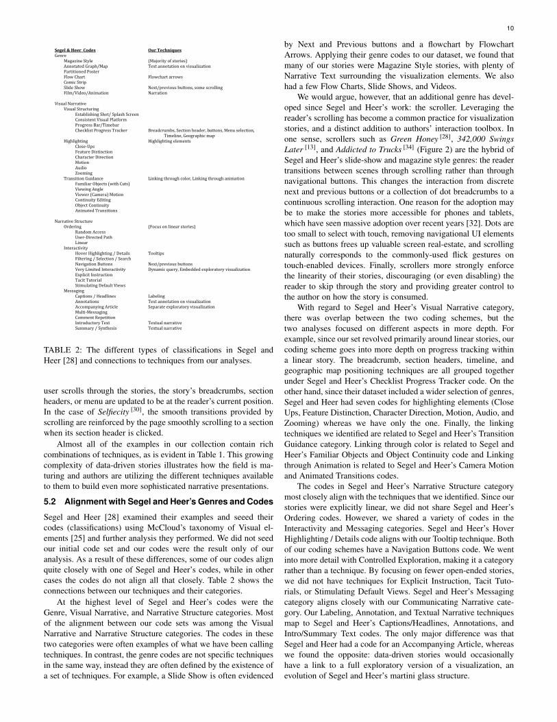
Segel & Heer Codes Our Techniques Genre Magazine Style (Majority of stories) Annotated Graph/Map Text annotation on visualization Partitioned Poster Flow Chart Flowchart arrows Comic Strip Slide Show Next/previous buttons, some scrolling Film/Video/Animation Narration Visual Narrative Visual Structuring Establishing Shot/ Splash Screen Consistent Visual Platform Progress Bar/Timebar Checklist Progress Tracker Breadcrumbs, Section header, buttons, Menu selection, Timeline, Geographic map Highlighting Highlighting elements Close-Ups Feature Distinction Character Direction Motion Audio Zooming Transition Guidance Linking through color, Linking through animation Familiar Objects (with Cuts) Viewing Angle Viewer (Camera) Motion Continuity Editing Object Continuity Animated Transitions Narrative Structure Ordering (Focus on linear stories) Random Access User-Directed Path Linear Interactivity Hover Highlighting / Details Tooltips Filtering / Selection / Search Navigation Buttons Next/previous buttons Very Limited Interactivity Dynamic query, Embedded exploratory visualization Explicit Instruction Tacit Tutorial Stimulating Default Views Messaging Captions / Headlines Labeling Annotations Text annotation on visualization Accompanying Article Separate exploratory visualization Multi-Messaging Comment Repetition Introductory Text Textual narrative Summary / Synthesis Textual narrative
TABLE 2: The different types of classifications in Segel andHeer [28] and connections to techniques from our analyses.
user scrolls through the stories, the story’s breadcrumbs, sectionheaders, or menu are updated to be at the reader’s current position.In the case of Selfiecity [30], the smooth transitions provided byscrolling are reinforced by the page smoothly scrolling to a sectionwhen its section header is clicked.
Almost all of the examples in our collection contain richcombinations of techniques, as is evident in Table 1. This growingcomplexity of data-driven stories illustrates how the field is ma-turing and authors are utilizing the different techniques availableto them to build even more sophisticated narrative presentations.
5.2 Alignment with Segel and Heer’s Genres and Codes
Segel and Heer [28] examined their examples and seeed theircodes (classifications) using McCloud’s taxonomy of Visual el-ements [25] and further analysis they performed. We did not seedour initial code set and our codes were the result only of ouranalysis. As a result of these differences, some of our codes alignquite closely with one of Segel and Heer’s codes, while in othercases the codes do not align all that closely. Table 2 shows theconnections between our techniques and their categories.
At the highest level of Segel and Heer’s codes were theGenre, Visual Narrative, and Narrative Structure categories. Mostof the alignment between our code sets was among the VisualNarrative and Narrative Structure categories. The codes in thesetwo categories were often examples of what we have been callingtechniques. In contrast, the genre codes are not specific techniquesin the same way, instead they are often defined by the existence ofa set of techniques. For example, a Slide Show is often evidenced
by Next and Previous buttons and a flowchart by FlowchartArrows. Applying their genre codes to our dataset, we found thatmany of our stories were Magazine Style stories, with plenty ofNarrative Text surrounding the visualization elements. We alsohad a few Flow Charts, Slide Shows, and Videos.
We would argue, however, that an additional genre has devel-oped since Segel and Heer’s work: the scroller. Leveraging thereader’s scrolling has become a common practice for visualizationstories, and a distinct addition to authors’ interaction toolbox. Inone sense, scrollers such as Green Honey [28], 342,000 SwingsLater [13], and Addicted to Trucks [34] (Figure 2) are the hybrid ofSegel and Heer’s slide-show and magazine style genres: the readertransitions between scenes through scrolling rather than throughnavigational buttons. This changes the interaction from discretenext and previous buttons or a collection of dot breadcrumbs to acontinuous scrolling interaction. One reason for the adoption maybe to make the stories more accessible for phones and tablets,which have seen massive adoption over recent years [32]. Dots aretoo small to select with touch, removing navigational UI elementssuch as buttons frees up valuable screen real-estate, and scrollingnaturally corresponds to the commonly-used flick gestures ontouch-enabled devices. Finally, scrollers more strongly enforcethe linearity of their stories, discouraging (or even disabling) thereader to skip through the story and providing greater control tothe author on how the story is consumed.
With regard to Segel and Heer’s Visual Narrative category,there was overlap between the two coding schemes, but thetwo analyses focused on different aspects in more depth. Forexample, since our set revolved primarily around linear stories, ourcoding scheme goes into more depth on progress tracking withina linear story. The breadcrumb, section headers, timeline, andgeographic map positioning techniques are all grouped togetherunder Segel and Heer’s Checklist Progress Tracker code. On theother hand, since their dataset included a wider selection of genres,Segel and Heer had seven codes for highlighting elements (CloseUps, Feature Distinction, Character Direction, Motion, Audio, andZooming) whereas we have only the one. Finally, the linkingtechniques we identified are related to Segel and Heer’s TransitionGuidance category. Linking through color is related to Segel andHeer’s Familiar Objects and Object Continuity code and Linkingthrough Animation is related to Segel and Heer’s Camera Motionand Animated Transitions codes.
The codes in Segel and Heer’s Narrative Structure categorymost closely align with the techniques that we identified. Since ourstories were explicitly linear, we did not share Segel and Heer’sOrdering codes. However, we shared a variety of codes in theInteractivity and Messaging categories. Segel and Heer’s HoverHighlighting / Details code aligns with our Tooltip technique. Bothof our coding schemes have a Navigation Buttons code. We wentinto more detail with Controlled Exploration, making it a categoryrather than a technique. By focusing on fewer open-ended stories,we did not have techniques for Explicit Instruction, Tacit Tuto-rials, or Stimulating Default Views. Segel and Heer’s Messagingcategory aligns closely with our Communicating Narrative cate-gory. Our Labeling, Annotation, and Textual Narrative techniquesmap to Segel and Heer’s Captions/Headlines, Annotations, andIntro/Summary Text codes. The only major difference was thatSegel and Heer had a code for an Accompanying Article, whereaswe found the opposite: data-driven stories would occasionallyhave a link to a full exploratory version of a visualization, anevolution of Segel and Heer’s martini glass structure.
11
5.3 Evolution of the Field
In order to identify trends in the use of data-driven storytellingtechniques, we have analyzed Segel and Heer’s collection ofstories [28] using our set of techniques. We were unable to analyzeall of the stories in their set. 12 of the stories are no longeravailable at the provided URLs, and 6 of the stories are behindthe Financial Times’s paywall. We were therefore able to analyze40 of the 58 stories. Of those 40, we would argue that 15 arenot stories based on our criteria from Section 3. Our discussiontherefore addresses the remaining 25 stories in Segel and Heer’scorpus. Table 1 shows these 25 stories broken down via thetechniques we identified earlier in Section 4. An accompanyingwebsite4 provides an interactive version of the table.
The major theme in the the development over the past fiveyears has been the integration of more and more components intosingle stories. As is telling from the different codes developed,Segel and Heer found that many of their stories linked to arelated article. In contrast, our set of stories almost always includevisualization elements embedded within textual narratives. Thereappears to be less of a need to separate these two elements.The addition of multiple elements (whether these are narrative oradditional visualizations) tends to require that these be linked inorder to retain context. Therefore, we have also seen a similar risein the use of techniques from the Linking Elements category. It isunclear whether the rise of scrolling as a navigation mechanismis the cause or the effect of the rise in co-located storytellingelements. However, as discussed above, the Scroller genre hascertainly developed in tandem with the rise. Similarly, there seemsto be a lowered use of Navigation Buttons in favor of Scrolling,again signaling the pattern of keeping elements on the samescreen. Finally, it is worth mentioning that many of the techniquesin the Communicating Narrative (Labeling, Annotation, Tooltips,and Highlighting Elements) category have all remained popularbetween both corpora.
5.4 Recent Notable Stories
Storytelling with data continues to evolve and develop, much ofit outside the visualization research community. Since our initialgathering of the collection of stories, a number of new exampleshave appeared that make interesting use of the techniques identi-fied earlier. We review a number of stories below that we believeprovide creative designs and approaches for communicating nar-rative stories using data.
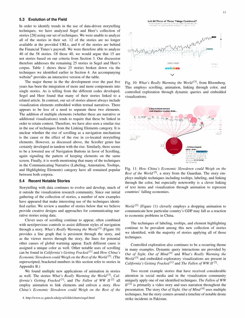
Clever uses of scrolling continue to appear, often combinedwith next/previous controls to assist different styles of navigationthrough a story. What’s Really Warming the World [3] (Figure 10)provides a line graph that is persistent through the story, andas the viewer moves through the story, the lines for potentialother causes of global warming appear. Each different cause isassigned a unique color as well. Other notable uses of scrollingcan be found in California’s Getting Fracked [1] and How China’sEconomic Slowdown could Weigh on the Rest of the World [5]. (Thesuperscripted, bracketed numbers in this section refer to stories inAppendix B.)
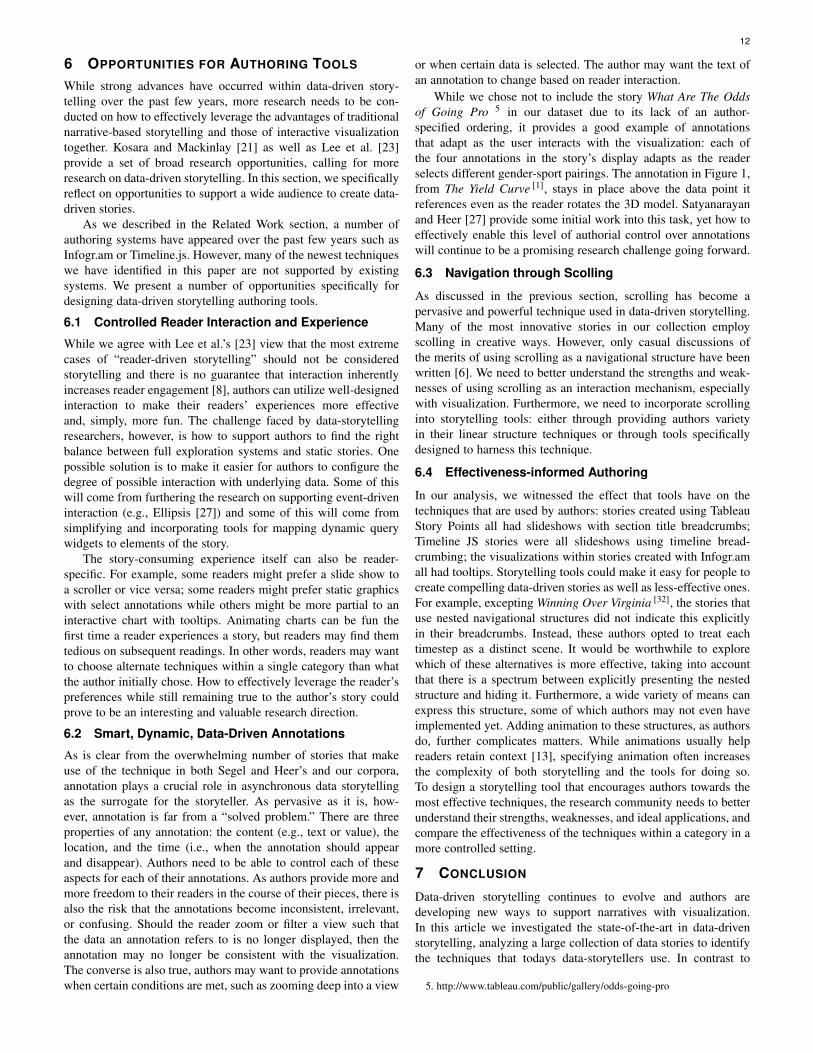
We found multiple new applications of animation in storiesas well. The stories What’s Really Warming the World [3], Cal-ifornia’s Getting Fracked [1], and The Fallen of WW II [2] allemploy animation to link elements and enliven a story. HowChina’s Economic Slowdown could Weigh on the Rest of the
4. http://www.cc.gatech.edu/gvu/ii/dds/charts/segel.html
Fig. 10: What’s Really Warming the World [3], from Bloomberg.This employs scrolling, animation, linking through color, andcontrolled exploration through dynamic queries and embeddedvisualizations.
Fig. 11: How China’s Economic Slowdown could Weigh on theRest of the World [5], a story from the Guardian. The story em-ploys multiple techniques including tooltips, labeling, and linkingthrough the color, but especially noteworthy is a clever linkingof text items and visualization through animation to representcountries’ falling economies.
World [5] (Figure 11) cleverly employs a dropping animation tocommunicate how particular country’s GDP may fall as a reactionto economic problems in China.
The techniques of labeling, tooltips, and element highlightingcontinue to be prevalent among this new collection of storieswe identified, with the majority of stories applying all of thosetechniques.
Controlled exploration also continues to be a recurring themein many examples. Dynamic query interactions are provided byOut of Sight, Out of Mind [4] and What’s Really Warming theWorld [3] and embedded exploratory visualizations are present inCalifornia’s Getting Fracked [1] and The Fallen of WW II [2].
Two recent example stories that have received considerableattention in social media and in the visualization communityuniquely apply one of our identified techniques. The Fallen of WWII [2] is primarily a video story and uses narration throughout thepresentation. The story Out of Sight, Out of Mind [4] uses multipletechniques, but the story centers around a timeline of notable dronestrike incidents in Pakistan.
12
6 OPPORTUNITIES FOR AUTHORING TOOLS
While strong advances have occurred within data-driven story-telling over the past few years, more research needs to be con-ducted on how to effectively leverage the advantages of traditionalnarrative-based storytelling and those of interactive visualizationtogether. Kosara and Mackinlay [21] as well as Lee et al. [23]provide a set of broad research opportunities, calling for moreresearch on data-driven storytelling. In this section, we specificallyreflect on opportunities to support a wide audience to create data-driven stories.
As we described in the Related Work section, a number ofauthoring systems have appeared over the past few years such asInfogr.am or Timeline.js. However, many of the newest techniqueswe have identified in this paper are not supported by existingsystems. We present a number of opportunities specifically fordesigning data-driven storytelling authoring tools.
6.1 Controlled Reader Interaction and Experience
While we agree with Lee et al.’s [23] view that the most extremecases of “reader-driven storytelling” should not be consideredstorytelling and there is no guarantee that interaction inherentlyincreases reader engagement [8], authors can utilize well-designedinteraction to make their readers’ experiences more effectiveand, simply, more fun. The challenge faced by data-storytellingresearchers, however, is how to support authors to find the rightbalance between full exploration systems and static stories. Onepossible solution is to make it easier for authors to configure thedegree of possible interaction with underlying data. Some of thiswill come from furthering the research on supporting event-driveninteraction (e.g., Ellipsis [27]) and some of this will come fromsimplifying and incorporating tools for mapping dynamic querywidgets to elements of the story.
The story-consuming experience itself can also be reader-specific. For example, some readers might prefer a slide show toa scroller or vice versa; some readers might prefer static graphicswith select annotations while others might be more partial to aninteractive chart with tooltips. Animating charts can be fun thefirst time a reader experiences a story, but readers may find themtedious on subsequent readings. In other words, readers may wantto choose alternate techniques within a single category than whatthe author initially chose. How to effectively leverage the reader’spreferences while still remaining true to the author’s story couldprove to be an interesting and valuable research direction.
6.2 Smart, Dynamic, Data-Driven Annotations
As is clear from the overwhelming number of stories that makeuse of the technique in both Segel and Heer’s and our corpora,annotation plays a crucial role in asynchronous data storytellingas the surrogate for the storyteller. As pervasive as it is, how-ever, annotation is far from a “solved problem.” There are threeproperties of any annotation: the content (e.g., text or value), thelocation, and the time (i.e., when the annotation should appearand disappear). Authors need to be able to control each of theseaspects for each of their annotations. As authors provide more andmore freedom to their readers in the course of their pieces, there isalso the risk that the annotations become inconsistent, irrelevant,or confusing. Should the reader zoom or filter a view such thatthe data an annotation refers to is no longer displayed, then theannotation may no longer be consistent with the visualization.The converse is also true, authors may want to provide annotationswhen certain conditions are met, such as zooming deep into a view
or when certain data is selected. The author may want the text ofan annotation to change based on reader interaction.
While we chose not to include the story What Are The Oddsof Going Pro 5 in our dataset due to its lack of an author-specified ordering, it provides a good example of annotationsthat adapt as the user interacts with the visualization: each ofthe four annotations in the story’s display adapts as the readerselects different gender-sport pairings. The annotation in Figure 1,from The Yield Curve [1], stays in place above the data point itreferences even as the reader rotates the 3D model. Satyanarayanand Heer [27] provide some initial work into this task, yet how toeffectively enable this level of authorial control over annotationswill continue to be a promising research challenge going forward.
6.3 Navigation through Scolling
As discussed in the previous section, scrolling has become apervasive and powerful technique used in data-driven storytelling.Many of the most innovative stories in our collection employscolling in creative ways. However, only casual discussions ofthe merits of using scrolling as a navigational structure have beenwritten [6]. We need to better understand the strengths and weak-nesses of using scrolling as an interaction mechanism, especiallywith visualization. Furthermore, we need to incorporate scrollinginto storytelling tools: either through providing authors varietyin their linear structure techniques or through tools specificallydesigned to harness this technique.
6.4 Effectiveness-informed Authoring
In our analysis, we witnessed the effect that tools have on thetechniques that are used by authors: stories created using TableauStory Points all had slideshows with section title breadcrumbs;Timeline JS stories were all slideshows using timeline bread-crumbing; the visualizations within stories created with Infogr.amall had tooltips. Storytelling tools could make it easy for people tocreate compelling data-driven stories as well as less-effective ones.For example, excepting Winning Over Virginia [32], the stories thatuse nested navigational structures did not indicate this explicitlyin their breadcrumbs. Instead, these authors opted to treat eachtimestep as a distinct scene. It would be worthwhile to explorewhich of these alternatives is more effective, taking into accountthat there is a spectrum between explicitly presenting the nestedstructure and hiding it. Furthermore, a wide variety of means canexpress this structure, some of which authors may not even haveimplemented yet. Adding animation to these structures, as authorsdo, further complicates matters. While animations usually helpreaders retain context [13], specifying animation often increasesthe complexity of both storytelling and the tools for doing so.To design a storytelling tool that encourages authors towards themost effective techniques, the research community needs to betterunderstand their strengths, weaknesses, and ideal applications, andcompare the effectiveness of the techniques within a category in amore controlled setting.
7 CONCLUSION
Data-driven storytelling continues to evolve and authors aredeveloping new ways to support narratives with visualization.In this article we investigated the state-of-the-art in data-drivenstorytelling, analyzing a large collection of data stories to identifythe techniques that todays data-storytellers use. In contrast to
5. http://www.tableau.com/public/gallery/odds-going-pro

13
Segel and Heer’s original analysis [28] that centered on thedesign space and genres within narrative visualization as a whole,our analysis focused on the more specific techniques used inauthor-constructed, data-driven storytelling. We identified 20 vi-sual storytelling techniques organized into four broad categories:communicating narrative and explaining data, linking separatedstory elements, enhancing structure and navigation, and providingcontrolled exploration. We then reflected on these findings, dis-cussed the evaluation of and trends within the community, andenumerated a number of possibilities for future research.
This work advances the discussion of narrative visualization bydescribing the state-of-the-art of the medium. Through identifyingspecific techniques to be incorporated into stories, this workinforms the design of future tools that enable storytellers toeffectively create data-driven pieces. We as a research communityshould be making a greater effort to fully leverage visualizationas a storytelling medium. Alongside improving our understandingof the techniques and categories that authors have been using,we need to provide storytellers with better tools and support forcreating compelling data-driven stories. Finally, we must inspireand encourage authors to continue exploring ever more creativemeans of telling visual data stories.
ACKNOWLEDGMENTS
This work was supported in part by the National Science Founda-tion via award IIS-1320537.
8 REFERENCES
[1] Infoactive. https://infoactive.co.[2] Infogr.am. https://infogr.am.[3] G. Aisch. Seven Features You’ll Want In Your Next Charting
Tool. http://vis4.net/blog/posts/seven-features-youll-wantin-your-next-charting-tool.
[4] F. Amini, N. Henry Riche, B. Lee, C. Hurter, and P. Irani. Understandingdata videos: Looking at narrative visualization through the cinematogra-phy lens. In Proceedings of the 33rd Annual ACM Conference on HumanFactors in Computing Systems, CHI ’15, pages 1459–1468, 2015.
[5] Apple Corp. Keynote for Mac. https://www.apple.com/mac/keynote.[6] M. Bostock. How To Scroll. http://bost.ocks.org/mike/scroll/, Nov. 2014.[7] M. Bostock, V. Ogievetsky, and J. Heer. D3: Data-Driven Documents. Vi-
sualization and Computer Graphics, IEEE Transactions on, 17(12):2301–2309, Dec. 2011.
[8] J. Boy, F. Detienne, and J.-D. Fekete. Storytelling in informationvisualizations: Does it engage users to explore data? In Proceedingsof the 33rd Annual ACM Conference on Human Factors in ComputingSystems, CHI ’15, pages 1449–1458, 2015.
[9] E. K. Choe, B. Lee, and m. c. schraefel. Characterizing VisualizationInsights from Quantified-Selfers Personal Data Presentations. IEEEComputer Graphics and Applications, 35(4):27–38, 2015.
[10] B. Ferster. VisualEyes. http://www.viseyes.org/.[11] E. Fields. 8.2 Preview: Story Points. http://www.tableau.com/about/blog/
2014/5/82-preview-tell-story-your-data-story-points-30761.[12] J. Fulda, M. Brehmer, and T. Munzner. Timelinecurator: Interactive
authoring of visual timelines from unstructured text. IEEE Transactionson Visualization and Computer Graphics, 22(1):300–309, Jan 2016.
[13] J. Heer and G. Robertson. Animated Transitions in Statistical DataGraphics. IEEE Transactions on Visualization and Computer Graphics,13(6):1240–1247, Nov. 2007.
[14] J. Hullman and N. Diakopoulos. Visualization Rhetoric: Framing Effectsin Narrative Visualization. IEEE Transactions on Visualization andComputer Graphics, 17(12):2231–2240, Dec. 2011.
[15] J. Hullman, N. Diakopoulos, and E. Adar. Contextifier: automaticgeneration of annotated stock visualizations. In 2013 ACM SIGCHIConference on Human Factors in Computing Systems, CHI ’13, pages2707–2716, April 2013.
[16] J. Hullman, S. Drucker, N. Riche, B. Lee, D. Fisher, and E. Adar. ADeeper Understanding of Sequence in Narrative Visualization. IEEETransactions on Visualization and Computer Graphics, 19(12):2406–2415, Dec. 2013.
[17] A. Kirk. 10 Significant Visualisation Developments: January to June2014. http://www.visualisingdata.com/index.php/2014/08/10-significant-visualisation-developments-january-to-june-2014.
[18] A. Kirk. 10 Significant Visualisation Developments: July to December2014. http://www.visualisingdata.com/index.php/2014/12/10-significant-visualisation-developments-july-december-2014.
[19] Knight Foundation. Timeline JS. http://timeline.knightlab.com.[20] R. Kosara. The State of Information Visualization, 2015. https:
//eagereyes.org/blog/2015/the-state-of-information-visualization-2015.[21] R. Kosara and J. Mackinlay. Storytelling: The Next Step for Visualiza-
tion. Computer, 46(5):44–50, May 2013.[22] B. Lee, R. Kazi, and G. Smith. SketchStory: Telling More Engaging
Stories with Data through Freeform Sketching. IEEE Transactions onVisualization and Computer Graphics, 19(12):2416–2425, Dec. 2013.
[23] B. Lee, N. H. Riche, P. Isenberg, and S. Carpendale. More Than Tellinga Story: a Closer Look at the Process of Transforming Data into VisuallyShared Stories (In Press). Computer Graphics and Applications, IEEE,2015.
[24] K.-L. Ma, I. Liao, J. Frazier, H. Hauser, and H.-N. Kostis. ScientificStorytelling Using Visualization. IEEE Computer Graphics and Appli-cations, 32(1):12–19, Jan. 2012.
[25] S. McCloud. Making comics: storytelling secrets of comics, manga andgraphic novels. Harper, New York, 1st ed edition, 2006.
[26] Microsoft Corp. Microsoft powerpoint. http://products.office.com/en-us/powerpoint.
[27] A. Satyanarayan and J. Heer. Authoring narrative visualizations withellipsis. In Computer Graphics Forum, volume 33, pages 361–370. WileyOnline Library, 2014.
[28] E. Segel and J. Heer. Narrative Visualization: Telling Stories with Data.IEEE Transactions on Visualization and Computer Graphics, 16(6):1139–1148, Dec. 2010.
[29] B. Shneiderman. Dynamic queries for visual information seeking. IEEESoftware, 11(6):70 –77, Nov. 1994.
[30] D. Skau. 14 Of 2014’s Best Information Designers and Animators. http://blog.visual.ly/14-2014s-best-information-designers-animators.
[31] N. Yau. The Best Data Visualization Projects of 2014. http://flowingdata.com/2014/12/19/the-best-data-visualization-projects-of-2014-2.
[32] K. Zickuhr and L. Rainie. Tablet and E-reader Ownership. http://www.pewinternet.org/2014/01/16/tablet-and-e-reader-ownership/.
9 APPENDIX A: STORIES ANALYZED
[1] G. Aisch and A. Cox. A 3-D View of a Chart That Predicts The EconomicFuture: The Yield Curve. http://www.nytimes.com/interactive/2015/03/19/upshot/3d-yield-curve-economic-growth.html, 2015.
[2] G. Aisch, R. Gebeloff, and K. Quealy. Where We Came From and WhereWe Went, State by State. http://www.nytimes.com/interactive/2014/08/13/upshot/where-people-in-each-state-were-born.html, 2014.
[3] G. Aisch and B. Marsh. Road Map. http://www.nytimes.com/interactive/2015/01/29/sunday-review/road-map-home-values-street-names.html? r=0, 2015.
[4] A. Ambrose. Beating Stanford in Fundraising. https://infogr.am/beyondcrowdfunding, 2013.
[5] A. America. Egypt in Turmoil. http://america.aljazeera.com/articles/timeline-egypt-inturmoil0.html, 2013.
[6] G. Arnett. The Numbers Behind the Worldwide Trade in Drones.http://www.theguardian.com/news/datablog/2015/mar/16/numbers-behind-worldwide-trade-in-drones-uk-israel, 2015.
[7] J. Ashkenas and H. Park. The Race Gap in America’s Police Depart-ments. http://www.nytimes.com/interactive/2014/09/03/us/the-race-gap-in-americas-police-departments.html, 2014.
[8] J. Ashkenas, A. Tse, and K. Yourish. In Gaza, a Pattern of Con-flict. http://www.nytimes.com/interactive/2014/07/31/world/middleeast/in-gaza-a-pattern-of-conflict.html, 2014.
[9] M. Barry and B. Card. Visualizing MBTA Data. http://mbtaviz.github.io/,2014.
[10] L. Borgenheimer, P. Blickle, J. Stahnke, S. Venohr, C. Bangel, M. Young,F. Mohr, M. Biedowicz, and A. M. . A Nation Divided. http://zeit.de/feature/german-unification-a-nation-divided, 2014.
[11] M. Bostock and F. Fessenden. Stop and Frisk All but Gone fromNew York. http://www.nytimes.com/interactive/2014/09/19/nyregion/stop-and-frisk-is-all-but-gone-from-new-york.html, 2014.
[12] B. Burke, S. Carter, J. Daniel, T. Giratikanon, and K. Quealy. 4th Down:When to Go for It and Why. http://www.nytimes.com/2014/09/05/upshot/4th-down-when-to-go-for-it-and-why.html, 2014.
[13] S. Carter, J. Ward, and D. Waldstein. 342,000 Swings Later, Derek JeterCalls It a Career. http://www.nytimes.com/interactive/2014/09/14/sports/baseball/jeter-swings.html, 2014.

14
[14] B. Casselman. Strong Hiring Still Isn’t Bringing Pay Raises.http://fivethirtyeight.com/datalab/strong-hiring-still-isnt-bringing-pay-raises/, 2015.
[15] B. Casselman. What Wal-Mart’s Pay Increase Means for the Econ-omy. http://fivethirtyeight.com/datalab/what-wal-marts-pay-increase-means-for-the-economy/, 2015.
[16] H. Enten. Boston Breaks Snowfall Record with Amazing Fin-ish. http://fivethirtyeight.com/datalab/boston-breaks-snowfall-record-with-an-amazing-finish/, 2015.
[17] M. Francis. How Sunspots Control Global Weather. http://public.tableausoftware.com/views/SunSpotsStory/SunspotsTheWeather, 2014.
[18] W. Franklin, T. Griggs, and G. Arnett. Oscars 2015: Does WinningBest Director Kill Your Career? http://www.theguardian.com/film/ng-interactive/2015/feb/20/what-it-really-means-to-win-the-oscars-best-director, 2015.
[19] A. L. G. The Evolution of Israeli Politics. http://www.economist.com/blogs/economist-explains/2015/03/economist-explains-11, 2015.
[20] Gapminder Foundation. Will Saving Poor Childen Lead to Overpopula-tion? http://www.gapminder.org/videos/will-saving-poor-children-lead-to-overpopulation/, 2014.
[21] P. Gilks. The Case for a New Type of Minimum Wage. http://public.tableausoftware.com/views/MinimumWage 3/MinimumWage-StoryPointsEdition, 2014.
[22] Guardian US Interactive Team. Gay Rights in the US, State byState. http://www.theguardian.com/world/interactive/2012/may/08/gay-rights-united-states, 2012.
[23] E. Klein, M. Yglesias, L. McGann, E. Barkhorn, A. Rockey, L. Williams,K. Keller, J. Posner, M. Bell, Y. Victor, R. Mark, A. Palanzi, T. Whiting,J. S. Maria, J. Fong, T. Whiting, A. Katakam, M. Thielking, A. Es-puelas, E. Caswell, D. Stanfield, J. Posner, and J. Posner. Obama: TheVox Conversation. http://www.vox.com/a/barack-obama-interview-vox-conversation/obama-domestic-policy-transcript, 2014.
[24] M. C. Klein. What the Jobs Report Really Means. http://www.bloomberg.com/dataview/2013-11-08/, 2013.
[25] M. C. Klein. Bubble to Bust to Recovery. http://www.bloomberg.com/dataview/2014-02-25/bubble-to-bust-to-recovery.html, 2014.
[26] M. C. Klein. How Americans Die. http://www.bloomberg.com/dataview/2014-04-17/how-americans-die.html, 2014.
[27] Kurzgesagt. The History and Future of Everything – Time. https://www.youtube.com/watch?v=2XkV6IpV2Y0, 2013.
[28] M. Lee. Green Honey. http://muyueh.com/greenhoney/, 2013.[29] Lemonly. What is Excessive Alcoholism Costing Our Economy? http:
//americanaddictioncenters.org/hidden-costs-of-alcoholism/, 2015.[30] L. Manovich, M. Stephaner, M. Yazdani, D. Baur, D. Goddemeyer,
A. Tifentale, N. Hochman, and J. Chow. Selfiecity. http://selfiecity.net/,2014.
[31] D. McCandless, D. Swain, M. McLean, M. Quick, and C. Miles. Byte-Sized. http://www.bbc.com/future/story/20130621-byte-sized-guide-to-data-storage, 2013.
[32] T. Mellnik, K. Park, and R. Johnson. Winning OverVirginia. http://www.washingtonpost.com/wp-srv/special/local/2013-elections/demographics/, 2013.
[33] R. Monroe. Money. http://xkcd.com/980/, 2011.[34] A. Pearce, B. Migliozzi, and D. Ingold. Scientific Proof that Ameri-
cans are Completely Addicted to Trucks. http://www.bloomberg.com/graphics/2015-auto-sales/, 2015.
[35] Politzane. Wealth Inequality in America. https://www.youtube.com/watch?v=QPKKQnijnsM, 2012.
[36] K. Quealy and M. Sanger-Katz. Obamacare: Who wasHelped Most. http://www.nytimes.com/interactive/2014/10/29/upshot/obamacare-who-was-helped-most.html, 2014.
[37] G. S., P. K., A. C. M, and L. P. Battle Scars. http://www.economist.com/blogs/graphicdetail/2014/07/daily-chart-21, 2014.
[38] A. Sedghi. Zero Hour Contracts in Four Charts. http://www.theguardian.com/news/datablog/2015/feb/25/zero-hour-contracts-in-four-charts,2015.
[39] N. Silver. A Better Way to Find the Best Flights and Avoid the Worst Air-ports. http://fivethirtyeight.com/features/fastest-airlines-fastest-airports/,2015.
[40] N. Smith. Pulp Fiction in Chronological Order. http://visual.ly/pulp-fiction-chronological-order, 2012.
[41] SuperScholar.org. Comprehensive History of Philosophy. http://superscholar.org/comp-history-philosophy/, 2015.
[42] The Data Team. The Agony of Greece. http://www.economist.com/blogs/graphicdetail/2015/03/daily-chart-0, 2015.
[43] The Data Team. The Nuclear Age. http://www.economist.com/blogs/graphicdetail/2015/03/interactive-daily-chart, 2015.
[44] TIME Staff. Nelson Mandela’s Extraordinary Life.http://world.time.com/2013/12/05/nelson-mandelas-extraordinary-life-an-interactive-timeline/, 2013.
[45] D. Yanofsky and T. Fernholtz. The World Above Us. http://qz.com/296941/interactive-graphic-every-active-satellite-orbiting-earth/, 2014.
10 APPENDIX B: RECENT ADDITIONAL STORIES
[1] A. Flagg, S. Craig, and A. Bruno. California’s Getting Fracked. http://www.facesoffracking.org/data-visualization/, 2015.
[2] N. Halloran. The Fallen of WWII. http://www.fallen.io/ww2/, 2015.[3] E. Rolston and B. Migliozzi. What’s Really Warming the World? http:
//www.bloomberg.com/graphics/2015-whats-warming-the-world/, 2015.[4] P. I. team. Out of Sight, Out of Mind.[5] C. Zapponi, S. Clarke, H. Bengtsson, T. Griggs, and P. Inman.
How China’s Economic Slowdown Could Weigh on the Rest of theWorld. http://www.theguardian.com/world/ng-interactive/2015/aug/26/china-economic-slowdown-world-imports, 2015.
Charles D. Stolper is a Computer Science PhDCandidate in the School of Interactive Comput-ing at the Georgia Institute of Technology. His re-search interests are in Information Visualization,Graph Visualization, Data Science, and Human-Computer Interaction. His work focuses on iden-tifying aspects of and implementing visualizationtoolkits.
Bongshin Lee is a Senior Researcher at Mi-crosoft Research. She received her PhD in Com-puter Science from the University of Marylandat College Park in 2006. Her research interestsinclude Human-Computer Interaction, Informa-tion Visualization, and User Interfaces and Inter-action Techniques. She is currently focusing ondeveloping innovative ways for people to createvisualizations, interact with their data, and sharedata-driven stories visually.
Nathalie Henry Riche is a researcher atMicrosoft Research since December 2008.Nathalie holds a Ph.D. in Computer Sciencefrom the University of Paris Sud & Inria, Franceand the University of Sydney, Australia. Her re-search interests span the entire information vi-sualization spectrum: from designing interfacesfor scientists to visually explore their data, to de-signing interfaces for the general public to sharedata-driven stories.
John Stasko is a Professor in the School ofInteractive Computing at the Georgia Institute ofTechnology. He is a widely published author inthe areas of information visualization, visual an-alytics, and human-computer interaction. Staskois an IEEE Fellow, an ACM Distinguished Scien-tist, and a member of the ACM CHI Academy.In 2013, he was General Chair of the IEEE VISConference.