1 collecting data 5 - pearson schools and fe colleges · ... too personal or may influence the...
TRANSCRIPT

Collecting data
1.1 Introduction
• You can collect data: by using a questionnaire by making observations and recording the results by carrying out an experiment from records or a database from the internet.
• Data you collect yourself is called primary data. Data that has been collected by other people is called secondary data.
• A census collects information from every member of a population.
• A sample collects information from only part of a population. The larger the sample, the more reliable the results will be.
• When you carry out a survey, select a random sample to avoid bias.
The National Census collects information for every household in the UK. The information is collected every ten years. The next Census will be in 2011.
Brian wants to fi nd out what people think about Heavy Metal music.He considers asking three different groups of people:Group A: The people in his classGroup B: The people at a Heavy Metal concertGroup C: The people at a school fete
Which group of people should he ask?
Group C In group A, Brian would be finding out what people in his own age group think about Heavy Metal music. The people in this group are unlikely to be representative of people in general. In group B the people like Heavy Metal music! They are not representative of people in general.
Example 1
1
There is likely to be a mix of ages and views in this group.
In a random sample, every member of the population has an equal chance of being chosen.
5

Exercise 1A
For questions 1–4 select the most appropriate group of people to ask: A, B or C.
1 What people think about snookerA: The people in a shopping centreB: The people in a youth clubC: Snooker players
2 What people think about Chinese foodA: People in a Chinese restaurantB: People in a supermarketC: Men in a football club
3 If people are in favour of the new roadA: Car drivers using the roadB: People without a carC: People at the local cinema
4 What people think about the cost of dental careA: People in a library B: Dentists C: Students
5 Hal is doing a survey of the people in his school.(a) Who will he choose if he takes a census?(b) Write down one advantage of taking a census.(c) Write down one disadvantage of taking a census.
6 Here are some sets of data. Decide whether each is primary or secondary data.(a) Prices of MP3 players in a catalogue(b) Ages of people in your family(c) Numbers of households with a PC(d) Favourite bands of people in your class(e) Local people’s views on sports facilities(f) GCSE results for a school
1.2 Designing questions
• In a survey bias can result from: leading questions, which invite a particular answer unclear or ambiguous questions people not answering every question.
• When you are writing questions for a questionnaire: be clear what you want to find out and what data you need ask short, simple questions provide tick boxes with possible answers avoid questions which are vague, too personal or may influence the answer.
Chapter 1 Collecting data2

Exercise 1B
1 Shani and Erica carry out a survey on the sweets people eat in the office canteen.
Shani writes the question ‘Which sweets do you eat?’ Erica says that this question is too vague.
Write down two ways in which the question could be improved.
2 Jack is designing a survey to find out about people who use an internet cafe near his home. One of the things he wants to find out is how far people have travelled to get to the cafe.
Tony conducts a survey into people’s TV viewing habits. In his questionnaire he asks the question‘You enjoy watching soap operas, don’t you?’(a) Explain why this is not a good question to ask.(b) Write three suitable questions which invite people to
provide reasonable information about soap operas.
(a) The question is a poor one because it is leading; it invites a person to answer YES.
(b) Three suitable questions might be:1. Tick the box which shows most accurately the
number of hours (t) you spend each week watching soap operas on TV:Do not watch 0 t 1 1 t 2 2 t 3 3 t 4 4 t 5 More than 5
2. In this list of soap operas, write the numbers 1, 2 and 3 in the boxes to show your 1st, 2nd and 3rd favourite.Next Door to You For and Against Abdication Road Junction Road Riverside Other Westsiders
3. If you have written a 1, 2 or 3 in the box next to ‘Other’ in question 2, please write the name of this soap opera here:Other is
Example 2
3
5
1.2 Designing questions
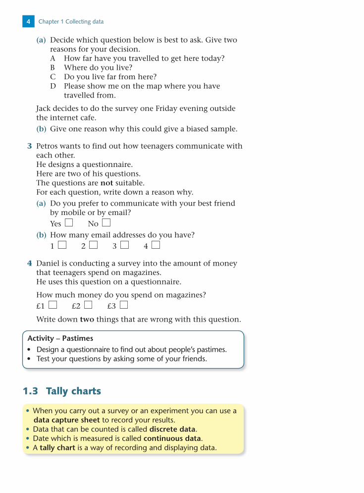
(a) Decide which question below is best to ask. Give two reasons for your decision.A How far have you travelled to get here today?B Where do you live?C Do you live far from here?D Please show me on the map where you have
travelled from.
Jack decides to do the survey one Friday evening outside the internet cafe.(b) Give one reason why this could give a biased sample.
3 Petros wants to find out how teenagers communicate with each other.He designs a questionnaire.Here are two of his questions.The questions are not suitable.For each question, write down a reason why.(a) Do you prefer to communicate with your best friend
by mobile or by email?Yes No
(b) How many email addresses do you have?1 2 3 4
4 Daniel is conducting a survey into the amount of money that teenagers spend on magazines. He uses this question on a questionnaire.
How much money do you spend on magazines?£1 £2 £3
Write down two things that are wrong with this question.
1.3 Tally charts
Activity – Pastimes• Design a questionnaire to find out about people’s pastimes.• Test your questions by asking some of your friends.
• When you carry out a survey or an experiment you can use a data capture sheet to record your results.
• Data that can be counted is called discrete data.• Date which is measured is called continuous data.• A tally chart is a way of recording and displaying data.
Chapter 1 Collecting data4

This gives four groups: 1–4 5–8 9–1213–16
Numbers of calls Tally Frequency
1–4 9
5–8 7
9–12 6
13–16 2
The smallest weight is 3.8 g.Start the groups at 3.0 g.
The largest weight is 93 g.End the groups at 10.0 g.
Hitesh did a survey of the numbers of calls to the emergency services in his town in one month. Here are his results:
3 9 13 2 7 35 1 10 16 3 16 8 8 10 11 74 1 8 4 11 12
Design a data capture sheet on which this data can be collected.Record the data on the data capture sheet.
The numbers of calls are discrete data. A suitable data capture sheet is a tally chart with numbers of calls in groups of four.
Example 3
Remember:
Use to represent 5.
The weights in grams of 30 humming-birds are:6.7 4.2 5.8 6.2 7.1 9.2 3.8 6.7 6.1 5.26.8 4.4 6.1 6.5 4.3 5.5 6.9 8.0 7.1 6.65.4 7.3 7.7 8.8 6.6 6.0 5.5 6.1 9.3 4.2
Design a data capture sheet and use it to record the data above.
A suitable data capture sheet is a tally chart with weights in groups of 10 g.
Example 4
3.0 w 4.0 includes weights of 3.0 g and over, up to but not including 4.0 g.
Weight, w (kg) Tally Frequency
3.0 w 4.0 1
4.0 w 5.0 4
5.0 w 6.0 5
6.0 w 7.0 12
7.0 w 8.0 4
8.0 w 9.0 2
9.0 w 10.0 2
5
5
1.3 Tally charts

Exercise 1C
1 Which of the following are discrete data and which are continuous?(a) The time taken to eat breakfast(b) The number of songs on a CD(c) The number of bees in a beehive(d) The weight of an elephant(e) The temperature of a cup of tea
2 David sold 24 DVDs on an internet auction site. He recorded the number of bids for each DVD. Here are his results:
9 15 8 7 9 210 5 7 12 8 1113 6 4 3 19 3 6 17 16 7 9 5
Copy and complete the tally chart for this data.
Number of bids Tally Frequency
1–5
6–10
11–15
16–20
3 The height of 30 trees in a park in metres is recorded:13.1 8.7 6.8 4.3 5.6 18.1 8.3 14.0 10.8 21.722.2 6.0 13.6 3.1 11.5 10.8 15.7 3.7 9.4 8.0 6.4 17.0 7.3 12.8 13.5 12.9 10.0 4.2 16.0 11.5Copy and complete the frequency table below, using intervals of 5 seconds.
Height, h (m) Tally Frequency
0 h 5
4 30 people used an off-licence one evening. They bought:Beer Wine Spirits Wine Sherry WineSherry Sherry Sherry Beer Sherry BeerBeer Beer Spirits Spirits Beer SpiritsBeer Beer Beer Sherry Sherry SpiritsBeer Beer Sherry Spirits Beer Sherry
Make sure your groups don’t overlap.
Chapter 1 Collecting data6

Copy and complete the table to show this information.
Drink Tally Frequency
Beer
Wine
Spirits
Sherry
Total 30
5 Here are the midday temperatures, in degrees Celsius, for 40 different towns.
18.6 19.3 21.2 17.8 18.3 18.4 22.8 19.6 18.8 17.216.3 17.0 21.4 18.0 16.2 19.1 22.2 18.4 17.9 15.415.8 22.5 20.8 21.7 18.9 18.5 17.6 18.3 20.1 20.017.6 22.0 21.4 19.3 18.0 16.6 20.1 19.2 20.2 18.3
(a) Design a data capture sheet on which these temperatures could be recorded. Use intervals of 1 degree, starting at 15 °C.
(b) Complete your data capture sheet for this data.
6 Billy’s home is near a busy main road. He decides to carry out a survey of the different types of car that travel on the main road. Design a suitable data capture sheet for him to use.
7 Alex and June want to collect information on the type of music downloaded by students in their school.Draw a suitable data collection sheet for this information.
1.4 Two-way tables
• You can use a two-way table to record or display data that is grouped in two categories.
A travel company offers three types of holiday:Beach Cities Lakes and mountains
Customers for these holidays are classified by gender asMale or Female
Design a two-way table to collect and record the data about the choice of holiday for people of each gender.
Example 5
7
5
1.4 Two-way tables

A suitable table is:
Beach Cities Lakes and mountains Total
Male
Female
Total
This incomplete two-way table shows some information about the numbers of shirts sold on a market stall last week.
Small Medium Large Total
White 50 120
Red 79 35 27
Blue 40 45 139
Total 135 135 400
Complete the table.Looking at the first column, for small shirts:The total number of small shirts sold was white red blue 135i.e. white 79 40 135so white 135 40 79 white 16Then looking across the first row, for white shirts: small medium large 120i.e. 16 50 large 120so large 120 50 16 large 54Then looking down the second row, for red shirts: small medium large totali.e. 79 35 27 totalso total 141Then looking down the second column, for medium shirts: total white red blue total 50 35 45 total 130Then looking down the third column, for large shirts: white red blue total 54 27 blue 135 blue 135 54 27 blue 54
Example 6
Chapter 1 Collecting data8

Exercise 1D
1 The two-way table gives some information about the
School lunch
Packed lunch
Other Total
Female 21 13 47
Male 5
Total 40 85
Copy and complete the two-way table. [E]
2 Mary is conducting a survey into the ways students usually travel to school.She has identified the four methods of travel as:
Walk Cycle Car BusShe has also classified the students as:
KS3 KS4 Sixth formDesign a two-way table Mary could use to collect and record data.
3 Bob asked 100 adults which type of music they enjoyed the most. They could choose Jazz, Rock, Classical or Folk music.
The two-way table shows some information about their answers.
Jazz Rock Classical Folk Total
Men 12 19 4 52
Women 23
Total 21 11 100
Copy and complete the two-way table.
You can check that the fourth column of totals add to give 400:120 141 139 400 so the values are correct.
The final table is:
Small Medium Large Total
White 16 50 54 120
Red 79 35 27 141
Blue 40 45 54 139
Total 135 130 135 400
9
5
1.4 Two-way tables

4 A reporter recorded the gender and age of the 35 people at a meeting of the European Parliament in Strasbourg.
Here are her results:Male 33 Female 24 Female 58 Male 29Male 48 Male 45 Female 57 Male 44Male 46 Female 40 Female 49 Male 52Female 33 Female 37 Female 52 Male 42Male 54 Male 48 Male 56 Male 52Male 49 Male 59 Male 56 Female 37Male 34 Male 49 Male 39 Male 48Male 49 Male 55 Female 32 Female 29Male 37 Female 32 Male 50
Record the data on a copy of the data capture sheet below.
Age (years) Male Female Total
21–30
31–40 41–50
51–60
Total 35
Mixed exercise 1
1 Gary is looking at the mileage of some second-hand cars. No car has completed more than 100 000 miles or less than 10 000 miles.(a) Design a suitable data capture sheet for the data.
Give reasons for your design.
In Gary’s first sample of 40 cars, the mileages are:12 850 23 402 16 011 76 852 57 113 45 206 93 444 15 347 25 143 17 642 56 442 33 449 18 730 42 665 85 472 22 225 43 571 88 432 19 002 52 000 17 036 83 202 66 661 57 349 14 027 95 671 75 420 34 006 23 975 62 51044 921 48 632 34 285 37 848 26 936 44 502 11 032 63 021 51 128 24 137
(b) Record these values on your data capture sheet.
Hint: Use tallies. This represents one male who is between 31 and 40 years old.
Chapter 1 Collecting data10

2 The maximum and minimum temperatures in degrees Celsius, were recorded one day for 15 different holiday resorts. The results are given in the table below:
Max. 37.1 42.0 16.2 24.1 22.1 17.4 26.7 27.3 29.0 27.4 22.4 18.6 31.7 30.0 33.5
Min. 26.8 27.2 12.1 26.2 14.2 12.3 22.0 19.8 22.1 19.3 13.8 10.5 23.7 22.0 24.7
(a) Design a data capture sheet for these temperatures. Give reasons for your design.
(b) Complete your data capture sheet for these temperatures.
3 Sumreen is doing a survey into how much time students in a school spend each week playing computer games. She is particularly interested to see whether there is any difference between the times for boys and for girls.Design, giving your reasons, a suitable data capture sheet she could use for her survey.
4 A student wanted to find out how many pizzas adults ate.He used this question on a questionnaire.
‘How many pizzas have you eaten?’
A few A lot
(a) Write down two things that are wrong with this question.
He gave his questionnaire to 10 of his teachers.(b) Give two reasons why this is not a good way to find
out how many pizzas adults ate. [E]
5 80 students each study one of three languages. The two-way table shows some information about these
students.
French German Spanish Total
Female
Male 17
Total 31 28 80
39 of the 80 students are female.15 of the 39 female students study French.Copy and complete the two-way table. [E]
11
5
Mixed exercise

Summary of key points
1 You can collect data: by using a questionnaire by making observations and recording the results by carrying out an experiment from records or a database from the internet.
2 Data you collect yourself is called primary data. Data that has been collected by other people is called secondary data.
3 A census collects information from every member of a population.
4 A sample collects information from only part of a population. The larger the sample, the more reliable the results will be.
5 When you carry out a survey, select a random sample to avoid bias.
6 In a survey bias can result from: leading questions, which invite a particular answer unclear or ambiguous questions people not answering every question.
7 When you are writing questions for a questionnaire: be clear what you want to find out and what data you
need ask short, simple questions provide tick boxes with possible answers avoid questions which are vague, too personal or may
influence the answer.
8 When you carry out a survey or an experiment you can use a data capture sheet to record your results.
9 Data that can be counted is called discrete data.
10 Date which is measured is called continuous data.
11 A tally chart is a way of recording and displaying data.
12 You can use a two-way table to record or display data that is grouped in two categories.
Chapter 1 Collecting data12

5
2Representing and processing data
A table that shows the number of times each data value occurs is called a frequency distribution.
• You can show discrete data, or data in words, in a bar chart. Remember to leave gaps between the bars.
Examples of data in words are ‘red’, ‘small’, ‘blond’.
Joanne surveys 30 swimmers in her swimming club. She records the colour of each person’s swim suit.Blue Red Red Green Black Red Yellow BlueRed Pink Red Red Blue Black White RedYellow Green Red White Red Blue Yellow WhiteRed Blue Green Yellow White Red(a) Complete this tally chart for these results.
Colour Tally Frequency
Blue
Red
Green
Black
Yellow
Pink
White
(b) Draw a bar chart to show this information.(c) Which is the most common swimsuit colour for the
swimming club?
(a)
Colour Tally Frequency
Blue 5
Red 11
Green 3
Black 2
Yellow 4
Pink 1
White 4
Example 1
2.1 Bar charts and pictograms

(b)
Red Black Pink WhiteBlue
4
8
12
2
6
10
GreenColour
Freq
uen
cy
Yellow
(c) The most common swimsuit colour is the one with the greatest frequency, so it is red.
A diagram that shows the number of times each data value occurs is called a frequency diagram.
Red has the tallest bar in the bar chart and the highest frequency in the tally chart.
The bar chart shows some information about the number of megapixels for each of four cameras.
2
4
6
1
0
3
5
Mammon
Meg
apix
els
Pentbox Bopak Vivacity
(a) Write down the camera with the largest number of pixels.(b) Work out the difference in the number of pixels
between the Mammon and the Pentbox cameras.(c) An Optickler camera has 4.8 megapixels.
Show this on the bar chart.
(a) Vivacity(b) 4.2 3 1.2 megapixels(c)
2
4
6
1
0
3
5
Mammon
Meg
apix
els
Pentbox Bopak Vivacity Optickler
Example 2
Chapter 2 Representing and processing data14

5
Exercise 2A
1 Forty people were asked the make of car they drive. Their answers were:Ford Skoda Ford Vauxhall Jaguar BMW Vauxhall FordBMW Rover Vauxhall Ford Rover Fiat Ford FiatRover Ford Ford Vauxhall Ford Jaguar Vauxhall FordFord Vauxhall Rover Ford BMW Fiat Honda HondaRover Ford Ford Honda Ford Jaguar Ford Ford
(a) Draw and complete a tally chart for this information.(b) Draw a bar chart for this information.(c) For these 40 people, which is the most popular make of car?
A pictogram uses symbols or pictures to represent a quantity. It needs a key to show what one symbol represents.
This pictogram shows the numbers of drivers caught by a speed camera in Askhorne last week.
Mon
Tues
Wed
Thur
Fri
Sat
Sun
� 20 drivers
(a) Write down the number of drivers caught by this speed camera(i) last Monday (ii) last Wednesday (iii) last Friday.
Last Sunday 30 drivers were caught speeding.(b) Draw symbols to show this.
(a) (i) 80 (ii) 50 (iii) 90(b)
Example 3
4 car symbols 4 20 drivers 80 drivers
Half a symbol 10 drivers
2.1 Bar charts and pictograms 15

2 The pictogram shows the number of swimmers who used the swimming pool on four days last week.
Sun
Mon
Tues
Wed
� 10 swimmers
(a) How many swimmers used the swimming pool last Sunday?
(b) How many swimmers used the pool last Monday?(c) On Wednesday 35 swimmers used the swimming pool.
Draw symbols to show this.
3 The bar chart shows some information about the numbers of prescriptions a doctor gave one week.
4
8
12
16
20
0Mon Tues Wed Thur
Day
Nu
mbe
r of
pre
scri
pti
ons
(a) On which day did the doctor give the smallest number of prescriptions?
(b) How many more prescriptions did the doctor give on Monday than on Thursday?
On Friday the doctor gave 14 prescriptions.(c) Copy and complete the bar chart.(d) Work out the total number of prescriptions the doctor
gave in the week.
2.2 Pie charts and line graphs
• A pie chart shows how something is shared or divided.• The angles at the centre of a pie chart add up to 360°.
Chapter 2 Representing and processing data16

5
The table shows the amount of oil used per day by five countries.
CountryBarrels of oil
per day (millions)
United States 20
China 6
Japan 5
Russia 3
UK 2
Total 36
Draw a pie chart to show this information.
On the pie chart, the angle for the United States will be:
20 ___ 36 360 200°
The other angles are:
China: 6 __ 36 360 60°
Japan: 5 __ 36 360 50°
Russia: 3 __ 36 360 30°
UK: 20 __ 36 360 20°
So the pie chart is:
Total number of barrels 36The US share is 20 ___
36
There are 360° in the whole pie chart.
108°
144°72°
36°
AB
A
O
B
UnitedStates
China
Japan
RussiaUK
The pie chart shows the proportions of people with blood groups A, O, B and AB. The data is for 500 people living in Weymouth.
(a) Which blood group is most common?
(b) How many people were in each blood group?
Example 5
172.2 Pie charts and line graphs
Example 4

(a) O is the most common blood group.(b) The pie chart represents 500 people.
The angle for blood group O is 144°.So the number of people with blood group O is
144 ___ 360 500 200 people
For the other blood groups:
Blood group A: 108 ___ 360 500 150 people
Blood group AB: 36 ___ 360 500 50 people
Blood group B: 72 ___ 360 500 100 people
Check:200 150 50 100 500 which is the correct total.
• You can show continuous data in a line graph.A line graph that illustrates data collected at timed intervals (hourly, daily, weekly, etc.) is called a time series. There is more about time series graphs in Chapter 5.
The table shows a baby’s weight in kg over 6 weeks. Draw a line graph to show this information.
Week 1 2 3 4 5 6
Weight (kg) 2.4 2.2 2.4 2.7 2.9 3.2
2 4 6
1
2
3
010 3
Week
Wei
ght
(kg)
5
Example 6
Exercise 2B
1 Harry collected data on the food some people bought in the restaurant today. Here are his results:
Food Frequency
Pizza 5
Chicken tikka 12
Fish and chips 10
Baked potato 3
(a) Draw a bar chart to show this information.(b) Show the information on a pie chart. Use squared paper.
Chapter 2 Representing and processing data18

5
2 Sixty people used a sports centre one evening. They each took part in only one of the following activities:
Aerobics Badminton Football Squash Tennis
The pie chart shows information about their activities.(a) Which of the activities was most popular?(b) How many of the 60 people took part in aerobics?(c) What fraction of the 60 people took part in football?
3 The table gives some information about which supermarket 90 people shopped in.
Supermarket Frequency Angle
Whiteways 36
Baldy 18
Miniver’s
Fine Fare
Total 90
(a) Use the information in the table to copy and complete the pie chart.
(b) Use the information in the pie chart to copy and complete the table.
(c) Which of these four supermarkets is(i) most popular (ii) least popular?
4 Draw a pie chart for the car data in Exercise 2A question 1.
5 The table shows the depth of water in a pond over an eight-week period. Copy the axes and draw a line graph to show this information.
Week 1 2 3 4 5 6 7 8
Depth (cm) 24 21 29 23 17 26 30 25
120°
30°
Badminton
FootballTennis
Squash
Aerobics
36°
Fine Fare
Miniver’s108°
2 4 6
10
20
30
07 810 3
Week
Dep
th (
cm)
5
192.2 Pie charts and line graphs

2.3 Stem and leaf diagrams
• A stem and leaf diagram shows the shape of a distribution and keeps all the data values. It needs a key to show how the stem and leaf combine.
Exercise 2C
1 Here are Shinai’s ten-pin bowling scores:
43 32 64 85 71 38 57 52 63 5191 77 62 72 55 54 62 67 80 4951 63 70 63 44 48 64 57 62 7254 57 42 55 61 90 66 61 50 69
Represent this information as a stem and leaf diagram.
2 Carly did a survey into the ages of people using a library one day. Here are her results.
27 25 17 32 8 36 57 49 82 6164 70 19 12 44 38 29 20 16 2246 51 54 73 34 38 61 48 46 4952 56 29 26 31 64 54 59 50 3341 32 27 46 52 6 15 46 42 3848 53 52 45 39 33 42 40 61 56
(a) Draw stem and leaf diagram to show these ages.
The 30 students in Set 2 take a Science test marked out of 50. Their marks are given below:
32 41 17 24 43 36 47 12 26 3245 16 9 22 35 27 28 20 37 3419 7 18 26 33 29 48 37 25 23
Using the tens as the stem, represent this information as a stem and leaf diagram.
0 7, 91 2, 6, 7, 8, 92 0, 2, 3, 4, 5, 6, 6, 7, 8, 93 2, 2, 3, 4, 5, 6, 7, 74 1, 3, 5, 7, 8
Key: 4 | 1 means 41
Example 7
The stems are 0, 10, 20, 30 and 40.
Remember to give a key.
Chapter 2 Representing and processing data20

5
(b) Carly says ‘There were more library users in their 60s than any other age group.’ Is she correct?
3 The heights in cm of 30 athletes are recorded below:
170, 167, 172, 185, 159, 176, 186, 179, 168, 201,164, 191, 182, 183, 169, 177, 173, 186, 183, 192,149, 181, 171, 169, 173, 184, 188, 173, 179, 168.
Draw a stem and leaf diagram to show this data.
2.4 Frequency polygons
• You can show grouped continuous data in a histogram. A histogram has no gaps between the bars.
• A frequency polygon shows the general pattern of data in a histogram.
The table shows the weekly rainfall, in millimetres, for one year.
Rainfall per week, r (mm) Frequency
0 r 5 8
5 r 10 6
10 r 15 17
15 r 20 10
20 r 25 7
25 r 30 4
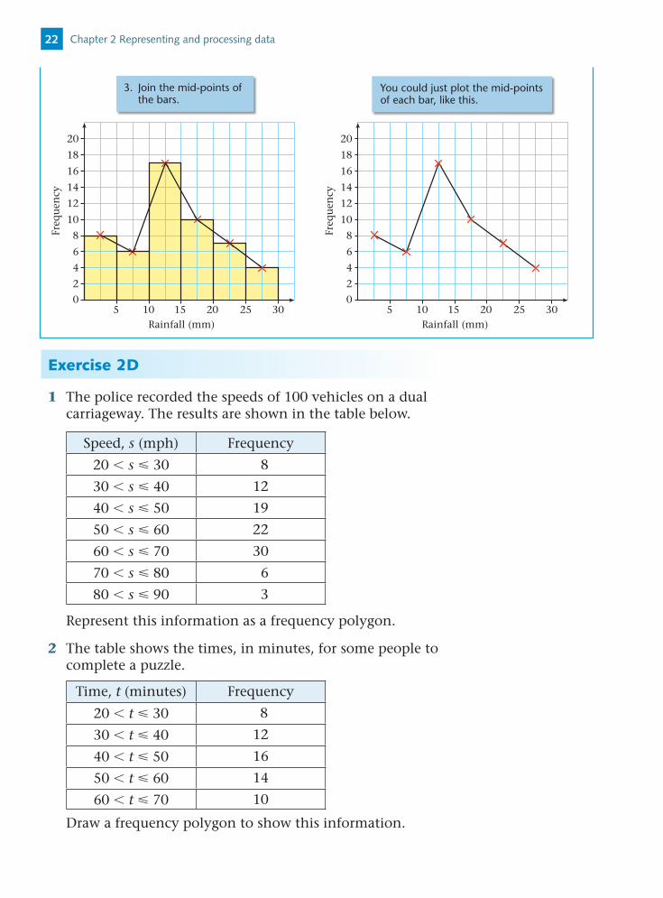
Draw a frequency polygon for this frequency distribution.
Example 8
10 20 30
4
8
12
14
16
18
20
2
6
10
05 15
Rainfall (mm)
Freq
uen
cy
25
1. Draw the histogram.2. Mark the mid-points
of the bars.
212.4 Frequency polygons
Exercise 2D
1 The police recorded the speeds of 100 vehicles on a dual carriageway. The results are shown in the table below.
Speed, s (mph) Frequency
20 s 30 8
30 s 40 12
40 s 50 19
50 s 60 22
60 s 70 30
70 s 80 6
80 s 90 3
Represent this information as a frequency polygon.
2 The table shows the times, in minutes, for some people to complete a puzzle.
Time, t (minutes) Frequency
20 t 30 8
30 t 40 12
40 t 50 16
50 t 60 14
60 t 70 10
Draw a frequency polygon to show this information.
10 20 30
4
8
12
14
16
18
20
2
6
10
05 15
Rainfall (mm)
Freq
uen
cy
25 10 20 30
4
8
12
14
16
18
20
2
6
10
05 15
Rainfall (mm)Fr
equ
ency
25
3. Join the mid-points of the bars.
You could just plot the mid-points of each bar, like this.
Chapter 2 Representing and processing data22

5
3 The sizes of fish in a lake are recorded. The distribution of lengths of the fish is given in the table below.
Length, l (mm) Frequency
0 l 100 2
100 l 200 8
200 l 300 15
300 l 400 10
400 l 500 5
Show this information as a frequency polygon.
Mixed exercise 2
1 Forty people are asked their favourite type of music.Their answers are:
Pop Classical Jazz Rock Pop JazzPop Rock Pop Pop Jazz RockRock Pop Pop Rock Jazz PopPop Rock Rock Classical Pop PopJazz Jazz Rock Pop Rock PopPop Classical Pop Rock Rock PopPop Pop Jazz Rock
(a) Copy and complete the tally chart and frequency table:
Type of music Tally Frequency
(b) Draw a bar chart to show this information.(c) Draw a pie chart for this information.
Activity – Investigating height• (Go to www.heinemann.co.uk/hotlinks, insert the express
code 3827P and click on this activity.)• Use the Mayfield database to select at random the heights
of 50 students from key stage 4 (KS4).• Record the data in a frequency table using the class intervals
1.3 h 1.4, 1.4 h 1.5, etc.• Draw a frequency polygon for this information. • Comment on the shape of your frequency polygon.
23Mixed exercise 2

2 The pictogram shows the number of diamond rings sold by a shop in January, February and March.
January
February
March
April
May
represents 4 diamond rings.Key
(a) Write down the number of diamond rings sold in January.
(b) Work out how many more diamond rings were sold in March than in February.
20 diamond rings were sold in April.14 diamond rings were sold in May.(c) Copy the pictogram. Use this information to complete
it.
3 200 people were asked when and where they took their summer holiday: in the UK, Europe or elsewhere. The incomplete table shows some of their responses.
UK Europe Elsewhere Total
July 20 8 40
August 36 16
September 32 60
Total 56 100
(a) Copy and complete the table.(b) Draw a pie chart to represent the total numbers of
people holidaying in each of the three months.(c) Draw a second pie chart to represent the total
numbers of people holidaying in the UK, Europe or elsewhere.
4 The table gives the share price of a company on the first ten days in one month.
Day 1 2 3 4 5 6 7 8 9 10
Share price (pence) 23 23 26 22 28 32 29 30 26 32
Chapter 2 Representing and processing data24

5
Copy and complete the line graph to show this information.
00
Day
Shar
e p
rice
(p
ence
)
1 2 3 4 5 6 7 8 9 10
10
20
30
5 The monthly average mid-day temperatures are recorded in the table below:
Month Temperature (°C)
October 5
November 17
December 22
January 24
February 19
March 11
April 1
May 9
Represent this information as a line graph.
6 The pie chart provides some information about the colours of 120 cars in a car park.
Copy the frequency table. Use the information from the pie chart to complete it.
Colour Frequency
Red
Blue
White
Silver
Black
60°120°
54°
36°
25Mixed exercise 2

7 The table shows information about the heights of Christmas trees in a garden centre.
Height, h (cm) Frequency
50 h 90 7
90 h 130 15
130 h 170 12
170 h 210 5
210 h 250 3
Represent this information as a frequency polygon.
8 There are 27 boxes in a warehouse. The frequency polygon for their weights is shown opposite.
Represent this information as a frequency table.
9 The costs per night, in £, for a double room in 24 hotels are:110, 118, 125, 110, 134, 132, 169, 125, 127, 141, 110, 111, 120, 149, 99, 159, 120, 125, 127, 180, 163, 170, 109, 115
Represent this information as a stem and leaf diagram.
Summary of key points
1 You can show discrete data, or data in words, in a bar chart. Remember to leave gaps between the bars.
2 A pictogram uses symbols or pictures to represent a quantity. It needs a key to show what one symbol represents.
3 A pie chart shows how something is shared or divided.
4 The angles at the centre of a pie chart add up to 360°.
5 A stem and leaf diagram shows the shape of a distribution and keeps all the data values. It needs a key to show how the stem and leaf combine.
6 You can show grouped continuous data in a histogram. A histogram has no gaps between the bars.
7 A frequency polygon shows the general pattern of data in a histogram.
400
Weight (kg)
Freq
uen
cy
50 60 70 80 90
2
4
6
8
Chapter 2 Representing and processing data26
5
3 Averages and spread
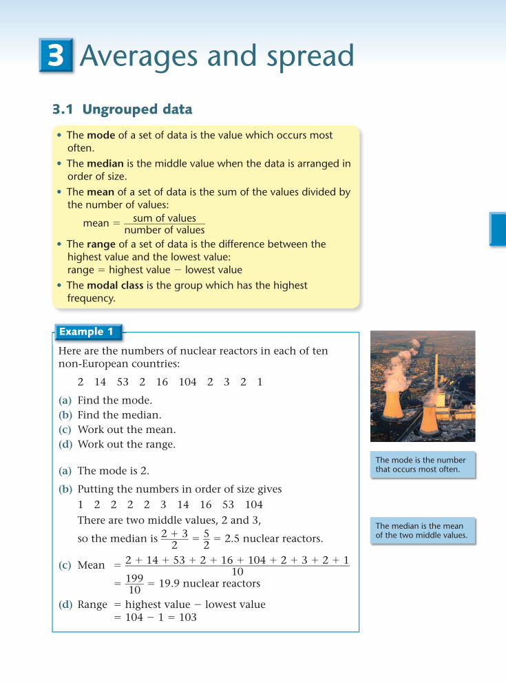
3.1 Ungrouped data
• The mode of a set of data is the value which occurs most often.
• The median is the middle value when the data is arranged in order of size.
• The mean of a set of data is the sum of the values divided by the number of values:
mean sum of values ________________ number of values
• The range of a set of data is the difference between the highest value and the lowest value: range highest value lowest value
• The modal class is the group which has the highest frequency.
Here are the numbers of nuclear reactors in each of ten non-European countries:
2 14 53 2 16 104 2 3 2 1
(a) Find the mode.(b) Find the median.(c) Work out the mean.(d) Work out the range.
(a) The mode is 2.
(b) Putting the numbers in order of size gives 1 2 2 2 2 3 14 16 53 104 There are two middle values, 2 and 3,
so the median is 2 3 ______ 2 5 __
2 2.5 nuclear reactors.
(c) Mean 2 14 53 2 16 104 2 3 2 1 ___________________________________________ 10
199 ____ 10
19.9 nuclear reactors
(d) Range highest value lowest value 104 1 103
Example 1
The mode is the number that occurs most often.
The median is the mean of the two middle values.

Exercise 3A
1 Here are the numbers of nuclear reactors in each of nineteen European countries:
27 13 5 11 9 1 6 30 1 1 2 4 19 59 4 6 6 7 1
(a) Find the mode.(b) Find the median.(c) Work out the mean.(d) Work out the range.
The average of the 10th and 11th values is
15 17 ________ 2 16
The frequency diagram shows the distribution of ages for the population of Madwell village.Write down the modal class for these ages.
The modal class is the age group 30 to 40.
Example 3
40 80
10
20
30
5
0
15
25
200 60Age (years)
Freq
uen
cy
10030 7010 50 90
The stem and leaf diagram shows the number of complaints received by a television broadcasting company for each of 20 programmes.
0 2, 4, 5, 6, 81 0, 2, 2, 3, 5, 7, 7, 92 1, 1, 8, 8, 8, 8 Key: 3 0 means 30 complaints3 0
(a) Find the mode.(b) Find the median.(c) Work out the range.
(a) The mode is 28.
(b) The median is the 20 1 _______ 2 10.5th value 16
(c) The range is 30 2 28
Example 2
10th value
11th value
Chapter 3 Averages and spread28

5
2 Last term Jenny did 14 homeworks in History. Her marks were
8 1 _ 2 , 7, 6, 8, 4, 5, 5, 9, 8, 8, 4, 8 1 _ 2 , 7 1 _ 2 , 5 1 _ 2 .(a) Find the mode of these marks.(b) Find the median of these marks.(c) Work out the mean mark.(d) Work out the range of these marks.
3 Here are the times, in minutes, of 10 films:162 174 155 132 201 188 175 168 146 187
(a) Find the median time.(b) Work out the range of the times.(c) Work out the mean time.
4 The stem and leaf diagram shows the number of tree rings in each of 25 tree stumps.
2 5, 5, 5, 5, 6, 8, 9, 93 0, 0, 2, 2, 6, 7, 7, 84 3, 3, 5, 7, 7, 8, 8 Key: 5 1 means 51 tree rings5 1, 3
Find (a) the mode(b) the median(c) the range
5 Use the ‘mean’ function on your calculator to work out the mean of the numbers
3, 7, 8, 5, 9, 10, 7, 8, 6, 2
Check your results without using a calculator.
6 The grouped frequency diagram shows the distribution of the weights of a group of people.
Write down the modal class interval.
3.2 Frequency distributions 70
10
20
5
15
5030Weight (kg)
Freq
uen
cy
6040 80
The key may be labelled __
X or __ x
• When n values are written in ascending order:
the median is the n 1 ______ 2 th value.
• For a frequency distribution: mean fx
____ f
3.2 Frequency distributions 29
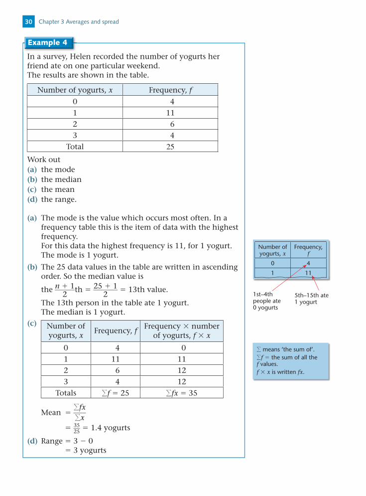
In a survey, Helen recorded the number of yogurts her friend ate on one particular weekend.The results are shown in the table.
Number of yogurts, x Frequency, f
0 41 112 63 4
Total 25Work out(a) the mode (b) the median(c) the mean (d) the range.
(a) The mode is the value which occurs most often. In a frequency table this is the item of data with the highest frequency. For this data the highest frequency is 11, for 1 yogurt. The mode is 1 yogurt.
(b) The 25 data values in the table are written in ascending order. So the median value is
the n 1 ______ 2 th 25 1 _______
2 13th value.
The 13th person in the table ate 1 yogurt. The median is 1 yogurt.(c) Number of
yogurts, xFrequency, f Frequency number
of yogurts, f x
0 4 01 11 112 6 123 4 12
Totals f 25 fx 35
Mean fx
____ x
35 __ 25 1.4 yogurts
(d) Range 3 0 3 yogurts
Example 4
Number of yogurts, x
Frequency, f
0 4
1 11
1st–4th people ate 0 yogurts
5th–15th ate 1 yogurt
means ‘the sum of’.f the sum of all the f values.f x is written fx.
Chapter 3 Averages and spread30

5
Exercise 3B
1 The table shows the number of goals scored by Halifax Wonderers in 20 matches.
Work out(a) the mode(b) the median(c) the mean.
2 The table shows the number of days lost through illness in April for 47 employees in a company.
Days 0 1 2 3 4
Frequency 27 9 6 3 2
Work out(a) the range (b) the mean.
3 In a survey, Ross asks some people about the number of brothers and sisters that they each have. The table shows his results.
Brothers and sisters 0 1 2 3 4 5
Frequency 11 20 13 3 2 1
Work out(a) the mode (b) the mean.
4 The table shows information about the number of people living in each of 100 houses.
Number of people, x Frequency, f
1 5
2 13
3 20
4 25
5 19
6 11
7 7
Total 100
Work out(a) the mode (b) the mean (c) the range.
Copy the table and add an f x column.
Number of goals, x Frequency, f
0 5
1 6
2 7
3 1
4 1
Total 20
3.2 Frequency distributions 31

3.3 Grouped frequency distributions
• For grouped data: you can state the class interval that contains the median the class interval with the highest frequency is called the
modal class you can calculate an estimate of the mean using the
middle value of each class interval.
The table provides information about the amount of rain that fell during the 52 weeks of one year.
Amount of rain, r (mm) Number of weeks
0 r 5 8
5 r 10 6
10 r 15 17
15 r 20 10
20 r 25 7
25 r 30 4
Work out an estimate for the mean amount of rain that fell per week.
Rainfall Middle value of interval (x)
Frequency (number of weeks, f )
f x
0 to 5 2.5 8 8 2.5 20 5 to 10 7.5 6 6 7.5 45
10 to 15 12.5 17 17 12.5 212.5
15 to 20 17.5 10 10 17.5 175
20 to 25 22.5 7 7 22.5 157.5
25 to 30 27.5 4 4 27.5 110
f 52 fx 720
Mean fx
____ f
720 ____ 52
13.846
The mean amount of rain per week is 13.85 mm (to 2 d.p.)
Example 5
Add columns for the middle values (x) of the intervals and f x.
From the table, the maximum amount of rain is 30 mm and the minimum is 0 mm. So as a rough guess, the mean is likely to be about halfway between 0 and 30, which is 15 mm.
Chapter 3 Averages and spread32

5
The frequency distribution shows the ages of 49 members of an aerobics class.
Age, a (years) Frequency
10 a 20 4
20 a 30 18
30 a 40 10
40 a 50 14
50 a 60 3
(a) Write down the modal class interval for the ages.
(b) Work out which class interval contains the median age.
(c) Work out an estimate for the mean of the ages.
(d) Work out the maximum possible range for the ages.
(a) The modal class is 20 a 30 years.
(b) The data in the table is in order. There are 49 people altogether.
The median value is the n 1 ______ 2 th 49 1 _______
2 25th value.
The interval 30 a 40 contains the 25th value.
(c)Age, a
Middle value of interval (x)
Frequency( f ) f x
10 a 20 15 4 60
20 a 30 25 18 450
30 a 40 35 10 350
40 a 50 45 14 630
50 a 60 55 3 165
f 49 fx 2166
Mean fx
____ f
2166 _____ 49
42.2 years correct to one decimal place.
(d) The lowest possible age is 10 years. The highest possible age is 60 years.
So the maximum possible range is 60 10 50 years.
Example 6
This is the group with the highest frequency.
333.3 Grouped frequency distributions

Exercise 3C
1 The frequency table gives information about the number of text messages that Gina received each day in a month.
Number of text messages Frequency
0 to 2 8
3 to 5 13
6 to 8 6
9 to 11 3
12 to 14 1
(a) Write down the modal class interval.
(b) Work out the class interval which contains the median.
(c) Calculate an estimate for the mean number of text messages per day.
2 A farmer surveys the weight of some of the potatoes he grows. He weighs 40 potatoes. The distribution of weights is given in the table below.
Weight, w (g) Frequency
0 w 100 2
100 w 200 16
200 w 300 10
300 w 400 9
400 w 500 3
(a) Work out an estimate for the mean weight of the potatoes.
(b) Write down the class interval which contains the median weight.
(c) Write down the modal class interval.
(d) Write down the maximum possible range for the weight of the potatoes.
Chapter 3 Averages and spread34

5
3 A survey is conducted on the speeds of 80 vehicles on a main road at lunchtime. The results of the survey are:
Speed (s) in mph Frequency
0 s 10 1
10 s 20 2
20 s 30 10
30 s 40 30
40 s 50 32
50 s 60 3
60 s 70 2
(a) Work out an estimate for the mean speed of these vehicles.
(b) Write down the modal class interval for the speed.
(c) Write down the class interval which contains the median.
The speed limit on the road is 45 mph.
(d) Estimate how many of the vehicles in the survey were exceeding the speed limit. Give your reasons.
Activity – Estimating the mean (an investigation)
Here are the times, in seconds for each of 50 people to complete a number puzzle:
80 65 57 30 61 91 67 61 86 5138 44 81 40 63 45 86 33 67 8865 81 94 41 55 94 52 53 75 5886 57 35 65 64 31 53 97 61 8547 85 49 56 46 93 60 68 47 68
1 Draw a grouped frequency table for this data. Use class intervals 30 x 40, 40 x 50, etc.
2 Use your grouped frequency table to calculate an estimate for the mean time to complete the number puzzle.
3 Repeat 1 and 2 using class intervals 30 x 45, 45 x 60, etc.
4 Repeat 1 and 2 using other equal class intervals.
5 Calculate the actual mean of the times.
6 Comment on your findings.
353.3 Grouped frequency distributions

Mixed exercise 3
1 Here are the number of cases of malaria that Dr Chang saw each month, for a year. 11, 20, 14, 19, 10, 7, 11, 17, 12, 16, 9, 15
(a) Work out the median.
(b) Work out the range.
2 The stem and leaf diagram shows information about the areas of 32 photographs.
0 8, 8, 91 1, 1, 3, 4, 4, 8, 92 0, 3, 5, 5, 7, 8, 8, 9 3 2, 2, 3, 3, 5, 6, 8, 8 4 1, 1, 3, 3, 5, 8 Key: 4 1 represents 41 cm2
(a) Write down the number of photographs that have an area of 38 cm2.
(b) Work out the median. [E]
3 Amanda collected 20 leaves and wrote down their lengths, in cm.
Here are her results.5 6 5 2 4 5 8 7 5 47 6 4 3 5 7 6 4 8 5
(a) Copy and complete the frequency table to show Amanda’s results.
Length in cm Tally Frequency
2
3
4
5
6
7
8
(b) Write down the modal length.
(c) Work out the ranges. [E]
Chapter 3 Averages and spread36

5
4 The midday temperatures, in °C, in 25 holiday resorts are shown below: 24, 23, 19, 28, 20, 31, 38, 32, 27, 29, 18, 26, 27, 23, 30, 26, 29, 33, 28, 26, 26, 28, 21, 20, 25(a) Copy and complete the table for these temperatures.
Temperature, T (°C) Tally Frequency
15 T 20
20 T 25
25 T 30
30 T 35
35 T 40
(b) Find the median temperature.(c) Find the modal class interval.(d) Work out the mean of the temperatures.
5 The mean of five numbers is 8. Four of the numbers are 7, 9, 10, 3.
(a) Work out the fifth number.(b) Find the median of the five numbers.
6 Rosie had 10 boxes of drawing pins. She counted the number of drawings pins in each box.
The table gives information about her results.
Number of drawing pins Frequency
29 2
30 5
31 2
32 1
(a) Write down the modal number of drawing pins in a box.(b) Work out the range of the number of drawing pins in
a box.(c) Work out the mean number of drawing pins in a box. [E]
7 The speeds, in mph, of 30 motorbikes on a motorway are:44 42 60 55 81 72 75 48 56 68 59 75 72 69 80 50 52 66 71 68 73 56 62 58 63 60 64 37 88 73
(a) Work out the mean speed of these motorbikes.(b) Find the median speed.
37Mixed exercise 3

(c) Work out the range of the speeds.(d) Copy and complete the frequency table.
Speed (s) in mph Tally Frequency
30 s 40
40 s 50
50 s 60
60 s 70
70 s 80
80 s 90
(e) Write down the modal class interval for the speed.
8 There are 15 children in a choir. Ten of the children are girls and five of the children are boys. The mean age of the girls is 9.2 years. The mean age of the boys is 7.4 years. Work out the overall mean age of the 15 children.
9 The distribution of the ages, in years, of 60 women diagnosed with breast cancer is represented by the frequency diagram:(a) In which class interval does the median age lie?(b) Write down the modal class interval.
10 The number of people attending a Duke of Edinburgh’s scheme was recorded over 28 weeks.
The highest number attending was 18 and the range was 8. The group leader worked out that the mean number of
people attending was 8.7. Explain why the group leader’s calculation for the mean
number must be incorrect.
11 The grouped frequency table shows the lengths, in seconds, of some tracks on an MP3 player.
Samir works out an estimate for the mean time of the tracks.
He works out the answer to be 2840 seconds. Without working out an estimate for the
mean, explain why Samir’s answer must be incorrect.
60
10
20
25
5
15
5040Age (years)
Freq
uen
cy
5545 65 70
Time, t (seconds) Frequency
0 t 100 4
100 t 200 16
200 t 300 25
300 t 400 14
400 t 500 1
Chapter 3 Averages and spread38

5
12 Bill recorded the times, in minutes, taken to complete his last 40 homeworks.
The table shows information about the times.
Cost, c (£) Frequency
20 t 25 8
25 t 30 3
30 t 35 7
35 t 40 7
40 t 45 15
(a) Find the class interval in which the median lies.(b) Calculate an estimate of the mean time it took Bill to
complete each homework. [E]
Summary of key points
1 The mode of a set of data is the value which occurs most often.
2 The median is the middle value when the data is arranged in order of size.
3 The mean of a set of data is the sum of the values divided by the number of values:
mean sum of values ________________ number of values
4 The range of a set of data is the difference between the highest value and the lowest value:
range highest value lowest value
5 The modal class is the group which has the highest frequency.
6 When n data values are written in ascending order:
the median is the n 1 ______ 2 th value.
7 For a frequency distribution: mean fx
____ f
8 For grouped data: you can state the class interval that contains the median the class interval with the highest frequency is called the
modal class you can calculate an estimate of the mean using the
middle value of each class interval.
You do not know the individual data values. So you can only calculate an estimate for the mean.
39Summary of key points